Design System Carnival! One accessible component, many pretty masks.

A presentation at ReactJSDay in October 2022 in Verona, VR, Italy by Kathleen McMahon

Slide 1

Slide 1

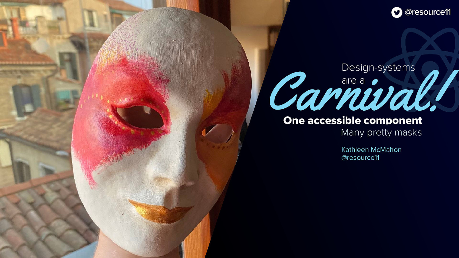
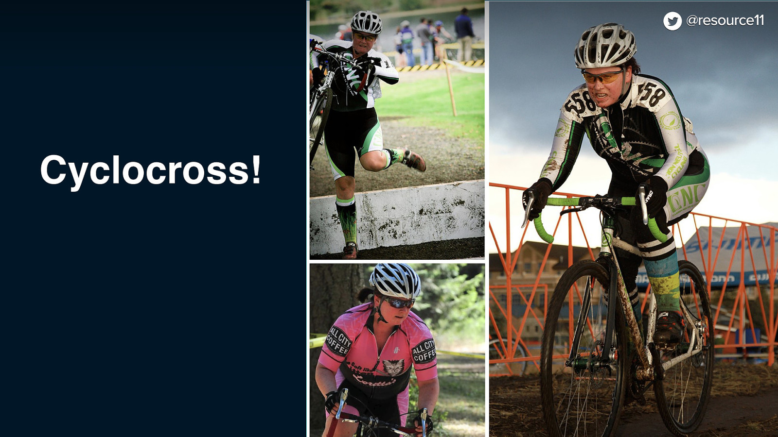
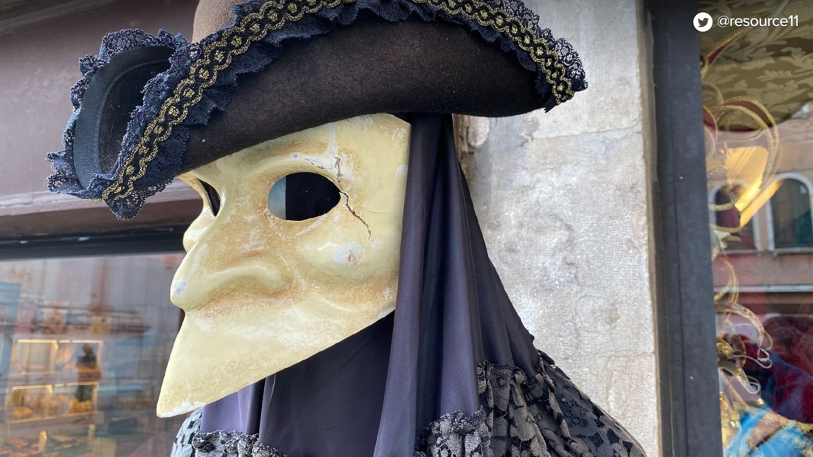
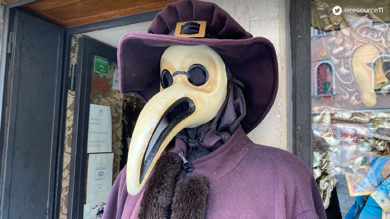
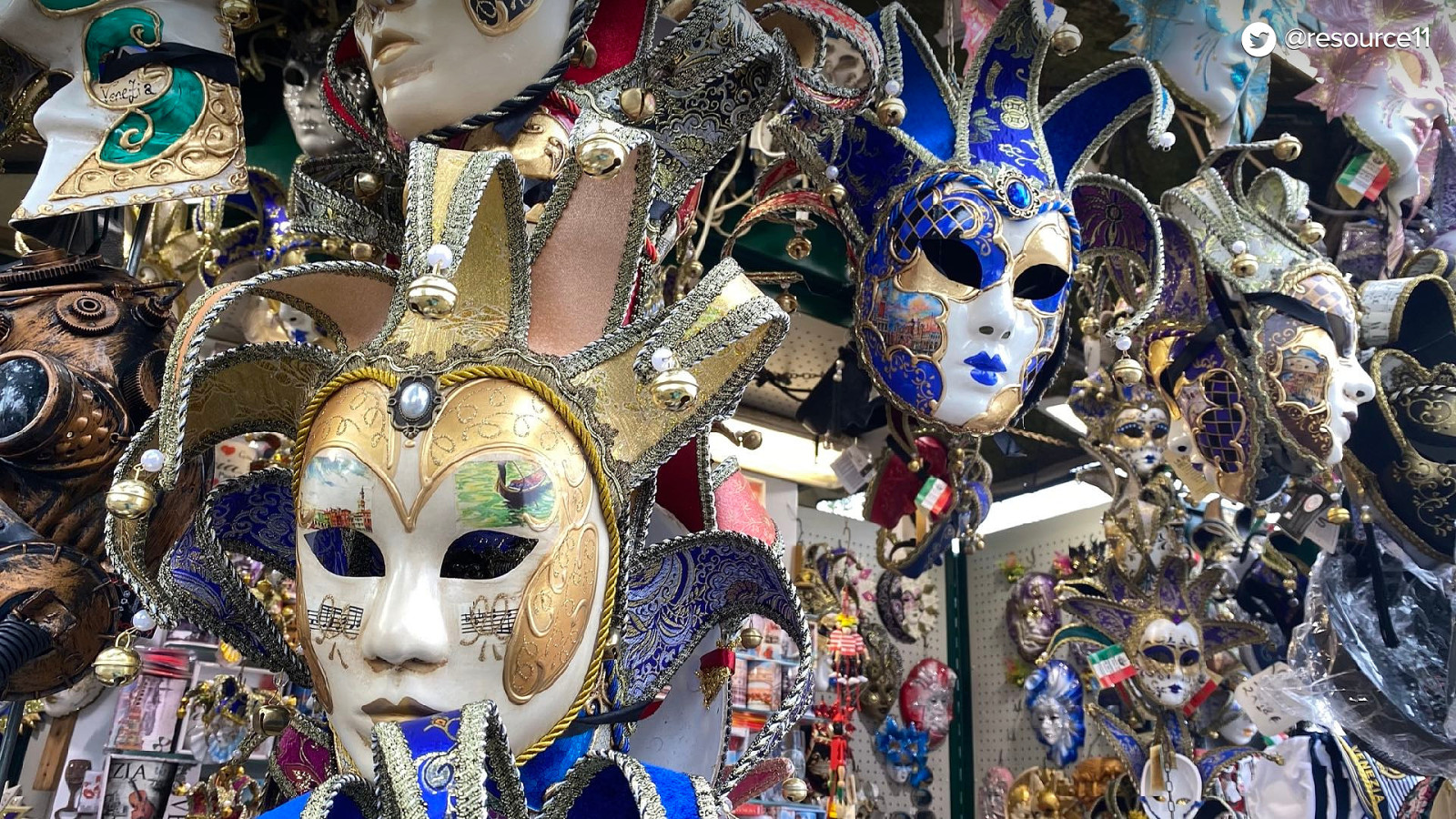
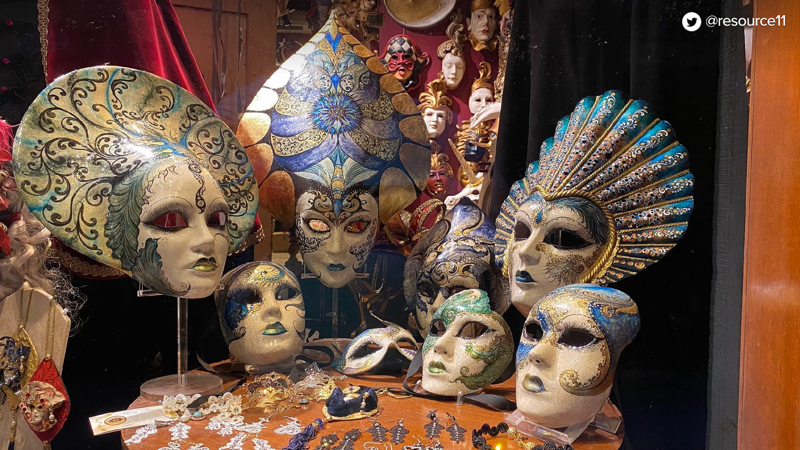
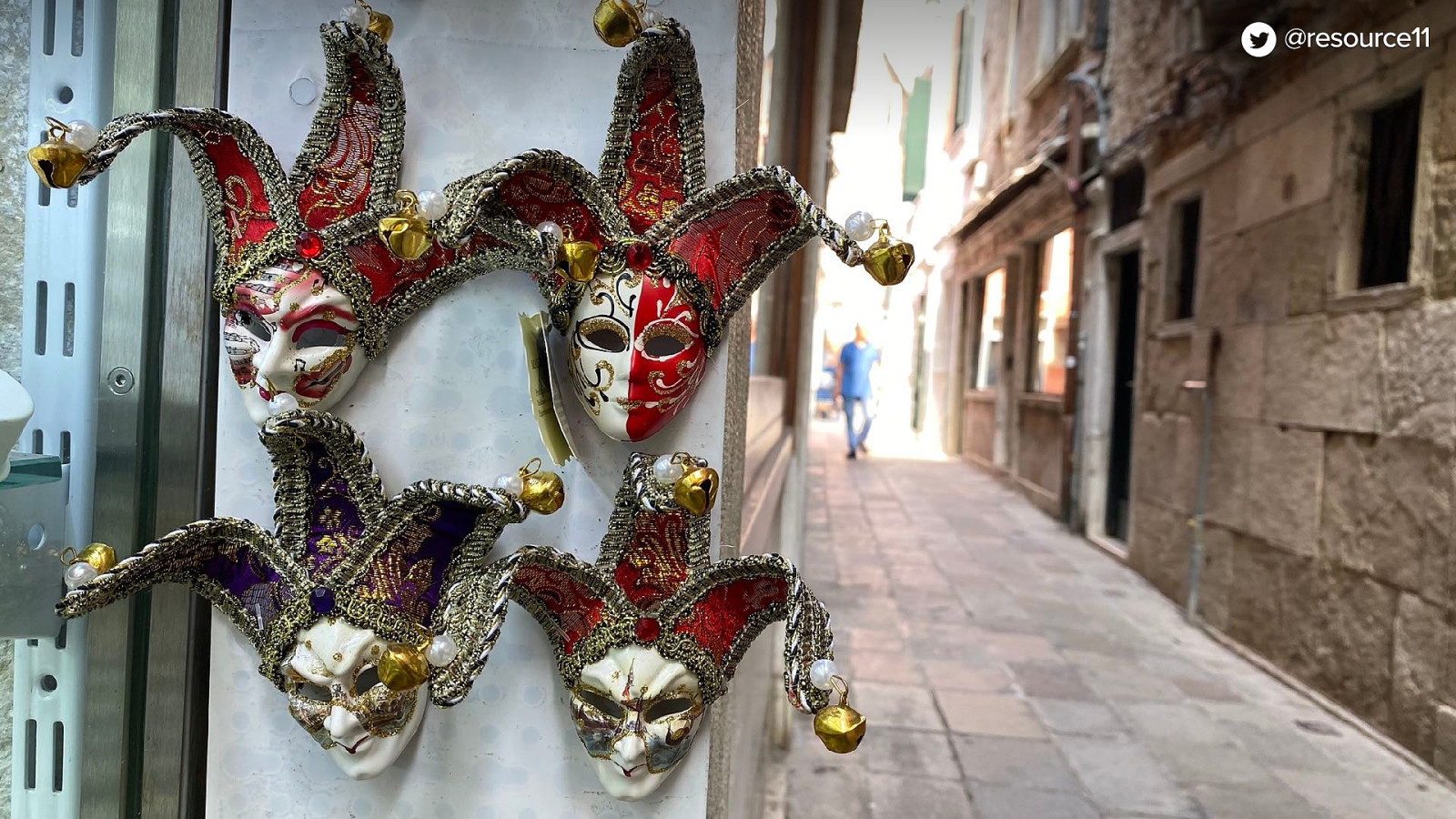
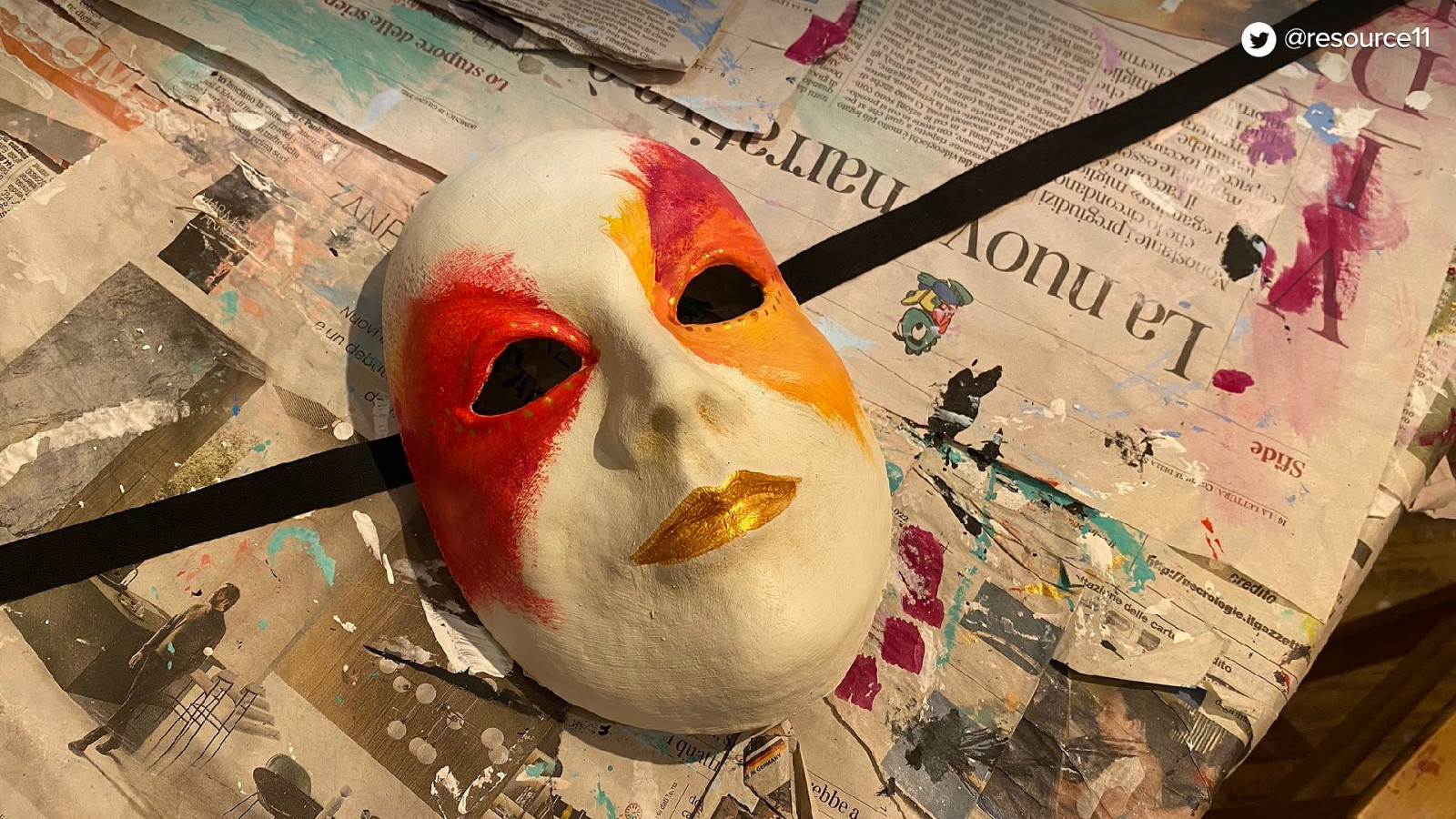
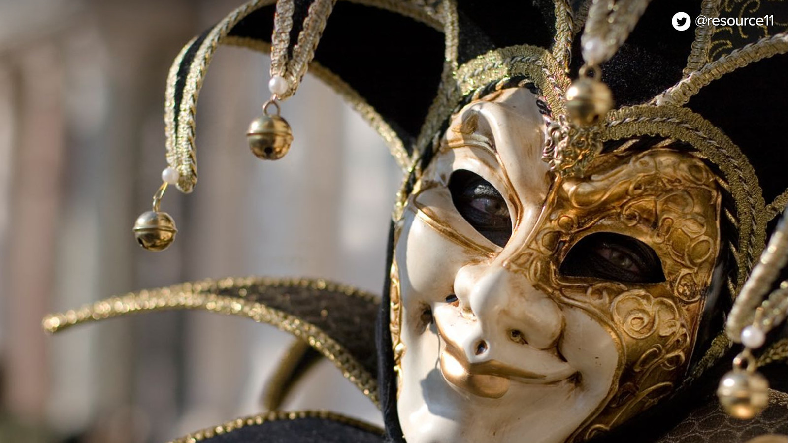
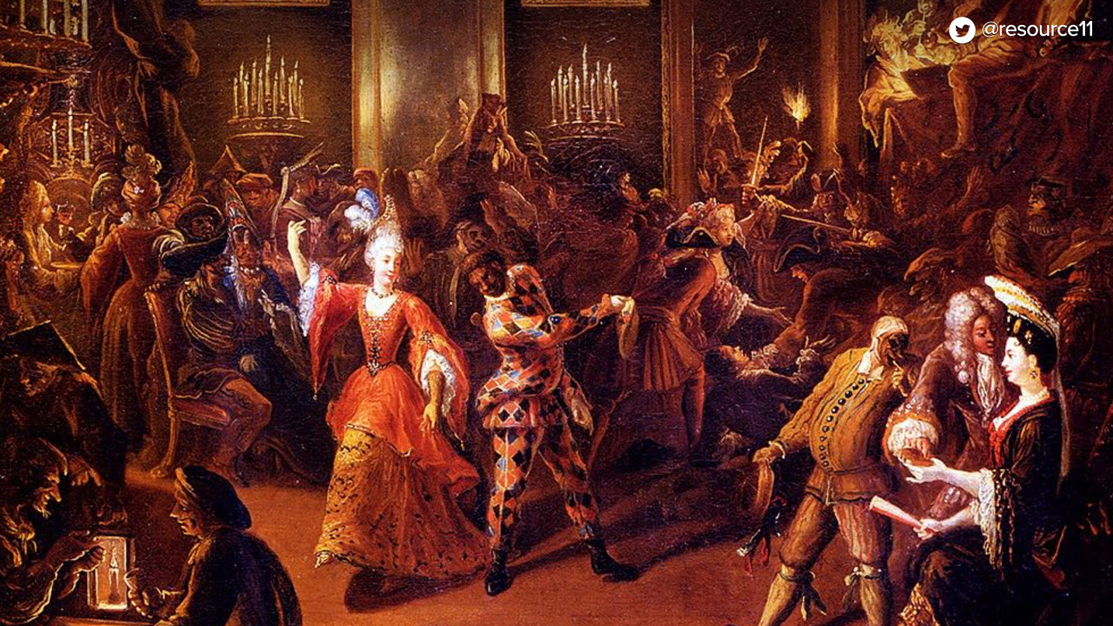
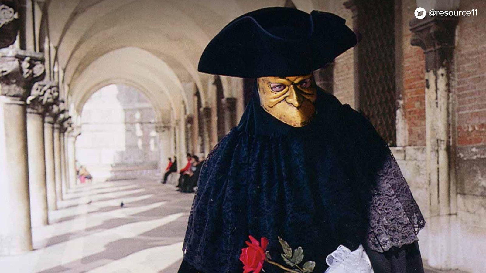
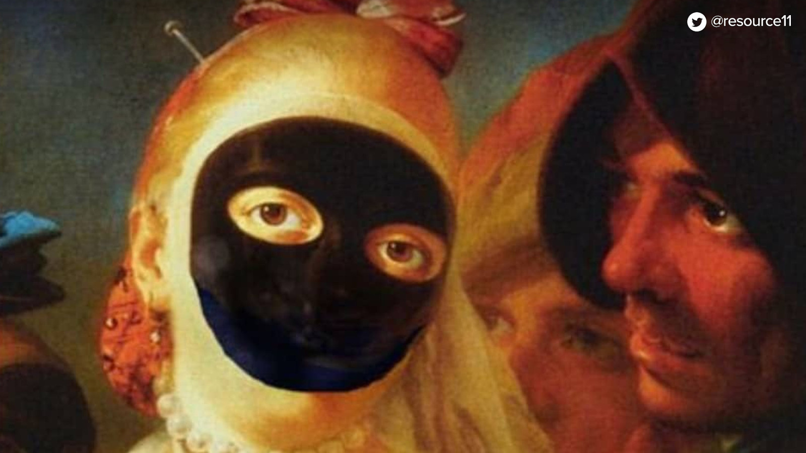
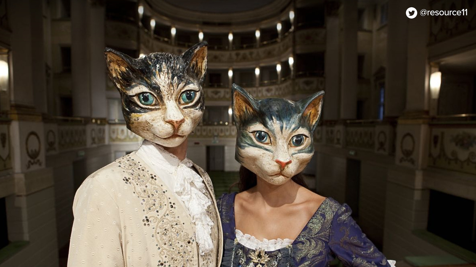
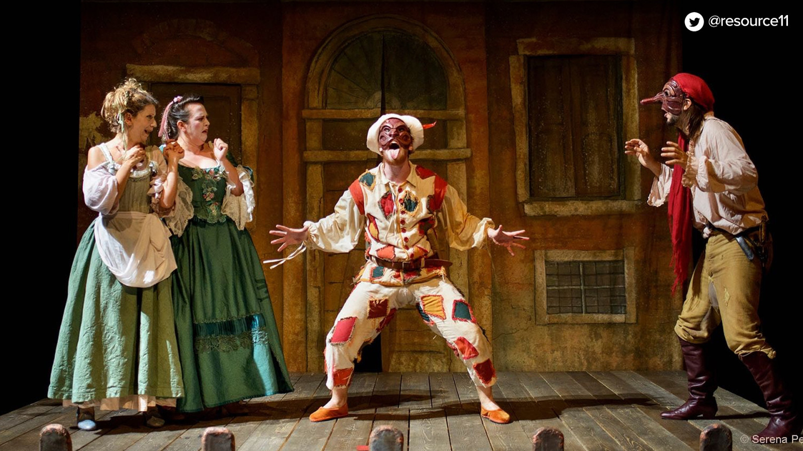
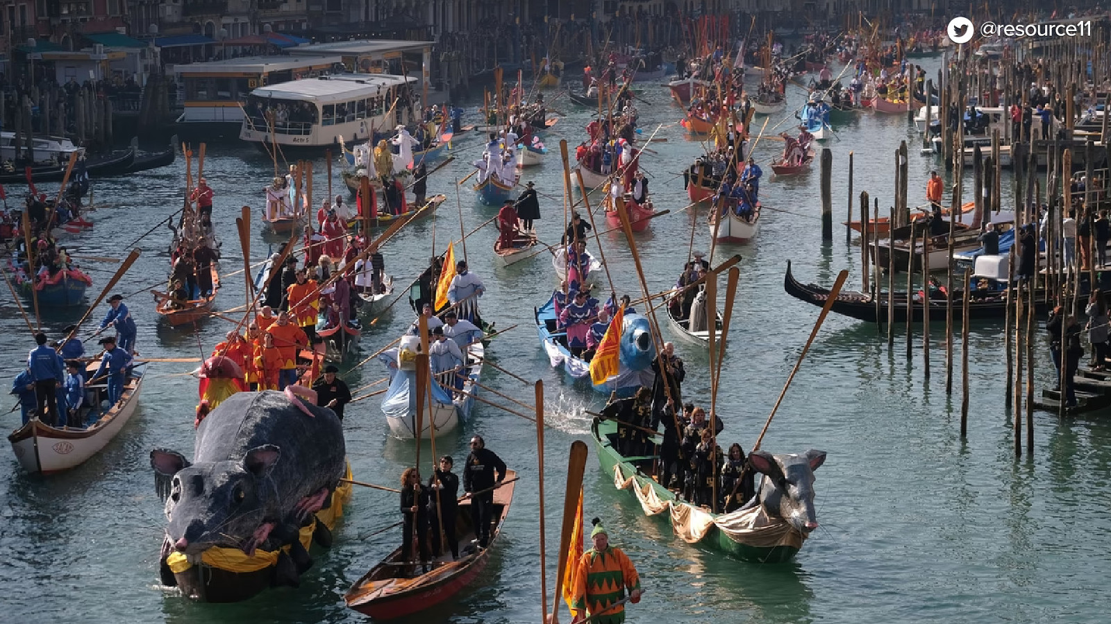
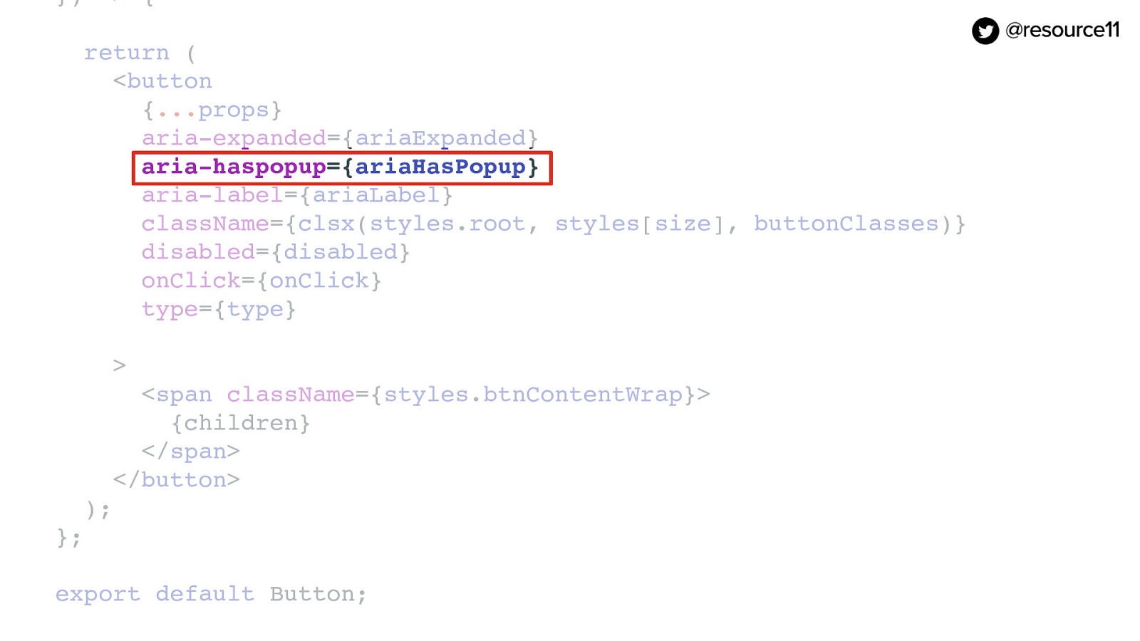
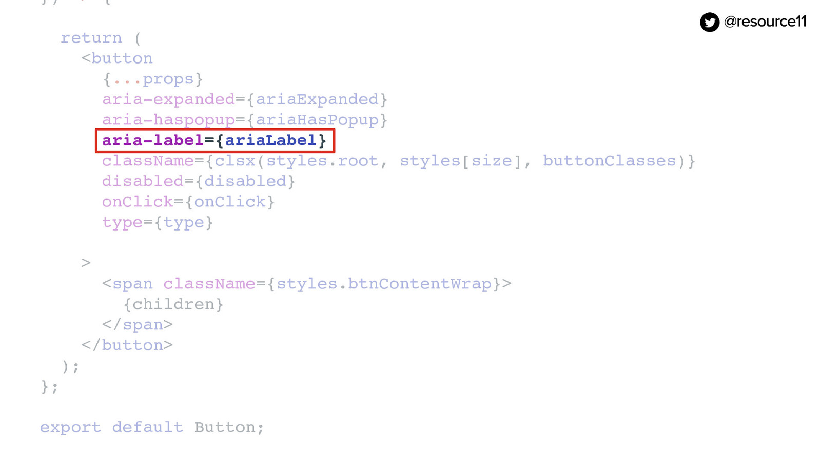
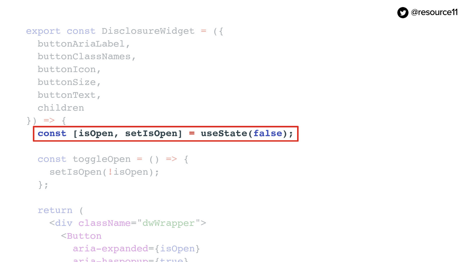
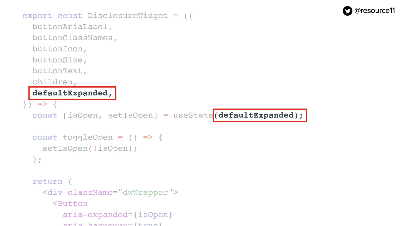
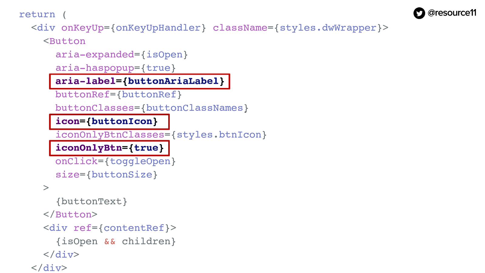
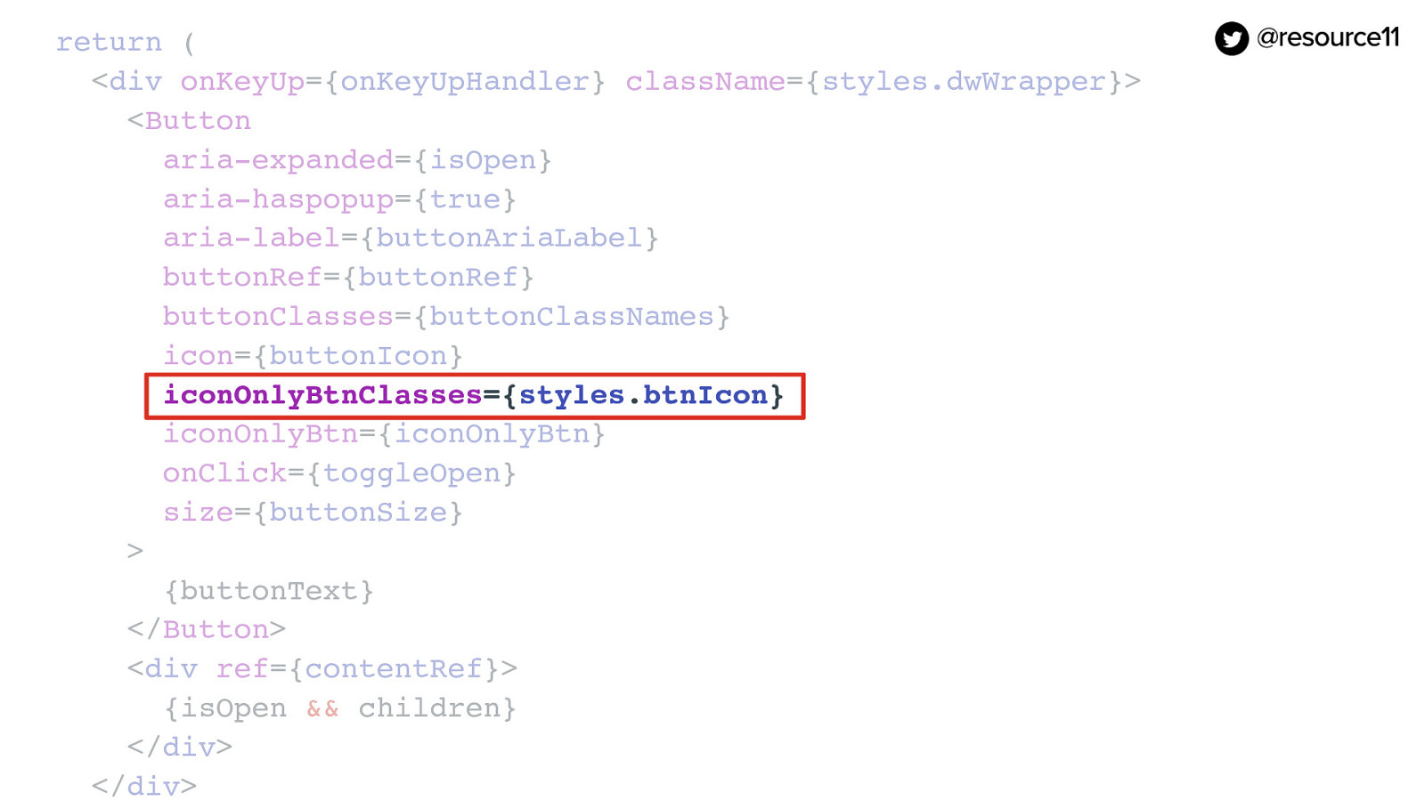
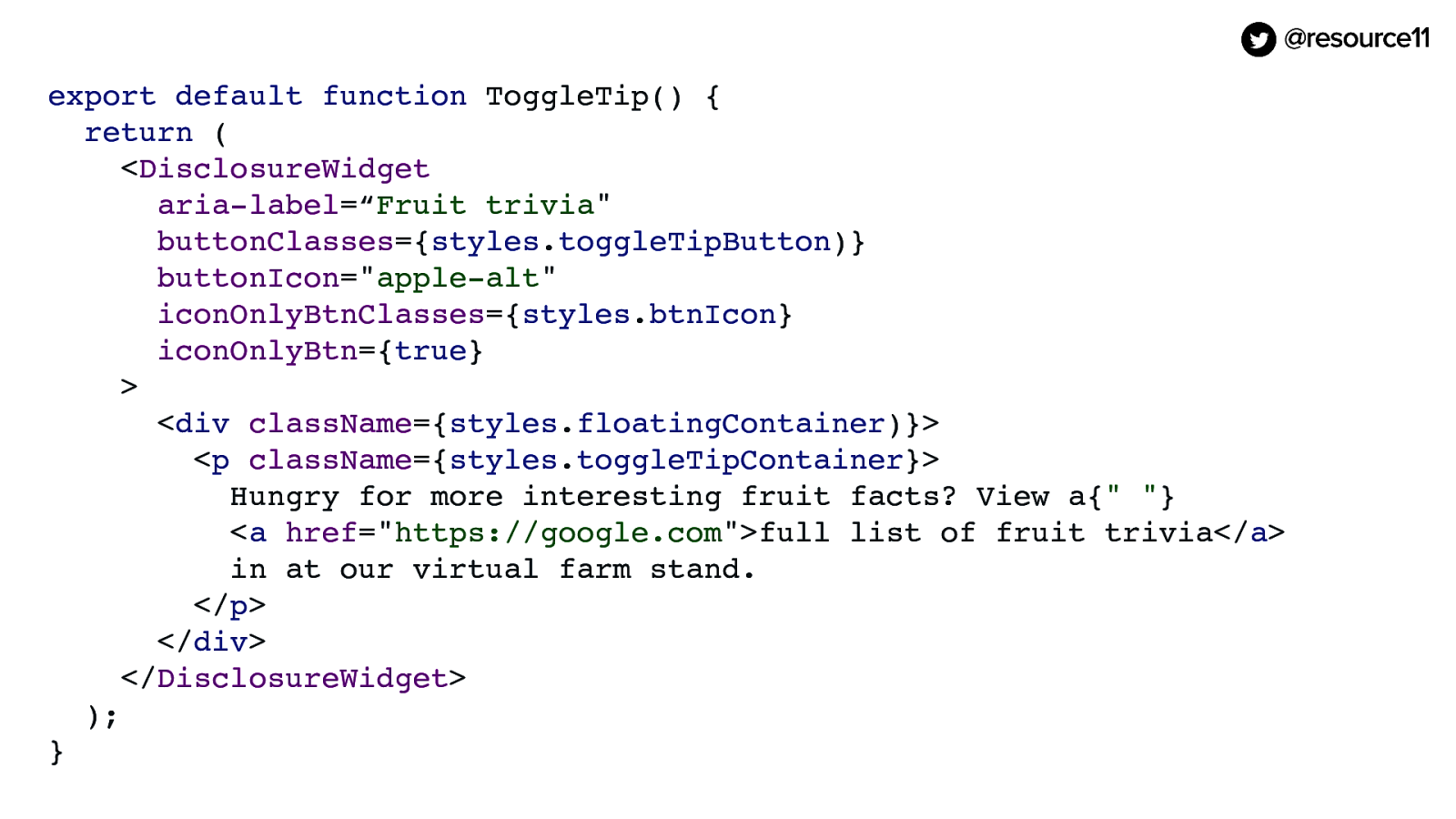
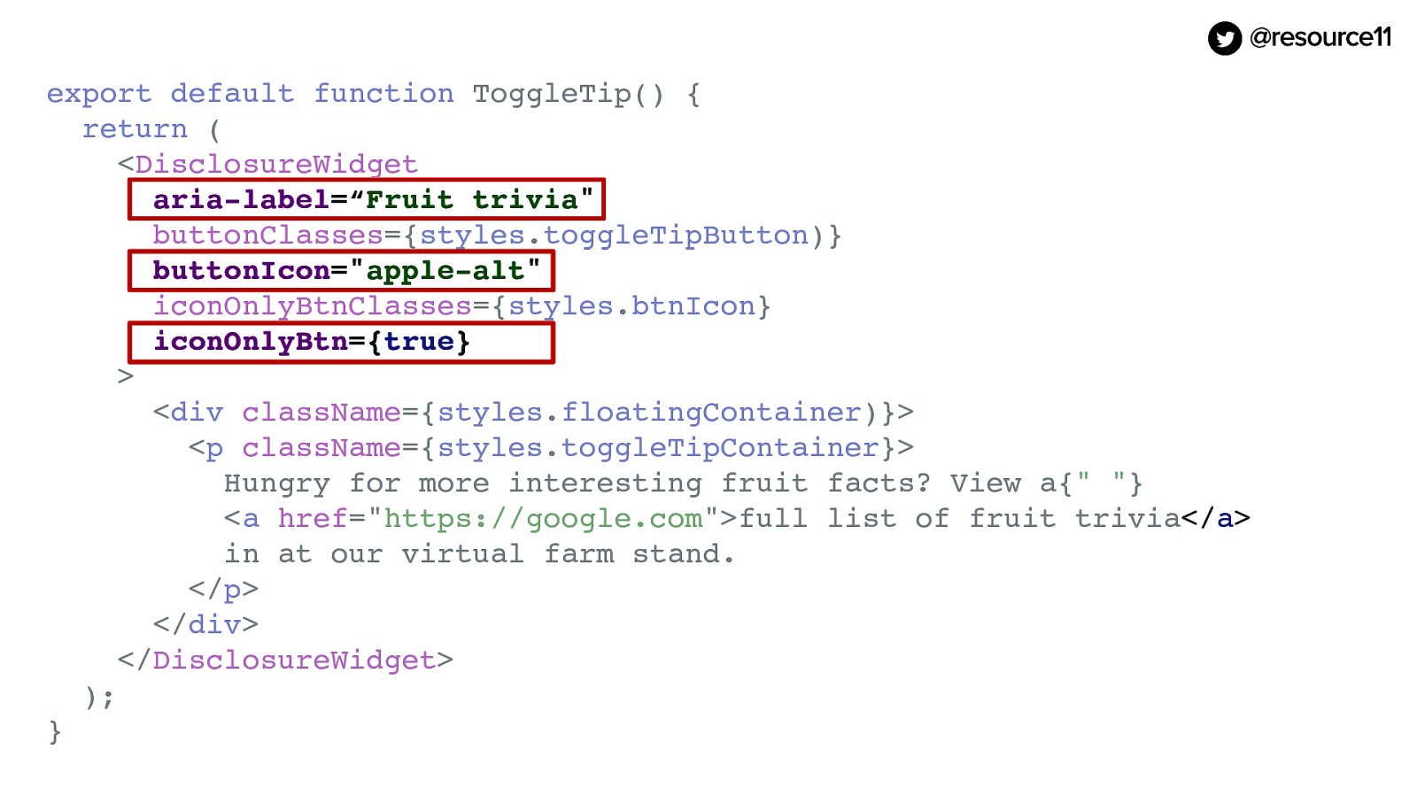
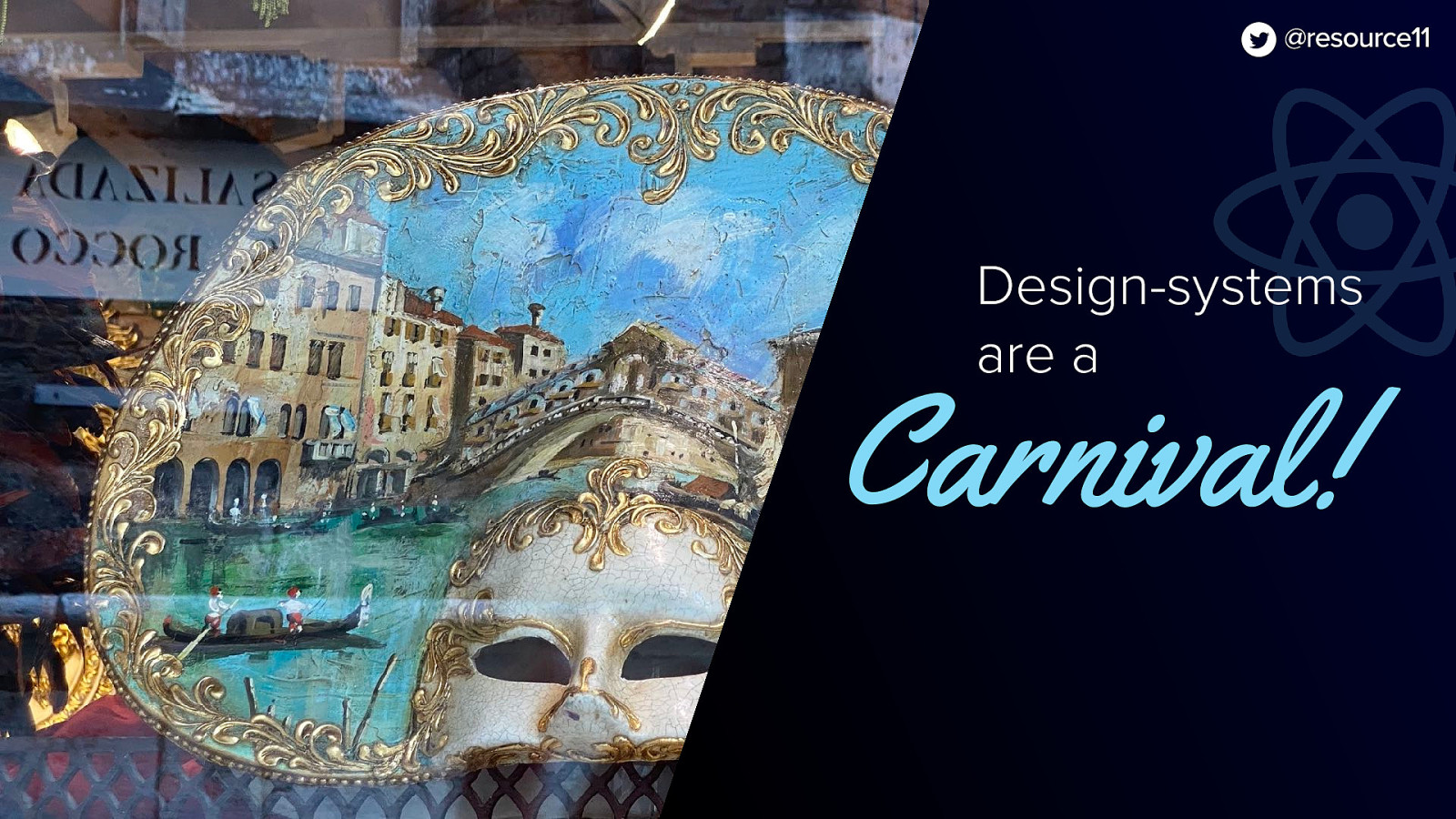
Design-systems are a Carnival! One accessible component Many pretty masks | Kathleen McMahon @resource11

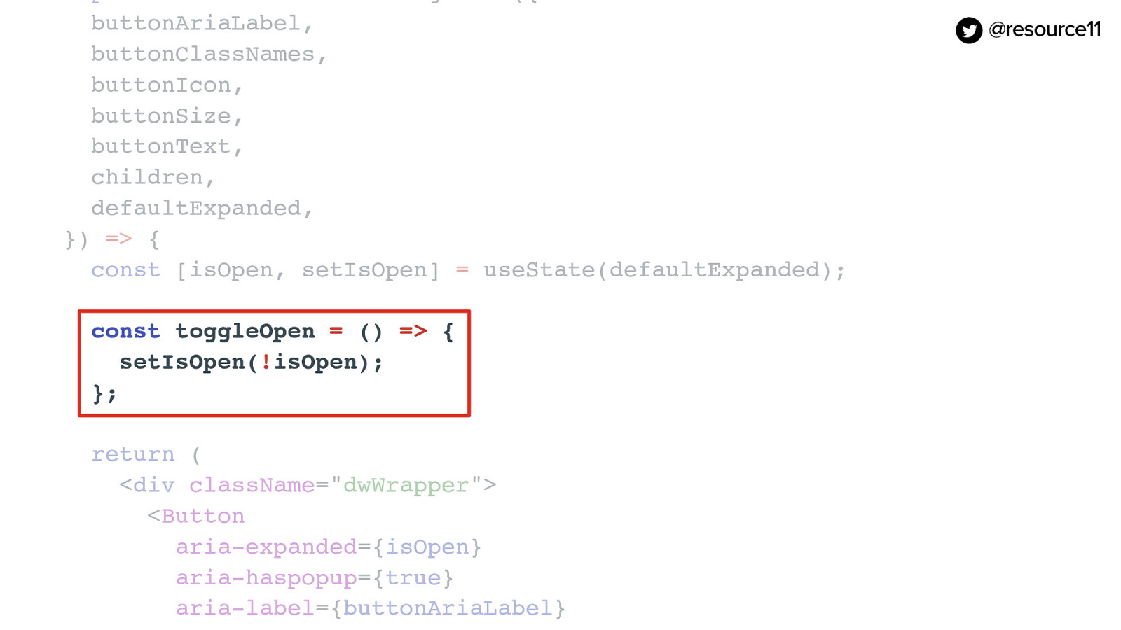
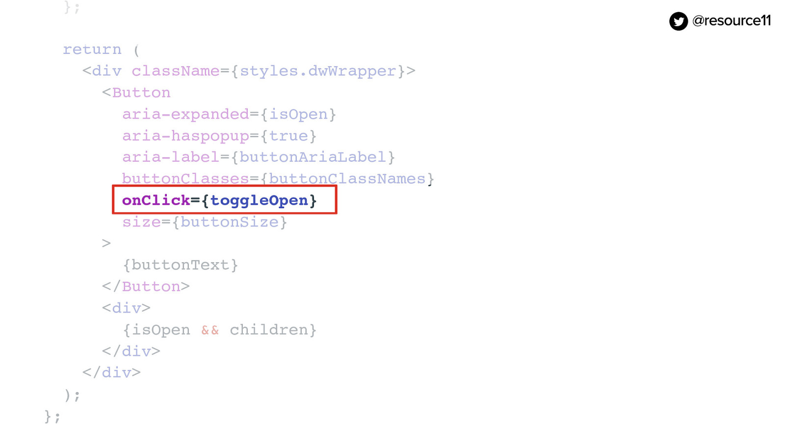
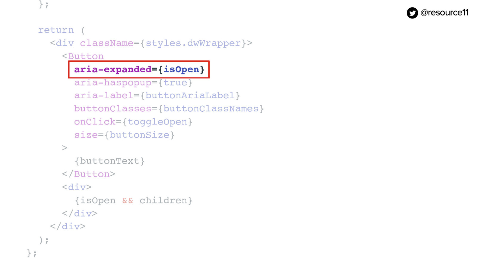
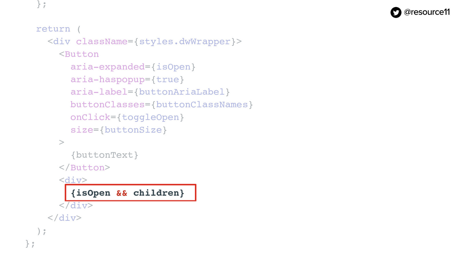
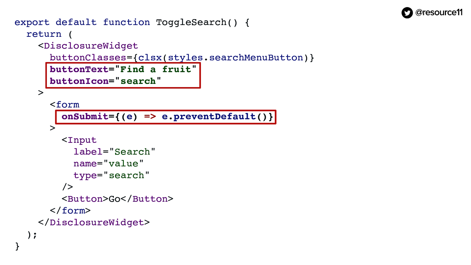
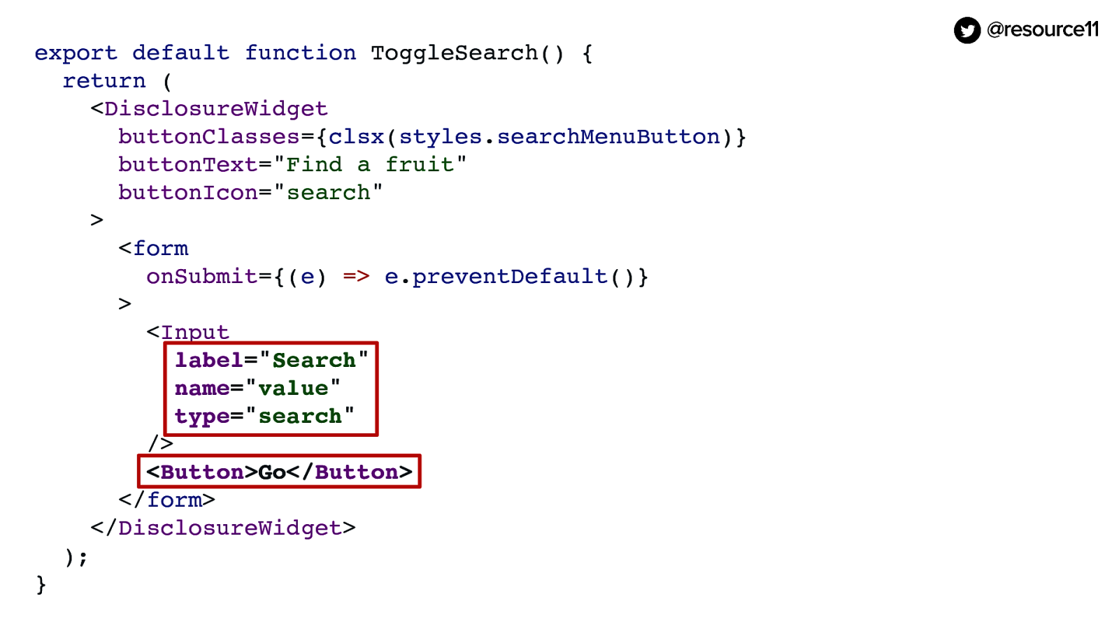
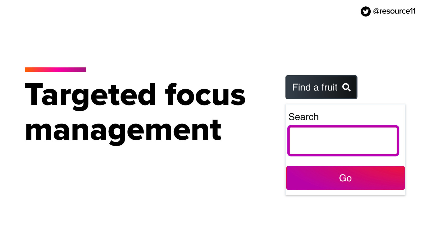
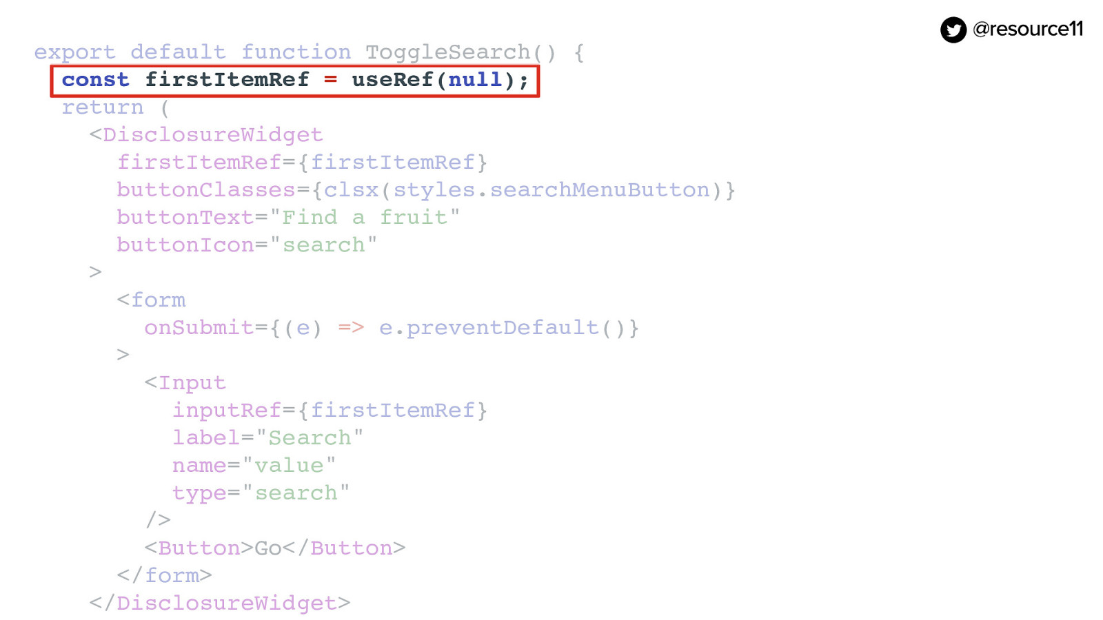
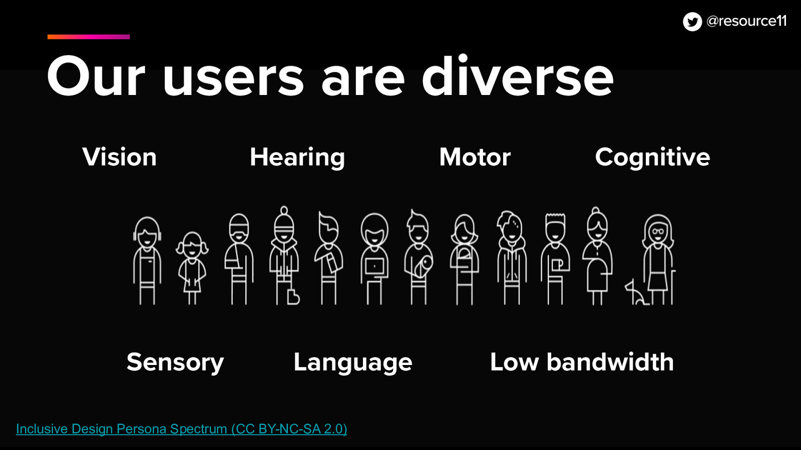
Welcome everyone! I’m Kathleen McMahon and I’m here today to talk about a Design System Carnival! One accessible component that wears many pretty masks. Before we begin, let’s get some details out of the way.

Slide 2

Slide 2

https://noti.st/resource11

My presentation will be posted on Notist, that’s https://noti.st/resource11 — including links to resources — after my talk. I’ll also post the full URL on Twitter after my presentation.

Slide 3

Slide 3

@resource11 Twitter | Instagram | GitHub

You can follow me at. Resource11 on Twitter, Instagram, and GitHub.

Now… here’s an outline of what we’ll be covering today.

Slide 4

Slide 4

Who are you, again?

Let’s back up so I can introduce myself better…

Slide 5

Slide 5

Kathleen McMahon | Engineer • Designer • Speaker

So I’m an engineer and a designer and I like to speak about things…

Slide 6

Slide 6

image: Me on a cyclocross bike, hopping over barriers and riding through mud.

And… I sometimes race cyclocross. Very badly.

Slide 7

Slide 7

image: Me on a cyclocross bike, in Spam, Ninja Turtle, Nerds candy box, Medusa costumes

Mostly you’ll see me in costume, racing two laps to your six, at the back of the pack, on a singlespeed bicycle — with a bunch of onlookers laughing at me, toasting with their beverages.

Slide 8

Slide 8

image: Stanley Spadowski shouts "OPEN WIDE!" and douses boy with a fire hose

Now I think y’all agree these past few of years have been intense. Right?!

Slide 9

Slide 9

image: Group of penguins gathered on an iceberg with a few swimming and jumping in the ocean. One penguin attempts to jump atop an iceberg to join their penguin friends — and fails — splashing back into the water in ungraceful fashion.

See the penguin in the middle of the screen? The one that failed to jump on the iceberg? That was me. Burning out. Surviving Covid layoffs. Tech interviews. New jobs. The isolation of lockdown. More burnout. So.. I did a few things to survive. Like…

Slide 10

Slide 10

image: a wide-screen view of the colorful lamps and lighting strips adorning my home office desk and bookcases

Spending my time getting crafty with lighting setups during the colder months.

Slide 11

Slide 11

image: Thor, my floofy beige-striped cat, rests in his bed in my colorfully-lit office

Photographing my cats Thor…

Slide 12

Slide 12

image: Thor, resting on the windowsill of my kitchen window, enjoying the warm summer breeze and sunshine on his soft beige fur and dreamy blue eyes.

Slide 13

Slide 13

image: Otis — my silky black haus panther — nestled between my purple bed pillows, gazing at me with calm golden eyes.

…and Otis…

Slide 14

Slide 14

image: Otis and Thor — in perfect light and dark fur contrast — nestle together atop a soft red flannel throw.

As this photo of them snuggling clearly shows… they are always fighting. It’s a problem.

Slide 15

Slide 15

image: A wide-planked boardwalk — with soft sand and sea grass surrounding its weathered wooden railing — leads toward the calm ocean during a cloudy afternoon low tide

And in the summer, I go to the beaches!

Slide 16

Slide 16

image: Lush green foliage surrounding fiberglass boardwalk leading to the ocean at dawn. The bright orange "Public access 1" sign accenting the way to ocean bliss.

At different times…

Slide 17

Slide 17

image: Weathered wooden railings surround a raised boardwalk leading to an expanse of beach at low tide. Two individuals sit in beach chairs nearby glancing at the calm ocean water.

Different days, and…

Slide 18

Slide 18

image: Weathered beige wooden railings and tall sea grass surround soft light beige sand leading to a calm surf at peak low tide. The late morning sun reflecting off of wispy cirrus clouds.

Different locations…

Slide 19

Slide 19

image: Dark gray weathered wooden railing and tall sage green sea grass surround a fiberglass boardwalk leading to a deep blue ocean at low tide in the late afternoon. Two fluffy white clouds sail across the clear blue sky.

Always at low tide…

Slide 20

Slide 20

image: Calm waves lapping against the sand

Which is the best time…

Slide 21

Slide 21

image: Dark beige wet sand, ready to reveal a baby sand dollar

…to look for sand dollars

Slide 22

Slide 22

image: A sand dollar peeking out of a cluster of rocks, barnacles, and periwinkle shells in a crowded ocean tidal pool.

It’s like the Where’s Waldo of the ocean.

Slide 23

Slide 23

image: A montage of sand dollars of various sizes and colors, next to a tiny and medium sand dollar in the palm of my hand.

So I get a serious…

Slide 24

Slide 24

image: A tiny pearlescent shell sits on the side of a dark gray sand dollar in the palm of my hand. Beneath my hand is the cool waters of a very crowded tidal pool full of rocks, shells and ocean water.

Collection of sand dollars!

Slide 25

Slide 25

image: A gathering of cream-colored sand dollars and a large periwinkle shell in a large open clam shell sitting atop a brown wooden bench at the beach

And I photograph <click>

Slide 26

Slide 26

image: A gathering of a dark gray sand dollar, large and small periwinkle shells in a large open clam shell sitting atop a weathered gray wooden bench at the beach

My treasure

Slide 27

Slide 27

image: A gathering of sand dollars of many colors and sizes in a large open clam shell sitting atop the sand next to some seaweed at the beach

Every time

Slide 28

Slide 28

image: A gathering of sand dollars of multiple shapes, sizes and colors on my dining room windowsill.

Trying to do this at home is a problem… because of the Otis factor.

Slide 29

Slide 29

image: Otis — black cat of magic — lovingly gazing at me with golden eyes while lying upside down. Paws outstretched.

Because Otis is especially needy…

Slide 30

Slide 30

image: A gathering of green aventurine, sodalite, rose quarts towers, and quarts diamond on the kitchen table

See, during lockdown before burnout hit peak, I also started a heck of a crystal collection. And attempted…

Slide 31

Slide 31

image: Otis, the black wonder cat, steps into the frame of my crystal collection

To get good photos. But Otis was having none of that…

Slide 32

Slide 32

image: Otis' paws walk through my crystal arrangement on the kitchen table

None…

Slide 33

Slide 33

image: grouping of citrine, amethyst, and celestite glowing in the sunshine-washed windowsill

…of it…

Slide 34

Slide 34

image: Otis — sassy black cat — sits exactly on top of all my windowsill crystals, seeking attention.

None of it.

Slide 35

Slide 35

image: A gathering of sand dollars of multiple shapes, sizes and colors on my dining room windowsill.

So my attempts at this…

Slide 36

Slide 36

image: Otis — always insistent black cat — standing on my dining table, inspecting my gathering of sand dollars on the dining room windowsill.

Yeah… nope.

Slide 37

Slide 37

image: Thor — ever curious fluffy beige Manx cat of Wonder — standing on my dining table, inspecting my gathering of sand dollars on the dining room windowsill.

And now he’s even taught Thor…

Slide 38

Slide 38

image: Thor bravely places his white-mittened beige paw on the windowsill gathering of sand dollars.

To do…

Slide 39

Slide 39

image: In pure art director fashion, Thor sits distinctly on one windowsill sand dollar. Ready to provide his ultimate design judgement..

The same…

Slide 40

Slide 40

image: Thor looks up from the windowsill to the camera with a very satisfied look. His blue eyes gaze hypnotically my way as his pink nose points upward, whiskers pridefully twitching.

Thor looks pretty satisfied.

Slide 41

Slide 41

image: Otis looking very cute as he lays upside down on my bed, gazing at me.

Who could resist Otis though?

Slide 42

Slide 42

image: Otis expectantly gazing at me from his cat tree perch.

So here is Otis. Attending by proxy.

Slide 43

Slide 43

image: Penguin — running forward on an icy tundra — skids to a stop.

Anyhow… When it was time to head to here to see people in person, I felt so excited! People. Finally!

Slide 44

Slide 44

image: Group of penguins on tundra running away

Then I remembered… omg… talking to people. How many of you felt the same? My introvert did a little panic. Did any of you feel the same?

Slide 45

Slide 45

image: Penguin — running forward on an icy tundra — skids to a stop.

But excitement won out, y’all! And now I’ve shaken off my stage fright anxiety…

Slide 46

Slide 46

Thanks for your patience

Thanks for your patience.

So… you’re here to learn about Design systems carnivals

Slide 47

Slide 47

Northwestern Mutual

Currently, I’m working with an amazing group of people at Northwestern Mutual as a Senior Design Systems Engineer, helping them take the Luna Design System to the next level.

Slide 48

Slide 48

Design Systems are ALWAYS the hotness image: Person in inflatable dinosaur costume flips into a raft floating on a pond and claps with glee.

And I’m a super fan of design systems, so this is exciting work!

Slide 49

Slide 49

image: Visual of the various intersecting parts of a design system.

If you’ve ever worked on a design system, you know there are a lot of things to consider. Which can sometimes feel like…

Slide 50

Slide 50

image: Woman attempting to arrange 10 squirming kittens in a straight line, with varied success

…herding kittens. Always fun, yet lots of moving parts.

Similar to herding kittens, maturing a great design system can be tough with so many moving parts.

This means you have to be very strategic and choose what to tackle.

Slide 51

Slide 51

Design-systems are a Carnival!

It also means Design Systems are a Carnival!

What do I mean by that? OK …because they create cohesion and consistency like a design system does

Slide 52

Slide 52

image: Mannequin wearing Bauta mask adorned with navy Tabarro

So when I presented at ReactJSday Verona 2019, I visited Venice afterwards and was fascinated by the masks. I loved their beauty, their variety yet the way they created a sense of consistency.

Slide 53

Slide 53

image: Mannequin wearing plague doctor mask in muted purple costume

Similar to a design system. They provide a create a uniform look and a consistent set of actions for your team.

Slide 54

Slide 54

image: A crowd of Jester masks hanging in a Venetian vendor's market

And… they are everywhere.

Slide 55

Slide 55

image: Rows of brightly-colored porcelain masks handing on a Venetian market wall

Everywhere you look in Venice.

Slide 56

Slide 56

image: A group of very elaborate and detailed bespoke masquerade art pieces in a Venetian gallery

In the shops.

Slide 57

Slide 57

image: Four tiny jester mask magnets hanging in a Venetian shop doorway

In the souvenirs.

Slide 58

Slide 58

image: a white red and orange painted paper mache mask with ribbon ties on a paint-spattered newspapered table

I even made my own mask

Slide 59

Slide 59

image: a person wearing a Jester mask smiling

And the masks have a rich history of providing a way for a person to blend into a situation…

Slide 60

Slide 60

image: A gathering of people in 18th century costume dancing at the Giacoma Casanova Carnival

…whether it be gender, identity, or social class

Slide 61

Slide 61

image: man walking through a corridor wearing a Baùta and Tabarro

…Like the Baùta mask

Slide 62

Slide 62

image: red-haired woman wearing a small oval mask, made of Velvet, which is held with the mouth thanks to a button.

The Moretta

Slide 63

Slide 63

image: man and woman in 18th-century costume wearing cat masks

The Gagna

Slide 64

Slide 64

image: A man in a Harlequin mask surrounded by two surprised woman and an amused man in 19th-century clothing

The Harlequin

Slide 65

Slide 65

image: Venetians row during the Carnival masquerade parade on the Venetian Grand Canal.

And the masks have a rich history of providing a way for a person to blend into a situation…

Wearing these masks gives you access to the best parties — like this Venetian masquerade parade on the Grand Canal during the 2019 Carnival.

Photo by Manuel Silvestri / Reuters

Slide 66

Slide 66

Why accessible components?

Now, why accessible design system components?

Slide 67

Slide 67

Our users are diverse

Well, our users have varied needs, and… because so often, that’s what is handled last.

Which sends a poor message to our users.

Slide 68

Slide 68

I have a whole talk on accessibility-flavored react components make your design system delicious. This talk will cover a different aspect of accessibility. In fact, that talk was presented at reactJSday in 2019, and I’ll be using some of the primitive and modified components in this talk.

I’ll share those resources, though, so you can have all the notes.

Slide 69

Slide 69

One pattern, many uses

Now there’s one pattern that if built correctly, can have many uses in your design system. It’s called the Disclosure Widget.

Slide 70

Slide 70

Primitive masks

You can think of it as one of the more Primitive masks in your design system.

Slide 71

Slide 71

Anatomy of a disclosure widget

The anatomy of a disclosure widget is fairly straightforward.

Slide 72

Slide 72

A button that opens and closes a sibling container and returns focus to the button

A disclosure widget is a button that opens and closes a sibling container And returns focus to the button.

Slide 73

Slide 73

Primary keyboard interactions

The three primary interactions we will focus on are:

The space bar/Enter key — which comes natively when you use a button to open the disclosure — the ESC key, and mouse clicks.

Slide 74

Slide 74

<button />

Let’s begin building it with the JSX button. Why?

Slide 75

Slide 75

<button>

Under the hood, a JSX button renders as an HTML button, which already supports mouse clicks, spacebar, and enter keypresses for us. So we’ll use that as a basis for our pattern.

Slide 76

Slide 76

ARIA support

And… we’ll use ARIA attributes to let screen readers know when the container is being opened and closed — or in the case of if you have many widgets on the page — which container is being opened or closed.

First let’s add ARIA support to the button

Slide 77

Slide 77

The three ARIA attributes we’re adding to this component are aria-expanded, which conveys whether the widget is expanded or not

[jsx code]

aria-expanded={ariaExpanded}

Slide 78

Slide 78

aria-haspopup to tell assistive technology if there is an associated popup with the button

[jsx code]

aria-haspopup={ariaHasPopup}

Slide 79

Slide 79

And aria-label for cases where we need a more accurate button label

[jsx code]

aria-label={ariaLabel}

Slide 80

Slide 80

State & click handlers

We also need state and click handlers to toggle the container open and closed

Slide 81

Slide 81

First, we’ll use React’s useState hook and will define the isOpen state variable and the setIsOpen state function, initializing isOpen to false.

[jsx code]

const [isOpen, setIsOpen] = useState(false);

Slide 82

Slide 82

Or optionally, we could pass in a defaultExpanded prop, which should be a boolean.

[jsx code]

const [isOpen, setIsOpen] = useState(defaultExpanded);

Slide 83

Slide 83

We then create a toggleOpen function to that uses the setIsOpen function to toggle the state between true and false

[jsx code]

const toggleOpen = () => { setIsOpen(!isOpen); };

Slide 84

Slide 84

Pass the toggleOpen function into the Button’s onClick synthetic event

[jsx code]

onClick={toggleOpen}

Slide 85

Slide 85

Pass the isOpen value into the Button’s ariaExpanded prop

[jsx code]

aria-expanded={isOpen}

Slide 86

Slide 86

Add isOpen to the children JSX expression so the children only render in the div if isOpen is true

[jsx code]

<div> {isOpen && children} </div>

Slide 87

Slide 87

Focus management

Focus management. Let’s set our widget up to listen for ESC key presses and return focus to the button when the widget closes

Slide 88

Slide 88

We’ll start by creating a buttonRef using React’s useRef hook, initializing to null

[jsx code]

const buttonRef = useRef(null);

Slide 89

Slide 89

Then we’ll make an onKeyUpHandler function, which listens whether ESC key is pressed while the widget state isOpen.

And if the state isOpen, we’ll set IsOpen to false and send focus to the buttonRef

[jsx code]

const onKeyUpHandler = (e) => { if ((e.key === “Escape” || e.keyCode === 27) && isOpen) { setIsOpen(false); buttonRef.current.focus(); } };

Slide 90

Slide 90

Next, we pass in the onKeyUpHandler function to the onKeyUp synthetic event on the DisclosureWidget’s wrapper div, and Pass in the buttonRef to the Button’s buttonRef prop (say that three times fast) Your Widget will now close on ESC keypress and return focus to the Button

[jsx code]

return (

<div onKeyUp={onKeyUpHandler} className=”dwWrapper”> <Button ariaExpanded={isOpen} ariaHasPopup={true} ariaLabel={buttonAriaLabel} buttonRef={buttonRef} buttonClasses={buttonClassNames} icon={buttonIcon} iconOnlyBtn={iconOnlyBtn} onClick={toggleOpen} size={buttonSize} > {buttonText} </Button> <div> {isOpen && children} </div>

Slide 91

Slide 91

CSS focus states

CSS focus states. Now that we have focus management done, let’s get our CSS focus states normalized

Slide 92

Slide 92

Since browsers don’t give a consistent look for focus states, we need to make it clearly visible for our users when our interactive controls receive focus. Let’s add some default styling for our :focus pseudo selector throughout our app, and pick a color that is at least a 3:1 contrast ratio or greater.

[css code]

*:focus { outline: 0; outline-offset: var(—s-5); box-shadow: 0 0 0 var(—s-5) var(—purple-orchid); }

Slide 93

Slide 93

We can always override focus styles in our individual CSS files to customize them even more, yet it’s always important to show them.

[css code]

.button { font-weight: var(—font-weight-bold); border: 0; border-radius: var(—border-radius); cursor: pointer; display: inline-block; line-height: 1; transition: background-color 0.2s ease;

:hover { background-color: var(—color-primary); border: 1px solid var(—color-primary); }

:focus { outline: 0.1em solid var(—color-primary-reverse); outline-offset: -2px; box-shadow: 0 0 0 0.2rem var(—color-focus); }

:active { outline: 0.1em solid var(—color-aquamarine-500); }

Slide 94

Slide 94

Mouse click management

Mouse click management. If you have many widgets on the page, you’ll only want to have one widget open at a time, so let’s set up a handler to make that happen

Slide 95

Slide 95

Like our buttonRef, we’ll create a contentRef with useRef, initializing to null

[jsx code]

const contentRef = useRef(null);

Slide 96

Slide 96

Pass in the contentRef to the DisclosureWidget container div’s ref prop.

[jsx code]

<div ref={contentRef}>

Slide 97

Slide 97

Create onClickOutside event Handler function. This will check if the buttonRef or contentRef contains the event target, keep the widget open, otherwise, set IsOpen to false to close the widget

[jsx code]

const clickOutsideHandler = (e) => { if ( contentRef.current.contains(e.target) || buttonRef.current.contains(e.target) ) { return; } setIsOpen(false); };

Slide 98

Slide 98

Now that we have that clickOutsideHandler set up, we can user React’s useEffect hook and some if statements For example, If isOpen is true, we’ll add some document.addEventListener functions for mouseup and keyup and call the clickOutsideHandler for each.

[jsx code]

if (isOpen) { document.addEventListener(“mouseup”, clickOutsideHandler); document.addEventListener(“keyup”, clickOutsideHandler); }

Slide 99

Slide 99

If isOpen is false, we’ll remove those event listeners.

[jsx code]

} else { document.removeEventListener(“mouseup”, clickOutsideHandler); document.removeEventListener(“keyup”, clickOutsideHandler); };

Slide 100

Slide 100

We’ll also do a cleanup function to remove any stray event listeners from running

[jsx code]

return () => { document.removeEventListener(“mouseup”, clickOutsideHandler); document.removeEventListener(“keyup”, clickOutsideHandler); };

Slide 101

Slide 101

Lastly, we’ll pass in isOpen as the second argument to our hook to be sure useEffect only runs if the isOpen state changes value

[jsx code]

[isOpen]

Slide 102

Slide 102

Many pretty masks Now we can start using this pattern to making many pretty masks… so let’s make a toggle tip.

Slide 103

Slide 103

Toggle tips

Slide 104

Slide 104

Toggle tips are NOT Tooltips

One important thing to note. A tooltip is NOT a toggle tip, the interactions are different. A tooltip’s interactivity revolves around hovering over the tool tip and maybe focusing on it with a keyboard.

Slide 105

Slide 105

Toggletips

Toggletips contain interactive content,

Use the aria-popup attribute

Are supported by touch devices, non-mouse pointers, and eye trackers, where tooltips are not

Slide 106

Slide 106

Toggle tips

But technically, what we’ve already built, will support what we need with a little styling, and I know you’re going to go back to your work and do something like this instead

Slide 107

Slide 107

Toggle tips

Mmm hmm. OK y’all. Fine! We’ll make a Toggle tip with an icon-only version.

But let’s talk about icons for a minute

Slide 108

Slide 108

Many pretty masks

Toggle tip with icon button (add aria-label support)

Slide 109

Slide 109

Icons Informative or decorative

Icons can be informative or decorative

Informative icons need to be paired with descriptive text to be perceivable by screen readers

Decorative icons need to be hidden from screen readers, because they don’t add significant value to your app

Slide 110

Slide 110

What does an icon mean, anyway?

But wait! Icons can be interpreted in so many different ways! True…

Slide 111

Slide 111

For example, you may see the heart symbol used to favorite something in an app

Slide 112

Slide 112

Other apps may use a star. This leaves way too much up to interpretation by the user.

Slide 113

Slide 113

Pair icons with text …when possible

Ideally, you should be pairing any icons you use with visible text.

Slide 114

Slide 114

image: a heart and star icon, each labeled as "favorite"

This way, users will have a clear context on its purpose. Of course, there is a big BUT in here, and depends on the buy-in you get for icon usage in your designs. And whether you can get a design approved that uses a label paired with an icon like this. That said, in general terms… that’s my recommendation.

Slide 115

Slide 115

Since we want to support icons in our Button component, we’ll add in a new component to the mix

[jsx code]

return ( <button {…props} aria-expanded={ariaExpanded} aria-haspopup={ariaHasPopup} aria-label={ariaLabel} className={clsx(styles.root, styles[size], buttonClasses)} disabled={disabled} onClick={onClick} ref={buttonRef} type={type}

<span className={styles.btnContentWrap}> 
  {children} 
  {icon && ( 
    <FontAwesomeIcon 
      icon={icon} 
      className={iconOnlyBtn ? iconBtnClasses : iconClasses} 
      size={size !== ButtonSizes.small ? "lg" : "sm"} 
    /> 
  )} 
</span>
</button> );

Slide 116

Slide 116

The FontAwesomeIcon React component. We’ll gate them behind the icon prop to render them only when we need them

[jsx code]

{icon && ( <FontAwesomeIcon icon={icon} className={iconOnlyBtn ? iconBtnClasses : iconClasses} size={size !== ButtonSizes.small ? “lg” : “sm”} /> )}

Slide 117

Slide 117

We can pair an icon with visible button text

[jsx code]

<Button icon={buttonIcon}> {buttonText} </Button>

Slide 118

Slide 118

And we can pair an icon with an aria-label in an icon-only button to support screen readers

[jsx code]

<Button aria-label={buttonAriaLabel} icon={buttonIcon} iconOnlyBtn={true}

{buttonText} </Button>

Slide 119

Slide 119

And we have a way to add extra CSS to override Button styles in icon-only scenarios

[jsx code]

<Button iconOnlyBtnClasses={styles.btnIcon} > {buttonText} </Button>

Slide 120

Slide 120

Now that we have the button adjusted, we can use our DisclosureWidget and build our ToggleTip

[jsx code]

export default function ToggleTip() { return ( <DisclosureWidget aria-label=“Fruit trivia” buttonClasses={styles.toggleTipButton)} buttonIcon=”apple-alt” iconOnlyBtnClasses={styles.btnIcon} iconOnlyBtn={true} > <div className={styles.floatingContainer)}> <p className={styles.toggleTipContainer}> Hungry for more interesting fruit facts? View a{” “} <a href=”https://google.com”>full list of fruit trivia</a> in at our virtual farm stand. </p> </div> </DisclosureWidget> ); }

Slide 121

Slide 121

First we’ll pass in the buttonIcon, set iconOnlyBtn to true and pass in an aria-label

[jsx code]

aria-label=“Fruit trivia”

buttonIcon=”apple-alt”

iconOnlyBtn={true}

Slide 122

Slide 122

Then, we’ll add some styling to the button

[jsx code]

buttonClasses={styles.toggleTipButton)}

iconOnlyBtnClasses={styles.btnIcon}

Slide 123

Slide 123

Then, we’ll pass in a div with a paragraph and a link to our widget.

[jsx code]

<div className={styles.floatingContainer)}> <p className={styles.toggleTipContainer}> Hungry for more interesting fruit facts? View a{” “} <a href=”https://google.com”>full list of fruit trivia</a> in at our virtual farm stand. </p> </div>

Slide 124

Slide 124

Toggle tip

Boom. ToggleTip

Slide 125

Slide 125

ToggleSearch

Let’s make a Disclosure with an embedded search form

Slide 126

Slide 126

First…

[jsx code]

export default function ToggleSearch() { return ( <DisclosureWidget buttonClasses={clsx(styles.searchMenuButton)} buttonText=”Find a fruit” buttonIcon=”search” > <form onSubmit={(e) => e.preventDefault()} > <Input label=”Search” name=”value” type=”search” /> <Button>Go</Button> </form> </DisclosureWidget> ); }

Slide 127

Slide 127

…we’ll pass in some buttonText and an icon to our disclosureWidget button For the purposes of this prototype, we’ll pass in a form and prevent the default action onSubmit

[jsx code]

<DisclosureWidget buttonText=”Find a fruit” buttonIcon=”search”

<form onSubmit={(e) => e.preventDefault()} > <Input label=”Search” name=”value” type=”search” / <Button>Go</Button> </form> </DisclosureWidget>

Slide 128

Slide 128

Add an Input component with a label, name attribute and a input type of search, and a Button component. We don’t need to specify a submit type for the button, since it’s embedded in a form and we get that attribute for free.

[jsx code]

<form onSubmit={(e) => e.preventDefault()} > <Input label=”Search” name=”value” type=”search” /> <Button>Go</Button> </form>

Slide 129

Slide 129

Targeted focus management

An embedded search widget is the perfect use case for some enhanced UX in the form of targeted focus management. In other words, when we open the widget, we can send focus right to the search input.

Slide 130

Slide 130

In our ToggleSearch component we’re going to use React’s useRef hook to create a DOM reference to our input. This will allow us to do some targeted focus management. First we’ll create a variable called firstItemRef, and assign it a value of useRef(null)

[jsx code]

const firstItemRef = useRef(null);

Slide 131

Slide 131

We’ll pass firstItemRef into the DisclosureWidget prop …and our Input component’s inputRef prop

[jsx code]

<DisclosureWidget firstItemRef={firstItemRef} buttonClasses={clsx(styles.searchMenuButton)} buttonText=”Find a fruit” buttonIcon=”search”

<form onSubmit={(e) => e.preventDefault()} > <Input inputRef={firstItemRef} label=”Search” name=”value” type=”search” /> <Button>Go</Button> </form> </DisclosureWidget>

Slide 132

Slide 132

In our DisclosureWidget useEffect’s first if statement, we’ll add a nested if statement checking if the firstItemRef is defined, And if so, send focus to that firstItemref We’ll also pass in firstItemRef as second argument to the useEffect function to prevent component re-renders

[jsx code]

if (firstItemRef) { firstItemRef.current.focus(); }

Slide 133

Slide 133

Embedded search widget

And now we have an embedded search widget.

Slide 134

Slide 134

Menu lists

Slide 135

Slide 135

Demo

Codesandbox demo of various Disclosure patterns, showing the dangers of what happens when adding too many features in a Disclosure Widget begins to break the rules of ARIA.

Slide 136

Slide 136

image: brown squirrel sitting on a picnic table, shouting with outstretched paws

Whoa Nellie… Even though the one pattern can have many uses, it’s important to keep your Disclosure Widget uses separate. Otherwise, you begin to make unwise decisions… like…

Slide 137

Slide 137

image: Shrimp and lime jello mold, plated with apple slices

Creating dishes that include jello and shellfish?

When your masks get too complex, like we did in our Codesandbox example, you break the rules of ARIA and then things can go wrong very quickly.

Slide 138

Slide 138

image: Red squirrel with one paw outstretched in a "please stop!" gesture

So… Don’t mix the masks. You may think your magical mask will give you access to that very exclusive Carnival masquerade, but instead you may end up at a completely different Carnival…

Slide 139

Slide 139

image: 60-foot inflatable viking monster float lurks over a crowd

…like this one. The Viareggio Carnival with some extremely large floats…

Slide 140

Slide 140

image: 60-foot inflatable viking monster float lurks over a crowd

…and a completely different experience than you wanted. Don’t mix your masks.

Slide 141

Slide 141

Wrap-up

So to wrap up…

Slide 142

Slide 142

Design-systems are a Carnival!

Design Systems are a Carnival!

Slide 143

Slide 143

Our users are diverse

Slide 144

Slide 144

image: Red squirrel with one paw outstretched in a "please stop!" gesture

Don’t mix your masks

Slide 145

Slide 145

image: Shrimp and lime jello mold, plated with apple slices

Or you’ll make bad choices

Slide 146

Slide 146

image: 60-foot inflatable viking monster float lurks over a crowd

you may end up at a completely different Carnival…

http://www.grandvoyageitaly.com/travel/instead-of-heading-to-venice-try-the-viareggio-carnival

Slide 147

Slide 147

image: 60-foot inflatable viking monster float lurks over a crowd

…and a completely different experience than you wanted.

Slide 148

Slide 148

image: Person in inflatable dinosaur costume flips into a raft floating on a pond and claps with glee.

And Design Systems are always the hotness.

Slide 149

Slide 149

Thank you.

Slide 150

Slide 150

https://noti.st/resource11/

Slide deck posted after the talk

@resource11 Twitter | Instagram | GitHub