Stealth-mode North Star — Rebranding in secret with feature flags
Welcome, everyone! I’m Kathleen McMahon and I’m here today to show how we rolled out a rebrand in secret using feature flags
Before we begin, let’s get some details out of the way.

A presentation at Trajectory 2021 in November 2021 in by Kathleen McMahon
Welcome, everyone! I’m Kathleen McMahon and I’m here today to show how we rolled out a rebrand in secret using feature flags
Before we begin, let’s get some details out of the way.
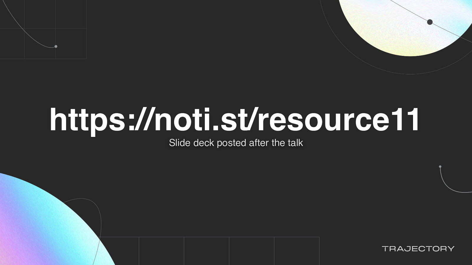
For those who like to follow along as I talk, my presentation is posted on Notist, that’s https://noti.st/resource11.
You can follow me at resource11 on Twitter, Instagram, and GitHub.
Let’s back up so I can introduce myself better…

So I’m an engineer and a designer and I like to speak about things…

And… I race bikes. Very badly.

Mostly you’ll see me in costume, racing two laps to your six, at the back of the pack, on a singlespeed, — with a bunch of onlookers in the crowd laughing at me, toasting with their beverages.

So while I’m an engineer, designer, and speaker, I’m a design engineer on the UX Next team at LaunchDarkly
Our team enables other designers and engineers to craft high quality experiences for our customers.
Part of our work includes maturing the design system.
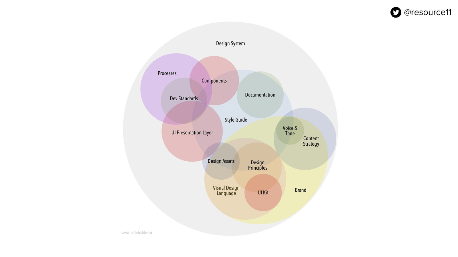
If you’ve ever worked on a design system, you know there are a lot of things to consider.

Similar to herding kittens, maturing a great design system can be tough with so many moving parts.
If your squad is small, you have to be very strategic. Especially when your product roadmap changes. For example…
What happens if you find out the creative team has refreshed the brand?

And your team is presented an updated brand North Star?

That’s definitely a Surprise Pikachu moment…
You may ask… what is a brand North Star?
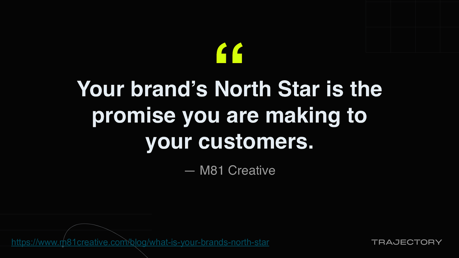
There is this article by M81 Creative that gives a great explanation of North star:
“Your brand’s North star is the promise that you are making to your customers.”
https://www.m81creative.com/blog/what-is-your-brands-north-star
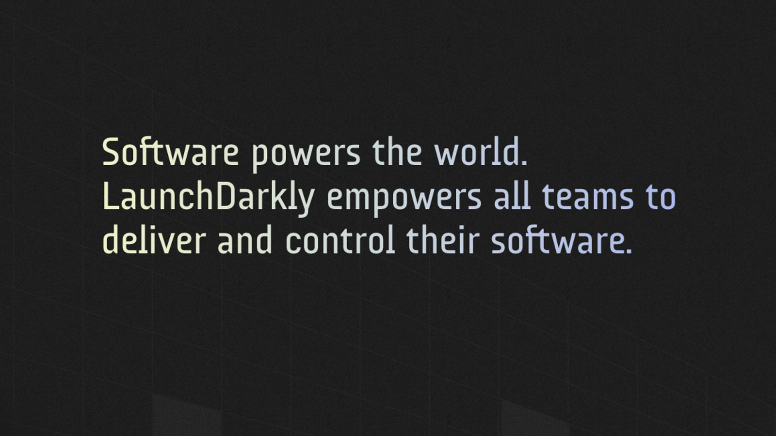
LaunchDarkly’s North Star is brought through in their core message:
Software powers the world. LaunchDarkly empowers all teams to deliver and control their software.
We lean into this mission with our colors, typography and signature logo.
Even the position of our logo mark, to the right of the logo type embodies our core beliefs:. In a world where every company is a software company, LaunchDarkly leads the way and saves the day.
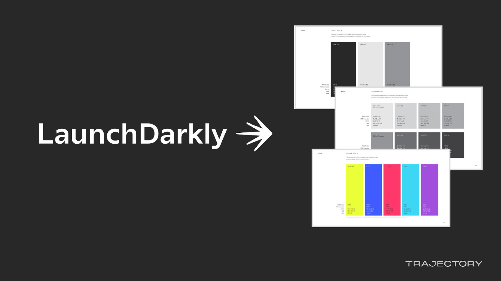
Creating a brand North Star takes time to do right.
You have to do things like strategy competitive analysis, users and customers insights, creative explorations.
This process takes up to many months, sometimes up to a year.
And once that is done, you will have some key outputs like logos, colors, typography and such…

Once that North Star is established, it’s time for teams to go to work to roll those branding visuals into the marketing site and the product app.
This is where it gets tricky. While our team was informed about the brand refresh at the earliest possible moment, we had one wrinkle. And it’s a big one.
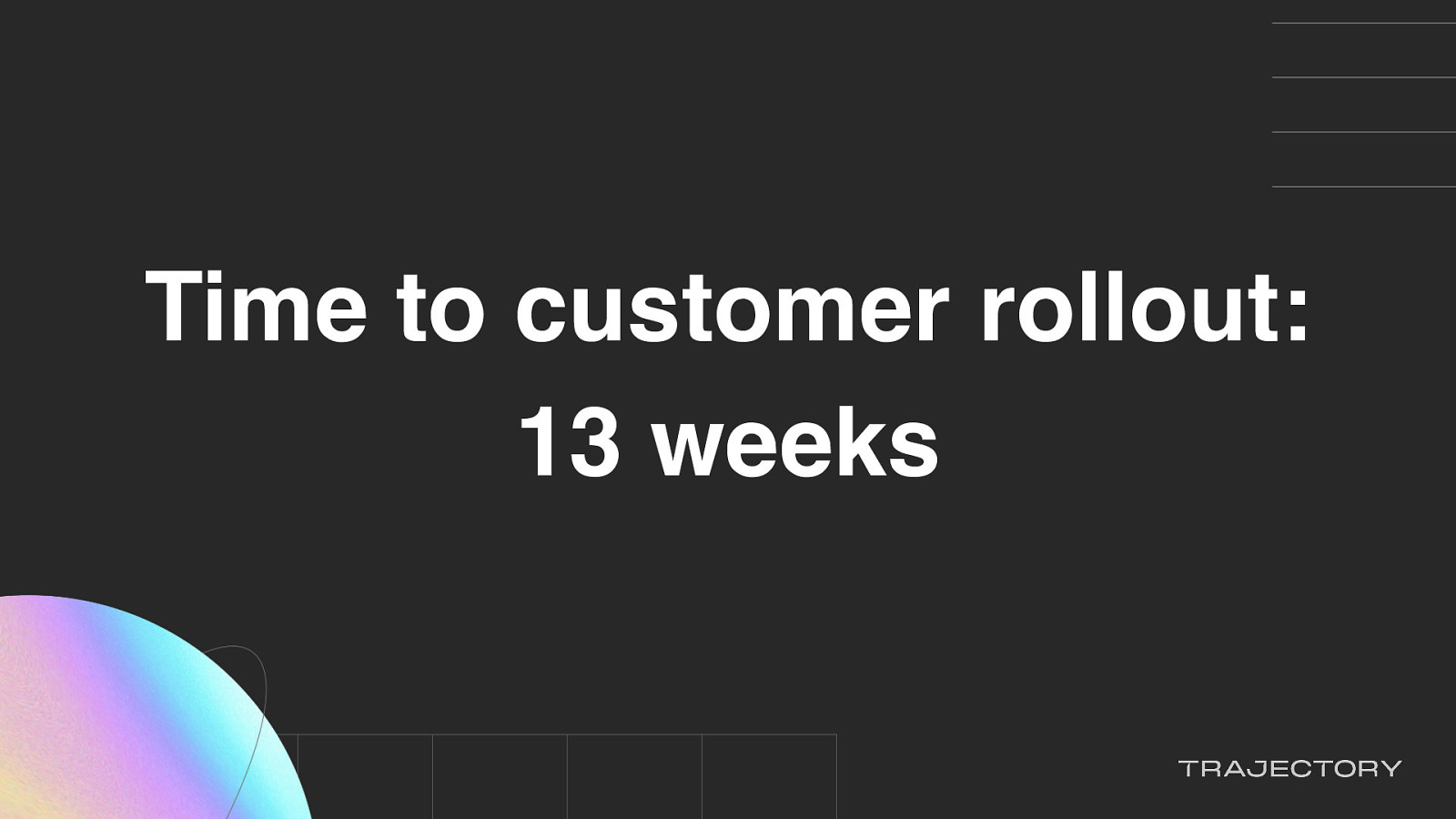
The time to the rebrand rollout to our customers is in 13 weeks

…and it’s a secret project,
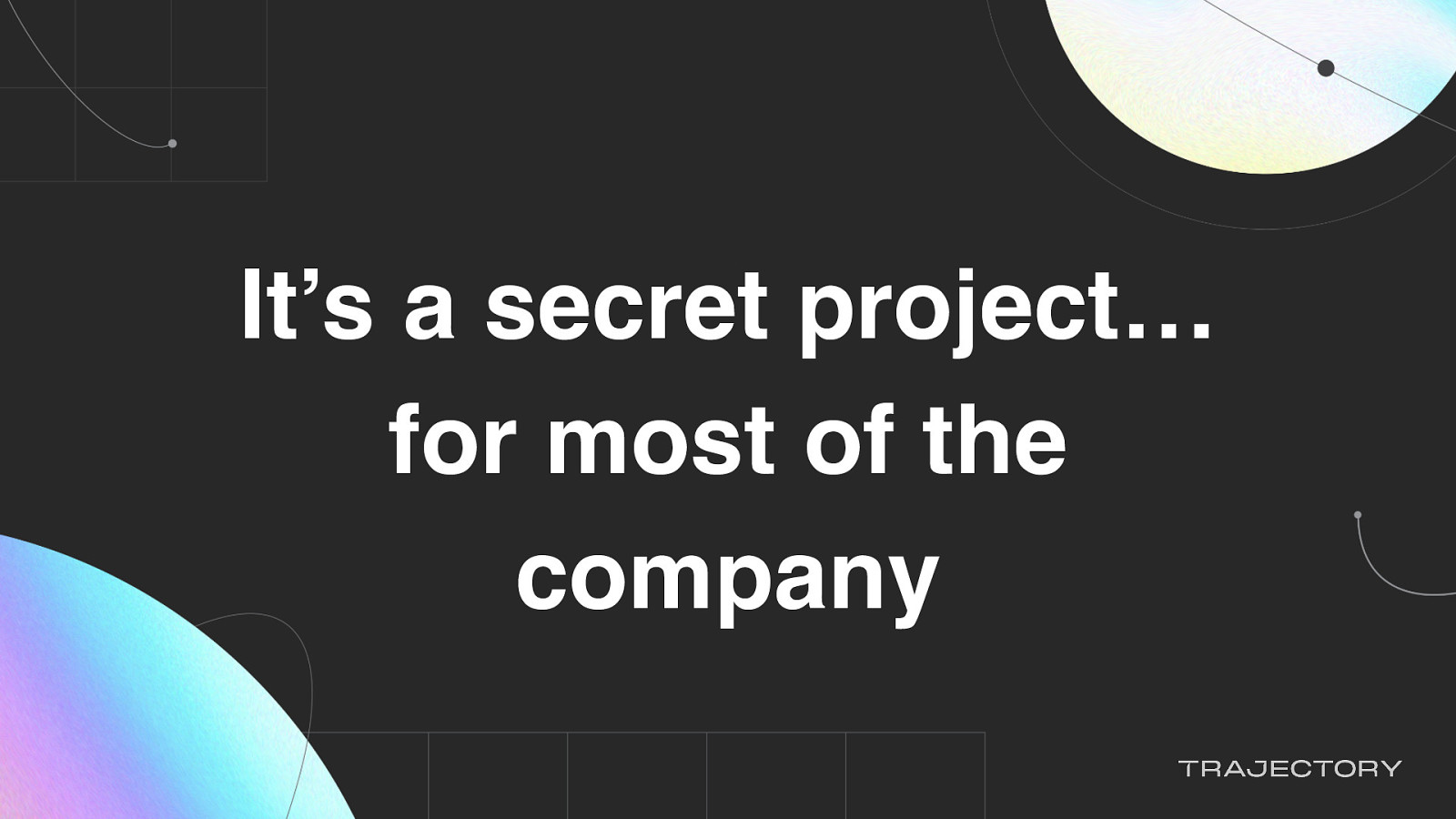
…for most of the company.
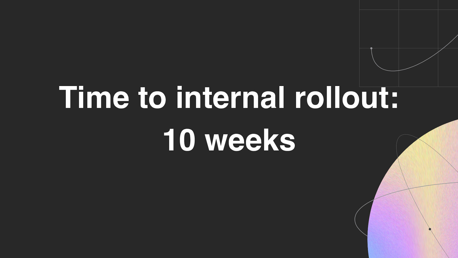
That means the time to internal rollout to our our teams is 10 weeks

So we had to pivot to figure out how to get things done, because of the inherent differences between a marketing site update and a product app.
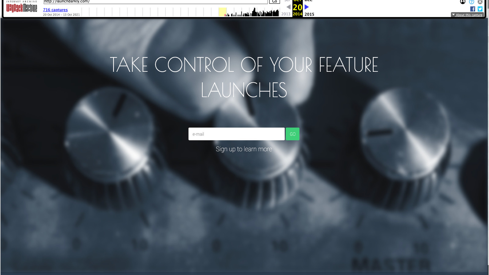
If you look at our marketing site over the years, visual refreshes happen more often
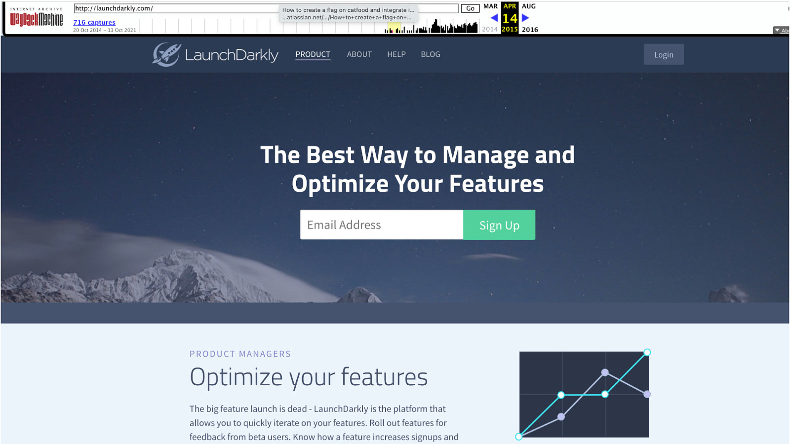
If you look at our marketing site over the years, visual refreshes happen more often
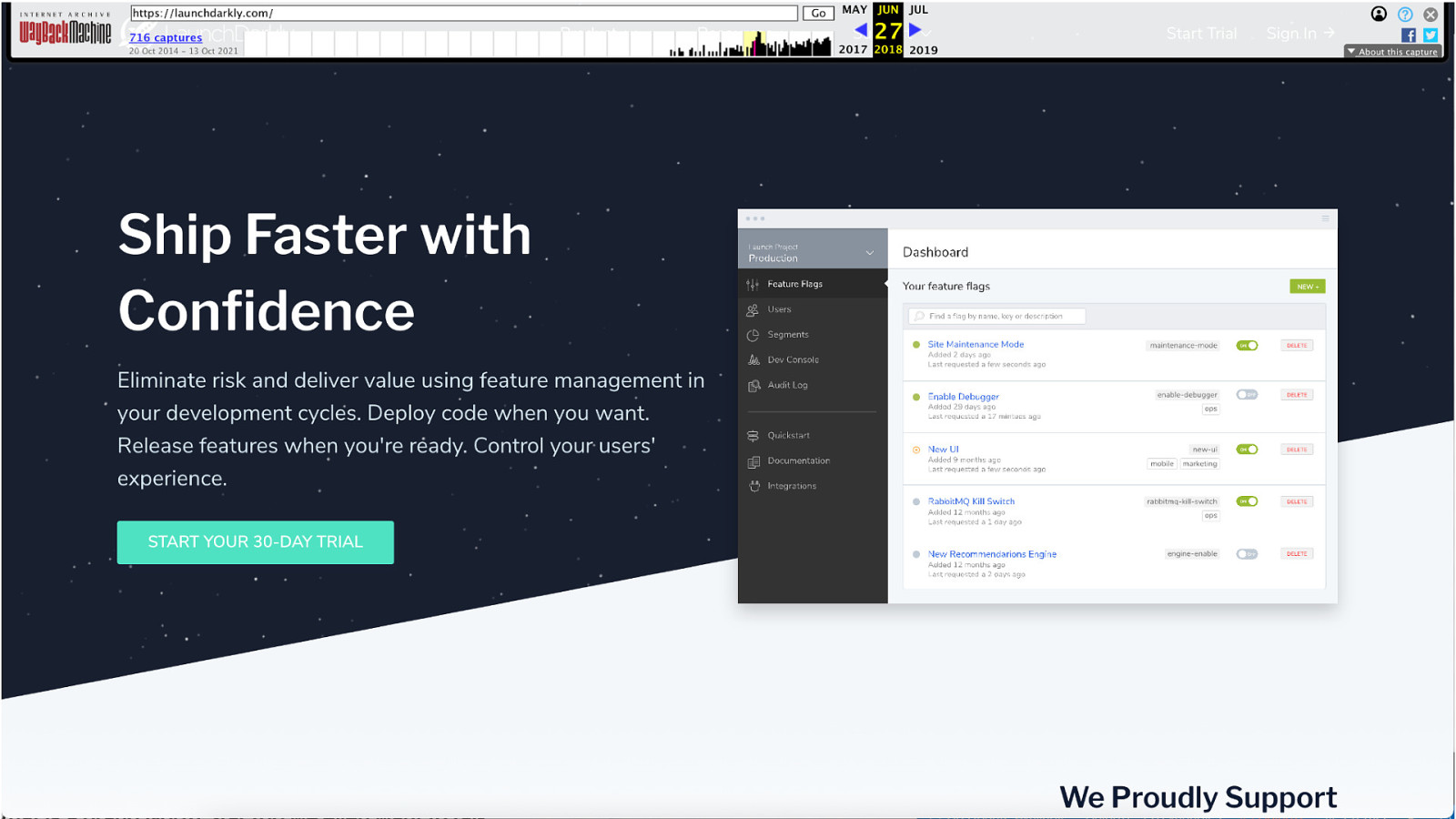
If you look at our marketing site over the years, visual refreshes happen more often
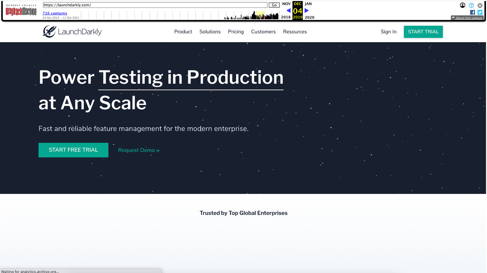
If you look at our marketing site over the years, visual refreshes happen more often
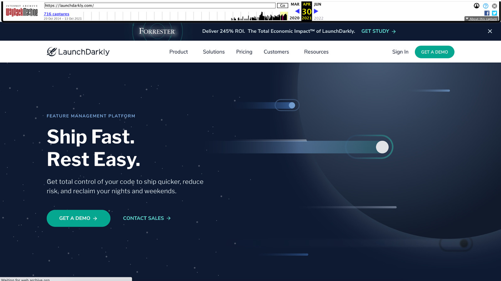
If you look at our marketing site over the years, visual refreshes happen more often
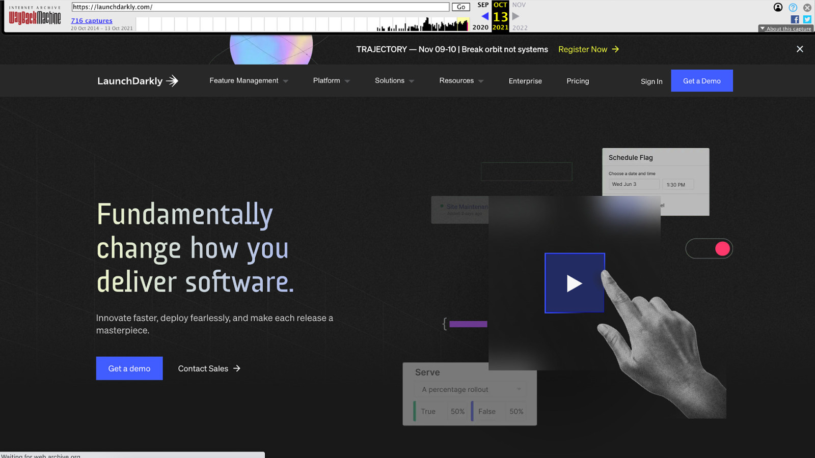
If you look at our marketing site over the years, visual refreshes happen more often
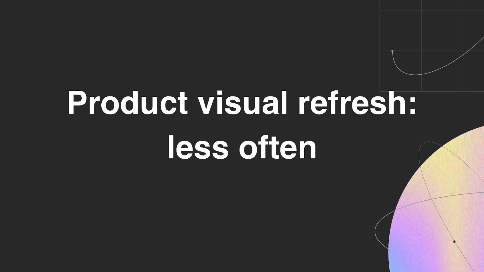
On the other hand, visual refreshes happen less often in the product app because…
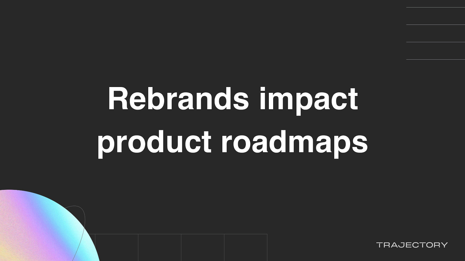
…a rebrand impact established product roadmaps.
And you need to be careful when the visuals between your marketing site and product app gets out of sync. First, your product APP will start looking outdated and Second, outdated app visuals breaks your brand promise.

So our team regrouped and thought… how can we get this done?

And how do we do this without making any questionable decisions that may impact the product, because you don’t want to be making questionable decisions like I don’t know…

Making dishes that include jello and shellfish.
It’s just just not a good look.
Thankfully, we work at a company that has a really cool product.

Feature flags. This means that…

We could set up a flagging structure and…
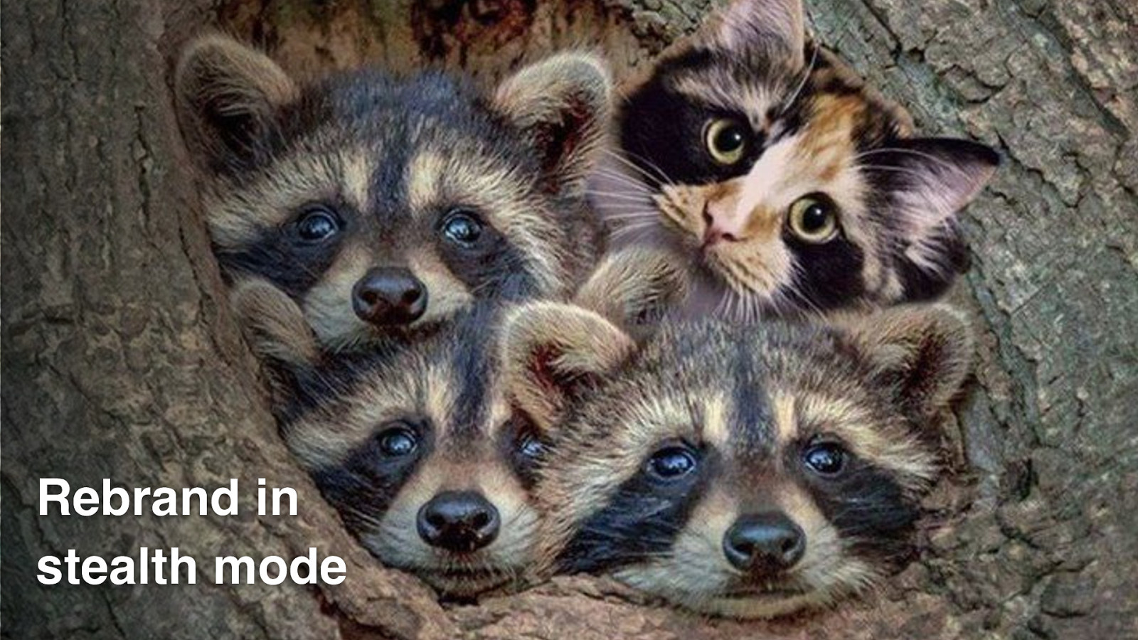
Rebrand in stealth mode.
We could make all of our changes alongside other teams, not disrupt other squads roadmaps…
All while the other product squads are not aware that the brand refresh was happing in the product.
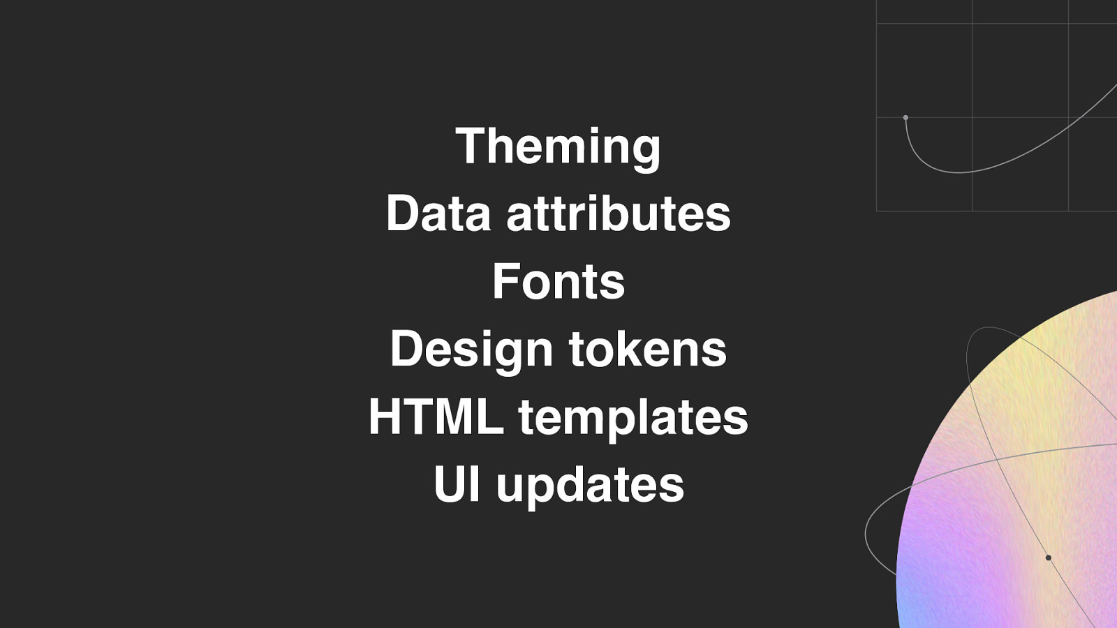
So what did we use flags for in this case?

Well, we used them to control theming, data attributes, fonts, design tokens, HTML templates, and UI updates.

And! Since we had to do it all in 10 weeks…
In secret…

We used this one ring…

..ahem!

One flag as the basis of most of our changes, and used it as a prerequisite for any other flags we needed for testing out additional features in isolation.
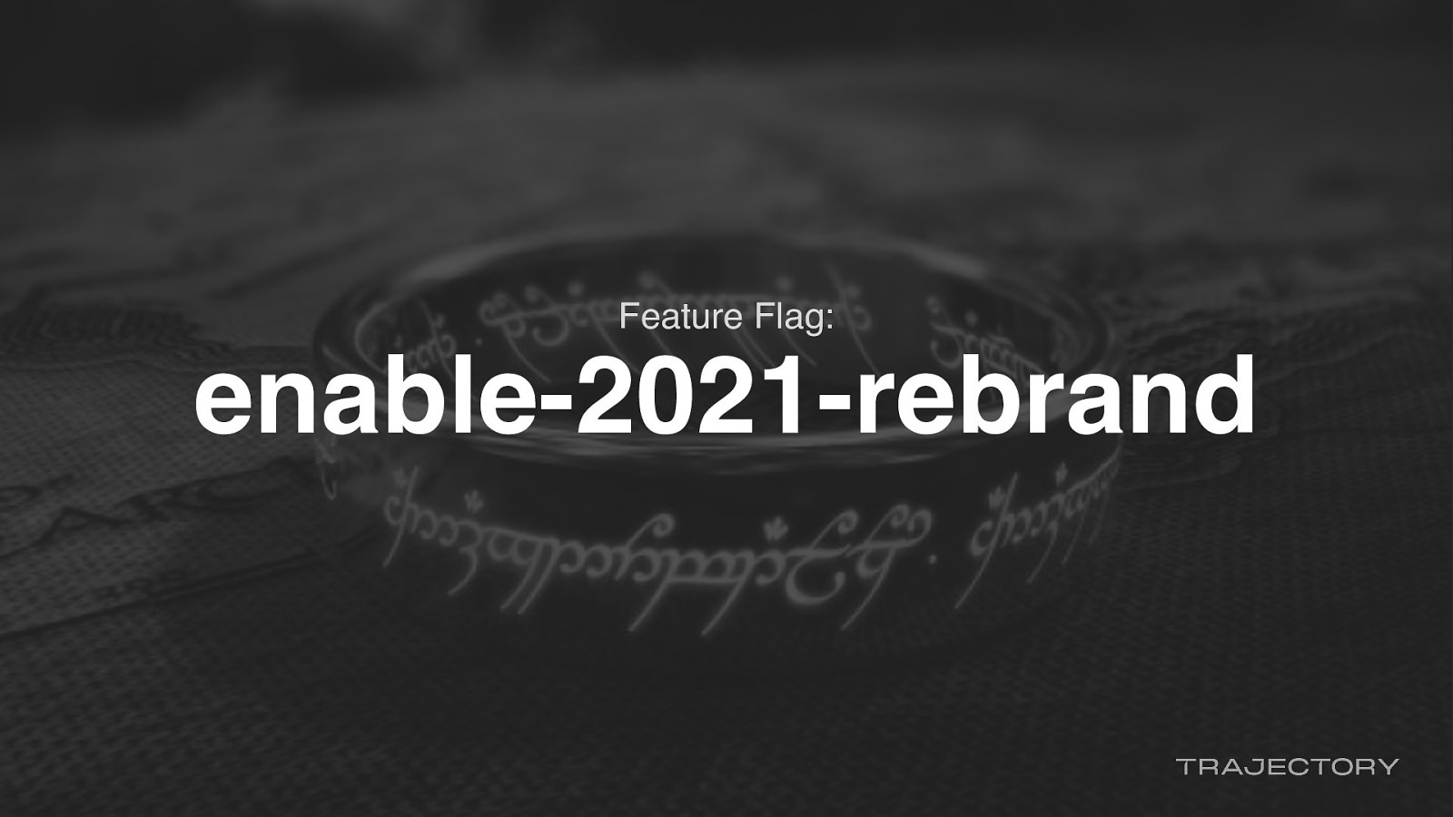
The flag that all our other flags were dependent upon was the enable-2021-rebrand flag
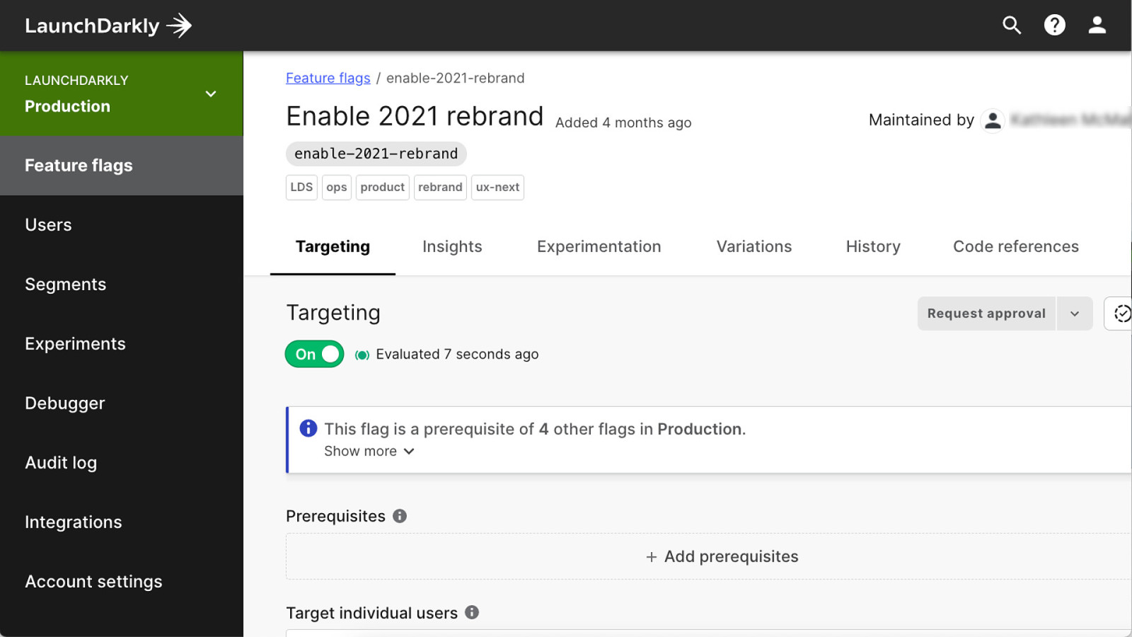
This flag was a prerequisite for other flags.
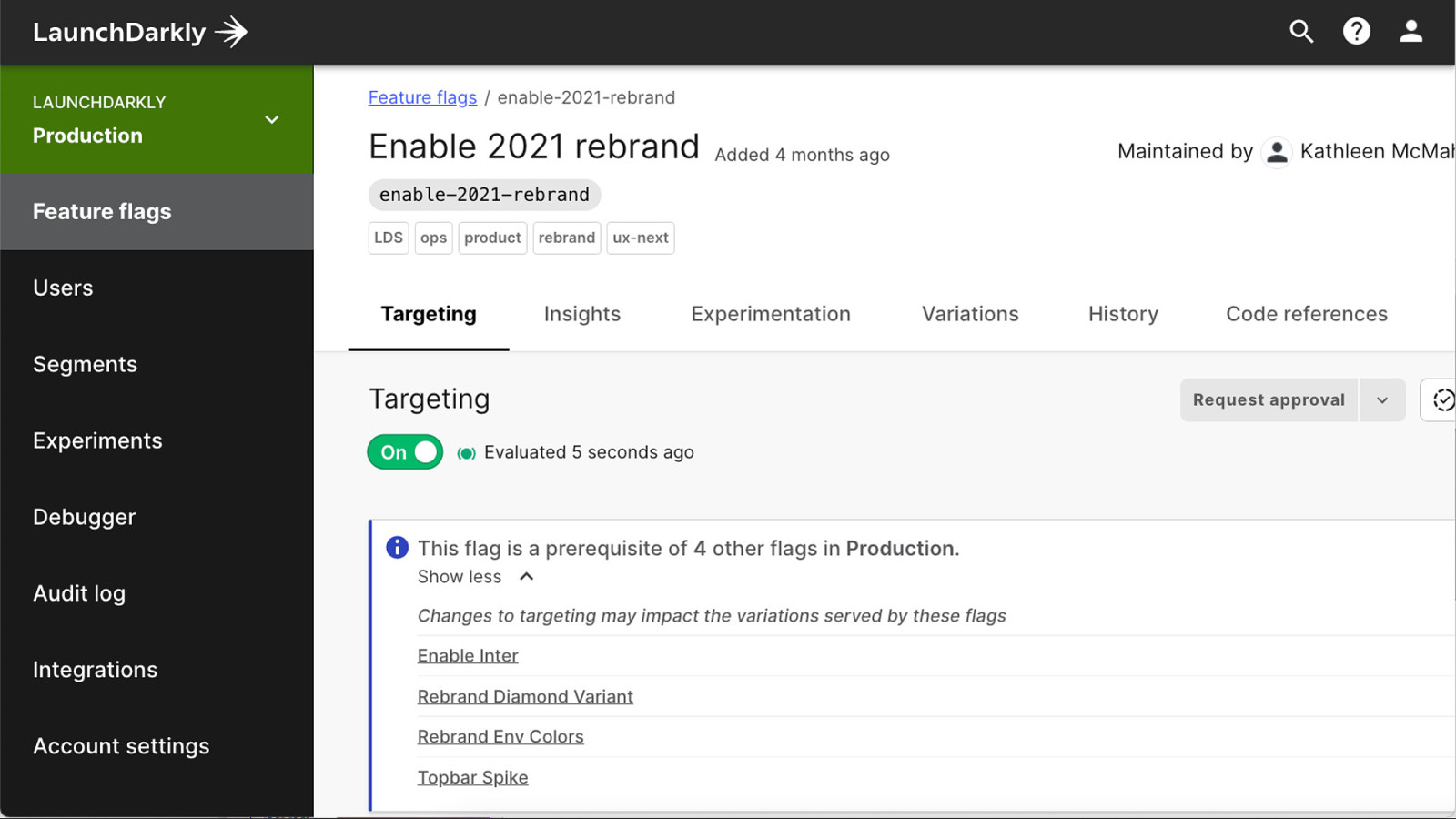
So if this flag wasn’t turned on, the other flags wouldn’t work…
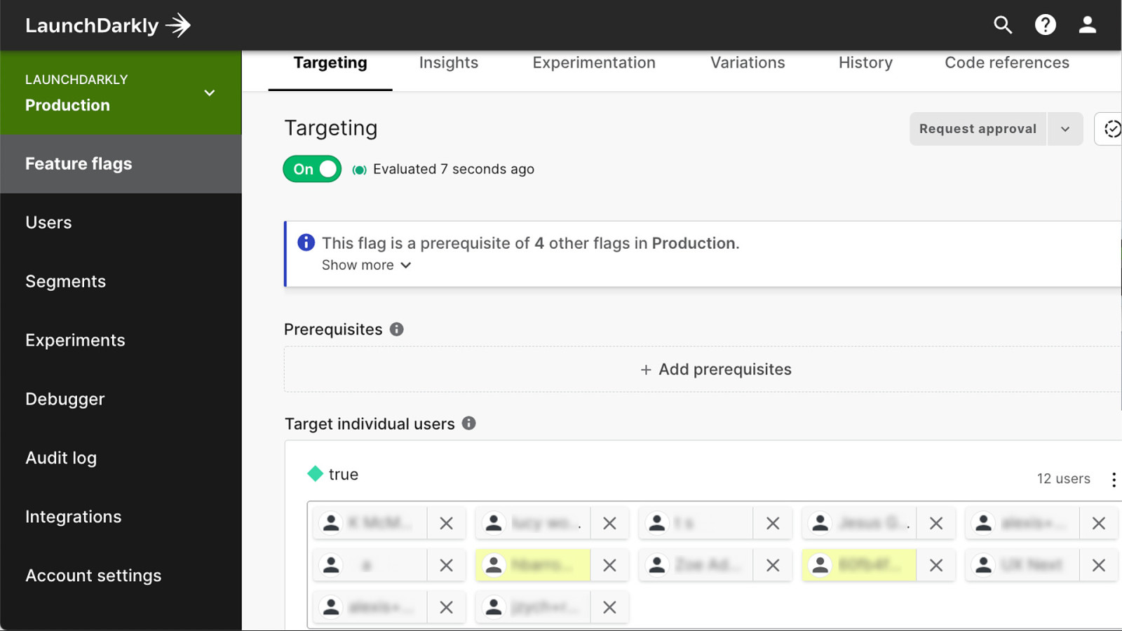
And because… secret project, we targeted specific users to be able to preview what we were working on.
Once this flag was on, we could continue work on things like…
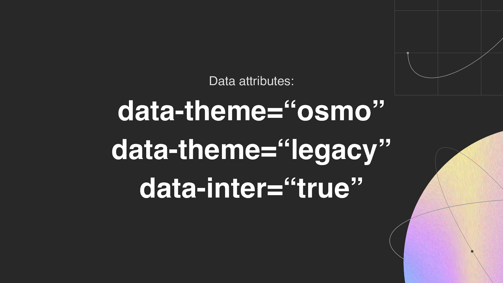
Theming support using…
Data attributes.
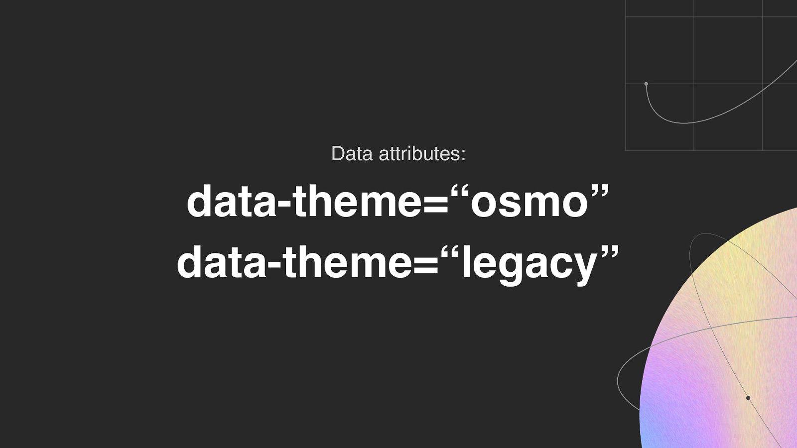
……to control whichever theme we wanted to serve up.
But we also wanted to use our new font, Inter, in our visual refresh so…
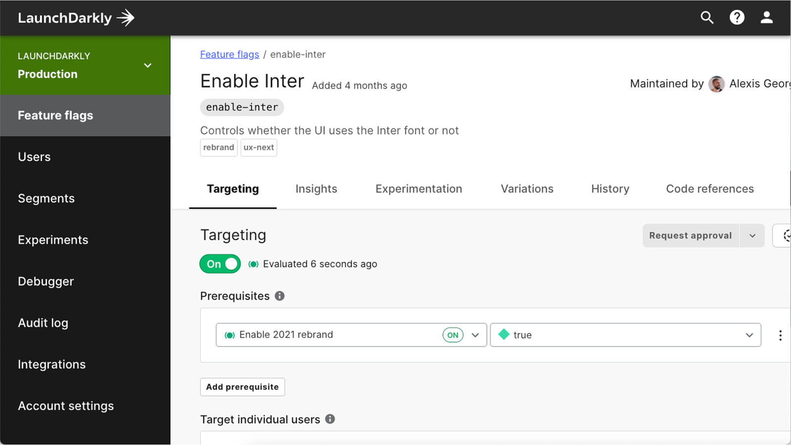
We added the enable-inter flag inter with the rebrand flag as a prerequisite…
And added it to our set of data attributes for theming.
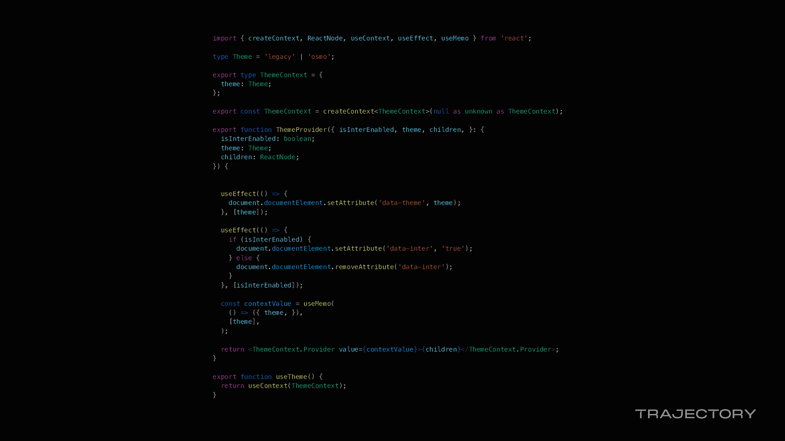
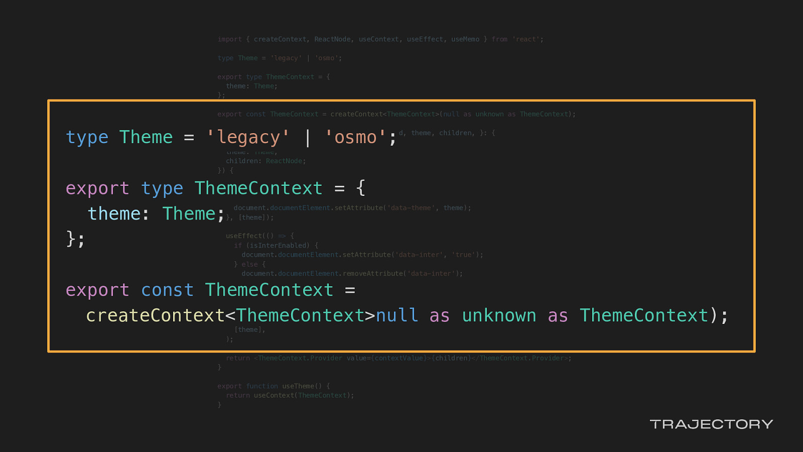
import { createContext, ReactNode, useContext, useEffect, useMemo } from ‘react’;
type Theme = ‘legacy’ | ‘osmo’;
export type ThemeContext = { theme: Theme; };
export const ThemeContext = createContext<ThemeContext>(null as unknown as ThemeContext);
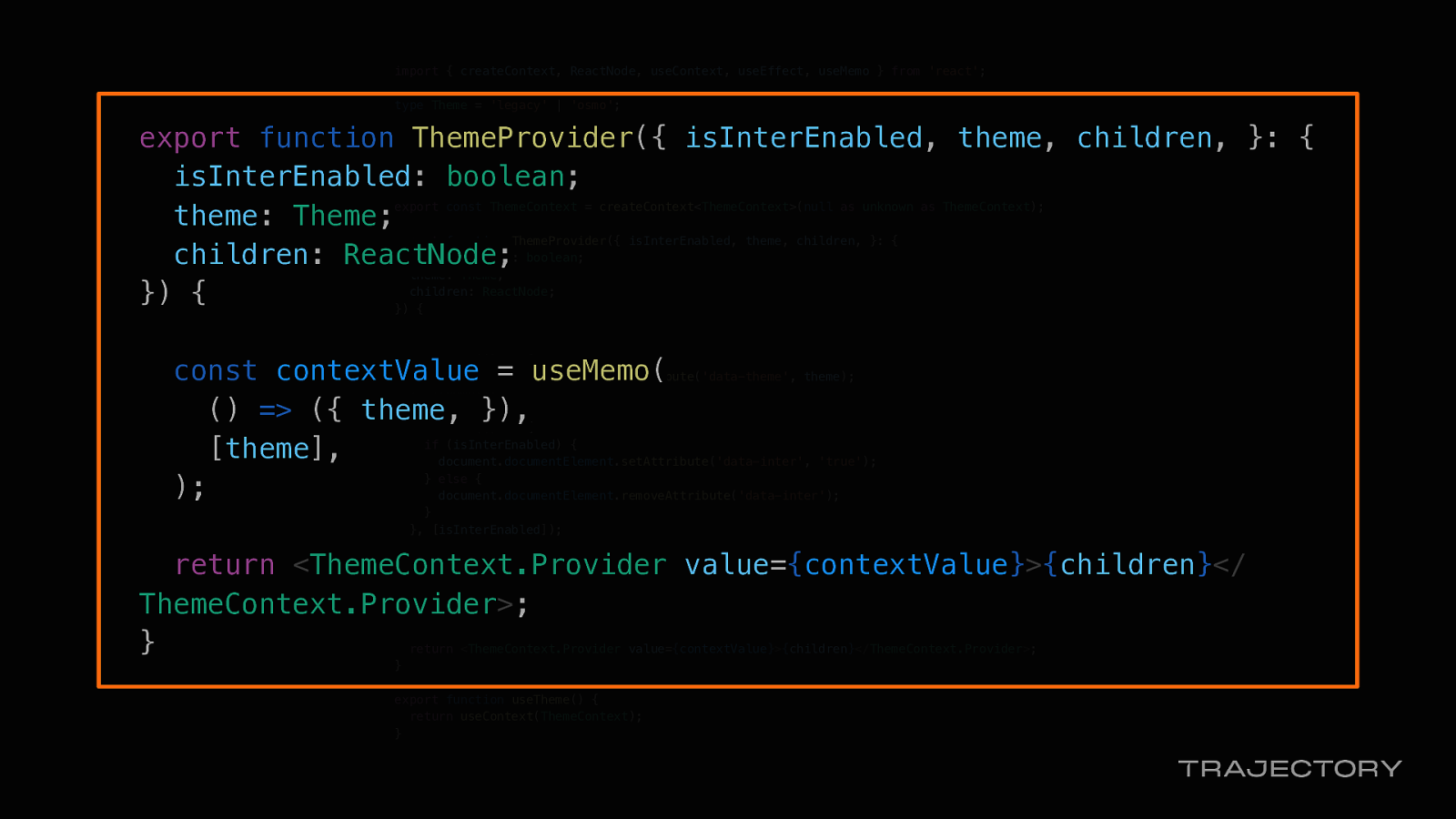
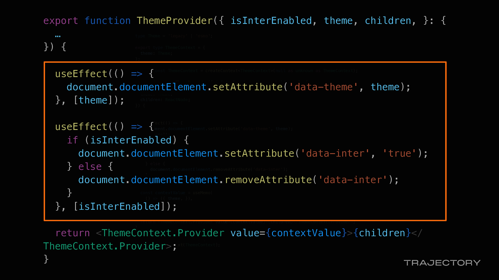
export function ThemeProvider({ isInterEnabled, theme, children, }: { isInterEnabled: boolean; theme: Theme; children: ReactNode; }) {
useEffect(() => { document.documentElement.setAttribute(‘data-theme’, theme); }, [theme]);
useEffect(() => { if (isInterEnabled) { document.documentElement.setAttribute(‘data-inter’, ‘true’); } else { document.documentElement.removeAttribute(‘data-inter’); } }, [isInterEnabled]);
const contextValue = useMemo( () => ({ theme, }), [theme], );
return <ThemeContext.Provider value={contextValue}>{children}</ThemeContext.Provider>; }
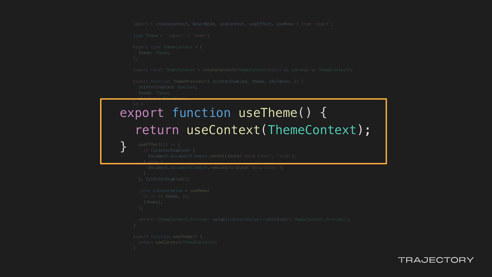
export function useTheme() { return useContext(ThemeContext); }
type Theme = ‘legacy’ | ‘osmo’;
export type ThemeContext = { theme: Theme; };
export const ThemeContext = createContext<ThemeContext>null as unknown as ThemeContext);
export function ThemeProvider({ isInterEnabled, theme, children, }: { isInterEnabled: boolean; theme: Theme; children: ReactNode; }) {
const contextValue = useMemo( () => ({ theme, }), [theme], );
return <ThemeContext.Provider value={contextValue}>{children}</ThemeContext.Provider>; }
export function useTheme() { return useContext(ThemeContext); }
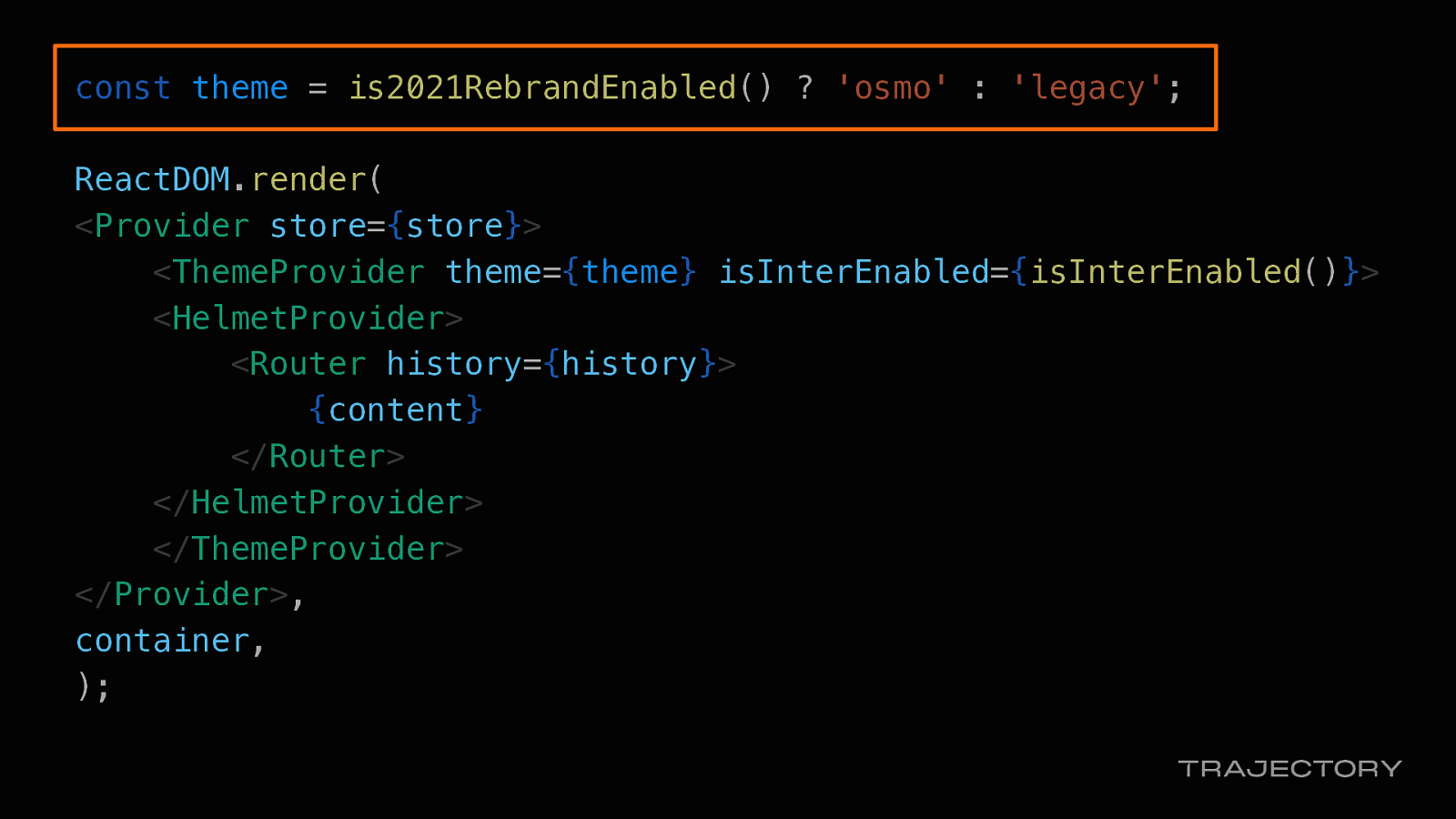
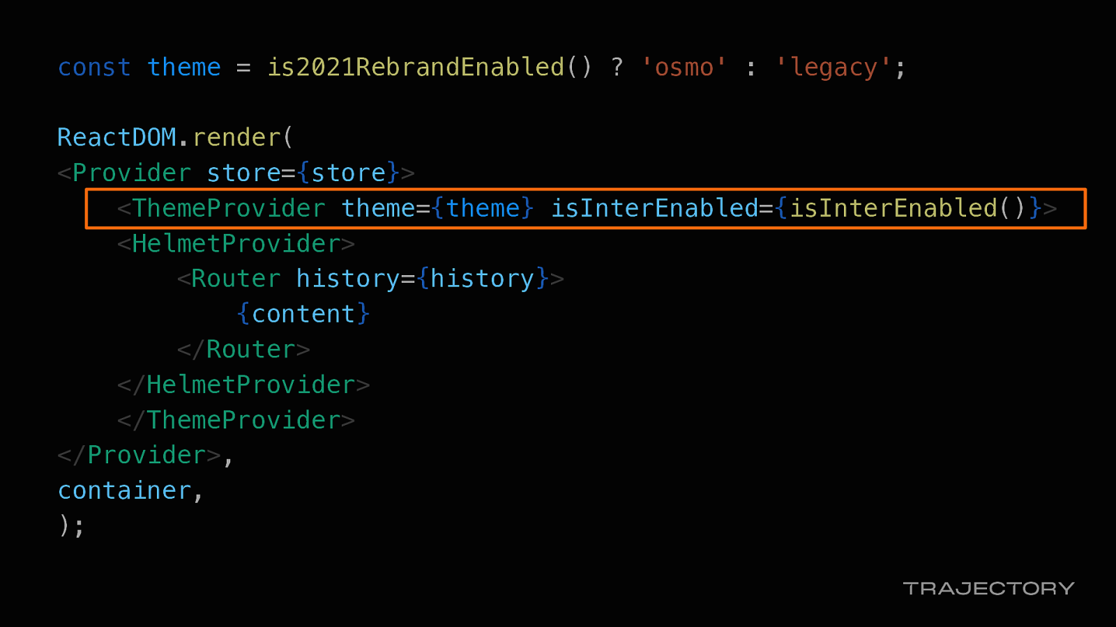
const theme = is2021RebrandEnabled() ? ‘osmo’ : ‘legacy’;
ReactDOM.render( <Provider store={store}> <ThemeProvider theme={theme} isInterEnabled={isInterEnabled()}> <HelmetProvider> <Router history={history}> {content} </Router> </HelmetProvider> </ThemeProvider> </Provider>, container, );
export function ThemeProvider({ isInterEnabled, theme, children, }: { … }) {
useEffect(() => { document.documentElement.setAttribute(‘data-theme’, theme); }, [theme]);
useEffect(() => { if (isInterEnabled) { document.documentElement.setAttribute(‘data-inter’, ‘true’); } else { document.documentElement.removeAttribute(‘data-inter’); } }, [isInterEnabled]);
return <ThemeContext.Provider value={contextValue}>{children}</ThemeContext.Provider>; }

Now that app theming was scaffolded, we could continue work on…
Before the North Star was revealed, our team was already refactoring our token architecture.
Our legacy token system was a blend of base and semantic, so it wasn’t scalable. Or themable. Hence the refactor.
Once this rebrand was announced, we had to adjust our tokens work without losing any of our progress.
Since we were using data attributes controlled by a flag, we could target the data attributes in our CSS to control our token values.
Considering the 10-week time frame, we chose to focus on using the data attribute to map our semantic tokens to base tokens in either the legacy or osmo theme. Our squads have been leaning on using our design tokens, so this would allow our re-theme to happen seamlessly.
We used a 1:1 mapping of our values and tested our rebrand by toggling on our flag.
This was especially helpful because our legacy tokens were blending base and semantics in their naming structure, and we could introduce a new set of semantic tokens quickly without much fuss.
The tokens that we were most concerned about where our application level tokens. now, we could have a separate set of base tokens for our our colors and fonts and our sizes in our legacy theme and our osmo theme.
By leveraging data attributes through feature flagging, we could test out our new token values in the app at runtime, without impacting any of the other teams’ work.
Even better, we could use this data attribute to wrap blocks of CSS code, and when it’s time to remove legacy styles, we can do it quickly.
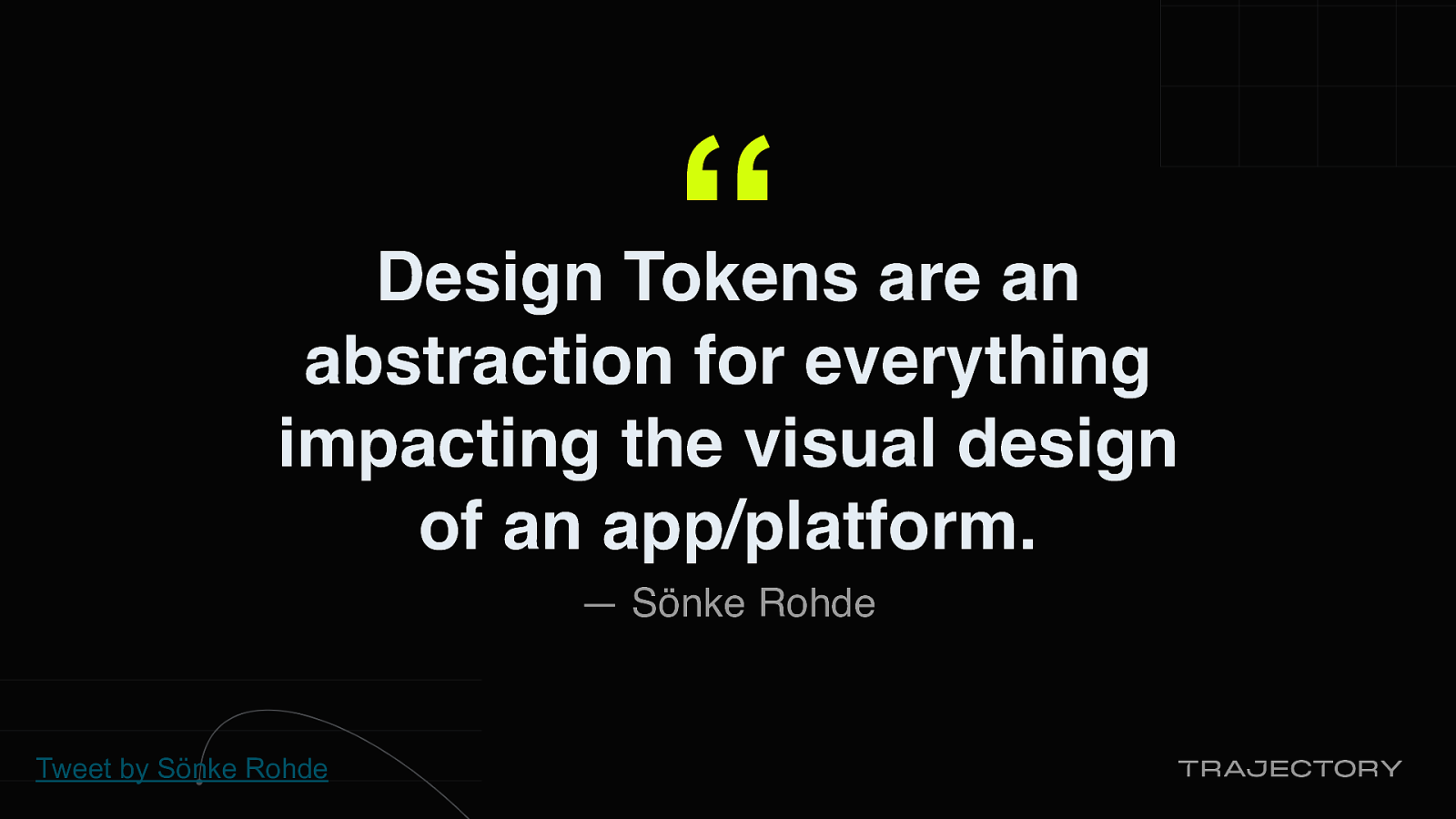
If you’ve never heard of design tokens, Sönke Rohde Tweeted a great definition: Design Tokens are an abstraction for everything impacting the visual design of an app or platform
In other words, design tokens are design decisions propagated through a system.
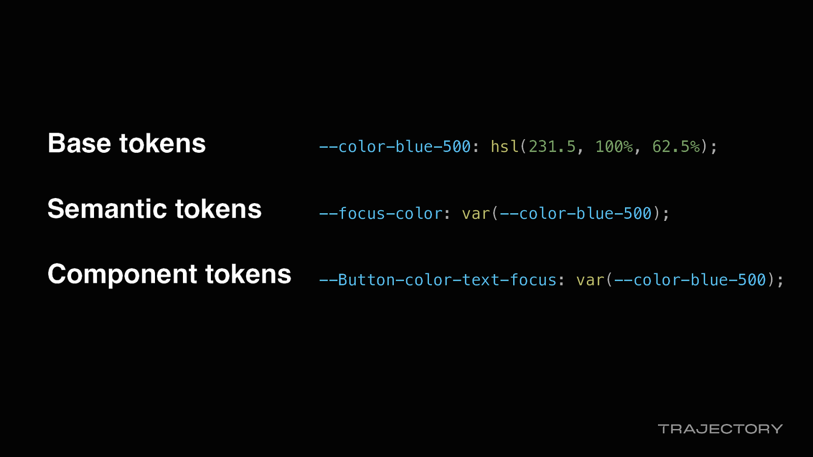
Base tokens —color-blue-500: hsl(231.5, 100%, 62.5%);
Semantic tokens —focus-color: var(—color-blue-500);
Component tokens —Button-color-text-focus: var(—color-blue-500);
Generally tokens span three categories:
Base, the raw values.
Semantic, aliased to base values and shared across the application, and component.
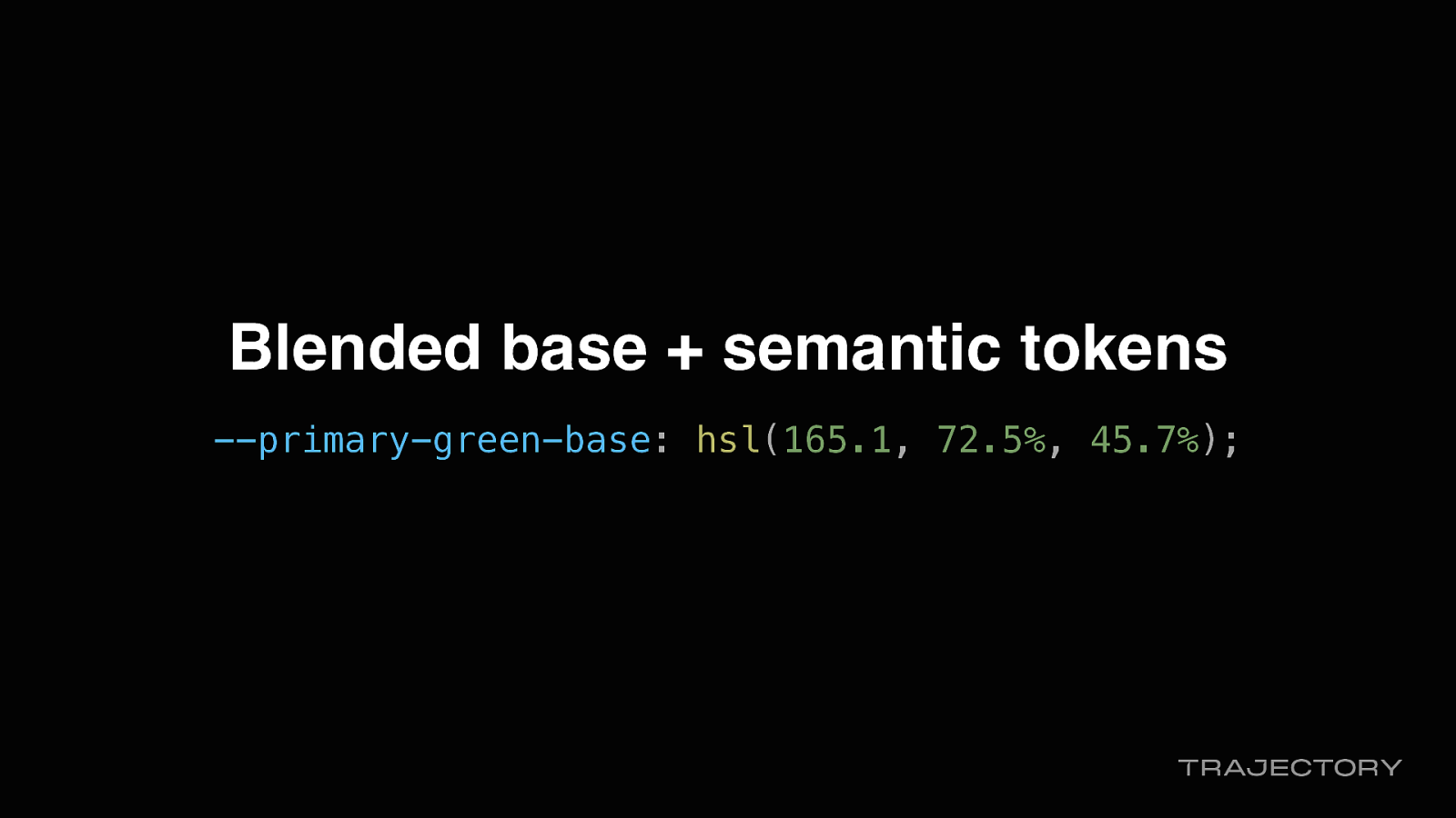
Our legacy token system was a blend of base and semantic, so it wasn’t scalable. Or themable due to the naming conventions used. Hence the refactor.
Blended base + semantic tokens —primary-green-base: hsl(165.1, 72.5%, 45.7%);

But by leaning into the data attributes
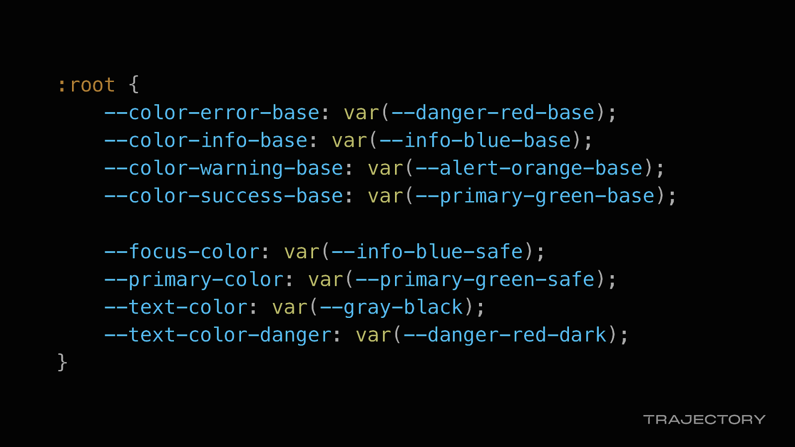
:root { —color-error-base: var(—danger-red-base); —color-info-base: var(—info-blue-base); —color-warning-base: var(—alert-orange-base); —color-success-base: var(—primary-green-base);
--focus-color: var(--info-blue-safe);
--primary-color: var(--primary-green-safe);
--text-color: var(--gray-black);
--text-color-danger: var(--danger-red-dark);
}
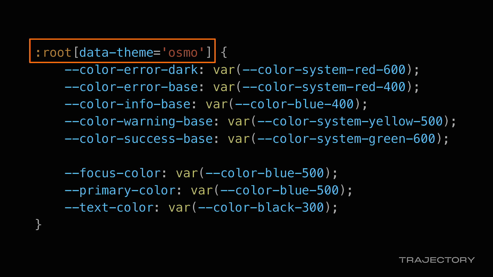
:root[data-theme=’osmo’]
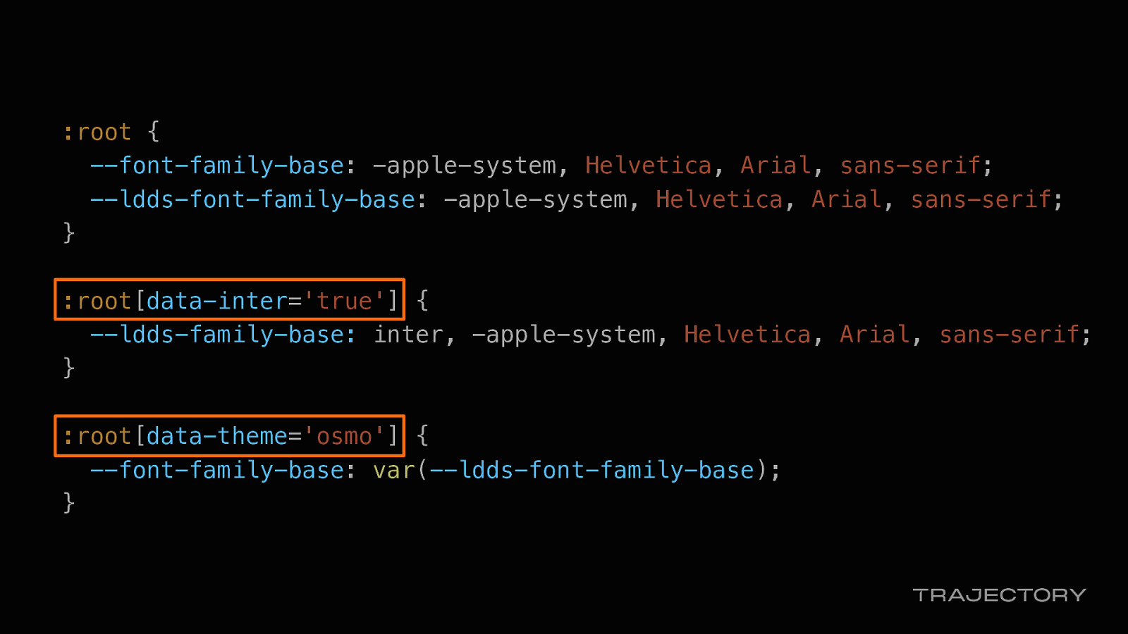
:root[data-inter=’true’]
:root[data-theme=’osmo’]
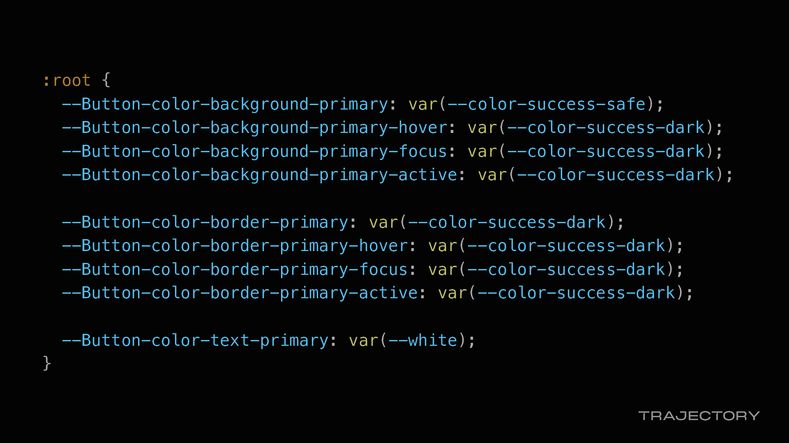
:root { —Button-color-background-primary: var(—color-success-safe); —Button-color-background-primary-hover: var(—color-success-dark); —Button-color-background-primary-focus: var(—color-success-dark); —Button-color-background-primary-active: var(—color-success-dark);
—Button-color-border-primary: var(—color-success-dark); —Button-color-border-primary-hover: var(—color-success-dark); —Button-color-border-primary-focus: var(—color-success-dark); —Button-color-border-primary-active: var(—color-success-dark);
—Button-color-text-primary: var(—white); }
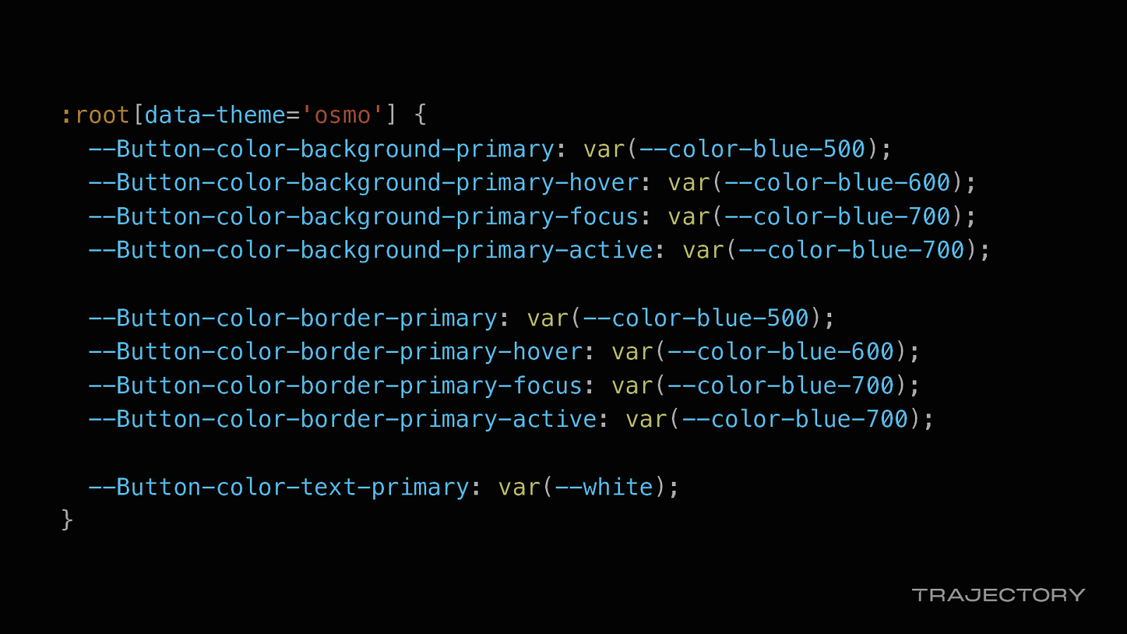
:root[data-theme=’osmo’] { —Button-color-background-primary: var(—color-blue-500); —Button-color-background-primary-hover: var(—color-blue-600); —Button-color-background-primary-focus: var(—color-blue-700); —Button-color-background-primary-active: var(—color-blue-700);
—Button-color-border-primary: var(—color-blue-500); —Button-color-border-primary-hover: var(—color-blue-600); —Button-color-border-primary-focus: var(—color-blue-700); —Button-color-border-primary-active: var(—color-blue-700);
—Button-color-text-primary: var(—white); }
We also used flags in other ways for performance optimizations
In our HTML templates…
we used the Go SDK and Go templates on the back end to bootstrap our flag data into our HTML templates to give us just enough information to render our pages.
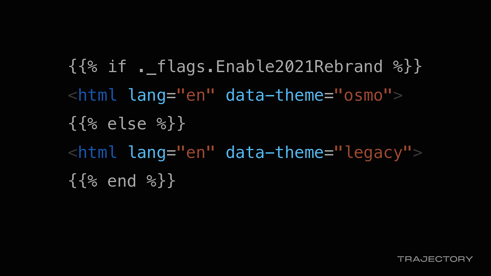
And used the enable-2021-rebrand feature flag to set the data-theme attribute as a performance optimization.
This way, we could have the HTML templates check for this flag and render the correct theme while we wait for the JavaScript to load and initialize the HTML, to avoid a flash of incorrectly-styled content
{{% if ._flags.Enable2021Rebrand %}}
<html lang=”en” data-theme=”osmo”> {{% else %}} <html lang=”en” data-theme=”legacy”> {{% end %}}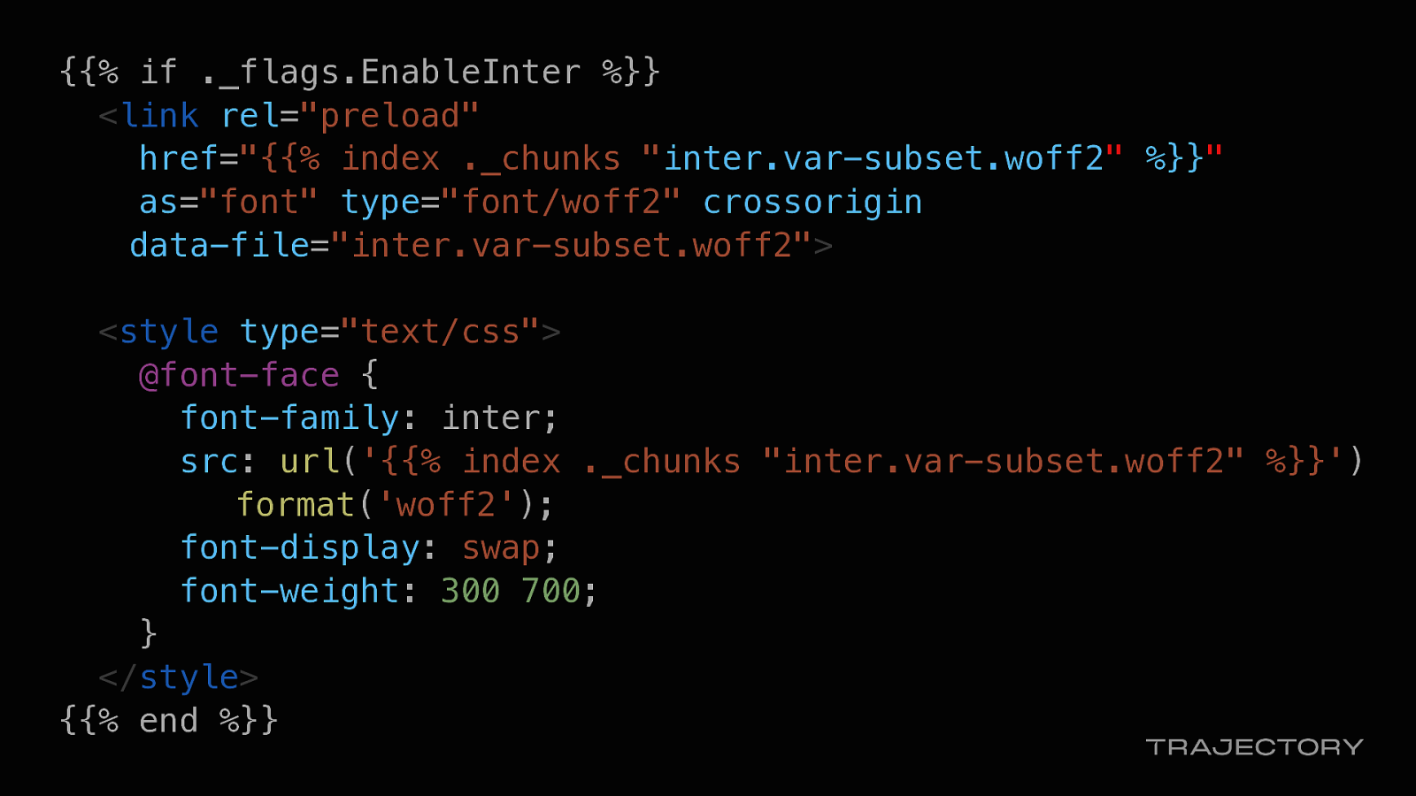
We also used the enable-inter flag value preload this variable font only if the flag was on.
This way, our app performance wouldn’t take a hit from loading any unnecessary fonts if the flag was off.
{{% if ._flags.Enable2021Rebrand %}}
<html lang=”en” data-theme=”osmo”> {{% else %}} <html lang=”en” data-theme=”legacy”> {{% end %}}
For UI updates…
We used feature flags to control whether we would show/hide content in our left nav
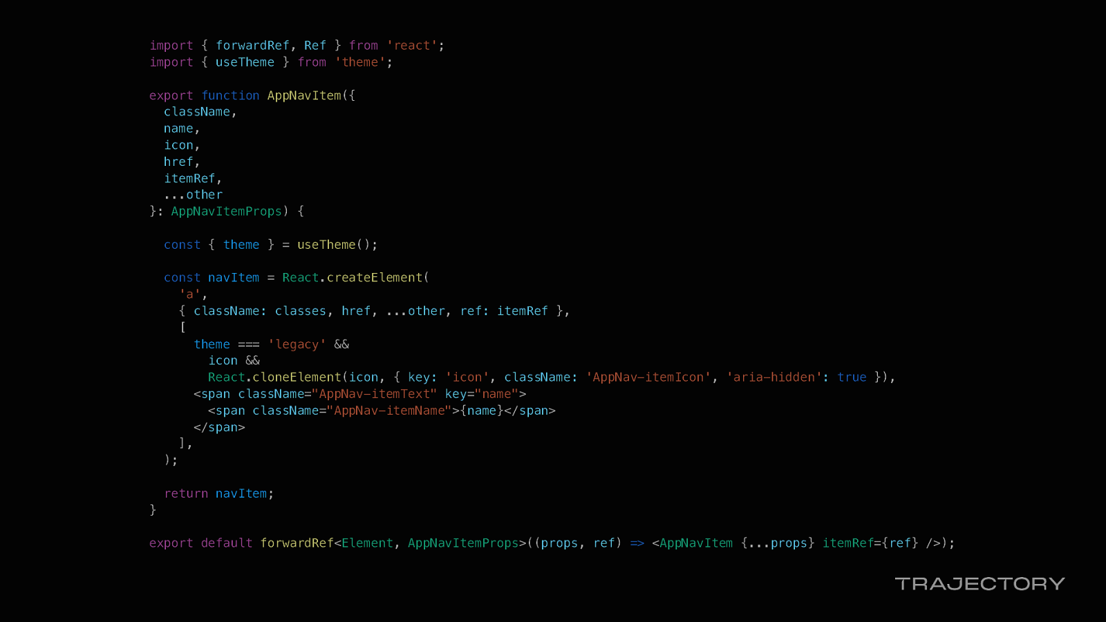
import { forwardRef, Ref } from ‘react’; import { useTheme } from ‘theme’;
export function AppNavItem({ className, name, icon, href, itemRef, …other }: AppNavItemProps) {
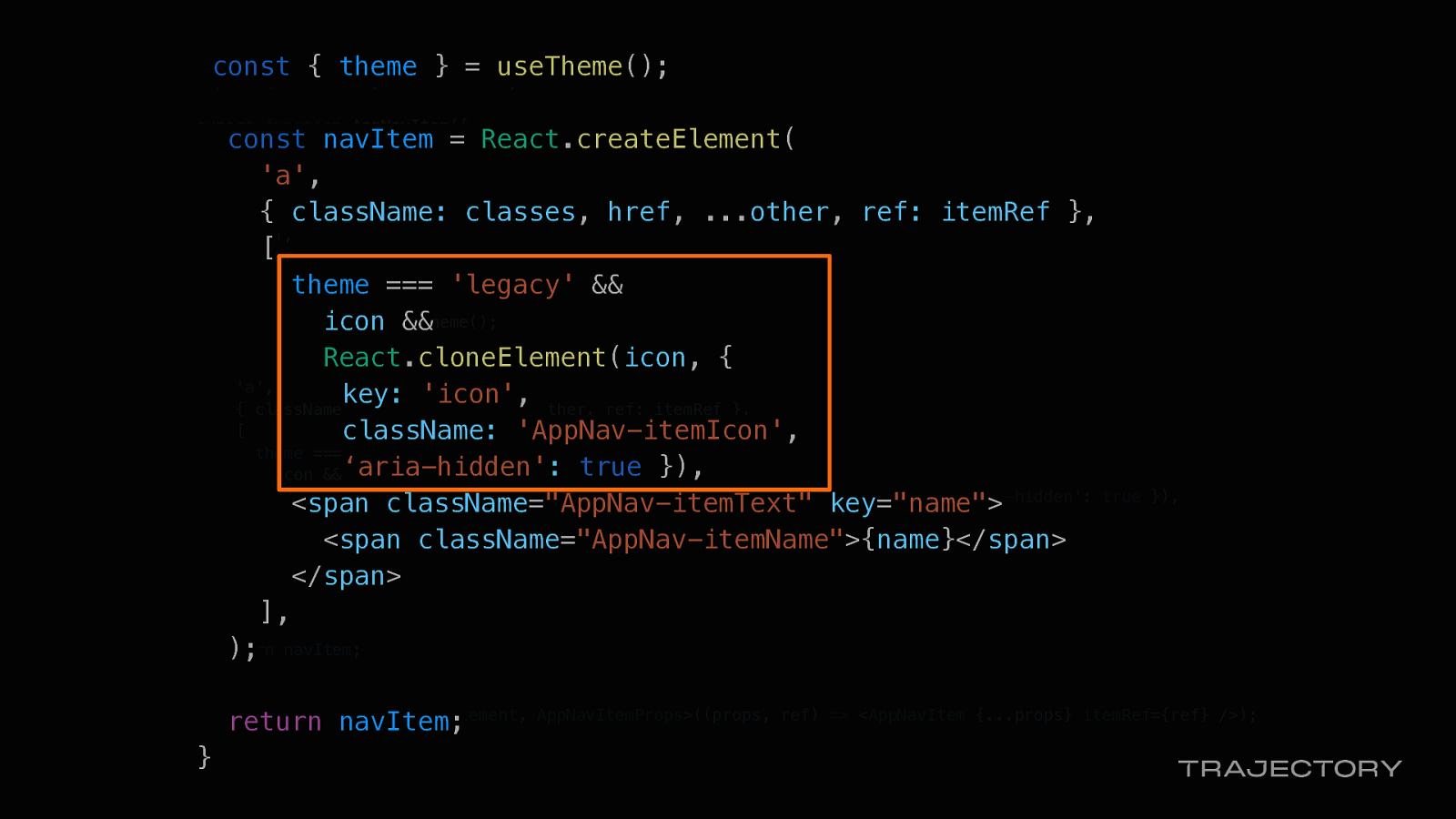
const { theme } = useTheme();
const navItem = React.createElement( ‘a’, { className: classes, href, …other, ref: itemRef }, [ theme === ‘legacy’ && icon && React.cloneElement(icon, { key: ‘icon’, className: ‘AppNav-itemIcon’, ‘aria-hidden’: true }), <span className=”AppNav-itemText” key=”name”> <span className=”AppNav-itemName”>{name}</span> </span> ], );
return navItem; }
export default forwardRef<Element, AppNavItemProps>((props, ref) => <AppNavItem {…props} itemRef={ref} />);
const { theme } = useTheme();
const navItem = React.createElement( ‘a’, { className: classes, href, …other, ref: itemRef }, [ theme === ‘legacy’ && icon && React.cloneElement(icon, { key: ‘icon’, className: ‘AppNav-itemIcon’, ‘aria-hidden’: true }), <span className=”AppNav-itemText” key=”name”> <span className=”AppNav-itemName”>{name}</span> </span> ], );
return navItem; }
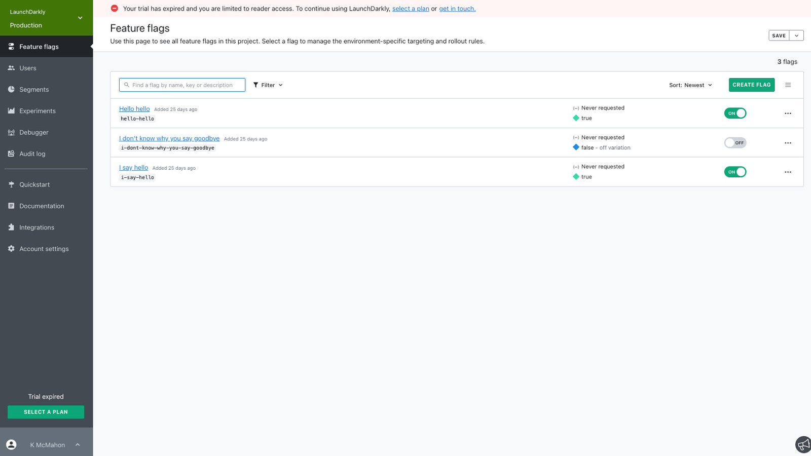
So our users would have the expected UI experience
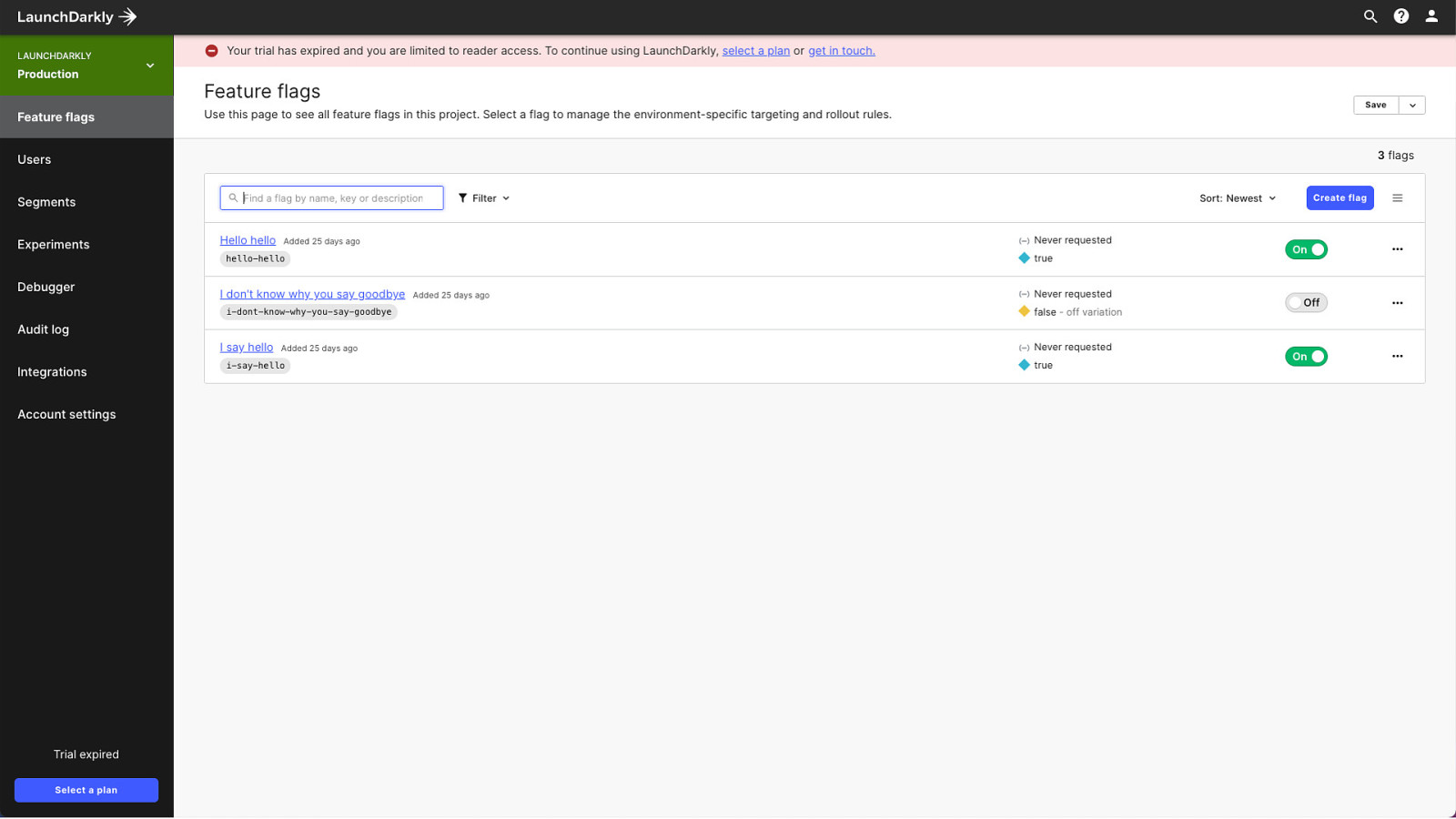
While we worked on the rebranded nav in secret

We didn’t have a top nav before…

…and now we do.

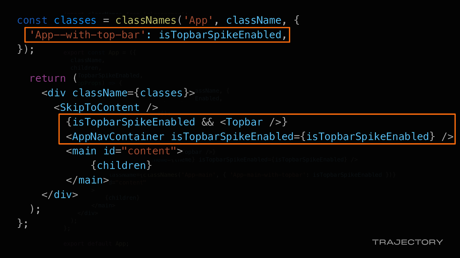
By adding the topbar-spike flag
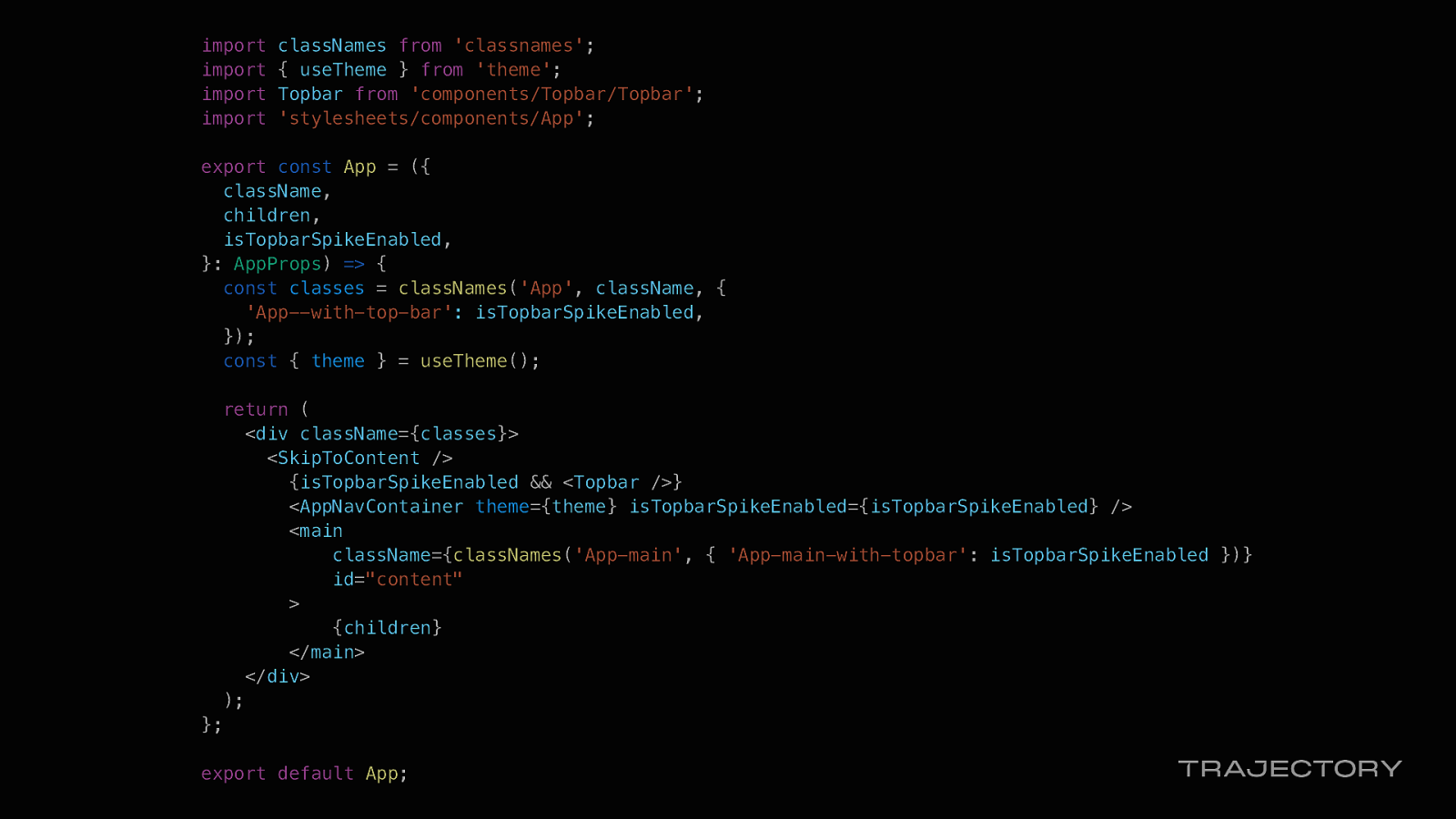
import classNames from ‘classnames’; import { useTheme } from ‘theme’; import Topbar from ‘components/Topbar/Topbar’; import ‘stylesheets/components/App’;
export const App = ({ className, children, isTopbarSpikeEnabled, }: AppProps) => { const classes = classNames(‘App’, className, { ‘App—with-top-bar’: isTopbarSpikeEnabled, }); const { theme } = useTheme();
return ( <div className={classes}> <SkipToContent /> {isTopbarSpikeEnabled && <Topbar />} <AppNavContainer theme={theme} isTopbarSpikeEnabled={isTopbarSpikeEnabled} /> <main className={classNames(‘App-main’, { ‘App-main-with-topbar’: isTopbarSpikeEnabled })} id=”content” > {children} </main> </div> ); };
export default App;
const classes = classNames(‘App’, className, { ‘App—with-top-bar’: isTopbarSpikeEnabled, });
return ( <div className={classes}> <SkipToContent /> {isTopbarSpikeEnabled && <Topbar />} <AppNavContainer isTopbarSpikeEnabled={isTopbarSpikeEnabled} /> <main id=”content”> {children} </main> </div> ); };

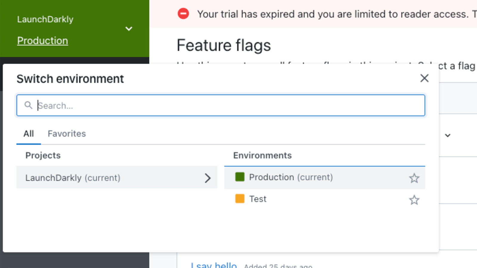
With LaunchDarkly, whenever you create a new project you get two default environments, production and test, and they are set specific colors by default.

We wanted to test out new default environment colors, so created the rebrand-env-colors multivariate flag
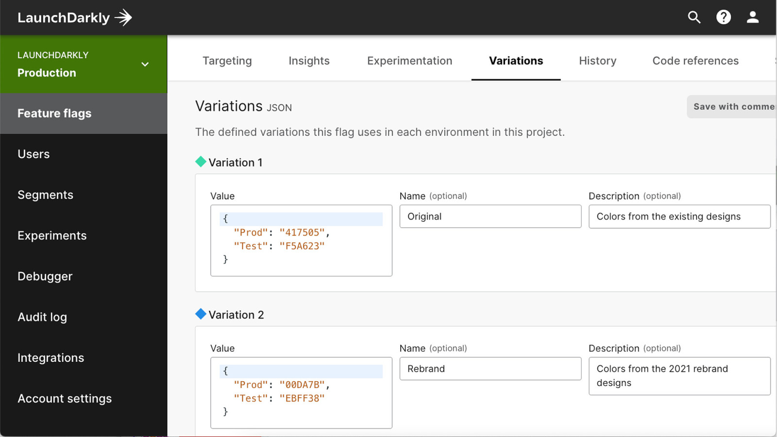
…and use blocks on JSON in our variations to test out color combinations on the fly.
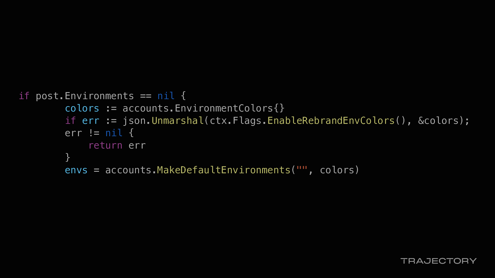
And used Go to store the values.
if post.Environments == nil { colors := accounts.EnvironmentColors{} if err := json.Unmarshal(ctx.Flags.EnableRebrandEnvColors(), &colors); err != nil { return err } envs = accounts.MakeDefaultEnvironments(“”, colors)
Lastly… Favicons. It’s always a nice touch to have your favicon ready to go when you rollout your rebrand rather than scrambling to update at the last moment.
Especially if you are using them in more than one environment.
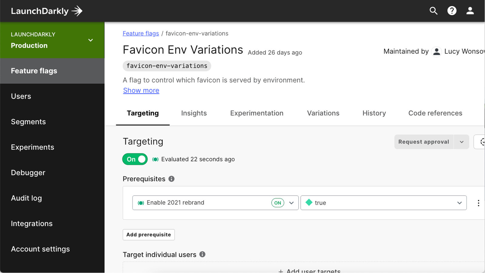
By adding the favicons-env-variations multivariate flag
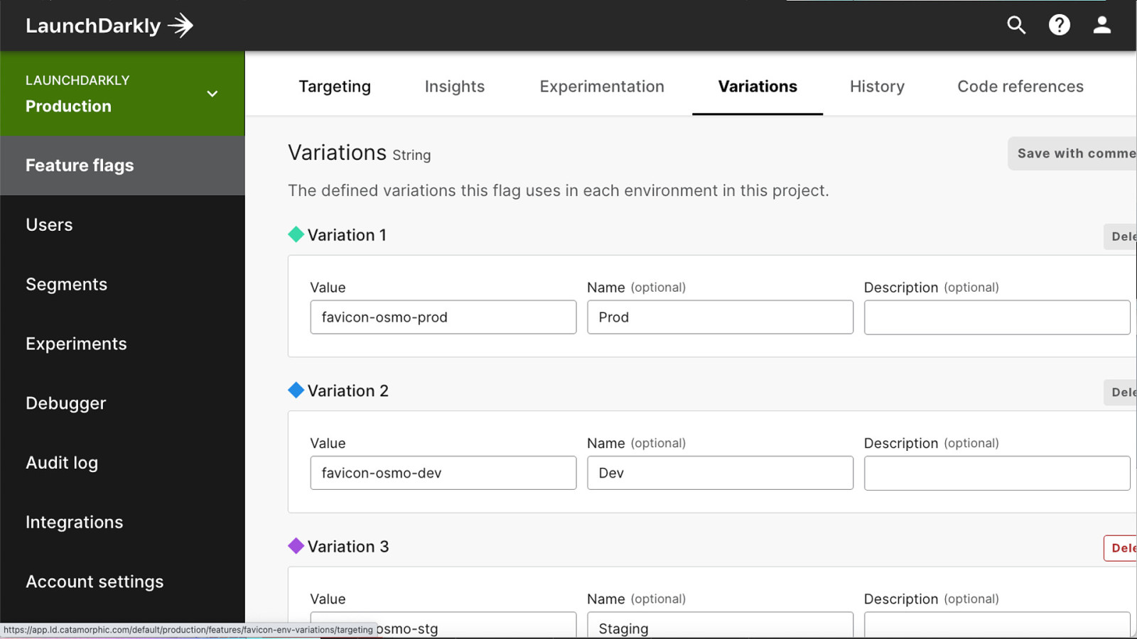
We could use strings in our variations…
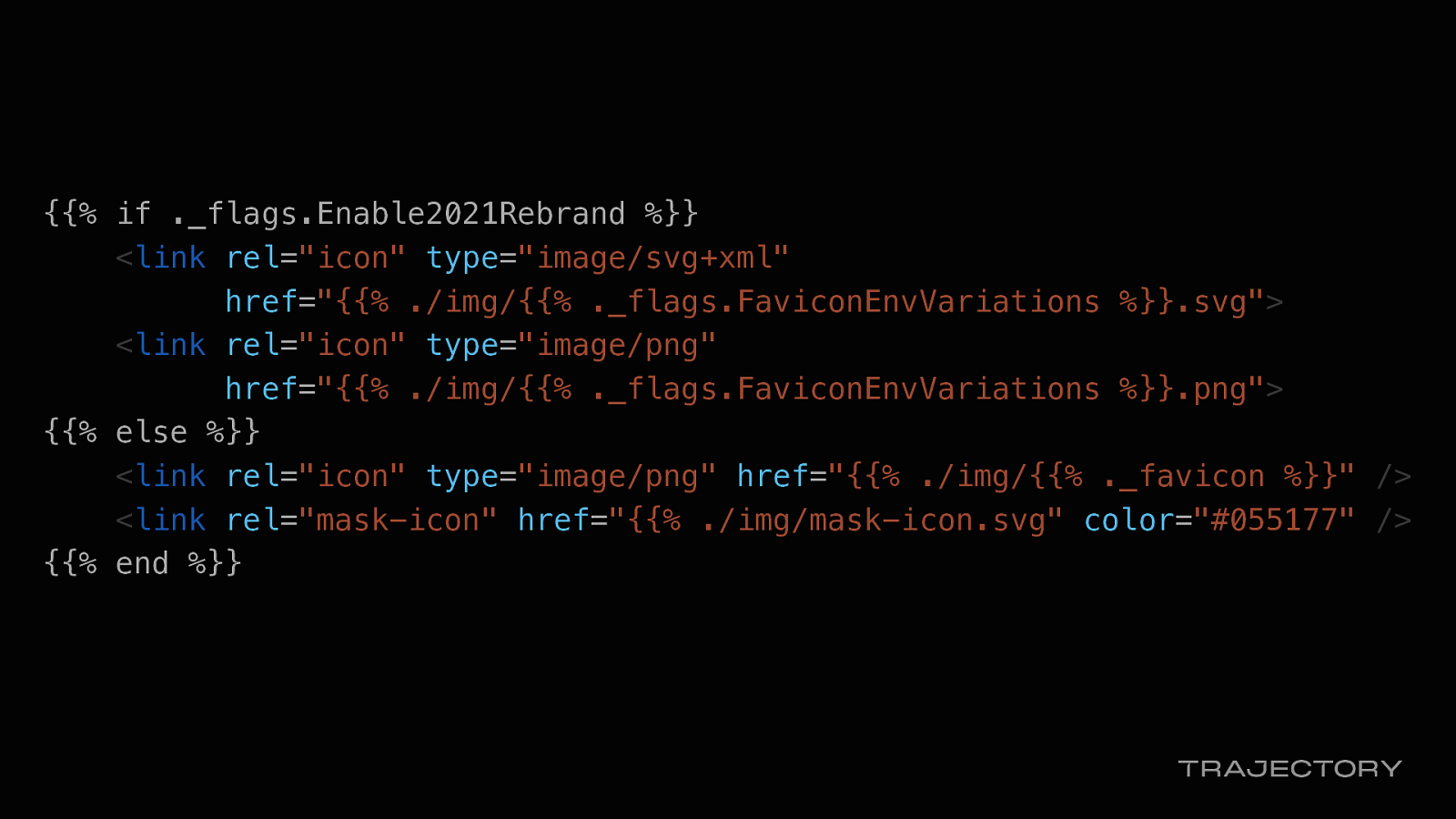
{{% if ._flags.Enable2021Rebrand %}} <link rel=”icon” type=”image/svg+xml” href=”{{% ./img/{{% ._flags.FaviconEnvVariations %}}.svg”> <link rel=”icon” type=”image/png” href=”{{% ./img/{{% ._flags.FaviconEnvVariations %}}.png”> {{% else %}} <link rel=”icon” type=”image/png” href=”{{% ./img/{{% ._favicon %}}” /> <link rel=”mask-icon” href=”{{% ./img/mask-icon.svg” color=”#055177” /> {{% end %}}
That was a lot… So to wrap up

With the power of feature flags…
In a 10-week time frame…
We could implement a substantial amount of changes to our product…

And rollout a product rebrand in stealth mode.
Thank you.