Putting Design On The Map

A presentation at From the Front - Frontend in Wonderland in September 2015 in Bologna, Metropolitan City of Bologna, Italy by Shane Hudson

Slide 1

Slide 1

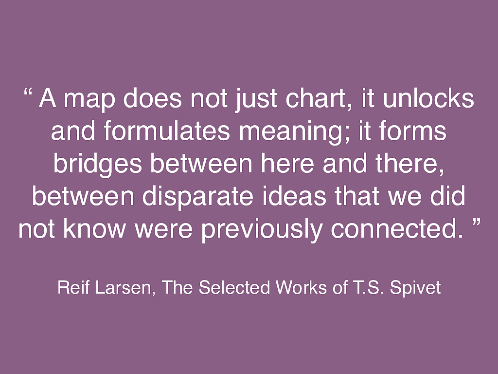
Putting Design On The Map Shane Hudson From The Front 2015 Hello everyone, thank you for having me.

I would like to start with a disclaimer: I am not a geographer or a historian or a politician. So if I get anything wrong or say something that could be taken the wrong way, then I’m really sorry.

https://thestrangersbookshelf.files.wordpress.com/2013/07/wonderlandmap.jpg

Slide 2

Slide 2

Sir Tim Berners-Lee “ The original idea of the web was that it should be a collaborative space where you can communicate through sharing information. ” Sir Tim Berners-Lee once said “The original idea of the web was that it should be a collaborative space where you can communicate through sharing information.”

Slide 3

Slide 3

And that is kind of why I am here. I am a developer, a person who makes a very small part of the web, who has stumbled down the rabbit hole into the world of maps.

Slide 4

Slide 4

This talk was meant to be based upon my Putting Design On The Map article at 24Ways, but over the past few months I’ve taken it a different direction. The practical aspects of maps are actually quite simple and there is plenty written about them. So instead of focussing purely on the code, I want to focus on exploring the bigger picture of maps on the web, as well as maps from the past.

Slide 5

Slide 5

Everyone “ But we already have Google Maps, right? ” Google seem to have a monopoly over the usage of web-based maps and I can understand why:

They are extremely quick and simple,

accurate and nice to look at.

Slide 6

Slide 6

Me “ Yup! ” So why am here, about to introduce to you an entire compendium of techniques for doing something that can be done in a matter of seconds? Well you can just embed a default Google map if you wish, I won’t think any less of you for doing so. I do it myself sometimes.

Slide 7

Slide 7

The First Web Page - No Styling! But you could also use Arial or Helvetica for all of your fonts, stock images for your photos, and that lovely blue and purple default colour scheme for links. I wouldn’t think any less of you for that either, there is a beauty to a even a plain HTML page. However, when was the last time you went without CSS?

Slide 8

Slide 8

The First Web Page - No Styling! I am sure the majority of people in this audience have spent countless hours slaving away over the typography, the colour scheme, getting the breakpoints correct so that the new-fangled responsive website looks just right with any size of screen.

Slide 9

Slide 9

I’m not saying you need to build a custom map for every coffee shop you build a website for. I just think it is valuable to know your options and to feel the inspiration to do something a little bit interesting.

So today I am going to discuss a variety of techniques from changing the colour palette of a Google map to building real-time visualisations. The purpose of this talk is not to teach the ins and outs, it is to give you ideas to explore.

Slide 10

Slide 10

This is the first map so far. But is it? What is a map? When do lines on a page become a map instead of a picture or just a mess?

https://thestrangersbookshelf.wordpress.com/fantasy-maps/

Slide 11

Slide 11

“ A map does not just chart, it unlocks and formulates meaning; it forms bridges between here and there, between disparate ideas that we did not know were previously connected. ” Reif Larsen, The Selected Works of T.S. Spivet I really love this quote by Reif Larsen in his novel ‘The Selected Works of T.S. Spivet’:

“A map does not just chart, it unlocks and formulates meaning; it forms bridges between here and there, between disparate ideas that we did not know were previously connected.”

Slide 12

Slide 12

Reif Larsen, The Selected Works of T.S. Spivet “ A map does not just chart, it unlocks and formulates meaning; it forms bridges between here and there, between disparate ideas that we did not know were previously connected. ” I won’t get into the various interpretations of that quote, just thinking about the phrase “disparate ideas” conjures up a multitude of questions and discussions to my mind. “unlocks and formulates meaning” is the important part.

Slide 13

Slide 13

The difference between a map and a picture is the context between the lines and dots, the unlocked meaning within. I won’t get into the various interpretations of that quote, just thinking about the phrase “disparate ideas” conjures up a multitude of questions and discussions to my mind. “unlocks and formulates meaning” is the important part.

The difference between a map and a picture is the context between the lines and dots, the unlocked meaning within.

Slide 14

Slide 14

London Squared Map © 2015. After the Flood The context could come from road labels, icons, or a recognisable physical feature such as the shape of the Thames through central London.

http://aftertheflood.co/projects/london-squared-map

Slide 15

Slide 15

Cartographia by Vincent Virga I’ve always been a bit of a bookworm and recently have had my nose in all the atlases and cartography books I can find, especially the ones with a lot of history in them. This one is called Cartographia, my favourite so far and it is a brilliant glimpse into the collections of the United States’ Library of Congress.

https://books.google.co.uk/books/about/Cartographia.html?id=yLhvQgAACAAJ&source=kp_cover&hl=en

Slide 16

Slide 16

View: OS One-Inch New Popular with National Grid: Sheet 181 - Ordnance Survey One-inch to the mile maps of England and Wales, New Popular Edition, 1945-1947 http://maps.nls.uk/view/74466980 1947 Ordnance Survey Map It’s quite interesting when you look at how maps have changed over time, not only because they knew far less of the geography of the earth than we do now but more due to the contexts in which they were used and required.

We take road maps, and perhaps even GPS, for granted but it’s only relatively recently that many maps have included roads at all.

http://maps.nls.uk/view/74466980

Slide 17

Slide 17

Map of Bologna from Civitates Orbis Terrarium While there are roads maps dating back to circa 1160 BC, they were not very common. It wasn’t until between 1572 and 1618AD, six volumes of Civitates Orbis Terrarium were published and filled with town plans of major cities from all over the world.

http://historic-cities.huji.ac.il/italy/bologna/maps/braun_hogenberg_IV_49.html

Slide 18

Slide 18

Reconstruction of Anaximander’s Map Long beforehand, back in circa 500BC, Hecataeus of Miletus was far more concerned with understanding the world. What shape is it? How do all of the countries connect together?

https://en.wikipedia.org/wiki/Anaximander

Slide 19

Slide 19

Reconstruction of Anaximander’s Map His map, known as “The World According To Hecataeus”, was lost long ago but over time there have been many reconstructions of it. Based upon earlier work by Anaximander, it shows a circular earth with three continents: Europe, Asia and Libya. This is Anaximander’s version.

Slide 20

Slide 20

Reconstruction of ‘The World According To Hecataeus' The boundaries between Europe and Asia were defined by the sea however there appears to have been a lot of debate as to where the boundary should be for Libya.

Originally the boundary was the Nile, but the Greek historian Herodotus later decided that it should actually be along the west border of Ancient Egypt.

https://en.wikipedia.org/wiki/Hecataeus_of_Miletus

Slide 21

Slide 21

Reconstruction of ‘The World According To Hecataeus' I could delve far deeper into these very early maps, there is so much history to do with how borders were formed. That is for continents, just imagine what it must have been like for the individual countries!

Slide 22

Slide 22

Dr John Snow’s 1854 Map of the London Cholera Outbreak While it is all well and good to map geography and to define borders, another common purpose of maps is to visualise and to make sense of data.

One of the most famous maps historically of this type is Dr John Snow’s map of the 1854 London Cholera Outbreak in which he took note of the number of deaths in each household near Broad Street.

https://en.wikipedia.org/wiki/John_Snow_(physician)

Slide 23

Slide 23

Dr John Snow’s 1854 Map of the London Cholera Outbreak He did not know that Cholera could spread via food and water, but based on the data he collected and how it was visualised on the map he was able to pinpoint the exact water pump that was causing the disease.

https://en.wikipedia.org/wiki/John_Snow_(physician)

Slide 24

Slide 24

Ethnographical map of the Balkan Peninsula by Jovan Cviji ć Not all maps have had such positive outcomes.

In 1918, at the end of the first World War, Jovan Cviji ć created a political map of the Balkan Peninsula in which he split Yugoslavia into regions based on the predominant ethnicities and religions. The map visualised the different groups using colour and textures.

He became the Chief Expert on Ethnographic Borders for the Serbian Government and it has been argued that the map was a destabilising factor in Yugoslavia that inspired war.

http://www.bl.uk/collection-items/ethnographical-map-balkan-peninsular

Slide 25

Slide 25

Photo of Cyprus taken In 2014 from the International Space Station It is very interesting to see how the purpose of maps have developed over the years. There is still the need to define political borders and to map rivers, but those are now secondary tasks.

In some ways, especially with the shape of rivers and coastlines, the tasks are mostly complete.

We have many planes and even people looking down at us from space—this photo was taken on the ISS with a regular Nikon DSLR, not even an expensive specialised camera. So it isn’t as hard to map the world as it was in Hecataeus’ time.

https://www.flickr.com/photos/nasa2explore/14503608231/

Slide 26

Slide 26

Google Map Showing Traffic In London These days, the focus is on how much tra ffi c there currently is on the road, which is the quickest route to your destination, or what the ecosystem is currently like along the coast. The keyword is ‘currently’, the context of our maps is now real time.

maps.google.com

Slide 27

Slide 27

Google Analytics Locations So let’s move on from the maps of antiquity to modern times, what are maps like now that we have computers? As web folk, we are all likely to encounter analytics tools at some point whether we like it or not. These tools have a wealth of data, both realtime and archived, showing (among many other things) where in the world viewers were from.

Slide 28

Slide 28

Google Analytics Locations That’s a very informative map, for the people that run the website. But quite useless to anyone else (except perhaps advertisers!)

Slide 29

Slide 29

On the flip side, there are many visualisations of the earth itself such as the wind speed and direction, location and magnitudes of earthquakes, as well as more scientific details such as the amount of chlorophyll in the sea.

These examples all require data. Where the ancient geographers used to map the seas by sailing the coastlines, we now rely heavily on sensors all over the world and on satellites in space.

http://earth.nullschool.net/

Slide 30

Slide 30

While I was developing this talk, I watched a few others to make sure I don’t just say everything that someone else has already said. During a talk about CartoDB, Aurelia [or-ree-lee-ah] Moser showed this map as an example of a beautiful awe-inspiring map. I just had to steal it! This shows the elevation hight of Iceland using Mapbox and CartoDB. You will notice that it is a full ‘slippy map’, with multiple zoom levels.

[Let it run through]

It really is beautiful.

http://iceland.cartodb.com/tables/iceland/embed_map?title=true&description=true&search=false&shareable=false&cartodb_logo=true&sql=

Slide 31

Slide 31

1862 Map of Abe River Region The elevation map of Iceland made me think of two historical maps I had seen. Aurelia showed it as an example of how maps can be beautiful, and these two are particularly beautiful.

This is a crop of a large Japanese watercolour map of the Abe River Region, it was created in 1862 and visually shows where all of the hills are. It doesn’t such elevation as such but it gives a good representation.

Slide 32

Slide 32

1764 Map of Dagua River Region, Colombia This second elevation map is the Map of Dagua River Region, Columbia. Again, it is a beautiful watercolour in which the height is represented by both colour and the shape. On this map, the top is South rather than North.

I think these two maps, if not this one alone, show just how beautiful maps can be.

http://www.wdl.org/en/item/5/

Slide 33

Slide 33

Visualising the wind and elevations is one extreme but the other extreme is showing a single point on the map. Just one marker. That’s probably the most common and useful use-cases of them all. Just one point, two if you’re lucky.

Slide 34

Slide 34

Where is the venue you are trying to get to? And where are you now? These are the most common type of map for businesses and events.

I was going to show the shear number of Google maps on these websites but that makes me angry and upset. So instead here are a few nice examples.

Slide 35

Slide 35

Eventbrite Styled Google Map This one is a Google Map. It is on an Eventbrite page for an event that I’m co-organising. It shows how the Google Maps can be nicely styled, in this case to fit the colour scheme of Eventbrite and has a marker with location information and options for directions.

Slide 36

Slide 36

I was planning to make fun of the map on the From The Front website, until I looked at it. How beautiful is this, well done to the designer! This is a good example of how SVG can be used for precise maps such as getting from here to the party!

http://2015.fromthefront.it/

Slide 37

Slide 37

2015 Map for dConstruct Venue Last Friday I went to dConstruct in Brighton, their website follows the trend of beautiful conference websites. Their map is a “slippy” map that uses leaflet with a retro basemap from Mapbox, which appears to be based upon the High Contrast basemap with possibly a few adjustments.

2015.dconstruct.org

Slide 38

Slide 38

Visualisation Techniques Before we get into the code, I would like to briefly go over a few of the most common and useful techniques for maps on the web.

Slide 39

Slide 39

Markers If you are working with vector data such as points or polygons then the easiest way to show the data is to just put it on the map. For example if you have a venue on a map, then a marker can show where it is. Similarly, you can mark out a bike route such as this one from Strava.

https://www.strava.com/routes

Slide 40

Slide 40

Contours Remember that beautiful visualisation of Iceland’s elevations? That is essentially just lots of contour lines with different colours. This could be done using vector data, though it is more likely to be produced as image tiles due to the amount of data required for large areas.

http://www.colocarto.com/graphics/maps/fullsize/contour.jpg

Slide 41

Slide 41

Choropleth With discrete data, where an area has a particular value, you can use choropleths to show the data. These are often coloured based on a spectrum of colour that represents the data values.

Slide 42

Slide 42

Heatmap Sometimes you will have the data but it is a bit fuzzy. For example, air pollution data will cover an area but get less precise the further away from the sensor. So heat maps let us extrapolate the data for a radius from the data point. It is imprecise but with multiple points, you soon see areas that have high values.

Slide 43

Slide 43

Technical It is clear to me that data and maps are the perfect match for not only showing pretty visualisations but explaining the data in a way that anyone can understood at a glance. Now… how do we code them?

Slide 44

Slide 44

Google Analytics Locations I took a look at the Google Analytics location page and it may surprise you, but they are one of the few websites that don’t just use a Google map! They actually use Google Charts to produce an SVG map of the world. This can be done by loading the visualisation library using Google’s JSAPI library loader.

Slide 45

Slide 45

Using Google Charts To Produce A Map google.load("visualization", "1", {packages:["geochart"]}); google.setOnLoadCallback(drawRegionsMap); function drawRegionsMap() { var data = google.visualization.arrayToDataTable([ // array of countries with data such as ["Italy", 100] ]); var options = {}; var chart = new google.visualization.GeoChart(container); chart.draw(data, options); } To use Google Charts to create a map like that, we need to load the library and specify the Geochart. The map option will use a standard Google Map (often called a slippy map) instead of the SVG of the world.

Slide 46

Slide 46

Projections EPSG:4326 = Geographic Coordinate System EPSG:3857 = Projected Coordinate System There are a countless number of projections, and it is important to remember that none are quite right. In fact, even a globe is not quite right due to the earth not being a perfect sphere. There are a few very common projections and they all have codes, such as ‘EPSG:4326' and ‘EPSG:3857’.

Slide 47

Slide 47

Quite often you will need to transform data that is in one projection to another, and all of the common mapping libraries can help you do that.

The easiest way to know if the projection is not correct is to check to see if the points are showing up near the coastline of Africa.

Slide 48

Slide 48

Base Maps The main difference about all the maps I’ve showed so far is the colours and the way features such as roads and labels are styled. That is the base map. You are probably used to seeing the same one or two all the time, but there really is quite a few that you can use.

You can also quite easily now make your own using tools such as Mapbox Studio, which used to be called Tilemill.

Slide 49

Slide 49

{"messages":[{"device":"1615","owner":"gizmo","topic":"/ orgs/EMSC/aegean-sea","payload": {"encoding":"UTF-8","content-type":"text/ plain","text":"{"source-catalog":"EMSC-RTS","time": "2015-09-07T08:17:54.9Z","longitude": 24.6,"magnitude":2.8,"unit-id":"20150907_0000038", "auth":"THE","region":"AEGEAN SEA", "updated_at":"2015-09-07T08:32:00.0Z","depth-in- km":7.0,"magnitude-type":"ml","id": "20150907_0000038","latitude":38.6,"source-id": "458114","event-type": "ke"}"},"date":"2015-09-07T08:37:25.650Z"}, {"device":"1615","owner":"gizmo","topic":"/orgs/EMSC/ aegean-sea","payload":{"encoding":"UTF-8","content- type":"text/plain","text":"{"source-catalog":"EMSC- RTS","time":"2015-08-21T05:58:25.8Z","longitude": 25.87,"magnitude":2.0,"unit-id": "20150821_0000014","auth":"ISK","region": "AEGEAN SEA","updated_at": "2015-08-21T06:12:00.0Z","depth-in-km": 9.0,"magnitude-type":"ml","id": "20150821_0000014","latitude":40.34,"source-id": "455634","event-type": "ke"}"},"date":"2015-08-21T06:17:21.576Z"}, {"device":"1615","owner":"gizmo","topic":"/orgs/EMSC/ API Response {"type":"FeatureCollection","features": [{"type":"Feature","geometry": {"type":"Point","coordinates":[24.6,38.6]}}, {"type":"Feature","geometry": {"type":"Point","coordinates":[25.87,40.34]}}, {"type":"Feature","geometry": {"type":"Point","coordinates":[25.61,39.79]}}, {"type":"Feature","geometry": {"type":"Point","coordinates":[25.9,38.47]}}, {"type":"Feature","geometry": {"type":"Point","coordinates":[25.75,38.82]}}, {"type":"Feature","geometry": {"type":"Point","coordinates":[25.14,40.18]}}, {"type":"Feature","geometry": {"type":"Point","coordinates":[25.71,40.33]}}, {"type":"Feature","geometry": {"type":"Point","coordinates":[25.86,39.45]}}, {"type":"Feature","geometry": {"type":"Point","coordinates":[25.99,39.38]}}, {"type":"Feature","geometry": GeoJSON If you are dealing with raw data then you are likely to be using a data type such as GeoJSON, KML, Well Known Text or Shapefiles. These are a bit daunting at first, especially if you are not used to large JSON or XML files but they are standardised ways to import and export geographical data. Some APIs, such as Open Sensors (which Sally briefly mentioned earlier), do not have this option and so you need to write a parser to convert from their response to something your mapping library understands.

Slide 50

Slide 50

This example uses Open Layers 3 with data about earthquakes from the European Mediterranean Seismological Centre via an API called OpenSensors.io. This is quite an interesting, useful visualisation that does not require a lot of code at all.

Slide 51

Slide 51

Earthquakes - Set up Open Layers map var raster = new ol.layer.Tile({ source: new ol.source.MapQuest({layer: 'sat'}) }); var map = new ol.Map({ target: 'map', layers: [ raster ], view: new ol.View({ center: ol.proj.transform( [37.41, 8.82], 'EPSG:4326', 'EPSG:3857' ), zoom: 4 }) }); So here we start by importing the base map as an Open Layer’s tile layer which I’ve named raster. This example uses the satellite base map from the MapQuest tile server.

Slide 52

Slide 52

Earthquakes - Set up Open Layers map var raster = new ol.layer.Tile({ source: new ol.source.MapQuest({layer: 'sat'}) }); var map = new ol.Map({ target: 'map', layers: [ raster ], view: new ol.View({ center: ol.proj.transform( [20, 40], 'EPSG:4326', 'EPSG:3857' ), zoom: 4 }) }); The map is created as an ol.Map object. Where it says map in the target, this is just an id in the html, usually a div. The raster layer we just created is referred to in the layers array, this could have a number of layers but because the data is imported separately we just need the one.

The view lets use control where the centre of the map is and the default zoom level.

Slide 53

Slide 53

Earthquakes - Get Data $.ajax({ type: "GET", url: "https://opensensors.io/api/1.0/users/ShaneHudson/messages-by-topic", headers: {"Authorization": "api-key xxxxx"}, data: { "topic": "/orgs/EMSC/aegean-sea" }, success: addData }); Here I just quickly used jQuery’s AJAX function to get the data about the aegean-sea from open sensors. This requires an api-key, to get that you create an account with open sensors.

Slide 54

Slide 54

Earthquakes - Parse The Data function parseGeo(data) { var geoData = { type: "FeatureCollection", features: [] }; for (var i = 0; i < data.messages.length; i++) { var payload = JSON.parse(data.messages[i].payload.text); geoData.features.push({ type : "Feature", geometry : { type : "Point", coordinates : [payload.longitude, payload.latitude] } }); } return geoData; } Data is rarely in a standardised format so you will often need to parse it. Ideally, this is done either on the server where the data is coming for or in a middleware that you create between the website and the dataserver. In this example though, I’ve just written a quick client-side parser to put the important bits into GeoJSON.

Slide 55

Slide 55

Earthquakes - Put Data On The Map var addData = function(response) { var format = new ol.format.GeoJSON(); var heatmap = new ol.layer.Heatmap({ source: new ol.source.Vector({ features: format.readFeatures( parseGeo(response), {
featureProjection : "EPSG:3857" } ) }), radius: 5 }); map.addLayer(heatmap); }; Now to get the data actually on the map, Open Layers has a Heatmap built in which we can set the features to read from the geoJSON we just made. Providing it is in the correct projection, once you run map.addLayer, it will work well.

Slide 56

Slide 56

Obviously this is an extremely simple version. Once you get to the point where you are showing the points on the map, you can quite quickly add functionality such as magnitude of earthquake to drastically improve the visualisation. Some of these dots would look quite small, and others would be far bigger. This is where heatmaps are particularly useful over just using markers.

Slide 57

Slide 57

Web Maps Can Work Offline! (Soon) The web is synonymous to the Internet for many people. But that simply isn’t the case. In the very near future, web browsers will be able to serve up content directly from a cache to provide instant content, which can be then updated with the latest content from the internet. This is made possible by service workers, so you can essentially cache the API calls made to the data. This works for both raw data and image tiles.

Slide 58

Slide 58

Real time O ffl ine is still a little while away yet, but real time updates is completely possible right now. If you have an API that updates regularly, then you can grab it. The most obvious way is using AJAX calls, perhaps on a timeout so it regularly polls for updates. That works, and it works in most browsers. But you can also use web sockets or Web RTC to have a direct connection. This of course depends on the API you use.

Slide 59

Slide 59

To o l s I showed a slide right at the beginning full of different tools, so now I would like to really quickly go over some of them.

Slide 60

Slide 60

If you are looking for something with a low barrier to entry then Leaflet is perfect. It is very well documented, with a large community answering questions. It is ideal as an alternative to a Google Map, where you just want to show a small amount of data.

http://leafletjs.com/

Slide 61

Slide 61

Leaflet var map = L.map('map').setView([51.505, -0.09], 13); L.tileLayer('http://{s}.tile.osm.org/{z}/{x}/{y}.png', { attribution: '© <a href="http://osm.org/copyright">OpenStreetMap</a> contributors' }).addTo(map); L.marker([51.5, -0.09]).addTo(map) .bindPopup('A pretty CSS3 popup.<br> Easily customizable.') .openPopup(); This is the code for that map, straight from their website. You can see that the Leaflet object is called L and you can set the center and zoom level using setView. The tile layer is created by using the ZXY-tile format base map from Open Street Map. It adds the attribution to the bottom of the map using adding an attribution string to an options object. It then adds a marker with a set location to the map and binds a popup with a string and automatically opens it.

Slide 62

Slide 62

Open Layers We used Open Layers for the Earthquake example. It is very powerful. This used to come with downsides such as performance but since version 3, it now uses modern web technologies such as WebGL to ensure it is fast.

http://openlayers.org/

Slide 63

Slide 63

Open Layers Open Layers is particularly well suited to customised interfaces as it gives you full access to the API for map controls. It also works well with multiple layers and has built in functionality for most things that even large apps will require.

Slide 64

Slide 64

ViziCities So far we have mostly looked at 2D maps, but the world is 3D and so maps can be well suited to 3D environments too. ViziCities, by Robin Hawkes, is still in development but I used it on a large project over the past year and it is a very useful and interesting tool.

http://vizicities.com/

Slide 65

Slide 65

Cesium Vizicities is made for looking at cities as if from a plane, Cesium on the other hand is a globe. For visualisations such as the wind example, you cannot go wrong with Cesium. This example on their website shows the International Space Station’s current position orbiting the earth.

Slide 66

Slide 66

Mapbox Mapbox is a company that specialise in maps on the web, they have lots of paid services but the part I find most interesting is Mapbox studio which is free. It allows you to style base maps essentially using CSS.

https://www.mapbox.com/

Slide 67

Slide 67

Mapbox Studio For example, to change the colour of all labels you simply do label { color: #fff; }. You can also target zoom levels, which gives a lot of power to specify the context in which they see the map.

Slide 68

Slide 68

Mapbox Online Editor As well as Mapbox studio, they also have an online editor that is really quick and simple. Their products are not for everybody but they have such a low barrier to entry that they have really changed how maps can be created on the web.

Slide 69

Slide 69

So now let’s wrap up with an awesome map of my own creation and go over the takeaways. We started by trying to work out what a map is. I quickly went on a long tangent about history and some of the maps I love to look at. Data is crucial in modern maps, so that was important to talk about. Then a bit of code to see how to make them, and some other tools to look at.

What is the most important takeaway of all? Well it is this: “Without context, it is very hard to know what you’re looking at”.

Slide 70

Slide 70

M a p

d a t a

© 2 0 1 5

G o o g l e 5 0 0

f t

G o o g l e

M a p s

Slide 71

Slide 71

@shanehudson From The Front 2015 Thank you! shanehudson.net