@shanehudson Common Sense of Web Performance Shane Hudson
Preface: I know common sense is different for everyone
Want to look into fundamentals, to base decisions about performance and build some common understanding
A presentation at SmashingConf London Jam Session in February 2018 in London, UK by Shane Hudson
Preface: I know common sense is different for everyone
Want to look into fundamentals, to base decisions about performance and build some common understanding

Performance is often improved by optimising or removing assets, but to do too far would be to “shatter and destroy”
Performance is a team game. Best by design, everyone taking it into consideration. Overruling decisions just to improve performance is disastrous for any team.

I asked on Twitter if people care about performance and why.
Only three answers!

Mike Rogers wants websites to scroll without lag and to load quickly. He prefers when things are simple.

@shanehudson Tom Hudson mentioned the lack of high-end devices and connections, “it’s exclusionary and needs to stop”
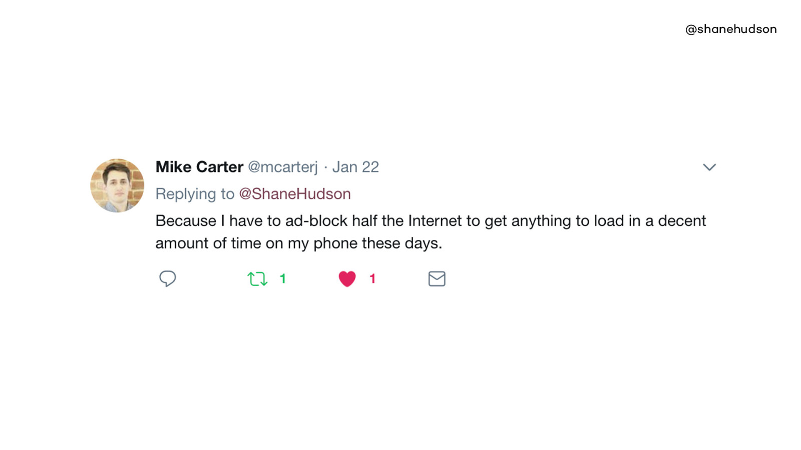
@shanehudson Mike Carter noted that ad-blockers are required to make the web usable
The more I think about performance, the more I see it as an important part of accessibility
You could spend all the time in the world improving the accessibility of the site, but if no one can load it it is useless

Tom mentioned specifically about poorer countries, but both Mikes replies showed that even on our extremely fast and expensive technology, we all still struggle to use the web at times.
A large amount of people pay for data PAYG or have small 500mb data packages.
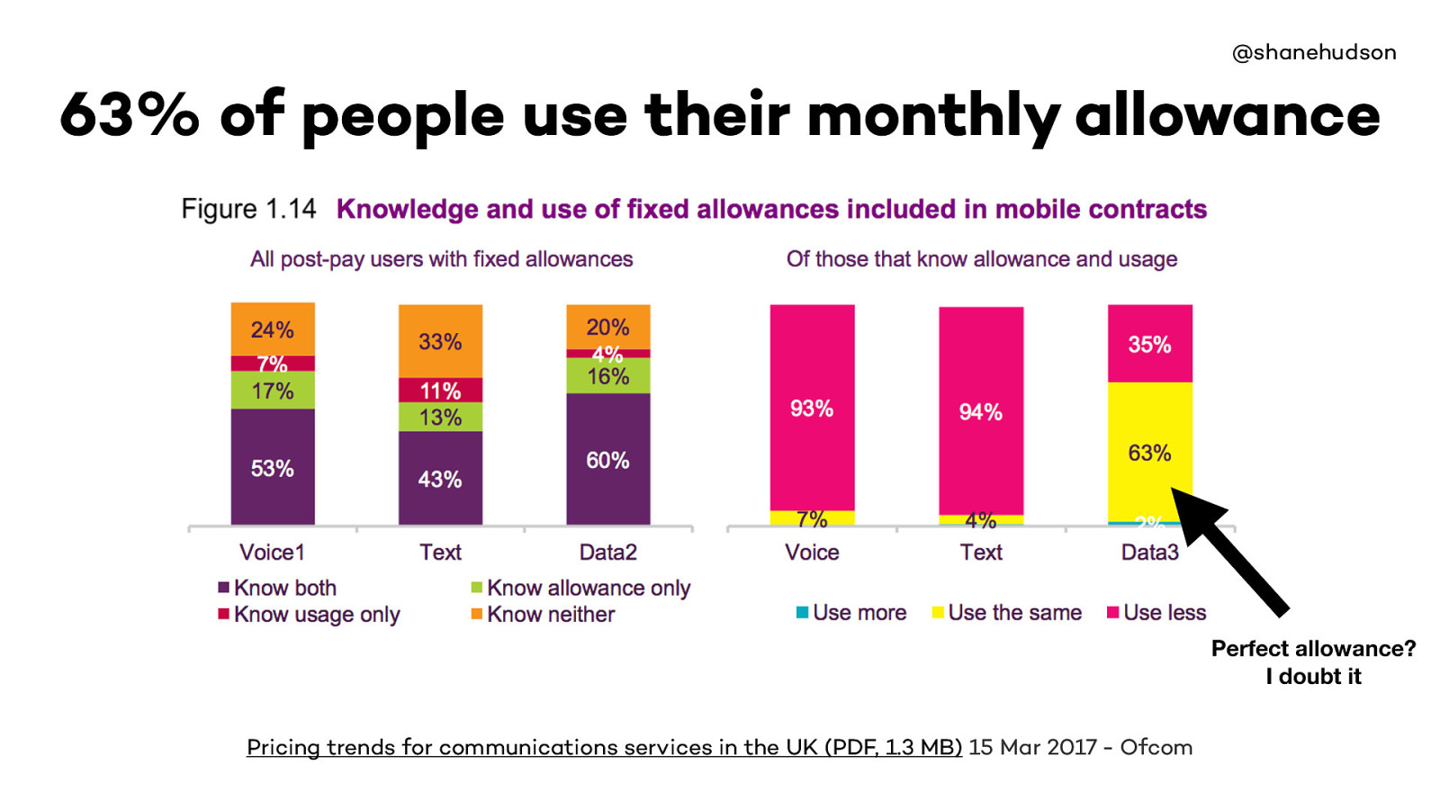
63% of people use the same amount of data as their allowance.
I believe the majority of those usage will be driven by allowance, not their allowance set perfectly based on usage.
Only 2% use more… which means majority of those 63% likely don’t want to spend the extra money

A lot of us have massive data allowances, and it is easy to think that only poorer countries struggle
But if the majority of people on a monthly contract are hitting their limit then it is down to us to ensure we don’t waste it.

That covers the “why care”, now to look at the “what” and “how”
Very easy to think of performance as something you can buy
There are loads of ways to let technology deal with performance
If second load is magically quicker then not enough effort. “Your cache is showing”
Ideal world people wait, real world they don’t. They go and don’t come back
It ruins first impressions. Also cache can break, of course use it but never rely on it.

I mentioned that it is easy to think of performance as something you can buy
As with the idea of relying on caching, you cannot rely on scaling resources
Even if adding more RAM or storage helps, probably hiding bigger issue
Story about PHP on server being configured badly despite masses of RAM
This is the main fundamental principle of performance on the web.
Knowing that the web is fast, I started realising that we are purposely making it slow by adding lots of content and large pages etc
And that is completely fine
As long as we do our best to mitigate it as we go

Bottleneck has been legacy code. Often we deprecate features or rework pages without completely removing old code or assets.
User needs come before tech debt, which is the right way
But sometimes we have to realise the tech debt is both slowing down the user and the developers

It’s not all about how fast a website loads. If a user gets stuck, the amount of time it will take to load next page doesn’t matter
The more stuff on the page, the slower it will be to load and potentially harder to use
One of the tweets earlier mentioned scrolling being laggy, your site can load blazingly fast but be a nightmare to use
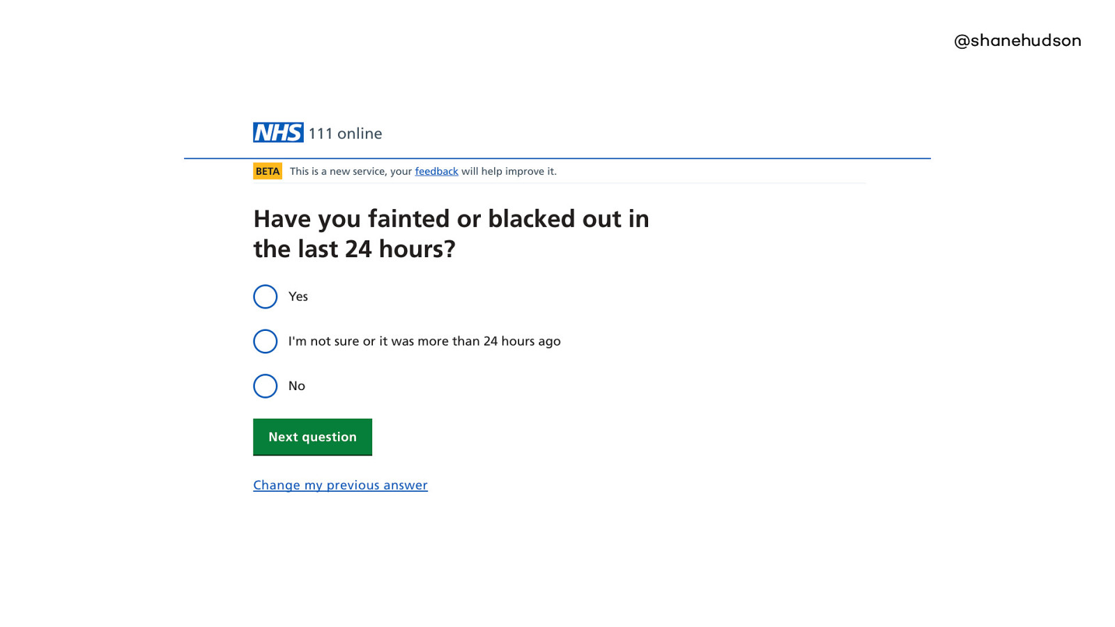
Currently working on the NHS 111 project - works same as phone - answer questions about symptom and get directed to services that can help (callback, visit or phone them).
Question page is a design pattern that we rely very heavily on, it is introduced to the user quickly and used for the majority of their journey
People find it easy to use and even users of assistive tech fly through the questions
Clear hierarchy
•Hierarchy •One context •Really simple, one image •Call to action What makes this page fast?
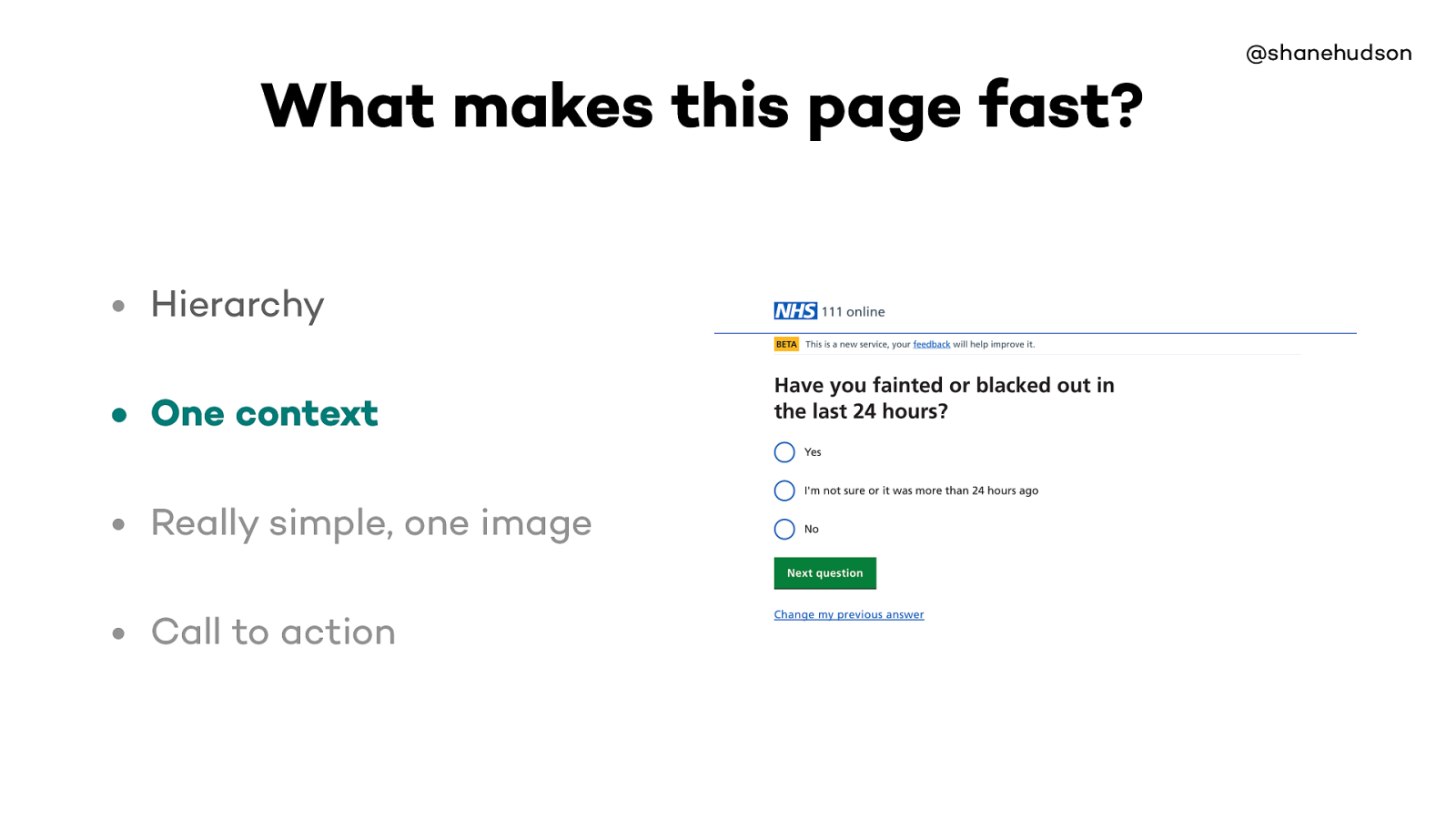
@shanehudson • Hierarchy • One context • Really simple, one image • Call to action What makes this page fast?
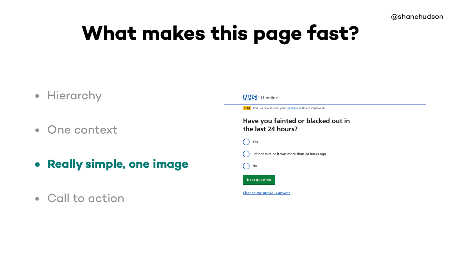
@shanehudson • Hierarchy • One context • Really simple, one image • Call to action What makes this page fast?
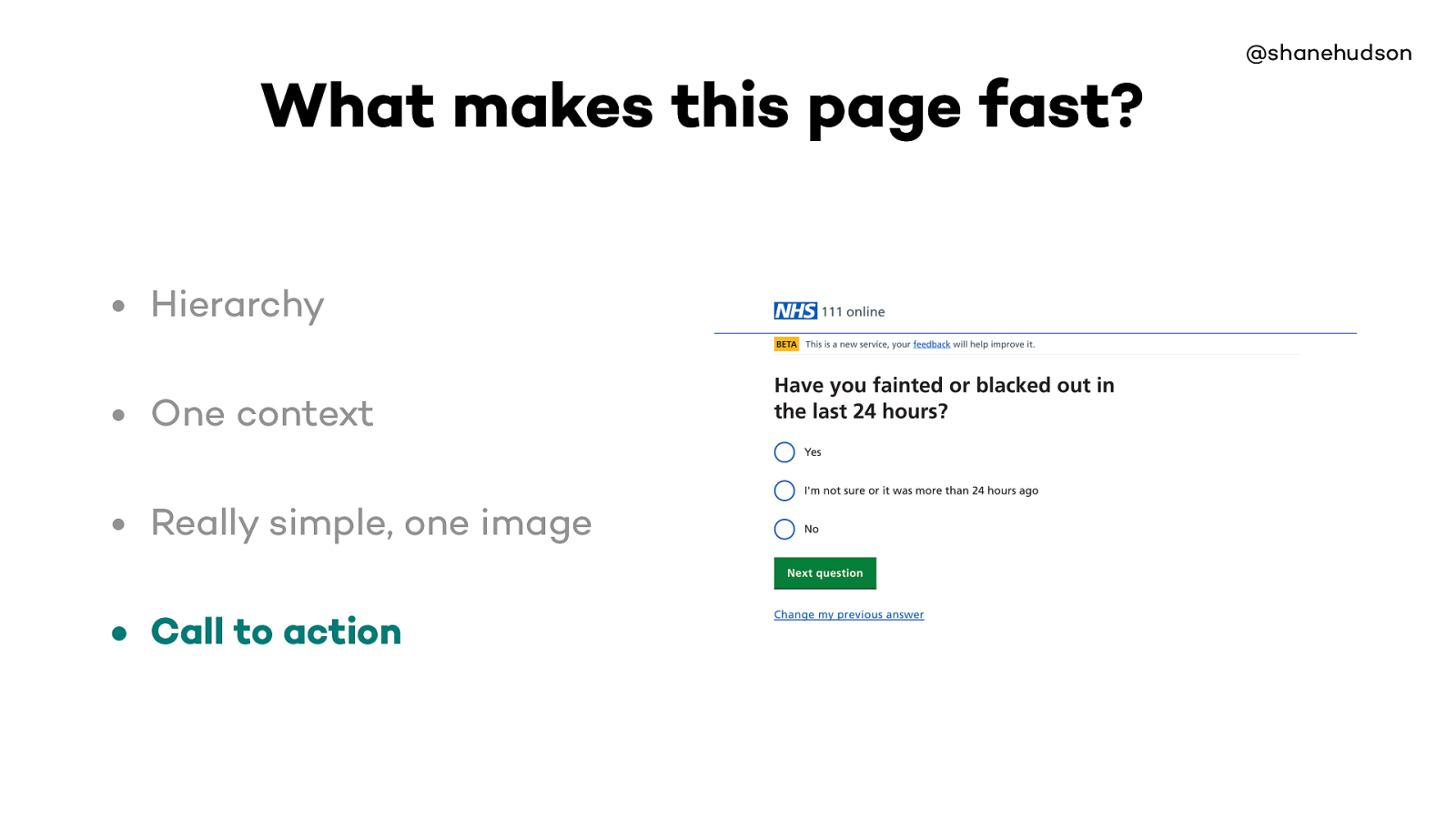
Page loads fast because it is very lightweight
There’s no complex interaction so it is easy to use, has no performance issues while using it and it is obvious
There’s some custom styling on radio buttons etc but essentially it uses the fact that the web is fast by default

So that’s why the question page is fast
What makes the website overall fast?

Repetition of design patterns makes it easy to use. Question page is most common page
Even if we ask loads of questions, people still zoom through (inc assistive technologies)
Most pages are lightweight but the performance of the site as a whole comes from the repetition of the easy to use design pattern and optimisation for those pages

@shanehudson “So when you are tired, distracted or confused. You can’t use new or novel interactions. You go back to the stuff you know.” Joe Leech https://mrjoe.uk/ux100/
Saw Joe give a talk in Bristol, he said some interesting things about cognitive load.
Really liked his point about going back to stuff you know when tired, distracted or confused
On this site our main target audience are likely to be in pain, anxious and so we want to make it as easy to use as possible
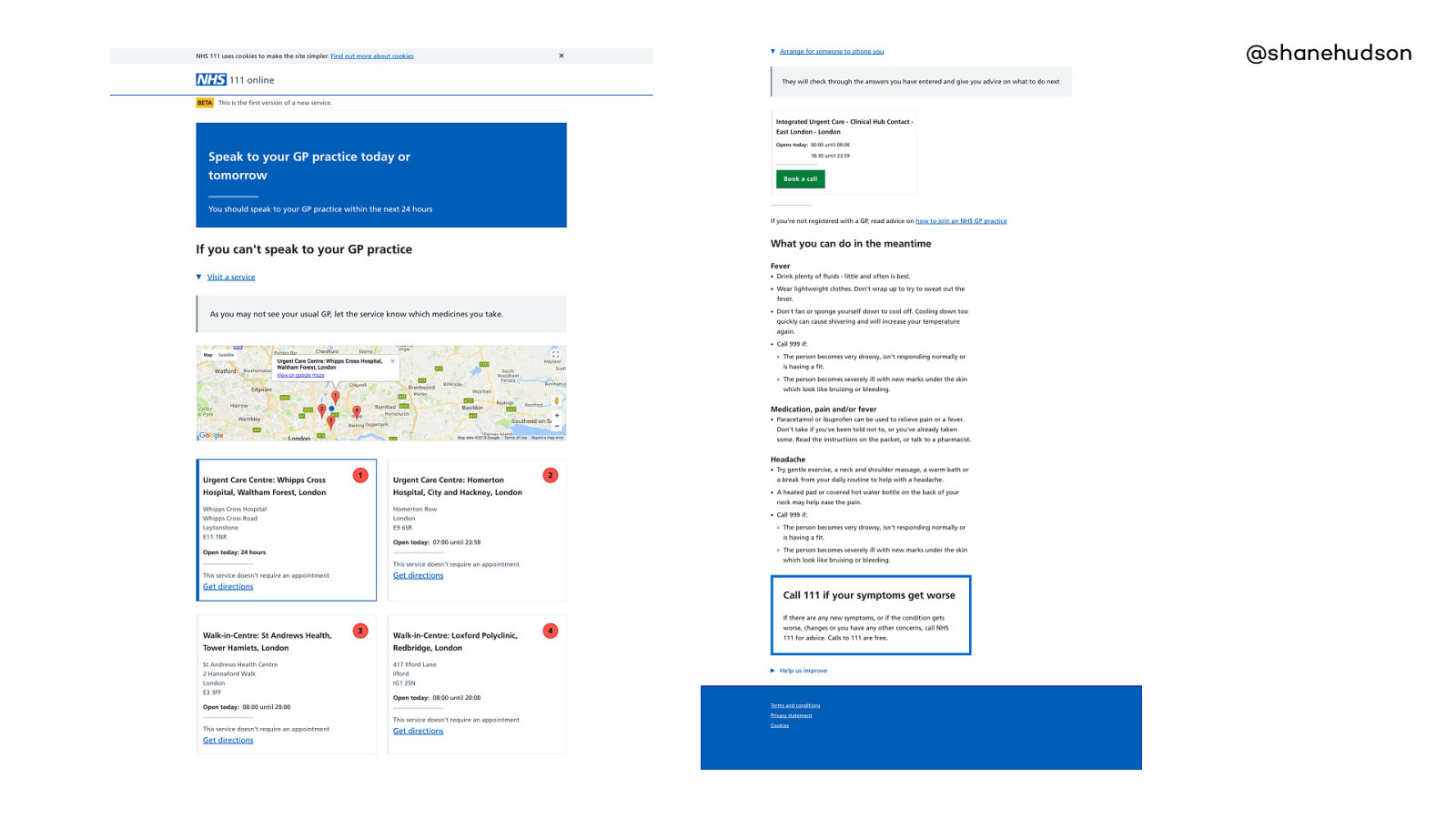
This page is one that we want to improve
The disposition pages have a lot more information, all of which is important.
There is a clear difference in how easy people find those two pages to use.
It works okay because it is the last page in the journey and importance is in order. But if pages like this were used earlier, then it would really slow down how quickly the user could progress •Six different contexts •Map •Service lookup (backend) •Call to action is not obvious, ordered by recommended priority What makes this page slower?
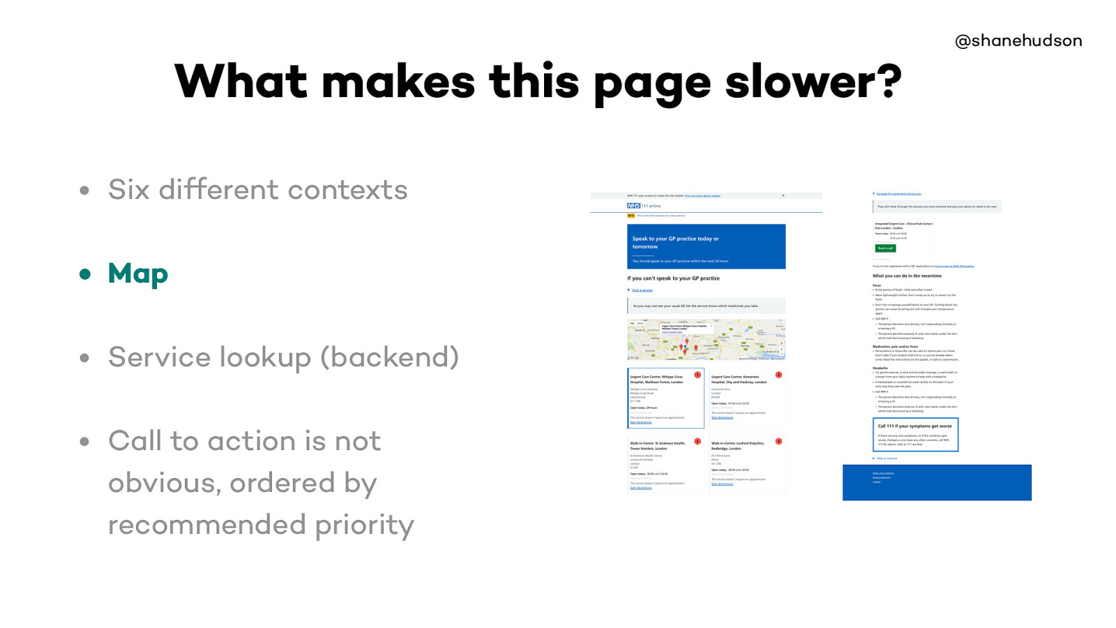
The map is one of the heaviest parts of the site, we decided that it gives a lot of benefits for letting the users see which services are nearest.
So we made sure it loads async, goes back to the point about making web slower then fixing it.
When things are done that make the site slower, it’s done with care and for the right reasons
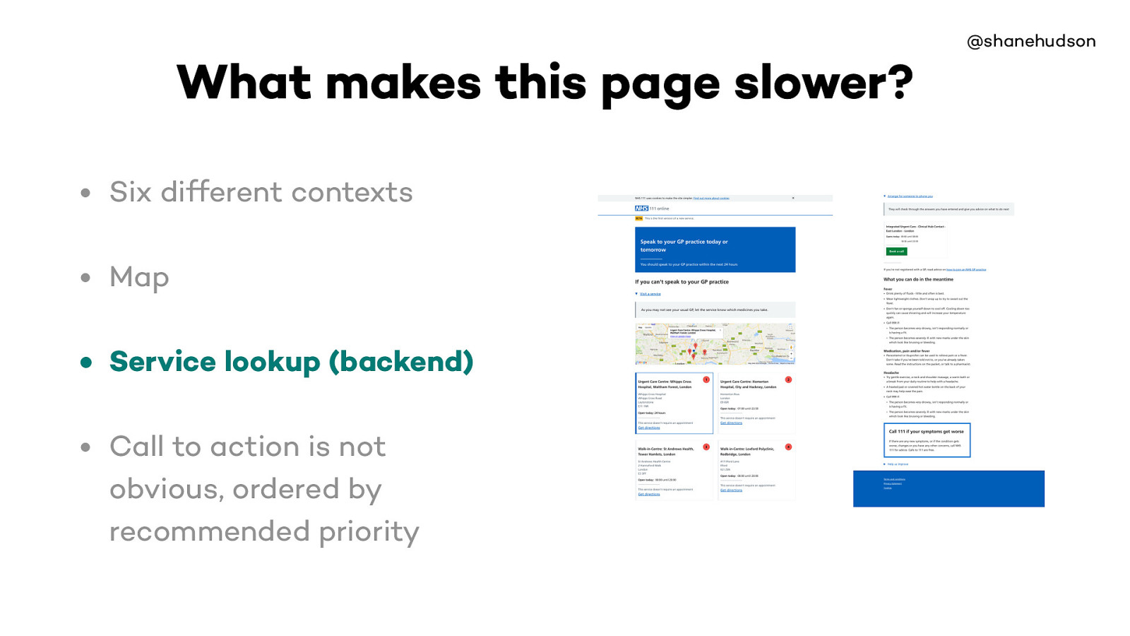
Slow because it both finds the disposition based on the answers to questions as well as finding relevant services
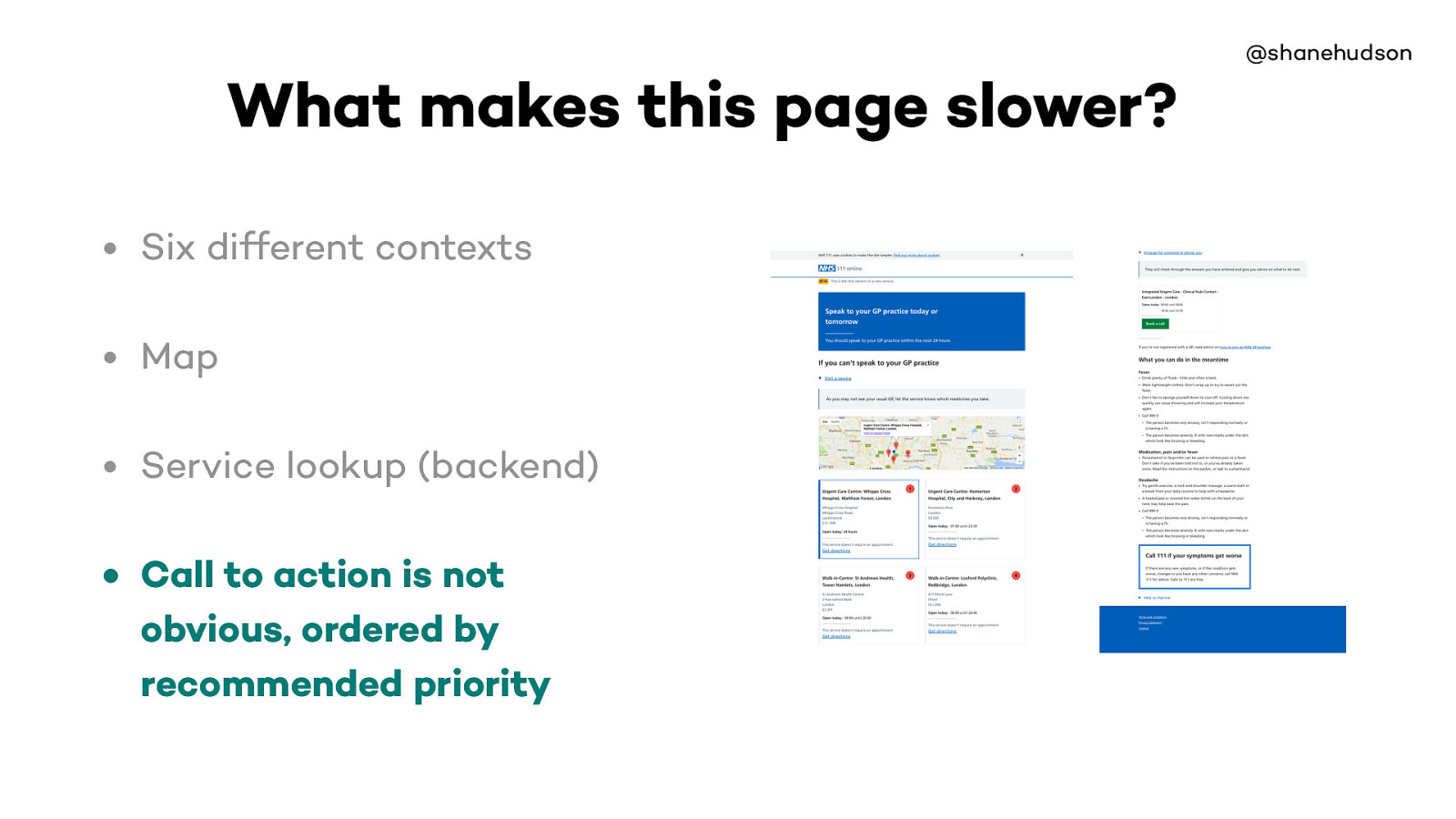
All information on page important
Question pages are clearly quicker

Important to know limitations and base decisions on them

On some websites we are in control of everything, but usually that’s not the case.
Most websites have a CMS controlling the content, and can easily end up with pages full of unoptimised images etc.

More often than not, things that slow the site down are required
Main elements of the site. The map is a performance hit but it is async and makes the goal of finding where to go much easier than just a list of addresses
The other type of requirement tends to be stakeholders, business reasons etc.

As you could imagine, privacy is important when dealing with medical stu ff
Each page of site has the information for the complete journey in hidden input fields that is POSTed to next page
This means the server has no history of the data, and there is no database
Causes each page to be slightly slower. But the privacy is worth the slight performance hit.

@shanehudson Can a website be too fast?

It is possible to make websites load so quickly that the user doesn’t notice they have changed.
This is the kind of use-case that animation is perfect for solving
Credit card handling, slow is better (did it work?)
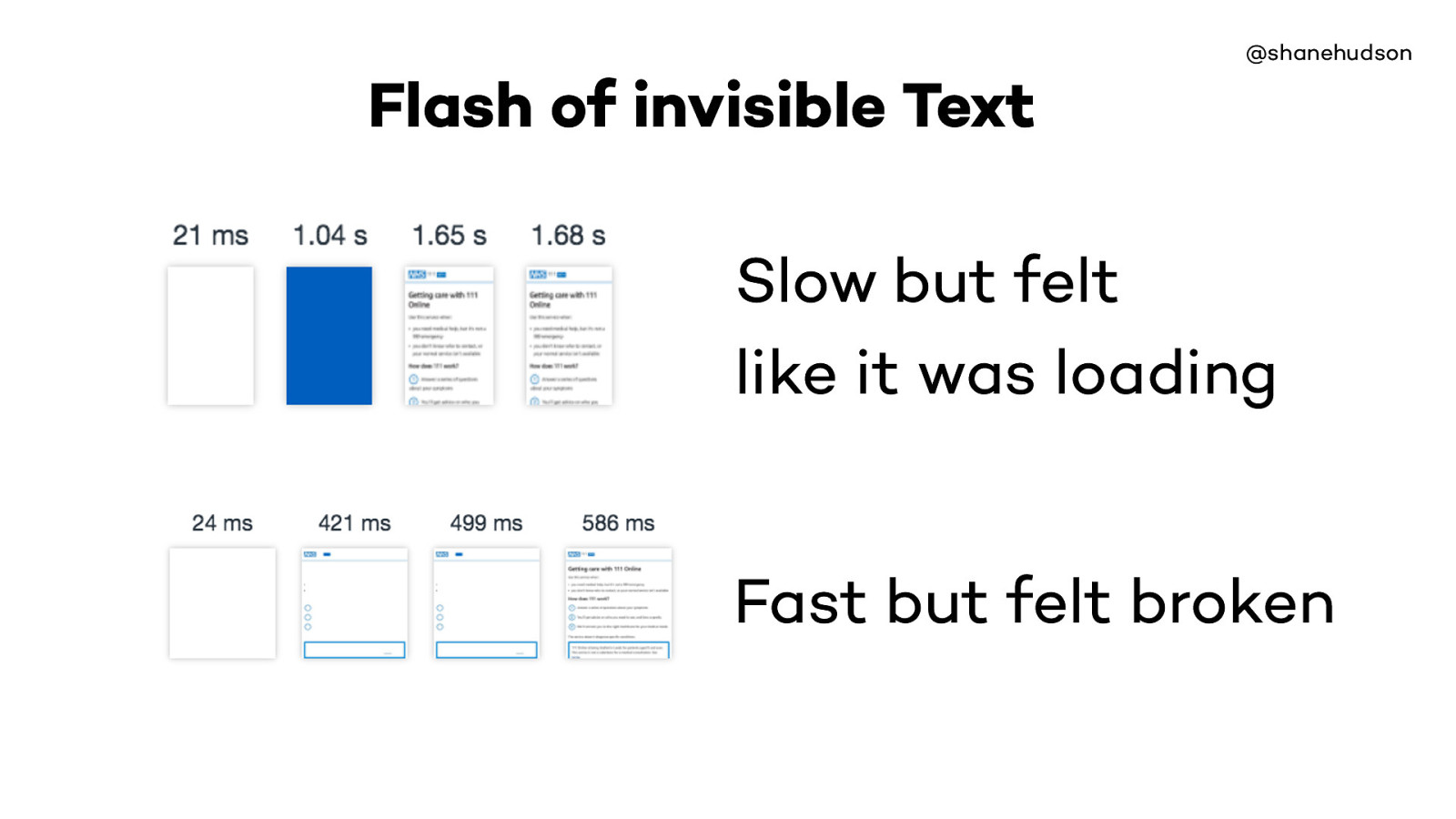
In September we were making big progress with performance, the slow one is still far better than it was before hand but wanted to make even faster, it was quicker but page went blue till everything loaded
We improved and removed the blue, but the site was so much quicker the text (and at one point logo) didn’t load quick enough. Felt worse even though a second faster.
@shanehudson Summary • Why care? • Performance as a factor of accessibility • Taking responsibility • Content is performance • Limitations • Too fast
@shanehudson Summary • Why care? • Performance as a factor of accessibility • Taking responsibility • Content is performance • Limitations • Too fast
@shanehudson Summary • Why care? • Performance as a factor of accessibility • Taking responsibility • Content is performance • Limitations • Too fast
@shanehudson Summary • Why care? • Performance as a factor of accessibility • Taking responsibility • Content is performance • Limitations • Too fast
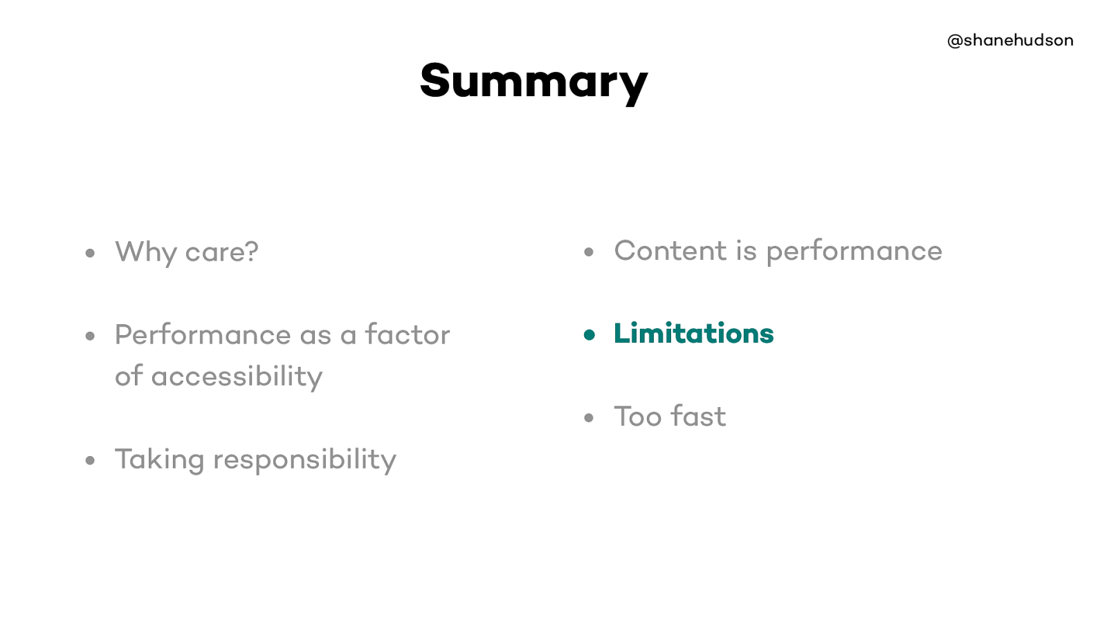
@shanehudson Summary • Why care? • Performance as a factor of accessibility • Taking responsibility • Content is performance • Limitations • Too fast
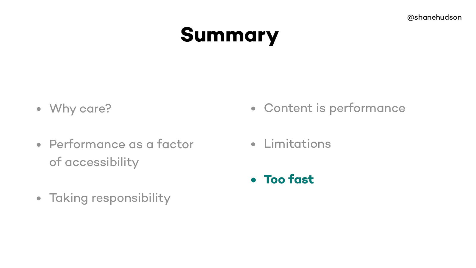
@shanehudson Summary • Why care? • Performance as a factor of accessibility • Taking responsibility • Content is performance • Limitations • Too fast

@shanehudson Thank you! Shane Hudson