Common Sense of Web Performance Shane Hudson Dev Talks Cluj 2018 [START TIMER ON NEXT SLIDE]
A presentation at DevTalks Romania in May 2018 in Cluj-Napoca, Romania by Shane Hudson

Common Sense of Web Performance Shane Hudson Dev Talks Cluj 2018 [START TIMER ON NEXT SLIDE]

Common sense is different for everyone
This is about building a common sense foundation for everyone, understanding the performance mindset without all the technical jargon

I’m Shane, I’m a freelancer and have worked on many projects
Currently working with the NHS in England to build a national product called 111 online
The most important bit of common sense is that everyone plays their part.
Whether you’re a developer, designer, or manager, you make decisions that affect every part of the website’s experience particularly performance
It’s often a front end developers job to fix (or sometimes ignore) performance
But a longer term goal should be foster a performance mindset within the team
Not by making rules about what is allowed, but by everyone considering it as part of their work
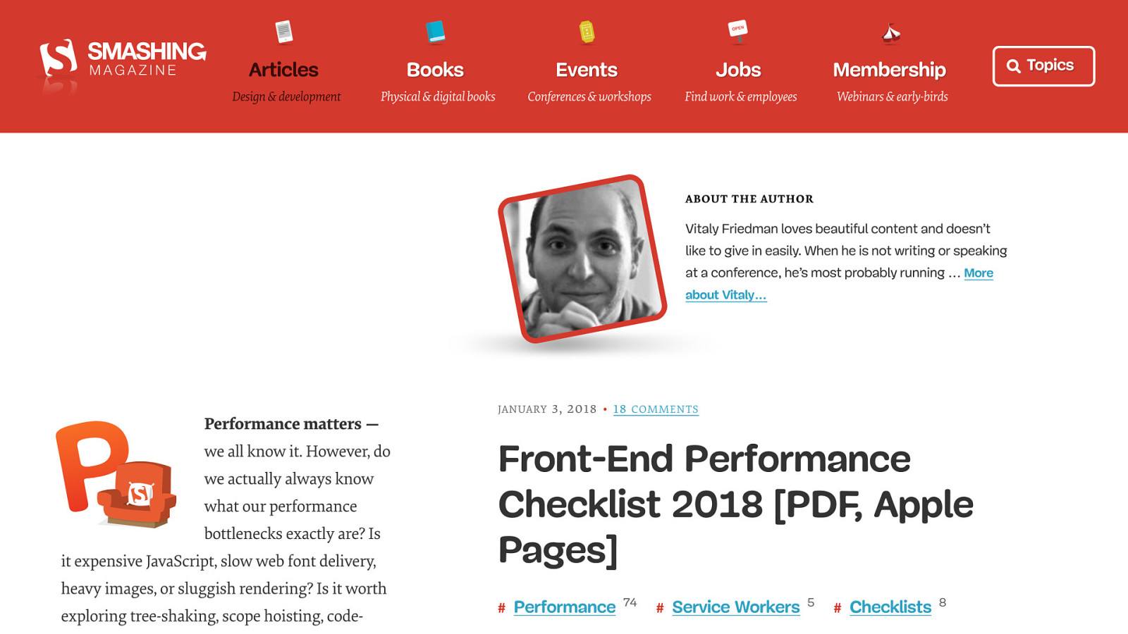
This article is an incredible source of information
43 items on the checklist
But it feels like a massive amount. Can just imagine being a beginner, I would have taken one look at it and exited the page.

People try to learn everything at once, doesn’t work
Learn what you need, when you need it
You can make decisions about how a change affects the performance without knowing all the techniques/technologies

Some things that were hard are now trivial, just look at rounded corners or the various layouts that are now much easier with flex or grid
But now there is so much more to learn, performance, accessibility, security. And they are all massive subjects

Web development community is brilliant at sharing.
Learning the fundamentals is a good start, then can learn and apply the techniques/technologies as required

@shanehudson
If you think about how the web works, it is obvious that it was designed to be fast by default
A website can function without any CSS, images or JavaScript.
Each layer enhances it, but if it required everything to be available and working before showing the site it would be much slower
Knowing that the web is fast, I started realising that we are purposely making it slow by adding lots of content and large pages etc We know it is going to slow the site down
That is completely fine as long as we do our best to mitigate it as we go
Every decision anyone makes about a website affects the performance
Every image, js file, video, embed, advert.. all makes the web slower. It’s okay if we understand that
Things like JavaScript at end of page, as it is render blocking
Critical CSS so that the important stuff loads, but load the rest later
Same with CSS, mastering the cascade is a very handy skill
When we say performance, we mean a lot of different things. And everyone thinks di ff erently about them all

@shanehudson Network
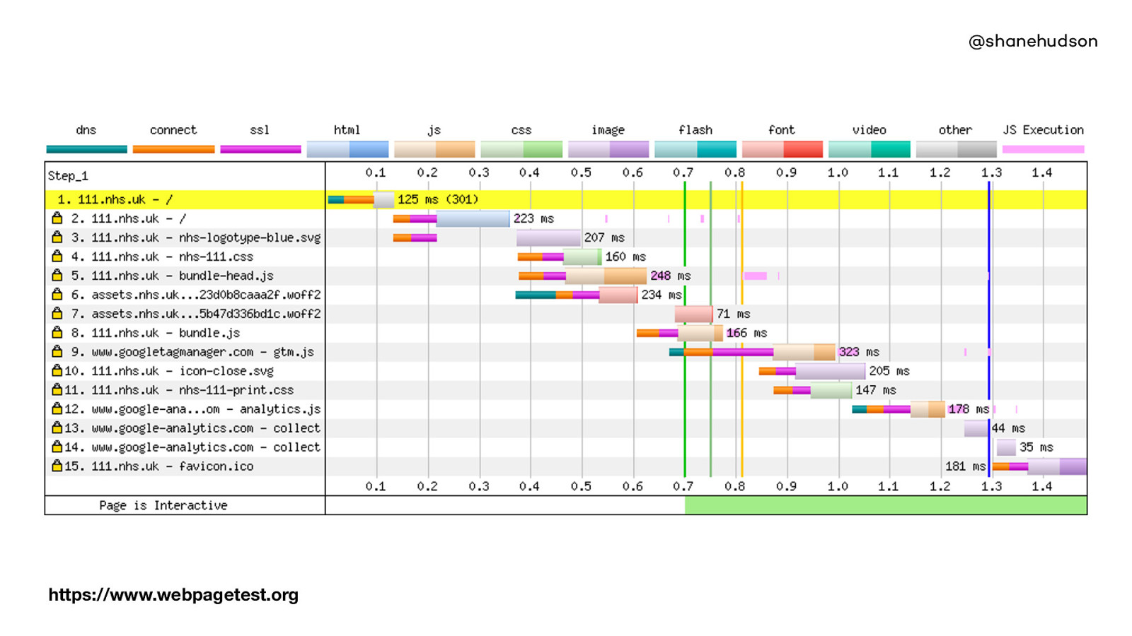
@shanehudson https://www.webpagetest.org Time to first byte,
DOM Load, Ready, etc.
https://www.webpagetest.org

@shanehudson Page performance More technical, often ignored. But still important, how quickly the page works. Does it lag. Does it work on really slow phones etc.
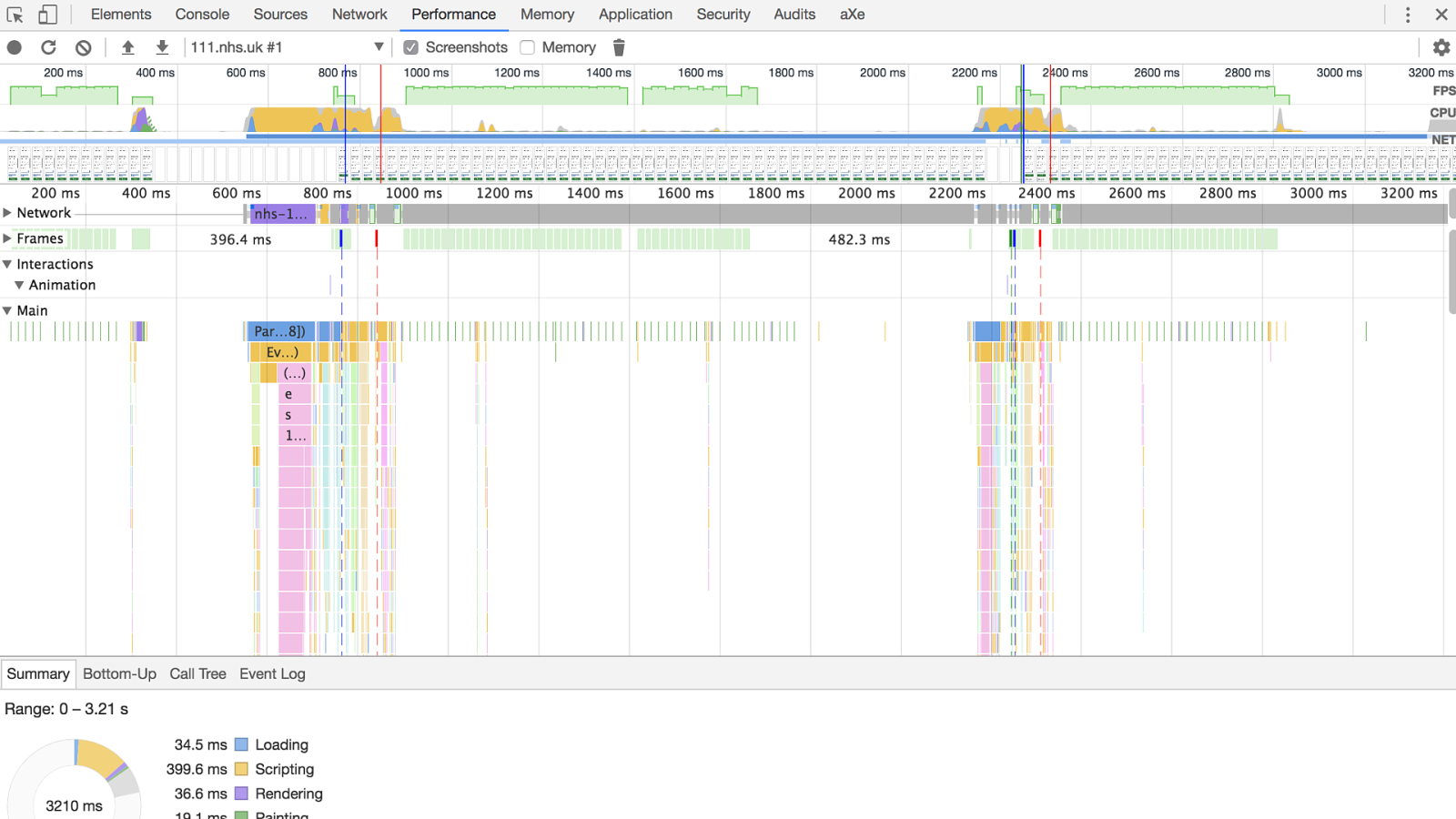
@shanehudson Canvas, scrolling, fps, repaint, reflow etc.

@shanehudson Speed of journey Usually ignored or classed as a content issue. Can have fastest site in the world but if users cannot use it or are slowed down, then it has same issue. Point being that performance and design are one and the same, teams should work together strongly.

@shanehudson Performance can be affected by Ads, content, pop ups, sign ups, confusion etc.

This is as common sense as you can get. Yet the more I thought about it, the more I realised how important factor it is
The more I think about performance, the more I see it as an important part of accessibility
You could spend all the time in the world improving the accessibility of the site, but if no one can load or use it, it is useless
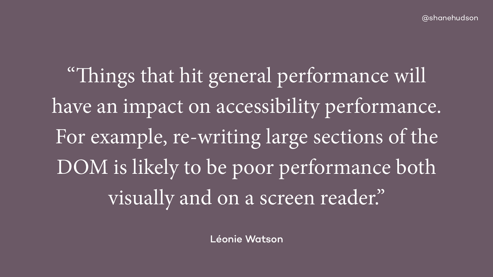
It’s not just about how quick the site loads either.

The more I thought of it, I realised that we all struggle to use websites sometimes.
Signal changes, scripts can be blocked
A large amount of people pay for data PAYG or have small 500mb data packages.
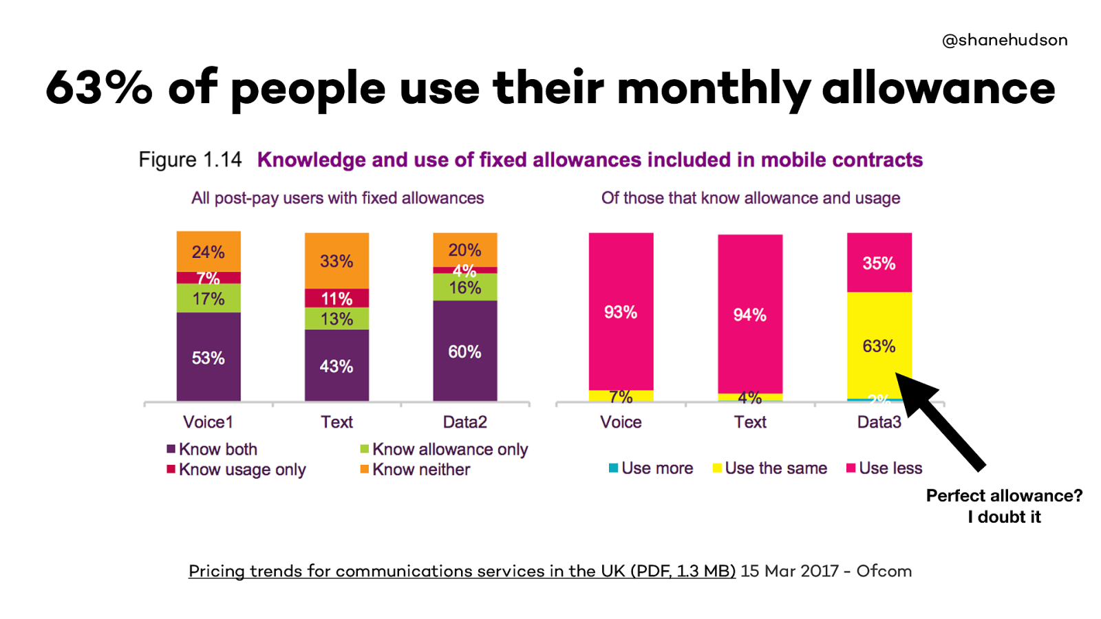
63% of people use the same amount of data as their allowance, presumably so they won’t go over their limit as it costs more
Only 2% use more… which means majority of those 63% likely don’t want to spend the extra money
https://www.ofcom.org.uk/__data/assets/pdf_file/0028/98605/Pricing-report-2017.pdf
A lot of developers have massive data allowances, and it is easy to forget people don’t have large data allowances
But if the majority of people on a monthly contract are hitting their limit then it is down to us to ensure we don’t waste it.
@shanehudson Progressive enhancement and performance go hand in hand. It’s all about the baselines .
Always figure out what the baseline experience is, then enhance from there
The response web design mindset tells us you can’t know exactly what the user will see, it will be different everywhere, and that is absolutely fine.
Same for performance. It isn’t about just optimising your images or using a CDN. It’s about considering the impact as you design and build the site.

Tunnels
The biggest benefit of the web is that you can be anywhere, we should appreciate that not consider it a burden
Sometimes the conditions are such that no matter how good your technology is, how much you pay for your data package, sometimes you still can’t get a good connection
You could be:
on a train in a tunnel
Travelling in another country
Tethering from another machine

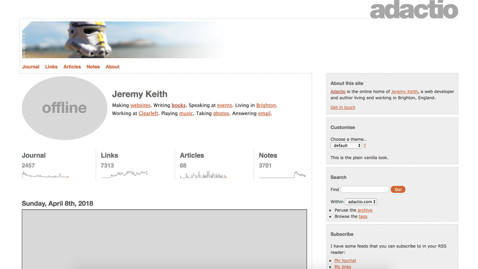
So if assets aren’t always guaranteed to load, we must consider what happens if they fail or partially load
@shanehudson

@shanehudson

@shanehudson 4. Less is more

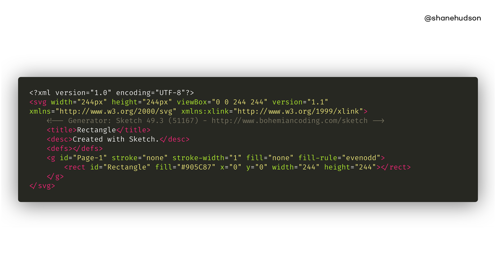
@shanehudson Here’s a rectangle
@shanehudson
@shanehudson https://jakearchibald.github.io/svgomg/
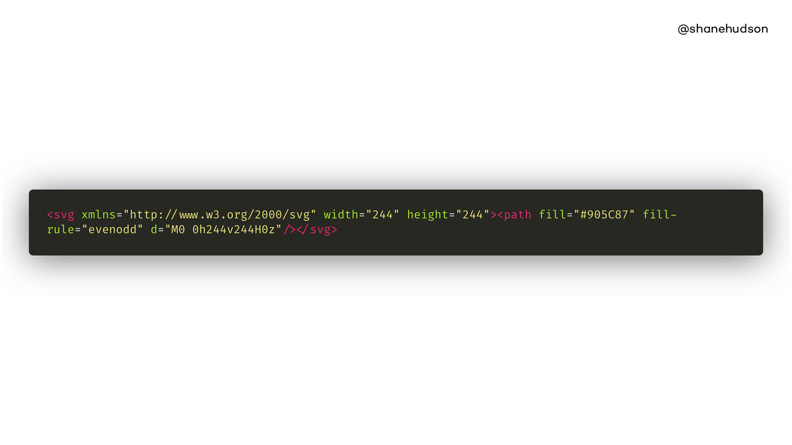
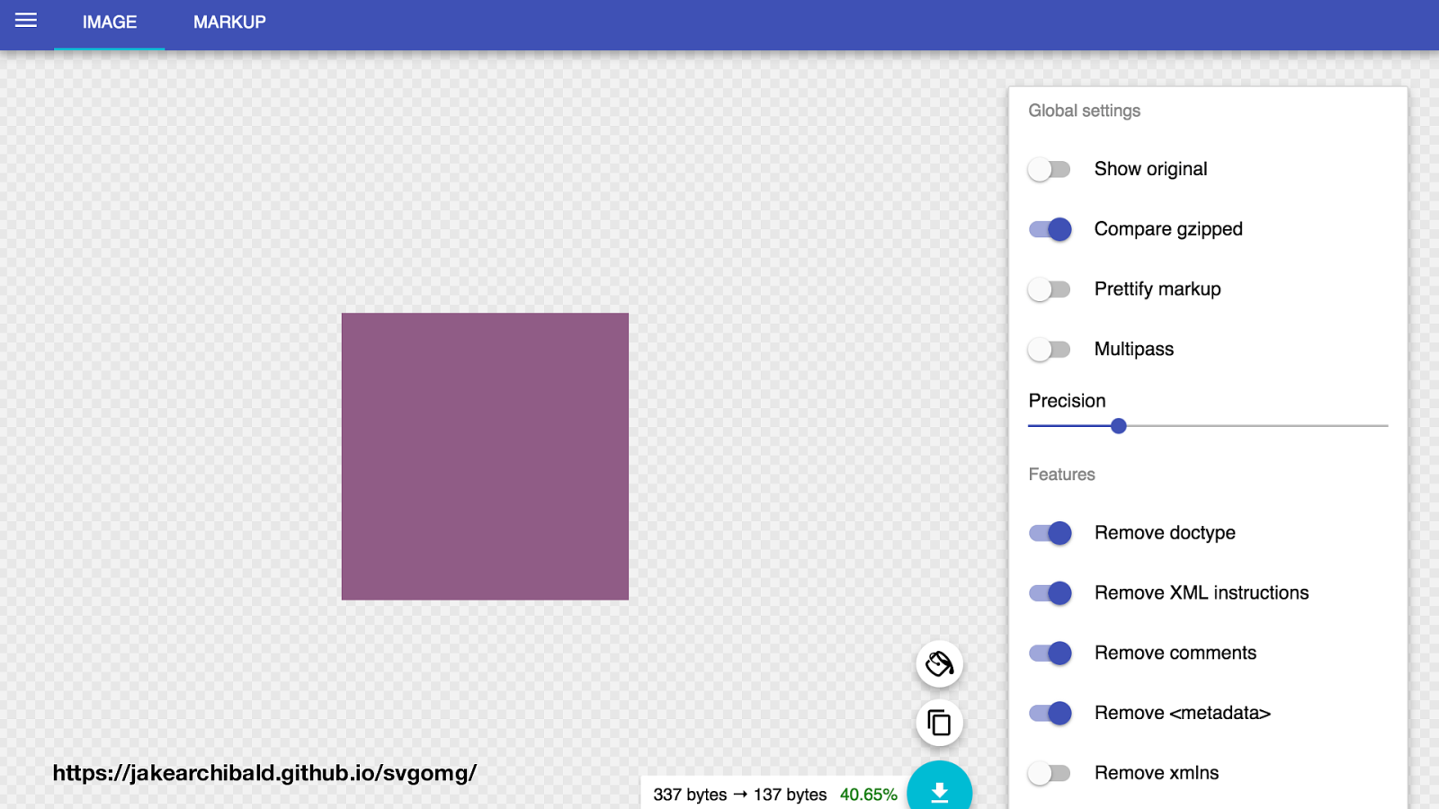
Here is the optimised SVG

It’s common sense, but why should images be optimised?
Speed up download
Speed up decode
Is an image even needed? Deleting it is a big optimisation
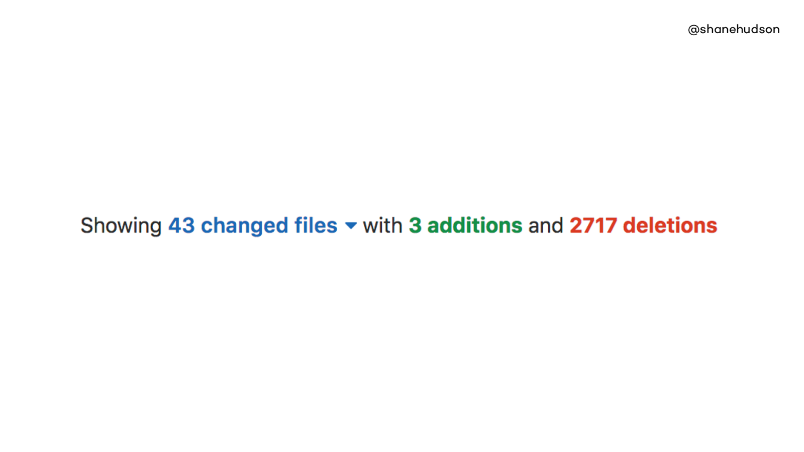
Bottleneck has been legacy code. Often we deprecate features or rework pages without completely removing old code or assets.
User needs come before tech debt, which is the right way
But sometimes we have to realise the tech debt is both slowing down the user and the developers
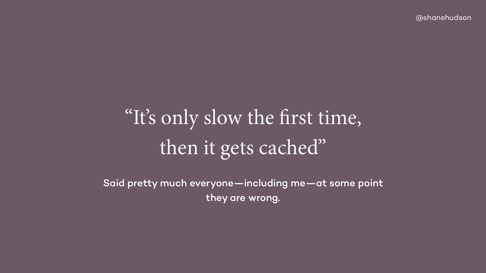
If second load is magically quicker then not enough effort. “Your cache is showing”
Ideal world people wait, real world they don’t. They go and don’t come back
It ruins first impressions. Also cache can break, of course use it but never rely on it.

Very easy to think of performance as something you can buy
There are loads of ways to let technology deal with performance
As with the idea of relying on caching, you cannot rely on scaling resources
Even if adding more RAM or storage helps, probably hiding bigger issue
Story about PHP on server being configured badly despite masses of RAM
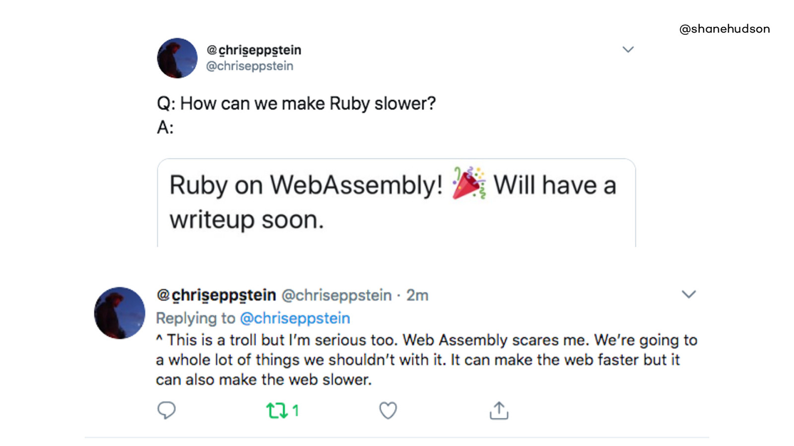
@shanehudson https://mobile.twitter.com/chriseppstein/status/982264930865790977
This is once again a way for us to make the web slower, to break the web. But also brings new functionality and sometimes the tradeoff might be well worth it.
Hopefully you can see that all the stuff I’ve been talking about has been less how to do technical things and more about design
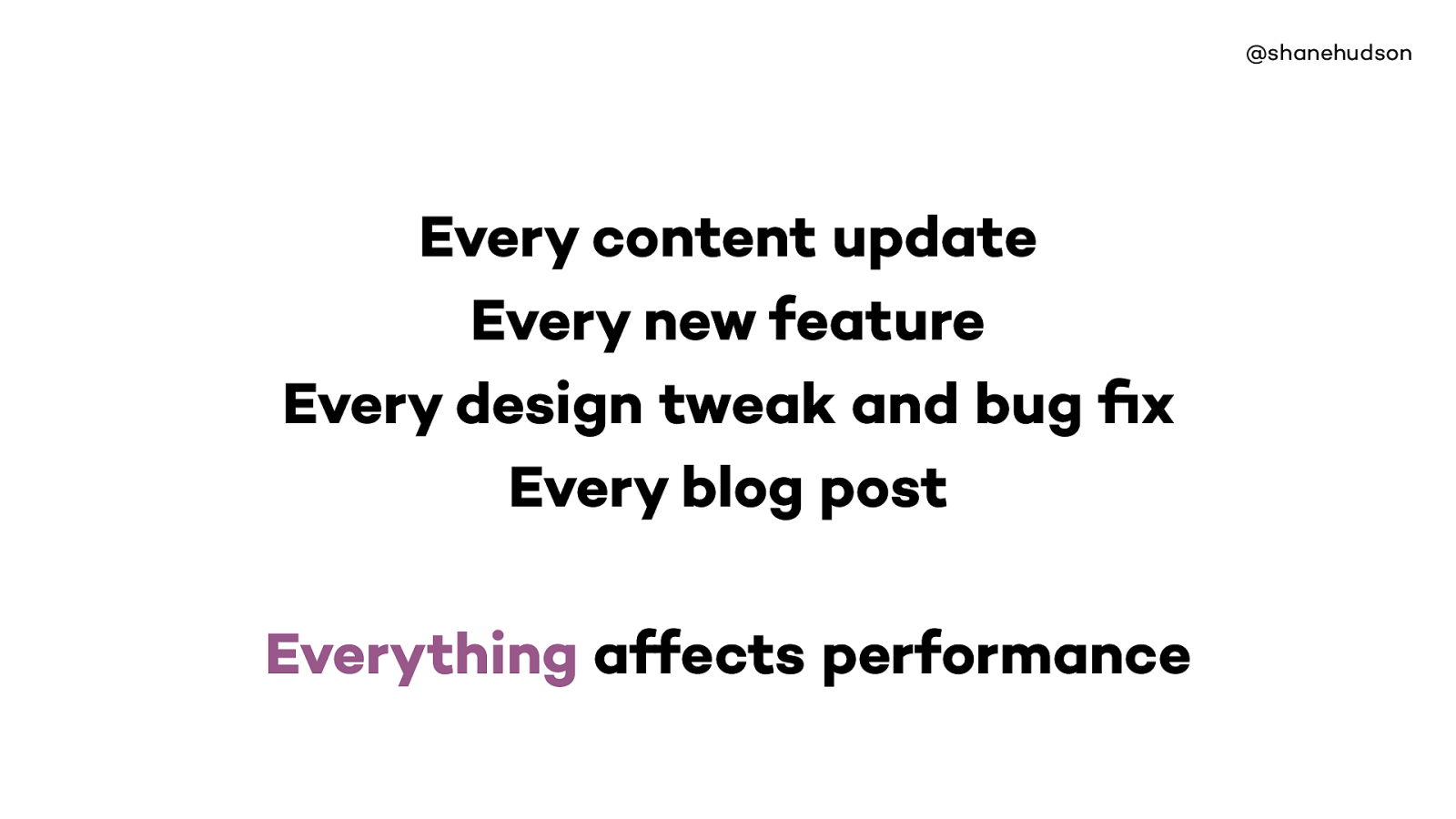
@shanehudson Every content update Every new feature Every design tweak and bug fix Every blog post Everything affects performance

Lots of people focus on performance of homepage
Need to consider the user’s journeys, make it as quick as possible to complete tasks
Test all pages

@shanehudson Case study - NHS 111 online
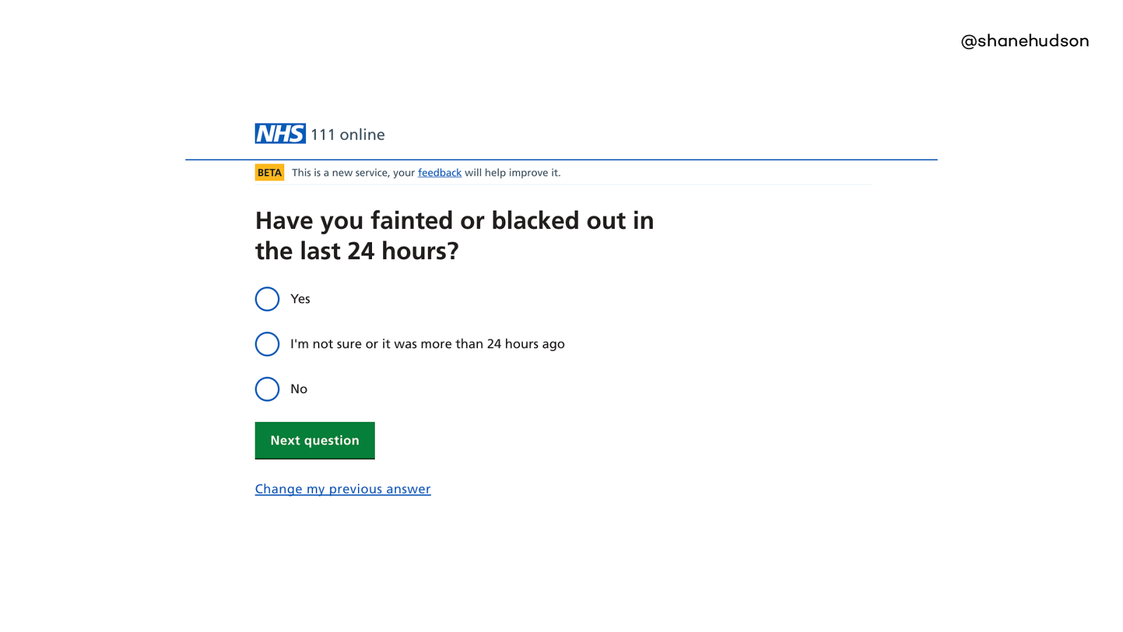
Currently working on the NHS 111 project - works same as phone - answer questions about symptom and get directed to services that can help (callback, visit or phone them).
Question page is a design pattern that we rely very heavily on, it is introduced to the user quickly and used for the majority of their journey
People find it easy to use and even users of assistive tech fly through the questions
Clear hierarchy
•Hierarchy •One context •Really simple, one image •Call to action What makes this page fast?
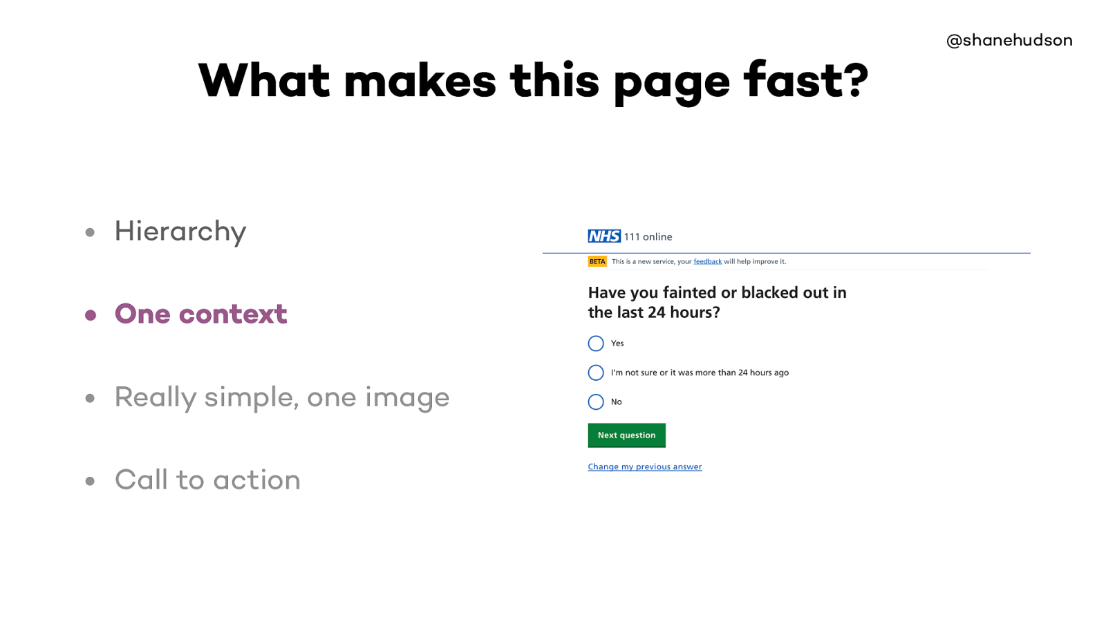
@shanehudson • Hierarchy • One context • Really simple, one image • Call to action What makes this page fast?
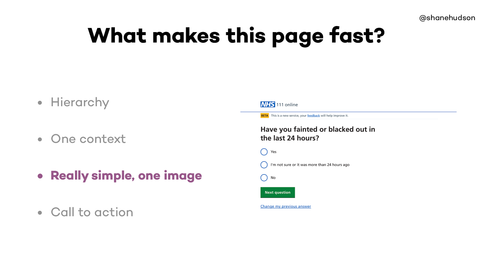
@shanehudson • Hierarchy • One context • Really simple, one image • Call to action What makes this page fast?
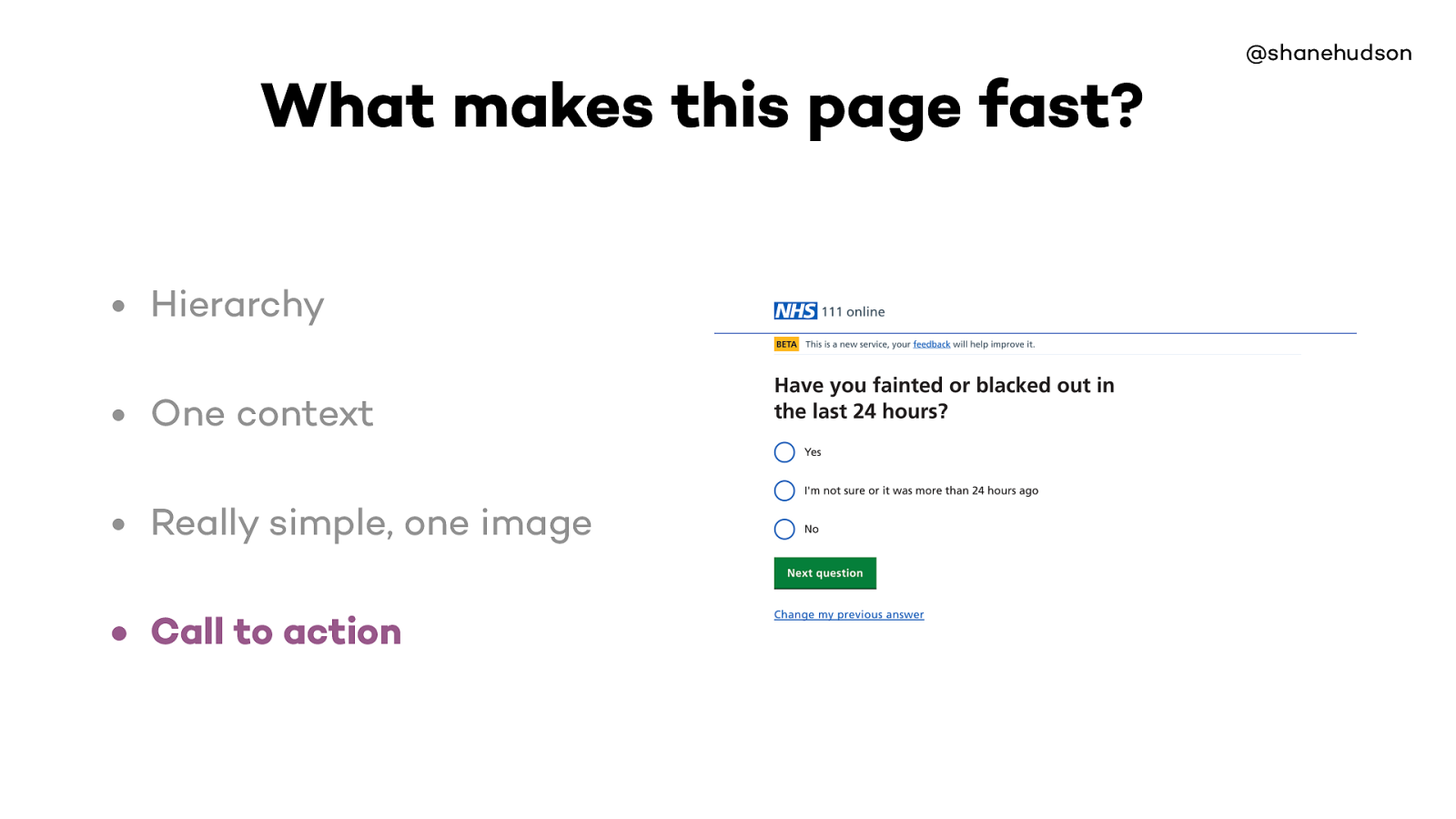
Page loads fast because it is very lightweight
There’s no complex interaction so it is easy to use, has no performance issues while using it and it is obvious
There’s some custom styling on radio buttons etc but essentially it uses the fact that the web is fast by default
Even if we ask loads of questions, people still zoom through (inc assistive technologies)
Repetition of design patterns makes it easy to use. Question page is most common page
Most pages are lightweight but the performance of the site as a whole comes from the repetition of the easy to use design pattern and optimisation for those pages
Also good for caching, if the same patterns are used everywhere

@shanehudson “When you are tired, distracted or confused, you can’t use new or novel interactions. You go back to the stuff you know.” Joe Leech https://mrjoe.uk/ux100/
Saw Joe give a talk in Bristol, he said some interesting things about cognitive load.
Really liked his point about going back to stuff you know when tired, distracted or confused
On this site our main target audience are likely to be in pain, anxious and so we want to make it as easy to use as possible
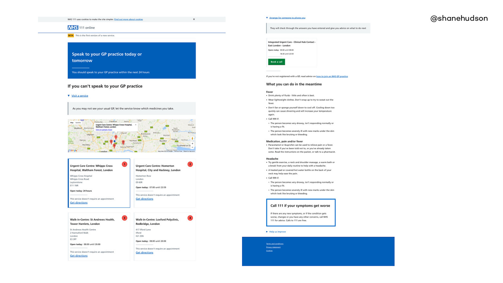
This page is one that we want to improve
The disposition pages have a lot more information, all of which is important.
There is a clear difference in how easy people find those two pages to use.
It works okay because it is the last page in the journey and importance is in order. But if pages like this were used earlier, then it would really slow down how quickly the user could progress •Six different contexts •Map •Service lookup (backend) •Call to action is not obvious, ordered by recommended priority What makes this page slower?
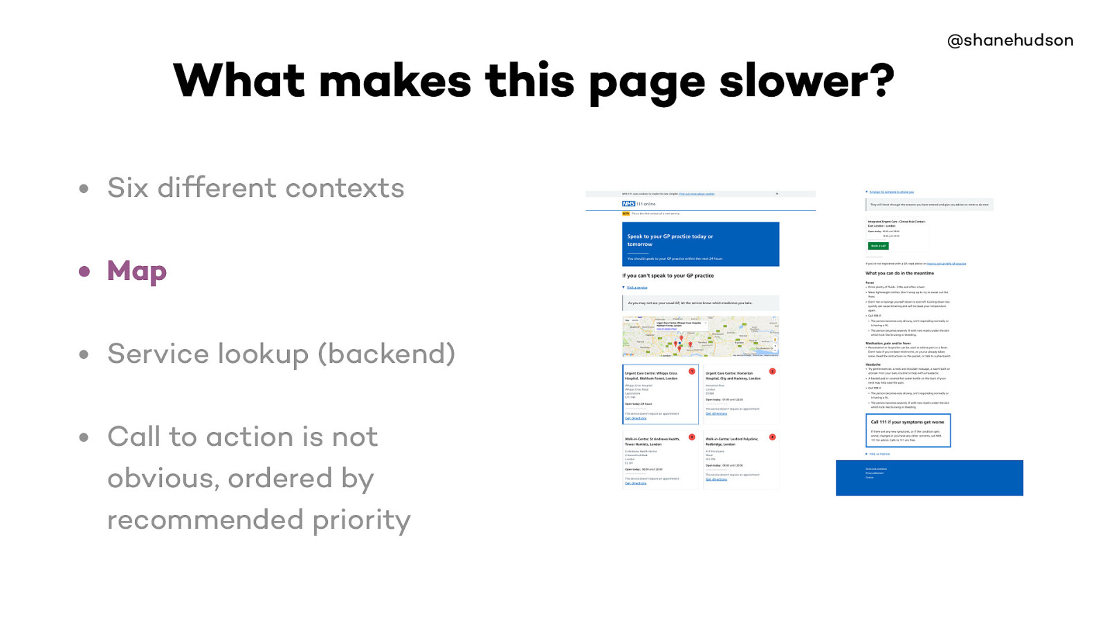
The map is one of the heaviest parts of the site, we decided that it gives a lot of benefits for letting the users see which services are nearest.
So we made sure it loads async, goes back to the point about making web slower then fixing it.
When things are done that make the site slower, it’s done with care and for the right reasons
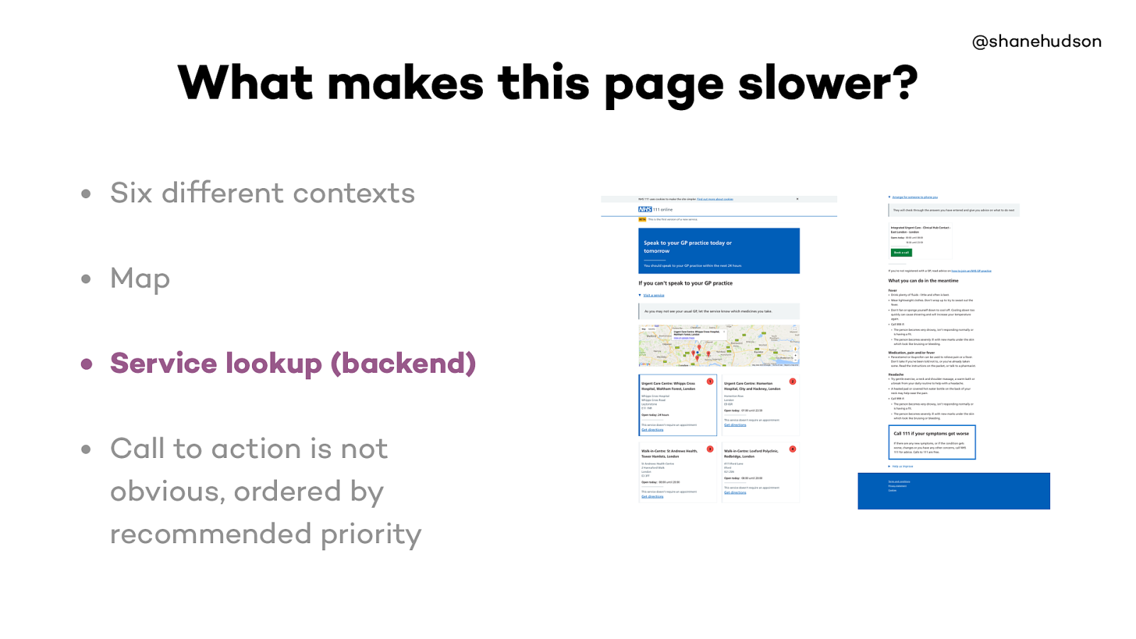
Slow because it both finds the disposition based on the answers to questions as well as finding relevant services
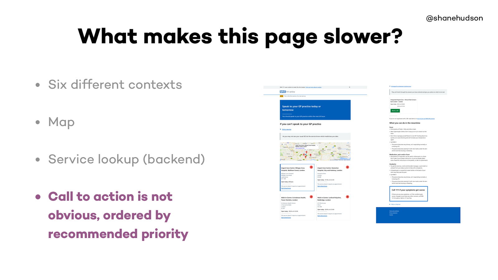
All information on page important
Question pages are clearly quicker

You can see from these two pages how the different types of performance are impacted
The question page is simple and often repeated, so it is quick to load, no heavy interactions, would generally be cached heavily, easy to get through quickly
The outcome page is still fairly simple compared to a lot of sites, but it has the map and a dependency on the service lookup. So network is hit a bit, and so is page performance. Speed of journey is slower because it is a new layout, not repeated, and not straight away obvious what to do

Knowing that the web is fast, I started realising that we are purposely making it slow by adding lots of content and large pages etc
And that is completely fine
As long as we do our best to mitigate it as we go

Important to know limitations and base decisions on them

On some websites we are in control of everything, but usually that’s not the case.
Most websites have a CMS controlling the content, and can easily end up with pages full of unoptimised images etc.

More often than not, things that slow the site down are required
Main elements of the site. The map is a performance hit but it is async and makes the goal of finding where to go much easier than just a list of addresses
The other type of requirement tends to be stakeholders, business reasons etc.

As you could imagine, privacy is important when dealing with medical stu ff
Each page of site has the information for the complete journey in hidden input fields that is POSTed to next page
This means the server has no history of the data, and there is no database
Causes each page to be slightly slower. But the privacy is worth the slight performance hit.

@shanehudson Can a website be too fast?

@shanehudson No. But…
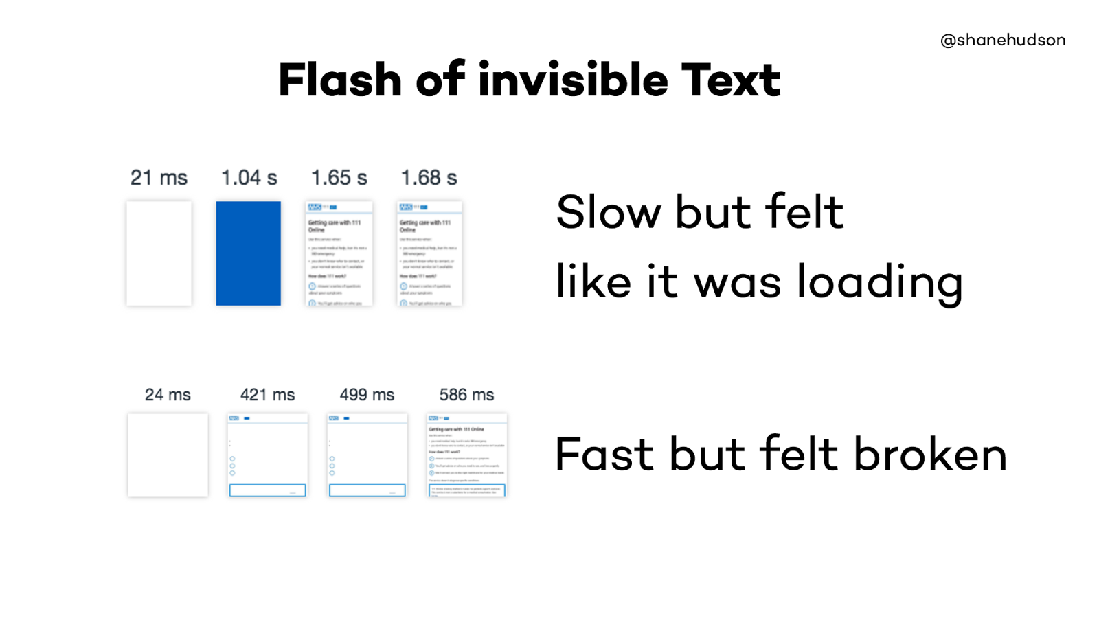
In September we were making big progress with performance, the slow one is still far better than it was before hand but wanted to make even faster, it was quicker but page went blue till everything loaded
We improved and removed the blue, but the site was so much quicker the text (and at one point logo) didn’t load quick enough. Felt worse even though a second faster.

It is possible to make websites load so quickly that the user doesn’t notice they have changed.
This is the kind of use-case that animation is perfect for solving
Credit card handling, slow is better (did it work?)
If things happen too fast, users don’t trust it worked.

Gmail show an alert that message has been sent
After a couple of seconds the undo disappears, but not the whole alert so you can trust it did send etc.

Nick Babich https://www.smashingmagazine.com/2016/12/best-practices-for-animated-progress-indicators/
From Material Design
Shows how animation can be used as a benefit alongside performance.
It doesn’t matter that it is may be a bit slow, it is really useful to know how long something will take.
If a spinner keeps spinning, you quite quickly think it is broken
@shanehudson Summary

Thank you! Shane Hudson