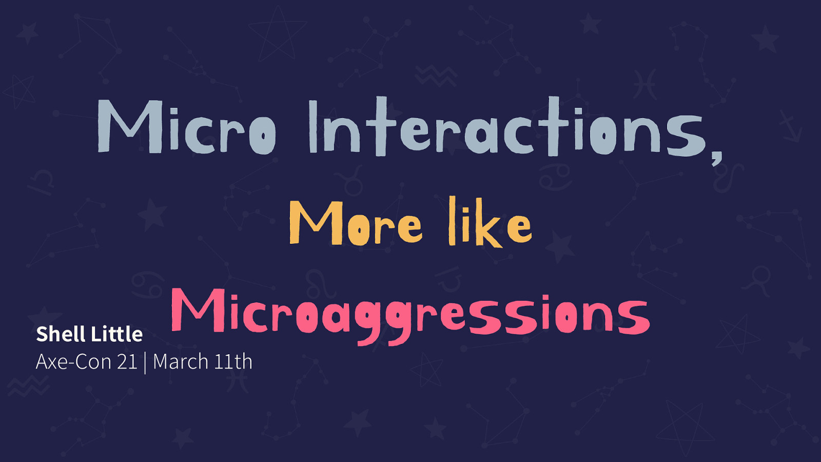
Micro Interactions, More like Microaggressions
Shell Little Axe-Con 21 | March 11th

A presentation at axe-con 2021 in March 2021 in by Shell Little
Shell Little Axe-Con 21 | March 11th
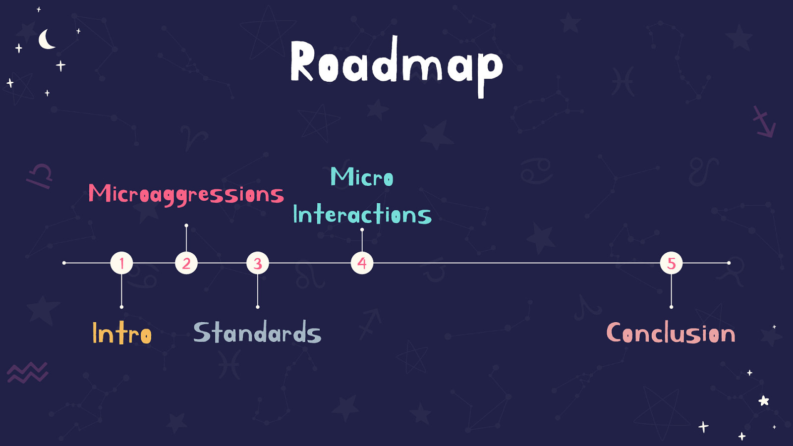
A timeline on the screen shows the road map of the talk. 1 Intro, 2 Microagressions, 3 Standards, 4 Micro Interactions, 5 Conclusion. The first 4 sections are spread out for the first half of the timeline, section 4 takes up about half of the timeline, followed by Conclusion near the end


I’m Shell Little | She/Her @ShellELittle Wells Fargo DS4B -AUx Team | Inclusive Design & Mobile Lead -Inclusive Design Lead for DS4B Design System -Cognitive Disability Speaker -Seattle | Partner and Kids w/ Tails

I have ADHD
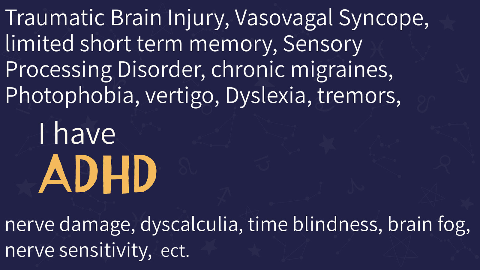
This slide shows the original “I have ADHD” surrounded by many names of disabilities I have in addition to just ADHD. The slide looks intentionally messy.
The conditions are: Traumatic Brain Injury, Vasovagal Syncope, limited short term memory, Sensory Processing Disorder, chronic migraines, Photophobia, vertigo, Dyslexia, tremors, nerve damage, dyscalculia, time blindness, brain fog, nerve sensitivity, ect.
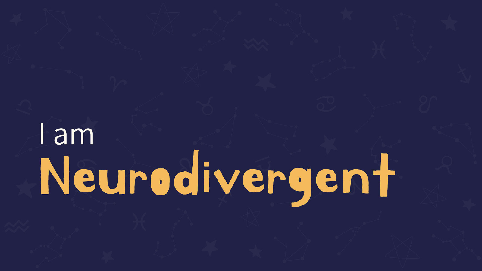
I am Neurodivergent
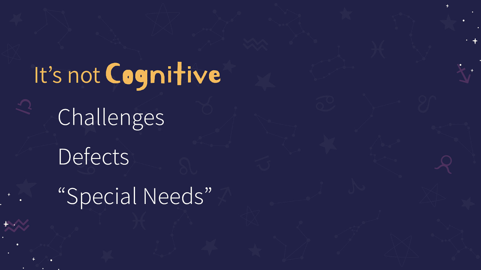
It’s not Cognitive Challenges, Defects, or “Special Needs”
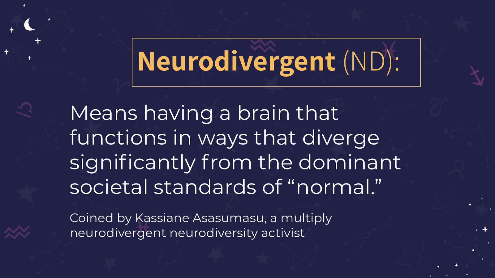
Means having a brain that functions in ways that diverge significantly from the dominant societal standards of “normal.” Coined by Kassiane Asasumasu, a multiply neurodivergent neurodiversity activist
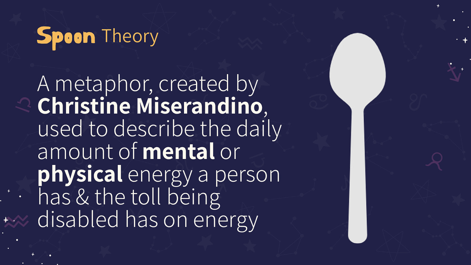
A metaphor, created by Christine Miserandino, used to describe the daily amount of mental or physical energy a person has & the toll being disabled has on energy
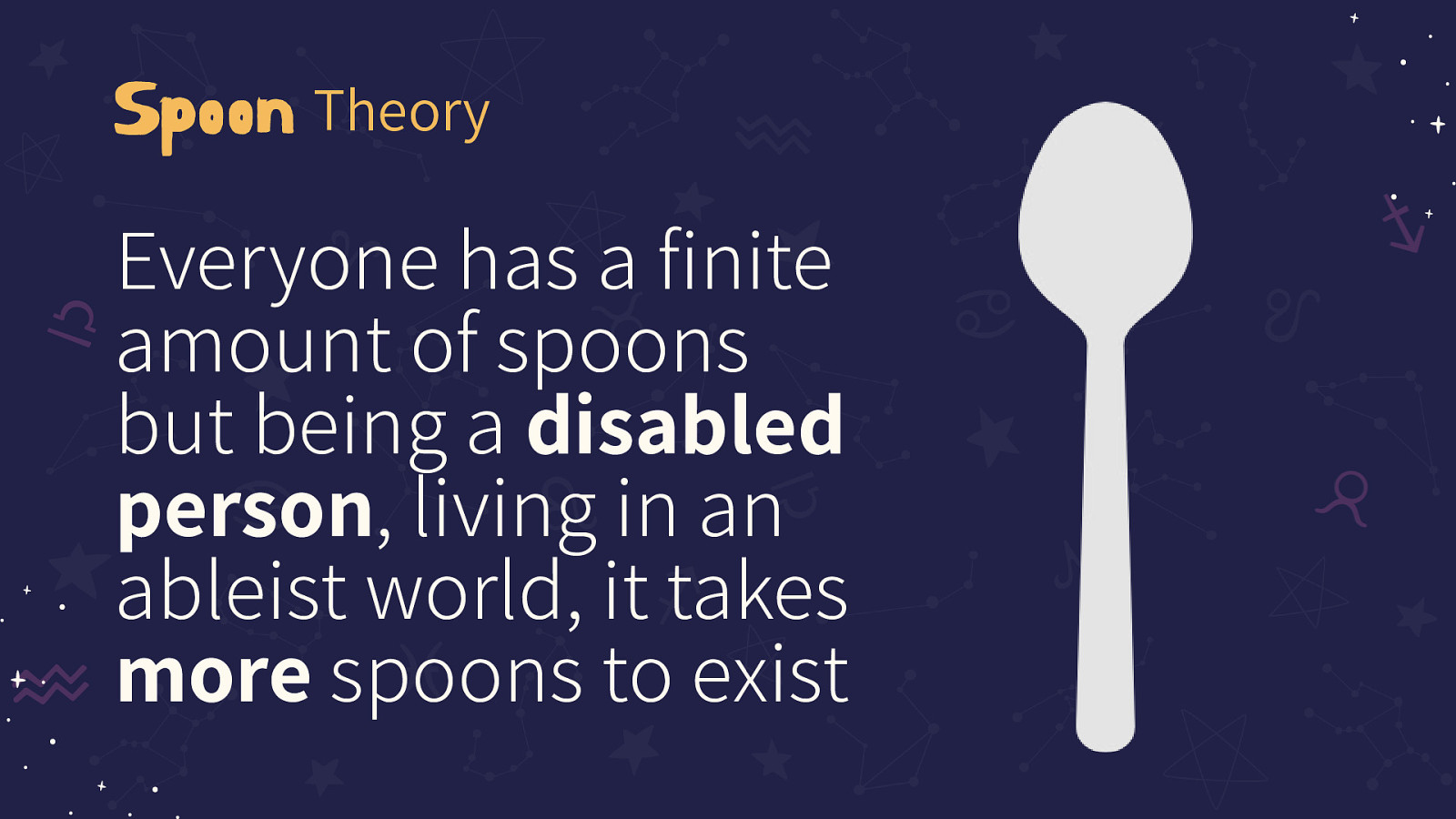
Everyone has a finite amount of spoons but being a disabled person, living in an ableist world, it takes more spoons to exist
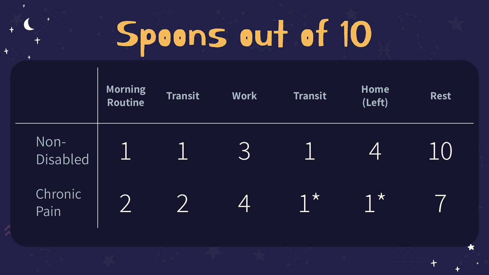
This slide contains a table as a visual aid. The two rows are Non-Disabled and Chronic Pain. Under the column ‘Morning Routine” Non-Disabled has 1 and Chronic pain has 2. For Transit, Non-Disabled has 1, Chronic pain has 2. For Work, it’s 3 and then 4. Transit again is 1 and 1*. For Home (Spoons Left) it is 4 for non-disabled and 1* for Chronic pain. Under Rest, the non-disabled number is 10 and Chronic Pain is 7
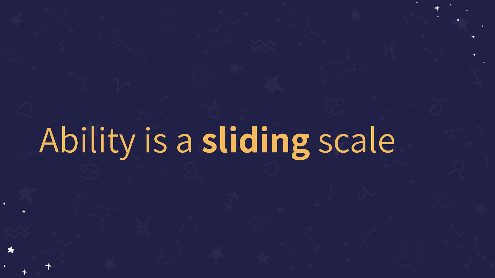
Ability is a sliding scale
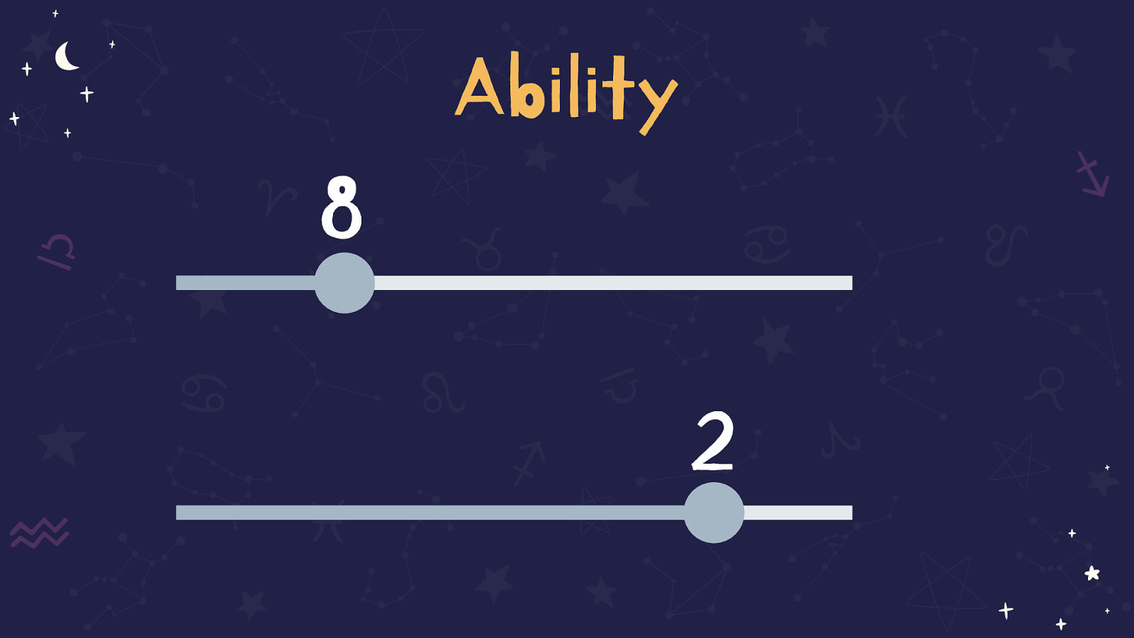
This slide shows two sliders, one is set to 8 and the other to 2
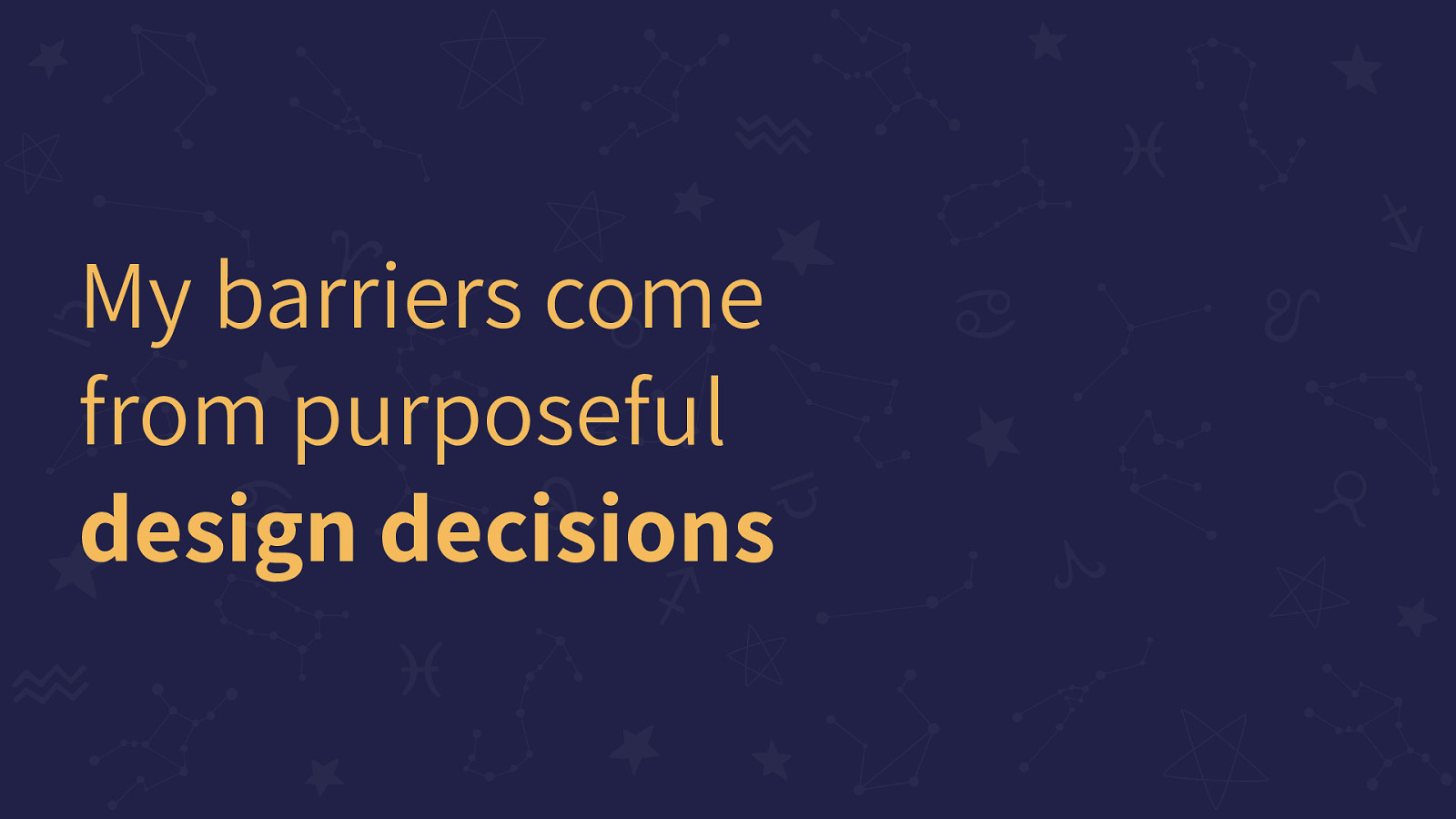
My barriers come from purposeful design decisions
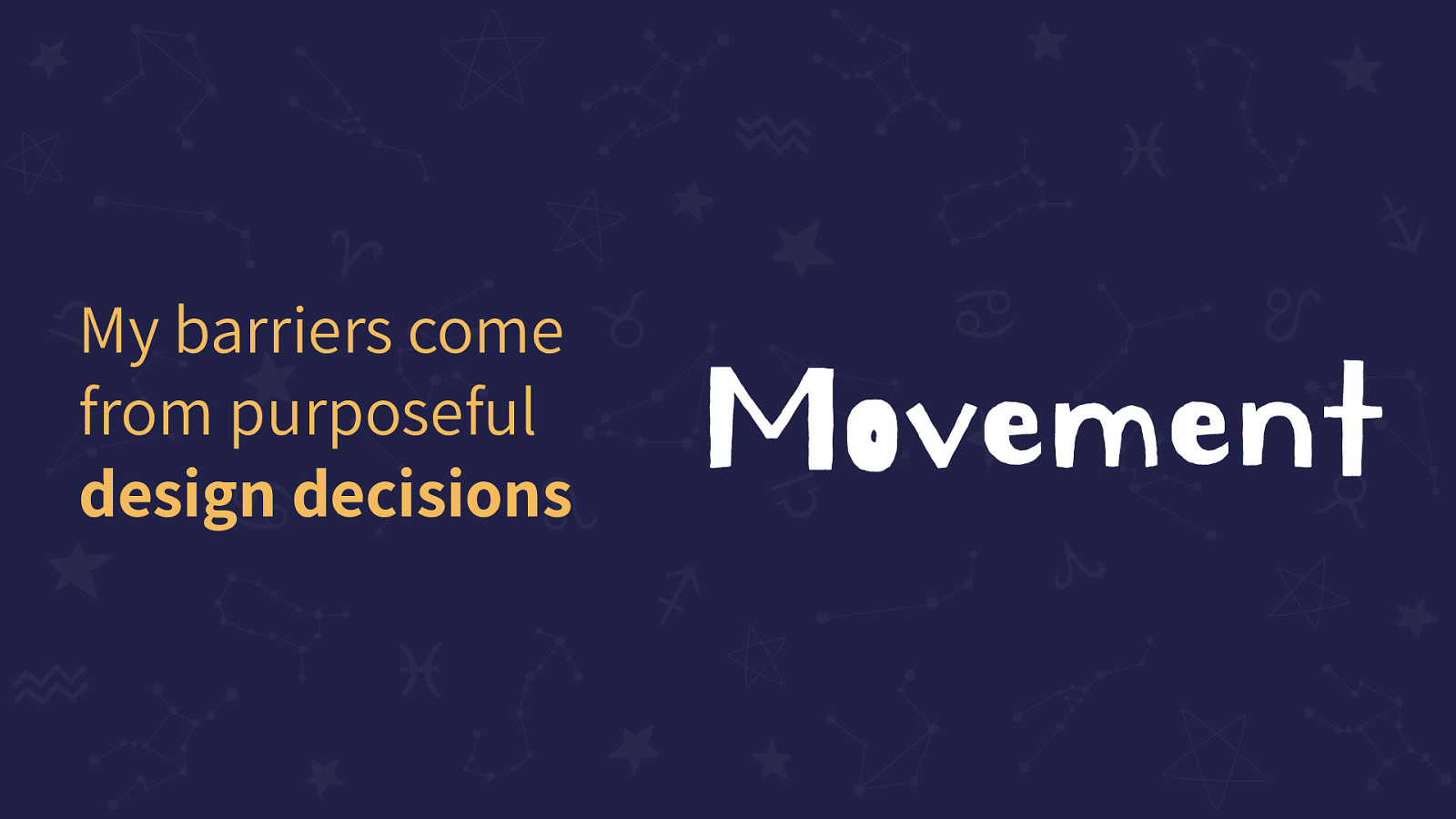
My barriers come from purposeful design decisions: Movement
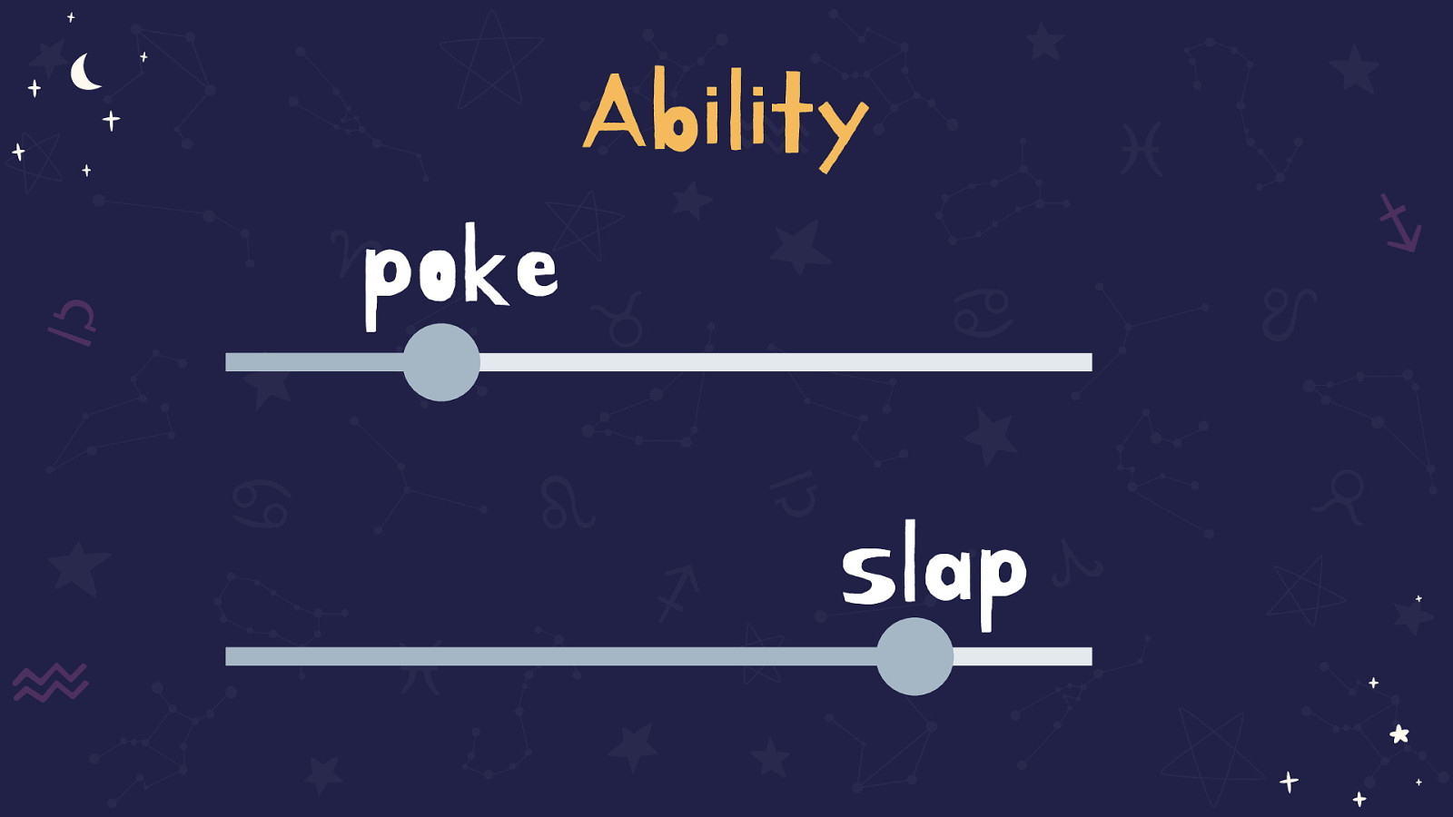
The same two sliders are displayed with 8 being replaced with ‘poke’ and 2 being replaced with ‘slap’
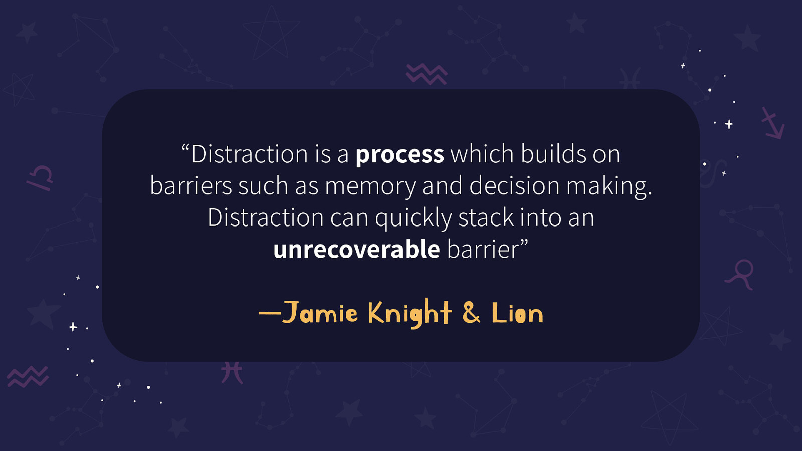
“Distraction is a process which builds on barriers such as memory and decision making. Distraction can quickly stack into an unrecoverable barrier” —Jamie Knight & Lion
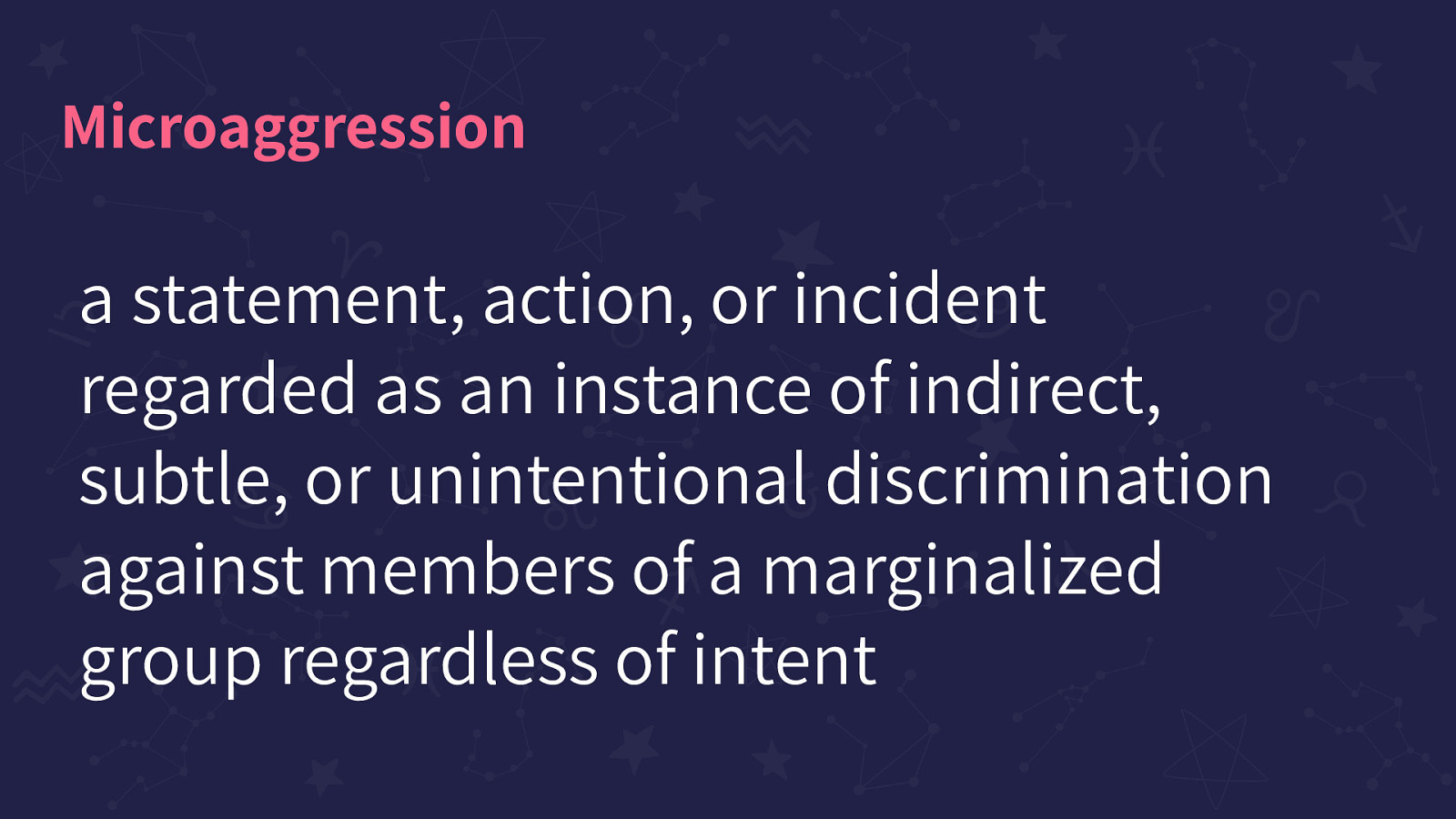
A statement, action, or incident regarded as an instance of indirect, subtle, or unintentional discrimination against members of a marginalized group regardless of intent
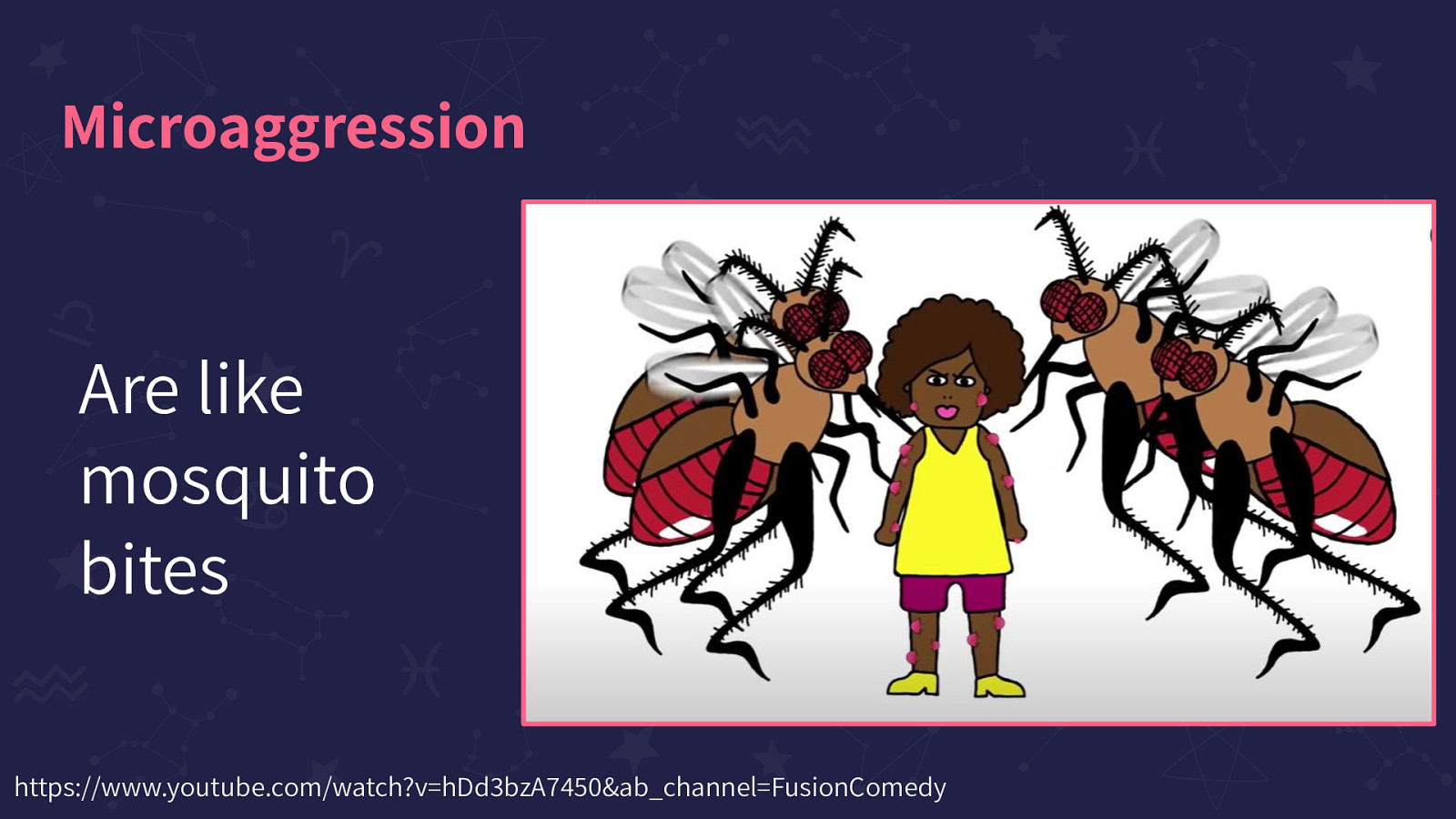
Are like mosquito bites. Image on the slide is a screenshot from this suggested YouTube video: https://www.youtube.com/watch?v=hDd3bzA7450&ab_channel=FusionComedy
Microaggressions oftentimes come in the form of misguided ‘compliments’
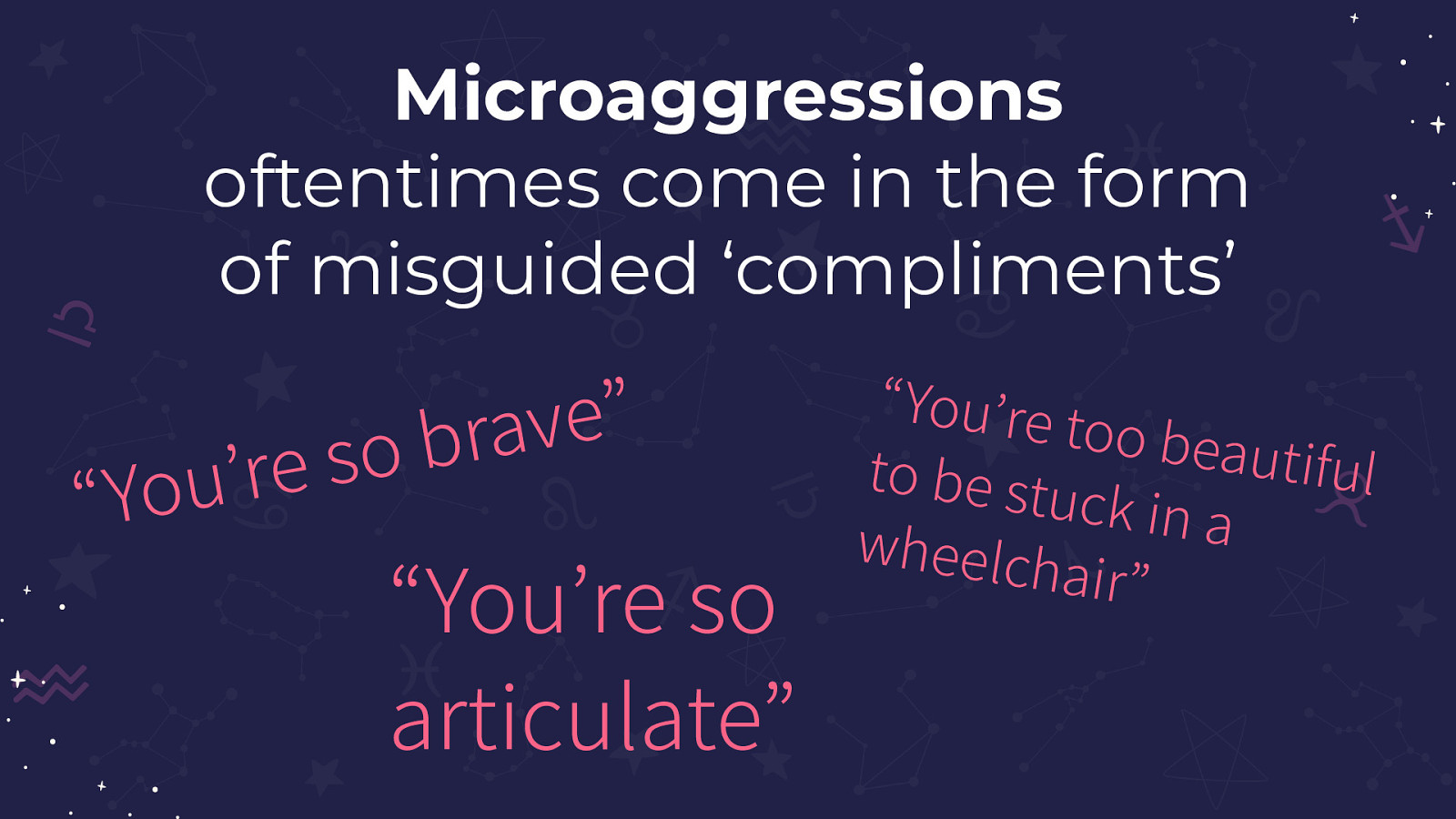
Microaggressions oftentimes come in the form of misguided ‘compliments’ such as: “You’re so brave”, “You’re so articulate”, and “You’re too beautiful to be stuck in a wheelchair”
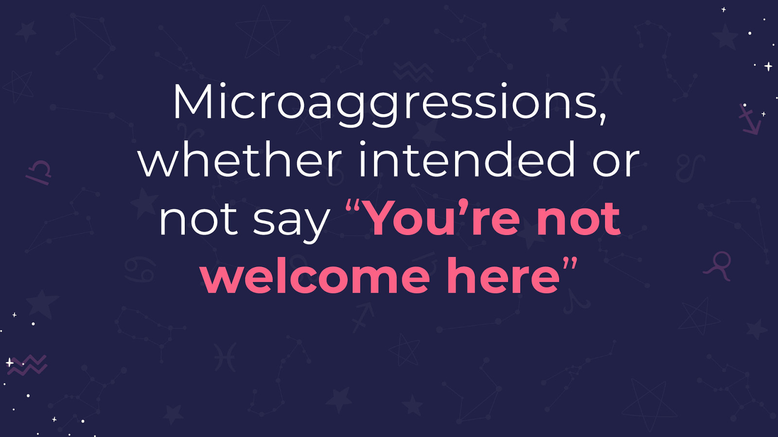
Microaggressions, whether intended or not say “You’re not welcome here”
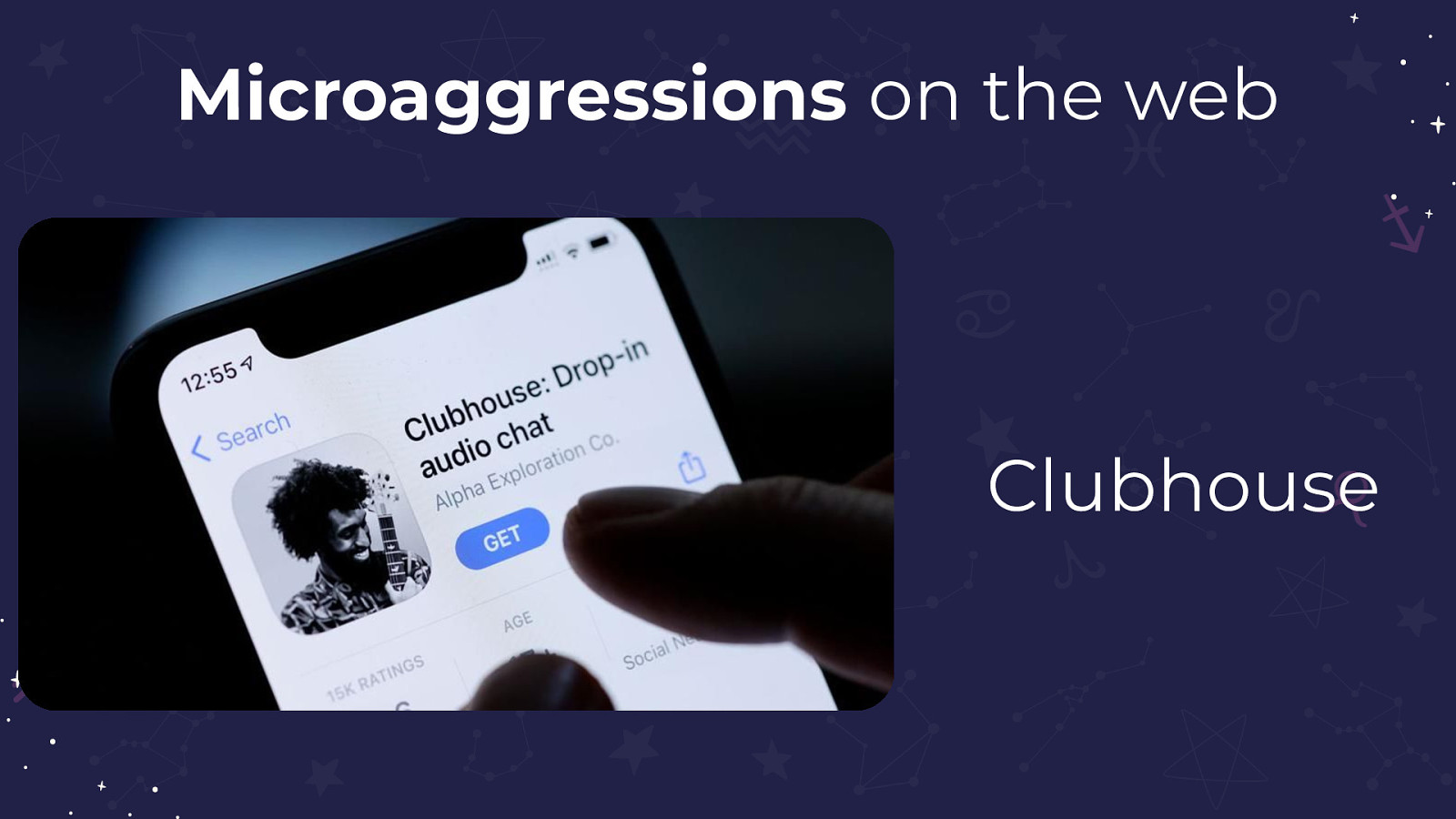
Clubhouse, a photo of Clubhouse is displayed on this slide
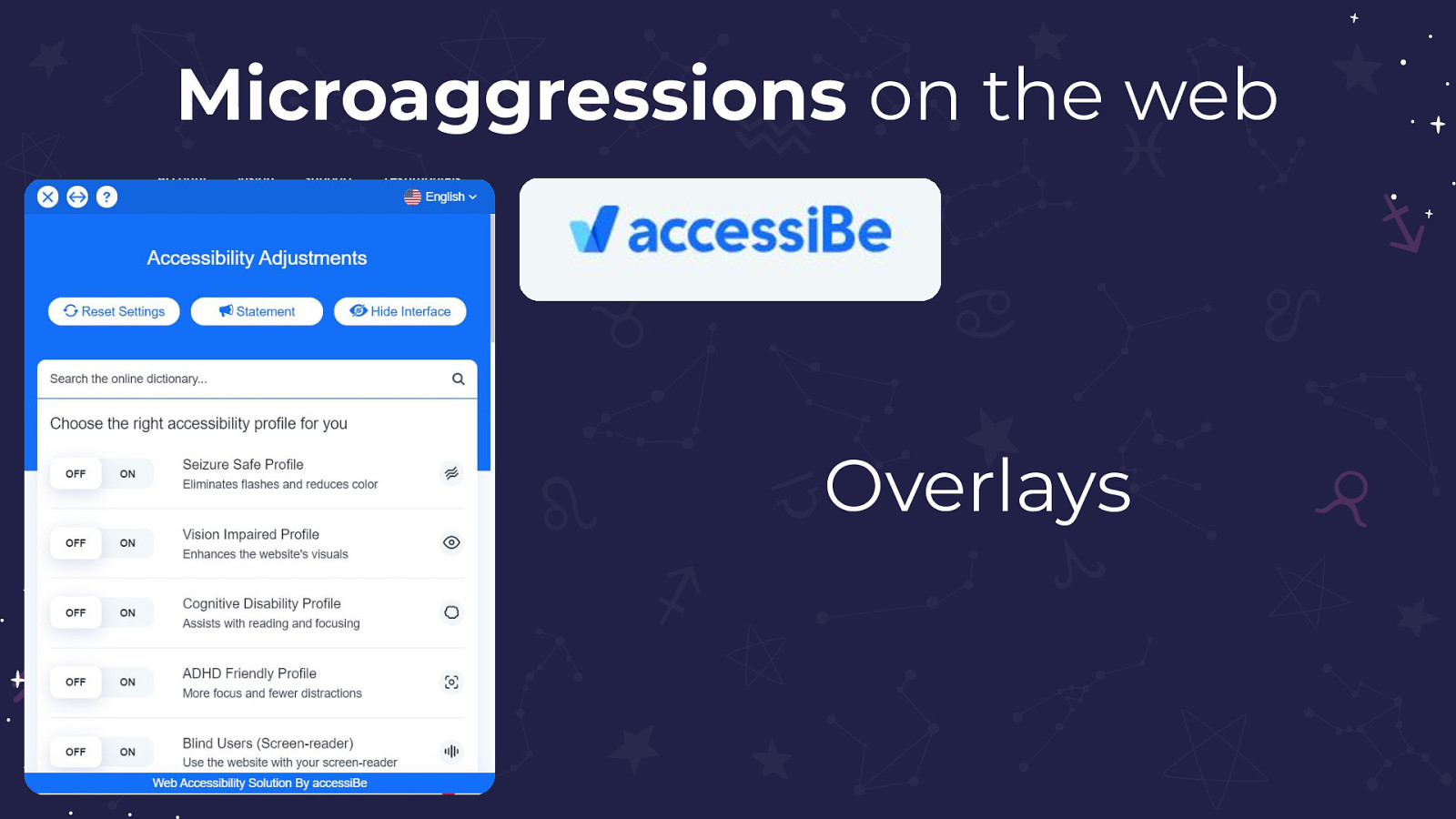
Overlays, a photo of AccessiBe is displayed on this slide
For people with Cognitive Disabilities the internet can be a downright hostile place
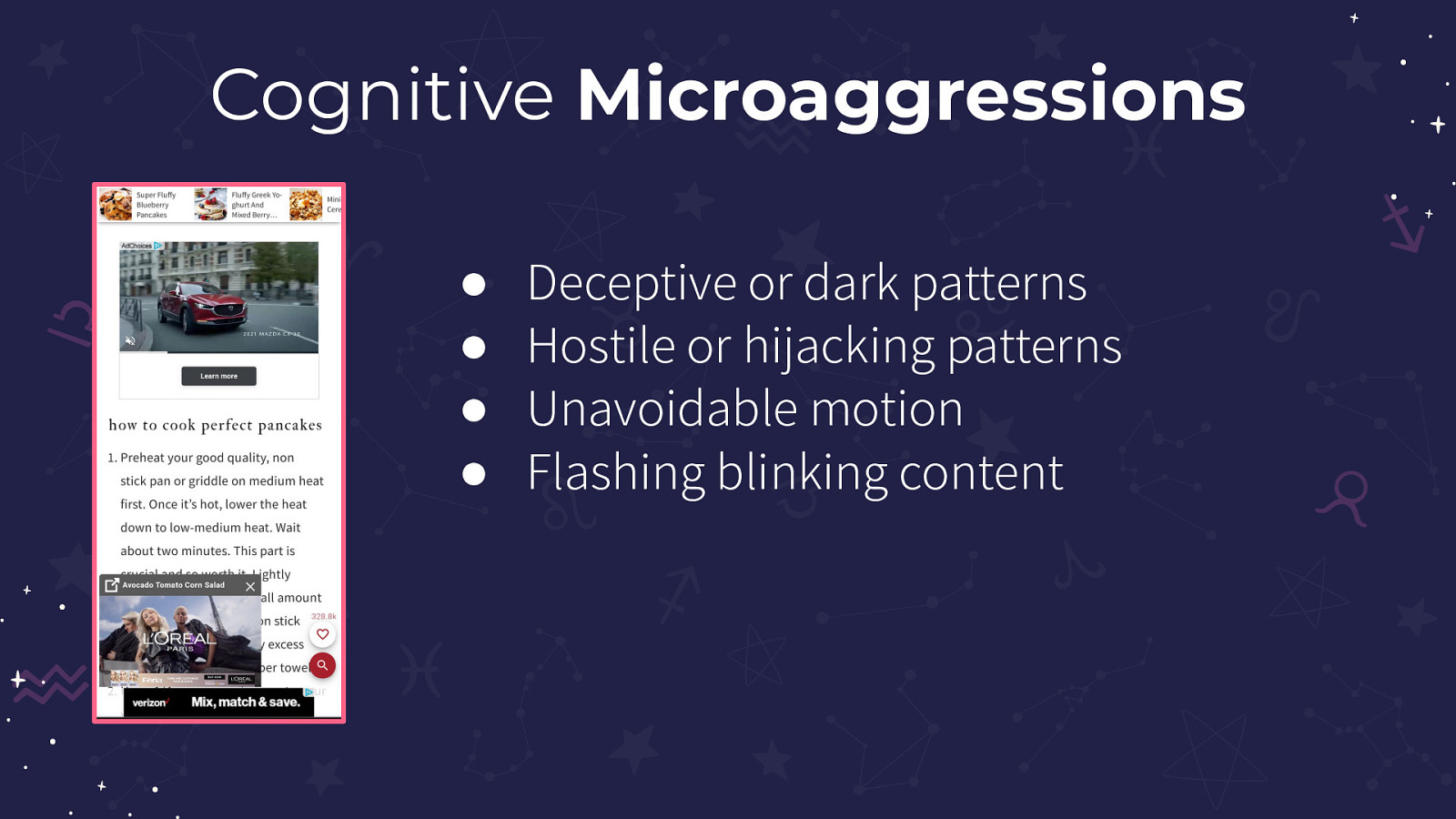
Deceptive or dark patterns, Hostile or hijacking patterns, Unavoidable motion, Flashing blinking content
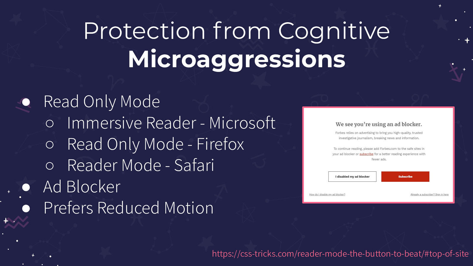
Read Only Mode: Immersive Reader by Microsoft, Read-Only Mode by Firefox, Reader Mode by Safari. Next, Ad Blockers and Prefers Reduced Motion
Article about Prefers Reduced Motion: https://css-tricks.com/reader-mode-the-button-to-beat/#top-of-site
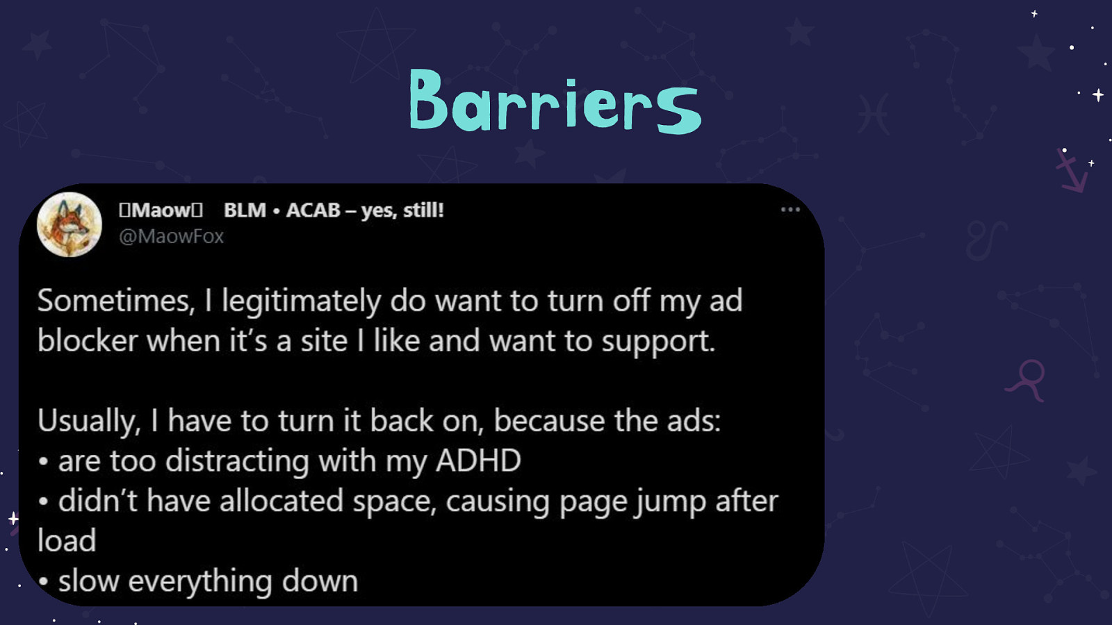
Tweet on the slide that reads: Sometimes, I legitimately do want to turn off my adblocker when it’s a site I like and want to support. Usually, I have to turn it back on because the ads: are too distracting with my ADHD, didn’t have allocated space causing page jump after load, slow everything down

Oh,WCAG
WCAG for Cognitive Disabilities?
WCAG for Cognitive Disabilities? It’s Complicated
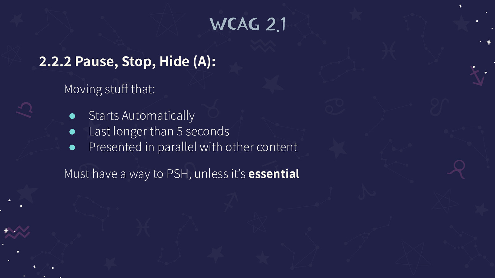
2.2.2 Pause, Stop, Hide (A): Moving stuff that: Starts Automatically, Last longer than 5 seconds, Presented in parallel with other content Must have a way to PSH, unless it’s essential
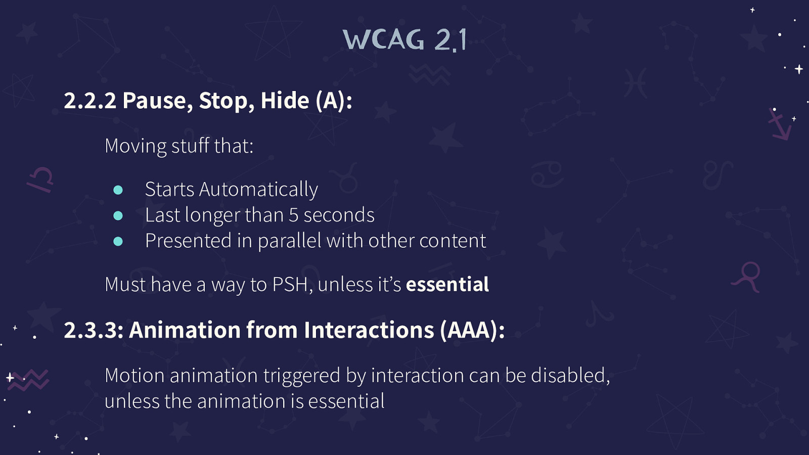
2.3.3: Animation from Interactions (AAA): Motion animation triggered by interaction can be disabled, unless the animation is essential
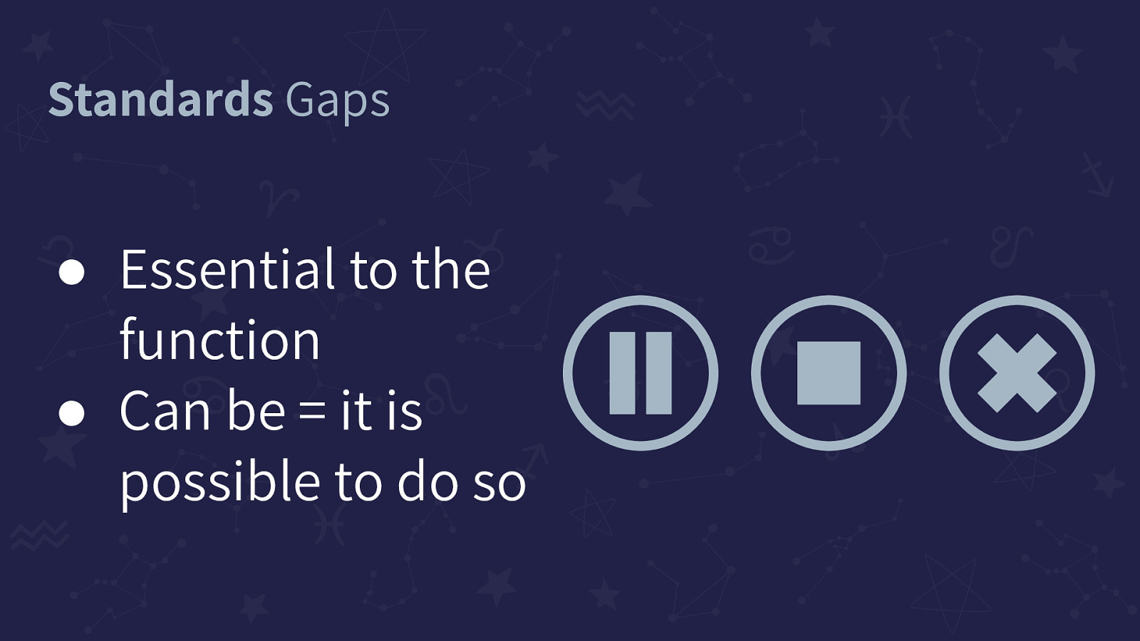
Essential to the function, Can be = it is possible to do so
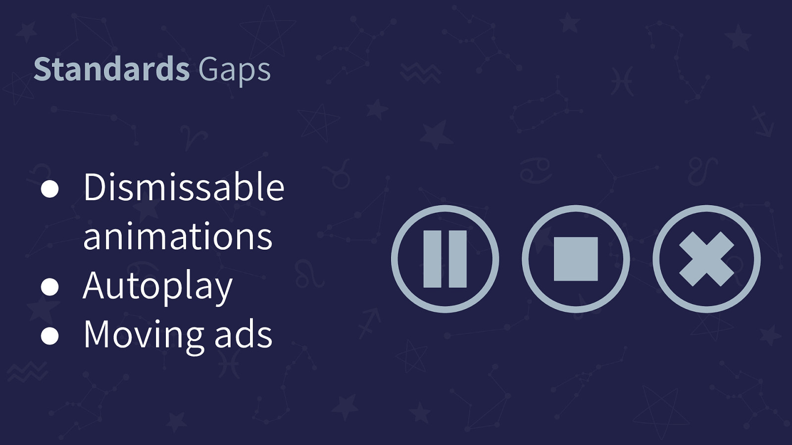
Dismissable animations, Autoplay, Moving ads
Where WCAG stops, that’s where Cognitive Barriers start
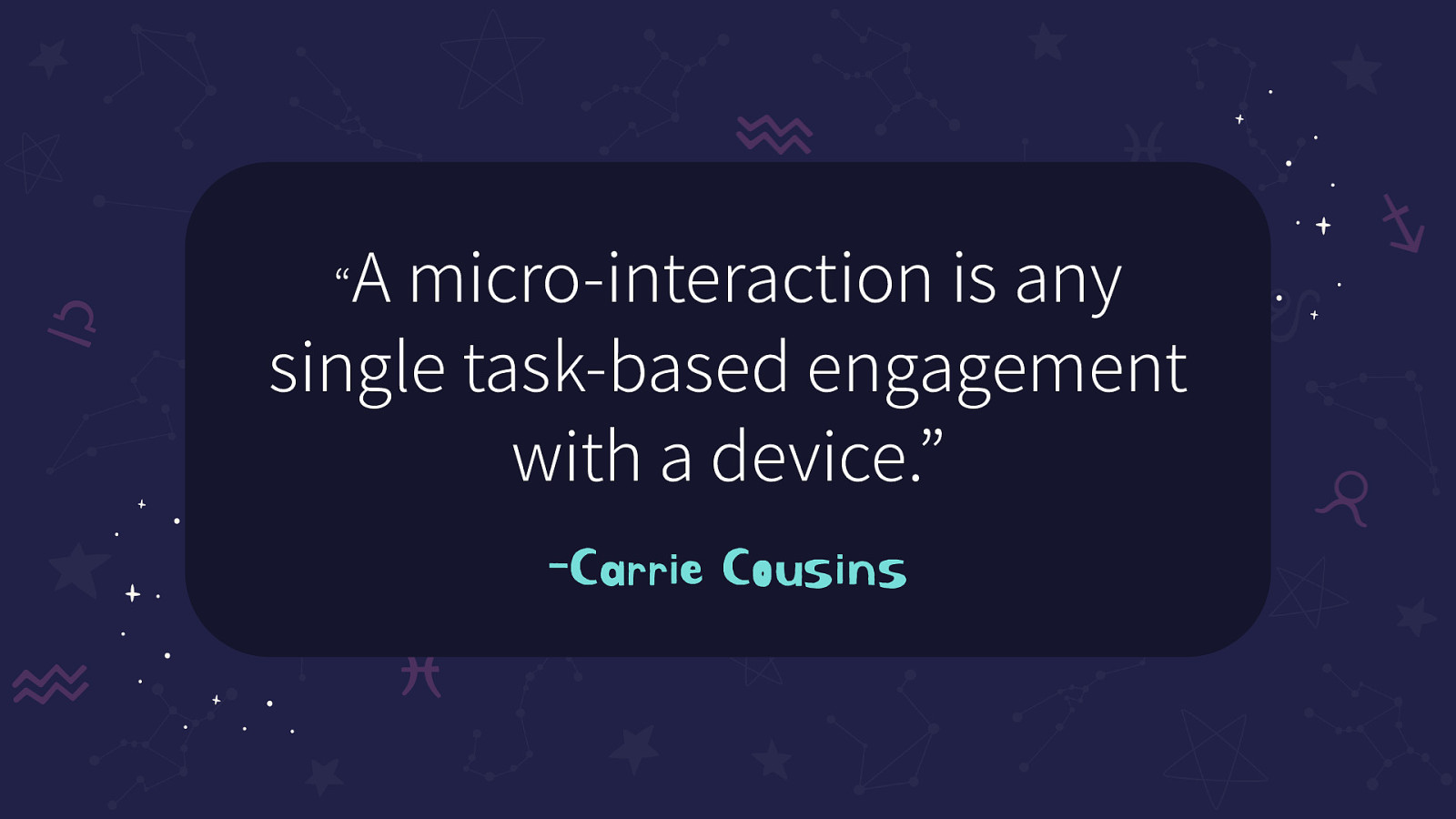
“A micro-interaction is any single task-based engagement with a device.” -Carrie Cousins
Are used to communicate meaningful feedback to the users because a user has to constantly know what happens when an action is performed
https://uxdesign.cc/micro-interactions-a-superpower-of-successful-design-ef7706154934
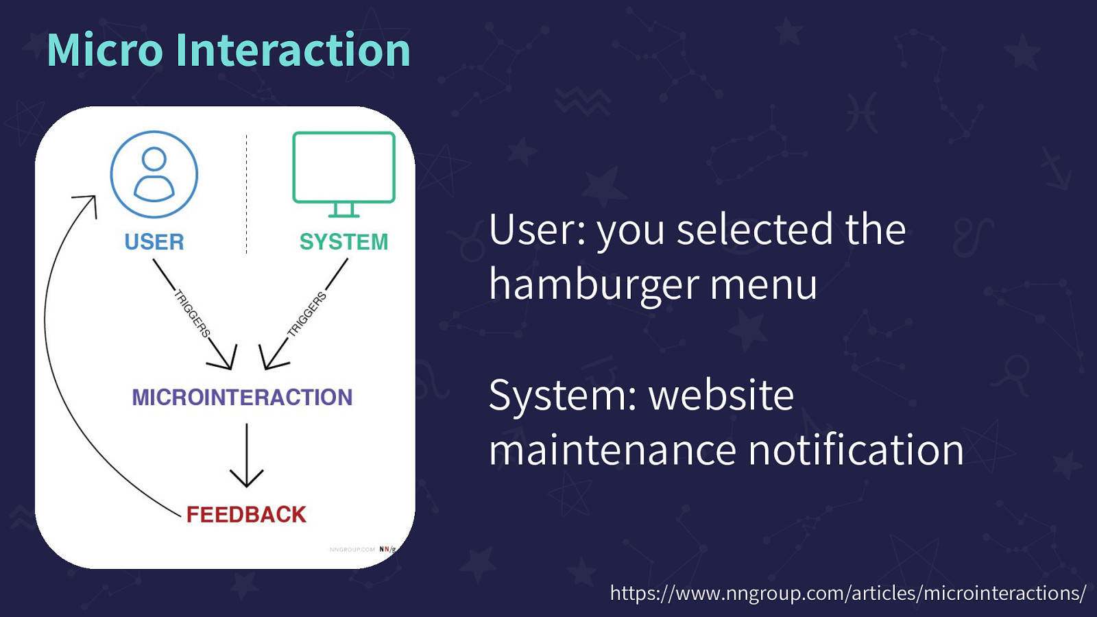
User: you selected the hamburger menu, System: website maintenance notification Image on the screen of a flow chart. User and System, both having ‘triggers’ that point to “Micro-interaction” and Micro-interactions points to Feedback. Feedback loops back up to ‘User’
https://www.nngroup.com/articles/microinteractions/
Feedback, Communicate State Change, Spatial Metaphors and Navigation, Signifier, Attention Grabbing and Attention Hijacking
https://www.nngroup.com/articles/animation-purpose-ux/
Animation used to communicate an action has been recognized by the system. This animation is of Spotify’s ‘like’ feature. When you press the ‘heart’ button that is already in a ‘liked’ state, the button goes from filled in green, has a shake animation, and then turns to a white outline empty button. Then when pressing it again the empty, white outline heart turns green with an animation of little hearts and a circle that radiates from the center outwards.
Example: https://drive.google.com/file/d/1dpWTZiC2yQ6a8c1A2Oy8wJh-KhWlj54u/view
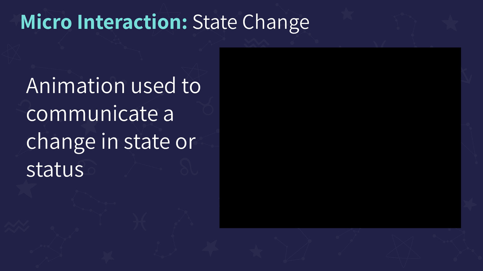
Animation used to communicate a change in state or status. This animation shows Twitter’s ‘Draft a tweet’ button that toggles in state from ‘Draft a tweet’ with a quill to the ‘Draft an email’ with an envelope. When you move from Feed to Messages, the button spins and changes from Quill to Envelope and back.
Example: https://drive.google.com/file/d/1dWd4kb6nVbNTfKwP5v-wReYvaecS1Z5f/view?usp=sharing
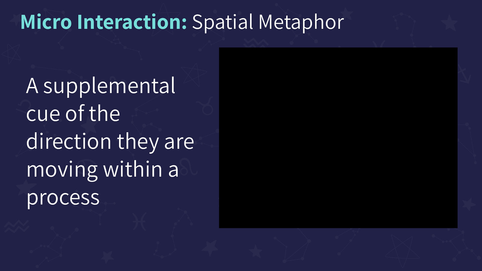
A supplemental cue of the direction they are moving within a process. This animation is of a simple hamburger menu located on Google’s Play Store. When the hamburger menu button is selected, the menu slides out from the left moving to the right. On a second tap, it slides from right to left, back out of sight.
Example: https://drive.google.com/file/d/1dkSclYuSrN4jzbOsJp28I-aqoG3GtV8_/view?usp=sharing
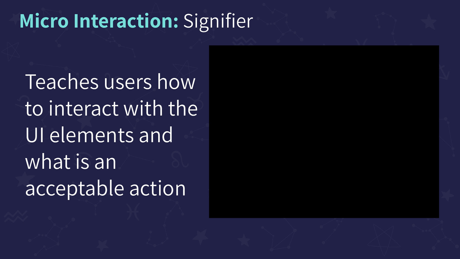
Teaches users how to interact with the UI elements and what is an acceptable action. This example is of Apple Music when you select the album cover of a song you’re currently listening to, a card shows up over your main page. When pulled down, the card shows that it can be dismissed by getting slightly smaller. On full swipe down, the card dismisses and shrinks back into the album cover on the player.
Example: https://drive.google.com/file/d/1Bk4GYRhBPjaZH3ImO348czf2M5g7oHHD/view?usp=sharing
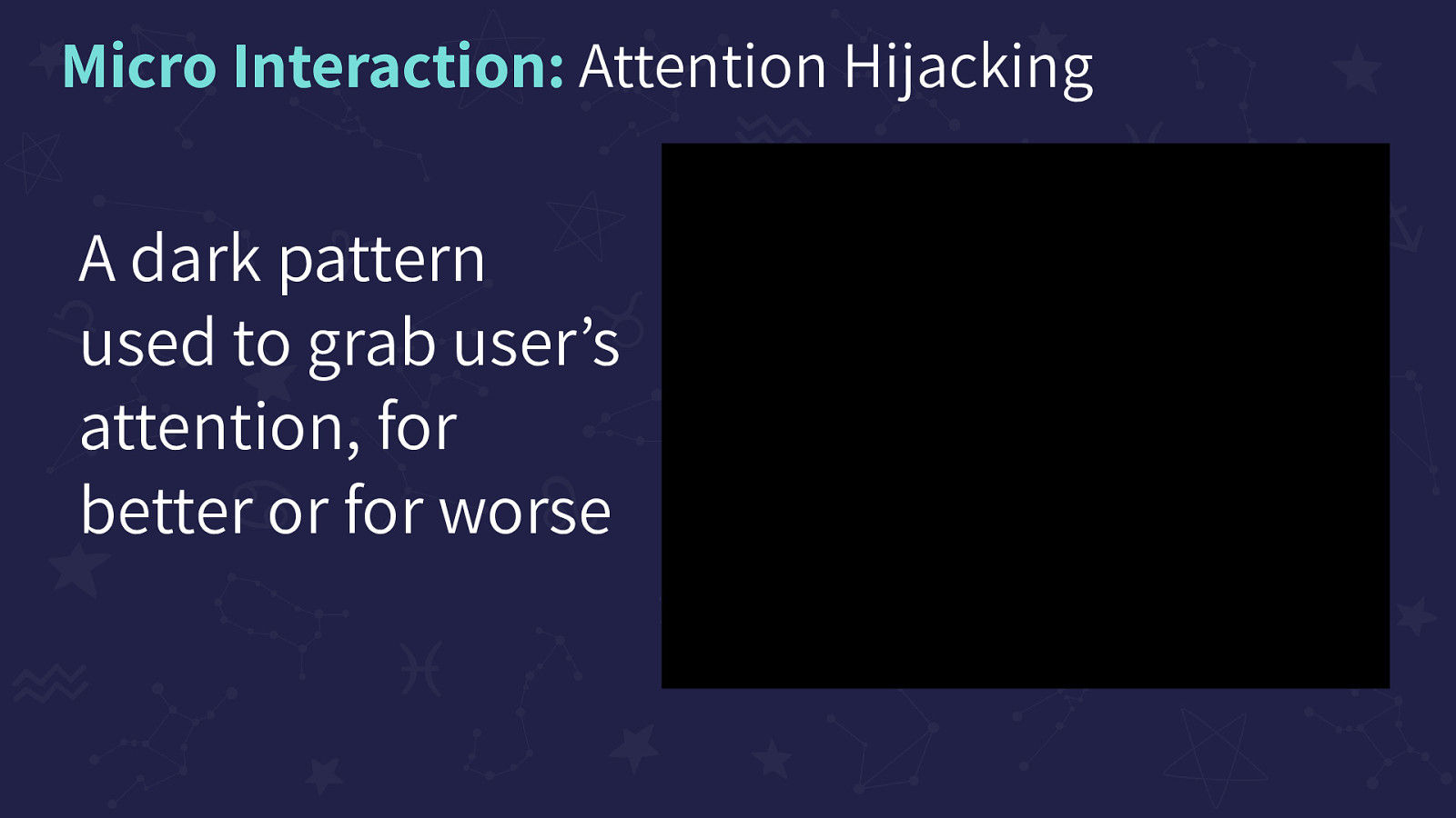
A dark pattern used to grab user’s attention, for better or for worse. In this example, an app called ‘Wonder Video’ is shown. The page has man animations playing including a bouncing crown to signify the ‘premium’ option, as well as animated videos that are likely buttons. The page is covered in animations and is very overwhelming.
Example: https://drive.google.com/file/d/1dpCrcYe61K43Mc1PaBCud5yug_VVW-lr/view?usp=sharing
What makes a Cognitively Accessible micro interaction?
What makes a Cognitively Accessible micro interaction? It’s Complicated
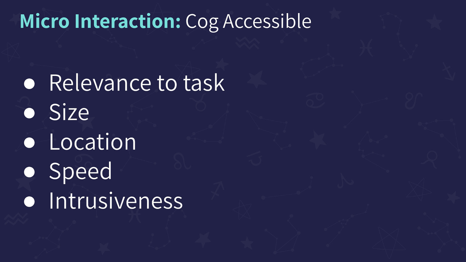
Relevance to task, Size, Location, Speed, and Intrusiveness
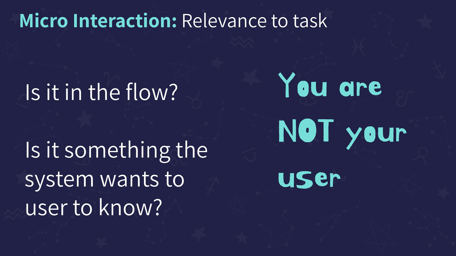
Is it in the flow? Is it something the system wants the user to know? You are NOT your user
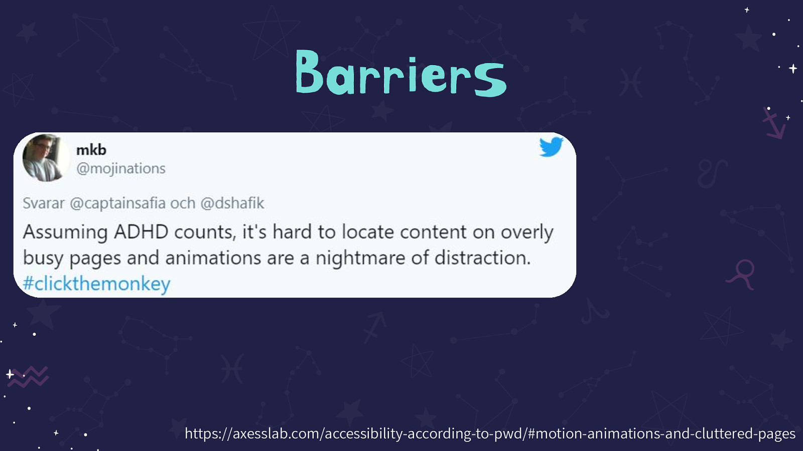
Tweet on the slide reads: Assuming ADHD counts, it’s hard to locate content on overly busy pages and animations are a nightmare of distraction. #clickthemonkey
Source: https://axesslab.com/accessibility-according-to-pwd/#motion-animations-and-cluttered-pages
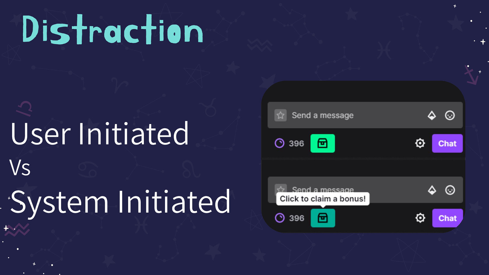
User Initiated Vs System Initiated. Image on the slide is showing Twitch’s Channel points CTA. A green storage box icon shakes endlessly until the user selects the icon that a tooltip shows reads “Click to claim a bonus!”
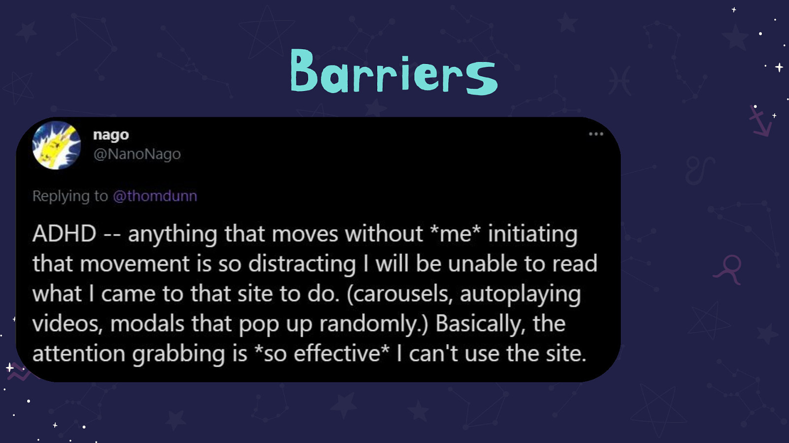
Tweet on the slide reads: ADHD — anything that moves without me initiating that movement is so distracting I will be unable to read what I came to that site to do. (carousels, autoplaying videos, modals that pop up randomly.) Basically, the attention grabbing is so effective I can’t use the site.
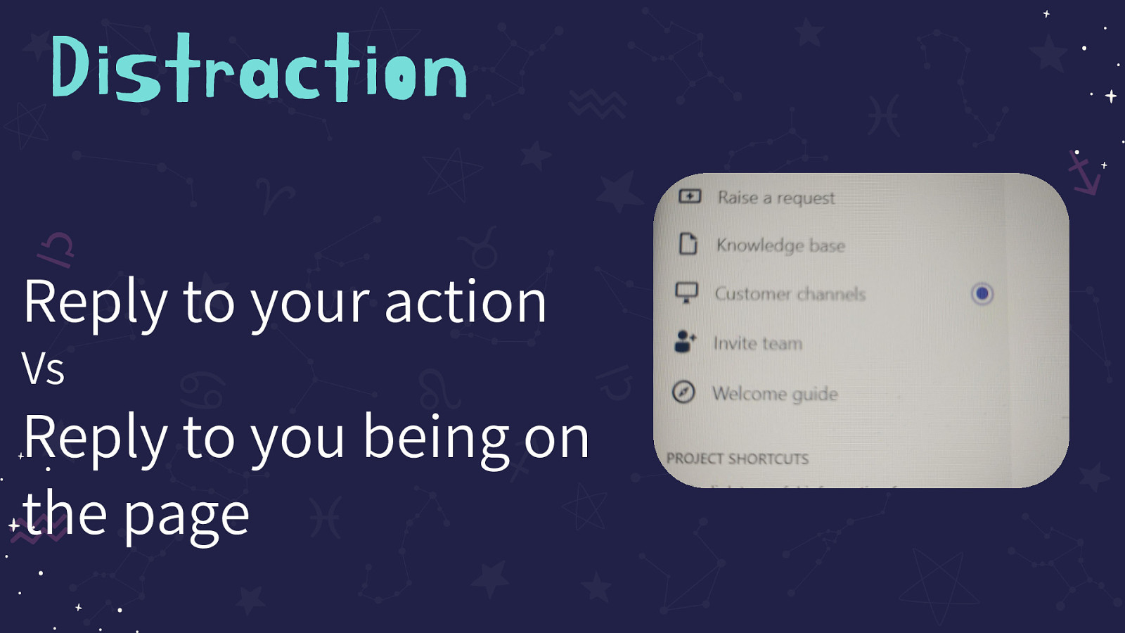
Reply to your action Vs Reply to you being on the page. Image on the screen shows a side nav on JIRA. The ‘Customer Channels’ item has a dot next to it that has a ring around it, indicating movement.
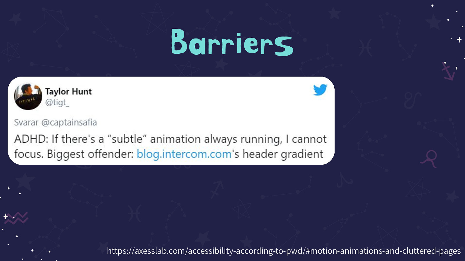
Tweet on the slide reads: ADHD: If there’s a “subtle” animation always running, I cannot focus. Biggest offender: http://blog.intercom.com’s header gradient
Source: https://axesslab.com/accessibility-according-to-pwd/#motion-animations-and-cluttered-pages
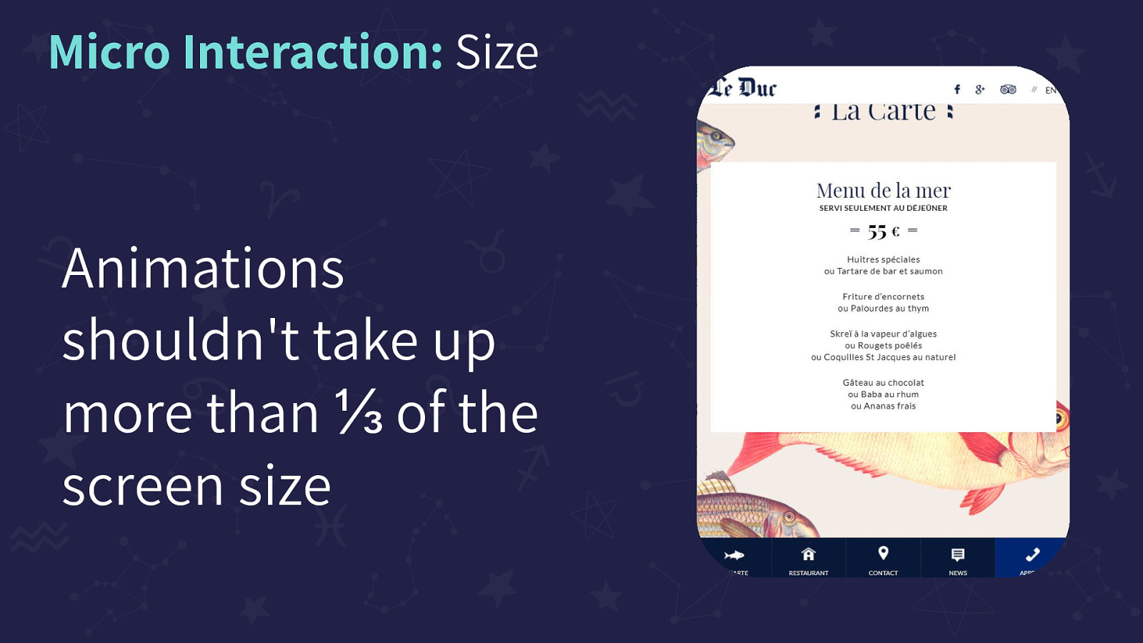
Animations shouldn’t take up more than ⅓ of the screen size. Image on the screen of a fish-themed restaurant site. The fish are behind the menu and move in a parallax pattern
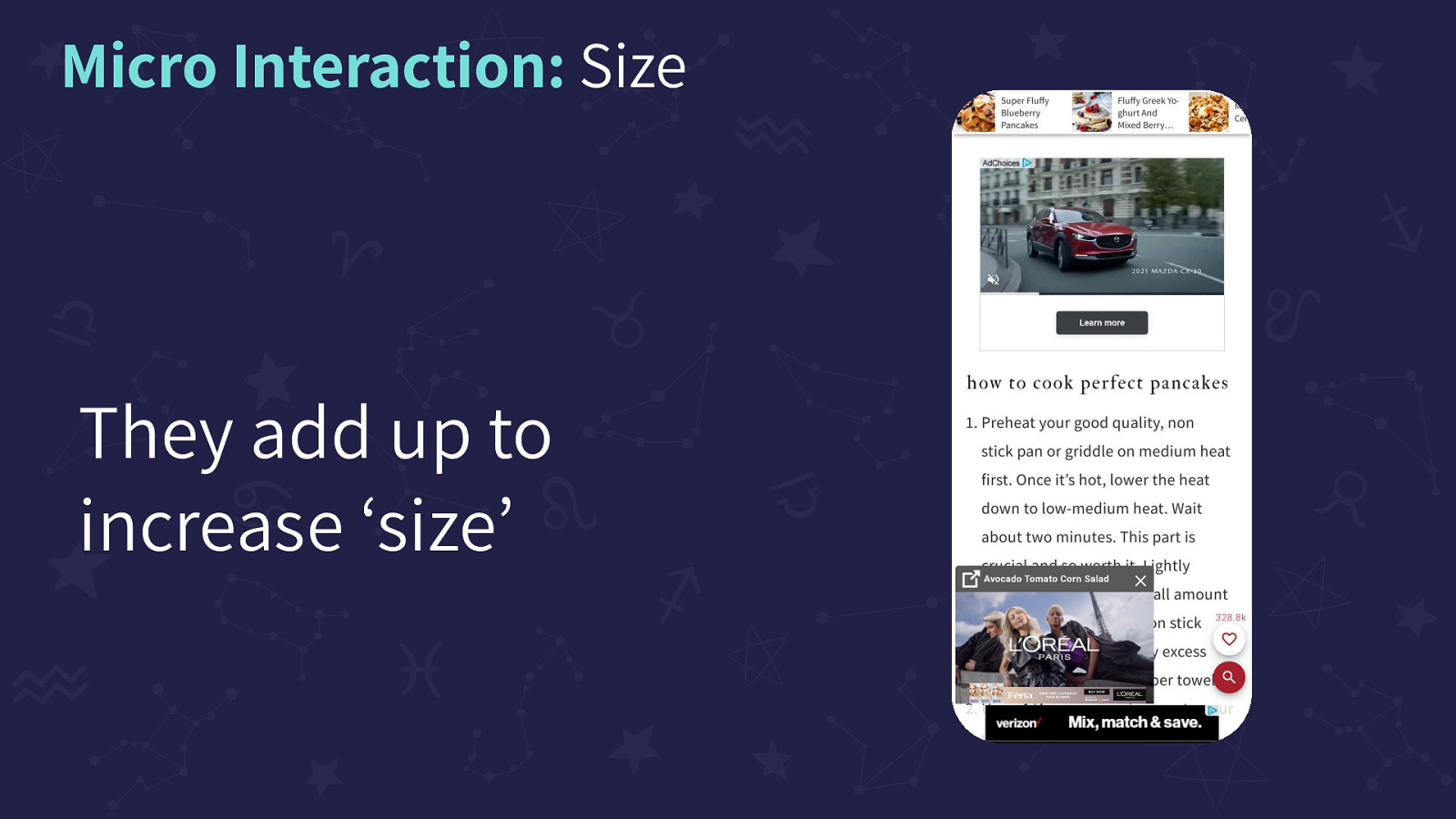
They add up to increase ‘size’. Image on the slide of a screenshot from a cooking website. There are countless ads including a moving sticky top bar, a video ad in the body, ads popping up from a bottom sticky bar, the bottom sticky bar itself. And as a kicker, the ‘like’ icon animates to show when others have ‘liked’ the recipe.
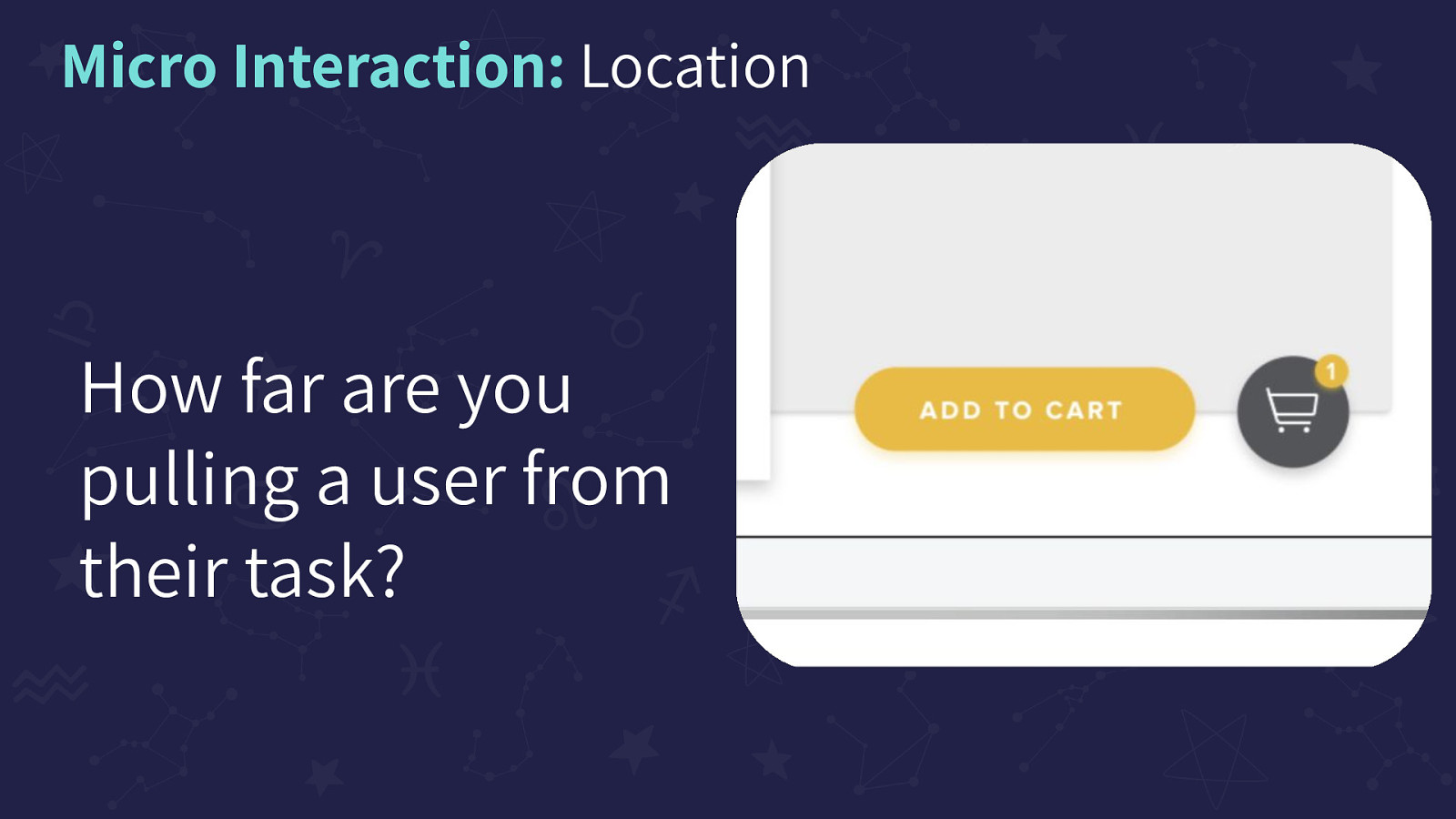
How far are you pulling a user from their task? Image on the slide of an ‘Add to Cart’ button next to a ‘Cart’ icon that has a badge button that reads 1.
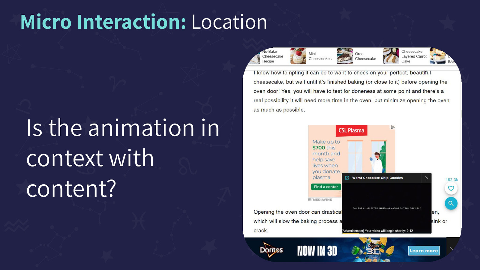
Is the animation in context with content? Image on the screen of another recipe sight with countless moving ads including a moving top navigation, a video ad in the body, ads popping up from a bottom sticky bar, the bottom sticky bar itself.
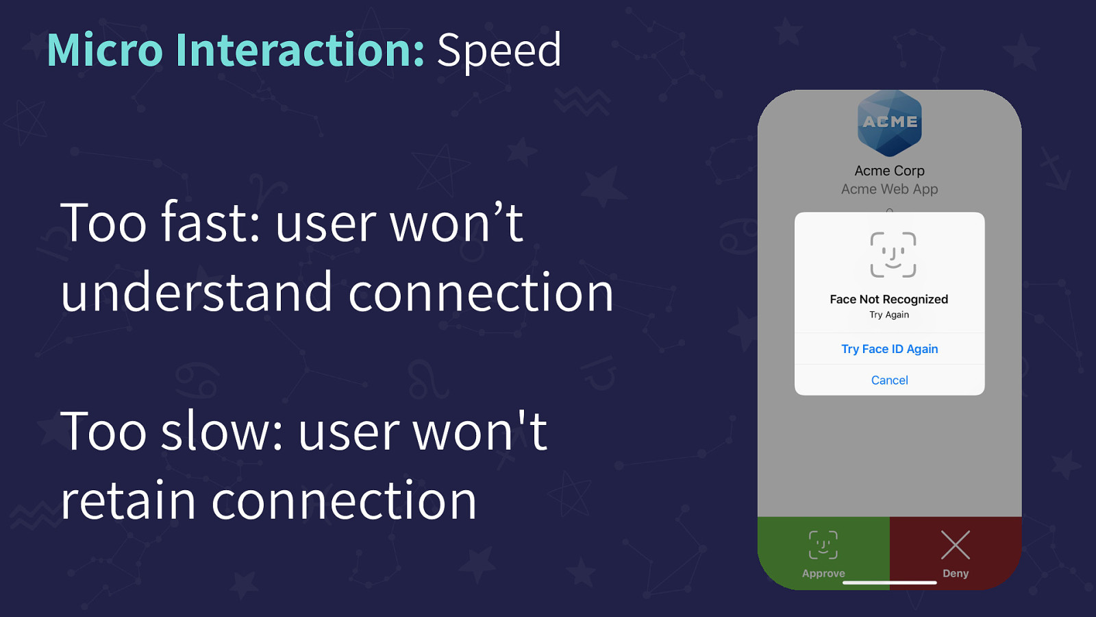
Too fast: user won’t understand connection Too slow: user won’t retain connection. Image on the slide of a ‘Face Recognition modal on a login page
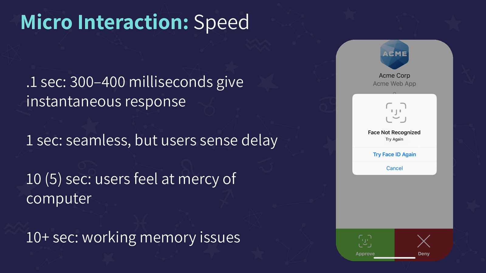
.1 sec: 300–400 milliseconds give instantaneous response, 1 sec: seamless, but users sense delay, 10 (5) sec: users feel at mercy of computer, 10+ sec: working memory issues. Repeated image on the slide of a ‘Face Recognition modal on a login page
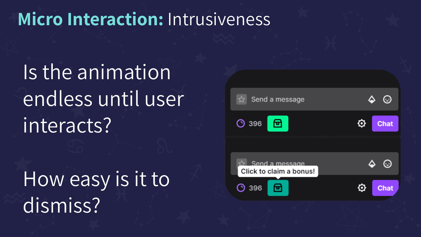
Is the animation endless until user interacts? How easy is it to dismiss? Repeated Image on the slide is showing Twitch’s Channel points CTA. A green storage box icon shakes endlessly until the user selects the icon that a tooltip shows reads “Click to claim a bonus!”
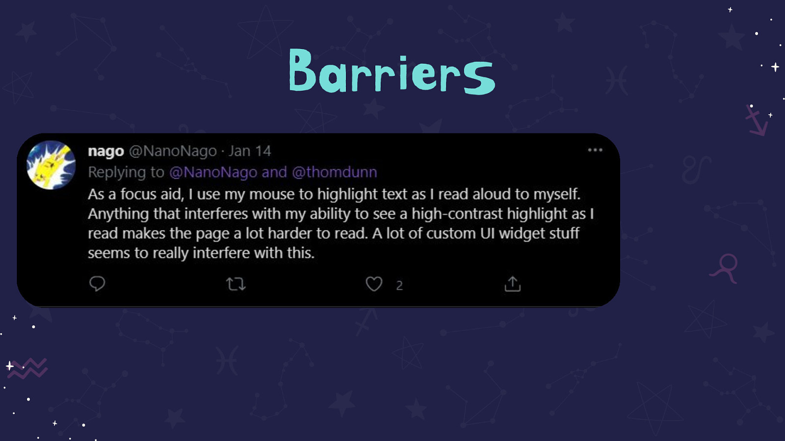
Tweet on the slide that reads: As a focus aid, I use my mouse to highlight text as I read aloud to myself. Anything that interferes with my ability to see a high-contrast highlight as I read makes the page a lot harder to read. A lot of custom UI widget stuff seems to really interfere with this
Large image on the slide showing the animation of ‘save’ on WordPress. The small ‘Save Draft’ changes to ‘Saving’ that blinks, and ends with ‘Saved’ with a checkmark
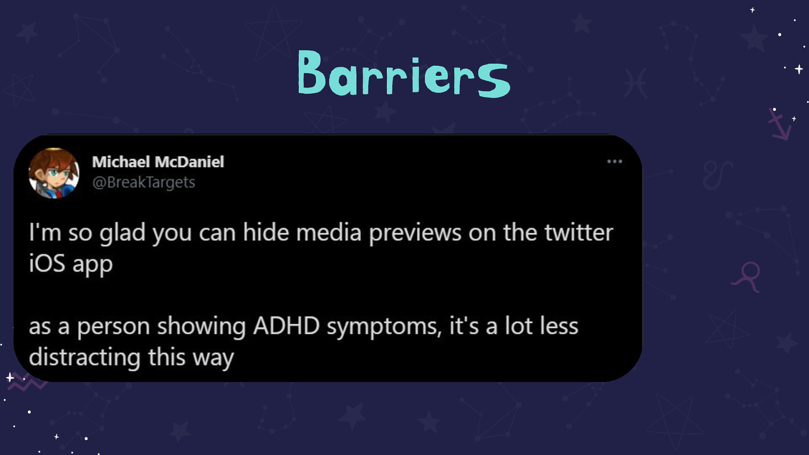
Tweet on the slide that reads: I’m so glad you can hide media previews on the twitter iOS app
as a person showing ADHD symptoms, it’s a lot less distracting this way
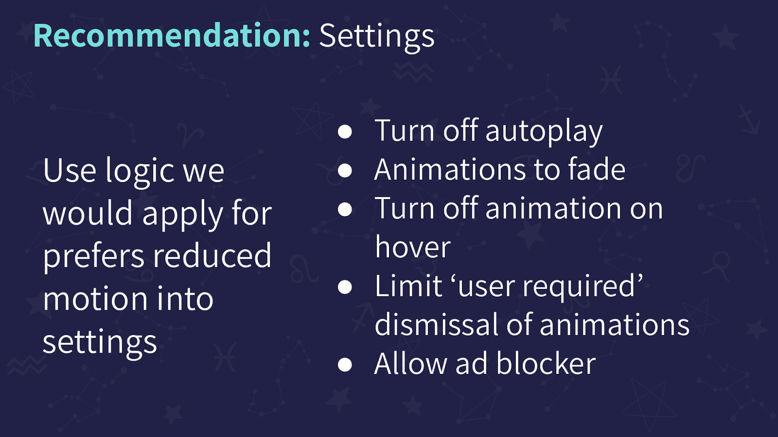
Use logic we would apply for prefers reduced motion into settings. Turn off autoplay, Animations to fade, Turn off animation on hover, Limit ‘user required’ dismissal of animations, Allow ad blocker
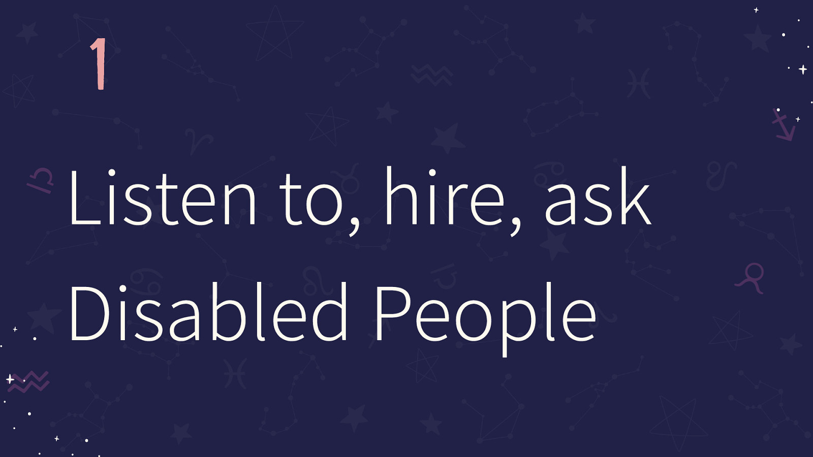
1 Listen to, hire, ask Disabled People
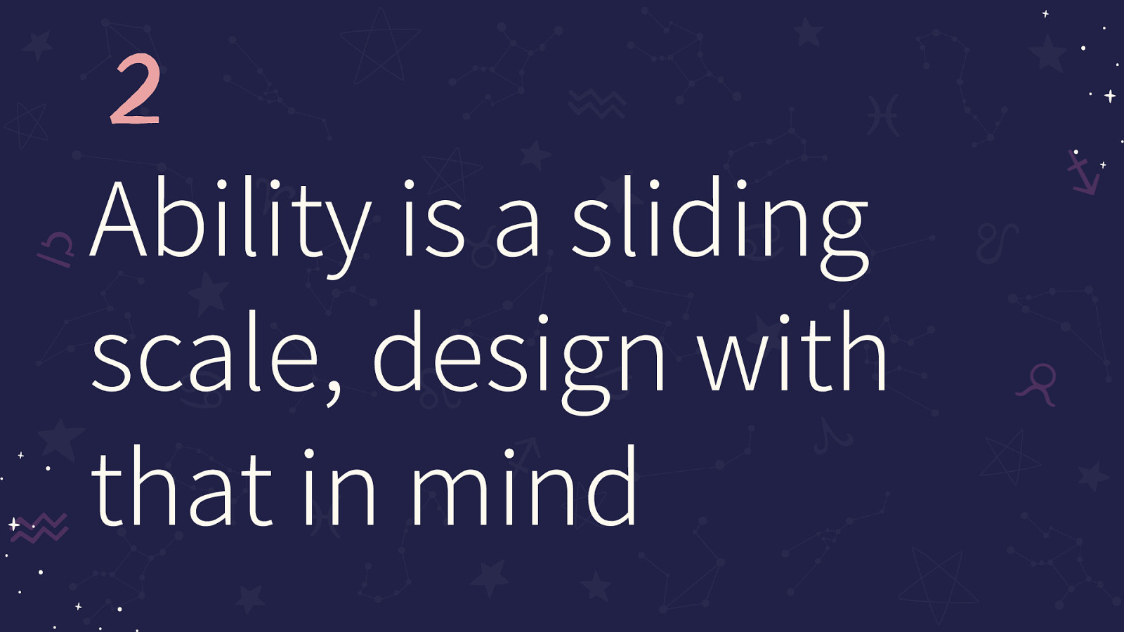
2 Ability is a sliding scale, design with that in mind
3 Microaggressions exist on the web and tell disabled users they are not welcome
4 Standards are never going to be enough, they are the start
5 Microinteractions and animations add a lot of accessibility for CogDis
6 Microinteractions if abused can create barriers to users with Cognitive Disabilities
7 Give your users settings, they know their needs better than anyone
THANKS! Join me at AccessU ‘21 for an in-depth version of this talk! Follow me on Twitter: @ShellELittle
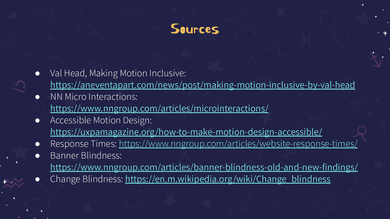
Val Head, Making Motion Inclusive: https://aneventapart.com/news/post/making-motion-inclusive-by-val-head
NN Micro Interactions: https://www.nngroup.com/articles/microinteractions/
Accessible Motion Design: https://uxpamagazine.org/how-to-make-motion-design-accessible/
Response Times: https://www.nngroup.com/articles/website-response-times/
Banner Blindness: https://www.nngroup.com/articles/banner-blindness-old-and-new-findings/
Change Blindness: https://en.m.wikipedia.org/wiki/Change_blindness
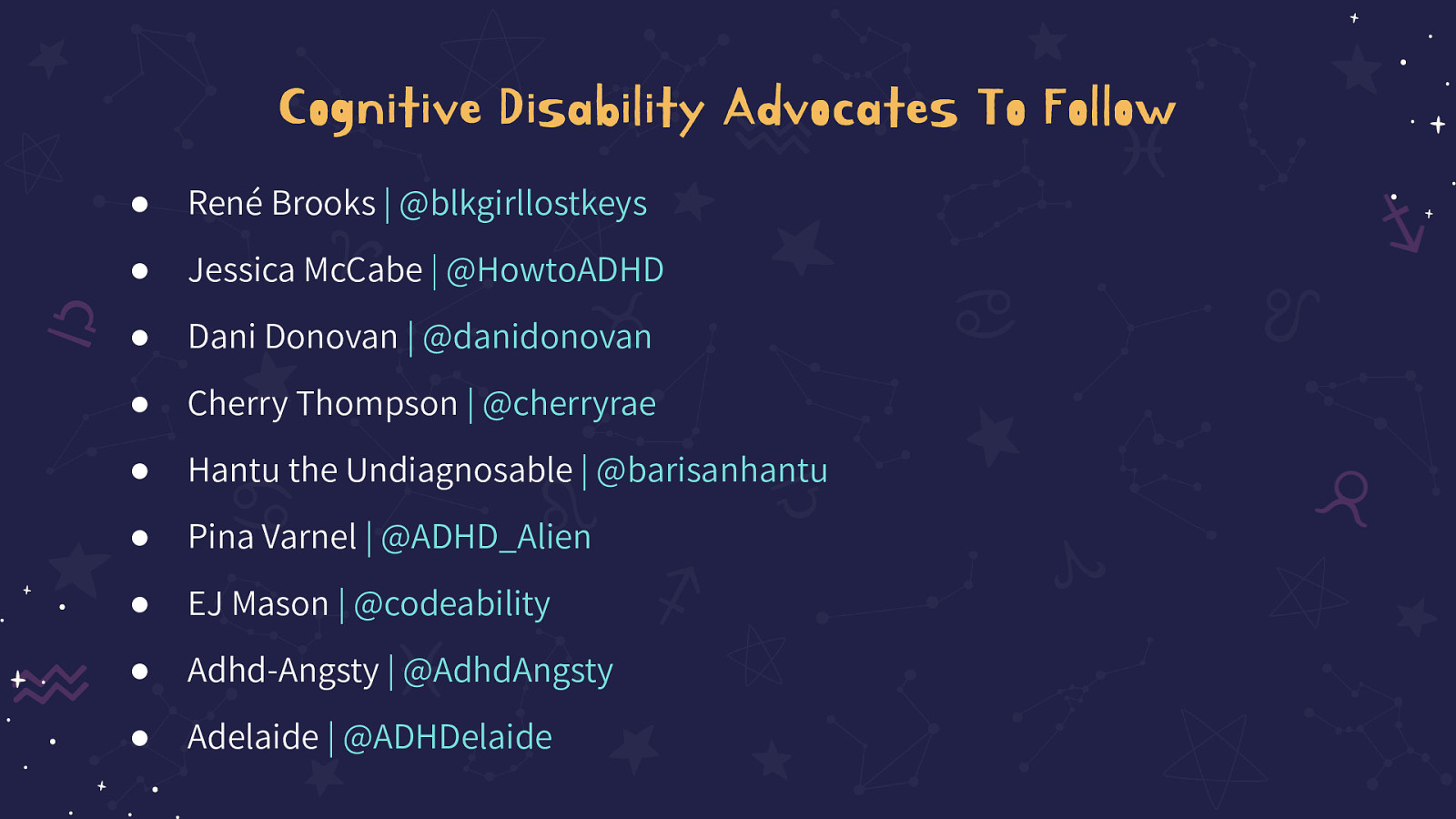
René Brooks | @blkgirllostkeys
Jessica McCabe | @HowtoADHD
Dani Donovan | @danidonovan
Cherry Thompson | @cherryrae
Hantu the Undiagnosable | @barisanhantu
Pina Varnel | @ADHD_Alien
EJ Mason | @codeability
Adhd-Angsty | @AdhdAngsty
Adelaide | @ADHDelaide