
A presentation at Y4IT 2019 in September 2019 in Quezon City, Metro Manila, Philippines by Sophia Lucero
Magandang umaga sa inyong lahat, salamat sa mga nag organisa ng Y4IT sa pag-imbita sa akin ngayong araw. I was actually a volunteer at this event a long time ago, so it’s nice to be back again, sort of.
A little random thing: does anyone know the Tagalog or Filipino word for “website”?
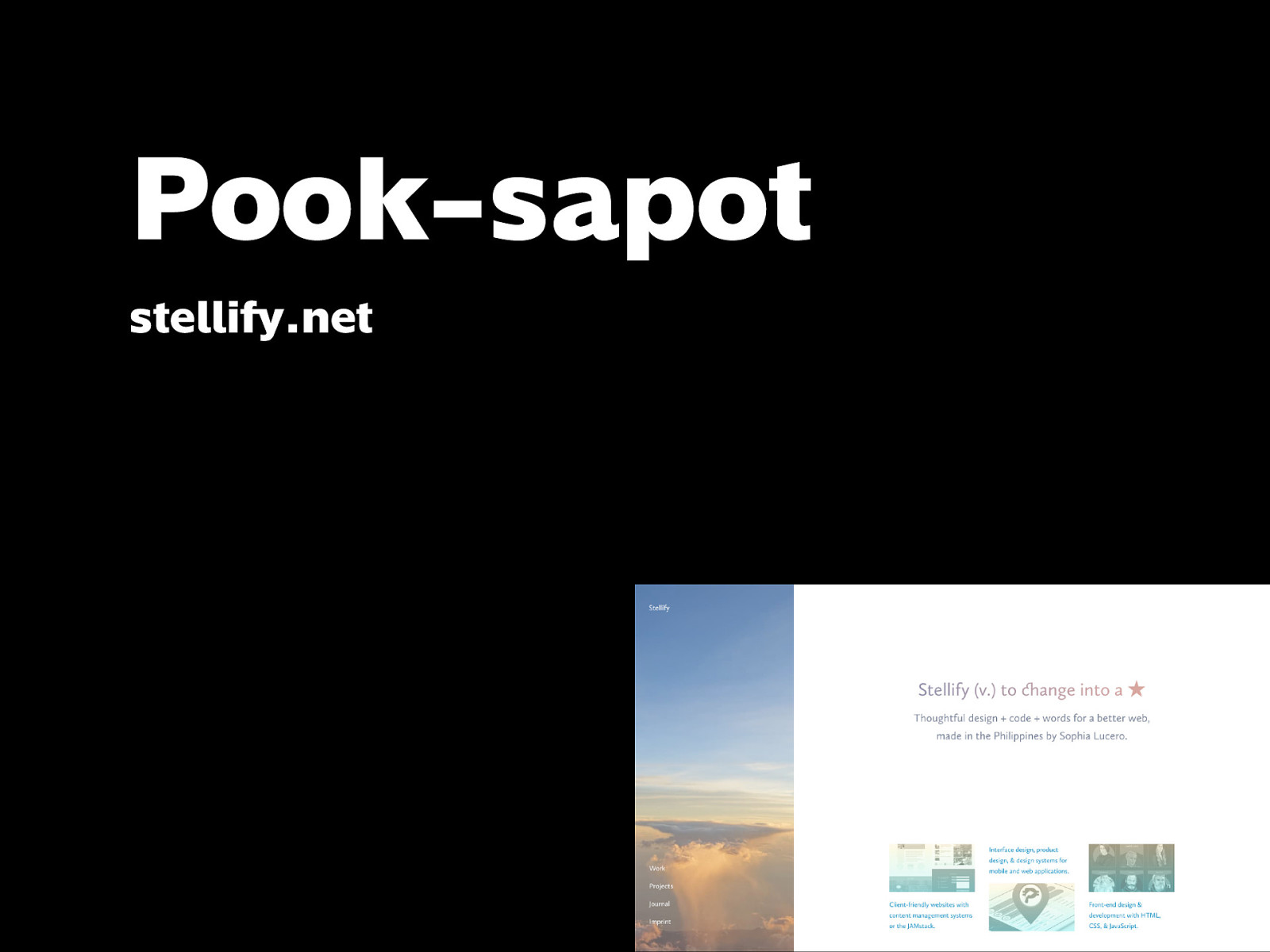
Pook-sapot. Yes, this is my website: stellify.net. I write blog posts and put my work, projects, and other links here.
I’m also co-founder of Philippine Web Designers Organization, which came together because we wanted to hold a web design conference in the country — the first of its kind in Asia, focusing on learning the things that aren’t always taught in school. PWDO is not a company, we don’t have salaries, we’re all volunteers, and we have even less time to run things because we’re working.
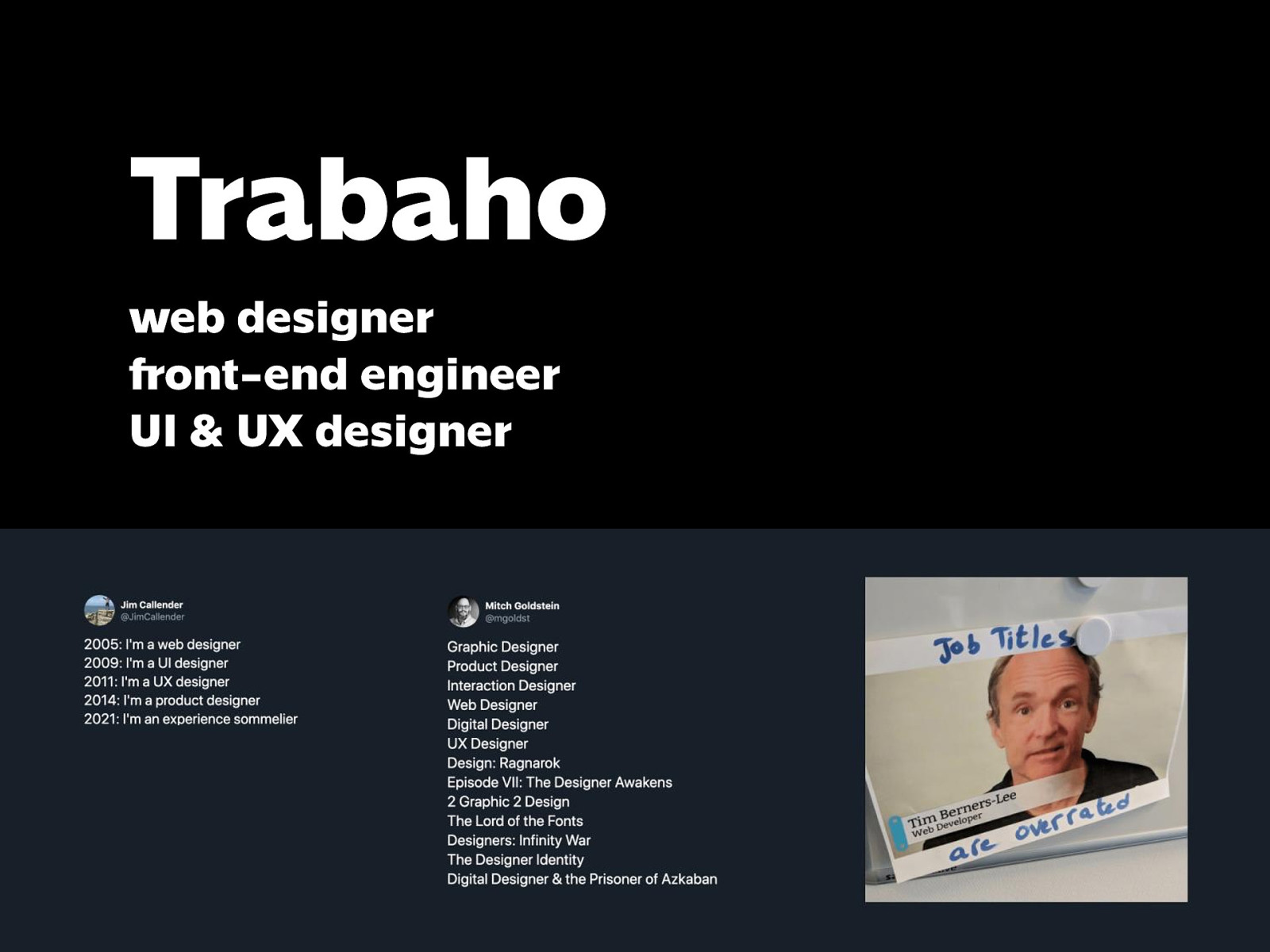
My actual work is as an independent web designer slash front-end engineer slash UI & UX designer, depending on the company. One of them is based in NY, and a couple others are based here.
So I’m going to rant a little bit. When I was a kid, I don’t remember this but allegedly when asked what I wanted to be when I grew up I’d answer: doctor, teacher, and scientist at the same time. And it was an amusing anecdote because people are expected to pick one profession, right?
In grade school, we were required to pick only one club, it was more of an elective than an after-school thing. First 3 years, it was Art Club. Last 3 years, it was Drama Club.
In HS, I went to Pisay (hello Pisay!). There was a thing where you were separated into science and tech streams, essentially determining what electives you could choose from. I chose the Science stream, since I planned to take VisComm in senior year, but I ended up doing 2 years of journalism, which led me to work on the English school paper called The Science Scholar. I wrote articles and did the layout. (This was also around the time I got into the web and learned how to make sites.)
In college, I took up CompSci, but I still went for the department and college papers, UP Parser and Engineering Logscript; worked as student assistant at the Engineering Web Team; one of the earliest officers of UP ACM and member of Info committee at UP CURSOR.
Since I graduated and to this day, the things I work on involve either design, or code, or both. I kind of enjoy being in that intersection. It frustrates me when things get separate.
Point is: in so many parts of my life there’s been this artificial choice or separation that kept me wondering WHY. You have to pick a club, elective, stream, specialization. Di ko naabutan yung SHS track, but I would be frustrated with that choice too.
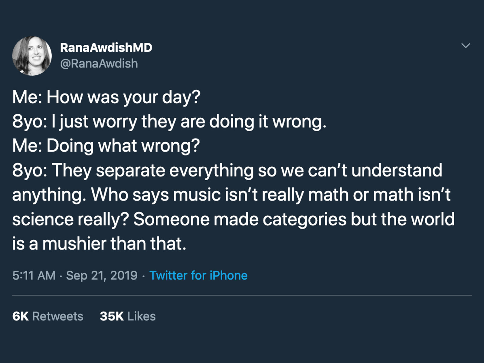
I just found this tweet about what an 8-year old said, and I relate to it so much.
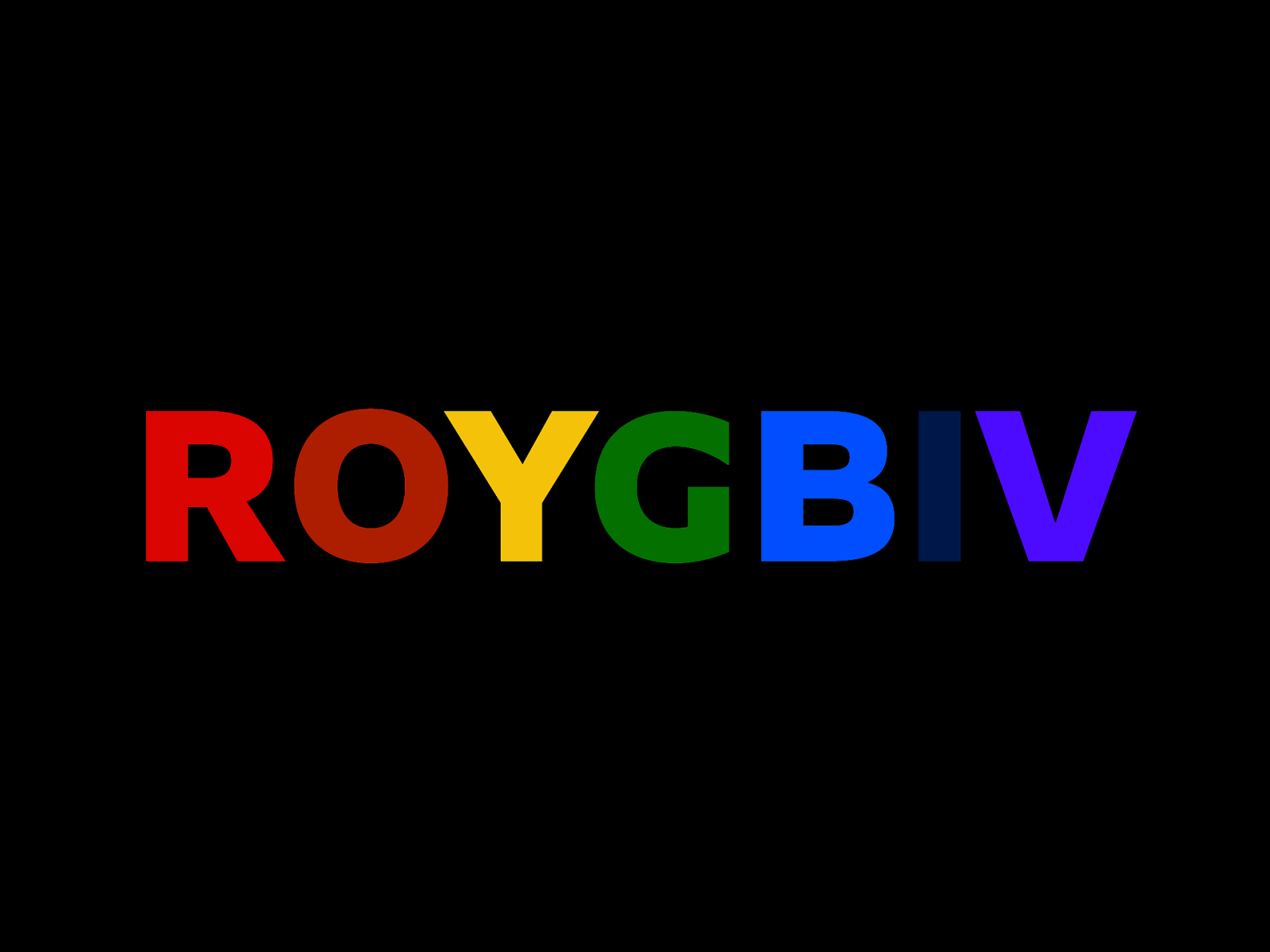
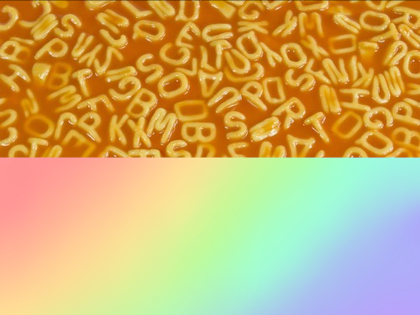
Growing up, we were taught that the rainbow has 7 distinct colors: ROYGBIV.
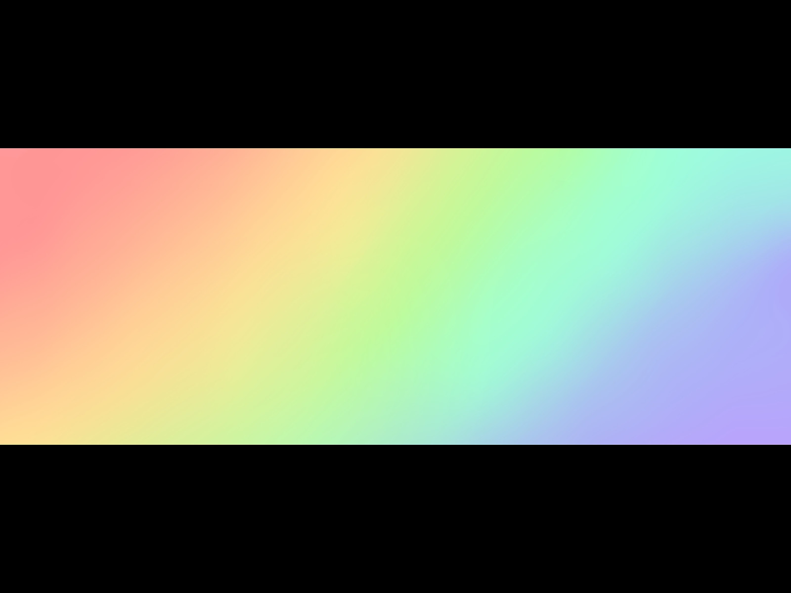
But if you look at the visible spectrum, it’s actually hard to tell where one color “ends” and another one “starts”. There are millions of unique colors and they all blend in. They’re all connected.
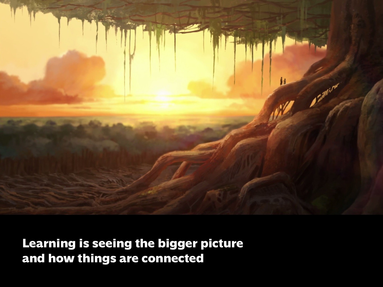
What I hope to do with this talk is to encourage the idea of seeing the bigger picture, especially when it comes to learning and education. You might be thinking, this is an IT event, and I’ll be talking about design, “but what does design have to do with tech, what does this have to do with me? Isn’t design for creative or artistic people? Is it part of my job? (or for the teachers — is it part of what I teach?) First of all, I firmly believe that creativity is a term that shouldn’t be limited to traditionally artistic fields.
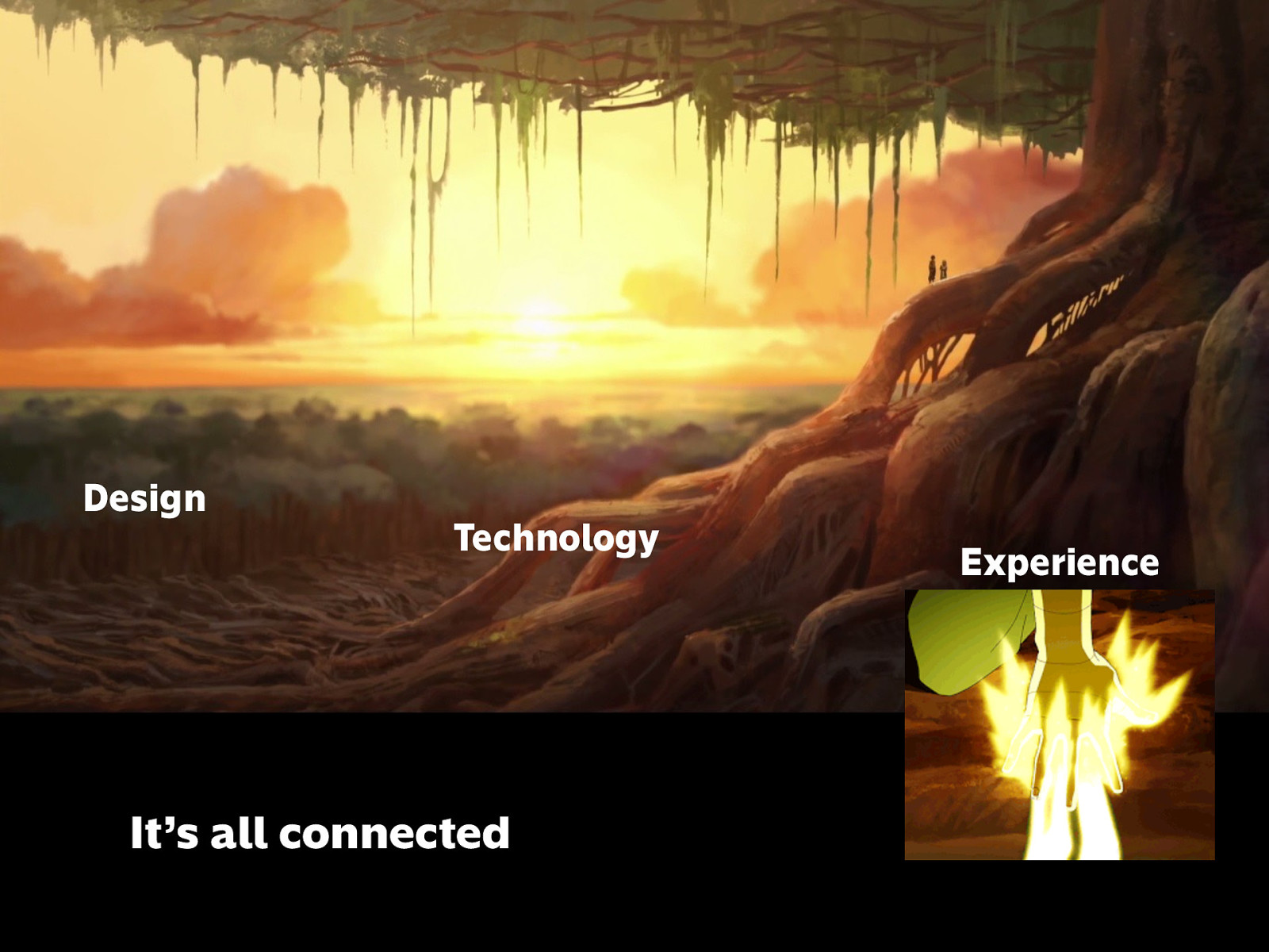
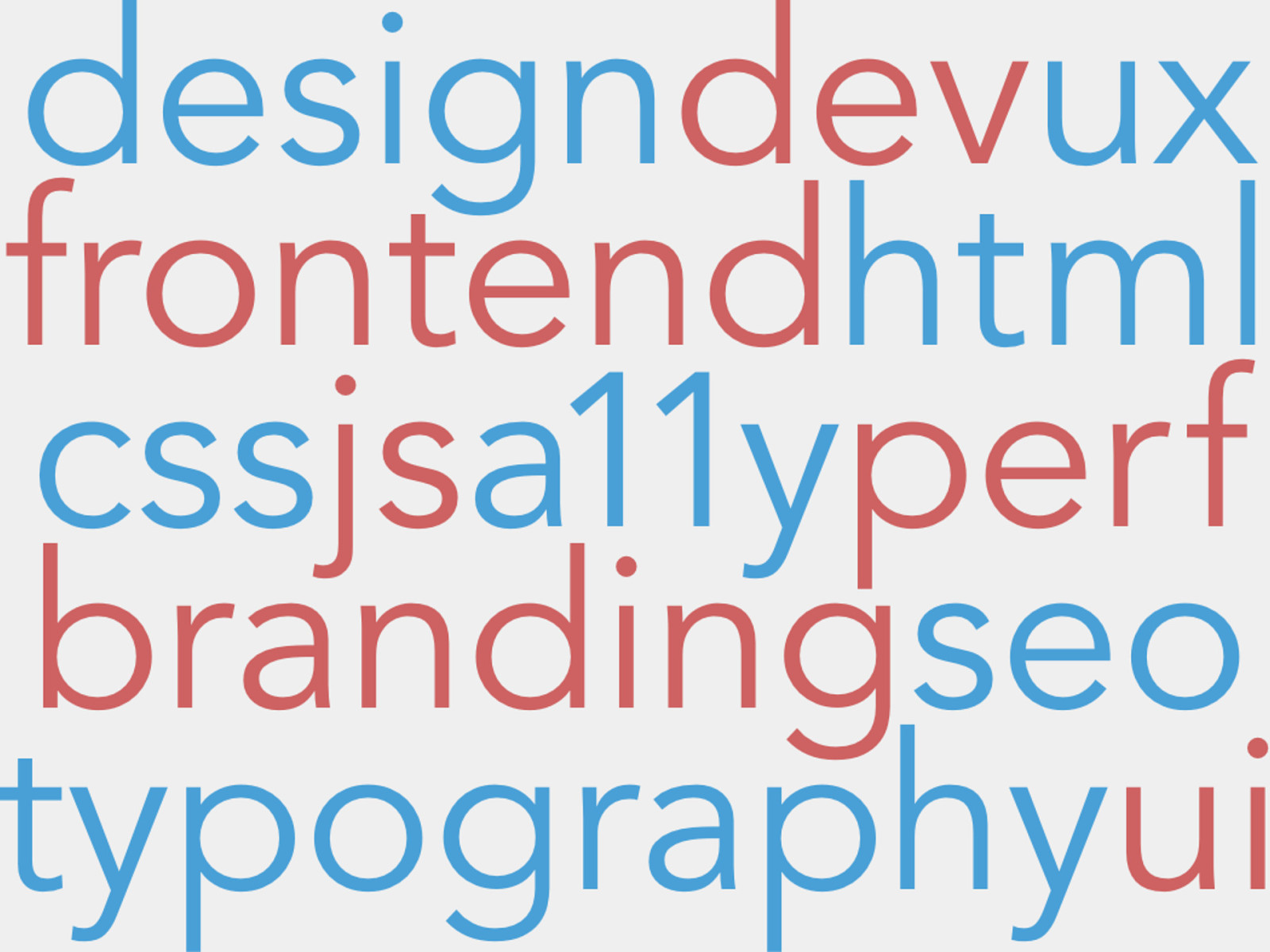
Design Technology Experience
The way I see it, it’s all connected.
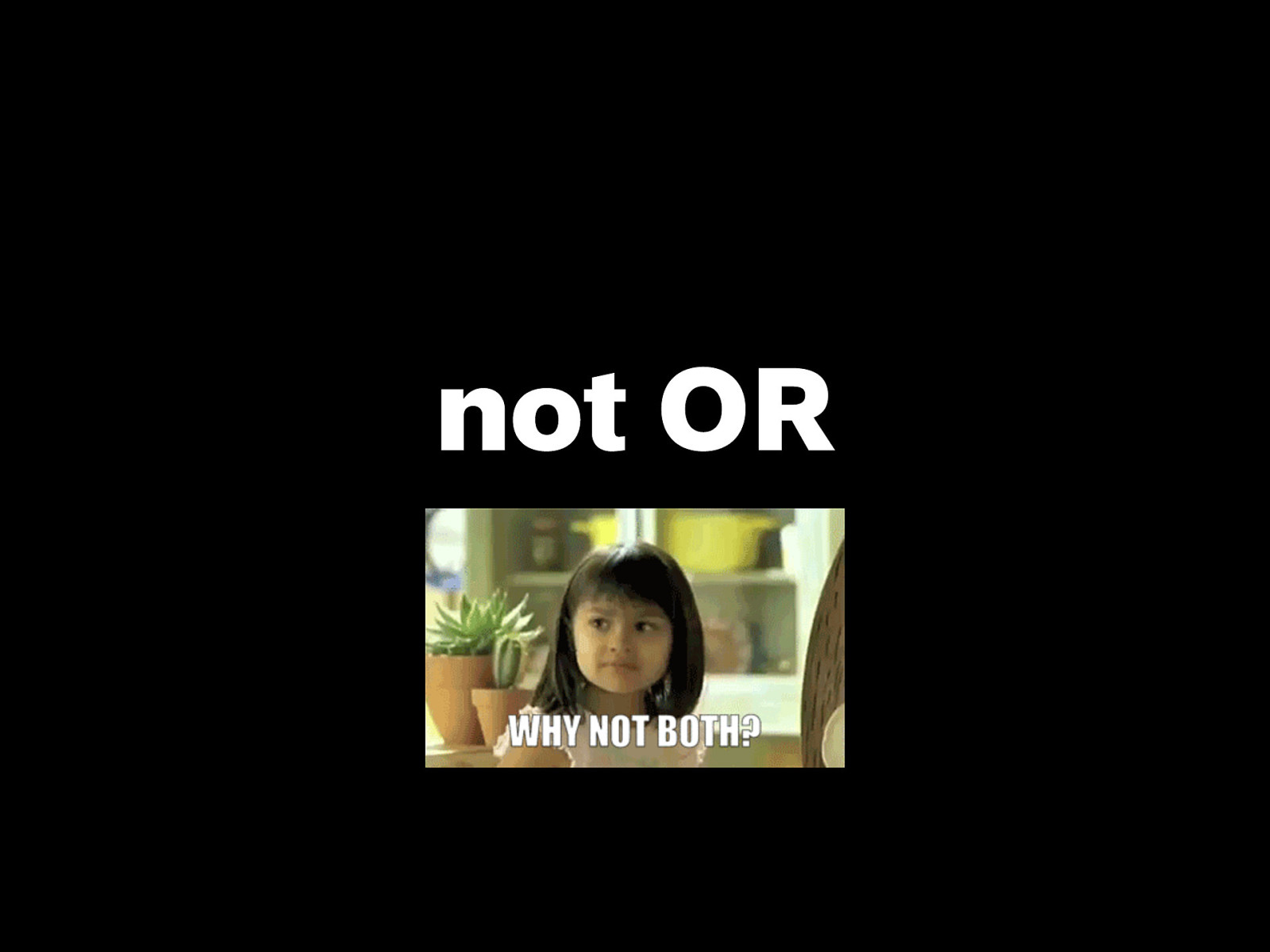
not Tech or Design
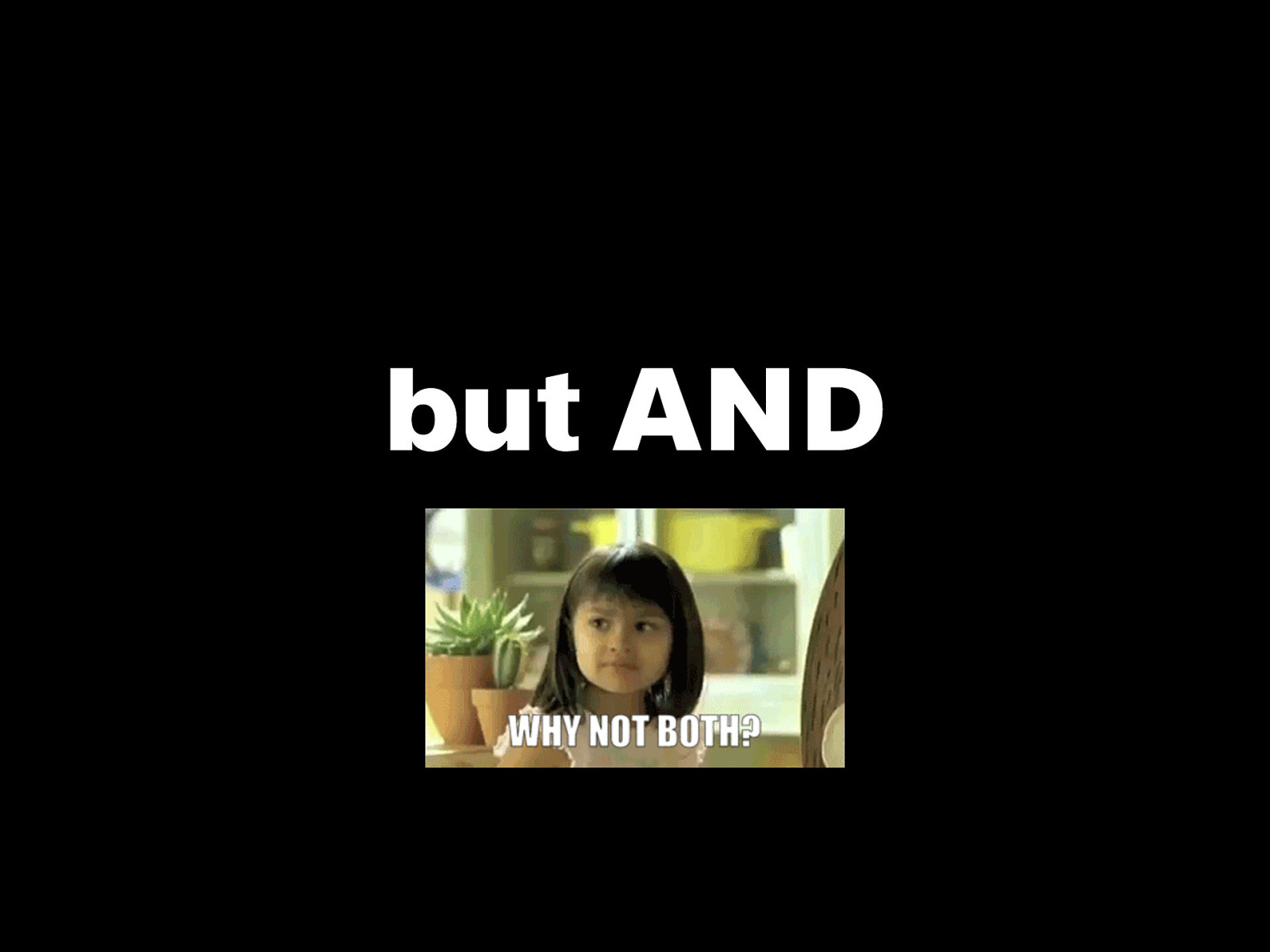
but Tech and Design, and how they connect…
…And we’ll start with these 3 letters.
User Interface
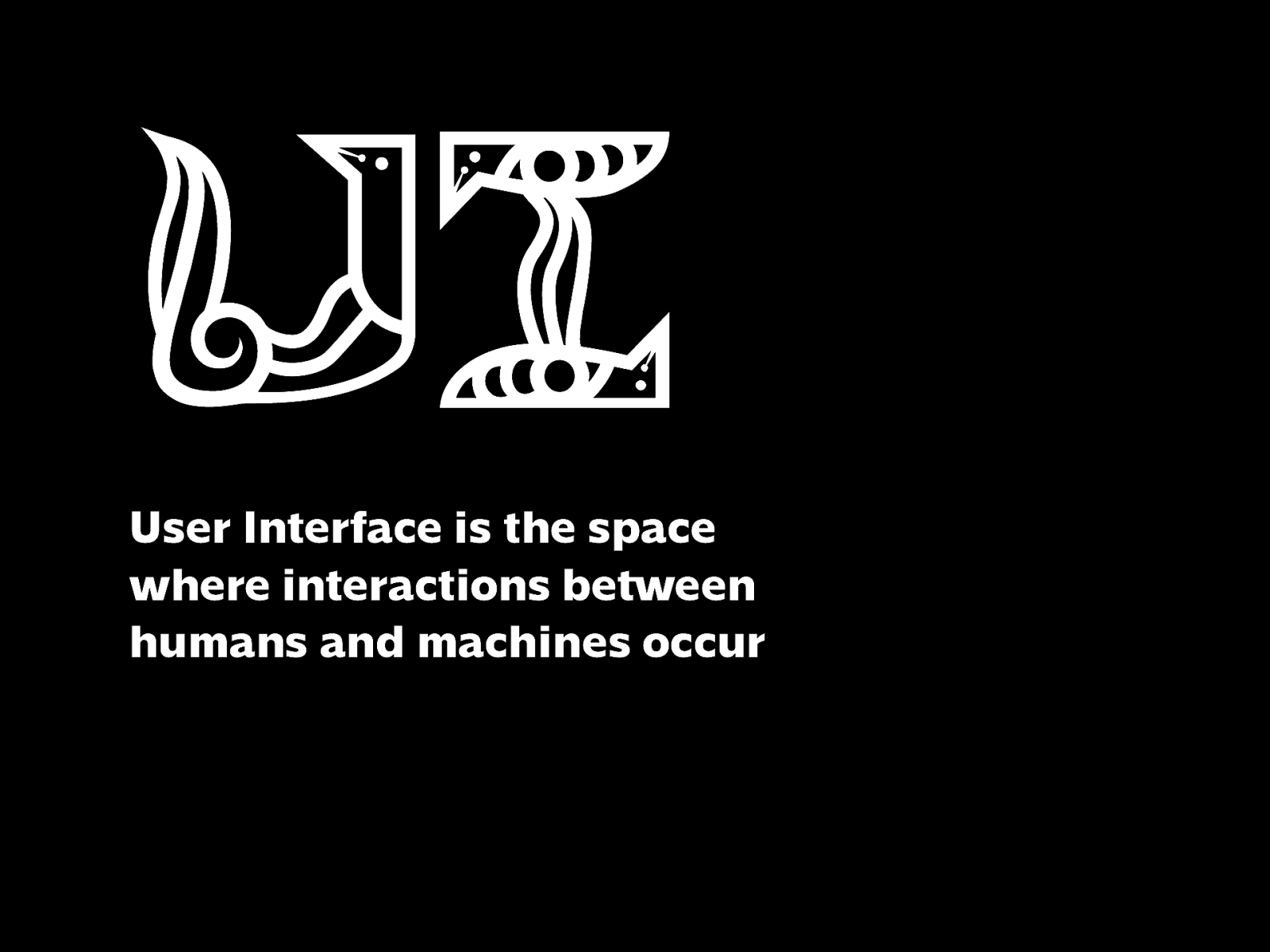
User Interface is the space where interactions between humans and machines occur
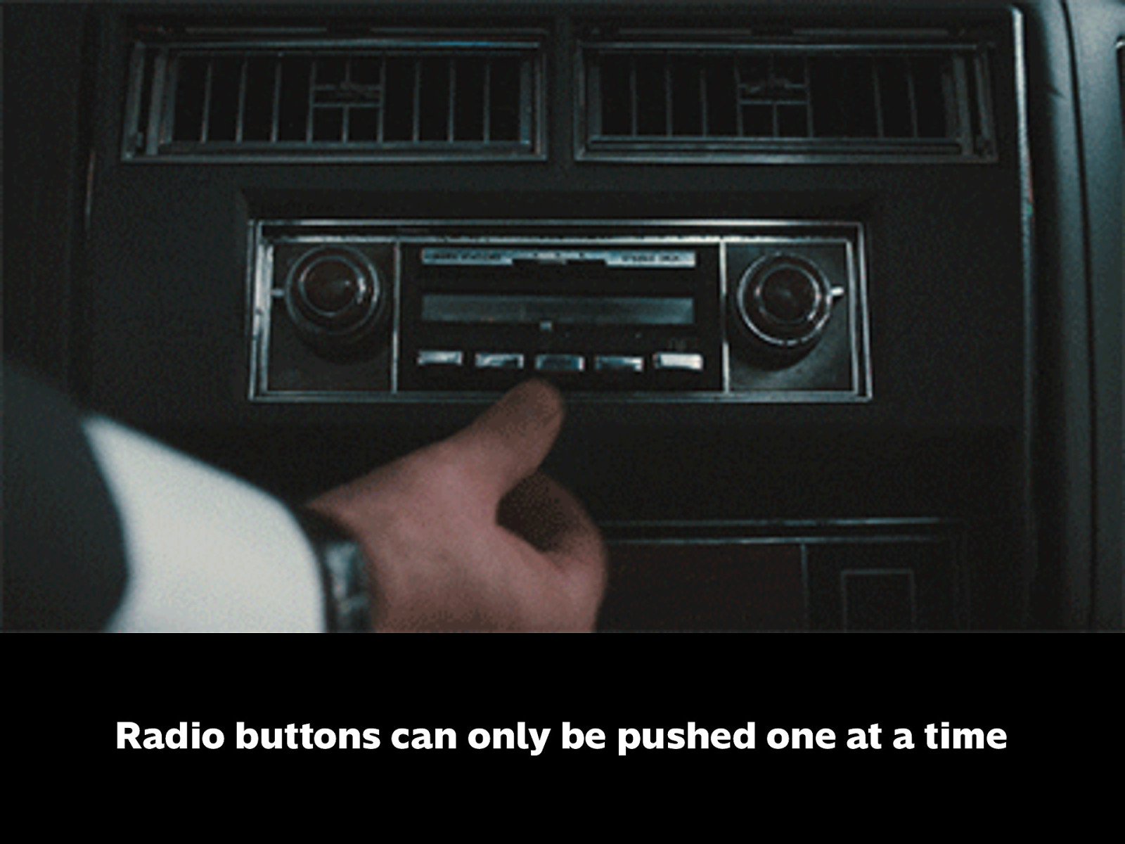
For example: this is technically an interface. In older cars, radio controls look like this. Buttons in the middle can only be active one at a time.
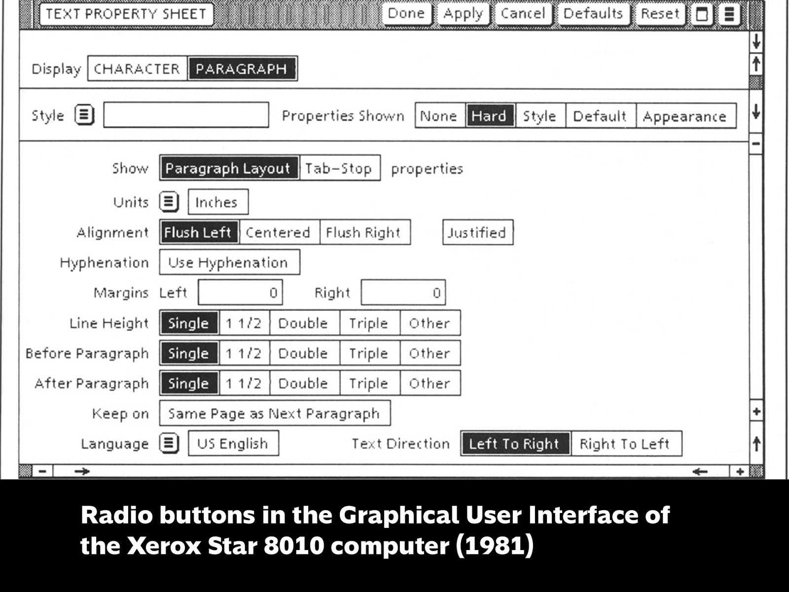
This is one of GUIs that applies to concept of the radio button to software. A UI metaphor, or skeuomorphism.
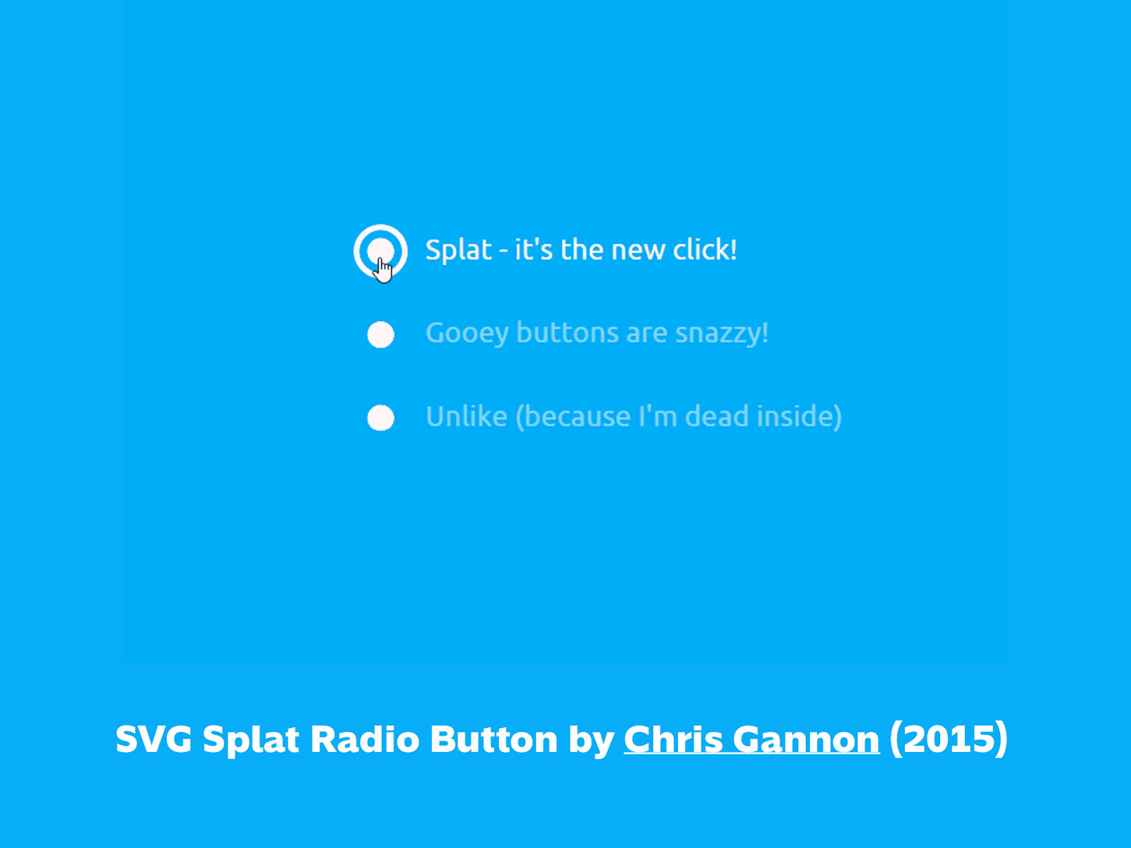
And here’s what radio buttons usually look like today, but with a cool animated touch. https://dribbble.com/shots/2378100-SVG-Splat-Radio-Button
User Experience
User Experience is a person’s perceptions & responses resulting from the use and/or anticipated use of a product, system, or service
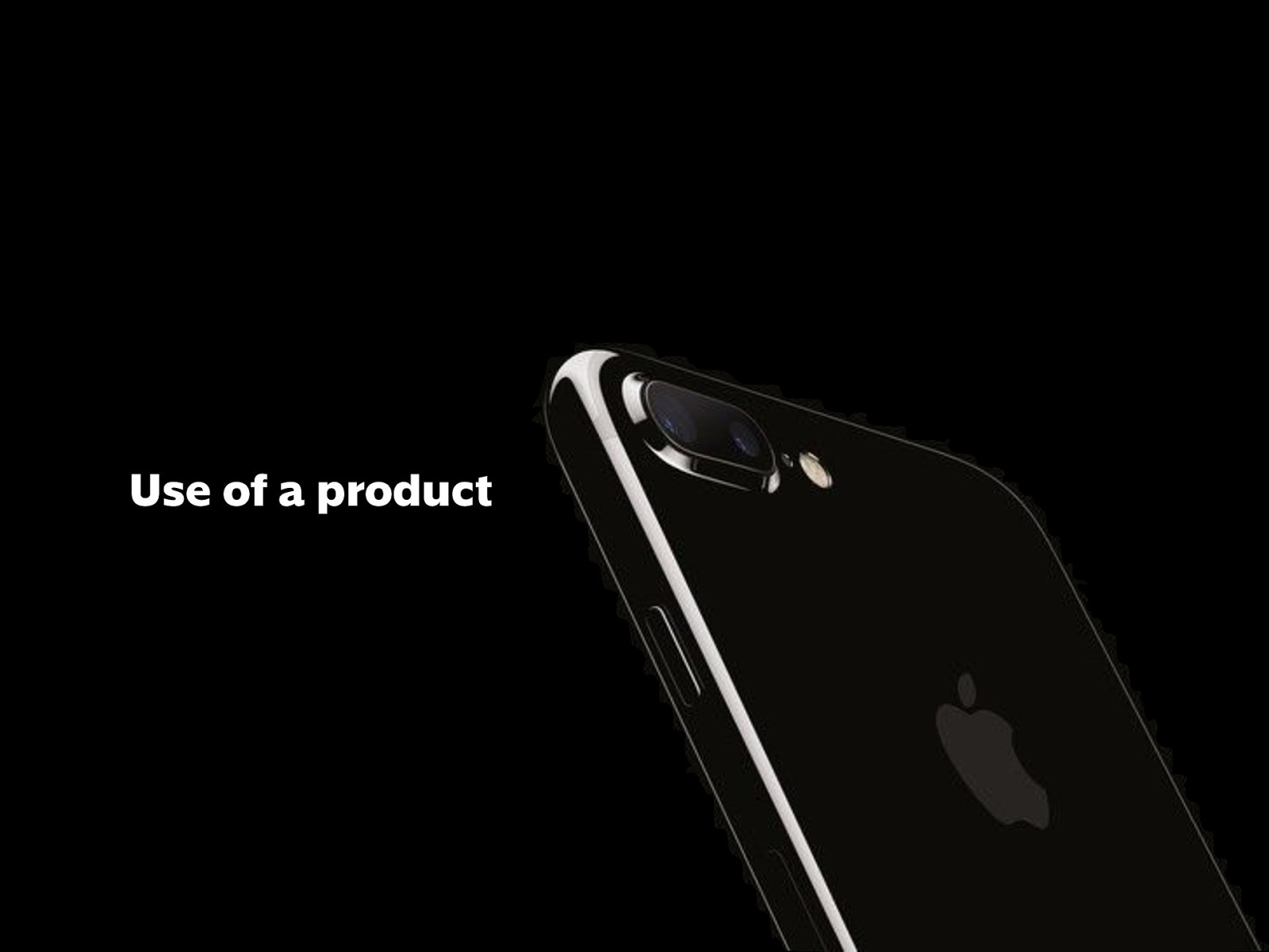
Use of a product
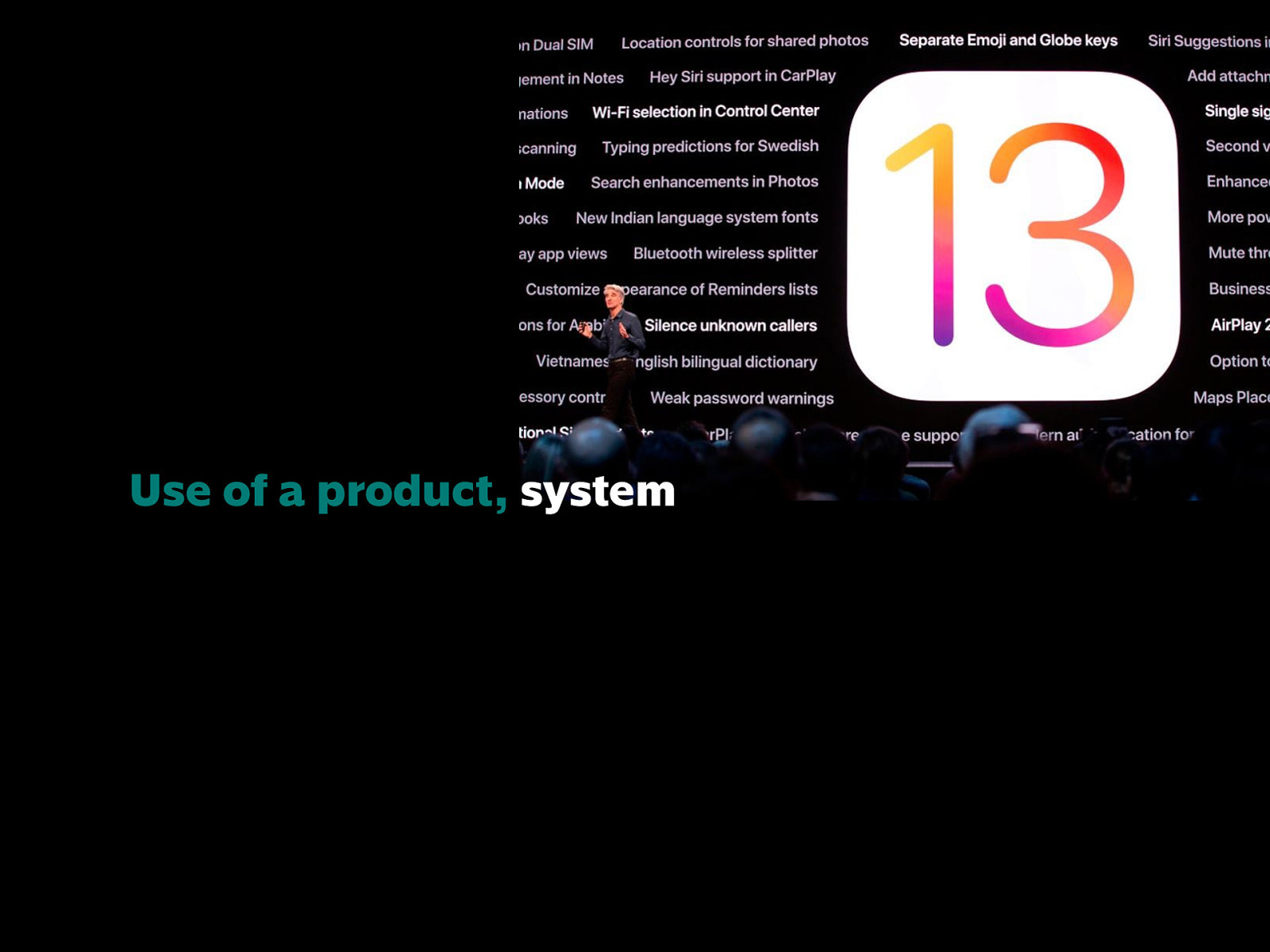
Use of a product, system
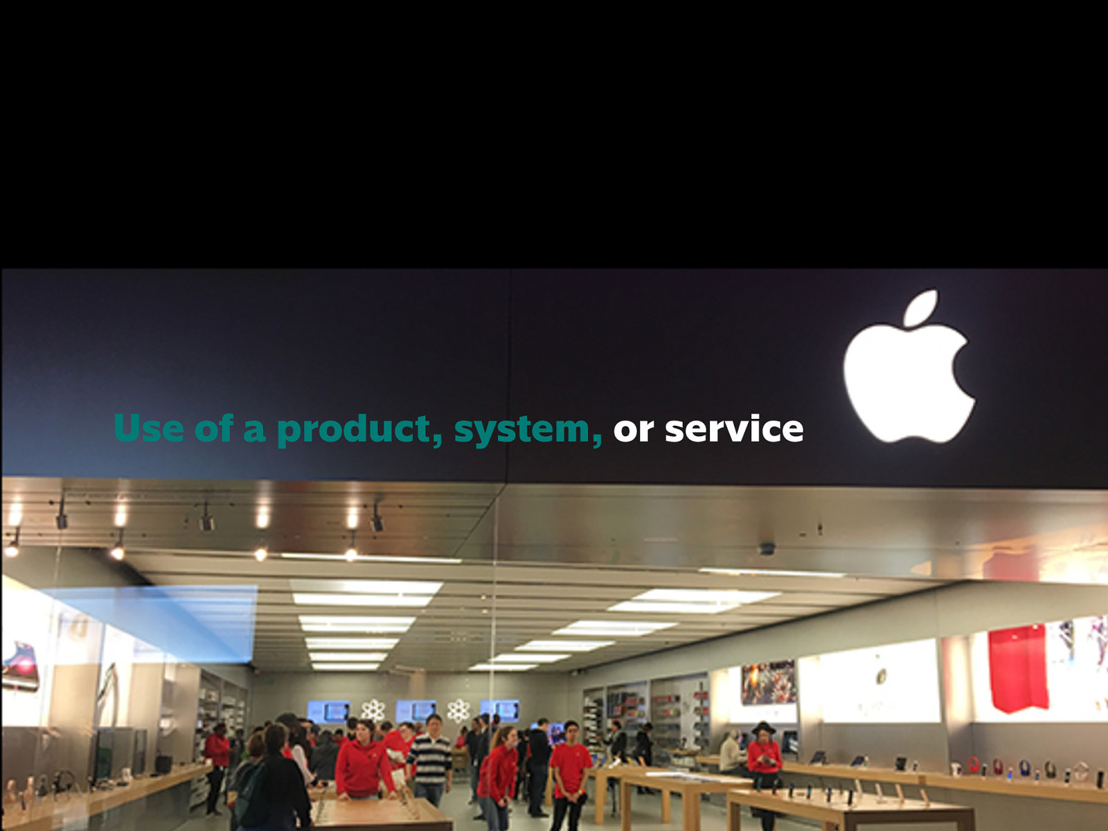
Use of a product, system, or service
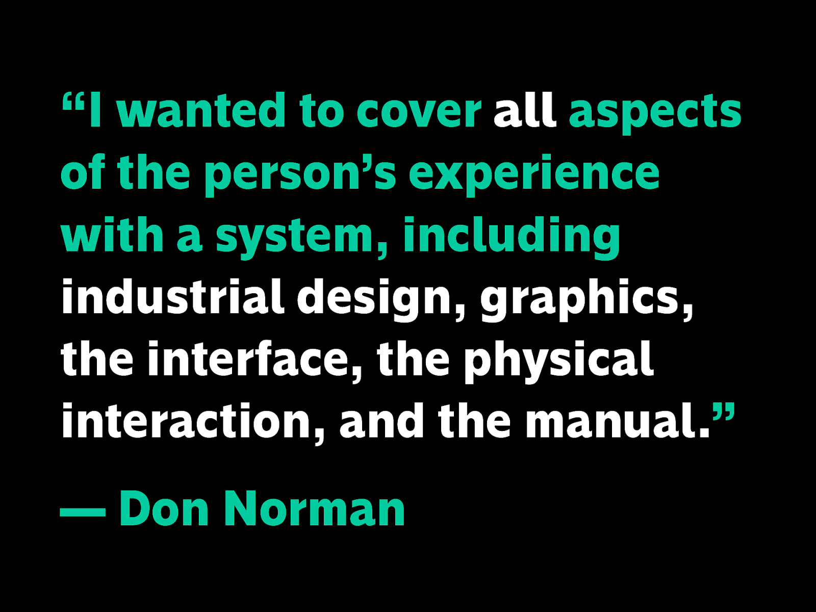
“I wanted to cover all aspects of the person’s experience with a system, including industrial design, graphics, the interface, the physical interaction, and the manual.” — Don Norman
Why are all the examples about Apple?
Don Norman coined the term UX in 1995 and worked at Apple at the time.
The point is to think about more than just the product itself, everything that can affect someone’s experience, quote: “when you first discover it, when you see it in the store, when you buy it, when you can’t fit it into the car, when you finally do get it home and opening the box it looks scary, “I don’t know if I can put this computer together”. It’s everything that touches upon your experience with the product and you may not even be new to the product—it may be telling somebody else about it.”
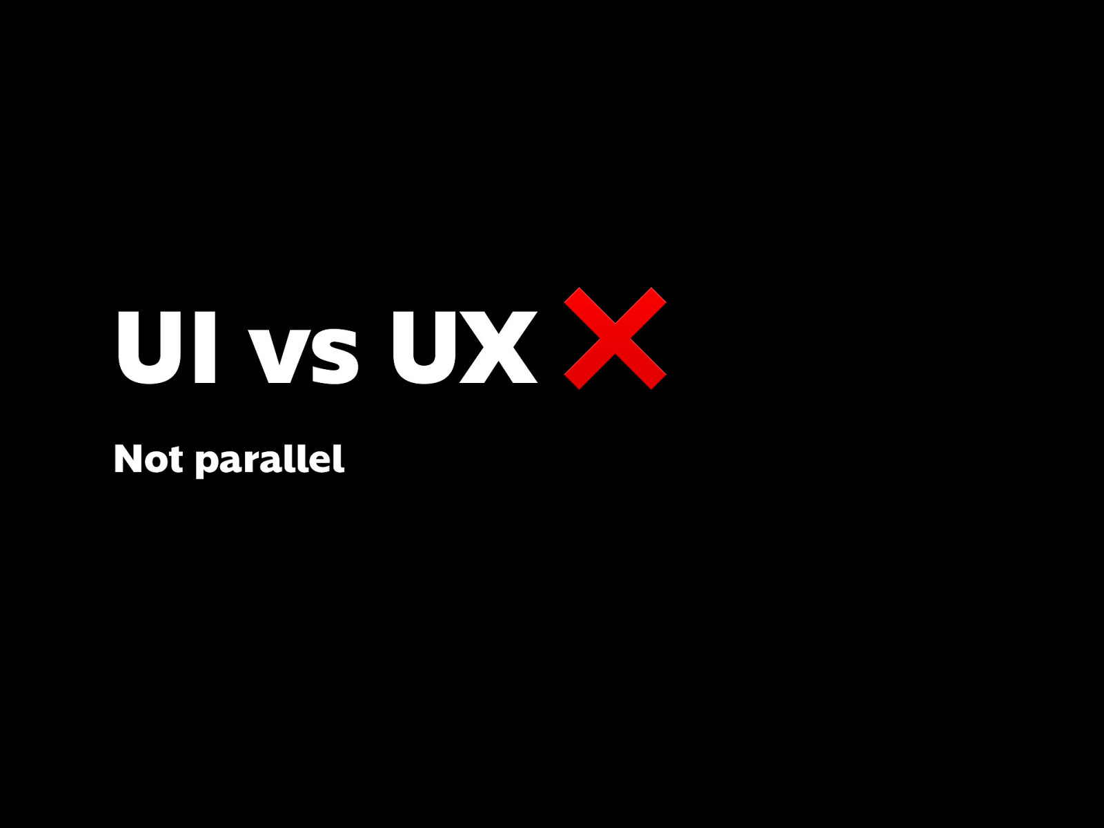
So hopefully you’ve realized that UI and UX are not really parallel things
They’re not opposed to each other
Nor are UI and UX interchangeable
But they’re often used together because it’s “easier” that way
Also, that interfaces can be more than digital
And that experiences can be more than digital
But for simplicity’s sake today, we’ll be looking at digital, because we’re at an IT event.
You can’t predict with 100% certainty the outcome of what you create and the situation a user will experience it
But everyone involved in a project contributes to what a user is going to experience.
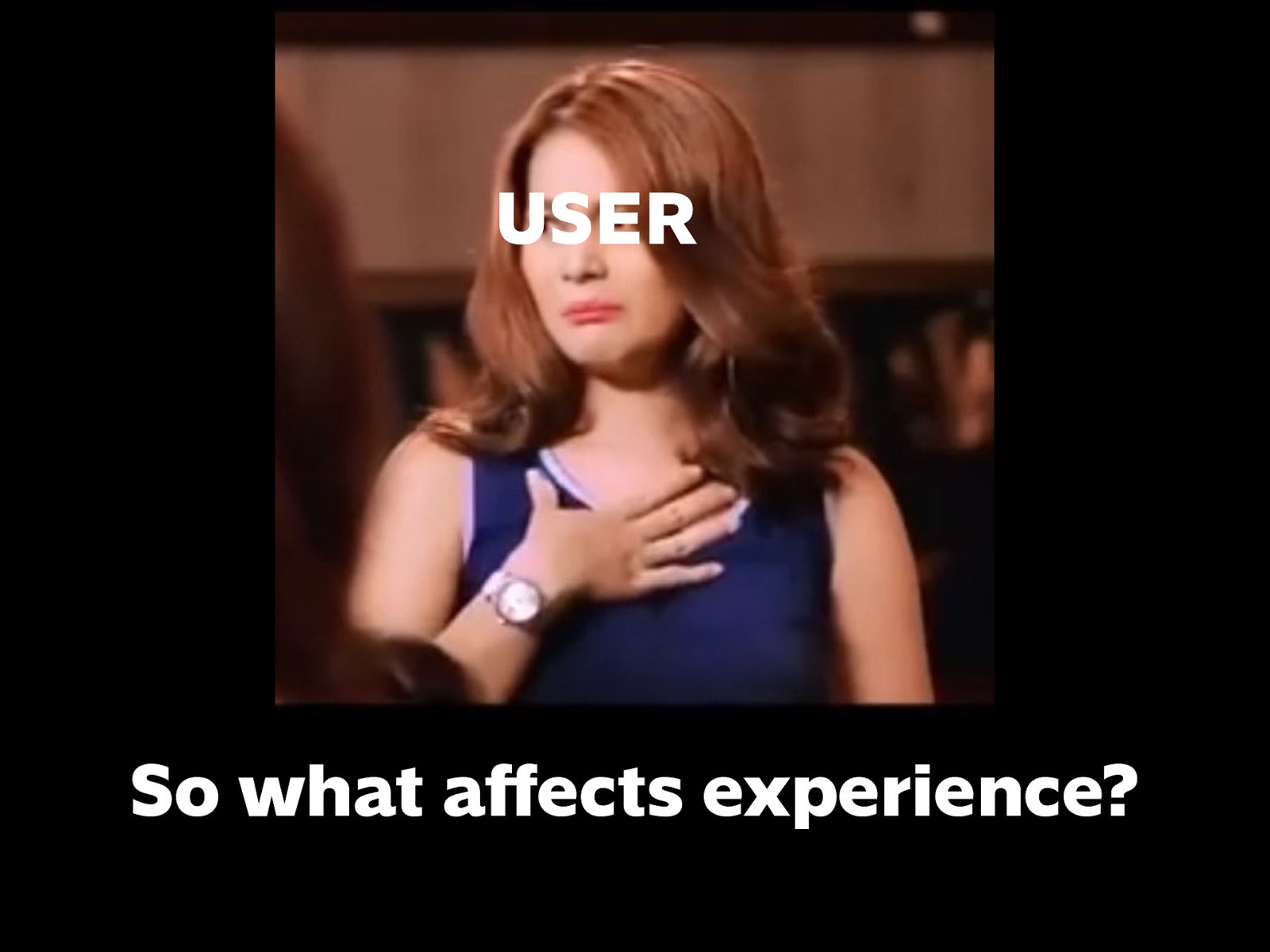
When a user is having a not so great experience, is it their fault? It most likely isn’t. So what could affect it?
There are many, many things to talk about, that’s why it’s a whole industry.
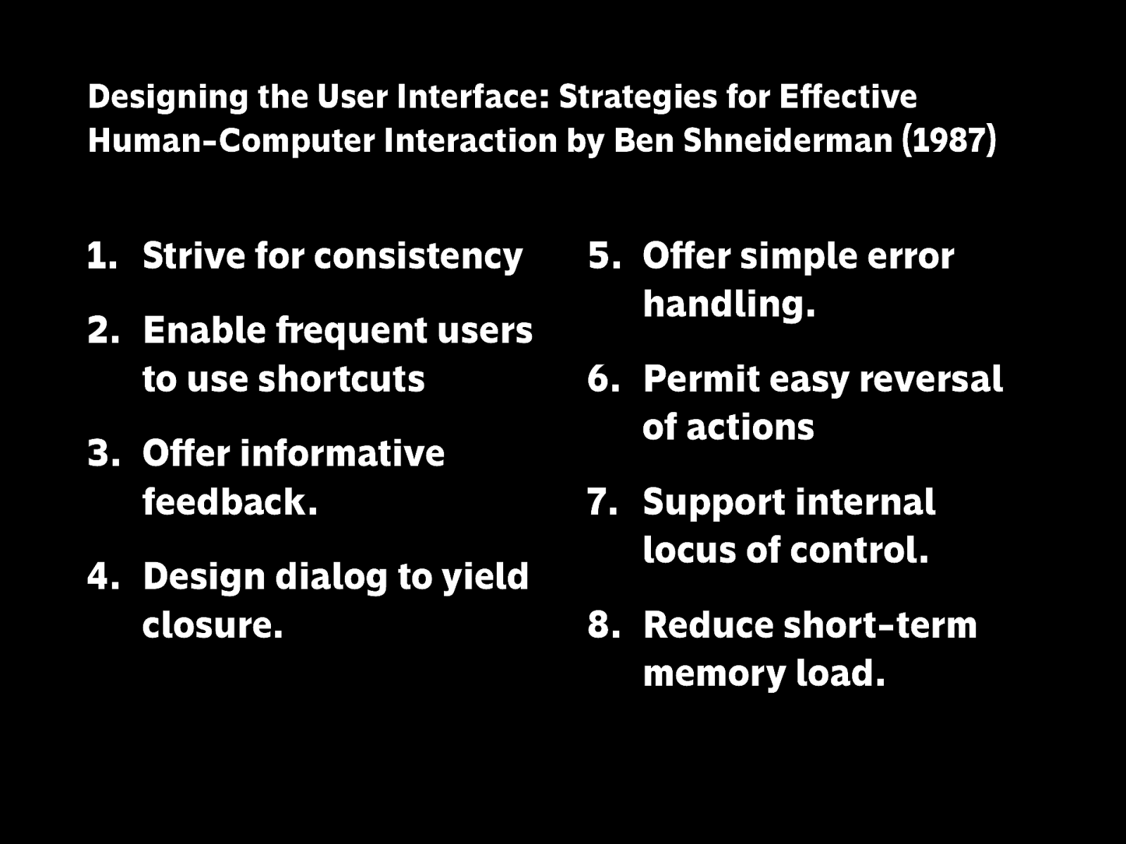
There are concrete lists like these you can refer to…
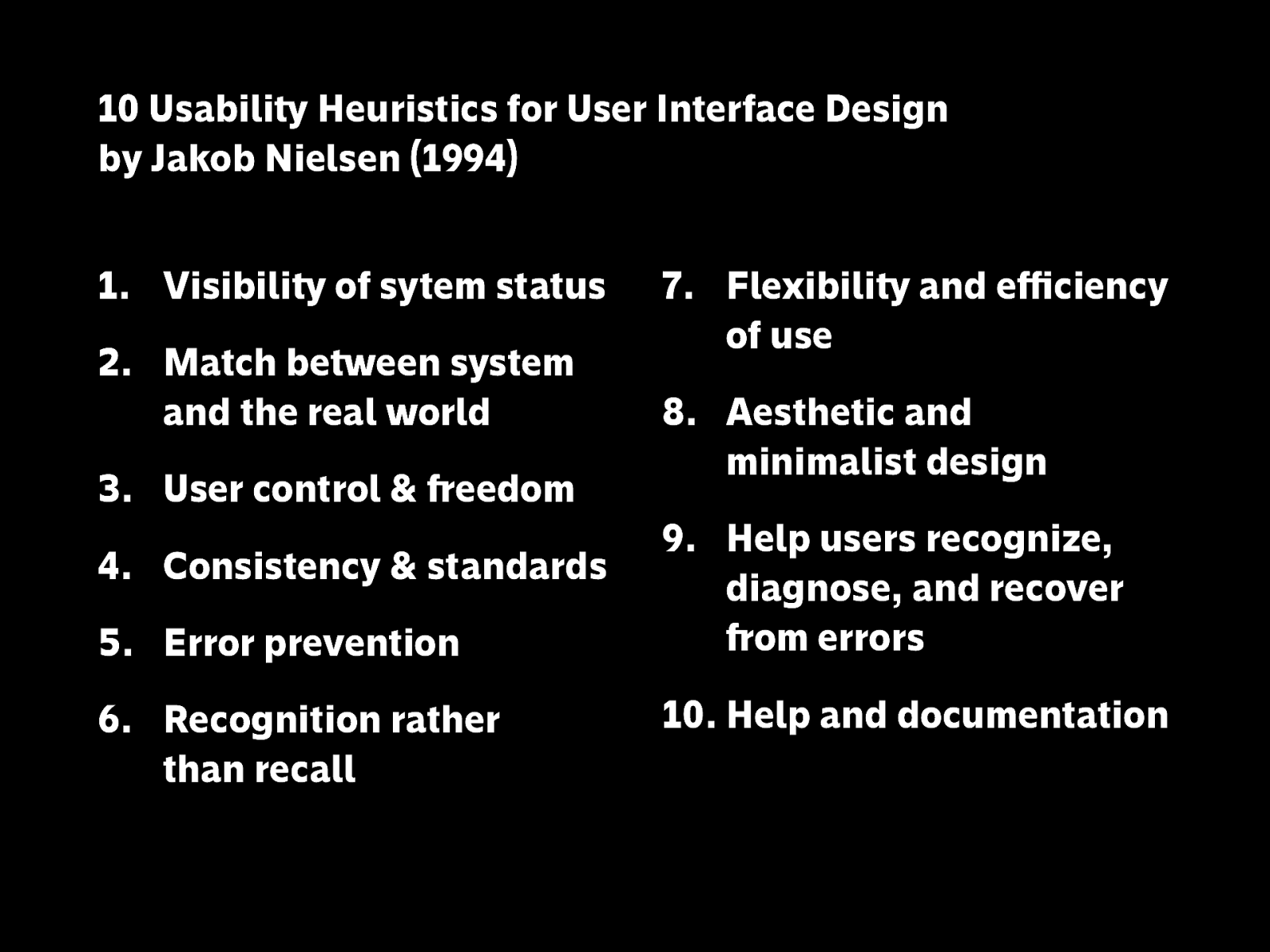
Which are what you would call heuristics, or broad rules of thumb you can turn to when evaluating something.
https://www.nngroup.com/articles/ten-usability-heuristics/
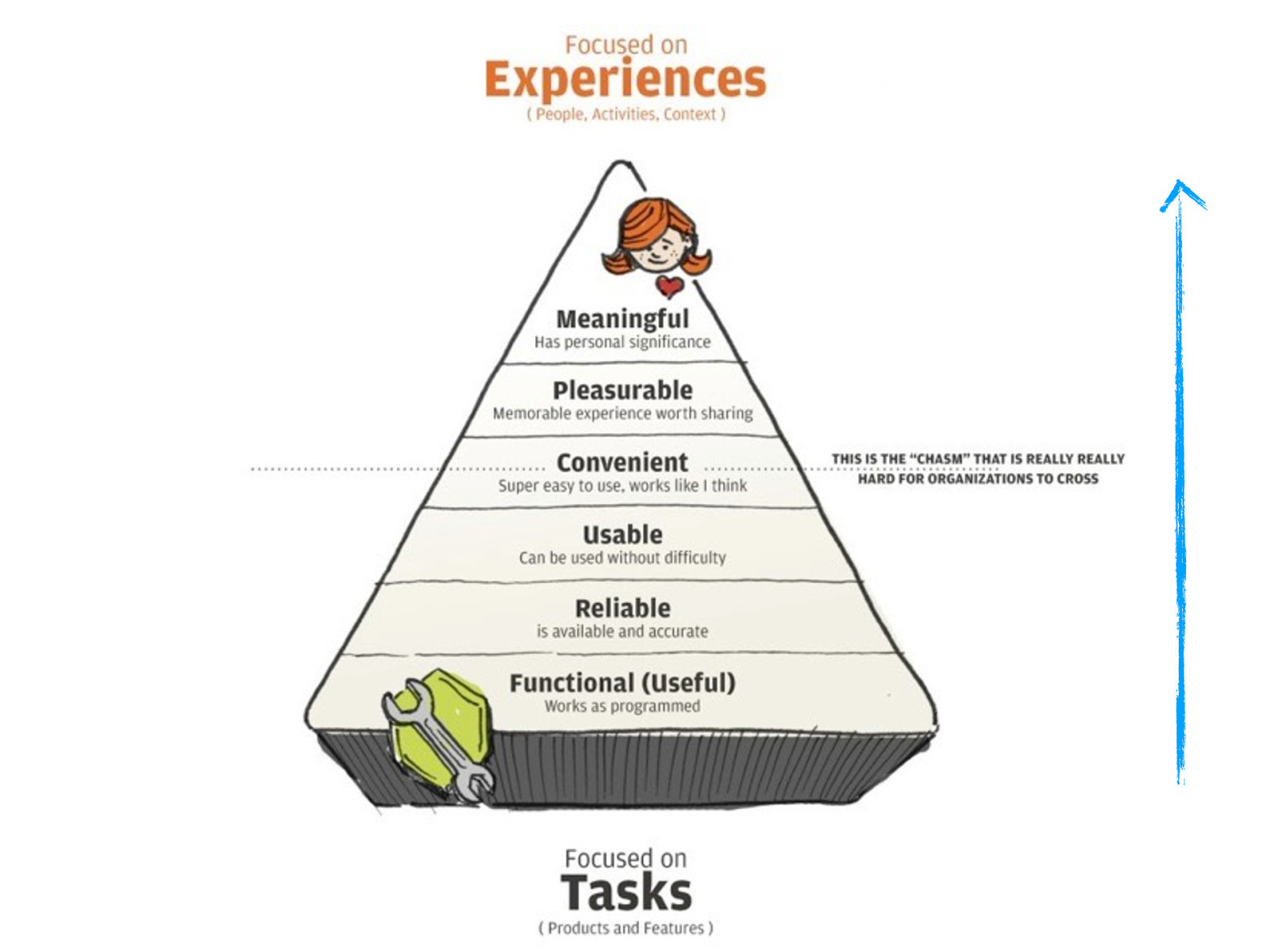
But let’s try this example based on Maslow’s Hierarchy of Needs. In order to have a great experience, you can’t stop at the bottom three. Paying attention to all the levels transforms your work from just OK to great, amazing, memorable, something they’ll want to keep using over and over again.
Image source: https://medium.com/@jagdish.sohal/what-you-need-to-know-about-learning-experience-design-d456fec4a1d3
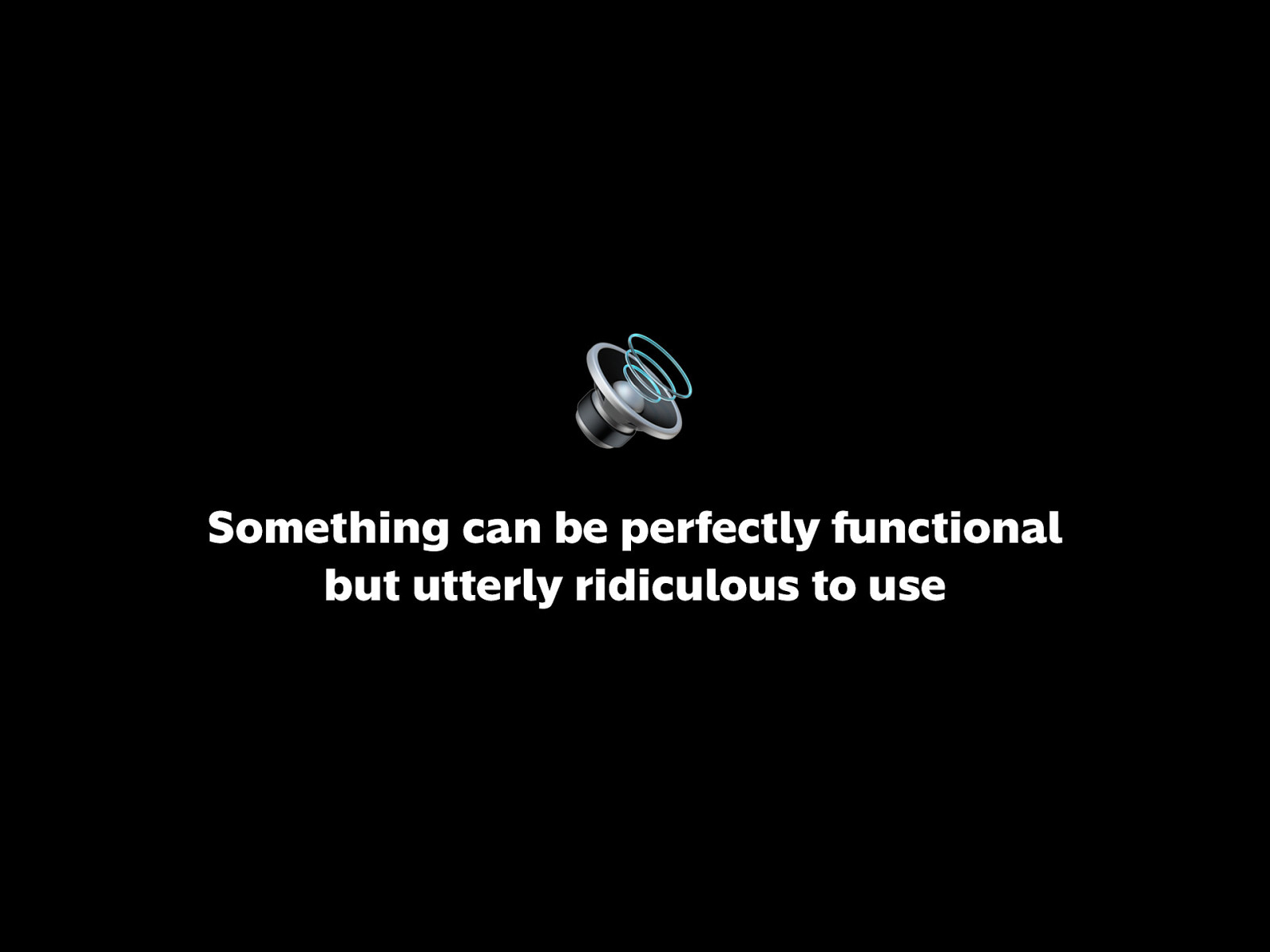
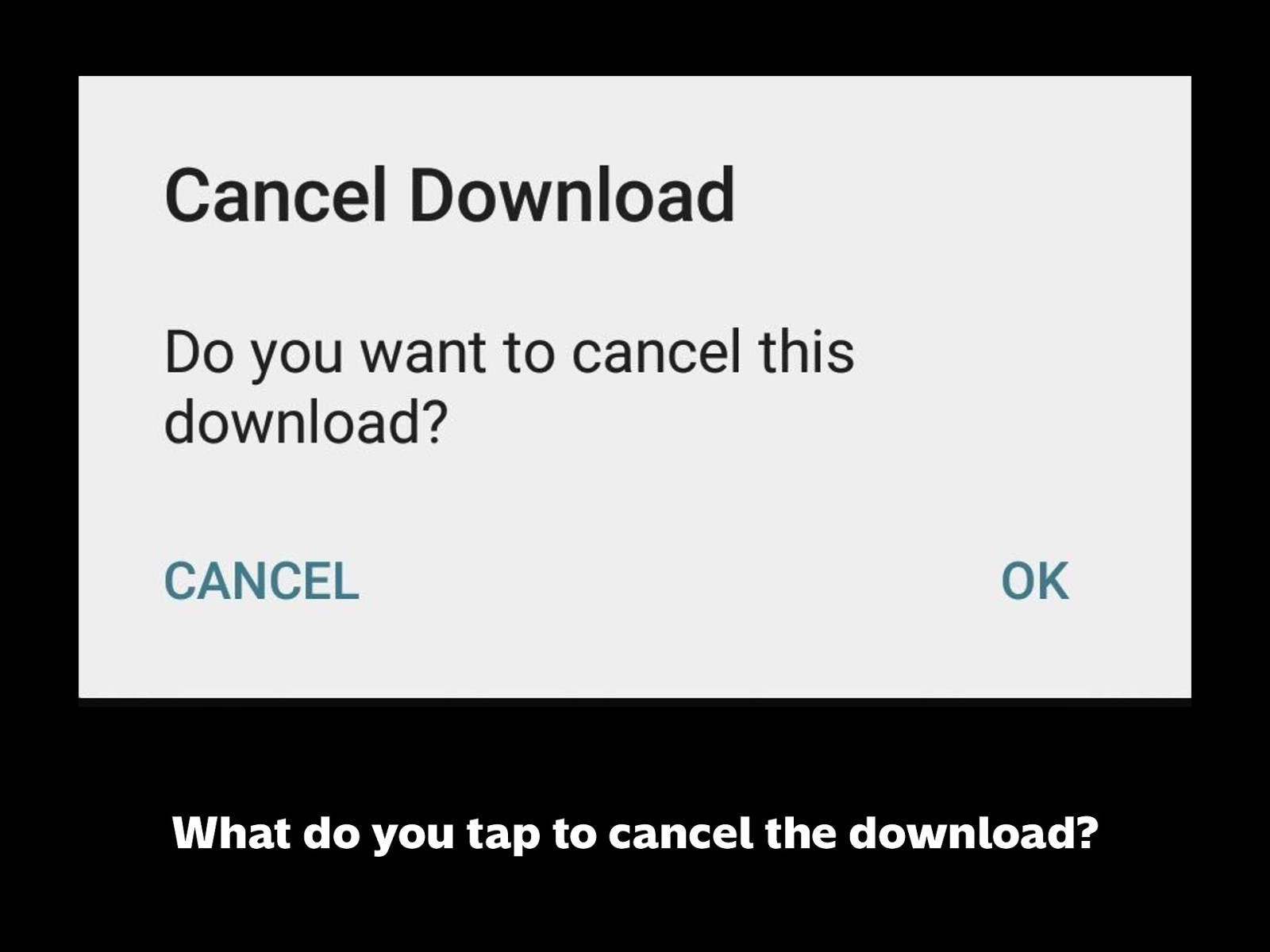
Imagine you’re on your phone or computer, browsing memes and stuff. Suddenly, loud music starts playing. It’s embarassing. It’s distracting.
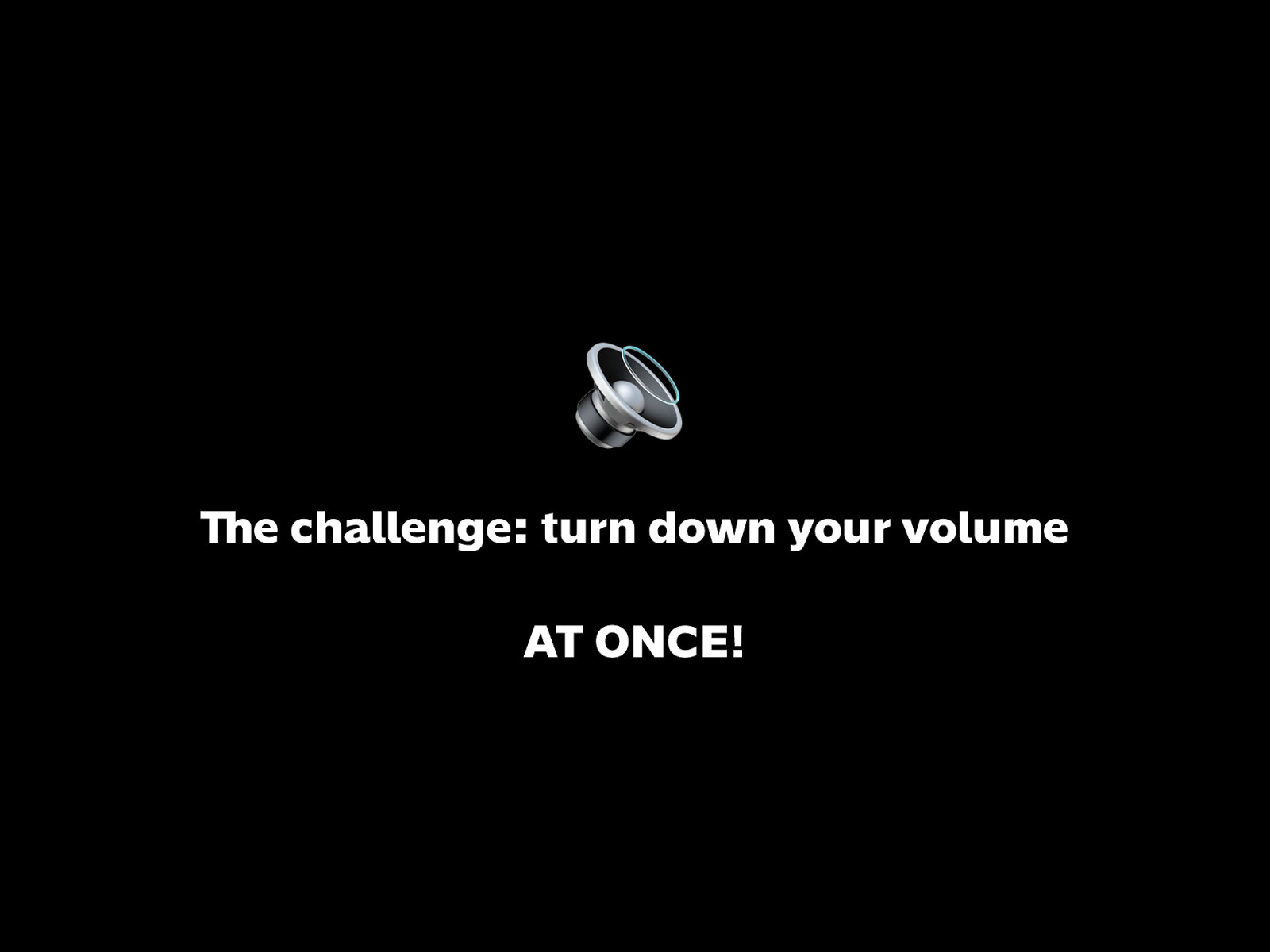
You scramble to find the volume controls on your device. And this is what you have to use…
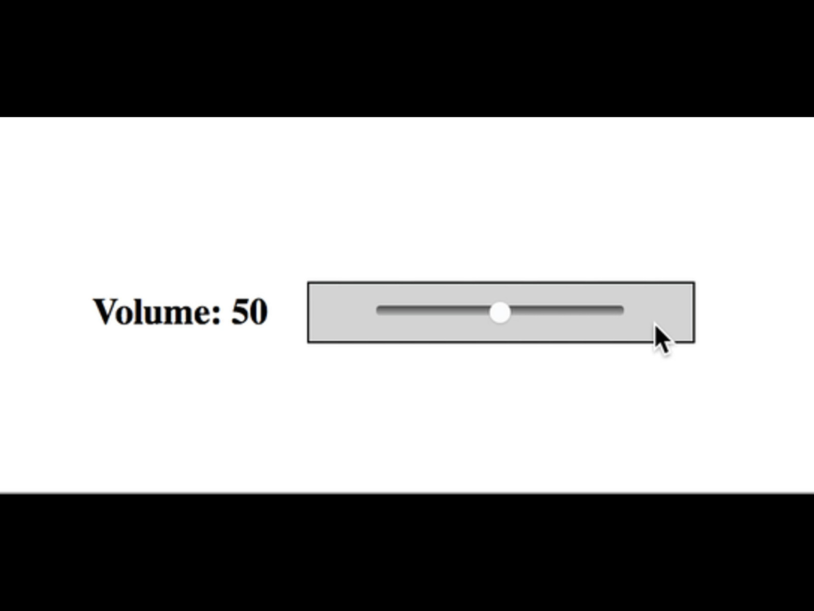
And this is what you have to use…
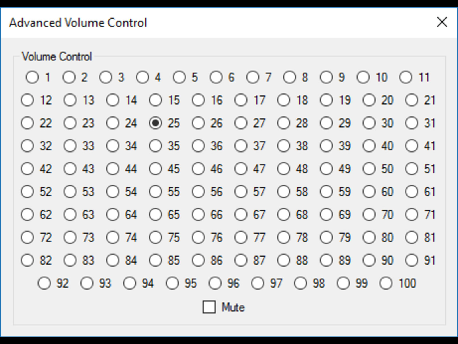
or this
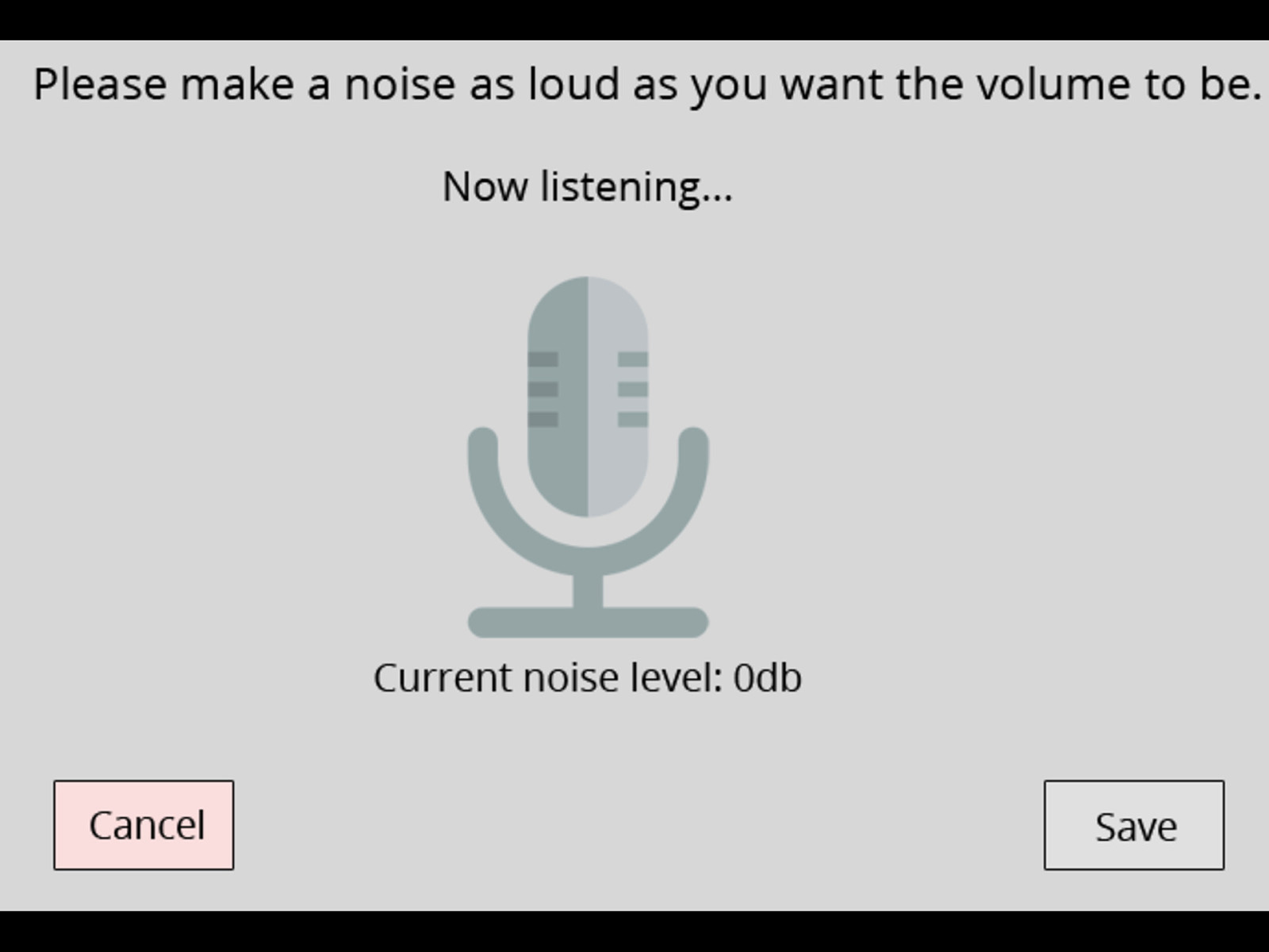
or this?
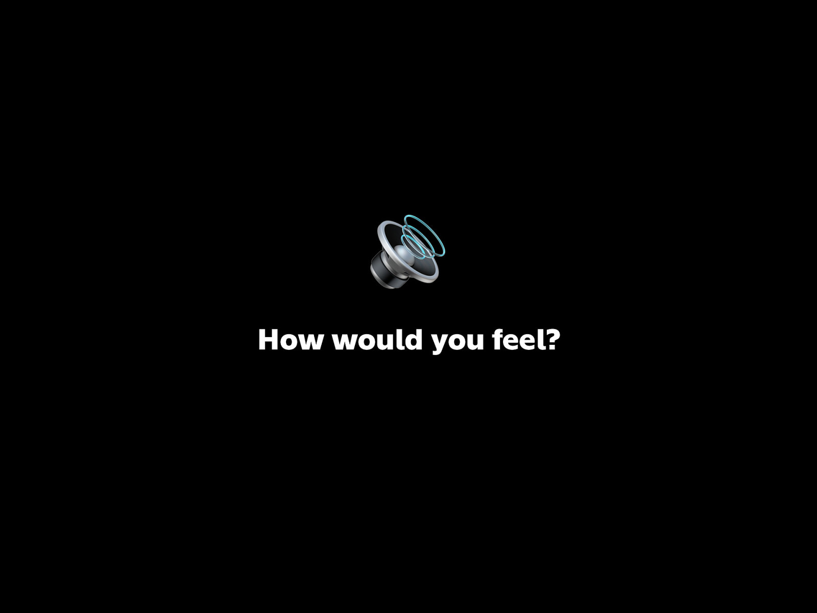
How would you feel? Utterly ridiculous? Frustrated?
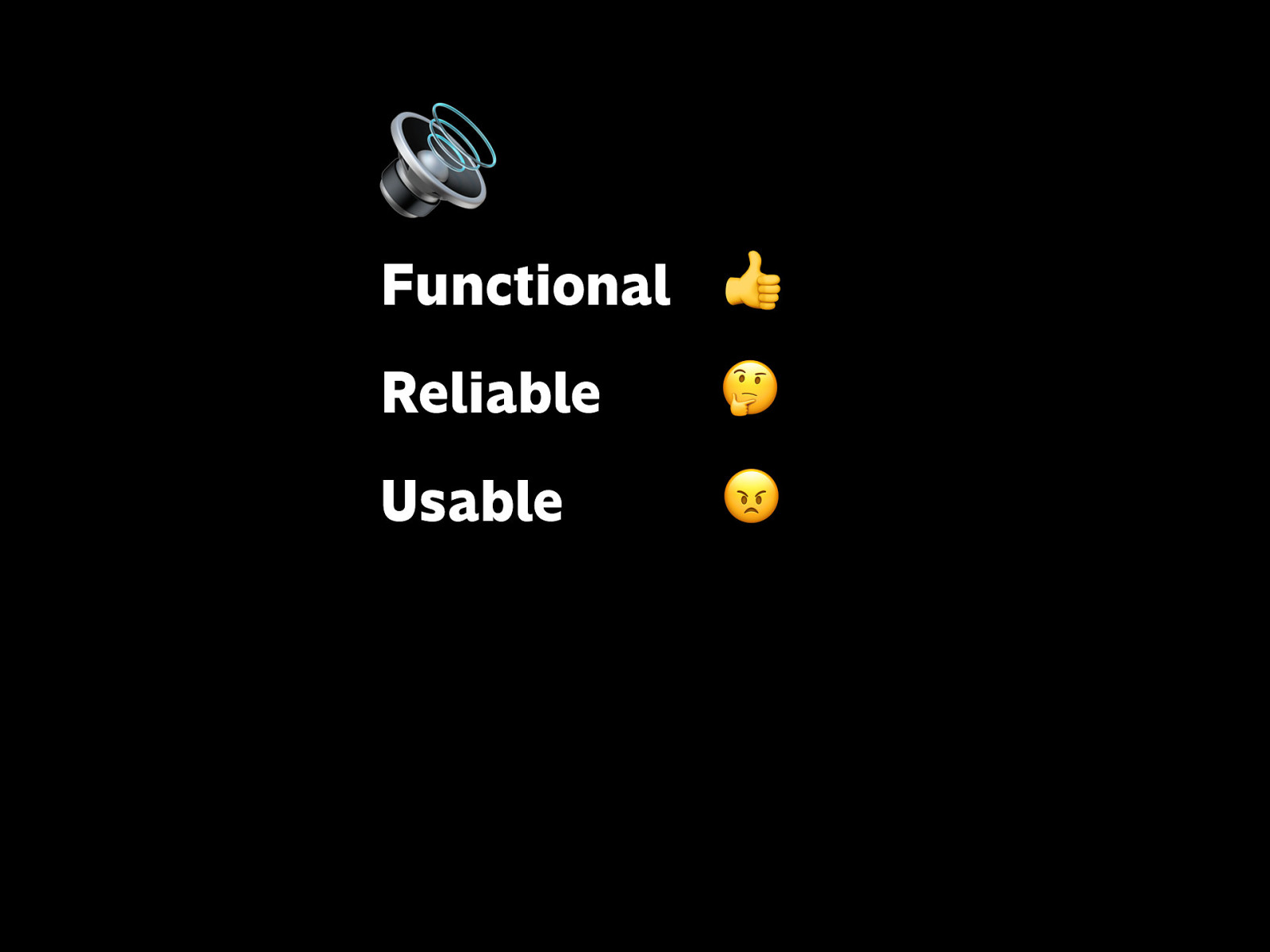
🔊
Functional 👍
Reliable 🤔
Usable 😠
If you evaluate the interface itself in terms of the previous pyramid…
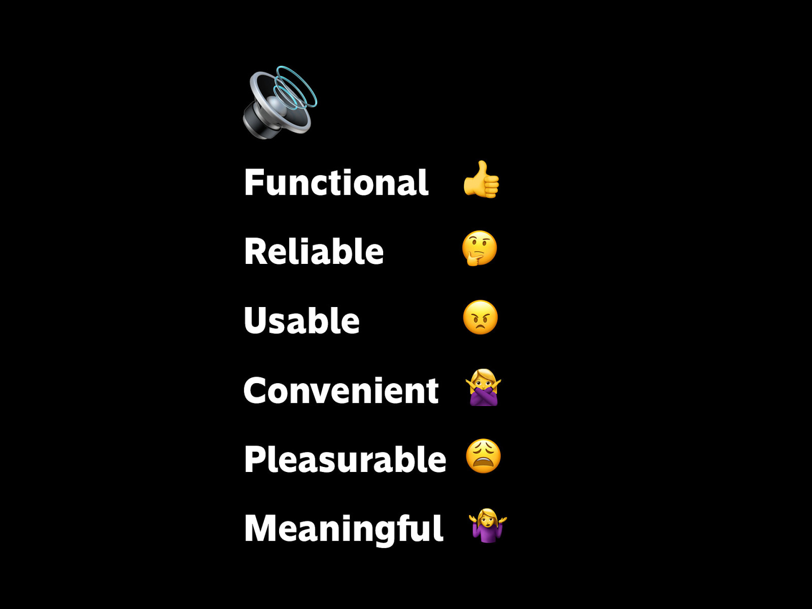
🔊
Functional 👍
Reliable 🤔
Usable 😠
Convenient 🙅
Pleasurable 😩
Meaningful 🤷
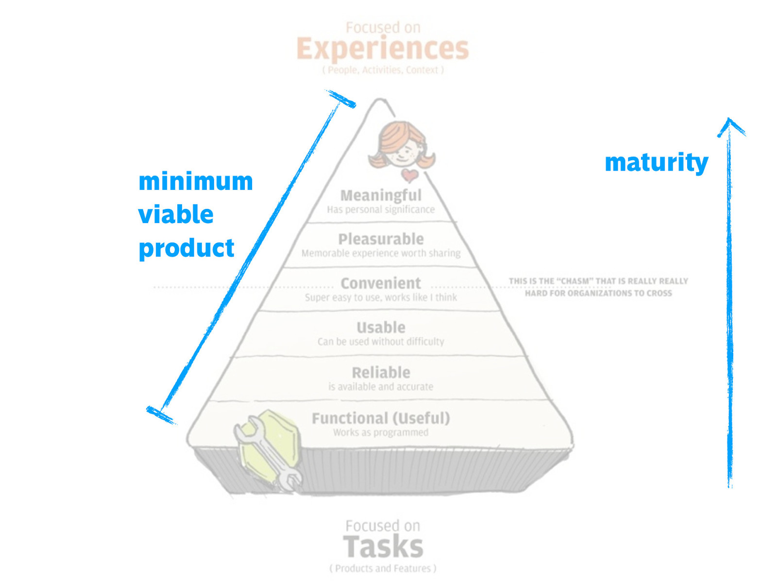
You want to try to cover ALL levels of the pyramid, and the more you care about the upper parts, the higher maturity your organization has about user experience.
Other times the challenges are more subtle.
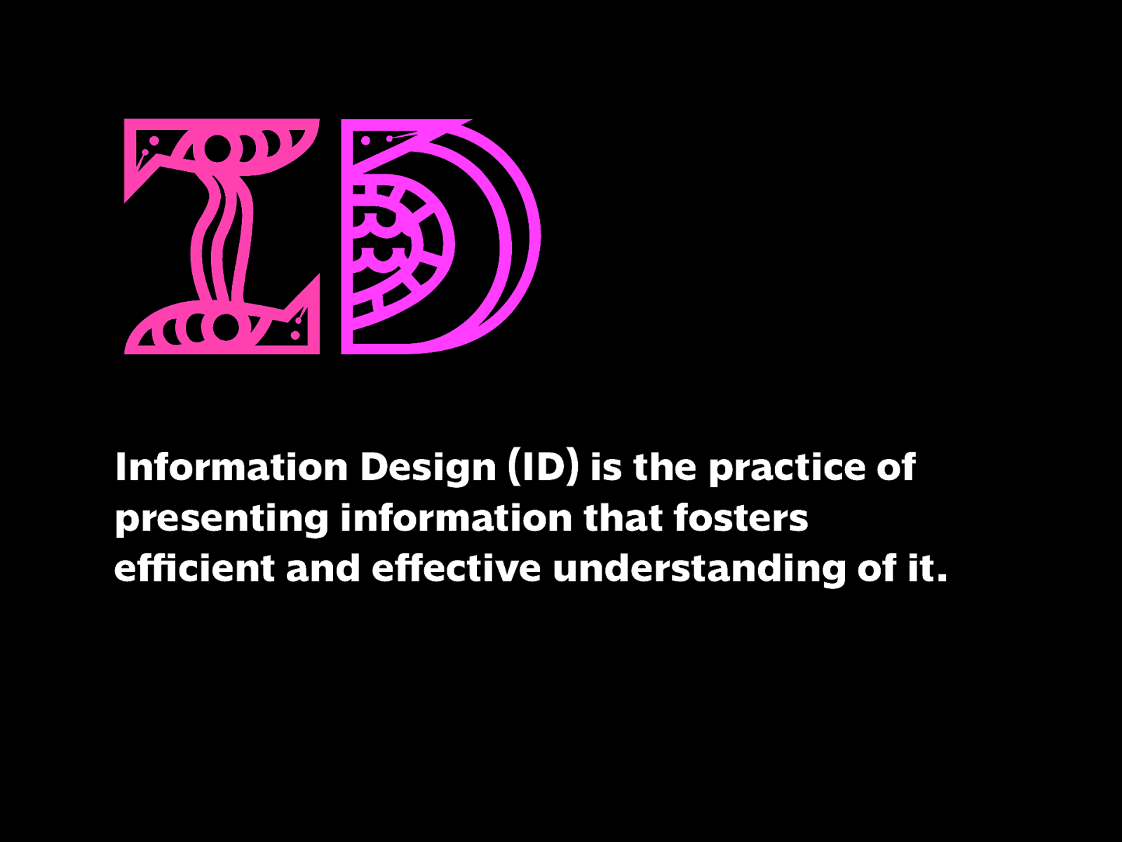
Information Design (ID) is the practice of presenting information that fosters efficient and effective understanding of it.
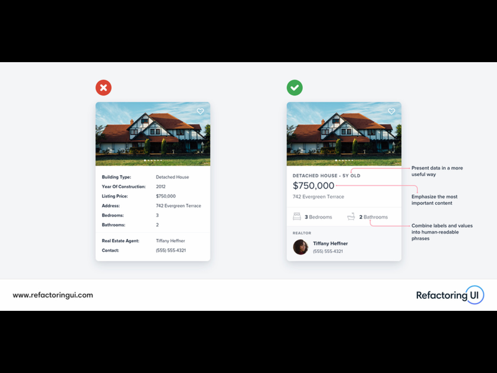
Here you have two cards of a real estate listing. The left one’s pretty good, but the right might be even better. Presenting information that can be made clearer, friendlier, and more expressive can deliver great results. Here, visual design principles come in: grouping, hierarchy, emphasis, contrast, typography, graphics, etc.
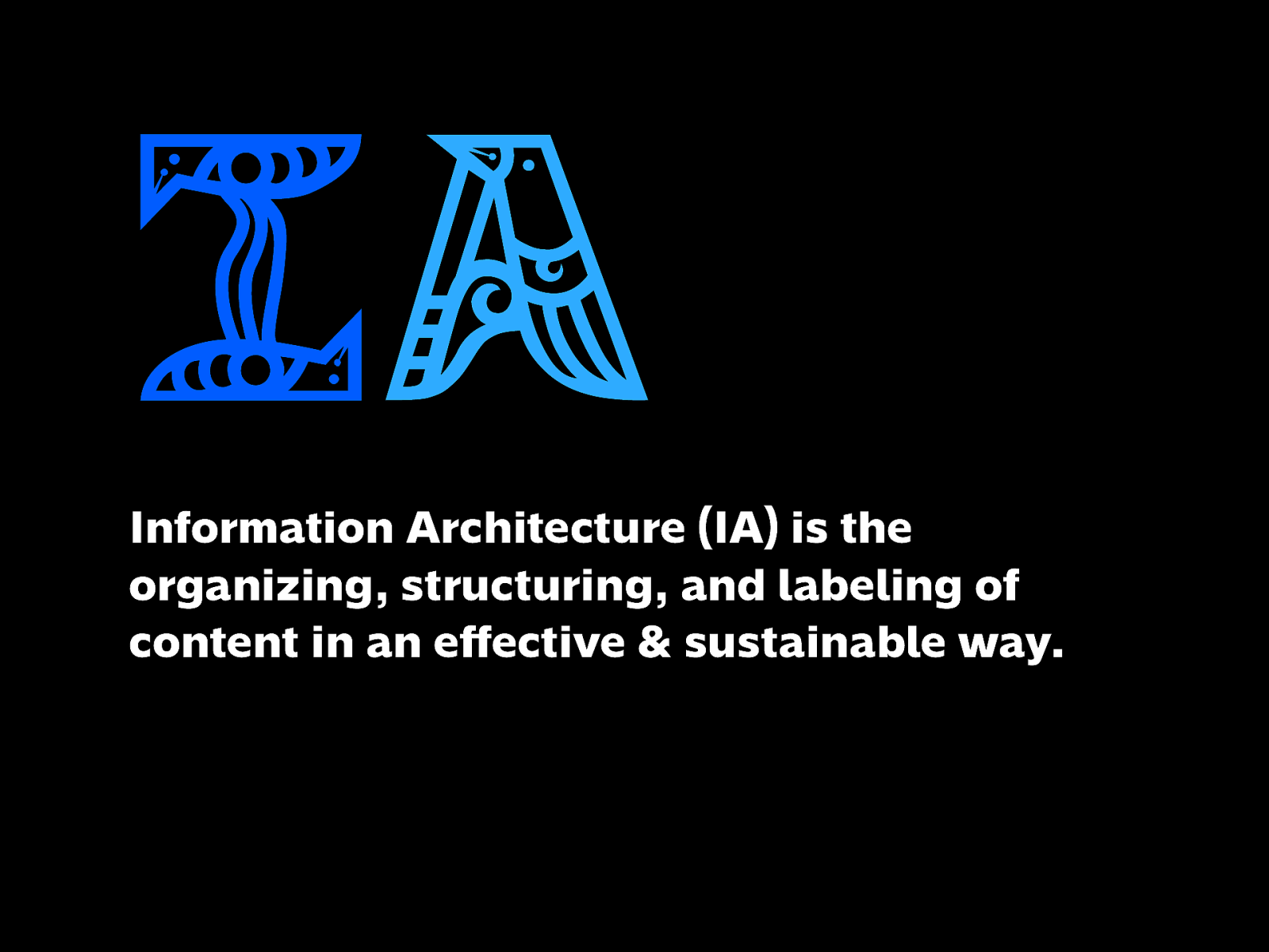
Information Architecture (IA) is the organizing, structuring, and labeling of content in an effective & sustainable way.
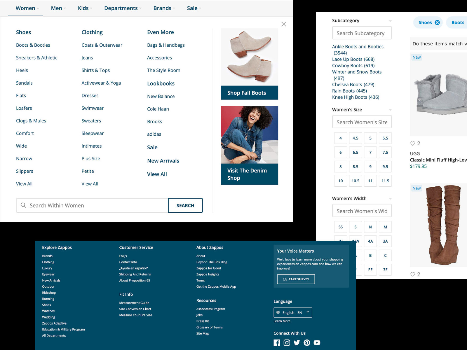
Especially with complex systems like e-commerce, making sure that finding a product through menus, categories, filters, and search makes sense falls under the discipline of IA.
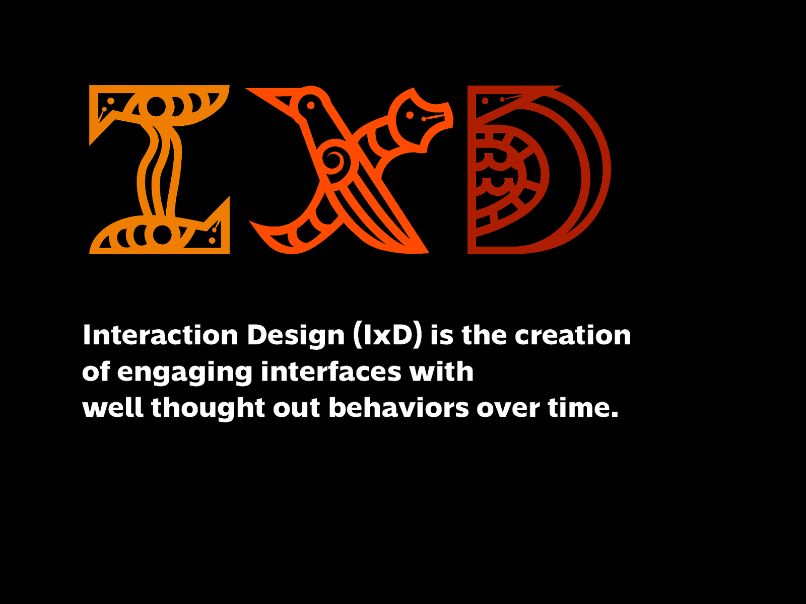
Interaction Design (IxD) is the creation of engaging interfaces with well thought out behaviors over time.
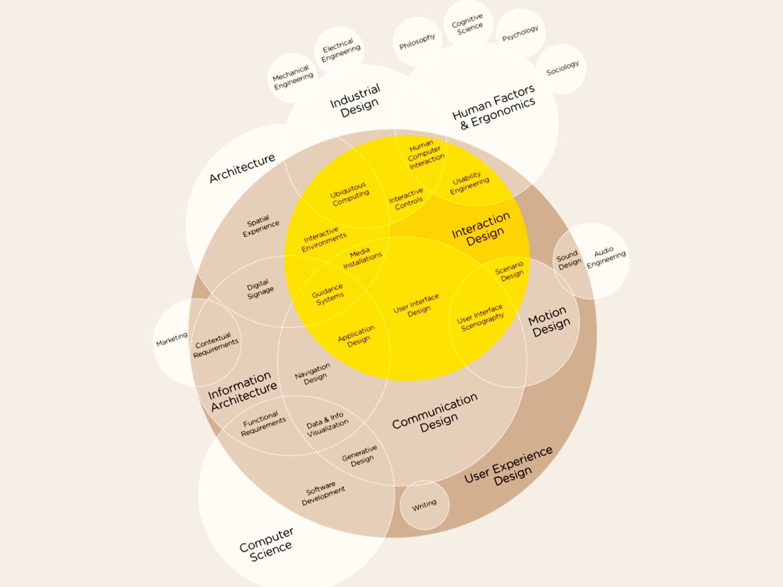
I thought this would be a good opportunity to show the context of different disciplines in relation to one another. You can even see how they’re connected to seemingly different fields like Architecture, Social Sciences, CS.
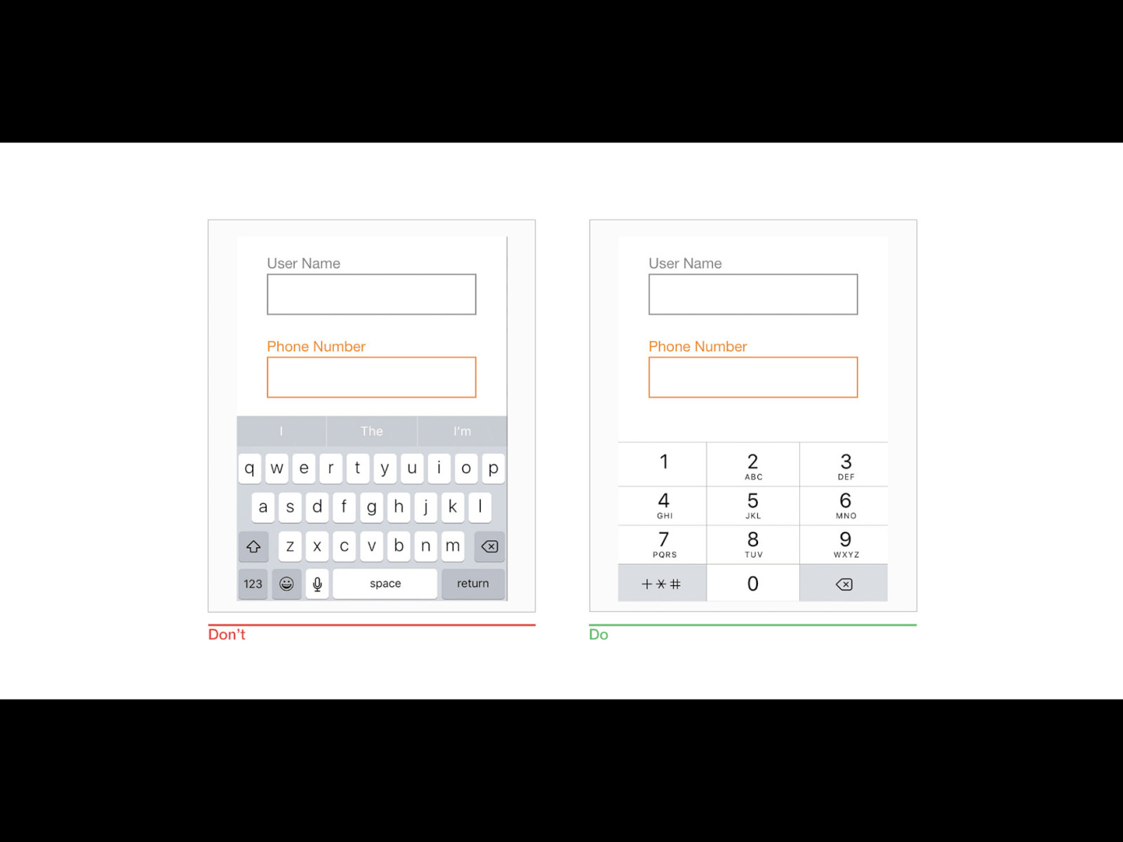
Thinking about interaction means you’re planning and understanding how a user gets from point A to B. It can be a big thing, or it can be a small thing: Here, when a form field asks for numerical input, you’ll want to make sure that the keyboard that shows up is numerical and not text.
https://www.smashingmagazine.com/2018/08/best-practices-for-mobile-form-design/
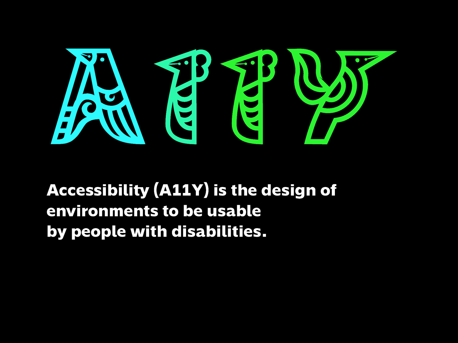
Accessibility (A11Y) is the design of environments to be usable by people with disabilities.
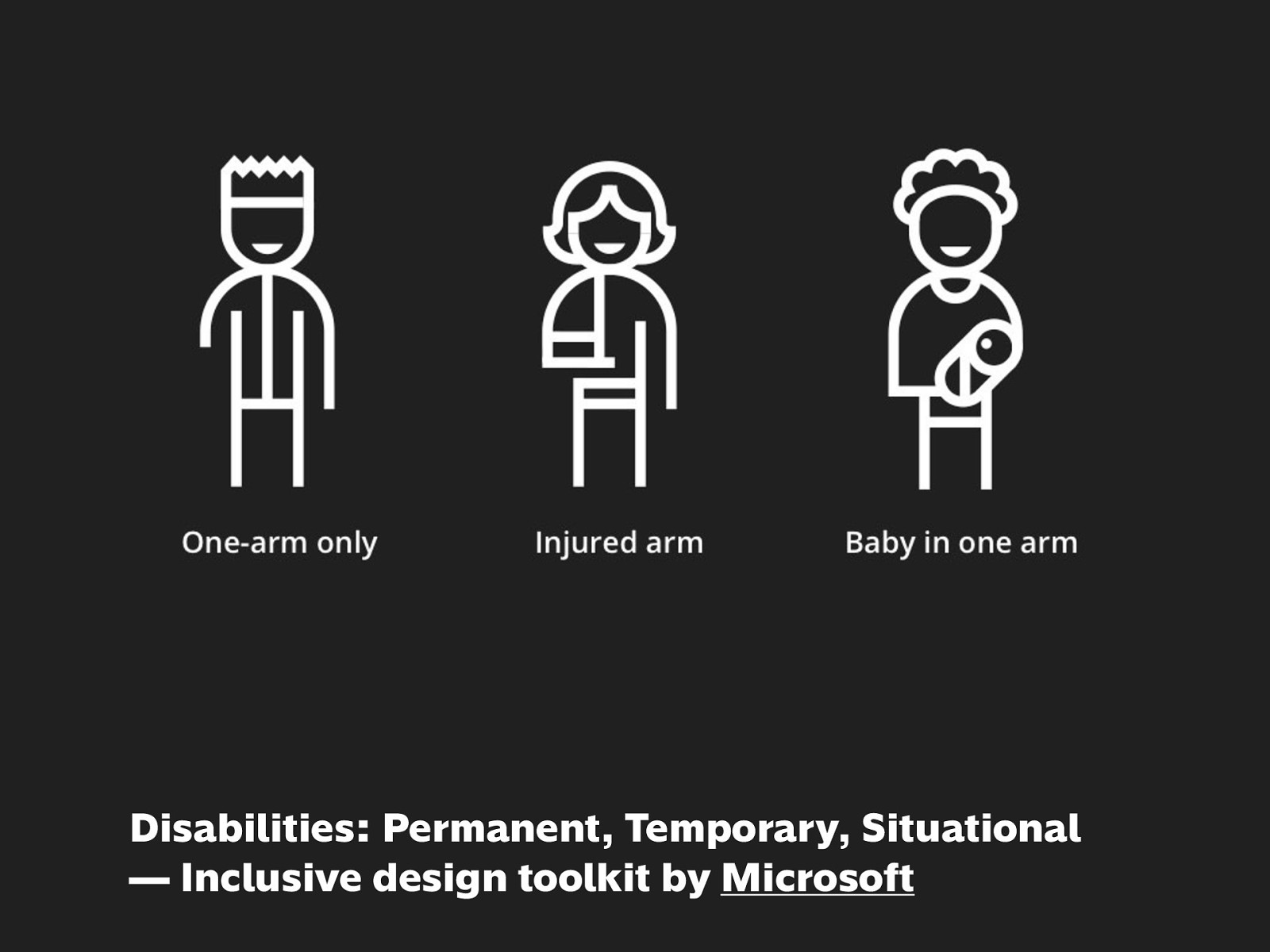
One thing I always like to point out when it comes to Accessibility is that it applies to everyone: a disability can be permanent, temporary, or situational. So when they use a product, are you anticipating those needs?
If they can’t use a keyboard, mouse, or screen, would your product work properly with a voice interface or screen reader?
If they’re colorblind or low-vision, are the content and controls on the page still understandable?
https://www.microsoft.com/design/inclusive/
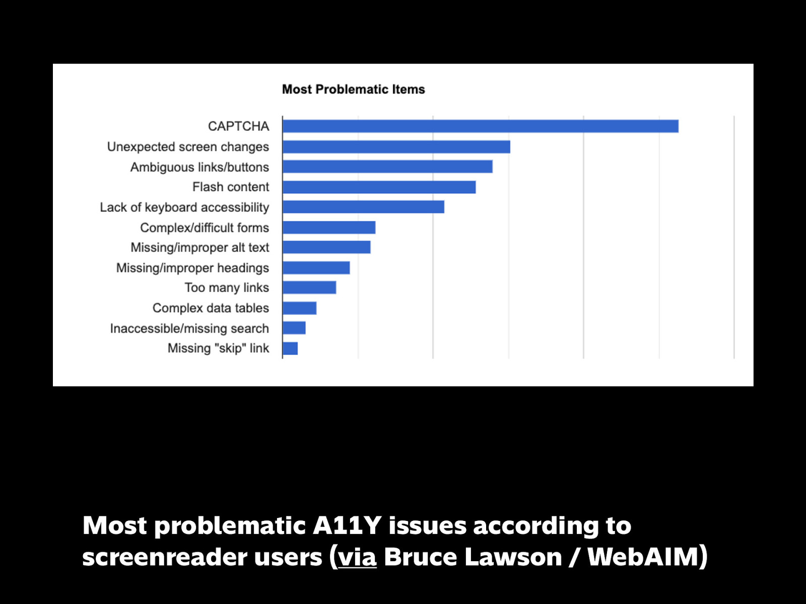
For those with vision difficulties, they use screenreaders, and these are the top problems they encounter. But a lot of these also sound like very familiar problems, right?
Image source:
https://twitter.com/brucel/status/1174186286216859649
https://webaim.org/projects/screenreadersurvey7/#impacts
Performance is the speed at which a page can download and render content, as measured objectively and perceived subjectively by the user.
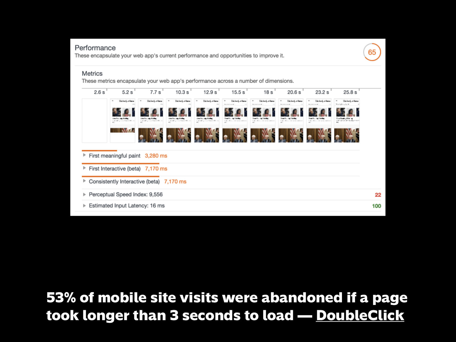
https://developers.google.com/web/fundamentals/performance/why-performance-matters/#performance_is_about_retaining_users
Copywriting, Content Strategy, Editing
And yes, writing plays an important ingredient in a good experience.
Words are the fundamental building blocks of how we communicate and connect with other people.
https://www.confabevents.com/videos/conversational-design
If you don’t put enough care about words when you build a product, you can wind up with something like this. Completely confusing and could be avoided entirely by being writing clearly.
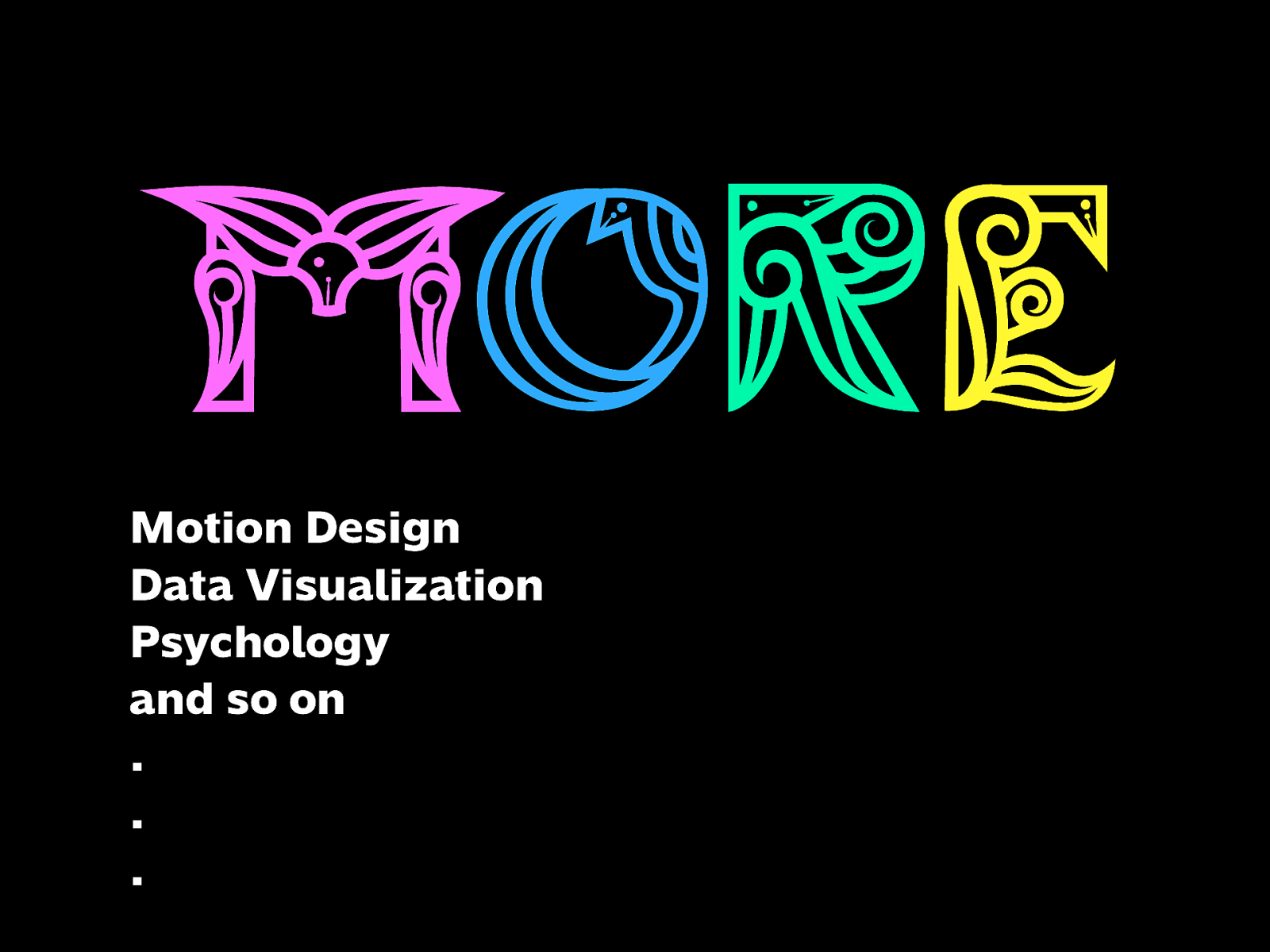
Motion Design
Data Visualization
Psychology
and so on …
And a lot more. Imagine what kind of factors would come into play when you’re creating virtual environments, or working with big data. - For example: as one of the top social media consumers in the world, we experience first-hand how billion-dollar companies create addictive products we load and refresh every day.

When you think about it, there’s this vast array of fields that are closely related to one another—they overlap and blend into one another like a rainbow. Especially for the examples I gave, these are things that you’ll most likely run into whether you’re a developer, designer, or someone working in the industry.
Plus: when you work in a small company, agency, or startup, some of these specializations might not be around, and you may need to do a bit of these anyway.
Being aware of and having a better understanding of these related disciplines helps a lot.
And once you have a broader view of how everything’s connected…
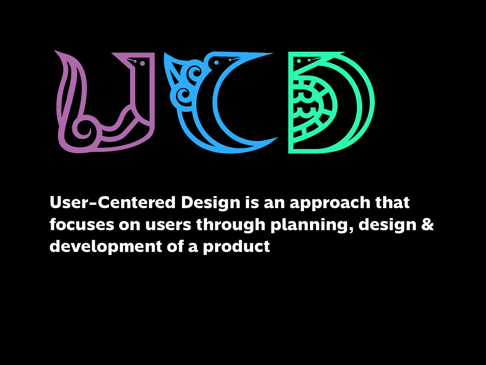
User-Centered Design is an approach that focuses on users through planning, design & development of a product
…you’re developing a sense of user-centered design.
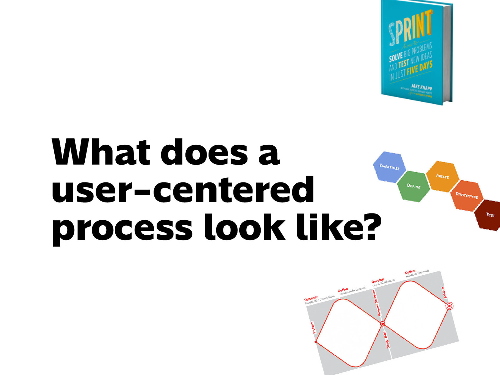
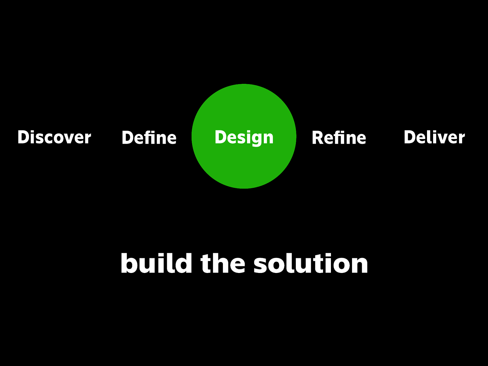
You may have heard terms like Design Sprint or Design Thinking or Double Diamond. Those are specific techniques or frameworks for what generally looks like this…
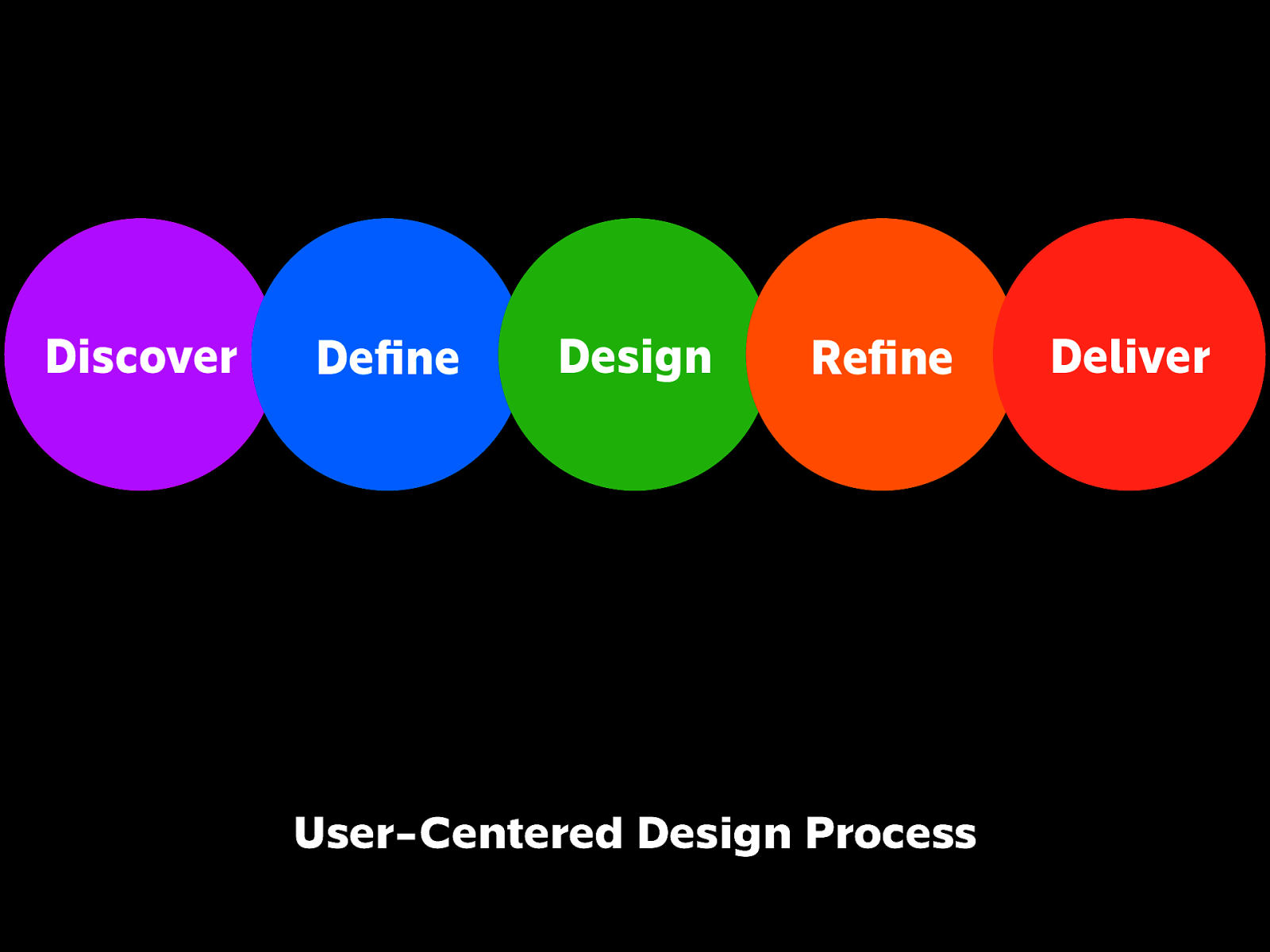
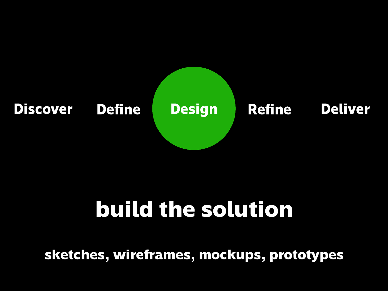
Discover
Define
Design
Refine
Deliver
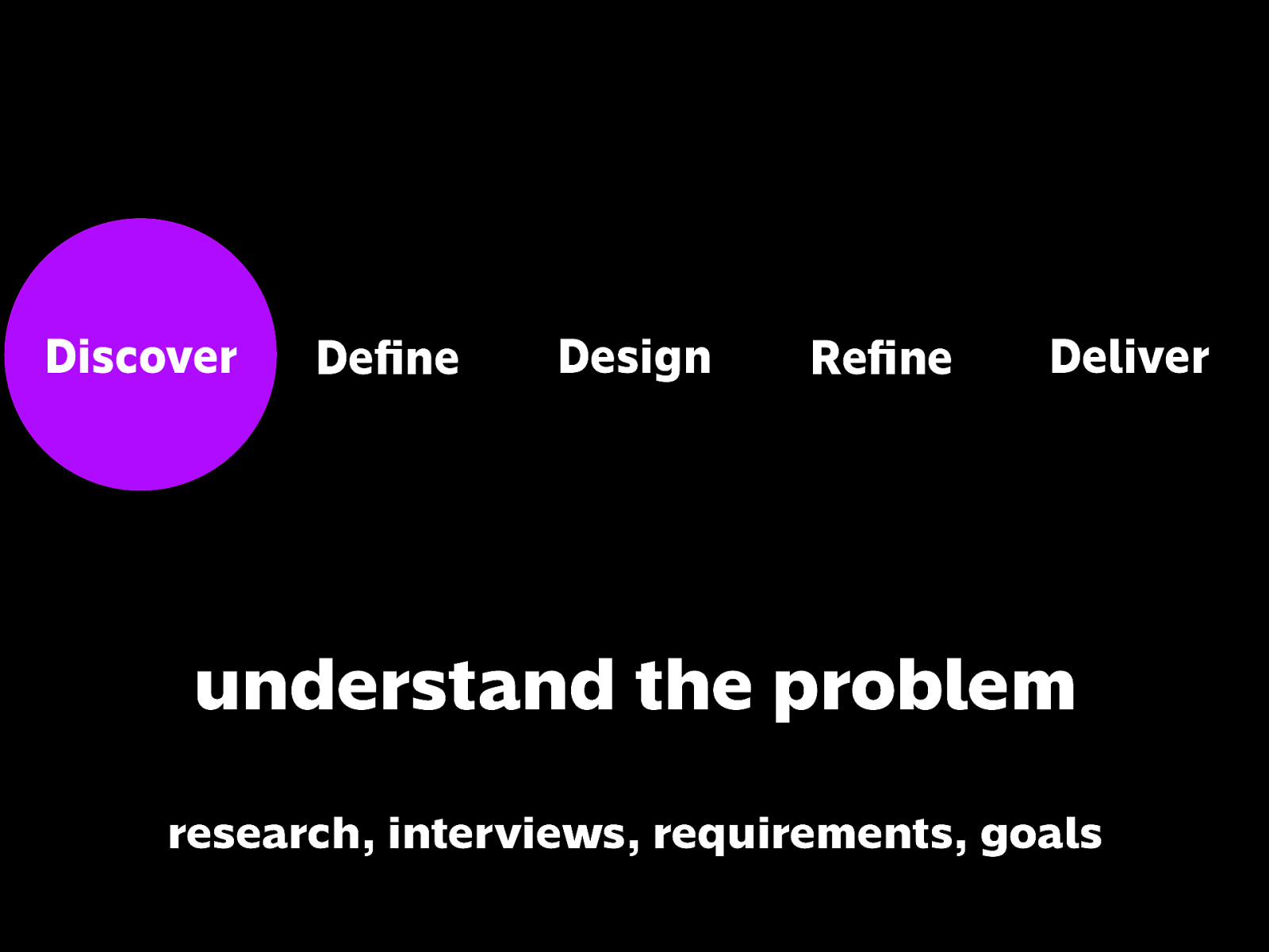
understand the problem research, interviews, requirements, goals
First you understand the problem.
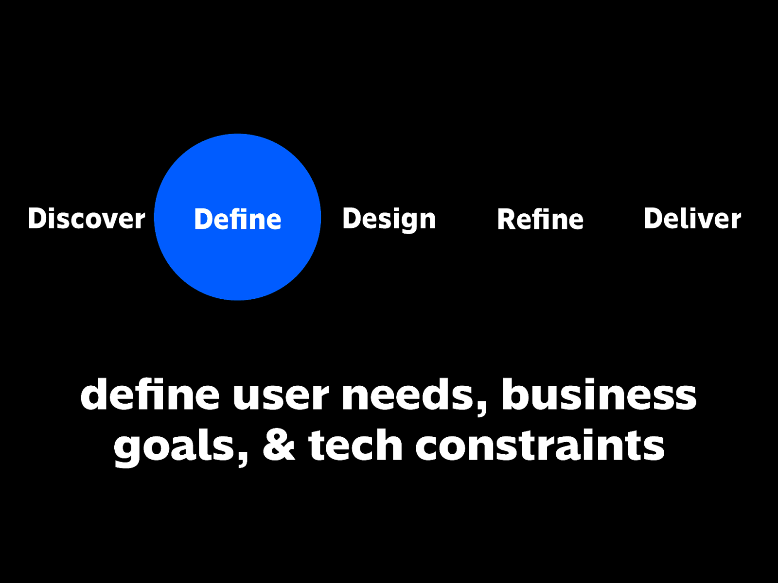
define user needs, business goals, & tech constraints
Then you define the problem based on user needs, business goals, and tech constraints.
build the solution
Then you go to the design phase.
When we talk about the word Design here, it’s more than visual design, like colors, fonts, spacing, layout.
Those are all important in the medium, but we’re talking about a broader meaning of the word design.
Where it’s an understanding of a problem and providing solutions to it.
build the solution
Here, the Design phase can be anything from wireframes, mockups, prototypes, proof of concepts. Yes, it can even be already coded.
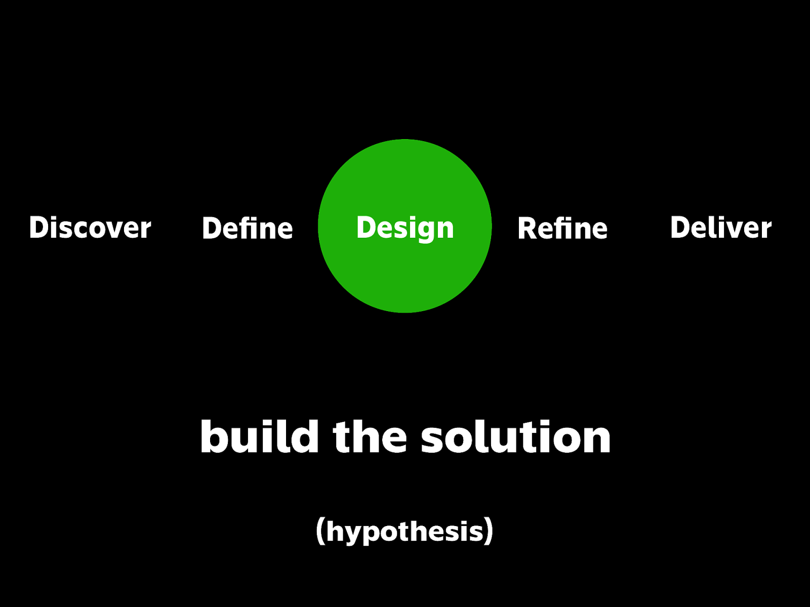
build the solution (hypothesis)
But just because you built something it doesn’t mean that it’s 100% correct. It’s essentially still a hypothesis that needs to be tested.
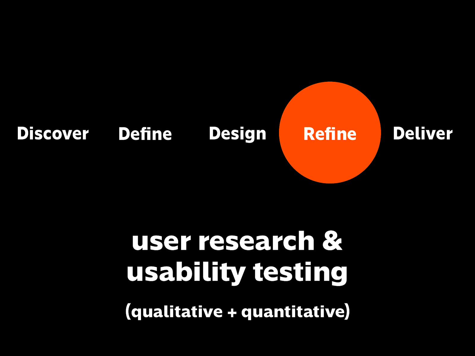
user research & usability testing (qualitative + quantitative)
So you go to users, and gather feedback to validate whether your hypothesis actually works. Research and testing; gathering both qualitative and quantitative data.
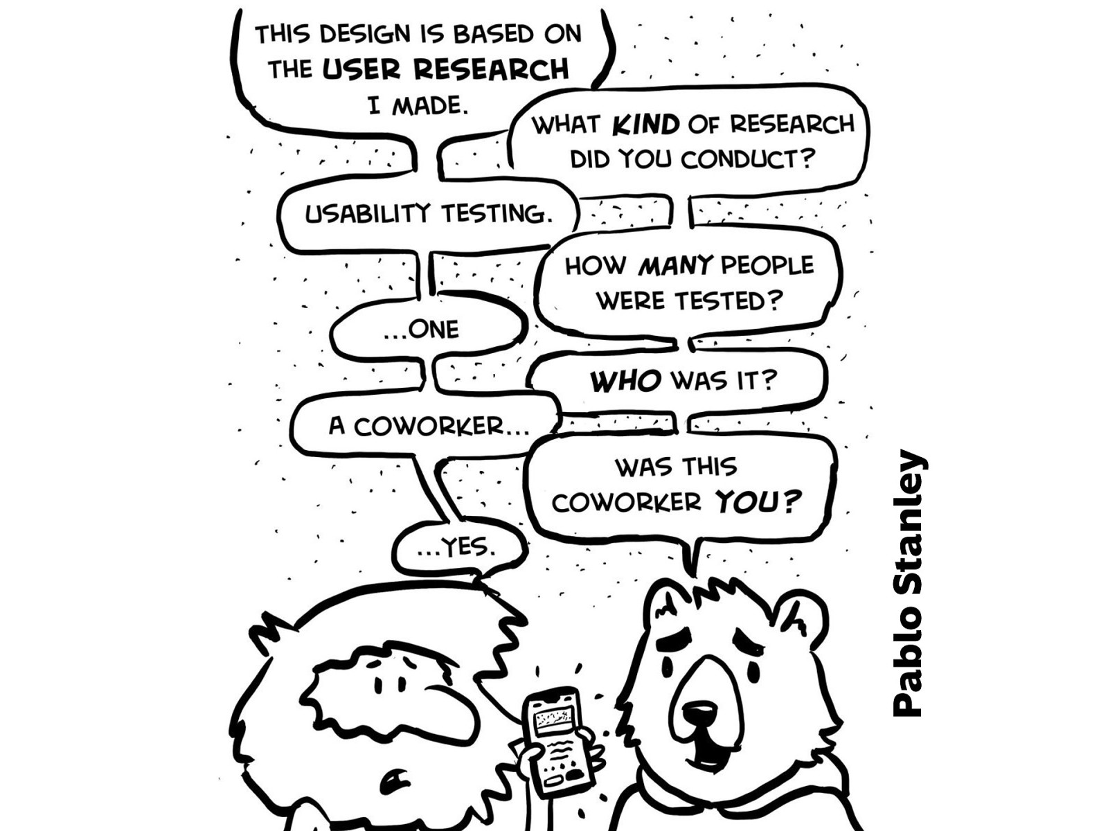
Here’s a comic by Pablo Stanley about what not to do.
Image source: https://twitter.com/pablostanley/status/1169223591881269249
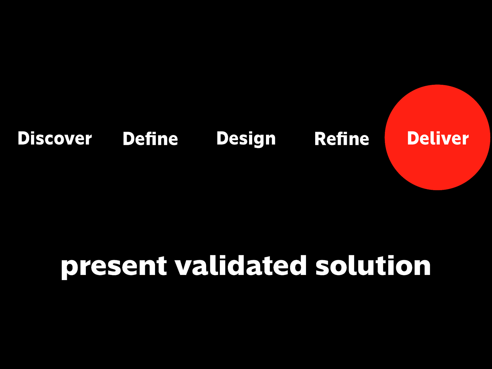
present validated solution
And hopefully you wind up with a better-informed, more successful solution.
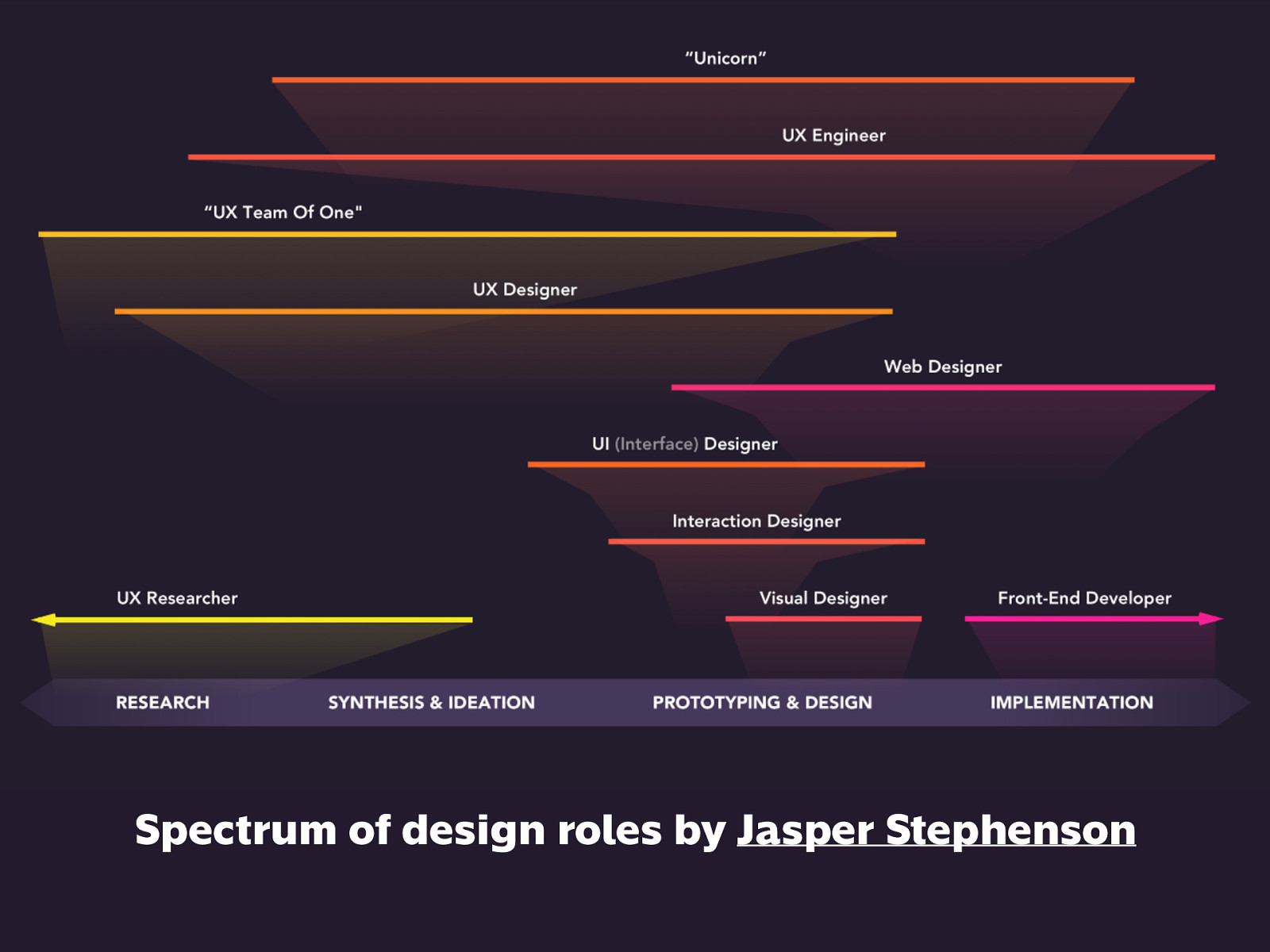
Just for reference, here are examples of design-focused roles, corresponding to the process. Take note: developers shouldn’t be removed from the design process because a design isn’t complete until it’s being used by actual people, and understanding technical constraints matters.
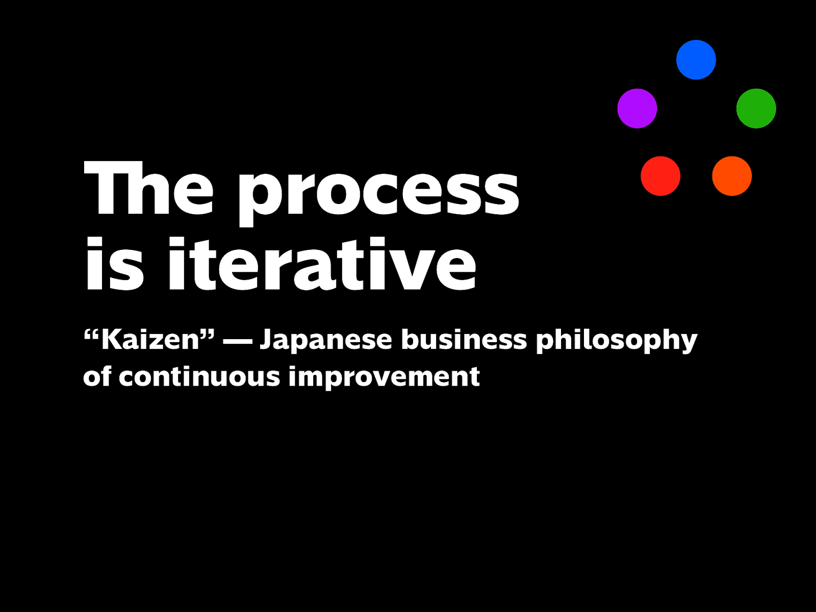
“Kaizen” — Japanese business philosophy of continuous improvement
But the process is not linear. It’s iterative. Keep doing improvements as long as time and resources permit.
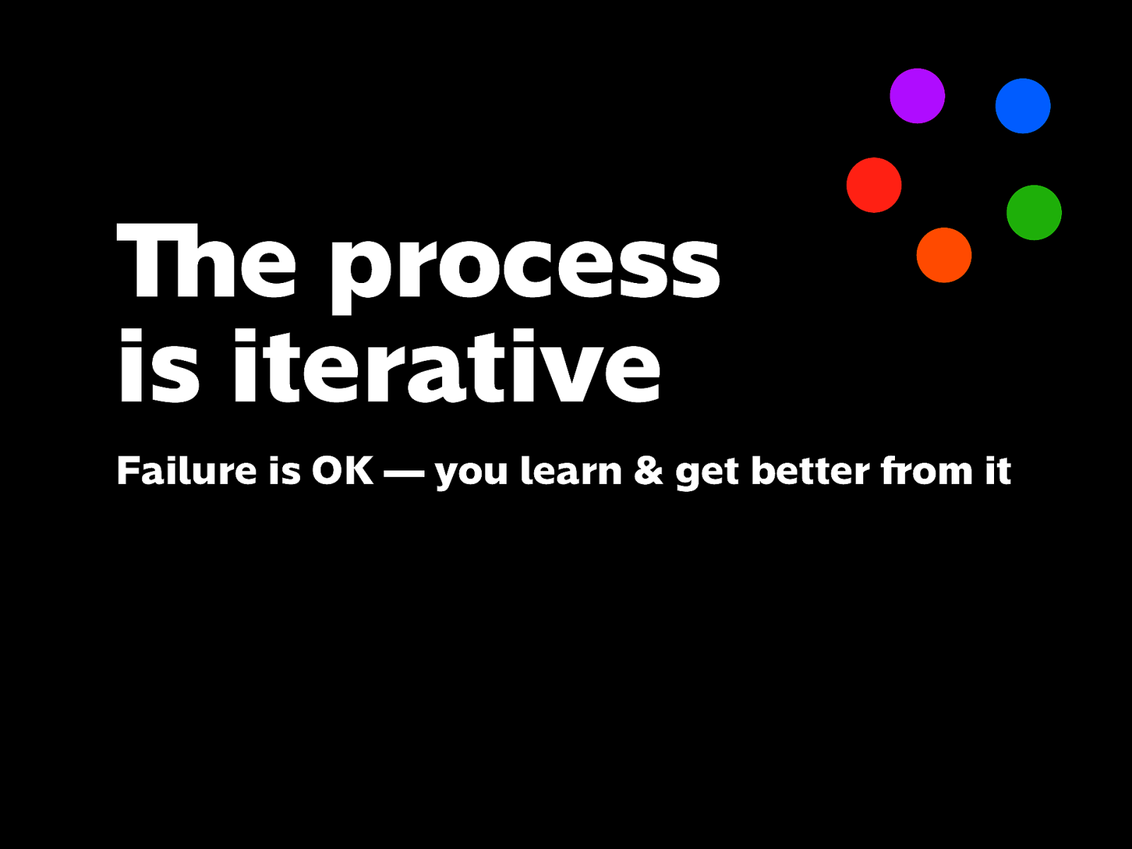
Failure is OK — you learn & get better from it
If things don’t turn out as you’d hope, don’t be discouraged, but take it as a learning opportunity.
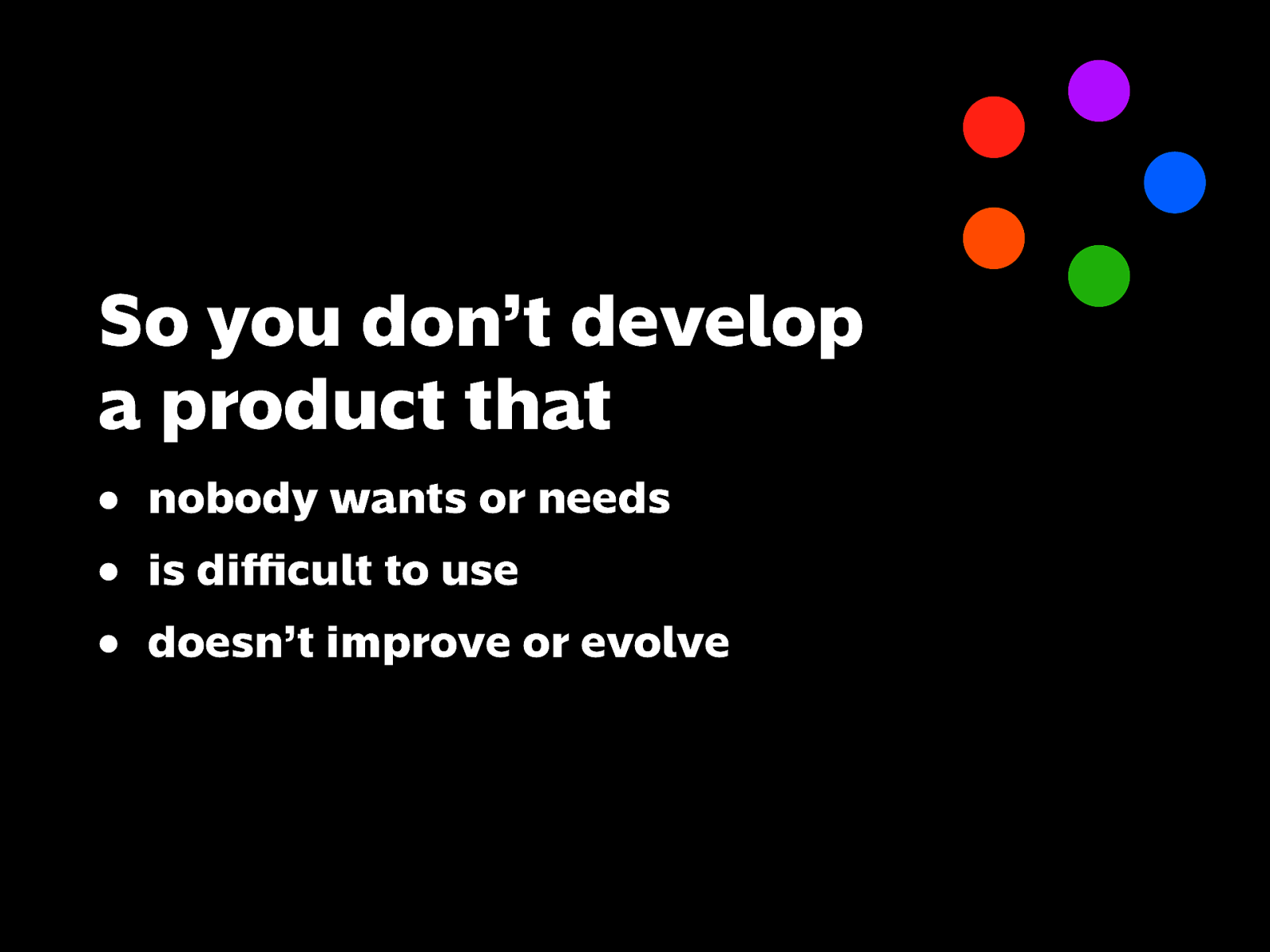
• nobody wants or needs
• is difficult to use
• doesn’t improve or evolve
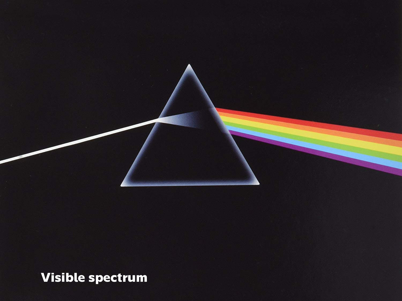
Lastly, I wanted to emphasize something that’s often overlooked when we talk skills and careers. To take the rainbow metaphor further: you could say that these rainbow of disciplines are part of the visible spectrum…
Image source: Dark Side of the Moon by Pink Floyd
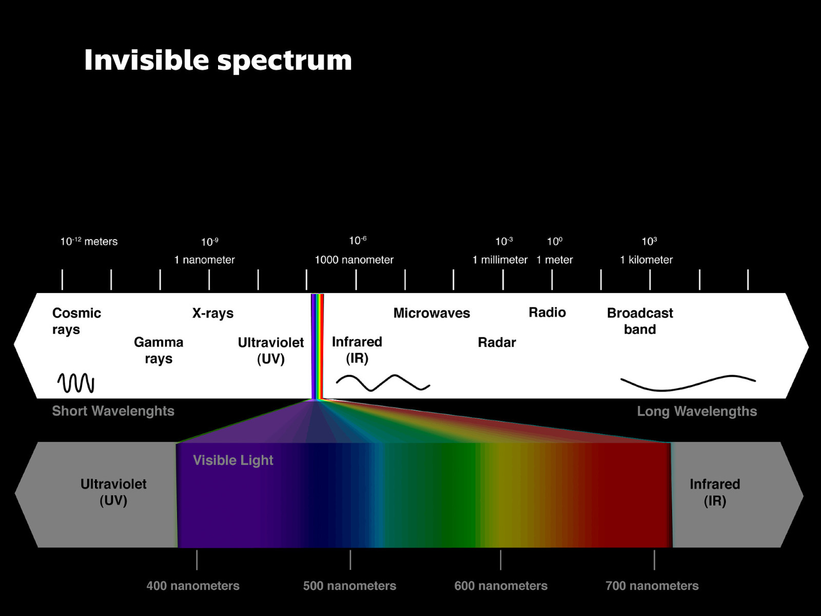
And the visible spectrum is only part of the entire electromagnetic spectrum, which also has wavelengths that are invisible to the eye.
Image source: https://sites.google.com/site/year7eclassroom/lesson-5-properties-of-light-reflection
These skills are used day to day, but are often taken for granted
Sometimes referred to as soft skills
Which is kind of negative and downplays their importance.
Everything we do happens by communicating with one another. If we don’t get our ideas across effectively, the work suffers.
Related to communication are persuasion & negotiation: if you can’t explain or defend your work even though it’s well done, others won’t be able to understand why, which is a waste.
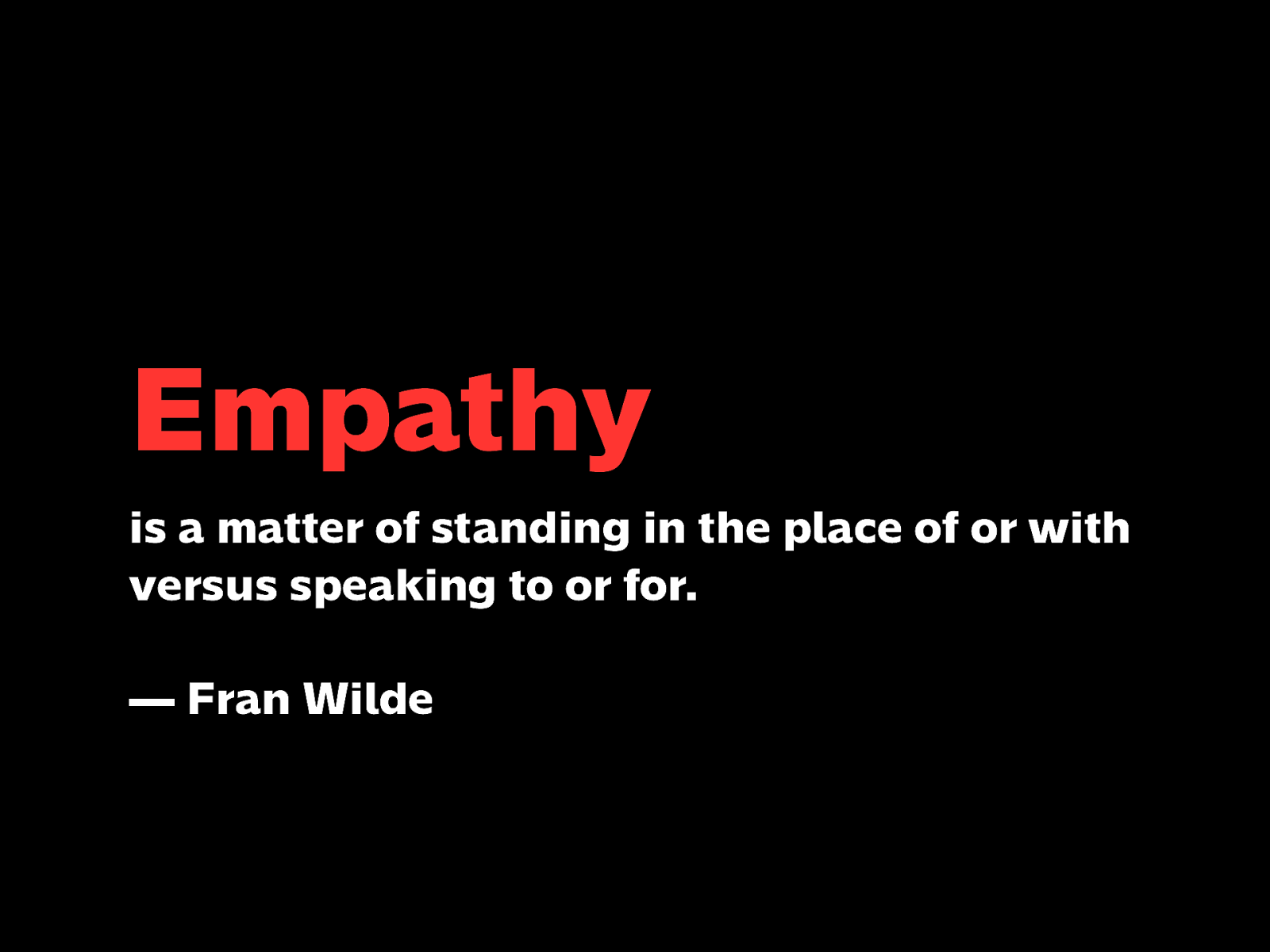
Empathy is putting yourself in the shoes of your user and really imagining how they might be feeling, rather than assuming for them.
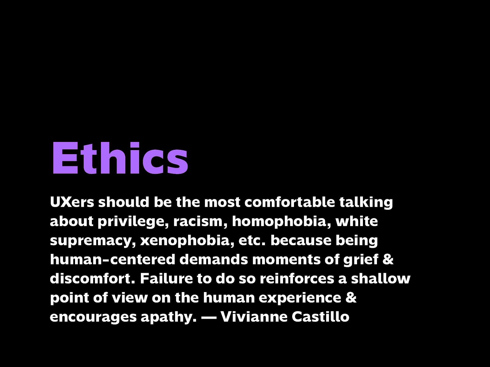
UXers should be the most comfortable talking about privilege, racism, homophobia, white supremacy, xenophobia, etc. because being human-centered demands moments of grief & discomfort. Failure to do so reinforces a shallow point of view on the human experience & encourages apathy. — Vivianne Castillo
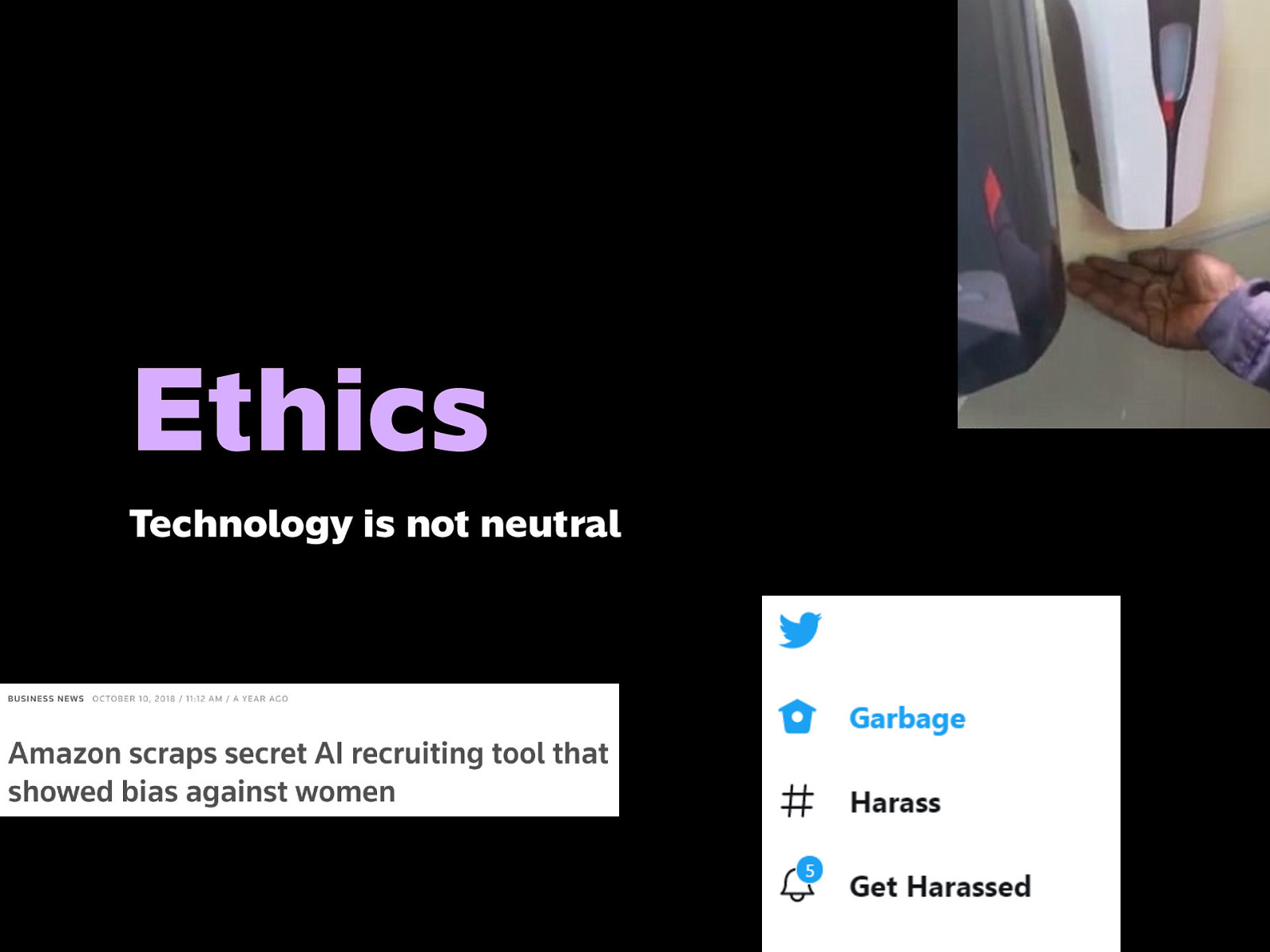
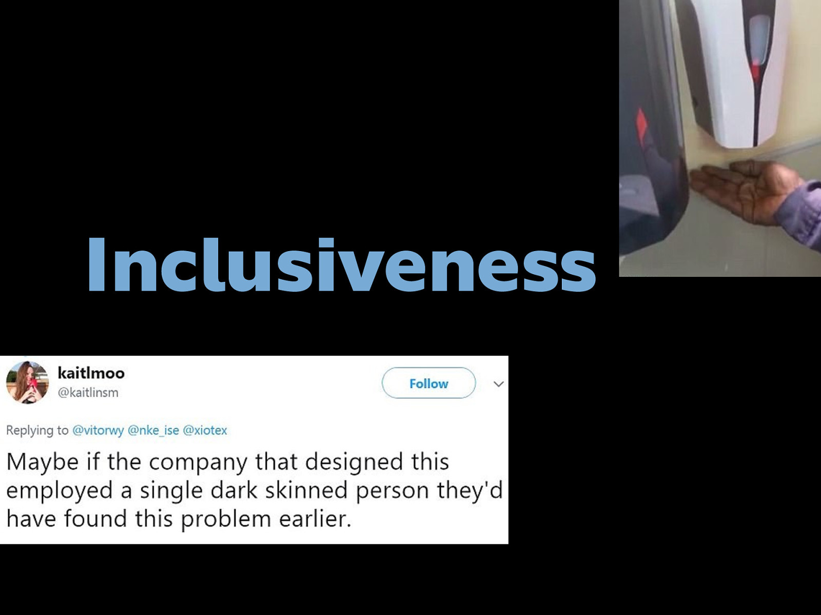
Technology is not neutral
Like HR software that excludes perfectly qualified candidates, or sensors unable to detect dark skin color, or social media companies that do nothing about harassment and fake news.
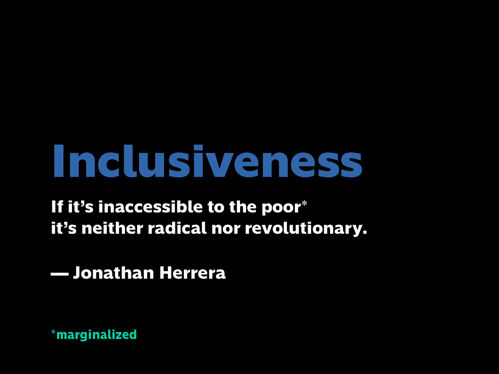
If it’s inaccessible to the poor* it’s neither radical nor revolutionary. — Jonathan Herrera
*marginalized
We must be mindful if our work is reachable and fair to the marginalized, from the poor to other minority groups.
Representation and diversity reinforces empathy and keeps us mindful of how inclusive our work is.
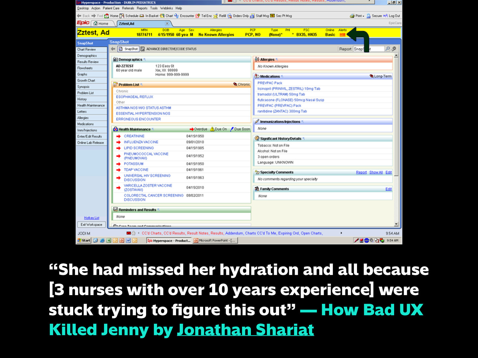
Lives are on the line. If the people building this piece of software used by nurses in a hospital realized how it could be so confusing that a girl dies of toxicity & dehydration, they would have put more effort into this.
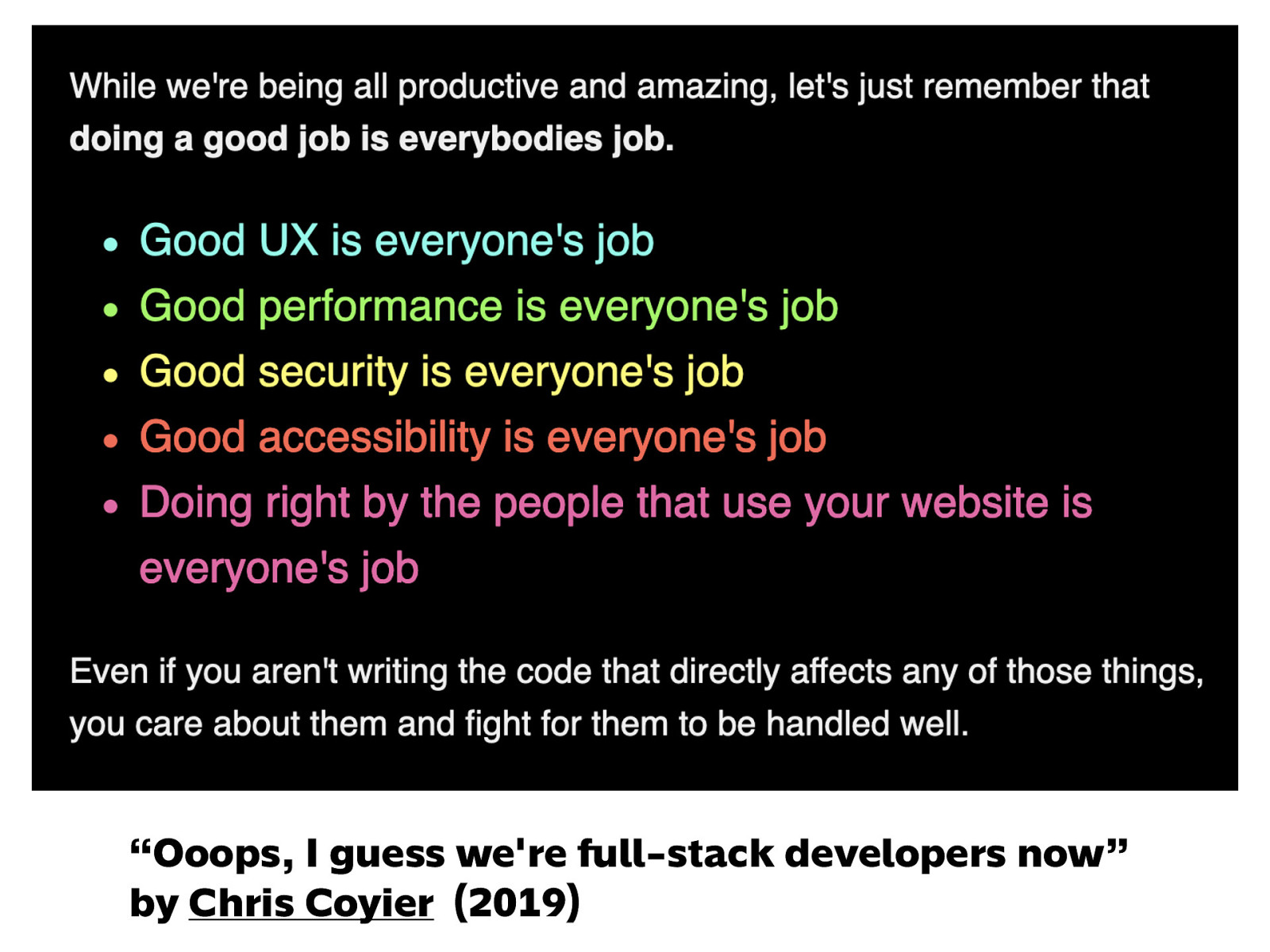
Doing a good job is everybody’s job. Doing right by your users is everyone’s job.
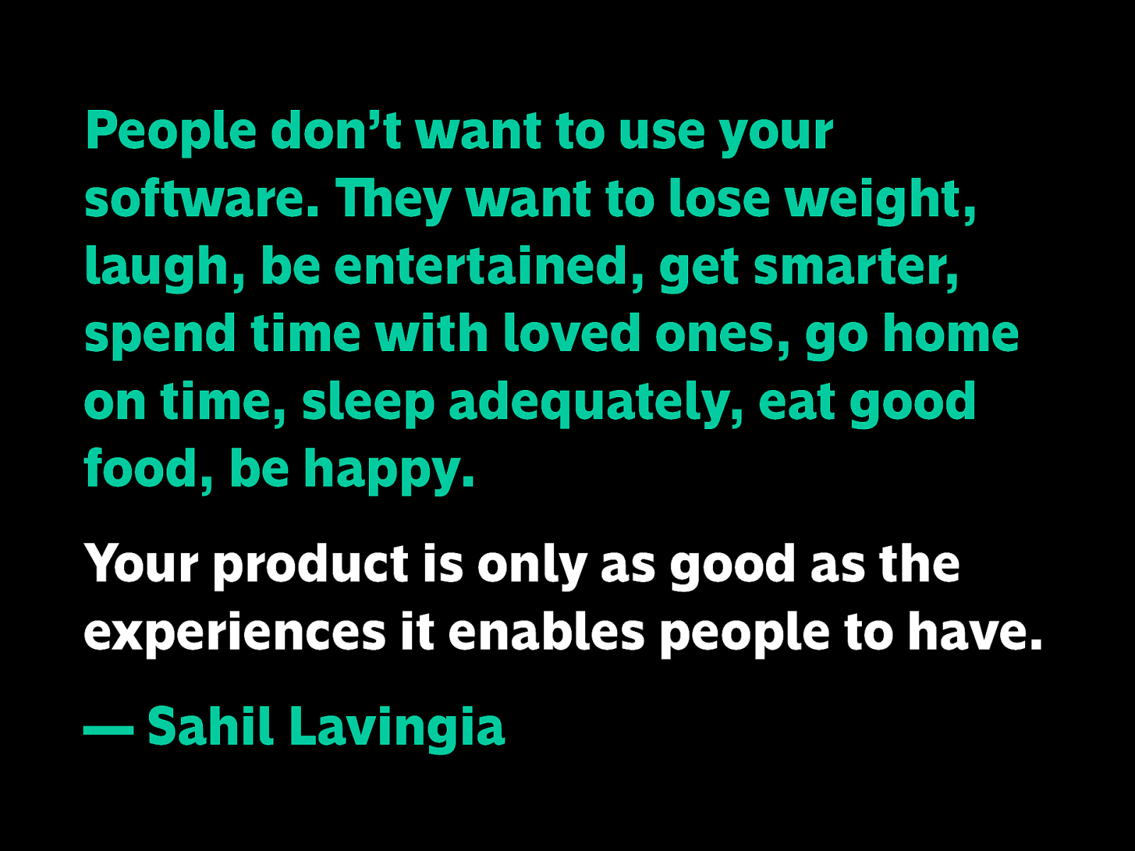
People don’t want to use your software. They want to lose weight, laugh, be entertained, get smarter, spend time with loved ones, go home on time, sleep adequately, eat good food, be happy. Your product is only as good as the experiences it enables people to have. — Sahil Lavingia
Because at the end of the day, we’re not just making software, or products, or services here. What we develop, what we design are solutions to problems of real people. Actual human beings who just want better lives. Let’s not mess that up. Quote source: https://twitter.com/shl/status/1162031786248900609
And before I close: flex ko lang Philippine Web Designers Organization
If my talk today has piqued your interest about design, tech, or any of these things, you might be interested in being part of our community! Tomorrow we’re doing a cool challenge called Women Who Code in the Dark, where you have 15 minutes to write HTML and CSS from a design without seeing the results until time’s up. It’s our 2nd year doing this and we do this in collaboration with other tech communities like Manila.CSS and Women Who Code Manila.
You can find links to what we do and how you can be part of it at pwdo.org. I would love to talk more about our accomplishments of over 10 years of existence, but that would be a whole other session, so visit our site for more info and follow us on social media for the latest updates.
Support local creators! Hanken.co Illuma typeface ObraTypeface.com
That’s it and thank you for having me!