LONG LOVE THE WEB (What we learned at Webconf.asia)
Good afternoon everyone, Sophia Lucero here. I’m here as an opening act of sorts for CITD…
A presentation at Women Who Code in the Dark in October 2018 in Taguig, Metro Manila, Philippines by Sophia Lucero

Good afternoon everyone, Sophia Lucero here. I’m here as an opening act of sorts for CITD…

I’m an independent web designer, that title changes depending on the project & client, but I still think “web design” captures the things I want to convey: I design things with technologies powered by the web, from pixels to code. What I really like about the web is how it’s made so many things possible, including…
…going from this…
…to this…

…and this.
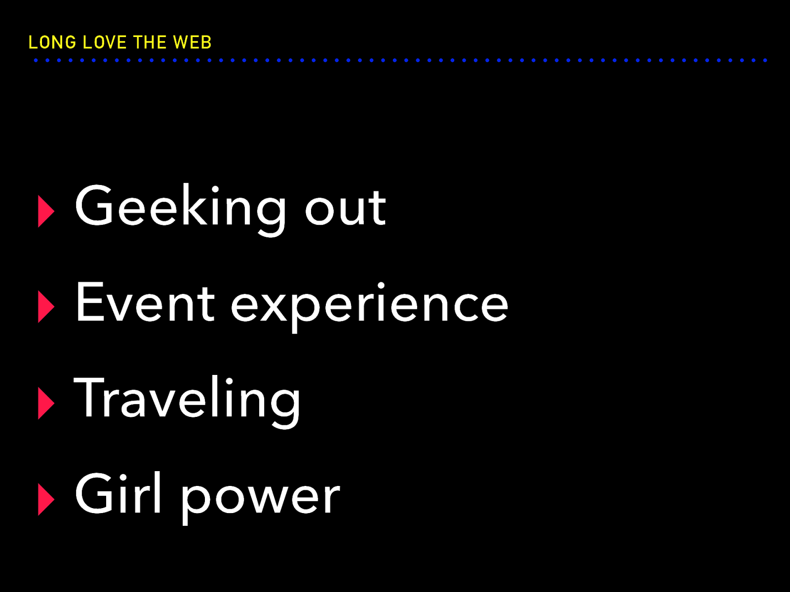
▸ Geeking out ▸ Event experience ▸ Traveling ▸ Girl power
Now as you might know, the Form Function & Class conference on indefinite hiatus, so it’s really nice to have another conference that ticks all these boxes for me. We started FFC and the org because there wasn’t anything like it in the Philippines or the rest of Asia, and I would see all these events on the other side of the globe and be envious. So just as FFC has been winding down, we’ve gotten a fairly new conference in Hong Kong called Webconf.asia.
What is Webconf.asia?

Webconf.asia is organized by Charis Rooda (another girl power event) who is originally from the Netherlands and was also organizer of a conference over there called Fronteers. (Both are awesome events you should be following.) “For people who build websites” reminds me instantly of A List Apart, which was also a huge influence over how we curate Form Function & Class. This isn’t just a “developer” or “designer” conference, this isn’t about labels or buzzwords—it’s everything in between, including user experience, business, security, ethics. It’s always great to be at an event with a holistic rather than a siloed philosophy. Webconf.asia is only on its 2nd year, and we’re fortunate to have attended both years. This year, only Kit and I attended, but there were a good number of Filipinos who were also there.

Since I’m an organizer and designer I like paying attention to event experience, so I’m gonna point out a few things here; also so you have a better idea of what the event is like:

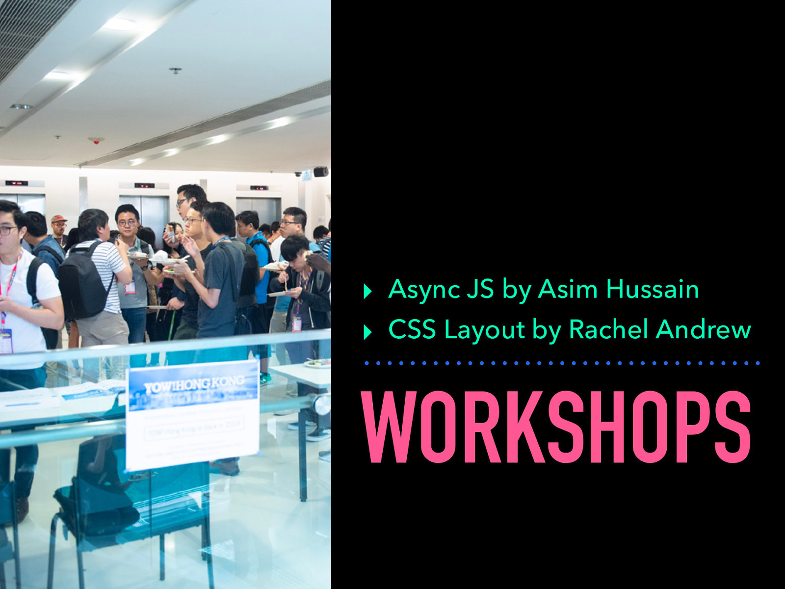
▸ Async JS by Asim Hussain ▸ CSS Layout by Rachel Andrew
Now before the conference days, there were actually 2 additional days of whole-day workshops by Asim Hussain and Rachel Andrew. There was also a pre-conference dinner and drinks on the evening of June 7. But we skipped on those :P
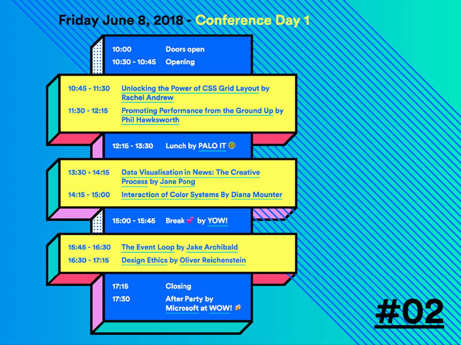
So onto the conference agenda. Webconf.asia had 12 speakers over 2 days, and the talks were intentionally spaced out with lots of breaks so attendees wouldn’t be overwhelmed by too much information.
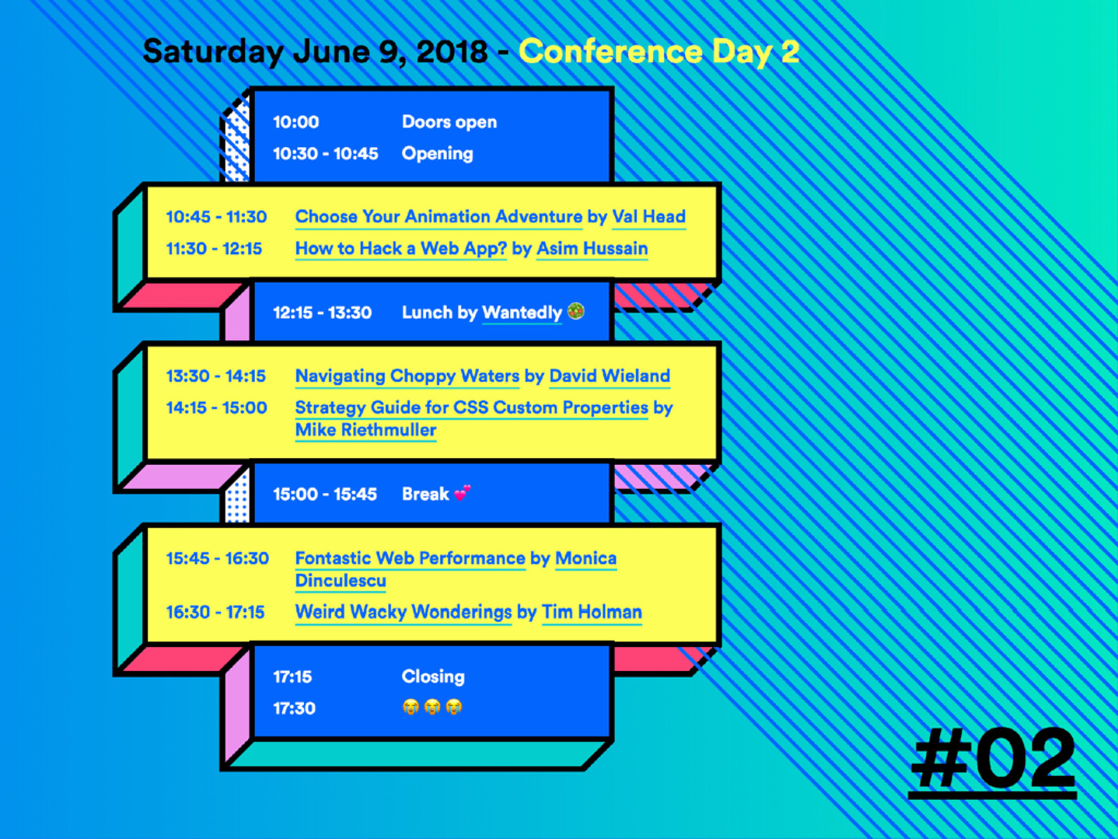
Conference agenda for day 2

▸ Rachel Andrew ▸ Val Head ▸ Phil Hawksworth ▸ Asim Hussain ▸ Jane Pong ▸ Mike Riethmuller ▸ Diana Mounter ▸ Monica Dinculescu ▸ Jake Archibald ▸ David Wieland ▸ Oliver Reichenstein ▸ Tim Holman But I’m going to attempt to summarize all 12 talks, so prepare for some information overload. Ready?
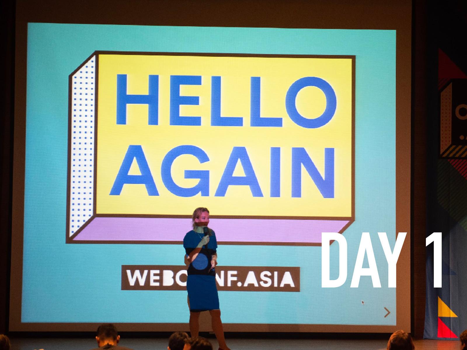
DAY 1 A little side note: there was a typhoon in HK that week, but thankfully it had subsided by the time the conf started. Still pretty wild though. Here’s Charis kicking off the conference.
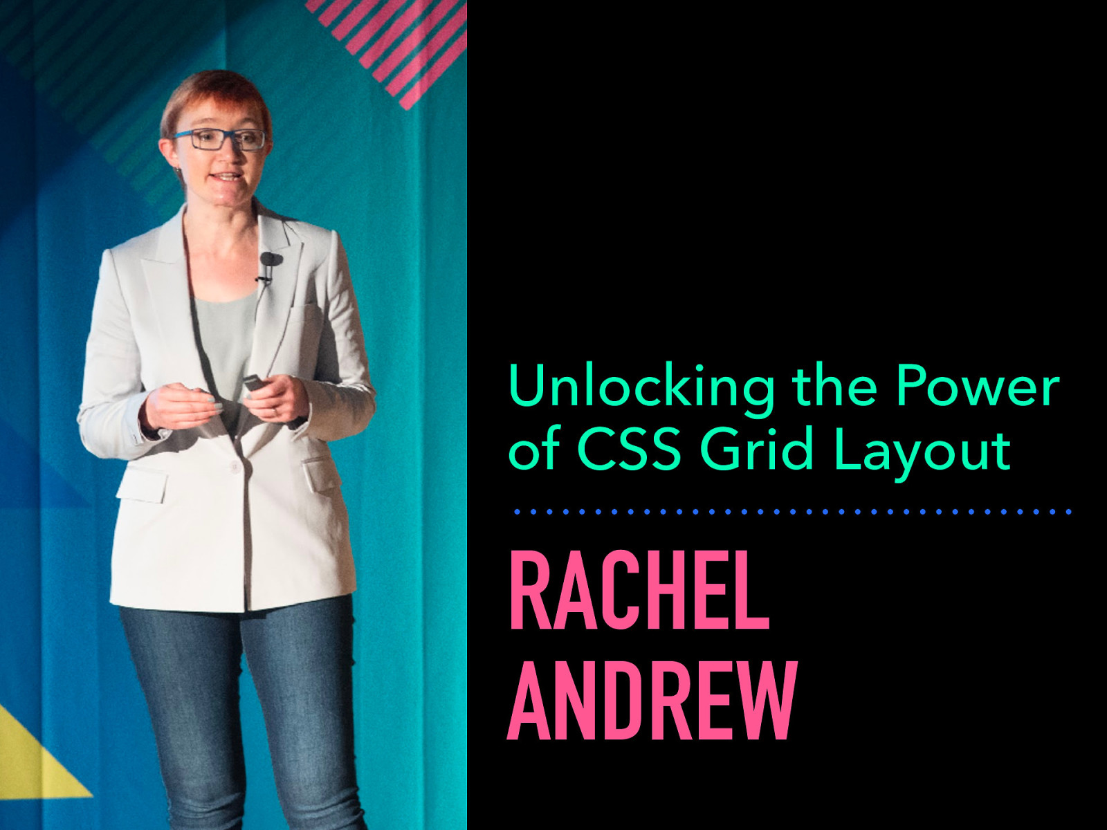
Unlocking the Power of CSS Grid Layout RACHEL ANDREW First up we have Rachel Andrew, who is one of the most prominent names in CSS, has written 22 books, editor in chief of Smashing Magazine, Invited Expert to the CSS Working Group.

Her talk brings us up to date on the much more powerful layouts we can achieve with Grid and Flexbox.
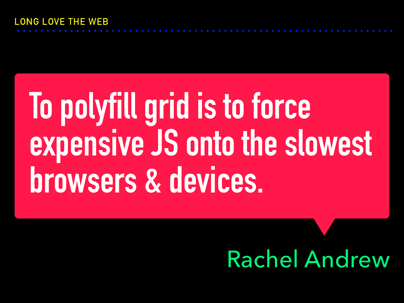
To polyfill grid is to force expensive JS onto the slowest browsers & devices. Rachel Andrew And whenever we talk about the latest in web features, there’s always the question of whether we can implement it now, and what we do with older browsers. The advice here is Progressive Enhancement.
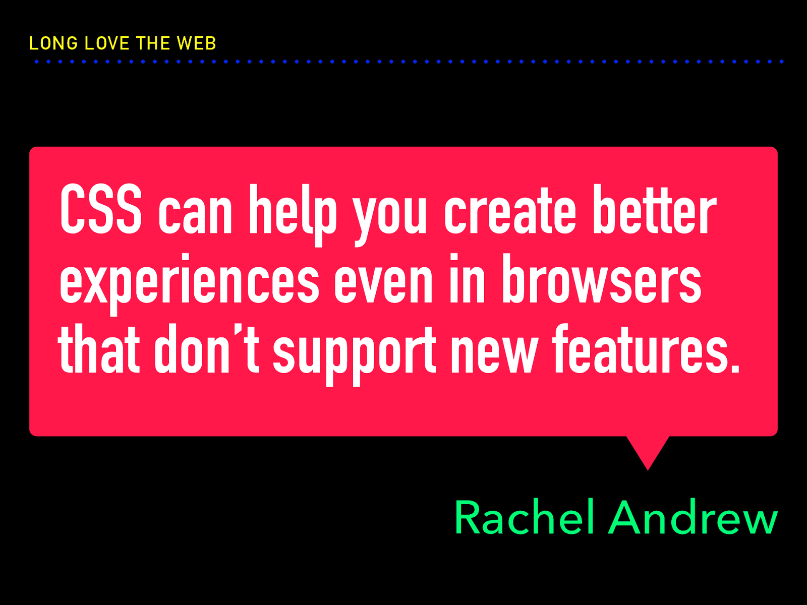
CSS can help you create better experiences even in browsers that don’t support new features. Rachel Andrew
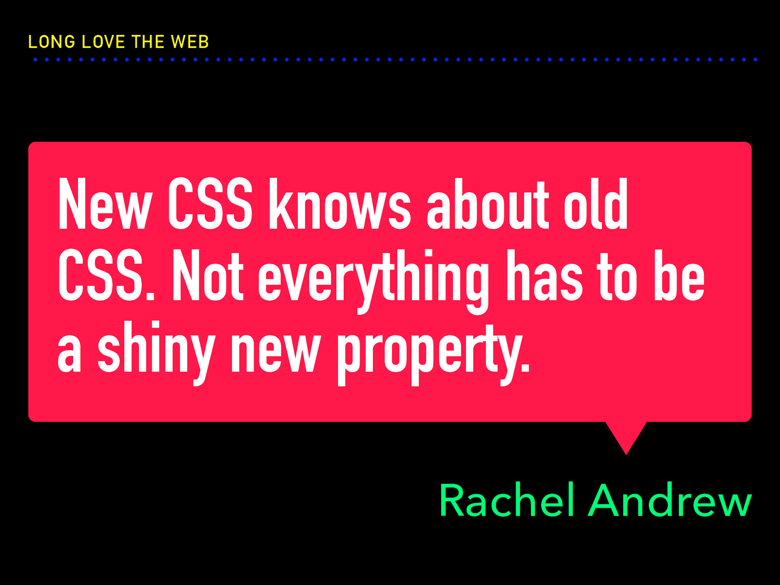
New CSS knows about old CSS. Not everything has to be a shiny new property. Rachel Andrew Older devices don’t need to have the latest features, not everything has to look the same. What’s important is the content is delivered properly, and things function well.
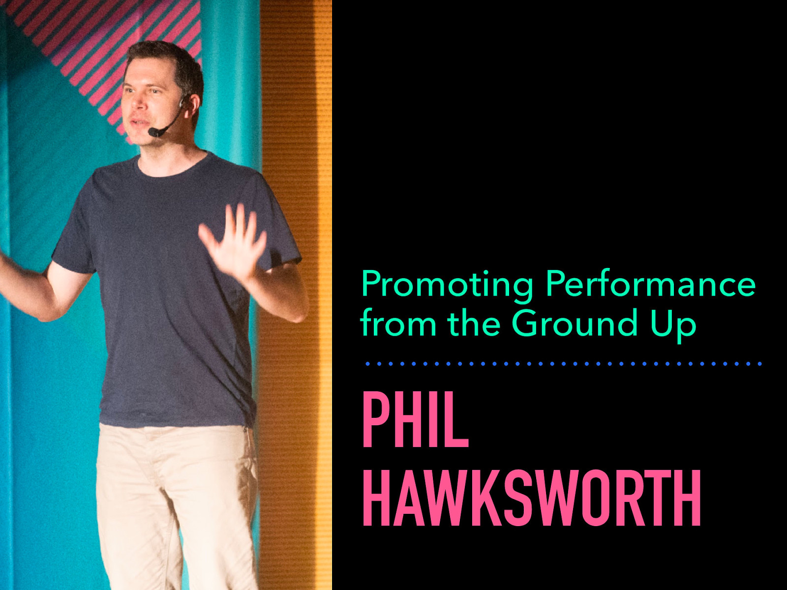
Promoting Performance from the Ground Up PHIL HAWKSWORTH Our next speaker is Phil Hawksworth, who is devrel at Netlify.
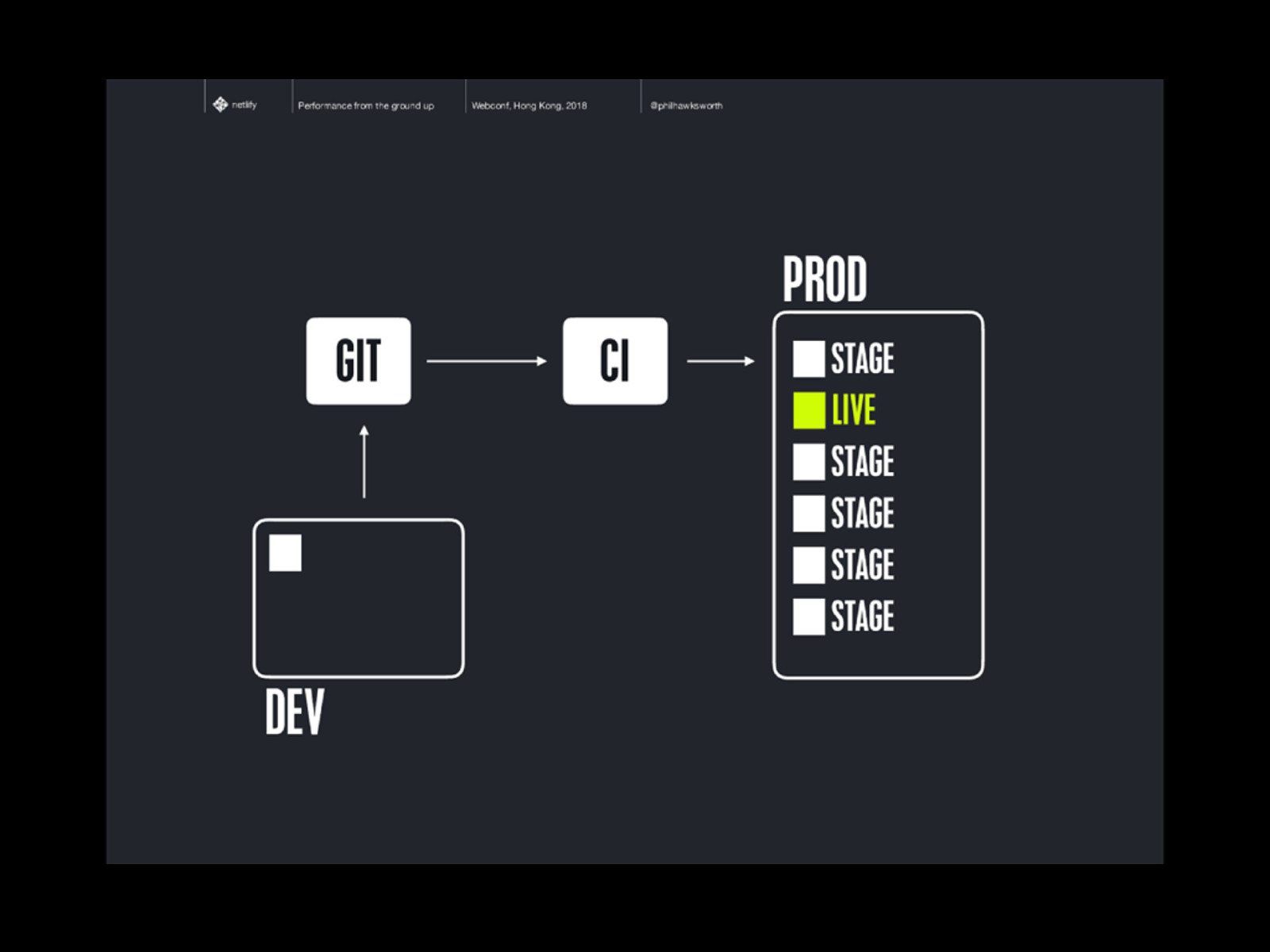
His talk covers the very stressful process of going from development to production and has a few suggestions on how to help with that. In this case, he talks about a serverless, Jamstack setup (JS + API + Markup), powered by Netlify. Even Netlify uses itself to deploy stuff.
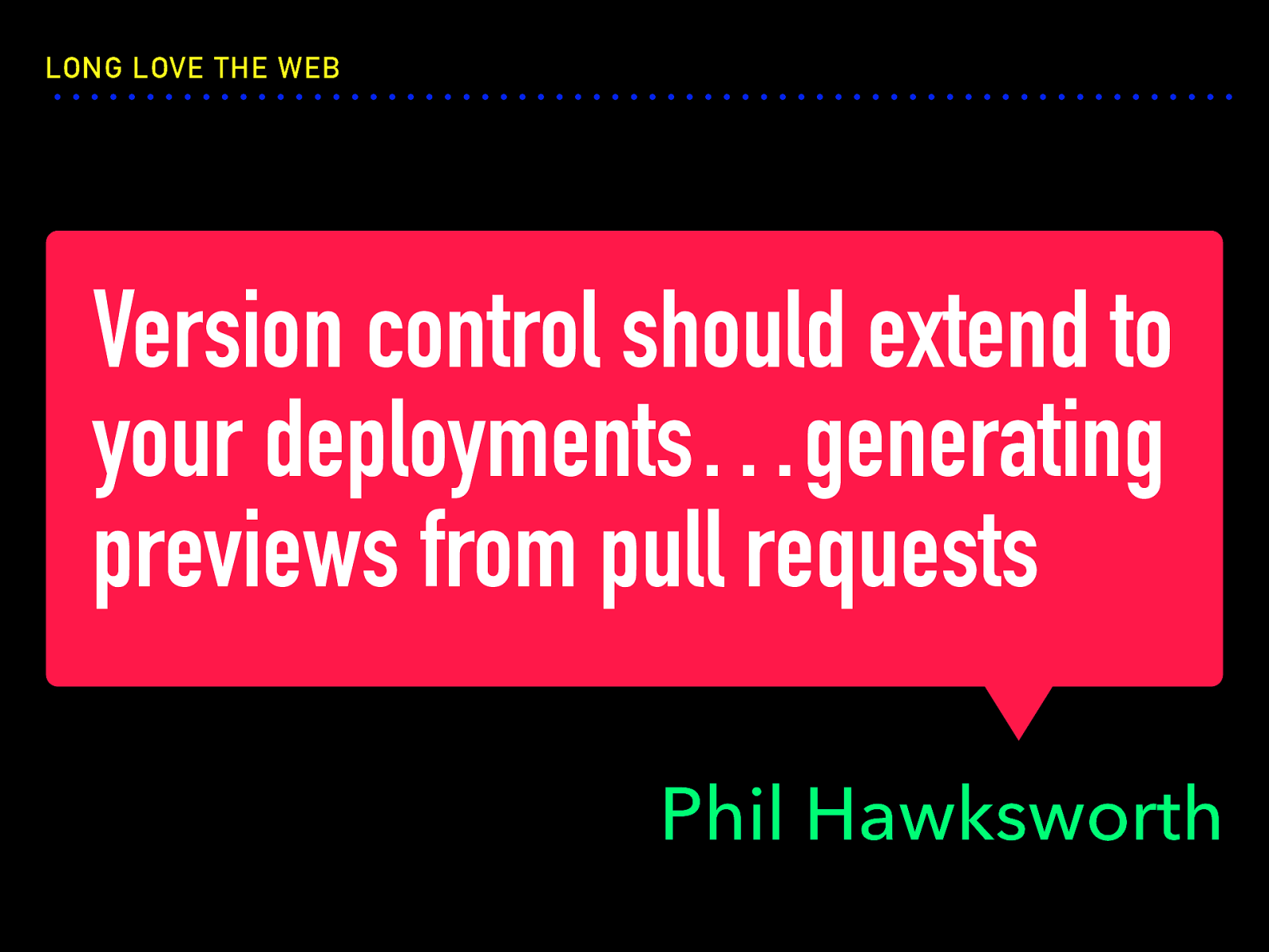
Version control should extend to your deployments…generating previews from pull requests Phil Hawksworth One key idea is to have a Git-based workflow all the way to deployment.
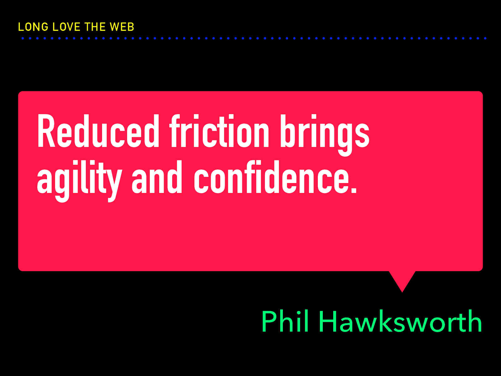
Reduced friction brings agility and confidence. Phil Hawksworth When your deployment is well-documented, accessible, and automated, your pain points and errors are reduced, and you can work faster and more confidently.

Data Visualisation in the News JANE PONG Jane Pong is data visualization journalist at the Financial Times.
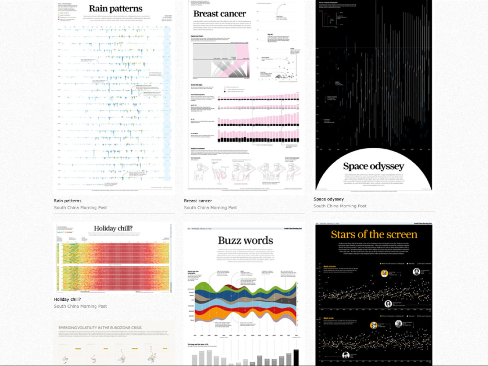
Her talk covers the creative process in her job. These are some of her work on officeofjane.com.
A picture paints a thousand words. A chart starts a conversation. Jane Pong Why is dataviz important in the newsroom? Because it helps tell a really clear story that cuts through the noise.
Is there in fact a story to tell? Nothing we do can make boring data interesting. Jane Pong
The workflow is usually one of 2 scenarios: I have data, or I have questions. You get the data, clean the data, do analysis, do storytelling.
Leverage the best of your platform and showcase the data the most effectively. Jane Pong
Where does it make the most sense to add interactivity? That’s where her experience and judgment as a designer and a journalist comes in. As for how do you deal with responsive web design: they do at least 5 different versions of graphics.

Interaction of Color Systems DIANA MOUNTER
Diana Mounter leads the design systems team at GitHub and organizes Design Systems Coalition in NYC. Her talk is specifically about the color aspect in design systems.
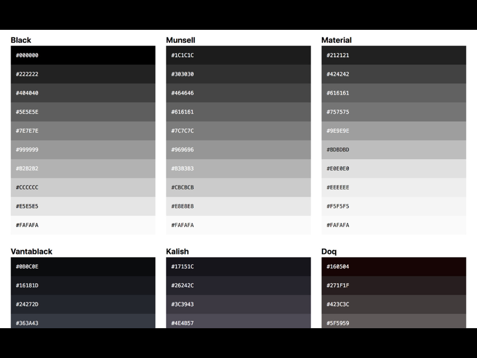
Because news flash: there are many different challenges when working with color.
The entire history of color theory is neglected in modern design tools. Diana Mounter
“Design tools put colors in neat boxes or circles and that’s kind of misleading”
It’s either accessible or it’s not. Diana Mounter
Green, orange, and yellow are the most challenging to work with in terms of a11y. It turns out the green used on GitHub didn’t pass contrast, while the shades of green did felt like a huge departure from the brand.
What is perceived is hard to calculate. Different colors have different range. Diana Mounter
Then there’s things like naming, which as we know is one of the hardest things to do in computer science, and then there’s programming color, which is not as straightforward as you might think: it’s not just a matter of doing the same increments of numbers for colors, because actual change in color is different from perceived change in color.
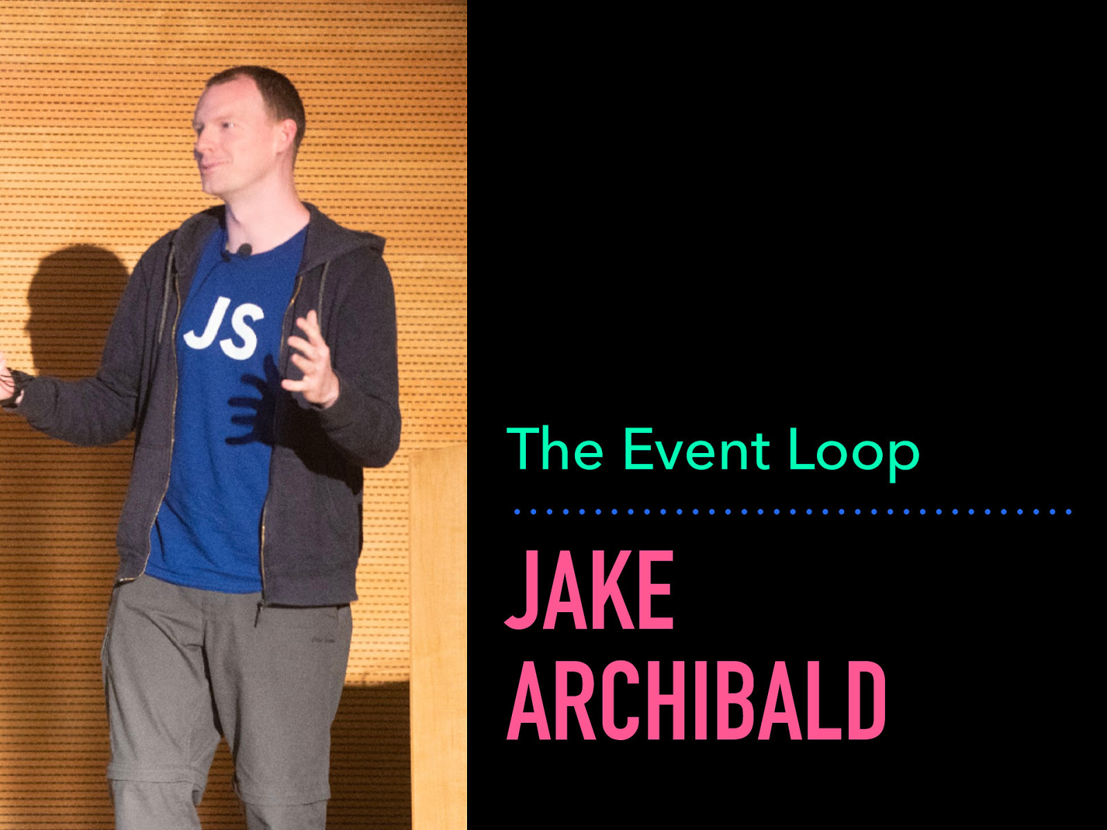
The Event Loop JAKE ARCHIBALD
Jake Archibald is developer advocate for Google Chrome and one of the editors of the service worker spec. His talk explains how the the event loop on web pages works.

Web pages have a main thread, which is where JS happens, and where rendering happens, where the DOM lives. There’s a certain order that’s followed when dealing with the main thread, and it sometimes gets to the point that those tasks are blocked…
As humans we don’t really have a main thread, except when we begin to sneeze. Jake Archibald
…and he says this is kind of hard to relate to as humans, because we don’t really have a main thread. We’re very multi-threaded aka multi-tasking. Except when we sneeze.
We don’t want to write our code like when we sneeze. Jake Archibald
We don’t want things to just get blocked. So what happens in the event loop has all this prioritization happening. For JS setTimeout or click events, we get off the main thread, spawn a new parallel thread and queue a task and make it happen there—these are called Task Queues. Another detour would be Render Steps, which is how the browser updates the screen, and it has Style calculations (CSS), Layout (creating a render tree), and Pixel data (paint). The third would be Micro Tasks, which happen anywhere JS can run, and behave differently depending on what’s in the JS stack.
If you want to run code that has anything to do with rendering, a task is really the wrong place to do it. We want to run code in the render steps. Jake Archibald
requestAnimationFrame is good for animation, as opposed to setTimeout, which still runs more times than the user can see, or than the display is capable of showing, which is pointless and wasteful and janky to the user. Again, setTimeout is not recommended for animation.
I treat tasks like I treat people who drink fizzy water: I keep our interaction to a minimum because I do not trust them at all. Jake Archibald
Tasks, Animation callbacks, & Microtasks are all processed subtly differently. Jake Archibald
Automated tests [using JS] can change the behavior of your code. Jake Archibald
If you want to watch video of this talk, there’s a recording from JSConf.asia on YouTube.
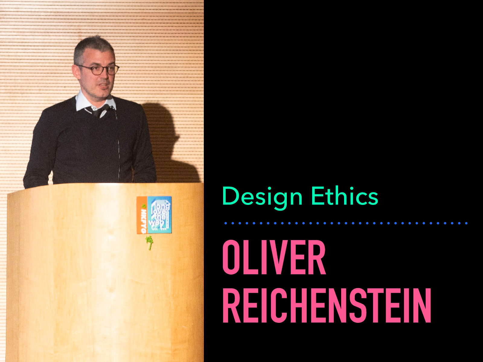
Design Ethics OLIVER REICHENSTEIN
Oliver Reichenstein is founder & director of Information Architects, and creator of the iA Writer app. His talk is about design ethics. (Side note, his company’s Twitter handle is @iA, and his site is iA.net, so if you know my nickname, you’ll understand why I’m low-key fangirling and jealous at the same time.)
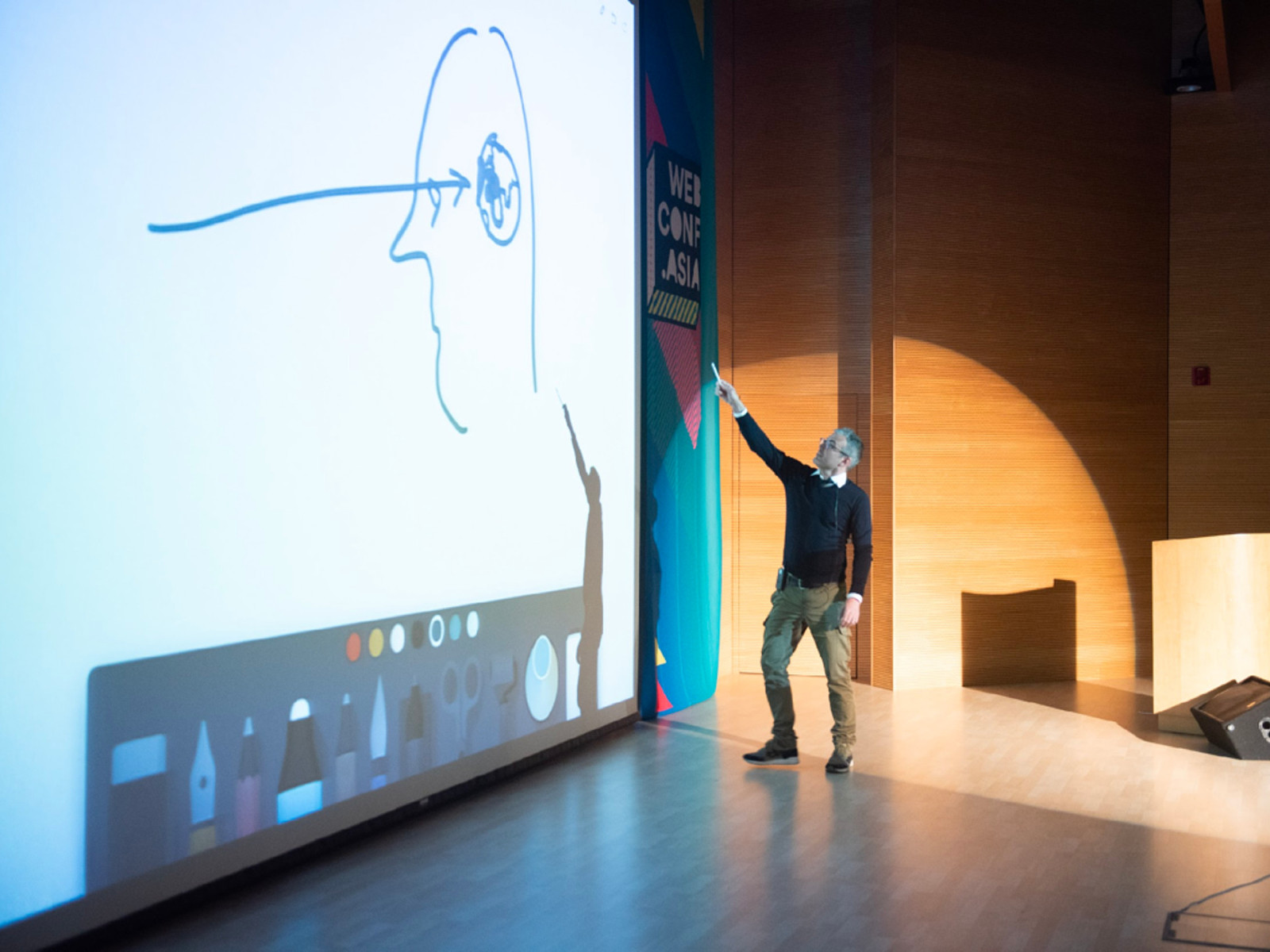
While presenting, he was drawing in real-time on the iPad app, Paper.
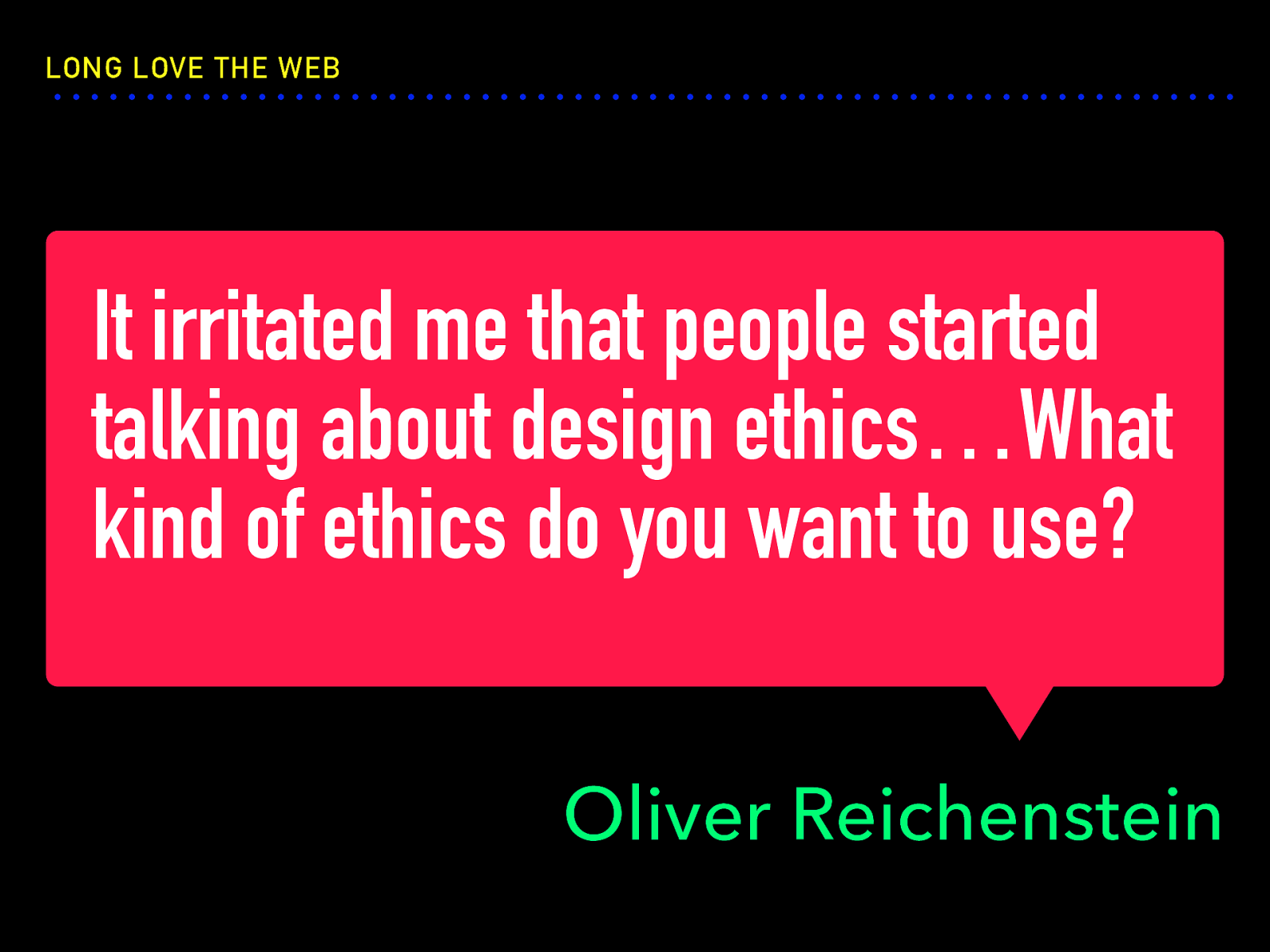
It irritated me that people started talking about design ethics…What kind of ethics do you want to use? Oliver Reichenstein
In order to understand ethics, he illustrated how different philosophers thought of it. With Aristotle you have happiness; Stoics, ignore pain; Jesus, love; David Hume, pleasure.
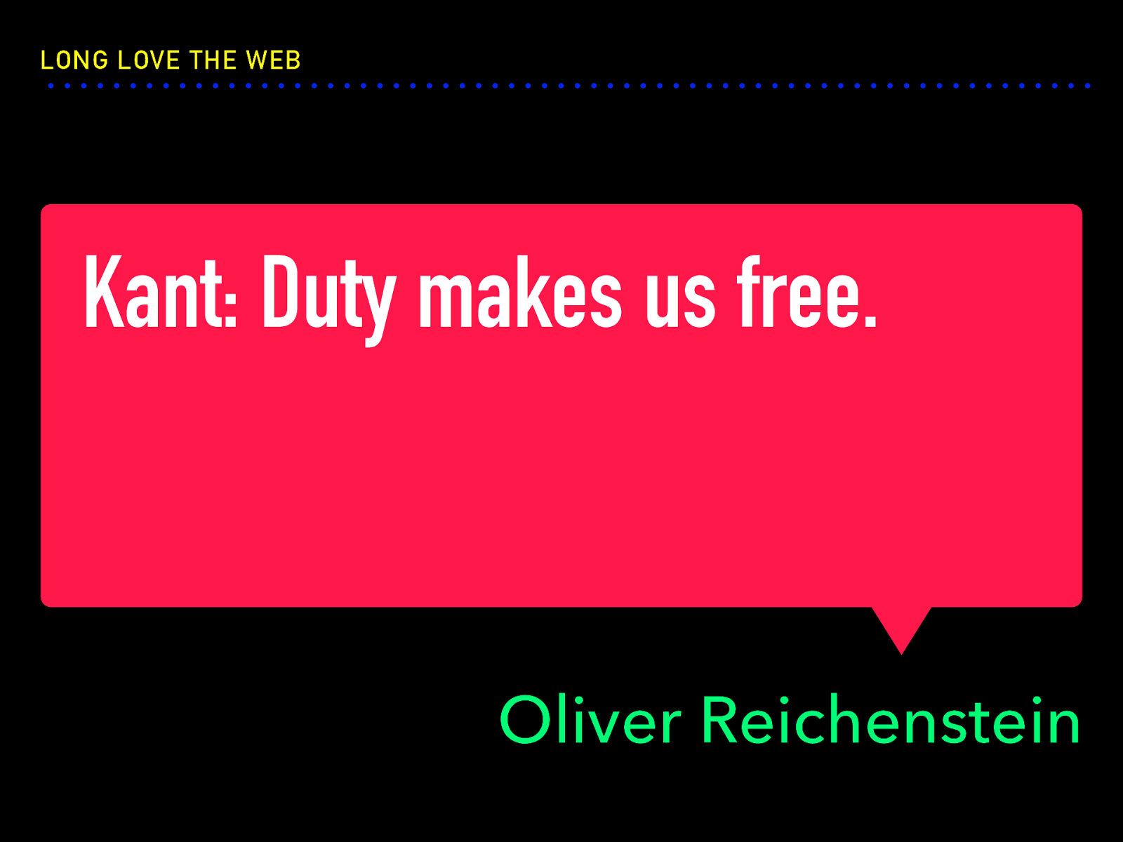
Kant: Duty makes us free. Oliver Reichenstein
Then he lands on Immanuel Kant, who thought about the connection between the stars and what’s inside him. Freedom of will. You are ethical if you do something because you know you have to, to increase the freedom of everybody.
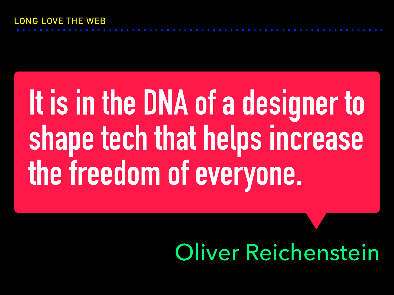
It is in the DNA of a designer to shape tech that helps increase the freedom of everyone. Oliver Reichenstein
When we design, we are making things that are supposedly making us freer. But: applying ethics won’t change the problems we have right now, but laws. And that wraps up Day 1. We had an afterparty sponsored by Microsoft at a coworking space. Lots of sushi and craft beer.

Day 2 started by Charis bringing Hui Jing Chen on stage. She was a speaker at Webconf.asia last year, her first ever speaking gig before she started speaking all over the world, and now she got an impromptu emcee assignment, which she gladly and expertly took on.

Choose Your Animation Adventure VAL HEAD
Val Head is design advocate at Adobe, author of Designing Interface Animation, teaches on lynda.com, and has a weekly newsletter called UI Animation.
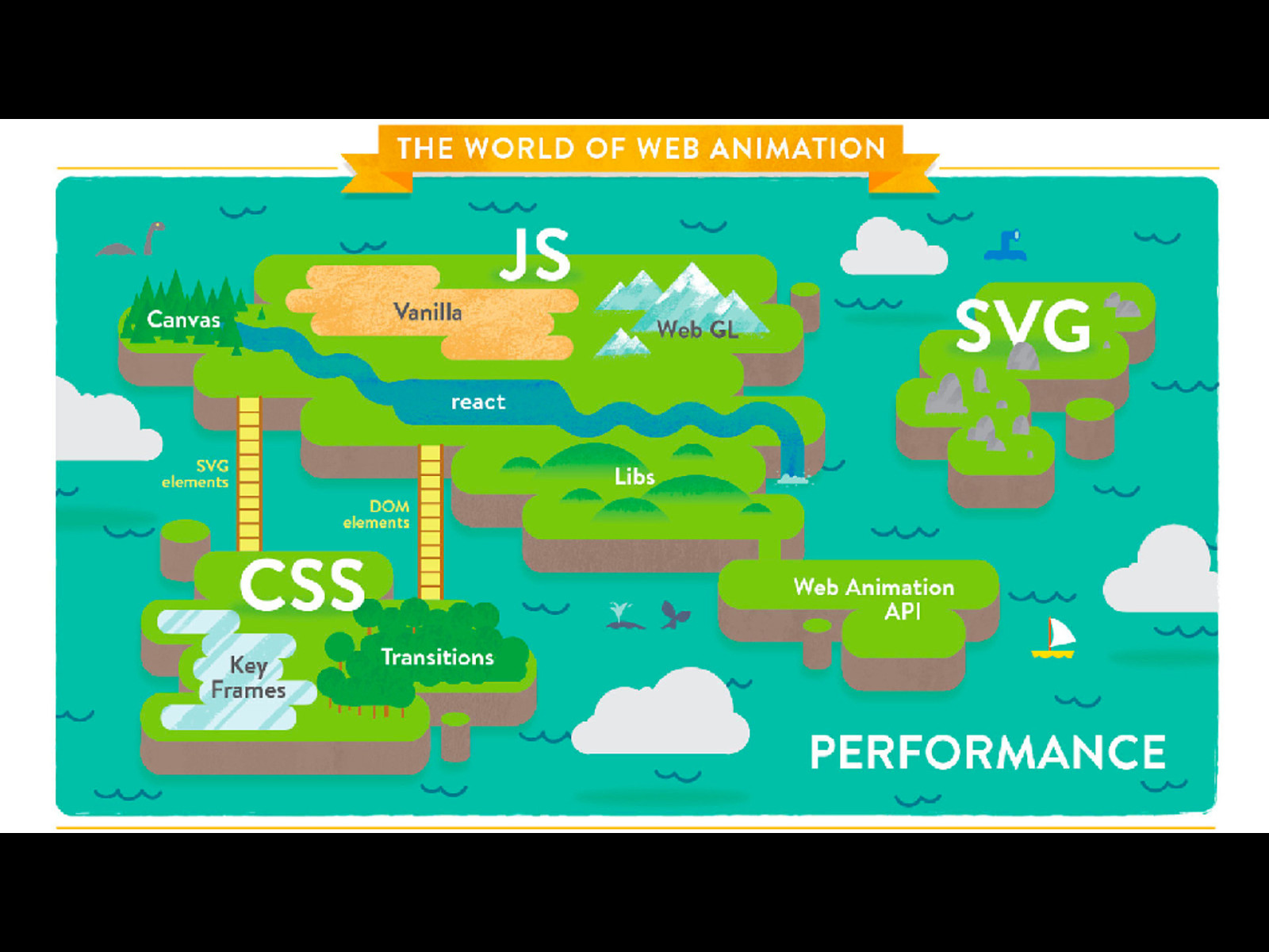
She had a beautifully made map of the world of web animation, and visited each area one by one: describing what they’re great at, and what they’re not so great at. For example, CSS shines with defined state animation.
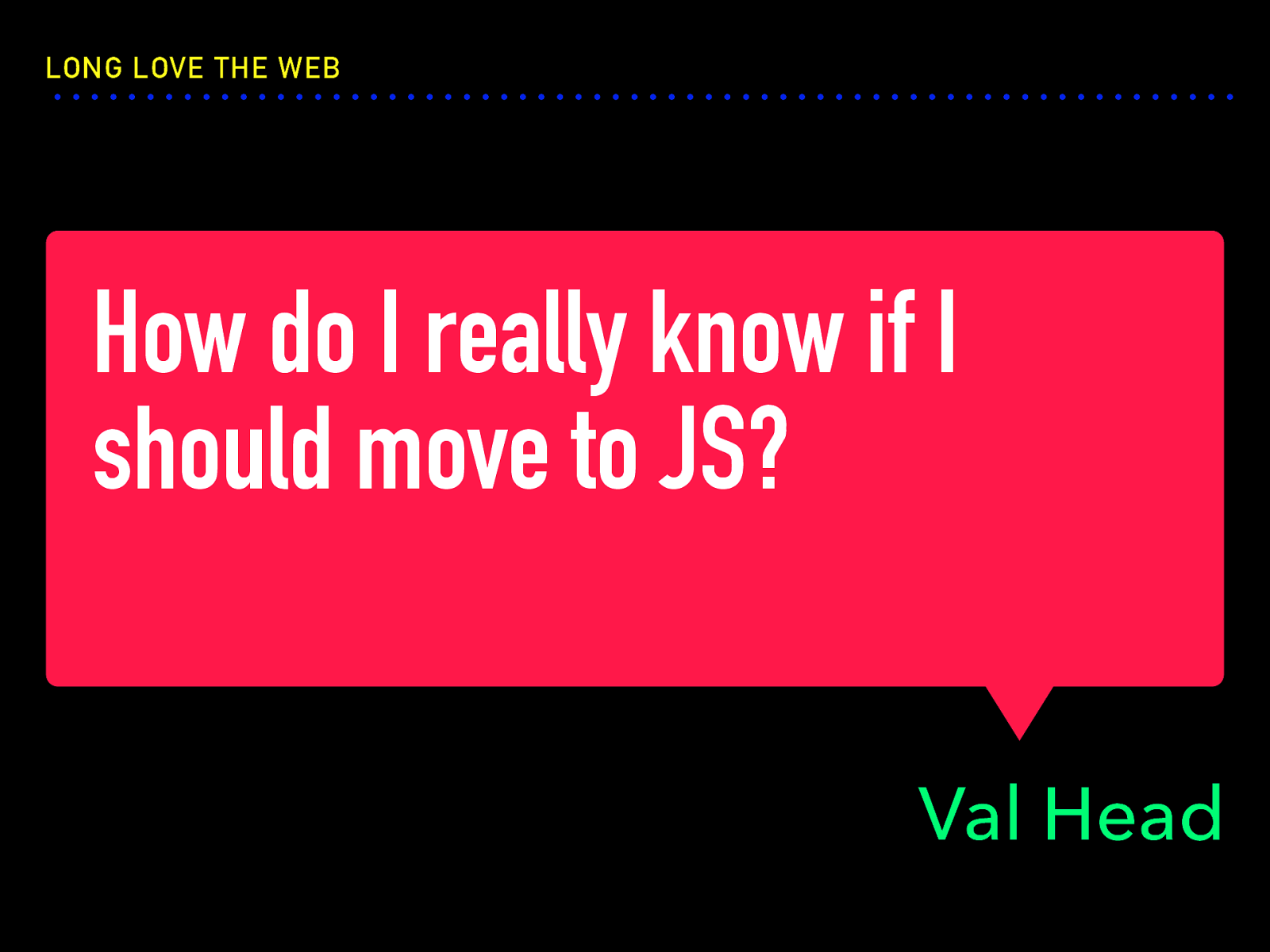
How do I really know if I should move to JS? Val Head
It be time to use JS if you’ll chain more than 3 animations in a sequence, or the animation needs to run dynamically, or physics & more complex easing is needed.
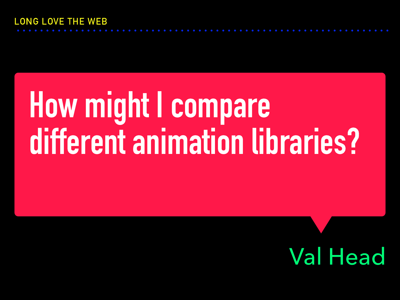
How might I compare different animation libraries? Val Head
Make a shortlist, and figure out what the the pros & cons you’re good with. For example, GreenSock supports up to IE8, but some features have paid licensing. Anime JS is very light (4.7 KB), but up to IE10 only.
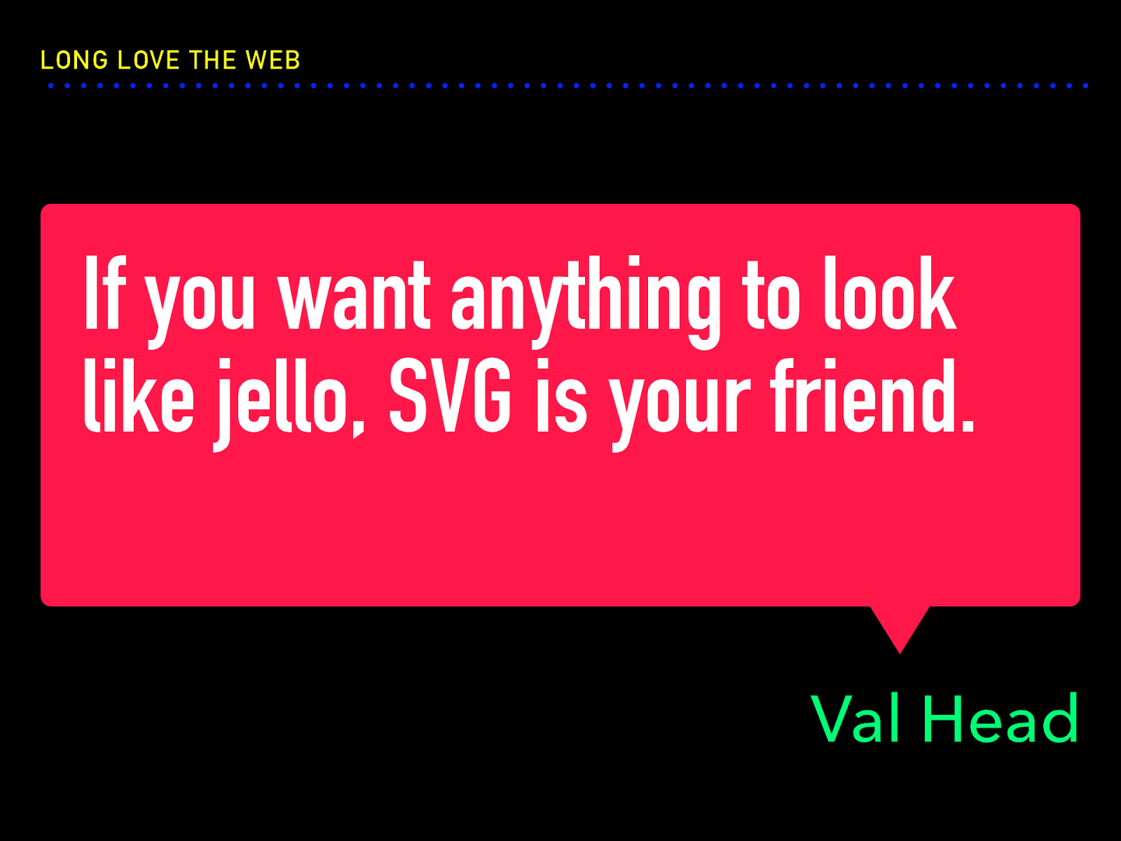
If you want anything to look like jello, SVG is your friend. Val Head
As for SVG, there are certain things you can do to it using CSS, JS. It’s great for animating illustrations & infographics, shape morphing, and motion along a path.
Performance?
CSS is declarative, so whole animation is known ahead of time. JS is imperative, so browser only knows the current frame; also hardware acceleration isn’t automatic. For SVG, performance is good in general and not all browsers support its hardware acceleration yet. It’s responsive by nature and its file sizes can be really tiny.

How to Hack a Web App? ASIM HUSSAIN
Asim Hussain is a cloud developer advocate at Microsoft, author of book and video series “Angular: From Theory to Practice”, and teaches at his site, codecraft.tv.

Equifax was hacked (the biggest hack in history) due to a known vulnerability, that had been fixed, and all they had to do was install an update. He cites snyk.io that “77% of 433k sites use vulnerable JS libraries. So what can you do?
Update everything. Asim Hussain
Make sure your code is updated. GitHub has put known vulnerabilities in its dependency graph; you can install NSP for CI; Azure has a trained AI to detect patterns if you’re being hacked.
Don’t assume your inputs will come in the form that you expect. Sanitize. Asim Hussain
Another common situation is SQL injection. There’s an actual UK company called ; DROP TABLE "COMPANIES";-- LTD. You always have to assume that users will give untrusted input, and sanitize that.
There’s no such thing as a small vulnerability. Asim Hussain
He tells another story about Orange Tsai, who chained 4 vulnerabilities on GitHub with webhooks, GET request, HTTPConnection lib, memcache. All the small vulnerabilities in those areas were chained together to result in a large exploit.
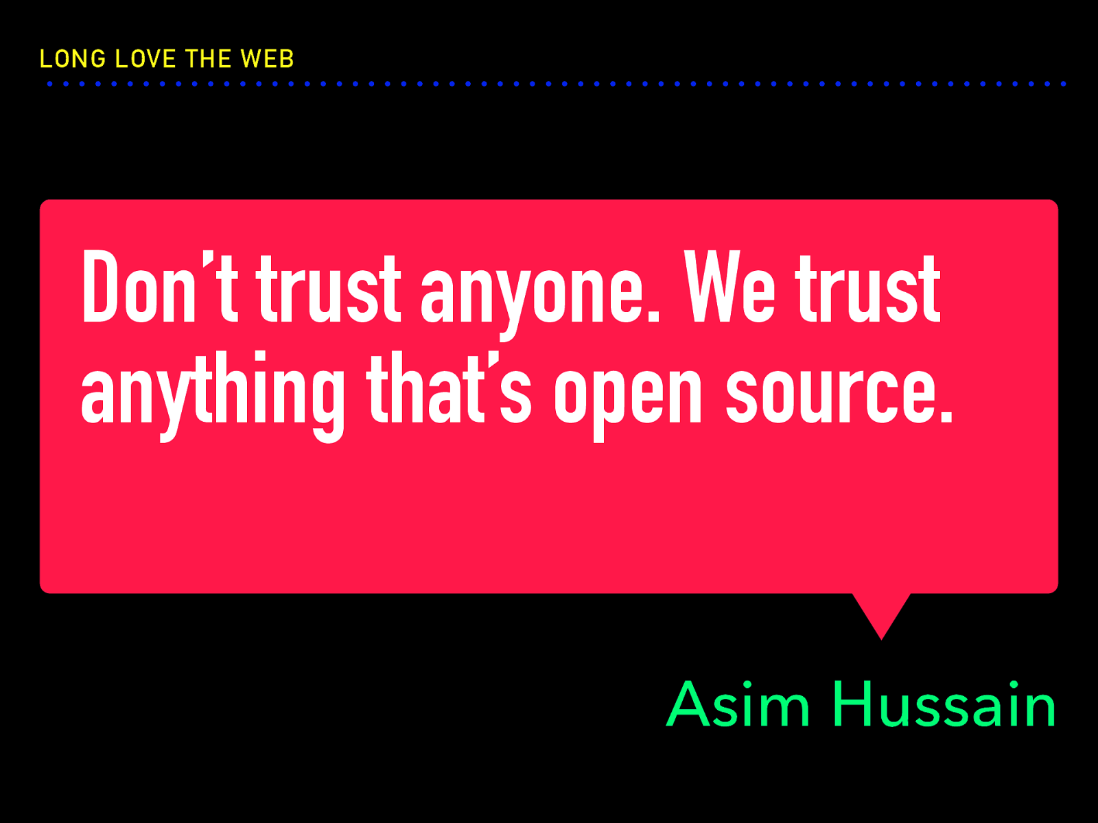
Don’t trust anyone. We trust anything that’s open source. Asim Hussain
There was one exploit that happened because of “typosquatting”: you might accidentally install a library similarly spelled, e.g. crossenv vs. cross-env. But we don’t really dig into the code of these open source libraries because we assume it’s fine.
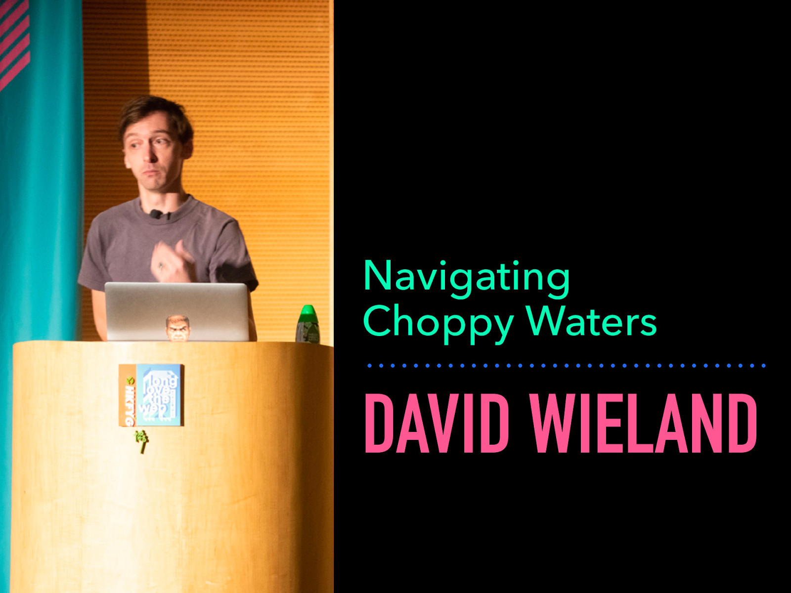
Navigating Choppy Waters DAVID WIELAND
David Wieland is chief of design at Grayscale design studio in HK.

His whole talk is about dealing with the client side of projects, with a seafaring metaphor through and through.
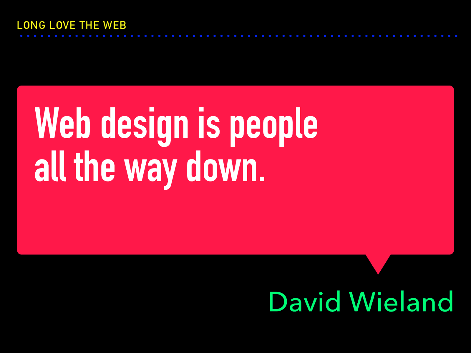
Web design is people all the way down. David Wieland
“Explaining design to non-designers is an underrated skill” and it’s something we need to develop as well, because they don’t think in the same way as we do.
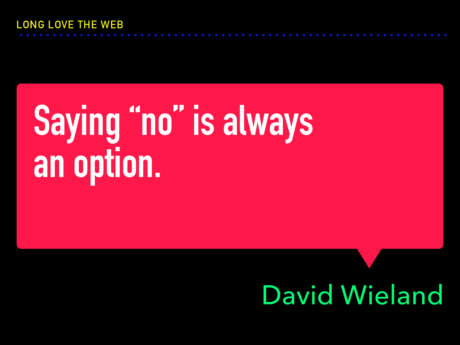
Saying “no” is always an option. David Wieland
He gives advice for “red flag” situations. No budget? Try fishing for one to gauge their reaction. Avoid fixed deadlines, or make sure there are consequences when things get pushed back. Want an upfront design “pitch”? No one wins with that.
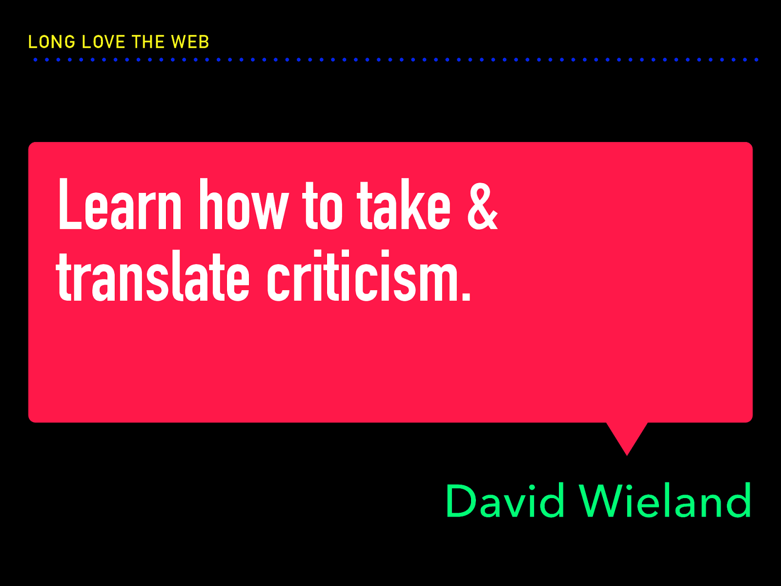
Learn how to take & translate criticism. David Wieland
Learn to figure out: what is helpful and not helpful?
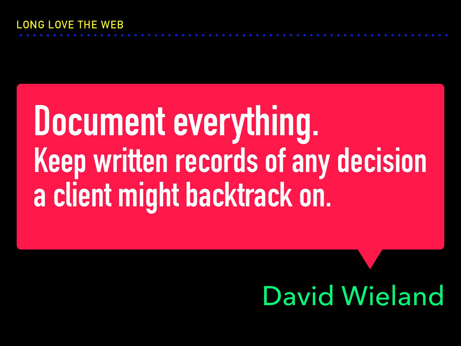
Document everything. Keep written records of any decision a client might backtrack on. David Wieland
Really important is to document everything. If it gets really bad: you might need to suspend the project to review, reassess, reassign. Or you might have to go nuclear and walk away from the sinking ship.

Strategy Guide for CSS Custom Properties MIKE RIETHMULLER
Mike Riethmuller is an independent web developer from Australia.
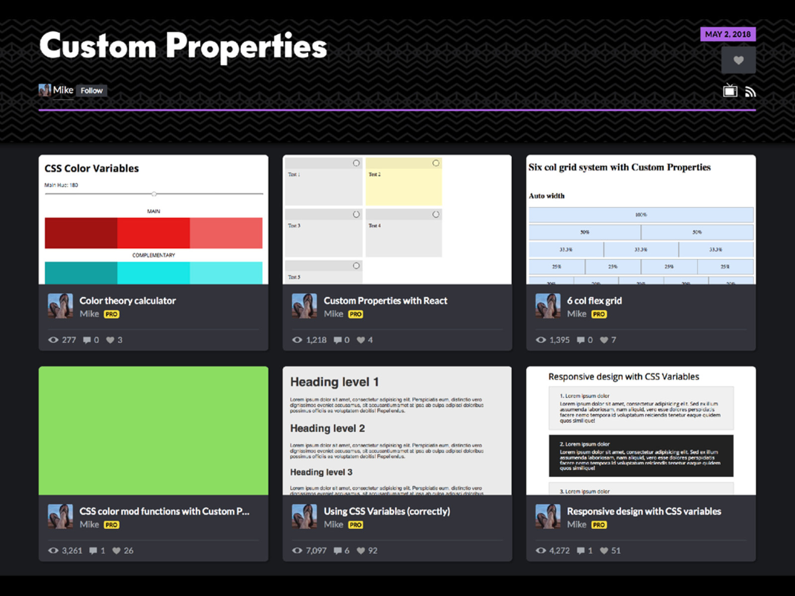
Custom properties, or CSS variables are a relatively new feature, and he has a few recommendations on how to use them.
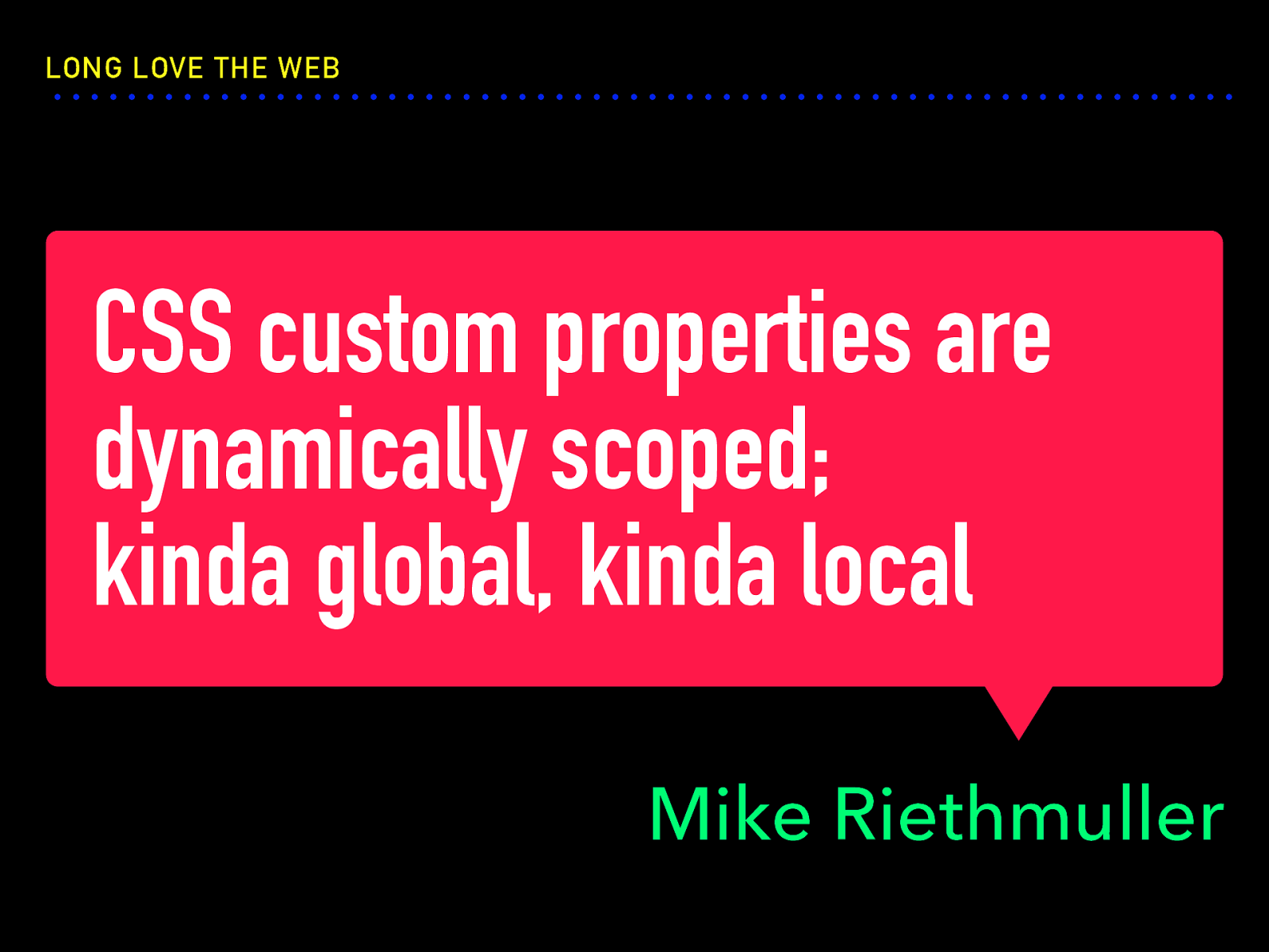
CSS custom properties are dynamically scoped; kinda global, kinda local Mike Riethmuller
Whereas variables in preprocessors are compiled into static values, CSS variables are subject to inheritance and the cascade; you can change the value inside media queries, pseudo-selectors, or JS, so they behave dynamically. In terms of scope: since they follow the selector they are applied to, you can say they’re “local”; but since they can also be inherited, they can also be “global”. So we need to be more thoughtful about their usage.
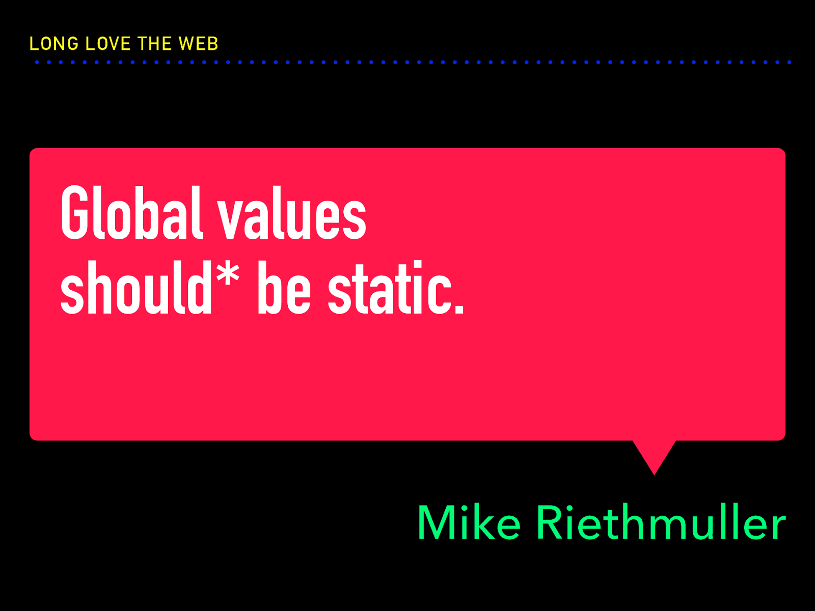
Global values should* be static. Mike Riethmuller
Although it might be tempting to convert every preprocessor variable into a CSS variable, it’s a good rule of thumb to keep global values static for things like readable code and documentation, and therefore keep them as CSS preproc variables. *One exception to this is theming, which is useful & more efficient with custom properties that can be dynamically updated with JS. Follow the convention of all caps for global variables.
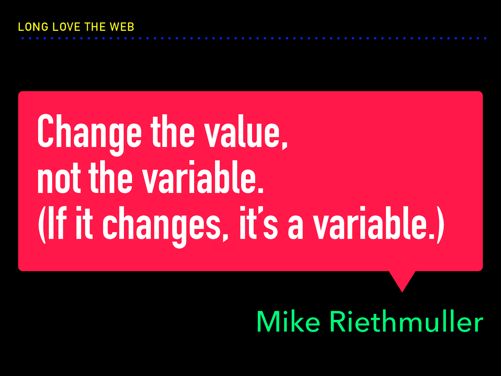
Change the value, not the variable. (If it changes, it’s a variable.) Mike Riethmuller
Another important rule is to never swap variables for a single purpose. Use a single custom property scoped to an element / component, and change its value as the situation arises, e.g. media queries for responsive design. Similarly, if a CSS property changes, use a custom property.
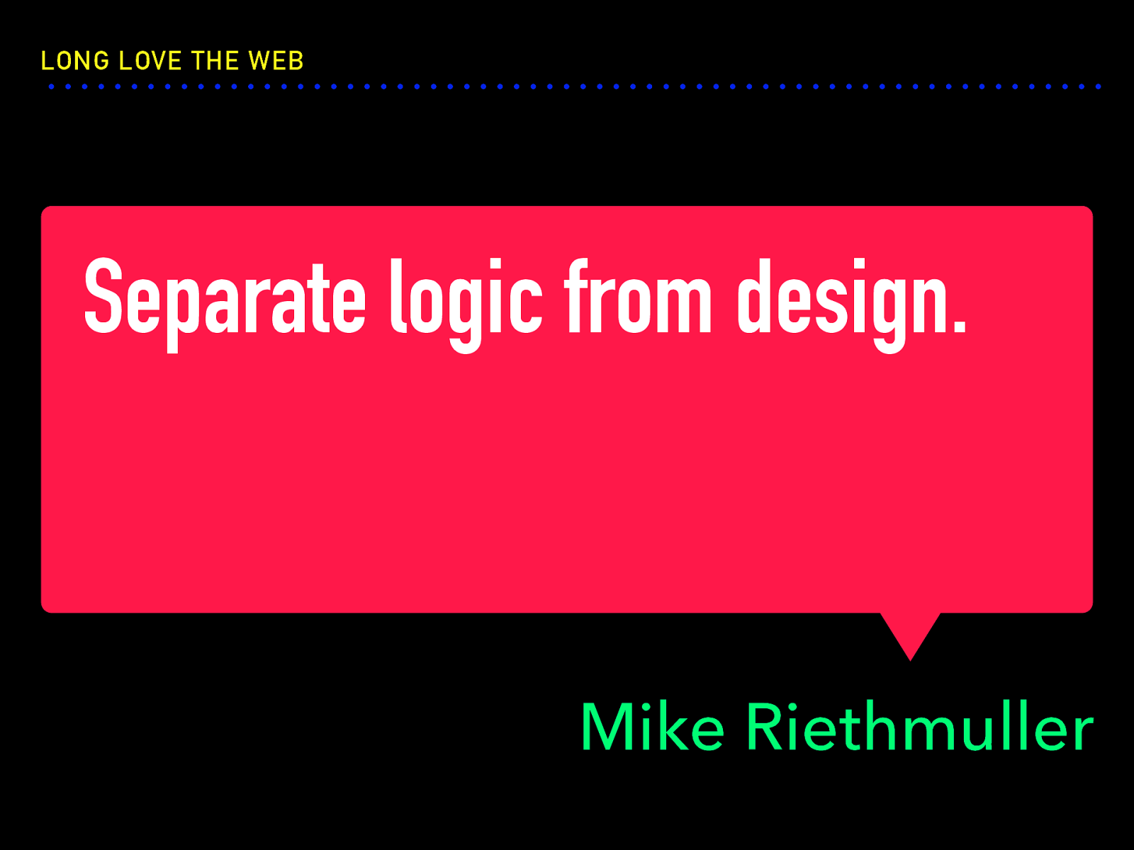
Separate logic from design.Mike Riethmuller
He also talks about the idea of the “logic fold”, where all the variables reside and the declarations when they can change. “Below the fold” is all declarative. So ideally it becomes easier to scan and understand the CSS code.

Fontastic Web Performance MONICA DINCULESCU
Monica Dinculescu is an emojineer at Google, working on Magenta, and previously on Polymer and Google Chrome.

Her talk is all about optimizing web font performance. One of the best stories that illustrate this is the “Mitt Romney font loading problem”.

Nuff said.
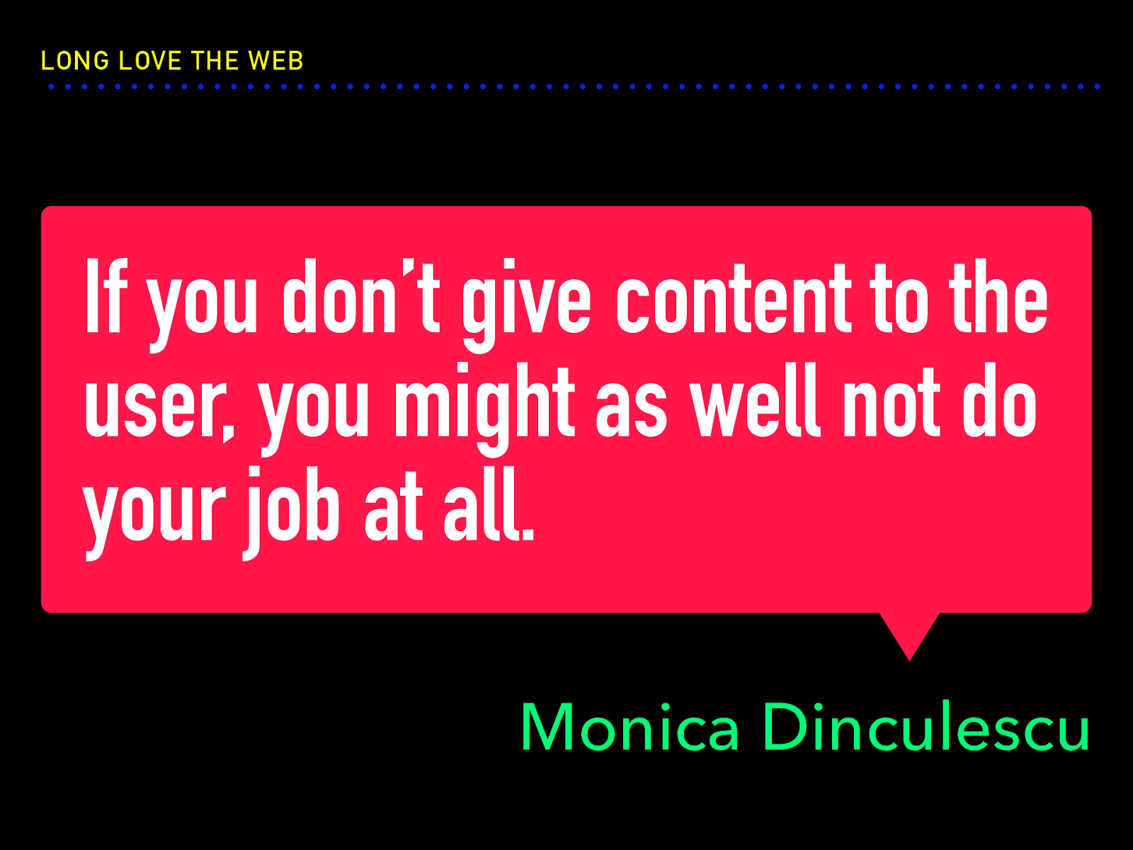
If you don’t give content to the user, you might as well not do your job at all. Monica Dinculescu
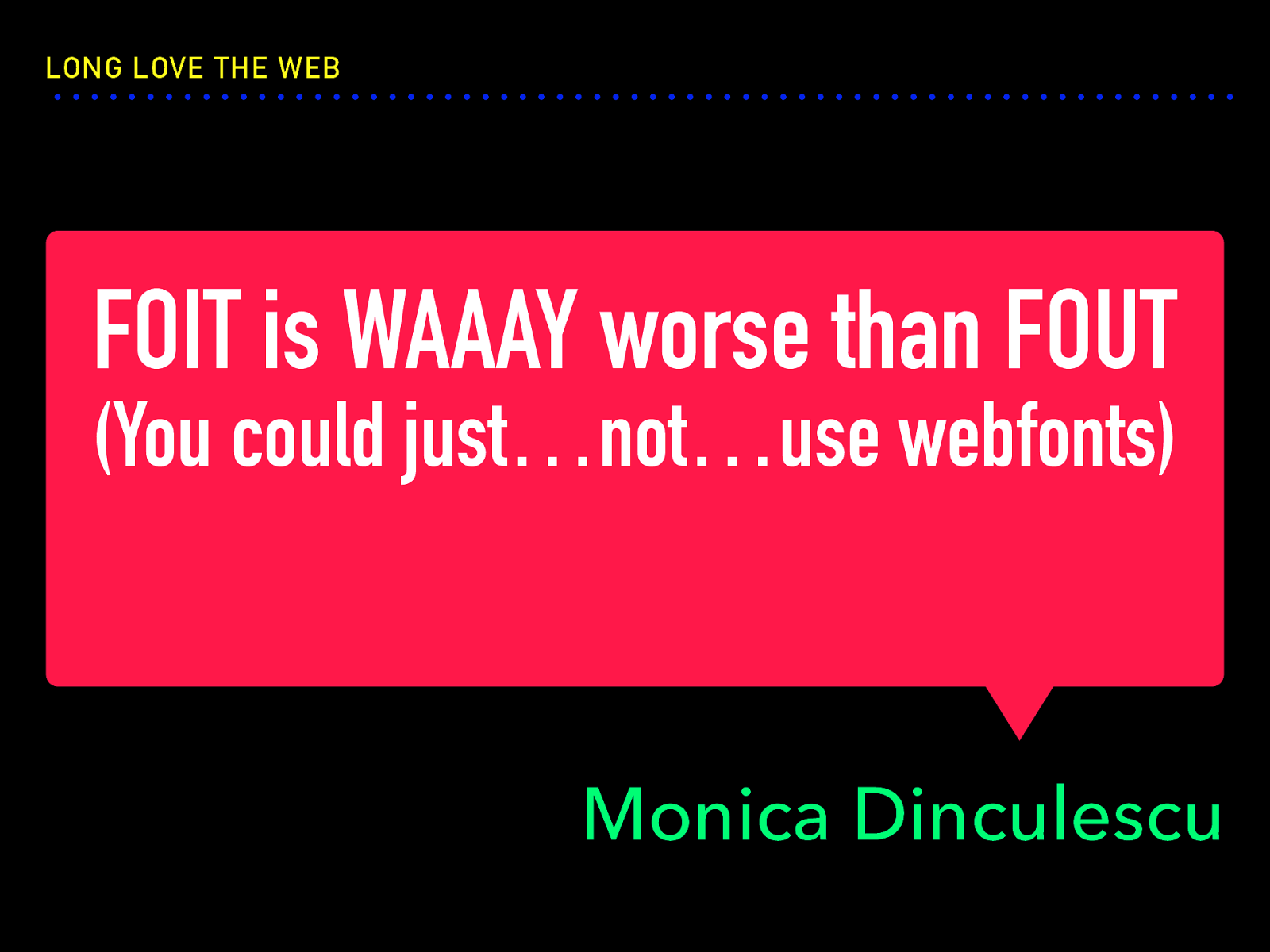
FOIT is WAAAY worse than FOUT (You could just…not…use webfonts) Monica Dinculescu
Invisible text is worse than Unstyled text. And as anyone who talks about web performance will tell you, the number one way to optimize is to not load the thing at all. Maybe you don’t really need webfonts in the first place? But if you really have to? Minimize FOIT: download fewer things, set unicode range, link rel=preload, font face observer, font-display: optional. Minimize FOUT: find fonts with similar x-heights.
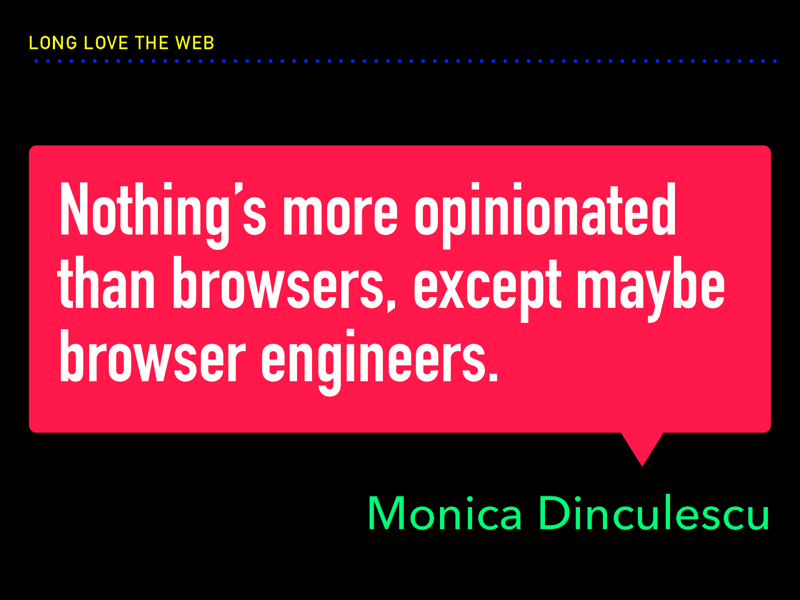
Nothing’s more opinionated than browsers, except maybe browser engineers. Monica Dinculescu
Anyway, after all those techniques, she also shared the cool stuff that’s happening with web fonts, like Datalegreya (a typeface that uses its ligatures to display text and charts inline), icon fonts, emoji, color fonts, variable fonts.

Weird Wacky Wonderings TIM HOLMAN
The last speaker was Tim Holman, a tinkerer, tuner, and tamperer from Australia.

Tim is behind so many, shall we say, interesting projects and showed us a bunch of them. One was a recreation of a DVD screensaver, meditative games at thezen.zone, a browser extension and unhelpful, opinionated voice bot called Buddy, and generativeartistry.com. I could mention a lot more, but the best way is to visit his site and experience them first-hand: tholman.com
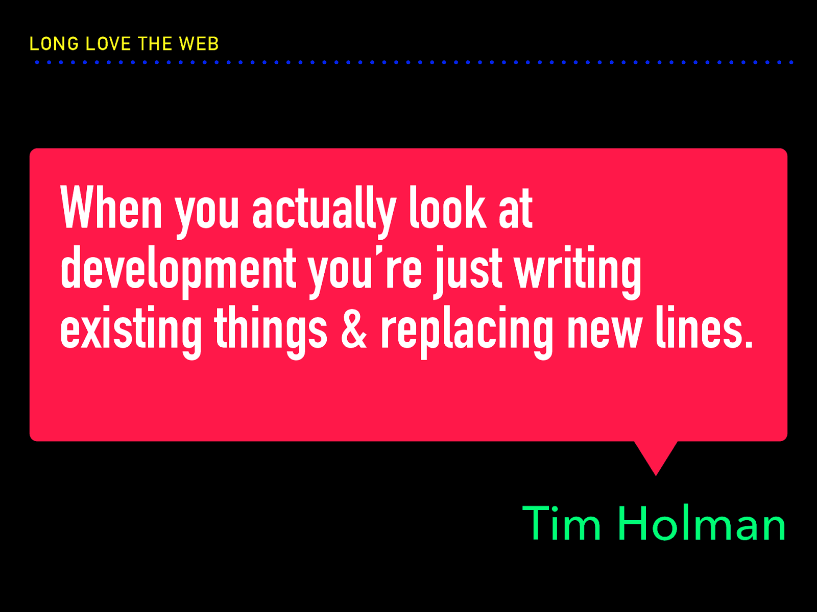
When you actually look at development you’re just writing existing things & replacing new lines. Tim Holman
They might look like “useless” projects, but it takes so much creativity, humor, and cleverness to put them all together. And while it does look hard, it’s a matter of pulling things from different places chunk by chunk, line by line.
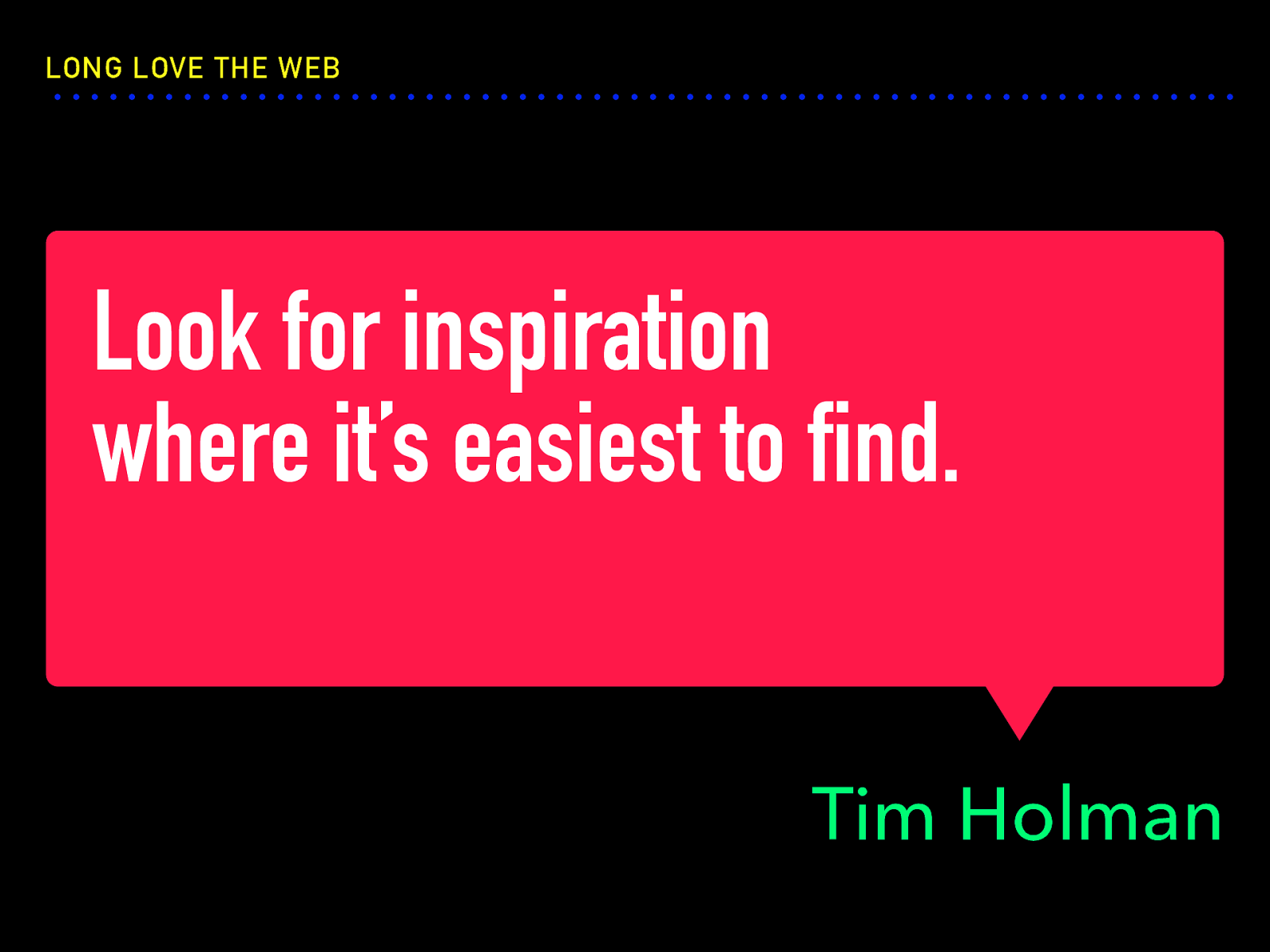
Look for inspiration where it’s easiest to find. Tim Holman
And that wraps up Day 2.
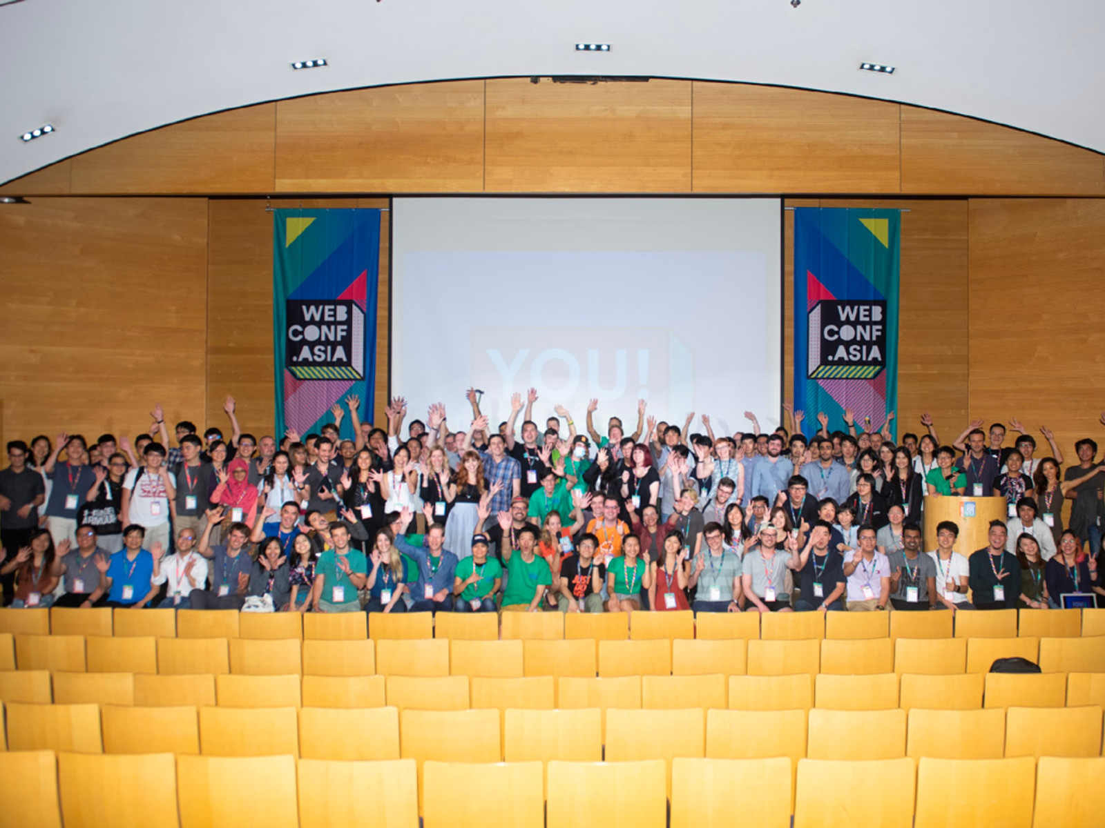
Here’s our class photo!

Presentations & more at: WEBCONF.ASIA/COVERAGE

WEBCONF.ASIA WILL RETURN (NOVEMBER?) 2019
(If you’re interested in attending next year, let us know so we can ask to arrange group discounts with Charis.)

🇵🇭✈️🇭🇰 THANK YOU!