
A presentation at Say Media Brown Bag in August 2017 in by Scott Vandehey

image credit: ericportis.com/posts/2014/srcset-sizes
image credit: ericportis.com/posts/2014/srcset-sizes
image credit: ericportis.com/posts/2014/srcset-sizes
image credit: ericportis.com/posts/2014/srcset-sizes
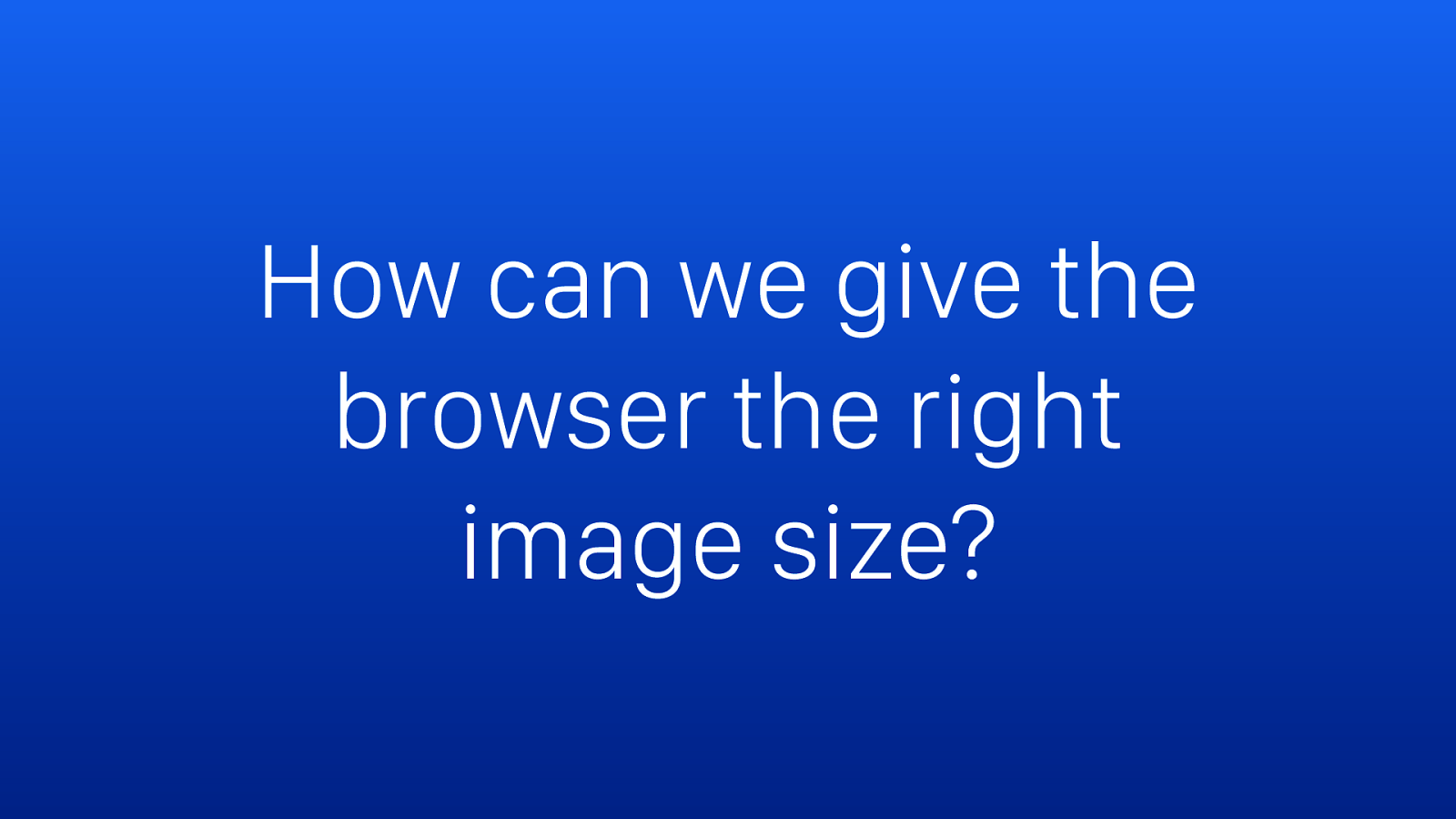
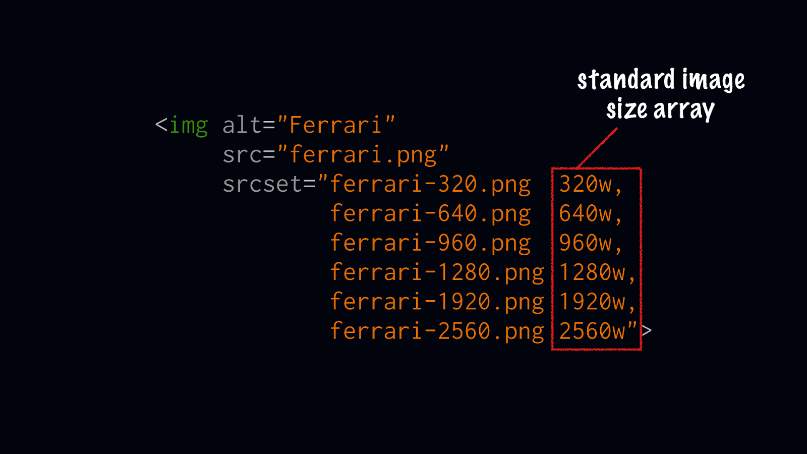
How can we give the browser the right image size?
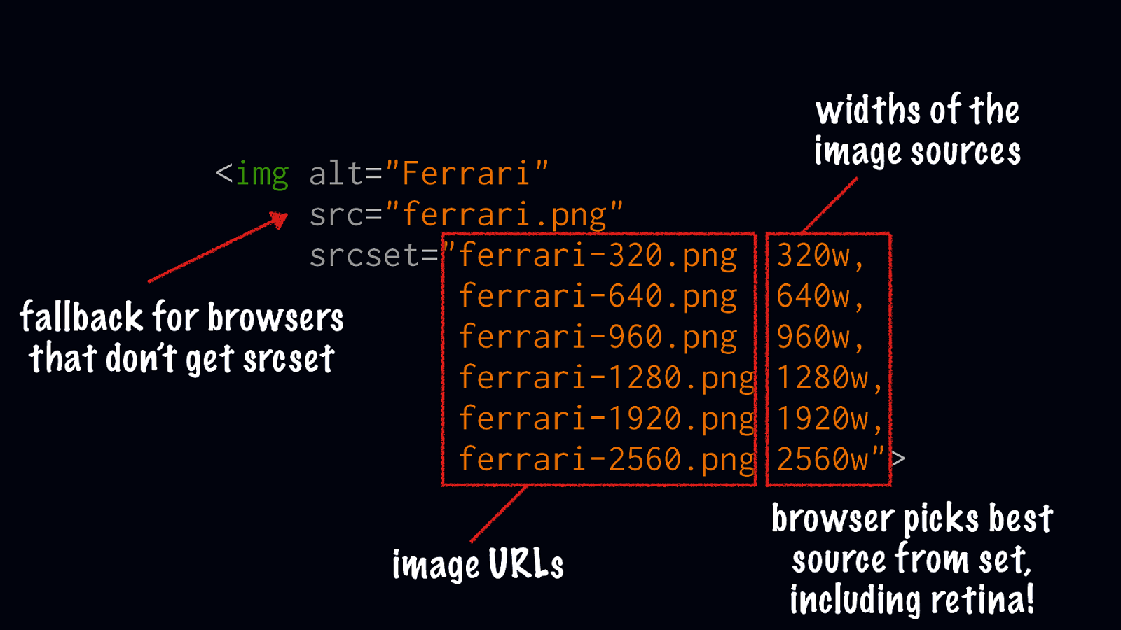
<img alt="Ferrari" src="ferrari.png" srcset="ferrari-320.png ferrari-640.png fallback for browsers ferrari-960.png that don’t get srcset ferrari-1280.png ferrari-1920.png ferrari-2560.png image URLs widths of the image sources 320w, 640w, 960w, 1280w, 1920w, 2560w"> browser picks best source from set, including retina!
image credit: cloudfour.com/thinks/responsive-images-101-part-9-image-breakpoints
image credit: cloudfour.com/thinks/responsive-images-101-part-9-image-breakpoints
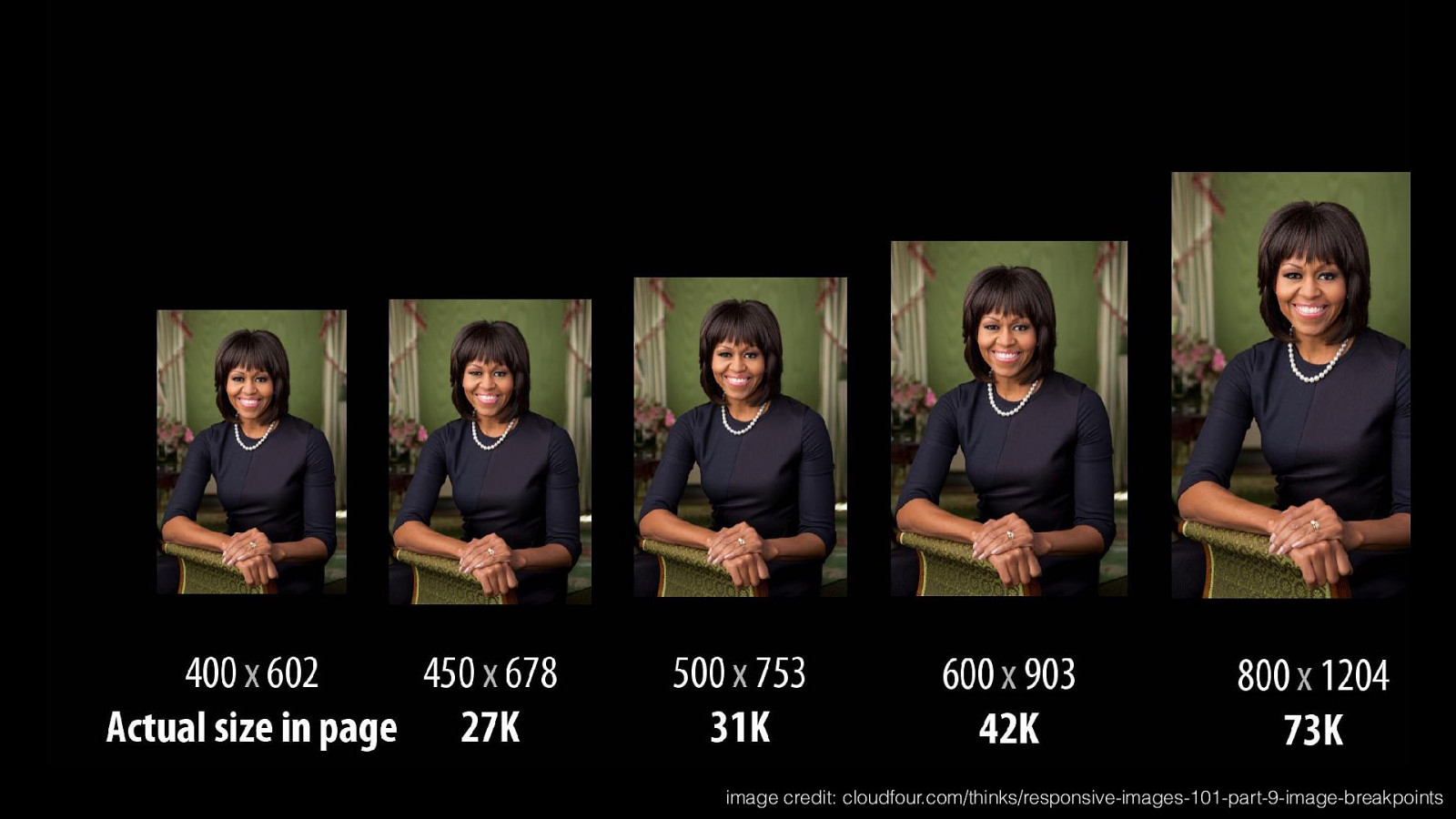
image credit: cloudfour.com/thinks/responsive-images-101-part-9-image-breakpoints
<img alt="Ferrari" src="ferrari.png" srcset="ferrari-320.png ferrari-640.png ferrari-960.png ferrari-1280.png ferrari-1920.png ferrari-2560.png standard image size array 320w, 640w, 960w, 1280w, 1920w, 2560w">
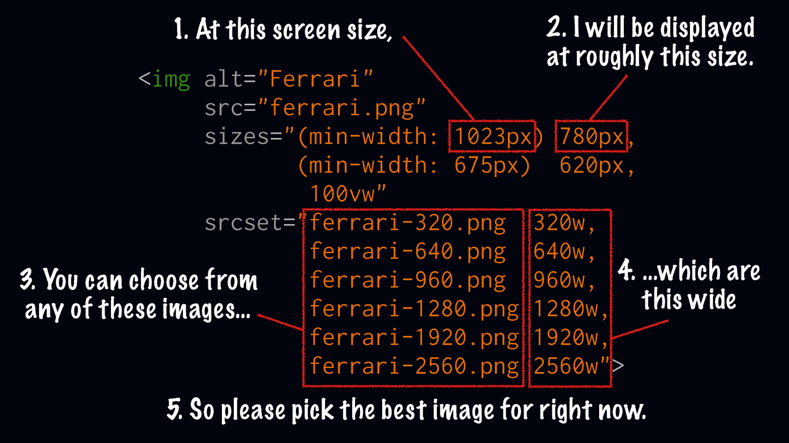
How can we tell the browser what size our image will display?
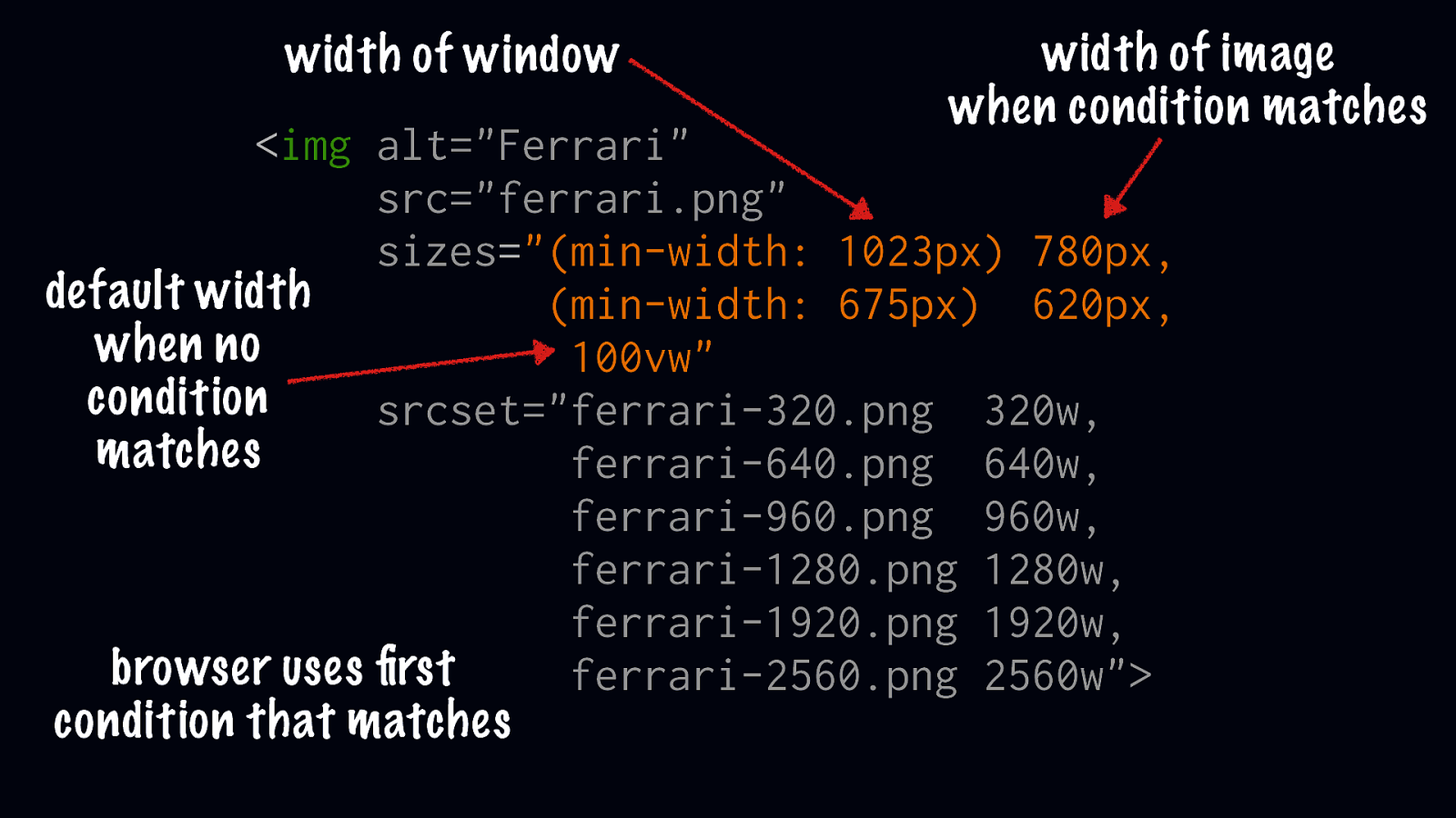
width of window width of image when condition matches <img alt="Ferrari" src="ferrari.png" sizes="(min-width: 1023px) 780px, default width (min-width: 675px) 620px, when no 100vw" condition srcset="ferrari-320.png 320w, matches ferrari-640.png 640w, ferrari-960.png 960w, ferrari-1280.png 1280w, ferrari-1920.png 1920w, browser uses first ferrari-2560.png 2560w"> condition that matches
What if we want different image crops per breakpoint?

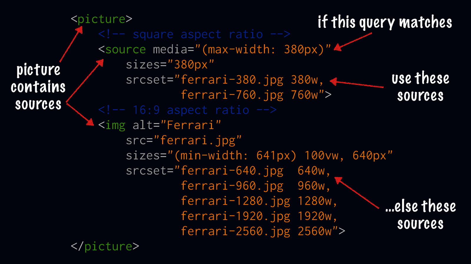
<picture> if this query matches <!-- square aspect ratio --> <source media="(max-width: 380px)" sizes="380px" picture use these srcset="ferrari-380.jpg 380w, contains ferrari-760.jpg 760w"> sources sources <!-- 16:9 aspect ratio --> <img alt="Ferrari" src="ferrari.jpg" sizes="(min-width: 641px) 100vw, 640px" srcset="ferrari-640.jpg 640w, ferrari-960.jpg 960w, ferrari-1280.jpg 1280w, …else these ferrari-1920.jpg 1920w, sources ferrari-2560.jpg 2560w"> </picture>

What if we want to support new image filetypes?
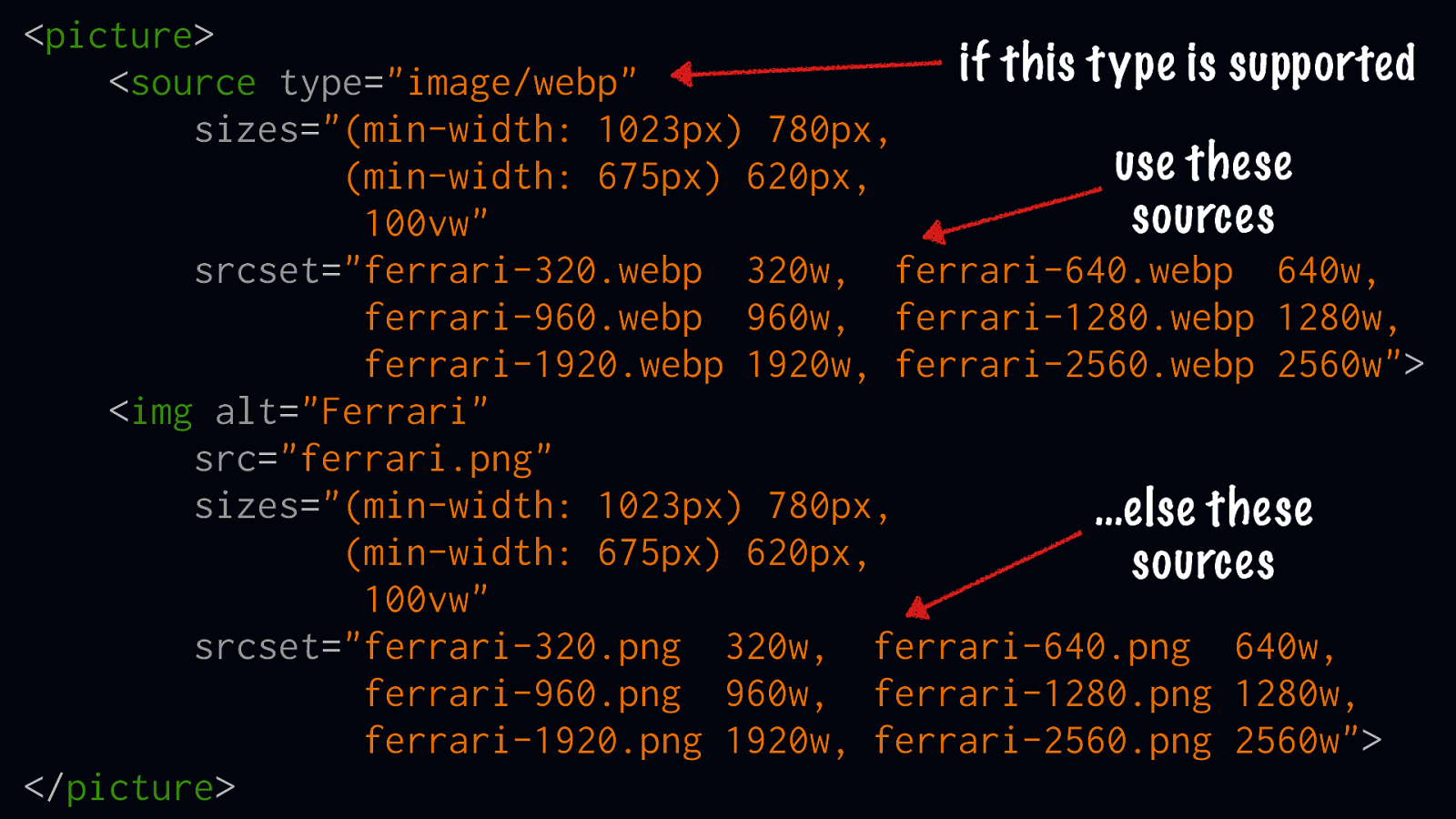
<picture> if this type is supported <source type="image/webp" sizes="(min-width: 1023px) 780px, use these (min-width: 675px) 620px, sources 100vw" srcset="ferrari-320.webp 320w, ferrari-640.webp 640w, ferrari-960.webp 960w, ferrari-1280.webp 1280w, ferrari-1920.webp 1920w, ferrari-2560.webp 2560w"> <img alt="Ferrari" src="ferrari.png" sizes="(min-width: 1023px) 780px, …else these (min-width: 675px) 620px, sources 100vw" srcset="ferrari-320.png 320w, ferrari-640.png 640w, ferrari-960.png 960w, ferrari-1280.png 1280w, ferrari-1920.png 1920w, ferrari-2560.png 2560w"> </picture>

What about browser support?
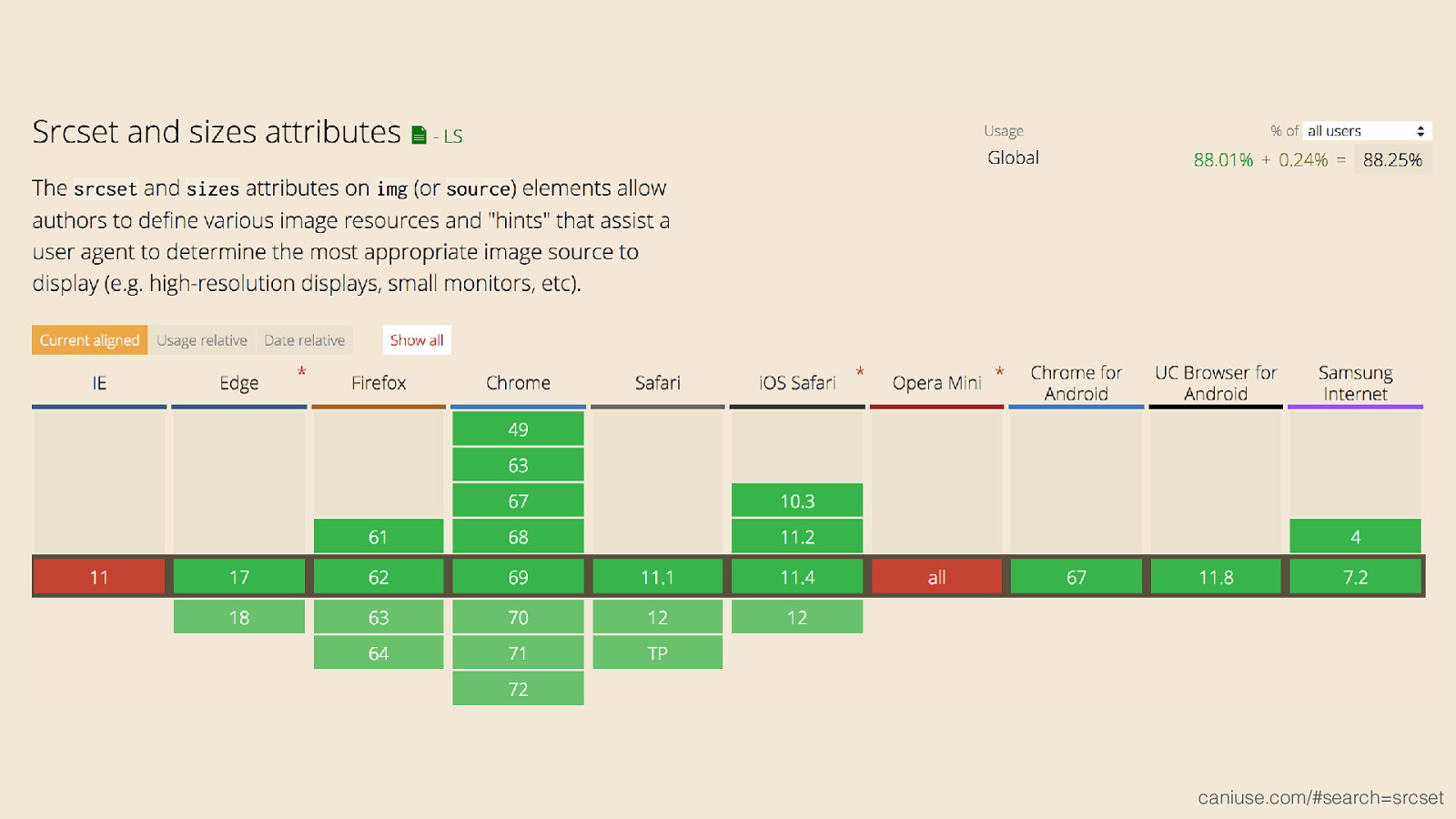
caniuse.com/#search=srcset
Learn More •
srcset and sizes by Eric Portis: ericportis.com/posts/2014/srcset-sizes
•
Responsive Images 101 by Jason Grigsby: cloudfour.com/thinks/responsive-images-101-definitions
•
The Anatomy of Responsive Images by Jake Archibald: jakearchibald.com/2015/anatomy-of-responsive-images