1 Weird Layout Trick UI Devs Use to Avoid Floats! Flexbox Will Shock You! Devsigners Hate Him! Scott Vandehey — @spaceninja — Devsigner 2015

A presentation at Devsigner Con 2015 in June 2015 in Portland, OR, USA by Scott Vandehey
1 Weird Layout Trick UI Devs Use to Avoid Floats! Flexbox Will Shock You! Devsigners Hate Him! Scott Vandehey — @spaceninja — Devsigner 2015
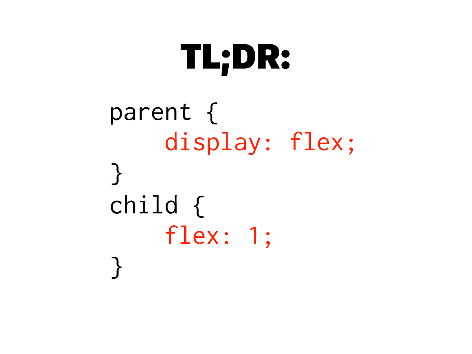
TL;DR: parent {
display: flex; } child { flex: 1; }

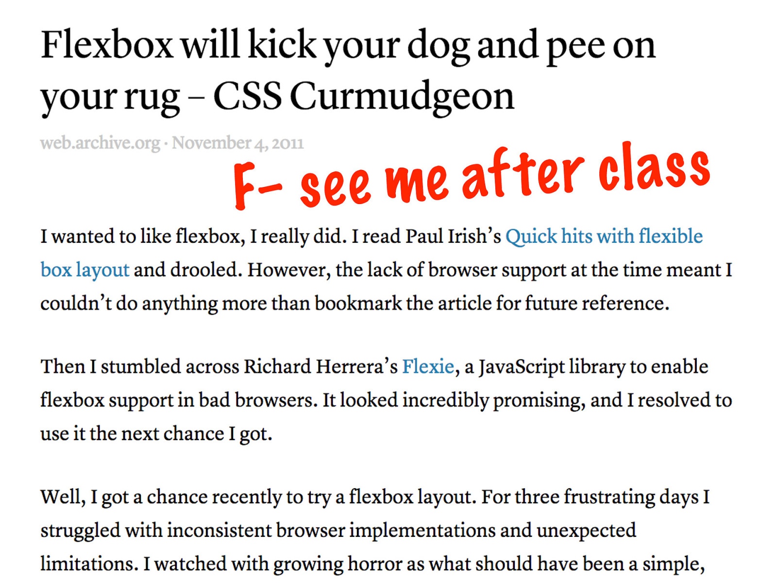
F– se e me af te r clas s

This can’t be true… In Fallout 3, The Presidential Metro Train is actually a hat worn by an NPC hidden under the tracks who runs around at high speeds during the travel cutscene
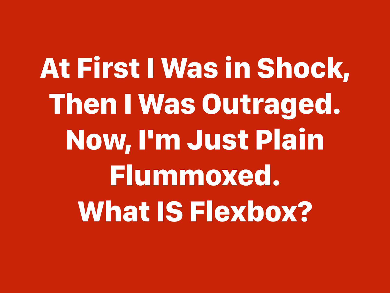
At First I Was in Shock, Then I Was Outraged. Now, I'm Just Plain Flummoxed. What IS Flexbox?
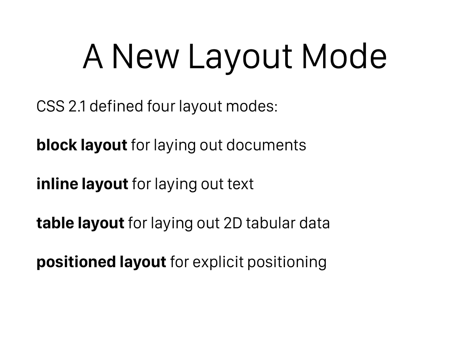
A New Layout Mode CSS 2.1 defined four layout modes: block layout for laying out documents inline layout for laying out text table layout for laying out 2D tabular data positioned layout for explicit positioning
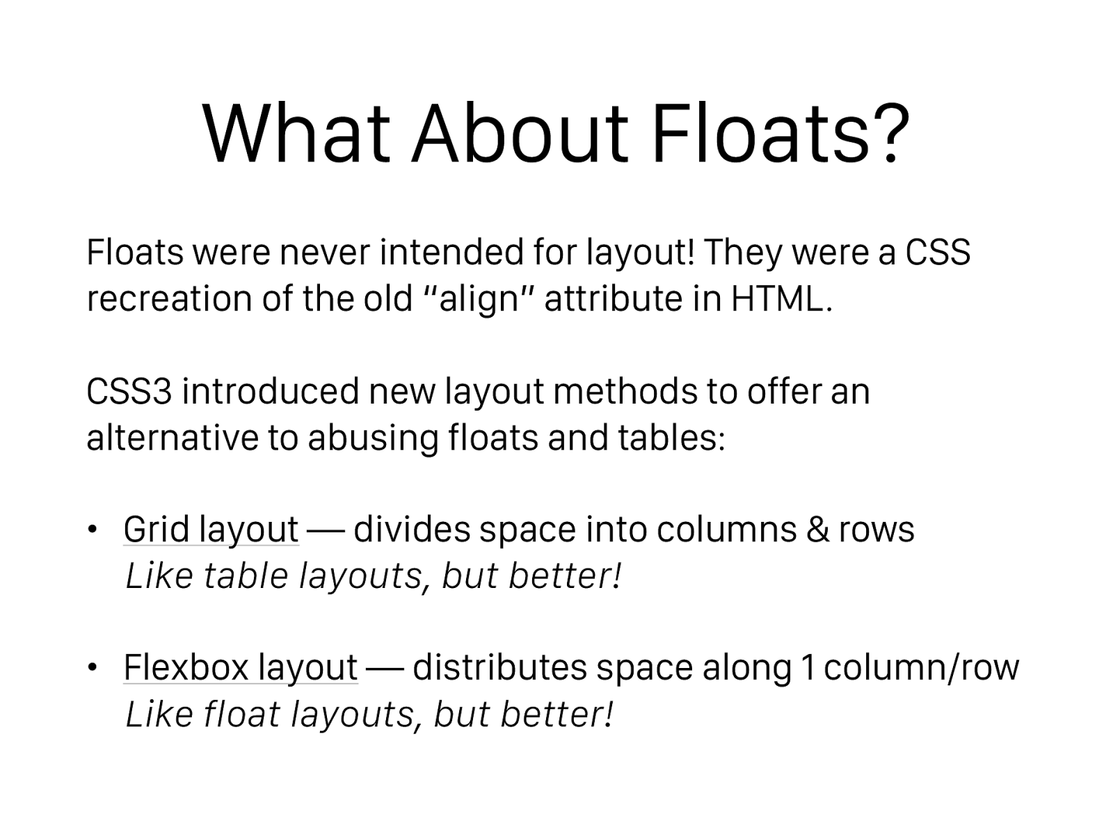
What About Floats? Floats were never intended for layout! They were a CSS recreation of the old “align” attribute in HTML. CSS3 introduced new layout methods to offer an alternative to abusing floats and tables: • Grid layout — divides space into columns & rows Like table layouts, but better!
• Flexbox layout — distributes space along 1 column/row Like float layouts, but better!
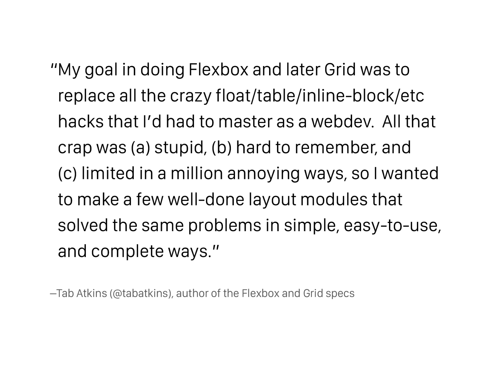
–Tab Atkins (@tabatkins), author of the Flexbox and Grid specs “My goal in doing Flexbox and later Grid was to replace all the crazy float/table/inline-block/etc hacks that I’d had to master as a webdev. All that crap was (a) stupid, (b) hard to remember, and (c) limited in a million annoying ways, so I wanted to make a few well-done layout modules that solved the same problems in simple, easy-to-use, and complete ways.”
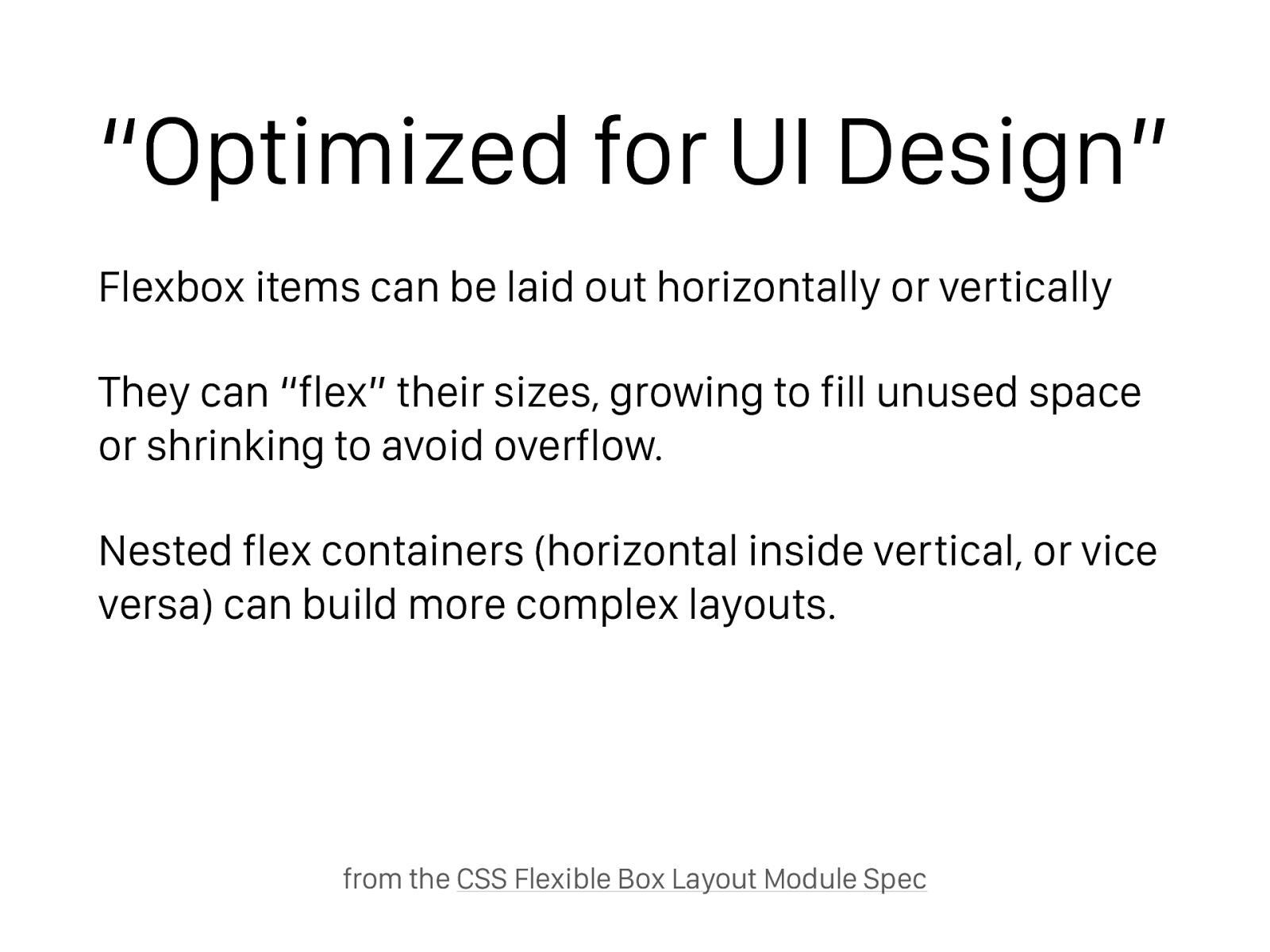
“Optimized for UI Design” Flexbox items can be laid out horizontally or vertically They can “flex” their sizes, growing to fill unused space or shrinking to avoid overflow. Nested flex containers (horizontal inside vertical, or vice versa) can build more complex layouts. from the CSS Flexible Box Layout Module Spec
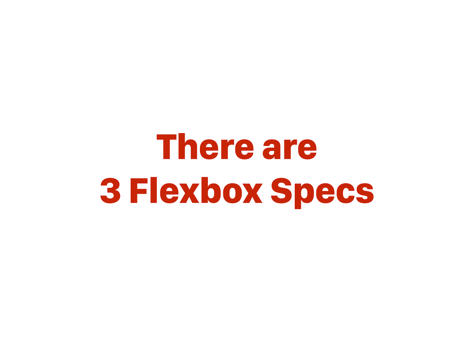
There are 3 Flexbox Specs

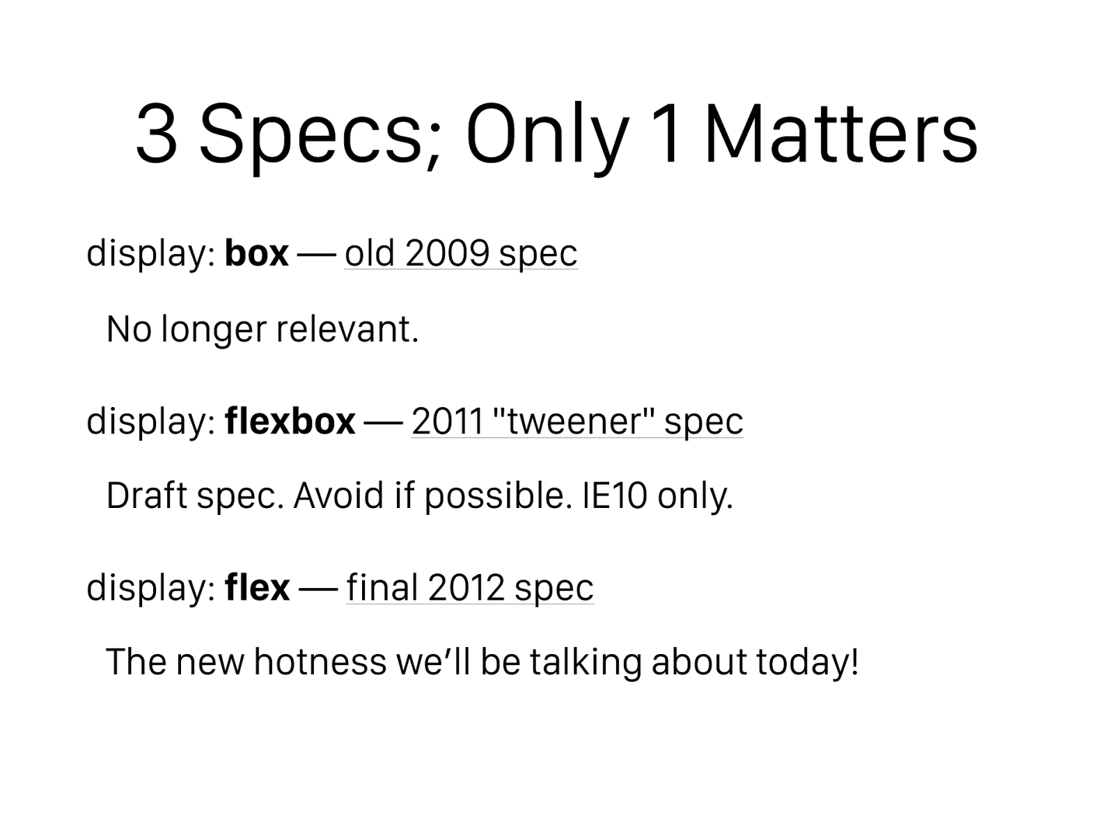
3 Specs; Only 1 Matters display: box — old 2009 spec
No longer relevant. display: flexbox — 2011 "tweener" spec
Draft spec. Avoid if possible. IE10 only. display: flex — final 2012 spec
The new hotness we’ll be talking about today!
Flexbox Layouts Go in One Direction
Flexbox = One Direction?
Flexbox = One Direction? #DadJoke
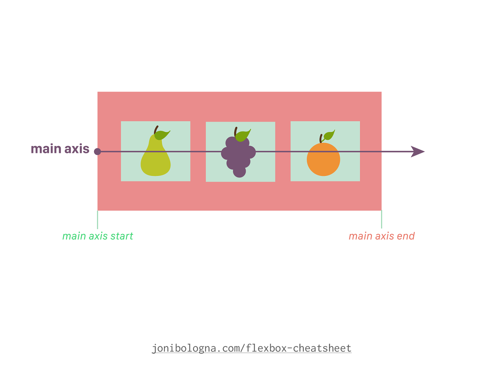
jonibologna.com/flexbox-cheatsheet
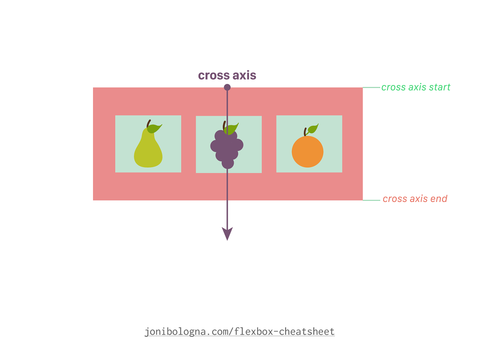
jonibologna.com/flexbox-cheatsheet
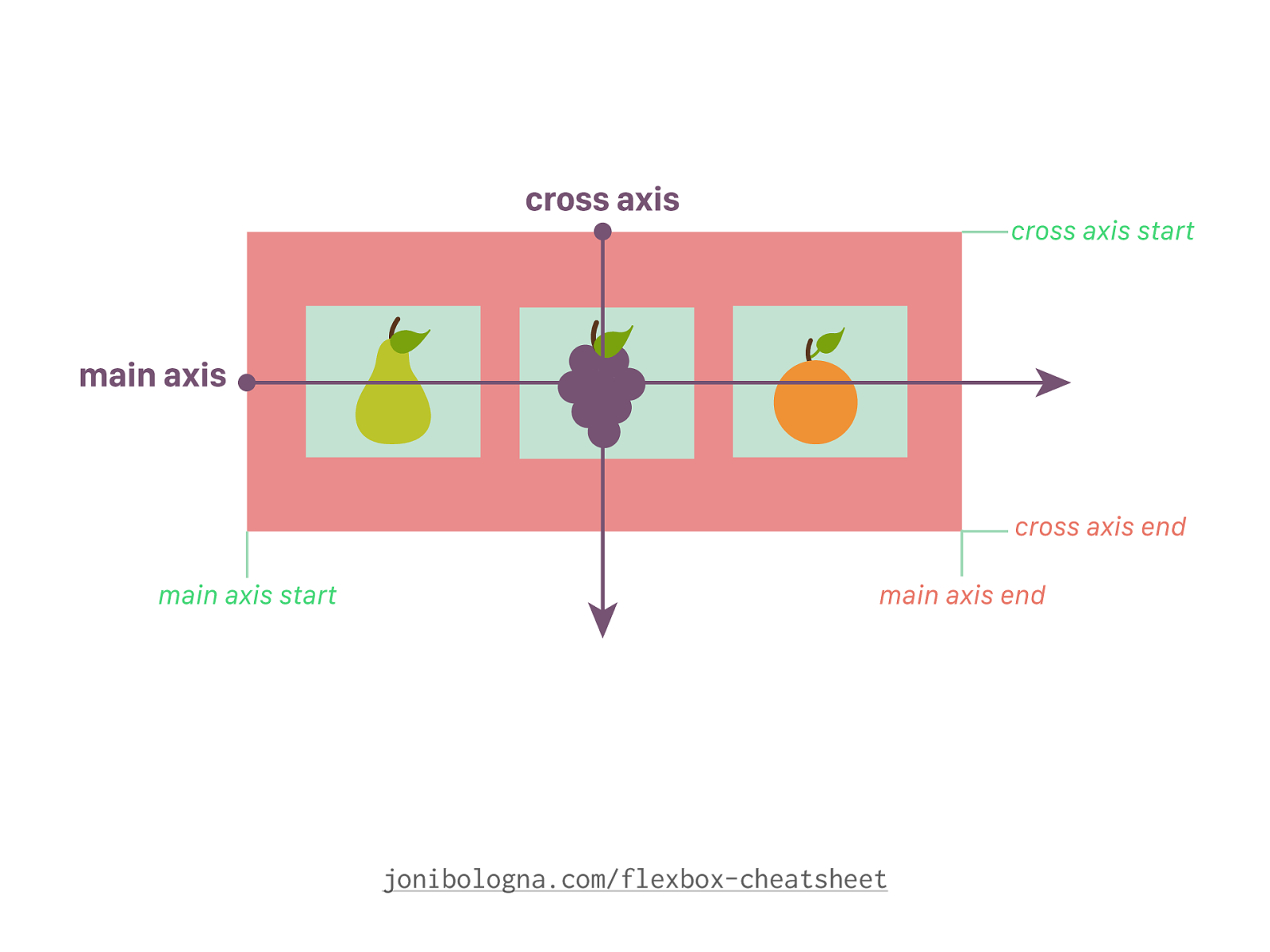
jonibologna.com/flexbox-cheatsheet
jonibologna.com/flexbox-cheatsheet
The 13 Flexbox Properties That Will Change Your Code… FOREVER
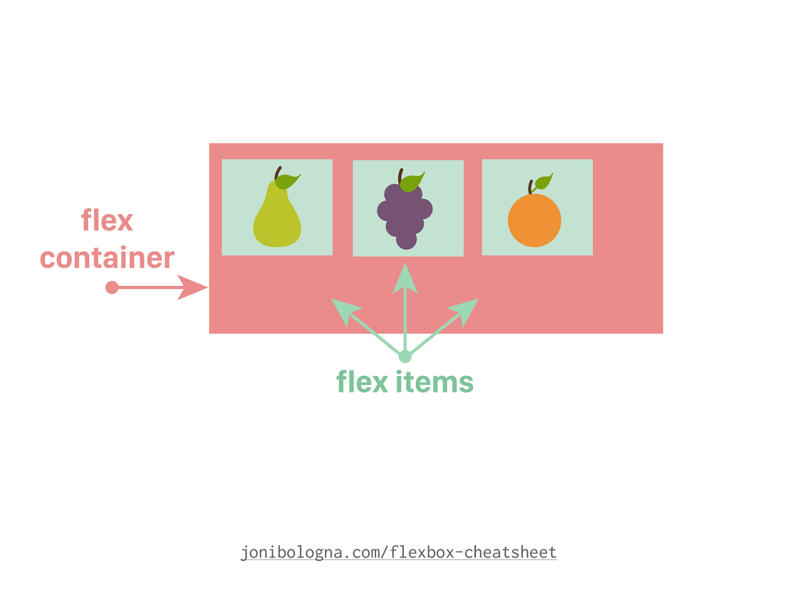
Flex Container Properties
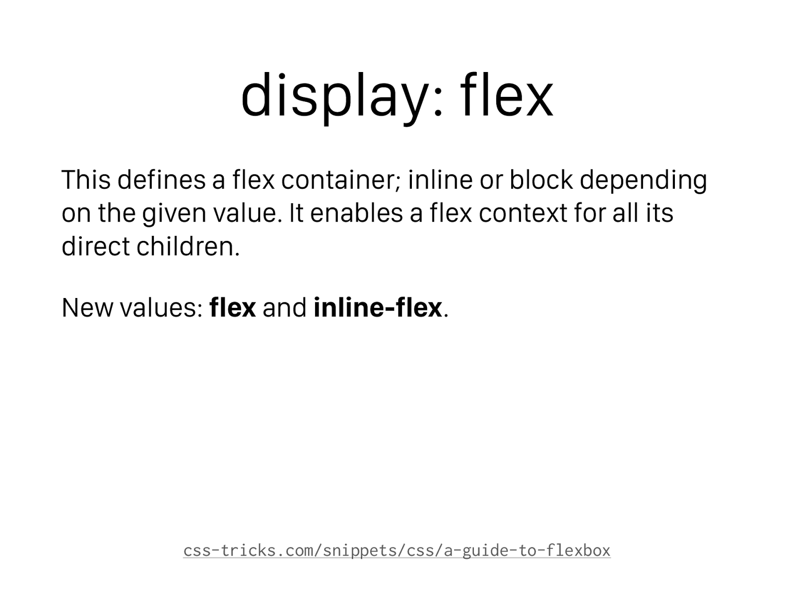
display: flex This defines a flex container; inline or block depending on the given value. It enables a flex context for all its direct children. New values: flex and inline-flex . css-tricks.com/snippets/css/a-guide-to-flexbox
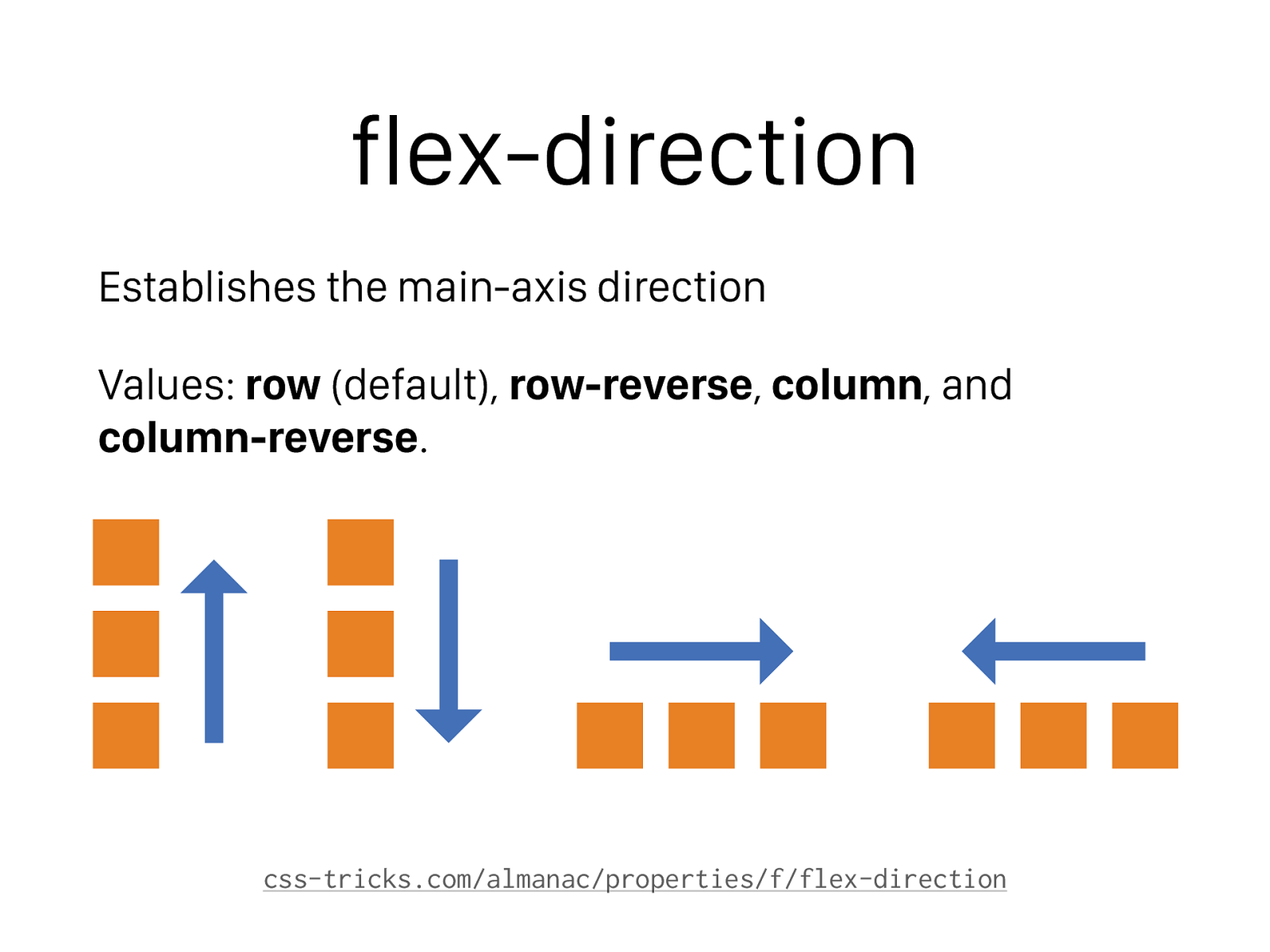
flex-direction Establishes the main-axis direction Values: row (default), row-reverse , column , and column-reverse . css-tricks.com/almanac/properties/f/flex-direction
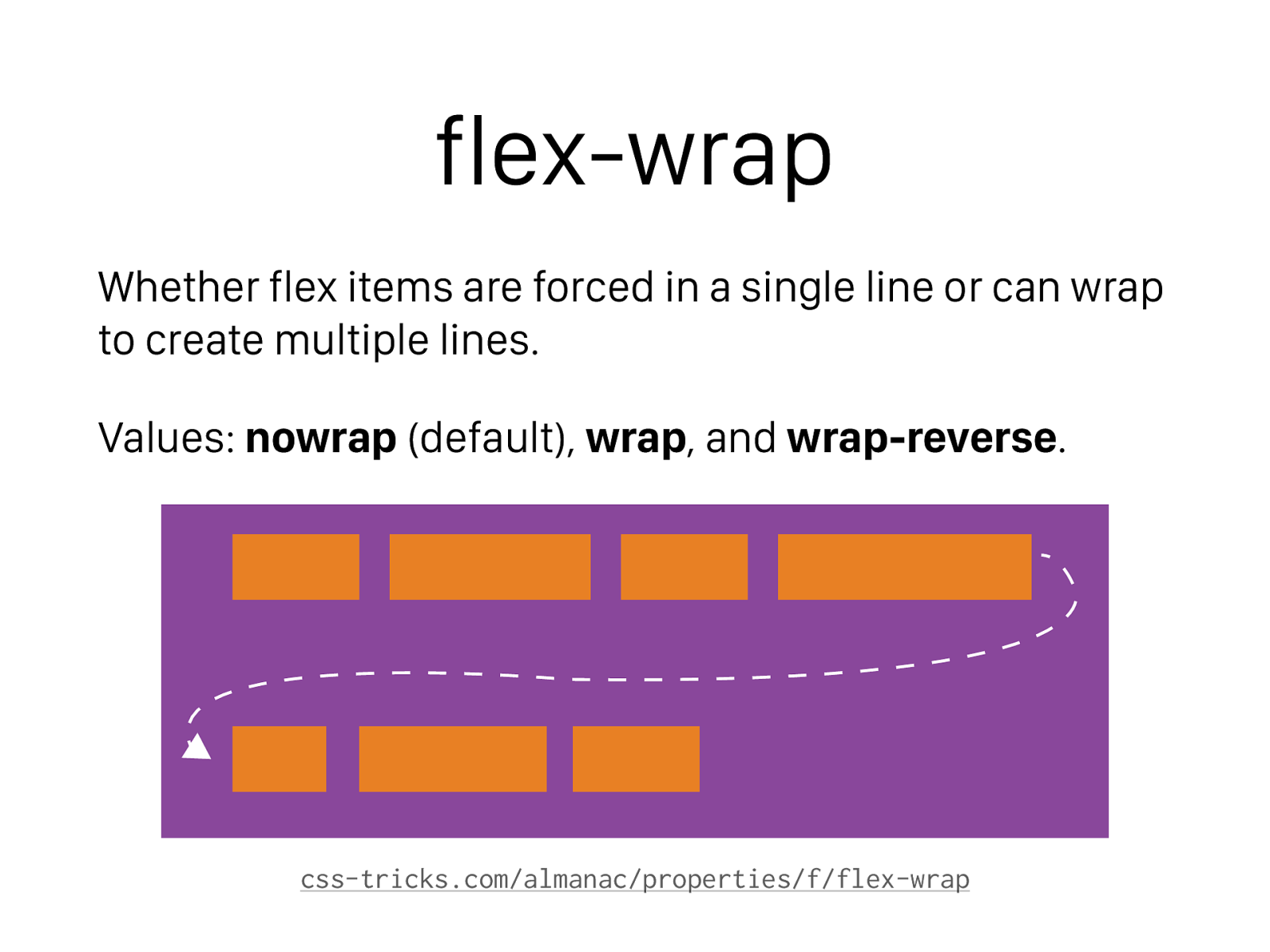
flex-wrap Whether flex items are forced in a single line or can wrap to create multiple lines. Values: nowrap (default), wrap , and wrap-reverse . css-tricks.com/almanac/properties/f/flex-wrap
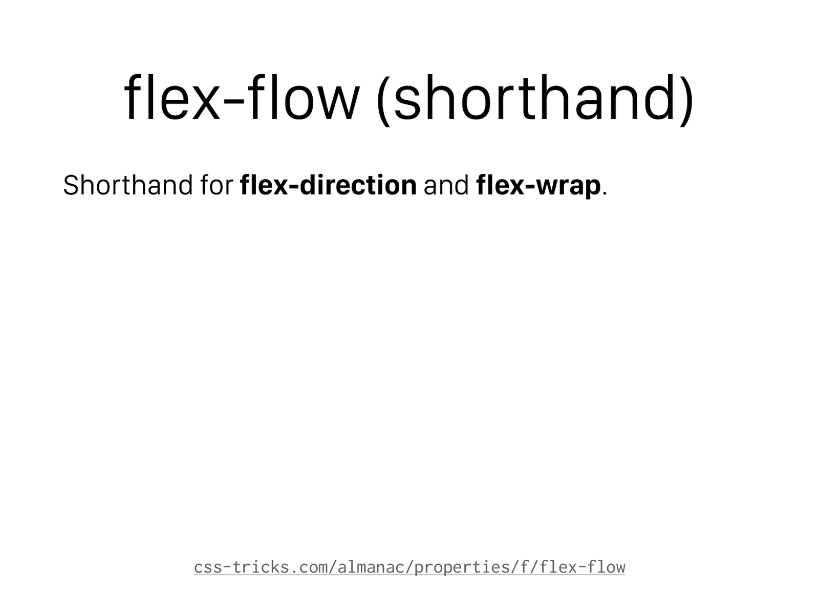
flex-flow (shorthand) Shorthand for flex-direction and flex-wrap . css-tricks.com/almanac/properties/f/flex-flow
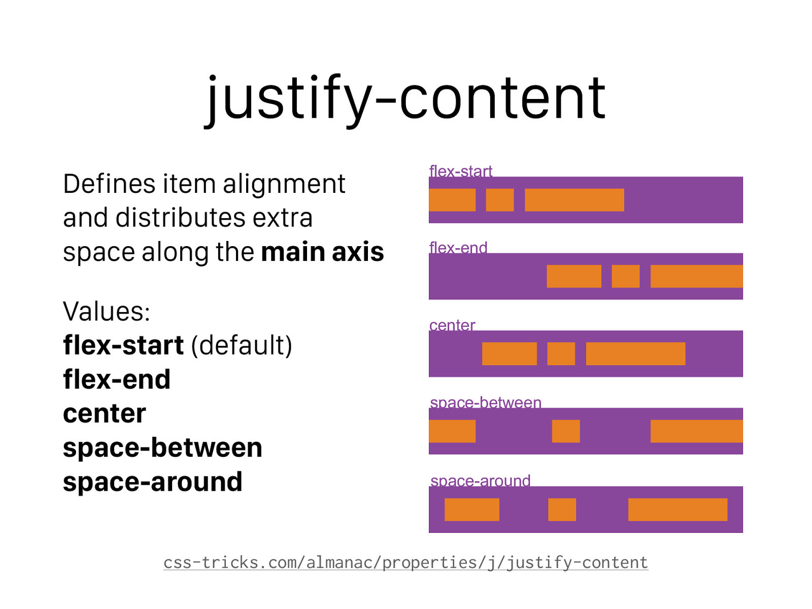
justify-content Defines item alignment and distributes extra space along the main axis
Values: flex-start (default) flex-end center space-between space-around css-tricks.com/almanac/properties/j/justify-content flex-start flex-end center space-between space-around
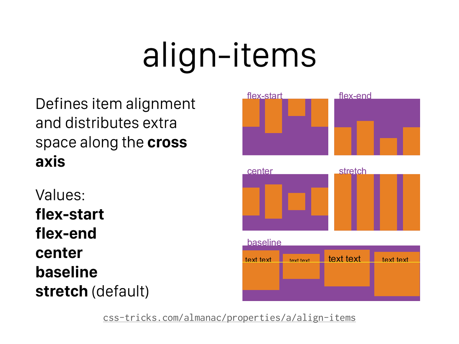
align-items Defines item alignment and distributes extra space along the cross axis
Values: flex-start flex-end center baseline stretch (default) css-tricks.com/almanac/properties/a/align-items flex-start center baseline stretch flex-end text text text text text text text text
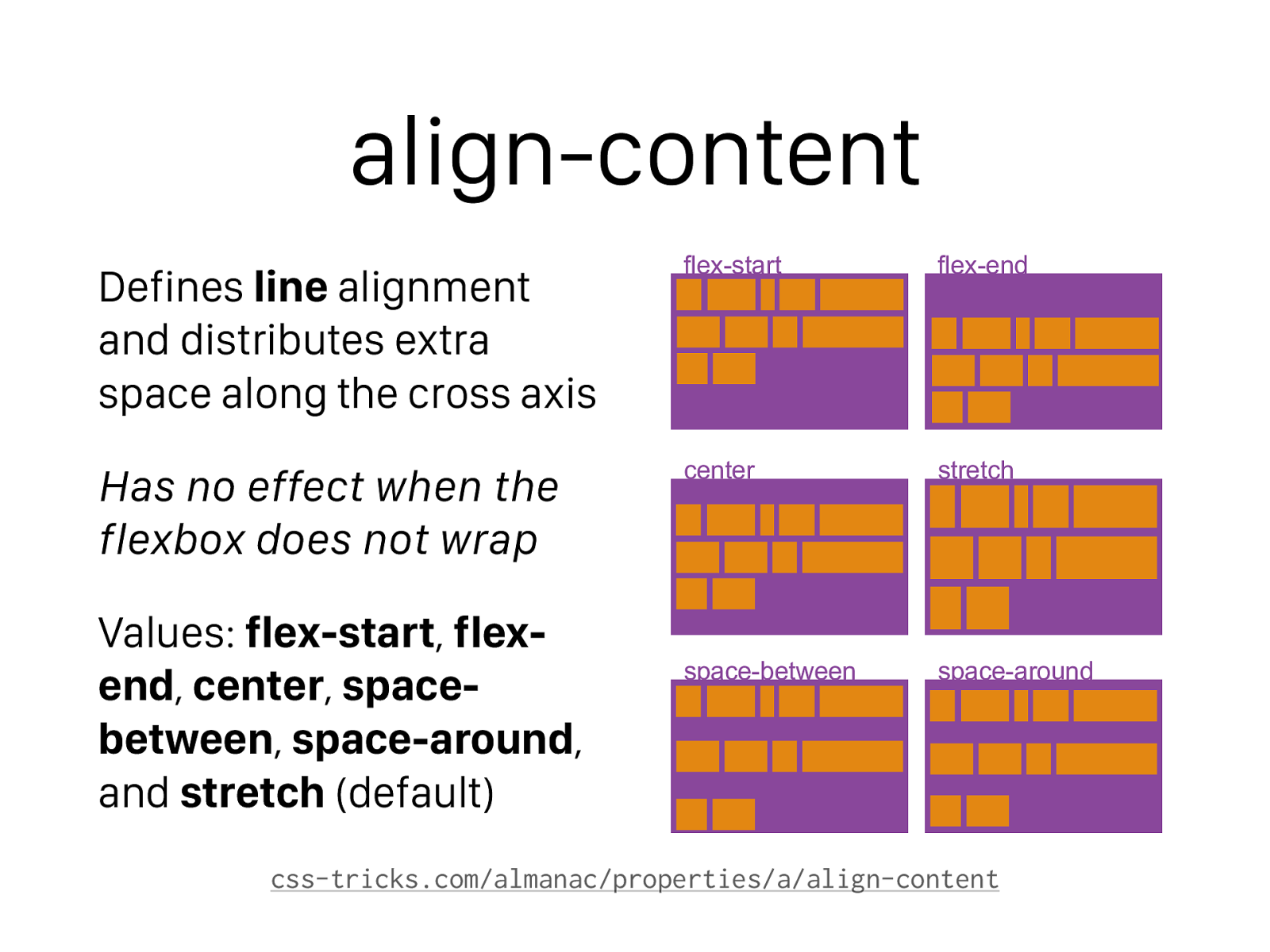
align-content Defines line alignment and distributes extra space along the cross axis Has no effect when the flexbox does not wrap Values: flex-start , flex- end , center , space- between , space-around , and stretch (default) css-tricks.com/almanac/properties/a/align-content flex-start center space-between stretch space-around flex-end
Flex Item Properties
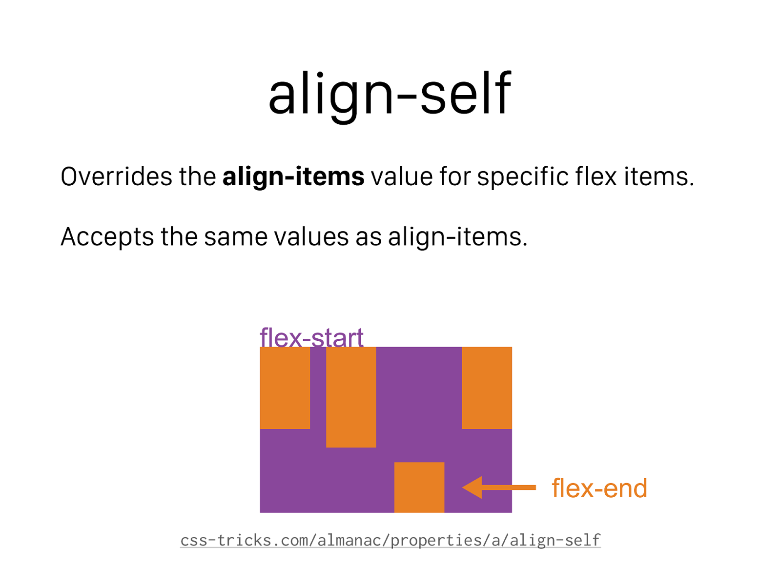
align-self Overrides the align-items value for specific flex items. Accepts the same values as align-items. css-tricks.com/almanac/properties/a/align-self flex-end flex-start
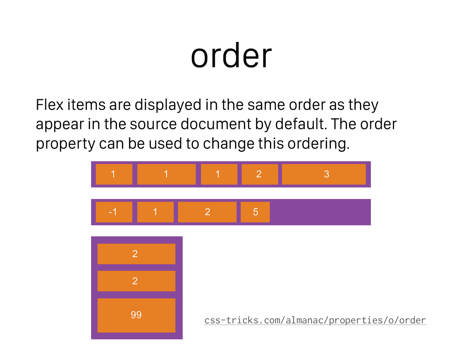
order Flex items are displayed in the same order as they appear in the source document by default. The order property can be used to change this ordering. css-tricks.com/almanac/properties/o/order 1 -1 1 2 5 1 1 2 3 2 2 99
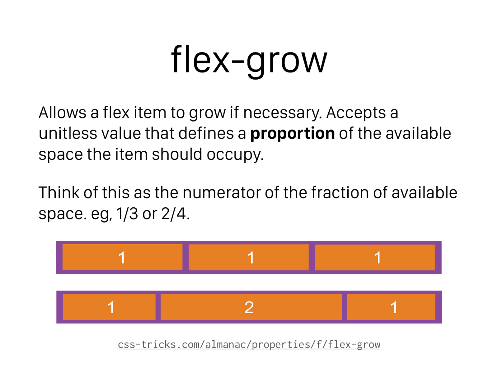
flex-grow Allows a flex item to grow if necessary. Accepts a unitless value that defines a proportion of the available space the item should occupy. Think of this as the numerator of the fraction of available space. eg, 1/3 or 2/4. css-tricks.com/almanac/properties/f/flex-grow 1 1 1 1 2 1
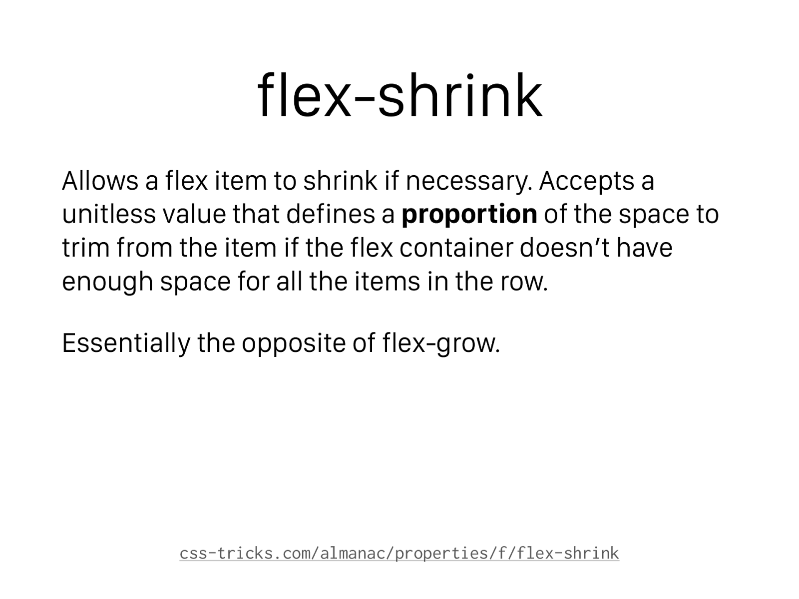
flex-shrink Allows a flex item to shrink if necessary. Accepts a unitless value that defines a proportion of the space to trim from the item if the flex container doesn’t have enough space for all the items in the row. Essentially the opposite of flex-grow. css-tricks.com/almanac/properties/f/flex-shrink
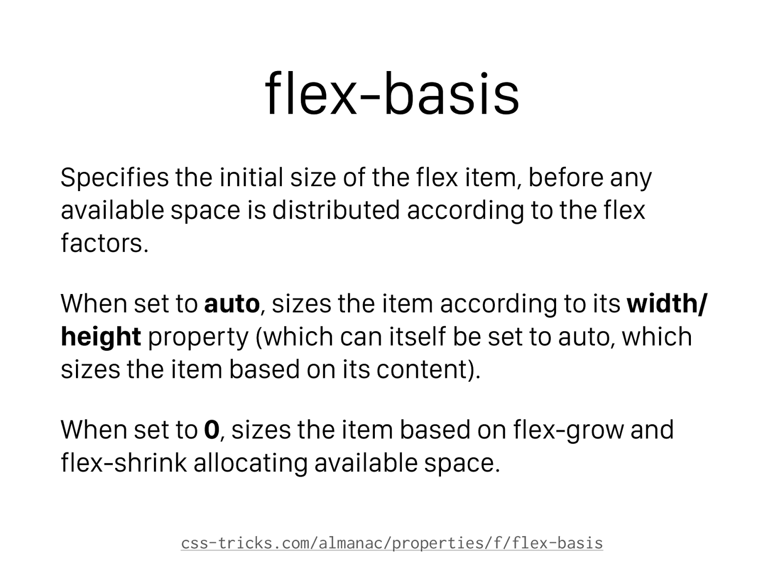
flex-basis Specifies the initial size of the flex item, before any available space is distributed according to the flex factors. When set to auto , sizes the item according to its width/ height property (which can itself be set to auto, which sizes the item based on its content). When set to 0 , sizes the item based on flex-grow and flex-shrink allocating available space. css-tricks.com/almanac/properties/f/flex-basis
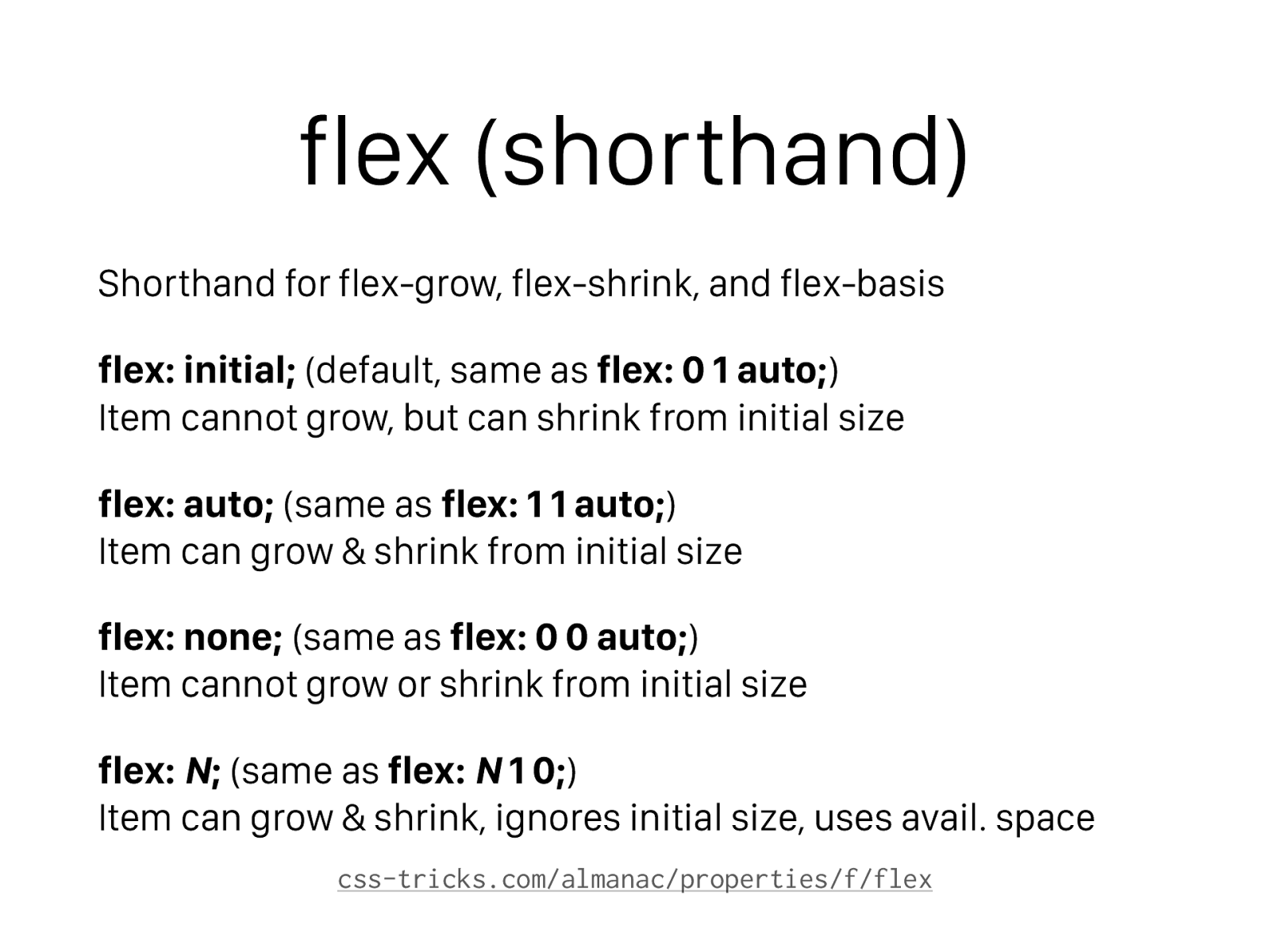
flex (shorthand) Shorthand for flex-grow, flex-shrink, and flex-basis flex: initial; (default, same as flex: 0 1 auto; ) Item cannot grow, but can shrink from initial size flex: auto; (same as flex: 1 1 auto; ) Item can grow & shrink from initial size flex: none; (same as flex: 0 0 auto; ) Item cannot grow or shrink from initial size flex: N ; (same as flex: N 1 0; ) Item can grow & shrink, ignores initial size, uses avail. space css-tricks.com/almanac/properties/f/flex
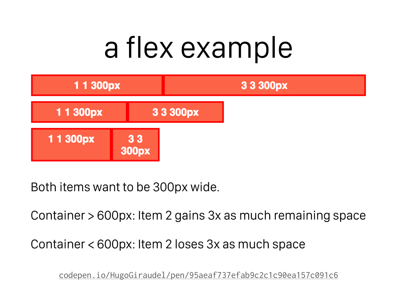
a flex example Both items want to be 300px wide. Container > 600px: Item 2 gains 3x as much remaining space Container < 600px: Item 2 loses 3x as much space codepen.io/HugoGiraudel/pen/95aeaf737efab9c2c1c90ea157c091c6
Speaker Calls CSS Layout “Difficult,” Gets DESTROYED Before a Live Audience by these Flexbox Examples
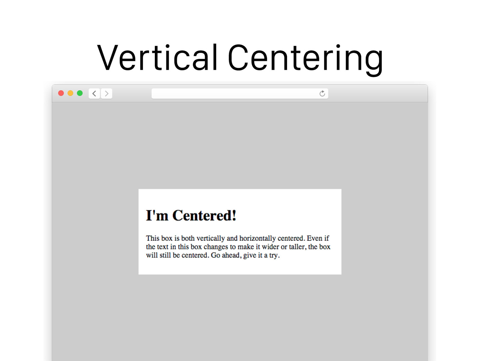
Vertical Centering
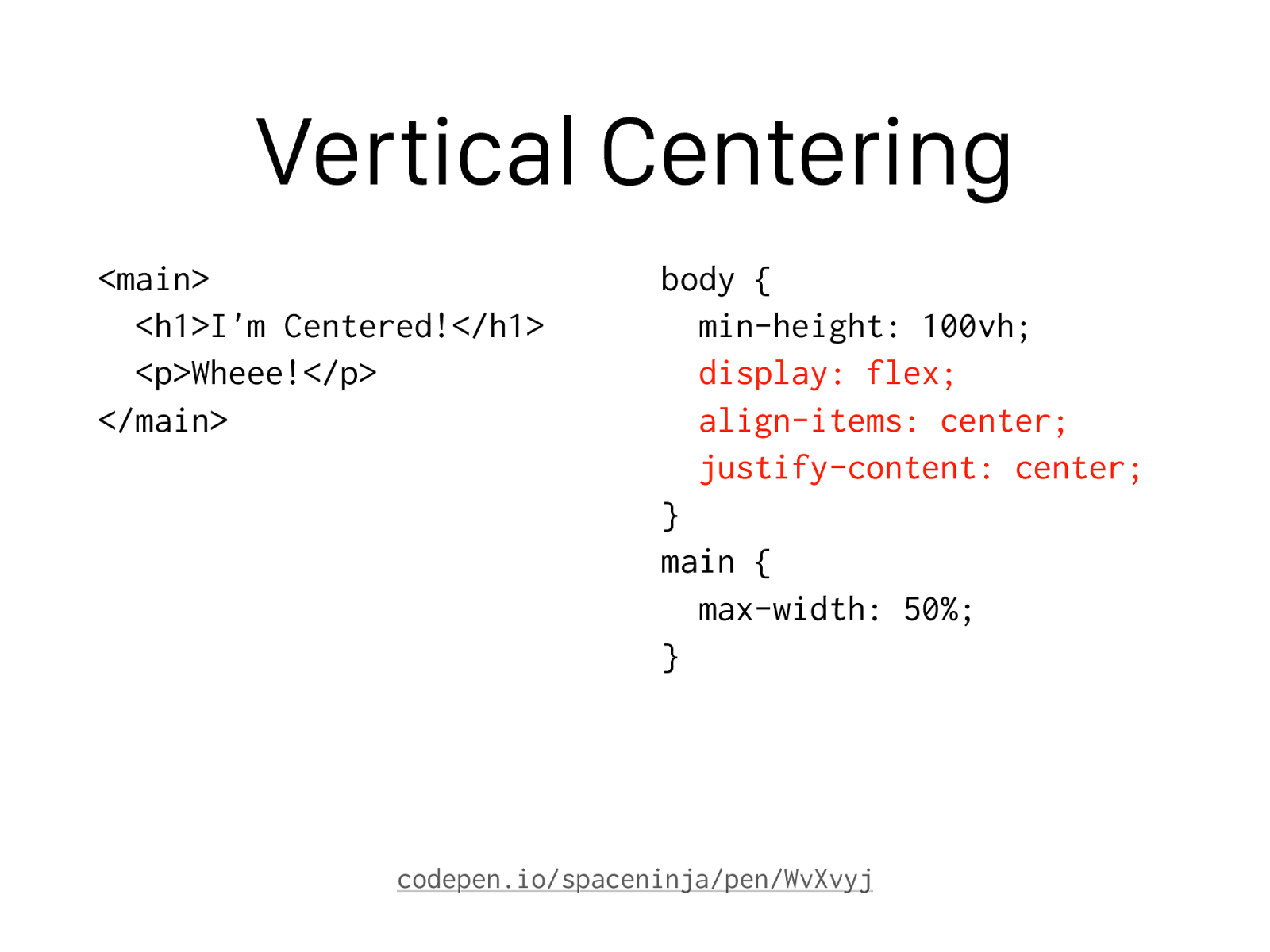
Vertical Centering
<main> <h1>I'm Centered!</h1> <p>Wheee!</p> </main> body { min-height: 100vh; display: flex; align-items: center; justify-content: center; } main { max-width: 50%; } codepen.io/spaceninja/pen/WvXvyj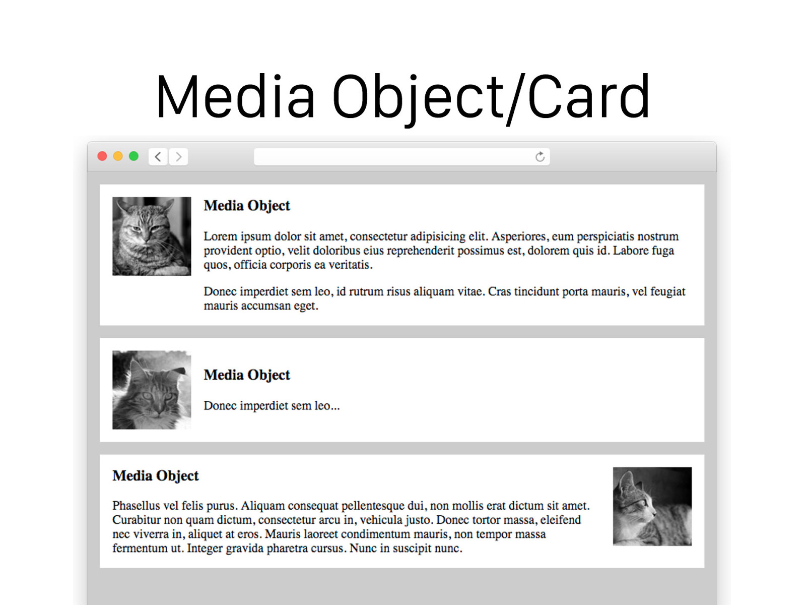
Media Object/Card
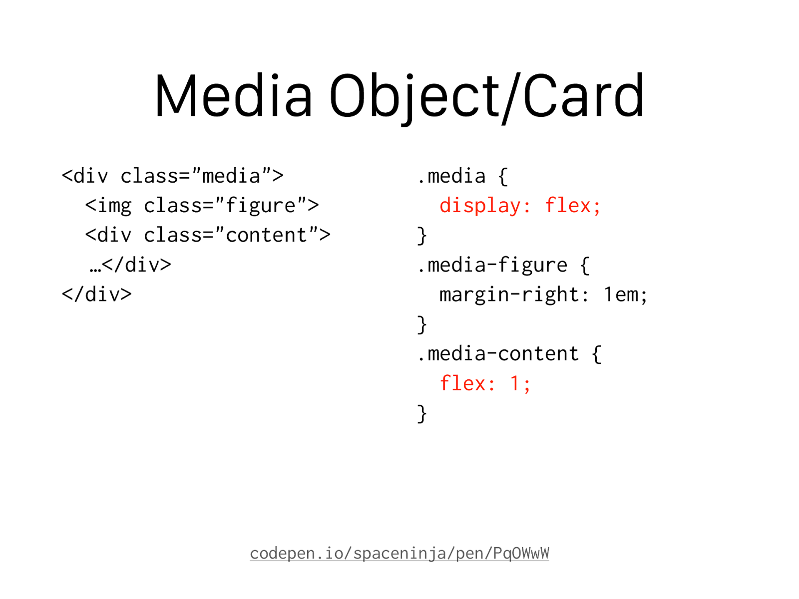
Media Object/Card
<div class="media"> <img class="figure"> <div class="content"> …</div> </div> .media { display: flex; } .media-figure { margin-right: 1em; } .media-content { flex: 1; } codepen.io/spaceninja/pen/PqOWwW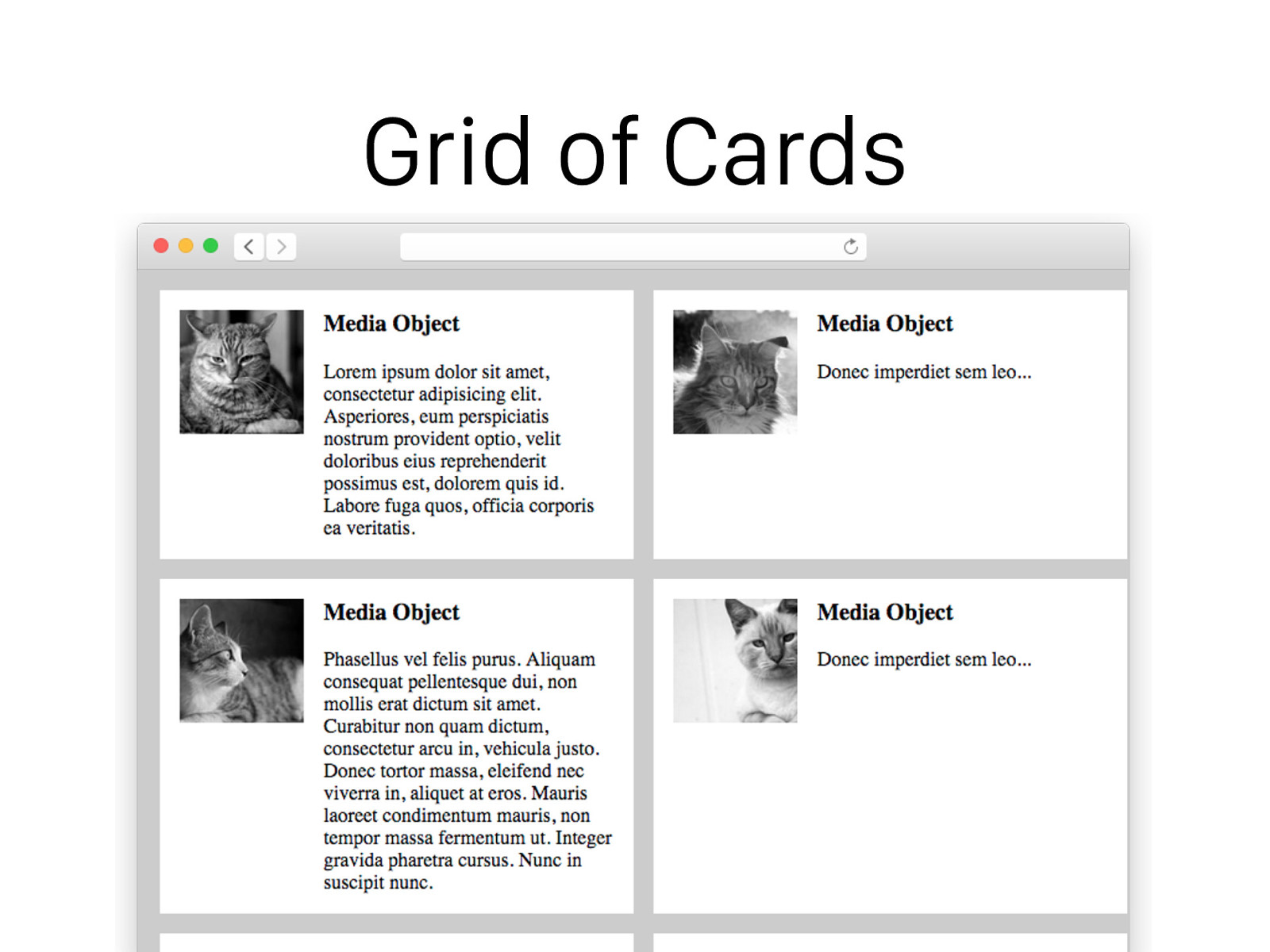
Grid of Cards
Grid of Cards
<div class="media-grid"> <div class="media">…</div> <div class="media">…</div> <div class="media">…</div> <div class="media">…</div> </div> .media-grid { display: flex; flex-wrap: wrap; } .media { width: 350px; } // and all the previous // media styles codepen.io/spaceninja/pen/ZGaZVO
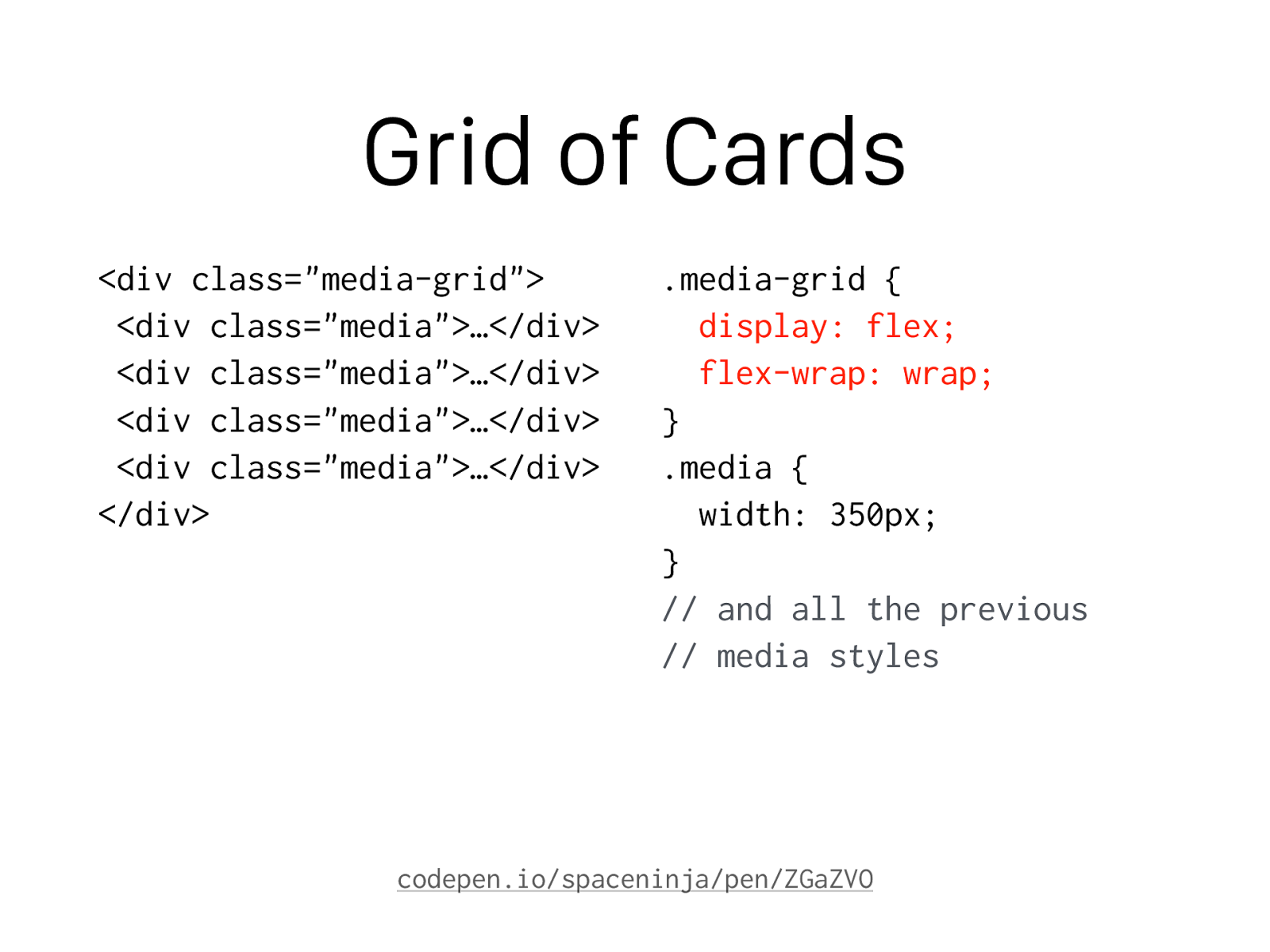
Sticky Footer
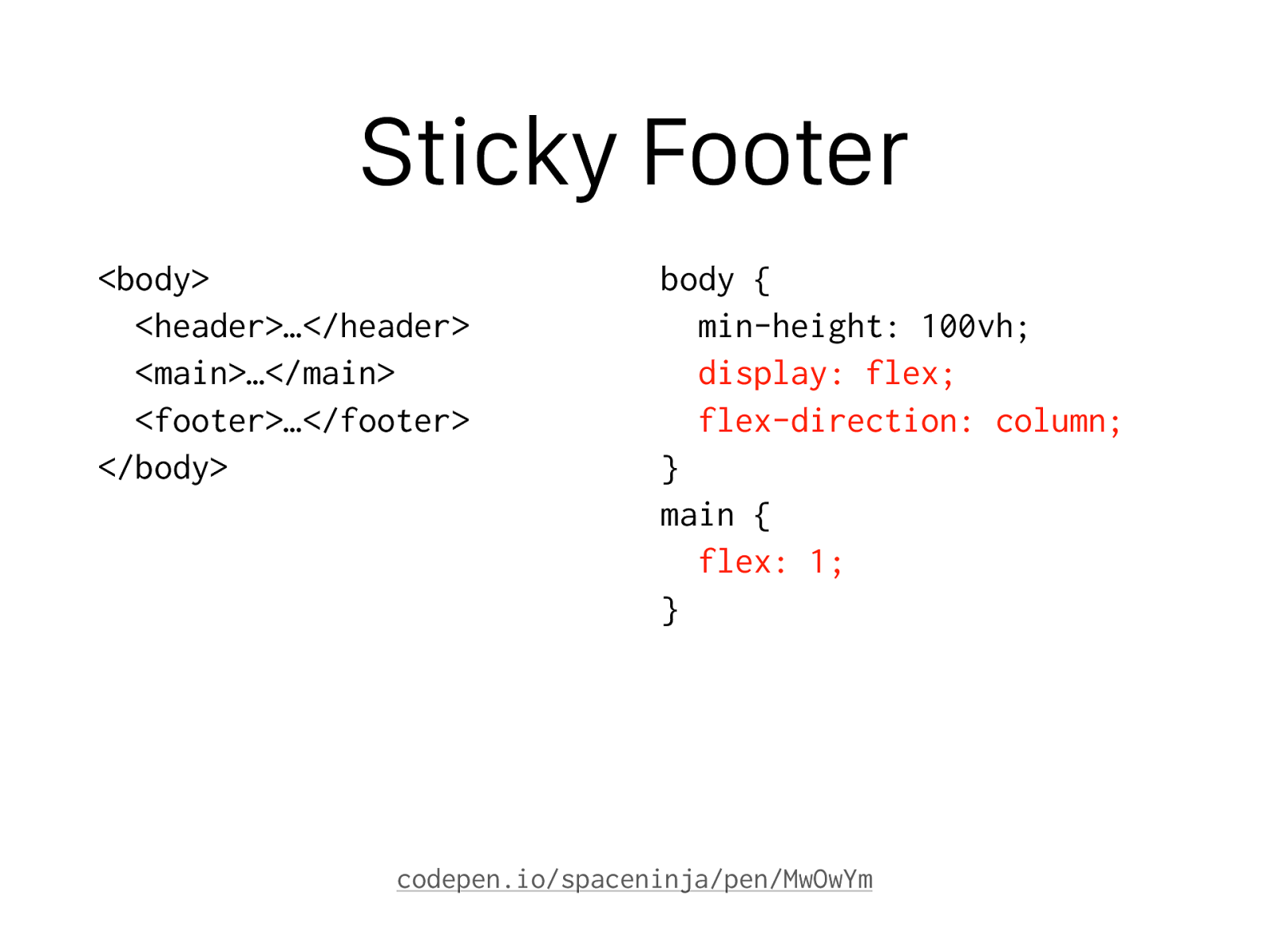
Sticky Footer
<body> <header>…</header> <main>…</main> <footer>…</footer> </body> body { min-height: 100vh; display: flex; flex-direction: column; } main { flex: 1; } codepen.io/spaceninja/pen/MwOwYm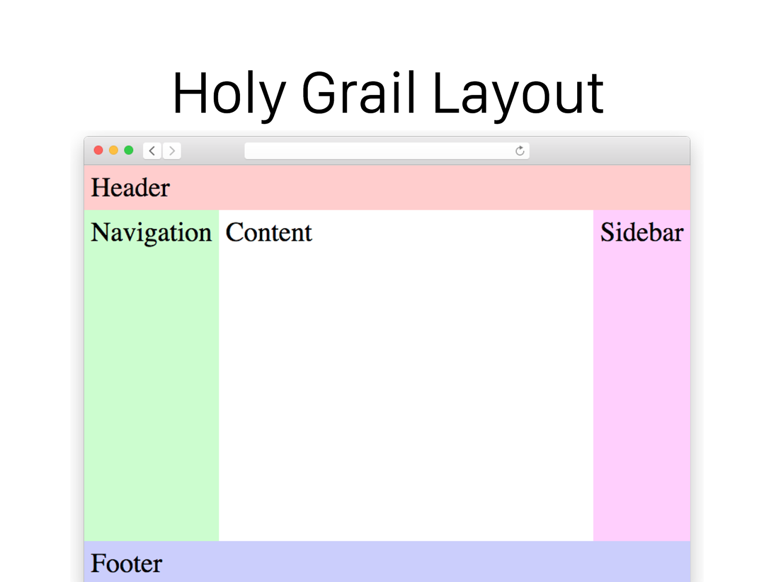
Holy Grail Layout
Holy Grail Layout
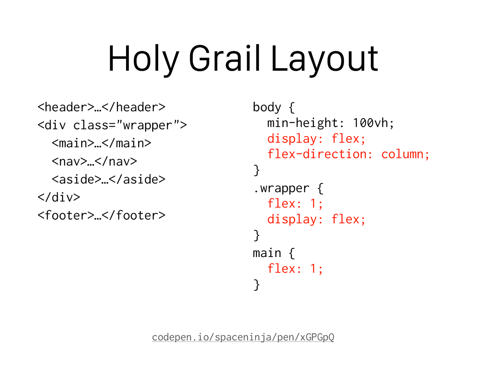
<header>…</header> <div class="wrapper"> <main>…</main> <nav>…</nav> <aside>…</aside> </div> <footer>…</footer> body { min-height: 100vh;display: flex;
flex-direction: column; } .wrapper {
flex: 1;
display: flex; } main {
flex: 1; } codepen.io/spaceninja/pen/xGPGpQ
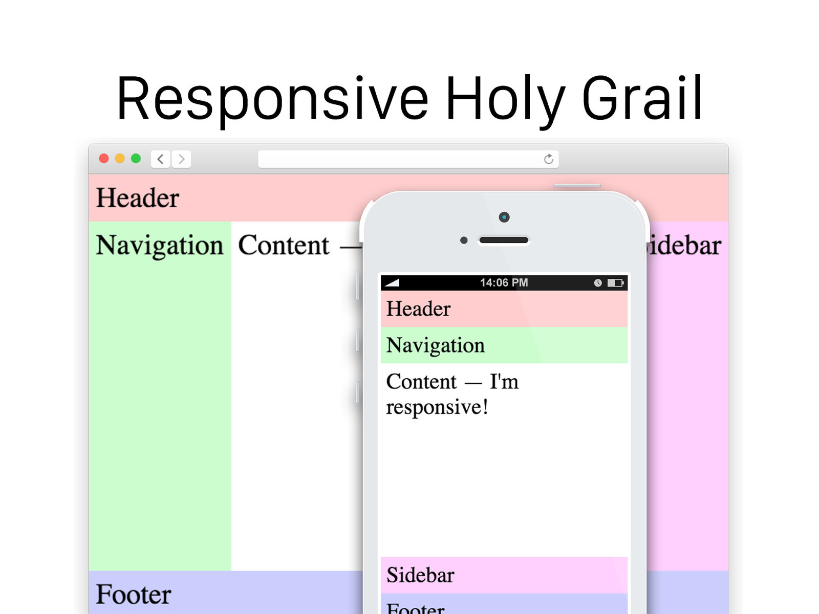
Responsive Holy Grail
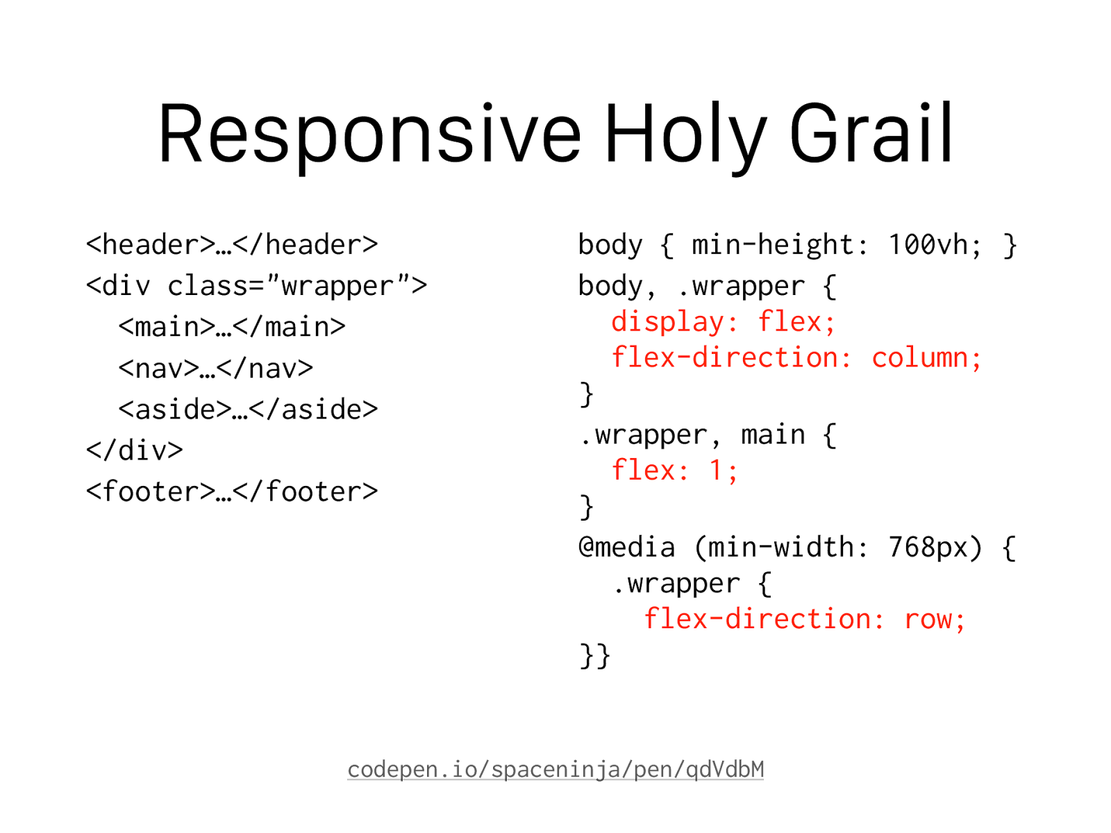
Responsive Holy Grail
<header>…</header> <div class="wrapper"> <main>…</main> <nav>…</nav> <aside>…</aside> </div> <footer>…</footer> body { min-height: 100vh; } body, .wrapper {display: flex;
flex-direction: column; } .wrapper, main {
flex: 1; } @media (min-width: 768px) { .wrapper {
flex-direction: row; }} codepen.io/spaceninja/pen/qdVdbM
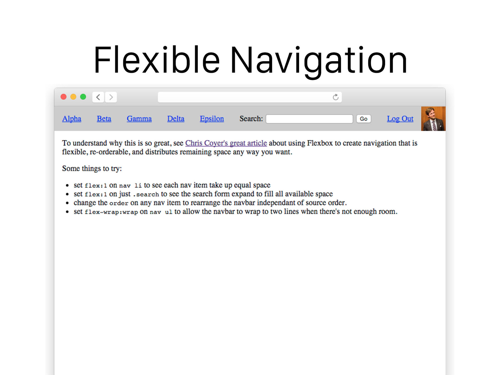
Flexible Navigation
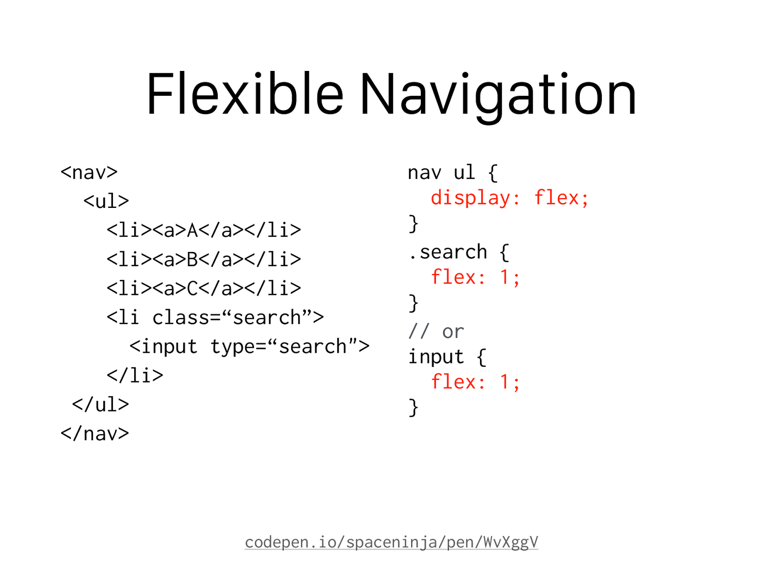
Flexible Navigation
<nav> <ul> <li><a>A</a></li> <li><a>B</a></li> <li><a>C</a></li> <li class=“search”> <input type=“search"> </li> </ul> </nav> nav ul {display: flex; } .search {
flex: 1; } // or input {
flex: 1; } codepen.io/spaceninja/pen/WvXggV
Will Lack of Browser
Support Kill Flexbox?
Yo u Wo n’ t B E L I E V E
What Happens Next.
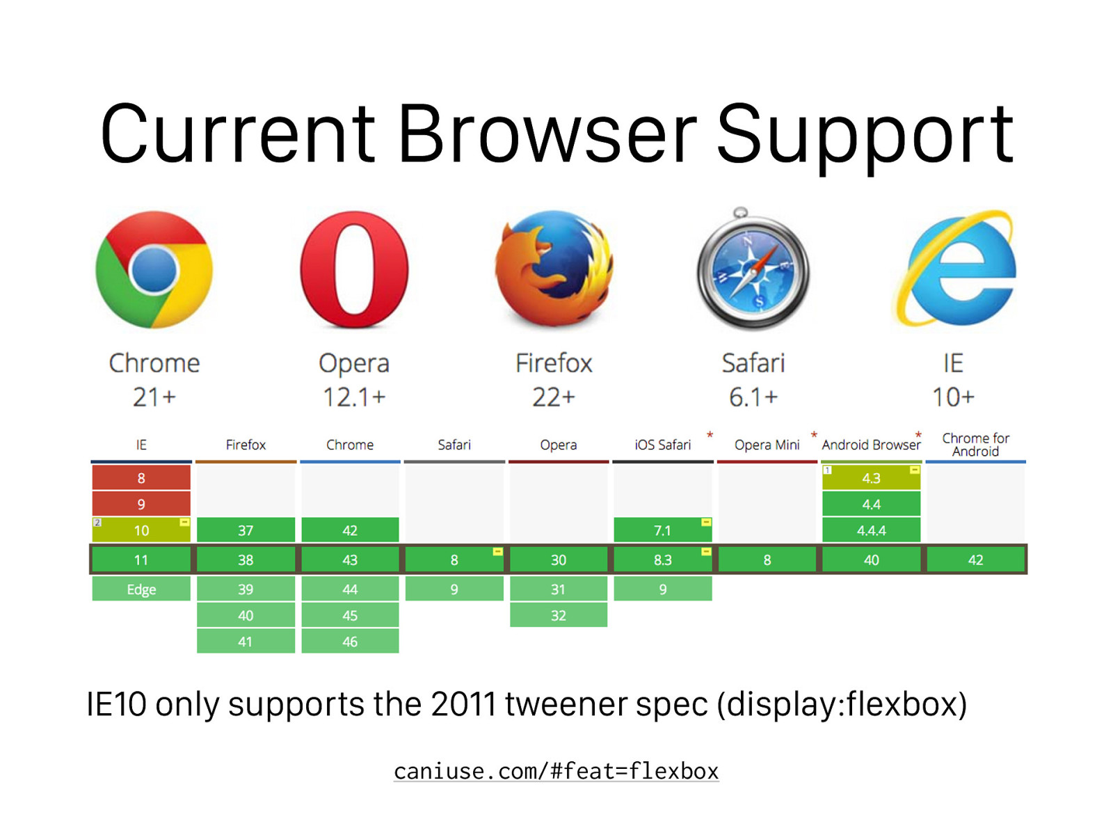
Current Browser Support IE10 only supports the 2011 tweener spec (display:flexbox) caniuse.com/#feat=flexbox

But What Can We Do About IE?

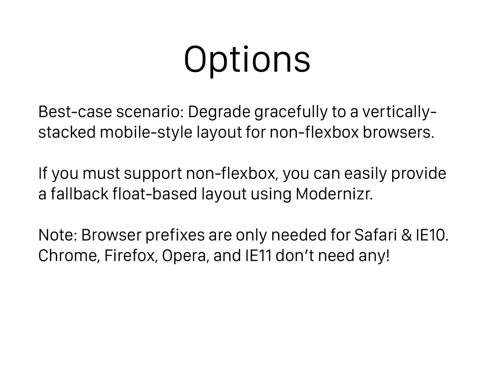
Options Best-case scenario: Degrade gracefully to a vertically- stacked mobile-style layout for non-flexbox browsers. If you must support non-flexbox, you can easily provide a fallback float-based layout using Modernizr. Note: Browser prefixes are only needed for Safari & IE10. Chrome, Firefox, Opera, and IE11 don’t need any!
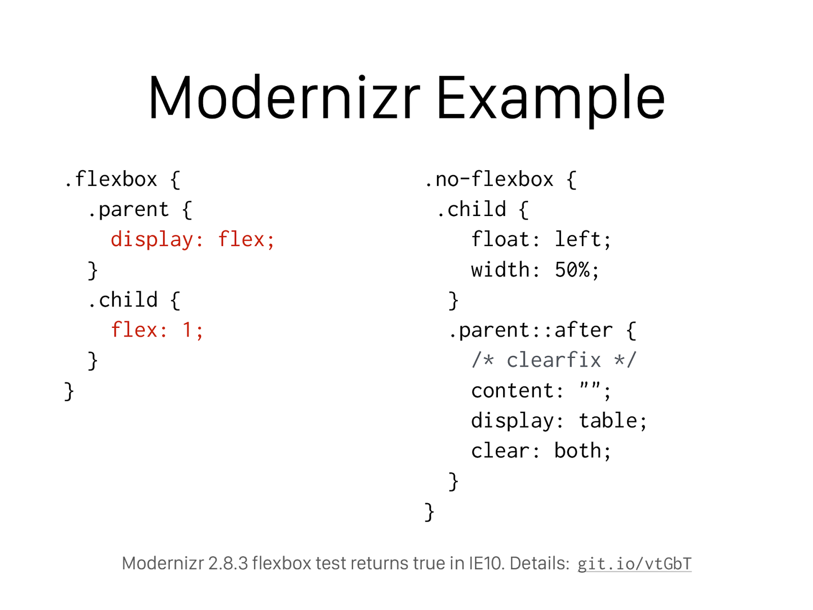
Modernizr Example .flexbox { .parent {
display: flex;
} .child {
flex: 1;
}
}
.no-flexbox {
.child {
float: left;
width: 50%;
}
.parent::after {
/* clearfix */
content: "";
display: table;
clear: both;
}
}
Modernizr 2.8.3 flexbox test returns true in IE10. Details:
git.io/vtGbT

I Thought Flexbox Would be Hard to Learn, But These Resources Restored My Faith in HUMANITY
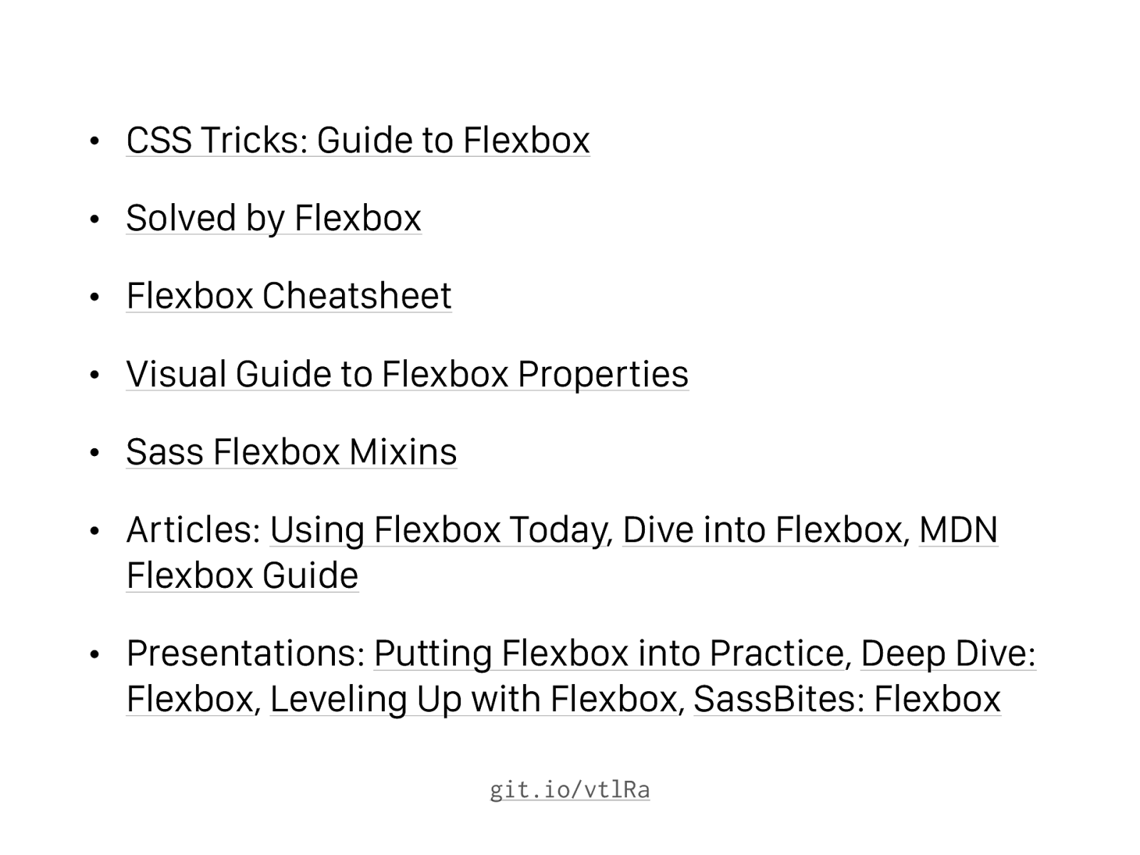
• CSS Tricks: Guide to Flexbox
• Solved by Flexbox
• Flexbox Cheatsheet
• Visual Guide to Flexbox Properties
• Sass Flexbox Mixins
• Articles: Using Flexbox Today , Dive into Flexbox , MDN Flexbox Guide
• Presentations: Putting Flexbox into Practice , Deep Dive: Flexbox , Leveling Up with Flexbox , SassBites: Flexbox git.io/vtlRa
What Isn’t This Speaker Telling You? Discover the SHOCKING Secrets of Grid Layout!
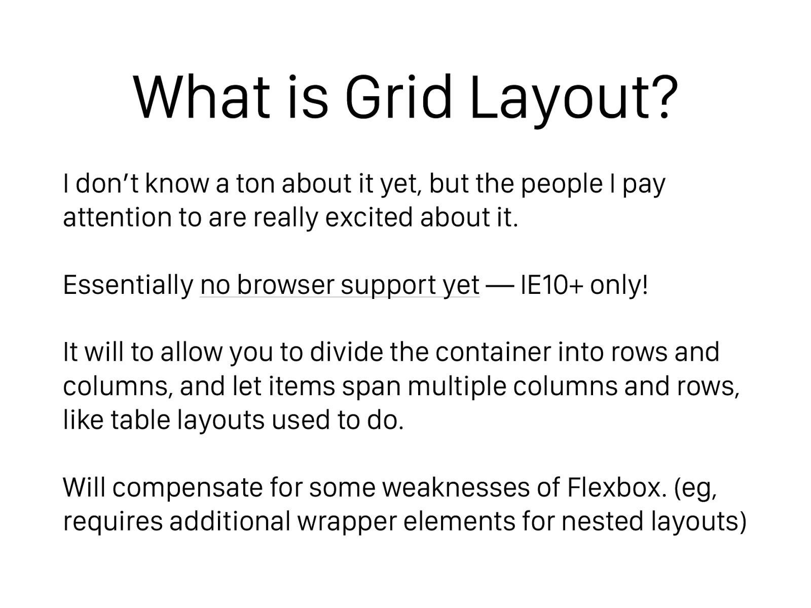
What is Grid Layout?
I don’t know a ton about it yet, but the people I pay
attention to are really excited about it.
Essentially
no browser support yet
— IE10+ only!
It will to allow you to divide the container into rows and
columns, and let items span multiple columns and rows,
like table layouts used to do.
Will compensate for some weaknesses of Flexbox. (eg,
requires additional wrapper elements for nested layouts)
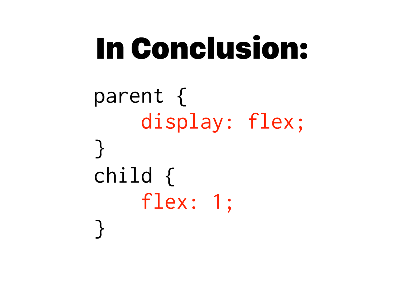
In Conclusion: parent {
display: flex; } child {
flex: 1; }