Making Accessible Web Animations
CSUN 2020 Julie Grundy, Digital Accessibility Consultant, @stringy Slides: http://bit.ly/mawa3 12 March 2020

A presentation at CSUN 2020 in March 2020 in Anaheim, CA, USA by Julie Grundy
CSUN 2020 Julie Grundy, Digital Accessibility Consultant, @stringy Slides: http://bit.ly/mawa3 12 March 2020
• CSS transitions and keyframes • CSS queries • Web Animations API for JavaScript
Animated content and interfaces can create access barriers to several groups of people.
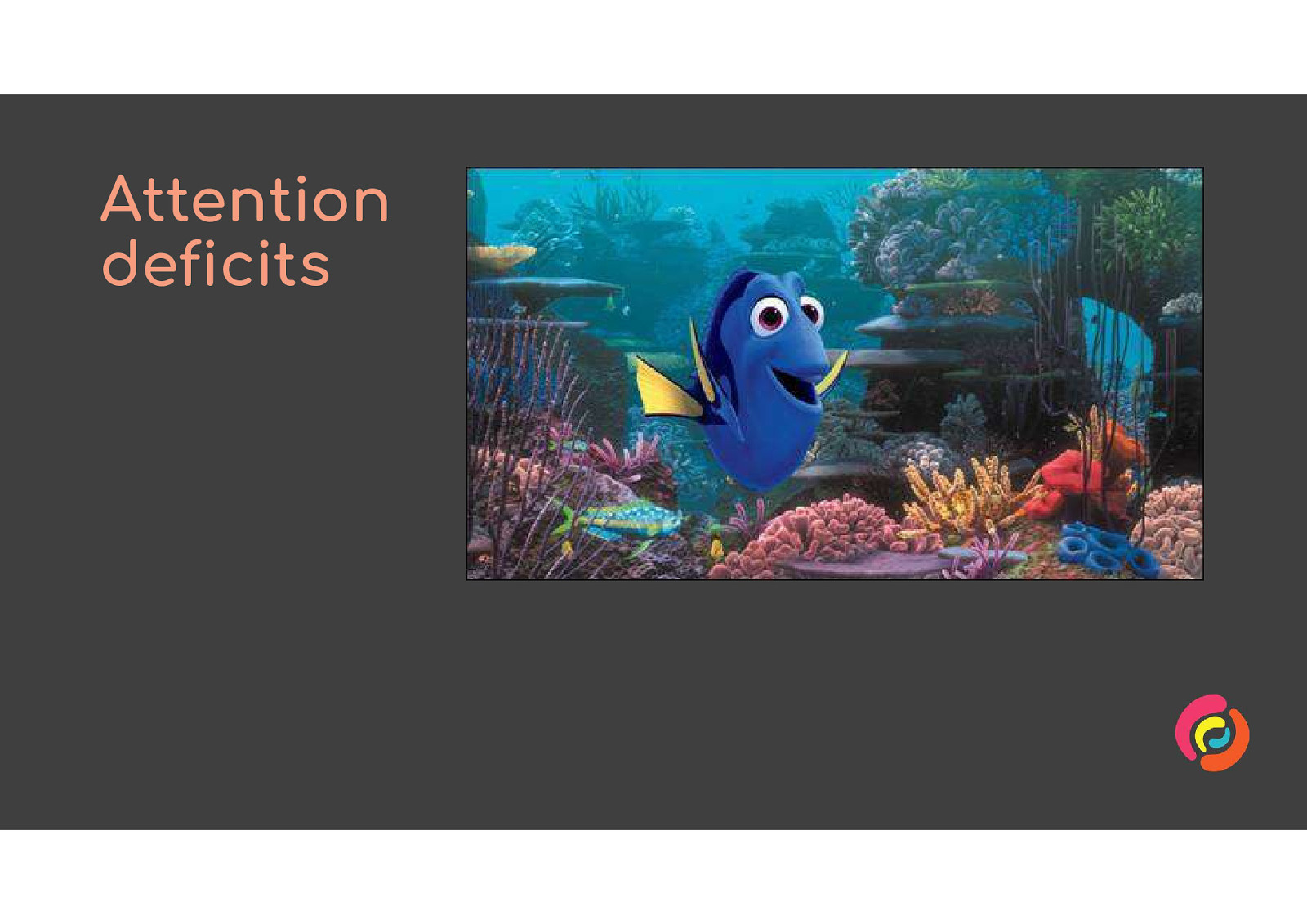
People with attention deficits, including ADHD but also some types of epilepsy and memory issues, can be easily distracted from their task by animated content.
35% of adults aged 40 years or older in the United States—approximately 69 million Americans—have experienced some form of vestibular dysfunction. Source: Vestibular Disorders Association www.vestibular.org
Vestibular disorders are like an extreme type of motion sickness, and can be triggered by animation like parallax effects, zooming and swirling content.
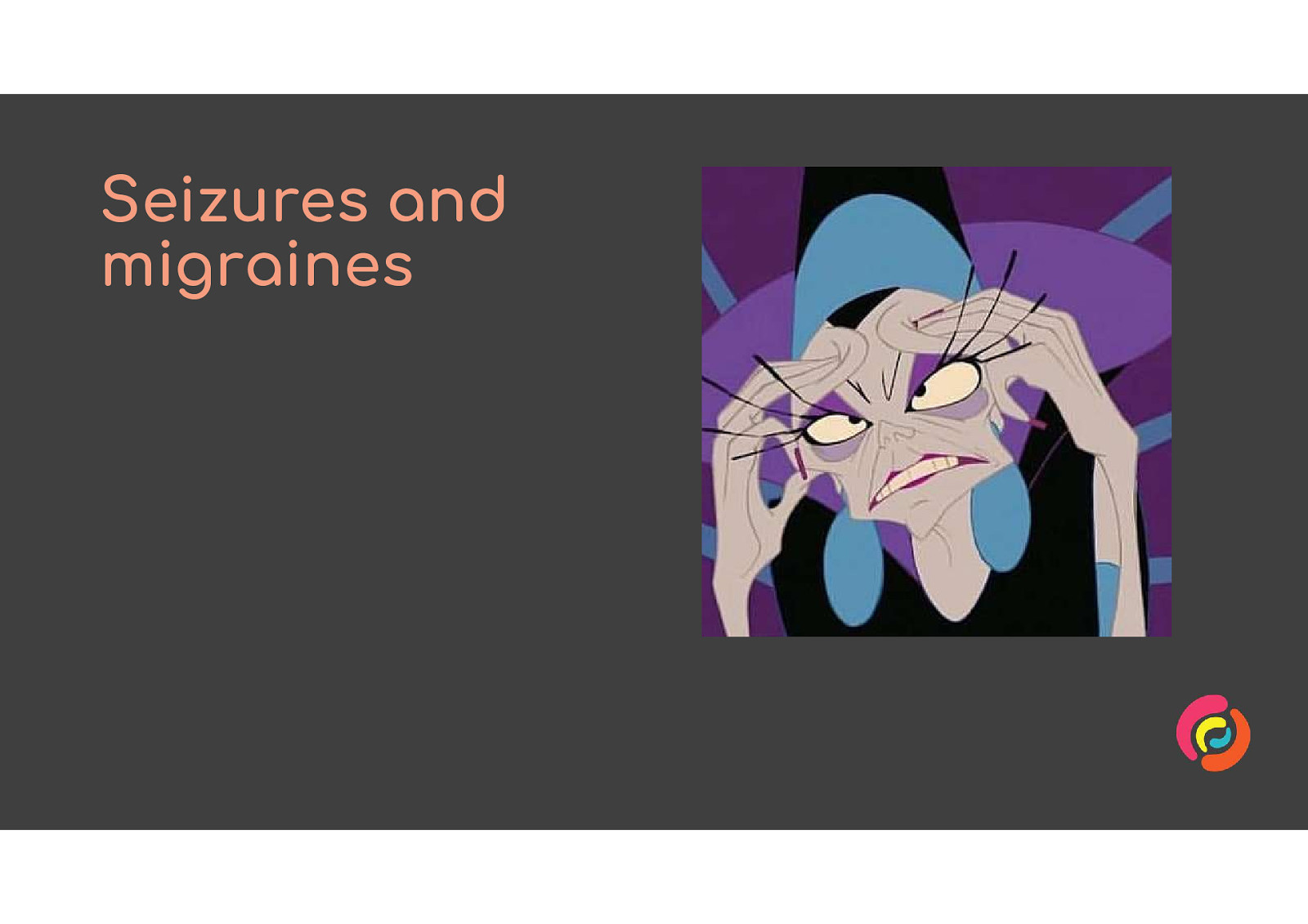
People with epilepsy or who get migraines can be triggered by flashing or flickering animation.
People with other access needs rely on animated content being keyboard-friendly, easy to see and easy to understand.
If animation is so bad for people with disabilities, why am I asking you to include any at all on your websites? I have two reasons.
Accessibility has a reputation for being boring and dull. But accessible experiences can and should be made beautiful and fun as well as usable.
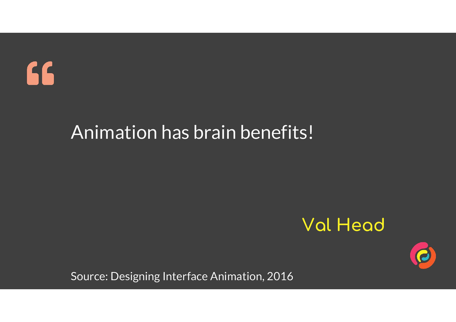
The second reason is that, as Val Head says frequently in her book Designing Interface Animation, animation can reduce the cognitive load of using an interface. So it can make a complex website easier to use for everyone and especially for people with cognitive issues.
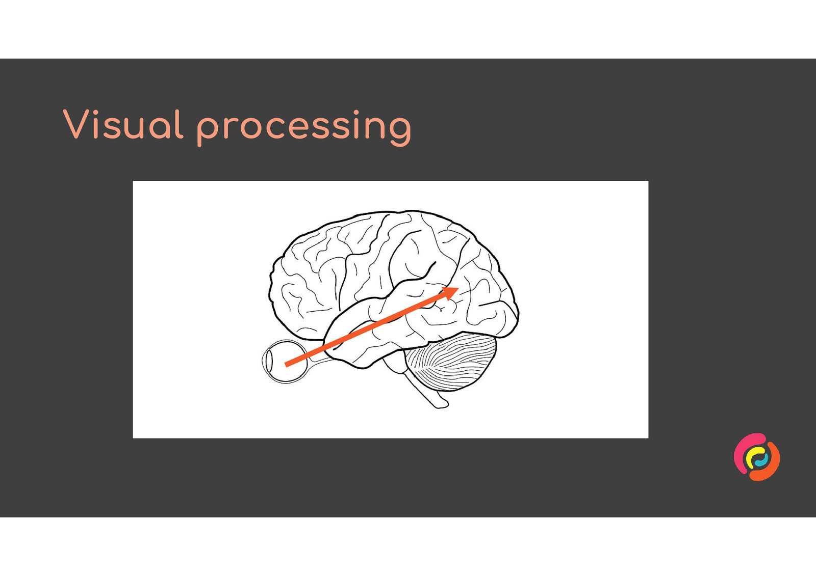
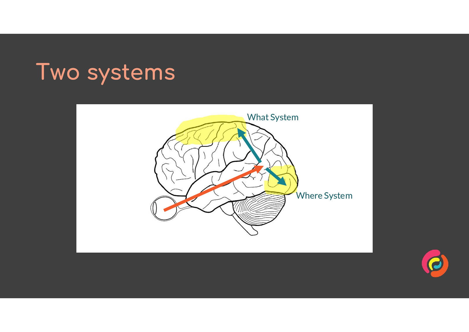
We see by taking information in through our retinas, and sending it through the brainstem to the primary visual cortex.
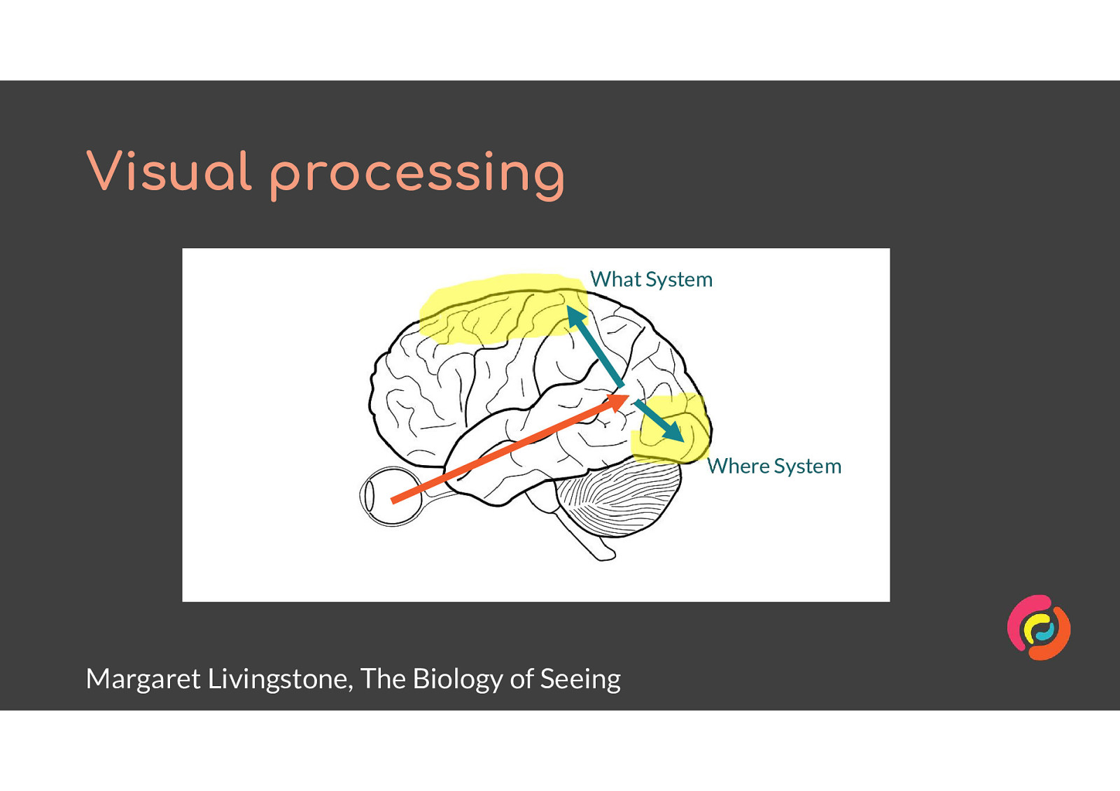
Margaret Livingstone, a biology professor, says in her book The Biology of Seeing that we have two systems for dealing with the content from the primary visual cortex. She calls them the What system and the Where system.
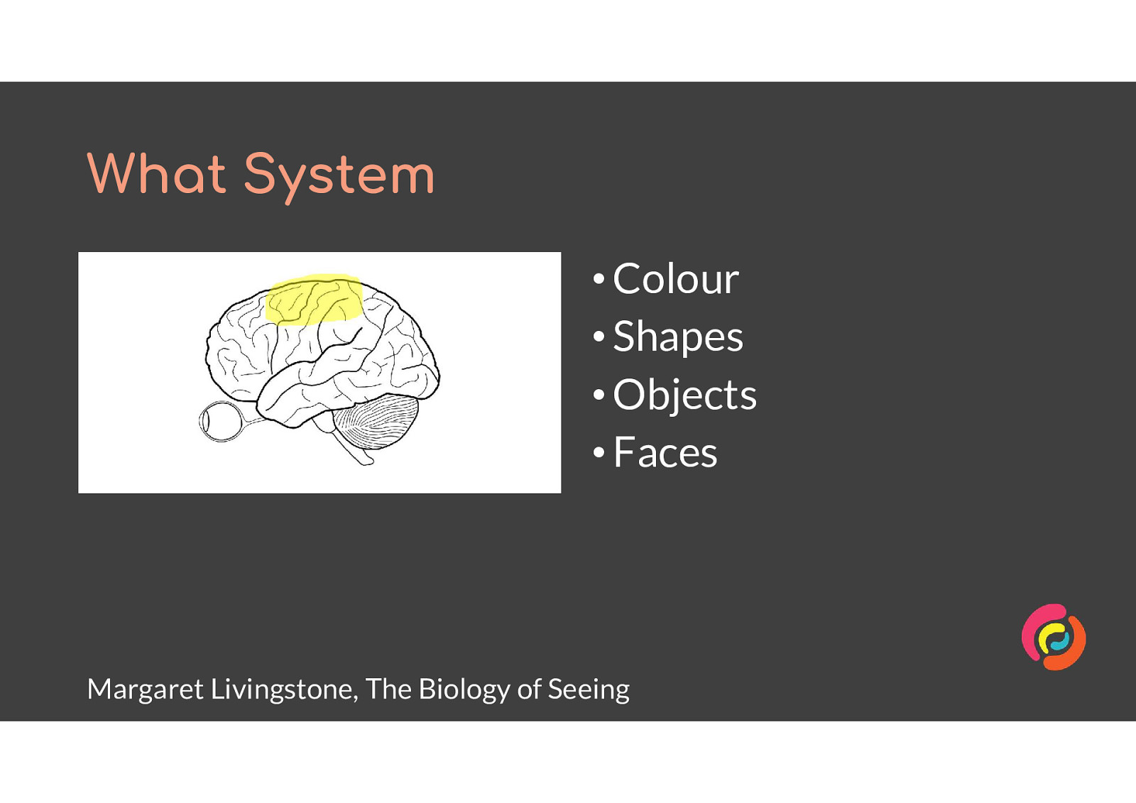
The What System perceives • Colour • Shapes • Objects • Faces It integrates with our logic, memory and other sensory processes. All primates have a What system.
Most websites rely on the What system to be understood. Website authors distinguish features by their shape and colour, and hope that by using familiar styles our audience will remember them from other websites they’ve used.
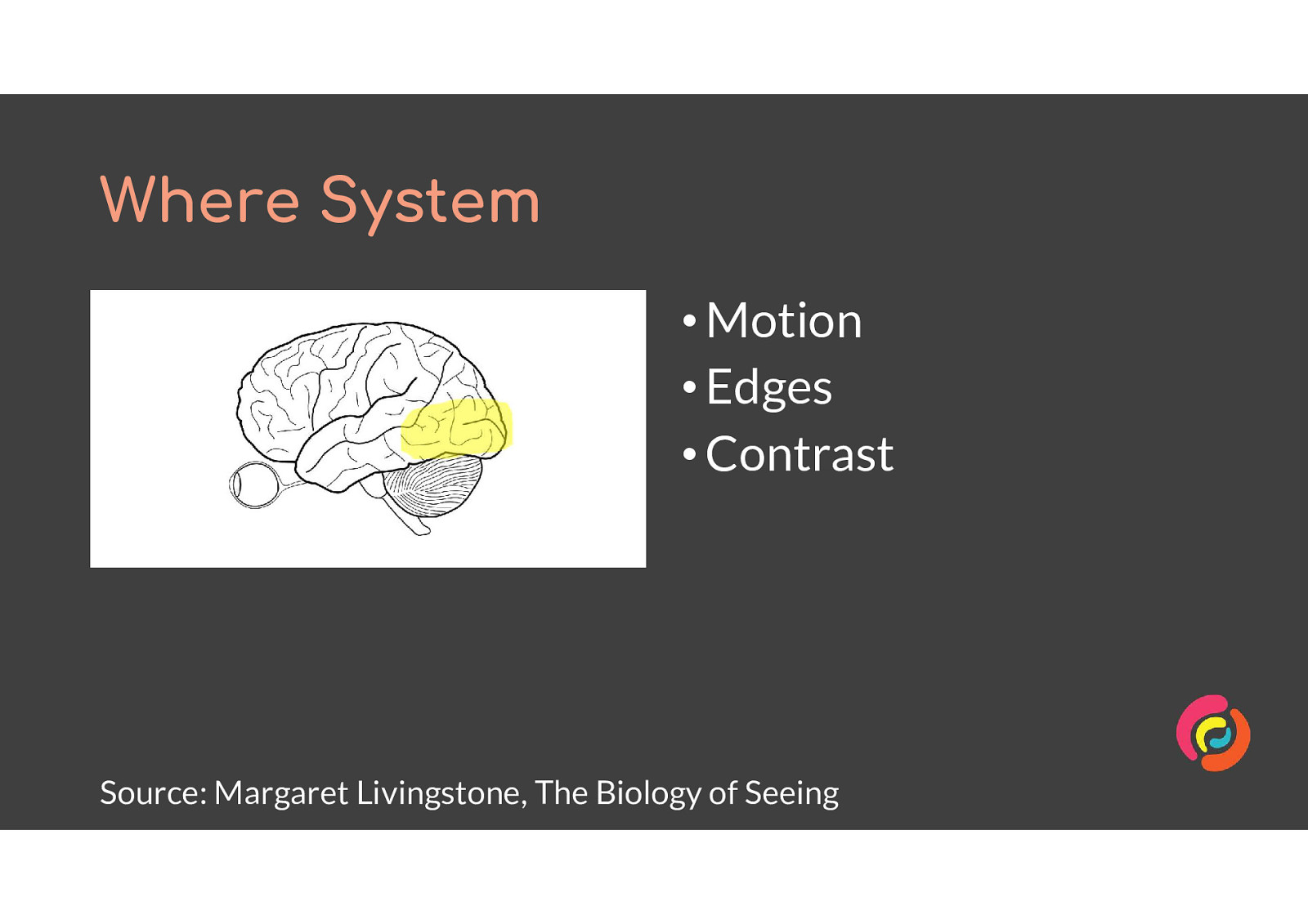
The Where System detects • Motion • Edges • Contrast It is not closely integrated with other parts of our seeing system, and operates somewhat independently. It is fast to react, since it is part of what can protect us from danger. All mammals have a Where system.
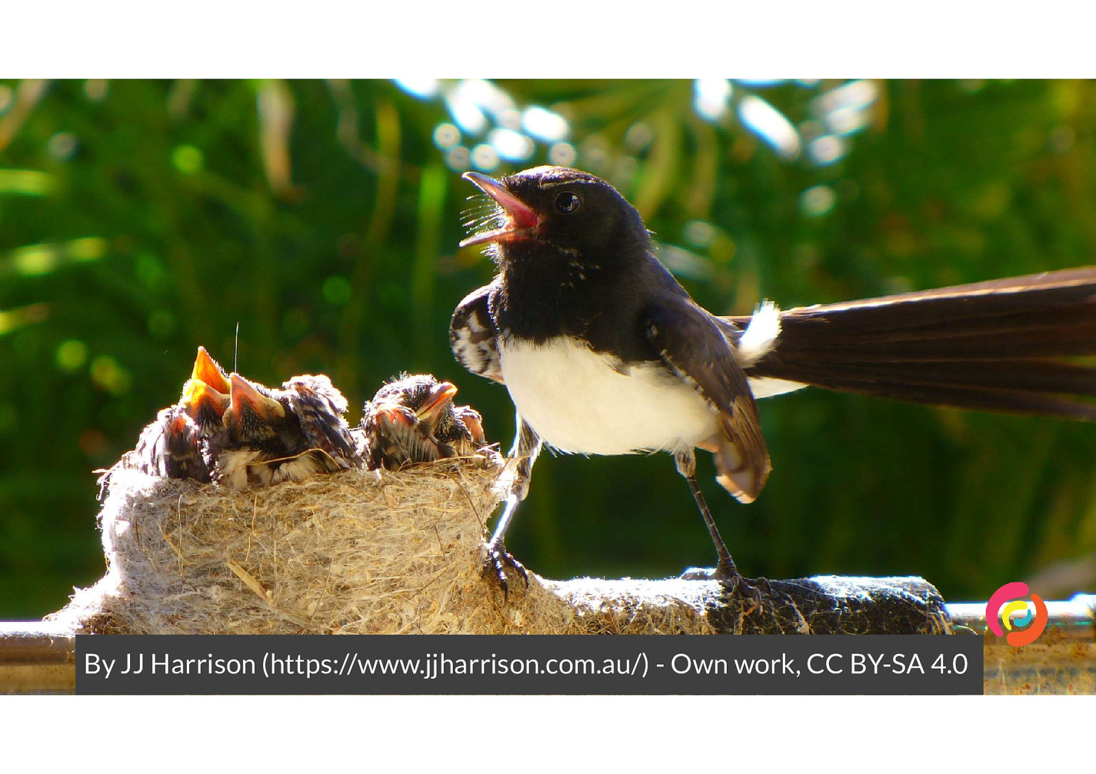
I was walking to a cafe with headphones in when something zoomed past me, from in front above head height to behind me at waist height. I ducked away then turned to look on the ground behind me, because my Where system had alerted me to the need for action and then calculated where the object should have been next. However there was nothing on the ground. My What system finished processing the details of colour and shape, and compared it to previous experiences to tell me “It’s a bird trying to scare you away from it’s nest”. I looked up and on my neighbour’s mailbox was a Willy Wagtail, a cute but grumpy little bird.
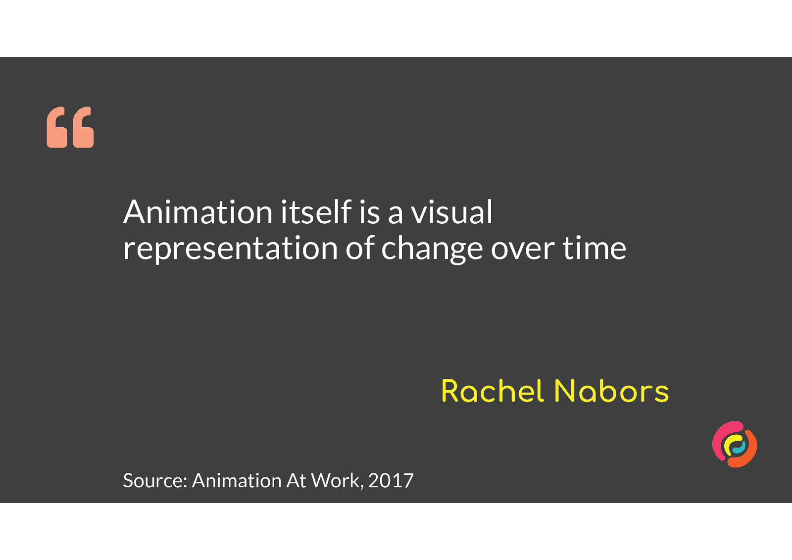
Animation itself is a visual representation of change over time Rachel Nabors Source: Animation At Work, 2017 It’s relevant to our websites as they become more complex in their interfaces, or get squashed down into small mobile screens. We can demonstrate their changes by using animation.
By animating changes in our website, we can push some of the cognitive load of understanding it from the What system to the Where system. This is not a fix for poorly designed layouts or content, but can make a complex site easier to use.
Animation can be used to highlight or distinguish items in a group - which one is selected, or has an error, or has new content.
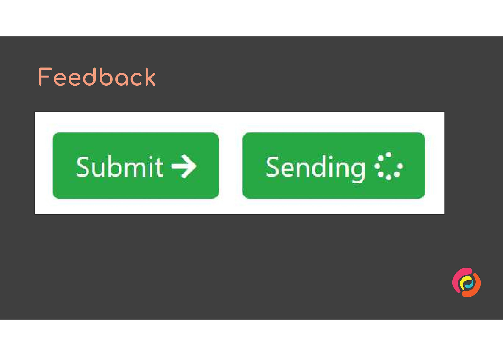
Animated feedback is useful for letting people know that their actions have had an effect. Give loading spinners to form submission buttons, or jiggle a shopping cart which has had an item added to it.
As layouts adapt to small screens or show and hide various areas, animate between the two states. This helps people understand where content has come from or is going to, and where they can find it again.
So how can we make use of this benefit without harming anyone else? I’m going to recommend 4 techniques.
For sites which have large amounts of decorative or instructional animation, let users choose if or when they want to have it running. WCAG SC 2.2.2 requires you to have a pause, stop or hide control for automatically animating or updating content.
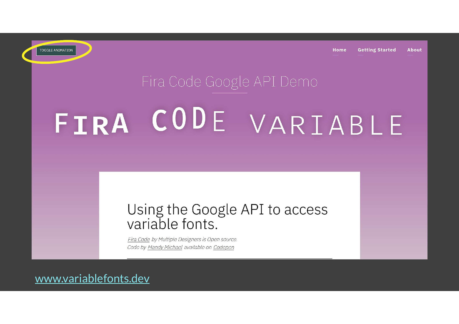
www.variablefonts.dev is my friend Mandy’s website. She has animated demonstrations of what each variable does to text, but those make it difficult to read some of the content as they are quite distracting. She added a toggle button in the top left of every page so people could decide when they wanted to look at the animation.
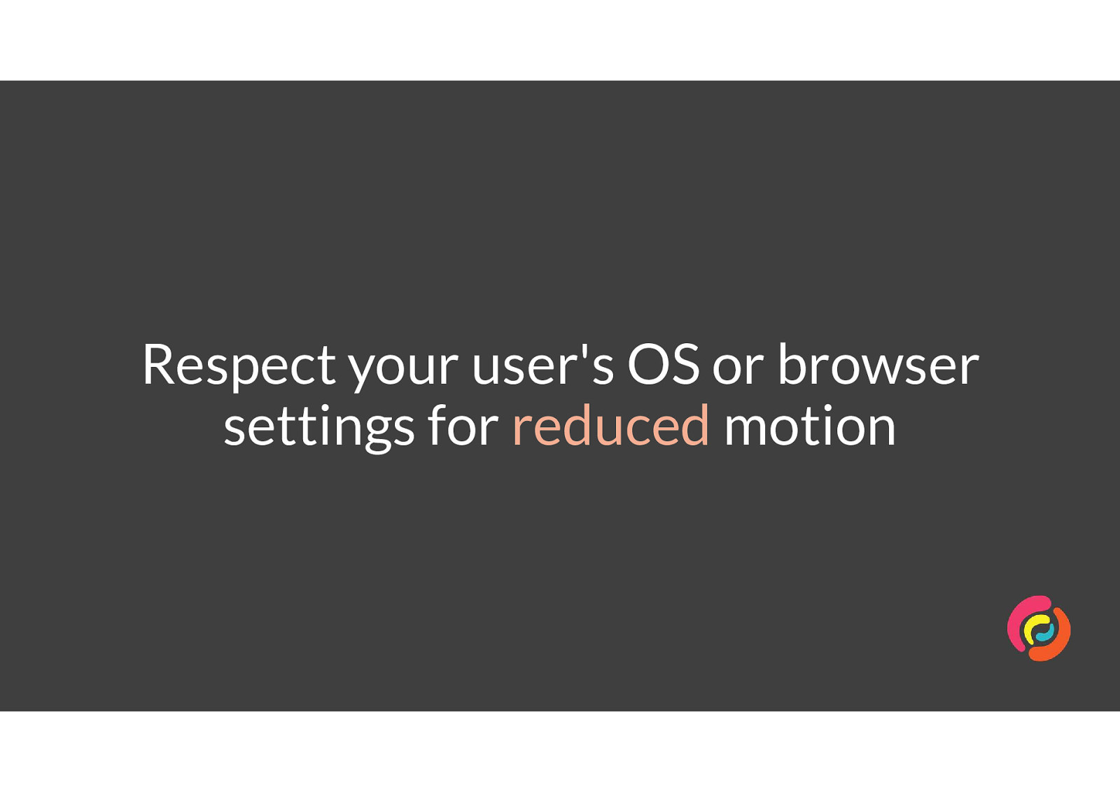
If someone has told us via technology that they don’t want to see animated interfaces, we should respect that and offer an alternative.
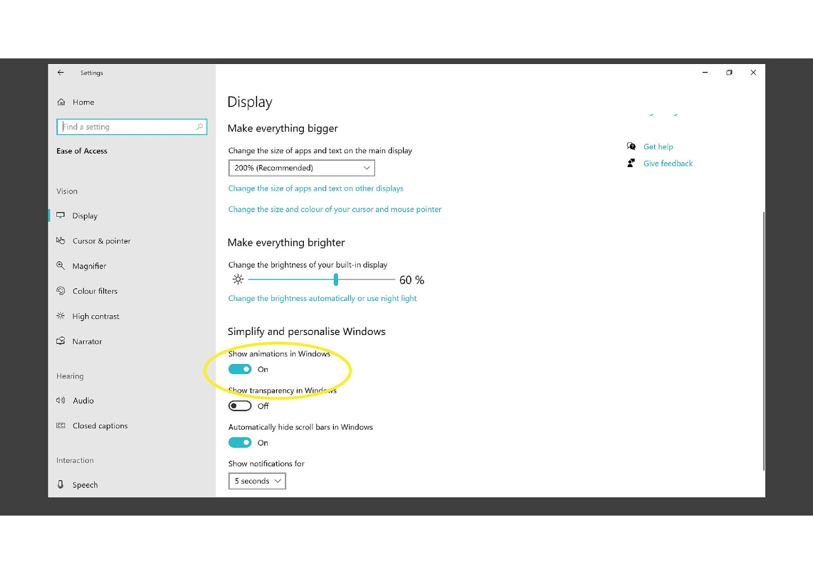
Windows, Mac, iOS and Android all have controls which let people reduce or completely remove animation from interfaces.
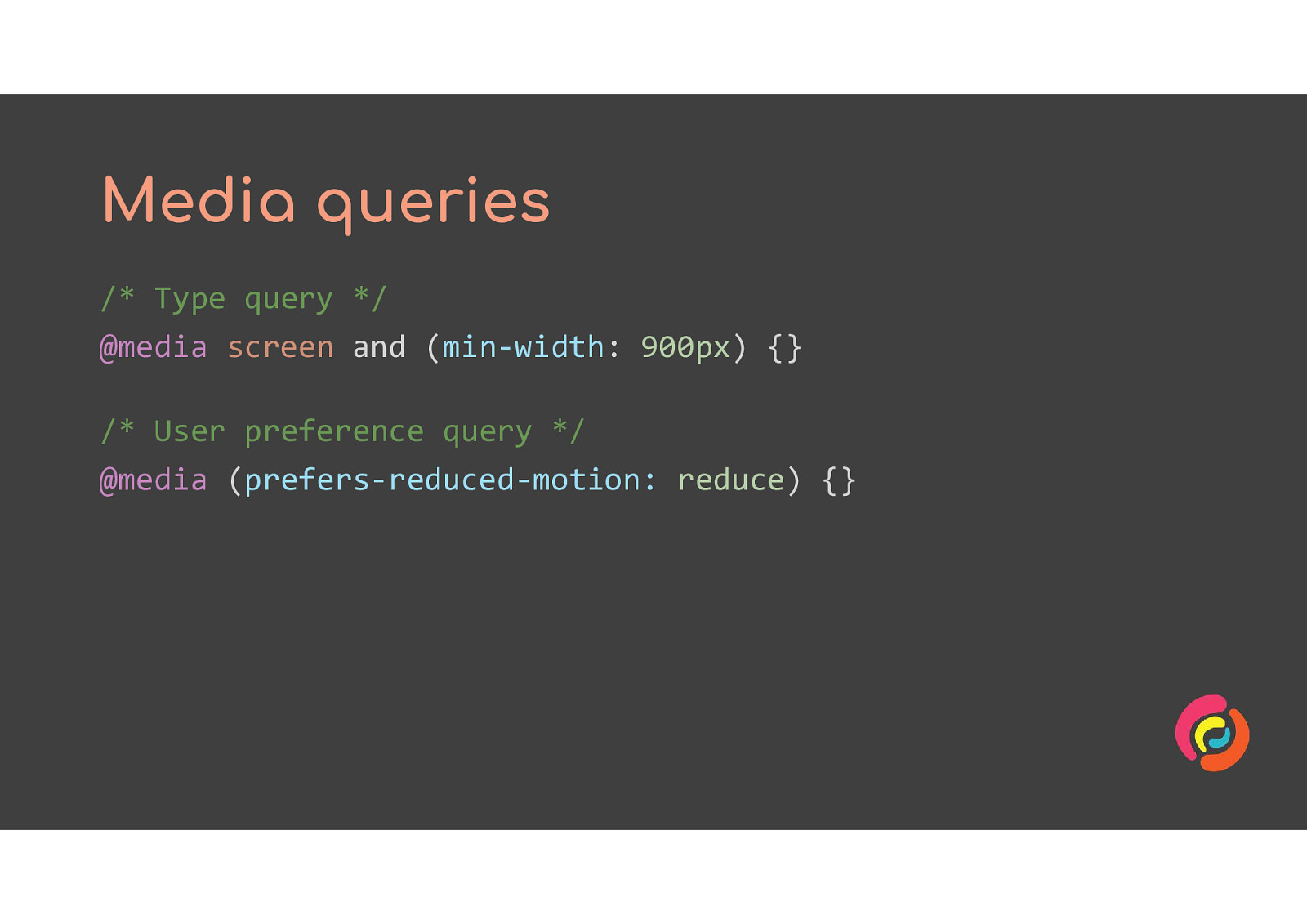
CSS media queries allow us to take advantage of those operating system settings to show different styles to people who’ve picked that option.
@media (prefers-reduced-motion: reduce) @media (prefers-reduced-motion: no-preference)
A fake web app has a login button in the main menu. The user clicks it and a modal window zooms out from the link. The user clicks a Close button in the modal which sends the modal zooming smaller back to the Login link.
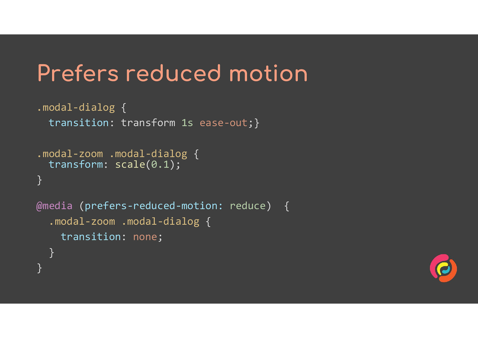
.modal-dialog { transition: transform 1s ease-out;} .modal-zoom .modal-dialog { transform: scale(0.1); } @media (prefers-reduced-motion: reduce) { .modal-zoom .modal-dialog { transition: none; } }
The prefers reduced motion CSS has been changed to remove the zoom transition for people who have expressed a preference for less motion. The video shows the same Login modal being opened and closed, but this time it appears instantly at full size instead of zooming in from small to large.
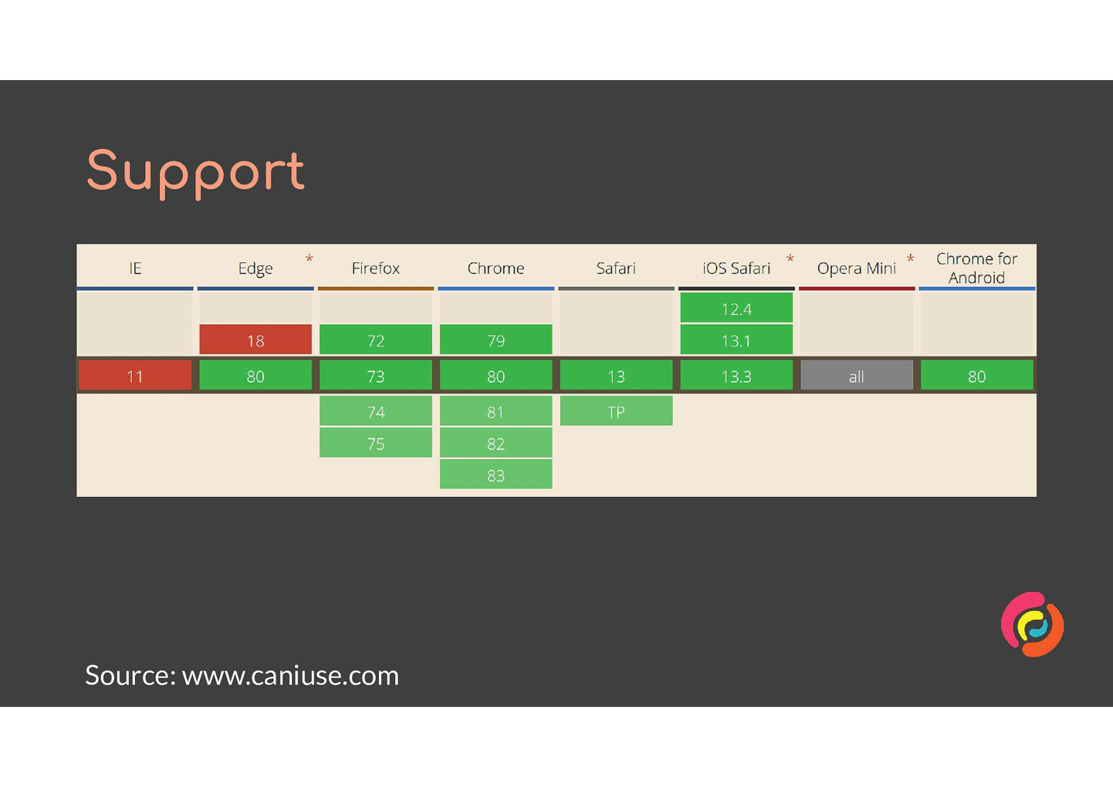
At the time of giving the talk, IE11 was the only browser with usage over 5% globally which did not support the prefers reduced motion query.
https://caniuse.com/#feat=mdn-css_at-rules_media_prefers-reduced-motion
This is to help our friends with seizures and migraines. Flashing or flickering content can trigger episodes for them, and we must prevent that from happening on our websites.
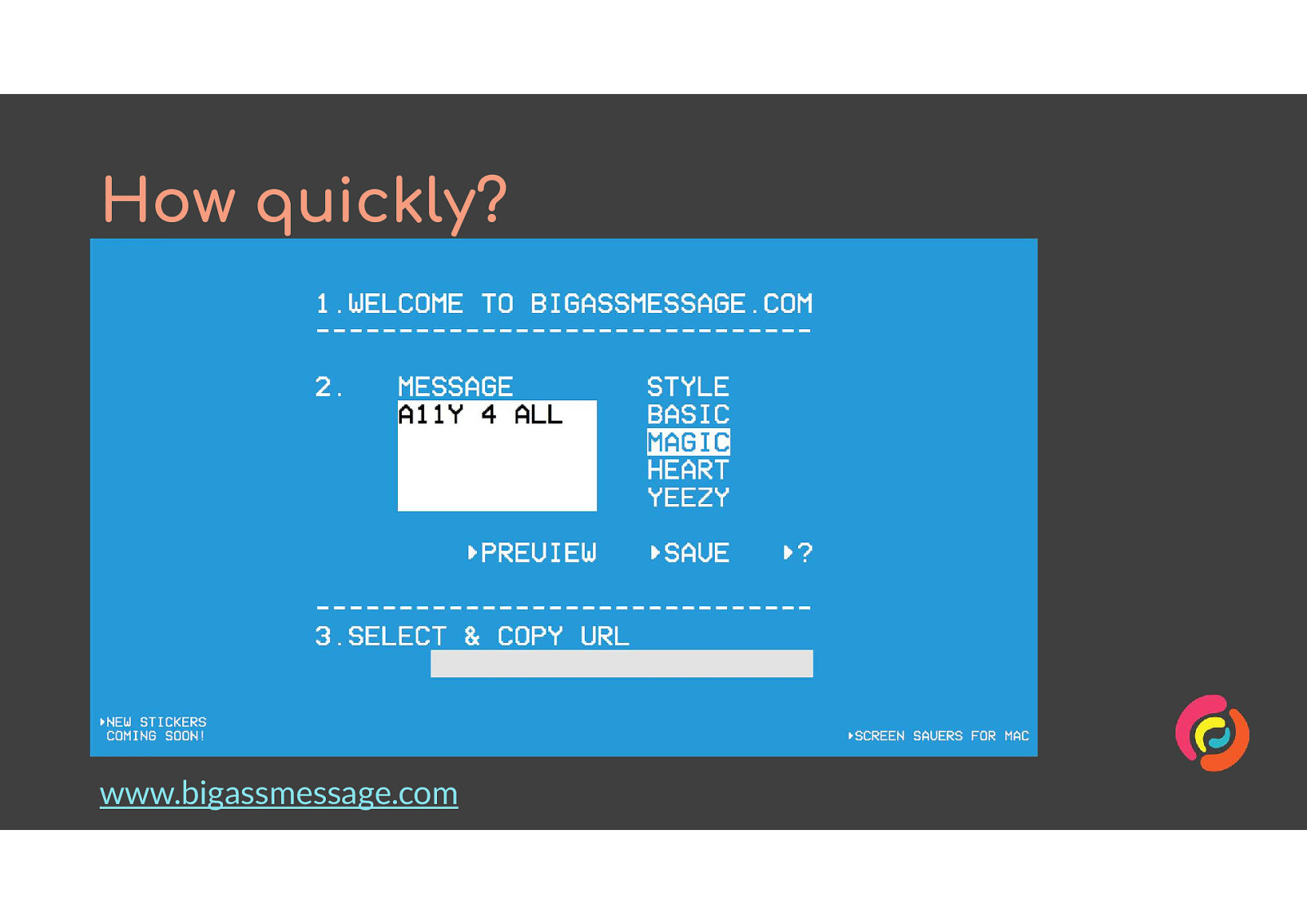
www.bigassmessage.com is (thankfully) the only example I can find which breaks this rule. It lets you type in a message, then choose a style, then gives you a link to a page with that message in that style.
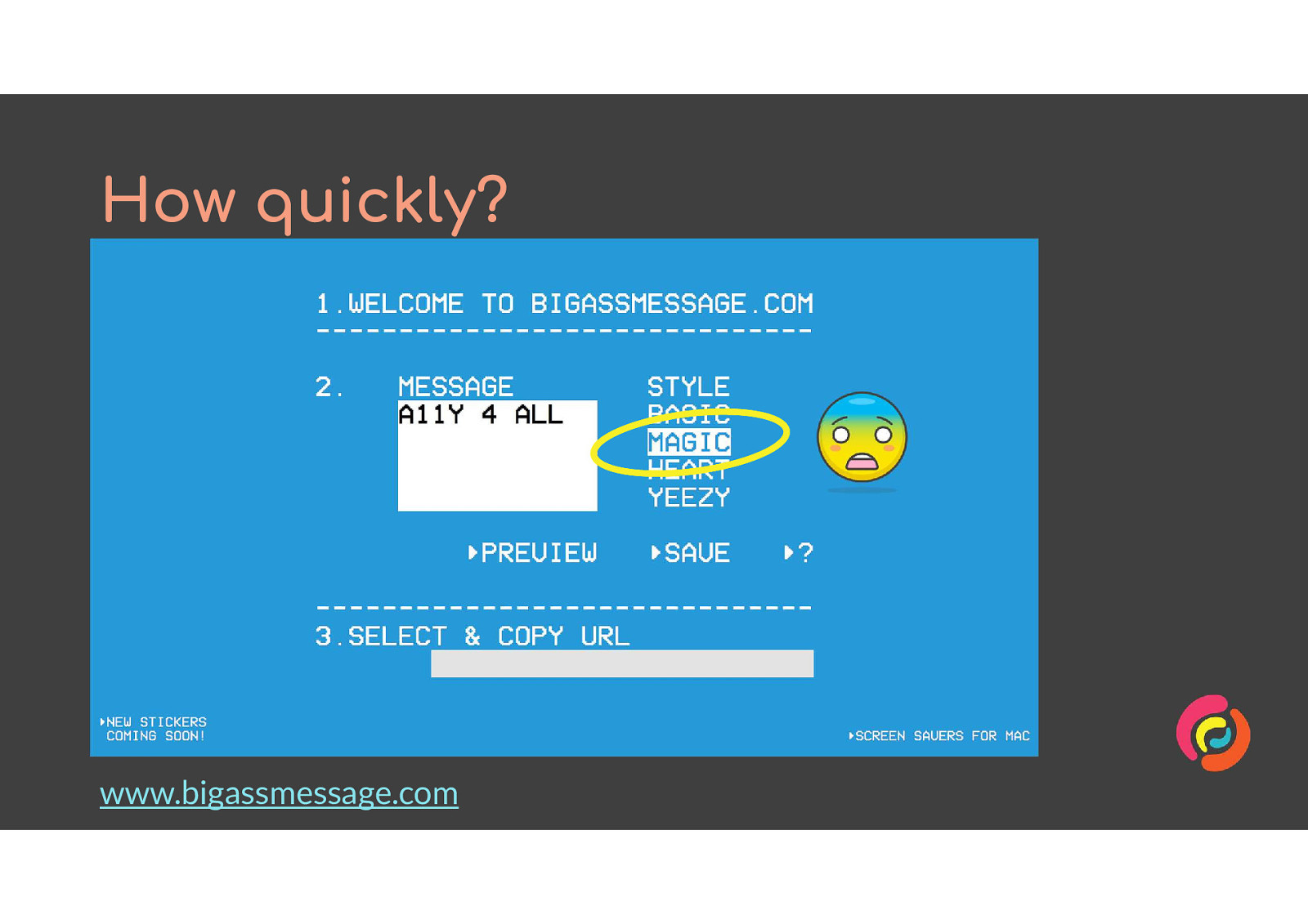
One of the styles is called ‘magic’ and it is awful. The text animates quickly between black and white, while the background animates between at least a dozen different colours. It gives me a headache to look at it, so I wasn’t able to use dev tools to find out how many changes were happening per second from the combination of animations.
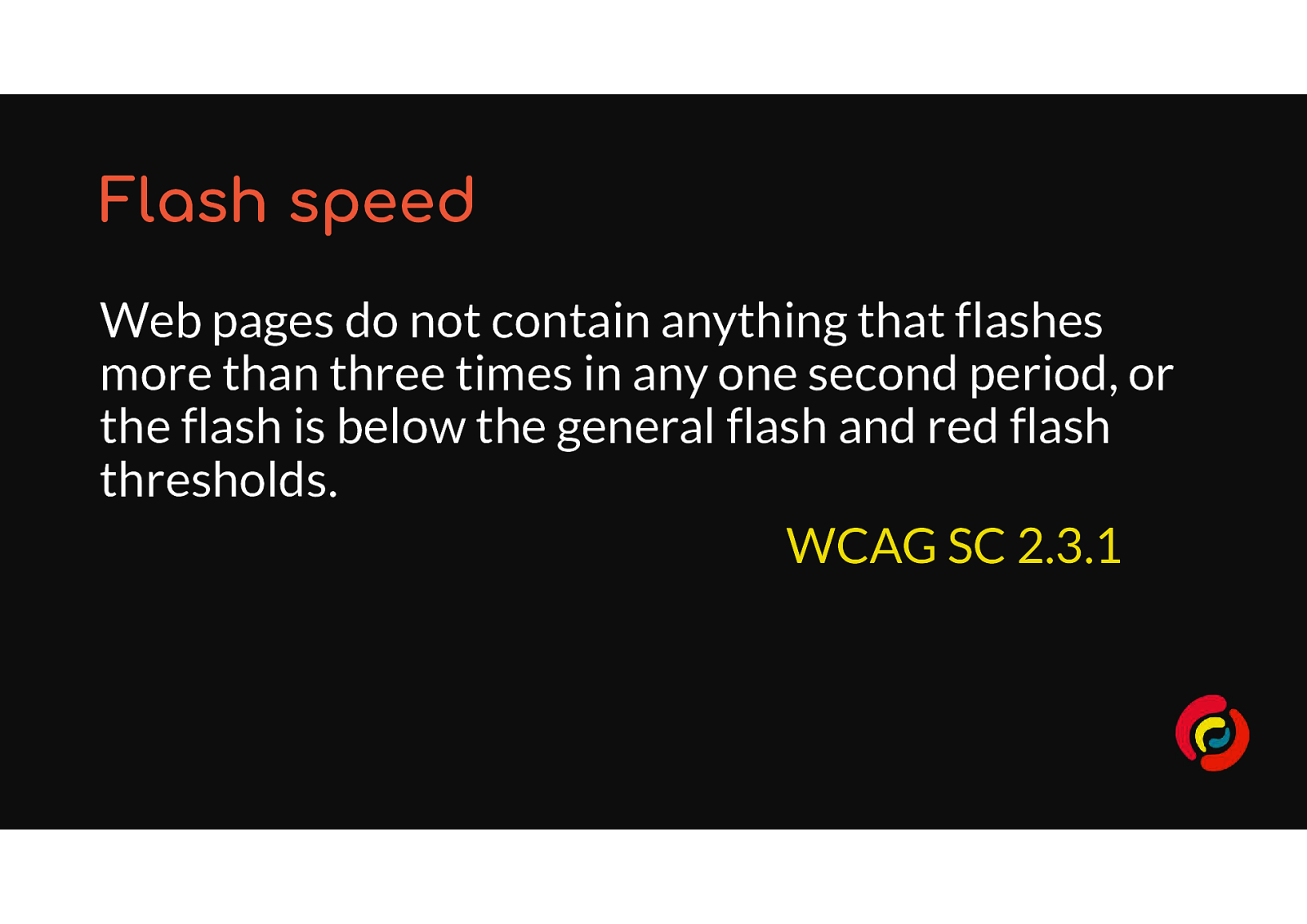
WCAG SC 2.3.1 Three Flashes Or Below Threshold says “Web pages do not contain anything that flashes more than three times in any one second period, or the flash is below the general flash and red flash thresholds.”
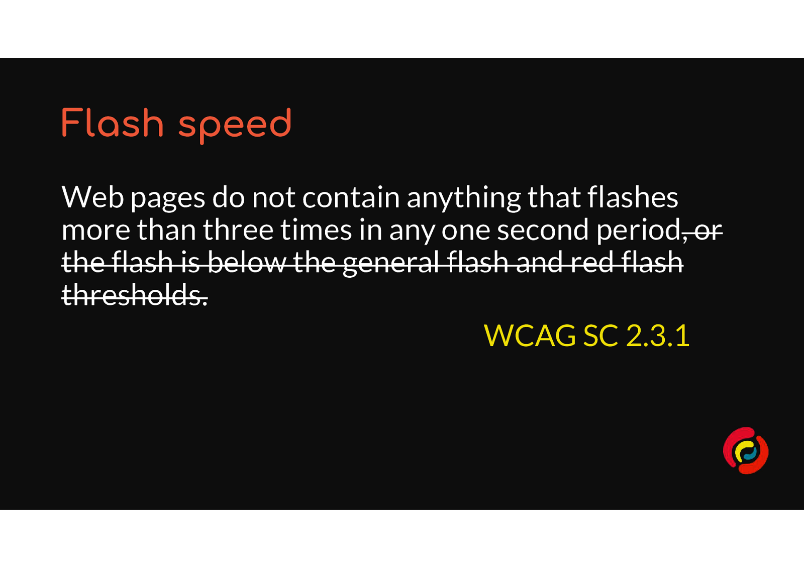
The Web Accessibility Initiative has to think of all possible scenarios. But my recommendation is to ignore the thresholds advice as it is a lot of work to understand and will not be relevant to most people. Keep your animations to 2 or more flashes per second and you will be fine.
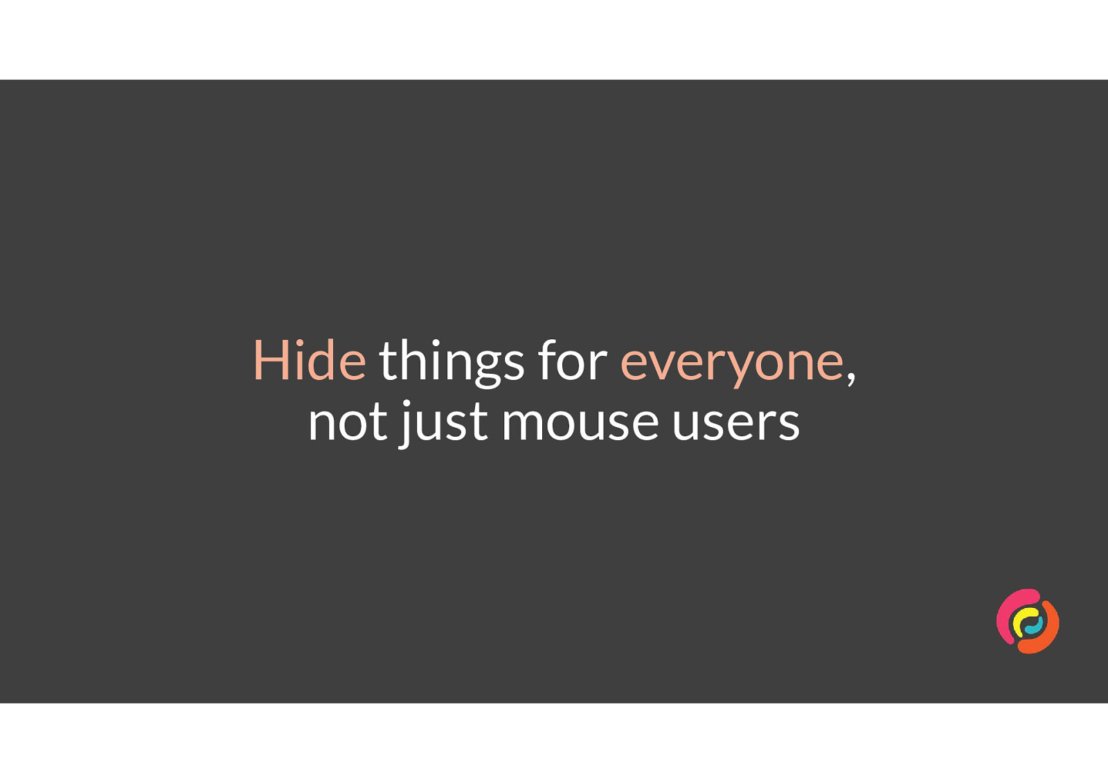
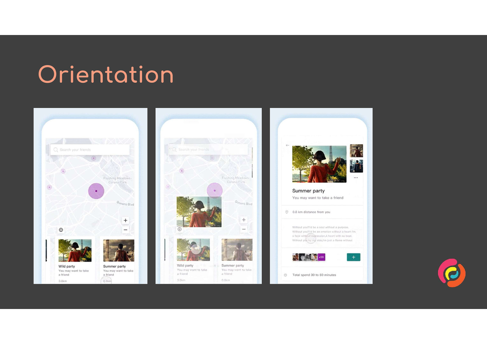
One of the most common use cases for animation of interfaces is when showing and hiding menus and content. However, animating the height or width of an object or sliding it offscreen will only hide it from sighted mouse users.
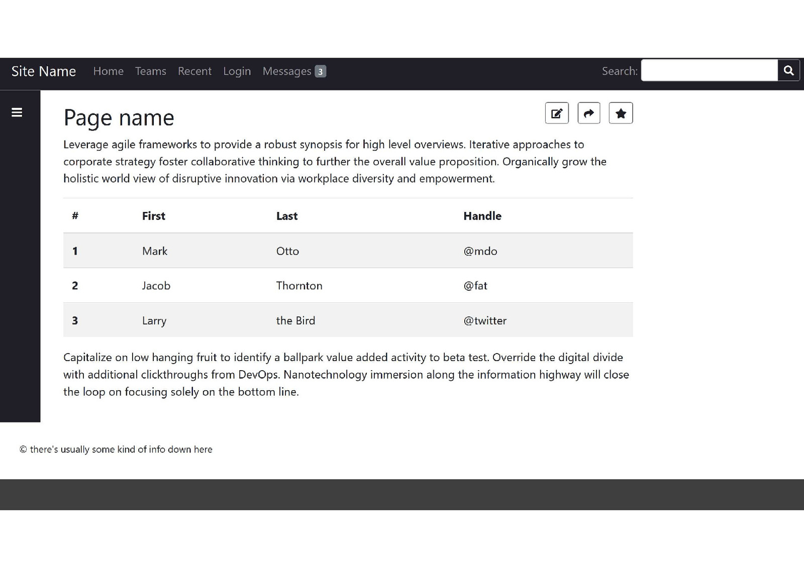
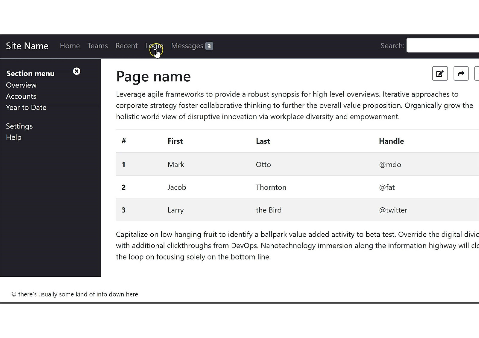
Here is our fake web app again. This time the section menu in the left-hand sidebar has been closed so there is more room to read or edit the page content.
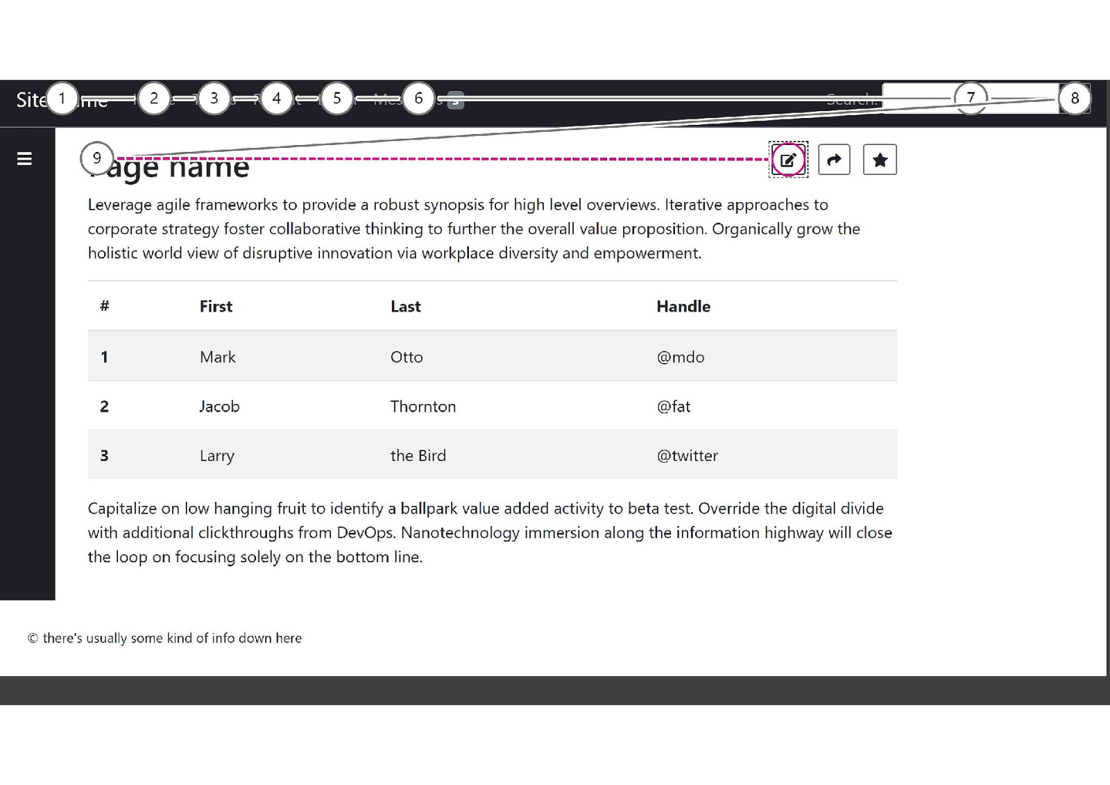
Using Microsoft Insight’s Test Tab Stops feature, I’ve shown the focus path we want when content is hidden. A sighted keyboard user would move from the logo through the main menu, to the search form, to the sidebar’s “toggle open” button, then over to the page editing tools.
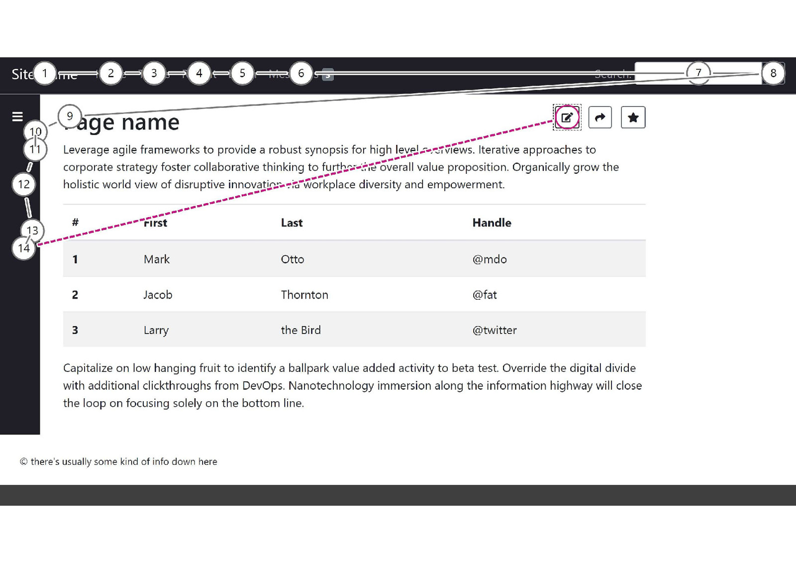
But more often, the focus path moves from the sidebar’s “toggle open” button to the hidden menu items in the sidebar. In this case, it adds 5 extra tab stops to the focus path before people can reach the page edit tools. Experienced users may understand why, but will not have gained much advantage from hiding the menu. Inexperienced users may become confused and give up. Screen reader users will not know that the “toggle open” and “toggle closed” buttons even do anything. This defeats the purpose of hiding the menu to get it out of the way.
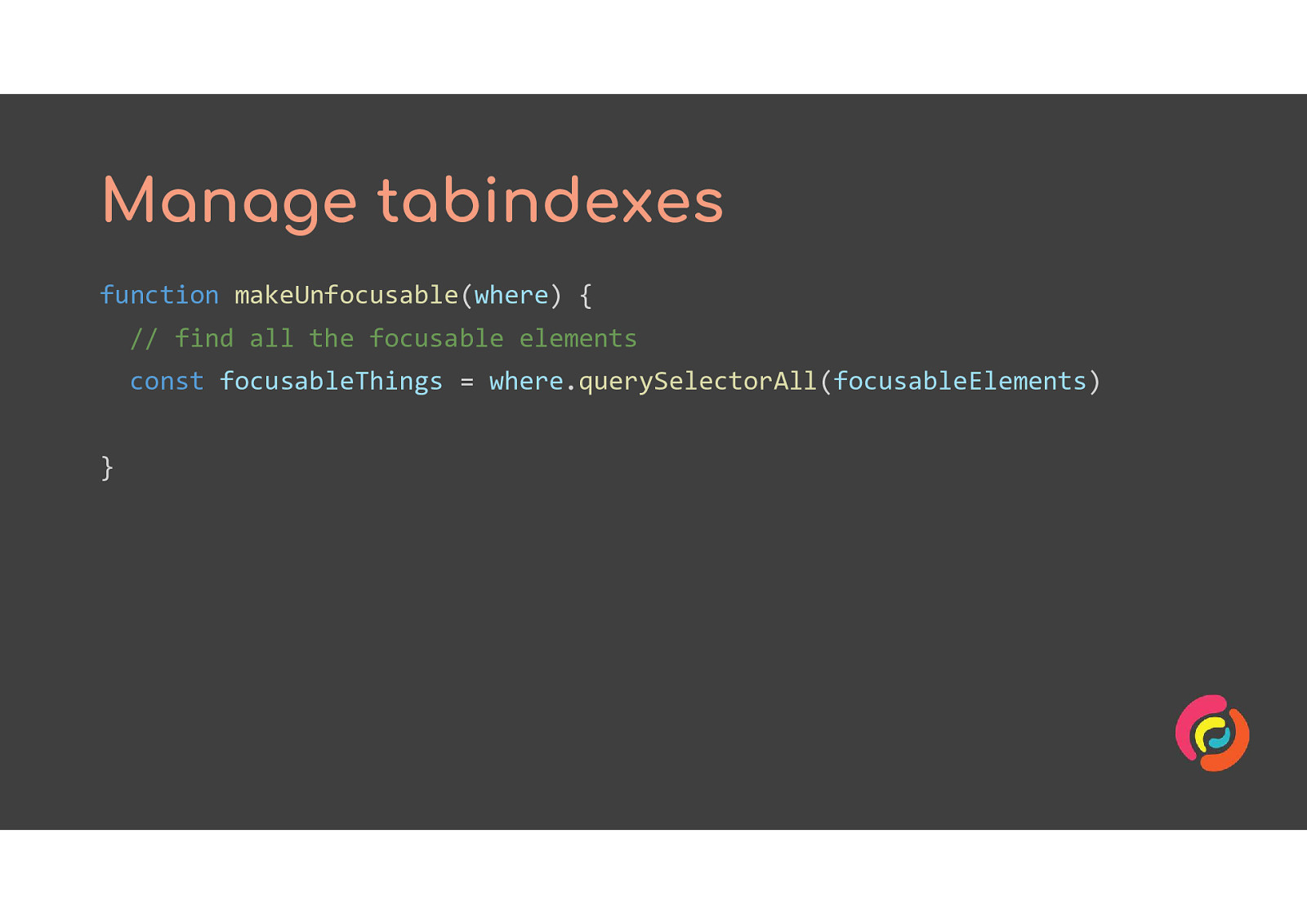
One solution is similar to what is done for modal dialog windows. We give all the focusable elements a negative tabindex to remove them from the focus path, and can add aria-hidden to the section to prevent screen readers from reaching the rest of the content.
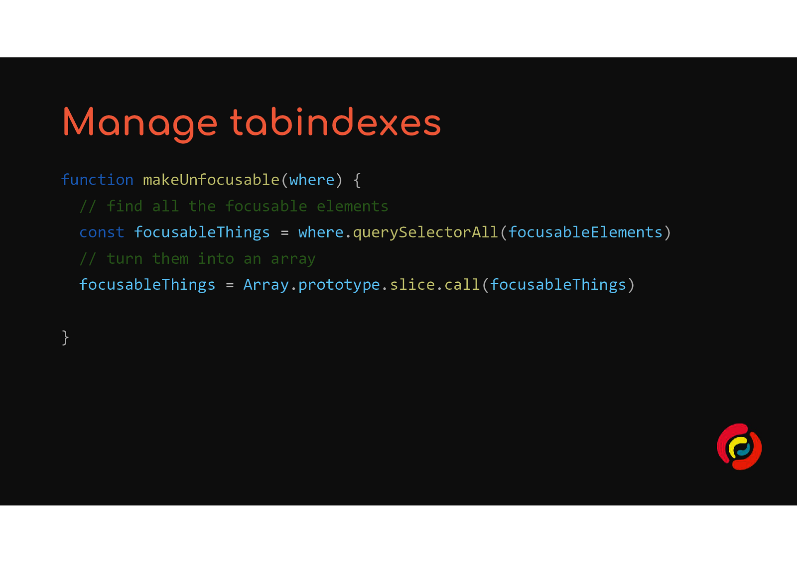
function makeUnfocusable(where) { // find all the focusable elements const focusableThings = where.querySelectorAll(focusableElements) // turn them into an array focusableThings = Array.prototype.slice.call(focusableThings) }
// loop through the array to change their tabindex values focusableThings.forEach(function(thing) { thing.setAttribute(‘tabindex’, ‘-1’) }) }
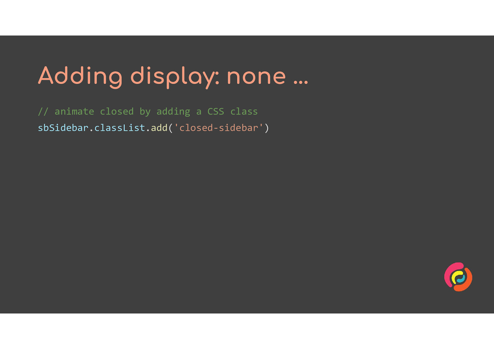
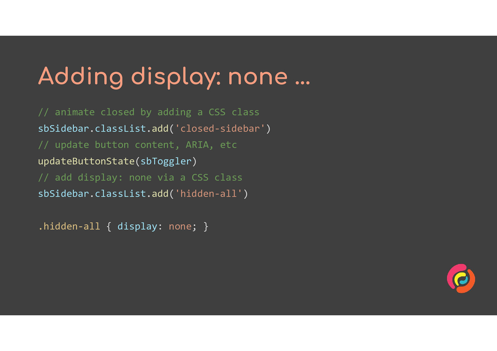
The display: none property in CSS removes the section of HTML from the DOM altogether. None of it will show up in the focus path or be reached by a screen reader.
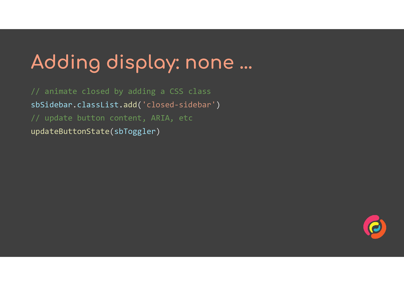
// animate closed by adding a CSS class sbSidebar.classList.add(‘closed-sidebar’) // update button content, ARIA, etc updateButtonState(sbToggler) // add display: none via a CSS class sbSidebar.classList.add(‘hidden-all’)
/* in your CSS file */ .hidden-all { display: none; }
When you add display:none via a class or inline style in JavaScript, the browser interprets that as the most important thing to do. So it removes the content from the DOM, leaving nothing to animate. You now have an accessible show/hide feature, but not an animated one. We have to go a step further and put the change inside a function. In the next slide I’ve used transitionend from the JavaScript Web Animations API as trigger for the function, but you could use setTimeout or anything else that works for your situation.
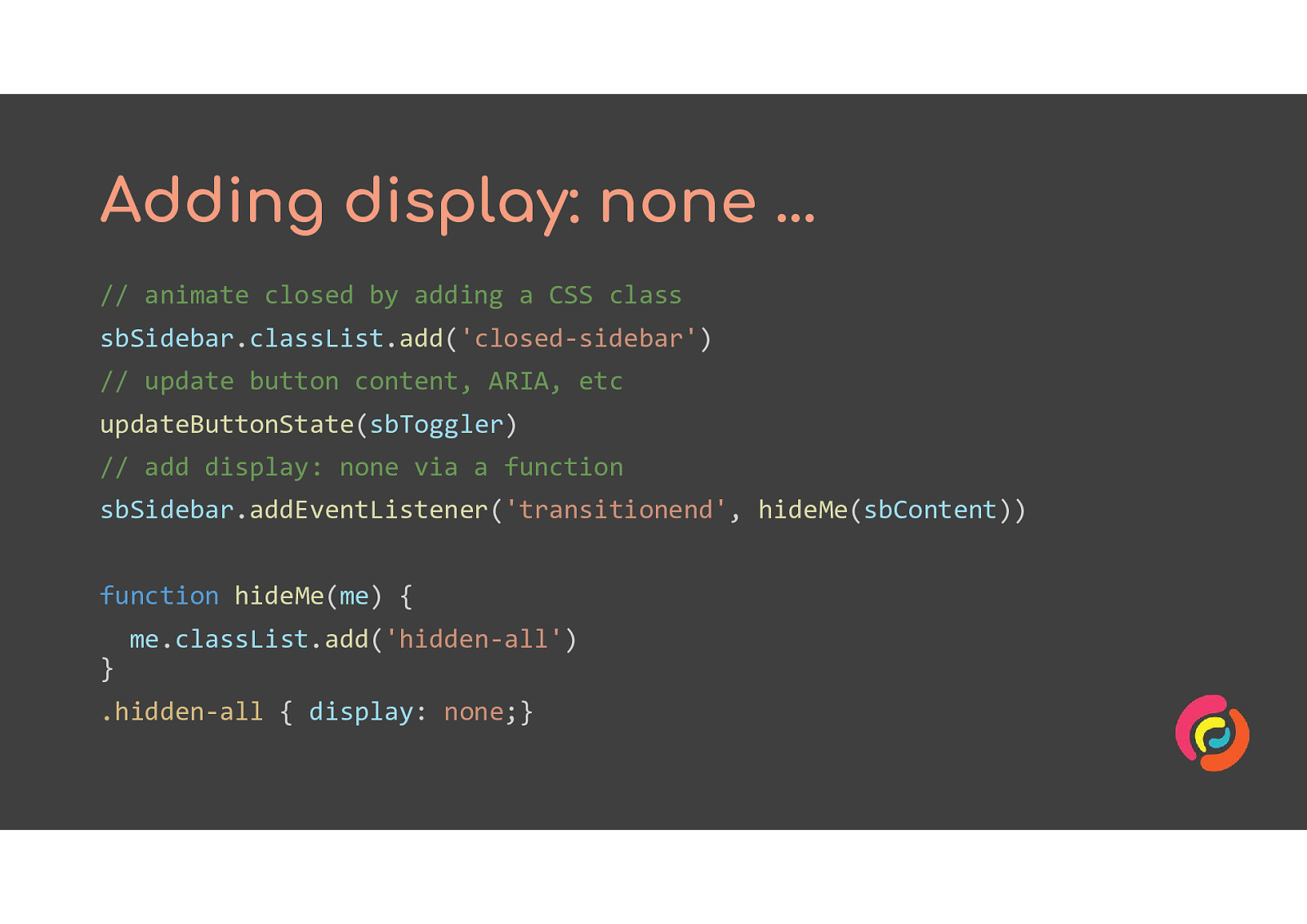
// add display: none via a function sbSidebar.addEventListener(‘transitionend’, hideMe(sbContent))
// the function function hideMe(me) { me.classList.add(‘hidden-all’) }
/* in your CSS file */ .hidden-all { display: none;}
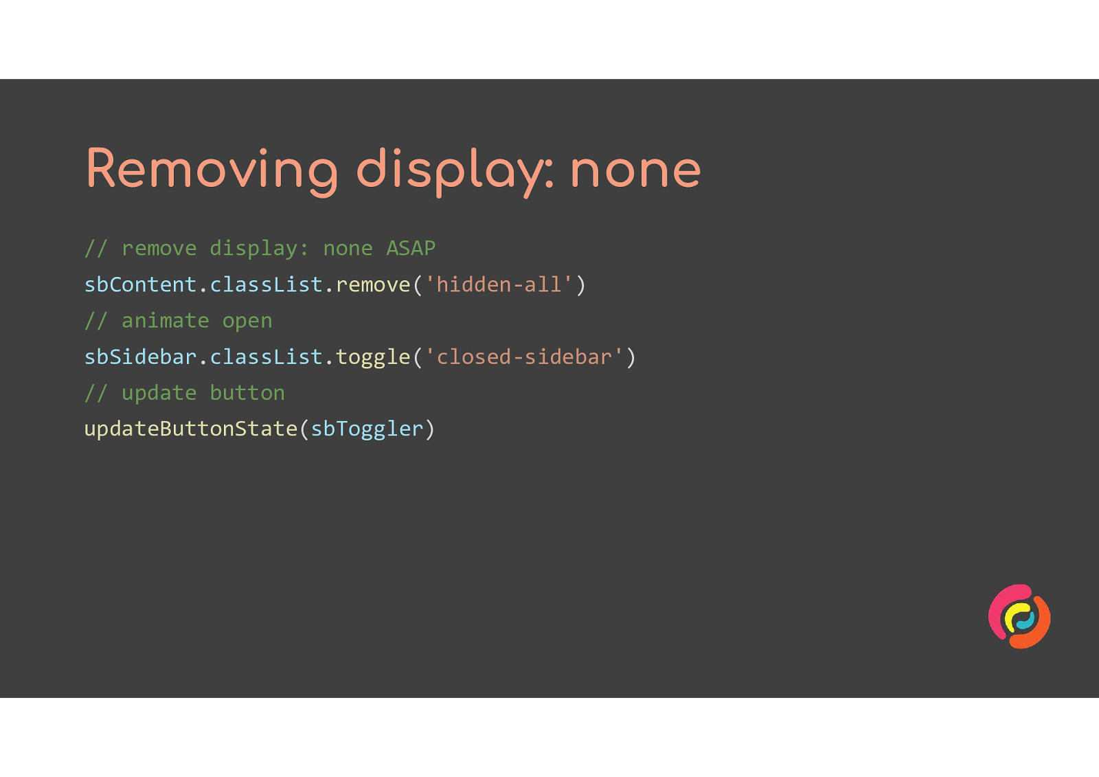
Removing display: none is easier because this time we agree with the browser that it should happen first. So we can use the classList.remove method for our CSS class with no need to hide it inside a function.
• Give your users control with a toggle or setting • Respect settings for reduced motion • No more than 3 flashes per second • Make sure hidden content is hidden from everyone
Slides: http://bit.ly/mawa3 Twitter: @stringy Intopia is on Twitter and LinkedIn Email: hello@intopia.digital