Can You See That OK?
Tips and techniques for supporting users with low vision

A presentation at CSSConf AU in March 2018 in Melbourne VIC, Australia by Julie Grundy
Tips and techniques for supporting users with low vision
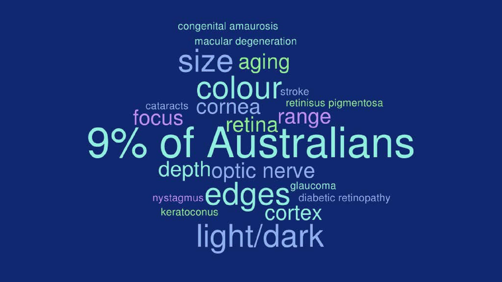
Vision impairments between legal blindness and able to be adapted to with standard glasses.
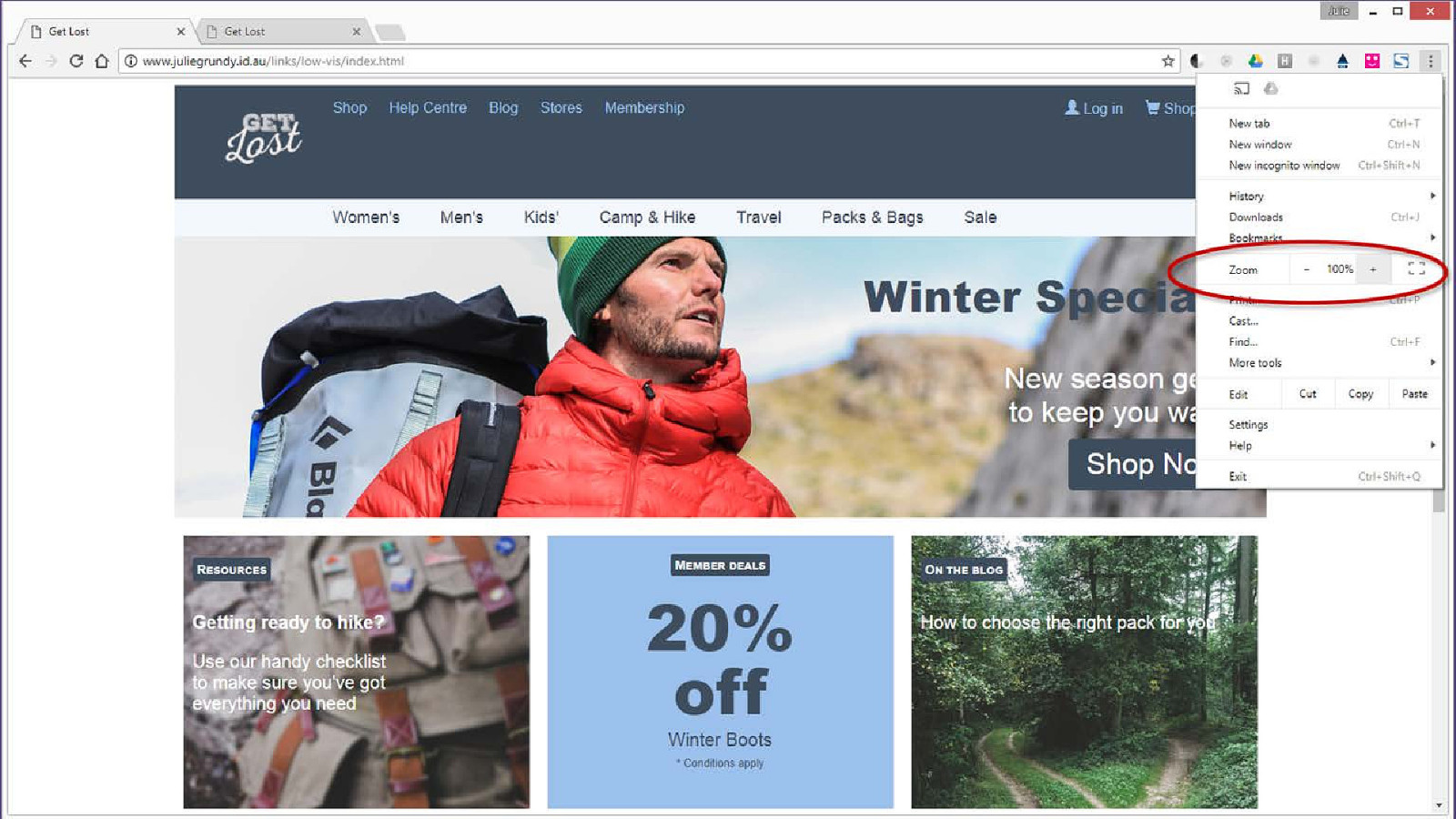
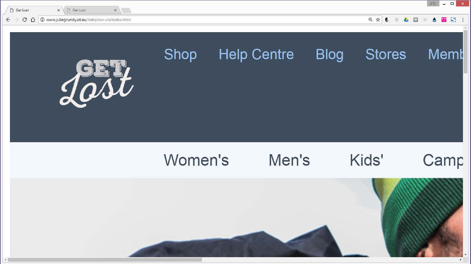
Users must scroll back and forth to read the whole site
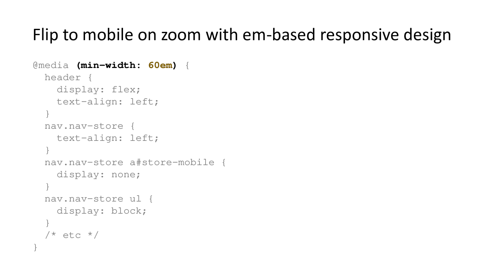
When the zoom is applied, the layout flips from a desktop style to a single-column mobile style as well as increasing the size of the content.
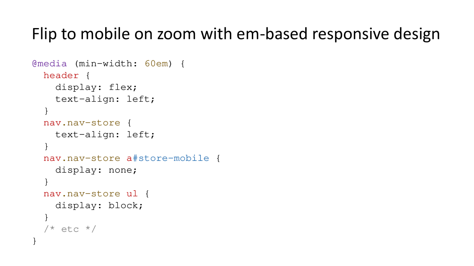
@media(min-width: 60em) { header { display: flex; text-align: left;} }

Text is cut off, overlaps with other text, or disappears into a matching background colour.
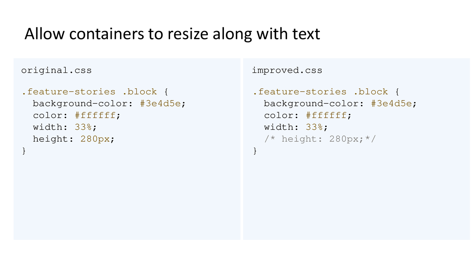
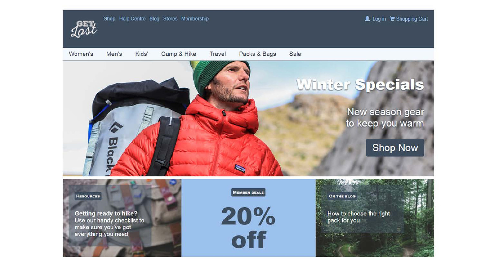
Two CSS statements for the feature stories. The original has a height of 280 pixels, the fixed version has that statement commented out.
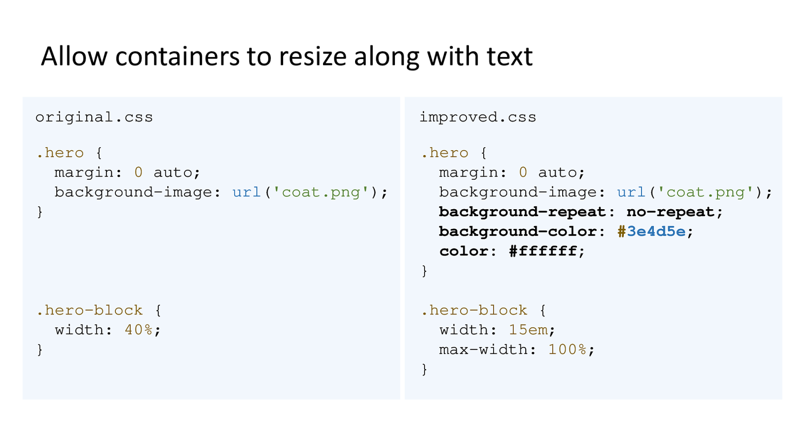
Two CSS statements for the hero story. The original has a background image set with a shorthand property. The fixed version specifies that it does not repeat, and falls back to a background colour which contrasts with the text.

The containers for the text have now increased in size to surround the larger text and the background image does not repeat.
Colour Accessibility Workflows by Geri Coady for A Book Apart
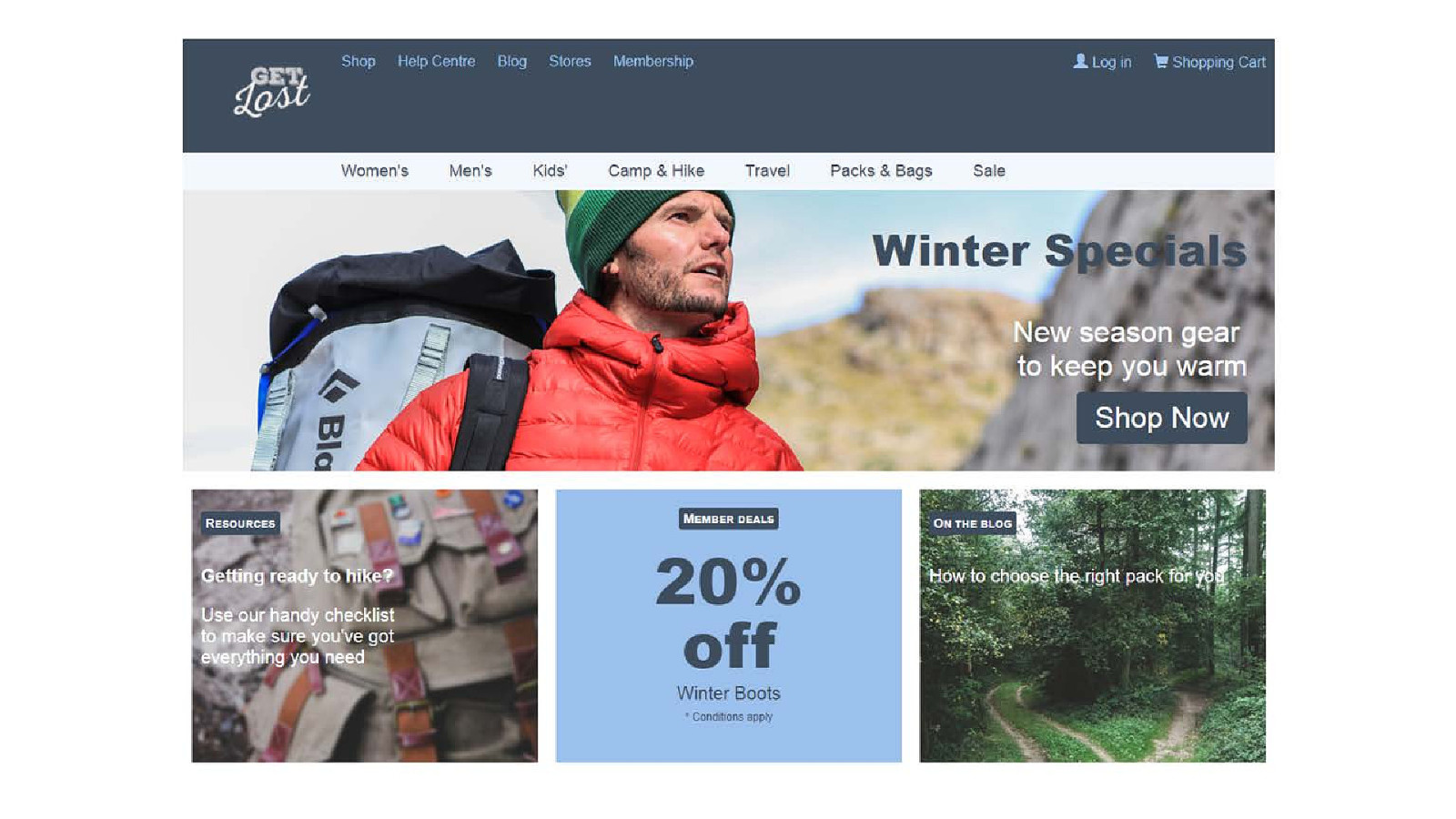
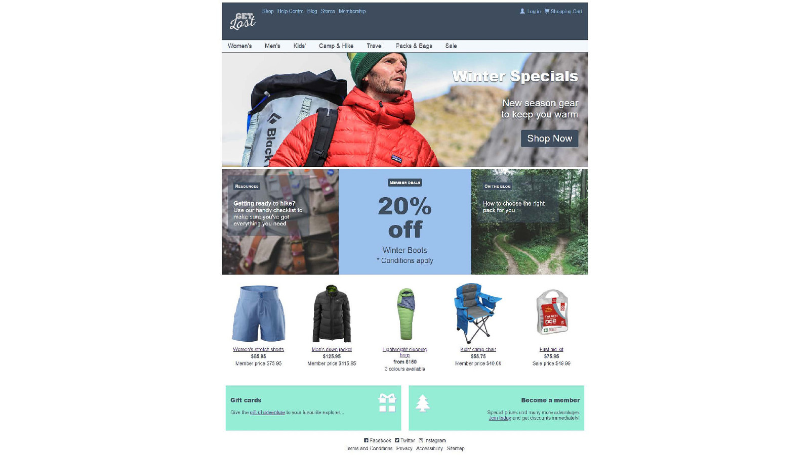
The text 'Winter specials' has enough contrast with the sky but not with the rock when it is set in dark blue text.
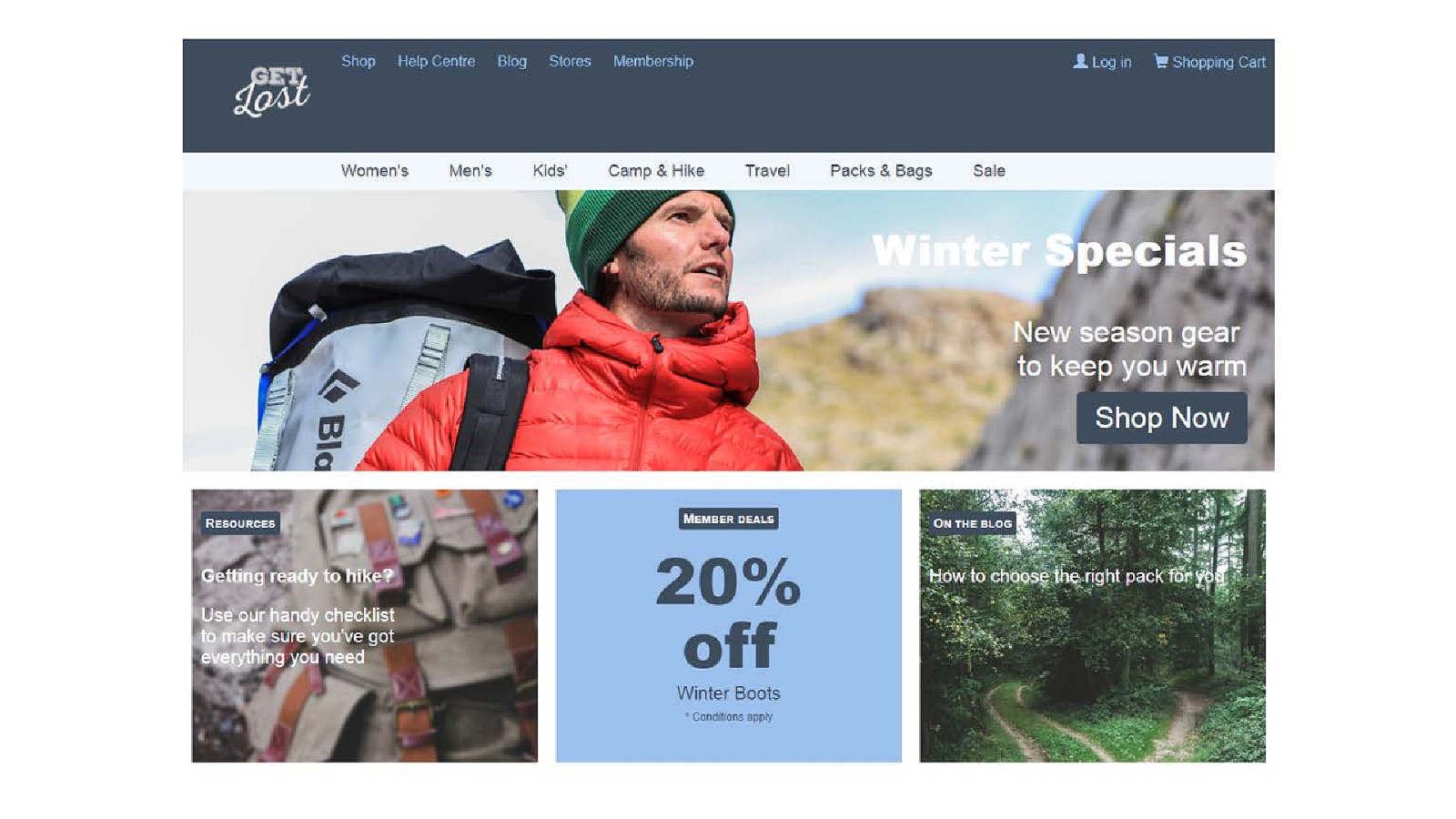
'Winter specials' is now in white, which contrasts with the rock but not the sky.

A drop-shadow on white 'Winter Specials' text shows the outline of the letters more easily.
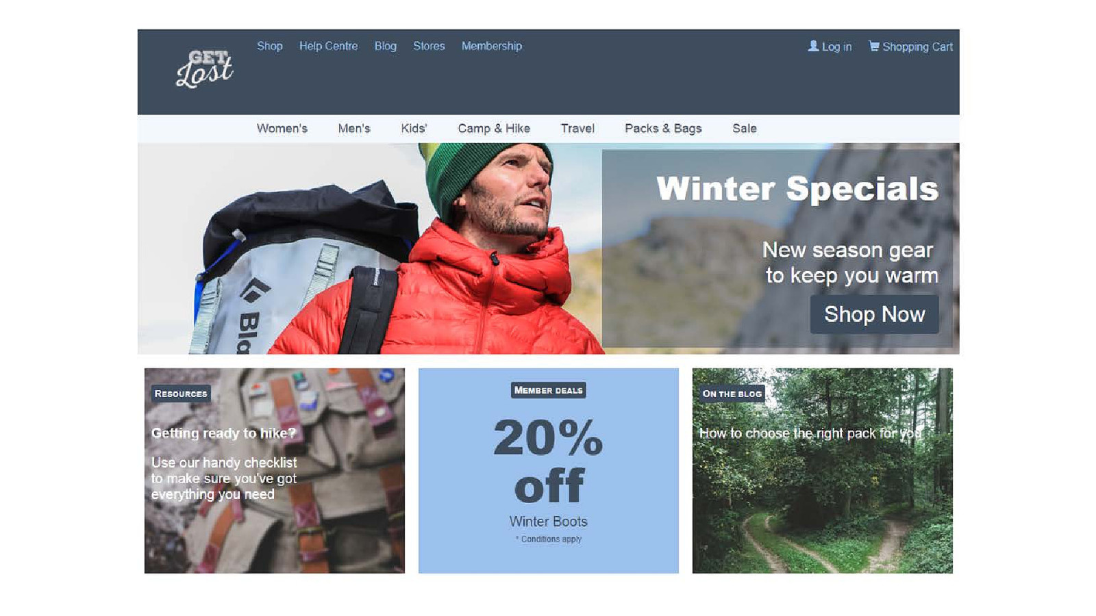
The text 'Winter Specials' now has a panel of translucent blue behind it. The photo still shows through but not as brightly, giving it more contrast with the white text.
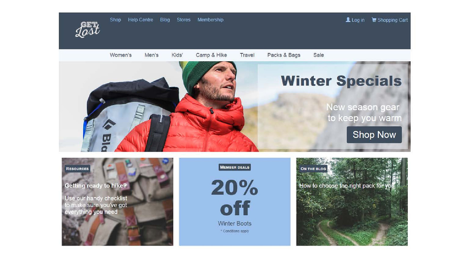
The same panel and text but now the panel is translucent white and the text is blue.
'Winter specials' has a drop-shadow and the feature stories use translucent panels.
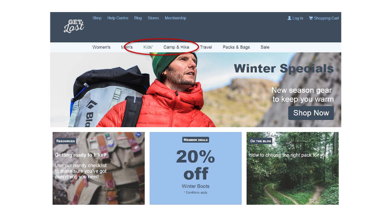
The selected menu item uses a different colour with enough contrast to the background.
body { filter: grayscale(100%); }
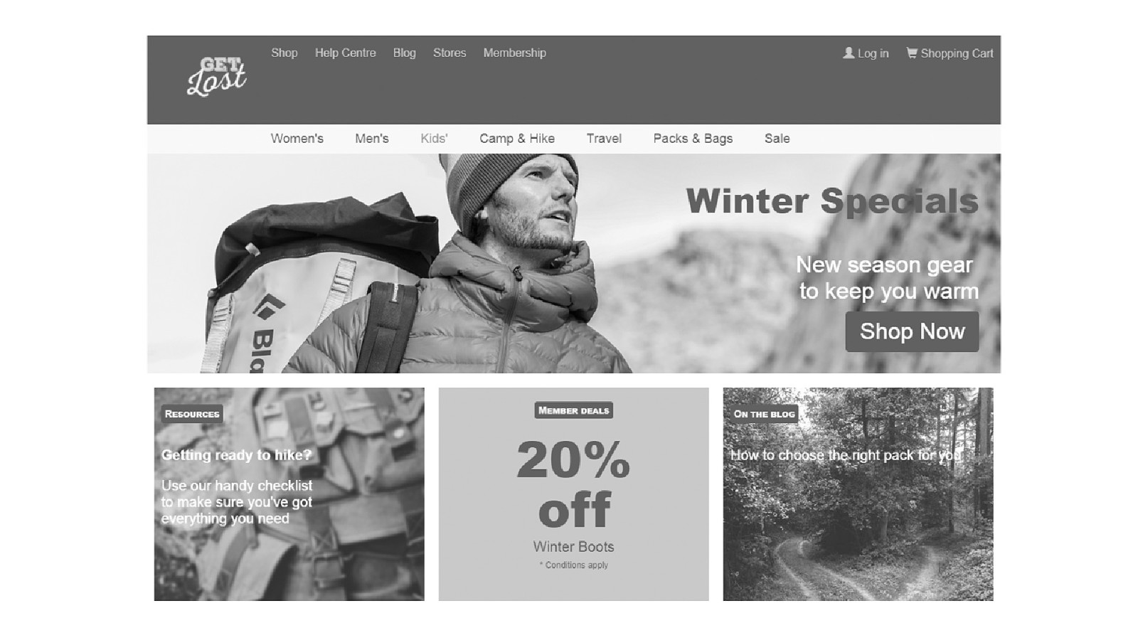
The highlighted menu item can be read, but doesn't look any different from the other menu items.
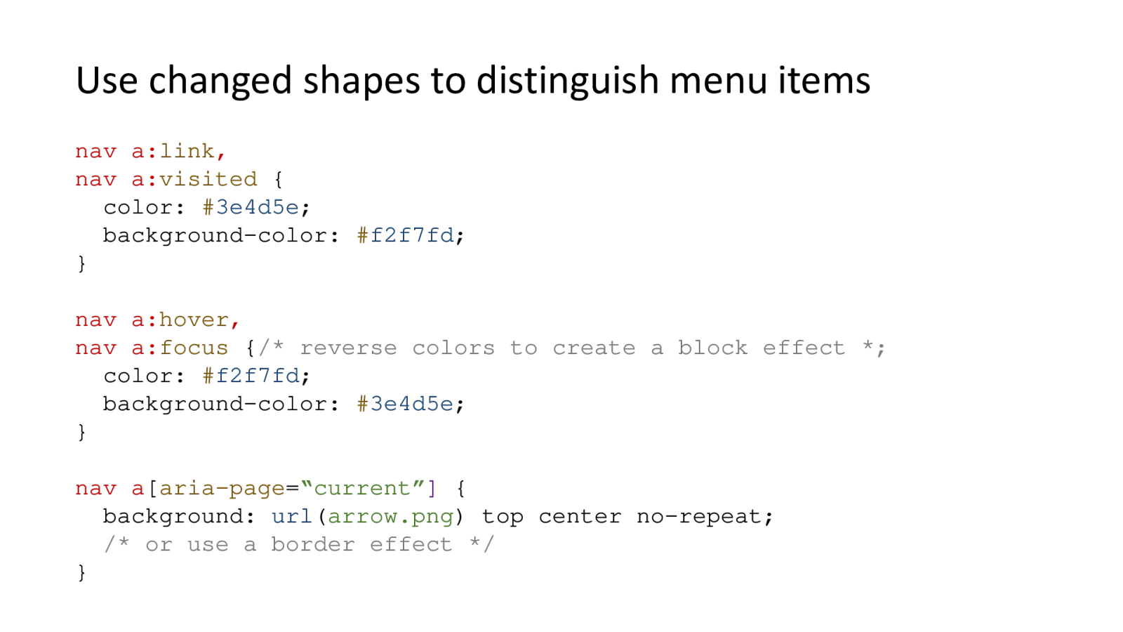
nav a:link, nav a:visited { color: #3e4d5e; background-color:#f2f7fd; } nav a:hover, nav a:focus { /* reverse colors to create a block effect / color:#f2f7fd; background-color:#3e4d5e; } nav a[aria-page="current"] { background: url(arrow.png) top center no-repeat; / or use a border effect */ }
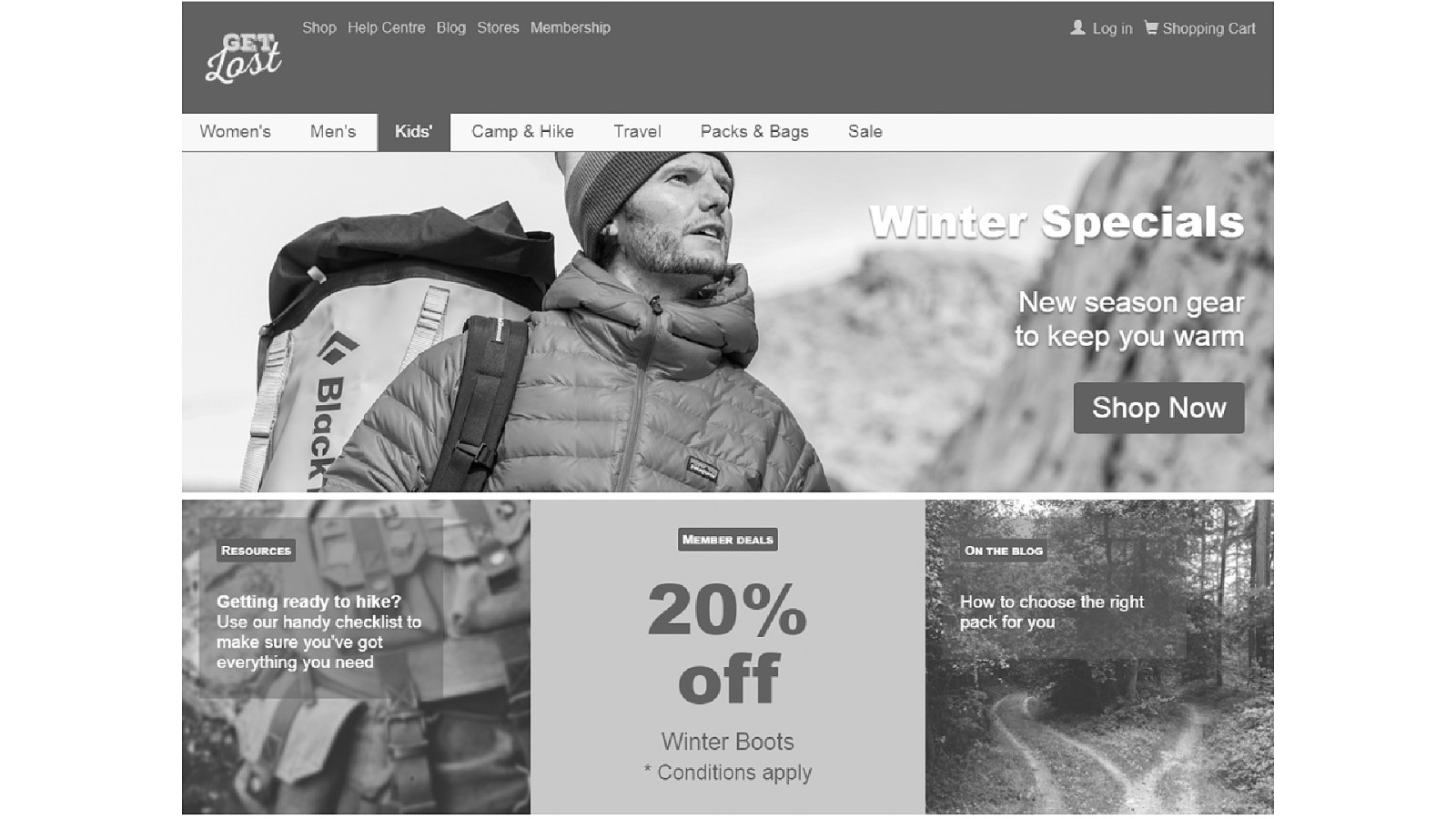
The colours on the selected menu item being the opposite to the other items creates a block shape which can be seen even without colour information.
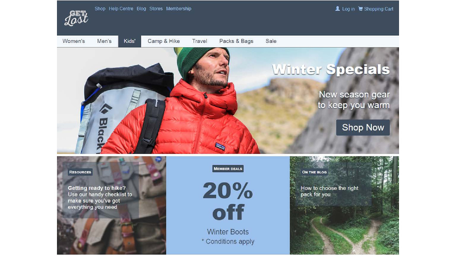
The block style looks nice in colour because it is using the same colours as the rest of the menu, just arranged differently.
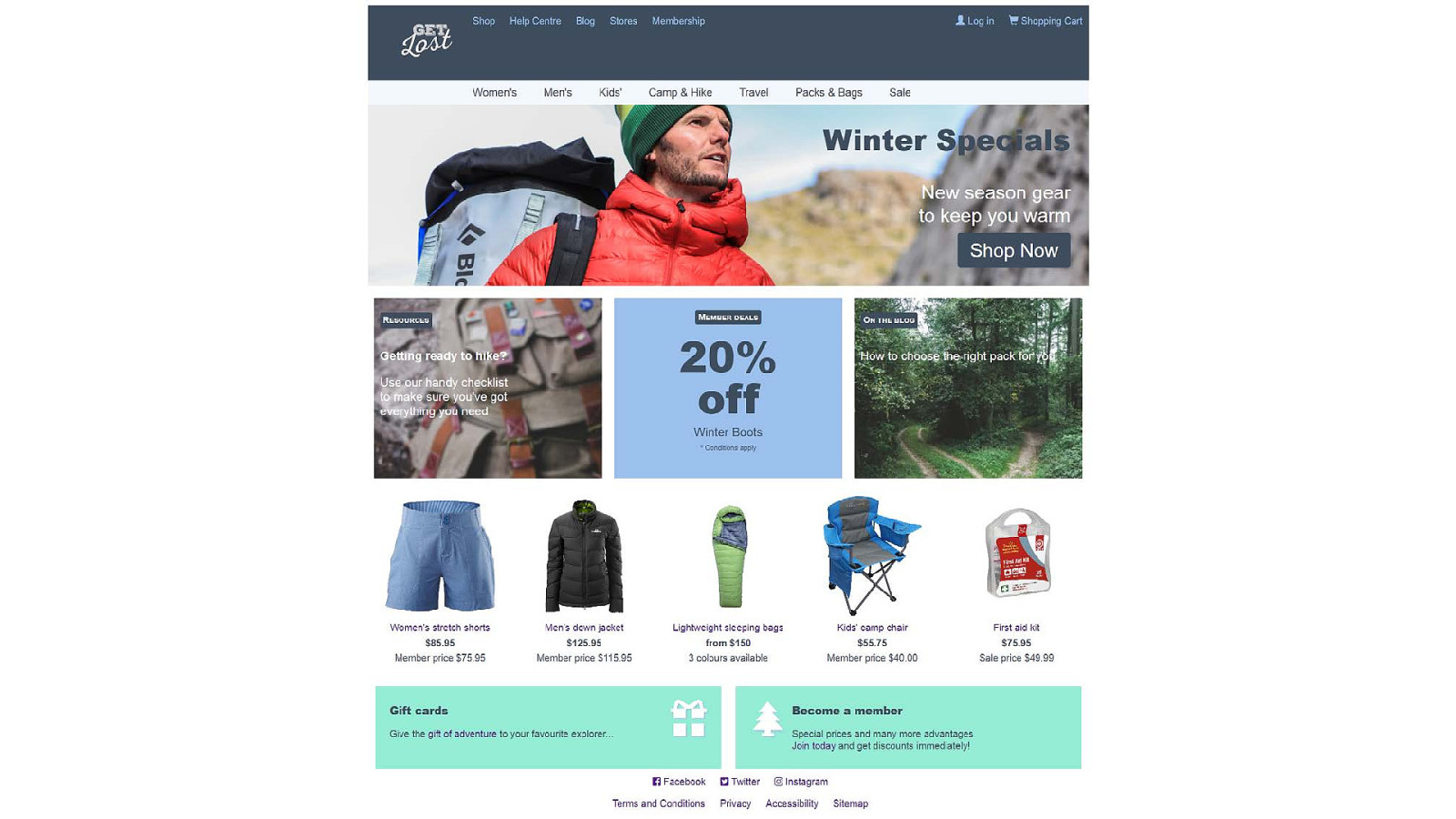
Products and promotional blocks
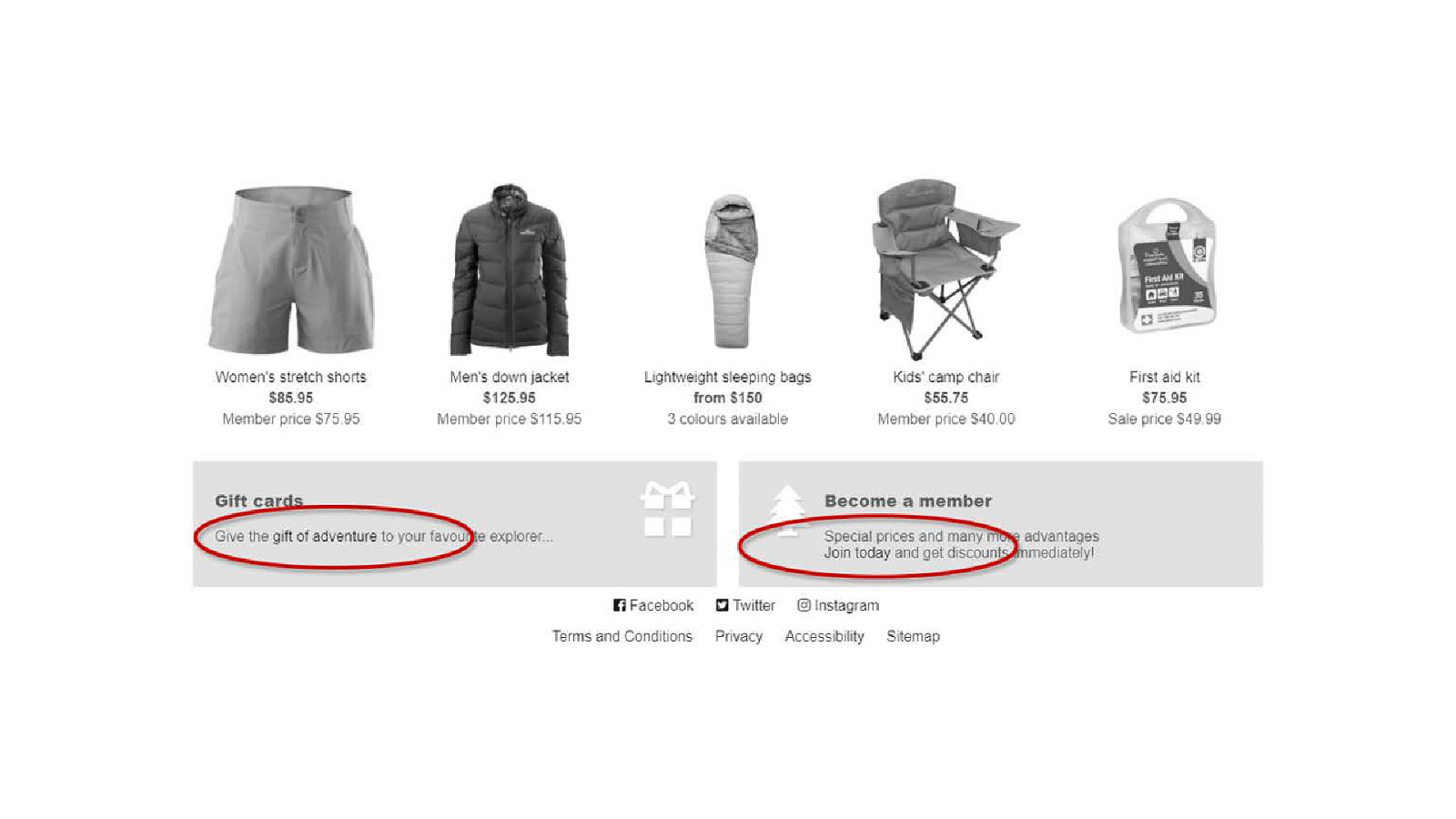
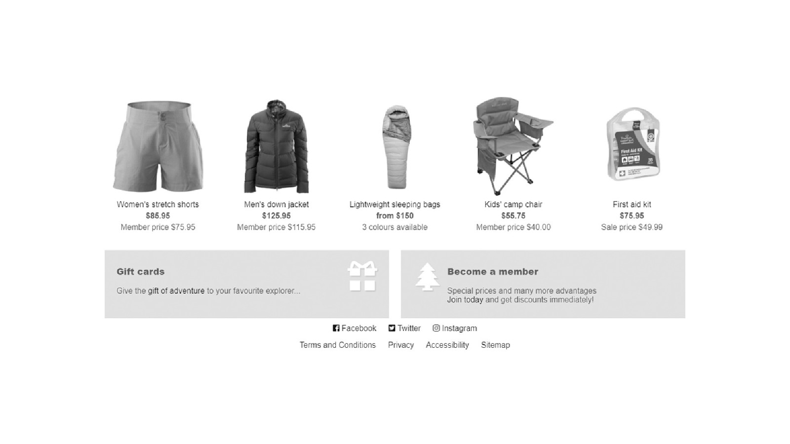
The links have no underlines so they look the same as plain text.
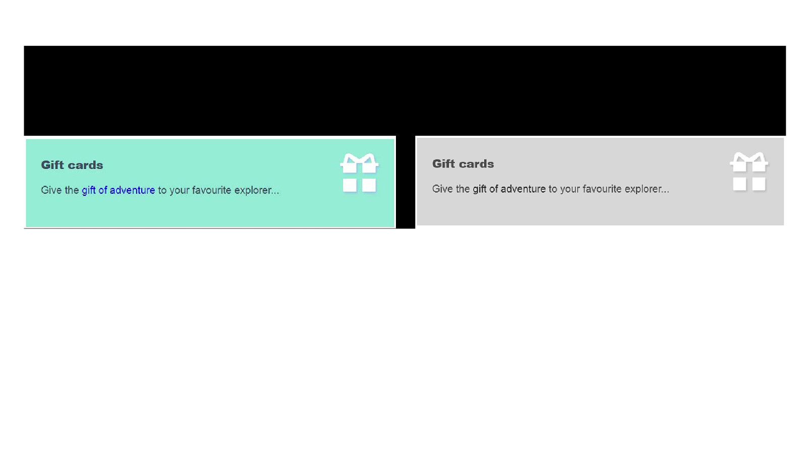
The same paragraph in colour and greyscale - the link can only be seen in the colour version.
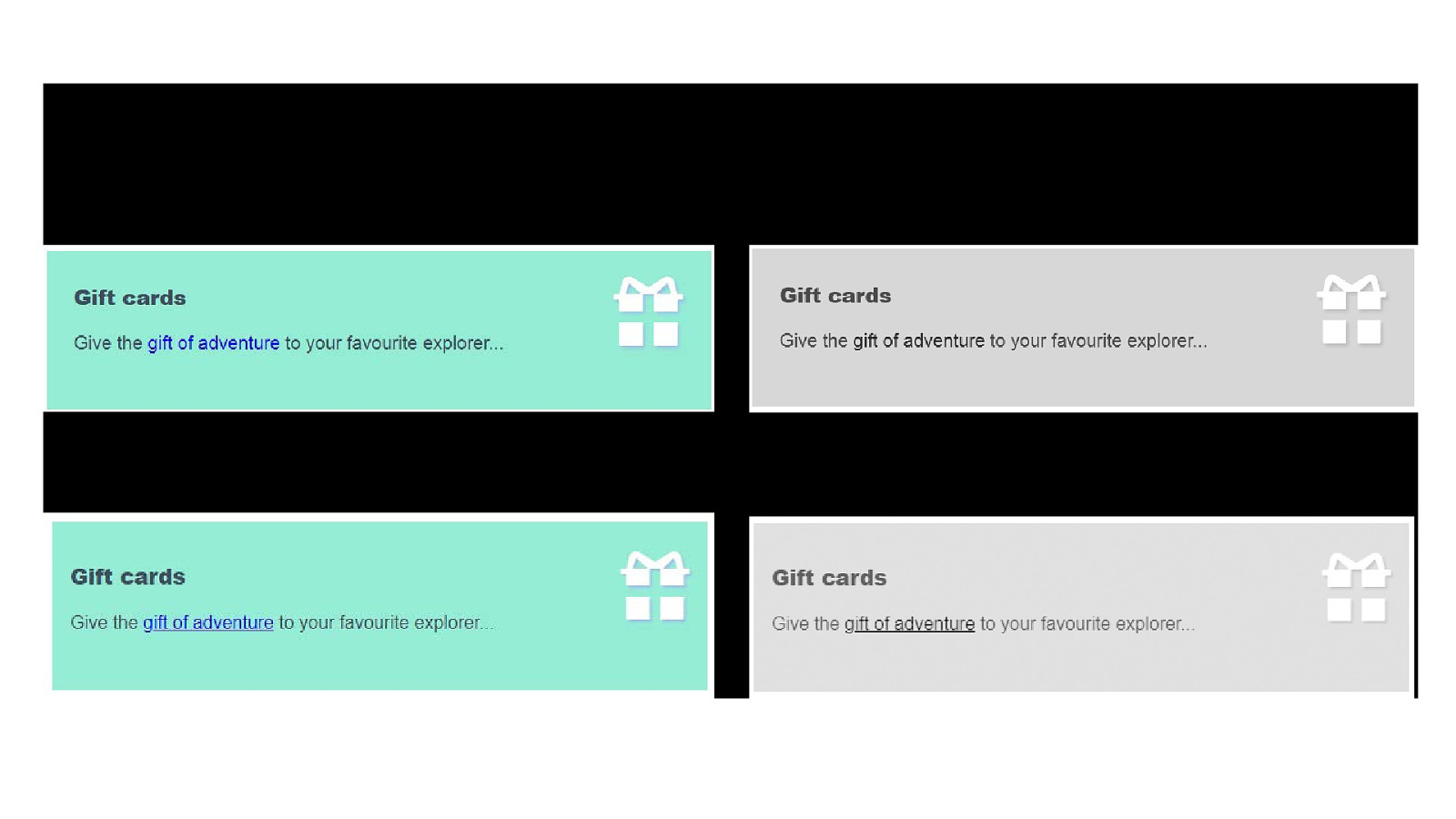
The same paragraph in colour and greyscale but now the link is underlined and can be seen in both versions.
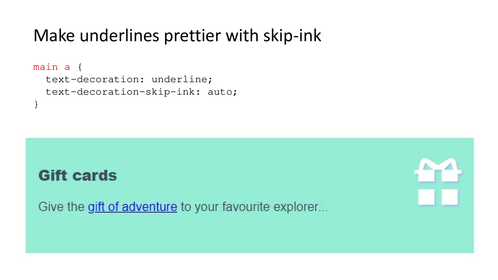
main a { text-decoration: underline; text-decoration-skip-ink: auto; }

User opens PC Settings, selects Ease of Access, then High contrast. User then switches from default theme to High Contrast 1 theme. The screen changes from a multi-coloured interface to a black background with yellow text.
The site is now entirely black with yellow text and blue links. The logo, icons and product images are shown but the background images and colours are missing.
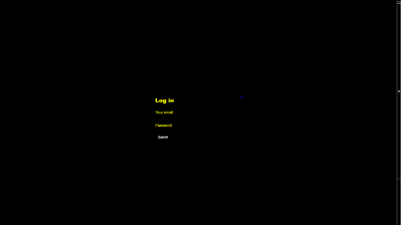
The modal has turned the whole screen black except for 4 lines of text.
The modal uses colour to dim most of the site and show a small modal with a form to enter username and password, a submit button and a close button.
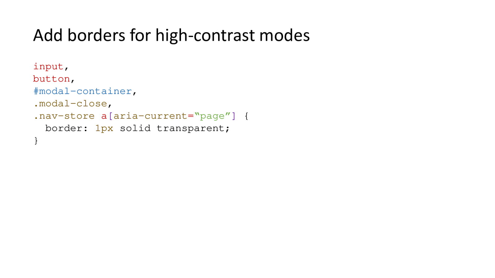
input, button, #modal-container, .modal-close, .nav-store a[aria-current="page"] { border: 1px solid transparent; }
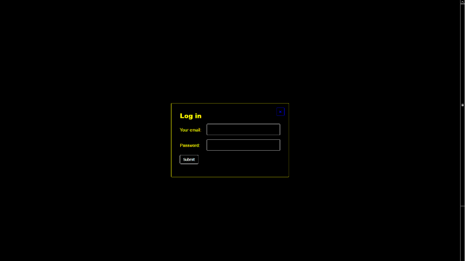
The screen is mostly black still, but the modal, form inputs and buttons have yellow borders which make them easy to see.
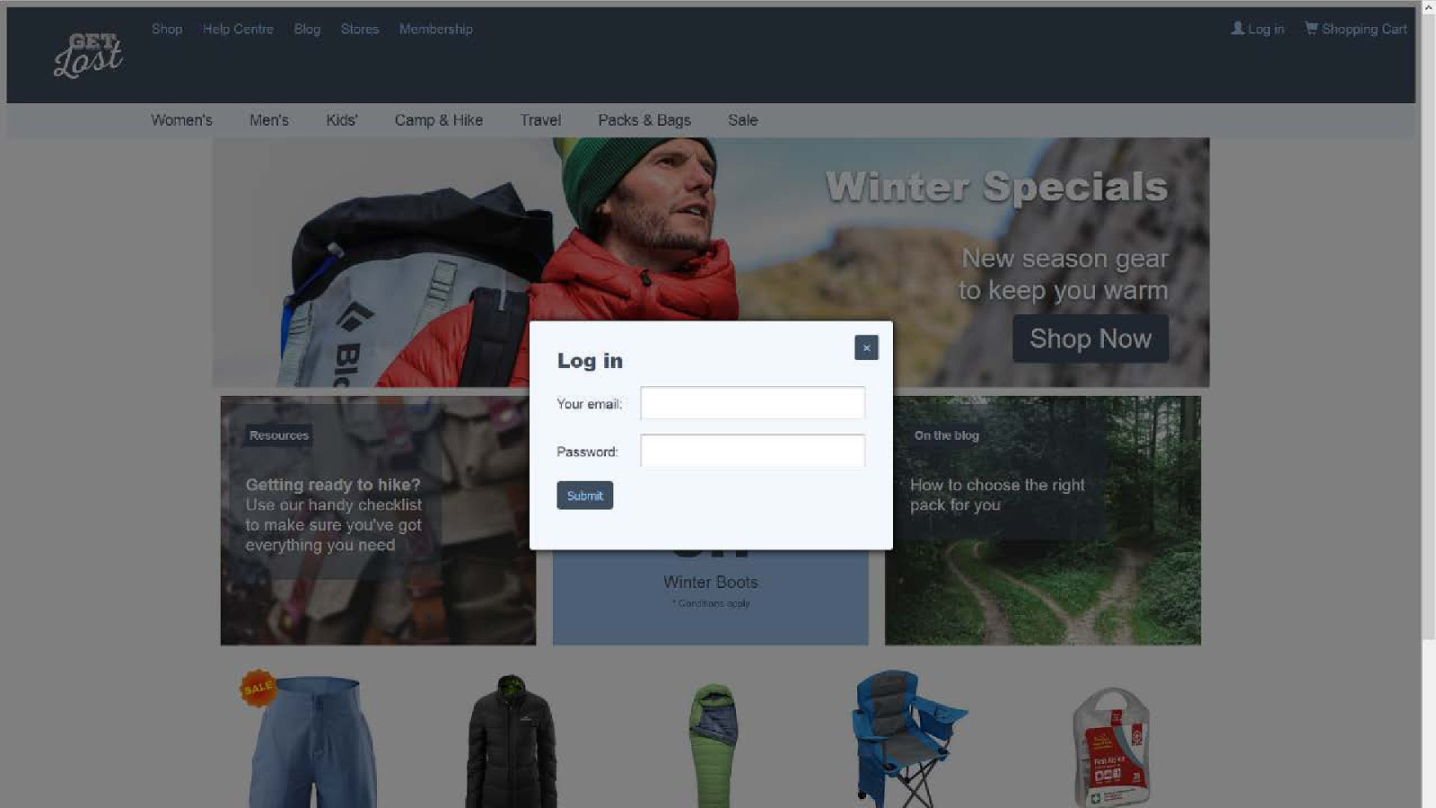
It looks very similar to the original site.
Notes and demo: www.juliegrundy.id.au/links/low-vis/notes.html