Building Accessible Components, Julie Grundy
Accessibility is measured on a per page basis, but we usually build one component or chunk at a time. 1

A presentation at A11y Camp 2018 in October 2018 in Melbourne VIC, Australia by Julie Grundy
Accessibility is measured on a per page basis, but we usually build one component or chunk at a time. 1

To demonstrate my process, I’ve built a datepicker component. Newer developers can use my process as a guide to creating their own; more experienced devs might be interested to see what features go into making an accessible datepicker. 2
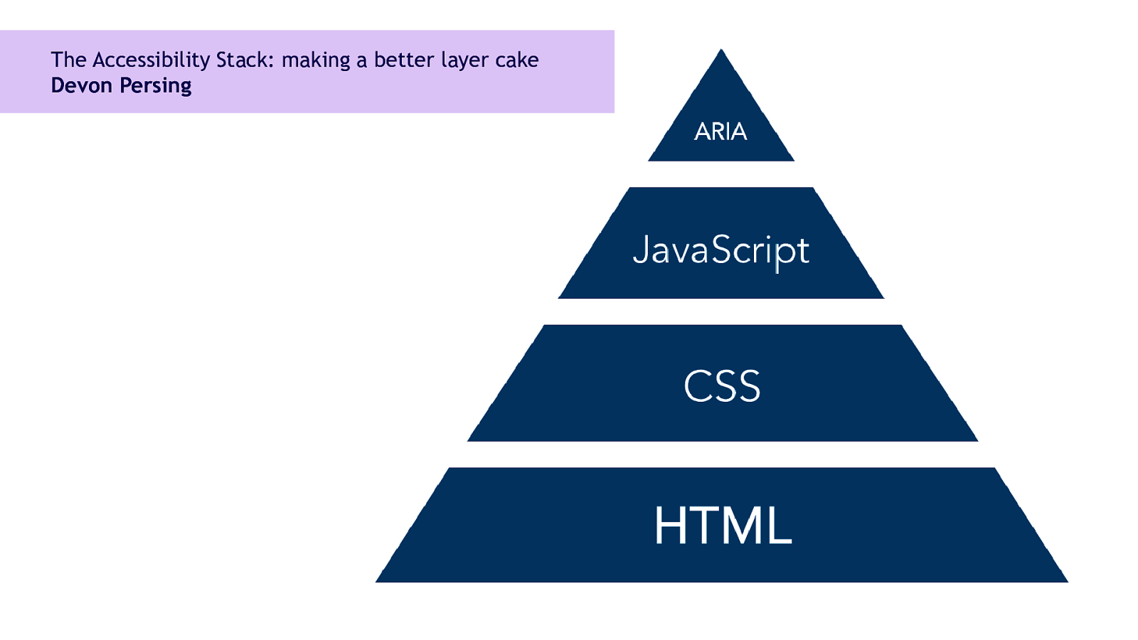
Making a better layer cake Devon Persing My process is based on what my friend Devon Person calls the Accessibility Stack. It’s all the technologies we use for accessibility (HTML, JavaScript, CSS and ARIA) sized by how robust they are. 3
Build your base HTML layer 5
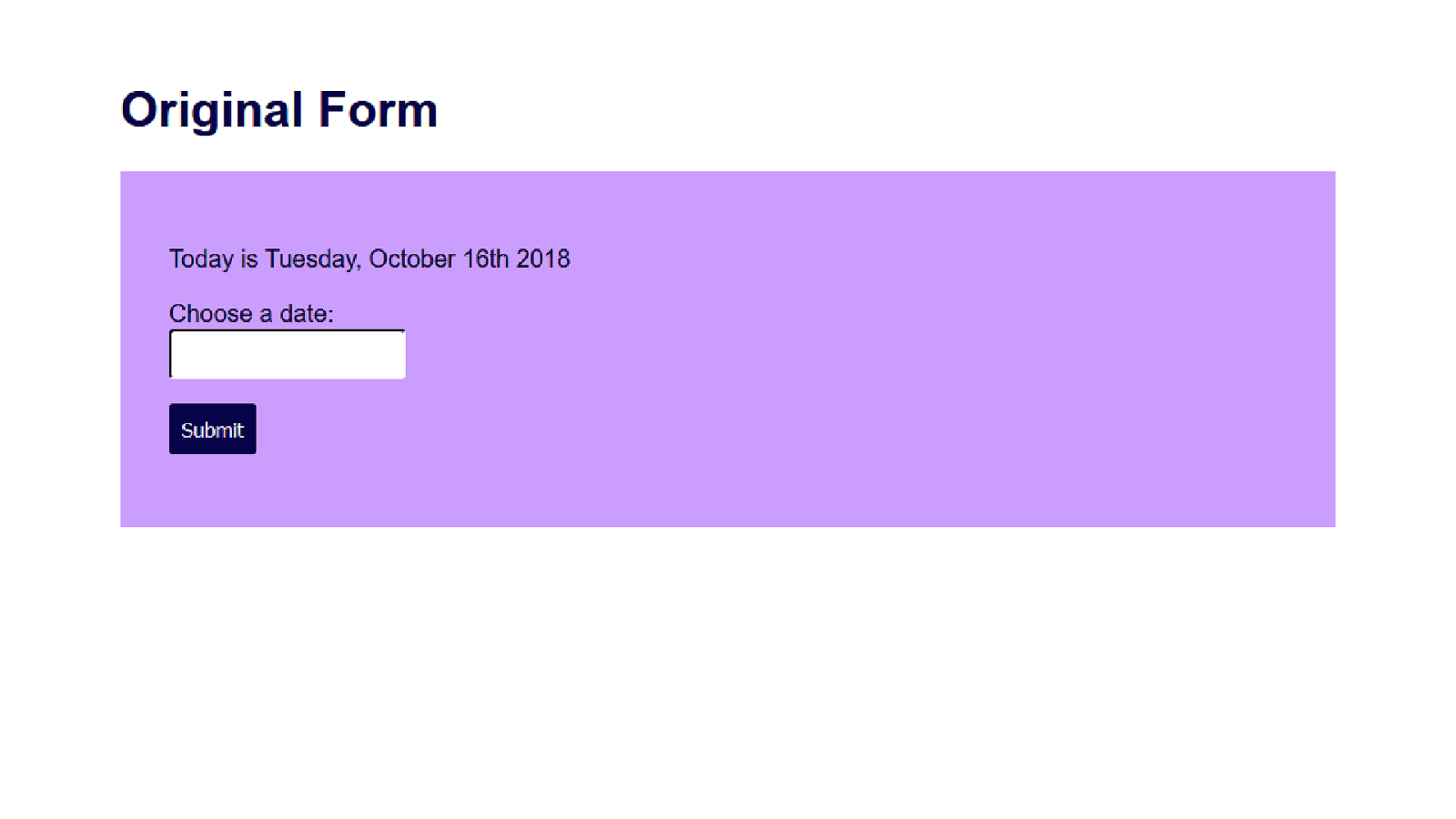
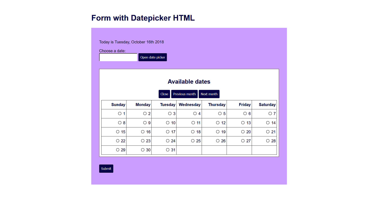
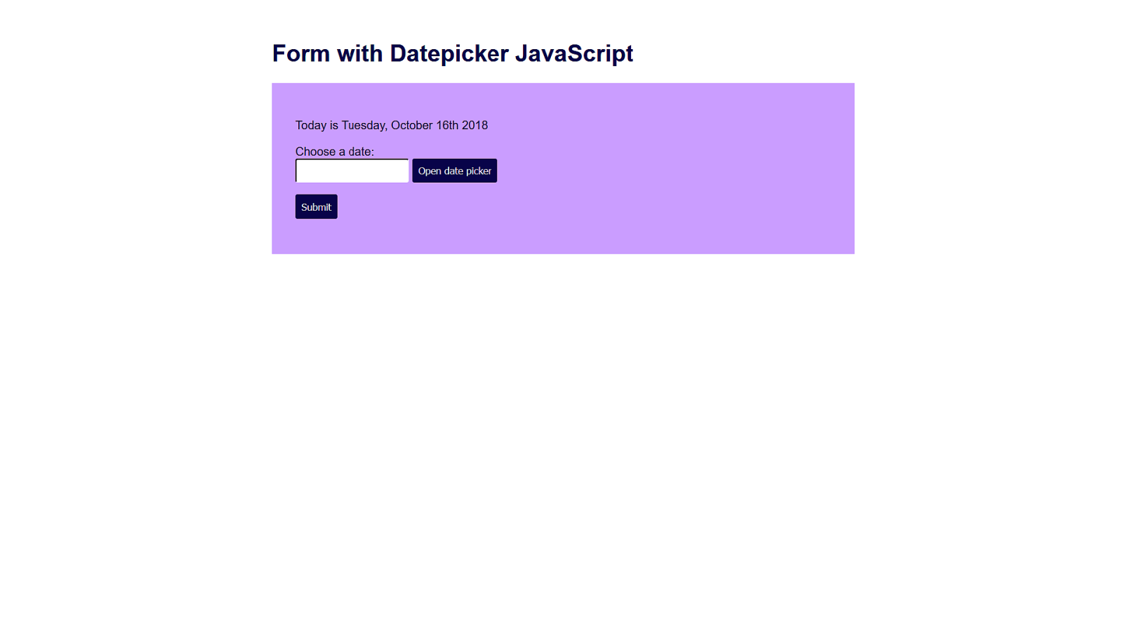
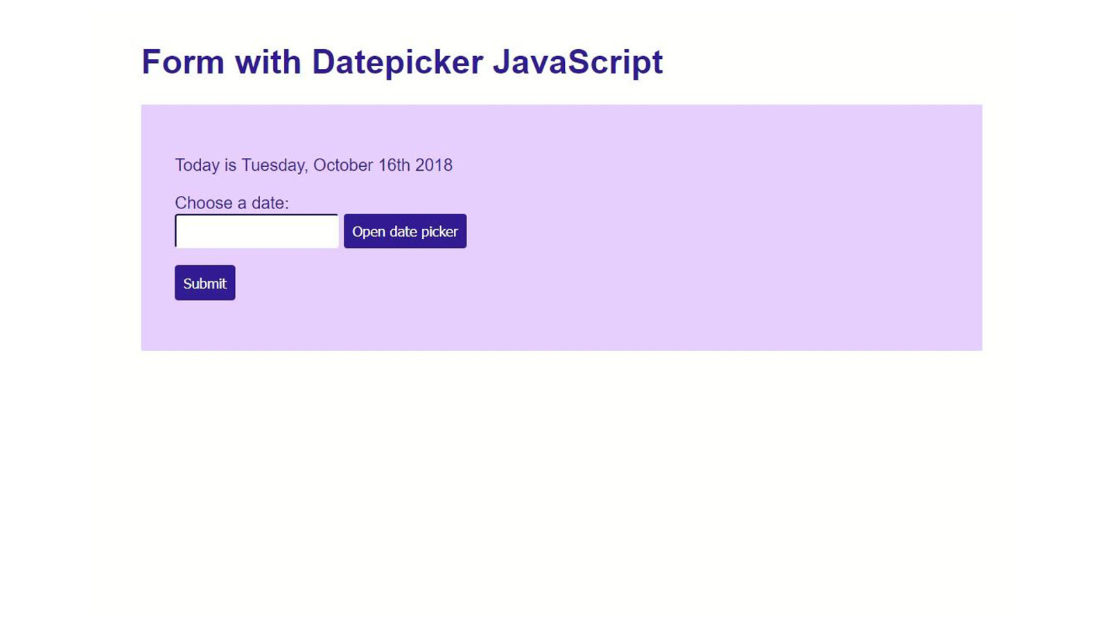
This is my original form. It tells you today’s date, then asks you to choose one of your own using the text input. I’m using a library called moment.js which make the JavaScript date object easier to work with. 6
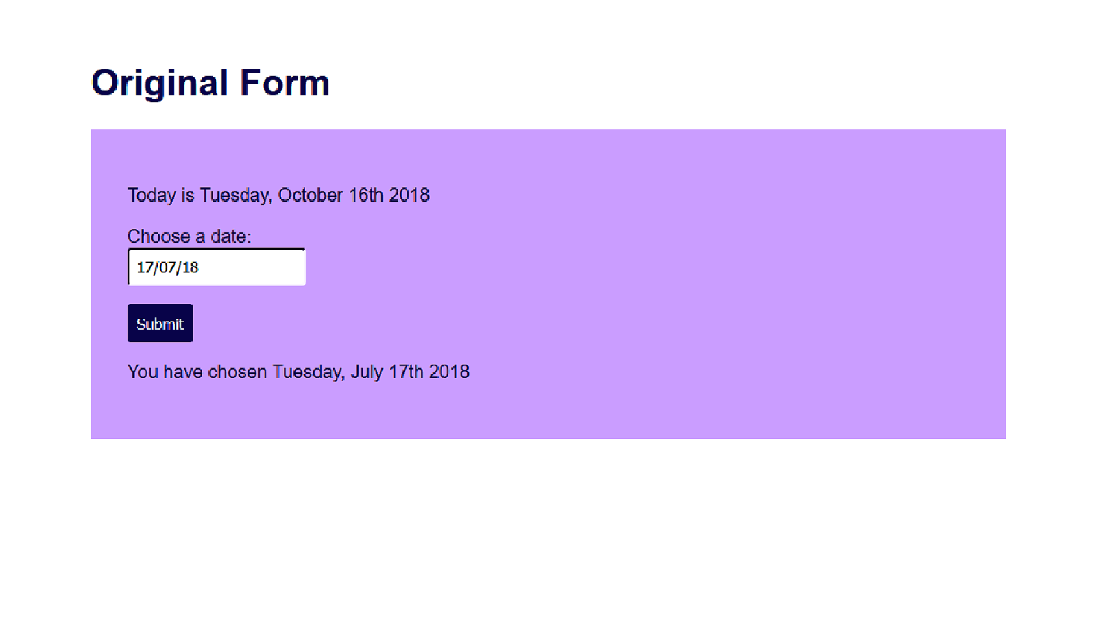
When you type in a date and click the Submit button, the form confirms which date you’ve chosen. 7
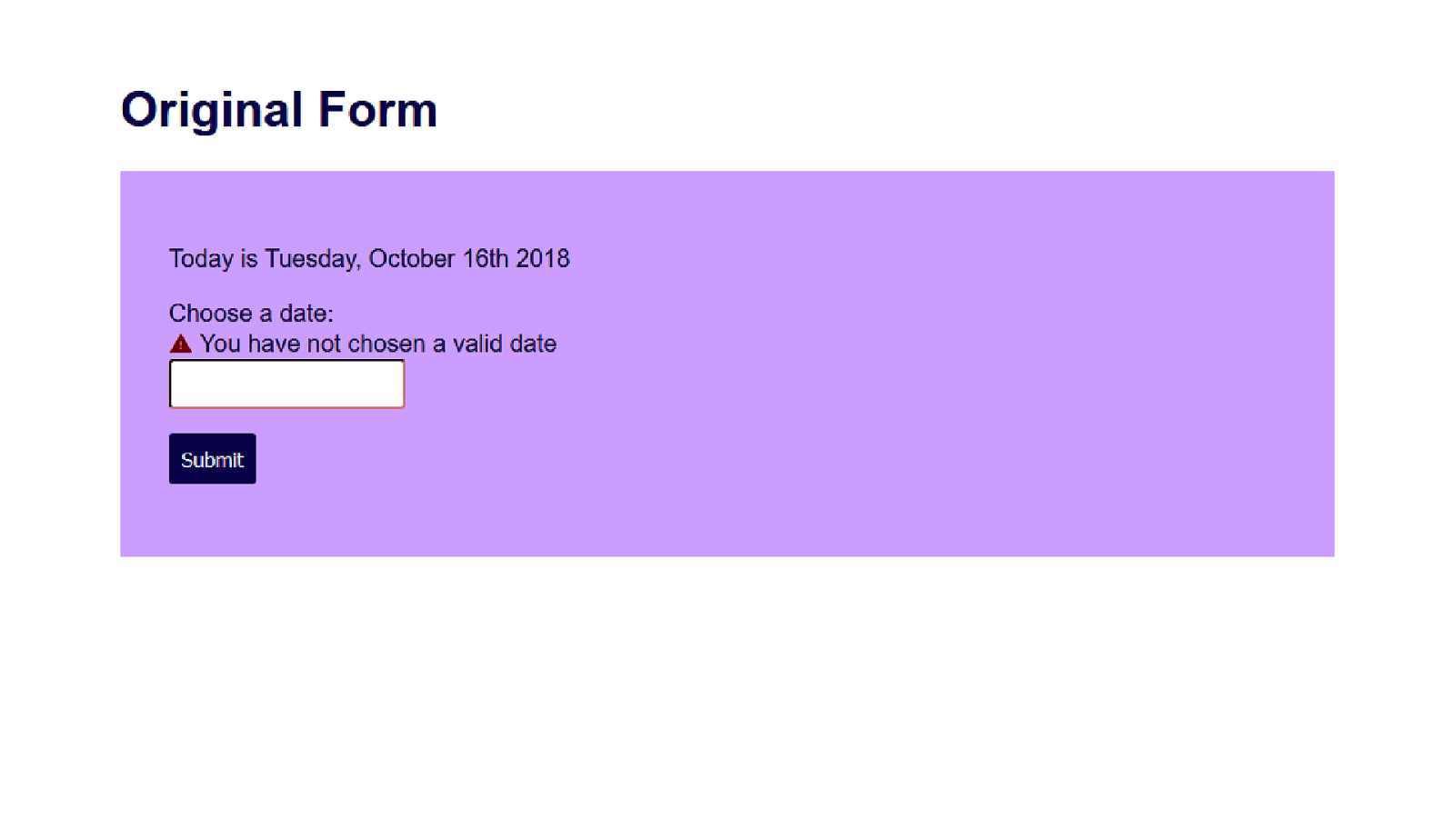
And if you don’t have a valid date, when you click Submit you get an accessible error message, very similar to what Russ just showed us. 8
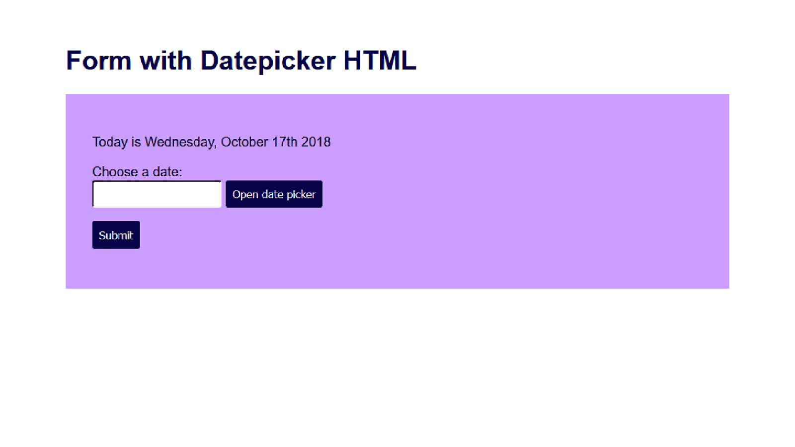
I’m going to add a button for my datepicker now. I’m not going to override the text input, because for many people it’s easier to type in numbers the way they think of them and let the computer handle the formatting and validation. The work of figuring out what is an okay date format should be our problem, not the user’s problem. 9
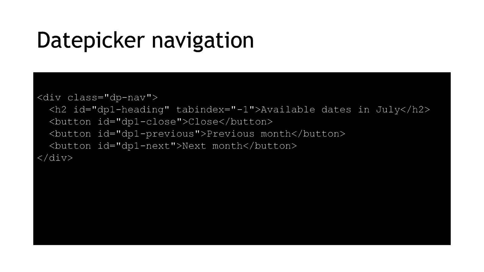
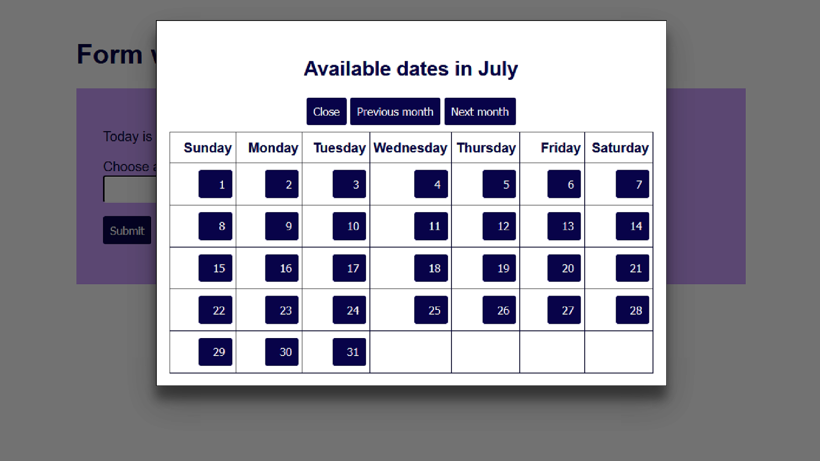
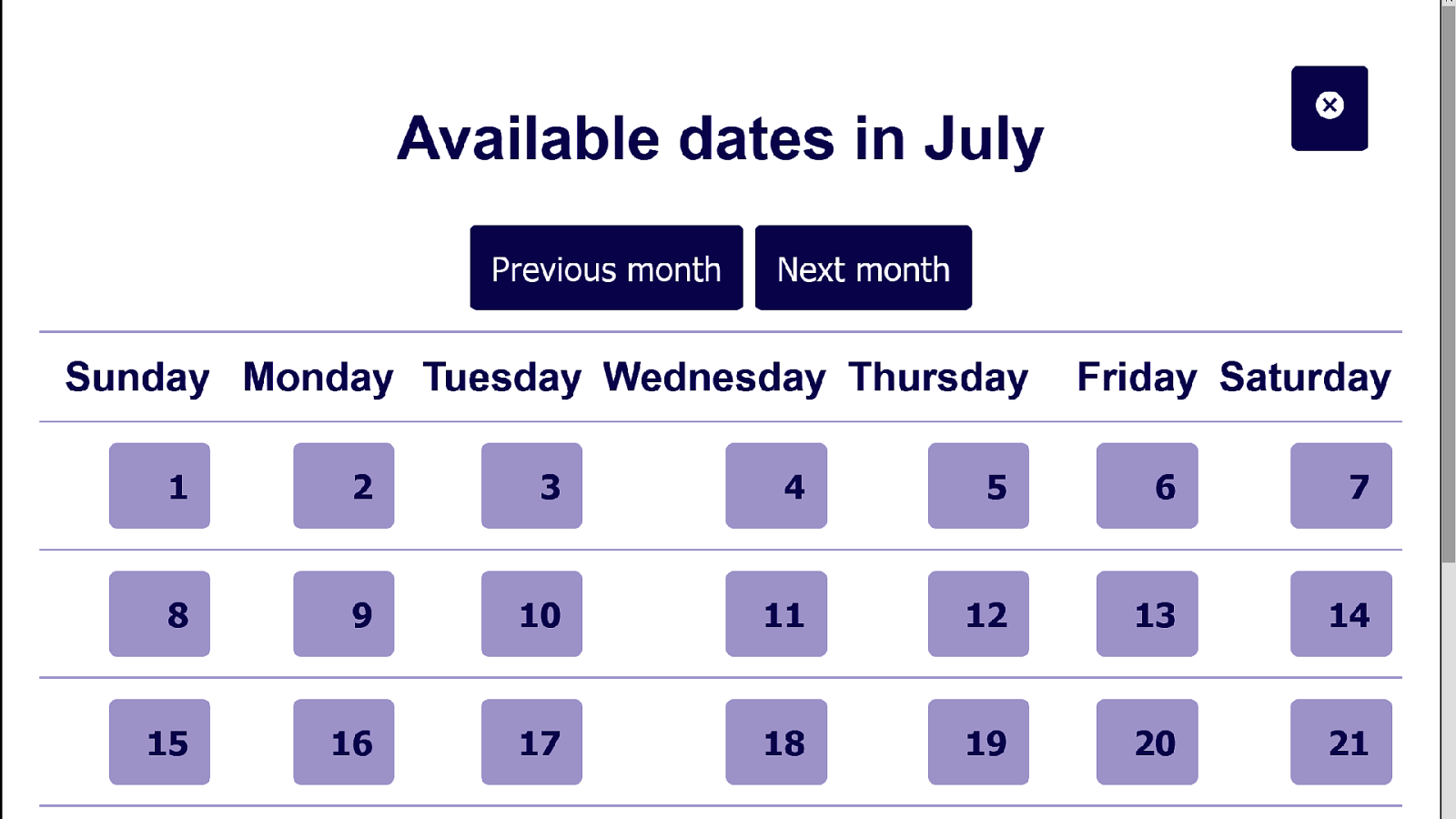
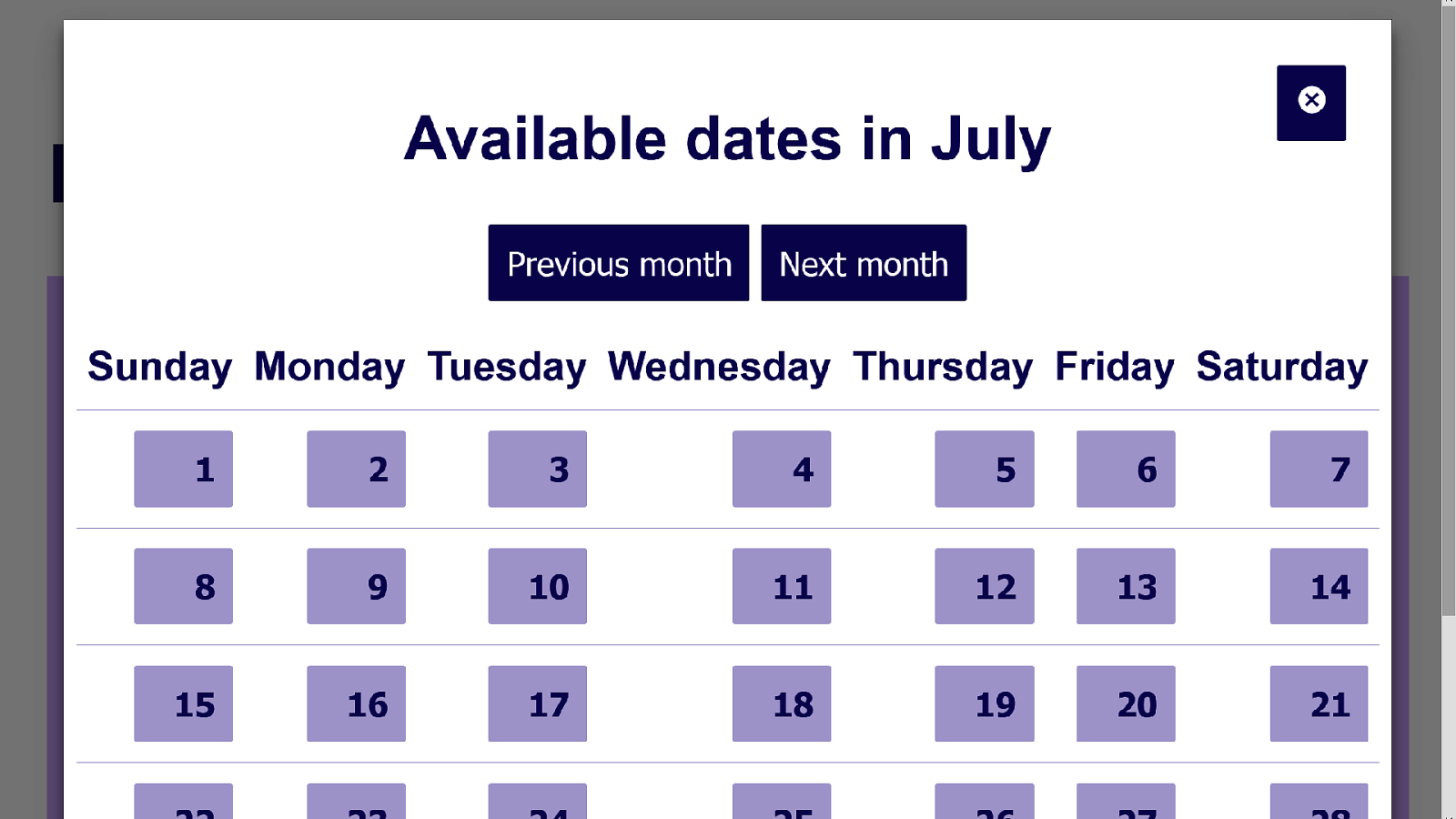
So let’s build us a base layer of HTML. This will be the datepicker navigation – a heading with 3 buttons. I’m giving the buttons long names as it’s more accessible than just “prev” or “next” or just some arrows with no alt content.
<div class=”dp-nav”> <h2 id=”dp1-heading” tabindex=”-1”>Available dates in July</h2> <button id=”dp1-close”>Close</button> <button id=”dp1-previous”>Previous month</button> <button id=”dp1-next”>Next month</button> </div>10
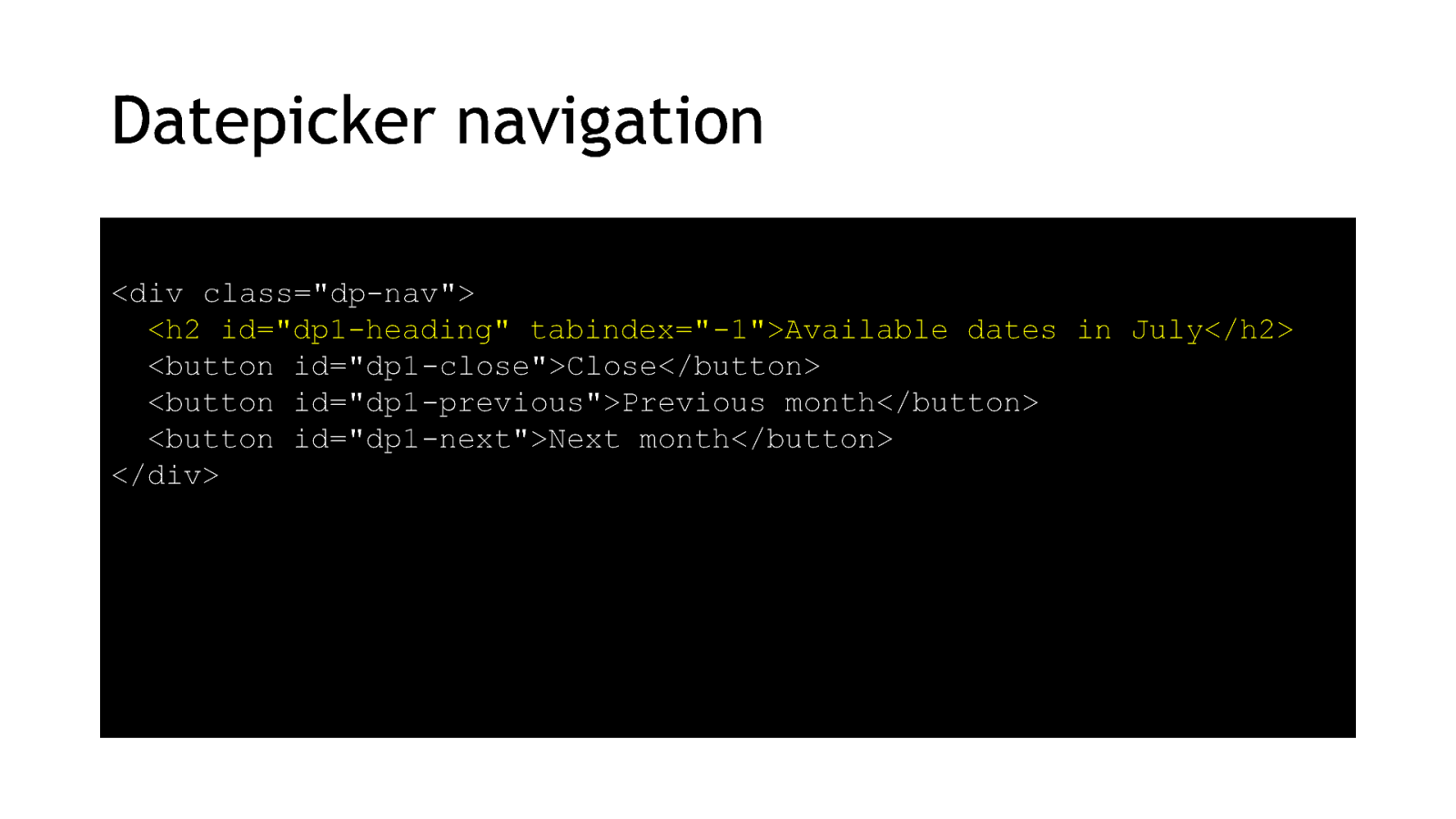
Notice that I’ve given the heading a negative tabindex. That’s so I can use my JavaScript later on to send focus to the heading. 11
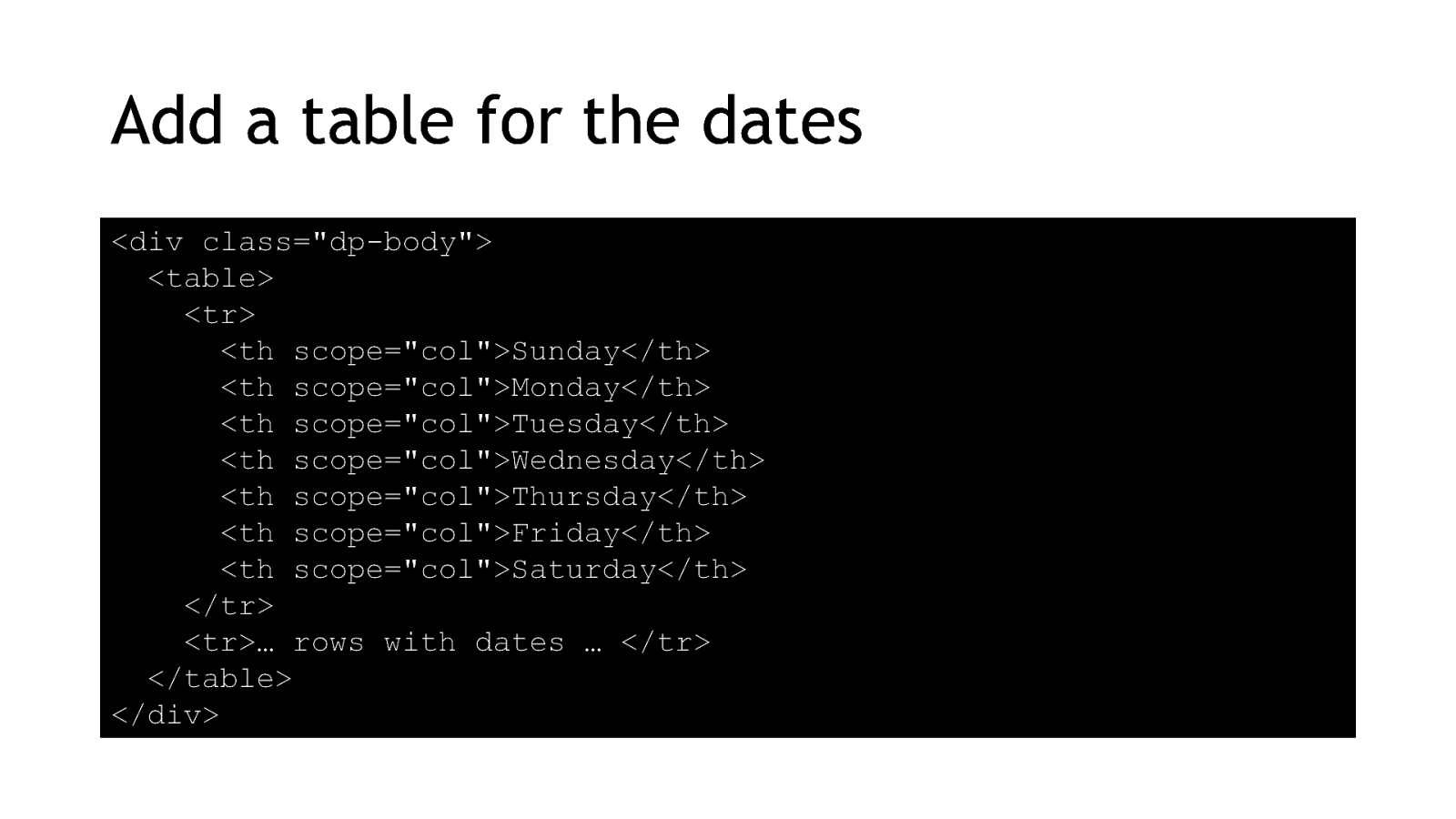
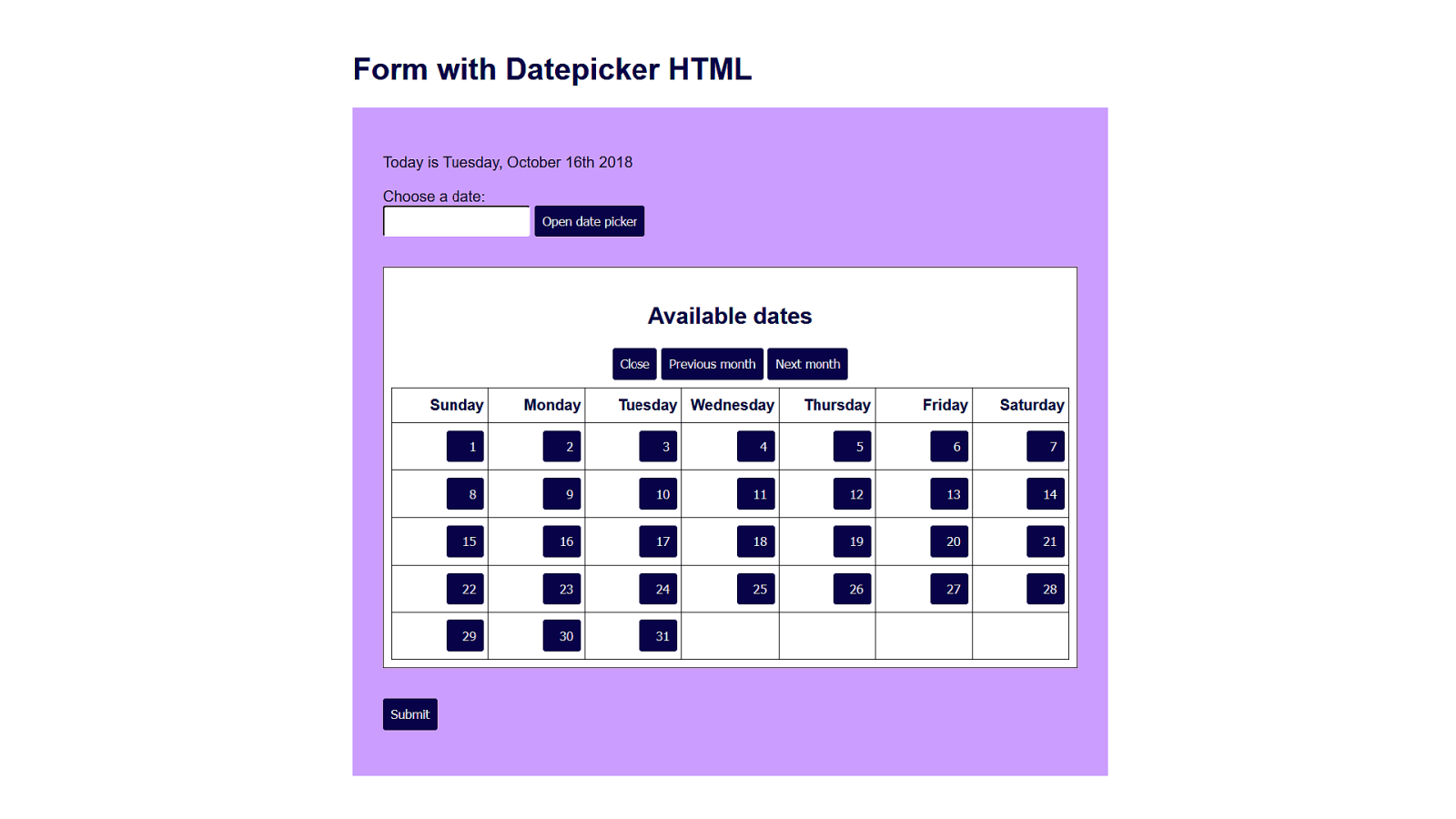
I’ve chosen to use a table to lay out the dates. You could use a list, but it can only be navigated in a linear way. Screenreader software has shortcuts for users to move around tables more easily.
<div class=”dp-body”> <table> <tr> <th scope=”col”>Sunday</th> <th scope=”col”>Monday</th> <th scope=”col”>Tuesday</th> <th scope=”col”>Wednesday</th> <th scope=”col”>Thursday</th> <th scope=”col”>Friday</th> <th scope=”col”>Saturday</th> </tr> <tr>… rows with dates … </tr> </table> </div> 12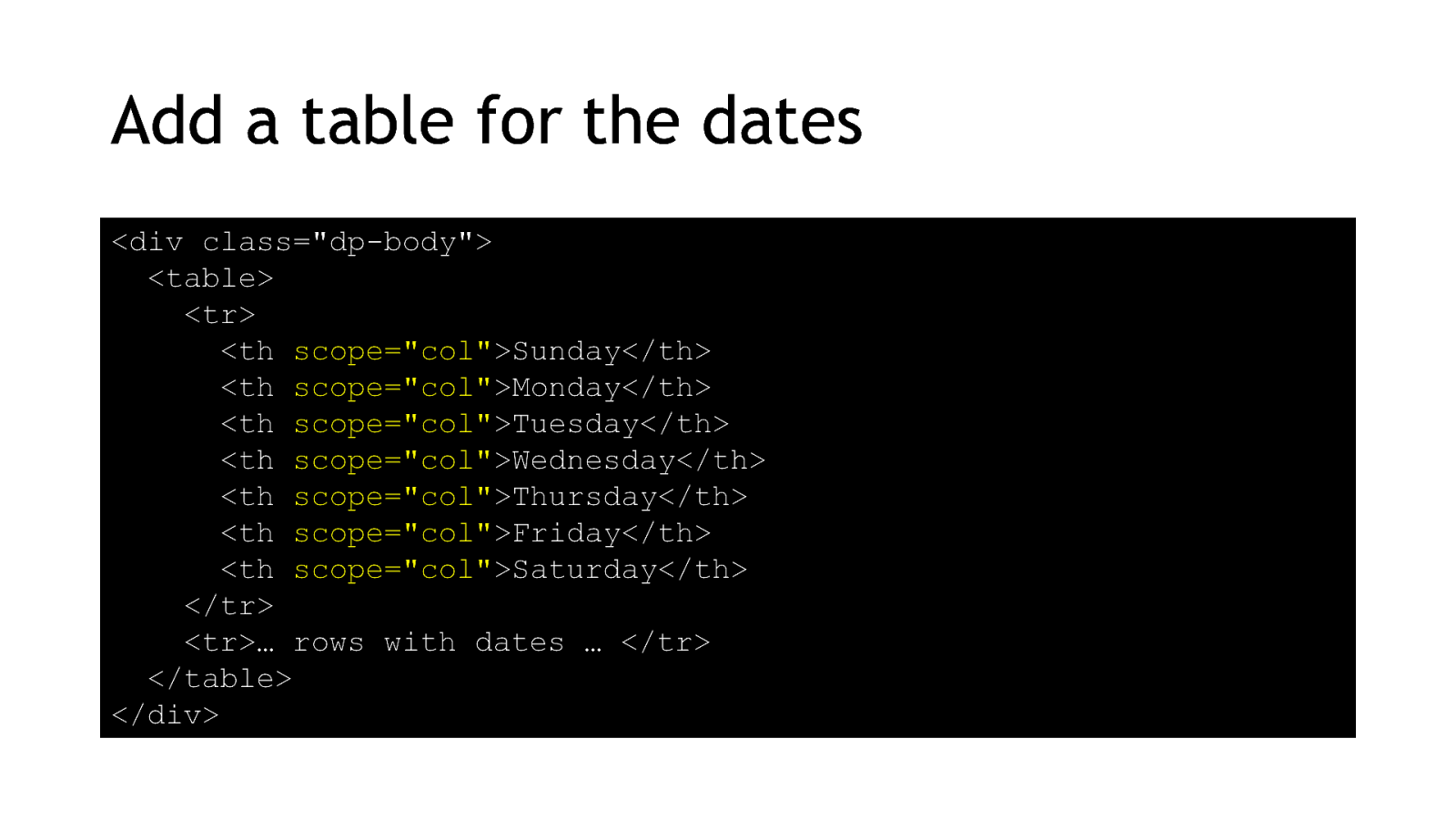
And adding the scope attribute makes it easier for screen reader users to understand which column they’re in by associating the header cells to the rest of the cells. 13
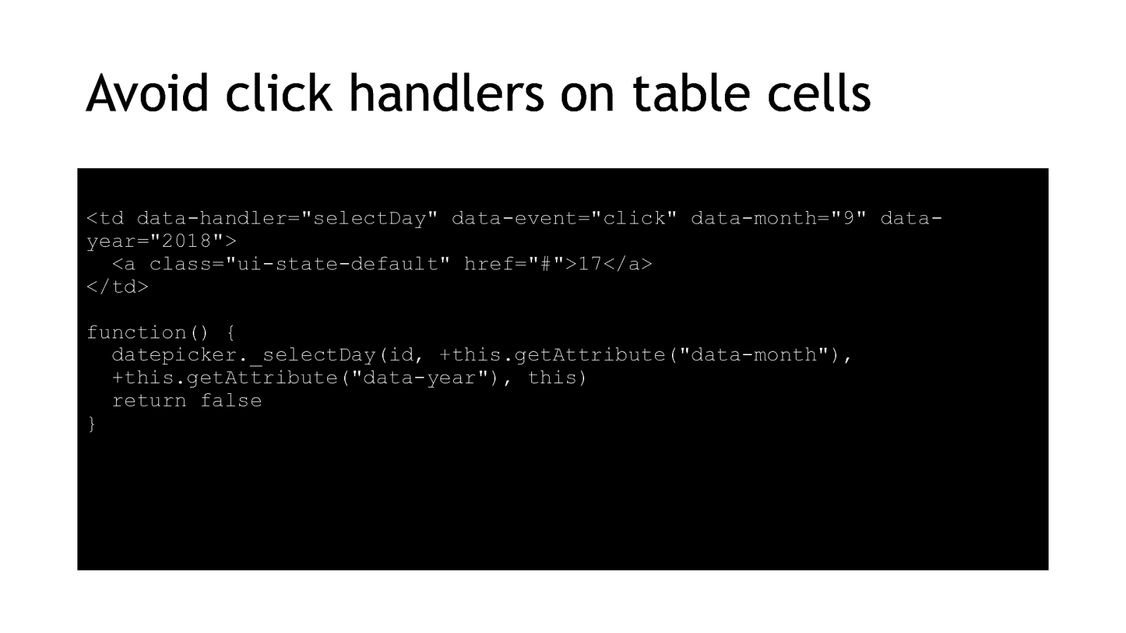
The problem with tables for layout is that a lot of developers are then tempted to add click events to the cells. You’ll see this kind of code in a lot of the big-name datepicker plugins. The problem is that this function only responds to mouse clicks.
<td data-handler=”selectDay” data-event=”click” data-month=”9” datayear=”2018”> <a class=”ui-state-default” href=”#”>17</a> </td> function() { datepicker._selectDay(id, +this.getAttribute(“data-month”), +this.getAttribute(“data-year”), this) return false } 14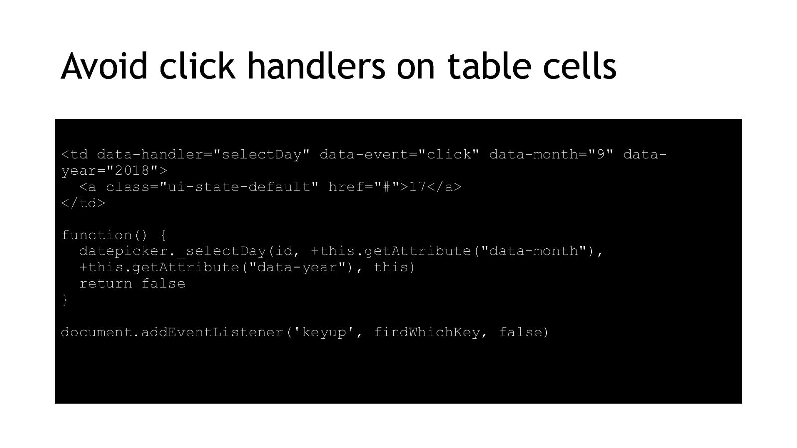
So we have to add some keyboard listeners
document.addEventListener(‘keyup’, findWhichKey, false) 15
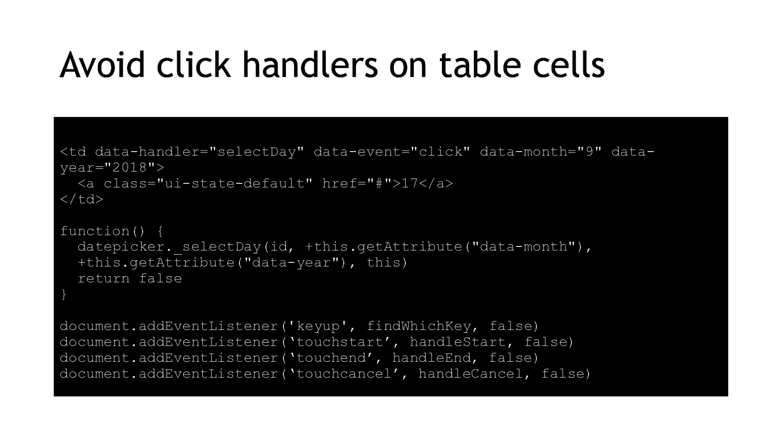
And some touch listeners. And there’s a Voice API in the early stages so we’ll probably have to start adding listeners for listening events soon too. document.addEventListener(‘touchstart’, handleStart, false) document.addEventListener(‘touchend’, handleEnd, false) document.addEventListener(‘touchcancel’, handleCancel, false) 16
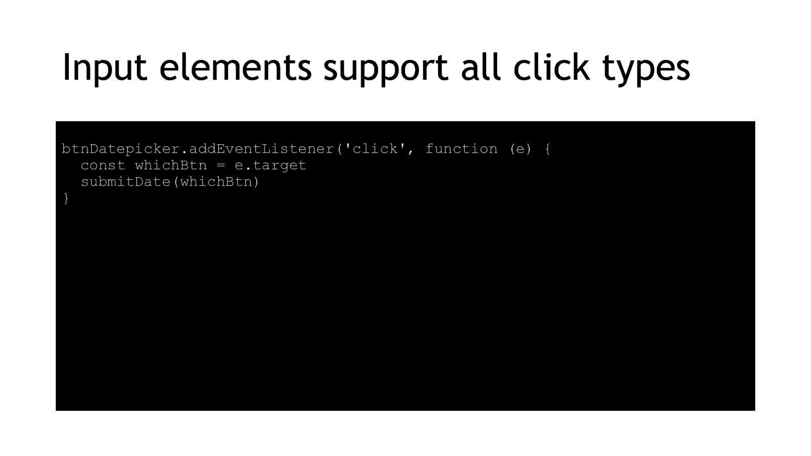
It’s much easier to use form inputs. All form inputs take focus and click events from any type of input device, so one listener works for all devices.
btnDatepicker.addEventListener(‘click’, function (e) { const whichBtn = e.target submitDate(whichBtn) } 17
When it comes to form inputs in a datepicker, you could use radio buttons if you only want users to choose a single day 18

Or checkbox inputs if you want them to choose a bunch of days. 19
In my demo I’ve used buttons because they’re more flexible and can be used for more than one type of datepicker. 20
Make it interactive with JavaScript 21
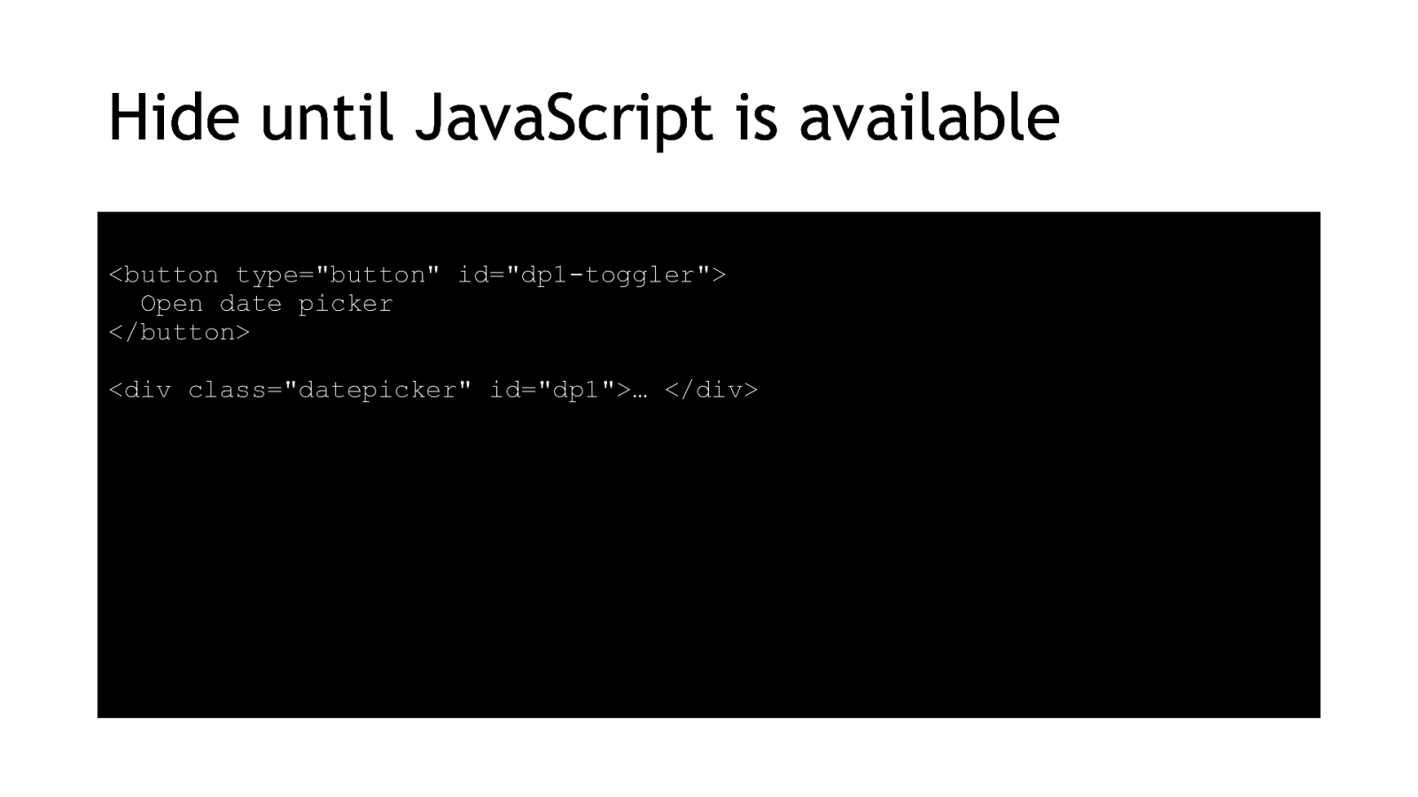
We don’t want people trying to use a datepicker unless they’ve got JavaScript available. So we’re going to hide the toggle button in the HTML. Using a class with display none on it, so the HTML is removed from the DOM until we ask for it. 22
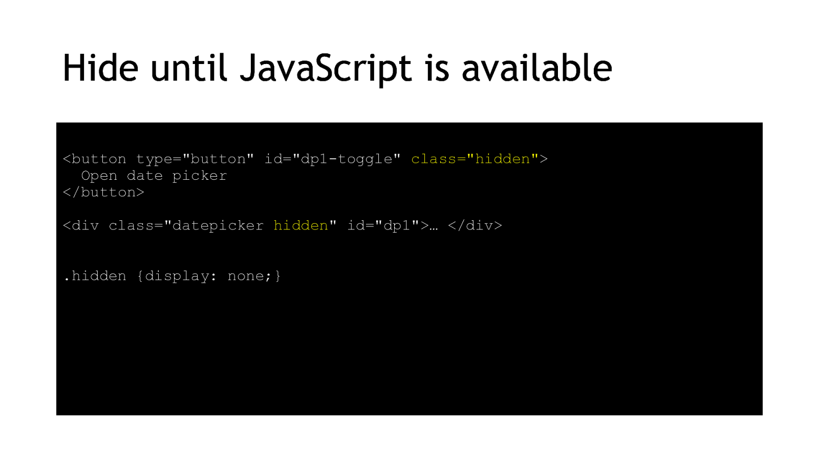
<button type=”button” id=”dp1-toggle” class=”hidden”> Open date picker </button> <div class=”datepicker hidden” id=”dp1”>… </div> .hidden {display: none;} 23
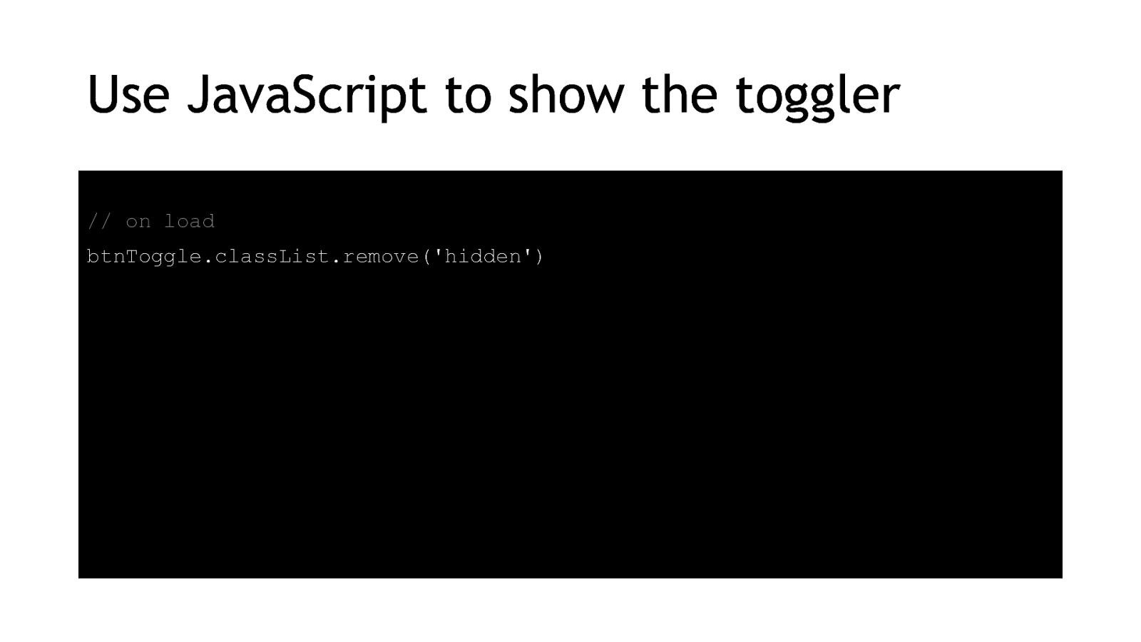
Then when our JavaScript is finished loading, we remove the class. This can be useful for sites which have an offline capability, or if your users are in areas of patchy internet with dropped connections all the time.
// on load btnToggle.classList.remove(‘hidden’) 24
So now we’ve got our button and JavaScript available and the user can choose for themselves whether to use the datepicker or not. 25
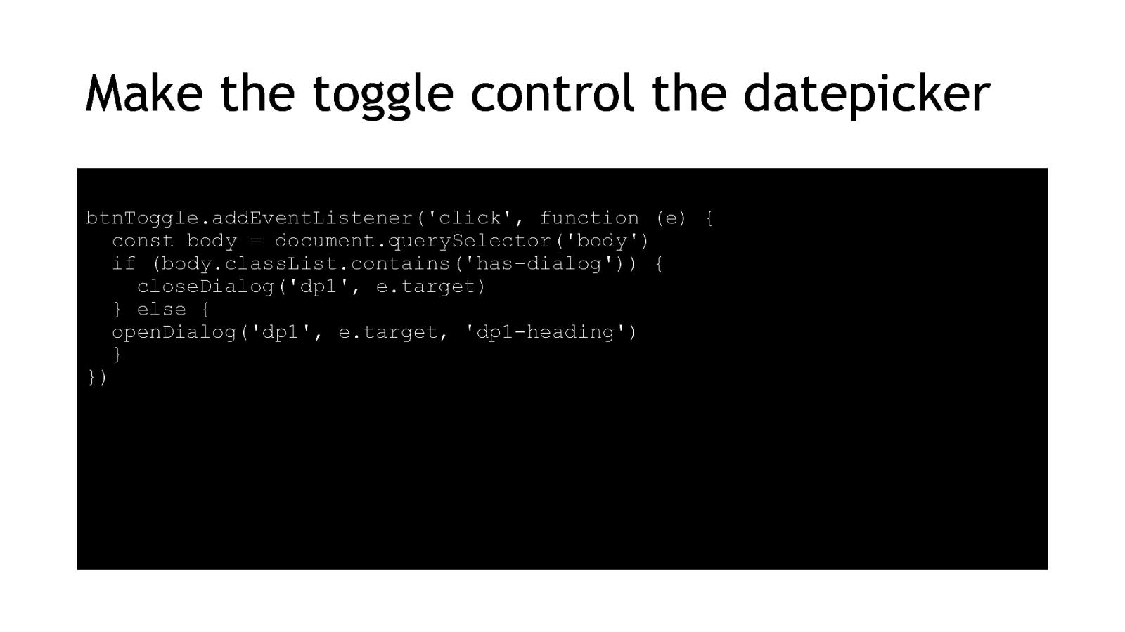
Next we add script to control the opening and closing of the datepicker. I’m using the W3Cs example script for a modal window. It’s opinionated but manages focus reliably.
26
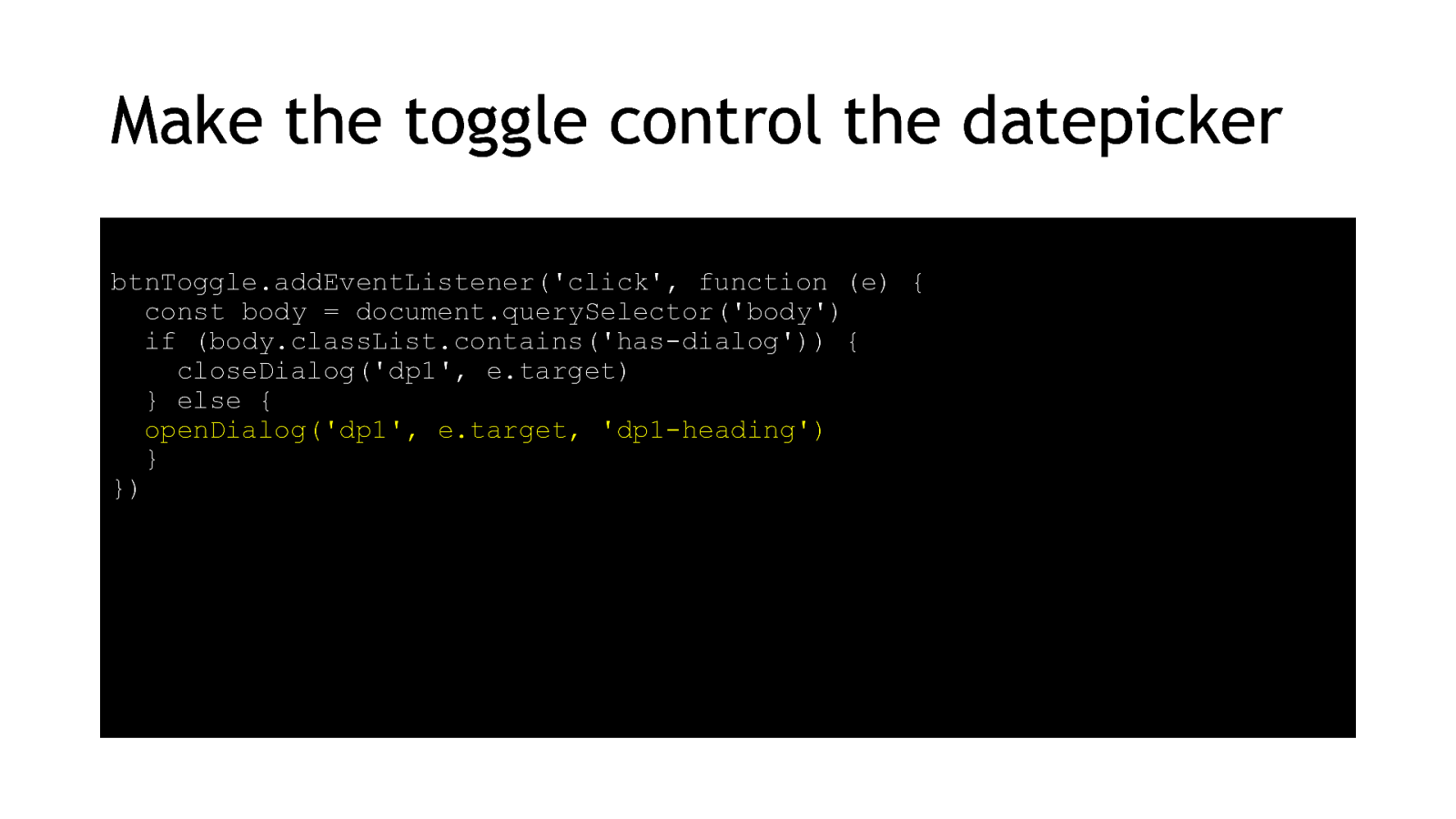
btnToggle.addEventListener(‘click’, function (e) { const body = document.querySelector(‘body’) if (body.classList.contains(‘has-dialog’)) { closeDialog(‘dp1’, e.target) } else { openDialog(‘dp1’, e.target, ‘dp1-heading’) } }) 27
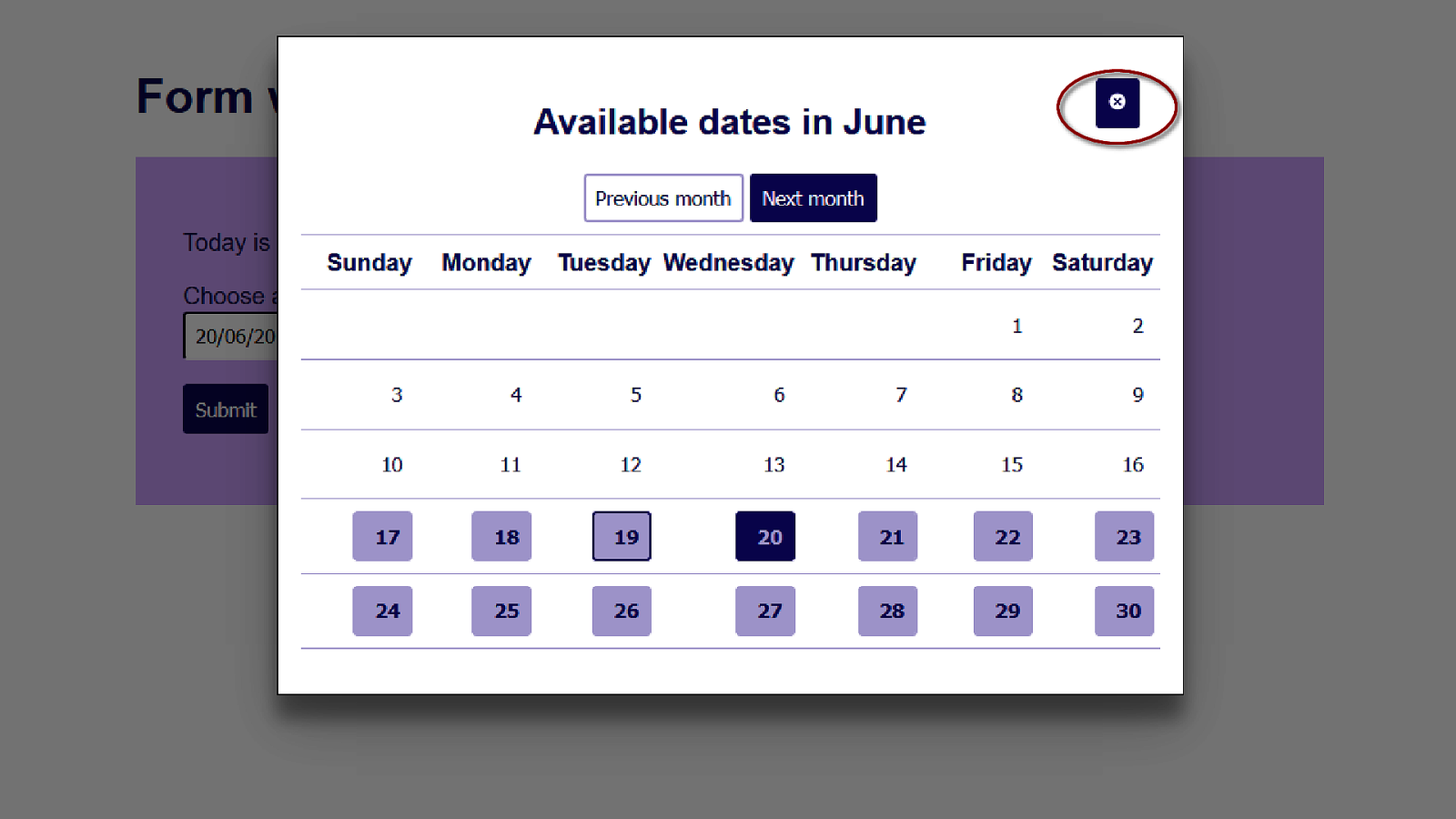
So here’s our datepicker in a modal window. We have a Close button already, so I’ve added a function for that. 28
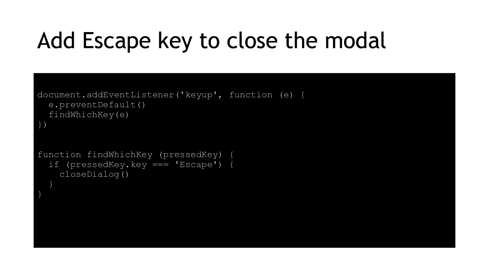
But we also want to make sure people have an alternative, and the Escape key is the usual method for getting out of somewhere you don’t want to be. document.addEventListener(‘keyup’, function (e) { e.preventDefault() findWhichKey(e) }) function findWhichKey (pressedKey) { if (pressedKey.key === ‘Escape’) { closeDialog() } } 29
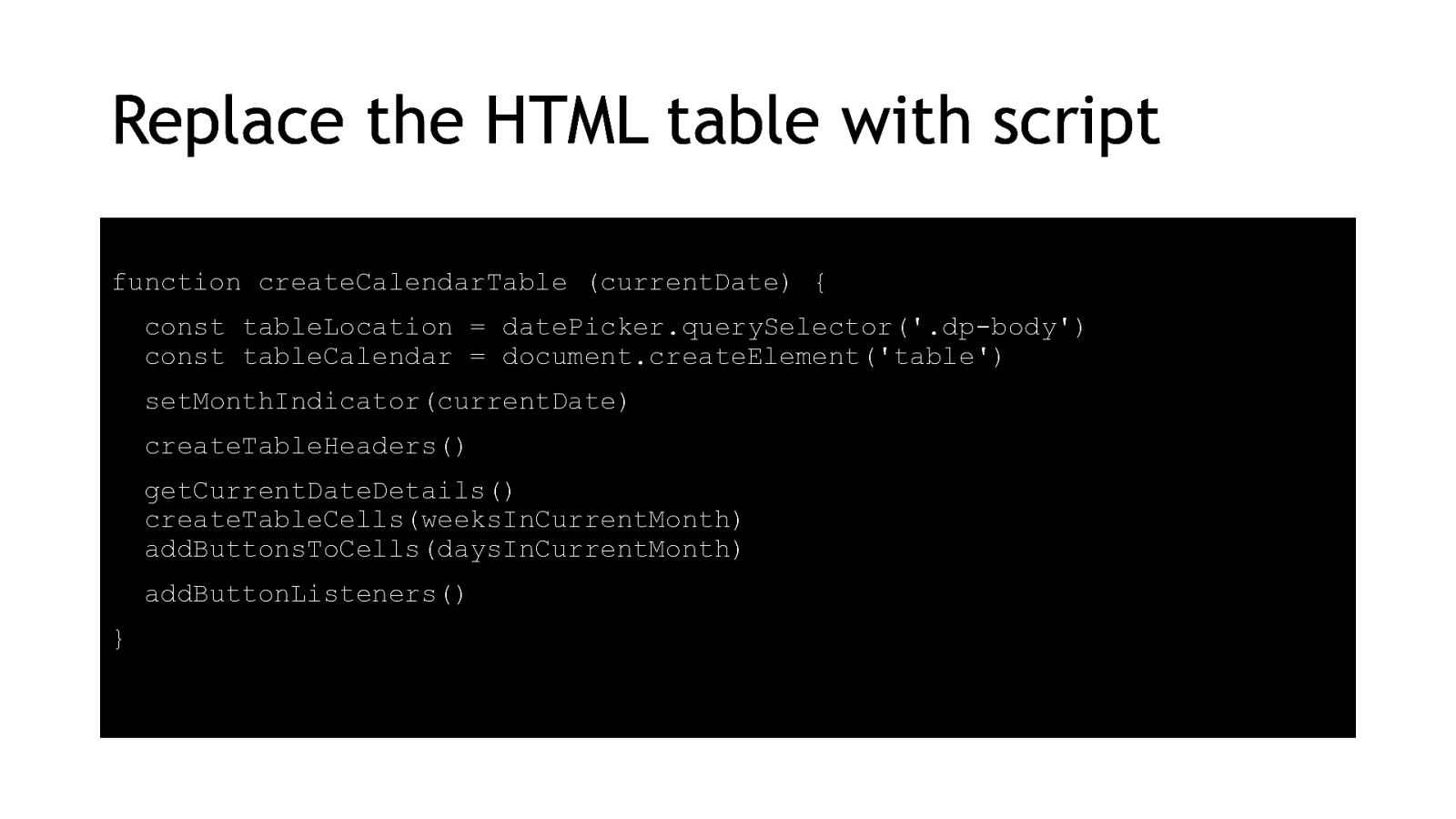
I’m going to replace my static table and buttons with a dynamic version, because I don’t want to have to maintain a zillion tables for every possible month someone might need.
createCalendarTable (currentDate) { const tableLocation = datePicker.querySelector(‘.dp-body’) const tableCalendar = document.createElement(‘table’) setMonthIndicator(currentDate) createTableHeaders() getCurrentDateDetails() createTableCells(weeksInCurrentMonth) addButtonsToCells(daysInCurrentMonth) addButtonListeners() }
30
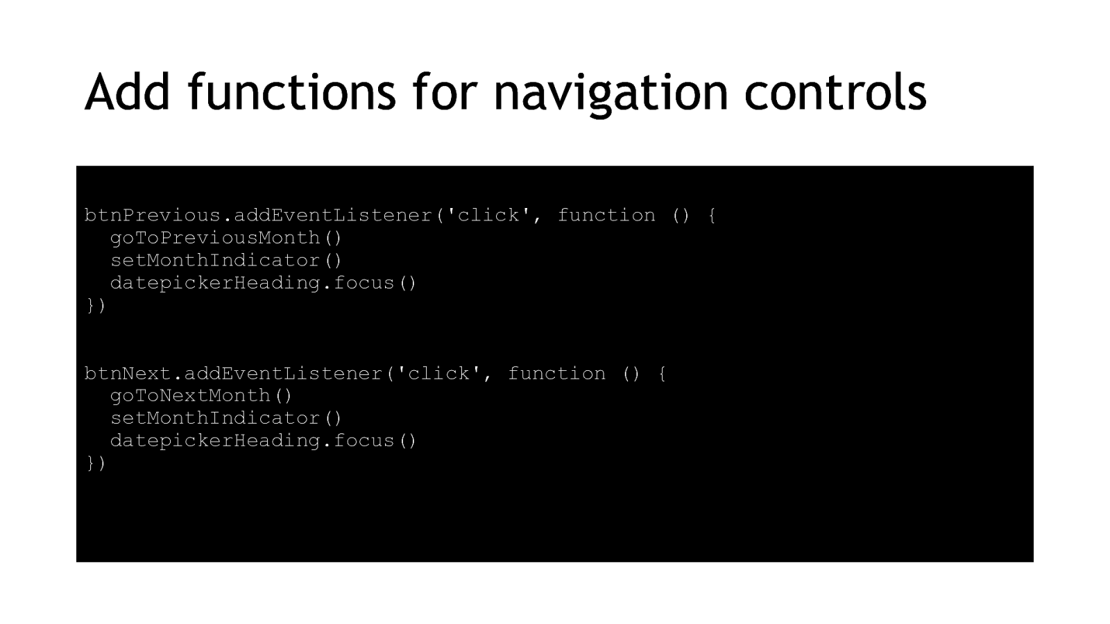
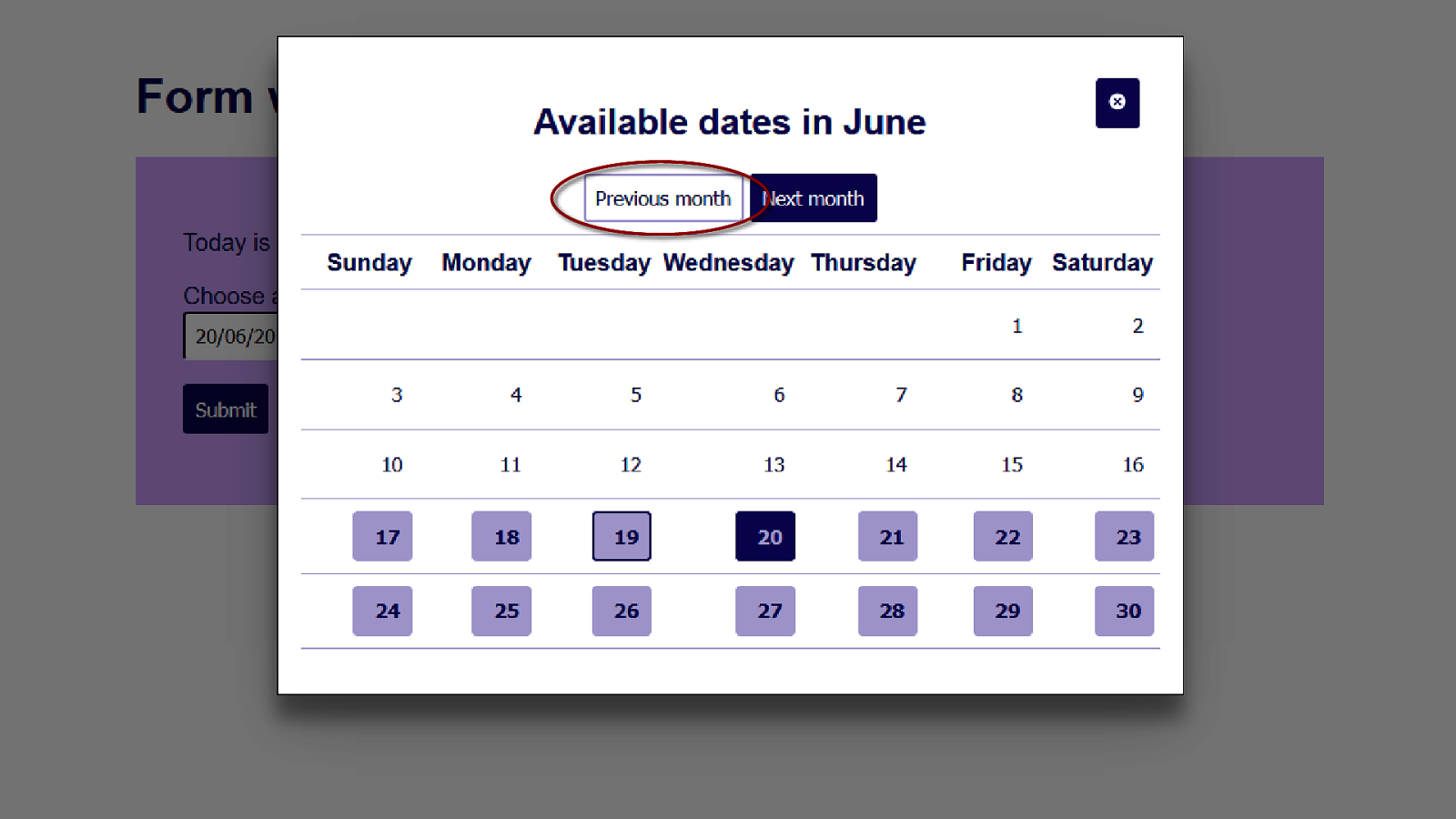
Next I add some controls for the Previous and Next buttons, so people can move forward and backward one month at a time. Remember when I put that tabindex on the heading element? It was so I could send focus there when the heading changes so that blind users will be notified that their click was successful. 31
btnPrevious.addEventListener(‘click’, function () { goToPreviousMonth() setMonthIndicator() datepickerHeading.focus() }) btnNext.addEventListener(‘click’, function () { goToNextMonth() setMonthIndicator() datepickerHeading.focus() }) 32
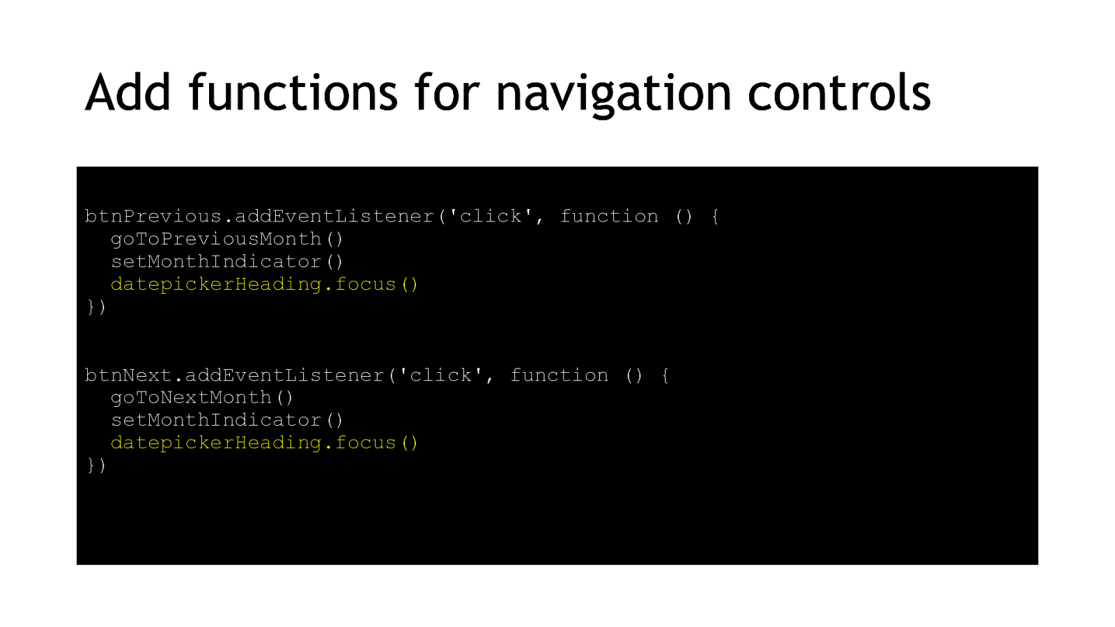
Now I’m going to disable any dates or months which are out of scope. I don’t usually like to disable buttons, but in a datepicker people don’t want to suddenly lose a button they’ve been using, or they might think they’ve missed a bunch of dates if they’ve been removed from the table. btnPrevious.addEventListener(‘click’, function () { goToPreviousMonth() setMonthIndicator() datepickerHeading.focus() disableInvalidControls() }) btnNext.addEventListener(‘click’, function () { goToNextMonth() setMonthIndicator() datepickerHeading.focus() disableInvalidControls() }) 33
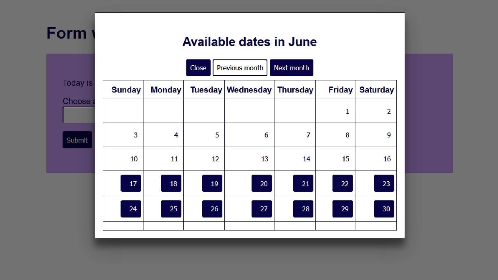
So here’s a month which has the earliest date we can pick. 34
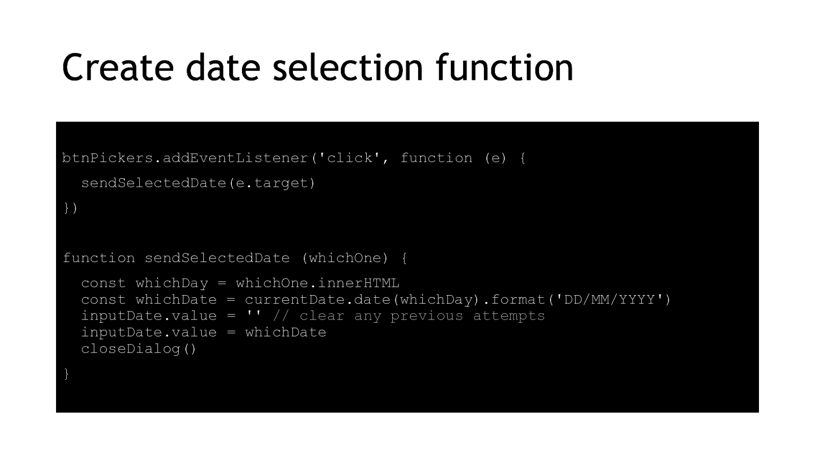
Finally we get to the real reason we were building a datepicker in the first place – to pick a date. When someone clicks one of our date buttons, we’ll send it to the original text input which already has all the validation we need, and we close the modal to return to the form. btnPickers.addEventListener(‘click’, function (e) { sendSelectedDate(e.target) }) function sendSelectedDate (whichOne) { const whichDay = whichOne.innerHTML const whichDate = currentDate.date(whichDay).format(‘DD/MM/YYYY’) inputDate.value = ” // clear any previous attempts inputDate.value = whichDate closeDialog() } [Next slide autoplays] 35
The user puts keyboard focus on the input then tabs to the Open Date Picker button. They click the button and the datepicker opens in a modal window. They tab around the dates and buttons, showing the basic focus indicator. They click on a date to select it. The modal closes and the selected date is now in the original text input. 36
Style it with CSS 37

I won’t read out my CSS to you, I’ll just point out the changes I made for accessibility reasons. 38
The Close button now has an accessible SVG icon in the HTML with alt text available. 39
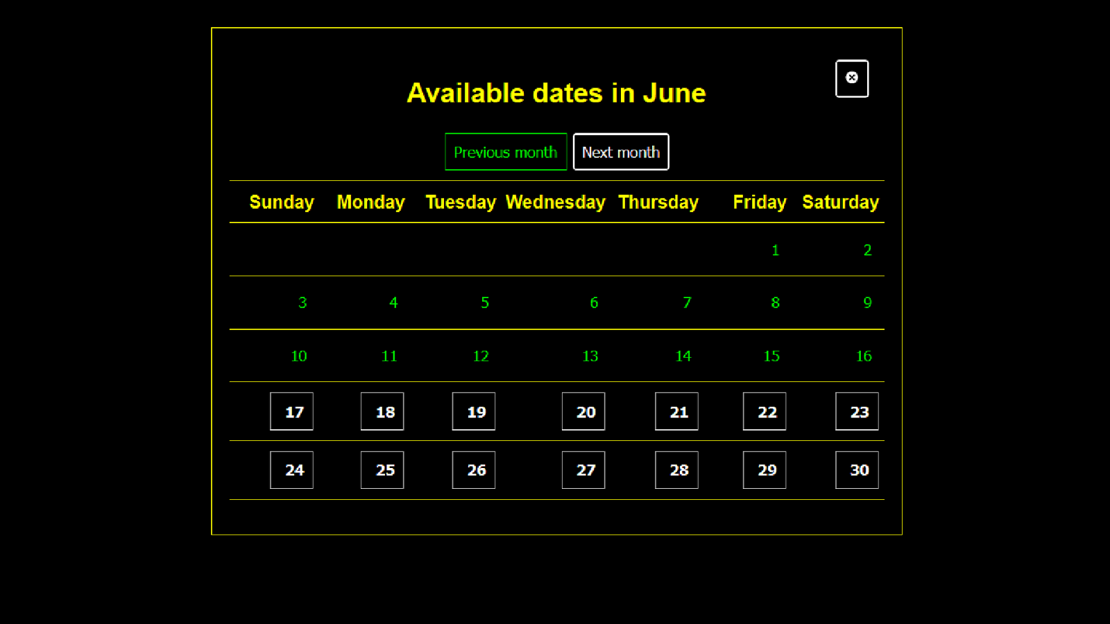
Any navigation buttons which have been disabled have a style distinct from the enabled buttons. 40
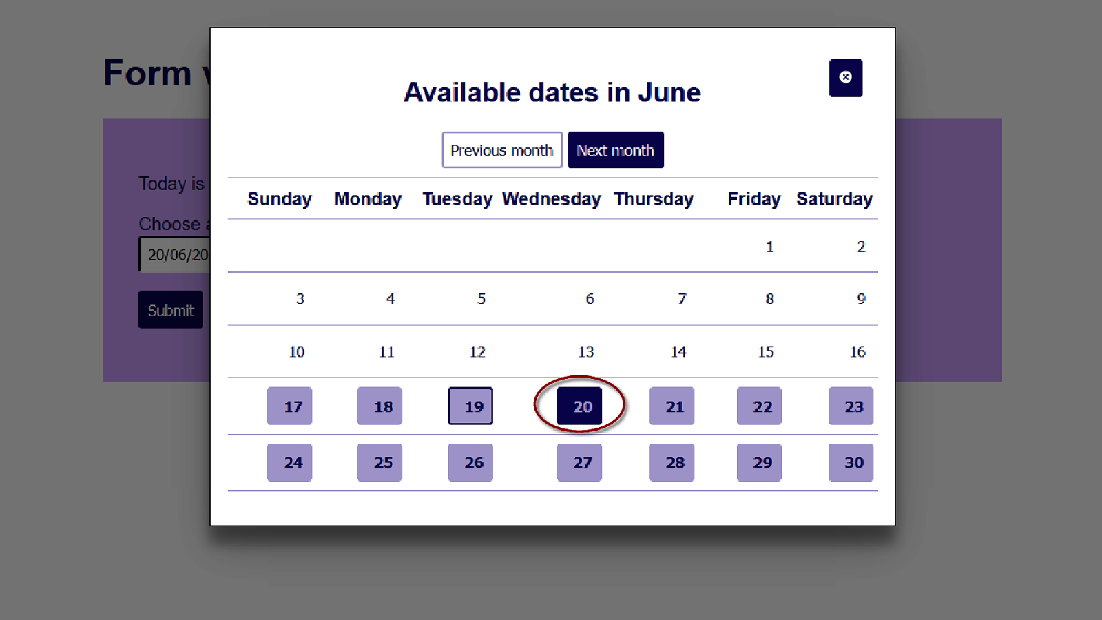
The currently selected date has it’s own style 41
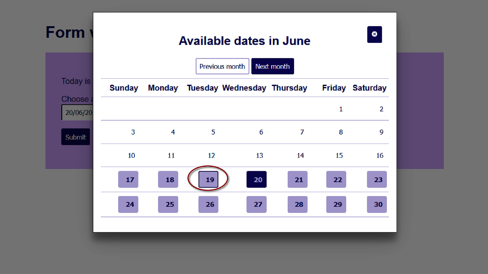
And so does the currently hovered or focused date. Let’s just confirm this works with some of the tools people with low vision might be using. 42
This is our modal when the whole page has been zoomed in. It takes up the whole screen but otherwise looks the same. 43
This is how it looks when text has been resized. It does not look as nice as the zoomed version but is clear and easy to read. 44
And this is how it looks in a high contrast theme. I think it could do with some more emphasis on the selected date and hover effect, but that’s a job for the next release. Overall I’m pretty happy with how it looks, it’s accessible and I wouldn’t be embarrassed to show it to a designer. 45
Enhance with ARIA and animation 46
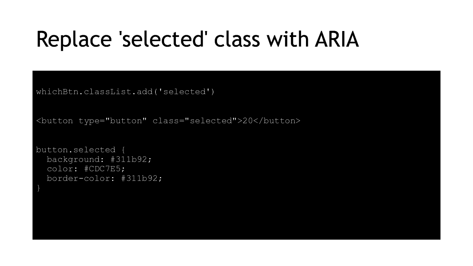
My CSS for the selected date works well for most people with low vision, but it isn’t reflected in the HTML so people using screenreaders won’t know about it. My original HTML and Javascript is:
whichBtn.classList.add(‘selected’) <button type=”button” class=”selected”>20</button> button.selected { background: #311b92; color: #CDC7E5; border-color: #311b92; } 47
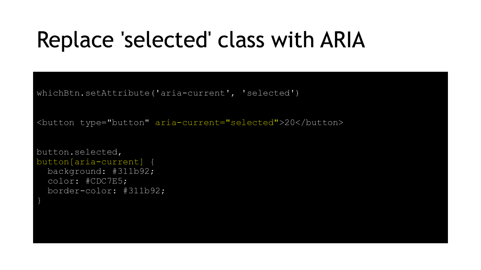
You can use ARIA attributes as CSS selectors though, so I’ve switched them over here. This way we’ve got our programmatic and our visual markers tied together. The new HTML and Javascript: whichBtn.setAttribute(‘aria-current’, ‘selected’) <button type=”button” aria-current=”selected”>20</button> button.selected, button[aria-current] { background: #311b92; color: #CDC7E5; border-color: #311b92; } 48
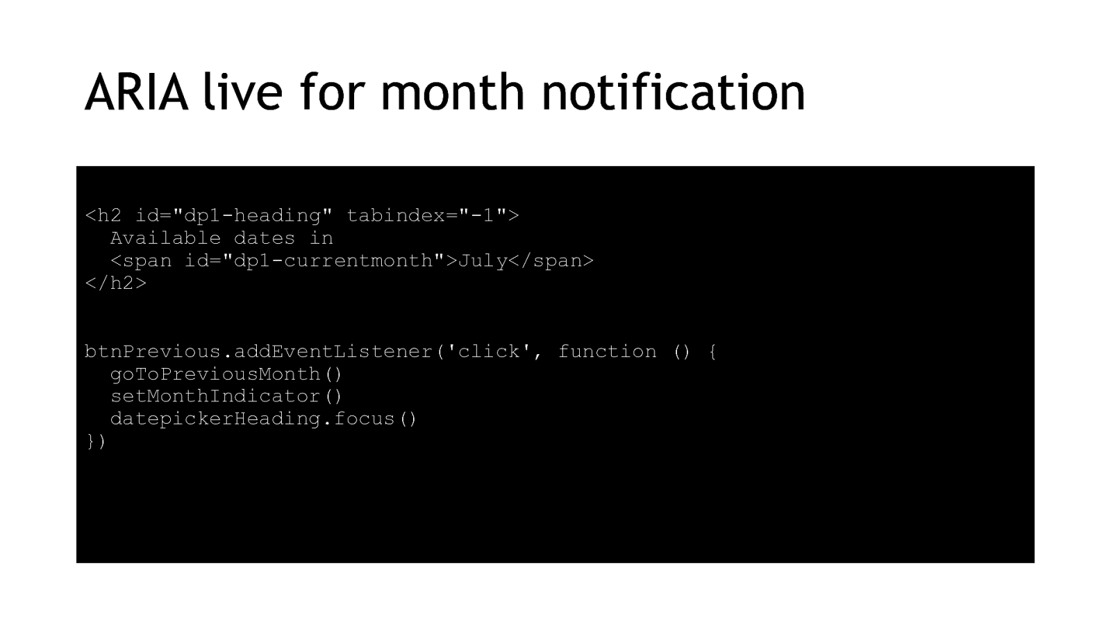
Another little improvement for usability is to replace the focus method as the way of letting screenreader users know when they’ve successfully changed months. My original HTML and Javascript:
<h2 id=”dp1-heading” tabindex=”-1”> Available dates in <span id=”dp1-currentmonth”>July</span> </h2> btnPrevious.addEventListener(‘click’, function () { goToPreviousMonth() setMonthIndicator() datepickerHeading.focus() }) 49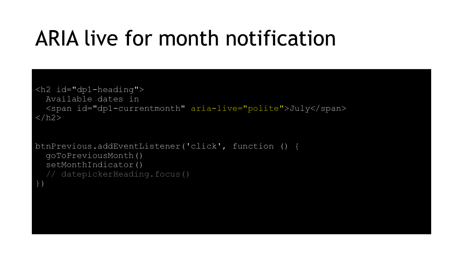
My updated HTML and Javascript:
<h2 id=”dp1-heading”> Available dates in <span id=”dp1-currentmonth” aria-live=”polite”>July</span> </h2> btnPrevious.addEventListener(‘click’, function () { goToPreviousMonth() setMonthIndicator() // datepickerHeading.focus() }) 50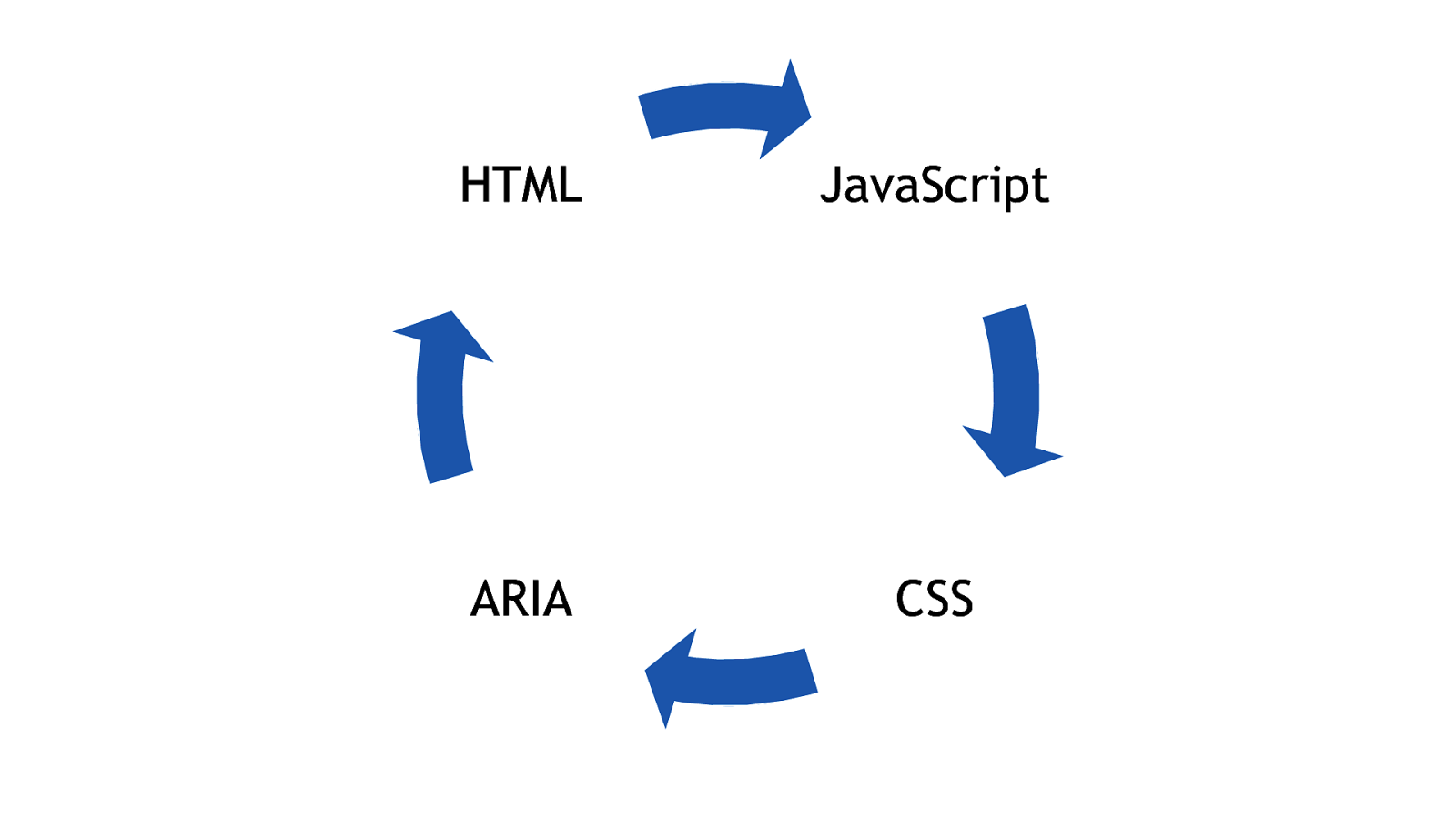
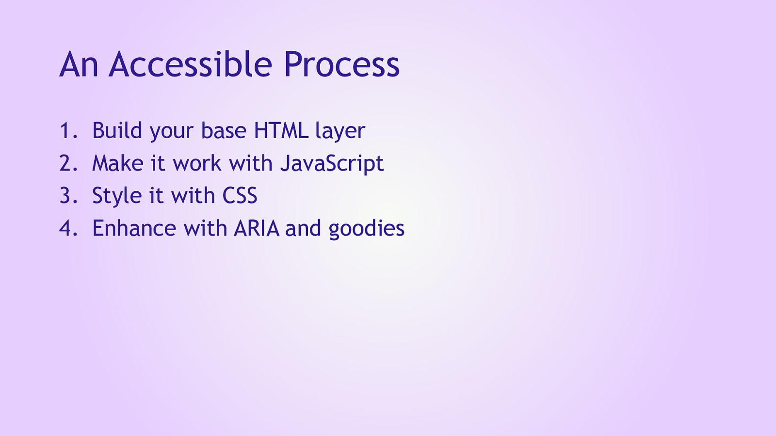
You’ve probably noticed that I haven’t stuck just to one of the accessibility technologies at a time. Each one interacts with and is supported by the others. So you might see my 4 steps as more of an iterative process than a step-by-step formula. Regardless of technology, I do find myself following those steps over and over again, so maybe it’s better to just re-phrase them in a technology-agnostic way. 51
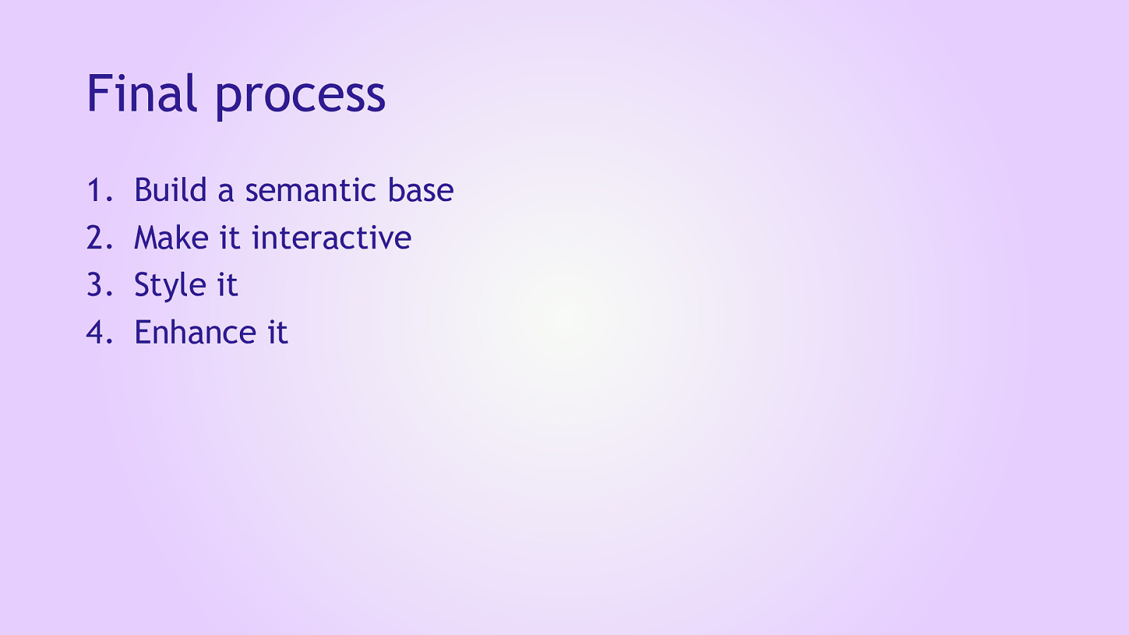
Final process
When you break it down, this is essentially a progressive enhancement process. A lot of my thinking on this topic has been influenced by Jeremy Keith. 52
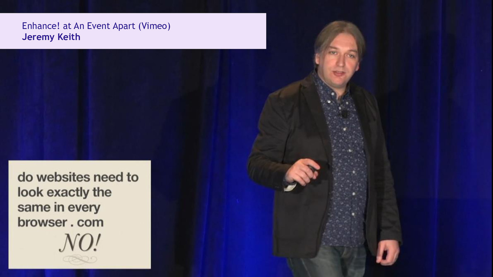
If you have time, I recommend his talk called “Enhance!” from An Event Apart, a few years ago. Sadly, it doesn’t have any captions that I could find. If you think about it, accessibility ensures that our work translates not just to different browsers but also to different input and output devices. 53
By by making sure our base layers are solid and accessible, we can spend more time working on the goodies. I hope this has been useful for you. I’ve put the slides and code online, so if you want to have a go at building on top of this demo, please do feel free to see what you can do to improve it. 54