Title page
Accessibility Testing Strategies Julie Grundy and Chris Pigden, Digital Accessibility Consultants creating an inclusive digital world at www.intopia.digital
A presentation at A11y Camp in November 2019 in Sydney NSW, Australia by Julie Grundy
Accessibility Testing Strategies Julie Grundy and Chris Pigden, Digital Accessibility Consultants creating an inclusive digital world at www.intopia.digital

Chris: background in testing, been working as an accessibility consultant for the past year and half. Julie: background as front-end dev, been an accessibility consultant for 8 years. Every testing strategy is a custom testing strategy.

We use a 4-step process: Planning, creating, testing and iterating.
Set goals. Your goal will depend on your reason for doing accessibility: best practice, legal compliance, pilot program, etc. What’s in scope and what’s out of scope? Stating your goal now helps you keep on track later when things get complicated.
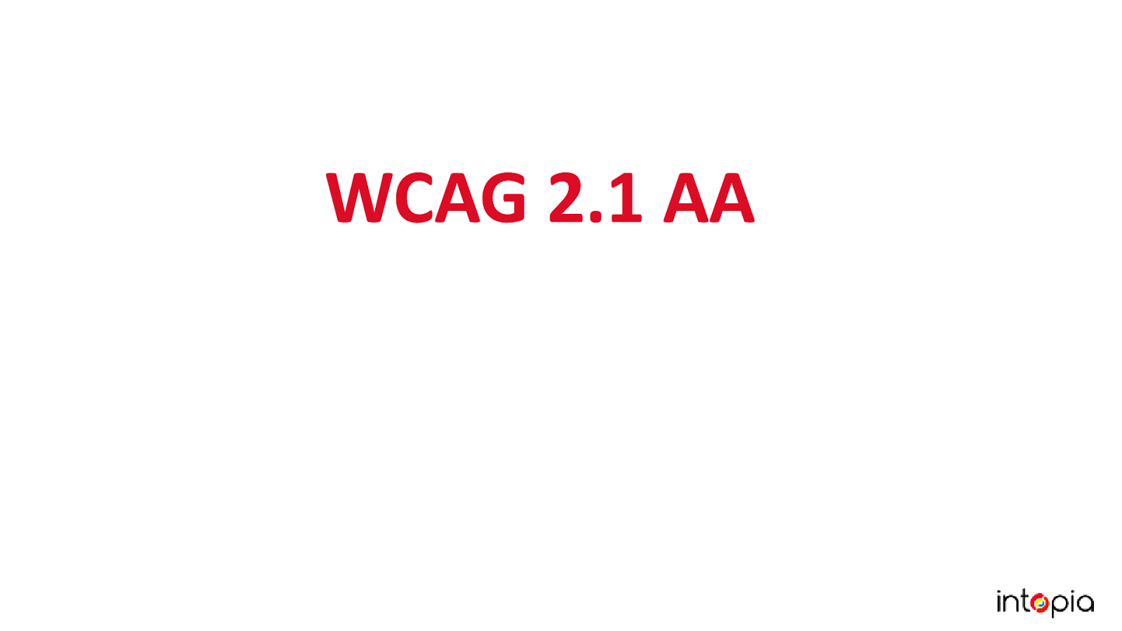
We recommend the 2.1 AA version of WCAG as your target criteria. We recommend AAA level if your primary target audience is people with disabilities.
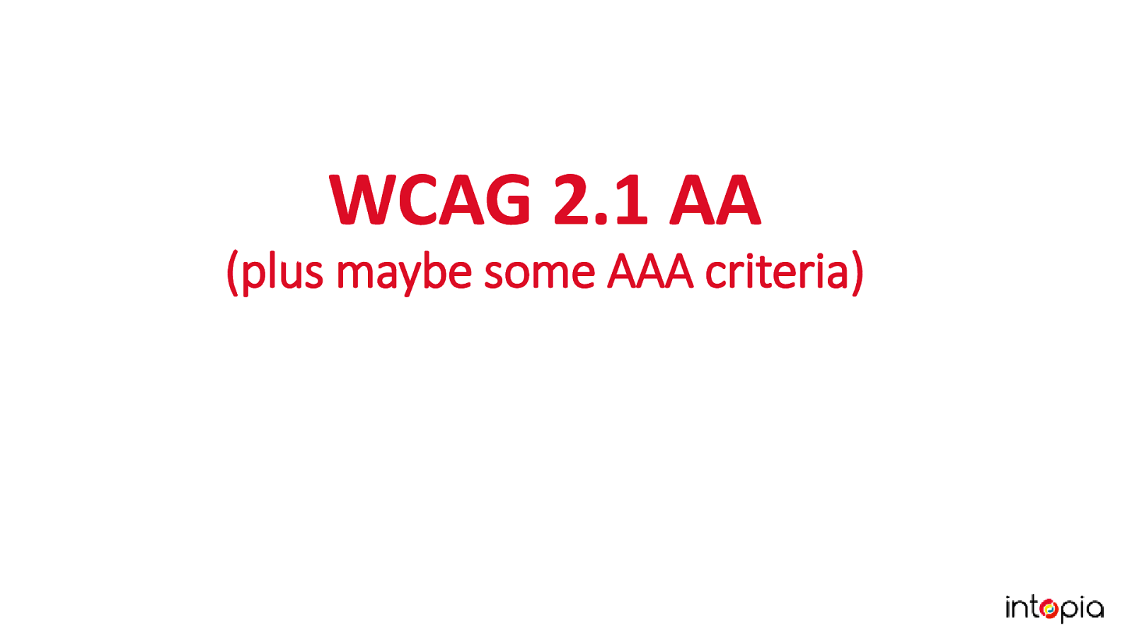
It’s worth looking at the triple AAA criteria to see if any are particularly relevant to your product, e.g. 3.1 Readability is good for content-heavy sites, 2.5 Input Modalities is good for people working on native apps.
Choose the right tools for your team. There are there are a lot tools out there these days, and new tools coming out all the time. This is great but is probably a bit of an overload if you’re new to testing accessibility. The good news is, we don’t need to use all of them!
We’re going to focus on what you do need to test accessibility: A browser, browser plugins, colour contrast analysers and screen readers. It’s important to choose tools which suit your product and team. Those tools should be available to everybody who needs them so there is consistency when you report and reproduce errors. They should provide the best coverage possible for the least effort.
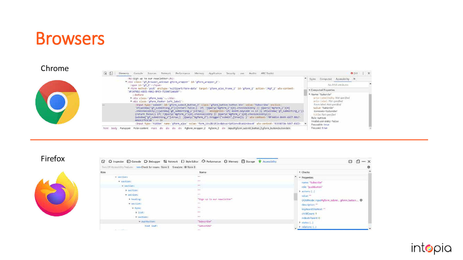
Chrome and Firefox have both great tools for testing accessibility. They allow you to inspect elements in the DOM and then view an Accessibility tree to see what is exposed in the accessibility API. This API is what assistive technologies interact with and so it gives you a good indication of what information is being provided to them. Chris often uses these when trying to understand why something is or is not being announced by the screen reader, it provides you an extra level of detail and clarity.
There’s also some excellent plugins for Chrome and Firefox that automate some tests for us, including AXE, ARC Toolkit and WAVE. These plugins can automatically detect errors quickly and assist us with manual testing. You don’t need to use all of them but you should try them out and pick the one you like. There’s a lot of cross over between tools, they should all catch the most basic errors. The difference is usually in how they report the issues.
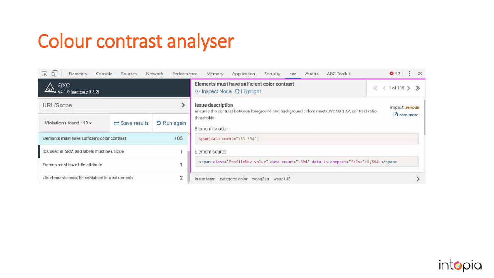
Automated plugins can be a quick way to detect contrast issues but aren’t always reliable with transparent or overlapping content. This slide shows the contrast check from the AXE plugin.
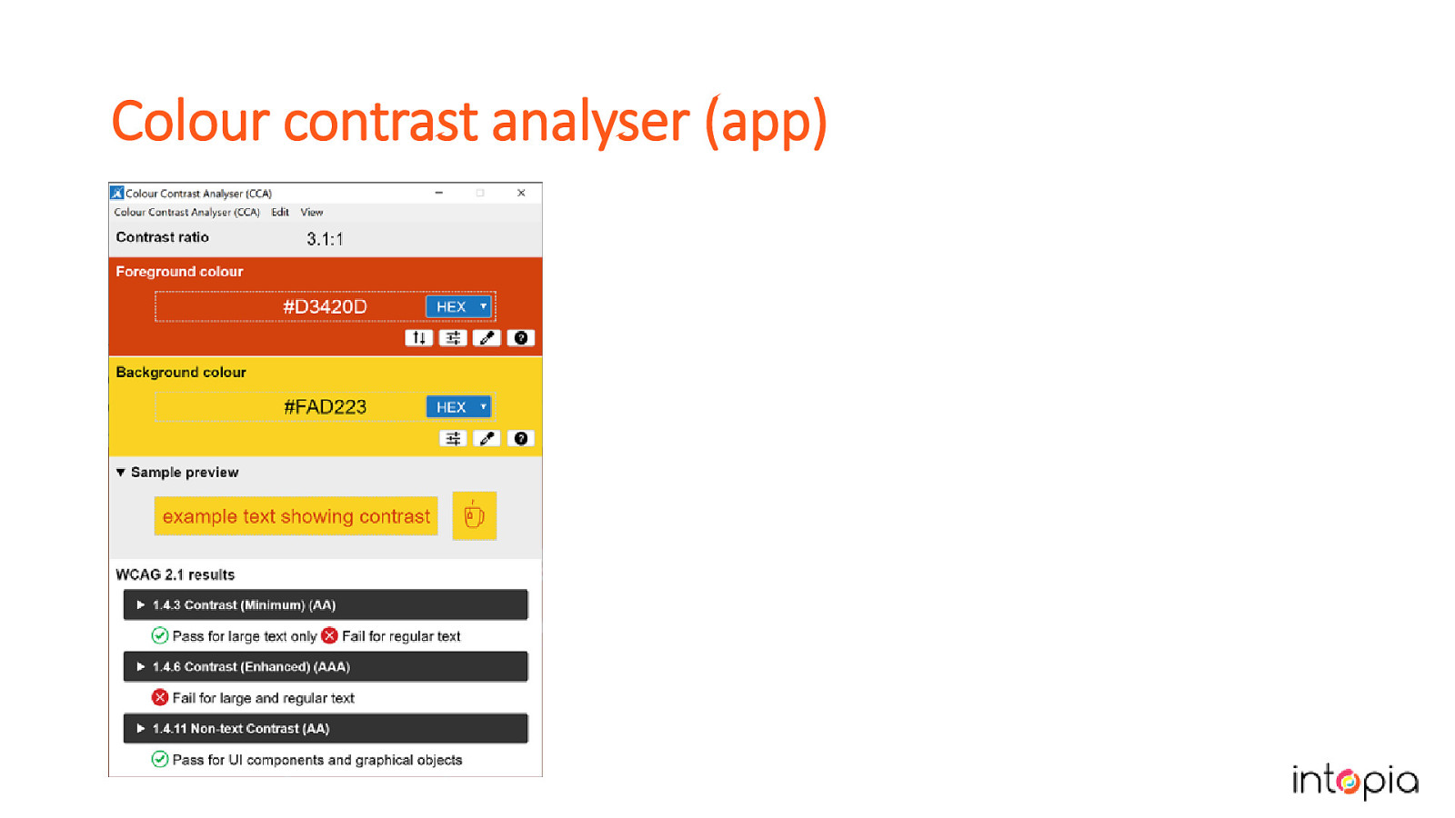
The Paciello Group Colour Contrast Analyser is accurate and allows you to sample colours from most applications but it can only be used to test one element at a time. Combining the plugins with manual inspections of areas that look suspect or have changes in state is a good approach.
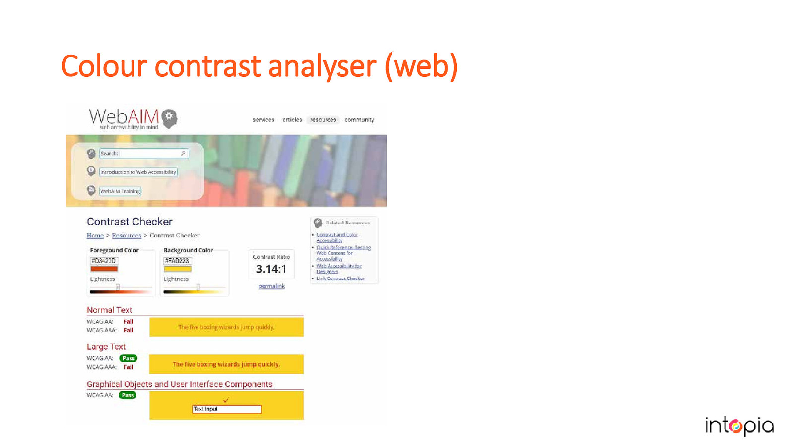
If you’re unable to install the Colour Contrast Analyser on your network, there are websites like WebAim’s Contrast Checker or Lea Verou’s Contrast-Radio.com that can be used to test contrast by manually entering the colour values.
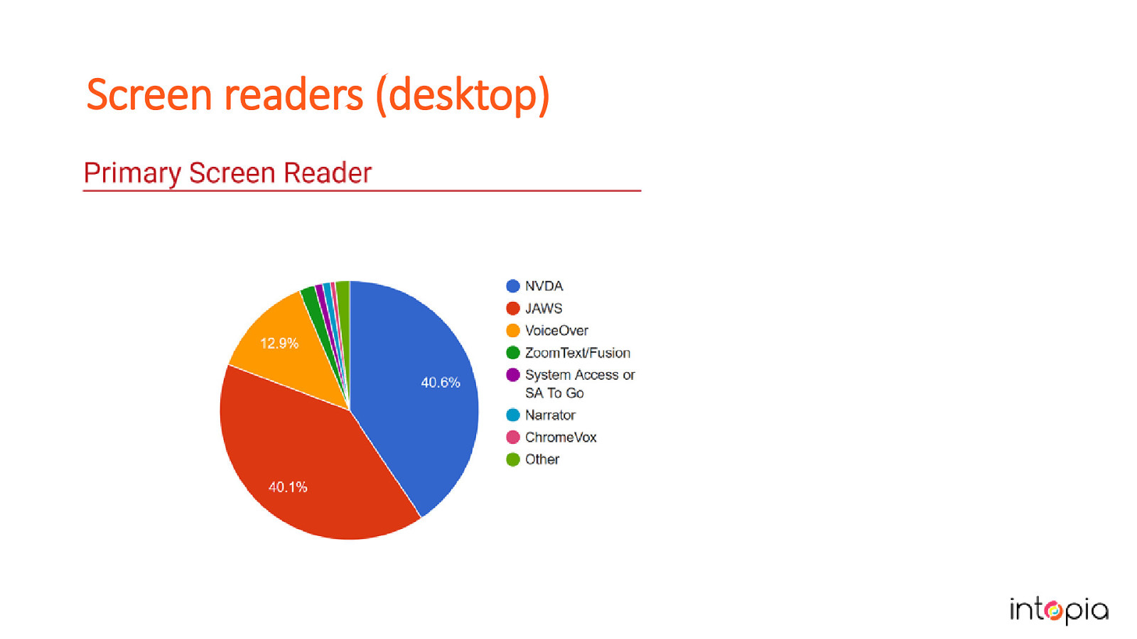
Another tool that you’ll be testing with all the time is a screen reader, but which screen readers and browser should you test with? If your site is public and responsive, you should definitely test with desktop and mobile screen readers. Every two years WebAim carries out a survey on screen reader usage This year’s survey showed that NVDA and JAWS on Windows are the most common as a primary screen reader and they are pretty much equal in numbers now (image in slide is the graph showing this). JAWS is most frequently used with Chrome, followed by IE, which is a reversal on previous years reports. NVDA is most commonly used with Firefox, closely followed by Chrome. NVDA is free which makes it a good choice when budget is a concern.
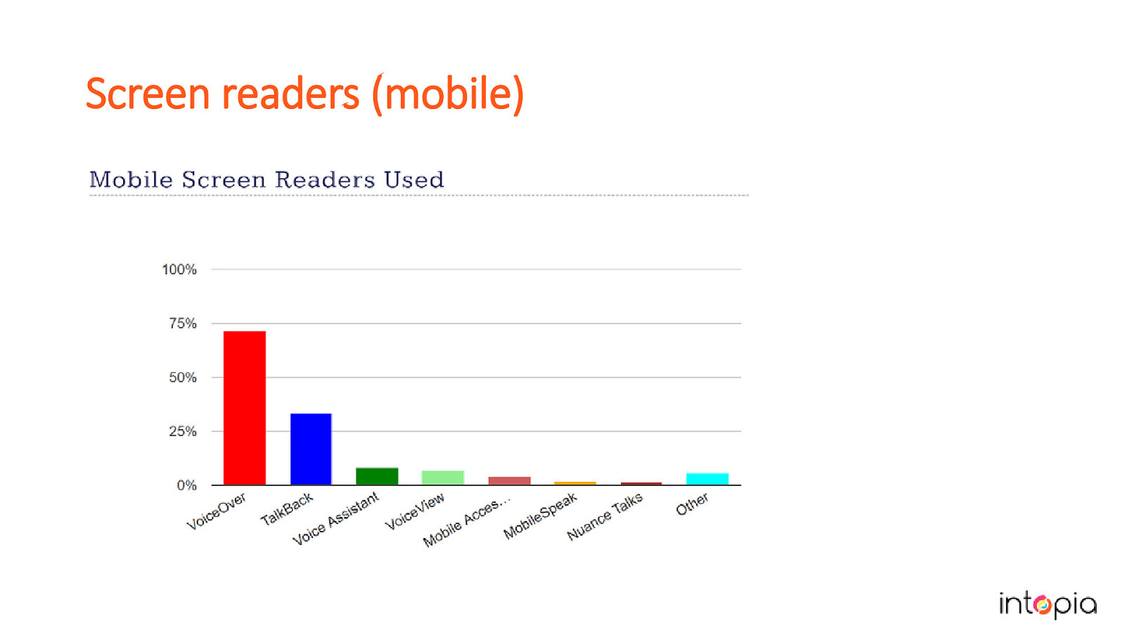
VoiceOver on iOS has more users than TalkBack on Android. Image on slide is a graph showing this. If you can afford to, test with Dragon Naturally Speaking or another voice control option. It’s always a bit of balancing act between getting the best coverage and what you can afford in terms of time and resources. We can’t test with every combination, so we have to target the screen reader and browsers that have the most users and that are most practical for our workplace. Another thing to consider is beefing up coverage for areas that are at high risk, so those that are more complex or have more serious implications if they fail.

After defining your goals, setting your criteria and deciding on what tools you will use, it’s time to start making a testing plan. To do this, you’ll need some test cases and some supporting materials.
It’s worth investing time in developing your test process. At Intopia we have recently been going through this process. When Chris started with Intopia he knew some of the WCAG guidelines but not all of them, so he reviewed each of the success criteria in sequence.
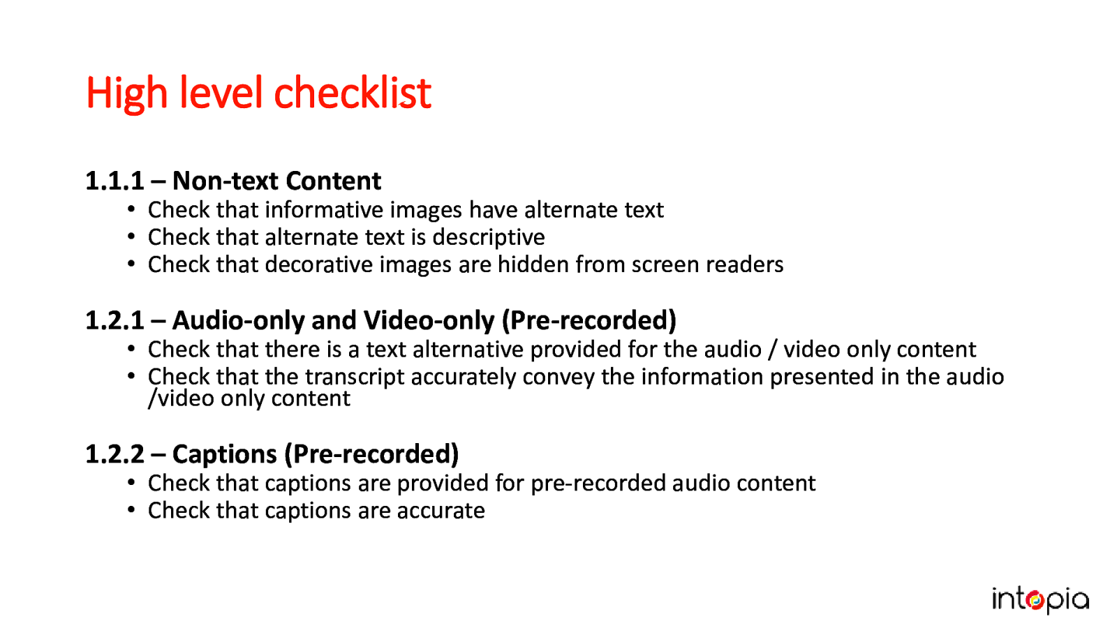
As you go through the Success Criteria, make a high-level checklist. Between the success criteria techniques and online tutorials, you can build an extensive list of compliance and best practice checks. Don’t worry if its not perfect, the aim is to get something workable quickly, get feedback and iterate.
An example from the slide: 1.2.2 – Captions (Pre-recorded).
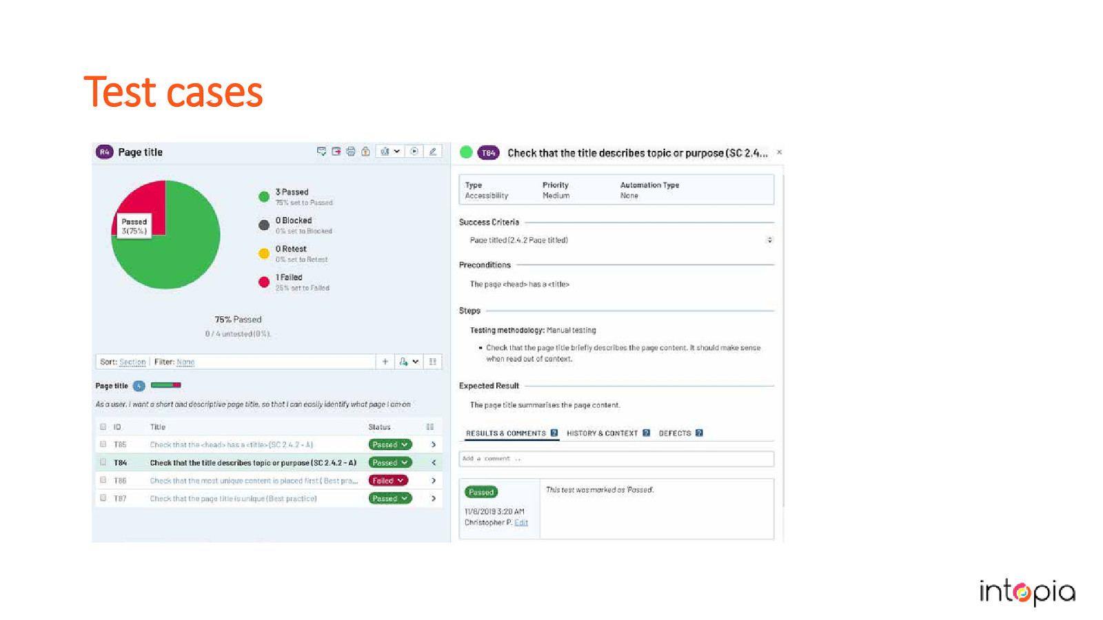
From the checklist, start to flesh out each test with more detail. Good tests work as high-level checks for people with experience, and have extra details for people who are new to the process. Keep tests short, test 1 thing at a time. Identify best practices as well as minimum compliance. Tests should include summary, steps, and expected result. Some optional information to include can be the category or the relevant WCAG success criteria. The example in the slide shows tests in software called Test Rail, which lets you add tests to test runs to distribute among your team.
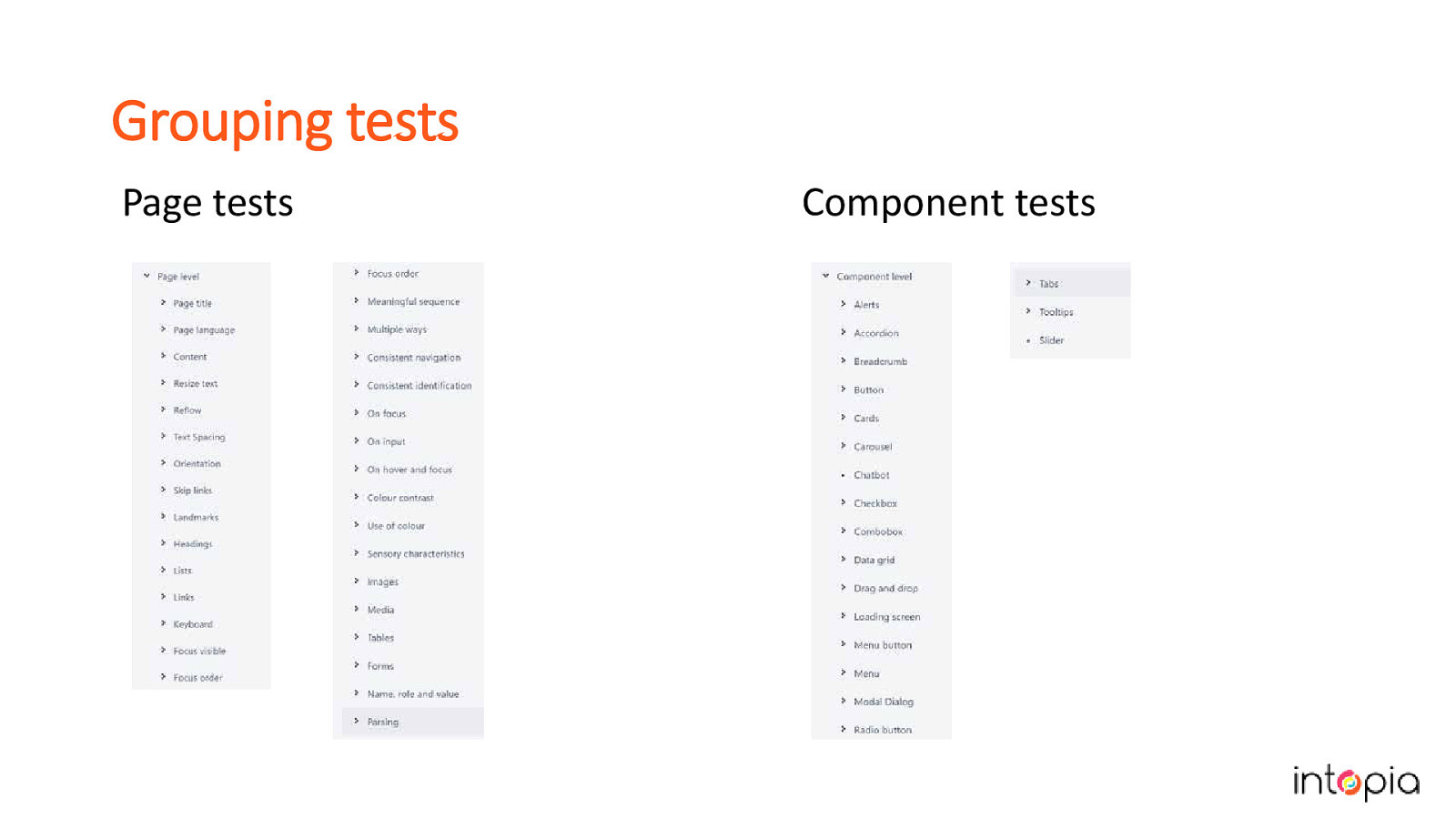
Slide shows two lists of tests labelled Page tests and Component tests. Important to consider how you group tests. If you test in order of the success criteria, you will end up doing repetitive steps. Need to be easy to find by everybody. Should flow logically. We organised ours by whether they should be done at the whole-page or component-only level. Our page tests are organsied by topics. You can use success criteria, HTML elements like headings or landmarks, or subjects like contrast, to organize yours. Components arranged alphabetically by the name of the component, and usually cover multiple success criteria in a group.
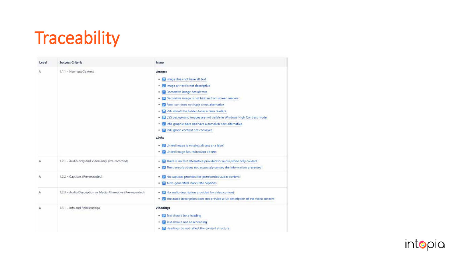
In software testing we sometimes create a traceability matrix to map our test cases back to our requirements and then track their status. With accessibility test cases it’s also a good idea to keep track of your test cases and map them against the Success Criteria. (Image in slide shows a spreadsheet listing the criteria in one column and the tests for each one beside it). This will help you to identify the gaps in your process, and make it easy to see where you should concentrate efforts to improve your test coverage.
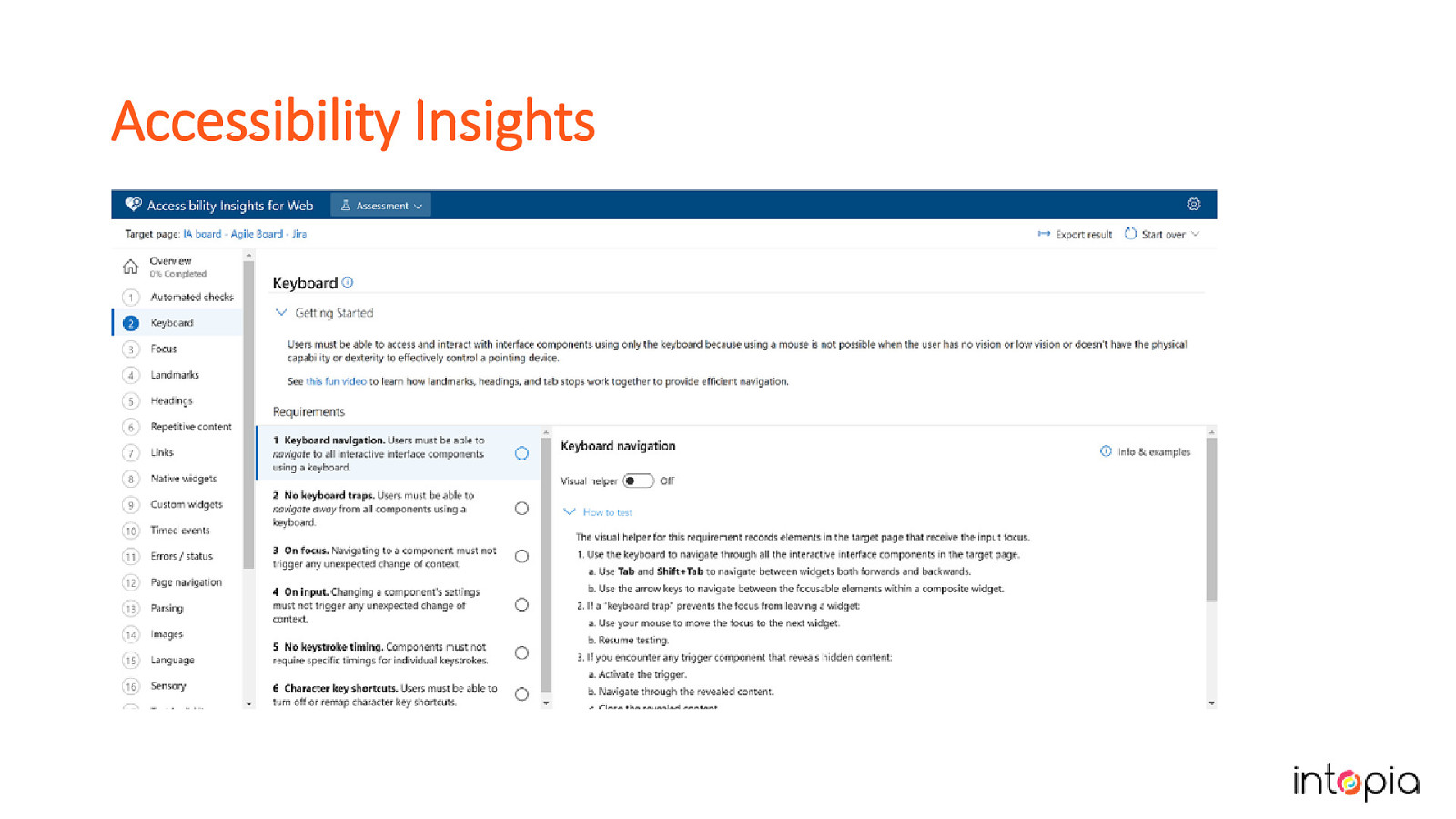
Accessibility Insights is a free tool from Microsoft that can give you a good start. Has AXE built into it. Provides assisted manual testing, comes with test cases you can follow. It could also give you ideas on how to group your own tests.
• How much extra work will be involved? • When will it start? • What support will be available? In our experience, just starting to send people tickets doesn’t work. Julie started by pestering everyone with information about all the accessibility problems she was seeing in their work. People have enough to do already, with the usual constraints of time and budget. Instead, while you’re still writing your test cases, let your team know what you’re working on. Be ready to take questions and hear people worry about the impact it will have. This is a good time to also do any “why accessibility is important” speeches that you have ready.
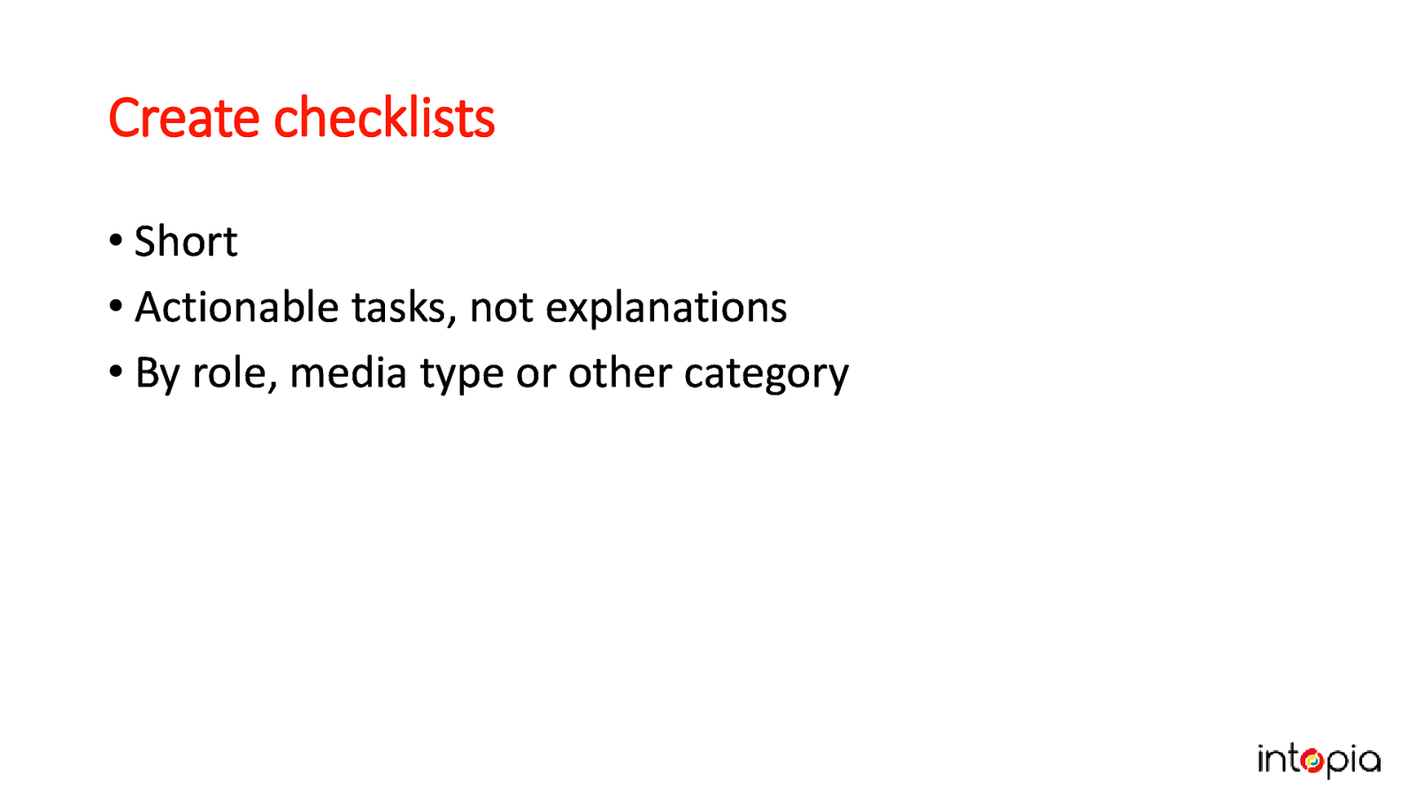
• Short • Actionable tasks, not explanations • By role, media type or other category. If you’re lucky, people will ask you to give them checklists. This is a good sign, it means they want to do the right thing. Don’t give them all of your test cases, it’s too overwhelming. Try grouping tasks by role, such as designer or developer, or by what’s being built (a web page, multimedia, print documents, etc). This is another area where MS Accessibility Insights can be useful in helping you write support material for your team.
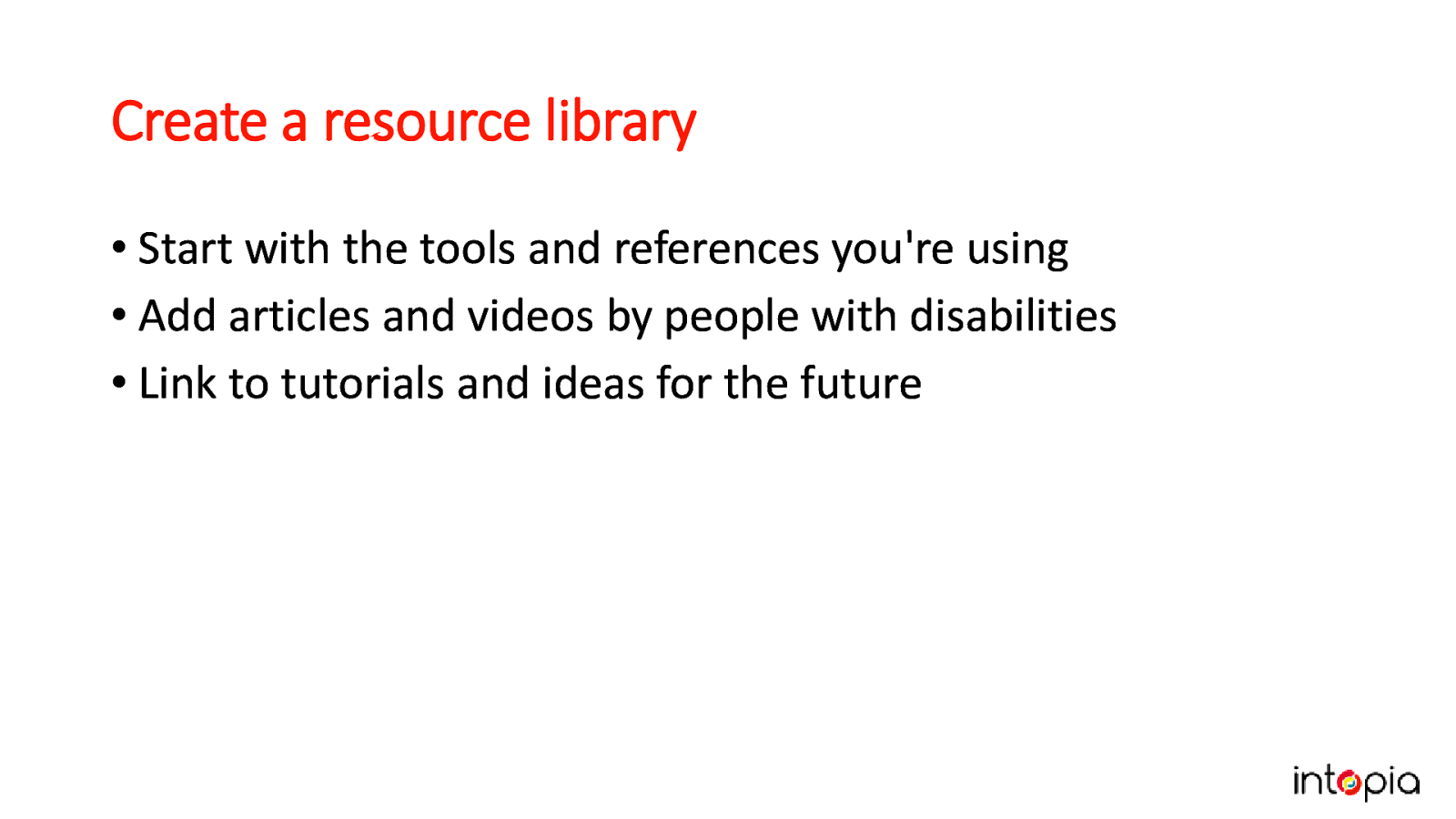
• Start with the tools and references you’re using • Add articles and videos by people with disabilities • Link to tutorials and ideas for the future. Julie made one of these in a previous job and wishes she’d kept a screengrab of it. It can be used firstly as a tool for your own convenience, but can also grow into a resource which all your team enjoys using to learn about accessibility.

Finally, we get to the part where some accessibility testing happens!
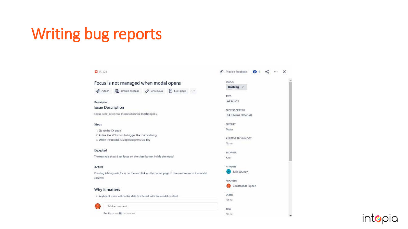
How you report issues is important. Try to be as consistent as you can in the way issues are worded and structured. Accessibility issues should include a summary, a longer description or steps to reproduce, severity, relevant success criteria, the expected result and the actual result of the test. Optional details: Why it matters (what impact will it have on your users?), recommendations for fixes if you know what they should be. In this slide we show a custom accessibility issue in JIRA.
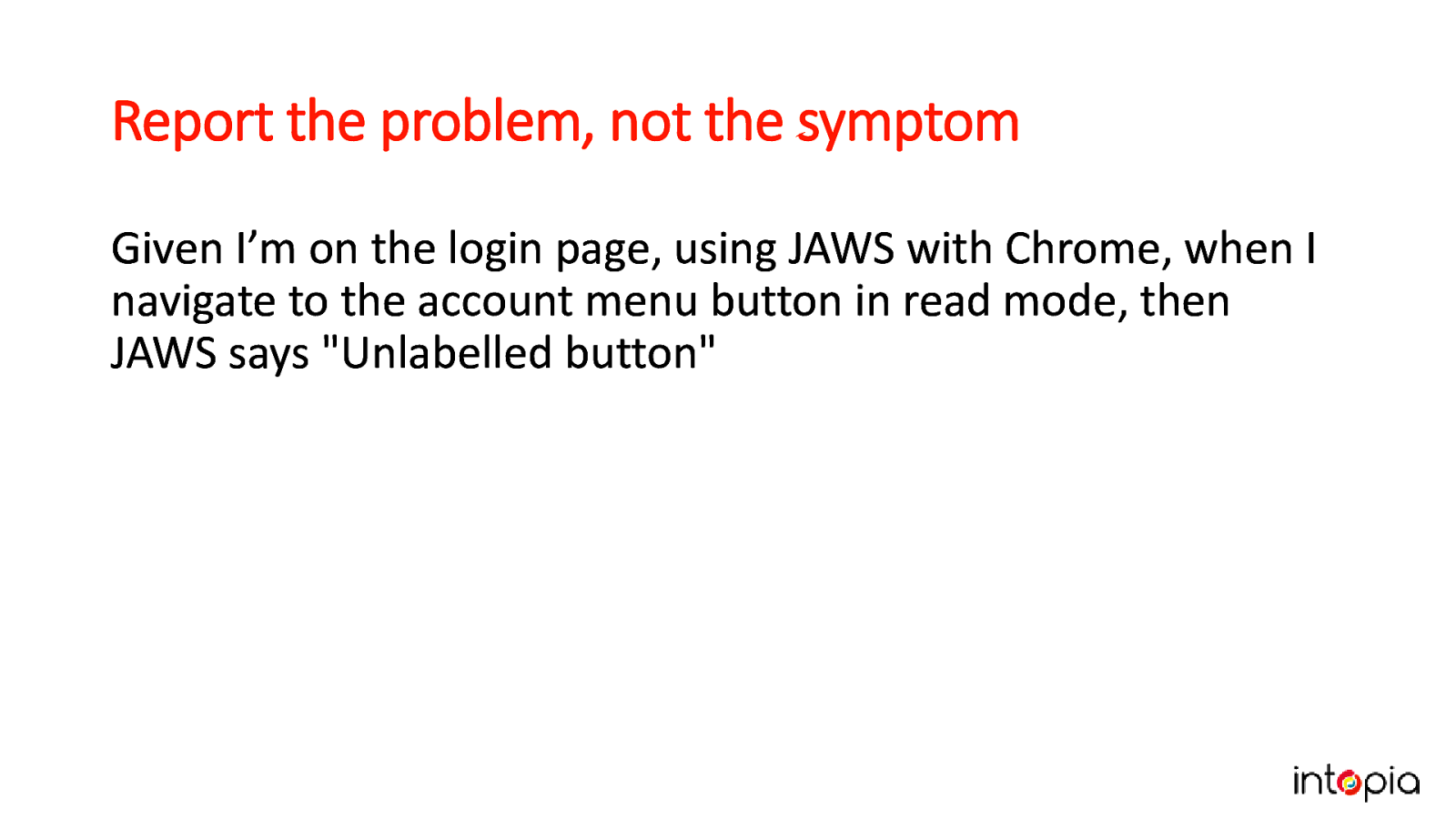
This example shows a description of the symptom of a problem. “Given I’m on the login page, using JAWS with Chrome, when I navigate to the account menu button in read mode, then JAWS says “Unlabelled button”.”
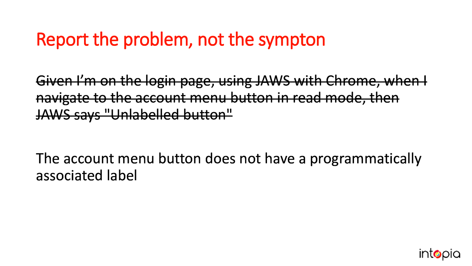
The previous text is crossed out, and new text says “The account menu button does not have a programmatically associated label.” Instead, try to describe the root cause of the problem. This makes it easier to find the right solution.
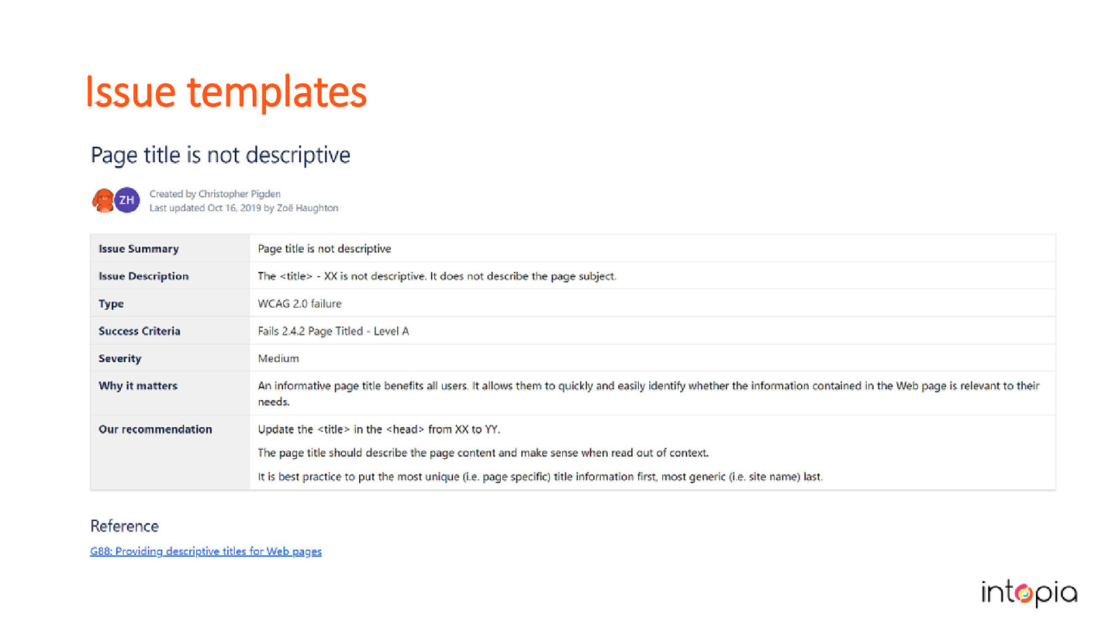
Accessibility issues can be scripted in a lot of cases. Invest time in creating issue templates for the bugs you report. If you use a test management tool like Test Rail, you can integrate it with JIRA and use the templates to create bugs when a product fails a case. The slide shows an example of a template in Confluence.

The most important part of any long-term project is to iterate. The chances of you getting accessibility testing process perfectly right on your first attempt is pretty low. But don’t let that stop you! The sooner you begin, the sooner you will be able to improve it.
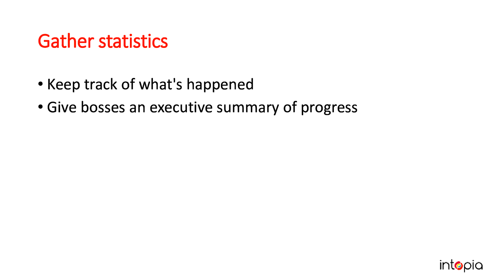
• Keep track of what’s happened • Give bosses an executive summary of progress Julie wishes she’d done this on her first big accessibility rollout. She recommends keeping data from the very start of your project – this might include issues created and resolved, processes improved to prevent future bugs, any customer or internal staff feedback.
If you are not meeting the goals you set at the beginning of this process, do you need to change the tactics or the goal?
An image of Julie using a magnifying glass like a detective. Gather as much feedback as you can, even when (or especially when) it’s negative. Solving the problems raised helps you customise the plan to your own team, and makes it more robust when deadlines are tight. Give praise where it’s due – people are trying new things in addition to their existing work. They need to hear from you when they’re doing a good job, even if the results aren’t what you’d hoped for.
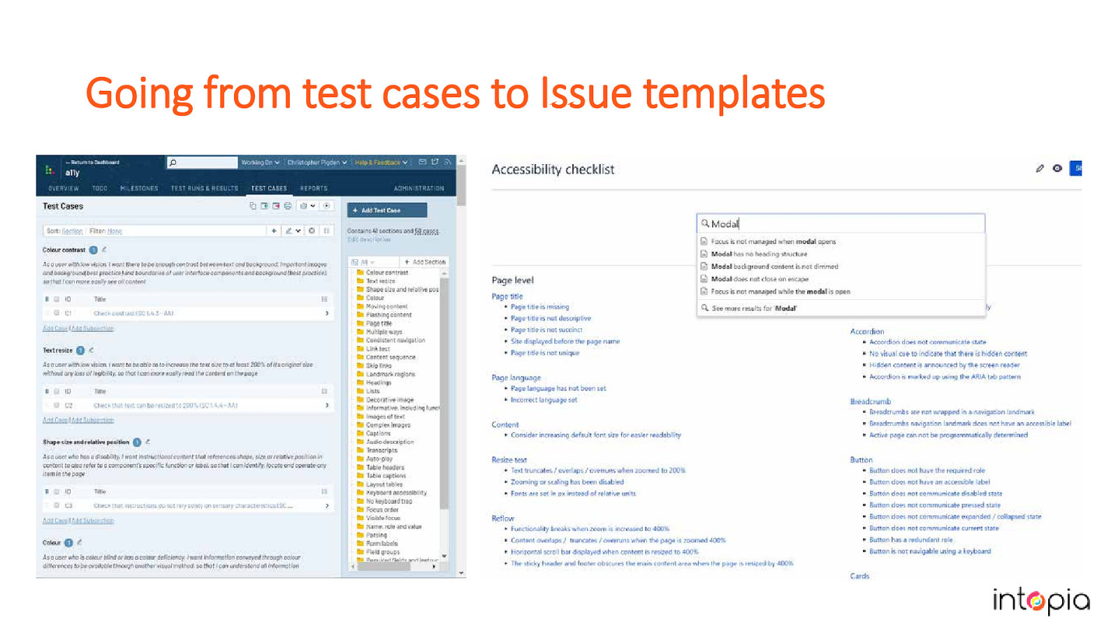
In our own process we have made 3 major iterations over the past year. We started by focusing on test cases following the process we’ve just described. We learned that the tests were secondary for us, because we are consultants working with a huge and varied range of products which need a huge and varied range of tests. The issue templates were what saved us the most time, so we separated them out from the test cases, and organised them to make each template easier to find. Do what works for you, and don’t be afraid to pivot if you have to. The slide shows the test cases next to the issue templates.

We really believe that creating your own testing strategy can make your accessibility practice more mature and robust. We’ve shown you our process, and we hope you’ll find our experience useful in working out how to make a plan that works for you and your organisation. If you have any questions, we can take them now. Or if you think of them later please do find us and say hi because we love talking about this stuff!