Building Email Design Systems with Baby Steps

A presentation at Litmus Live in November 2019 in San Francisco, CA, USA by Ted Goas

Slide 1

Slide 1

Building Email Design Systems with Baby Steps https://noti.st/tedgoas Alright, I know we’re nearing the end of the conference and our energy levels might be getting low, but if you stick with me for the next 30 minutes, I promise you a bunch of memes and jokes. And if there’s any time left, I’ll talk about design systems too. My slides are on Notist, for anyone who’d like to follow along on their own device.

Slide 2

Slide 2

Ted Goas Principal Product Designer, Stack Overflow @TedGoas He / him I’m Ted and I’m a Principal Product Designer at Stack Overflow. One of the many things I work on is our design system.

Slide 3

Slide 3

@TedGoas #LitmusLive Design systems… pretty popular right now. I’m not here to tell you what they are or convince you that you need one… I’m here to help you build your own.

Slide 4

Slide 4

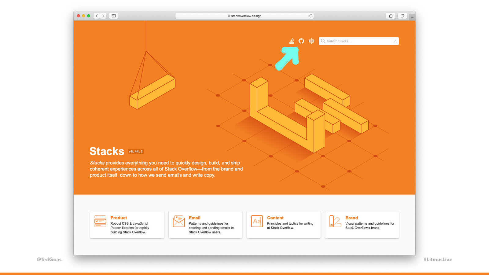
@TedGoas #LitmusLive Our design system is located at StackOverflow dot design. It’s open source, so you can see our GitHub repo by clicking the tiny GitHub icon at the top. For the past year or so, Stack Overflow’s email design system has supported every email we touch. It saves us a ton of time, but building our design system didn’t happen overnight. In the next 30 minutes, I’ll show you how we built it and how we use it.

Slide 5

Slide 5

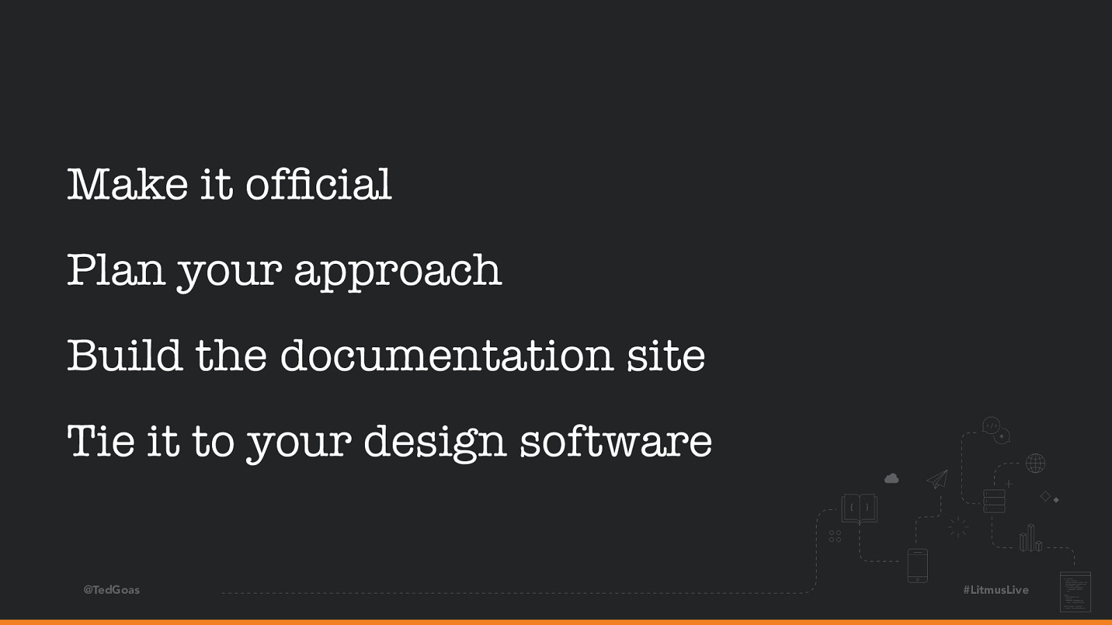
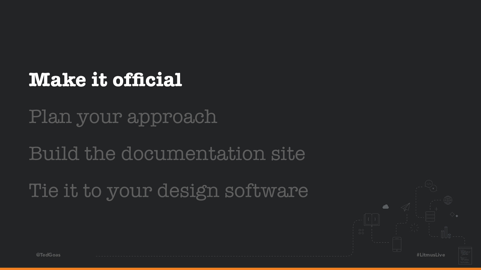
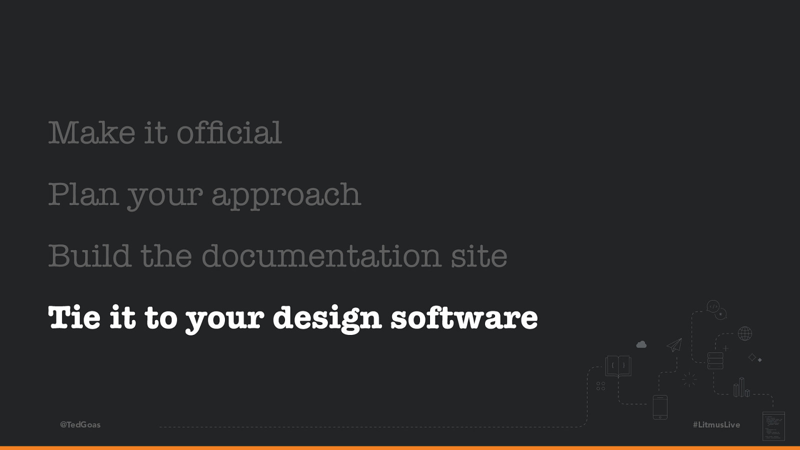
Make it official Plan your approach Build the documentation site Tie it to your design software @TedGoas #LitmusLive I’ll talk about how to plan a design system, build a documentation site, design using design system components, and find enough time to do all this. Let’s start with that last part.

Slide 6

Slide 6

Make it official Plan your approach Build the documentation site Tie it to your design software @TedGoas Alright so we’re building a design system! But… we all have regular jobs, right? #LitmusLive

Slide 7

Slide 7

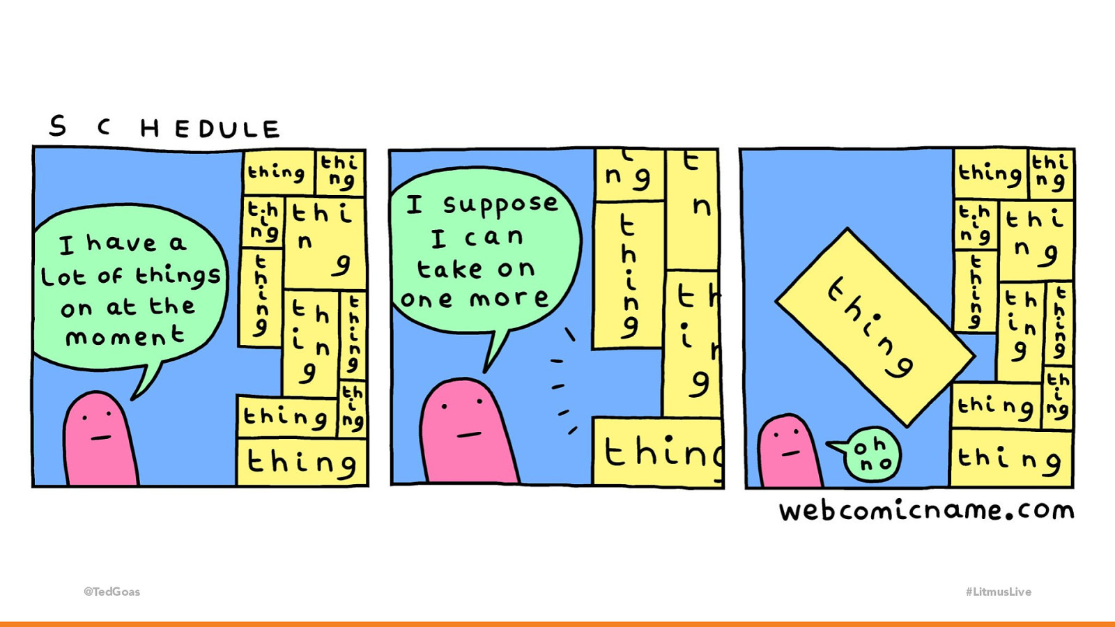
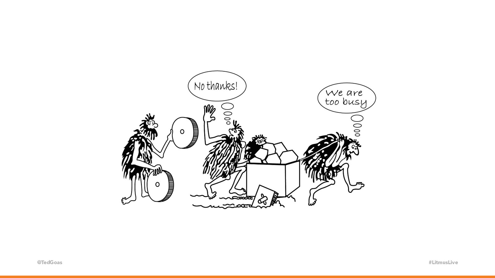
@TedGoas #LitmusLive How about the spare time between projects? We all have that from time to time… sounds logical. It’s how we started. However, our initial efforts were scattered and progress was inconsistent. Whenever we started gaining momentum, we’d get pulled away onto project work. We didn’t have regular check-ins or a roadmap.

Slide 8

Slide 8

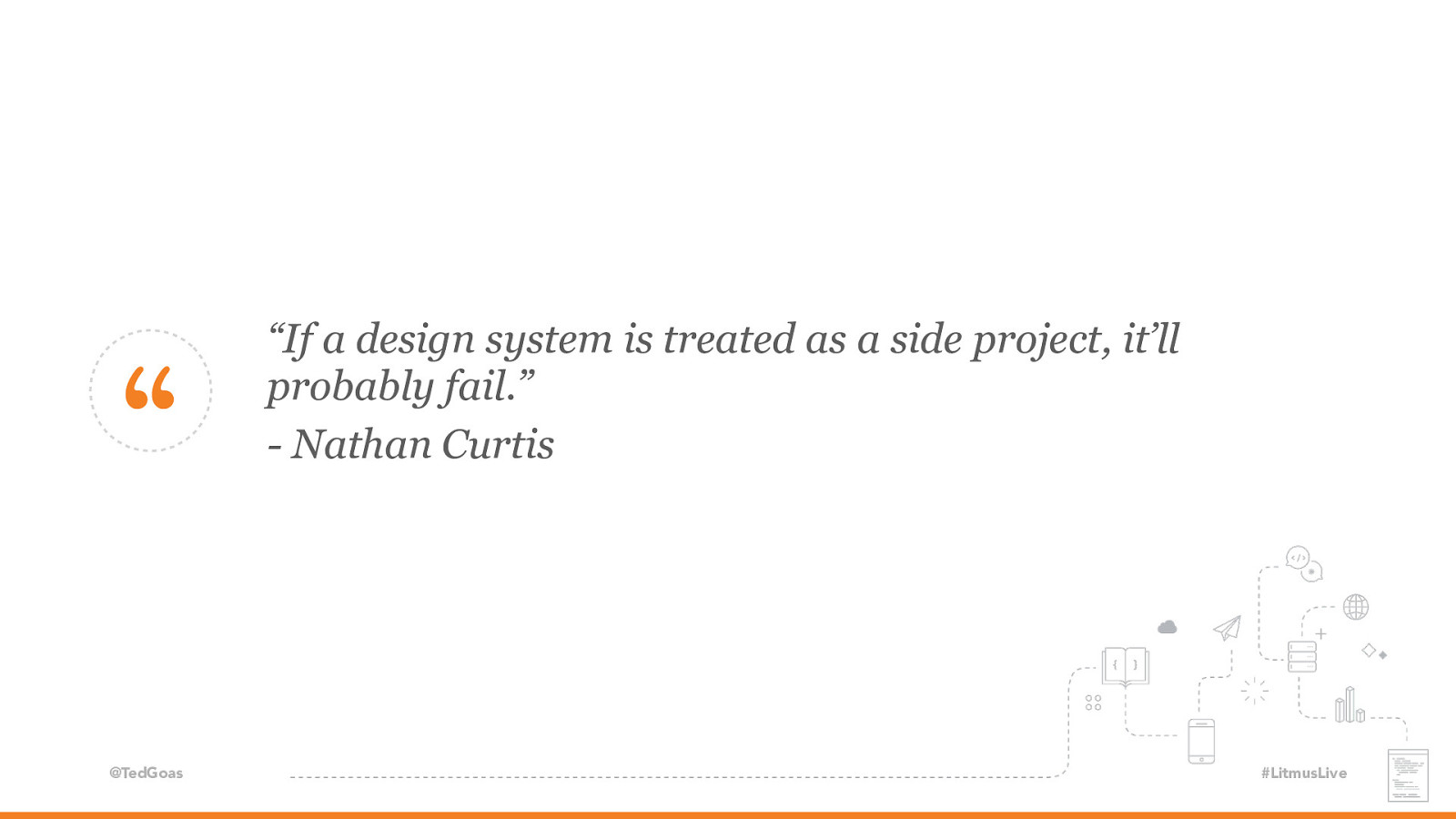
“ @TedGoas “If a design system is treated as a side project, it’ll probably fail.” - Nathan Curtis #LitmusLive And no one was being held accountable because we were treating this as a side project. And design systems as a side project is probably not gonna work.

Slide 9

Slide 9

@TedGoas #LitmusLive After a while, we learned that our design system would need to be an official project or the company would just keep pushing to ship product work faster instead of building a better future. Sound familiar? Yea… We knew we needed a better way to build email and thought an email design system would do that, but how do we convince the boss? Here’s how we made our case:

Slide 10

Slide 10

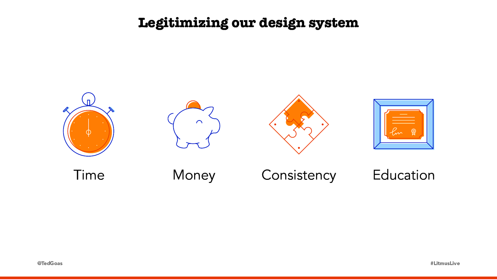
Legitimizing our design system Time @TedGoas Money Consistency Education #LitmusLive Time: We spend a lot of time solving the same problems over and over again. An email design system will speed us up by codifying common components, empower more people to build email, and free us all up to work on other things. Money: Our emails typically don’t bring in revenue directly, but they drive platform adoption, which does tie to revenue. An email design system also eliminates the need to outsource email work or hire an email specialist. And there’s always the “Take everyone’s time spent on an email, multiply by their salary, and add it up to show management how much an email cost to make” argument. Consistency: Our emails are inconsistent and often broken. A design system codifies common patterns, giving designers some creative freedom, but keeps them from “just going for it” on typical email projects and creating something off-brand. Education: Most importantly, an email design system’s documentation becomes a shared record of the team’s email knowledge and best practices. It removes information silos and bottlenecks caused by only a few people being experienced with email. When making your case, it helps to think about what your boss (or your boss’s boss) cares about. They might not care if a button looks funky in Outlook, but they might care about the extra five hours the team spent QA’ing that email last week or lost sales caused by a link that wasn’t clickable.

Slide 11

Slide 11

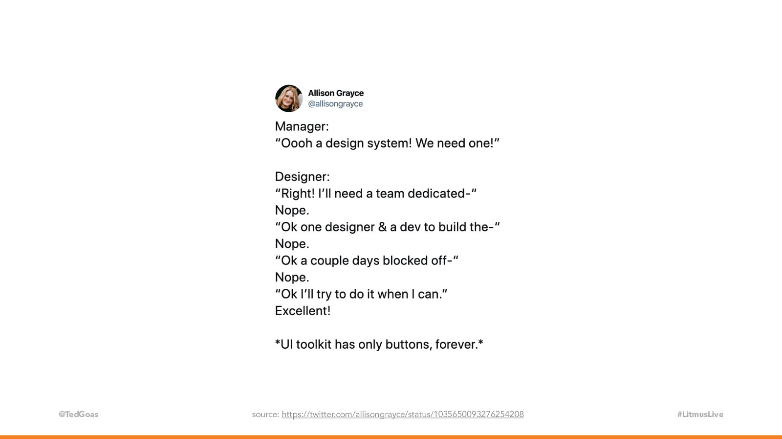
@TedGoas source: https://twitter.com/allisongrayce/status/1035650093276254208 #LitmusLive It took us a long time (like, almost a year!), but ultimately Stack Overflow recognized our design system as a sanctioned project. Now we have regular check-ins, a roadmap, and a full-time person dedicated to the design system. But it was a slow burn for us, so it helps to start pushing for this early to avoid scenarios like this.

Slide 12

Slide 12

Make it official Plan your approach Build the documentation site Tie it to your design software @TedGoas Alright, let’s say we finally got the buy in! We’re building a design system! #LitmusLive

Slide 13

Slide 13

Buttons Icons Tags Footers Links Thumbnails Lists Product details Animations Titles Two columns Three columns Colors Tables Logos Hero images Captions Borders Backgrounds Callouts Quotes Offer details Shadows Cards Four columns Menus @TedGoas #LitmusLive Let’s start by building some components right???? Well, no. In fact, that’s the last place you want to start. It’s tempting to add everything that you think might go in a design system or should go into a design system, but try to resist that urge for now. There’s two places where you can start. First is working backwards.

Slide 14

Slide 14

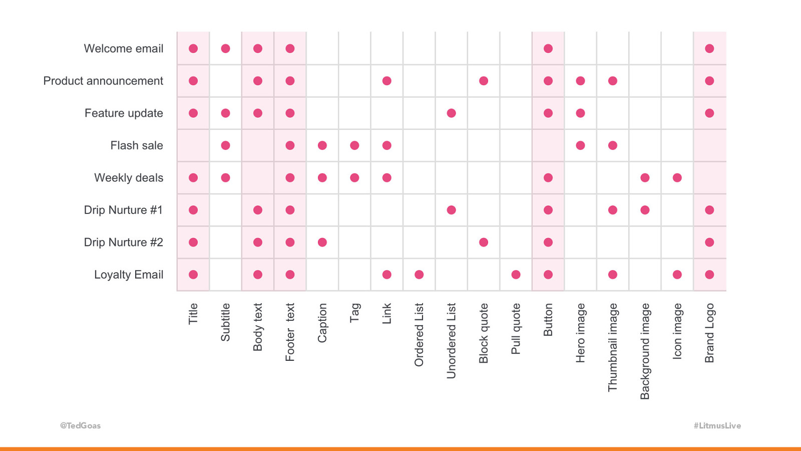
@TedGoas #LitmusLive You’ve likely already created a ton of emails… take a step back and see what they all share in common. Buttons? Lists? Background images? What are your most used snippets? This chart is super small, but it’s not important that you can read it. Creating a chart like this helps visualize what’s used most. Seeing a clump of dots usually signals something that would be great to standardize in the email design system.

Slide 15

Slide 15

“ @TedGoas “Don’t start at the abstract level, start at the extract level.” - Dan Mall #LitmusLive As Dan Mall explains, don’t start abstractly (what could be?), start by extracting what you already have. Remember, you’re building a design system for YOU. One company’s design system should not work for another company.

Slide 16

Slide 16

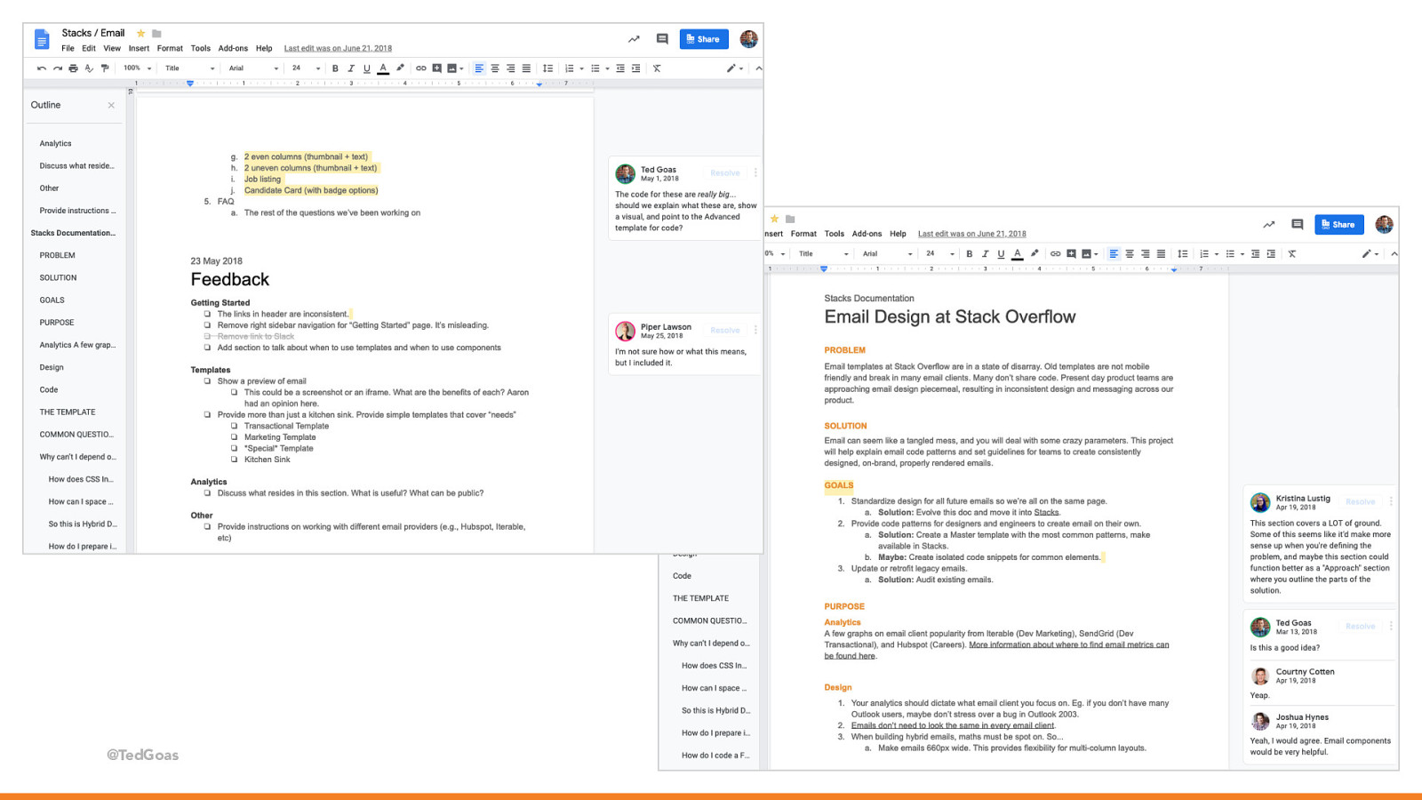
@TedGoas #LitmusLive Another place you can start is with a good ‘ol fashion brainstorm. We started in a blank Google Doc with editing rights enabled for everyone. We invited folks from all over the company to discuss how they use email and what questions they have. Engineering, product managers, marketing… we even got legal involved. Using a Google Doc lowered the barrier to entry and allowed everyone to brainstorm with us without configuring any software or being familiar with code. Hearing everyone’s voice at the beginning showed how everyone thinks about email differently and informed where to focus our initial efforts. Whatever route you take, it’s helpful to welcome people into your work early. It prevents work from becoming silo’d, invites different perspectives, and ultimately produces a better product. It also helps with adoption. A design system is not something to impose on people. If the design system will one day govern emails across an organization, more folks will adhere to it if they feel like part of the process. Open collaboration helps a design system take root.
Slide 17

Slide 17

Make it official Plan your approach Build the documentation site Tie it to your design software @TedGoas #LitmusLive Alright so we’ve decided what components to start with. Now we need a documentation site to put them, right? When it comes time to build a design system site, it’s tempting to look at other design systems to see what they’ve done.
Slide 18

Slide 18

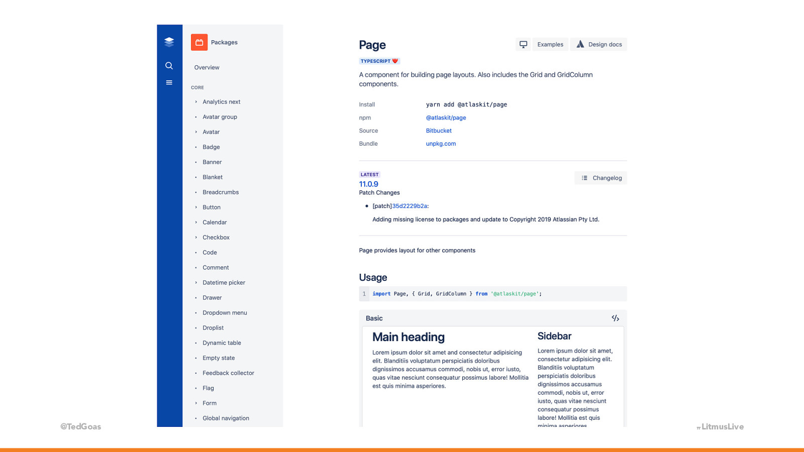
@TedGoas Ok, so let’s look at Atlassian’s design system. Nice design, looks pretty professional. Let’s see what we have here… #LitmusLive
Slide 19

Slide 19

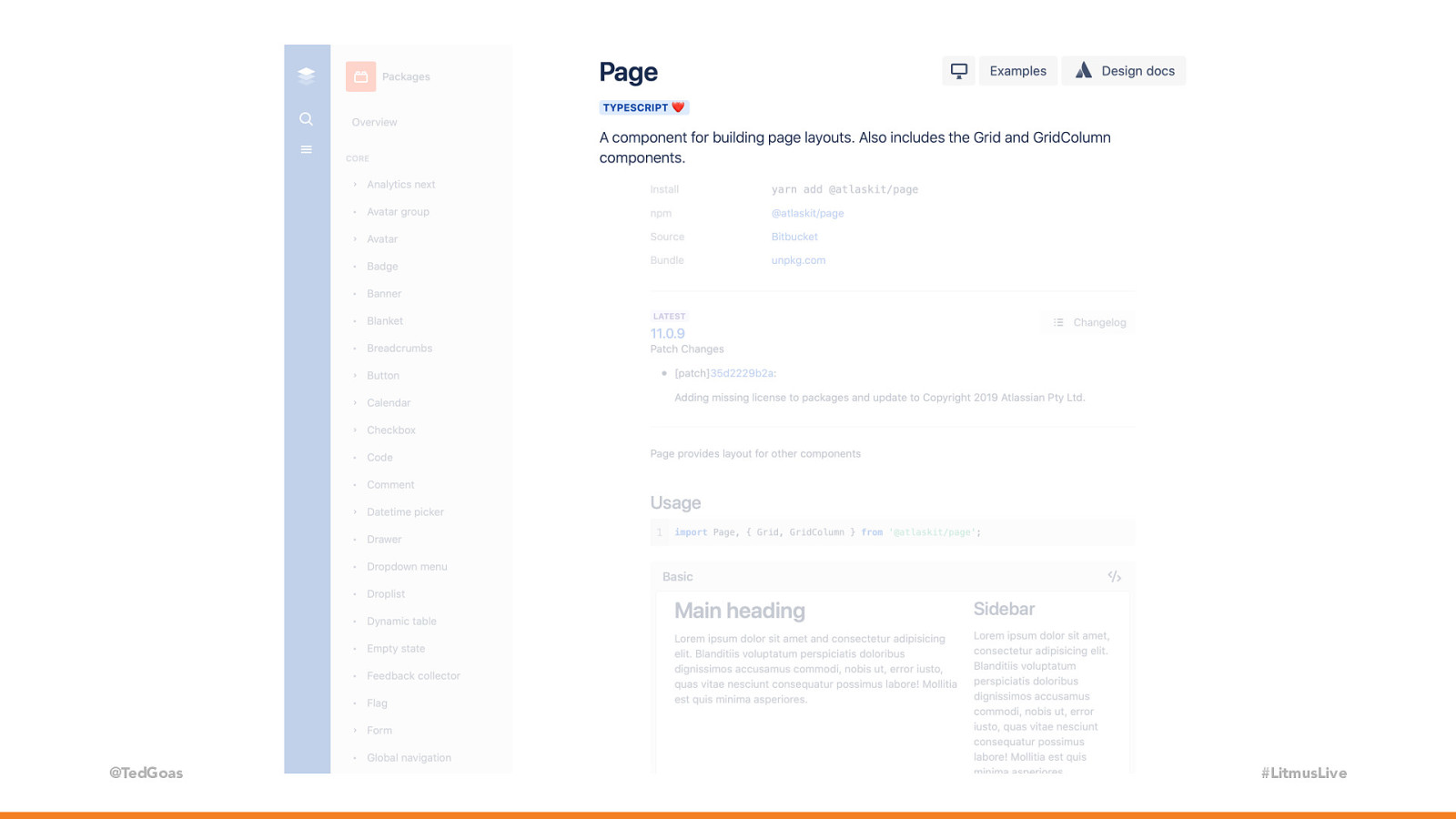
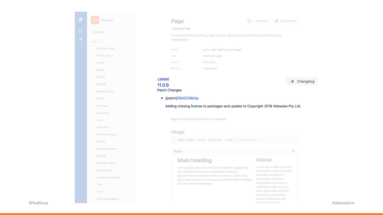
@TedGoas #LitmusLive Ok, so this screen shows us how to build a page layout in this design system. Cool cool, I see links to examples, design docs, and typescript…? I’ve heard of typescript… let’s move on…

Slide 20

Slide 20

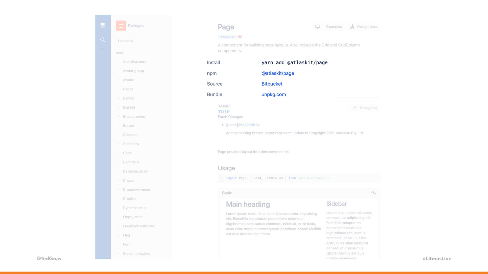
@TedGoas Ok, I’m seeing words like yarn and npm and bundle… mkay… #LitmusLive

Slide 21

Slide 21

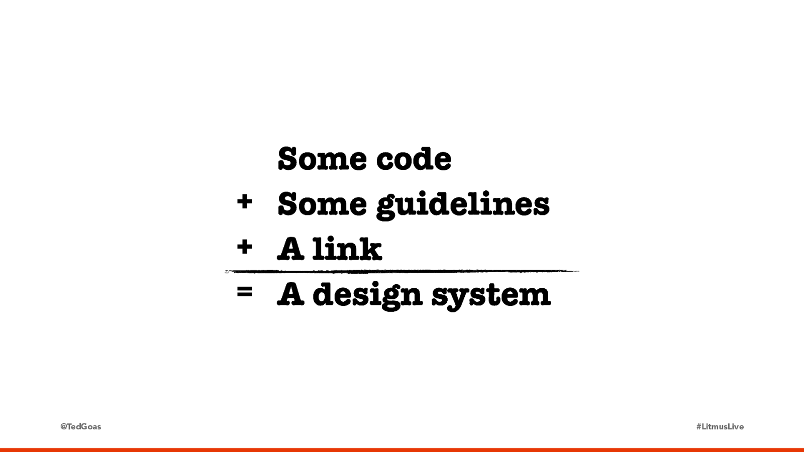
@TedGoas #LitmusLive Moving further down, we have patch information and a change log… These don’t sound like designer-y things, right?… do we need all this? Is this how design systems are built? Well… No. In my opinion, this is overkill for most teams. It’s only important that a design system contain three things…

Slide 22

Slide 22

Some code + Some guidelines + A link = A design system @TedGoas Some code you need to implement a component (because a Sketch library is not a design system). Some guidelines on how and when to use it. A URL that you can send to someone. #LitmusLive

Slide 23

Slide 23

UNPKG @TedGoas #LitmusLive At Stack Overflow, our design system runs on Jekyll, has a basic build process, is in a public GitHub repo, and is hosted on Netlify on a custom domain. These are the technologies we use on our design system, but we don’t need them all. In fact, we only need TWO. And since y’all are in this room, I bet you’re familiar with them.

Slide 24

Slide 24

UNPKG @TedGoas The result of all those logos is ultimately just dumb HTML/CSS pages. #LitmusLive

Slide 25

Slide 25

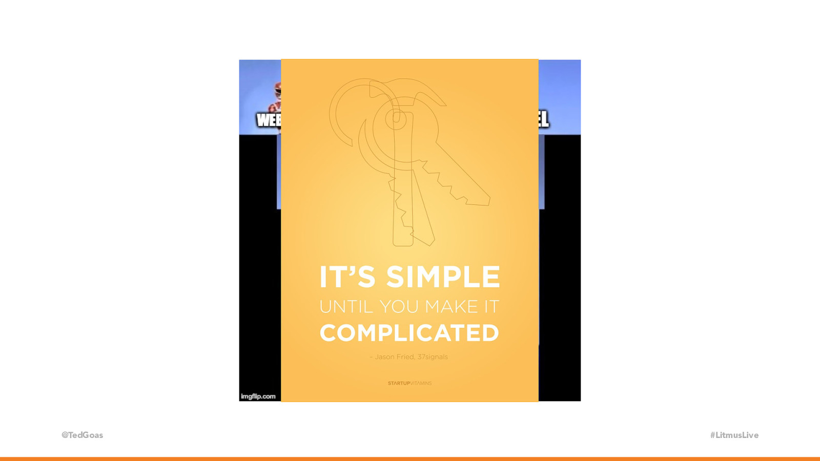
@TedGoas #LitmusLive You don’t need a million plugins or the latest framework de jour. A design system site could be done in php includes hosted in your company’s intranet. Or static HTML files in Dropbox. There are even off-the-shelf products like Storybook. —It doesn’t have to be complicated! I have this poster hanging in my office.

Slide 26

Slide 26

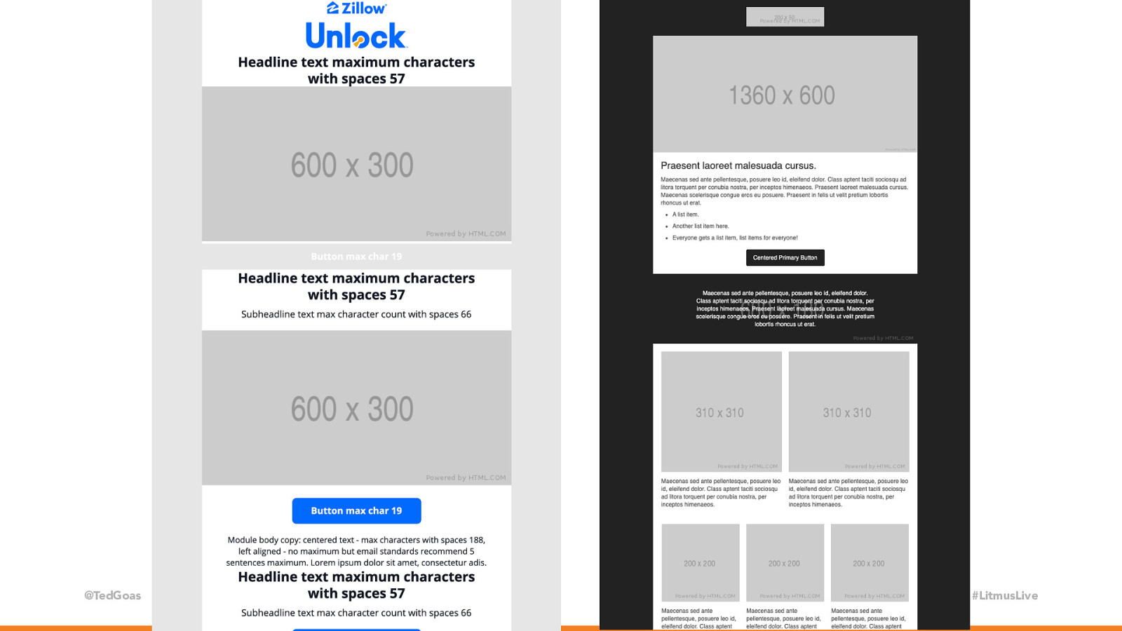
@TedGoas #LitmusLive As Crystal showed, the heart of Zillow’s design system is a large template with modules (aka Legos) and some documentation. Stack Overflow’s email design system started this way too, adapting from an open source template. It’s only as complicated as you want to make it.

Slide 27

Slide 27

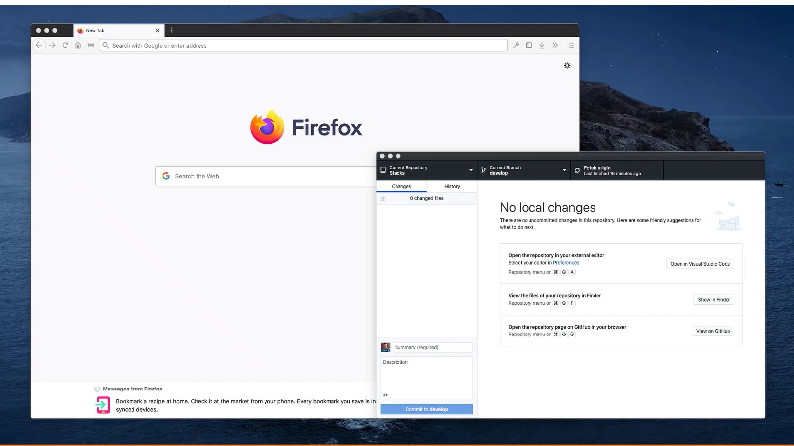
@TedGoas #LitmusLive Here’s quick animation of me bringing up our design system site locally. I use the GitHub client because it’s a nice, visual way to navigate a git repository. I open my terminal window from here so it opens the folder I want without having to do that in terminal, I type one of the few git commands I know, and in a few seconds I have a local copy of our design system running in my browser. Not too many bells and whistles. Now this is not to say you can’t do some cool things. Let me show you a few fancy things we do with Stack Overflow’s design system. Our local build system uses grunt to compile LESS into CSS and Jekyll templates and front matter into HTML. This allows us to use variables and partials across the design system.

Slide 28

Slide 28

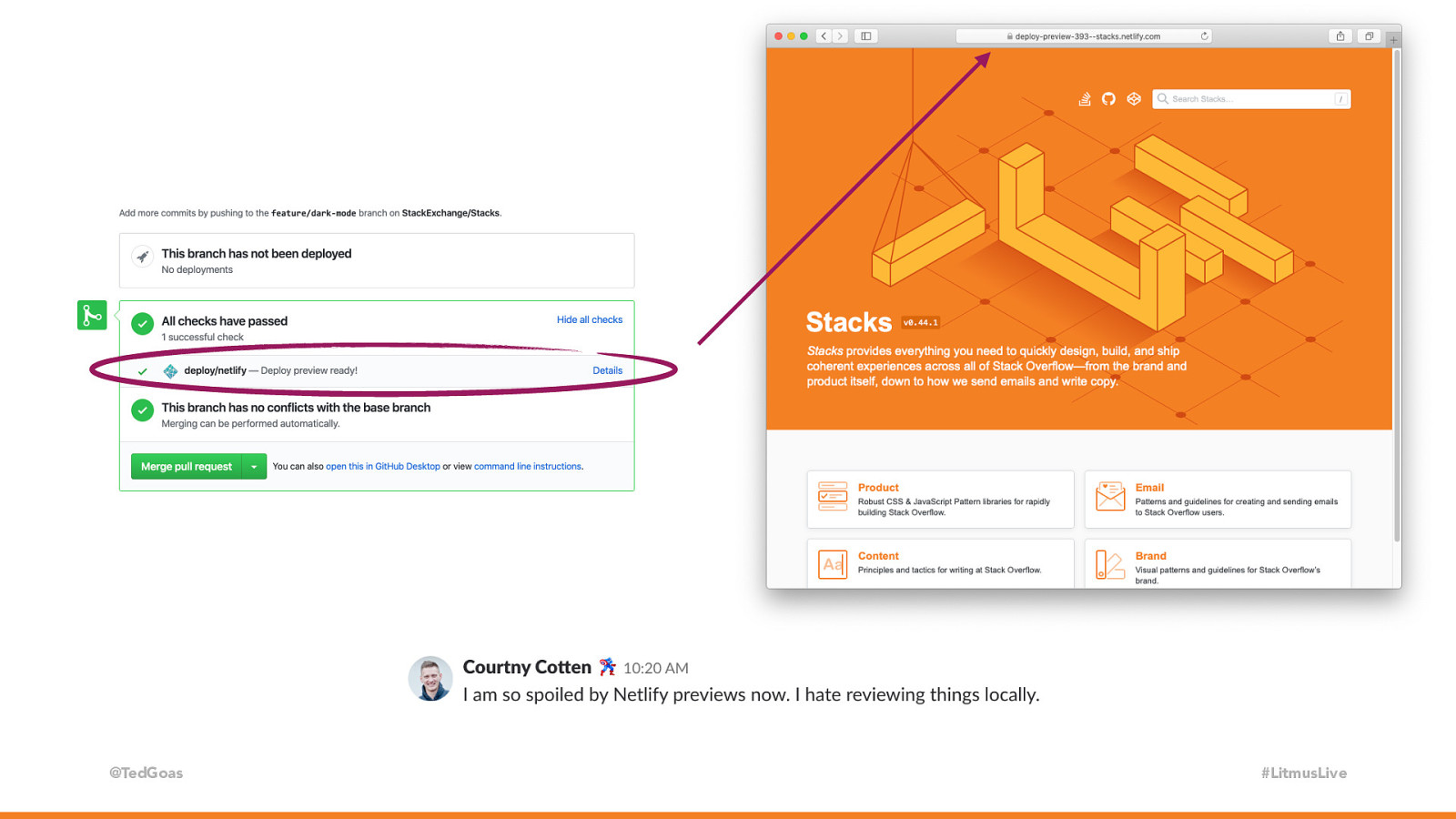
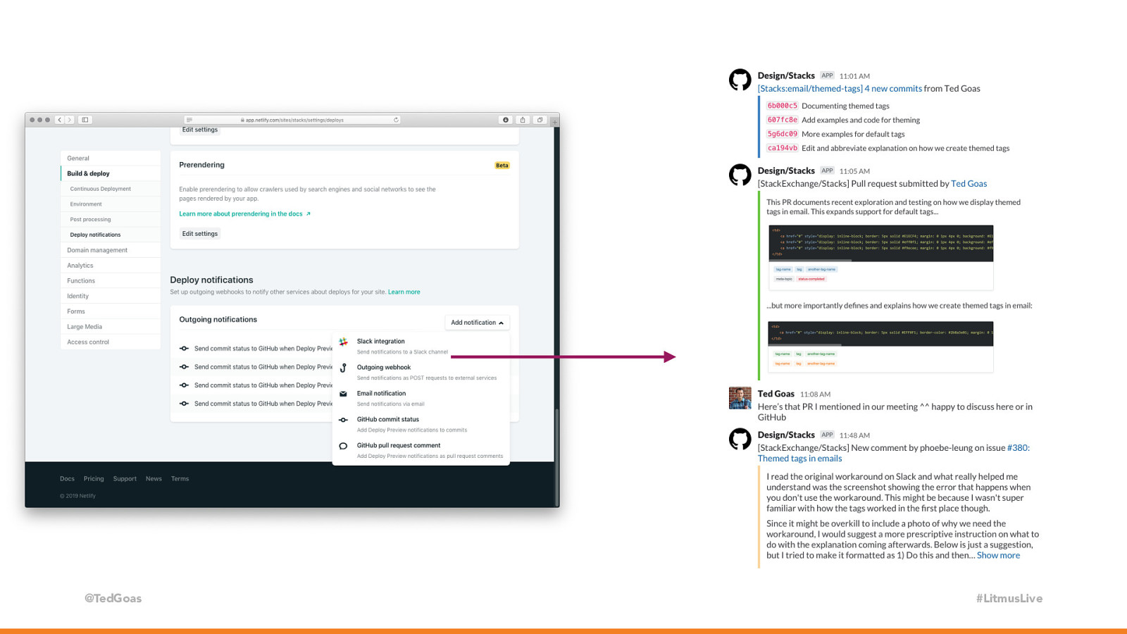
@TedGoas #LitmusLive We work in GitHub, all work is done on branches (our master branch is protected). This allows us to try wildly different ideas without messing up the core design system. Every pull request on GitHub is matched by a preview URL from Netlify. These branch preview links allow anyone to preview this work-in-progress without logging into or setting up our design system on their computer. It’s like Netlify creates a public dev server for us. Super handy for us since we’re a remote team and can’t pull someone over to look at our screen to look at something we’re working on. We can grab these branch preview links and drop them into chat or doc. Netlify also runs basic tests to ensure we don’t break the site by missing a close tag or something.

Slide 29

Slide 29

@TedGoas #LitmusLive Another we we socialize work is by pushing GitHub activity into our Slack channel for our design system. Whenever we push changes to Github, a GitHub webhook pushes those details into Slack so folks can follow along without being on GitHub. Now you saw me using terminal…, how many folks here aren’t comfortable using the command line? Yea… me too. I’m really not great at the command line. In fact this is my favorite book about git.

Slide 30

Slide 30

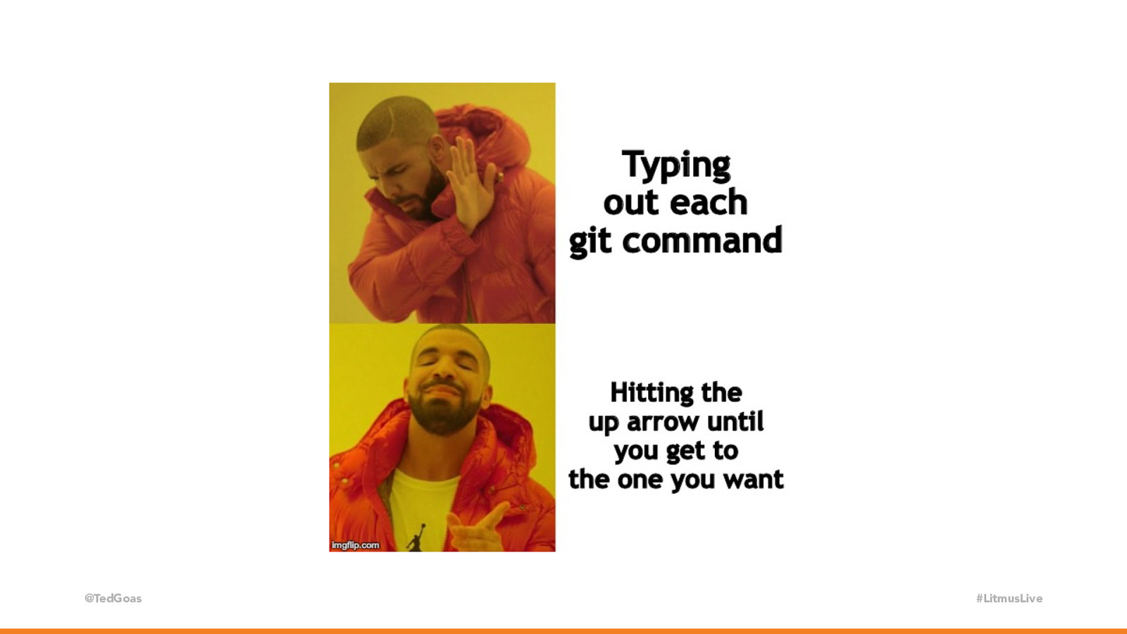
@TedGoas #LitmusLive Right… I know what I need to know to get by. So I use the same 6 git commands and… it gets even worse. And I don’t even type them

Slide 31

Slide 31

@TedGoas #LitmusLive I just keep hitting the up arrow that cycles through my history until I get to the one I want. Super technical, right? So the takeaway is: spinning up a design system site can be a lot less technical than it may seem. It doesn’t require a million plugins or mastery of the command line.

Slide 32

Slide 32

Make it official Plan your approach Build the documentation site Tie it to your design software @TedGoas #LitmusLive Cool, so let’s say we have a design system site and some components in the form of code. What about design? I mean, maybe sometimes we design in code or a visual editor, but we use also use programs like Sketch or Figma. How do we make sure that our designs are an accurate representation of what’s in our email design system?

Slide 33

Slide 33

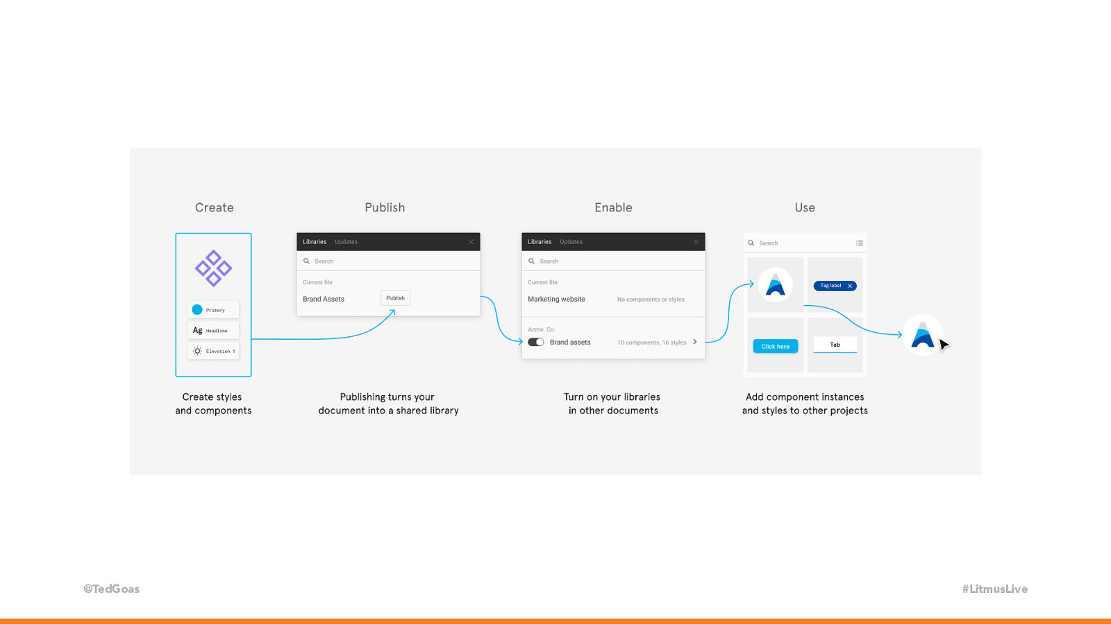
@TedGoas #LitmusLive Two things help: Shared styles and shared components. Sketch, Figma, Adobe XD, Invision DSM all offer these in one form or another, but I’ll focus on Figma since it’s what we use. Shared styles are predefined values for design elements. Think colors, type sizes, shadows, and spacing. We use them to control typography and colors so that we don’t have 50 different type sizes or a 100 shades of gray across our email designs.

Slide 34

Slide 34

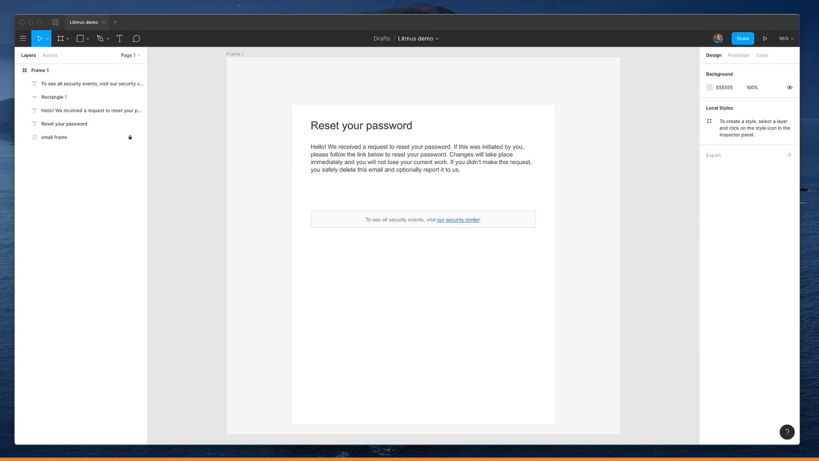
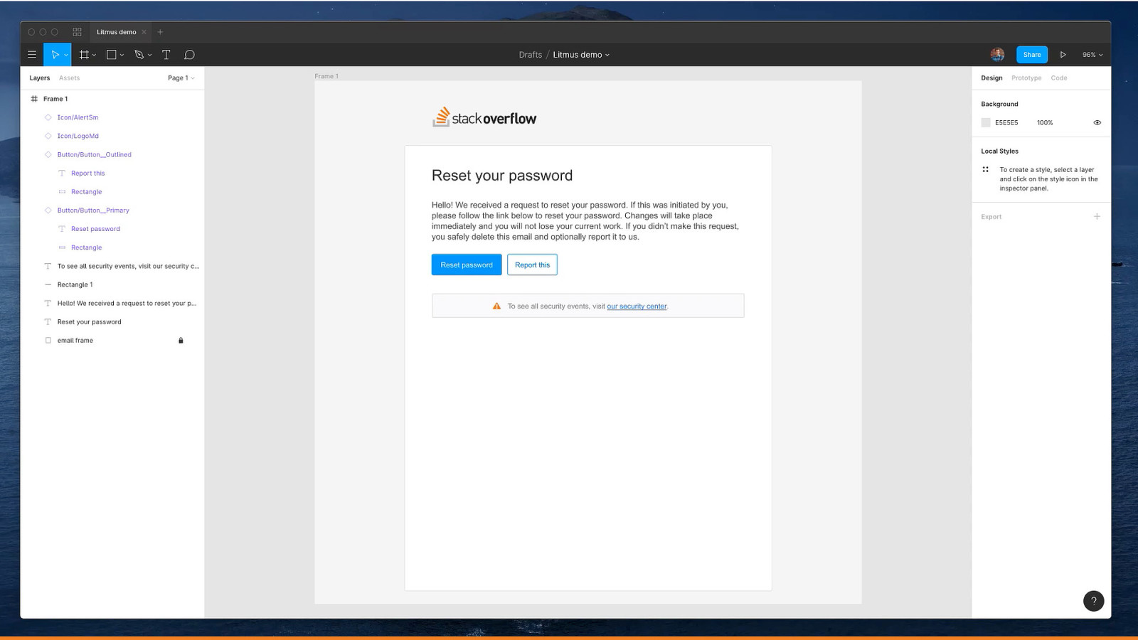
@TedGoas #LitmusLive Here’s me adding some typography and boxes to a design. We have a headline that’s big a dark… some body text that smaller and lighter… a bounding box with some text. Might not look like much, but we have the foundation of a transactional email in less than 60 seconds and we know that all type sizes and colors match what’s in our design system. So that’s shared styles. Shared components go one step further. Shared components are predefined design elements. Think buttons, icons, and images.

Slide 35

Slide 35

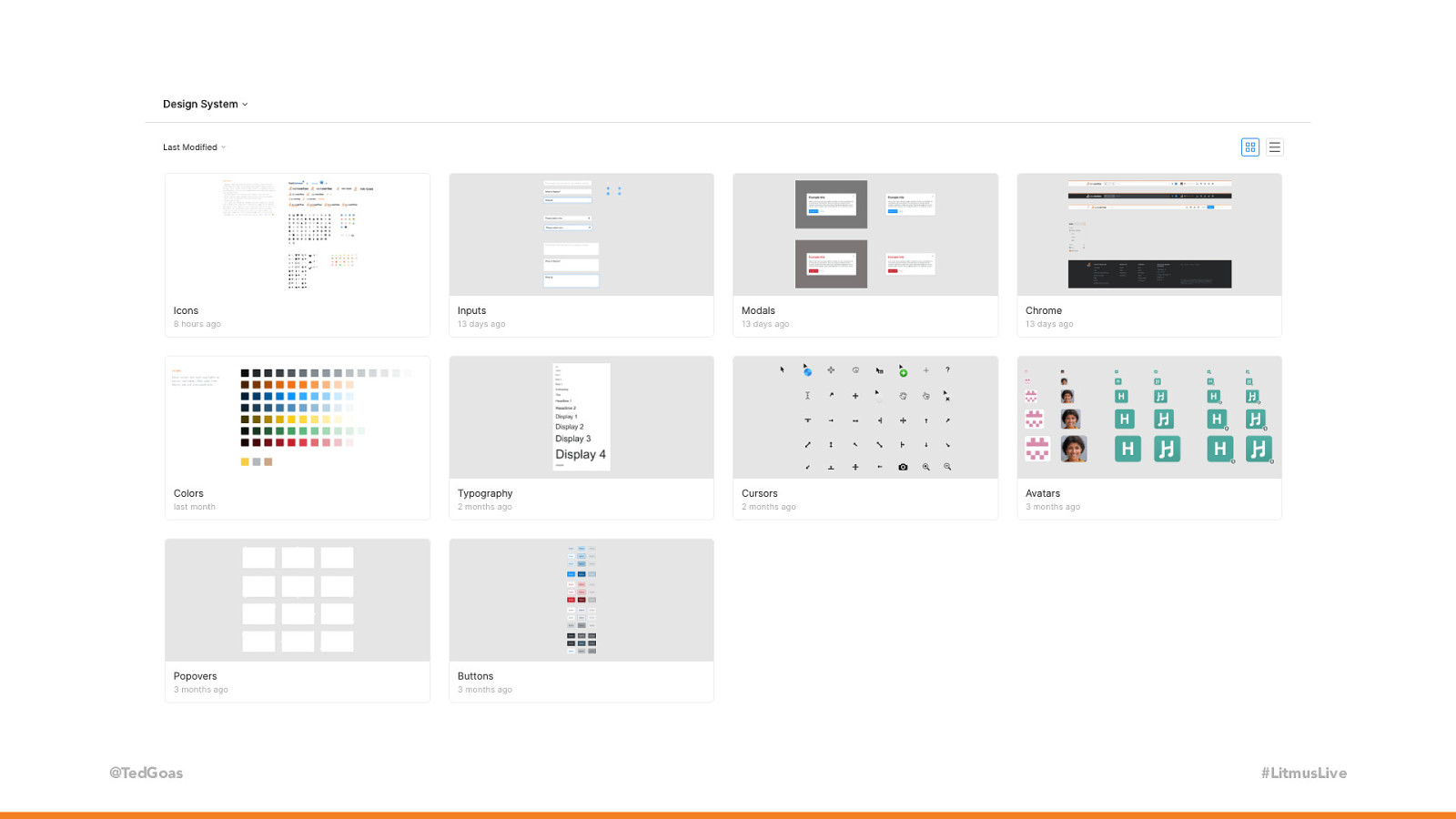
@TedGoas #LitmusLive Now let’s add to our email. Here’s my Figma Library and I have every button in our design system (including hover and active states)… and let’s add our most up-to-date logo that’s sized perfectly and pixel-fit… and an icon from our library. Not only does this ensure that all components are to spec, but it saves time because we don’t have to create this stuff over and over again.

Slide 36

Slide 36

“ @TedGoas “A good design system takes care of the stuff you shouldn’t reinvent and allows you to spend time on where it matters.” - Dan Mall #LitmusLive This kind of repetitive work is what computers are made for, so let’s outsource that to the design system. I haven’t drawn a new button in almost a year and I gotta tell ya… it feels great.

Slide 37

Slide 37

@TedGoas #LitmusLive Master components and styles can be set up by creating them in a Figma doc and publishing them as a Team Library. This allows everyone in your Team to view and use them across their design files, so everyone is designing from the same agreed-upon building blocks

Slide 38

Slide 38

@TedGoas #LitmusLive If you wanna get really nerdy, you can customize your design program’s presets to match your design system. For instance, if you select an element and use the arrows keys, it moves said element by 1px… but you hold shift it nudges it by more than that. Most apps set this to a round number like 10. But say your grid system is an 8pt grid… you can set this number to 8 (or 4 or 2 or whatever multiple you want). Shared styles, components, and custom software presets all help ensure that artwork for an email matches styles defined in the email design system. This is very handy when reviewing or critiquing an email designs or handing off design to a developer or agency. How many people know what redlines are? Yea? How many enjoy creating them?

Slide 39

Slide 39

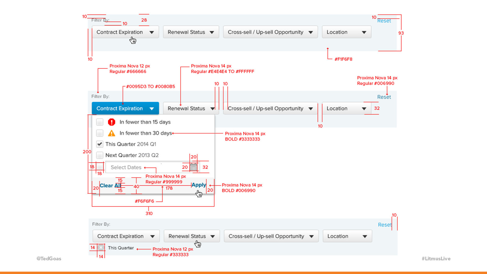
@TedGoas #LitmusLive Redlines are literal guides, which are often red lines, within a document that communicate exact spacing, type size, color, etc. And creating them is just awful. Now instead of this… we can say “Here’s a button and here’s a link to our design system that shows you exactly how to code it.” Again, let’s outsource to boring, repetitive work to the design system. Now all Stack Overflow’s designers, regardless of their ability to code, can design using design system components in their design software.

Slide 40

Slide 40

@TedGoas #LitmusLive Photo by Perry Grone on Unsplash So that’s our design system, how we build it, and how we use it. Again, creating a design system site and incorporating it into your design software takes time, so getting buy-in for the design system is important so you can dedicate time and focus on it amidst your “regular work.” If I can leave you with some parting words: Buy yourself the time you need. Welcome people into your work. Don’t overcomplicate things. Open Source if you can. #emailgeeks have a lot to share. We’ll all be a better community for it.

Slide 41

Slide 41

Thank You! ✌ @TedGoas If you’re interested in chatting, ping me on Twitter or message me on email geeks chat! I’ll also be around the conference with my laptop if anyone wants a live demo. Thanks ✌