How we build component-based Drupal themes by Tamás Hajas and Gábor Tompa
Note: A lot of the slide notes are copied from documentation and related articles. Thanks to the authors!
A presentation at Budapest Drupal User Group Meetup in April 2019 in Budapest, Hungary by Tamás Hajas

Note: A lot of the slide notes are copied from documentation and related articles. Thanks to the authors!
A page? System of components Brake down the page into reusable peaces! Decoupled frontend frameworks (React, Vue etc.) use component structure as well.

Atomic Design Brad Frost, 2013.

Is there anyone who haven’t seen this yet?
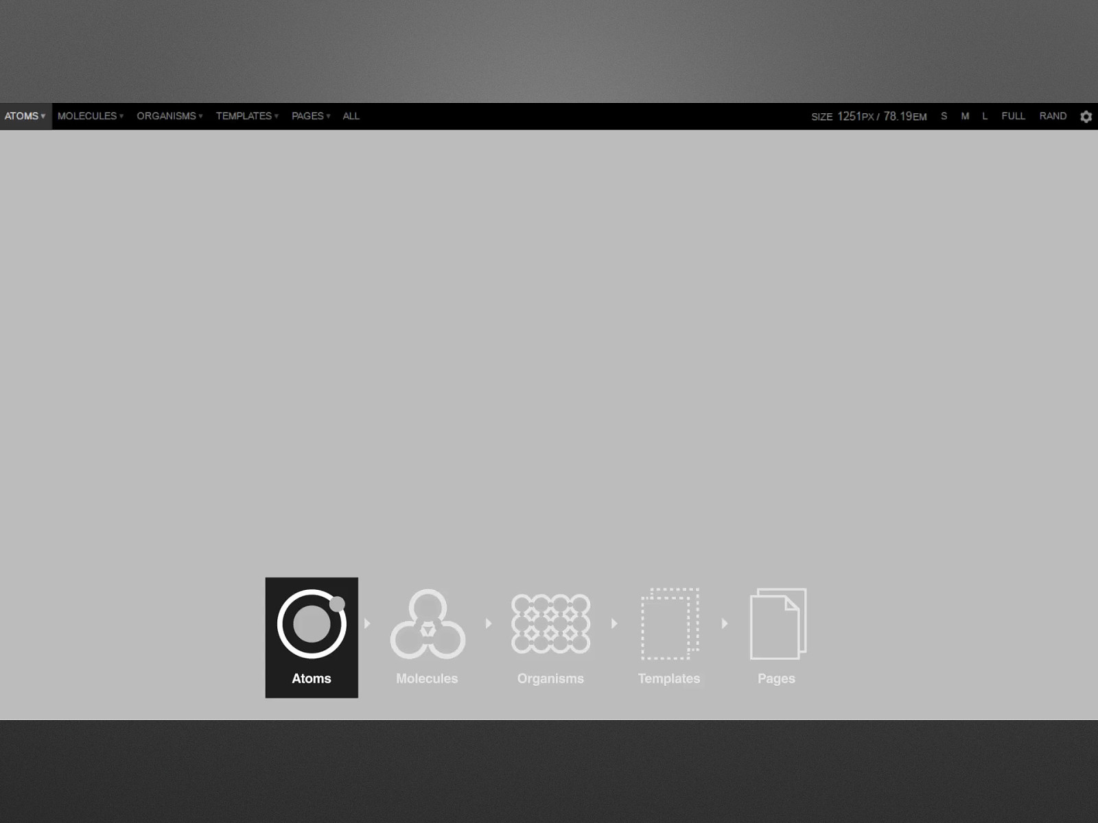
Atoms are the basic building blocks of matter. Applied to web interfaces, atoms are our HTML tags, such as a form label, an input or a button. Molecules are where things start to get more tangible as we start combining atoms together. Example, a search form comprised of a label, input and submit button. Organisms allow us to combine molecules into something relatively complex, such as a distinct section of the interface. Example, the header or footer of a site. Templates consist mostly of groups of organisms stitched together to form pages. It’s here where we start to see the design coming together and start seeing things like layout in action. Example, article node page. Pages are specific instances of templates. Here, placeholder content is replaced with real representative content to give an accurate depiction of what a user will ultimately see. Drupal: In general, fields can be thought of as atoms, nodes as molecules and views, paragraphs or other listings as organisms.
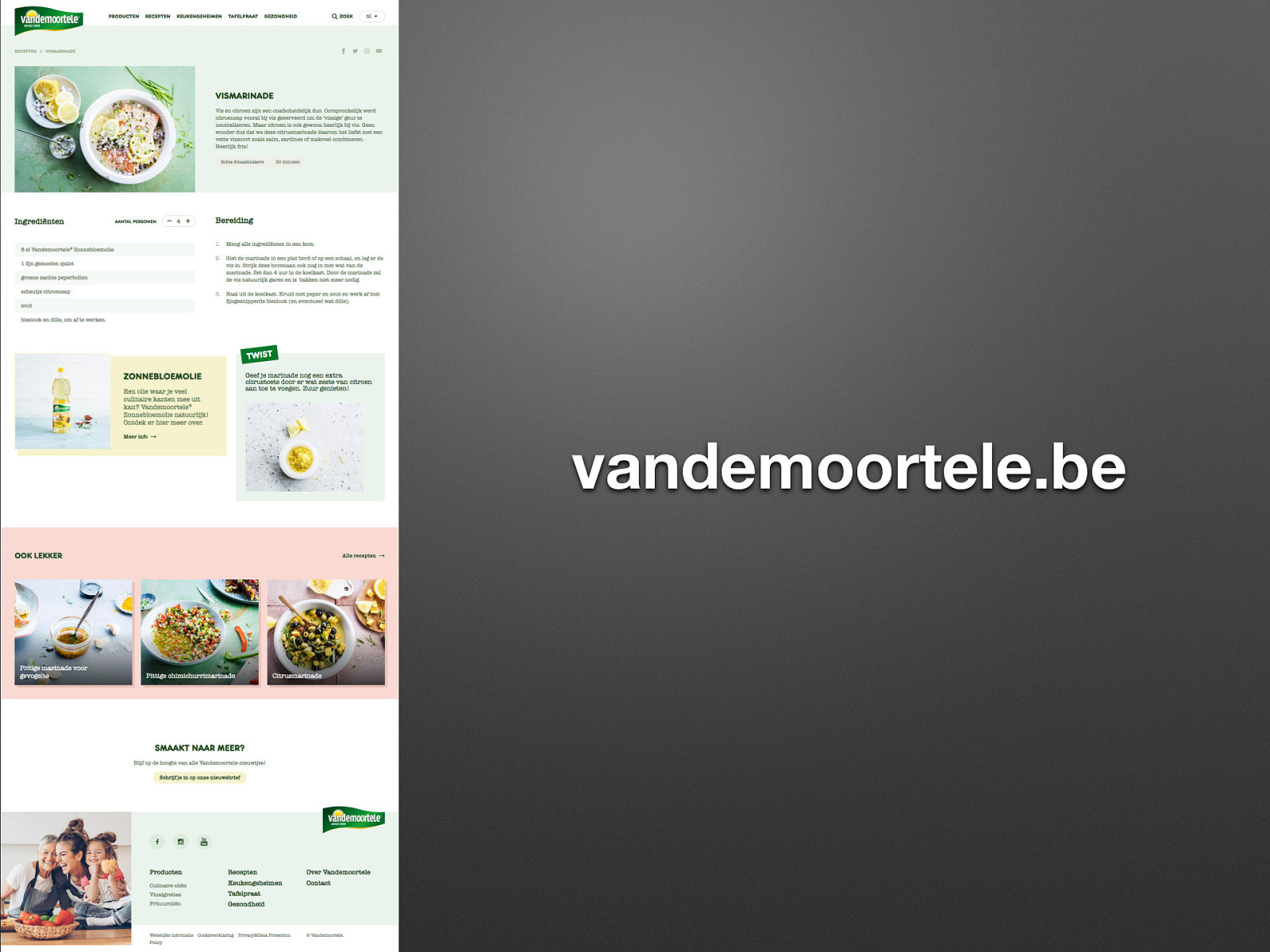
vandemoortele.be
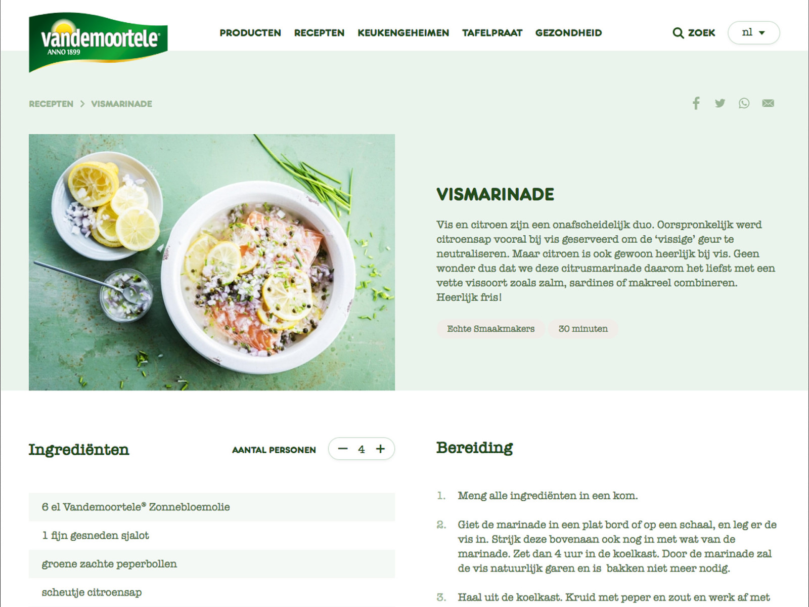

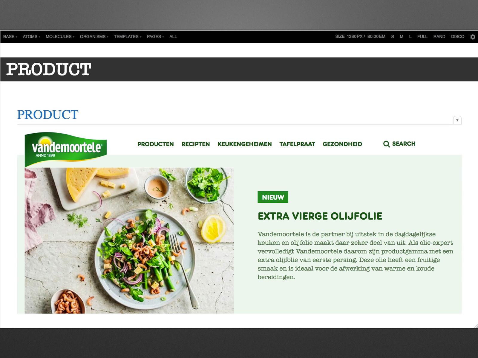
Emulsify Component based Drupal theming needs a (relatively) complex toolset. (We will see.) Emulsify provides it out of the box.
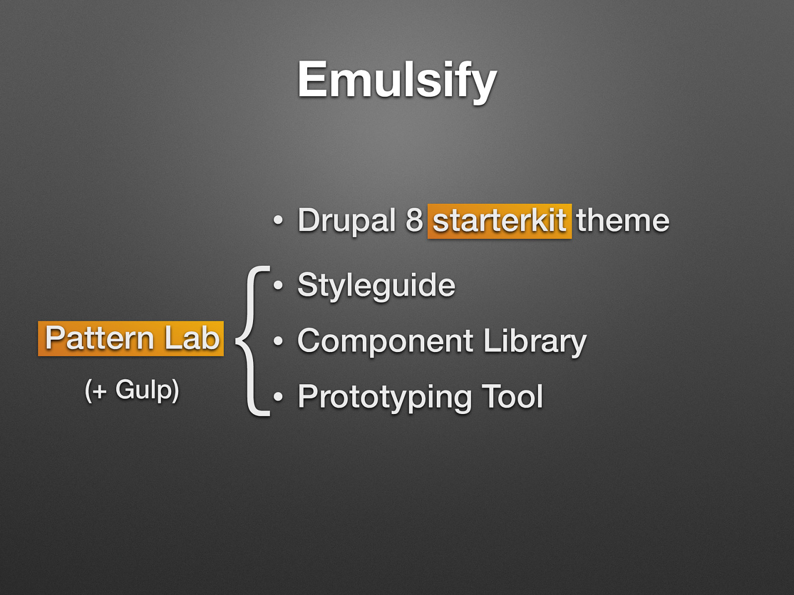
• Drupal 8 starterkit theme • Styleguide • Component Library • Prototyping Tool { Emulsify provides several useful components out of the box such as images, menus, headings (and a whole lot more) and the accompanying Drupal templates have already been overwritten and plumbed accordingly so you can quite literally start working on the pattern lab and see the results directly inside the Drupal build as you go. Styleguide (base, atoms): colors, typography, butonns, form elements, icons, utilities, grids Component Library (molecules, organisms): cards, media blocks, menus, grids of media blocks – collect own examples! Prototyping Tool (templates, pages): homepage, full node view, landing page – this level is not used in Drupal (do not include a whole PL page into Drupal) parallel frontend / backend workflow. Frontend dev does not depend on backend results. Get rid of thinking in Drupal terms / drupalisms. No Drupal knowledge needed to create the frontend components create non-static “design”: quicker than building it in Drupal, clients may be involved One source of truth: uses the same components in prototype and in Drupal Reuse a the design system in multiple sites (- theoretically. But: maintainability, fragmentation!)
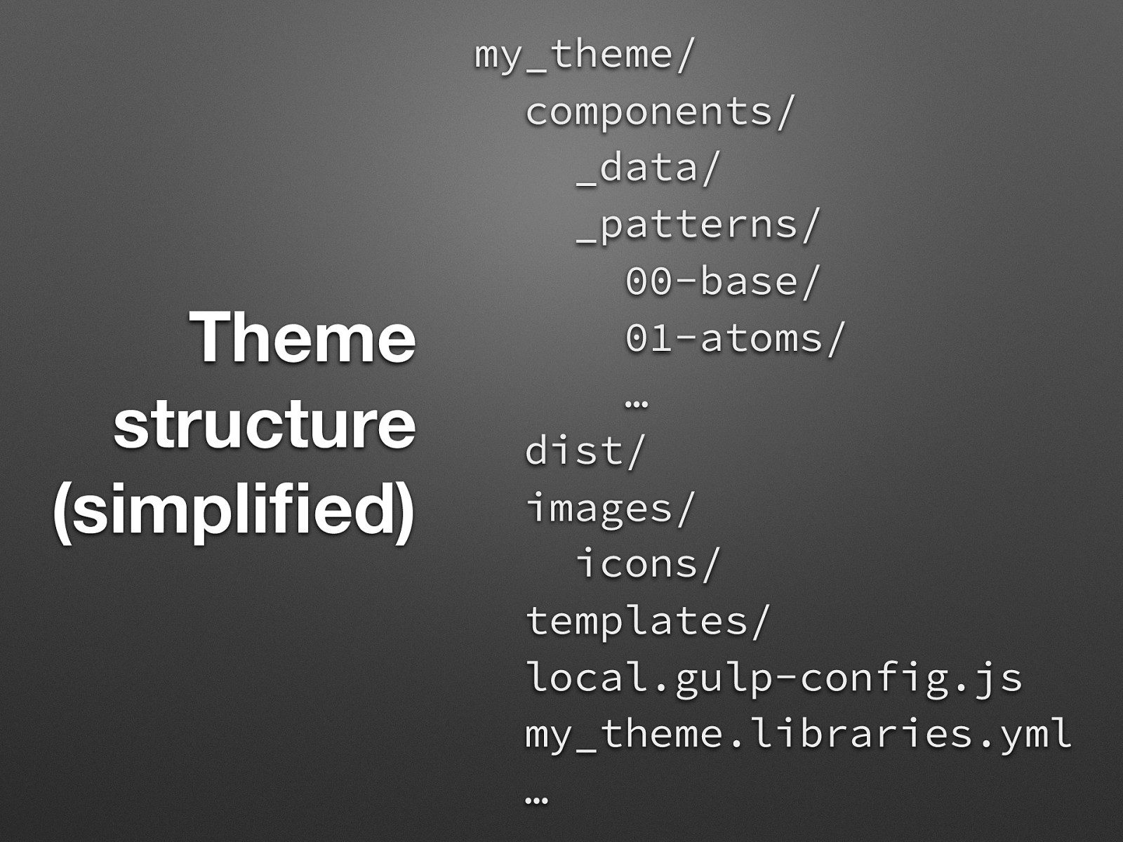
Theme structure (simplified) my_theme/ components/ _data/ _patterns/ 00-base/ 01-atoms/ … dist/ images/ icons/ templates/ local.gulp-config.js my_theme.libraries.yml … components/_data – .yml/.json global data files components/_patterns/ - All components are filed here from smallest (atoms) to largest (pages). components/_patterns/00-base - For top-level needs such as sass variables/mixins, layout, fundamental styles, etc. dist - minified js files, svg sprite, style.css images/icons/src/ - individual SVGs placed here will be automatically combined into an SVG sprite via a gulp task. See components/_patterns/01-atoms/04-images/ icons/icons.md in Pattern Lab for instructions.
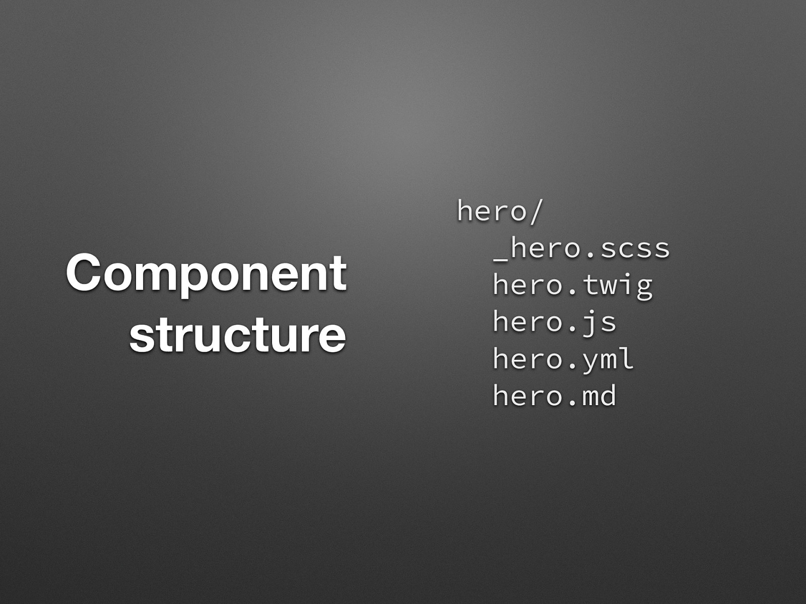
Component structure hero/ _hero.scss hero.twig hero.js hero.yml hero.md simple / meaningful names All related files (code) in a single place (twig, css, js, data.yml, metadata.md) Each component folder contains it’s own Twig template as well as the asset files for that component. It may also contain sample data (yml/json) as well as a documentation file for annotations (markdown).
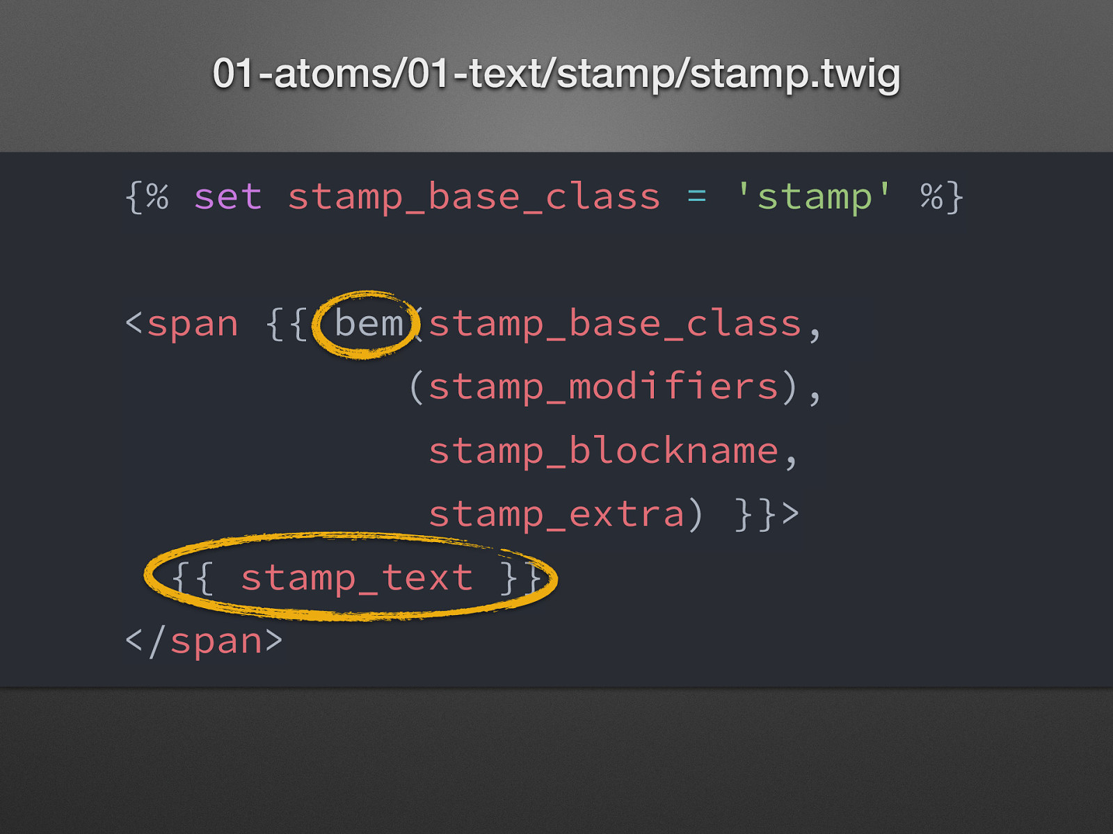
01-atoms/01-text/stamp/stamp.twig {% set stamp_base_class = ‘stamp’ %} <span {{ bem(stamp_base_class, (stamp_modifiers), stamp_blockname, stamp_extra) }}> {{ stamp_text }} </span> BEM Twig extension: makes it easy to deliver classes to both Pattern Lab and Drupal while using Drupal’s Attributes object (In Drupal – attributes.addClass() – appends classes to whatever classes core or other plugins provide as well. Simpler syntax + Drupal Attributes support!) Supports blocks, modifiers, elements and extra classes (variables as arguments here): calss name of the block / or element, [ modifiers ], name of the block for element, [ extra classes ]
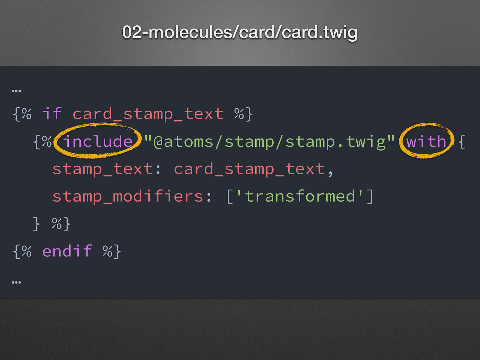
02-molecules/card/card.twig … {% if card_stamp_text %} {% include “@atoms/stamp/stamp.twig” with { stamp_text: card_stamp_text, stamp_modifiers: [‘transformed’] } %} {% endif %} … Just a small part of the code! (My) Problem: including with exact path. » No easy reorganisation. Twig functions for nesting components - Include: pull in file, replace variables - Extends: pull in file, replace Twig blocks (not used because variables lways defined) - Embed: pull in file, replace variables and / or twig blocks
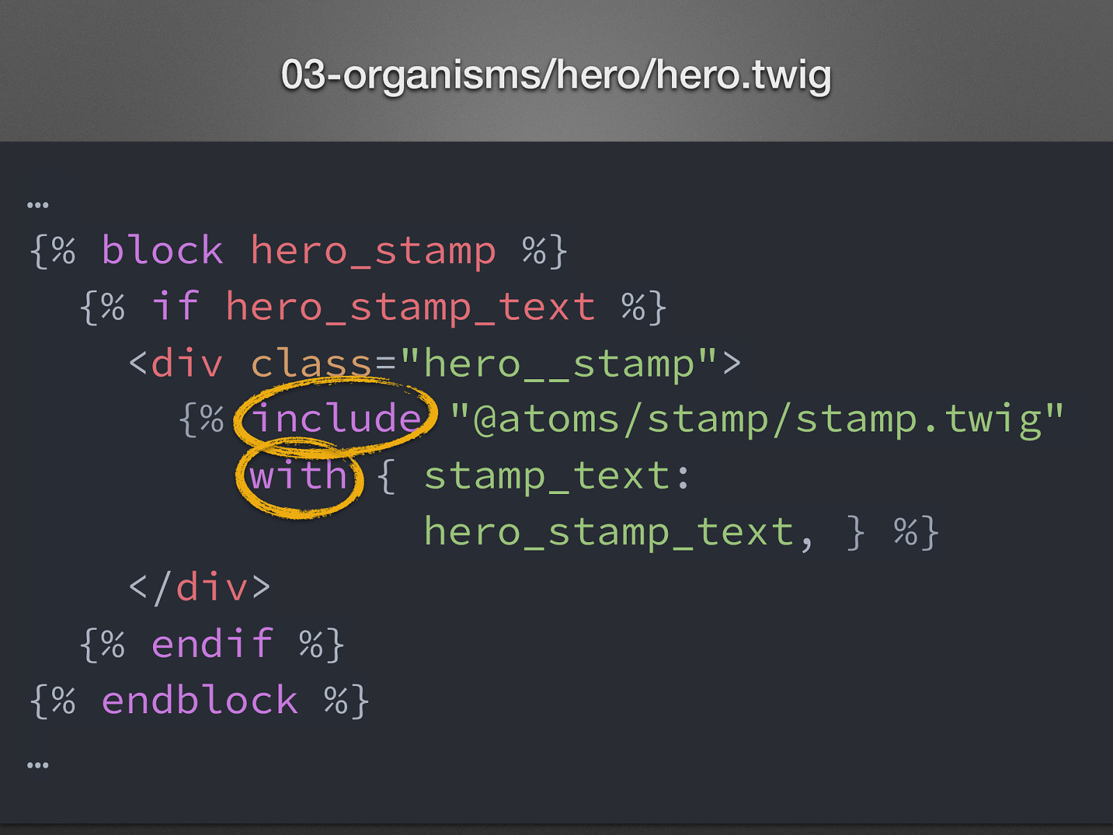
03-organisms/hero/hero.twig … {% block hero_stamp %} {% if hero_stamp_text %} <div class=”hero__stamp”> {% include “@atoms/stamp/stamp.twig” with { stamp_text: hero_stamp_text, } %} </div> {% endif %} {% endblock %} … Just a small part of the code! (My) Problem: including with exact path. » No easy reorganisation.
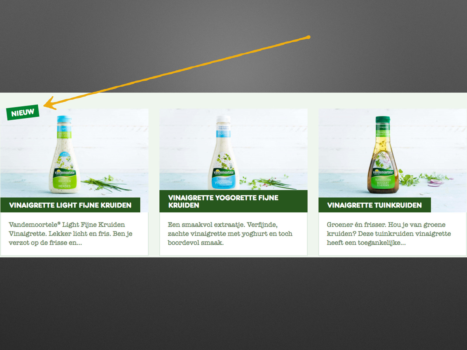
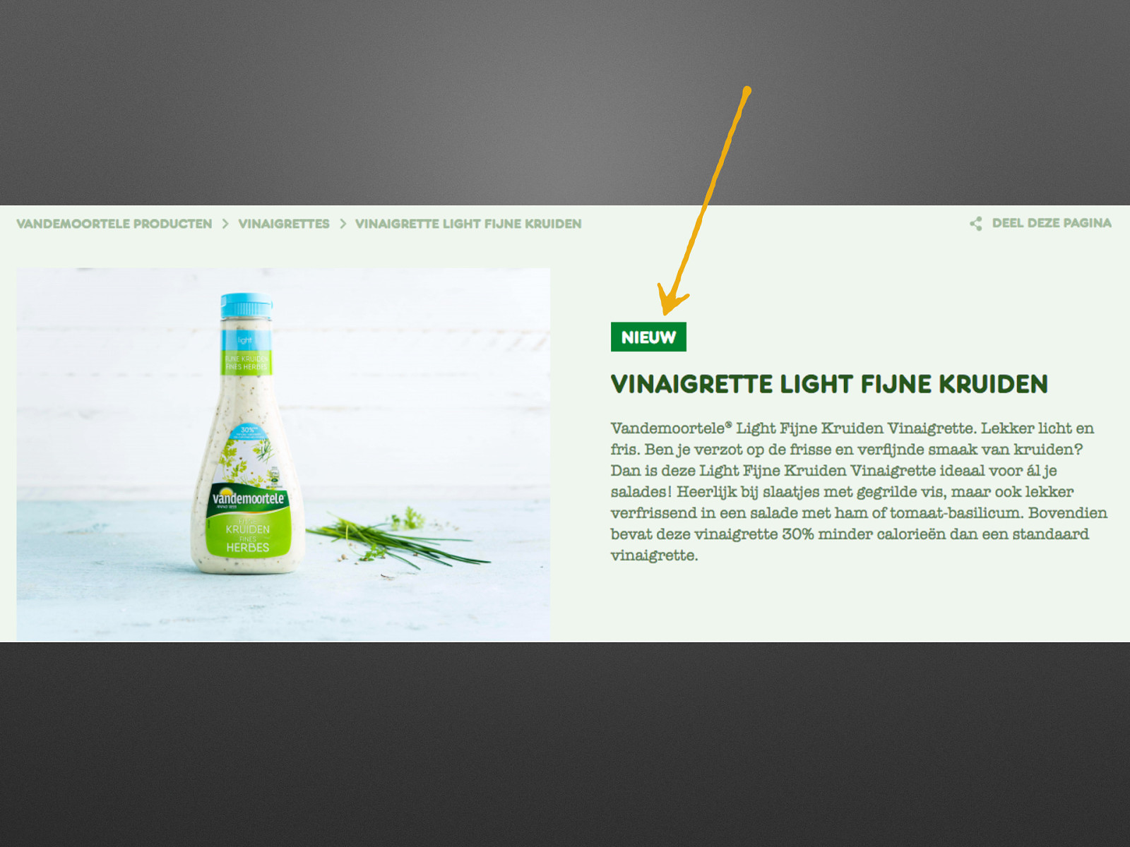
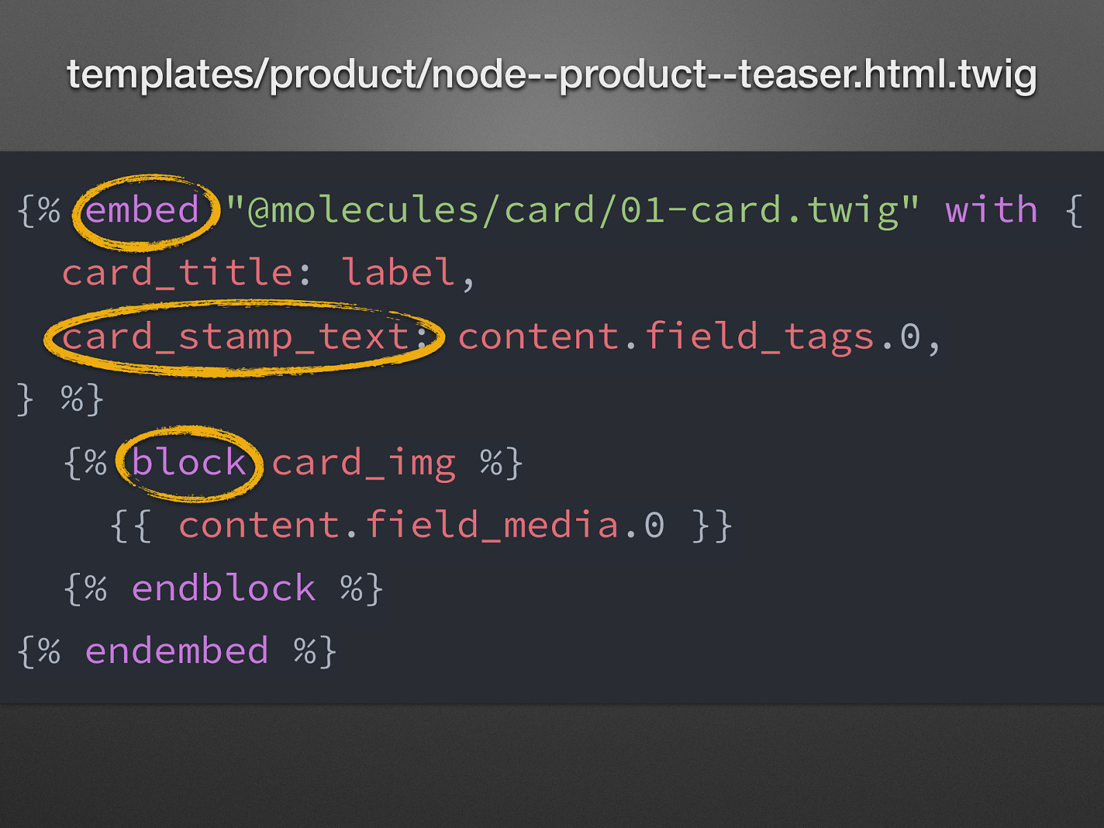
templates/product/node—product—teaser.html.twig {% embed “@molecules/card/01-card.twig” with { card_title: label, card_stamp_text: content.field_tags.0, } %} {% block card_img %} {{ content.field_media.0 }} {% endblock %} {% endembed %} Integrating PL into Drupal components needs work! - create integrating templates of Drupal theme (few lines of code) - may need to change the PL component (eg. different data source) Tools coming with Emulsify - Components (Library module), Unified Twig extensions (module), Attach Library Twig extension Drupal has specific Twig functions, filters, tags, etc. that it uses that Pattern Lab is not aware of. Pattern Lab has an easy way to add those though, which is in components/_twig-components/. There are examples of filters and functions already in there (e.g., t(), without(), kint() functions). Documentation on how to add these can be found here. Twig functions for nesting components - Include: pull in file, replace variables - Extends: pull in file, replace Twig blocks (not used because variables lways defined) - Embed: pull in file, replace variables and / or twig blocks
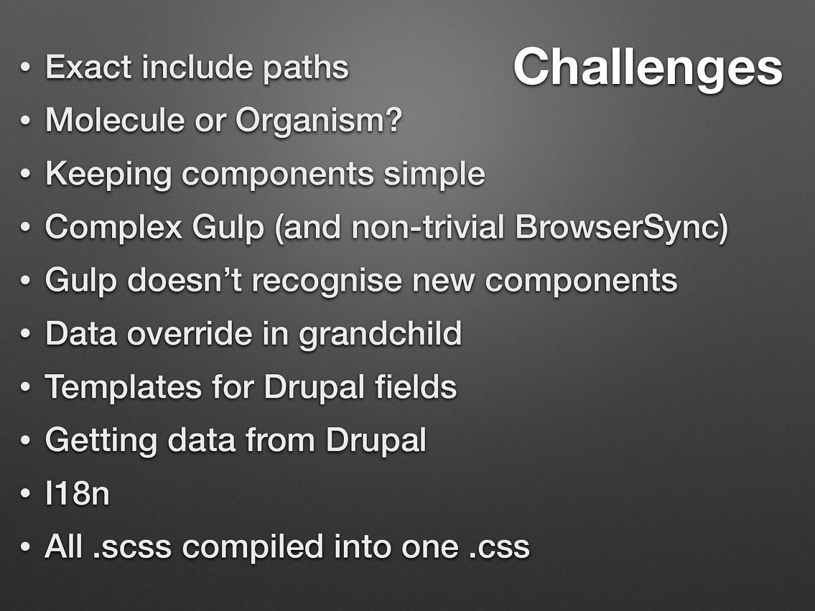
Challenges • Exact include paths • Molecule or Organism? • Keeping components simple • Complex Gulp (and non-trivial BrowserSync) • Gulp doesn’t recognise new components • Data override in grandchild • Templates for Drupal fields • Getting data from Drupal • I18n • All .scss compiled into one .css
Helping hands: drupaltwig-slack.herokuapp.com #pattern-lab

Fractal
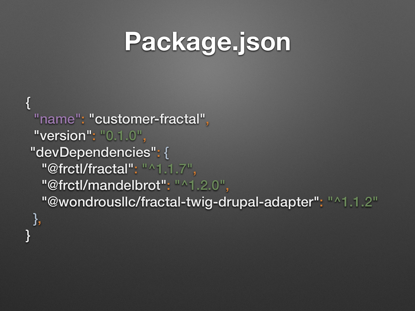
Package.json { “name”: “customer-fractal”, “version”: “0.1.0”, “devDependencies”: { “@frctl/fractal”: “^1.1.7”, “@frctl/mandelbrot”: “^1.2.0”, “@wondrousllc/fractal-twig-drupal-adapter”: “^1.1.2” }, } Of course you need more thinks like gulp, sass, lint, etc.
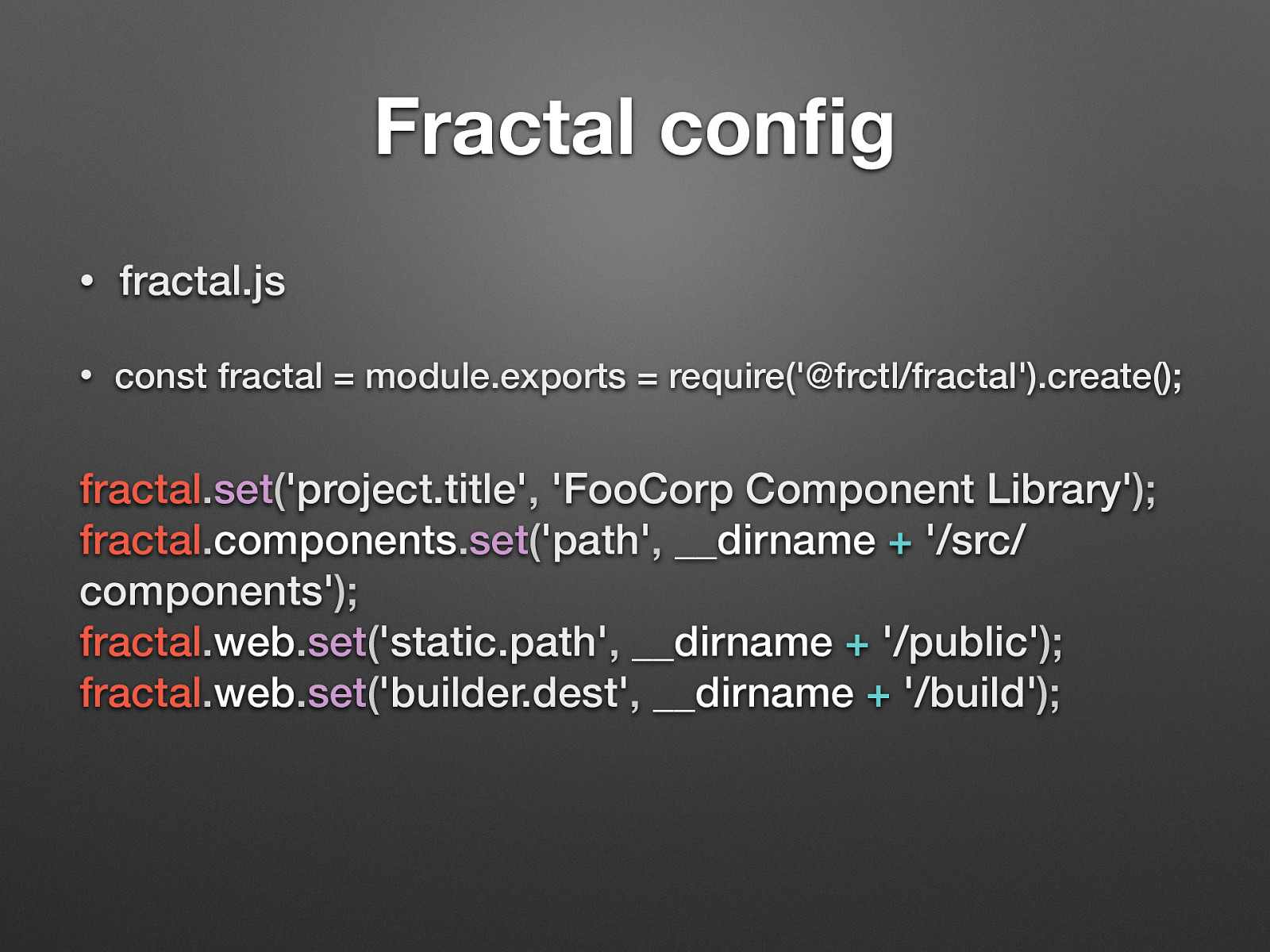
Fractal config • fractal.js • const fractal = module.exports = require(‘@frctl/fractal’).create(); fractal.set(‘project.title’, ‘FooCorp Component Library’); fractal.components.set(‘path’, __dirname + ‘/src/ components’); fractal.web.set(‘static.path’, __dirname + ‘/public’); fractal.web.set(‘builder.dest’, __dirname + ‘/build’);
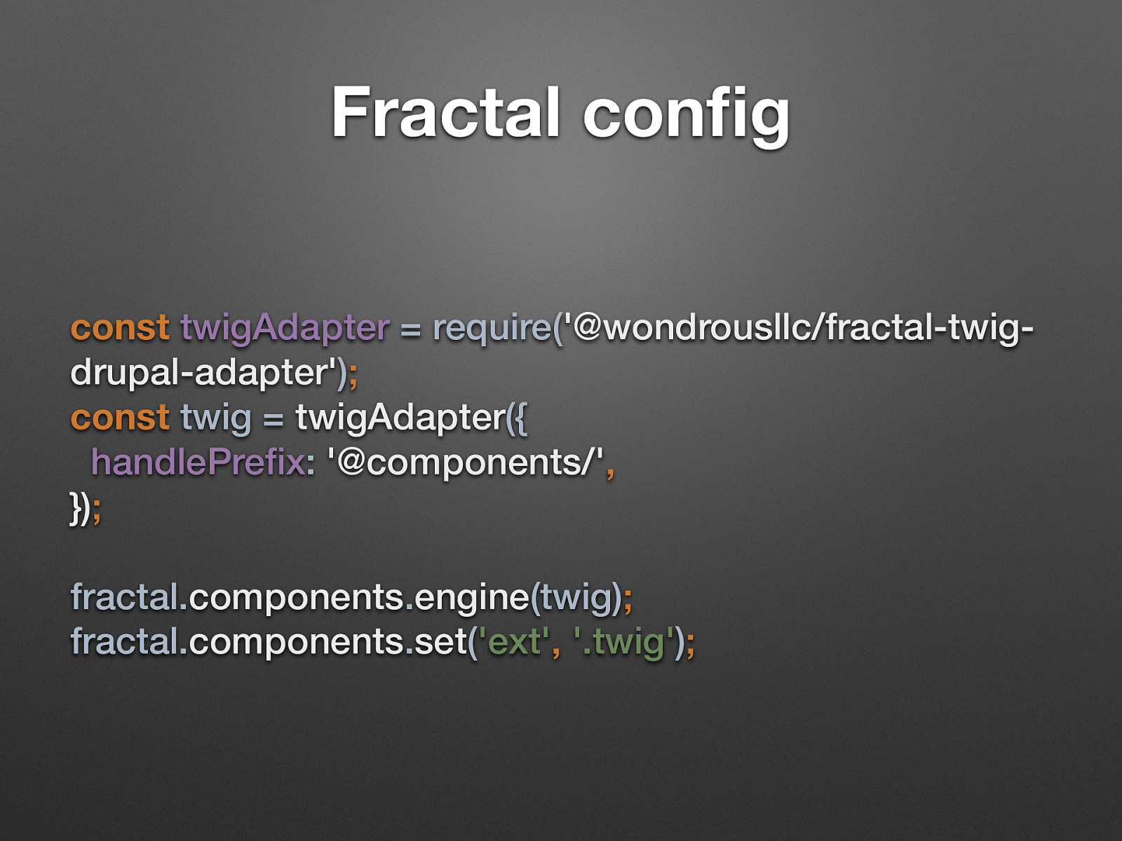
Fractal config const twigAdapter = require(‘@wondrousllc/fractal-twigdrupal-adapter’); const twig = twigAdapter({ handlePrefix: ‘@components/’, }); fractal.components.engine(twig); fractal.components.set(‘ext’, ‘.twig’); Lots of templating language (the default is handlebars we used twig and nunjucks)
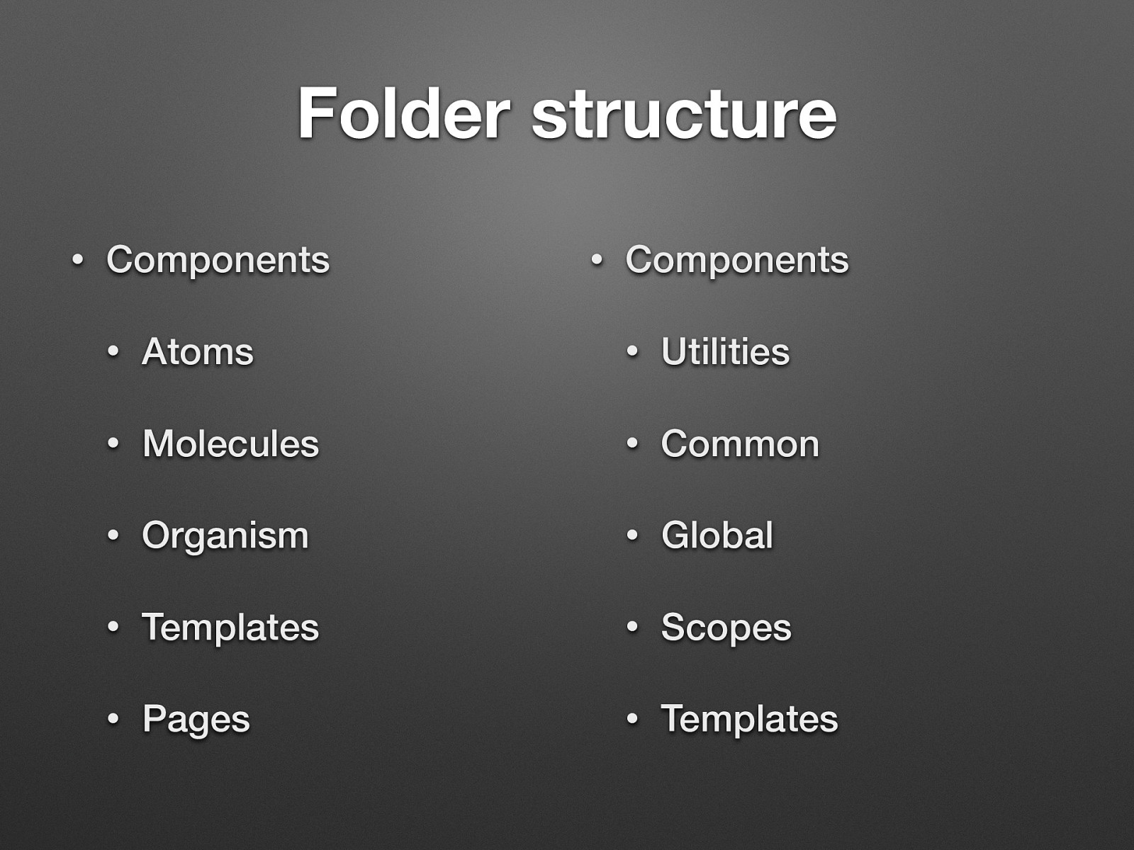
Folder structure • Components • Components • Atoms • Utilities • Molecules • Common • Organism • Global • Templates • Scopes • Pages • Templates You can build your own structure - the second one is the 24ways.com style guide.
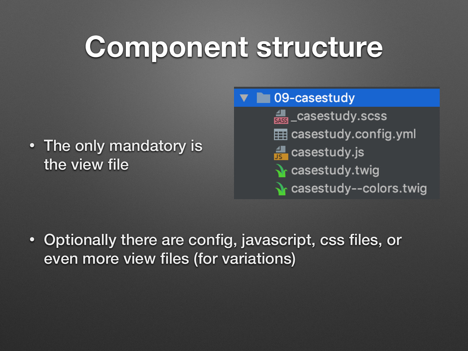
Component structure • The only mandatory is the view file • Optionally there are config, javascript, css files, or even more view files (for variations)
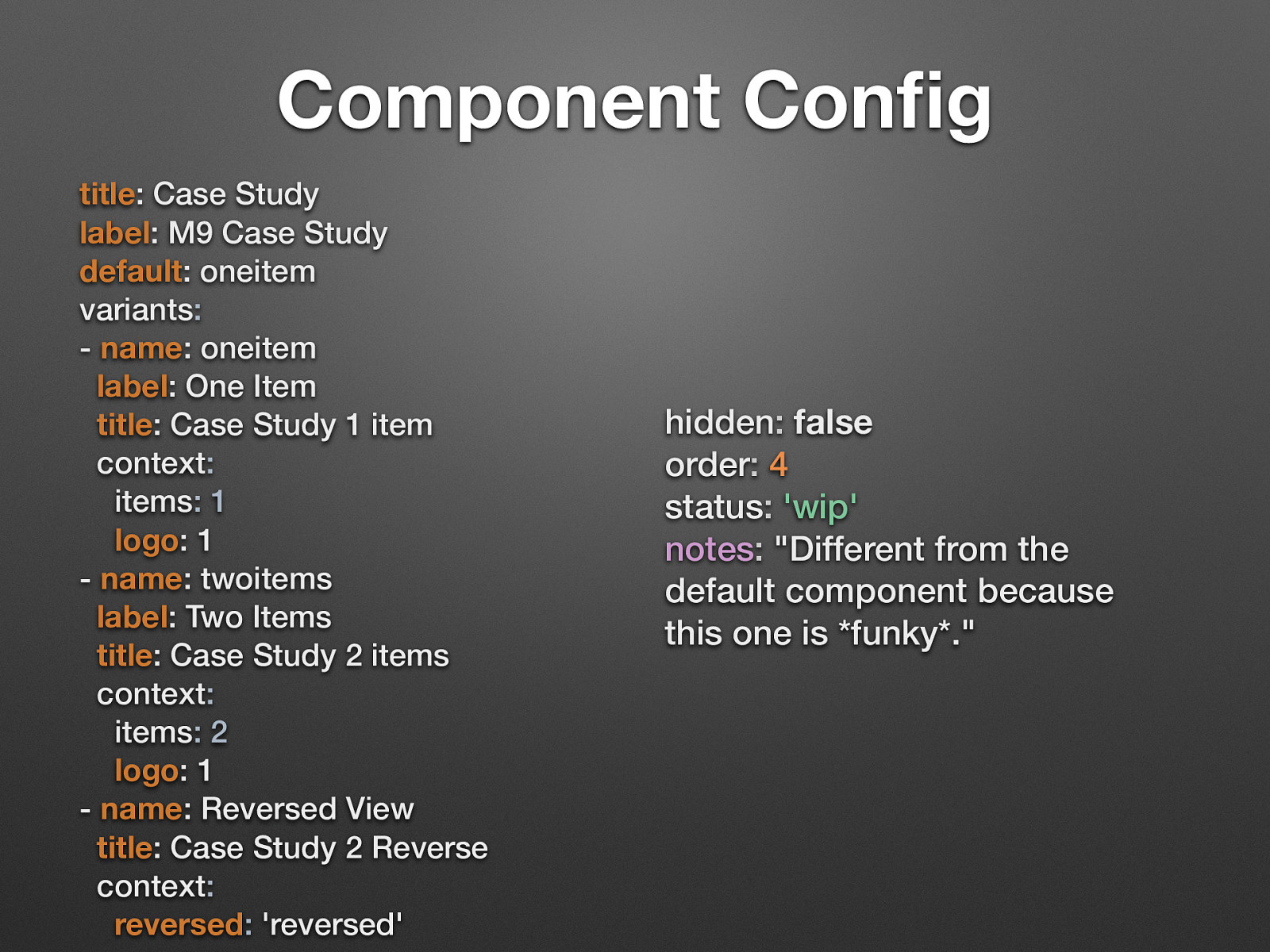
Component Config title: Case Study label: M9 Case Study default: oneitem variants: - name: oneitem label: One Item title: Case Study 1 item context: items: 1 logo: 1 - name: twoitems label: Two Items title: Case Study 2 items context: items: 2 logo: 1 - name: Reversed View title: Case Study 2 Reverse context: reversed: ‘reversed’ hidden: false order: 4 status: ‘wip’ notes: “Different from the default component because this one is funky.” Lots of config format (the default is json, we used yml) Whether or not the collection (and all its children) should be hidden from listings and navigation. An integer order value, used when sorting collections. Overrides any order value set as a property of the directory name if set. Any notes about the variant. Displayed in the web preview UI if present. Accepts markdown.
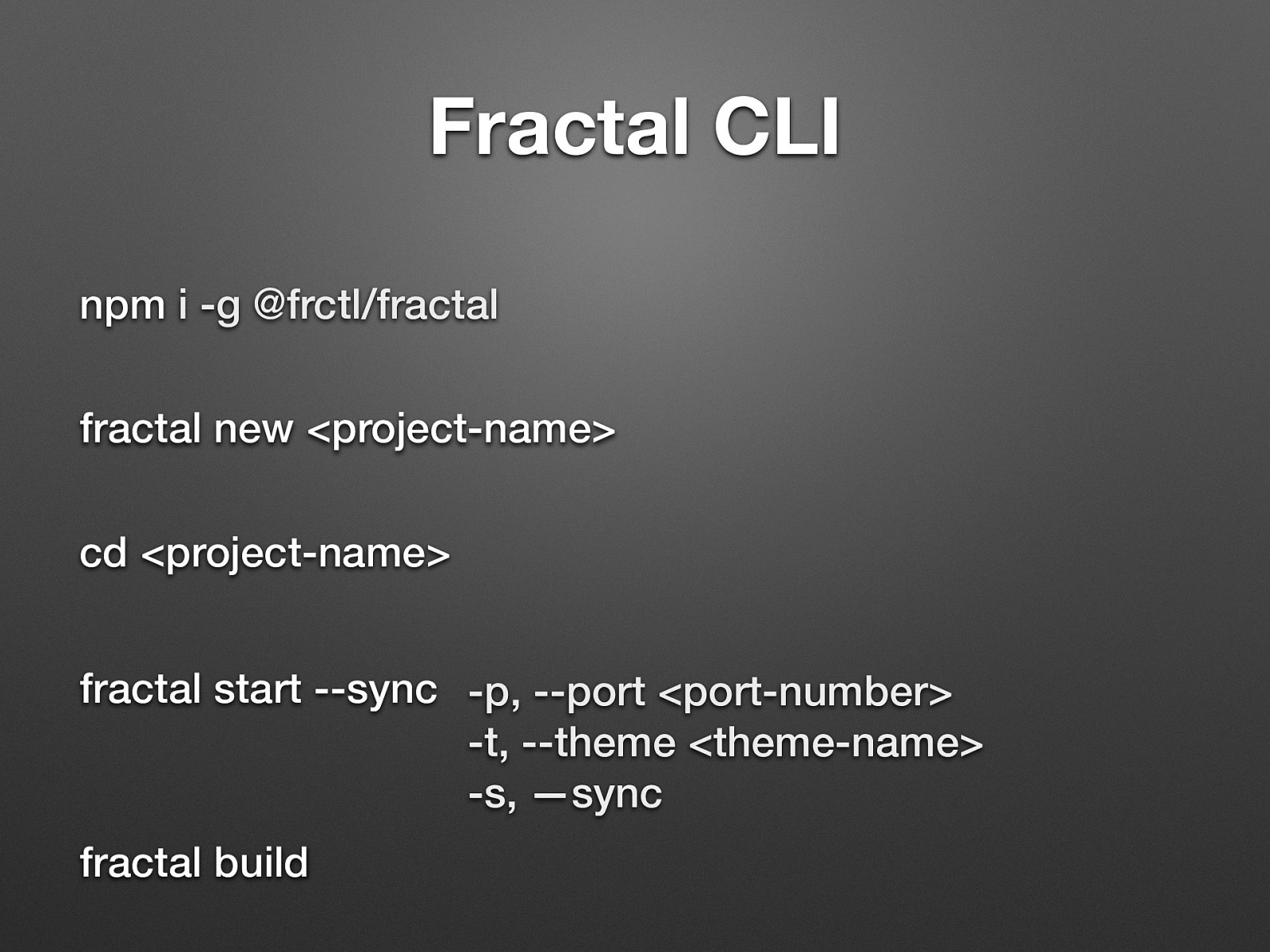
Fractal CLI npm i -g @frctl/fractal fractal new <project-name> cd <project-name> fractal start —sync -p, —port <port-number> -t, —theme <theme-name> -s, —sync fractal build Very handly and fast development.
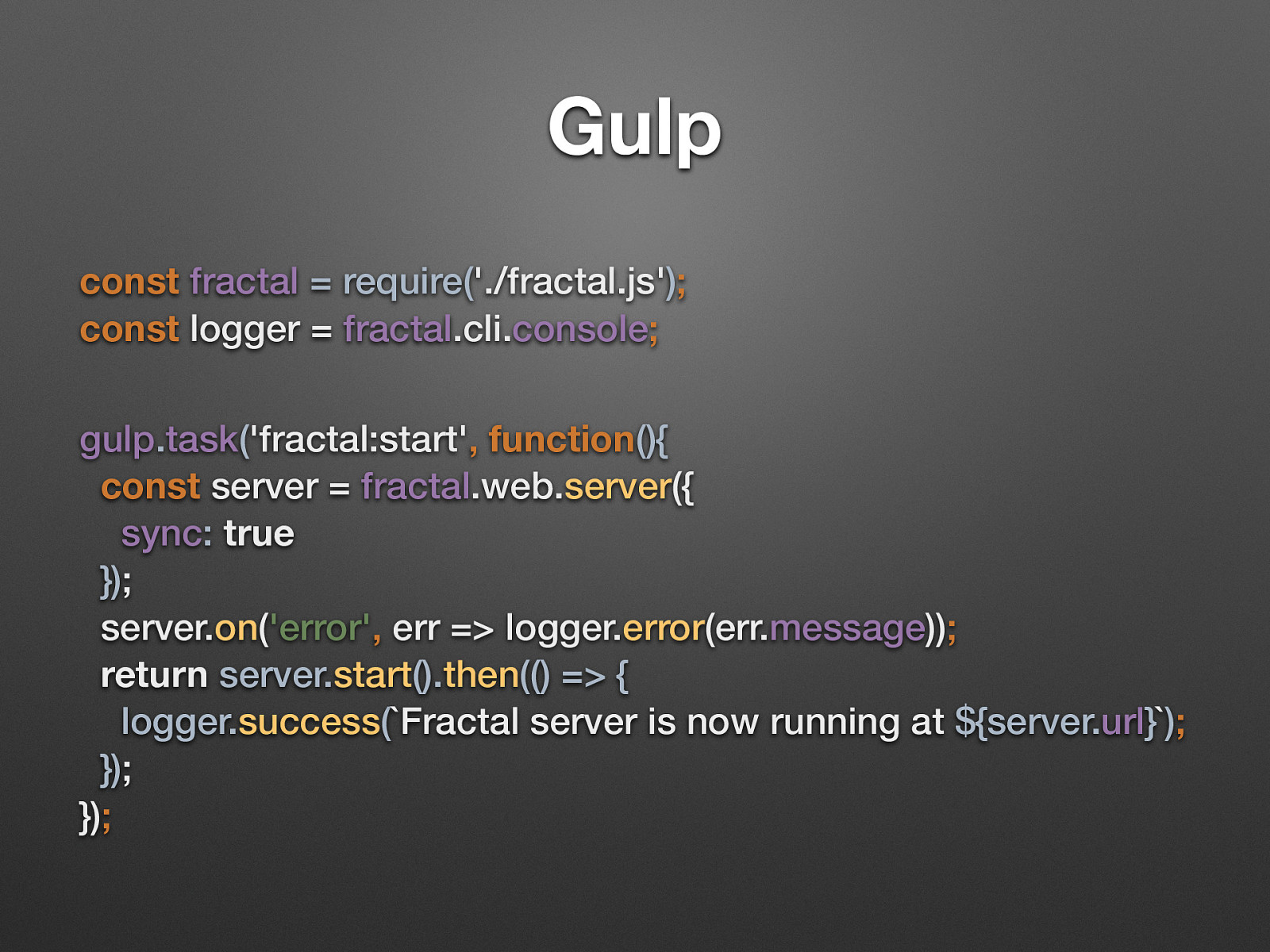
Gulp const fractal = require(‘./fractal.js’); const logger = fractal.cli.console; gulp.task(‘fractal:start’, function(){ const server = fractal.web.server({ sync: true }); server.on(‘error’, err => logger.error(err.message)); return server.start().then(() => { logger.success(Fractal server is now running at ${server.url}); }); });
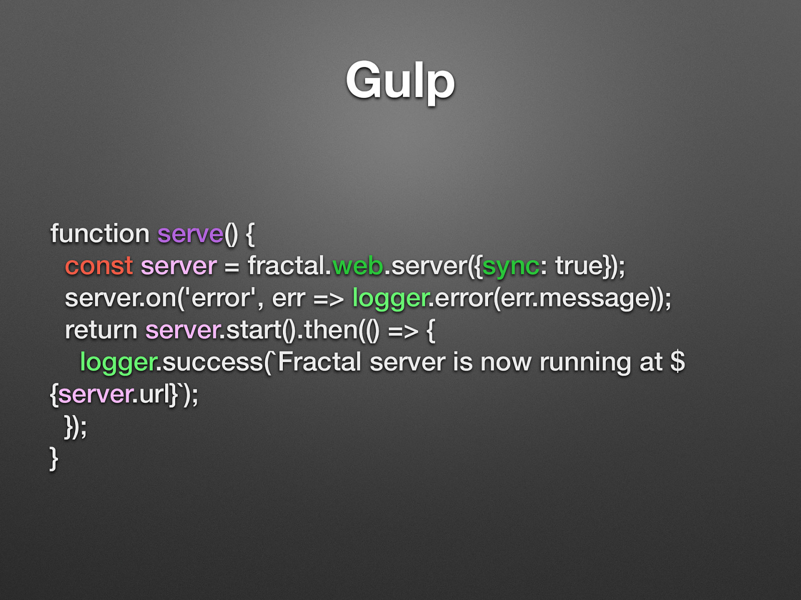
Gulp function serve() { const server = fractal.web.server({sync: true}); server.on(‘error’, err => logger.error(err.message)); return server.start().then(() => { logger.success(Fractal server is now running at $ {server.url}); }); }
Yeah, that’s very old, and should be udpdated to gulp 4.
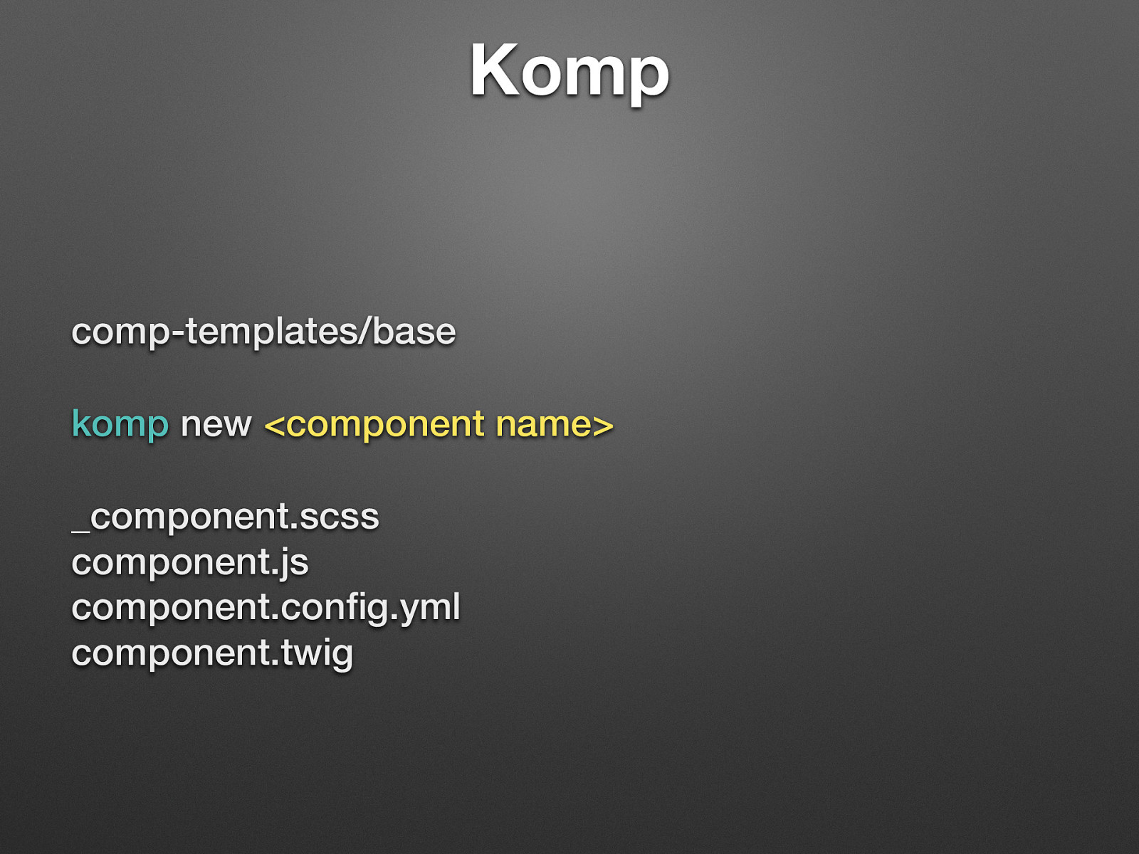
Komp comp-templates/base komp new <component name> _component.scss component.js component.config.yml component.twig Create files with boilerplate content. -T to choose template (base is the default)
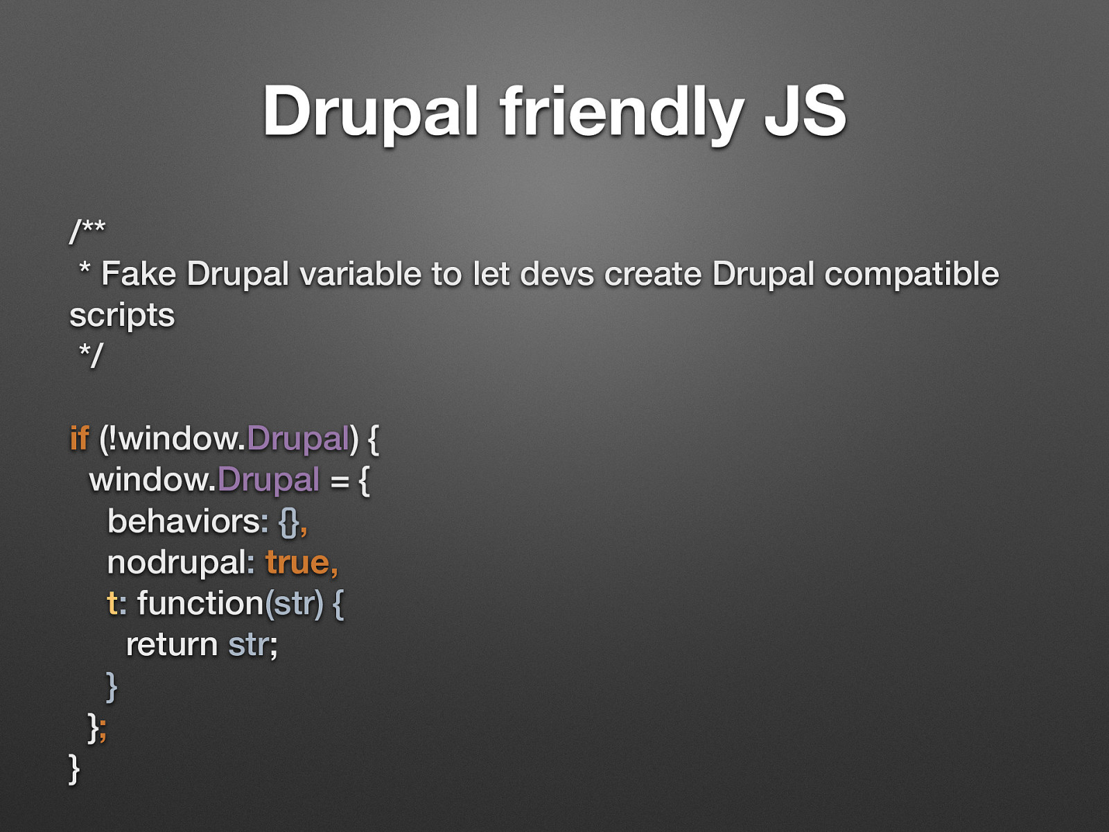
Drupal friendly JS /** * Fake Drupal variable to let devs create Drupal compatible scripts */ if (!window.Drupal) { window.Drupal = { behaviors: {}, nodrupal: true, t: function(str) { return str; } }; }
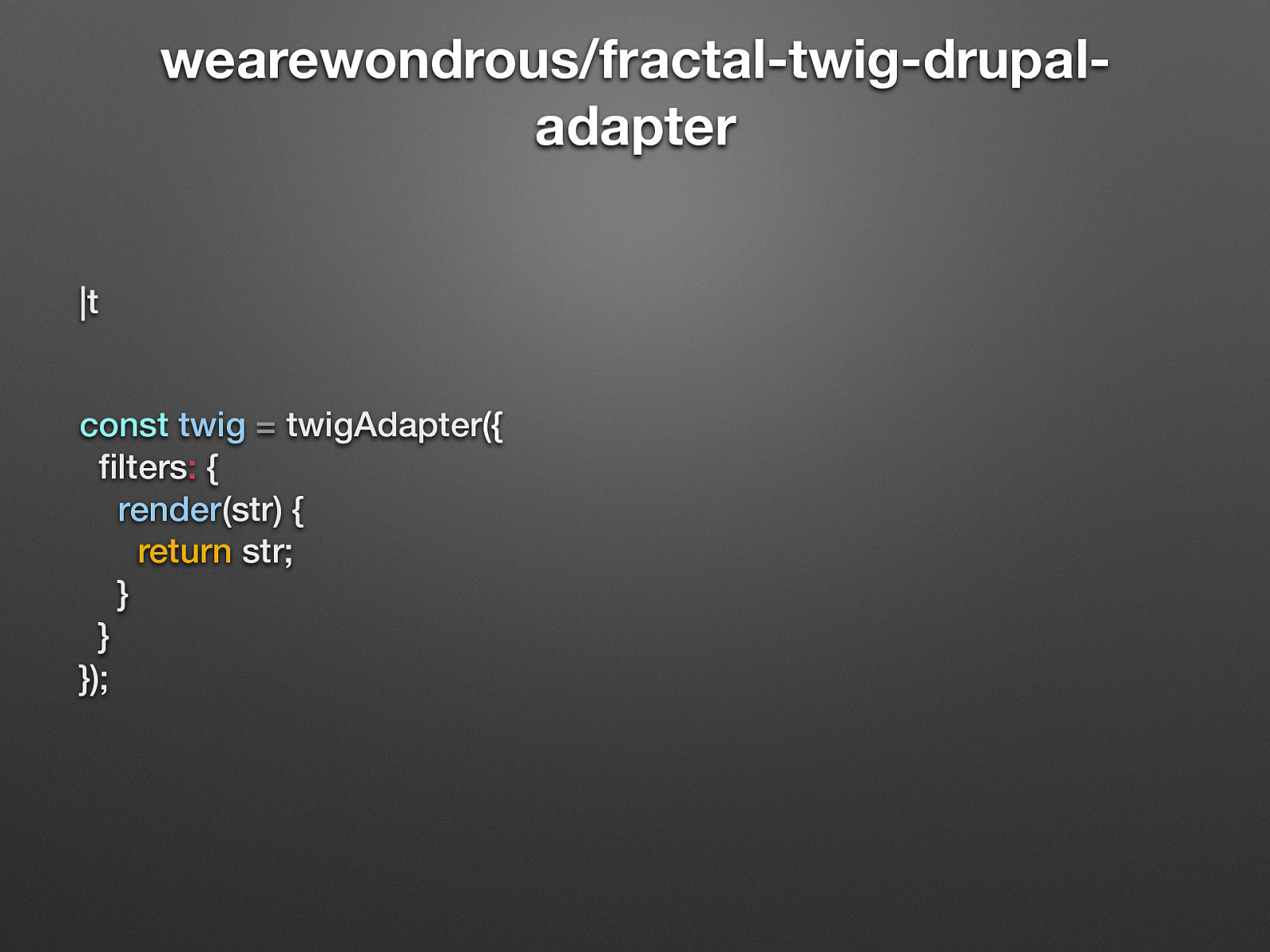
wearewondrous/fractal-twig-drupaladapter |t const twig = twigAdapter({ filters: { render(str) { return str; } } }); Add Custom Filters You have the ability to extend Twig with custom filters by adding any filter functions to the twigAdapter configuration. The name of the function will be used as the filter name. For example, to create a |render filter:
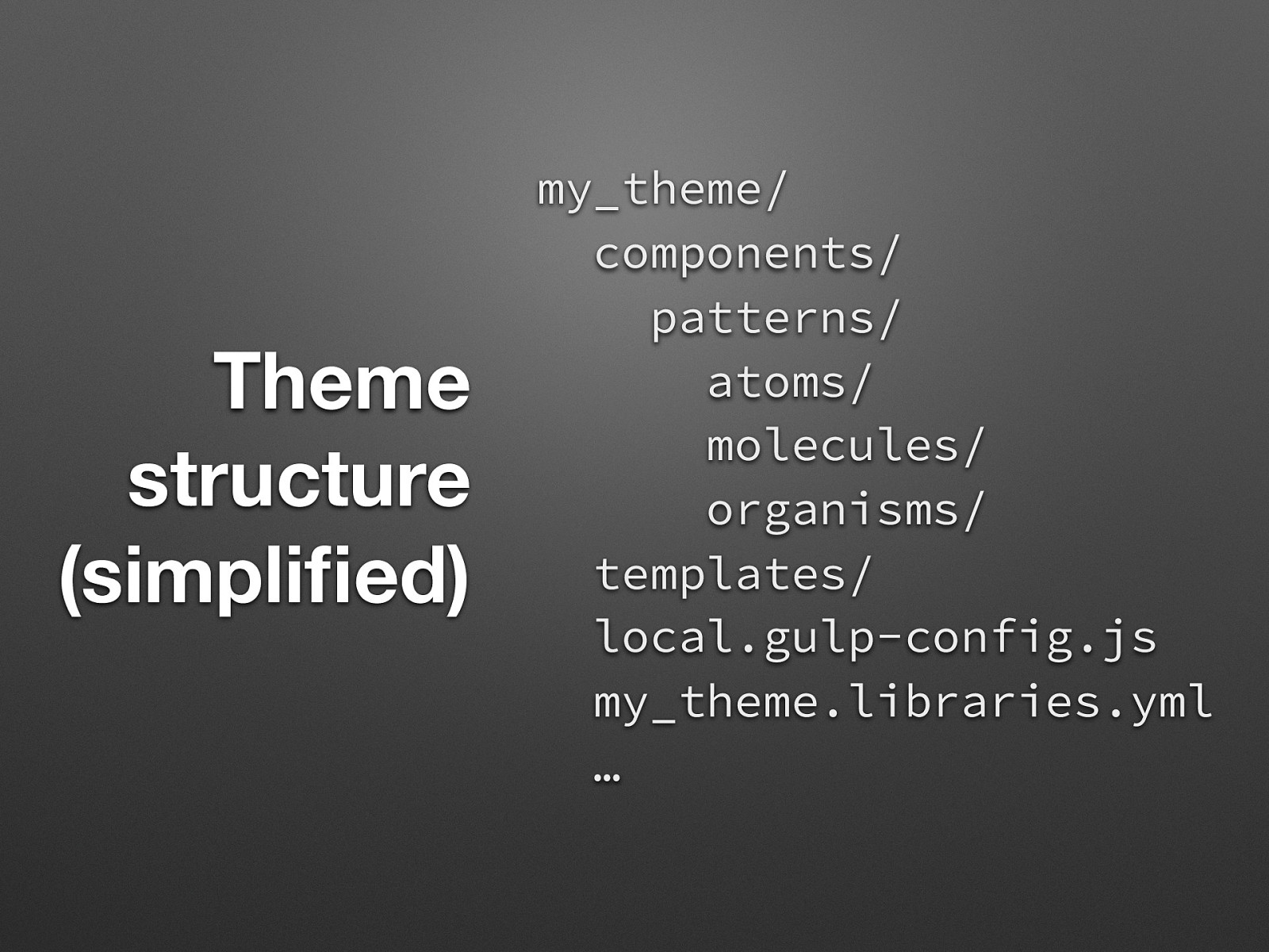
Theme structure (simplified) my_theme/ components/ patterns/ atoms/ molecules/ organisms/ templates/ local.gulp-config.js my_theme.libraries.yml …
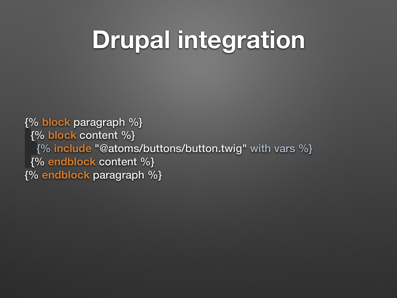
Drupal integration {% block paragraph %} {% block content %} {% include “@atoms/buttons/button.twig” with vars %} {% endblock content %} {% endblock paragraph %} We use paragraphs and include our atoms/molecules/organisms. If we are smart enough we can use the same variables in Fractal that we used in Drupal but if another site (Angular, Laravel.., Wordpress) uses our fractal repo, they may needs to do use the same variables.
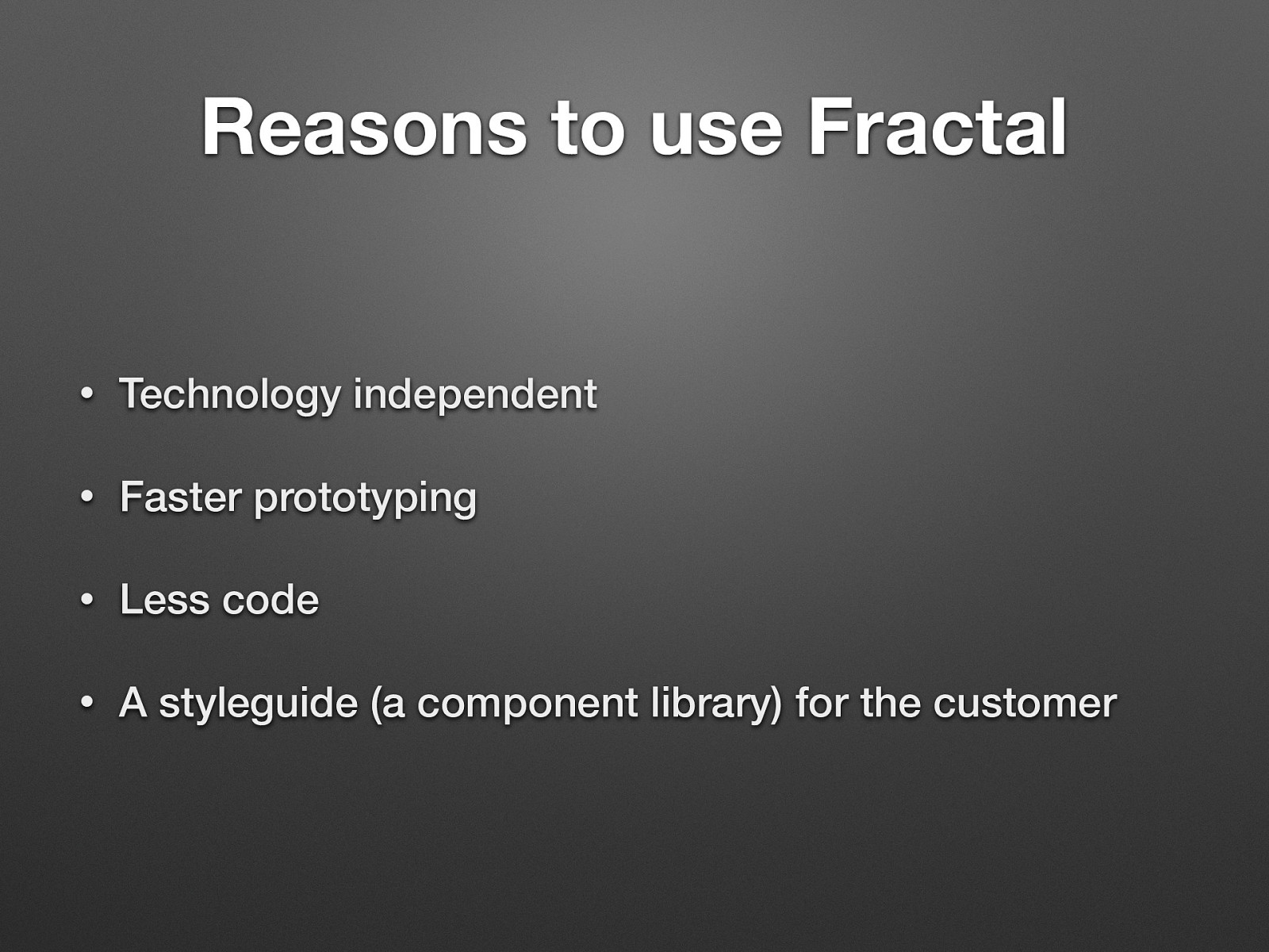
Reasons to use Fractal • Technology independent • Faster prototyping • Less code • A styleguide (a component library) for the customer

http://fractal.clearleft.com/