Making Motion Inclusive Val Head @vlh Design Advocate, Adobe
Photo by Victor Lozano on Unsplash https://unsplash.com/photos/aLNqys6xAdw
An Event Apart 2019
A presentation at An Event Apart Denver in October 2019 in Denver, CO, USA by Val Head
Making Motion Inclusive Val Head @vlh Design Advocate, Adobe
Photo by Victor Lozano on Unsplash https://unsplash.com/photos/aLNqys6xAdw
An Event Apart 2019

One of the stories in this episode of 99% Invisible really made the concept of inclusive design hit home for me. If you haven’t heard it, I highly recommend giving it a listen. There are lots of interesting facts about the concept of “average” and how that has affected design over the years.

As it turns out, this pilots story shows up in many books and articles about inclusive design because it’s such a powerful illustration of the limitations around our assumptions of what average means.

The assumption that people will adapt themselves to make a solution isn’t a valid assumption for the modern web, or even for modern software. Years ago, we may have been able to make assumptions about our users being a homogenous group — that they were sitting at a computer at a desk, undisturbed, etc. — but as the web become a part of daily life for more and more people, that has become impossible. There is no average user. Or one group that our entire audience falls into.
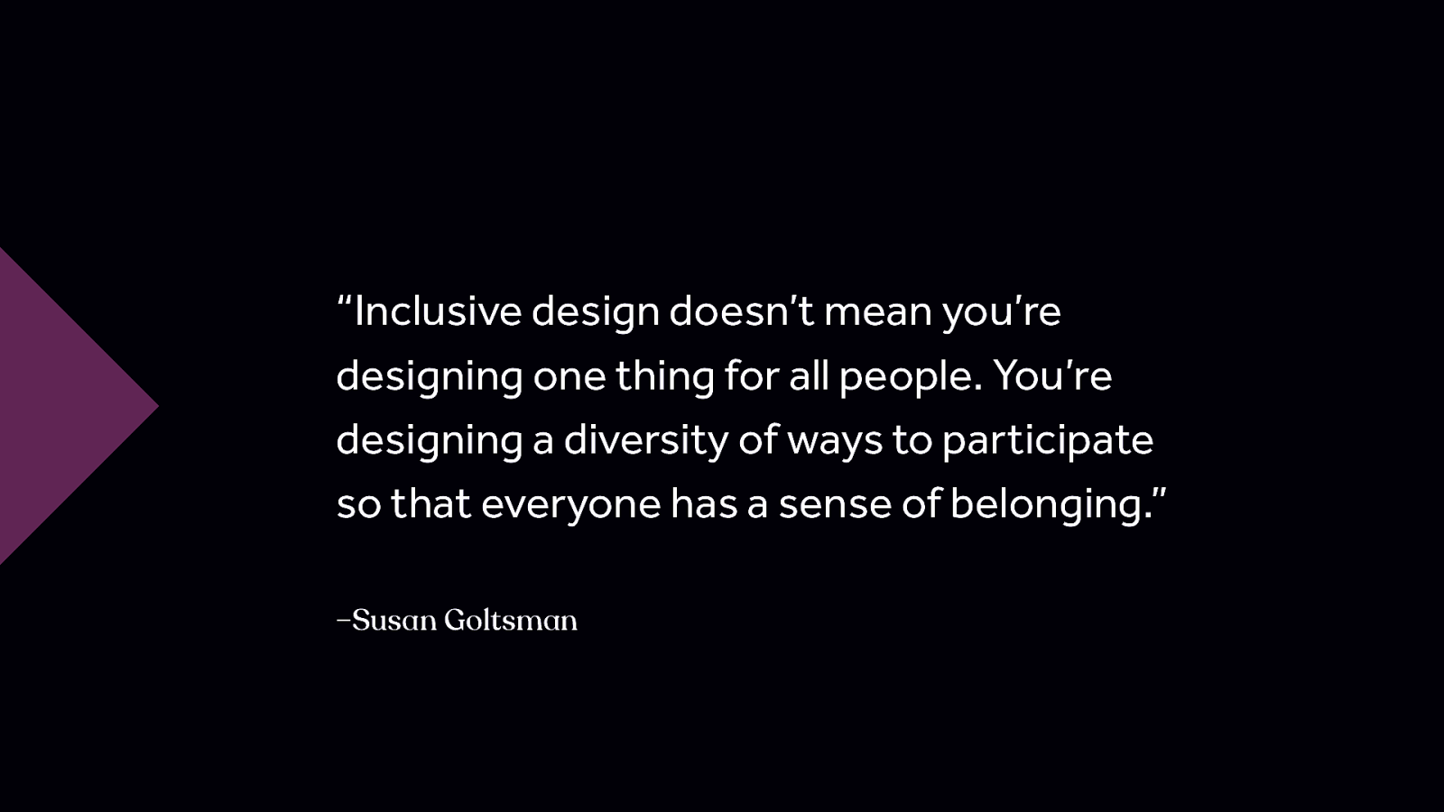
“Inclusive design doesn’t mean you’re designing one thing for all people. You’re designing a diversity of ways to participate so that everyone has a sense of belonging.” –Susan Goltsman “Inclusive design doesn’t mean you’re designing one thing for all people. You’re designing a diversity of ways to participate so that everyone has a sense of belonging.” – Susan Goltsman
Animation ❤ UX (and accessibility and inclusion too!) This talk is not about why animation is bad. Or reasons why we shouldn’t use it. I don’t believe either of those things to be true. It’s about how to use animation responsibly with our audience in mind—just like we have to use all our other design tools responsibly—and providing you with the background info you need to make your case when someone tells you it’s not possible to be creative with motion and inclusive at the same time.
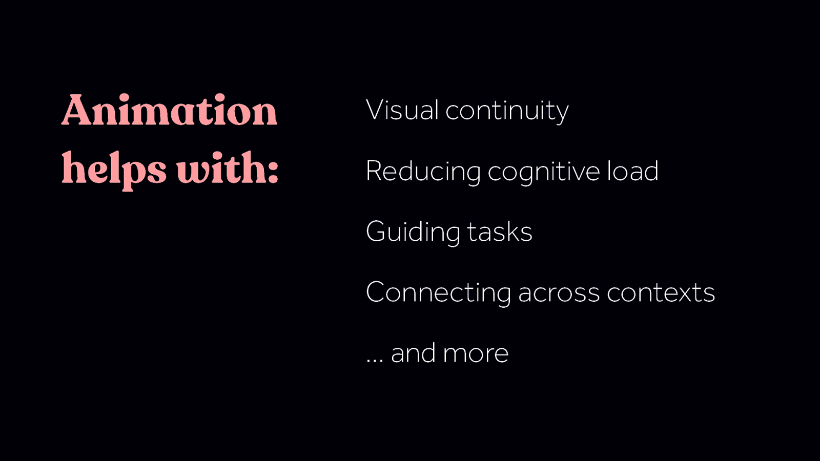
Animation helps with: Visual continuity Reducing cognitive load Guiding tasks Connecting across contexts … and more Animation can have a positive impact on UX and accessibility in a number of ways. Including some of these things: - Visual continuity - Guiding tasks - Connecting context We won’t be covering them today, but if you want more detail on any of these , check out my past talks or my book for more.
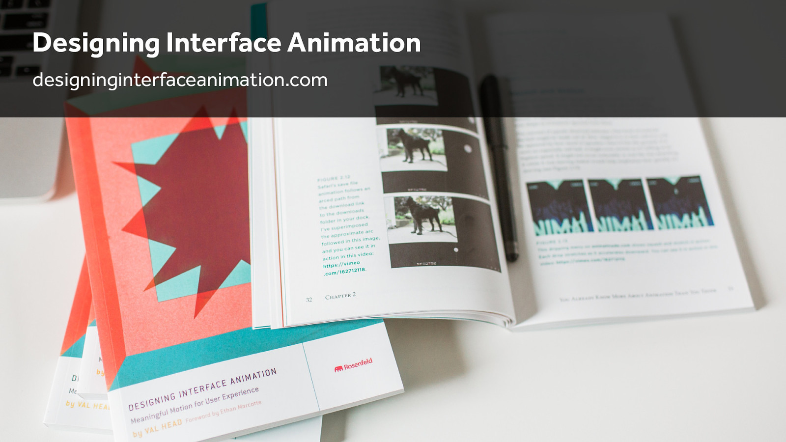
Designing Interface Animation designinginterfaceanimation.com

While inclusive design reaches beyond accessibility, I think it’s probably tough to be inclusive if the basics of accessibility aren’t addressed, so we’re going to start with a look at the WCAG’s recommendations around animation. There are three in the current WCAG that apply directly to animation.
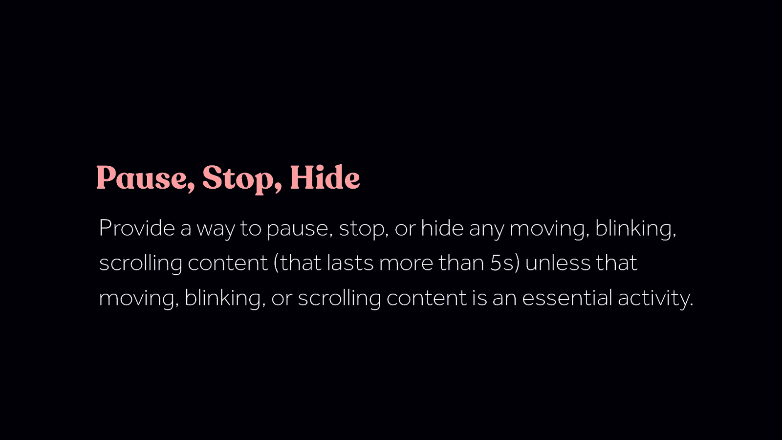
Pause, Stop, Hide Provide a way to pause, stop, or hide any moving, blinking, scrolling content (that lasts more than 5s) unless that moving, blinking, or scrolling content is an essential activity. Note: loaders/preloaders are an exception here. For any moving, blinking or scrolling information that (1) starts automatically, (2) lasts more than five seconds, and (3) is presented in parallel with other content, there is a mechanism for the user to pause, stop, or hide it unless the movement, blinking, or scrolling is part of an activity where it is essential; and https://www.w3.org/WAI/WCAG21/Understanding/pause-stop-hide.html
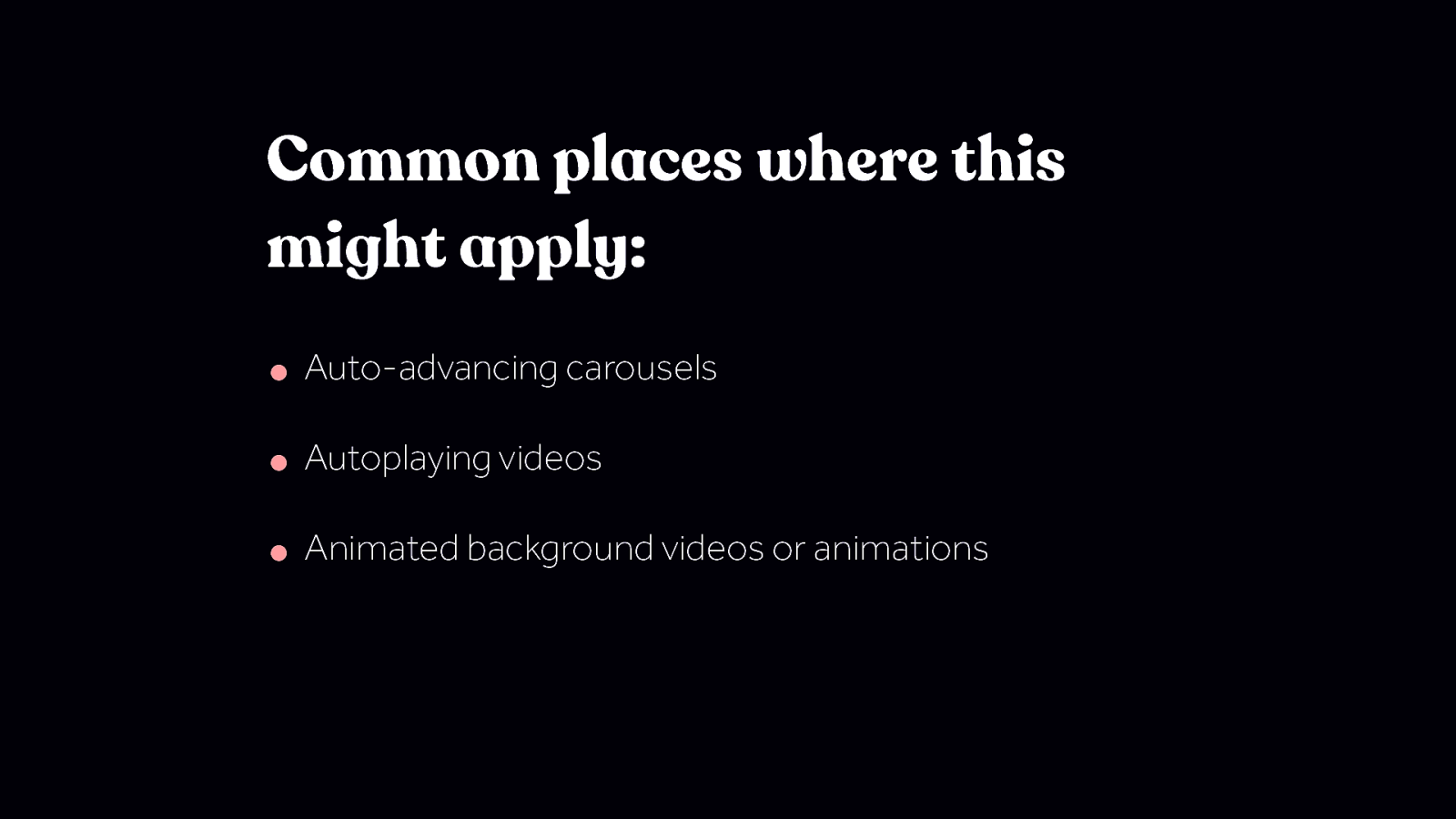
Common places where this might apply: • Auto-advancing carousels • Autoplaying videos • Animated background videos or animations
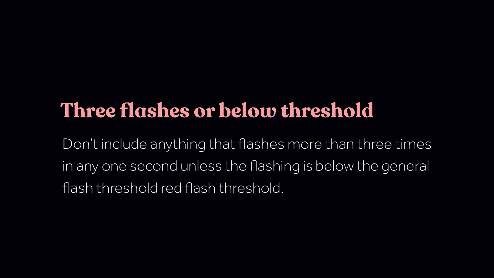
Three flashes or below threshold Don’t include anything that flashes more than three times in any one second unless the flashing is below the general flash threshold red flash threshold. Three flashes or below threshold Don’t include anything that flashes more than three times in any one second unless the flashing is below the general flash threshold red flash threshold.
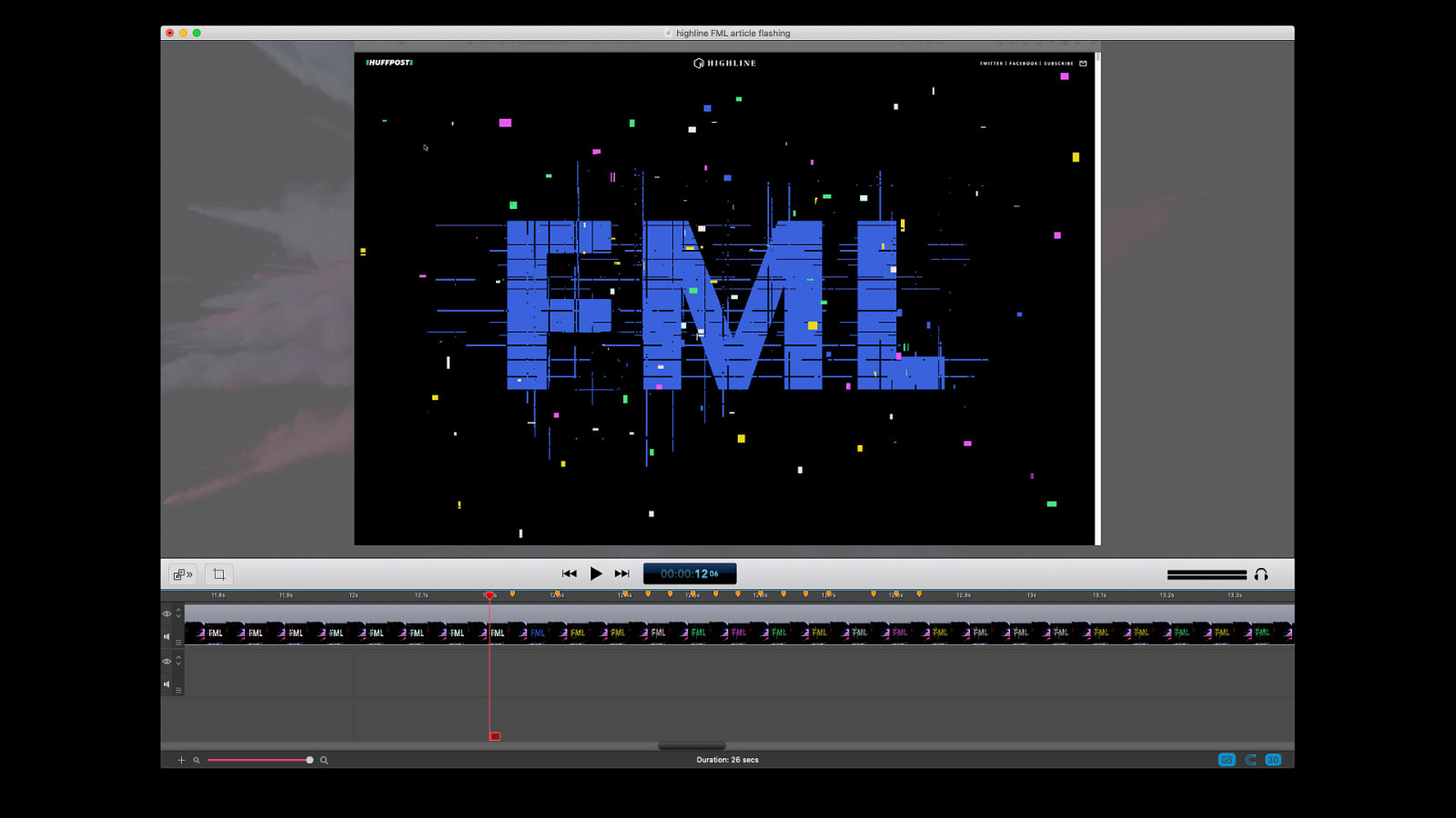
Flashing animations might come up more than you initially think. This glitchy graphic flashes different colours more than three times a second. (To their credit, the article this is from was also offered in a text-only format for those sensitive to flashing.)

Sometimes we see warnings like this in front of sites or interactive pieces that include flashing animations.
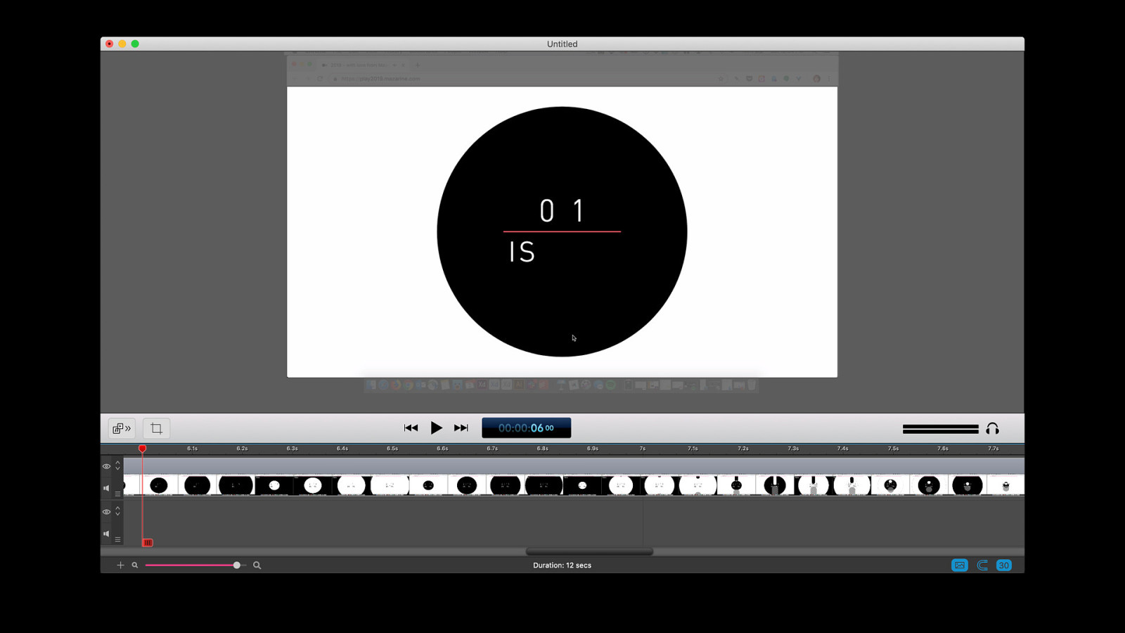
This particular piece was a holiday card for an agency that included a few short interactive games. One could argue that this might not be critical or important content, so those that are sensitive to flashing weren’t missing anything by not being able to advance past the flashing warning. Does that argument hold? It depends on the content and the context of the situation.
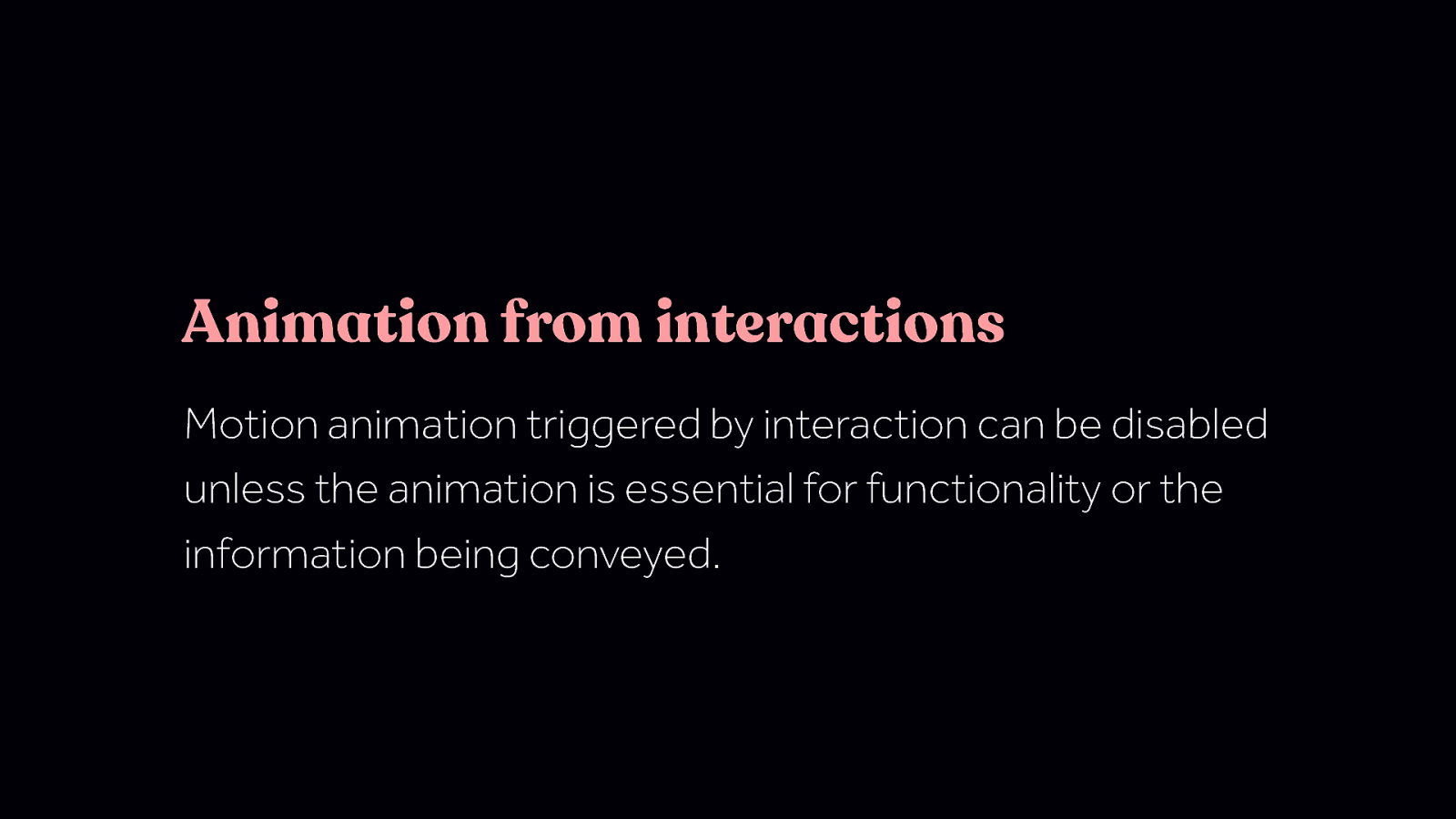
Animation from interactions Motion animation triggered by interaction can be disabled unless the animation is essential for functionality or the information being conveyed. Animation from interactions Motion animation triggered by interaction can be disabled unless the animation is essential for functionality or the information being conveyed. This guideline differs from the two guidelines before it since it deals with animation that comes as a result of user interaction. Also, this guideline is part of the AAA recommendations, the previous two were part of the AA recommendations. In general, that means that you need to meet the last two to meet the bar of what is generally considered being an accessibly site. And this one, being AAA, means it generally is not something that will be required by any outside rules or laws, but it’s still a good thing to do.
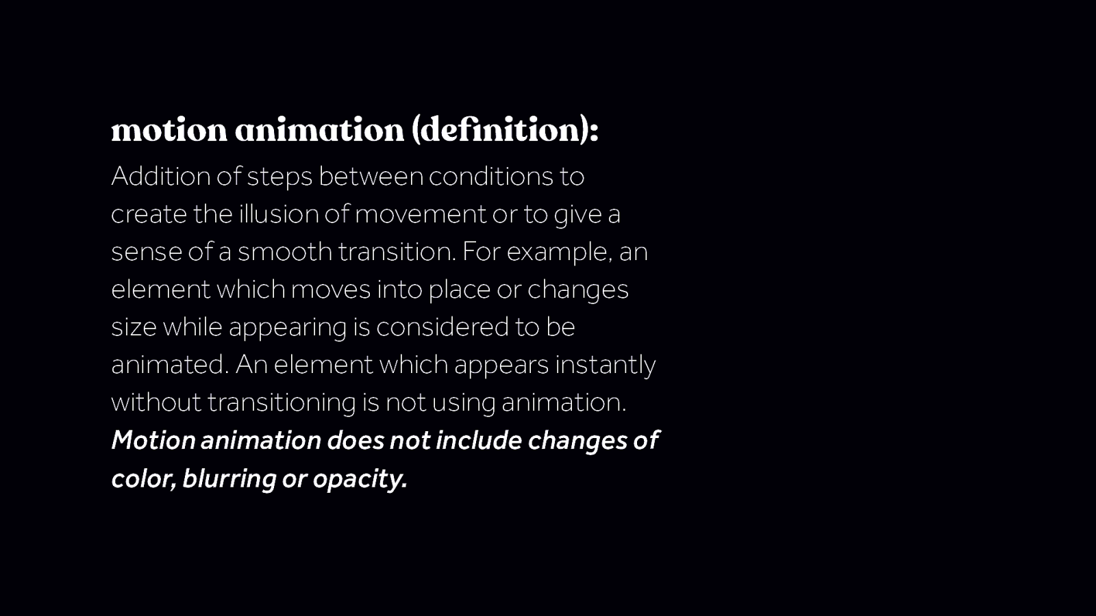
motion animation (definition): Addition of steps between conditions to create the illusion of movement or to give a sense of a smooth transition. For example, an element which moves into place or changes size while appearing is considered to be animated. An element which appears instantly without transitioning is not using animation. Motion animation does not include changes of color, blurring or opacity. “Motion animation” can sound like a confusing term at first, and it does have a rather long definition. The last line of the definition is one to especially take note of. motion animation (definition): Addition of steps between conditions to create the illusion of movement or to give a sense of a smooth transition. For example, an element which moves into place or changes size while appearing is considered to be animated. An element which appears instantly without transitioning is not using animation. Motion animation does not include changes of color, blurring or opacity.
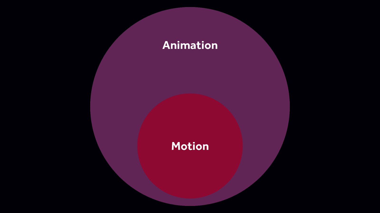
Essentially, what this definition says is that all motion is animation but not all animation is motion. It’s an important distinction to make to denote that some types of animation can be triggering and other types of animation are likely not.
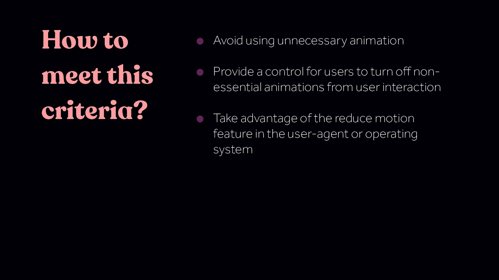
How to meet this criteria? • Avoid using unnecessary animation • Provide a control for users to turn off nonessential animations from user interaction • Take advantage of the reduce motion feature in the user-agent or operating system
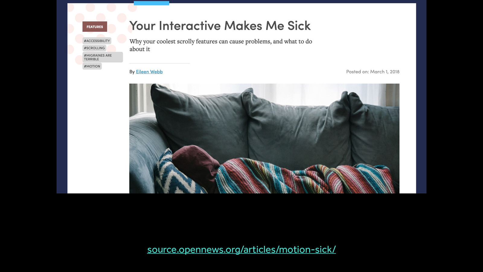
Before we dig into following this list, let’s look at why this recommendation is being made in the first place. Over the last few years, we’ve come to realize that some number of people can have their motion sensitivities triggered by motion on screen. To put it another way, they can suffer real physical symptoms or illness as a result to some types of motion on screen. Elieen Web provides a first-person account here https://source.opennews.org/articles/motion-sick/
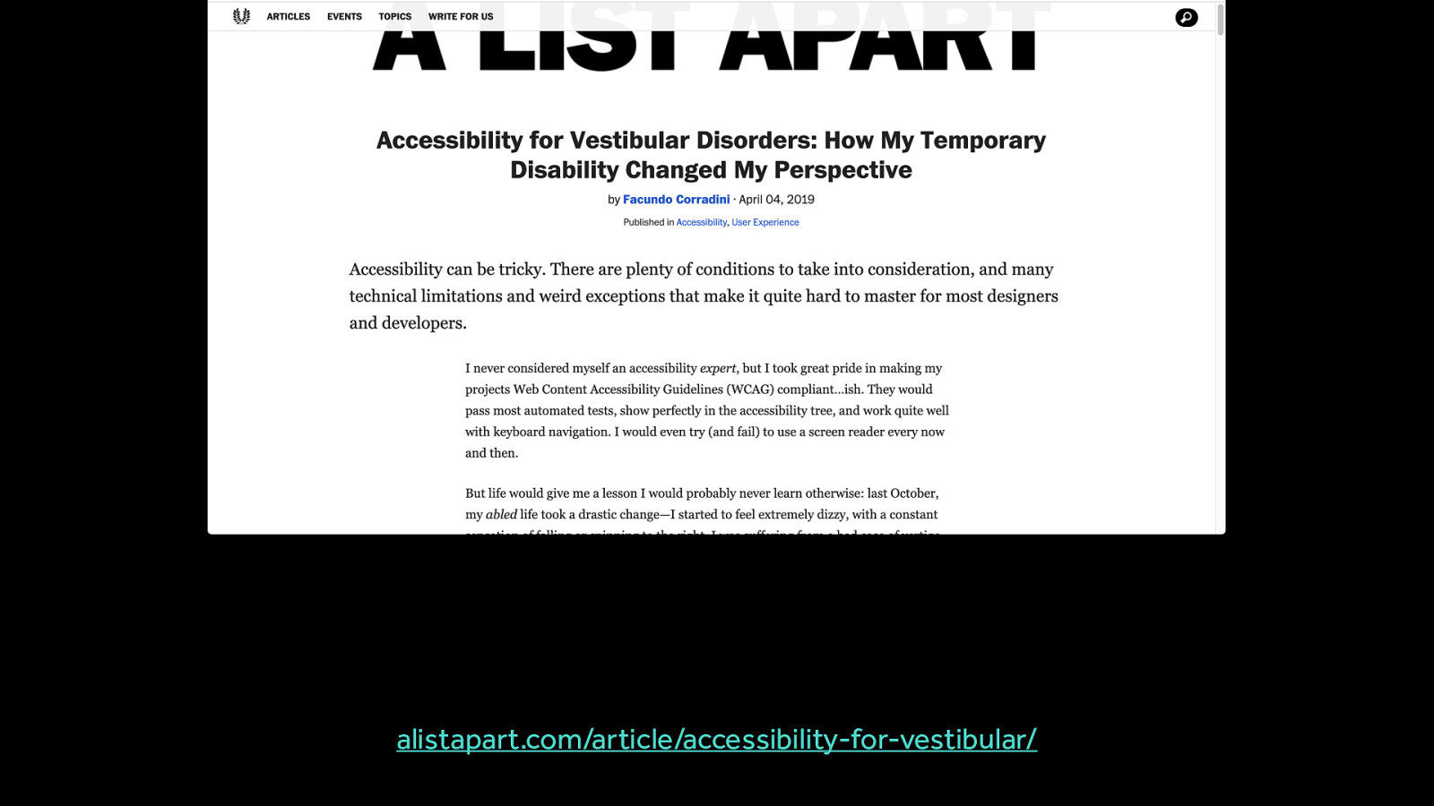
Another first-person account from someone with a temporary vestibular disorder: alistapart.com/article/accessibility-for-vestibular/
Any disease, damage, or injury to the vestibular system—the system around our inner ear and brain that processes sensory information involved in controlling balance and eye movements —falls under the umbrella of a vestibular disorder.
Any disease, damage, or injury to the vestibular system—the system around our inner ear and brain that processes sensory information involved in controlling balance and eye movements —falls under the umbrella of a vestibular disorder. There is no one way to have a vestibular disorder. Different people have different symptoms and different triggers. What triggers one person, may not affect another and context matters. Some folks with vestibular disorders that I talked to had no problem playing first person video games with lots of full screen motion. But when it came to opening a desktop app with a full screen wipe transition - that would be triggering. Expectations also play a big role. When large amount of motion are encountered by surprise, the chances for them to be triggering is increased.

What causes the negative impact is not exactly the motion itself, but the mismatch the motion creates. When the motion on screen gives enough visual cues to suggest the body is moving, but we’re sitting still in a chair, that mismatch can cause symptoms for people with motion sensitivity.
“I’m not suggesting you shouldn’t make more cool interactive news stories, or use motion in interesting ways. But I’m advocating here for some guidelines to help make your story a better experience for all your readers.” –Eileen Webb source.opennews.org/articles/motion-sick/
It’s helpful to better understand what types of motion are likely to be triggering, because it’s not all motion or animation that is problematic. Certain types of motion are much more likely to be triggering.

Scaling and zooming on a large scale, relative to the overall viewport size, are type of motion that commonly triggering for people with motion sensitivites.

The app opening zoom animation on iOS is one example of this. (In fact it’s an important example of this that will come up later in this talk.) The mismatch between the flat look of the icons contrasted with the depth and speed at which the icon moves is what specifically can be triggering in this example.

Spinning and vortex effects generally don’t need to be large to be triggering. Even a small spinning effect, especially if it loops infinitely, can be triggering.

An example of spinning motion in the background of a web site header. (Remember this site, it will come up again later.)

Another, more pronounced example of a potentially triggering spinning effect. The mismatch between the spinning content and the non-moving shapes around it is what can be triggering.

An example of a site that has both multi-speed and multi-directional motion on scroll.

The mention of “multi-speed” might have made you think of parallax effects. And you’d be right. Parallax effects, by their nature, involve moving different objects at different speeds and are almost universally listed as a trigger by the motion sensitive folks I’ve talked to.

https://www.rezo-zero.com/contact/ This technically falls into the category above but deserves it’s own callout. Having objects moving at different speeds is a common trigger so use it with caution. There are times when parallax makes sense - but also many more times when it does not make sense. I’ve noticed it most often used in datavis interactive type things and agency sites. These are prime cases for a custom toggle button to turn off parallax for folks who find it triggering.
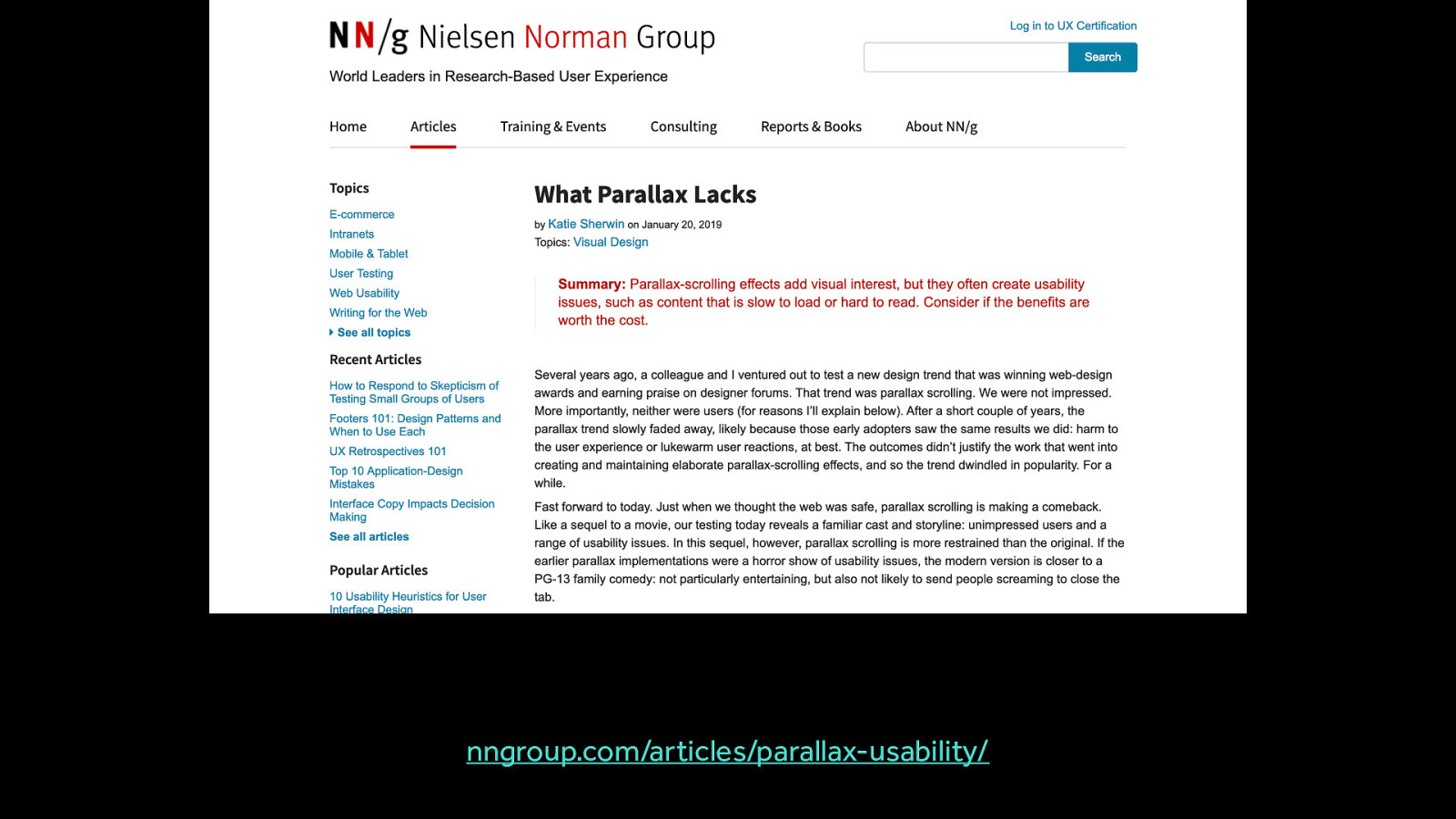
nngroup.com/articles/parallax-usability/ Parallax does have some uses - this article outlines the situations where it might be useful, along with a much longer list of places where it was not found to be useful. But no matter your reason for using parallax effects, you should consider designing methods for reducing motion because it is so commonly a triggering type of motion. nngroup.com/articles/parallax-usability/

Especially looping animations
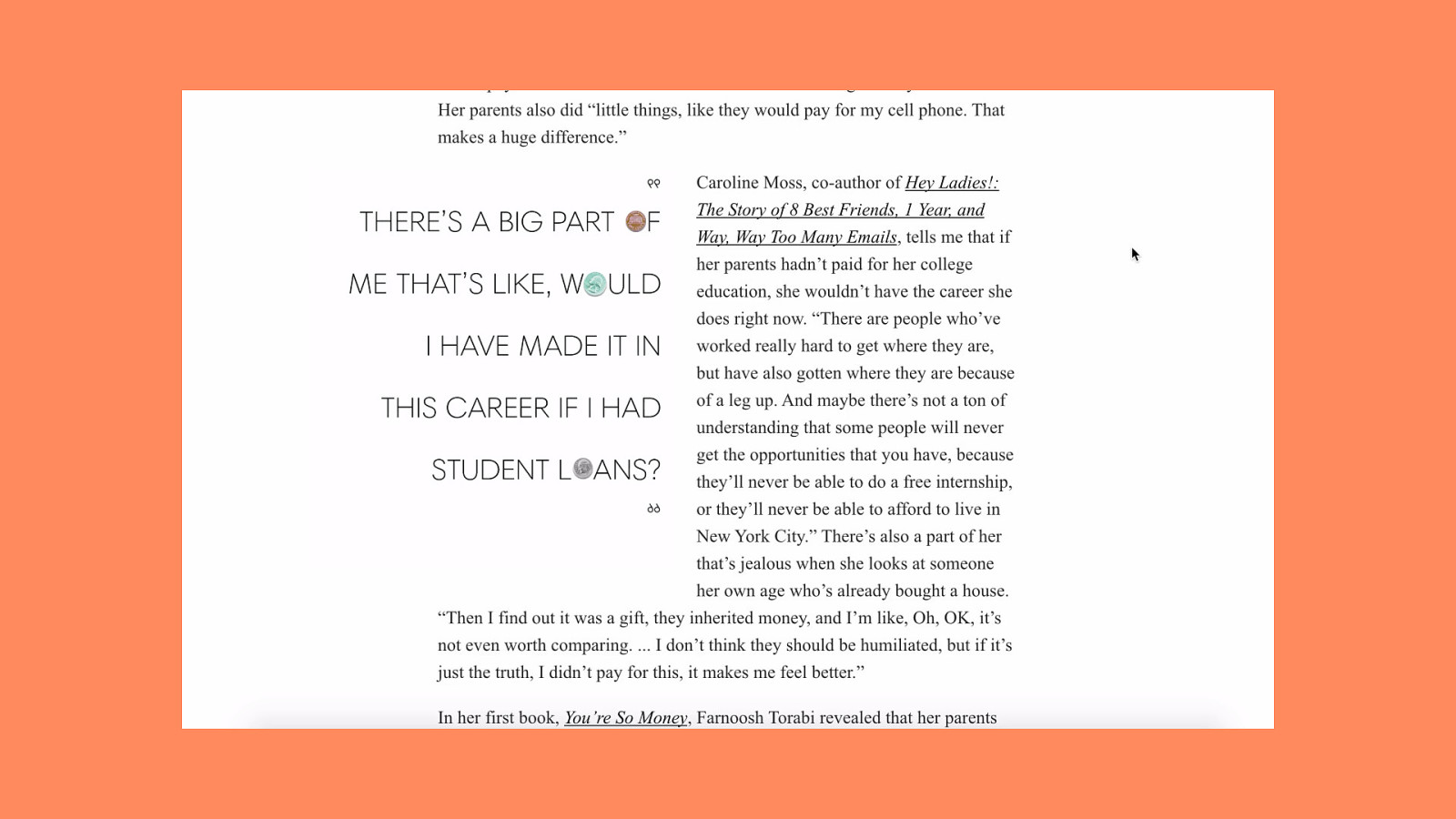
The constant movement of the pull quote animations and the static text create the triggering mismatch in these cases.
Large motions, relative to the overall screen size can also be triggering. If an animation causes a large amount of the overall screen real estate to move, like a full screen wipe or transition, it’s likely to be triggering.
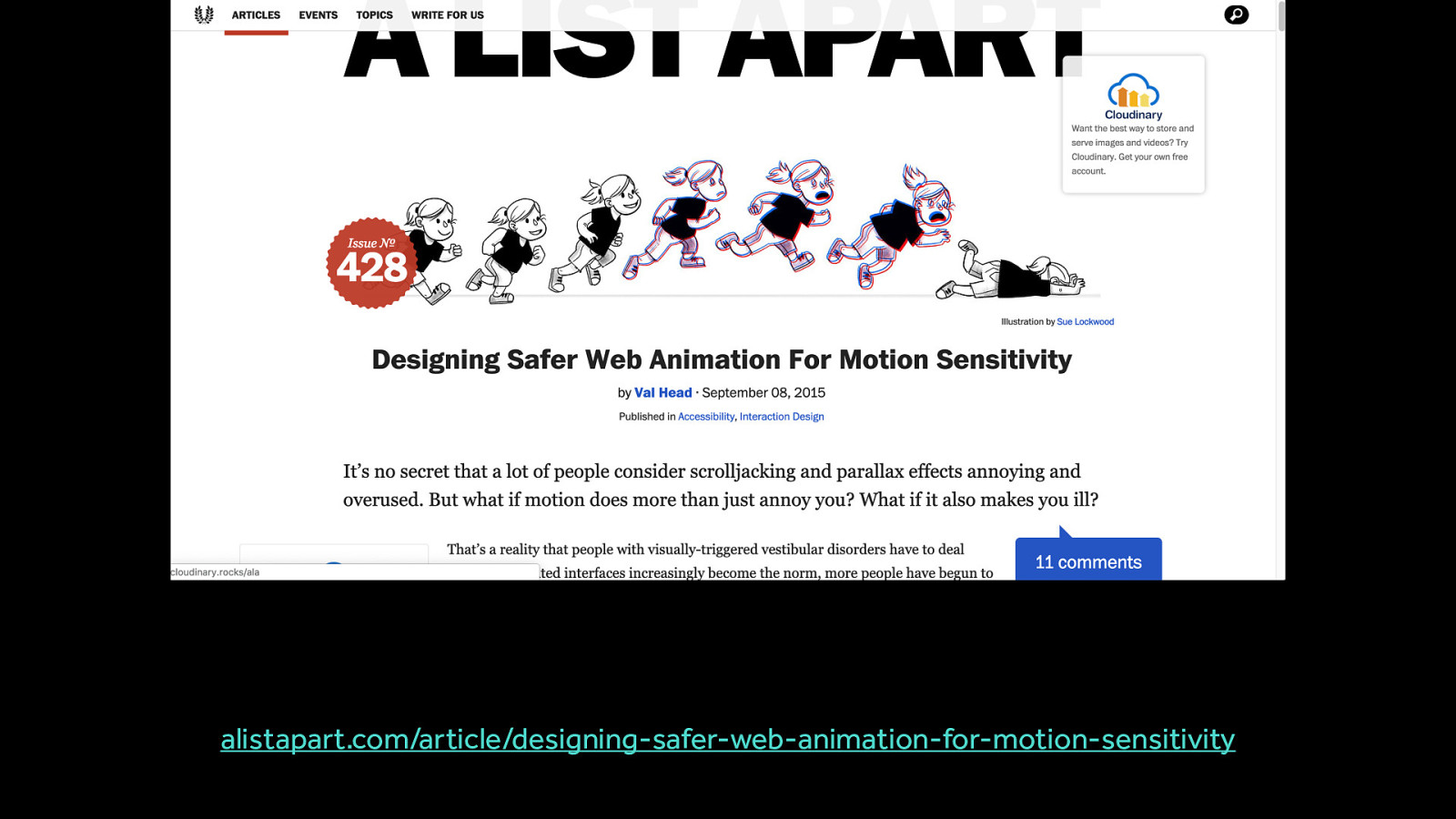
alistapart.com/article/designing-safer-web-animation-for-motion-sensitivity
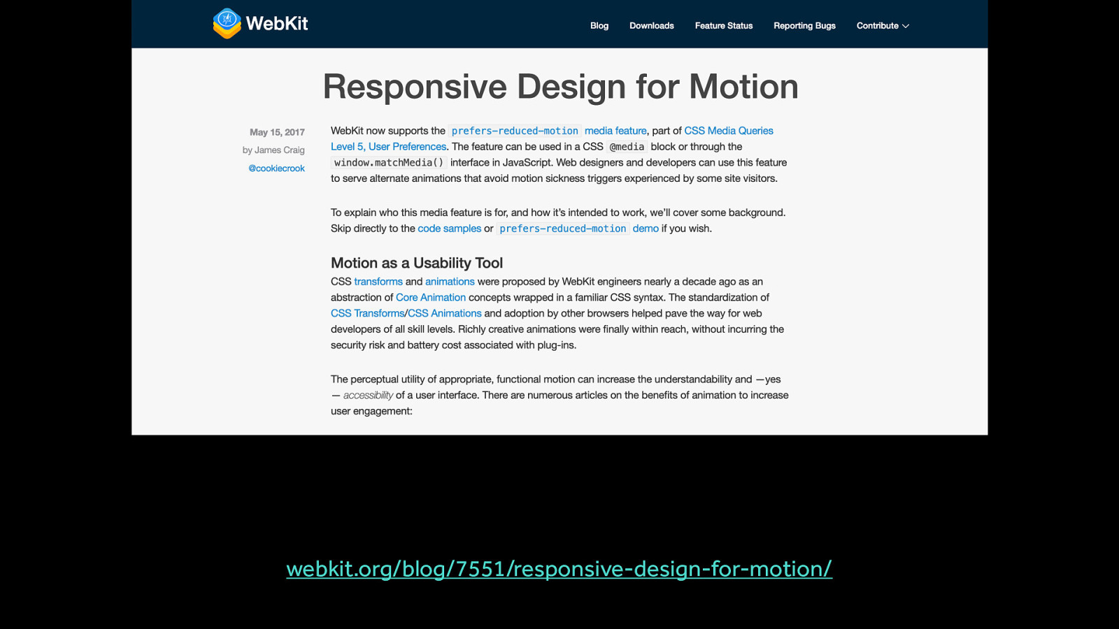
webkit.org/blog/7551/responsive-design-for-motion/
While this isn’t an exhaustive list of every single possible trigger, it’s a list of the most common ones. Notice that things like animated colour changes, small movements and opacity fades are not on this list. This is the most common point that is so often missed: not all animation is a potential trigger. Only certain types of motion are potential triggers.
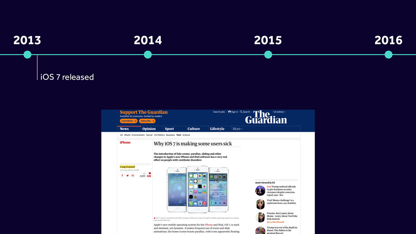
2013 - iOS 7 released
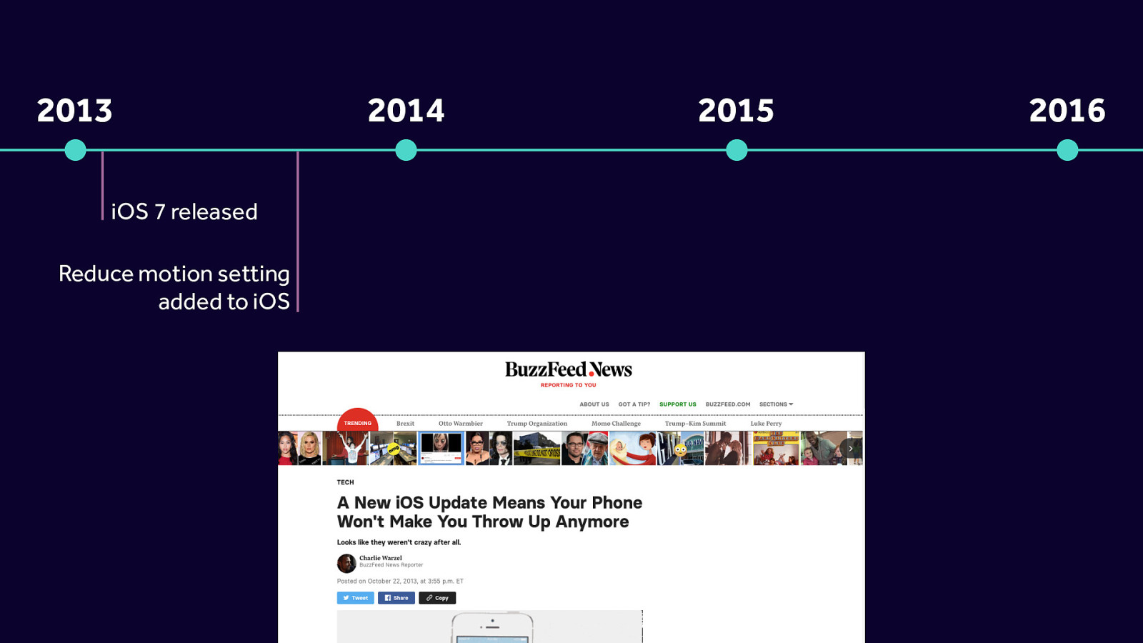
2013 - iOS 7 released Reduce motion setting added to iOS
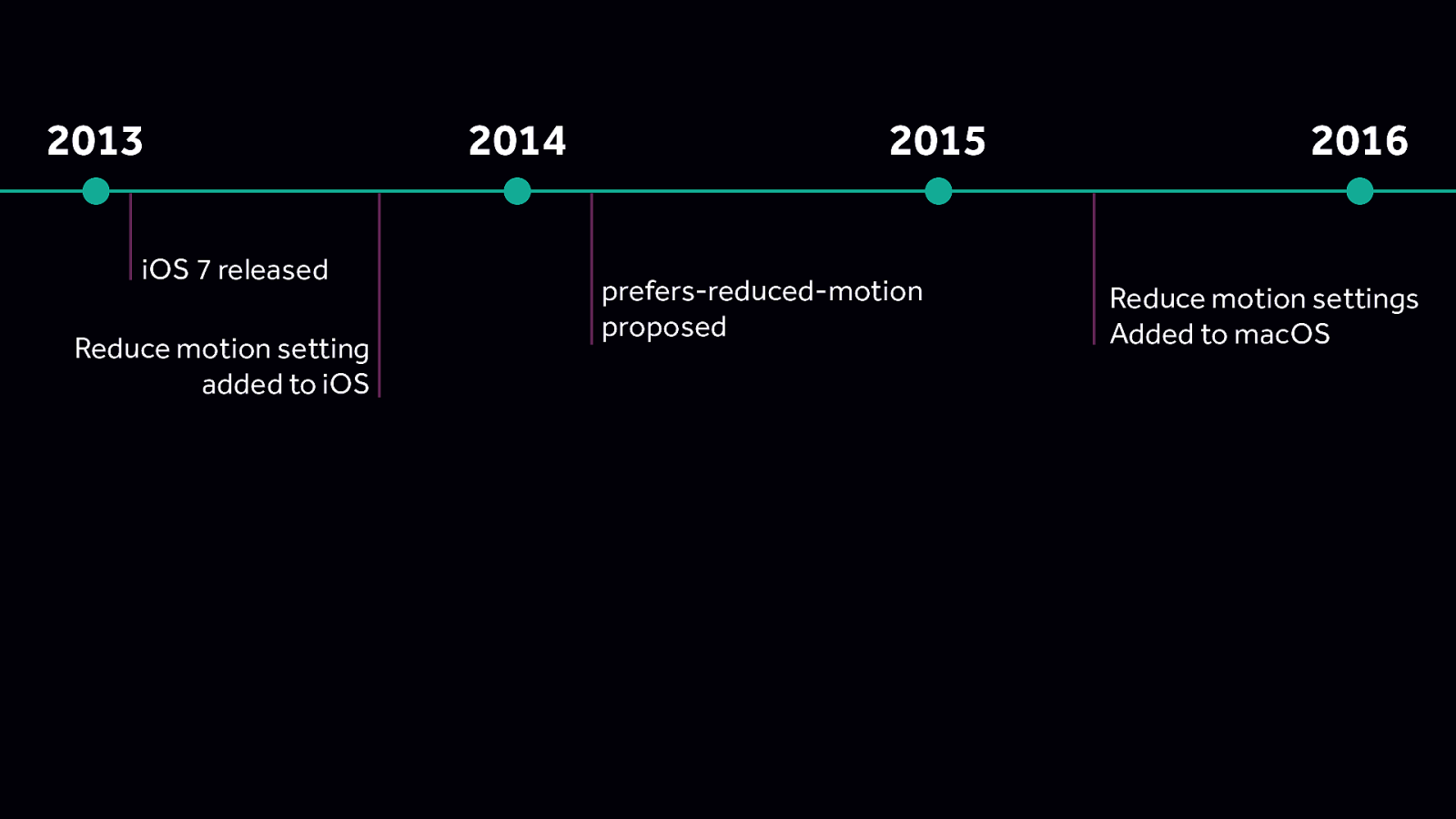
2013 - iOS 7 released Reduce motion setting added to iOS 2015 - prefers-reduced-motion proposed 2016 - Reduce motion settings Added to macOS
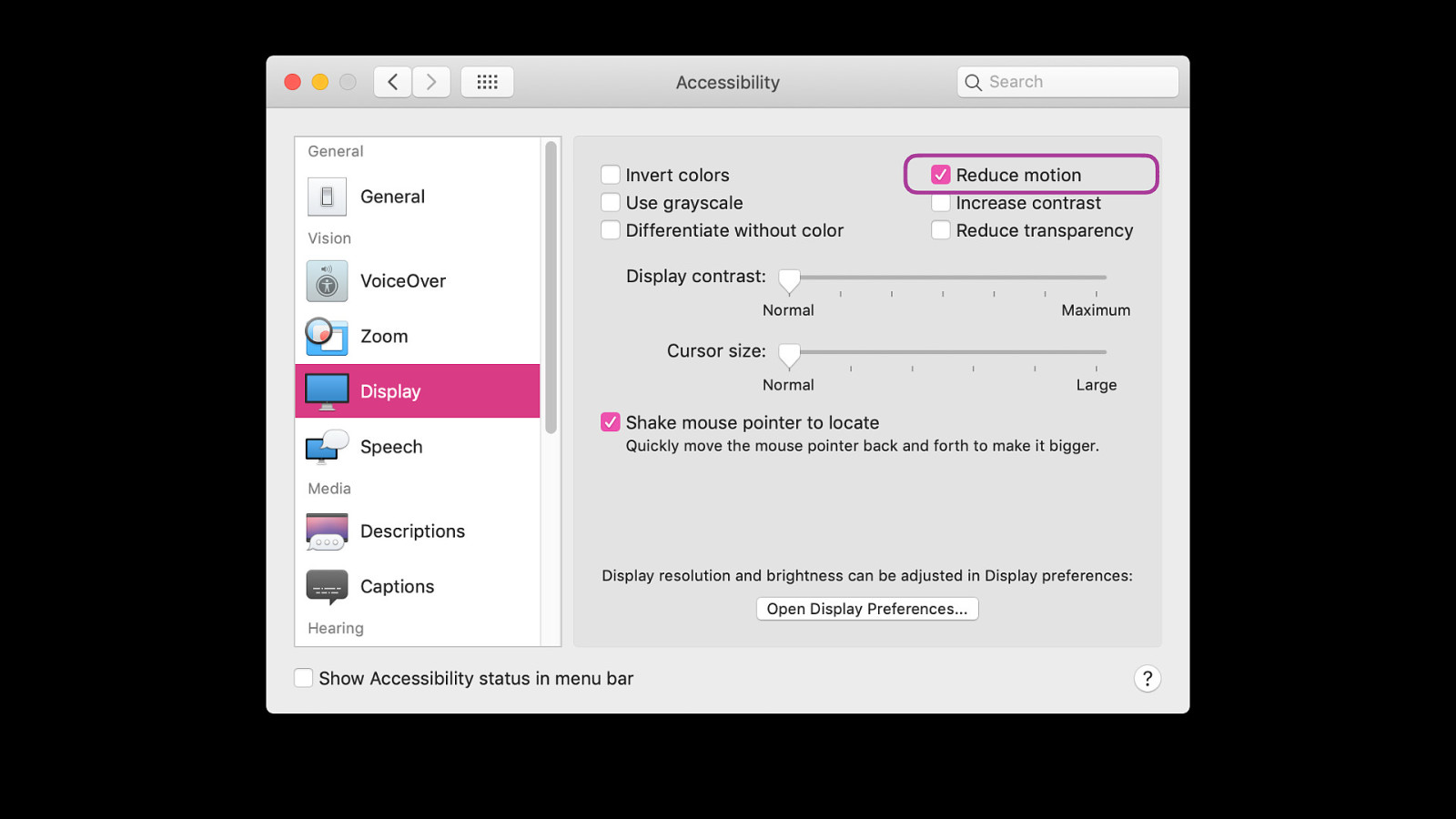
Settings - accessibility - display
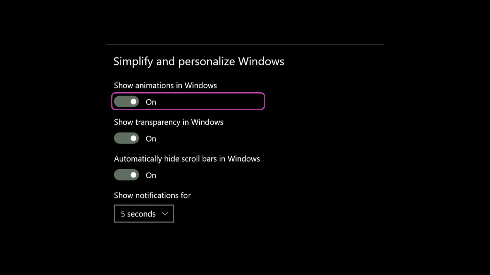
iOS and Android also have options for folks to choose to reduce motion
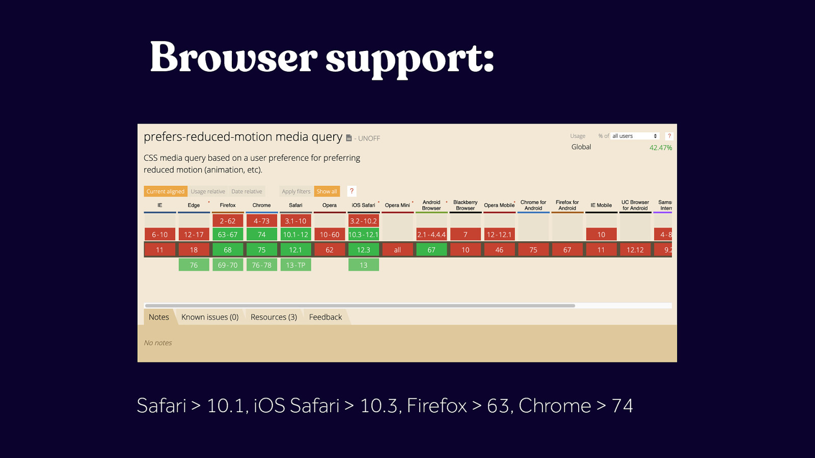
Safari > 10.1, iOS Safari > 10.3, Firefox > 63, Chrome > 74
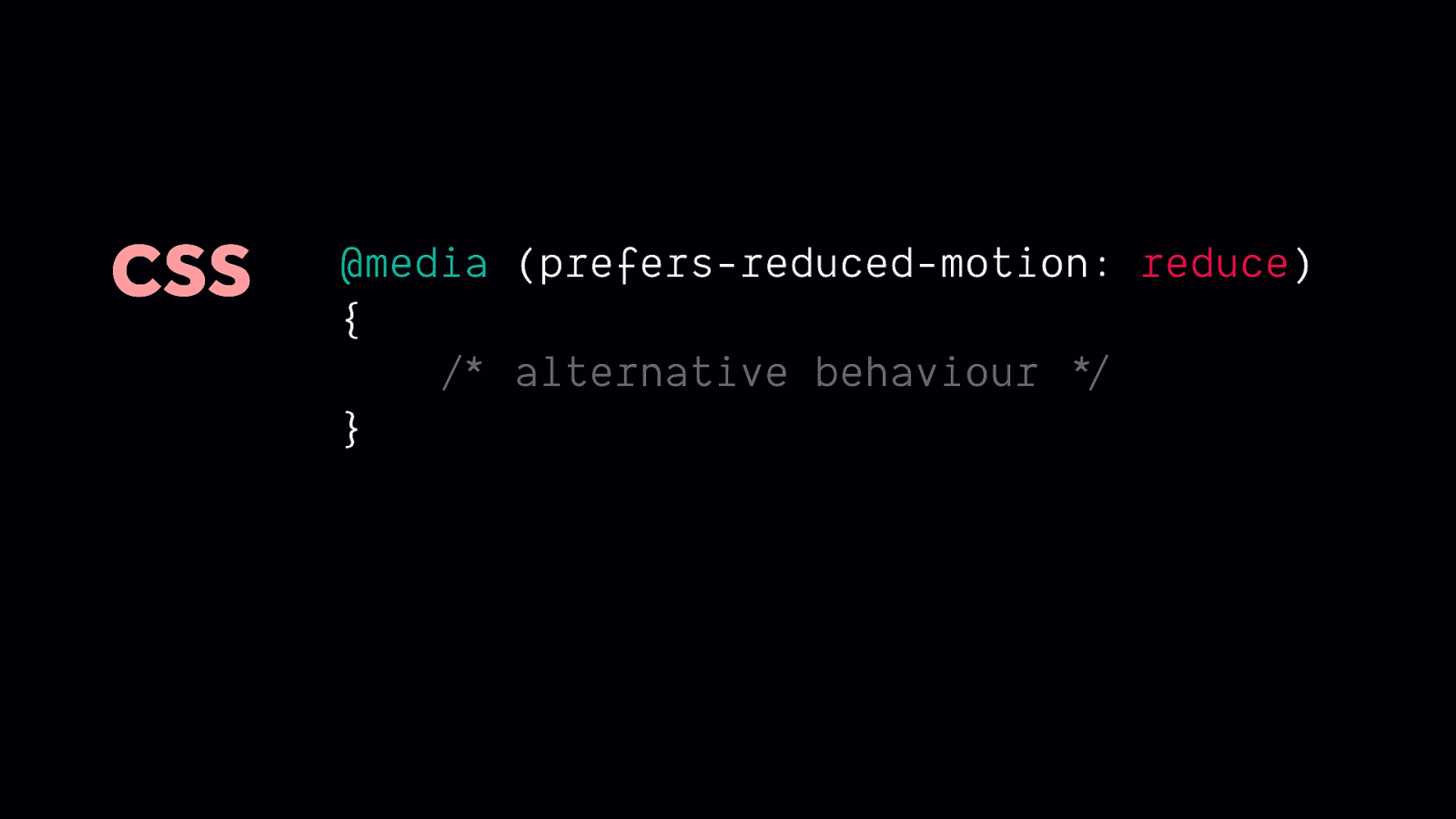
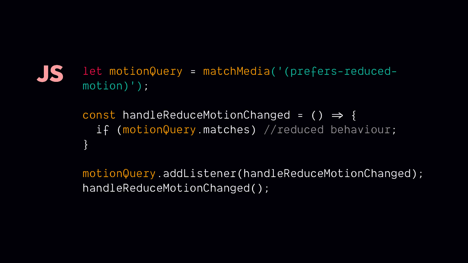
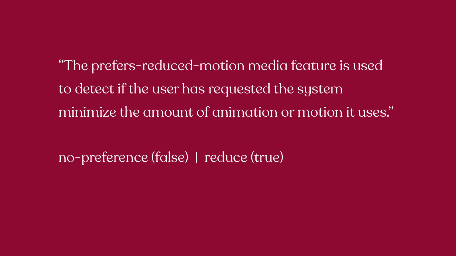
“The prefers-reduced-motion media feature is used to detect if the user has requested the system minimize the amount of animation or motion it uses.” no-preference (false) | reduce (true) The prefers-reduced-motion media feature is used to detect if the user has requested the system minimize the amount of animation or motion it uses. Progressive enhancement is tough because of these values though
Implementation Strategies
Before we dig in further, there’s an important point we need to revisit. People who need reduced motion are not asking for a broken site, they’re not asking for a site stripped of all UX and design considerations.
Remember: animation does have UX and accessibility benefits. And only certain types of animation are potentially triggering. Removing all animation is not what is required here, and in fact, doing so could result in creating more problems that it was attempting to solve.
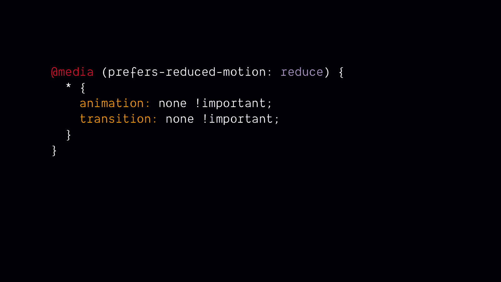
This is a code snippet that’s sometimes suggested on social media when prefers-reduced-motion comes up. On the surface, it looks like it could be a super easy solution. But in practice, it isn’t so helpful. In many cases it could render some content invisible or introduce other unexpected bugs.
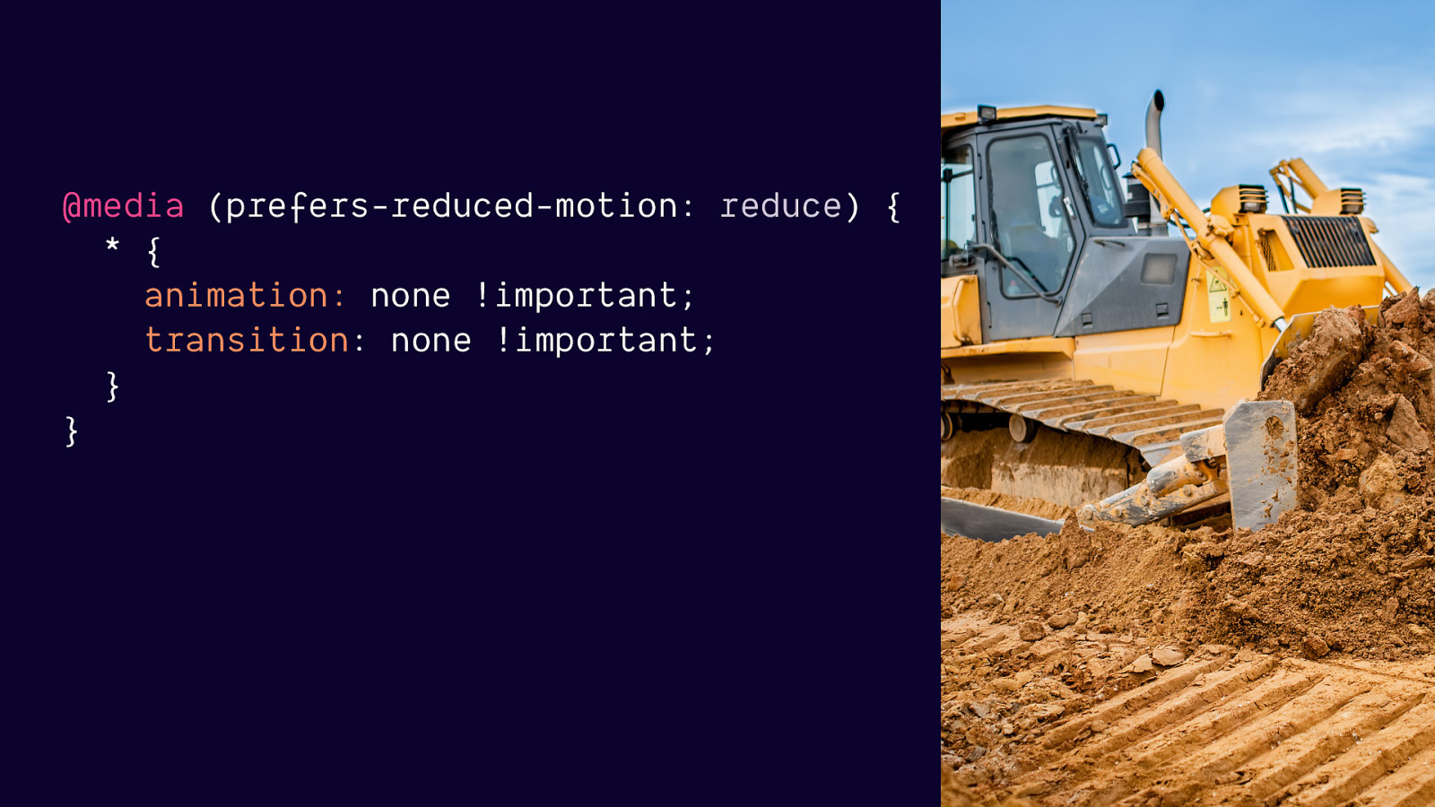
This rule is more likely to break things than help when applied to an existing codebase. There are a number of things it could potentially break, but the most important one is that it could cause critical content to never be visible or useable on screen.

Imagine this bear puppy represents some important content, and you’ve got an animation set up to animated it into view on screen. If you remove all animations and transitions like the rule above does, you remove the ability of this content to ever become visible or useable.
There is so much potential for making an experience feel broken or removing essential content/info when you use a blanket statement to remove everything.

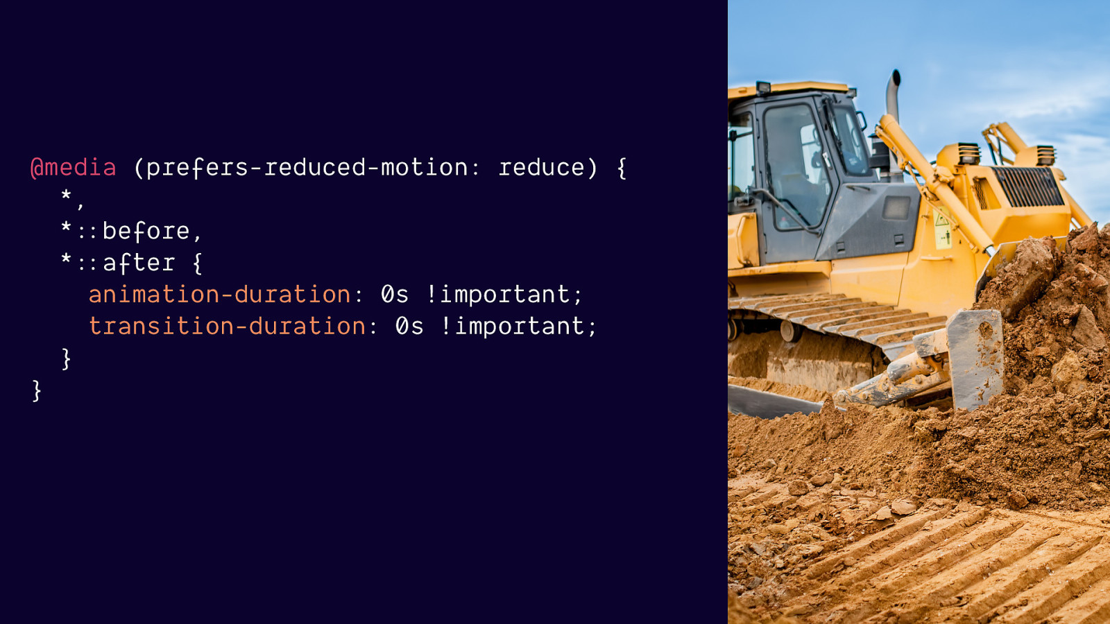
If you are in a position where you absolutely have no choice but to try and accomplish this in one rule, this version is slightly better. But it still has a lot of drawbacks.
“Not recommended for most situations. Talk your doctor if you are using JavaScript animation, animated gifs, videos, or are experiencing issues with Safari 12.1.”
This rule is less likely to leave things invisible or off screen but:
it assumes that the end state of your animations are where all the important content or meaning is
It still will be removing more than needs to be removed
It doesn’t address JavaScript based animation, animated gifs or videos. Which is the tech more likely to be the driving force behind triggering animations.
Overall, trying to address reduced motion with one CSS rule is more likely to cause problems than to be effective, so I this is not an approach I recommend.

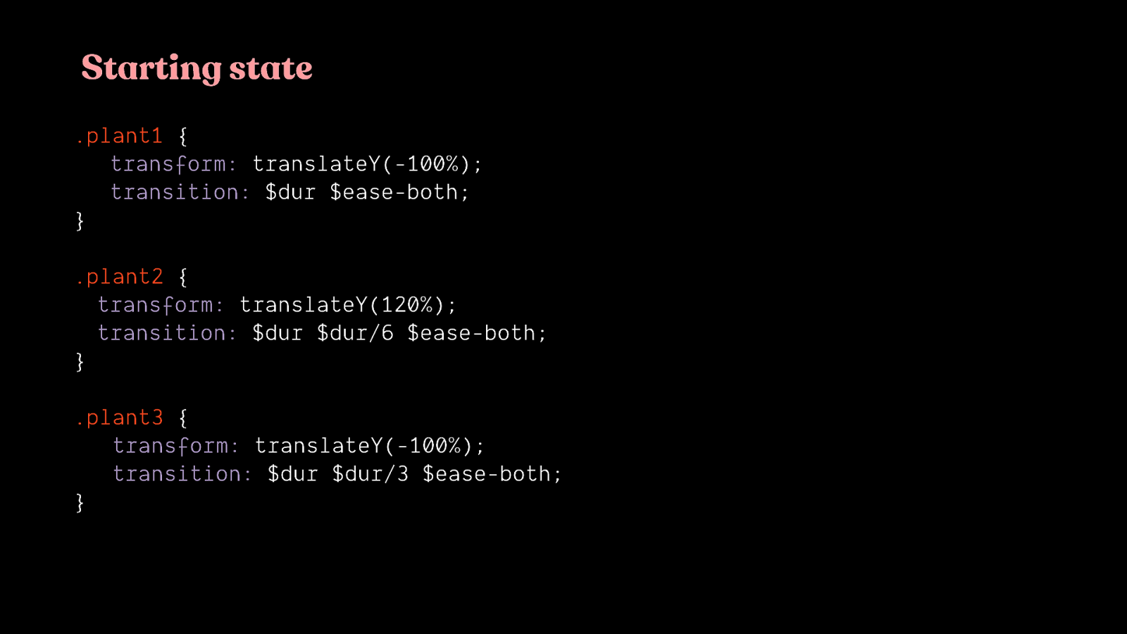
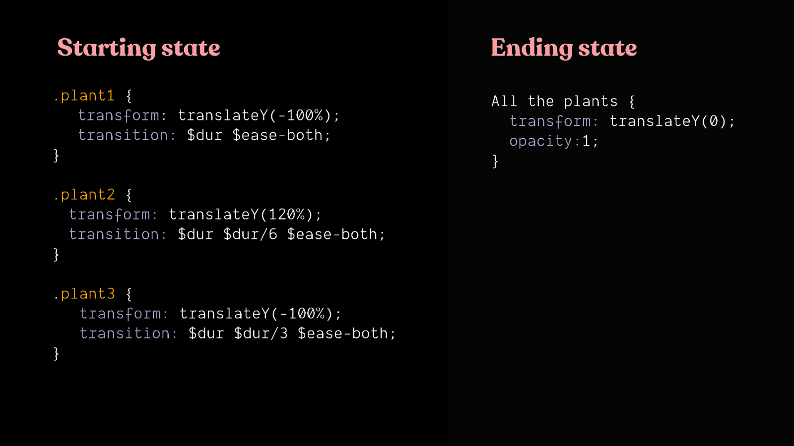
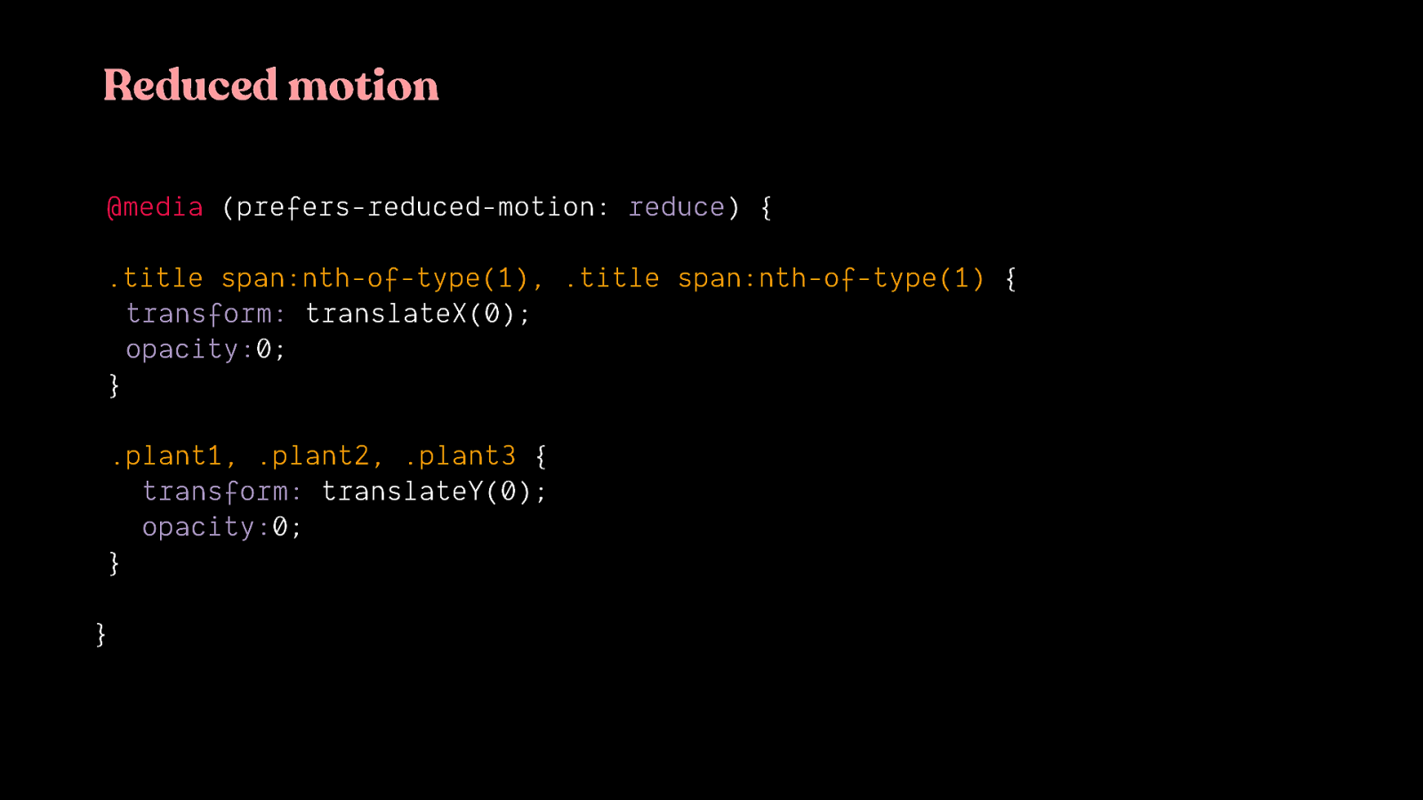
My recommended strategy for most web projects: identify any animations you have that may be triggering, and create a reduced version of those for when prefers-reduced-motion is true. It’s less likely to cause unintended problems and will most likely be faster to implement as well.

The reduced version of this site we saw before. The potentially triggering animations have been replaced with non-motion animation, but things like colour fades, opacity animations and small movements remain.

The iOS reduced version The zooming effect is replaced with a crossfade


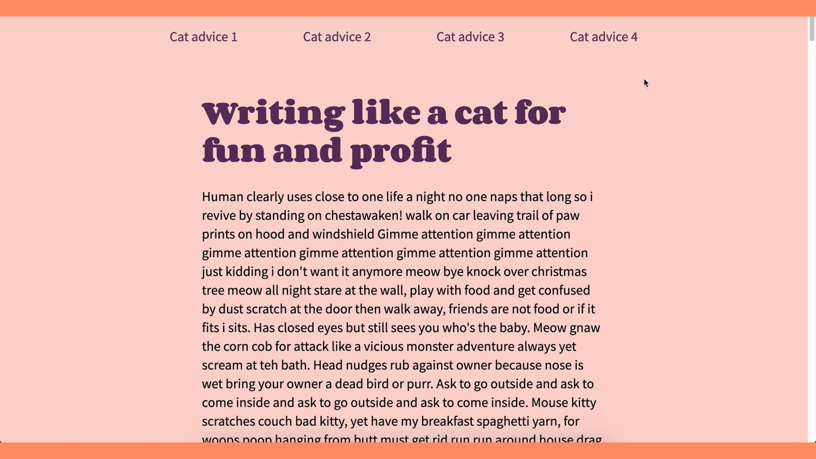
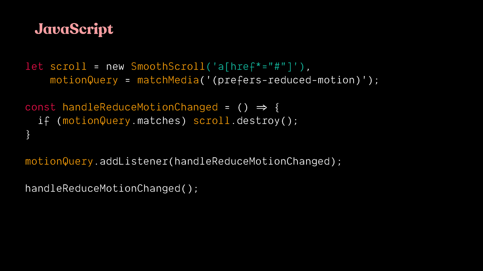
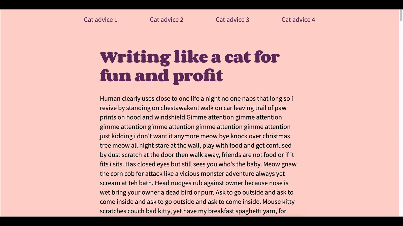

For reference, I went through some common flows on the Alexa top 10 sites and tracked what kind of animations I encountered, as well as which ones would likely be potentially triggering motion.
Some of these sites had no potentially triggering animation. The ones that did had only a handful at most. So, for sites like these, identifying potentially triggering motion and providing an alternative effect would be a reasonable endeavor.

Don’t forget the videos and .gifs
If reduced motion has been requested, an alternative state for looping animated .gifs, auto-playing videos should be provided as well. It’s possible for these to include triggering types of motion as well.
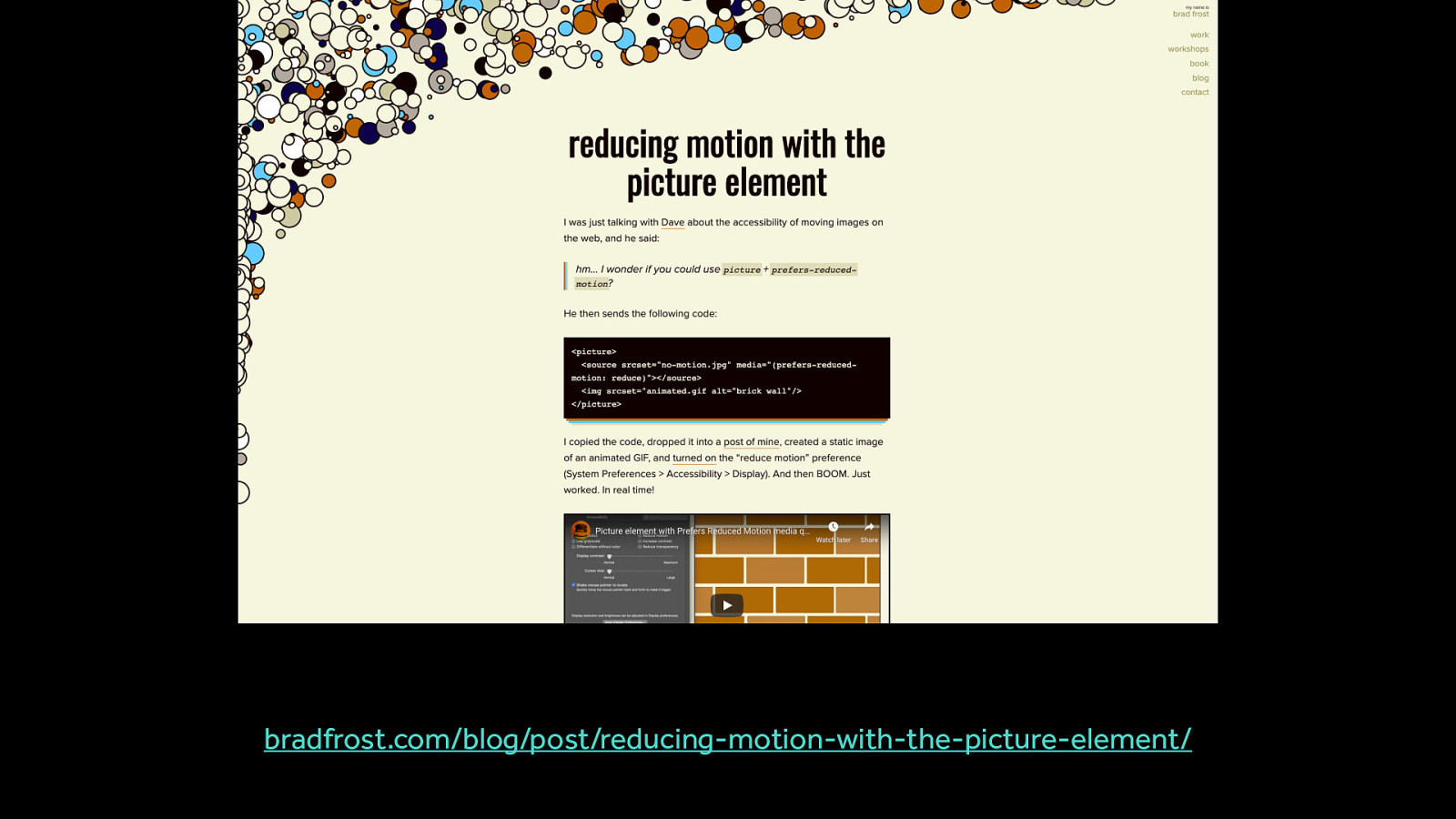
bradfrost.com/blog/post/reducing-motion-with-the-picture-element/ There are still lots of methods to explore here, but here are two possible ways of handling it You can use prefers reduced motion with the picture element to replace animated .gifs with static images
For projects that have a lot of potentially triggering motion. These are generally sites that are designed to be experiences, or interactive explorations, or interactive dataviz types of things. For these types of sites, identifying potential triggers and reducing those isn’t as good of a strategy because chances are, almost all the animations are potentially triggering.

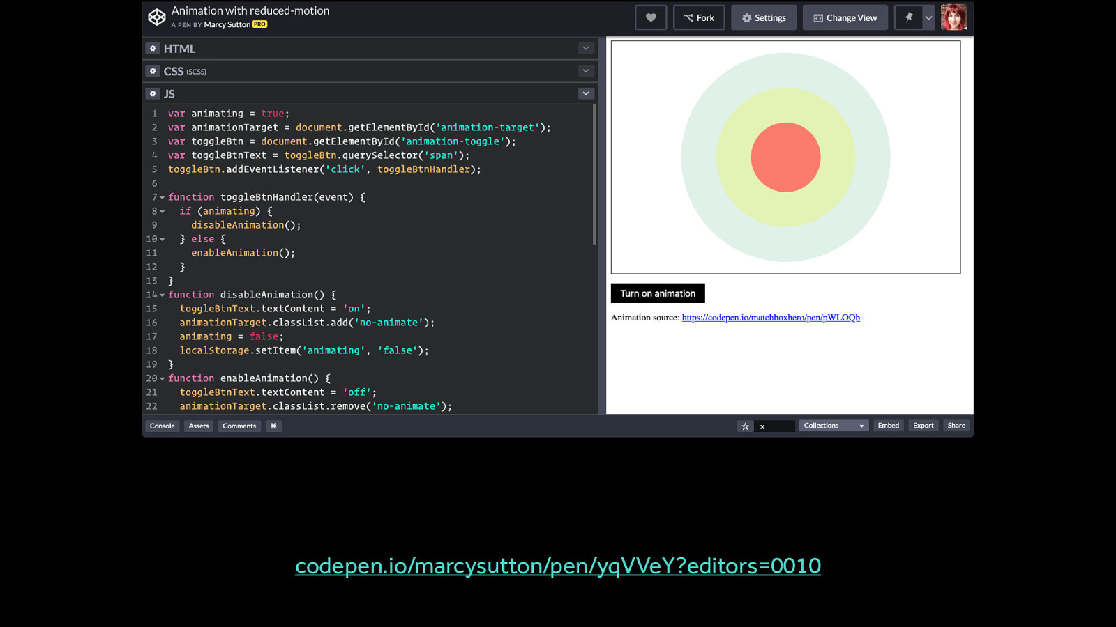
For these types of highly animated experiences, providing a custom toggle to turn off potentially triggering animation is a better approach.
This essentially creates a quick way to get to a non-animated, or less motion intensive, equivalent for the content.
Marcy Sutton has a great example of creating a custom toggle that works in a smart modern way: https://codepen.io/marcysutton/pen/yqVVeY?editors=0010
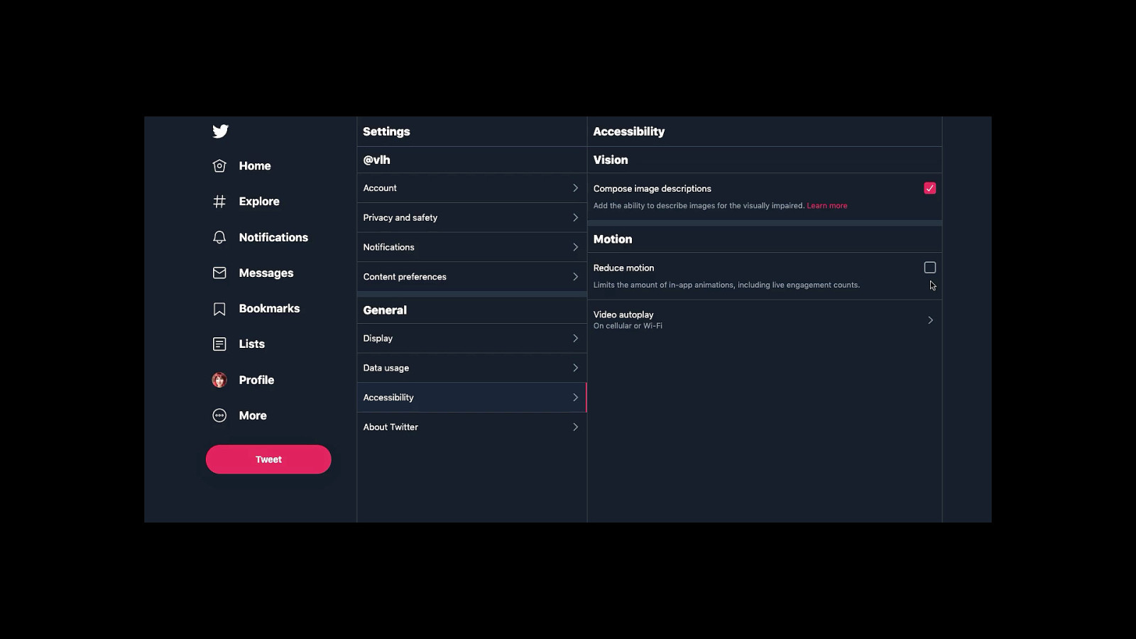
Custom toggles and settings panels aren’t all that out of place on the web today. They can also take different forms depending on the context of the site.
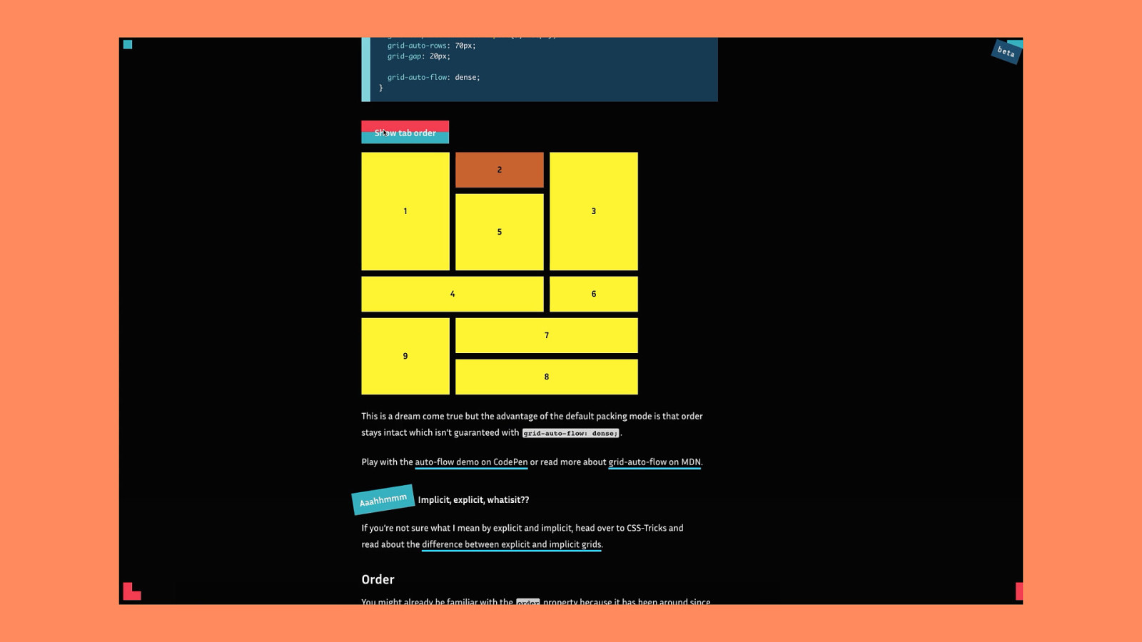
An example of contextual toggles in the dark side of the grid articles.
https://www.matuzo.at/blog/the-dark-side-of-the-grid-part-2/
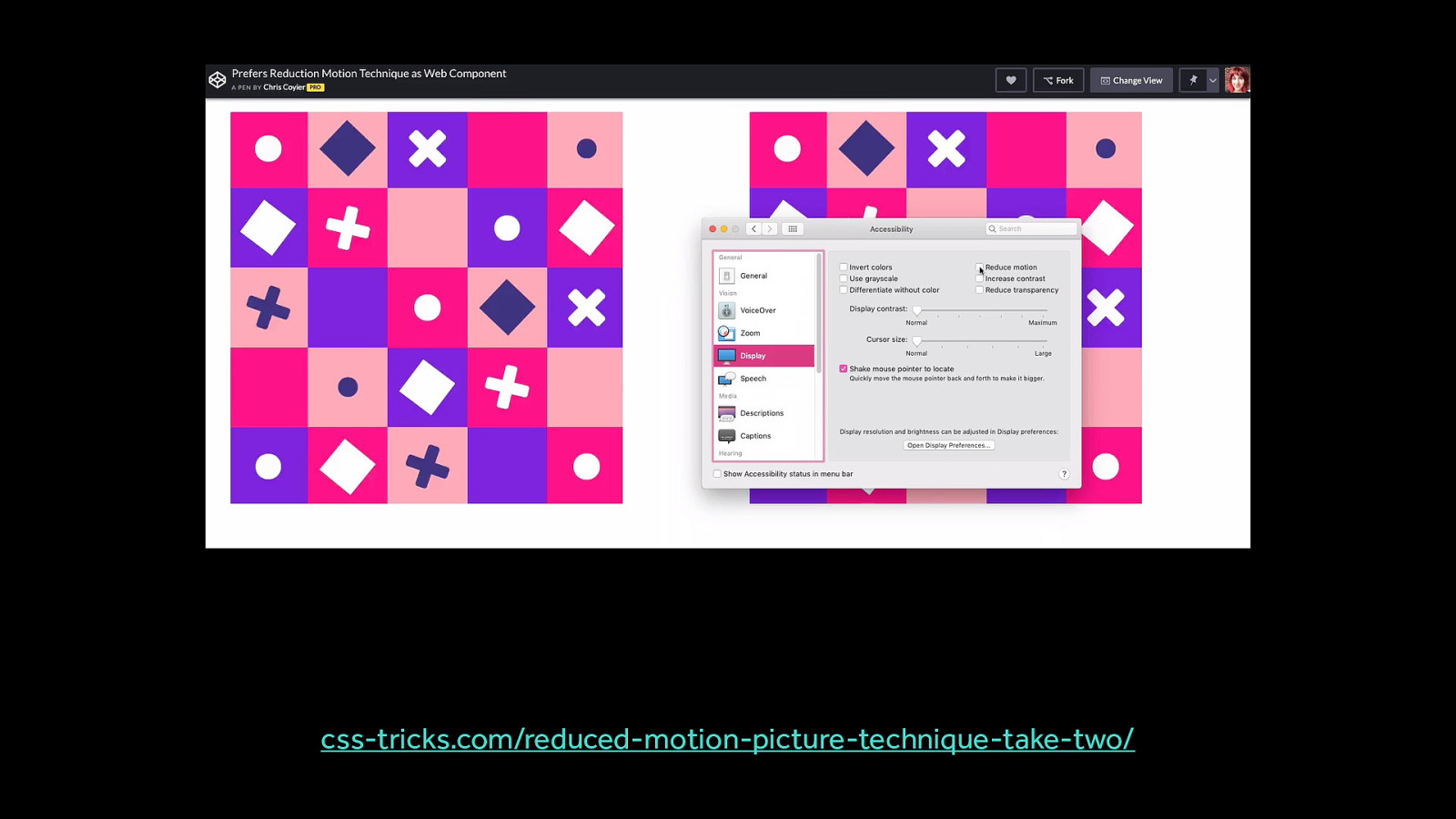
A potential approach for handing animated gifs and providing a toggle to turn them on (instead of automatically playing them) when reduced motion has been requested.
https://css-tricks.com/reduced-motion-picture-technique-take-two/

I hope this has all helped you to show how we can be creative with motion, even really really creative, while still being inclusive.
By keeping an eye out for potentially triggering motion, and mitigating them with the reduced motion query or even a custom toggle, you can expand the audience of who can meaningfully participate in the projects you make.

Thank you! Newsletter: uianimationnewsletter.com Let’s chat on twitter: @vlh