Kickstarting libraries of shared React components for multiple teams

A presentation at React Foo in March 2019 in Bengaluru, Karnataka, India by Xavier Lefèvre
Kickstarting libraries of shared React components for multiple teams
👋 Hi! Me : Xavier Lefèvre Job !: Team leader of React and React Native projects Company 🏢: BAM, a tech consulting and development agency Passion 🤩: I love tech as much as I love travelling which means I’m super happy to be here! I do also love motorcycles.
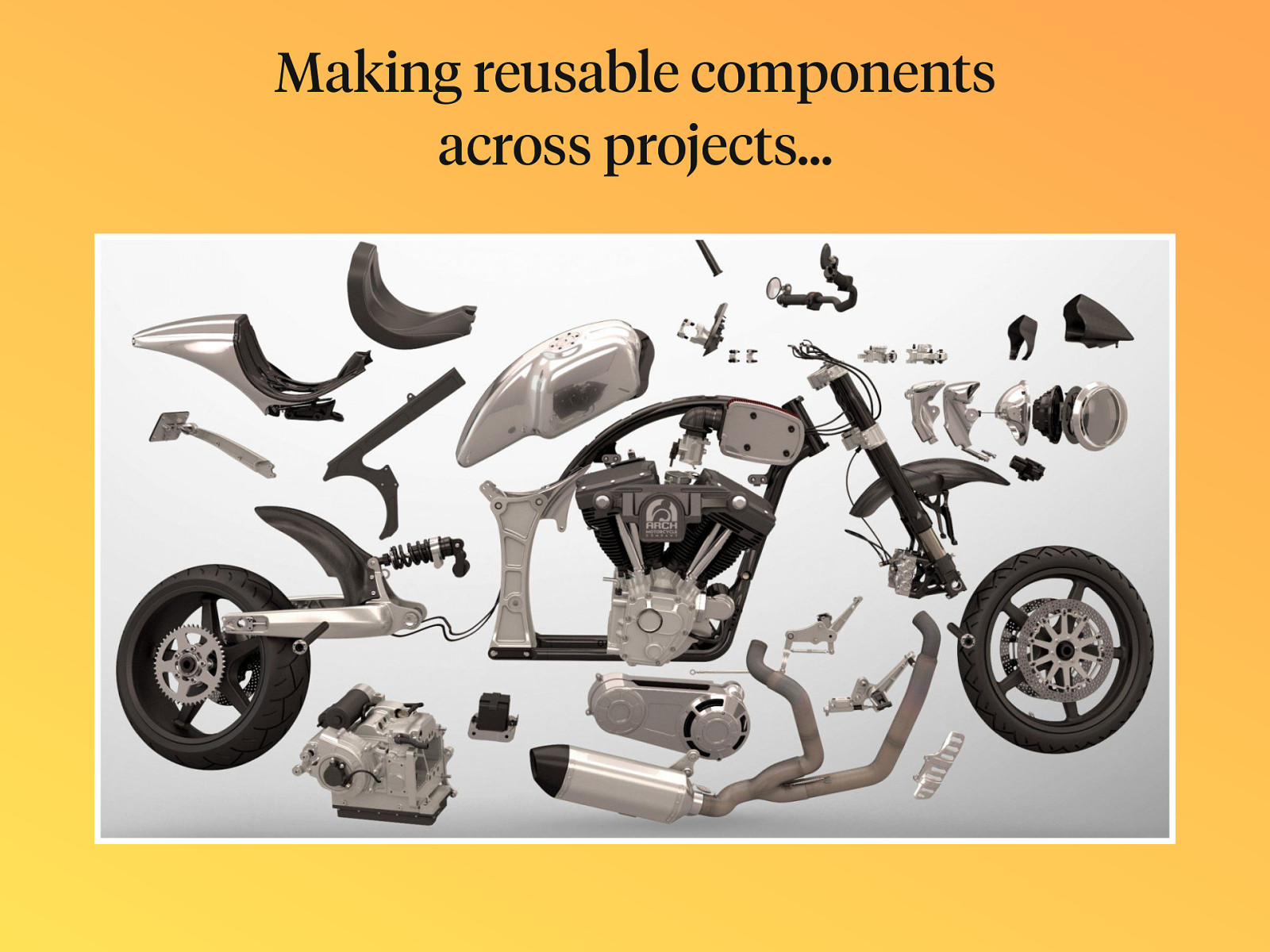
Making reusable components across projects…
Contents
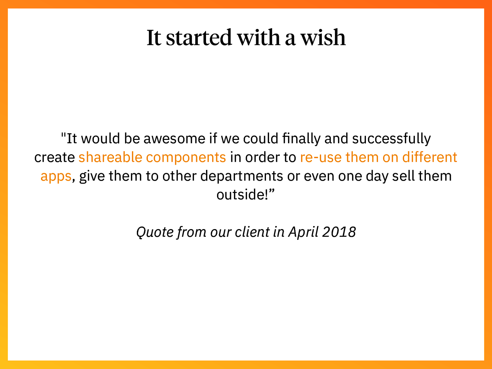
It started with a wish “It would be awesome if we could finally and successfully create shareable components in order to re-use them on different apps, give them to other departments or even one day sell them outside!” Quote from our client in April 2018
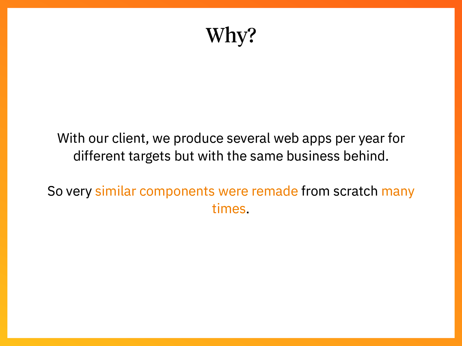
Why? With our client, we produce several web apps per year for different targets but with the same business behind. So very similar components were remade from scratch many times.
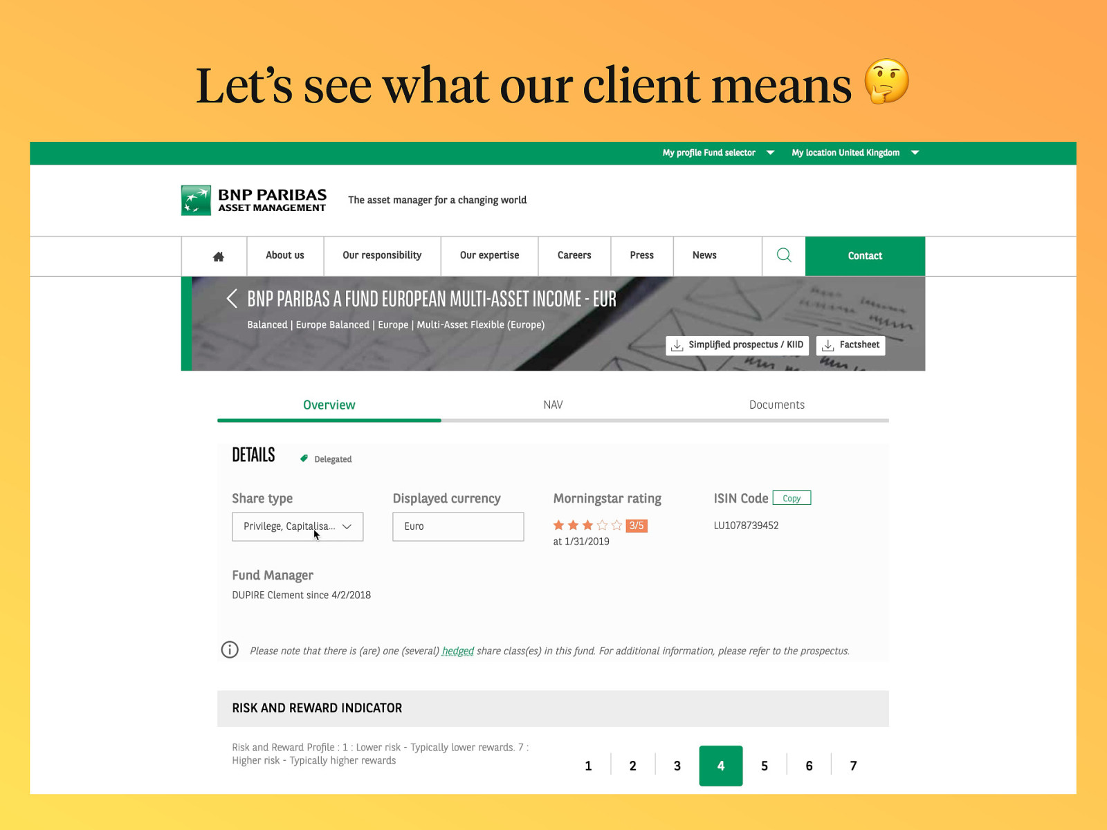
Let’s see what our client means 🤔
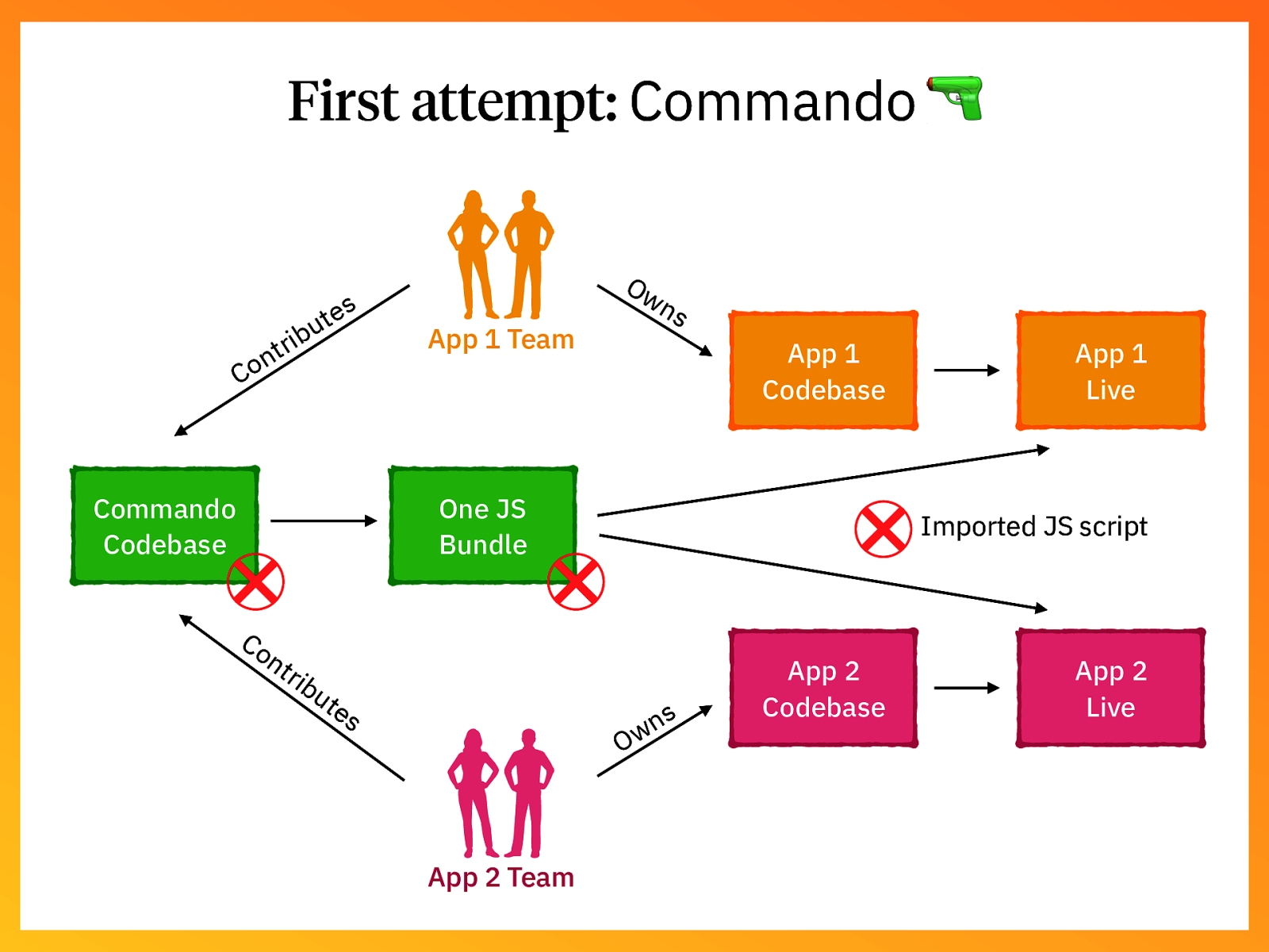
First attempt: Commando 🔫 s e t u rib t n Co Commando Codebase Ow App 1 Team ns App 1 Codebase One JS Bundle Co nt ri bu te s Imported JS script s n Ow App 2 Team App 1 Live App 2 Codebase App 2 Live
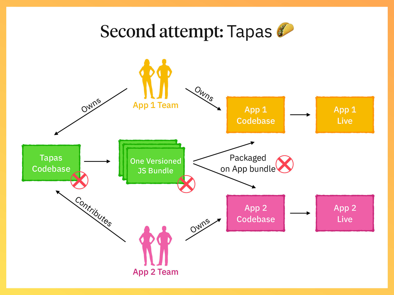
Second attempt: Tapas 🌮 s n w O Ow App 1 Team ns App 1 Codebase JS Bundle JS Bundle One Versioned Output Output Tapas Codebase Packaged on App bundle JS Bundle Co nt ri bu te s s n Ow App 2 Team App 1 Live App 2 Codebase App 2 Live
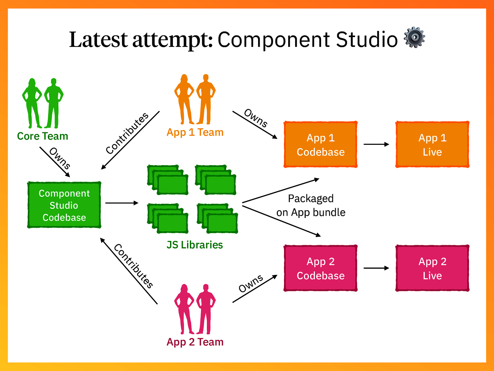
rib Ow App 1 Team ns ns w O App 1 Codebase Co nt Core Team ut es Latest attempt: Component Studio ⚙ Component Studio Codebase App 1 Live Packaged on App bundle rib nt Co JS Libraries es ut s n Ow App 2 Team App 2 Codebase App 2 Live
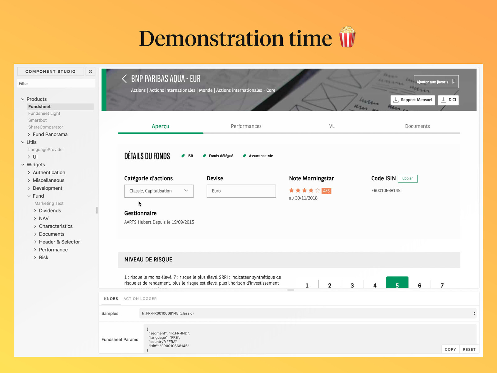
Demonstration time 🍿

Let’s dive in for some tips!
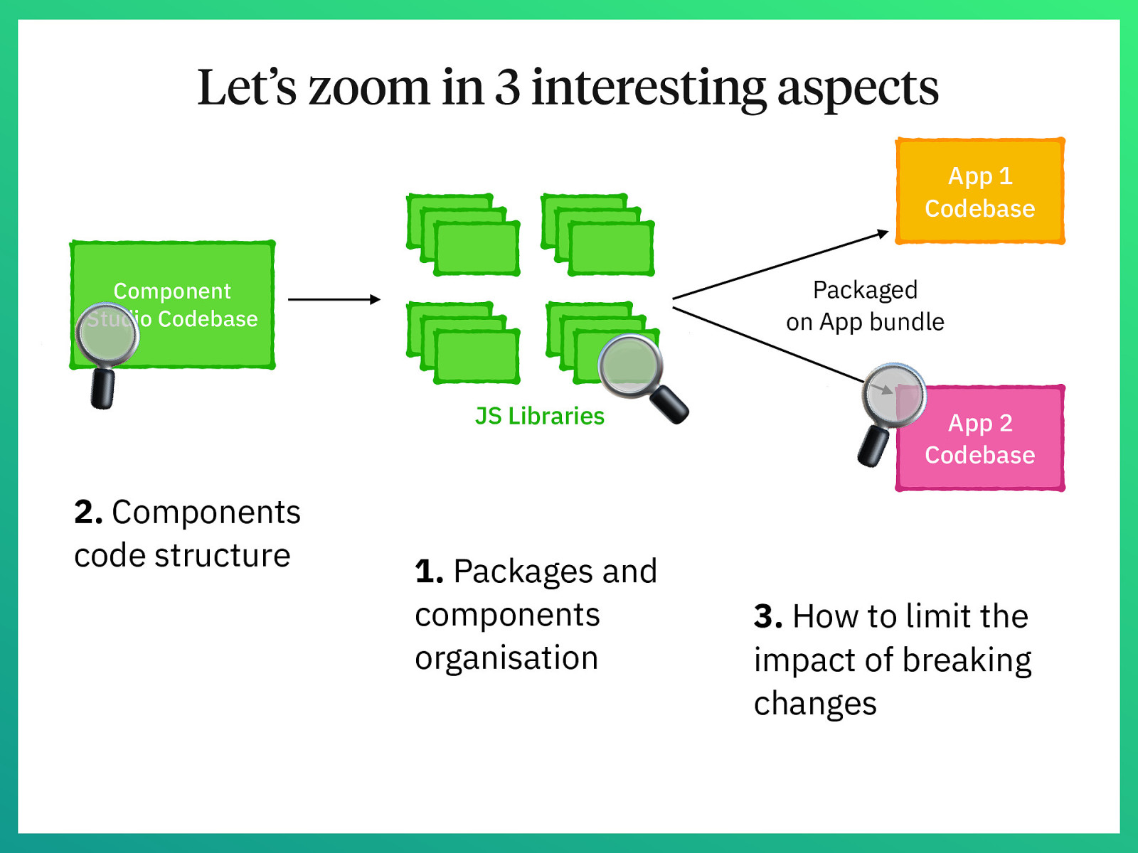
Let’s zoom in 3 interesting aspects App 1 Codebase Component Studio Codebase
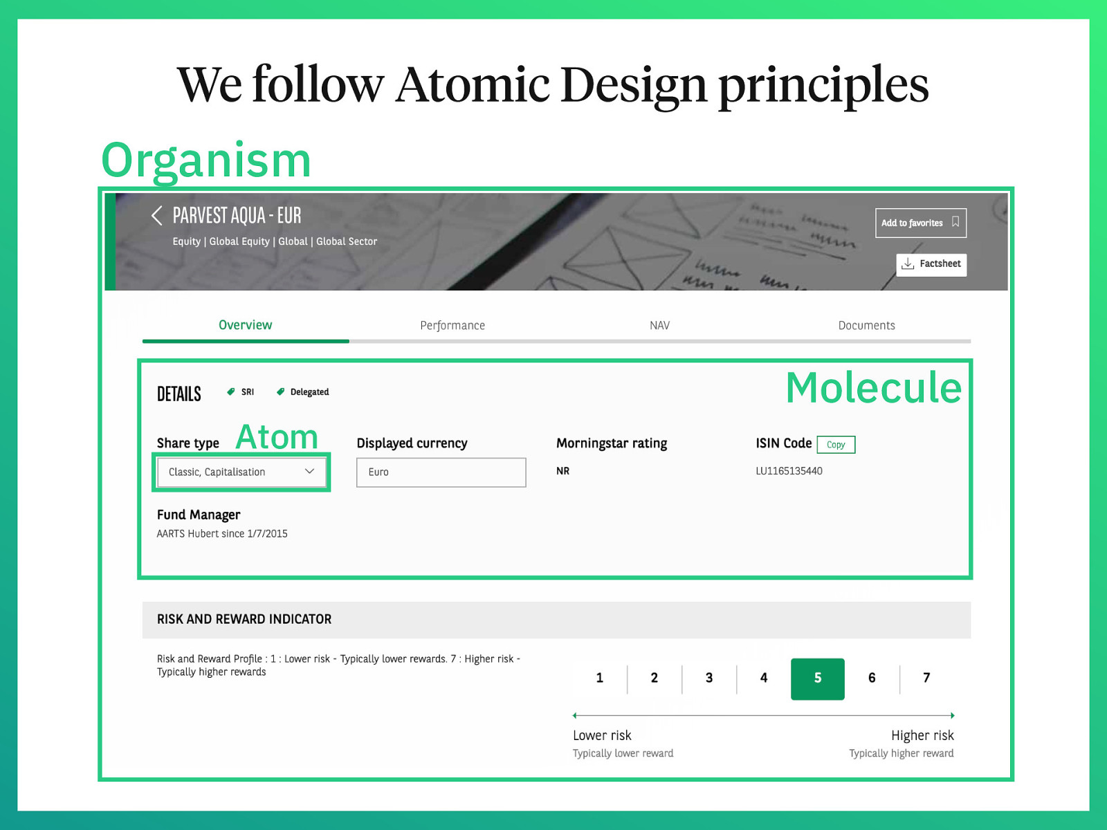
We follow Atomic Design principles Organism Atom Molecule
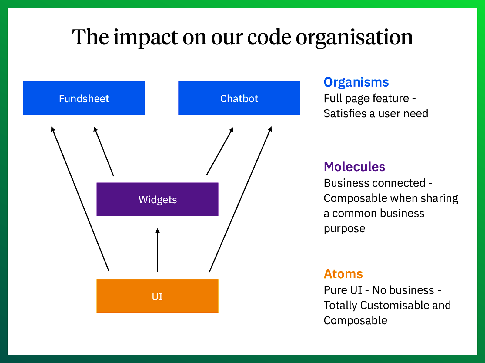
The impact on our code organisation Organisms Fundsheet Chatbot Full page feature Satisfies a user need Molecules Widgets Business connected Composable when sharing a common business purpose Atoms UI Pure UI - No business Totally Customisable and Composable
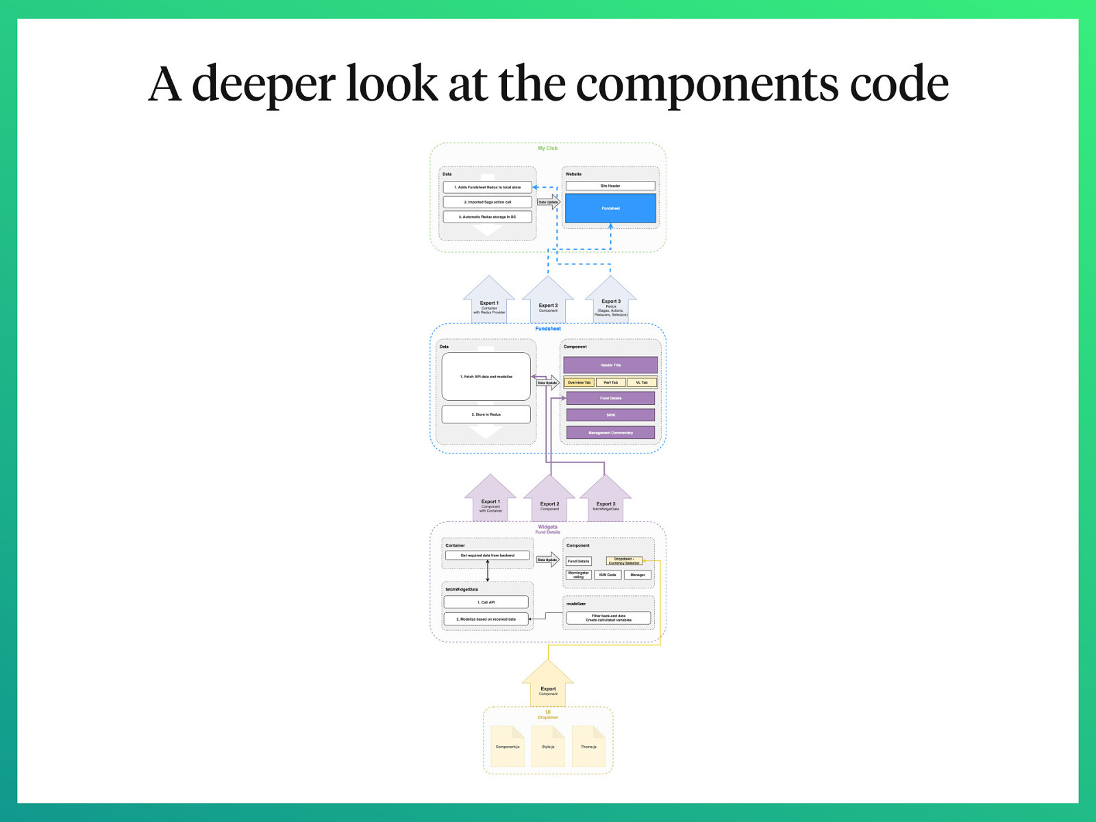
A deeper look at the components code
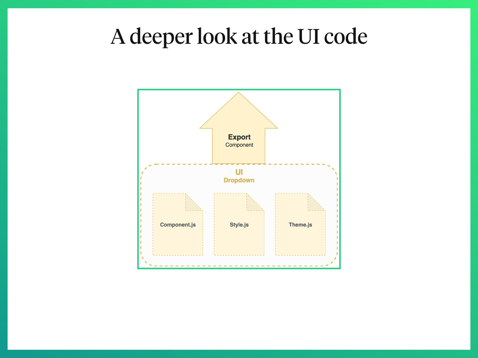
A deeper look at the UI code
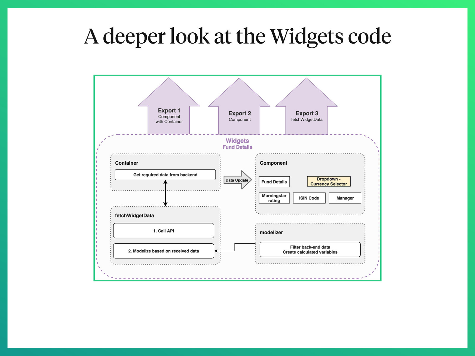
A deeper look at the Widgets code
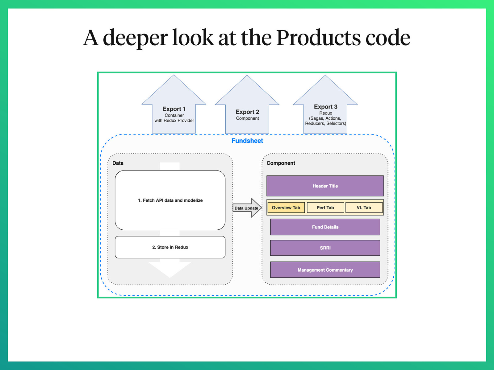
A deeper look at the Products code
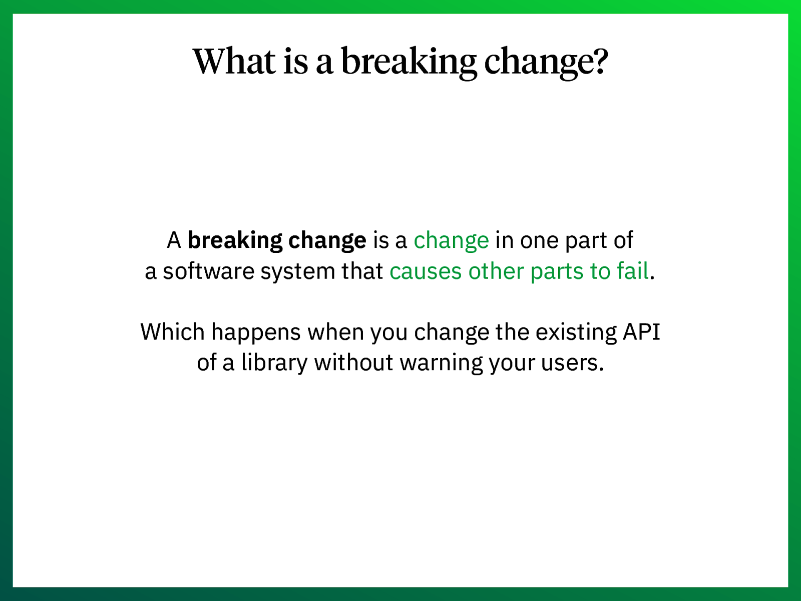
What is a breaking change? A breaking change is a change in one part of a software system that causes other parts to fail. Which happens when you change the existing API of a library without warning your users.
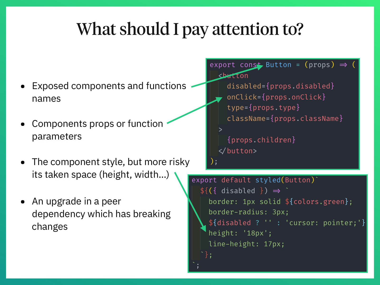
What should I pay attention to? • Exposed components and functions names • Components props or function parameters • The component style, but more risky its taken space (height, width…) • An upgrade in a peer dependency which has breaking changes
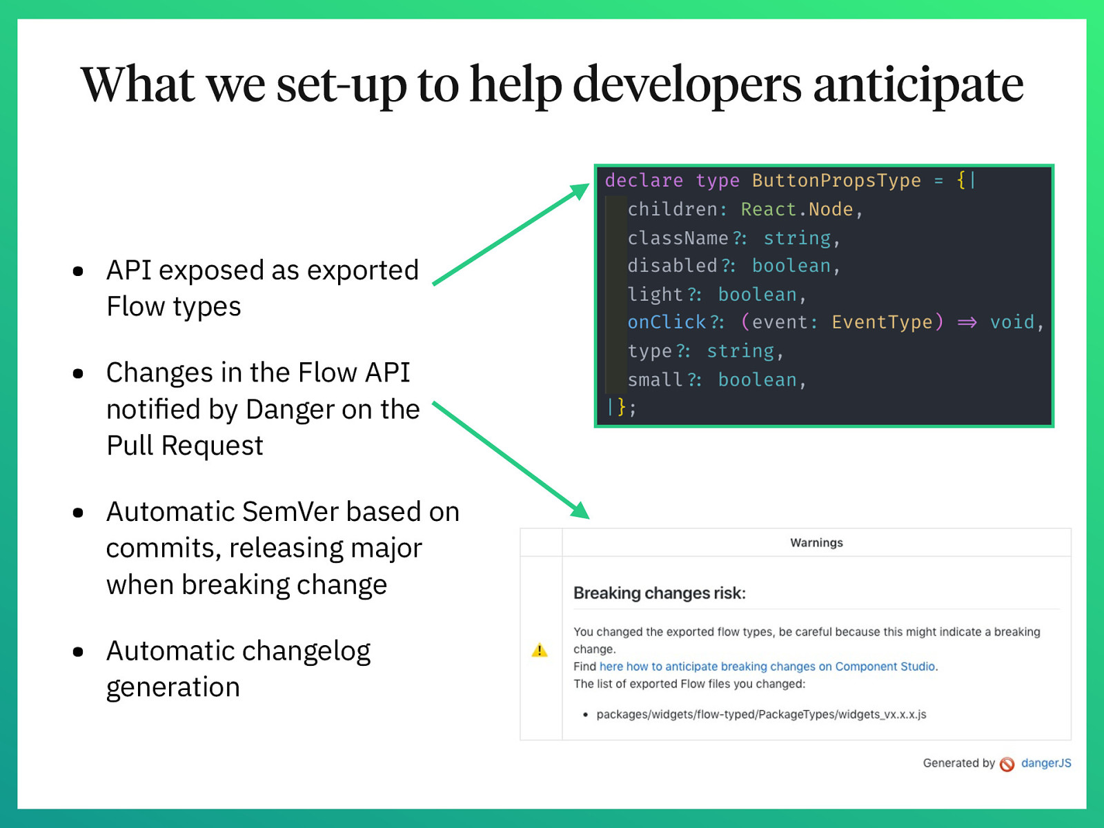
What we set-up to help developers anticipate • API exposed as exported Flow types • Changes in the Flow API notified by Danger on the Pull Request • Automatic SemVer based on commits, releasing major when breaking change • Automatic changelog generation
How do we know our project is successful?
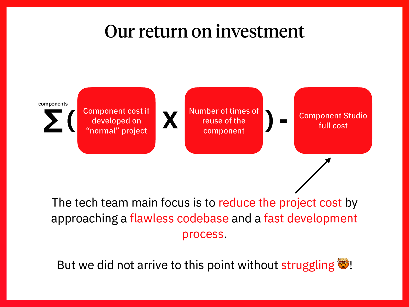
Our return on investment components Σ( Component cost if developed on “normal” project X Number of times of reuse of the component )- Component Studio full cost The tech team main focus is to reduce the project cost by approaching a flawless codebase and a fast development process. But we did not arrive to this point without struggling 🤯!
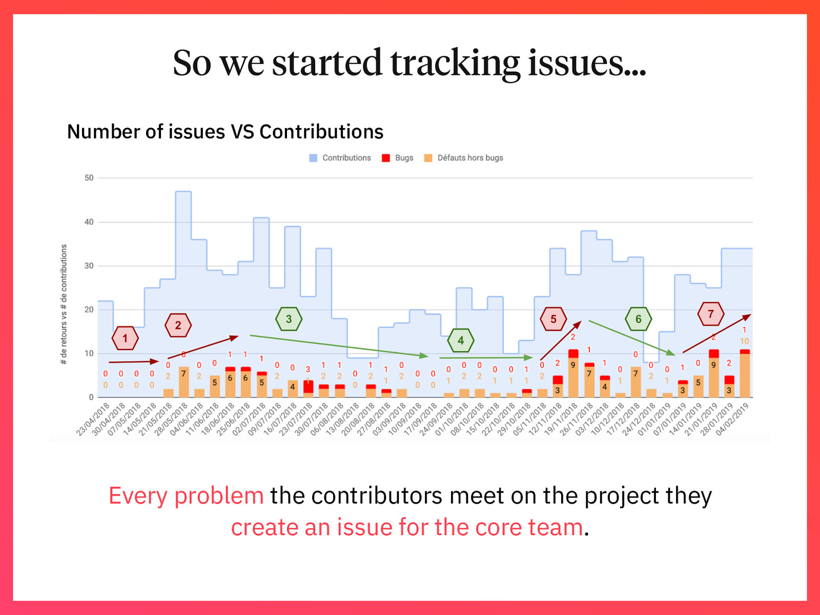
So we started tracking issues… Number of issues VS Contributions Every problem the contributors meet on the project they create an issue for the core team.
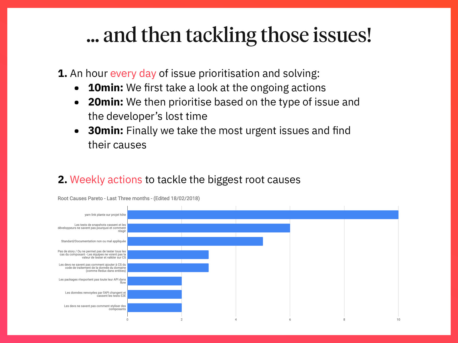
… and then tackling those issues! 1. An hour every day of issue prioritisation and solving: • 10min: We first take a look at the ongoing actions • 20min: We then prioritise based on the type of issue and the developer’s lost time • 30min: Finally we take the most urgent issues and find their causes 2. Weekly actions to tackle the biggest root causes
So, is it worth it? 👍 or 👎
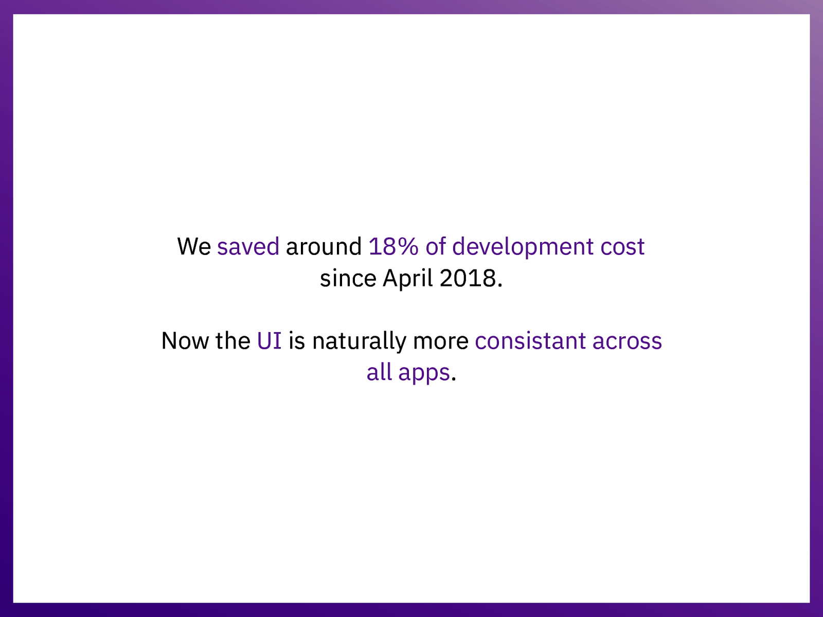
We saved around 18% of development cost since April 2018. Now the UI is naturally more consistant across all apps.
🙏 Thanks! Special thanks to everybody that worked on this project: I am able to share all this because of a huge team work since day 1. @xavi_lefevre xavierlefevre
Appendix • • • • • • Complete project stack Global architecture Atomic Design deep dive Development Flow Our current issues Links
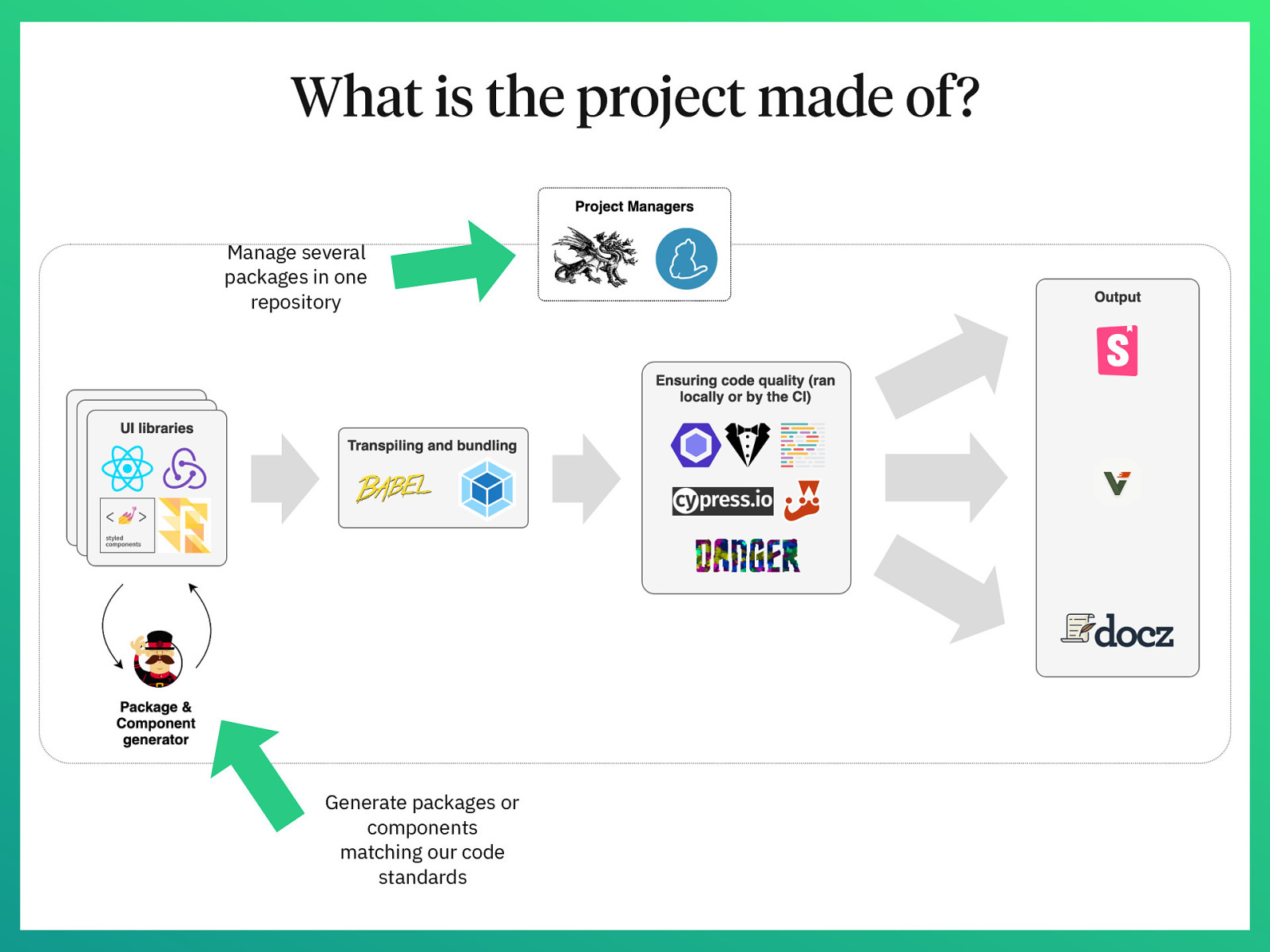
What is the project made of? Manage several packages in one repository Generate packages or components matching our code standards
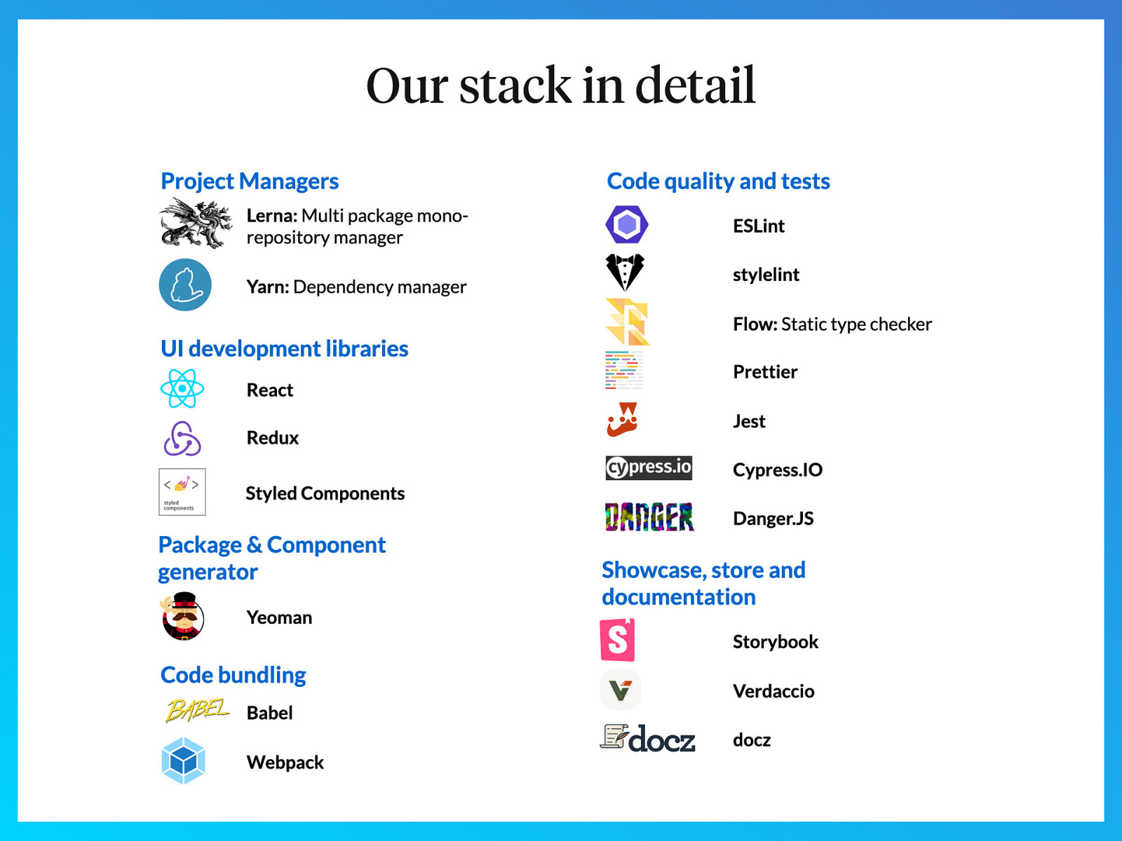
Our stack in detail
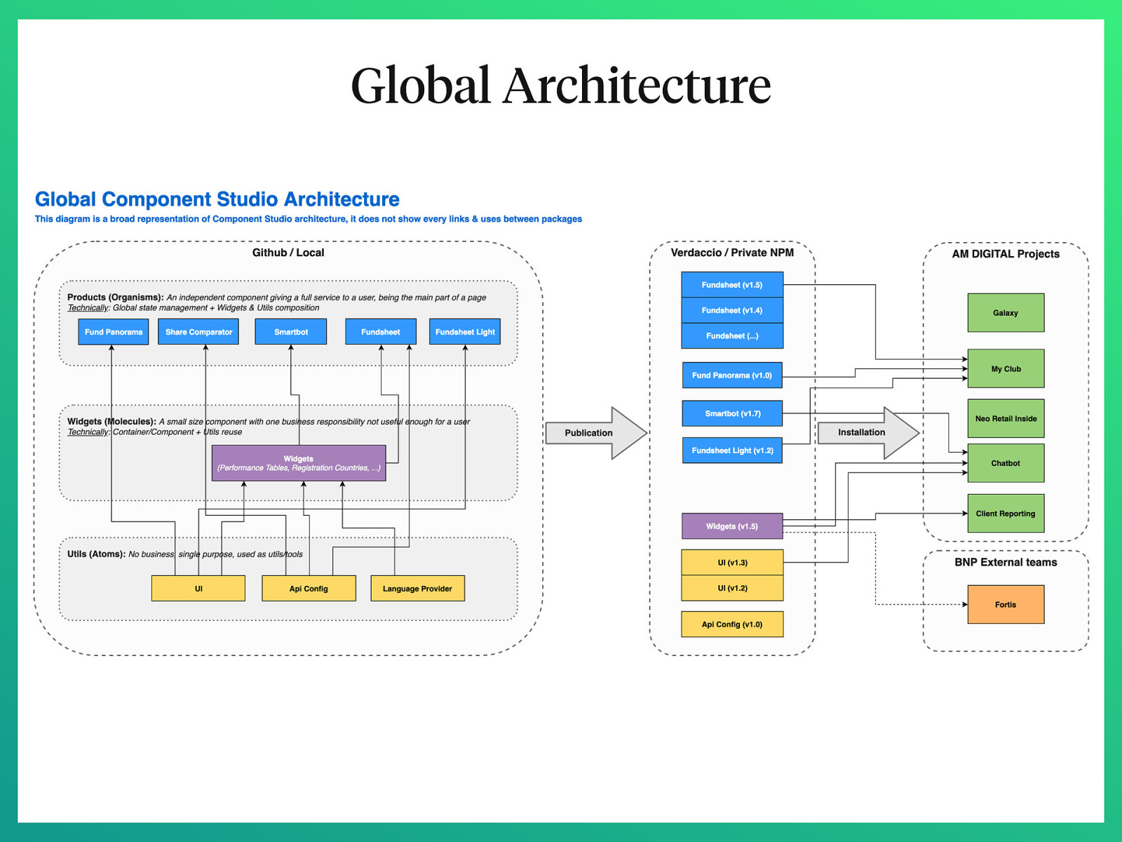
Global Architecture
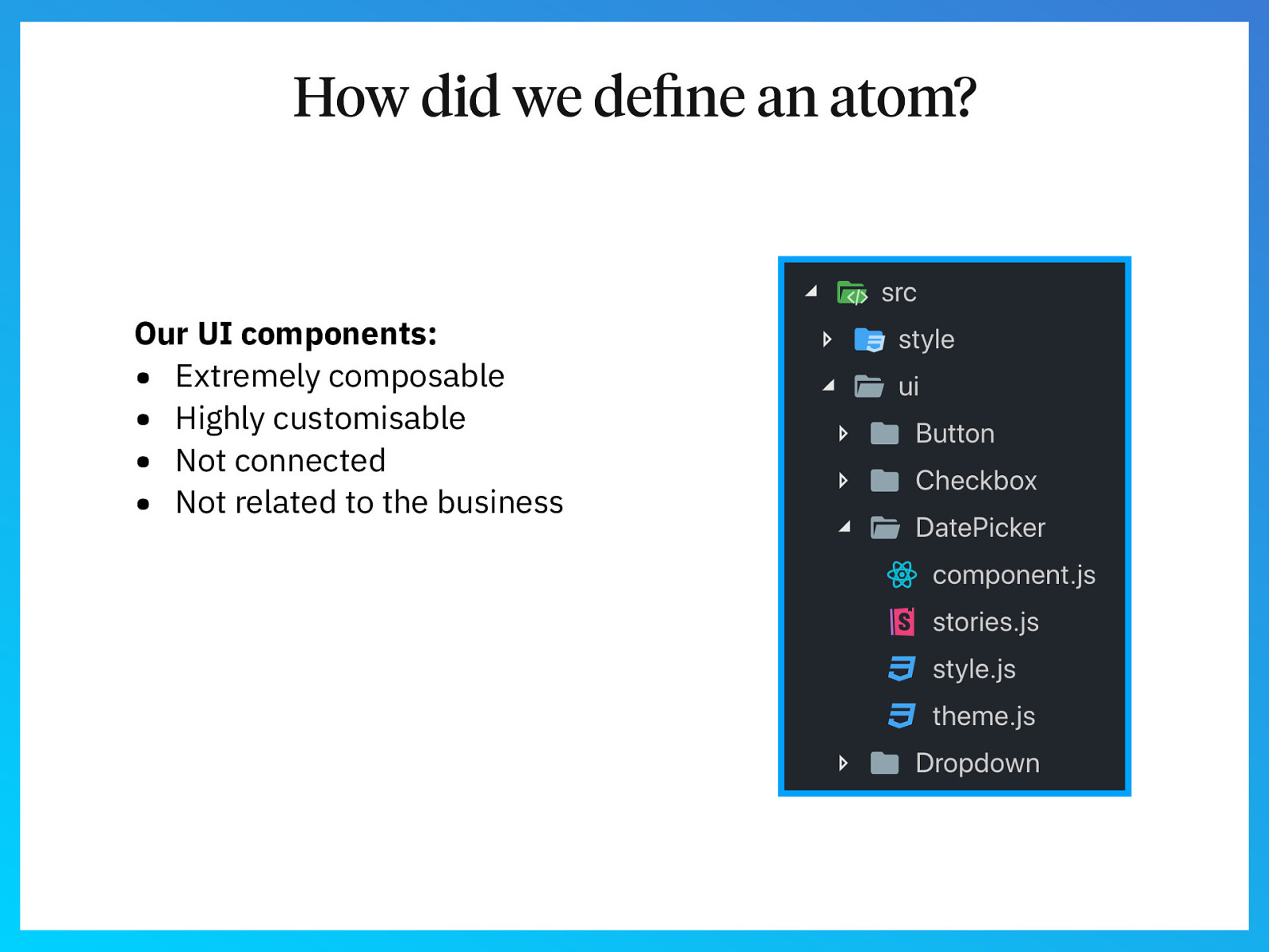
How did we define an atom? Our UI components: • Extremely composable • Highly customisable • Not connected • Not related to the business
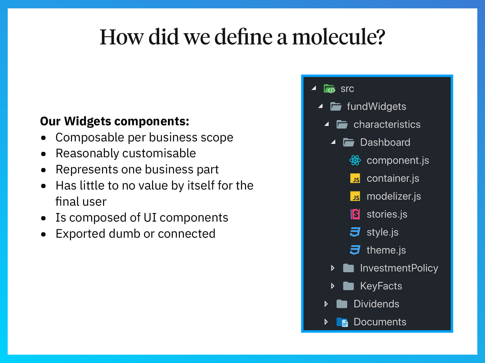
How did we define a molecule? Our Widgets components: • Composable per business scope • Reasonably customisable • Represents one business part • Has little to no value by itself for the final user • Is composed of UI components • Exported dumb or connected
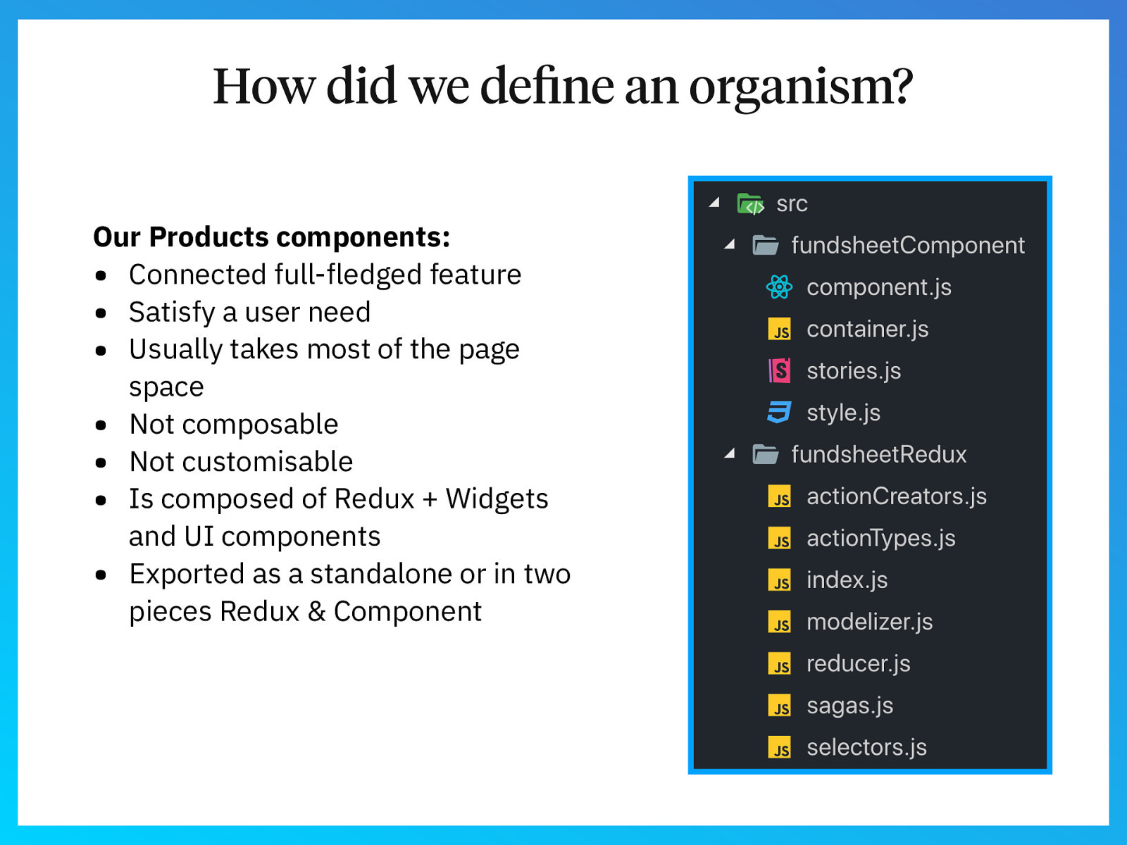
How did we define an organism? Our Products components: • Connected full-fledged feature • Satisfy a user need • Usually takes most of the page space • Not composable • Not customisable • Is composed of Redux + Widgets and UI components • Exported as a standalone or in two pieces Redux & Component
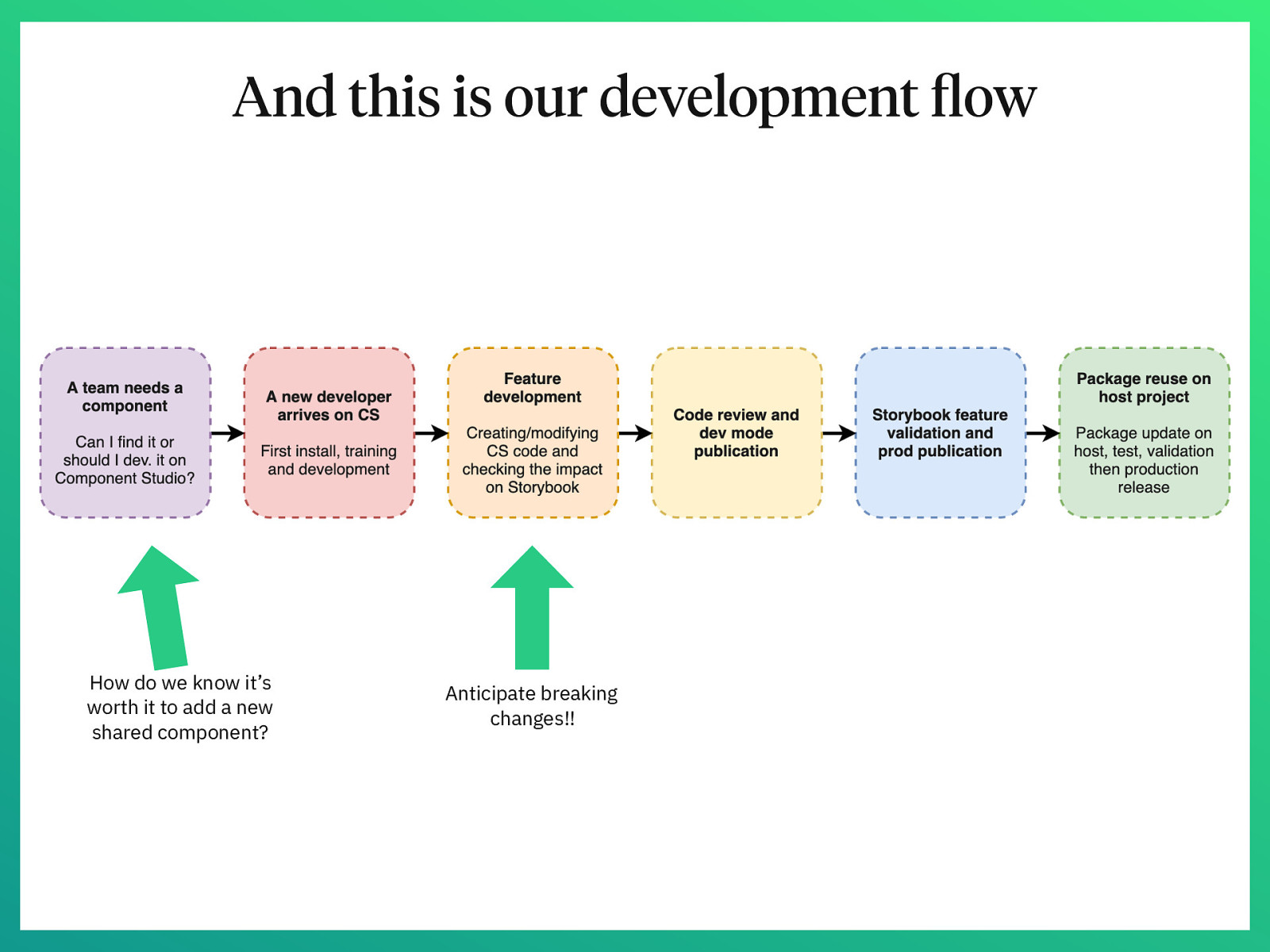
And this is our development flow How do we know it’s worth it to add a new shared component? Anticipate breaking changes!!
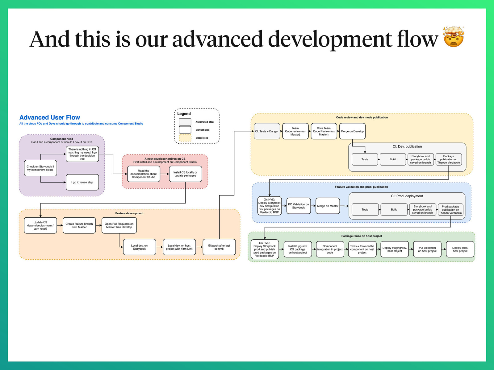
And this is our advanced development flow 🤯
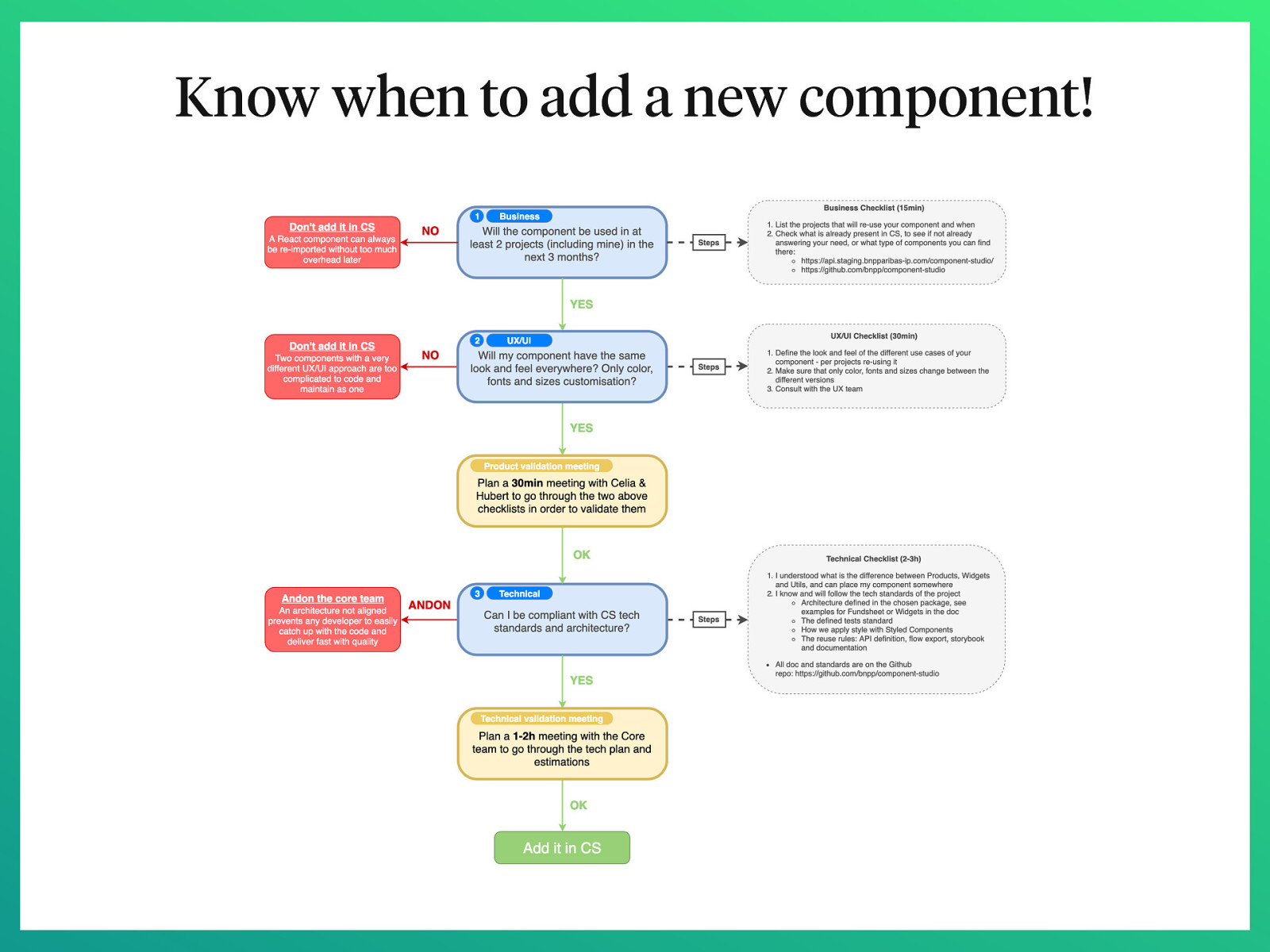
Know when to add a new component!
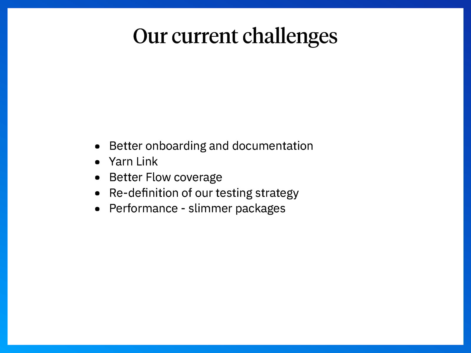
Our current challenges • • • • • Better onboarding and documentation Yarn Link Better Flow coverage Re-definition of our testing strategy Performance - slimmer packages
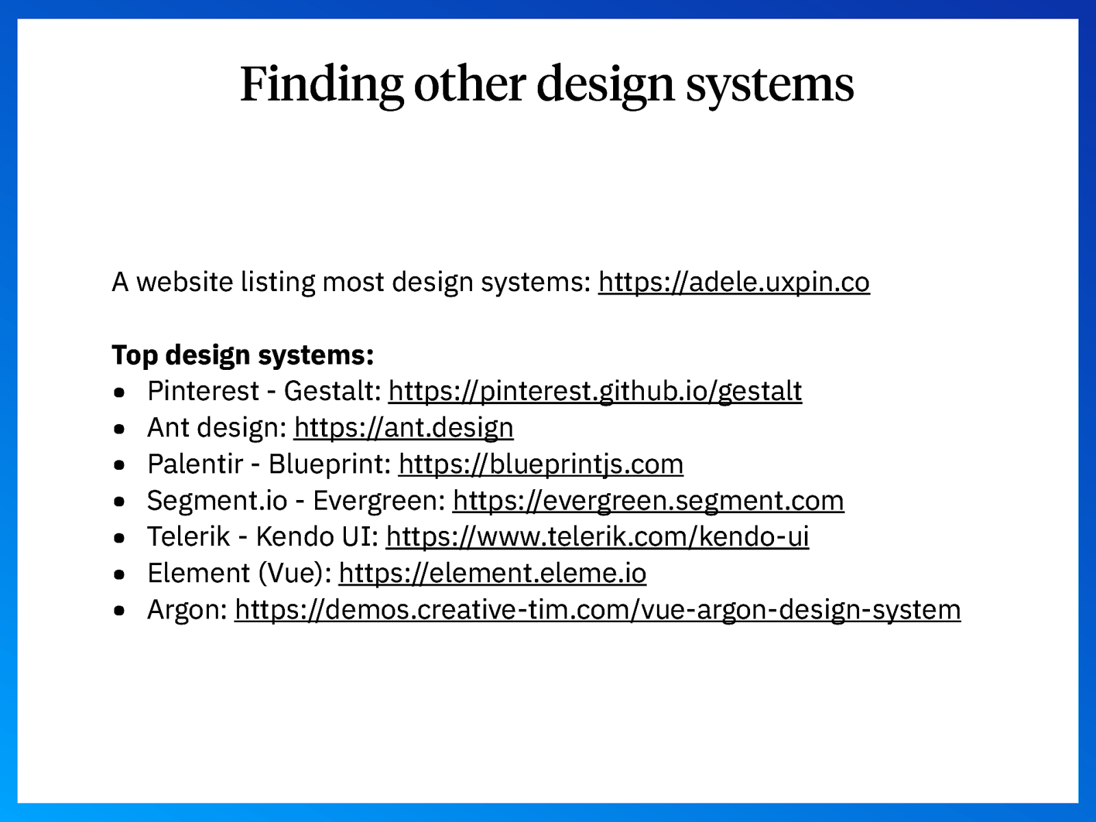
Finding other design systems A website listing most design systems: https://adele.uxpin.co Top design systems: • Pinterest - Gestalt: https://pinterest.github.io/gestalt • Ant design: https://ant.design • Palentir - Blueprint: https://blueprintjs.com • Segment.io - Evergreen: https://evergreen.segment.com • Telerik - Kendo UI: https://www.telerik.com/kendo-ui • Element (Vue): https://element.eleme.io • Argon: https://demos.creative-tim.com/vue-argon-design-system
Links • Atomic design: http://bradfrost.com/blog/post/atomic-web-design