Building Resilient Websites

A presentation at Lockdown Learning with Fruition IT in June 2020 in by Chris Taylor

Slide 1

Slide 1

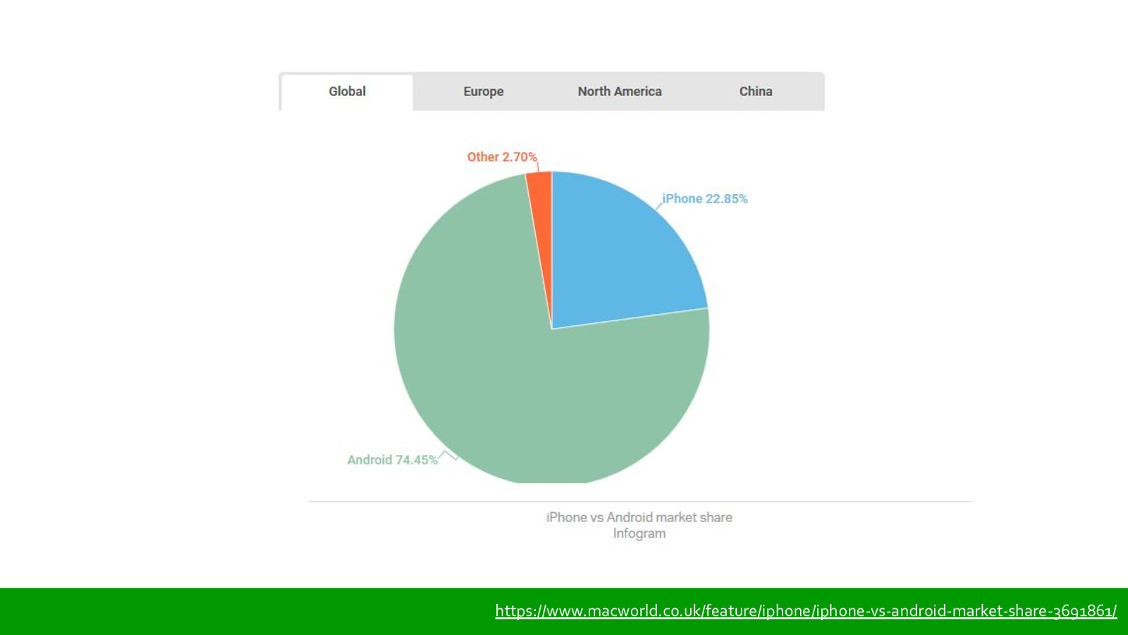
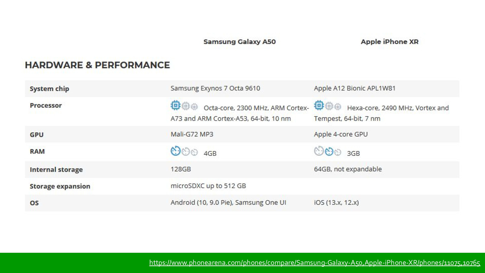
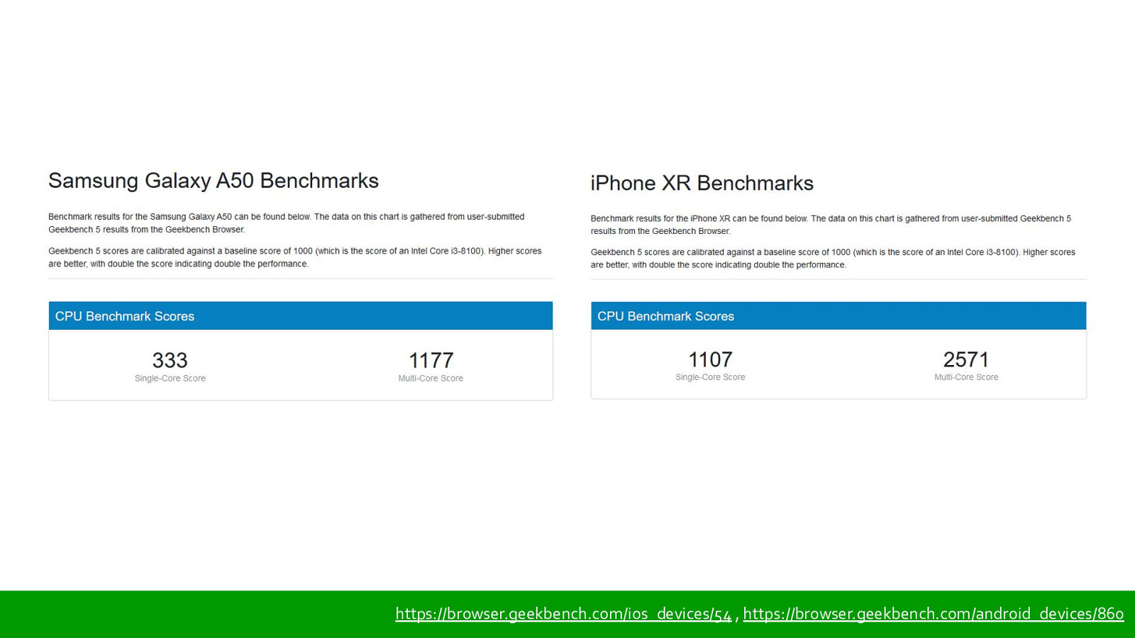
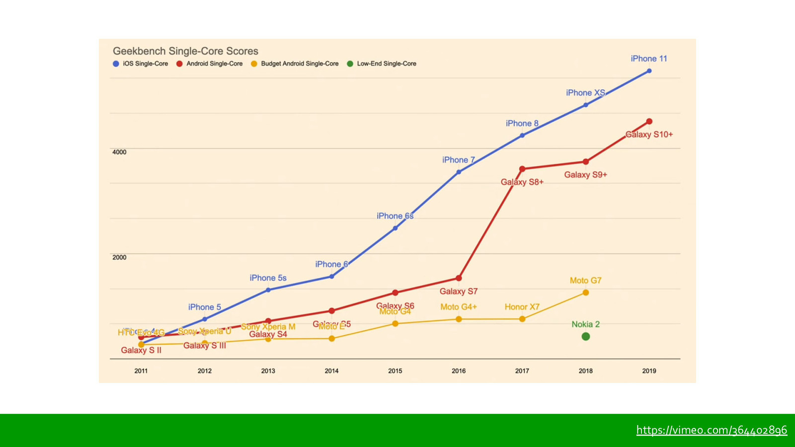
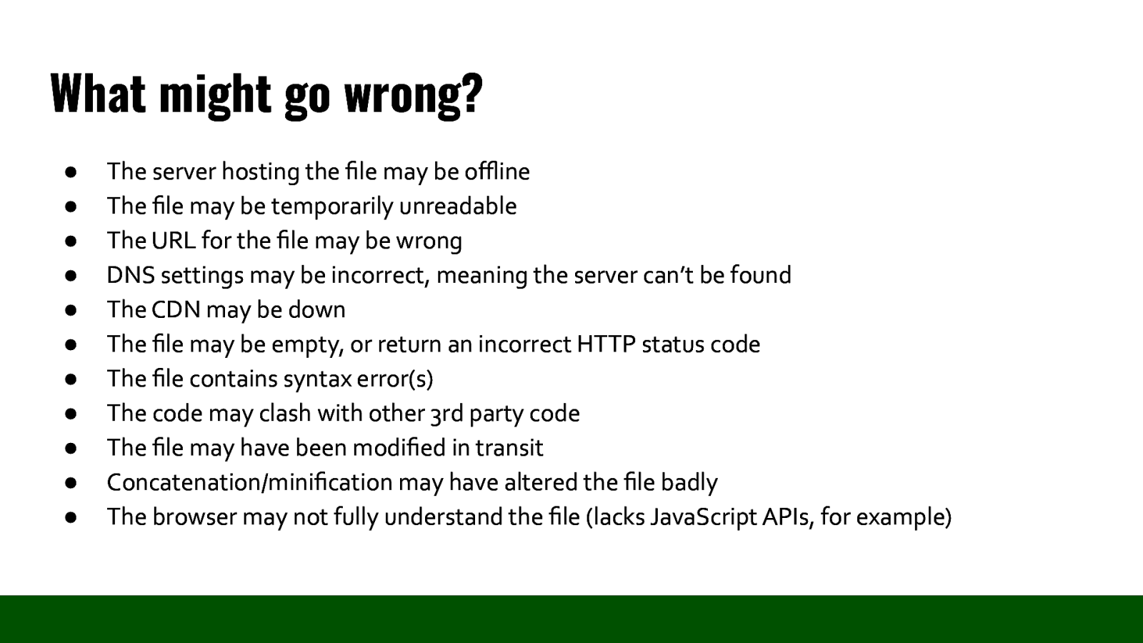
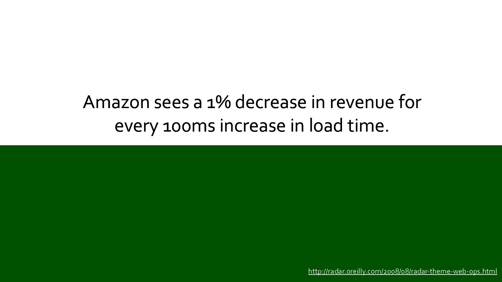
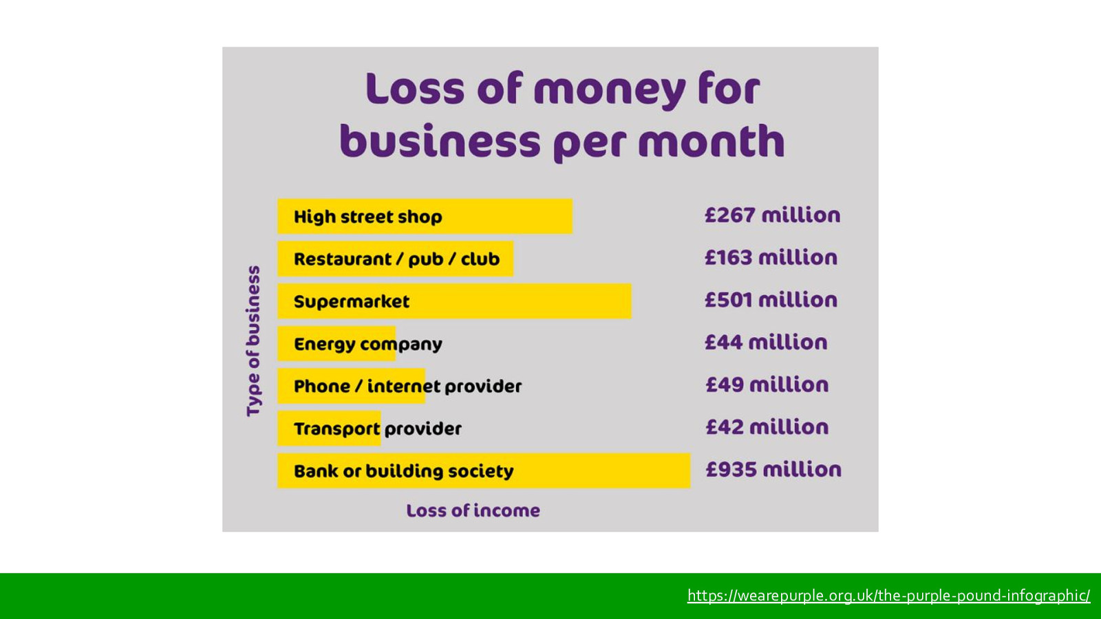
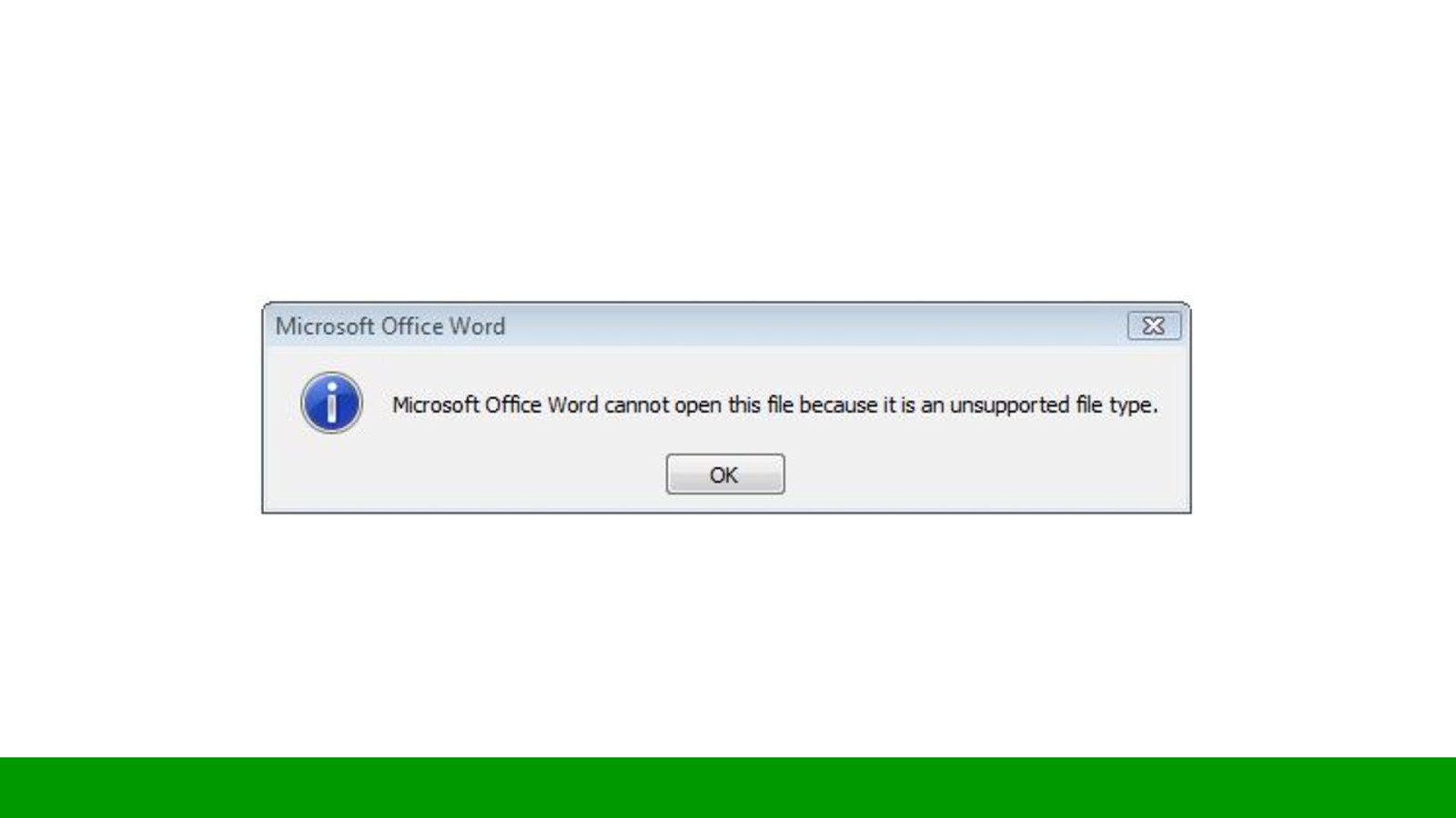
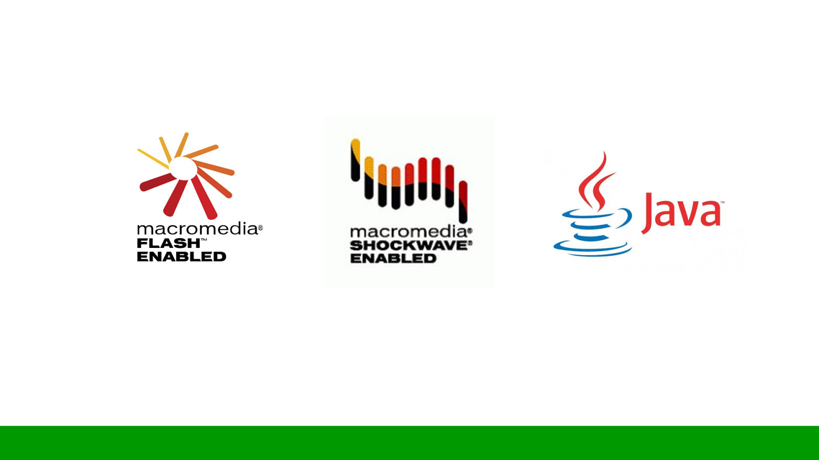
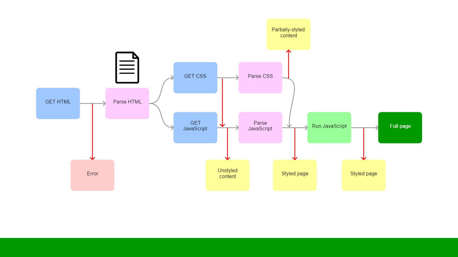
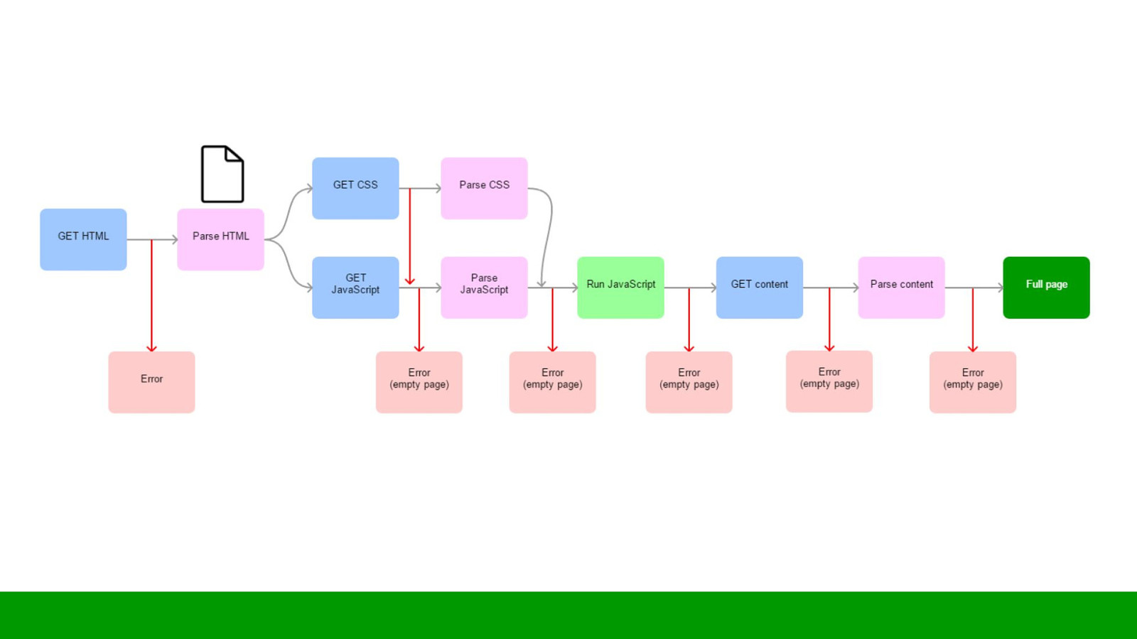
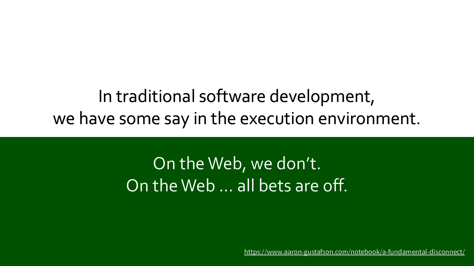
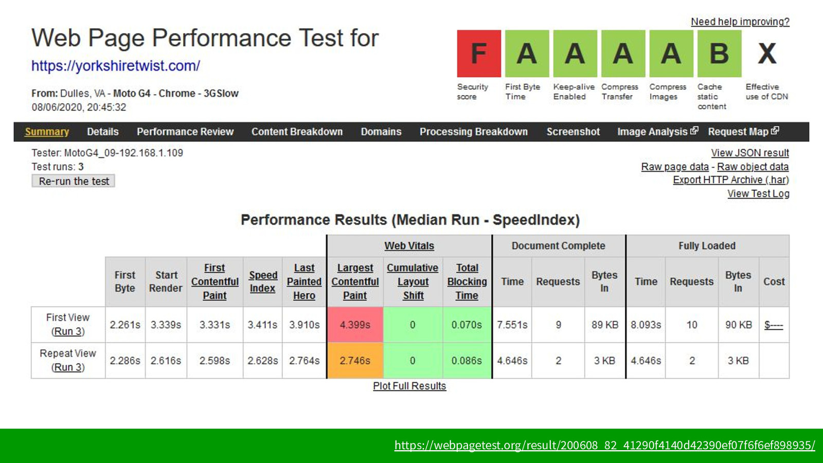
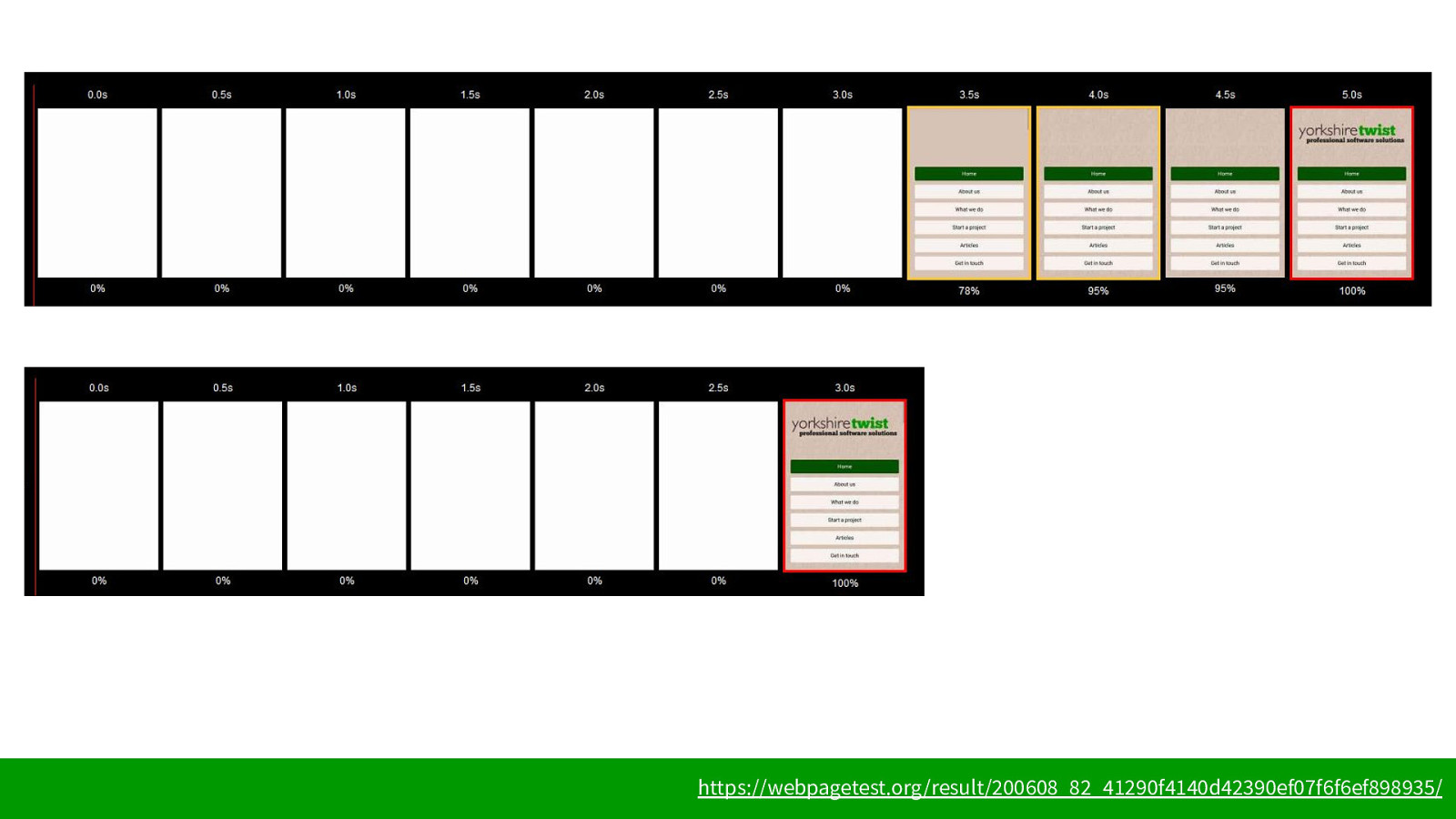
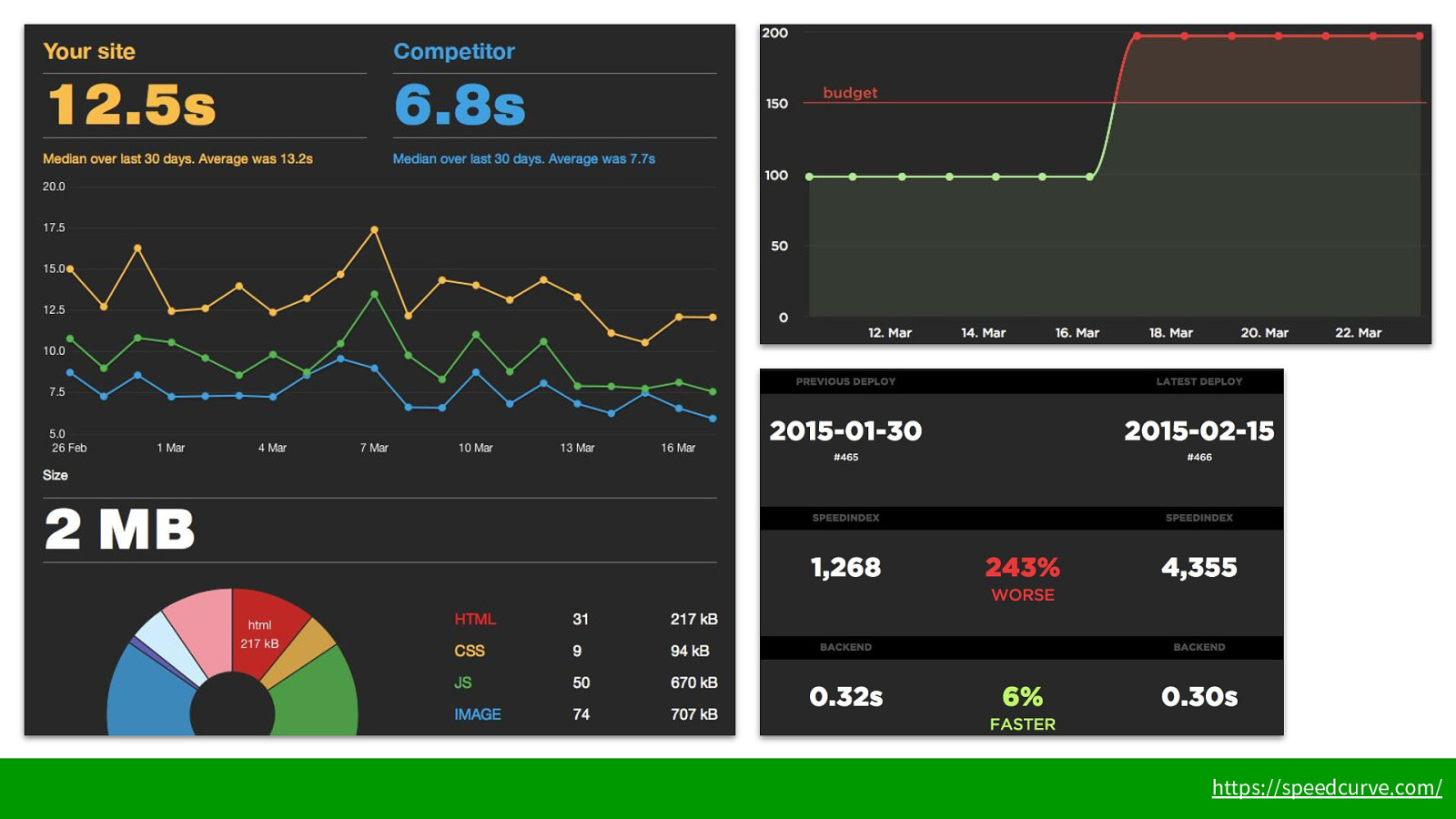
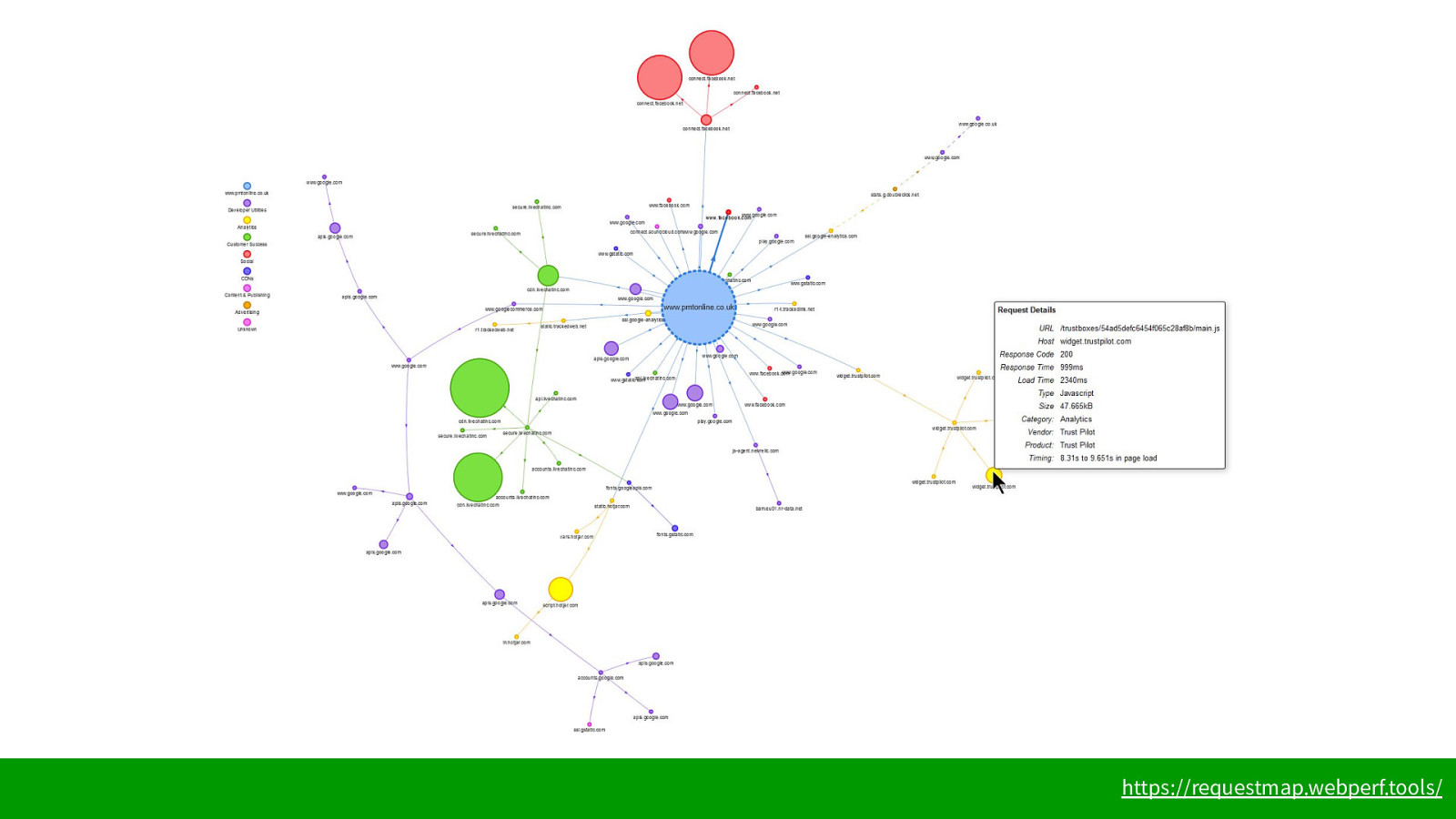
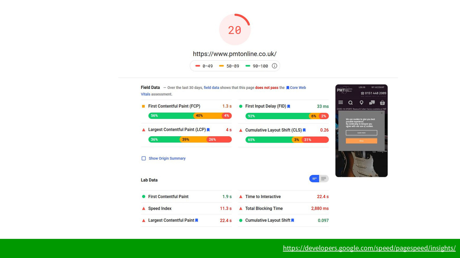
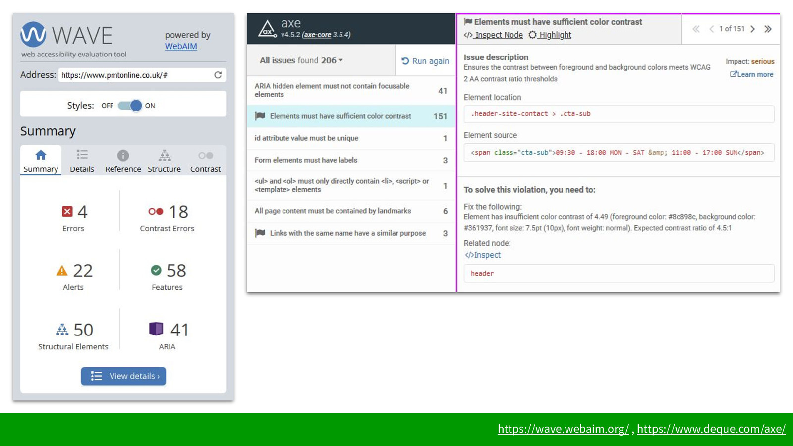
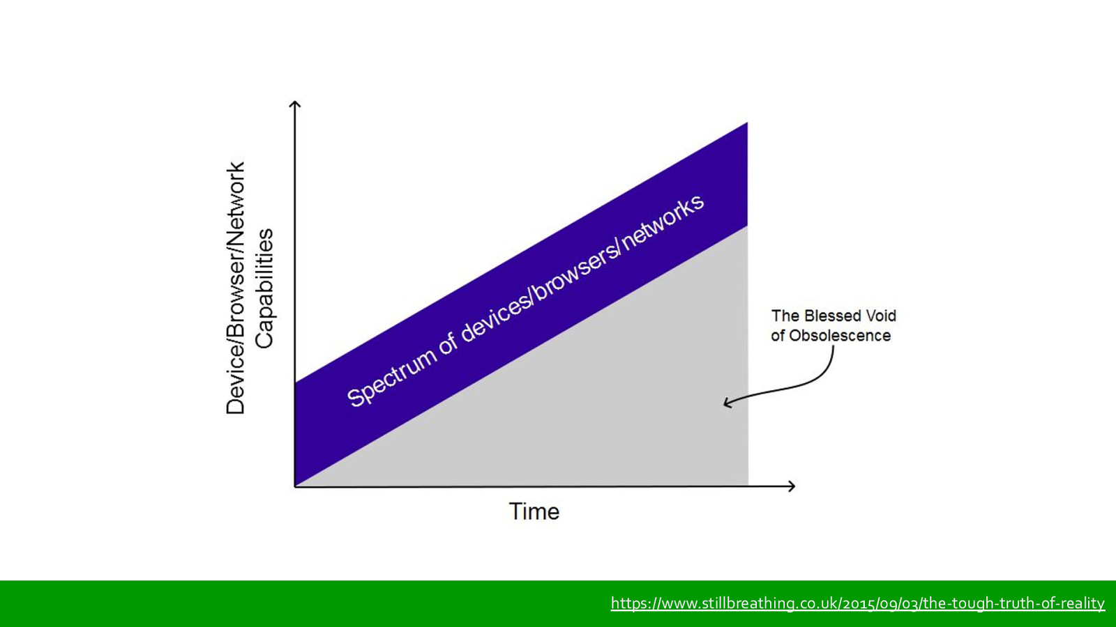
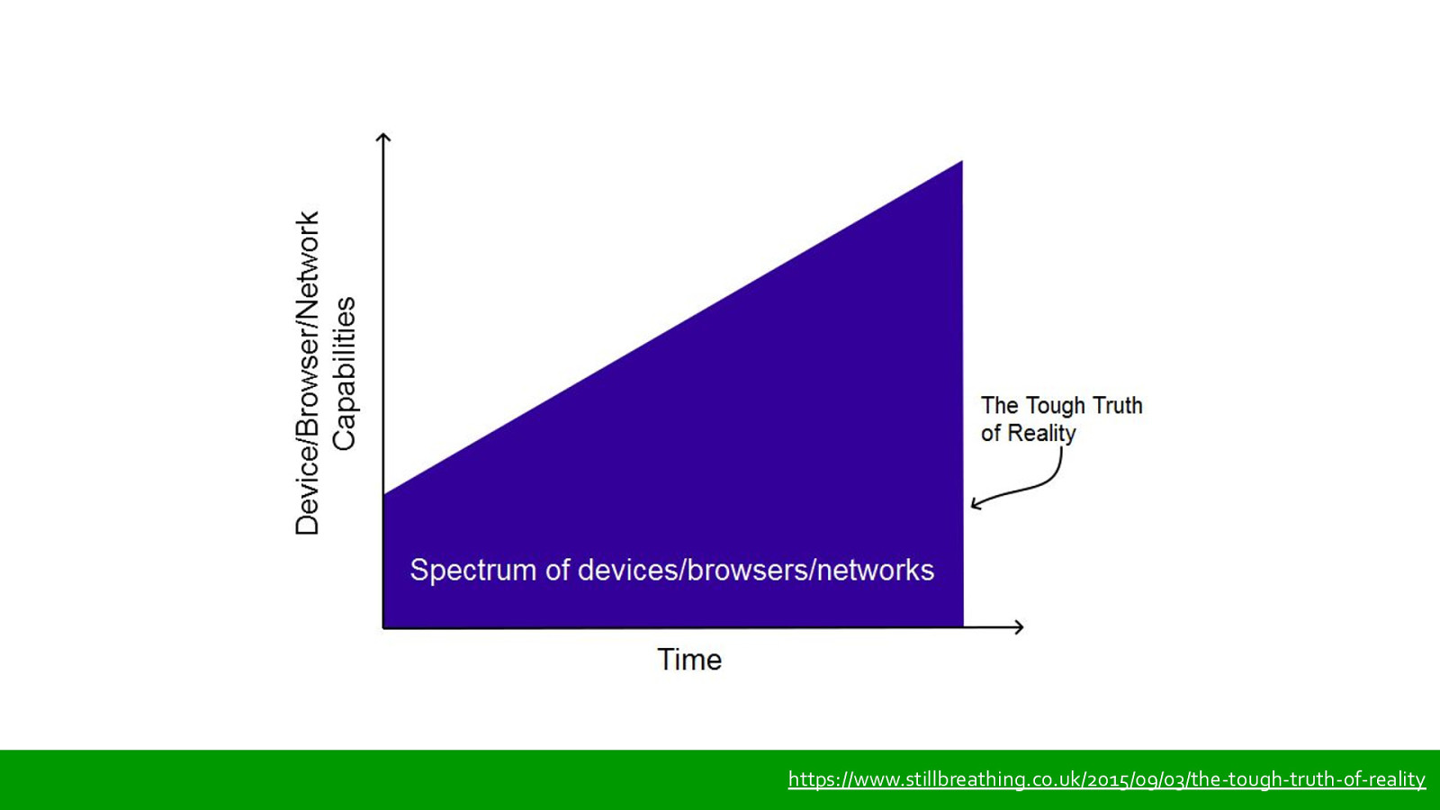
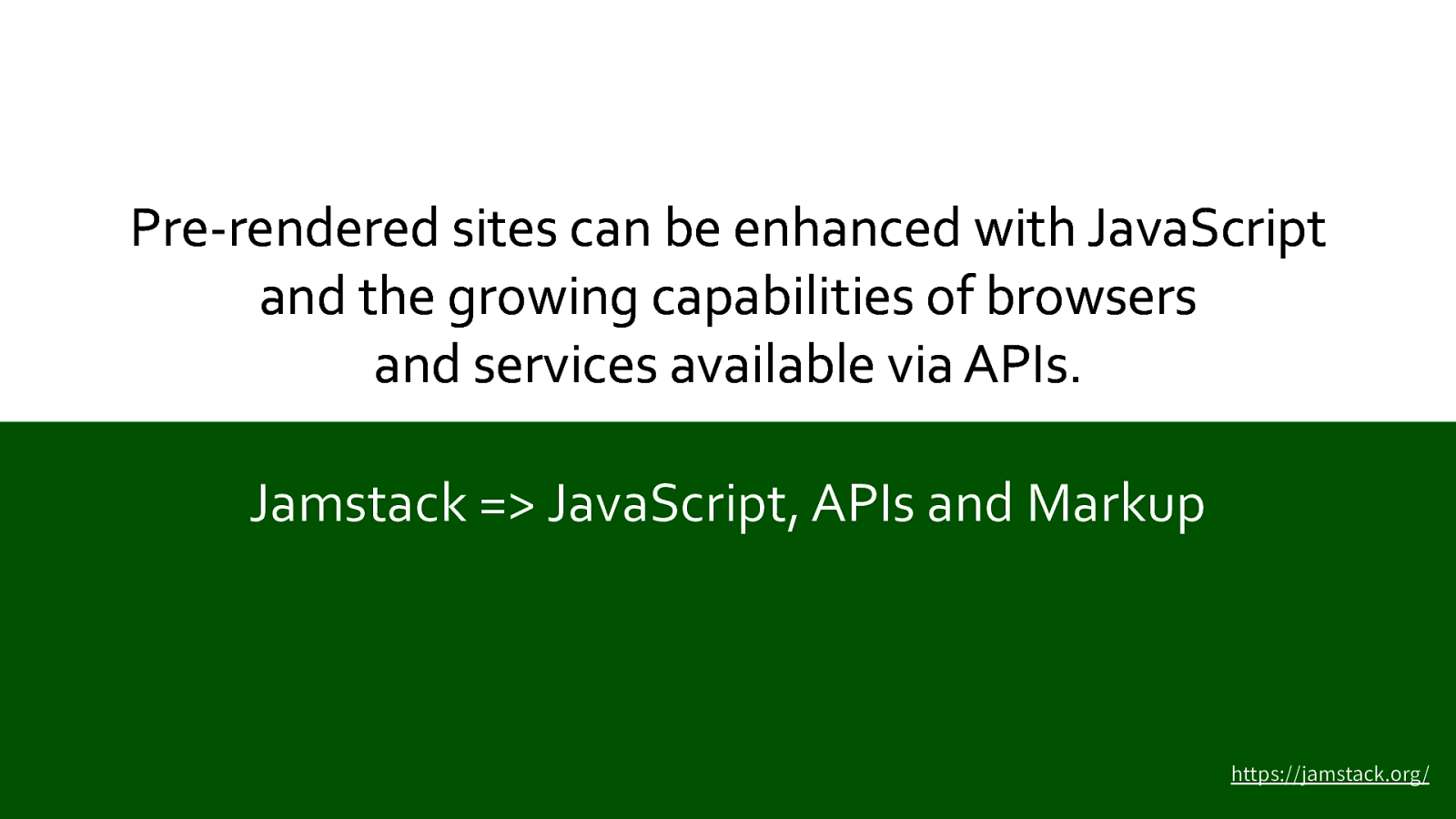
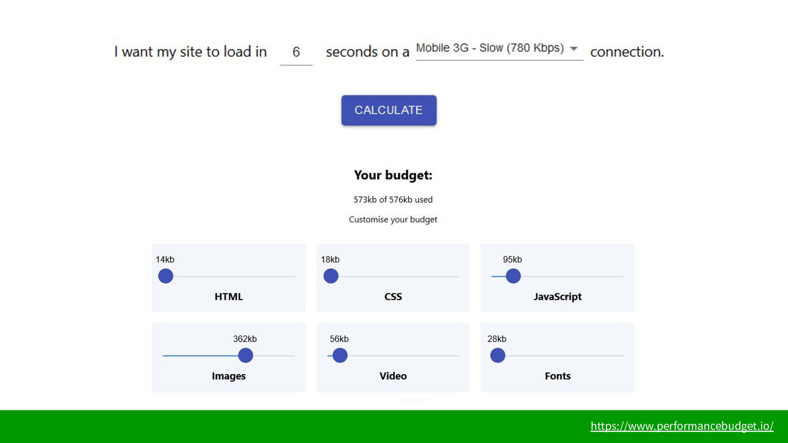
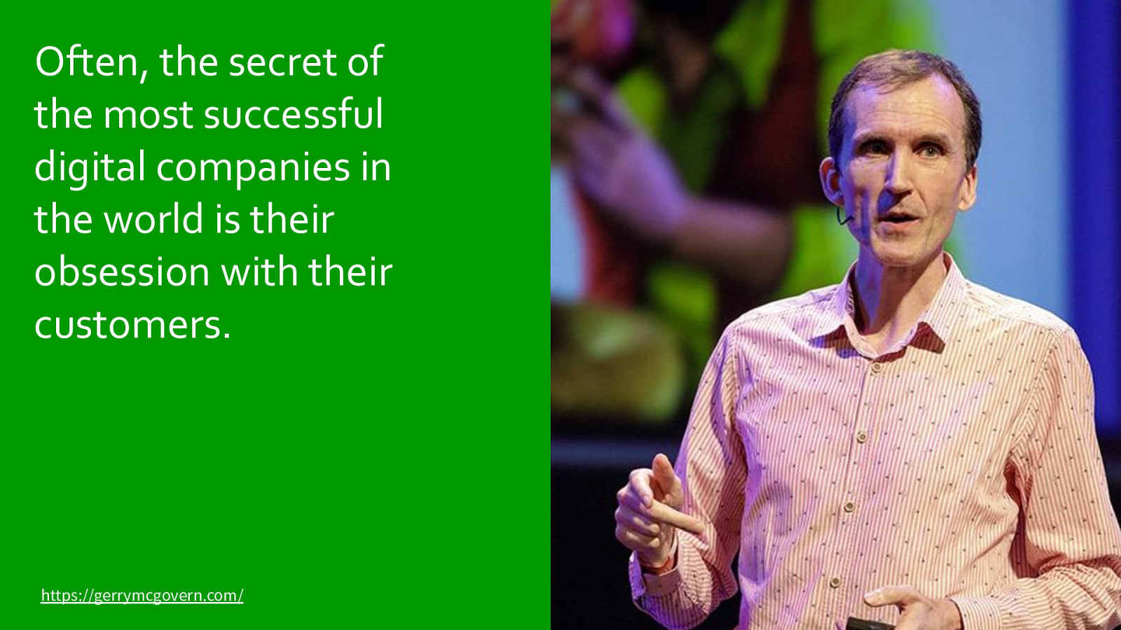
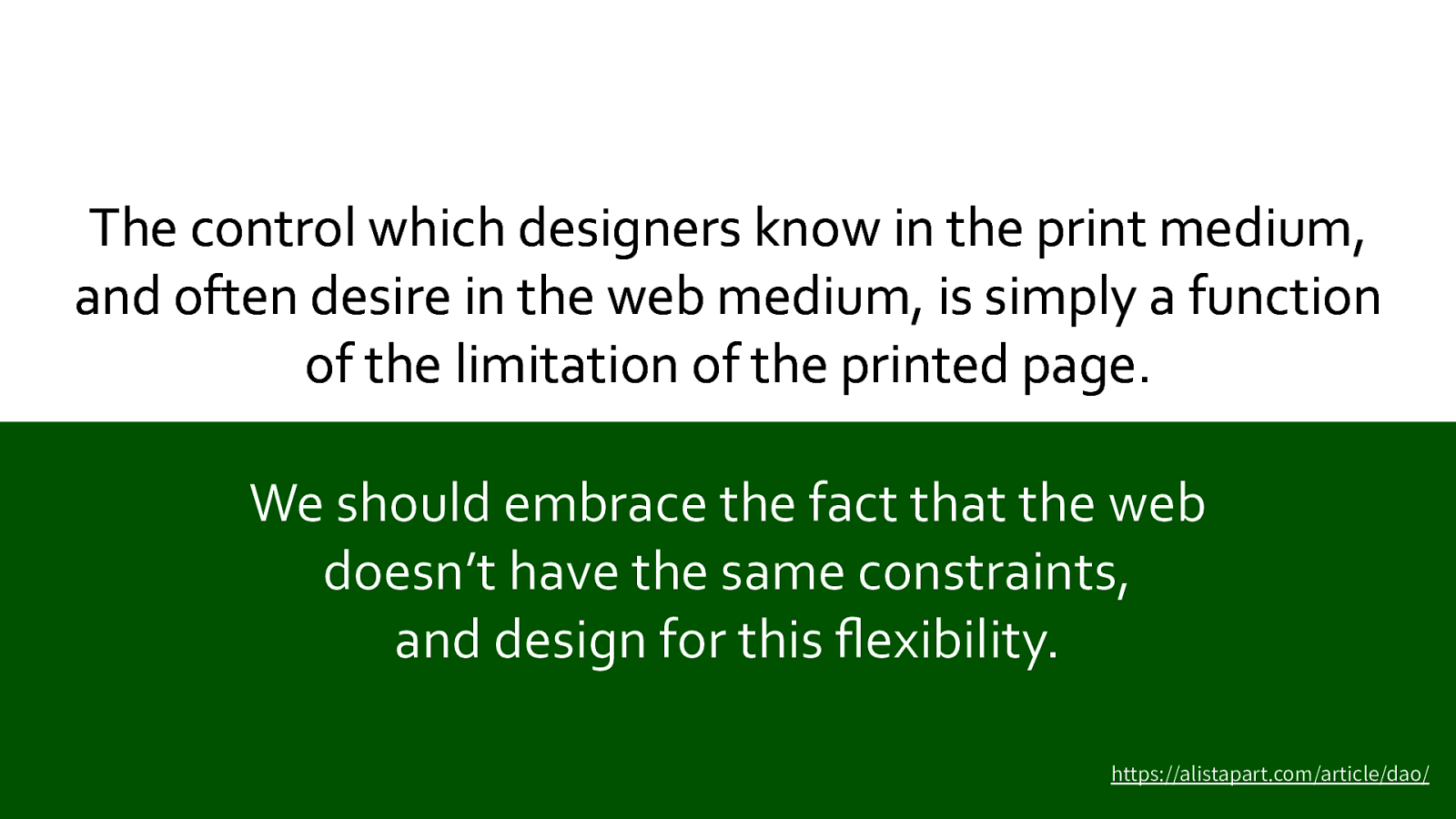
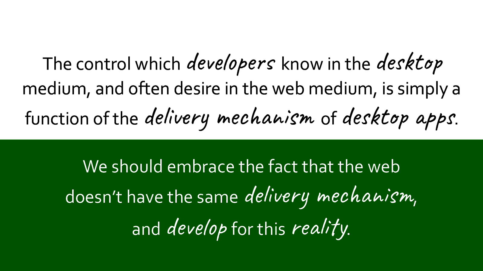
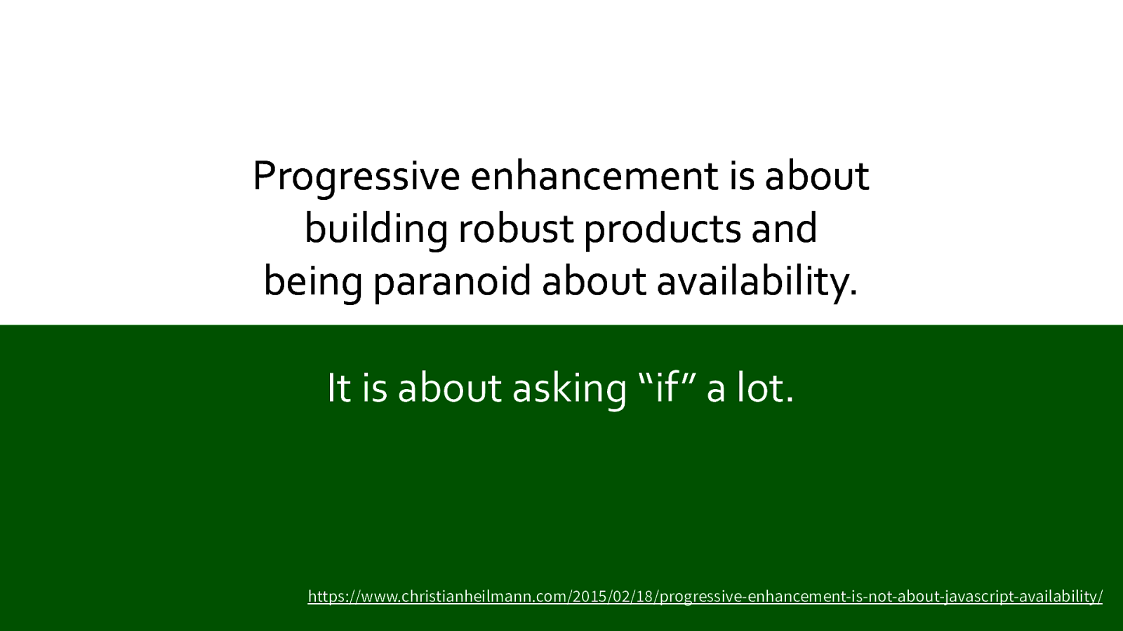
I guess most people here are involved professionally in the development of software. And most of the time that means stuff which is on, or uses, the Internet - particularly the web. But we all know just as well as the average punter that the web isn’t the nirvana of user experience it’s cracked up to be. Why? How can we make it better? That’s what we’re going to explore in this talk.

Slide 2

Slide 2

But first let’s define what we mean by ‘resilience’. The dictionary definition seems to be nothing to do with the web. Let’s try to paraphrase this so we have a handle on it in terms of websites.

Slide 3

Slide 3

Here’s a definition I’ll be using.

The ability for a site to encounter unexpected conditions, yet not fail the user.

Sounds great, right? We all know that unexpected conditions occur all the time on the web - we’ll be looking at some of those shortly - so if a site can recover from those, bounce back, and not fail the user, that’s got to be a good thing, right?

These unexpected conditions normally result in a sucky experience for our users and customers. If we can mitigate those unexpected conditions, reduce the suck, we’ll end up with happier users and we’ll improve the bottom line.

Slide 4

Slide 4

These conditions are sometimes out of our control. But more often than not they are in our control, so we should do something about them. because make stuff that could affect millions of lives, so we should be responsible with that power. Wherever we can control how our sites respond to unexpected conditions, we should do so.

Slide 5

Slide 5

We’re going to be using data from the HTTP Archive, which has been gathering this information for over a decade. Their yearly Web Almanac offers fascinating insights in to a huge amount of data. The first aspect we’re going to look at is:

Slide 6

Slide 6

Networks. Or, as some people call them, “notworks”. We all know that network speeds are getting faster - many of us here will have moved on from 3G to 4G for our mobile devices, some perhaps even to 5G. And on desktop many of us are now on fibre broadband, perhaps even fibre-to-the-home. But does the web feel fast, most of the time? No.

Slide 7

Slide 7

The Nielsen Norman group, who have been doing research into user experience since 1998, have analysed the data from the HTTP Archive to pull out a few sobering facts. This first graph shows that in the US on desktop despite network speeds increasing greatly since 2010, the median page load time has stayed relatively static.

Slide 8

Slide 8

For mobile devices the situation is even worse. Median page load time has got slower over the last 10 years despite the network speed for many of us being faster than we had to our desktops just a few years ago. The load time here is measured in seconds. That’s right: the median load time for web pages is approaching 20 seconds. This, I’m sure, will ring true for many people here. Often, the web just feels slow. What does that mean for users?

Slide 9

Slide 9

They think the site sucks.

Slide 10

Slide 10

At this point we should recognise that there are a lot of moving parts which go into delivering a web page. For mobile devices, network coverage, latency and congestion play a major part. This data from OpenSignal shows that even close to a big city like Leeds there are plenty of weak or dead spots. And if we travel to the beautiful Yorkshire coast the situation is even worse. The biggest problem with networks is we assume they are going to work. We assume they are going to be relatively predictable and consistent. But they aren’t - mobile networks in particular.

Slide 11

Slide 11

These assumptions are bad. Bad for us, bad for our sites, bad for our clients, users and customers. Every assumption - especially assumptions about the network - is a “fingers-crossed” wish for the best.

We can’t do much about making the network connection between a user and our sites better, but we can definitely change how we use that connection. So that brings me onto another subject over which we have no control.

Slide 12

Slide 12

Devices. In most circumstances we have absolutely no control over the devices used to access our websites. We hope - that is, we often assume - that most people are on a reasonably new Apple or Android device. And if your audience is mainly young, mainly middle class, mainly urban people then you may well be partly right. But there are a lot of people who use devices you and I wouldn’t want to be stuck with.

Slide 13

Slide 13

Worldwide sales data from 2019 shows that Android has a market share three times bigger than Apple. Is this what you expected? Well, that’s worldwide so includes a bunch of countries where paying the Apple premium isn’t an option. How about Europe?

Slide 14

Slide 14

In Europe Apple have only a 5% bigger market share. So if your users and customers are based in Europe, which for most of us is true, this is what you have to deal with.

Slide 15

Slide 15

It’s true that mobiles are getting faster - or at least the top-end ones are. Alex Russell from Google has done amazing research into the performance of mobile devices, I highly recommend you checkout his presentation linked from this slide. But even top-end devices use only a fraction of their power, and only for a fraction of the time? Why? Heat.

If you ran a decent mobile device at full-CPU-power for any length of time it would become as hot as a light bulb in your hand. So device manufacturers do loads of trickery inside those devices to ensure the hot bits run, basically, as little as possible.

But most people don’t have top-end devices. Remember, we’re probably all affluent geeks - power users with money to spend on expensive phones. We search for things like “best smartphone 2020”. Most people don’t.

Slide 16

Slide 16

According to the Standard newspaper the best-selling smartphone in 2019 was the Samsung Galaxy A50. In fact there are only two Apple devices in the top 10. What do we see if we compare the specs of the A50 to the iPhone XR, which was the iPhone model launched around the same time?

Slide 17

Slide 17

Looks OK, the Samsung has an octa-core processor, and the Apple has a hexa-core. There’s not much in terms of megahertz between them. But if we look at the actual geekbench scores:

Slide 18

Slide 18

Oh dear, the Apple wipes the floor with the Samsung. This is just one example, but there are countless others. The spectrum of Android devices out there is huge, and even mid-range ones like this A50 are no match for the top-end devices many of us working in web development have in our pockets. In fact, according to Alex Russell (seriously - check out his talks, they’re amazing) many popular phone models now have the same performance as top-of-the-line models from nearly a decade ago.

Slide 19

Slide 19

Just look at that Nokia 2 at the bottom right. It was released in June 2019 and costs just £94 on Amazon, and has the same performance as an iPhone 4 or Galaxy S3. As manufacturers look for ways to sell more devices, especially in emerging markets, these low-end devices are going to become more and more common.

Slide 20

Slide 20

If a user with one of these devices visits your website, which you’ve tested and works great on your iPhone 11 or Galaxy S10, and they have a bad, janky experience, what are they going to think?

Slide 21

Slide 21

They think the site sucks. What’s the part of your site that is going to choke these slower devices? Yes, it’s the language everyone loves to hate - or hates to love:

Slide 22

Slide 22

We all know JavaScript is a big part of the web these days. But JavaScript, unlike other types of assets such as images, requires parsing and executing before it does anything. So what effect does that processing have on page performance? Back to the HTTP Archive data we go.

Slide 23

Slide 23

The HTTP Archive found that the processing time for scripts varies wildly, with the median around 849ms on desktop and 2.4 seconds on mobile. Think about that. 2.4 seconds of … nothing. In terms of web page performance that’s an eternity. The 90th percentile is over 10 seconds! That’s a whole lot of waiting around for a lot of users. Where does all this JavaScript come from?

Slide 24

Slide 24

It comes mainly from 3rd parties. And every connection to a 3rd party means not only do your users have to parse and execute their scripts, but you’re putting the performance of your pages at the mercy of other sites over whom you have little or no control. And that’s assuming all these scripts play nicely together. What if things go wrong? What if there are clashes? What if dependencies fail to load, parse or execute correctly?

Slide 25

Slide 25

Jerry Jones, a developer at Automattic, puts it like this.

Automattic, by the way, develops WordPress - which powers by some counts over 30% of all websites, so they know a thing or two about scale.

This dependency on JavaScript is fashionable at the moment.

Slide 26

Slide 26

Tim Kadlec did some analysis on HTTP Archive data and found some startling facts. He compared sites using jQuery, Angular, React and Vue. Here you can see that the number of bytes of JavaScript sent to mobile devices varies a lot. But it’s the processing time where it gets really scary.

Slide 27

Slide 27

All those milliseconds spent on parsing and executing JavaScript. This is yet more evidence to show that you shouldn’t believe that everyone has the same experience as you on your fast device when visiting sites using frameworks like these. Many most people - have a slow and janky experience. But the use of JavaScript that really confuses me is when it’s entirely unnecessary.

Slide 28

Slide 28

Here’s a very current example. The corona virus dashboard from gov.uk. Anyone seen this? It relies on JavaScript. But here’s the thing; the page is updated about once per day. So instead of this error message, perhaps they should show this:

Slide 29

Slide 29

I’ve seen too many examples of static content relying on hugely complex and powerful front-end frameworks, where a set of HTML pages would have done the job.

Slide 30

Slide 30

Which is why Matthew Somerville, a developer from Birmingham, did a version of the coronavirus dashboard which is just HTML, enhanced with a bit of JavaScript. On a desktop his version is 87% smaller than the official gov.uk site - but provides the same data and functionality. Then there are actual errors, genuine production runtime bugs.

Slide 31

Slide 31

OK, who here has never seen a JavaScript error in the wild? This was one I saw a few years ago which I’ve used as an example of the worst time for a JavaScript error to happen - as a customer (in this case me) was about to purchase something. A normal person - by which I mean someone who doesn’t browse the web with devtools open - would click repeatedly, then eventually give up in despair. What’s the outcome? That’s right.

Slide 32

Slide 32

They think the site sucks. Clearly we can do a lot to fix many of these performance problems. One of the ways is just to send less stuff down the wire. Yes, I’m talking about assets.

Slide 33

Slide 33

Or, as some have said, they should be called “liabilities” - and you’ll see why. One of the reasons web pages are slow is because of the assets that have to be downloaded. Let’s dive back into the HTTP Archive Web Almanac.

Slide 34

Slide 34

From the data gathered in 2019, the HTTP Archive has found that most web pages have a total weight - taking into account scripts, images, CSS and everything else - of multiple megabytes. On our beefy desktops we lose track of just how huge a megabyte is in terms of raw data. Did you know that the complete works of Shakespeare consists of about 3.5 million characters, which is about 3.4MB. Let me make that clear.

Slide 35

Slide 35

25% of web pages are larger than the complete works of Shakespeare

Slide 36

Slide 36

And this huge size is increasing year on year. The change for the heaviest sites has increased by more than 350KB in the year from 2018 to 2019. One thing I hate, and I guess you do too, is when you think a page has finished loading so you try to click or press on something but the page “jumps” as the layout shifts because some other asset affecting layout has been downloaded. That makes my blood boil.

Slide 37

Slide 37

In fact Ericsson found that the stress caused by waiting for a slow web page on a mobile device is comparable to watching a horror movie.

Slide 38

Slide 38

When it comes to assets, what are the kind of unexpected conditions we might encounter? Here’s a non-exhaustive list. In some of these cases we can do our best to ensure they can’t happen, but on some cases we have no control. What’s the outcome for users when they wait ages for stuff to download, or any of these problems occur?

Slide 39

Slide 39

They think the site sucks. All these different aspects of performance are clearly a big problem. But there’s another unexpected condition which degrades the experience users have of our sites. That unexpected condition is the needs of the user for the site to be accessible.

Slide 40

Slide 40

I’m not talking about really advanced stuff, even the basics are being missed too often.

Slide 41

Slide 41

The Web Almanac highlights the scale of the problem, showing even something as simple as semantic HTML - in this case the 6 heading levels - aren’t used on many sites. These headings, along with other “landmark” HTML elements, help people who use assistive technologies such as screenreaders to navigate the page. Oh, they also help search engines understand the structure of the page, so put a tick in the box for search engine optimisation as well.

Slide 42

Slide 42

After all, the full range of HTML elements isn’t too hard to learn. A 2 year old could do it. Thanks to the great Bruce Lawson for correlating these two facts. OK, let’s look at something simpler.

Slide 43

Slide 43

Everyone knows that alt attributes need to be added to images, yes? Yet many pages don’t. So how about visual accessibility:

Slide 44

Slide 44

Colour contrast is very important, not just for our users and customers but for ourselves. Eyesight gets worse in most humans as they age. The ability to distinguish between colours reduces. It might not be fashionable, but increasing colour contrast can even save battery life on mobile devices as users don’t have to turn the screen contrast up as much.

Slide 45

Slide 45

I won’t dwell on accessibility too much longer, I have a whole other talk about that if people are interested. I do want to say that increasing the accessibility of your pages benefits everyone, in the same way that increasing the accessibility of a physical space - in this example getting on or off a train - benefits more than just people with disabilities.

This is catering for the human needs of people using our site - whether they have visual or physical disabilities, or any of the wide range of cognitive problems. And the other reason to do it, of course, is it’s the law.

Slide 46

Slide 46

The Equality Act of 2010 in the UK gives clear guidance to service providers - which includes businesses with a web site or app - to make “reasonable adjustments” for disabled persons. What happens if we fail to provide an accessible experience for users? You’ve guessed it.

Slide 47

Slide 47

They think the site sucks. Now, you might be thinking at this point:

Slide 48

Slide 48

Does any of this matter? What effect do a few performance or accessibility problems actually have on users? There’s a great website that tells us all about what effect performance has:

Slide 49

Slide 49

Wpostats.com. Web performance optimisation stats collects examples showing the effect of web performance for all kinds of organisations. Let’s run through a few of them here.

Slide 50

Slide 50

Improving performance by reducing render time and page weight increases conversions.

Slide 51

Slide 51

Increasing performance by removing 3rd party assets improves revenue.

Slide 52

Slide 52

Reducing latency makes customers spend more.

Slide 53

Slide 53

Users will abandon your site if it’s too slow.

Slide 54

Slide 54

Increasing load time reduces revenue.

I could go on, but you get the picture. Company after company, organisation after organisation have found that improving performance - handling the unexpected conditions their sites encounter - consistently improves business metrics. Some of these studies are from a while ago, but you’ll agree with me that good performance isn’t going to go out of style any time soon. OK, what about accessibility.

Slide 55

Slide 55

Firstly the number of people who have a long-term illness, impairment or disability is probably much higher than you thought. Many of these things affect how people use the web. Did you know:

Slide 56

Slide 56

More than 2 million people in the UK have some form of sight loss.

Slide 57

Slide 57

6.8 million people are living with some form of mobility problem, which especially for older people can affect their manual dexterity such as using a mouse.

Slide 58

Slide 58

People with disabilities often rely on software or specialist hardware, such as this Braille keyboard. If your site doesn’t provide them with a good experience they’ll take their custom to somewhere that does.

Slide 59

Slide 59

The “purple pound” refers to the spending power of disabled households. If your bosses don’t want to make your sites more accessible because it’s the right thing to do, or because it’s the law, maybe showing them there’s money on the table will persuade them.

So we’ve seen several examples of unexpected conditions that degrade the experience of people using our sites. These conditions can happen at any layer in the stack. Plus there are human needs for accessible sites. And we’ve seen statistics showing that these things directly impact the success of the site.

Slide 60

Slide 60

That’s a lot of suck. But I guess a lot of it has rung true for many of us. The question is:

Slide 61

Slide 61

I bet you’d thought I’d forgotten about my Bob the Builder threat, right? Nope. There are many things we can do to fix these problems and ensure our sites are more resilient to the unexpected conditions I’ve described. But I’ve got to warn you.

Slide 62

Slide 62

Some of the things I suggest aren’t fashionable. But I believe they are necessary to improve our sites and ensure they are resilient to the many different ways they may fail our users and customers. I have six tips to suggest for you. The first tip is:

Slide 63

Slide 63

Learn how browsers work. It’s always surprising to me how many developers working on the web have never looked into how the runtime environment they use actually functions. After all, the web is vastly different to desktop or server software.

Slide 64

Slide 64

With desktop and server software you either get everything or nothing. Either you have the software or you don’t. And when you’re trying to open an old file format you need the right version of the software.

Slide 65

Slide 65

Many years ago the web copied this ‘all or nothing’ approach. Does anyone remember Flash, Shockwave or Java applets? If you had the right plugin you got the full experience, but if not you got nothing. It was all or nothing.

Slide 66

Slide 66

Milli Vanilli sang - and I use the term loosely - about this on their 1988 album ‘All or Nothing’, which was included in Q magazine’s 2006 list of the 50 worst albums ever made.

But ‘all or nothing’ is not how the web was designed. Let’s have a look at a process diagram for a browser.

Slide 67

Slide 67

Requesting a web page begins by getting some HTML. If an error at that point happens you get the status of that error - a 404 ‘Page Not Found’, 500 ‘Server Error’, some kind of authentication error maybe. Once you get some HTML the browser parses it and kicks off two different pipelines - one getting and parsing CSS, the other getting, parsing and executing JavaScript.

If errors happen during those pipelines - assets not available, script execution problems, whatever - the user still has the HTML. Yes, it’s not a pretty or fancy web page, but they get something.

Slide 68

Slide 68

With SPA frameworks where content is loaded by JavaScript calls to APIs, there are more places that errors can occur. In this model, everything has to work before the user gets anything. Because if the script which fetches the content fails for some reason, the user has nothing.

This is ‘all or nothing’, in the same way that Flash and Java applets were. Of course, there’s a lot we can do to protect against this - server-rendering is a great start.

Slide 69

Slide 69

Built into the design principles of the web is this simple idea: that these layers build on each other to increase the richness of the user experience. HTML comes first, both figuratively and literally - as when the web was being designed there was only HTML. CSS and JavaScript came later and built on it. So you need to understand at least to a reasonably level how browsers work. Learn about rendering pipelines, blocking and non-blocking resources - there’s loads of information out there to help you.

Slide 70

Slide 70

Because the reality is we don’t control the execution environment our sites run in. So we should try to understand how it works so we can make our sites more resilient. And the simplest practical way to get started is:

Slide 71

Slide 71

Semantic HTML. By which I mean HTML which describes what the content is. We’ve already seen there are around 140 HTML elements, so let’s use them.

Slide 72

Slide 72

That means using buttons for buttons, links for links, proper headings. Doing this not only fixes many accessibility problems, but helps with search engine optimisation and saves you writing code. For example, the functionality built into the humble button element means it’s focusable, can be triggered by various keypresses as well as the mouse. That’s all functionality that you don’t have to write.

I’m not saying don’t use div and span elements at all - they have their uses - but you should look for a more suitable element first.

Slide 73

Slide 73

Knowing HTML isn’t fashionable, but I’d argue it should be. Because semantic HTML means that your pages have a ‘flow’ to them which is discoverable programmatically.

Slide 74

Slide 74

In this example you can see how headings used properly allow the page to be navigated by assistive technologies. Users can skip over entire sections if they don’t contain content they’re interested in. The over use of div elements for layout is a particular bugbear of mine. It’s been called ‘divitis’, and you can see why:

Slide 75

Slide 75

Hadouken! Almost everything you see here in this code from Facebook is a div. I get it, modern sites can be complex, but having a huge number of DOM elements can cause problems.

Slide 76

Slide 76

In fact, Google’s Lighthouse tool (which we’ll look at in a moment) penalises sites where the DOM tree is too large. As developers we should get familiar with the output our systems are producing. That means we need to get good at investigation and testing.

Slide 77

Slide 77

Fortunately, there are loads of great tools to help us. The first one you already use, devtools.

Slide 78

Slide 78

Devtools in all of the major browsers are amazingly powerful. I remember the days before devtools, dropping console.log calls everywhere and hoping for the best. If it wasn’t for people like Chris Pederick who paved the way by creating browser extensions for web developers I probably would have gone bonkers by now.

As well as the usual features you’re already using, like DOM inspection and adding breakpoints, devtools offer other features you can see here such as network throttling simulation, emulation of vision deficiencies, flame charts of JavaScript calls and Edge is bringing back the 3D view. All great stuff.

Slide 79

Slide 79

Built into the devtools for Chromium-based browsers is Lighthouse. This is an automated tool for checking the quality of web pages, based on rules set by Google. It gives a good high-level view of how well a page is working in terms of performance, accessibility and SEO. It’s something you should run regularly, but as it’s built into your own browser and can only simulate network conditions, it’s not a proper test of what your users actually experience. For that you need a tool which actually loads your pages from different locations.

Slide 80

Slide 80

So next on your list should be webpagetest.org. It may not be the prettiest of sites, but for testing performance it’s a free tool of astounding quality. Here I’m testing my site with a Moto G device - yes, that’s a real phone available for free from Dulles, in the US state of Virginia. Actual devices are available from just a couple of locations worldwide, but there are dozens of testing locations offering desktop browsers all over the planet.

Slide 81

Slide 81

Web Page Test shows loads of deep information about the performance of your site. One of my favourites is the filmstrip view:

Slide 82

Slide 82

The top view here is the first load with an empty cache, the bottom view is a repeat visit with a primed cache. I’ve had great success showing these filmstrips to managers and other non-technical people to show what the performance of their sites actually looks like. And when you compare your slow site to a competitor’s fast site, there’s no better way to get buy-in for making performance improvements.

Please do take some time to have a look around Web Page Test at everything it does. It can be quite daunting to a newbie, and as it’s free you sometimes have to wait in line behind lots of other tests. If your organisation is happy paying a bit of money then do look at Speedcurve.

Slide 83

Slide 83

SpeedCurve is built on top of Web Page Test and allows you to set up scheduled tests, comparisons to other sites, performance budgets (which will tell you if your site breaches those budgets - we’ll discuss this more in a bit) and much more. It’s all really gorgeous, perfect for putting on a dashboard, and the SpeedCurve team comprises of some of the best web performance engineers in the business.

Slide 84

Slide 84

Linked from Web Page Test, and using its results, is a tool called Request Map. This visually shows the relationship a site has with third party domains. Here I’ve tested the site for a large UK music equipment retailer, and you can see there’s a whole lot more 3rd party calls than you might expect. Request Map traces calls as far as it can, so you can see branches of calls going off into the distance. This is why 3rd party calls are a performance killer.

Slide 85

Slide 85

It’s also worth mentioning PageSpeed Insights, which is another Google tool providing much the same information as Lighthouse, but using Google’s infrastructure rather than your own browser. What I want to draw your attention to here is the mention of “Core Web Vitals”.

Slide 86

Slide 86

Core Web Vitals is a new initiative from Google which tests three major aspects of performance: how quickly a page looks like it loads (known as largest contentful paint), how quickly a user can interact with it (called first input delay) and whether the layout shifts, which as I mentioned earlier is something which really annoys people. These metrics are built into PageSpeed Insights, Lighthouse and Web Page test, so they are a useful high-level set of metrics to use.

Slide 87

Slide 87

I mentioned testing from real devices is much better than just simulating a slow network connection. So if you have old phones you can put a pay as you go SIM card in that would be fantastic. Perhaps your organisation is willing to pay for a few popular cheap smartphones and tablet devices to use for testing. A ‘device lab’ like this can be shared between multiple teams.

Slide 88

Slide 88

Web performance is really easy to get into, there are loads of resources and tools to help you, and a thriving community on social media. There’s even a Slack workspace at webperformance.slack.com where you can talk to other performance engineers.

Sitespeed.io also has a great collection of tools and lots of guides to get you started. There’s no excuse not to make your sites fast. OK, that’s a lot about testing performance. What about accessibility.

Slide 89

Slide 89

First up has to be WAVE - the web accessibility evaluation tool. You can use this from the website linked here, or there are extensions for Chrome and Firefox. Also displayed here is the aXe extension from Deque. Both will highlight common accessibility issues.

Slide 90

Slide 90

For a deeper look into possible accessibility problems you should test your pages using screenreader software. There are extensions for browsers, but it’s also worth using one of the “real” ones - NVDA from NV Access is free and open source. Screenreaders can be very daunting if you’ve never used one before. But persevere with them, they are incredibly useful.

It’s also worth trying to navigate and use your site using just a keyboard - that’s easy to do and very enlightening.

Slide 91

Slide 91

Finally, and most importantly, if you’re serious about making your site accessible your should investigate testing with real users. People who use assistive technologies, who can give you the wisdom of their lived experience. According to world-renowned accessibility experts the Paciello Group, automated accessibility tools will only catch about 30% of issues. Get serious about the other 70%.

Slide 92

Slide 92

The next step is to question all your assumptions. Earlier we looked at assumptions about the network, but there are many other assumptions we make.

Slide 93

Slide 93

For example we can assume which browsers and devices people are using. As we’ve seen, the range of devices people may be using is huge. Developers often assume that over time the capabilities and quality of things like networks, browsers and devices increase - and they do. We believe that the old, outdated, slow stuff is left behind in what I’ve called the Blessed Void of Obsolescence.

Slide 94

Slide 94

But the tough truth of reality is that we never really leave the old stuff behind. For example, as we’ve seen, cheap new devices get released which have the same performance profile of top-end devices from nearly a decade ago. You should check the analytics for your site regularly see whether the assumptions you make about devices, browsers, screen sizes, and more are still valid.

Slide 95

Slide 95

Web Page Test can help with one other assumption - that 3rd parties can be relied on. When you start a test, under the ‘advanced’ section there’s a tab called ‘SPOF’ which stands for ‘single point of failure’. Here you can simulate what would happen if certain domains - for example your CDN, or a 3rd party you rely on - were to fail. Yes, this is your very own chaos monkey.

Chaos monkey, if you didn’t know, is something invented by Netflix to test how resilient their systems are. Basically it’s a bot which randomly turns services off to see whether Netflix as a whole keeps running. This feature in Web Page Test allows you to do that as well.

Slide 96

Slide 96

The next tip is the least fashionable suggestion I’ll make. JavaScript is cool, but sometimes you don’t need it - or at least not so much of it, as we saw with the coronavirus dashboard earlier. Some sites seem to lose sight of the content they are actually serving up. For example, how about a site that shows coupons - pretty static content, right?

Slide 97

Slide 97

Except when the JavaScript fails you get only this beautiful template.

How about an image gallery like instagram? That’s got to give the user something if the script fails, right?

Slide 98

Slide 98

Nope, nothing. Don’t get me wrong, I’m not saying JavaScript is bad - but relying on it too much can lead to negative outcomes for users.

Several years ago a team was put together to rebuild a newspaper site in the US called the Boston Globe. It was one of the first big responsive designs. One of the team members said this about how they used JavaScript.

Slide 99

Slide 99

This, for me, is a pragmatic approach. The core functionality of that site is to show people the news, so the team made that functionality as resilient as it could be. Other features were considered enhancements - they aren’t the core functionality, so even if they break the user still gets what they visited the site for.

This quote, by the way, is from the book ‘Resilient Web Design’ by Jeremy Keith. It’s a fantastic book, not just for the content but because it’s online, free, and it’s a progressive web app. The book practices what it preaches.

This isn’t a fashionable view, but it’s not just me saying that a total dependence on JavaScript needs to be considered very carefully. Other developers have the same opinion.

Slide 100

Slide 100

For example Dan Abramov, who recently said this: “Client-side only is not sustainable”. Who is Dan Abramov?

Slide 101

Slide 101

The co-author of redux and create-react-app, who works on the react team.

Slide 102

Slide 102

The majority of websites aren’t, and don’t need to be, single-page apps. And not just Dan and me.

Guess where you’ll find this phrase?

Slide 103

Slide 103

On the react site.

Slide 104

Slide 104

If we’re focussed on ensuring that our users are successful in what they’re trying to do - read some content, fill in a form, search for some information - then we should code to make that successful outcome as likely as possible. Where appropriate, JavaScript is a great tool. But where it’s not needed it can cause problems for users that could be avoided.

Slide 105

Slide 105

There’s an approach gaining in popularity called Jamstack - that stands for JavaScript, APIs and markup. Essentially it describes pre-rendered information that is enhanced with judicious use of JavaScript. So you get all the performance and stability of server-rendered HTML, and all the whizz-bang of client-side interactivity.

And when this is combined with a service worker, which can provide advanced caching and offline support - not to mention the ability for your site to be “installed” to a device - it’s a compelling approach.

Slide 106

Slide 106

My final tip is to create a performance culture. In the same way we implement CI/CD pipelines and automate tests to catch regression bugs at code level, we should do the same at user experience level.

All the tools I mentioned earlier help with this, but nothing beats getting close to the experience real users have with our sites. That may be through a real user monitoring system, or web analytics - these are often owned by a marketing department, so you may need to bridge that gap.

Slide 107

Slide 107

One great way to start is to create a performance budget. This defines upper limits for asset sizes and various metrics to ensure you keep your pages fast. The performancebudget.io tool helps you craft a budget suitable for your site - but be warned, you’ll have MUCH less to play with than you would like.

Slide 108

Slide 108

Gerry McGovern is a master at helping organisations focus on what customers actually want. If you visit his website linked here you can watch a selection of his talks, I guarantee you’ll be glad you did. Gerry often talks about ‘top tasks’ - the things that visitors most often want to accomplish on our sites. Perhaps it’s find a product, or download some information, or make an insurance claim.

Whatever those top tasks are, we should strive to remove as many barriers as possible which stop the user achieving their goal. Resilience of the site, ensuring it doesn’t fail the user when it encounters unexpected conditions, is a big part of that.

Slide 109

Slide 109

Because this stuff - performance, accessibility, this resilience I’ve talked about matters. It matters to our users and customers, and when they are happy we’ll get better outcomes from the systems we build.

Back in April 2000 an article was published by John Allsop on the A List Apart magazine. Called ‘A Dao of Web Design’ it was a call to understand and design for the web medium - which at the time was still fairly young.

The article is incredibly visionary, alluding to responsive design ten years before Ethan Marcotte coined the term, and encouraging us to think about different browsers, platforms and screens six years before the first iPhone revolutionised where the web could be used. In that article John wrote this:

Slide 110

Slide 110

The control which designers know in the print medium, and often desire in the web medium, is simply a function of the limitation of the printed page. We should embrace the fact that the web doesn’t have the same constraints, and design for this flexibility.

While this is absolutely true, I think we can paraphrase that to be more suitable for web developers, like this:

Slide 111

Slide 111

The control which developers know in the desktop medium, and often desire in the web medium, is simply a function of the delivery mechanism of desktop apps. We should embrace the fact that the web doesn’t have the same delivery mechanism, and develop for this reality.

If you remember back 3 or 4 weeks ago when I started this presentation, I talked about an ‘all or nothing’ approach, which is what you get with desktop apps and with plugins like Flash and Java applets. The web wasn’t designed to work like that, and we’ve seen that the layering of different technologies to build a complete page - HTML, CSS, JavaScript - means there are many potential points of failure. But we can and should try to make our sites resilient to these unexpected conditions, and not fail our users and customers. There’s a name for this mindset of building websites: progressive enhancement.

Slide 112

Slide 112

It means asking “if” a lot. If this file is missing, if this API call fails, if the browser doesn’t execute this script correctly - what then. It’s only when we consider those things, question our assumptions, that we can truly make resilient websites.

Slide 113

Slide 113

We as developers need to expect the unexpected on the web.

Slide 114

Slide 114

Thank you Let’s go fix it!