Mobile app accessibility
Allison Ravenhall Twitter: @RavenAlly
A presentation at NDC Melbourne in June 2022 in Melbourne VIC, Australia by Allison Ravenhall
Allison Ravenhall Twitter: @RavenAlly

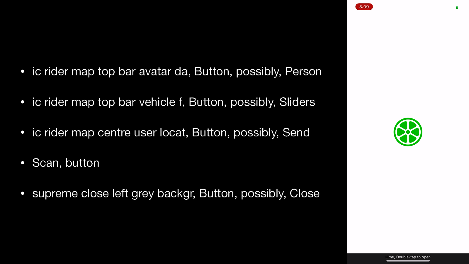
The first 5 controls a VoiceOver user hears when opening the Lime app • ic rider map top bar avatar da, Button, possibly, Person • ic rider map top bar vehicle f, Button, possibly, Sliders • ic rider map centre user locat, Button, possibly, Send • Scan, button • supreme close left grey backgr, Button, possibly, Close If these don’t make sense, that’s the point of the demo! Most of these “labels” are likely derived from the icon filenames. VoiceOver is attempting to help by suggesting labels (the “possibly” content) based on its recognition of the icon shapes
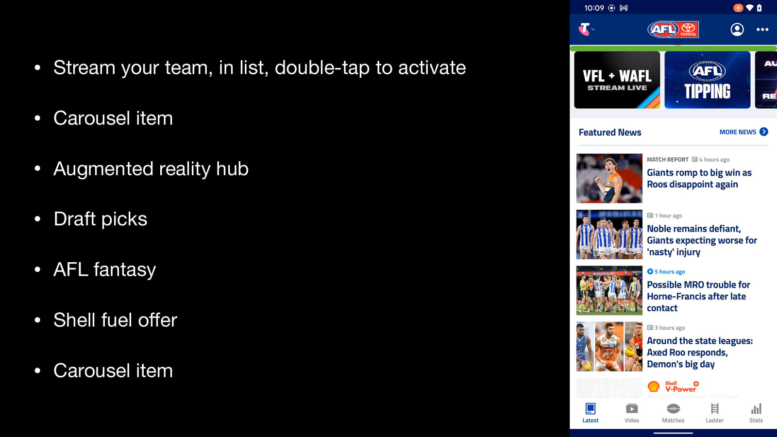
The TalkBack screen reader experience of a promotional carousel in the AFL Live app • Stream your team, in list, double-tap to activate • Carousel item • Augmented reality hub • Draft picks • AFL fantasy • Shell fuel offer • Carousel item Some of these labels are placeholders (“Carousel item”) while some of the labels do not provide equivalent information to what’s on the screen (“Shell fuel offer” versus “4 cents per litre off at Shell Coles Express, terms & conditions apply).
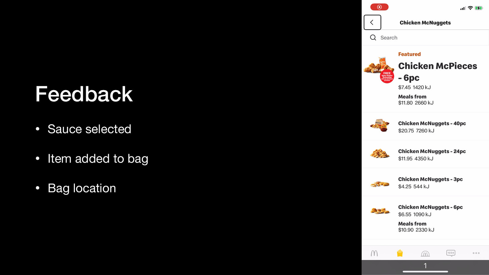
This is a good demonstration of screen reader feedback corresponding to user actions. When I activate the button to select a sauce, VoiceOver says “Barbecue sauce selected”, confirming the selection. After I activate the button add the pack of chicken nuggets to my order, VoiceOver says “Item added to your bag, bag available near the bottom of the screen to checkout now.” The “Checkout now” button stretches from left edge to right edge above the tab navigation bar, meaning if I explore-by-touch down the screen, I will encounter the checkout button. Very nice support.
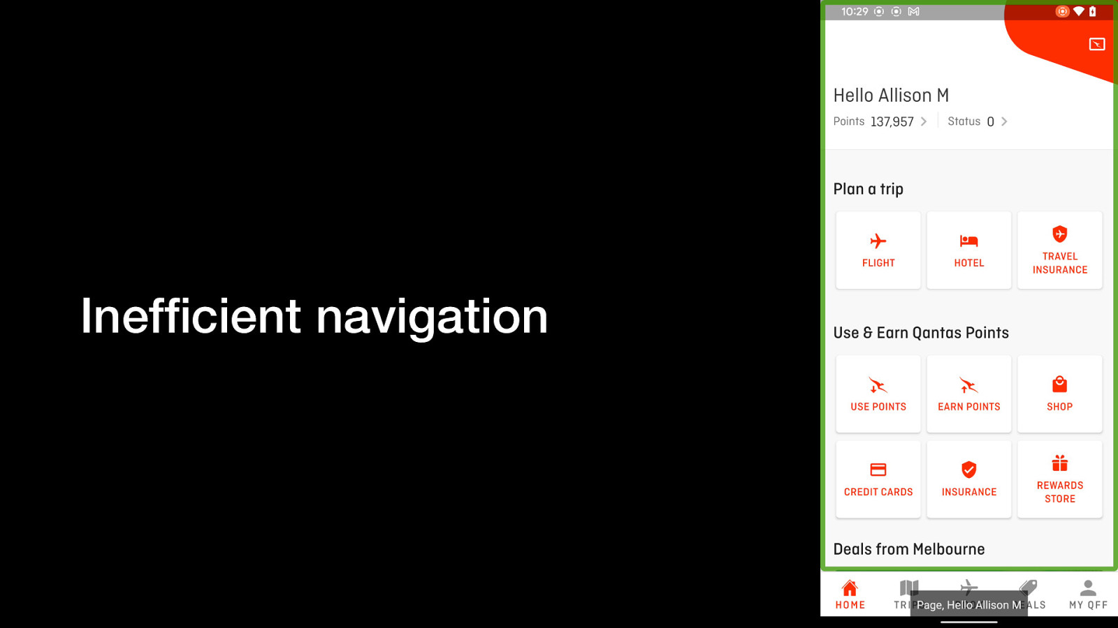
The Qantas Android app does not support TalkBack navigation via headings. This demo moves through the first few items, then switches to heading navigation mode. TalkBack says “No headings found”.
In the latest WebAIM screen reader user survey (https://webaim.org/projects/screenreadersurvey9/#mobilescreenreaders), the most popular Android screen reader is TalkBack. App teams should use the same to reflect what their users are doing.
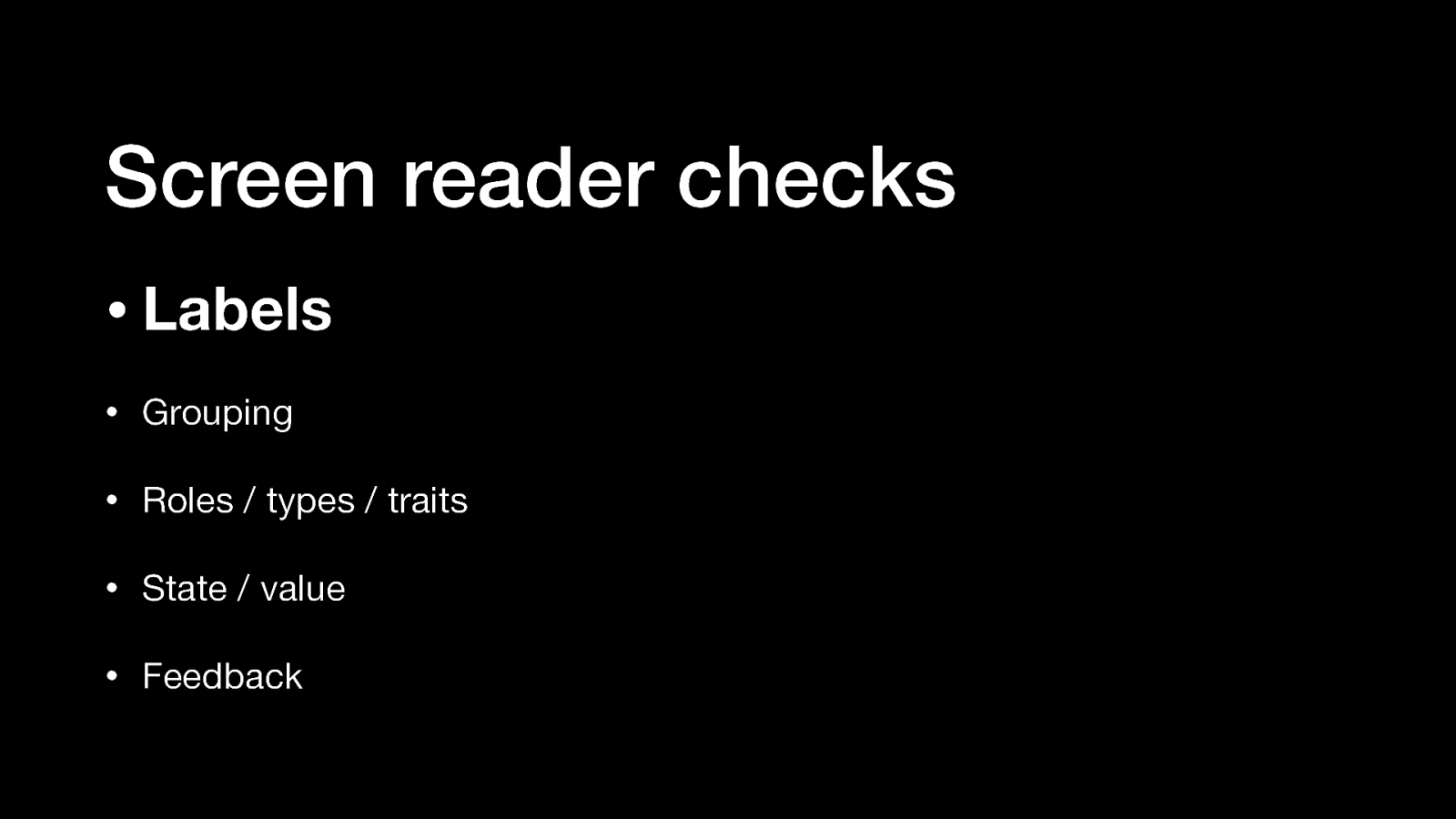
Things developers should check to improve screen reader support of their app: • Labels • Grouping • Roles / types / traits • State / value • Feedback

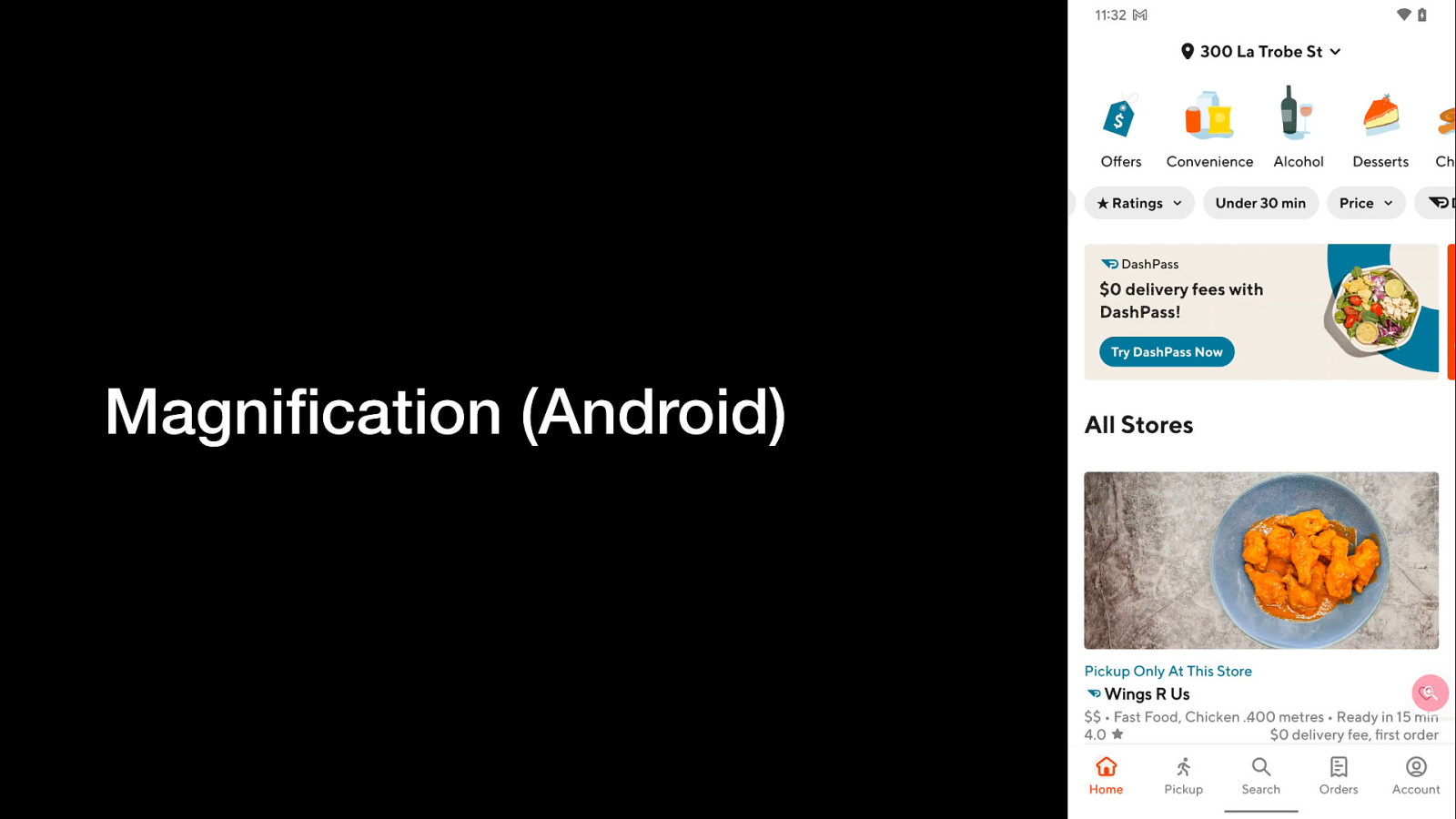
A video clip showing the partial window mode of the Magnification feature on Android phones. It works like it sounds; a small window overlaid on the app shows a magnified view of whatever is underneath. The user can move the magnified window around.
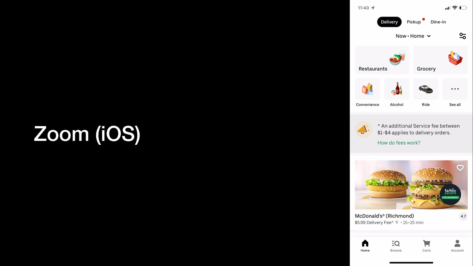
A video clip showing the full window mode of the Zoom feature on iPhones. The entire screen shows a magnified view of whatever is underneath. The user can move their viewport around. Developers do not have any control over these features, it’s a separate overlay. However, it shows the importance of laying out elements in predictable and easy-to-find ways.
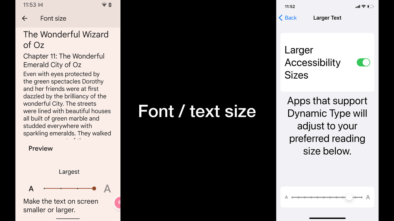
Screenshots of the font (Android) / text (iOS) size settings screens. Font / text size is something developers have a lot of control over.
Android teams should test maximum text size on Samsung Galaxy since they’re capable scaling up a lot larger than Google Pixels. If anything’s going to break, it’ll happen at the extremes.
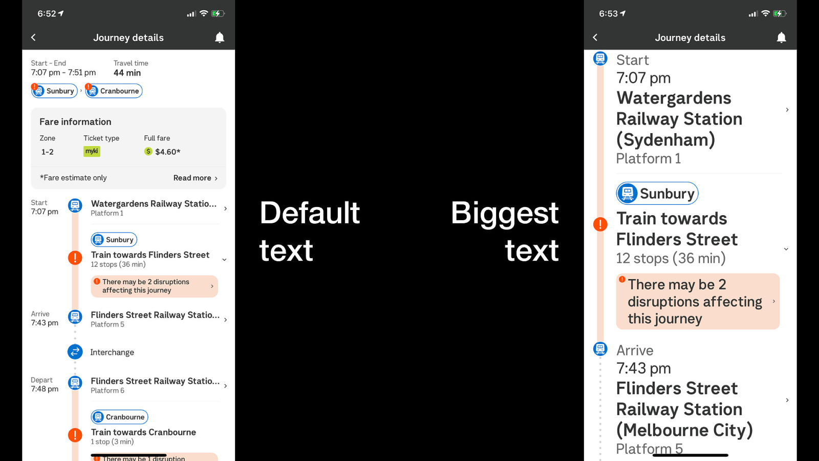
A very well-designed large text experience. The journey times in the first column of the default view are relocated to the final column in the large text view, making best use of the available space. The location name is capped at 1 line in default view, which truncates. In large text view, that same content is allowed to wrap and take up as many lines as needed.
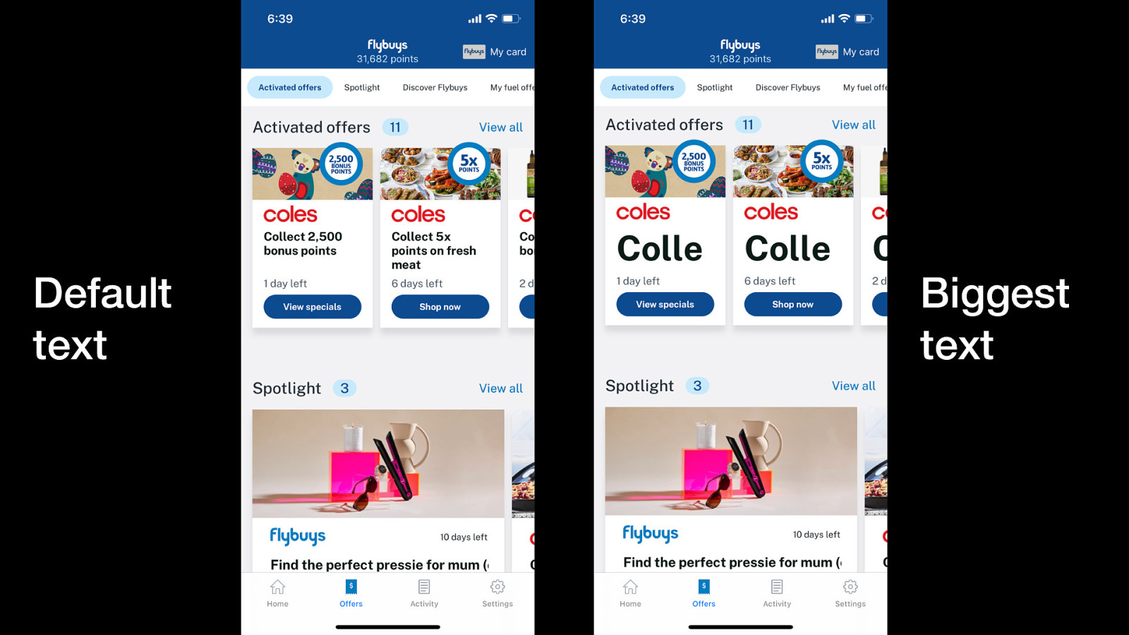
A very poor large text experience; most of the content doesn’t respond at all. One line has resized within a card but the card itself hasn’t increased so the content is severely truncated.
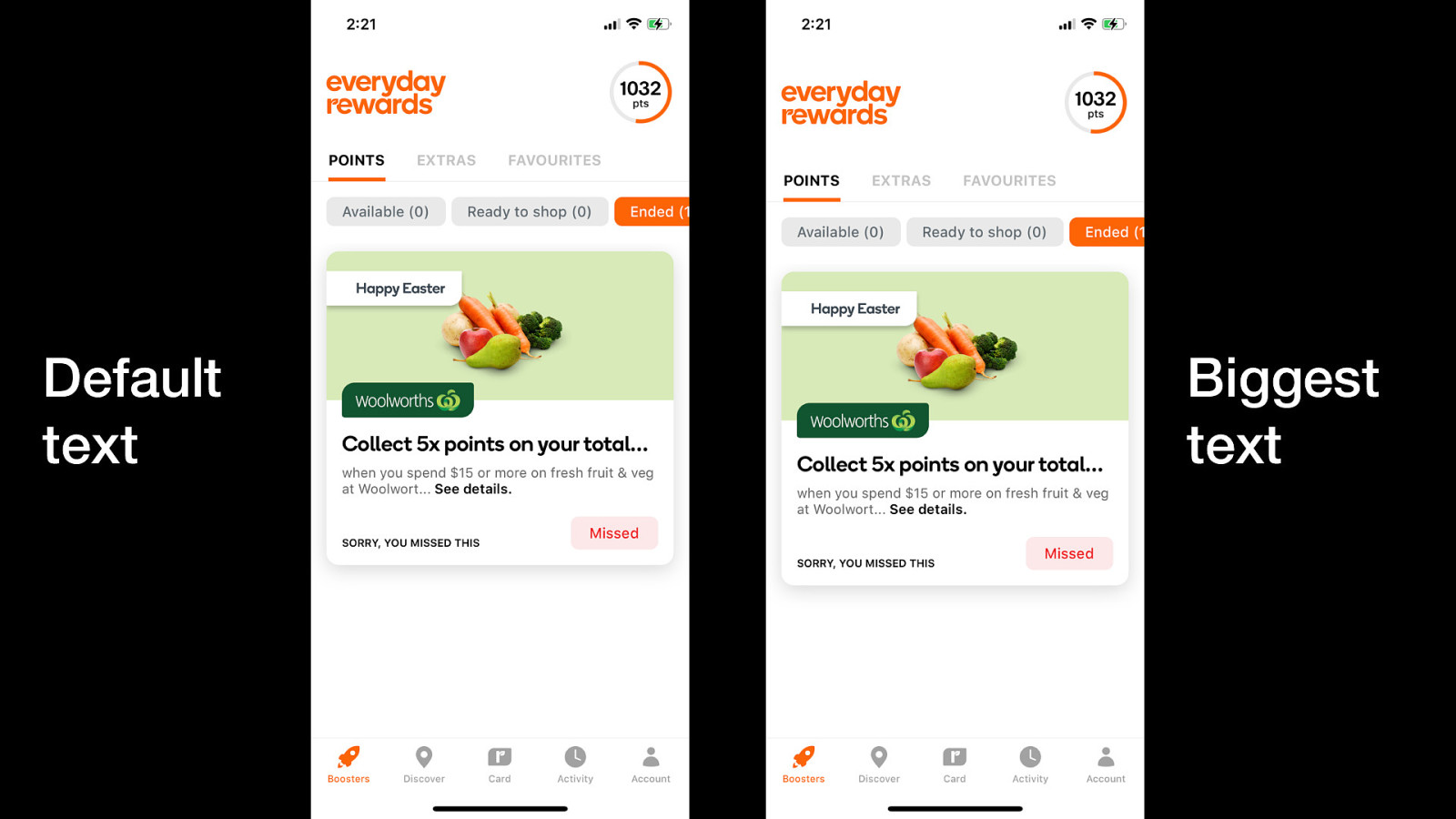
Another poor large text experience, with no meaningful changes to text size or layout at all.
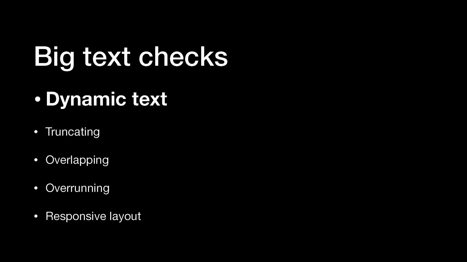
Things developers should check to improve big text support in their app: • Dynamic text • Truncating • Overlapping • Overrunning • Responsive layout
iOS / iPad / Mac: Voice Control is installed by default Android: Voice Access is available in the Play Store if it’s not already on your phone
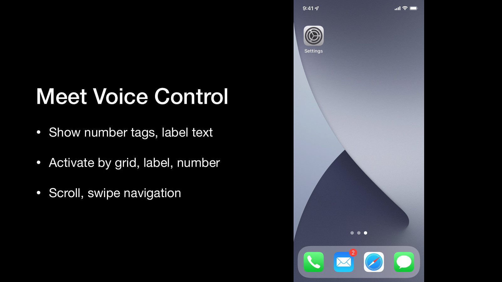
A video demonstration of iPhone’s Voice Control interface that shows • Show number tags, label text • Activate by grid, label, number • Scroll, swipe navigation
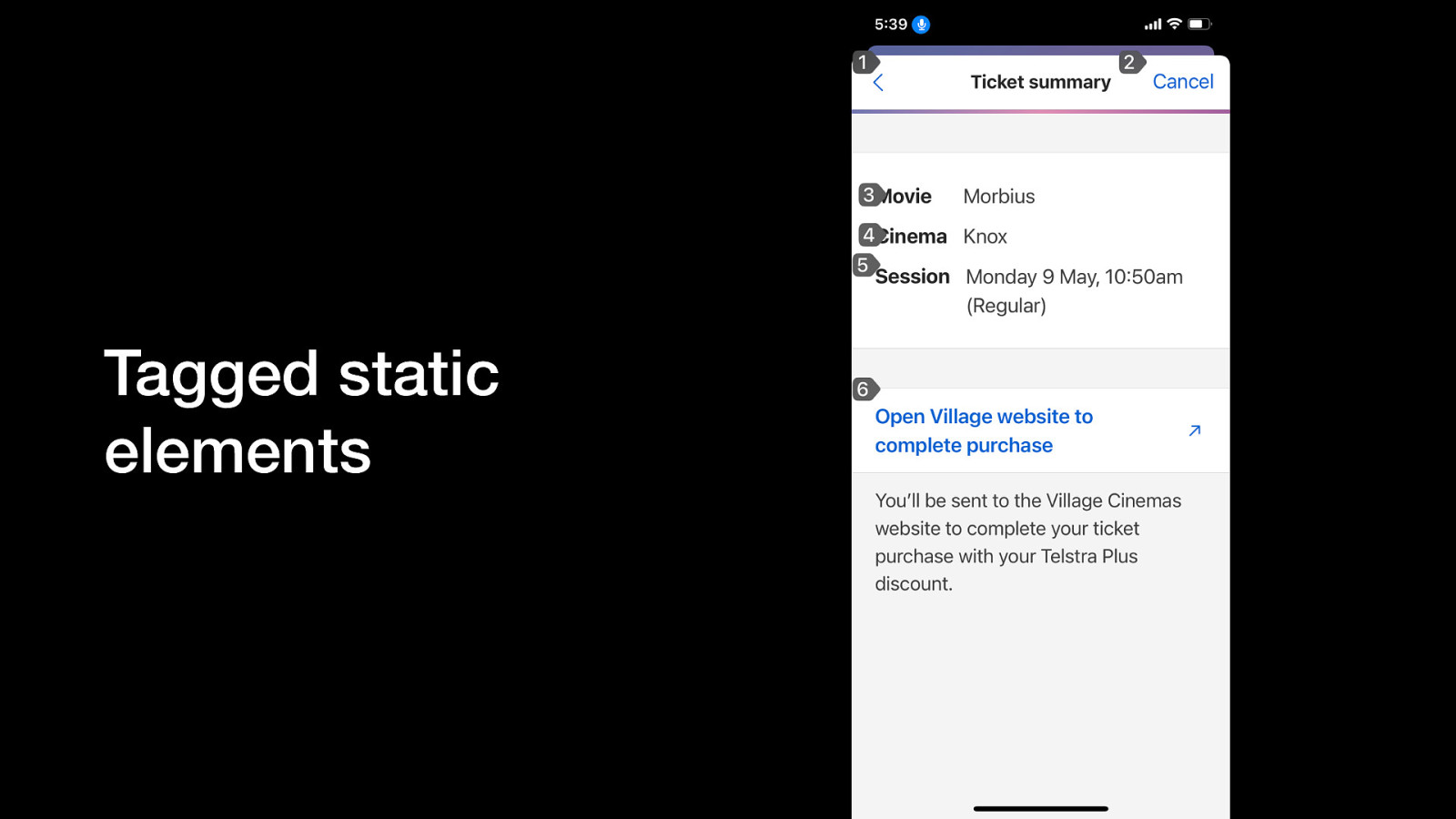
One issue speech interface users can encounter is when static elements are tagged due to empty event handlers, inappropriate inheritance or incorrect roles. This is misleading and reduces trust in the app.
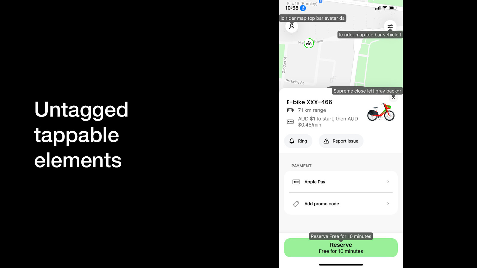
Similarly, speech interface users may encounter interactive elements that have not been tagged or recognised as enabled / tappable. They may be able to activate via the grid interface if they know how to use it, but shouldn’t have to. This should not happen if correct traits or native library elements are used.
Things developers should check to improve big text support in their app: • Labels • Tappable vs. static elements
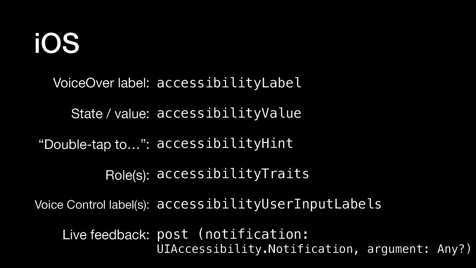
VoiceOver label: accessibilityLabel State / value: accessibilityValue “Double-tap to…”: accessibilityHint Role(s): accessibilityTraits Voice Control label(s): accessibilityUserInputLabels Live feedback: post (notification: UIAccessibility.Notification, argument: Any?)
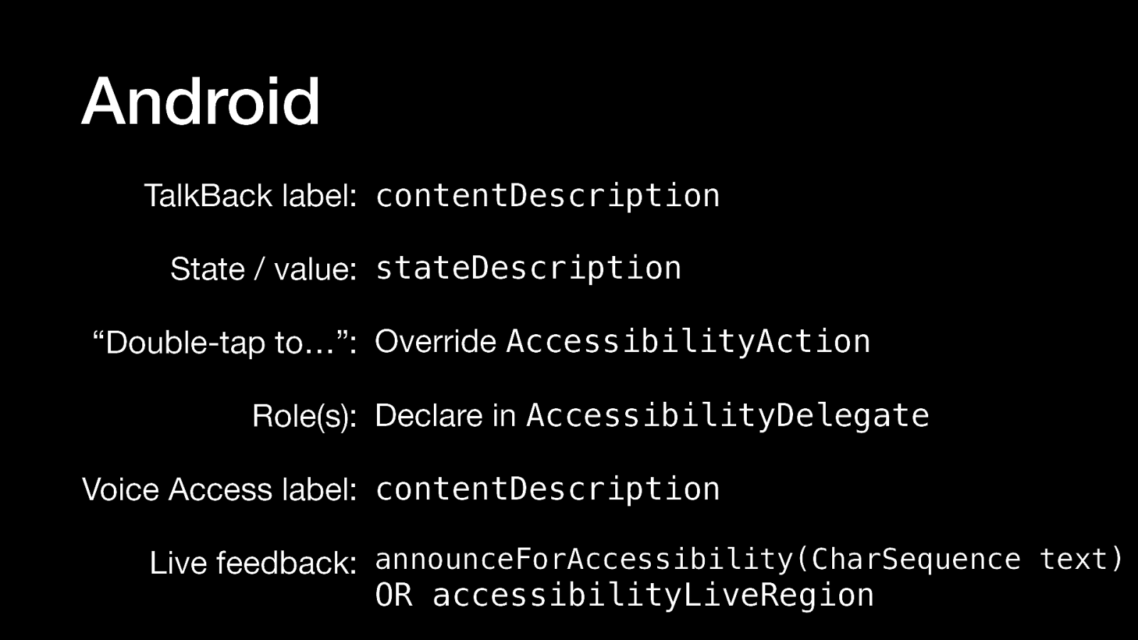
TalkBack label: contentDescription State / value: stateDescription “Double-tap to…”: Override AccessibilityAction Role(s): Declare in AccessibilityDelegate Voice Access label: contentDescription Live feedback: announceForAccessibility(CharSequence text) OR accessibilityLiveRegion
You don’t need to know everything about accessibility, you just need to get started. Every little update will improve the user experience.