What’s new in WCAG 2.2 Candidate Recommendation
Allison Ravenhall, @RavenAlly on Twitter

A presentation at A11y Camp in November 2022 in Australia by Allison Ravenhall

Allison Ravenhall, @RavenAlly on Twitter
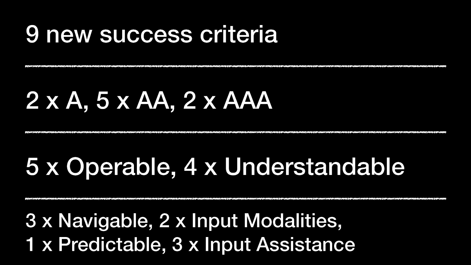
2 x A, 5 x AA, 2 x AAA
5 x Operable, 4 x Understandable 3 x Navigable
2 x Input Modalities, 1 x Predictable, 3 x Input Assistance

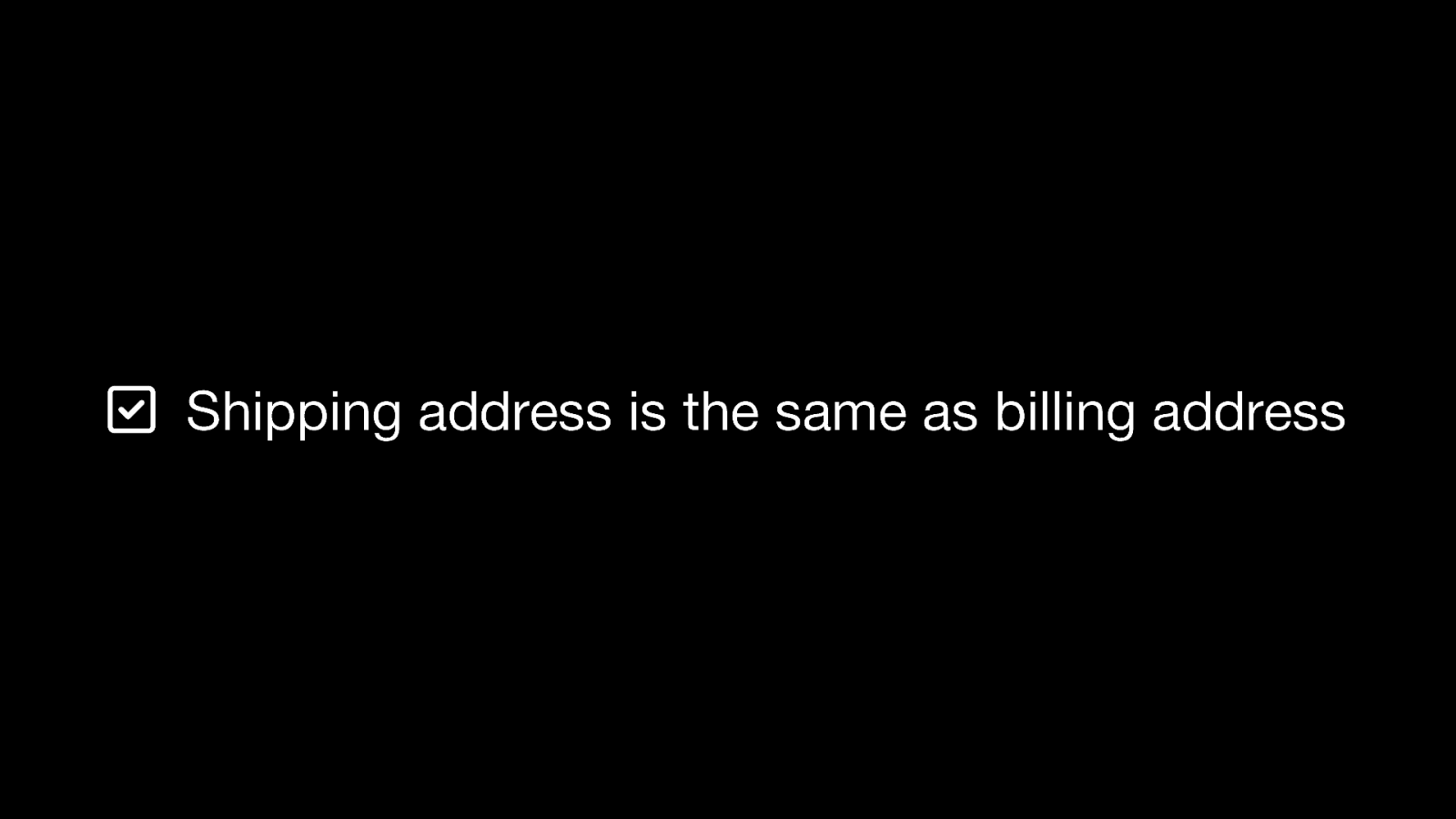
Shipping address is the same as billing address is the most common example of Redundant Entry.
When a form or process captures the same information more than once, enable automated methods to reuse the information: autofill, list of previously used data, checkbox to confirm reuse, etc.
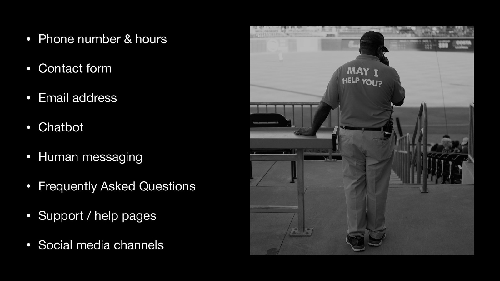
Examples of help channels
• Phone number & hours
• Contact form
• Email address
• Chatbot
• Human messaging
• Frequently Asked Questions
• Support / help pages
• Social media channels
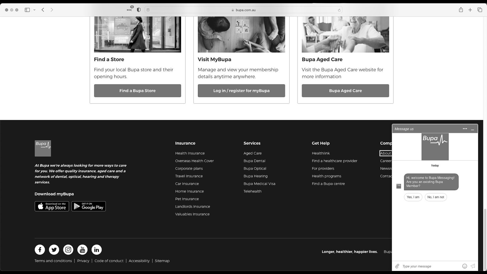
The chat window partially obscures a list of links in the footer. One of the links has a keyboard focus outline displayed.
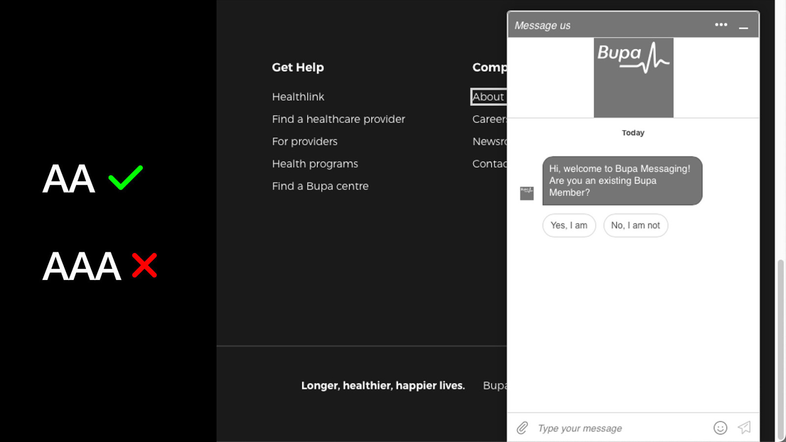
To meet level AA, focus location may be partially obscured but not totally hidden by floating content.
To meet level AAA, focus location may not be obscured by floating content at all.

No, Pointer Gestures is scoped to path-based movements only, and dragging is not path-based.
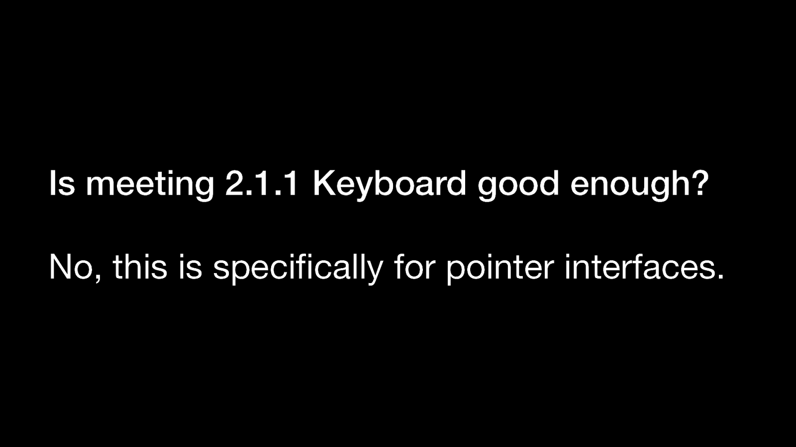
No, this is specifically for pointer interfaces.
An example of an experience that works well for keyboard, but still requires complex swiping movements for pointer-based interfaces.
An example of an experience that typically leans heavily on drag-and-drop interactions but can be augmented with context menu single-clicks.
An example of an experience that typically leans heavily on drag-and-drop interactions but can be augmented with context menu single-clicks.
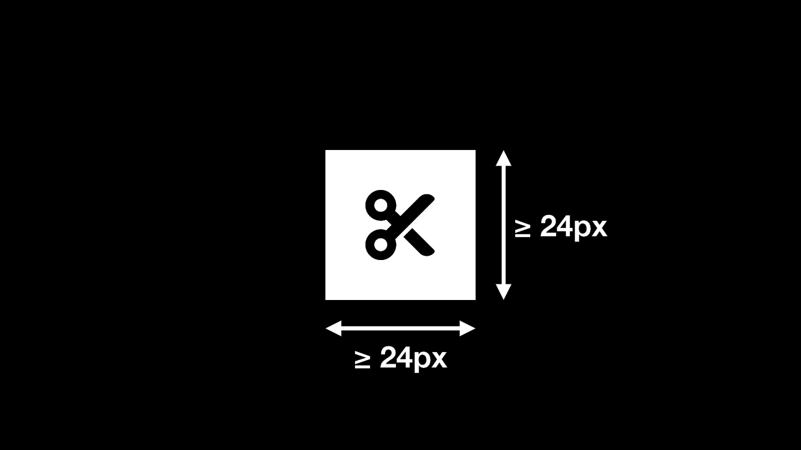
Is 24 x 24px
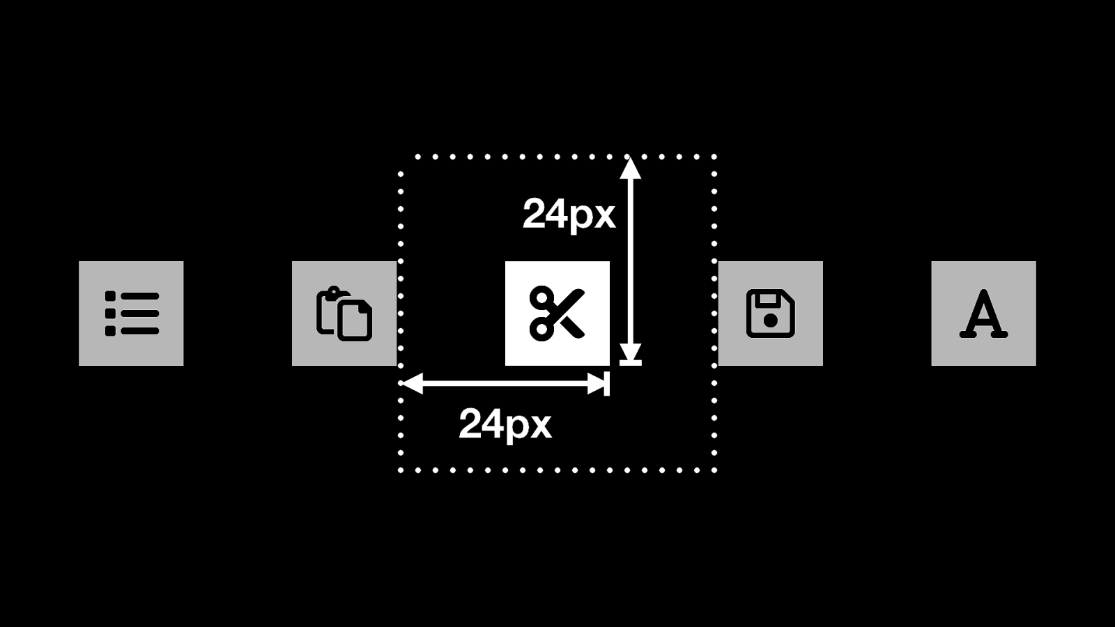
The target needs to have an exclusive offset of 24px in all directions to reduce accidental incorrect taps.
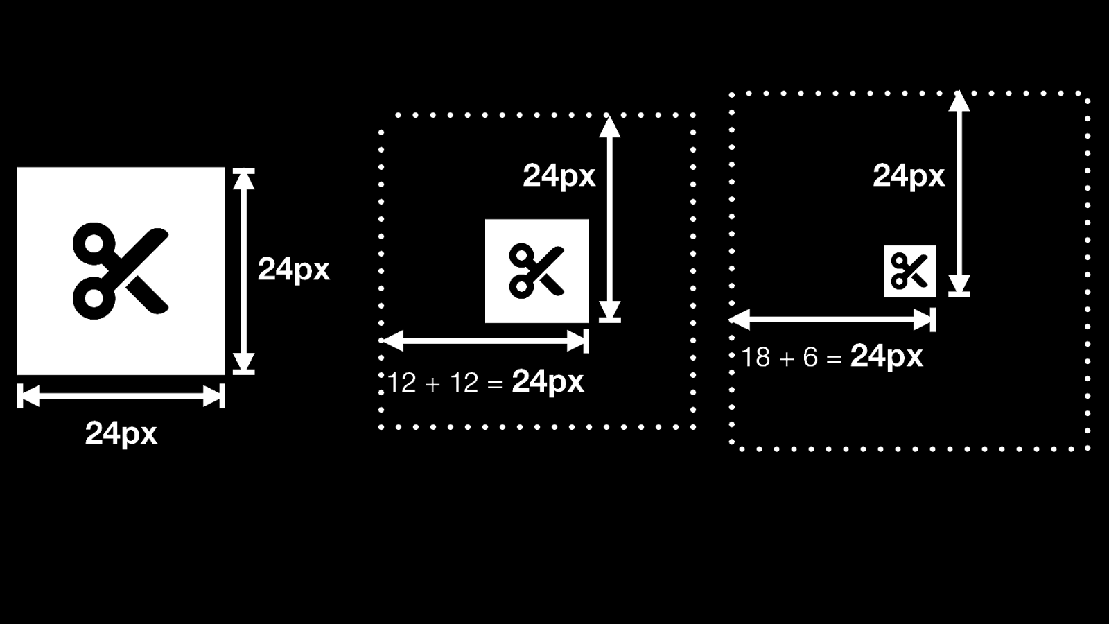
…means the exclusive area occupied by a target grows as a target size shrinks.
24 x 24px button has no exclusion area.
12 x 12px button has 12px offset.
6 x 6 px button has 18px offset.
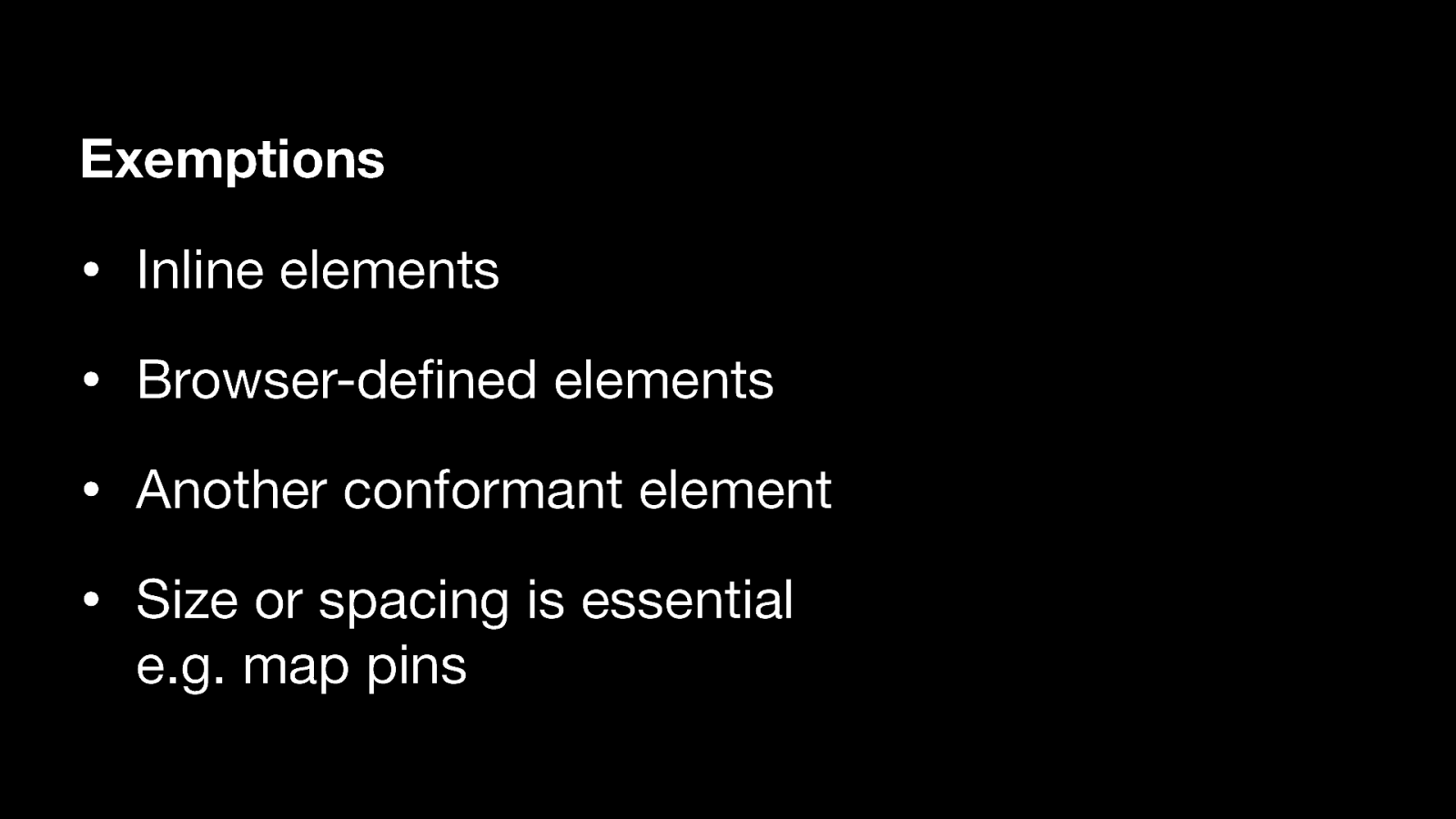
• Inline elements
• Browser-defined elements
• Another conformant element that performs the same action
• Size or spacing is essential e.g. map pins
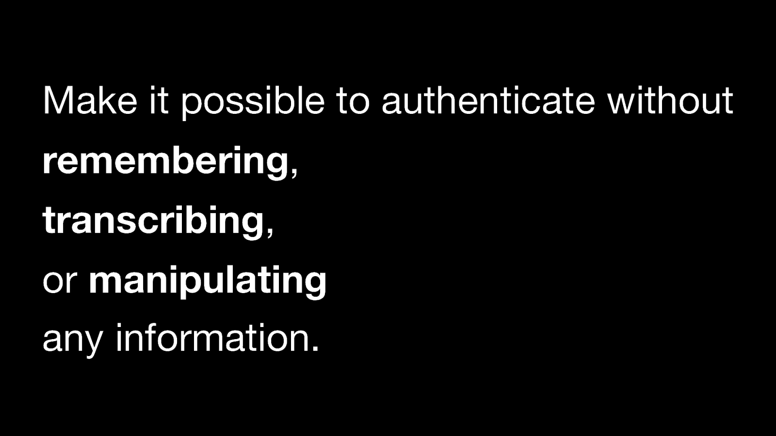
Make it possible to authenticate without remembering, transcribing, or manipulating any information.
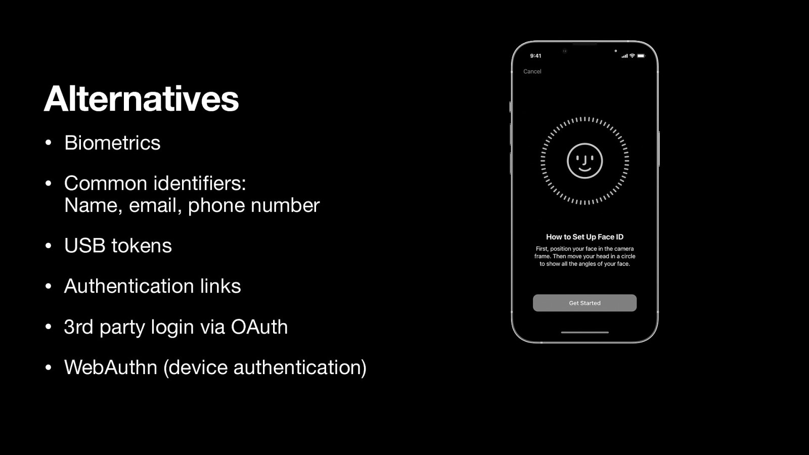
• Biometrics
• Common identifiers: Name, email, phone number
• USB tokens
• Authentication links
• 3rd party login via OAuth
• WebAuthn (device authentication)
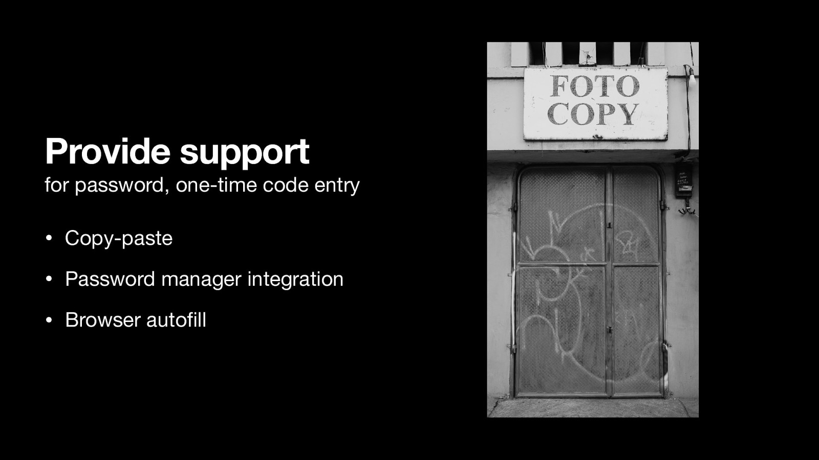
Provide support for password, one-time code entry
• Copy-paste
• Password manager integration
• Browser autofill
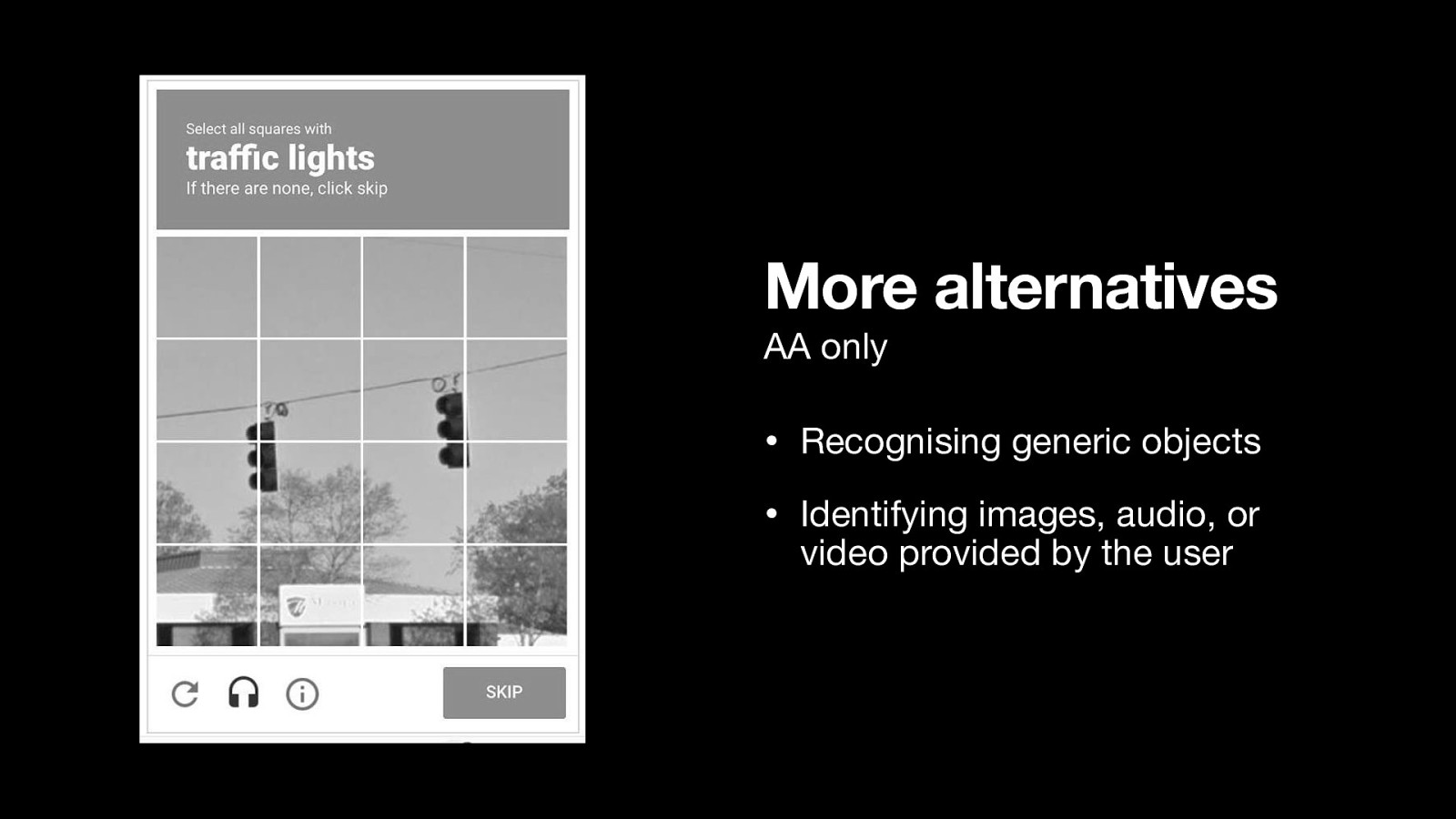
• Recognising generic objects
• Identifying images, audio, or video provided by the user
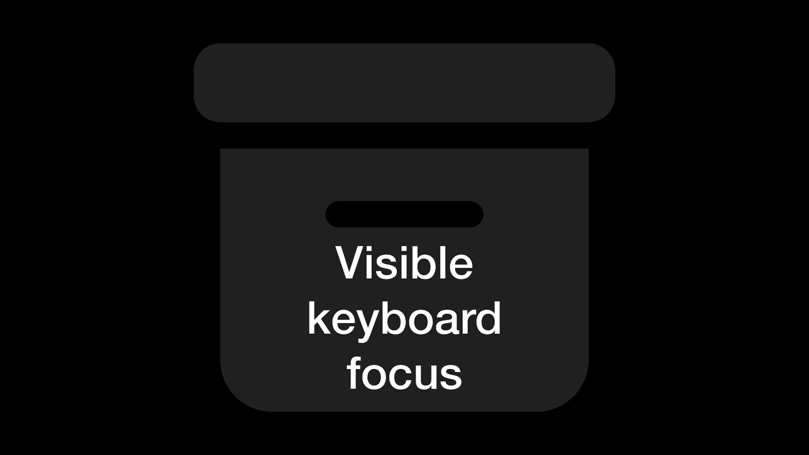
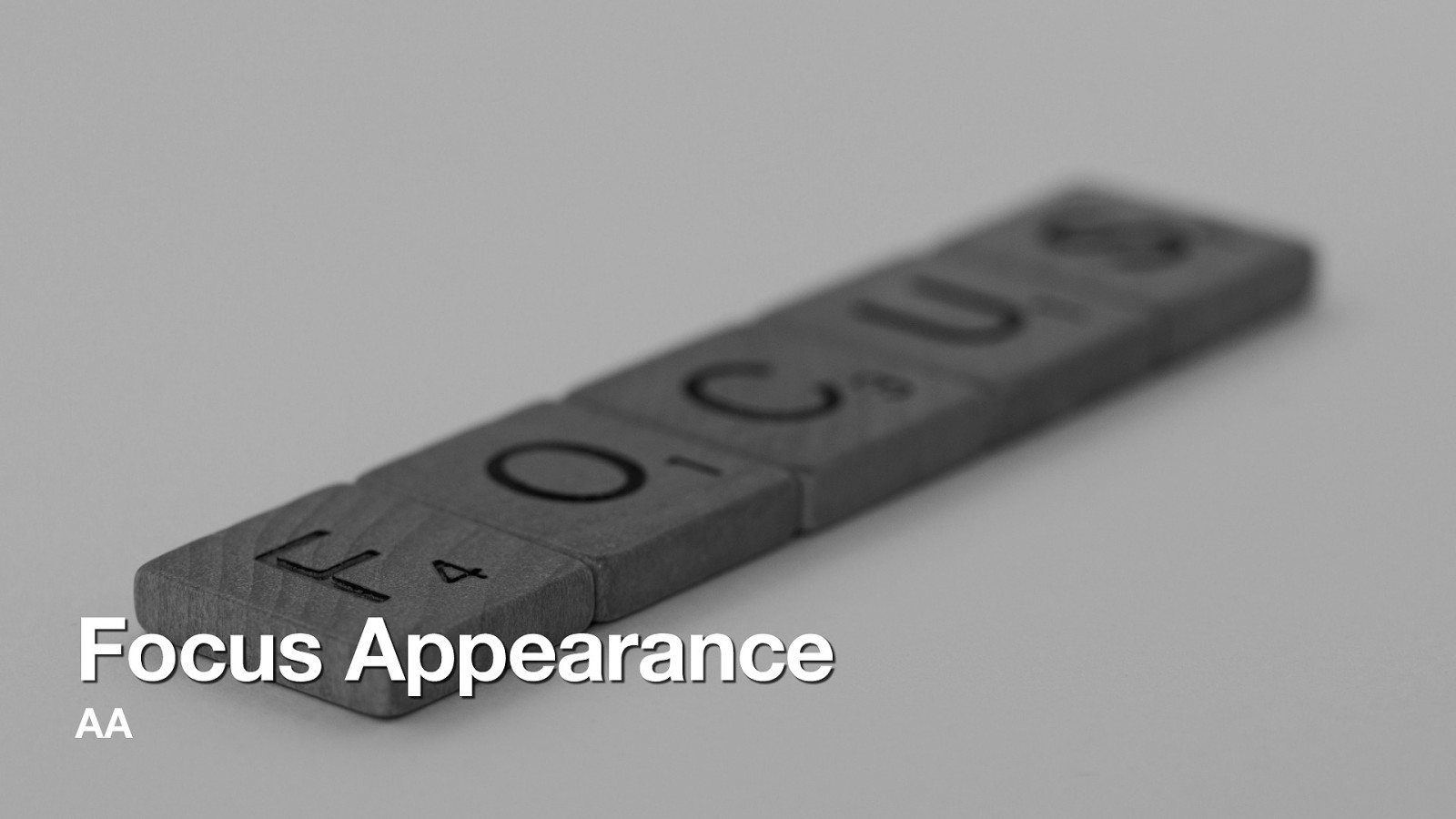
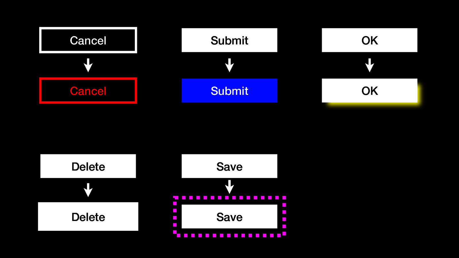
Like it says on the box: Visible keyboard focus
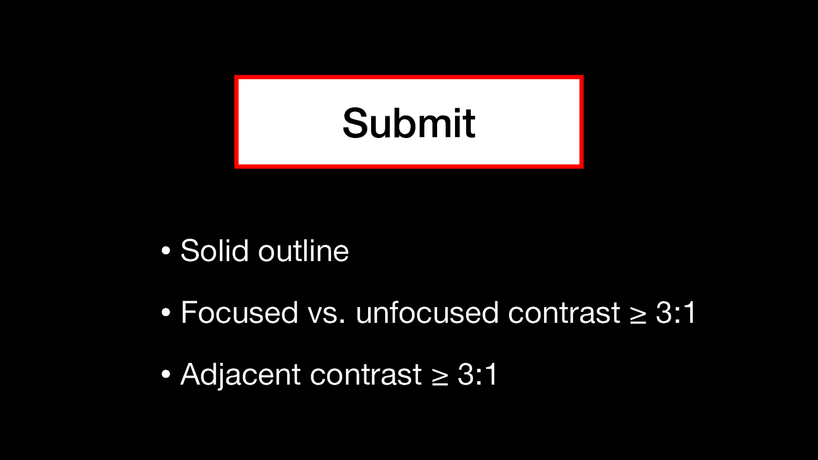
• Solid outline
• Focused vs. unfocused contrast ≥ 3:1
• Adjacent contrast ≥ 3:1
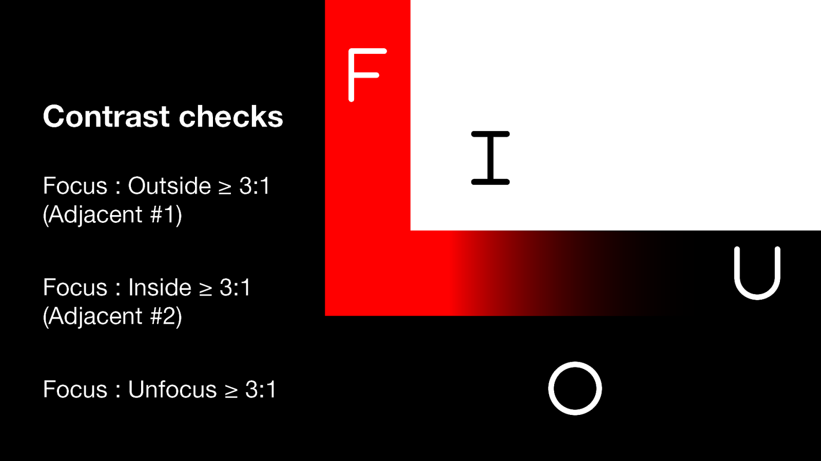
Focus colour : Outside colour ≥ 3:1 (Adjacent #1)
Focus colour : Inside colour ≥ 3:1 (Adjacent #2)
Focus colour : Unfocussed colour ≥ 3:1
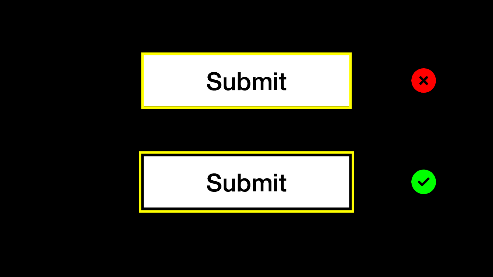
White button with a solid yellow focus outline that hugs the button fails the adjacent-inside check.
White button with a solid yellow focus outline that has some space between the focus line and the button edge passes.
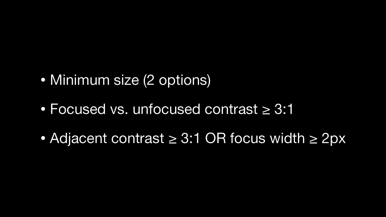
• Minimum size (2 options)
• Focused vs. unfocused contrast ≥ 3:1
• Adjacent contrast ≥ 3:1 OR focus width ≥ 2px
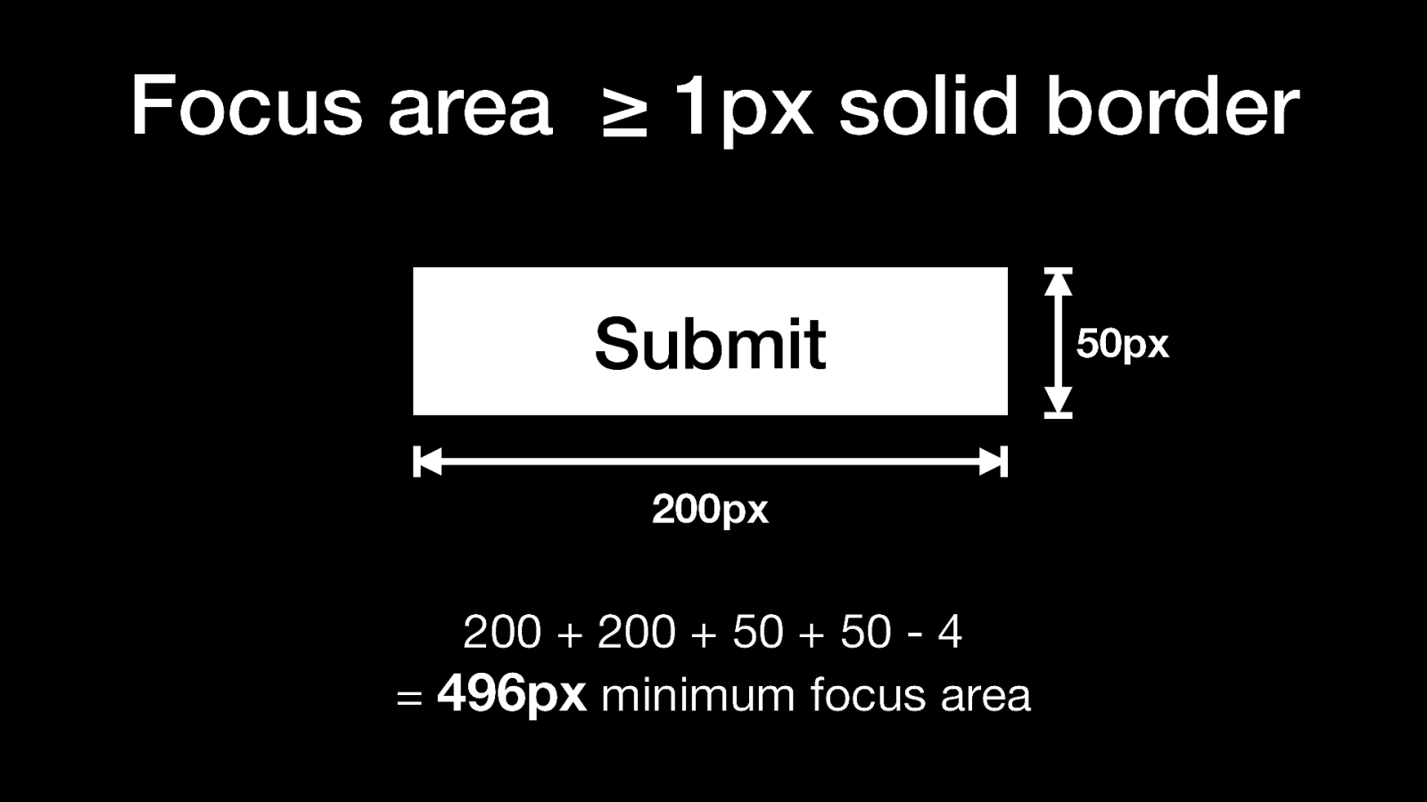
Focus area must be ≥ 1px solid border
Example for a 200 x 50px button: 200 + 200 + 50 + 50 - 4 = 496px minimum focus area
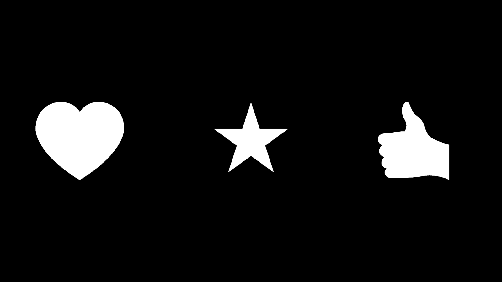
Examples: Heart, star, thumbs up
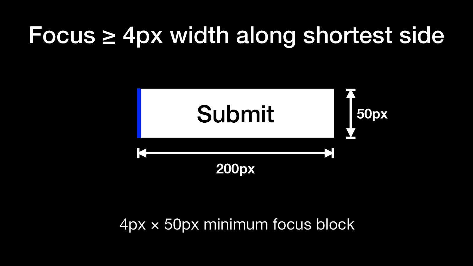
Focus ≥ 4px width along shortest side
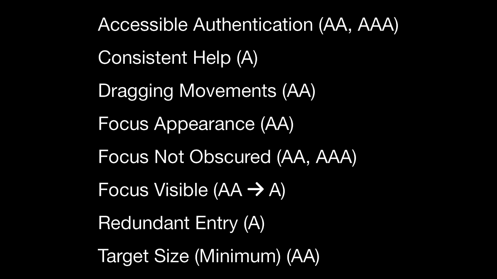
Accessible Authentication (AA, AAA)
Consistent Help (A)
Dragging Movements (AA)
Focus Appearance (AA)
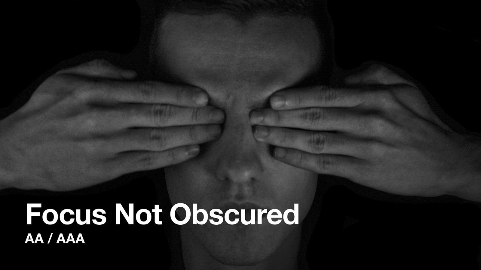
Focus Not Obscured (AA, AAA)
Focus Visible (AA → A)
Redundant Entry (A)
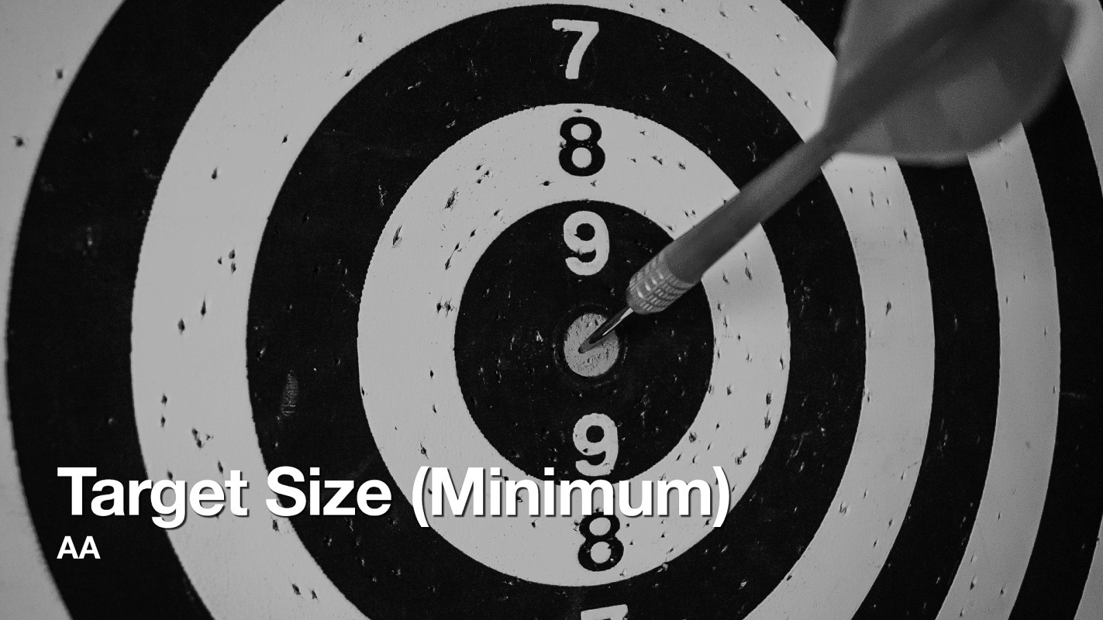
Target Size (Minimum) (AA)