
A presentation at React Amsterdam Meetup - Design systems, Testing, and getting serious with Types in in Amsterdam, Netherlands by Bart Waardenburg
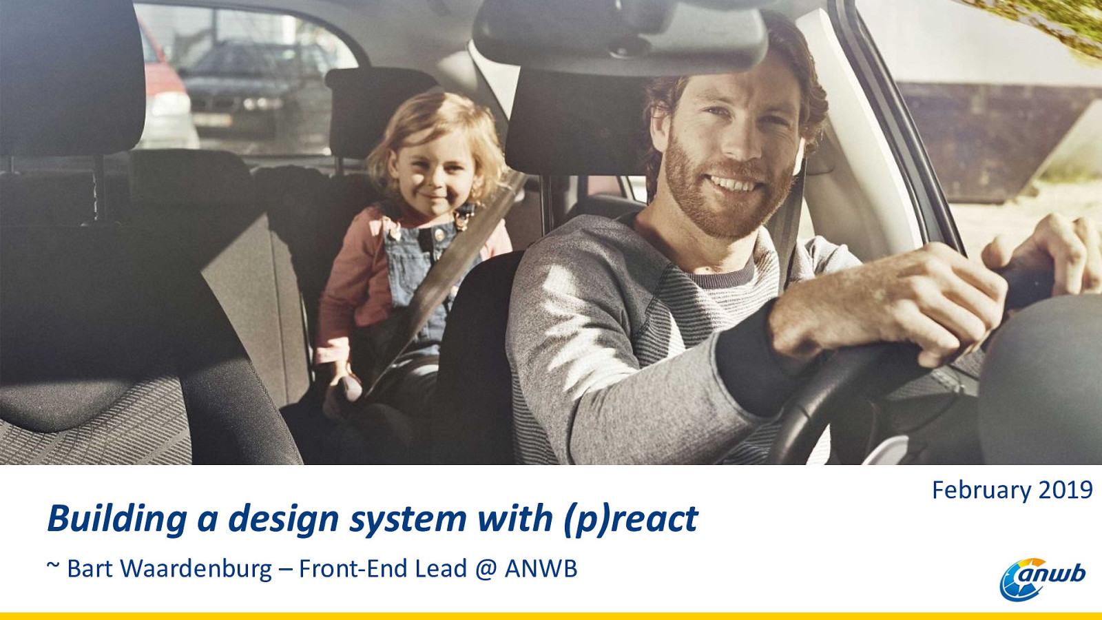
Building a design system with (p)react ~ Bart Waardenburg – Front-End Lead @ ANWB February 2019
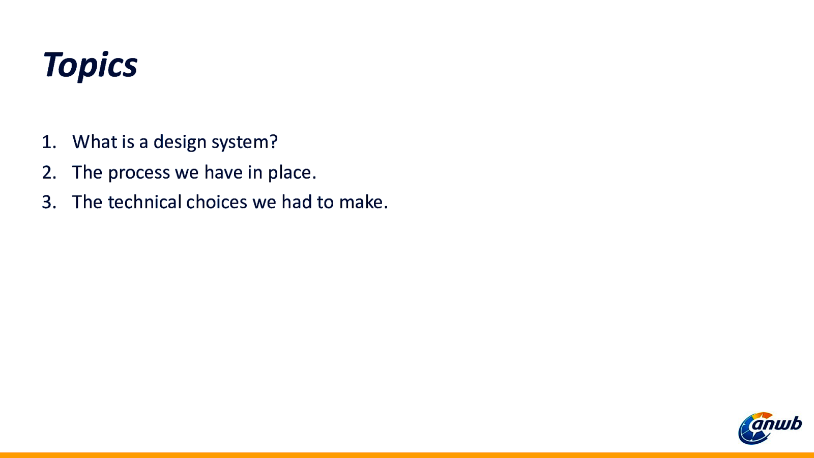
Topics 1. What is a design system? 2. The process we have in place. 3. The technical choices we had to make.
Design system?
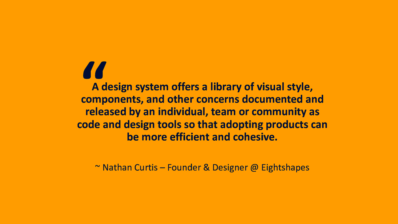
“ A design system offers a library of visual style, components, and other concerns documented and released by an individual, team or community as code and design tools so that adopting products can be more efficient and cohesive. ~ Nathan Curtis – Founder & Designer @ Eightshapes
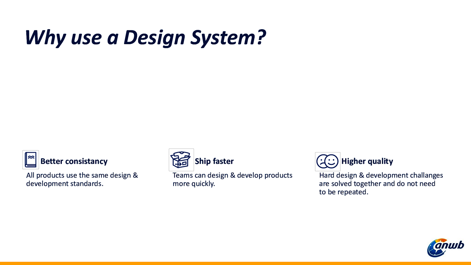
Why use a Design System? Better consistancy All products use the same design & development standards. Ship faster Teams can design & develop products more quickly. Higher quality Hard design & development challanges are solved together and do not need to be repeated.
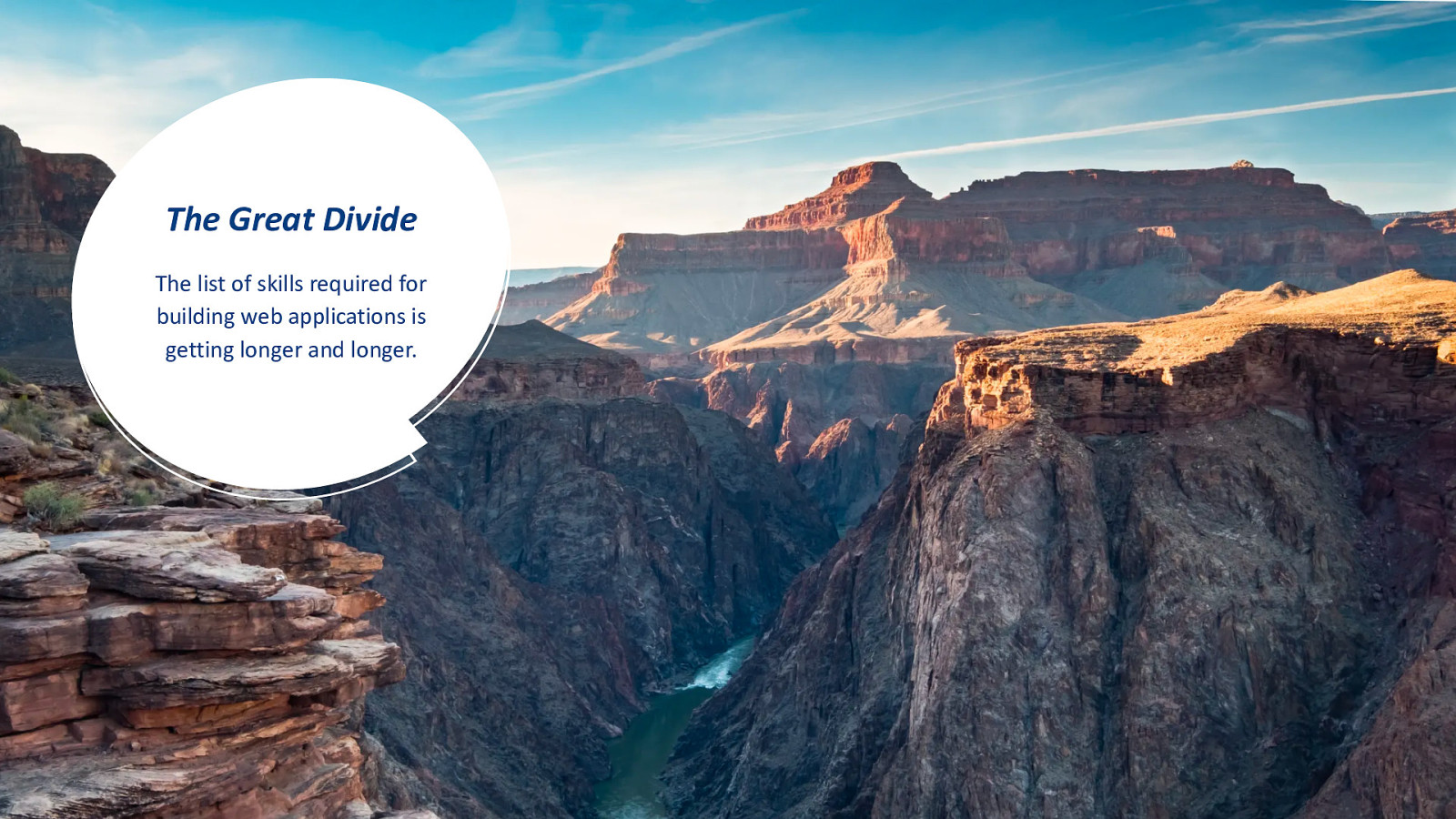
The Great Divide The list of skills required for building web applications is getting longer and longer.
Our design system
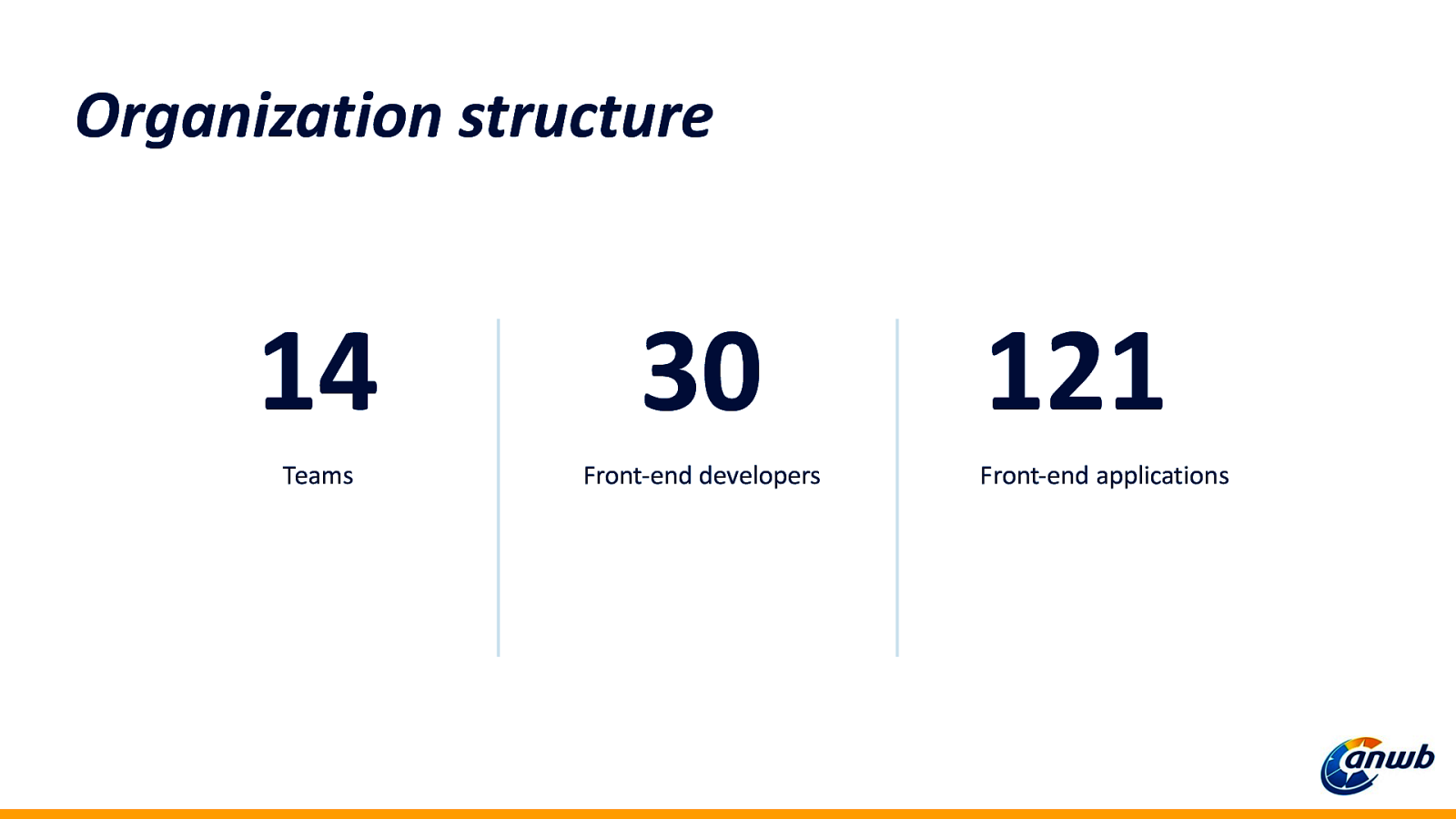
Organization structure 14 Teams 30 Front-end developers 121 Front-end applications
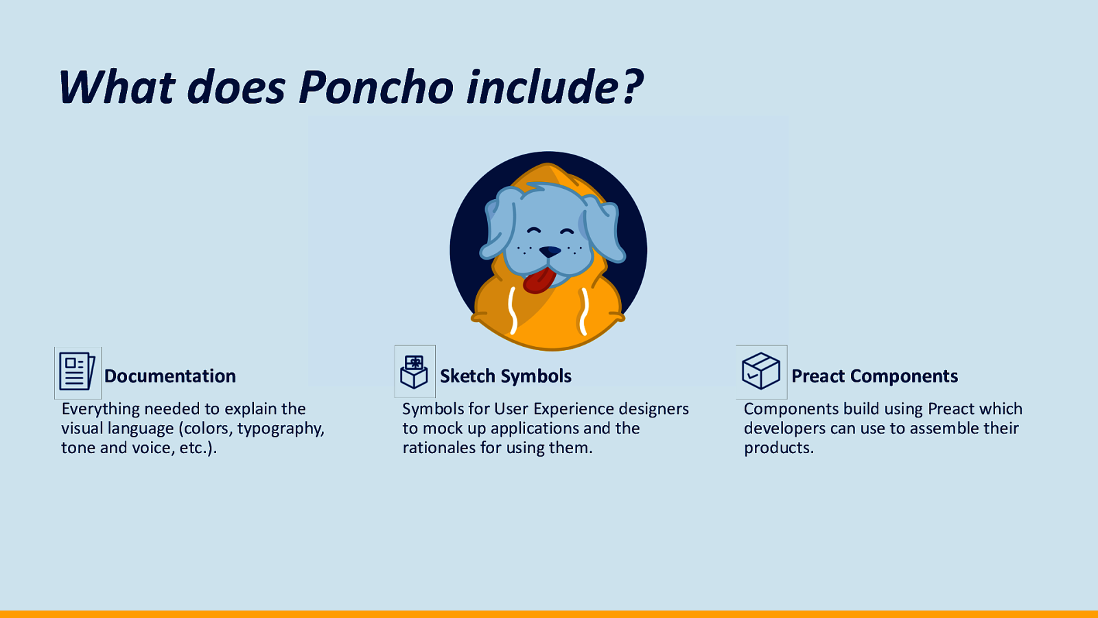
Poncho
What does Poncho include? Documentation Everything needed to explain the visual language (colors, typography, tone and voice, etc.). Sketch Symbols Symbols for User Experience designers to mock up applications and the rationales for using them. Preact Components Components build using Preact which developers can use to assemble their products.
Shipping products
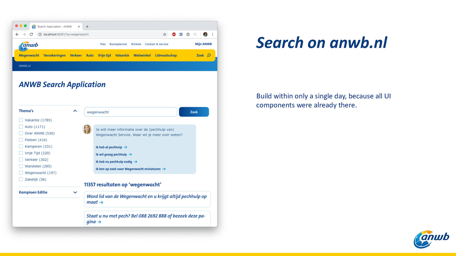
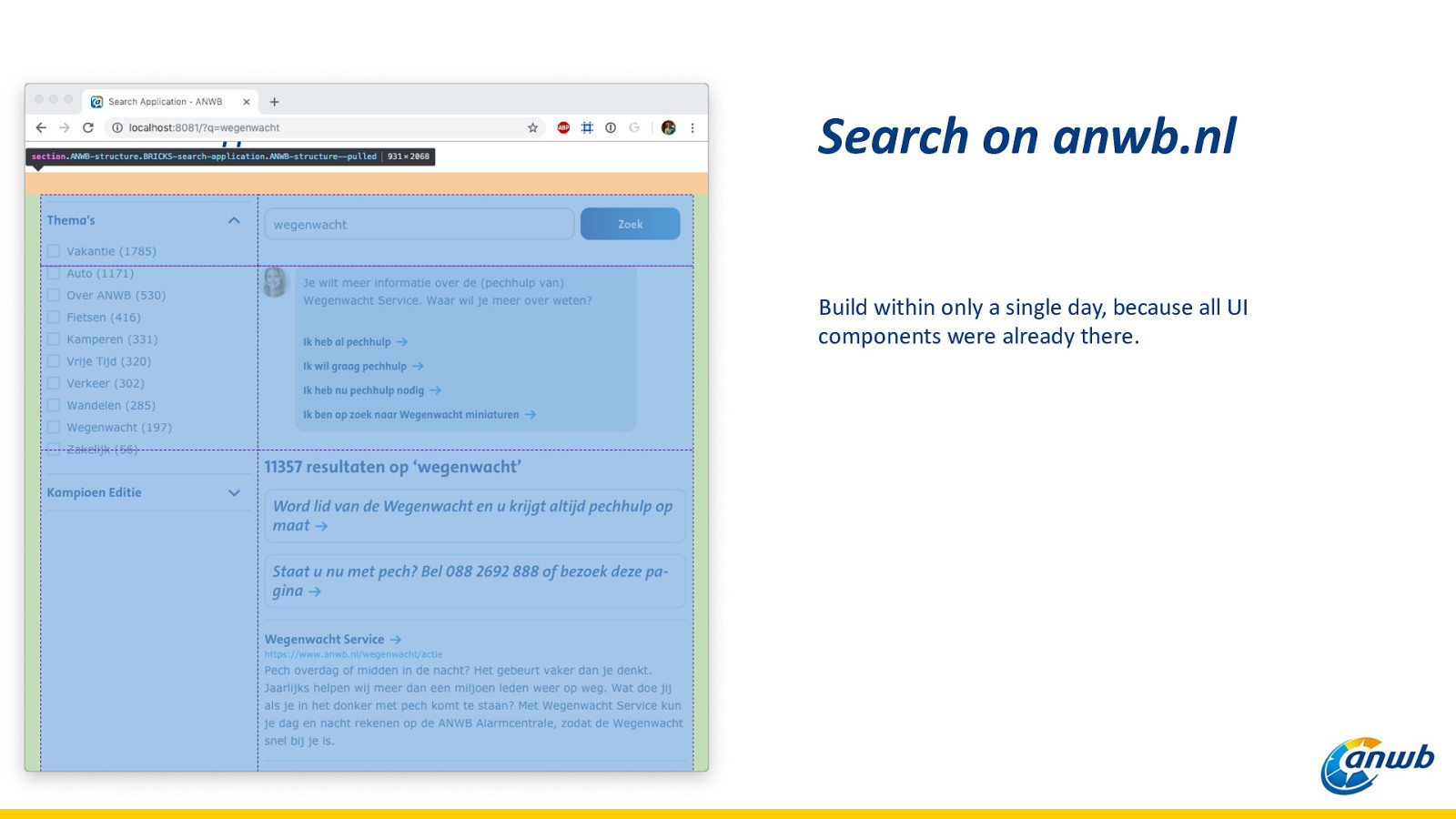
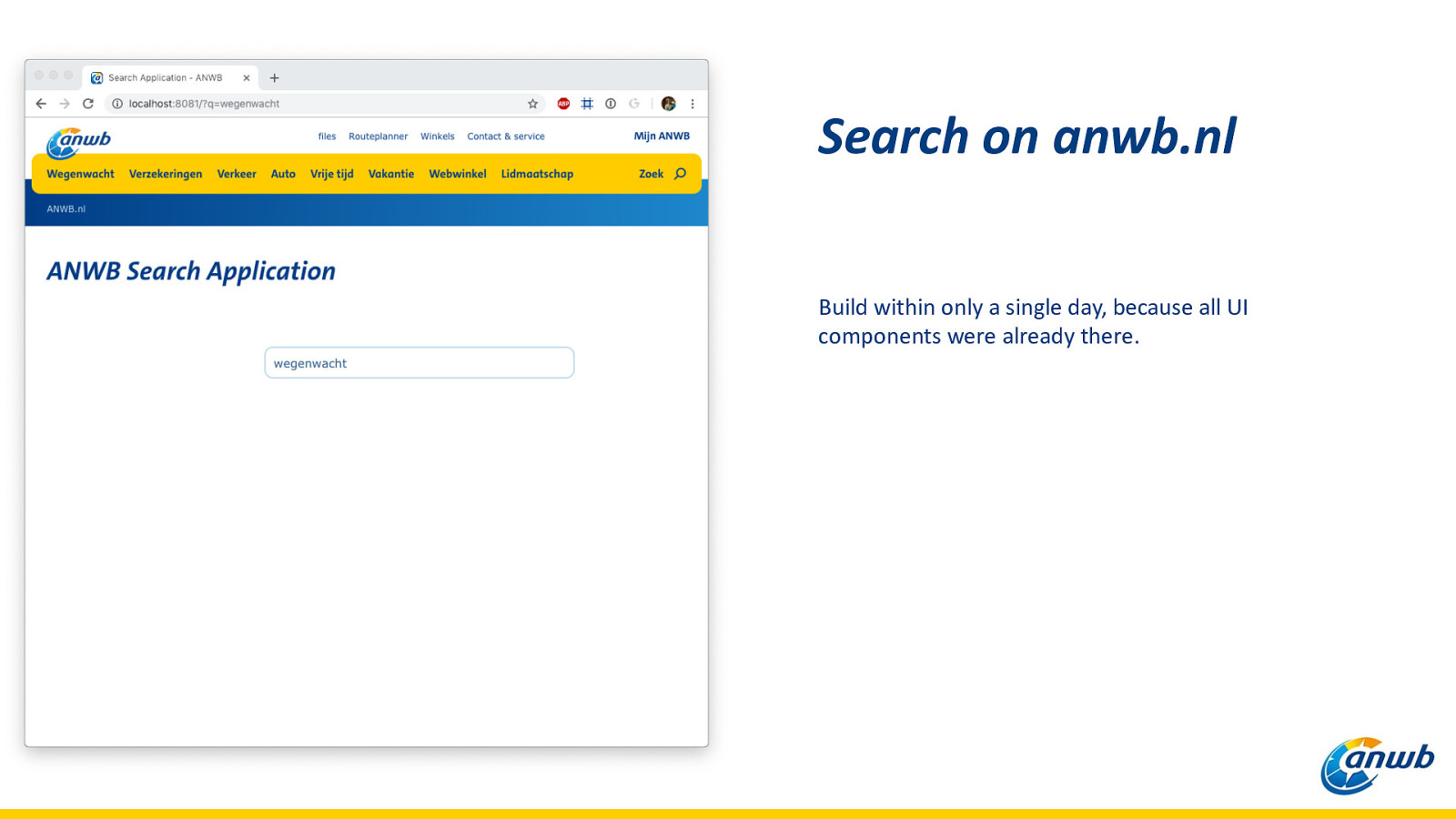
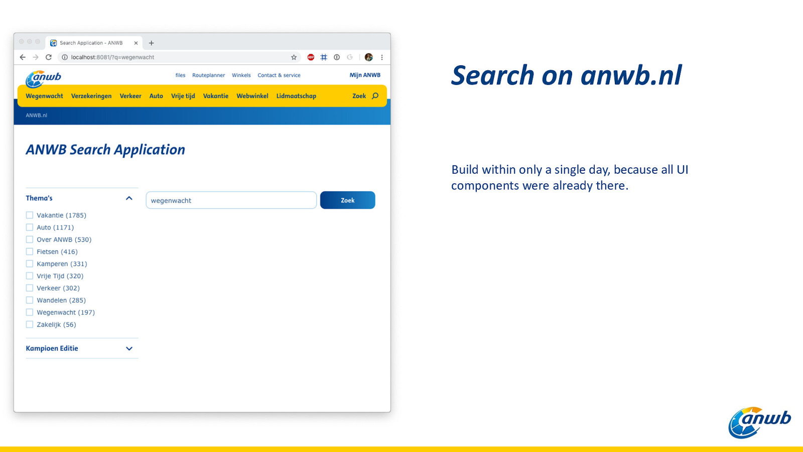
Search on anwb.nl Build within only a single day, because all UI components were already there.
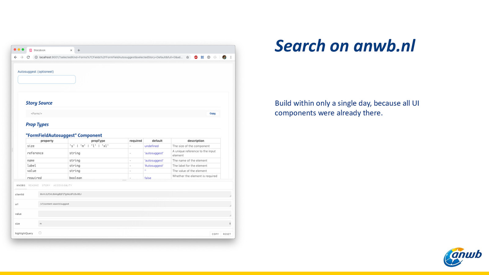
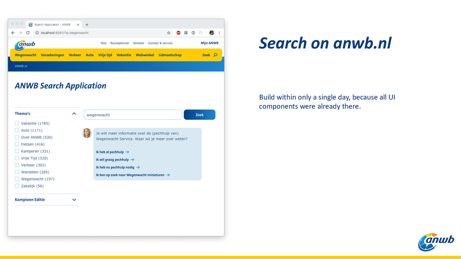
Search on anwb.nl Build within only a single day, because all UI components were already there.
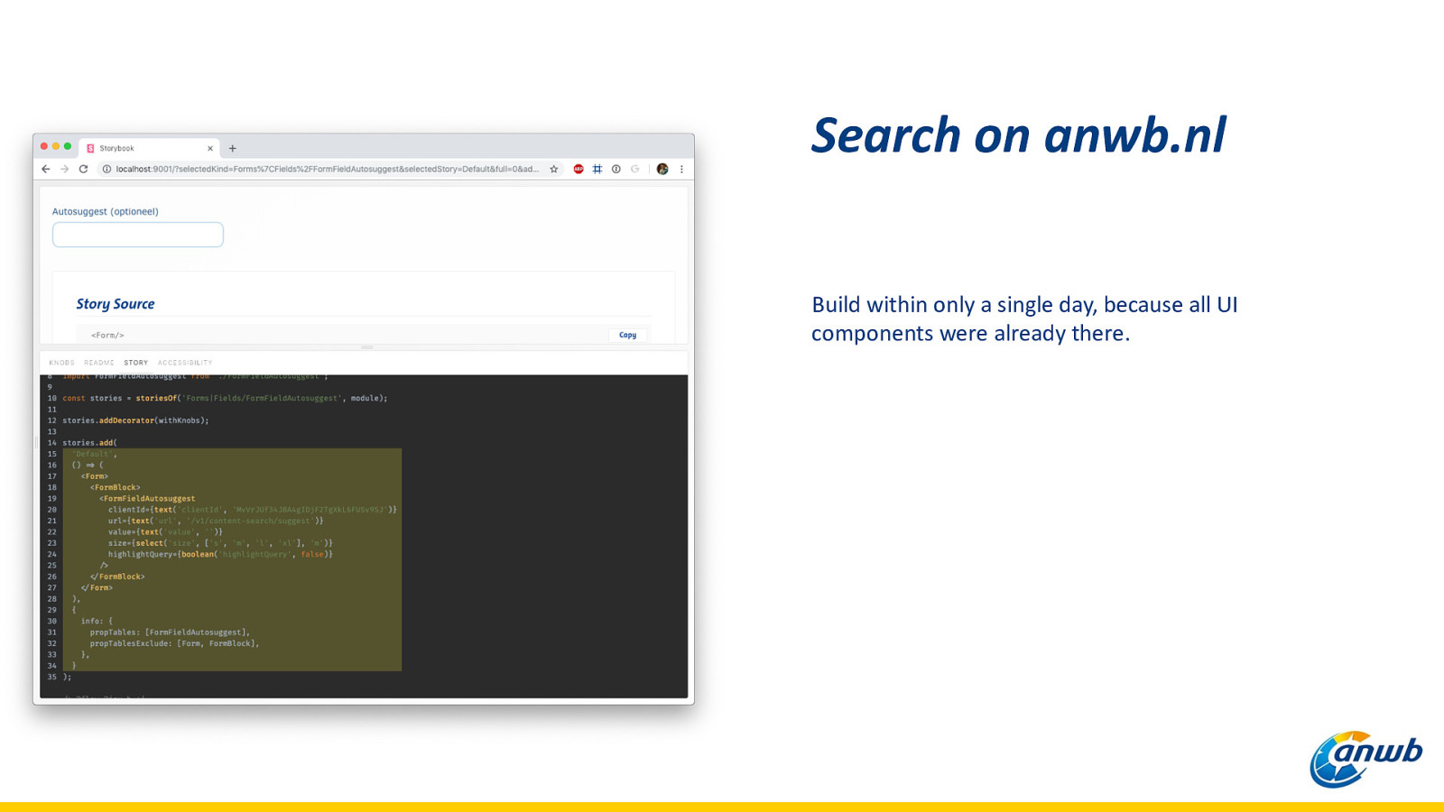
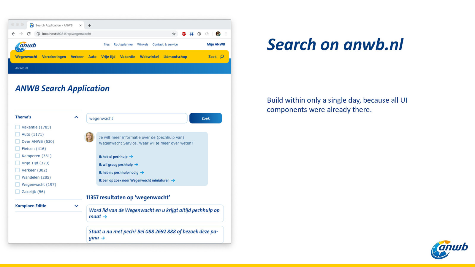
Search on anwb.nl Build within only a single day, because all UI components were already there.
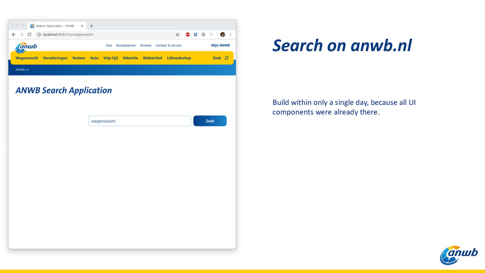
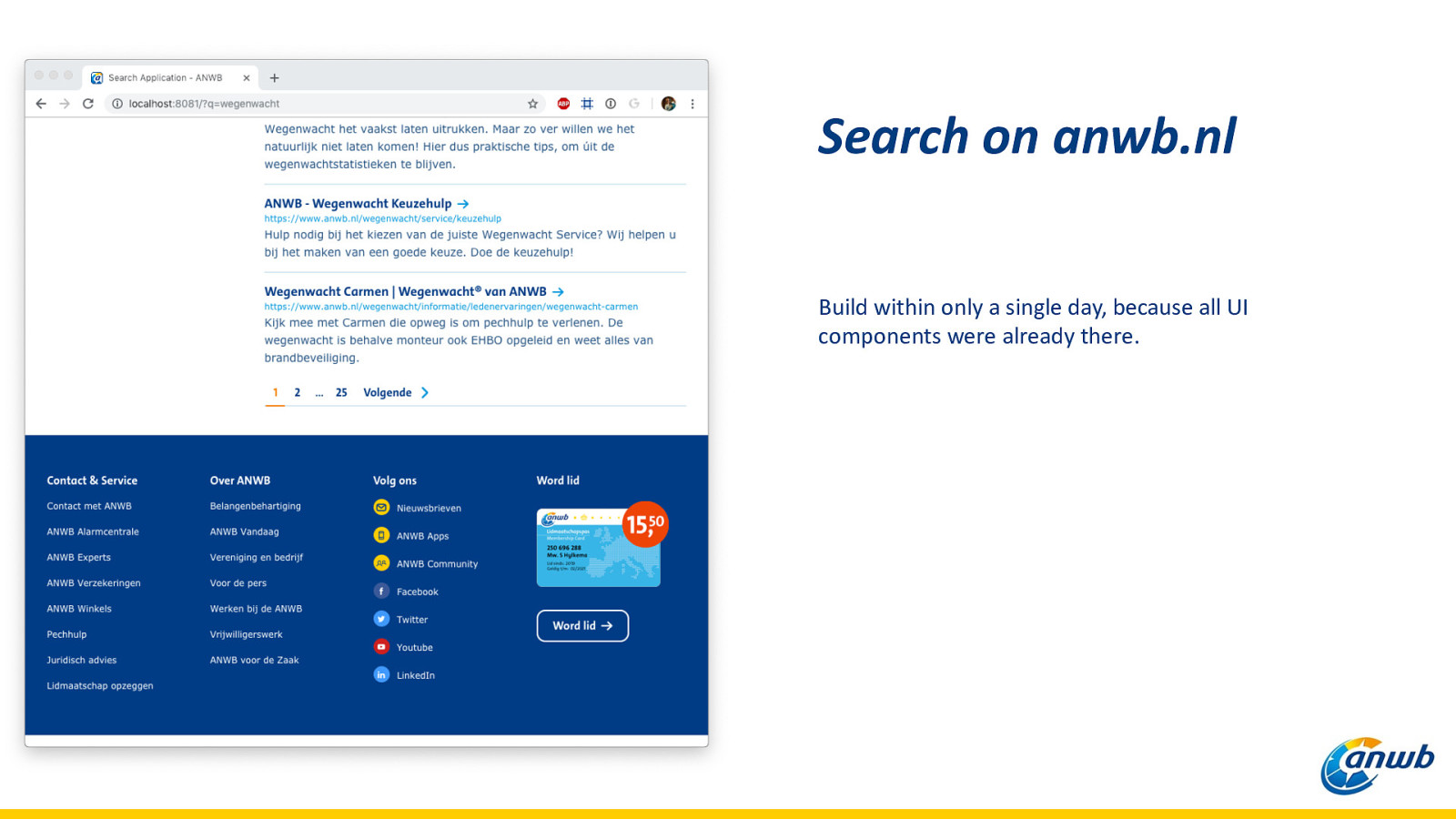
Search on anwb.nl Build within only a single day, because all UI components were already there.
Search on anwb.nl Build within only a single day, because all UI components were already there.
Search on anwb.nl Build within only a single day, because all UI components were already there.
Search on anwb.nl Build within only a single day, because all UI components were already there.
Search on anwb.nl Build within only a single day, because all UI components were already there.
Search on anwb.nl Build within only a single day, because all UI components were already there.
Search on anwb.nl Build within only a single day, because all UI components were already there.
Search on anwb.nl Build within only a single day, because all UI components were already there.
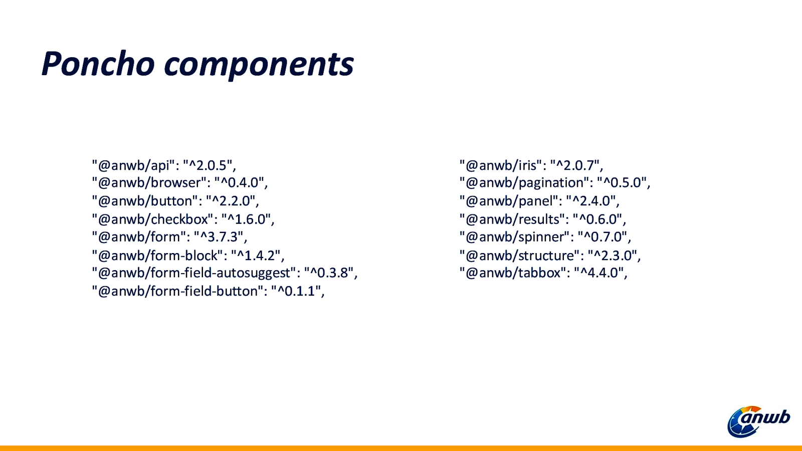
Poncho components “@anwb/api”: “^2.0.5”, “@anwb/browser”: “^0.4.0”, “@anwb/button”: “^2.2.0”, “@anwb/checkbox”: “^1.6.0”, “@anwb/form”: “^3.7.3”, “@anwb/form-block”: “^1.4.2”, “@anwb/form-field-autosuggest”: “^0.3.8”, “@anwb/form-field-button”: “^0.1.1”, “@anwb/iris”: “^2.0.7”, “@anwb/pagination”: “^0.5.0”, “@anwb/panel”: “^2.4.0”, “@anwb/results”: “^0.6.0”, “@anwb/spinner”: “^0.7.0”, “@anwb/structure”: “^2.3.0”, “@anwb/tabbox”: “^4.4.0”,
Our process
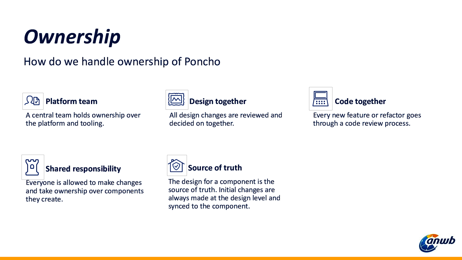
Ownership How do we handle ownership of Poncho Platform team A central team holds ownership over the platform and tooling. Shared responsibility Everyone is allowed to make changes and take ownership over components they create. Design together All design changes are reviewed and decided on together. Source of truth The design for a component is the source of truth. Initial changes are always made at the design level and synced to the component. Code together Every new feature or refactor goes through a code review process.
A design system is a product
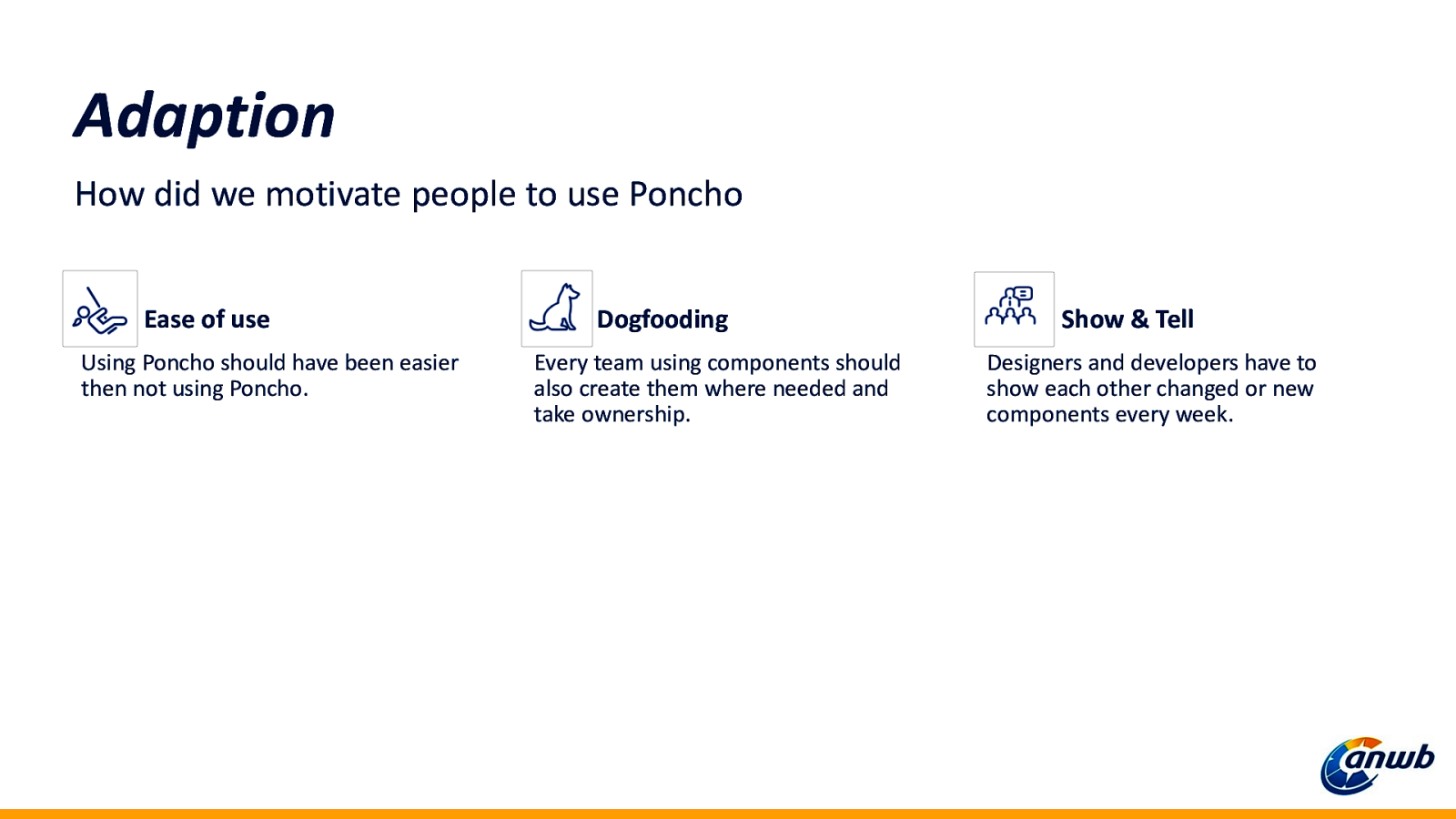
Adaption How did we motivate people to use Poncho Ease of use Using Poncho should have been easier then not using Poncho. Dogfooding Every team using components should also create them where needed and take ownership. Show & Tell Designers and developers have to show each other changed or new components every week.
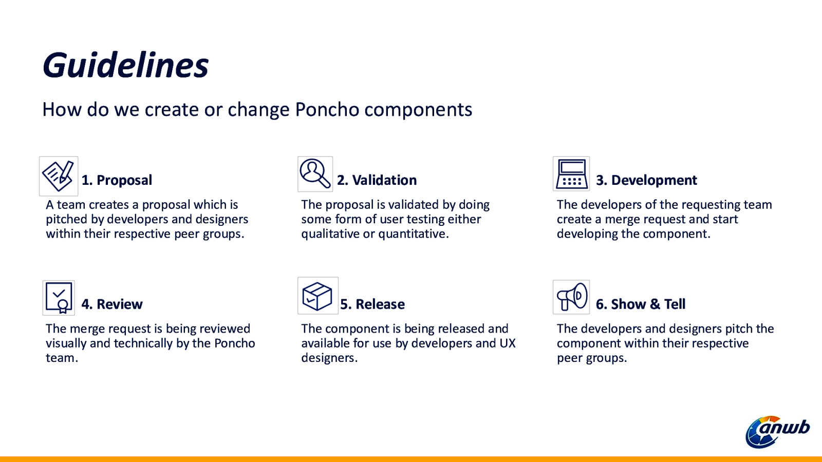
Guidelines How do we create or change Poncho components 1. Proposal A team creates a proposal which is pitched by developers and designers within their respective peer groups. 4. Review The merge request is being reviewed visually and technically by the Poncho team. 2. Validation The proposal is validated by doing some form of user testing either qualitative or quantitative. 5. Release The component is being released and available for use by developers and UX designers. 3. Development The developers of the requesting team create a merge request and start developing the component. 6. Show & Tell The developers and designers pitch the component within their respective peer groups.
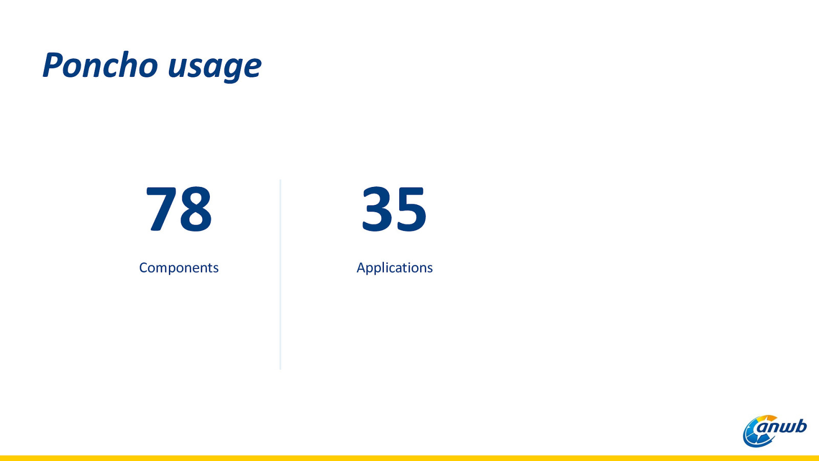
Poncho usage 78 35 Components Applications
Technical choices
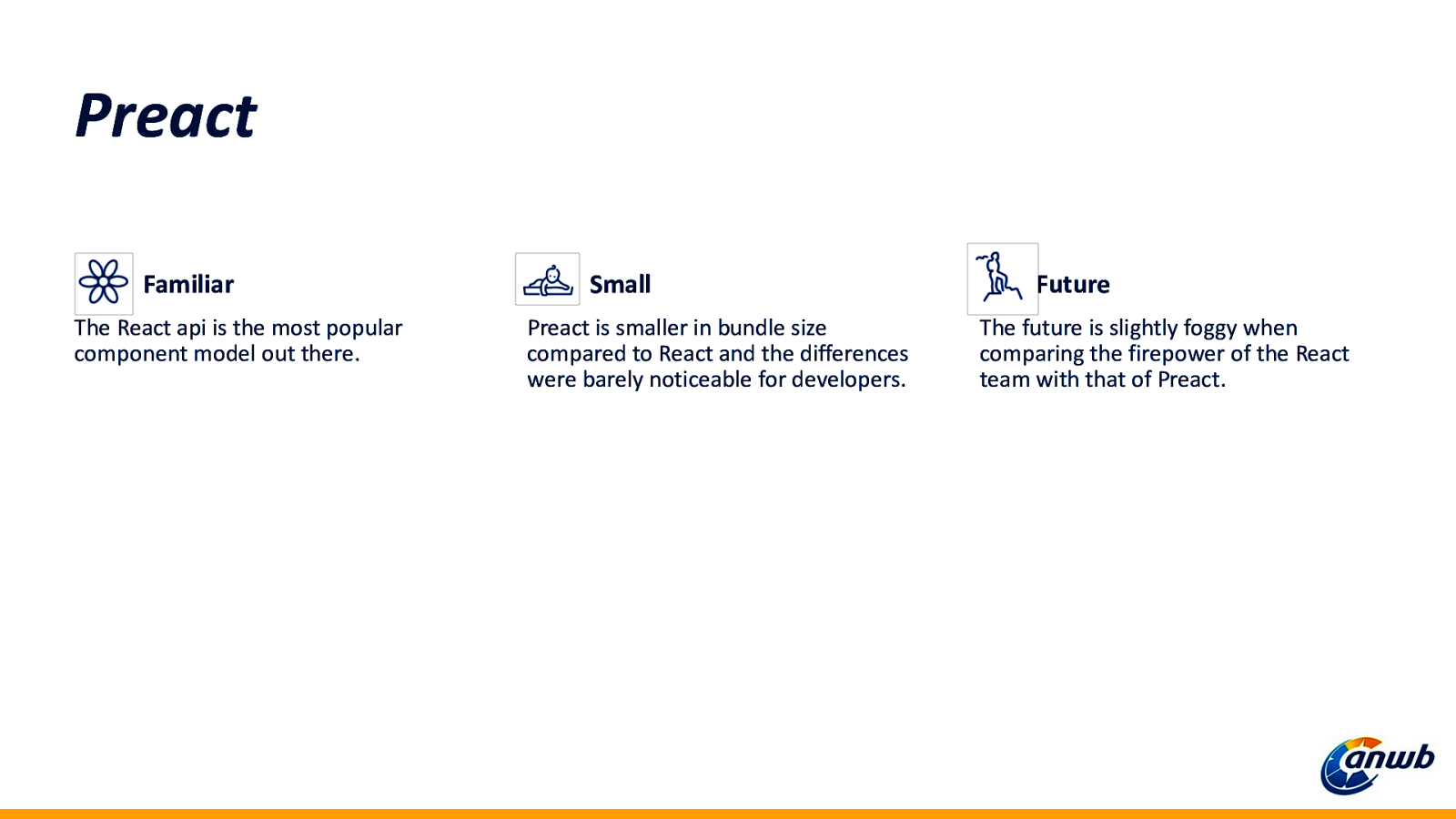
Preact Familiar The React api is the most popular component model out there. Small Preact is smaller in bundle size compared to React and the differences were barely noticeable for developers. Future The future is slightly foggy when comparing the firepower of the React team with that of Preact.
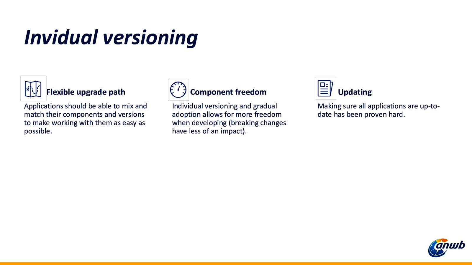
Invidual versioning Flexible upgrade path Component freedom Applications should be able to mix and match their components and versions to make working with them as easy as possible. Individual versioning and gradual adoption allows for more freedom when developing (breaking changes have less of an impact). Updating Making sure all applications are up-todate has been proven hard.
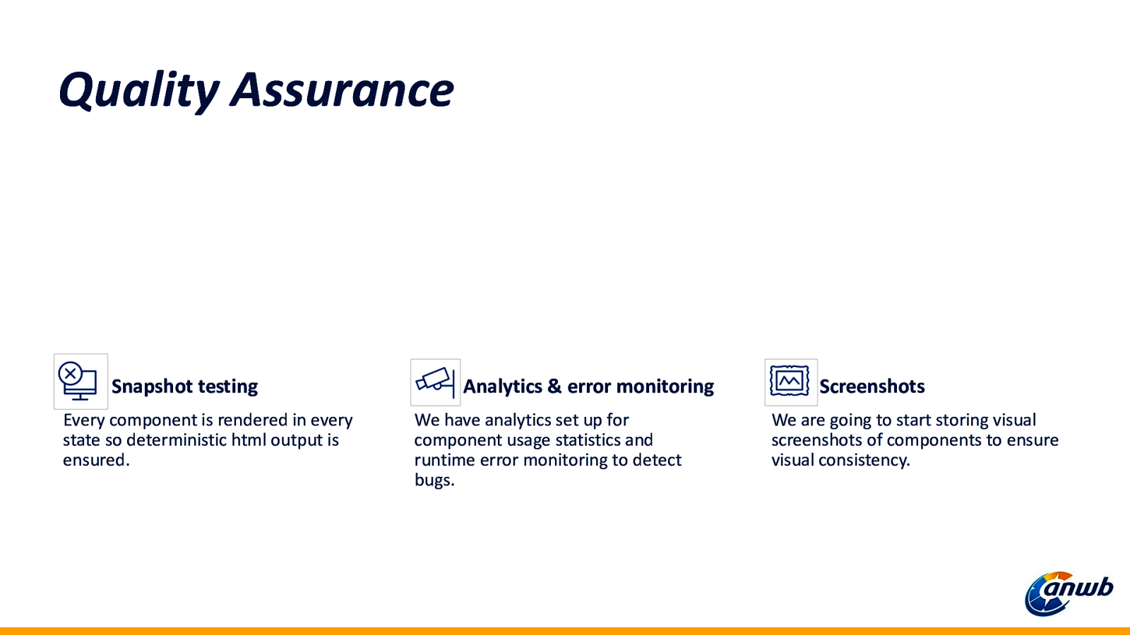
Quality Assurance Snapshot testing Every component is rendered in every state so deterministic html output is ensured. Analytics & error monitoring We have analytics set up for component usage statistics and runtime error monitoring to detect bugs. Screenshots We are going to start storing visual screenshots of components to ensure visual consistency.
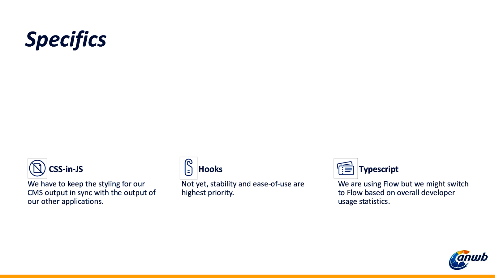
Specifics CSS-in-JS We have to keep the styling for our CMS output in sync with the output of our other applications. Hooks Not yet, stability and ease-of-use are highest priority. Typescript We are using Flow but we might switch to Flow based on overall developer usage statistics.
Thanks! Questions? @bartwaardenburg

Working with multiple teams on multiple applications brings a whole new set of challenges to software development. How do you share code, how do you keep code consistent, how do your prevent breaking other peoples applications… We could keep rambling on. At the ANWB we are currently tackling these problems while building a design system using (p)react. In this presentation we will share our learnings, challenges and progress moving our front-end applications to a new shared component architecture.


 for free. You
can too.
for free. You
can too.