
A presentation at 200OK Conf by Bryan Robinson
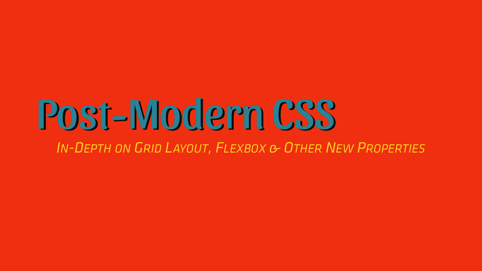
Post-Modern CSS IN-DEPTH ON GRID LAYOUT, FLEXBOX & OTHER NEW PROPERTIES
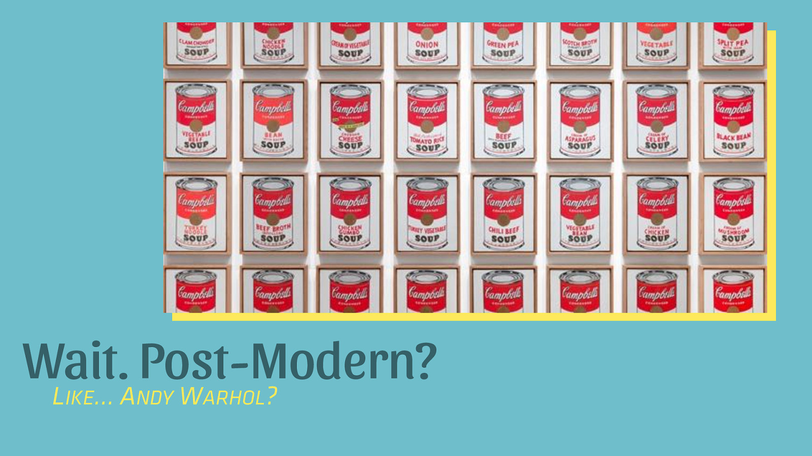
Wait. Post-Modern? L …A W ? IKE NDY ARHOL
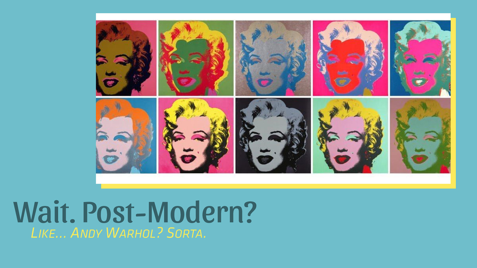
Wait. Post-Modern? L …A W ?S . IKE NDY ARHOL ORTA
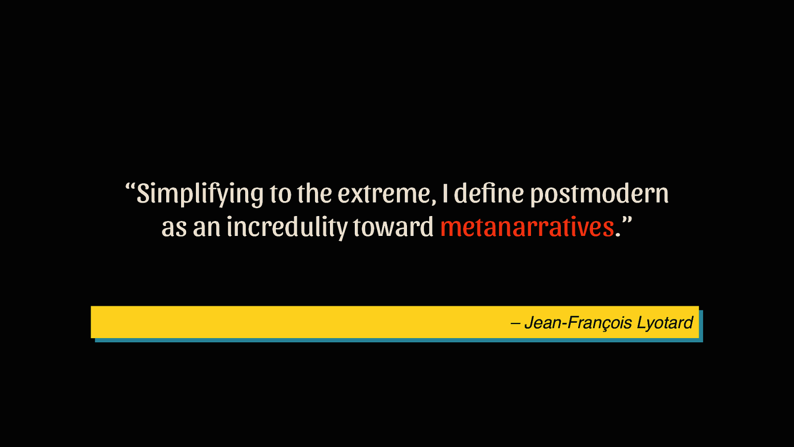
“Simplifying to the extreme, I define postmodern as an incredulity toward metanarratives.” – Jean-François Lyotard
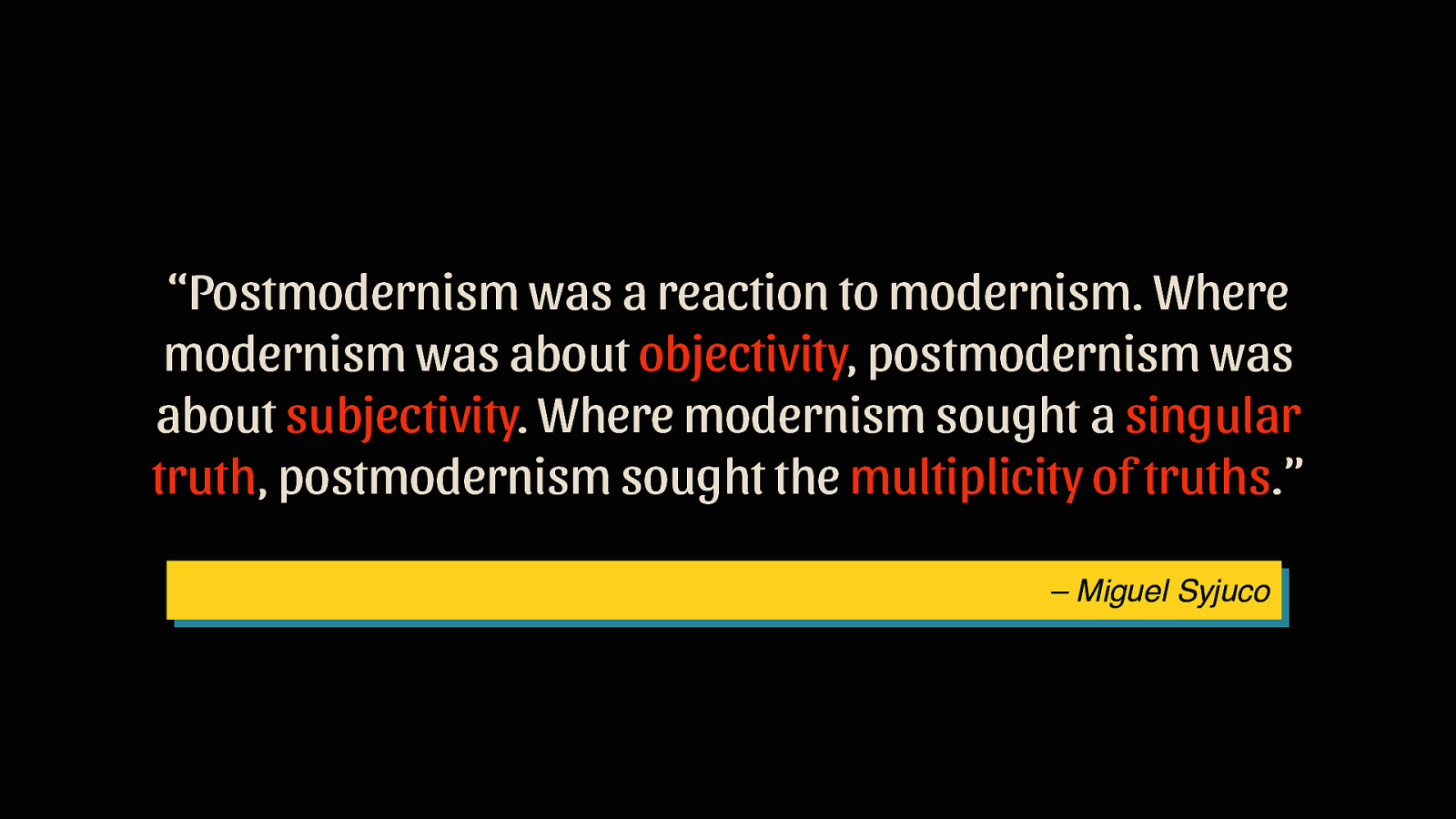
“Postmodernism was a reaction to modernism. Where modernism was about objectivity, postmodernism was about subjectivity. Where modernism sought a singular truth, postmodernism sought the multiplicity of truths.” – Miguel Syjuco
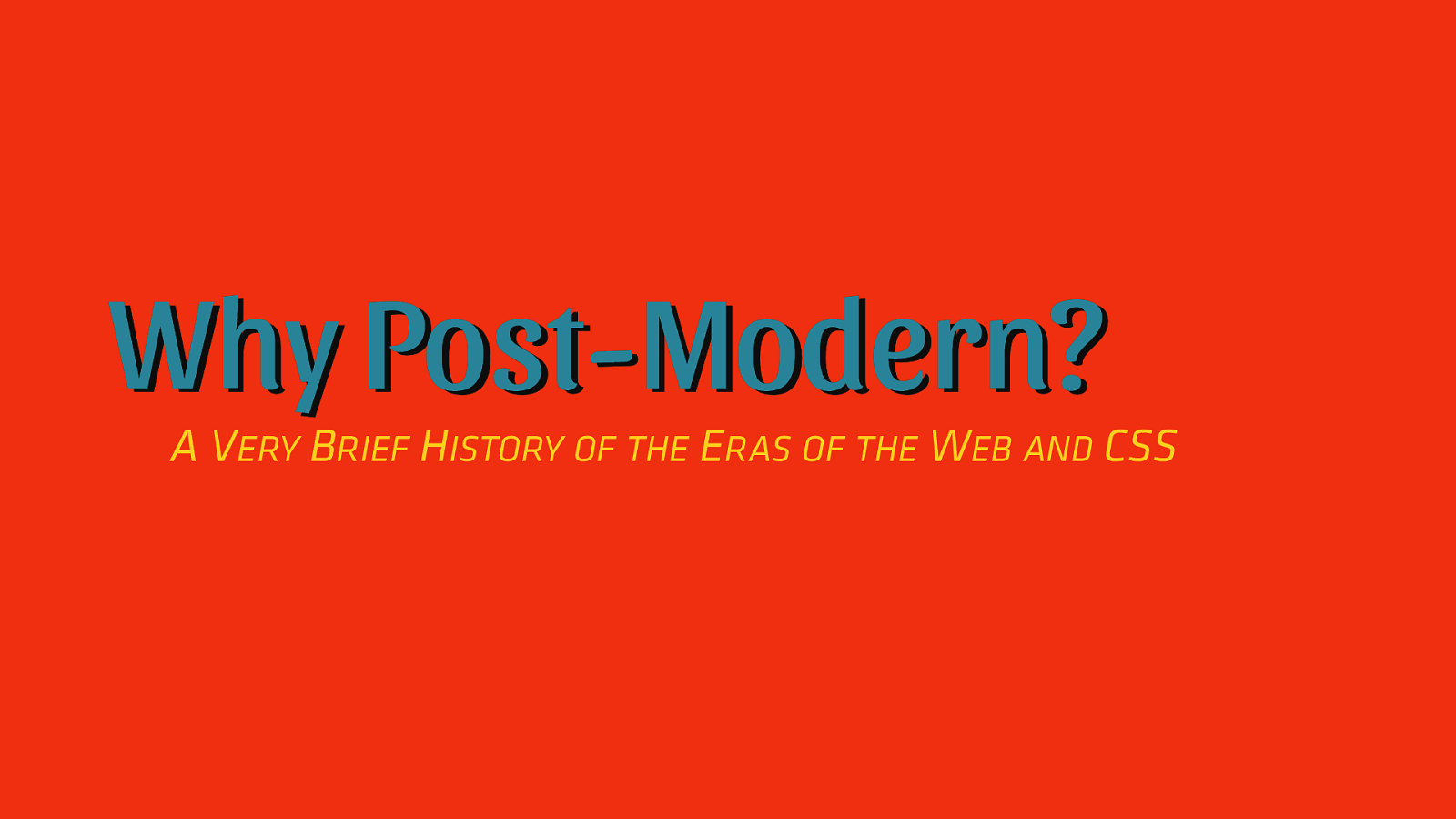
Why Post-Modern? A VERY BRIEF HISTORY OF THE ERAS OF THE WEB AND CSS
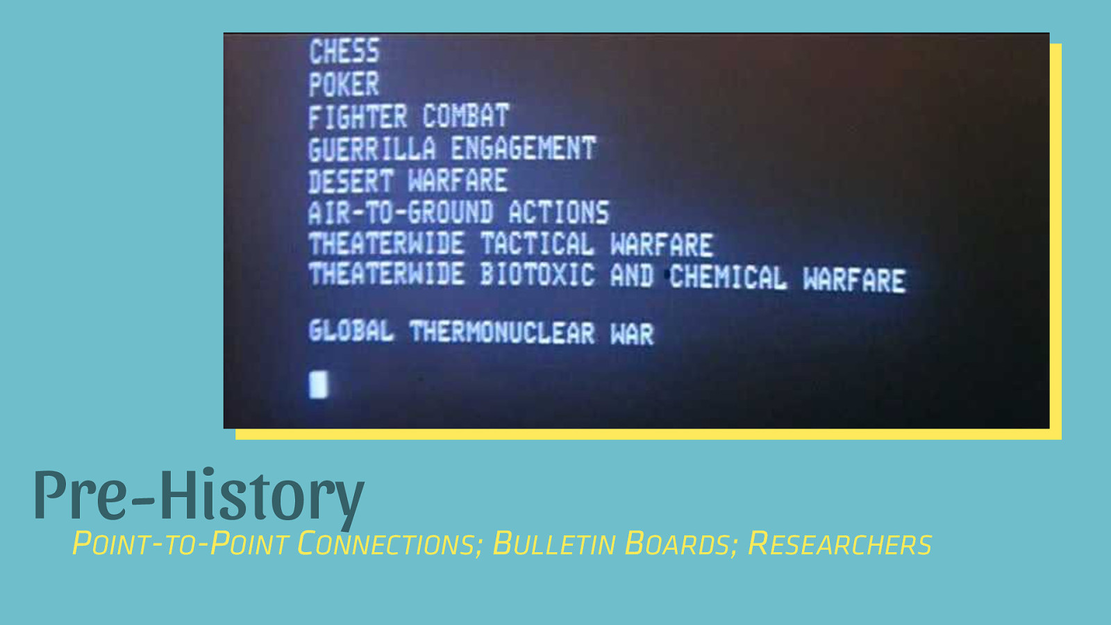
Pre-History P - -P C OINT TO OINT ONNECTIONS; BULLETIN BOARDS; RESEARCHERS
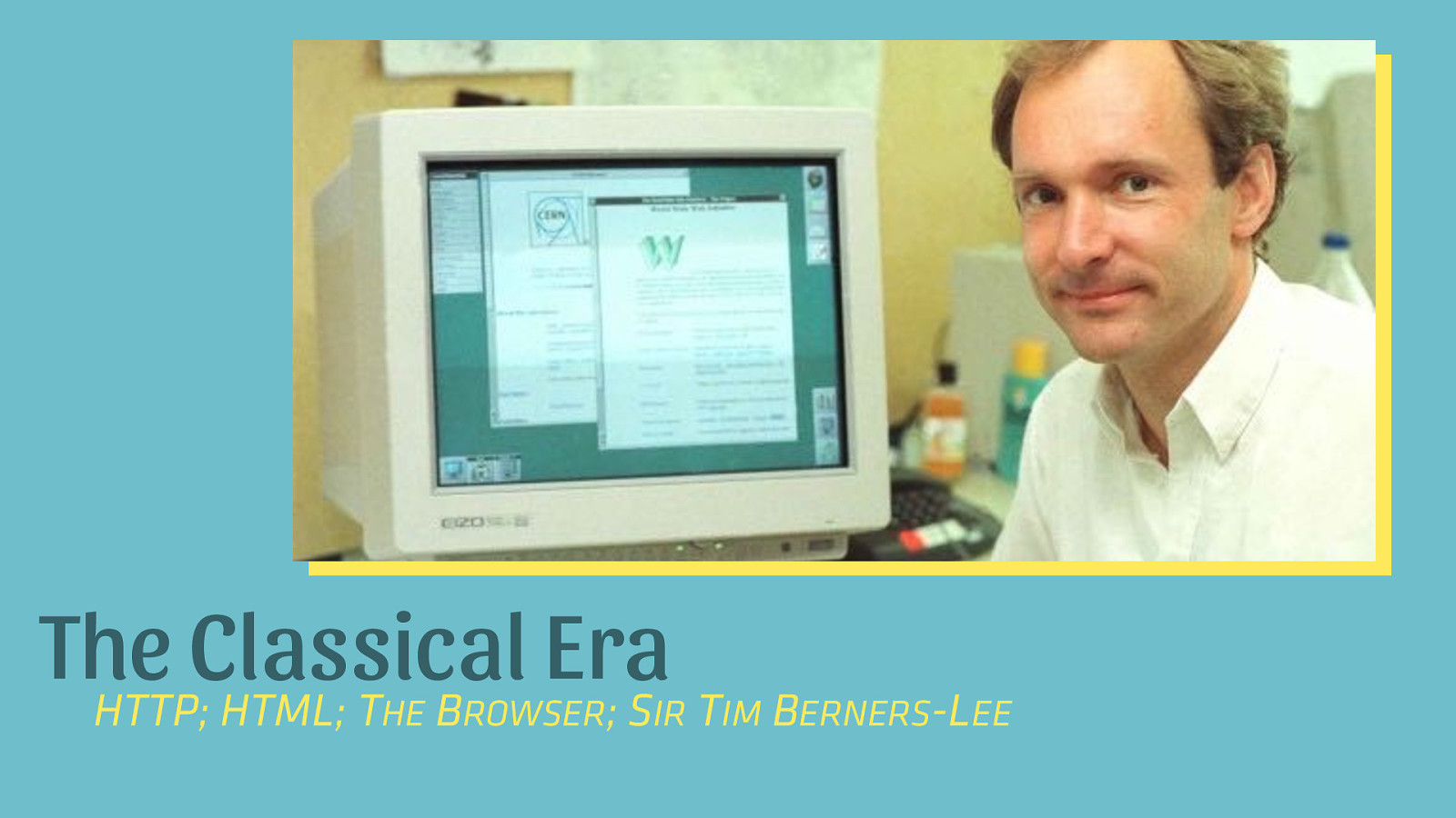
The Classical Era HTTP; HTML; T B ;S T HE ROWSER IR IM BERNERS-LEE
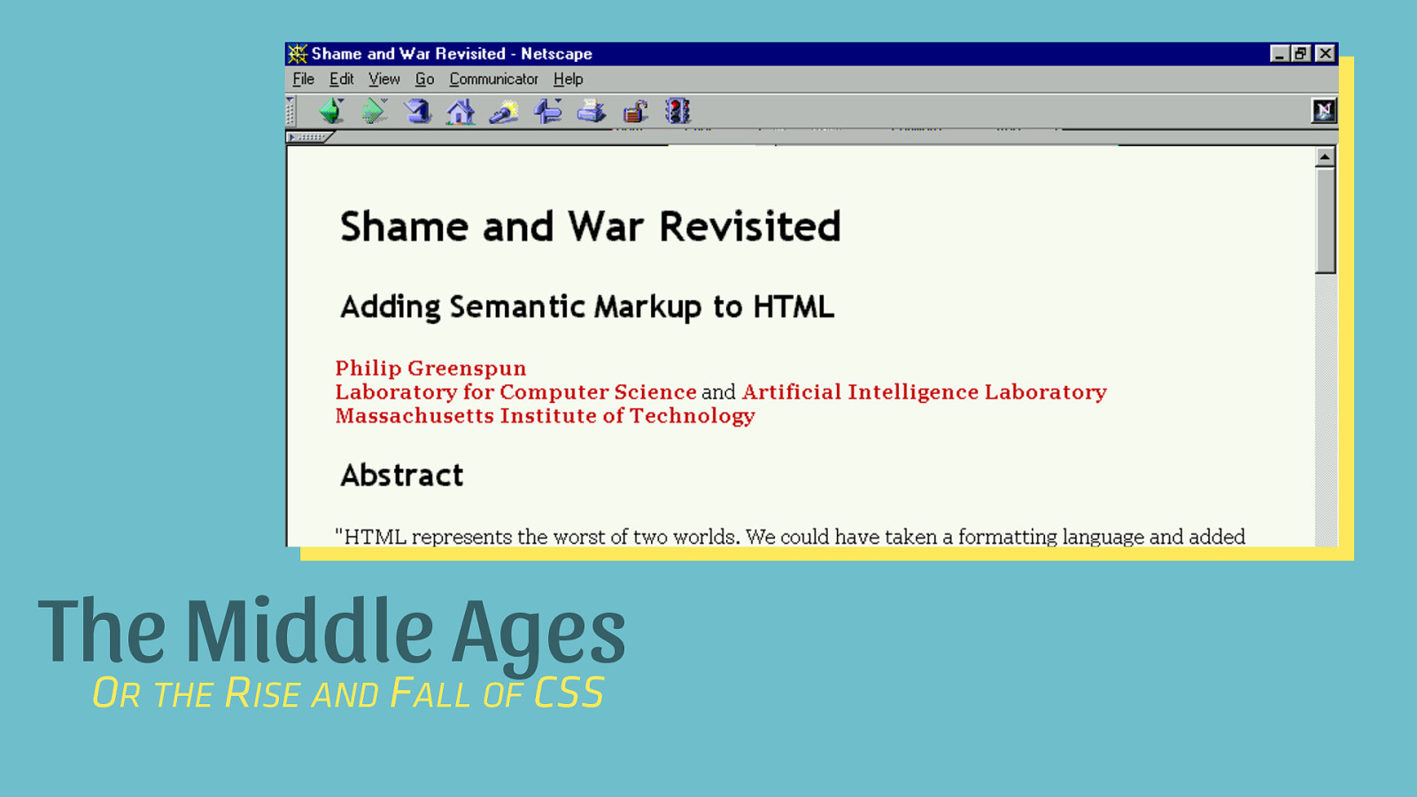
The Middle Ages O R F CSS R THE ISE AND ALL OF
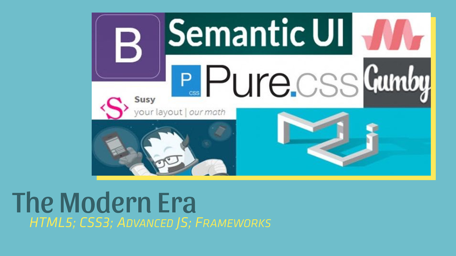
The Modern Era HTML5; CSS3; A JS; F DVANCED RAMEWORKS
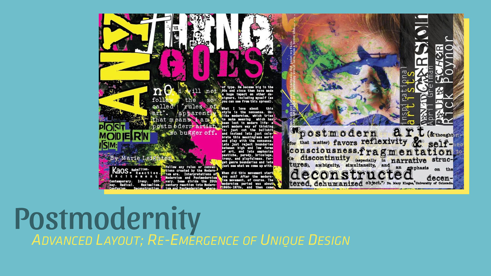
Postmodernity A L ; R -E DVANCED AYOUT E MERGENCE OF UNIQUE DESIGN
“Postmodernism was a reaction to modernism. Where modernism was about objectivity, postmodernism was about subjectivity. Where modernism sought a singular truth, postmodernism sought the multiplicity of truths.” – Miguel Syjuco
Our Objectivism
SOURCE: HTTP://ADVENTUREGA.ME/BOOTSTRAP/
“Simplifying to the extreme, I define postmodern as an incredulity toward metanarratives.” – Jean-François Lyotard
Our Metanarrative
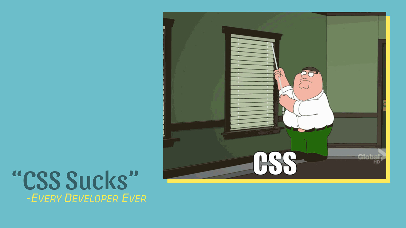
“CSS Sucks” -E D E VERY EVELOPER VER
The Rise and Fall of CSS THE BATTLE OVER STYLE SHEETS AND IMPLEMENTATION
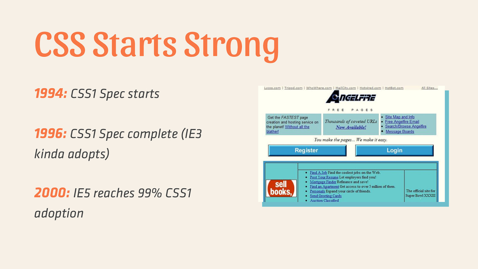
CSS Starts Strong 1994: CSS1 Spec starts 1996: CSS1 Spec complete (IE3 kinda adopts) 2000: IE5 reaches 99% CSS1 adoption
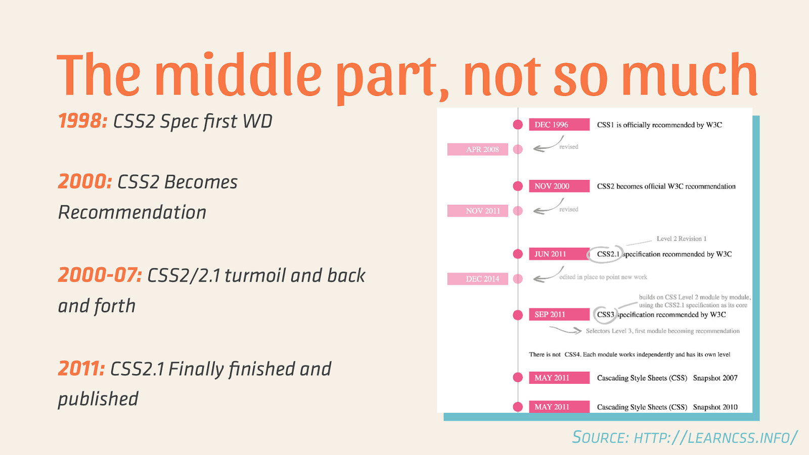
The middle part, not so much 1998: CSS2 Spec first WD 2000: CSS2 Becomes Recommendation 2000-07: CSS2/2.1 turmoil and back and forth 2011: CSS2.1 Finally finished and published SOURCE: HTTP://LEARNCSS.INFO/
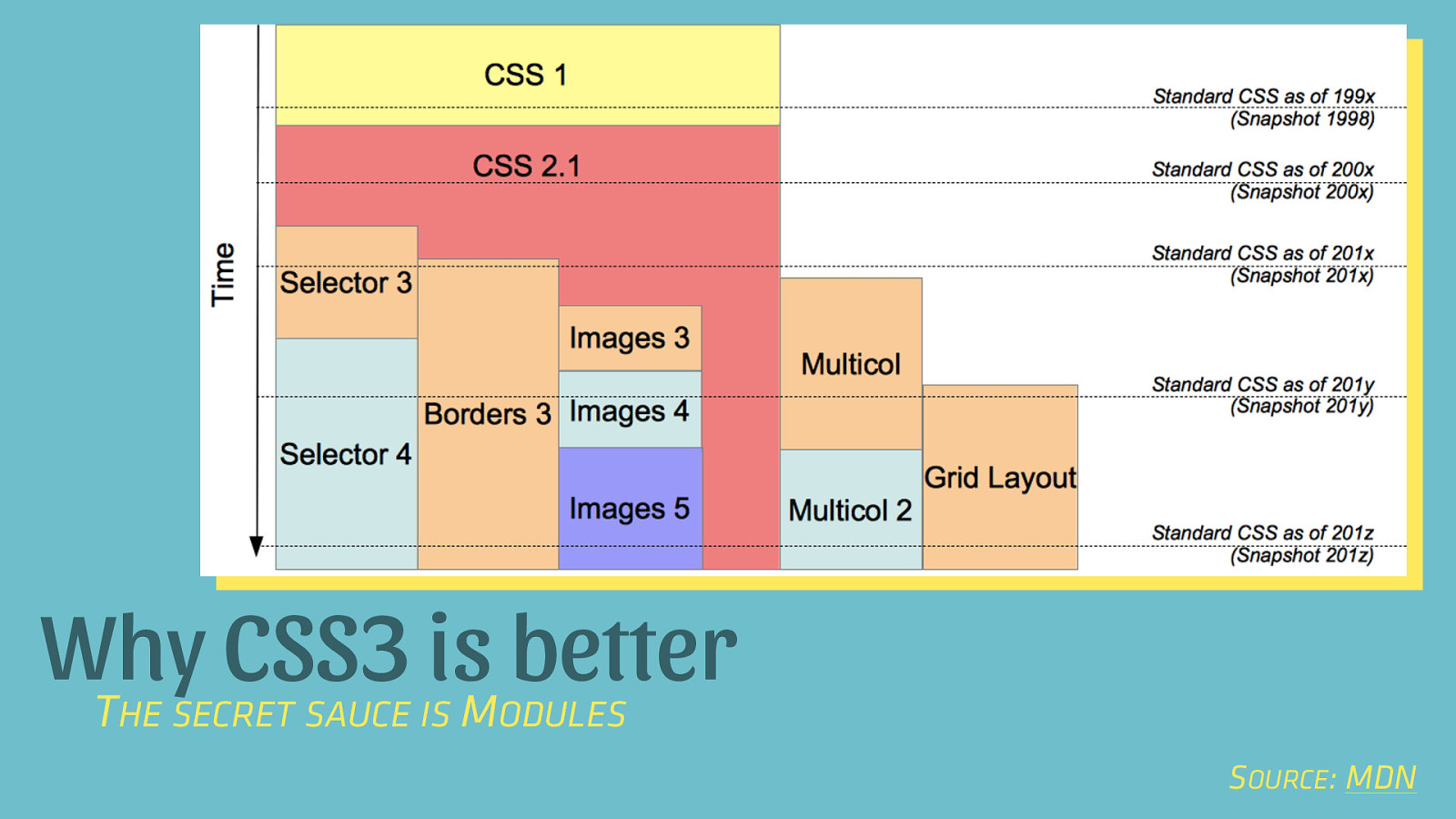
Why CSS3 is better T M HE SECRET SAUCE IS ODULES SOURCE: MDN
Further Reading • • The CSS Saga The Evolution of CSS
The New Hotness TODAY’S GOAL: ADOPT ONE OF THESE PROPERTIES
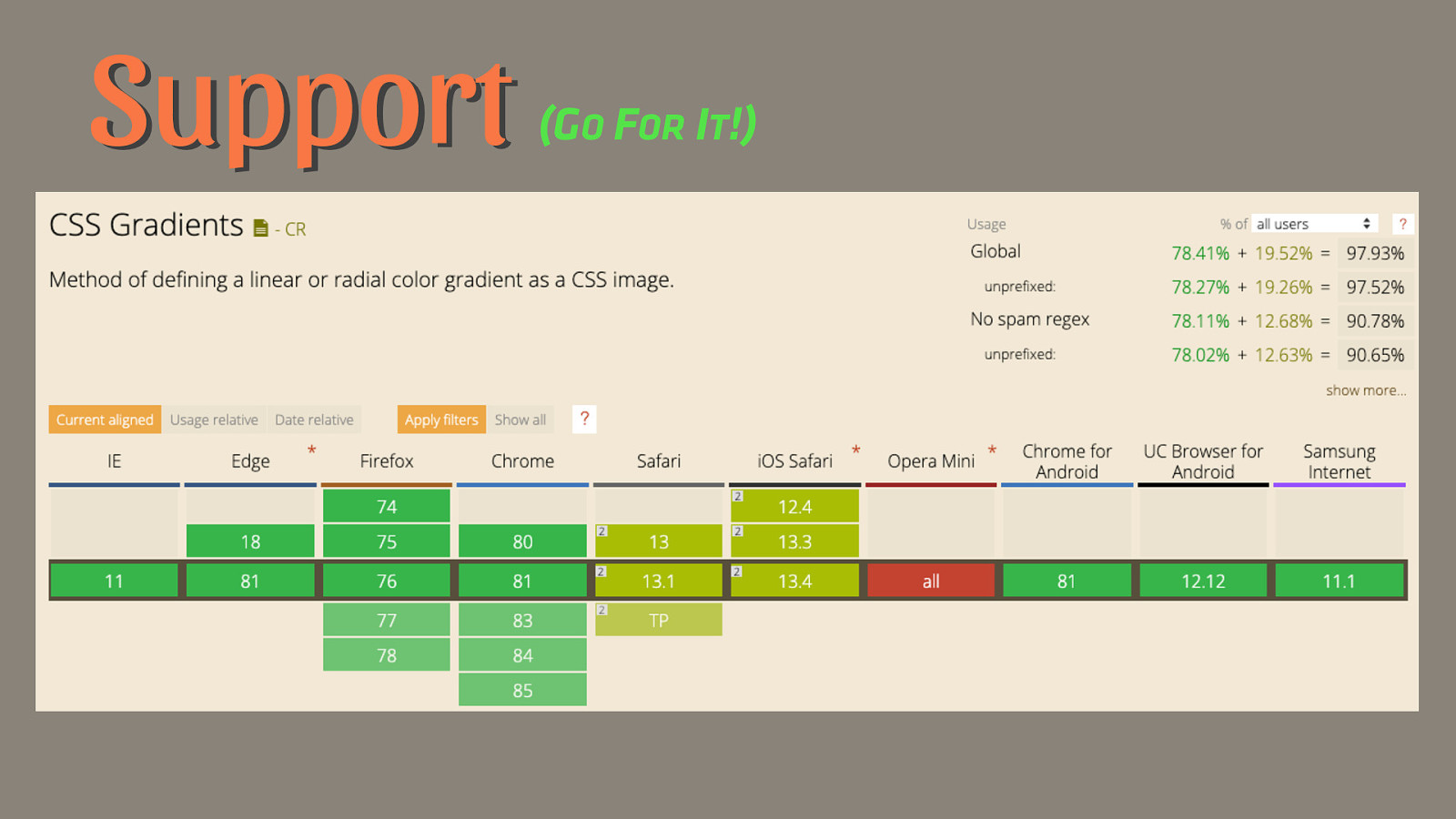
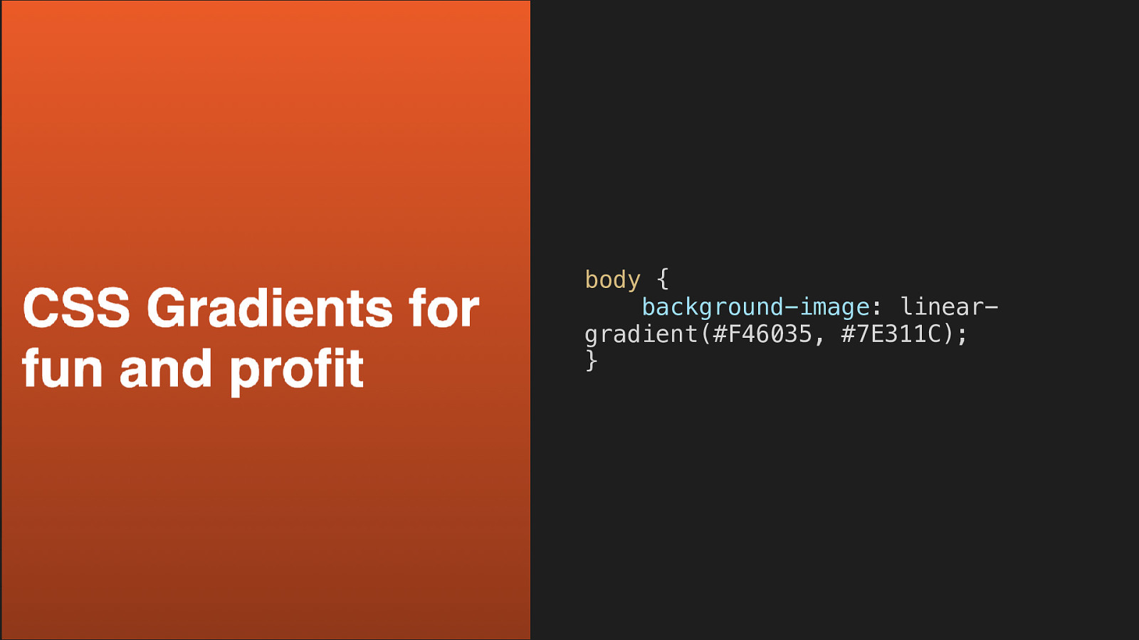
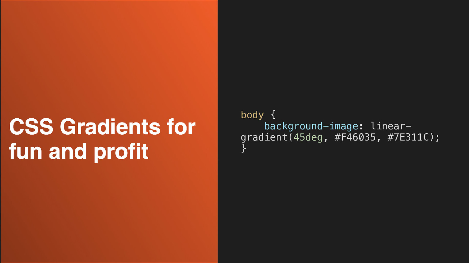
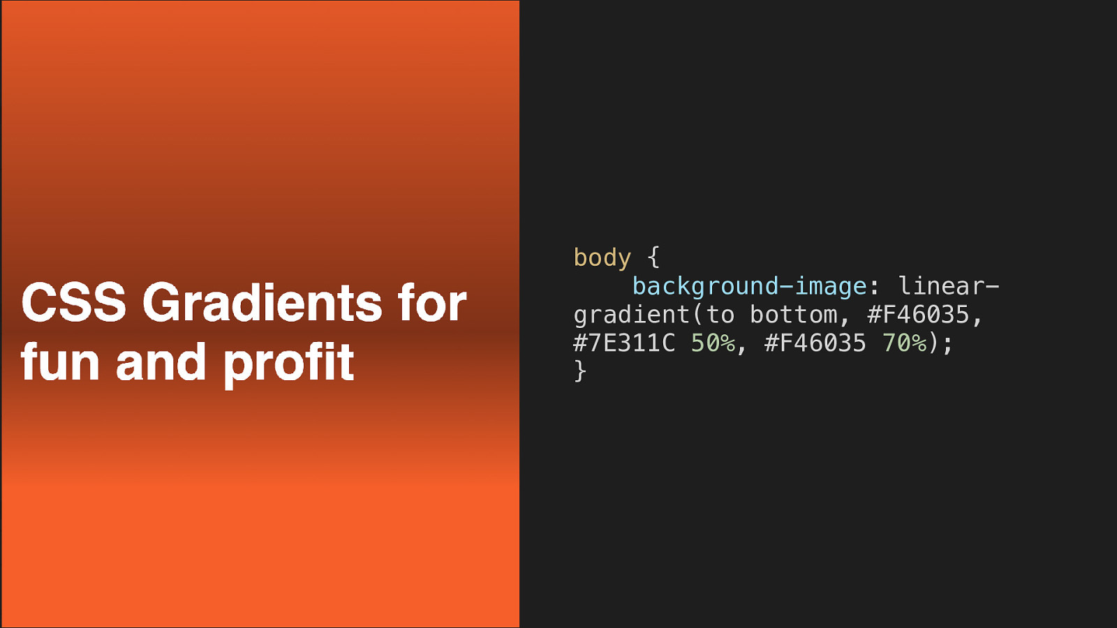
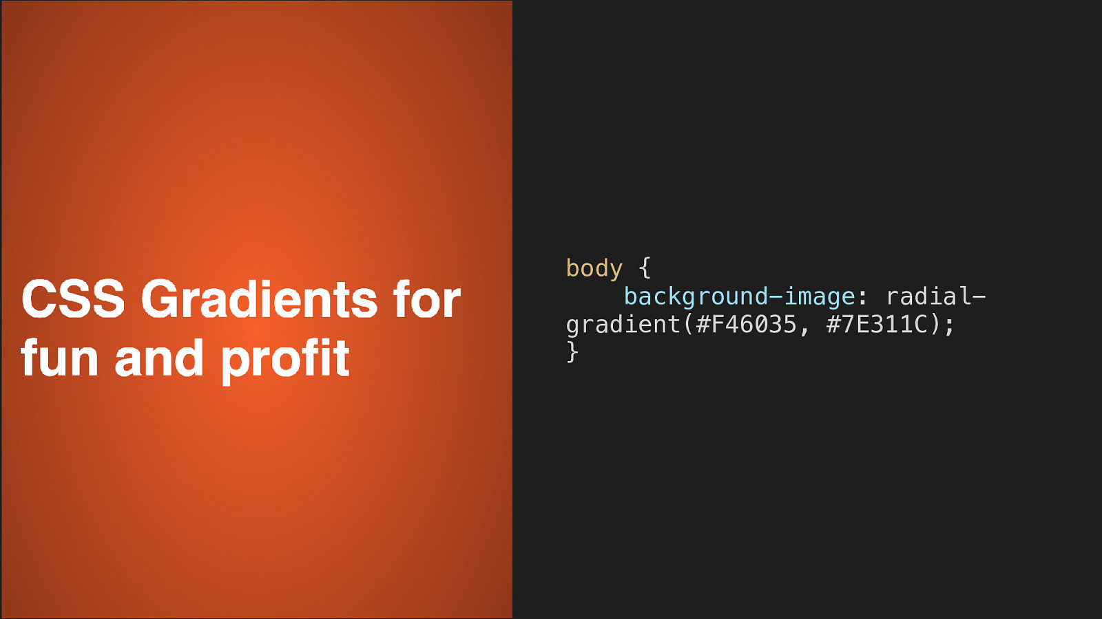
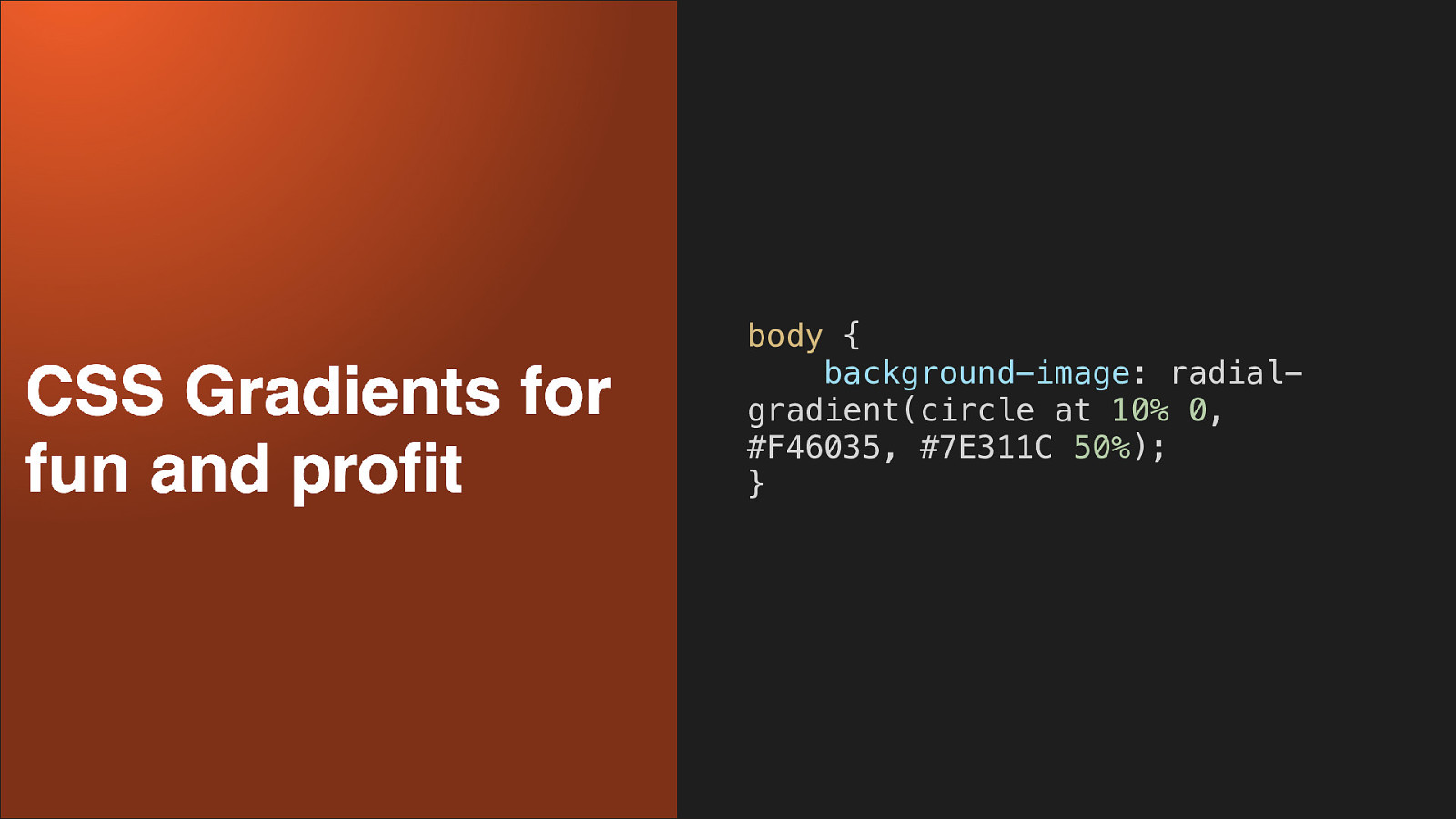
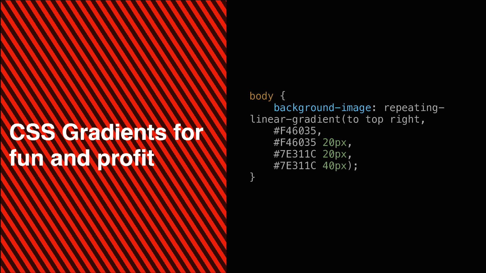
CSS Gradients WHY USE IMAGES WHEN CSS CAN DO AMAZING THINGS?
Support (GO FOR IT!)
body { background-image: lineargradient(#F46035, #7E311C); }
body { background-image: lineargradient(45deg, #F46035, #7E311C); }
body { background-image: lineargradient(to bottom, #F46035, #7E311C 50%, #F46035 70%); }
body { background-image: radialgradient(#F46035, #7E311C); }
body { background-image: radialgradient(circle at 10% 0, #F46035, #7E311C 50%); }
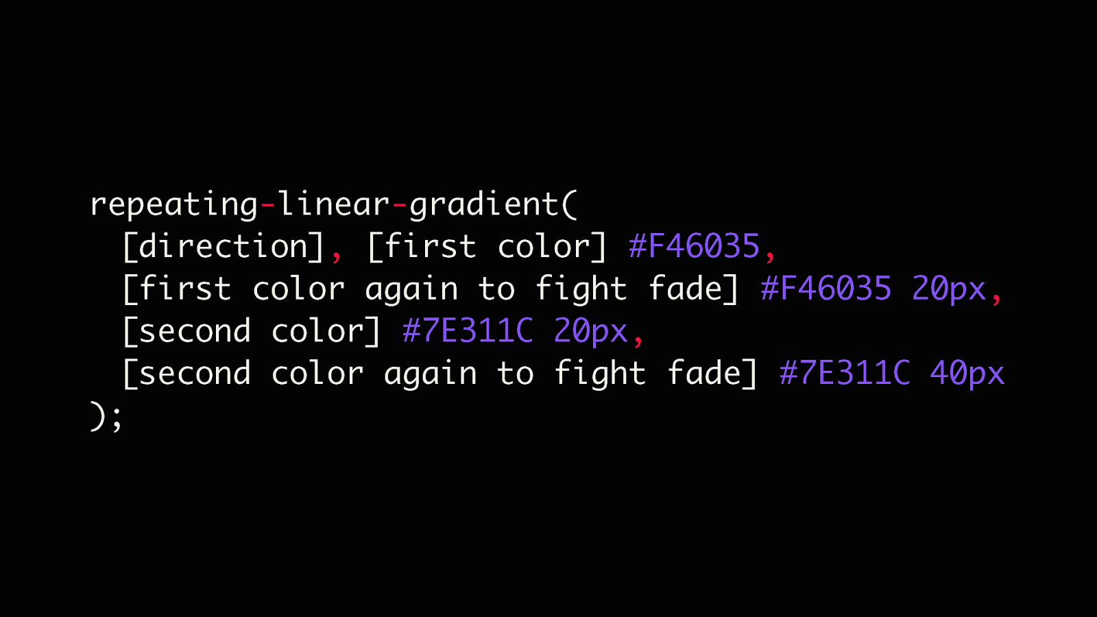
body { background-image: repeatinglinear-gradient(to top right, #F46035, #F46035 20px, #7E311C 20px, #7E311C 40px); }
repeating-linear-gradient( [direction], [first color] #F46035, [first color again to fight fade] #F46035 20px, [second color] #7E311C 20px, [second color again to fight fade] #7E311C 40px );
Flexbox TRULY RESPONSIVE UNI-DIRECTIONAL LAYOUT
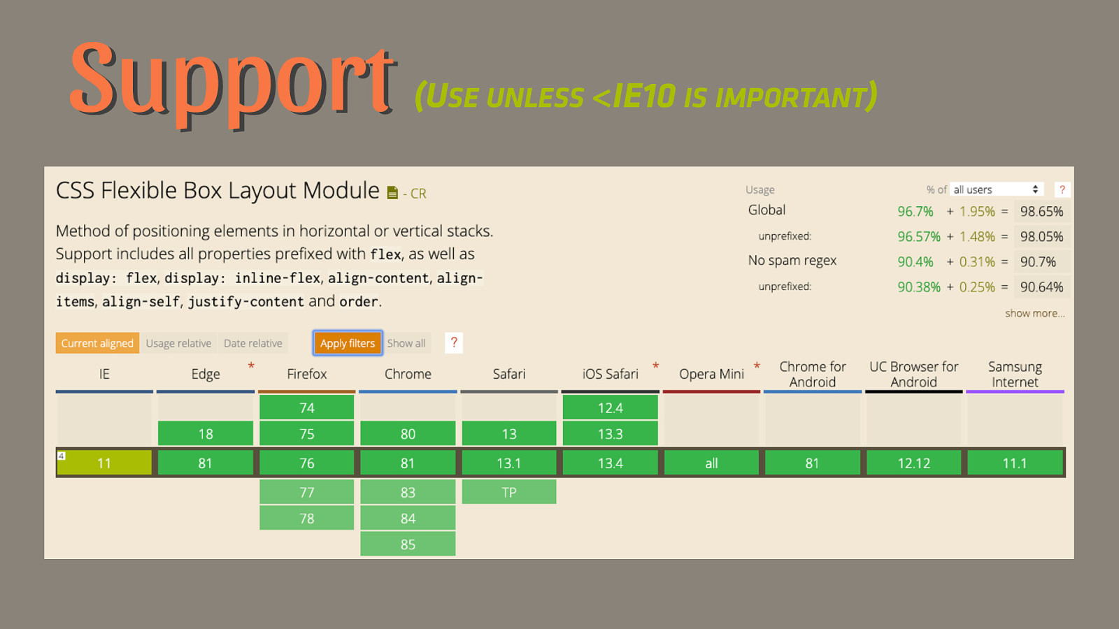
Support (USE UNLESS <IE10 IS IMPORTANT)
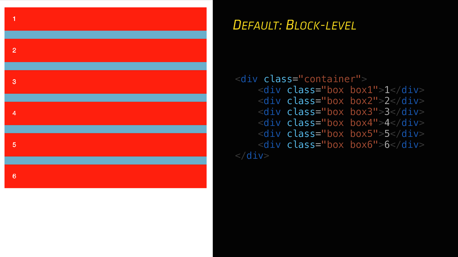
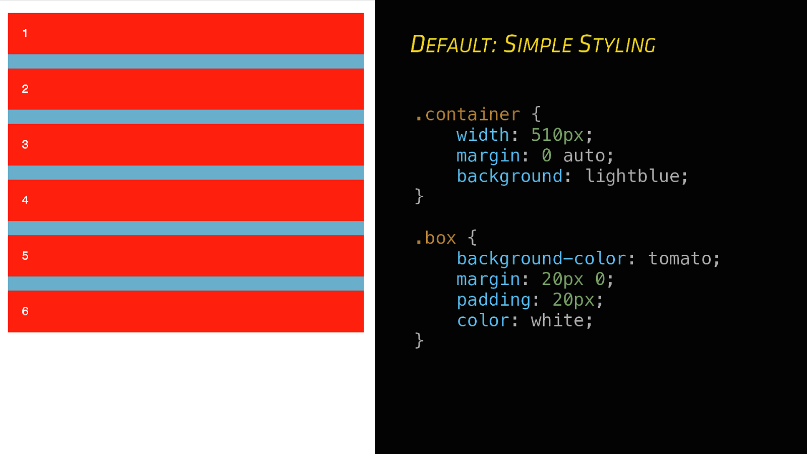
DEFAULT: BLOCK-LEVEL
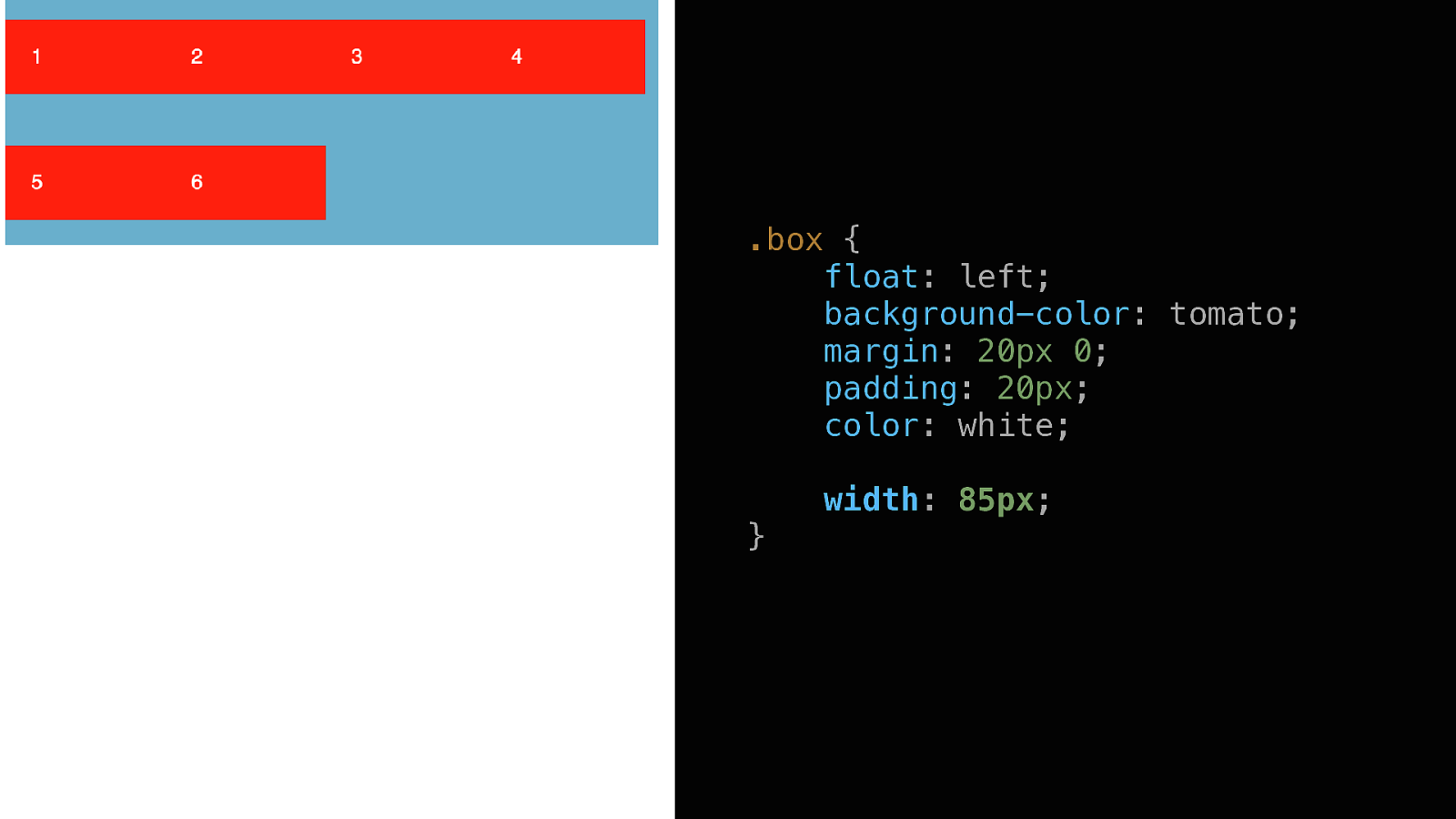
<div class=”container”> <div class=”box box1”>1</div> <div class=”box box2”>2</div> <div class=”box box3”>3</div> <div class=”box box4”>4</div> <div class=”box box5”>5</div> <div class=”box box6”>6</div> </div>DEFAULT: SIMPLE STYLING .container { width: 510px; margin: 0 auto; background: lightblue; } .box { background-color: tomato; margin: 20px 0; padding: 20px; color: white; }
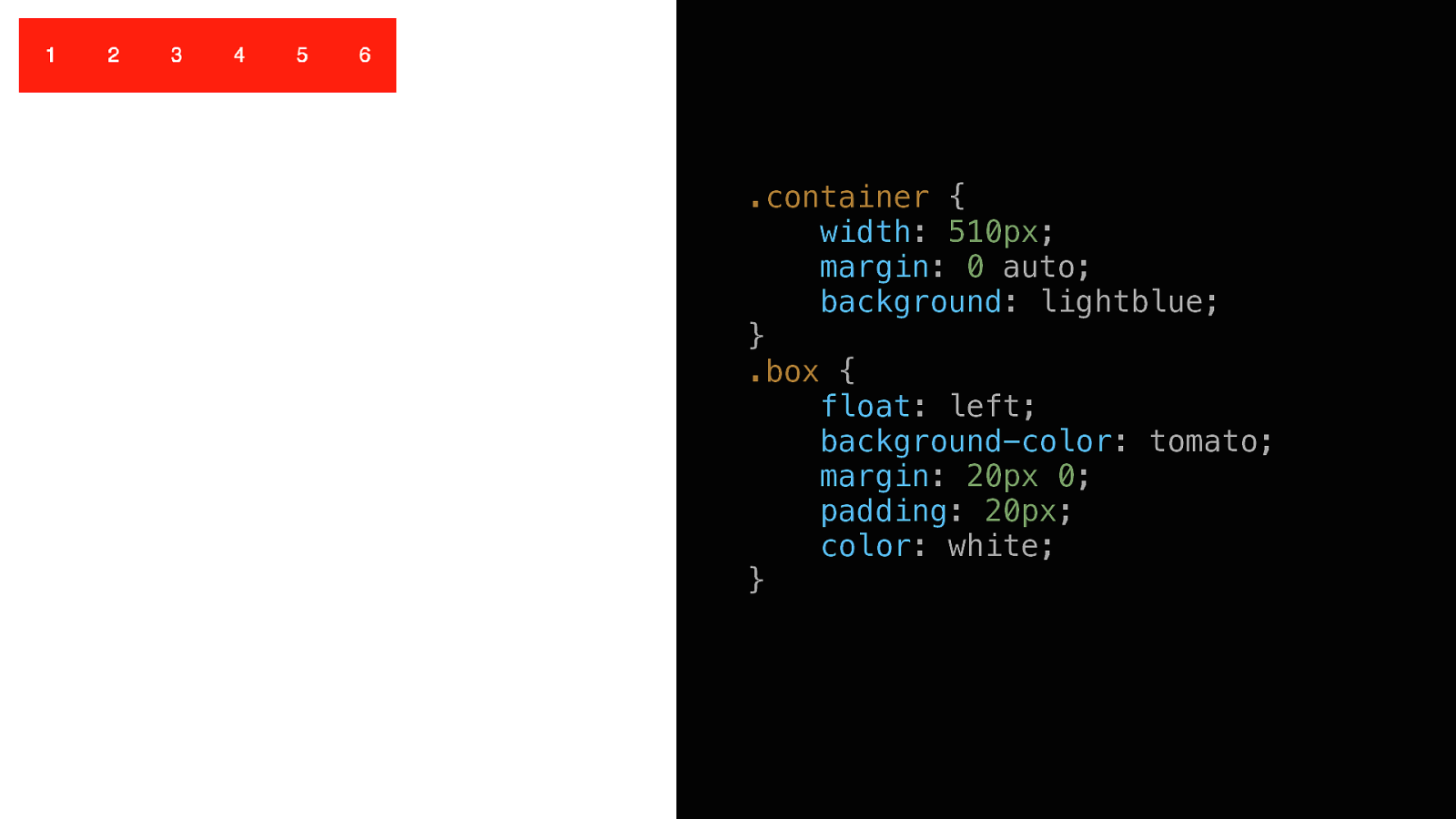
.container { width: 510px; margin: 0 auto; background: lightblue; } .box { float: left; background-color: tomato; margin: 20px 0; padding: 20px; color: white; }
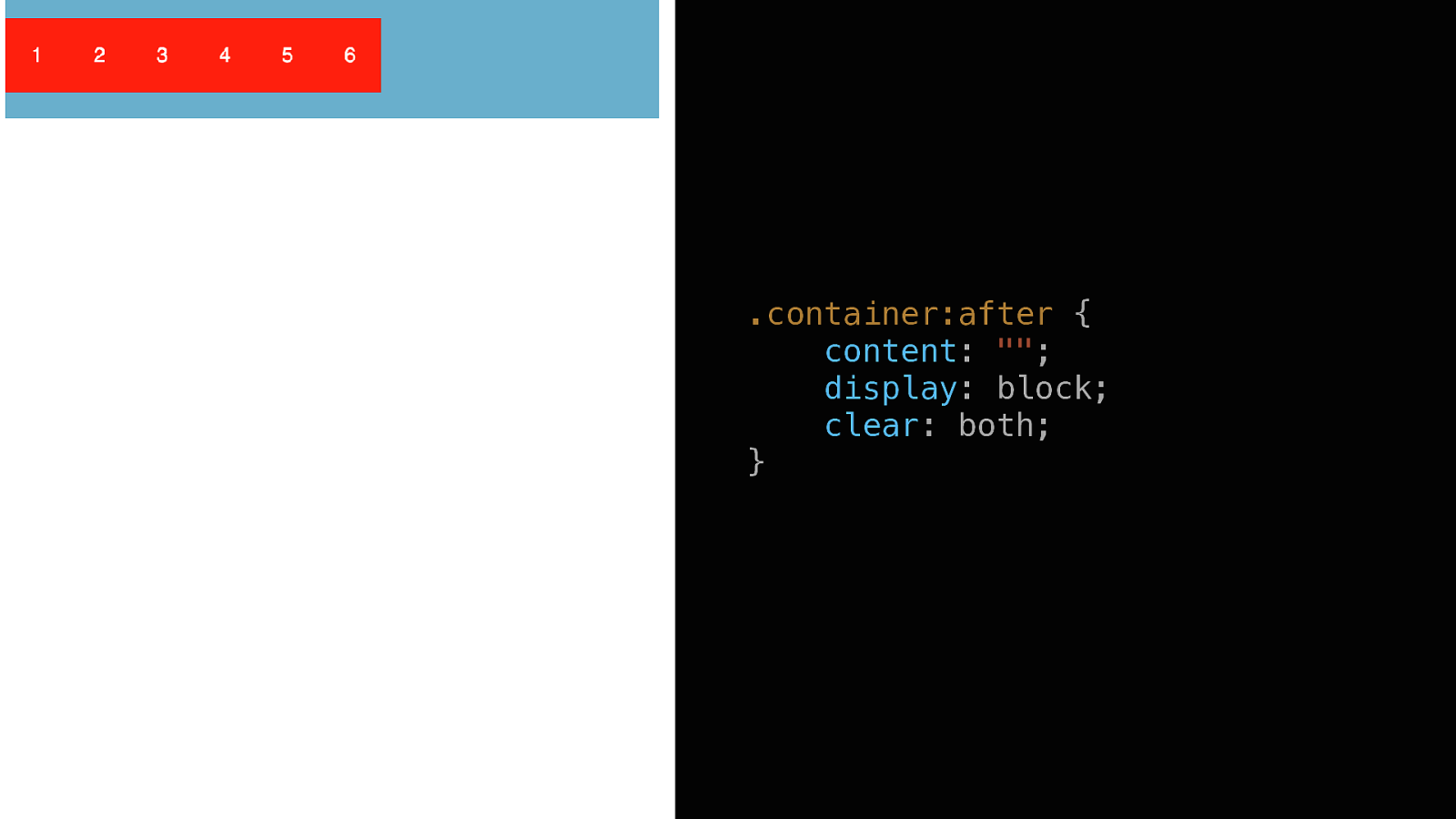
.container:after { content: “”; display: block; clear: both; }
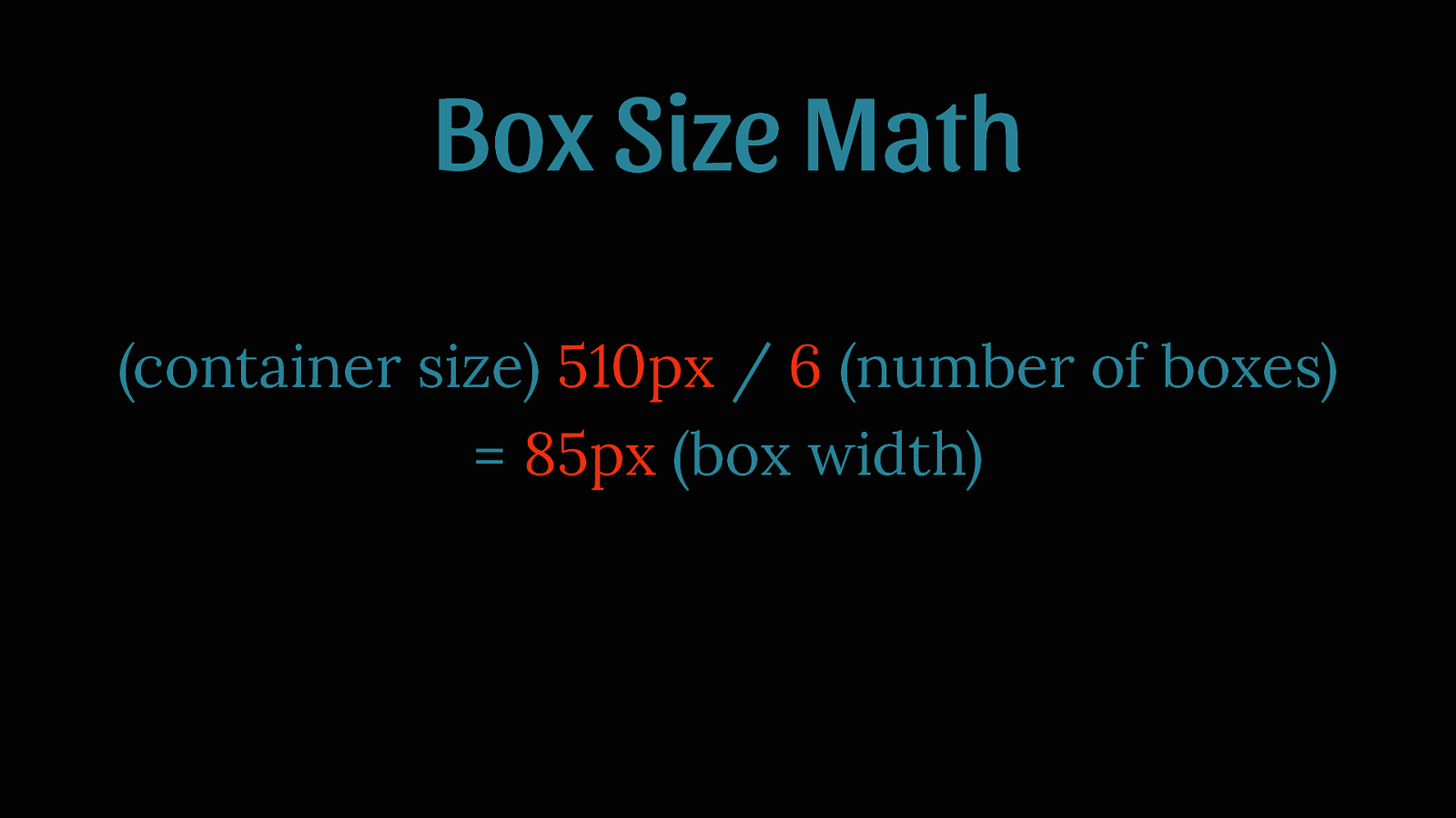
Box Size Math (container size) 510px / 6 (number of boxes) = 85px (box width)
.box { float: left; background-color: tomato; margin: 20px 0; padding: 20px; color: white; width: 85px; }
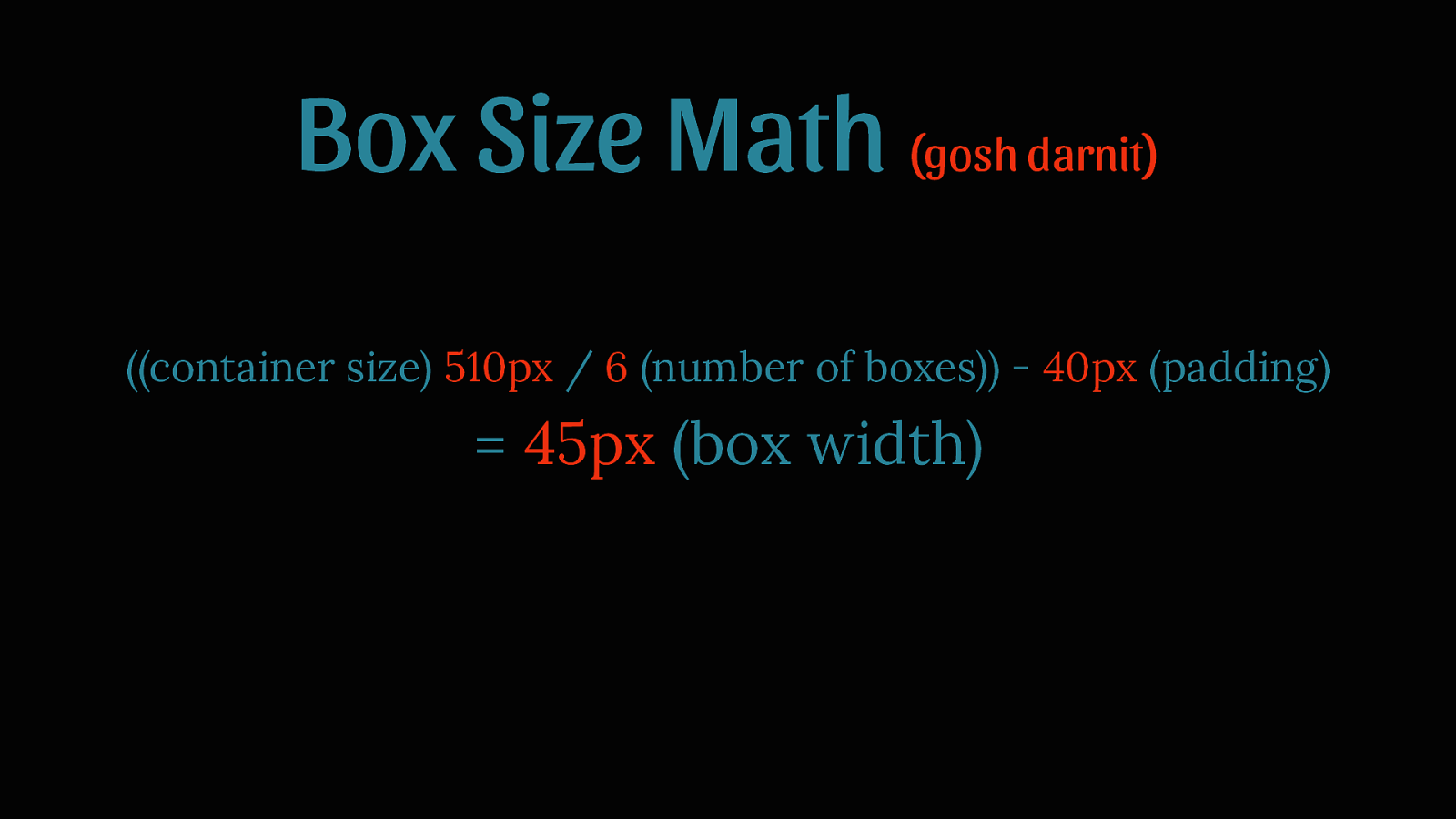
Box Size Math (gosh darnit) ((container size) 510px / 6 (number of boxes)) - 40px (padding) = 45px (box width)
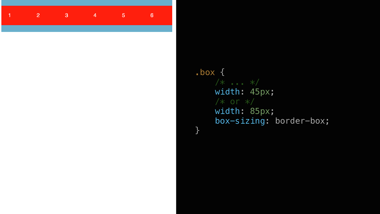
.box { /* … / width: 45px; / or */ width: 85px; box-sizing: border-box; }
This is why we use frameworks
This is why Flex was created
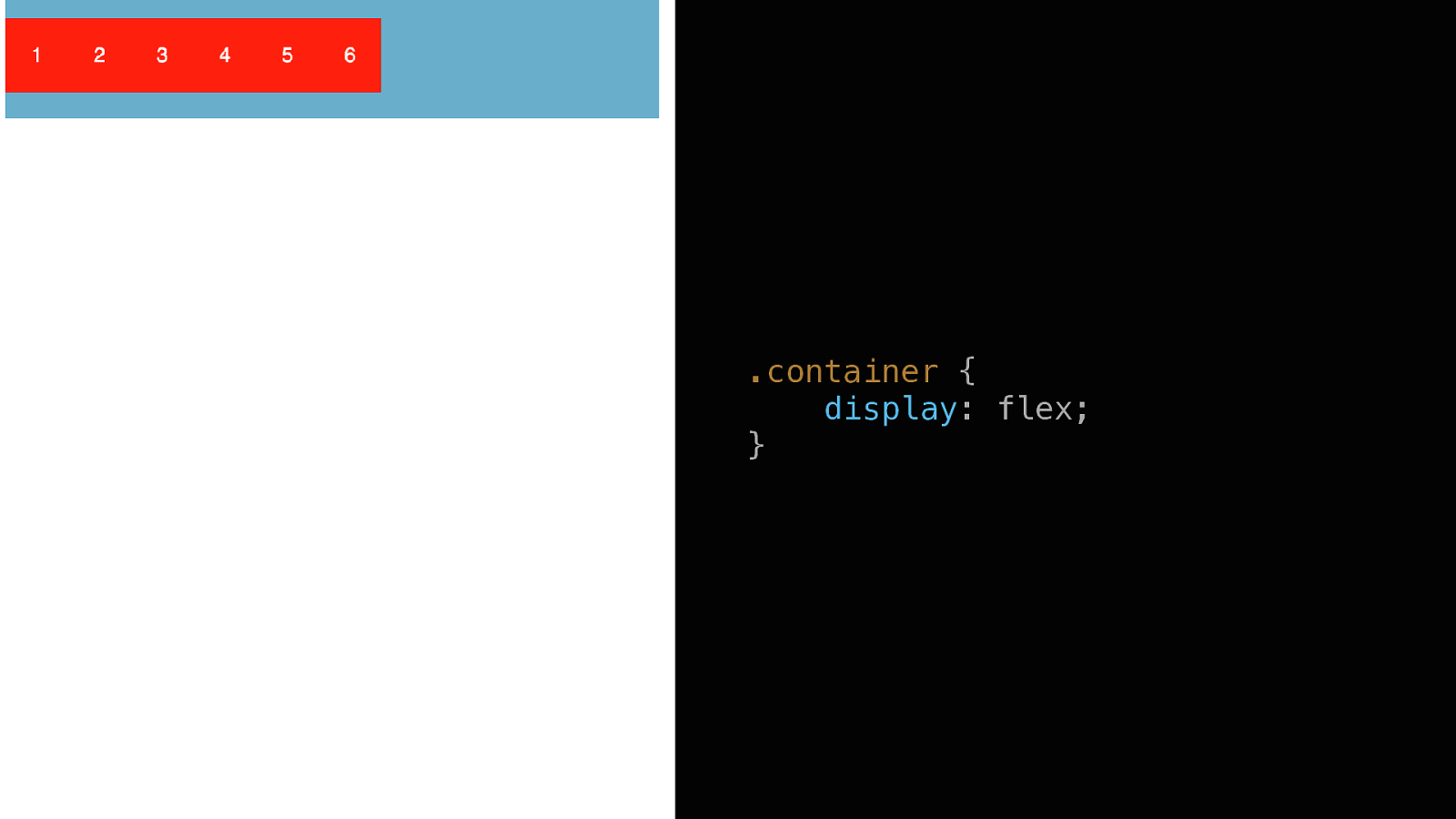
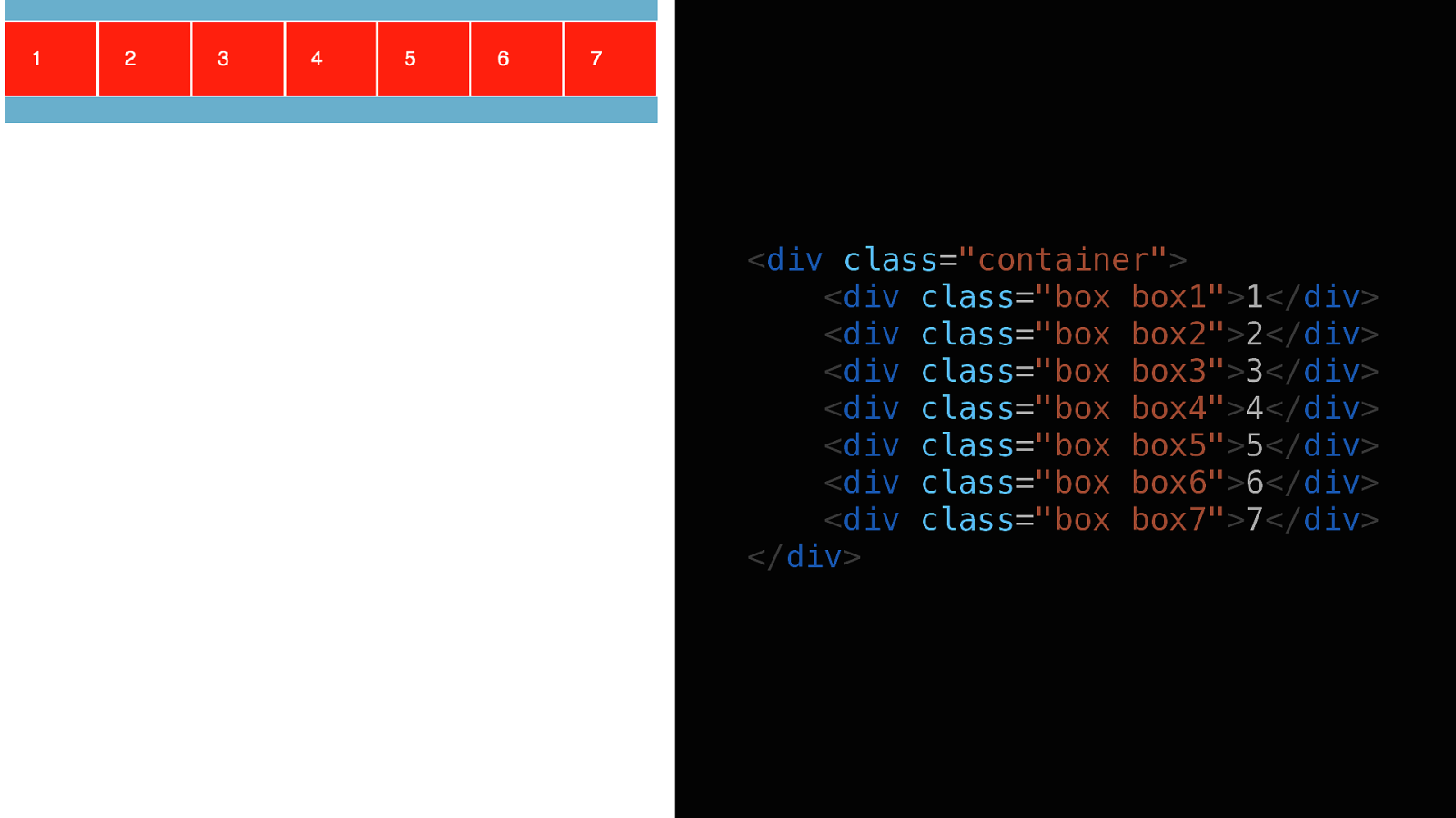
BACK THE TO START <div class=”container”> <div class=”box box1”>1</div> <div class=”box box2”>2</div> <div class=”box box3”>3</div> <div class=”box box4”>4</div> <div class=”box box5”>5</div> <div class=”box box6”>6</div> </div>
.container { display: flex; }
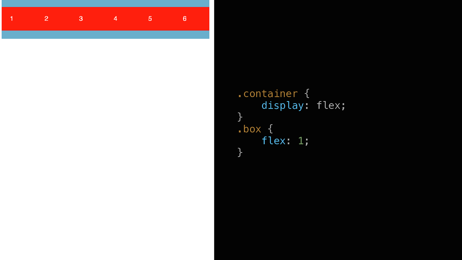
.container { display: flex; } .box { flex: 1; }
Box Size Math (done) …
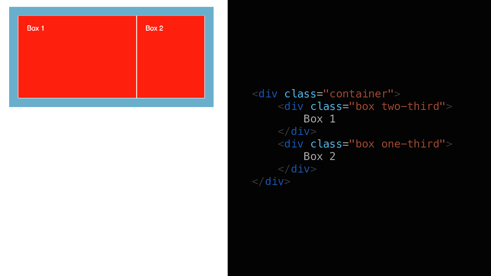
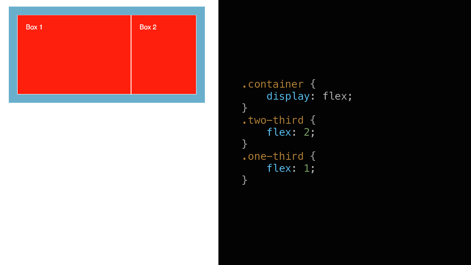
Flex Layouts
Flex-grow
.container { display: flex; } .two-third { flex: 2; } .one-third { flex: 1; }
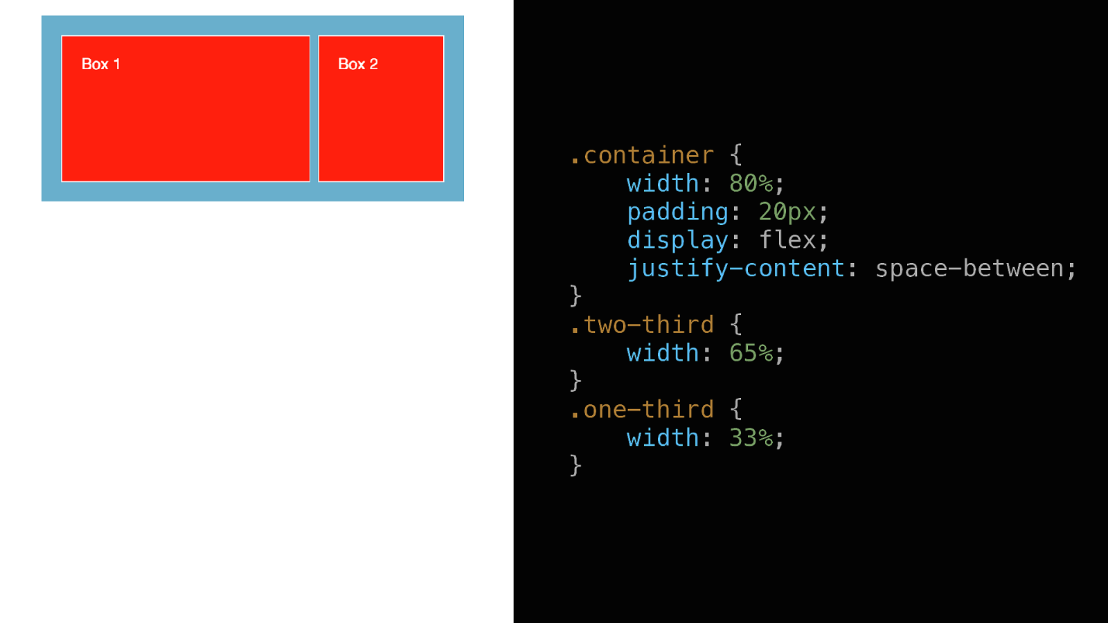
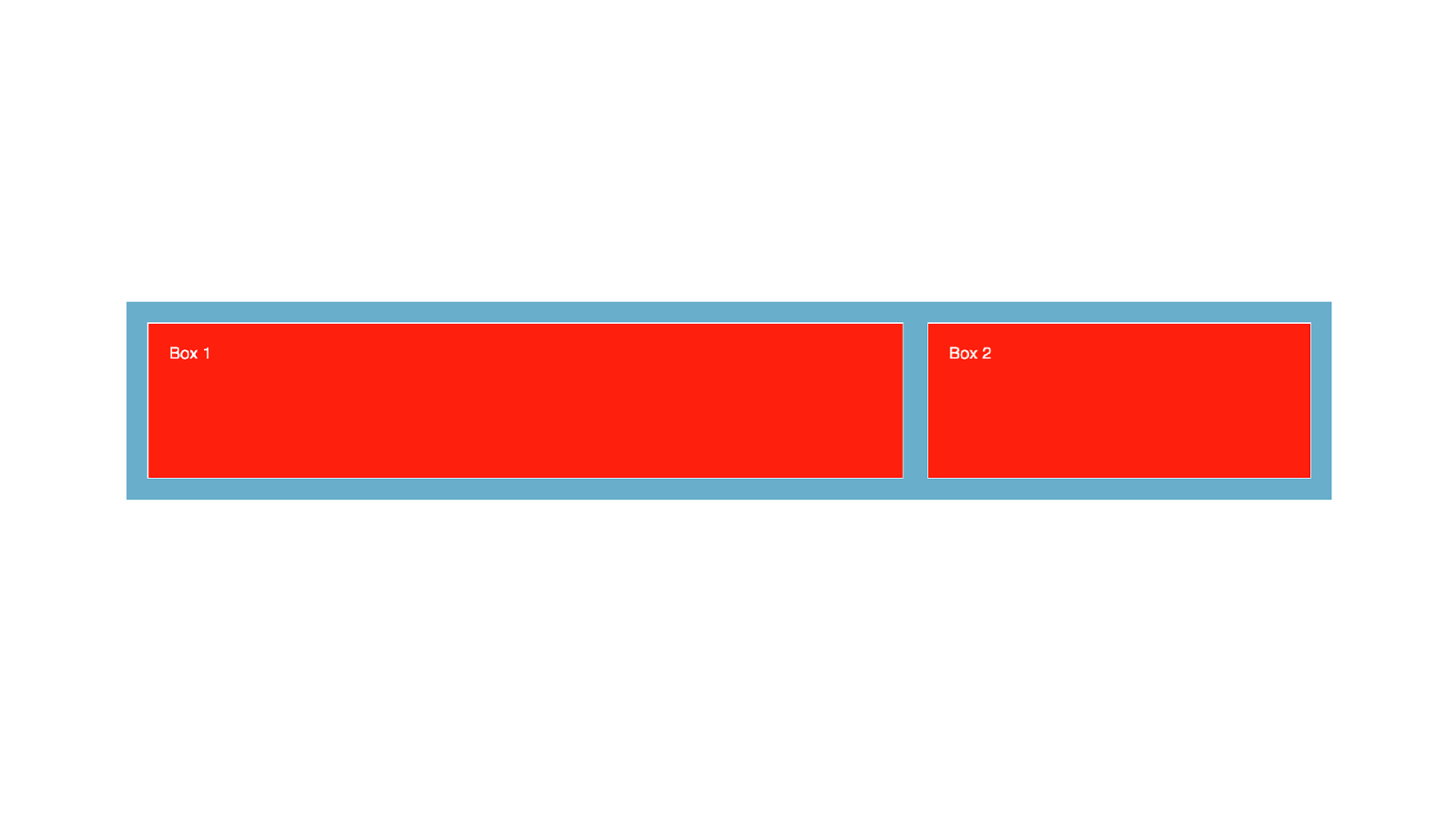
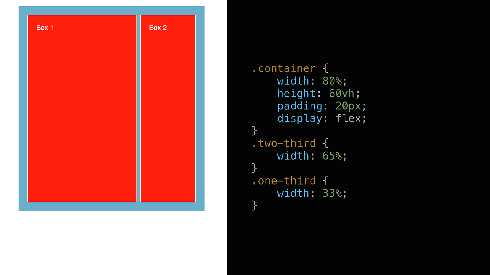
Width + Justify-Content
.container { width: 80%; padding: 20px; display: flex; justify-content: space-between; } .two-third { width: 65%; } .one-third { width: 33%; }
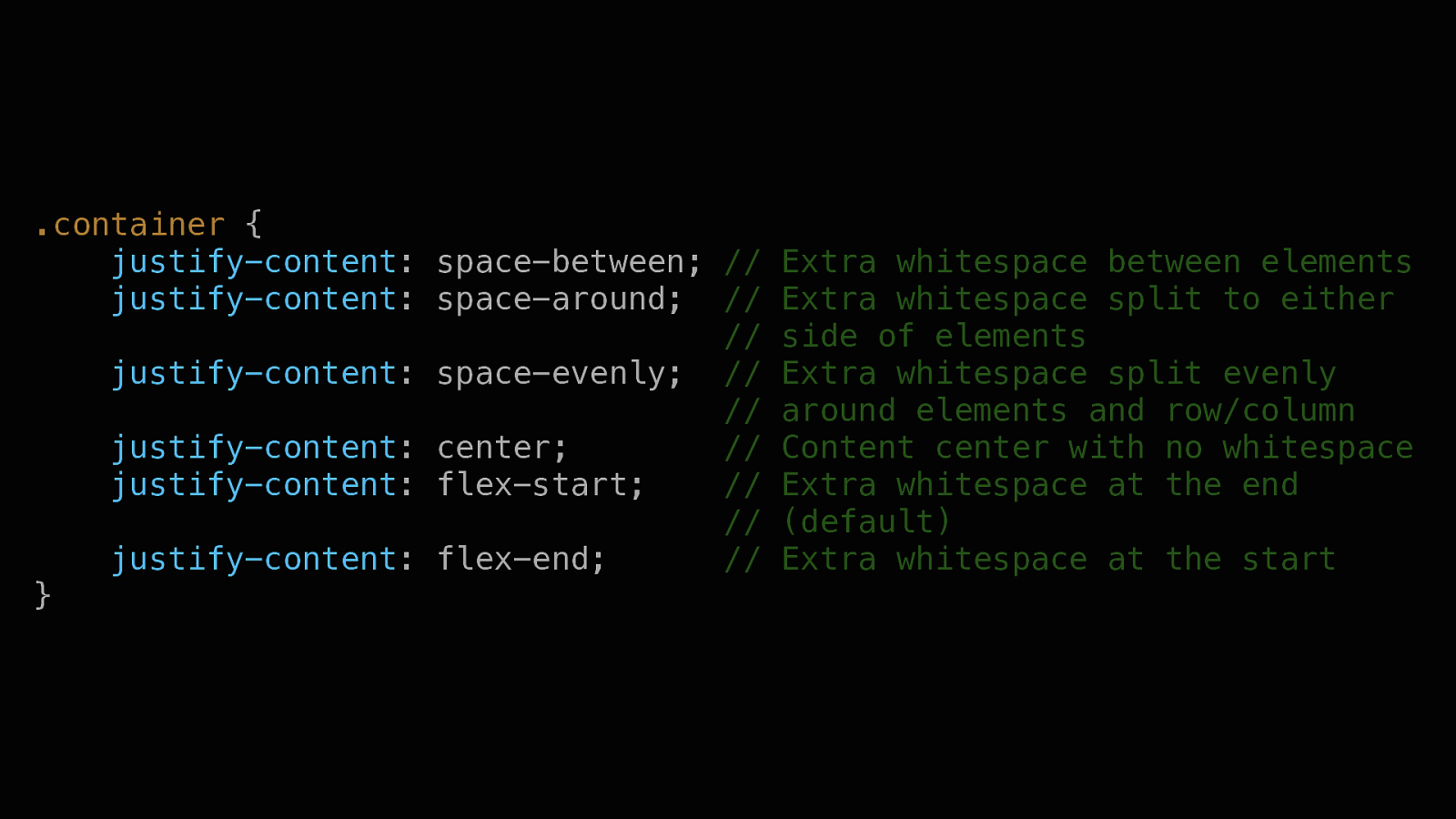
.container { justify-content: space-between; // justify-content: space-around; // // justify-content: space-evenly; // // justify-content: center; // justify-content: flex-start; // // justify-content: flex-end; // } Extra whitespace between elements Extra whitespace split to either side of elements Extra whitespace split evenly around elements and row/column Content center with no whitespace Extra whitespace at the end (default) Extra whitespace at the start
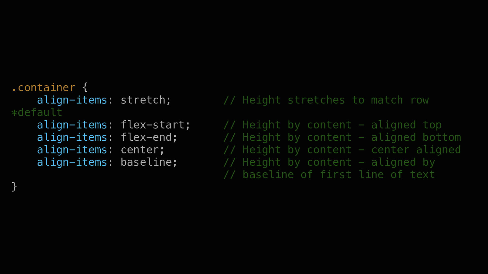
Height + Align-Items
.container { width: 80%; height: 60vh; padding: 20px; display: flex; } .two-third { width: 65%; } .one-third { width: 33%; }
.container { align-items: *default align-items: align-items: align-items: align-items: } stretch; // Height stretches to match row flex-start; flex-end; center; baseline; // // // // // Height by content Height by content Height by content Height by content baseline of first
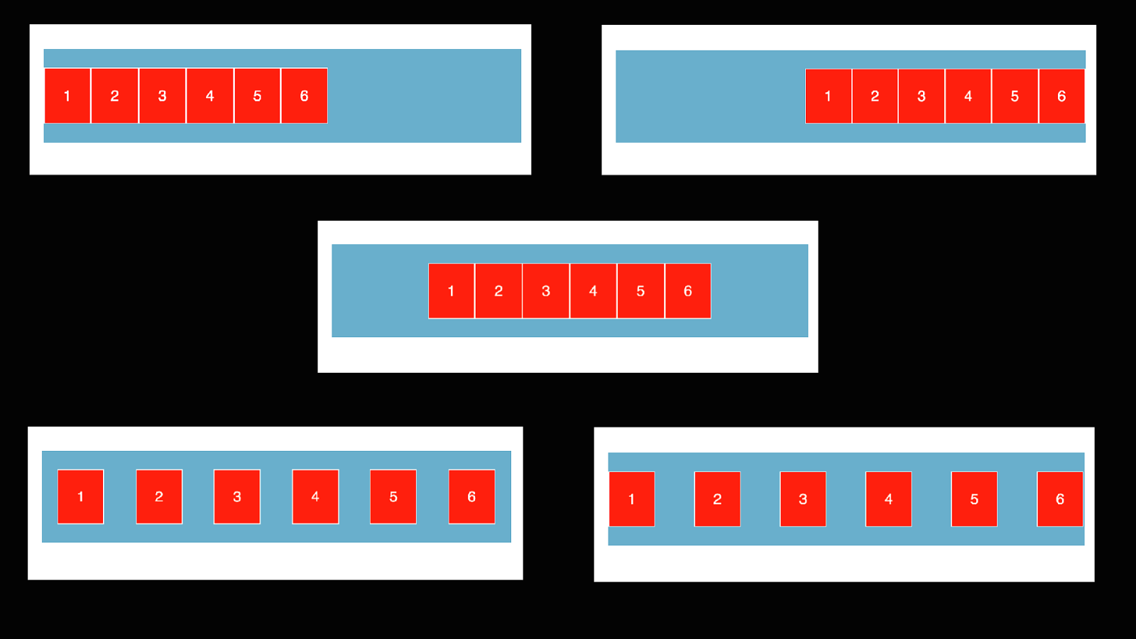
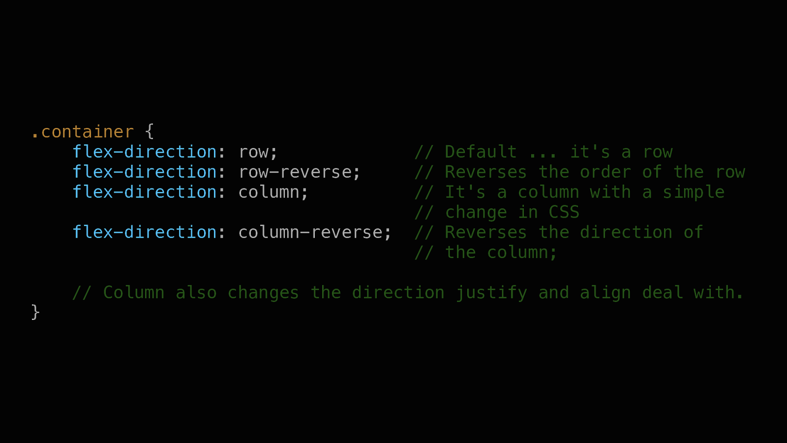
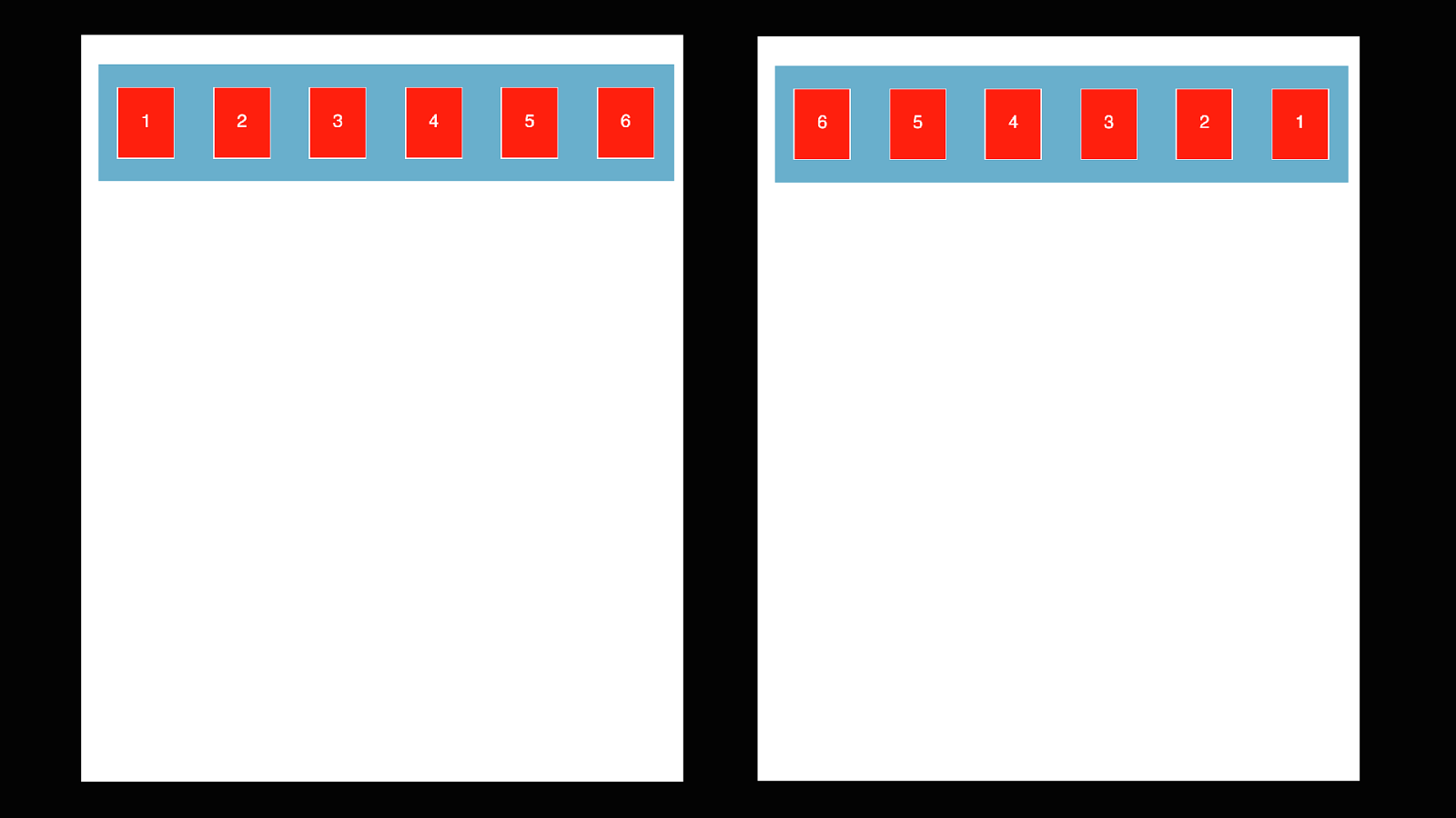
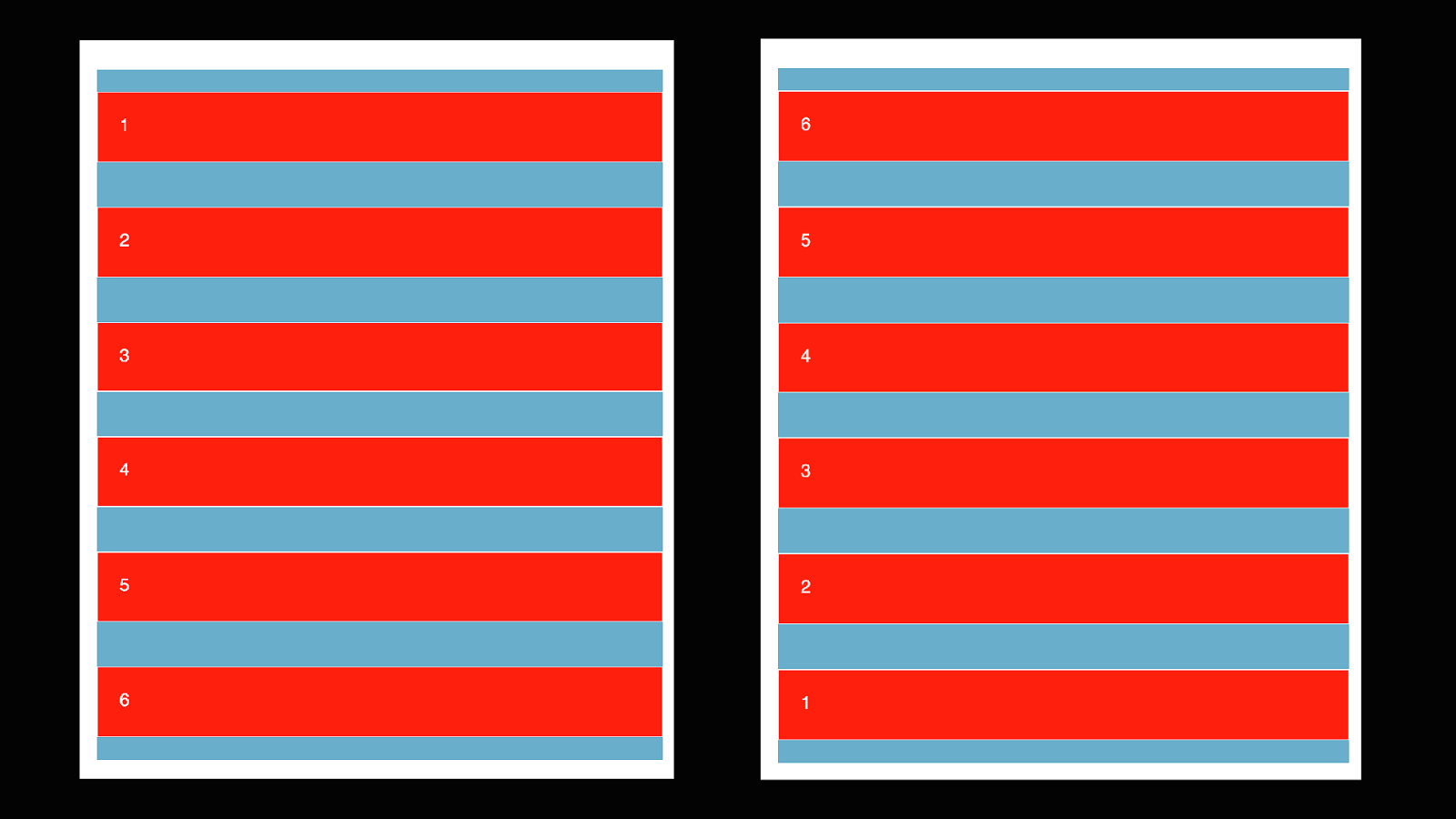
Directional Flexing
.container { flex-direction: row; flex-direction: row-reverse; flex-direction: column; flex-direction: column-reverse; // // // // // // Default … it’s a row Reverses the order of the row It’s a column with a simple change in CSS Reverses the direction of the column; // Column also changes the direction justify and align deal with. }
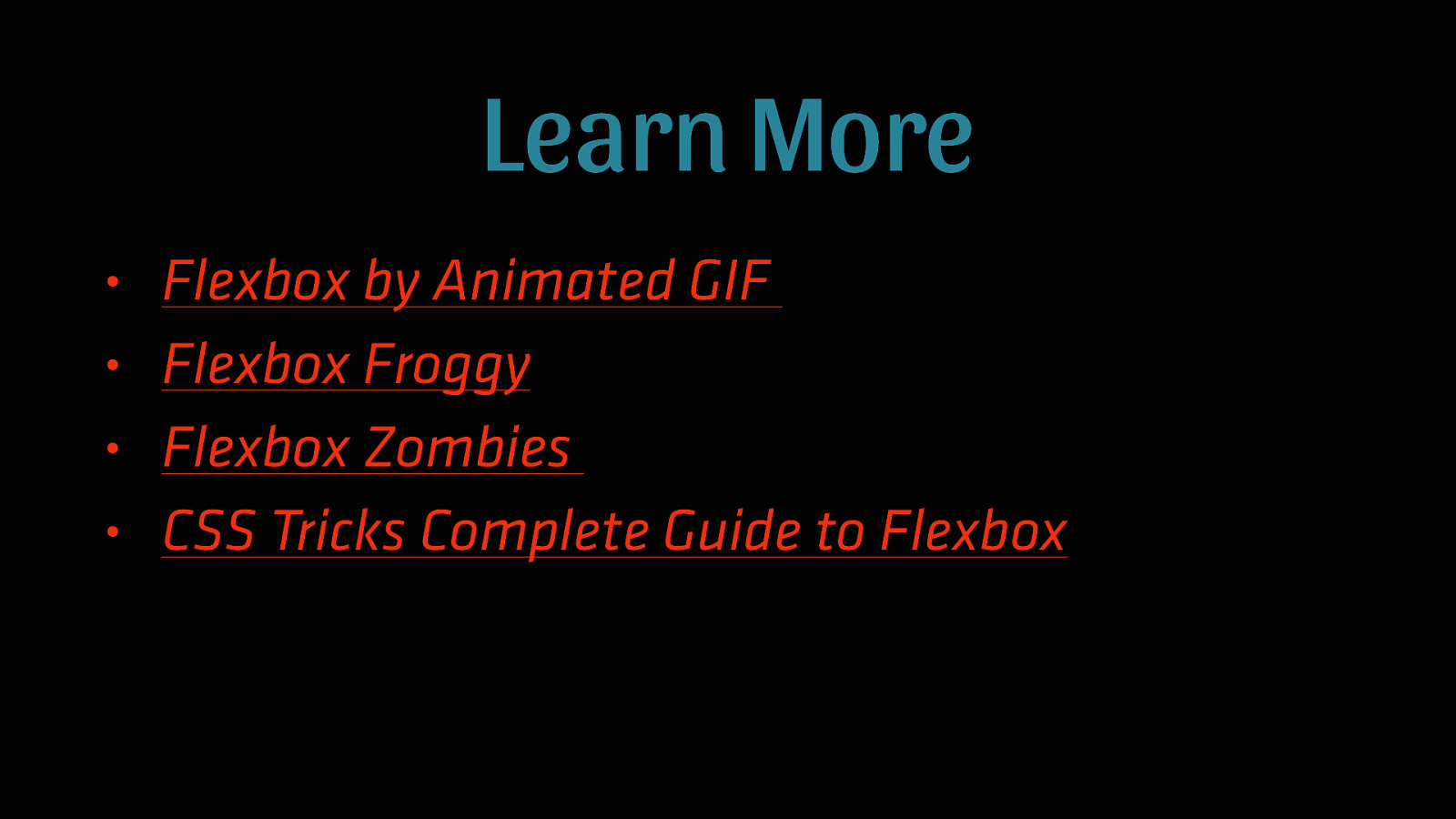
Learn More • • • • Flexbox by Animated GIF Flexbox Froggy Flexbox Zombies CSS Tricks Complete Guide to Flexbox
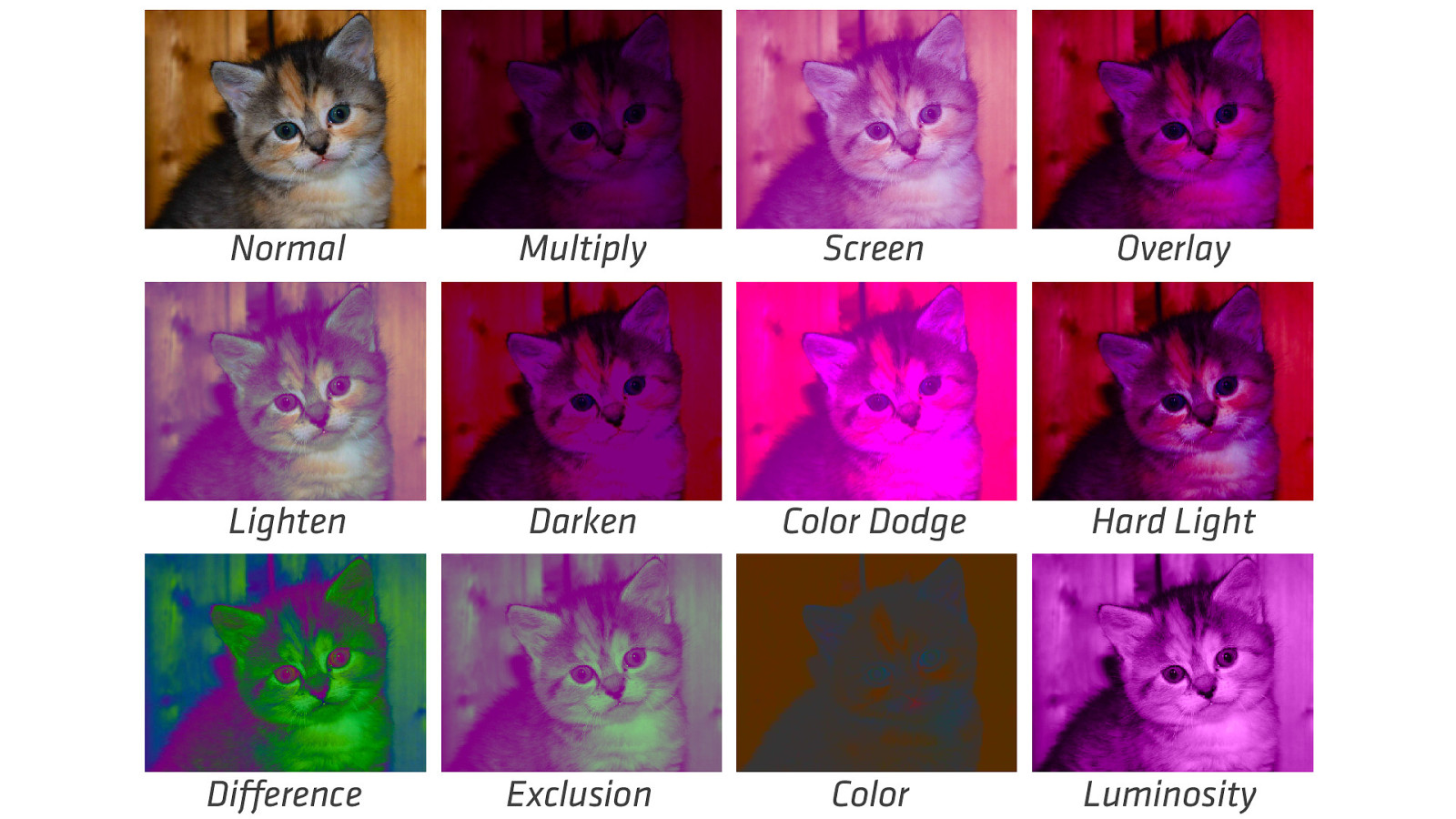
Background Blend Mode CAN THE BROWSER REPLACE PHOTOSHOP?
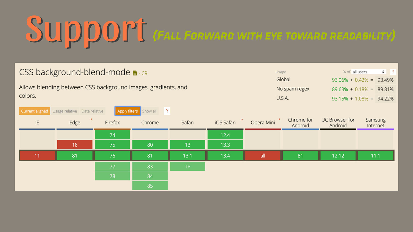
Support (FALL FORWARD WITH EYE TOWARD READABILITY)
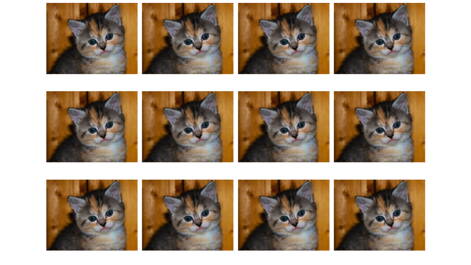
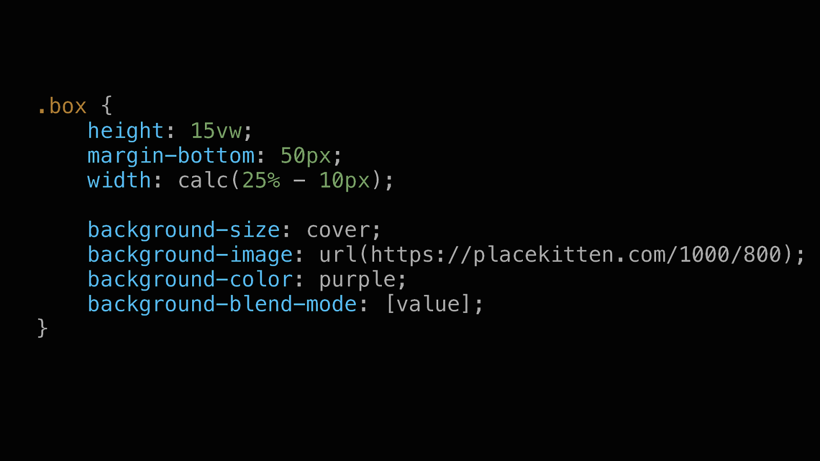
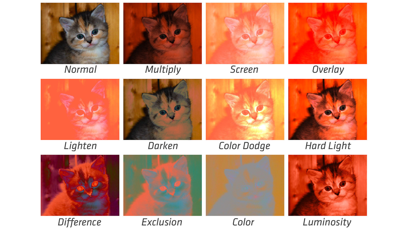
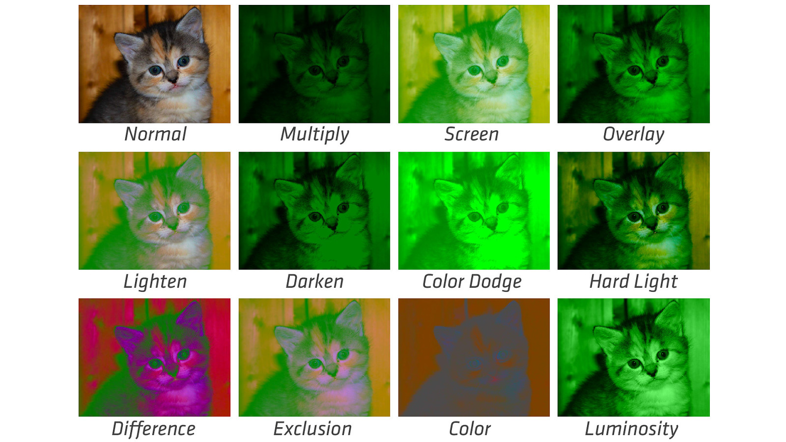
.box { height: 15vw; margin-bottom: 50px; width: calc(25% - 10px); } background-size: cover; background-image: url(https://placekitten.com/1000/800); background-color: purple; background-blend-mode: [value];
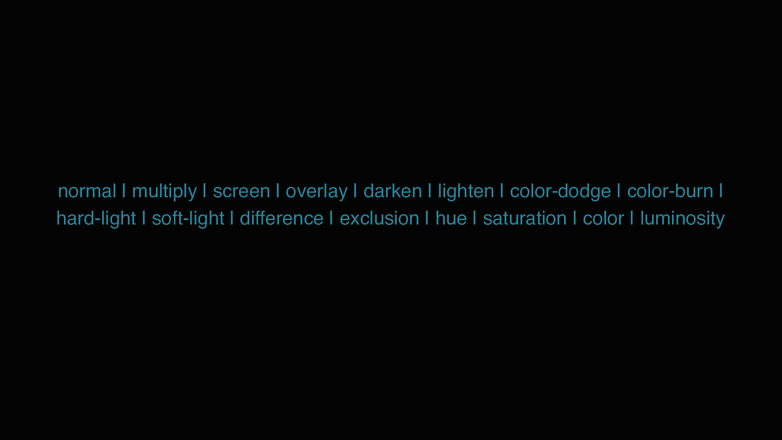
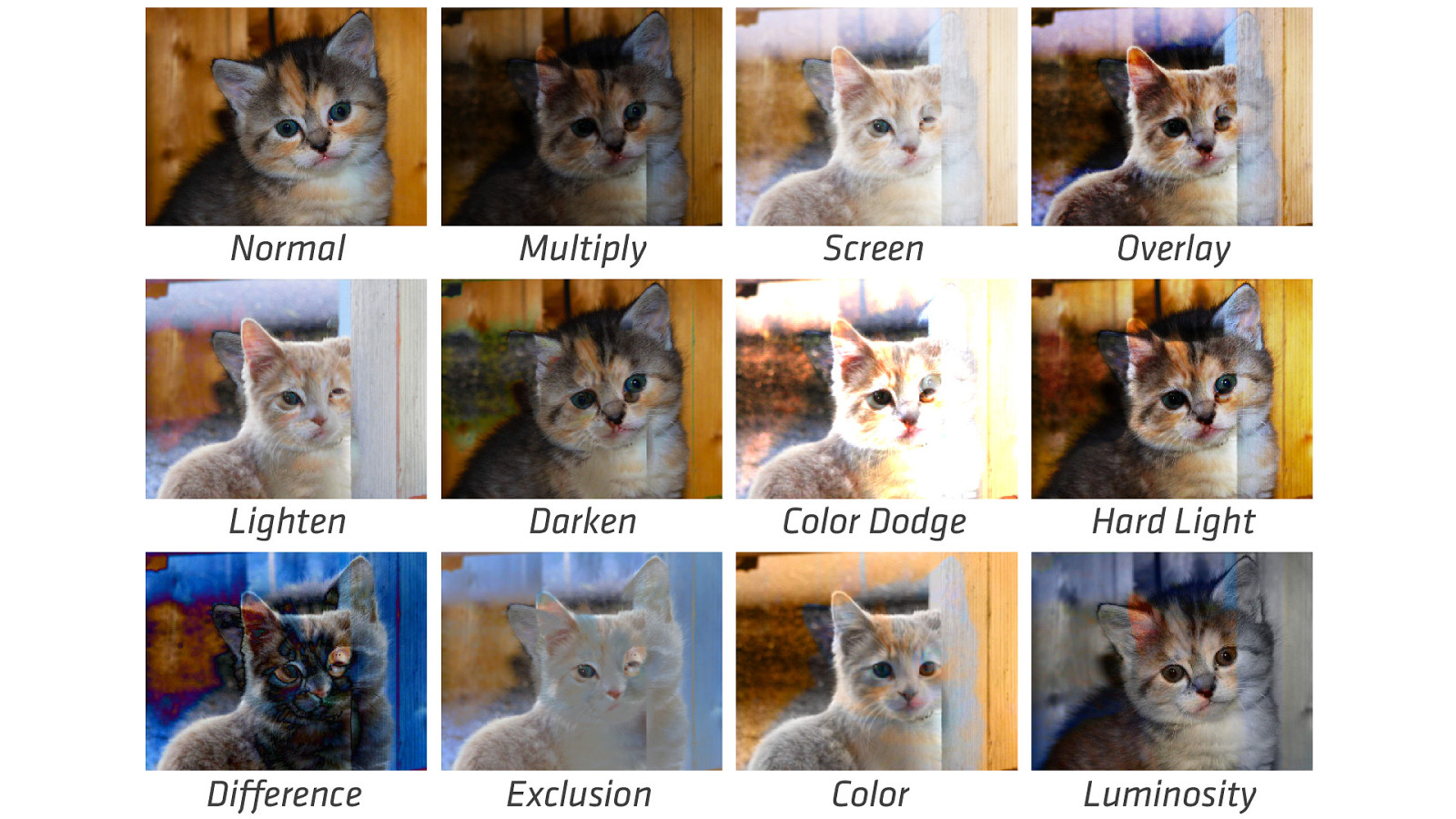
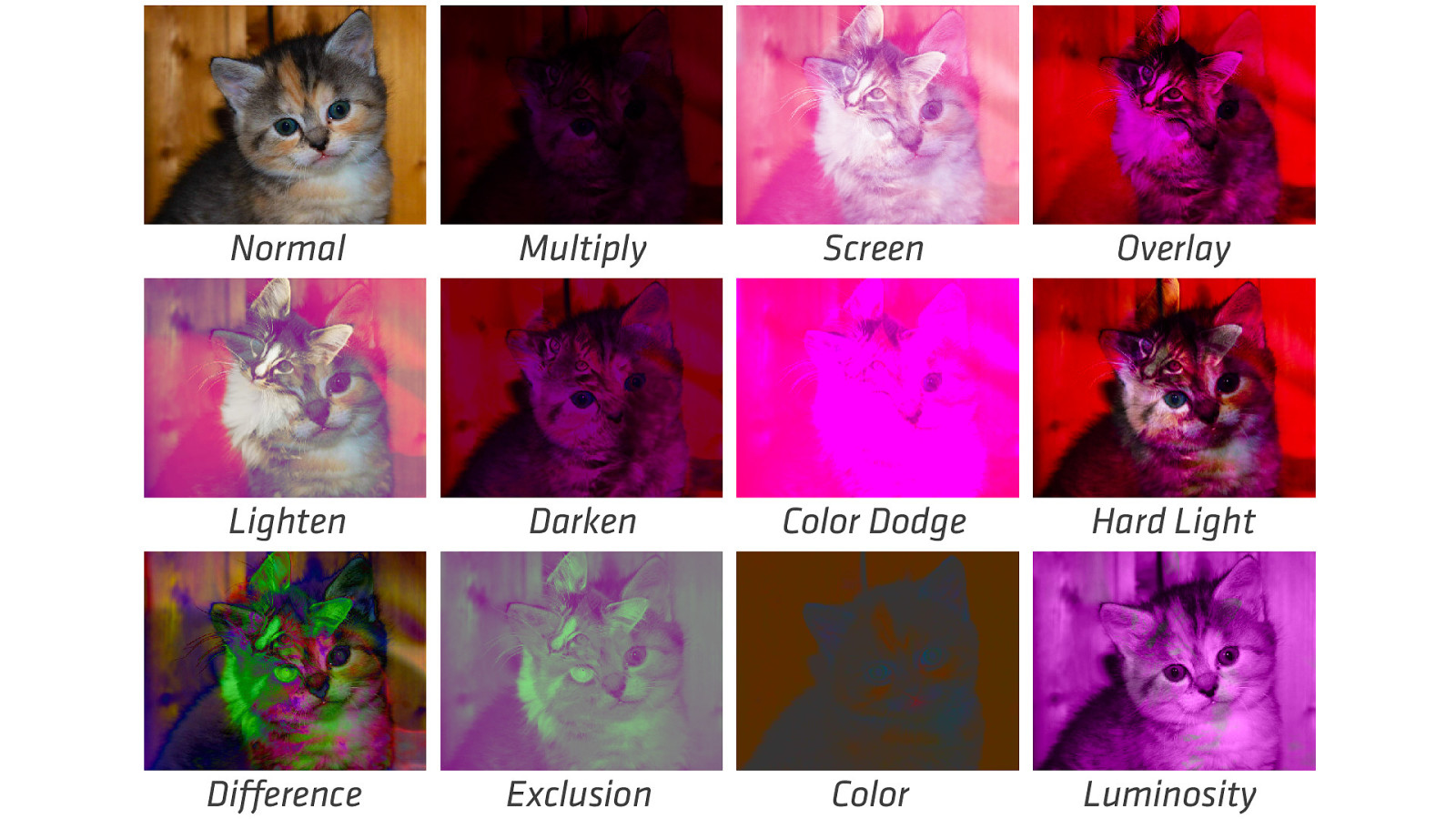
normal | multiply | screen | overlay | darken | lighten | color-dodge | color-burn | hard-light | soft-light | difference | exclusion | hue | saturation | color | luminosity
Normal Multiply Screen Overlay Lighten Darken Color Dodge Hard Light Difference Exclusion Color Luminosity
Normal Multiply Screen Overlay Lighten Darken Color Dodge Hard Light Difference Exclusion Color Luminosity
Normal Multiply Screen Overlay Lighten Darken Color Dodge Hard Light Difference Exclusion Color Luminosity
Normal Multiply Screen Overlay Lighten Darken Color Dodge Hard Light Difference Exclusion Color Luminosity
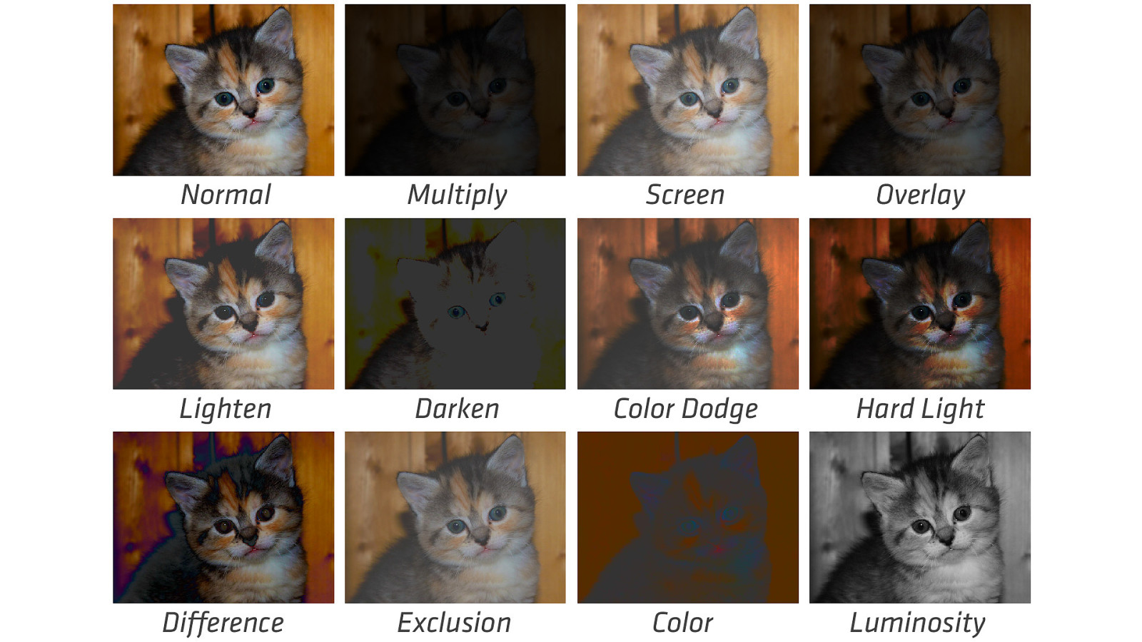
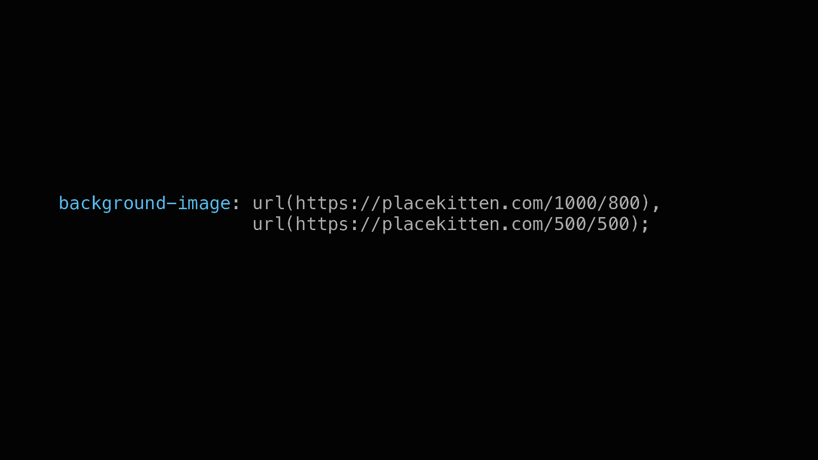
background-image: url(https://placekitten.com/1000/800), url(https://placekitten.com/500/500);
Normal Multiply Screen Overlay Lighten Darken Color Dodge Hard Light Difference Exclusion Color Luminosity
Normal Multiply Screen Overlay Lighten Darken Color Dodge Hard Light Difference Exclusion Color Luminosity
Grid Layout TWO-DIMENSIONAL LAYOUT AT ITS FINEST
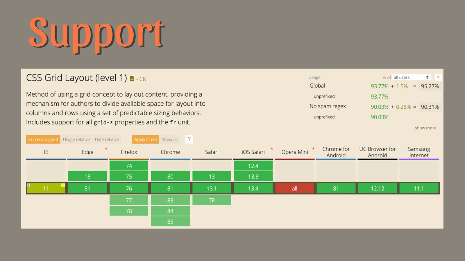
Support
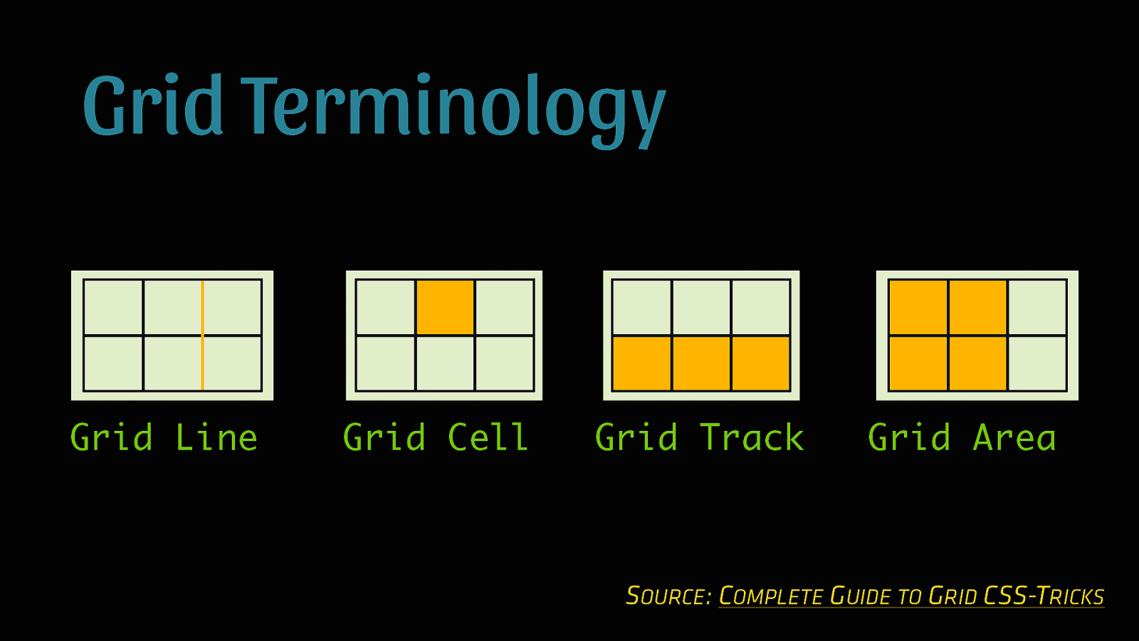
Grid Terminology Grid Line Grid Cell Grid Track Grid Area SOURCE: COMPLETE GUIDE TO GRID CSS-TRICKS
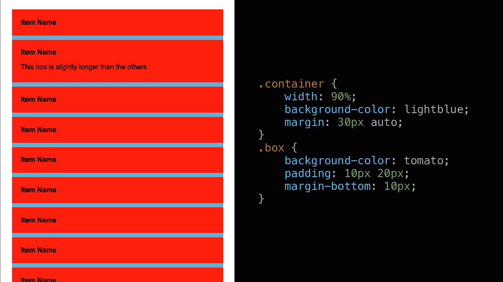
.container { width: 90%; background-color: lightblue; margin: 30px auto; } .box { background-color: tomato; padding: 10px 20px; margin-bottom: 10px; }
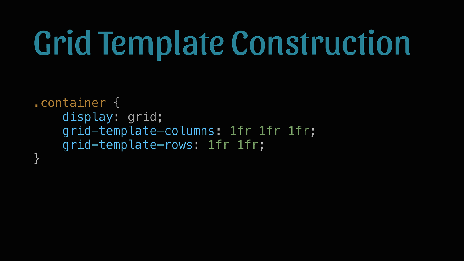
Grid Template Construction .container { display: grid; grid-template-columns: 1fr 1fr 1fr; grid-template-rows: 1fr 1fr; }
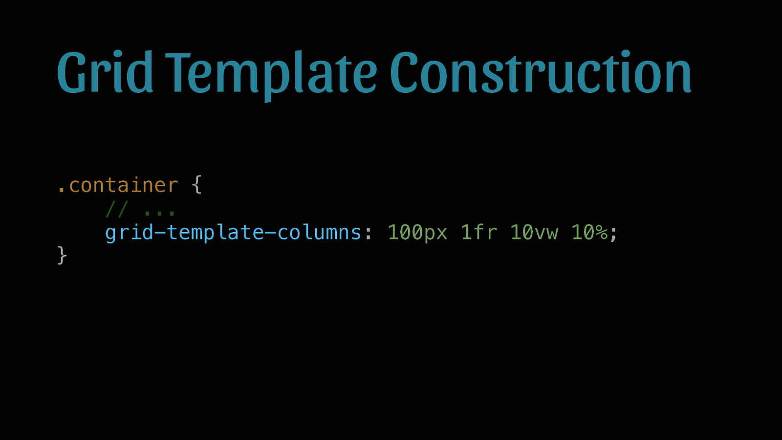
Grid Template Construction .container { // … grid-template-columns: 100px 1fr 10vw 10%; }
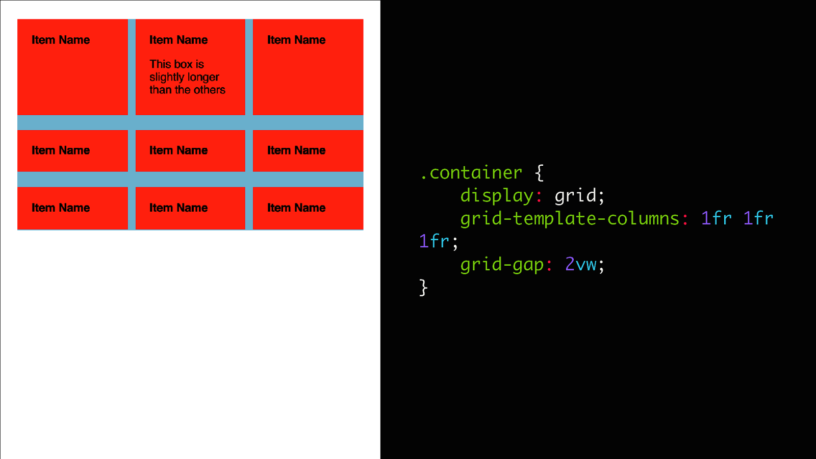
.container { display: grid; grid-template-columns: 1fr 1fr 1fr; grid-gap: 2vw; }
Asymmetry in Flex
Flex solution: HTML <div class=”promos”> <div class=”left-column”> <a href=”#” class=”promo”>Promo Space 1</a> </div> <div class=”right-column”> <a href=”#” class=”promo”>Promo Space 2</a> <div class=”columns”> <a href=”#” class=”promo”>Promo space 3</a> <a href=”#” class=”promo”>Promo space 4</a> </div> </div> </div>
Flex solution: CSS (a lot) .promos { display: flex; justify-content: space-between; } .promo { display: flex; justify-content: center; align-items: center; min-height: 30vh; } .column { width: calc(50vw - .5rem); display: flex; flex-direction: column; } .columns { display: flex; justify-content: space-between; } .columns > .promo { flex: 1; } .columns > .promo:first-child { margin-right: 1rem; } .right-column > .promo { margin-bottom: 1rem; } .left-column .promo { height: 100%; }
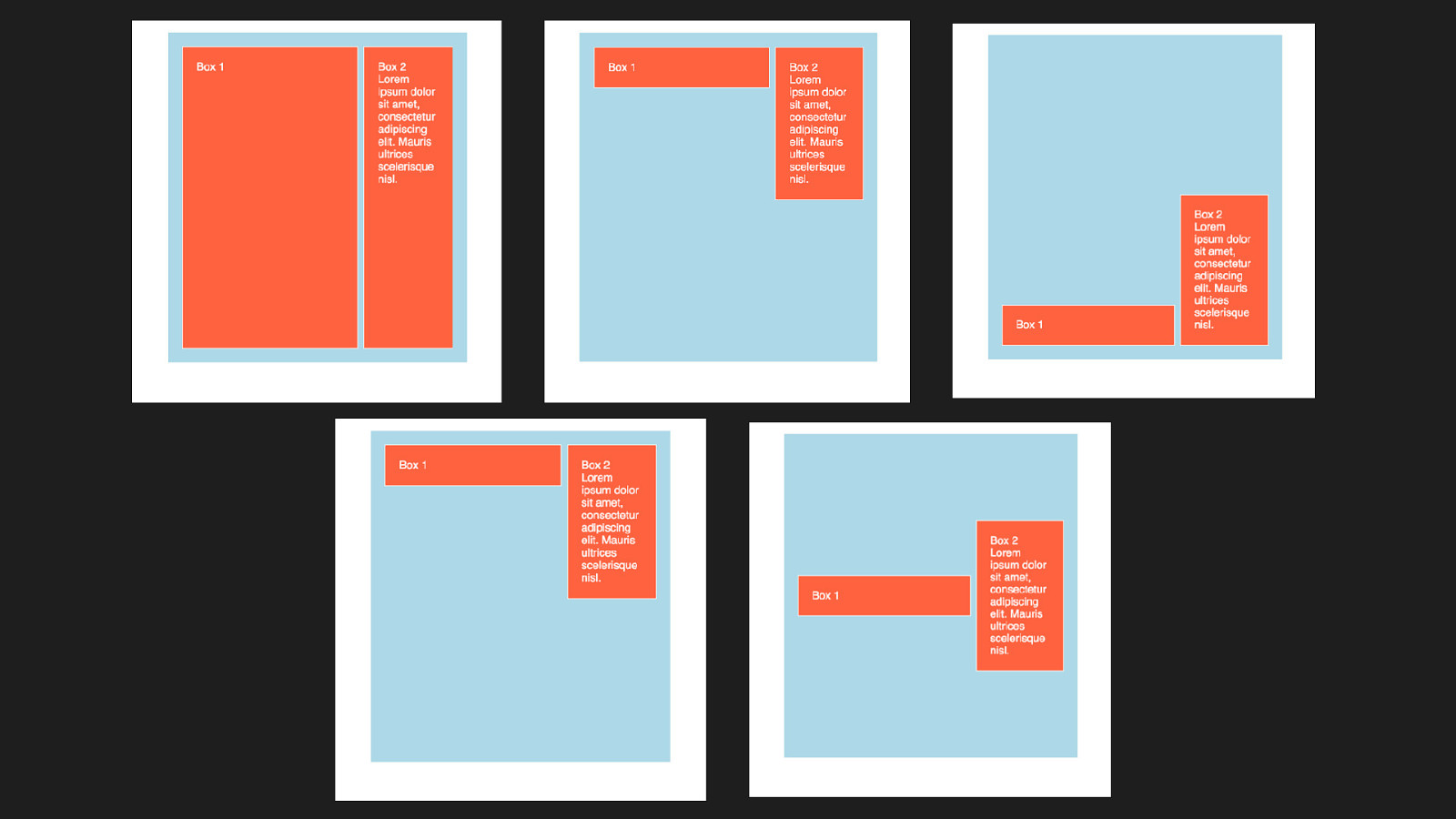
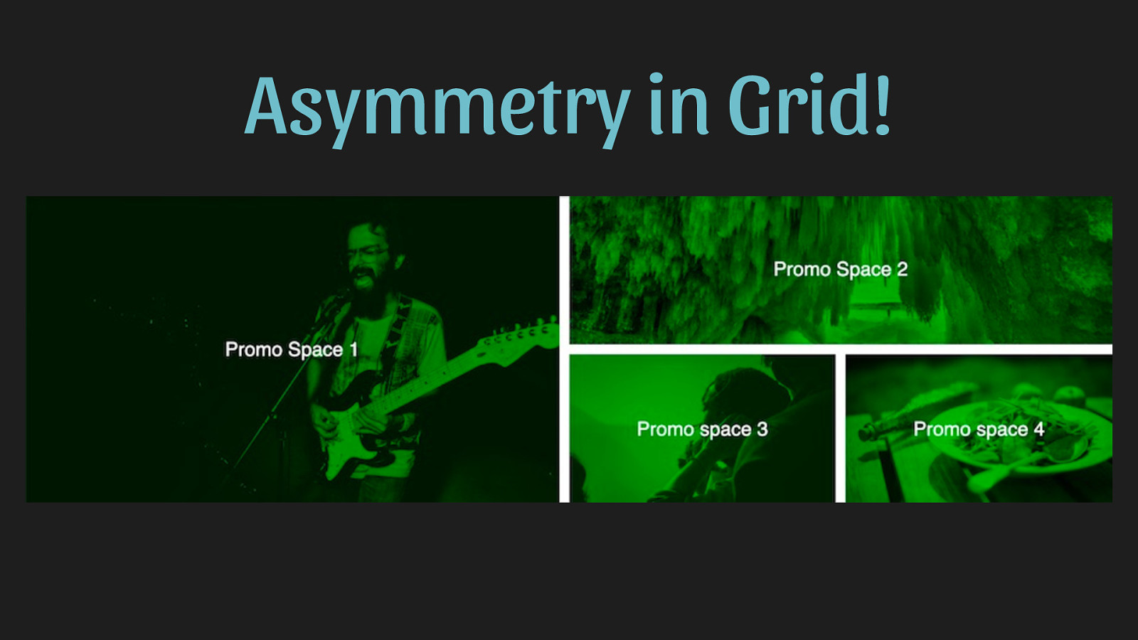
Asymmetry in Grid!
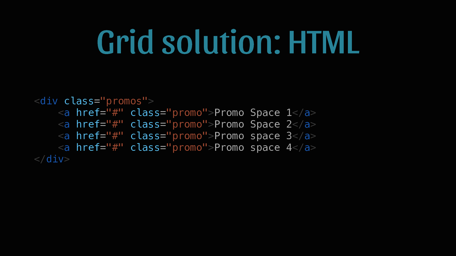
Grid solution: HTML <div class=”promos”> <a href=”#” class=”promo”>Promo <a href=”#” class=”promo”>Promo <a href=”#” class=”promo”>Promo <a href=”#” class=”promo”>Promo </div> Space Space space space 1</a> 2</a> 3</a> 4</a>
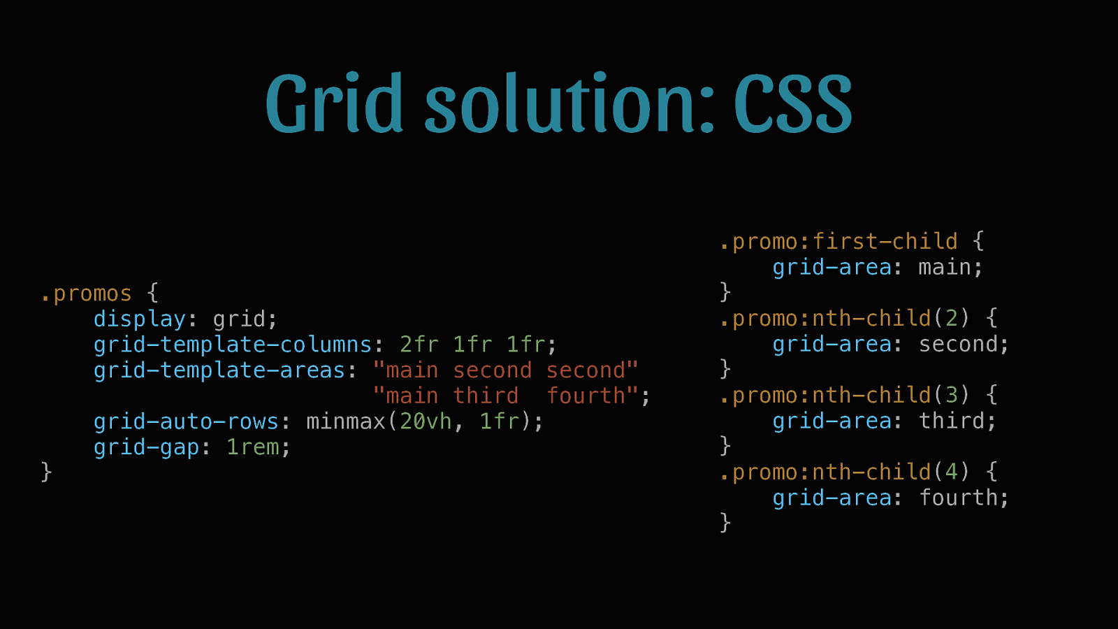
Grid solution: CSS .promos { display: grid; grid-template-columns: 2fr 1fr 1fr; grid-template-areas: “main second second” “main third fourth”; grid-auto-rows: minmax(20vh, 1fr); grid-gap: 1rem; } .promo:first-child { grid-area: main; } .promo:nth-child(2) { grid-area: second; } .promo:nth-child(3) { grid-area: third; } .promo:nth-child(4) { grid-area: fourth; }
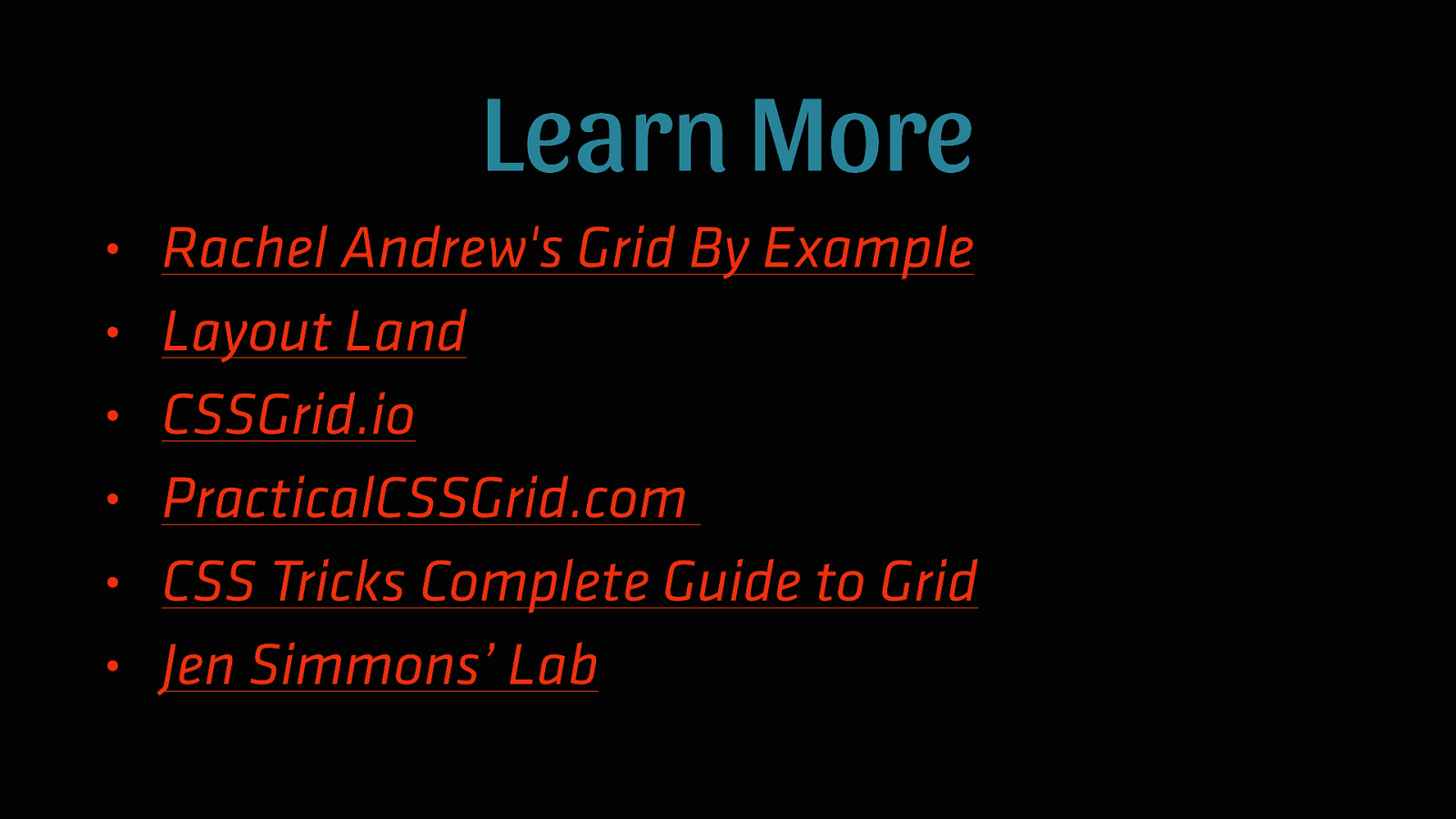
Learn More • • • • • • Rachel Andrew’s Grid By Example Layout Land CSSGrid.io PracticalCSSGrid.com CSS Tricks Complete Guide to Grid Jen Simmons’ Lab
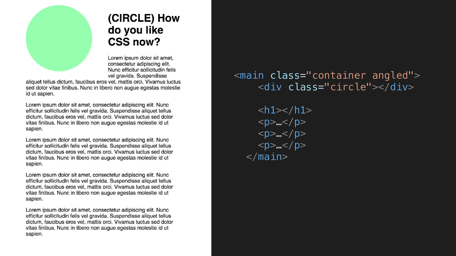
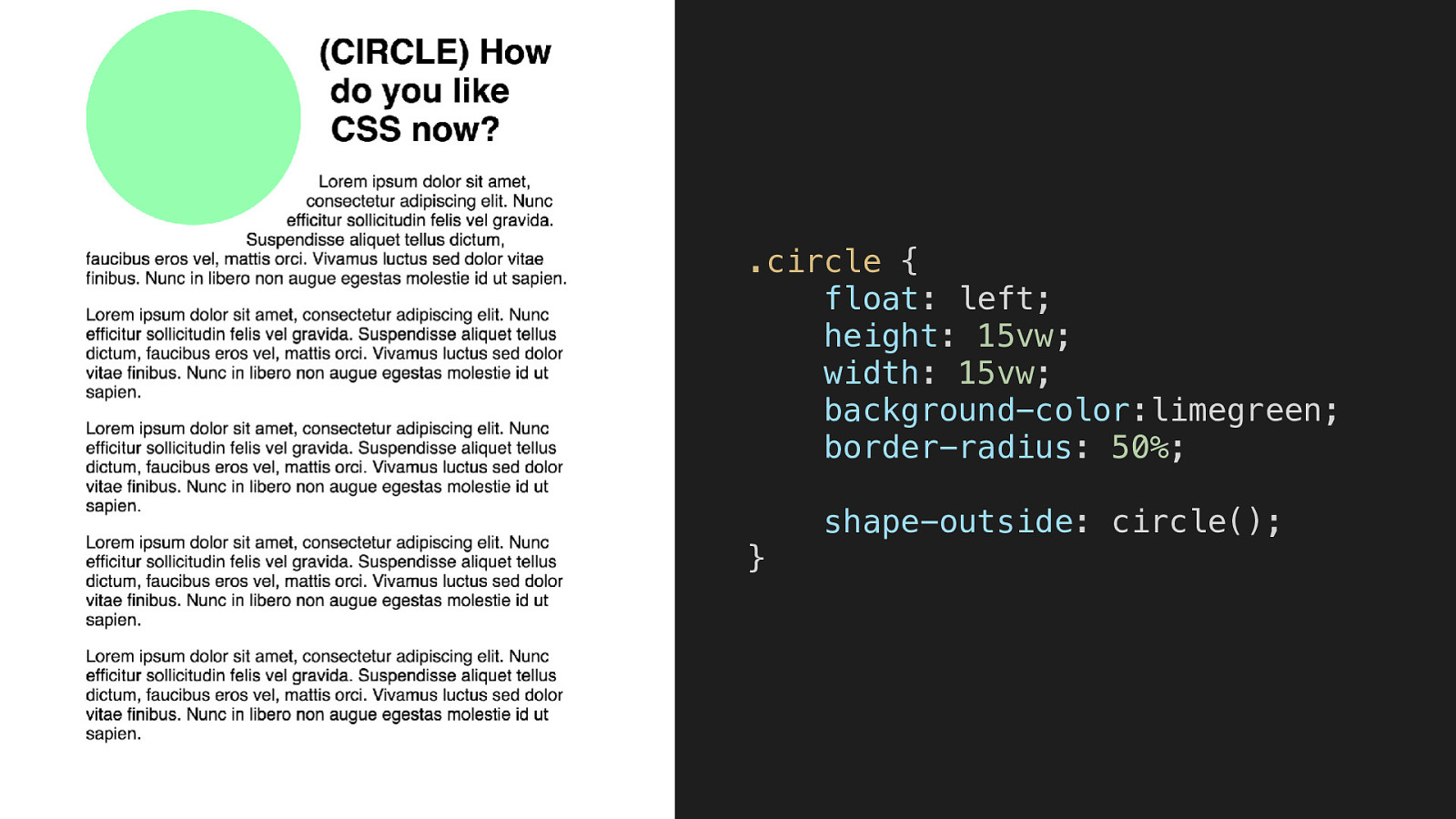
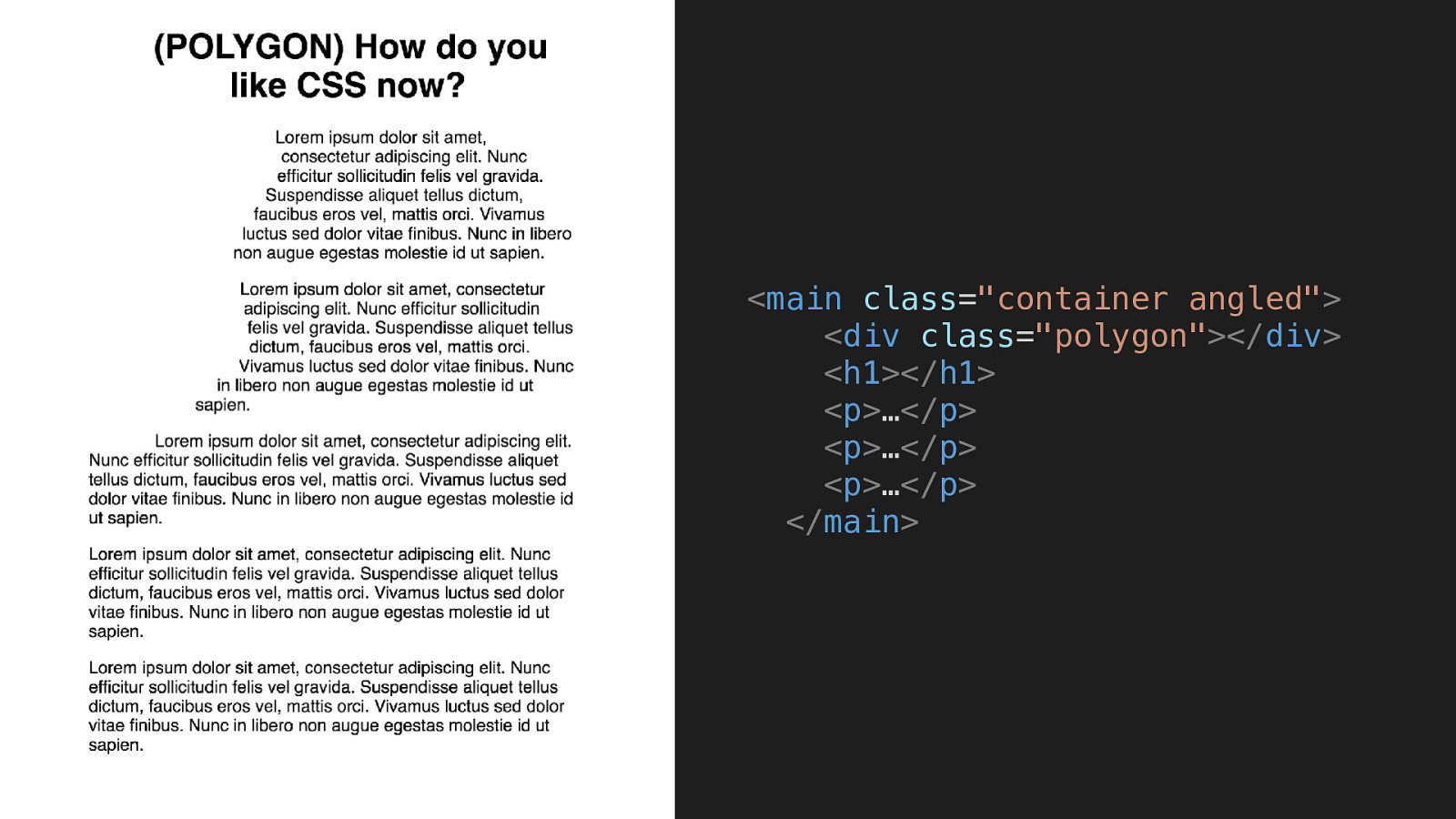
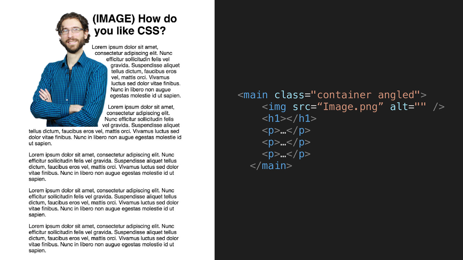
CSS Shapes MAKING FLOATING IMAGES INTERESTING AGAIN
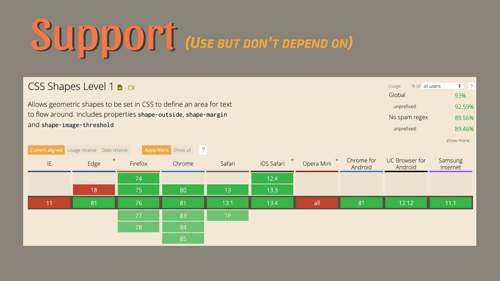
Support (USE BUT DON’T DEPEND ON)
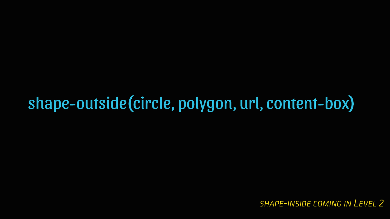
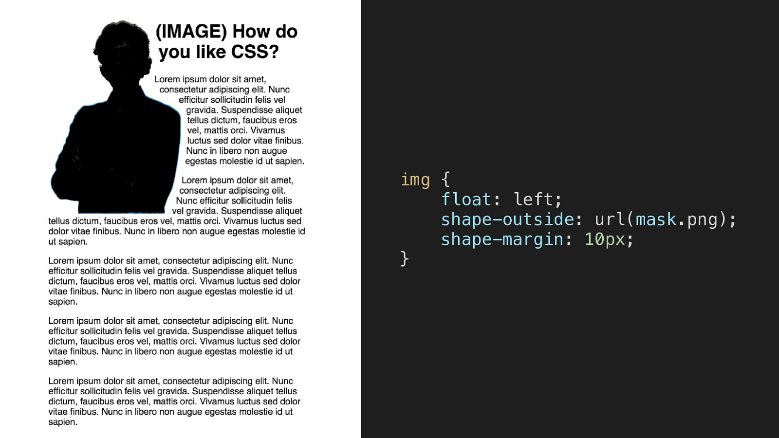
shape-outside(circle, polygon, url, content-box) SHAPE-INSIDE COMING IN LEVEL 2
.circle { float: left; height: 15vw; width: 15vw; background-color:limegreen; border-radius: 50%; shape-outside: circle(); }
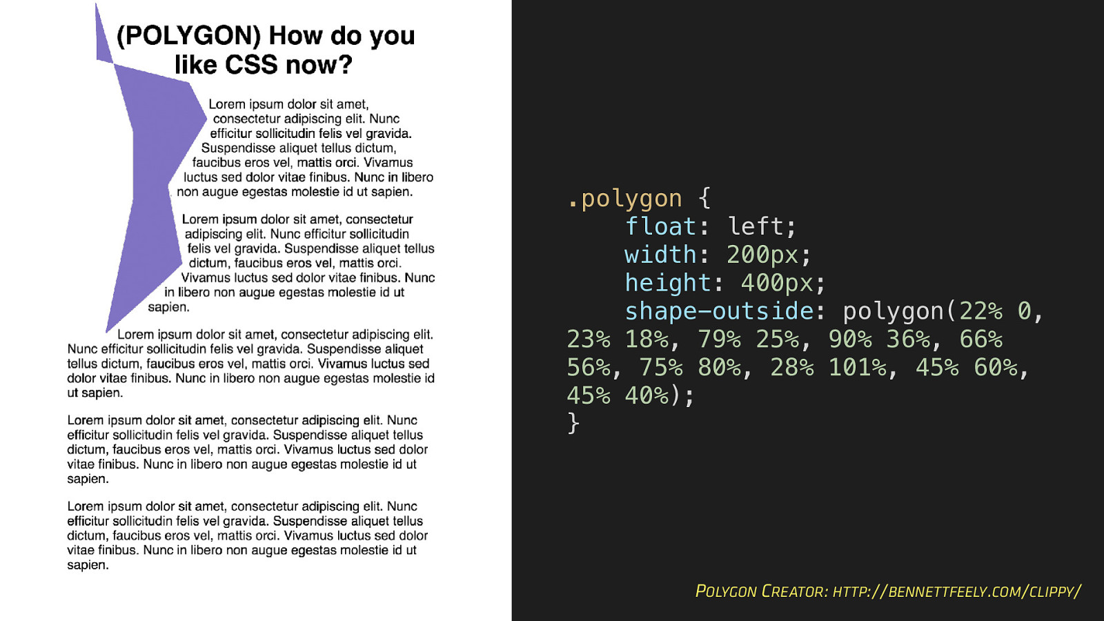
.polygon { float: left; width: 200px; height: 400px; shape-outside: polygon(22% 0, 23% 18%, 79% 25%, 90% 36%, 66% 56%, 75% 80%, 28% 101%, 45% 60%, 45% 40%); } POLYGON CREATOR: HTTP://BENNETTFEELY.COM/CLIPPY/
img { float: left; shape-outside: url(mask.png); shape-margin: 10px; }
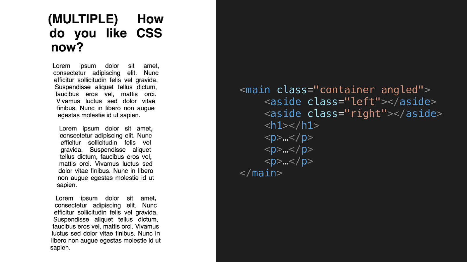
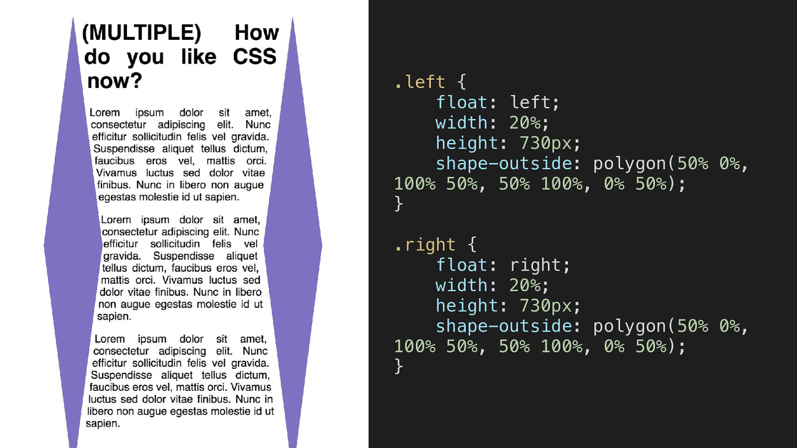
.left { float: left; width: 20%; height: 730px; shape-outside: polygon(50% 0%, 100% 50%, 50% 100%, 0% 50%); } .right { float: right; width: 20%; height: 730px; shape-outside: polygon(50% 0%, 100% 50%, 50% 100%, 0% 50%); }
Explore More
Explore More • Initial Letter • CSS Transforms • Object-Fit • CSS Filters • Clip Path
No Shame in Templates BUT UNDERSTAND WHAT THE TEMPLATE DOES AND HOW TO BREAK OUT
CSS is Powerful LEARN A FEW THINGS AND MAKE INTERESTING DESIGNS
Start Today YOU DON’T HAVE TO WAIT FOR 100% BROWSER ADOPTION
WAIT A SECOND! No More “Fallbacks” WRITE SUPPORT-FIRST CSS AND FALL FORWARD INTO THE NEW
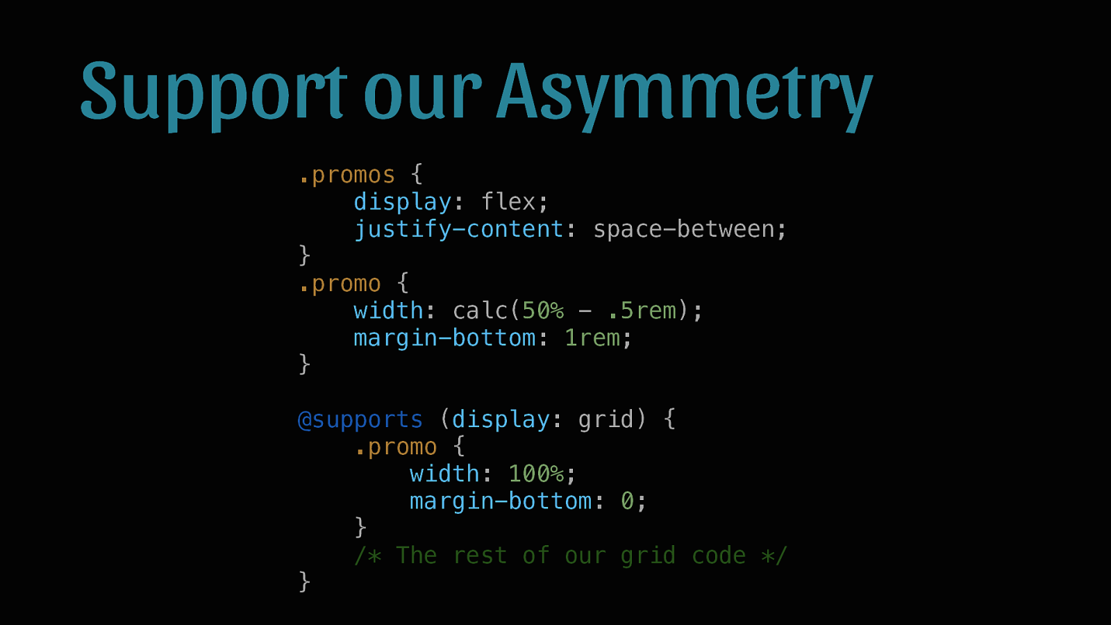
Support our Asymmetry .promos { display: flex; justify-content: space-between; } .promo { width: calc(50% - .5rem); margin-bottom: 1rem; } @supports (display: grid) { .promo { width: 100%; margin-bottom: 0; } /* The rest of our grid code */ }
Homework LEARN ONE NEW LAYOUT AND ONE NEW STYLE PROPERTY THEN TWEET AT ME (@BROB) TO LET ME KNOW WHAT YOU PICKED
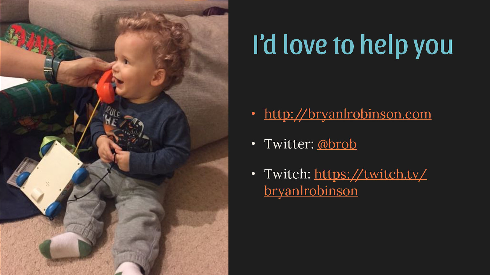
I’d love to help you • http://bryanlrobinson.com • Twitter: @brob • Twitch: https://twitch.tv/ bryanlrobinson

CSS has changed. It’s moving away from the mired mess of it’s origin and toward a bright future of interesting layout and easy design.
If you’ve been focused on other important skills in the past 5 years, you’ve missed out on a lot of new, helpful techniques, including Flexbox and CSS Grid Layout.
Here’s what was said about this presentation on social media.


 for free. You
can too.
for free. You
can too.