
A presentation at CreativePro Design + Accessibility Summit by Carie Fisher
Accessible Typography
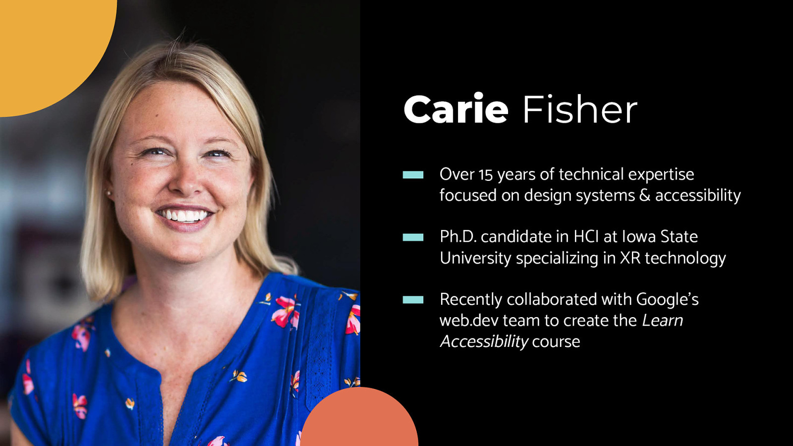
Carie Fisher Over 15 years of technical expertise focused on design systems & accessibility Ph.D. candidate in HCI at Iowa State University specializing in XR technology Recently collaborated with Google’s web.dev team to create the Learn Accessibility course
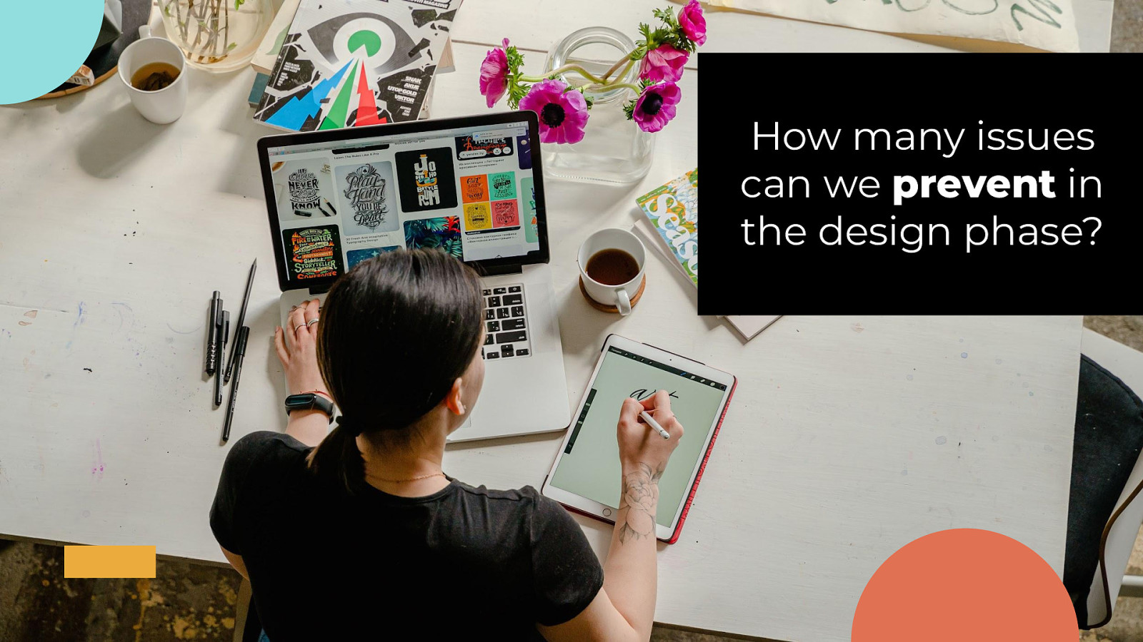
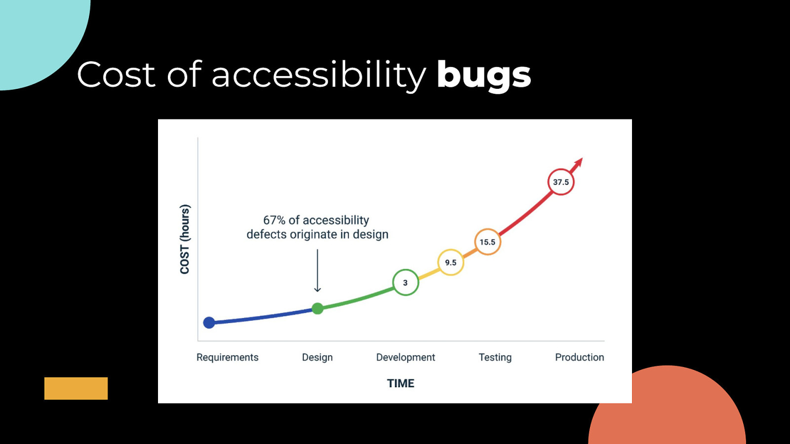
How many issues can we prevent in the design phase?
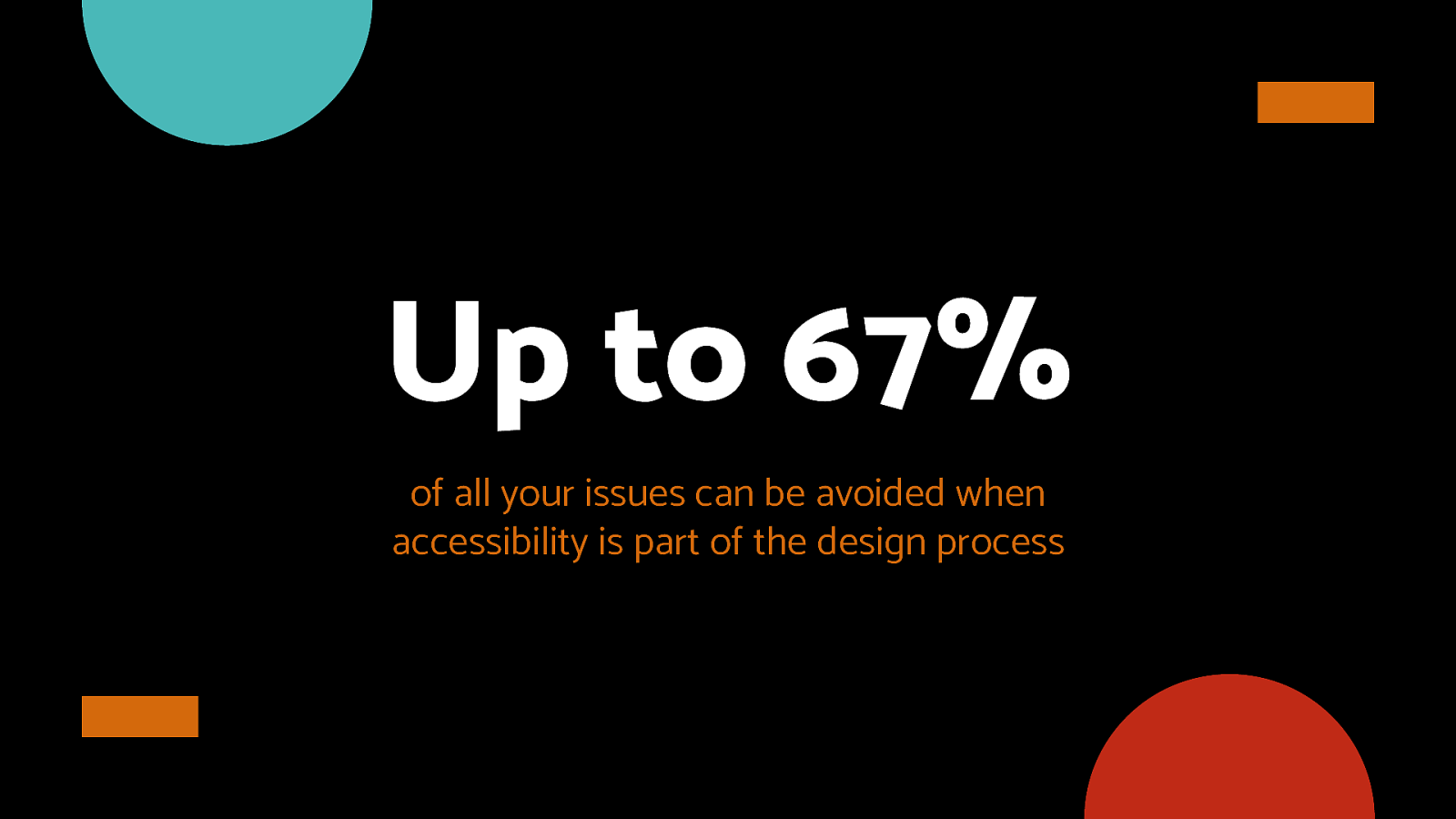
Up to 67% of all your issues can be avoided when accessibility is part of the design process
Cost of accessibility bugs
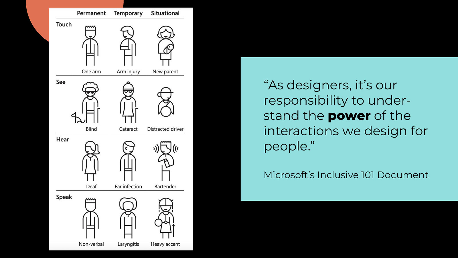
“As designers, it’s our responsibility to understand the power of the interactions we design for people.” Microsoft’s Inclusive 101 Document
01 Typeface & styling
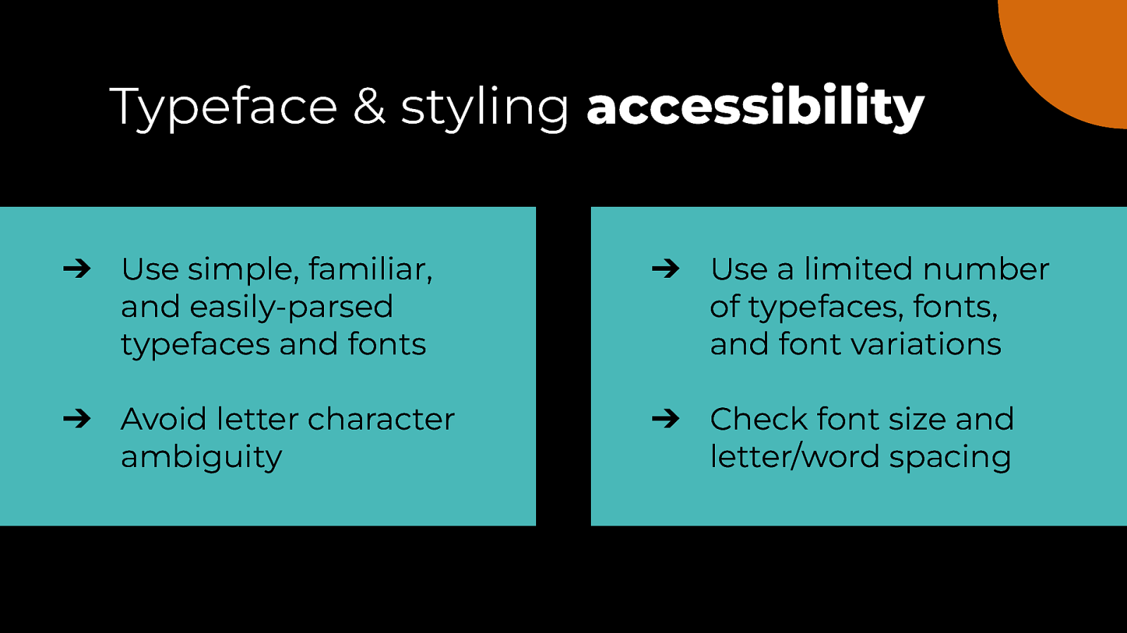
Typeface & styling accessibility ➔ Use simple, familiar, and easily-parsed typefaces and fonts ➔ Use a limited number of typefaces, fonts, and font variations ➔ Avoid letter character ambiguity ➔ Check font size and letter/word spacing
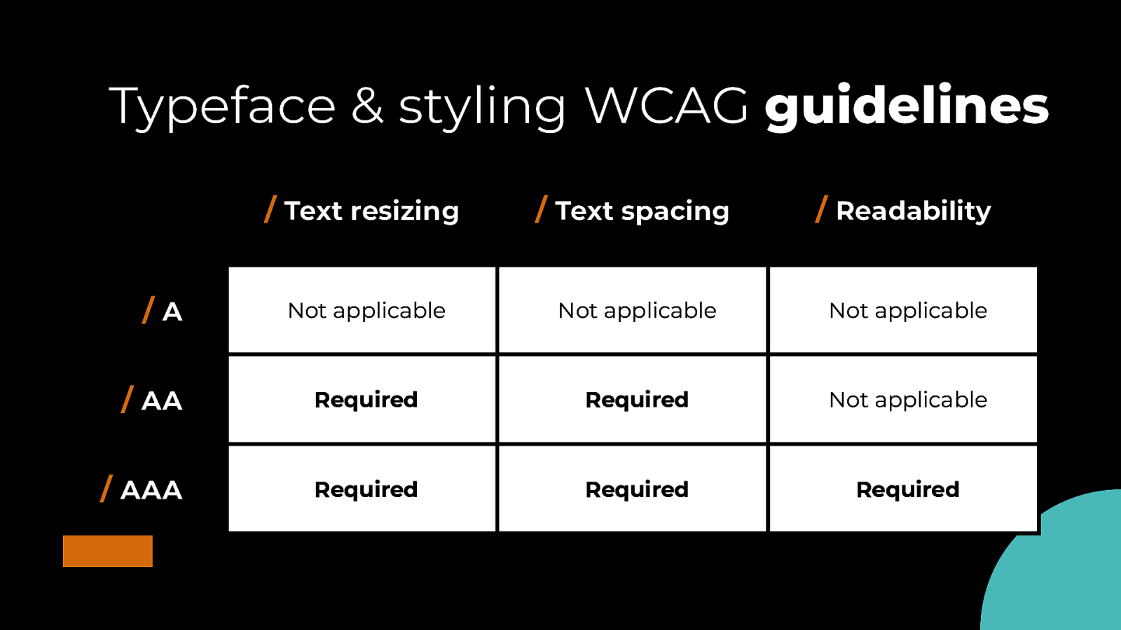
Typeface & styling WCAG guidelines / Text resizing / Text spacing / Readability Not applicable Not applicable Not applicable / AA Required Required Not applicable / AAA Required Required Required /A
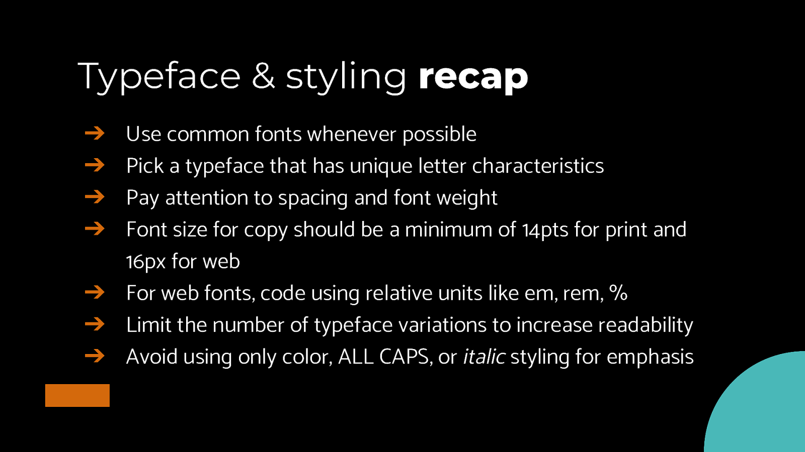
Typeface & styling recap Use common fonts whenever possible Pick a typeface that has unique letter characteristics Pay attention to spacing and font weight Font size for copy should be a minimum of 14pts for print and 16px for web ➔ For web fonts, code using relative units like em, rem, % ➔ Limit the number of typeface variations to increase readability ➔ Avoid using only color, ALL CAPS, or italic styling for emphasis ➔ ➔ ➔ ➔
02 Structure & layout
Structure & layout accessibility ➔ Simplify your layouts and organize similar content together ➔ Try not to exceed 80 characters per paragraph line ➔ White space helps with readability ➔ Avoid fully justified alignment for copy
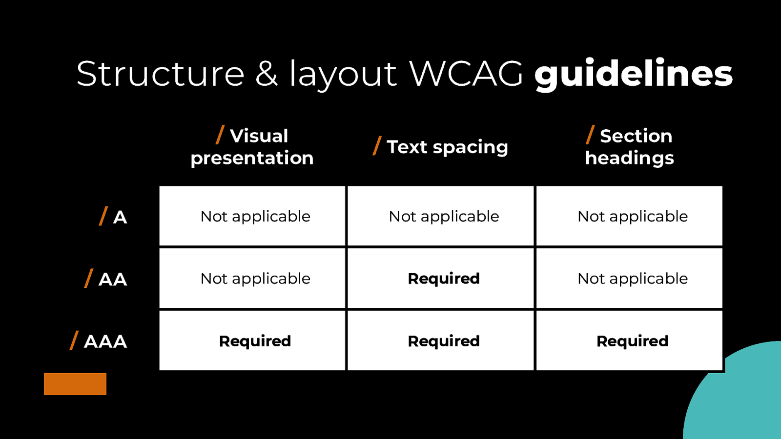
Structure & layout WCAG guidelines / Visual presentation / Text spacing / Section headings /A Not applicable Not applicable Not applicable / AA Not applicable Required Not applicable Required Required Required / AAA
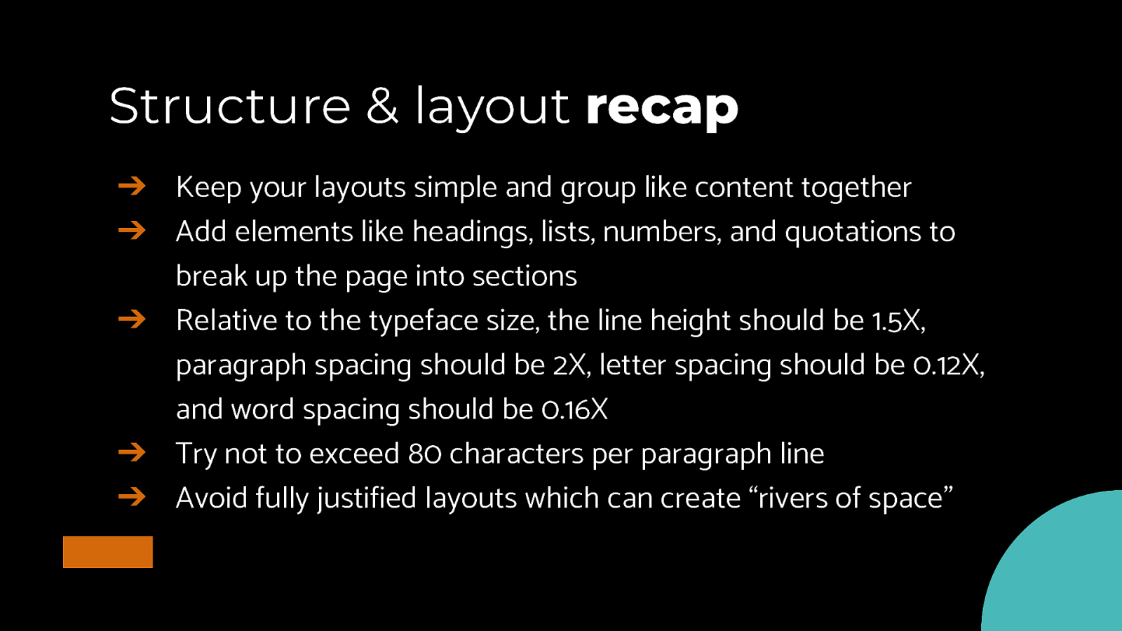
Structure & layout recap ➔ Keep your layouts simple and group like content together ➔ Add elements like headings, lists, numbers, and quotations to break up the page into sections ➔ Relative to the typeface size, the line height should be 1.5X, paragraph spacing should be 2X, letter spacing should be 0.12X, and word spacing should be 0.16X ➔ Try not to exceed 80 characters per paragraph line ➔ Avoid fully justified layouts which can create “rivers of space”
03 Color & contrast
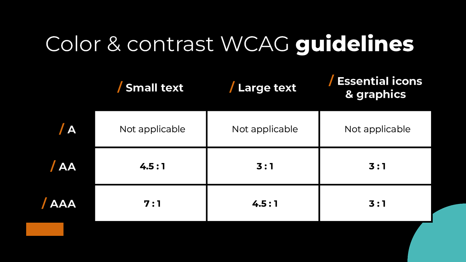
Color & contrast accessibility ➔ Small text must have a contrast ratio of 4.5:1 ➔ Large text & essential imagery must have a contrast ratio of 3:1 ➔ Use solid color backgrounds and dark gradients for text ➔ Do not rely on color alone to convey info
Color & contrast WCAG guidelines /A / AA / AAA / Essential icons / Small text / Large text Not applicable Not applicable Not applicable 4.5 : 1 3:1 3:1 7:1 4.5 : 1 3:1 & graphics
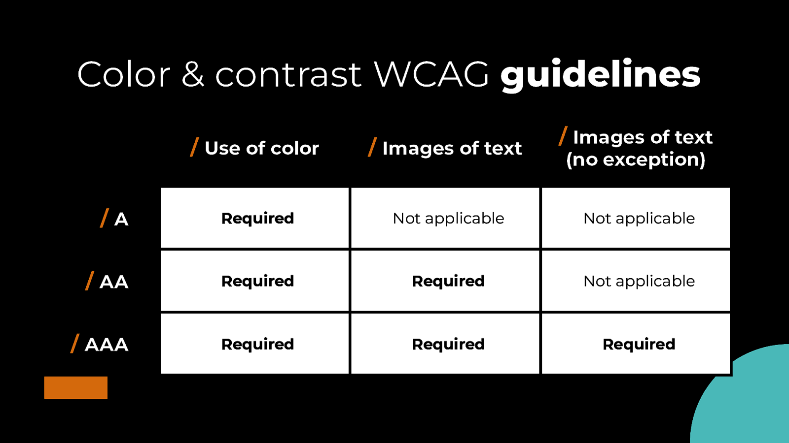
Color & contrast WCAG guidelines / Images of text / Use of color / Images of text /A Required Not applicable Not applicable / AA Required Required Not applicable / AAA Required Required Required (no exception)
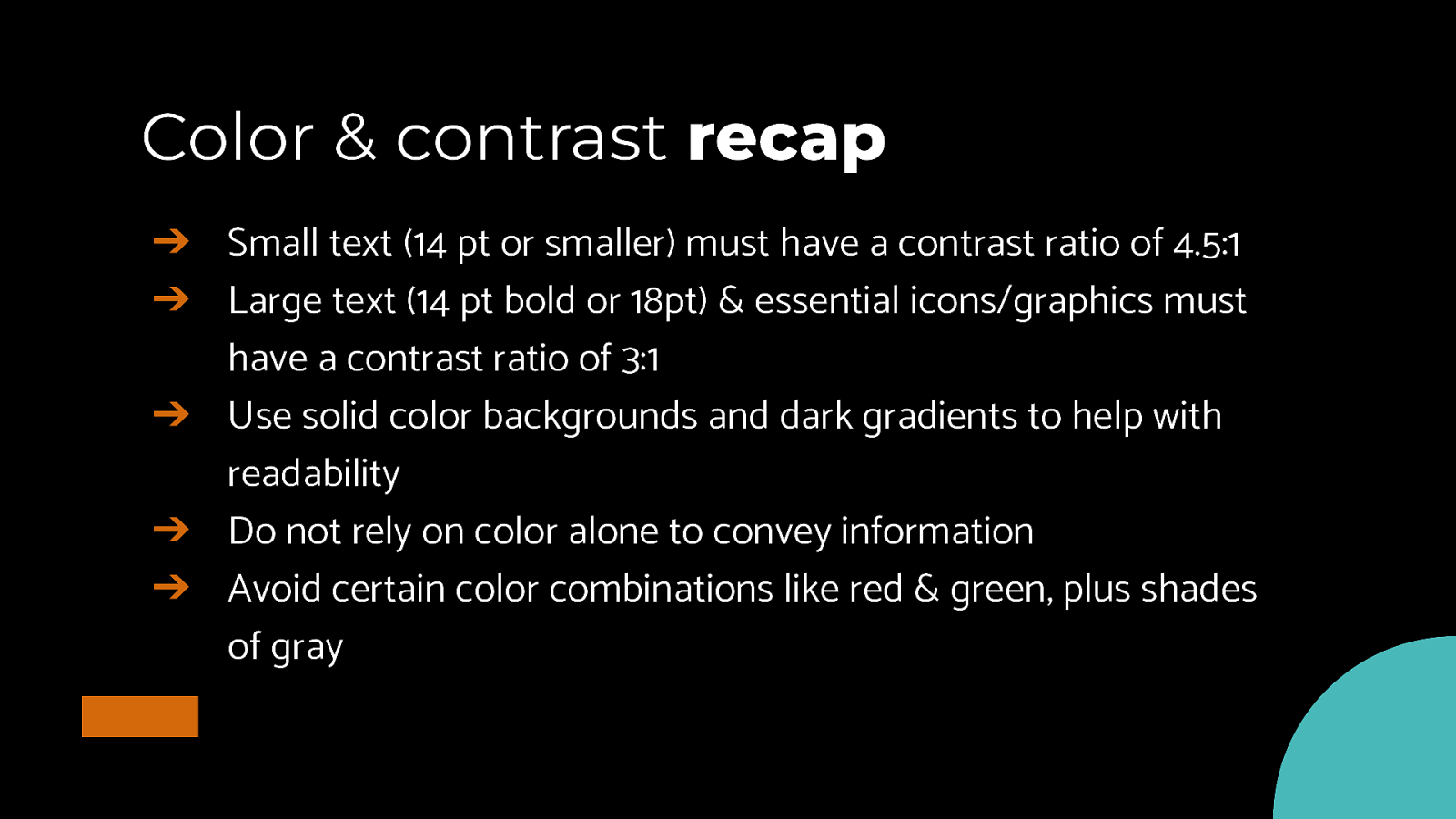
Color & contrast recap ➔ Small text (14 pt or smaller) must have a contrast ratio of 4.5:1 ➔ Large text (14 pt bold or 18pt) & essential icons/graphics must have a contrast ratio of 3:1 ➔ Use solid color backgrounds and dark gradients to help with readability ➔ Do not rely on color alone to convey information ➔ Avoid certain color combinations like red & green, plus shades of gray
“Recognizing the need is the primary condition for design.” Charles Eames
Thanks! Questions? @cariefisher

The most beautiful, well-crafted type in all the world will still fail if your audience can’t read it well. As a designer, you have the power to make choices that can make a world of difference to people with limited vision—young and old. Discover how to effectively set type to minimize challenges and maximize accessibility.


 for free. You
can too.
for free. You
can too.