A presentation at WordCamp US in November 2019 in St. Louis, MO, USA by Carie Fisher
Accessibility Instructor & Consultant cariefisher.com
Website accessibility or digital inclusion. We have all heard those terms by now, but what do they actually mean? Simply stated: website accessibility and digital inclusion is making sure the website you create is able to be used by as many people as possible.
According to the US Census Bureau, about 19% of the United States population identifies as having a disability, which is roughly 57 million people. Thinking of these numbers in a different way, there are more people with disabilities than twice the number of people living in the state of New York. If you consider a global audience, you are talking about 15% of the world’s population or one billion people. Or almost 18 times the number of people living in the state of NY.
That is a huge number of people who could benefit from an accessible website right from the start, but keep in mind, the official numbers do not even include people that either do not identify as having a disability or those populations that could benefit from accessible websites, such as English as a second language (ESL) users and the aging population — so the number of people needing accessible websites in reality could be much higher.
https://www.w3.org/WAI/WCAG20/quickref/
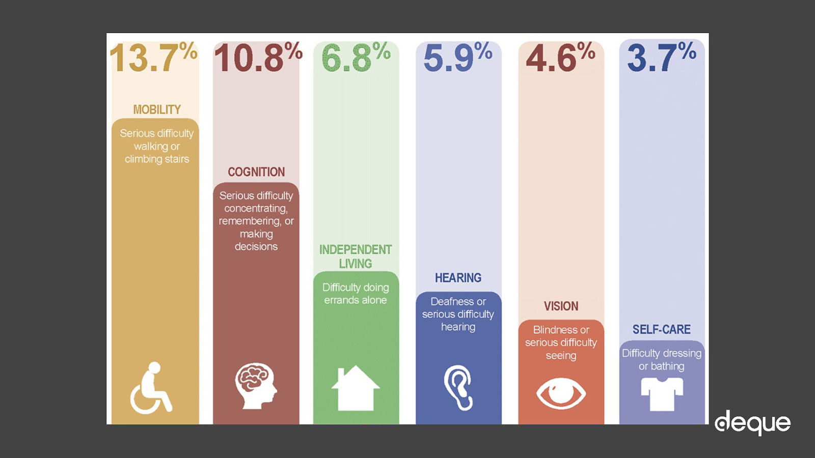
https://www.cdc.gov/ncbddd/disabilityandhealth/infographic-disability-impacts-all.html
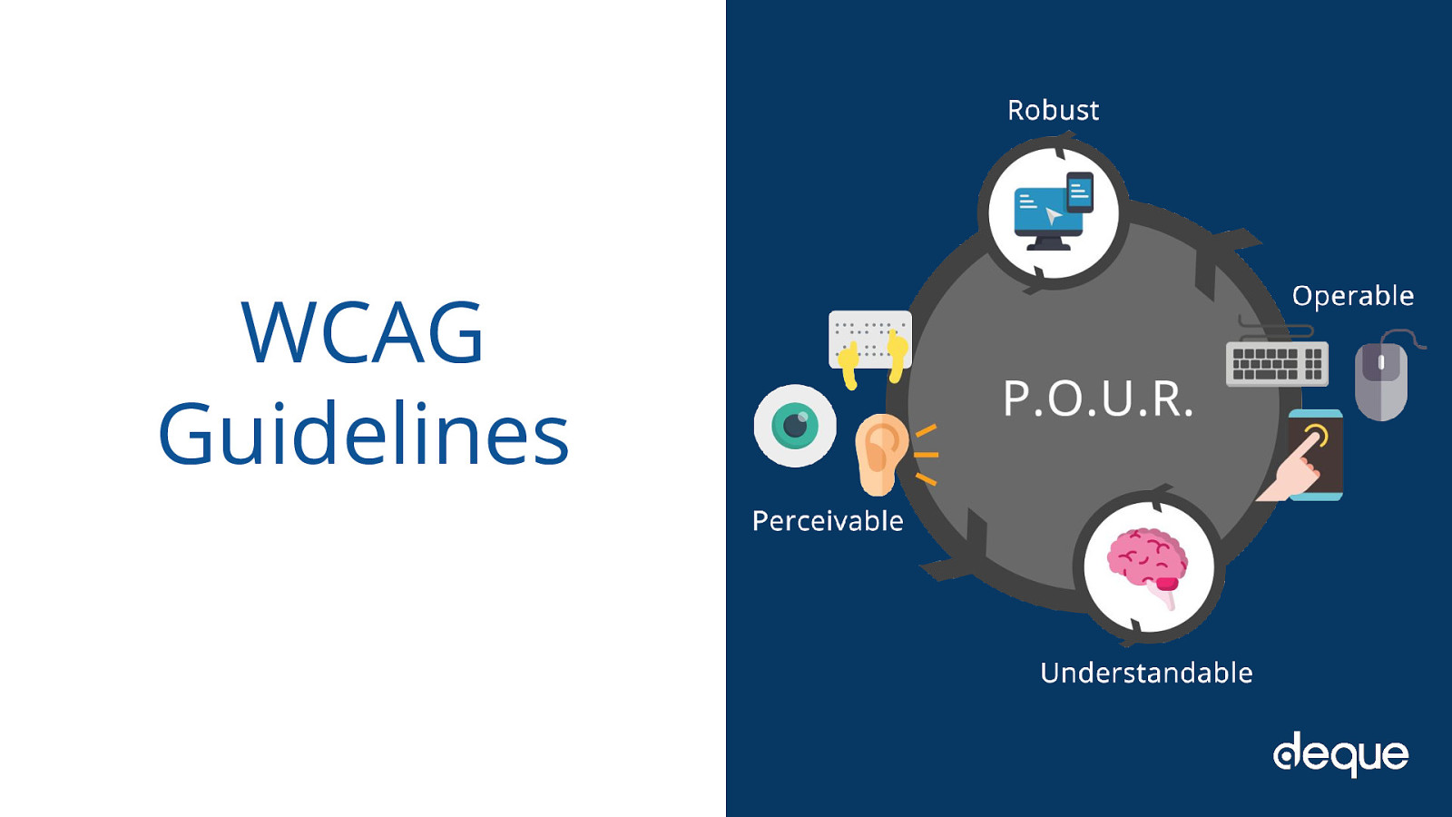
The WCAG guidelines are an international set of principles to aid developers in creating accessible websites. The spirit of POUR isn’t about rigidly adhering to hard and fast rules; it’s about understanding and meeting the diverse needs of our users.
The rules are broken into four main categories that we will go over now.
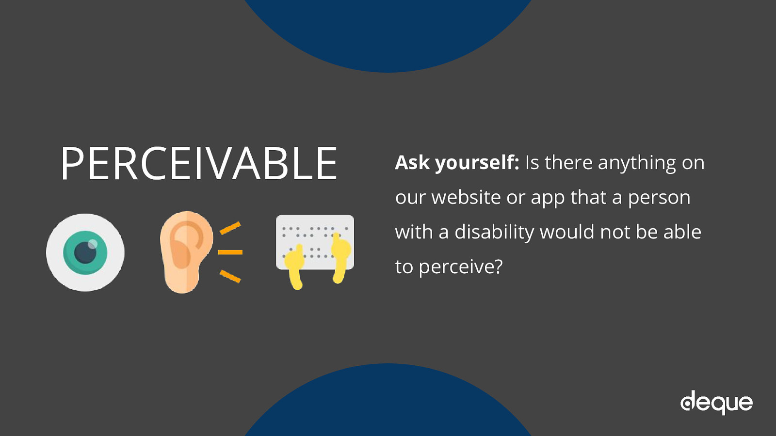
Ask yourself: Is there anything on our website or app that a person with a disability would not be able to perceive?
Ask yourself: Can users control interactive elements of our website/app? Does our website have any traps?
Ask yourself: Is all of the content clearly written? Are all of the interactions easy to understand? Does the order of the page make sense?
Ask yourself: Does our website only support the newest browsers or operating systems? Is our website developed with best practices? Does this work in both landscape and portrait orientation?
“a11y” is a numeronym that is short for “accessibility” A -> [11 letters] -> Y
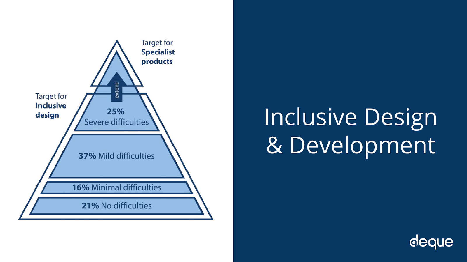
The term Inclusive Design is not a new one. It is a phrase that has been around since 2005. It is defined as “The design of mainstream products and/or services that are accessible to, and usable by, as many people as reasonably possible…without the need for special adaptation or specialized design.”
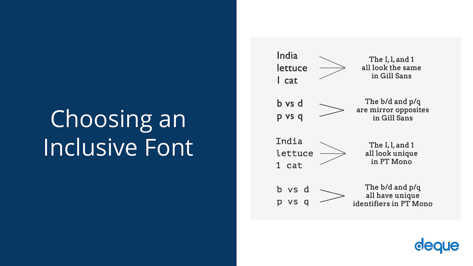
Font families are a good example of a place where you can make an inclusive design and development choice. Your choice of typeface/fonts can make or break a website, especially from an accessibility point of view. English as a second language (ESL) users, users with low vision, and users with reading, learning, and attention disorders (ex. dyslexia, ADHD), all benefit from accessible typography.
Researchers estimate that 10-17% of the U.S. population has dyslexia. That is a pretty significant percentage, which is even higher than current Internet Explorer, Edge, Firefox and Opera users combined (as of September 2017).
So if we choose a typeface we know that is legible for people with dyslexia (as shown by the top section on the pyramid with severe difficulties), then we also know every group under that section can also read the font. People who are blind or have more serious sight issues other than dyslexia would need additional typography or assistive technology considerations.
For example, people with visual impairments or dyslexia, certain letters or combinations of letters can be confusing, so it’s important that letter shapes are clearly defined and unique. Common offenders are the “I” (ex. India), “l” (ex. lettuce) and “1” (ex. one). Likewise, characters like “b” and “d” and “q” and “p” can sometimes be mirrored (either left-right or up-down) so words could be flipped into a nonsensical words or sometimes into a real word that would entirely change the meaning of the content.
There are some characteristics that can aid legibility. So when you are looking for your next font family, pay particular attention to the following things and you’ll be on your way to choosing an accessible font: Prominent ascenders (ex. the vertical line in d). Prominent descenders (ex. the down-pointing line in y). A d/b or p/q combination which are not an exact mirror image of one another. Uppercase I, lowercase l, and 1 must all have different characteristics from one another. Avoid fonts that have tight letter spacing; these will be difficult for some users to read. Kerning is also important, particularly between r and n. Otherwise, words like “barn” could be read as “bam” or “modern” could change to “modem.”
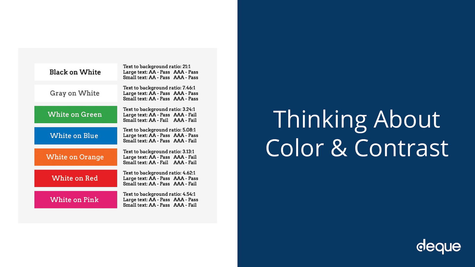
With the number of people living with some variant of color blindness, low vision, or complete blindness (all together roughly 9% of the global population), this is a very large area where designers can have a direct and immediate impact on website accessibility.
There are a lot of things to consider when making your content accessible from a color and contrast perspective including:
Use color/contrast testing tools and simulators to measure contrast ratios for your website design. According to the WCAG contrast guidelines, small text should have a contrast ratio of at least 4.5:1 against its background. While large text (18pt and larger) should have a contrast ratio of at least 3:1 against its background. Use solid color backgrounds–reading text on busy backgrounds, overlays, or gradients is difficult, especially if it does not have enough contrast. Use colors on the opposite ends of the color spectrum–avoid red/green and blue/yellow combinations when you can. Be careful with light shades of color, especially grays–they are difficult to see for people with low vision. Do not rely on color alone to convey info to your users. For example, make sure your links have underlines, or some other visual indicator besides color.

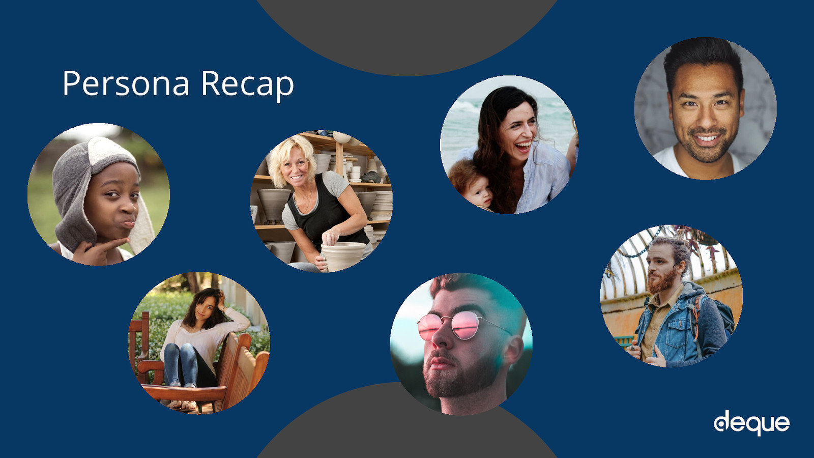
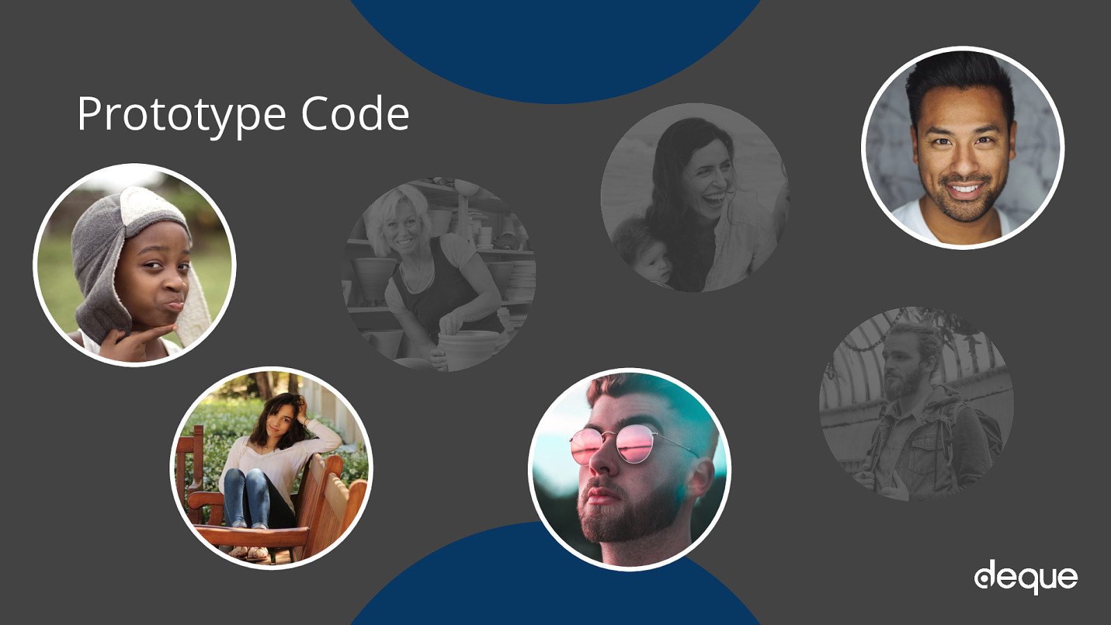
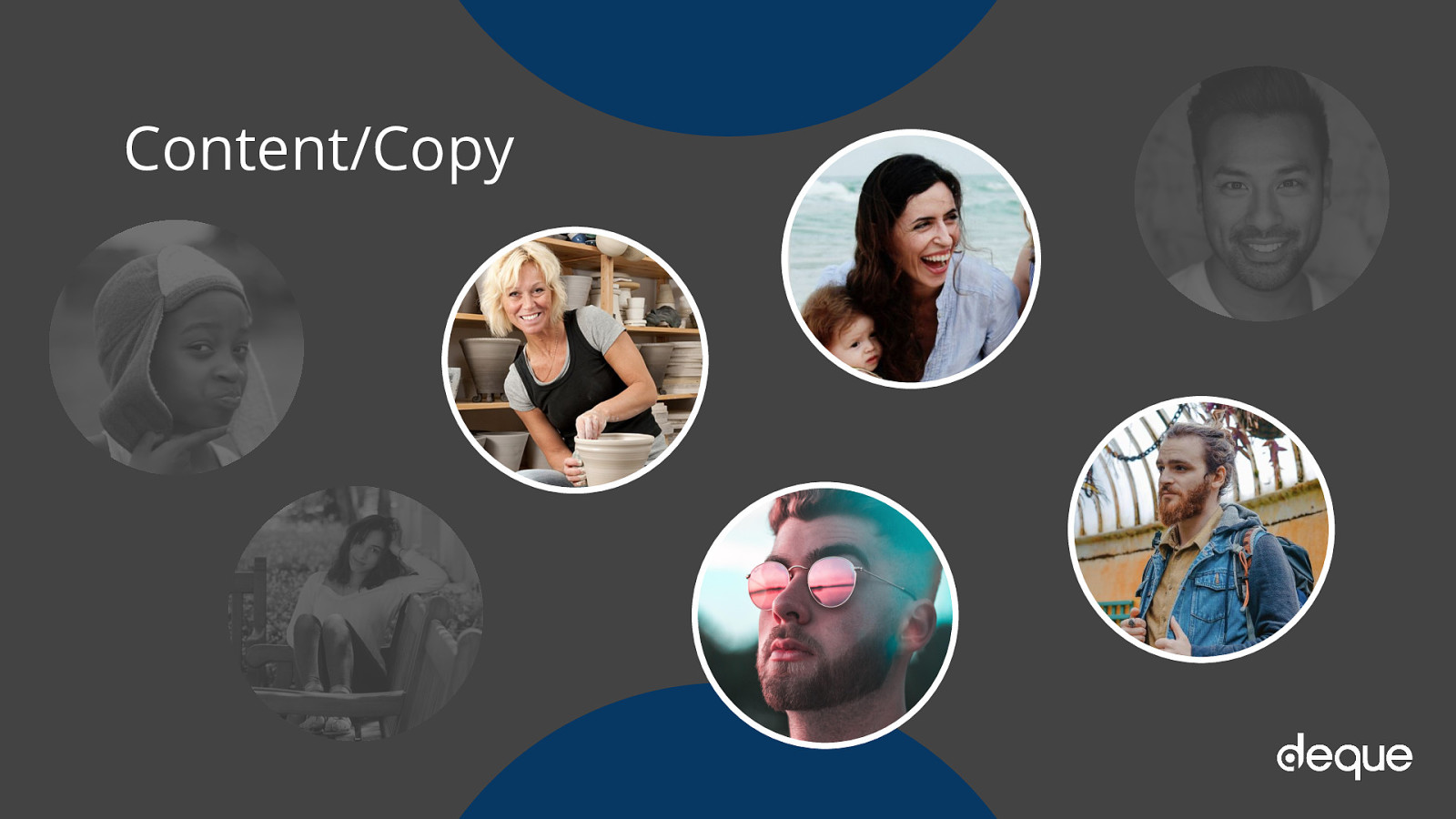
Personas answer the question, “Who are we designing and developing for?” and they help to align strategy and goals to specific user groups. A user persona can be formal or informal…on paper on in your head. It is important when planning a new website to keep people of varying backgrounds, ethnicities, genders, ages, technical abilities, etc. as a part of your personas so that you’re working toward meeting a realistic variety of perspectives and needs
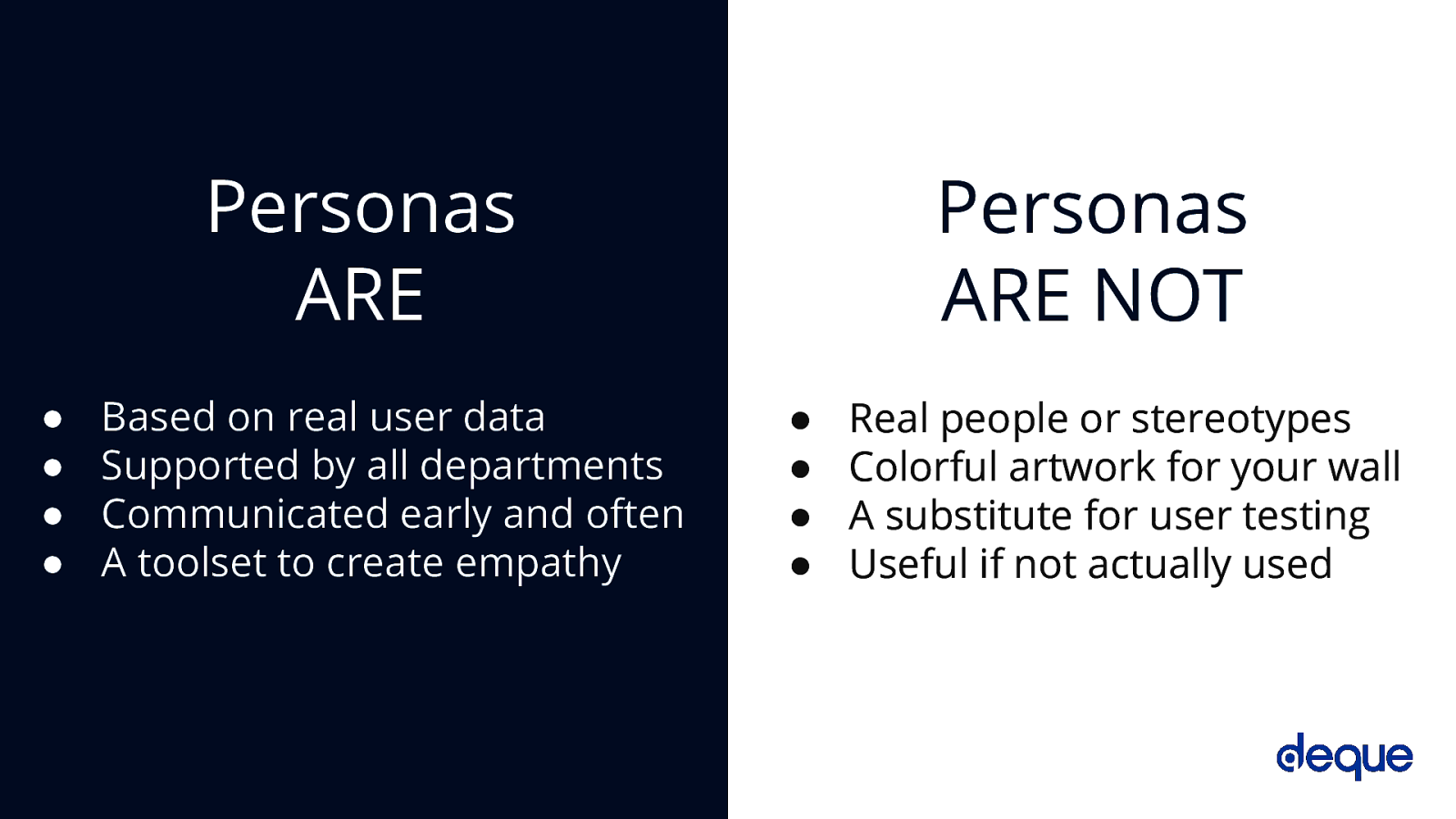
Personas ARE Based on real user data Supported by all departments Communicated early and often A toolset to create empathy
Personas ARE NOT Real people or stereotypes Colorful artwork for your wall A substitute for user testing Useful if not actually used
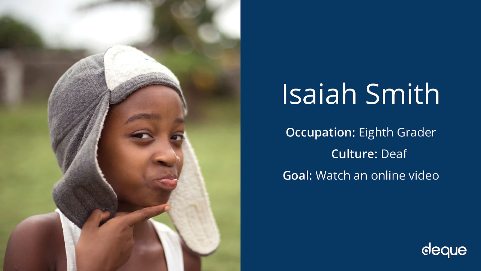
Occupation: Eighth Grader Culture: Deaf Goal: Watch an online video


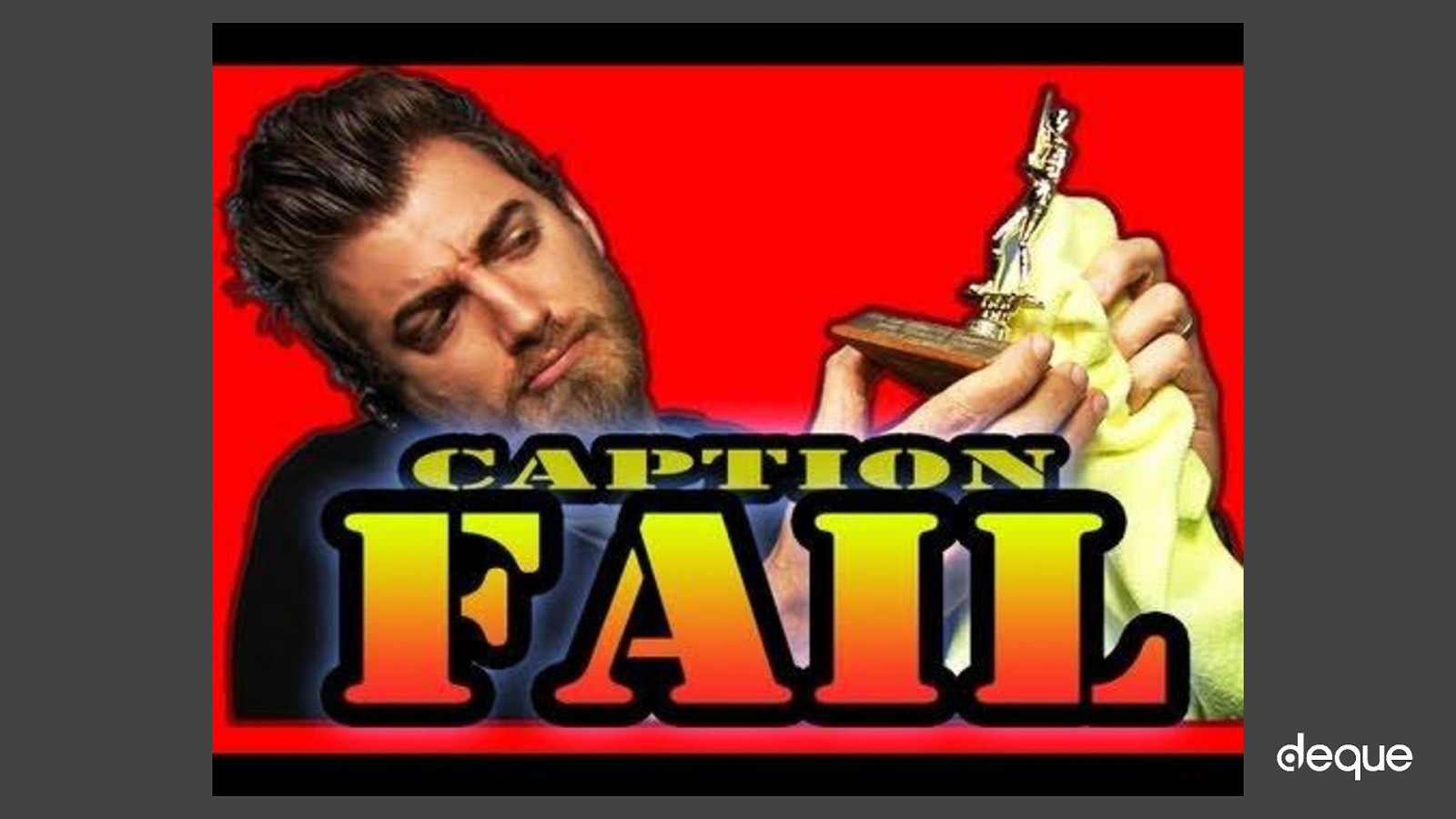
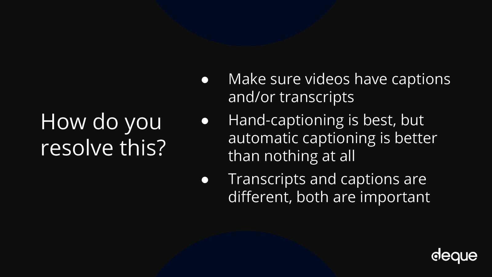
● Make sure videos have captions and/or transcripts ● Hand-captioning is best, but automatic captioning is better than nothing at all ● Transcripts and captions are different, both are important
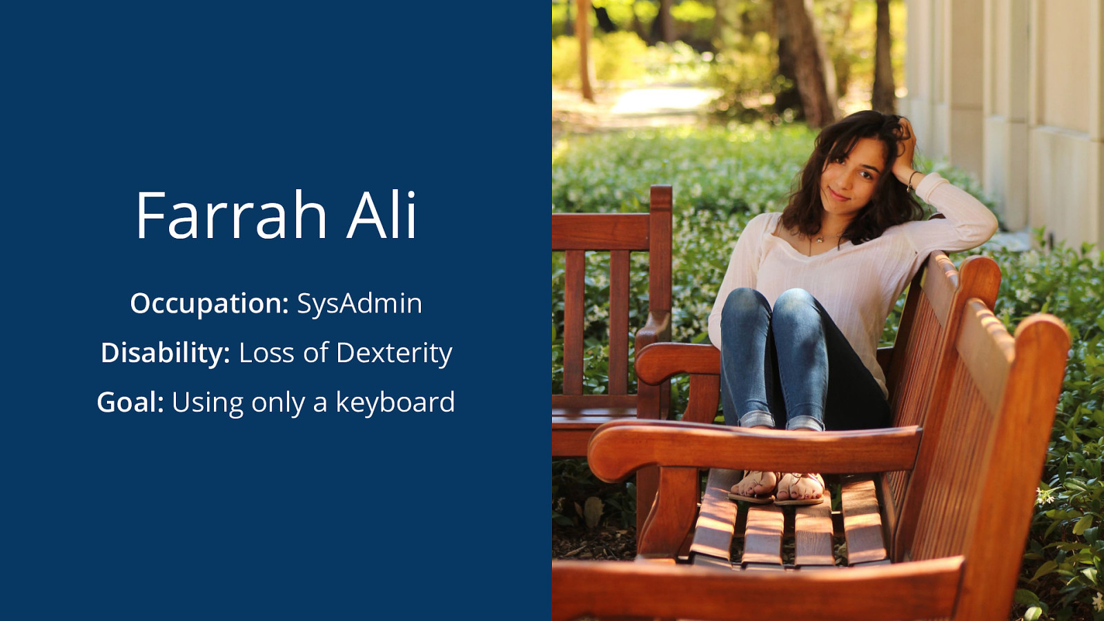
Occupation: SysAdmin Disability: Loss of Dexterity Goal: Using only a keyboard
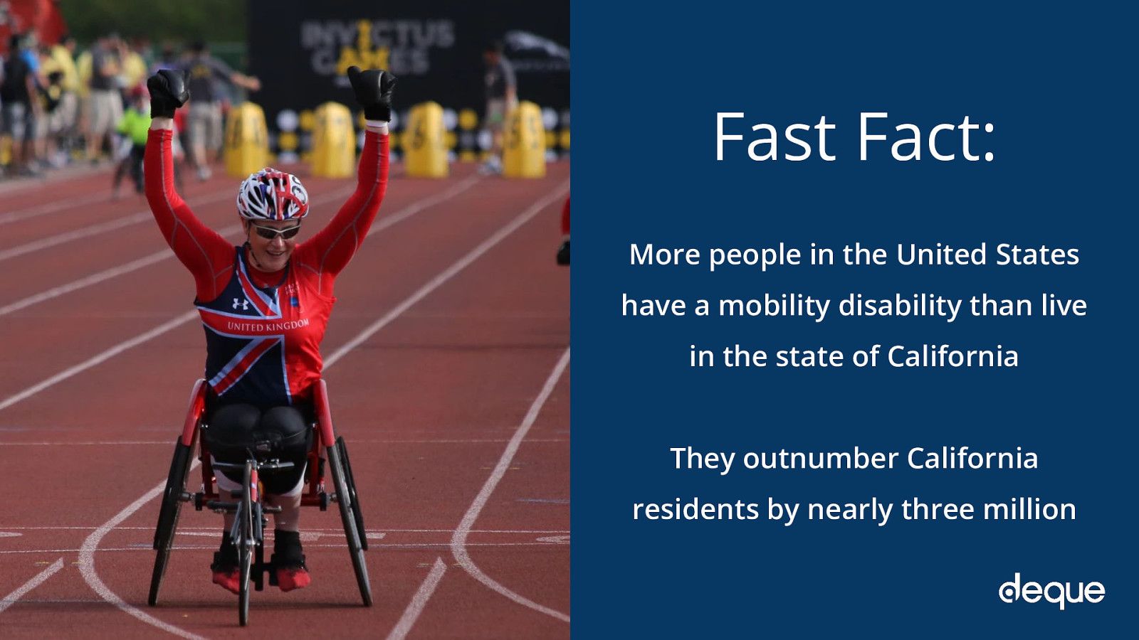
More people in the United States have a mobility disability than live in the state of California They outnumber California residents by nearly three million

● Plan out heading and page structure - make sure it makes sense to all users and devices ● Place important actions at the top or bottom of the page ● Use skip links and don’t forget your focus indicators

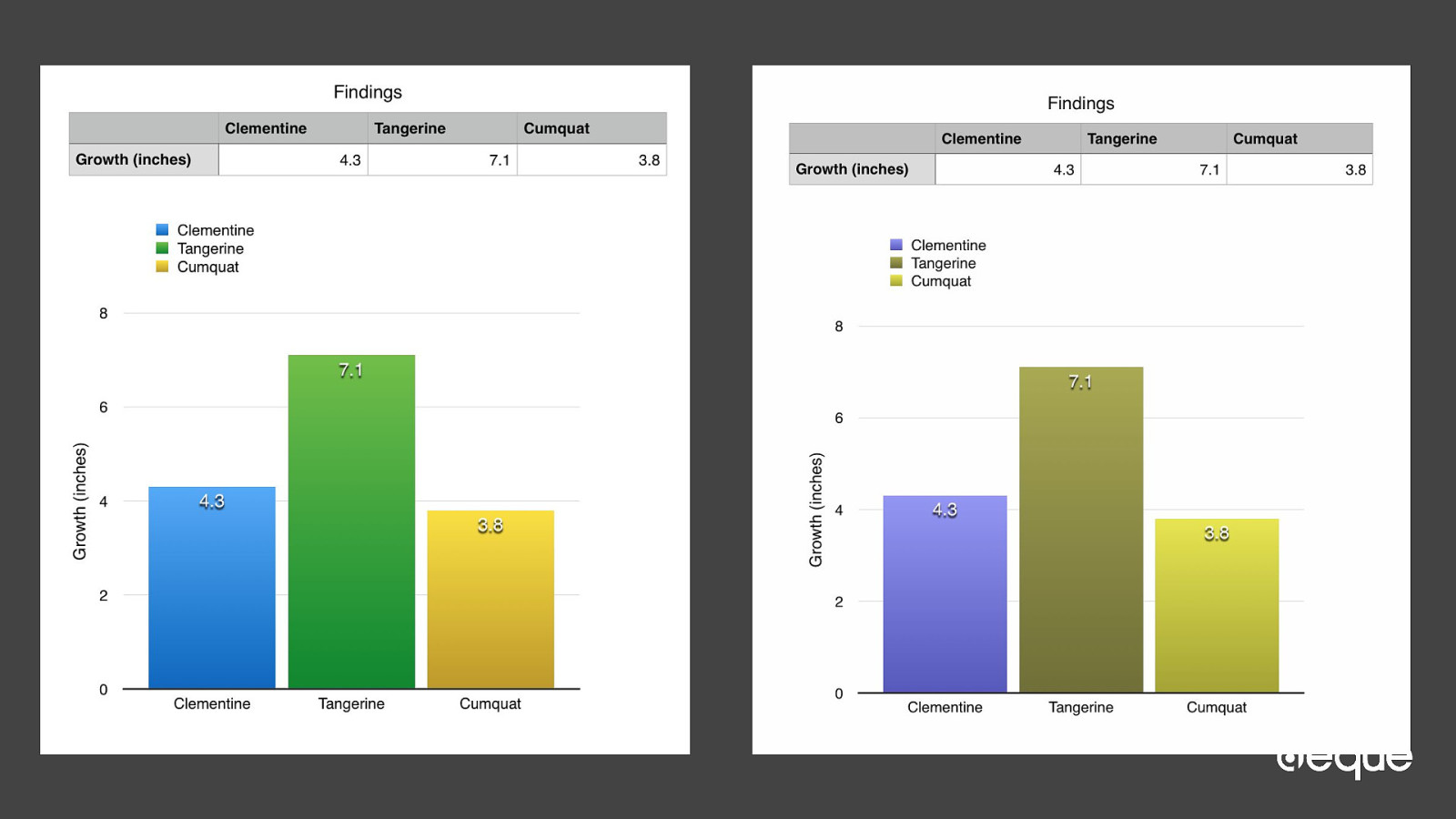
Occupation: Botany student Disability: Colorblind Goal: Analyze graphed data
1 in 12 men have some type of colorblindness


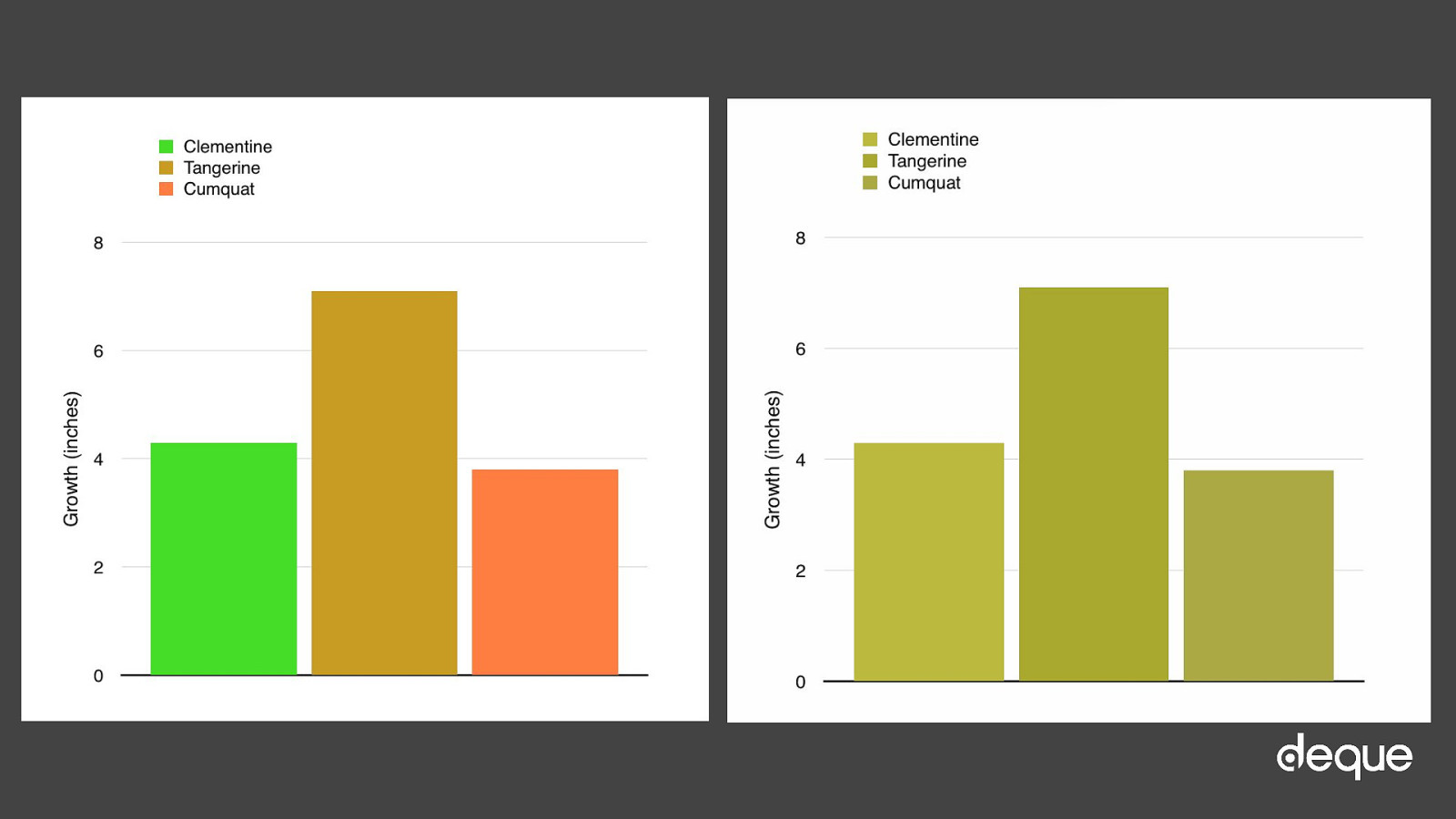
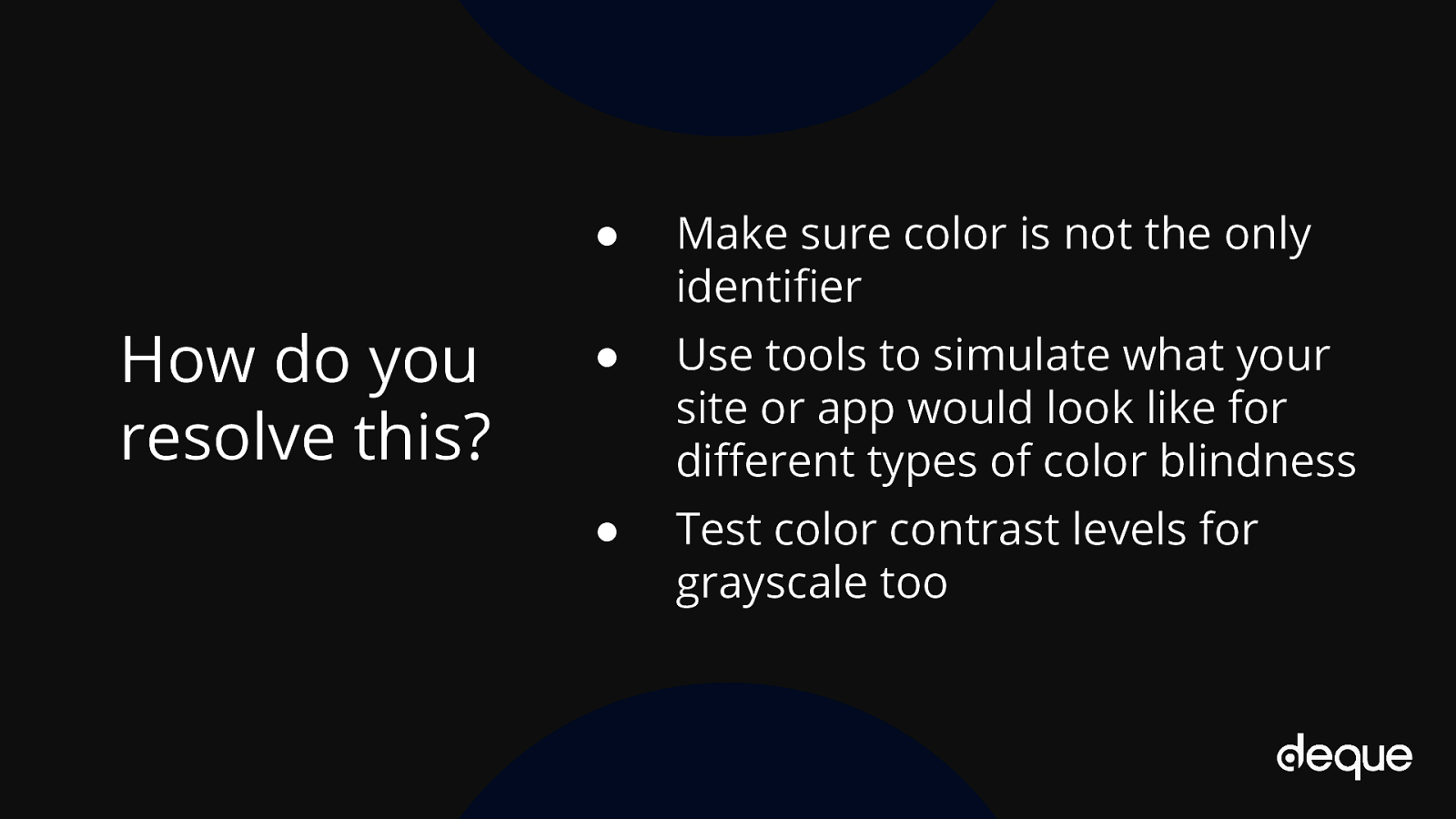
● Make sure color is not the only identifier ● Use tools to simulate what your site or app would look like for different types of color blindness ● Test color contrast levels for grayscale too
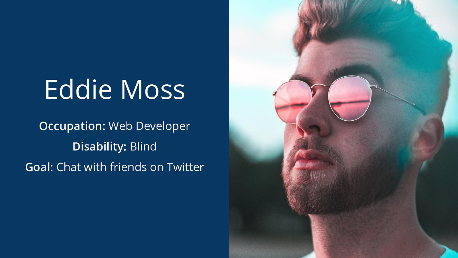
Occupation: Web Developer Disability: Blind Goal: Chat with friends on Twitter


// Bad example. <img src=”../assets/snail.jpg” alt=”snail”>

// Good example. <img src=”../assets/snail.jpg” alt=”Small, pink snail resting on top of a gray capped mushroom with green moss in the background.”>

// Please never do this. Not even if the SEO guy tells you to. <img src=”../assets/snail.jpg” alt=”Save on nature tours at national parks coupons tours wildlife ecology educational field trips vacations cheap free parking”>
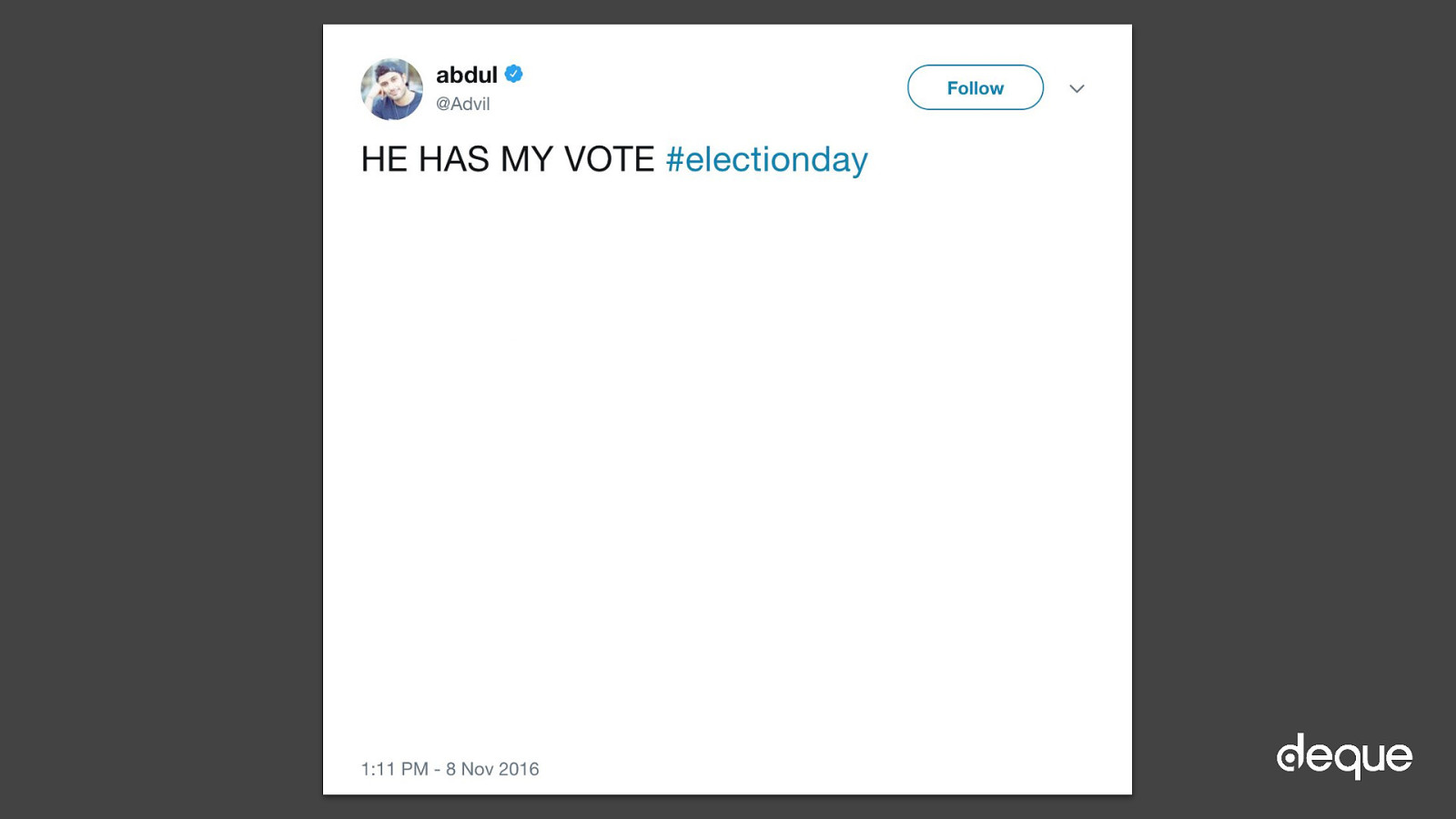

● Turn on “Compose image descriptions” on in your Twitter account: Settings > Accessibility ● Add context to image/gif posts on all social media platforms ● Think about alt text like a tweet. Aim to briefly convey as much information as possible
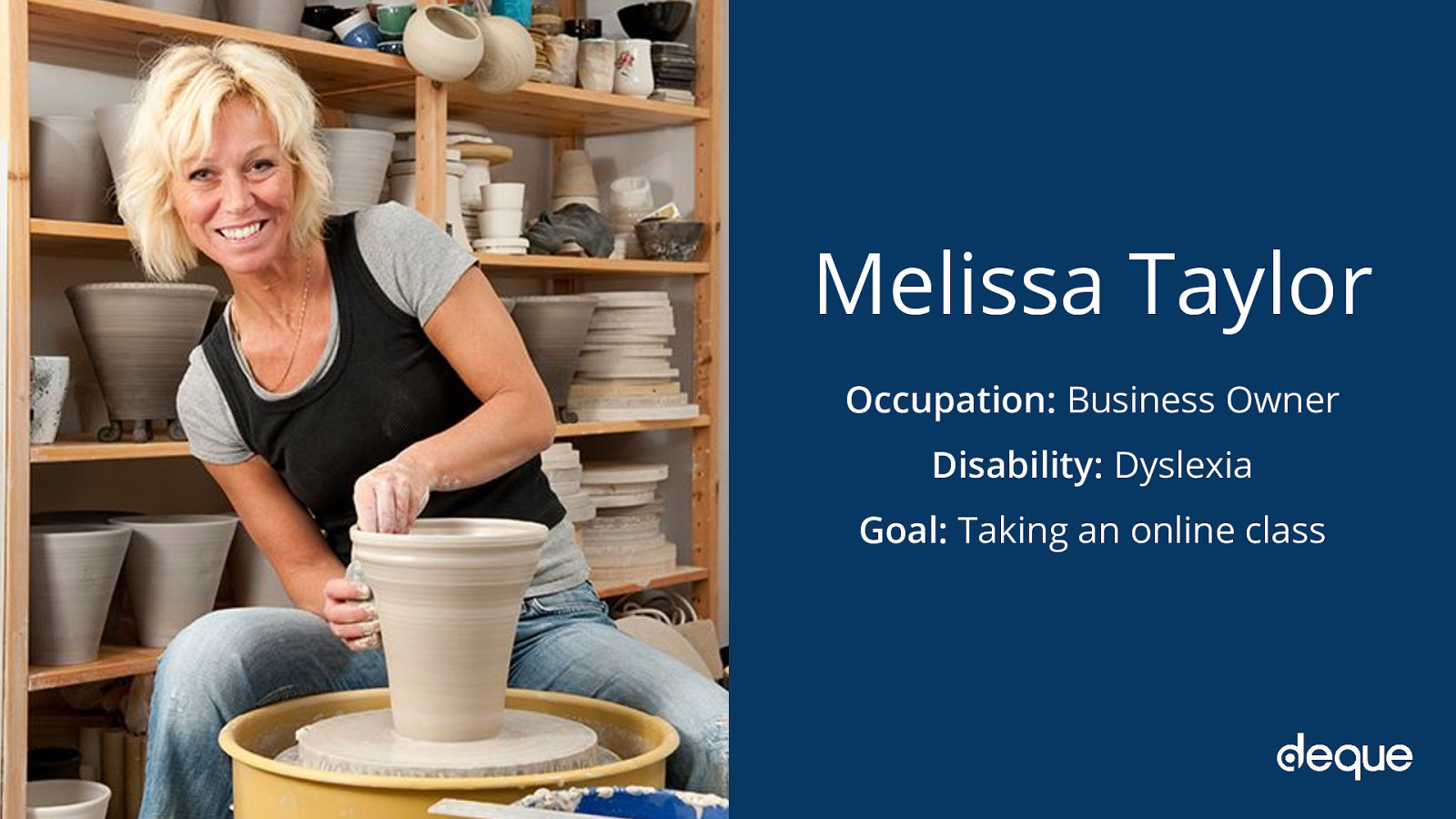
Occupation: Business Owner Disability: Dyslexia Goal: Taking an online class

● Use an inclusive font in relative units like rems and ems ● Make sure to add enough margins, padding, and line spacing to your text ● Break text into small pieces or use bullet points/numbers
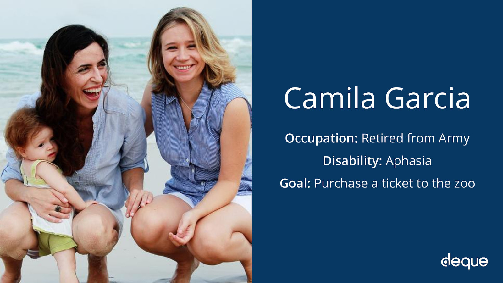
Occupation: Retired from Army Disability: Aphasia Goal: Purchase a ticket to the zoo
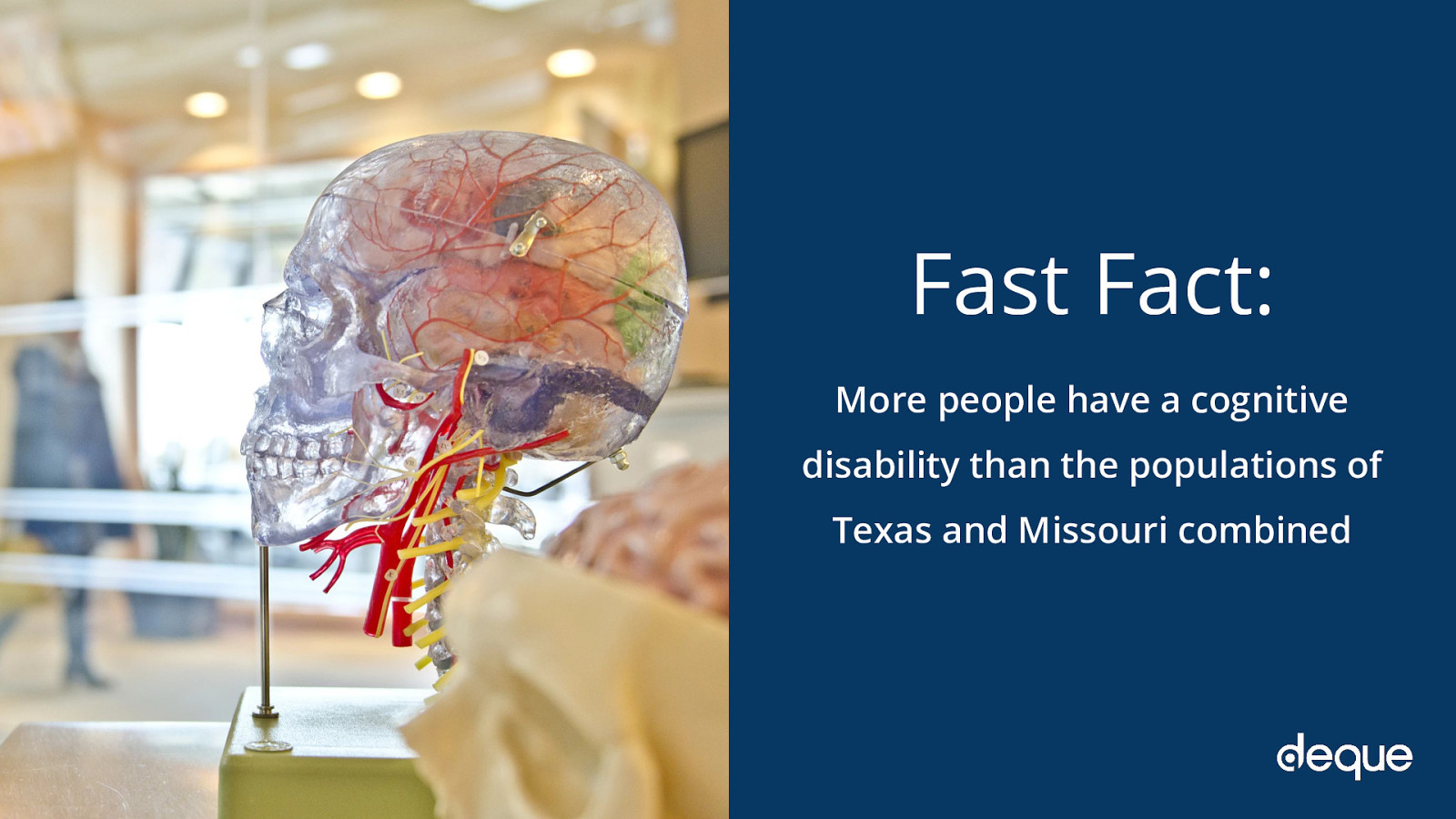
More people have a cognitive disability than the populations of Texas and Missouri combined

● Use icons along with text on important features ● Make sure there is enough white space on the page and minimize or eliminate distractions ● Give users enough time to complete tasks

Occupation: Concert promoter Disability: Vestibular disorder Goal: Visit a new band’s website

● Do not automatically play your media or slideshows ● Allow the user to take control of media-based features ● Be careful of gifs, animations, and other “delights” that may trigger vertigo and seizures






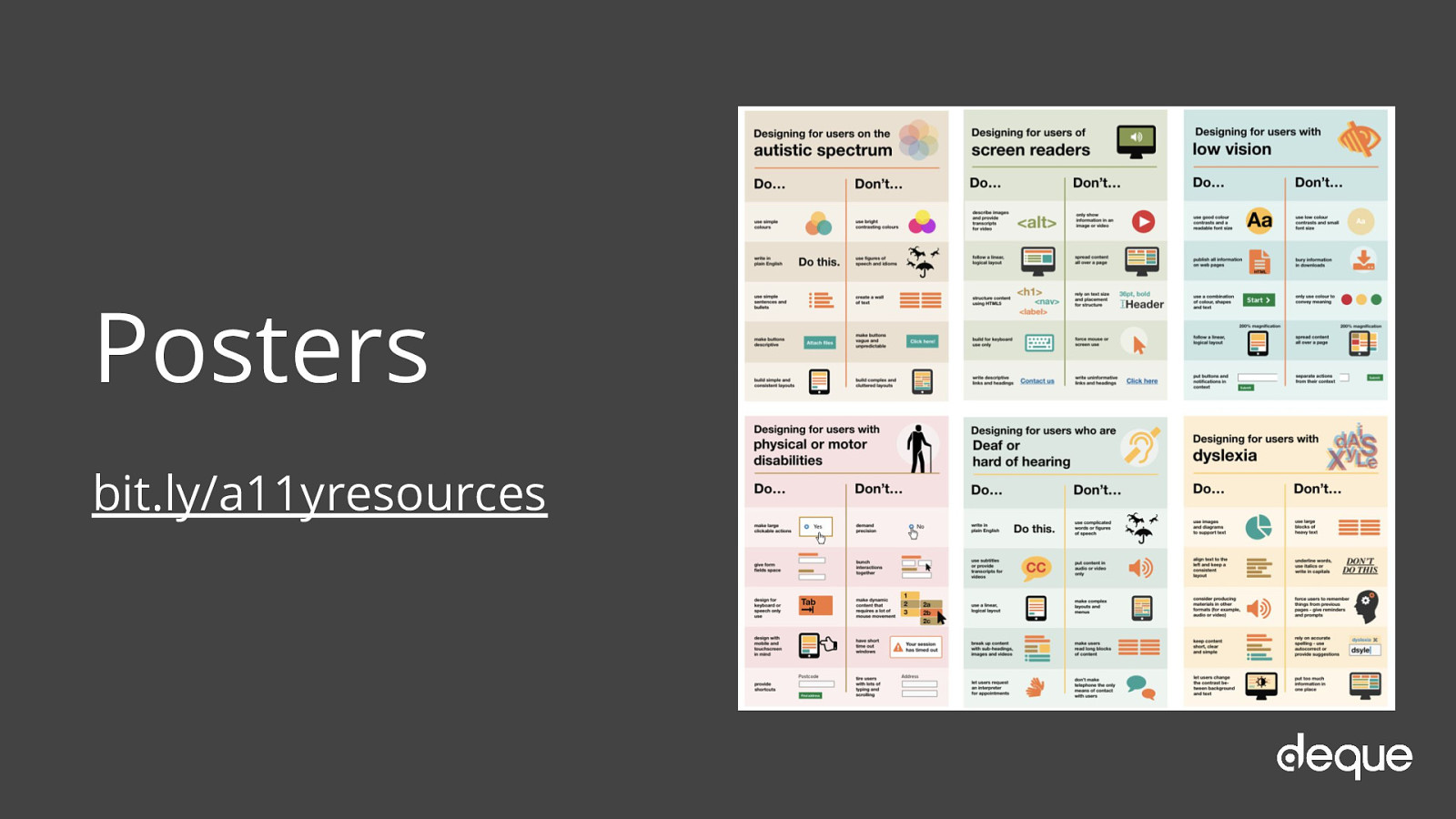
bit.ly/a11yresources

The power of the Web is in its universality. Access by everyone regardless of disability is an essential aspect. Tim Berners-Lee
