
A presentation at Drupalcon Dublin 2016 in in Dublin, Ireland by Cristina Chumillas

IMPROVING THE RESPONSIVE WEB DESIGN PROCESS IN 2016 Cristina Chumillas @chumillas @chumillas
Cristina Chumillas DESIGNER AND FRONTEND DEVELOPER AT YMBRA ckrina @chumillas @chumillas
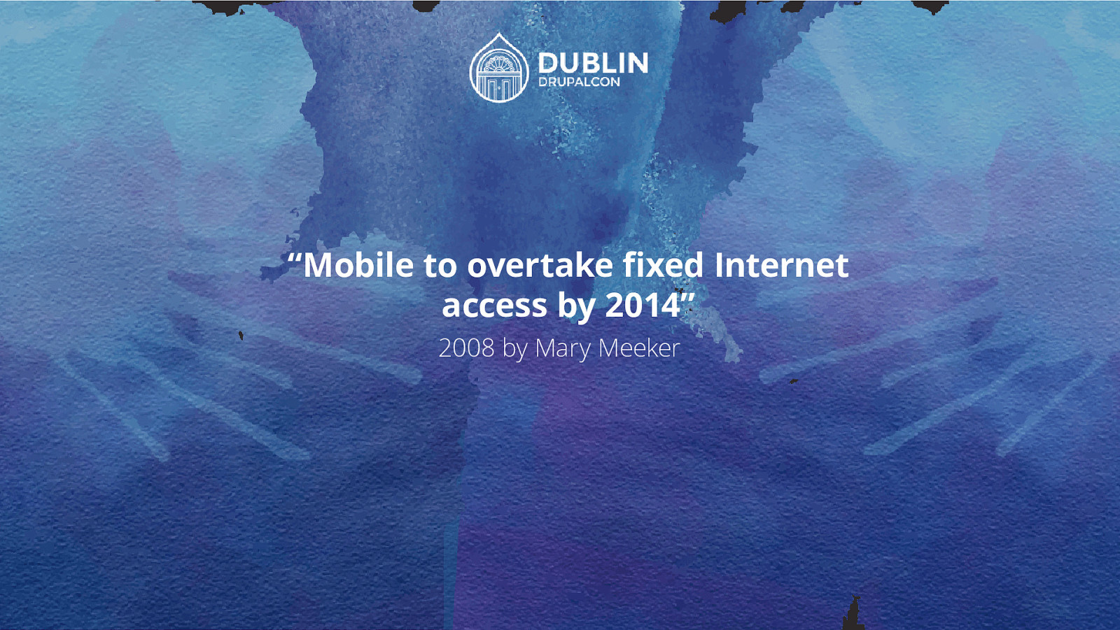
“Mobile to overtake fixed Internet access by 2014” 2008 by Mary Meeker
Modern Design processes
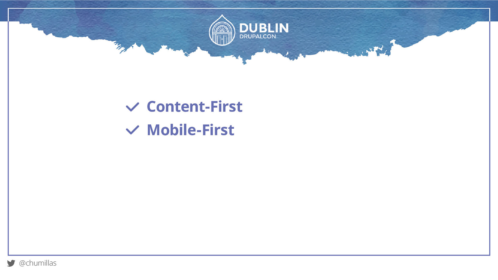
Content-First Mobile-First @chumillas
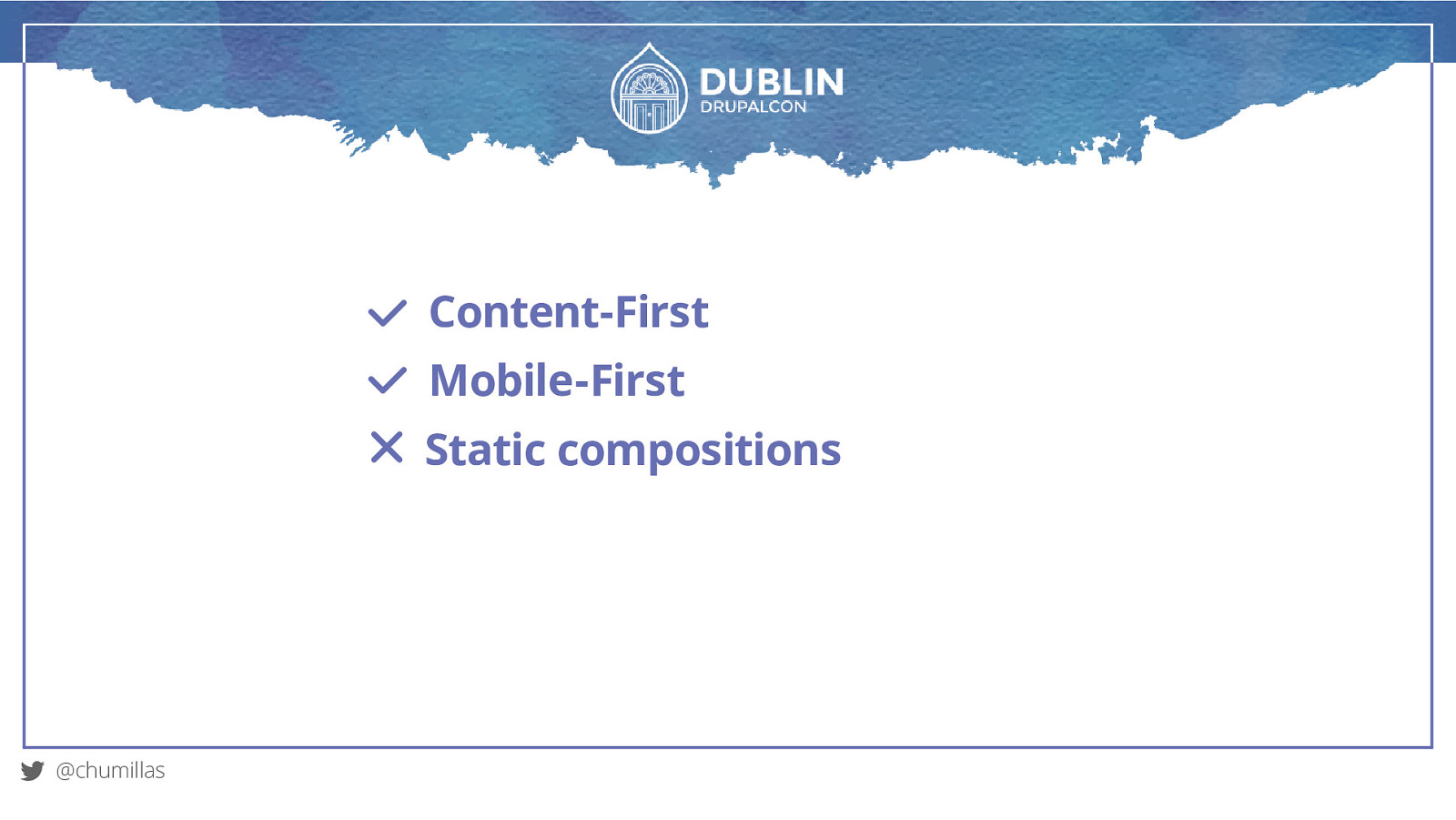
Content-First Mobile-First Static compositions @chumillas
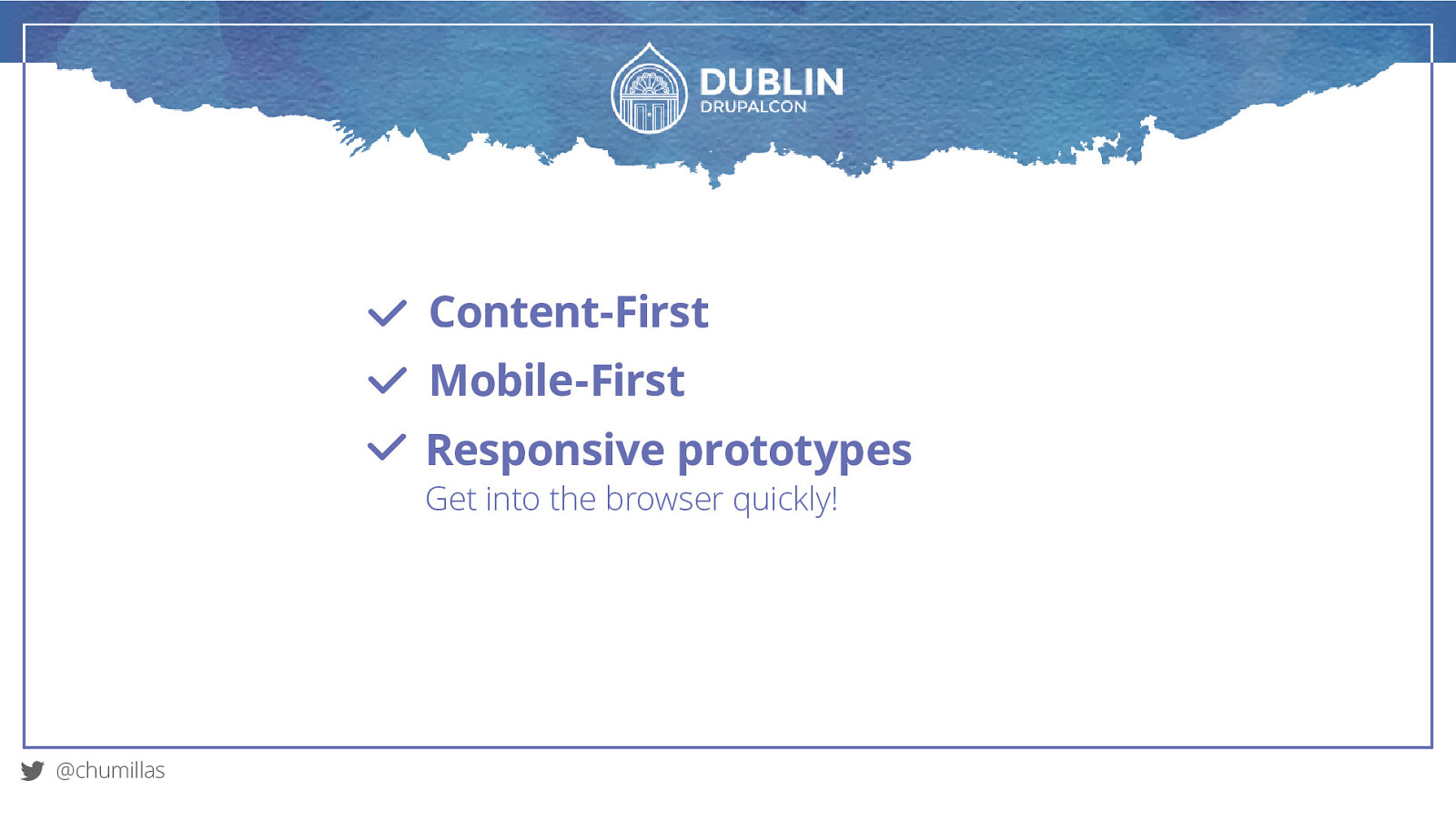
Content-First Mobile-First Responsive prototypes Get into the browser quickly! @chumillas
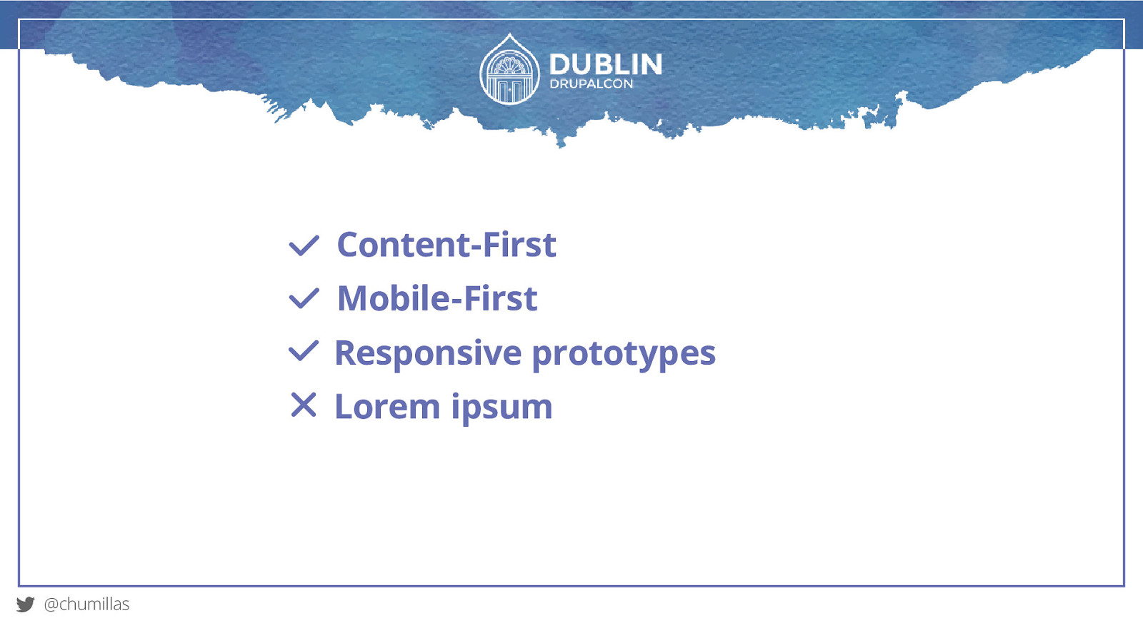
Content-First Mobile-First Responsive prototypes Lorem ipsum @chumillas
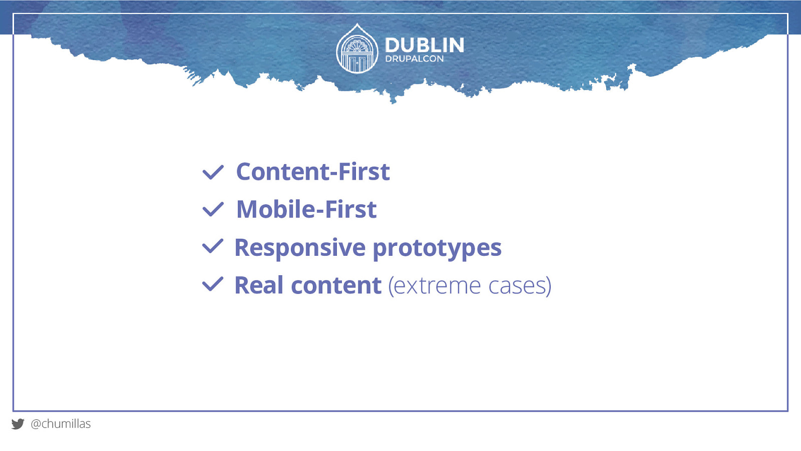
Content-First Mobile-First Responsive prototypes Real content (extreme cases) @chumillas
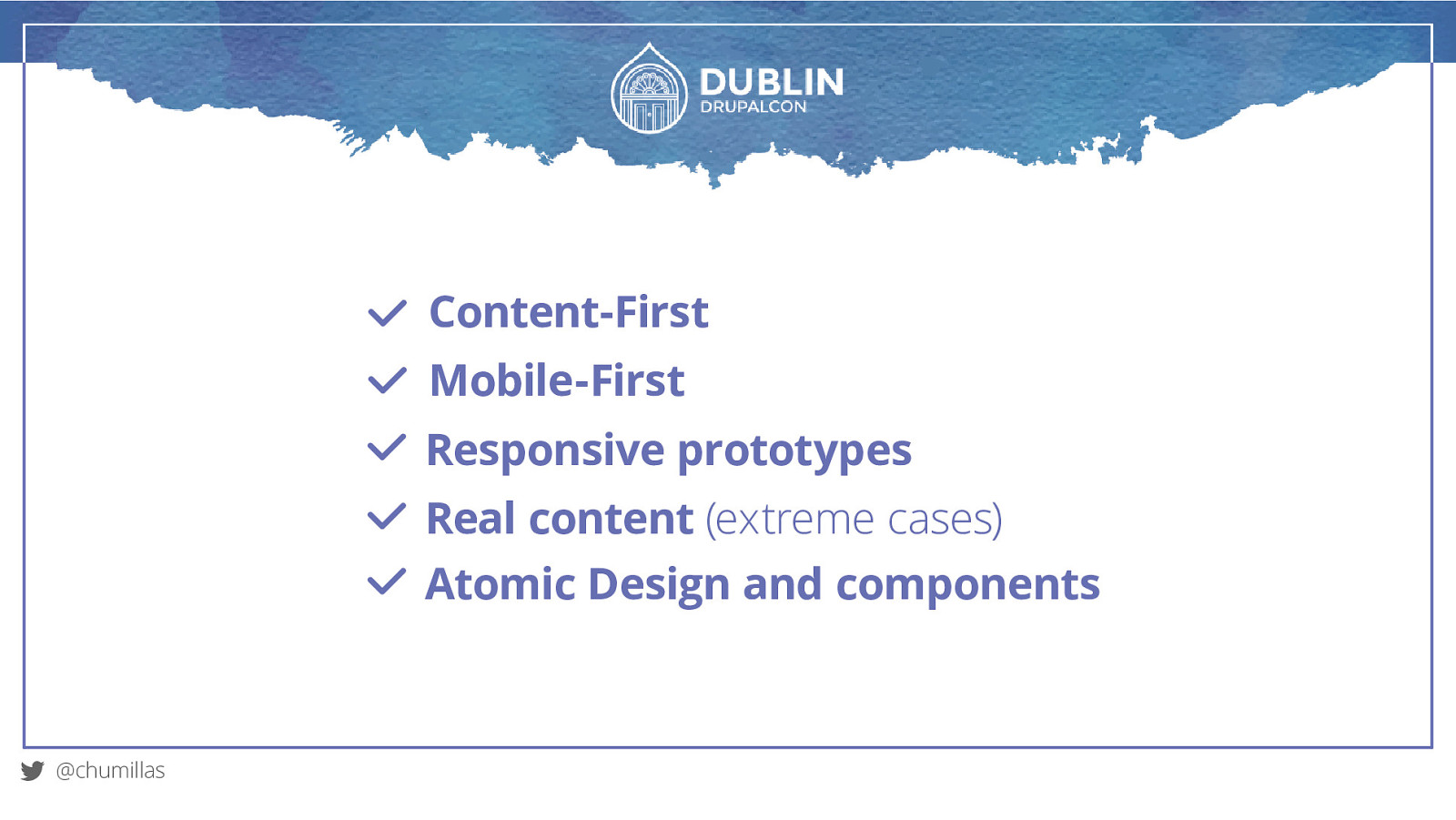
Content-First Mobile-First Responsive prototypes Real content (extreme cases) Atomic Design and components @chumillas
Performance
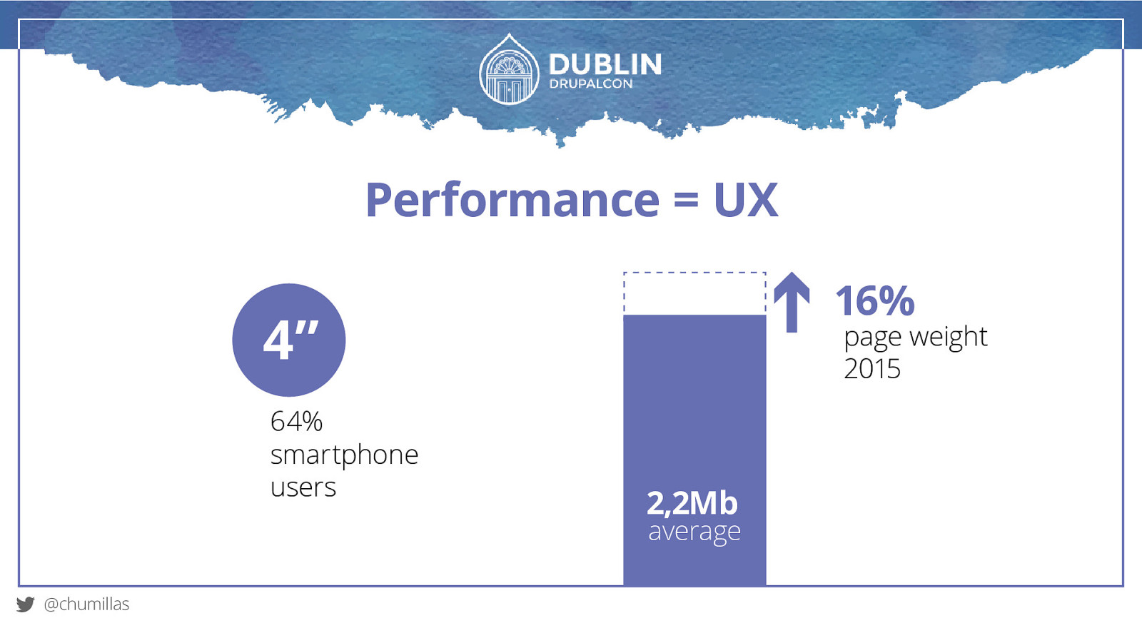
Performance = UX page weight 2015 2,2Mb average @chumillas average 16% 4” 64% smartphone users 2,2Mb
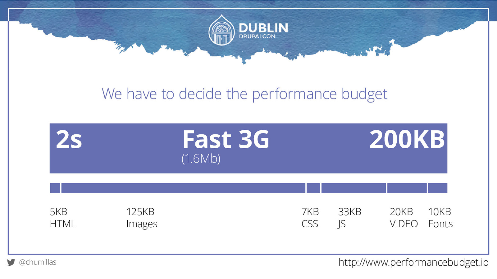
We have to decide the performance budget 2s 5KB HTML @chumillas Fast 3G 200KB (1.6Mb) 125KB Images 7KB CSS 33KB JS 20KB VIDEO 10KB Fonts http://www.performancebudget.io
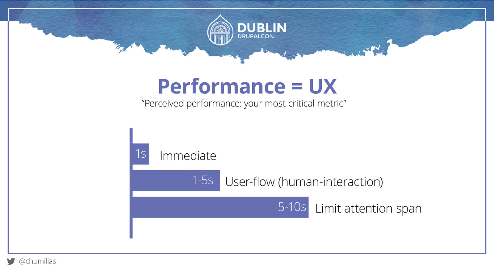
Performance = UX “Perceived performance: your most critical metric” 1s Immediate 1-5s User-flow (human-interaction) 5-10s Limit attention span @chumillas
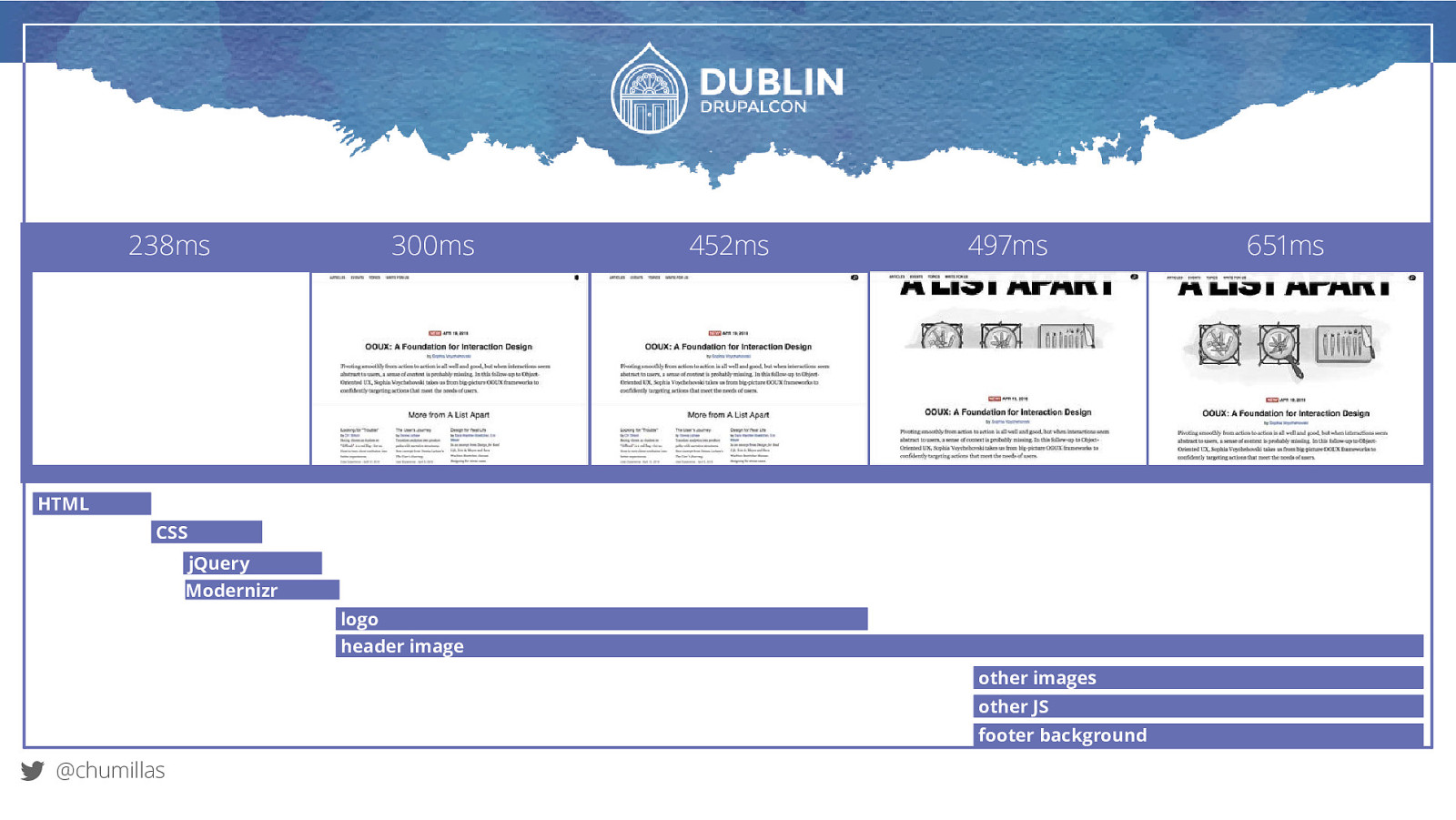
238ms 300ms 452ms 497ms HTML CSS jQuery Modernizr logo header image other images other JS footer background @chumillas 651ms
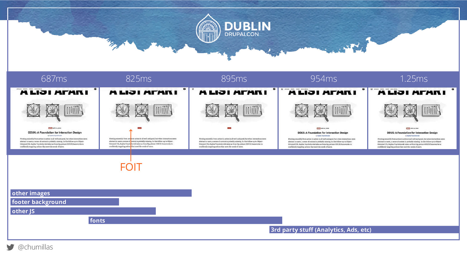
687ms 825ms 895ms 954ms FOIT other images footer background other JS fonts 3rd party stuff (Analytics, Ads, etc) @chumillas 1.25ms
TIPS Optimize image files Concatenate text files Minimify text files Compress text files Cache everywhere @chumillas
CSS structuring and optimization
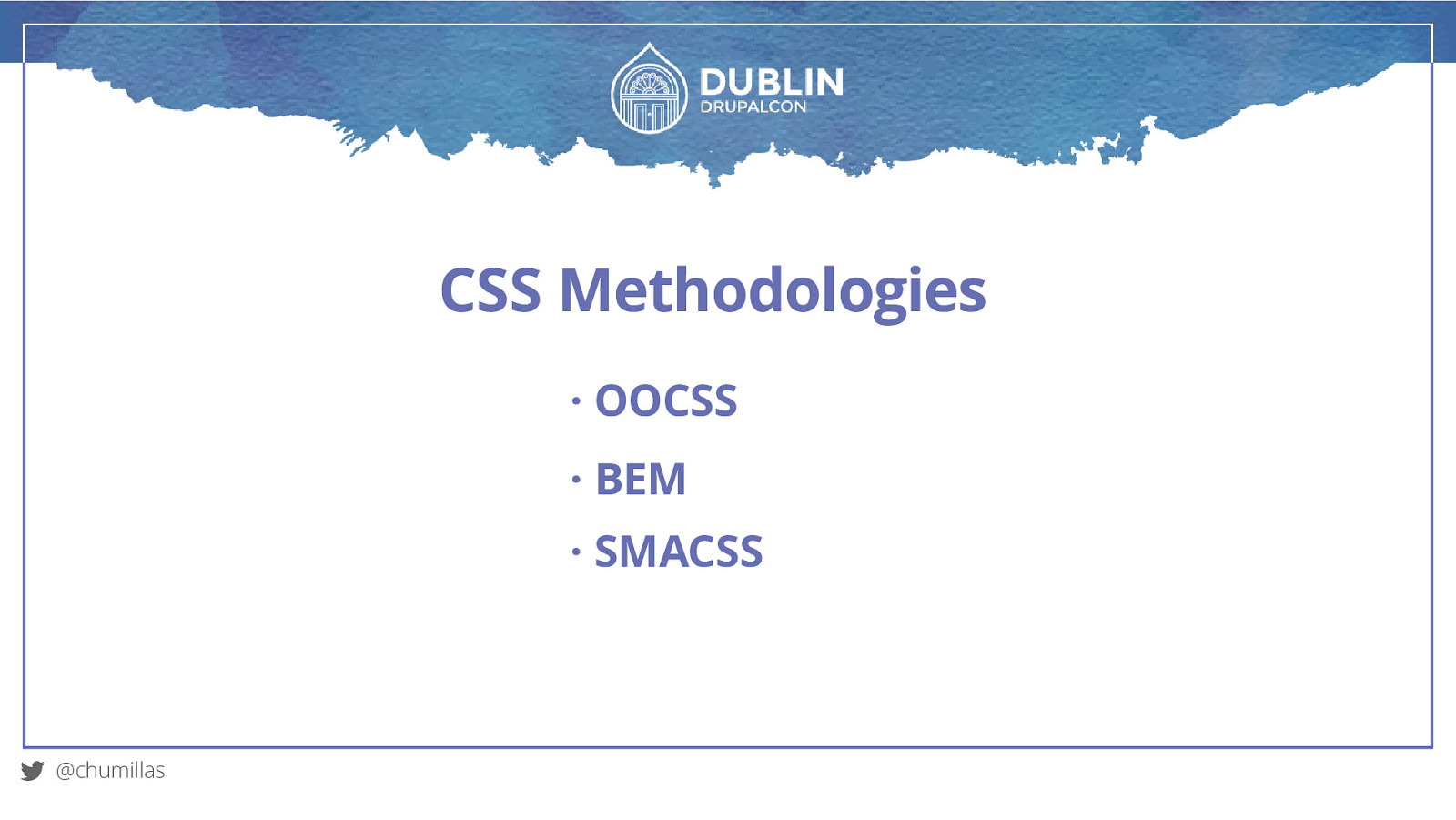
CSS Methodologies · OOCSS · BEM · SMACSS @chumillas
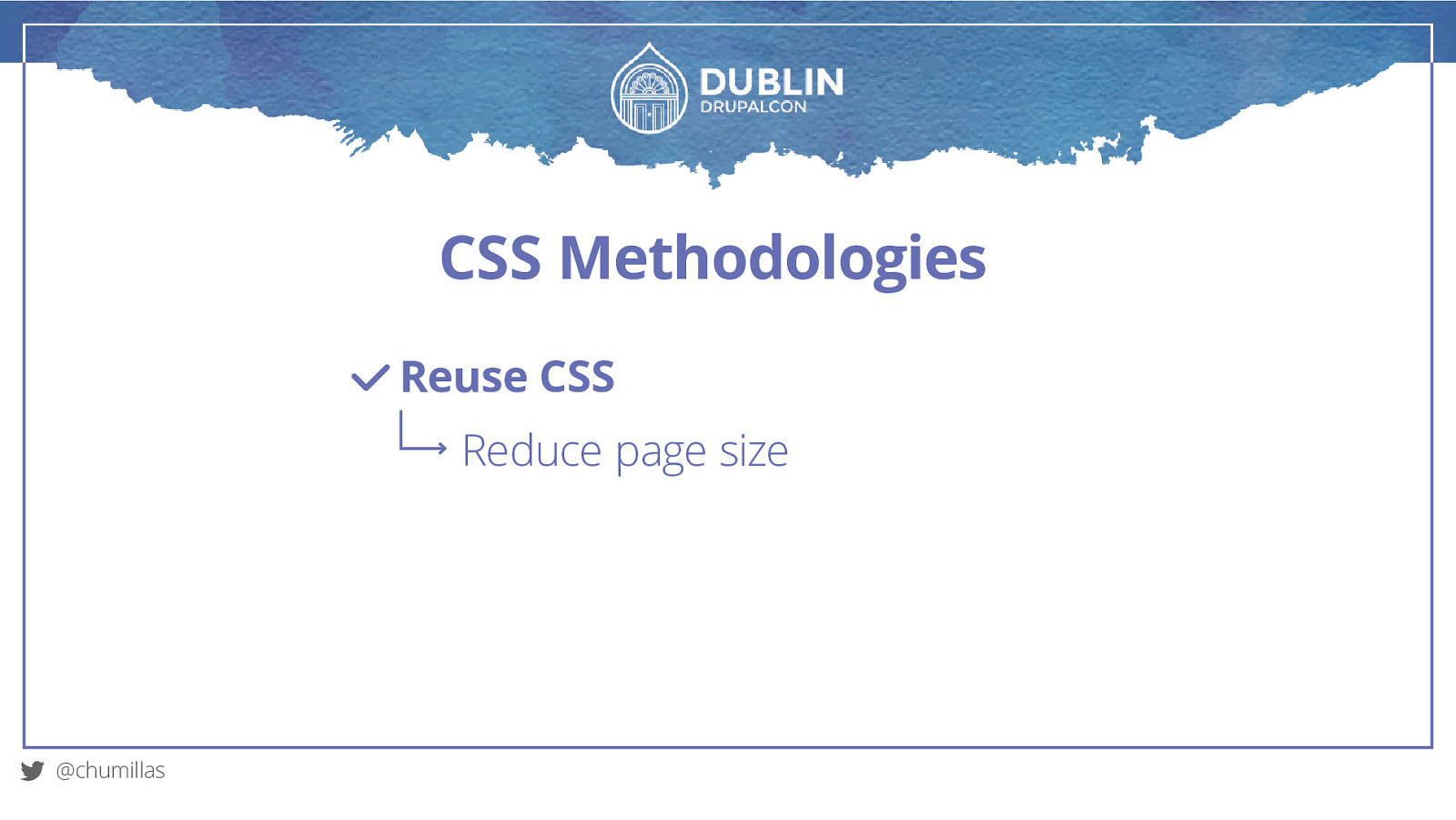
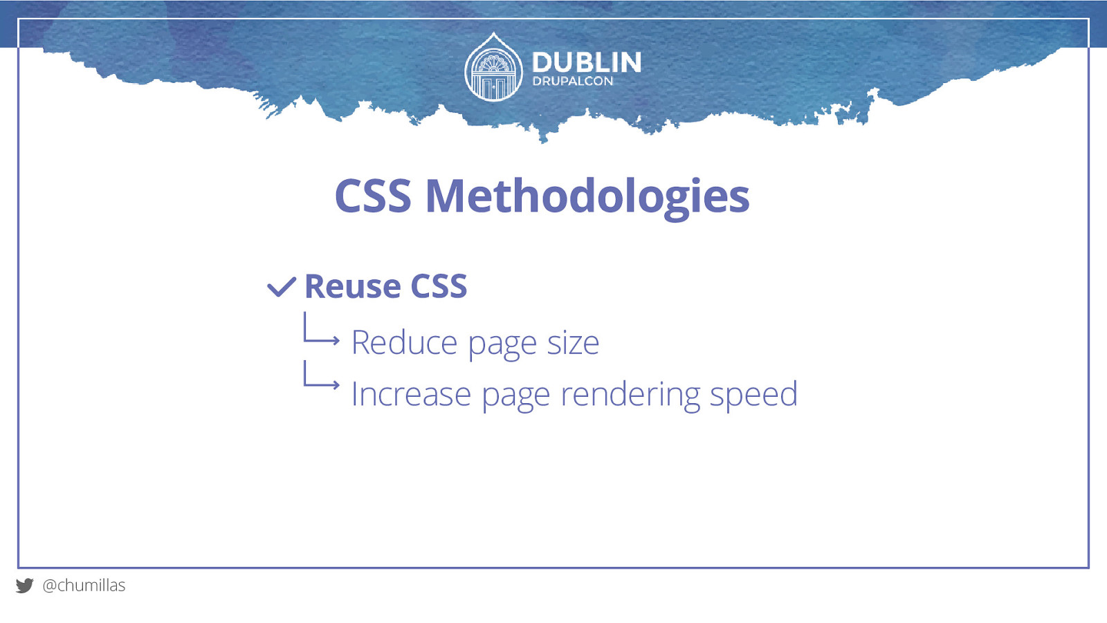
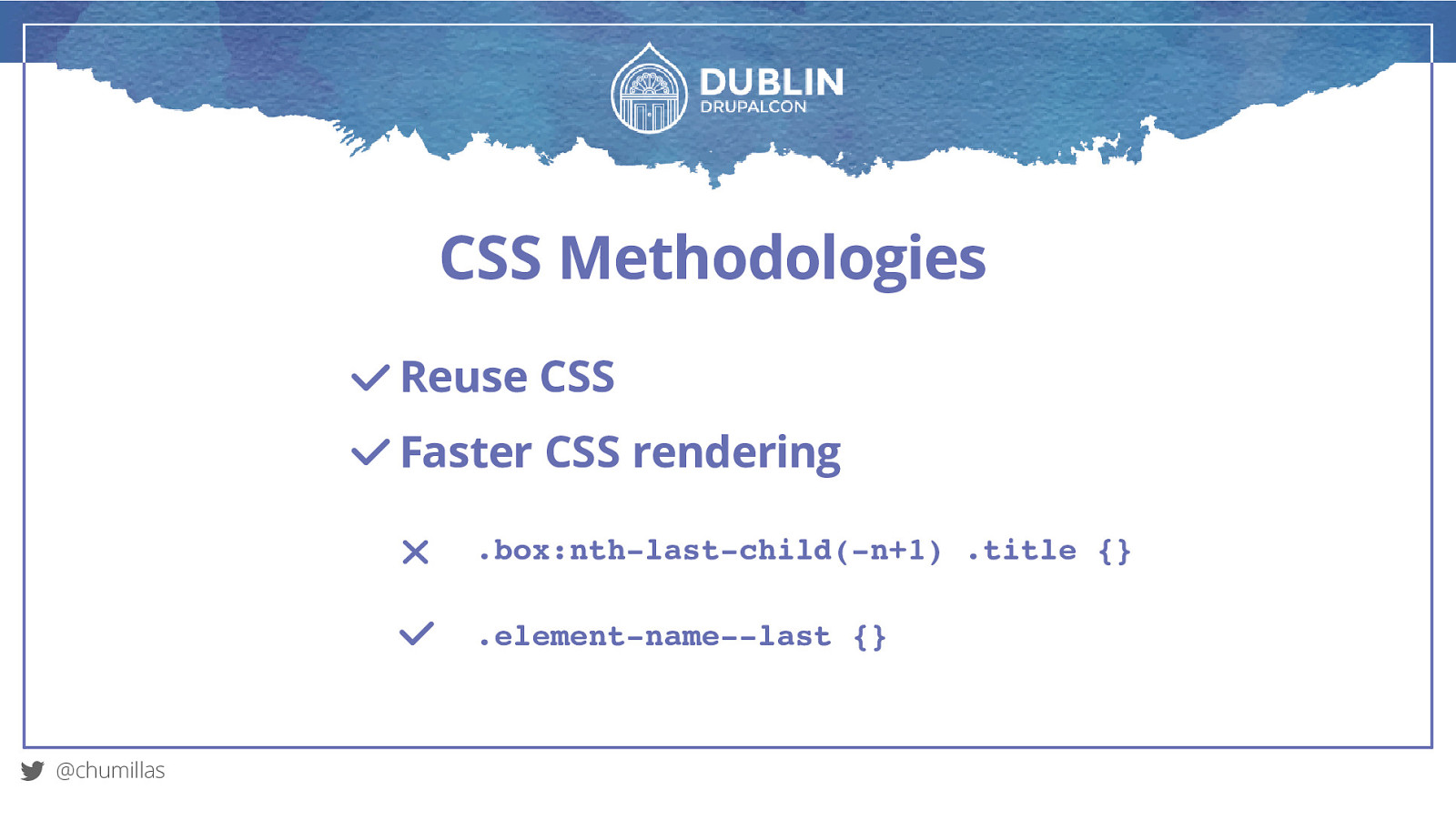
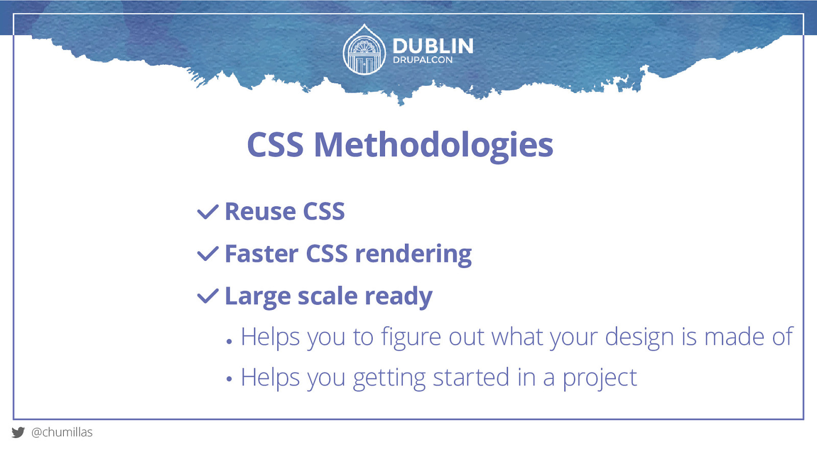
CSS Methodologies Reuse CSS @chumillas
CSS Methodologies Reuse CSS Reduce page size @chumillas
CSS Methodologies Reuse CSS Reduce page size Increase page rendering speed @chumillas
CSS Methodologies Reuse CSS Faster CSS rendering .box:nth-last-child(-n+1) .title {} .element-name—last {} @chumillas
CSS Methodologies Reuse CSS Faster CSS rendering Large scale ready Helps you to figure out what your design is made of Helps you getting started in a project @chumillas
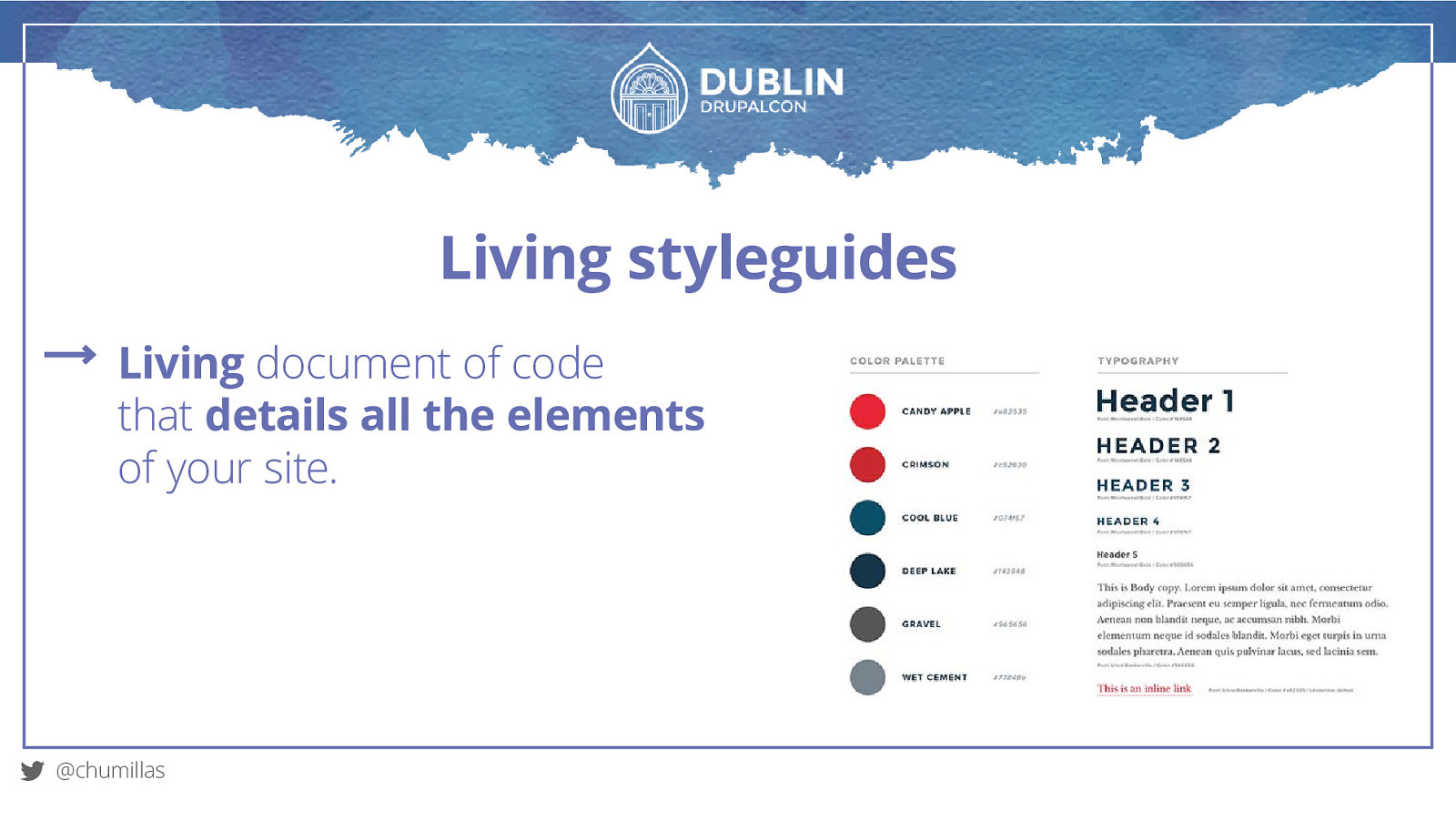
Living styleguides Living document of code that details all the elements of your site. @chumillas
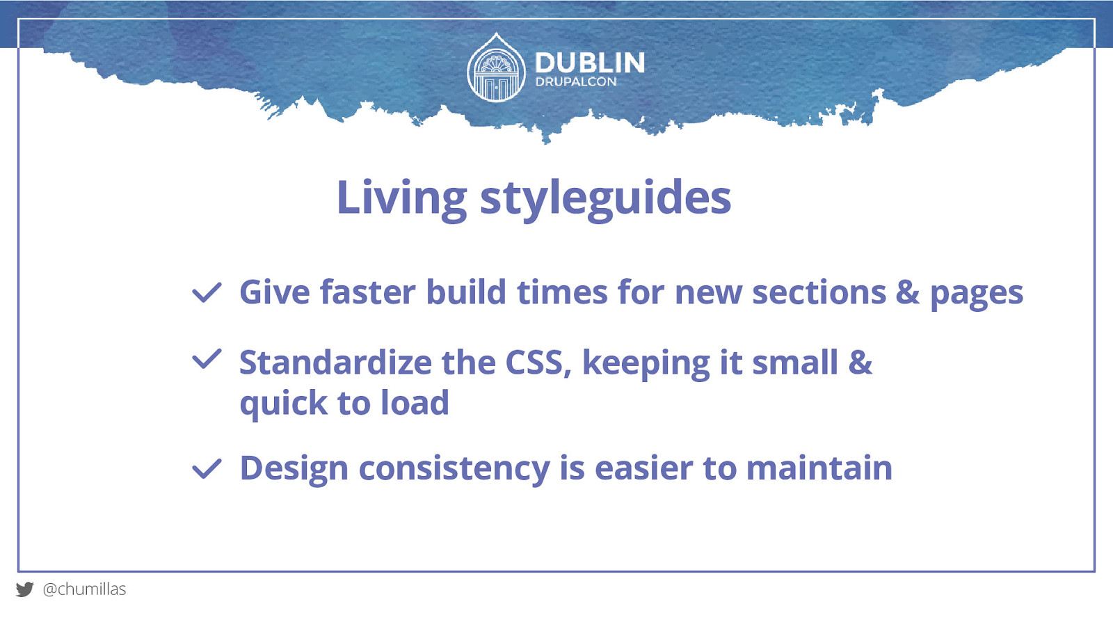
Living styleguides Give faster build times for new sections & pages Standardize the CSS, keeping it small & quick to load Design consistency is easier to maintain @chumillas
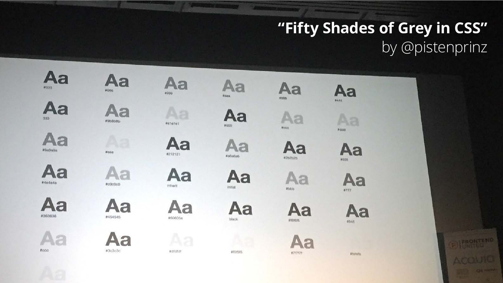
“Fifty Shades of Grey in CSS” by @pistenprinz
Fixed-pixel vs relative units
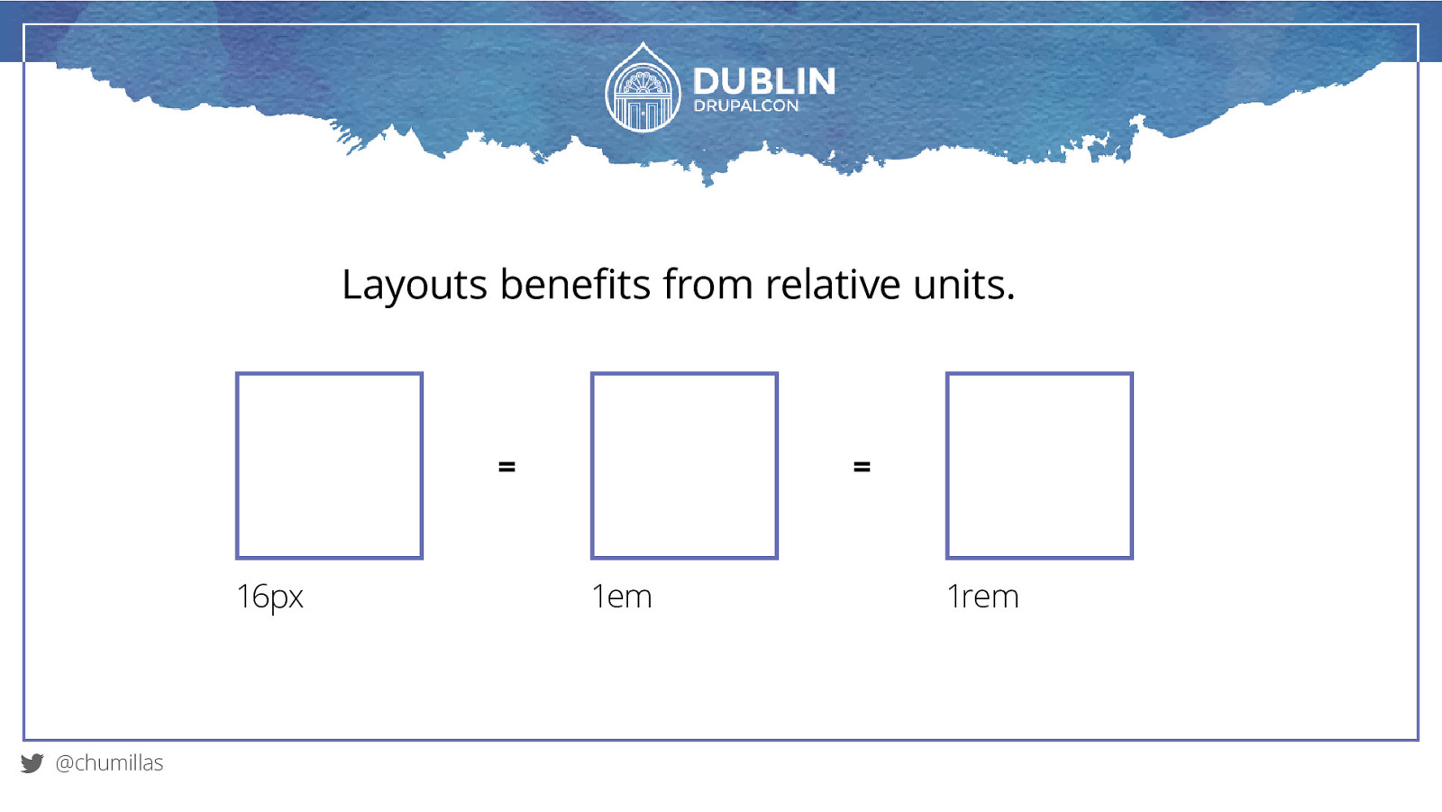
1em 1rem
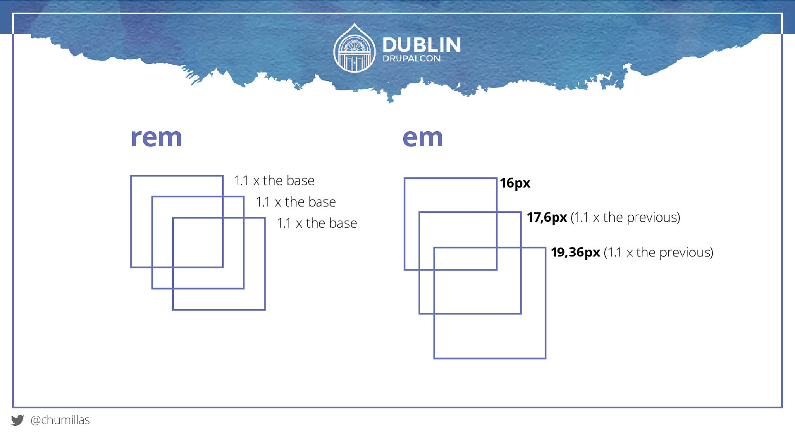
rem em 1.1 x the base 1.1 x the base 1.1 x the base 16px 17,6px (1.1 x the previous) 19,36px (1.1 x the previous) @chumillas
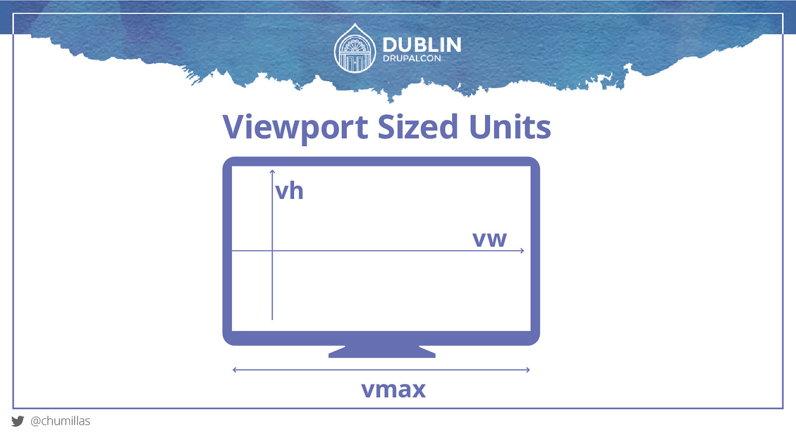
Viewport Sized Units vh vw vmax @chumillas
Responsive Typography
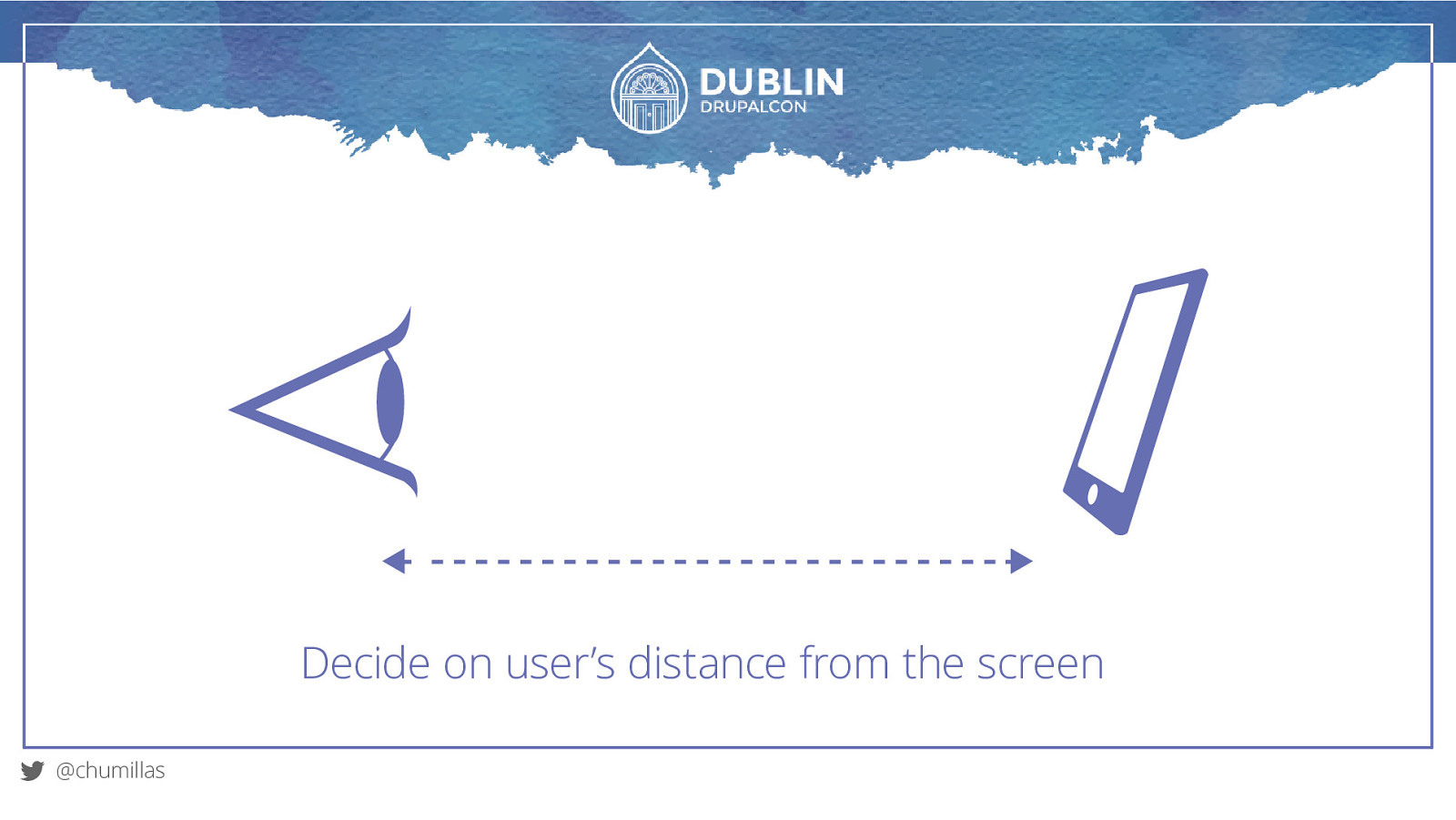
Decide on user’s distance from the screen @chumillas
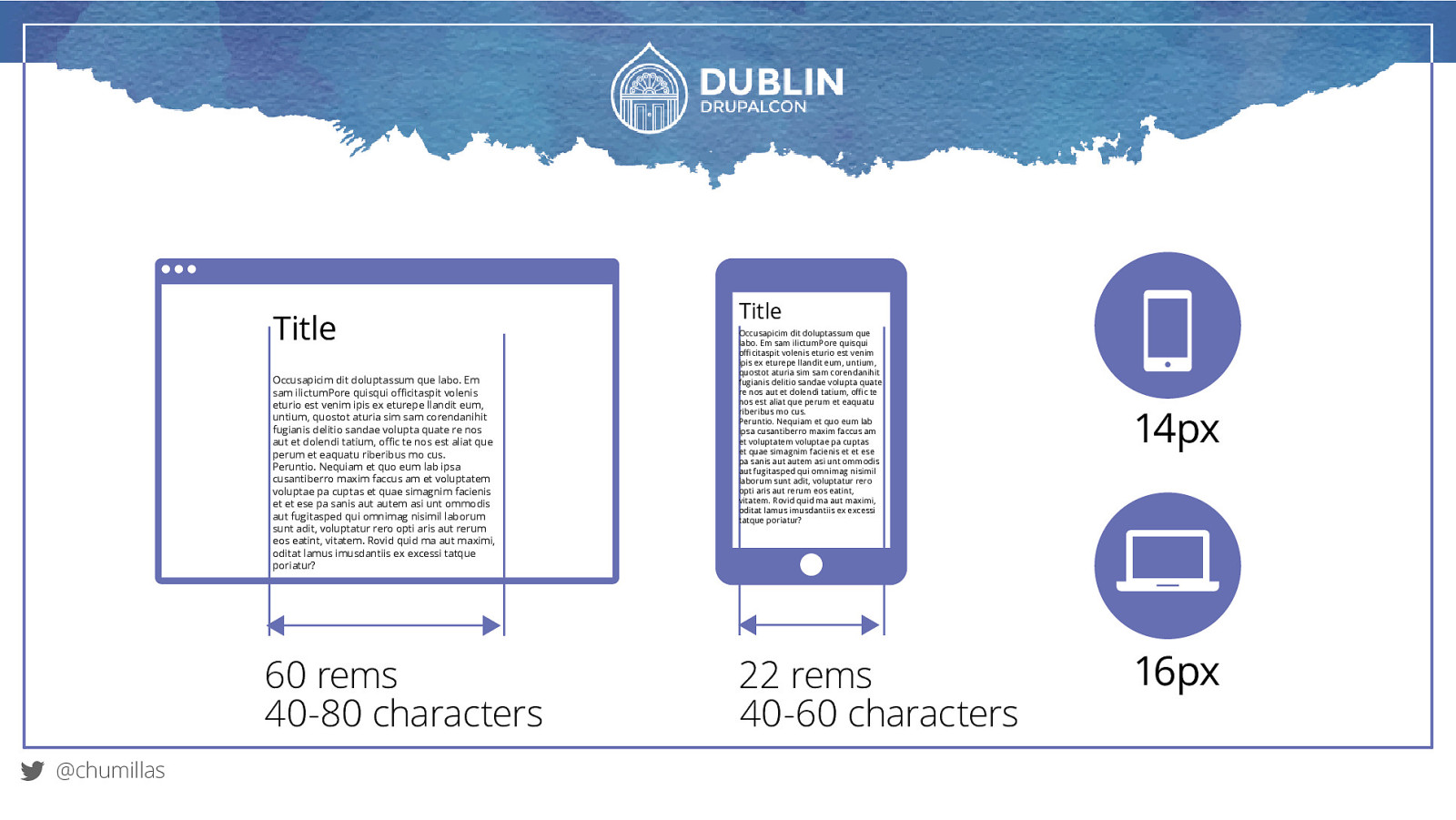
Title Occusapicim dit doluptassum que labo. Em sam ilictumPore quisqui officitaspit volenis eturio est venim ipis ex eturepe llandit eum, untium, quostot aturia sim sam corendanihit fugianis delitio sandae volupta quate re nos aut et dolendi tatium, offic te nos est aliat que perum et eaquatu riberibus mo cus. Peruntio. Nequiam et quo eum lab ipsa cusantiberro maxim faccus am et voluptatem voluptae pa cuptas et quae simagnim facienis et et ese pa sanis aut autem asi unt ommodis aut fugitasped qui omnimag nisimil laborum sunt adit, voluptatur rero opti aris aut rerum eos eatint, vitatem. Rovid quid ma aut maximi, oditat lamus imusdantiis ex excessi tatque poriatur? 60 rems 40-80 characters @chumillas Title Occusapicim dit doluptassum que labo. Em sam ilictumPore quisqui officitaspit volenis eturio est venim ipis ex eturepe llandit eum, untium, quostot aturia sim sam corendanihit fugianis delitio sandae volupta quate re nos aut et dolendi tatium, offic te nos est aliat que perum et eaquatu riberibus mo cus. Peruntio. Nequiam et quo eum lab ipsa cusantiberro maxim faccus am et voluptatem voluptae pa cuptas et quae simagnim facienis et et ese pa sanis aut autem asi unt ommodis aut fugitasped qui omnimag nisimil laborum sunt adit, voluptatur rero opti aris aut rerum eos eatint, vitatem. Rovid quid ma aut maximi, oditat lamus imusdantiis ex excessi tatque poriatur? 22 rems 40-60 characters 14px 16px
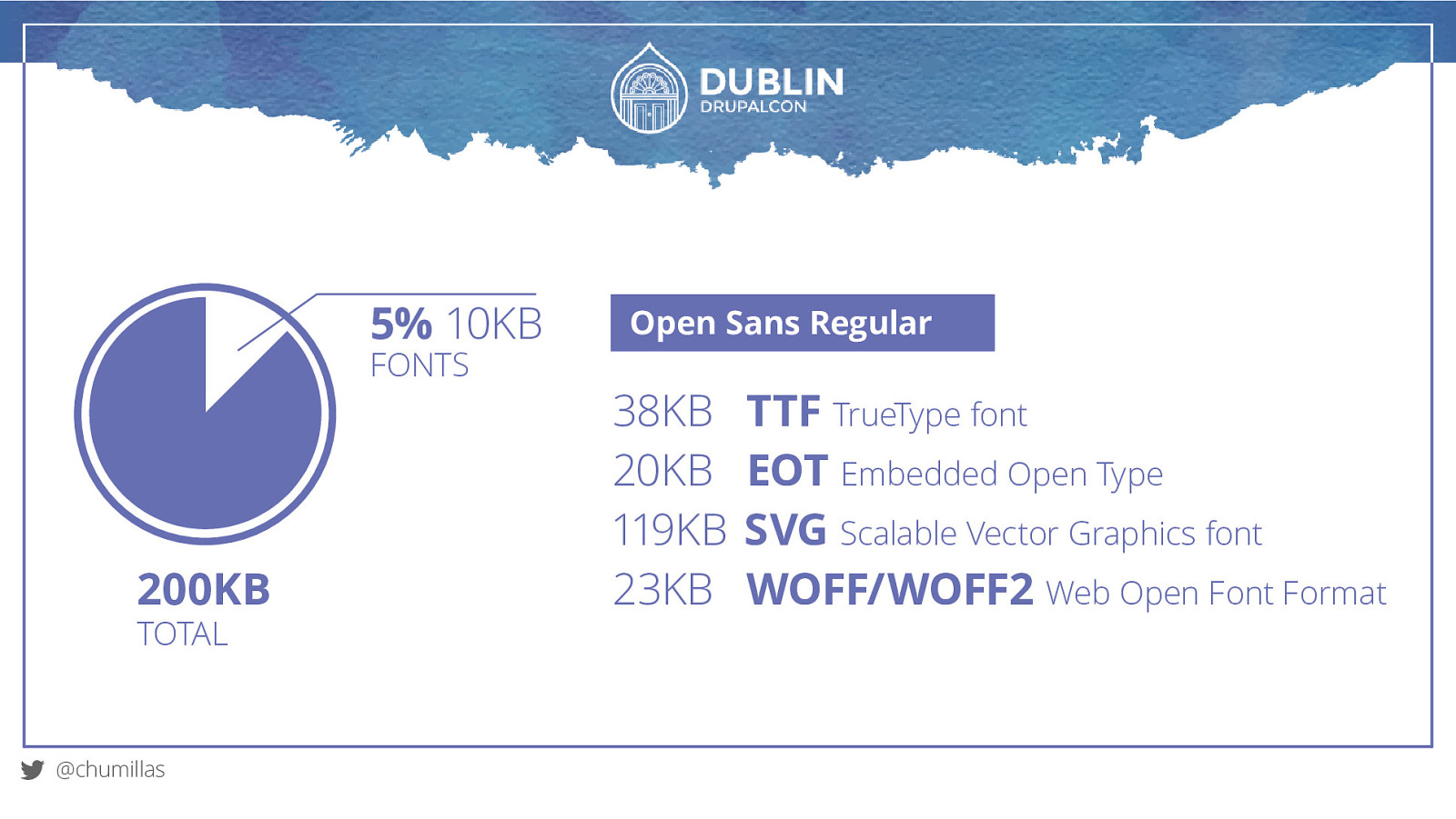
5% 10KB FONTS 200KB TOTAL @chumillas Open Sans Regular 38KB 20KB 119KB 23KB TTF TrueType font EOT Embedded Open Type SVG Scalable Vector Graphics font WOFF/WOFF2 Web Open Font Format
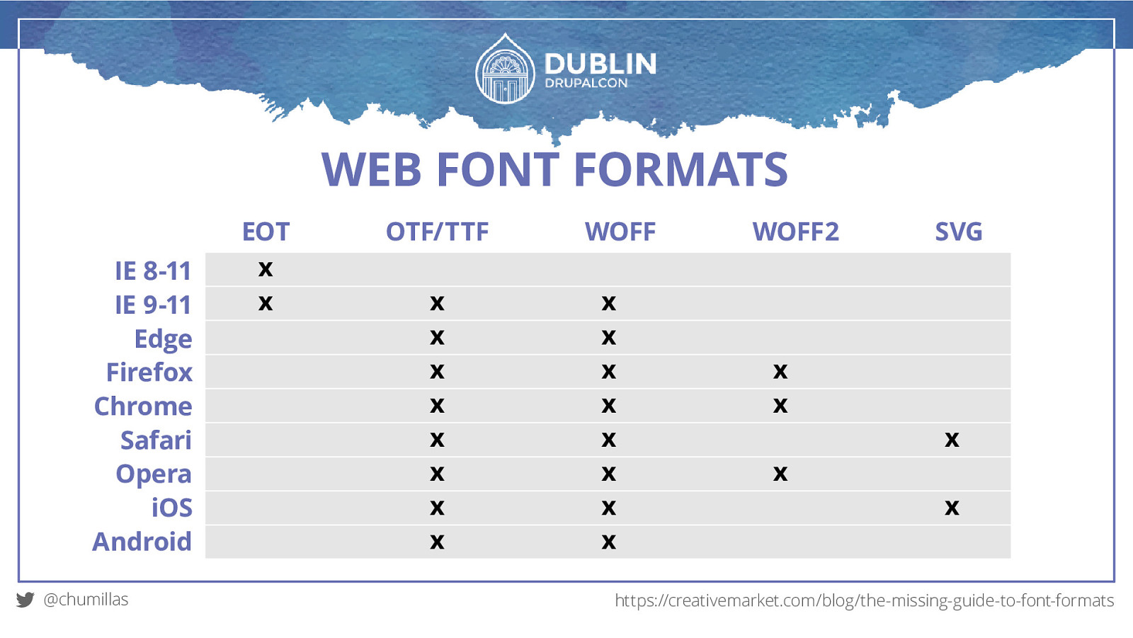
WEB FONT FORMATS EOT OTF/TTF WOFF WOFF2 SVG IE 8-11 IE 9-11 Edge Firefox Chrome Safari Opera iOS Android @chumillas https://creativemarket.com/blog/the-missing-guide-to-font-formats
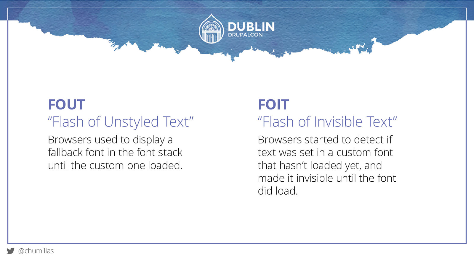
FOUT “Flash of Unstyled Text” FOIT “Flash of Invisible Text” Browsers used to display a fallback font in the font stack until the custom one loaded. Browsers started to detect if text was set in a custom font that hasn’t loaded yet, and made it invisible until the font did load. @chumillas
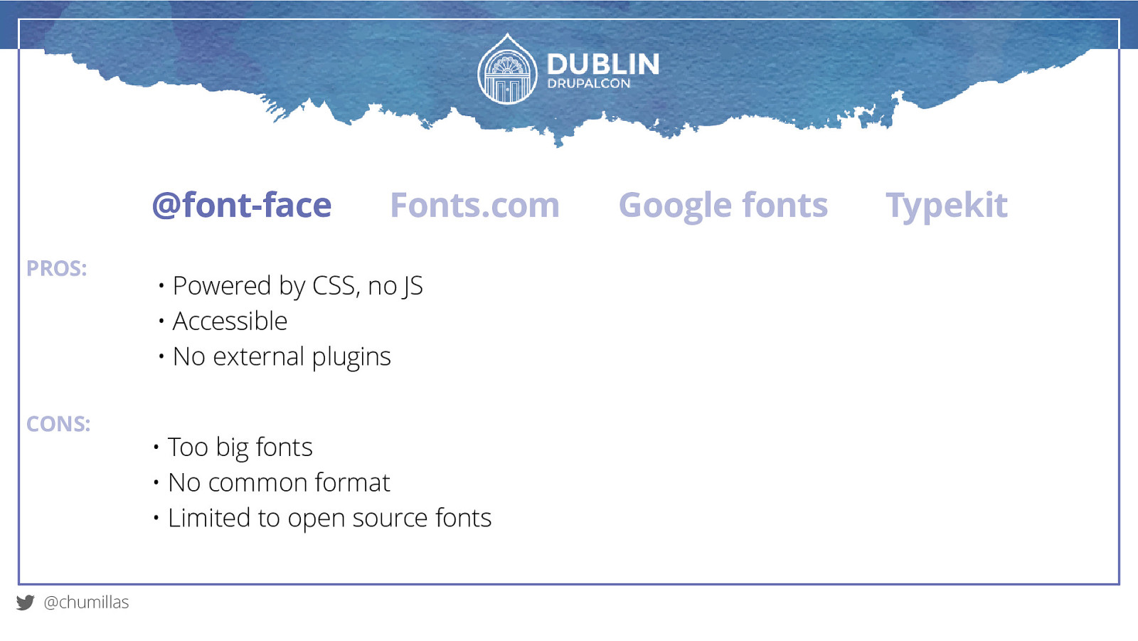
@font-face PROS: CONS: @chumillas Fonts.com • Powered by CSS, no JS • Accessible • No external plugins • Too big fonts • No common format • Limited to open source fonts Google fonts Typekit
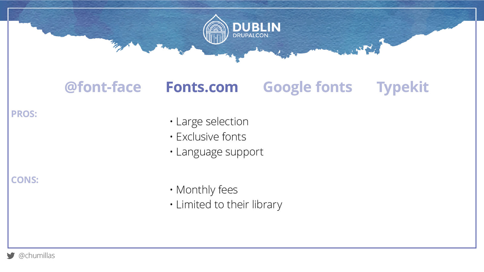
@font-face PROS: CONS: @chumillas Fonts.com Google fonts • Large selection • Exclusive fonts • Language support • Monthly fees • Limited to their library Typekit
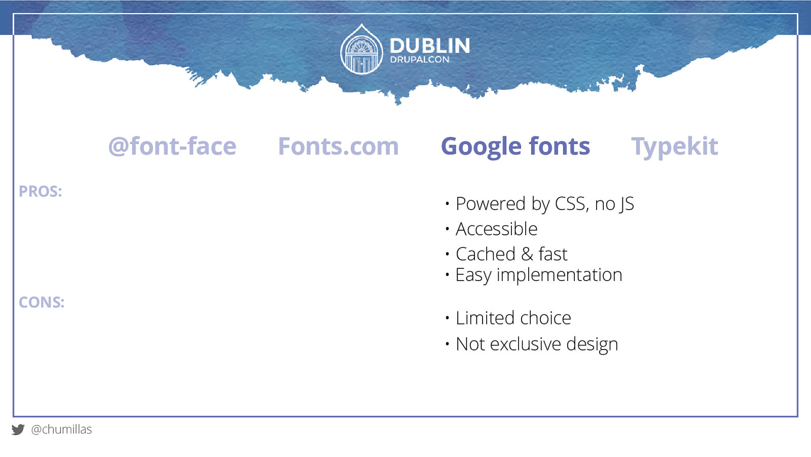
@font-face PROS: CONS: @chumillas Fonts.com Google fonts Typekit • Powered by CSS, no JS • Accessible • Cached & fast • Easy implementation • Limited choice • Not exclusive design
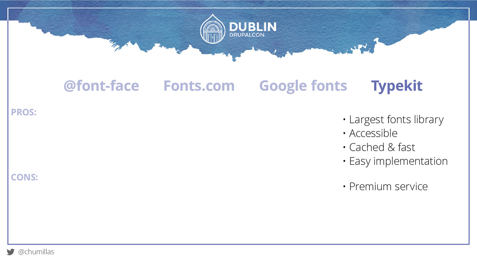
@font-face PROS: CONS: @chumillas Fonts.com Google fonts Typekit • Largest fonts library • Accessible • Cached & fast • Easy implementation • Premium service
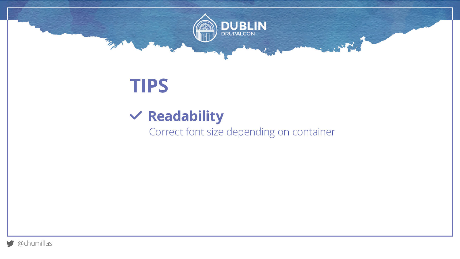
TIPS Readability Correct font size depending on container @chumillas
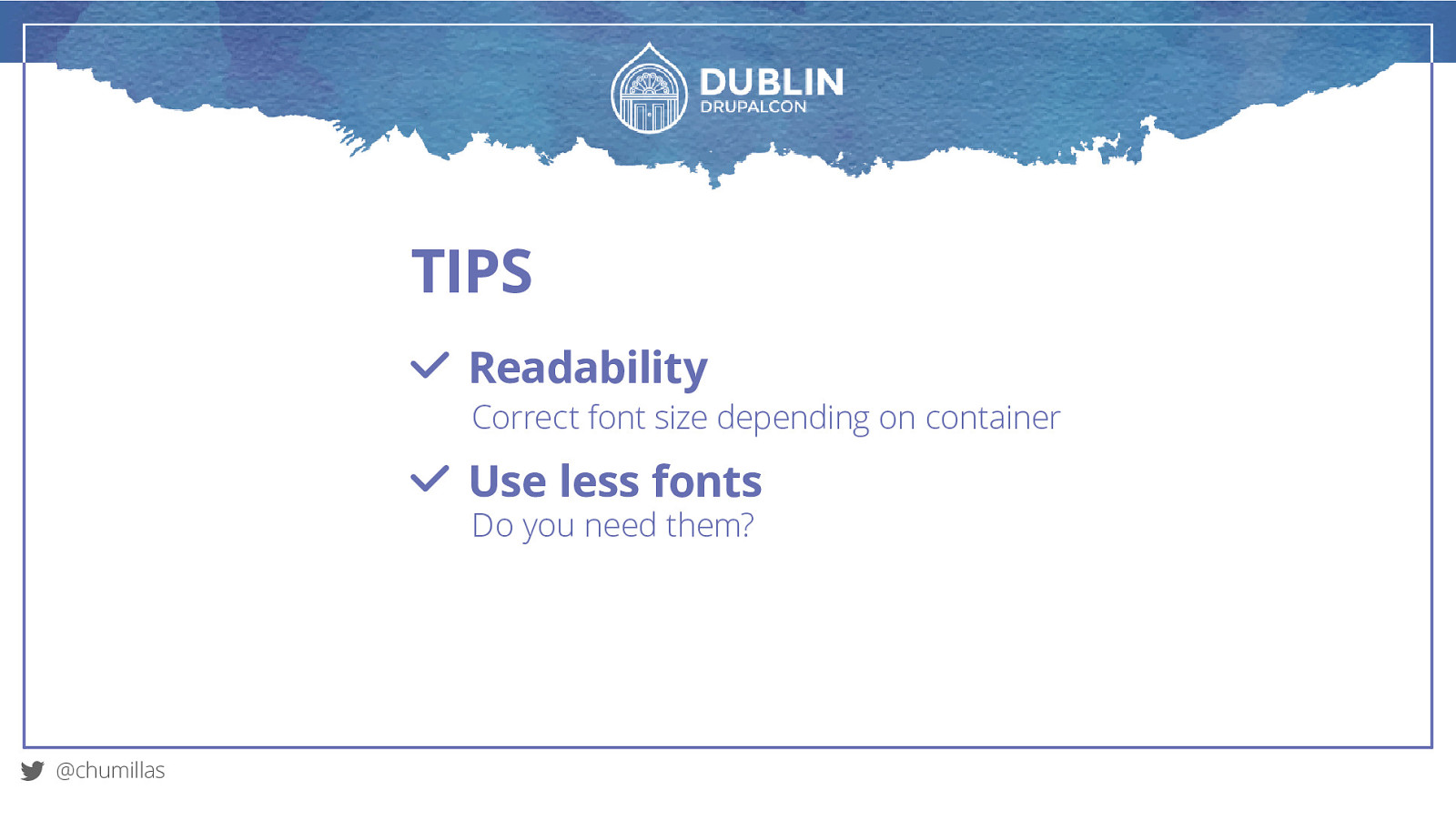
TIPS Readability Correct font size depending on container Use less fonts Do you need them? @chumillas
TIPS Readability Correct font size depending on container Use less fonts Do you need them? Use modern font formats Reduce the page weight @chumillas
Images
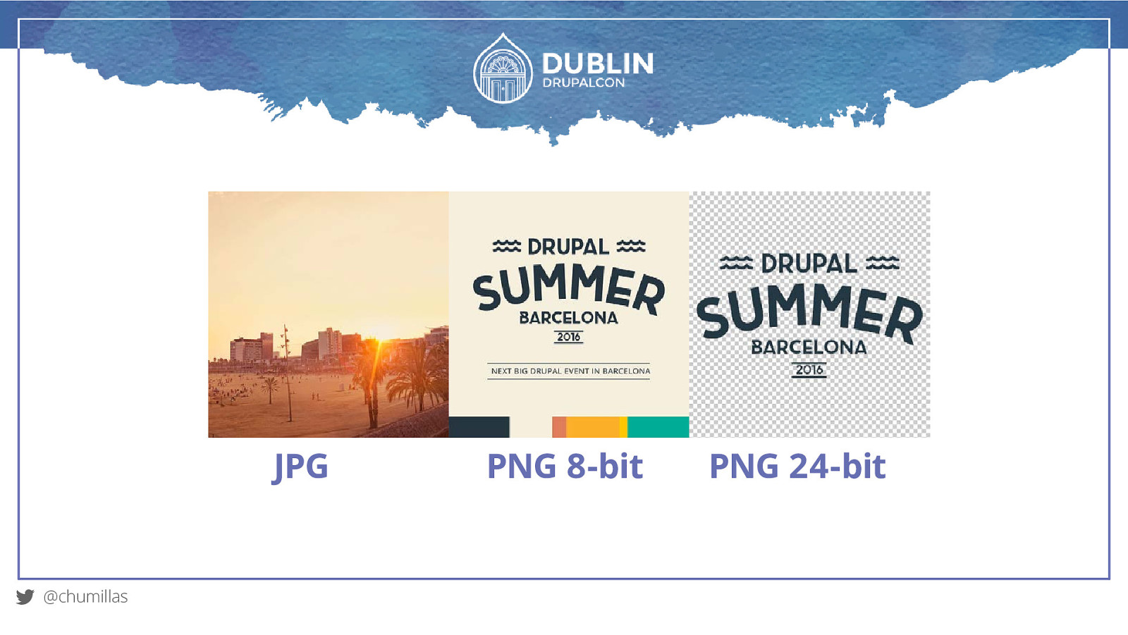
JPG @chumillas PNG 8-bit PNG 24-bit
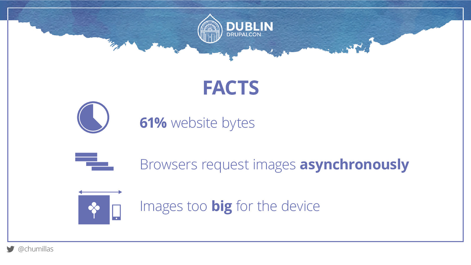
FACTS 61% website bytes Browsers request images asynchronously Images too big for the device @chumillas
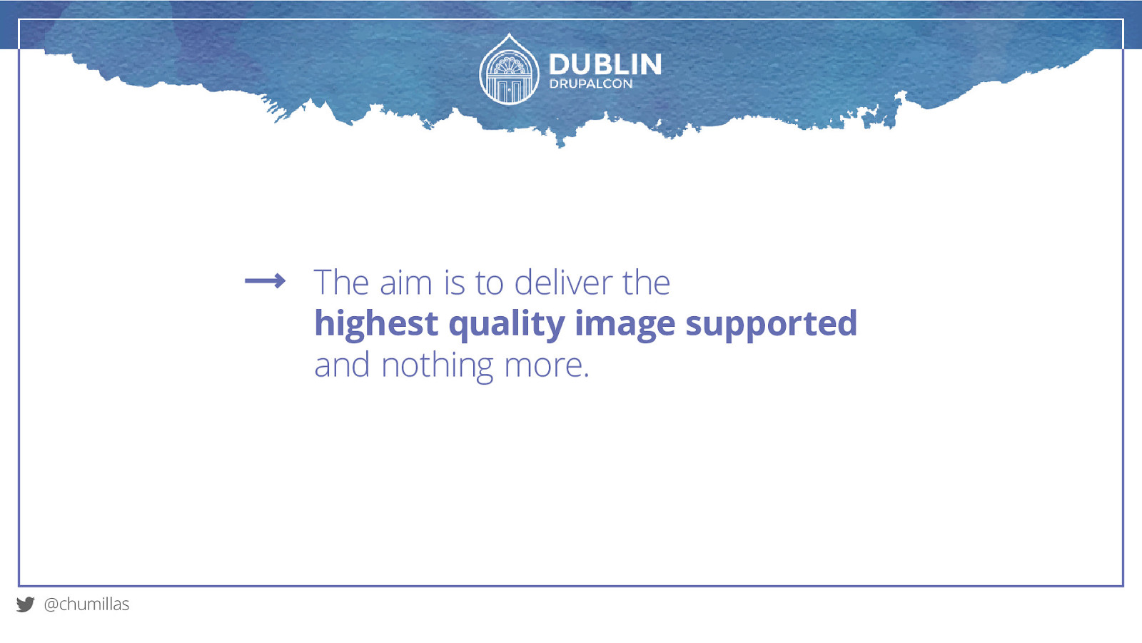
The aim is to deliver the highest quality image supported and nothing more. @chumillas
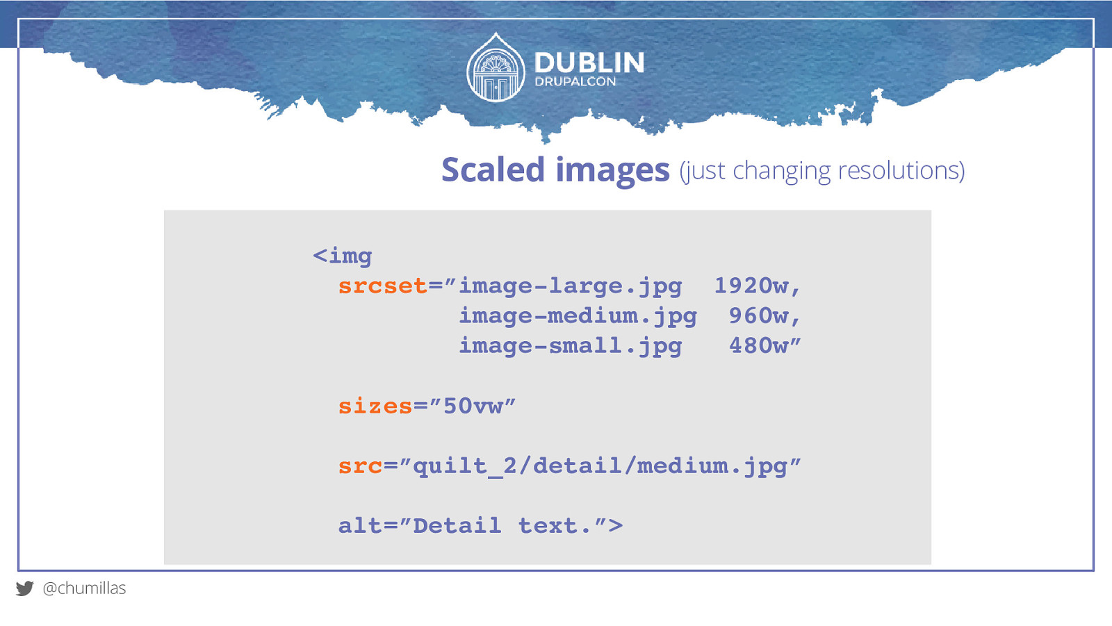
Scaled images (just changing resolutions) <img srcset=”image-large.jpg 1920w, image-medium.jpg 960w, image-small.jpg 480w” sizes=”50vw” src=”quilt_2/detail/medium.jpg” alt=”Detail text.”> @chumillas
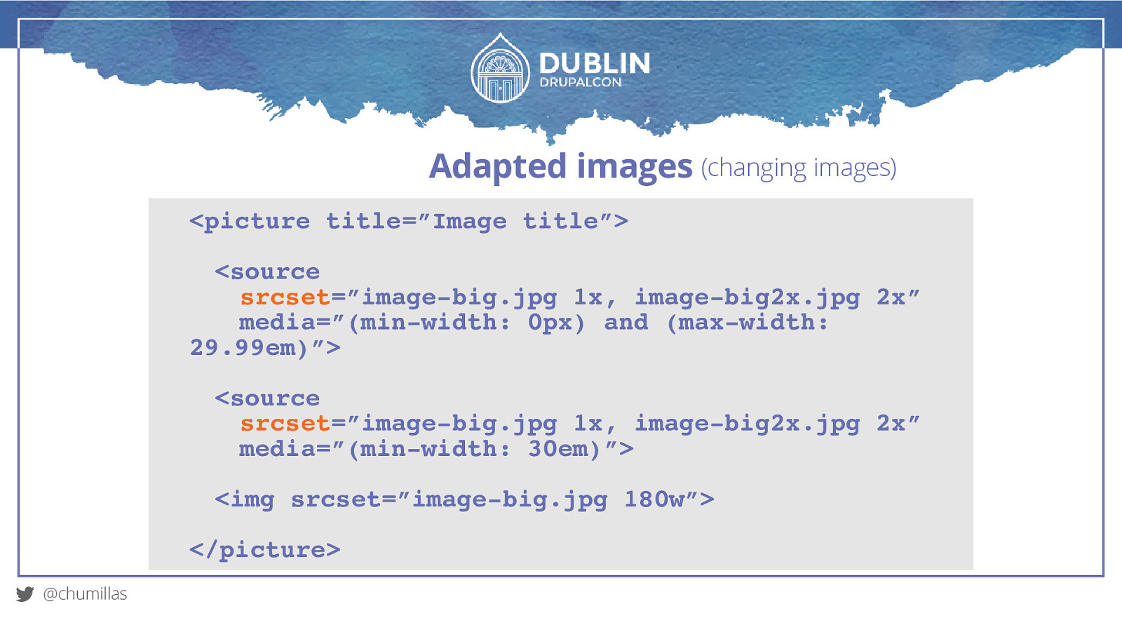
Adapted images (changing images) @chumillas
Adapted images (changing images) <picture title=”Image title”> <source srcset=”image-big.jpg 1x, image-big2x.jpg 2x” media=”(min-width: 0px) and (max-width: 29.99em)”> <source srcset=”image-big.jpg 1x, image-big2x.jpg 2x” media=”(min-width: 30em)”> <img srcset=”image-big.jpg 180w”> </picture> @chumillas
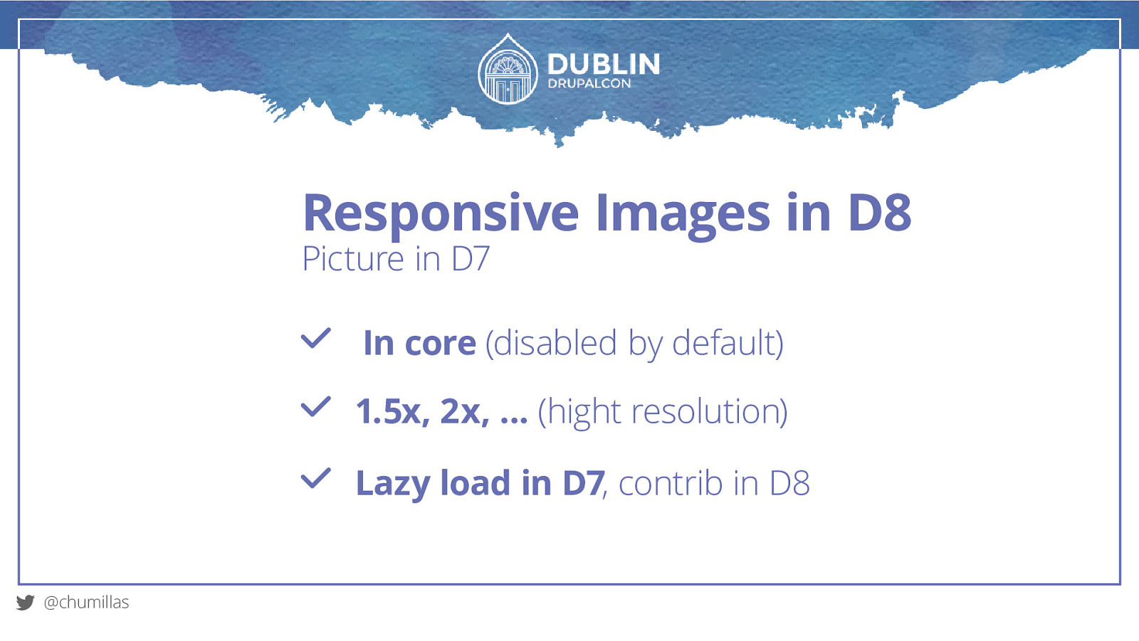
Responsive Images in D8 Picture in D7 In core (disabled by default) 1.5x, 2x, … (hight resolution) Lazy load in D7, contrib in D8 @chumillas
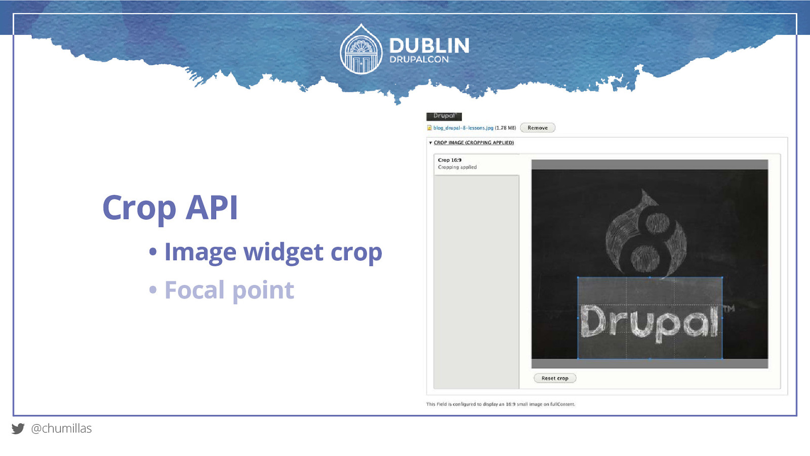
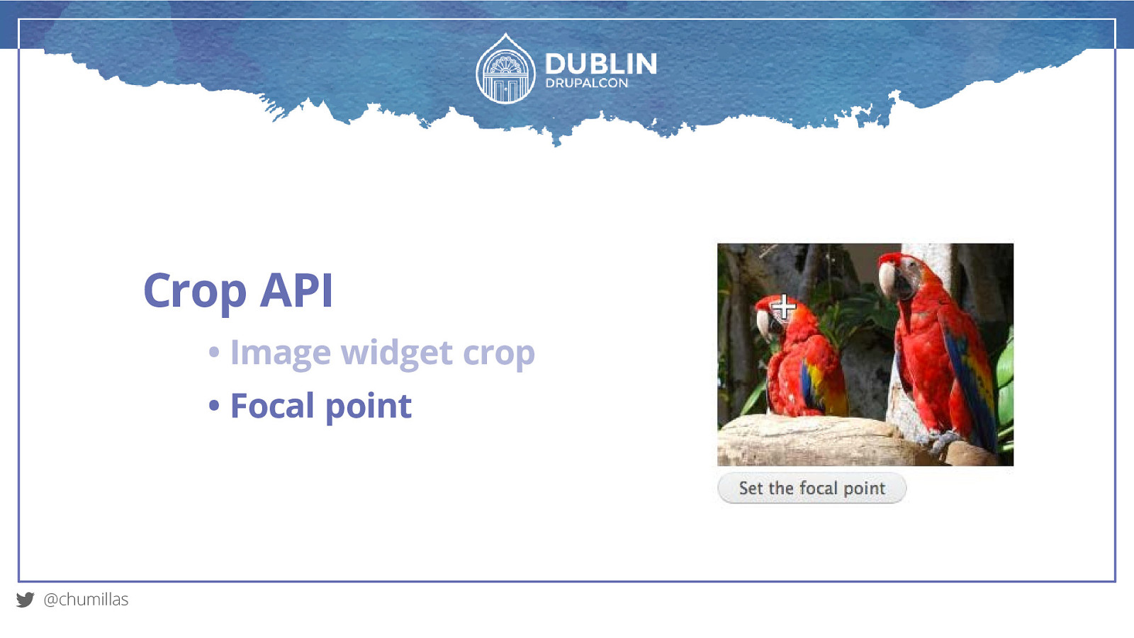
Crop API • Image widget crop • Focal point @chumillas
Crop API • Image widget crop • Focal point @chumillas
Crop API • Image widget crop • Focal point @chumillas
What else? @chumillas
What else? Designer’s creativity. @chumillas
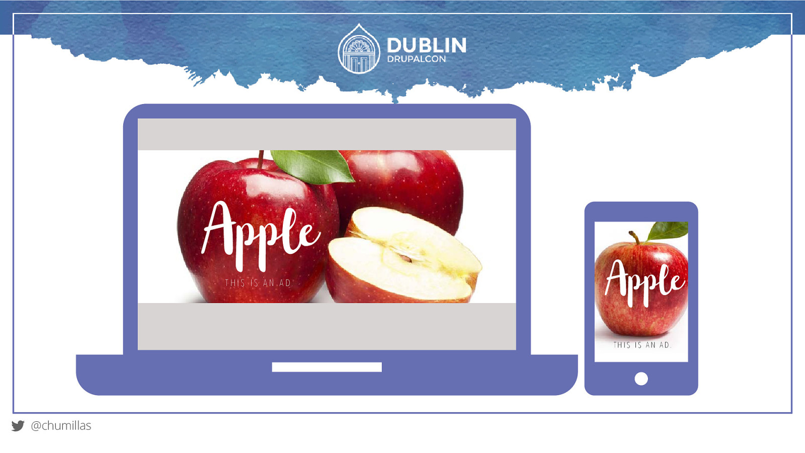
Apple T H I S I S A N A D. Apple T H I S I S A N A D. @chumillas
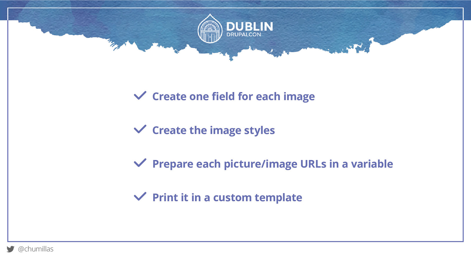
Create one field for each image Create the image styles Prepare each picture/image URLs in a variable Print it in a custom template @chumillas
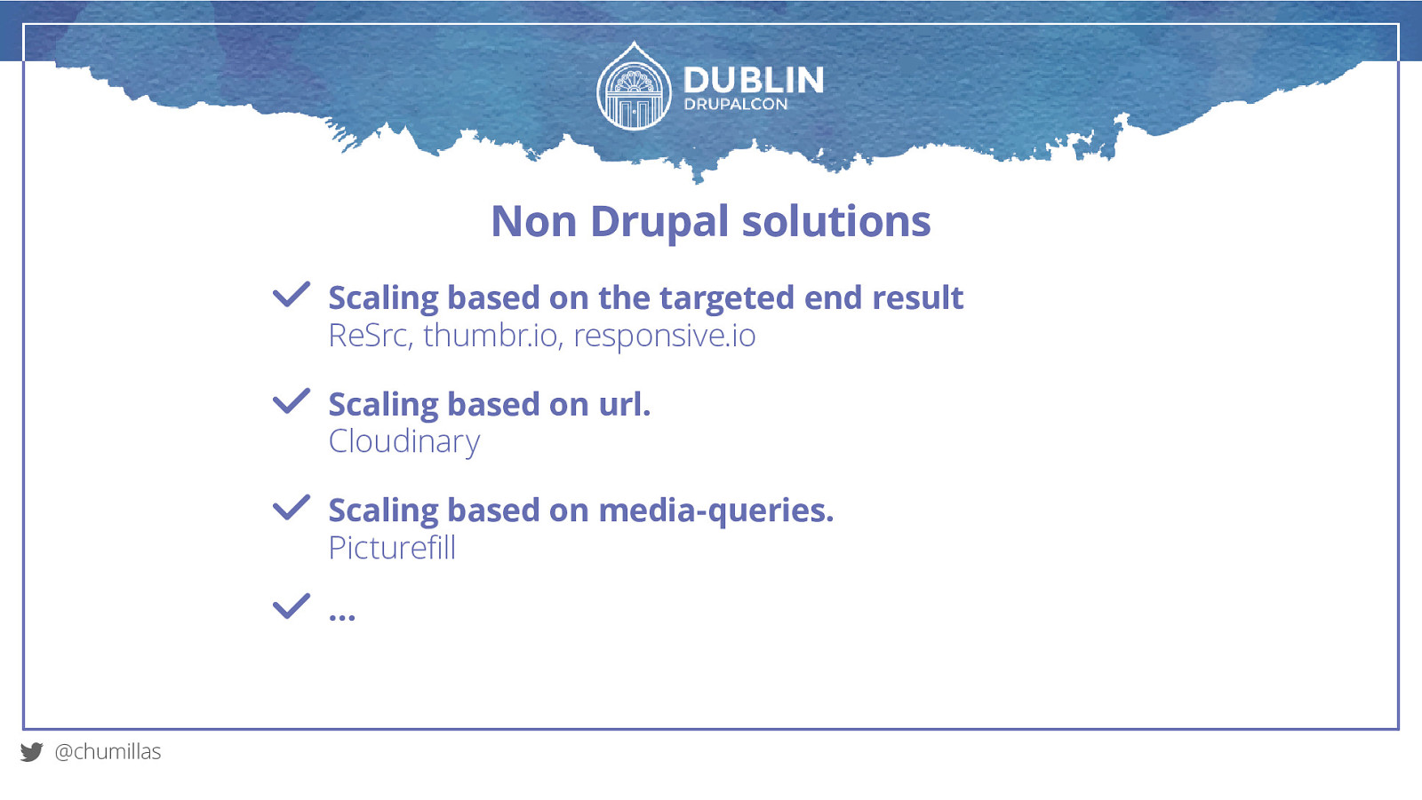
Non Drupal solutions Scaling based on the targeted end result ReSrc, thumbr.io, responsive.io Scaling based on url. Cloudinary Scaling based on media-queries. Picturefill … @chumillas
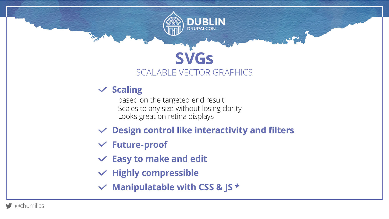
SVGs SCALABLE VECTOR GRAPHICS Scaling based on the targeted end result Scales to any size without losing clarity Looks great on retina displays Design control like interactivity and filters Future-proof Easy to make and edit Highly compressible Manipulatable with CSS & JS * @chumillas
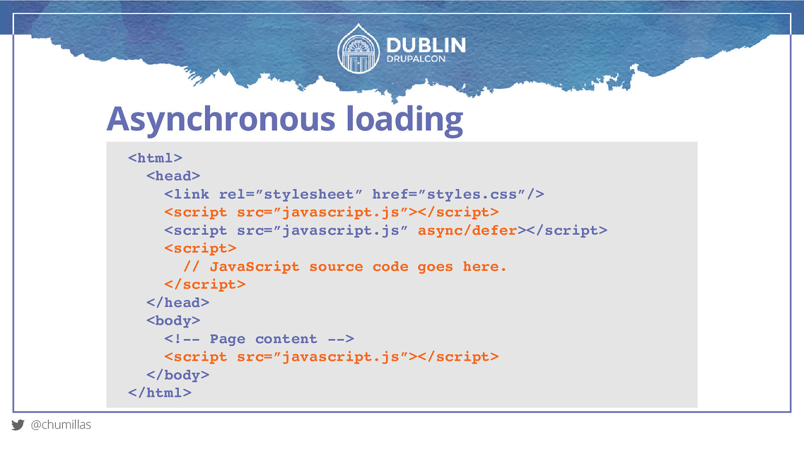
Asynchronous loading
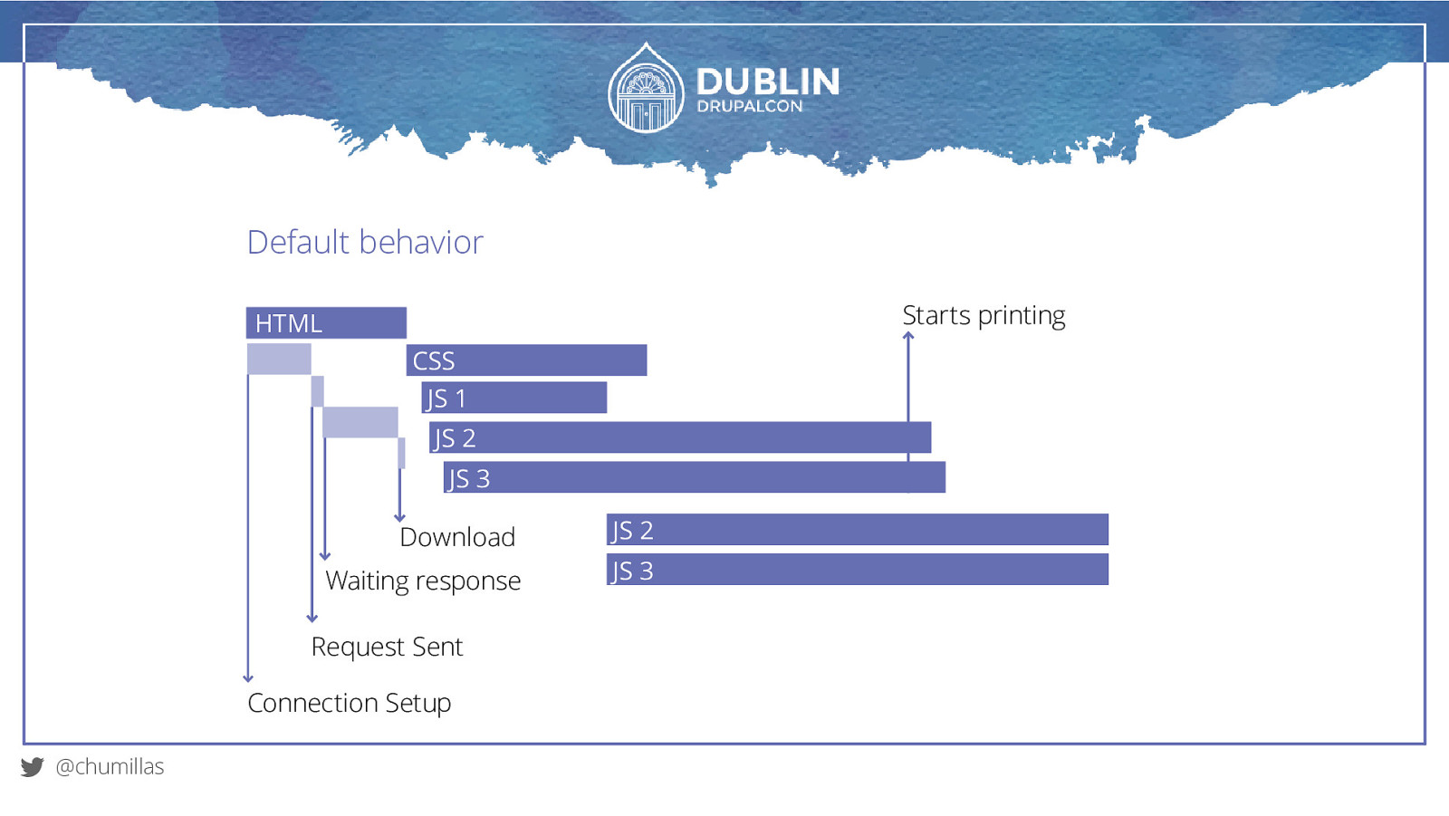
Default behavior Starts printing HTML CSS JS 1 JS 2 JS 3 Download JS 2 Waiting response JS 3 Request Sent Connection Setup @chumillas
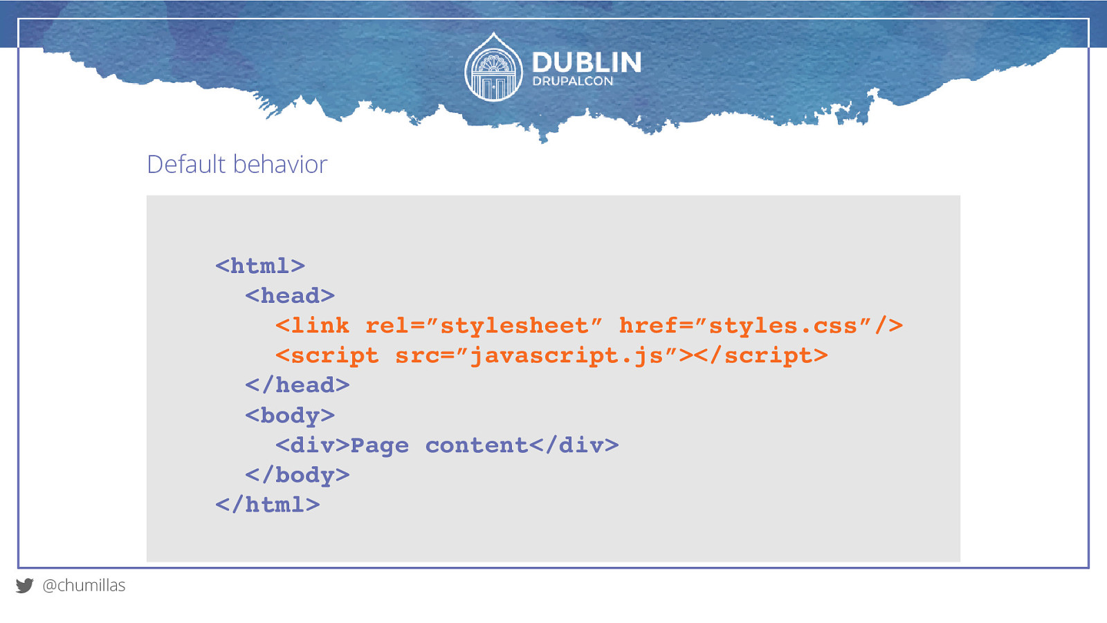
Default behavior
<html> <head> <link rel=”stylesheet” href=”styles.css”/> <script src=”javascript.js”></script> </head> <body> <div>Page content</div> </body> </html> @chumillasAsync
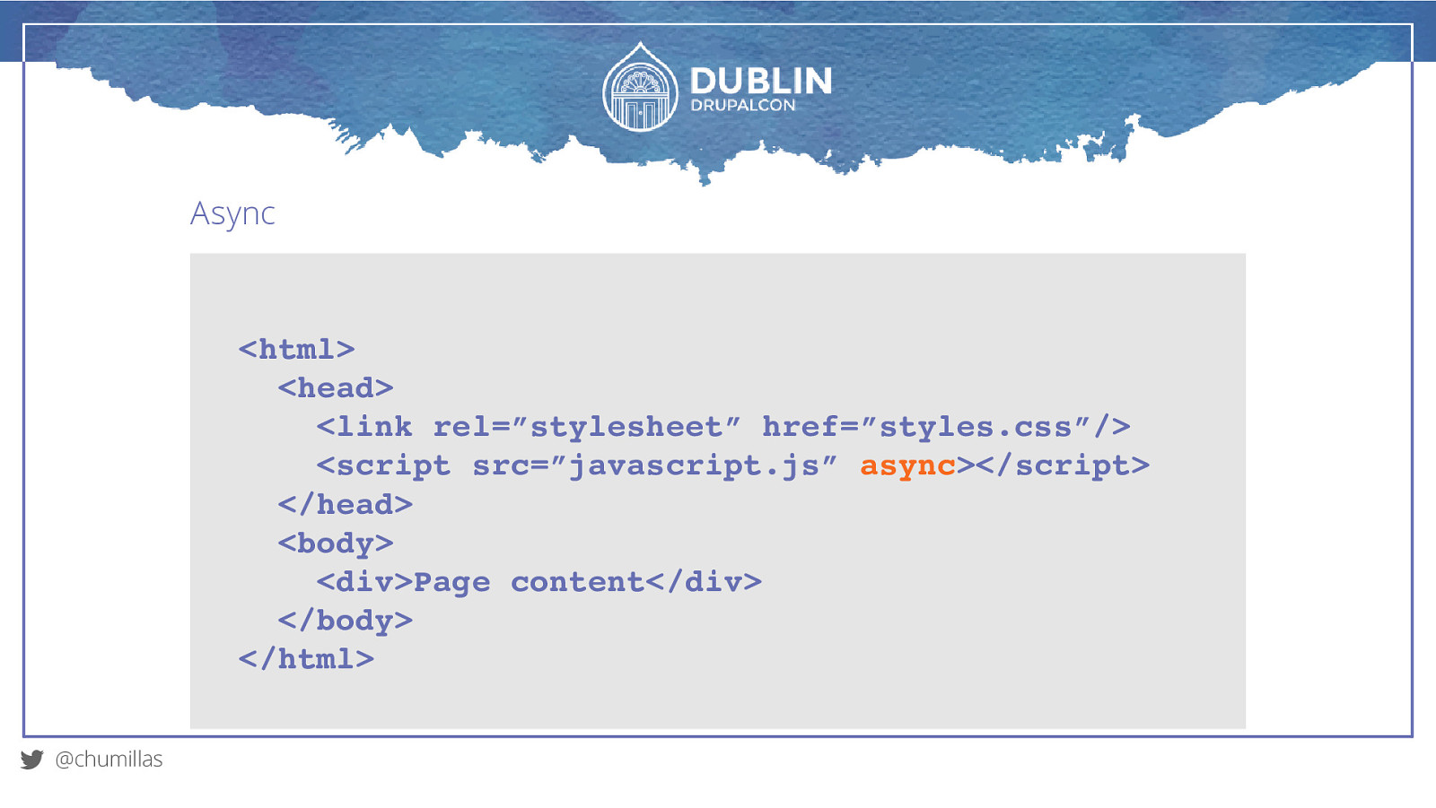
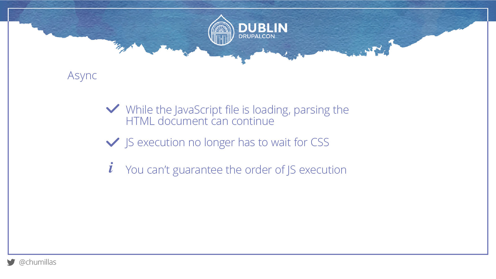
<html> <head> <link rel=”stylesheet” href=”styles.css”/> <script src=”javascript.js” async></script> </head> <body> <div>Page content</div> </body> </html> @chumillasAsync While the JavaScript file is loading, parsing the HTML document can continue JS execution no longer has to wait for CSS i @chumillas You can’t guarantee the order of JS execution
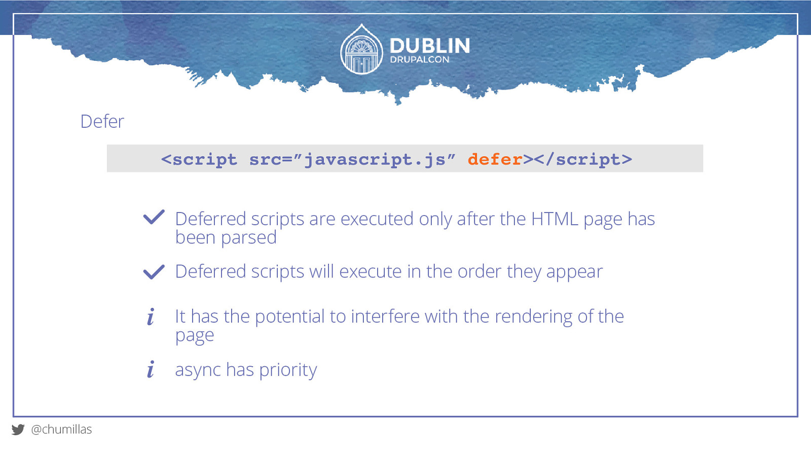
Defer <script src=”javascript.js” defer></script> Deferred scripts are executed only after the HTML page has been parsed Deferred scripts will execute in the order they appear i i @chumillas It has the potential to interfere with the rendering of the page async has priority
Asynchronous loading <html> <head> <link rel=”stylesheet” href=”styles.css”/> <script src=”javascript.js”></script> <script src=”javascript.js” async/defer></script> <script> // JavaScript source code goes here. </script> </head> <body> <!— Page content —> <script src=”javascript.js”></script> </body> </html> @chumillas
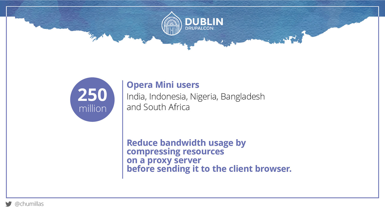
Proxy-based browsers
250 million Opera Mini users India, Indonesia, Nigeria, Bangladesh and South Africa Reduce bandwidth usage by compressing resources on a proxy server before sending it to the client browser. @chumillas
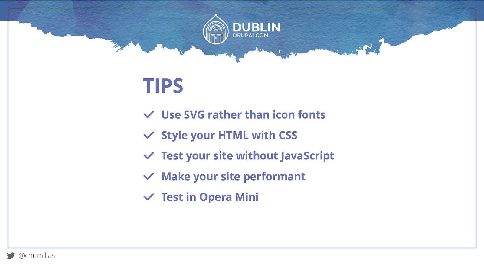
TIPS Use SVG rather than icon fonts Style your HTML with CSS Test your site without JavaScript Make your site performant Test in Opera Mini @chumillas
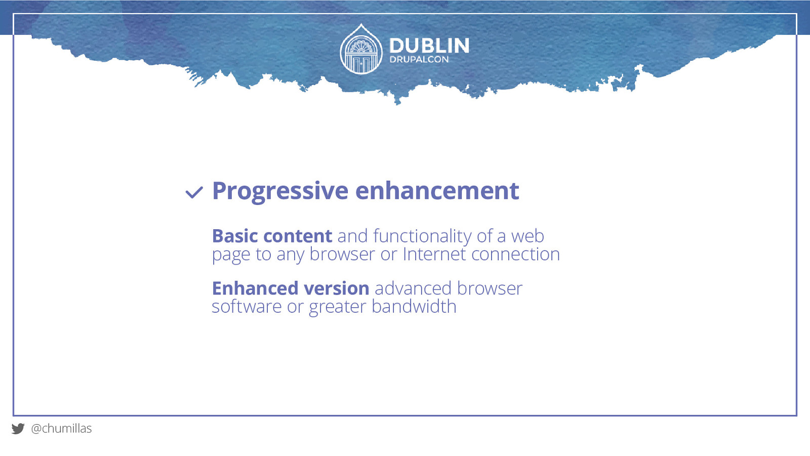
Progressive enhancement Basic content and functionality of a web page to any browser or Internet connection Enhanced version advanced browser software or greater bandwidth @chumillas
Beyond the Mouse TOUCH & KEYBOARD EVENTS
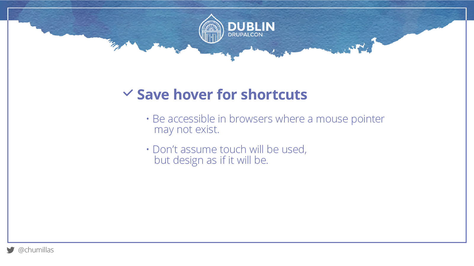
Save hover for shortcuts • Be accessible in browsers where a mouse pointer may not exist. • Don’t assume touch will be used, but design as if it will be. @chumillas
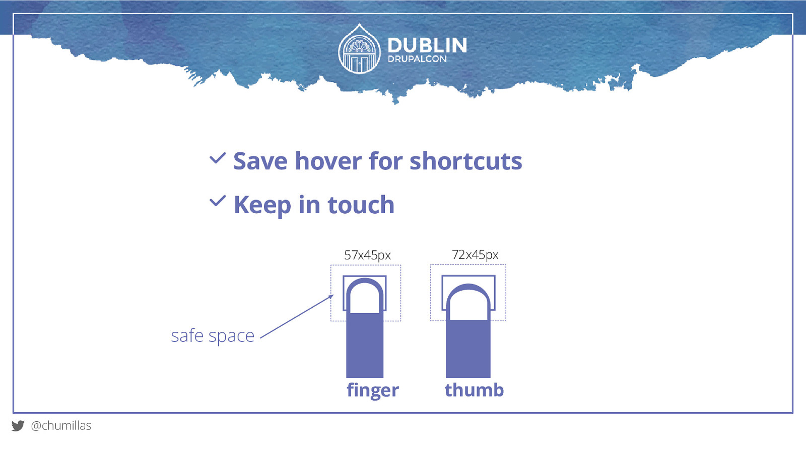
Save hover for shortcuts Keep in touch 57x45px 72x45px safe space finger @chumillas thumb
Save hover for shortcuts Keep in touch Gestures: don’t override system defaults @chumillas
RWD patterns
Design patterns are recurring solutions that solve common design problems. @chumillas
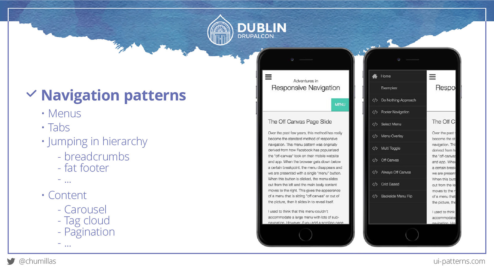
Navigation patterns • Menus • Tabs • Jumping in hierarchy - breadcrumbs - fat footer - … • Content - Carousel - Tag cloud - Pagination - … @chumillas ui-patterns.com
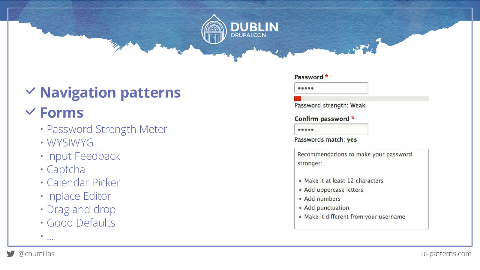
Navigation patterns Forms • Password Strength Meter • WYSIWYG • Input Feedback • Captcha • Calendar Picker • Inplace Editor • Drag and drop • Good Defaults • … @chumillas ui-patterns.com
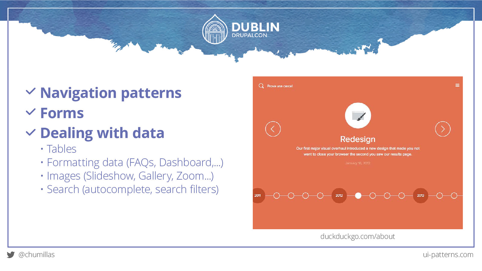
Navigation patterns Forms Dealing with data • Tables • Formatting data (FAQs, Dashboard,…) • Images (Slideshow, Gallery, Zoom…) • Search (autocomplete, search filters) duckduckgo.com/about @chumillas ui-patterns.com
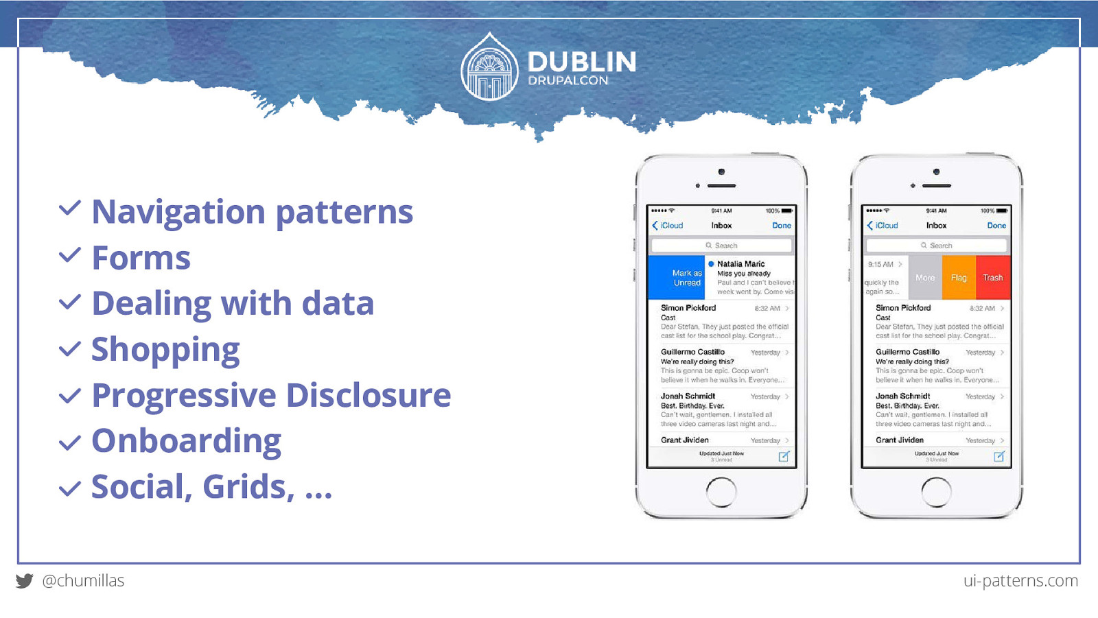
Navigation patterns Forms Dealing with data Shopping Progressive Disclosure Onboarding Social, Grids, … @chumillas ui-patterns.com
Conclusions
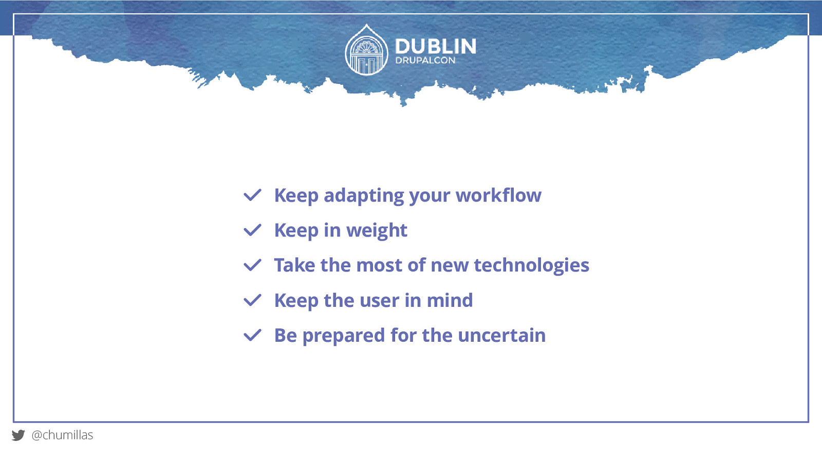
Keep adapting your workflow Keep in weight Take the most of new technologies Keep the user in mind Be prepared for the uncertain @chumillas
Keep evolving. @chumillas
Thank you! @chumillas
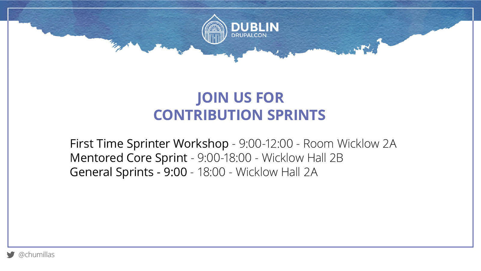
JOIN US FOR CONTRIBUTION SPRINTS First Time Sprinter Workshop - 9:00-12:00 - Room Wicklow 2A Mentored Core Sprint - 9:00-18:00 - Wicklow Hall 2B General Sprints - 9:00 - 18:00 - Wicklow Hall 2A @chumillas
WHAT DID YOU THINK? Evaluate this session events.drupal.org/dublin2016/schedule THANK YOU!
It’s been 6 years since the term Responsive Web Design (RWD) was coined and today is difficult to see new projects without implementing it. But this time has allowed us to see the implementation can be even more important than the technique and the theory.
The RWD covers from the performance to the implementation of patterns and “standard” behaviors to improve usability.
In this session I will review tools, techniques and concepts to improve our projects:


 for free. You
can too.
for free. You
can too.