
A presentation at Awwwards - Love Days in in Paris, France by Simon Collison
2006
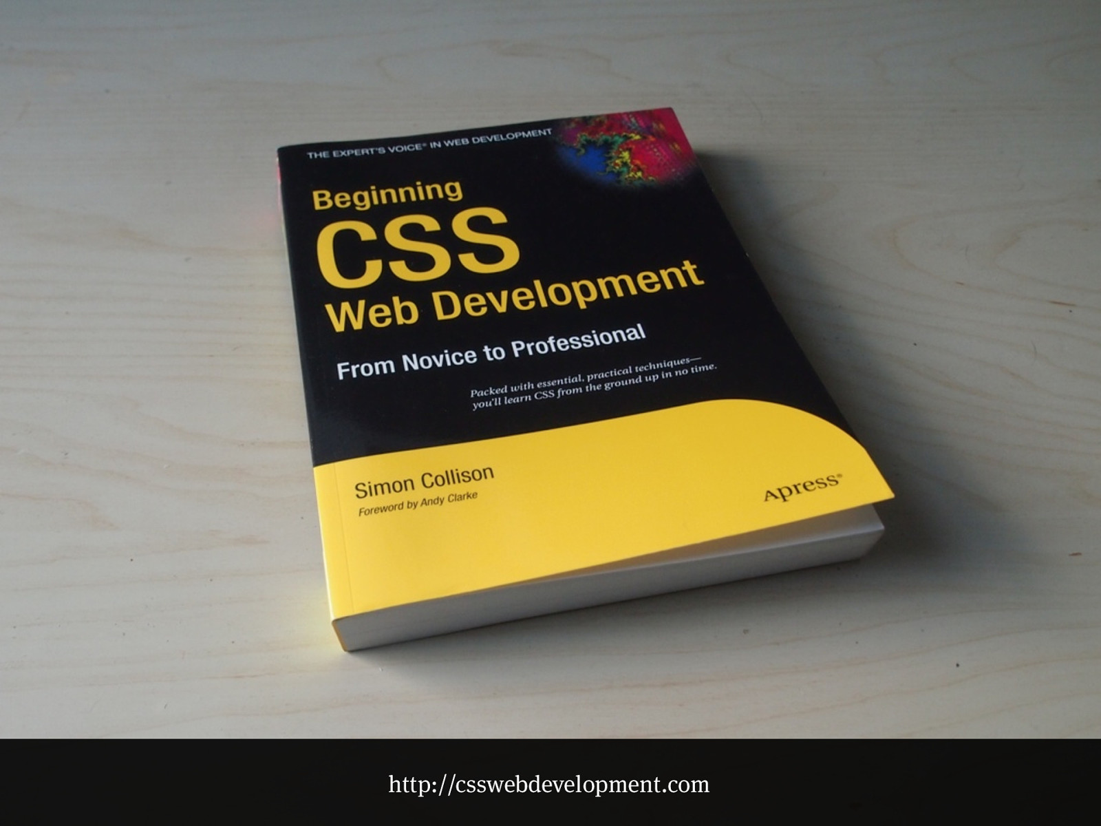
That book
http://csswebdevelopment.com
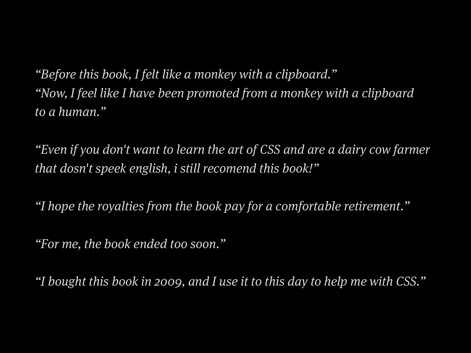
“Before this book, I felt like a monkey with a clipboard.”
“Now, I feel like I have been promoted from a monkey with a clipboard
to a human.”
“Even if you don't want to learn the art of CSS and are a dairy cow farmer
that dosn't speek english, i still recomend this book!”
“I hope the royalties from the book pay for a comfortable retirement.”
“For me, the book ended too soon.”
“I bought this book in 2009, and I use it to this day to help me with CSS.”
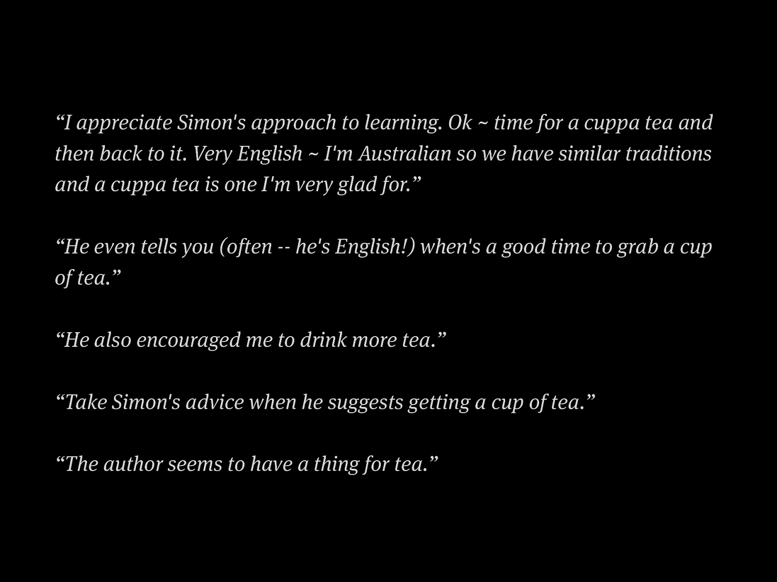
“I appreciate Simon's approach to learning. Ok ~ time for a cuppa tea and then back to it. Very English ~ I'm Australian so we have similar traditions and a cuppa tea is one I'm very glad for.” “He even tells you (often -- he's English!) when's a good time to grab a cup of tea.” “He also encouraged me to drink more tea.” “Take Simon's advice when he suggests getting a cup of tea.” “The author seems to have a thing for tea.”
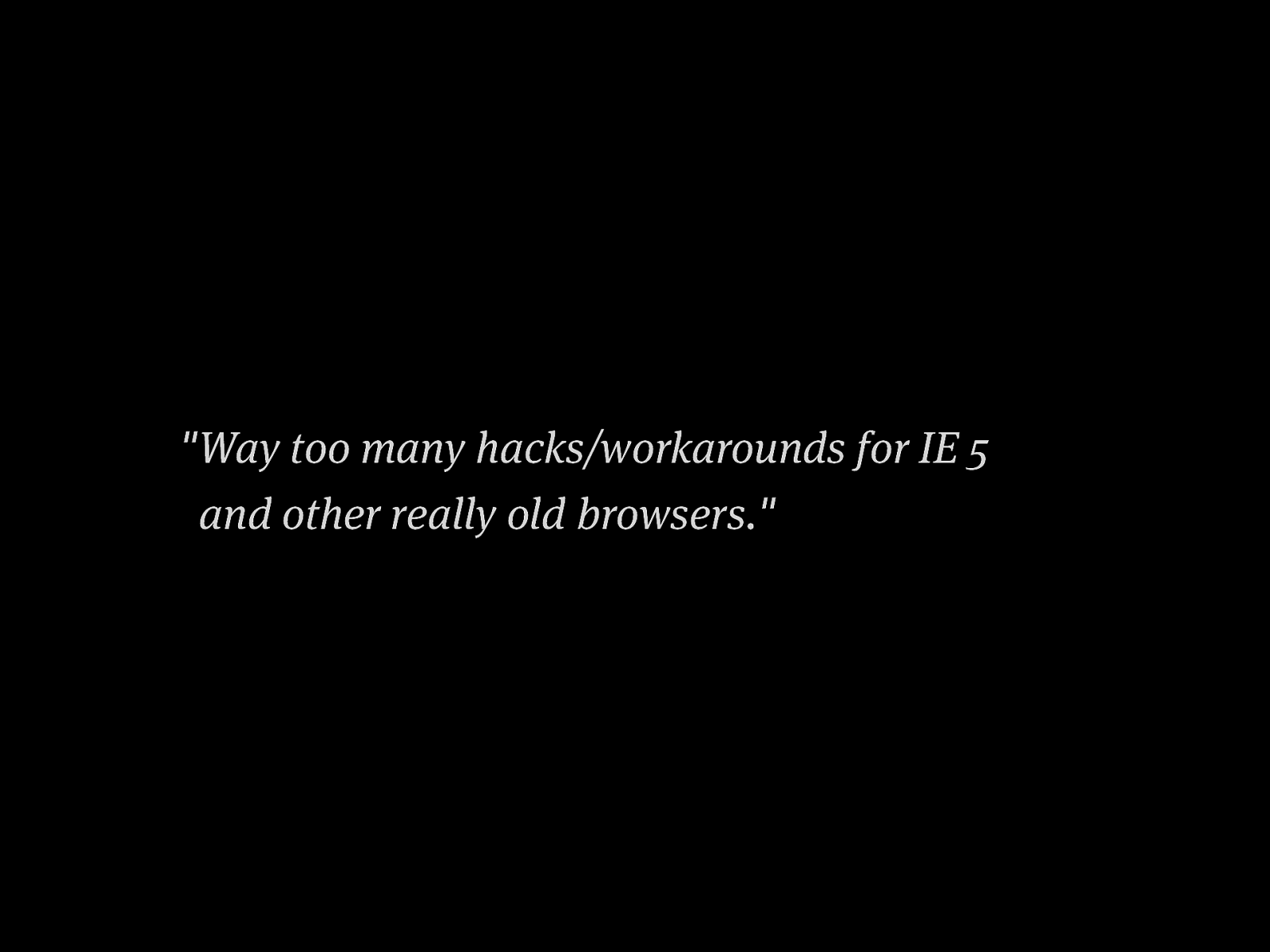
"Way too many hacks/workarounds for IE 5 and other really old browsers."
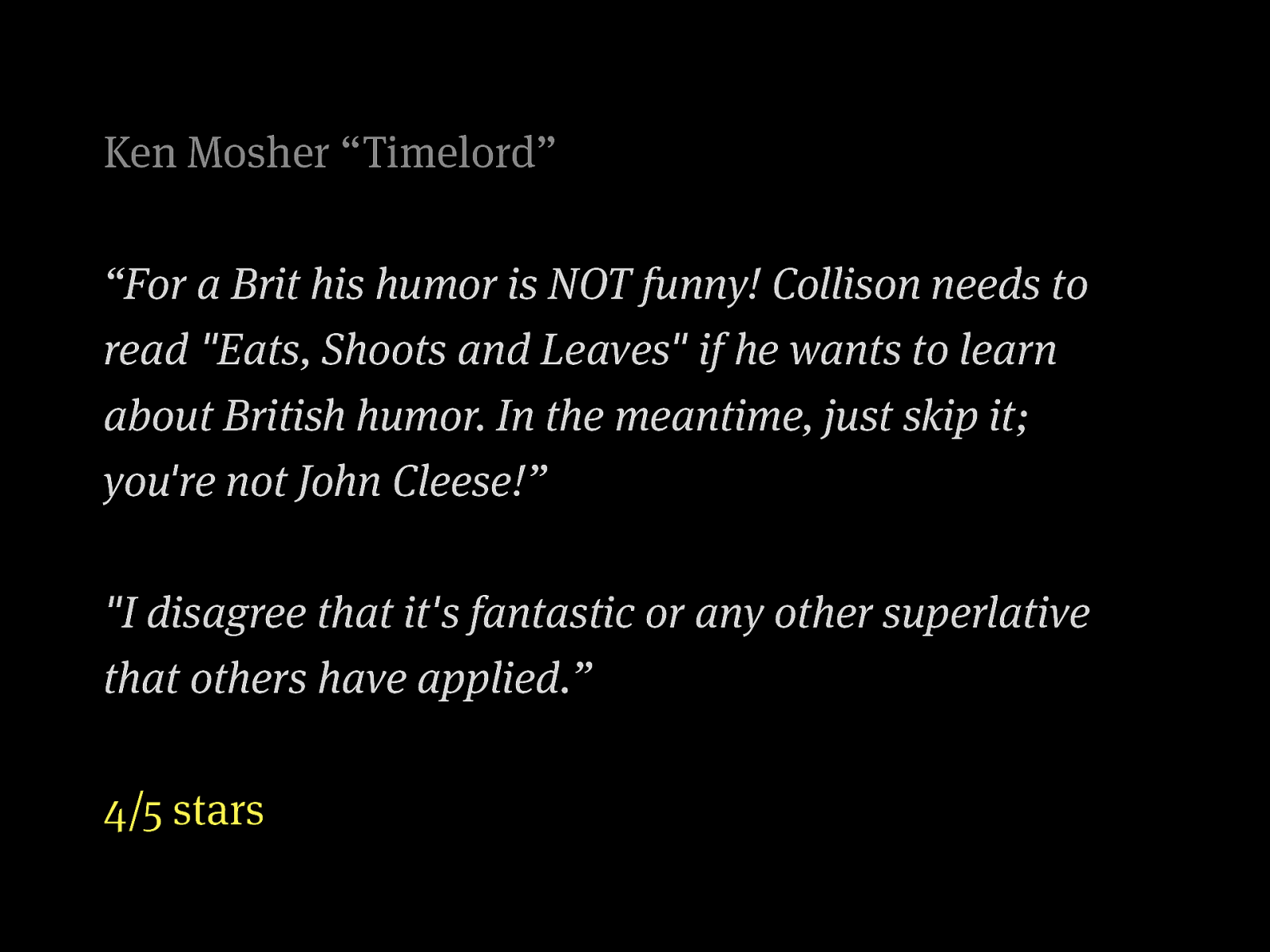
Ken Mosher “Timelord” “For a Brit his humor is NOT funny! Collison needs to read "Eats, Shoots and Leaves" if he wants to learn about British humor. In the meantime, just skip it; you're not John Cleese!” "I disagree that it's fantastic or any other superlative that others have applied.” 4/5 stars
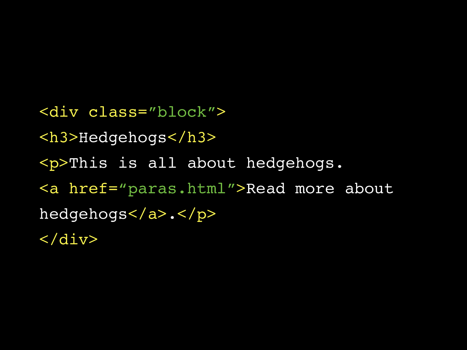
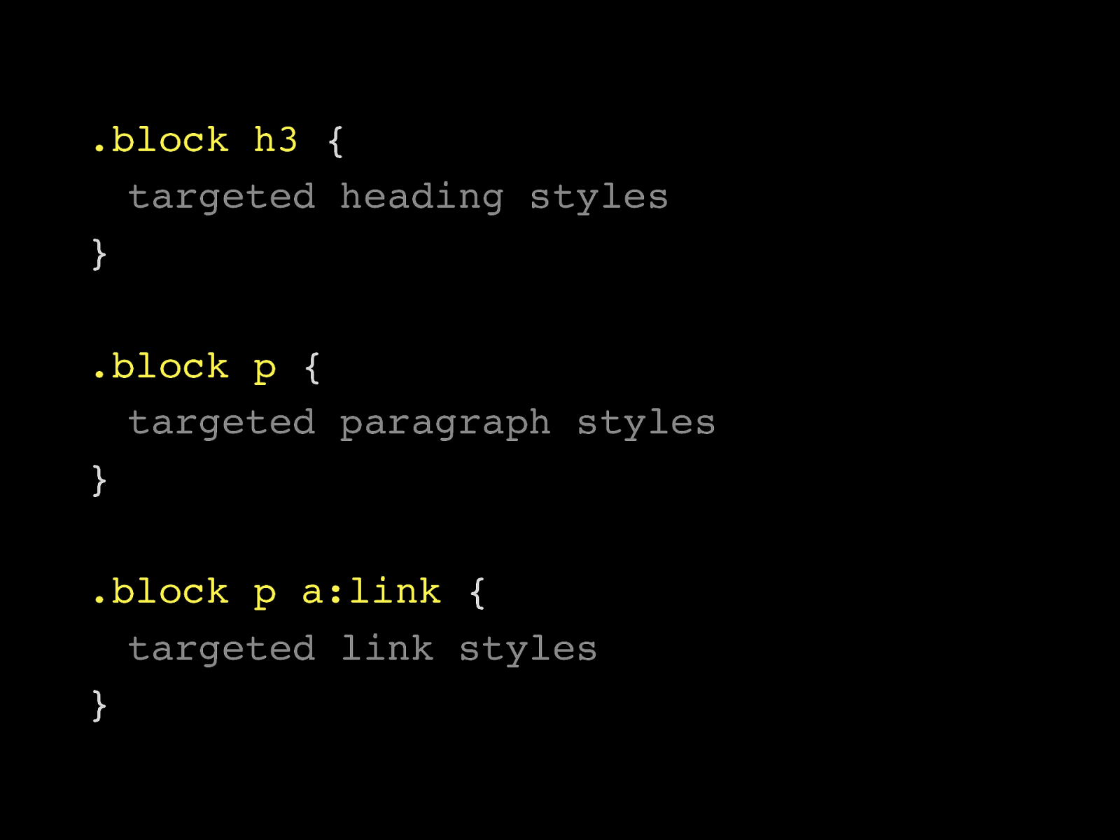
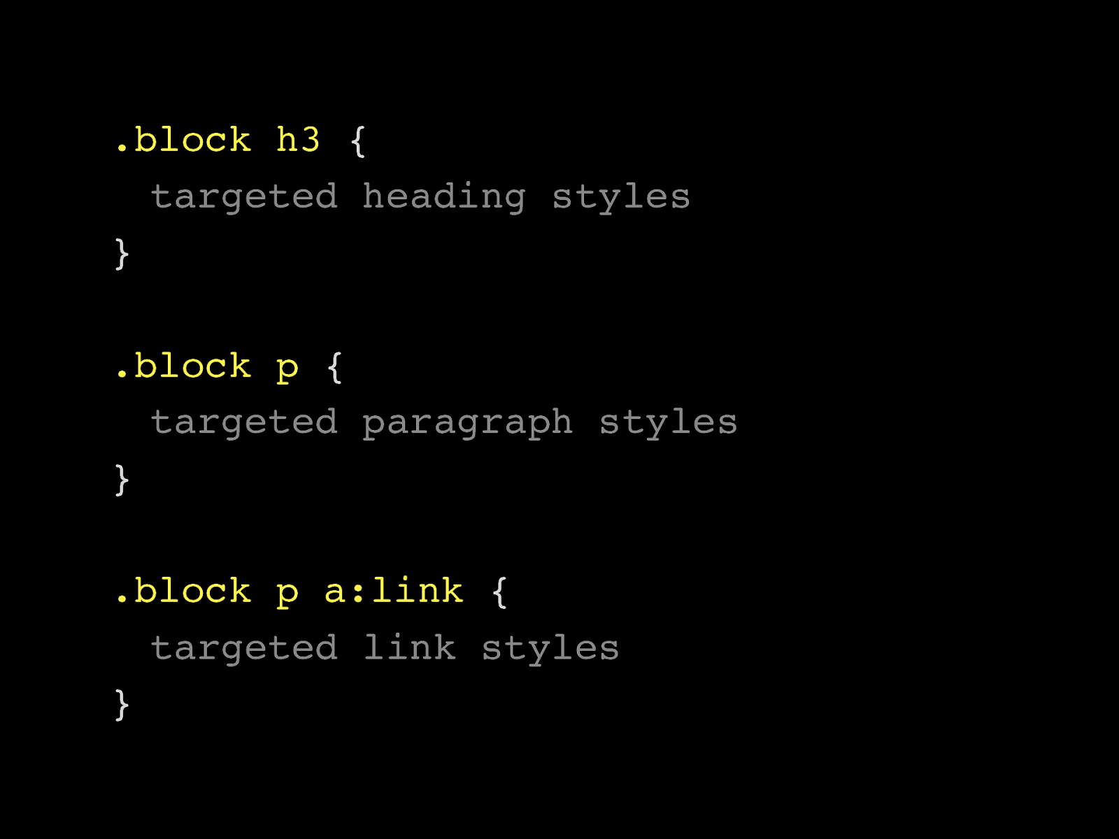
.block h3 { targeted heading styles } .block p { targeted paragraph styles } .block p a:link { targeted link styles }
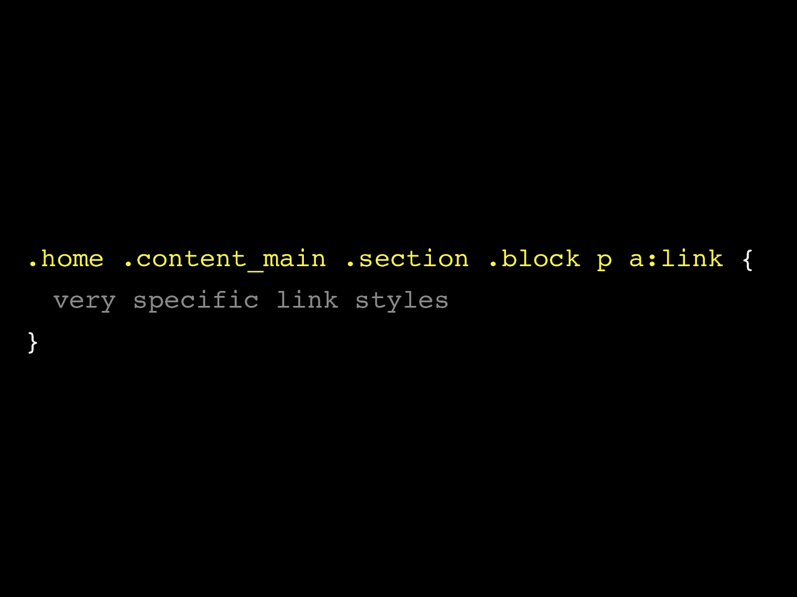
.home .content_main .section .block p a:link { very specific link styles }
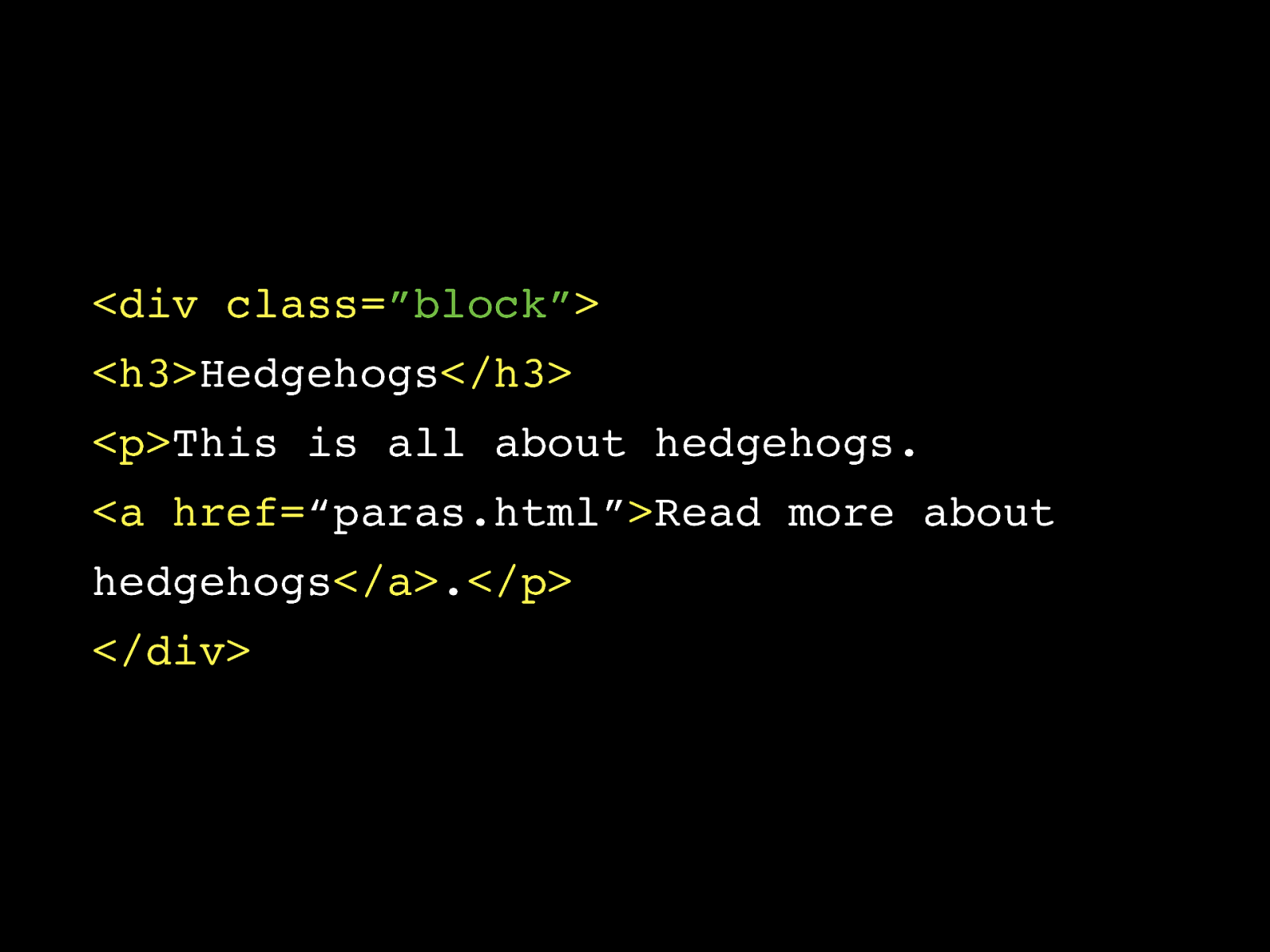
Web “pages”
2009
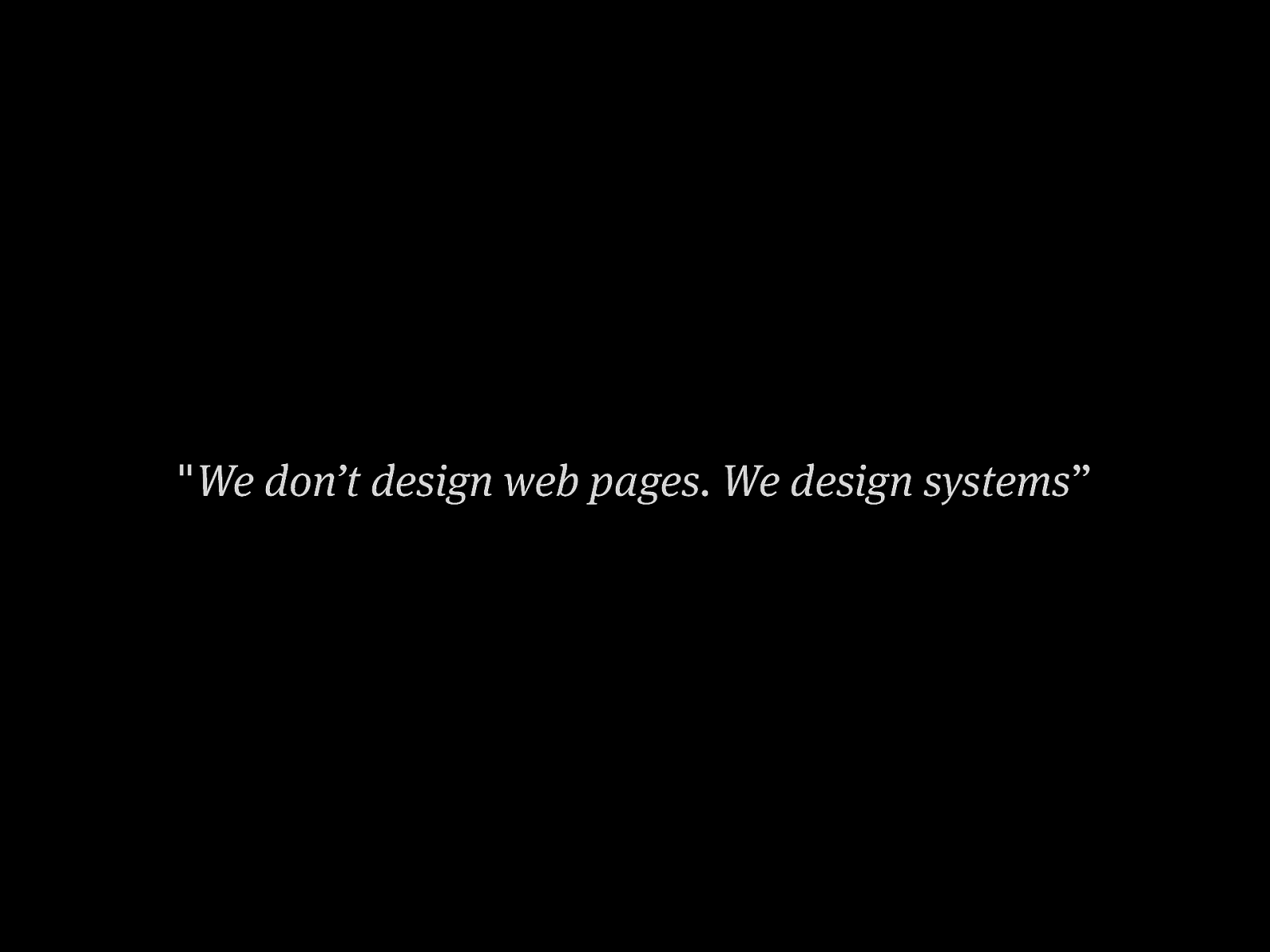
" We don’t design web pages. We design systems ”
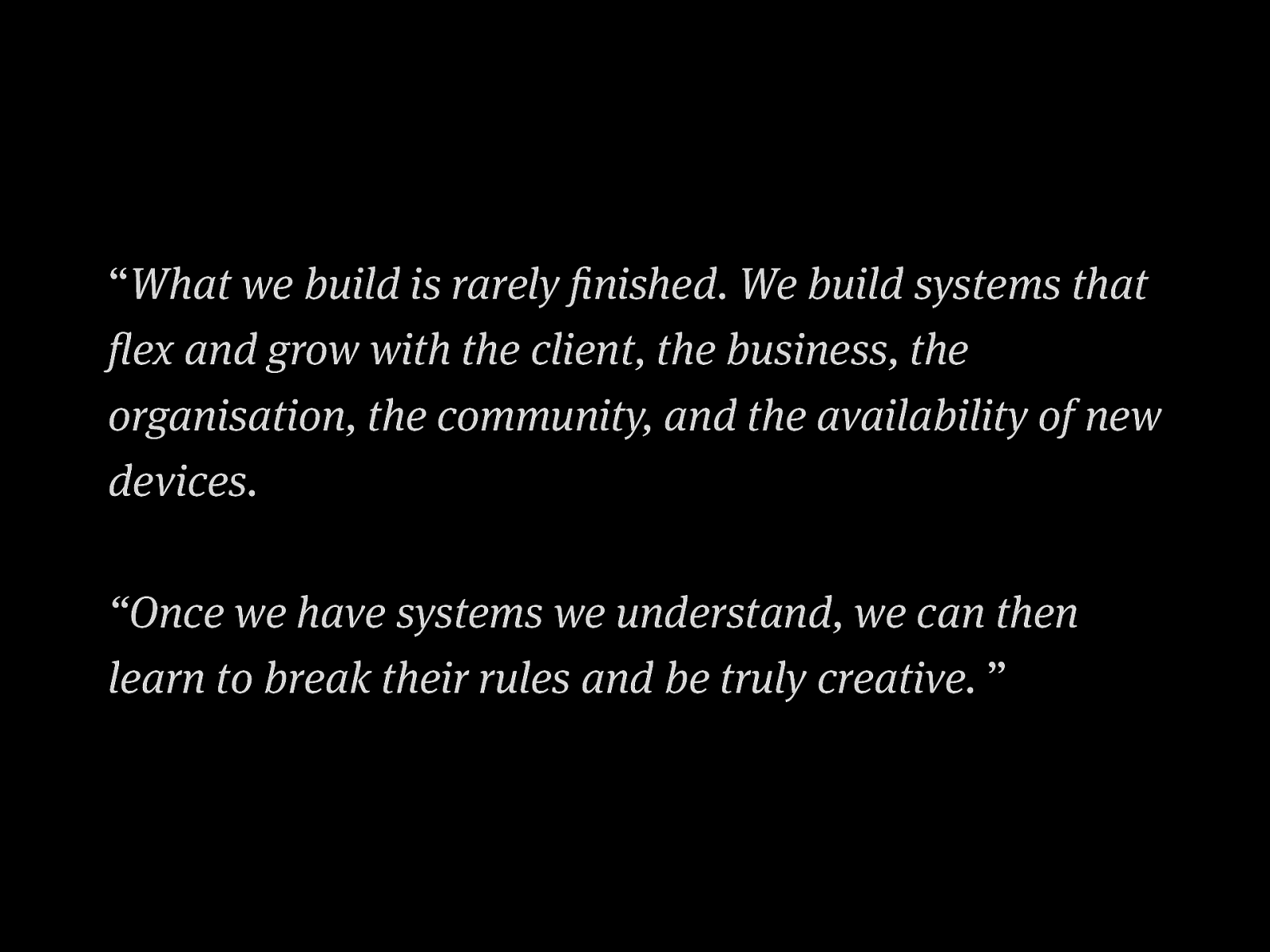
“ What we build is rarely finished. We build systems that flex and grow with the client, the business, the organisation, the community, and the availability of new devices. “Once we have systems we understand, we can then learn to break their rules and be truly creative. ”
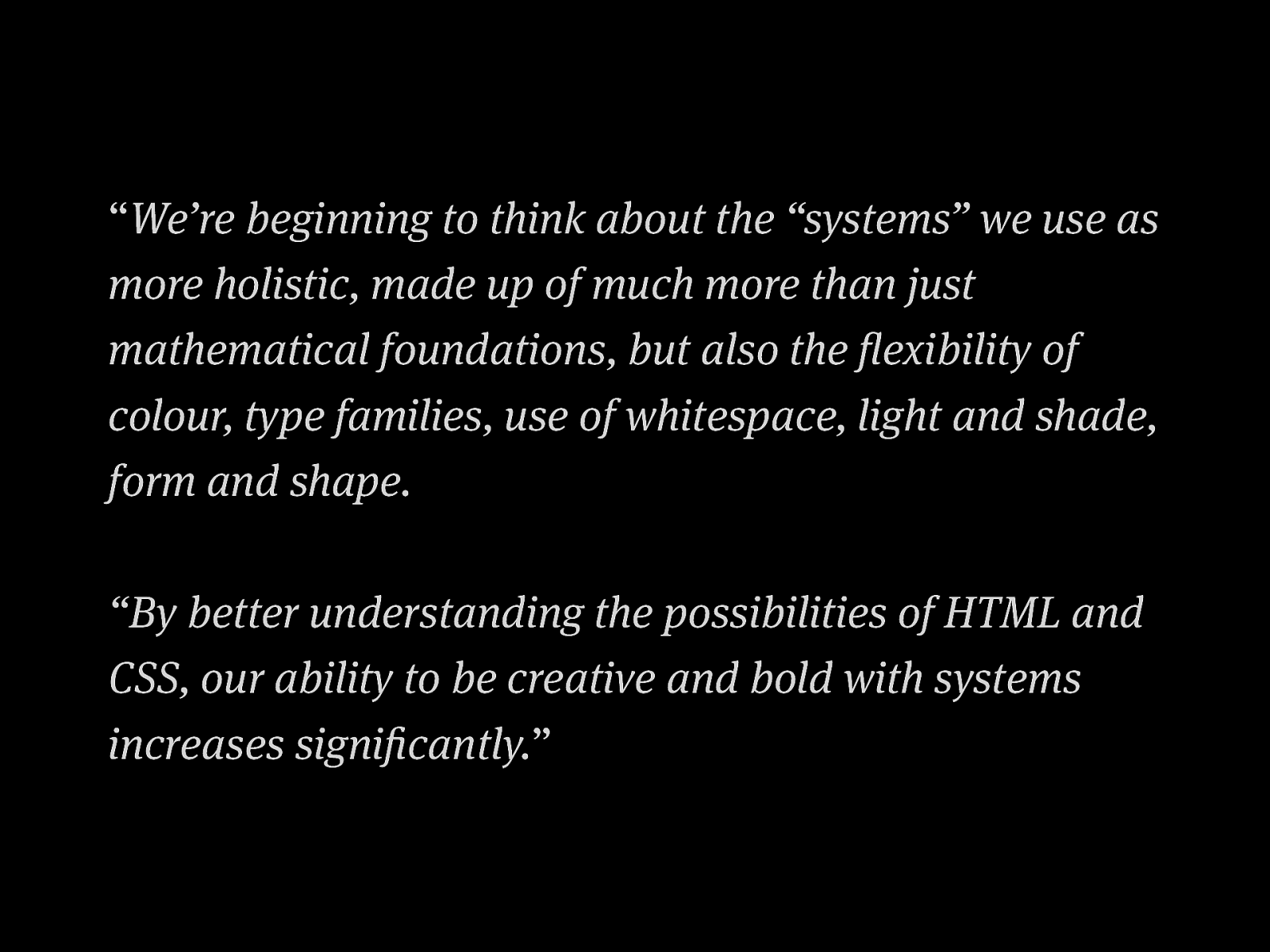
“ We’re beginning to think about the “systems” we use as more holistic, made up of much more than just mathematical foundations, but also the flexibility of colour, type families, use of whitespace, light and shade, form and shape. “By better understanding the possibilities of HTML and CSS, our ability to be creative and bold with systems increases significantly. ”
Base layer
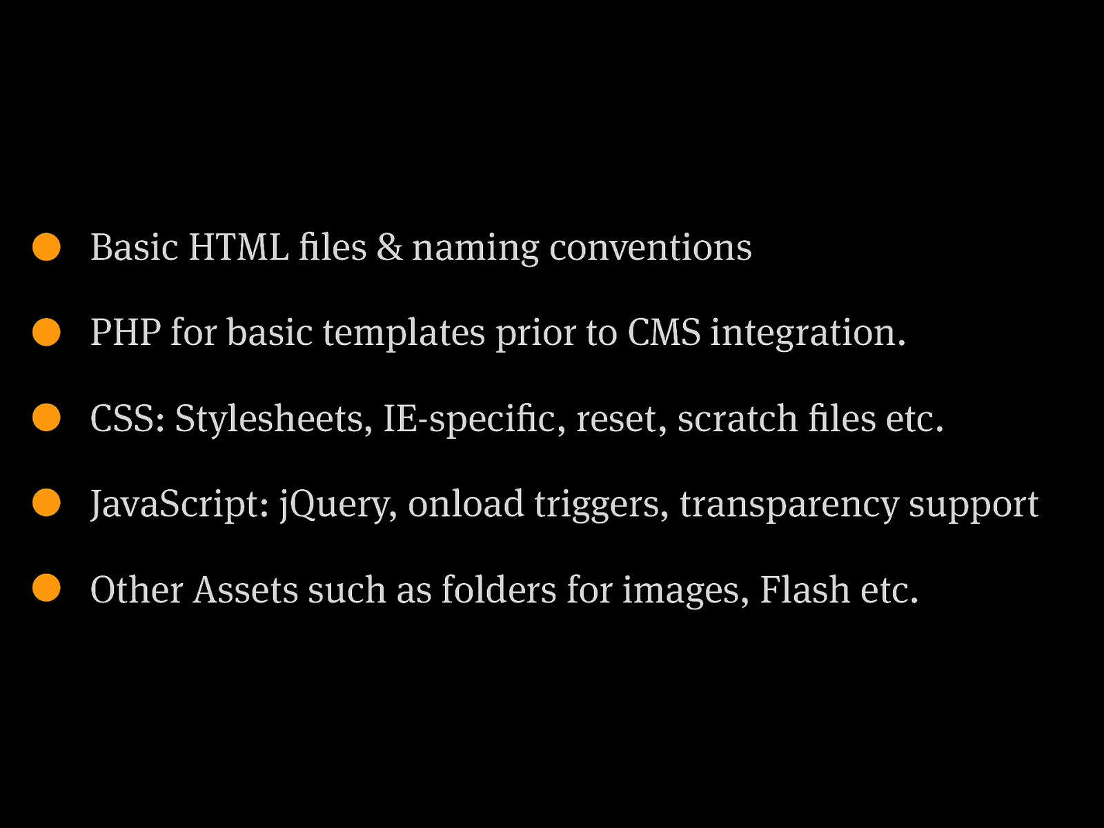
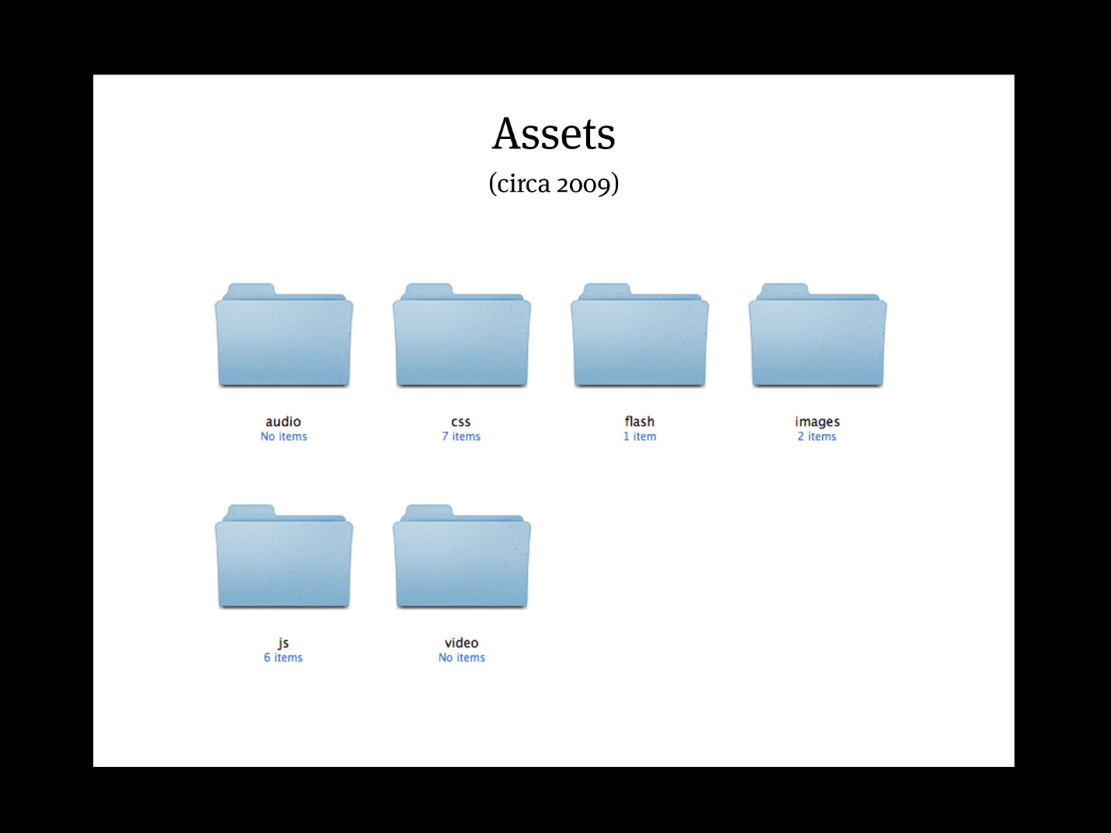
Basic HTML files & naming conventions PHP for basic templates prior to CMS integration. CSS: Stylesheets, IE-specific, reset, scratch files etc. JavaScript: jQuery, onload triggers, transparency support Other Assets such as folders for images, Flash etc.
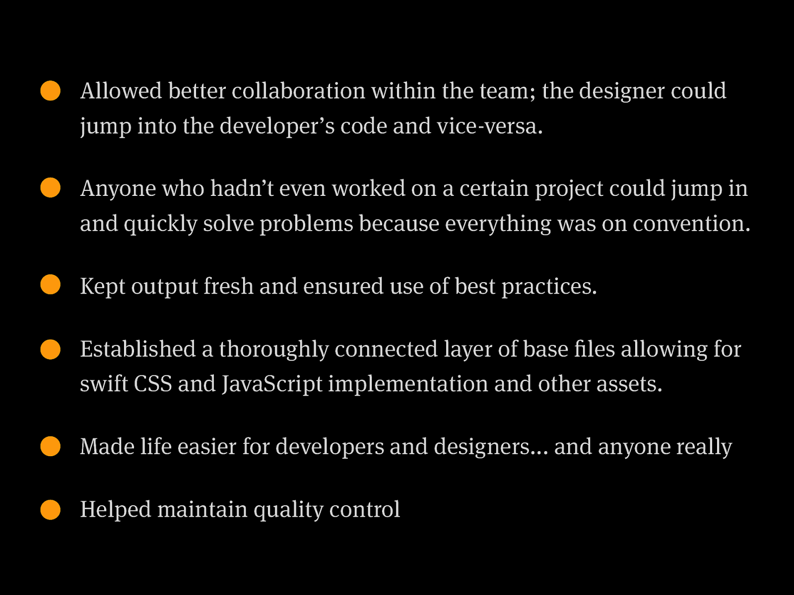
Allowed better collaboration within the team; the designer could jump into the developer’s code and vice-versa. Anyone who hadn’t even worked on a certain project could jump in and quickly solve problems because everything was on convention. Kept output fresh and ensured use of best practices. Established a thoroughly connected layer of base files allowing for swift CSS and JavaScript implementation and other assets. Made life easier for developers and designers... and anyone really Helped maintain quality control
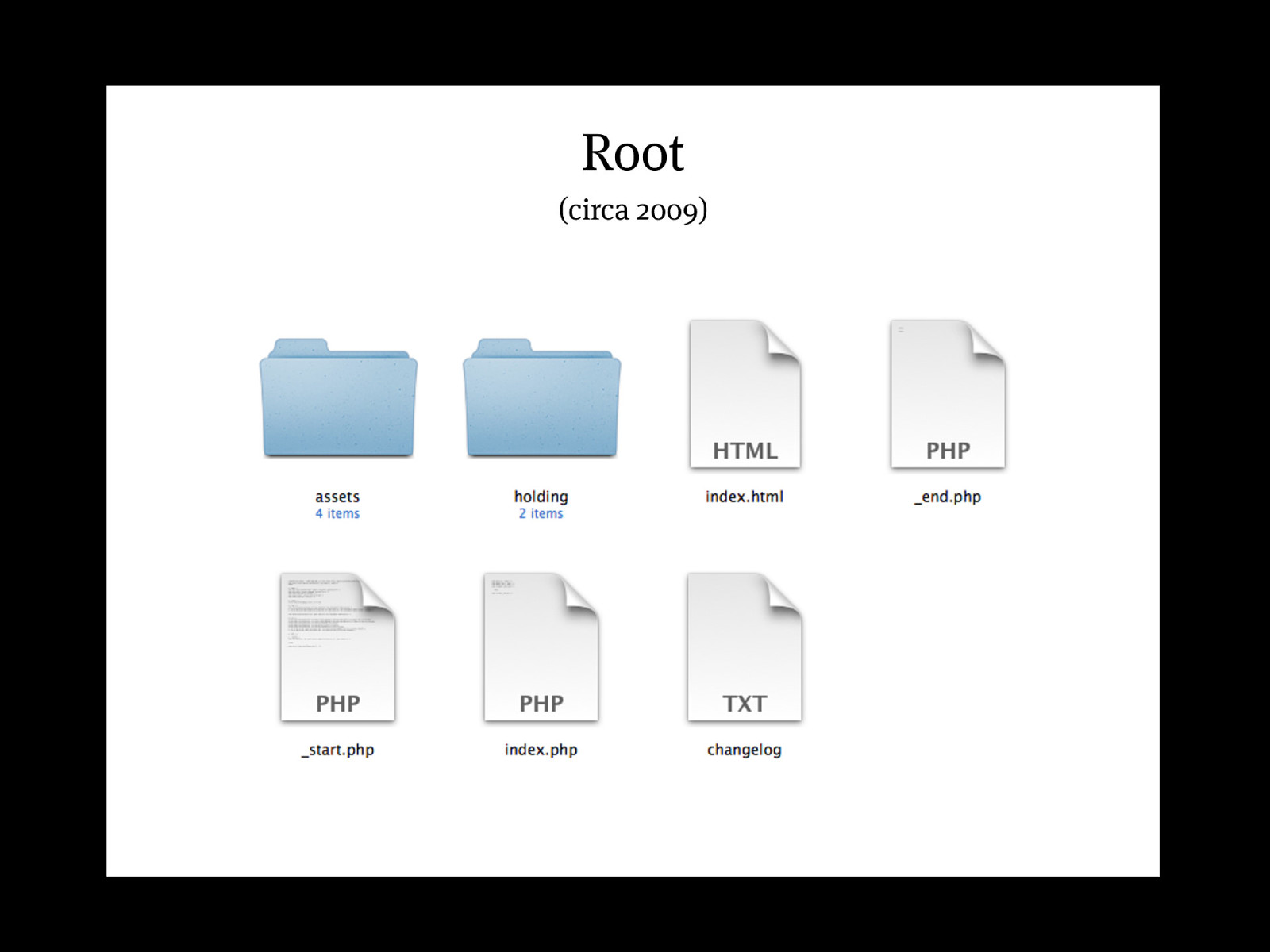
Root Root (circa 2009)
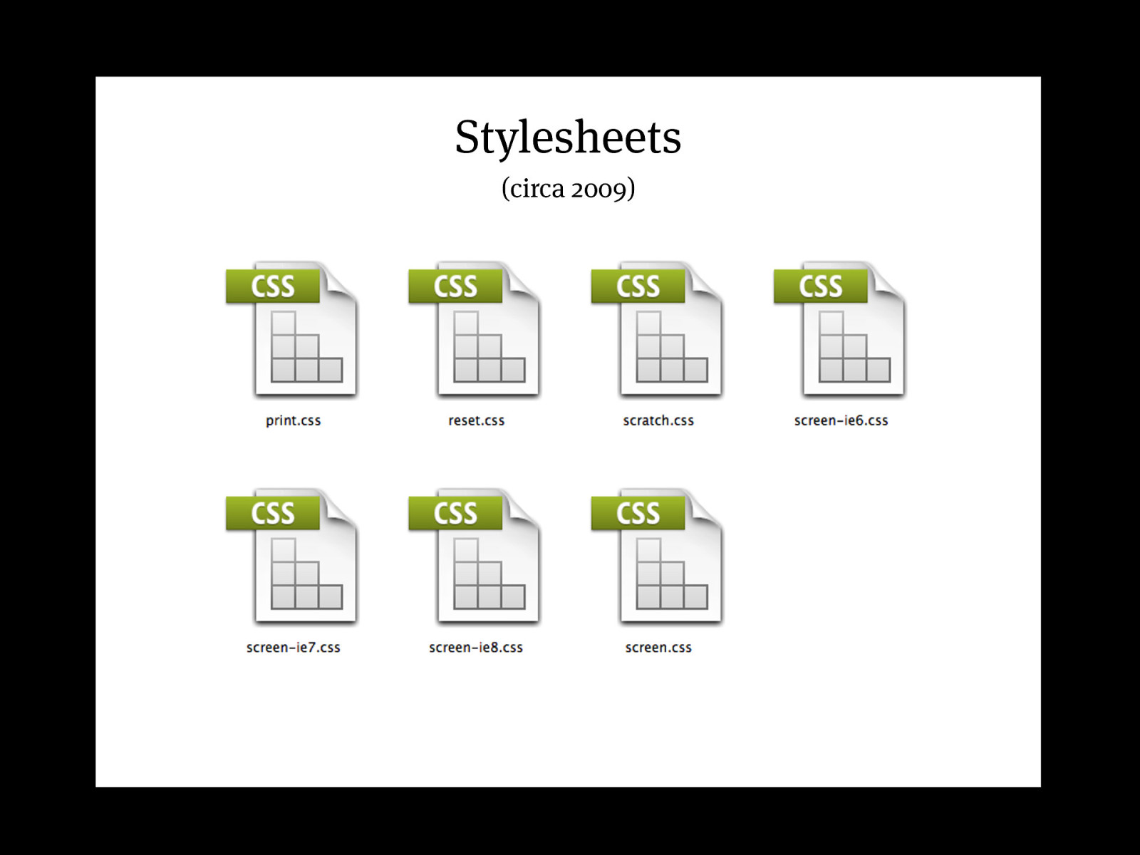
Stylesheets (circa 2009)
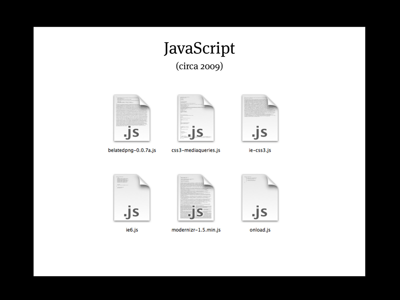
JavaScript (circa 2009)
Assets (circa 2009)
Pattern Libraries Anna Debenham 24 Ways:
http://24ways.org/2011/front-end-style-guides/ Her book:
http://www.fivesimplesteps.com/products/front-end-style-guides
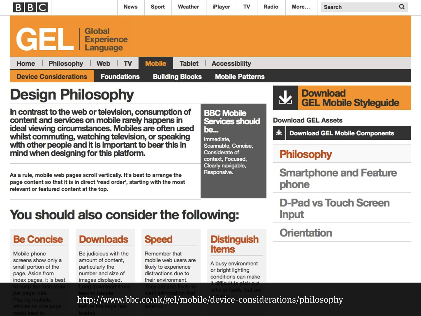
http://www.bbc.co.uk/gel/mobile/device-considerations/philosophy
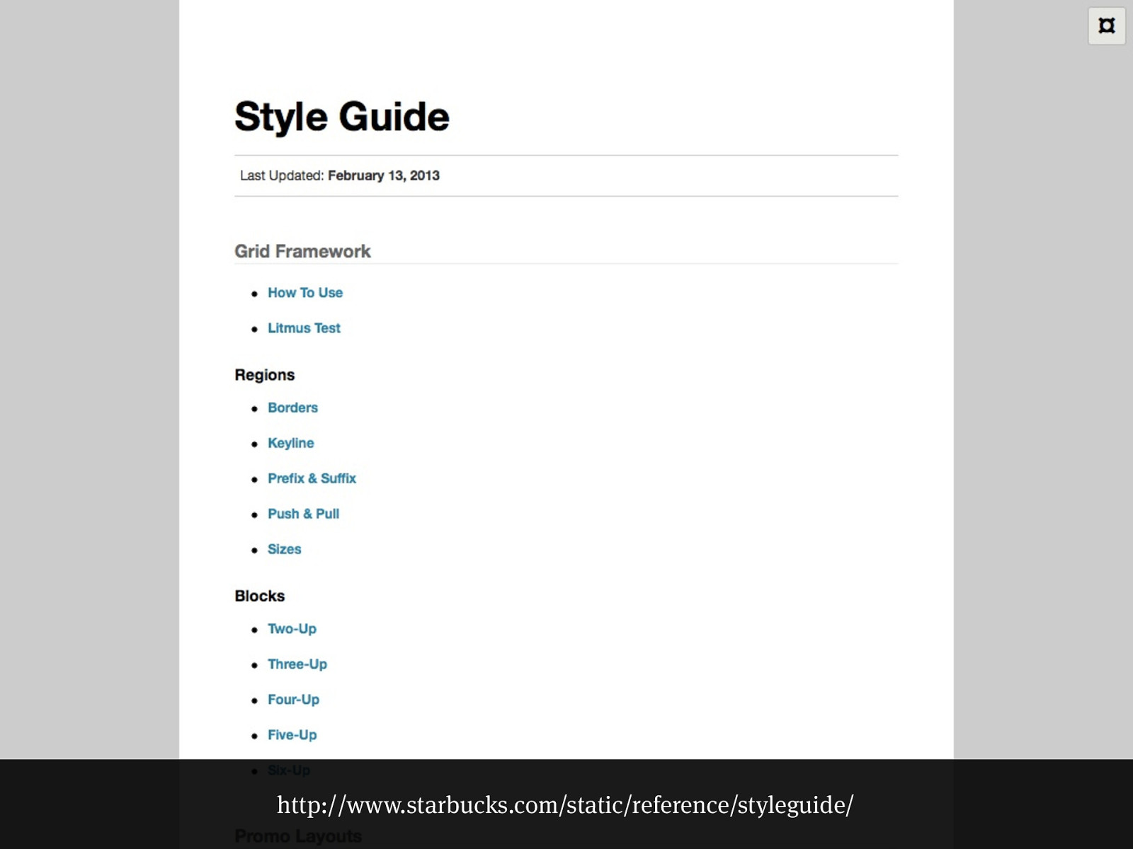
http://www.starbucks.com/static/reference/styleguide/
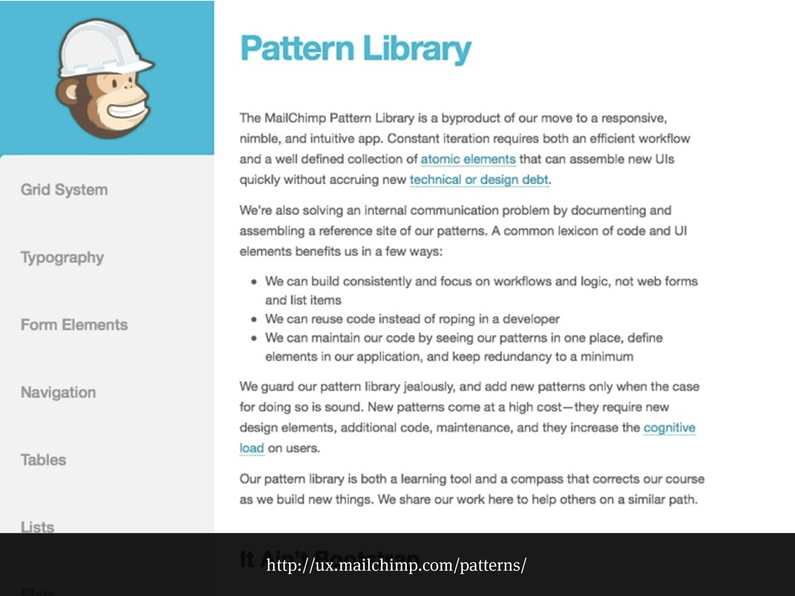
http://ux.mailchimp.com/patterns/
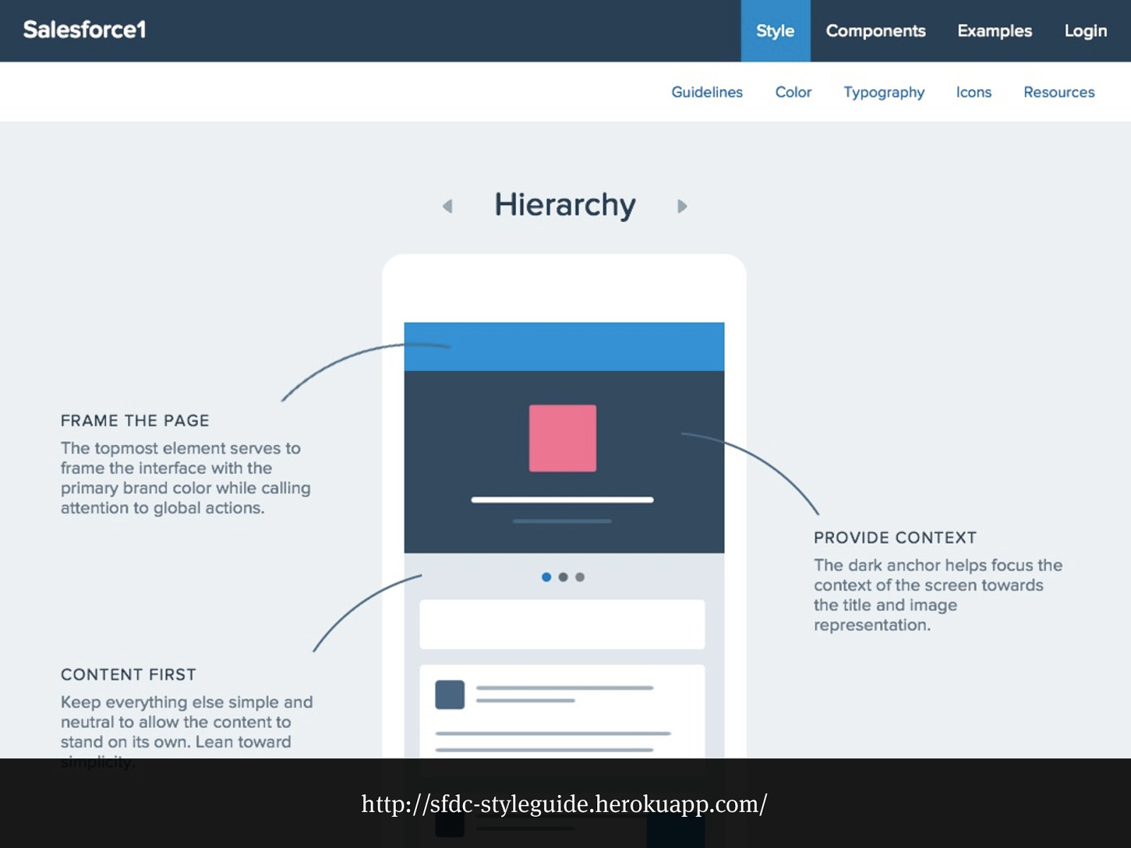
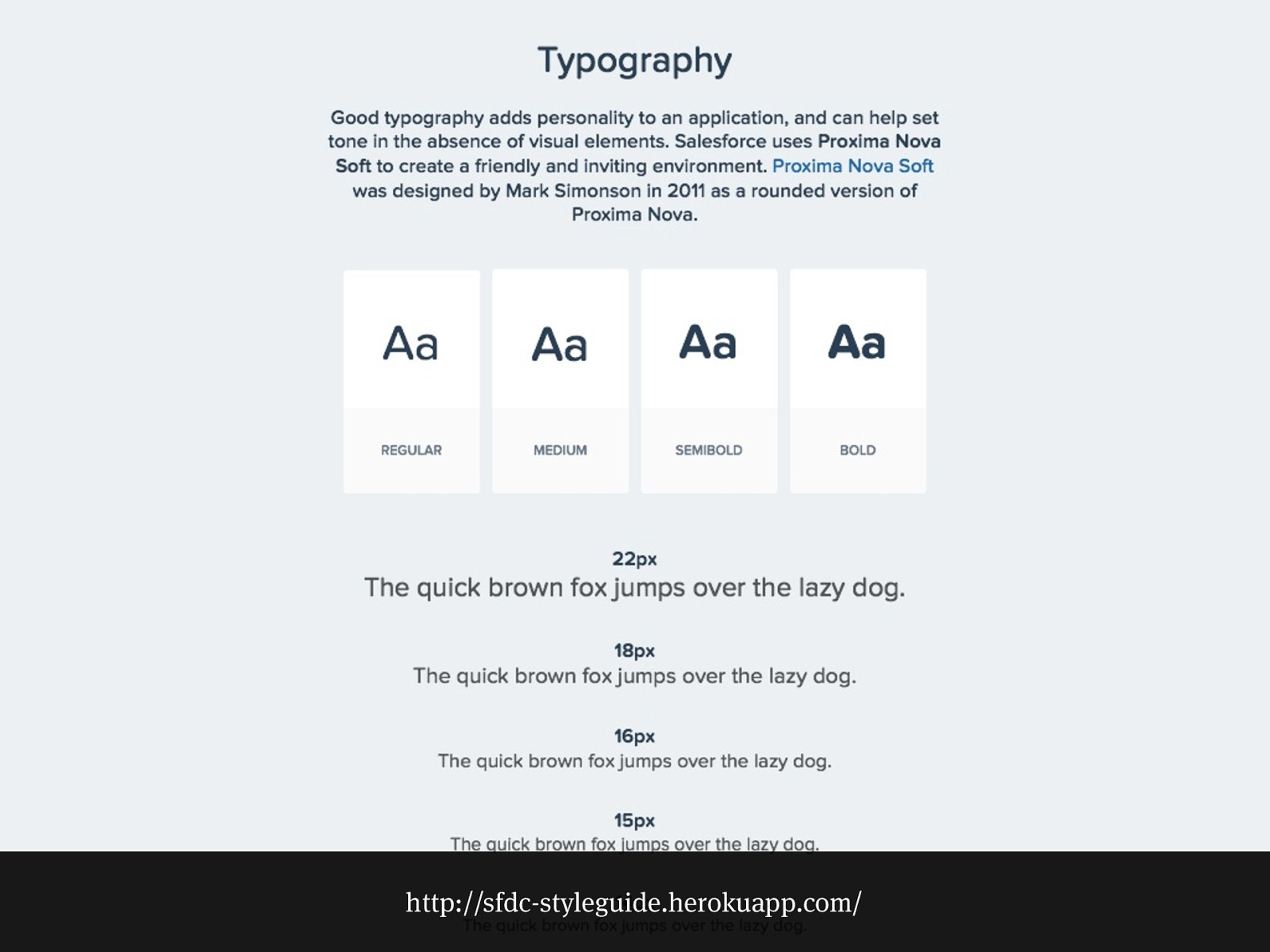
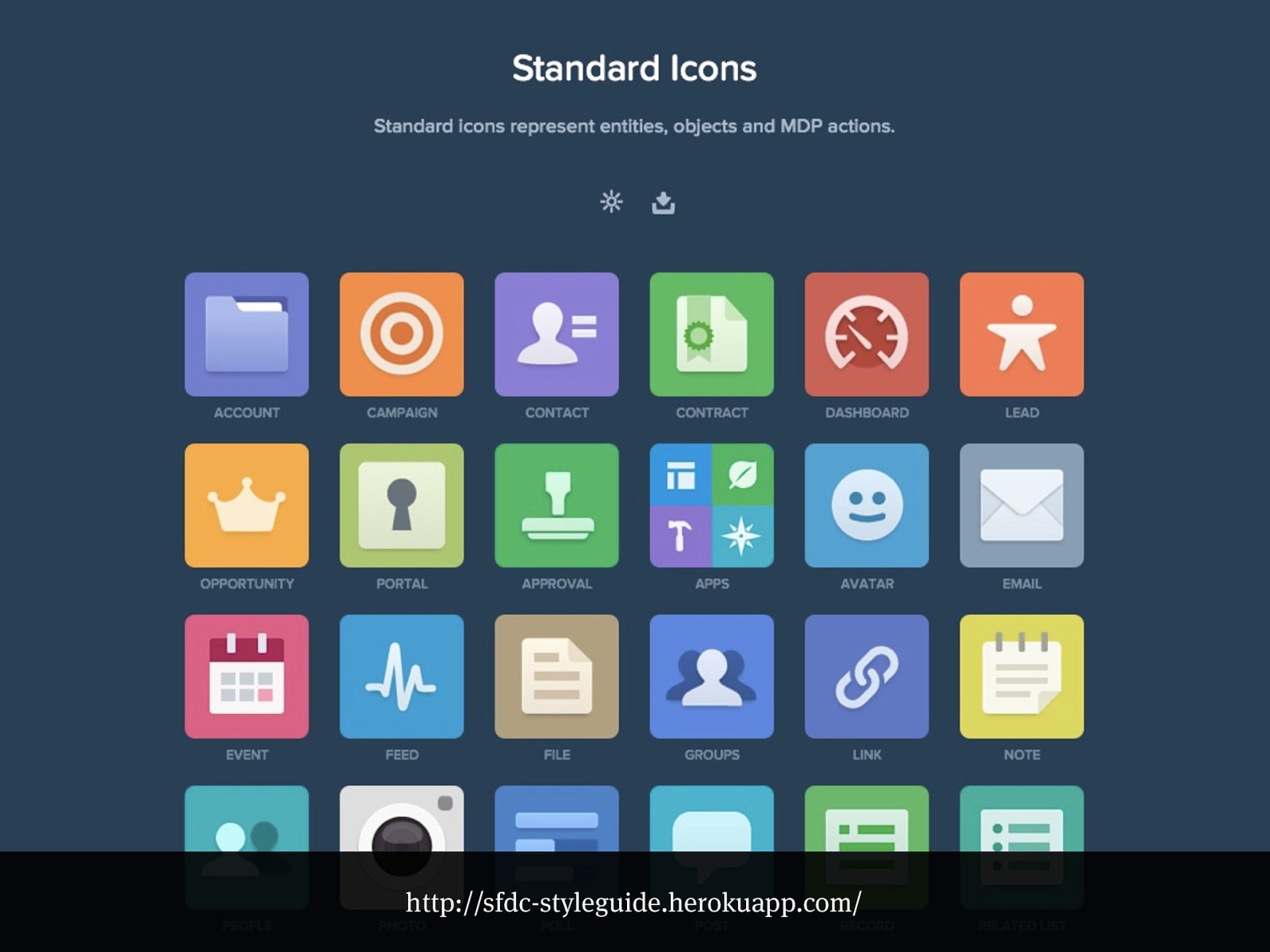
http://sfdc-styleguide.herokuapp.com/
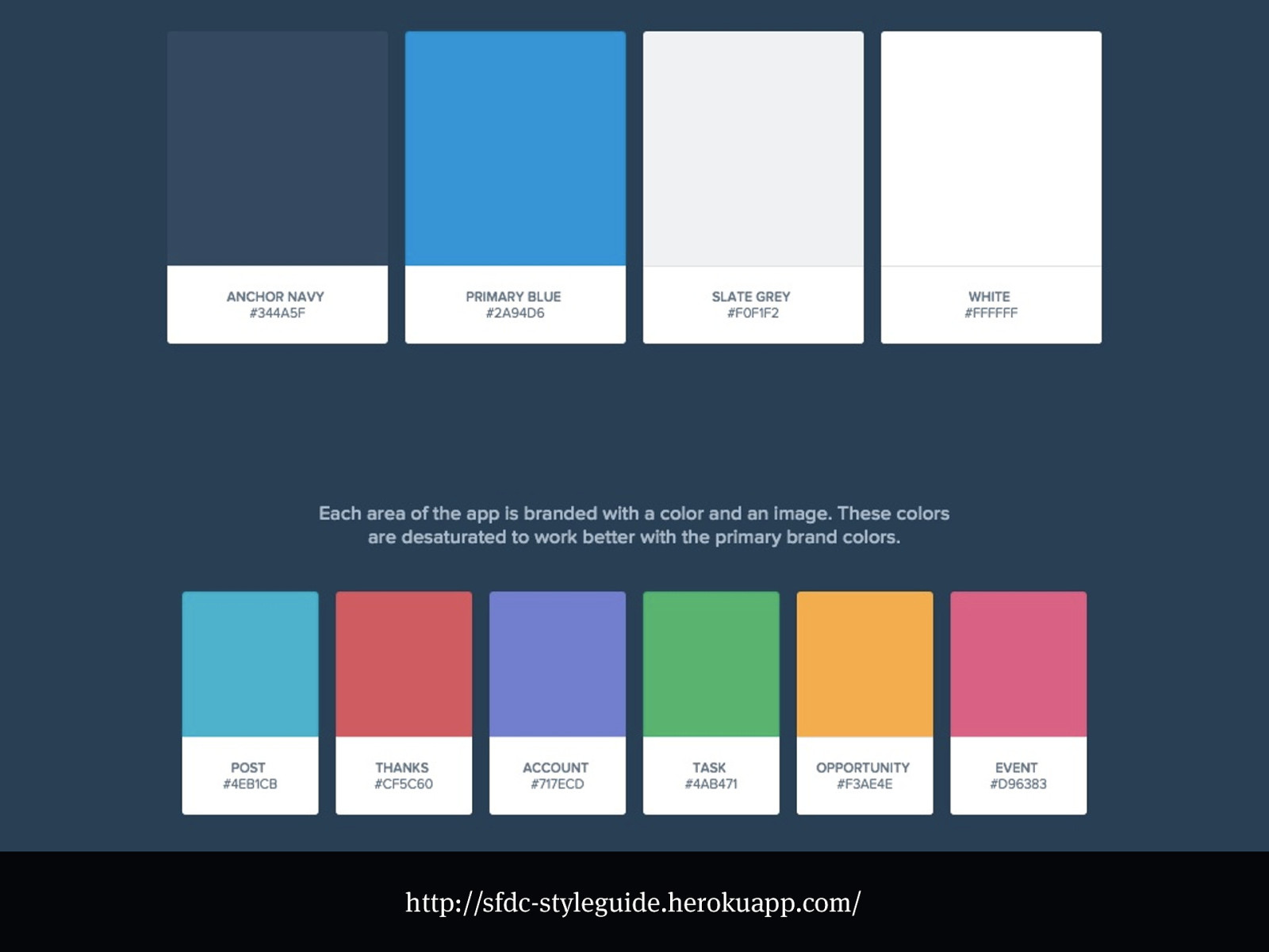
http://sfdc-styleguide.herokuapp.com/
http://sfdc-styleguide.herokuapp.com/
http://sfdc-styleguide.herokuapp.com/
Present day
Code sketches
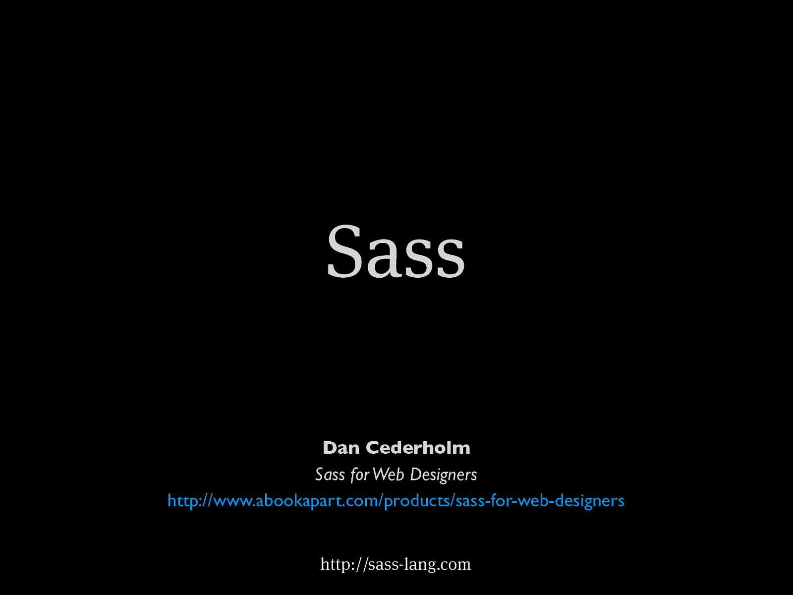
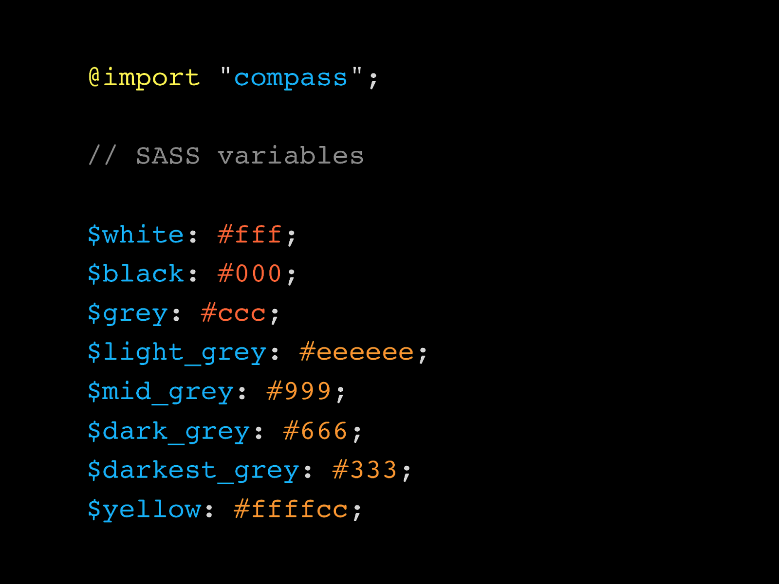
Sass http://sass-lang.com Dan Cederholm Sass for Web Designers http://www.abookapart.com/products/sass-for-web-designers
@import " compass "; // SASS variables $white : #fff ; $black : #000 ; $grey : #ccc ; $light_grey : #eeeeee ; $mid_grey : #999 ; $dark_grey : #666 ; $darkest_grey : #333 ; $yellow : #ffffcc ;
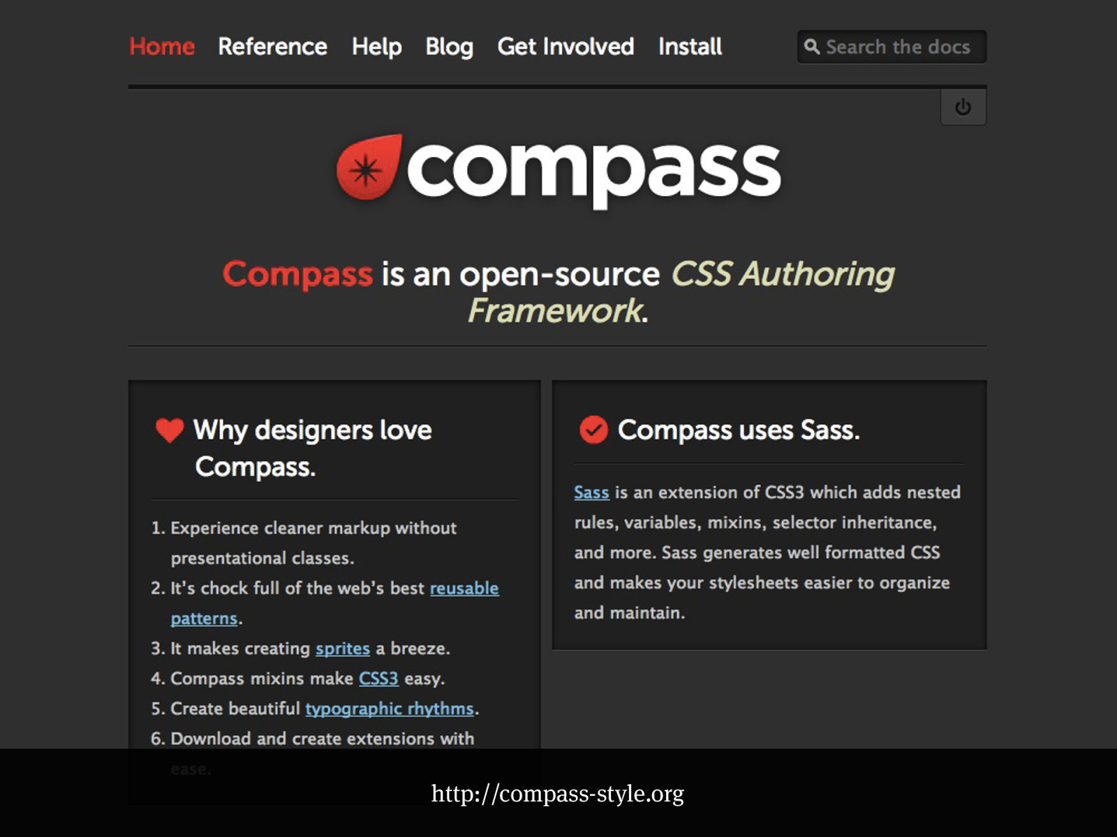
http://compass-style.org
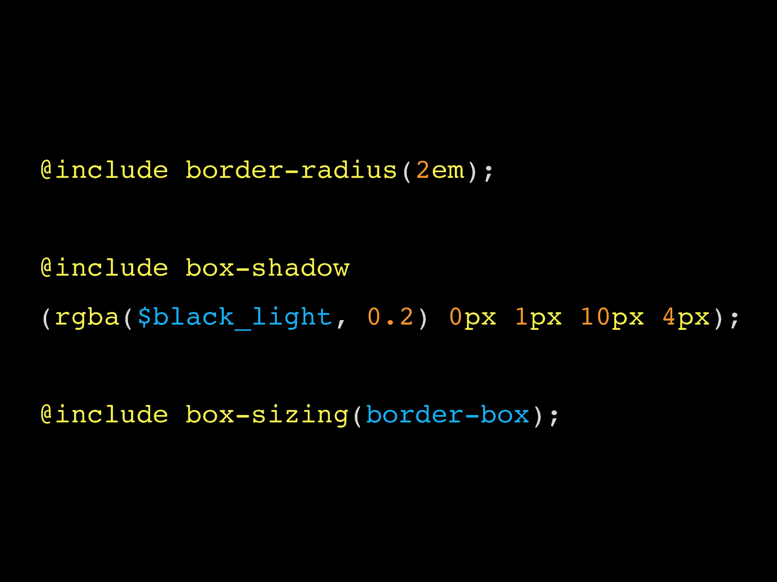
@include border-radius ( 2 em ); @include box-shadow ( rgba ( $black_light , 0.2 ) 0 px
1 px
10 px
4 px ); @include box-sizing ( border-box );
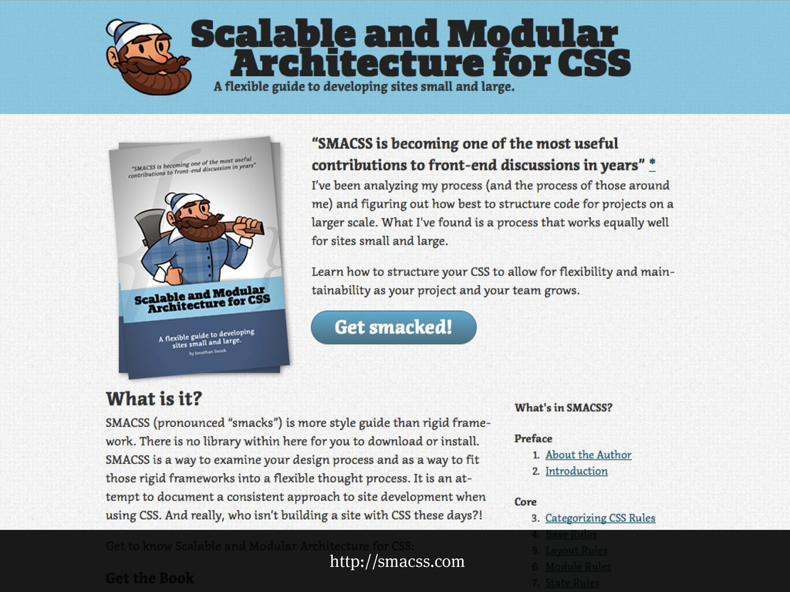
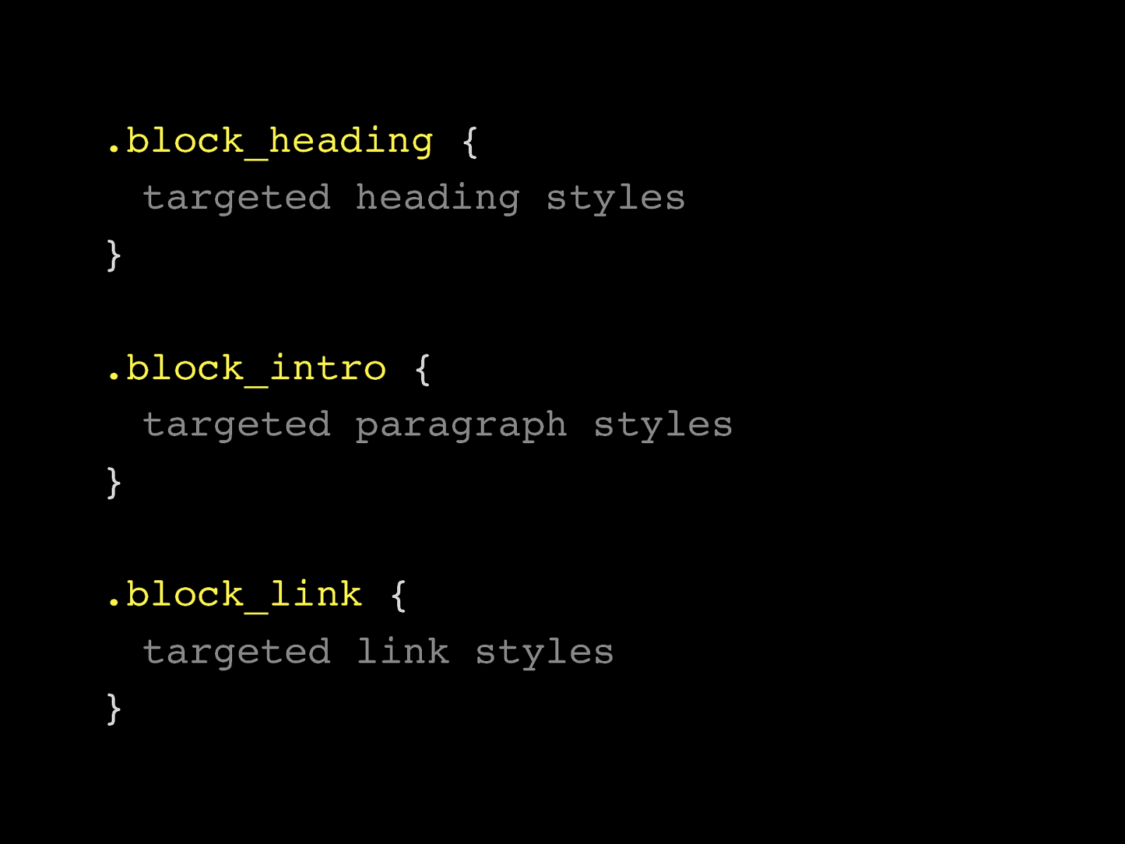
http://smacss.com
.block h3 { targeted heading styles } .block p { targeted paragraph styles } .block p a:link { targeted link styles }
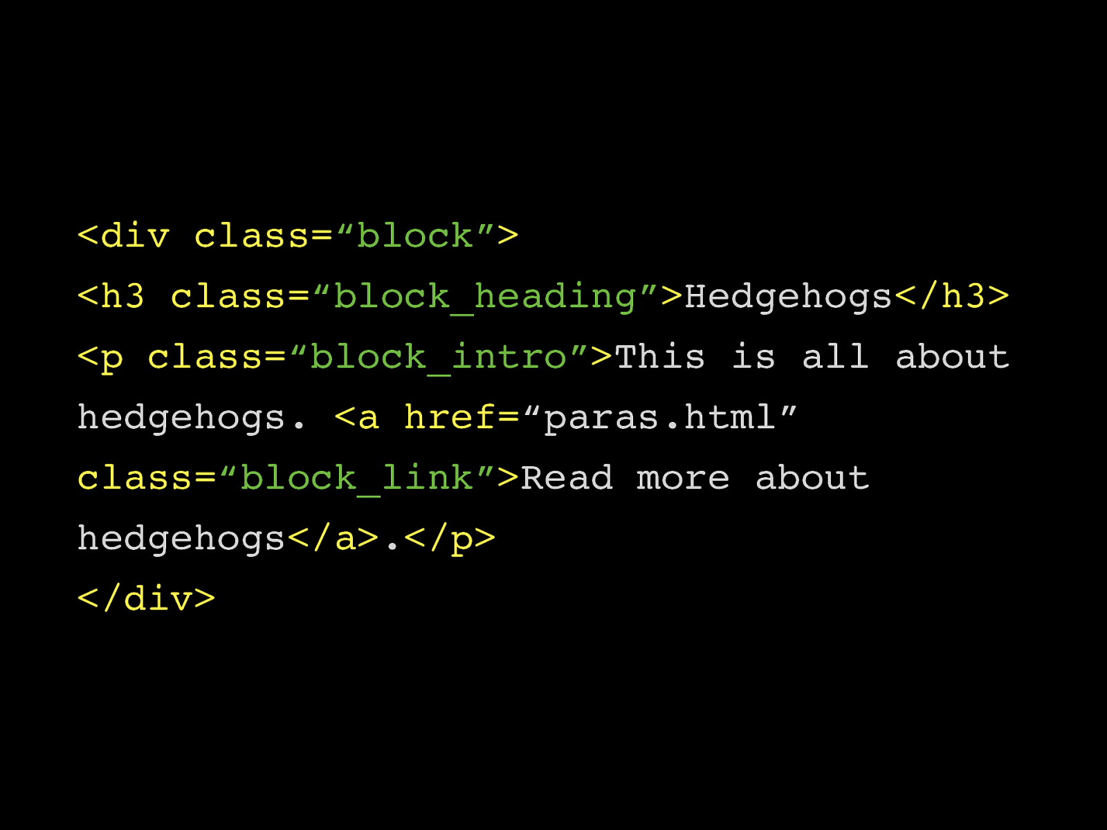
.block_heading { targeted heading styles } .block_intro { targeted paragraph styles } .block_link { targeted link styles }
Systems
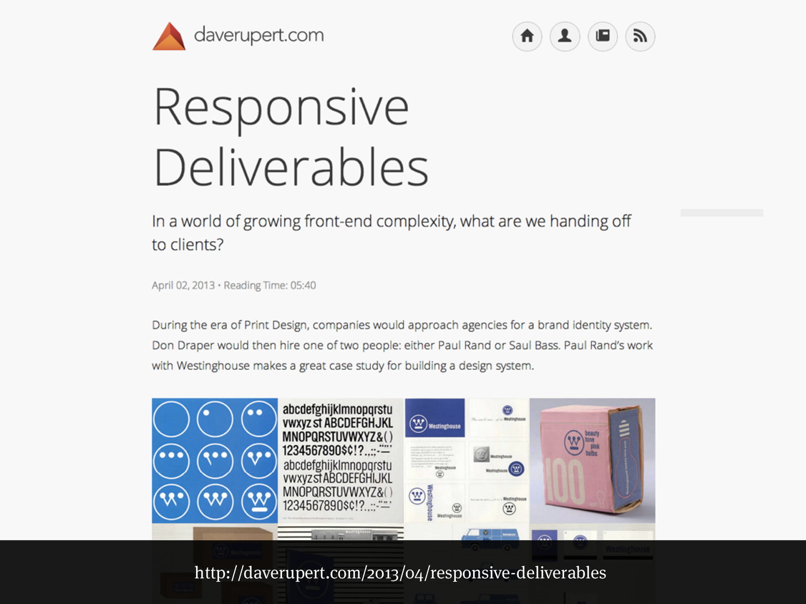
Deliver Modules
http://daverupert.com/2013/04/responsive-deliverables
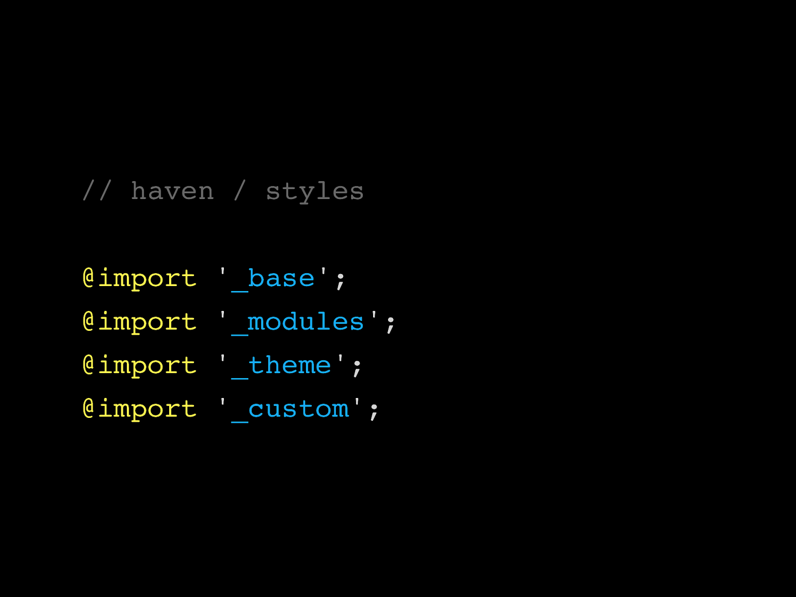
// haven / styles @import ' _base '; @import ' _modules '; @import ' _theme '; @import ' _custom ';
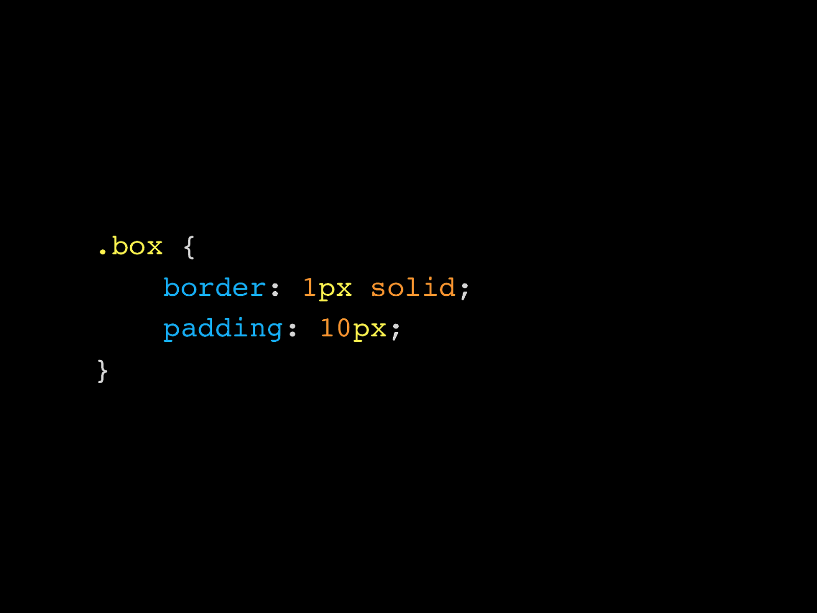
.box {
border : 1 px
solid ;
padding : 10 px ; }
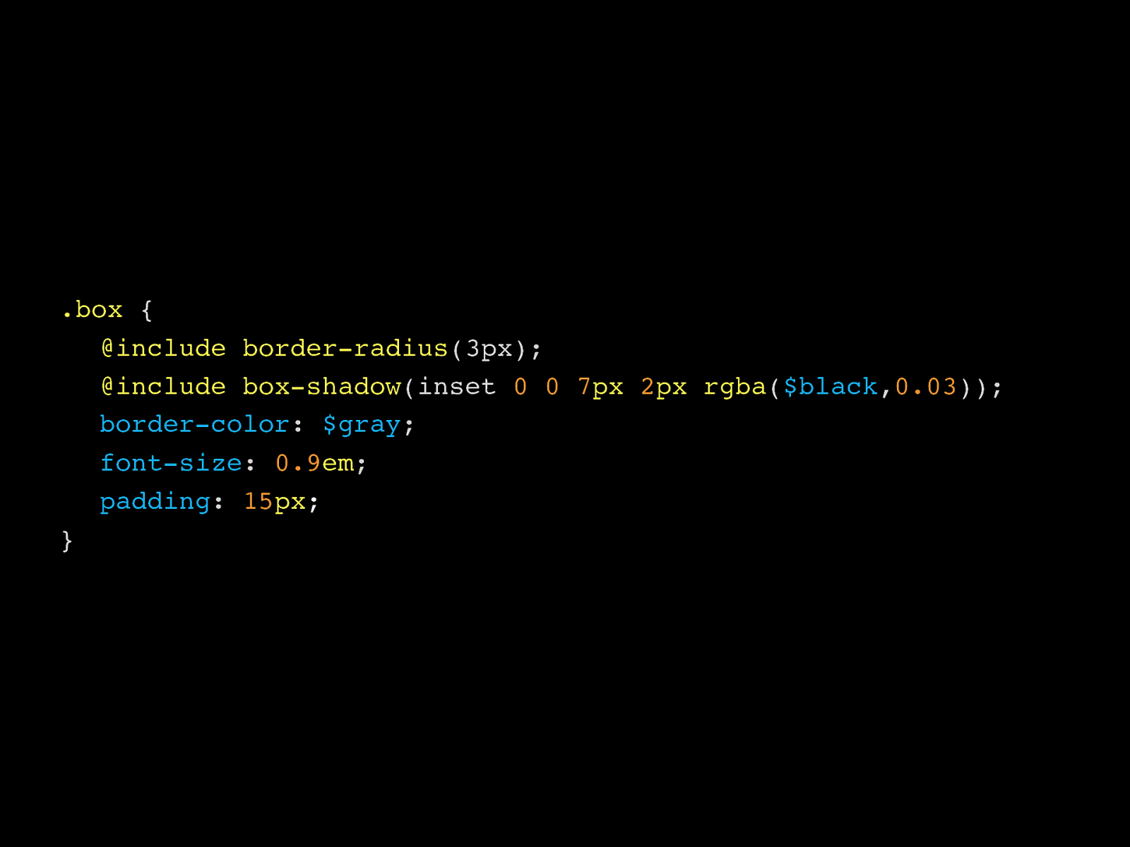
.box { @include border-radius (3px); @include box-shadow (inset 0 0 7 px
2 px rgba ( $black , 0.03 )); border-color : $gray ; font-size : 0.9 em ; padding : 15 px ; }
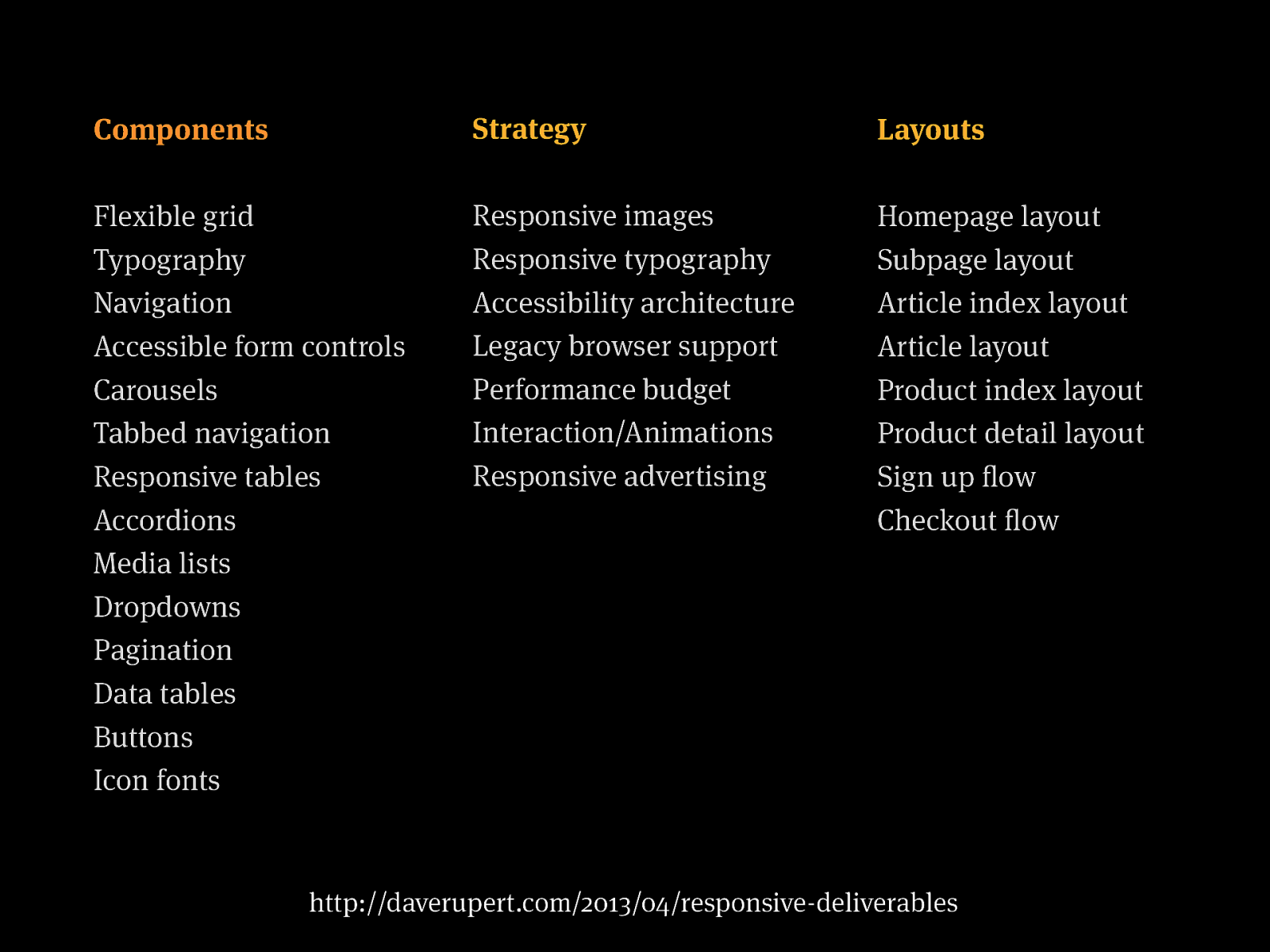
Components Flexible grid Typography Navigation Accessible form controls Carousels Tabbed navigation Responsive tables Accordions Media lists Dropdowns Pagination Data tables Buttons Icon fonts Strategy Responsive images Responsive typography Accessibility architecture Legacy browser support Performance budget Interaction/Animations Responsive advertising Layouts Homepage layout Subpage layout Article index layout Article layout Product index layout Product detail layout Sign up flow Checkout flow http://daverupert.com/2013/04/responsive-deliverables
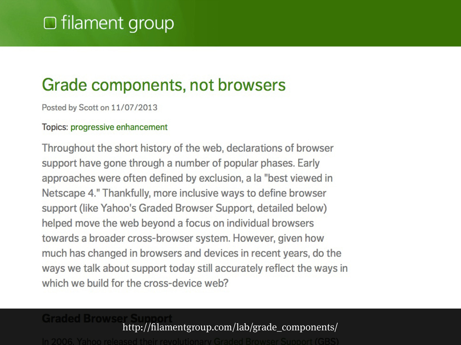
http://filamentgroup.com/lab/grade_components/
Patterns
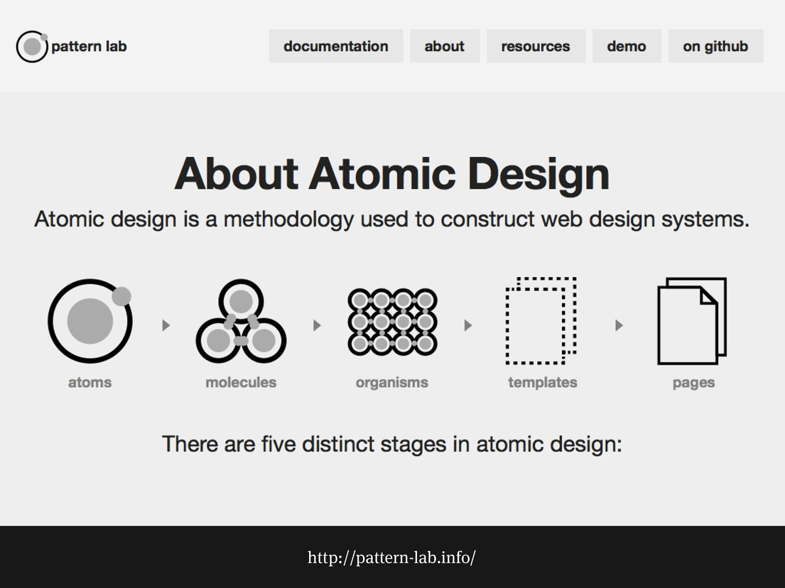
http://pattern-lab.info/
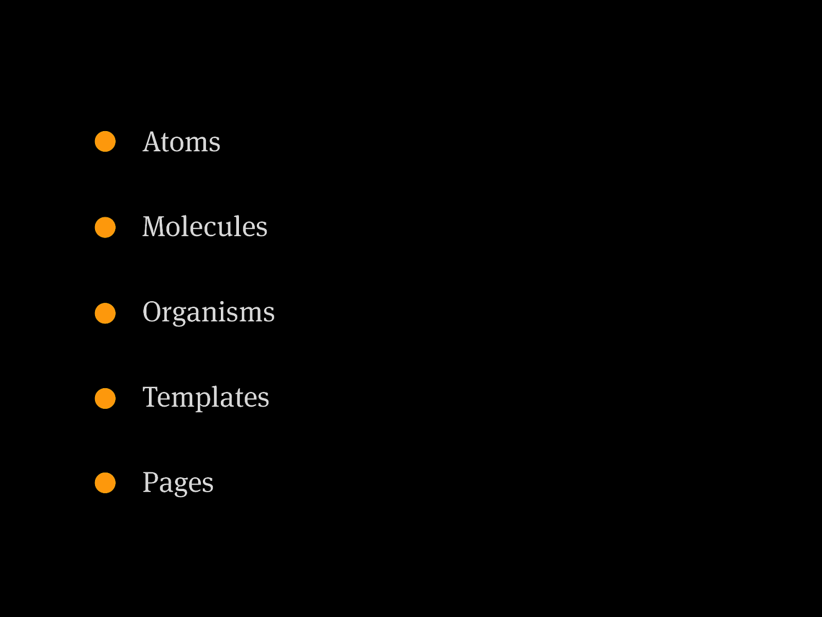
Atoms Molecules Organisms Templates Pages
Language
My processes
I am a module
Two core systems
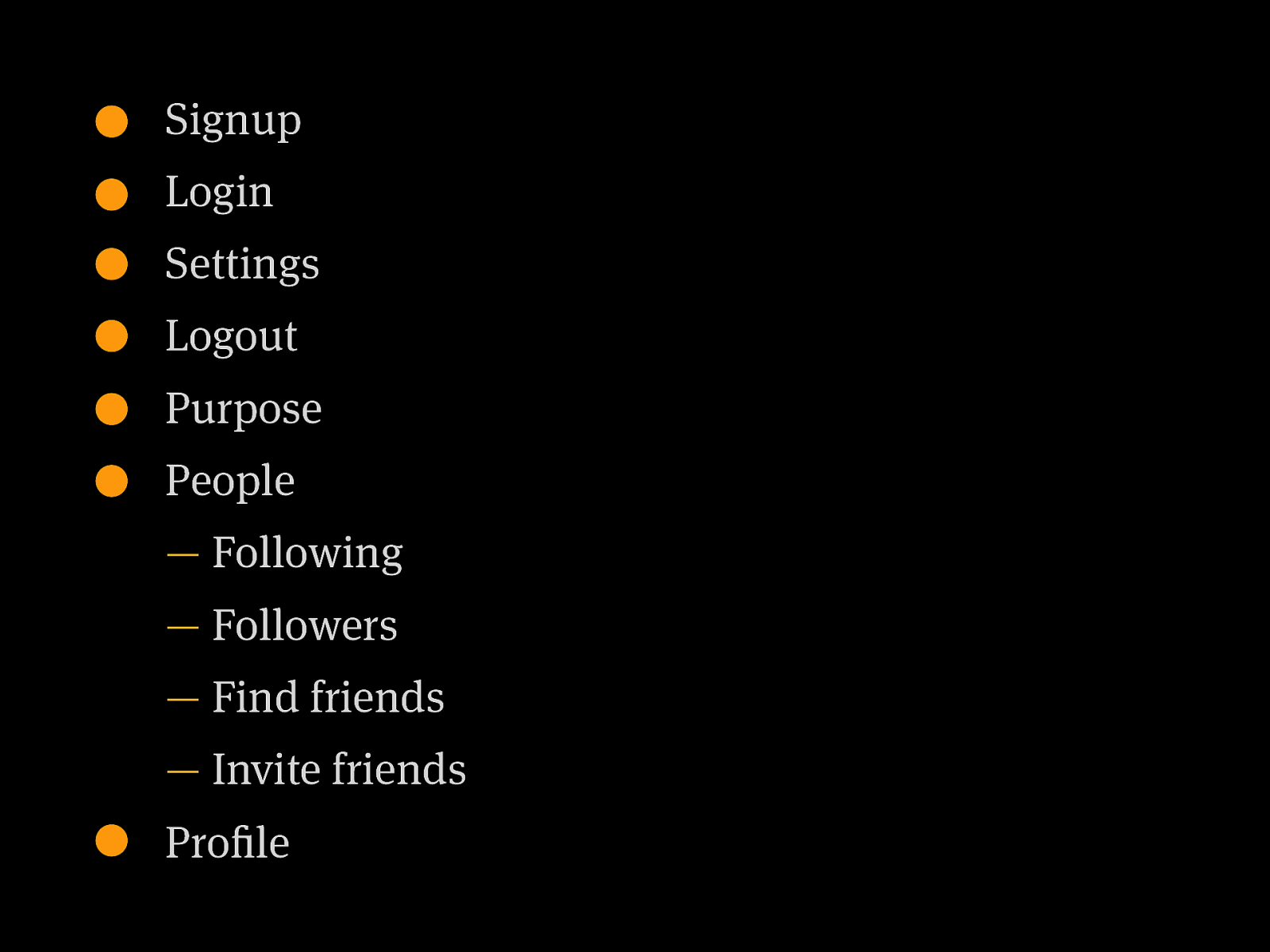
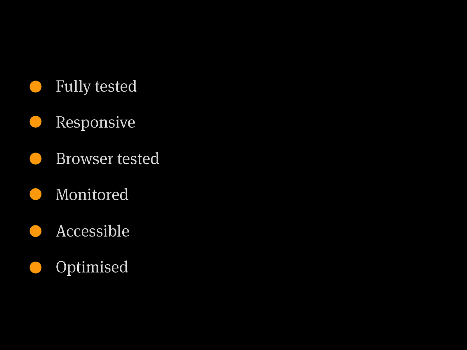
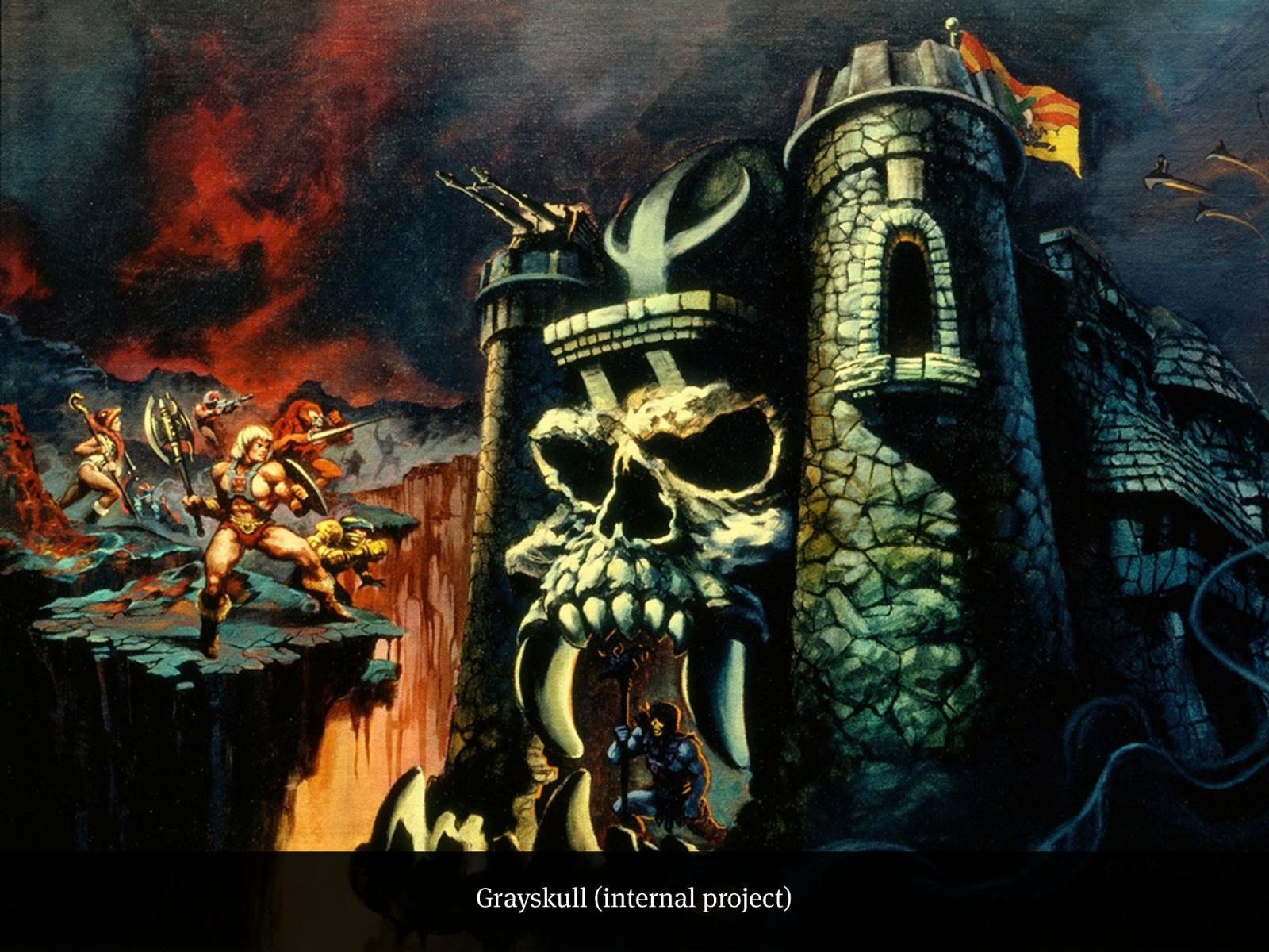
Skeletor (internal project)
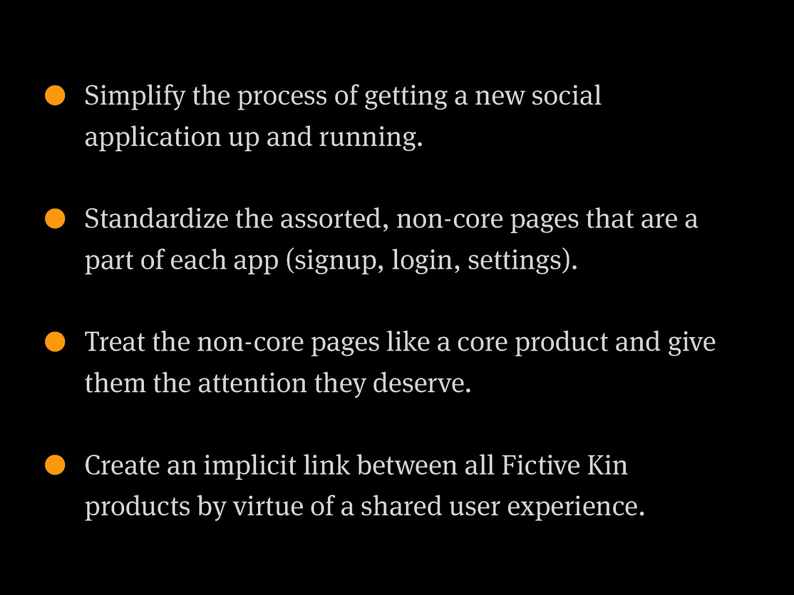
Simplify the process of getting a new social application up and running. Standardize the assorted, non-core pages that are a part of each app (signup, login, settings). Treat the non-core pages like a core product and give them the attention they deserve. Create an implicit link between all Fictive Kin products by virtue of a shared user experience.
Signup Login Settings Logout Purpose People — Following — Followers — Find friends — Invite friends Profile
Fully tested Responsive Browser tested Monitored Accessible Optimised
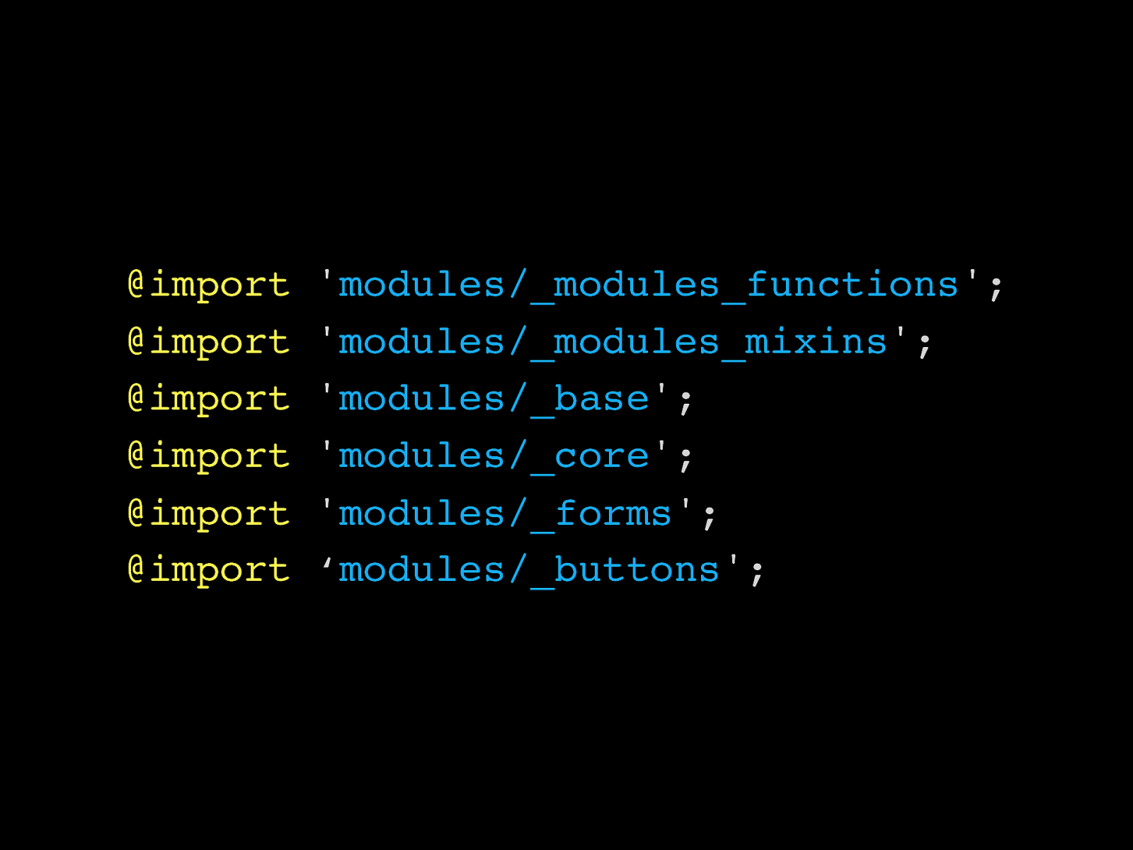
@import ' modules/_modules_functions '; @import ' modules/_modules_mixins '; @import ' modules/_base '; @import ' modules/_core '; @import ' modules/_forms '; @import ‘ modules/_buttons ';
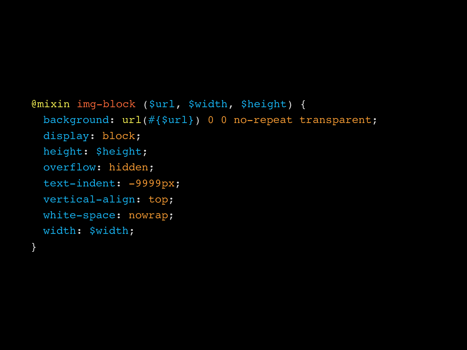
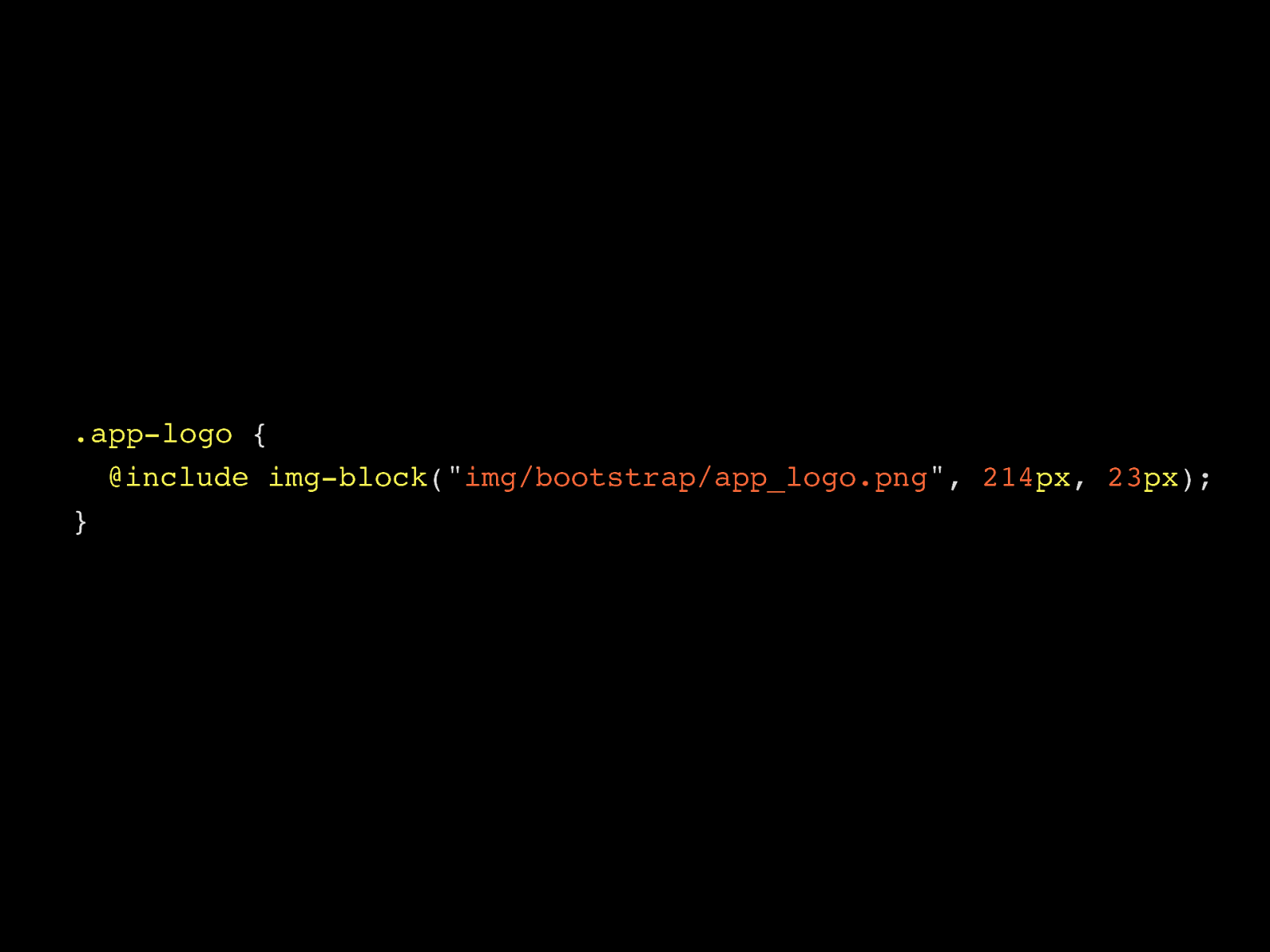
@mixin img-block ( $url , $width , $height ) { ! background : url ( #{$url} ) 0 0 no-repeat transparent ; ! display : block ; ! height : $height ; ! overflow : hidden ; ! text-indent : -9999px ; ! vertical-align : top ; ! white-space : nowrap ; ! width : $width ; }
.app-logo { ! @include img-block (" img/bootstrap/app_logo.png ", 214 px , 23 px ); }
Grayskull (internal project)
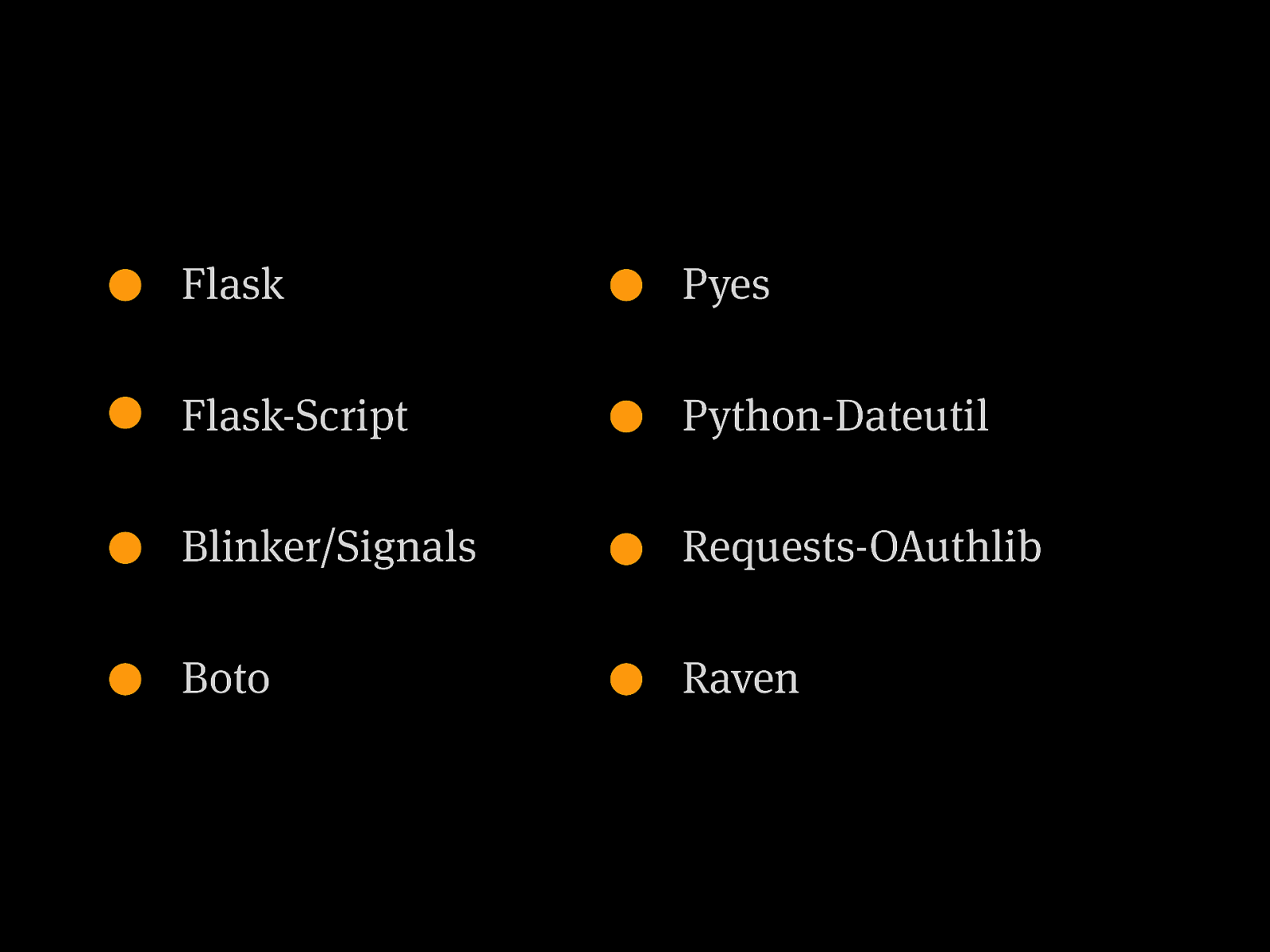
Flask Flask-Script Blinker/Signals Boto Pyes Python-Dateutil Requests-OAuthlib Raven
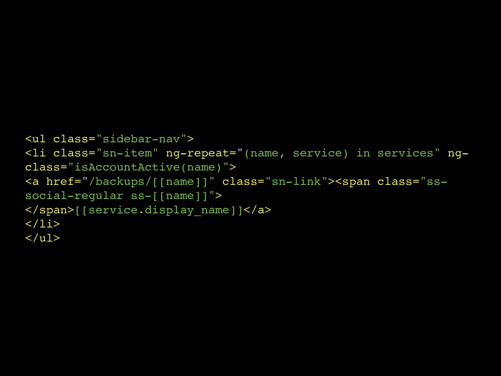
Templating
ng-repeat= " (name, service) in services"
ng- class= "isAccountActive(name)"
<a href= " /backups/[[name]]"
class= "sn-link"
</span> [[service.display_name]] </a> </li> </ul><span class= "ss- social-regular ss-[[name]]"
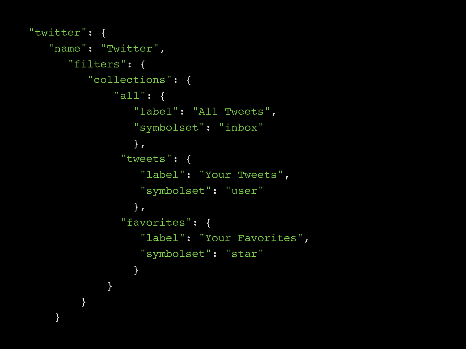
Data layers
"twitter" : {
"name" : "Twitter" ,
"filters" : {
"collections" : {
"all" : {
"label" : "All Tweets" ,
"symbolset" : "inbox" },
"tweets" : {
"label" : "Your Tweets" ,
"symbolset" : "user" },
"favorites" : {
"label" : "Your Favorites" ,
"symbolset" : "star" } } } }
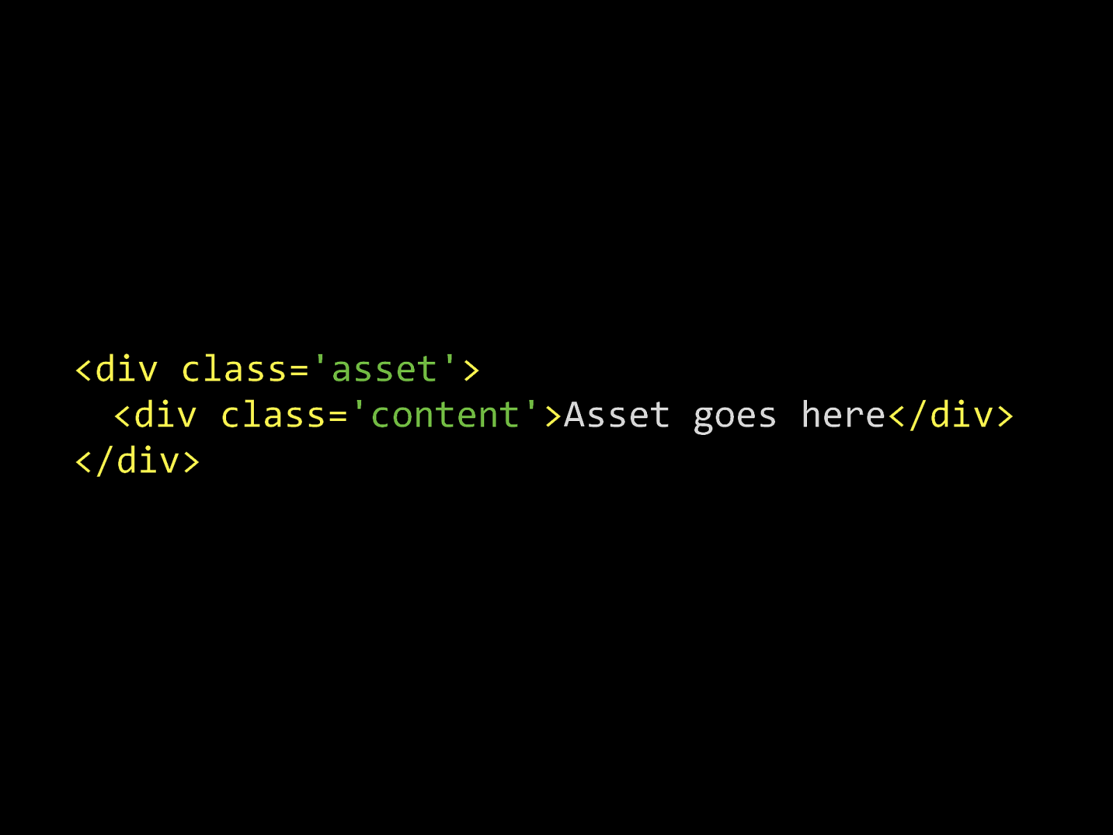
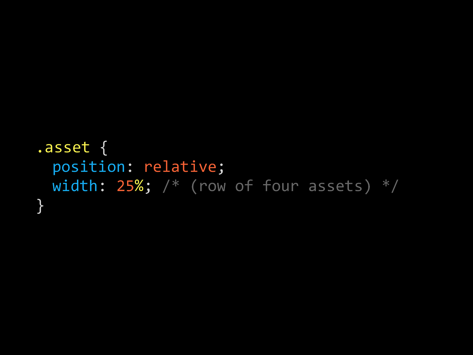
Modular everything
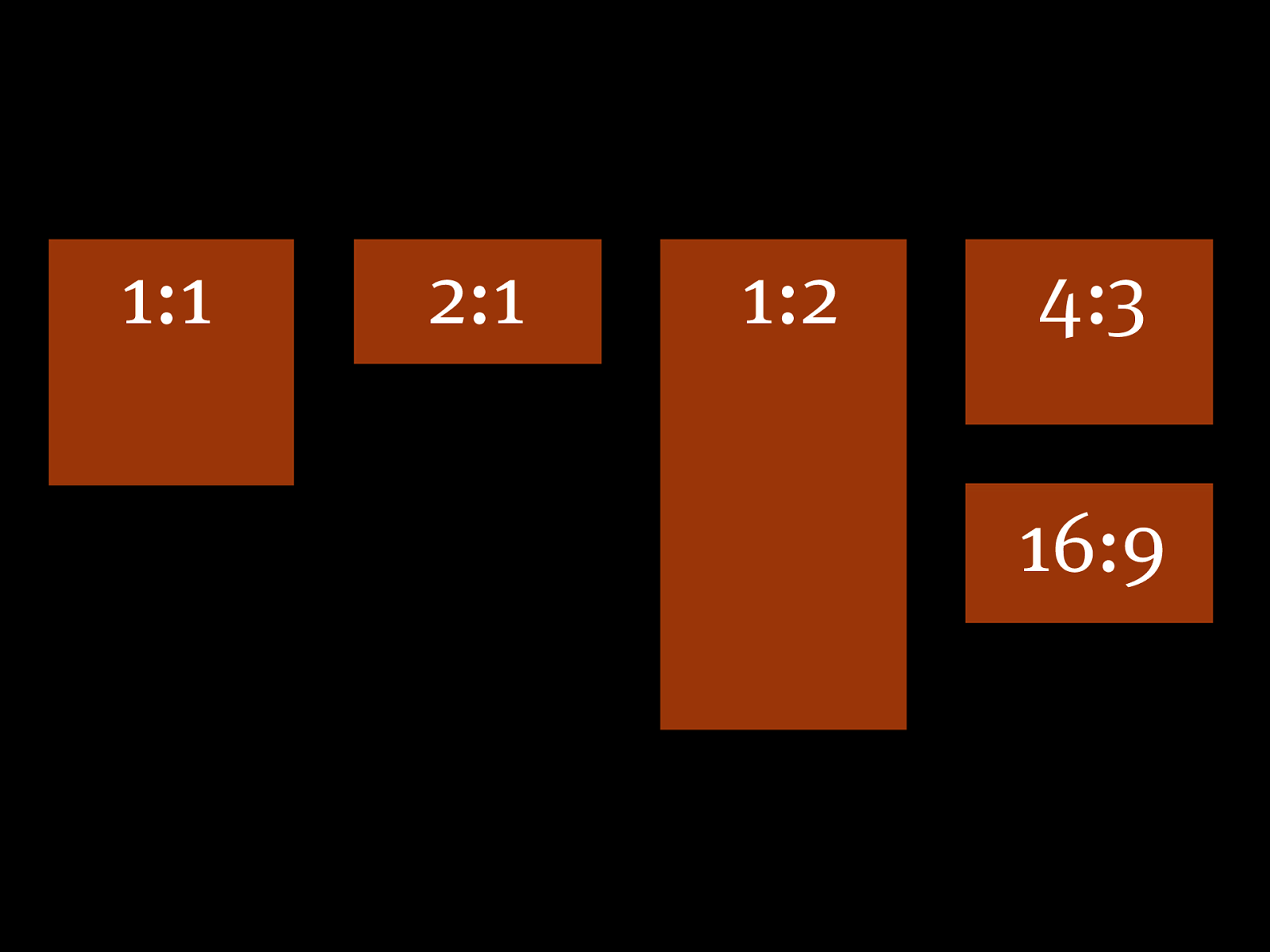
1:1 2:1 1:2 4:3 16:9
<div%class= 'asset'
% % <div%class= 'content'
Asset%goes%here
</div> % </div>.asset %{ % position :% relative ; % width :% 25 % ;% /%(row%of%four%assets)%/ }
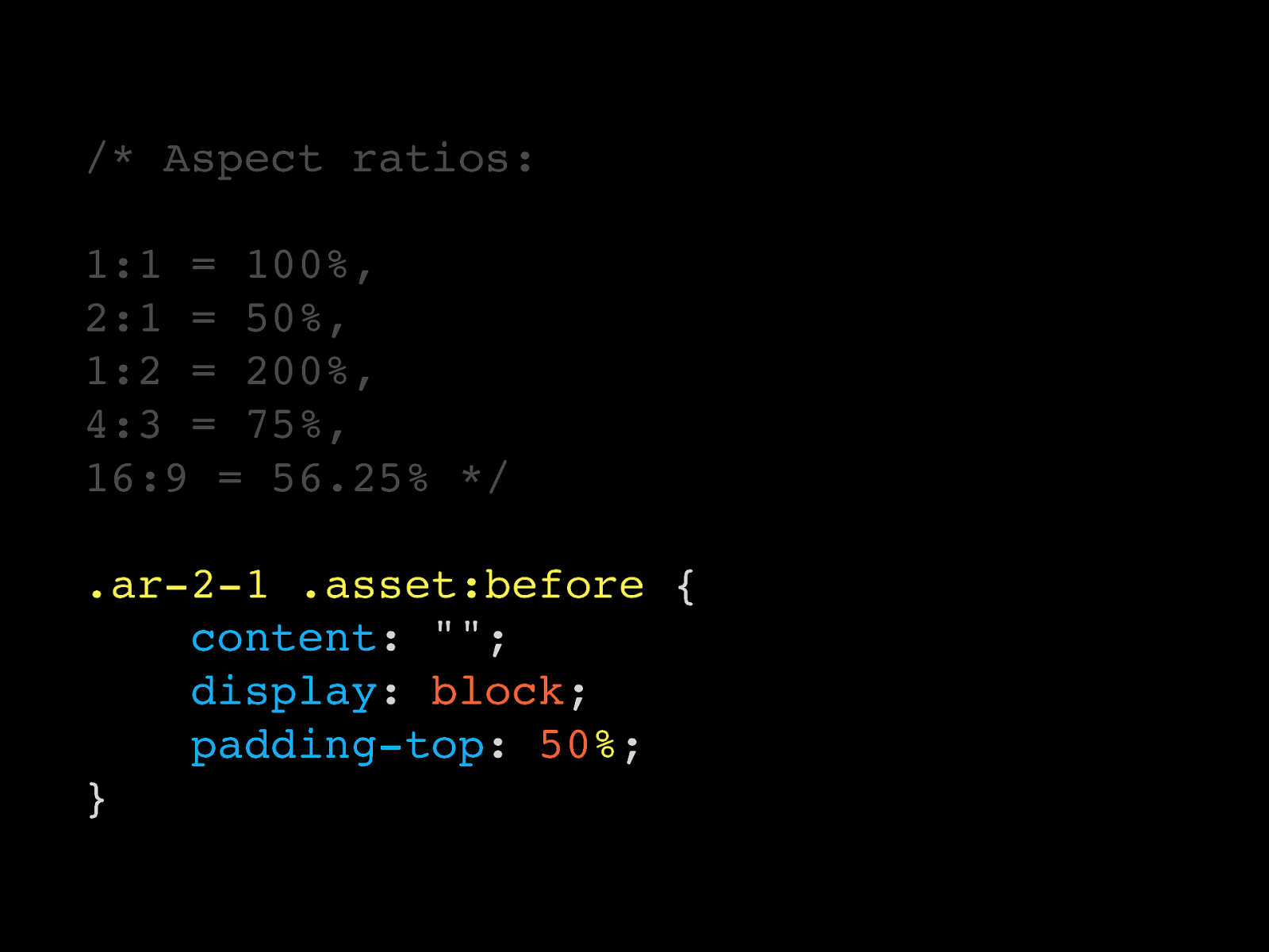
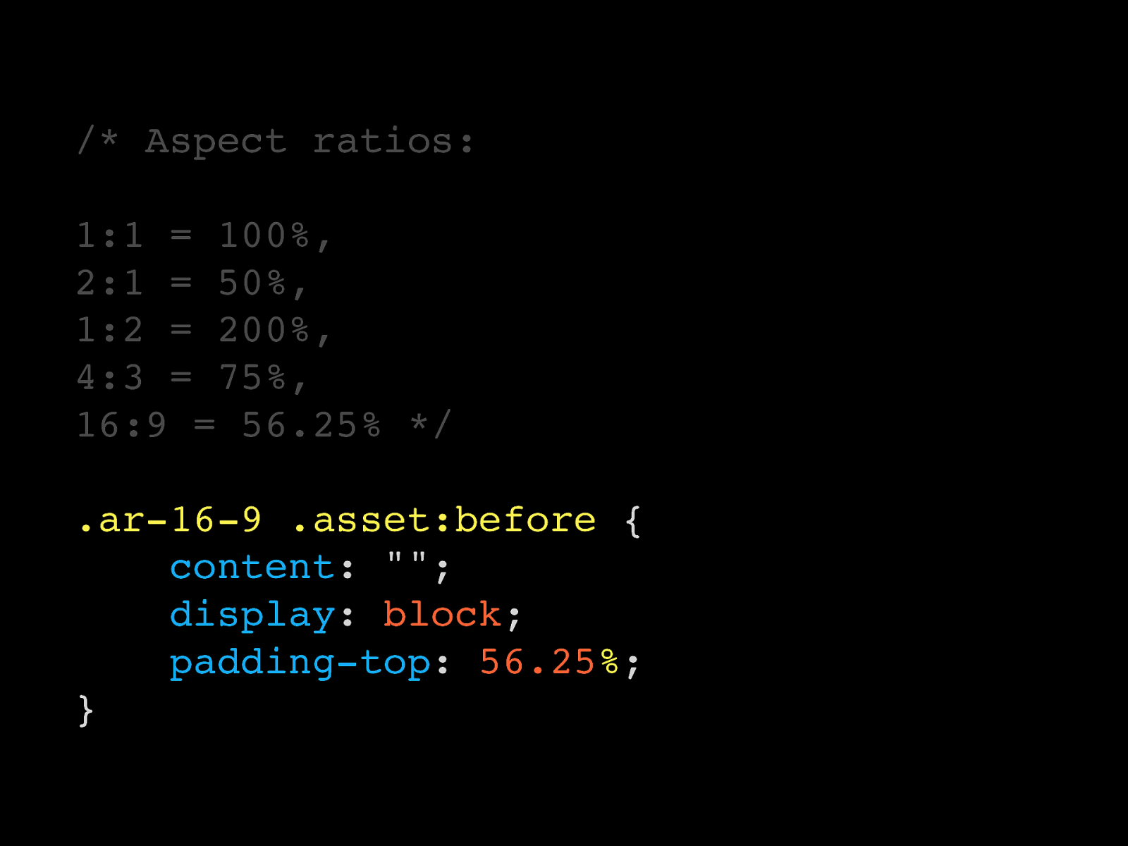
/* Aspect ratios: 1:1 = 100%, 2:1 = 50%, 1:2 = 200%, 4:3 = 75%, 16:9 = 56.25% */ .ar-1-1 .asset:before {
content : "";
display : block ;
padding-top : 100 % ; }
/* Aspect ratios: 1:1 = 100%, 2:1 = 50%, 1:2 = 200%, 4:3 = 75%, 16:9 = 56.25% */ .ar-2-1 .asset:before {
content : "";
display : block ;
padding-top : 50 % ; }
/* Aspect ratios: 1:1 = 100%, 2:1 = 50%, 1:2 = 200%, 4:3 = 75%, 16:9 = 56.25% */ .ar-1-2 .asset:before {
content : "";
display : block ;
padding-top : 200 % ; }
/* Aspect ratios: 1:1 = 100%, 2:1 = 50%, 1:2 = 200%, 4:3 = 75%, 16:9 = 56.25% */ .ar-4-3 .asset:before {
content : "";
display : block ;
padding-top : 75 % ; }
/* Aspect ratios: 1:1 = 100%, 2:1 = 50%, 1:2 = 200%, 4:3 = 75%, 16:9 = 56.25% */ .ar-16-9 .asset:before {
content : "";
display : block ;
padding-top : 56.25 % ; }
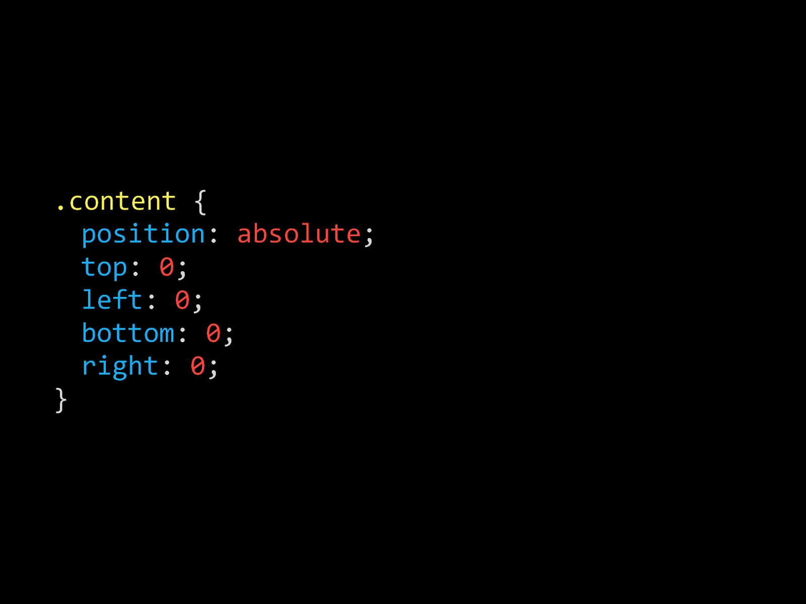
.content %{ % position :% absolute ; % top :% 0 ; % left :% 0 ; % bottom :% 0 ; % right :% 0 ; }
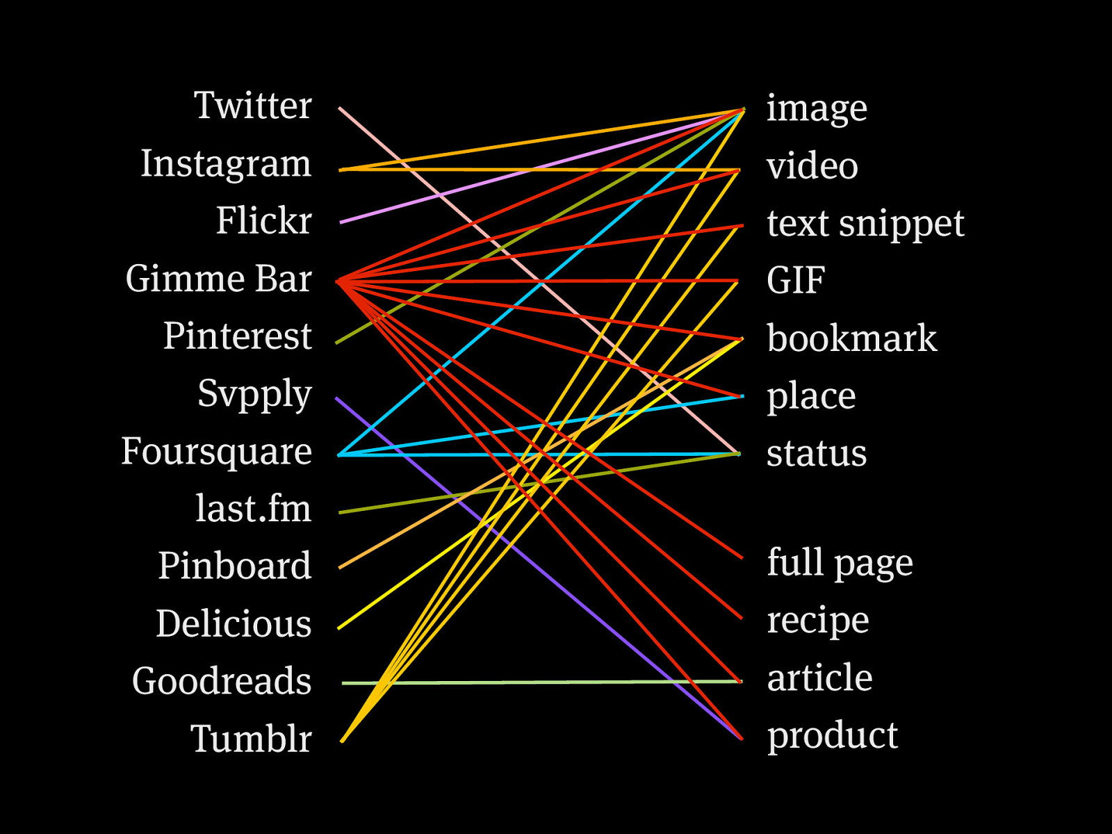
Twitter Instagram Flickr Gimme Bar Pinterest Svpply Foursquare last.fm Pinboard Delicious Goodreads Tumblr image video text snippet GIF bookmark place status full page recipe article product
To conclude
Thanks :) @colly colly.com fictivekin.com

In 2006 Simon wrote a successful book about learning CSS. Building the web wasn’t easy back then, but CSS was pretty basic. Simon also used to talk about systems a lot, but didn’t have many answers. Fast-forward to 2014 and everything has changed; that CSS book is both useless and wrong, and systems inform much of what we build. This talk will look at how the landscape changed for front-end designers, and how we must think more holistically about the scope of our projects. With practical examples he’ll explore the tools, methodologies and systems that reenergised him and helped make sense of the whole darned mess.


 for free. You
can too.
for free. You
can too.