Designing for Inclusion with Media Queries

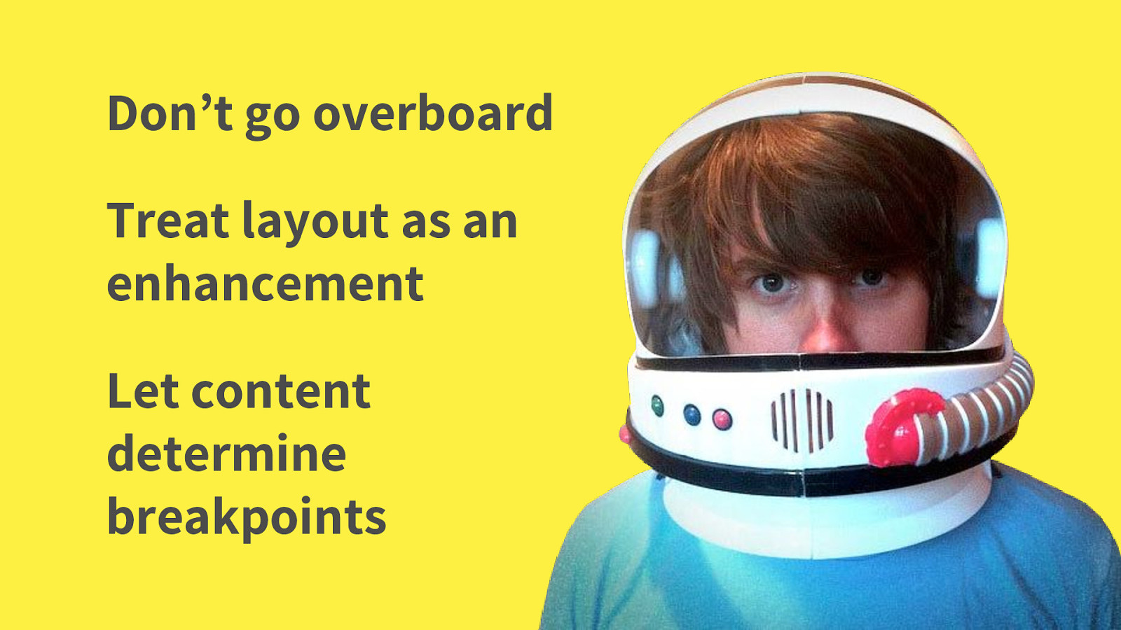
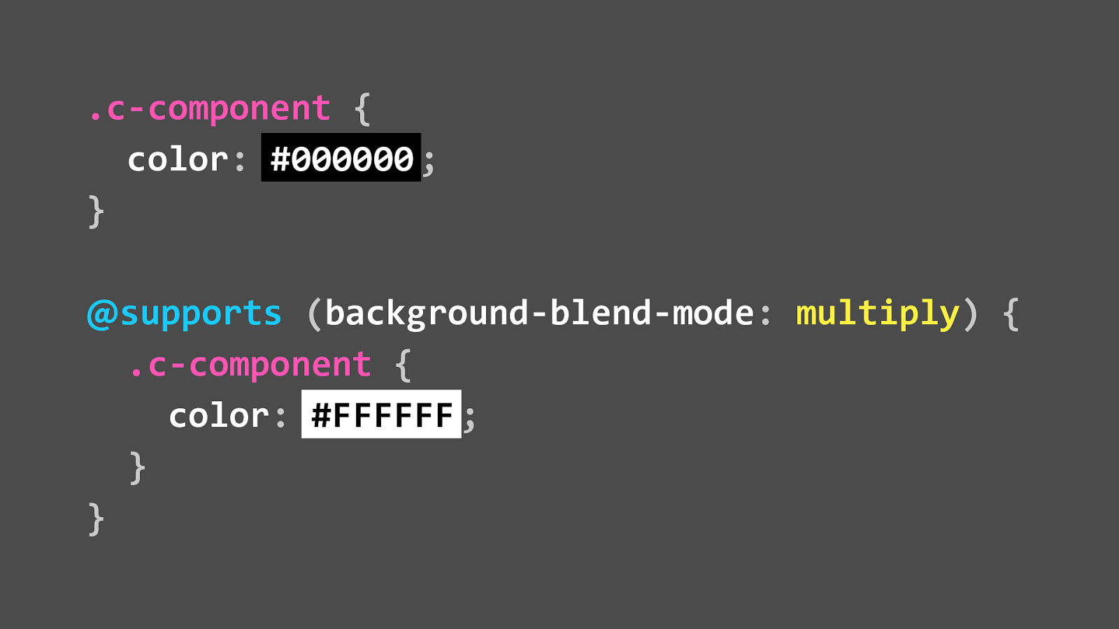
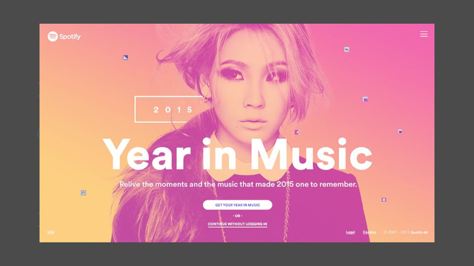
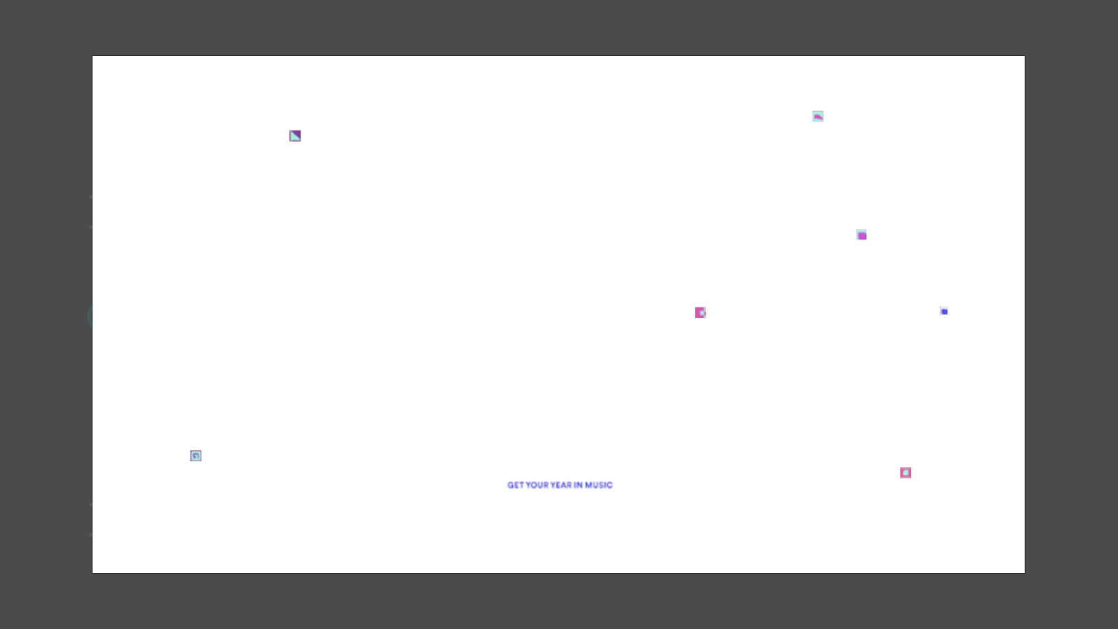
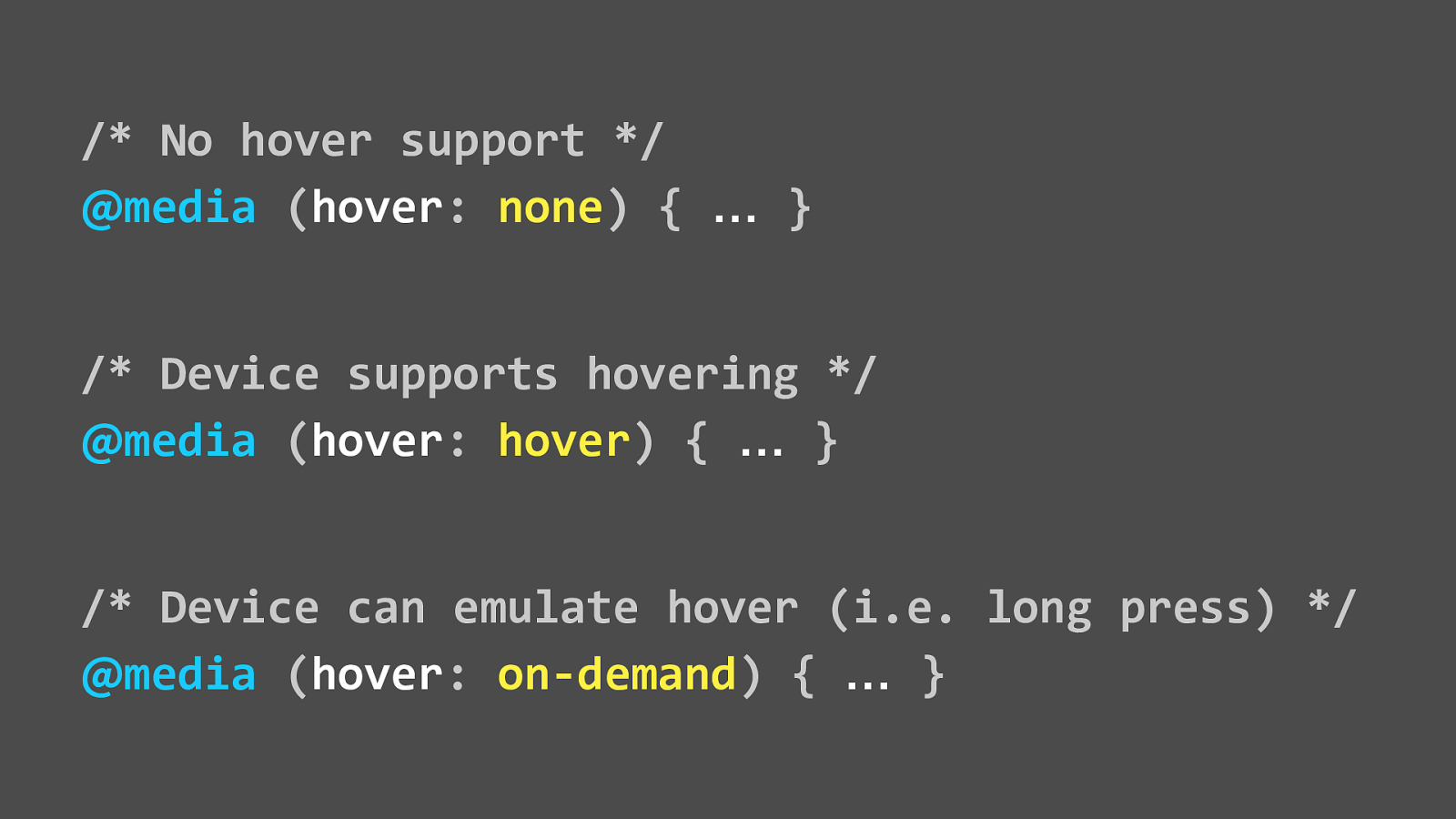
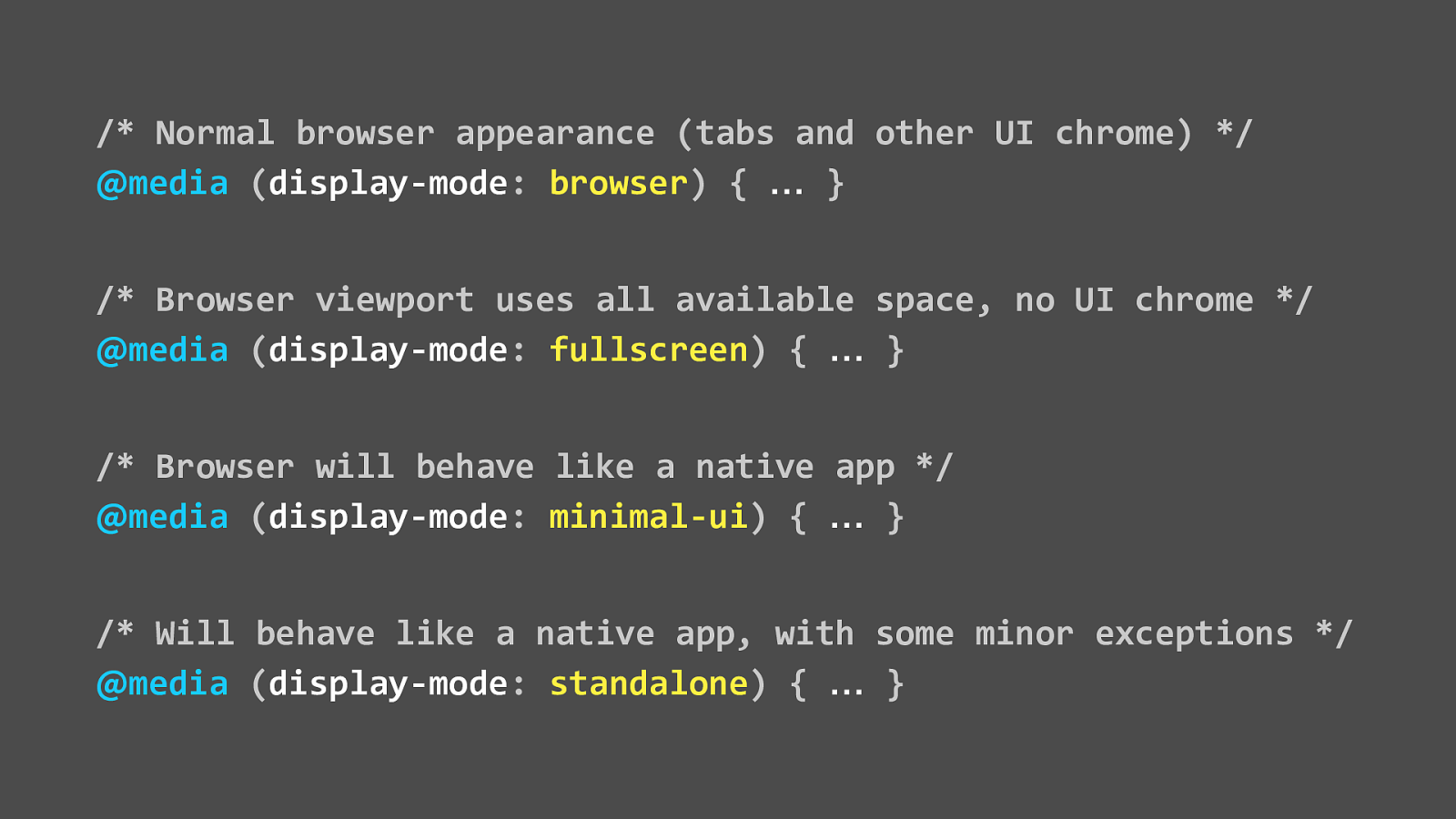
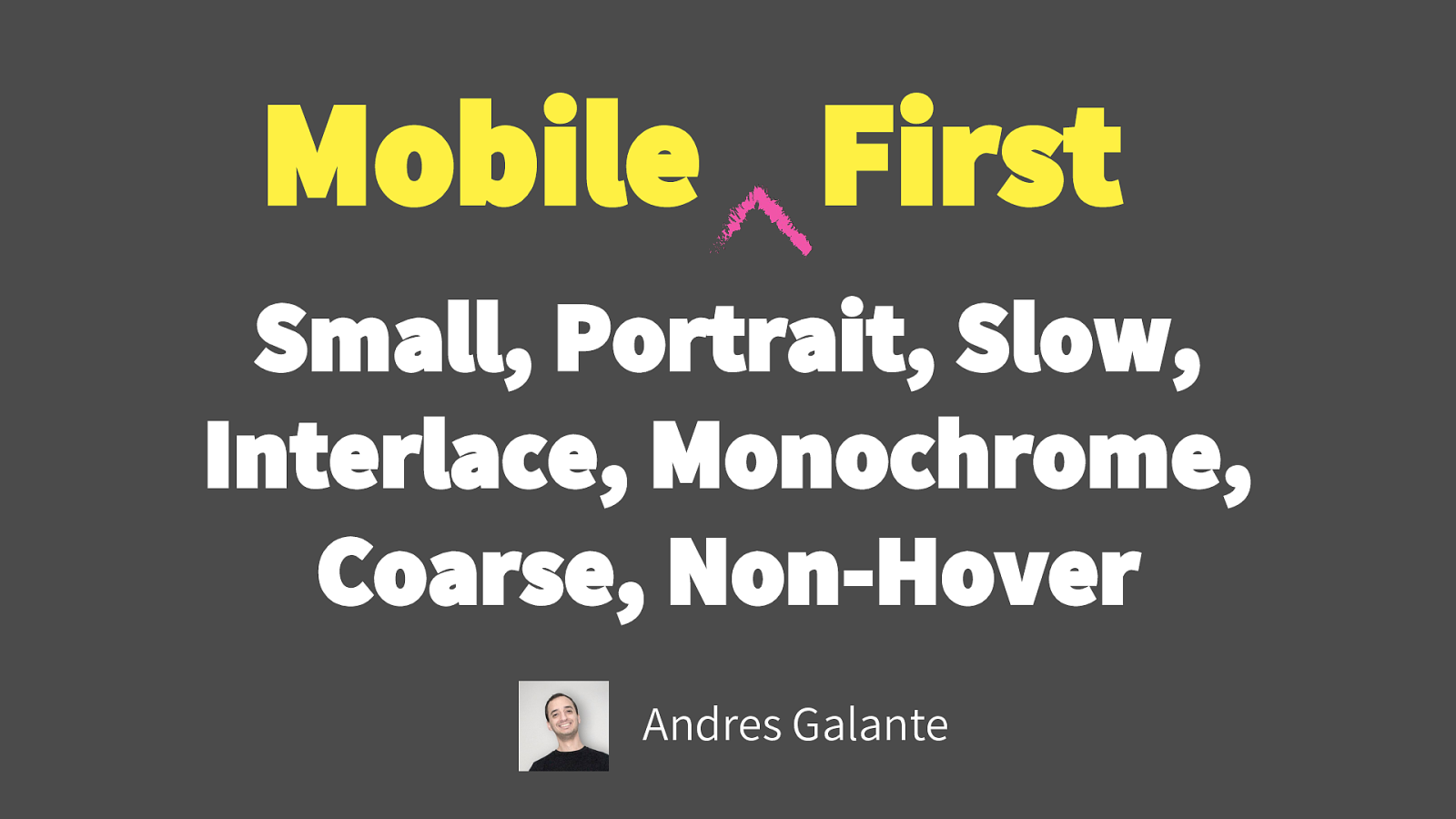
A presentation at Boston CSS in August 2017 in Boston, MA, USA by Eric Bailey

Slide 1

Slide 1

Slide 2

Slide 2

  • So it’s 2017 and responsive design is now table stakes for any project on the web
  • But sometimes it seems our process gets in the way of what we’re actually trying to do,

Slide 3

Slide 3

  • We seem to be obsessed with checking off boxes: is there an iPad view? Can you use it in a screen reader? Are we reducing our bounce rate?
  • These are means to an end, but we need to keep the big picture in mind: building experiences that work anywhere and for anyone
  • Inclusive design teaches us that it’s more than just these boxes

Slide 4

Slide 4

  • Where’s the test for holding a screaming toddler while trying to make lunch reservations?
  • Where’s the test for looking at the map to the restaurant in the noonday sun?

Slide 5

Slide 5

  • CSS is often overlooked as something to take advantage of when it comes to doing accessibility work
  • But it has a lot of potential when viewed through the lens of Inclusive Design
  • And assumptions are the antithesis of Inclusive Design
  • So let’s begin with some level setting

Slide 6

Slide 6

  • What is the web?
  • It’s many things to many people but
  • At it’s core it is about content
  • That might sound kind of glib, so to put it another way: it’s about communicating and acting on information

Slide 7

Slide 7

  • What is the web?
  • Structurally, this is the ideal:
  • HTML, JavaScript, and CSS: a nice and tidy separation of concerns
  • However, it is the web so it’s going to be weird

Slide 8

Slide 8

  • Lately it’s begun to feel more like these concerns are starting to blur
  • Not necessarily a value judgement, it just is
  • But it does feel like because of these choices we’re leaving some people out in the cold
  • So let’s set a common understanding to talk about this more

Slide 9

Slide 9

  • HTML describes meaning
  • Describe meaning semantically
  • It’s an ordered hierarchy of content, not an arbitrary stack of divs
  • I would say this isn’t an idealized situation, but unfortunately, that’s usually not true in the real world

Slide 10

Slide 10

  • JavaScript adds behavior
  • Not create structure
  • This might seem like an oversimplification, you’re right! This is a CSS talk

Slide 11

Slide 11

  • CSS creates priority
  • Remember: at its core, the web is about content and
  • Appearance is just visual priority of content
  • Played to their strengths, these three technologies working together make the web accessible
  • That’s one of the founding principles of the web
  • Honoring it makes compliance easier

Slide 12

Slide 12

  • What is compliance
  • I’ve always thought It’s weird that Human Centered Design is a speciality in our field
  • We build interfaces for people, so of course you want people to be able to use them
  • At its core, audit compliance really just is a formalized set of checks that guarantee everyone can operate an interface, regardless of ability
  • But that’s baseline, it can be so much more than that

Slide 13

Slide 13

  • So, what is web compliance?

Slide 14

Slide 14

  • Played to their strengths, these two methodologies working together cast the widest possible net for people
  • That’s important because as more and more services necessary to living everyday life go online, it is vital to make sure everyone can use them

Slide 15

Slide 15

  • What is a browser?
  • If your entry point is a desktop chances are be either Edge or Safari

Slide 16

Slide 16

  • But then there’s also the other popular browsers

Slide 17

Slide 17

  • And their mobile counterparts
  • Mobile is already a very common entry point for the web
  • Sometimes it’s the only option if you’re economically disadvantaged

Slide 18

Slide 18

  • Then the newcomers and the
  • Slightly less popular, but still totally legitimate browsers

Slide 19

Slide 19

  • And their developer editions

Slide 20

Slide 20

  • Don’t forget that we tend to be Western-centric, but that’s rapidly changing
  • Remember: it’s the World Wide Web, not the Wealthy Western Web

Slide 21

Slide 21

  • So the point is browsers are impossible to corral and
  • It might seem intimidating, but that’s actually a good thing
  • Different users have different needs
  • We don’t want to be prescriptive because we can’t know all our user’s needs all the time, or how they go about satisfying them
  • Inclusive Design embraces that

Slide 22

Slide 22

  • What is a browser?
  • Browsers are ubiquitous, but we still don’t really think of them that way
  • When seeing the word browser, typically people think “Google Chrome on a desktop”

Slide 23

Slide 23

  • The way we interact with content changes constantly
  • This is Lynx, an early text-based browser

Slide 24

Slide 24

  • Browsers can also use a lot of different interaction modes
  • Here, a screen reader can display all the links on a page in an ordered list

Slide 25

Slide 25

  • And browsers might be on platforms you might not immediately be thinking of
  • The Sony Playstation ships with one built in

Slide 26

Slide 26

  • We tend to make assumptions about nearly every aspect of our audience
  • Here’s a LeapPad, a tablet targeted towards kids

Slide 27

Slide 27

  • We also make assumptions based on price
  • Here’s a $30 touchscreen smartphone with a color display and a camera

Slide 28

Slide 28

  • And here’s a Kindle, a luxury device with a slow, monochromatic display

Slide 29

Slide 29

  • We also assume that devices will come through traditional channels and be used as intended
  • Here’s a CHiP, a full color touch display computer with a nonstandard screen size that can get a browser hacked onto it in minutes

Slide 30

Slide 30

  • And here’s an oscilloscope that runs Internet Explorer

Slide 31

Slide 31

  • We also tend to assume a lot about form factor
  • It’s a fridge, and yes it’s real - you can go and buy it right now
  • An immobile, low power browser with a long product lifespan

Slide 32

Slide 32

  • And we don’t know what the future will be like
  • The web itself was a surprise, think about how much it’s changed in only 20 years,
  • Do you know where it’ll be in the next 20?
  • Your car’s windshield? Contact lenses? Your bedroom wallpaper?
  • I guarantee you that whatever it is, there’s going to be some sort of browser involved in that future—the web isn’t going away anytime soon
  • And by making things as robust as possible in the present, you’re making them adaptable, which is great for weathering the seas of change
  • This is embracing Inclusive Design in the short term do the heavy lifting for us in the long term

Slide 33

Slide 33

  • So, how does CSS fit into all of this? After all, this is a talk about media queries
  • That depends on how you talk about it
  • "Writing the correct CSS once is pretty easy. Making that CSS work in all situations, and for all people is the hard part."
  • That’s a quote from Micah Godbolt, Senior Design Developer at Microsoft
  • For me, “working in all situations and for all people” falls into the domain of media queries
  • How do I talk about media queries?

Slide 34

Slide 34

  • Media queries describe meaning in context
  • So, close your eyes for a second and imagine you’re in a dark room with some friends and there’s an elephant in it
  • Reach out and touch it and describe what you’re experiencing
  • The tusks feel like spears, the trunk feels like a snake, the tail feels like rope, the legs feel like wooden stumps, the skin feels like concrete
  • That’s kind of how I think about media queries, you have this platonic ideal of a site floating out there in the ether, with different browsers describing what it is from their perspective
  • Oh, and you can open your eyes now if you haven’t already

Slide 35

Slide 35

  • As a consultant, I see a few repeated patterns when working with other people’s CSS
  • That usually boils down to blindly copying and pasting without knowing the all the potential of the technology
  • Another tell are libraries that make writing media queries easier, but at the expense of leaving other features out
  • That’s not necessarily a value judgement, people have deadlines, and it if it works, it works!
  • Hopefully, however I can give you a few more tricks to share with your team

Slide 36

Slide 36

  • "The absence of support for media queries is in fact the first media query."
  • That's a quote from Bryan Rieger's landmark Rethinking the Mobile Web talk
  • What you want here are sensible defaults to accommodate the unknown
  • Good design practices such as

Slide 37

Slide 37

Slide 38

Slide 38

  • Larger type and comfortable line height and width to accommodate concerns

Slide 39

Slide 39

Slide 40

Slide 40

  • Good affordances for interactive areas for motor control issues such as Parkinsons or Arthritis

Slide 41

Slide 41

Slide 42

Slide 42

  • And a clear hierarchy of content and chunking of information for cognitive concerns

Slide 43

Slide 43

  • Cognitive concerns are worth discussing a little bit in detail here

Slide 44

Slide 44

  • We tend to think of disabilities as people in wheelchairs, but the vast majority of disability issues are actually cognitive

Slide 45

Slide 45

  • This is on authority from the World Health Organization and their reports outline depression as one of the most significant forms of cognitive impairment
  • This isn’t assumptions about English as a second language, or lack of public schooling, this is a widespread genetic and environmental issue that affects the entire planet
  • Depression can stunt things like the learning and application of knowledge, but we barely ever discuss it because of the social stigmas
  • Personally, I’m willing to admit suffering from it, and since getting treatment I have definitely experienced better problem solving capabilities. This talk is actually a product of getting help, so go CSS!
  • When you go to write your content and technical documentation, it’s good to keep this in mind
  • Okay, that was heavy. Let’s get into actual media query support!

Slide 46

Slide 46

  • When any device’s viewport reaches a minimum width of 30 ems, do the following:
  • This is what we want to do
  • How do we get there?

Slide 47

Slide 47

  • Here’s the syntax:
  • “When the media rule keyword of at media is present and the min-width of 30ems media feature occurs, apply these selectors and declarations”

Slide 48

Slide 48

  • Why ems?
  • They accommodate the widest swath of browsers
  • Most importantly, since they are based on type size, they elegantly and dynamically accommodate browser zoom
  • A lot of exhaustive research has been done on this,
  • Your pixel value use case isn’t as clever as you think it is and rems fall apart in some really obscure edge cases
  • Trust me: use ems
  • Now let’s up the complexity a little

Slide 49

Slide 49

  • When a device with a screen’s viewport reaches a minimum width of 30 ems, do the following:
  • How do we get there?

Slide 50

Slide 50

  • “With a media type of screen and a minimum width of 30 ems, apply these selectors and declarations”
  • The media type is a subtle but important distinction:
  • It targets screens
  • So what other media types are there?

Slide 51

Slide 51

  • So here’s all the media types listed in the documentation
  • However, it’s the web, so things aren’t easy

Slide 52

Slide 52

  • Only All, Print, Screen, and Speech have wide enough support to be used with confidence

Slide 53

Slide 53

  • Of those four, “speech” is tricky because of two things:
  • Screen readers don’t always communicate their presence to the browser and the lack of any real support for aural CSS properties
  • Yes it aural CSS exists, and yes, it would be awesome if we could use it
  • It’s a spec that is intended to tell a digitized voice how should it read content, the same way regular CSS tells the browser how to visually display content
  • This is good for screen readers, but don’t forget that digital assistants are becoming very popular

Slide 54

Slide 54

  • Print is often overlooked, but more people print web pages than you’d think
  • CSS features like before and after pseudo elements let us create meaningful artifacts like printed URLs for links and descriptions of the main takeaway for interactive visualizations
  • I’ve even seen QR codes for long, difficult to type URLs that preconfigure queries and application state
  • Which goes to show a little consideration can go a long way UX-wise

Slide 55

Slide 55

  • Another interesting thing I’d like to point out here:
  • Handheld, Projection, and TV have all been deprecated because what is a TV? What is a projector?
  • Good inclusive design principles obviates the need for these distinctions
  • If your color contrast ratio and type size are proper, you don’t have to worry about a special theme that targets a projector’s display

Slide 56

Slide 56

  • Another thing I’d like to point out is the “all” media type
  • A lot of browsers will default to using this if you don’t explicitly state a media type
  • This can get you into trouble via the unintended consequences of the cascade
  • It’s better to get in the habit of declaring “screen” when you make visual edits

Slide 57

Slide 57

  • So, let’s talk media features- The background from this slide is one of my favorite scenes from a movie
  • The Blues Brothers ask the bartender of a backwater bar what kind of music they usually play, and she answers “Oh, we got both kinds, we got country and western!”
  • That’s kind of how I feel about media features
  • In addition to browser height and width, we have 8 other media features available to work with

Slide 58

Slide 58

  • These are important
  • They allow us to really dig into the capabilities of a device
  • The quality of its screen, it’s physical orientation in space, how it handles color

Slide 59

Slide 59

  • However, a lot of the time in these lists you will also see these three deprecated features:
  • device-aspect-ratio, device-height, device-width
  • Simply put: don’t use them
  • Remember, it’s near impossible to know what a device is, but we can react to how the device behaves

Slide 60

Slide 60

  • Like programming languages, media queries also have logic
  • It’s pretty basic, but also pretty powerful in the right hands

Slide 61

Slide 61

  • The at media declaration itself is an if statement
  • “If the browser supports at media, do something”

Slide 62

Slide 62

  • You can chain with and
  • Target screens with both a minimum height of 20ems and a minimum width of 30ems

Slide 63

Slide 63

  • Or allows you to apply to this or that
  • Target anything with a max-width of 10ems or a minimum width 20ems, but nothing in between

Slide 64

Slide 64

  • And you can exclude with not
  • Target anything with a max-width display of 10ems that isn’t monochrome
  • So why is all of this so great?

Slide 65

Slide 65

  • With good namespacing discipline, you can adapt your content to best fit the device it will be consumed on, without knowing specifically what that device is
  • Use media queries to write small, surgical tweaks that enhance the class, not the page the class is placed on
  • Here the theme background class can safely remove images for devices that would break if they tried to display them,
  • and remove backgrounds from media that would choke on rendering them
  • People still use grid displays and still print webpages and not for the reasons you’d initially think
  • For example, I’ve got a terminal powered by Webkit open on my computer right now
  • and printed slide notes in case things go really pear-shaped

Slide 66

Slide 66

  • So, armed with these expanded capabilities, how do we go about best using them?
  • First, set your breakpoints based on ergonomics, not devices
  • Think about how we position ourselves around our devices, and remember that you don’t always have hands to do it
  • Positioning is a good baseline for setting type
  • Ask yourself: Is the type sufficiently large enough to read when you hold a device in your palm? Or on your lap? When you’re sitting at a desk? Or when you’re across the room?
  • In fact, take a moment to think about how you’re viewing this presentation right now
  • Type is the cornerstone of any interface—once you have that established, you can build outward with confidence

Slide 67

Slide 67

  • With regard to Media Queries, a very smart guy called Brad Frost advises us to:
  • Don't go overboard
  • Treat layout as an enhancement
  • Let content determine breakpoints
  • Remember to think not in terms of audience, but in terms of people
  • People aren’t always going to be on a Webkit browser or a Windows machine, but they will reading the web
  • Don’t target common device screen sizes, even if your analytics guy wants you to
  • You have people that use iPads, not iPad users and that’s a subtle yet important distinction

Slide 68

Slide 68

  • I’d also like to point out another at rule, supports
  • Although it is not technically a media query, it is very much in keeping with the spirit of this presentation
  • Supports allow us to construct what is known as a feature query,
  • which lets you adjust the interface based on what level of compliance the browser has for modern CSS features
  • That ensures that everyone gets a high quality experience, regardless of device

Slide 69

Slide 69

  • In this example, the site’s text would get a high contrast fallback, that would have otherwise been illegible when rendered by a browser that does not support background blend modes

Slide 70

Slide 70

  • Which is perfect for those gradient-loaded fullpage hero screens that seem so in vogue these days

Slide 71

Slide 71

  • Speaking of namespacing, components make things easier to manage
  • If you’re using a CSS preprocessor, you can include the media query inside of the component partial and it will export as valid CSS
  • This helps make robust components and makes your code easier to understand - remember, inclusive design principles can extend to code!

Slide 72

Slide 72

  • Minifiers will organize and optimize the end CSS - let robots mind the kinds of things robots are good at minding
  • For example, the CSSNano part of the process maintains the semantics of the stylesheet you pass it through, but does stuff like remove redundant properties and leading zeros and standardize the kind of quotes used
  • this make things incredibly friendly for server-side compression
  • These micro-optimizations ultimately assist low bandwidth users by creating the smallest possible download
  • This is good for everyone: developing countries, rural areas, people with metered data plans, people on bus, train, or conference wifi, and people with Comcast, which is basically all of Boston

Slide 73

Slide 73

Slide 74

Slide 74

  • High Contrast Mode is a setting that makes interfaces legible for people experiencing low vision
  • On this example, the logo on the Boston Globe is not visually apparent when High Contrast Mode is enabled
  • This is bad because logos that link home are a common affordance people use to navigate
  • Remember that high contrast doesn’t always mean a low vision disorder is present, either

Slide 75

Slide 75

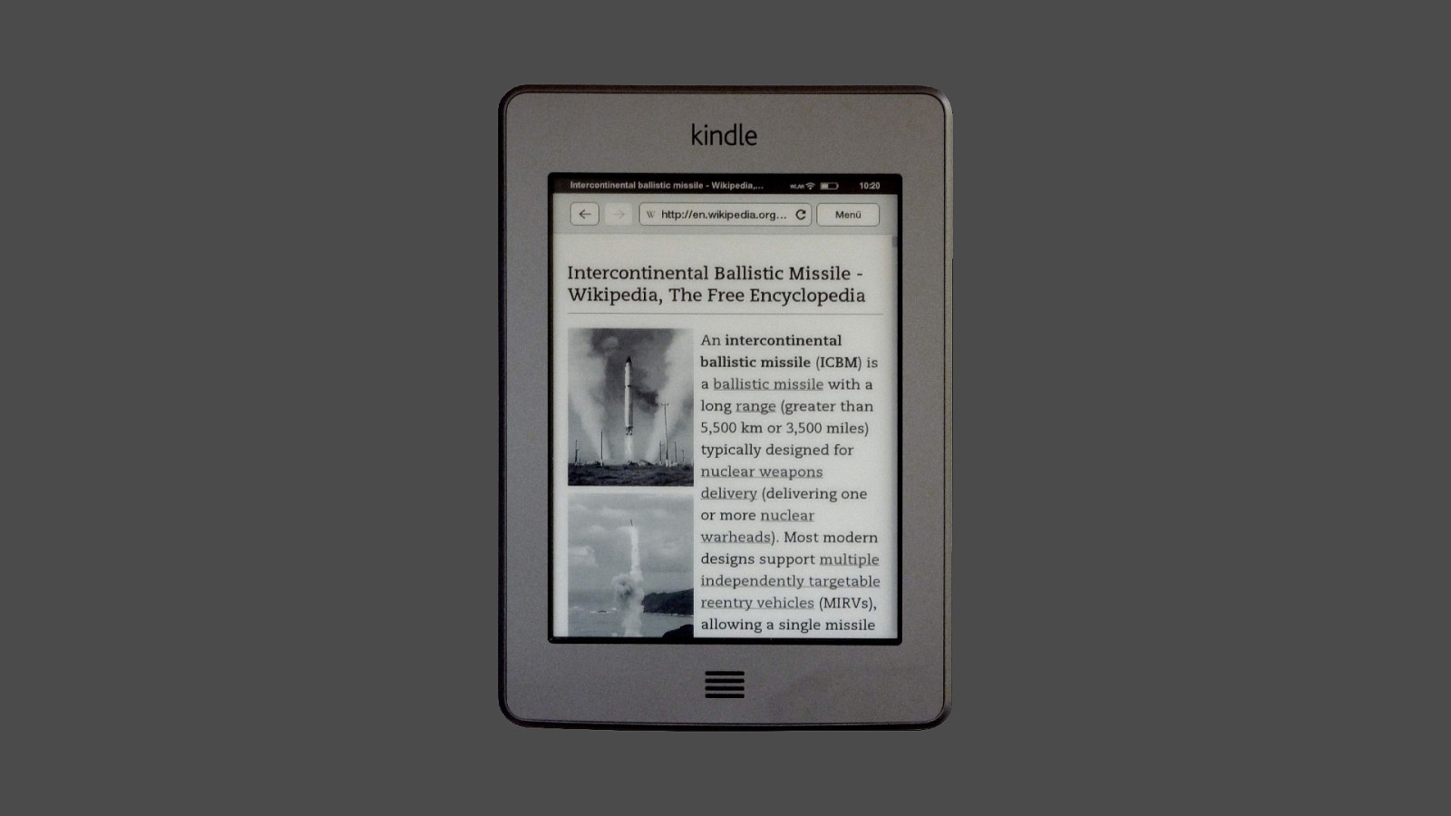
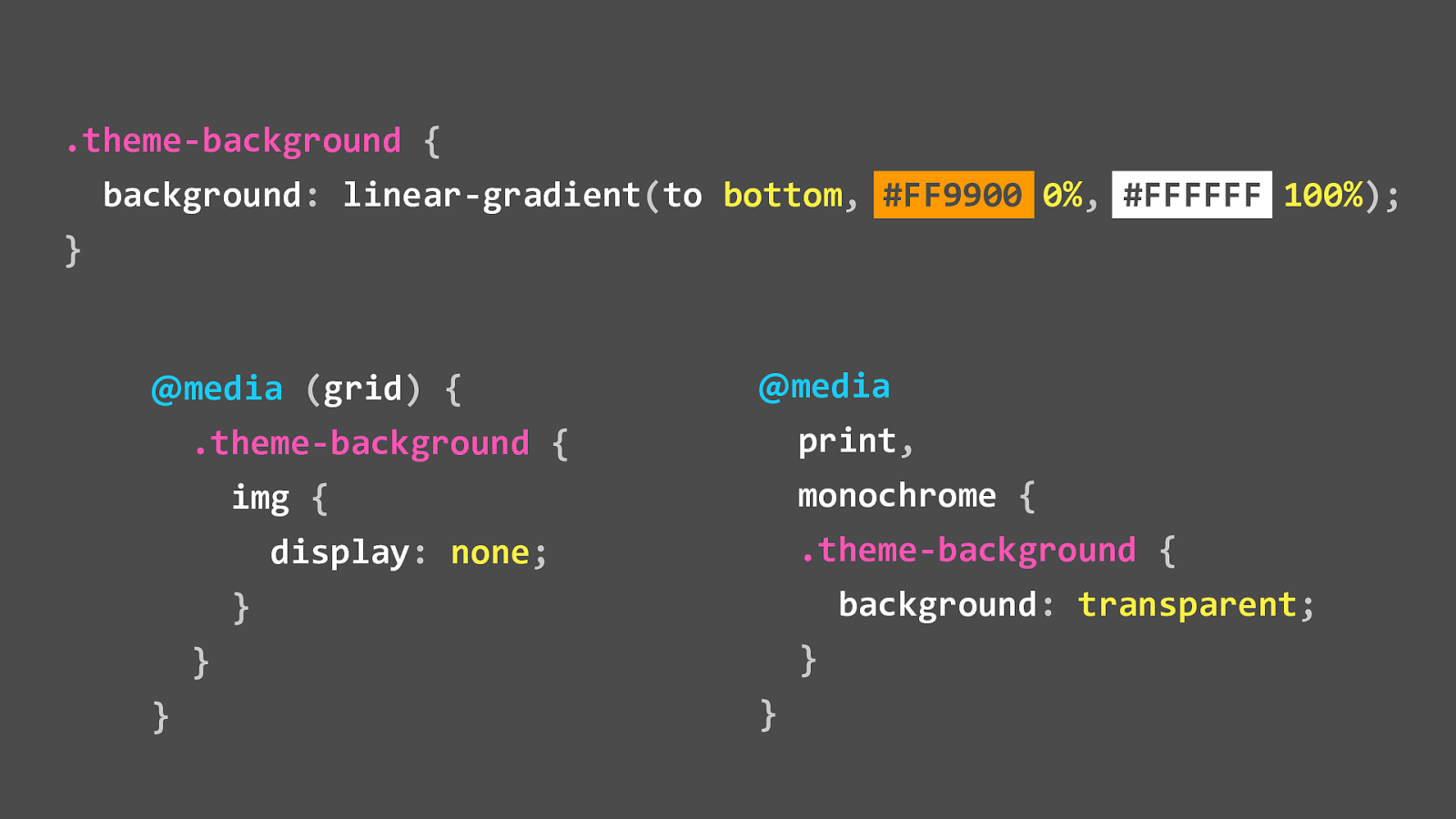
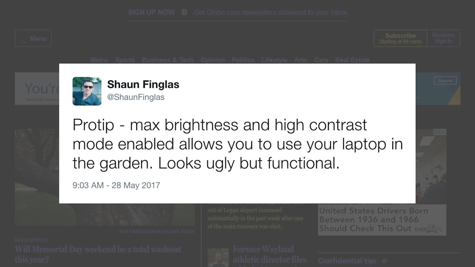
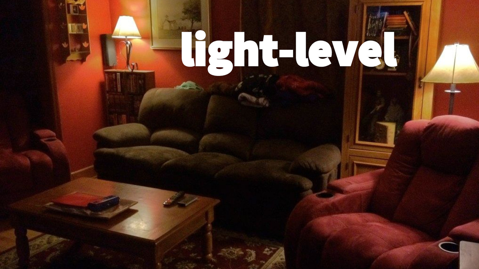
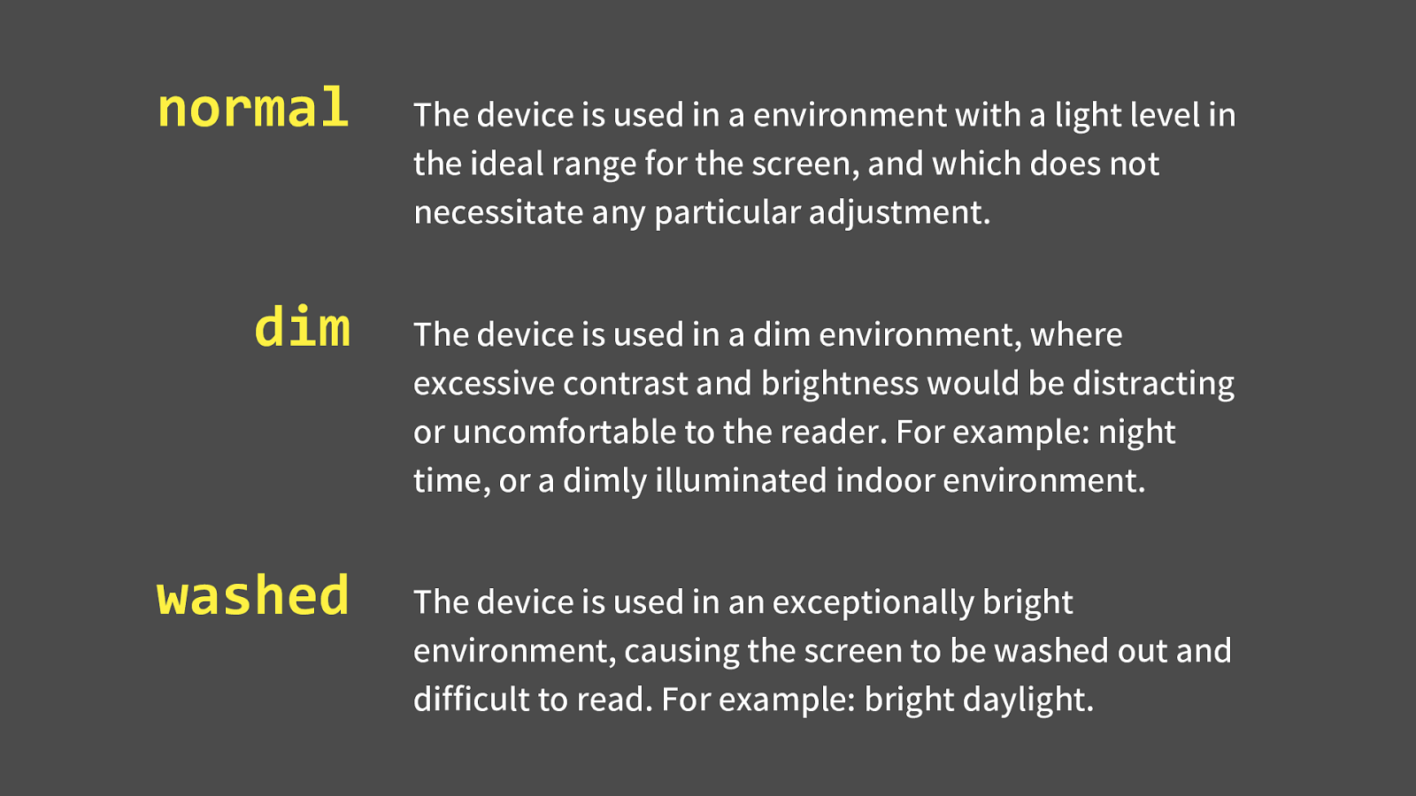
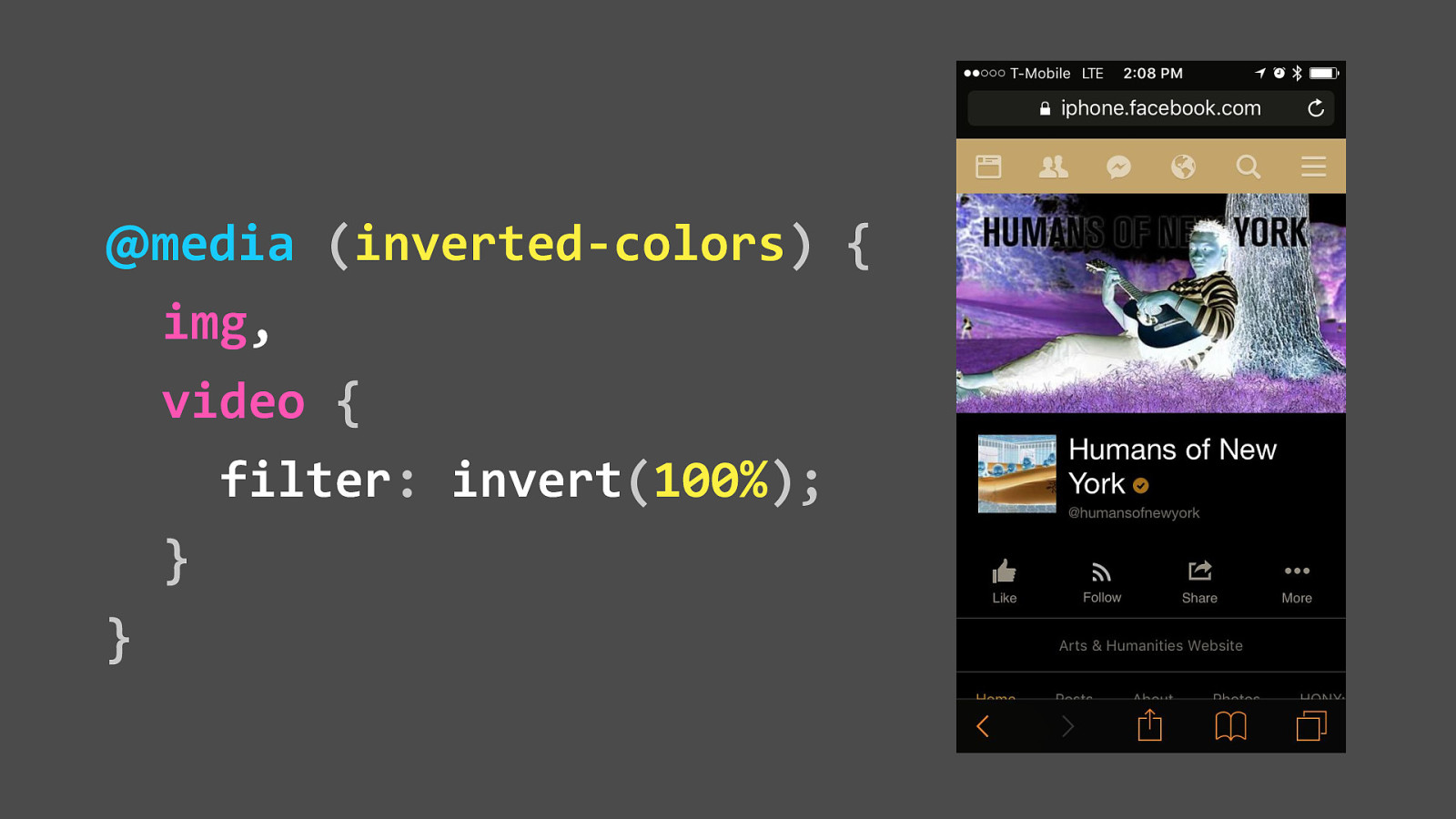
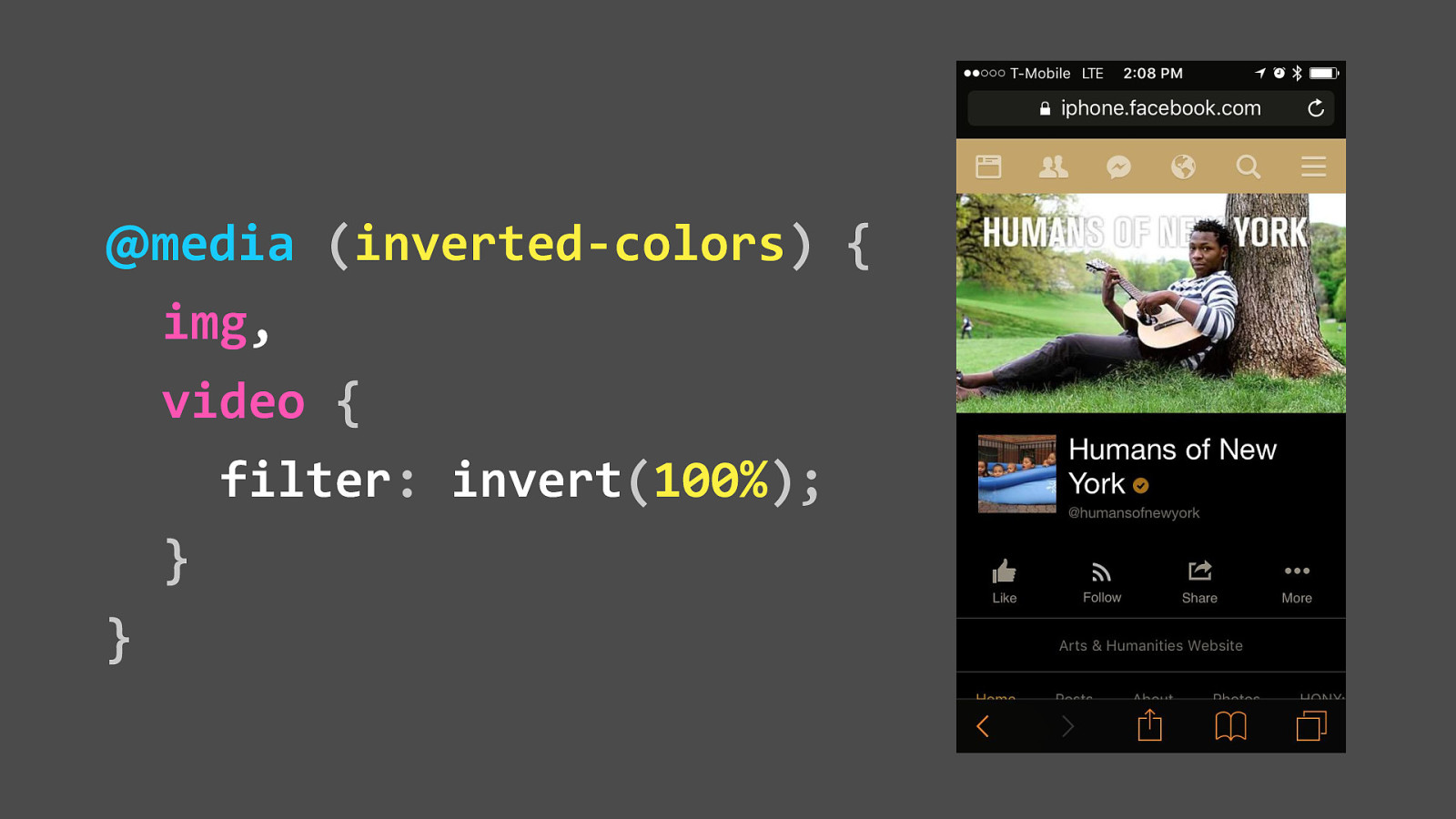
"Protip - max brightness and high contrast mode enabled allows you to use your laptop in the garden. Looks ugly but functional."
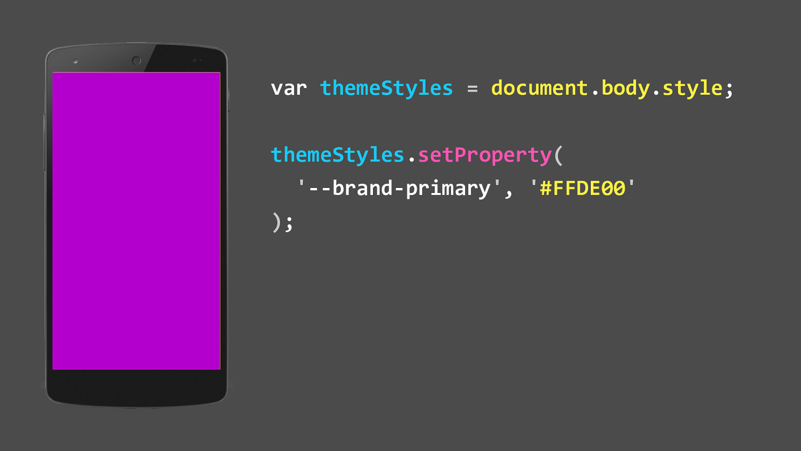
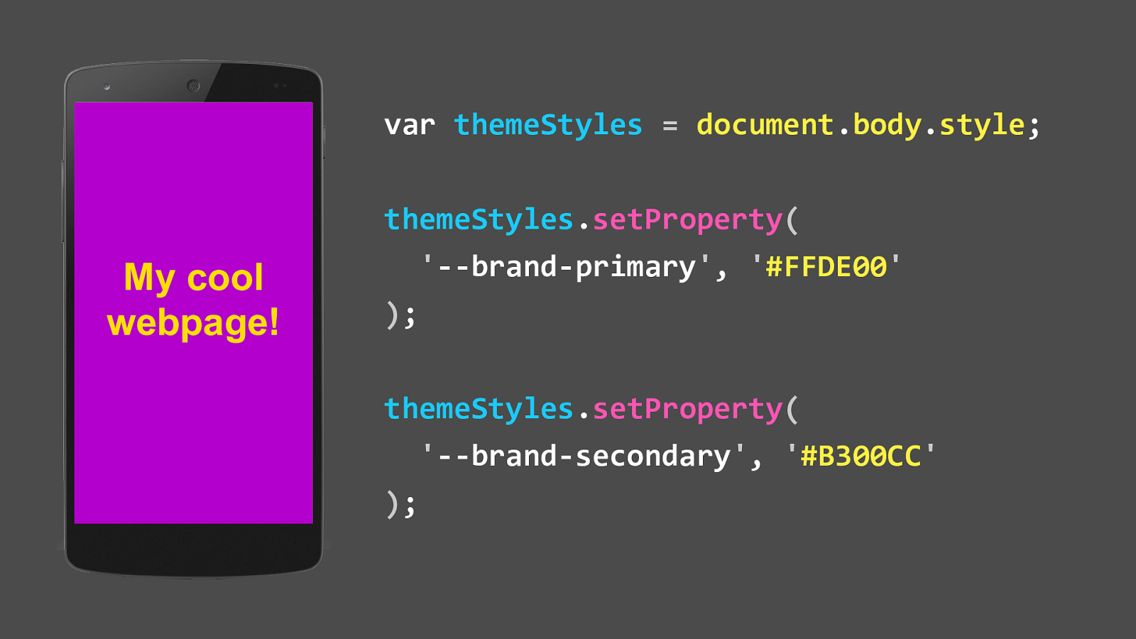
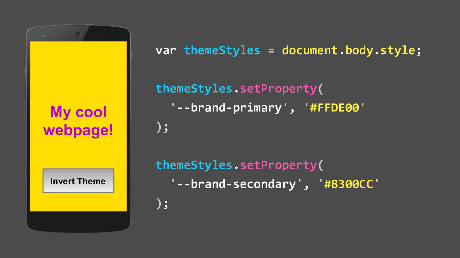
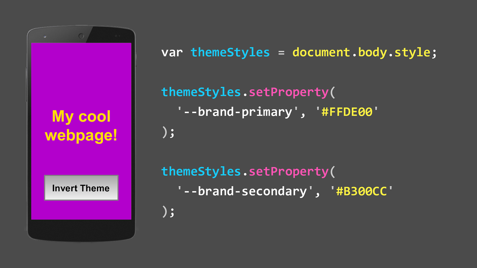
  • That’s advice some guy on Twitter is sharing on how to use a computer when harsh glare is present
  • He’s not a specialist or industry rock star, just some guy on twitter
  • Making technology work for him, and not the other way around

Slide 76

Slide 76

  • The High Contrast Mode media query only works in Edge on Windows for now
  • In the example, we’re telling the SVG icon in a button to match the color of the button label, whatever the label color might be set to
  • I’m saying “set to” because Windows High Contrast colors are mapped to CSS system color keywords
  • This is important because Windows allows you to create custom high contrast themes, so these colors could hypothetically be anything

Slide 77

Slide 77

  • Here is a mapping of the content types and the relevant keywords that will allow you to work with High Contrast Mode best

Slide 78

Slide 78

  • Reduced Motion - what’s that?
  • Well, it’s exactly what it says it is,
  • it allows you to target users who have explicitly stated a preference for less motion in the UI animation
  • This is great for people with vestibular disorders or ADHD
  • or for people like me, impatient curmudgeons who have no time for watching gratuitous UI animation over and over again

Slide 79

Slide 79

  • This media query only works in Safari on macOS and iOS,
  • and only when Reduce Motion is enabled in the operating system preferences
  • In the example, we’re removing animation from a large background
  • We could also also slow it down or simplify things
  • if the use case requires the animation in order to convey critical information
  • Like High Contrast Mode, these tweaks are there for those who need them, to make the experience work regardless of circumstance

Slide 80

Slide 80

  • Not a lot of people are aware of these two features, but that doesn’t mean we should ignore using them because of it
  • You might be in a situation where you’re not seeing the personal benefit,
  • or you are, but your boss might not see the business case
  • It’s important to remember that disabilities are more than just screenreader support
  • they’re a spectrum of concerns and
  • Inclusive design teaches us that disabilities can be conditional:
  • harsh glare, a fever, a broken arm, not knowing the native language, or just getting older
  • Unfortunately, as much as we might want to pretend, technology does not exist in a vacuum
  • and we also live in an age where people can and will use disability triggers as attack vectors, such as deliberately sending a journalist with epilepsy seizure-inducing tweets
  • This year the current administration has been stripping government protections, but the recent Winn Dixie lawsuit has created precedence for private individuals successfully suing private companies for lack of access.
  • This is huge, as it no longer takes a large organizational momentum, such as needing the National Foundation for the Blind to intervene
  • So advocate for your future self, and in doing so advocate for others

Slide 81

Slide 81

  • Okay! Let’s talk about the future!
  • The writing is on the wall, and by wall I mean the specs:
  • It’s feature queries
  • Feature Queries are media queries for user preferences
  • Existing media queries have display on lockdown,
  • so now it’s all about letting our users tell us what they want and responding to it
  • We have had a taste of this with the last two examples, so let’s see what’s coming down the pike

Slide 82

Slide 82

  • Color gamut allows you to manipulate images based on the color profile of the display
  • But Inclusive Design concerns really should be handled with proper contrast ratios, not gamut shenanigans
  • If you’re using images to communicate large amounts of critical information, you’ll probably want to rethink your content strategy
  • I’m including this for the sake of completeness, but I’m sure someone more clever than me will figure out something cool to do with it

Slide 83

Slide 83

  • Interaction covers the new Pointer and Hover media features, which go together like chimpanzees and tuxedos
  • These two features can adjust the display based on how we can interact with the device

Slide 84

Slide 84

  • Pointer reacts to the accuracy of the device’s primary form of input
  • It’s important to note “primary” as the operative word here, since there are devices that can accept multiple forms of input

Slide 85

Slide 85

  • Here’s a Microsoft Surface, a device with a touchscreen, a trackpad, a stylus, and a wireless mouse
  • Keep that sort of thing in mind when you start messing with things like clickable areas,
  • remember that individuals with motor control issues may augment their devices with specialized pointing tools
  • and that it’s just easier to work with the cascade and create sensible defaults from the get-go

Slide 86

Slide 86

  • Hover capability is also determined by the device’s primary input mechanism
  • As a rule, I don’t like interfaces that utilize hover to expose functionality
  • It’s a throwback from a desktop and mouse-centric era, and in addition to issues with discoverability
  • It is also problematic for people with motor control issues, to say nothing about technological literacy concerns
  • And a pretty big obstacle if you’re navigating via switch control
  • I think it’s also worth mentioning here that small devices aren’t always lacking hover capability

Slide 87

Slide 87

  • And the opposite also applies, large devices might not have hover capability either
  • iPad Pros, anyone?

Slide 88

Slide 88

  • Alright, so now let’s talk about media queries that speak to the display itself

Slide 89

Slide 89

  • Display mode allows us to change things based on how the browser itself is presented
  • As Progressive Web Apps become more popular, this becomes more important
  • The inclusive design angle here is a low-bandwidth, battle for the homescreen one where web apps can behave like native apps
  • while still being being open and interoperable
  • The web is becoming a first class citizen for mobile OSes, which is huge because the accessibility of Android apps stinks
  • and HTML as a format is far more accommodating to assistive tech

Slide 90

Slide 90

  • Update checks how quickly the device is able to modify the appearance of the content
  • This one is pretty straightforward:
  • you’re able to more granularly craft experiences for e-ink or lower power devices

Slide 91

Slide 91

  • A gentleman by the name of Andres Galante wrote a great article for CSS Tricks about putting them all together
  • Mobile First was a great starting point when we were first figuring out what responsive design was
  • but in our “everything has a browser now” world this update provides a rock-solid, future-friendly foundation to build from

Slide 92

Slide 92

  • Light level uses the device’s sensors to determine how bright the environment is
  • This media query makes me feel old because we now assume that the majority of devices will ship with some sort of camera built into it

Slide 93

Slide 93

  • There are three options for light level: normal, dim, and washed
  • This is cool because Washed has been discussed as a supplement for high contrast mode
  • Remember, with media query logic we can lump the two together and not have to write redundant code!

Slide 94

Slide 94

  • Let’s note that normal lighting is rated to what the manufacturer describes as ideal for the screen
  • But since these technologies are interoperable there is also the potential to override them,
  • Say with a system-wide preference toggle, or a browser extension

Slide 95

Slide 95

  • Scripting allows us to target JavaScript, or the lack thereof

Slide 96

Slide 96

  • There are three values, “enabled”, “none”, and “initial”
  • Enabled is if the user can support JavaScript, while None is if they have it disabled it or it fails to load
  • Remember, even though we live in the age of monolithic javascript frameworks, every user technically does not have JavaScript until they do
  • This might get me some subtweets from guys with fancy Twitter bios, but the larger the JS payload, the larger the chance of failure
  • If you’re thinking this smells a lot like arguing for Progressive Enhancement, you’re right!

Slide 97

Slide 97

  • Initial-only is a little tricky

Slide 98

Slide 98

  • The authors are still trying to figure out what the difference is between a server rendered page and a page with deferred loading JS
  • I think these are champagne problems - performant webpages are oftentimes also accessible pages
  • For example, Lighthouse, Google’s Progressive Web App analyzer uses an accessibility audit as a primary scoring metric

Slide 99

Slide 99

  • Inverted colors are the poor man’s High Contrast Mode
  • Most operating systems can do it - I use it when using my iPhone at night a lot
  • And again, you can chain it using the logic described earlier
  • It’s worth mentioning that Chrome has an extension for it,
  • which is a good reminder that you shouldn’t be in the business of trying to do device sniffing, especially for assistive tech

Slide 100

Slide 100

  • A practical application of this would be the “double inversion” technique, where you invert inverted multimedia

Slide 101

Slide 101

  • It’s simple but powerful, and ensures content remains legible regardless of what mode it is being viewed in

Slide 102

Slide 102

  • Our old friend Reduced Motion is also listed
  • So all that work you did for Apple devices? It’ll be available to everyone!

Slide 103

Slide 103

  • Finally, we have custom media queries
  • This one is a little weird to wrap your head around, so bear with me

Slide 104

Slide 104

  • If you weren’t aware, CSS is getting support for a special syntax called Custom Properties

Slide 105

Slide 105

  • These special properties are variables that are declared in the root selector to give them global scope,
  • The root selector being equivalent to the HTML tag selector
  • They are key/value pairs that print out whatever string you have defined

Slide 106

Slide 106

  • Here I’ve been using them to do some really simple theming work

Slide 107

Slide 107

  • The cool thing about CSS Custom Properties is that, unlike preprocessor variables they are accessible via JavaScript on the live site
  • Previously, to send data from CSS to JavaScript, we often had to resort to hacks like writing CSS values via plain JSON in the CSS output and then parsing it in JS

Slide 108

Slide 108

  • But now once you’ve got the CSS styles targeted in JavaScript you can manipulate them

Slide 109

Slide 109

  • Here, I am switching the values for the primary and secondary brand colors

Slide 110

Slide 110

  • And then you can take it one step further and work the logic into dynamic components

Slide 111

Slide 111

  • This button toggles inverting the site’s theme.
  • It’s a simple example, but hopefully it makes sense

Slide 112

Slide 112

Slide 113

Slide 113

  • So in the same vein, you’ll soon be able to declare custom media query properties
  • They’re functionally the same, an author-defined custom string
  • Only this time you’re using the “at custom media” declaration to create them

Slide 114

Slide 114

  • Like CSS custom properties you can use them in the site’s CSS
  • The easy win here is a “set once and update everywhere” approach

Slide 115

Slide 115

  • But don’t forget that you can then manipulate with JavaScript

Slide 116

Slide 116

  • I’ll admit, this amount of power is potentially very intimidating, but I think there’s also a lot of potential for being future-friendly
  • We’re leaving the doors wide open to accommodate the unknown, and a lot of that could be interfacing with assistive technology we can’t even dream of yet

Slide 117

Slide 117

  • "CSS variables (custom properties) makes supporting reduced motion settings super easy. There is little excuse not too."
  • In fact, I came across this tweet on my way over, it uses custom properties to elegantly control reduced motion. How cool is that!

Slide 118

Slide 118

  • There’s going to be a lot of wonderful things written by brilliant people that we’ll be seeing in the coming years
  • and I can’t wait to use them!

Slide 119

Slide 119

  • I know we covered a lot of material, so here’s how to reach me if you have any follow up questions
  • I’ll also be posting slides with links to the resources I used to develop this talk
  • Thank you for your time, and thanks to Amanda and Meg for this wonderful speaking opportunity!

Slide 120

Slide 120

Slide 121

Slide 121

Slide 122

Slide 122

Slide 123

Slide 123

Slide 124

Slide 124

Slide 125

Slide 125

Slide 126

Slide 126

Slide 127

Slide 127