
A presentation at Stay Curious – Fonts by Oliver Schöndorfer
Stop using Open Sans and start living
Open Sans
Open Sans
Open Sans
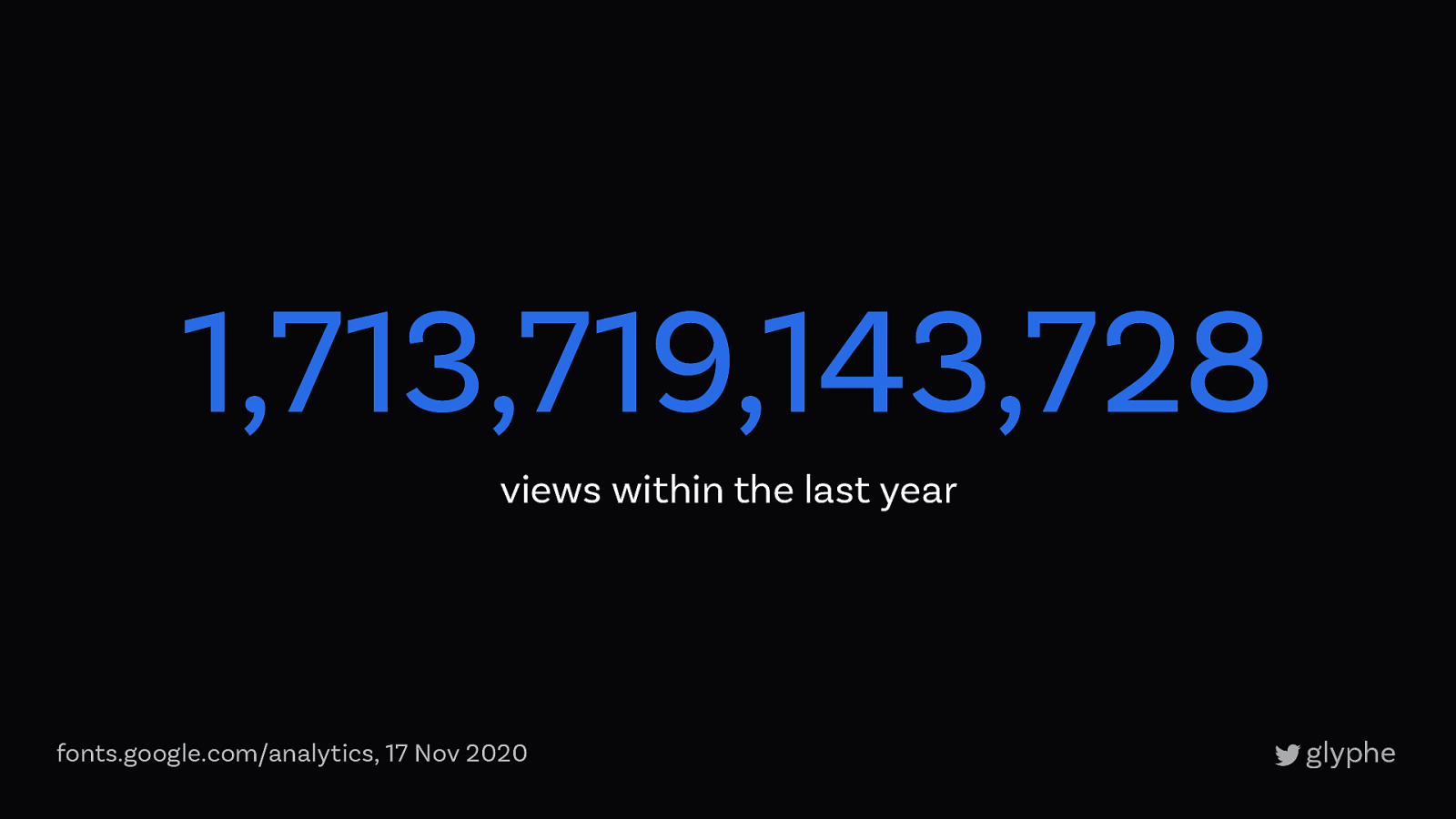
1,713,719,143,728 views within the last year fonts.google.com/analytics, 17 Nov 2020
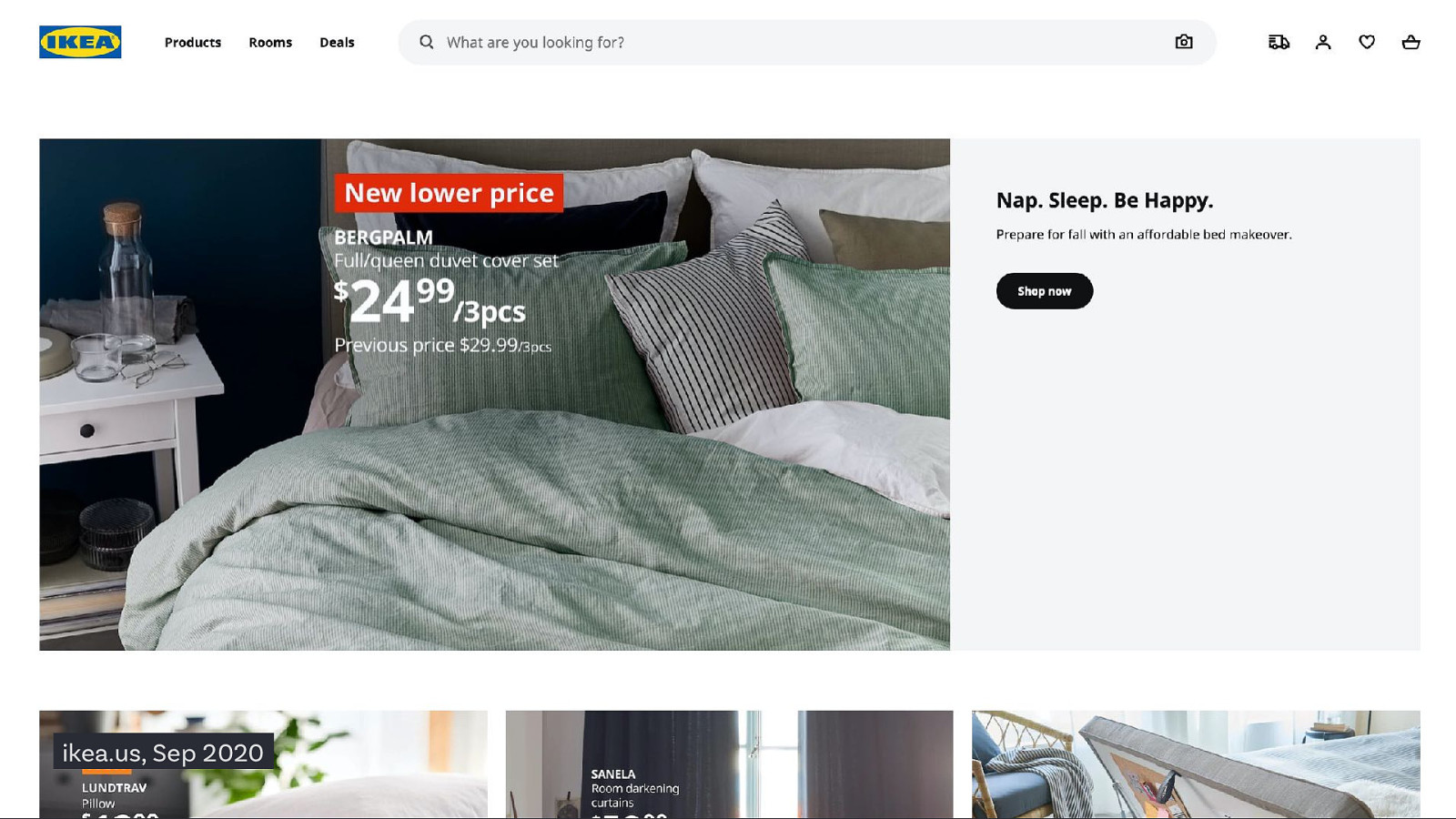
ikea.us, Sep 2020
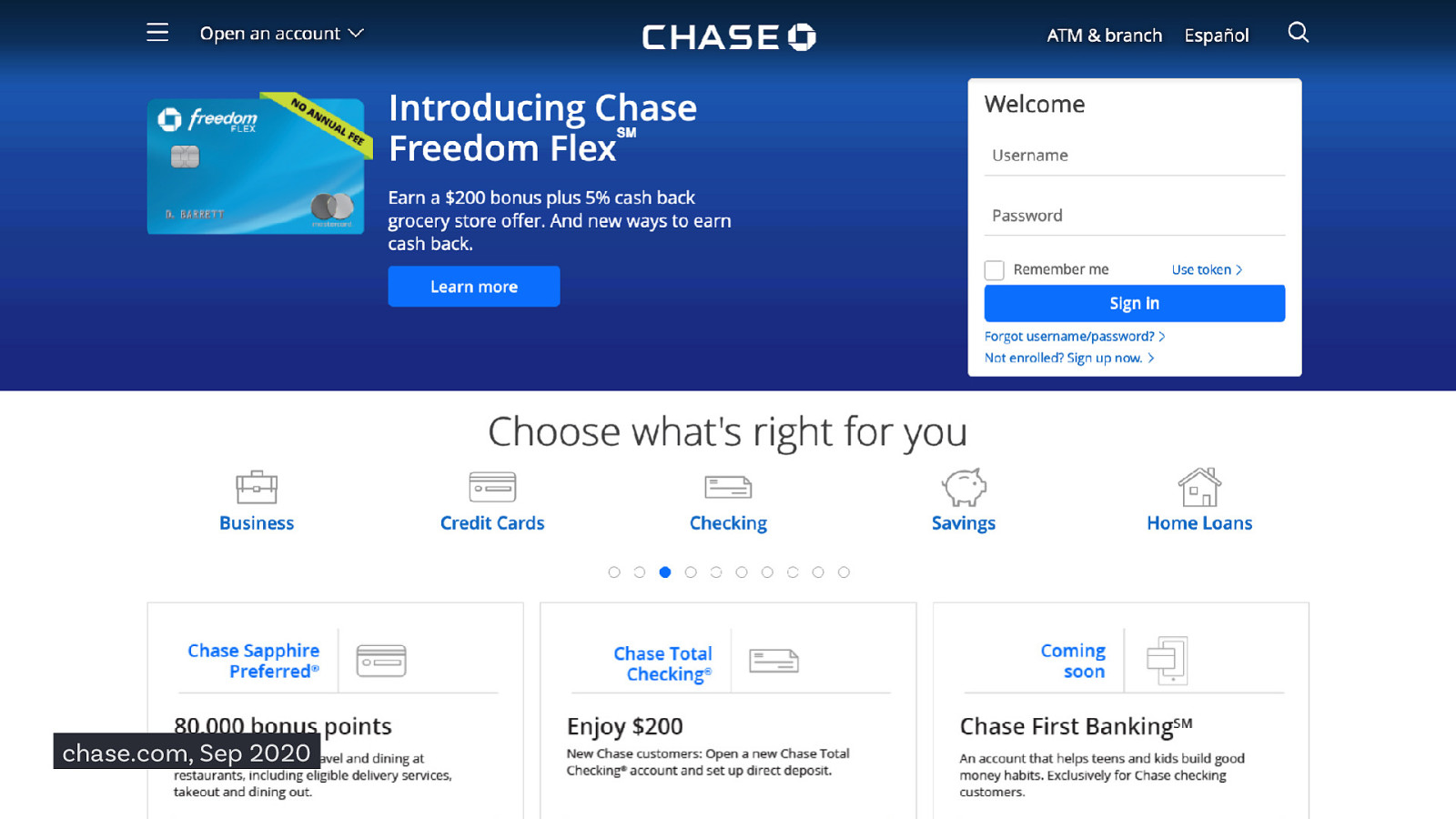
chase.com, Sep 2020
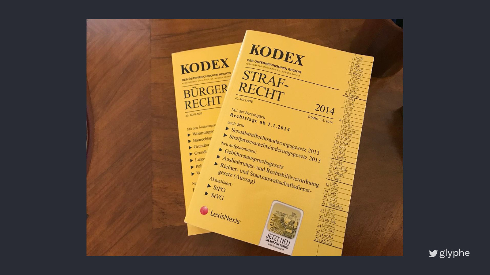
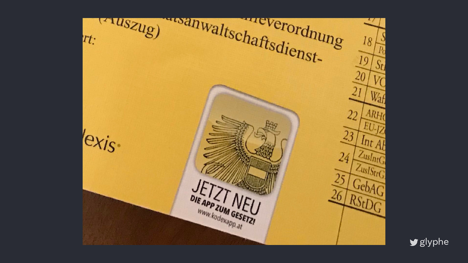
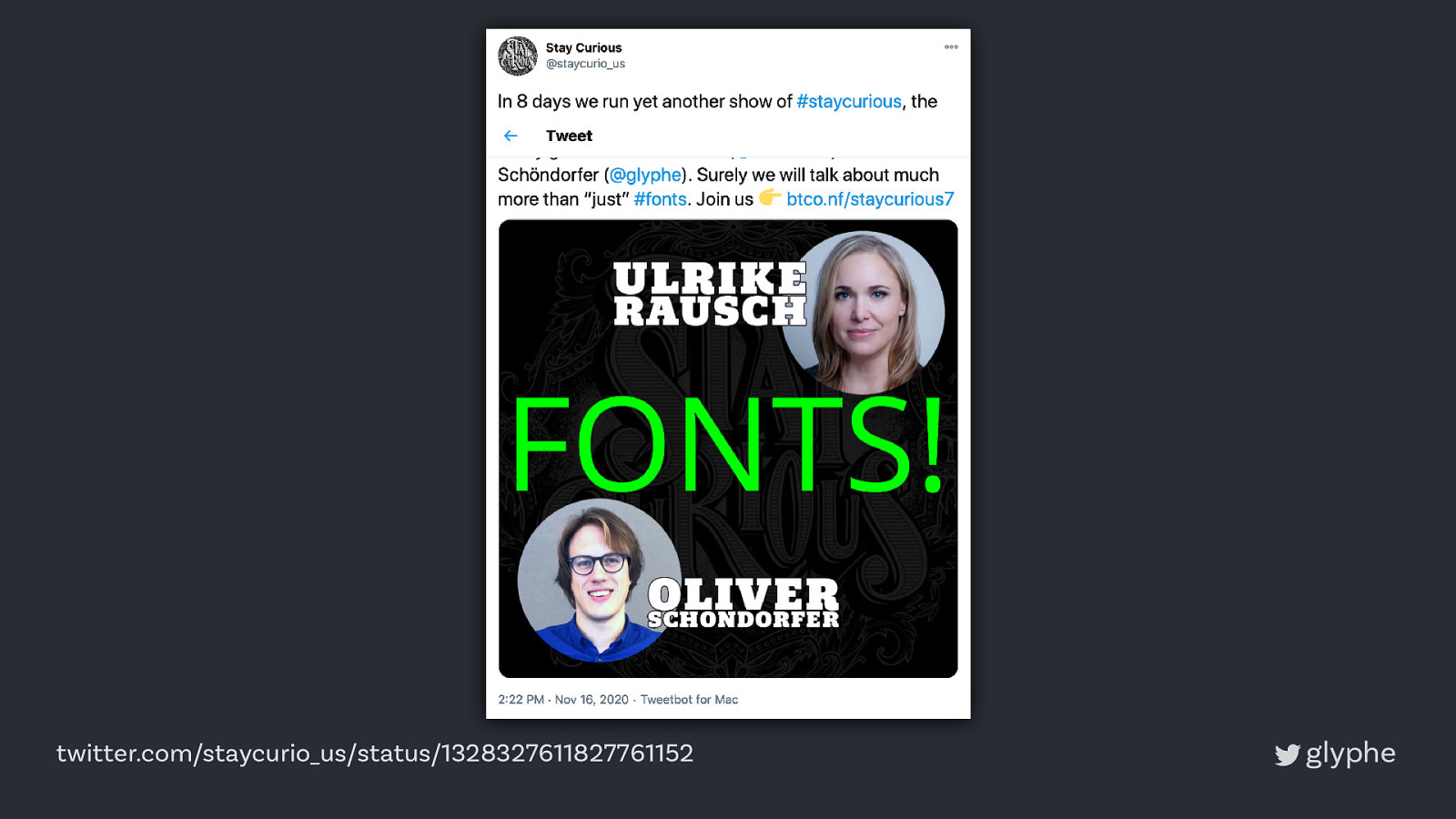
twitter.com/staycurio_us/status/1328327611827761152
twitter.com/staycurio_us/status/1328327611827761152
Why?
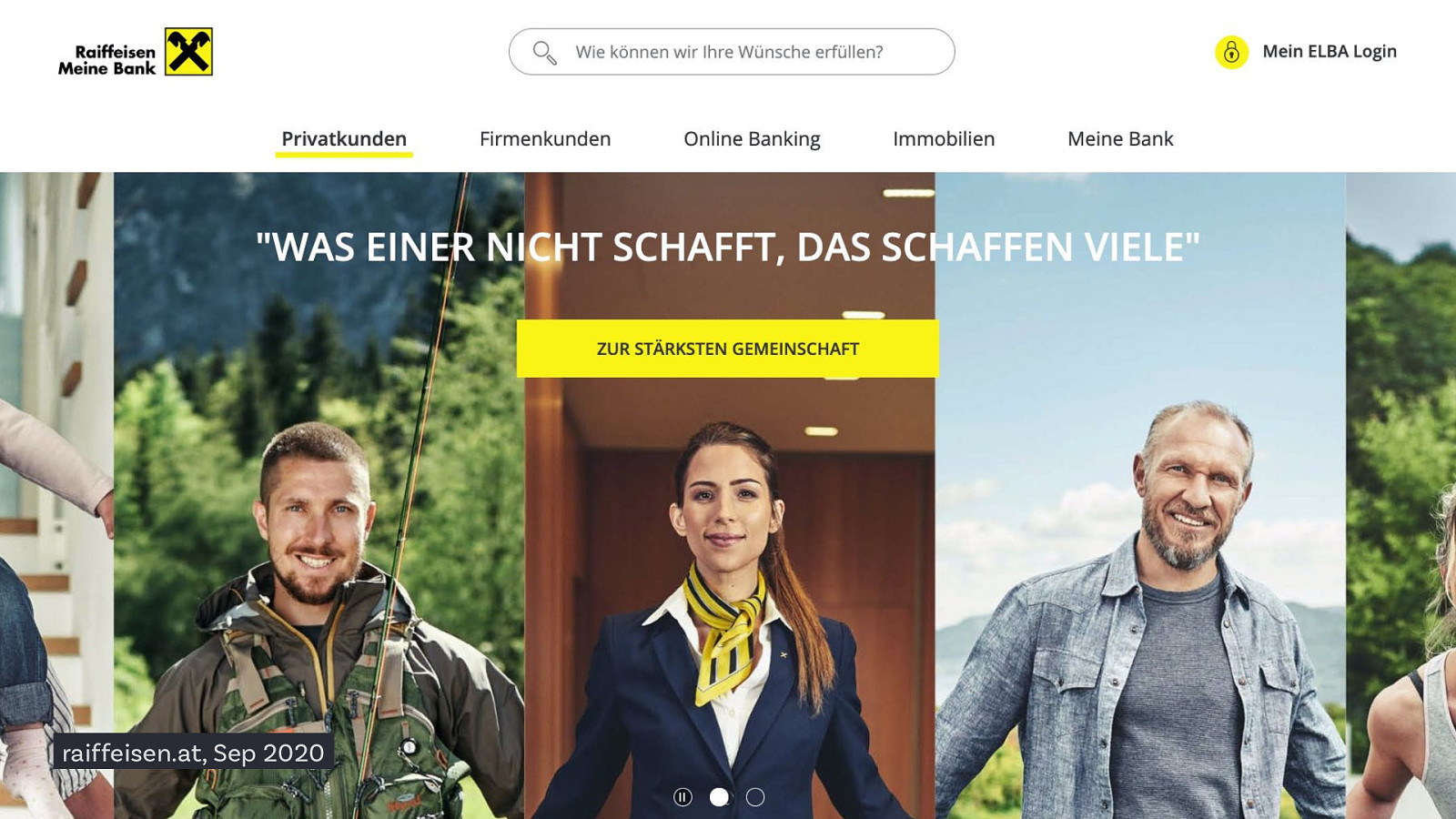
raiffeisen.at, Sep 2020
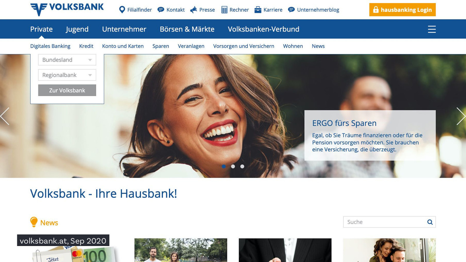
volksbank.at, Sep 2020
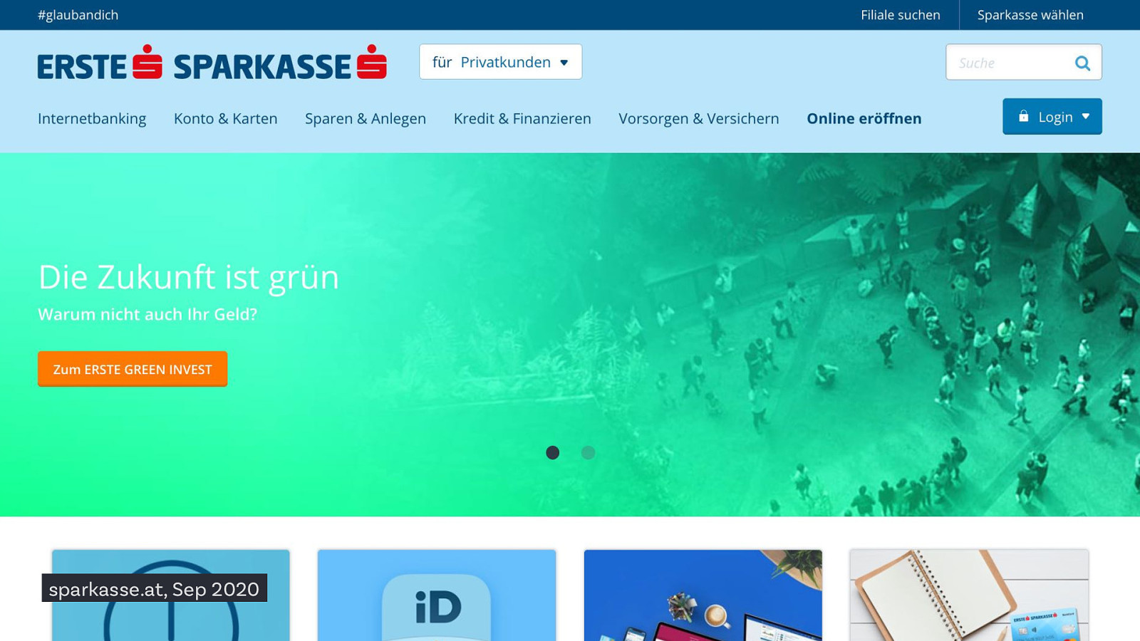
sparkasse.at, Sep 2020
This is an opportunity
1
1 Why your font choice matters
Without text there’s no communication
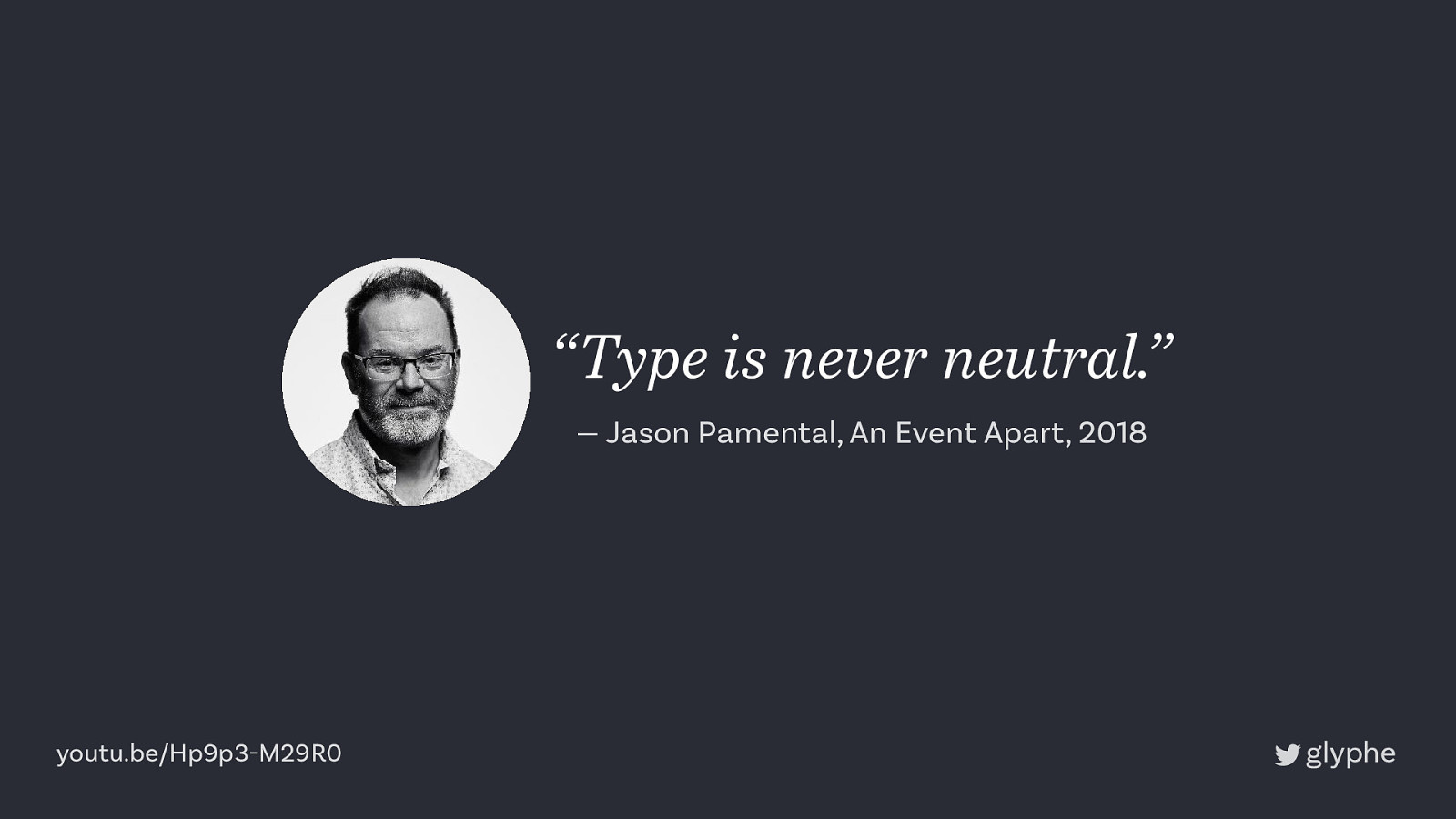
“Type is never neutral.” — Jason Pamental, An Event Apart, 2018 youtu.be/Hp9p3-M29R0
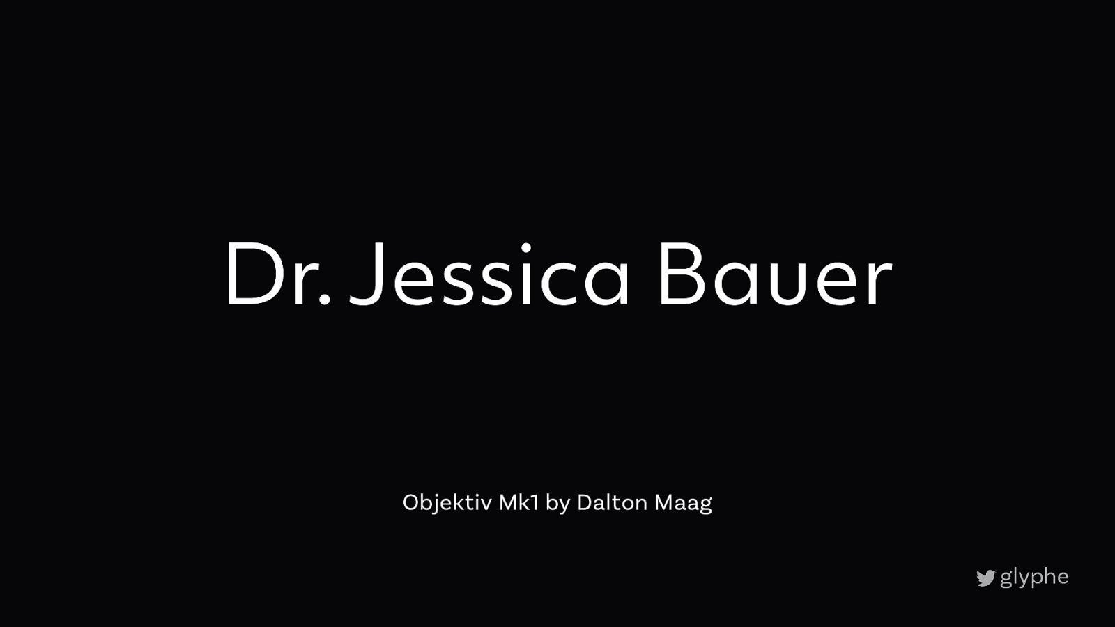
Dr. Jessica Bauer Objektiv Mk1 by Dalton Maag
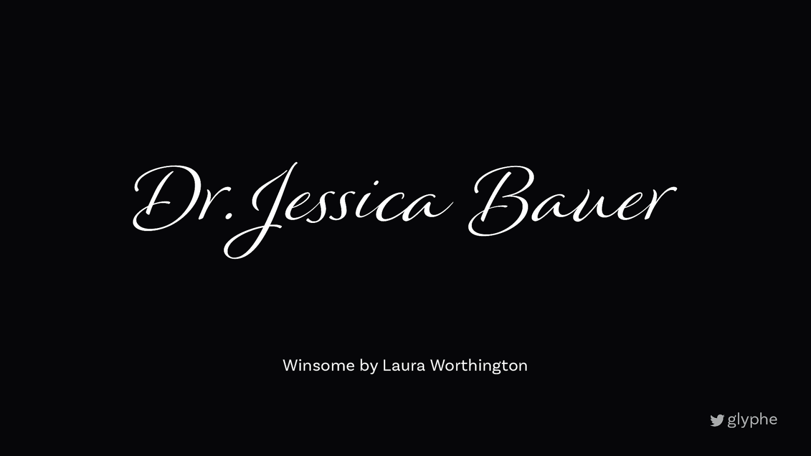
Dr. Je!ica Bauer Winsome by Laura Worthington
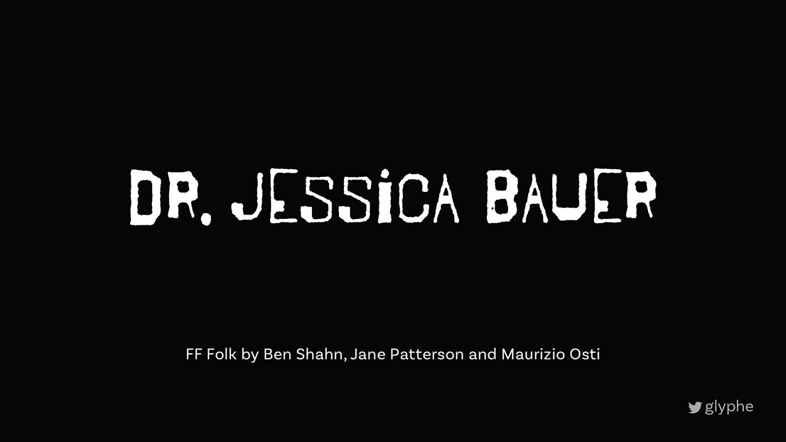
Dr. Jessica Bauer FF Folk by Ben Shahn, Jane Patterson and Maurizio Osti
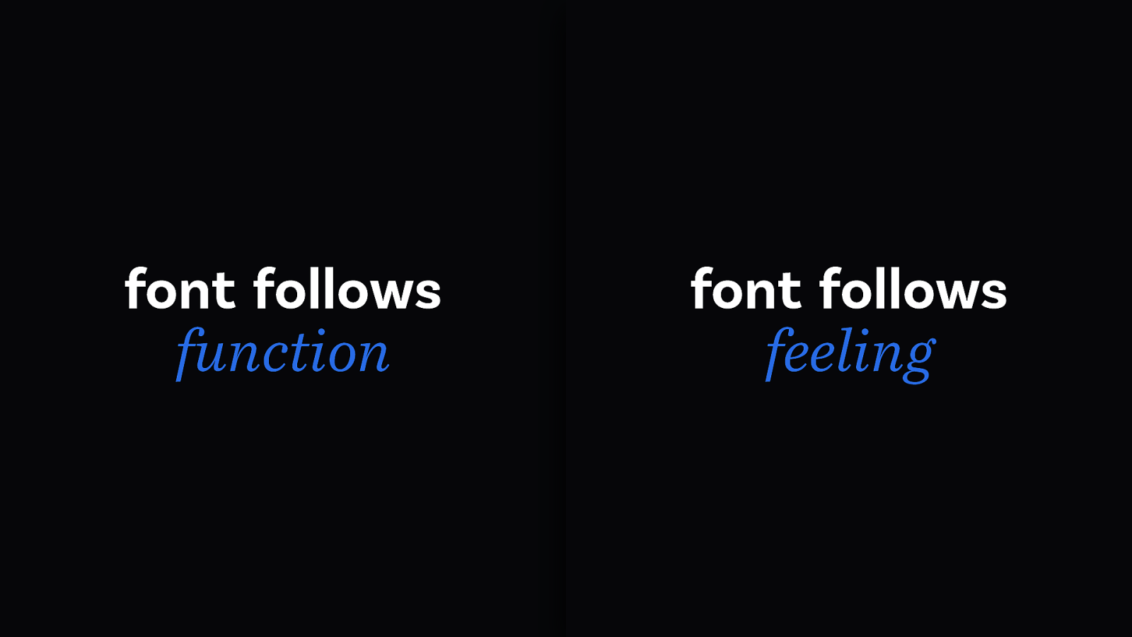
font follows function font follows feeling
2
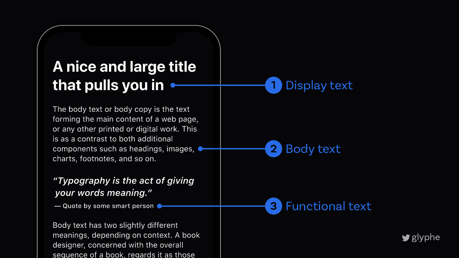
2 Different kinds of text
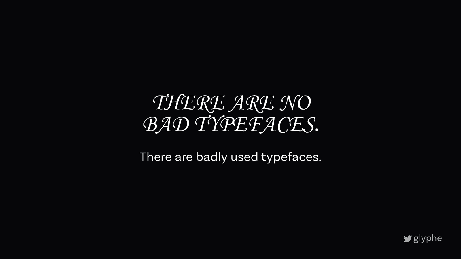
THERE ARE NO BAD TYPEFACES. There are badly used typefaces.
What is the key application?
What is the key audience?
What limitations are there?
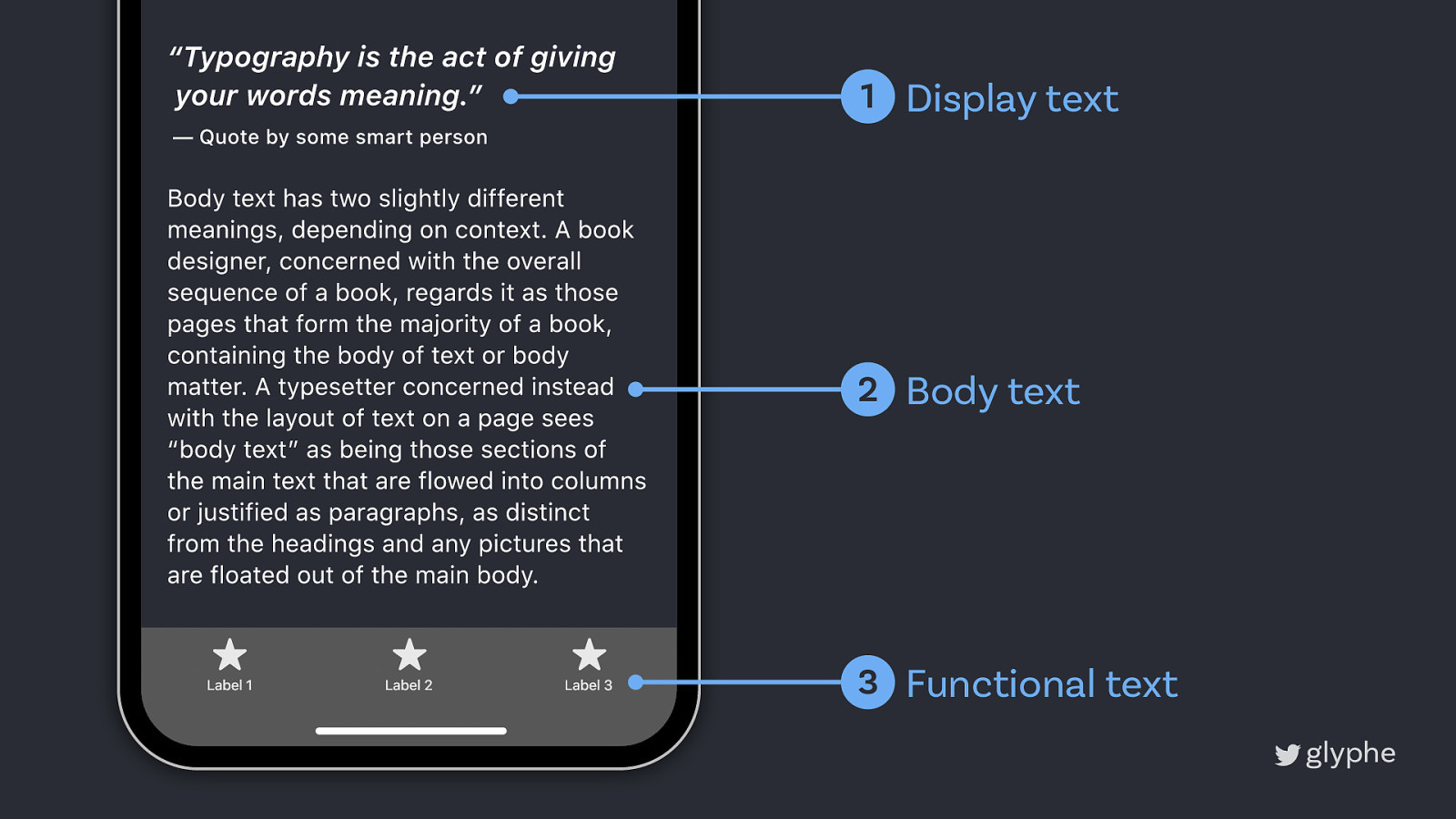
1 Display text 2 Body text 3 Functional text
1 Display text 2 Body text 3 Functional text
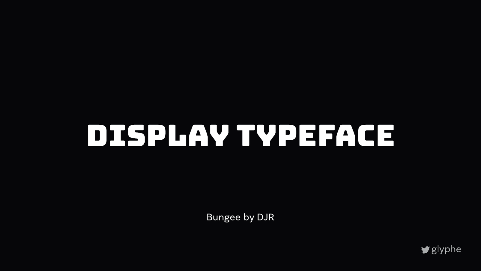
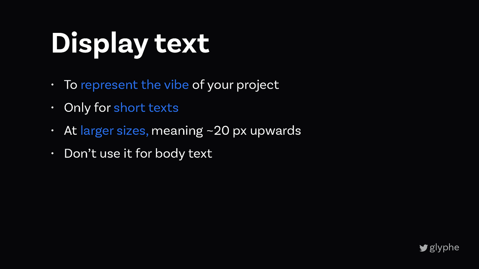
1 Display text
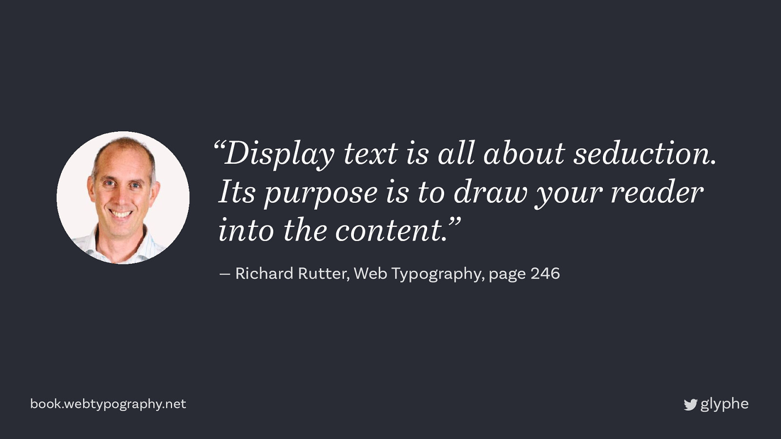
“Display text is all about seduction. Its purpose is to draw your reader into the content.” — Richard Rutter, Web Typography, page 246 book.webtypography.net
Display Typeface Bungee by DJR
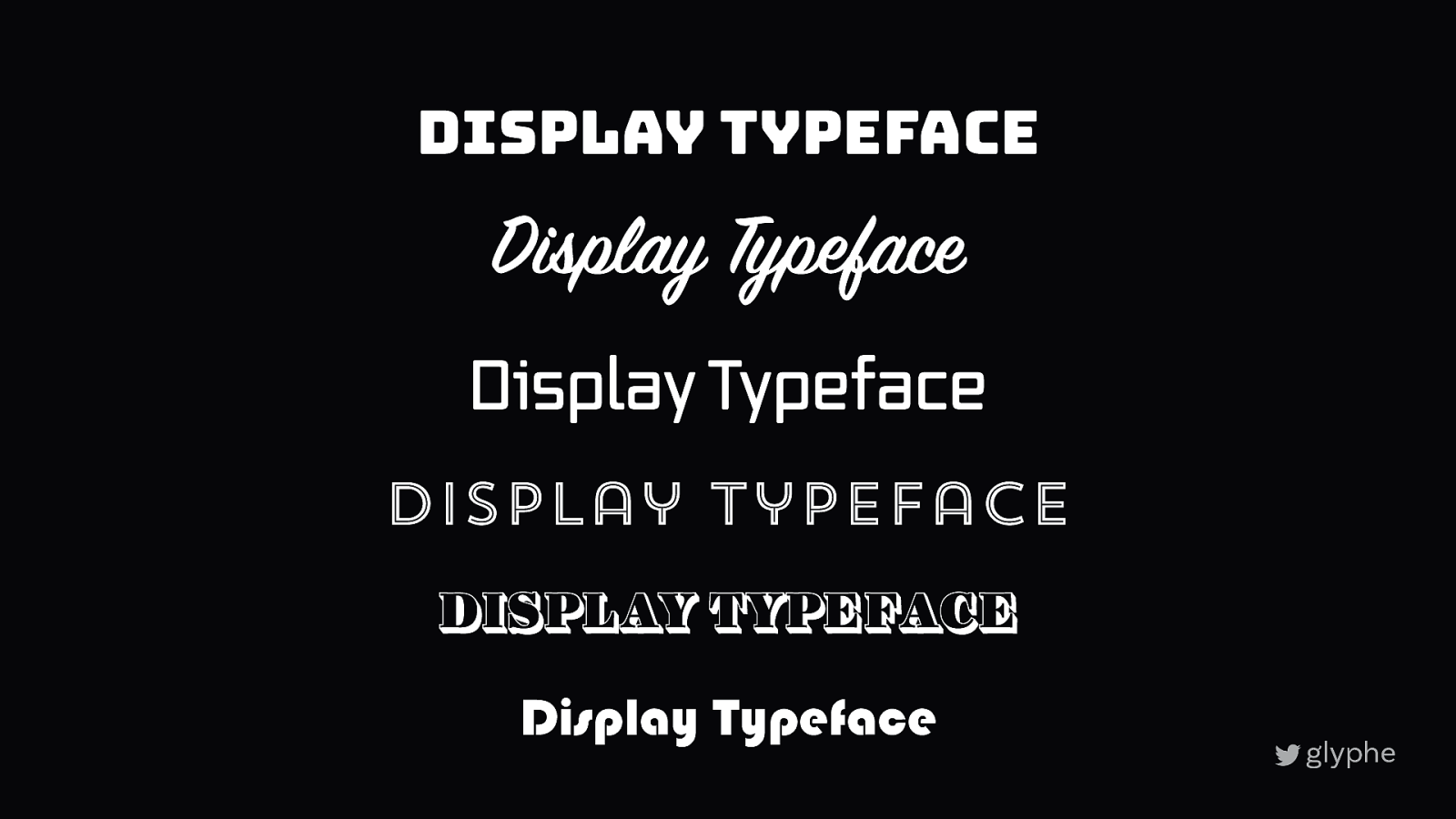
Display Typeface Display Typeface Display Typeface Display Typeface Display Typeface Display Typeface
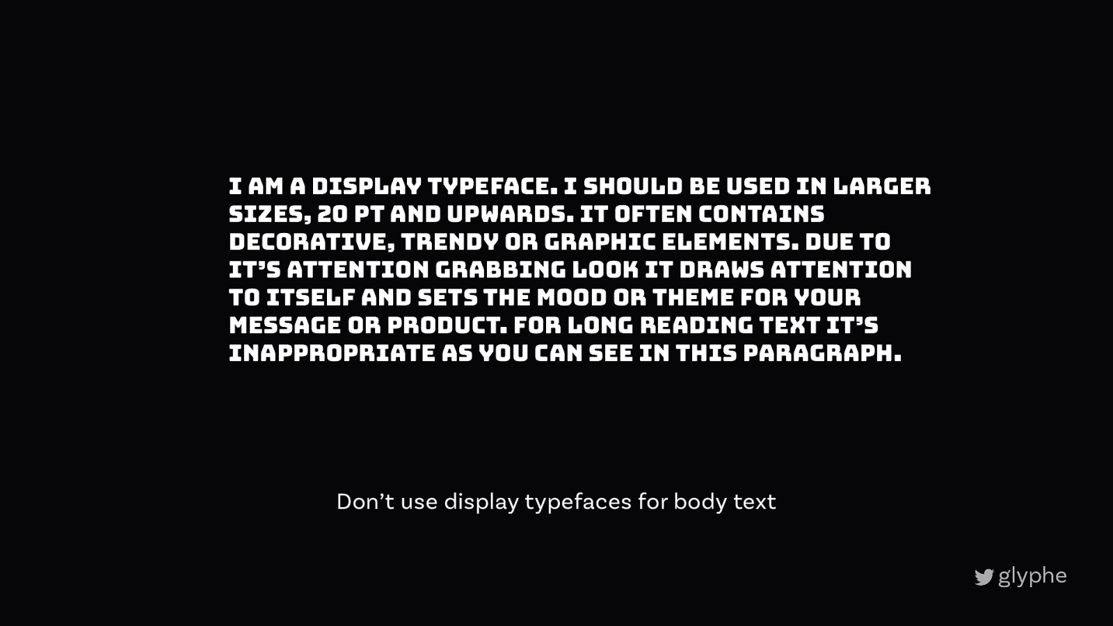
I am a display typeface. I should be used in larger sizes, 20 pt and upwards. It often contains decorative, trendy or graphic elements. Due to it’s attention grabbing look it draws attention to itself and sets the mood or theme for your message or product. For long reading text it’s inappropriate as you can see in this paragraph. Don’t use display typefaces for body text
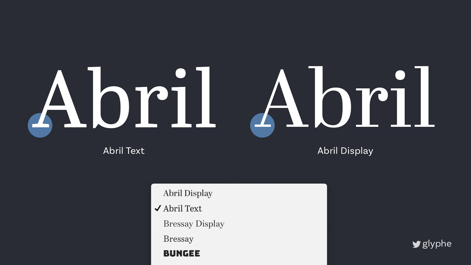
Abril Abril Abril Text Abril Display
Display text • To represent the vibe of your project • Only for short texts • At larger sizes, meaning ~20 px upwards • Don’t use it for body text
2 Body text
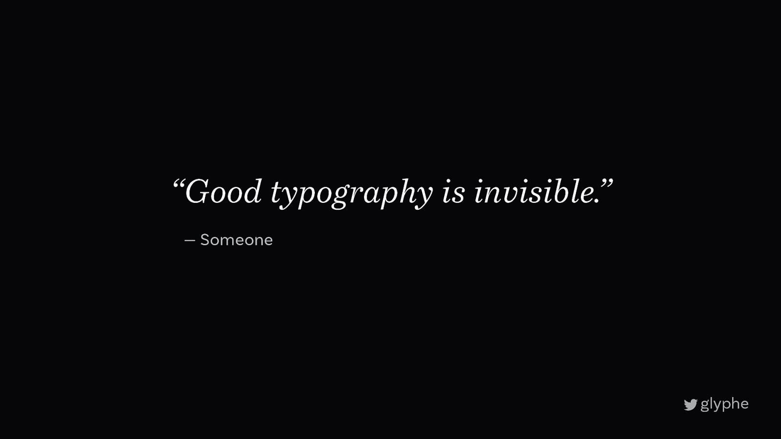
“Good typography is invisible.” — Someone
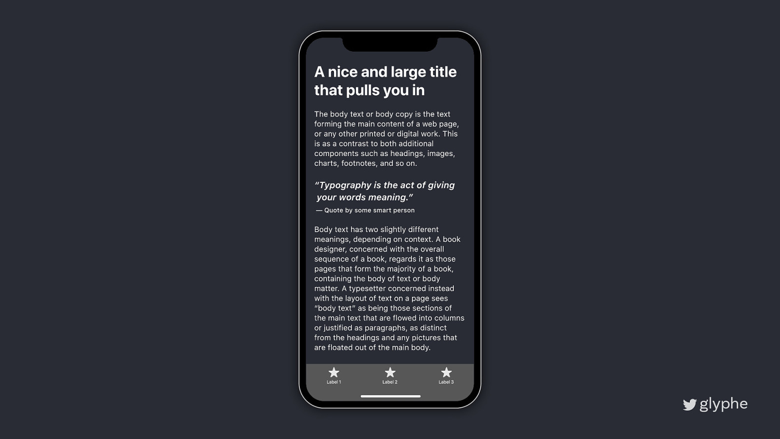
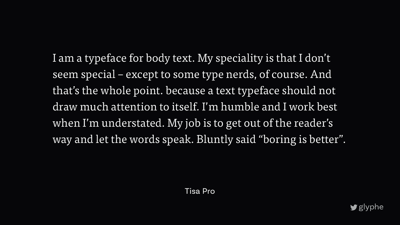
I am a typeface for body text. My speciality is that I don’t seem special – except to some type nerds, of course. And that’s the whole point. because a text typeface should not draw much attention to itself. I’m humble and I work best when I’m understated. My job is to get out of the reader’s way and let the words speak. Bluntly said “boring is better”. Tisa Pro
Sans Serif
Good? Bad?
modern
elegant
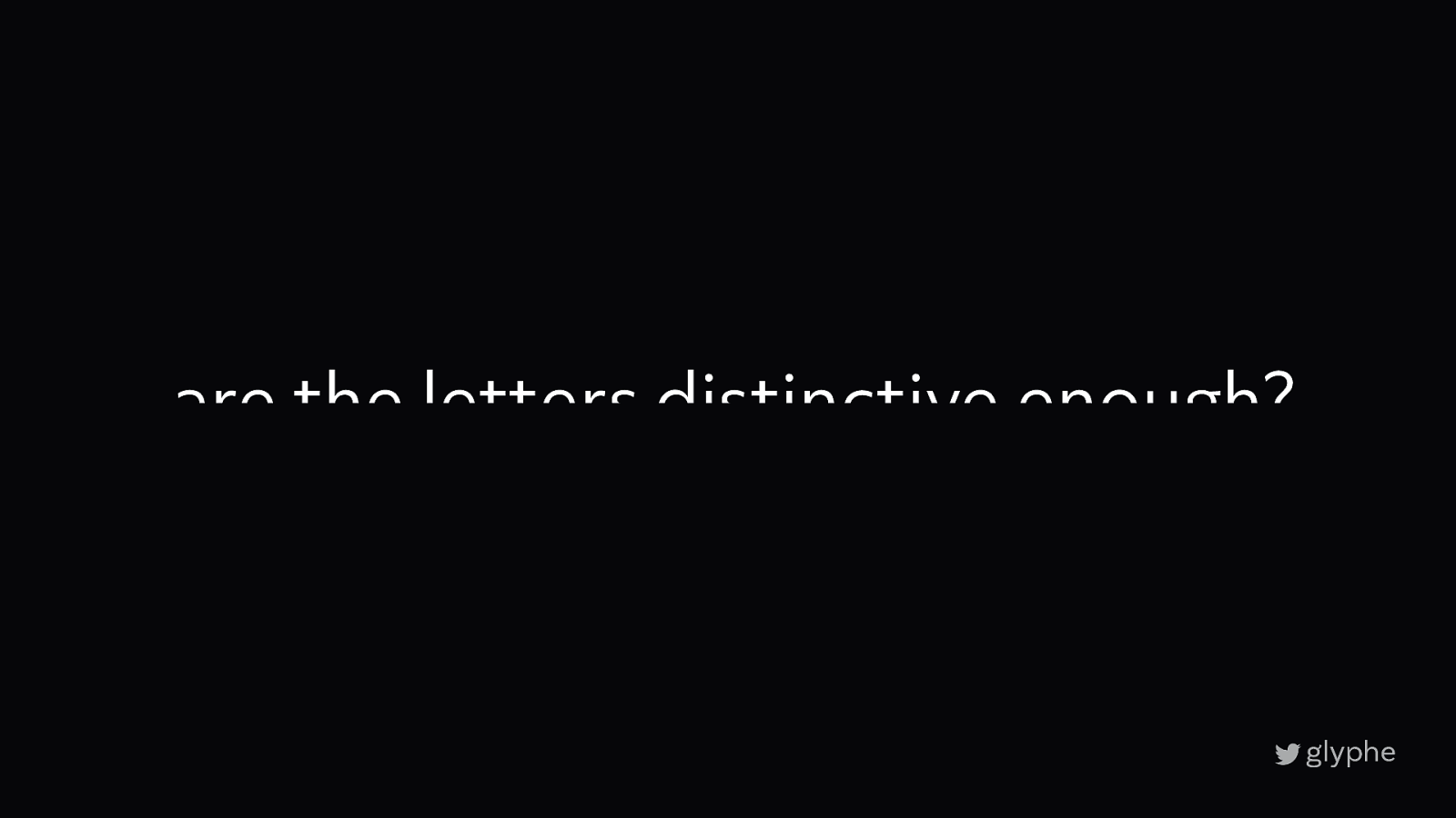
are the letters distinctive enough?
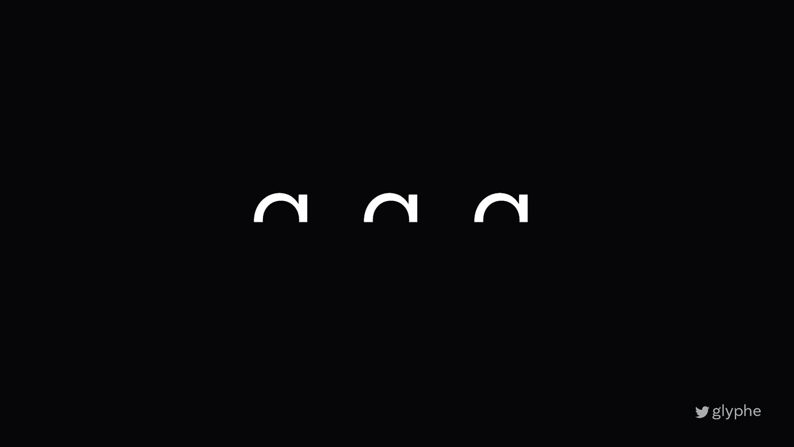
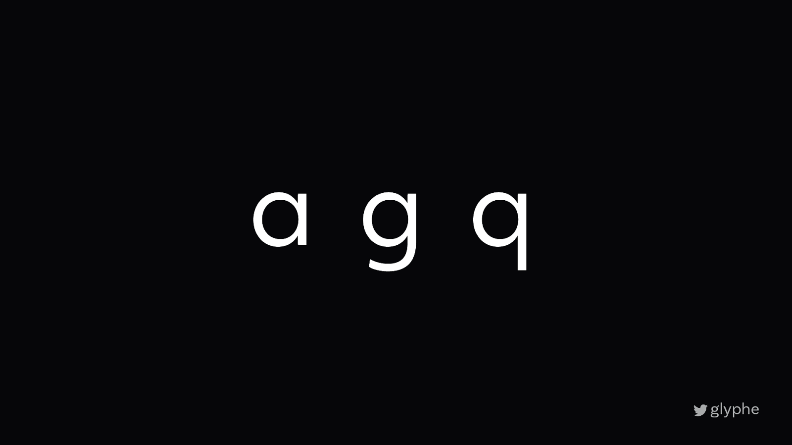
a g q
a g q
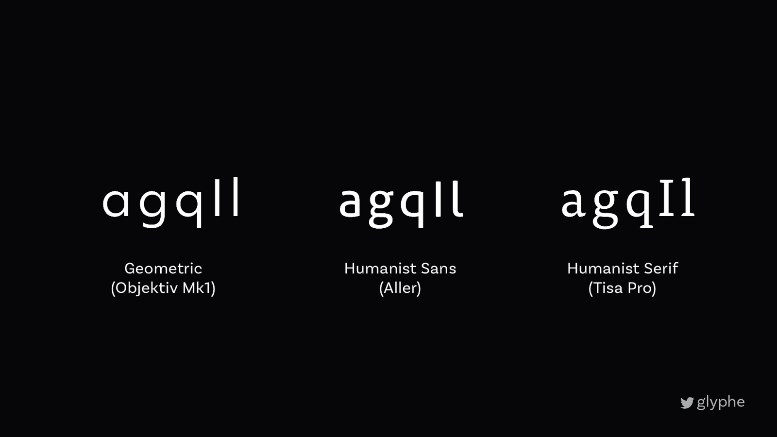
agqIl Geometric (Objektiv Mk1) agqIl Humanist Sans (Aller) agqIl Humanist Serif (Tisa Pro)
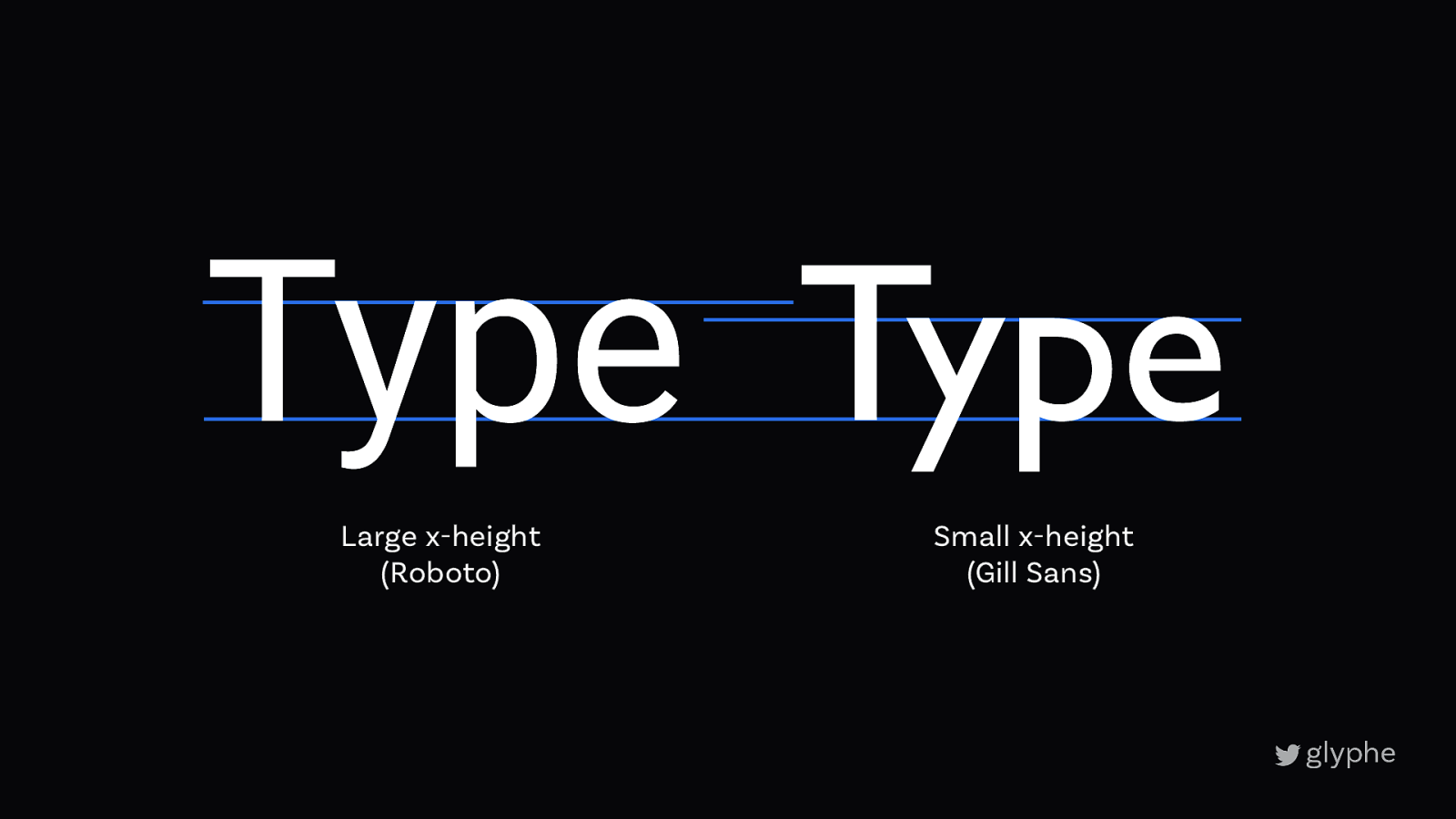
Type Type Large x-height (Roboto) Small x-height (Gill Sans)
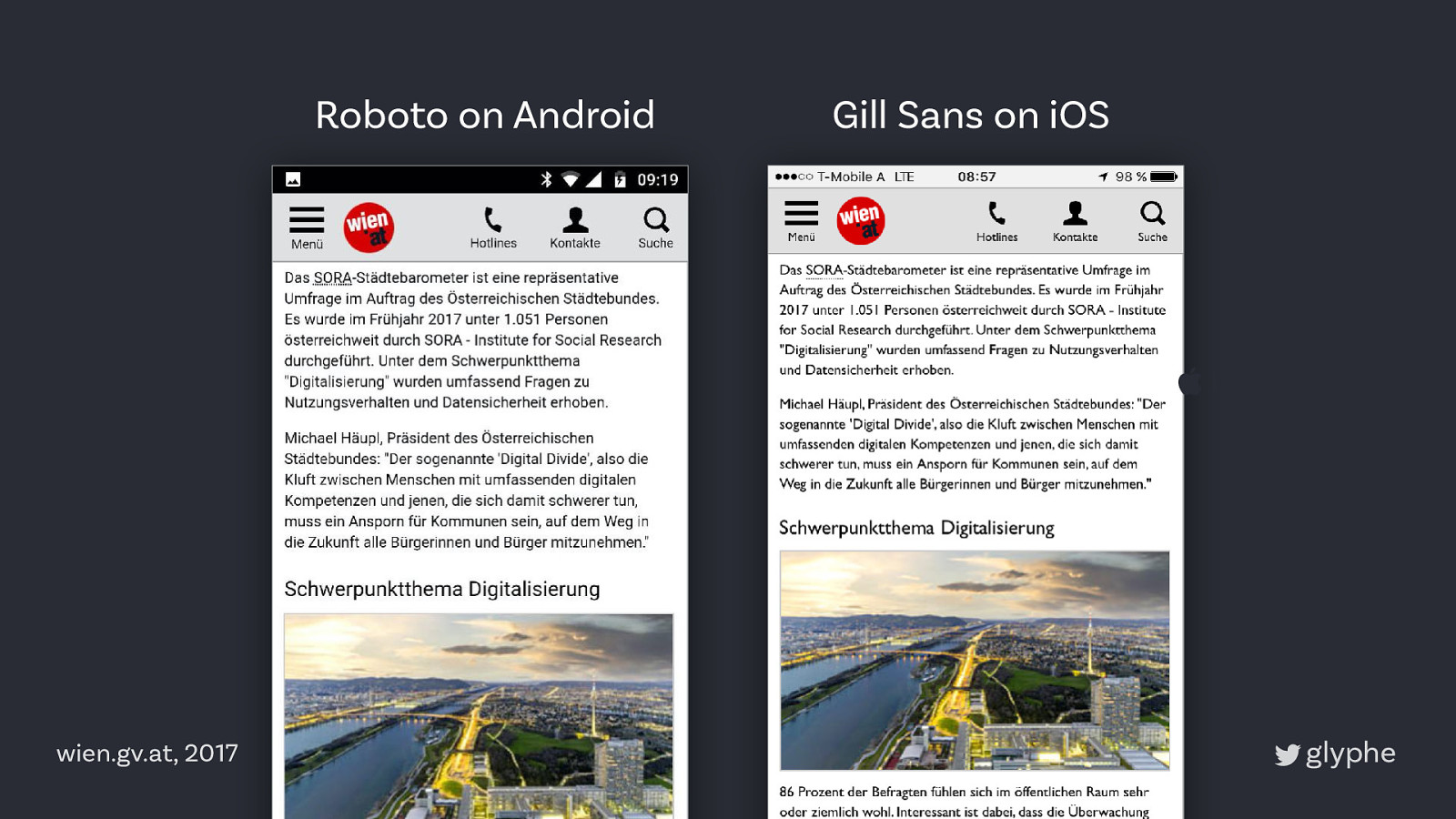
Roboto on Android Gill Sans on iOS ” iOS wien.gv.at, 2017
Body text • Boring is better • Sans and serif are both fine • Look for distinctive letter shapes • Go for larger x-heights
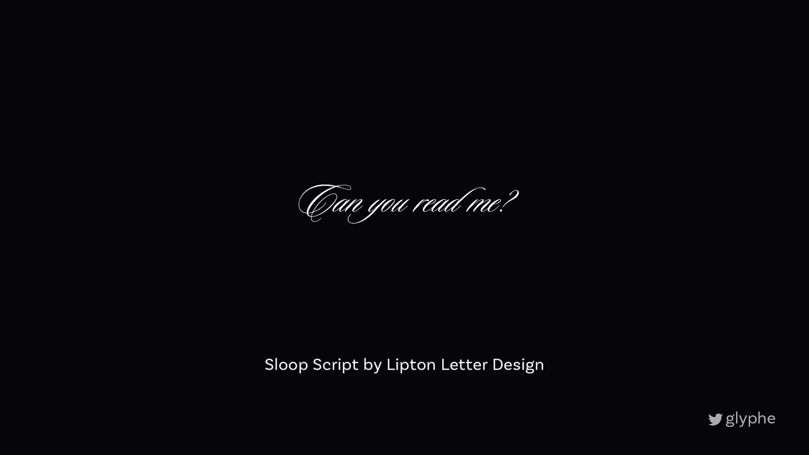
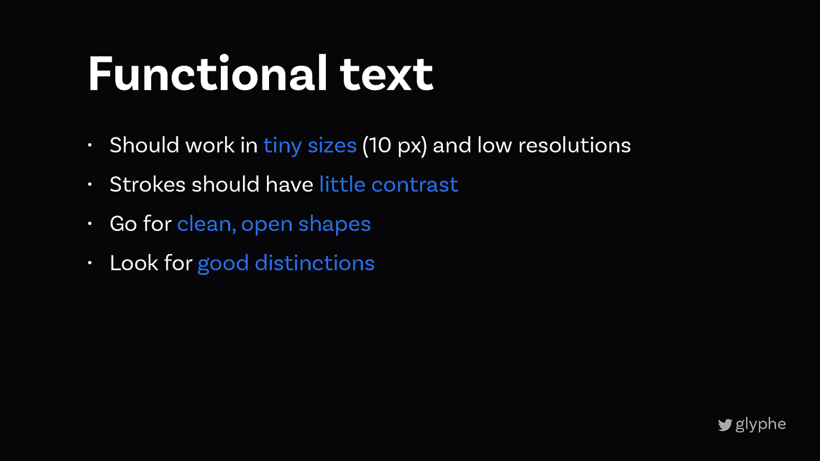
3 Functional text
Can you read me? Sloop Script by Lipton Letter Design
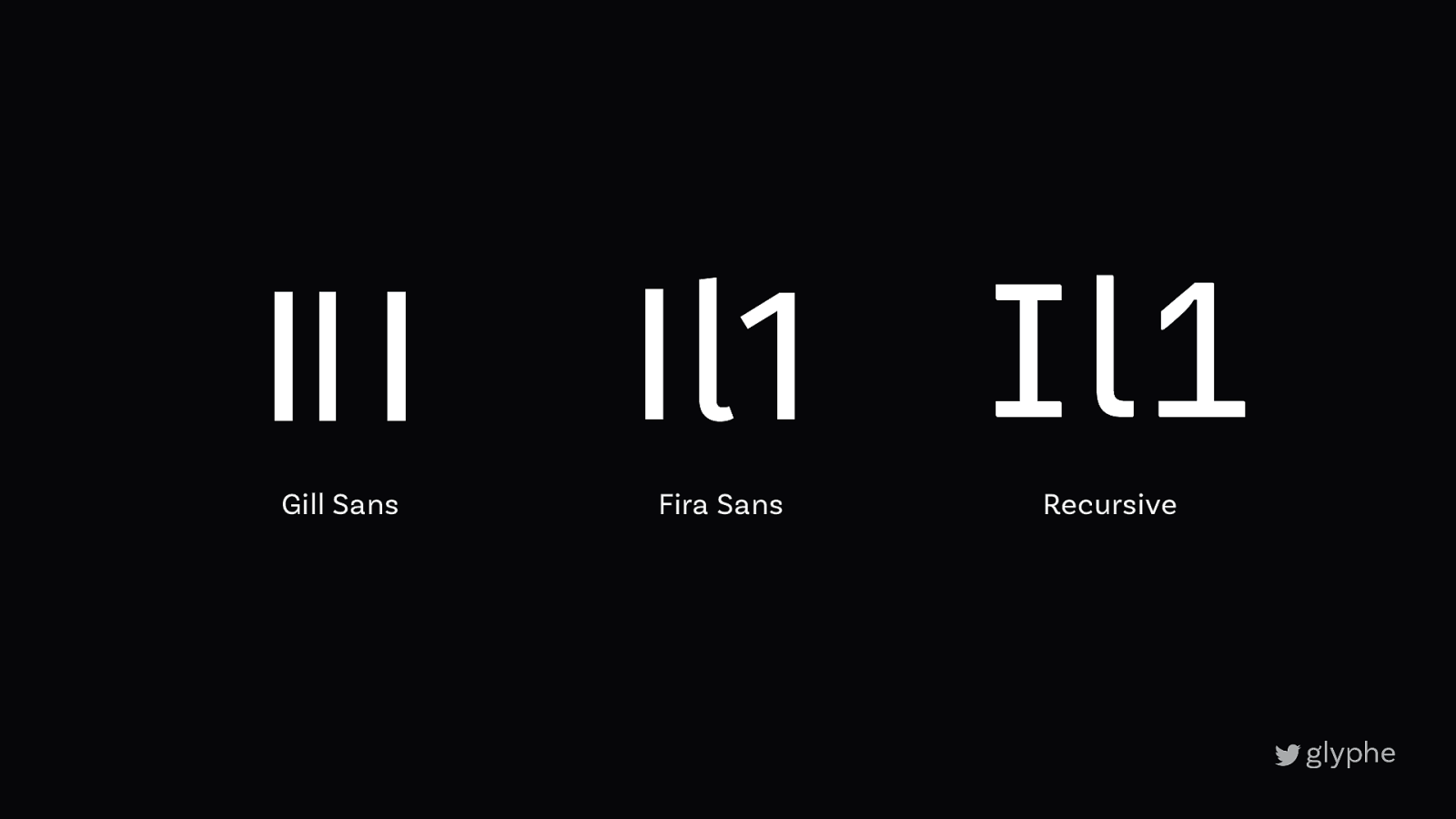
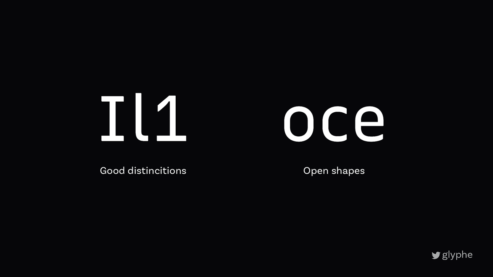
Il1 Il1 Il1 Gill Sans Fira Sans Recursive
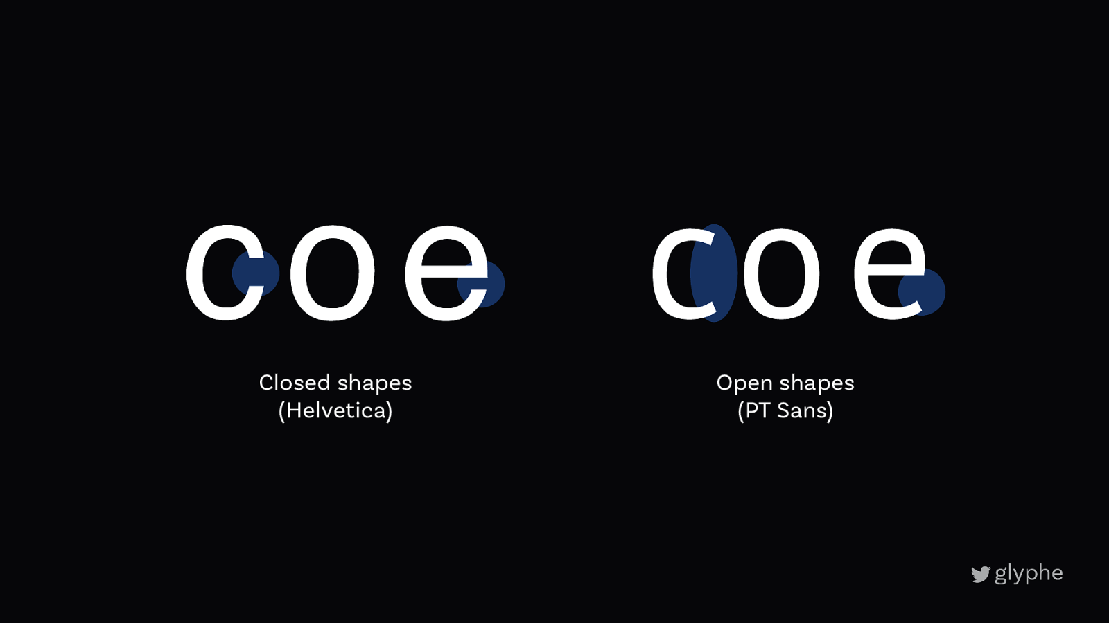
coe coe Closed shapes (Helvetica) Open shapes (PT Sans)
coe coe Closed shapes (Helvetica) Open shapes (PT Sans)
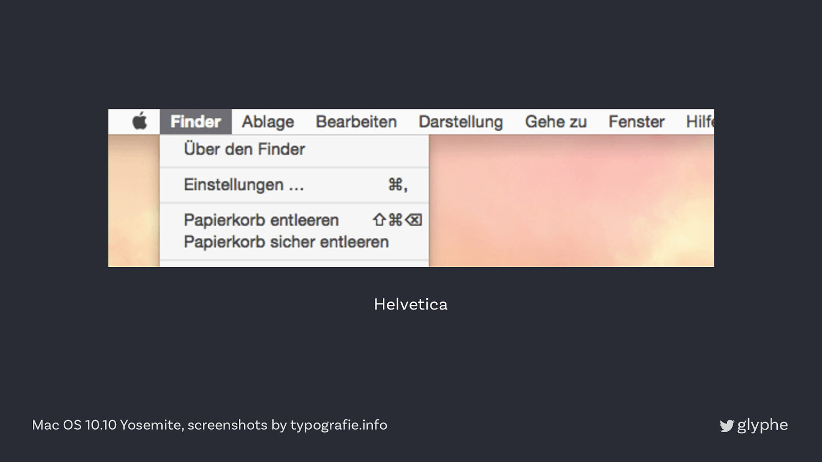
Helvetica Mac OS 10.10 Yosemite, screenshots by typografie.info
Lucida Grande Mac OS 10.10 Yosemite, screenshots by typografie.info
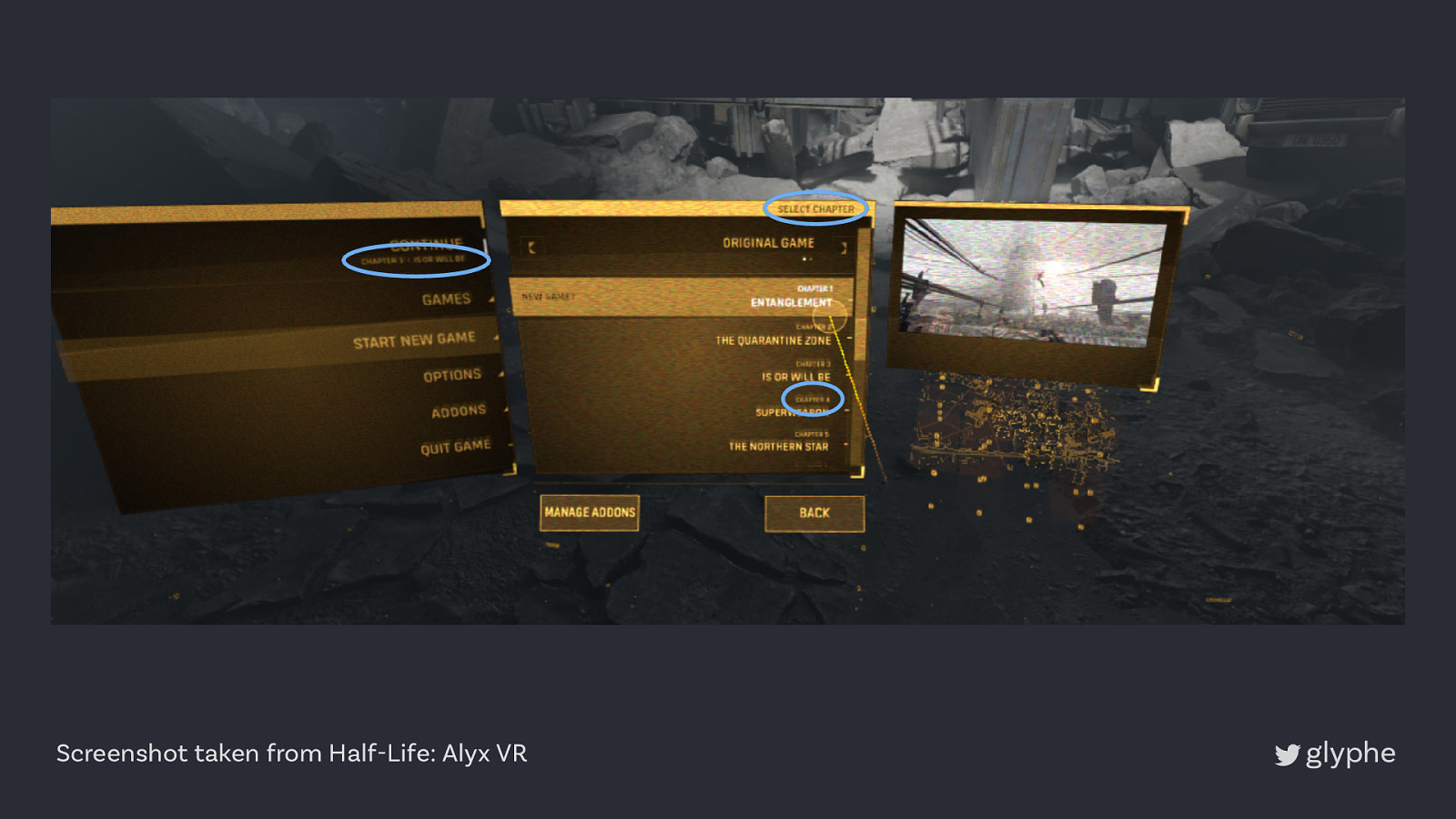
Screenshot taken from Half-Life: Alyx VR
Functional text • Should work in tiny sizes (10 px) and low resolutions • Strokes should have little contrast • Go for clean, open shapes • Look for good distinctions
3
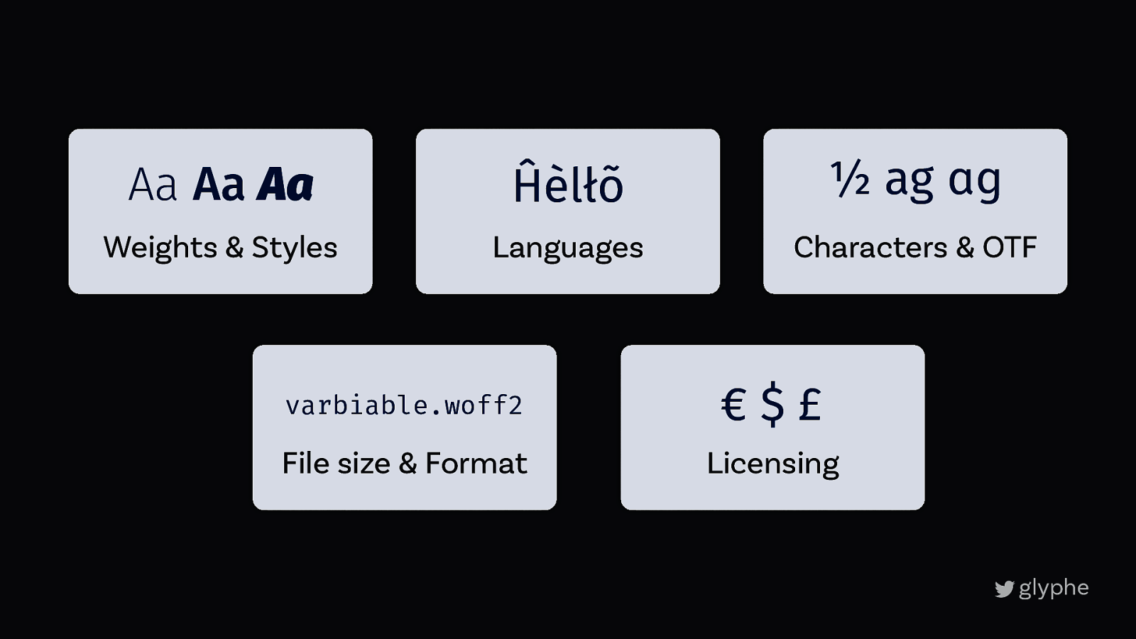
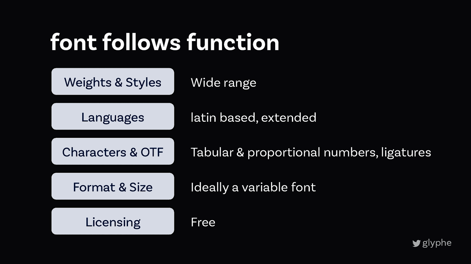
3 Font follows function
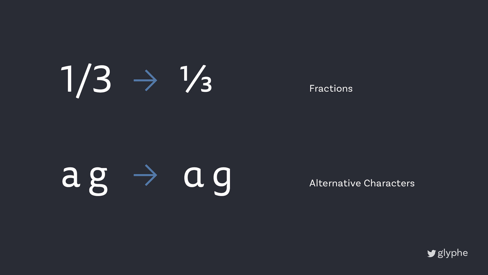
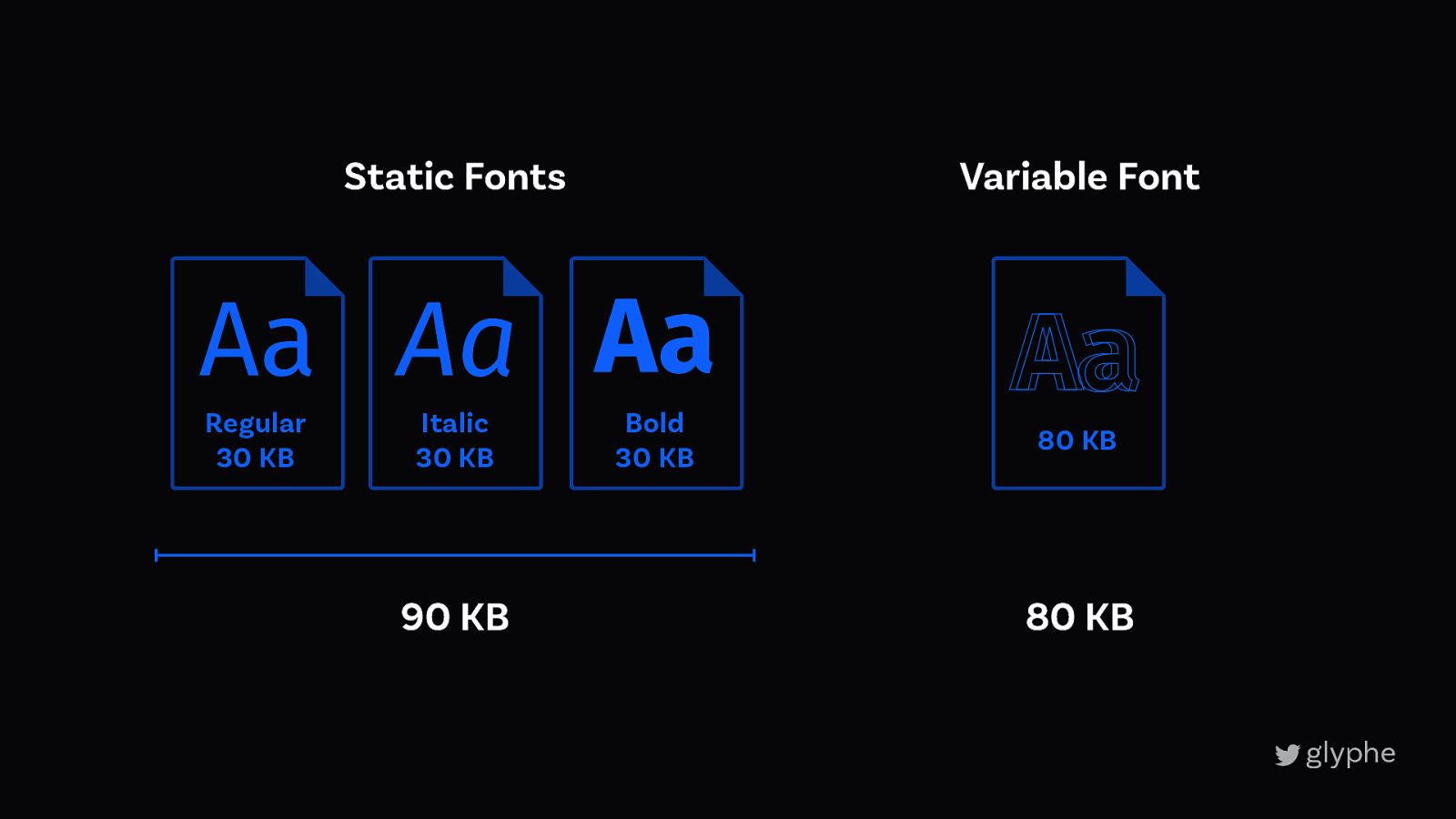
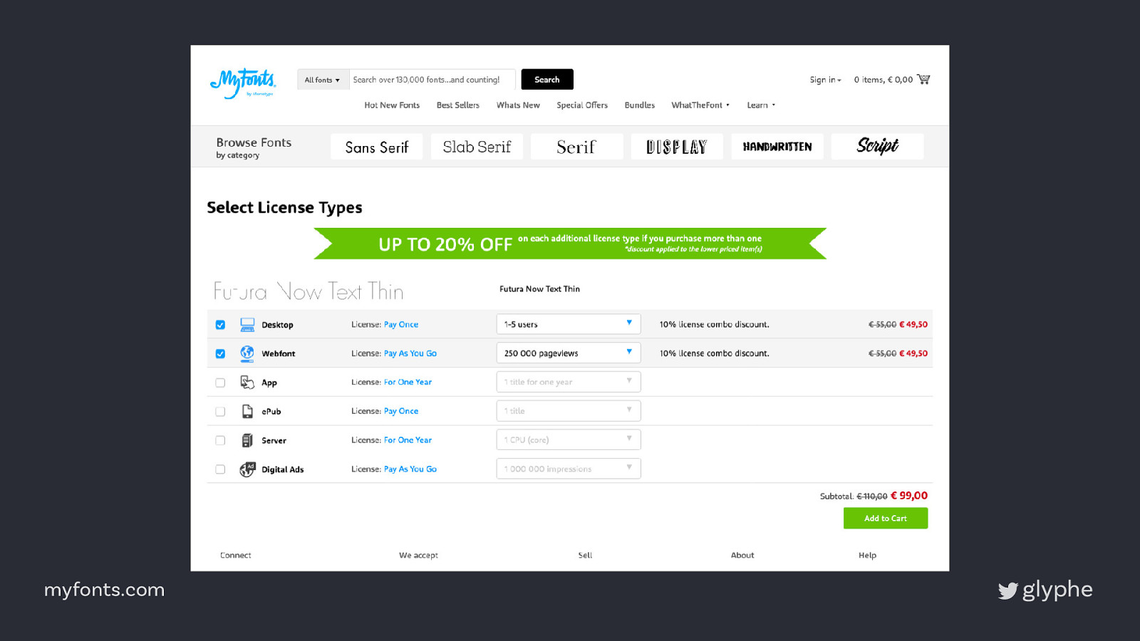
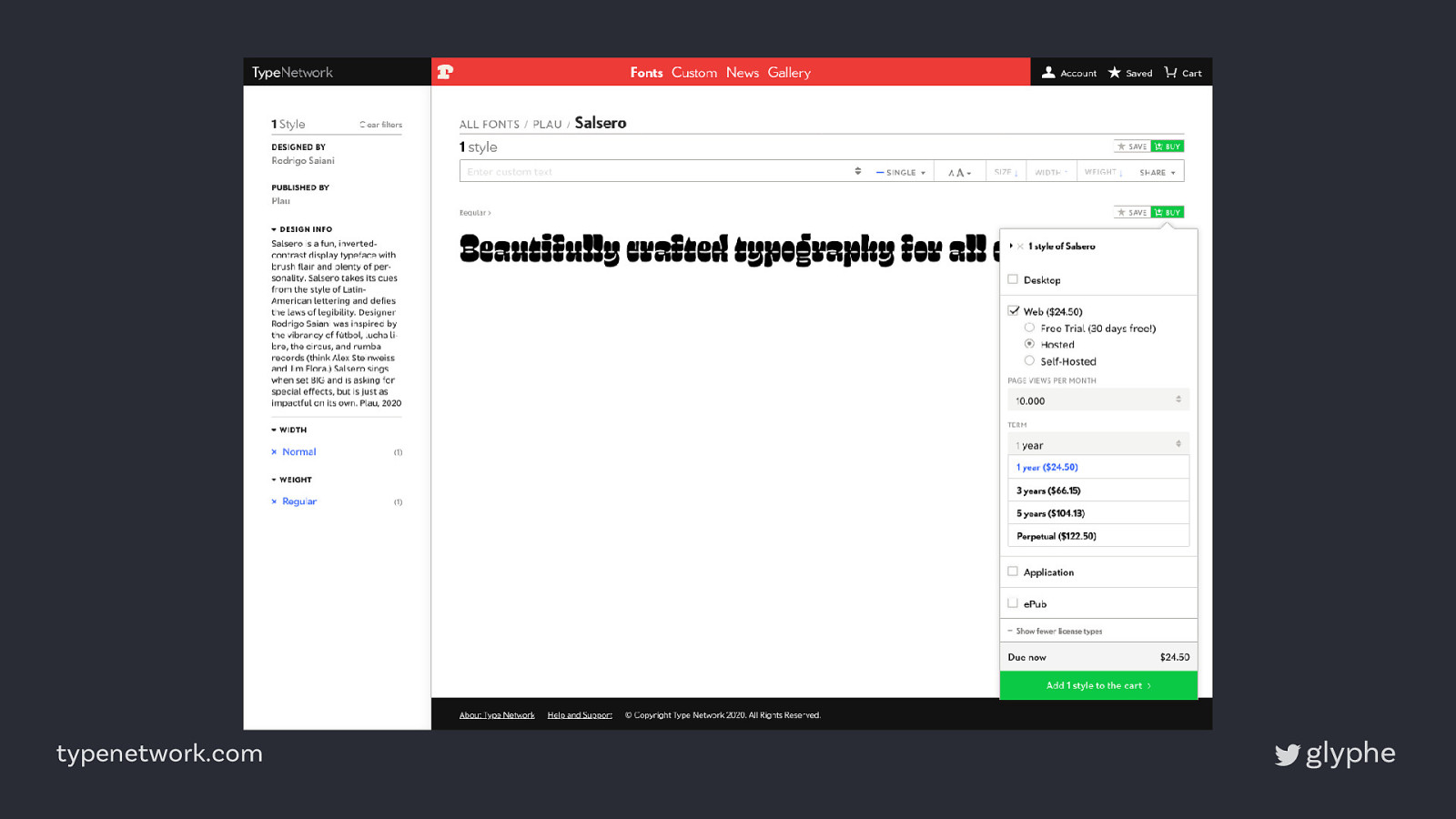
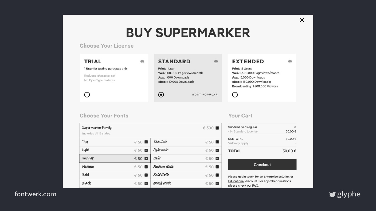
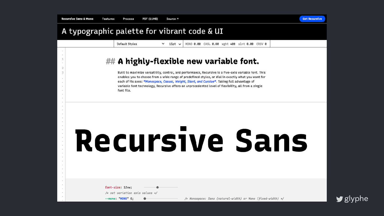
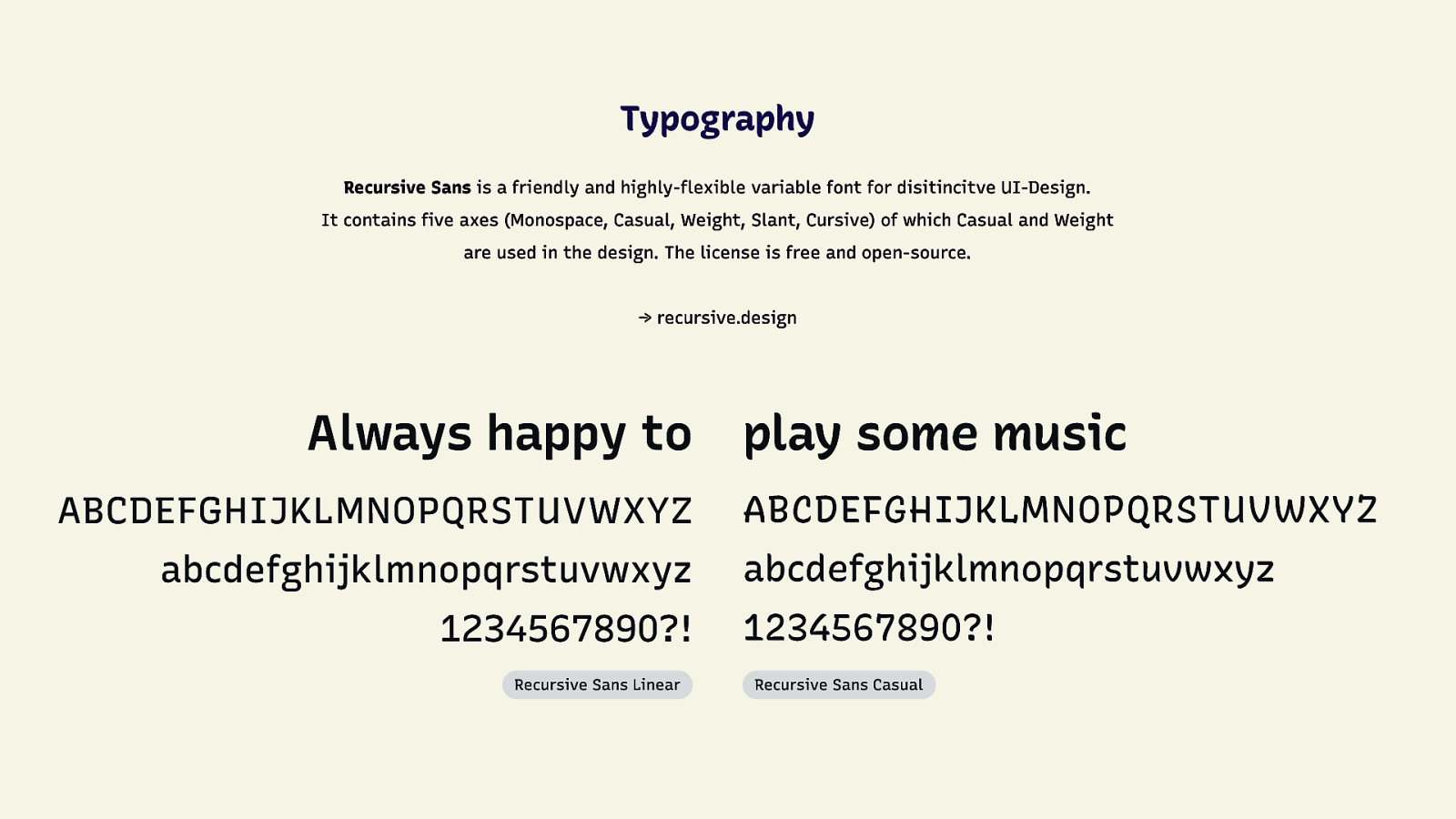
Aa Aa Aa Ĥèlłõ 1⁄2 ag ag Weights & Styles Languages Characters & OTF varbiable.woff2 €$£ File size & Format Licensing
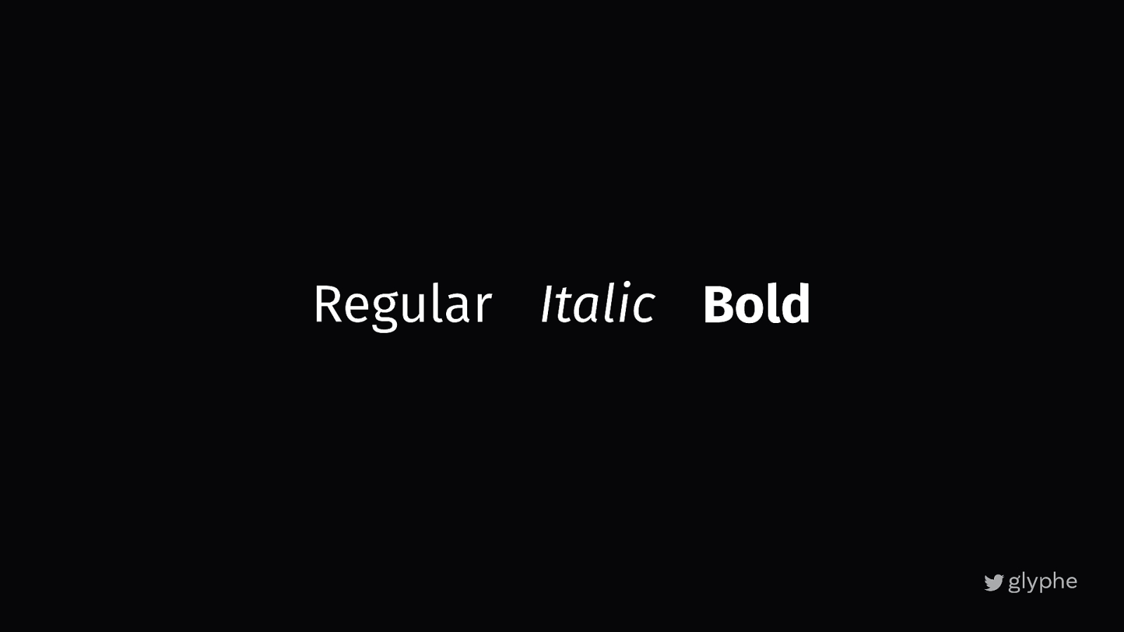
Regular Italic Bold
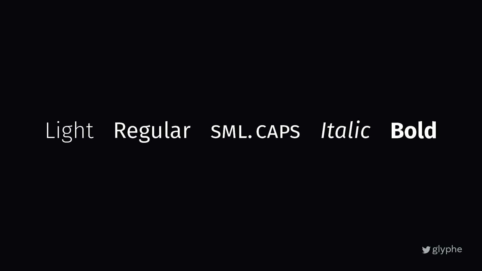
Light Regular sml. caps Italic Bold
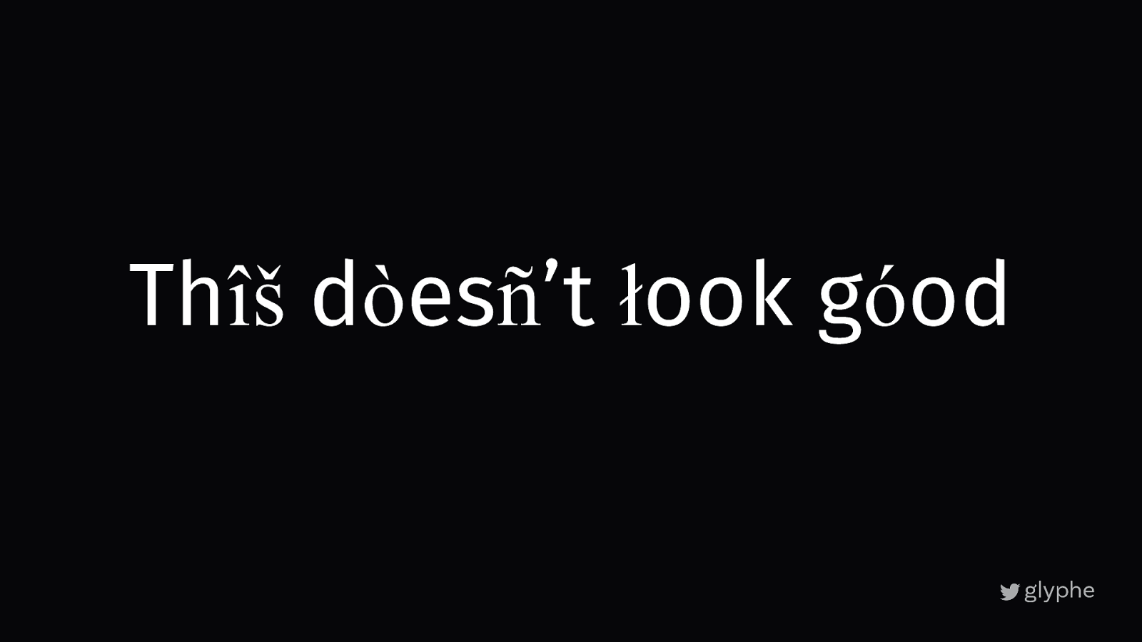
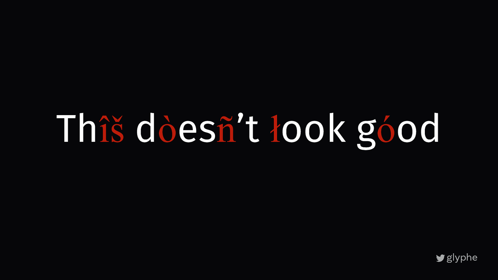
Thîš dòesñ’t łook góod
Thîš dòesñ’t łook góod
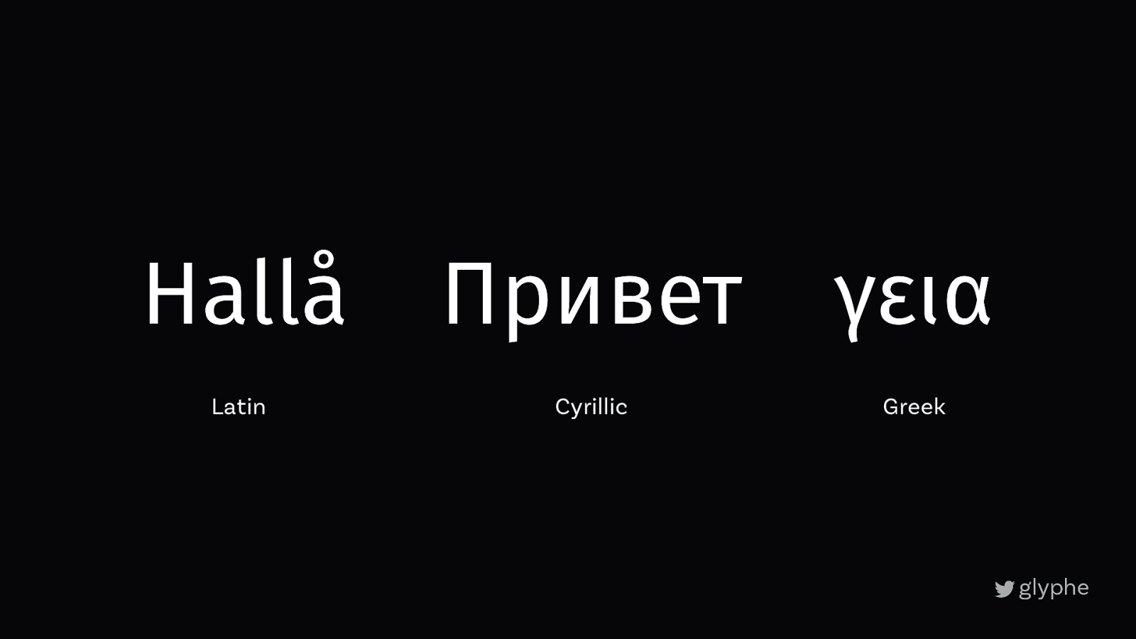
Hallå Привет γεια Latin Cyrillic Greek
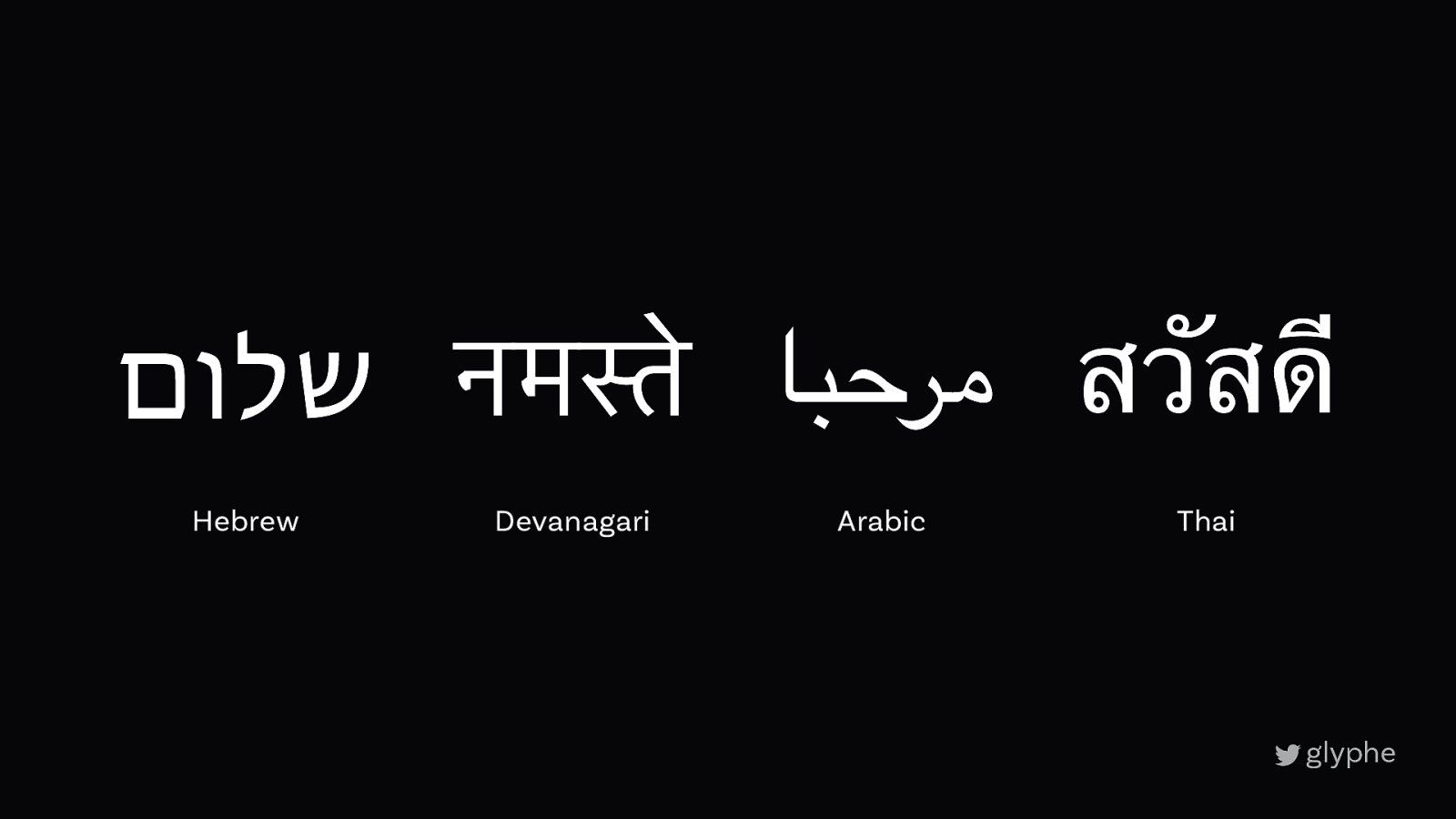
مرحبا สวัสดี नमस्ते שלום Hebrew Devanagari Arabic Thai
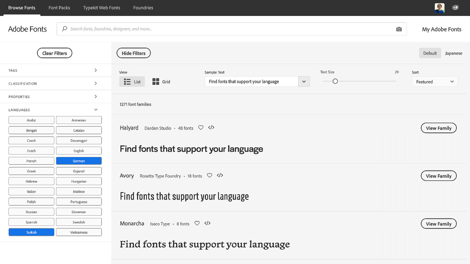
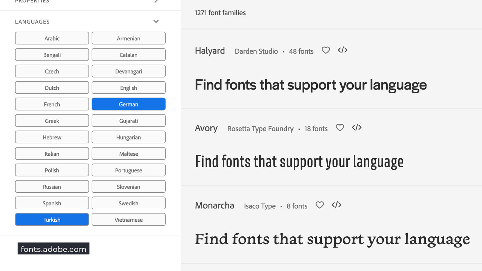
fonts.adobe.com
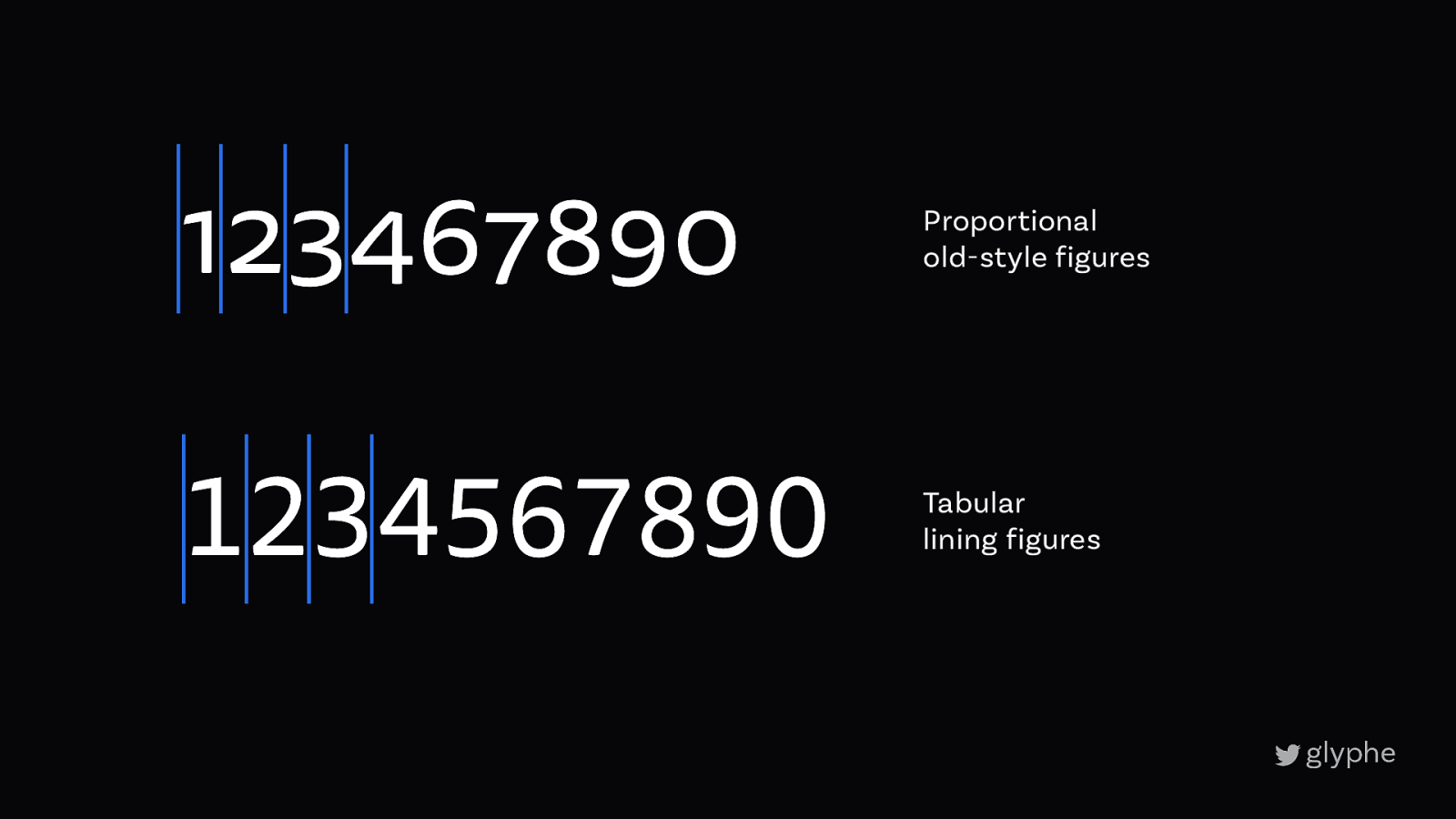
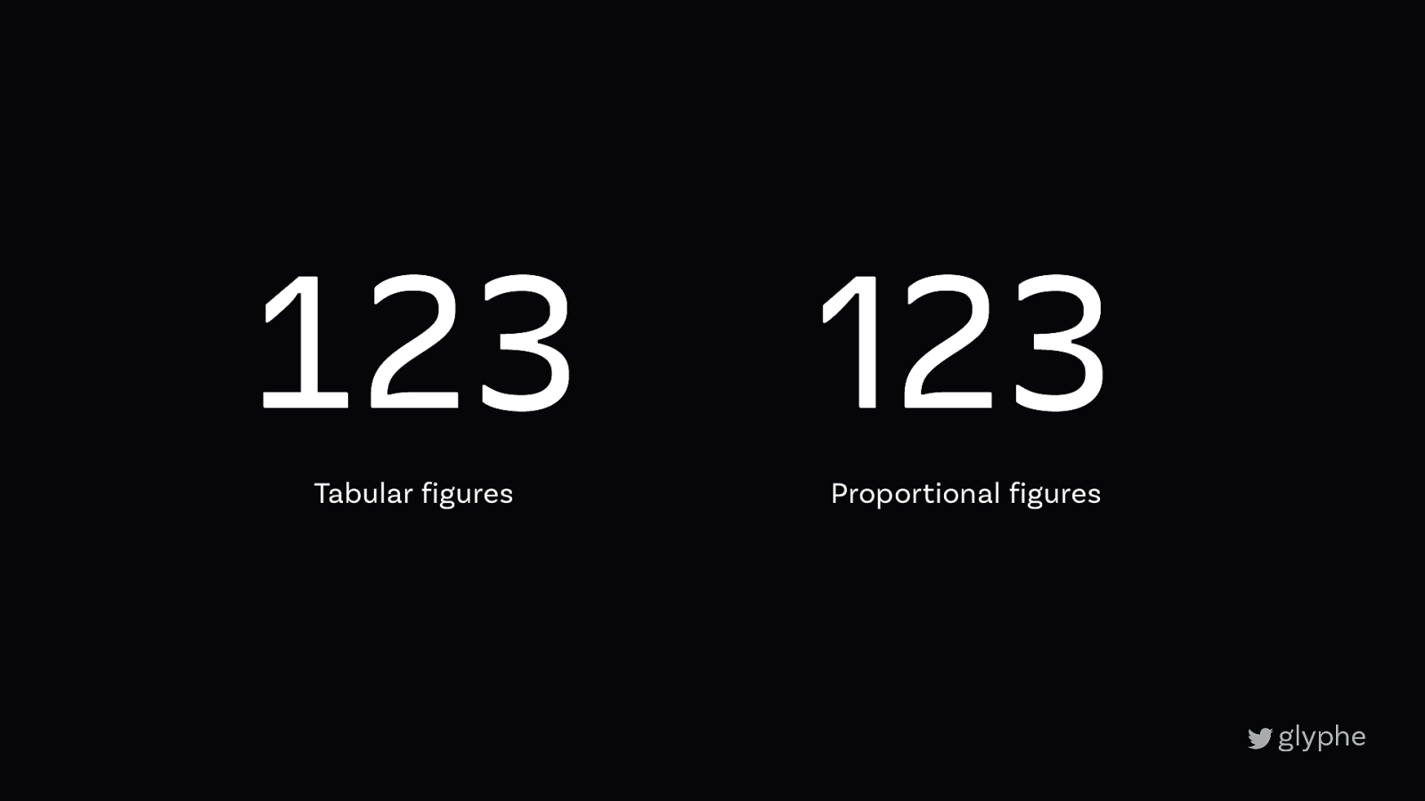
123467890 Proportional old-style figures 1234567890 Tabular lining figures
1/3 → 1⁄3 ag → ag Fractions Alternative Characters
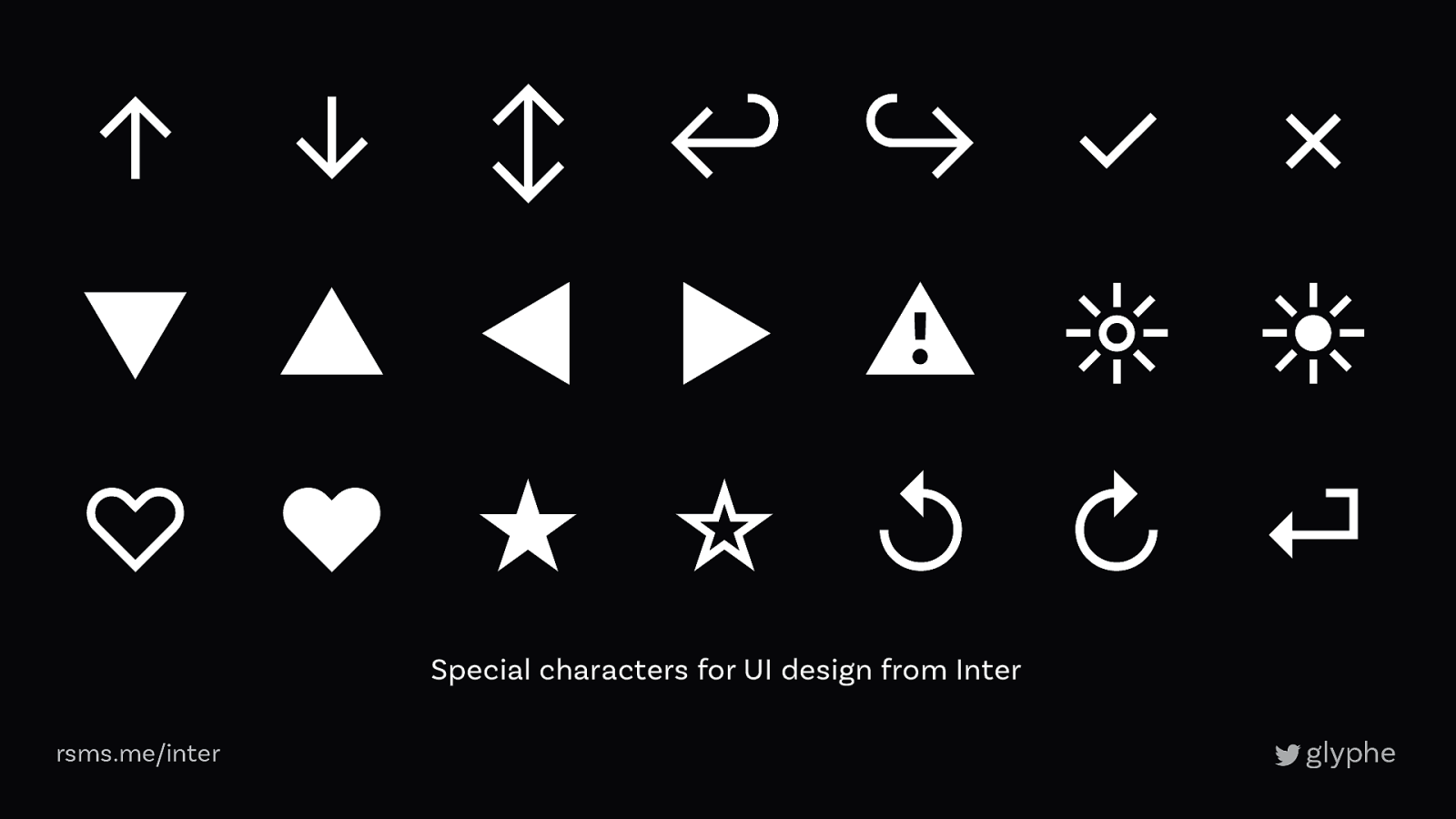
↑ ↓ ↕ ↩ ↪ ✓ ✗ ▼ ▲ ◀ ▶ ⚠ ☼ ☀ ♡ ♥ ★ ☆ ↺ ↻ ⏎ Special characters for UI design from Inter rsms.me/inter
Static Fonts Variable Font Aa Aa Aa Aa Regular 30 KB Italic 30 KB 90 KB Bold 30 KB 80 KB 80 KB
myfonts.com
typenetwork.com
fontwerk.com
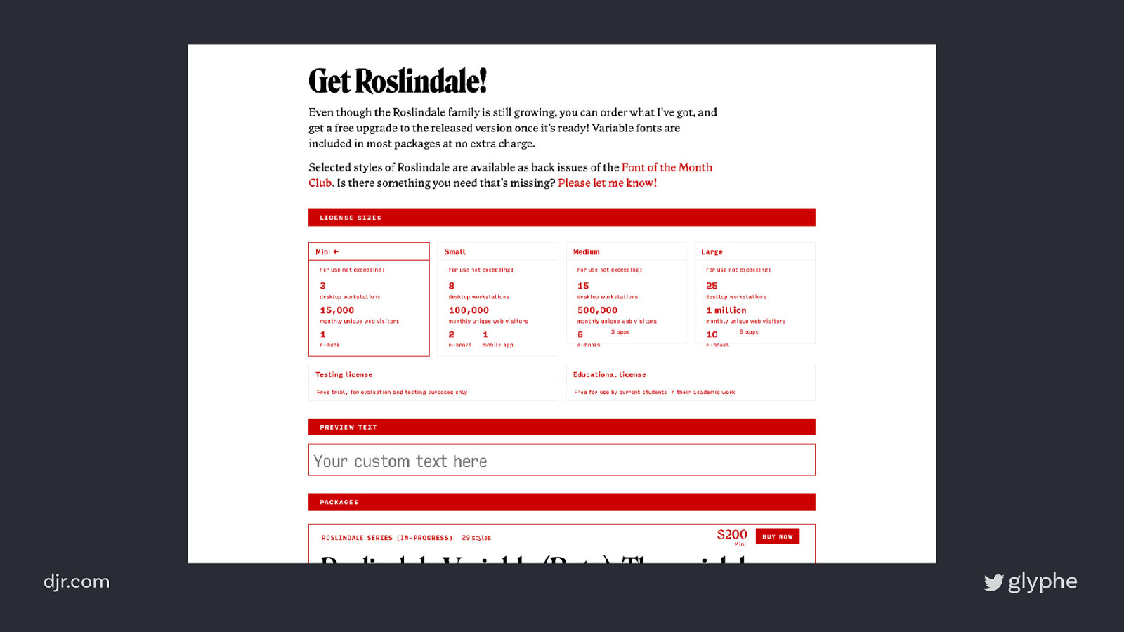
djr.com
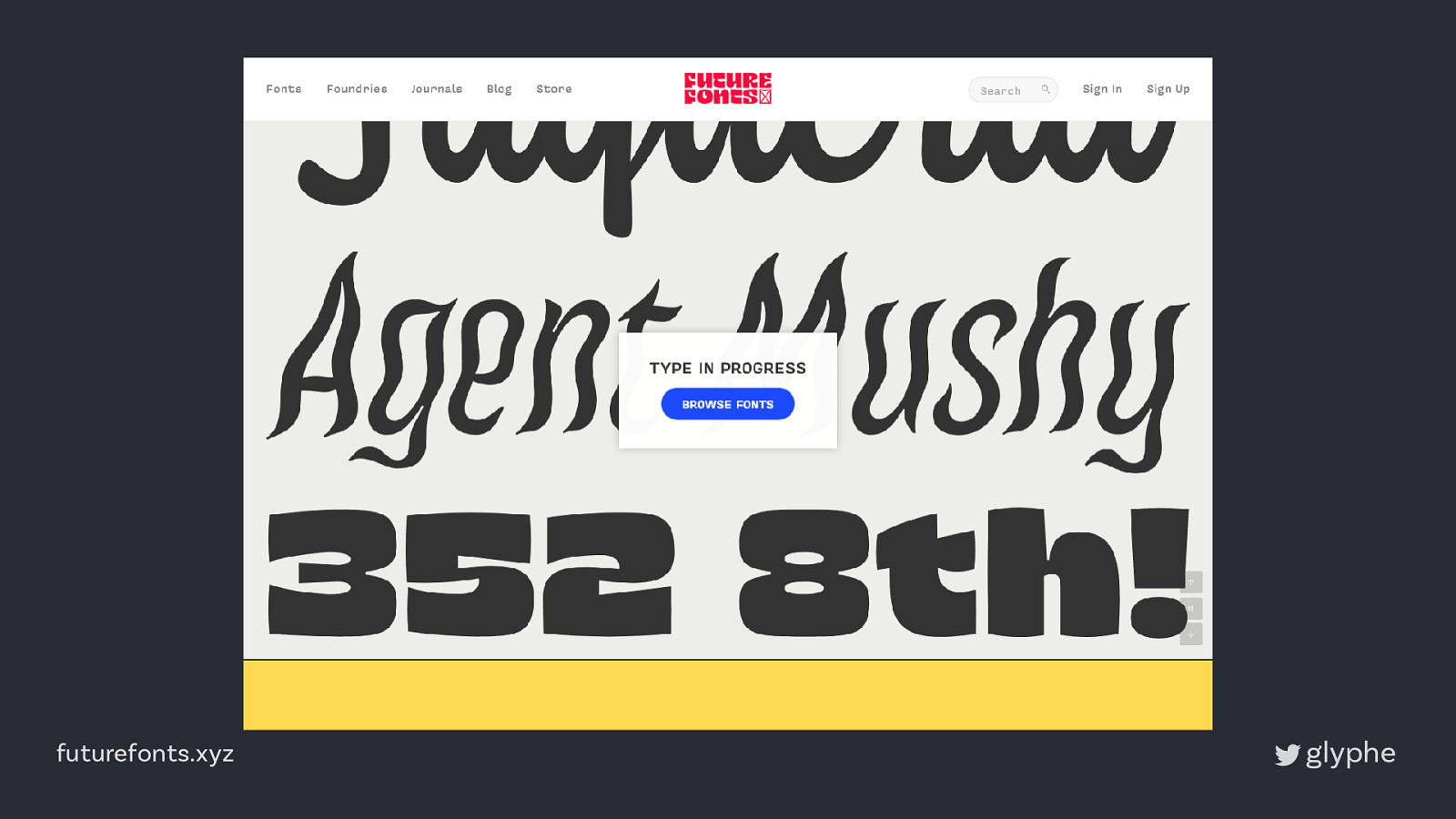
futurefonts.xyz
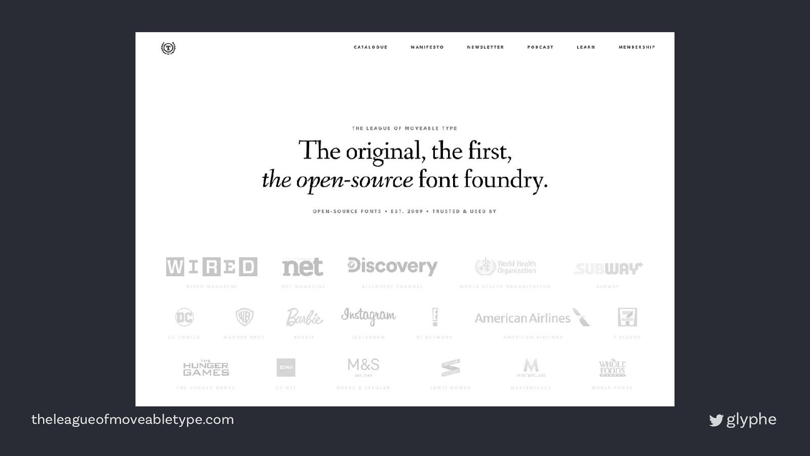
theleagueofmoveabletype.com
4
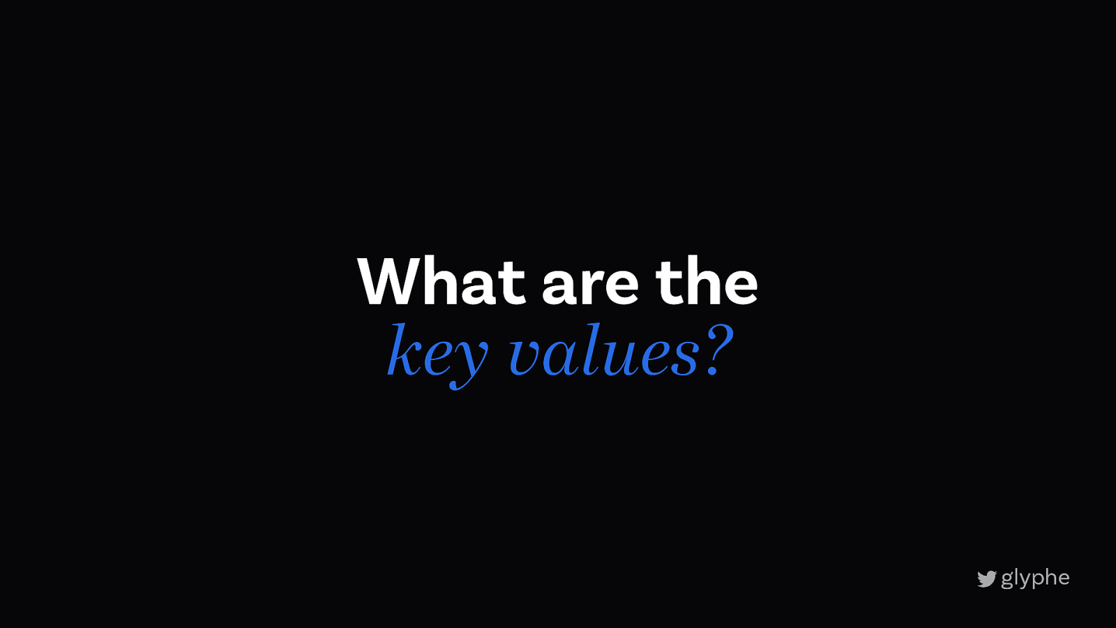
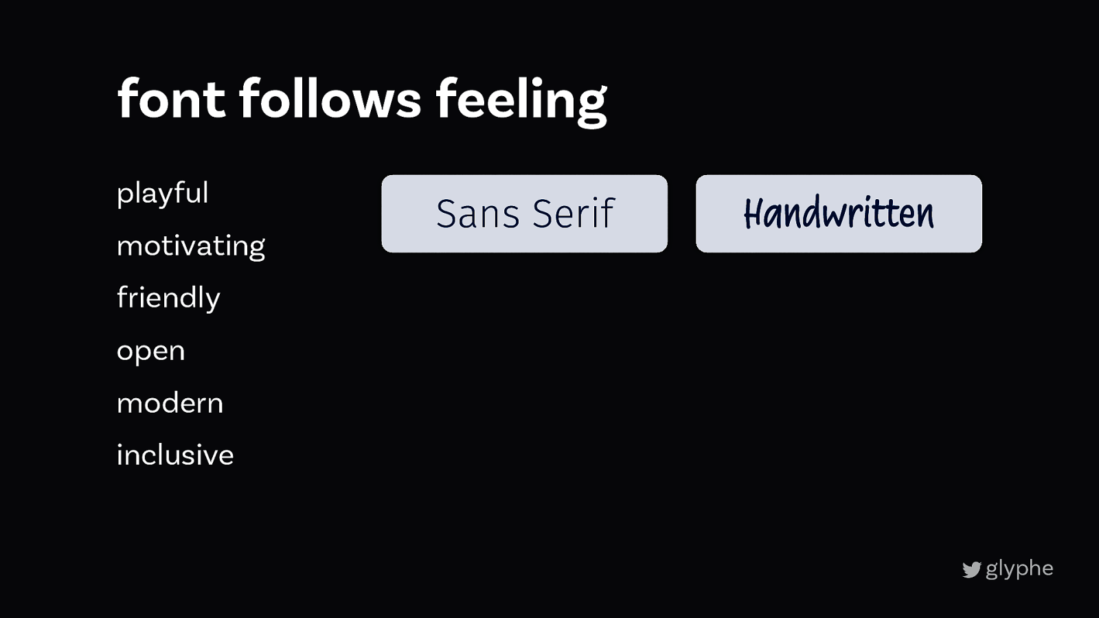
4 Font follows feeling
What are the key values?
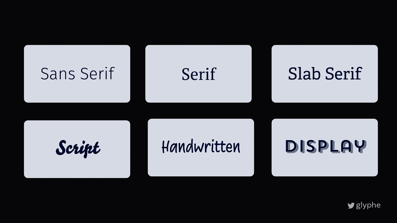
Sans Serif Serif Slab Serif Script Handwritten Display
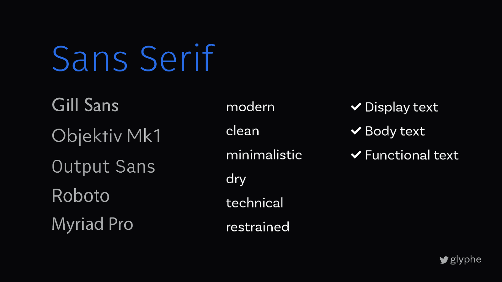
Sans Serif Gill Sans modern ! Display text Objektiv Mk1 clean ! Body text minimalistic ! Functional text Output Sans Roboto Myriad Pro dry technical restrained
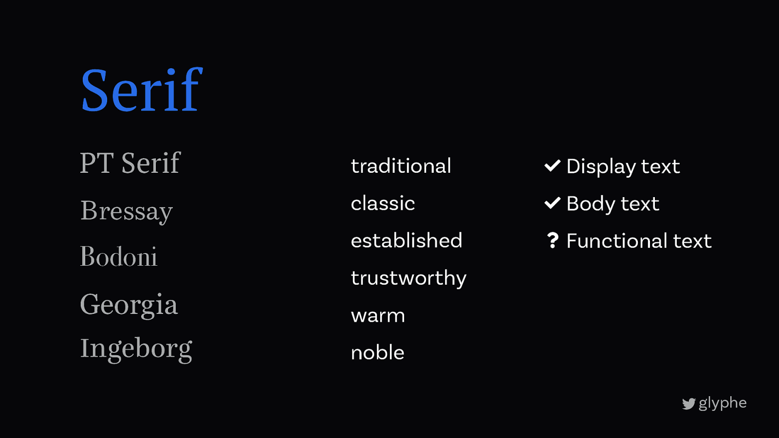
Serif PT Serif traditional ! Display text Bressay classic ! Body text established ? Functional text Bodoni Georgia Ingeborg trustworthy warm noble
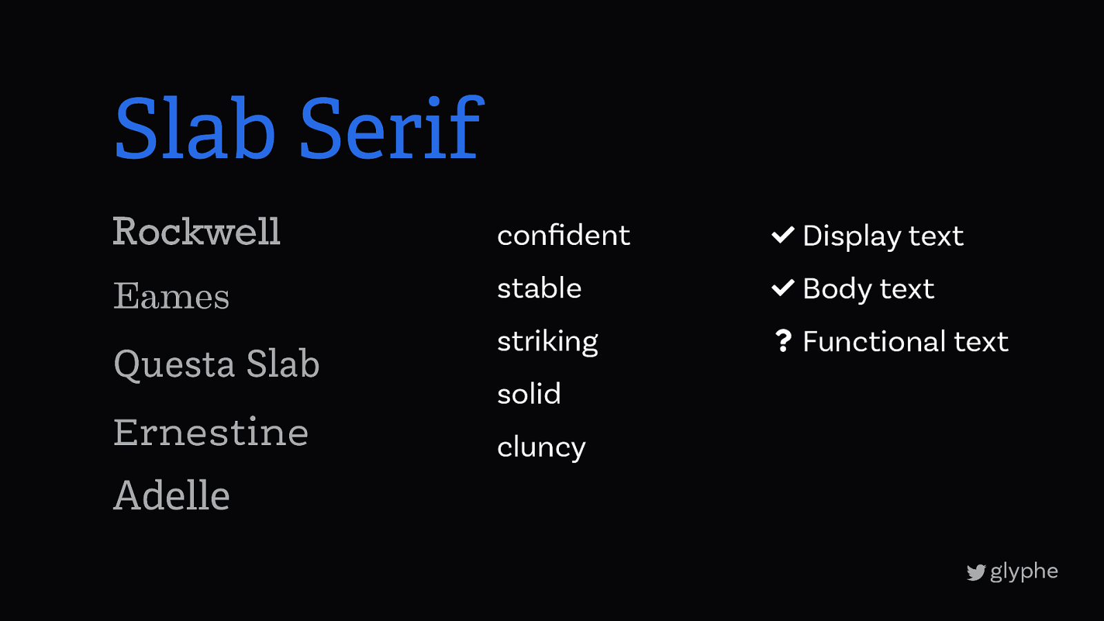
Slab Serif Rockwell confident ! Display text Eames stable ! Body text striking ? Functional text Questa Slab Ernestine solid cluncy Adelle
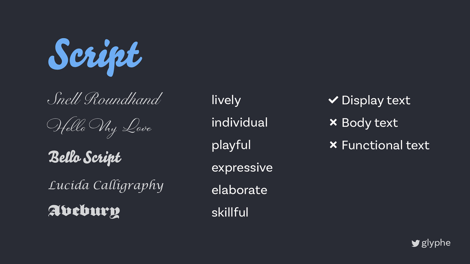
Script Snell Roundhand lively ! Display text He!o My Love individual ” Body text playful ” Functional text Bello Script expressive Lucida Calligraphy elaborate Avebury skillful
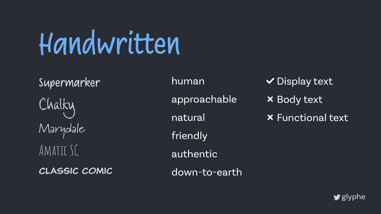
Handwritten Supermarker human ! Display text Chalky approachable ” Body text natural ” Functional text Marydale friendly Amatic SC authentic Classic Comic down-to-earth
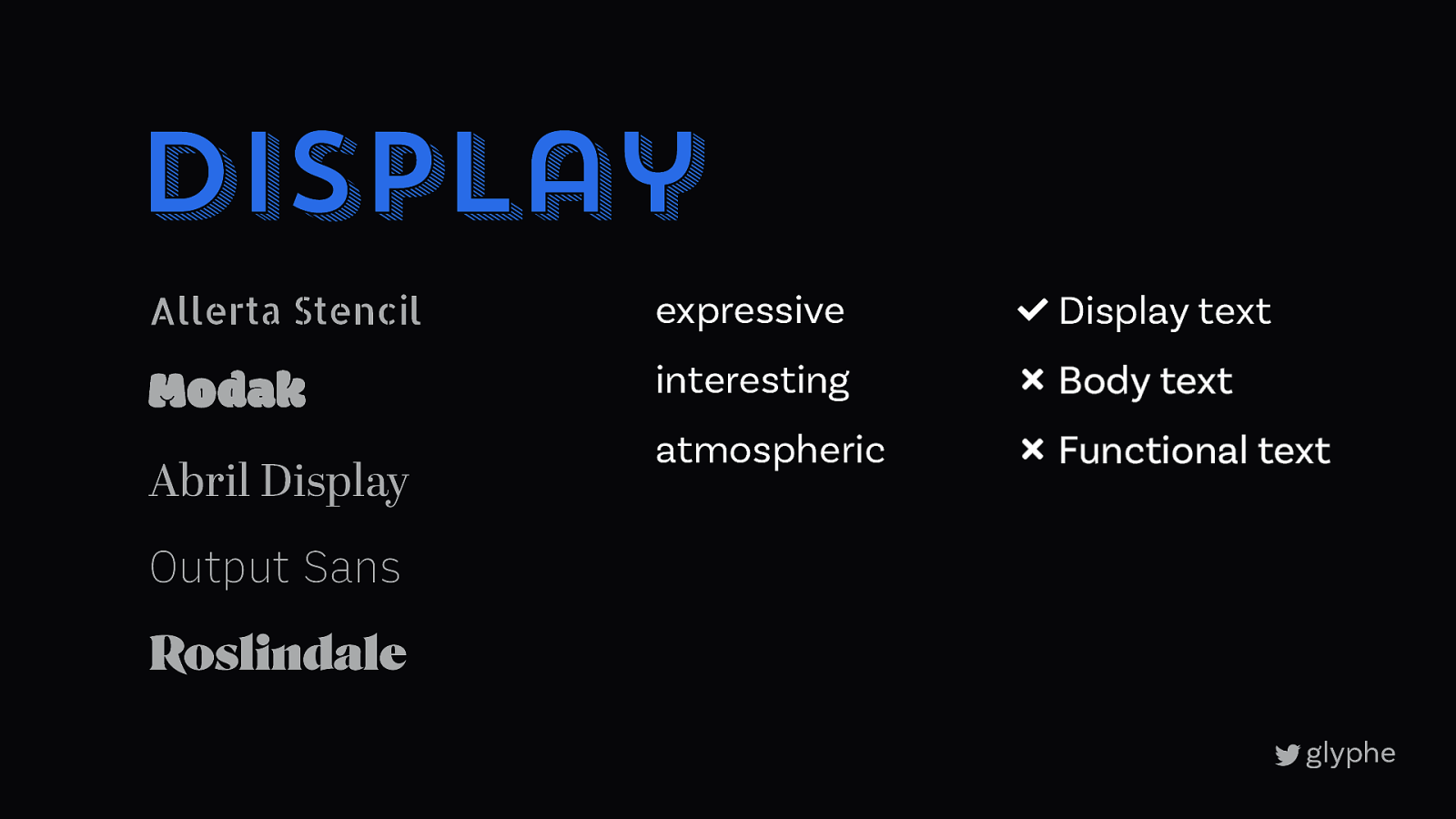
Display Allerta Stencil expressive ! Display text Modak interesting ” Body text atmospheric ” Functional text Abril Display Output Sans Roslindale
5
5 Bringing it together
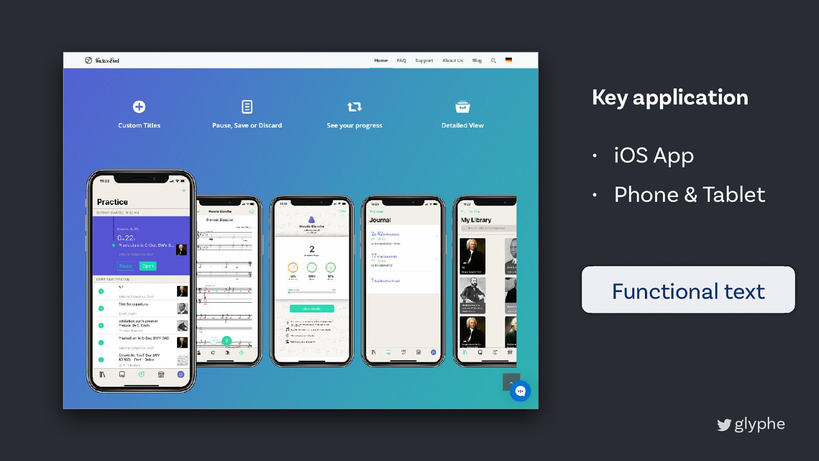
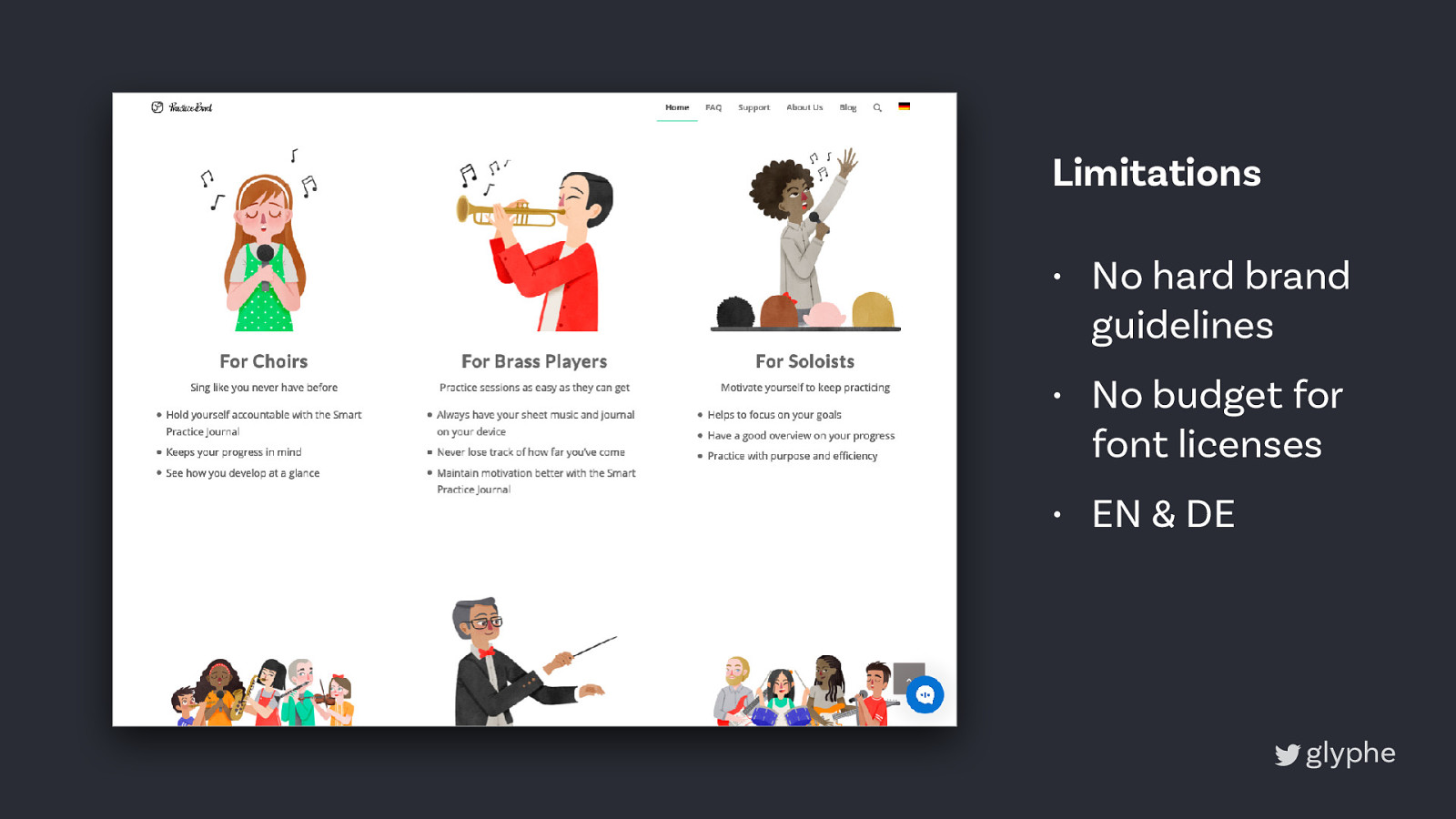
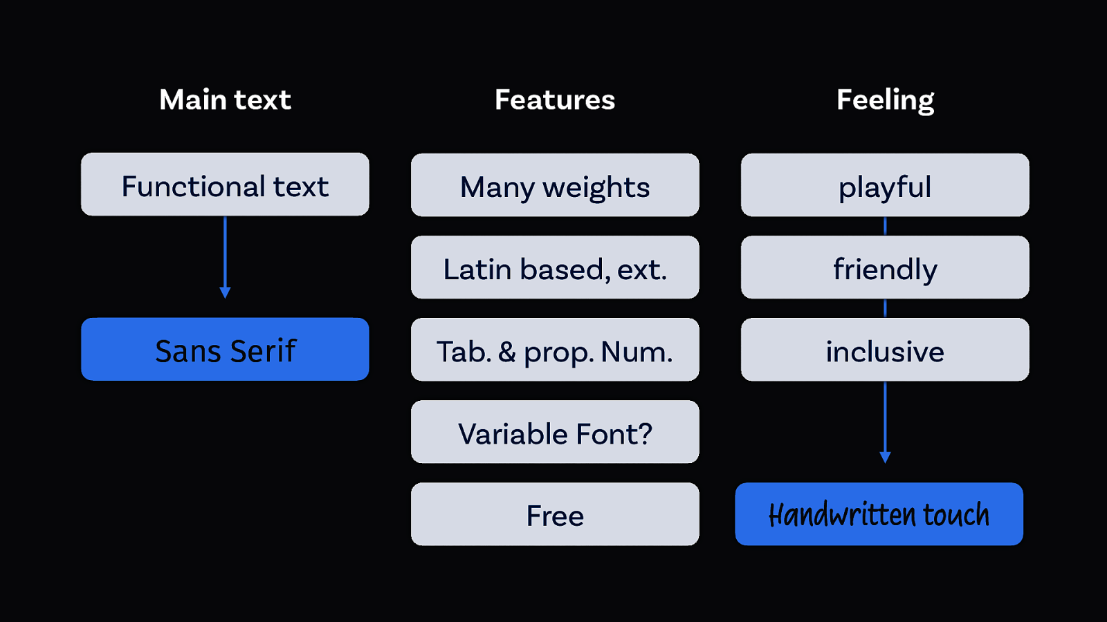
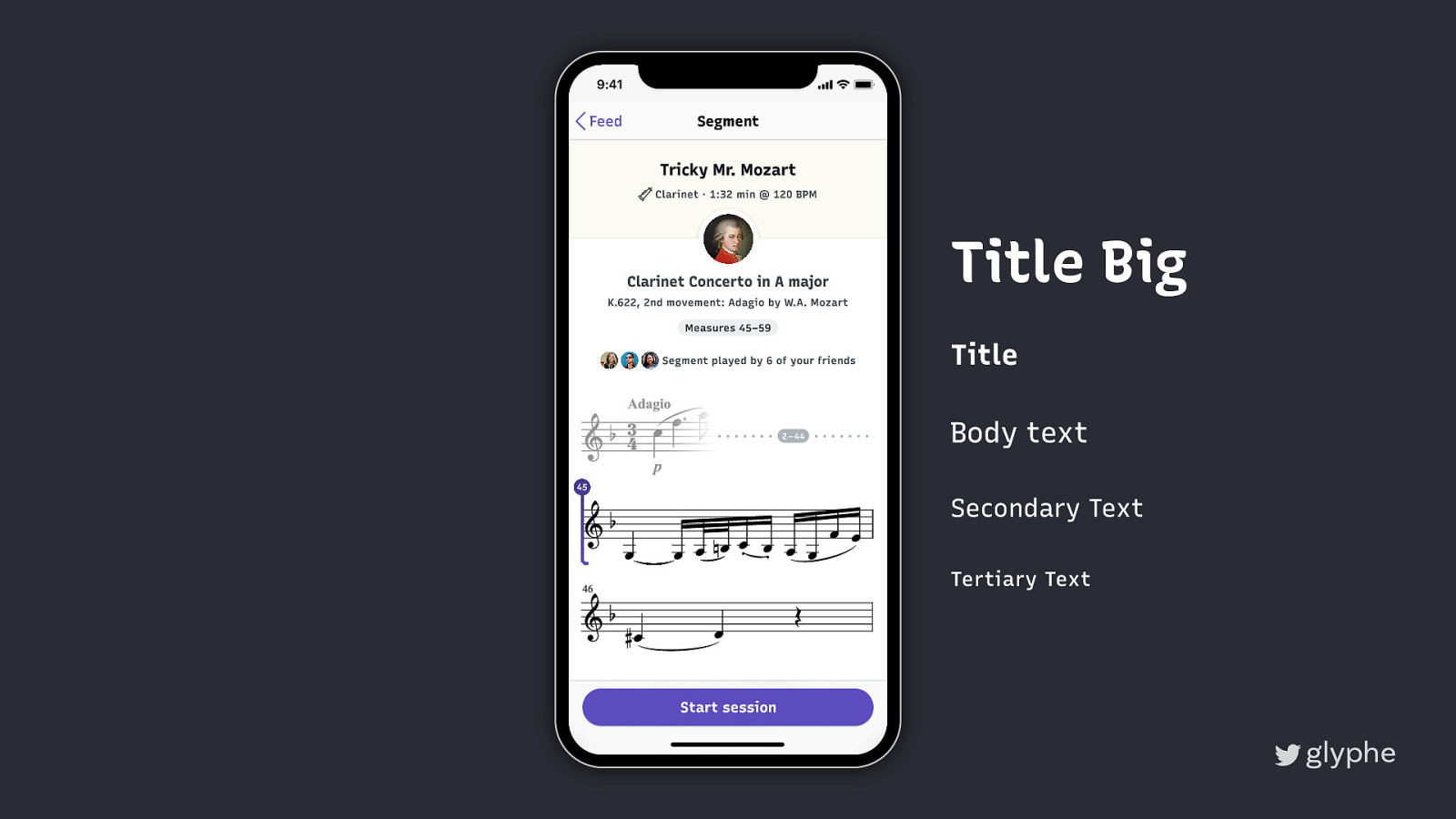
Key application • iOS App • Phone & Tablet Functional text
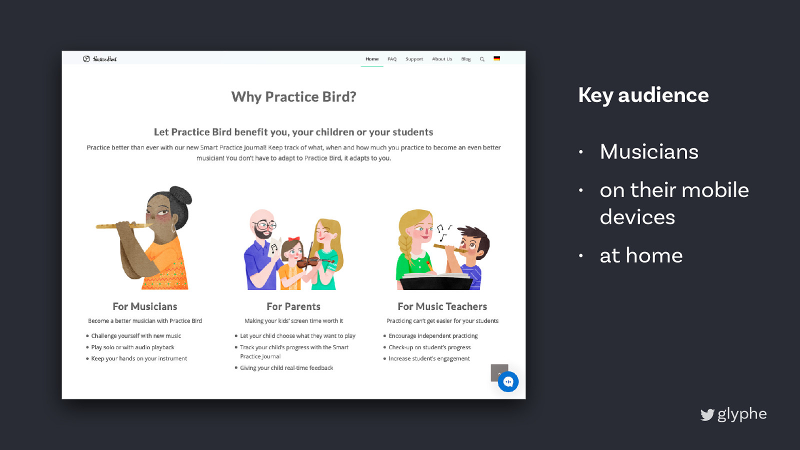
Key audience • Musicians • on their mobile devices • at home
Limitations • No hard brand guidelines • No budget for font licenses • EN & DE
font follows function Weights & Styles Languages Characters & OTF Format & Size Licensing Wide range latin based, extended Tabular & proportional numbers, ligatures Ideally a variable font Free
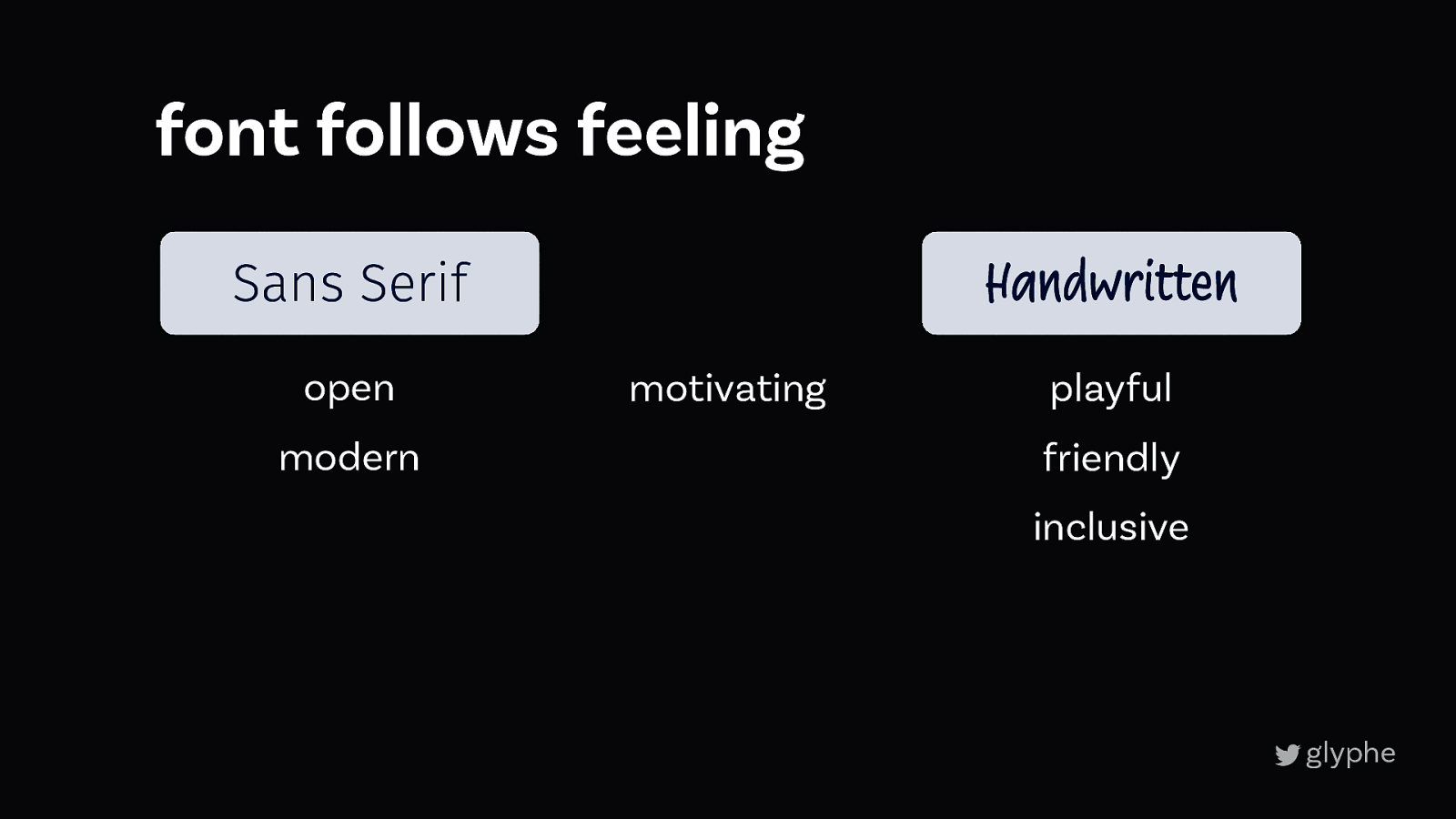
font follows feeling playful motivating Sans Serif Handwritten friendly open modern inclusive
font follows feeling Handwritten Sans Serif open modern motivating playful friendly inclusive
Main text Features Feeling Functional text Many weights playful Latin based, ext. friendly Tab. & prop. Num. inclusive Sans Serif Variable Font? Free Handwritten touch
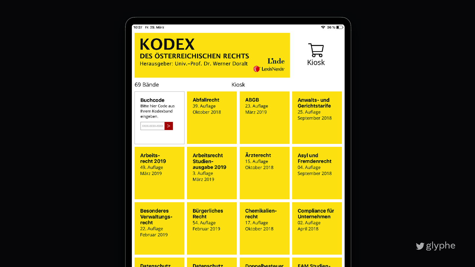
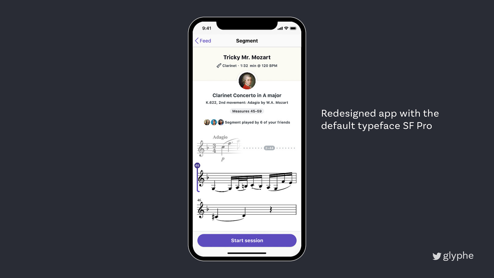
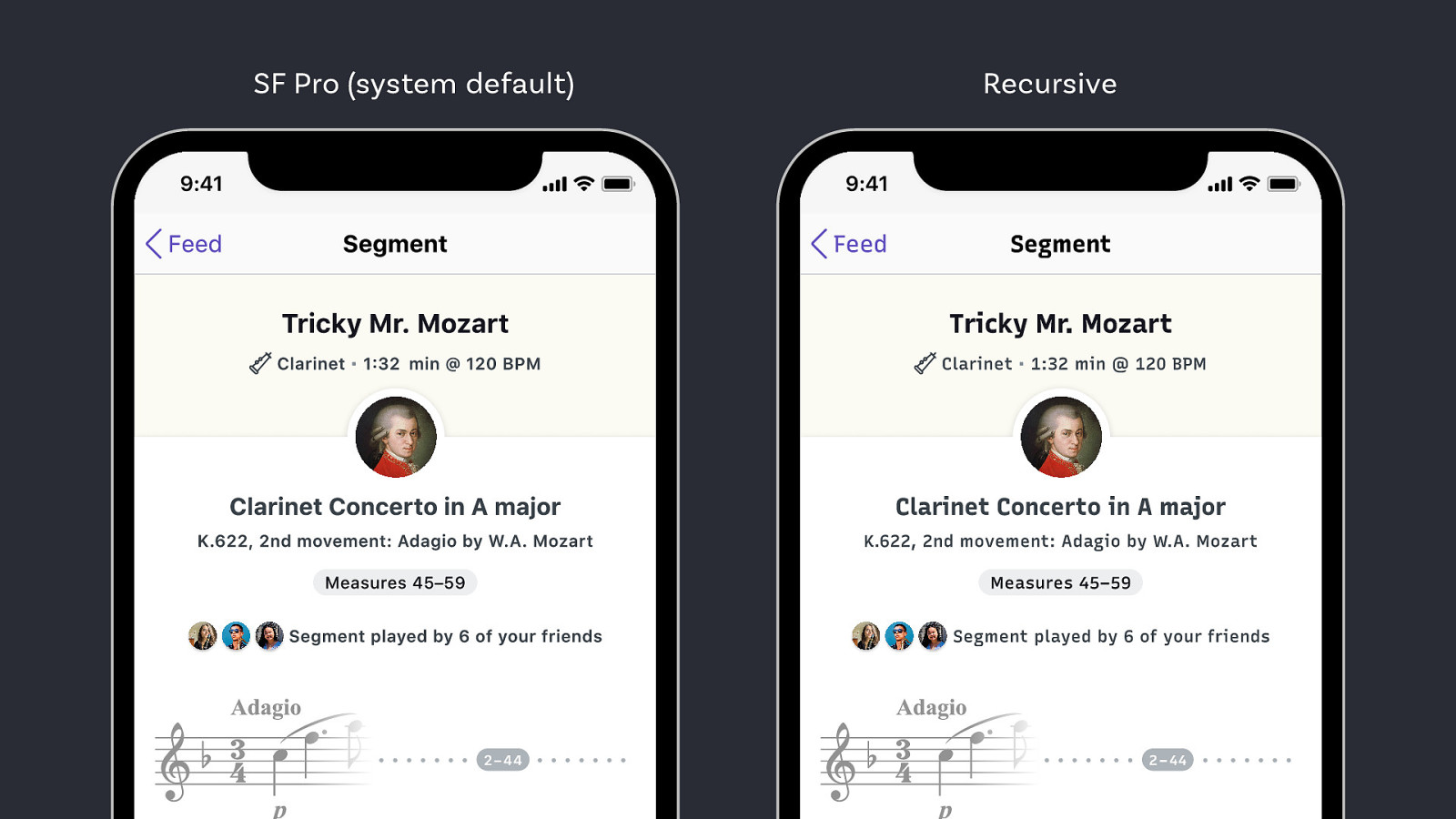
Redesigned app with the default typeface SF Pro
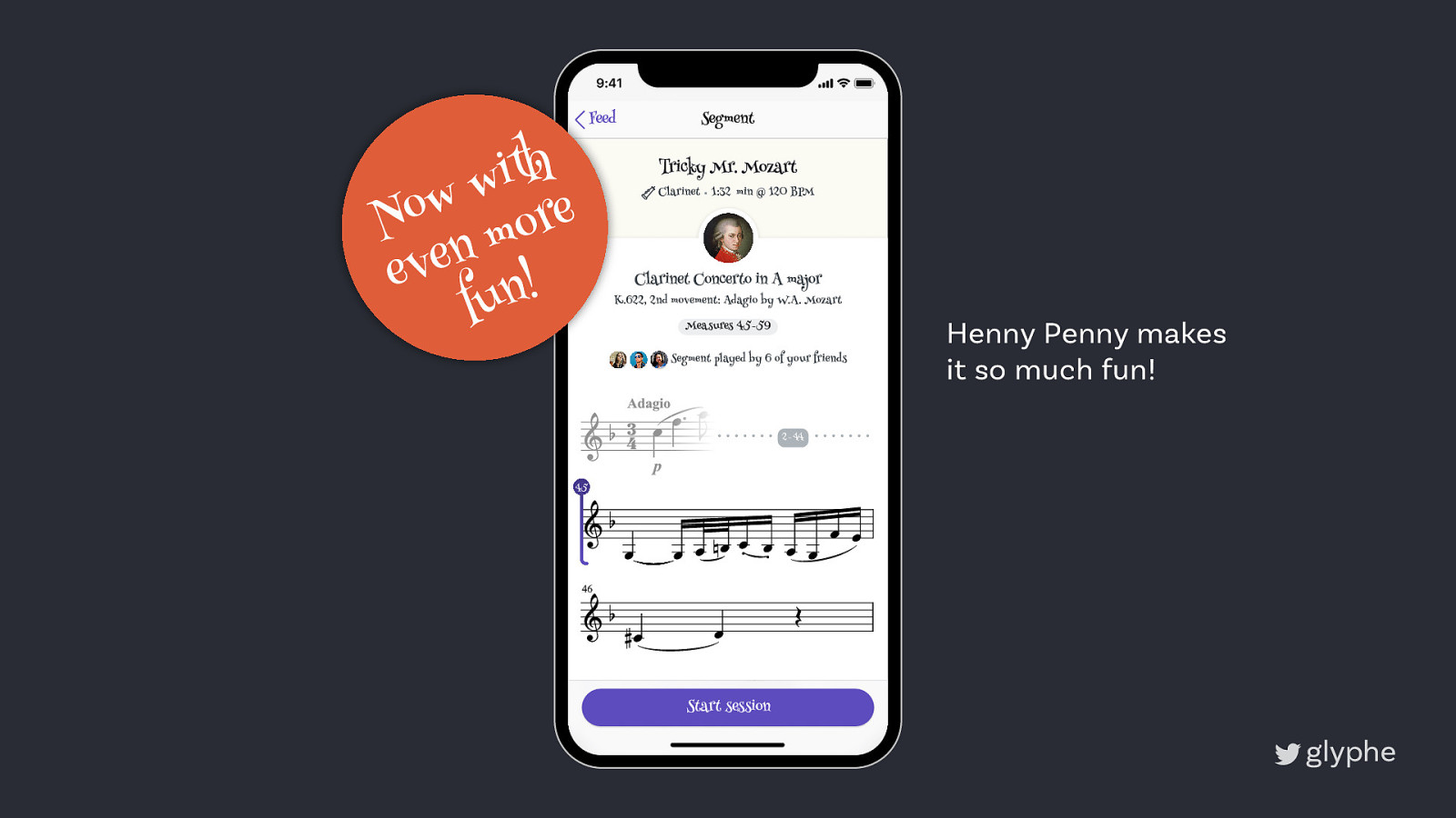
th i w w o e r N o m n e ev ! n fu Henny Penny makes it so much fun!
Il1 oce Good distincitions Open shapes
123 123 Tabular figures Proportional figures
SF Pro (system default) Recursive
book.webtypography.net
zeichenschatz.net
pimpmytype.com
Now, start living! Oliver Schöndorfer zeichenschatz.net ! Pimp my Type

Open Sans, Open Sans, Open Sans – it’s everywhere! It’s the second most popular web font, it’s the new Arial. However, there is nothing wrong about Open Sans specifically, it’s just overused. Picking a typeface is an opportunity for your website, app or digital product to show personality, be memorable and stand out among its competition. And if you’re using Open Sans you’re missing out on all that good stuff.
In this talk you’ll learn why your font choice matters, where to find good alternatives and what to consider when picking a font for your digital product. So you won’t have to use Open Sans again (or Roboto, or Lato, or PT Sans, …).
Here’s what was said about this presentation on social media.


 for free. You
can too.
for free. You
can too.