A presentation at UXcamp Europe 2015 in in Berlin, Germany by Gunnar Bittersmann
Responsive ~~Design~~ ~~Workflow~~ Mindset @g16n #uxce15
now: June 2015: UXcamp Europe
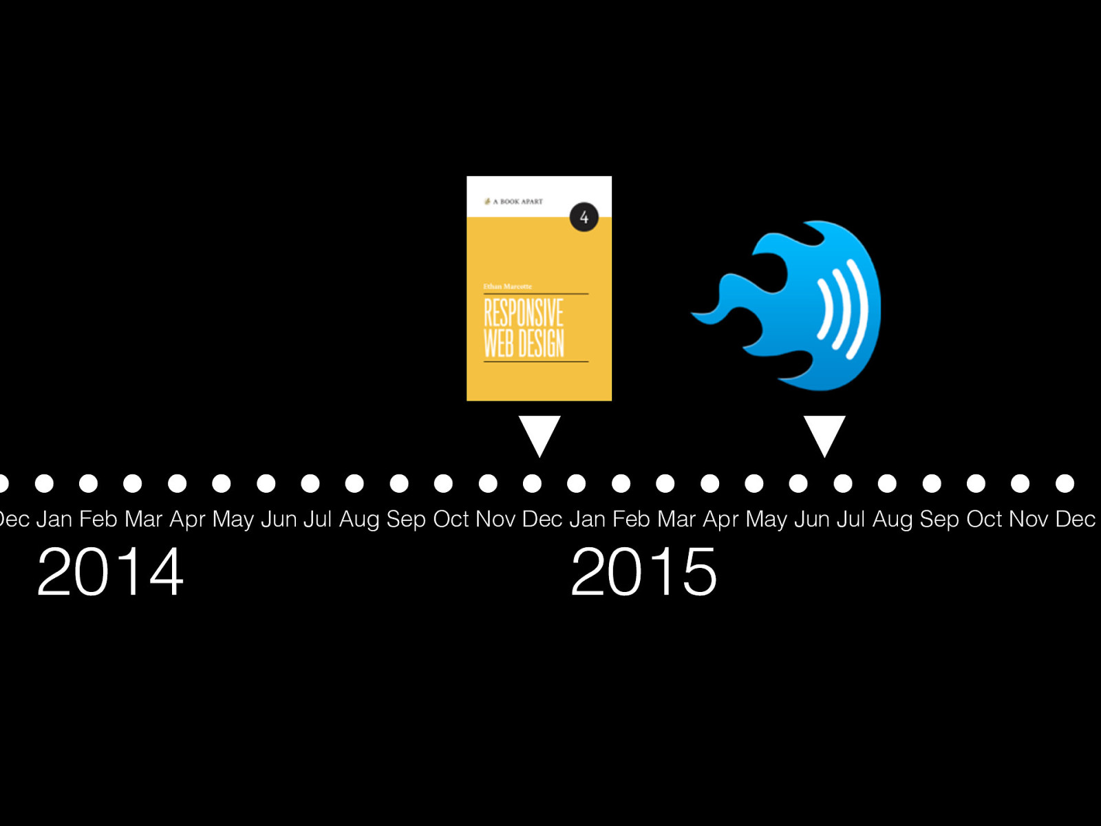
December 2014: book “Responsive Web Design” by Ethan Marcotte (2nd edition)
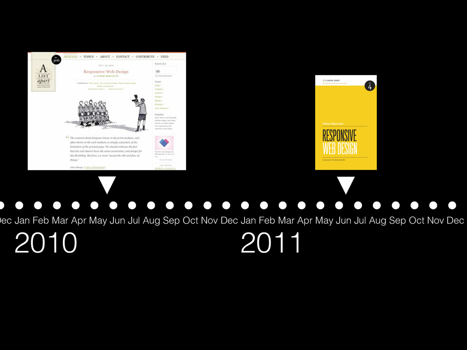
June 2011 book “Responsive Web Design” by Ethan Marcotte May 2010: article “Responsive Web Design” by Ethan Marcotte on A List Apart
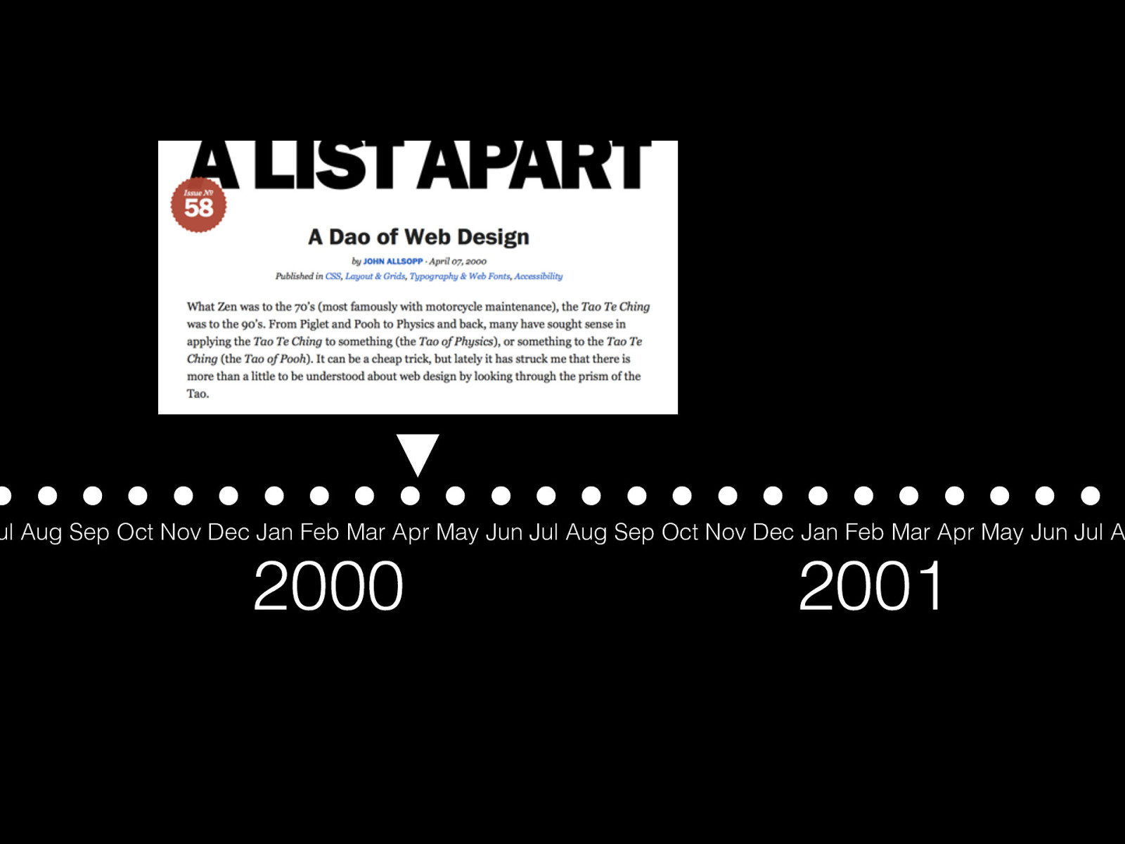
April 2000: May 2010: article “A Dao of Web Design” by John Allsopp on A List Apart
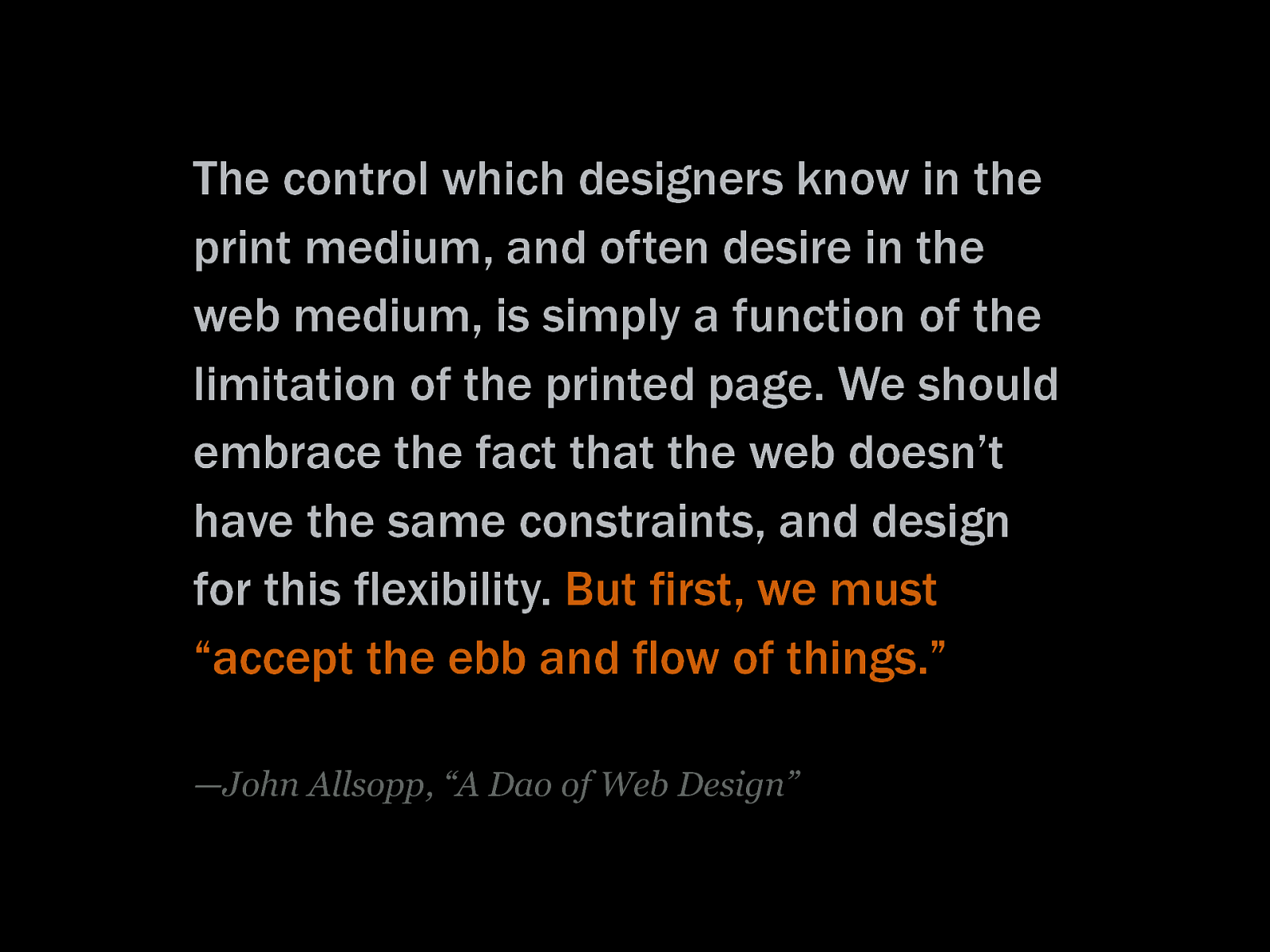
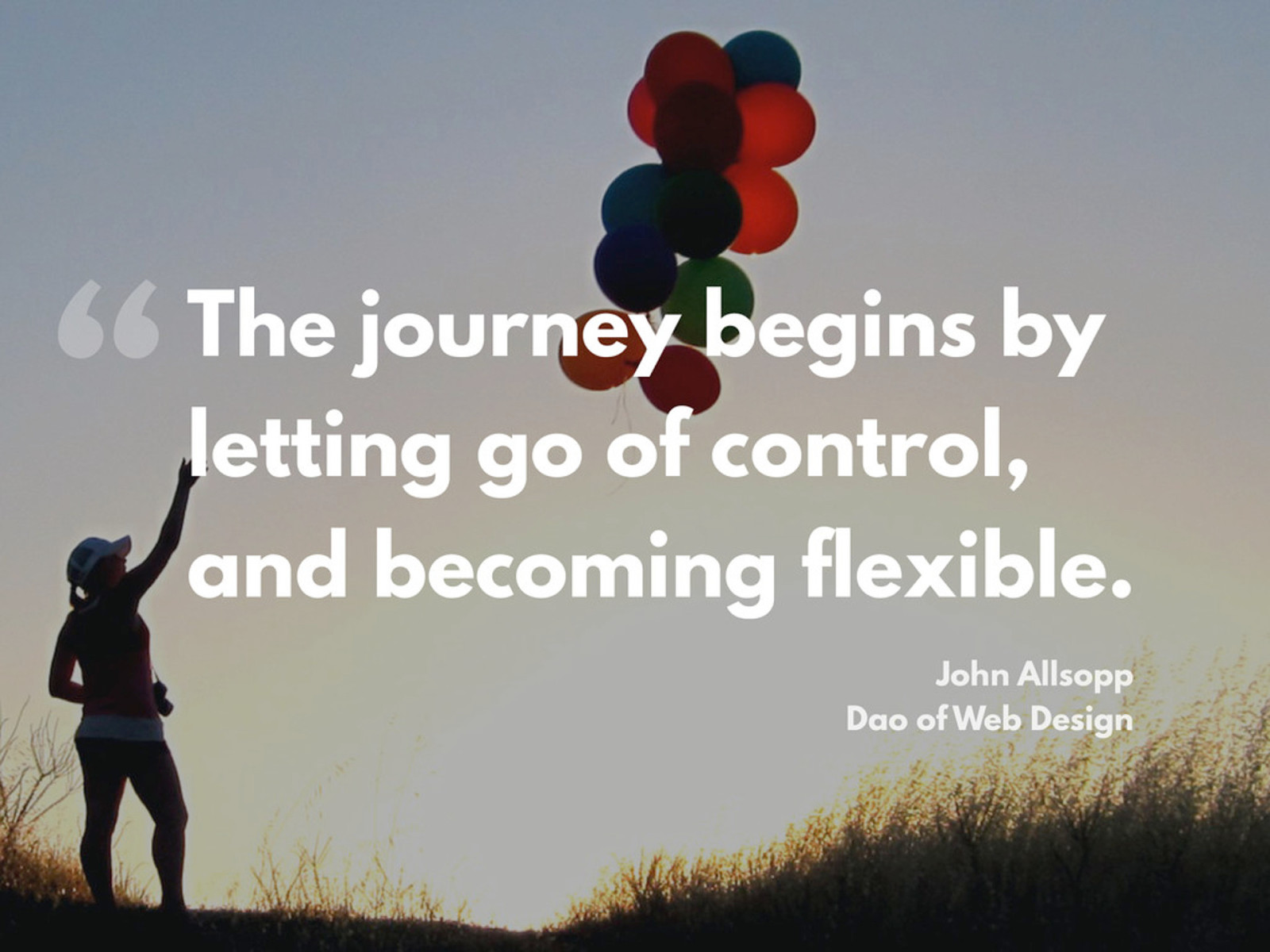
The control which designers know in the print medium, and often desire in the web medium, is simply a function of the limitation of the printed page. We should embrace the fact that the web doesn’t have the same constraints, and design for this flexibility. But first, we must “accept the ebb and flow of things.” —John Allsopp, “A Dao of Web Design”
(a desktop computer) “This is not the Web.” —Brad Frost
(various devices: desktop computers, laptops, tablets, mobile phones, feature phones) “This is the Web.” —Brad Frost
(various devices as in the previous slide, additionally smart watch, printer, refridgerator, car, and many question marks) “This will be the Web.” —Brad Frost
Do websites need to look exactly the same in every browser? No!
Using Photoshop/Fireworks for responsive design is like bringing a knife to a gunfight —Andy Clarke
Project Wire HTML Design mgmt frames CSS Backend development To do In progress Done QA Done
Project Wire HTML Design mgmt frames CSS Backend development To do In progress Done QA Done
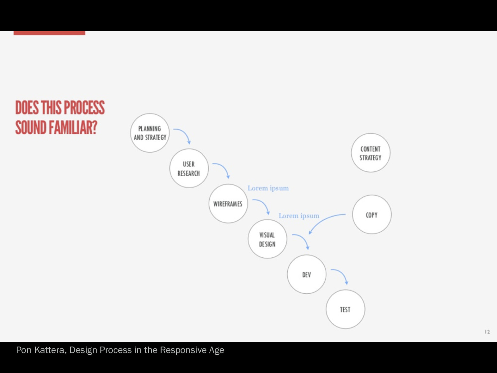
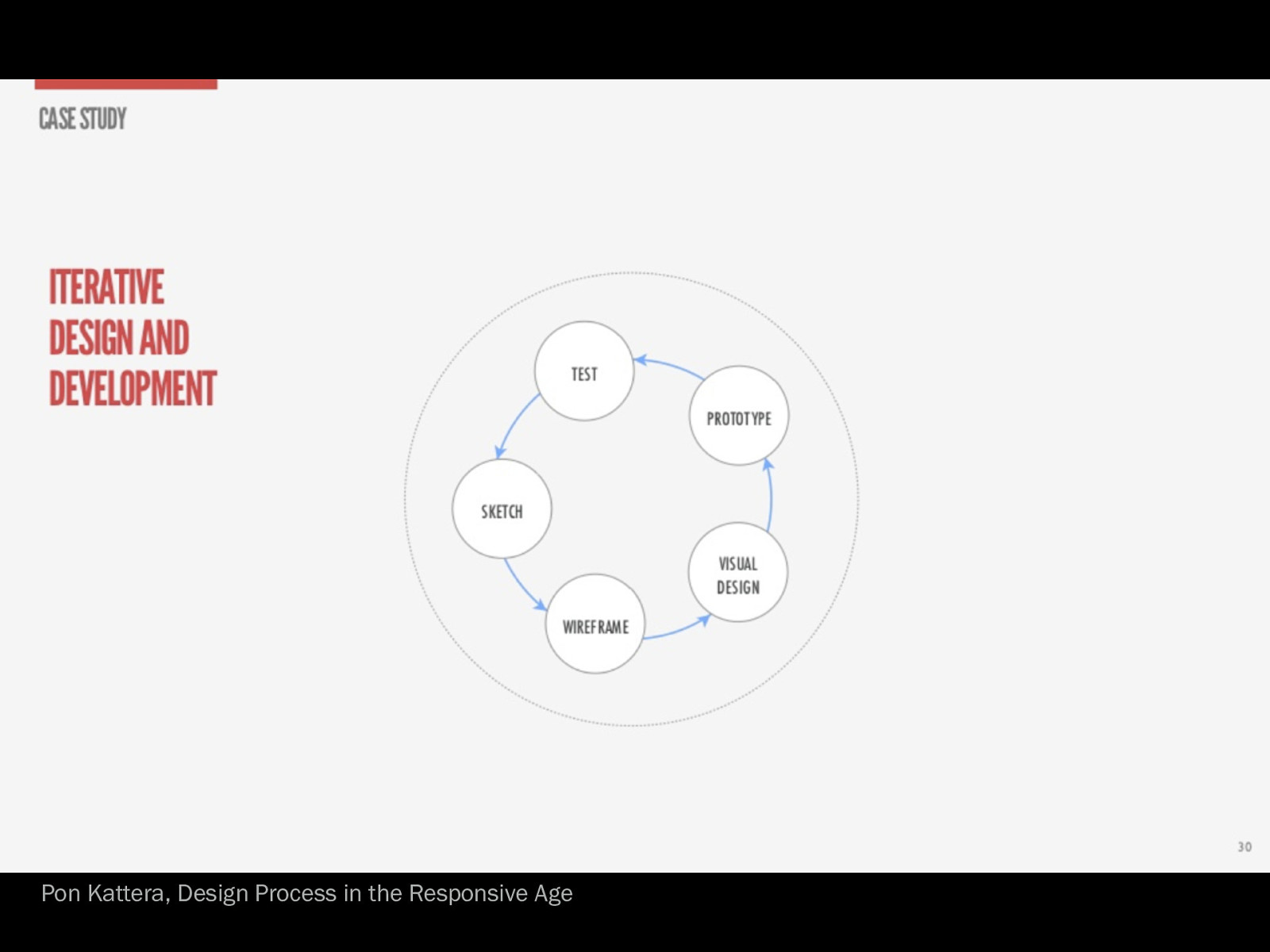
Pon Kattera, Design Process in the Responsive Age
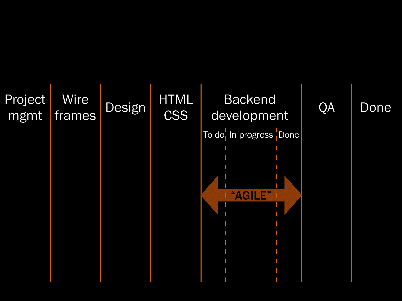
Project Wire HTML Design mgmt frames CSS Backend development To do In progress Done “AGILE” QA Done
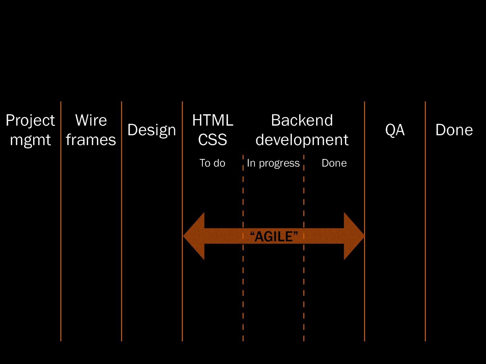
Project Wire HTML Design mgmt frames CSS To do Backend development In progress Done “AGILE” “AGILE” QA Done
Project Wire Design mgmt frames Development To do In progress QA Done “AGILE” “AGILE” Done
Project Wire Design mgmt frames Development AGILE QA Done
Project Wire Design mgmt frames Development AGILE QA Done
Pon Kattera, Design Process in the Responsive Age
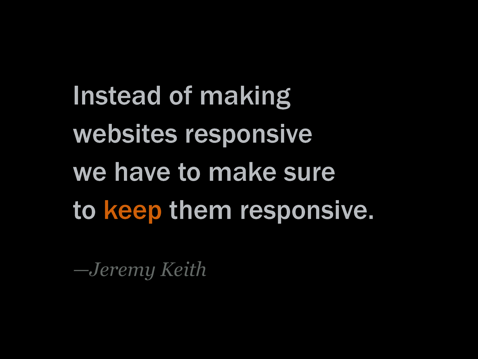
Instead of making websites responsive we have to make sure to keep them responsive. —Jeremy Keith
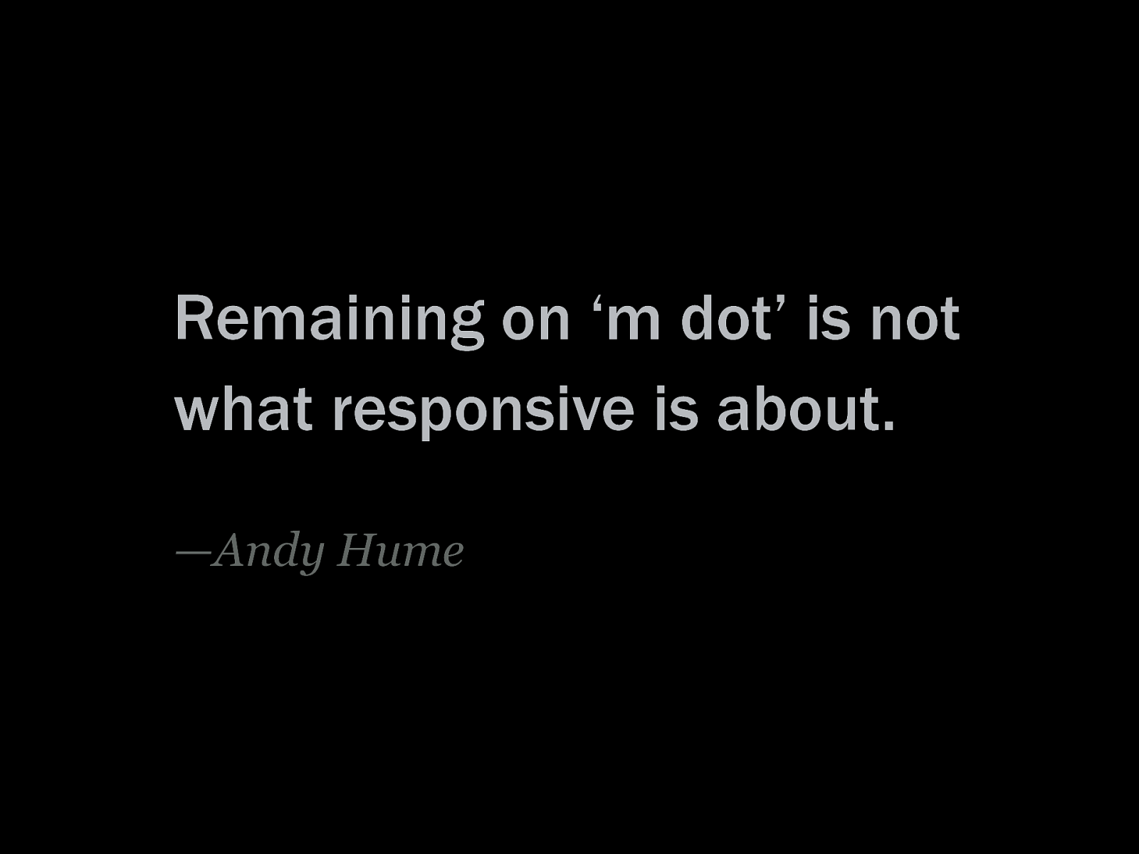
Remaining on ‘m dot’ is not what responsive is about. —Andy Hume
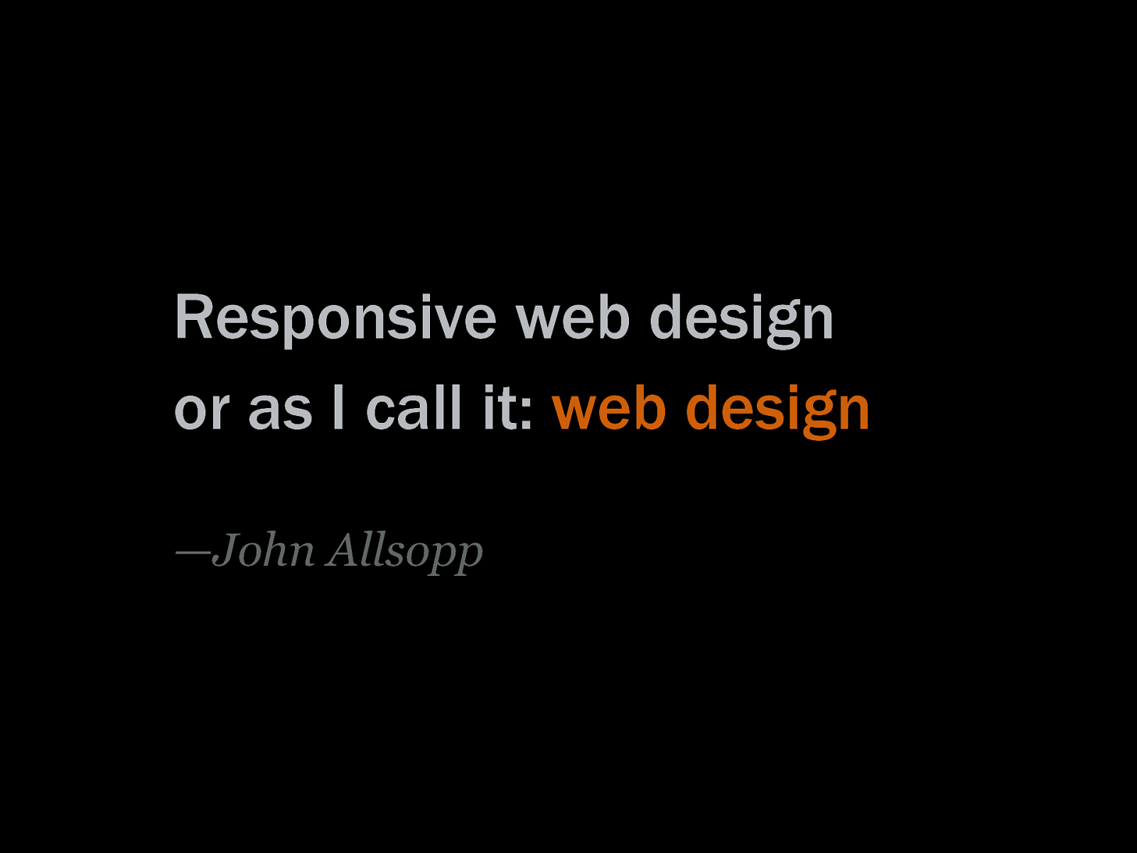
Responsive web design or as I call it: web design —John Allsopp
The journey begins by letting go of control, and becoming flexible. —John Allsopp, “A Dao of Web Design”
Responsive web design—Ethan Marcotte coined the term in his article on A List Apart in 2010. Yet the idea dates back to 2000: ‘A Dao of Web Design’, wherein John Allsopp calls designers to let go of control they know in the print medium, to design for the flexibility of the Web, to “accept the ebb and flow of things.”
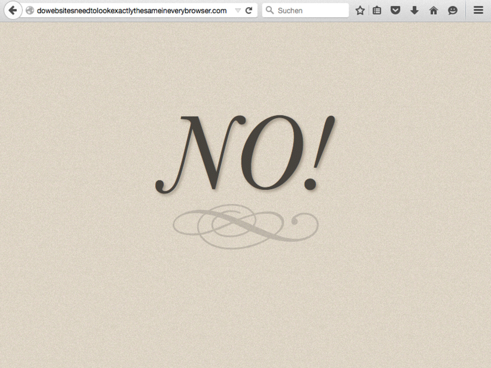
This became more relevant now that the Web is not accessed only on desktop computers, but on a growing variety of devices. Web sites not only do not need to look exactly the same in every browser, they must not look the same in every browser on every device.
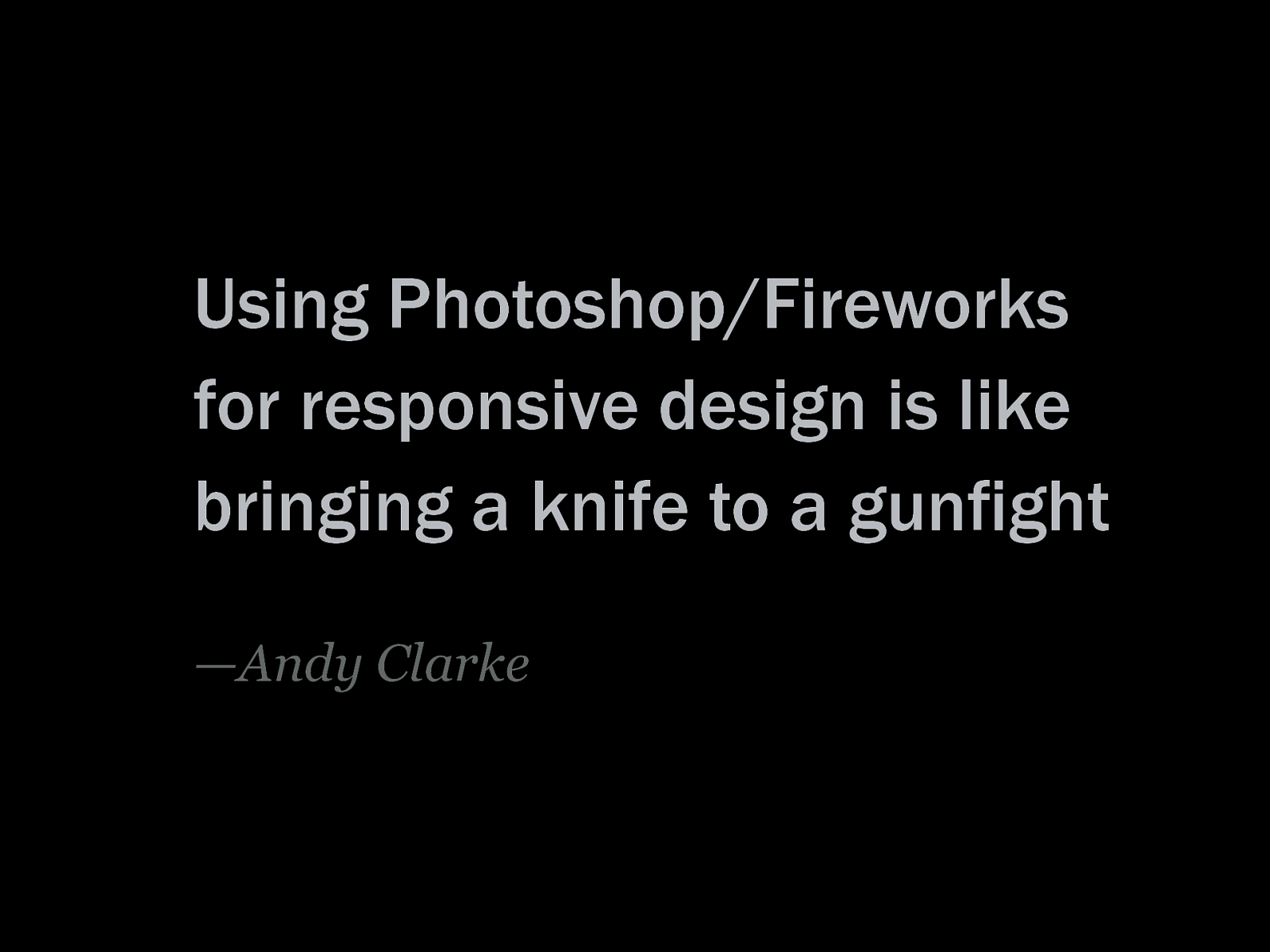
We cannot build a responsive web site based on Photoshop mockups—“you damn liar”, as Josh Brewer sang(!) at beyond tellerrand 2013. Mockups can only show particular views of a web page, not those in between.
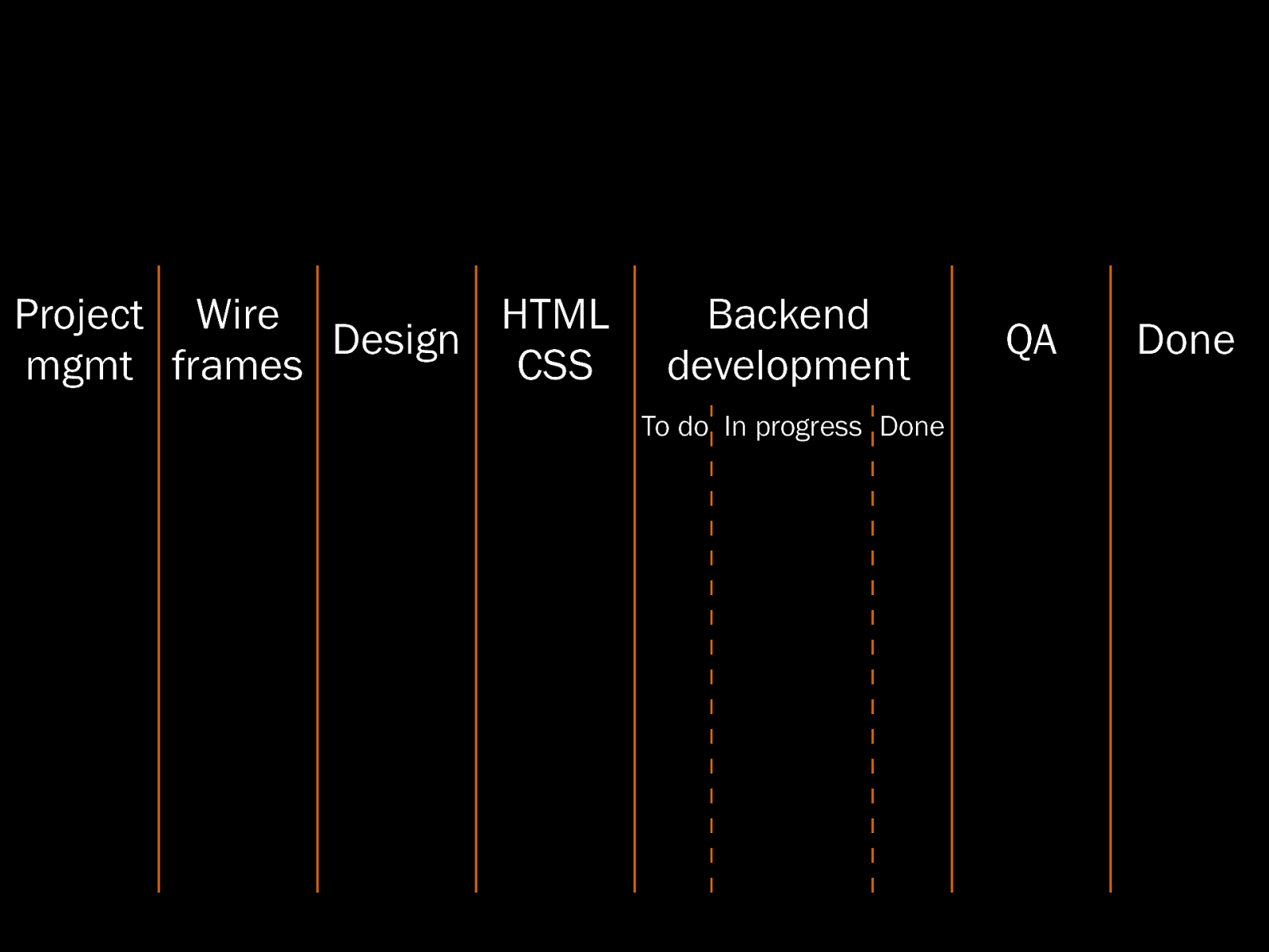
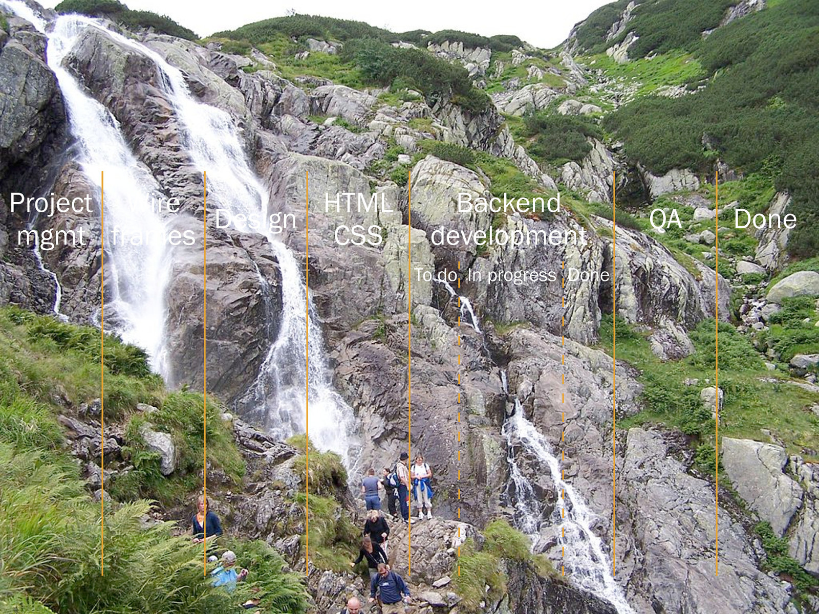
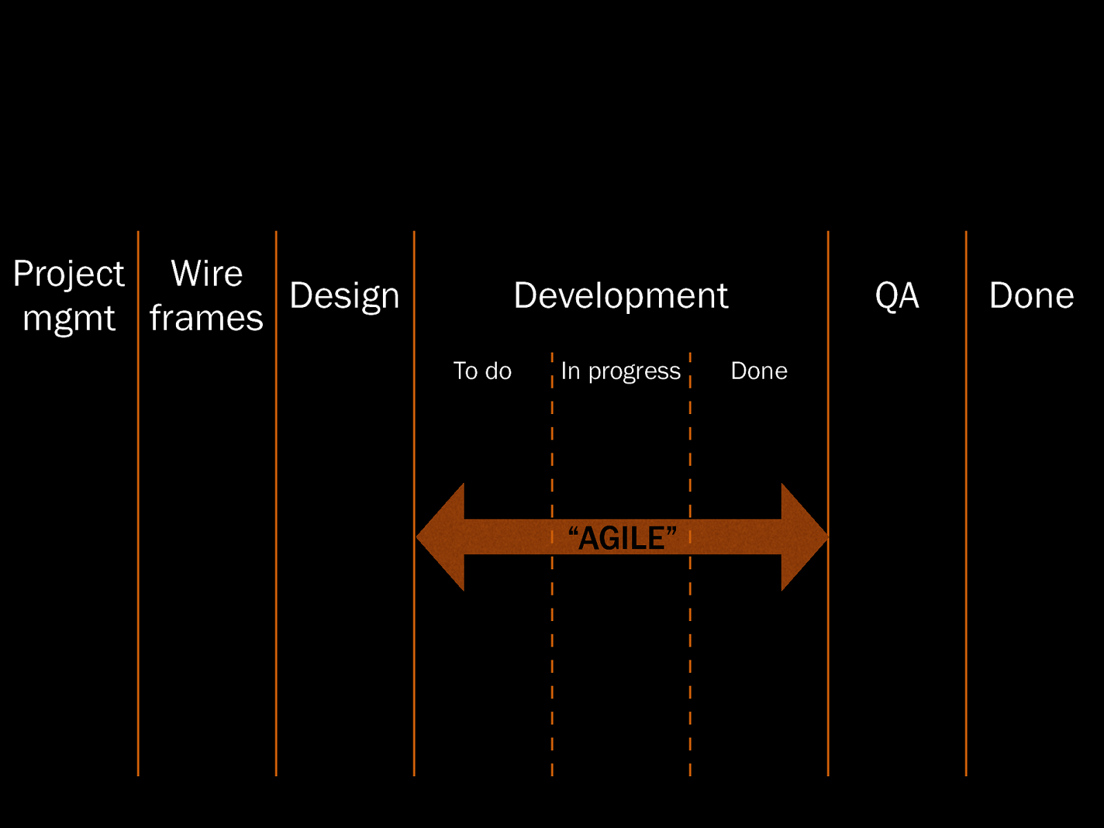
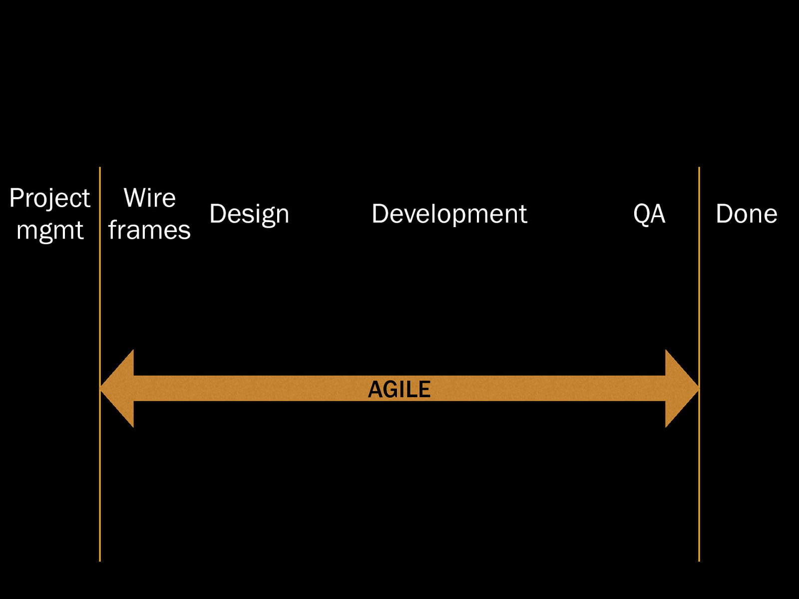
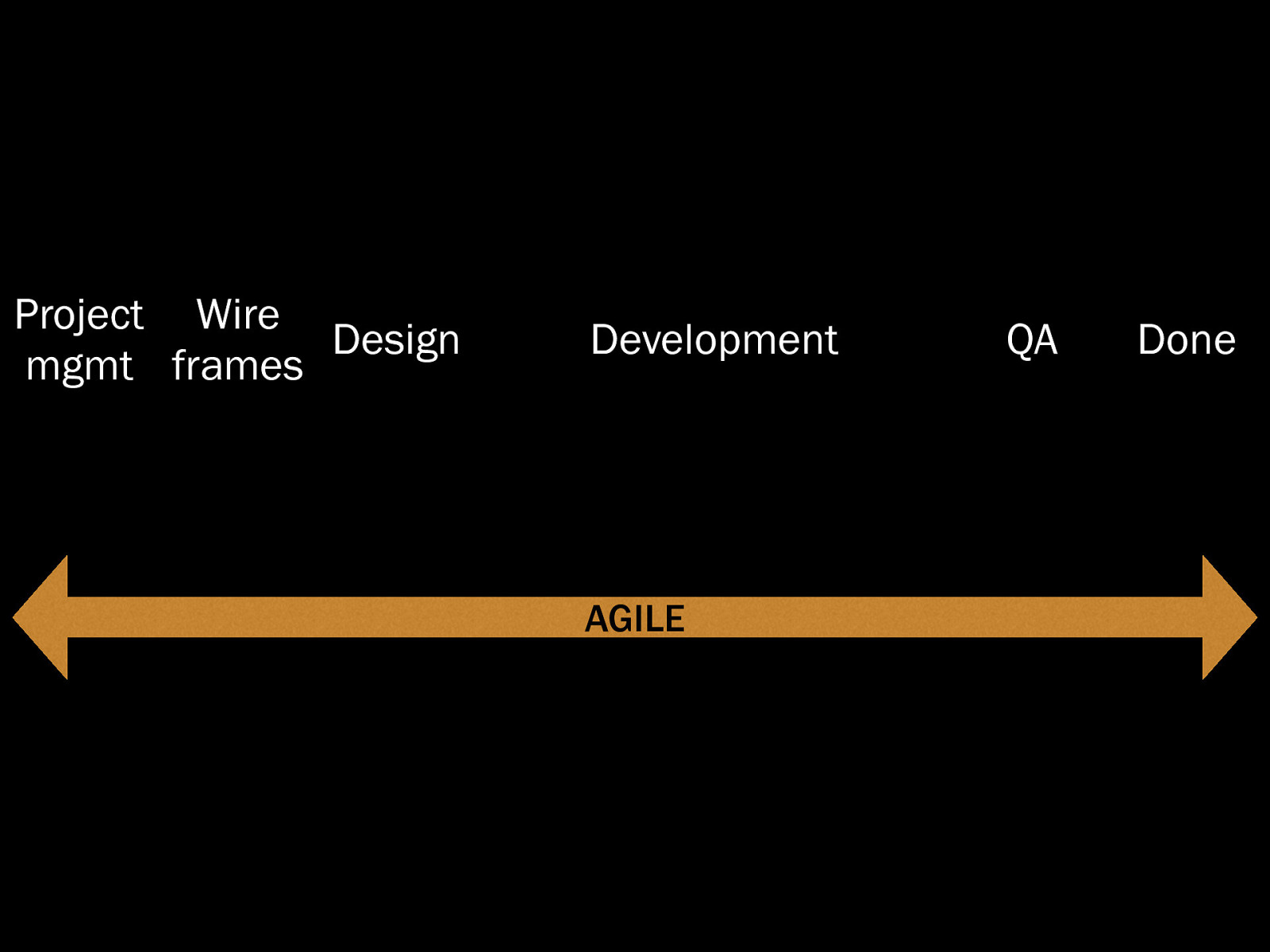
We cannot build a responsive web site in a waterfall process—we need a responsive workflow. A workflow that does not separate design from development. A workflow that allows for iteration cycles.
Developers tend to think that with Scrum or Kanban, they are doing agile development. But on a larger view, they are still stuck in a wireframes–visual design–development waterfall process. You are not agile unless developers, designers, project managers and other stakeholders sit on the same table and work together, not sequently.
To implement a responsive workflow in our company, we need to rewire some people’s brains. We need a responsive mindset. But how do we get there?
The following resources were mentioned during the presentation or are useful additional information.
by John Allsopp on A List Apart on 07 April 2000
by Ethan Marcotte on A List Apart on 25 May 2010
by Brad Frost on 29 March 2012
by Pon Kattera on 21 June 2012
slide from a presentation by Tim Kadlec
presentation by Josh Brewer at beyond tellerrand, Düsseldorf 2013
Here’s what was said about this presentation on social media.