Everyone’s a user Helen Clark - UX consultant at SPARCK @littlehelli
A presentation at NUX Manchester in February 2018 in Manchester, UK by Helen Joy
Everyone’s a user Helen Clark - UX consultant at SPARCK @littlehelli
Hi Editorial & magazine designer Graphic designer Web/digital designer UX/UI designer UX consultant Everyone’s a user @littlehelli
Everyone’s a user @littlehelli
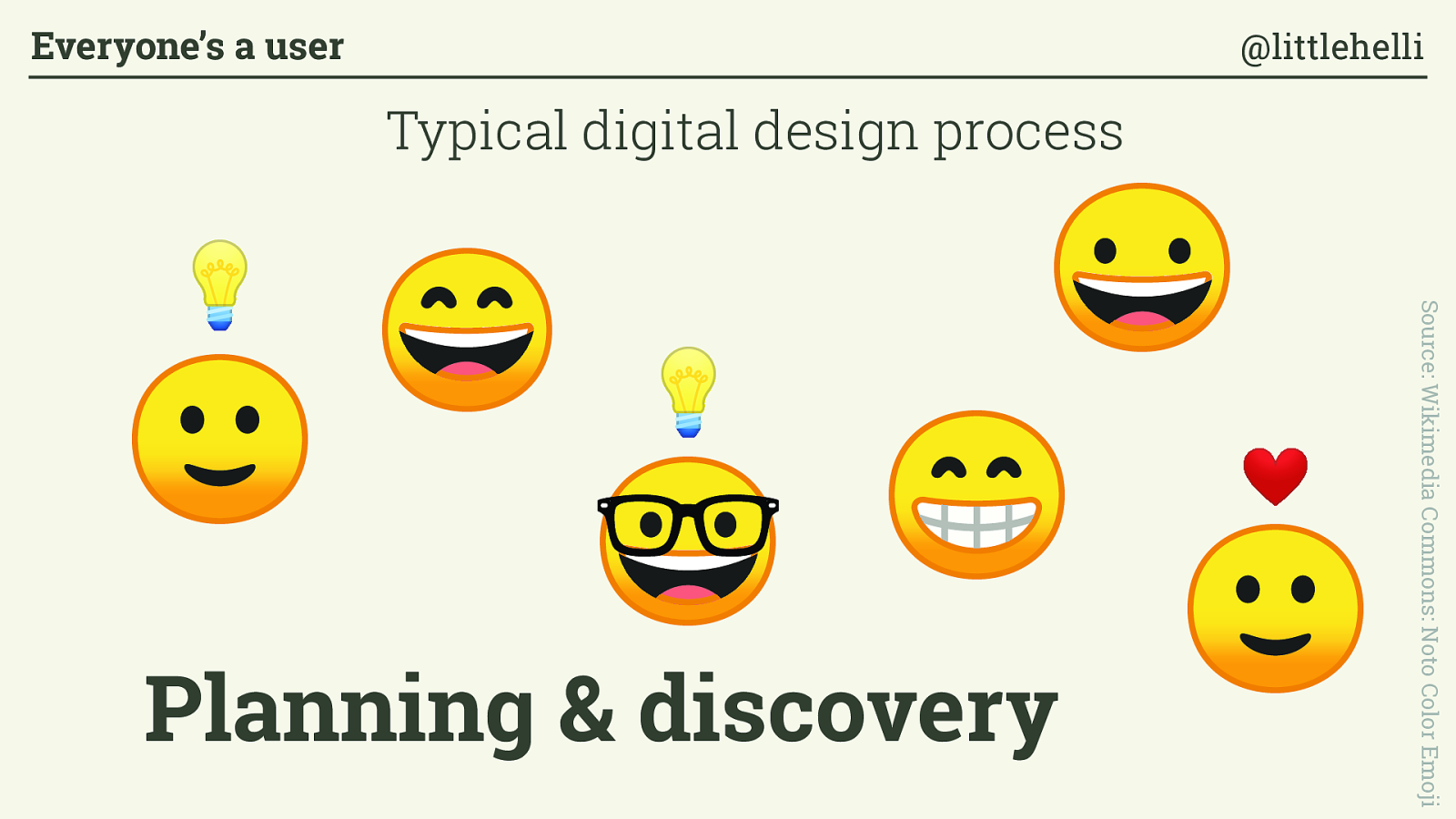
Source: Wikimedia Commons: Noto Color Emoji Planning & discovery Typical digital design process Everyone’s a user @littlehelli
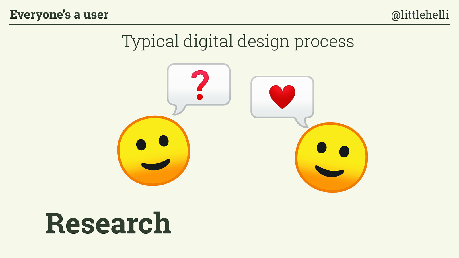
Research Typical digital design process Everyone’s a user @littlehelli
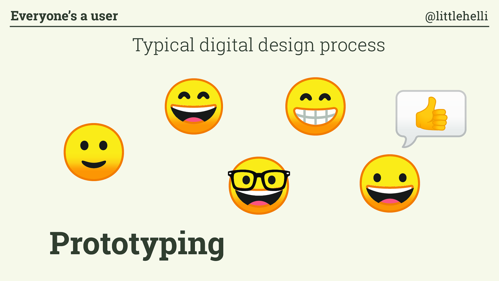
Prototyping Typical digital design process Everyone’s a user @littlehelli
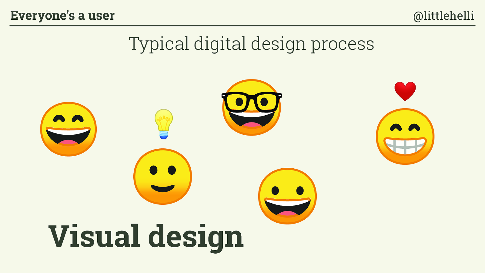
Visual design Typical digital design process Everyone’s a user @littlehelli

Development Typical digital design process Everyone’s a user @littlehelli

Beta testing Typical digital design process Everyone’s a user @littlehelli

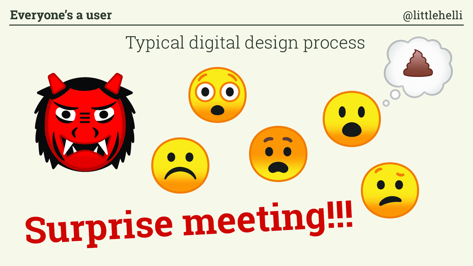
Surprise meeting!!! Typical digital design process Everyone’s a user @littlehelli
Revisions Typical digital design process Everyone’s a user @littlehelli
Amendments Typical digital design process Everyone’s a user @littlehelli
Launch Typical digital design process Everyone’s a user @littlehelli
Post-launch Typical digital design process Everyone’s a user @littlehelli
Cluster fuck
/ ˈ kl ʌ s.t ə ˌ f ʌ k/
Chaotic situation with all plans disintegrating in all directions Everyone’s a user @littlehelli
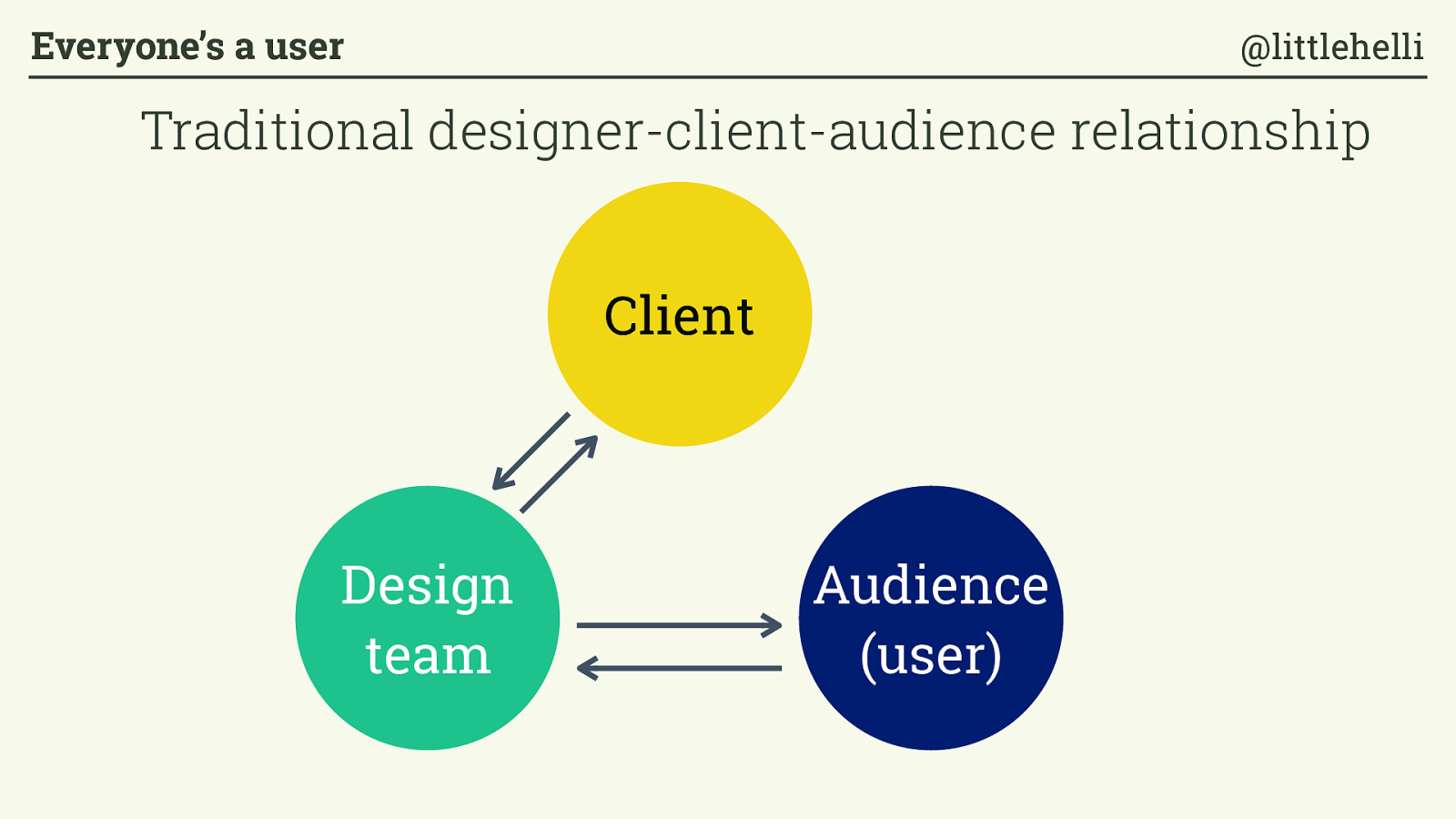
Client Audience (user) Design team Traditional designer-client-audience relationship Everyone’s a user @littlehelli
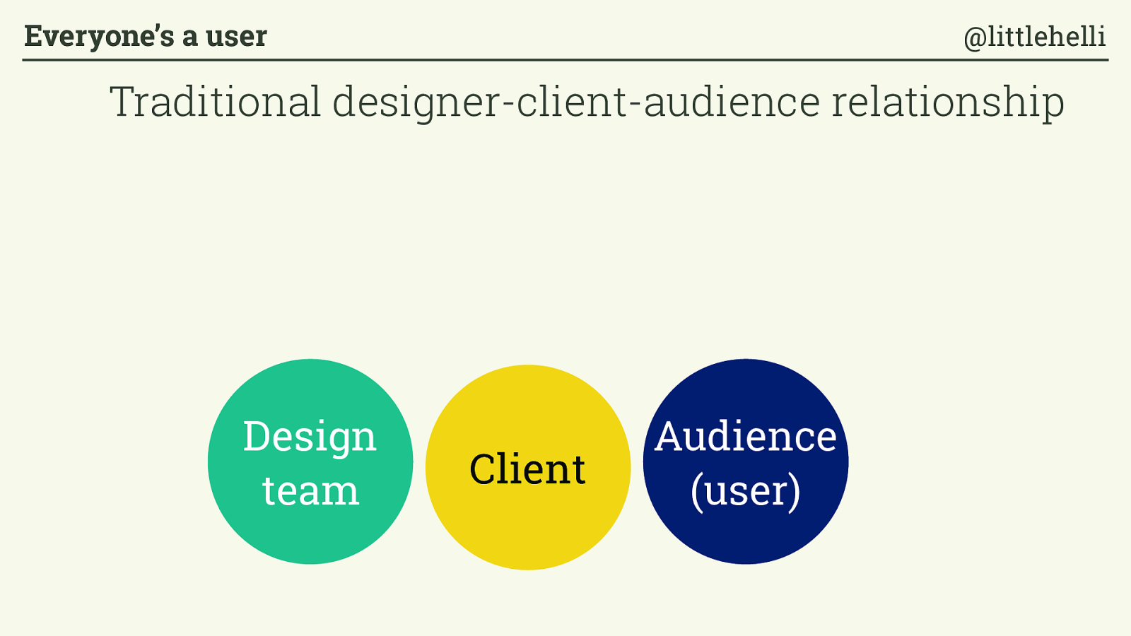
Audience (user) Design team Client Traditional designer-client-audience relationship Everyone’s a user @littlehelli
“Humans have a fundamental need to be consulted, engaged, to exercise their knowledge (and thus power). ” Paul Ford, The Web Is a Customer Service Medium Everyone’s a user @littlehelli

Client Audience (user) Design team Inclusive relationship Everyone’s a user @littlehelli
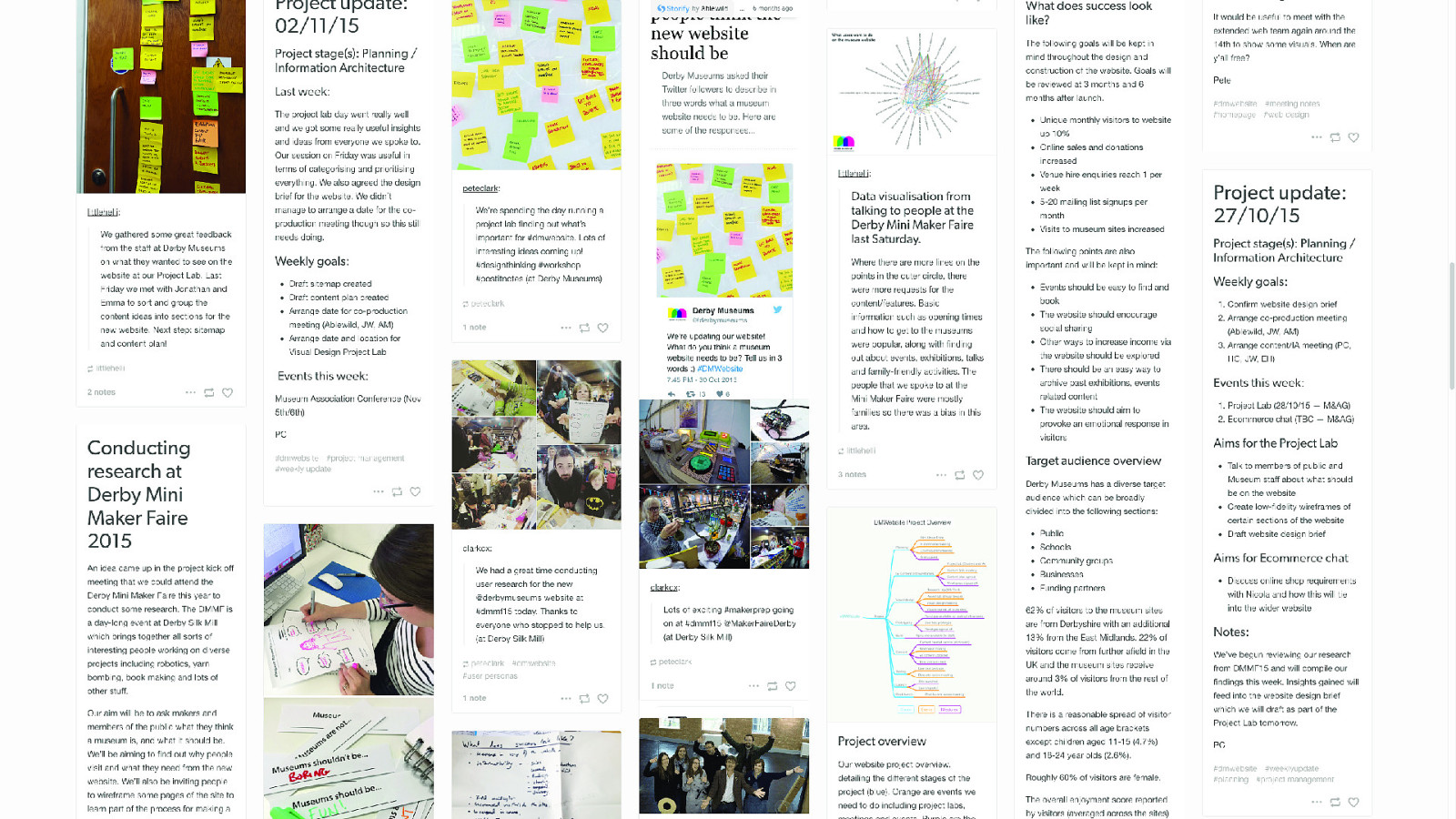
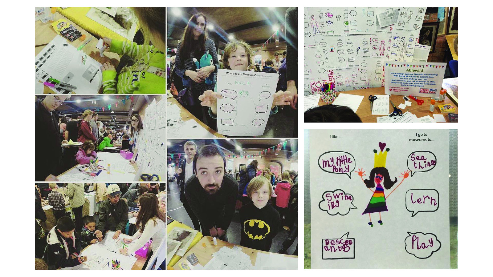
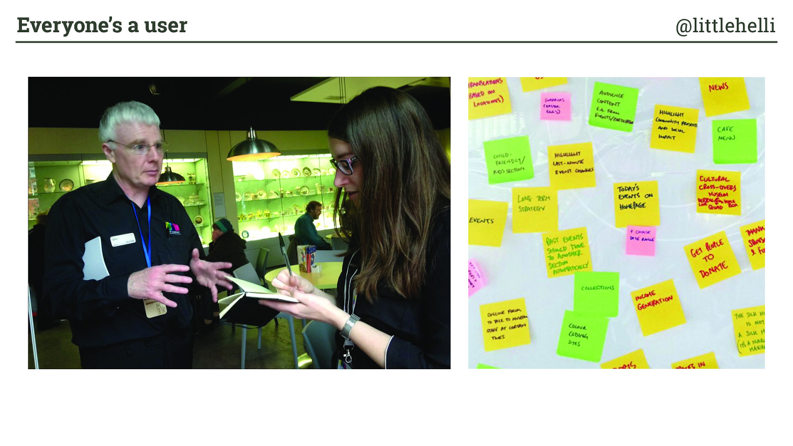
Case study: Derby Museums Everyone’s a user @littlehelli
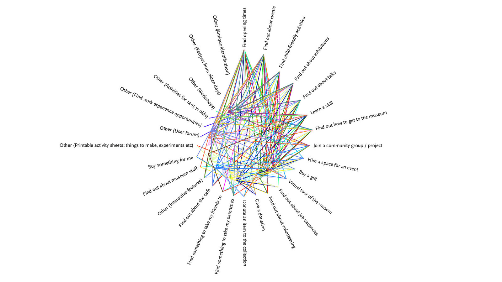
Find opening times Find out about events Find child-friendly activities Find out about exhibitions Find out about talks Learn a skill Find out how to get to the museum Join a community group / project Buy a gift Hire a space for an event Virtual tour of the musem Find out about job vacancies Find out about volunteering Give a donation Donate an item to the collection Find something to take my parents to Find something to take my friends to Find out about the cafe Other (Interactive features) Find out about museum sta ! Buy something for me Other (Printable activity sheets: things to make, experiments etc) Other (User forum) Other (Find work experience opportunities) Other (Activities for 12-15 yr olds) Other (Workshops) Other (Recipes from olden days) Other (Antique identi " cation)
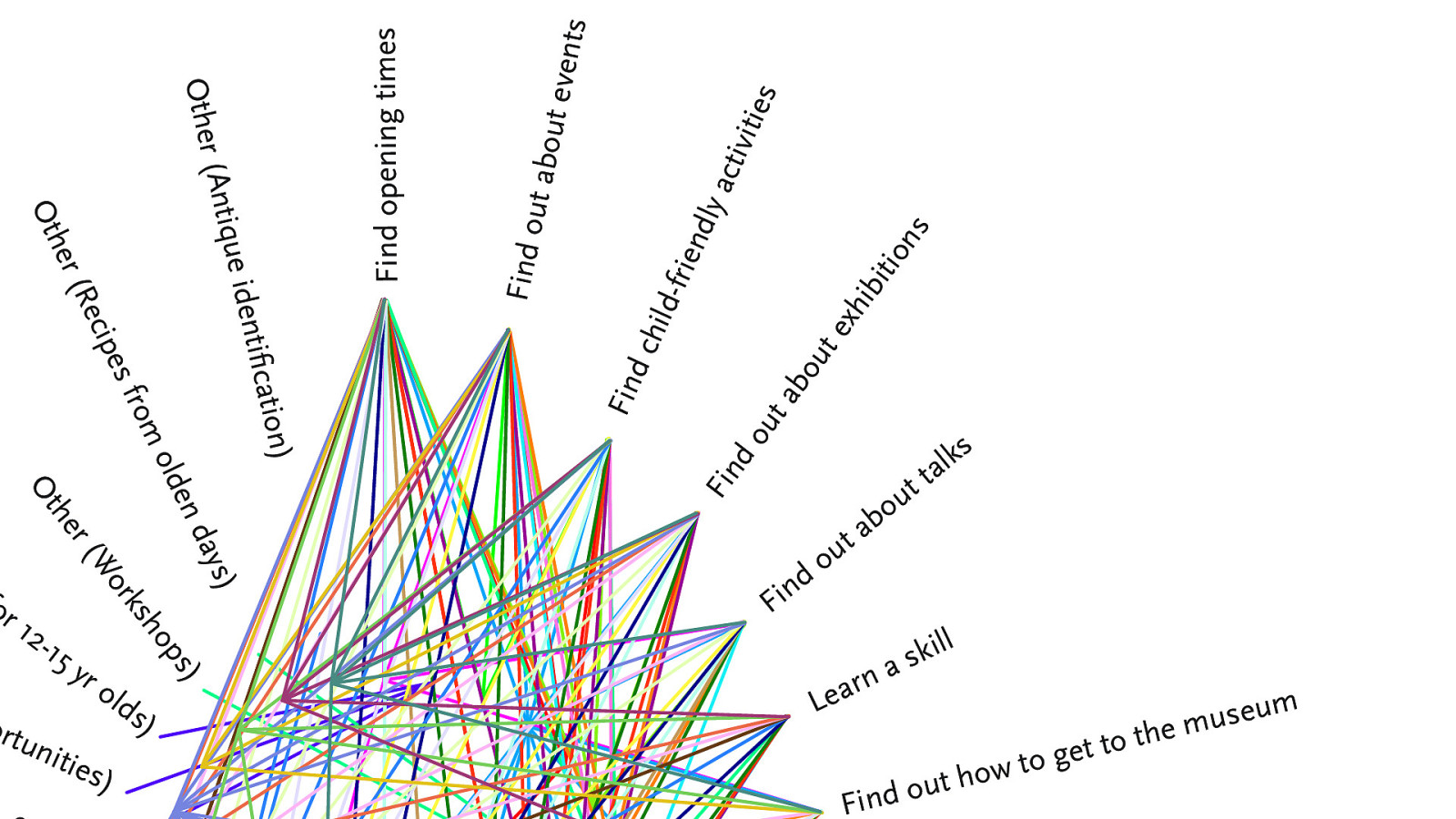
Find opening times Find out about events Find child-friendly activities Find out about exhibitions Find out about talks Learn a skill Find out how to get to the museum Join a community group / project Buy a gift Hire a space for an event Virtual tour of the musem Find out about job vacancies Find out about volunteering Give a donation Donate an item to the collection Find something to take my parents to Find something to take my friends to Find out about the cafe Other (Interactive features) Find out about museum sta ! Buy something for me Other (Printable activity sheets: things to make, experiments etc) Other (User forum) Other (Find work experience opportunities) Other (Activities for 12-15 yr olds) Other (Workshops) Other (Recipes from olden days) Other (Antique identi " cation)
Everyone’s a user @littlehelli
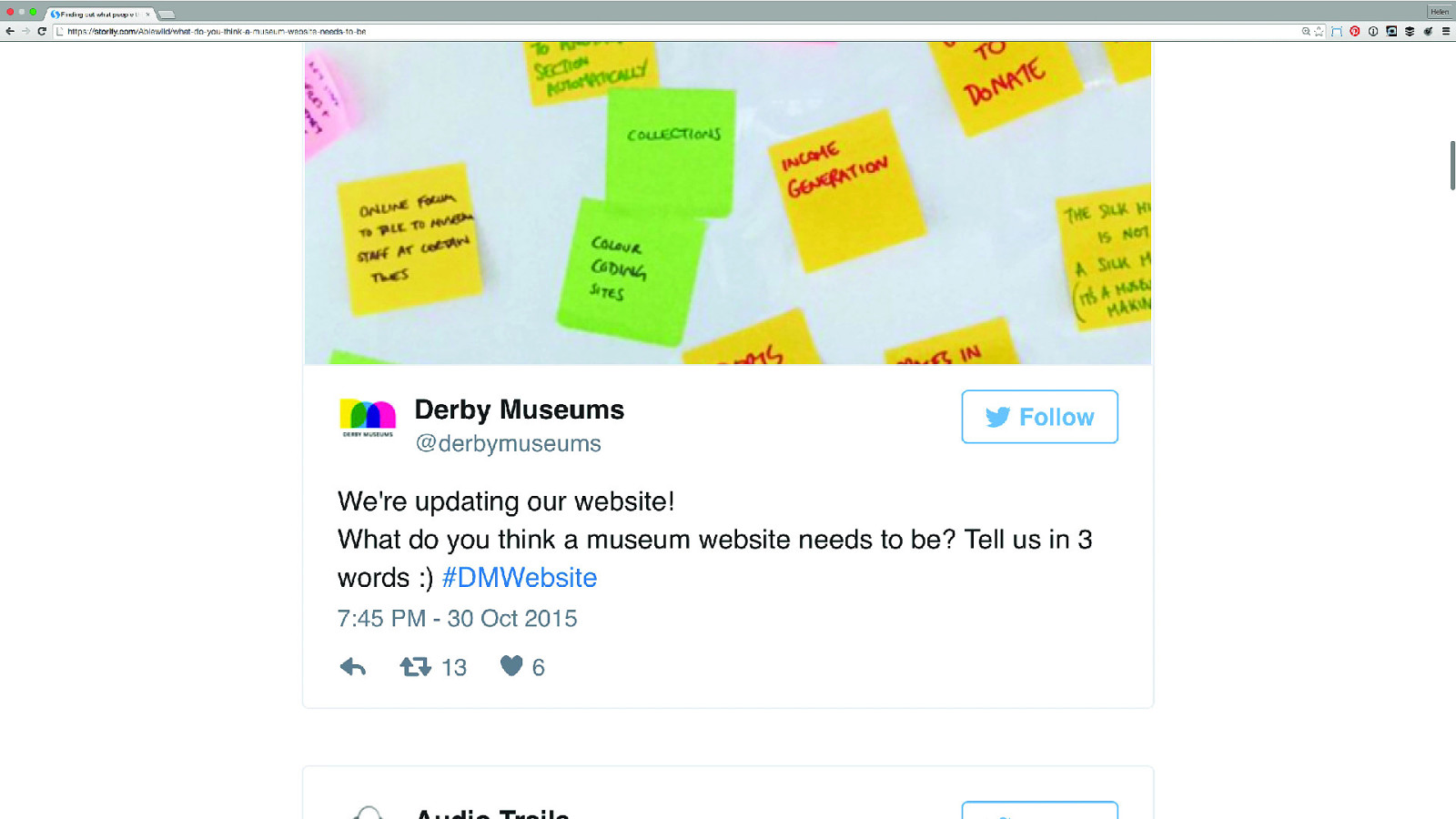
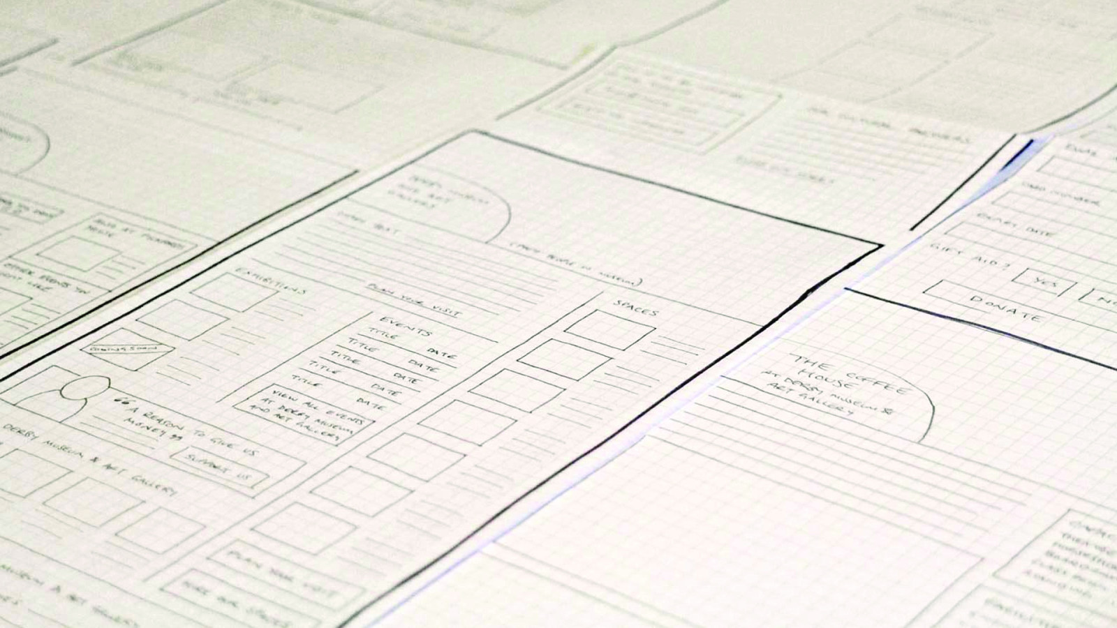
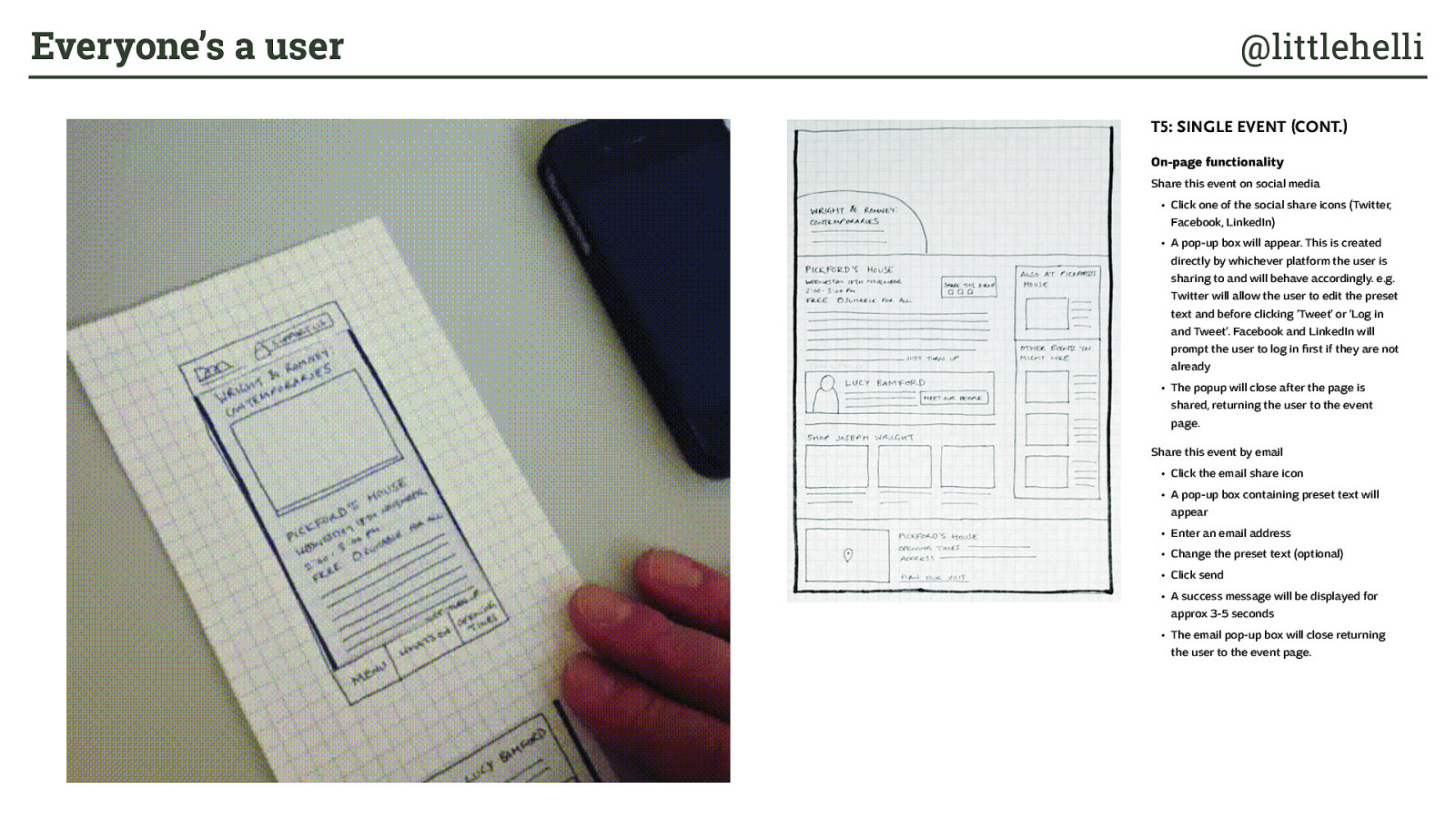
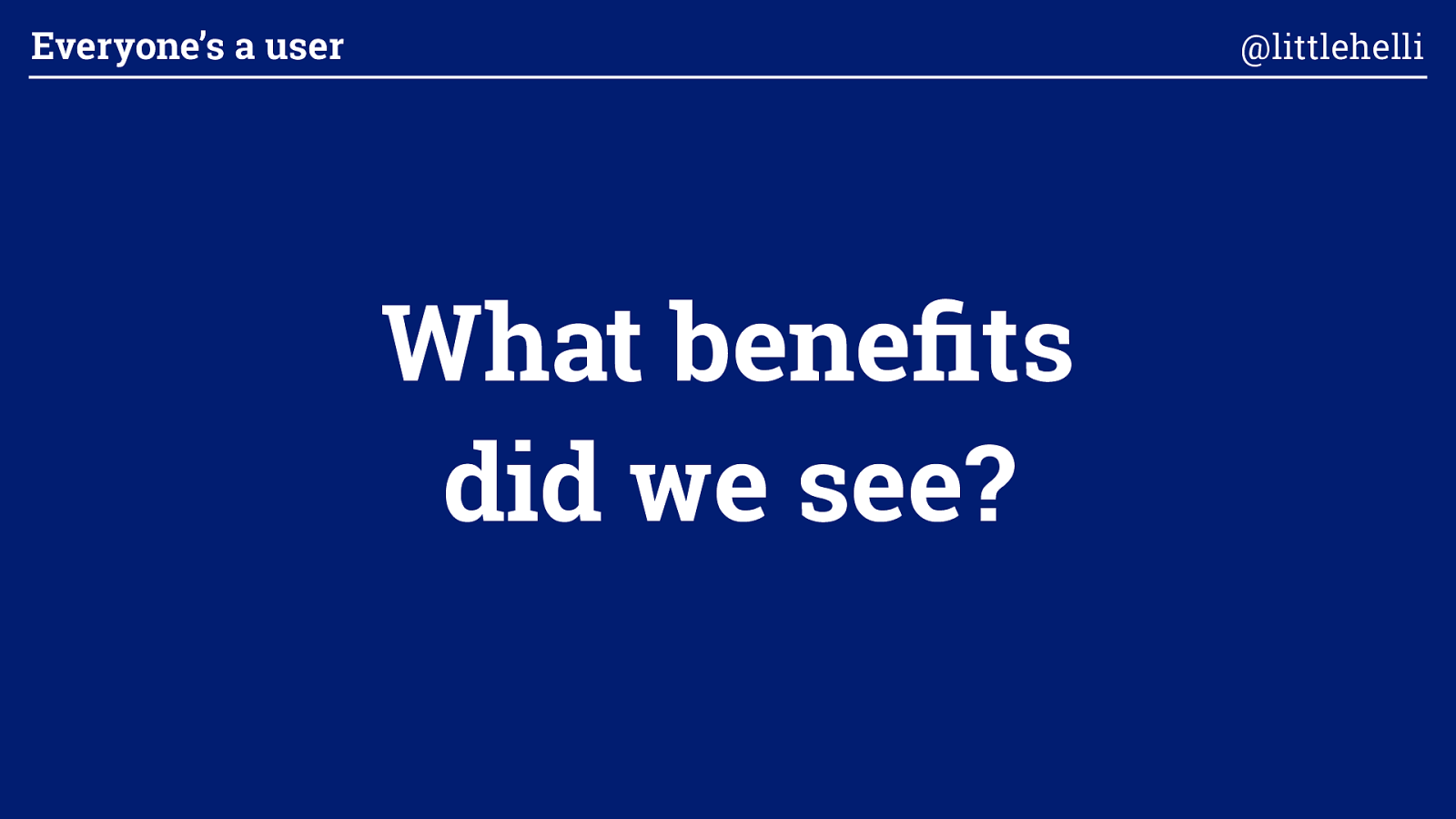
What benefits did we see? Everyone’s a user @littlehelli
Honest feedback from users and potential users Benefit 1 Everyone’s a user @littlehelli
Benefit 2 Useful suggestions from front line staff Everyone’s a user @littlehelli
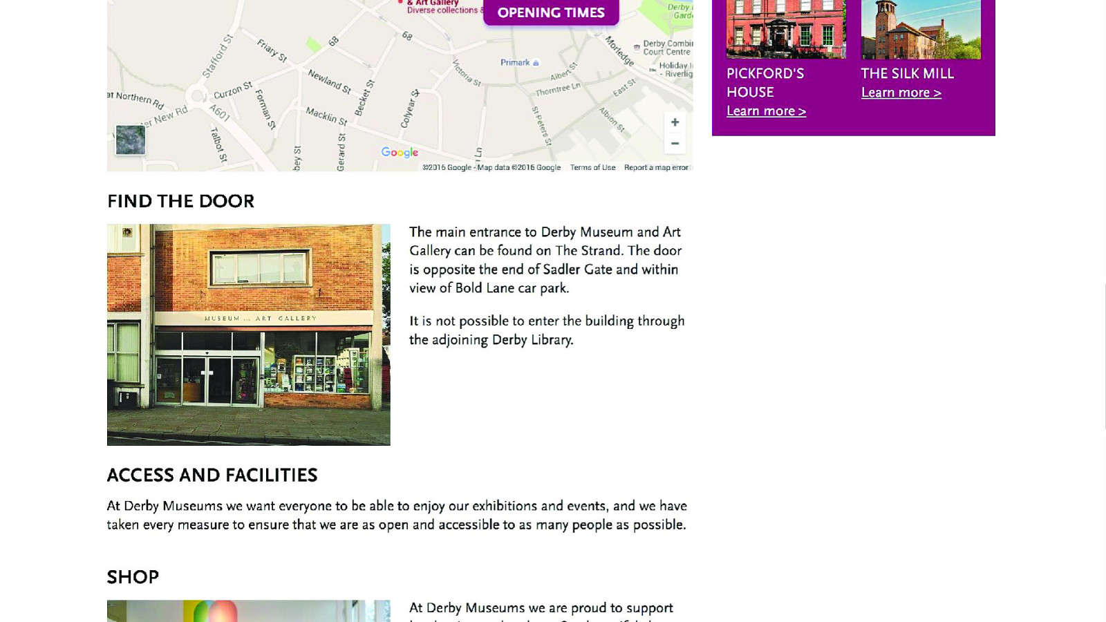
Benefit 3 Feedback has been applied beyond the website Everyone’s a user @littlehelli
What were the risks of working openly? Everyone’s a user @littlehelli
Risk 1 Getting the wrong kind of feedback Everyone’s a user @littlehelli
“The page is all in Italian. (I think.)” Everyone’s a user @littlehelli
“It somehow felt a bit basic, and not just because it isn’t finished.” Everyone’s a user @littlehelli
Risk 2 People trying to solve problems rather than identifying them Everyone’s a user @littlehelli
Risk 3 It can make people uncomfortable Everyone’s a user @littlehelli
Risk 4 It costs more Everyone’s a user @littlehelli
Risk 5 Assuming that because it’s public, people are looking at it Everyone’s a user @littlehelli

Surprise meeting!!! Everyone’s a user @littlehelli
Everyone’s a user @littlehelli
and the design brief Bring it back to research Everyone’s a user @littlehelli
“When user-centered practices are executed, designers and researchers can find the design ‘sweet spot’ where business needs and user needs overlap. ” Hoa Loranger VP at Nielsen Norman Group, UX Without User Research Is Not UX Everyone’s a user @littlehelli
What about outside of the web industry? Everyone’s a user @littlehelli
Early access gaming Everyone’s a user @littlehelli
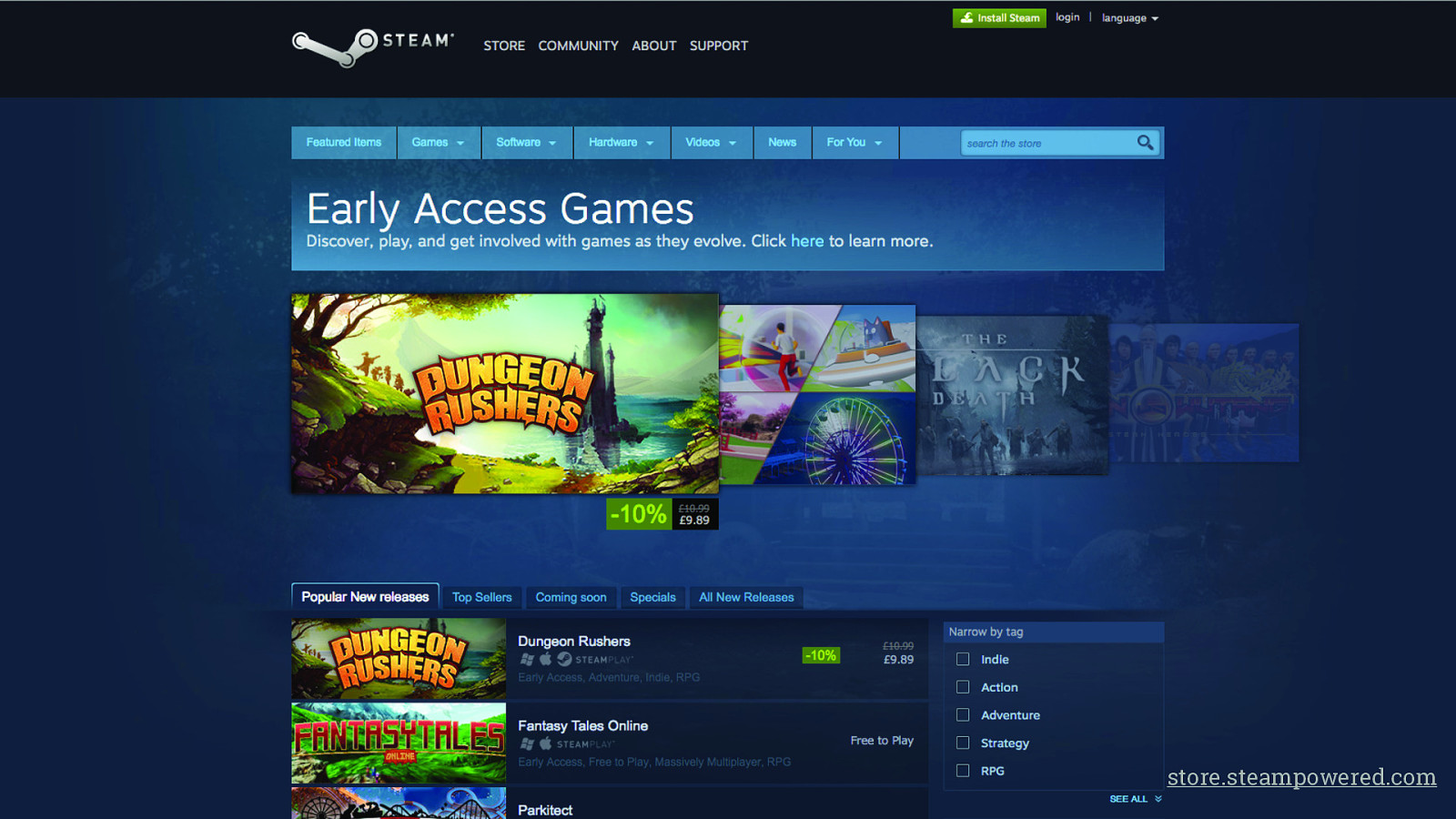
store.steampowered.com
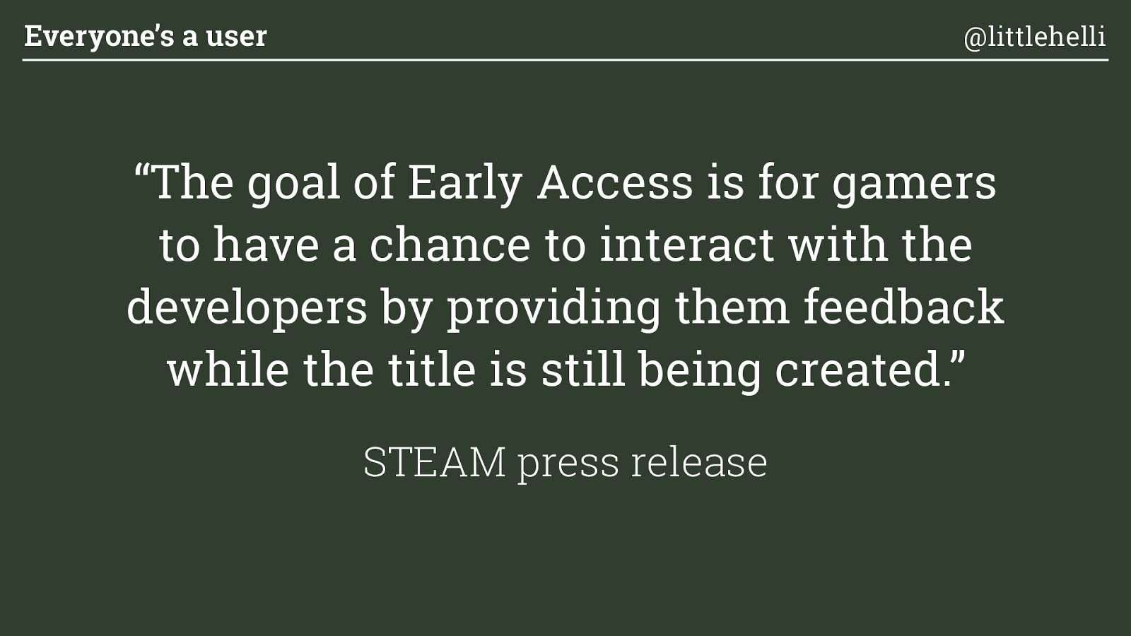
“The goal of Early Access is for gamers to have a chance to interact with the developers by providing them feedback while the title is still being created.”
STEAM press release Everyone’s a user @littlehelli
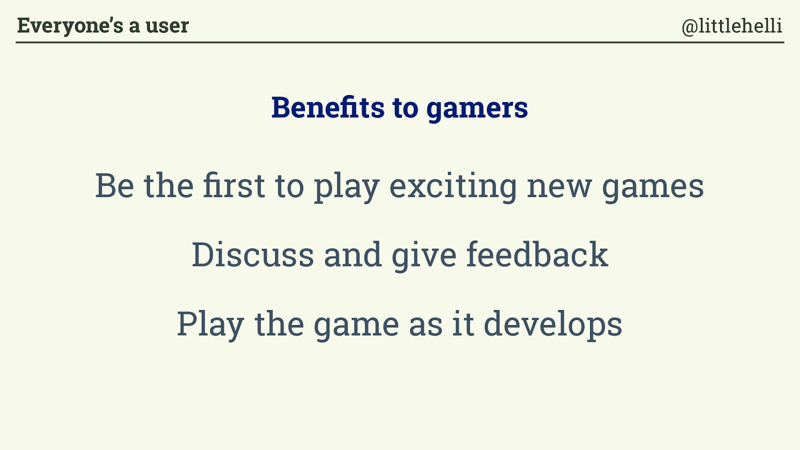
Be the first to play exciting new games Discuss and give feedback Play the game as it develops Benefits to gamers Everyone’s a user @littlehelli
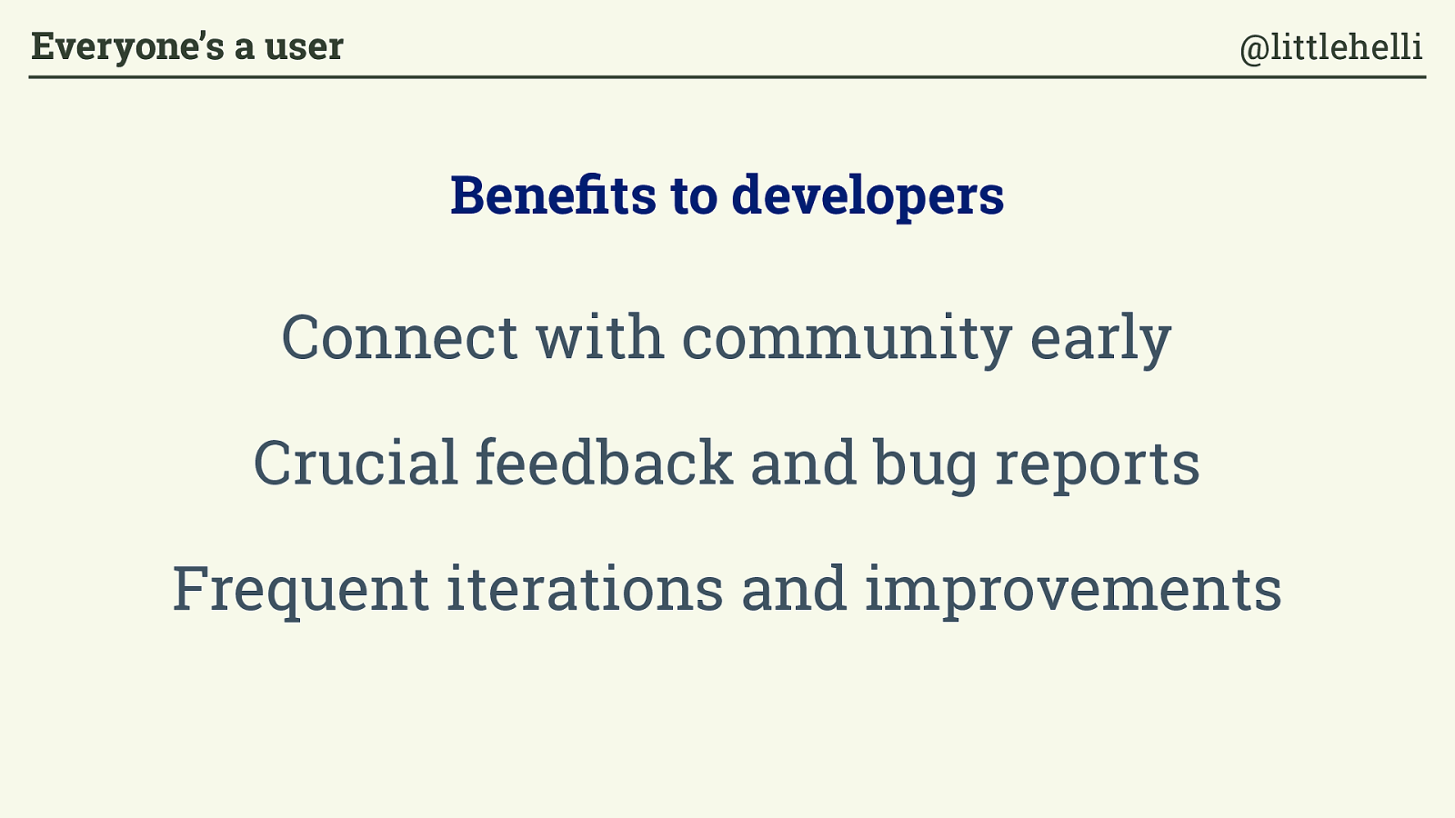
Benefits to developers Connect with community early C rucial feedback and bug reports Frequent iterations and improvements Everyone’s a user @littlehelli
“ These are games that evolve as you play them, as you give feedback, and as the developers update and add content. This is the way games should be made. ” Steam early access Everyone’s a user @littlehelli
“These are websites that evolve as you use them, as you give feedback, and as the designers and developers update and add content. This is the way websites should be made. ” Everyone’s a user @littlehelli
Open & inclusive organisations Everyone’s a user @littlehelli

Everyone’s a user @littlehelli
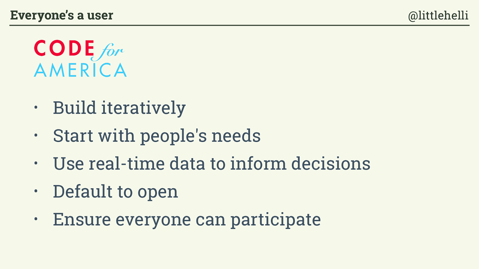
• Build iteratively • Start with people's needs • Use real-time data to inform decisions • Default to open • Ensure everyone can participate Everyone’s a user @littlehelli
ALPHA GOV.UK identity guidelines December 2013 9 For printed materials and stationary, the symbol should be black Symbol Printed Symbol Printed Everyone’s a user @littlehelli
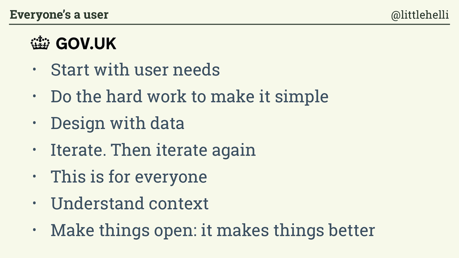
• Start with user needs • Do the hard work to make it simple
• Design with data
• Iterate. Then iterate again
• This is for everyone • Understand context • Make things open: it makes things better ALPHA GOV.UK identity guidelines December 2013 9 For printed materials and stationary, the symbol should be black Symbol Printed Symbol Printed Everyone’s a user @littlehelli
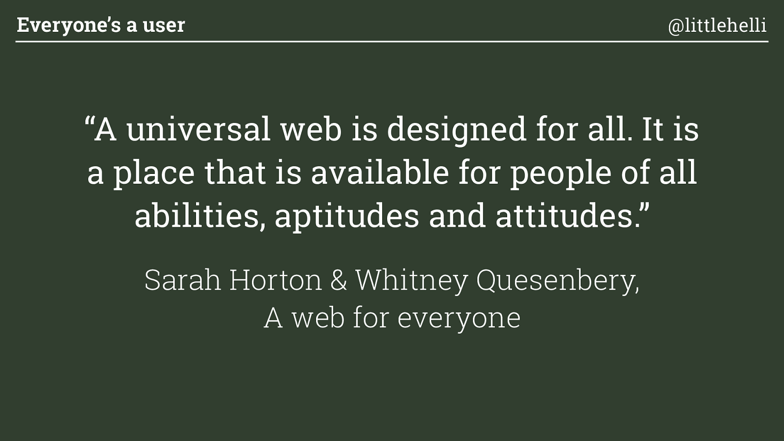
“A universal web is designed for all. It is a place that is available for people of all abilities, aptitudes and attitudes.”
Sarah Horton & Whitney Quesenbery, A web for everyone Everyone’s a user @littlehelli

Visual design Typical digital design process Everyone’s a user @littlehelli
Development Typical digital design process Everyone’s a user @littlehelli
Beta testing Typical digital design process Everyone’s a user @littlehelli
“Hang on this is going to be accessible, right? ” Everyone’s a user @littlehelli
“No problem, we’ll add some in. ” Everyone’s a user @littlehelli
“We are creating websites and apps to be accessed, yet treating accessibility like an optional extra.”
Mischa Andrews, The inaccessible web: how we got into this mess Everyone’s a user @littlehelli
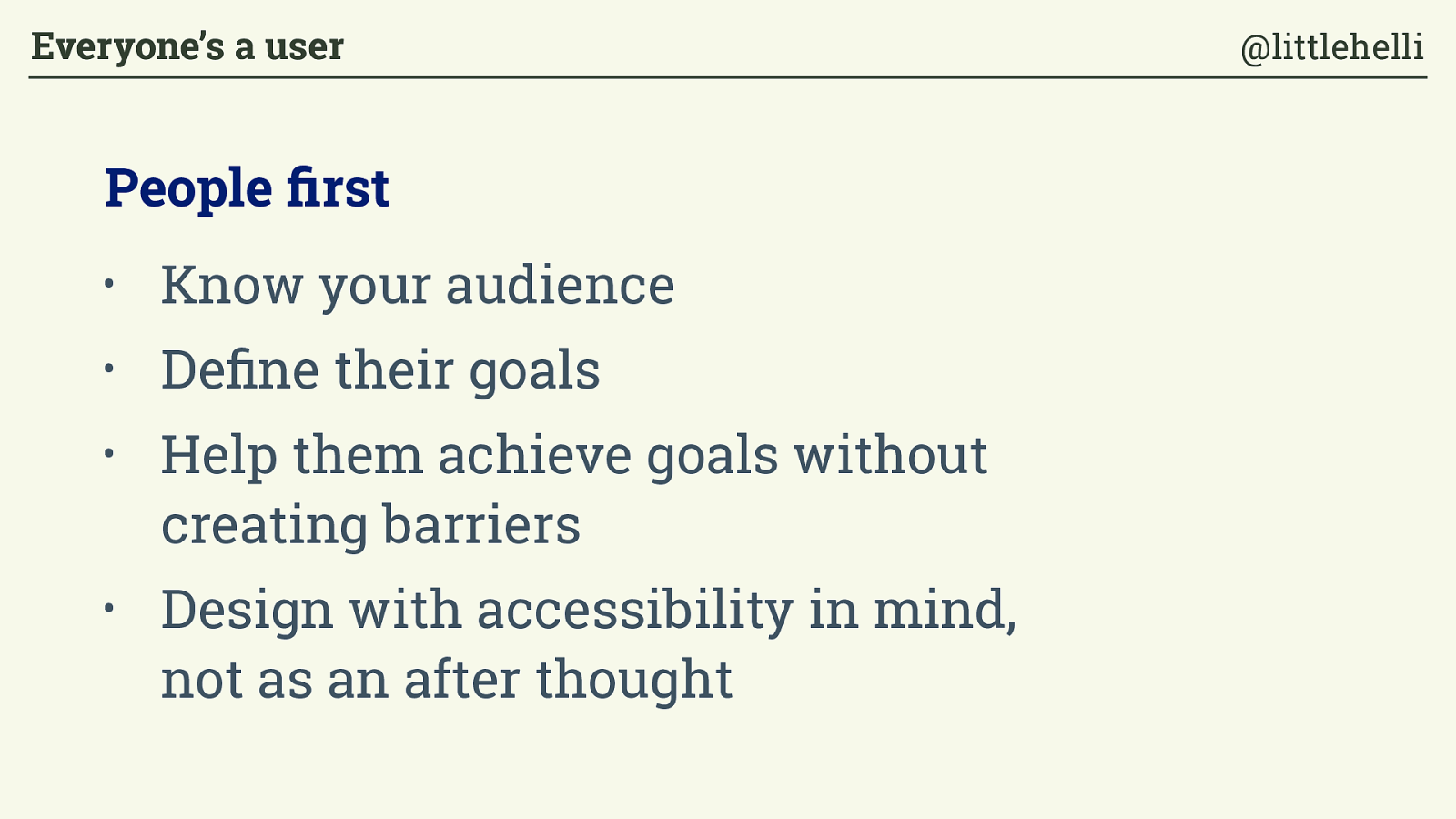
•
Know your audience
•
Define their goals
•
Help them achieve goals without
creating barriers
•
Design with accessibility in mind,
not as an after thought
People first
Everyone’s a user
@littlehelli
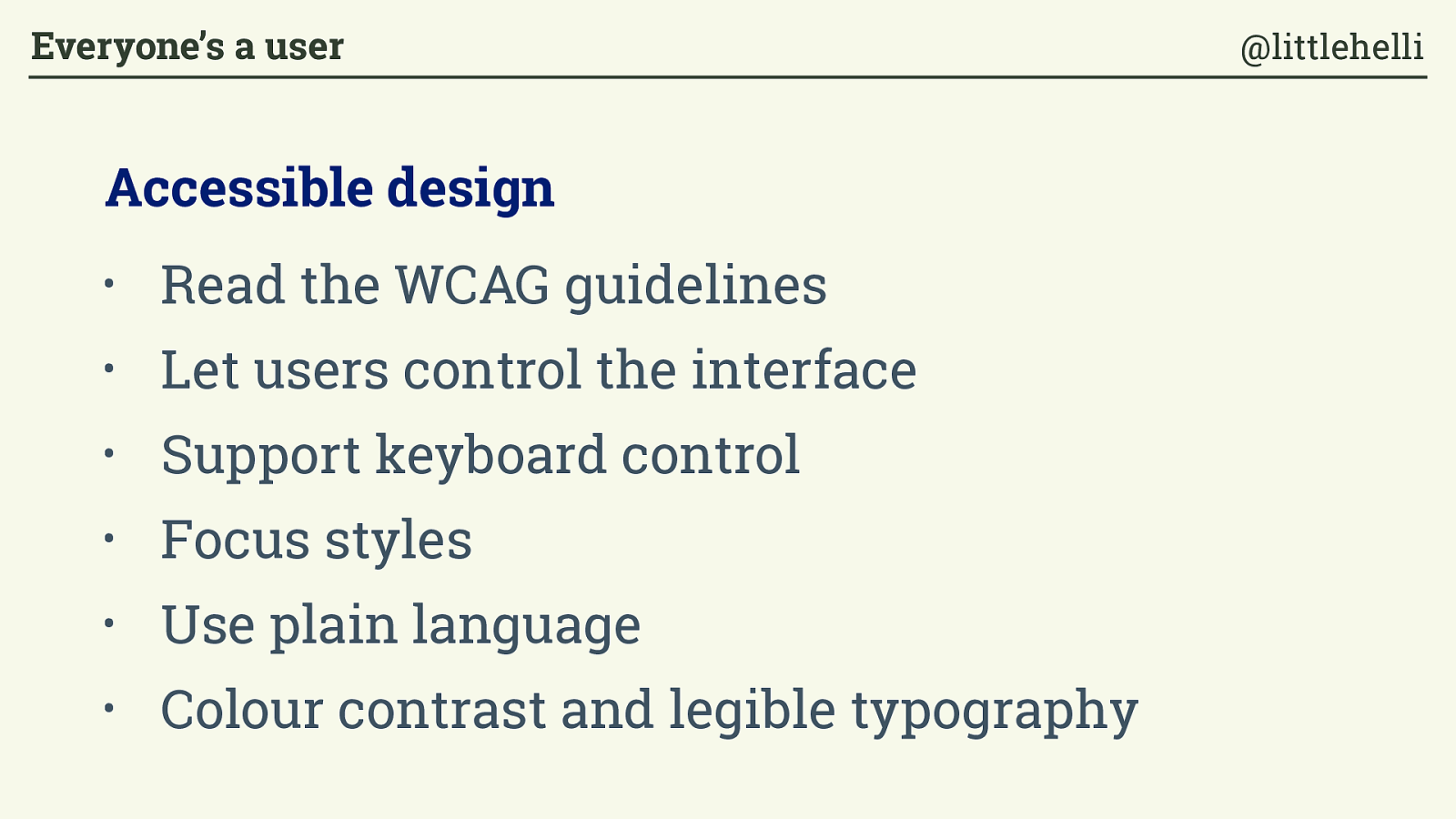
•
Read the WCAG guidelines
•
Let users control the interface
• Support keyboard control
•
Focus styles
•
Use plain language
•
Colour contrast and legible typography
Accessible design
Everyone’s a user
@littlehelli
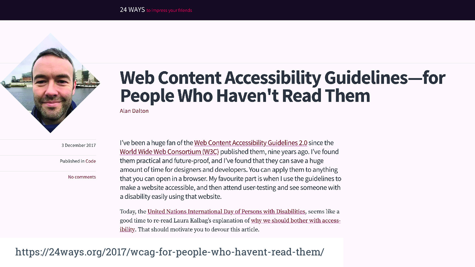
https://24ways.org/2017/wcag-for-people-who-havent-read-them/
“Everyone is responsible for looking out for the user.”
Erika Hall, Just enough research Everyone’s a user @littlehelli
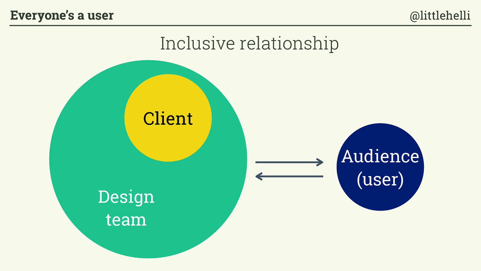
Client Audience (user) Design team Inclusive relationship Everyone’s a user @littlehelli
Making websites is hard! Everyone’s a user @littlehelli
Making websites is hard! Everyone’s a user @littlehelli
Making results-driven, user-oriented, effective websites on time and on budget is fucking hard ! Everyone’s a user @littlehelli
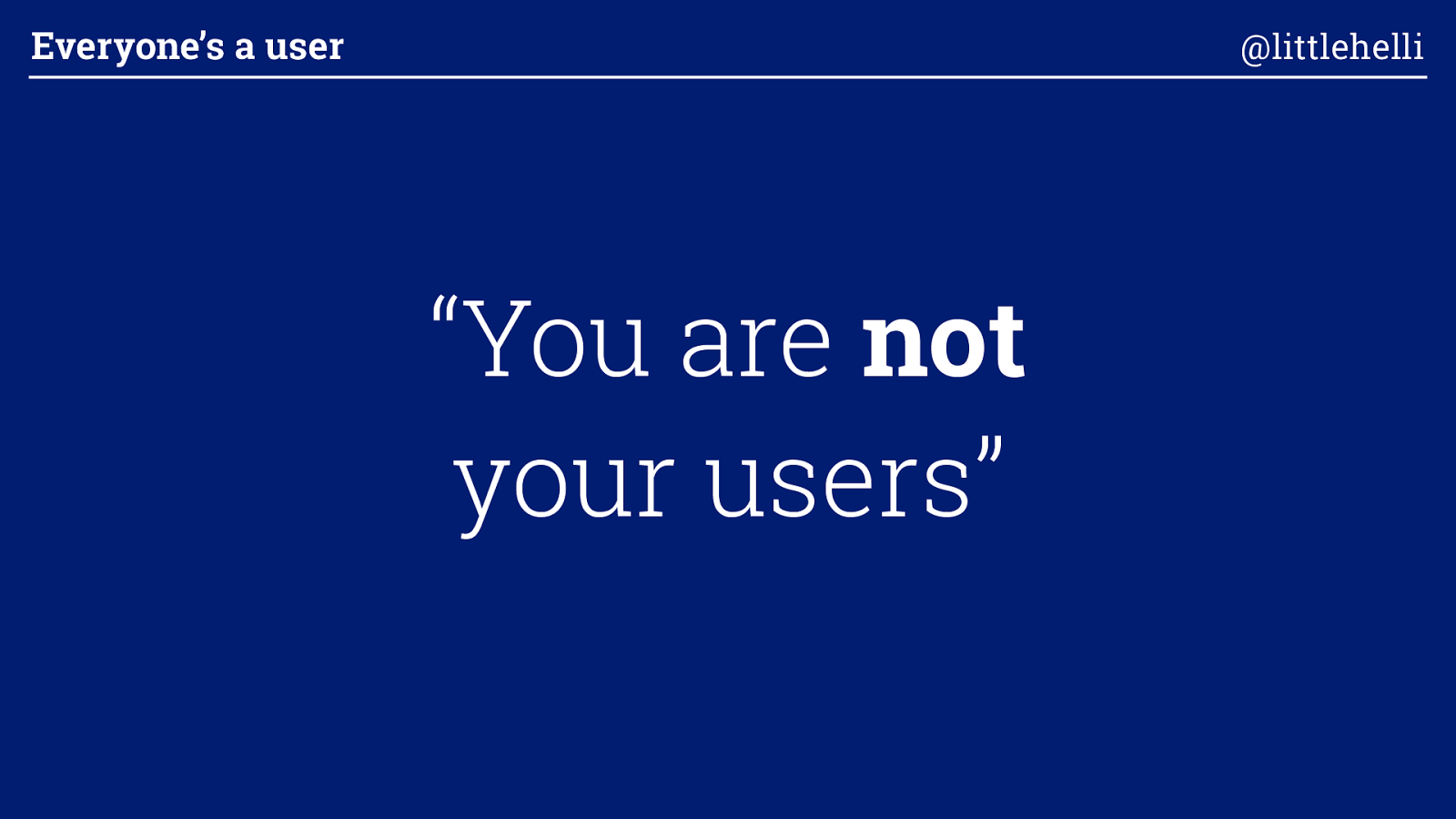
“You are not
your users” Everyone’s a user @littlehelli
Everyone’s a user @littlehelli
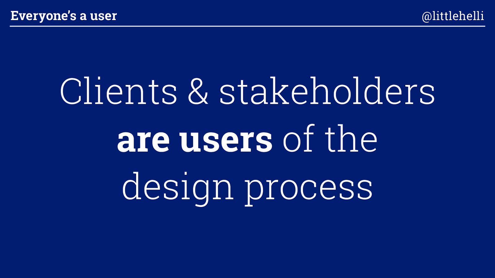
Clients & stakeholders are users of the design process Everyone’s a user @littlehelli
Everyone’s a user @littlehelli
What can we do to make the design process
better
for them? Everyone’s a user @littlehelli
How can they see the value of the way we work? Everyone’s a user @littlehelli
Why should they care ? Everyone’s a user @littlehelli
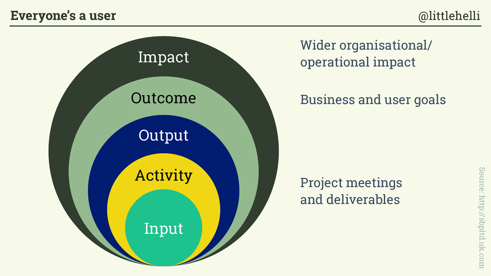
Impact Outcome Input Output Activity Source: http://sbpltd.uk.com Project meetings and deliverables Business and user goals Wider organisational/ operational impact Everyone’s a user @littlehelli
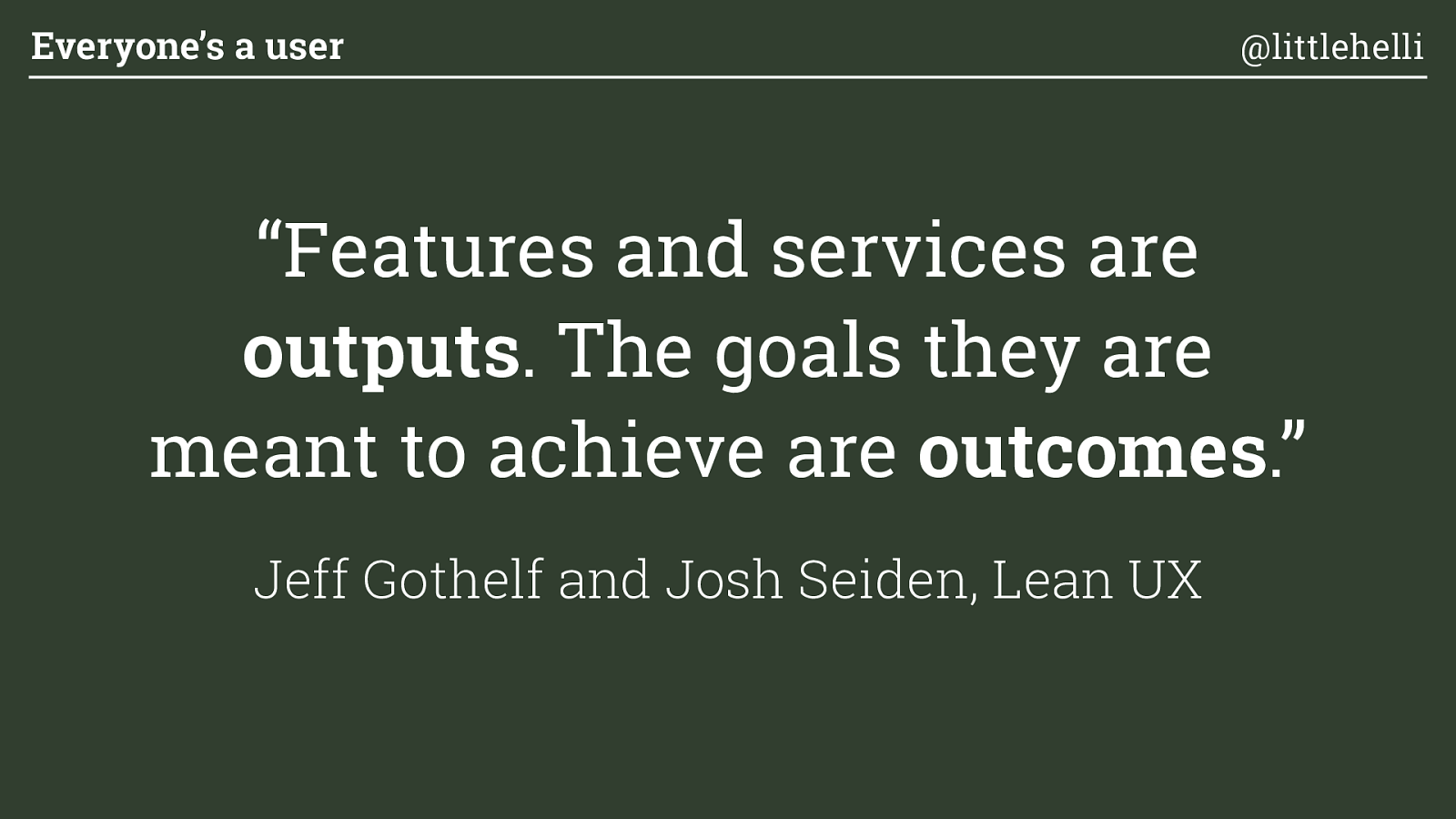
“Features and services are outputs . The goals they are meant to achieve are outcomes . ” Jeff Gothelf and Josh Seiden, Lean UX Everyone’s a user @littlehelli
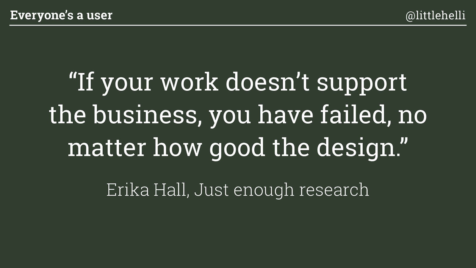
“If your work doesn’t support the business, you have failed, no matter how good the design. ” Erika Hall, Just enough research Everyone’s a user @littlehelli
3 ways to focus stakeholders on outcomes, not outputs (and make them feel included) Everyone’s a user @littlehelli
“The re is no design without discovery” Dan Brown, Practical Design Discovery Everyone’s a user @littlehelli
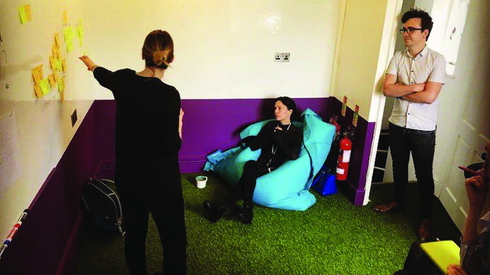
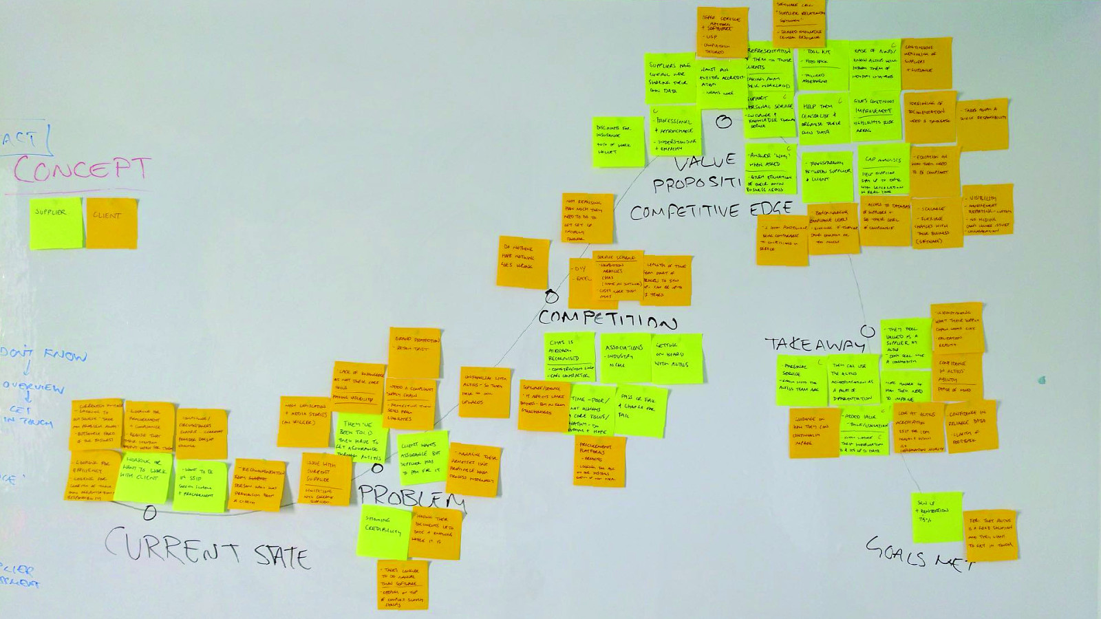
Storymapping Everyone’s a user @littlehelli
24
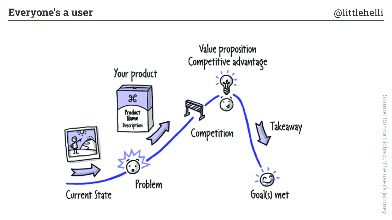
C hapter 3 How Concept Stories Work Because concept stories illustrate how your target customers do or could think about your product or service, they are either based on real data or are aspirational. Think of them as the mental calculation that someone makes when they ' rst hear about your product. The story might only last a few seconds as your customer puts together the important pieces of what your product is and what they can do with the product. Even though it lasts a few seconds, this story sets the stage for your customer being intrigued or excited by what your product is. Concept stories operate like this (see Figure 3.1): •
Exposition: The current state of things •
Inciting Incident/Problem: The problem your product will solve •
Rising Action: The product name and a brief description or market category •
Crisis: The competition FIGURE 3.1 How a concept story is structured and operates—this is how people think about and see value in your product. Source: Donna Lichaw, The user’s journey Everyone’s a user @littlehelli
“Inviting people to participate empowers them. ” Erika Hall, Just enough research Everyone’s a user @littlehelli
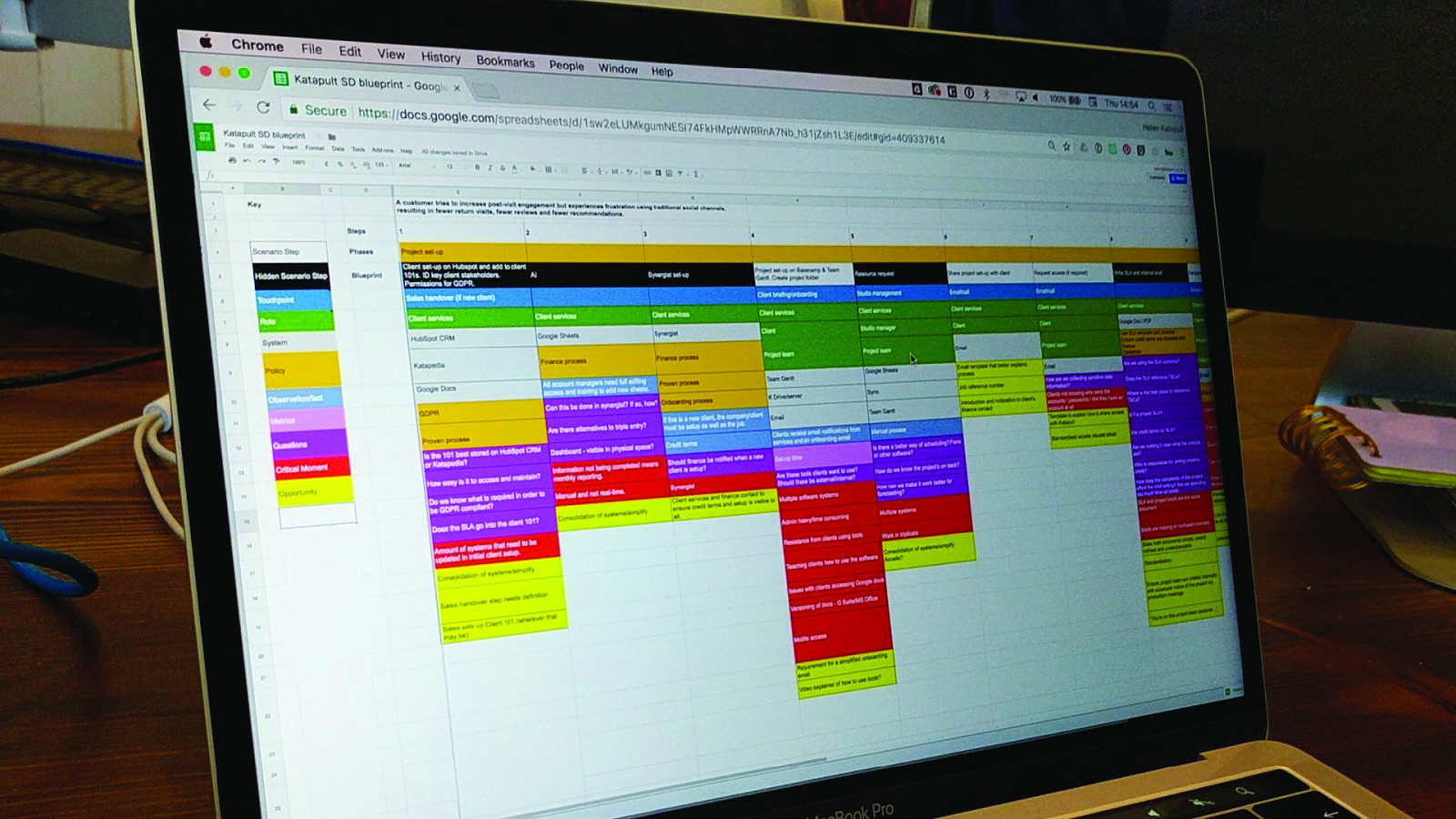
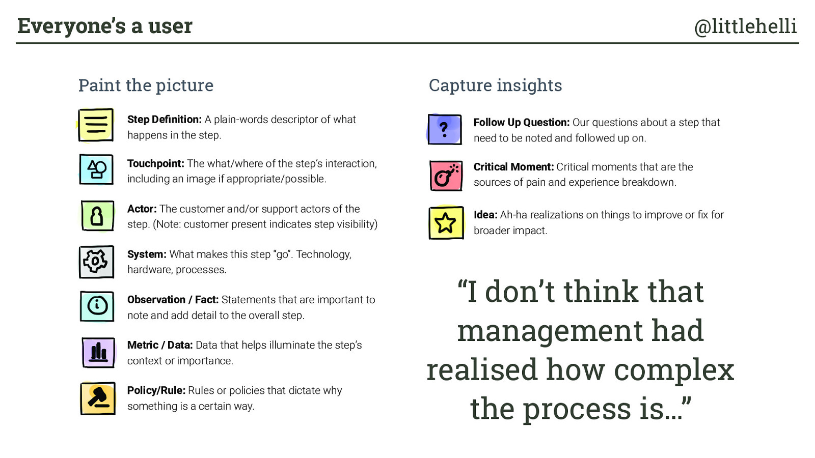
Service design blueprint Everyone’s a user @littlehelli
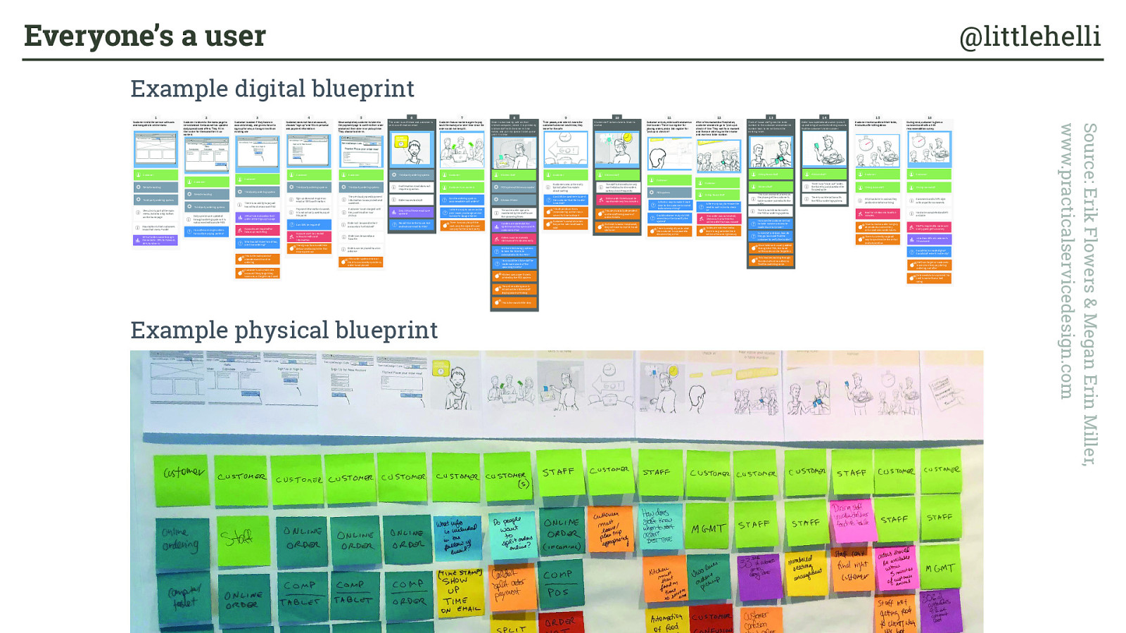
Example physical blueprint Example digital blueprint Source: Erik Flowers & Megan Erin Miller, www.practicalservicedesign.com Everyone’s a user @littlehelli at www.practicalservicedesign.com Customer visits the-service-cafe.com and navigates to online menu 1 Screenshot of online menu CustomerWebsite hosting The order is confirmed and customer is sent a confirmation email 6 Touchpoint Order is received by cafe on their kitchen computer, where it is printed by kitchen staff with the dine-in time noted, and put in a special ticket queue until it is time. 8 Touchpoint Kitchen staff notices tickets. Order is started. 10 Touchpoint Front of house staff gives the table number to the customer and sends the number back to be written on the existing ticket. 13 Touchpoint Order is completed and a server picks it up and brings it out to the dining room to find the customer’s table number. 14 Touchpoint Customer is asked if they have an account already, and given choice to sign up for one, or to sign in with an existing one 3 Touchpoint Customer does not have an account, chooses “sign up” and fills in personal and payment information 4 Touchpoint Customer is taken to the menu page to view standard items as well as updated daily specials and offers. They fill in their order for them and their 2 co-workers 2 Touchpoint Once completed, customer is taken to the payment page to confirm their order and select their dine-in or pickup time. They choose to dine-in. 5 Touchpoint Customer has co-workers agree to pay back the money at a later time since the order could not be split. 7 Touchpoint Time passes, and when it nears the customer’s desired lunch time, they leave for the cafe. 9 Touchpoint Customer arrives, enters cafe and sees a line to order. There is a register for placing orders, and a 2nd register for “pick up & check in”. 11 Touchpoint After a few moments of hesitation, customer decides to go to “pick up & check in” line. They wait for a moment and then are able to give their name and receive a table number. 12 Touchpoint Customer receives order at their table,9 minutes after sitting down. 15 Touchpoint During meal, customer is given a comment card with a 1-10 recommendation survey. 16 Touchpoint Third party ordering systemMenu link is part of the main menu, but also a big button on the homepage Customer Customer Customer Customer Customer Kitchen Staff Customer Kitchen Staff Dining Room Staff Kitchen Staff Customer Customer Customer Customer Third party ordering system Third party ordering system Website hostingThird party ordering system Third party ordering system Third party ordering system POS system/Kitchen computerKitchen Printer POS system Assumption is that customers know that menu = order There is no ability to pay ad-hoc without an account first Daily specials are updated through ordering system. It is not connected to onsite POS Accounts are required for follow up marketing 19% of users abandon their order at the Sign up/in page This is the main point of abandonment in online ordering What would it take for ad-hoc, one time ordering? 30% of orders come through the website - 20% for takeout, 10% for dine-in Sign up does not require an email or SMS confirmation There is no way to split the cost, only the signed in user can pay for the whole party Confirmation email does not require any action. Can the ordering system accommodate split orders?Is there a way to use an online peer money exchange service to help? ie Google Wallet Only 15% of these emails are opened Can SMS be used here to alert the customer that their order is started? Could customer reply via SMS when the arrive to notify the system? This depends on them remembering on their own when it’s time to depart Can SMS be required?Account can’t be created without credit card information Customer’s will create new account if they forget they have one, or forget email used Goal for sit-down to food is 5 minutes. Dining room staffComment card is NPS style with a spot for commentsHas to be completed and left on table Could this be made digital? Could staff enter it in directly? Data needs to be captured. No card is worse than a bad rating. Staff is required to make sure every guest get’s a survey Staff can forget or customres leave since they pay during ordering, not after Less than 30% of customer’s fill out card A tip has to be in cash as they paid online before arriving Dining room staff Time to receive order is highly dependant on when they arrive and when order startsThere is currently no good way to synchronize the arrival and preparation How often are single orders for multiple paying parties? The sign up flow is a definite detour and bump in the first-time experience Payment information is saved, it is not actually used to pay at this point The previously saved payment information is now picked and used here.Customer is not charged until they confirm dine-in or pickup.Order will be saved in their account as “unfinished”Order can be saved as a favorite. Would it be better to use text and not use email for this? Order moves to step 8 Kitchen uses paper tickets printed by the POS systemThe online order queue is reliant on the kitchen staff staying aware of timing Are there technology options to have the tickets be automated with the POS? The online order queue is monitored by the staff to see the upcoming times This is the most brittle step X orders are started at the right time so they sync up with customer arrivalOrders must be started a minimum of 15 minutes early How could the kitche staff be made more aware of the upcoming tickets? Customer’s complain when they arrive later and food is cold Customers who arrive early typically don’t complain about waiting This step is totally dependent on the staff being aware of online tickets. Online order tickets must be monitored every few minutes The staff is trained to be very worried about online orders so they check frequently If a ticket is lost or misplaced, they will have to reprint it and start over There is ambiguity as to what the customer is supposed to do when they arrive Tables are not reserved so there is no guarantee there will be a free one right away There is no “close out” order, the ticket is just placed on the finished spike Since tables are usually added through the POS, the hand written ones can be forgotten This is an awkward process as they have get the customer’s table number paired with the order This involves looking through the stack of online orders to find the matching name How can the customer arrival to table number process be made less error-prone?In event of a mishap, how do they go back and find the customer to verify their order? Kitchen Staff Is there a way to make it more clear to the customer on what to do when arriving? Dining Room Staff There is no interaction with the POS or ordering systems There is no interaction with the POS or ordering systems Is there any way to remove the need to wait in line to check in? Orders can be placed hours in advanceIf the order system errors or there is a connection problem, order is not placed If an order was not started, kitchen will prioritize the online order that was missed Customer’s co-workers Example Digital Blueprint Example Physical Blueprint
User-annotated sitemap Everyone’s a user @littlehelli
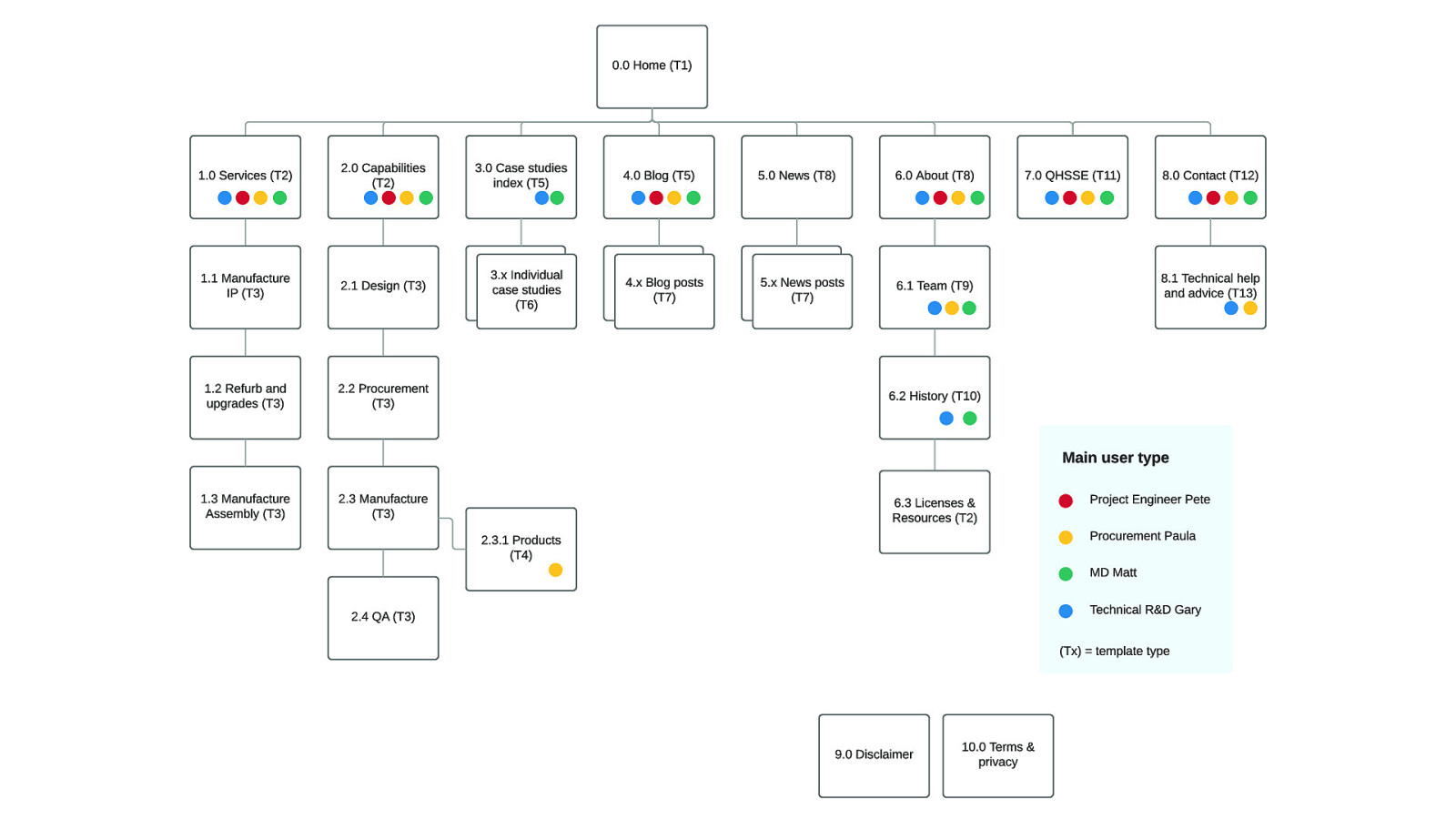
P R O B E
O I L
S I T E
M A P
S e p t e m b e r
8 ,
2 0 1 7 0 . 0
H o m e
( T 1 ) P r o j e c t
E n g i n e e r
P e t e P r o c u r e m e n t
P a u l a T e c h n i c a l
R & D
G a r y M D
M a t t
M a i n
u s e r
t y p e 3 . 0
C a s e
s t u d i e s
i n d e x
( T 5 ) 4 . 0
B l o g
( T 5 ) 7 . 0
Q H S S E
( T 1 1 ) 5 . 0
N e w s
( T 8 ) 6 . 0
A b o u t
( T 8 ) 5 . x
N e w s
p o s t s
( T 7 ) 1 . 3
M a n u f a c t u r e
A s s e m b l y
( T 3 ) 2 . 2
P r o c u r e m e n t
( T 3 ) 1 . 2
R e f u r b
a n d
u p g r a d e s
( T 3 ) 2 . 1
D e s i g n
( T 3 ) 2 . 3 . 1
P r o d u c t s
( T 4 ) 2 . 0
C a p a b i l i t i e s
( T 2 ) 1 . 0
S e r v i c e s
( T 2 ) 1 . 1
M a n u f a c t u r e
I P
( T 3 ) 4 . x
B l o g
p o s t s
( T 7 ) 2 . 3
M a n u f a c t u r e
( T 3 ) 2 . 4
Q A
( T 3 ) 3 . x
I n d i v i d u a l
c a s e
s t u d i e s
( T 6 ) 6 . 1
T e a m
( T 9 ) 8 . 0
C o n t a c t
( T 1 2 ) 8 . 1
T e c h n i c a l
h e l p
a n d
a d v i c e
( T 1 3 ) 6 . 2
H i s t o r y
( T 1 0 ) 9 . 0
D i s c l a i m e r 1 0 . 0
T e r m s
&
p r i v a c y 6 . 3
L i c e n s e s
&
R e s o u r c e s
( T 2 ) v
1 . 1 ( T x )
=
t e m p l a t e
t y p e
Results per page Everyone’s a user @littlehelli
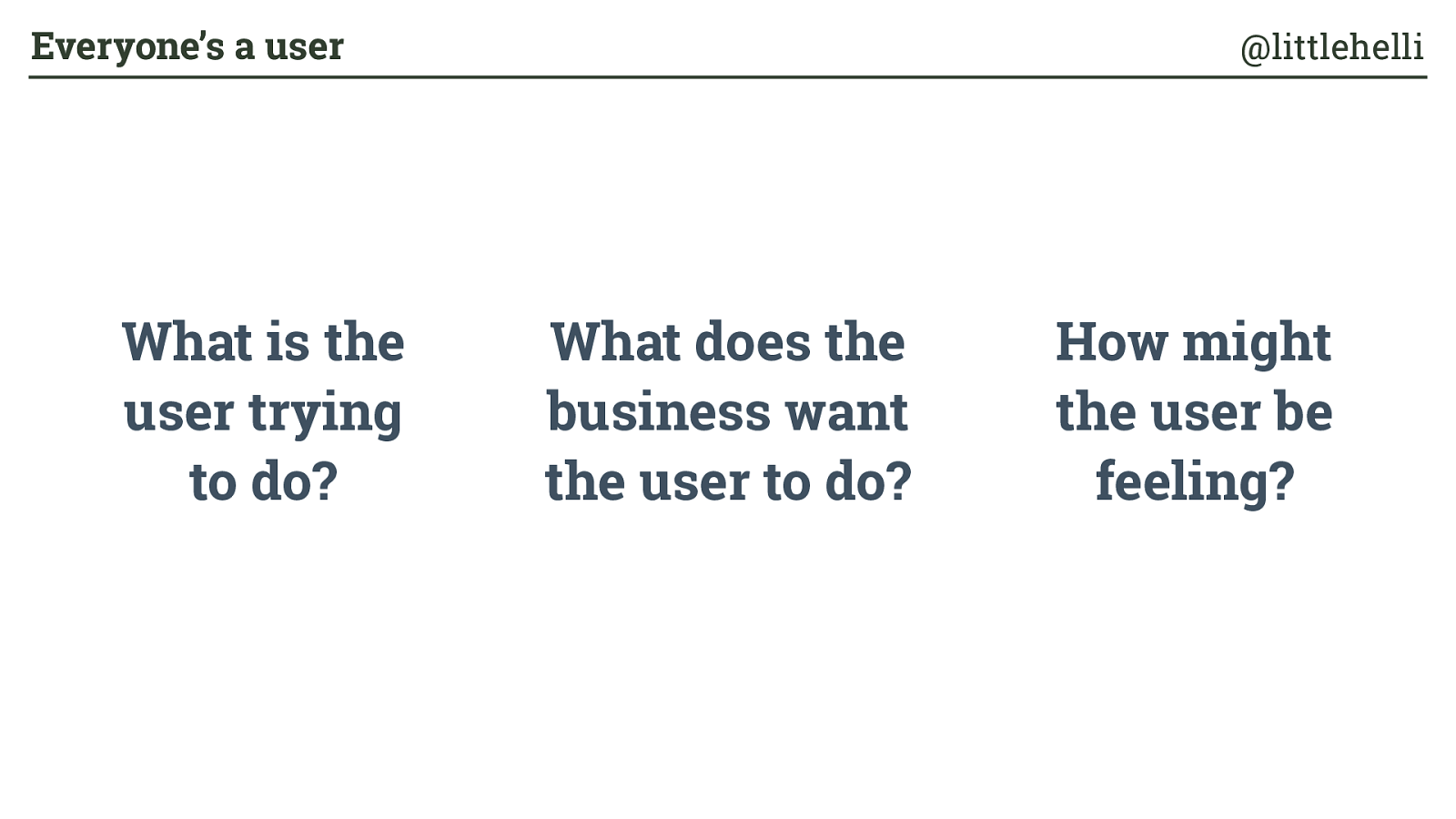
What is the user trying to do? What does the business want the user to do? How might the user be feeling? Everyone’s a user @littlehelli
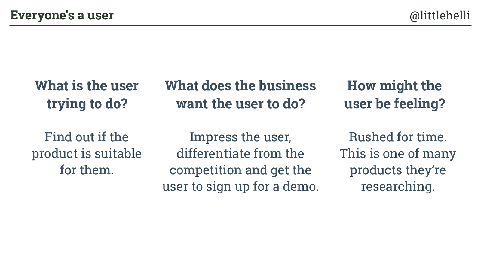
What is the user trying to do? What does the business want the user to do? How might the user be feeling? Find out if the product is suitable for them. Impress the user, differentiate from the competition and get the user to sign up for a demo. Rushed for time. This is one of many products they’re researching. Everyone’s a user @littlehelli
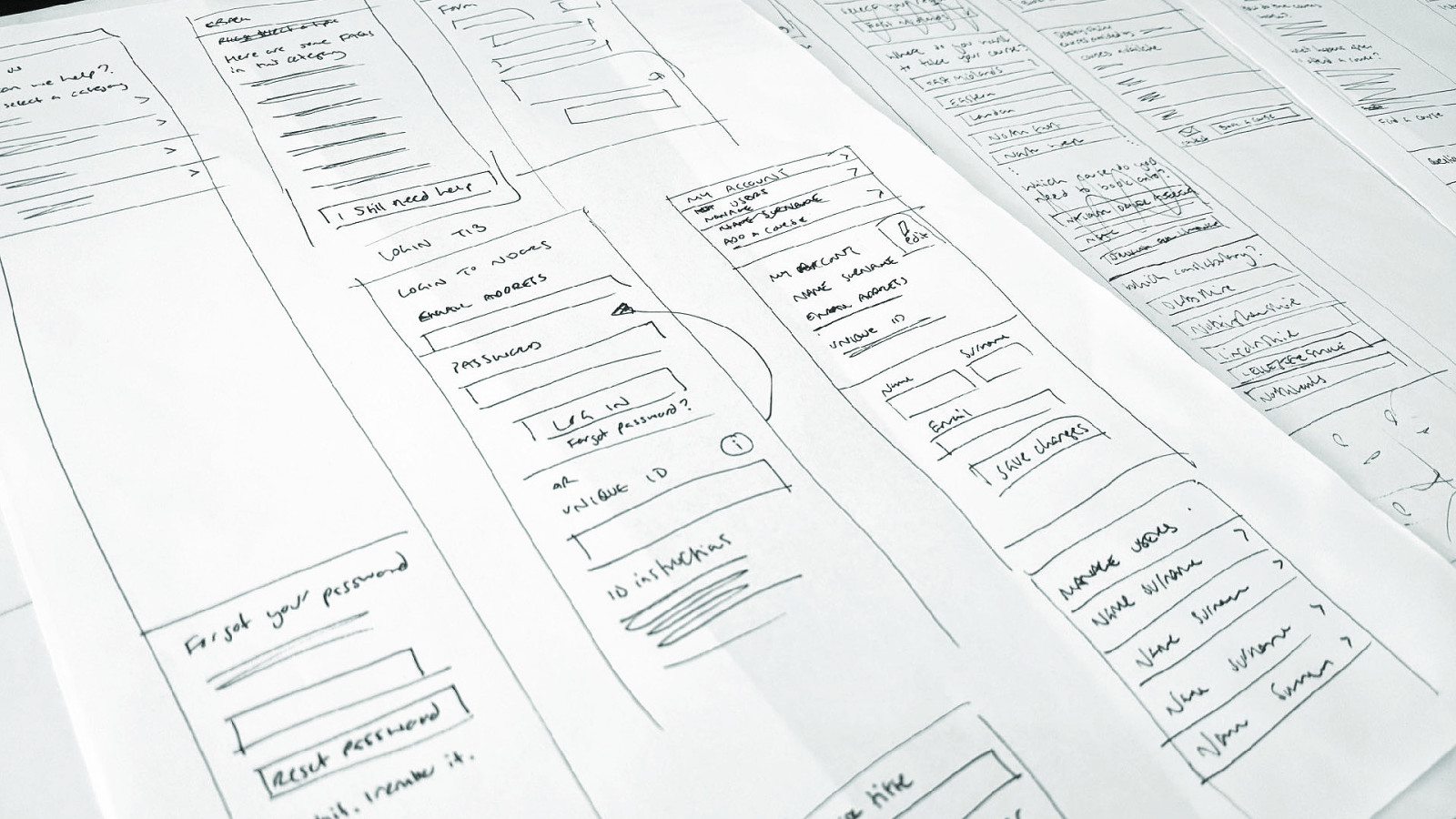
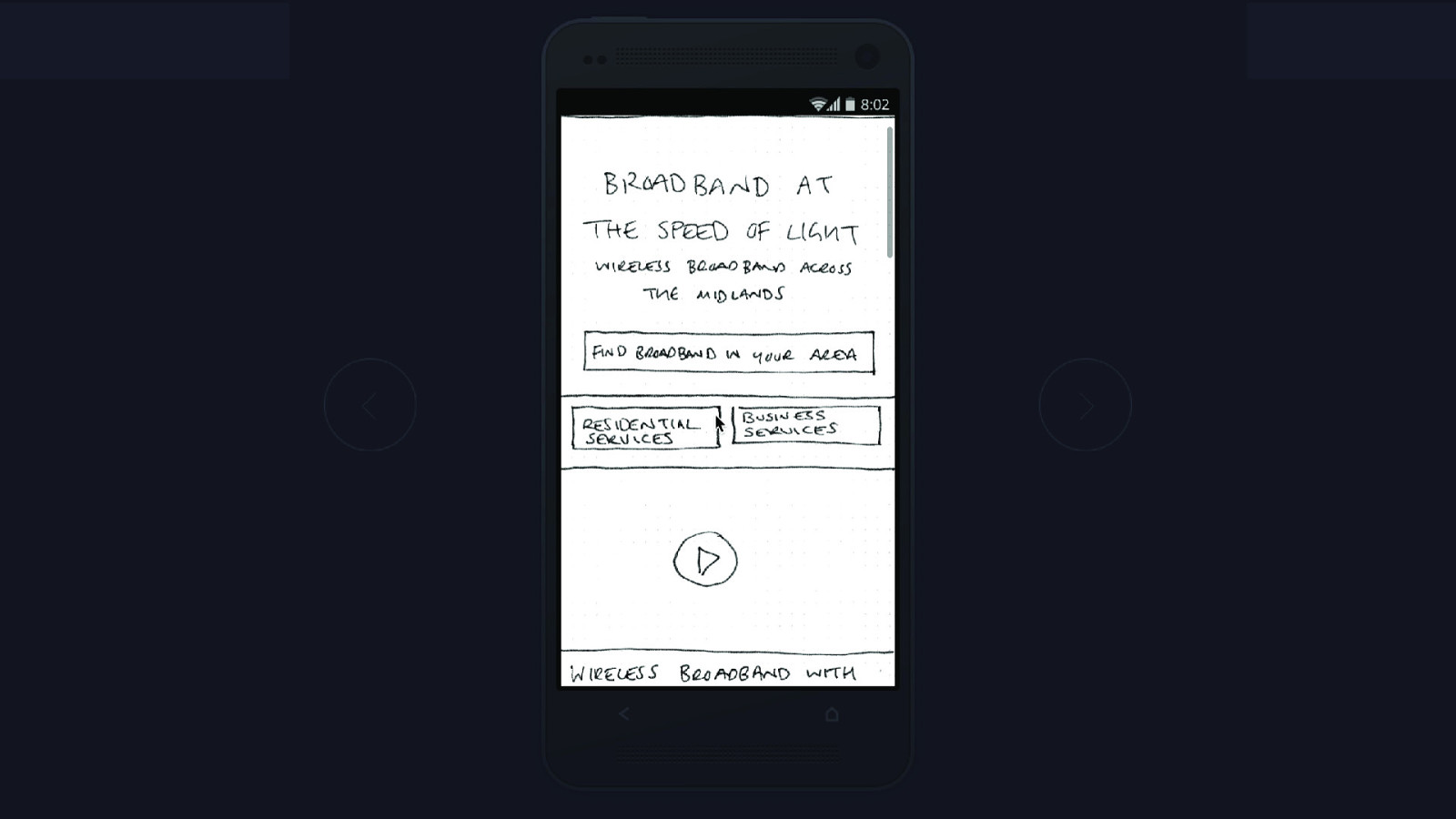
“I can see how much thought has gone into this.” Everyone’s a user @littlehelli
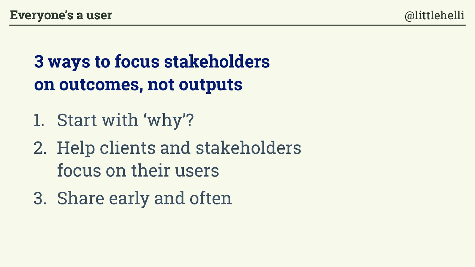
Start with ‘why’? 2. Help clients and stakeholders focus on their users 3. Share early and often 3 ways to focus stakeholders on outcomes, not outputs Everyone’s a user @littlehelli
“No one is born knowing how to be a good client. Successful design projects need equal participation from the client and the designer.”
Mike Monterio, You’re my favorite client Everyone’s a user @littlehelli
Thank you! Everyone’s a user @littlehelli
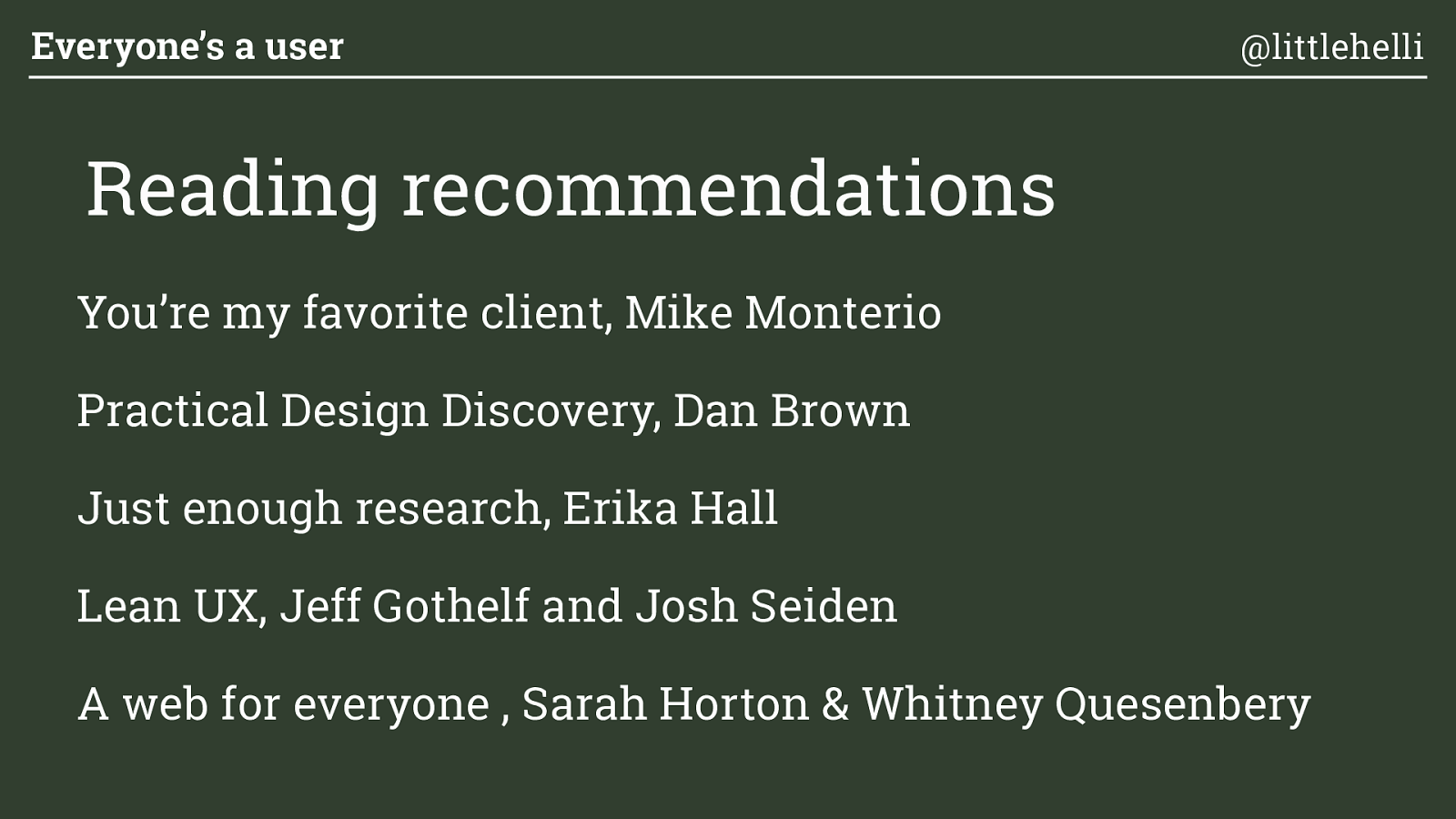
You’re my favorite client, Mike Monterio
Practical Design Discovery, Dan Brown
Just enough research, Erika Hall
Lean UX, Jeff Gothelf and Josh Seiden
A web for everyone , Sarah Horton & Whitney Quesenbery Everyone’s a user @littlehelli Reading recommendations