Digital inclusion: Designing for everyone
Alt: Hi! I’m Helen UX consultant User researcher Service designer Women in Tech Nottingham & Tech Nottingham organiser Hot yoga lover Massive procrastinator
A presentation at UX Crunch, Manchester in February 2020 in Manchester, UK by Helen Joy
Alt: Hi! I’m Helen UX consultant User researcher Service designer Women in Tech Nottingham & Tech Nottingham organiser Hot yoga lover Massive procrastinator
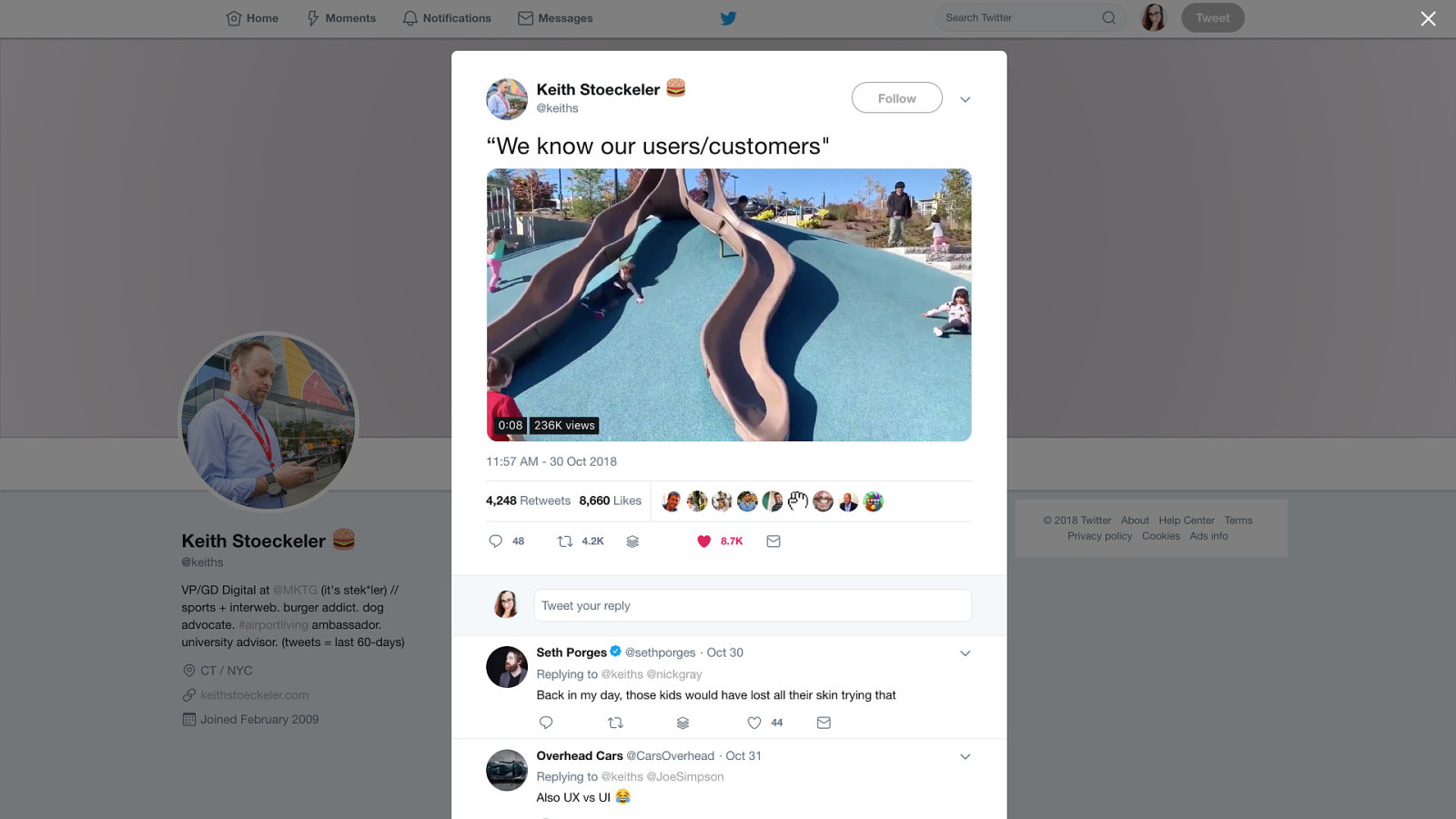
Alt: A tweet showing image of kids sliding along the ground alongside slides at a playground
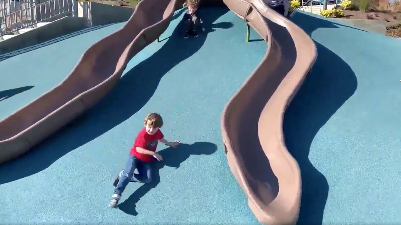
Alt: A video of kids sliding along the ground alongside slides at a playground
Notes A metaphor for people not using design in the way it was intended The aim of this talk is to think about the real people we’re designing for. Not who we imagine them to be. This puts us into our own filter bubbles
Alt: A young blonde woman blowing bubbles
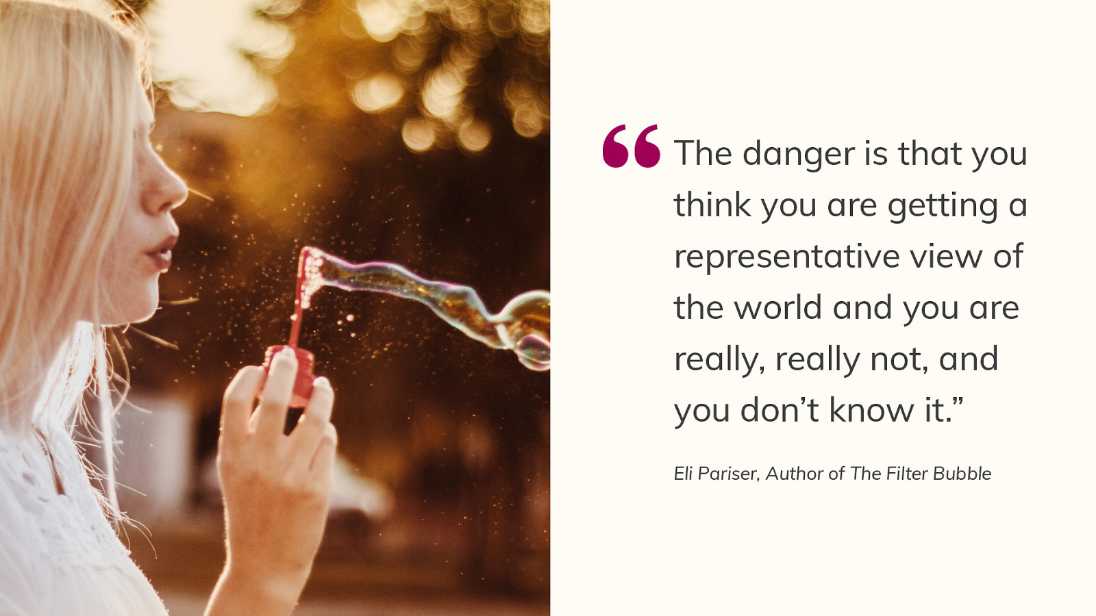
“The danger is that you think you are getting a representative view of the world and you are really, really not, and you don’t know it.” Eli Pariser, Author of The Filter Bubble
Notes This happens in tech all the time. So often we build things on biases, assumptions, untested business models, wishful thinking…?
Alt: “Every decision we make can raise or lower barriers to participation in society. It’s our collective responsibility to lower these barriers through inclusive products, services, environments, and experiences.” Microsoft Inclusive Design Manual
Notes How can we lower these barriers if we don’t access the people using our products or we’’re acting as them? We can make best guesses and stick with well-known design conventions But what we really need to do is break out of our bubbles and challenge our assumptions I’m going to address some commonly held assumptions, we as designers have.
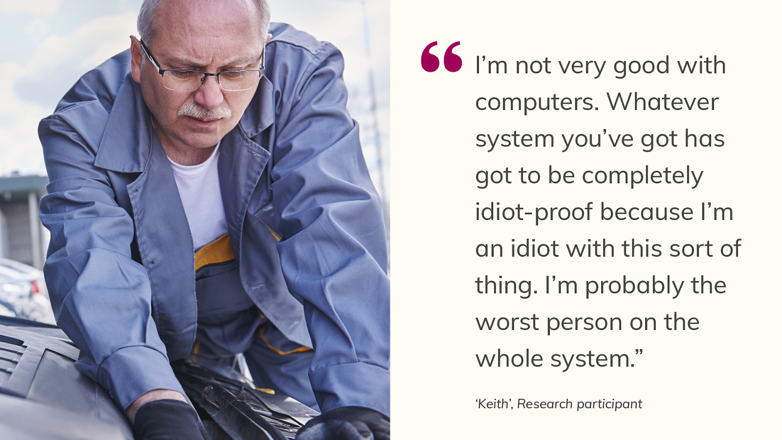
Alt: A male mechanic with white hair and fair skin working on a car in his late 50s, early 60s
“I’m not very good with computers. Whatever system you’ve got has got to be completely idiot-proof because I’m an idiot with this sort of thing. I’m probably the worst person on the whole system.” ‘Keith’, Research participant
Notes What stood out: self-critical about his tech abilities He’s managed to ‘get to grips’ with online banking He has an iPhone but uses it just for basic texts and a few email Even though he knows he can do things on his phone, if he has to do too much on it, he uses a laptop at home where his girlfriend and daughter can ‘guide him if he goes wrong.’ Despite the low confidence has the skills he needs to do his job. However…
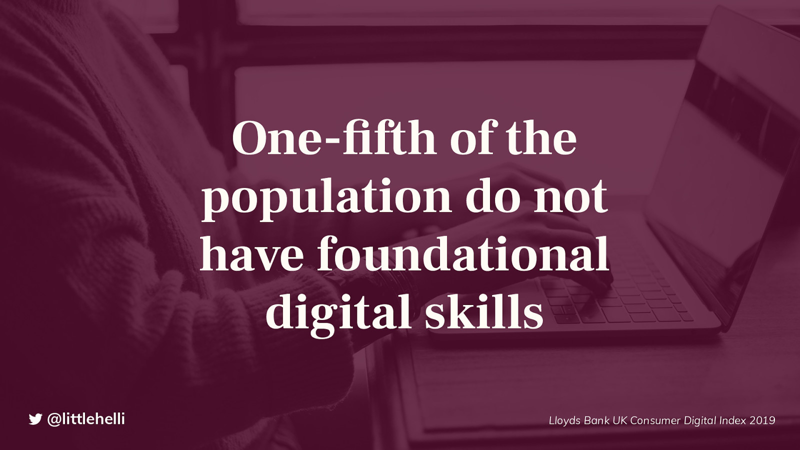
Alt: Statistic from Lloyds Bank UK Consumer Digital Index 2019
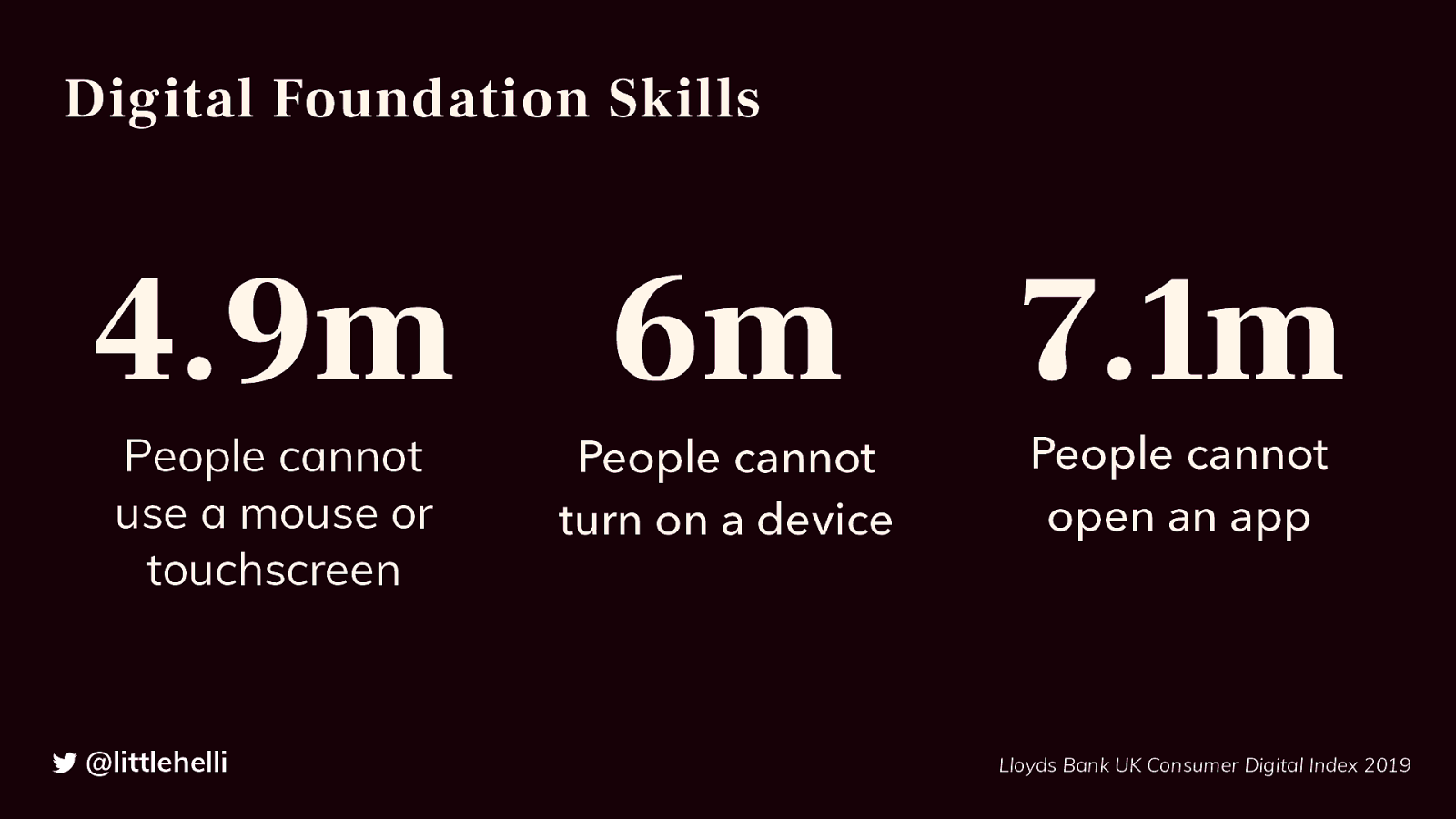
Alt: 4.9m People cannot use a mouse or touchscreen 6m People cannot turn on a device 7.1m People cannot open an app Statistic from Lloyds Bank UK Consumer Digital Index 2019
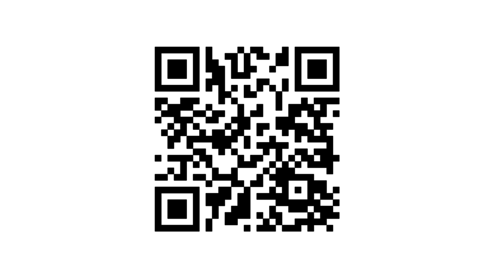
Alt: A QR code
We found several ways that people tried to scan the QR code. Only half the participants, who were office-based roles, knew how to scan it.
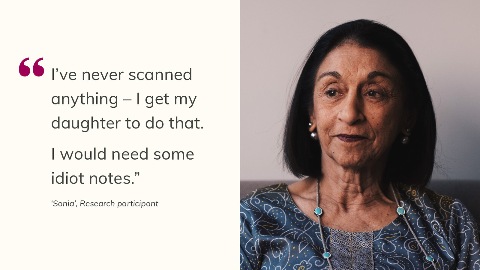
Alt: A woman in her late 50s with dark hair and skin looking away from the camera.
“I’ve never scanned anything – I get my daughter to do that. I would need some idiot notes.” ‘Sonia’, Research participant
Notes Note the use of idiot again We took the same prototype out for testing with another set of people using the service and they gave us this quote:
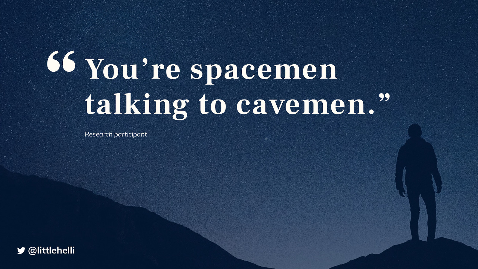
Alt: Background image of a person in front of a night sky filled with stars
Notes Sometimes we need to stop and consider that the world we exist in is completely different to other people’s worlds. That’s because we have:
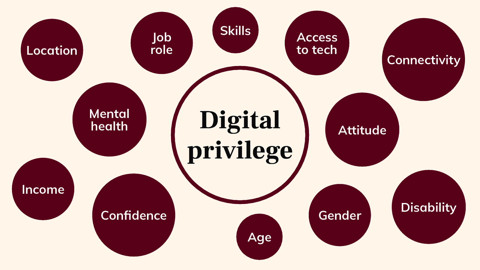
Alt: A diagram showing a big circle with the words Digital privilege. There are smaller circles around that show reasons for not having digital privilege. E.g. location, mental health, confidence, age, gender, connectivity, access to tech, disability.

Alt: A desk in an office with people working around it. There are laptops, smartphones, notepads, pens and coffee on the desk. There are people sharing sketches of wireframes.
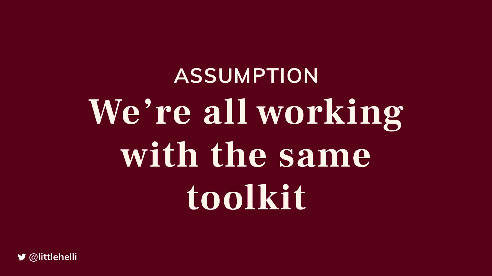
Notes Our set-up - latest tech, software, browsers, bean bags, beer, pool tables Our toolkit is not the same as the people using it
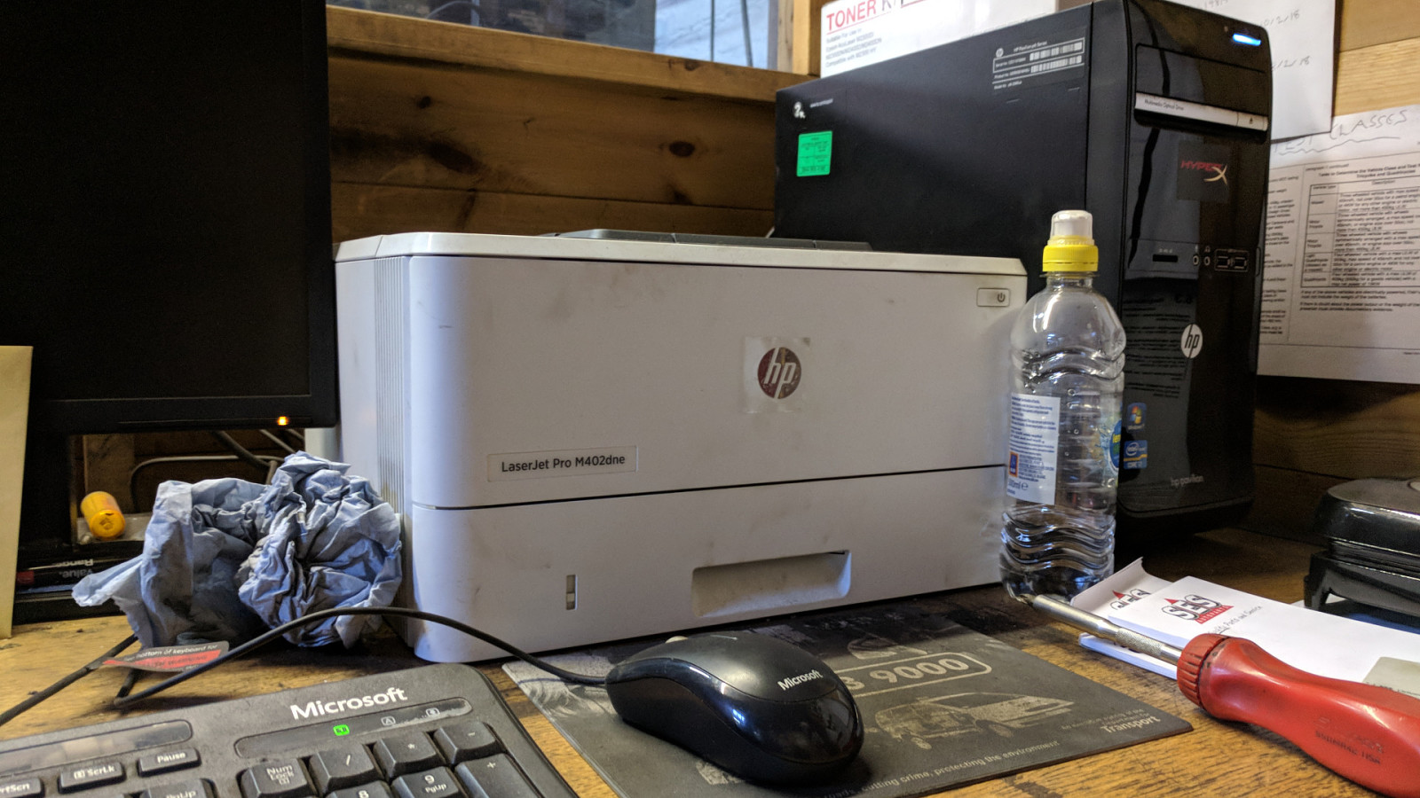
Alt: A tower PC with an oil marked printer. A dusty keyboard with an oily rag and a screwdriver on the desk. There is a wooden texture behind the computer setup.
Notes This is what the tech really looks like.
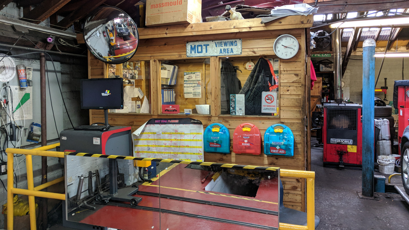
Alt: The MOT viewing area which is a shed within the garage.

Note It’s a world away from our offices.
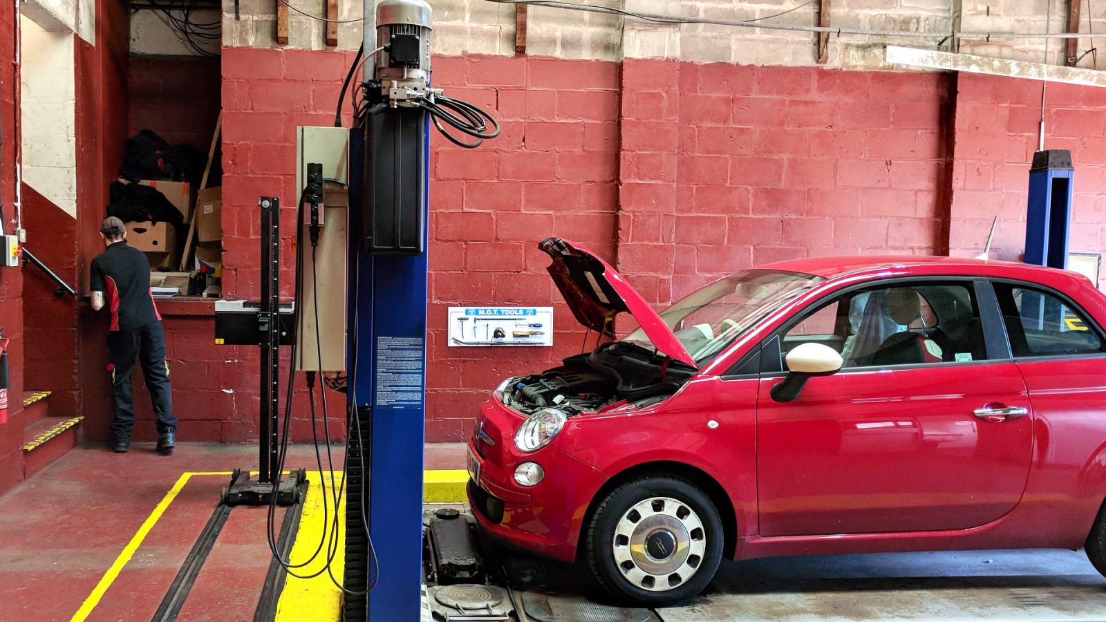
Alt: An MOT test bay with a red Fiat 500 being MOT tested. There is a mechanic in the background with his back to the camera.
Notes No computer in this picture No computer in the space in which he works He has to walk through two workshops to reception to log on and then walk back to start working on the car - back and forth This is the value of getting out: If we just imagined a user journey, we wouldn’t even consider he didn’t have instant access to a computer. This is why we need UR
Alt: “Without user research, you won’t know what problems you’re trying to solve, what to build or if the service you create will work well for users.” GDS Service Manual
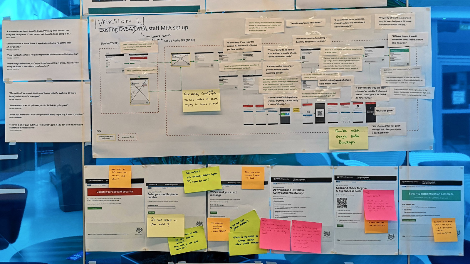
Alt: A user journey map taped to a wall. There are quotes from user research attached to the map. There are print outs of screens with post-it note annotations.
Notes We share our findings in many ways, but the most effective thing we’ve implemented is using walls My favourite UR quote - “I didn’t actually read what you were meant to do.” Feedback post-its from developers But it’s not just user research that is the responsibility of the team.
Notes Which leads me to the last assumption I want to talk about today.
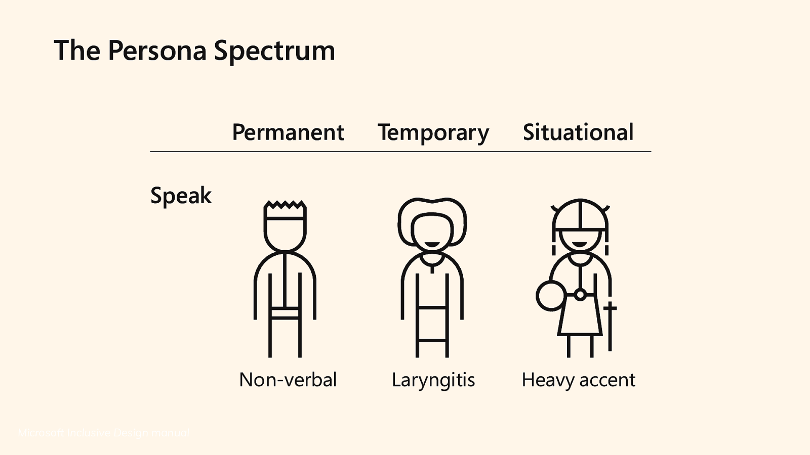
Alt: Diagram showing speech as being Non-verbal (permanent situation) having Laryngitis (temporary situation) and having a Heavy accent (situational situation)
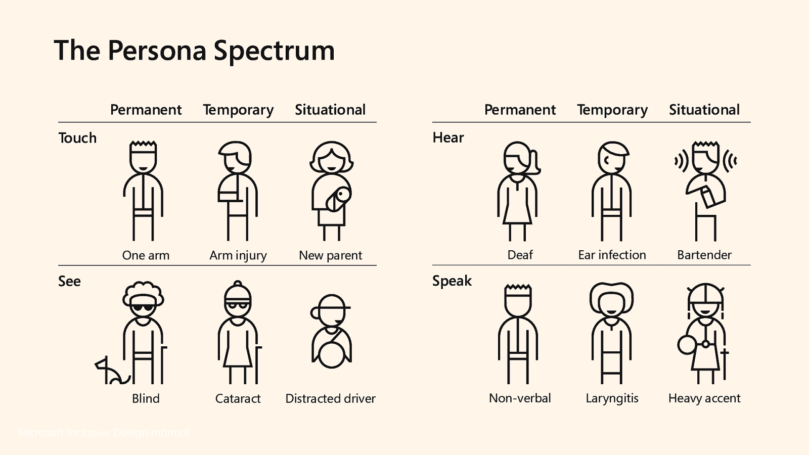
Alt: Diagram of four areas of senses Touch: One arm (permanent), Arm injury (temporary), New parent (situational) Hear: Deaf (permanent), Ear infection (temporary), Bartender (situational) See: Blind (permanent), Cataracts (temporary), Distracted driver (situational) Speak: Non-verbal (permanent), Laryngitis (temporary), Heavy accent (situational)
Alt: “We frequently only create idealised personas: attractive people happily interacting with our products and completing tasks.” Design for Real life, Eric Meyer & Sara Wachter-Boettcher

Alt: A mid-thirties man, sat at a desk in a brightly lit office, smiling at his computer.
Notes I don’t know what product he’s using, but he’s really loving it! There are a couple of things we can do to get away from the idealised persona
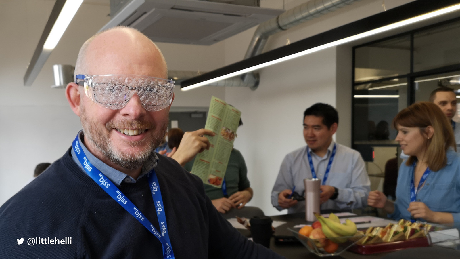
Alt: A man in early forties looking towards the camera wearing goggles that simulate having cataracts. There is a group of people in the background interacting with other goggles.
Notes We started off with bringing visual simulation goggles into sessions with the entire development team
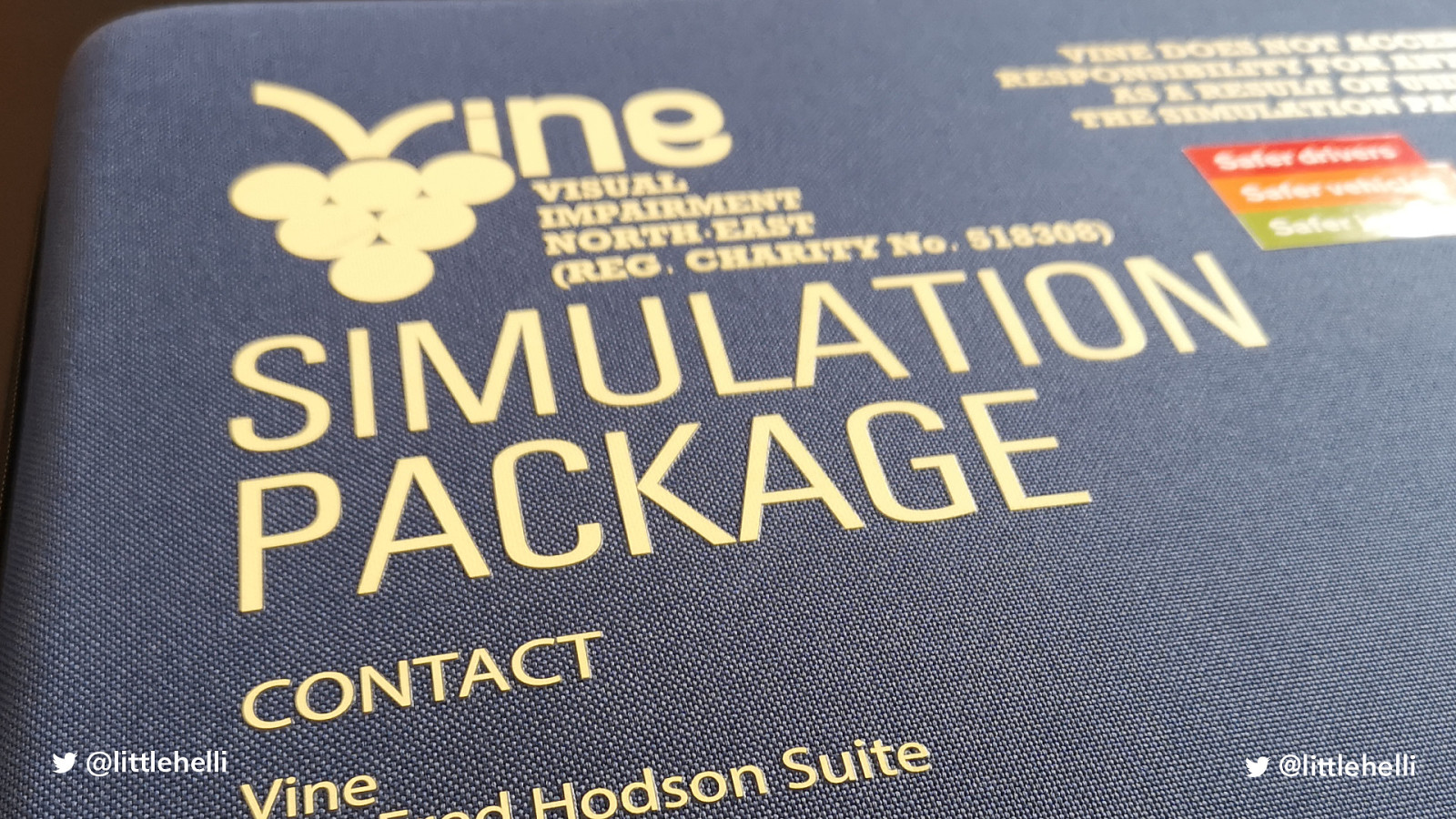
Alt: The case that the goggles come in called Vine (Visual Impairment North-East) Simulation Package
Notes These are just under £200 But it doesn’t need to be expensive and we can create situations that are more than just taking the perspective of visual impairments
Note This is something we have been working on to demonstrate situational accessibility needs.
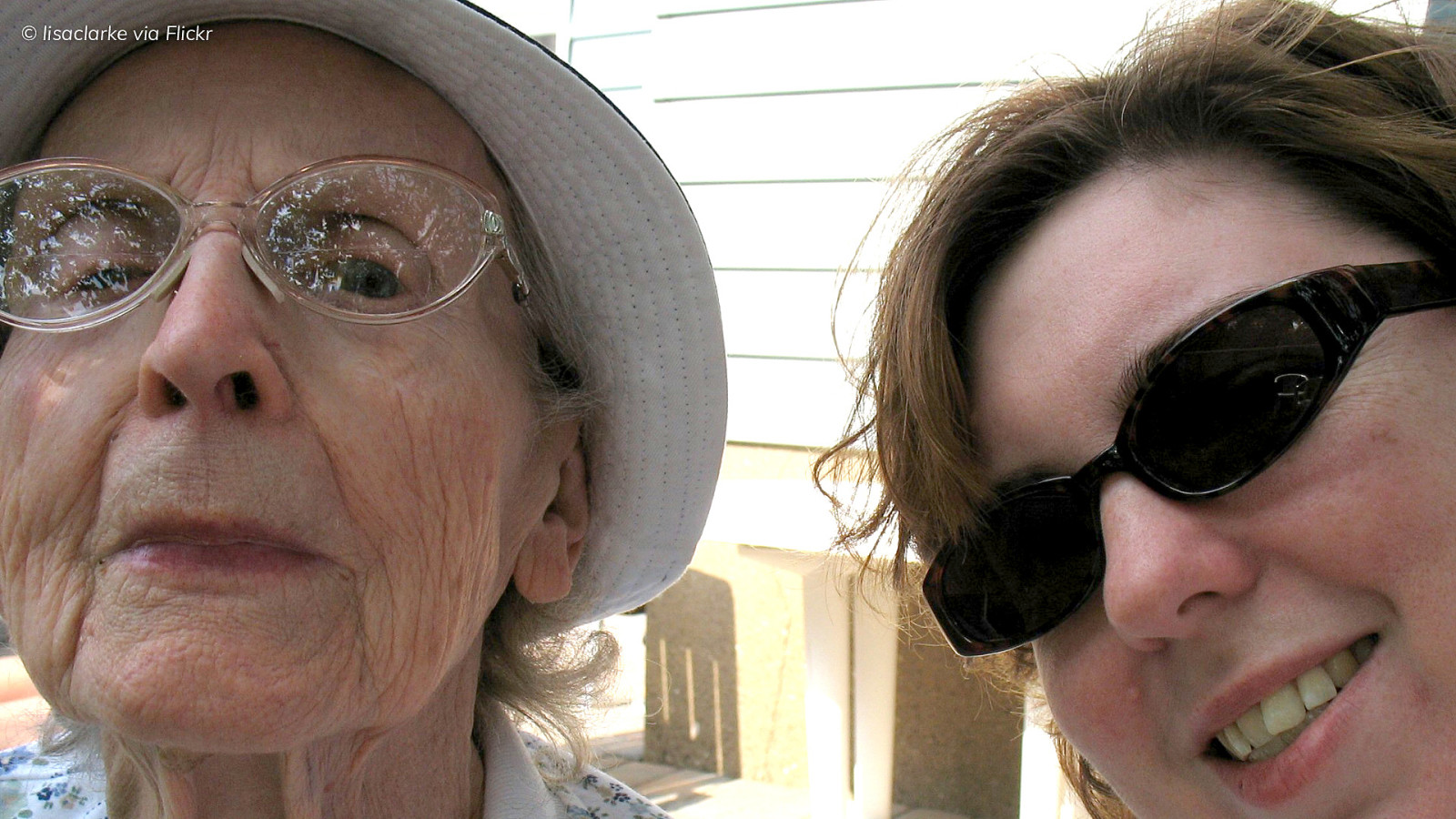
Alt: Elderly woman wearing thick glasses and a sun hat looking towards the camera. A woman in her thirties is smiling next to her wearing sunglasses.
Notes Jean - has cataracts and hearing loss in one ear. Wants to book tickets to visit her granddaughter in Australia who has just had a baby.
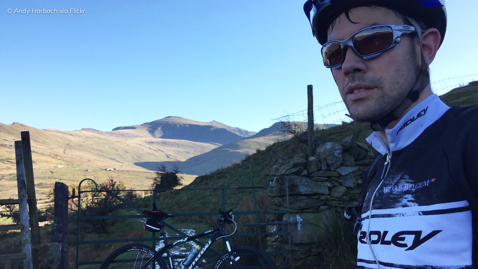
Alt: A selfie of a man in his late twenties wearing cycling gear including sunglasses and a helmet in front of countryside hills with his bike in the background.
Notes Went cycling in the Peak District and fell off his bike and broke his arm and his iPhone He’s got a follow-up appointment but has lost the information.

Alt: A man looking disgusted covered in green baby food with a baby stood on his knee with the food all over his bib and face.
Notes Early 30s father of a nearly one-year-old He promised his wife he’d organise a party at a local soft play centre. But he forgot and has just remembered and needs to find somewhere quickly.
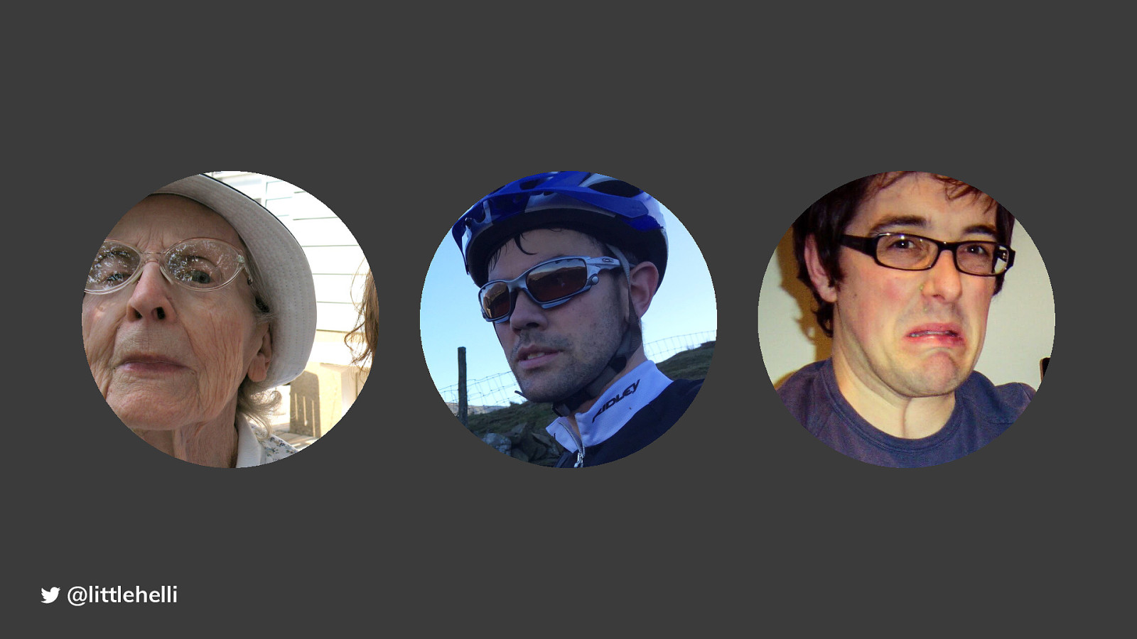
Alt: All three personas grouped together
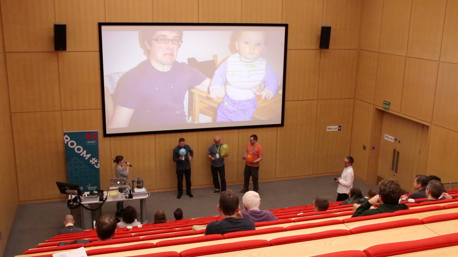
Alt: Video still. Three men stood at the front of a lecture theatre holding inflated balloons. The video shows the men trying to keep their balloons in the air whilst looking up information on their phones
Notes This is the distracted fathers trying to find a play centre Look at how much they move around due to the levels of distraction
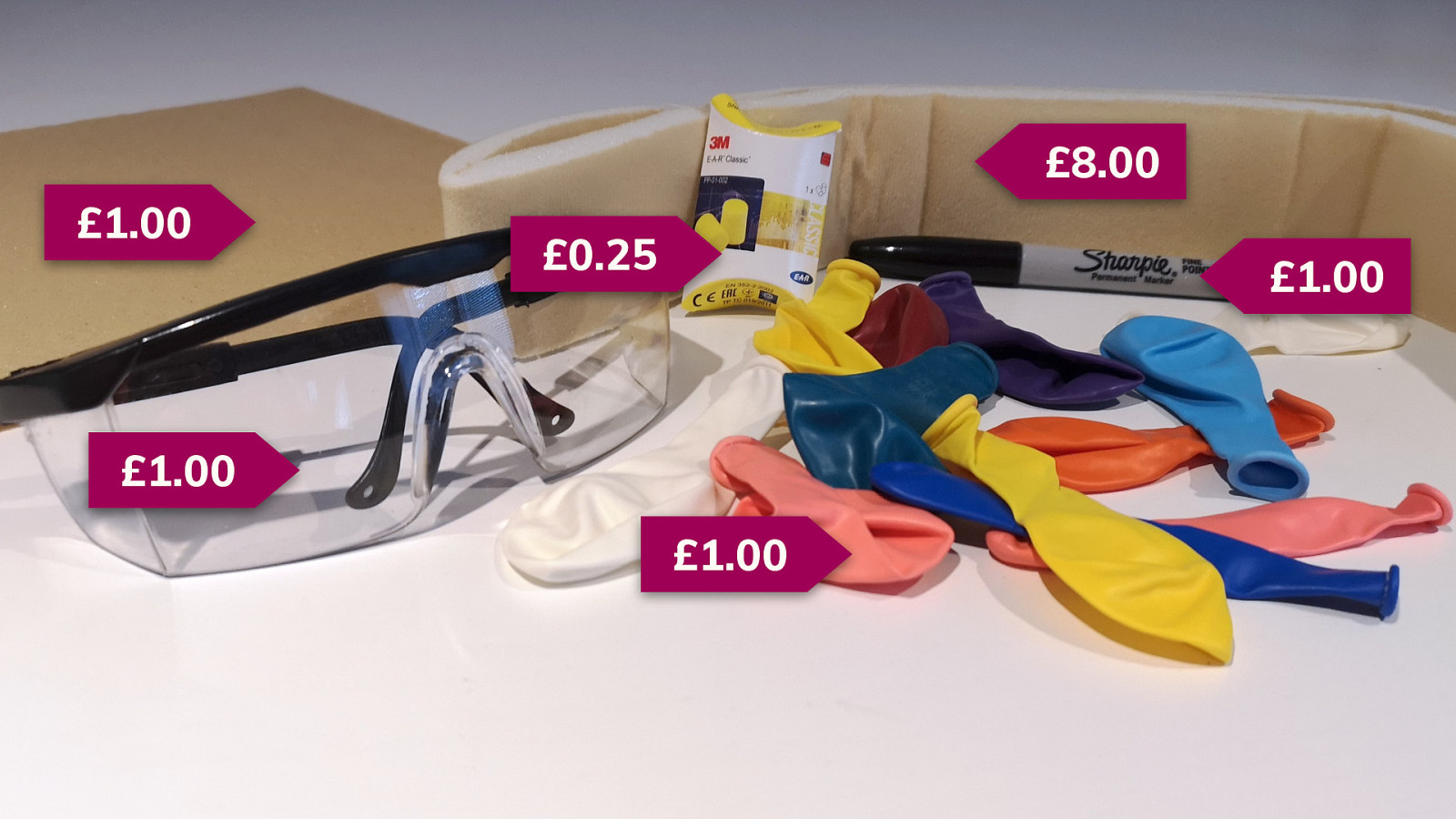
Alt: Safety goggles, sandpaper, a sling, earplugs, a sharpie and a pile of balloons with price tag graphics adding up to £12.25
Notes Extremely low cost to entry Like the persona spectrum, it’s a toolkit that is used to enable teams to take the perspective of being in situations where they are inhibited But rather than ‘thinking’ about these potential inhibitions they are experienced first hand. But to be clear
Notes It’s important to stress this
Notes And not only understanding but addressing the inequality of people’s experience when interacting with our products and services. It’s not a substitute for usability testing with disabled people.
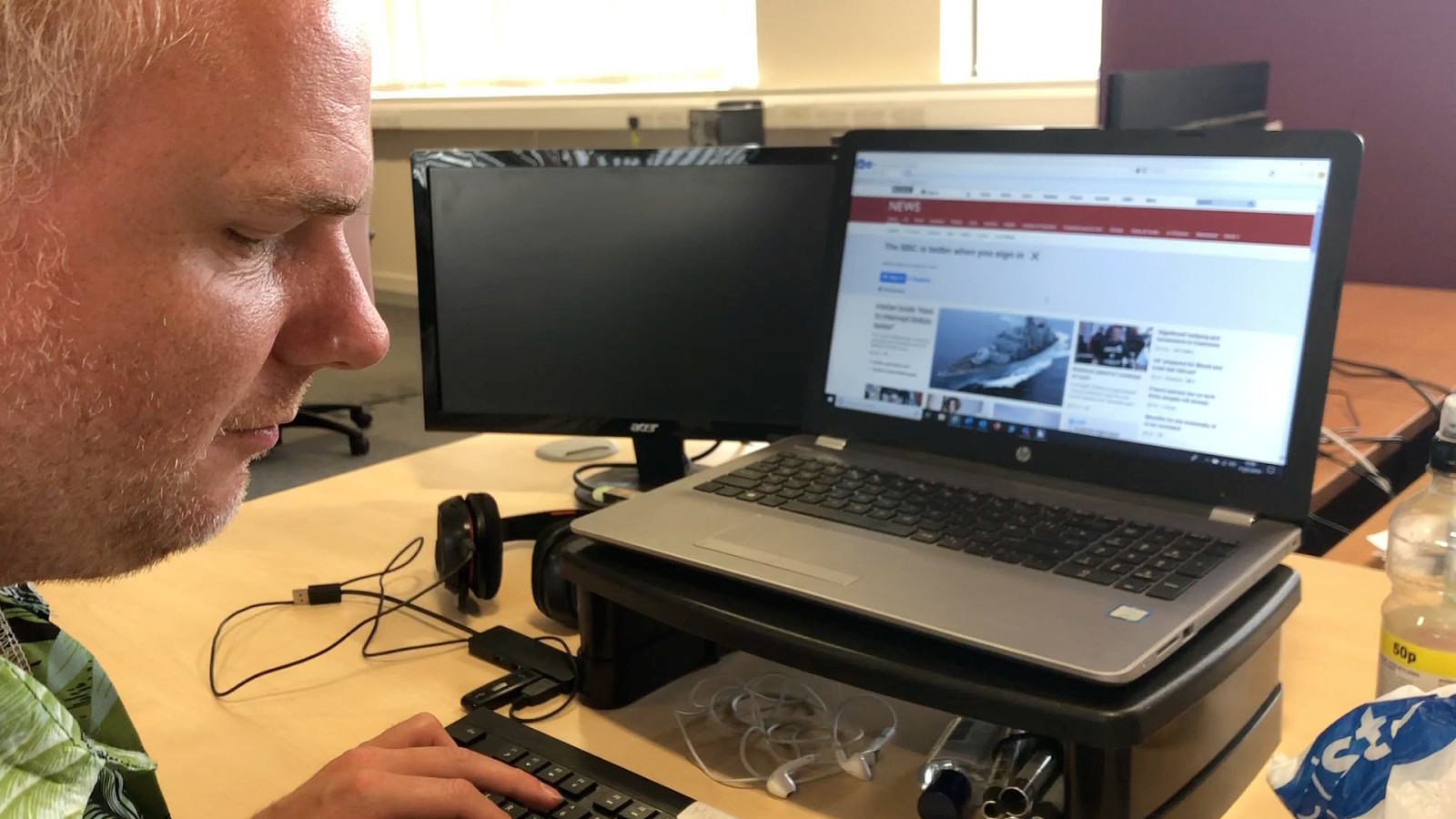
Alt: Video of a man sat at a desk using the BBC news page on a laptop computer
Notes We should absolutely be testing with screen readers, but it’s not the same as testing with blind users This is a demo we were given from a trip to DAC - the Digital Accessibility Centre in Swansea
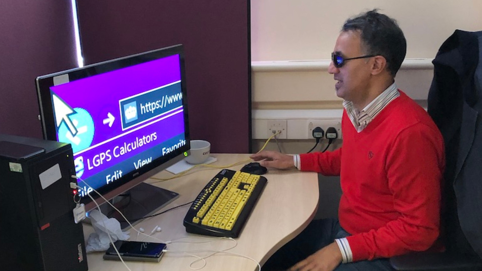
Alt: A man wearing goggles, sat at a desk with a web browser zoomed in. He has a high contrast yellow keyboard and is looking at the screen.
Notes This was a person with significant visual impairment who needed this level of zoom to navigate the internet. This is what we’re working on at the moment: Making accessibility part of the process Accessibility as definition as done It’s now a legal requirement to meet government accessibility requirements but more than that.
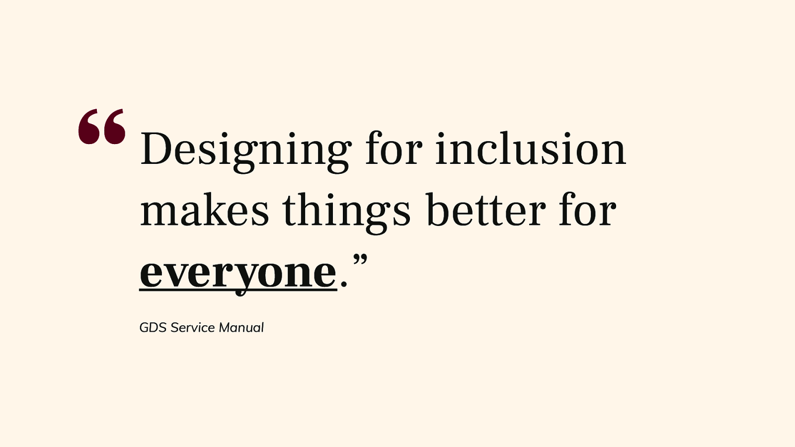
Alt: “Designing for inclusion makes things better for everyone.” GDS Service Manual
Notes It’s not us and them. It’s all of us.
Alt: Thank you If you think that your team would benefit from experiencing our inclusion lab, please get in touch. @littlehelli Helen.digital helen.joy@sparck.io
BJSS and SPARCK logos