READABILITY: LET’S BUILD GREAT AND INCLUSIVE EXPERIENCE NLHTML5 × CSS Day • Amsterdam • June 13, 2018

A presentation at NLHTML5 × CSS Day in June 2018 in Amsterdam, Netherlands by Damien Senger
READABILITY: LET’S BUILD GREAT AND INCLUSIVE EXPERIENCE NLHTML5 × CSS Day • Amsterdam • June 13, 2018
Damien Senger User-centered designer @iamhiwelo Raccoon Studio raccoon.studio
READABILITY: LET’S BUILD GREAT AND INCLUSIVE EXPERIENCE
Readability, why?
Reading is not an easy thing.
NLHTML5 × CSS Day • @iamhiwelo
Readability is not only useful for people with reading disabilities
NLHTML5 × CSS Day • @iamhiwelo
Reading issues can be linked to…
NLHTML5 × CSS Day • @iamhiwelo
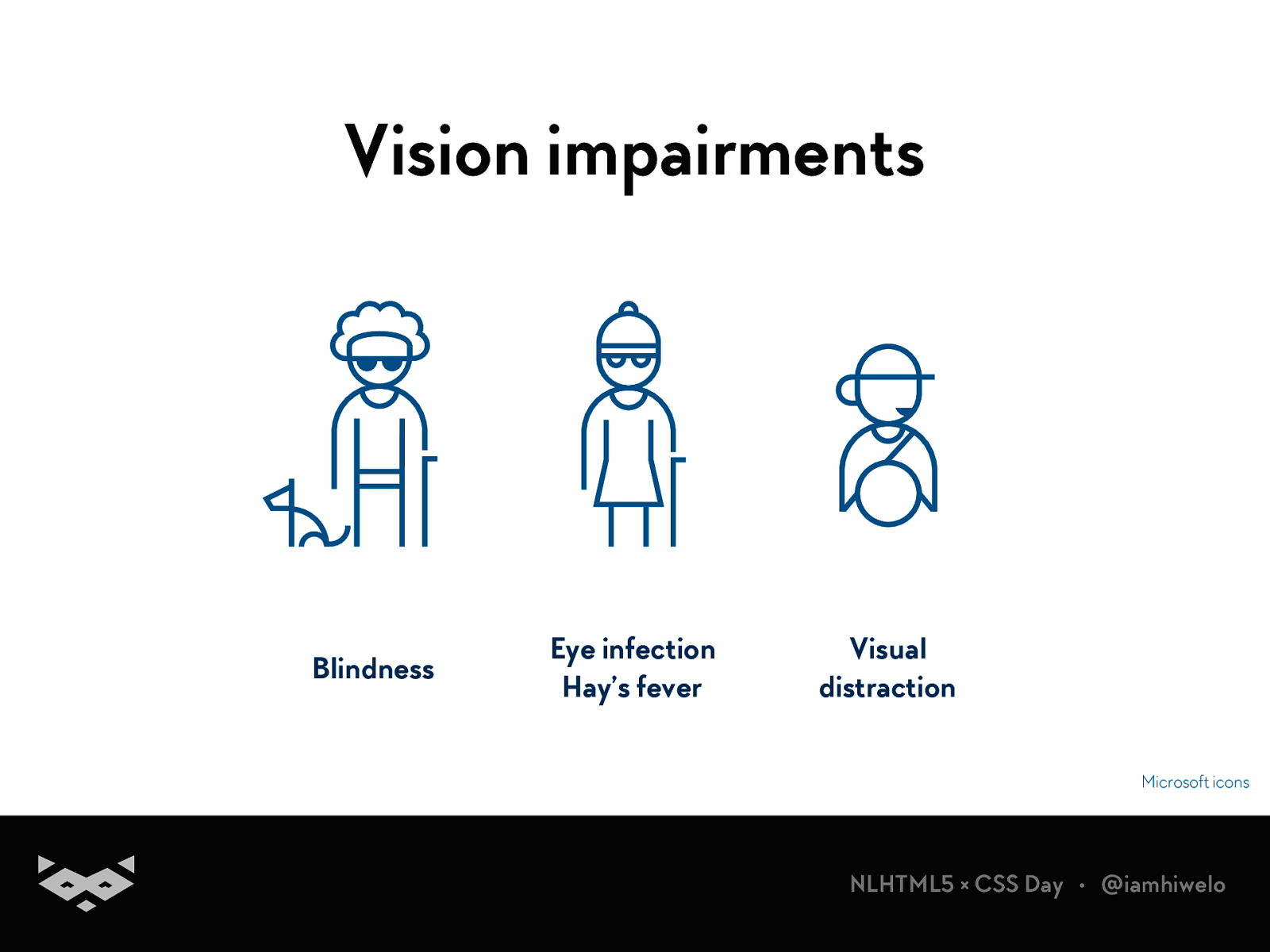
Vision impairments Blindness Eye infection Hay’s fever Visual distraction Microsoft icons
NLHTML5 × CSS Day • @iamhiwelo
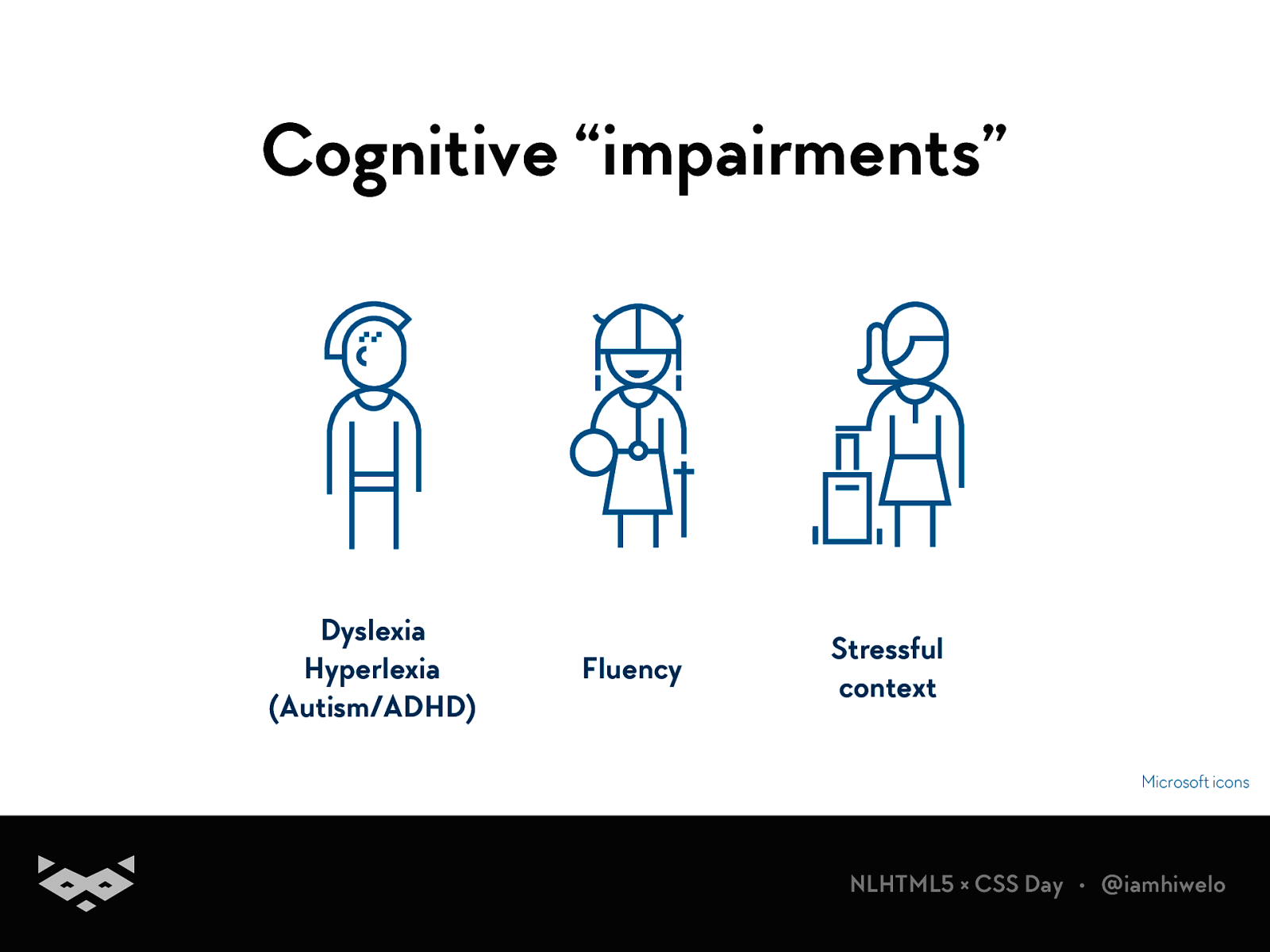
Cognitive “impairments” Dyslexia Hyperlexia (Autism/ADHD) Fluency Stressful context Microsoft icons
NLHTML5 × CSS Day • @iamhiwelo
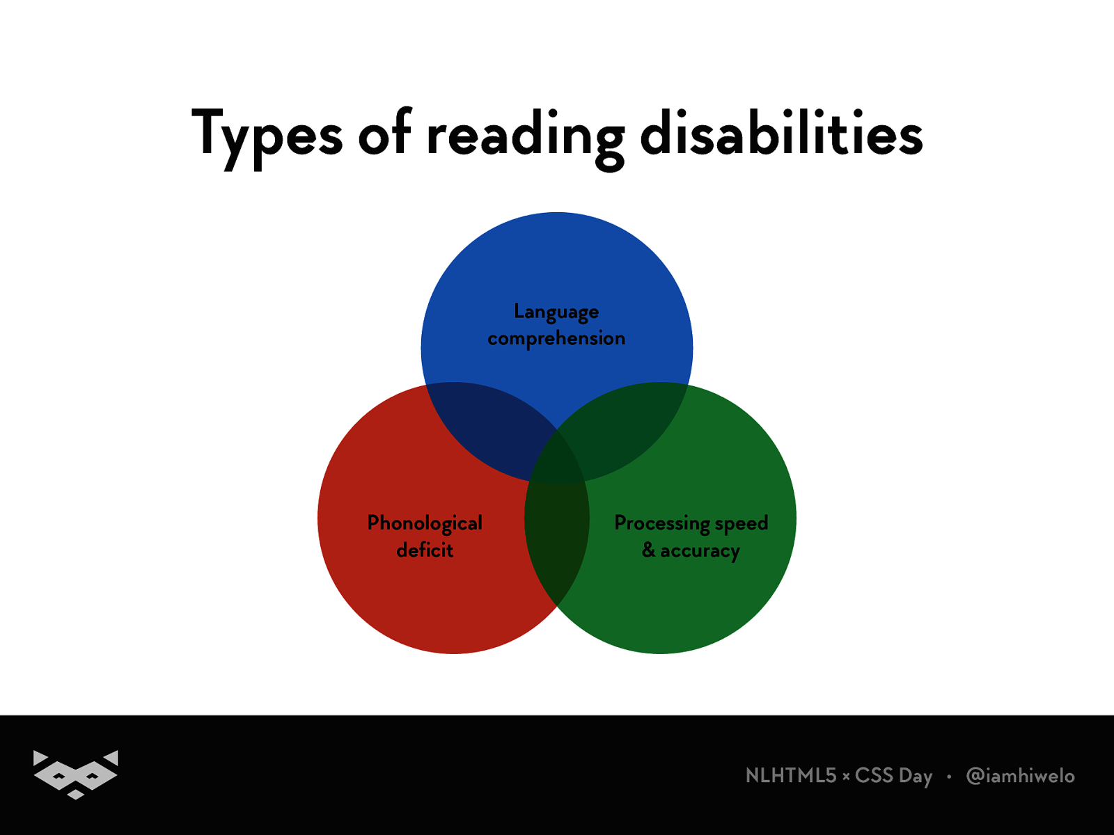
Types of reading disabilities Language comprehension Phonological deficit Processing speed & accuracy
NLHTML5 × CSS Day • @iamhiwelo
Yes, there is adult dyslexic people .
NLHTML5 × CSS Day • @iamhiwelo
How do we read ?
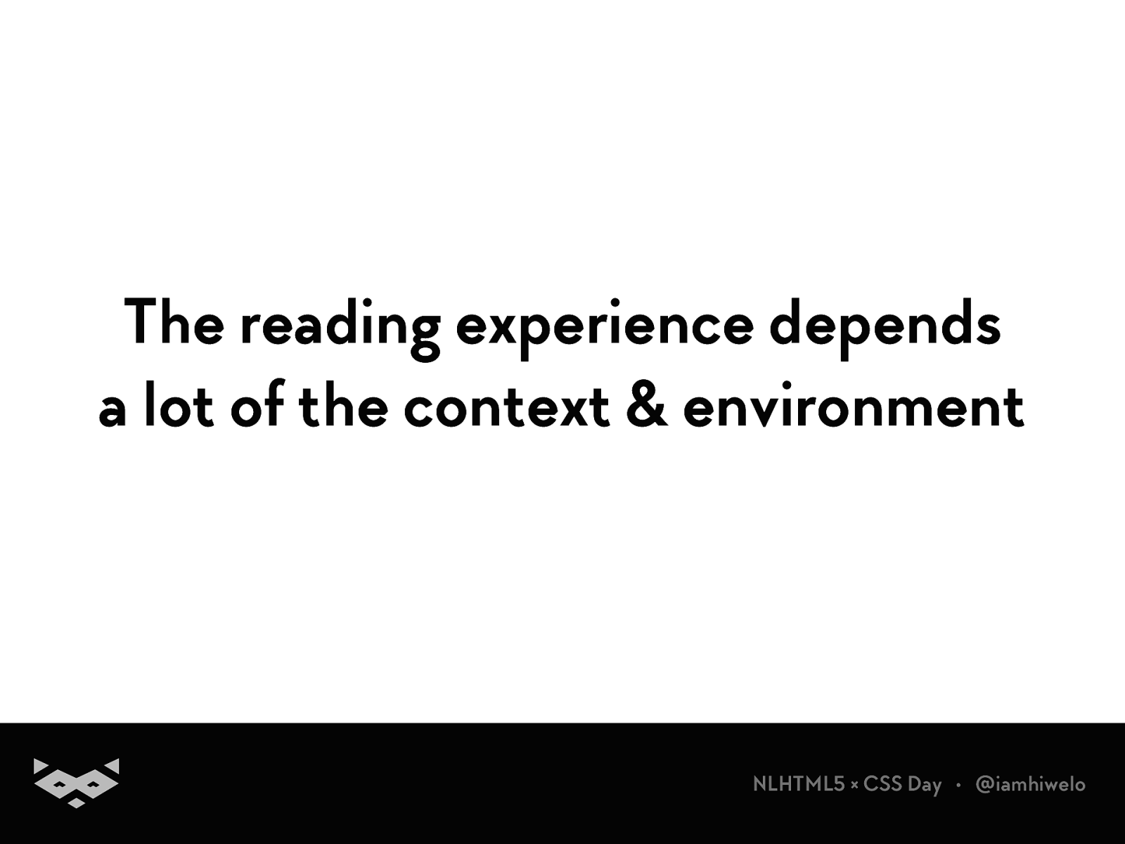
The reading experience depends a lot of the context & environment
NLHTML5 × CSS Day • @iamhiwelo
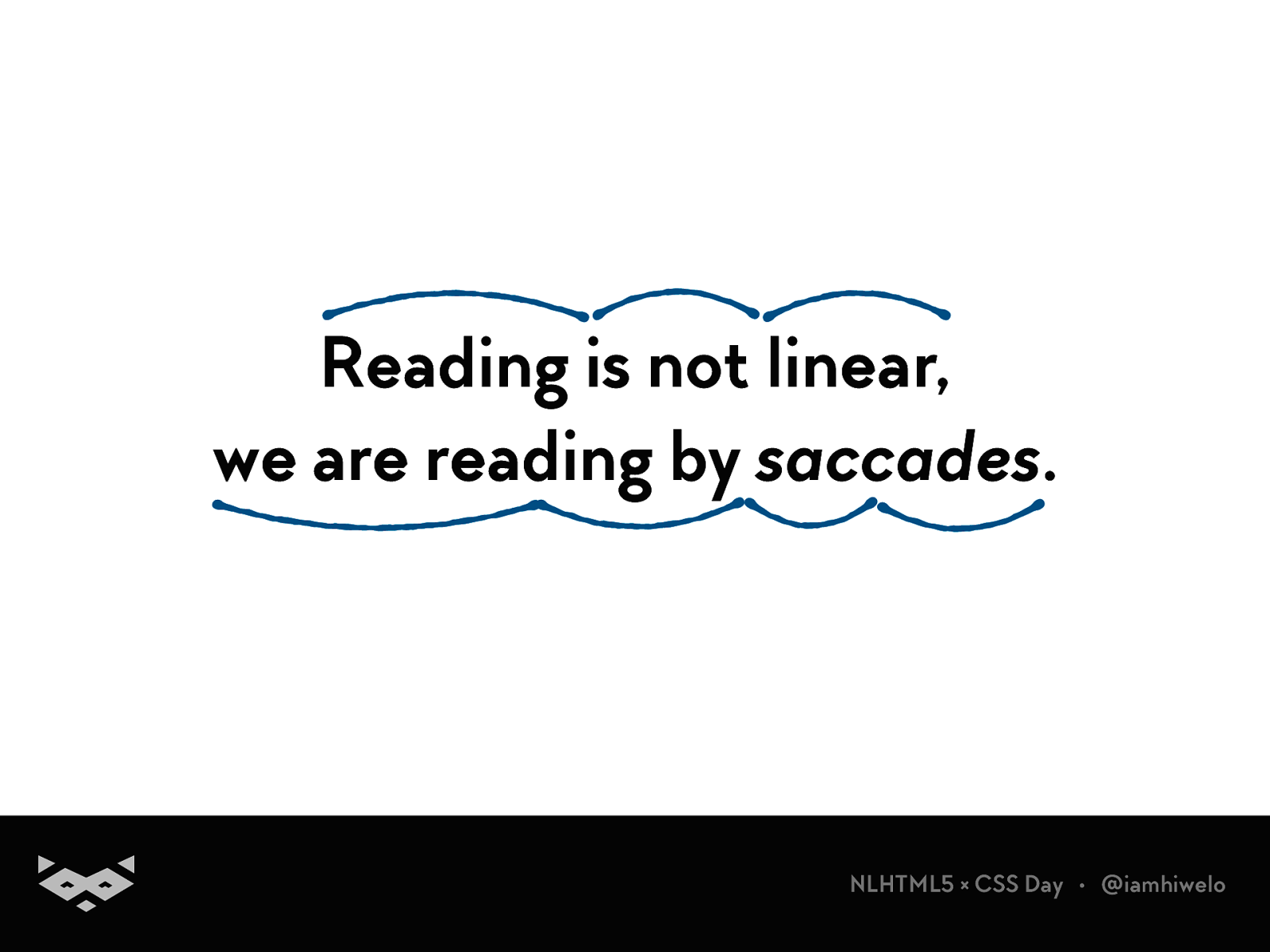
Reading is not linear, we are reading by saccades .
NLHTML5 × CSS Day • @iamhiwelo
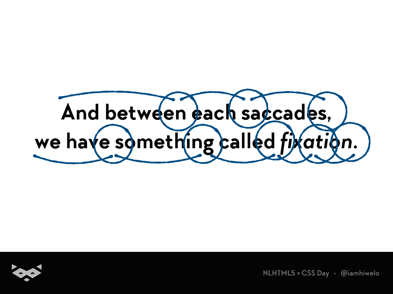
And between each saccades, we have something called fixation .
NLHTML5 × CSS Day • @iamhiwelo
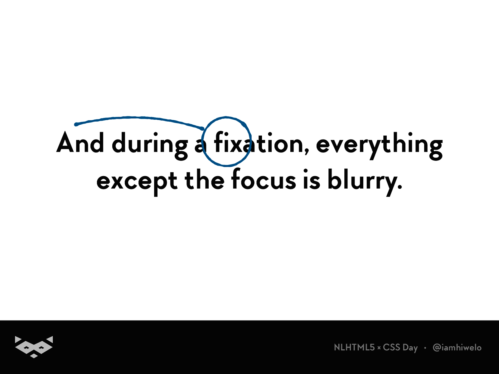
And during a fixation, everything except the focus is blurry.
NLHTML5 × CSS Day • @iamhiwelo
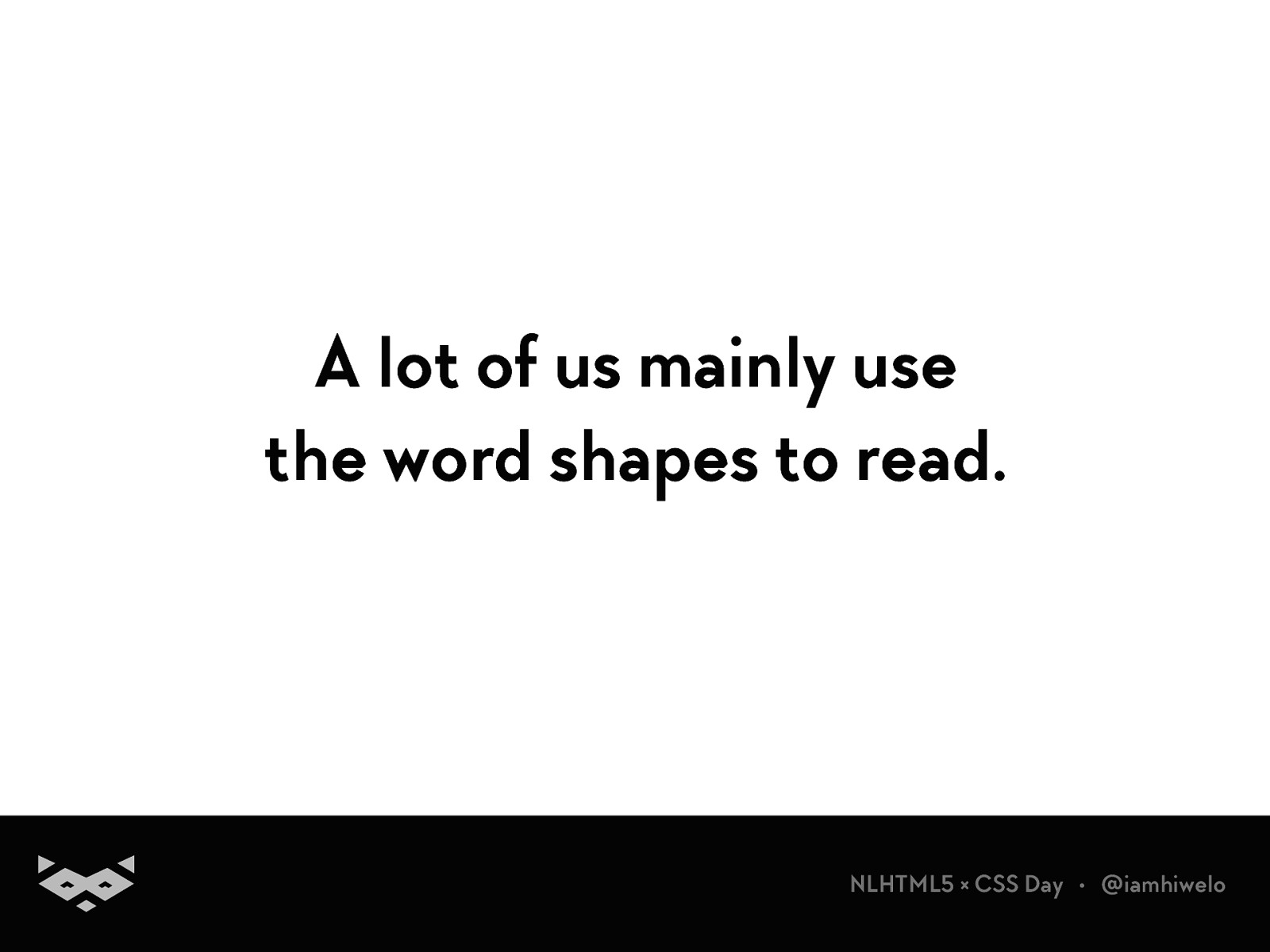
A lot of us mainly use the word shapes to read.
NLHTML5 × CSS Day • @iamhiwelo
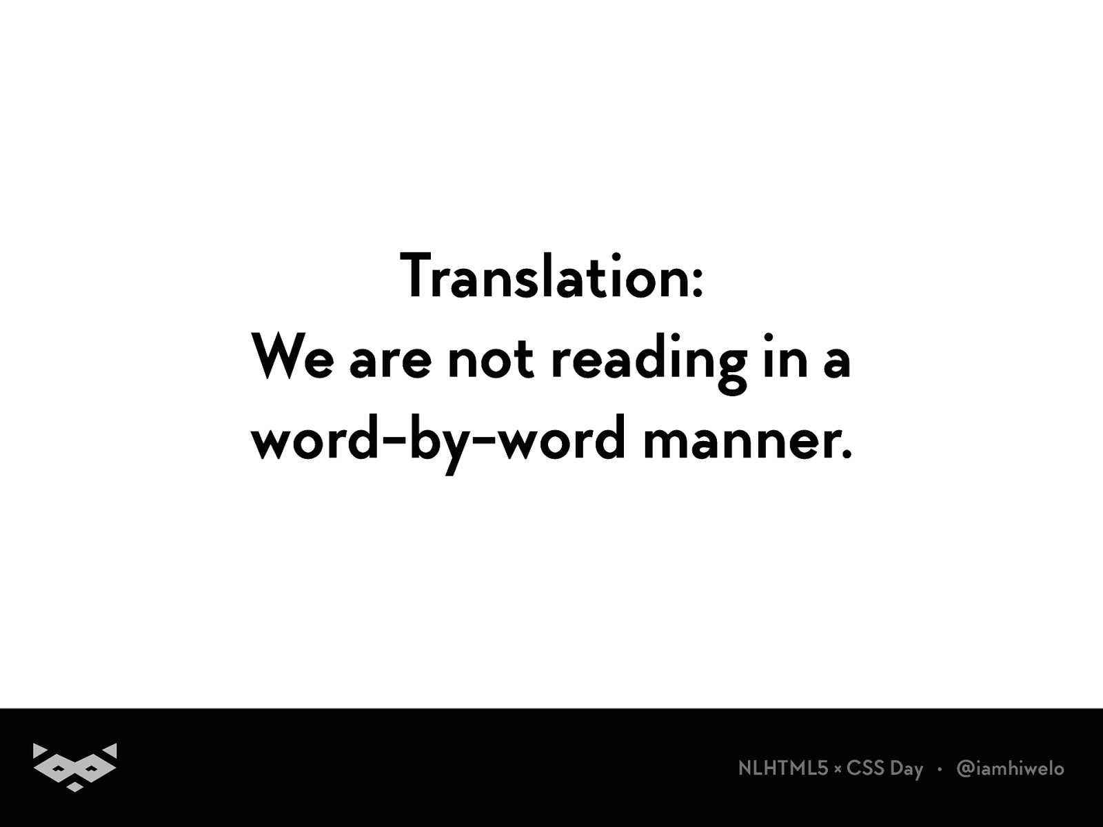
Translation: We are not reading in a word-by-word manner.
NLHTML5 × CSS Day • @iamhiwelo
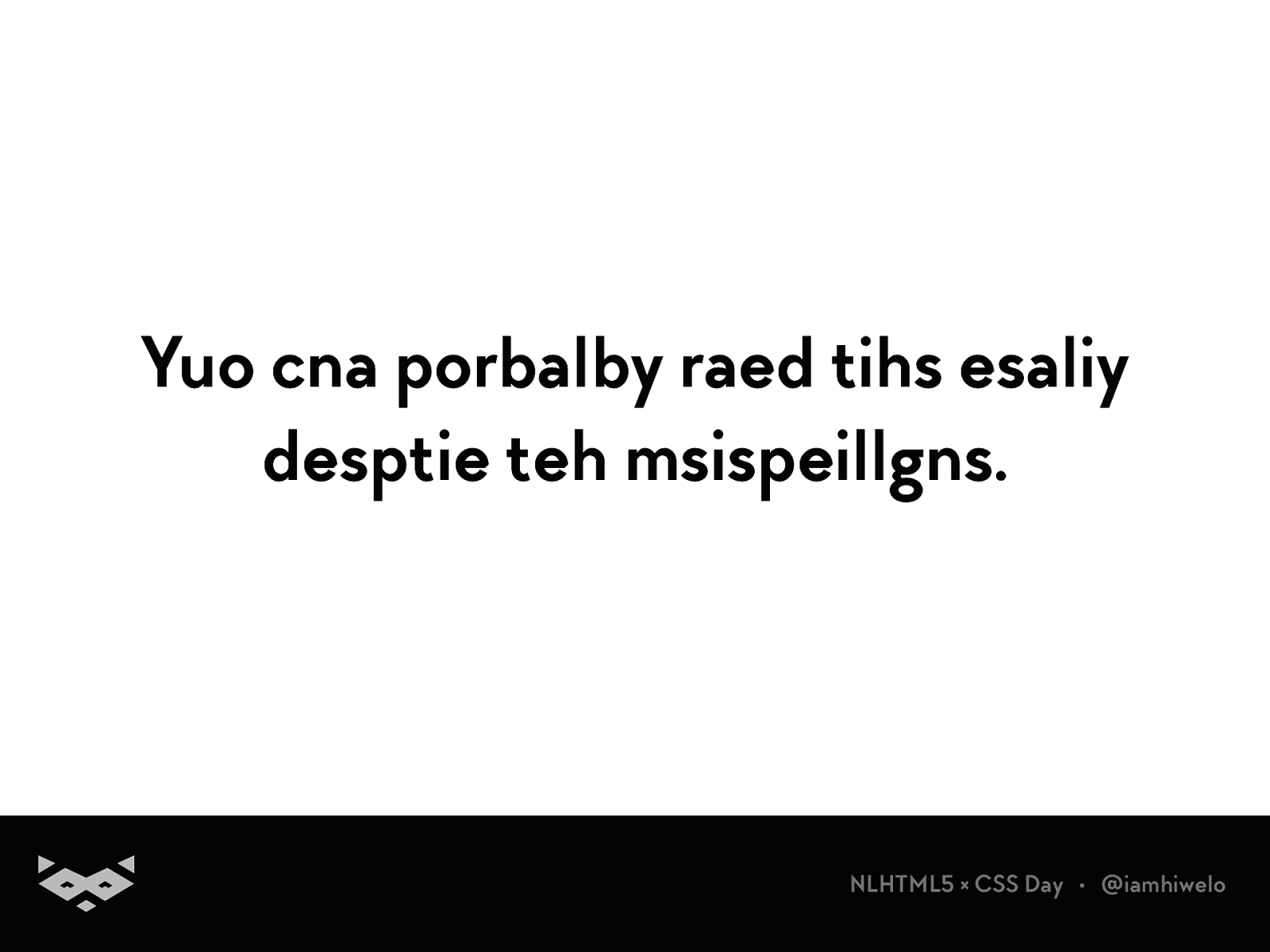
Yuo cna porbalby raed tihs esaliy desptie teh msispeillgns.
NLHTML5 × CSS Day • @iamhiwelo
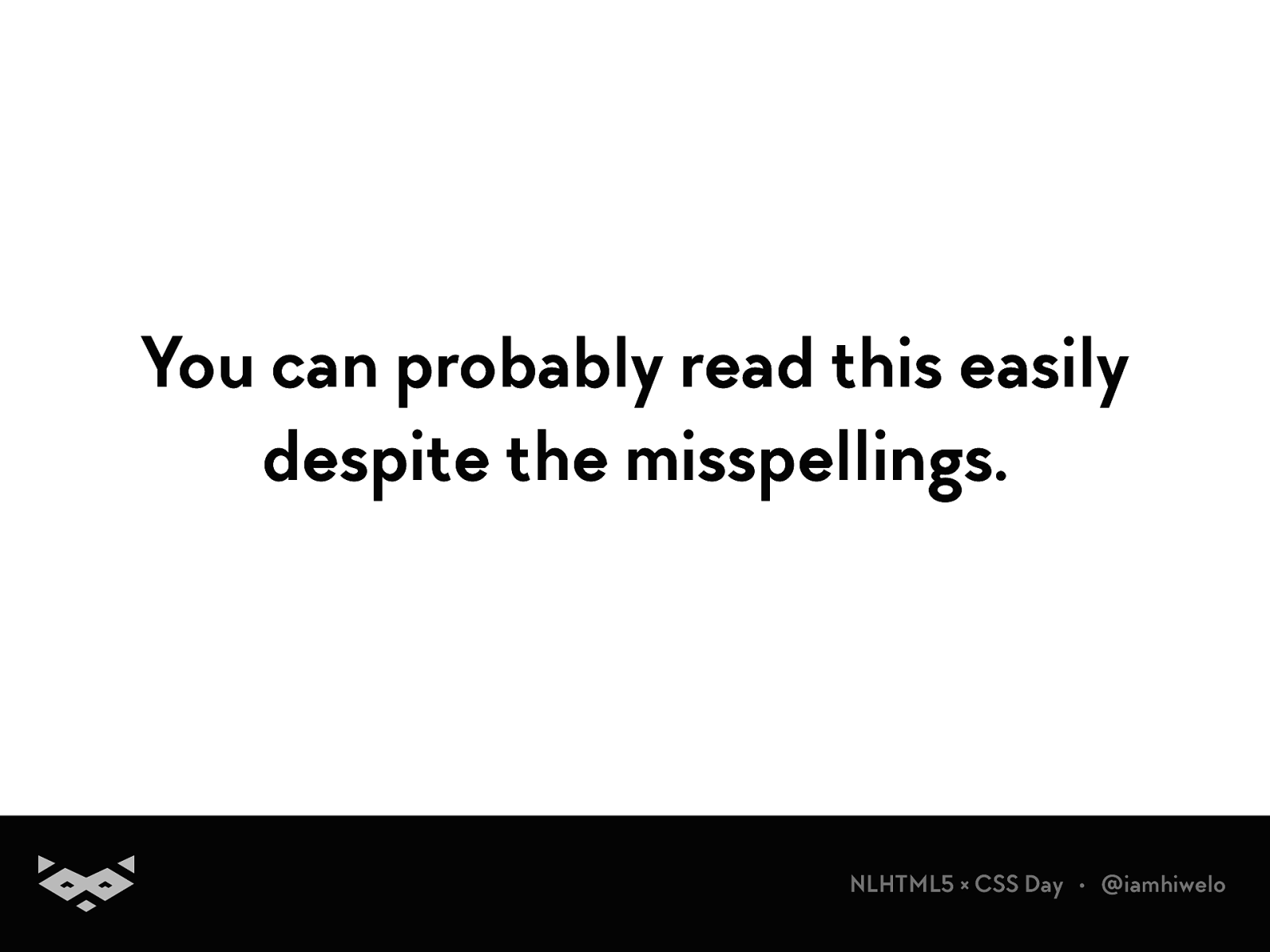
You can probably read this easily despite the misspellings.
NLHTML5 × CSS Day • @iamhiwelo
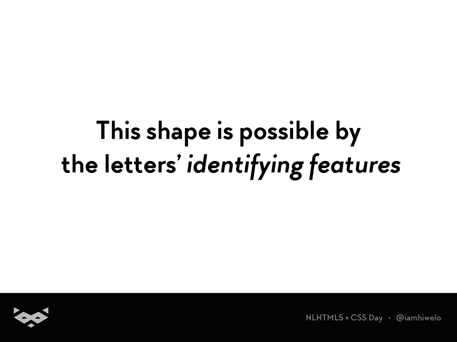
This shape is possible by the letters’ identifying features
NLHTML5 × CSS Day • @iamhiwelo
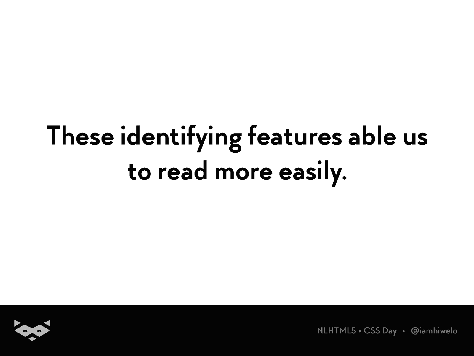
These identifying features able us to read more easily.
NLHTML5 × CSS Day • @iamhiwelo
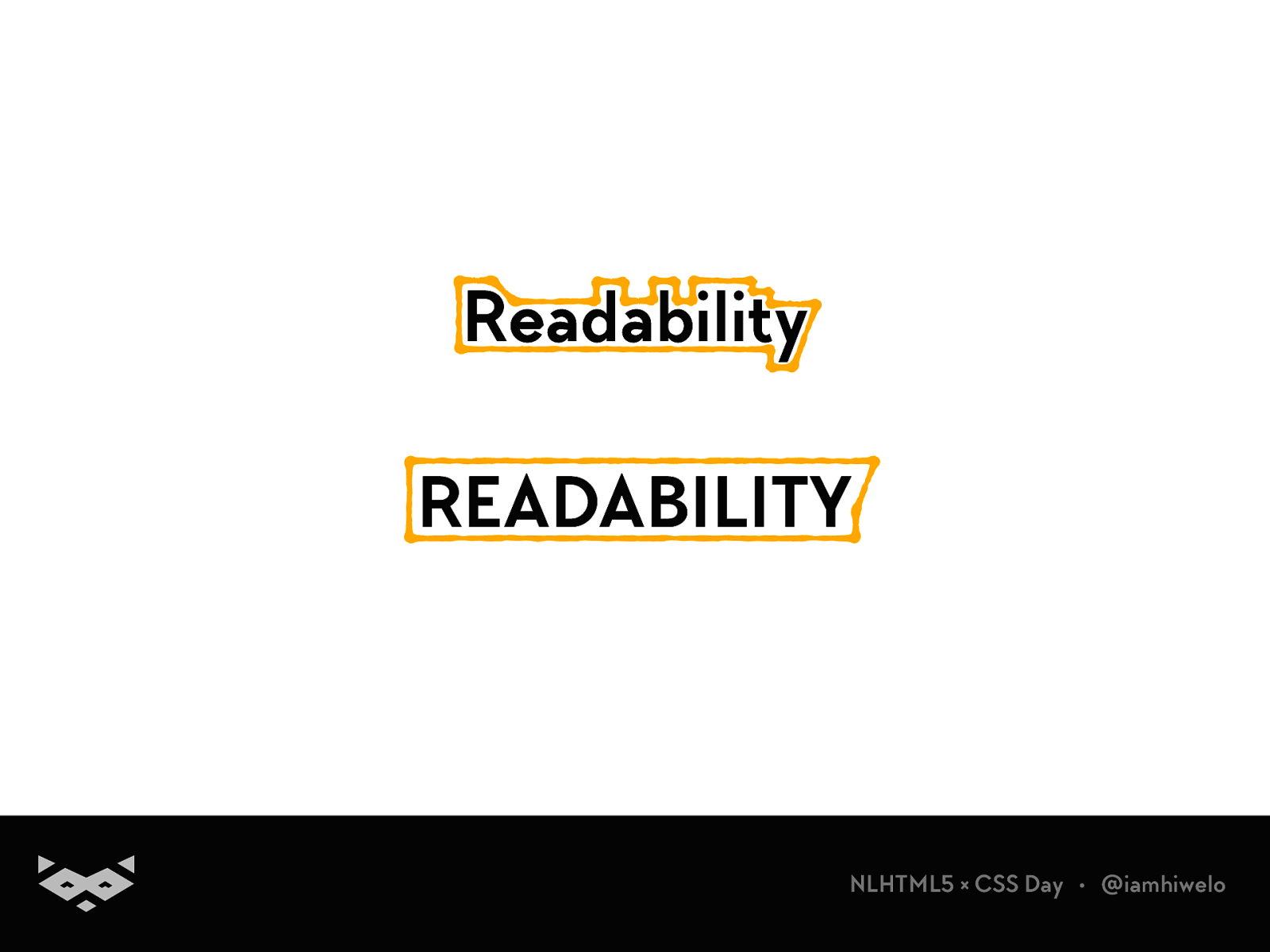
Readability READABILITY
NLHTML5 × CSS Day • @iamhiwelo
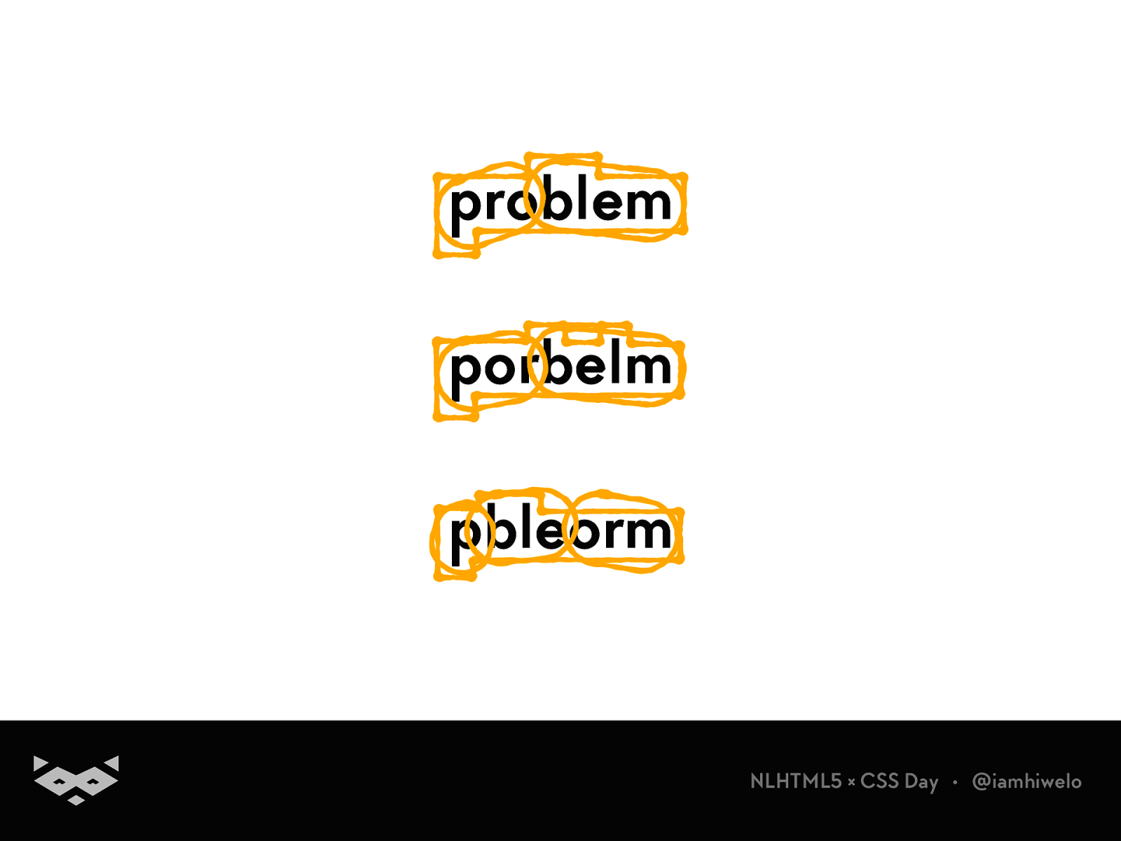
problem porbelm pbleorm
NLHTML5 × CSS Day • @iamhiwelo
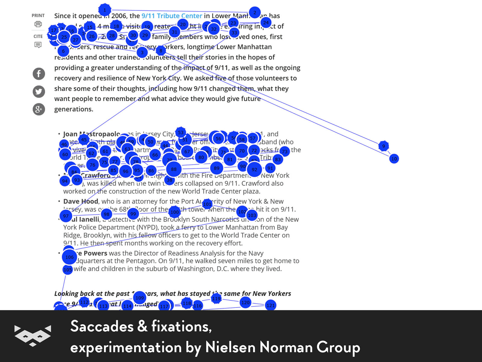
Saccades & fixations, experimentation by Nielsen Norman Group
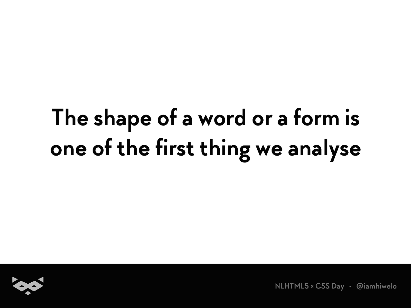
The shape of a word or a form is one of the first thing we analyse
NLHTML5 × CSS Day • @iamhiwelo
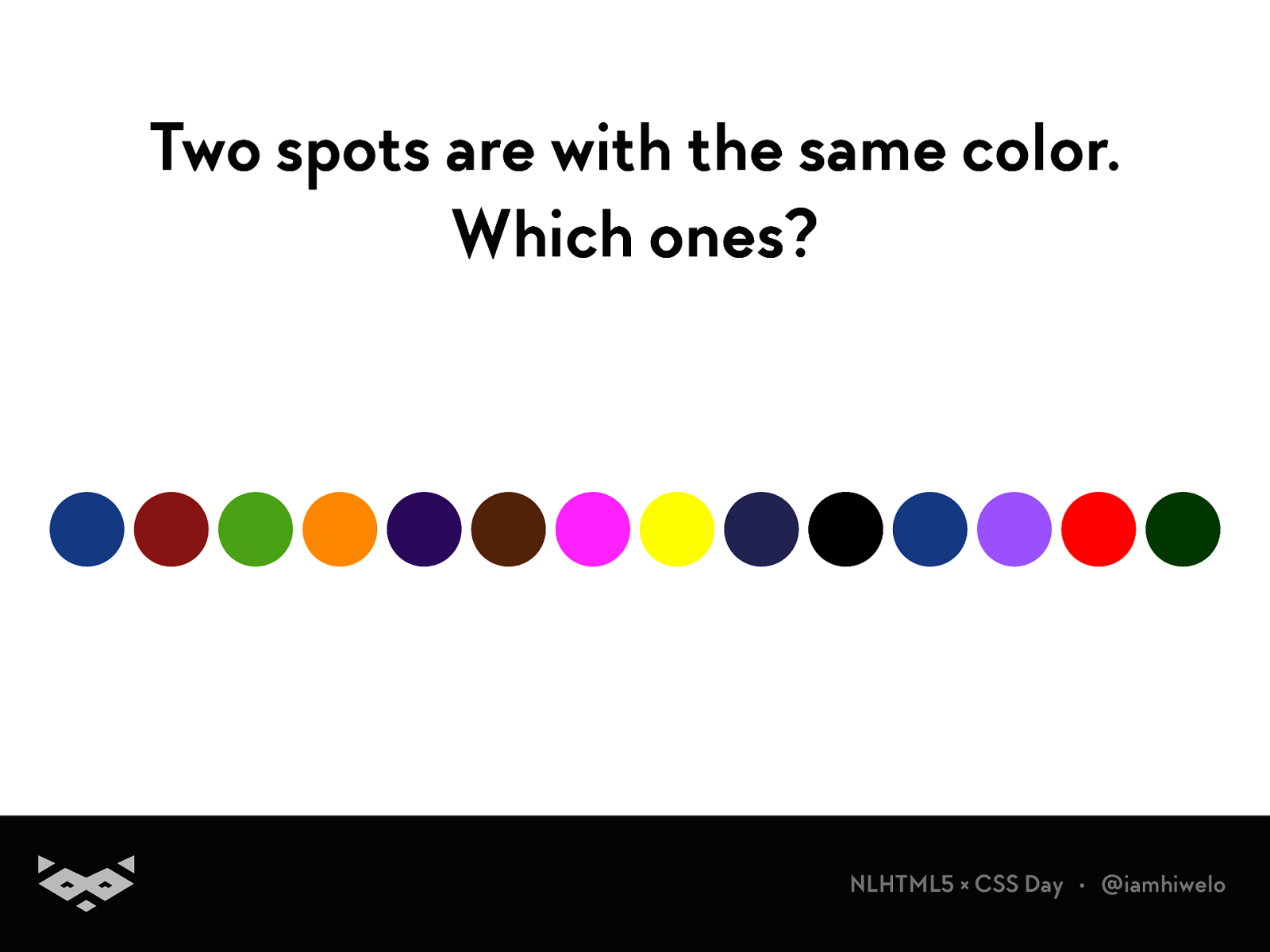
Two spots are with the same color. Which ones?
NLHTML5 × CSS Day • @iamhiwelo
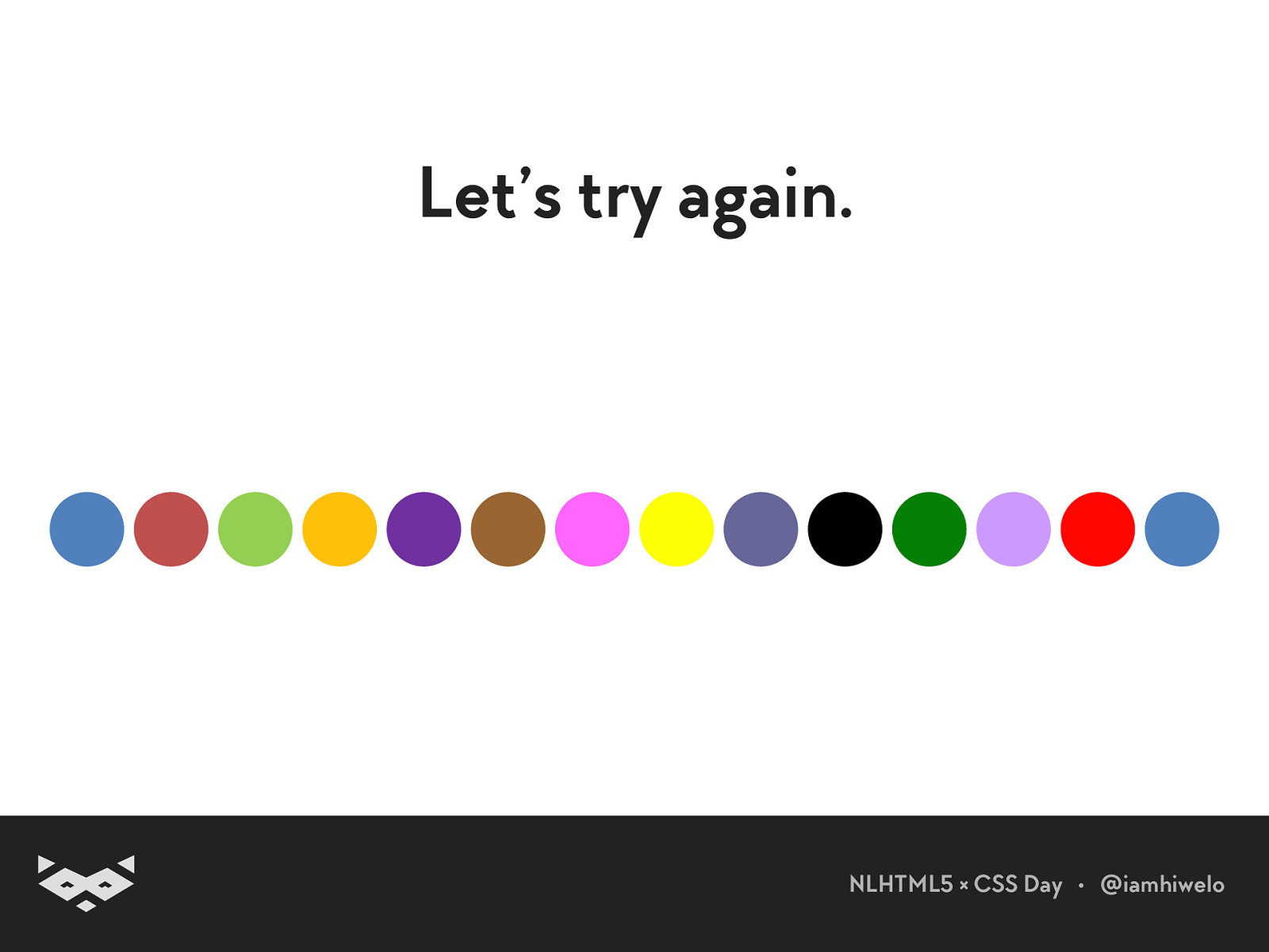
Let’s try again.
NLHTML5 × CSS Day • @iamhiwelo
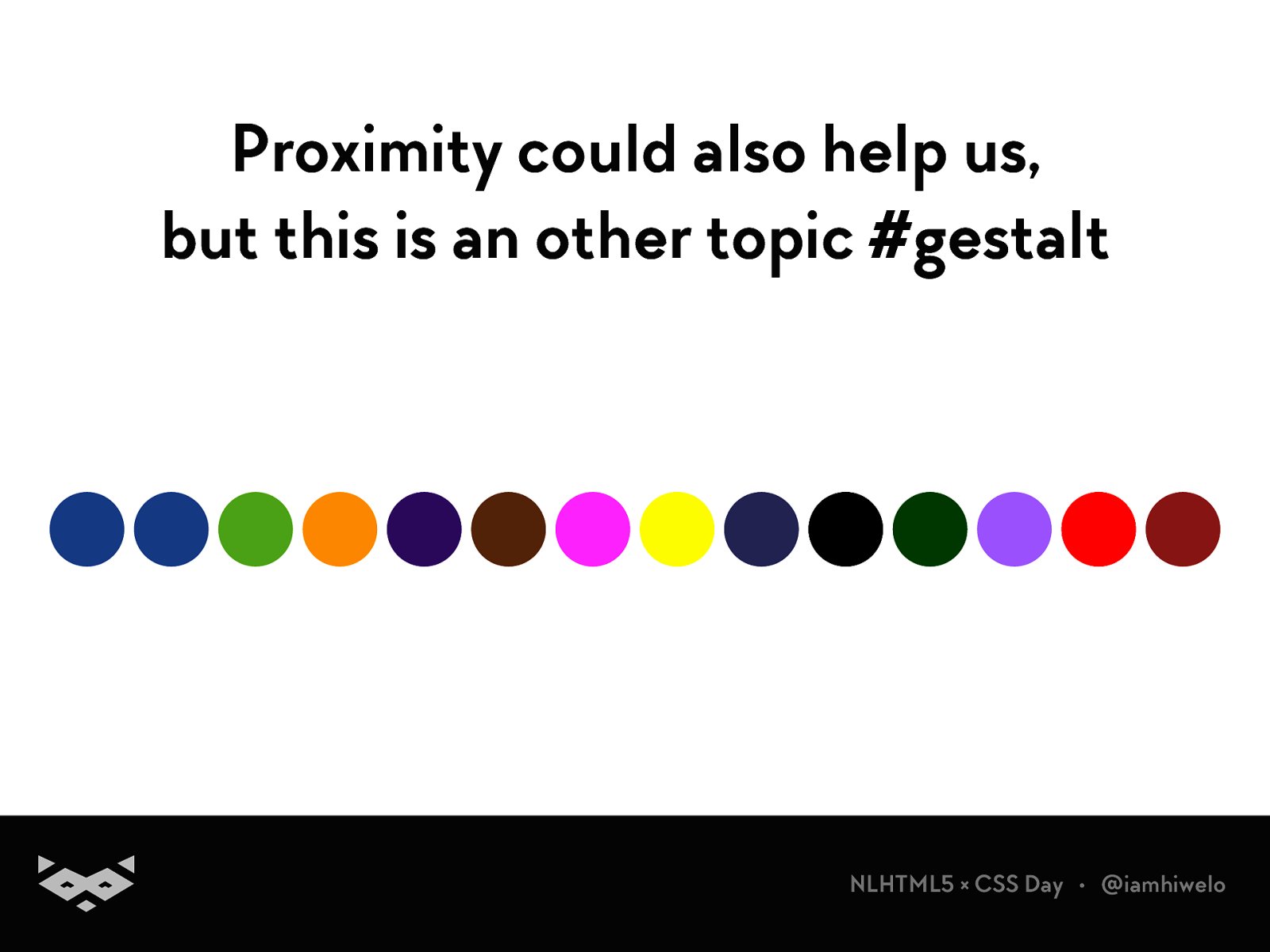
Proximity could also help us, but this is an other topic #gestalt
NLHTML5 × CSS Day • @iamhiwelo
Readability 101 .
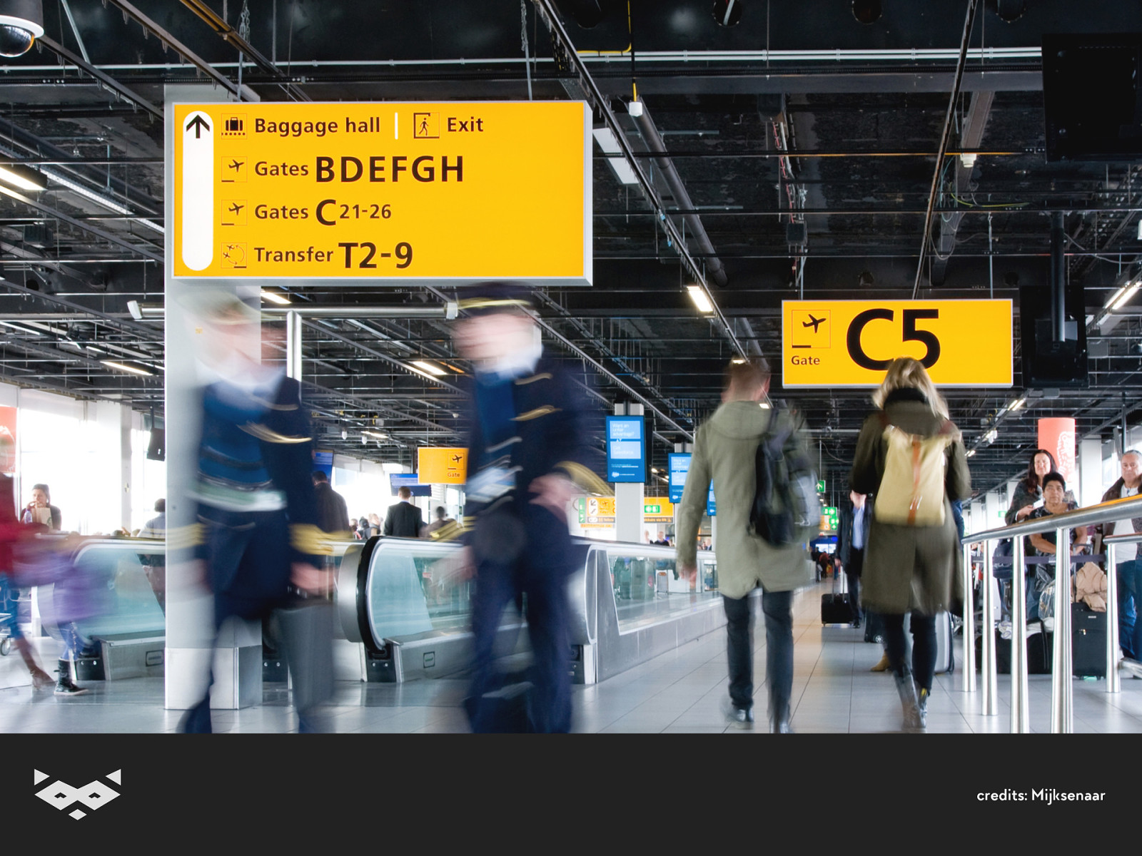
credits: Mijksenaar
The 4C of readability
NLHTML5 × CSS Day • @iamhiwelo
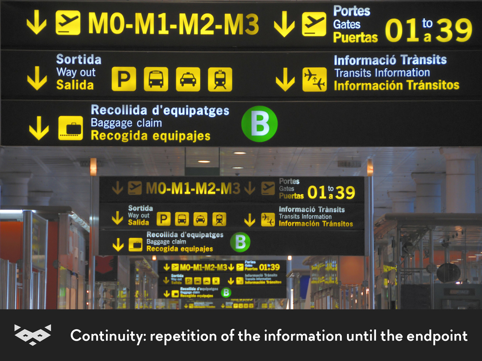
Continuity: repetition of the information until the endpoint
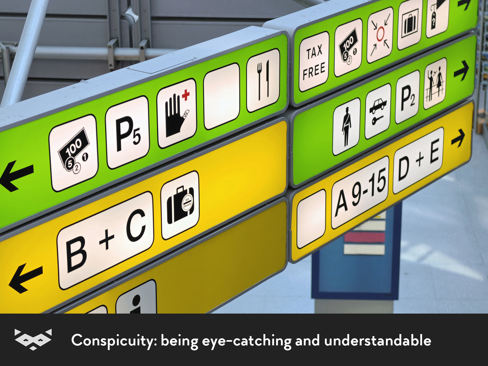
Conspicuity: being eye-catching and understandable
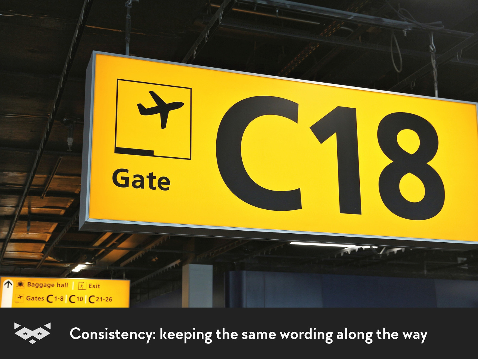
Consistency: keeping the same wording along the way
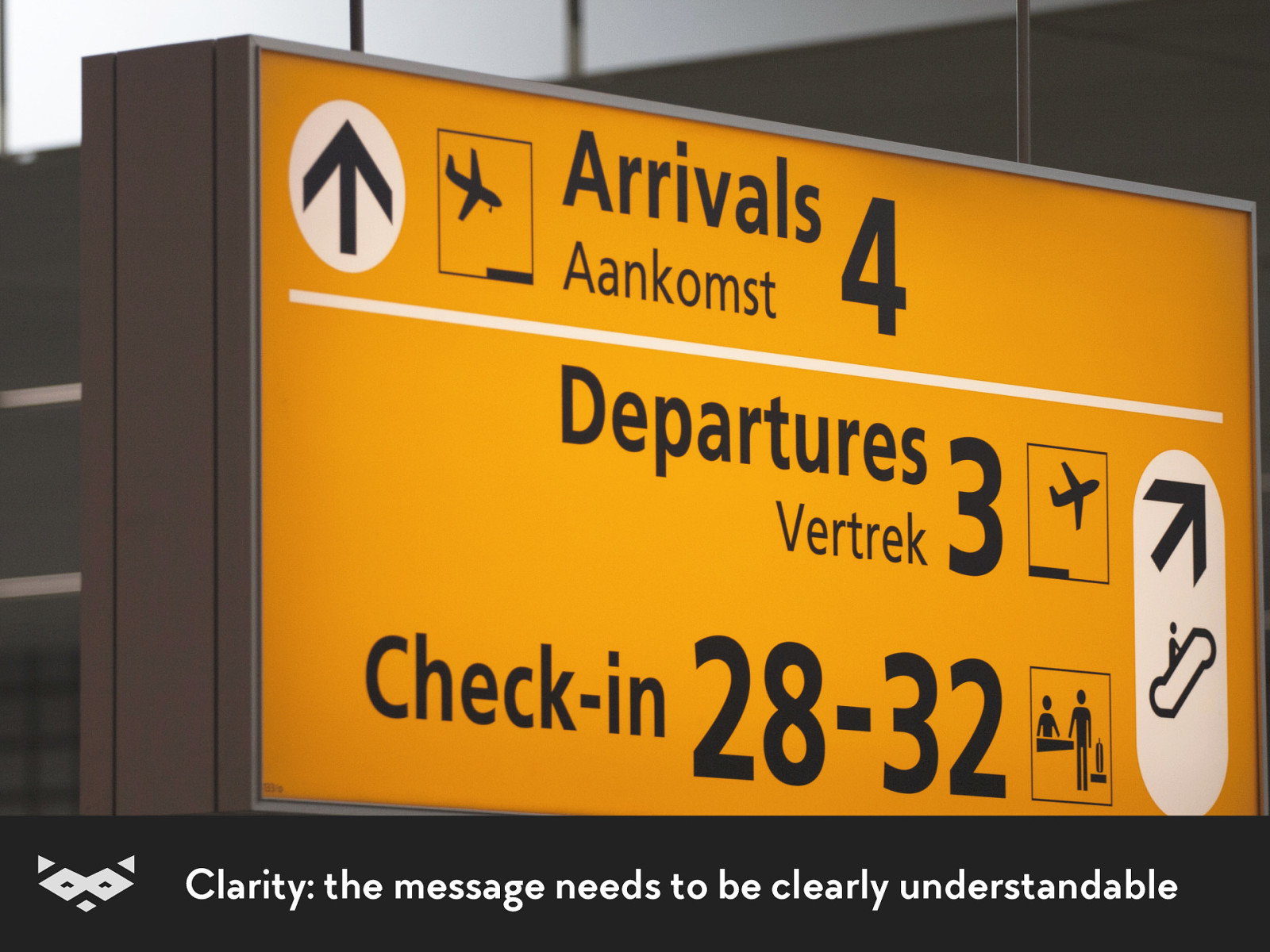
Clarity: the message needs to be clearly understandable
Thanks Paul Mijksenaar
!
Readability & web content .
First, Open Dyslexia is not a solution.
NLHTML5 × CSS Day • @iamhiwelo
Always include the most important
points in the first two paragraphs .
NLHTML5 × CSS Day • @iamhiwelo
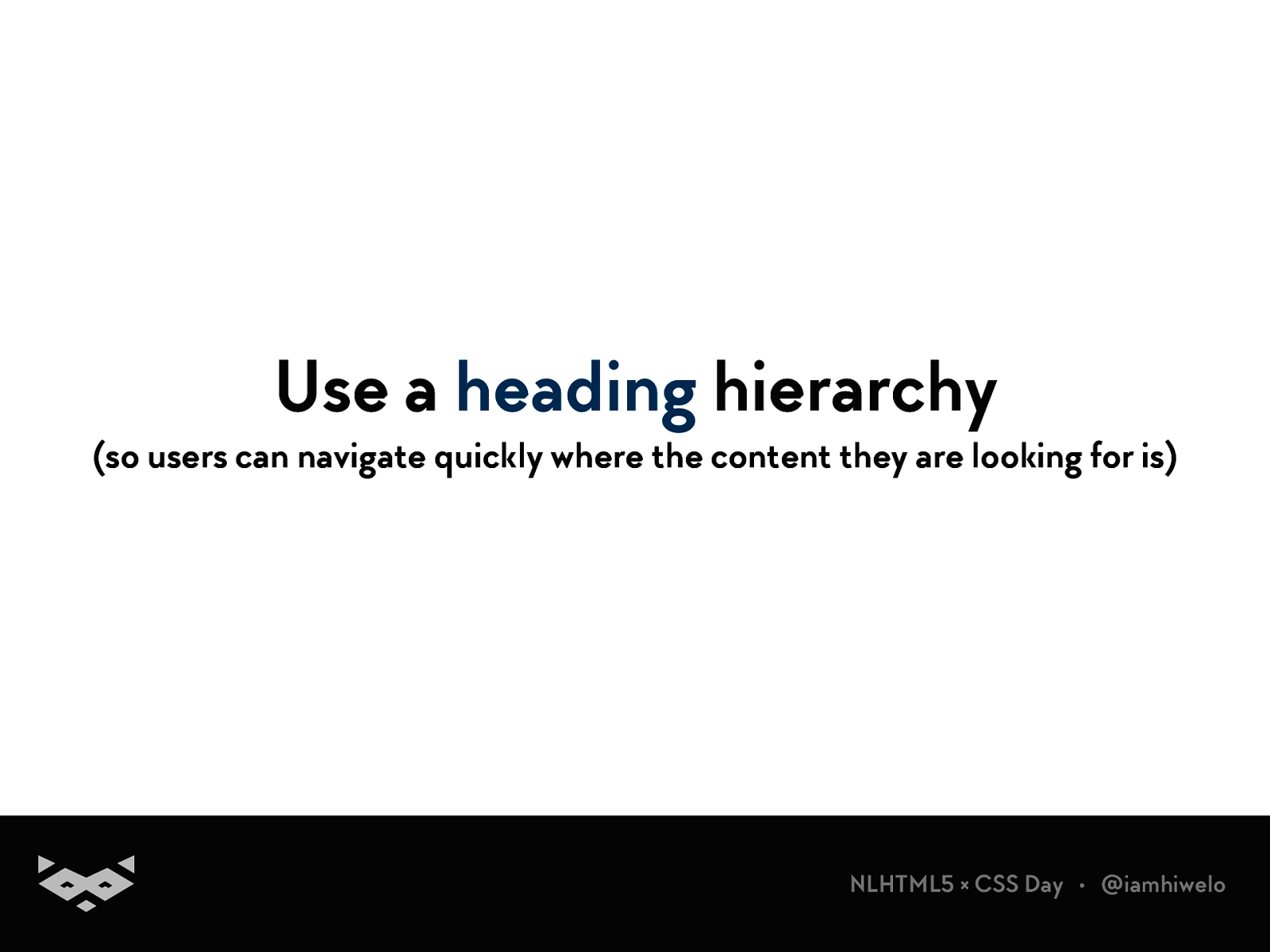
Use a heading hierarchy (so users can navigate quickly where the content they are looking for is)
NLHTML5 × CSS Day • @iamhiwelo
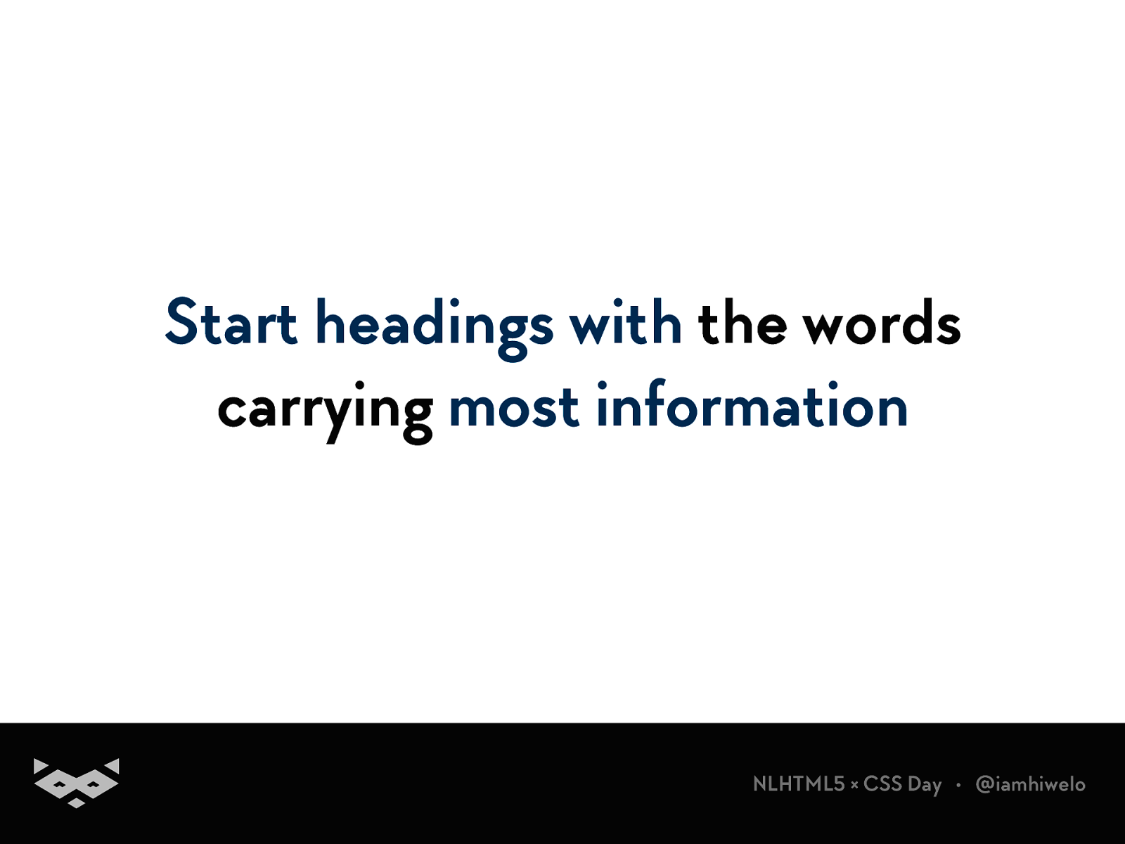
Start headings with the words carrying most information
NLHTML5 × CSS Day • @iamhiwelo
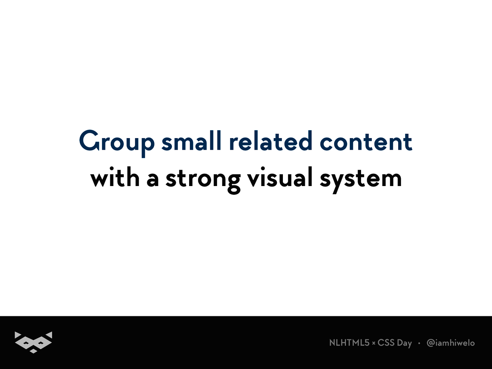
Group small related content with a strong visual system
NLHTML5 × CSS Day • @iamhiwelo
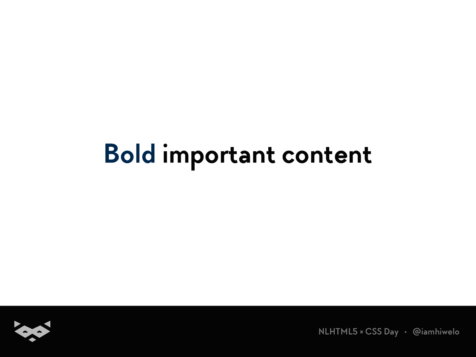
Bold important content
NLHTML5 × CSS Day • @iamhiwelo
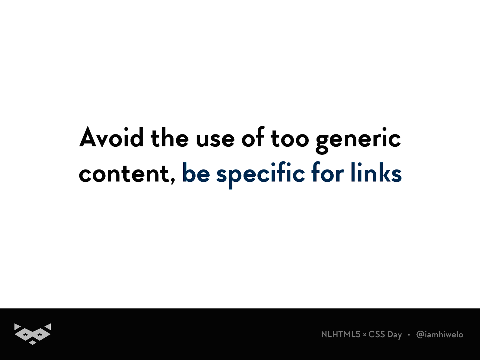
Avoid the use of too generic content, be specific for links
NLHTML5 × CSS Day • @iamhiwelo
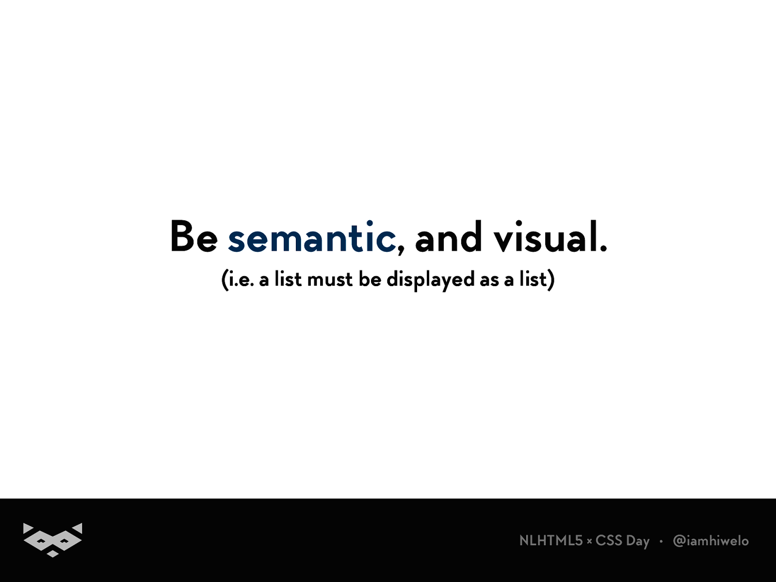
Be semantic , and visual. (i.e. a list must be displayed as a list)
NLHTML5 × CSS Day • @iamhiwelo
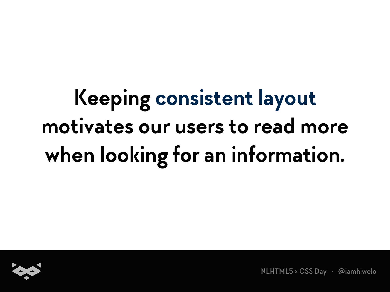
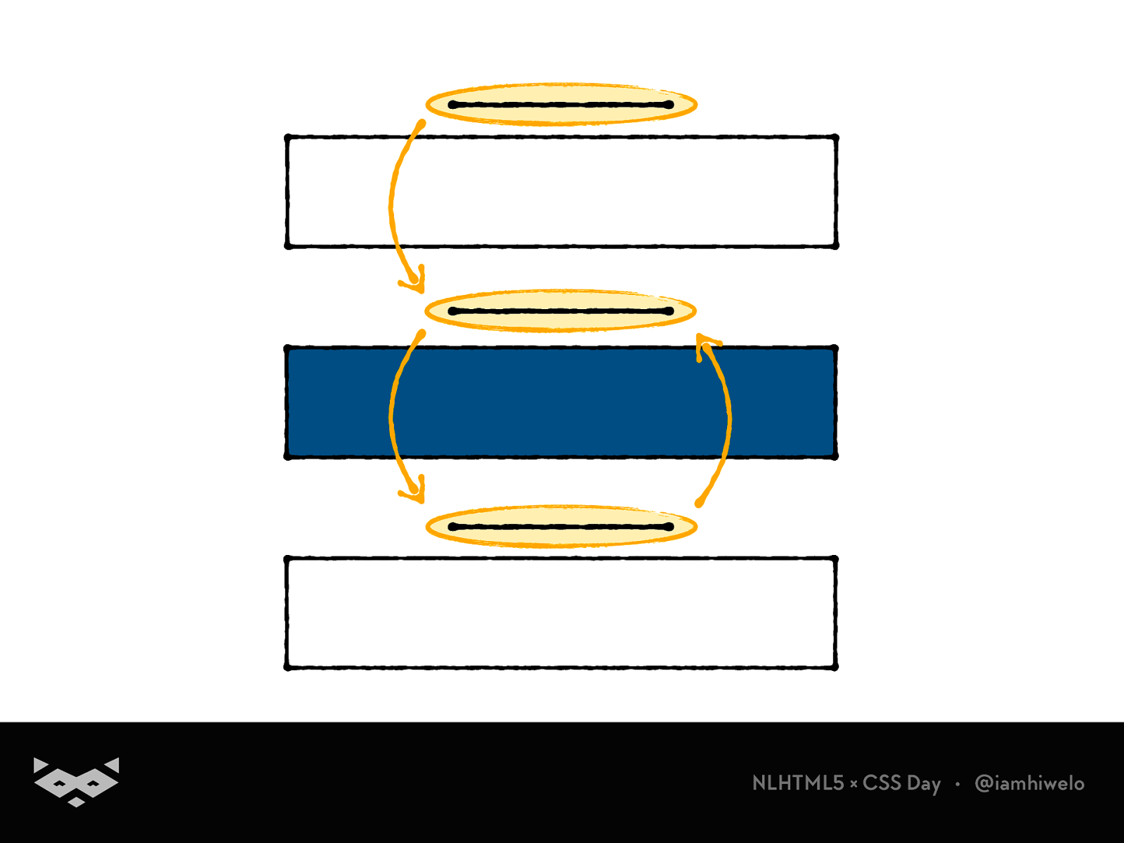
Keeping consistent layout
motivates our users to read more when looking for an information.
NLHTML5 × CSS Day • @iamhiwelo
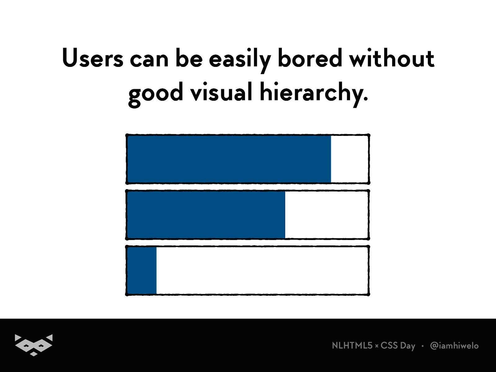
Users can be easily bored without good visual hierarchy.
NLHTML5 × CSS Day • @iamhiwelo
NLHTML5 × CSS Day • @iamhiwelo
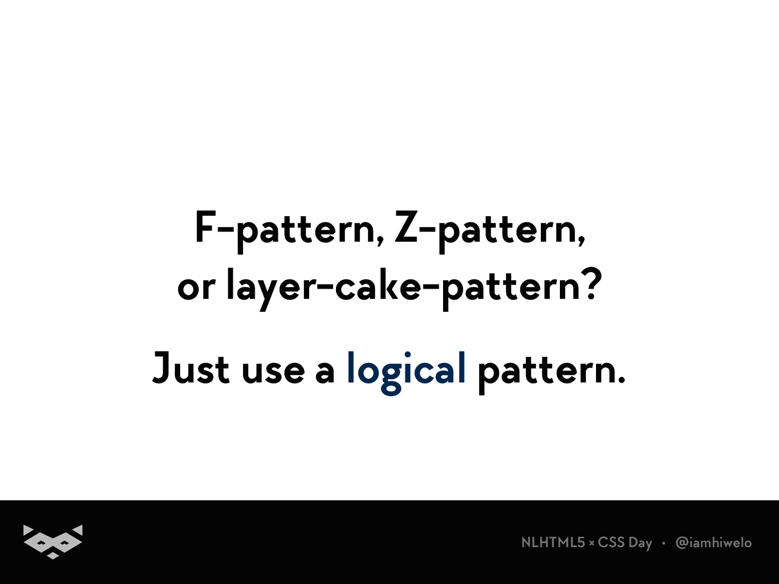
F-pattern, Z-pattern, or layer-cake-pattern? Just use a logical pattern.
NLHTML5 × CSS Day • @iamhiwelo
Propose distraction-free experiences
NLHTML5 × CSS Day • @iamhiwelo
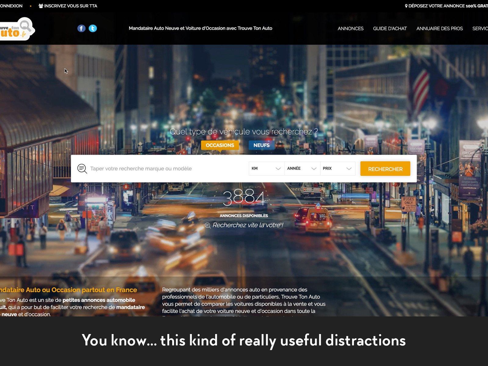
You know… this kind of really useful distractions
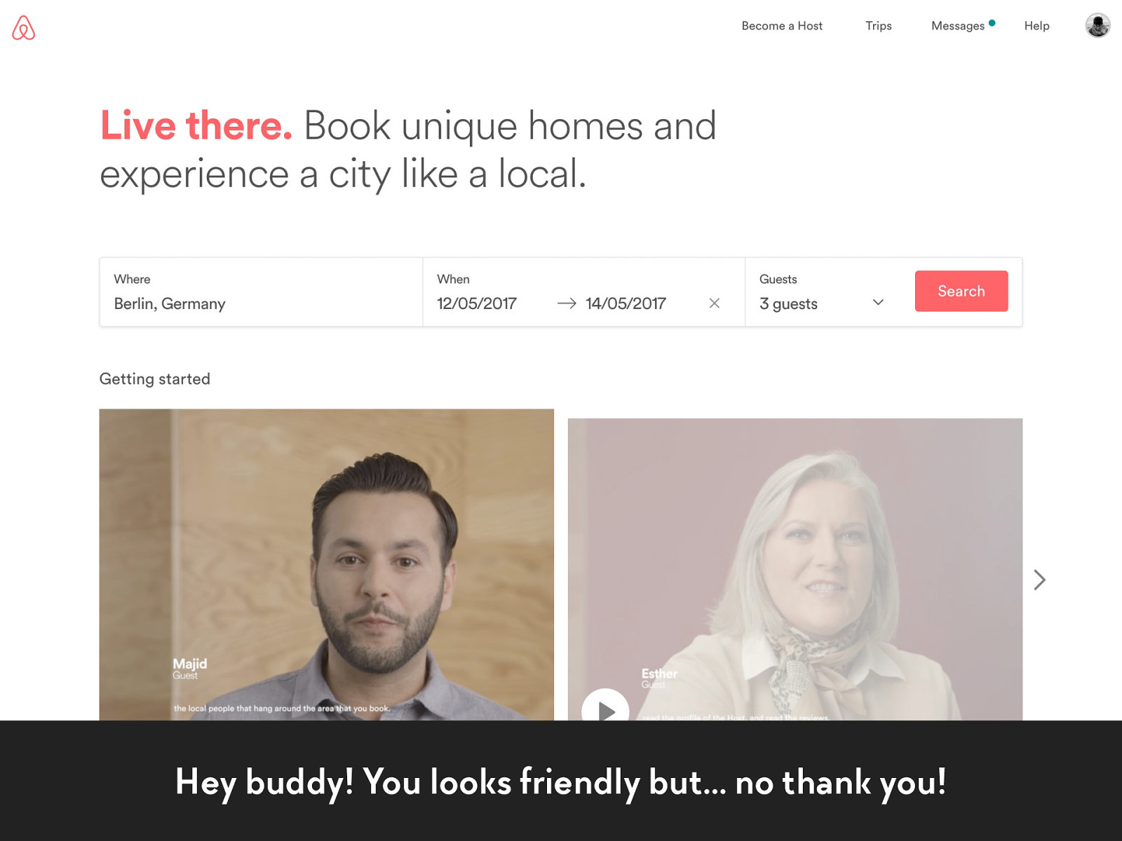
Hey buddy! You looks friendly but… no thank you!
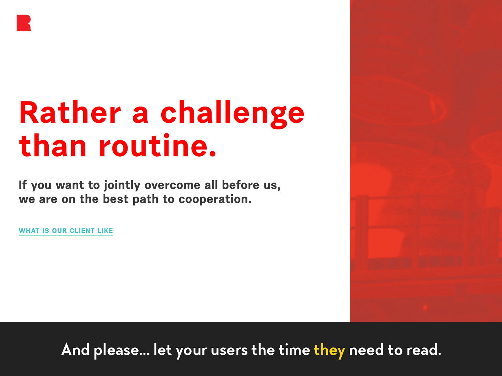
And please… let your users the time they need to read.
The last, but not the least…
NLHTML5 × CSS Day • @iamhiwelo
✂
NLHTML5 × CSS Day • @iamhiwelo
Remove unneeded content.
NLHTML5 × CSS Day • @iamhiwelo
How to experiment with your projects?
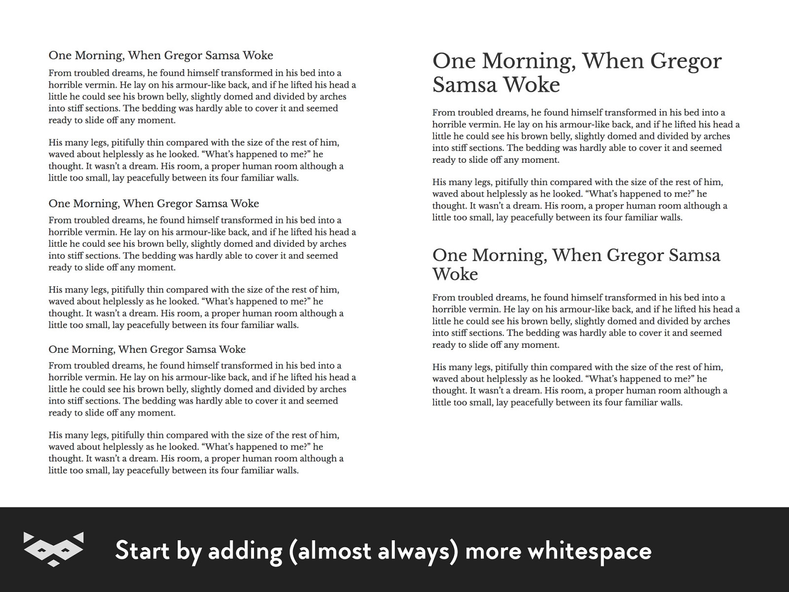
Start by adding (almost always) more whitespace
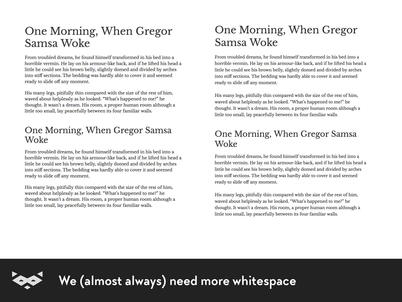
We (almost always) need more whitespace
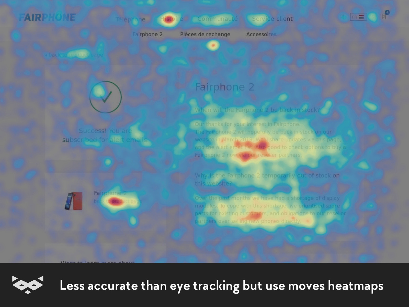
Less accurate than eye tracking but use moves heatmaps
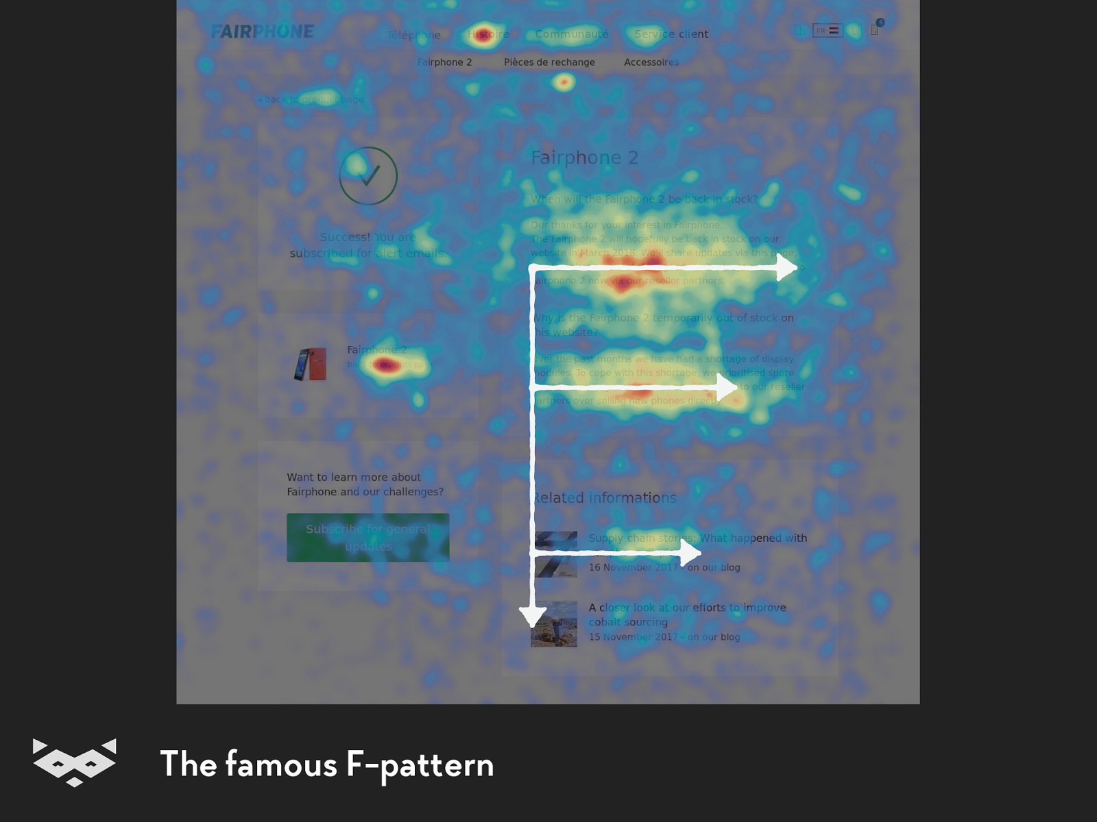
The famous F-pattern
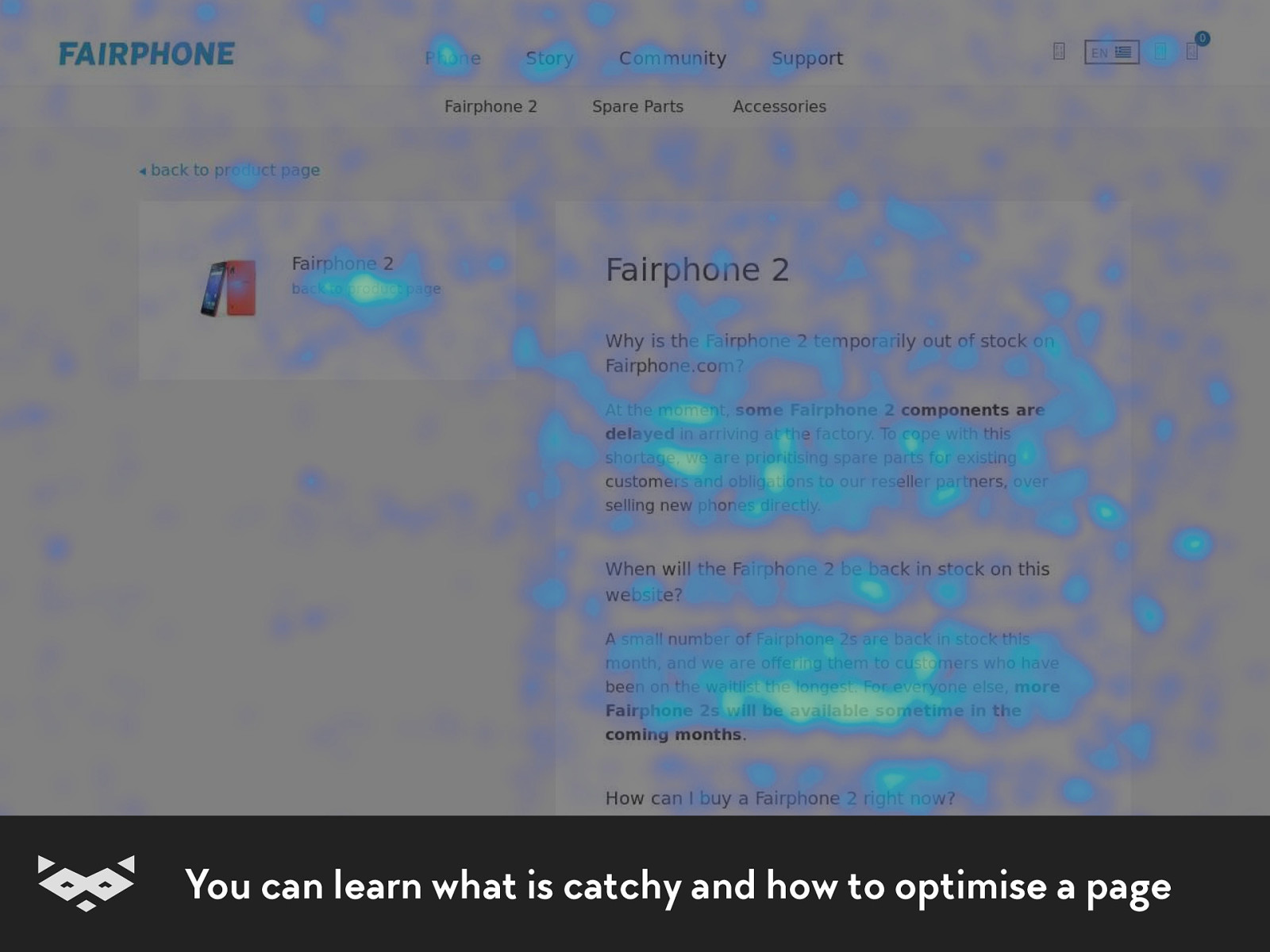
You can learn what is catchy and how to optimise a page
Some good
examples .
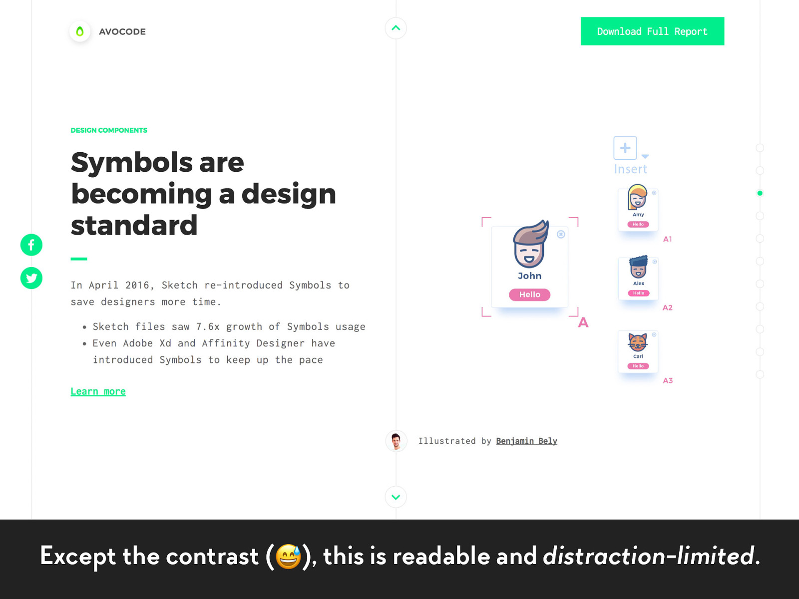
Except the contrast (
), this is readable and distraction-limited .
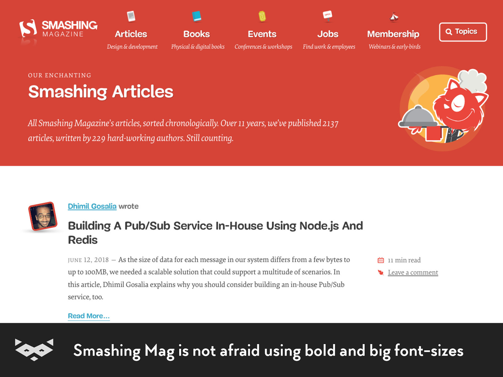
Smashing Mag is not afraid using bold and big font-sizes
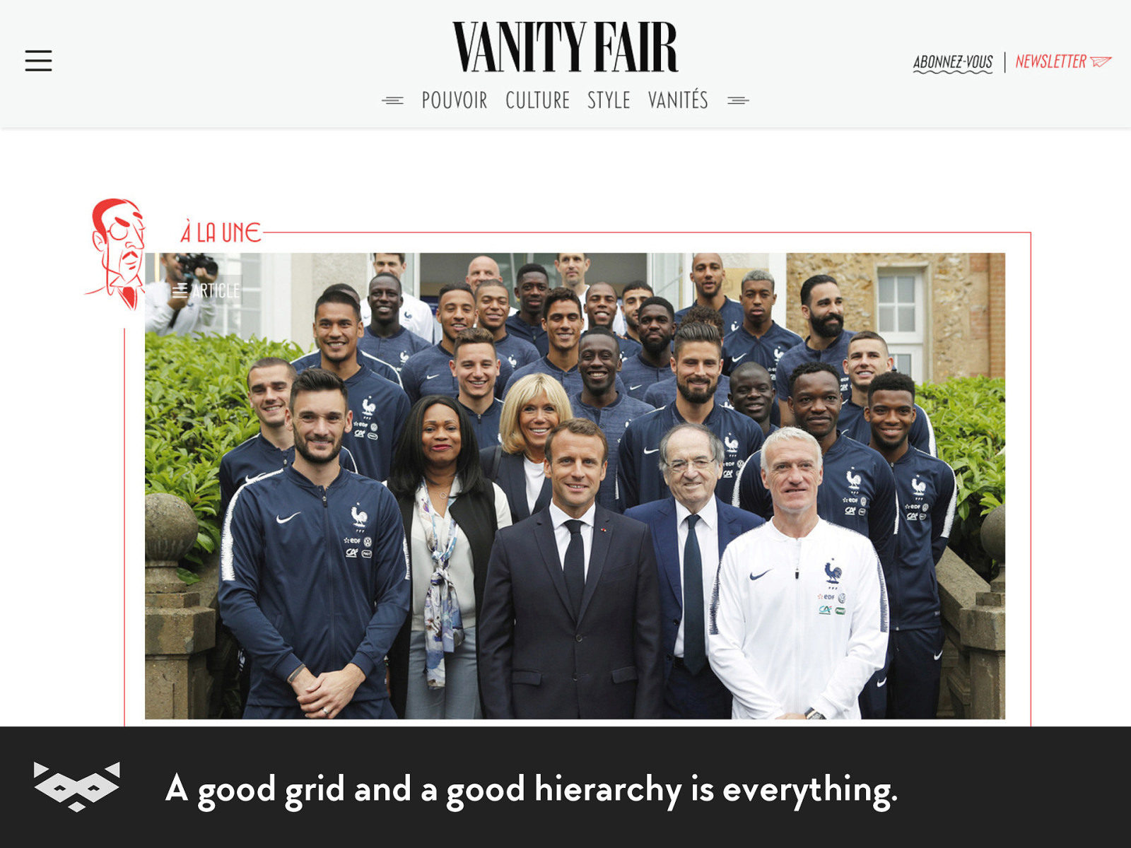
A good grid and a good hierarchy is everything.
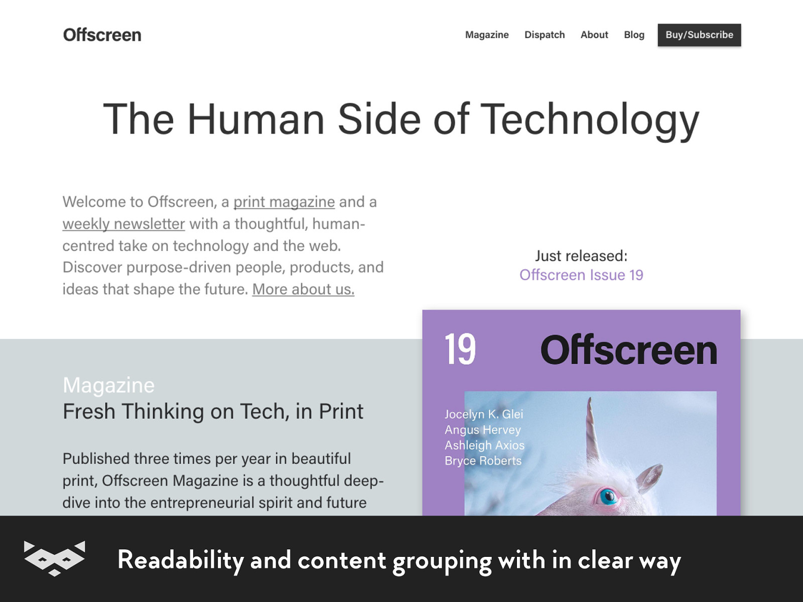
Readability and content grouping with in clear way

A nice & clearly readable design, must-have for webshop
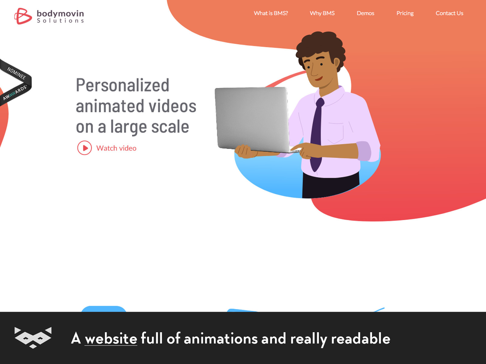
A website full of animations and really readable
Merci beaucoup ! $ Dank u wel! %
@iamhiwelo