Readability on the Web • NCDT 2019 • May 16, 2019

A presentation at Dutch Digital Accessibility Congress 2019 in May 2019 in Driebergen, Driebergen-Rijsenburg, Netherlands by Damien Senger
Readability on the Web • NCDT 2019 • May 16, 2019
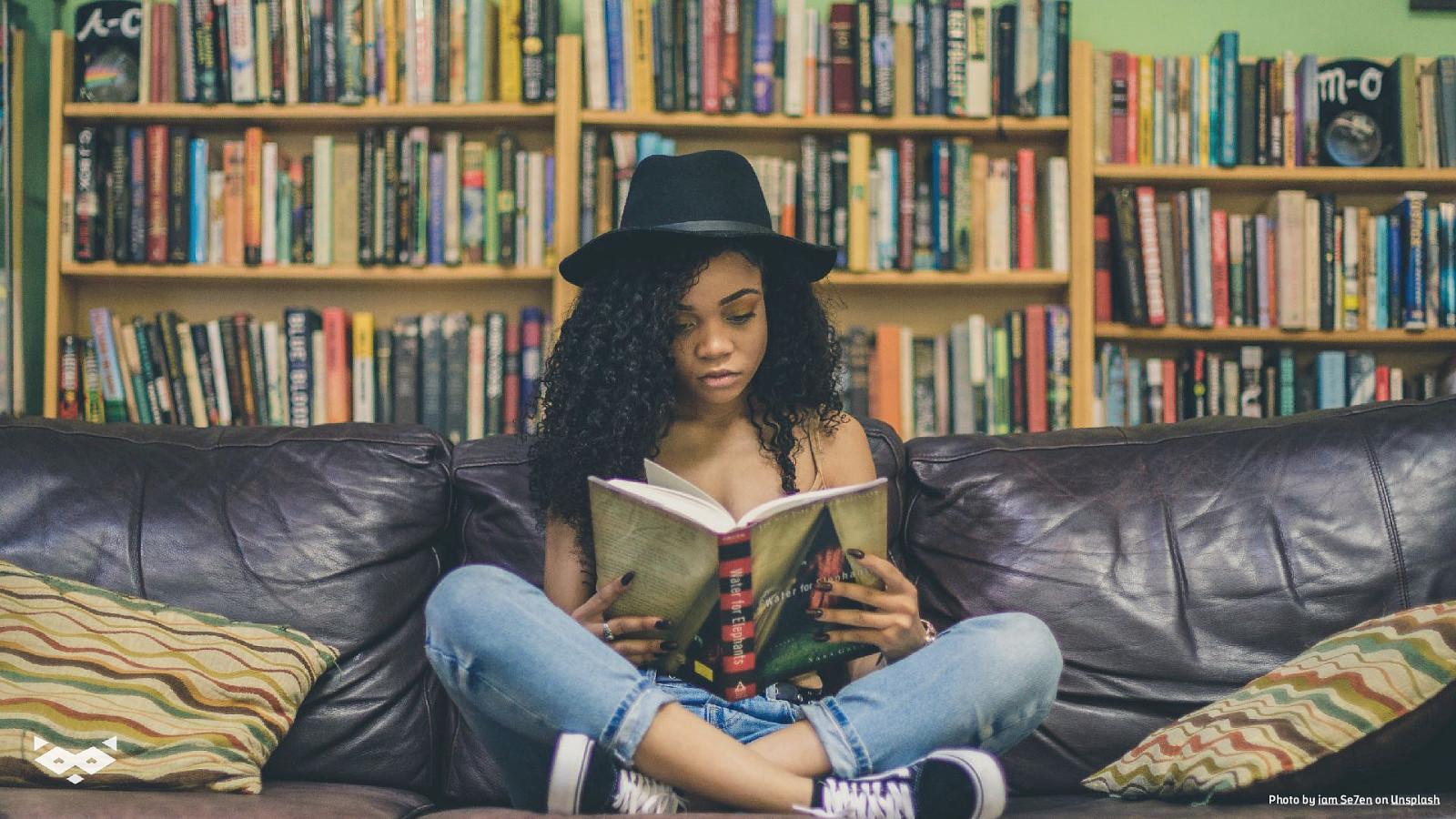
Photo of a woman reading a book on a couch in a living room. Photo by iam Se7en on Unsplash
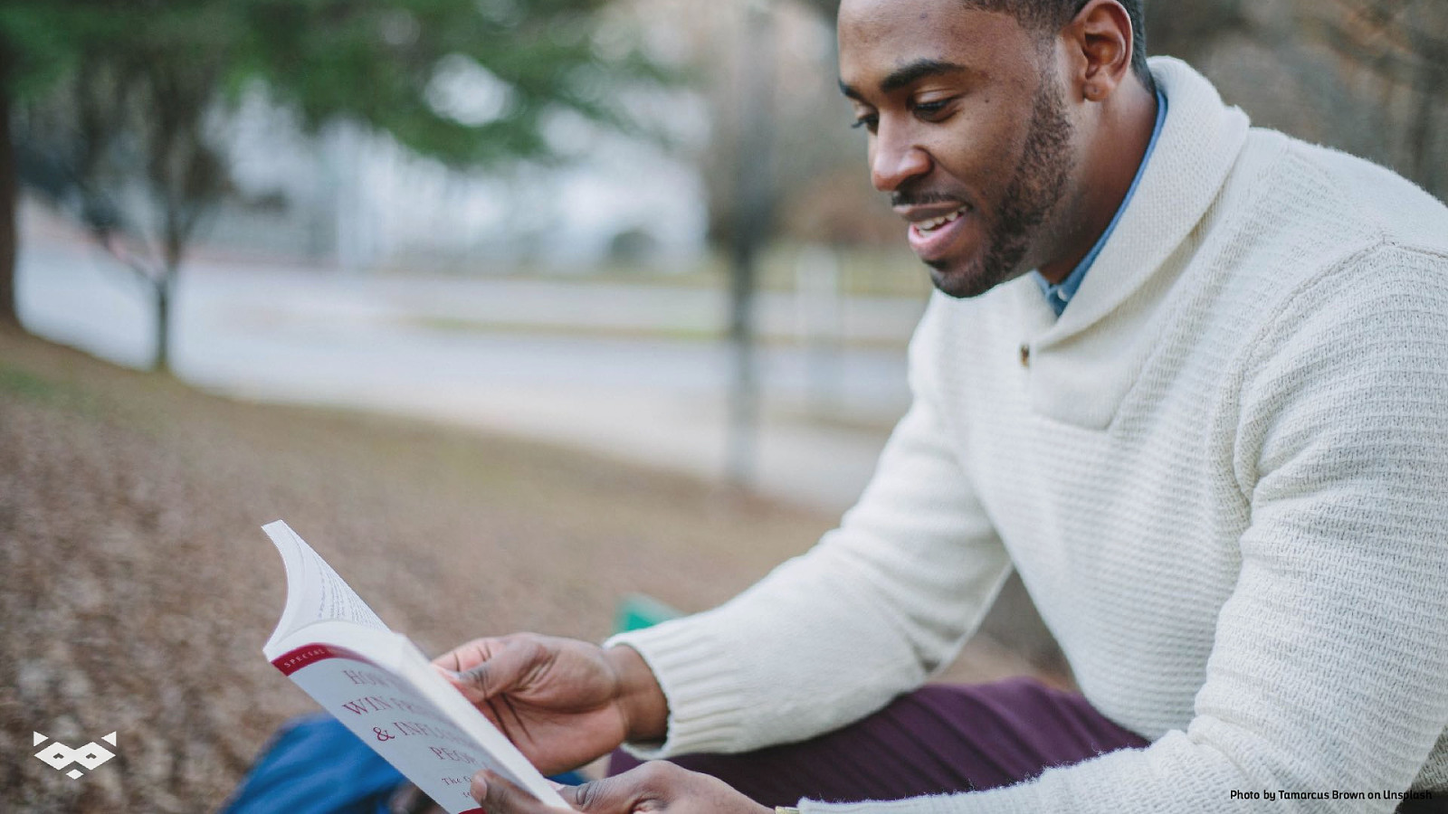
Photo of a man reading a book in a park, sitting on the grass. Photo by Tamarcus Brown on Unsplash
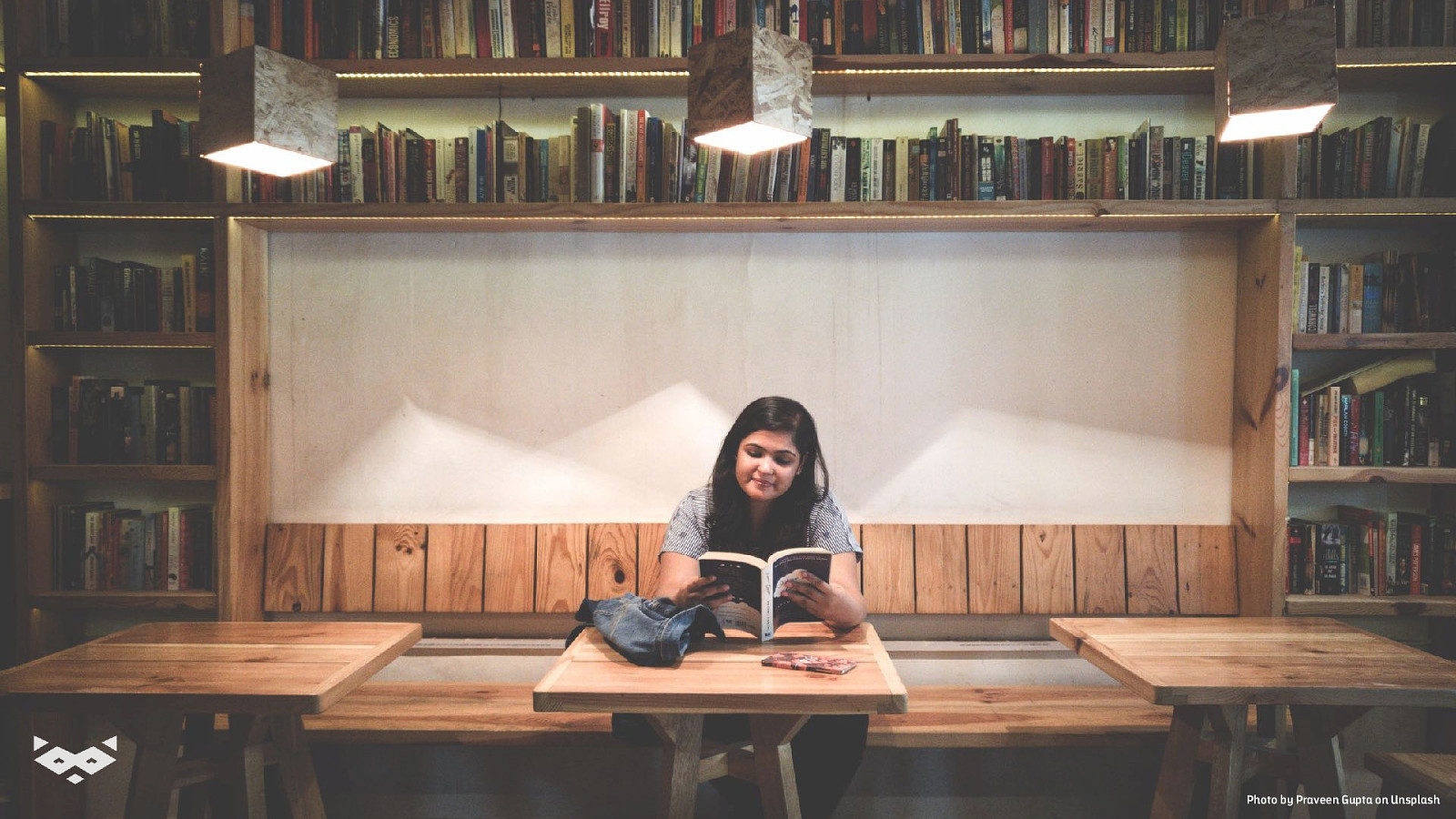
Photo of a woman reading a coffee place. Photo by Praveen Gupta on Unsplash
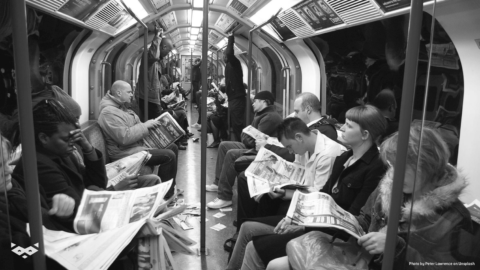
Photo of a subway with people reading newspapers. Photo by Peter Lawrence on Unsplash

Photo of a non-binary person reading on a smartphone. Photo from The Gender Spectrum Collection
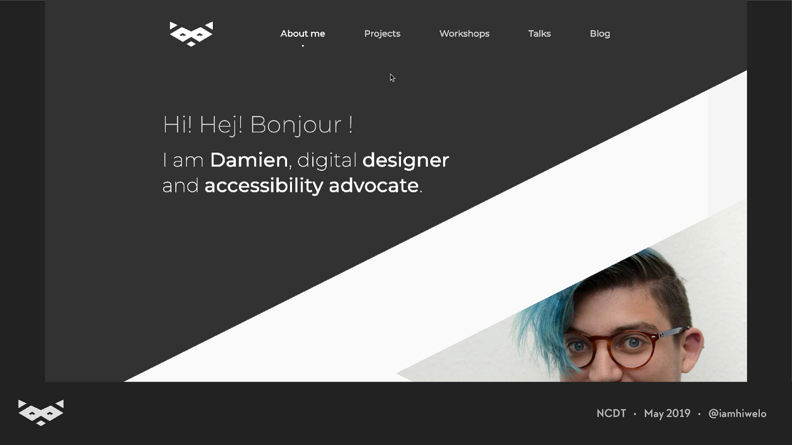
Hi! 👋 I’m Damien.
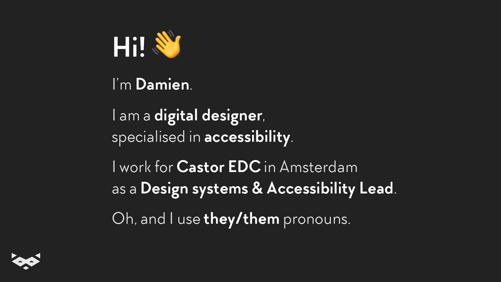
Hi! 👋 I’m Damien. I am a digital designer, specialised in accessibility. I work for Castor EDC in Amsterdam as a Design systems & Accessibility Lead. Oh, and I use they/them pronouns.
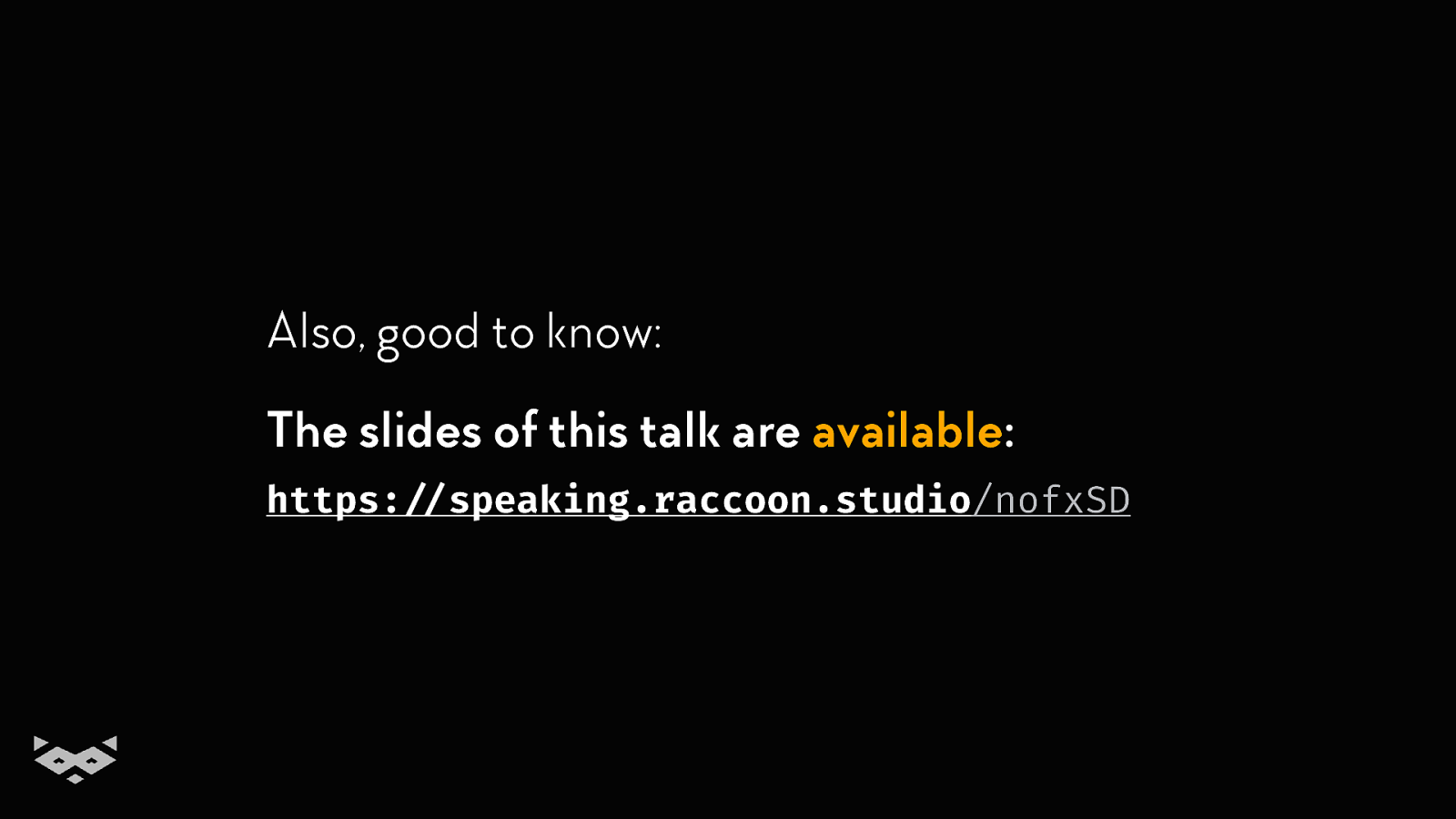
Also, good to know: The slides of this talk are available: https:!//speaking.raccoon.studio/nofxSD
So! Let’s talk about readability.
But first, why?
Reading is not an easy thing.
The Web is mainly text-based And a text is not accessible per se.
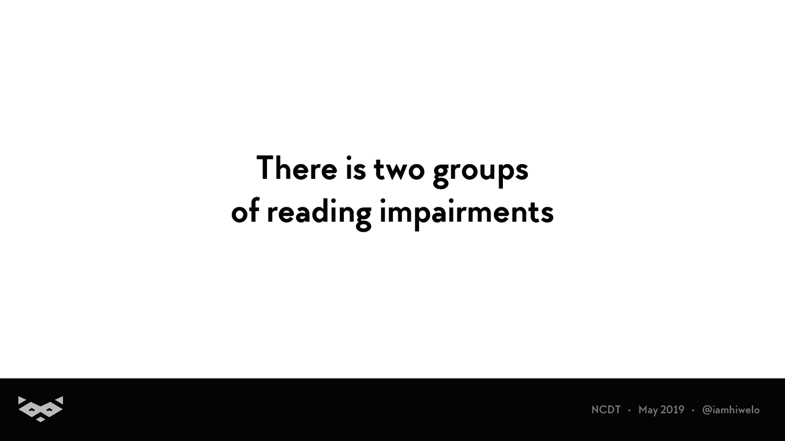
There is two groups of reading impairments
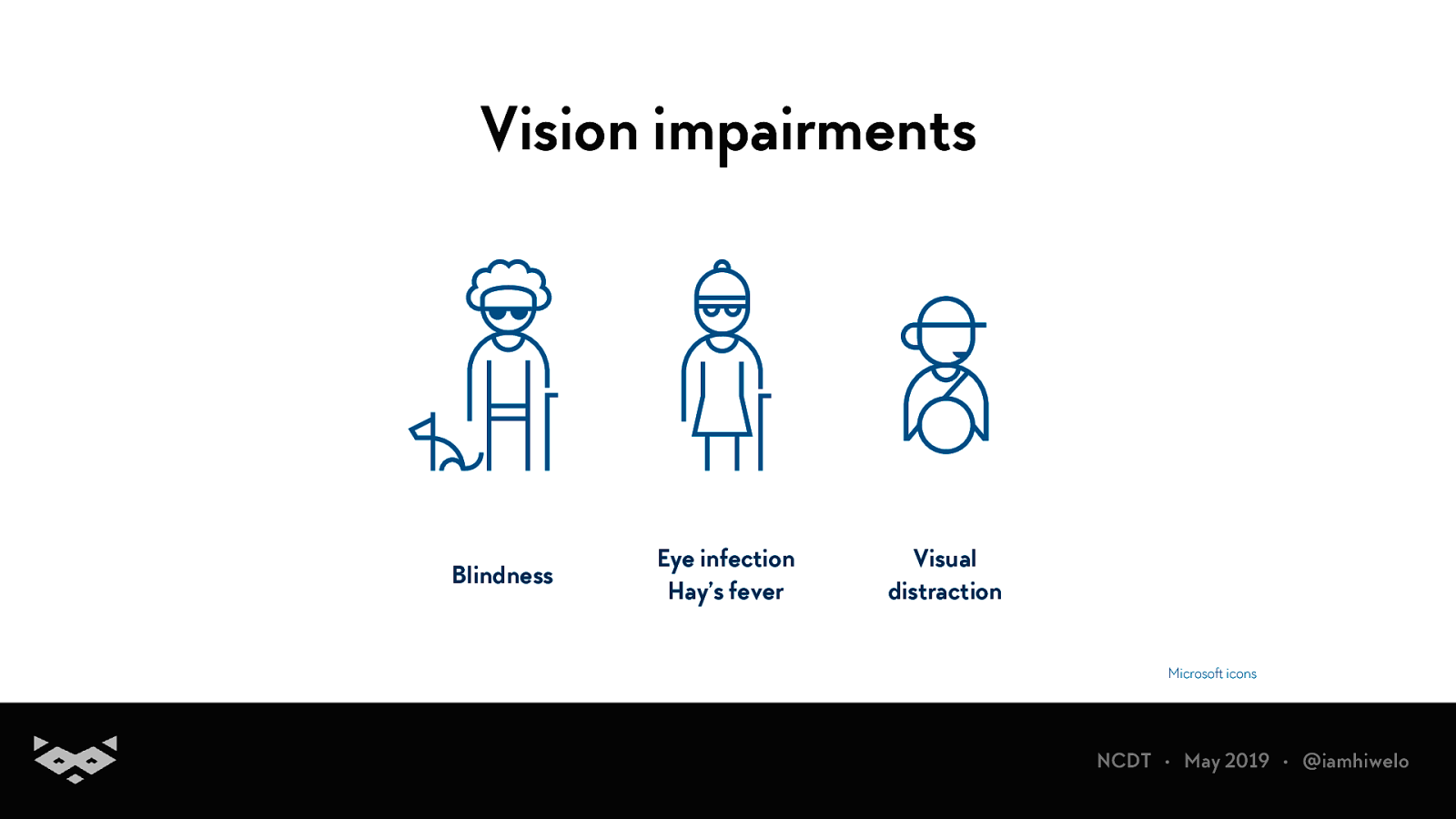
Vision impairments Blindness Eye infection Hay’s fever Visual distraction
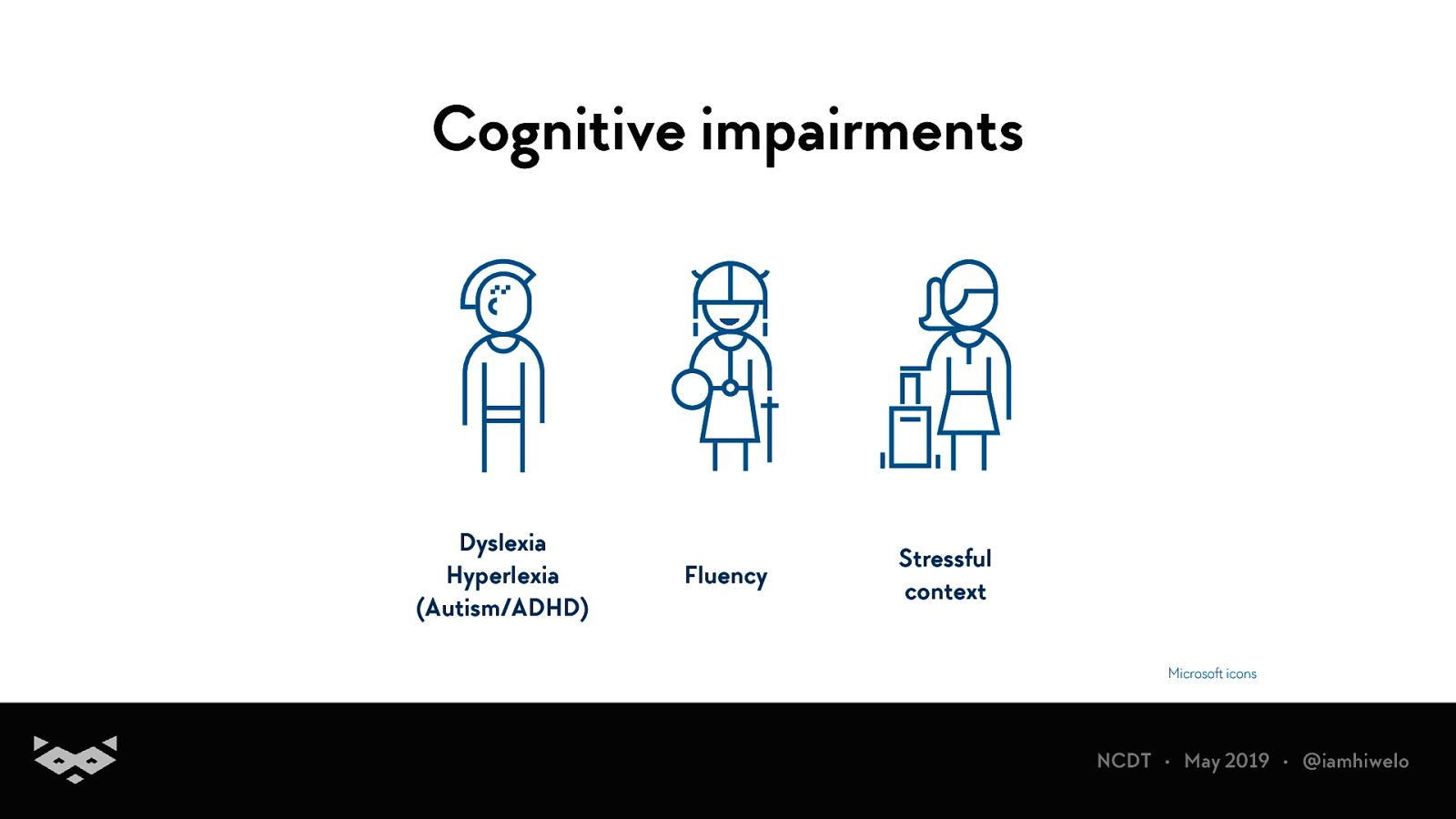
Cognitive impairments Dyslexia Hyperlexia (Autism/ADHD) Fluency Stressful context
A quick focus on dyslexia
Up to 7% of the global population.
Commonly associated with ADHD, autism and dyscalculia.
Can also appear after traumatic brain injuries and strokes.
How do we read?
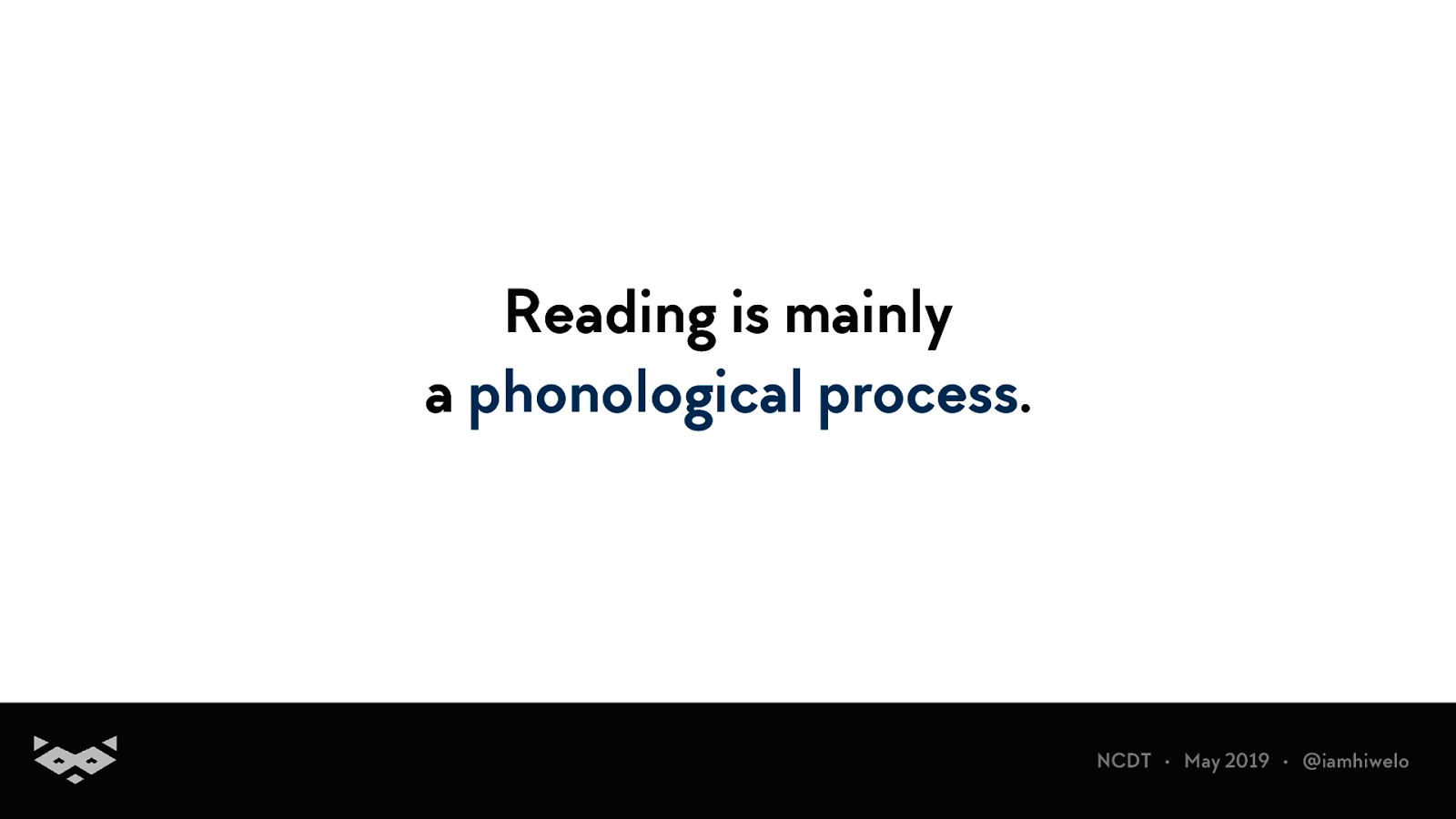
Reading is mainly a phonological process.
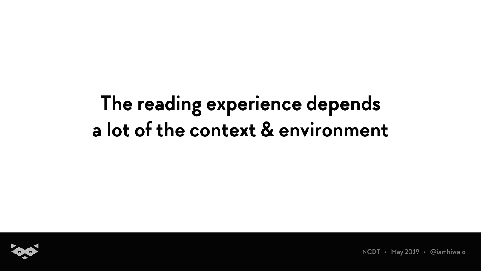
The reading experience depends a lot of the context & environment
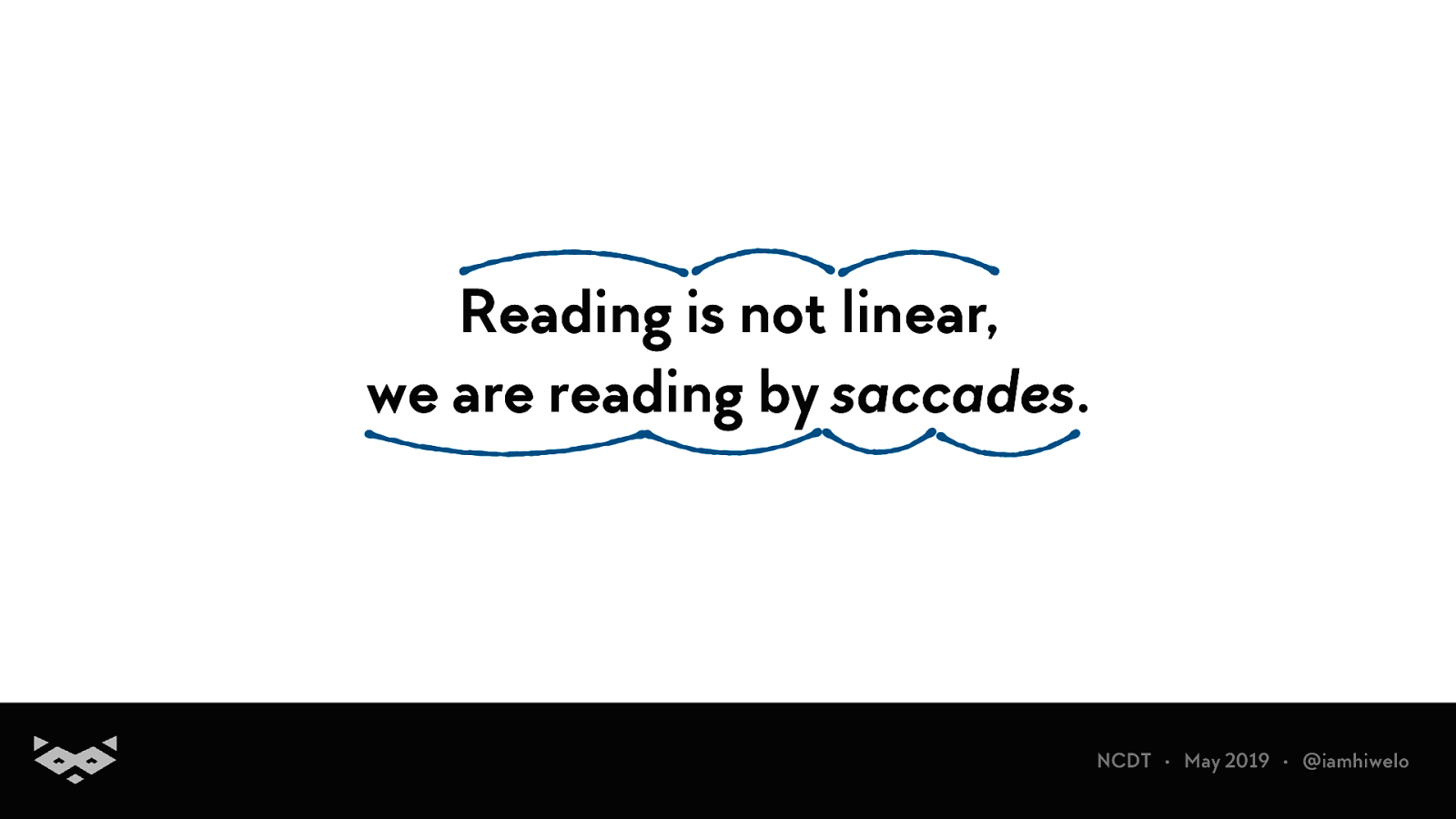
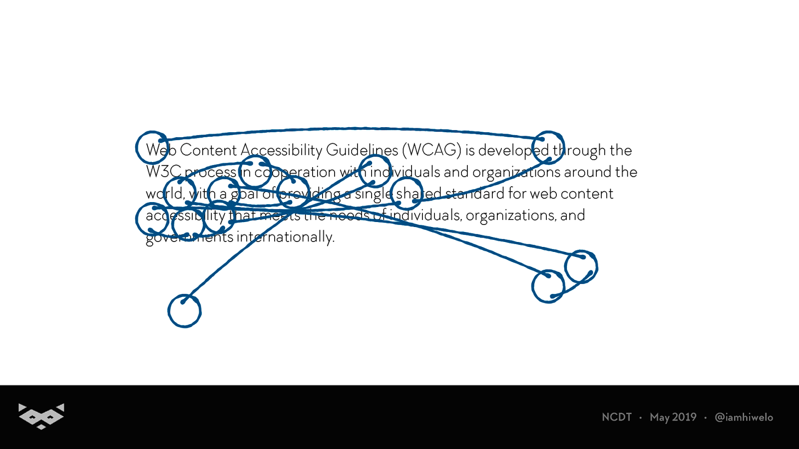
Reading is not linear, we are reading by saccades.
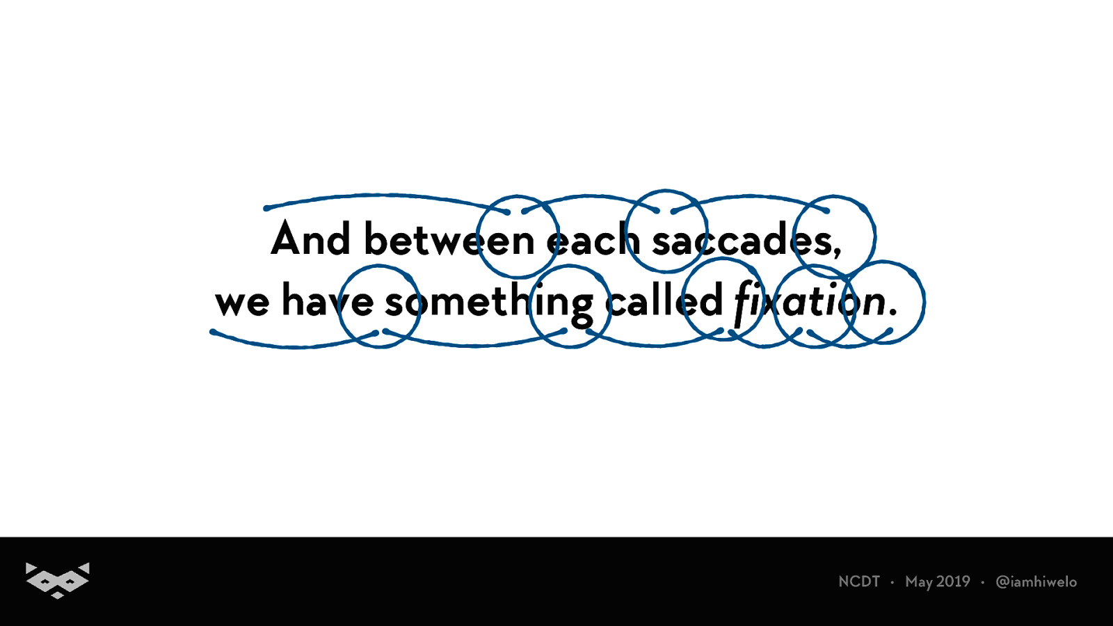
And between each saccades, we have something called fixation.
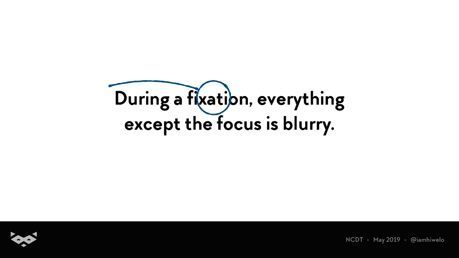
During a fixation, everything except the focus is blurry.
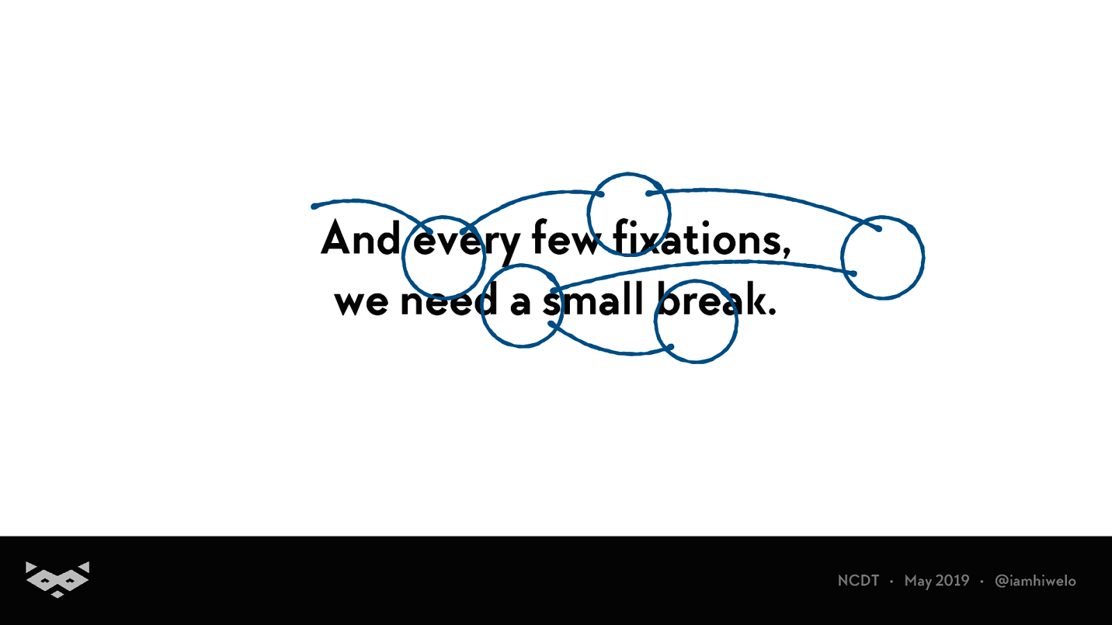
And every few fixations, we need a small break.
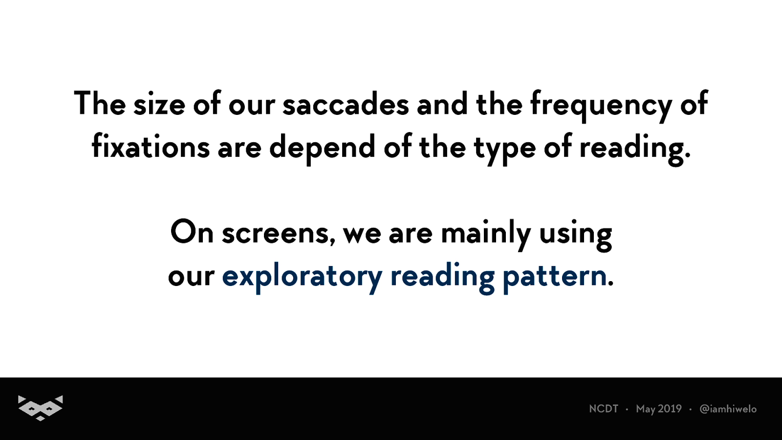
The size of our saccades and the frequency of fixations are depend of the type of reading. On screens, we are mainly using our exploratory reading pattern.
Web Content Accessibility Guidelines (WCAG) is developed through the W3C process in cooperation with individuals and organizations around the world, with a goal of providing a single shared standard for web content accessibility that meets the needs of individuals, organizations, and governments internationally.
We are first analysing the paragraph before starting to read.
On a screen, we are not reading in a word-by-word manner.
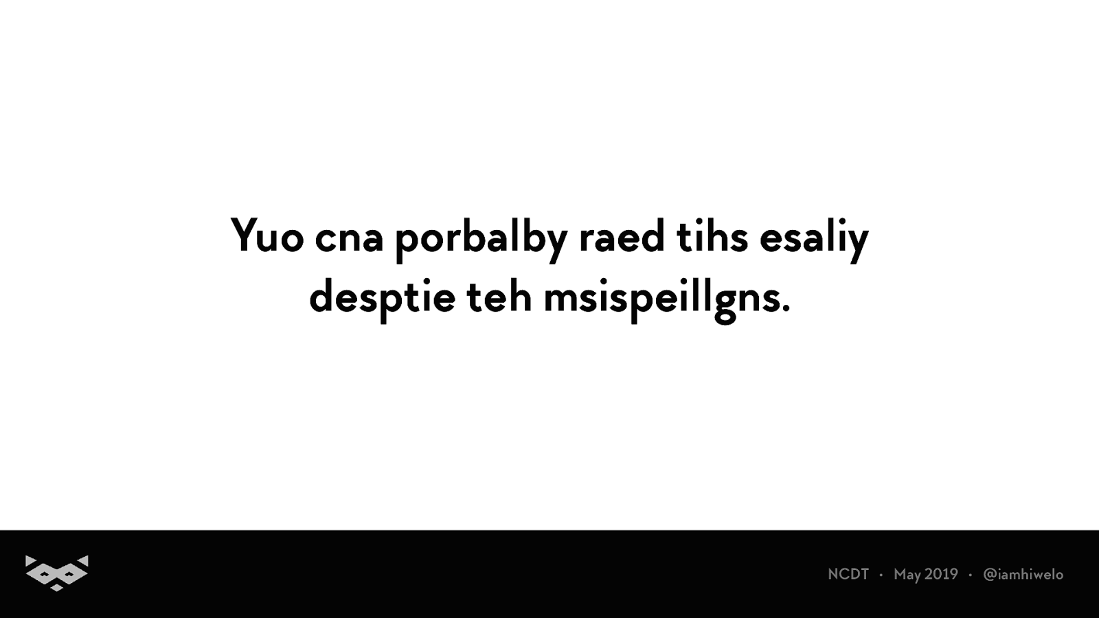
Yuo cna porbalby raed tihs esaliy desptie teh msispeillgns.
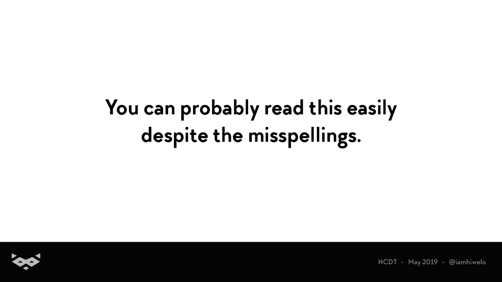
You can probably read this easily despite the misspellings.
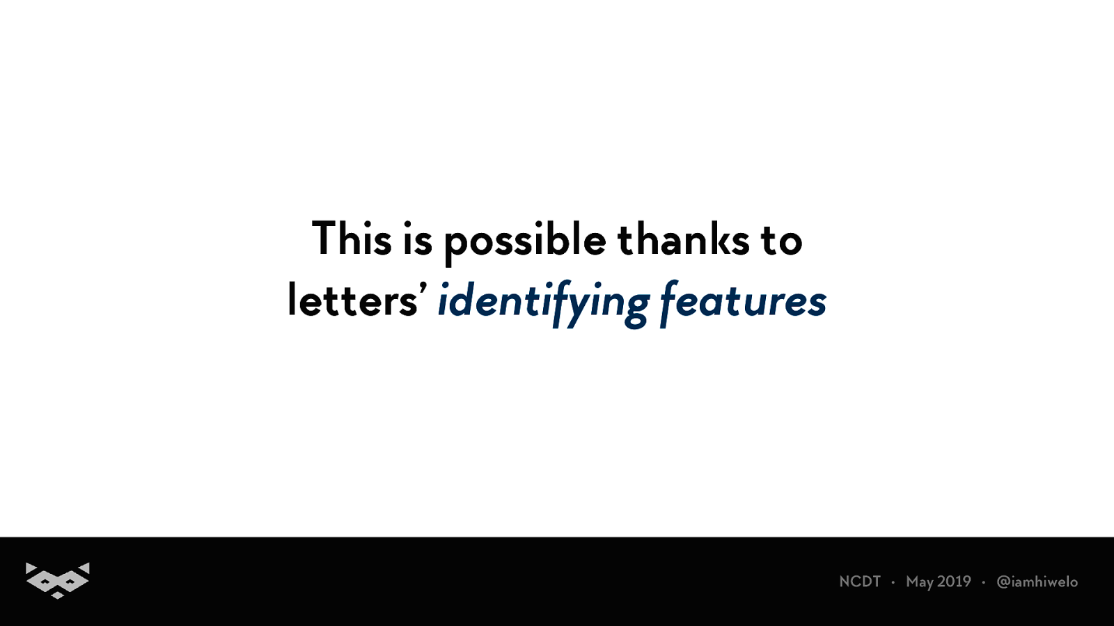
This is possible thanks to letters’ identifying features
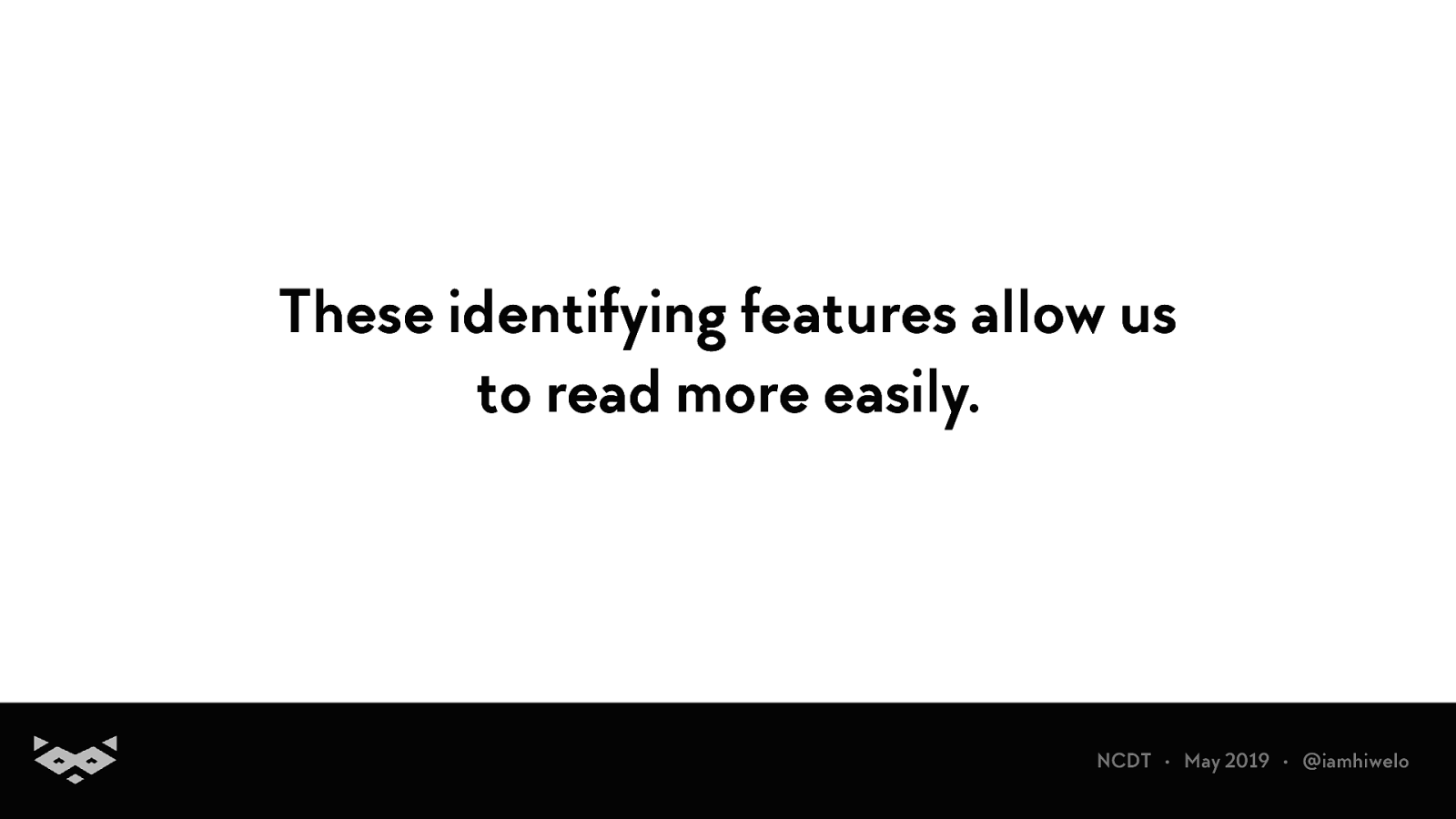
These identifying features allow us to read more easily.
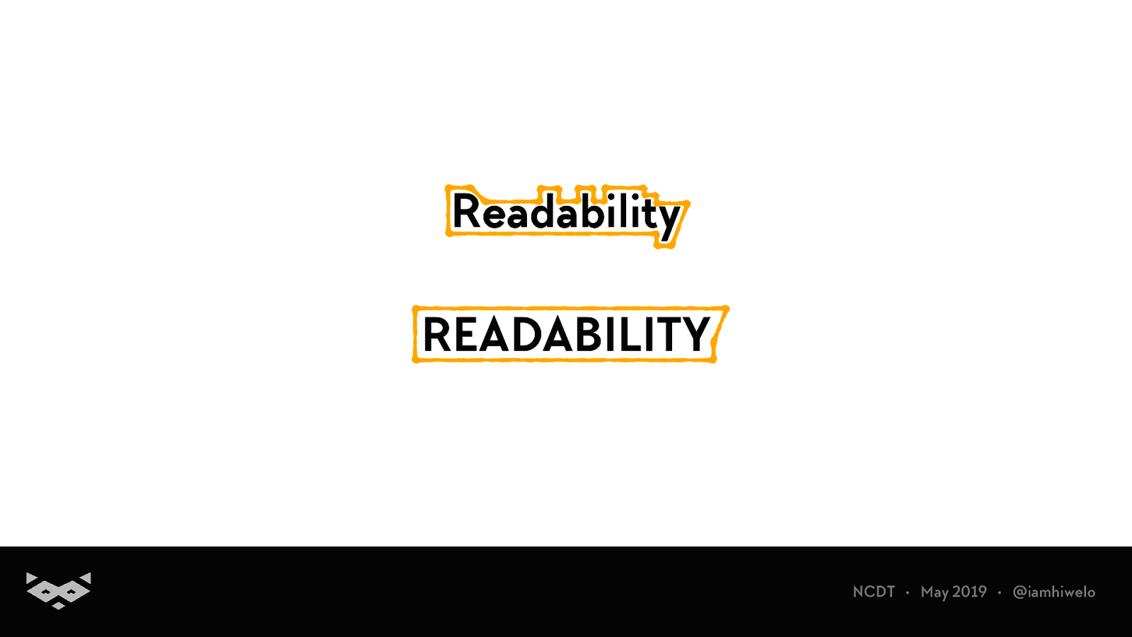
Readability READABILITY
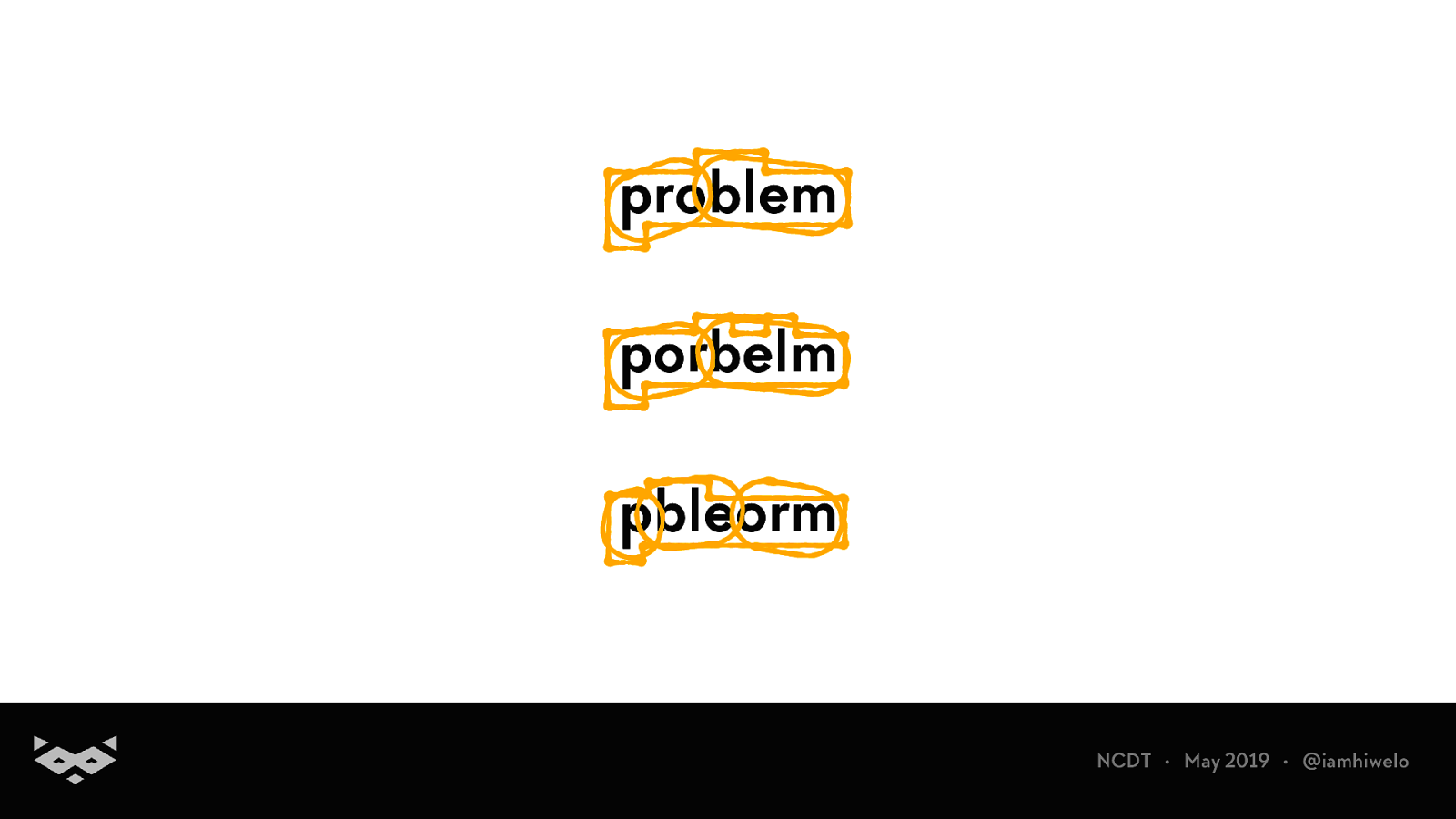
problem porbelm pbleorm
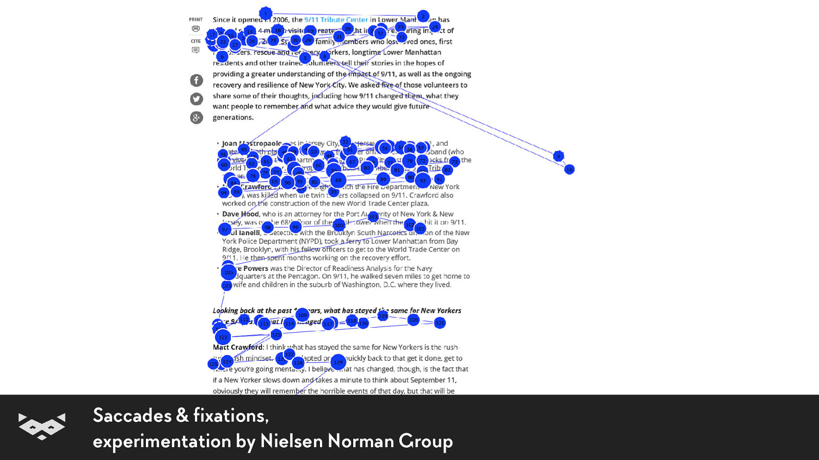
Saccades & fixations, experimentation by Nielsen Norman Group
Readability 101.
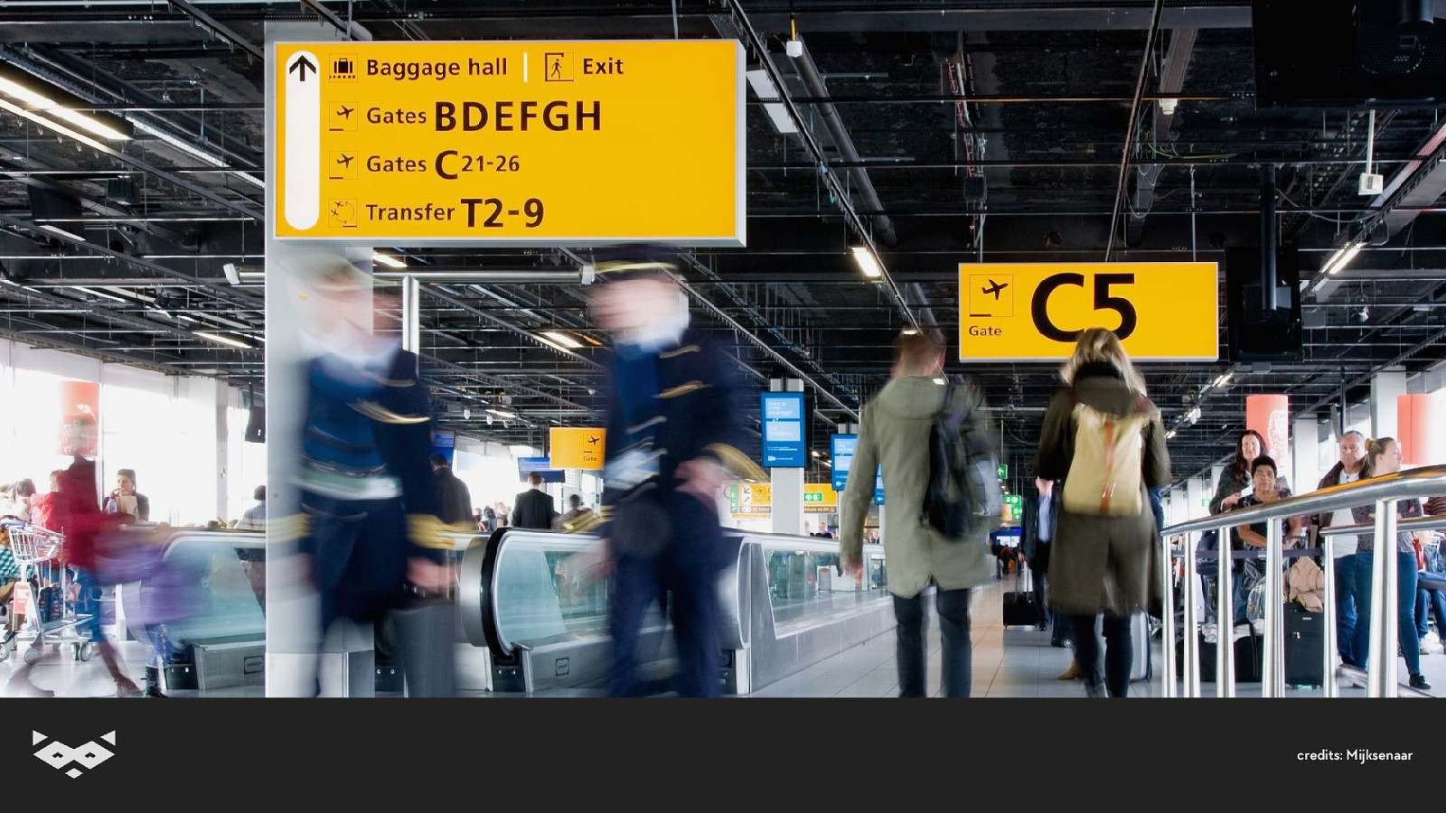
Photo of a hallway in an airport with giant signs. credits: Mijksenaar
The 4C of readability
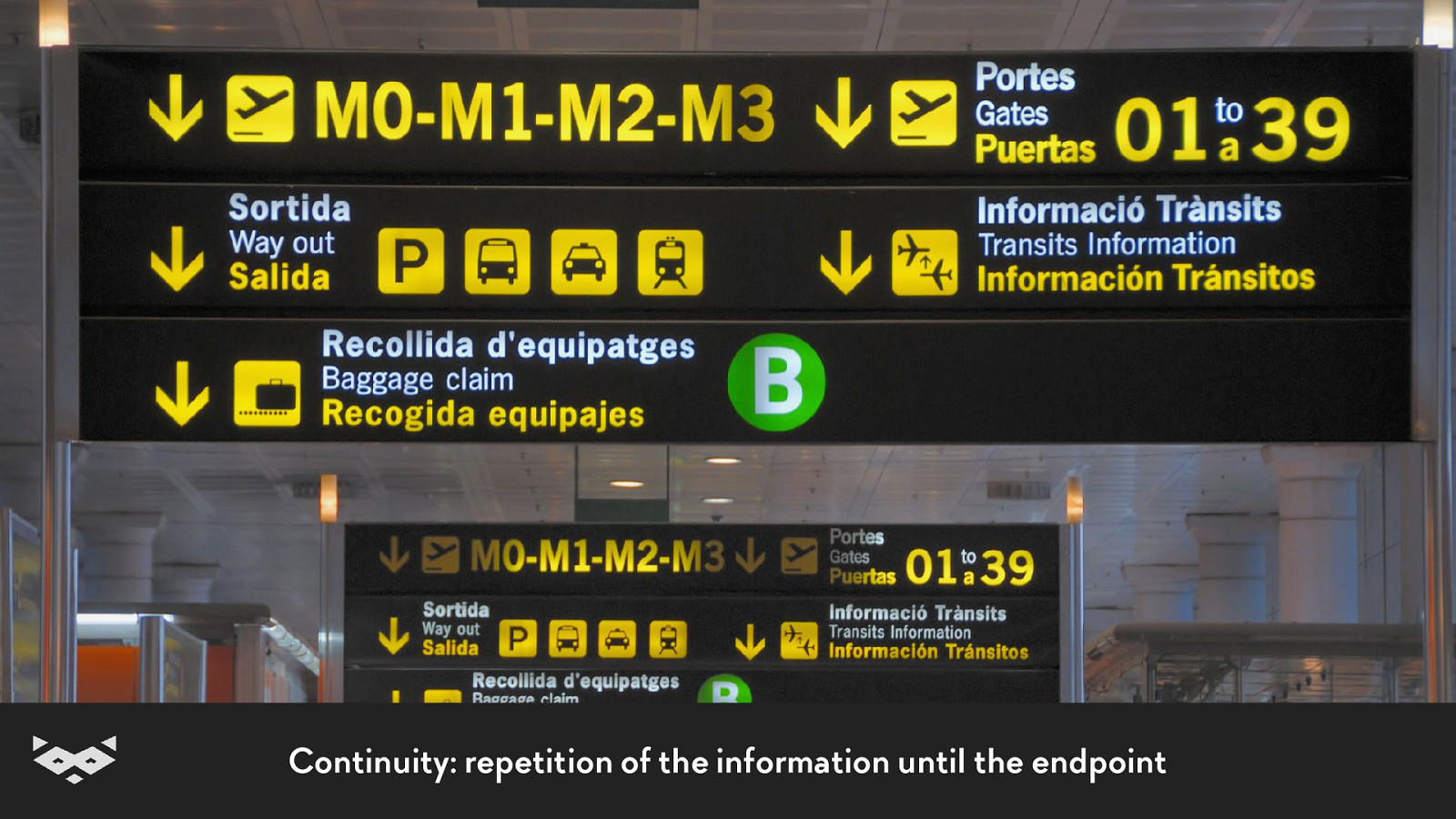
Continuity: repetition of the information until the endpoint
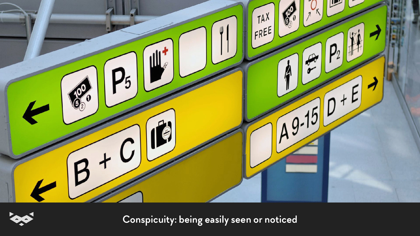
Conspicuity: being easily seen or noticed
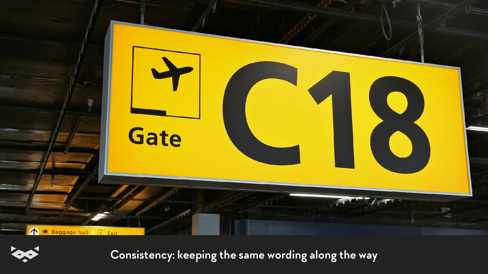
Consistency: keeping the same wording along the way
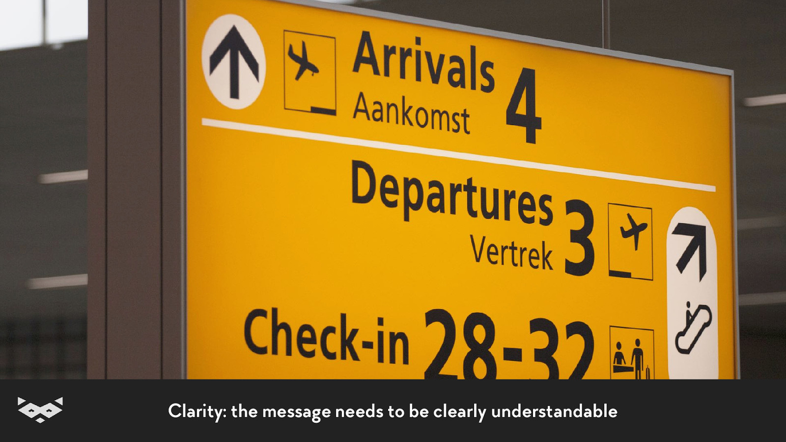
Clarity: the message needs to be clearly understandable
Thanks Paul Mijksenaar 👍
Readability & web content.
There is no one-fits-all solution.
So what?
A good contrast is primordial.
But too much contrast can create a blur effect.
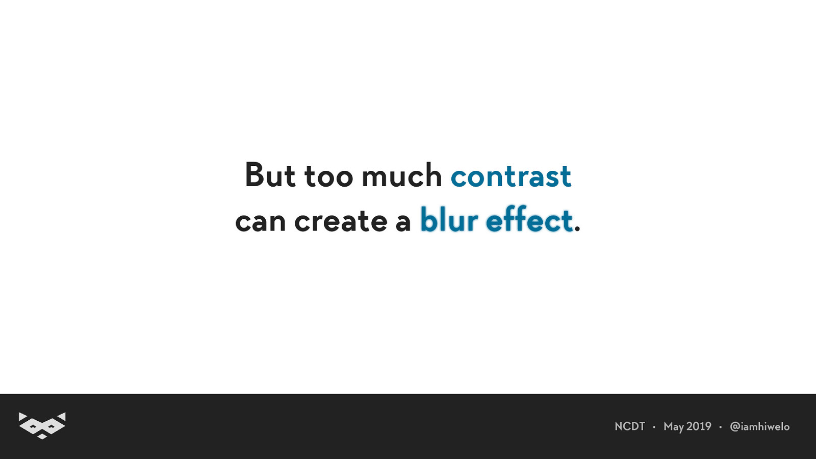
But too much contrast can create a blur effect.
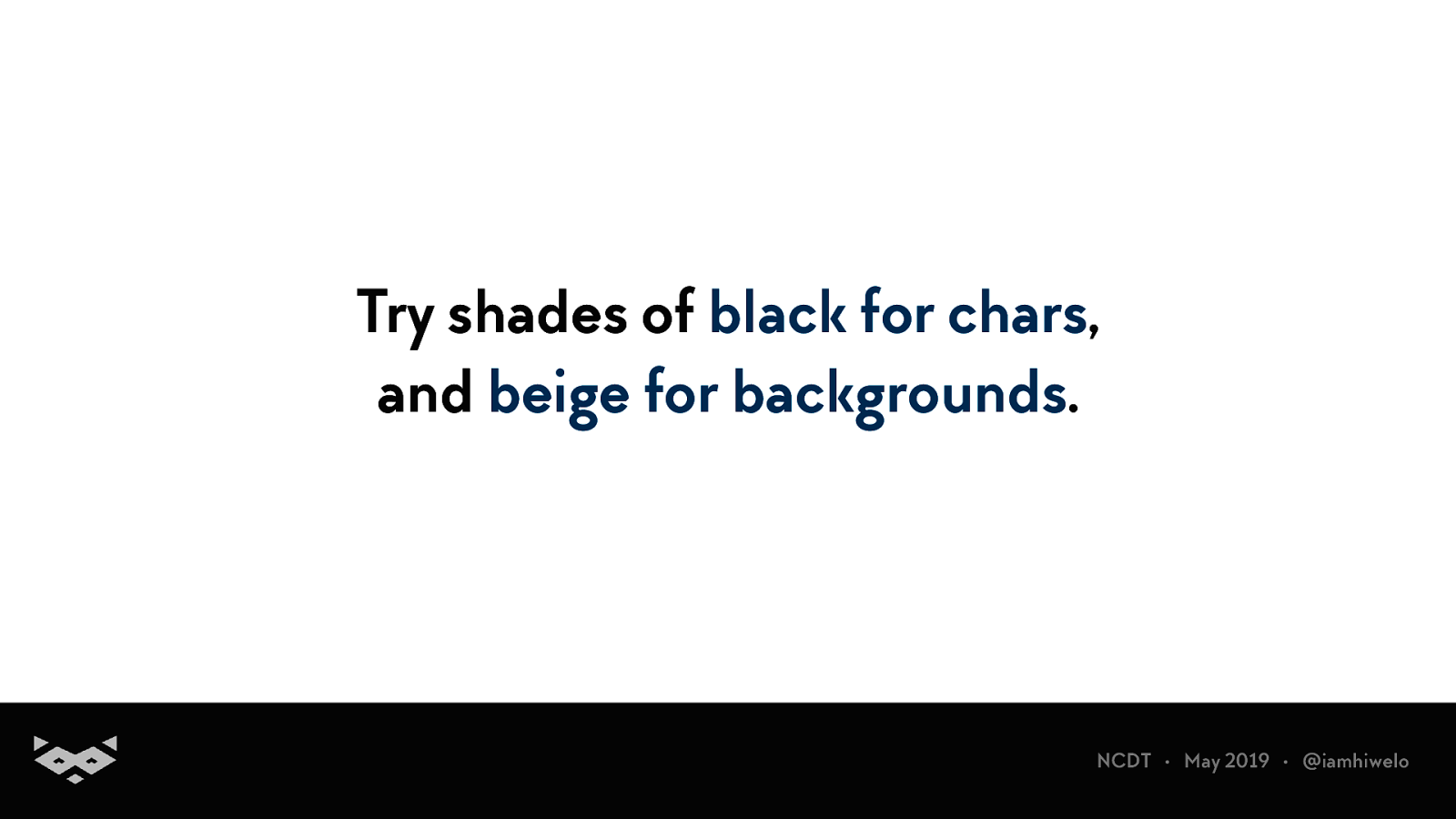
Try shades of black for chars, and beige for backgrounds.
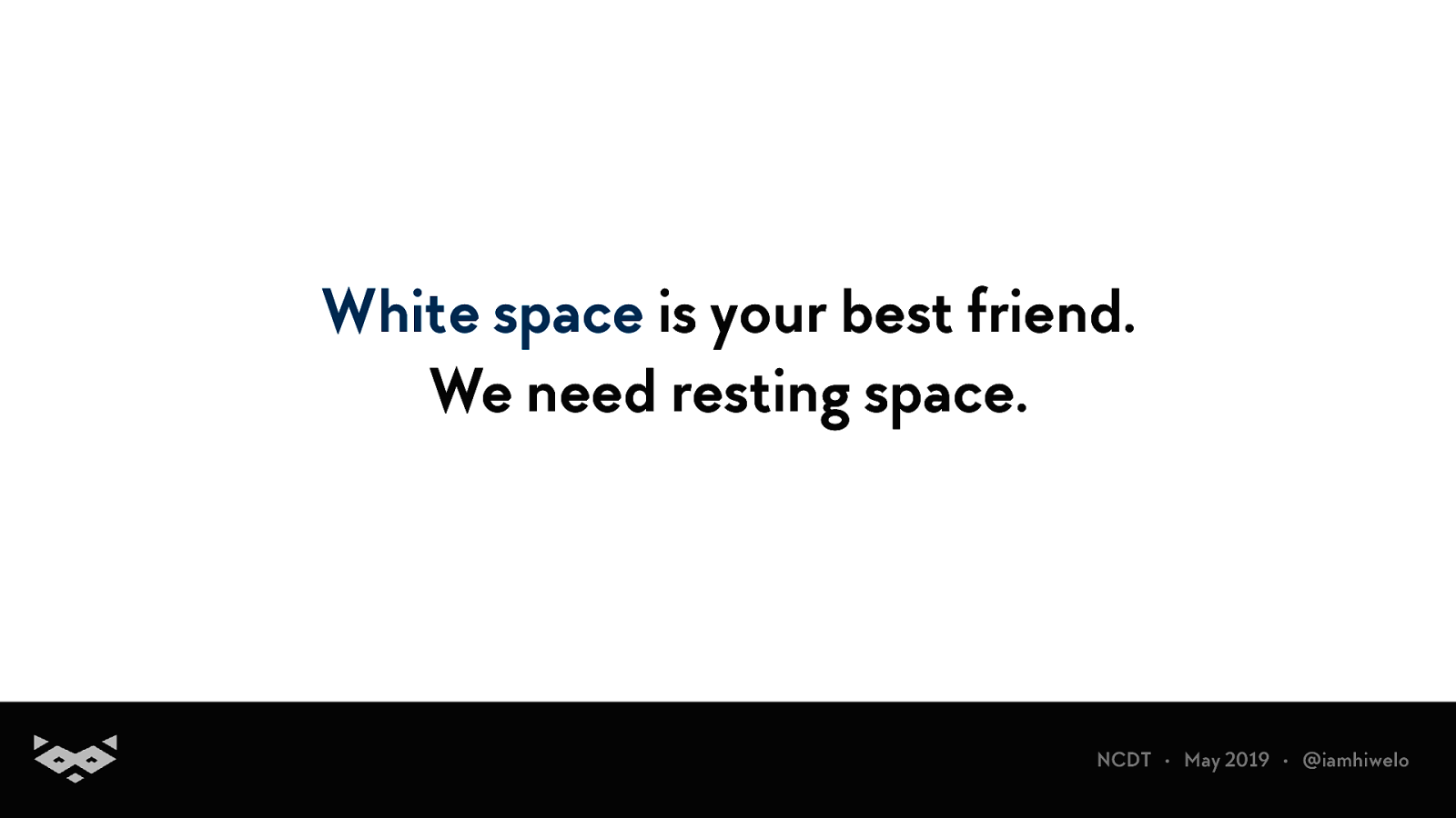
White space is your best friend. We need resting space.
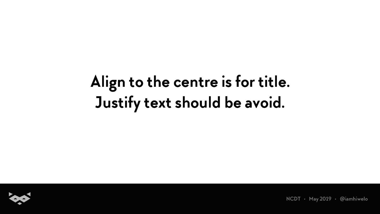
Align to the centre is for title. Justify text should be avoid.
In paragraph, users should be able to highlight text.
Bold important content
Avoid the use of too generic content, be specific for links
Use HTML and design accordingly. (yeah, dl exists and it’s amazing)
Basically, please be semantic.
Always include the most important points in the first two paragraphs.
Start headings with the words carrying most information
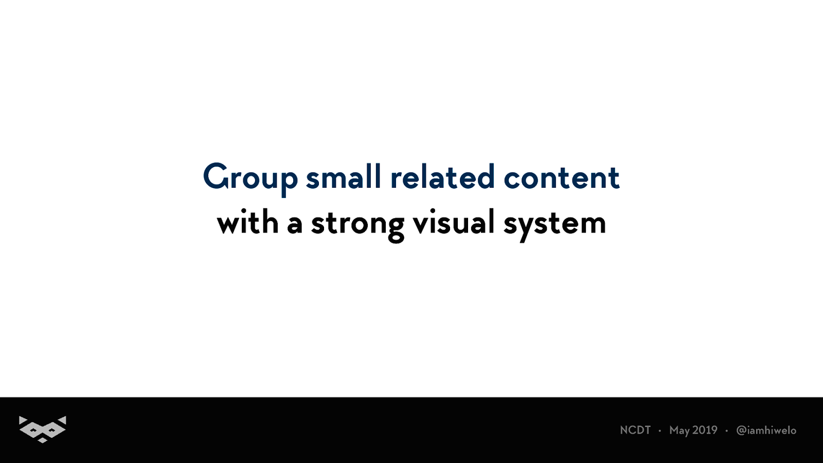
Group small related content with a strong visual system
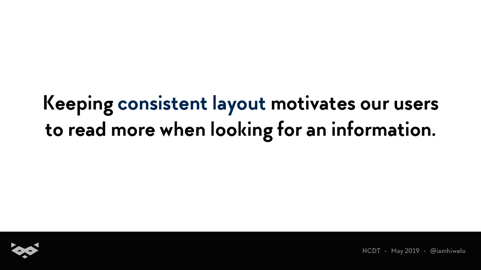
Keeping consistent layout motivates our users to read more when looking for an information.
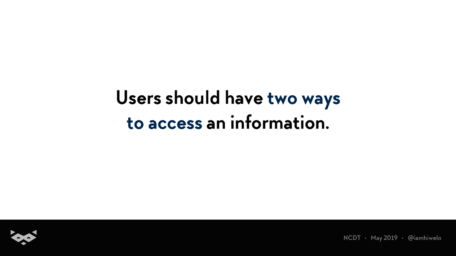
Users should have two ways to access an information.
Video of a user going through the homepage of my portfolio with pages accessible from the navigation and from the content itself.
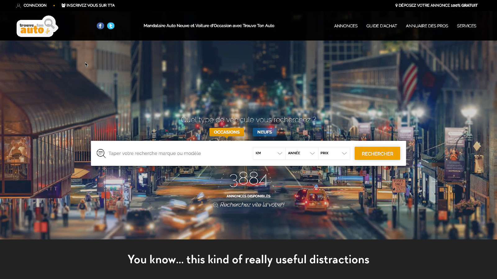
You know… this kind of really useful distractions
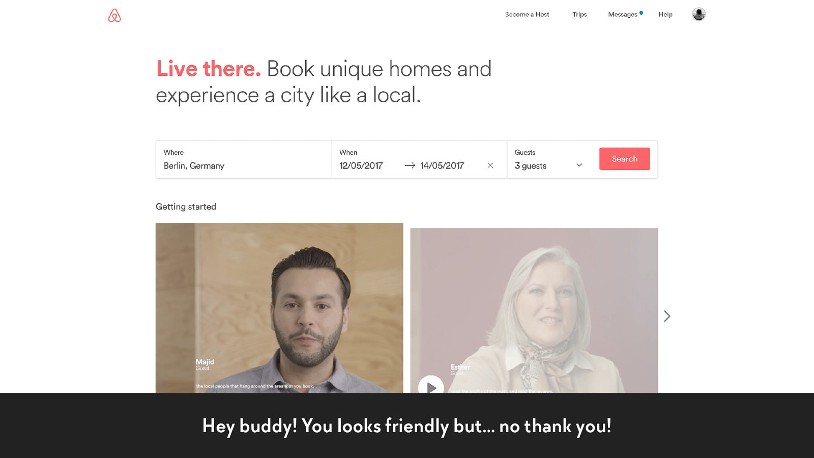
Hey buddy! You looks friendly but… no thank you!
And please… let your users the time they need to read.
+1 The last, but not the least…
+1 ✂
+1 Remove unneeded content.
How to experiment with your projects?
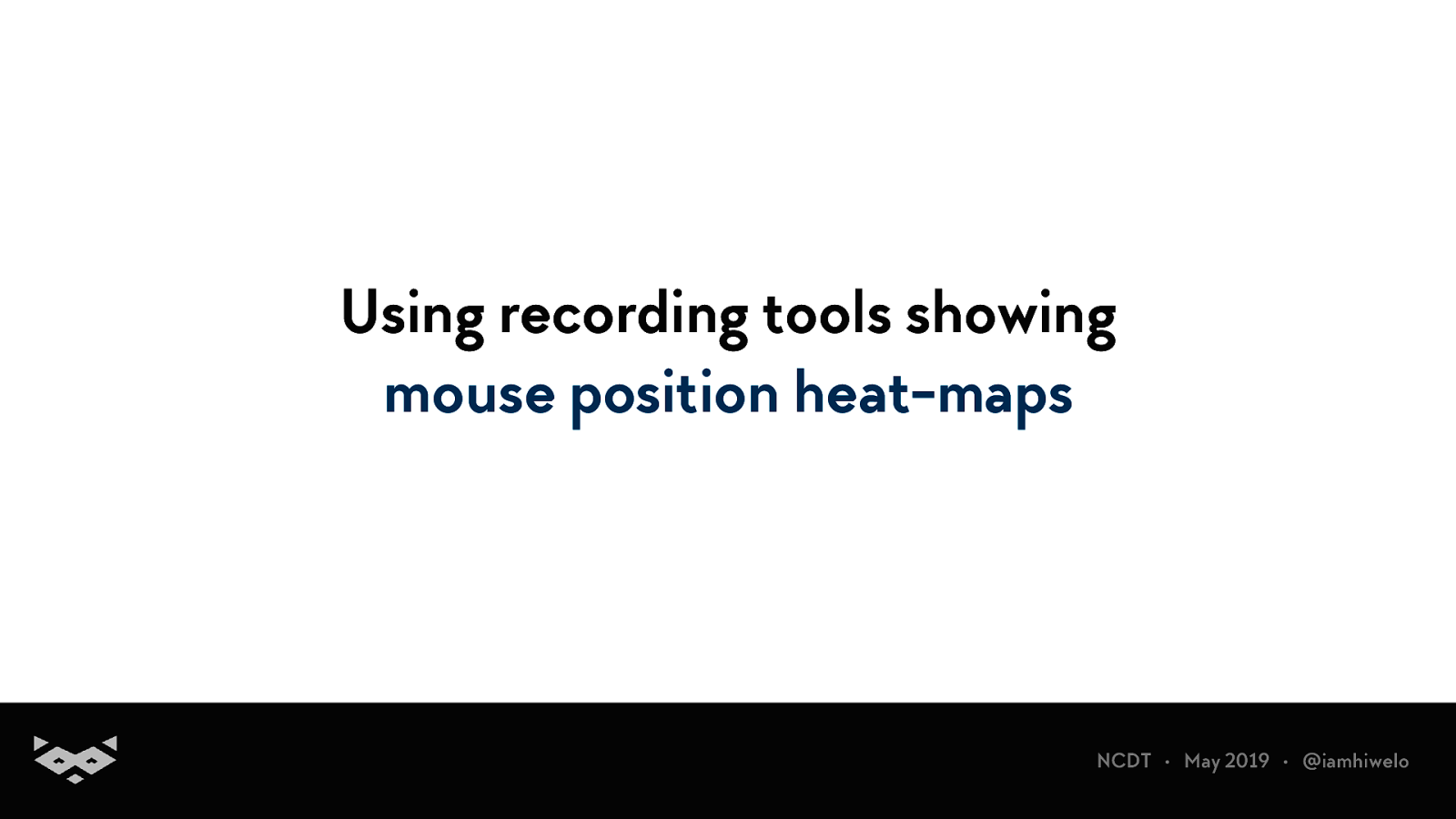
Using recording tools showing mouse position heat-maps
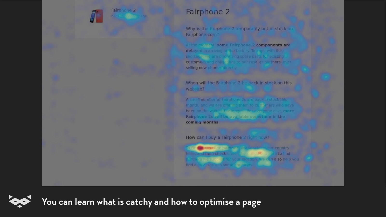
You can learn what is catchy and how to optimise a page
Using a screen reader and tools like a Web Rotor.
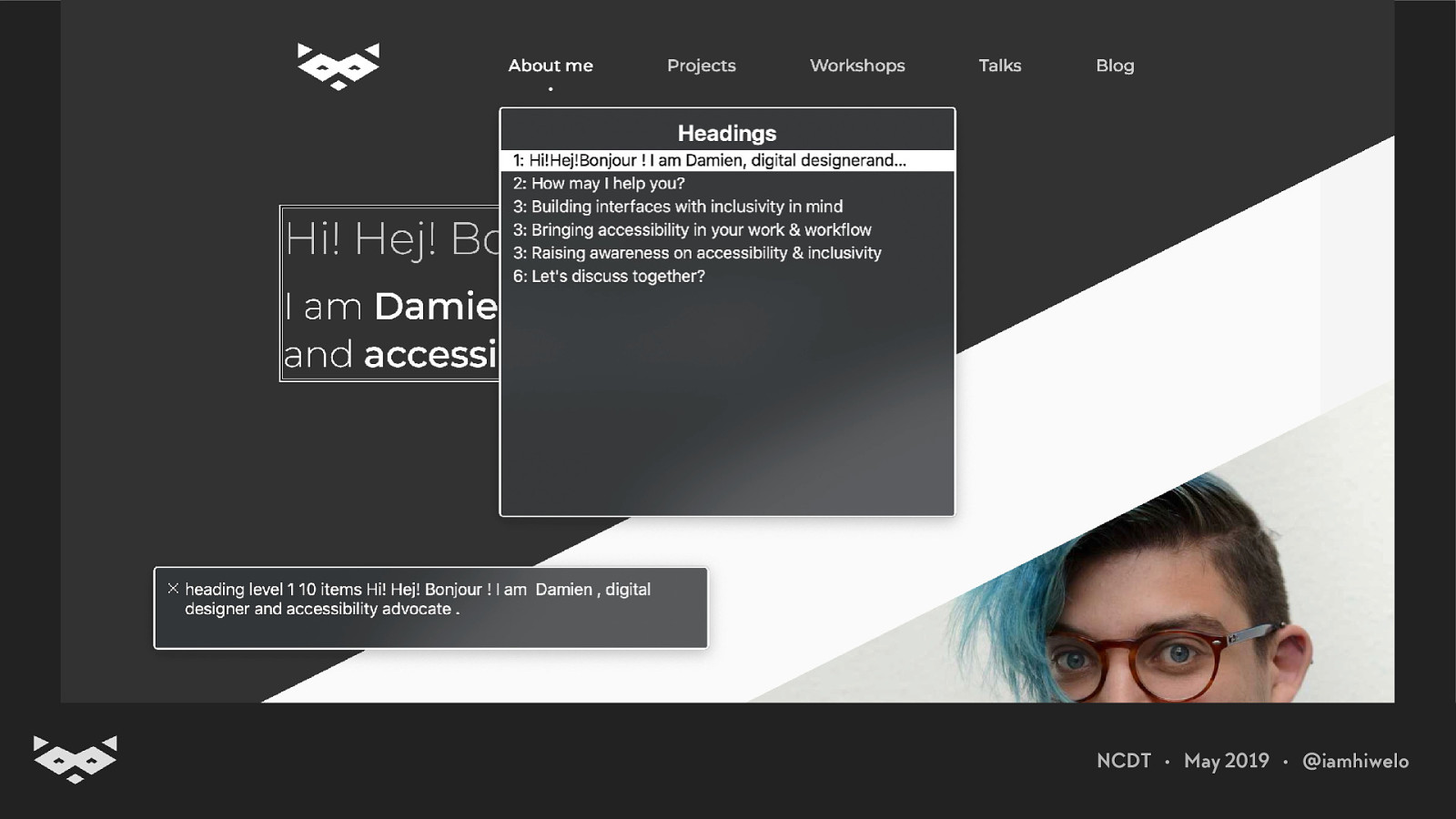
Video of a user going on my portfolio and using the WebRotor feature of my screen reader to see the heading hierarchy.
Some good examples.
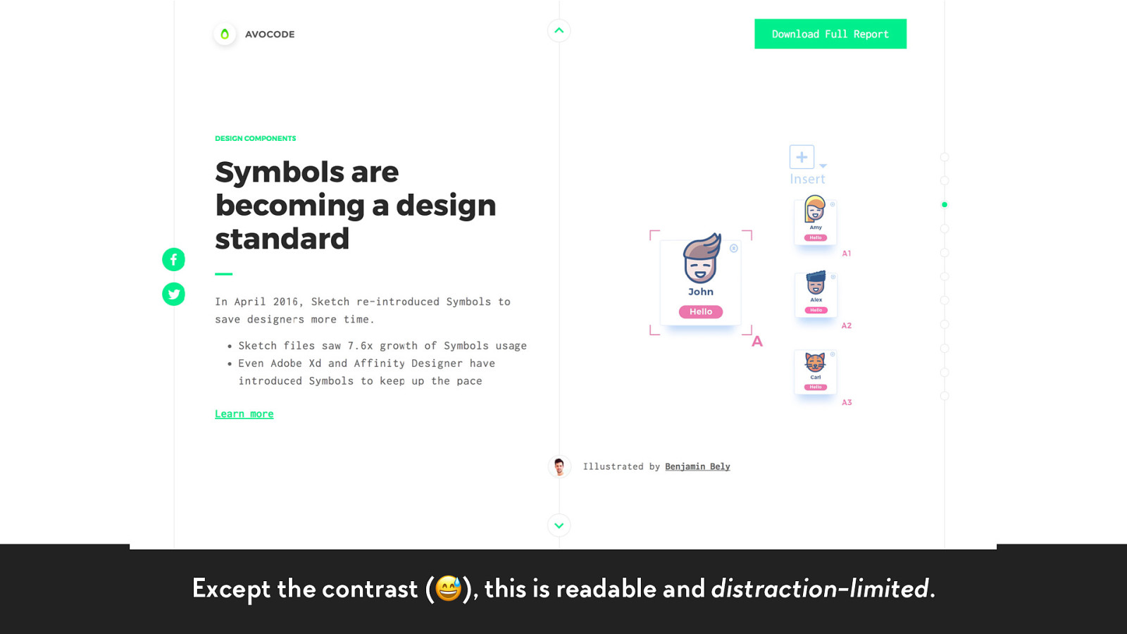
Except the contrast (😅), this is readable and distraction-limited.
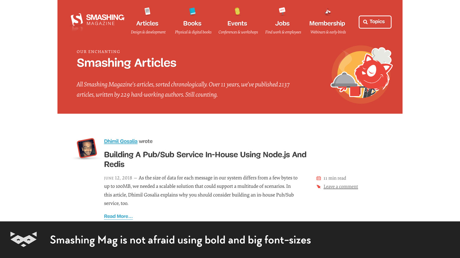
Smashing Mag is not afraid using bold and big font-sizes
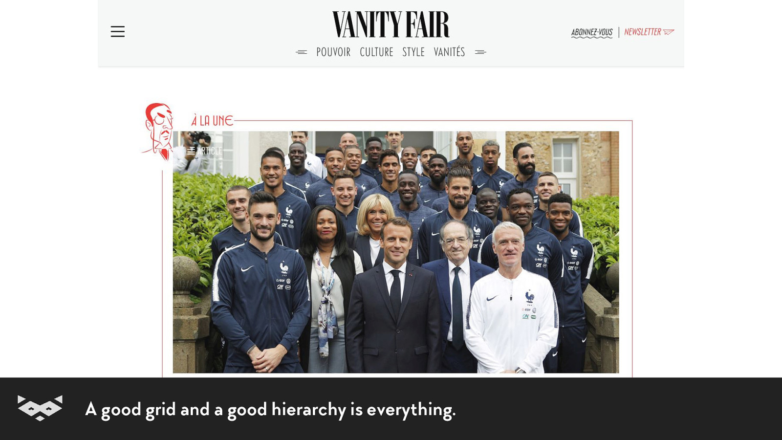
A good grid and a good hierarchy is everything.
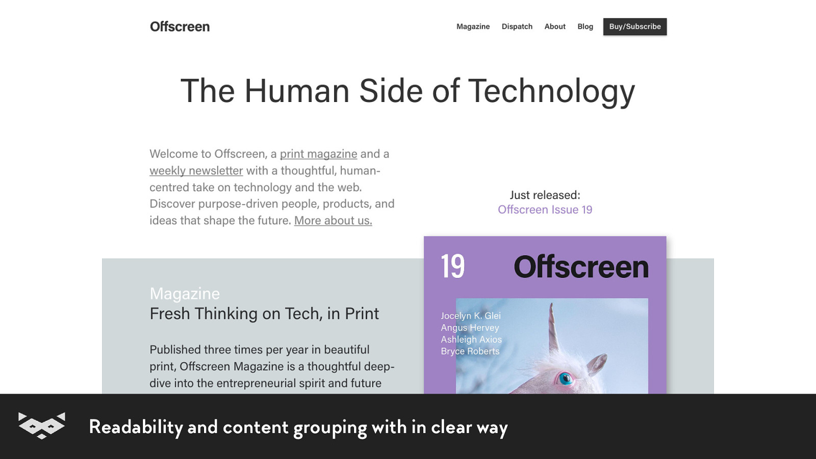
Readability and content grouping with in clear way
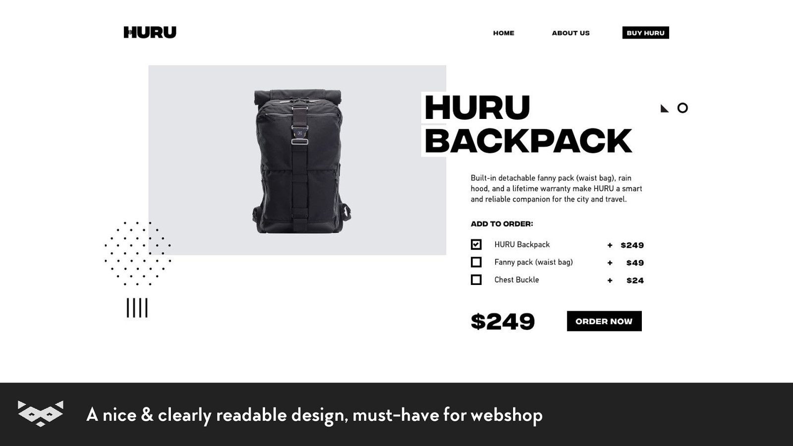
A nice & clearly readable design, must-have for webshop
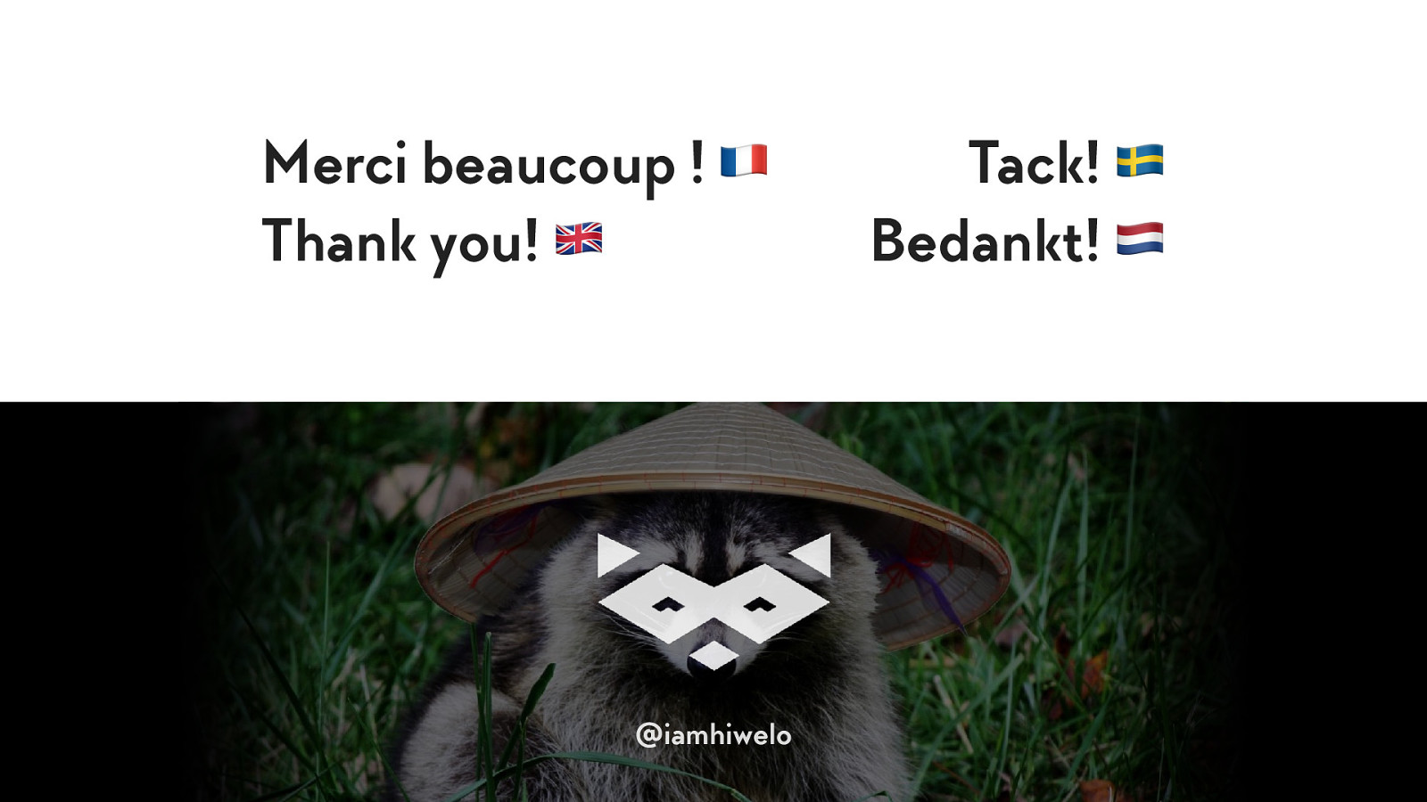
Merci beaucoup ! Thank you! Tack! Bedankt!
Damien Senger Digital designer, specialised in accessibility. raccoon.studio • noti.st/hiwelo @iamhiwelo