Lean Safe approach to building design systems Jan Toman, Kiwi.com Webcamp Zagreb, October 2019
A presentation at WebCamp Zagreb in October 2019 in Zagreb, Croatia by Jan Toman
Lean Safe approach to building design systems Jan Toman, Kiwi.com Webcamp Zagreb, October 2019

Making travel better at Jan Toman Design System Lead at Kiwi.com Twitter: @HonzaTmn
A design system is…
A design system is a collection of reusable UI components,
A design system is a collection of reusable UI components, guided by clear standards,
A design system is a collection of reusable UI components, guided by clear standards, that can be assembled together to build any number of applications. Source: Invision Blog
Design systems are 🚀 popular
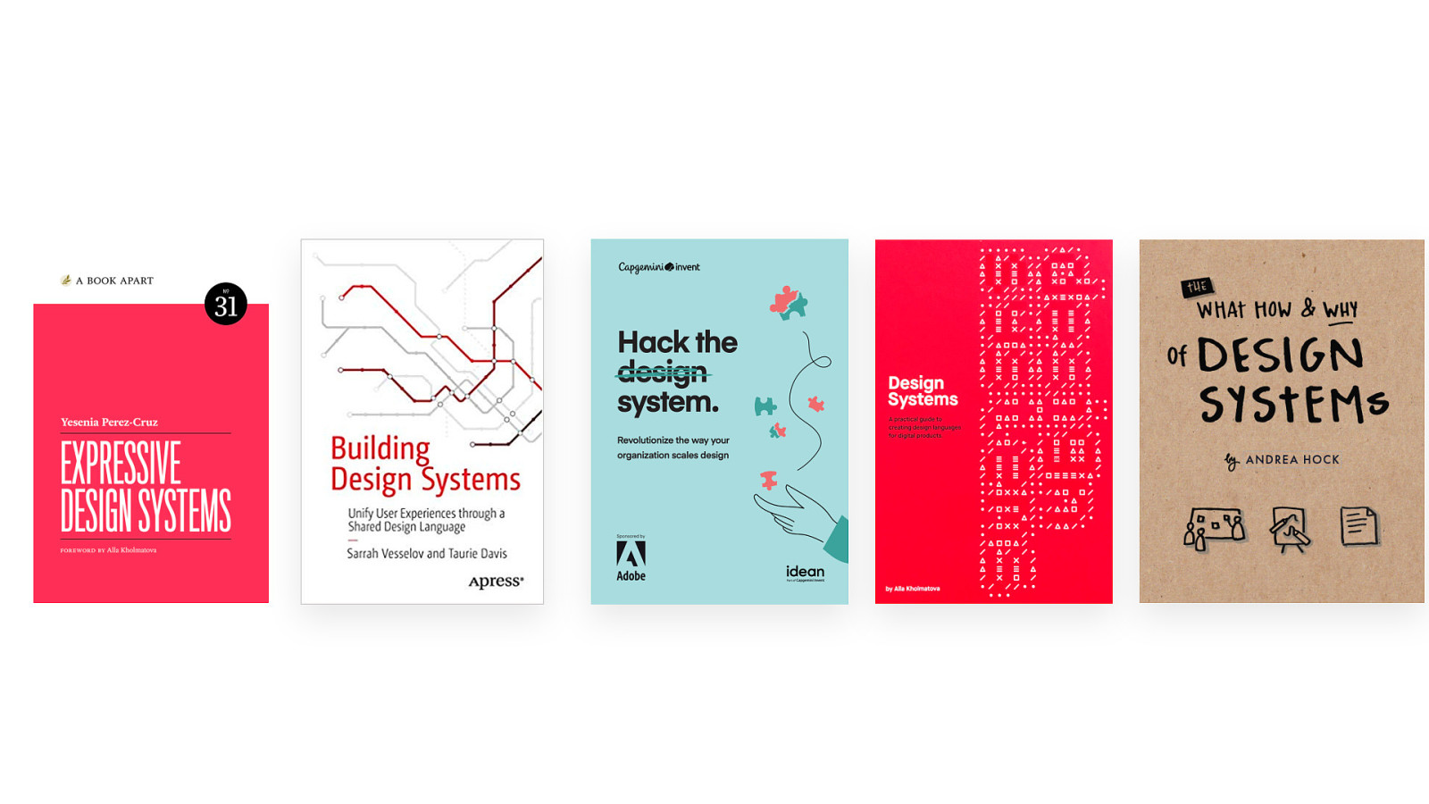
@HonzaTmn
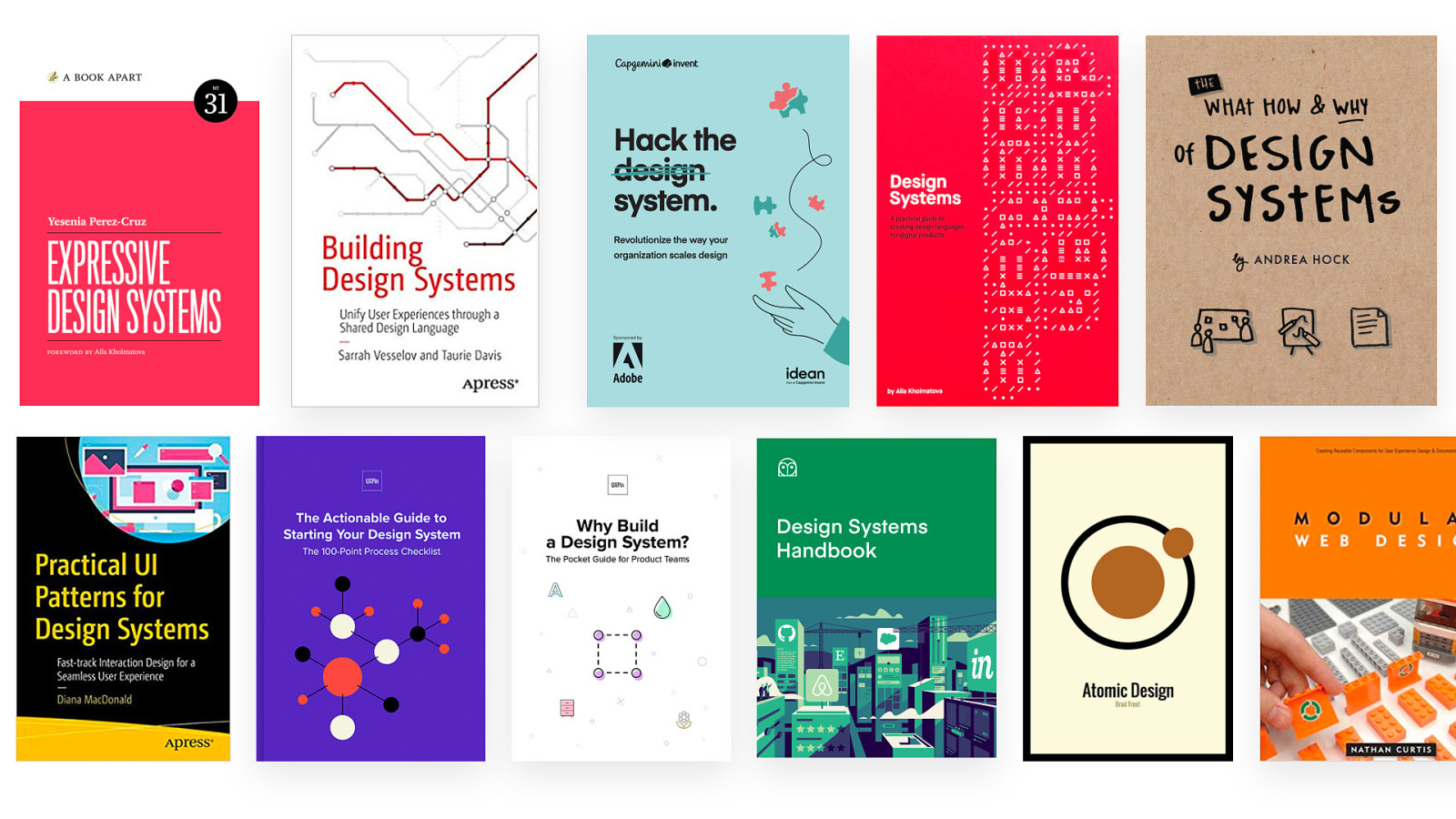
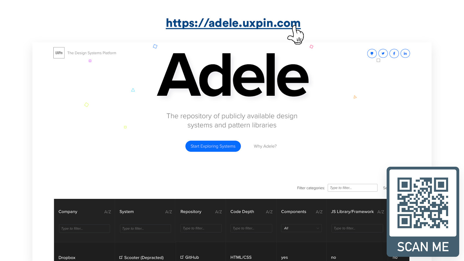
https://adele.uxpin.com @HonzaTmn
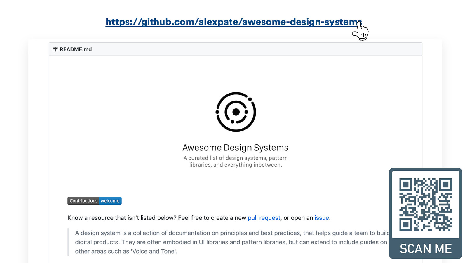
https://github.com/alexpate/awesome-design-systems @HonzaTmn
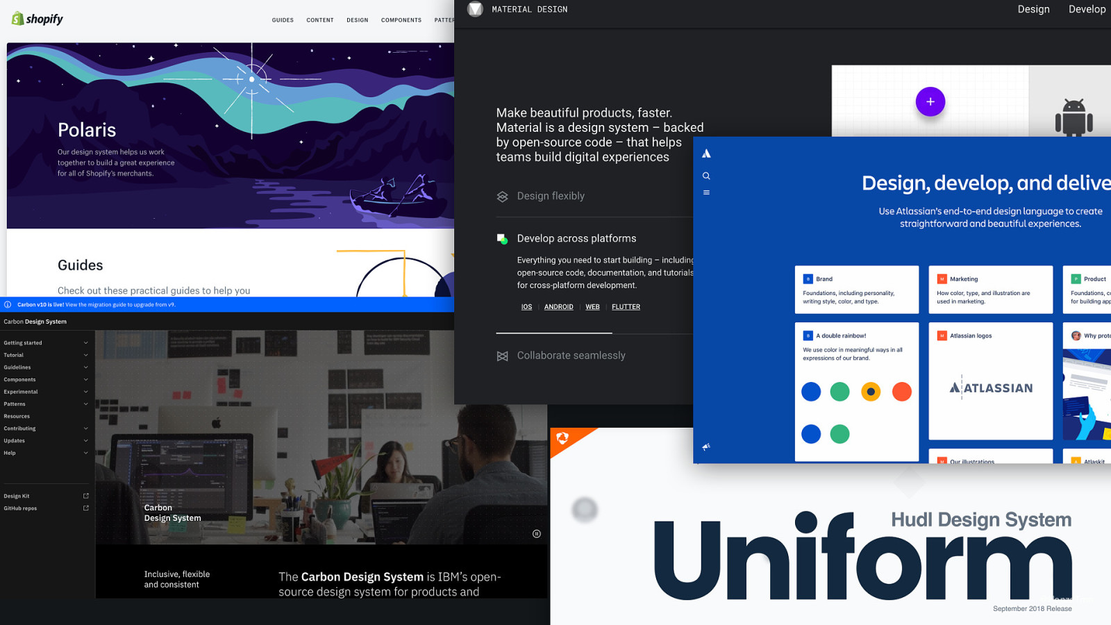
@HonzaTmn
@HonzaTmn

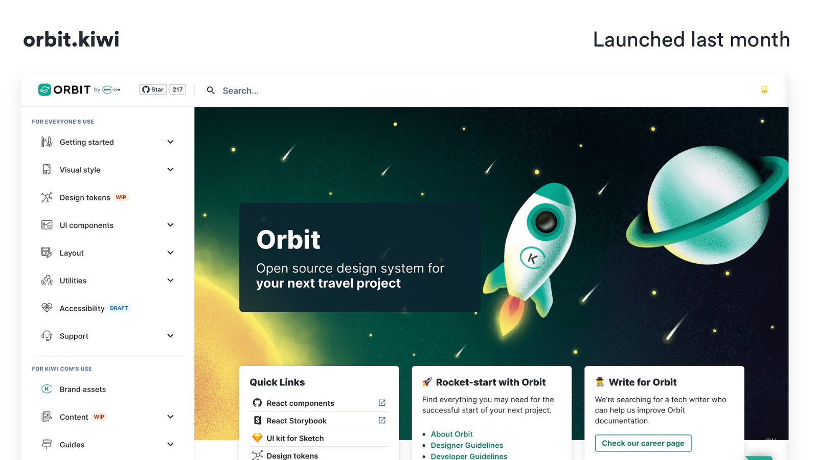
orbit.kiwi Launched last month @HonzaTmn
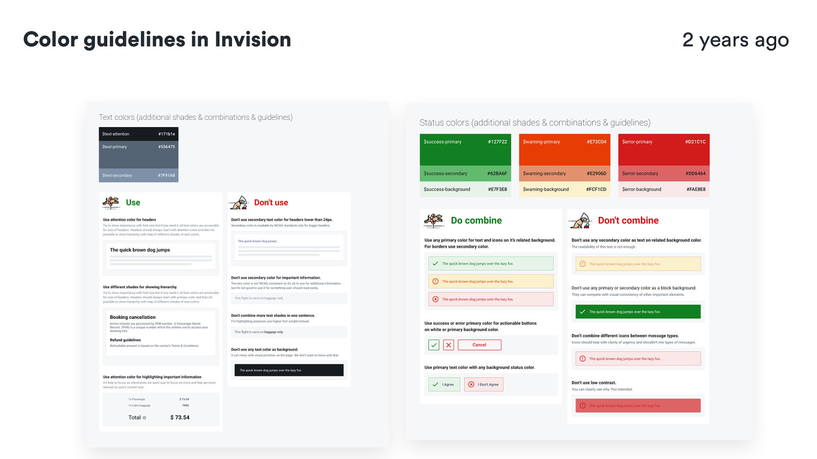
Color guidelines in Invision 2 years ago @HonzaTmn
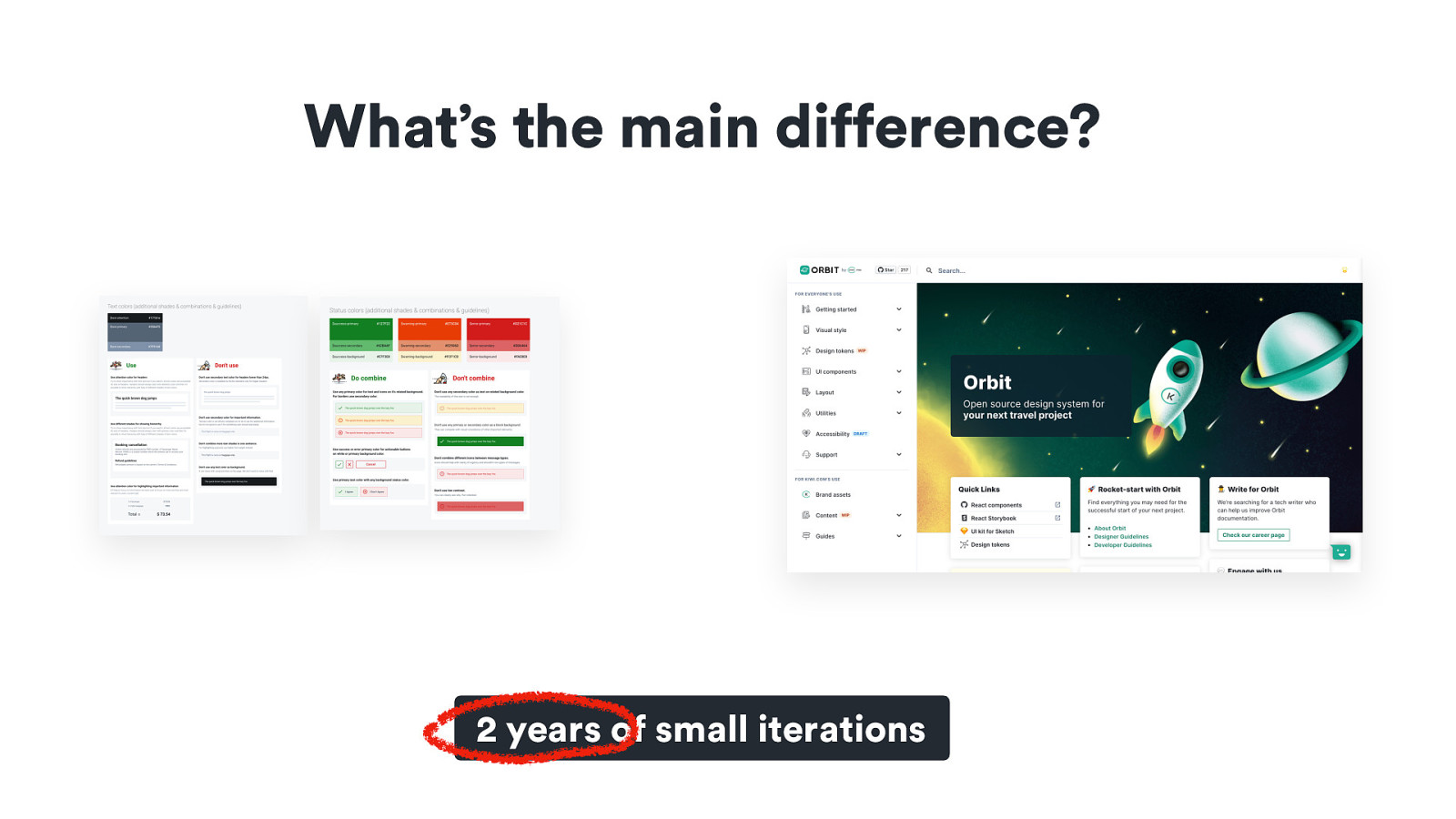
What’s the main difference? 2 years of small iterations @HonzaTmn
Change won’t happen overnight🦋 🐛
What do we want to change? 🧞
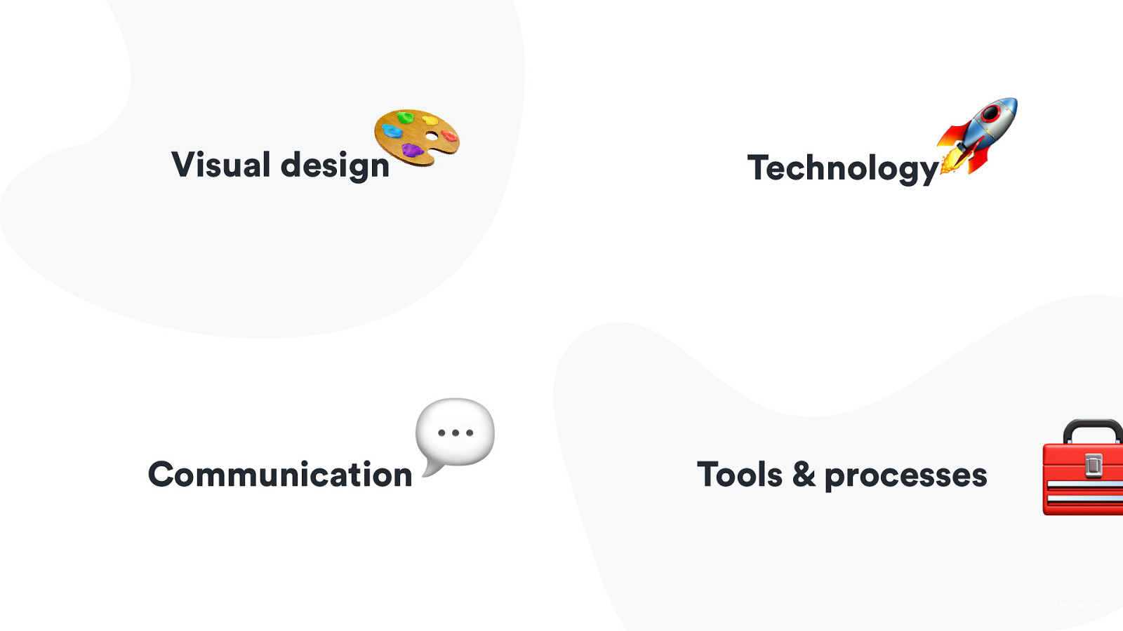
🎨 Visual design 💬 Communication 🚀 Technology Tools & processes 🧰 @HonzaTmn
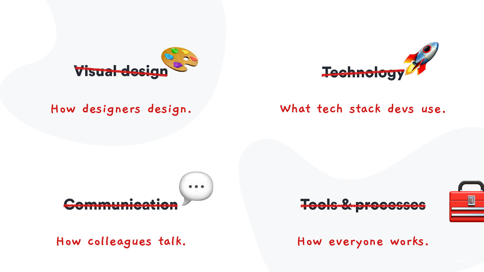
🎨 Visual design How designers design. 💬 Communication How colleagues talk. 🚀 Technology What tech stack devs use. Tools & processes How everyone works. 🧰 @HonzaTmn
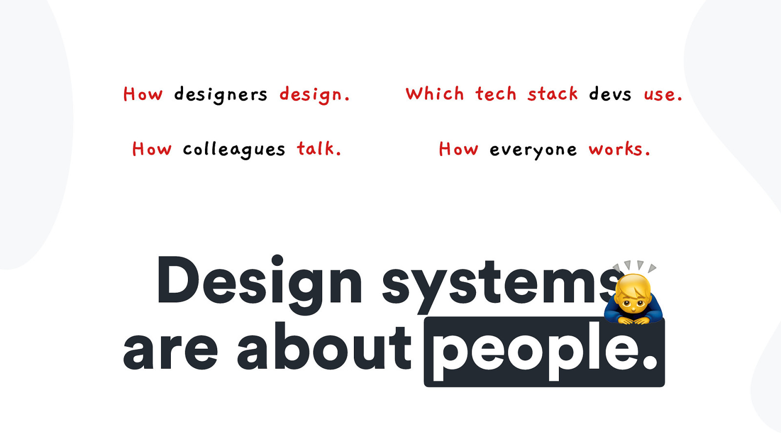
How designers design. Which tech stack devs use. How colleagues talk. How everyone works. Design systems🙇 are about people.
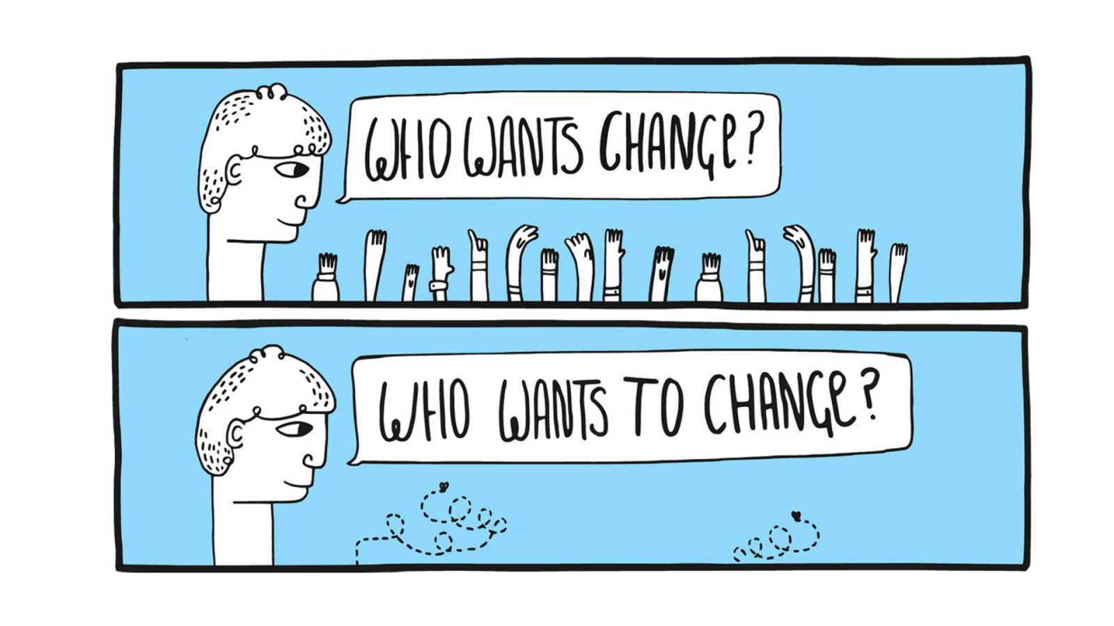
) You? When you want to change so many stuff for so many people, it’s important to balance it very carefully
Balancing a change with a lean approach Case study with examples from Orbit, Kiwi.com’s design system )🤹
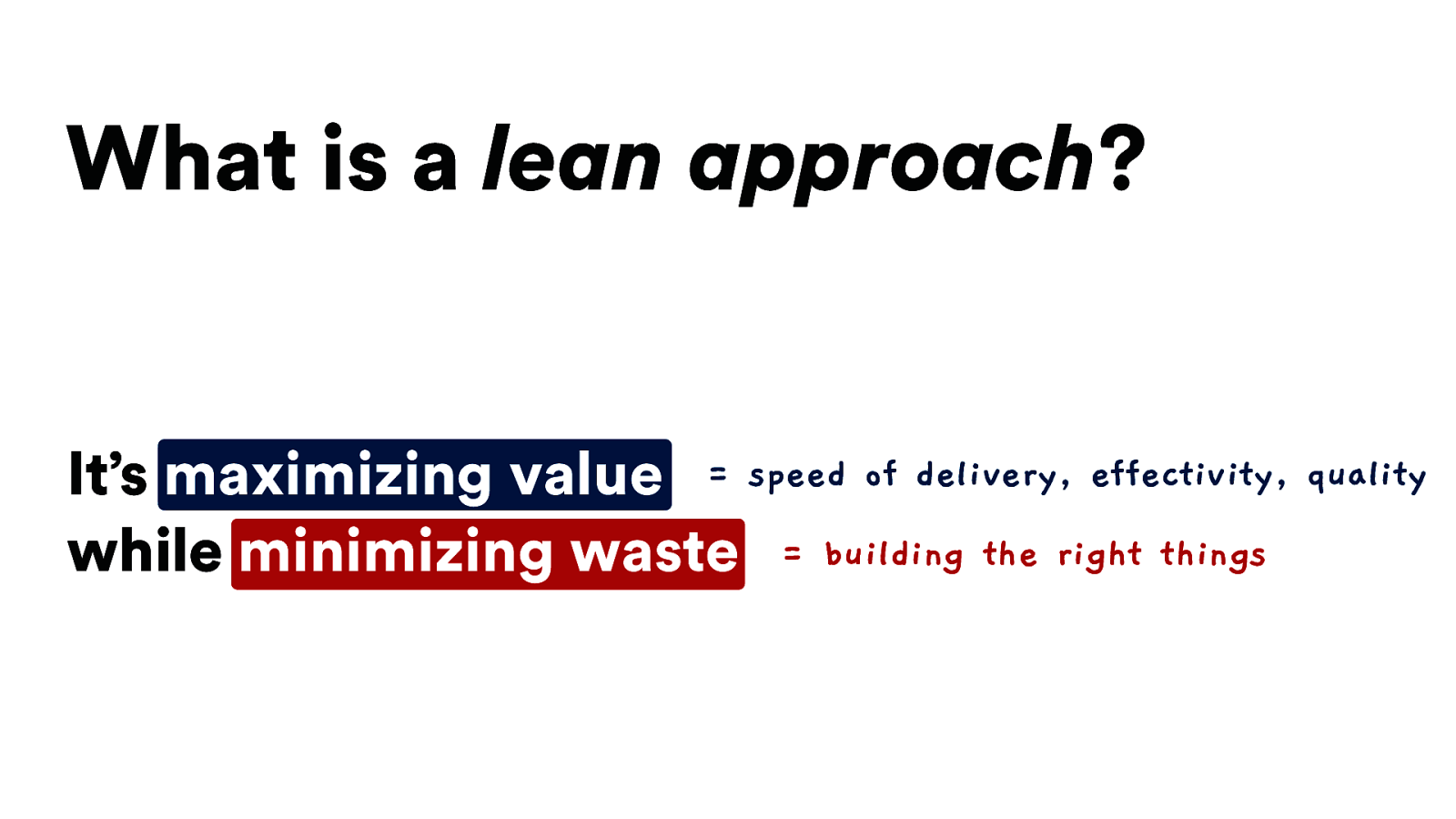
What is a lean approach? It’s maximizing value = speed of delivery, effectivity, quality while minimizing waste = building the right things
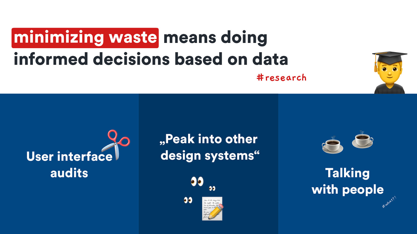
minimizing waste means doing informed decisions based on data #research ✂ User interface audits „Peak into other design systems“ 👀 👀 👀 📝 ☕ ☕ Talking with people !
t? a wh
☕ ☕ Talking with people !
t? a wh
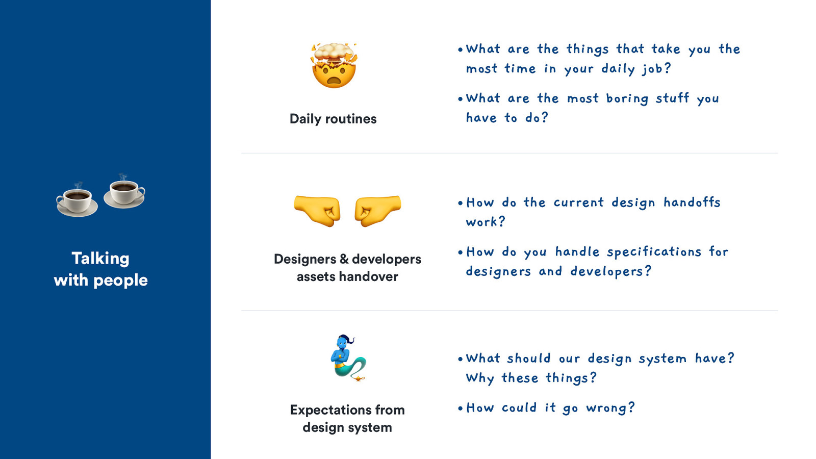
☕ ☕ Talking with people 🤯 t What are the things that take you the most time in your daily job? • What are the most boring stuff you have to do? • How do the current design handoffs work? • How do you handle specifications for designers and developers? • What should our design system have? Why these things? • How could it go wrong? Daily routines 🤜🤛 a h #w • Designers & developers assets handover 🧞 Expectations from design system
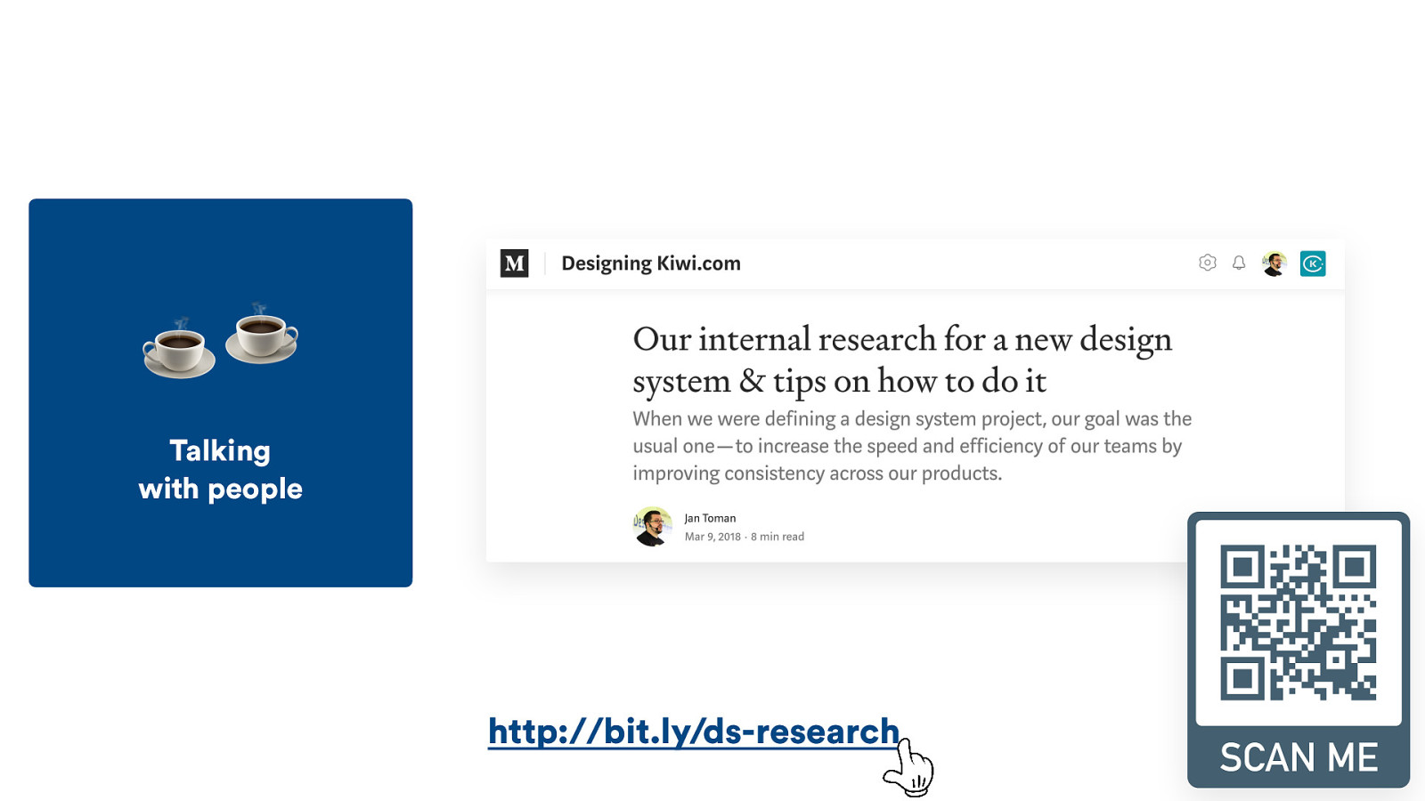
☕ ☕ Talking with people t a h #w http://bit.ly/ds-research

Top insights from our research 📝
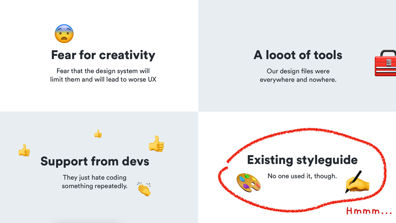
😨 Fear for creativity A looot of tools Fear that the design system will limit them and will lead to worse UX Our design files were everywhere and nowhere. 👍 👍 👍 Support from devs They just hate coding something repeatedly. 👏 🧰 Existing styleguide 🎨 No one used it, though. ✍ Hmmm… @HonzaTmn
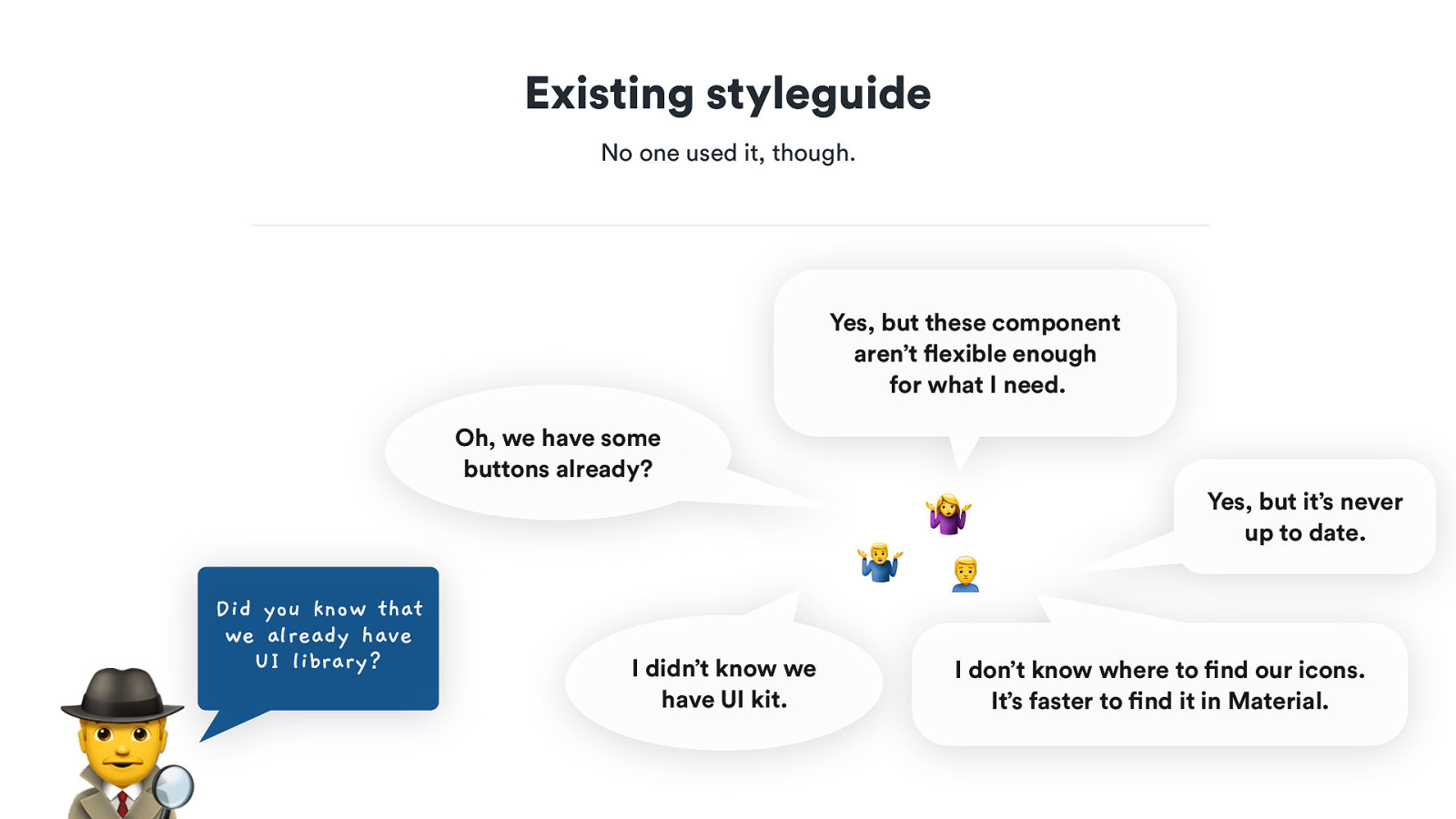
Existing styleguide 🎨 No one used it, though. ✍ Yes, but these component aren’t flexible enough for what I need. Oh, we have some buttons already? 🤷 🕵 Did you know that we already have UI library? 8 : I didn’t know we have UI kit. Yes, but it’s never up to date. I don’t know where to find our icons. It’s faster to find it in Material. @HonzaTmn
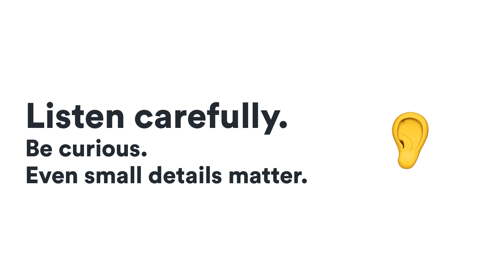
Listen carefully. Be curious. Even small details matter. 👂
Listen carefully. Be curious. Even small details matter. 👂 That’s how you’ll find your problems or get ideas about what can be improved.
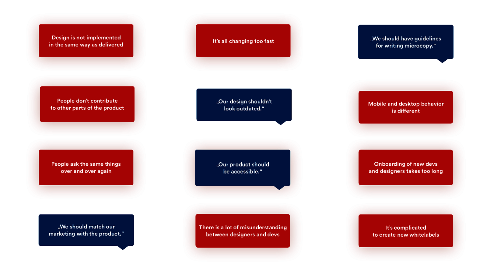
Design is not implemented in Synchronize the same waycomponents as delivered between design tools and code It’s all changing too fast Prepare our products for rapid change of design „We should have guidelines for writingconsistency microcopy.” Improve People don’t contribute toMake other easy partsto ofcontribute the product to other projects „Our design shouldn’t look outdated.“ Improve visual design Mobile and desktop behavior Synchronize and behavior is design different across mobile and desktop People ask the same things Prepare documentation over and over again for designers and developers „Our product should be accessible.“ Improve accessibility Onboarding of new devs and designers takes too long Make onboarding easier „We should match our „Match our marketing campaigns marketing with the product.“ with product visual There is a lot of misunderstanding Improvedesigners communication between and devs between designers and devs It’s complicated to create new whitelabels Prepare guidelines of our microcopy for our whitelabels & partners
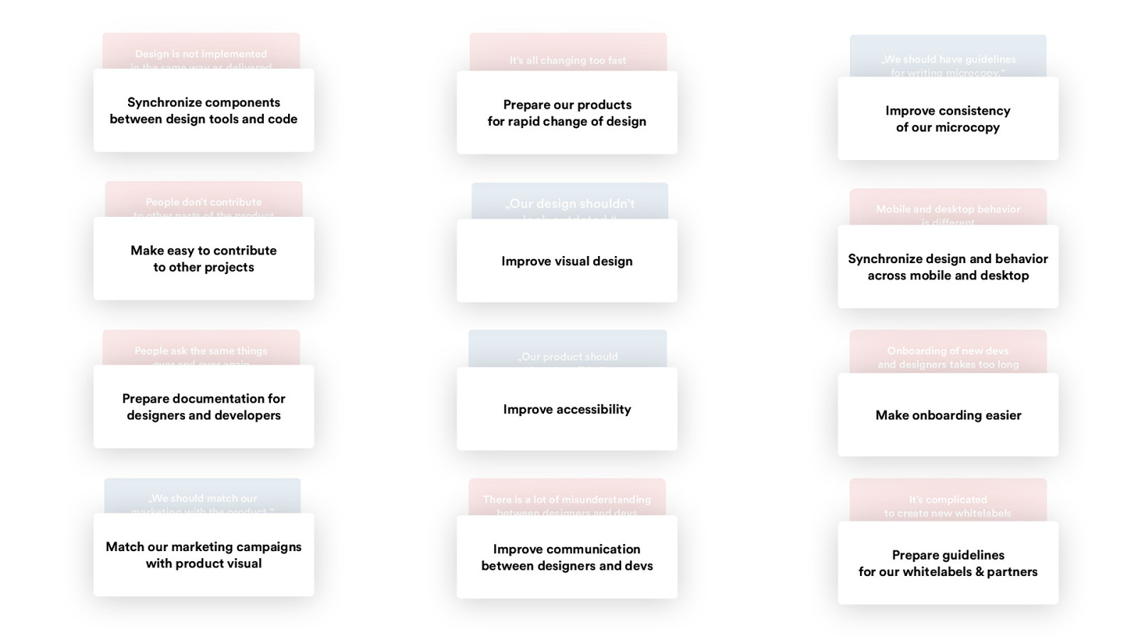
Design is not implemented in the same way as delivered It’s all changing too fast Synchronize components between design tools and code Prepare our products for rapid change of design People don’t contribute to other parts of the product „Our design shouldn’t look outdated.“ Make easy to contribute to other projects Improve visual design People ask the same things over and over again „Our product should be accessible.“ Prepare documentation for designers and developers Improve accessibility „We should match our marketing with the product.“ There is a lot of misunderstanding between designers and devs Match our marketing campaigns with product visual Improve communication between designers and devs „We should have guidelines for writing microcopy.” Improve consistency of our microcopy Mobile and desktop behavior is different Synchronize design and behavior across mobile and desktop Onboarding of new devs and designers takes too long Make onboarding easier It’s complicated to create new whitelabels Prepare guidelines for our whitelabels & partners
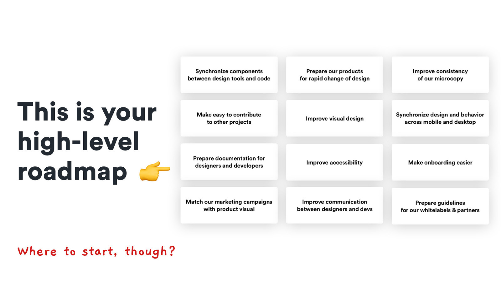
This is your high-level roadmap 👉 Where to start, though? Synchronize components between design tools and code Prepare our products for rapid change of design Improve consistency of our microcopy Make easy to contribute to other projects Improve visual design Synchronize design and behavior across mobile and desktop Prepare documentation for designers and developers Improve accessibility Make onboarding easier Match our marketing campaigns with product visual Improve communication between designers and devs Prepare guidelines for our whitelabels & partners
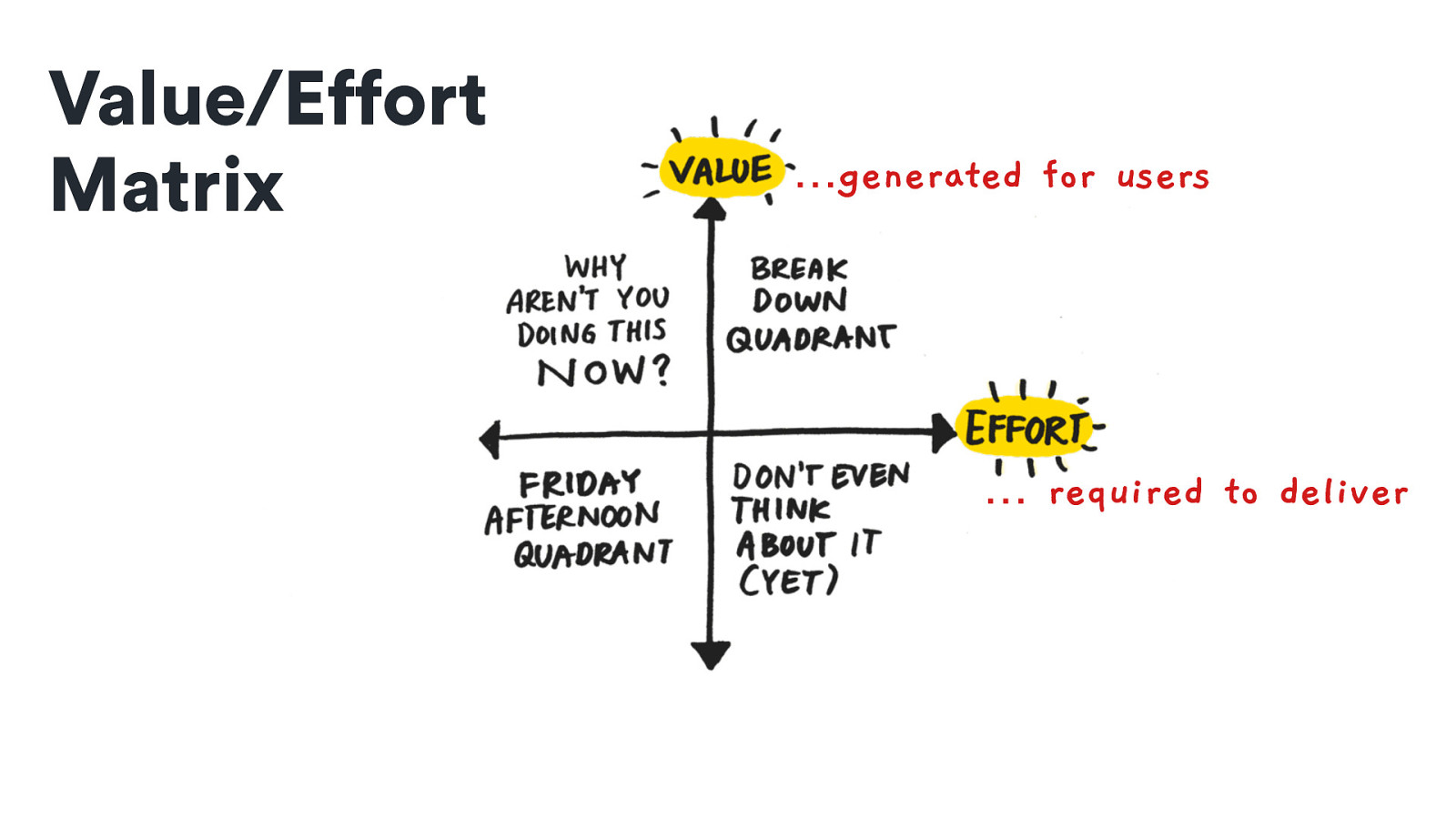
Value/Effort Matrix …generated for users … required to deliver
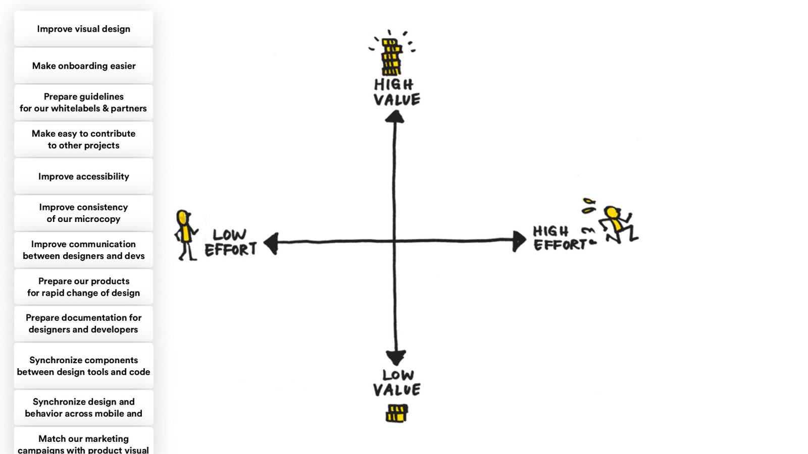
Improve visual design Make onboarding easier Prepare guidelines for our whitelabels & partners Make easy to contribute to other projects Improve accessibility Improve consistency of our microcopy Improve communication between designers and devs Prepare our products for rapid change of design Prepare documentation for designers and developers Synchronize components between design tools and code Synchronize design and behavior across mobile and Match our marketing campaigns with product visual
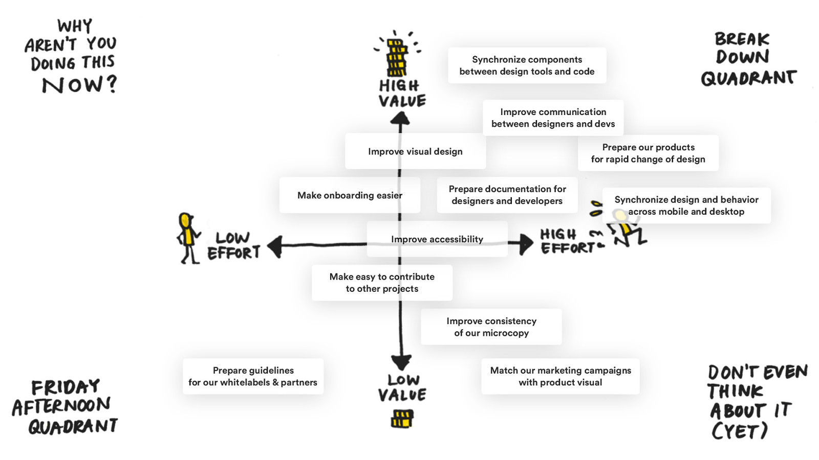
Synchronize components between design tools and code Improve communication between designers and devs Prepare our products for rapid change of design Improve visual design Make onboarding easier Prepare documentation for designers and developers Synchronize design and behavior across mobile and desktop Improve accessibility Make easy to contribute to other projects Improve consistency of our microcopy Prepare guidelines for our whitelabels & partners Match our marketing campaigns with product visual
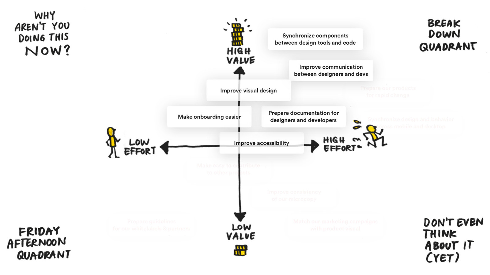
Synchronize components between design tools and code Improve communication between designers and devs Prepare our products for rapid change Improve visual design Make onboarding easier Prepare documentation for designers and developers Synchronize design and behavior across mobile and desktop Improve accessibility Make easy to contribute to other projects Improve consistency of our microcopy Prepare guidelines for our whitelabels & partners Match our marketing campaigns with product visual
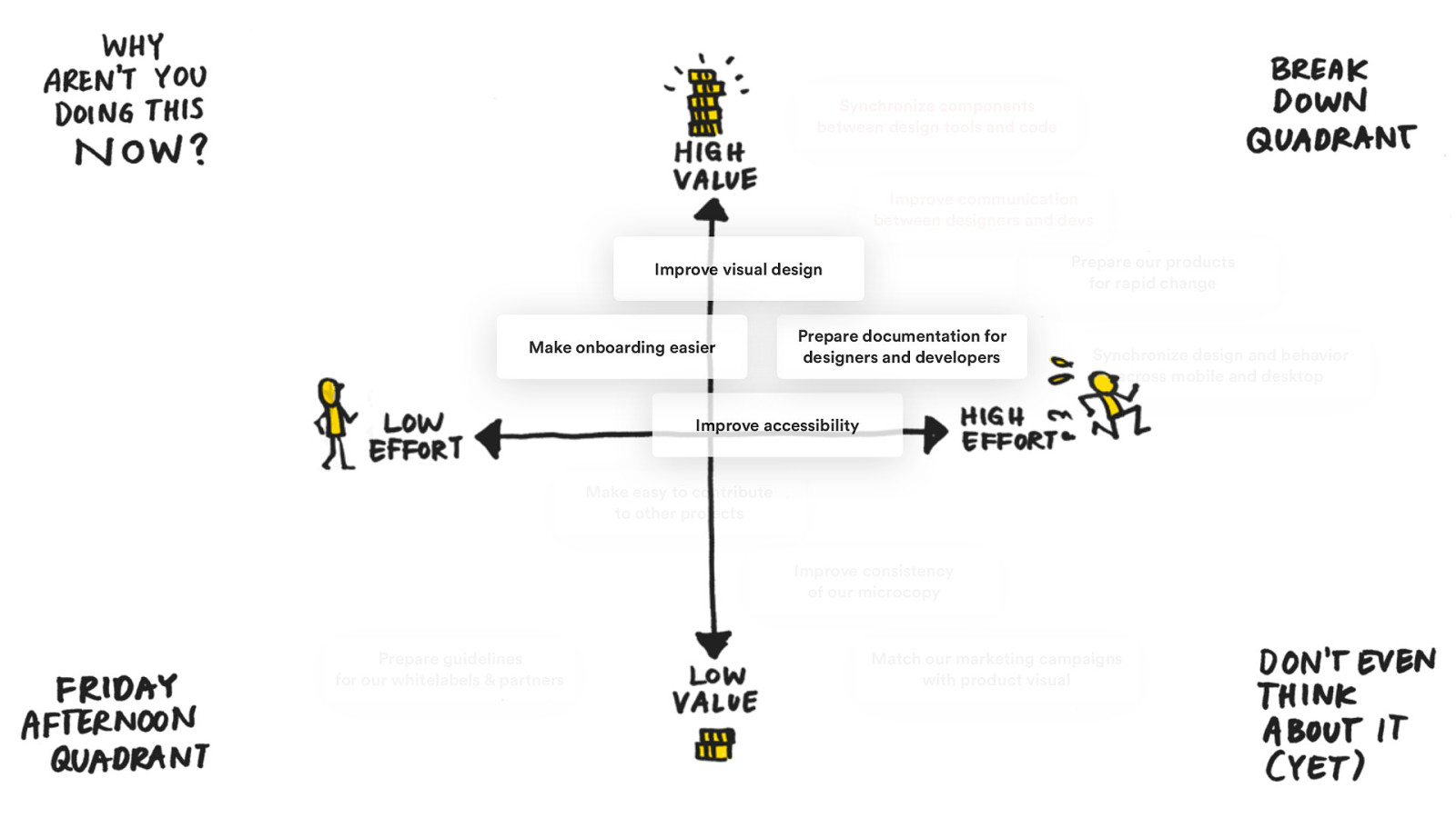
Synchronize components between design tools and code Improve communication between designers and devs Prepare our products for rapid change Improve visual design Make onboarding easier Prepare documentation for designers and developers Synchronize design and behavior across mobile and desktop Improve accessibility Make easy to contribute to other projects Improve consistency of our microcopy Prepare guidelines for our whitelabels & partners Match our marketing campaigns with product visual
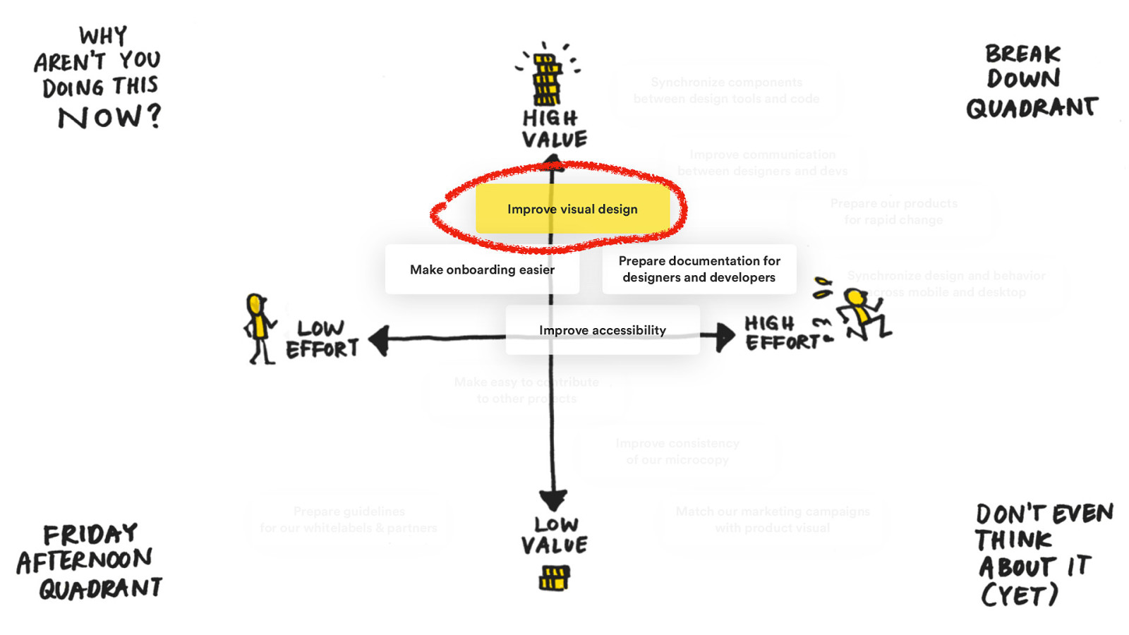
Synchronize components between design tools and code Improve communication between designers and devs Prepare our products for rapid change Improve visual design Make onboarding easier Prepare documentation for designers and developers Synchronize design and behavior across mobile and desktop Improve accessibility Make easy to contribute to other projects Improve consistency of our microcopy Prepare guidelines for our whitelabels & partners Match our marketing campaigns with product visual
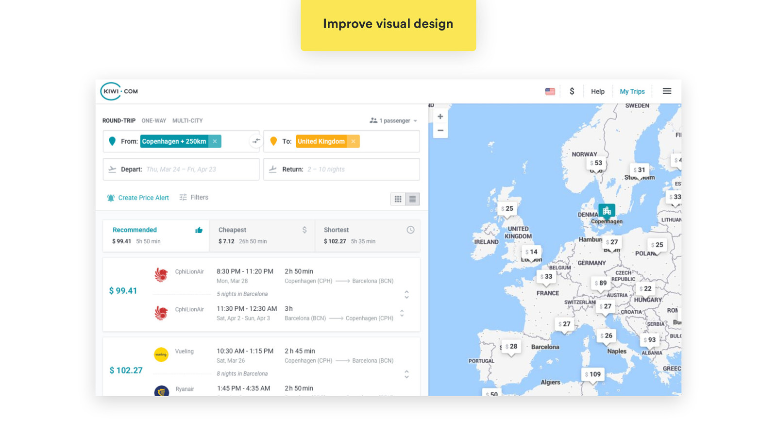
Improve visual design
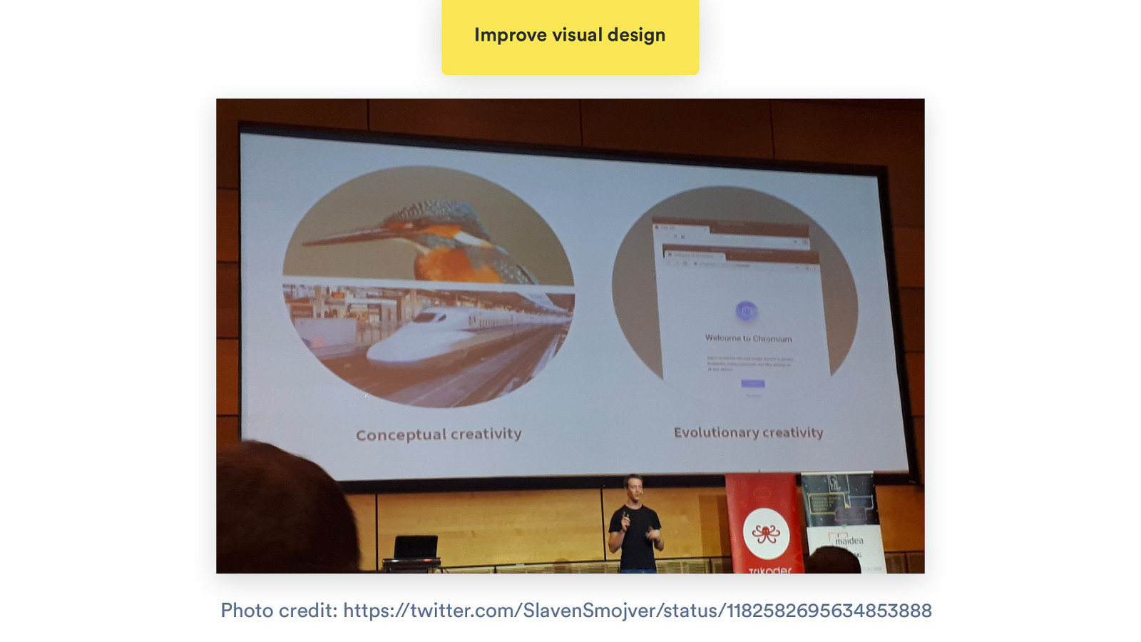
Improve visual design Photo credit: https://twitter.com/SlavenSmojver/status/1182582695634853888
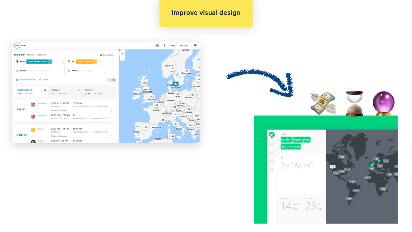
Improve visual design 💸 ⌛🔮
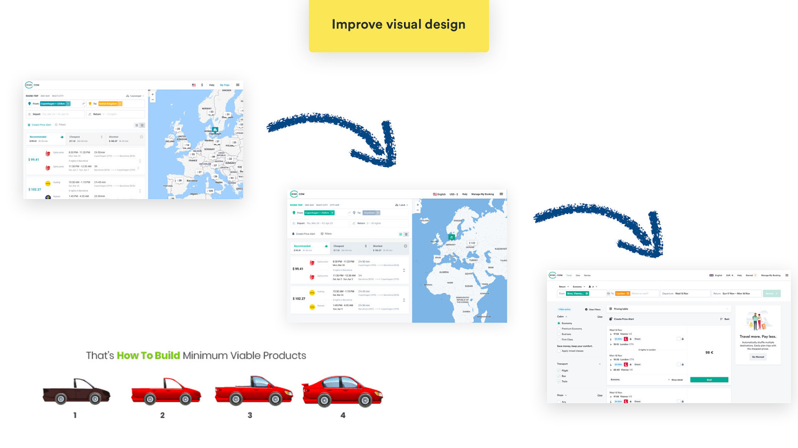
Improve visual design
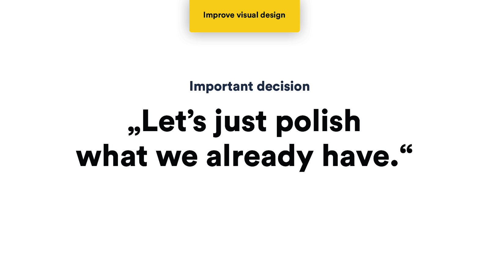
Improve visual design Important decision „Let’s just polish what we already have.“
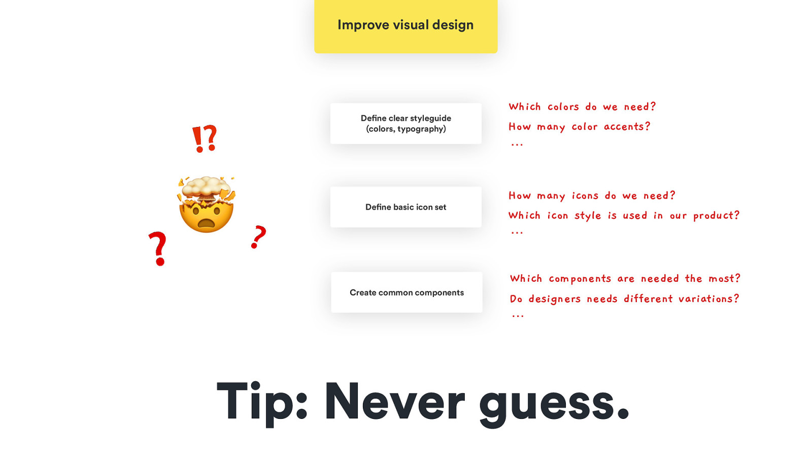
Improve visual design ⁉ 🤯❓ Define clear styleguide (colors, typography) Define basic icon set ❓ Create common components Which colors do we need? How many color accents? … How many icons do we need? Which icon style is used in our product? … Which components are needed the most? Do designers needs different variations? … Tip: Never guess.
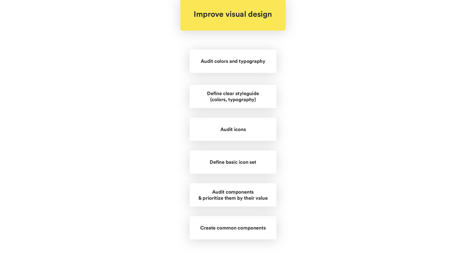
Improve visual design Audit colors and typography Define clear styleguide (colors, typography) Audit icons Define basic icon set Audit components & prioritize them by their value Create common components
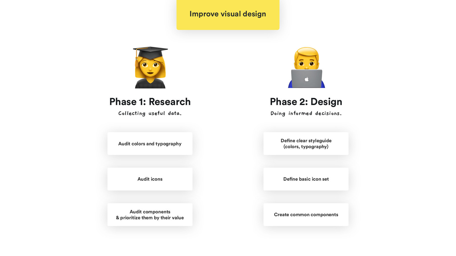
Improve visual design B C Phase 1: Research Phase 2: Design Collecting useful data. Doing informed decisions. Audit colors and typography Define clear styleguide (colors, typography) Audit icons Define basic icon set Audit components & prioritize them by their value Create common components
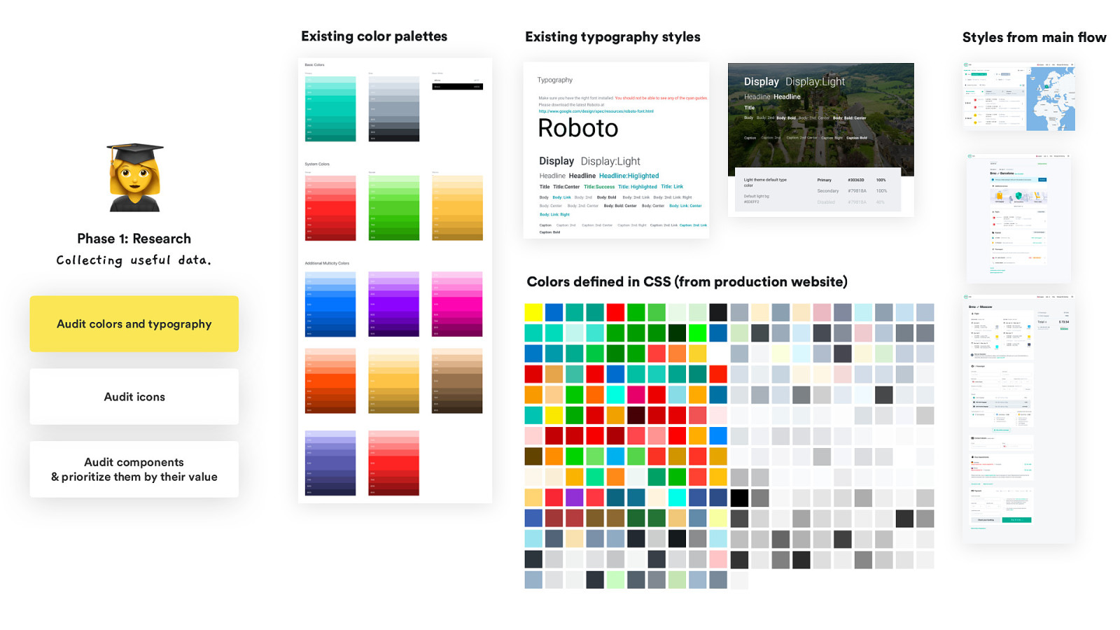
Existing color palettes Existing typography styles B Phase 1: Research Collecting useful data. Colors defined in CSS (from production website) Audit colors and typography Audit icons Audit components & prioritize them by their value Styles from main flow
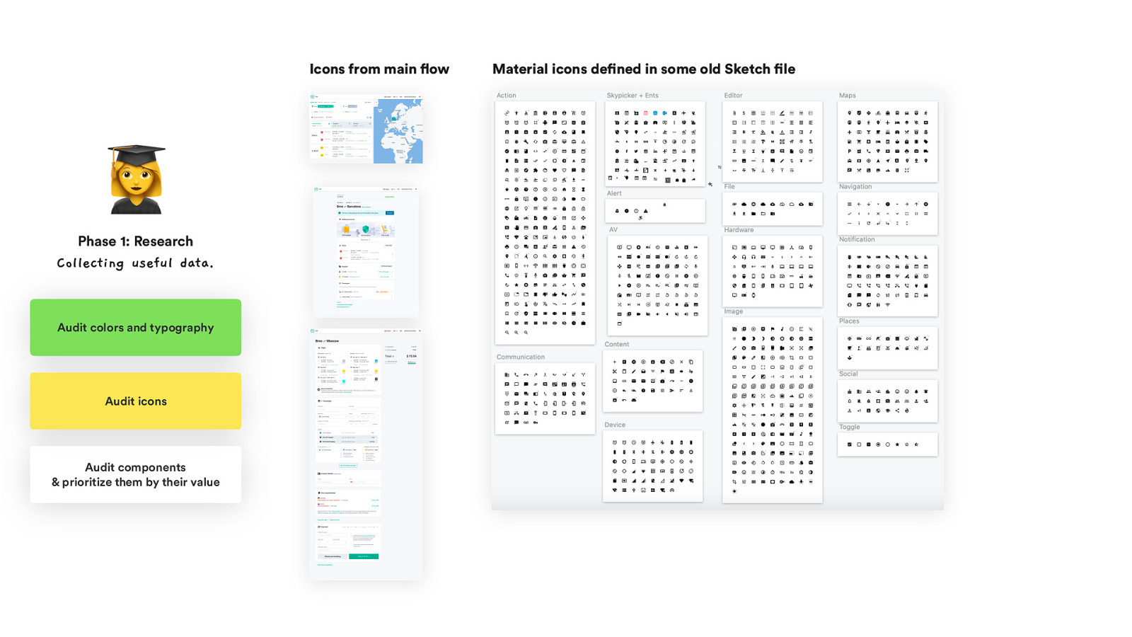
Icons from main flow B Phase 1: Research Collecting useful data. Audit colors and typography Audit icons Audit components & prioritize them by their value Material icons defined in some old Sketch file
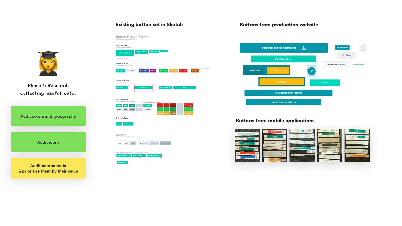
Existing button set in Sketch Buttons from production website B Phase 1: Research Collecting useful data. Audit colors and typography Audit icons Audit components & prioritize them by their value Buttons from mobile applications
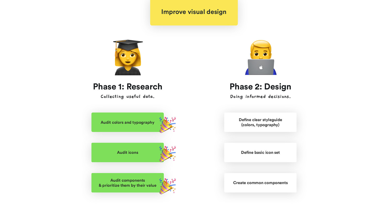
Improve visual design B C Phase 1: Research Phase 2: Design Collecting useful data. Doing informed decisions. Audit colors and typography Audit icons Audit components & prioritize them by their value 🎉 🎉 🎉 Define clear styleguide (colors, typography) Define basic icon set Create common components
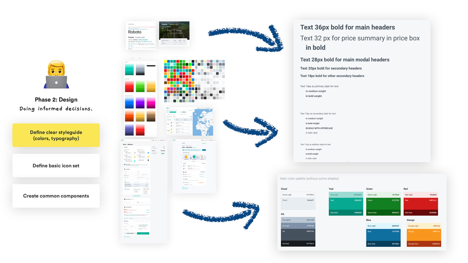
Existing C Phase 2: Design Doing informed decisions. Define clear styleguide (colors, typography) Define basic icon set Create common components Existing Colors defined in
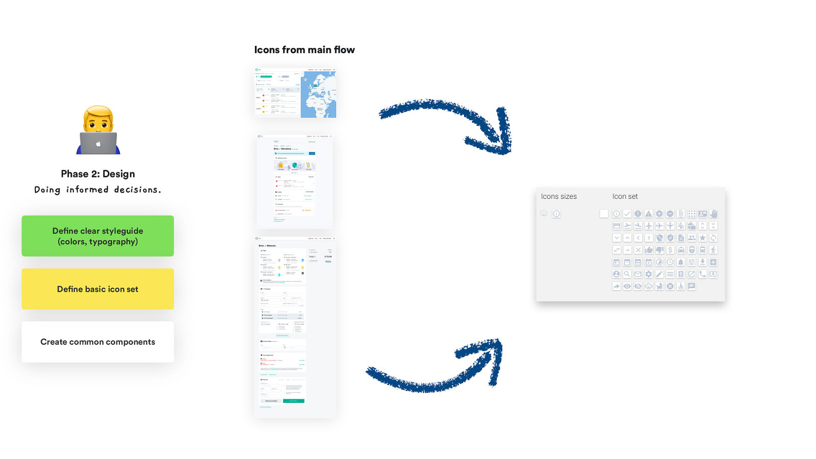
Icons from main flow C Phase 2: Design Doing informed decisions. Define clear styleguide (colors, typography) Define basic icon set Create common components
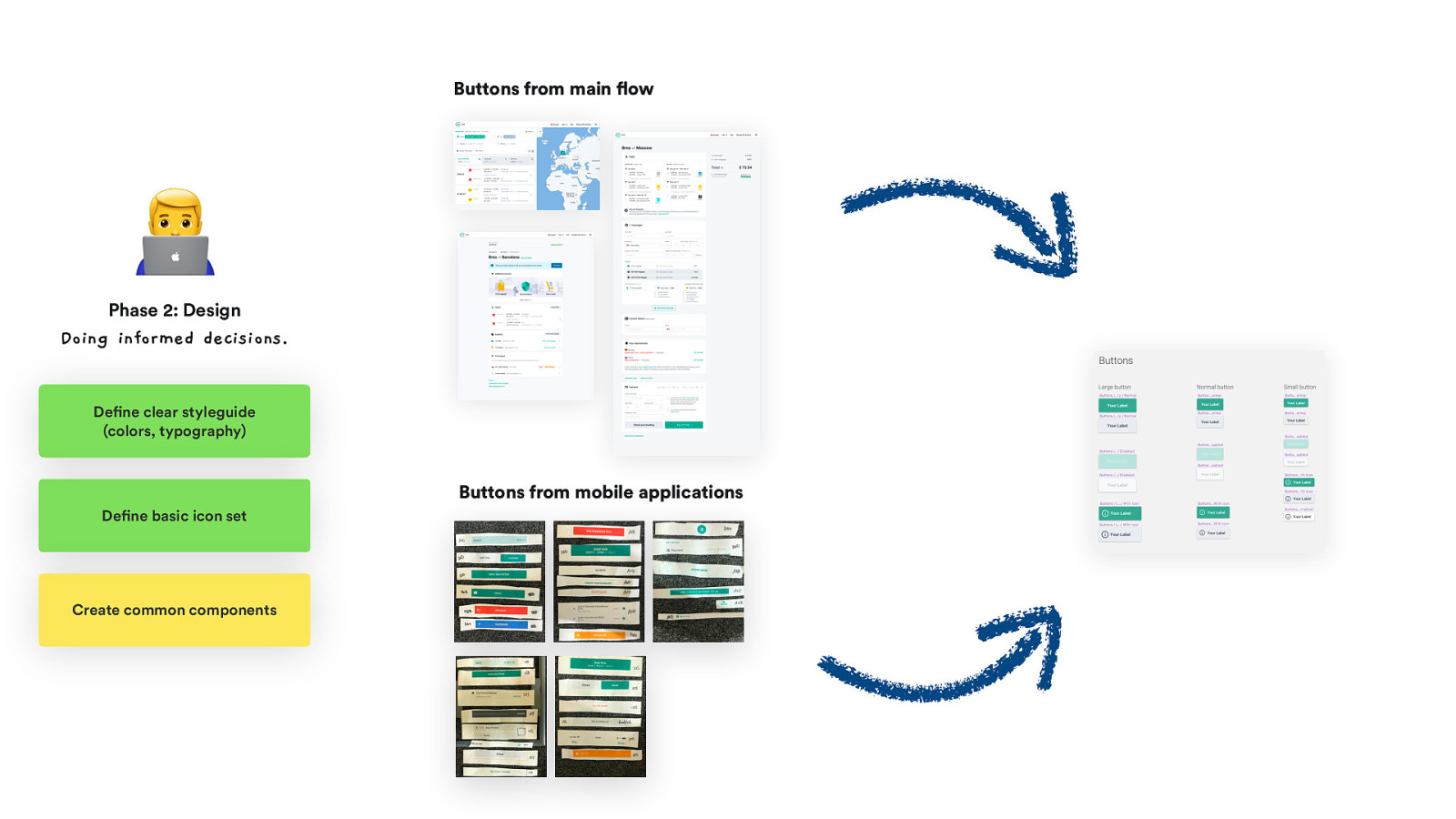
Buttons from main flow C Phase 2: Design Doing informed decisions. Define clear styleguide (colors, typography) Buttons from mobile applications Define basic icon set Create common components
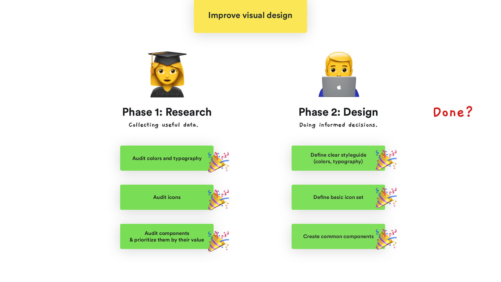
Improve visual design B Phase 1: Research Collecting useful data. Audit colors and typography Audit icons Audit components & prioritize them by their value C Phase 2: Design Doing informed decisions. 🎉 🎉 🎉 Define clear styleguide (colors, typography) Define basic icon set Create common components 🎉 🎉 🎉 Done?
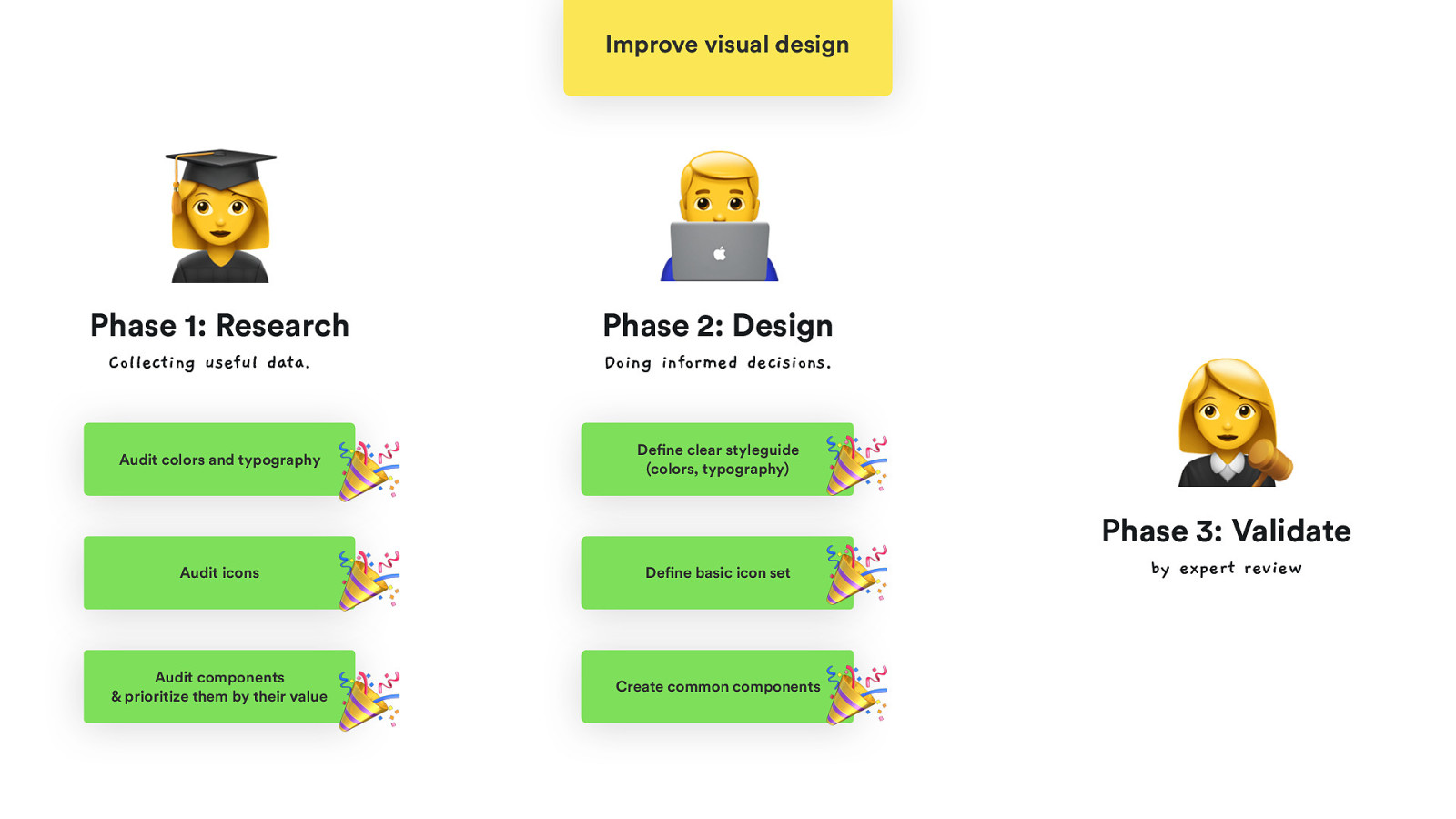
Improve visual design B Phase 1: Research Collecting useful data. Audit colors and typography Audit icons Audit components & prioritize them by their value C Phase 2: Design Doing informed decisions. 🎉 🎉 🎉 Define clear styleguide (colors, typography) Define basic icon set Create common components 🎉 🎉 🎉 E Phase 3: Validate by expert review
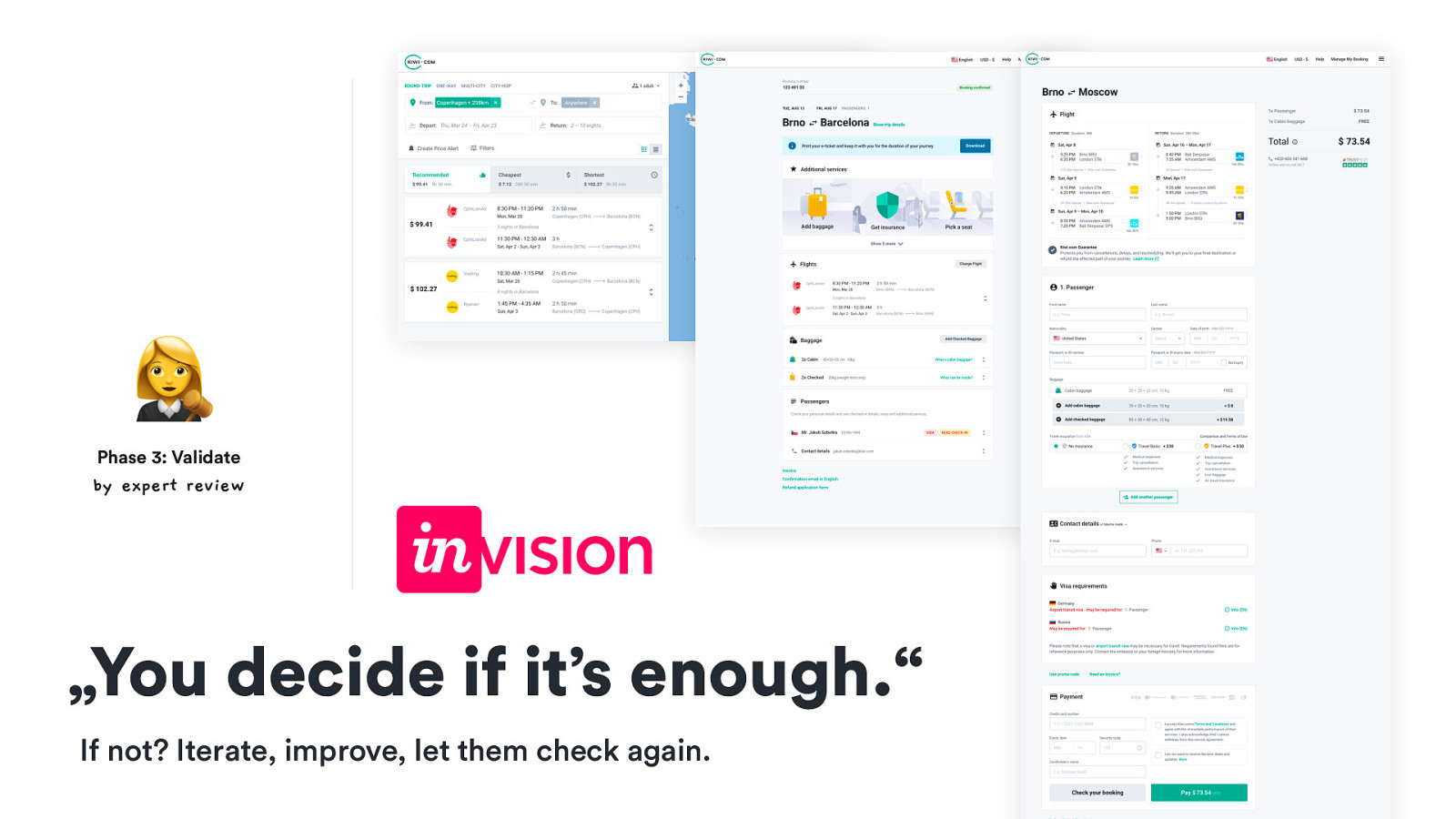
E Phase 3: Validate by expert review „You decide if it’s enough.“ If not? Iterate, improve, let them check again.
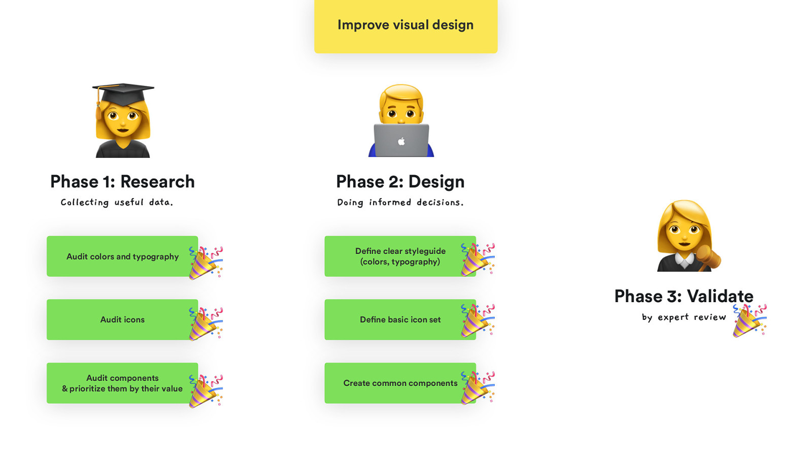
Improve visual design B Phase 1: Research Collecting useful data. Audit colors and typography Audit icons Audit components & prioritize them by their value C Phase 2: Design Doing informed decisions. 🎉 🎉 🎉 Define clear styleguide (colors, typography) Define basic icon set Create common components 🎉 🎉 🎉 E Phase 3: Validate by expert review 🎉
🎉 🎉 🎉 🎉 🎉 🎉 🎉 👏 👏 👏 So now it’s done! Is it, though?
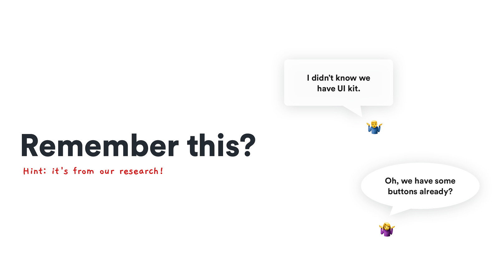
I didn’t know we have UI kit. Remember this? Hint: it ‘s from our research! 8 Oh, we have some buttons already? 🤷
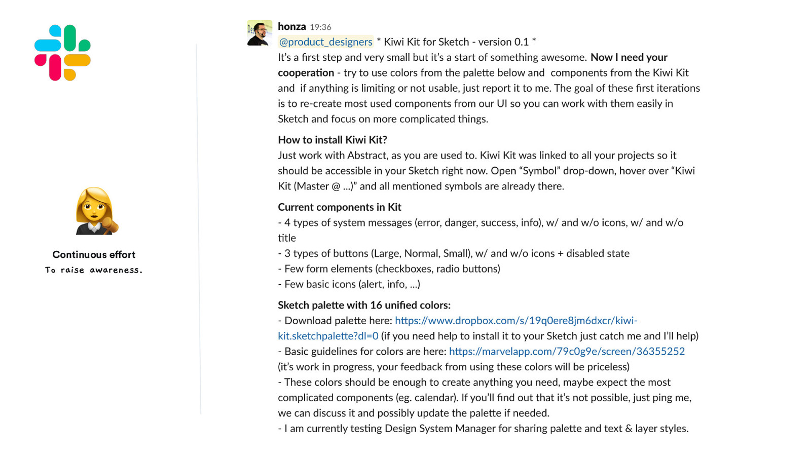
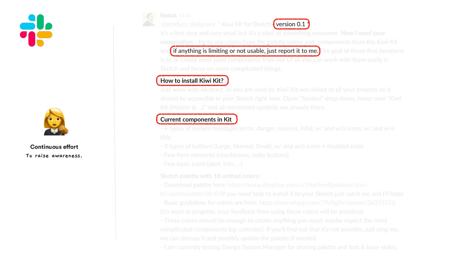
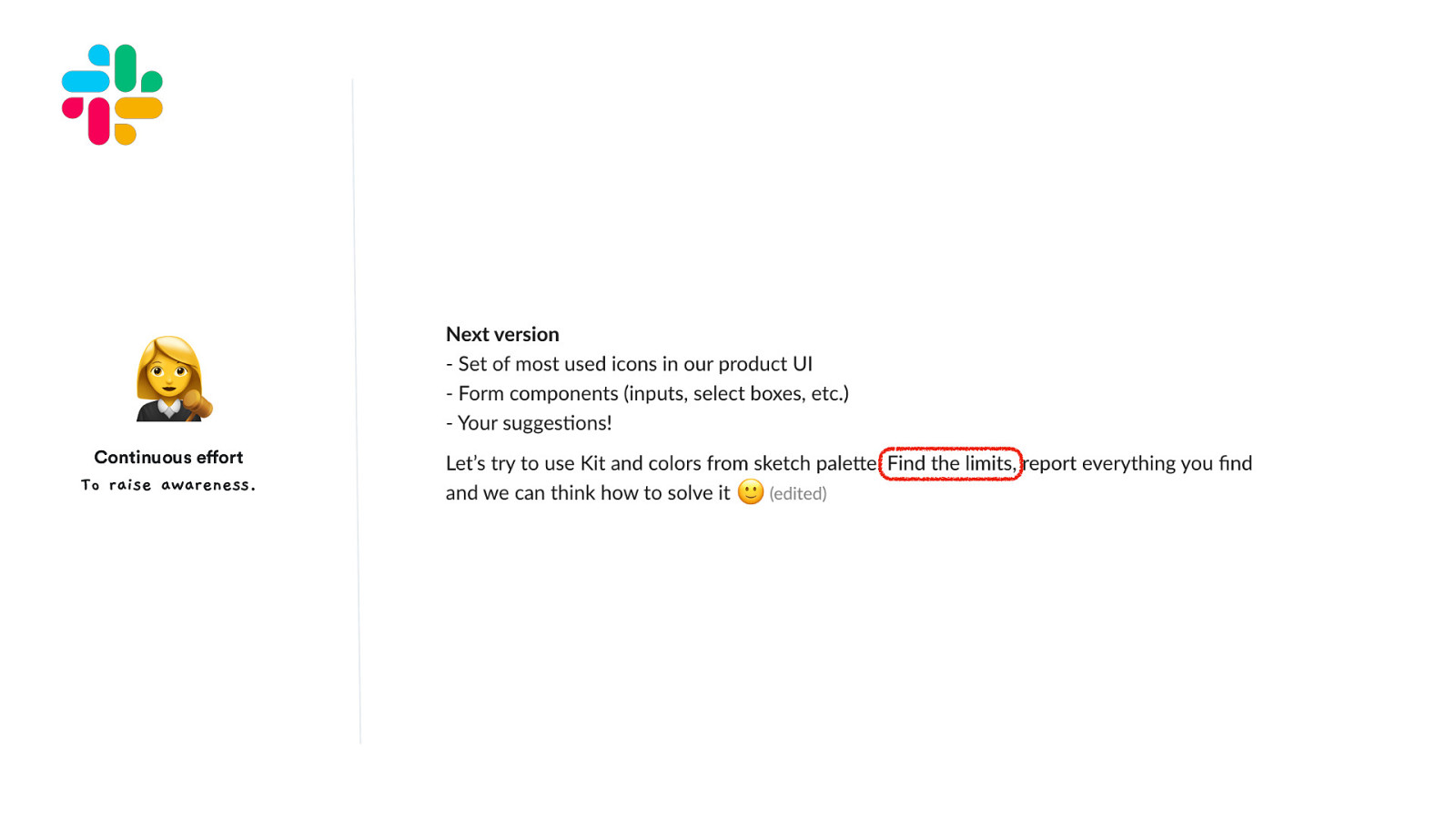
Continuous effort To raise awareness. Over-communication is a key to success. 🗝 E
E Continuous effort To raise awareness. @HonzaTmn
E Continuous effort To raise awareness. @HonzaTmn
E Continuous effort To raise awareness. @HonzaTmn
E Continuous effort To raise awareness. @HonzaTmn
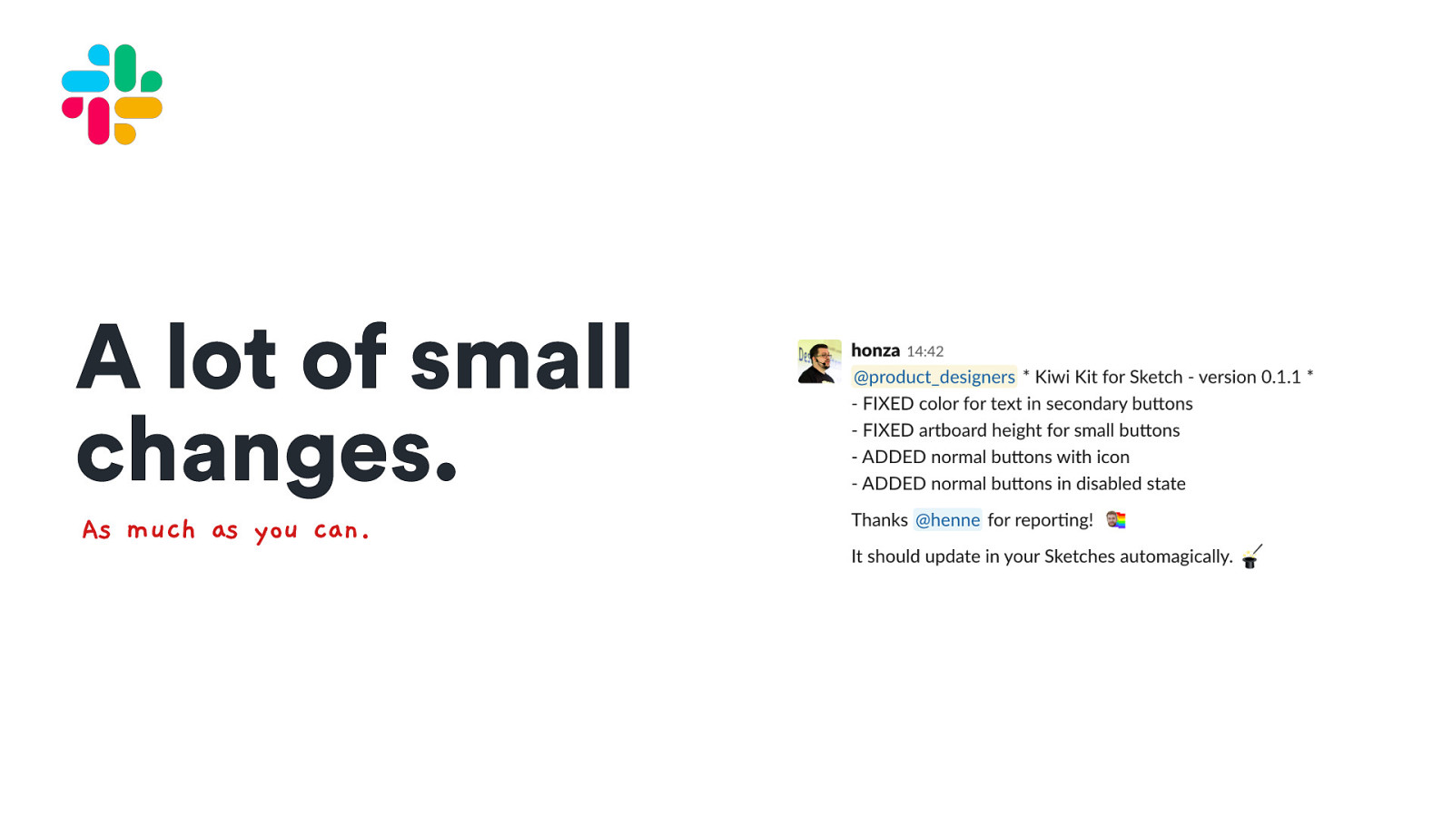
A lot of small changes. As much as you can. @HonzaTmn
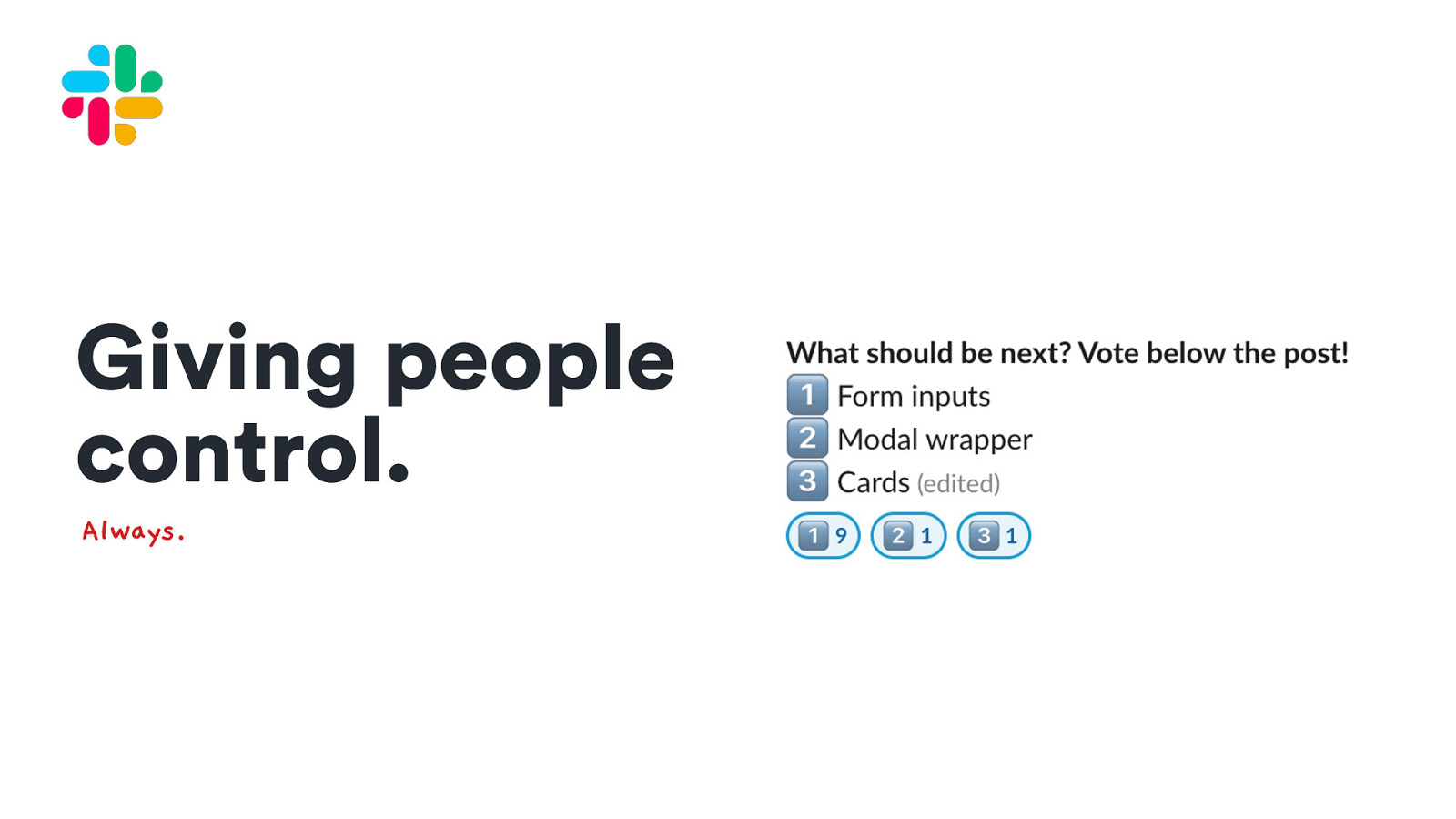
Giving people control. Always. @HonzaTmn
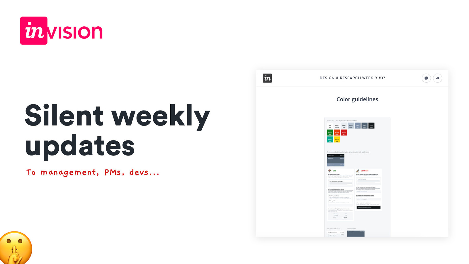
Silent weekly updates To management, PMs, devs… @HonzaTmn
🤜🤛 It’s all about gaining trust.

Check our roadmap 🎯
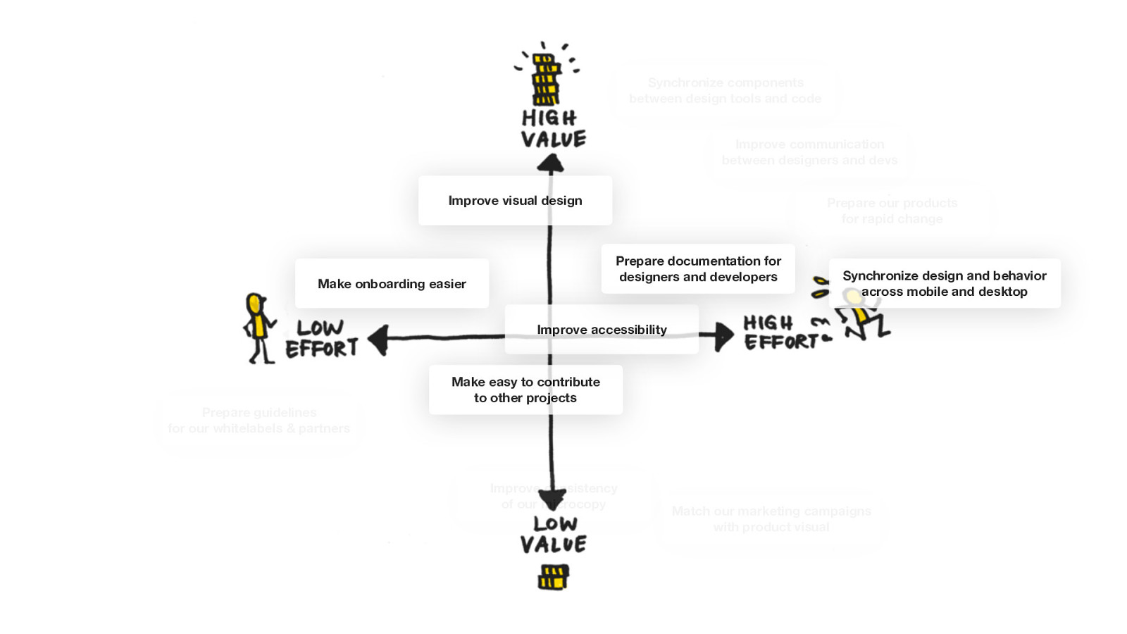
Synchronize components between design tools and code Improve communication between designers and devs Improve visual design Prepare our products for rapid change Prepare documentation for designers and developers Make onboarding easier Synchronize design and behavior across mobile and desktop Improve accessibility Prepare guidelines for our whitelabels & partners Make easy to contribute to other projects Improve consistency of our microcopy Match our marketing campaigns with product visual
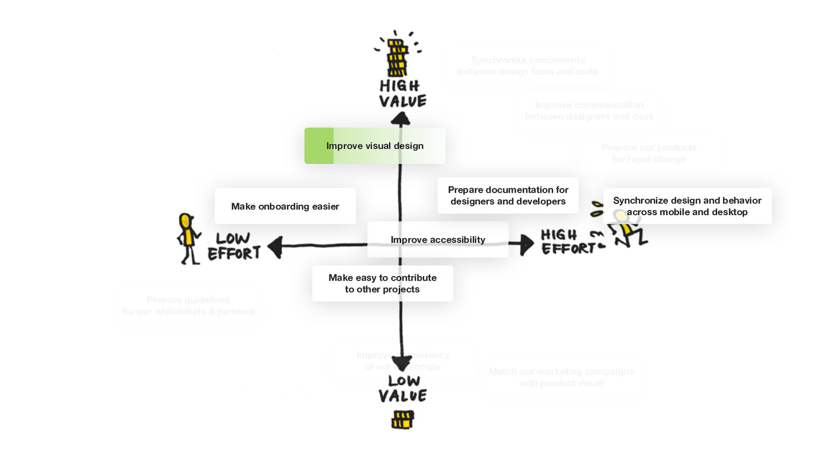
Synchronize components between design tools and code Improve communication between designers and devs Improve visual design Prepare our products for rapid change Prepare documentation for designers and developers Make onboarding easier Synchronize design and behavior across mobile and desktop Improve accessibility Prepare guidelines for our whitelabels & partners Make easy to contribute to other projects Improve consistency of our microcopy Match our marketing campaigns with product visual
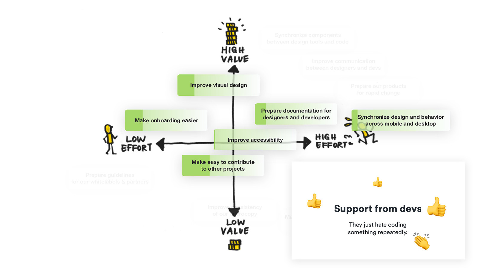
Synchronize components between design tools and code Improve communication between designers and devs Improve visual design Prepare our products for rapid change Prepare documentation for designers and developers Make onboarding easier Synchronize design and behavior across mobile and desktop Improve accessibility Prepare guidelines for our whitelabels & partners Make easy to contribute to other projects 👍 Improve consistency of our microcopy 👍 Support from devs Match our marketing campaigns with product visual They just hate coding something repeatedly. 👍 👏
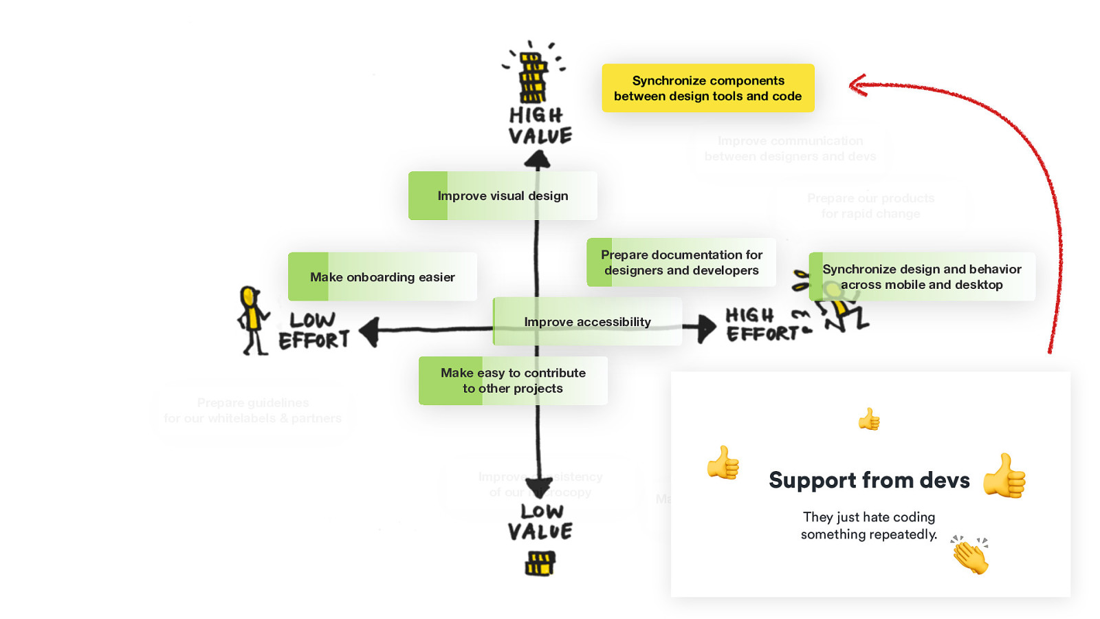
Synchronize components between design tools and code Improve communication between designers and devs Improve visual design Prepare our products for rapid change Prepare documentation for designers and developers Make onboarding easier Synchronize design and behavior across mobile and desktop Improve accessibility Prepare guidelines for our whitelabels & partners Make easy to contribute to other projects 👍 Improve consistency of our microcopy 👍 Support from devs Match our marketing campaigns with product visual They just hate coding something repeatedly. 👍 👏
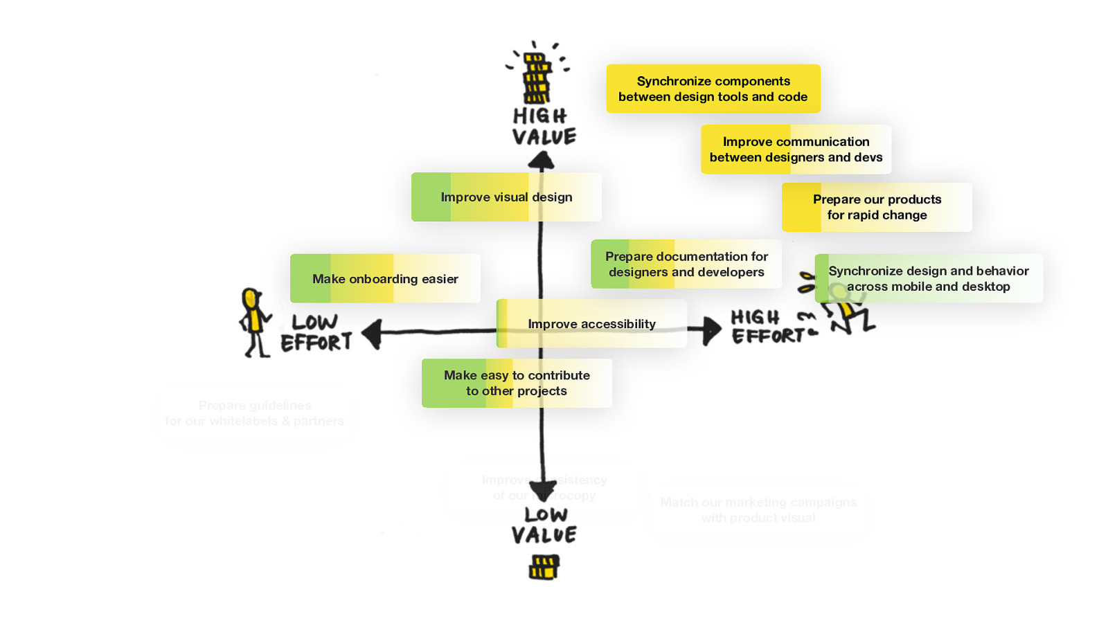
Synchronize components between design tools and code Improve communication between designers and devs Improve visual design Prepare our products for rapid change Prepare documentation for designers and developers Make onboarding easier Synchronize design and behavior across mobile and desktop Improve accessibility Prepare guidelines for our whitelabels & partners Make easy to contribute to other projects Improve consistency of our microcopy Match our marketing campaigns with product visual
“Nothing is invented and perfected at the same time.“ - John Ray
Benefits of this approach
🥳 Delivering small parts that matter 🧞
👏 Delivering small parts that matter Continuous proof of value 👍 👍 👍
Delivering small parts that matter Continuous proof of value Getting frequent feedback 🙋 L
🚀 Delivering small parts that matter Continuous proof of value Getting frequent feedback Increasing awareness N 📣
Change won’t happen overnight🦋 🐛 Be persistent. Be transparent. Be there for them.
)🤹 Thank you. 🐦 Reach out to me on Twitter: @HonzaTmn https://joind.in/talk/9d110