Make the Unclear Clear
Inspired by Abby “The IA” Covert.
A presentation at Defuse: Design for Use by Dublin IxDA in November 2019 in Dublin, Ireland by Jonathon Colman
Inspired by Abby “The IA” Covert.

Submitted for your approval: 3 stories, all with one outcome: the failure of complex systems.
The first focuses on this push notification, which was sent by the government of Hawai’i to all state residents last year. What’s that? You don’t remember Hawai’i being attacked by missiles?

The message was accidentally sent by an operator who was using this interface, which is deceptively complex: it’s just blue links on a white background—what could be simpler?
But the closer you look at the text, the more confusing it gets. Even a well-trained operator failed to choose the right option, even though it’s a “simple” interface. The false message caused a state-wide panic.
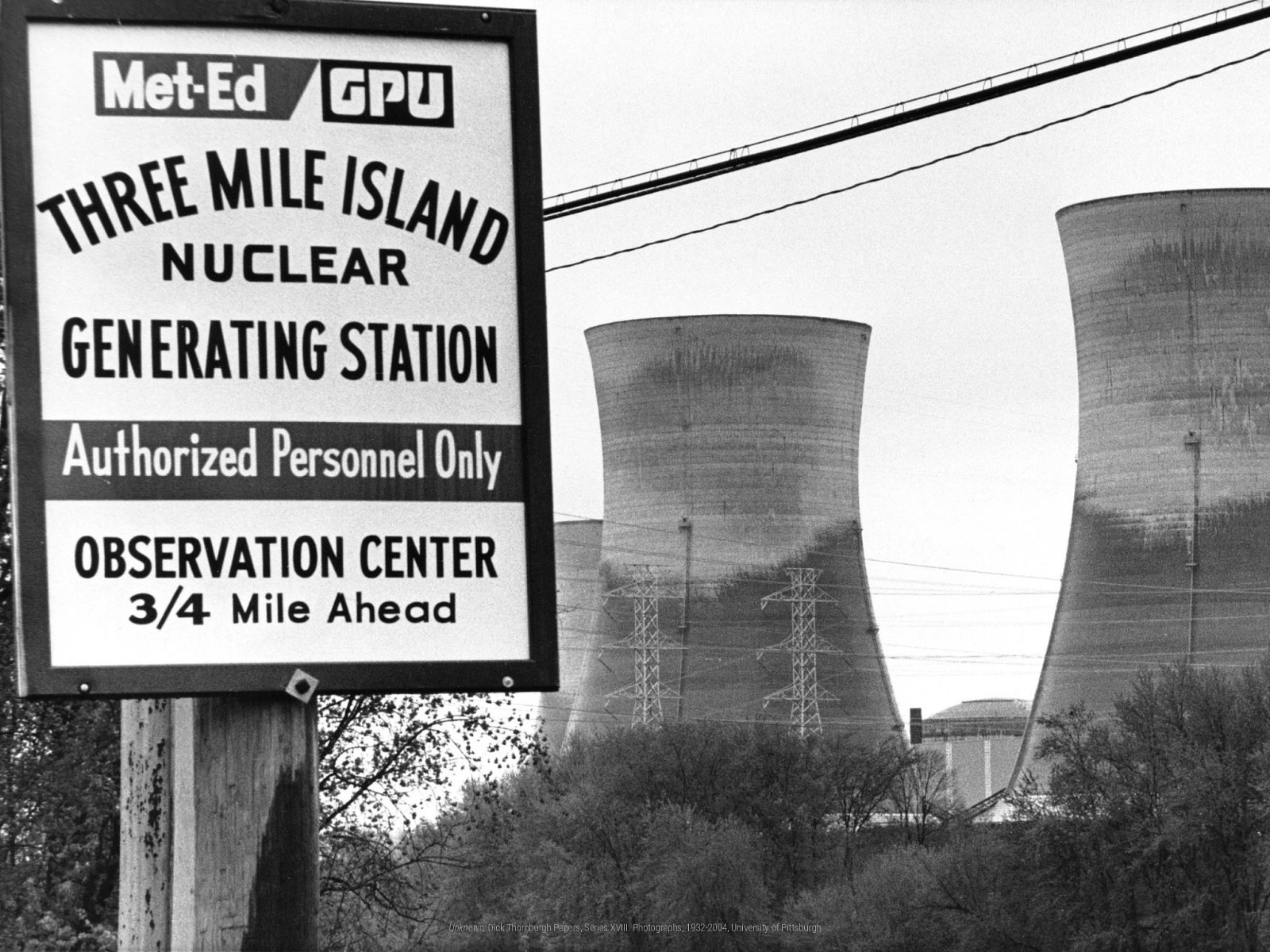
Next, we jump to Pennsylvania, home of the Three Mile Island nuclear power plant, which had a partial meltdown in 1979—a decade before Chernobyl.
140,000 people were evacuated and over 2 million were exposed to radiation.
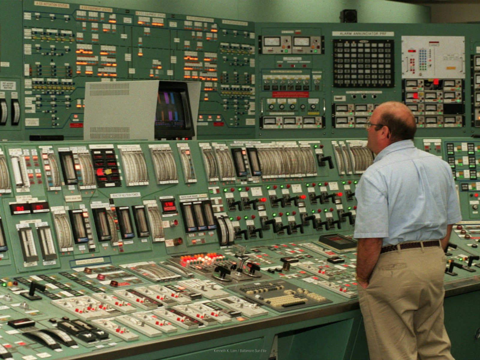
Here’s interface that actually ran the power plant. Somewhere amongst all these buttons and switches, a hidden indicator light light led an operator to make the wrong decision. They reduced coolant to the reactor core when more was needed.
One light in a sea of thousands.

Finally, you don’t need me to tell you how complex health care is. The human body—your body—is a complex, all-too-fragile system that’s always just a moment away from failure.
The scary truth is that our control of our bodies is an illusion, one that’s easily taken away from us without notice.
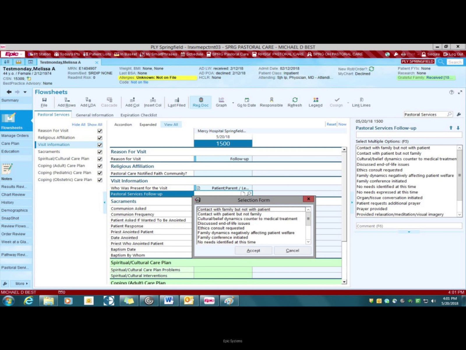
But our fragile nature is compounded by hospital interfaces like this one, which has been linked to increased errors by health care providers.
A recent study claims more than 250,000 people die every year from preventable medical errors. They’re now the third-leading cause of death after heart disease and cancer.
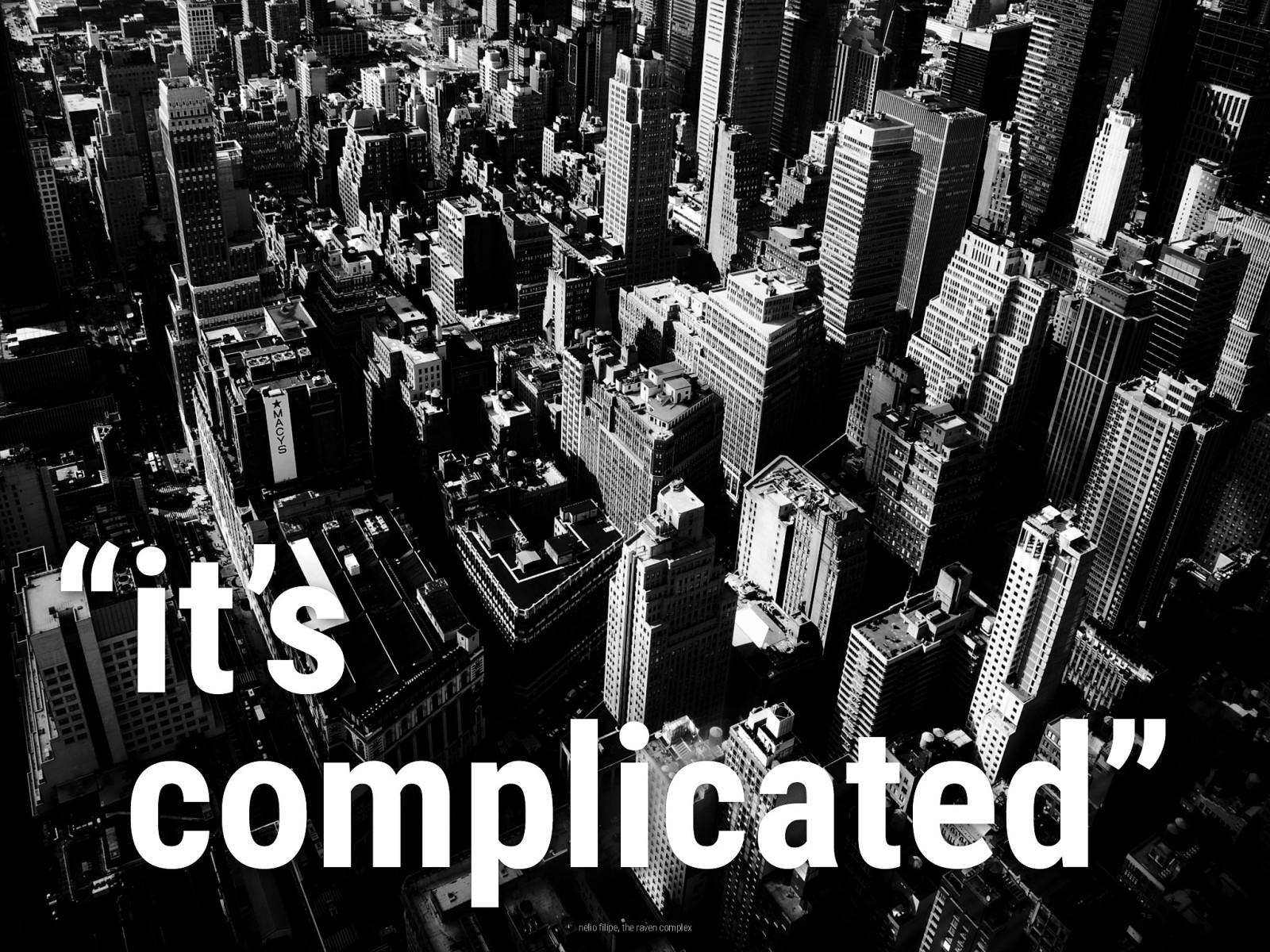
Now, we tend to blame these problems on things being complicated. But that doesn’t mean that the answer is just to make things simple.
There’s a lot of value in complexity. Think about how complex even your home is, let alone a skyscraper, or a city! We get a lot of benefits from complex systems and the chaos they bring with them.
After all, I believe it was an Irishman who told us, “Chaos is a ladder.”
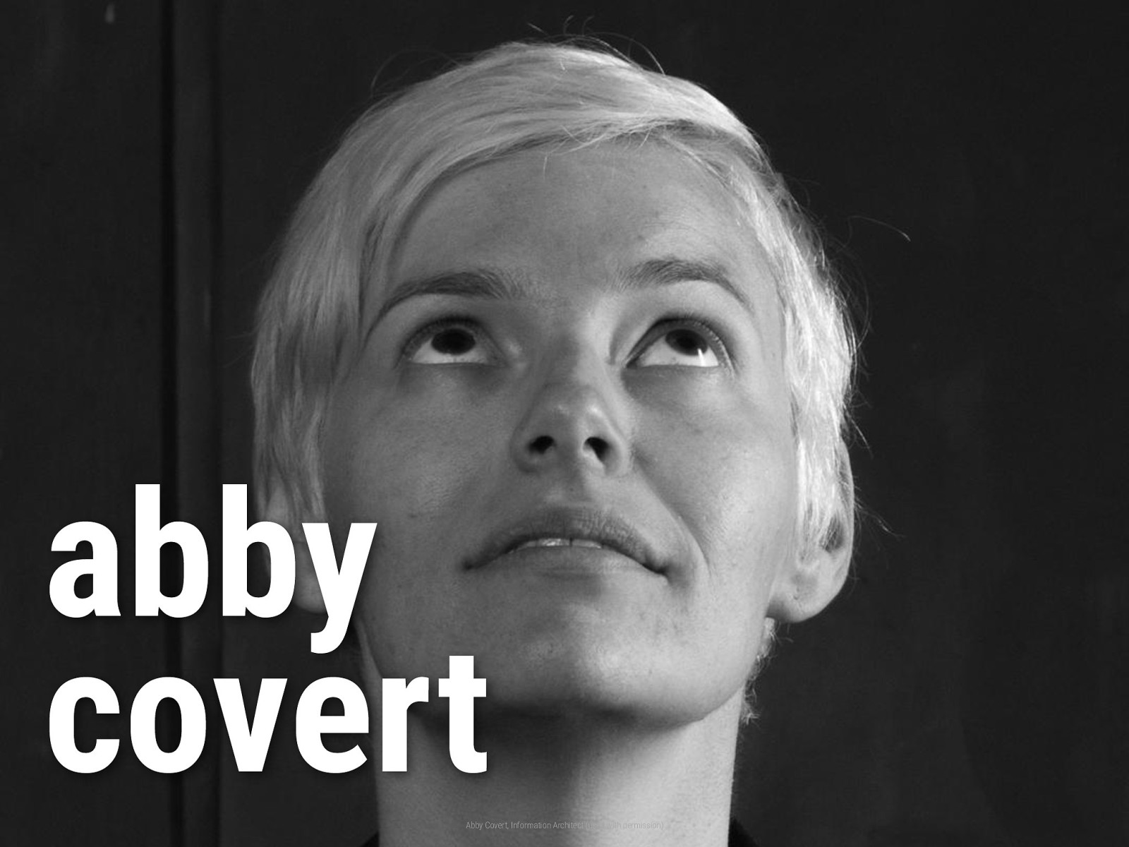
The solution is to make the unclear clear. This is an idea from Abby Covert, an information architect at Etsy.
She created this phrase, “Make the unclear clear,” to describe the work of information architects and all other UX practitioners.
So tonight, I’ll show you 5 ways that you can make the unclear clear in all of your efforts.
The first is to expect uncertainty, and even the unexpected. This helps you explore stress cases and avoid unintended consequences.
Let’s do an experiment… You know how Defuse works: these slides auto-advance every 15 seconds. So every moment has to be planned to deliver the perfect message…
Or does it? Let’s see what happens when something unexpected occurs.
…There, see? That wasn’t so bad. The more you can accept uncertainty, the more your designs will tolerate unexpected failures.
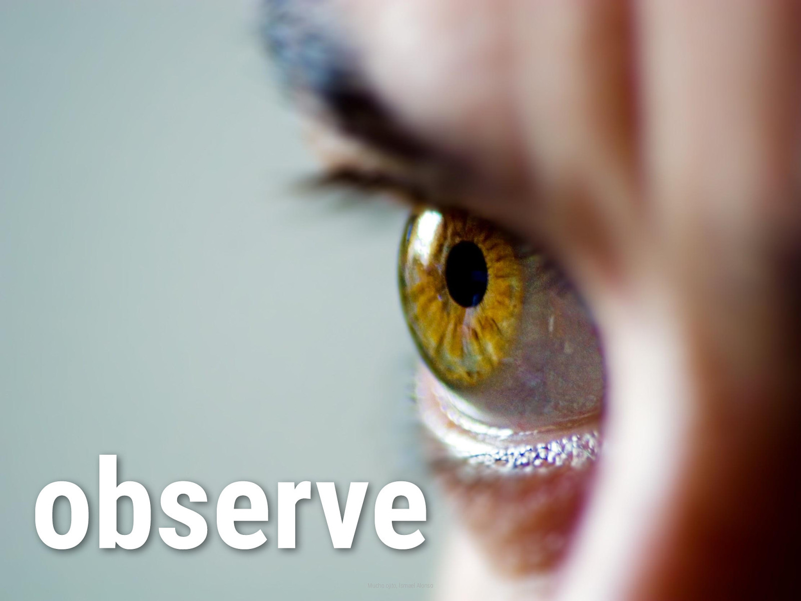
Sherlock Holmes once told us, “You see, but you do not observe.” But since so many of us work in “move fast” environments, we often fail to observe or sometimes even see.
So we need to look closer. This helps us better understand the problems we want to solve.

Observation and analysis aren’t just jobs for researchers or journalists—they’re your responsibility, too.
Understand the problem you want to solve. Validate that it’s the most important problem right now. Align a group of people toward solving it. These all depend on your ability to see things for what they really are.

We all want to do big things, but this often leads us to stretch ourselves too thin. We spread ourselves over massive surfaces to make sure we can touch absolutely everything all the time.
But having more breadth like this comes with knock-on effects: less depth, more meetings, less maker time, more context-switching, less alignment, and more strain on our relationships—possibly even burnout.

That’s why you should do one thing at a time—just the one. Something we often say at Intercom is that it’s far more important to do a great job on the one, single most important thing versus doing a shite job on 20 things or 100 things or more.
Don’t be afraid to prioritize, or even to cut scope in order to learn fast and ship right.
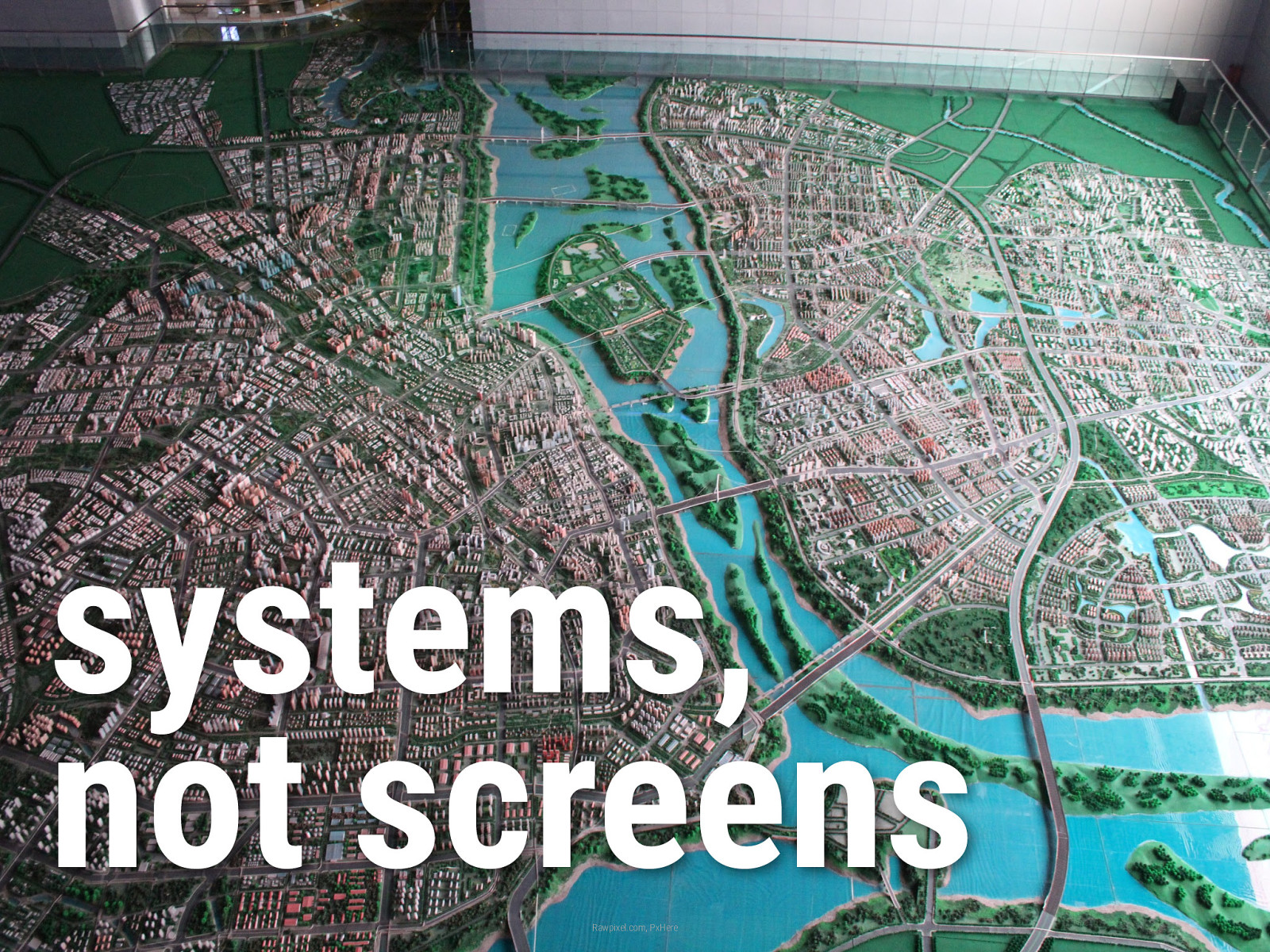
There’s a whole, wide world outside your monitor. The canvases you work on all day can’t hope to capture it because they all have edges, but the world doesn’t.
And yet so many of us start designing on a screen, laying out UI flows, building prototypes, and writing CSS. But true product design is really concept design: understanding the system before we ever get to a screen.

To understand a system, you need to do three things: first, list out all of the objects or entities you can find. Next, determine how they’re related to each other. Finally, you get to the hard part: figuring out how those connections provide meaning and value.
Most complex problems involve ecosystems, much like this Zen garden. It’s not a grain of sand, not a rock, not a tree—it’s how they all connect to make you calm.
Did you know that, by some estimates, humans have been using language for over 100,000 years?
I wonder: why are we so bad at it? Why is it so hard for us to be straightforward and direct with the people we’re closest to? And if that’s a challenge, think of someone you don’t give a fig about. Why, they’ll never get a straight answer, I can tell you that!

Most teams avoid working on the words until the very end, until just before we finish.
That’s a mistake because design isn’t just about determining how things work—it’s also about determining what things mean. And words play a big part in determining meaning.
Stop designing from the container in, but from the content out.

Listen: Complex problems are hard. They spin us about, fill us with uncertainty, and cause our vision to blur until nothing seems clear anymore. I know how scary that feels.
But that’s also why our work matters: because we’re complex people living in a complex world and always creating more and more complex things! Complexity isn’t our enemy—it’s part of who we are.
So the goal isn’t to make the complex simple—that would just remove value and benefits and even joy and humanity from the world.
In 2020 and beyond, don’t make the complex simple; make the unclear clear. Make the unclear clear. Make the unclear clear. Say it with me: “MAKE THE UNCLEAR CLEAR!”
Thank you.