
A presentation at An Event Apart Washington DC in in Washington, DC, USA by Jen Simmons
Jen Simmons A n E vent A part D.C. July 2018 E verything Y ou K now A bout Web D esign Just Changed
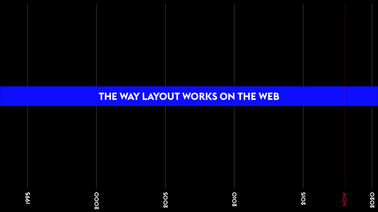
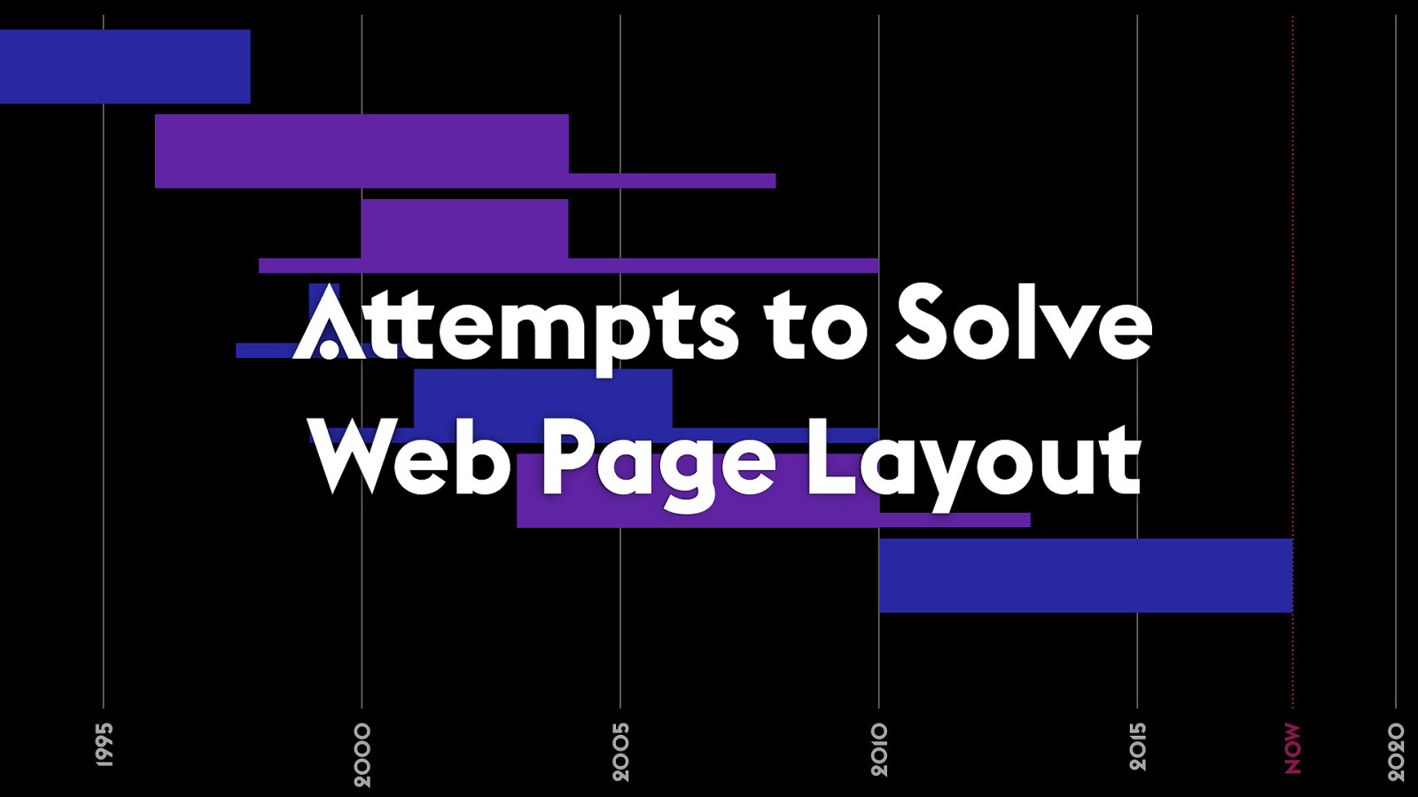
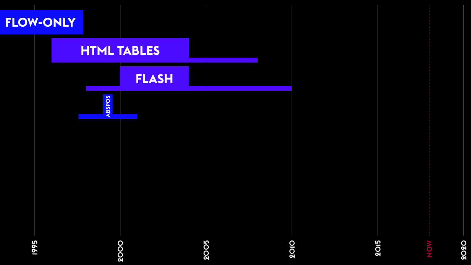
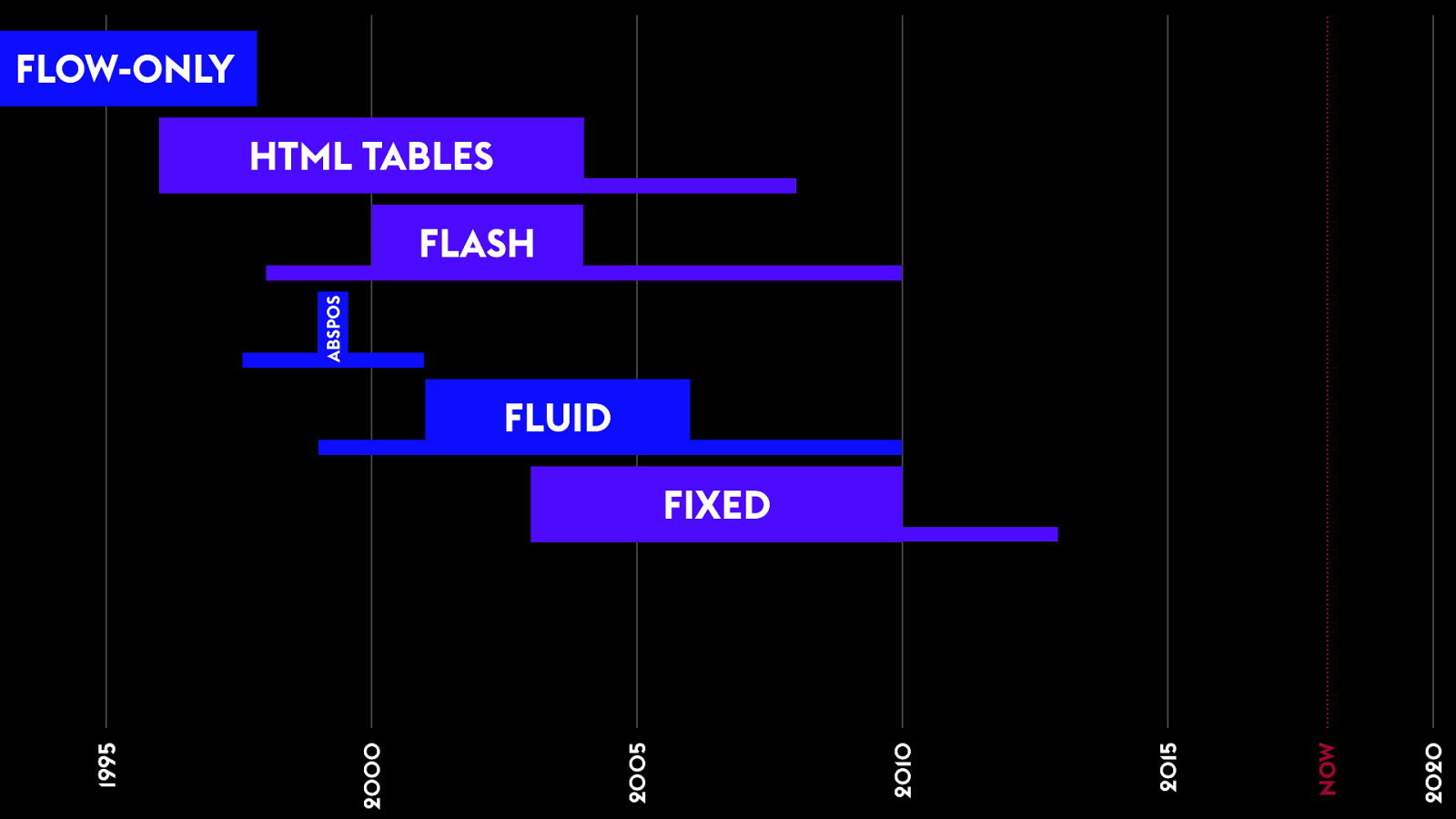
THE WAY LAYOUT WORKS ON THE WEB 1995 2000 2005 2010 2015 2020 NOW
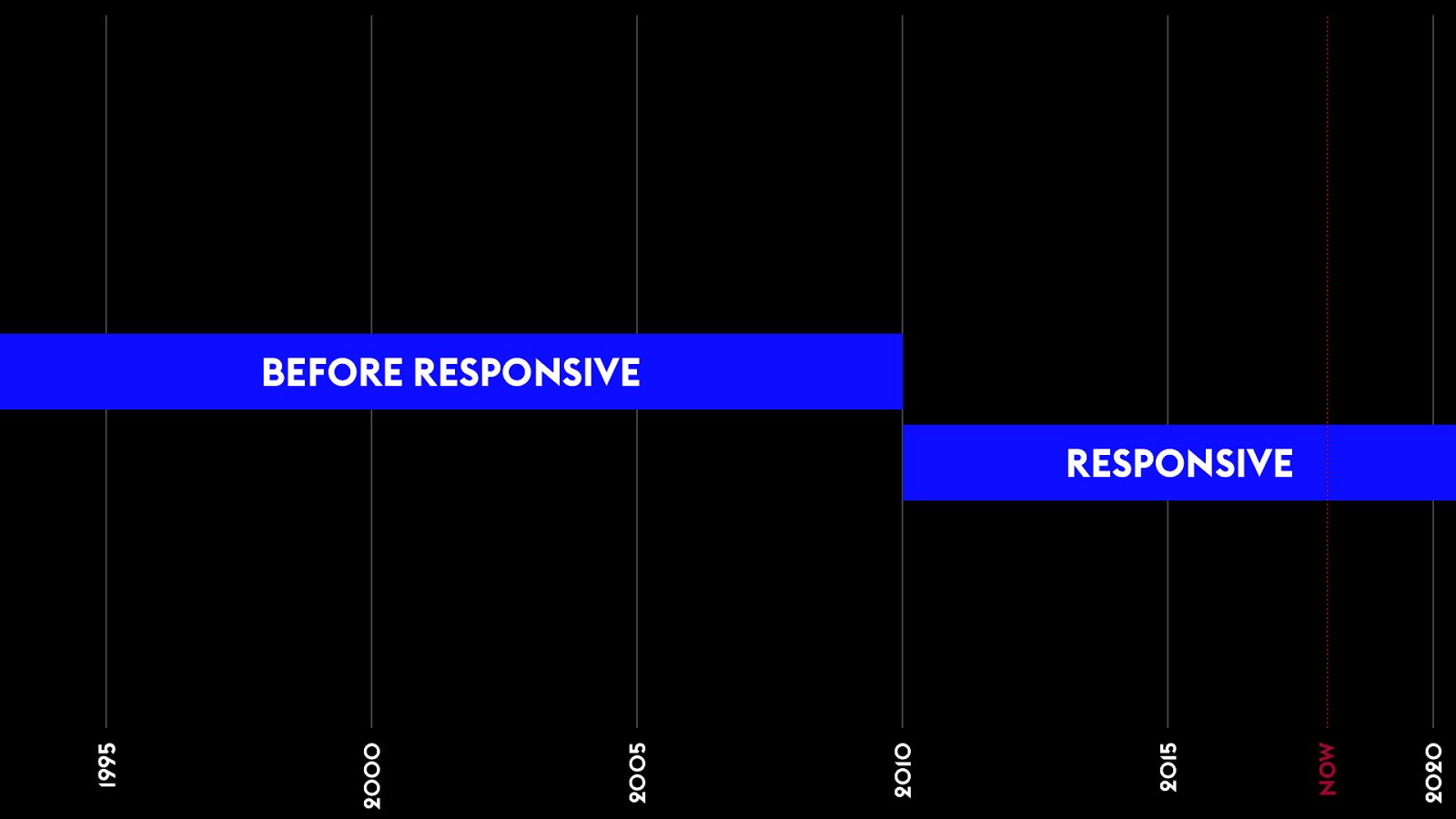
RESPONSIVE BEFORE RESPONSIVE 1995 2000 2005 2010 2015 2020 NOW
1995 2000 2005 2010 2015 2020 NOW
We need more art. R eal graphic design.
T h a t ’ s
not
ho w th e we b w orks .
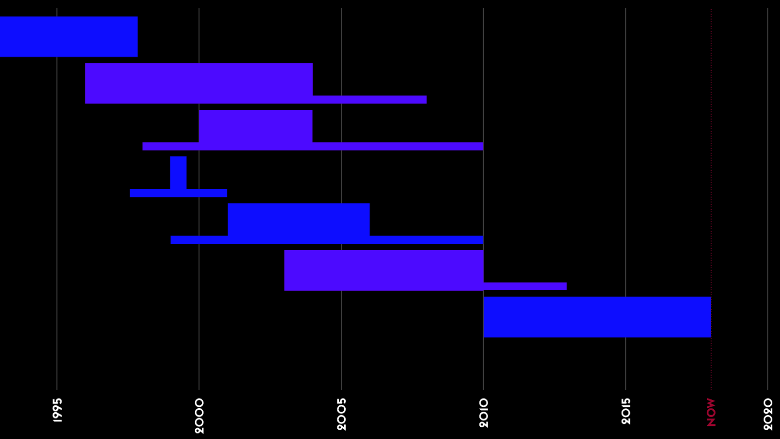
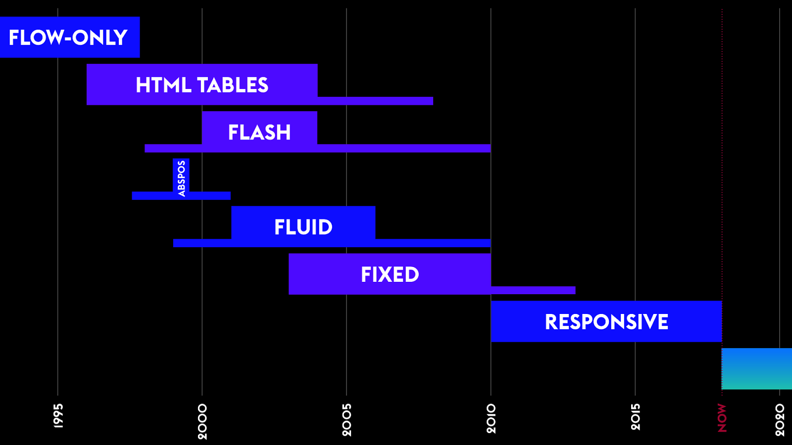
1995 2000 2005 2010 2015 2020 A/ empts to Solve Web P age Layout NOW
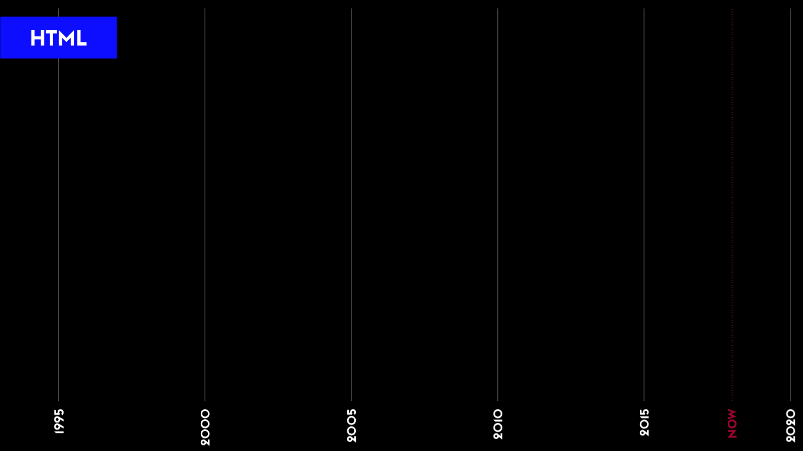
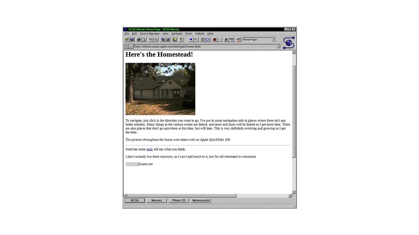
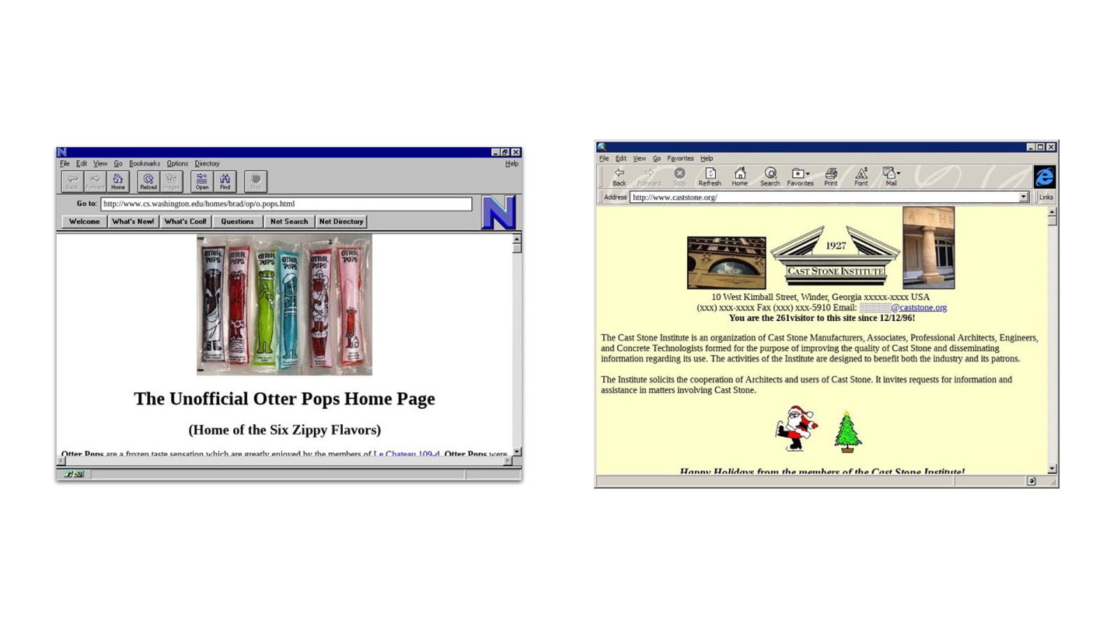
Simp le H T ML It ’ s ! e web!
HTML 1995 2000 2005 2010 2015 2020 NOW
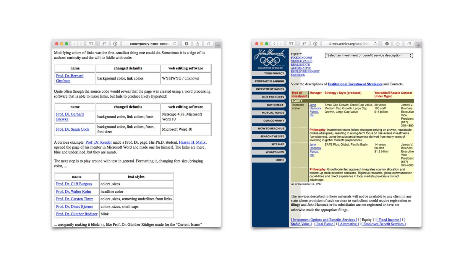
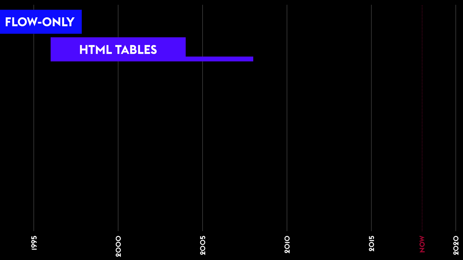
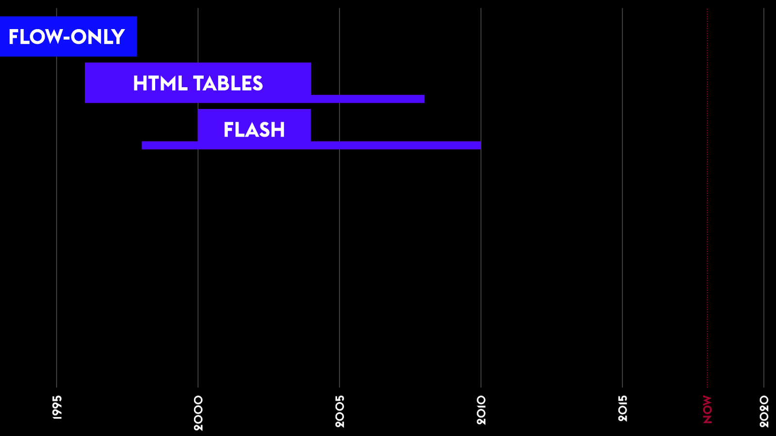
F low LESSON LEARNED
Tables for Layout We n " d a
!
1995 2000 2005 2010 2015 2020 HTML TABLES FLOW-ONLY NOW
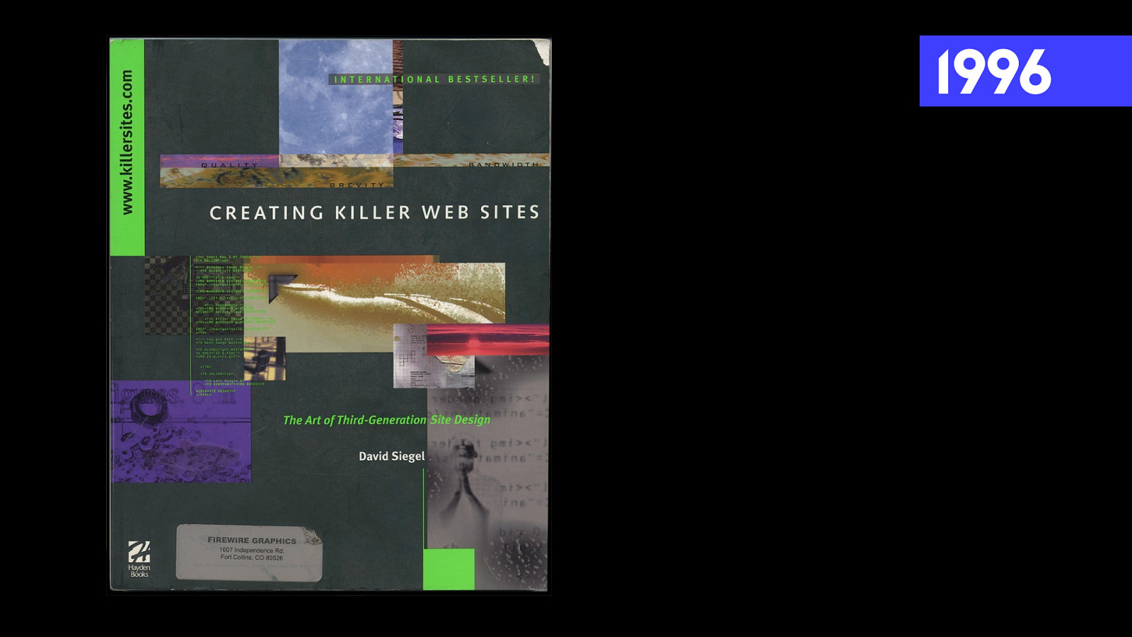
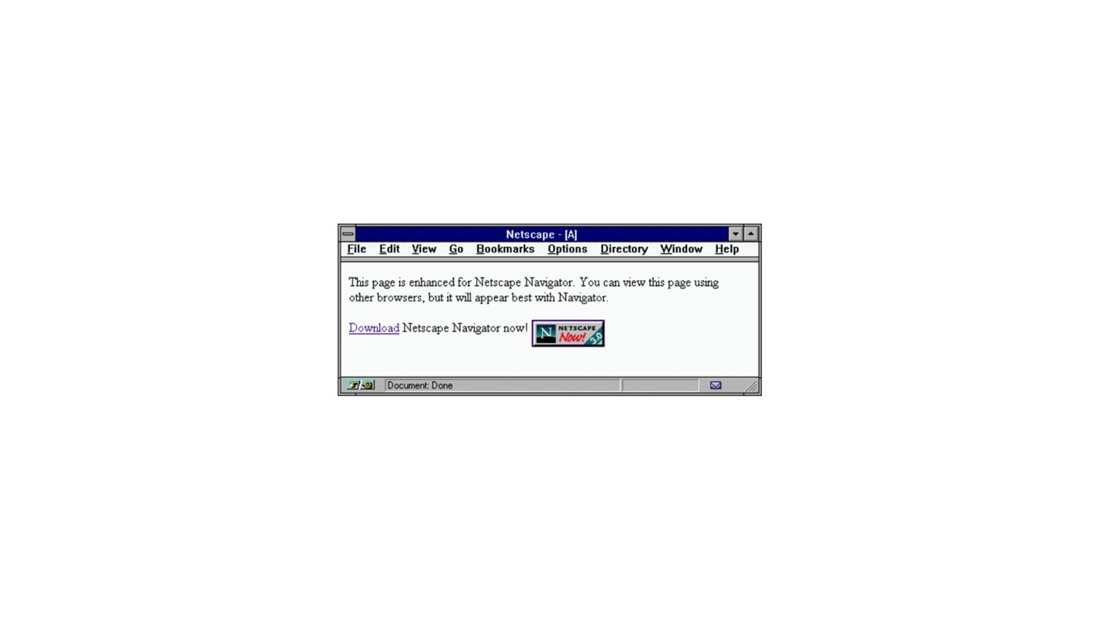
1996
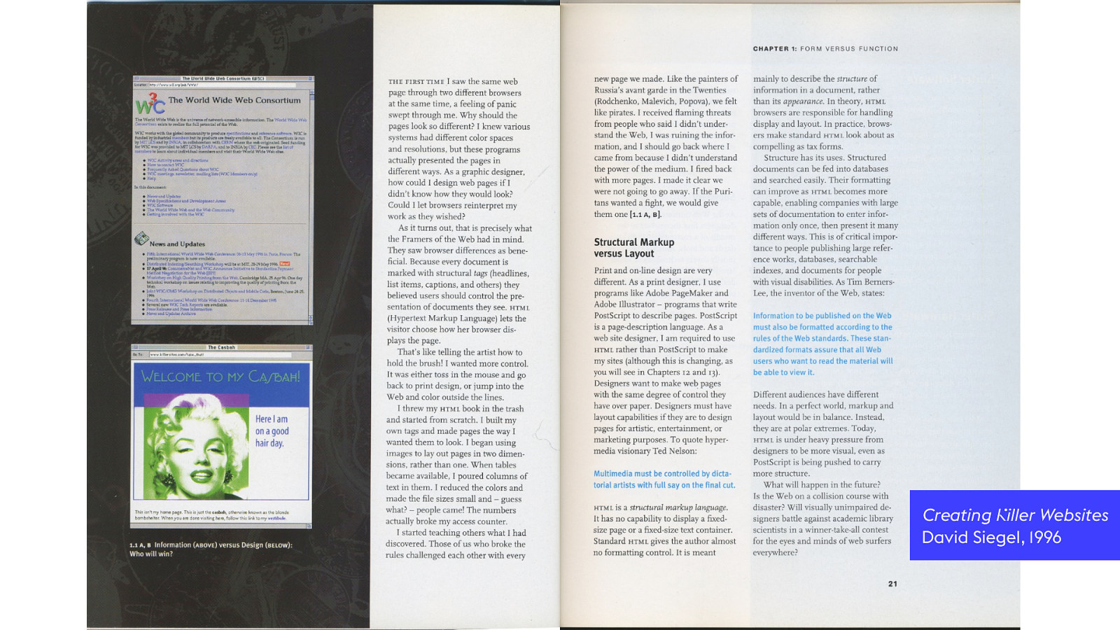
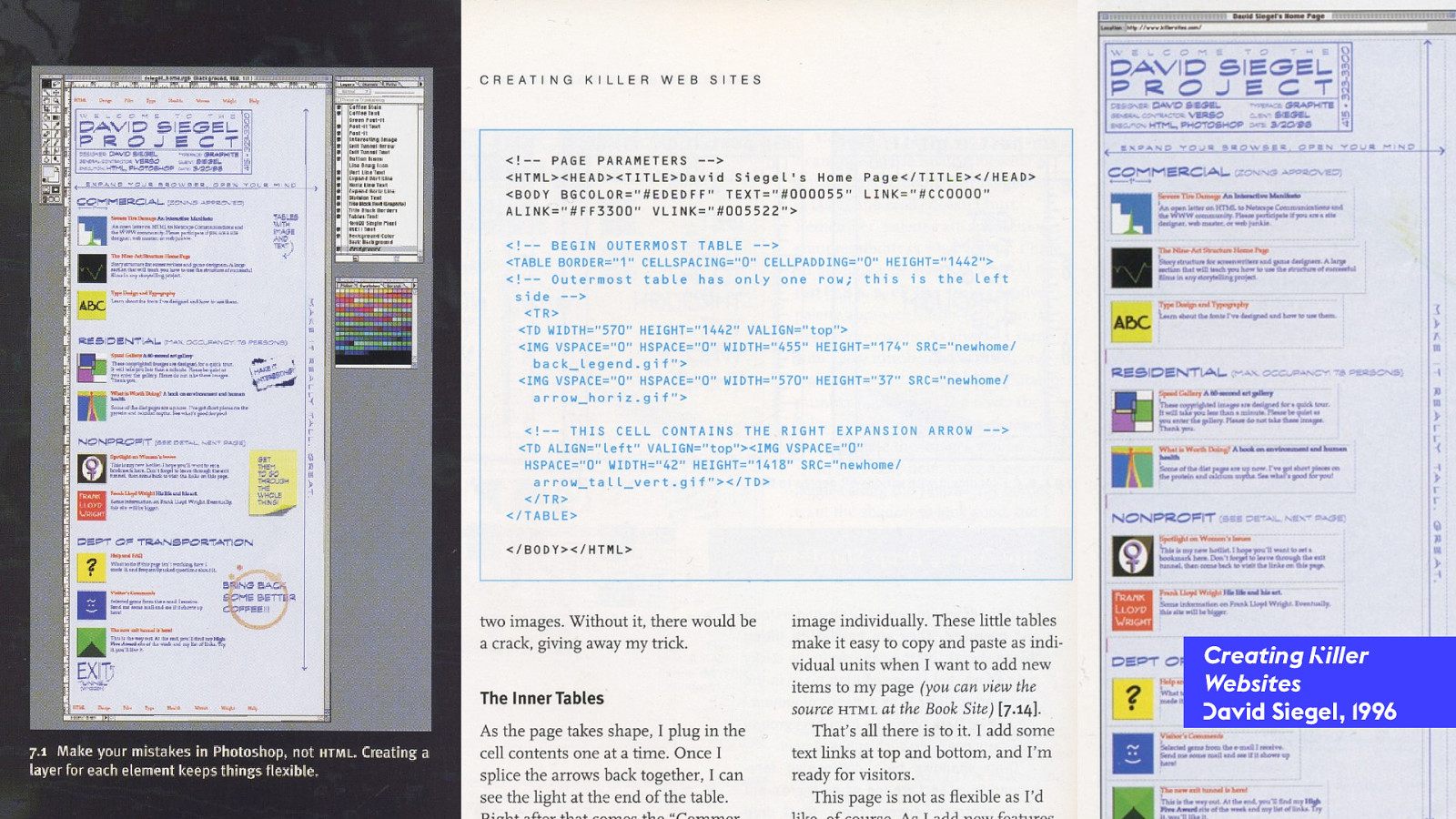
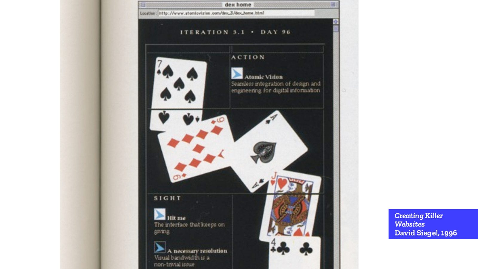
Creating K iller Websites David Siegel, 1996
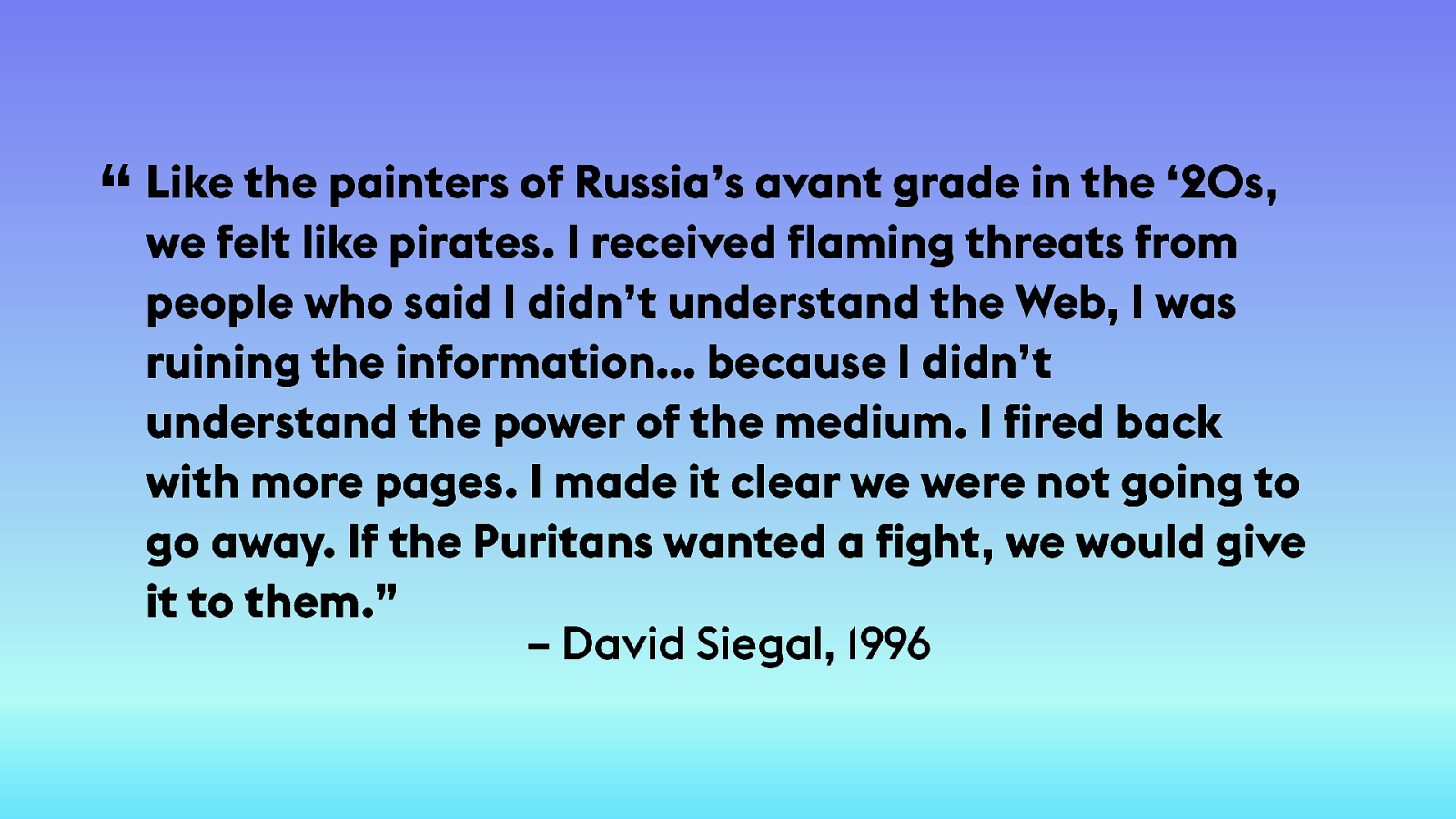
– David Siegal, 1996 Like the painters of Russia’s avant grade in the ‘20s, we felt like pirates. I received flaming threats from people who said I didn’t understand the Web, I was ruining the information… because I didn’t understand the power of the medium. I fired back with more pages. I made it clear we were not going to go away. If the Puritans wanted a fight, we would give it to them.” “
Creating K iller Websites D avid Siegel, 1996
Creating K iller Websites D avid Siegel, 1996
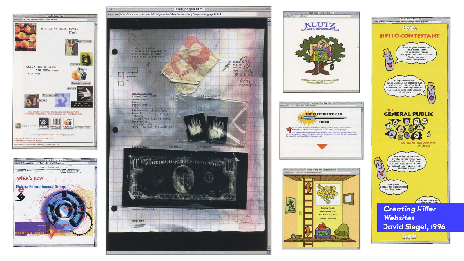
Creating Killer Websites David Siegel, 1996
F lash We n " d a
!
1995 2000 2005 2010 2015 2020 FLOW-ONLY HTML TABLES FLASH NOW
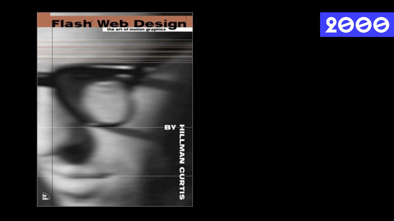
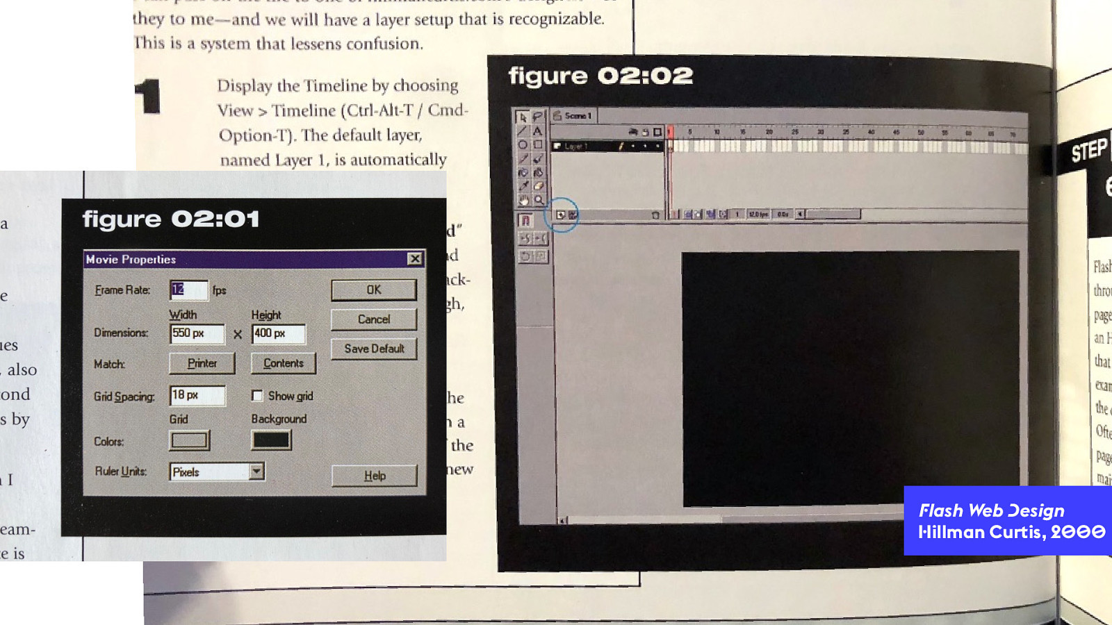
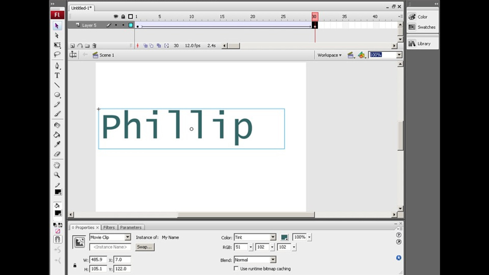
2 000
F lash Web D esign H illman Curtis, 2 000
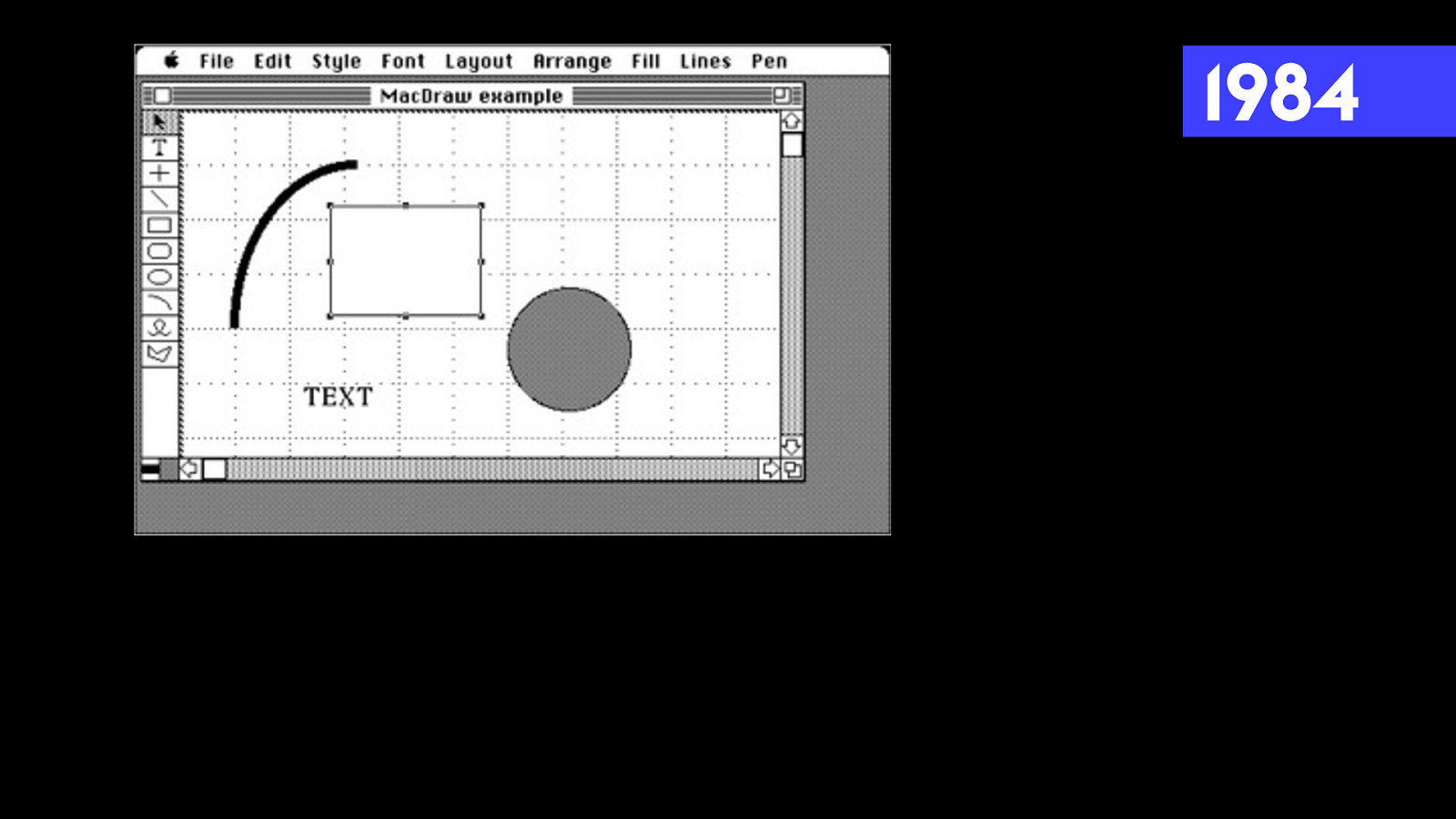
1984
CSS It ’ s ! e web!
2 00 3
D
esigning with Web
Standards
Jeffrey Zeldman, 2
00
3
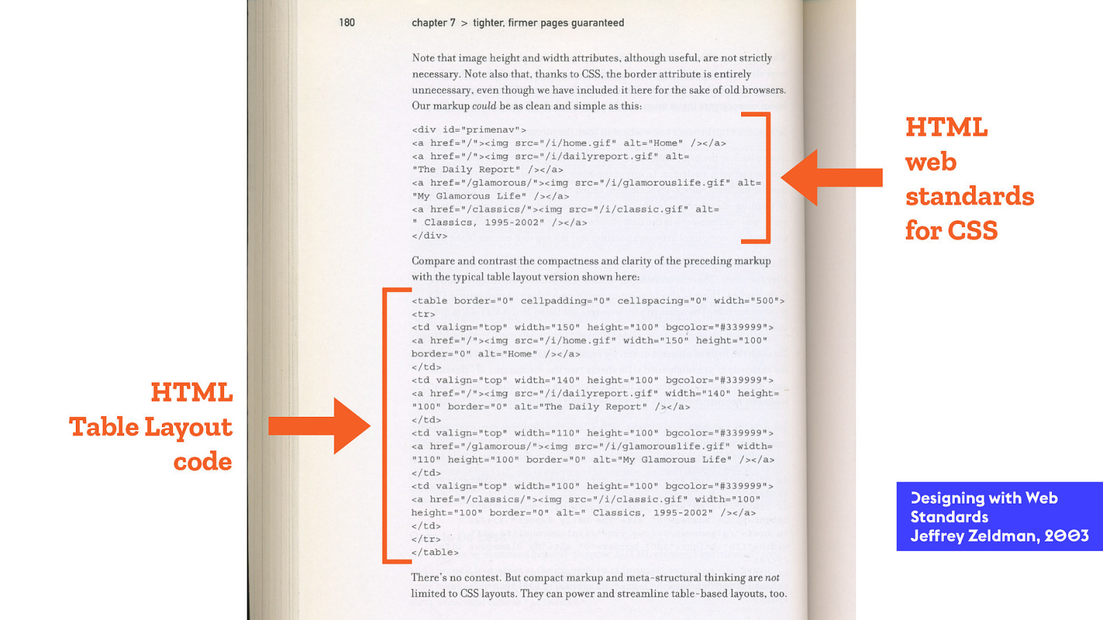
HTML
Table Layout
code
HTML
web
standards
for CSS
D esigning with Web Standards Jeffrey Zeldman, 2 00 3
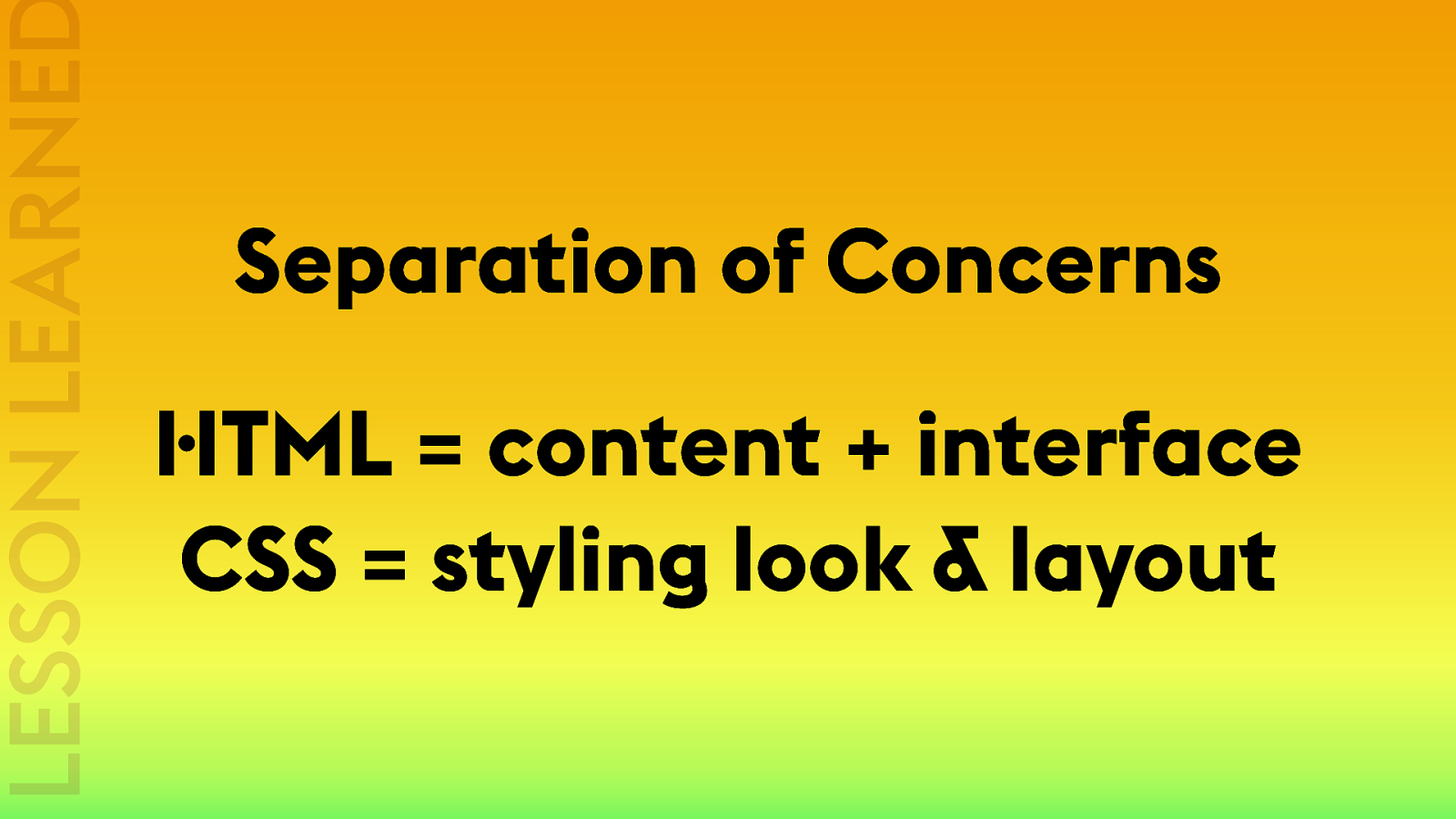
Semantic Markup LESSON LEARNED
Separation of Concerns H TML = content + interface CSS = styling look & layout LESSON LEARNED
Abso l ut e Positionin g It ’ s ! e web!
1984
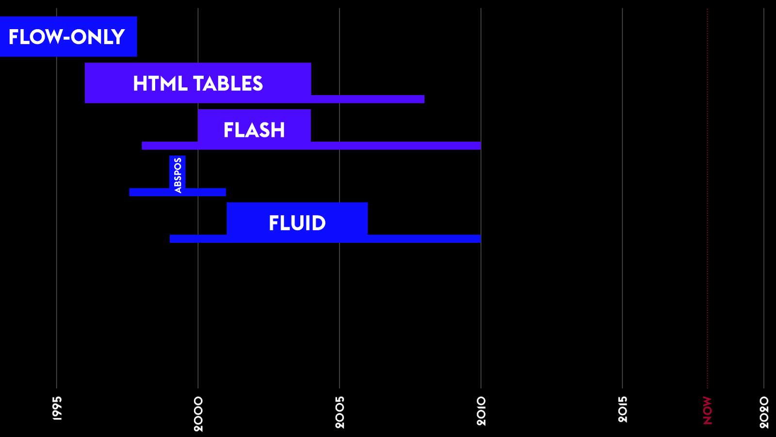
1995 2000 2005 2010 2015 2020 FLOW-ONLY HTML TABLES ABSPOS FLASH NOW
Fl uid La youts
usin g Fl o a ts It ’ s ! e web!
1995 2000 2005 2010 2015 2020 FLOW-ONLY HTML TABLES FLUID FLASH ABSPOS NOW
F luid Columns LESSON LEARNED
We n " d a
! It ’ s ! e web!
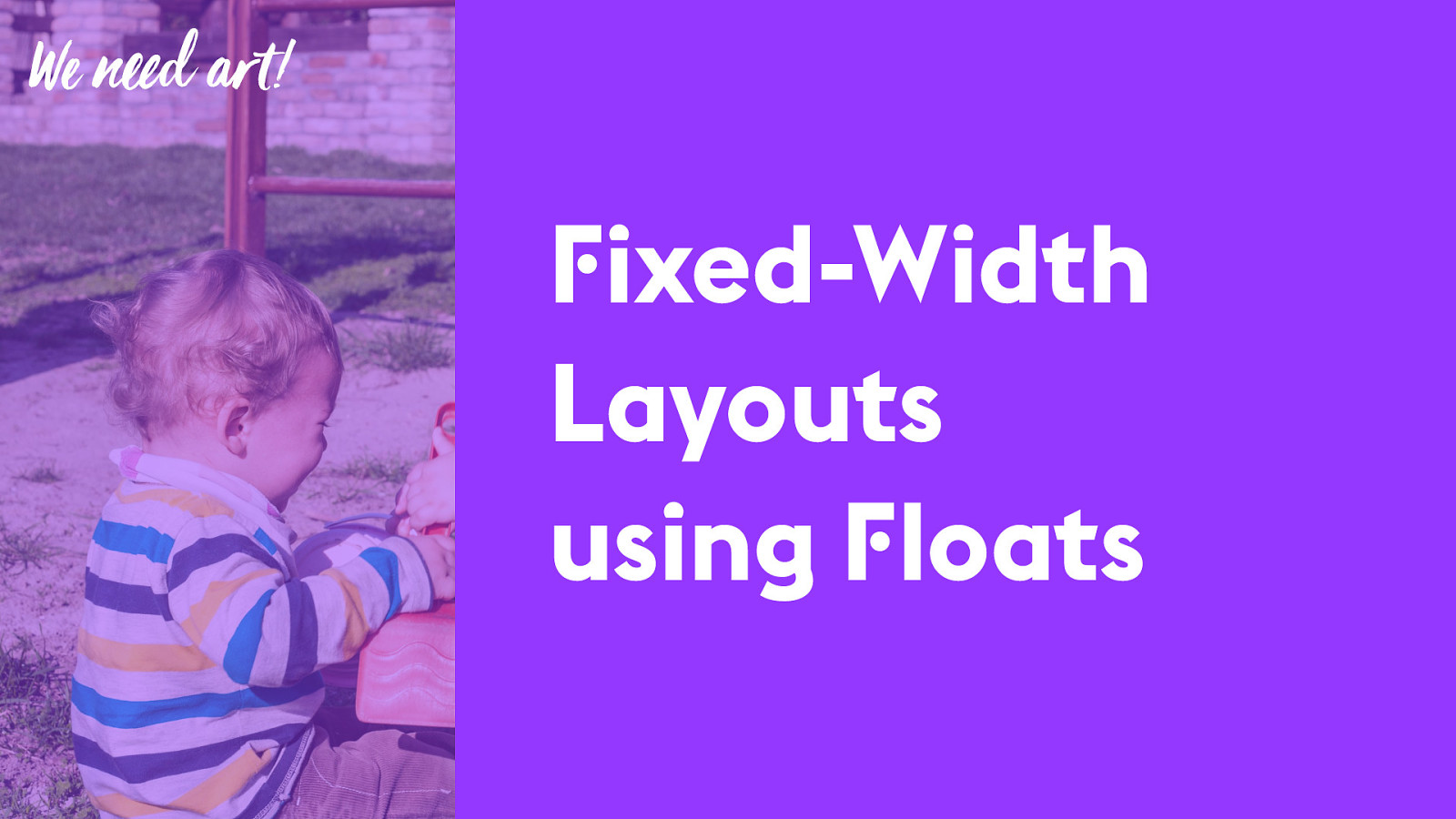
F ixed-Width Layouts using F loats We n " d a
!
F ixed-sized Content LESSON LEARNED
1995 2000 2005 2010 2015 2020 FLOW-ONLY HTML TABLES FLUID FIXED FLASH ABSPOS NOW
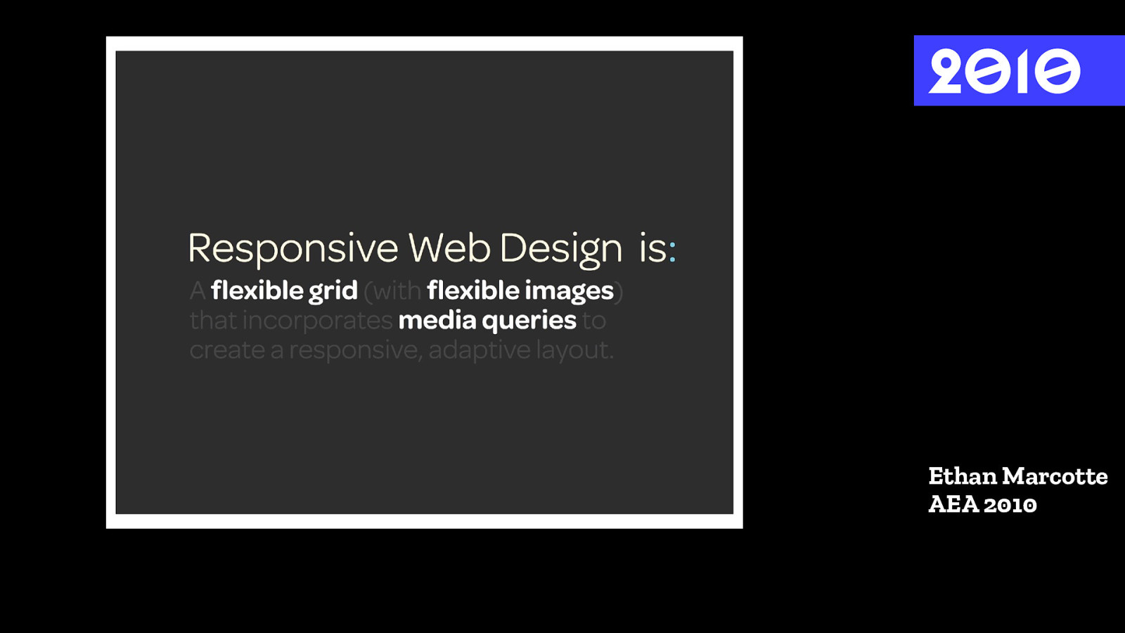
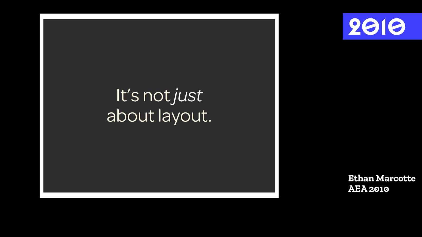
Re sponsi ve We b De si g n It ’ s ! e web!
2 0 1 0 Ethan Marcotte AEA 2010
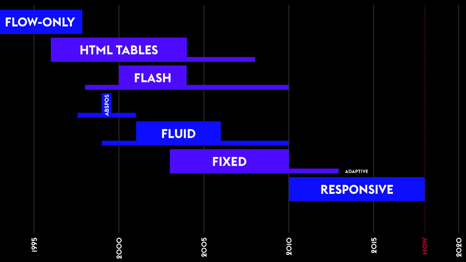
1995 2000 2005 2010 2015 2020 FLOW-ONLY HTML TABLES FLUID FIXED RESPONSIVE FLASH ADAPTIVE ABSPOS NOW
F luid Images & Media Media Q ueries LESSON LEARNED
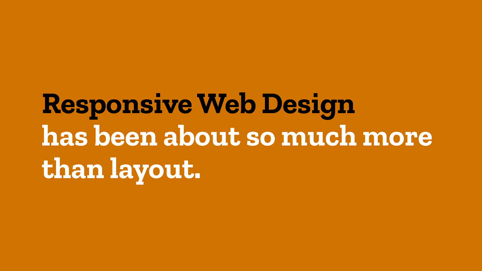
2 0 1 0 Ethan Marcotte AEA 2010
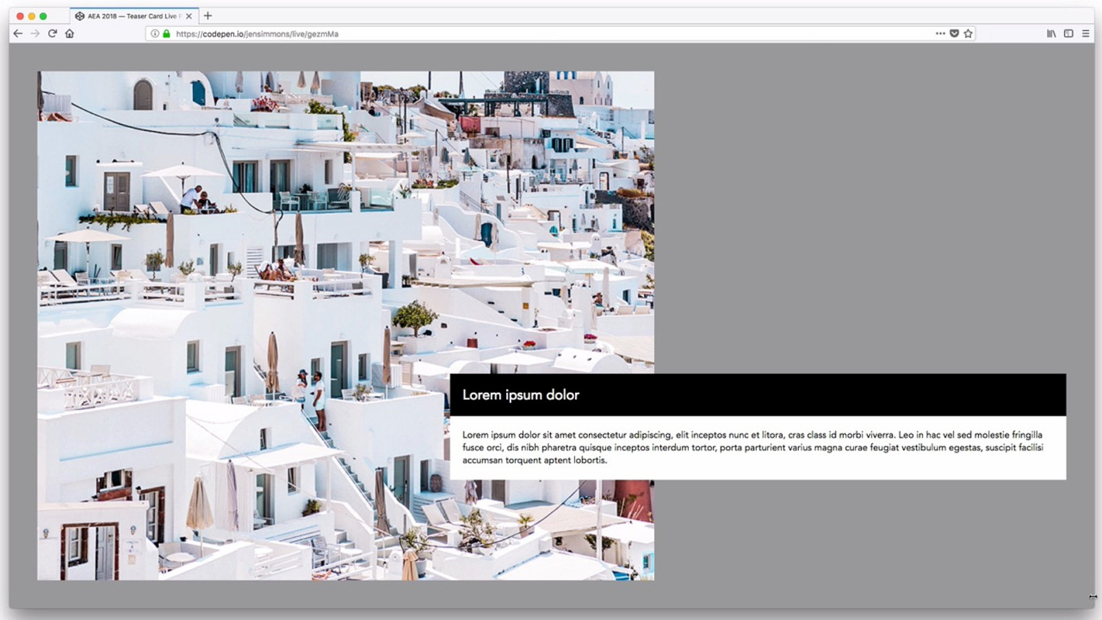
Responsive Web Design has been about so much more than layout.
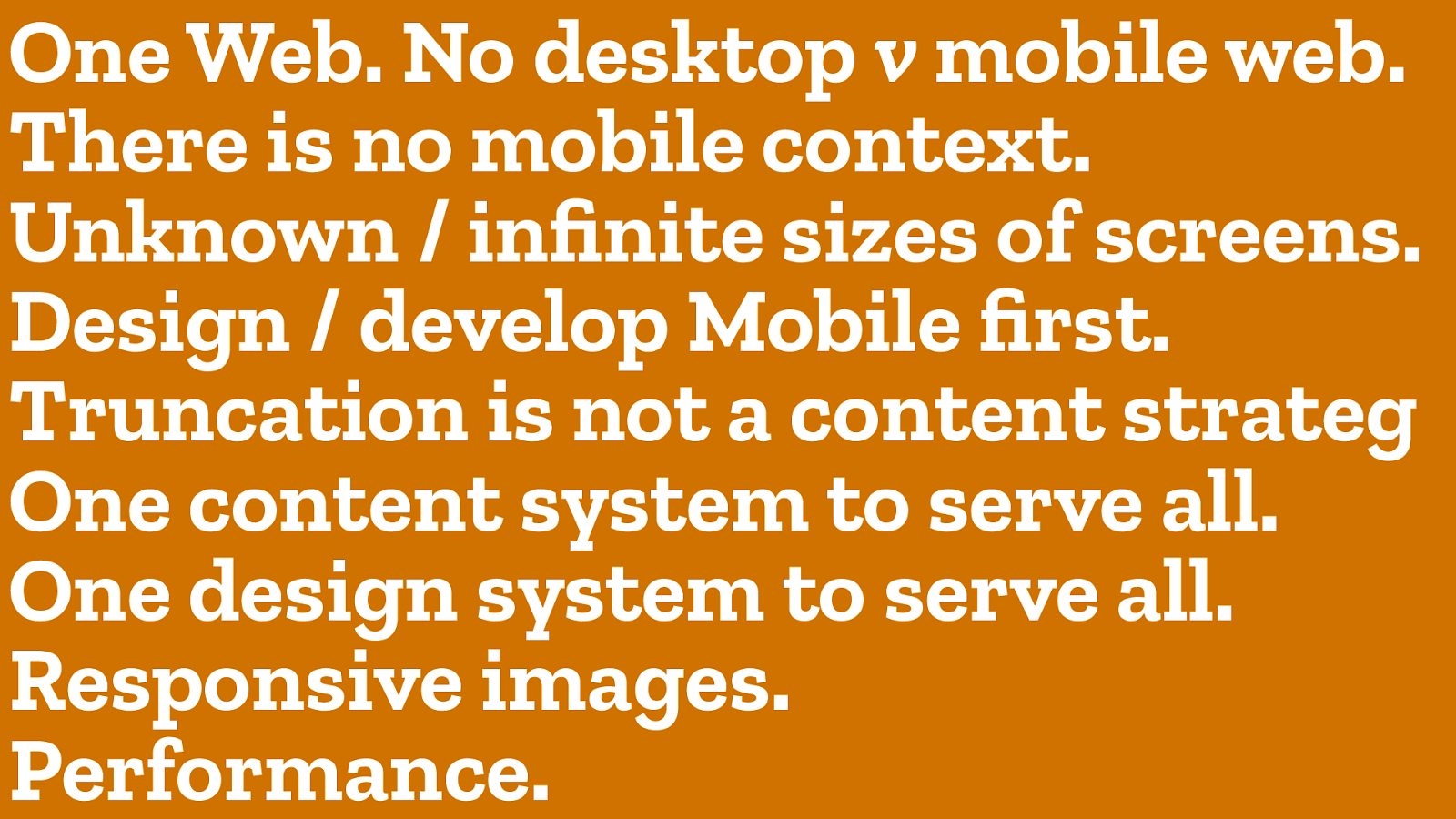
Performance. One Web. No desktop v mobile web. Design / develop Mobile first. Truncation is not a content strateg Responsive images. There is no mobile context. One design system to serve all. Unknown / infinite sizes of screens. One content system to serve all.
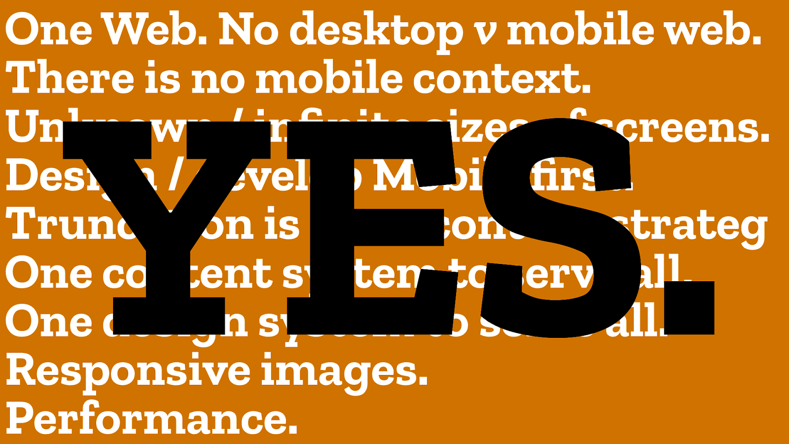
Performance. One Web. No desktop v mobile web. Design / develop Mobile first. Truncation is not a content strateg Responsive images. There is no mobile context. One design system to serve all. Unknown / infinite sizes of screens. One content system to serve all. YES.
L et’s do tal k about layout.
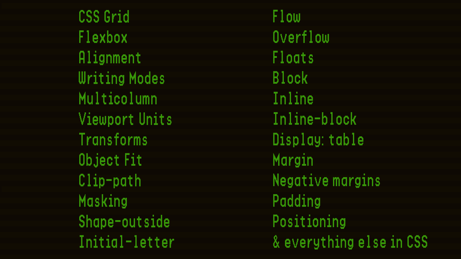
CSS Grid
Flexbox
Alignment
Writing Modes
Multicolumn
Viewport Units
Transforms
Object Fit
Clip-path
Masking
Shape-outside
Initial-letter
Flow
Overflow
Floats
Block
Inline
Inline-block
Display: table
Margin
Negative margins
Padding
Positioning
& everything else in CSS
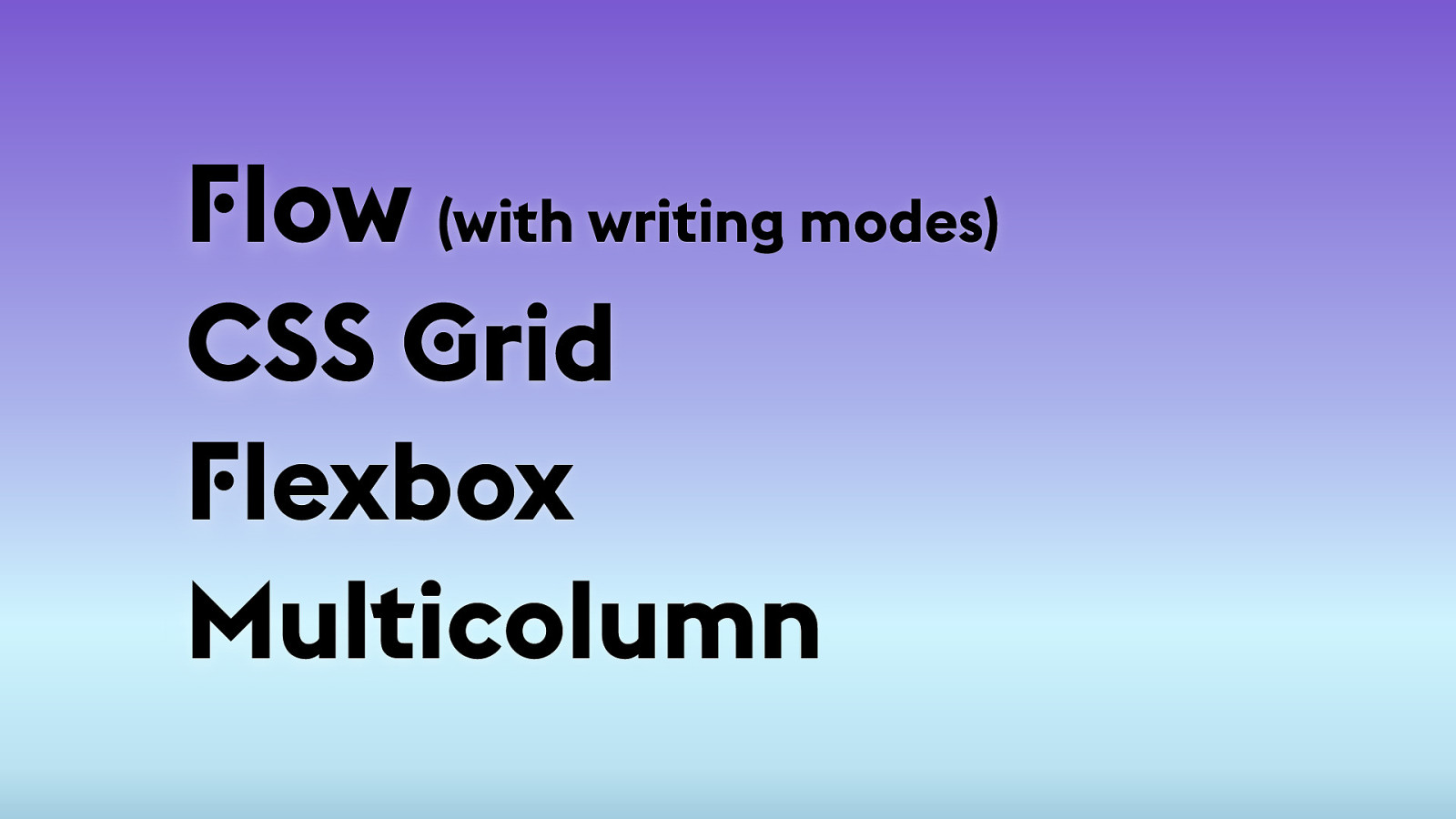
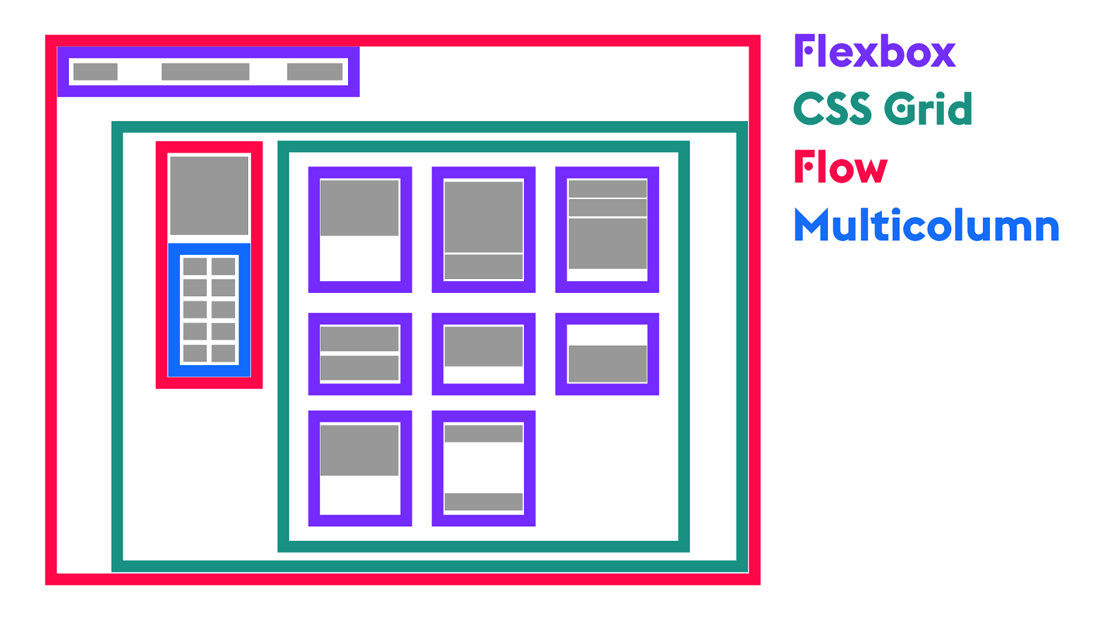
F low (with writing modes)
CSS G rid F lexbox Multicolumn
F lexbox CSS G rid F low Multicolumn
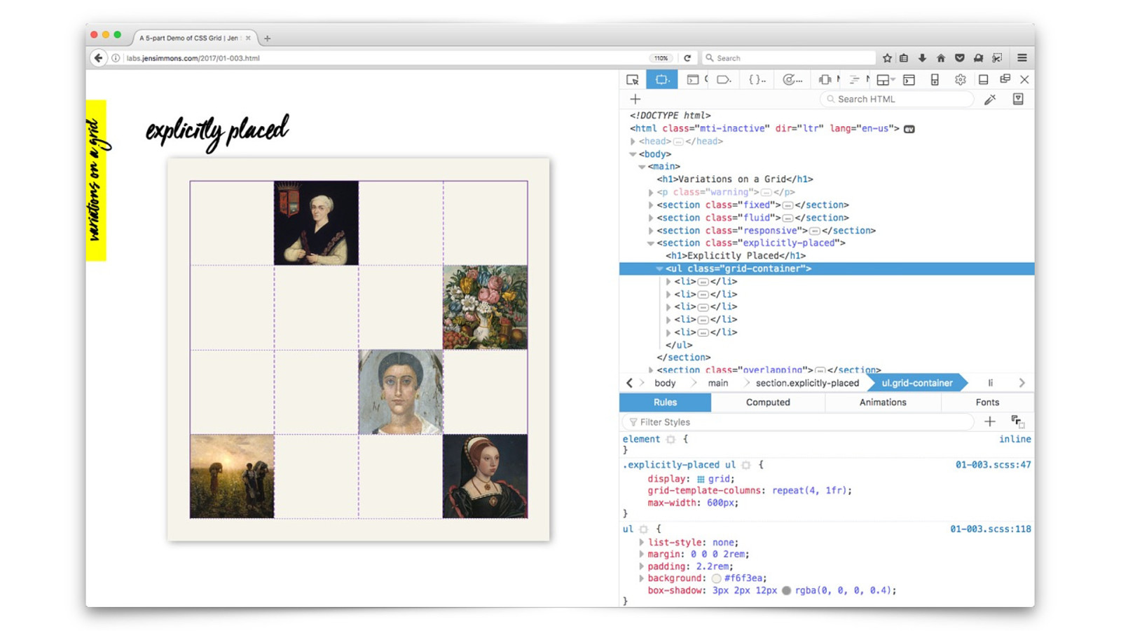
CSS G rid
Responsive Web Design *now more better.
1995 2000 2005 2010 2015 2020 HTML TABLES FLUID FIXED RESPONSIVE FLOW-ONLY FLASH ABSPOS NOW
We n " d a
! It ’ s ! e web!
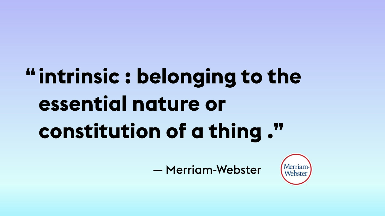
Intrinsic Web D esign
— Merriam-Webster intrinsic : belonging to the essential nature or constitution of a thing .” “
T he new reality of Intrinsic Web D esign
Contracting & E xpanding 2. F lexibility 3. Viewport
Ways to Contract and E xpand Space
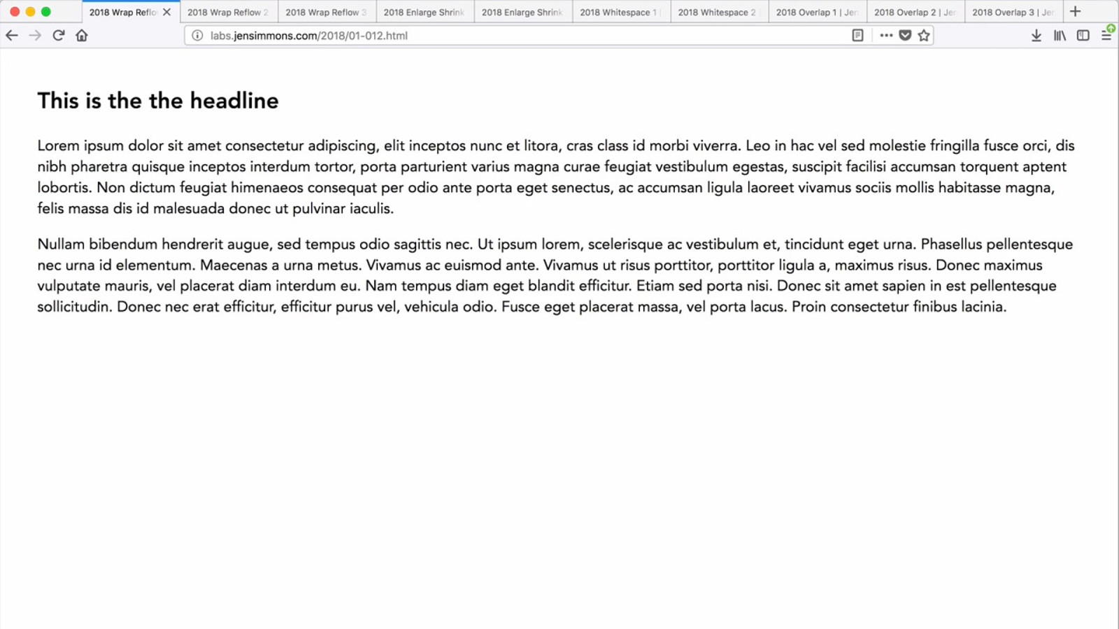
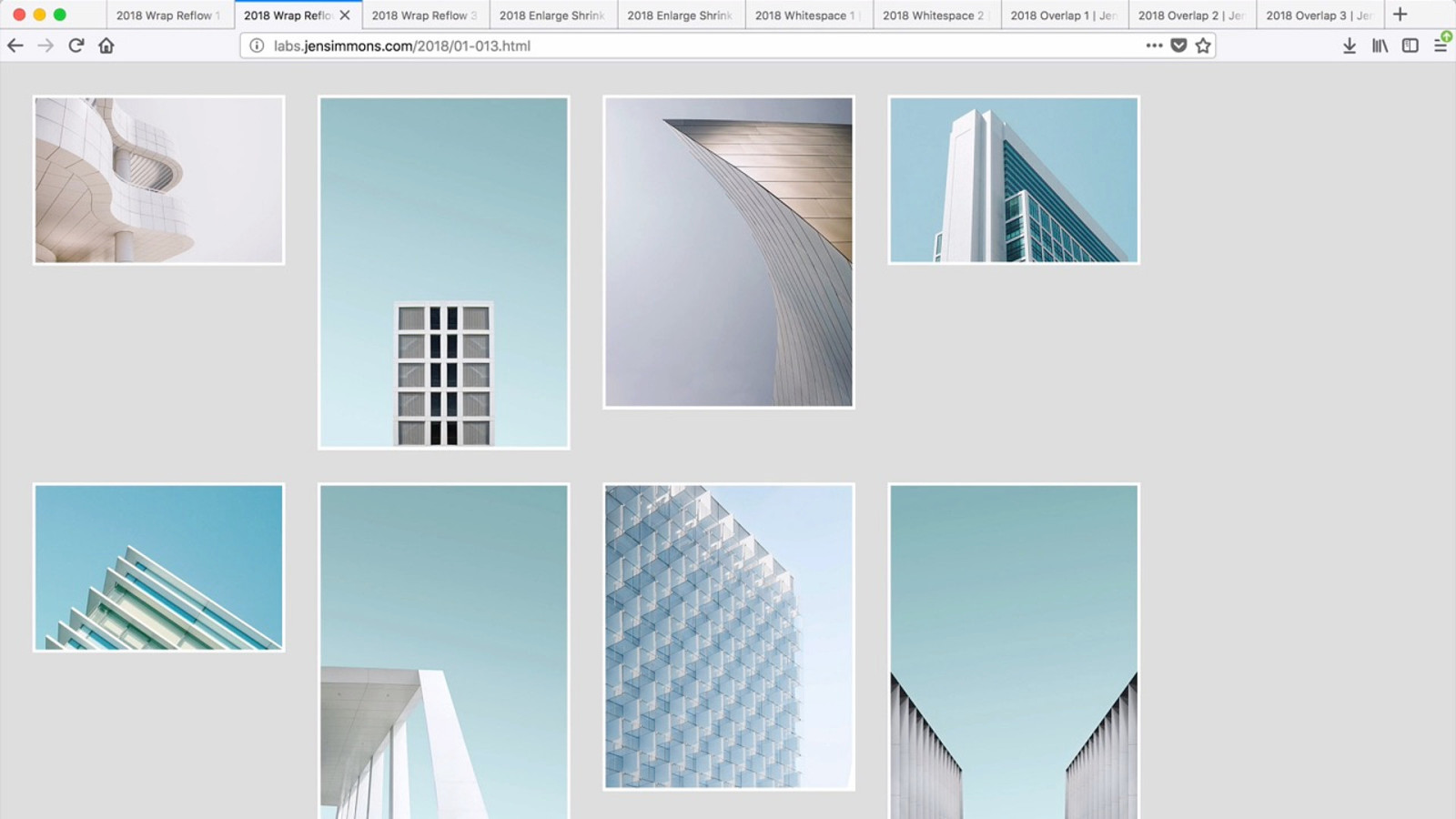
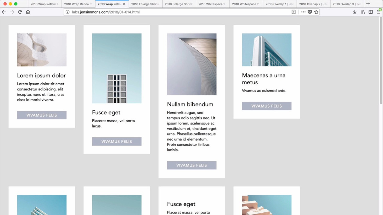
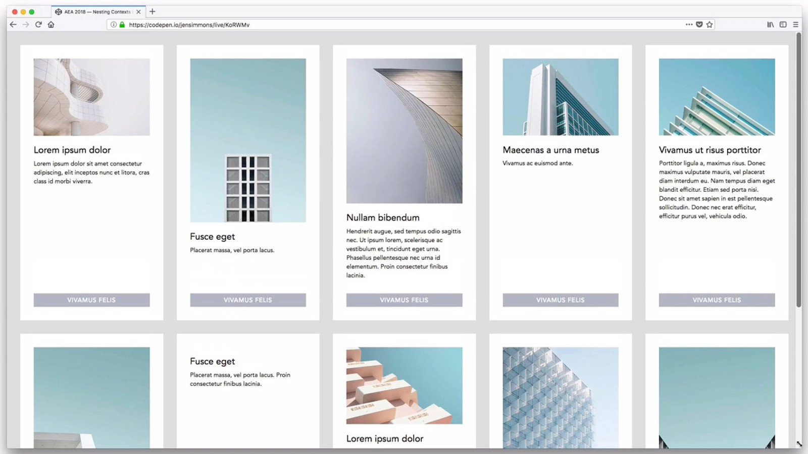
Wrap & R eflow
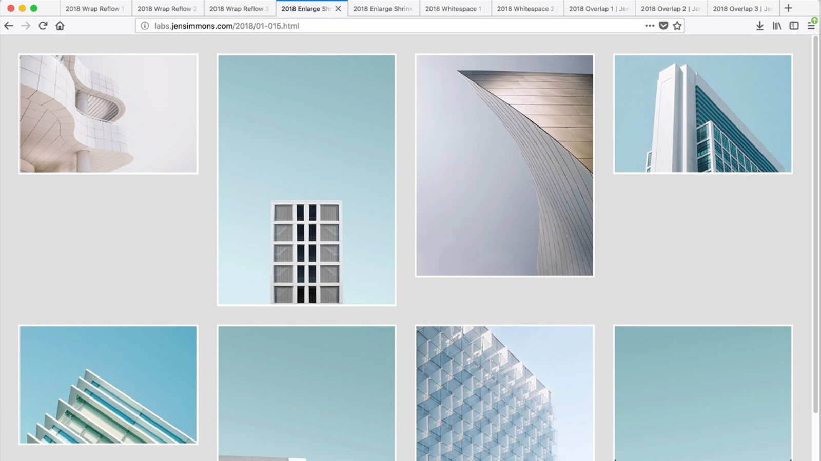
E nlarge / Shrink
A
dd /
R
emove
Whitespace
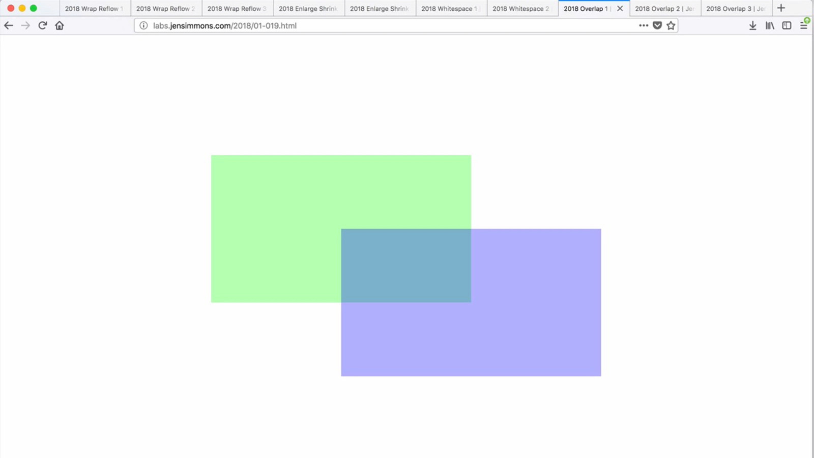
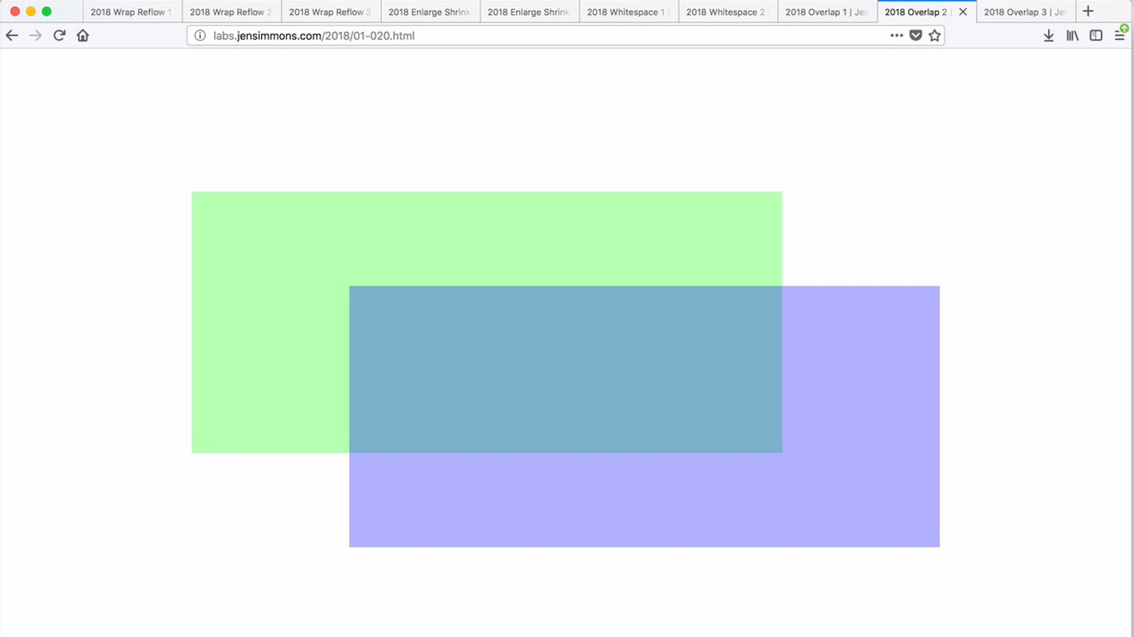
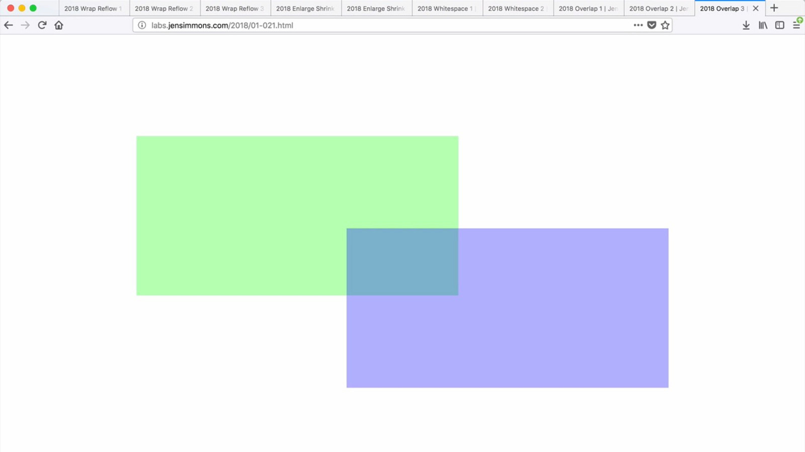
Slide / O verlap
Ways to Contract and E xpand Space
Wrap & R eflow E nlarge / Shrink A dd / R emove Whitespace Slide / O verlap
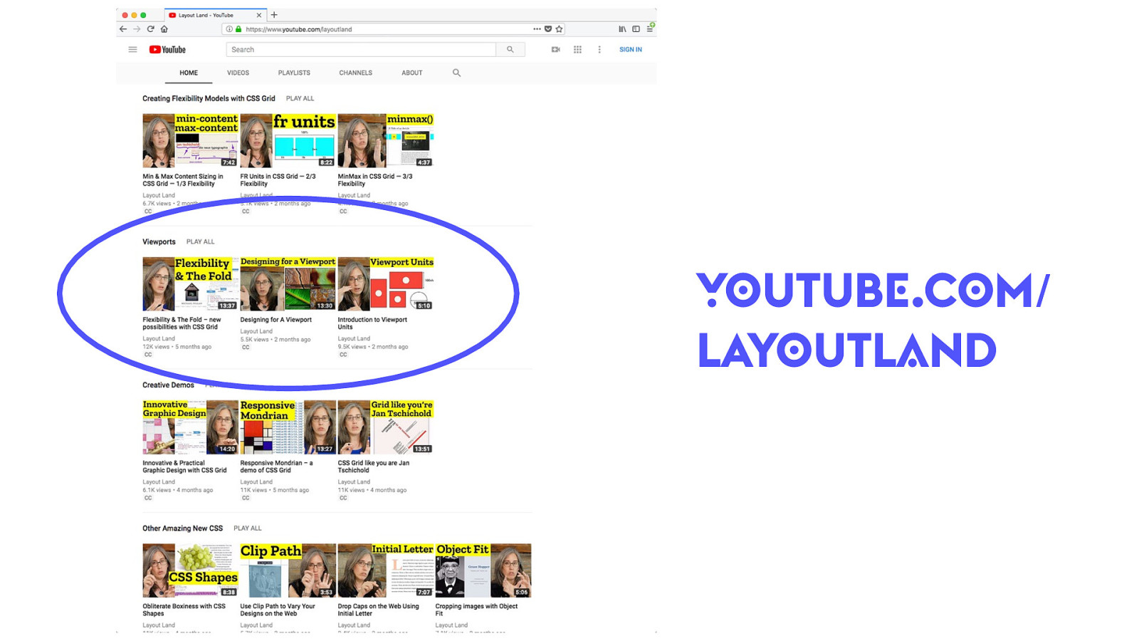
YO UTUB E .C O M / L AY O UTL A ND
New P ossibilities for F lexibility
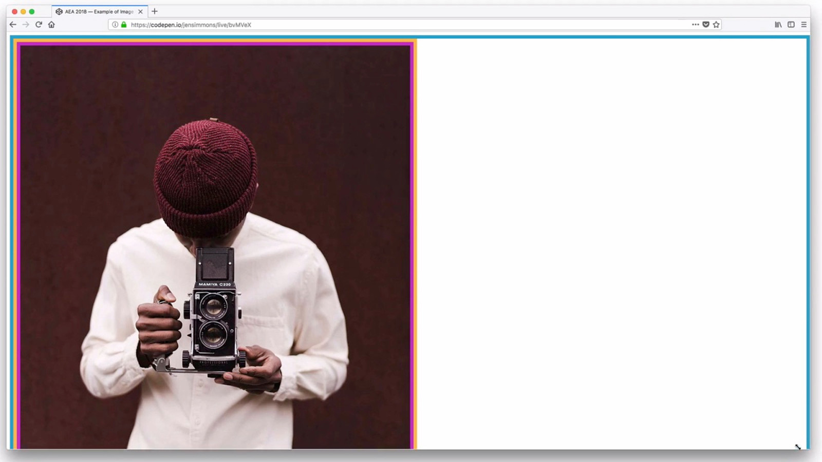
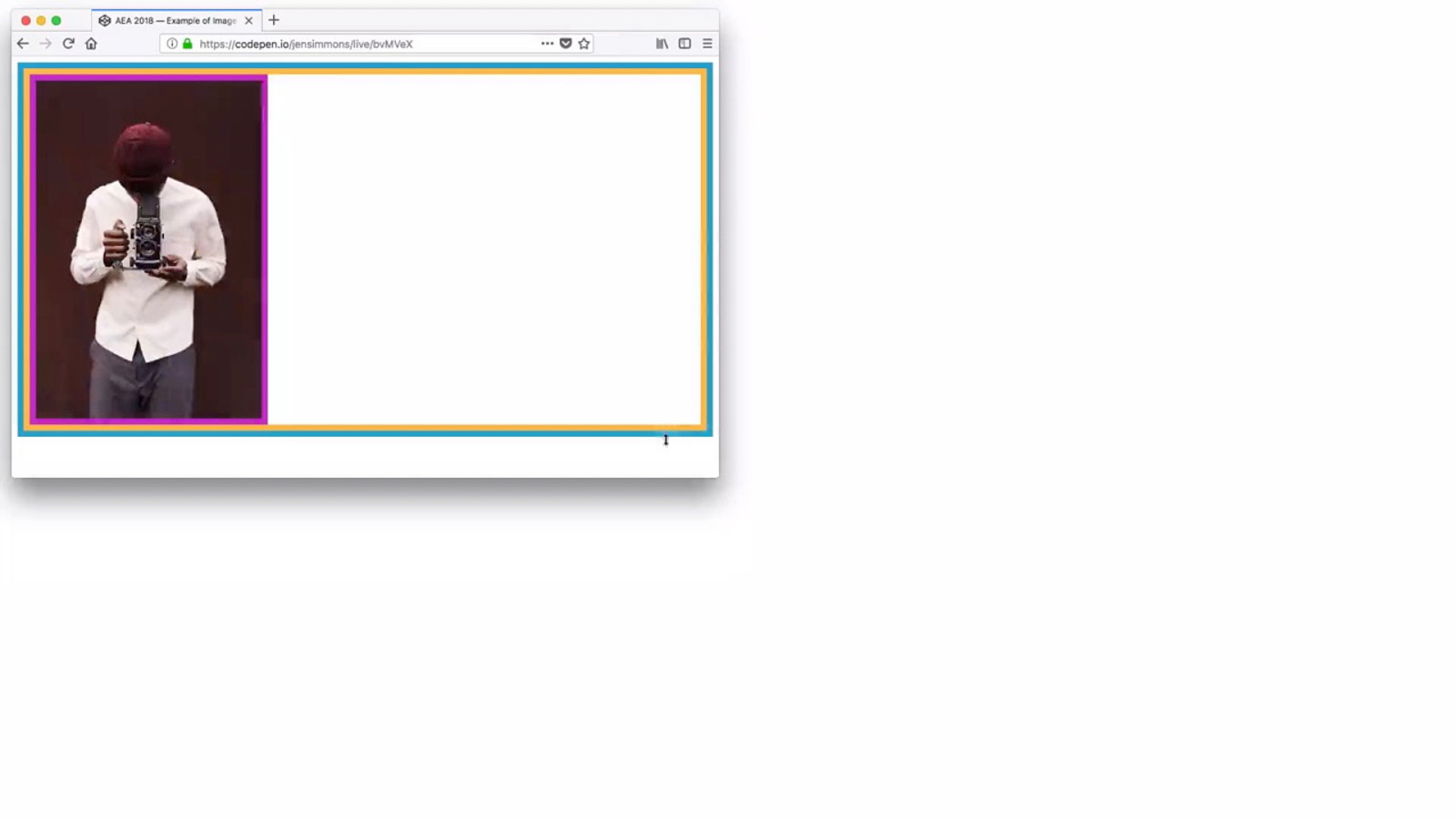
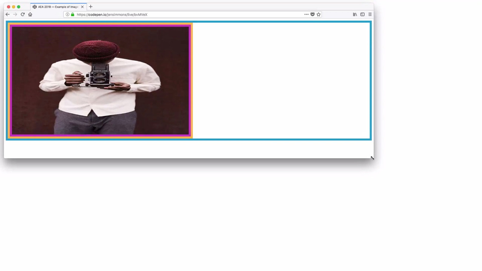
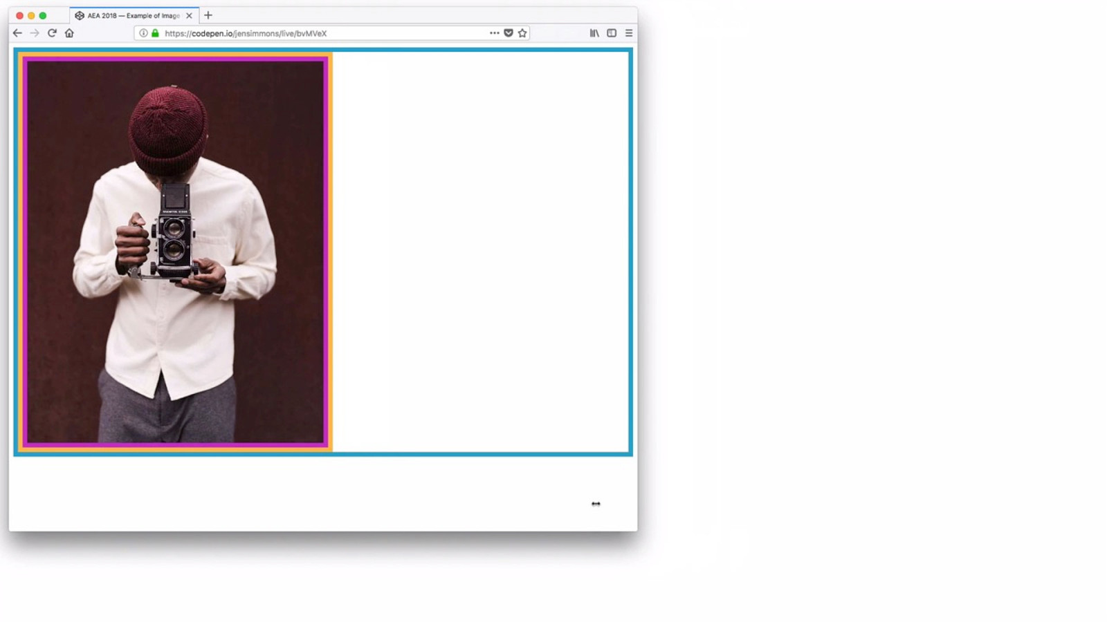
Images
F ixed Images
F luid Images
F luid, vertically
Set the width & height
O bject F it
object-fit: cover;
YO UTUB E .C O M / L AY O UTL A ND
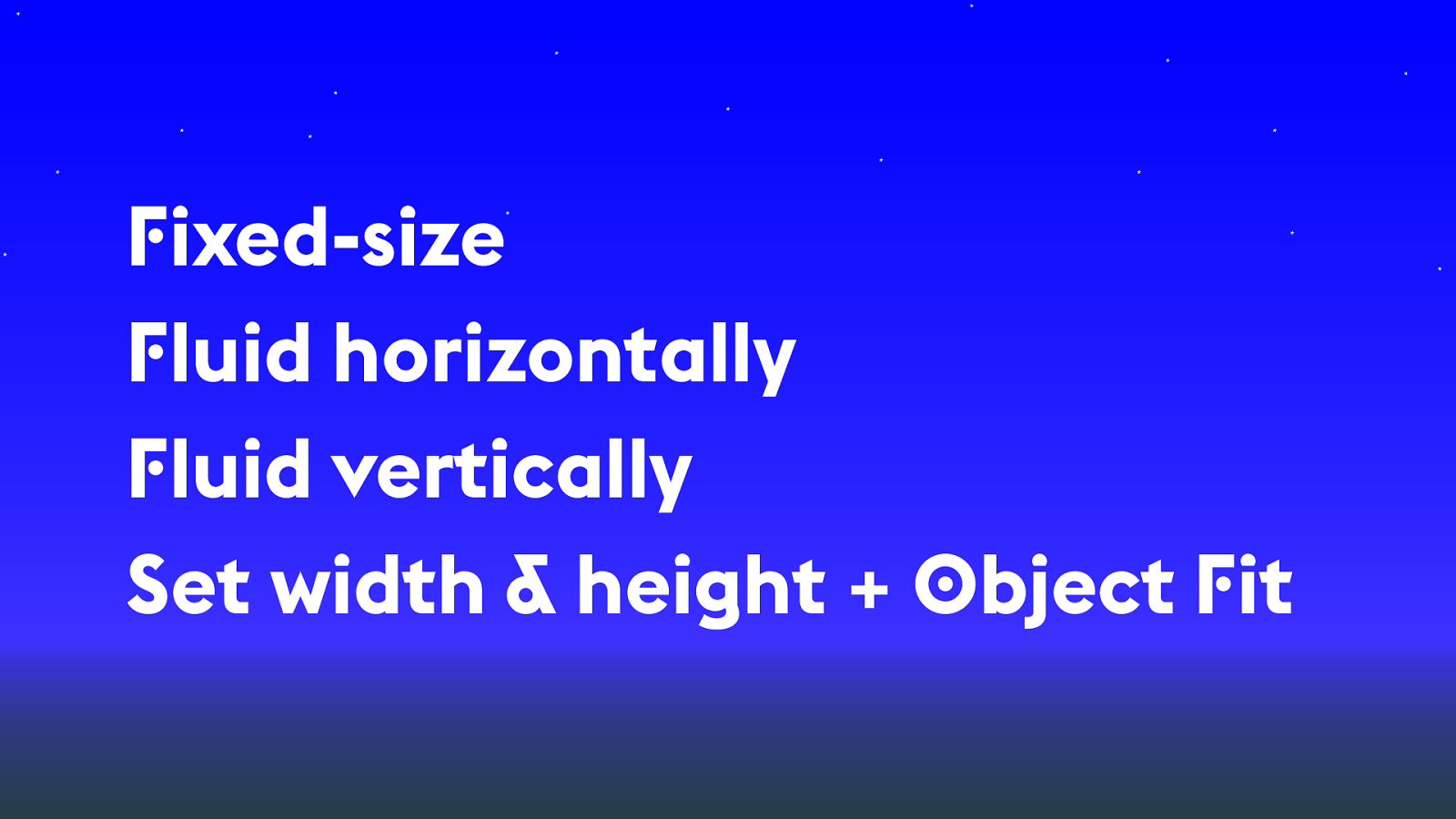
F
ixed-size
F
luid horizontally
F
luid vertically
Set width & height +
O
bject
F
it
Columns
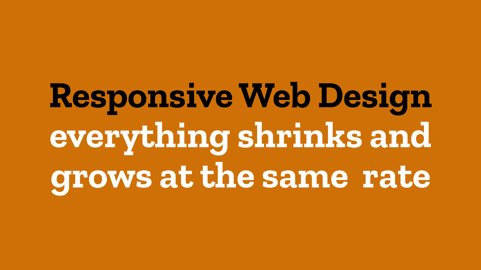
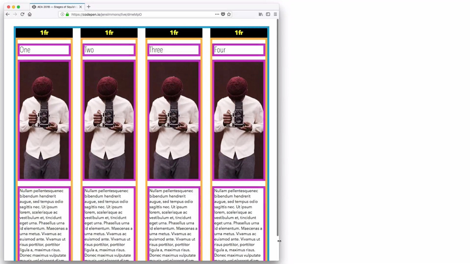
Responsive Web Design everything shrinks and grows at the same rate
%
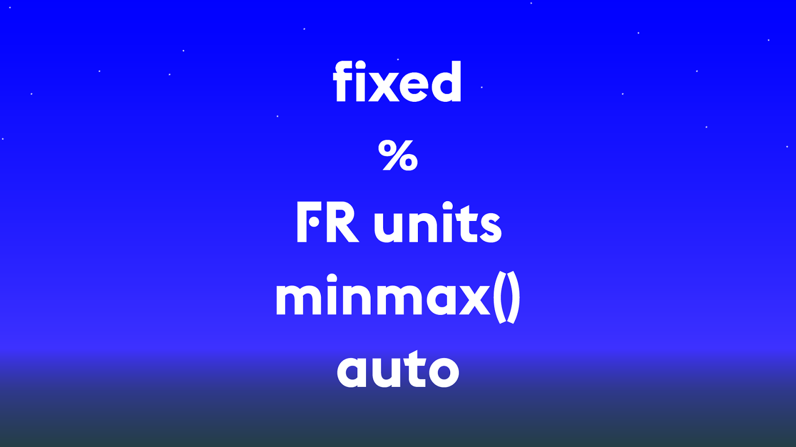
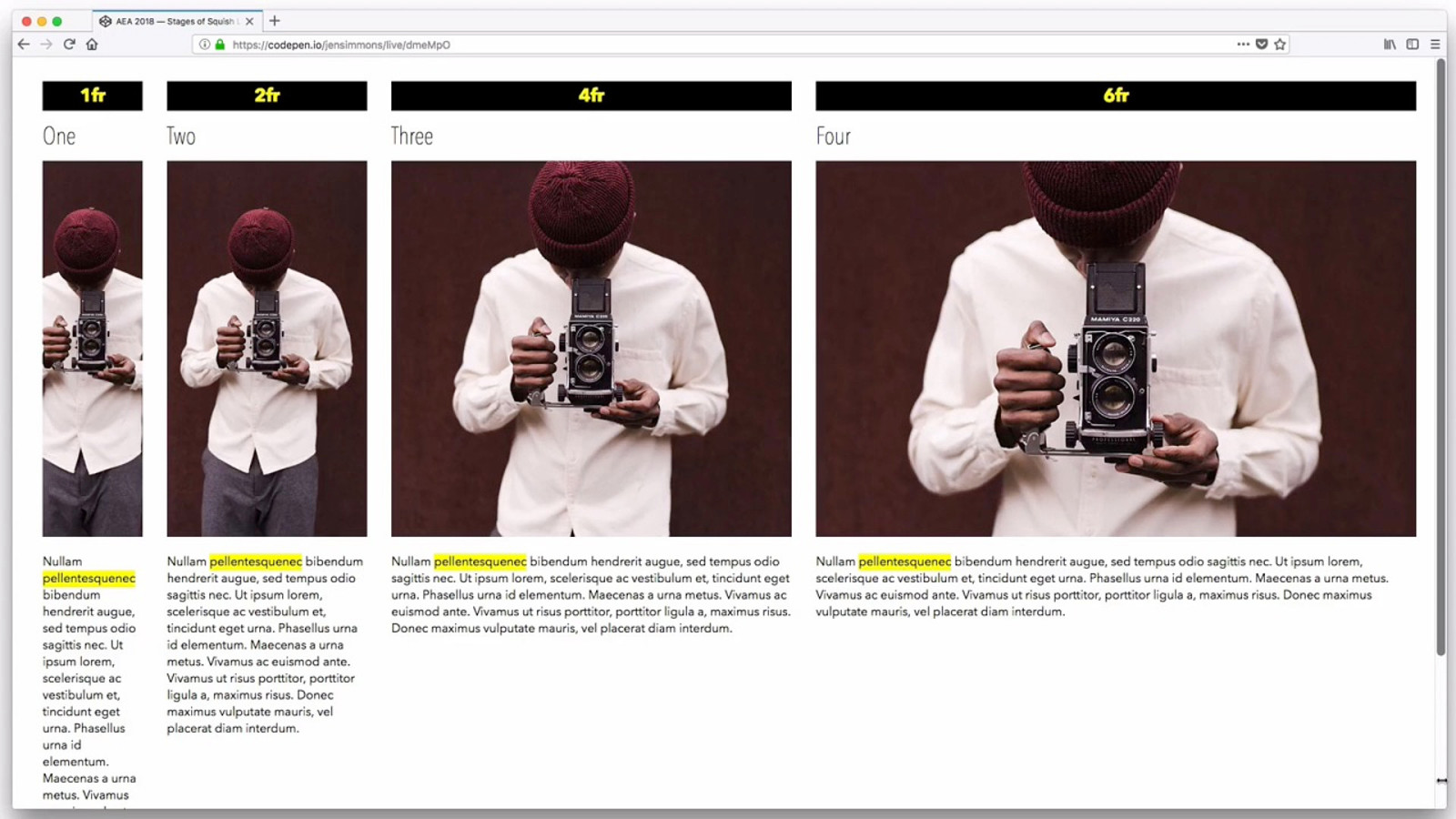
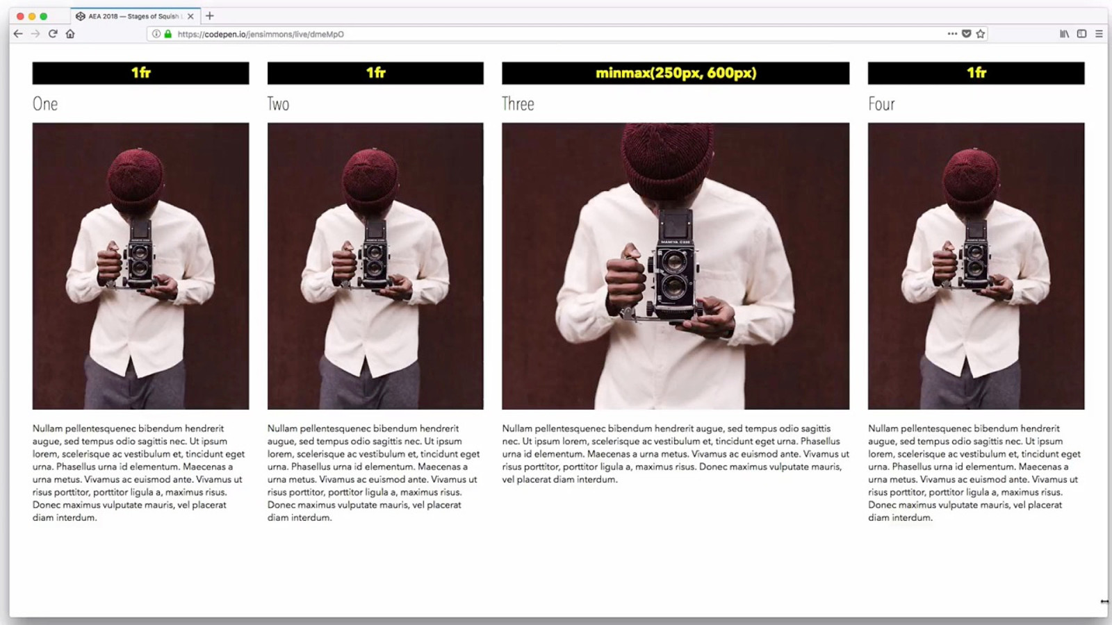
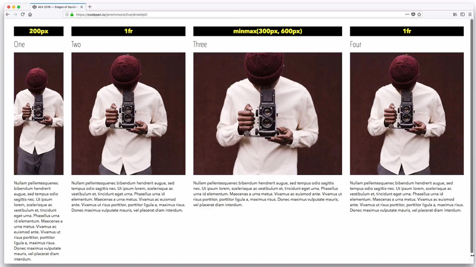
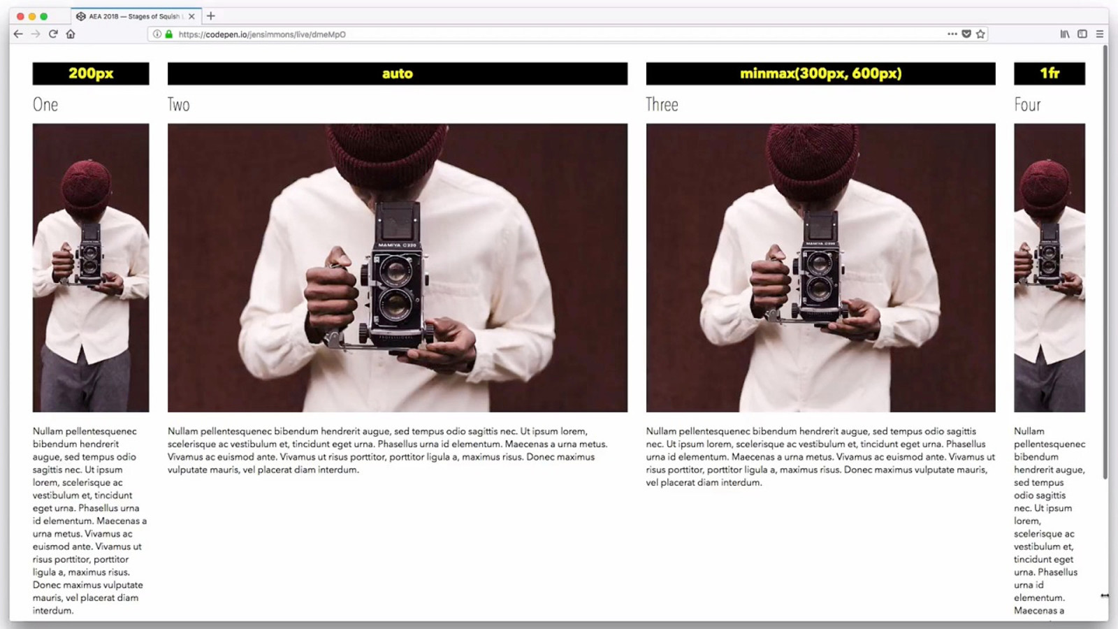
fixed % F R units minmax() auto
min-content sizing
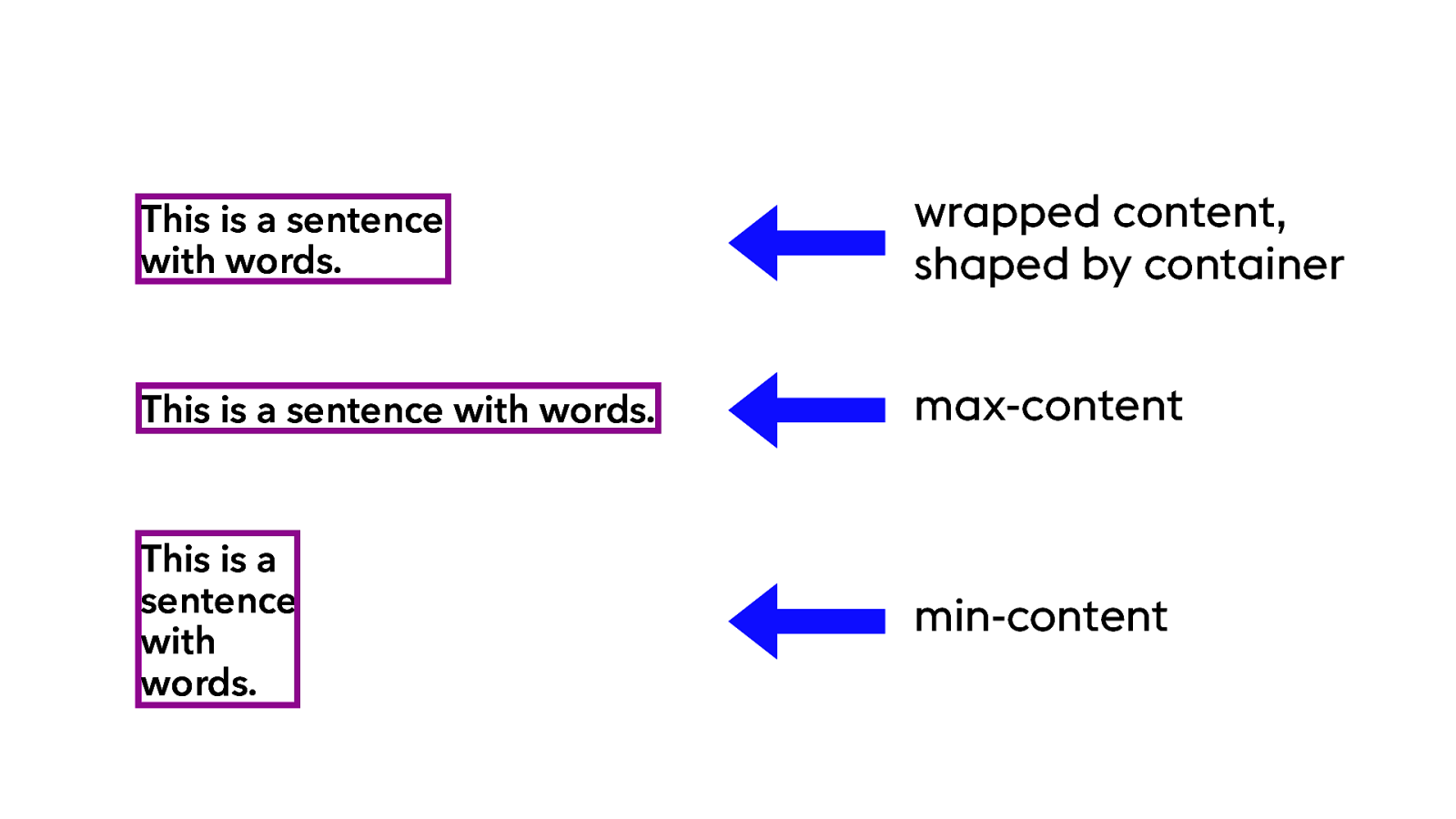
This is a sentence with words. max-content This is a sentence with words. wrapped content, shaped by container This is a sentence with words. min-content
This is a
sentence
with
words.
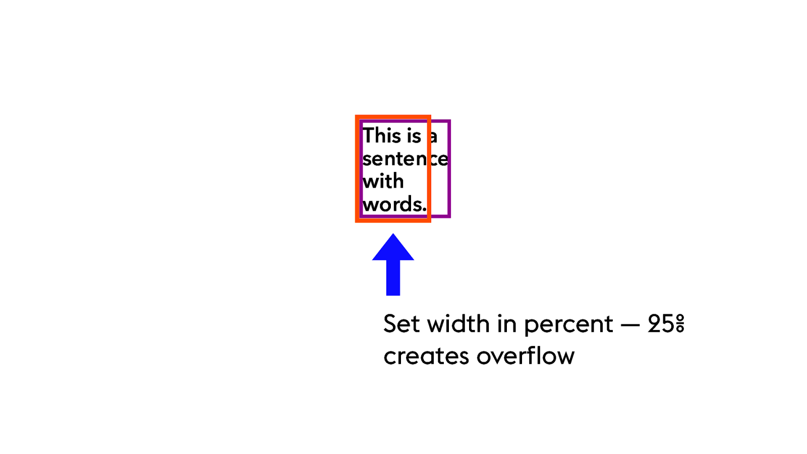
Set width in percent — 25%
creates overflow
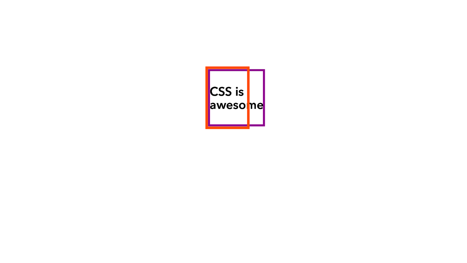
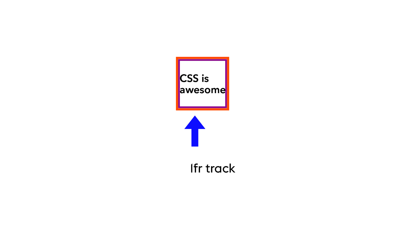
CSS is awesome
CSS is awesome 1fr track
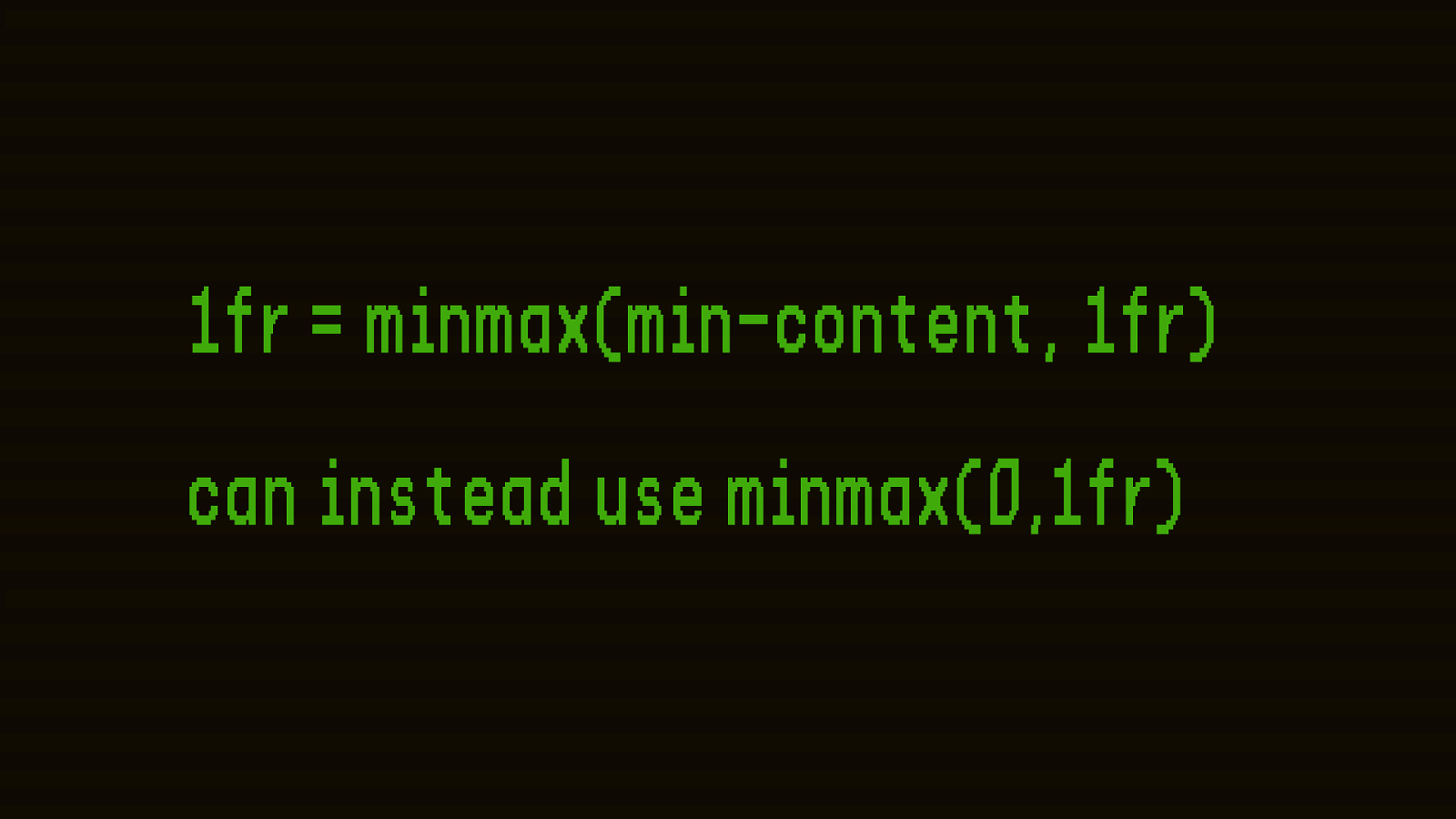
1fr = minmax(min-content, 1fr) can instead use minmax(0,1fr)
fixed % F R units minmax() auto
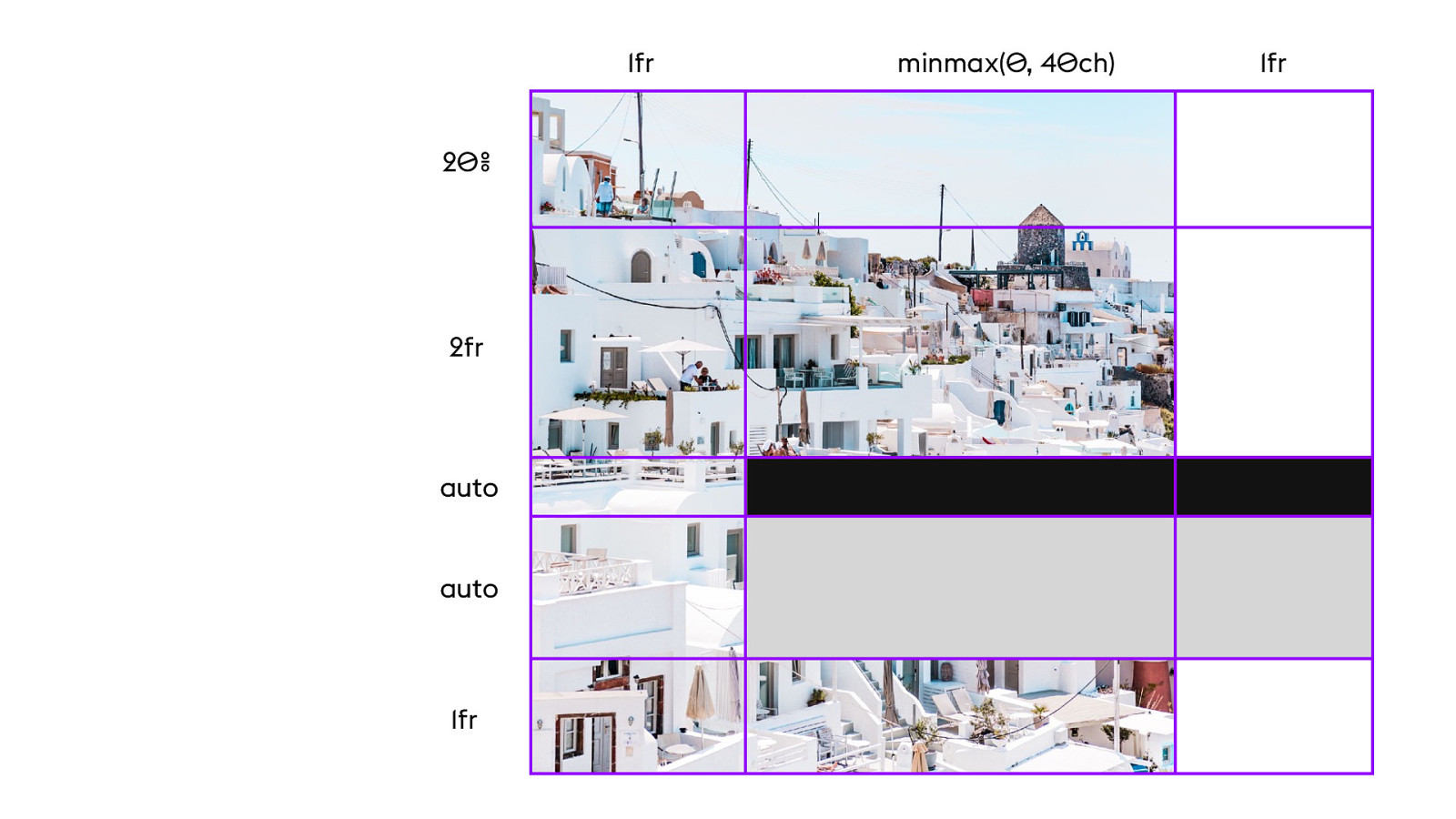
R ows
minmax( 0 , 4 0 ch) 1fr 1fr auto 1fr 2fr auto 2 0 %
YO UTUB E .C O M / L AY O UTL A ND
New P ossibilities for F lexibility
P rogramming F lexibility Model
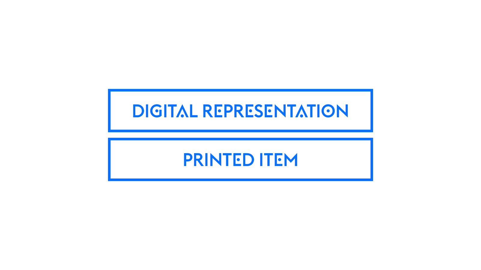
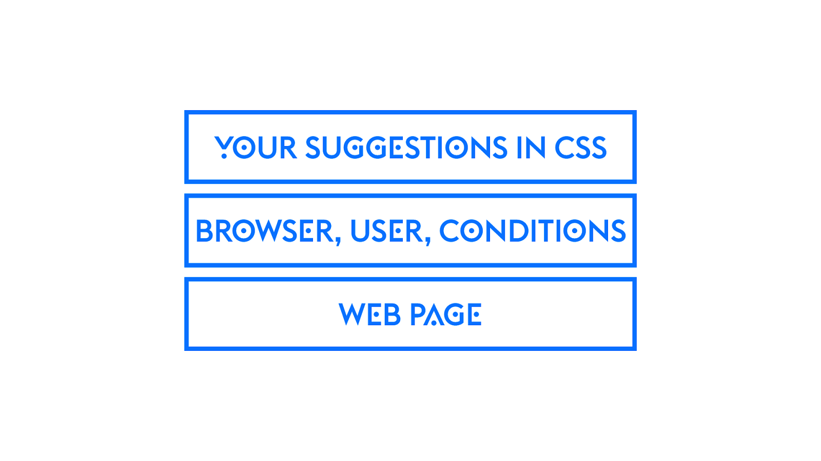
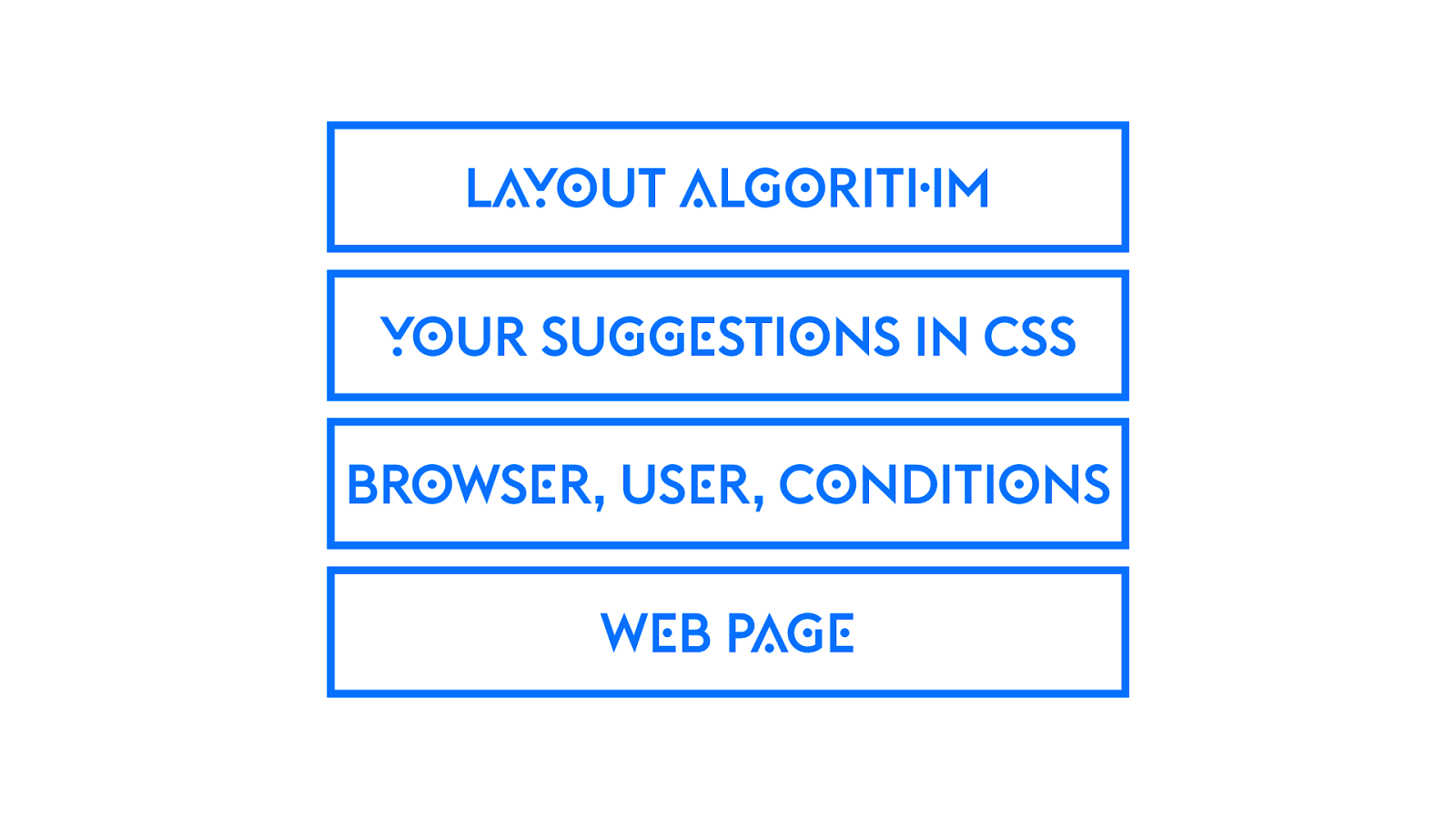
P A INTIN G
PRINT E D IT E M DI G IT A L R E PR E S E NT A TI O N
W E B P AGE BR O WS E R, US E R, C O NDITI O NS YO UR SU GGE STI O NS IN CSS
W E B P AGE BR O WS E R, US E R, C O NDITI O NS YO UR SU GGE STI O NS IN CSS L AY O UT A L GO RIT H M
P rogramming F lexibility Model
Change in how we use the Viewport
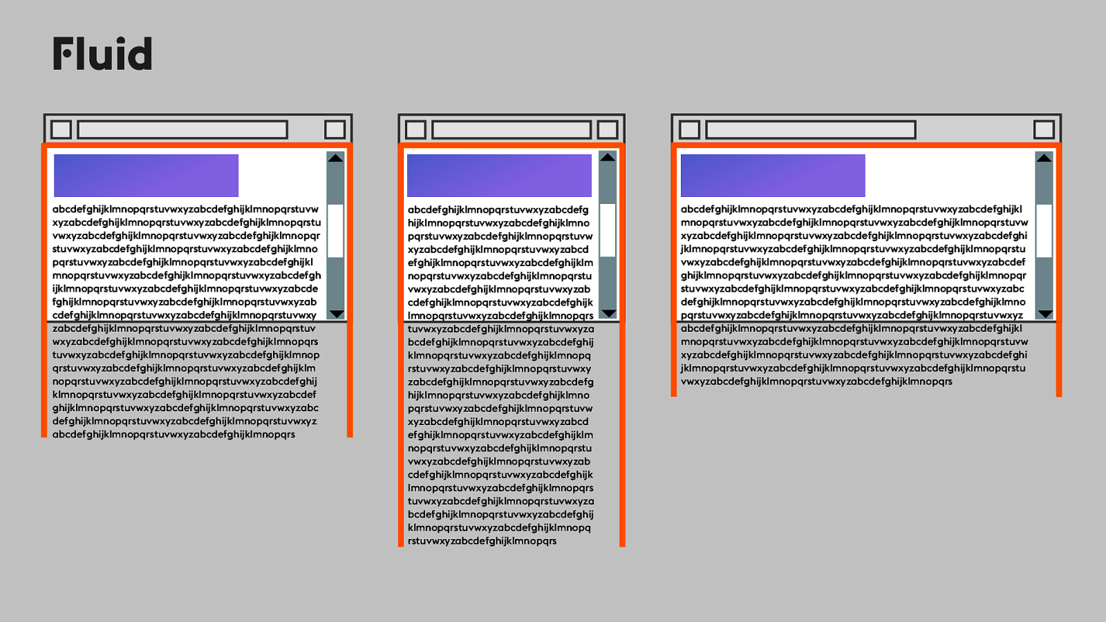
F luid abcdefghijklmnopqrstuvwxyzabcdefg hijklmnopqrstuvwxyzabcdefghijklmno pqrstuvwxyzabcdefghijklmnopqrstuvw xyzabcdefghijklmnopqrstuvwxyzabcd efghijklmnopqrstuvwxyzabcdefghijklm nopqrstuvwxyzabcdefghijklmnopqrstu vwxyzabcdefghijklmnopqrstuvwxyzab cdefghijklmnopqrstuvwxyzabcdefghijk lmnopqrstuvwxyzabcdefghijklmnopqrs tuvwxyzabcdefghijklmnopqrstuvwxyza bcdefghijklmnopqrstuvwxyzabcdefghij klmnopqrstuvwxyzabcdefghijklmnopq rstuvwxyzabcdefghijklmnopqrstuvwxy zabcdefghijklmnopqrstuvwxyzabcdefg hijklmnopqrstuvwxyzabcdefghijklmno pqrstuvwxyzabcdefghijklmnopqrstuvw xyzabcdefghijklmnopqrstuvwxyzabcd efghijklmnopqrstuvwxyzabcdefghijklm nopqrstuvwxyzabcdefghijklmnopqrstu vwxyzabcdefghijklmnopqrstuvwxyzab cdefghijklmnopqrstuvwxyzabcdefghijk lmnopqrstuvwxyzabcdefghijklmnopqrs tuvwxyzabcdefghijklmnopqrstuvwxyza bcdefghijklmnopqrstuvwxyzabcdefghij klmnopqrstuvwxyzabcdefghijklmnopq rstuvwxyzabcdefghijklmnopqrs abcdefghijklmnopqrstuvwxyzabcdefghijklmnopqrstuvwxyzabcdefghijkl mnopqrstuvwxyzabcdefghijklmnopqrstuvwxyzabcdefghijklmnopqrstuvw xyzabcdefghijklmnopqrstuvwxyzabcdefghijklmnopqrstuvwxyzabcdefghi jklmnopqrstuvwxyzabcdefghijklmnopqrstuvwxyzabcdefghijklmnopqrstu vwxyzabcdefghijklmnopqrstuvwxyzabcdefghijklmnopqrstuvwxyzabcdef ghijklmnopqrstuvwxyzabcdefghijklmnopqrstuvwxyzabcdefghijklmnopqr stuvwxyzabcdefghijklmnopqrstuvwxyzabcdefghijklmnopqrstuvwxyzabc defghijklmnopqrstuvwxyzabcdefghijklmnopqrstuvwxyzabcdefghijklmno pqrstuvwxyzabcdefghijklmnopqrstuvwxyzabcdefghijklmnopqrstuvwxyz abcdefghijklmnopqrstuvwxyzabcdefghijklmnopqrstuvwxyzabcdefghijkl mnopqrstuvwxyzabcdefghijklmnopqrstuvwxyzabcdefghijklmnopqrstuvw xyzabcdefghijklmnopqrstuvwxyzabcdefghijklmnopqrstuvwxyzabcdefghi jklmnopqrstuvwxyzabcdefghijklmnopqrstuvwxyzabcdefghijklmnopqrstu vwxyzabcdefghijklmnopqrstuvwxyzabcdefghijklmnopqrs abcdefghijklmnopqrstuvwxyzabcdefghijklmnopqrstuvw xyzabcdefghijklmnopqrstuvwxyzabcdefghijklmnopqrstu vwxyzabcdefghijklmnopqrstuvwxyzabcdefghijklmnopqr stuvwxyzabcdefghijklmnopqrstuvwxyzabcdefghijklmno pqrstuvwxyzabcdefghijklmnopqrstuvwxyzabcdefghijkl mnopqrstuvwxyzabcdefghijklmnopqrstuvwxyzabcdefgh ijklmnopqrstuvwxyzabcdefghijklmnopqrstuvwxyzabcde fghijklmnopqrstuvwxyzabcdefghijklmnopqrstuvwxyzab cdefghijklmnopqrstuvwxyzabcdefghijklmnopqrstuvwxy zabcdefghijklmnopqrstuvwxyzabcdefghijklmnopqrstuv wxyzabcdefghijklmnopqrstuvwxyzabcdefghijklmnopqrs tuvwxyzabcdefghijklmnopqrstuvwxyzabcdefghijklmnop qrstuvwxyzabcdefghijklmnopqrstuvwxyzabcdefghijklm nopqrstuvwxyzabcdefghijklmnopqrstuvwxyzabcdefghij klmnopqrstuvwxyzabcdefghijklmnopqrstuvwxyzabcdef ghijklmnopqrstuvwxyzabcdefghijklmnopqrstuvwxyzabc defghijklmnopqrstuvwxyzabcdefghijklmnopqrstuvwxyz abcdefghijklmnopqrstuvwxyzabcdefghijklmnopqrs
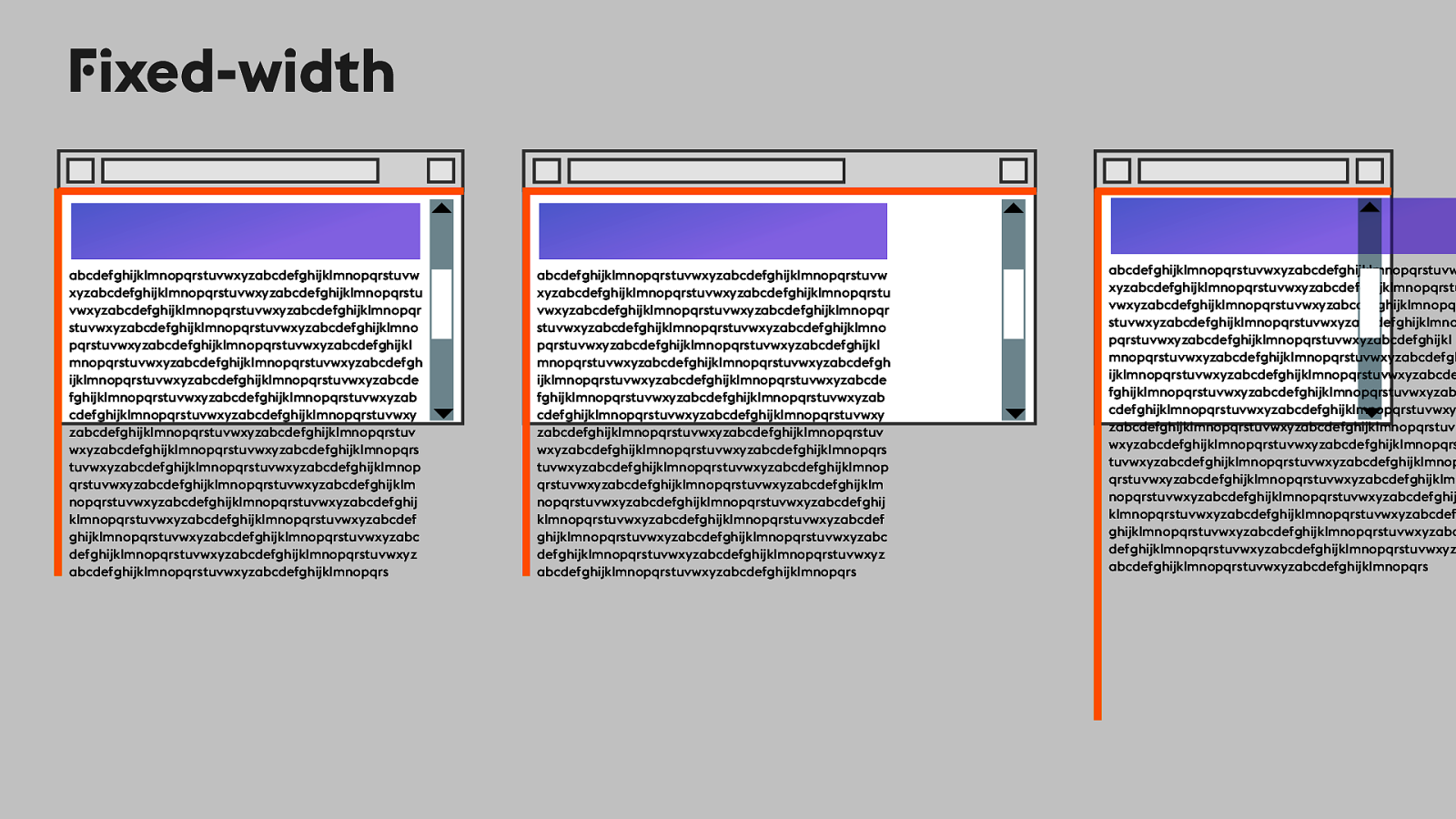
F ixed-width abcdefghijklmnopqrstuvwxyzabcdefghijklmnopqrstuvw xyzabcdefghijklmnopqrstuvwxyzabcdefghijklmnopqrstu vwxyzabcdefghijklmnopqrstuvwxyzabcdefghijklmnopqr stuvwxyzabcdefghijklmnopqrstuvwxyzabcdefghijklmno pqrstuvwxyzabcdefghijklmnopqrstuvwxyzabcdefghijkl mnopqrstuvwxyzabcdefghijklmnopqrstuvwxyzabcdefgh ijklmnopqrstuvwxyzabcdefghijklmnopqrstuvwxyzabcde fghijklmnopqrstuvwxyzabcdefghijklmnopqrstuvwxyzab cdefghijklmnopqrstuvwxyzabcdefghijklmnopqrstuvwxy zabcdefghijklmnopqrstuvwxyzabcdefghijklmnopqrstuv wxyzabcdefghijklmnopqrstuvwxyzabcdefghijklmnopqrs tuvwxyzabcdefghijklmnopqrstuvwxyzabcdefghijklmnop qrstuvwxyzabcdefghijklmnopqrstuvwxyzabcdefghijklm nopqrstuvwxyzabcdefghijklmnopqrstuvwxyzabcdefghij klmnopqrstuvwxyzabcdefghijklmnopqrstuvwxyzabcdef ghijklmnopqrstuvwxyzabcdefghijklmnopqrstuvwxyzabc defghijklmnopqrstuvwxyzabcdefghijklmnopqrstuvwxyz abcdefghijklmnopqrstuvwxyzabcdefghijklmnopqrs abcdefghijklmnopqrstuvwxyzabcdefghijklmnopqrstuvw xyzabcdefghijklmnopqrstuvwxyzabcdefghijklmnopqrstu vwxyzabcdefghijklmnopqrstuvwxyzabcdefghijklmnopqr stuvwxyzabcdefghijklmnopqrstuvwxyzabcdefghijklmno pqrstuvwxyzabcdefghijklmnopqrstuvwxyzabcdefghijkl mnopqrstuvwxyzabcdefghijklmnopqrstuvwxyzabcdefgh ijklmnopqrstuvwxyzabcdefghijklmnopqrstuvwxyzabcde fghijklmnopqrstuvwxyzabcdefghijklmnopqrstuvwxyzab cdefghijklmnopqrstuvwxyzabcdefghijklmnopqrstuvwxy zabcdefghijklmnopqrstuvwxyzabcdefghijklmnopqrstuv wxyzabcdefghijklmnopqrstuvwxyzabcdefghijklmnopqrs tuvwxyzabcdefghijklmnopqrstuvwxyzabcdefghijklmnop qrstuvwxyzabcdefghijklmnopqrstuvwxyzabcdefghijklm nopqrstuvwxyzabcdefghijklmnopqrstuvwxyzabcdefghij klmnopqrstuvwxyzabcdefghijklmnopqrstuvwxyzabcdef ghijklmnopqrstuvwxyzabcdefghijklmnopqrstuvwxyzabc defghijklmnopqrstuvwxyzabcdefghijklmnopqrstuvwxyz abcdefghijklmnopqrstuvwxyzabcdefghijklmnopqrs abcdefghijklmnopqrstuvwxyzabcdefghijklmnopqrstuvw xyzabcdefghijklmnopqrstuvwxyzabcdefghijklmnopqrstu vwxyzabcdefghijklmnopqrstuvwxyzabcdefghijklmnopqr stuvwxyzabcdefghijklmnopqrstuvwxyzabcdefghijklmno pqrstuvwxyzabcdefghijklmnopqrstuvwxyzabcdefghijkl mnopqrstuvwxyzabcdefghijklmnopqrstuvwxyzabcdefgh ijklmnopqrstuvwxyzabcdefghijklmnopqrstuvwxyzabcde fghijklmnopqrstuvwxyzabcdefghijklmnopqrstuvwxyzab cdefghijklmnopqrstuvwxyzabcdefghijklmnopqrstuvwxy zabcdefghijklmnopqrstuvwxyzabcdefghijklmnopqrstuv wxyzabcdefghijklmnopqrstuvwxyzabcdefghijklmnopqrs tuvwxyzabcdefghijklmnopqrstuvwxyzabcdefghijklmnop qrstuvwxyzabcdefghijklmnopqrstuvwxyzabcdefghijklm nopqrstuvwxyzabcdefghijklmnopqrstuvwxyzabcdefghij klmnopqrstuvwxyzabcdefghijklmnopqrstuvwxyzabcdef ghijklmnopqrstuvwxyzabcdefghijklmnopqrstuvwxyzabc defghijklmnopqrstuvwxyzabcdefghijklmnopqrstuvwxyz abcdefghijklmnopqrstuvwxyzabcdefghijklmnopqrs
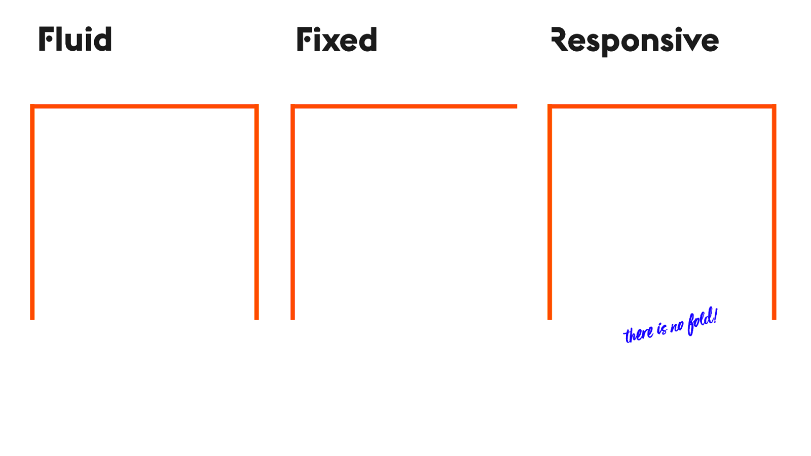
F ixed R esponsive F luid !e r e i s
n o fo l d!
Intrinsic
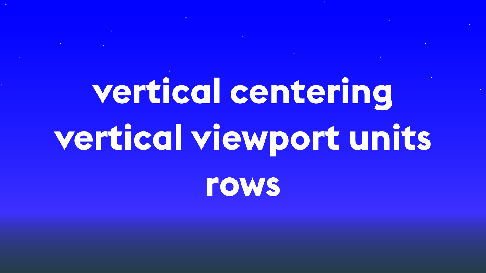
vertical centering vertical viewport units rows
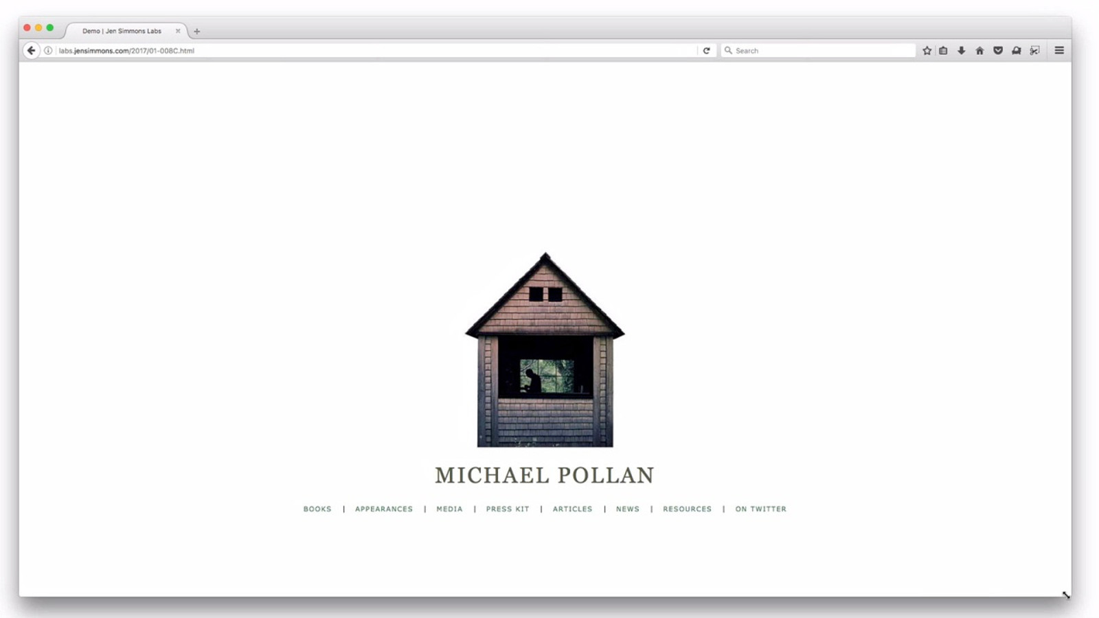
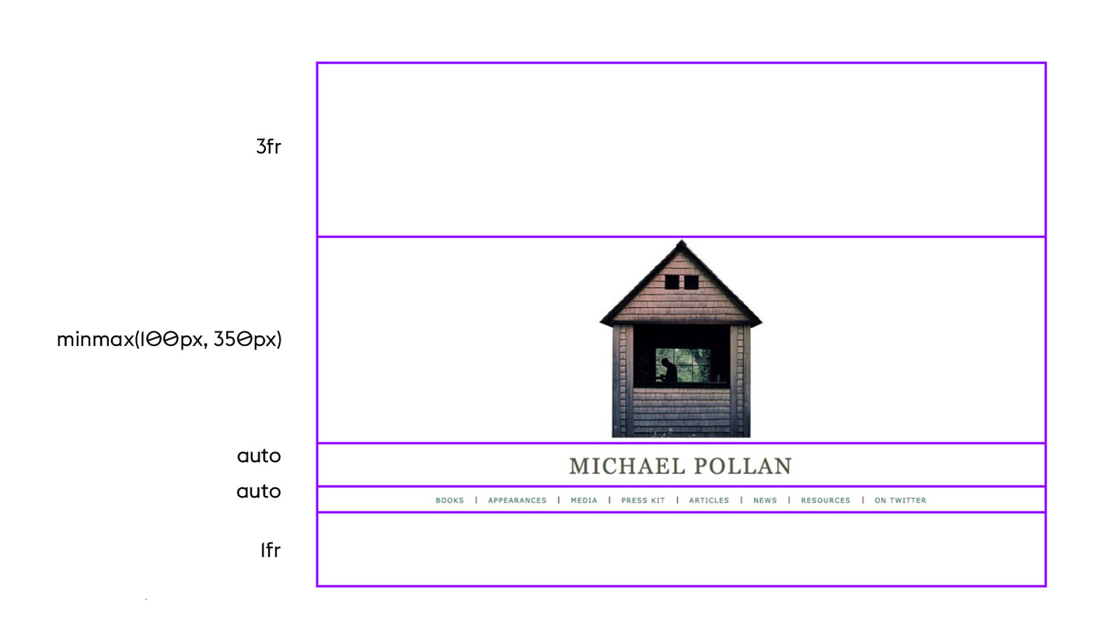
labs.jensimmons.com/2017/01-008.html
auto 1fr minmax(1 00 px, 35 0 px) auto 3fr
YO UTUB E .C O M / L AY O UTL A ND
Change in how we use the Viewport
P rogramming to all four edges of the Viewport
Intrinsic Web D esign
We n " d a
! It ’ s ! e web!
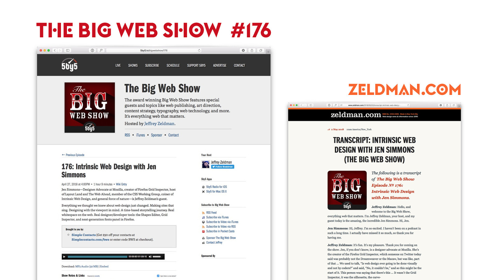
T HE BI G W E B S HO W #176 Z E LDM A N.C O M
YO UTUB E .C O M/ L AY O UTL A ND SUBSCRIB E BY EMAIL AT LAY O UT.LAND
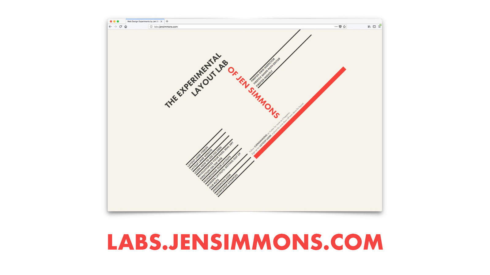
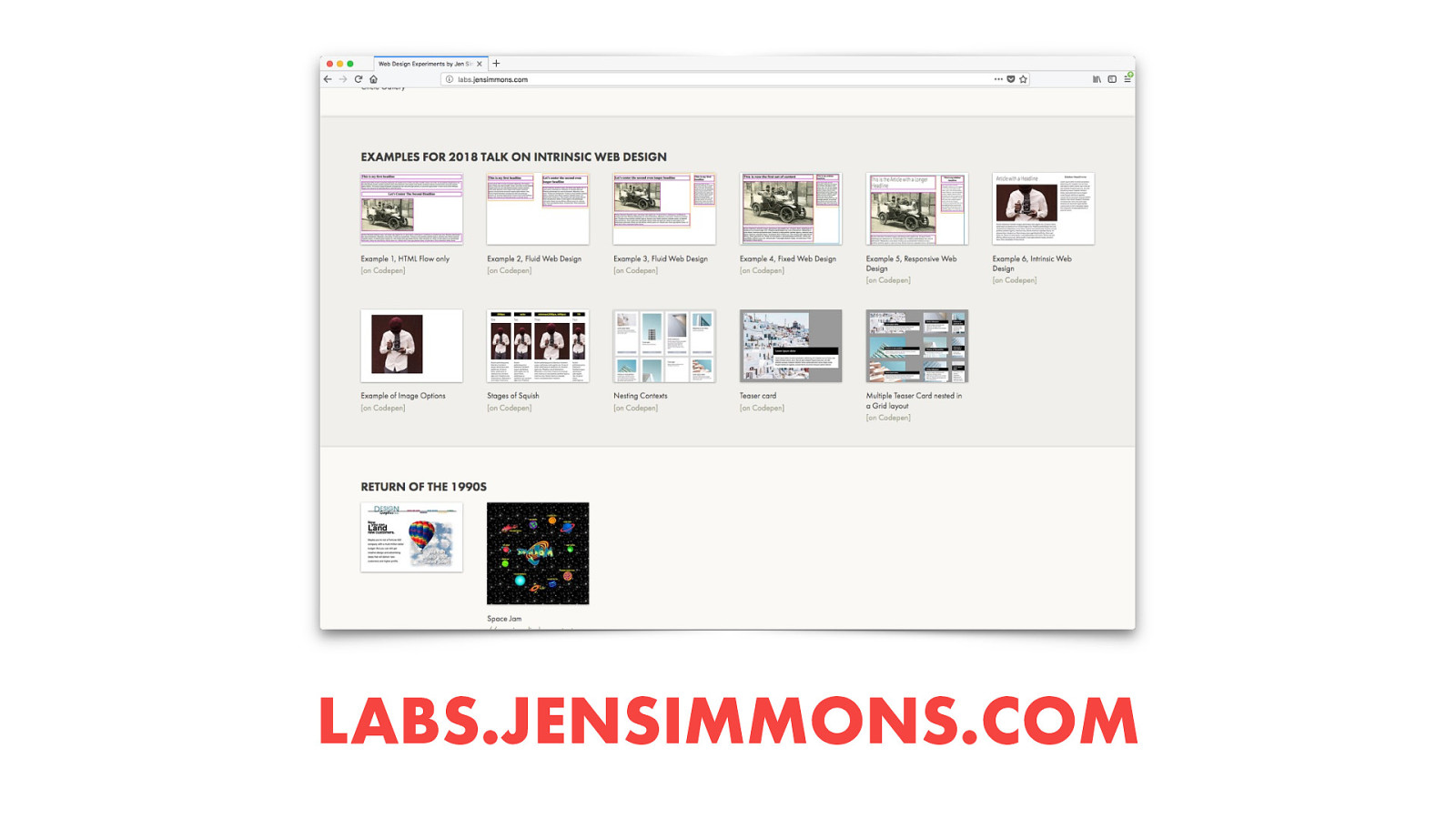
LABS.JENSIMMONS.COM
LABS.JENSIMMONS.COM
J E NSIMM O NS.C O M @J E NSIMM O NS L AY O UT.L A ND L A BS.J E NSIMM O NS.C O M Th an k s !

2017 saw a sea change in web layout, one that few of us have truly come to grips with. We’re standing at the threshold of an entirely new era in digital design—one in which, rather than hacking layouts together, we can actually describe layouts directly. The benefits will touch everything from prototyping to custom art direction to responsive design. In this visionary talk, rooted in years of practical experience, Jen will show you how to understand what’s different, learn to think through multiple stages of flexibility, and let go of pixel constraints forever.
The following resources were mentioned during the presentation or are useful additional information.
Here’s what was said about this presentation on social media.


 for free. You
can too.
for free. You
can too.