
A presentation at An Event Apart - Boston 2017 in in Boston, MA, USA by Jen Simmons
DESIGNING LAYOUTS: THE NEW SUPERPOWERS OF CSS WITH JEN SIMMONS
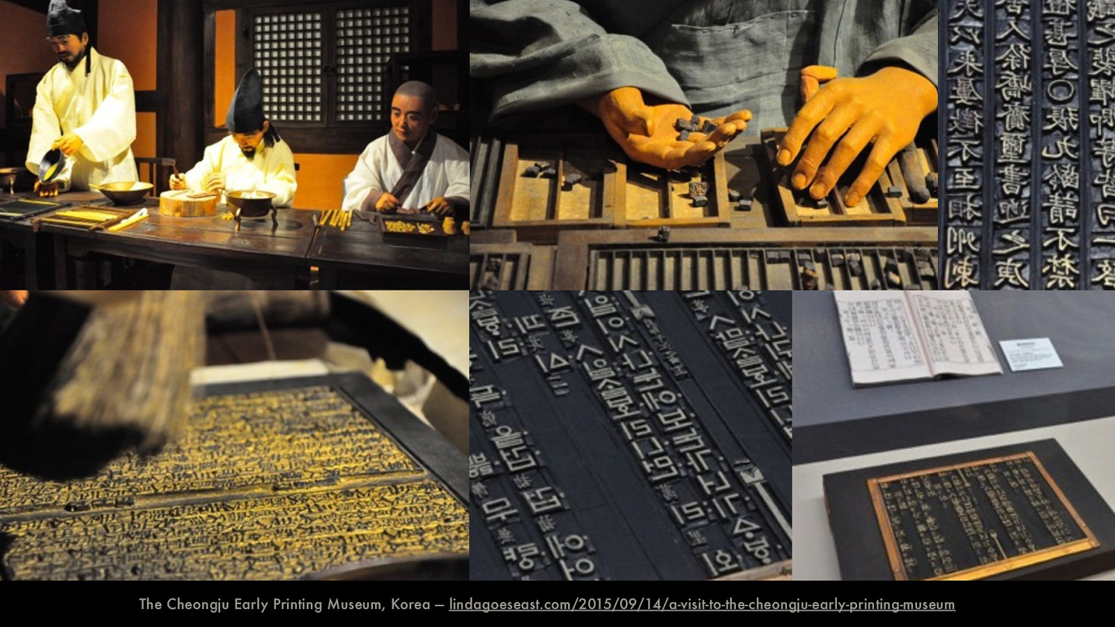
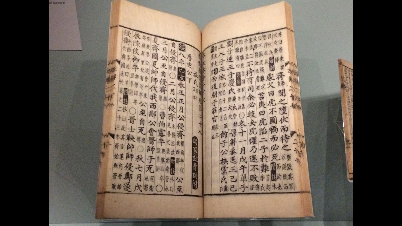
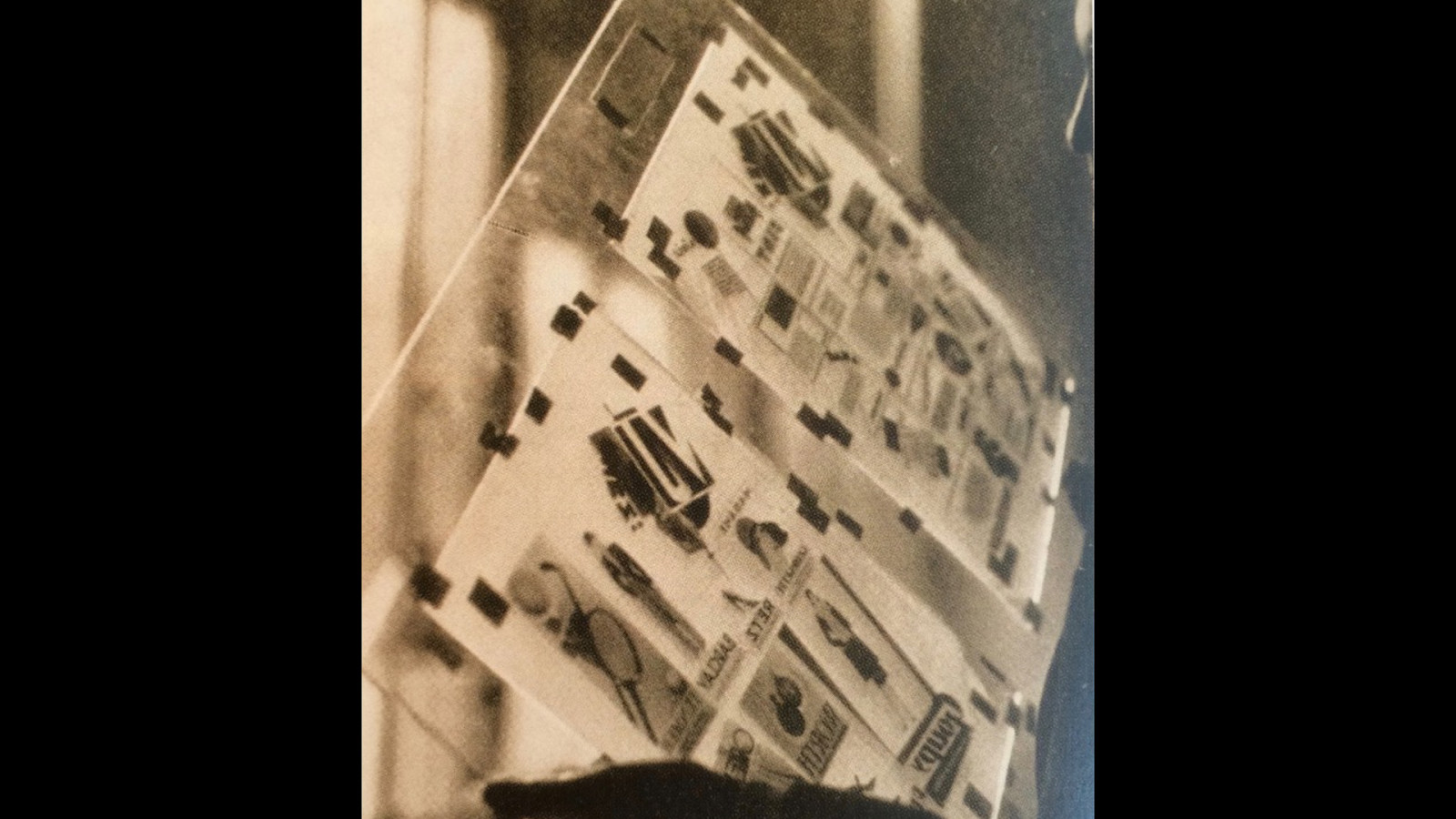
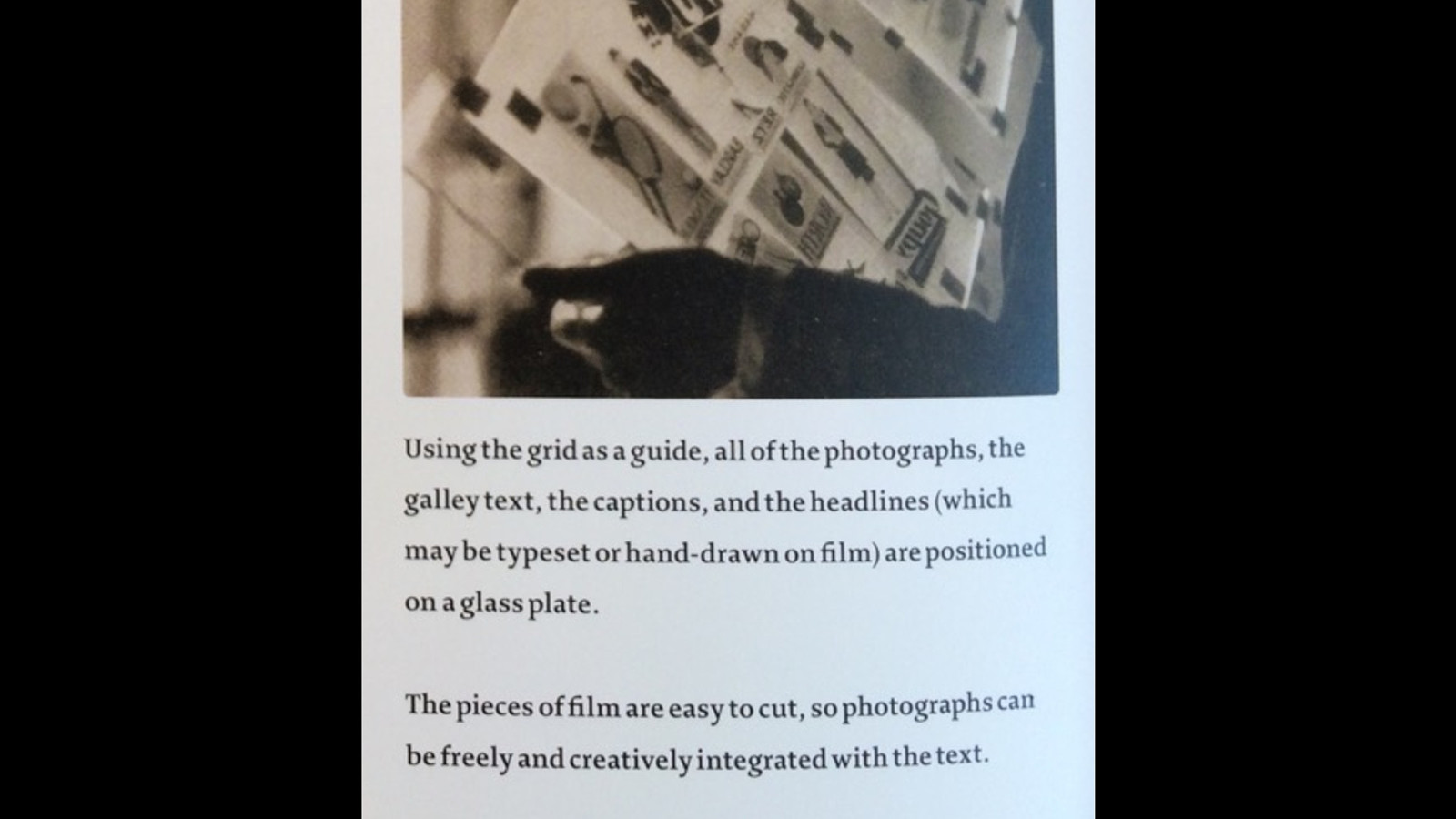
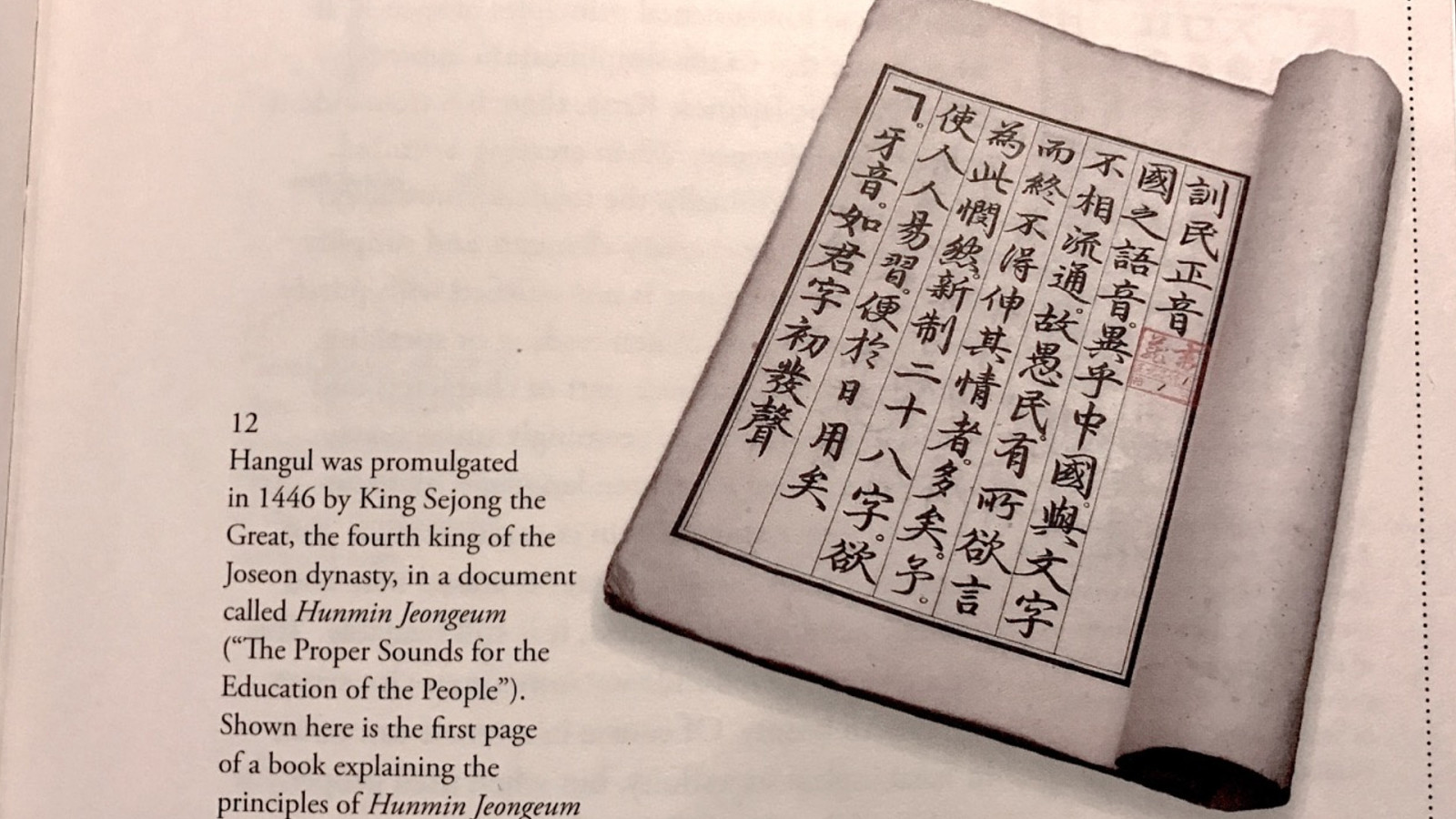
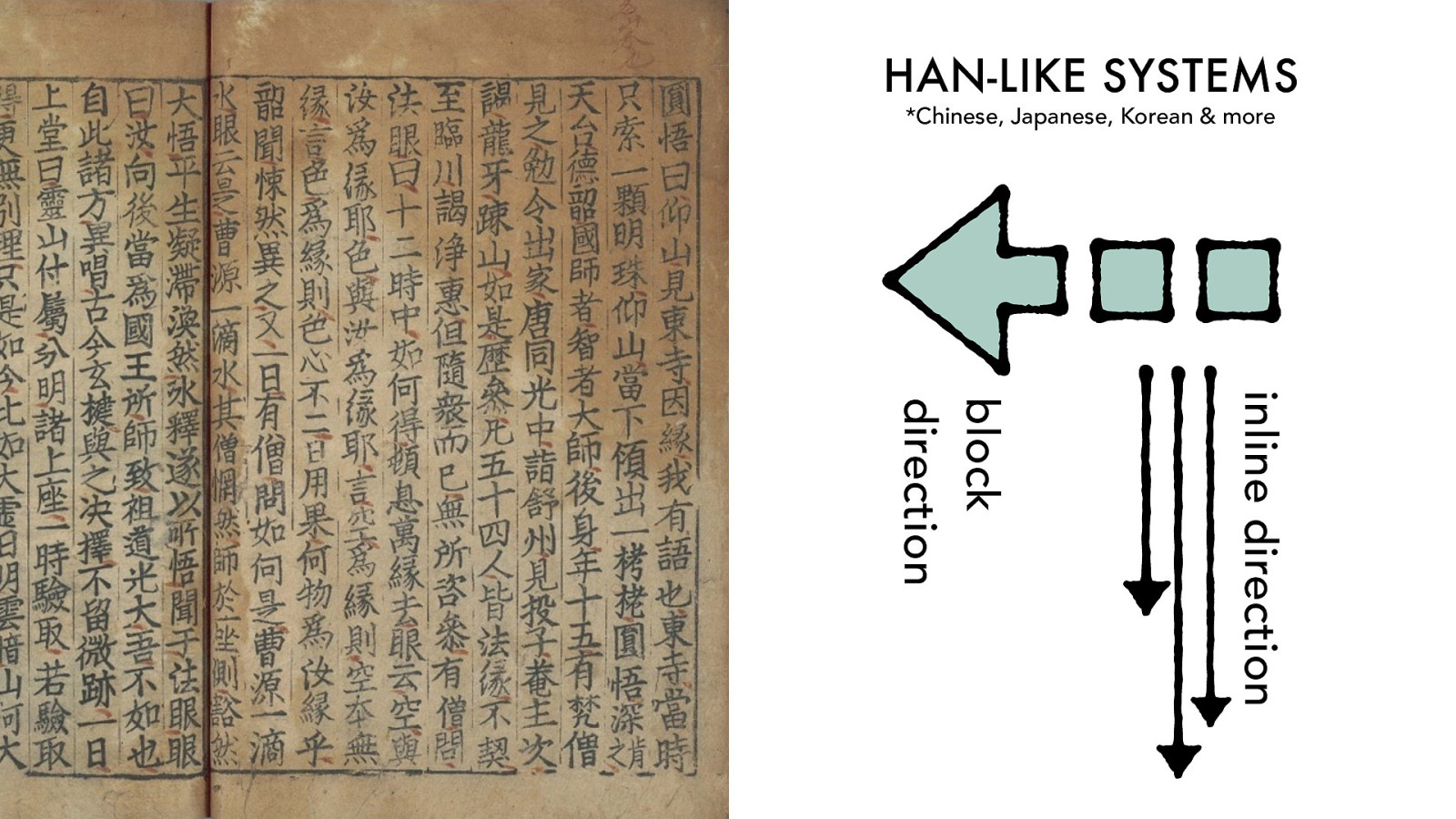
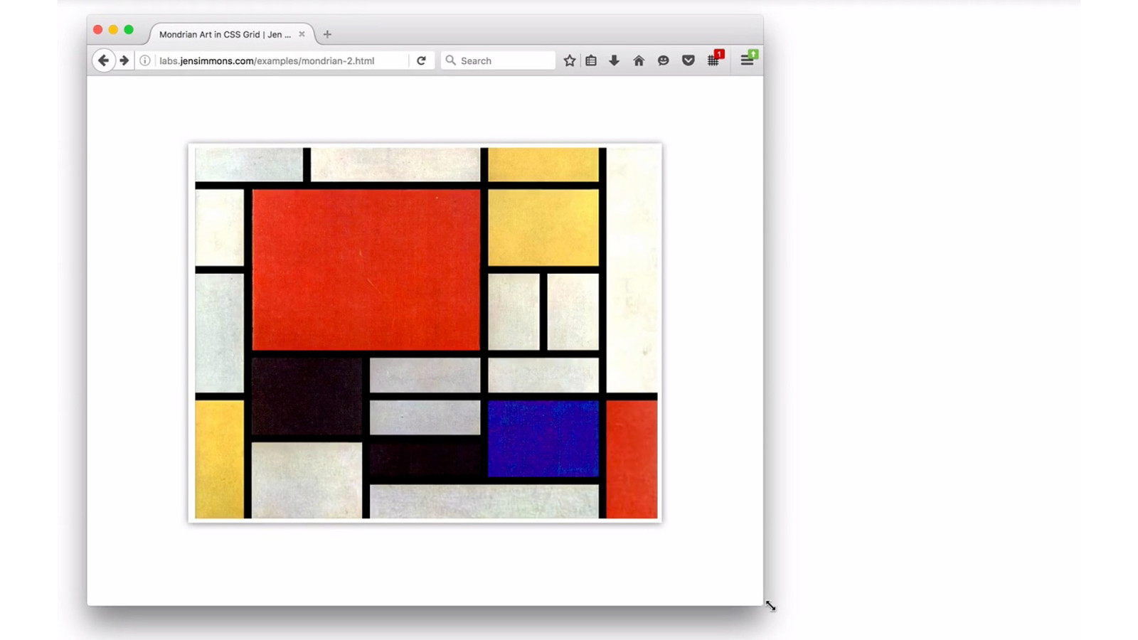
The Cheongju Early Printing Museum, Korea — lindagoeseast.com/2015/09/14/a-visit-to-the-cheongju-early-printing-museum
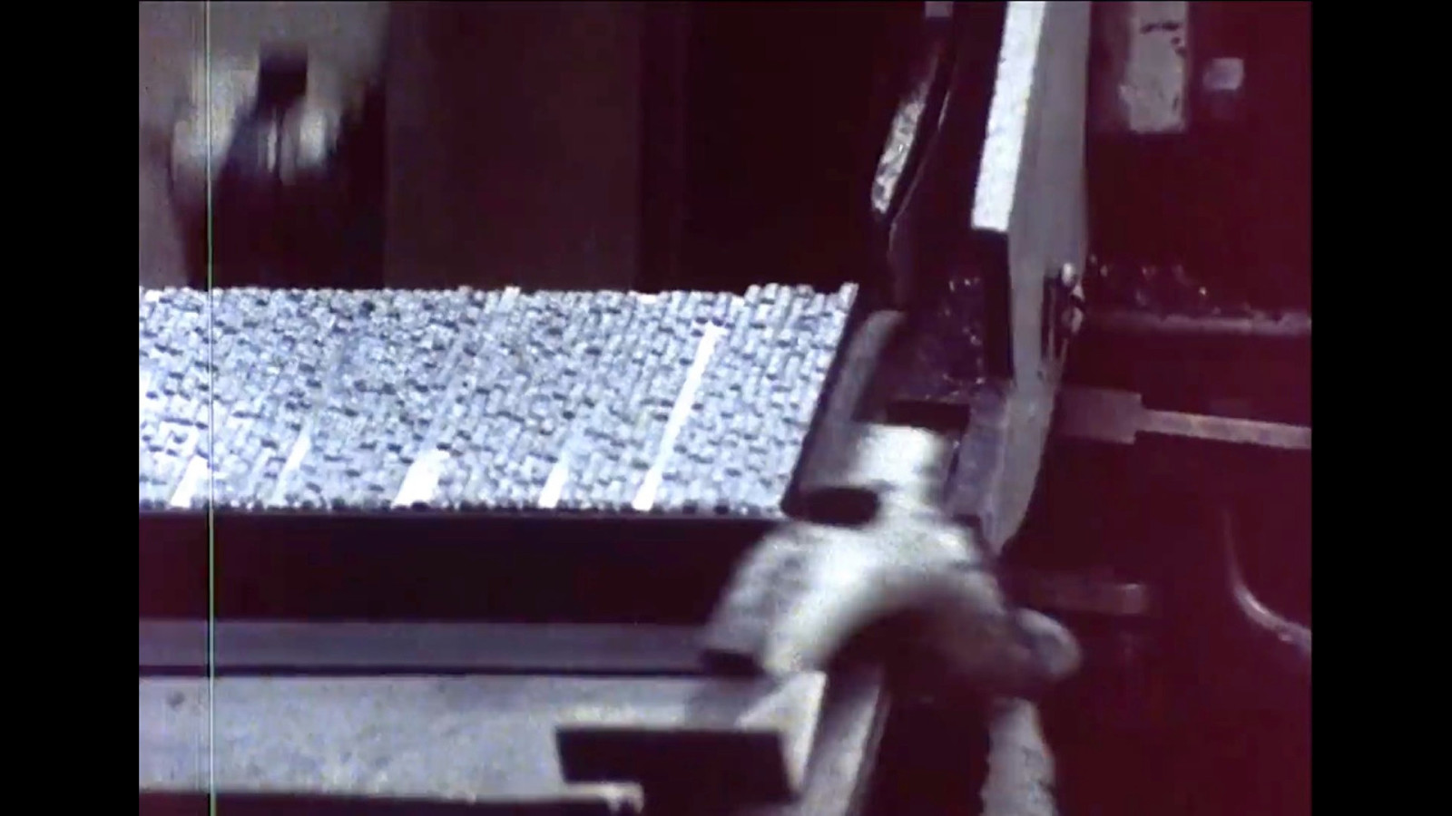
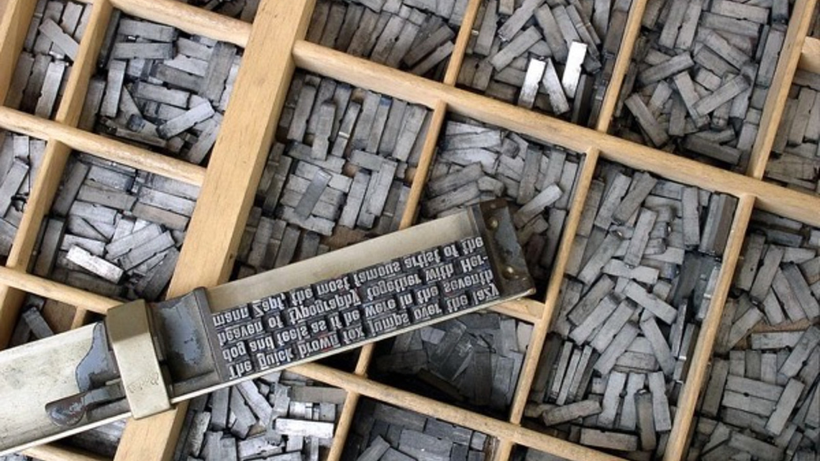
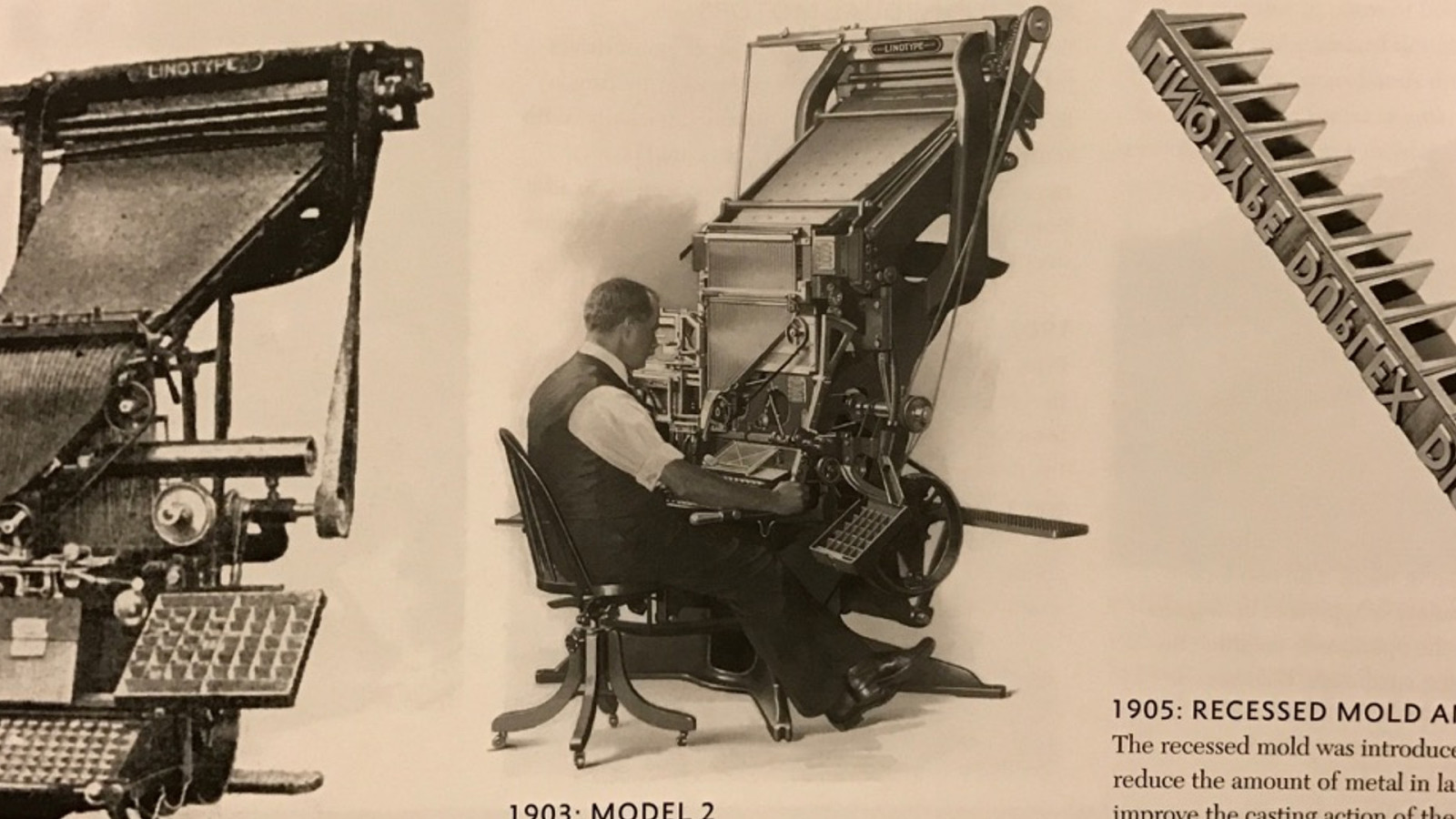
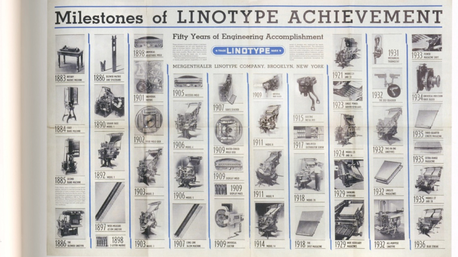
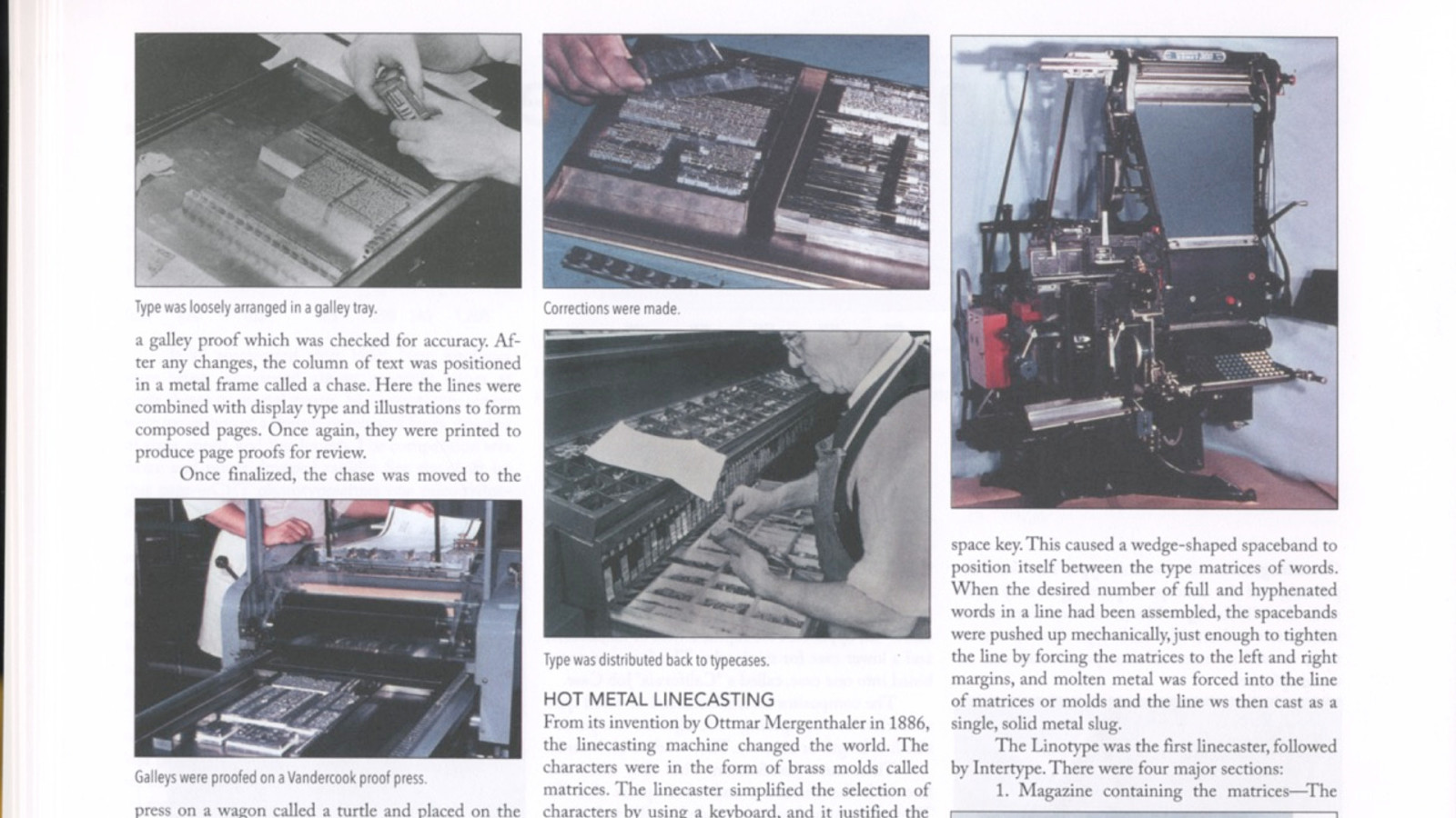
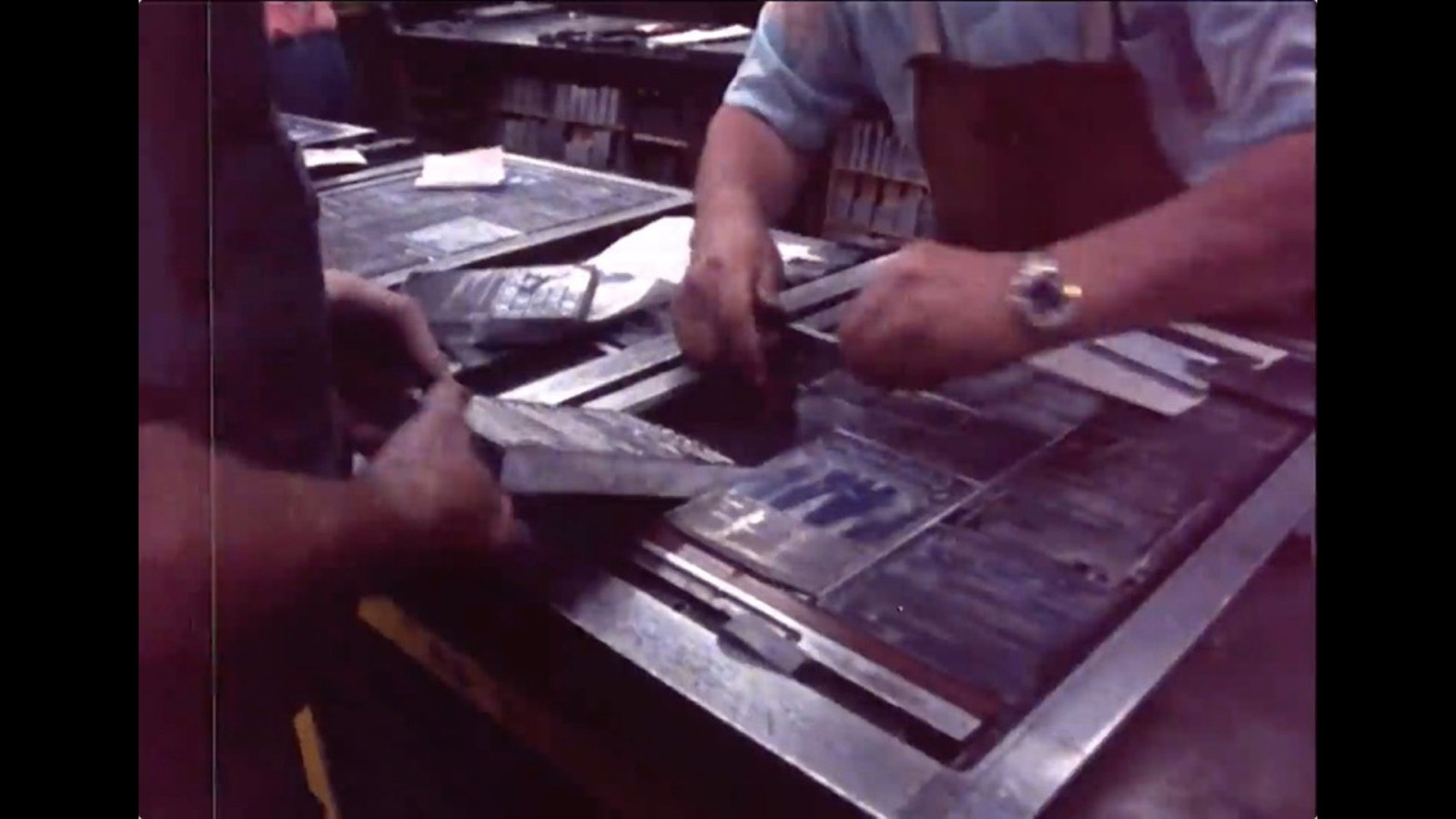
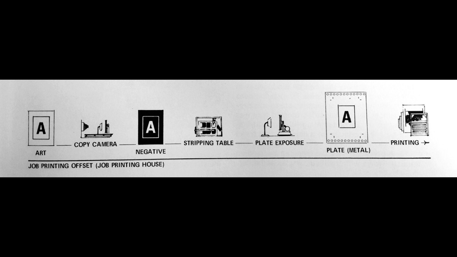
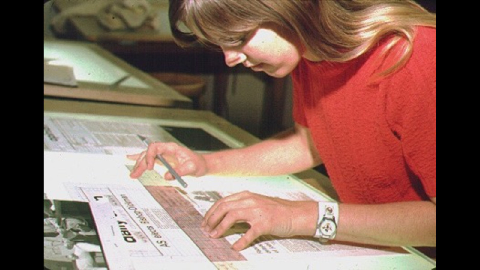
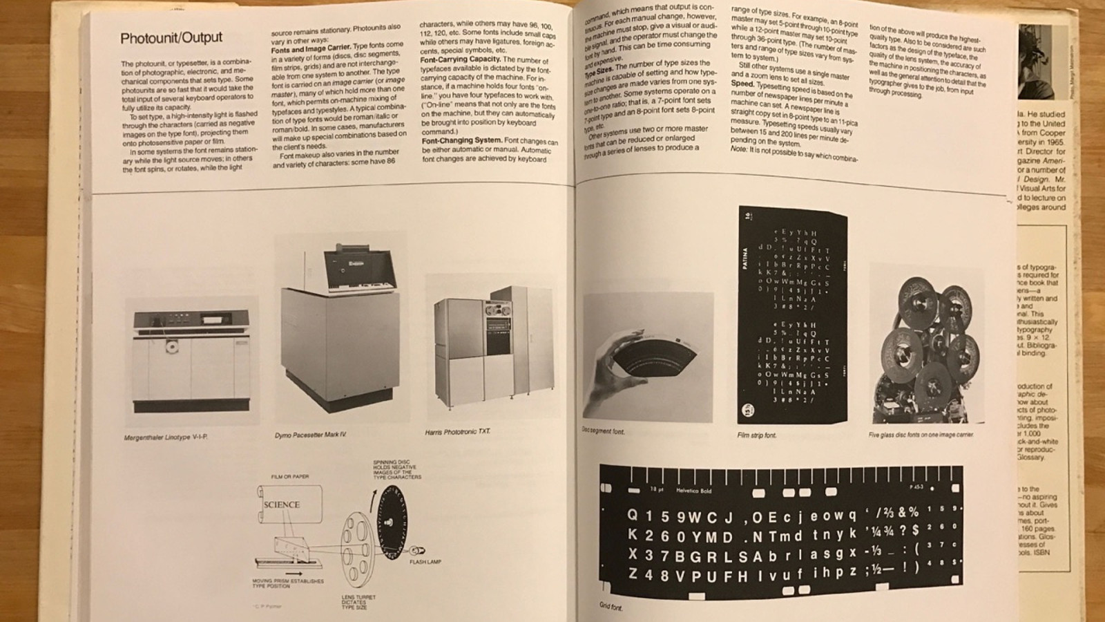
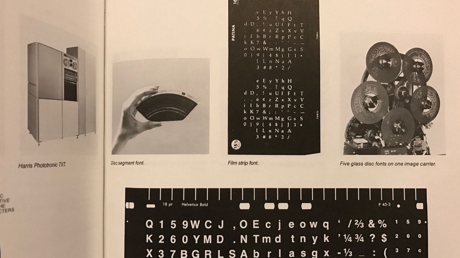
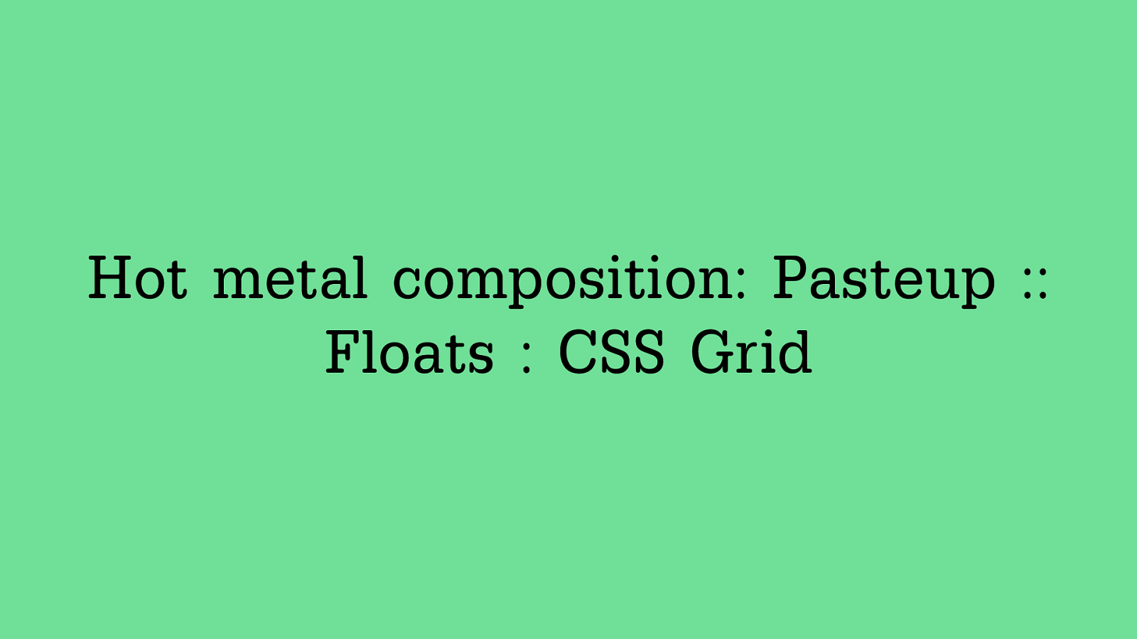
Hot metal composition: Pasteup :: Floats : CSS Grid
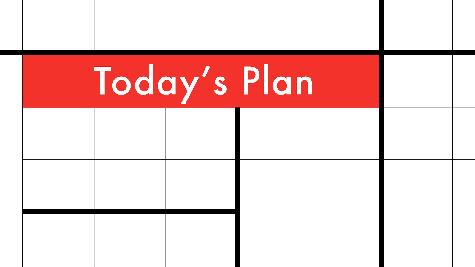
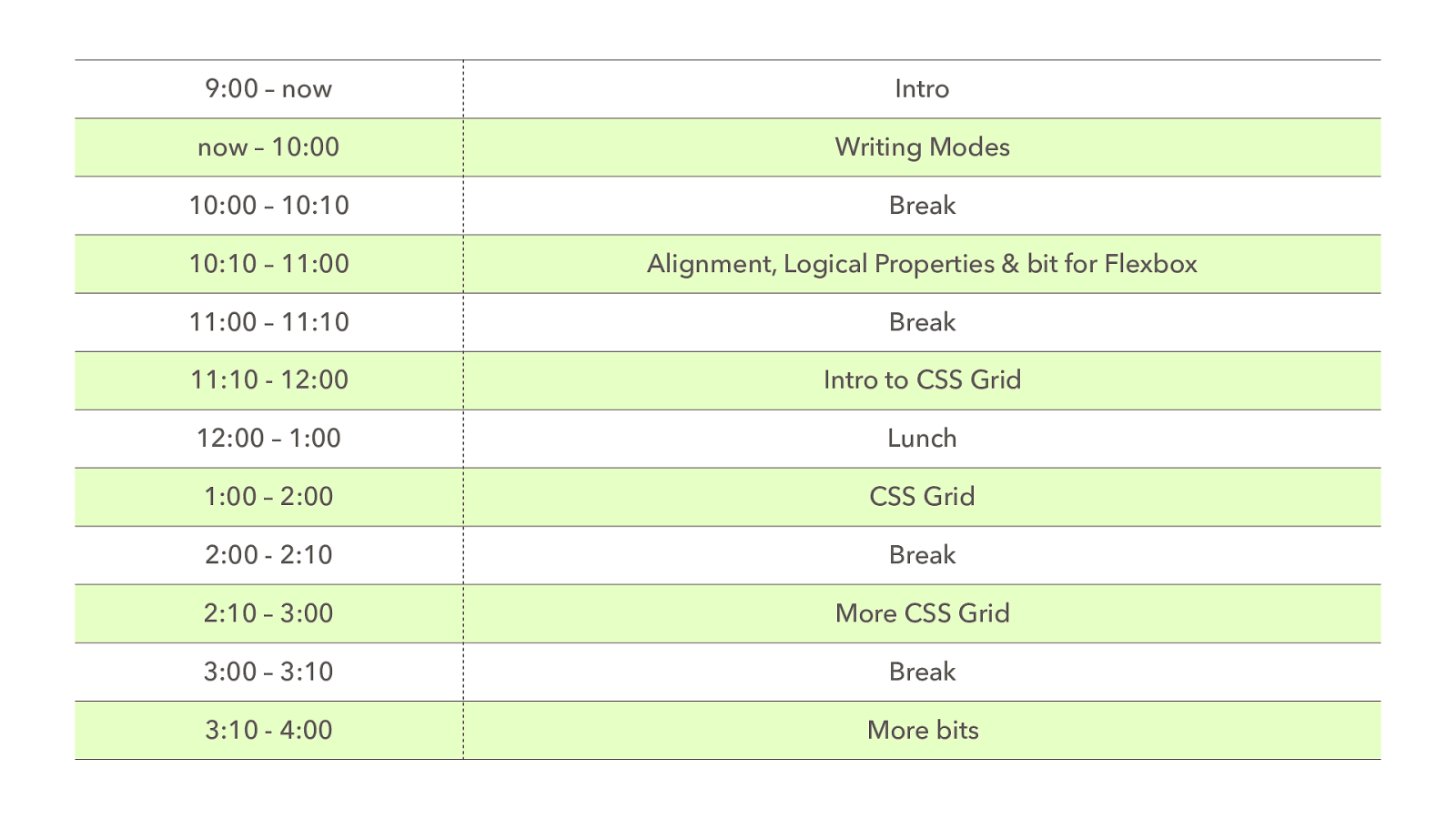
Toda y’s Plan
9:00 – now Intro now – 10:00 Writing Modes 10:00 – 10:10 Break 10:10 – 11:00 Alignment, Logical Properties & bit for Flexbox 11:00 – 11:10 Break 11:10 - 12:00 Intro to CSS Grid 12:00 – 1:00 Lunch 1:00 – 2:00 CSS Grid 2:00 - 2:10 Break 2:10 – 3:00 More CSS Grid 3:00 – 3:10 Break 3:10 - 4:00 More bits
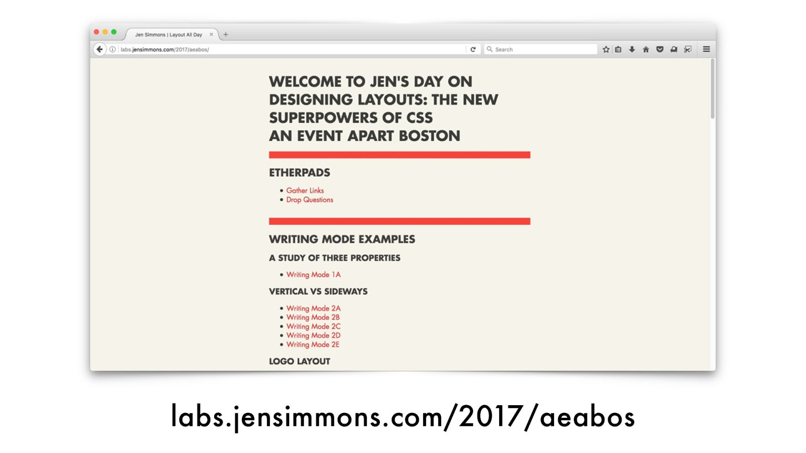
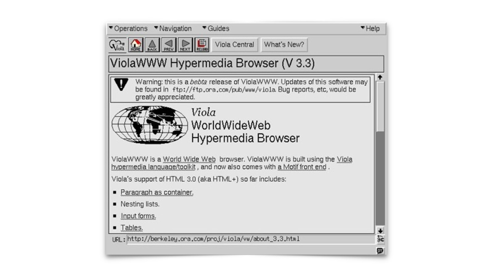
labs.jensimmons.com/2017/aeabos
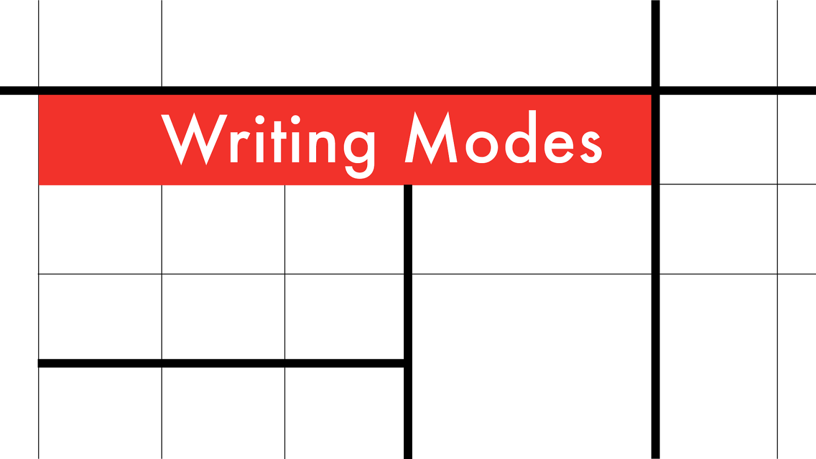
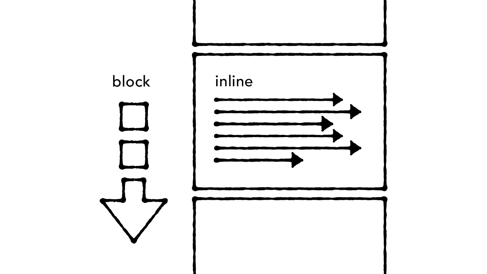
Wr iting Modes
“ — Bruce Lawson It ’s
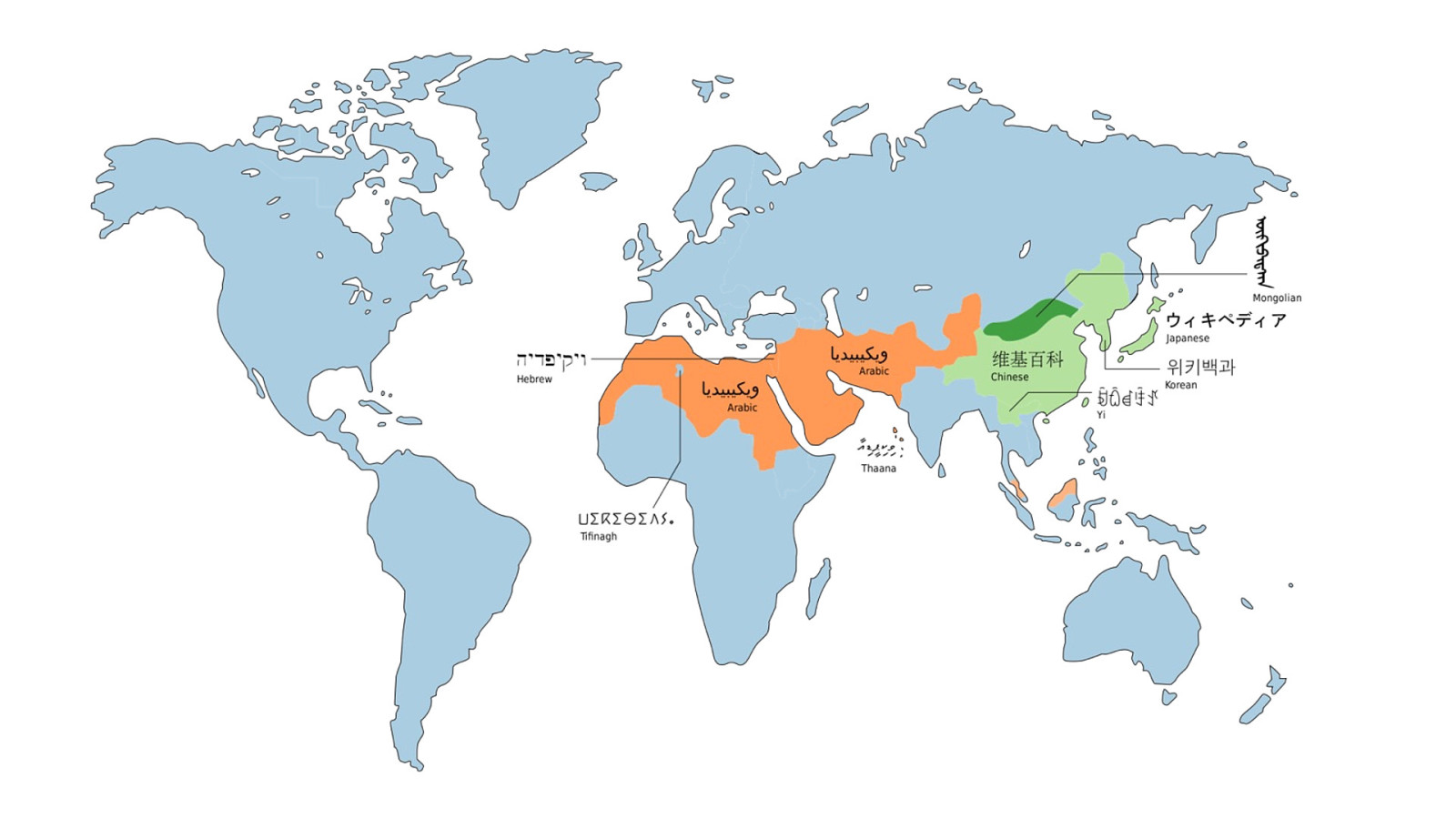
the World Wide Web, not the Wealthy Western Web.
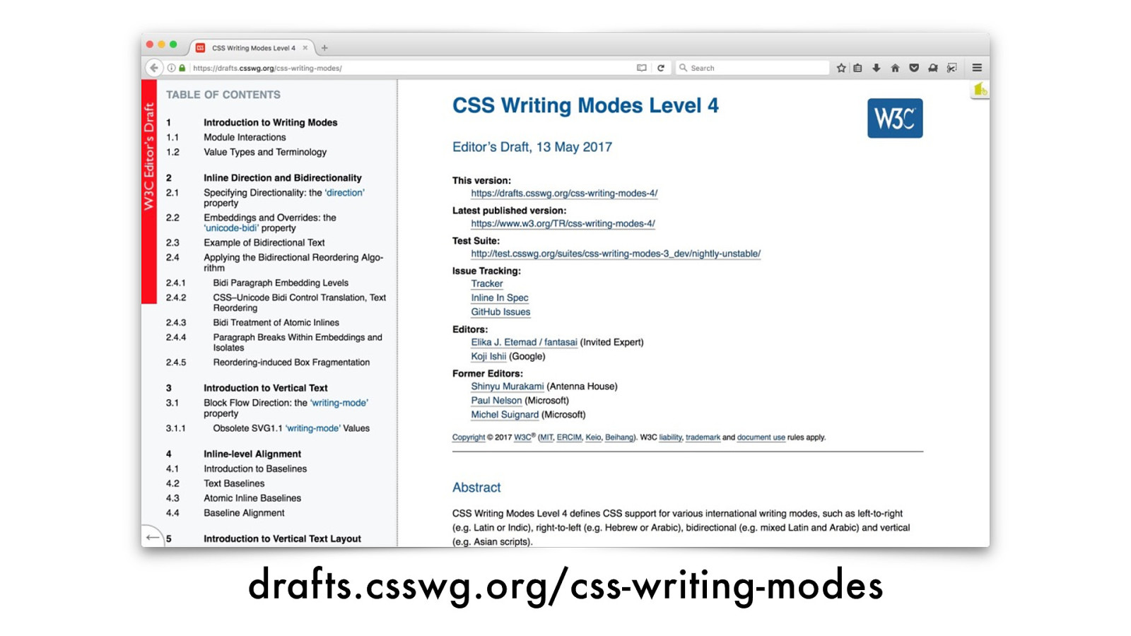
drafts.csswg.org/css-writing-modes
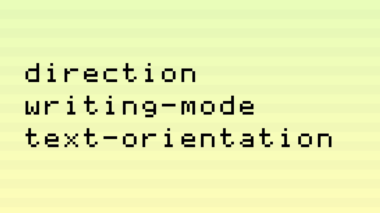
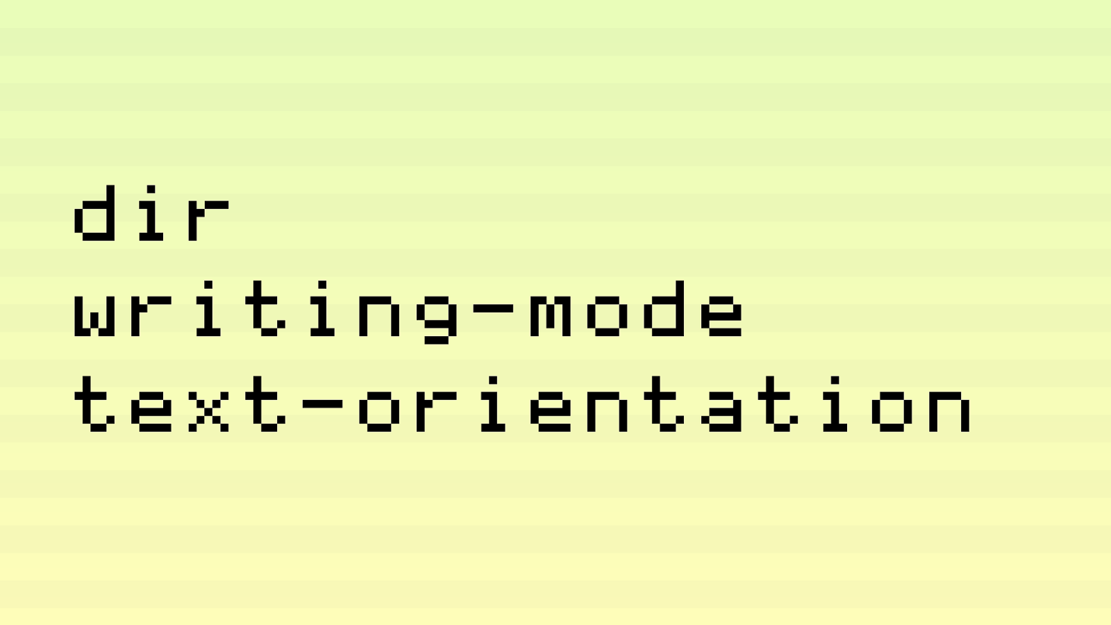
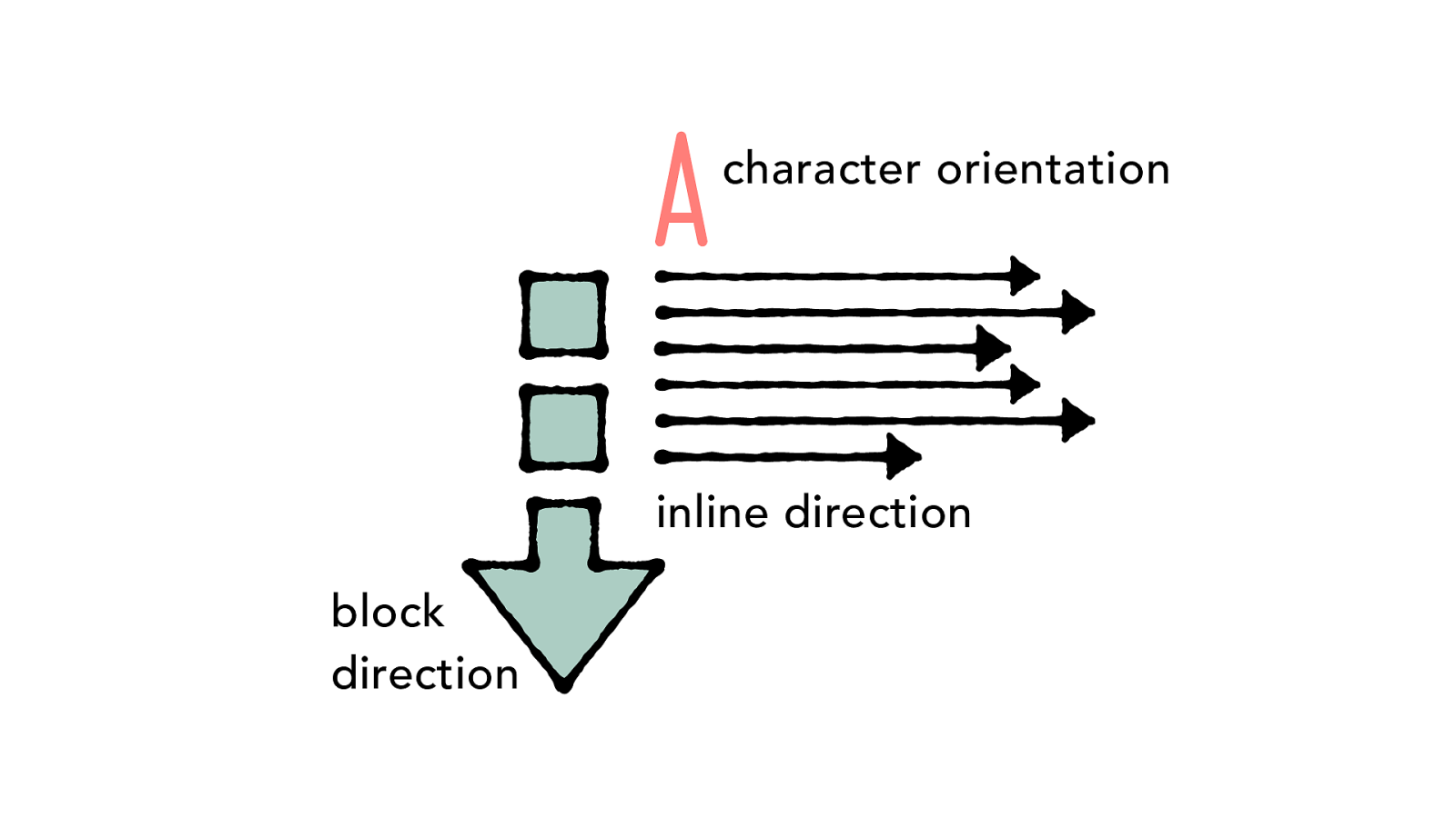
direction writing-mode text-orientation
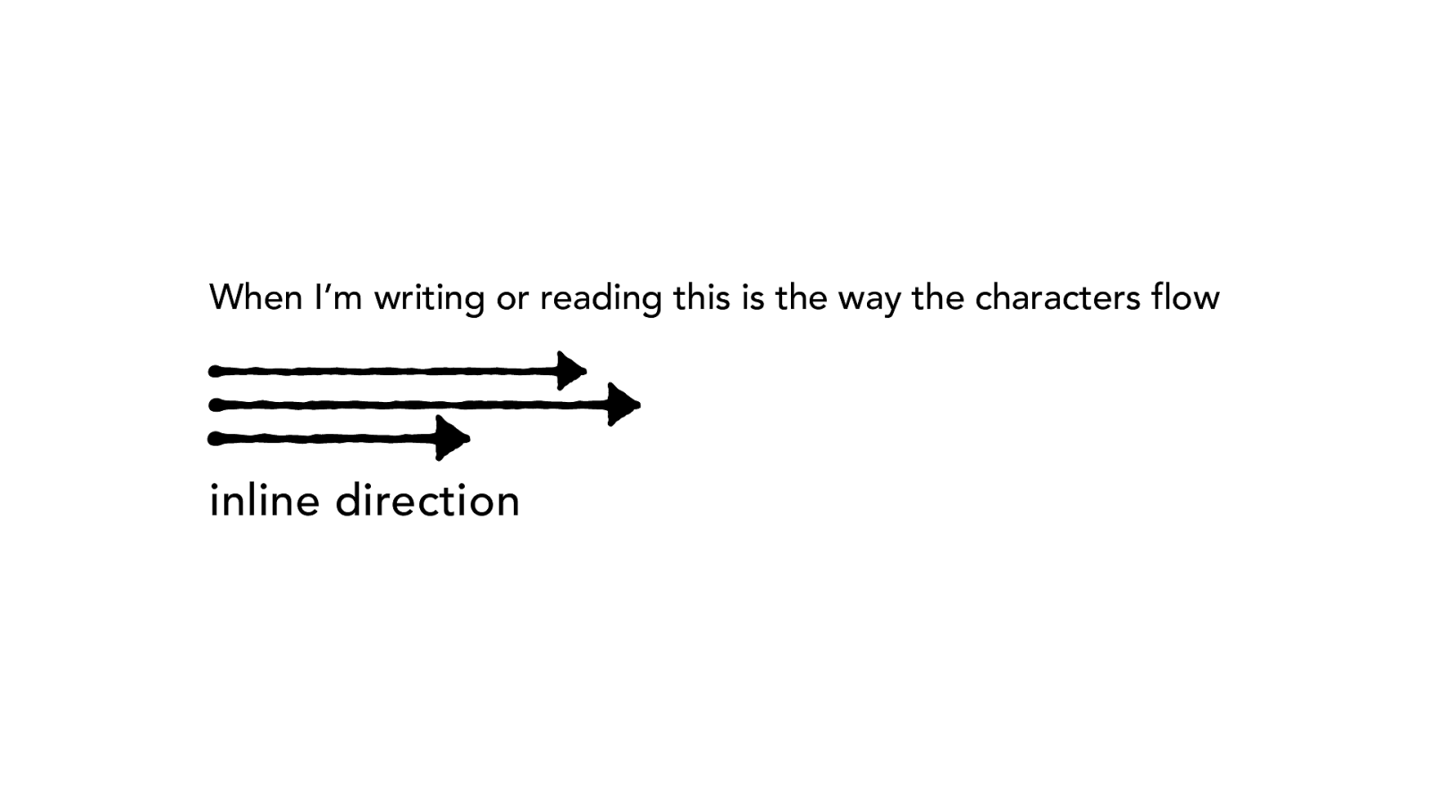
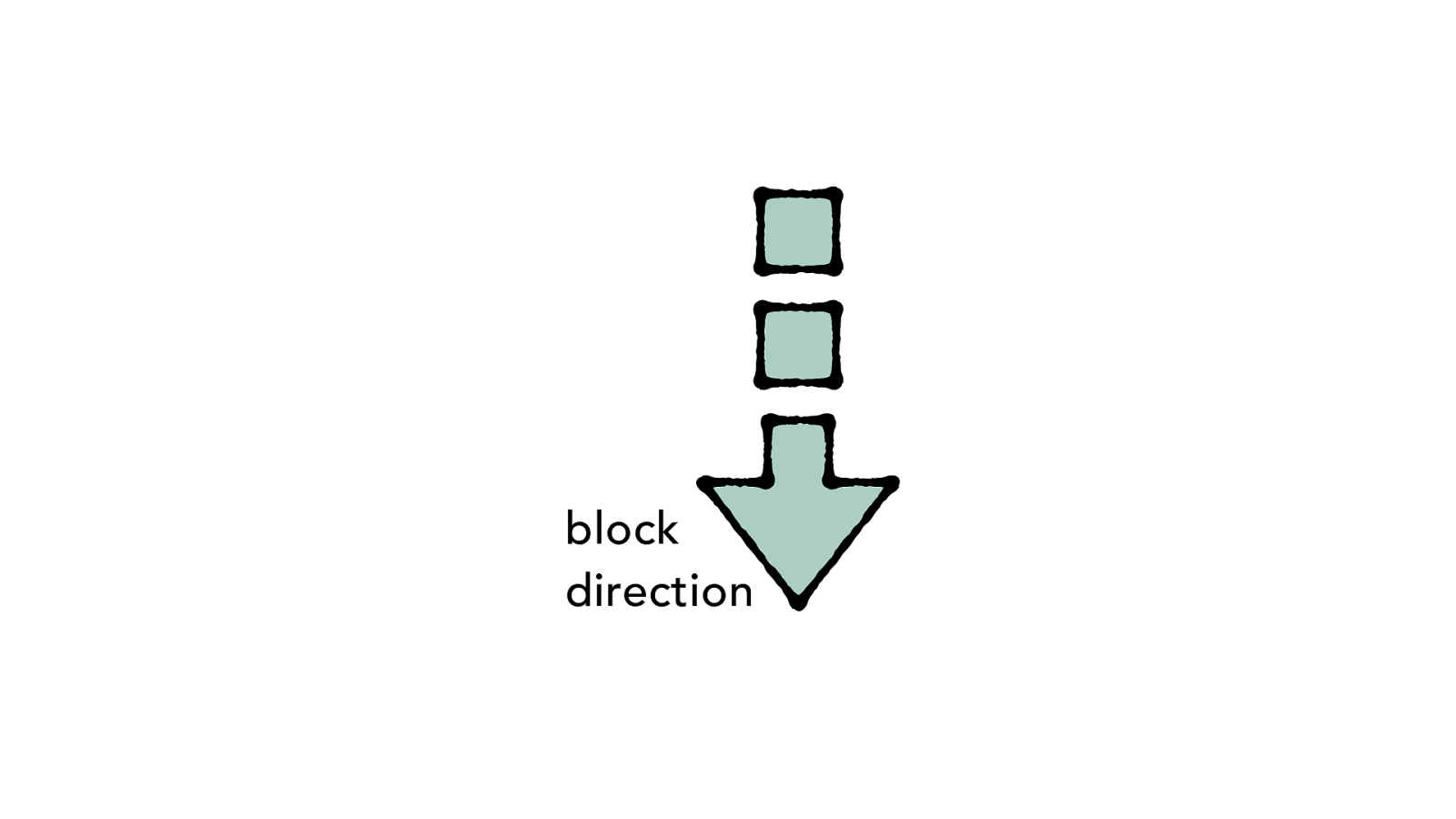
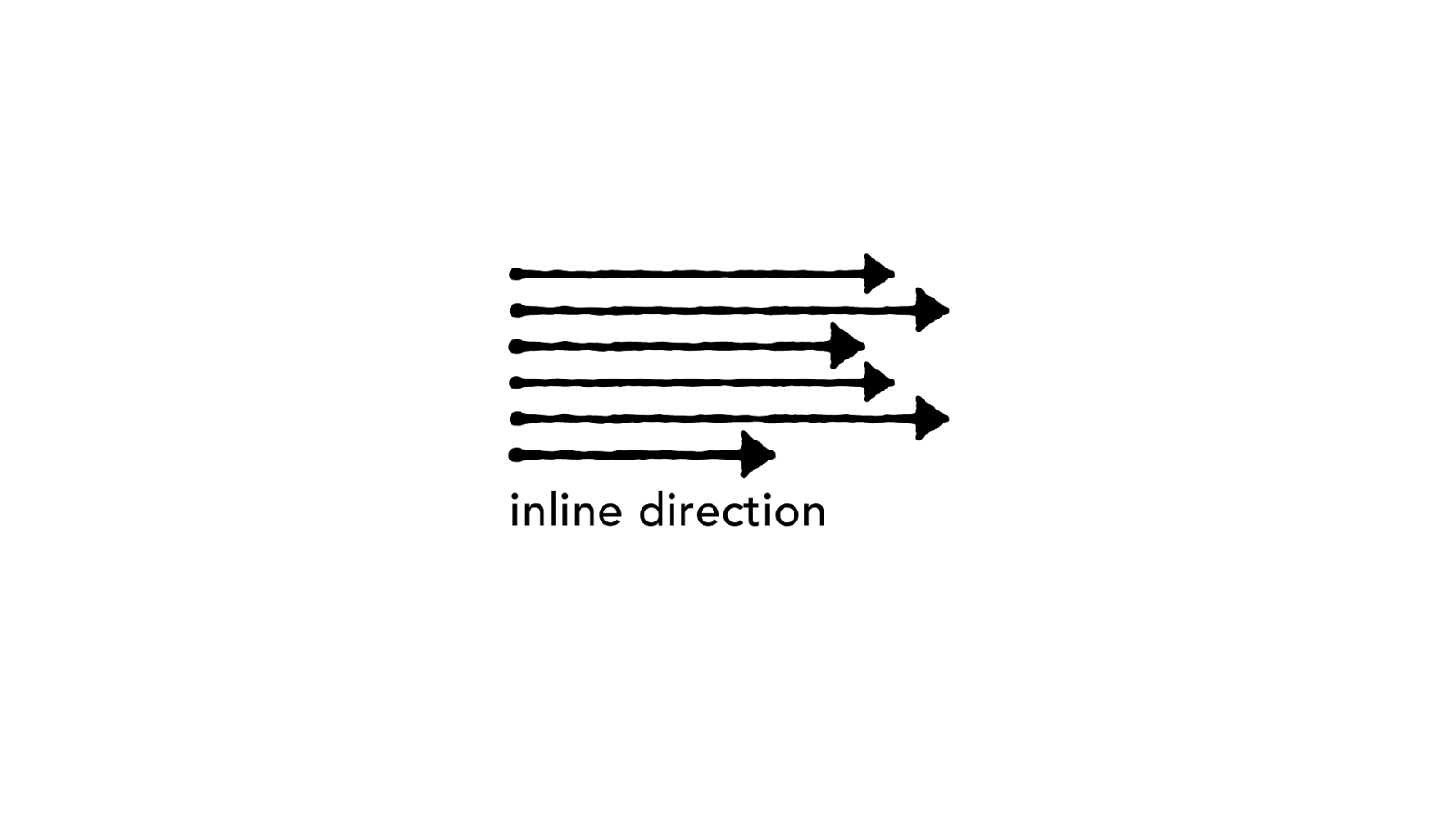
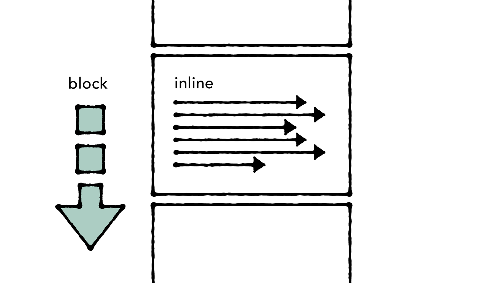
inline direction When I’m writing or reading this is the way the characters flow
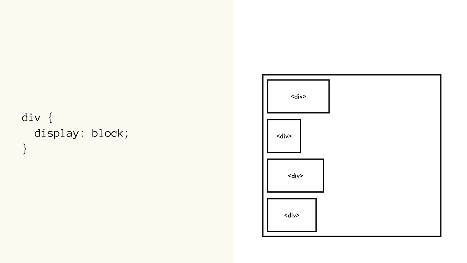
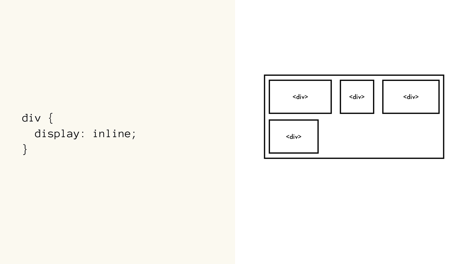
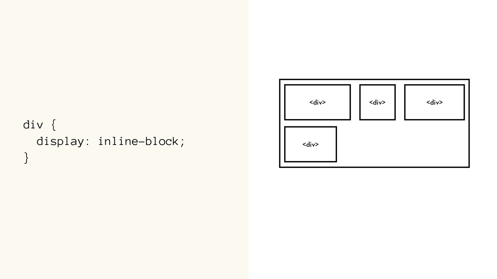
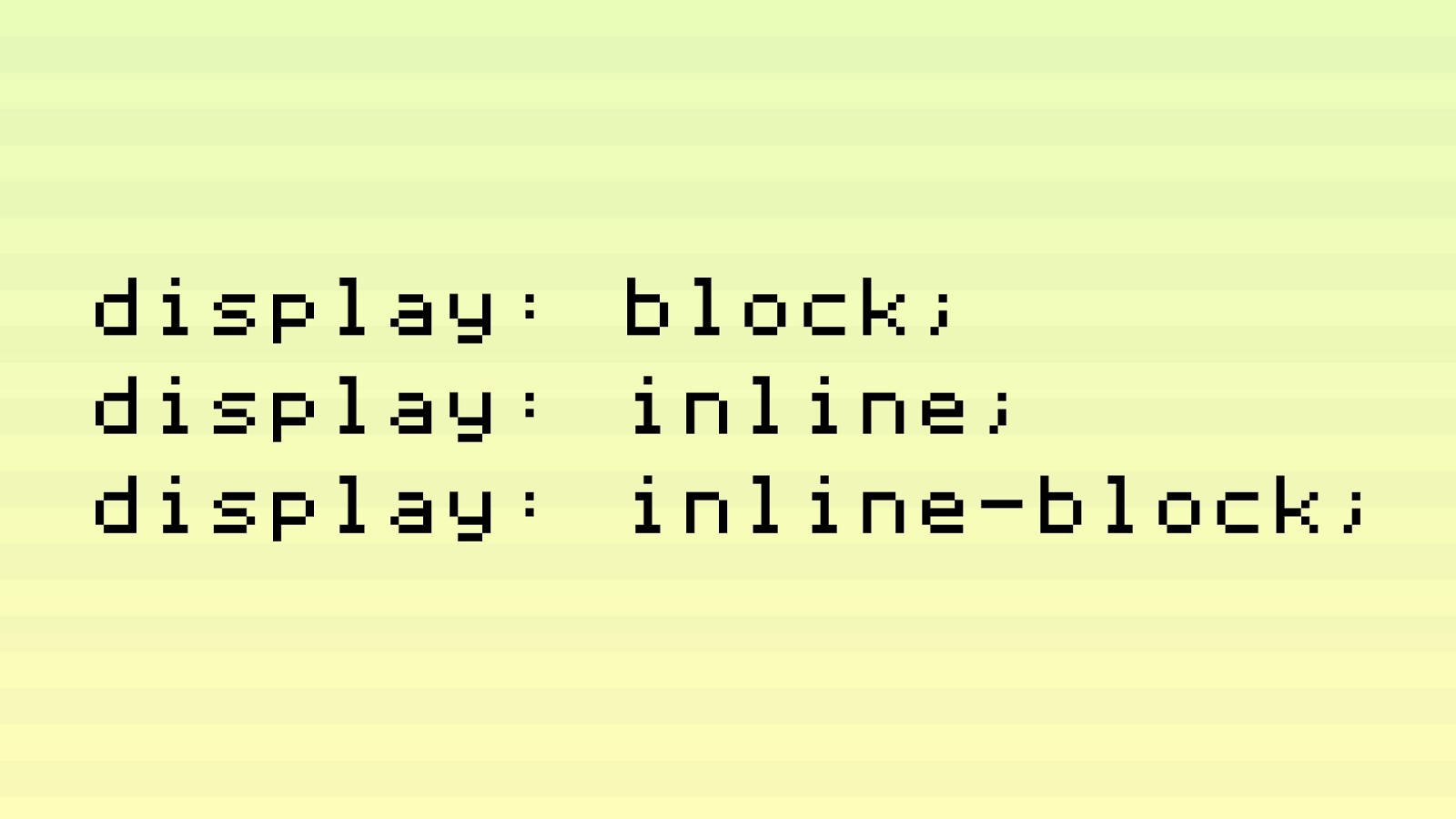
div {
display: block;
}
div {
display: inline;
}
div {
display: inline-block;
}
display: block; display: inline; display: inline-block;
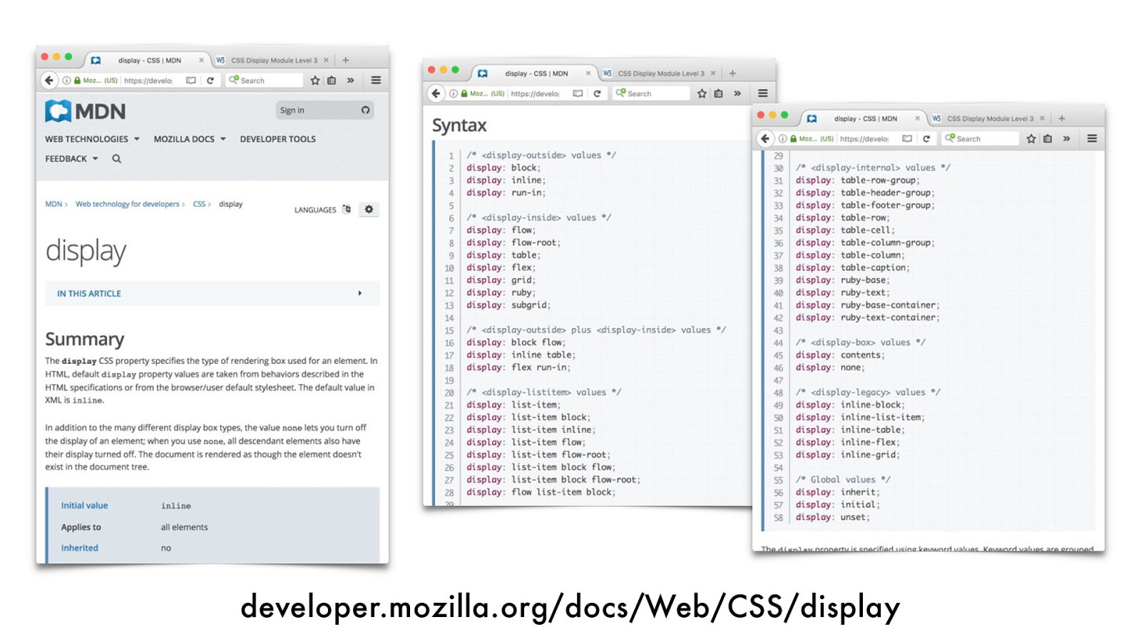
developer.mozilla.org/docs/Web/CSS/display
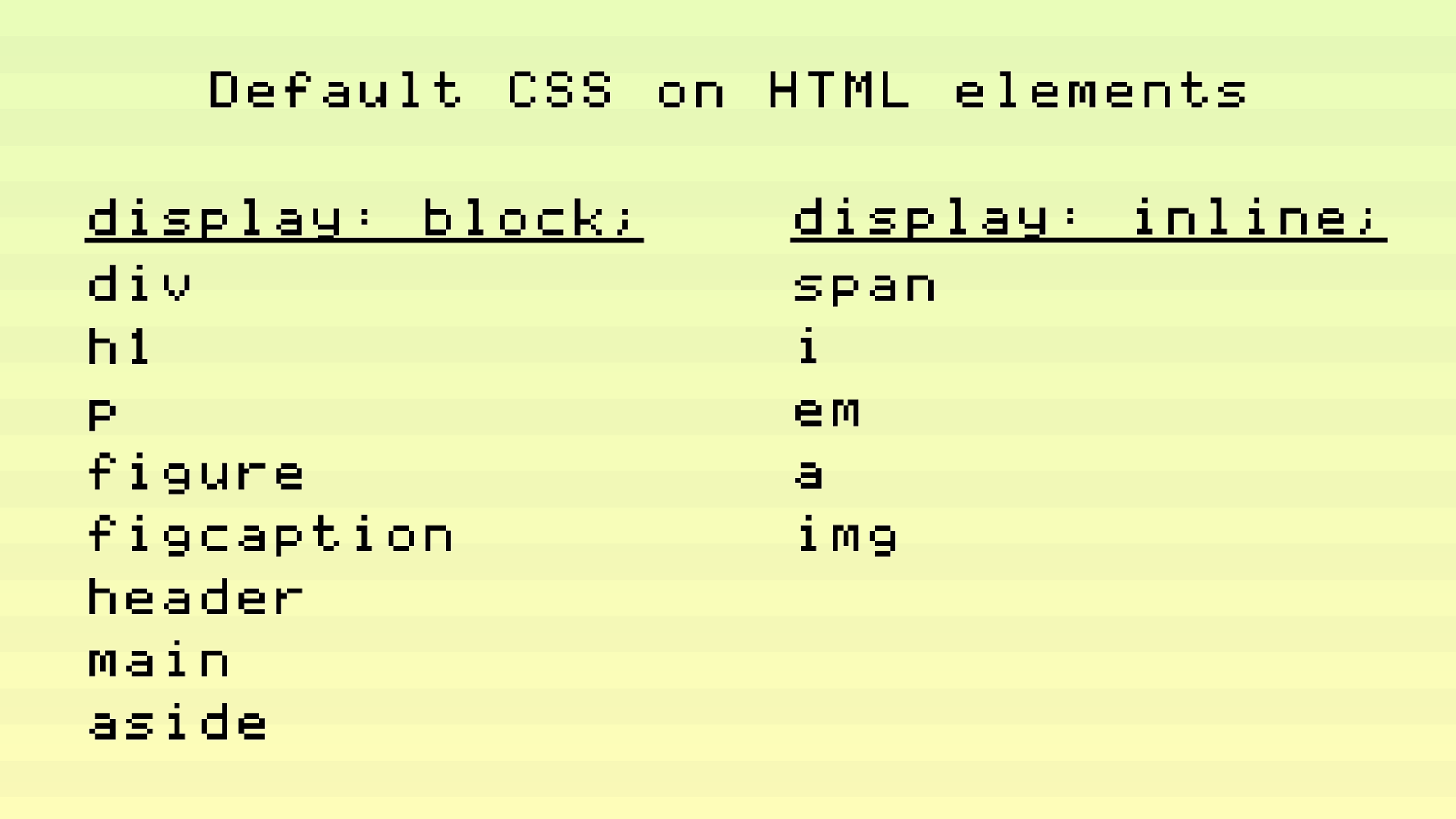
display: block; div h1 p figure figcaption header main aside display: inline; span i em a img Default CSS on HTML elements
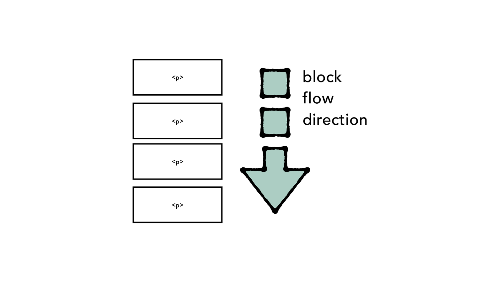
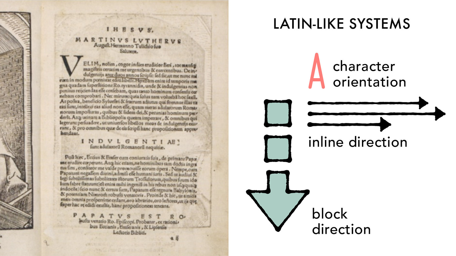
block
direction
inline direction
A character orientation
block
direction
inline direction
A
character orientation
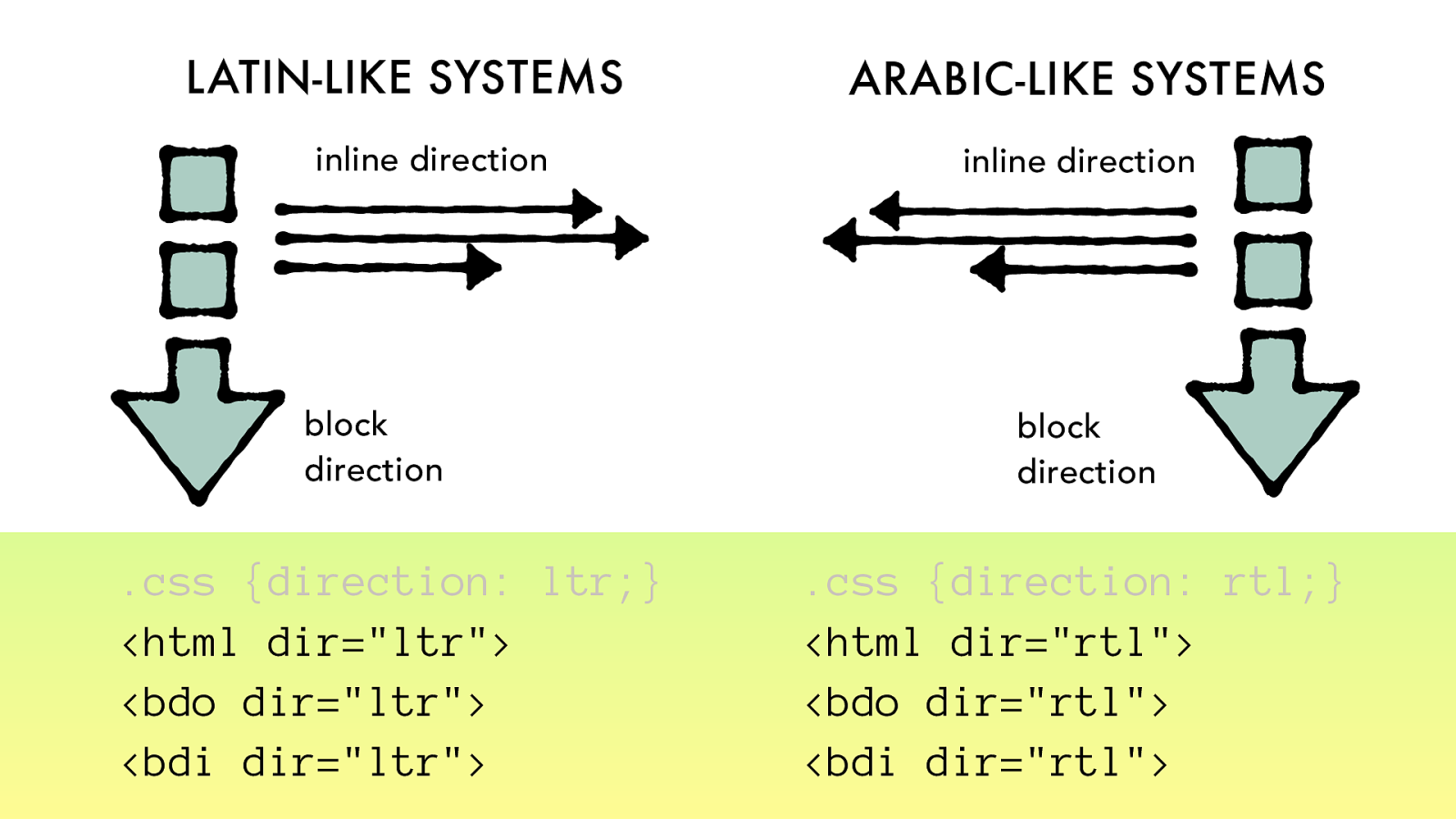
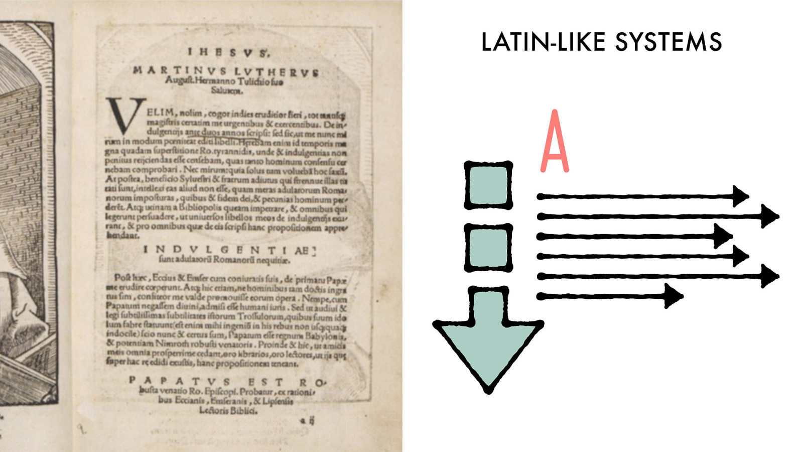
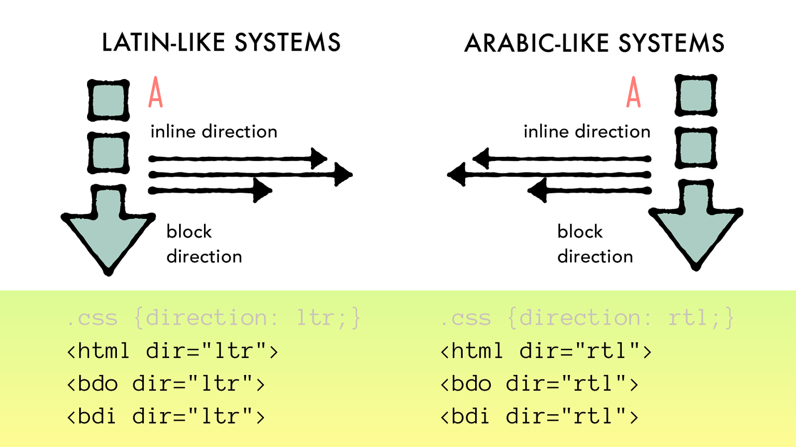
LATIN-LIKE SYSTEMS
block
direction
inline direction
A
character
orientation
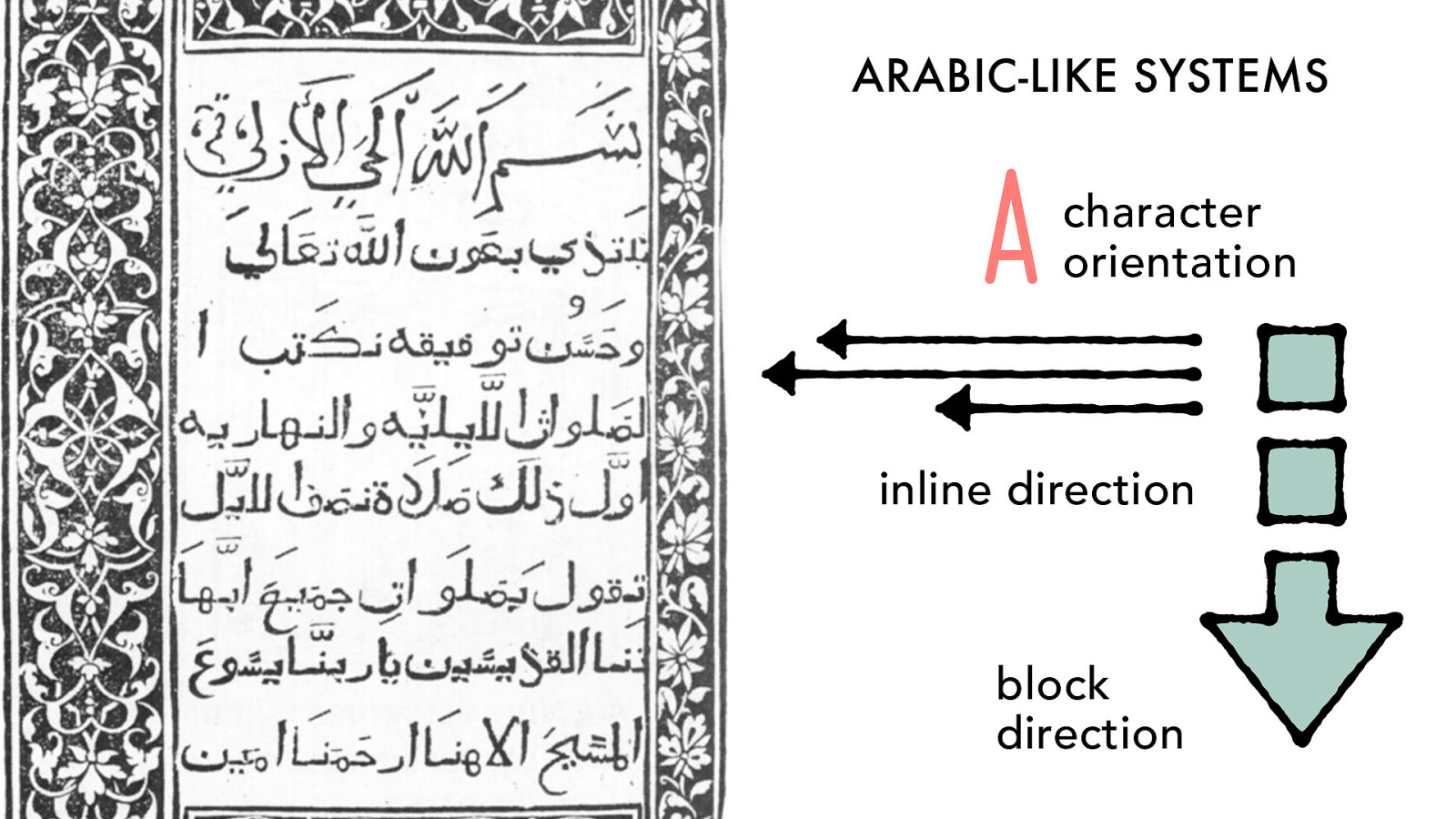
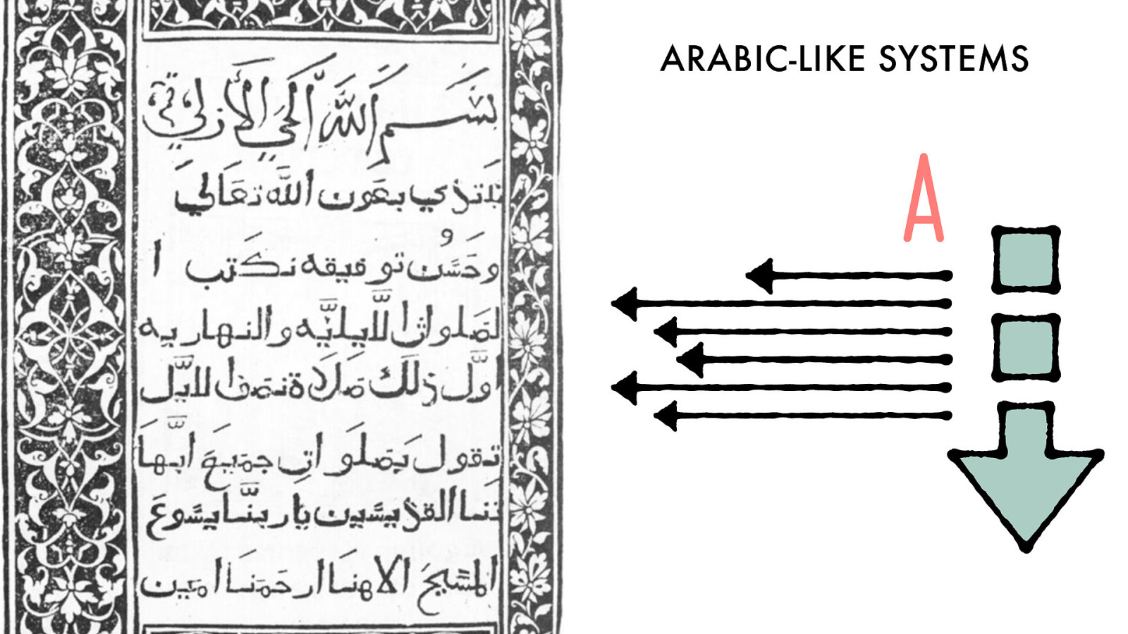
ARABIC-LIKE
SYSTEMS
inline direction
block
direction
A
character
orientation
direction
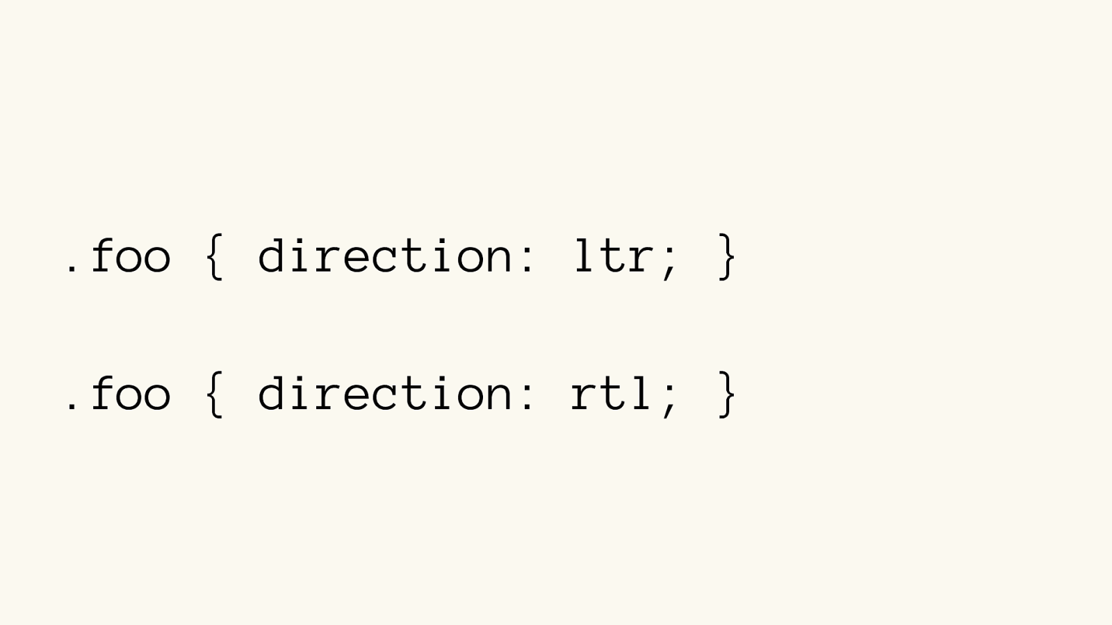
.foo { direction: ltr; }
.foo { direction: rtl; }
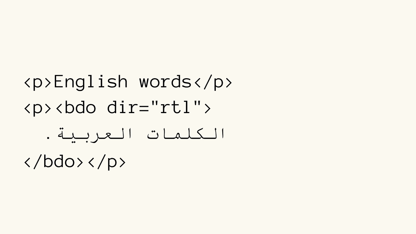
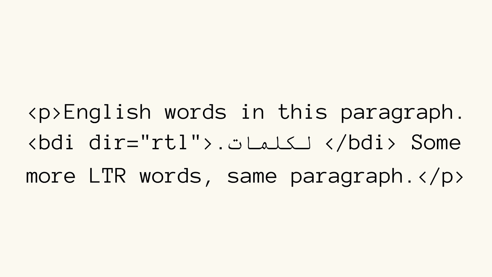
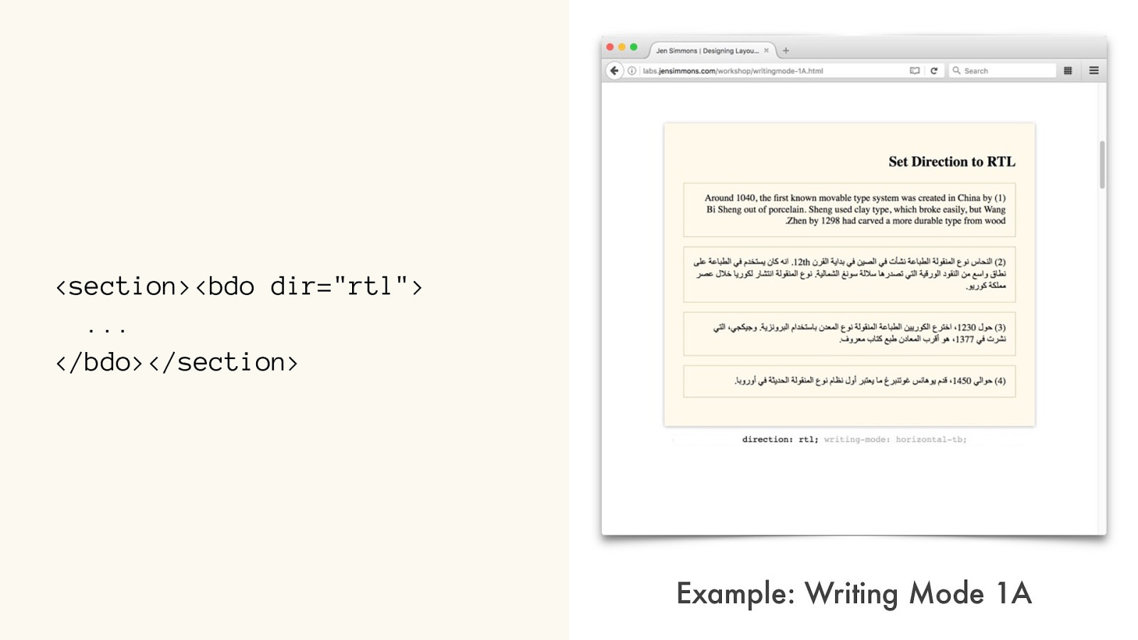
< p>English words</p>
<p><bdo dir=" rtl"> . ﺔﯿﺑﺮﻌﻟاتﺎﻤﻠﻜﻟا
</bdo></p>
</bdi> Some
more LTR words, same paragraph.</p>
LATIN-LIKE
SYSTEMS
ARABIC-LIKE
SYSTEMS
block
direction
inline direction
block
direction
inline direction
.css {direction: ltr;}
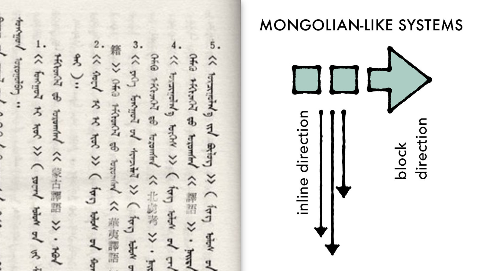
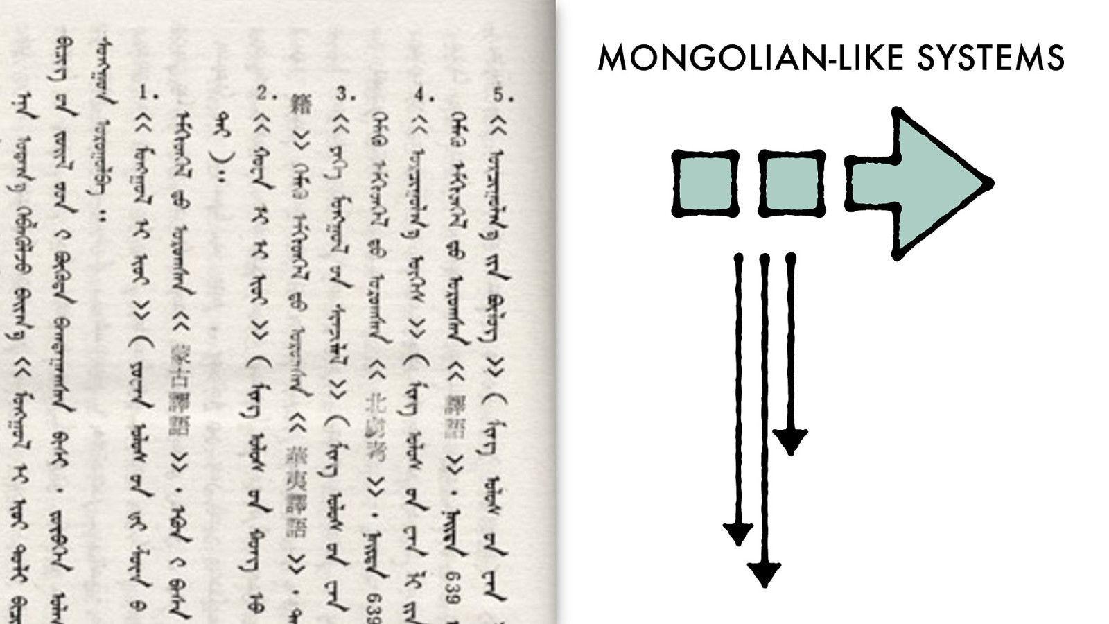
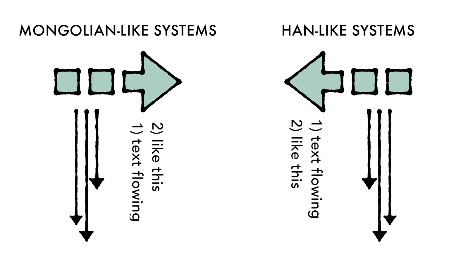
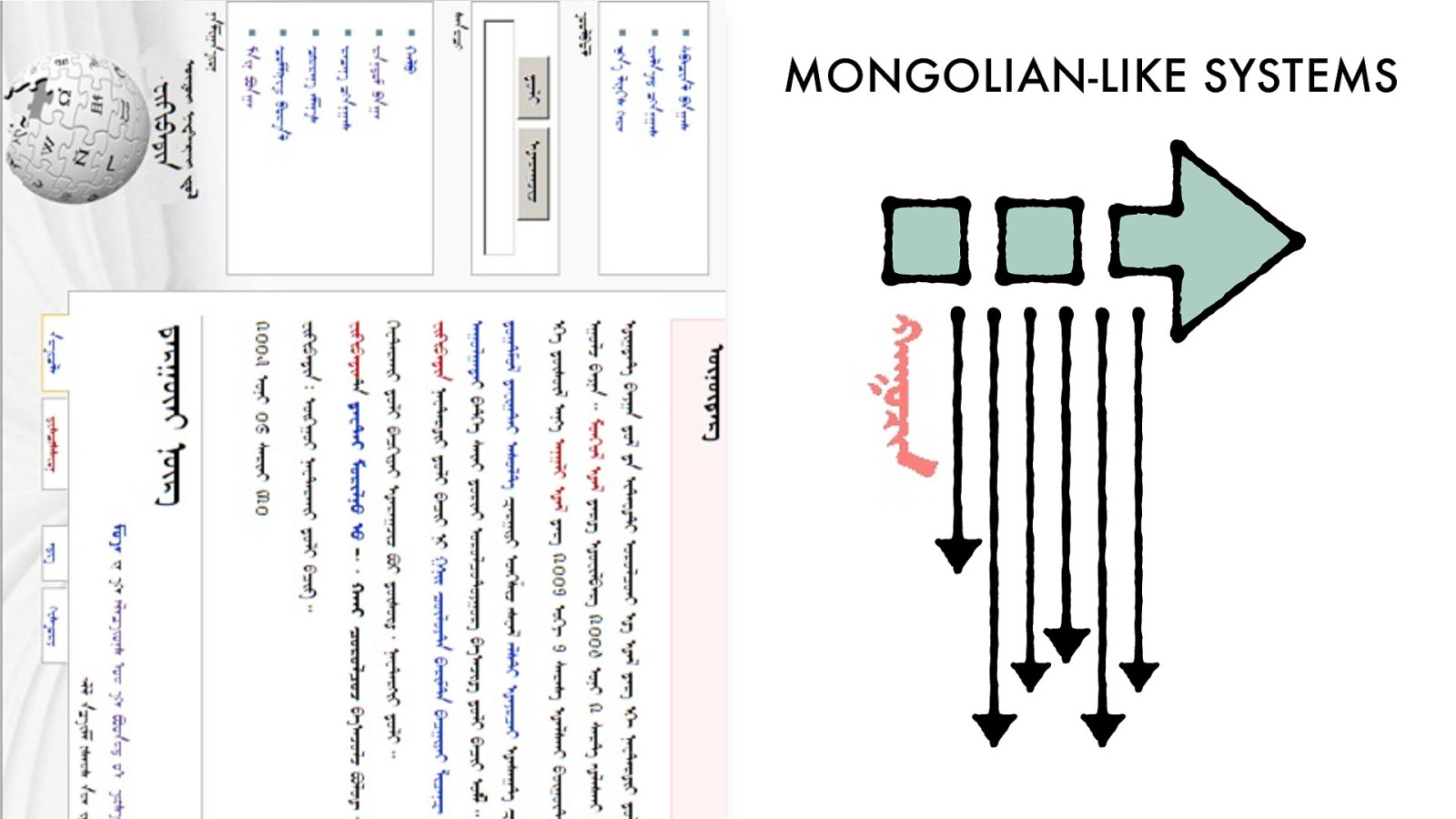
MONGOLIAN-LIKE
SYSTEMS
block
direction
inline direction
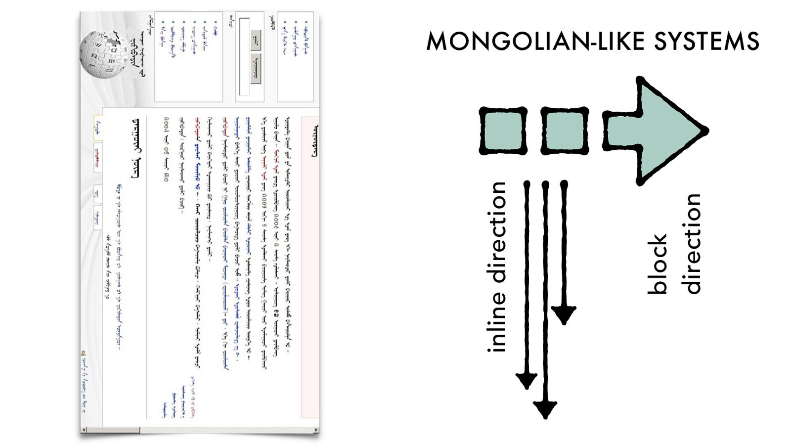
MONGOLIAN-LIKE
SYSTEMS
block
direction
inline direction
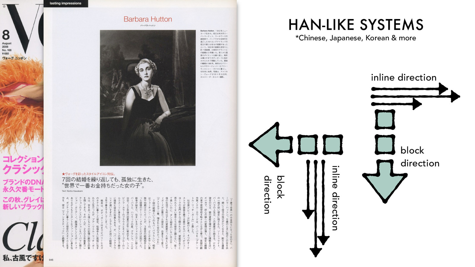
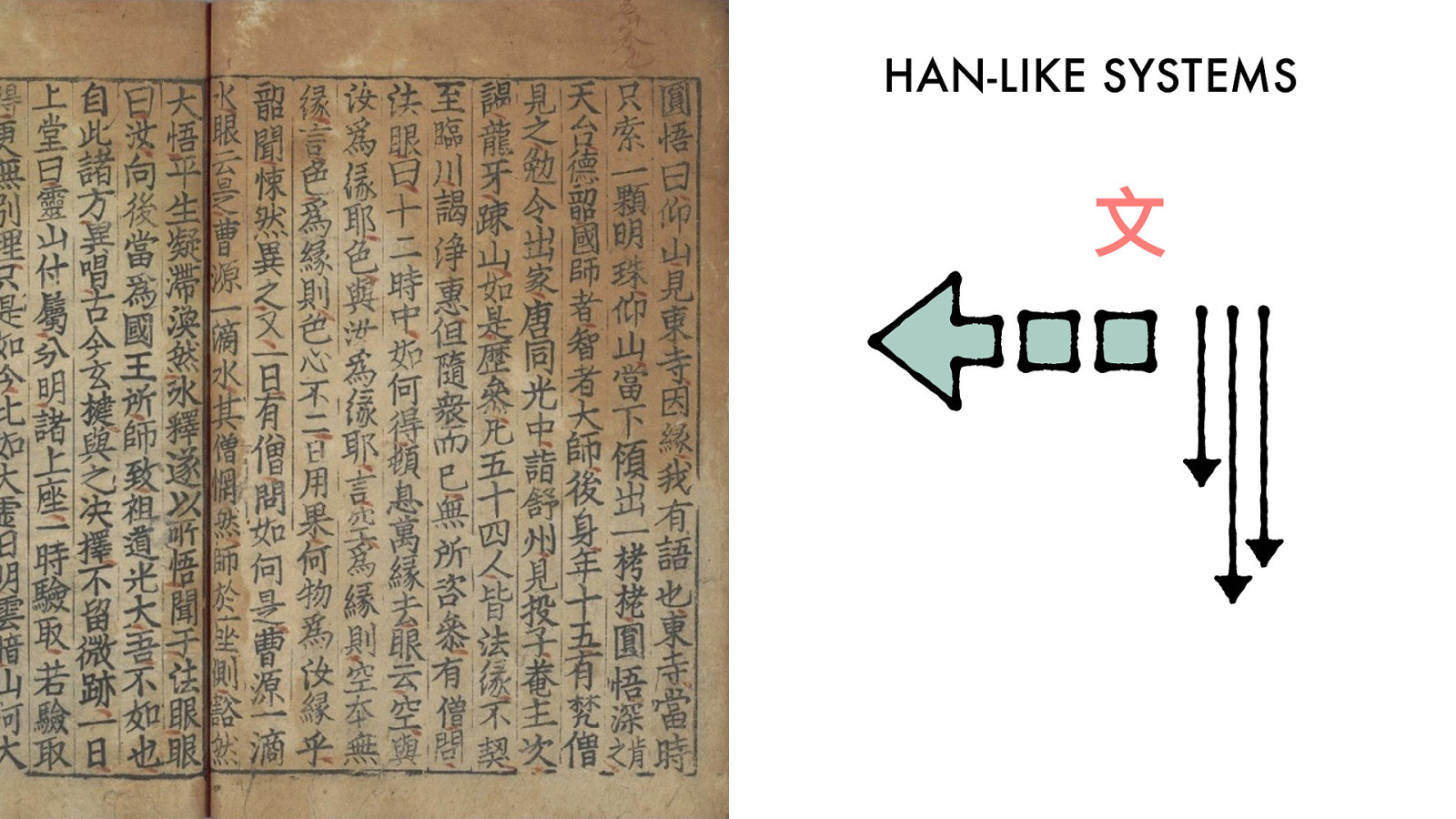
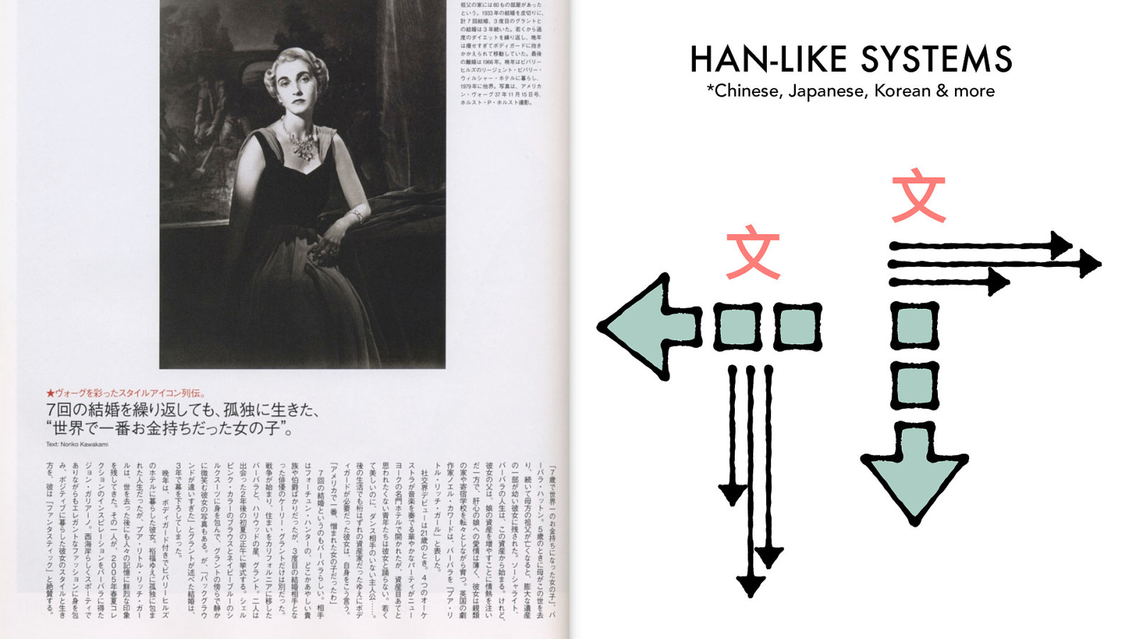
HAN-LIKE
SYSTEMS
block
direction
inline direction
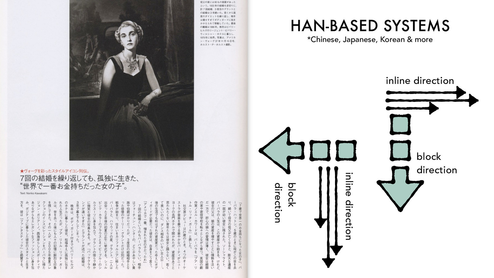
*Chinese, Japanese, Korean & more
HAN-LIKE
SYSTEMS
block
direction
inline direction
block
direction
inline direction
*Chinese, Japanese, Korean & more
HAN-BASED SYSTEMS
block
direction
inline direction
block
direction
inline direction
*Chinese, Japanese, Korean & more
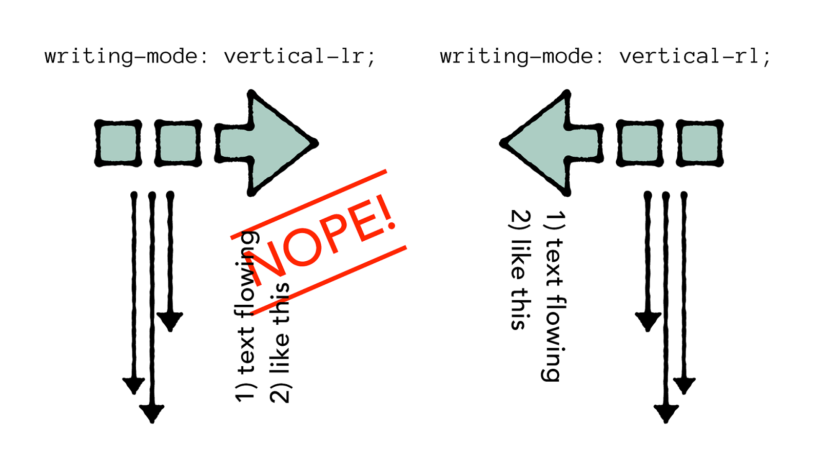
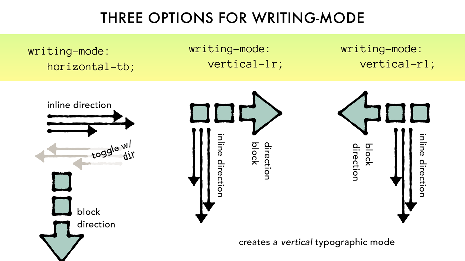
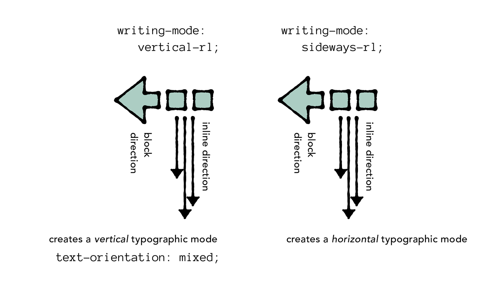
writing-mode
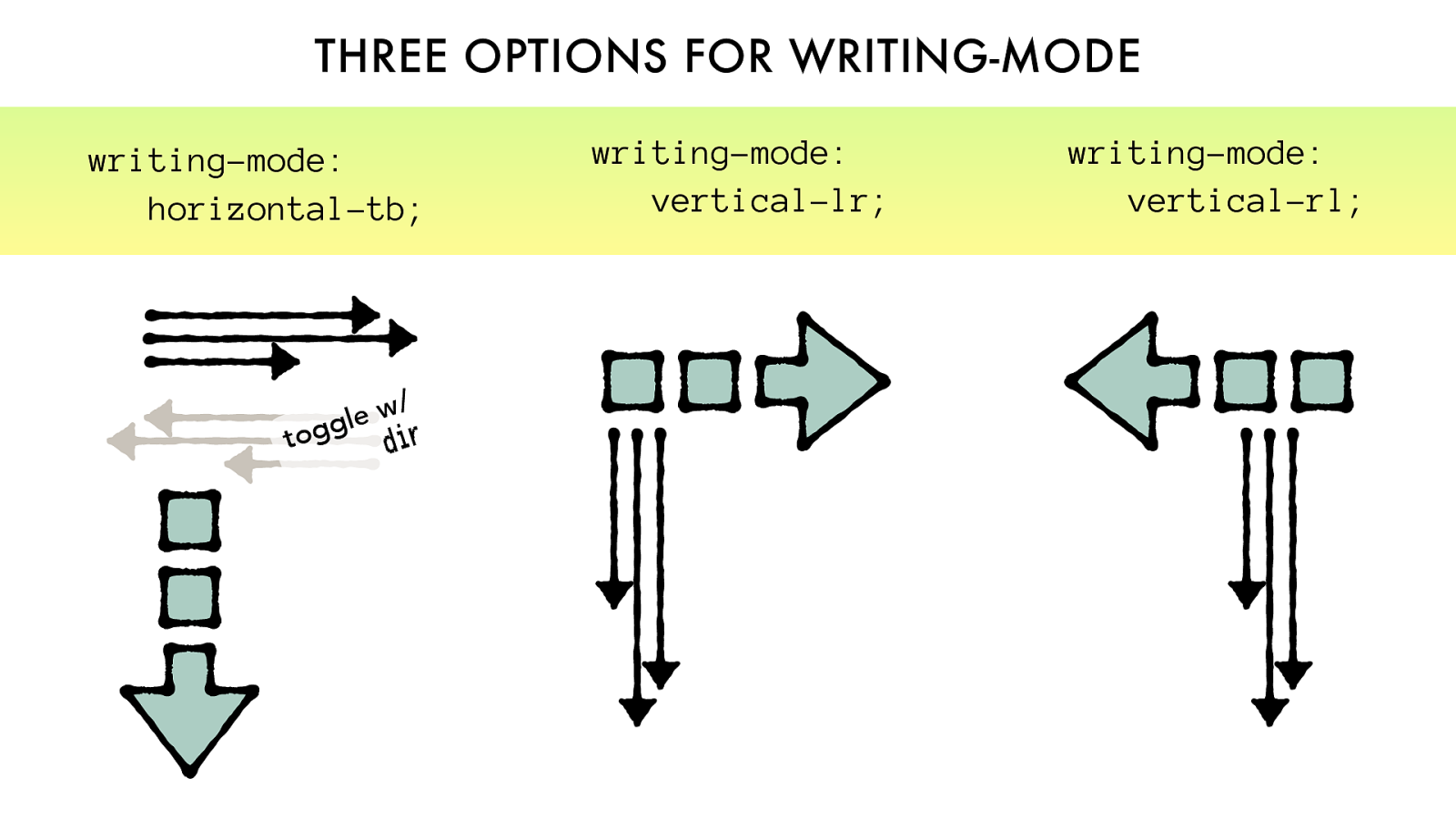
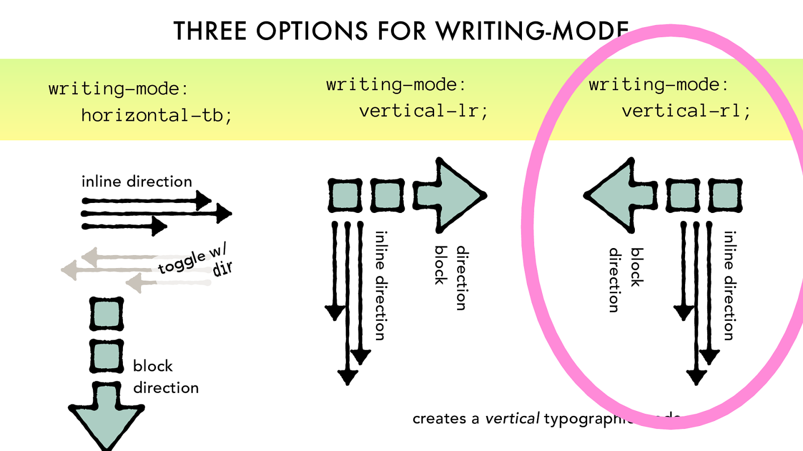
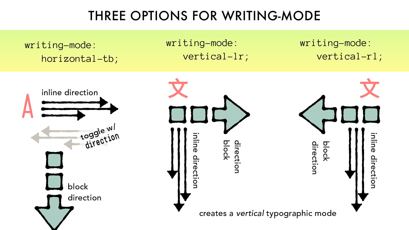
THREE OPTIONS FOR WRITING-MODE
writing-mode:
vertical-lr;
writing-mode:
vertical-rl;
toggle w/
dir
writing-mode:
horizontal-tb;
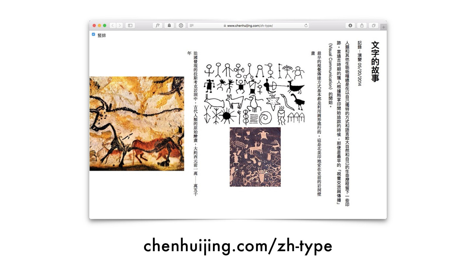
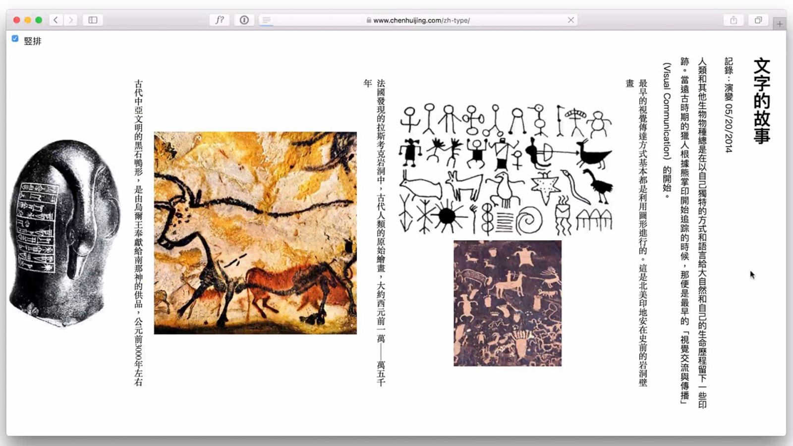
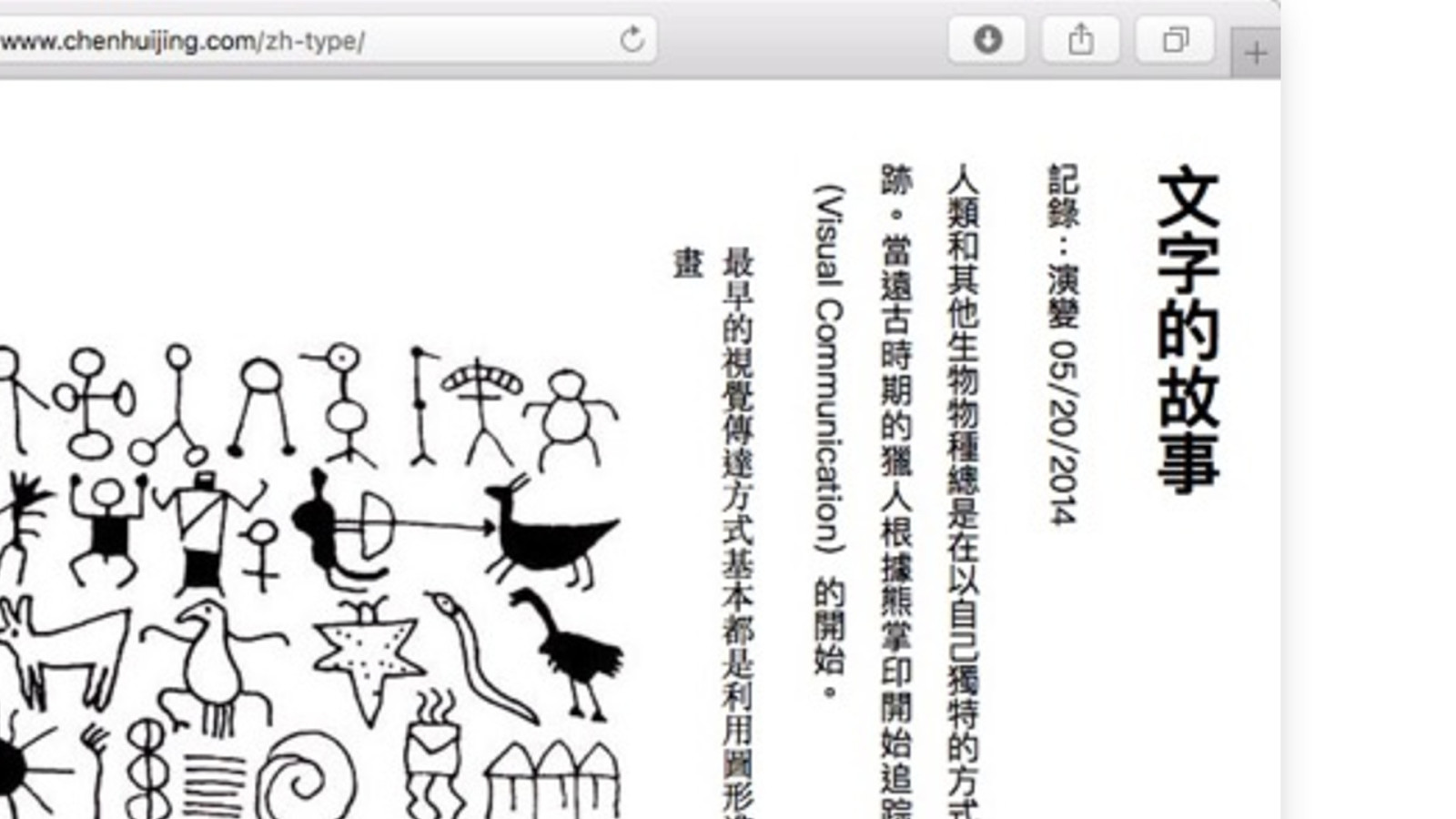
chenhuijing.com/zh-type
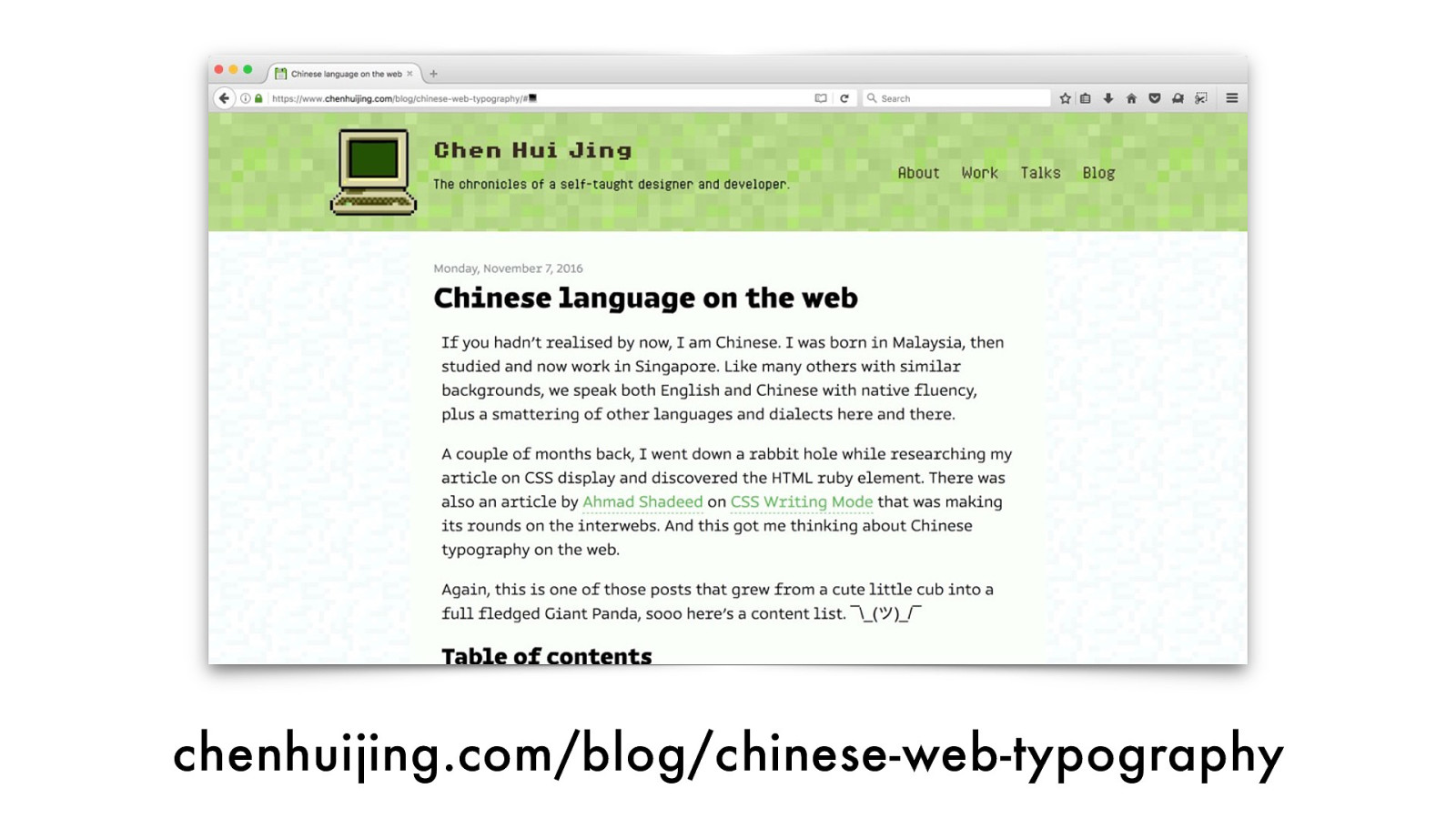
chenhuijing.com/blog/chinese-web-typography
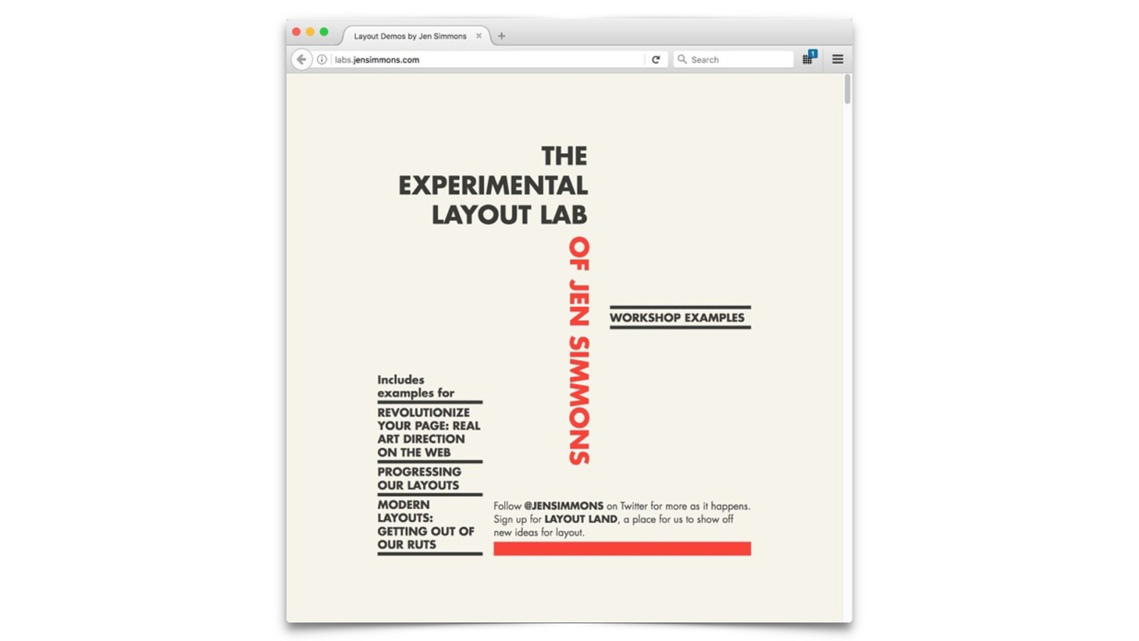
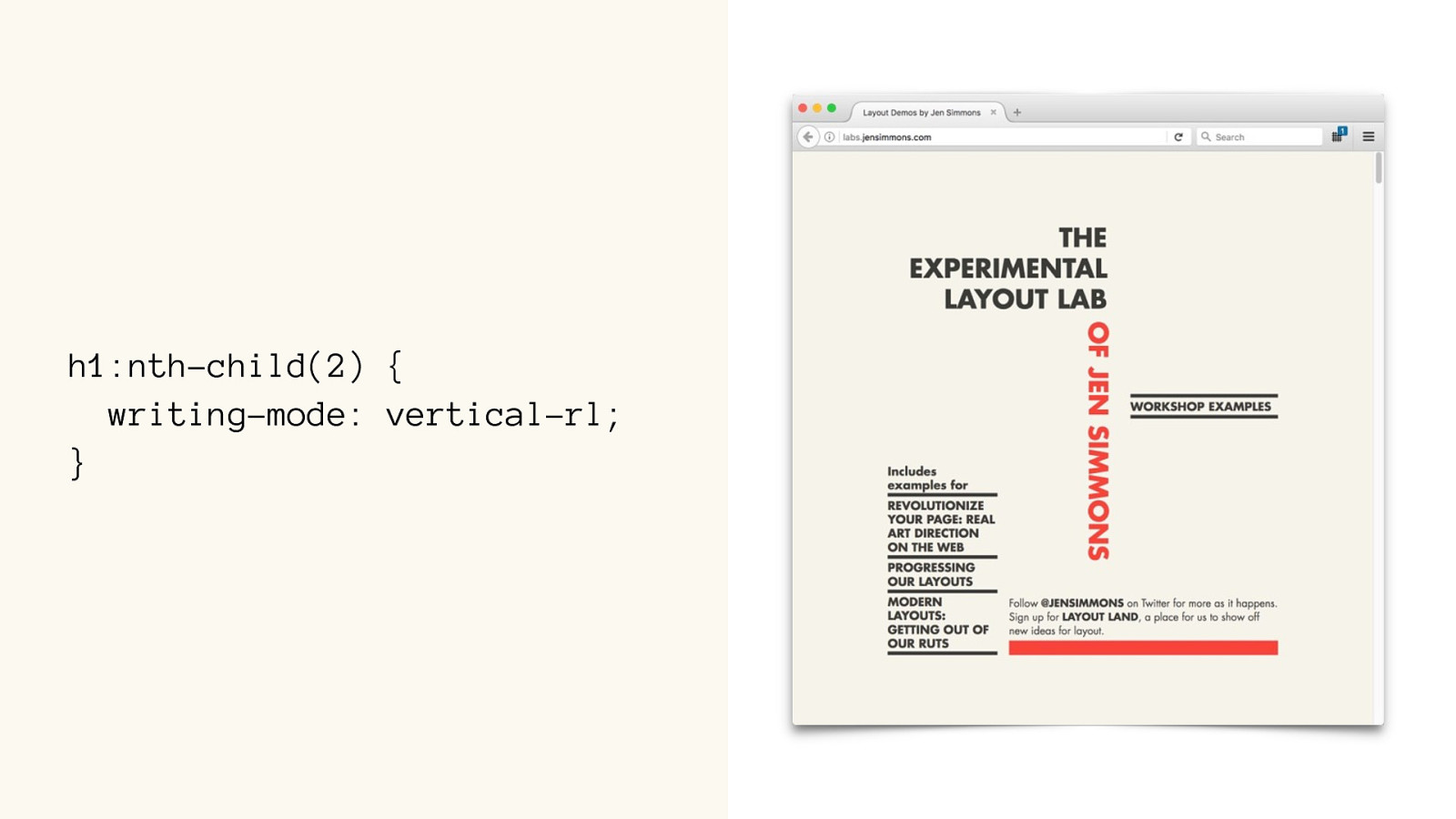
h1:nth-child(2) { writing-mode: vertical-rl; }
NOPE!
MONGOLIAN -LIKE SYSTEMS
MONGOLIAN -LIKE SYSTEMS
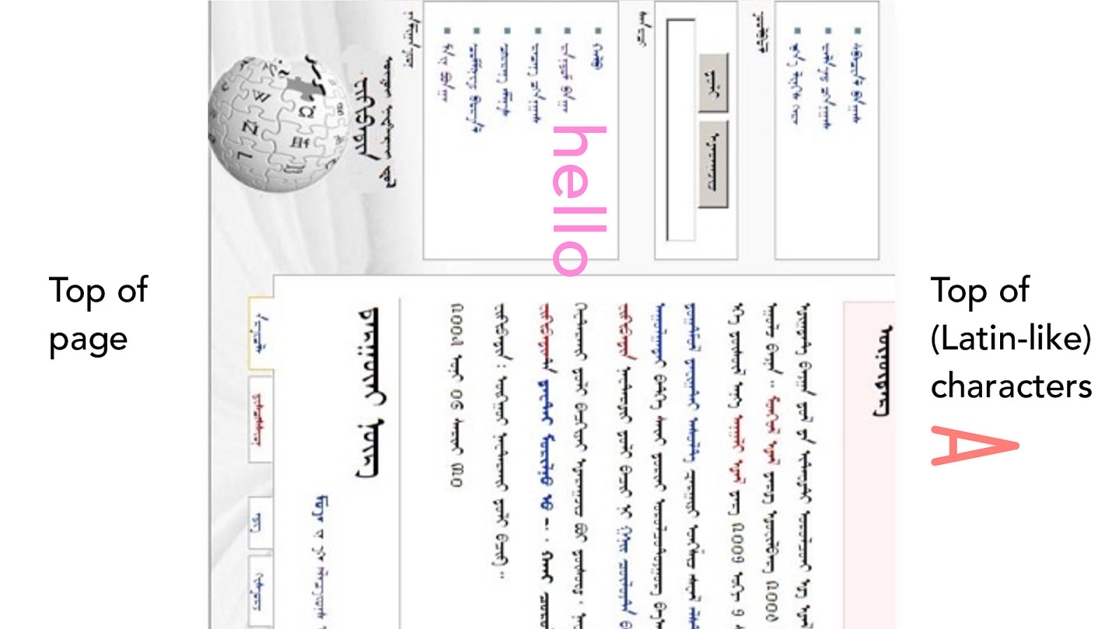
Top of
page
Top of
(Latin-like)
characters
hello
A
THREE OPTIONS FOR WRITING-MODE
direction
block
inline direction
writing-mode:
vertical-lr;
block
direction
inline direction
writing-mode:
vertical-rl;
block
direction
inline direction
toggle w/
dir
writing-mode:
horizontal-tb;
creates a
vertical
typographic mode
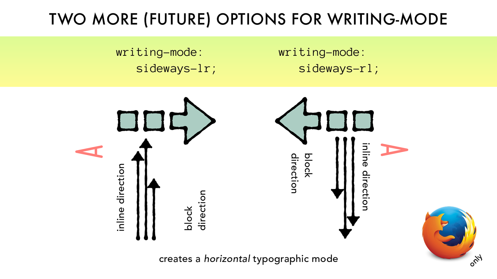
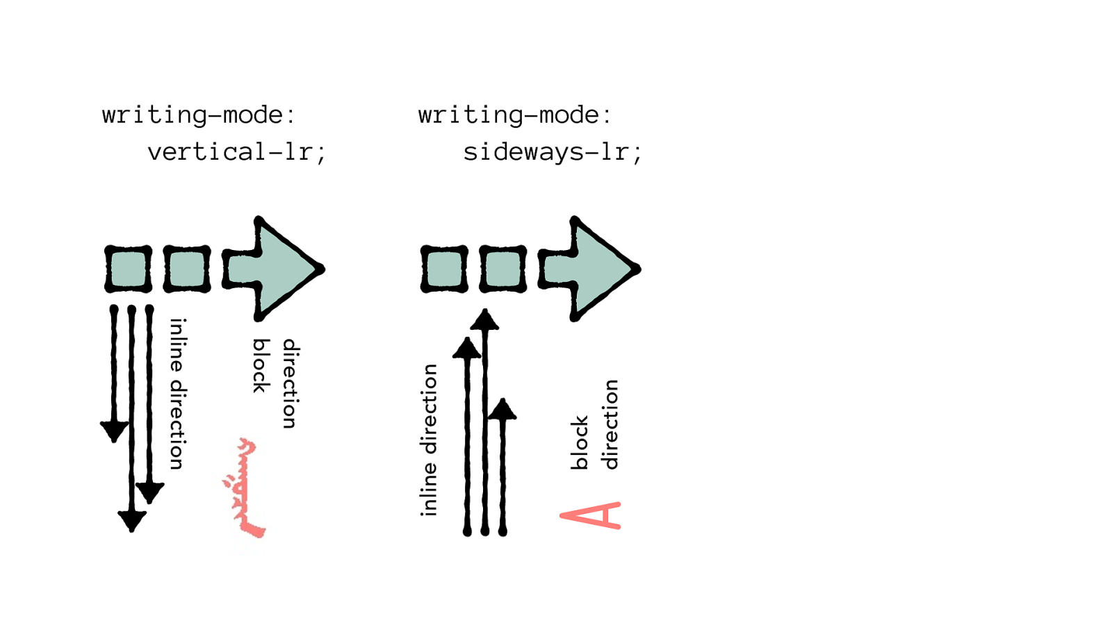
TWO MORE (FUTURE) OPTIONS FOR WRITING-MODE
block
direction
inline direction
writing-mode:
sideways-lr;
block
direction
inline direction
writing-mode:
sideways-rl;
creates a
horizontal
typographic mode only A A
block
direction
inline direction
writing-mode:
sideways-rl;
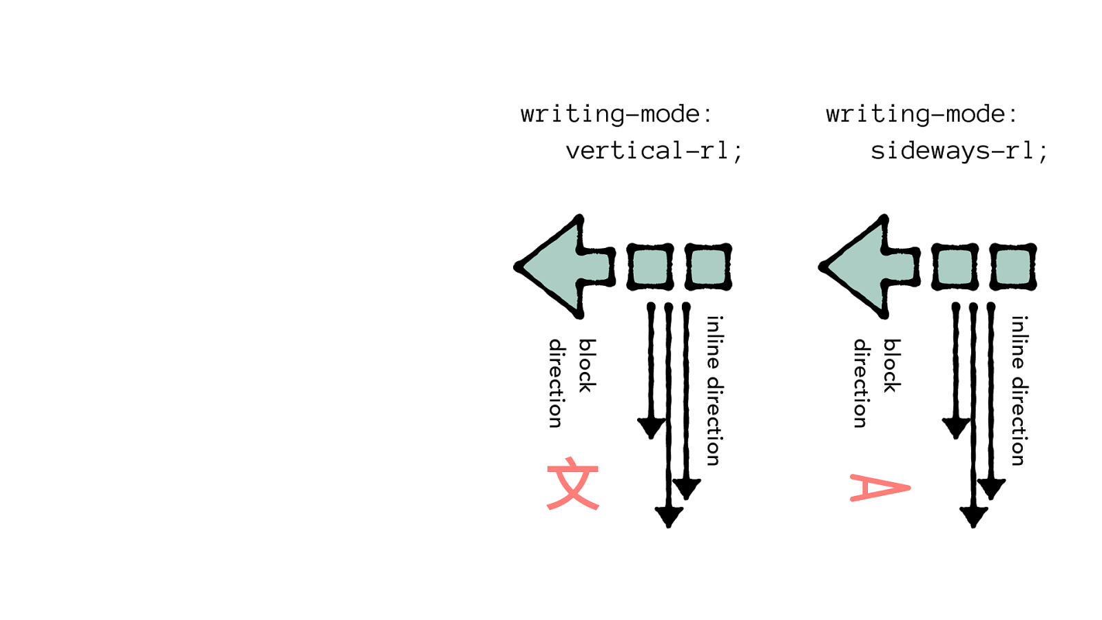
block
direction
inline direction
writing-mode:
vertical-rl;
A
È
direction
block
inline direction
writing-mode:
vertical-lr;
block
direction
inline direction
writing-mode:
sideways-lr;
A
creates a vertical
typographic mode
THREE OPTIONS FOR WRITING-MODE
direction
block
inline direction
writing-mode:
vertical-lr;
block
direction
inline direction
writing-mode:
vertical-rl;
block
direction
inline direction
toggle w/
dir
writing-mode:
horizontal-tb;
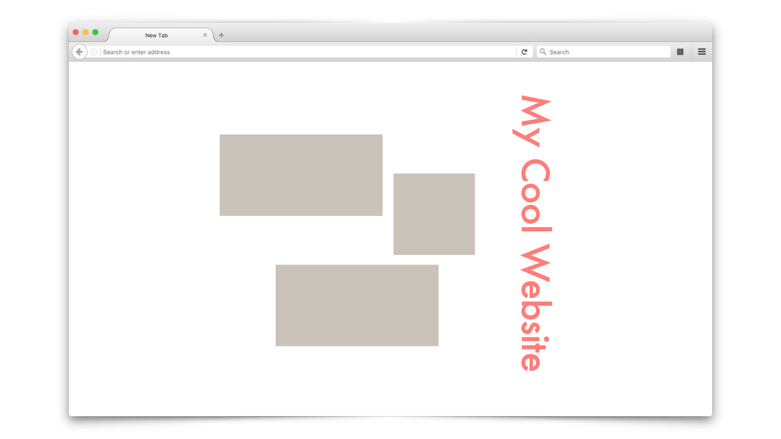
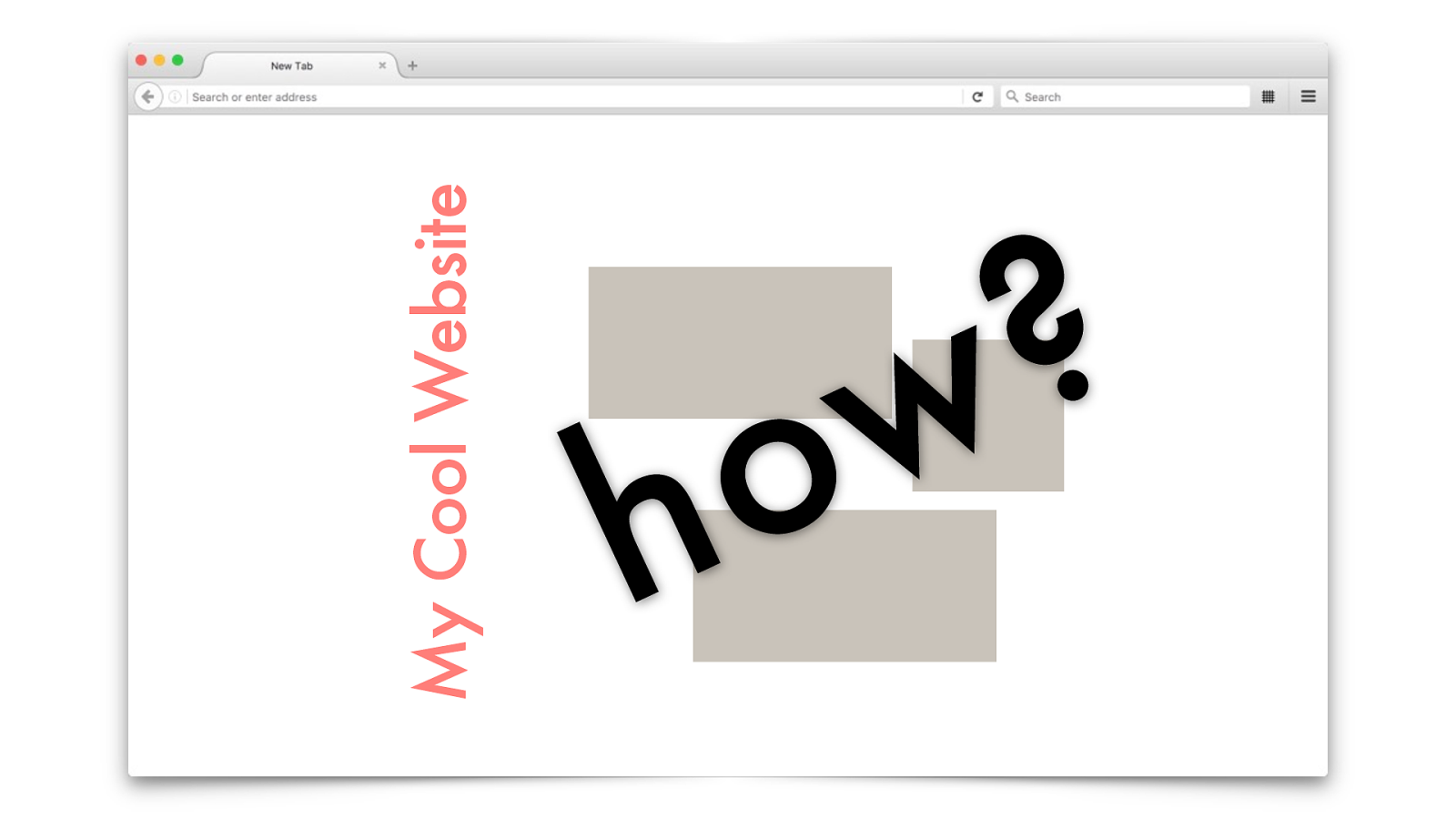
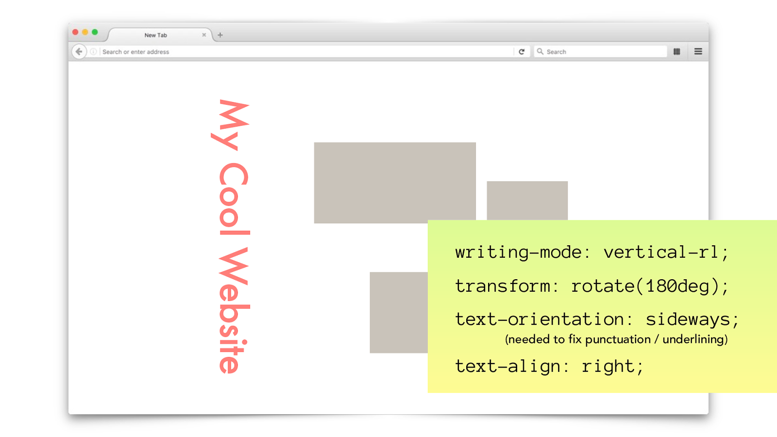
My Cool Website
My Cool Website how?
My Cool Website writing-mode: vertical-rl; transform: rotate(180deg) ; text-orientation: sideways; (needed to fix punctuation / underlining) text-align: right;
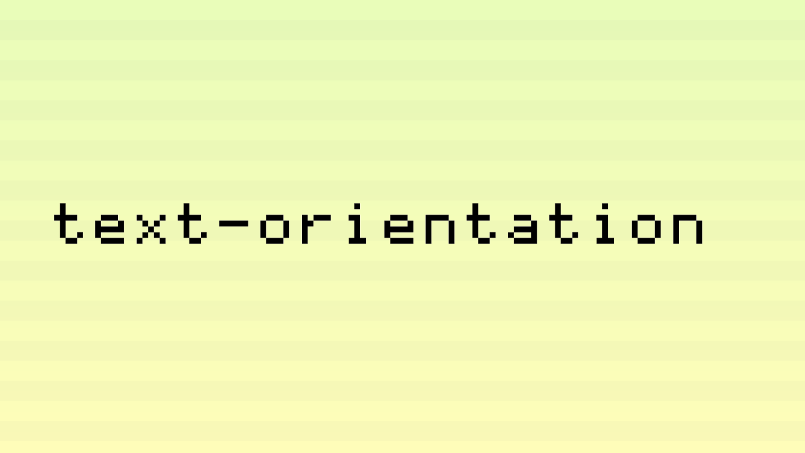
text-orientation
HAN-LIKE SYSTEMS
È
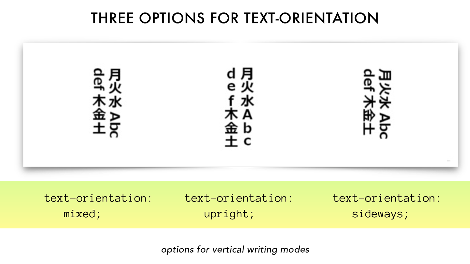
options for vertical
writing modes
text-orientation:
mixed;
text-orientation:
upright;
text-orientation:
sideways;
THREE OPTIONS FOR TEXT-ORIENTATION
block
direction
inline direction
writing-mode:
sideways-rl;
block
direction
inline direction
writing-mode:
vertical-rl;
text-orientation: mixed;
creates a
horizontal
typographic mode creates a vertical
typographic mode
My Cool Website writing-mode: vertical-rl; transform: rotate(180deg) ; text-orientation: sideways; (needed to fix punctuation / underlining) text-align: right;
SUMMARY
block
direction
inline direction
A
character orientation
LATIN-LIKE SYSTEMS A
ARABIC-LIKE SYSTEMS A
HAN-LIKE SYSTEMS *Chinese, Japanese, Korean & more
È
È
MONGOLIAN-LIKE SYSTEMS
dir writing-mode text-orientation
LATIN-LIKE
SYSTEMS
ARABIC-LIKE
SYSTEMS
block
direction
inline direction
block
direction
inline direction
.css {direction: ltr;}
THREE OPTIONS FOR WRITING-MODE
direction
block
inline direction
writing-mode:
vertical-lr;
block
direction
inline direction
writing-mode:
vertical-rl;
block
direction
inline direction
toggle w/
direction
writing-mode:
horizontal-tb;
creates a
vertical
typographic mode
È
È A
TWO MORE (FUTURE) OPTIONS FOR WRITING-MODE
block
direction
inline direction
writing-mode:
sideways-lr;
block
direction
inline direction
writing-mode:
sideways-rl;
creates a
horizontal
typographic mode only A A
options for vertical
writing modes
text-orientation:
mixed;
text-orientation:
upright;
text-orientation:
sideways;
THREE OPTIONS FOR TEXT-ORIENTATION
CODE IT UP
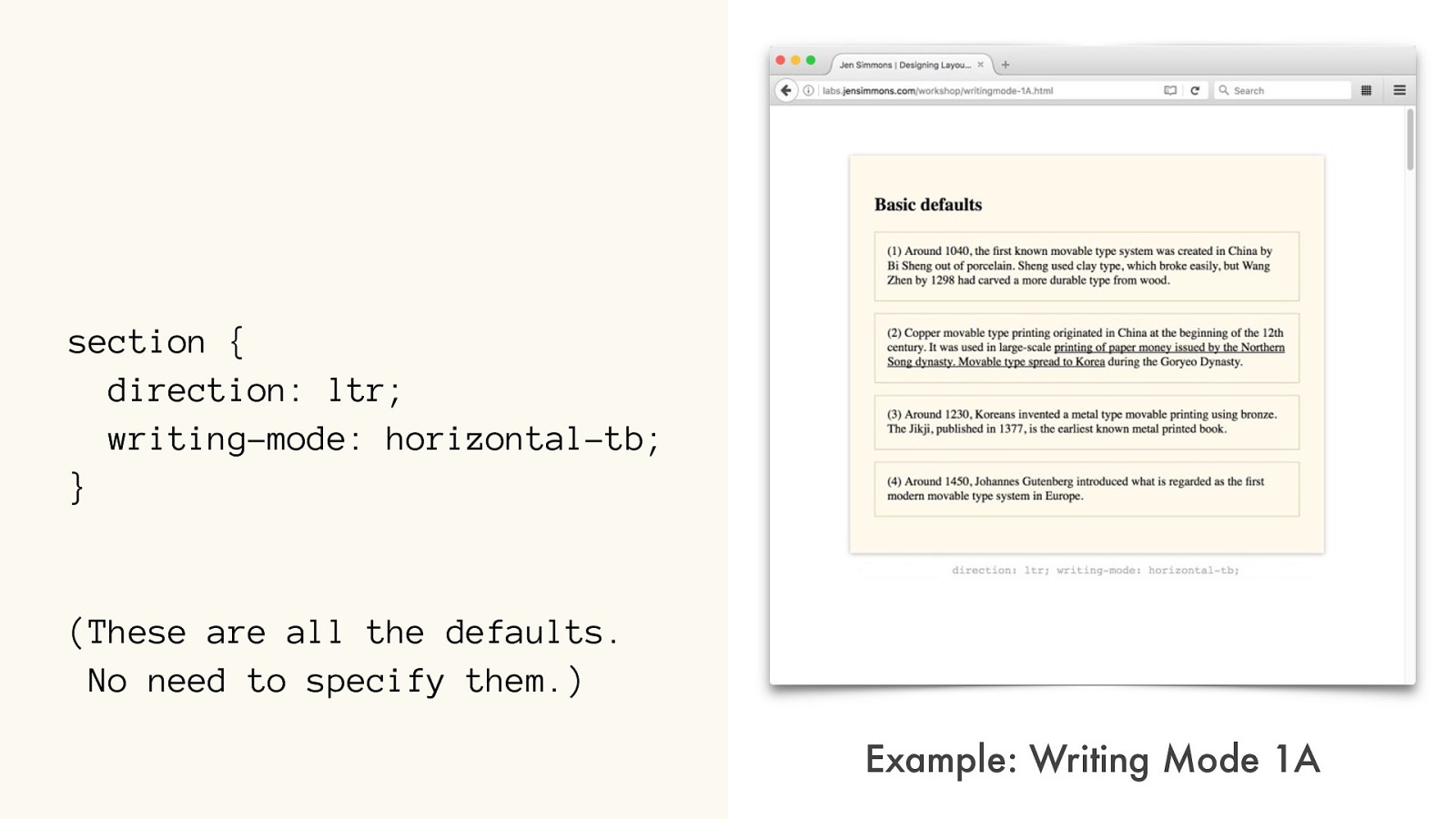
section { direction: ltr;
writing-mode: horizontal-tb;
}
(These are all the defaults.
No need to specify them.)
Example:
Writing Mode 1A
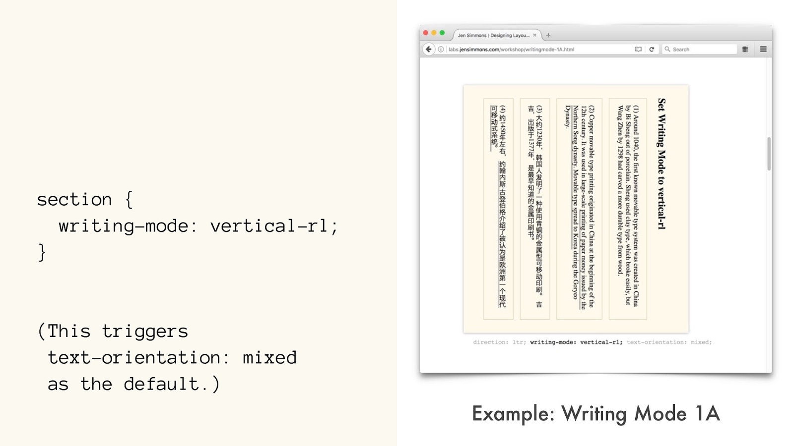
section { writing-mode: vertical-rl;
}
(This triggers
text-orientation: mixed
as the default.)
Example:
Writing Mode 1A
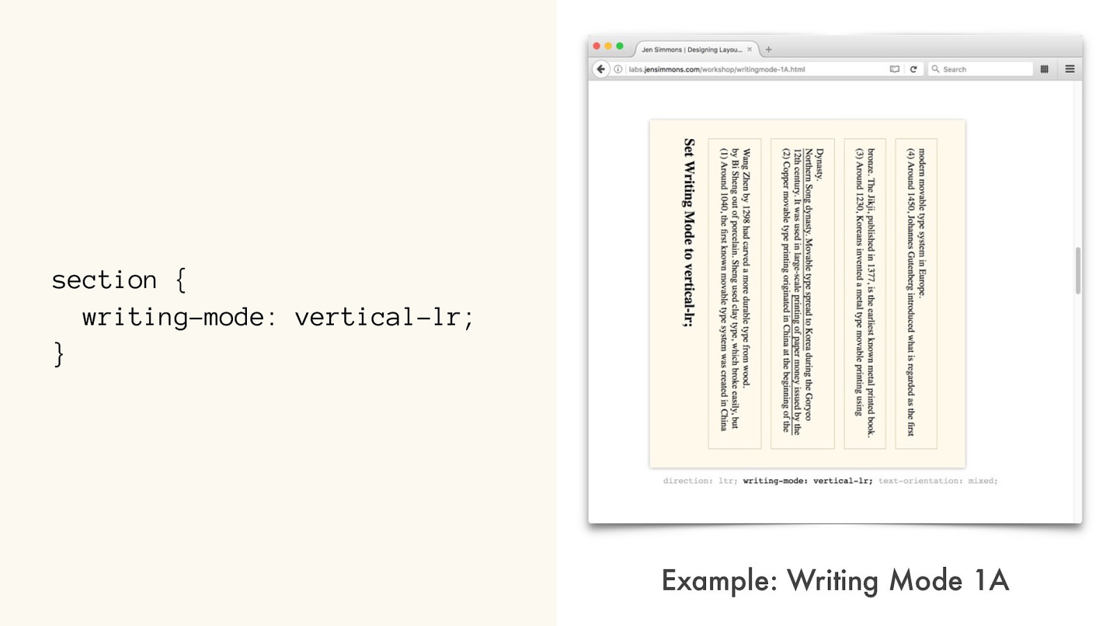
section { writing-mode: vertical-lr;
} Example: Writing Mode 1A
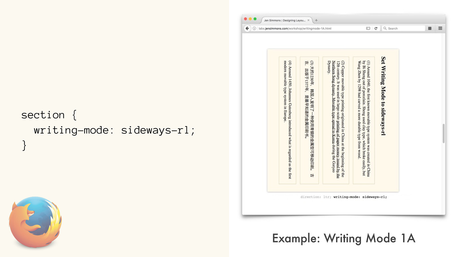
section { writing-mode: sideways-rl;
} Example: Writing Mode 1A
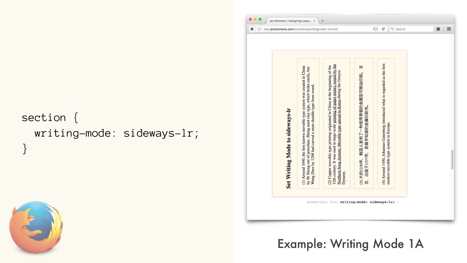
section { writing-mode: sideways-lr;
} Example: Writing Mode 1A
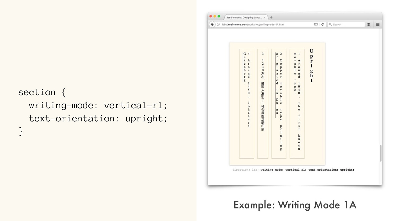
section { writing-mode: vertical-rl;
text-orientation: upright;
} Example: Writing Mode 1A
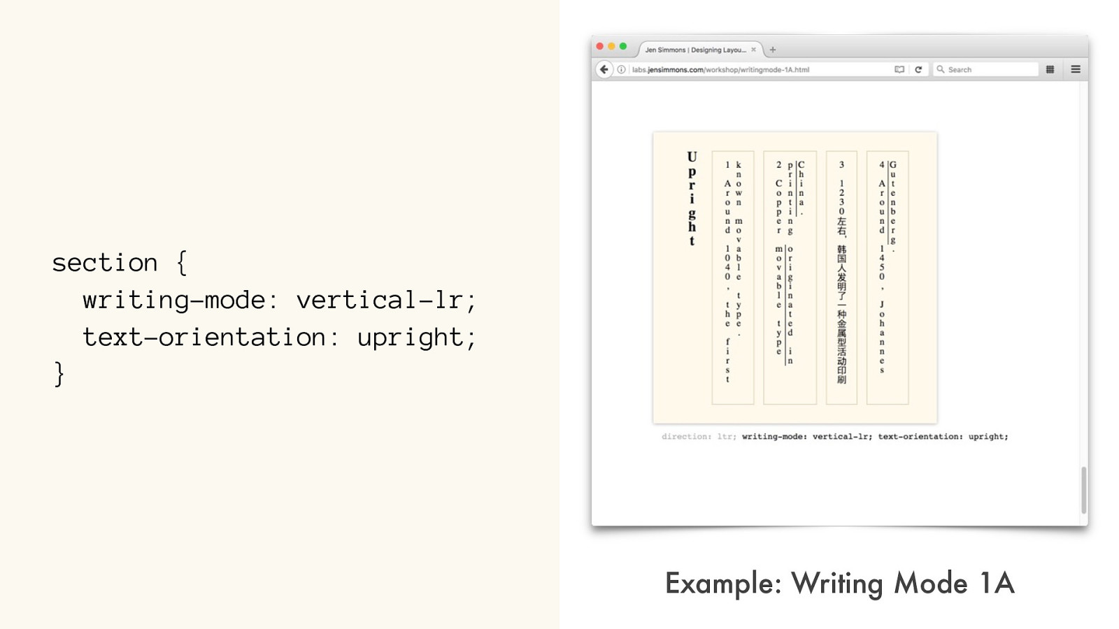
section { writing-mode: vertical-lr;
text-orientation: upright;
} Example: Writing Mode 1A
QUESTION TIME COMING SOON
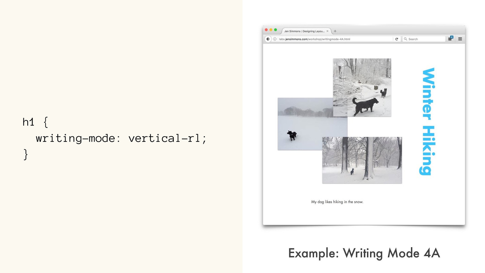
h1 { writing-mode: vertical-rl; } Example: Writing Mode 4A
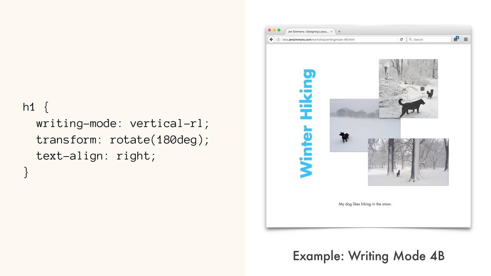
h1 { writing-mode: vertical-rl; transform: rotate(180deg); text-align: right; } Example: Writing Mode 4B
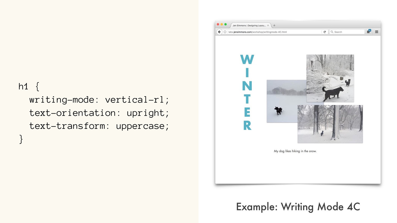
h1 { writing-mode: vertical-rl; text-orientation: upright; text-transform: uppercase; } Example: Writing Mode 4C
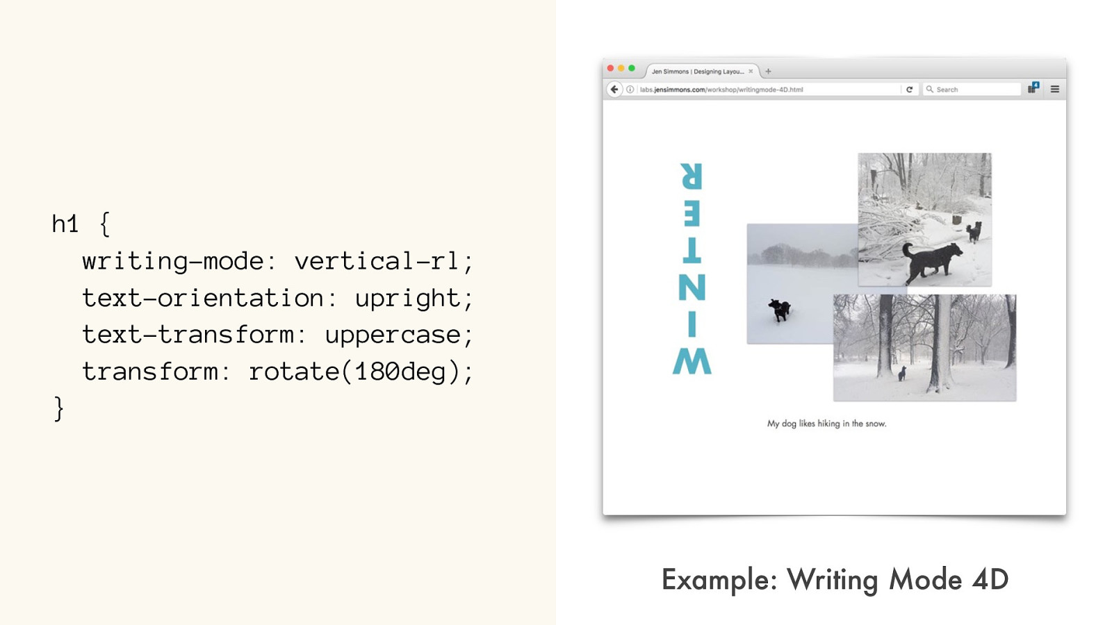
h1 { writing-mode: vertical-rl;
text-orientation: upright; text-transform: uppercase; transform: rotate(180deg); } Example: Writing Mode 4D
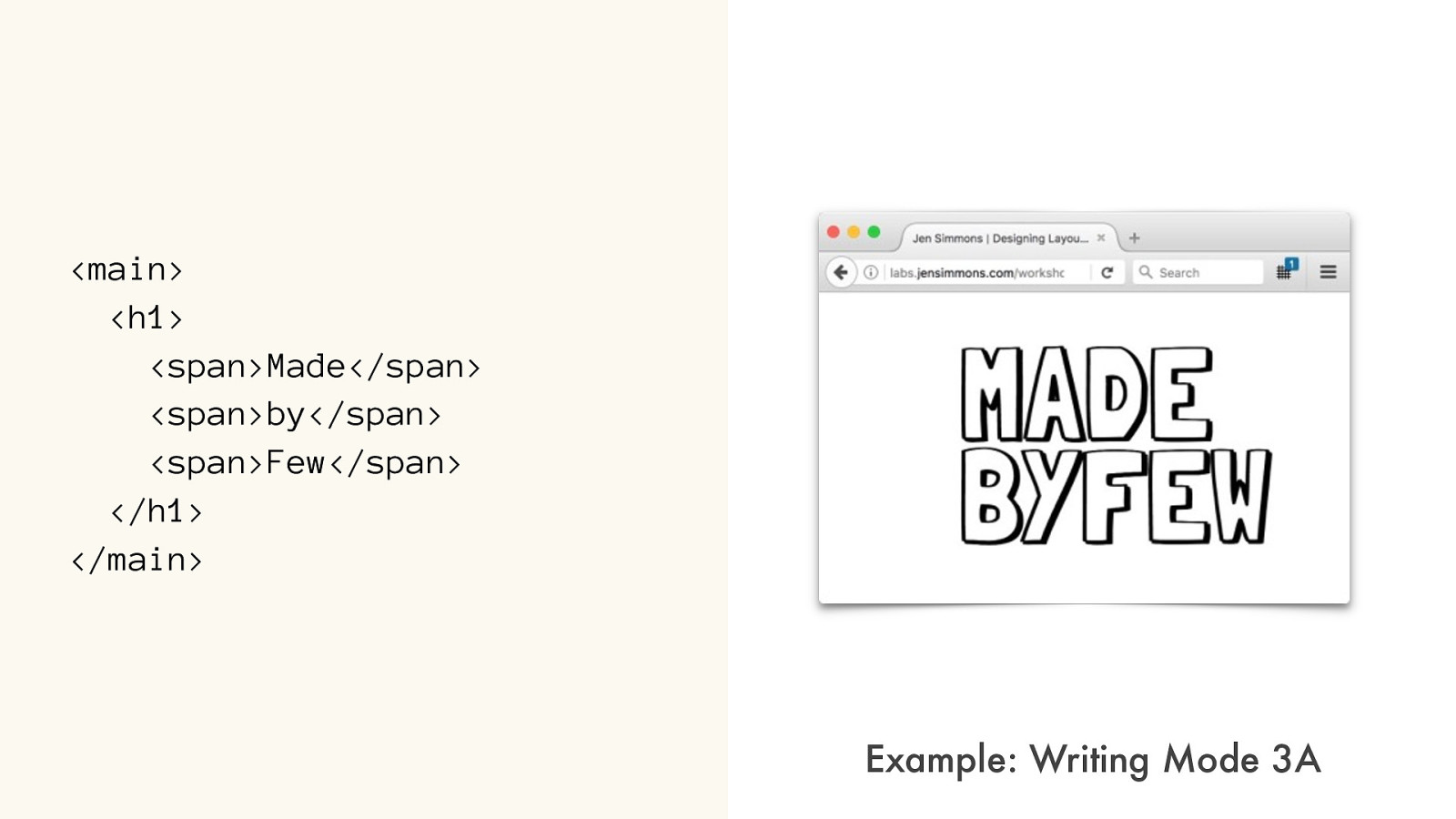
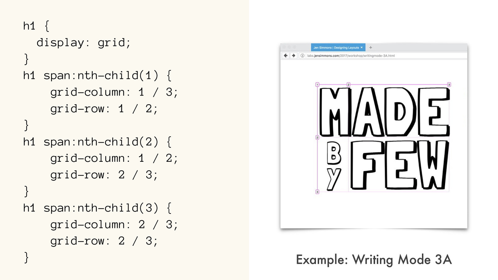
<span>Made</span>

<span>by</span>

<span>Few</span>
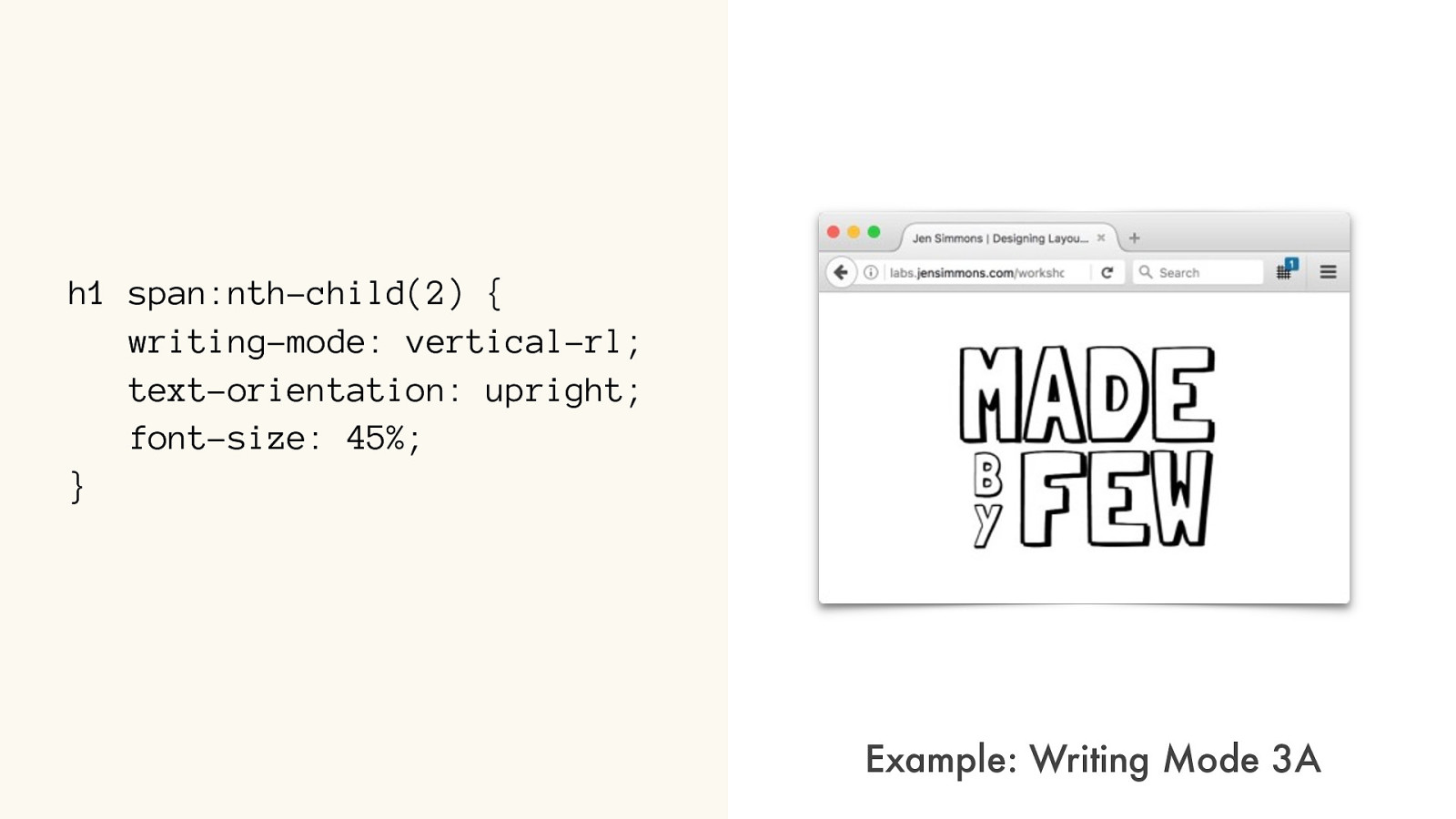
h1 span:nth-child(2) {
writing-mode: vertical-rl;
text-orientation: upright;
font-size: 45%;
}
Example: Writing Mode 3
A
h1 {
display: grid;
}
h1 span:nth-child(1) {
grid-column: 1 / 3;
grid-row: 1 / 2;
}
h1 span:nth-child(2) {
grid-column: 1 / 2;
grid-row: 2 / 3;
}
h1 span:nth-child(3) {
grid-column: 2 / 3;
grid-row: 2 / 3;
}
Example: Writing Mode 3
A
QUESTIONS?
Wr iting Modes
For the rest of today…
block
direction
inline direction
A
character orientation
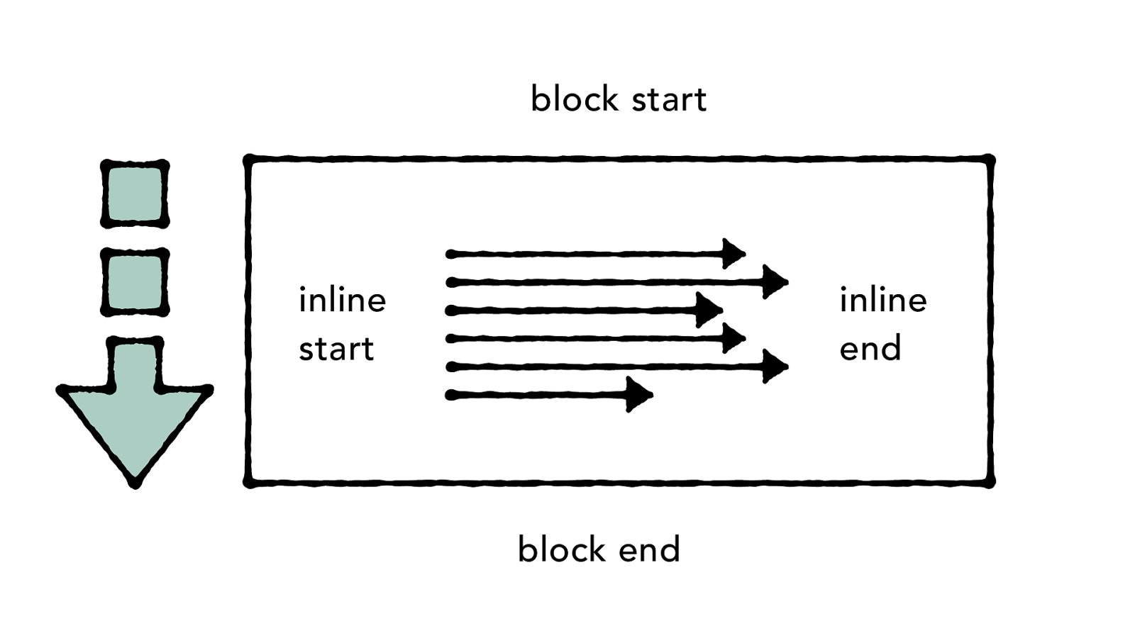
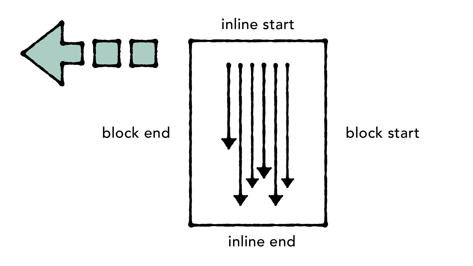
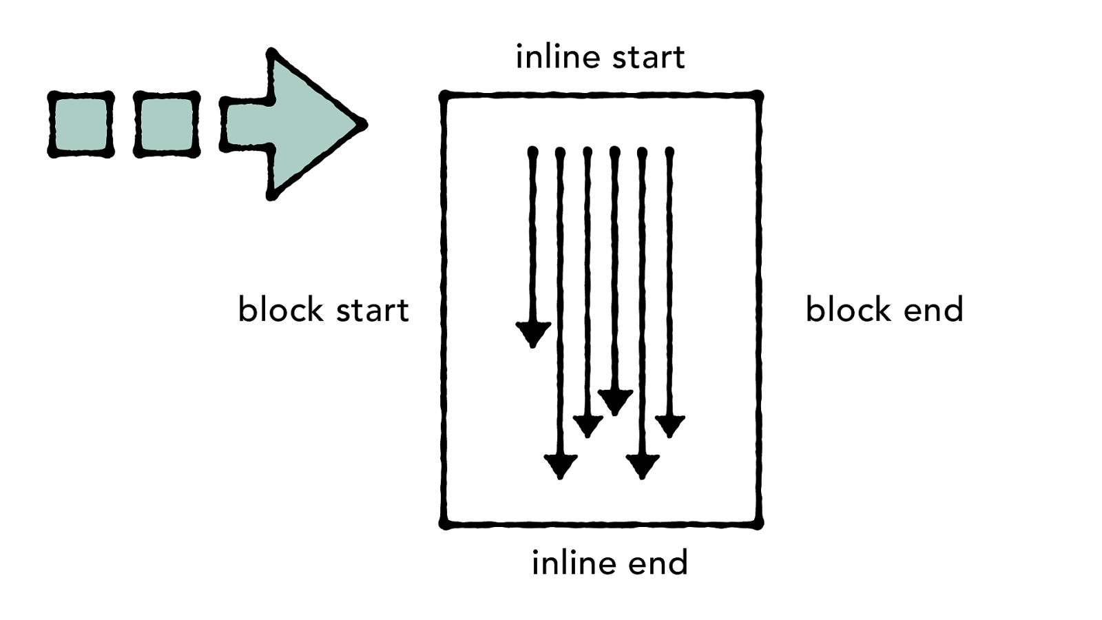
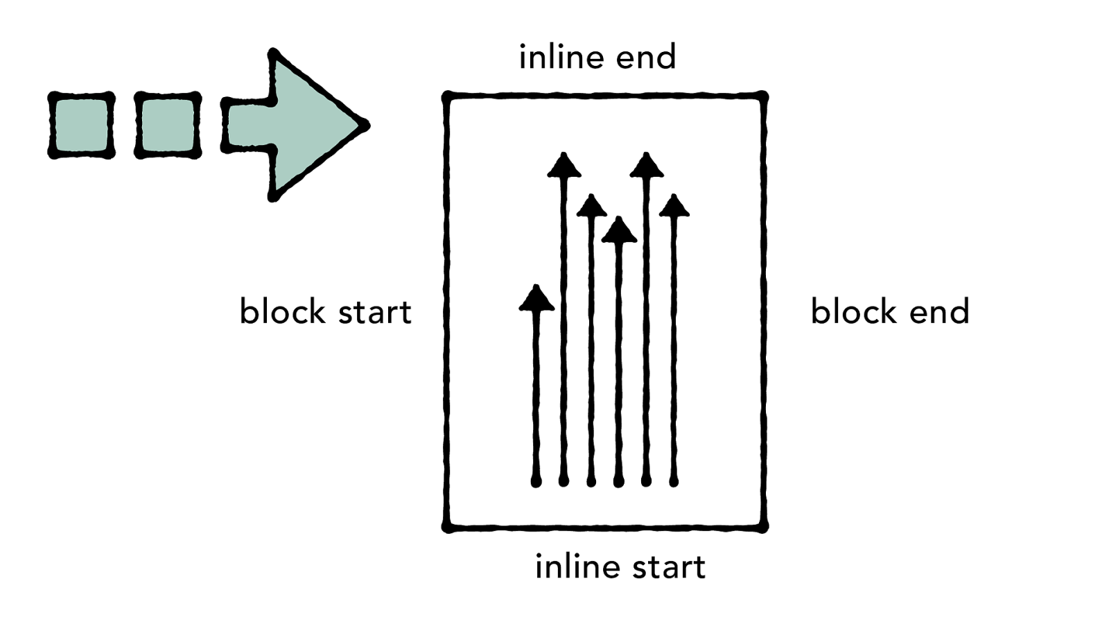
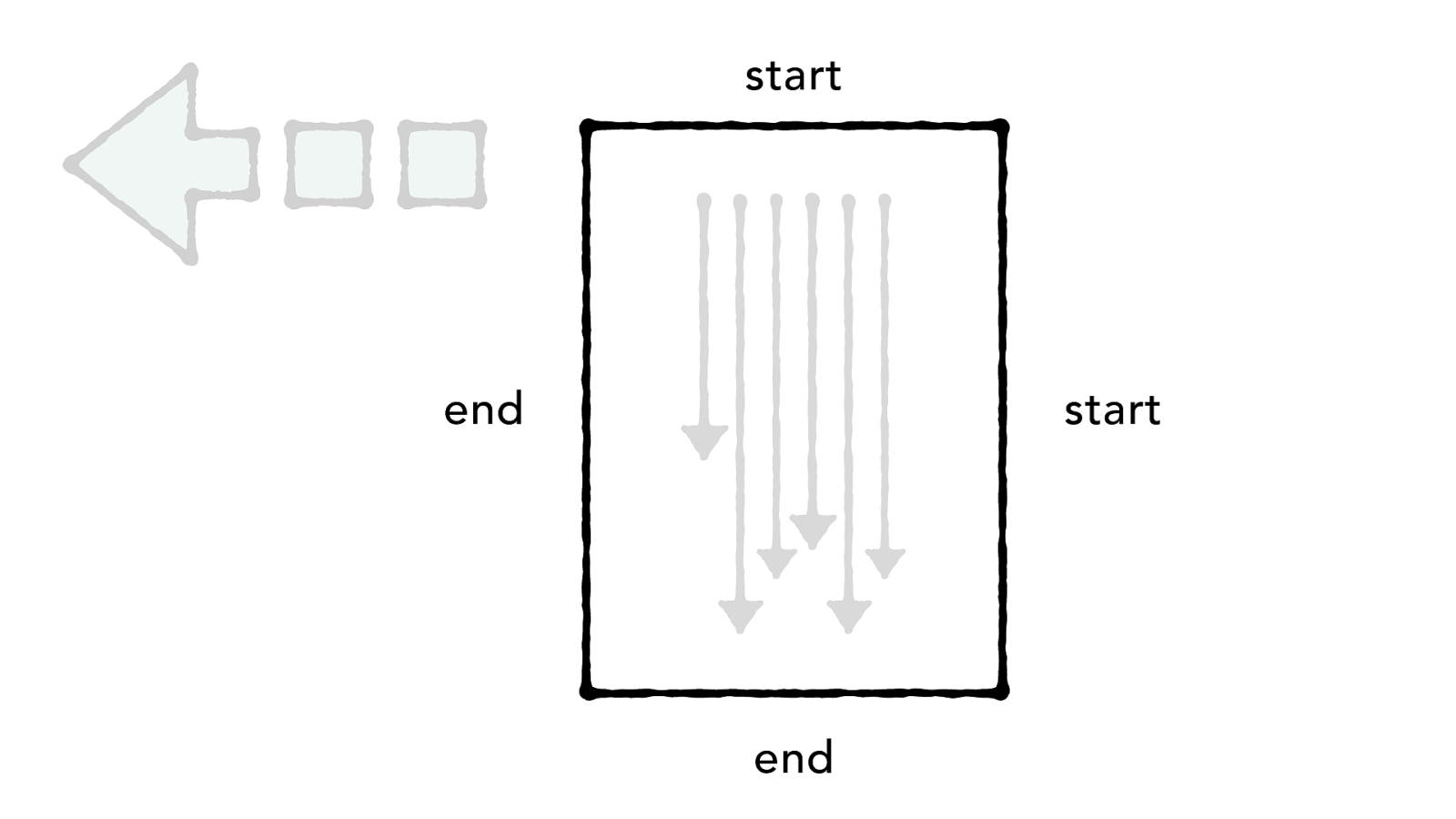
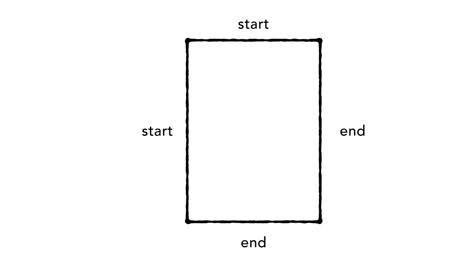
Start & End
block inline
block end
inline
start
inline
end
block start
block end inline start inline end block start
block start inline start inline end block end
block start inline end inline start block end
end start end start
start start end end
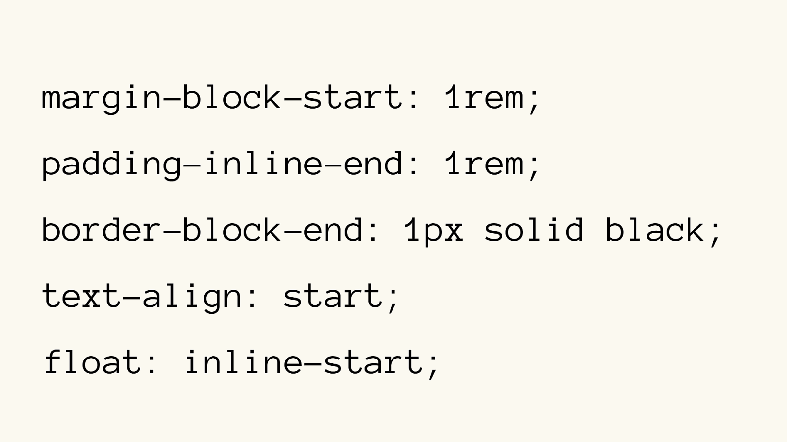
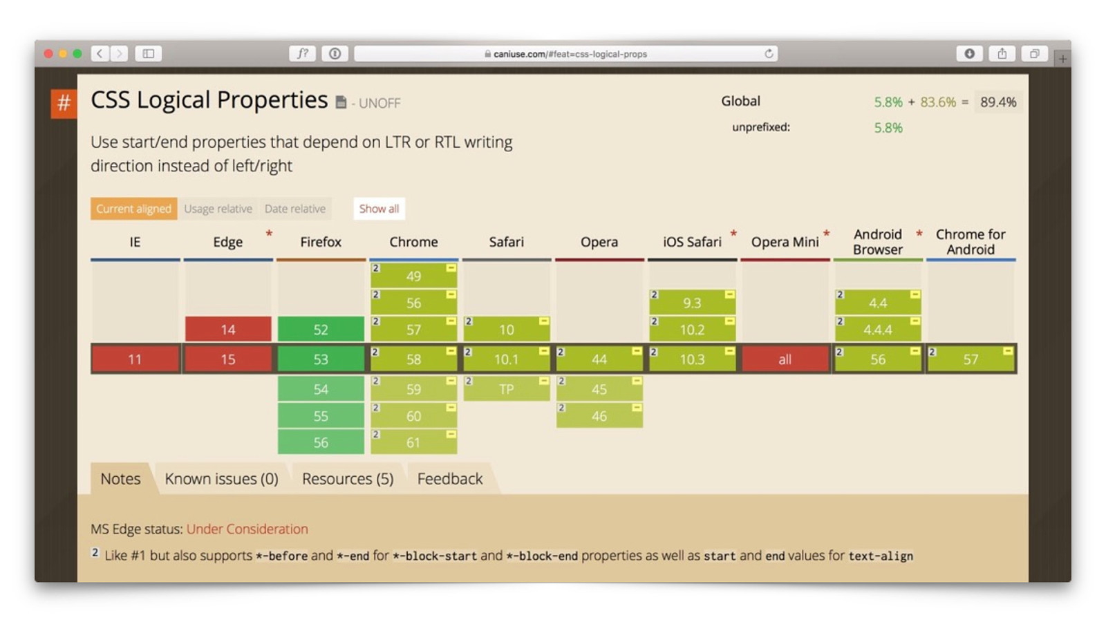
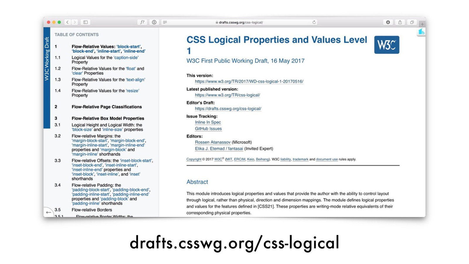
Logical Properties
margin-block-start: 1rem; padding-inline-end: 1rem; border-block-end: 1px solid black; text-align: start; float: inline-start;
drafts.csswg.org/css-logical
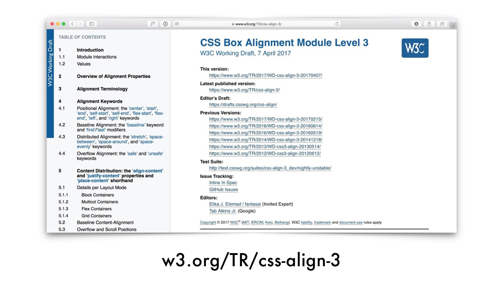
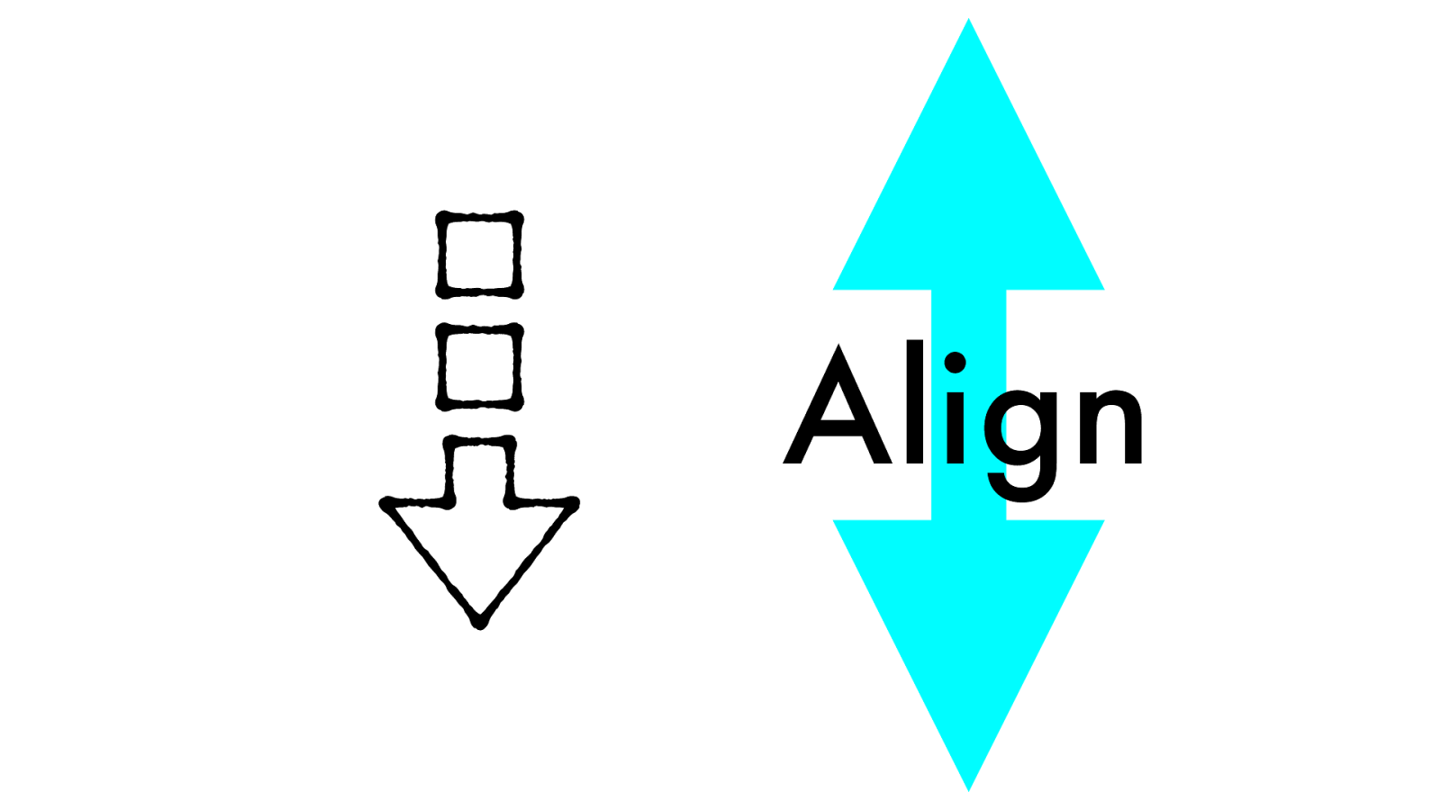
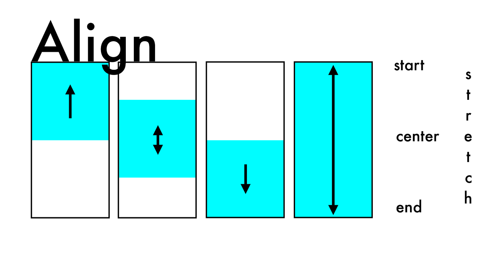
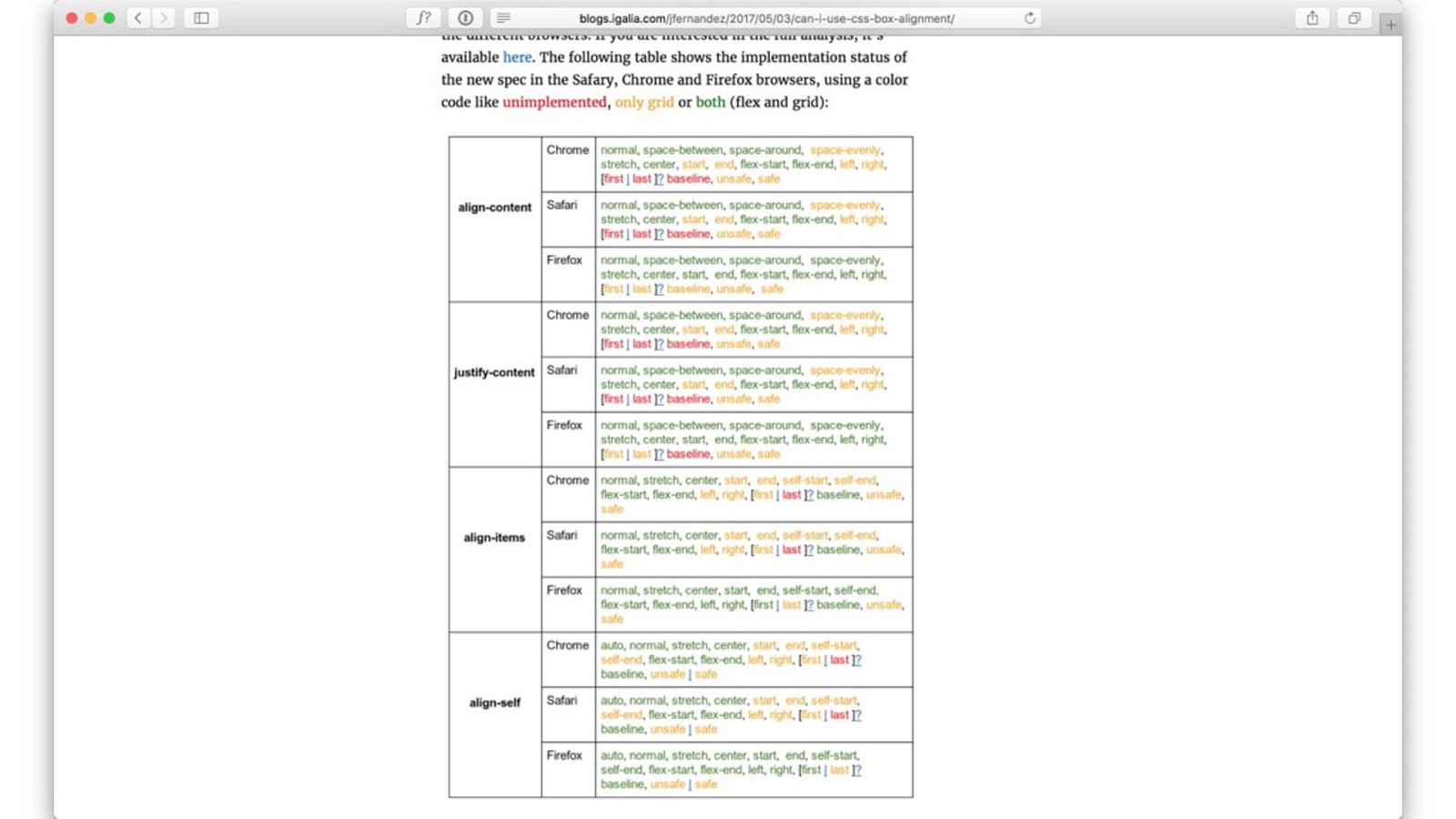
Alignment
w3.org/TR/css-align-3
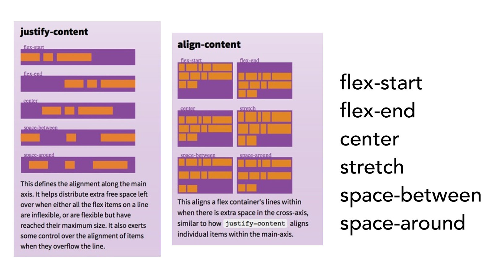
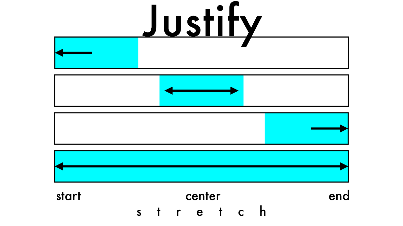
flex-start
flex-end
center
stretch
space-between
space-around
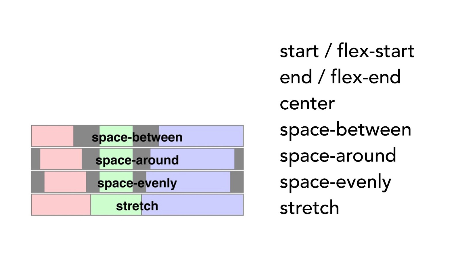
start / flex-start end / flex-end center space-between
space-around space-evenly stretch
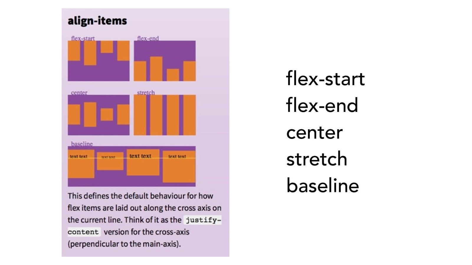
flex-start
flex-end
center
stretch
baseline
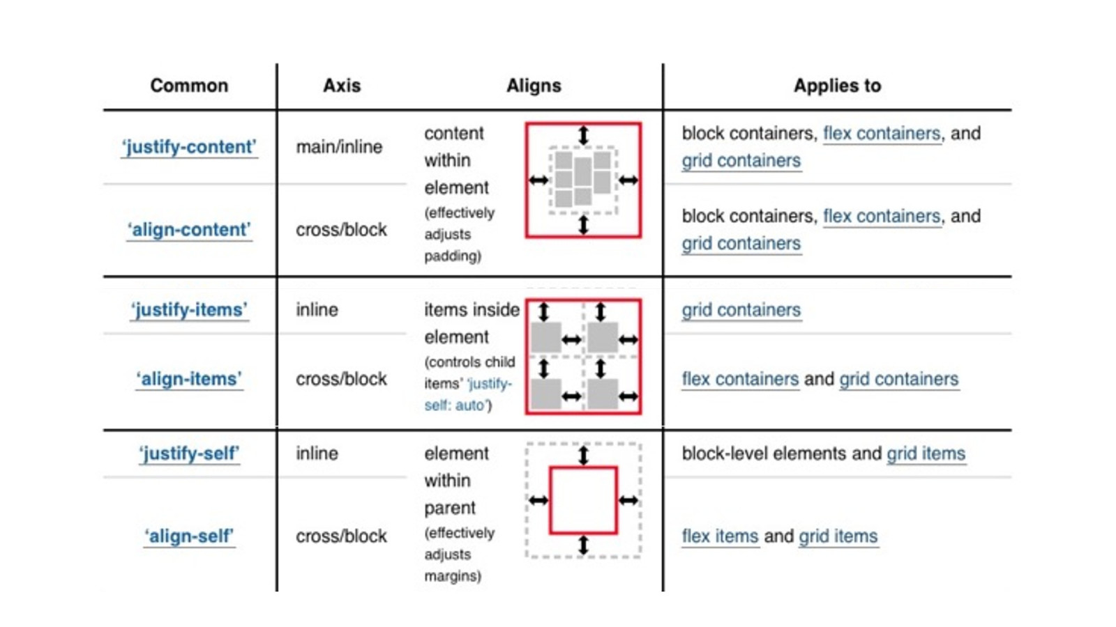
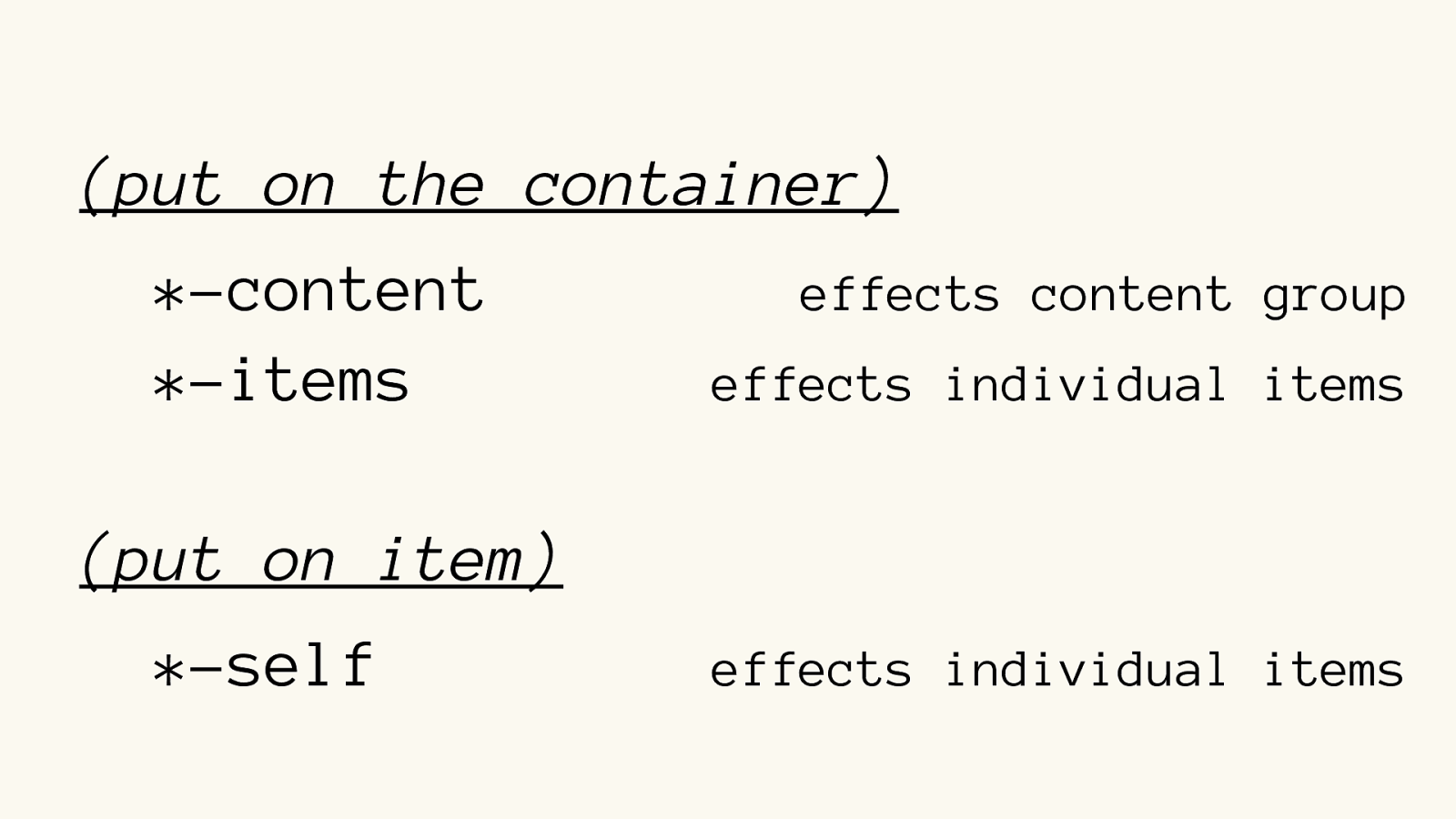
(put on the container) *-content
effects content group
*-items
effects individual items
(put on item)
*-self
effects
individual items
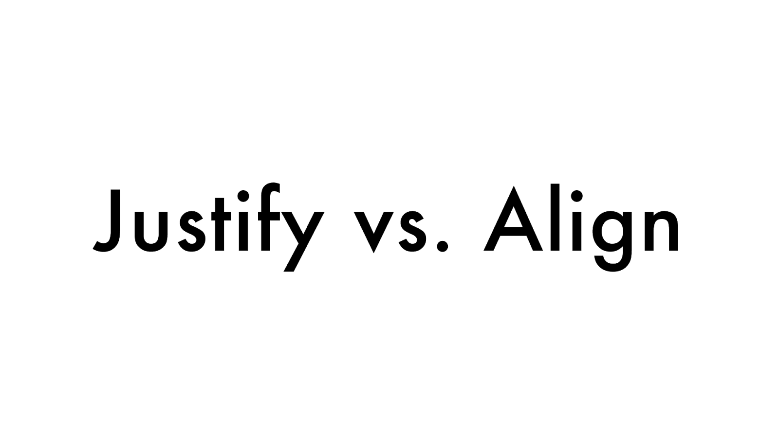
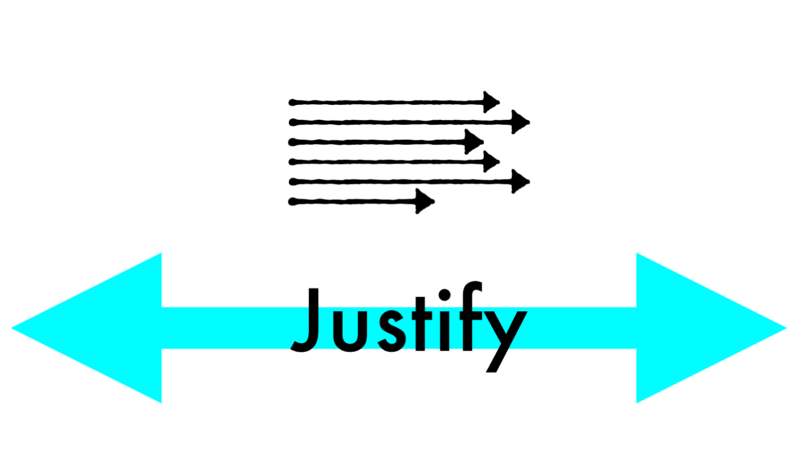
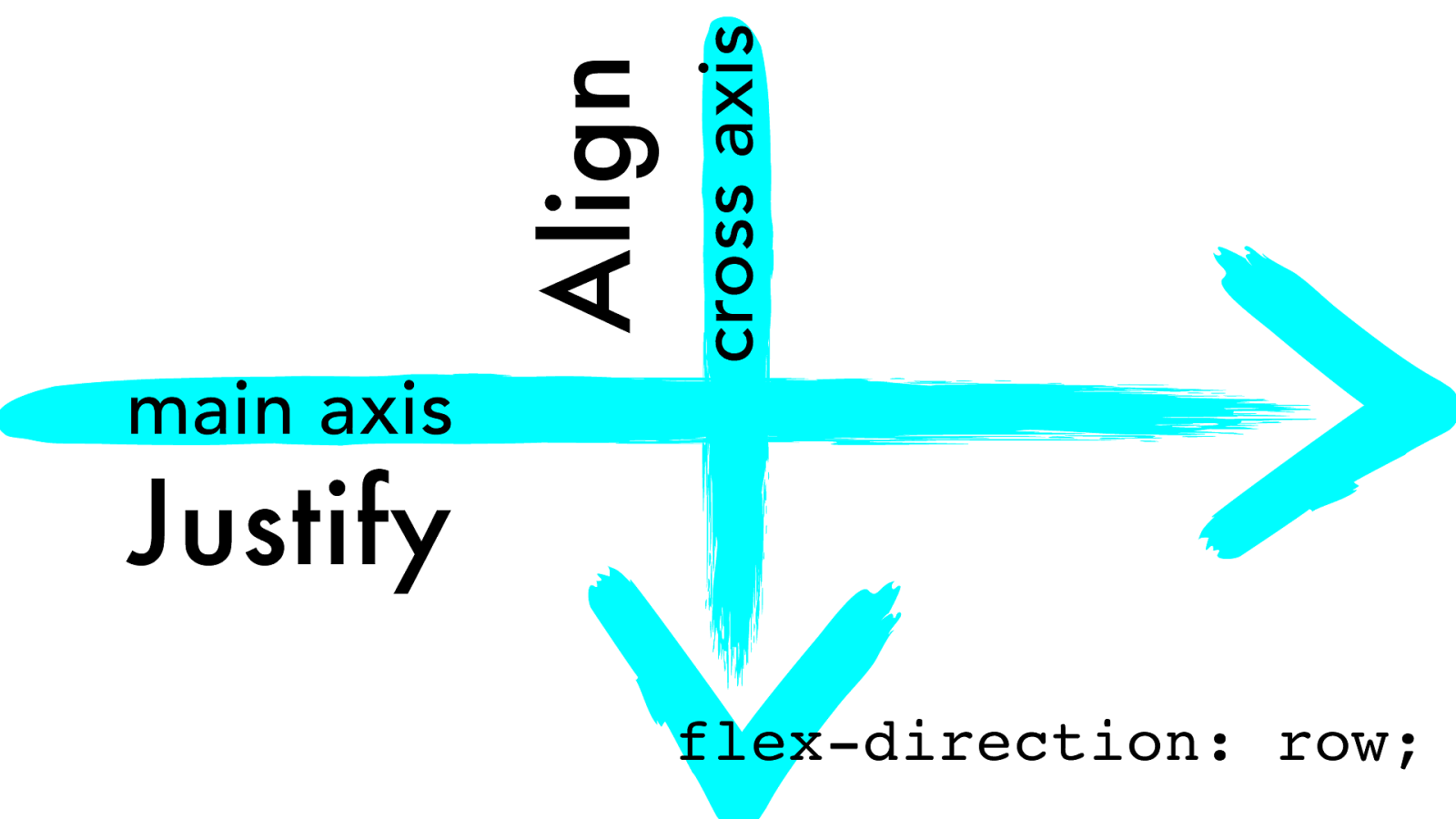
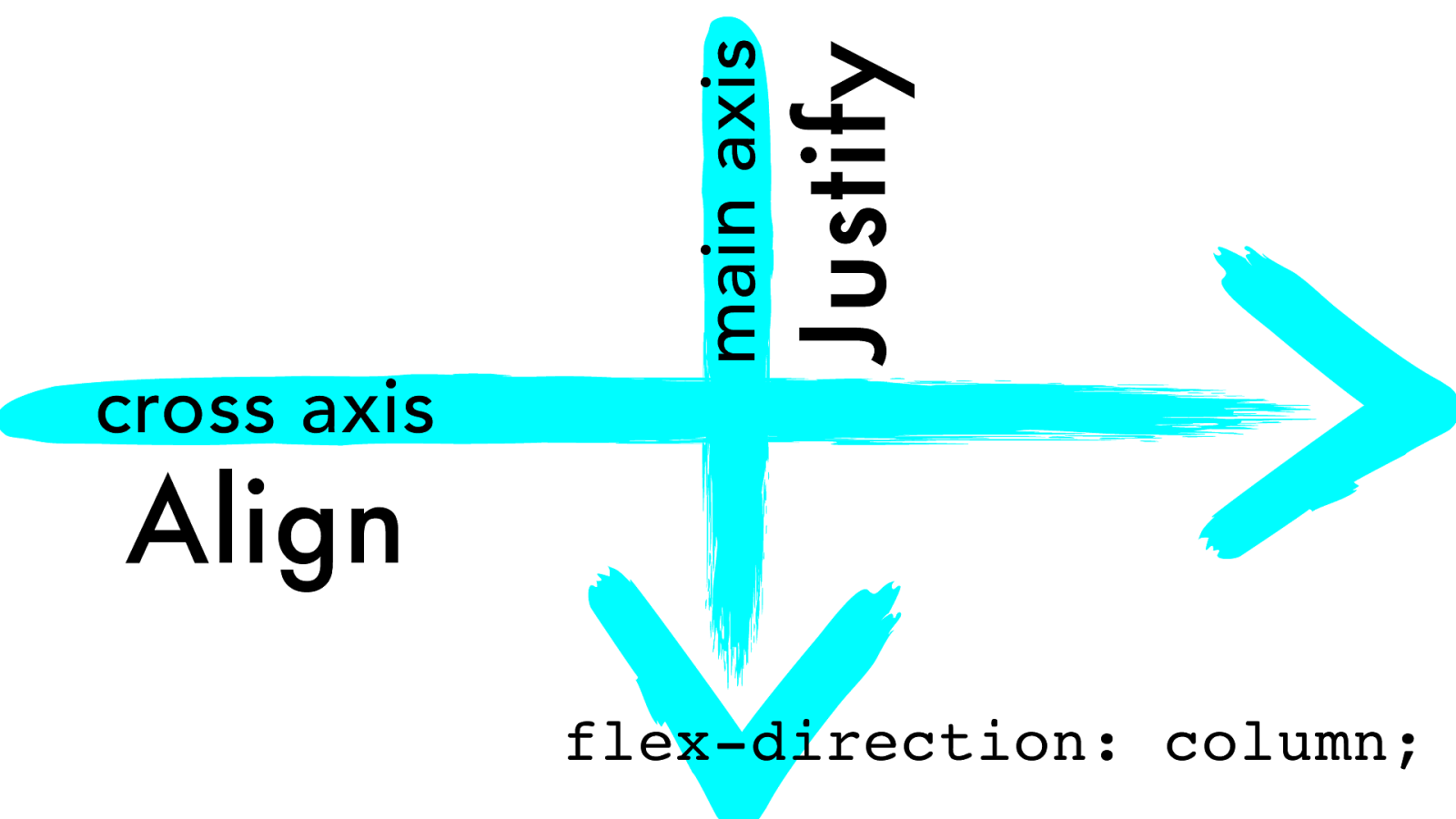
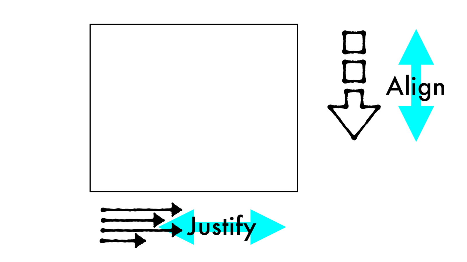
Justify vs. Align
block inline
Align
Justify
start
center
end
s t r e t c
h
Justify
start center end s t r e t c h Align
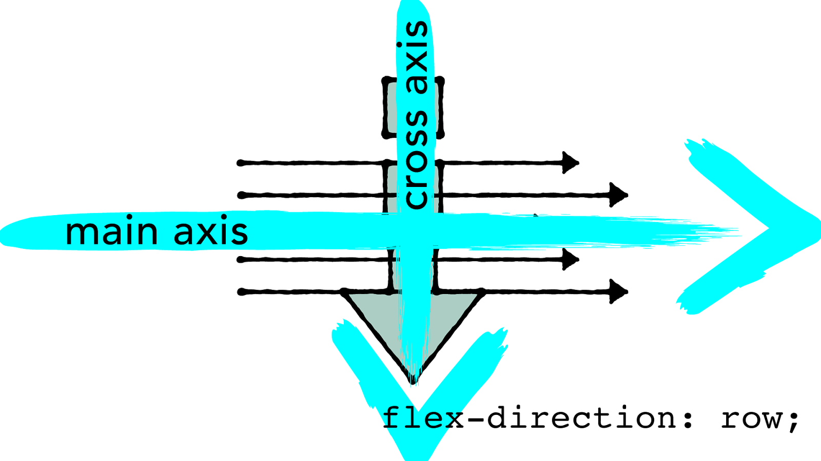
cross axis main axis flex-direction: row;
cross axis main axis Justify Align flex-direction: row;
main axis Justify cross axis Align flex-direction: column;
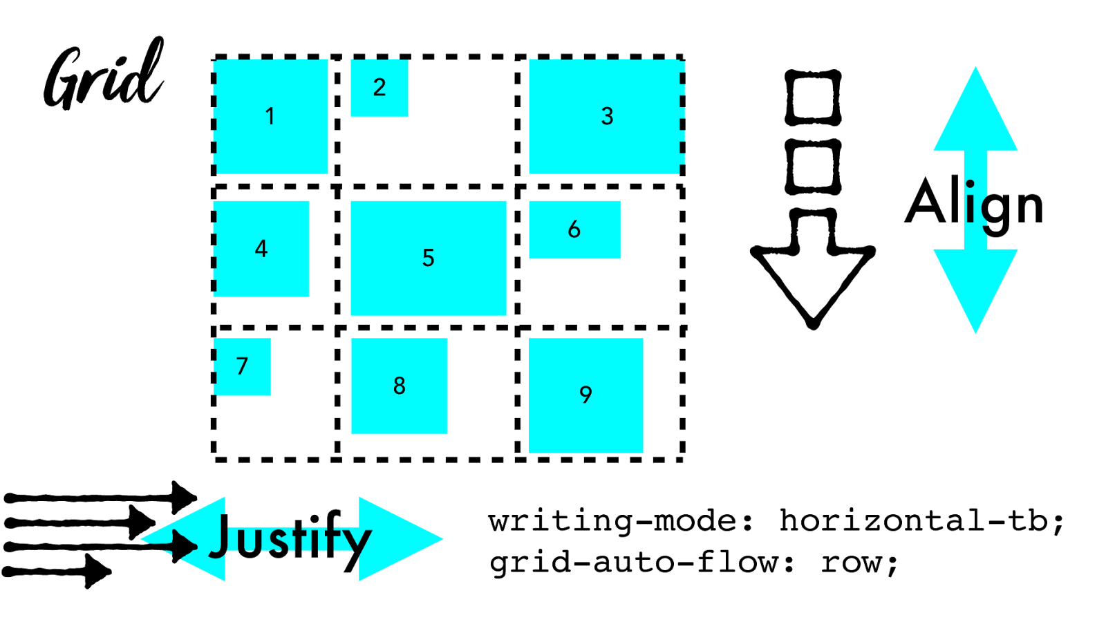
Grid Justify 1 4 5 2 3 6 8 7 9 Align writing-mode: horizontal-tb; grid-auto-flow: row;
Grid
Justify
1
4
5
2
3
6
8
7
9
writing-mode: horizontal-tb;
grid-auto-flow: column;
Align
Align Justify
w3.org/TR/css-align-3
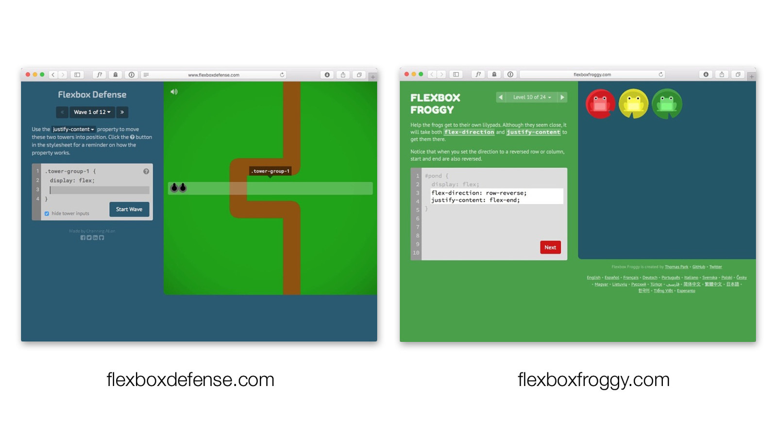
flexboxdefense.com flexboxfroggy.com
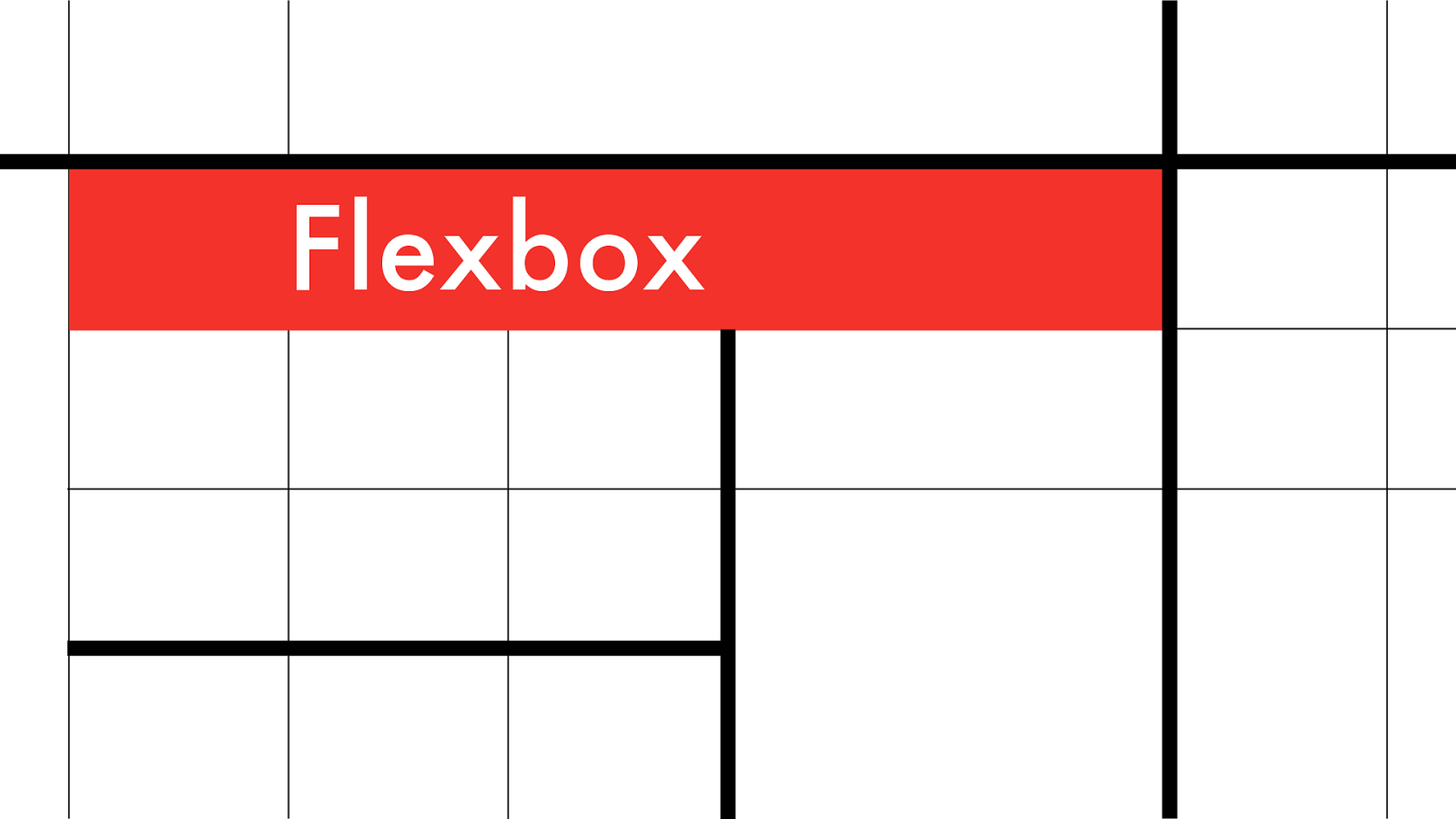
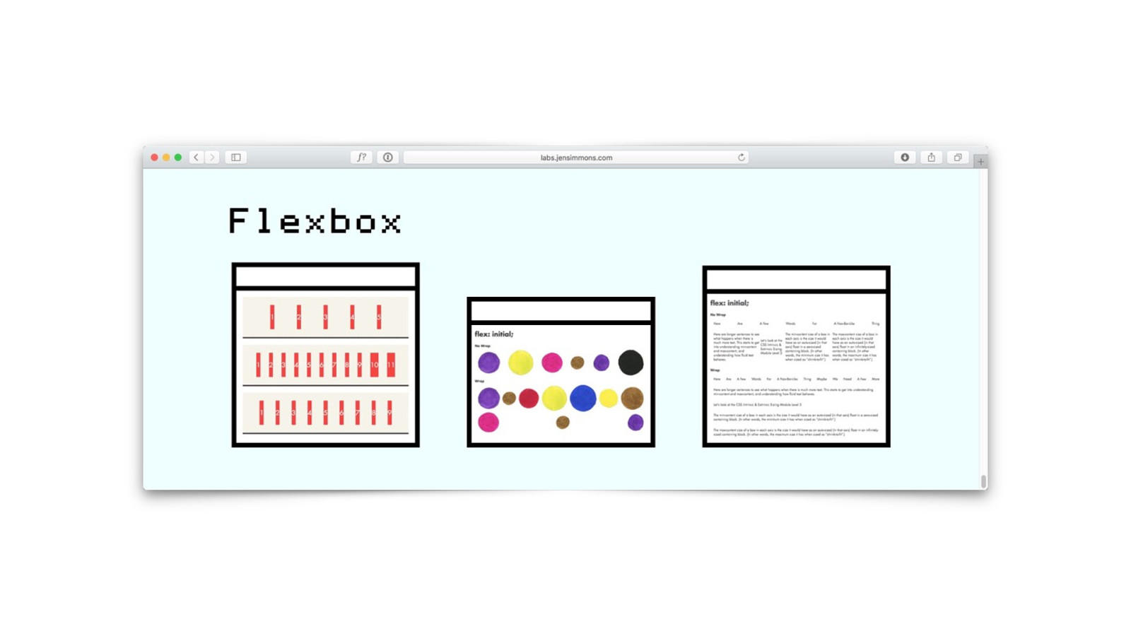
Flexbox
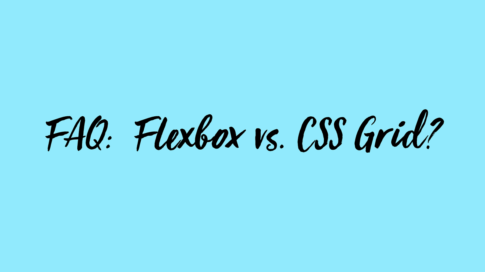
FAQ:
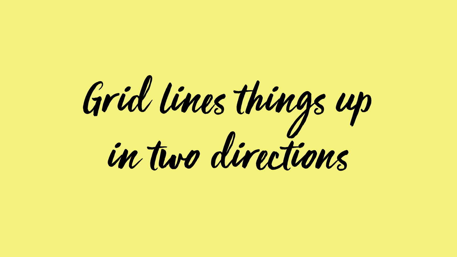
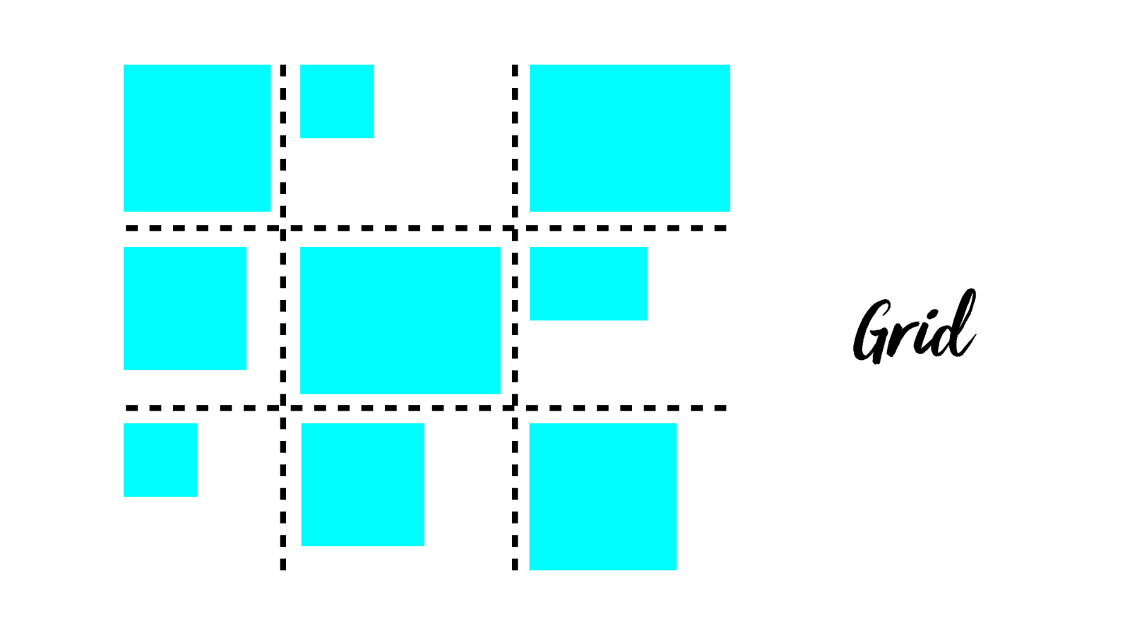
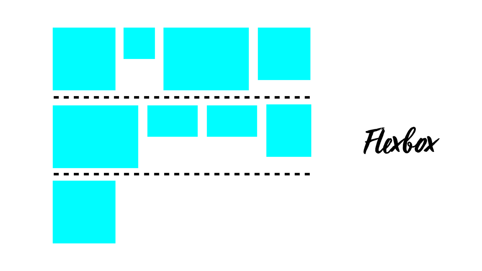
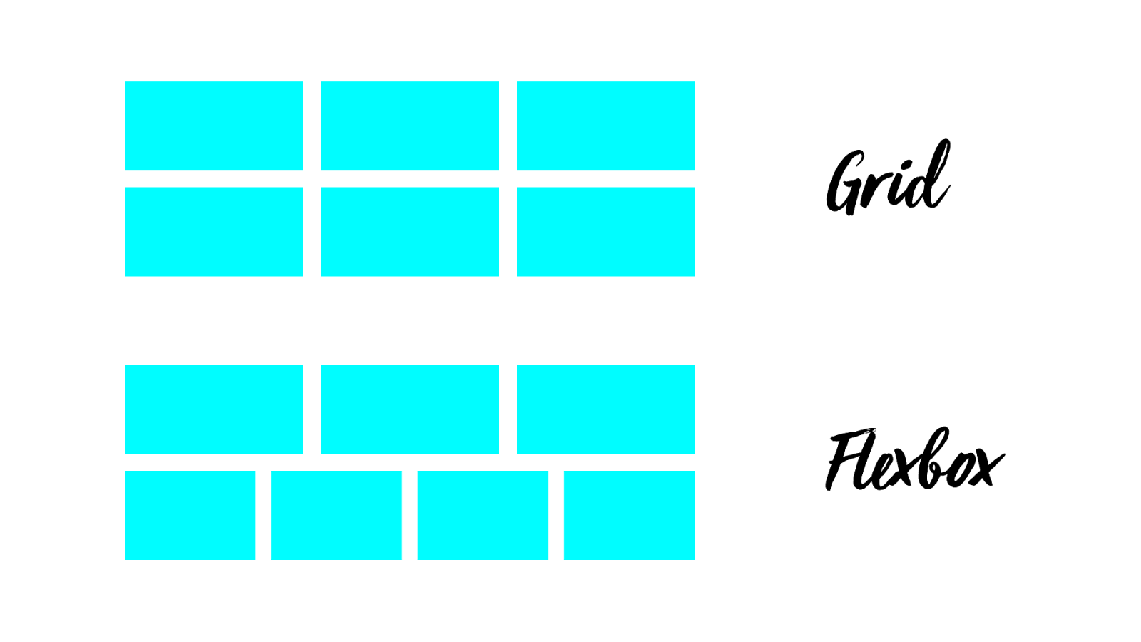
F le x box vs. CSS Grid?
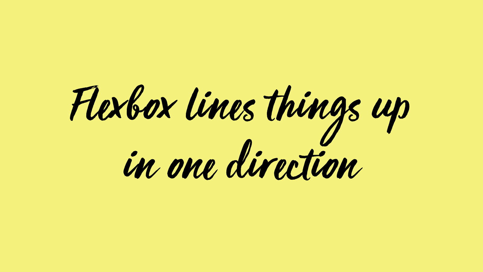
F lex box line s t hings up in one direction
Gr id line s t hings up in two directions
Grid
Grid
Flexbox
Flexbox
Flexbox
Grid Flexbox
Grid
Bot h super powers are u se ful . Which do you want?
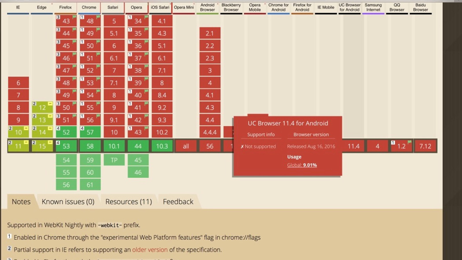
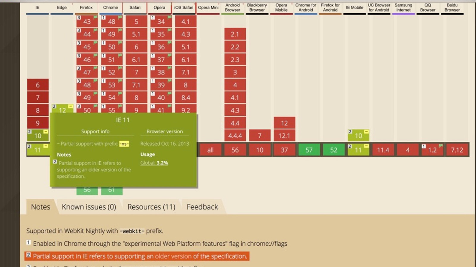
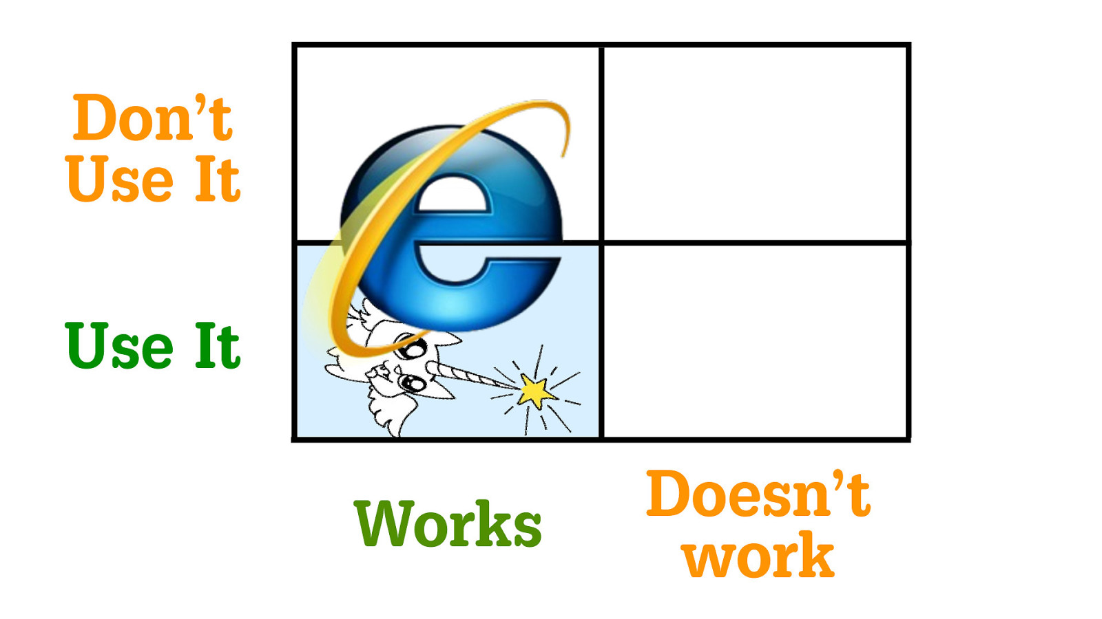
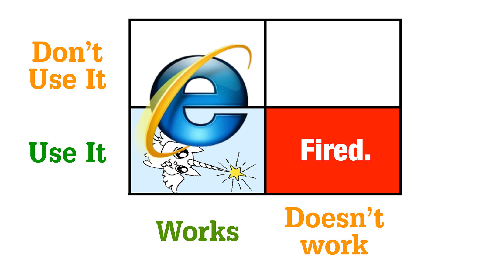
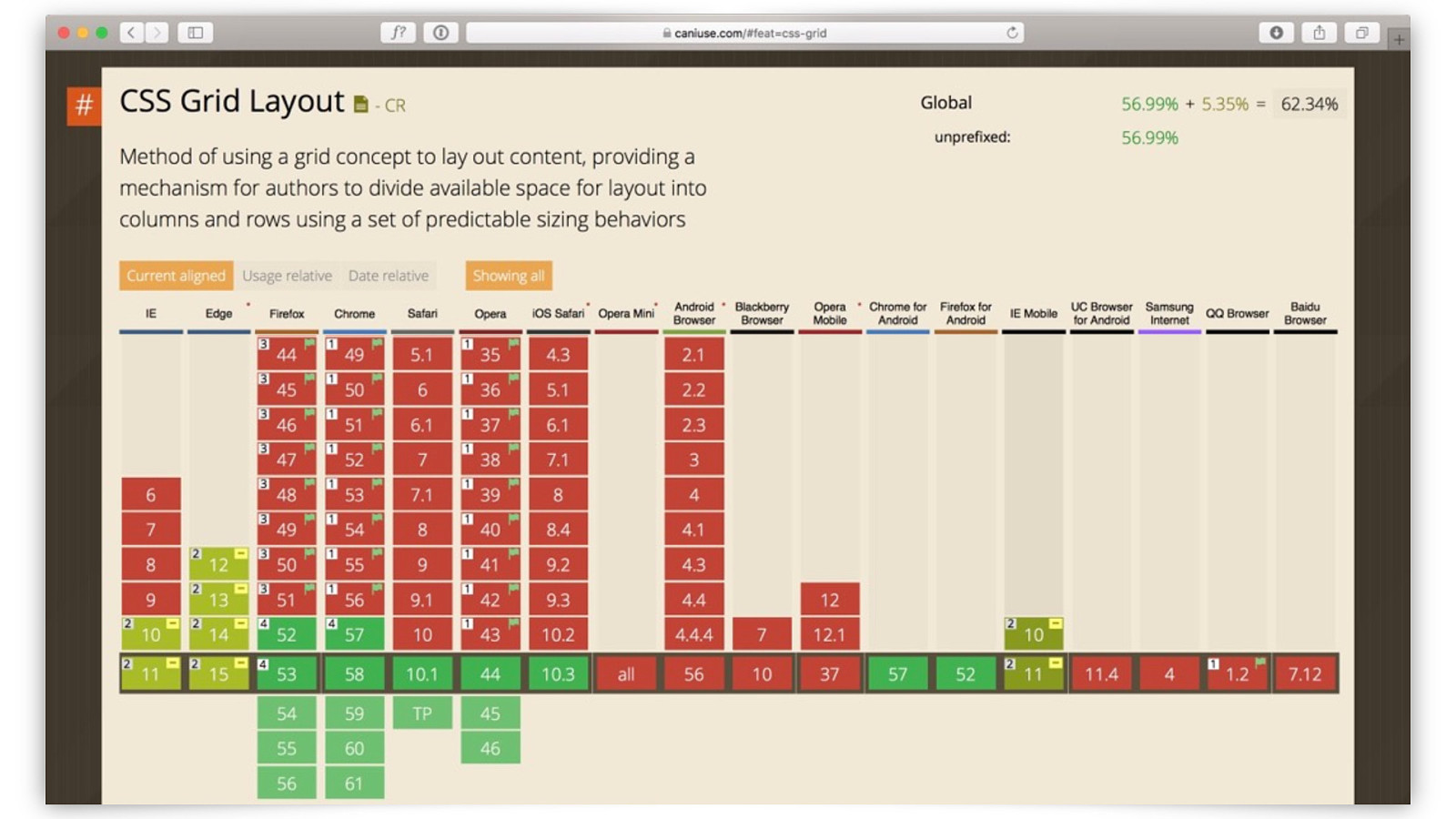
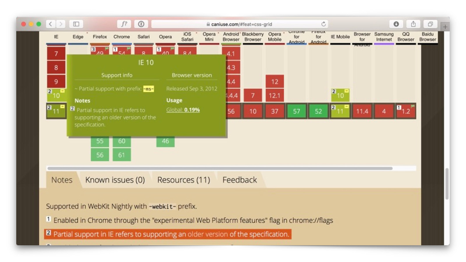
CSS Grid yet?
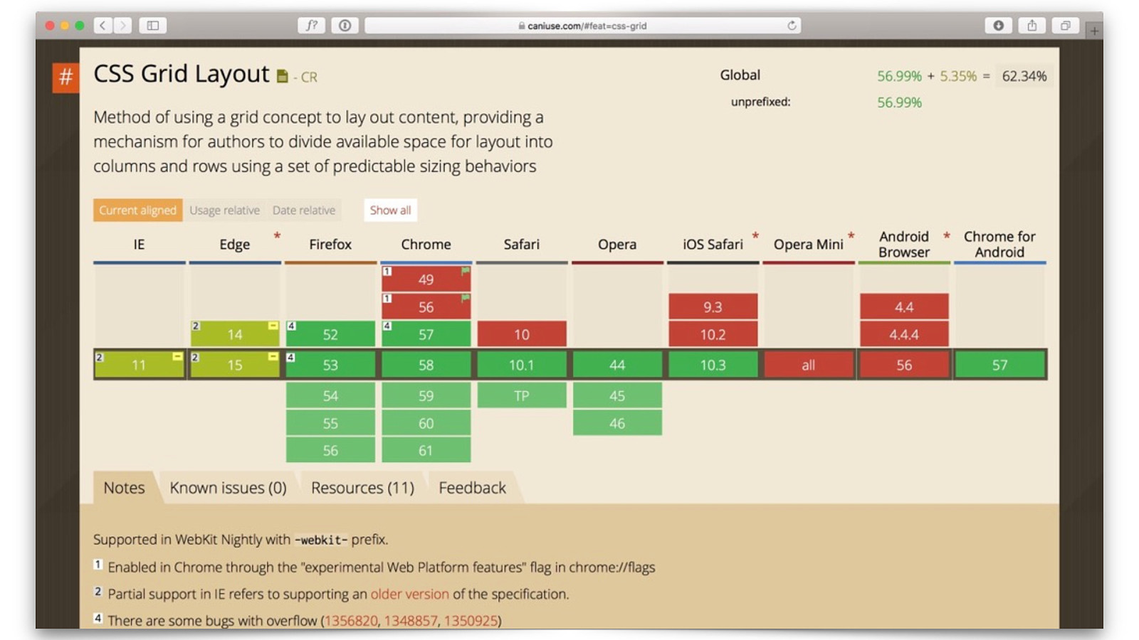
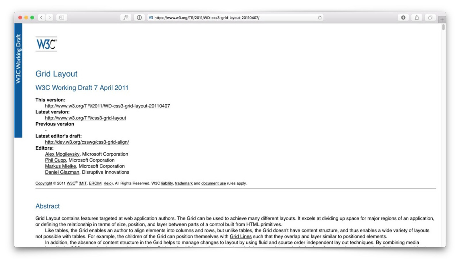
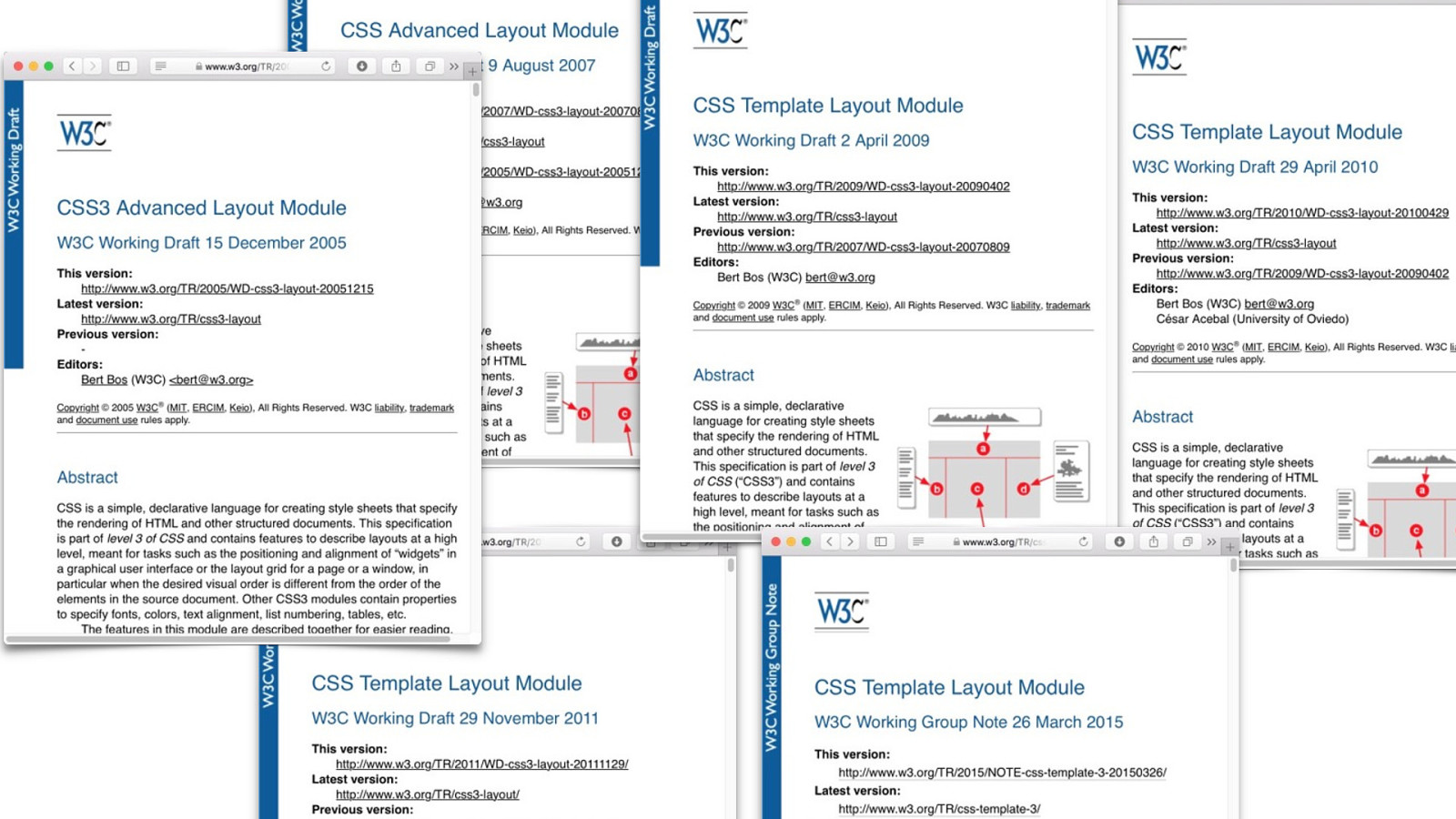
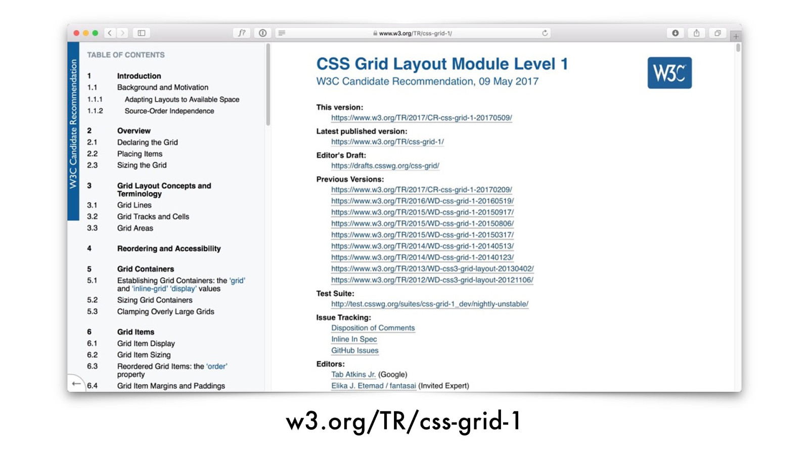
w3.org/TR/css-grid-1
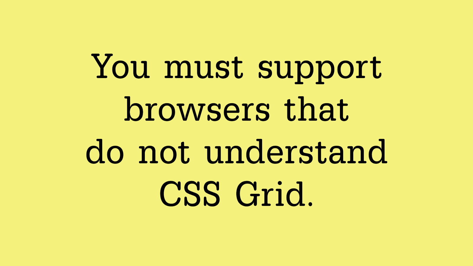
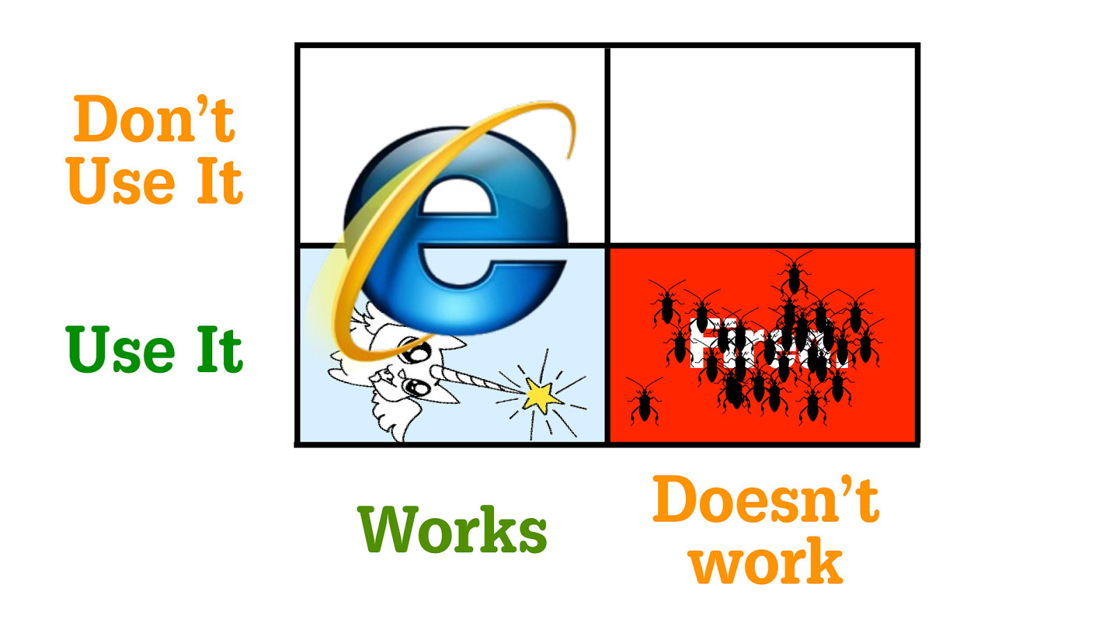
Yo u m u s t s u p p o r t
browsers that
do not understand
CSS Grid.
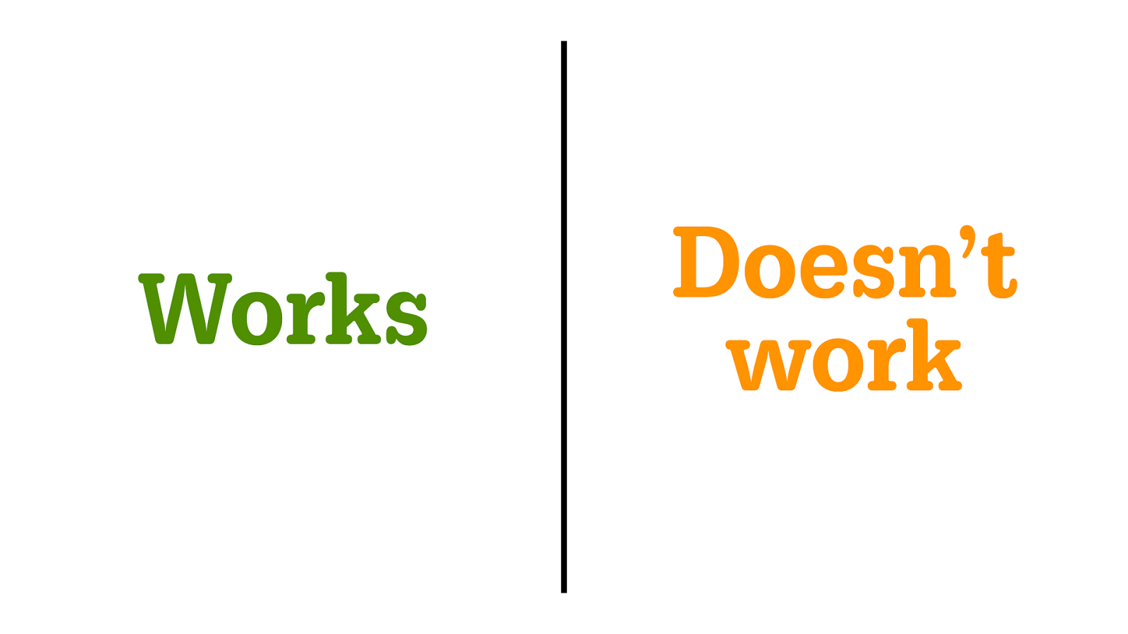
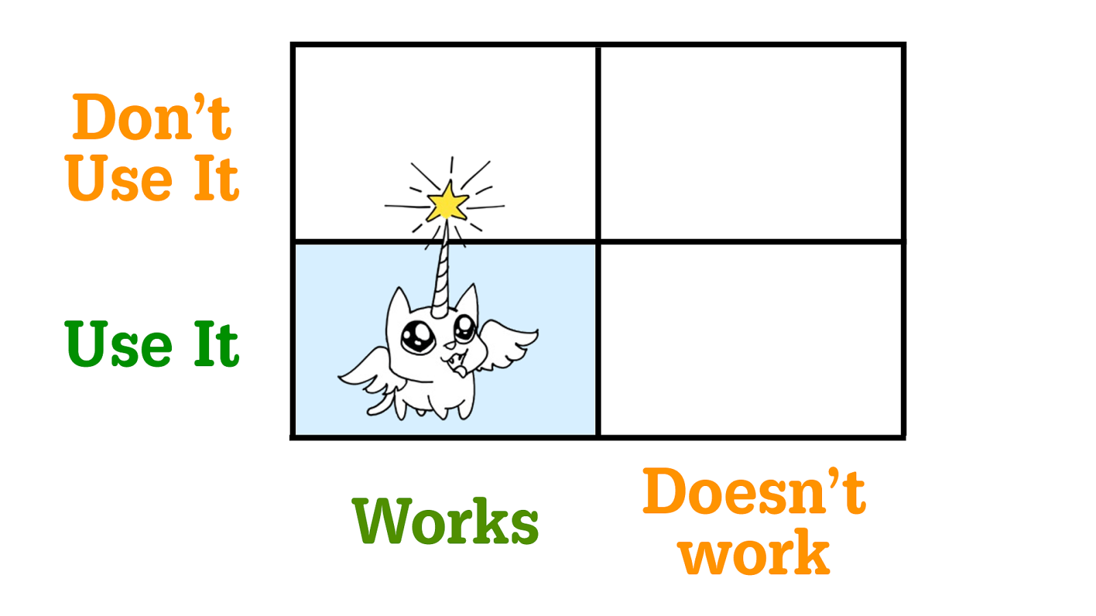
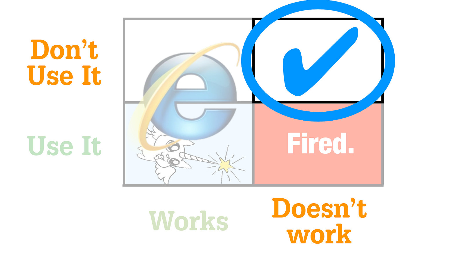
Works
Doesn’t
work
Use It Don’t Use It
Works
Doesn’t
work
Use It
Don’t
Use It
Works
Doesn’t
work
Use It
Don’t
Use It
Works
Doesn’t
work
Use It
Don’t
Use It
Works
Doesn’t
work
Use It
Don’t
Use It
Fired.
Works
Doesn’t
work
Use It
Don’t
Use It
Fired.
Works
Doesn’t
work
Use It
Don’t
Use It
Fired.
✔
Works
Doesn’t
work
Use It
Don’t
Use It
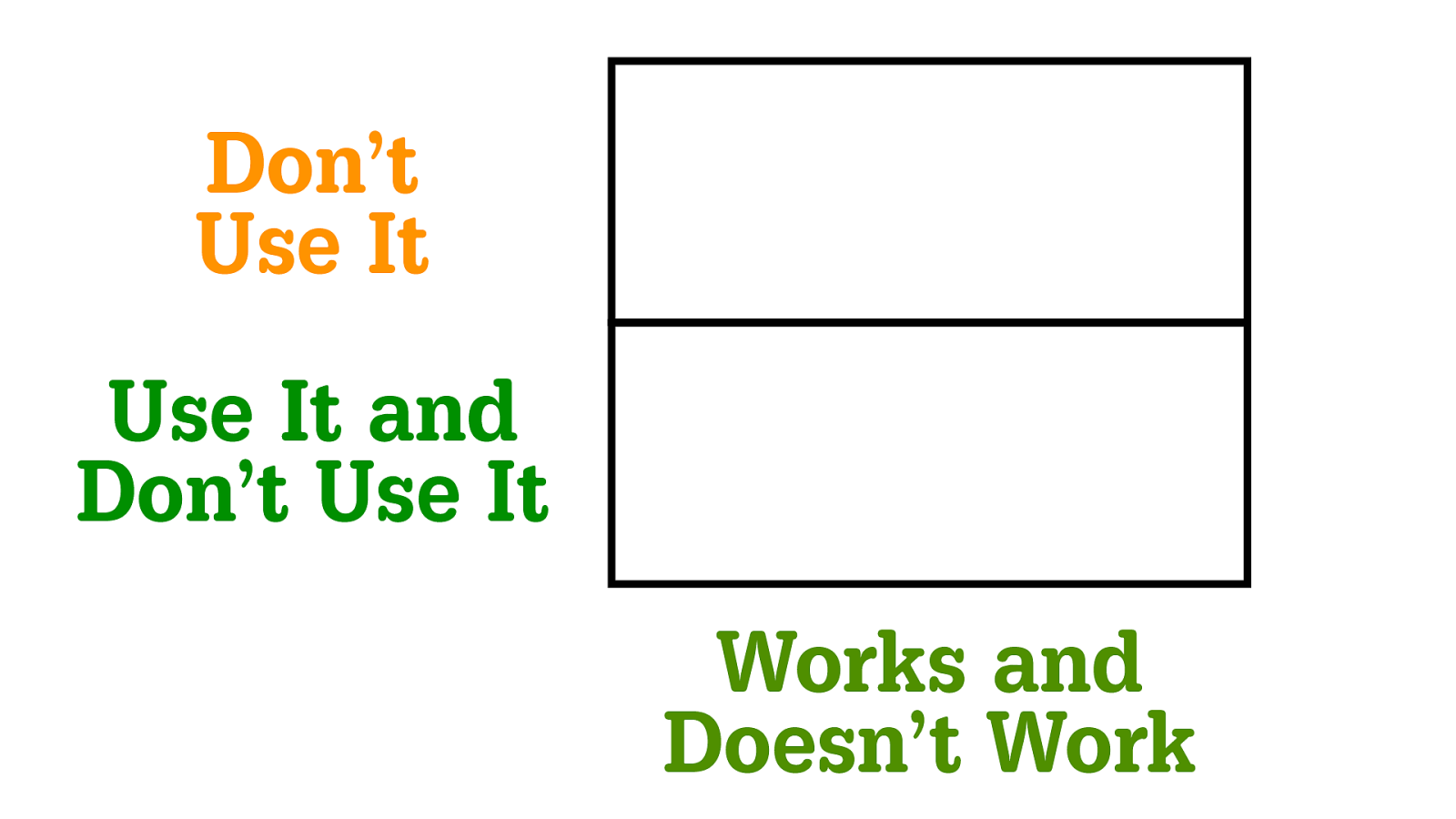
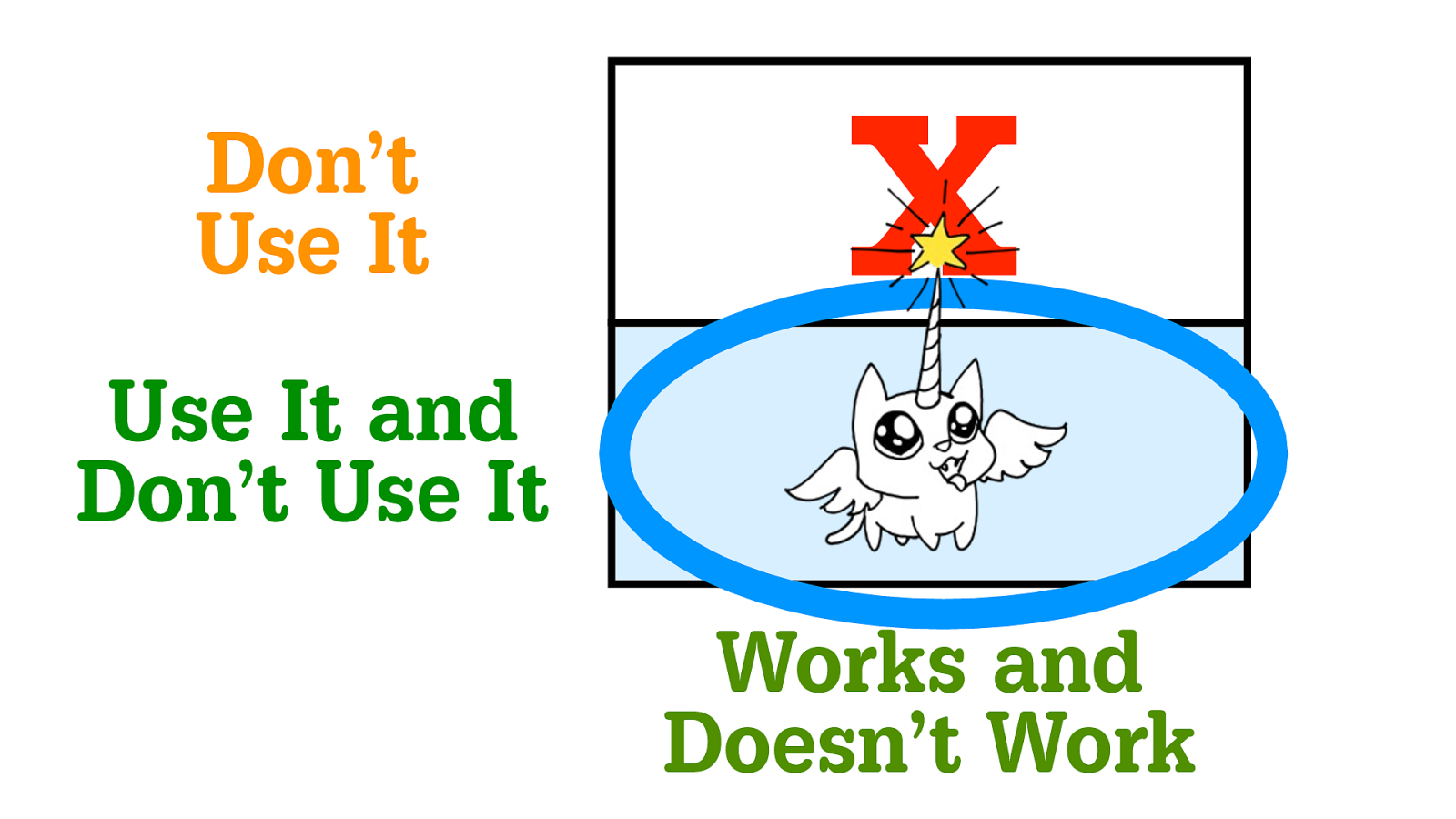
Works and
Doesn’t Work
Use It and
Don’t Use It
Don’t
Use It
X
Works and
Doesn’t Work
Use It and
Don’t Use It
Don’t
Use It
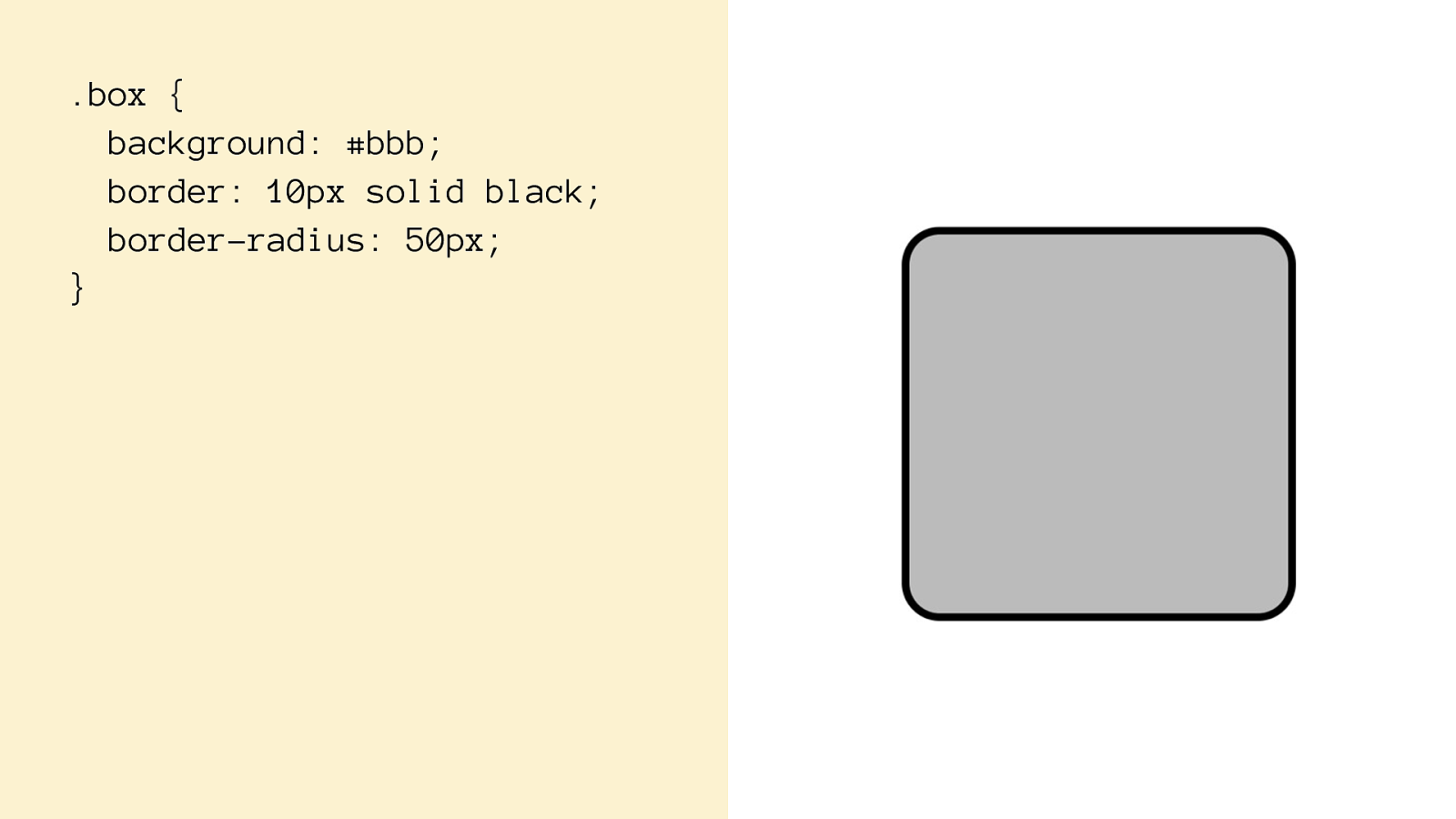
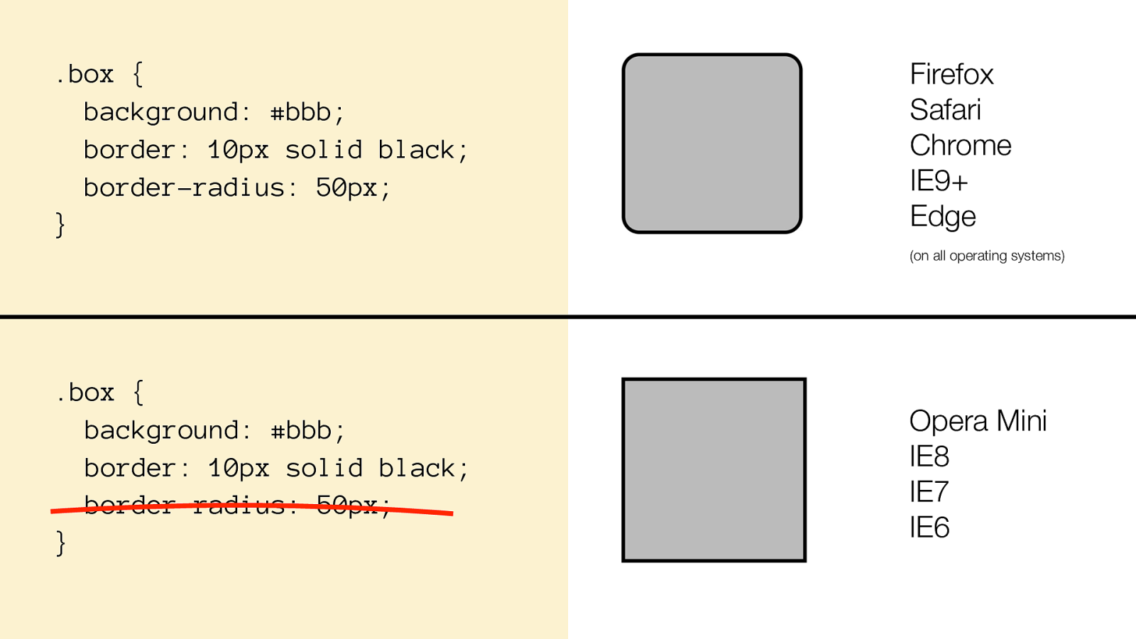
.box { background: #bbb; border: 10px solid black; border-radius: 50px; }
.box { background: #bbb; border: 10px solid black; border-radius: 50px; }
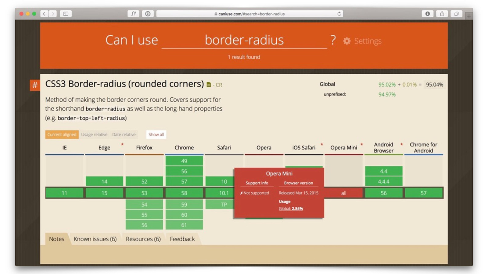
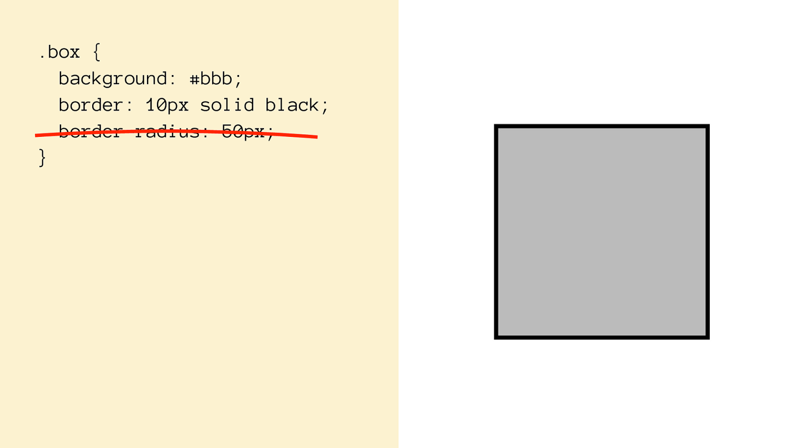
.box { background: #bbb; border: 10px solid black; border-radius: 50px; } .box { background: #bbb; border: 10px solid black; border-radius: 50px; } Opera Mini IE8 IE7 IE6 Firefox Safari Chrome IE9+ Edge (on all operating systems)
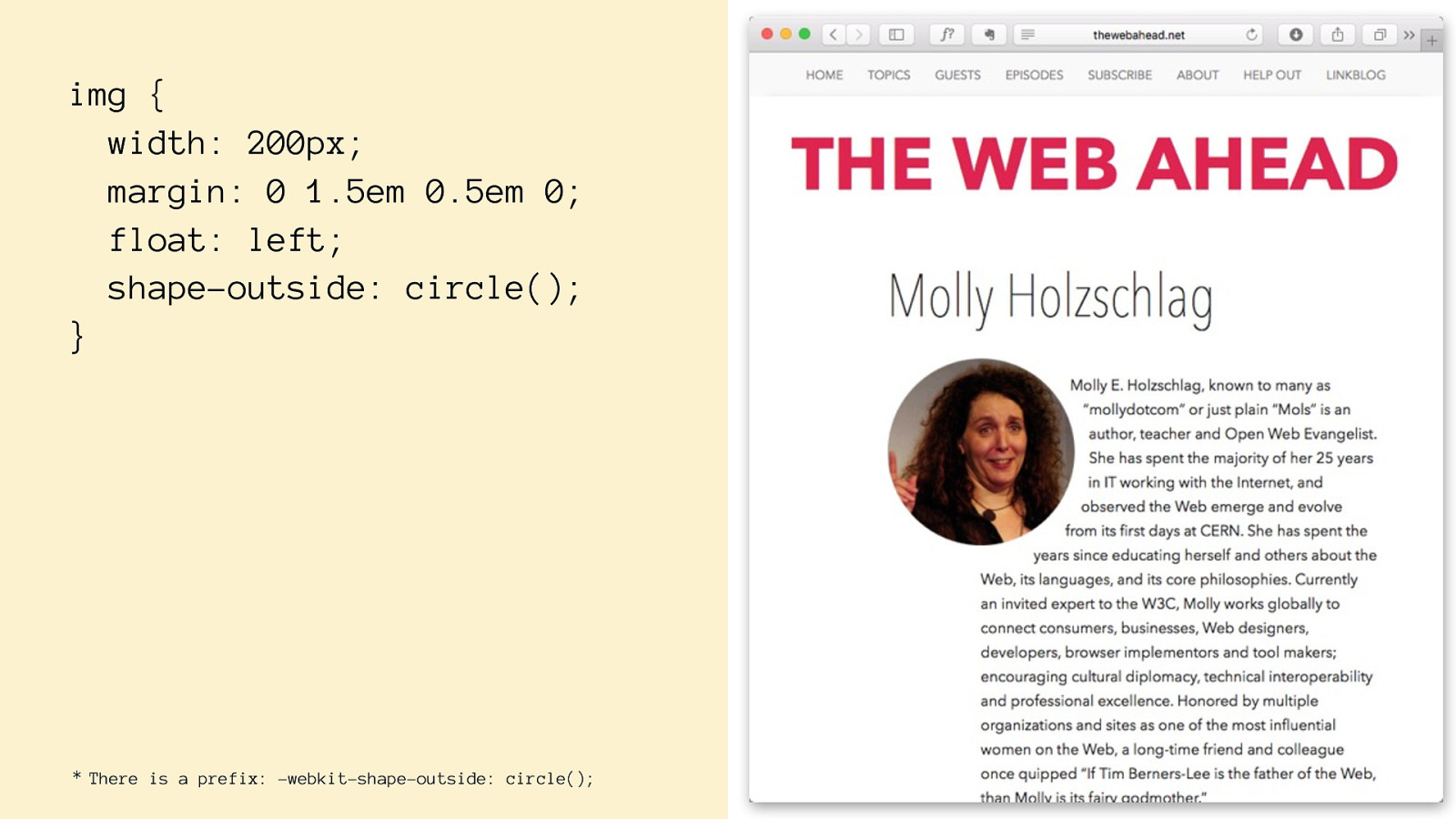
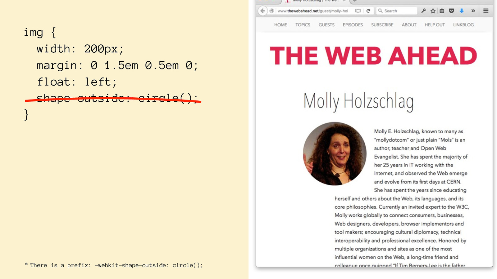
img {
width: 200px;
margin: 0 1.5em 0.5em 0;
float: left; shape-outside: circle() ; } There is a prefix: -webkit-shape-outside: circle(); *
img {
width: 200px;
margin: 0 1.5em 0.5em 0;
float: left; shape-outside: circle() ; } There is a prefix: -webkit-shape-outside: circle(); *
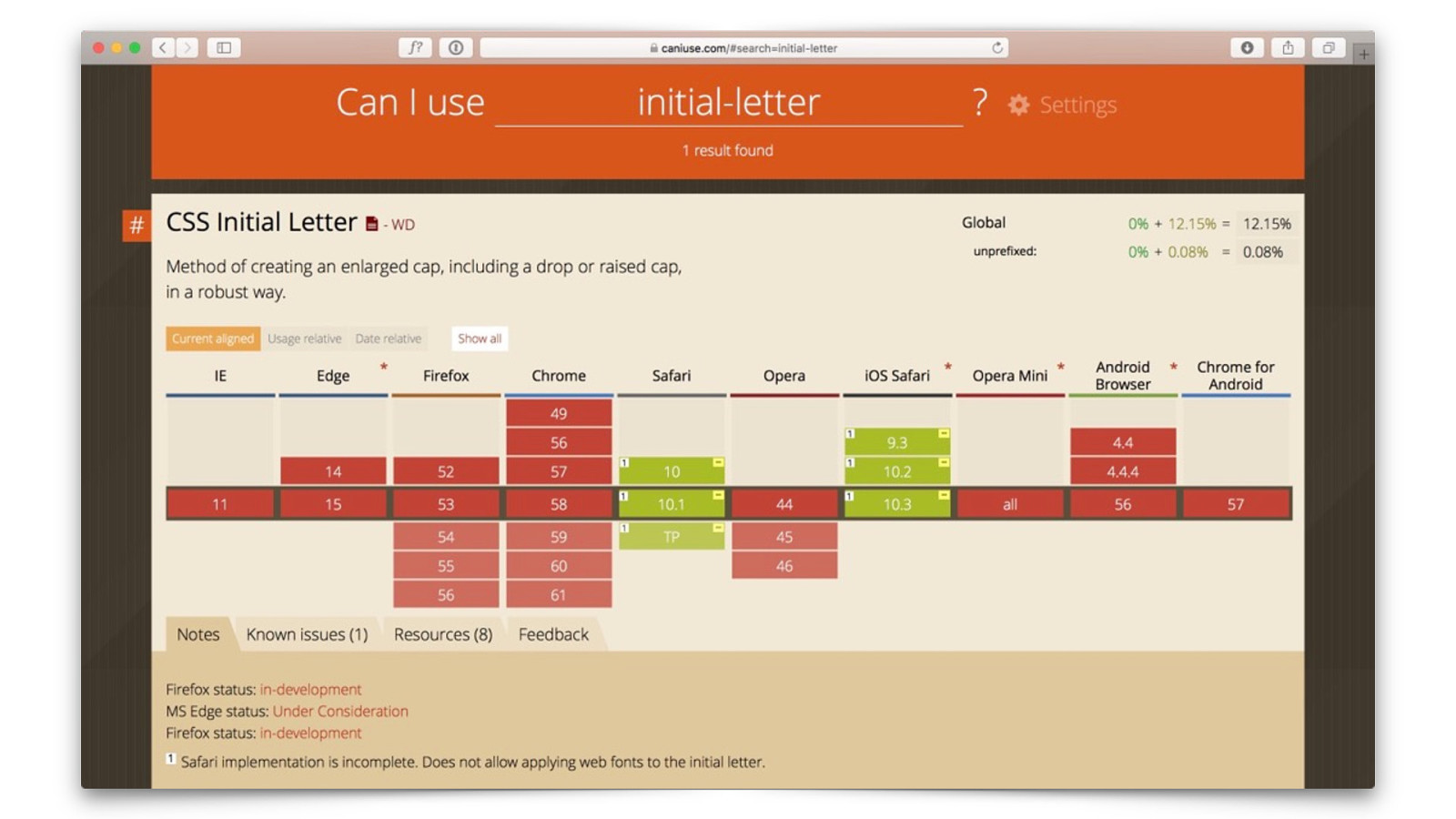
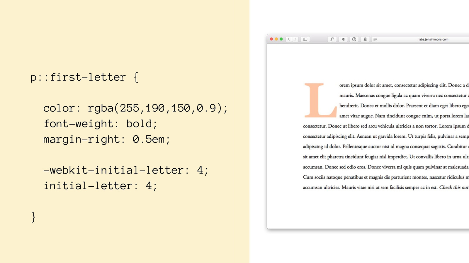
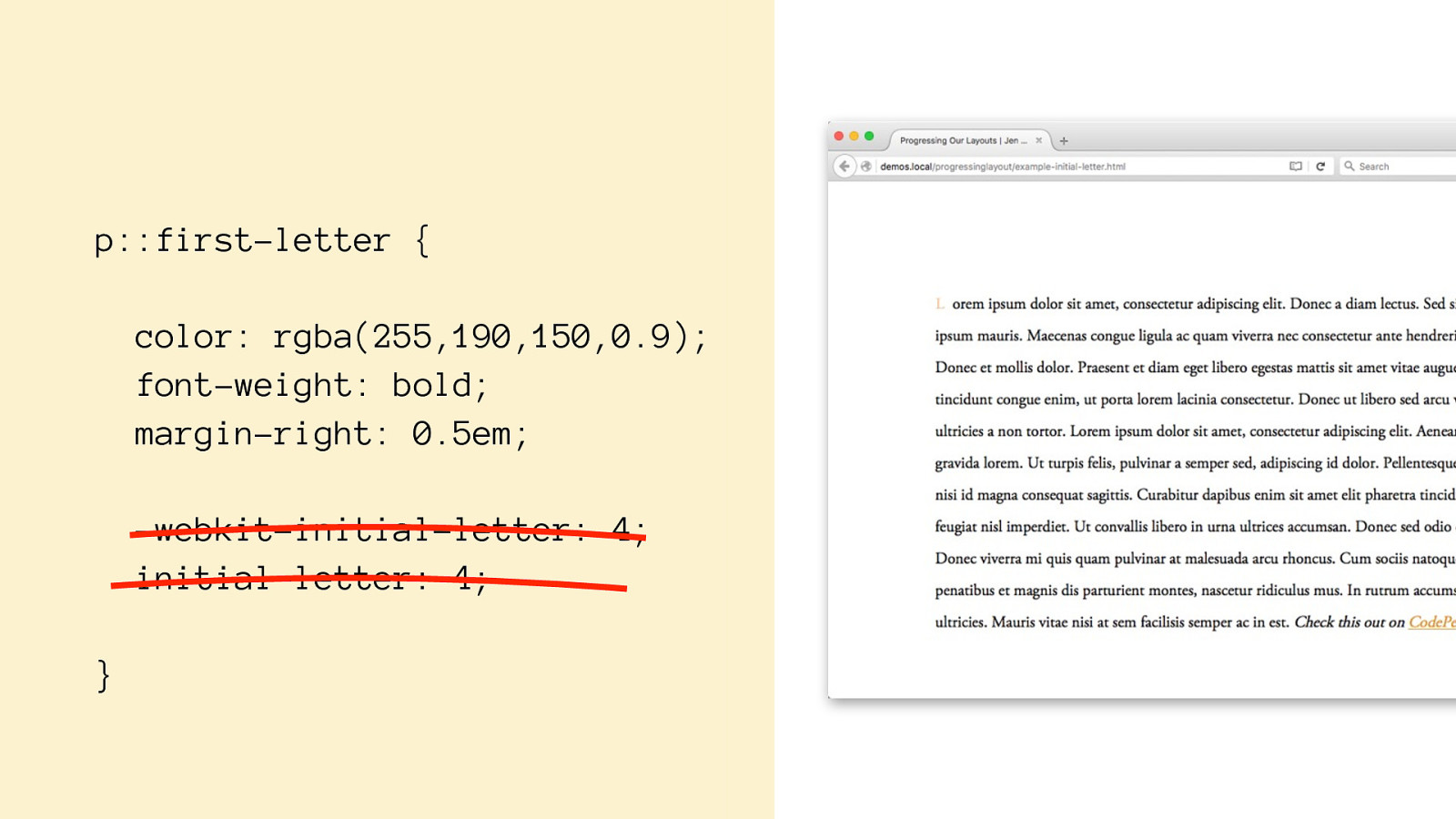
p::first-letter {
color: rgba(255,190,150,0.9);
font-weight: bold;
margin-right: 0.5em;
-webkit-initial-letter: 4; initial-letter: 4;
}
p::first-letter {
color: rgba(255,190,150,0.9);
font-weight: bold;
margin-right: 0.5em;
-webkit-initial-letter: 4; initial-letter: 4;
}
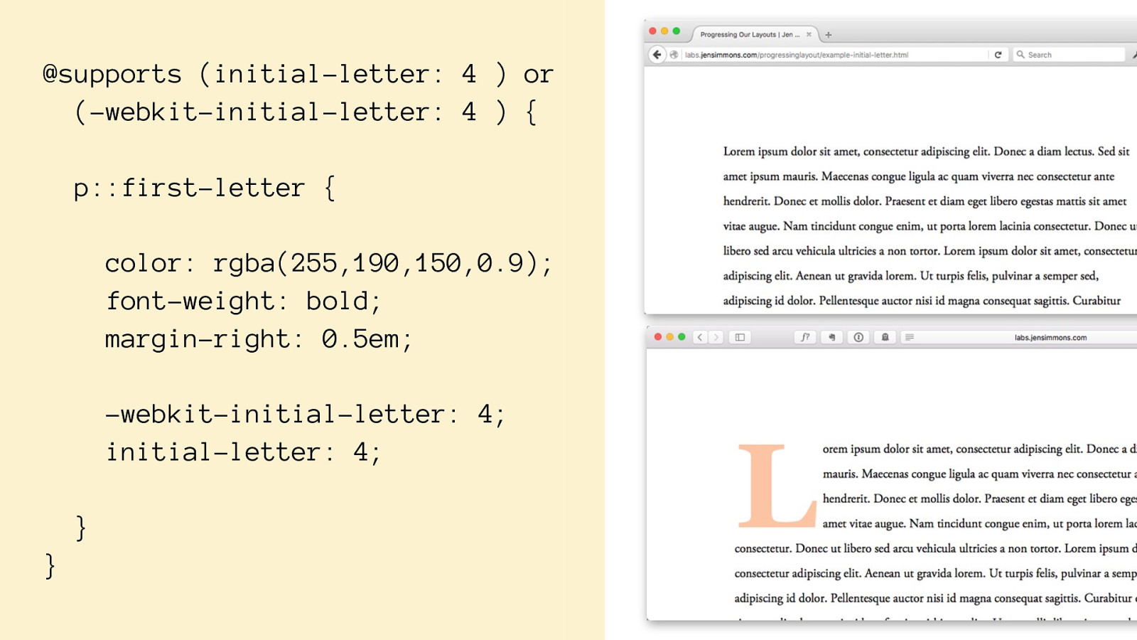
@supports (initial-letter: 4 ) or (-webkit-initial-letter: 4 ) { p::first-letter {
color: rgba(255,190,150,0.9);
font-weight: bold;
margin-right: 0.5em;
-webkit-initial-letter: 4; initial-letter: 4; }
}
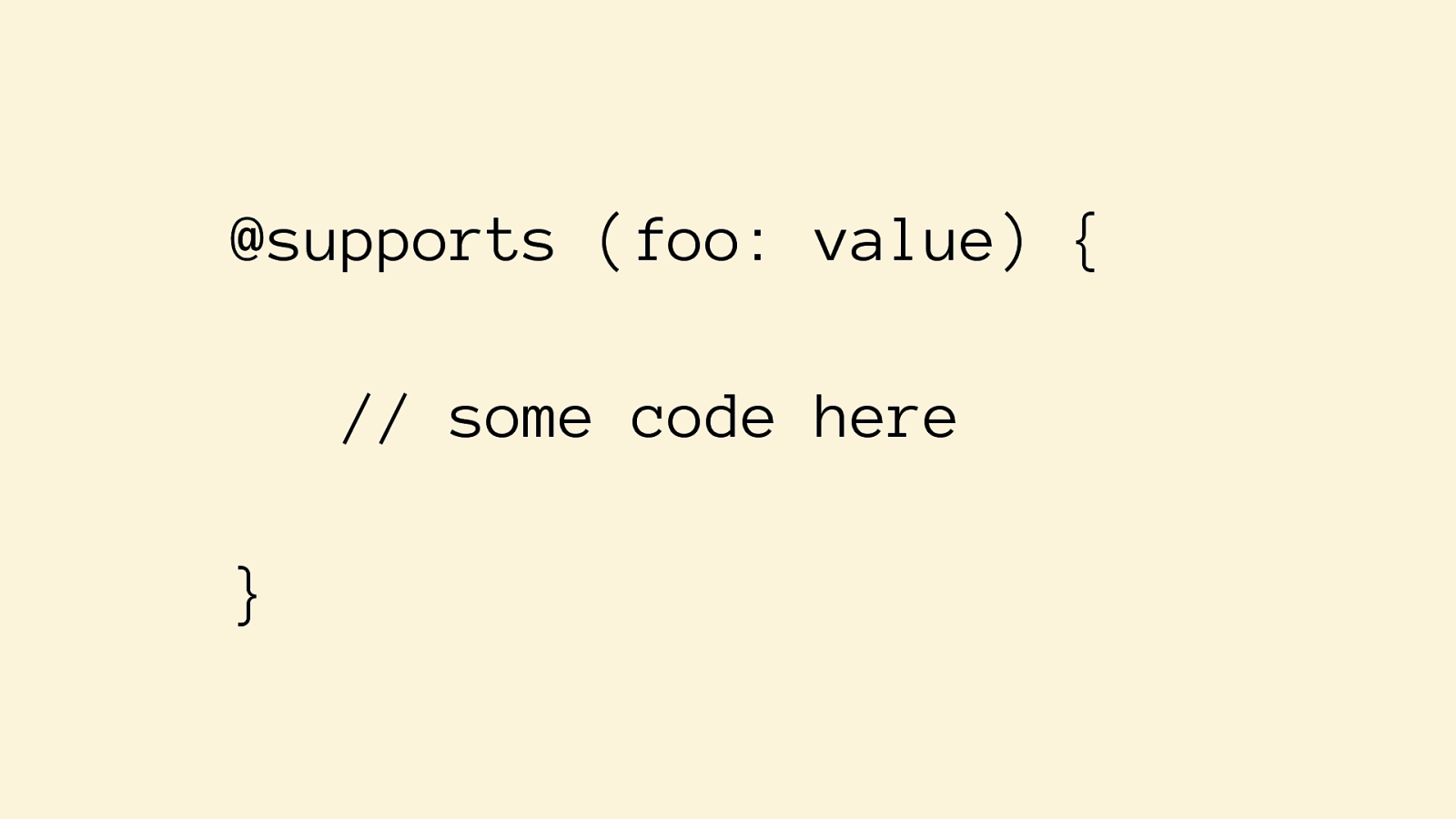
@supports (foo: value) {
// some code here
}
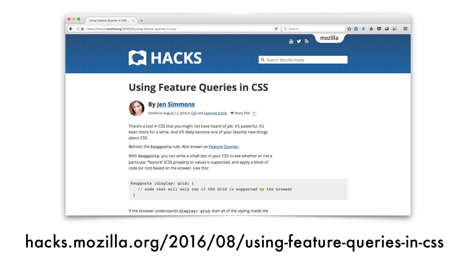
hacks.mozilla.org/2016/08/using-feature-queries-in-css
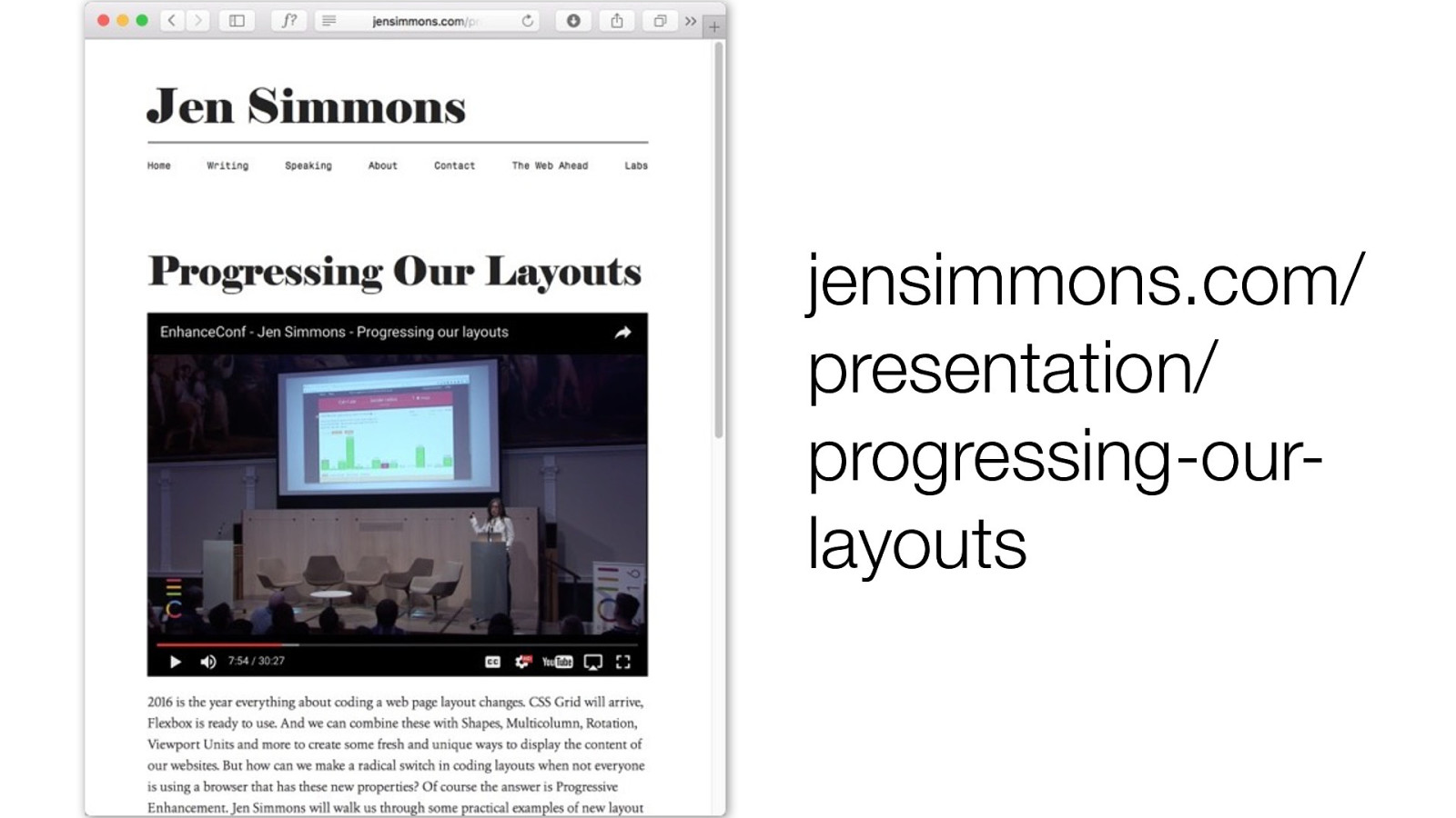
jensimmons.com/ presentation/ progressing-our- layouts
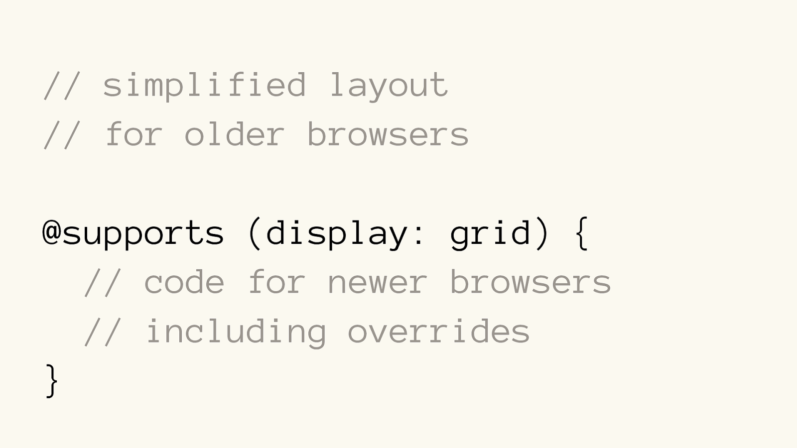
// simplified layout // for older browsers @supports (display: grid) {
// code for newer browsers
// including overrides }
// simplified layout // for older browsers @supports (display: grid) {
// code for newer browsers
// including overrides }
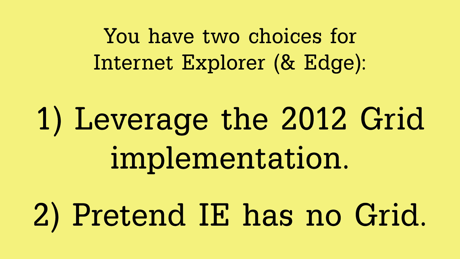
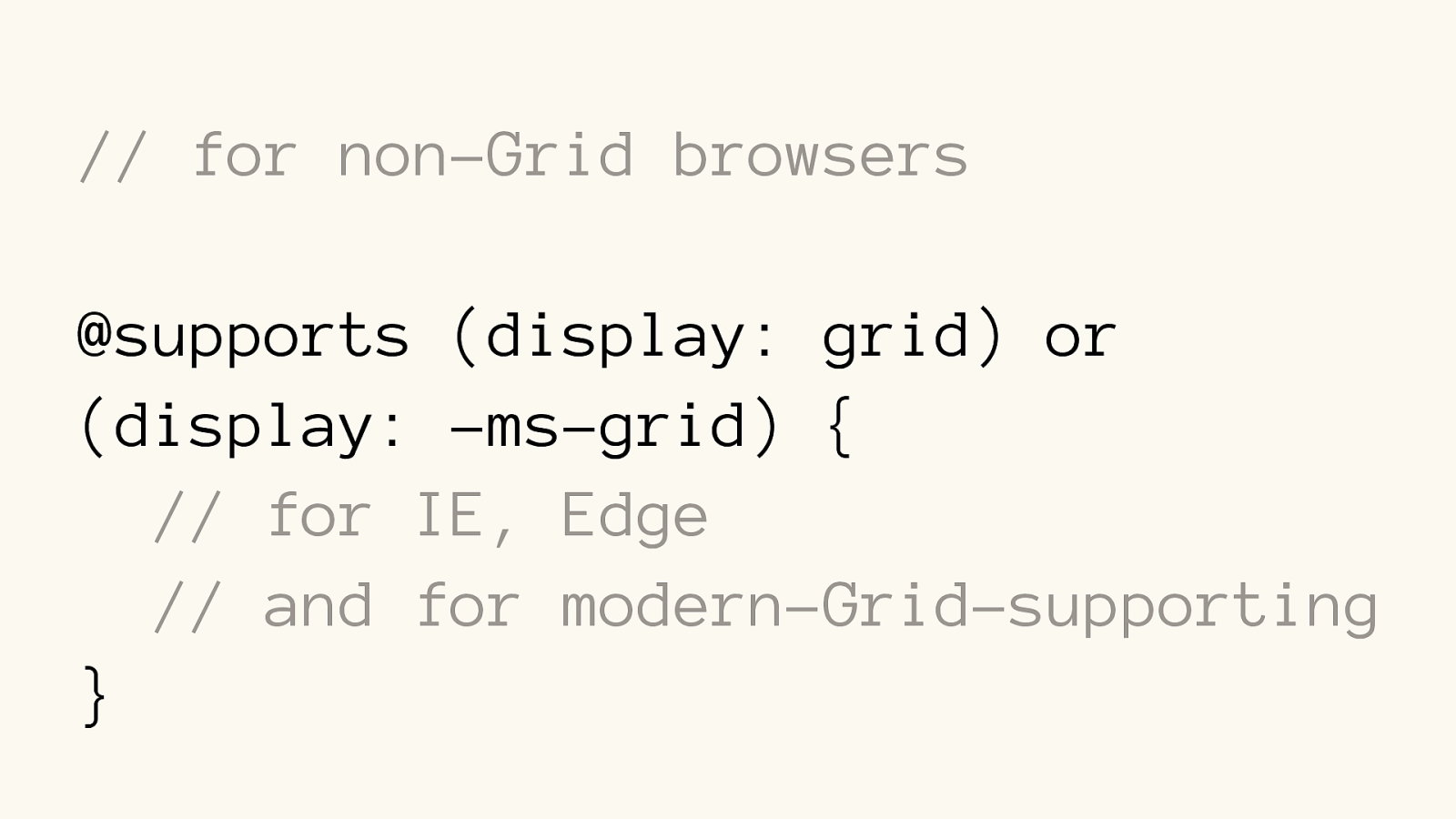
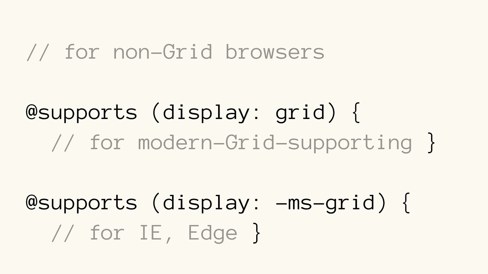
Yo u h a v e t w o c h o i c e s fo r
Internet Explorer (& Edge):
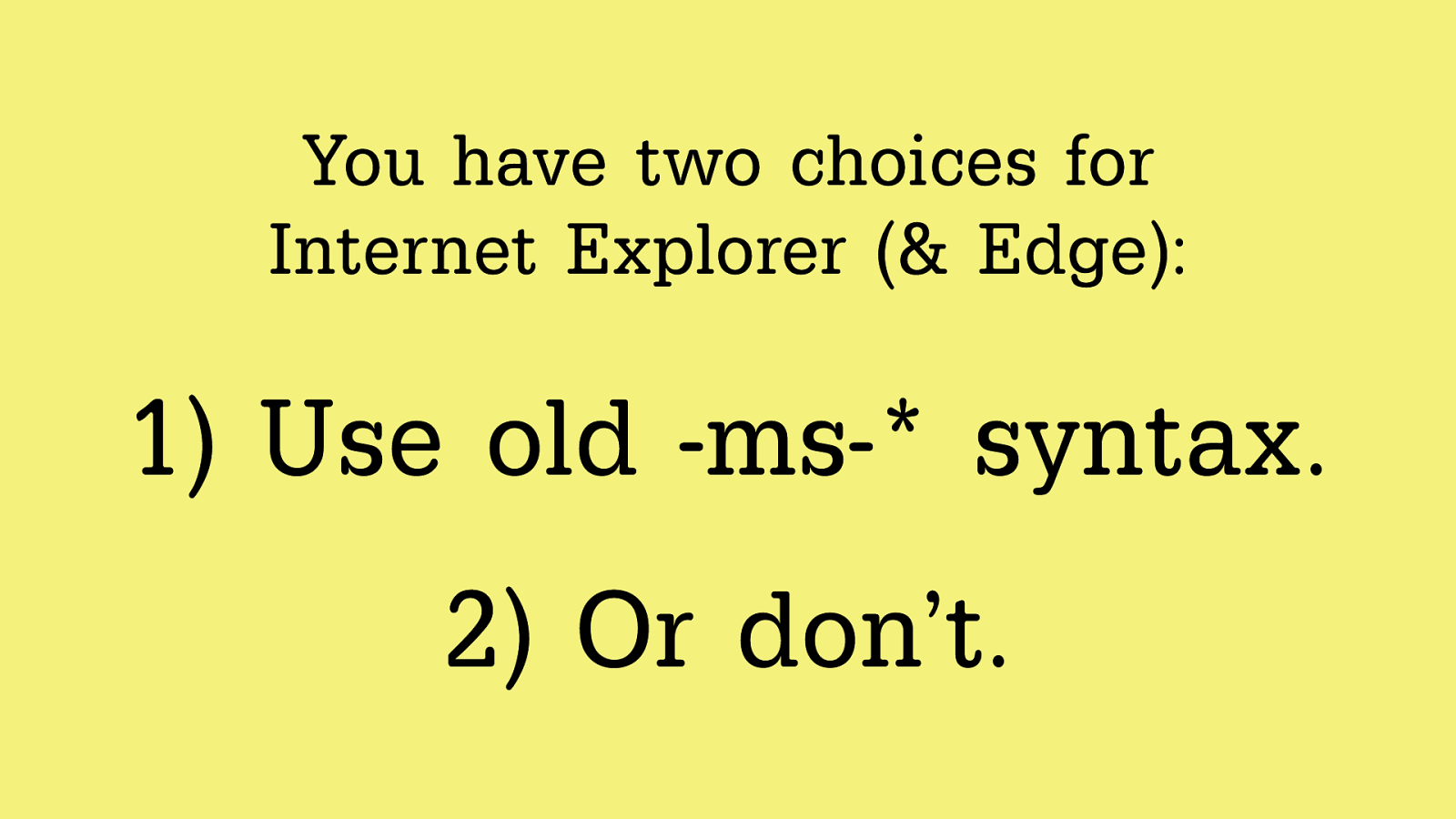
Yo u h a v e t w o c h o i c e s fo r
Internet Explorer (& Edge):
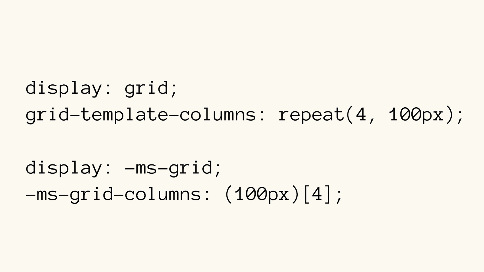
display: grid; grid-template-columns: repeat(4, 100px) ; display: -ms-grid; -ms-grid-columns: (100px)[4] ;
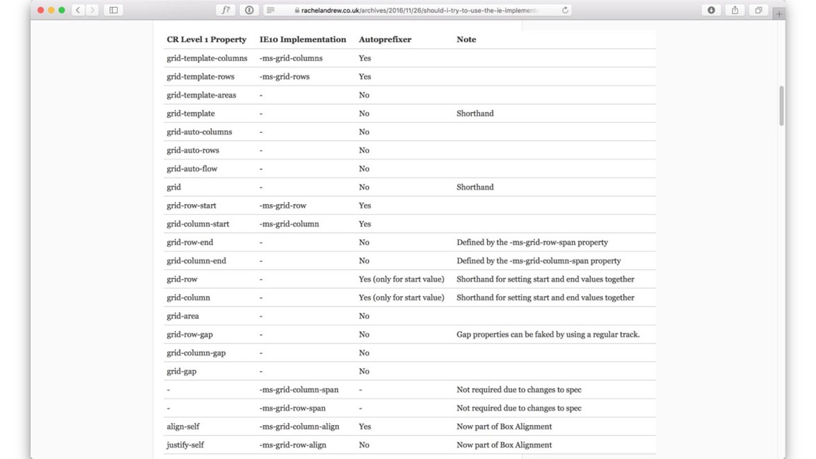
rachelandrew.co.uk/archives/2016/11/26/should-i-tr y- to-use-the-ie-implementation-of-css-grid-layout
autoprefixer
// for non-Grid browsers
@supports (display: grid) or (display: -ms-grid) { // for IE, Edge // and for modern-Grid-supporting
}
// for non-Grid browsers
@supports (display: grid) {
// for modern-Grid-supporting }
@supports (display: -ms-grid) {
// for IE, Edge }
Edge is coming
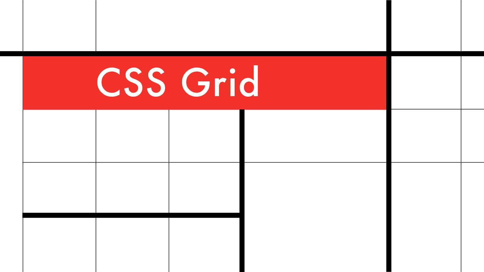
CSS Grid
w3.org/TR/css-grid-1
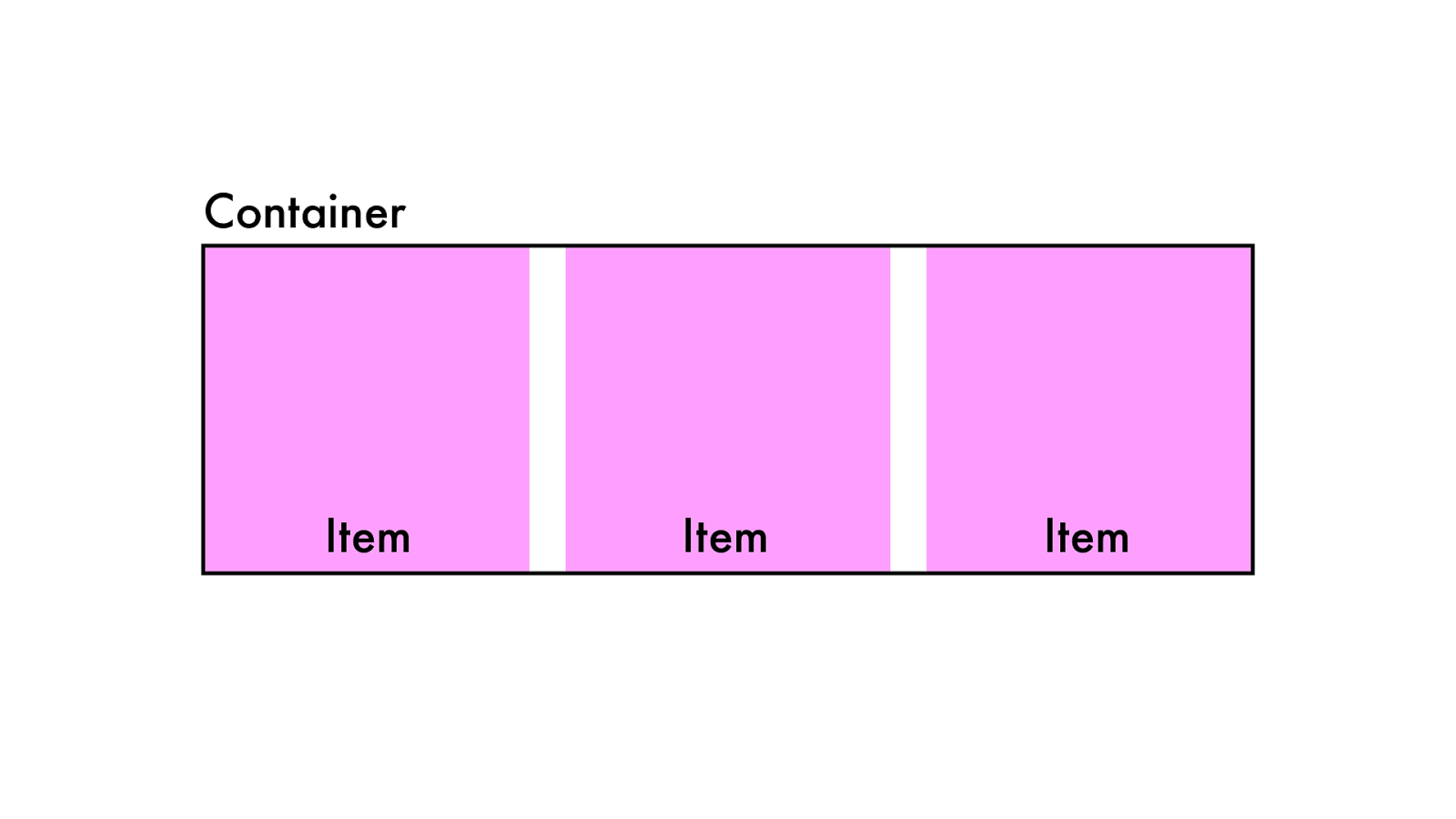
Grid Container
Grid Items
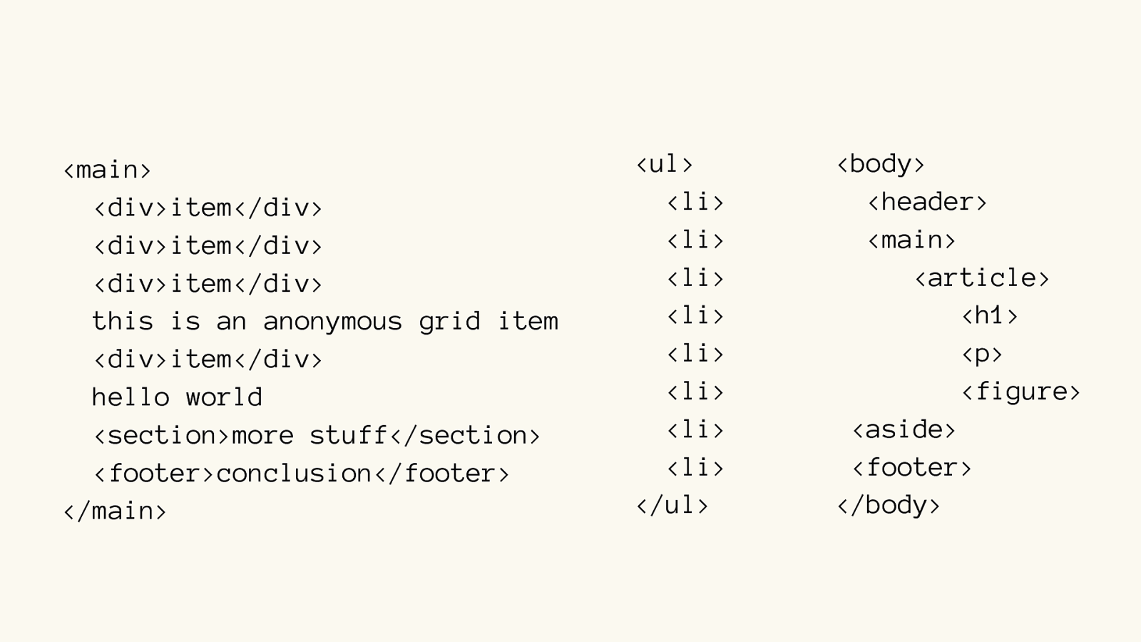
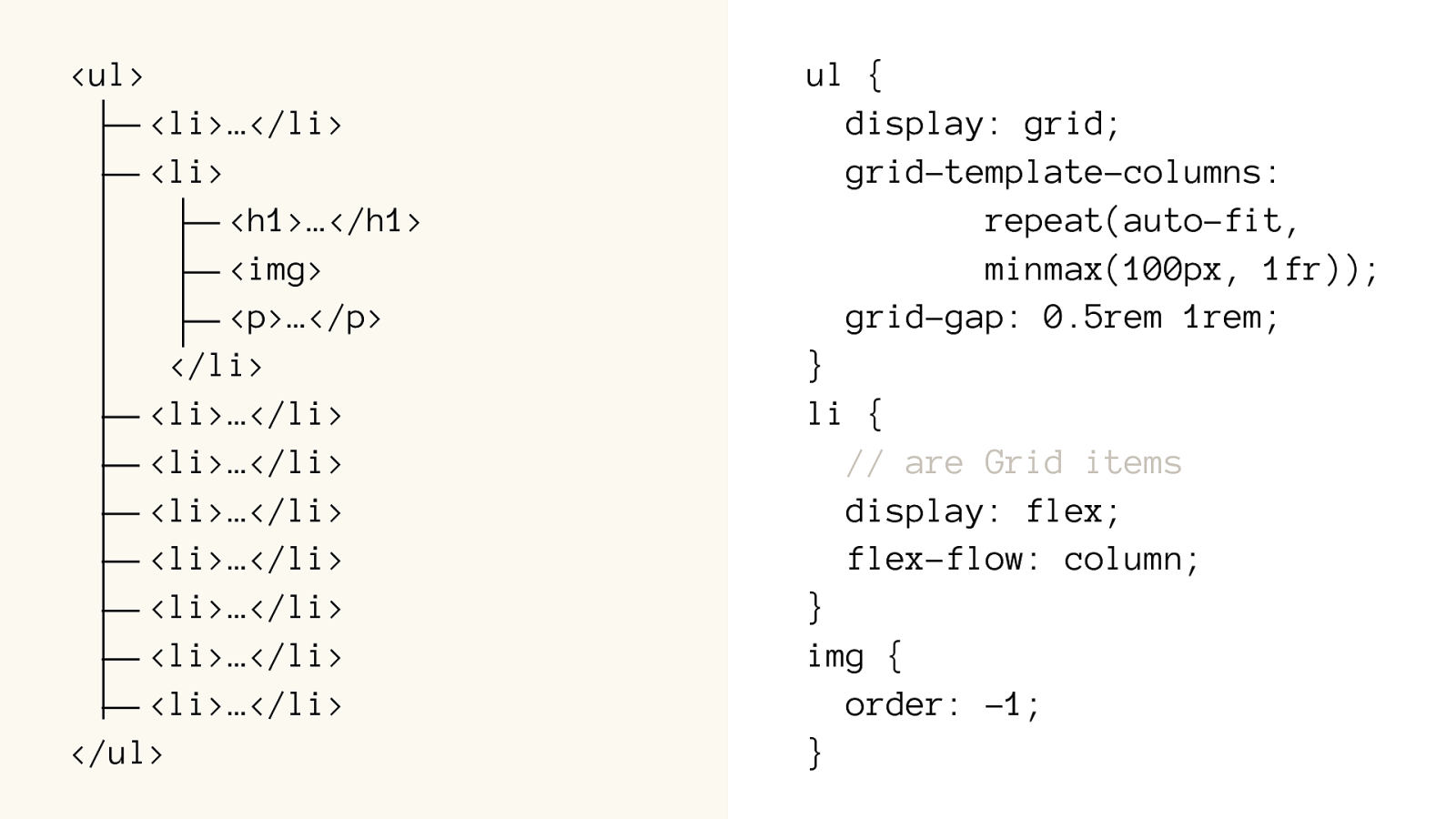
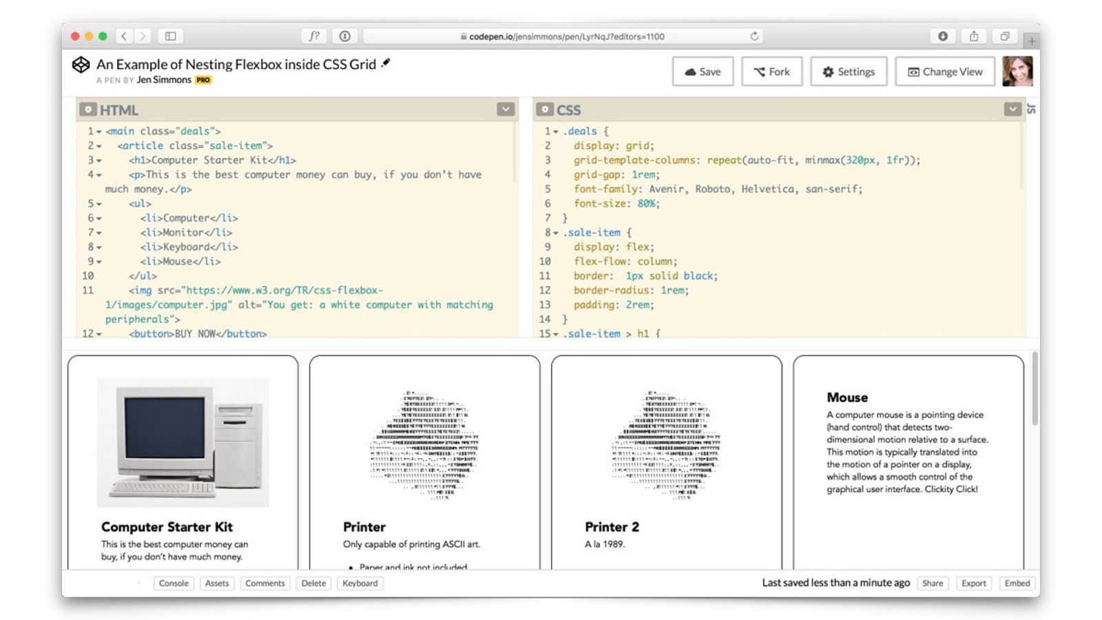
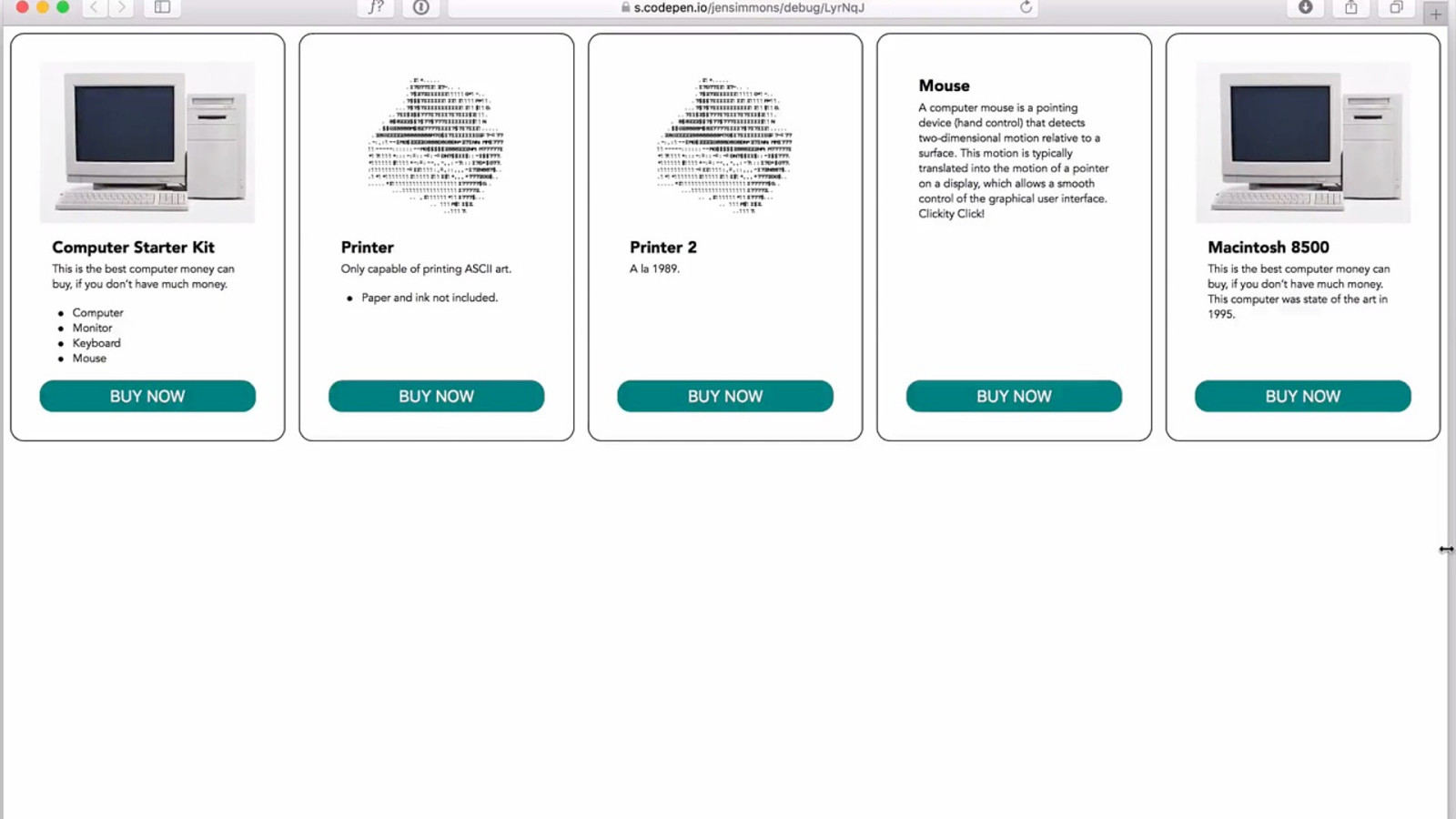
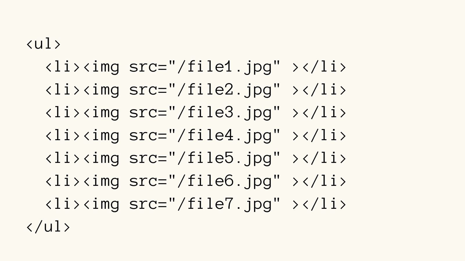
<li>…</li>

<li>…</li>

<li>…</li>

<li>…</li>

<li>…</li>
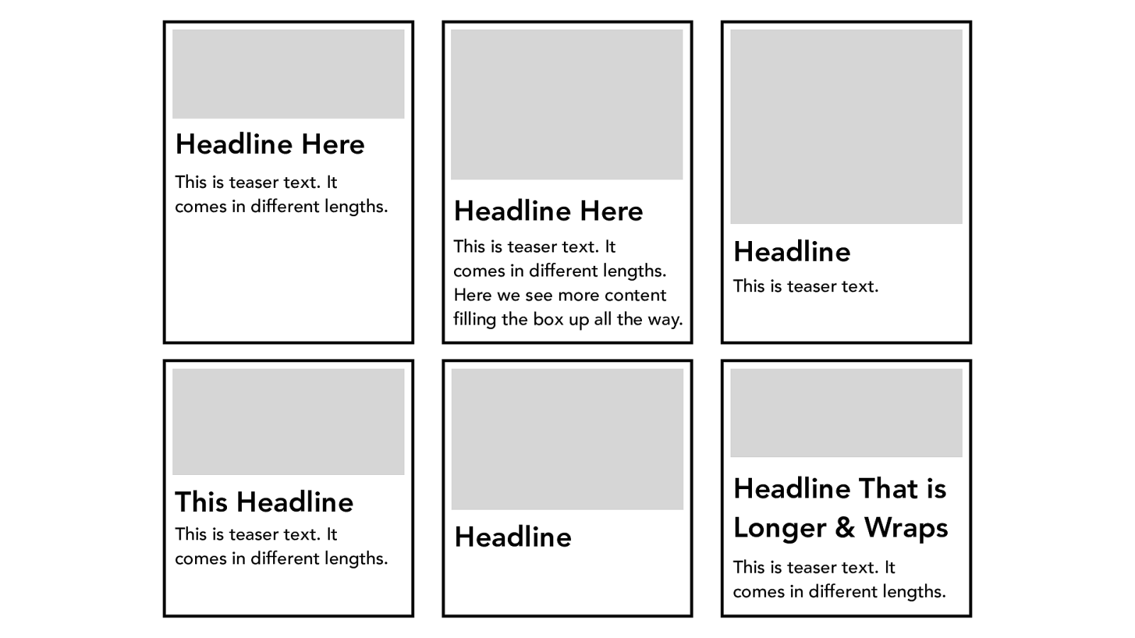
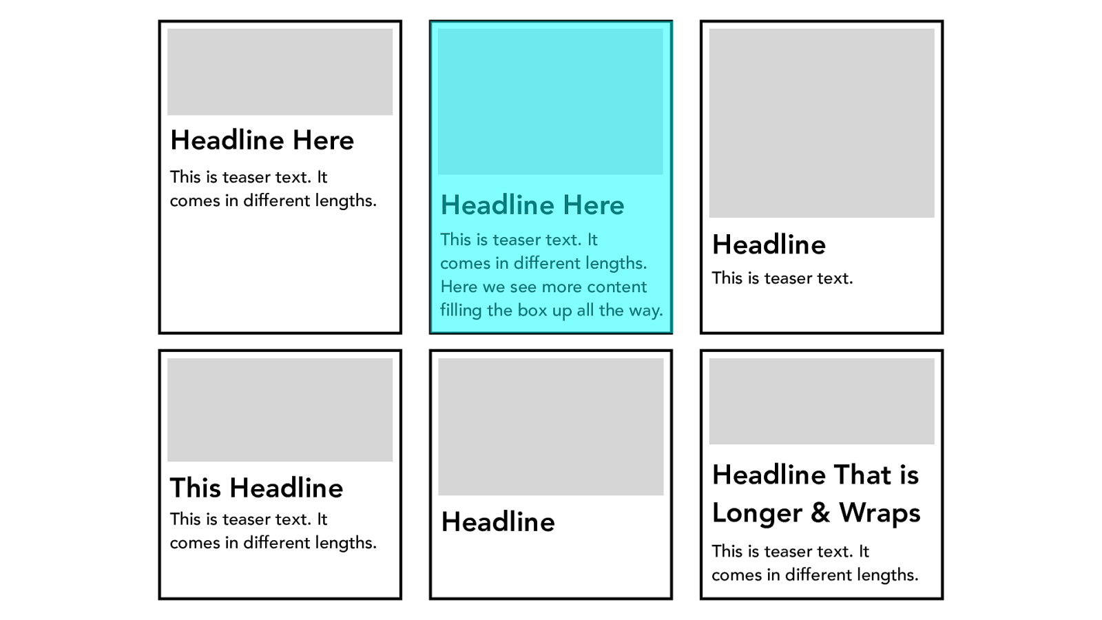
Headline Here
This is teaser text. It
comes in different lengths.
Headline Here
This is teaser text. It
comes in different lengths.
Here we see more content
filling the box up all the way.
Headline
This is teaser text.
Headline That is
Longer & Wraps
This is teaser text. It
comes in different lengths.
Headline
This Headline
This is teaser text. It
comes in different lengths.
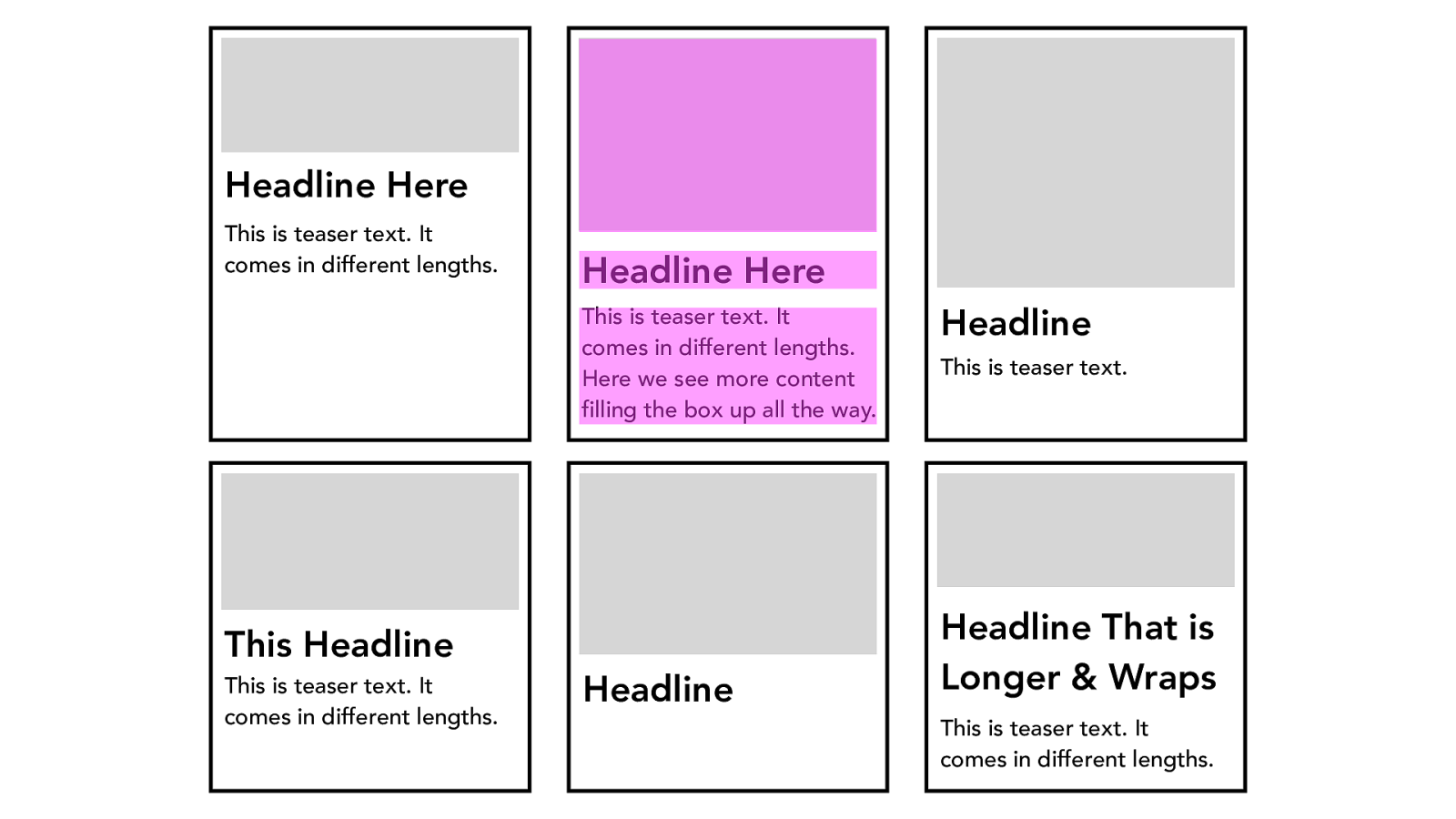
Headline Here
This is teaser text. It
comes in different lengths.
Headline Here
This is teaser text. It
comes in different lengths.
Here we see more content
filling the box up all the way.
Headline
This is teaser text.
Headline That is
Longer & Wraps
This is teaser text. It
comes in different lengths.
Headline
This Headline
This is teaser text. It
comes in different lengths.
Headline Here
This is teaser text. It
comes in different lengths.
Headline Here
This is teaser text. It
comes in different lengths.
Here we see more content
filling the box up all the way.
Headline
This is teaser text.
Headline That is
Longer & Wraps
This is teaser text. It
comes in different lengths.
Headline
This Headline
This is teaser text. It
comes in different lengths.
Container Item Item Item
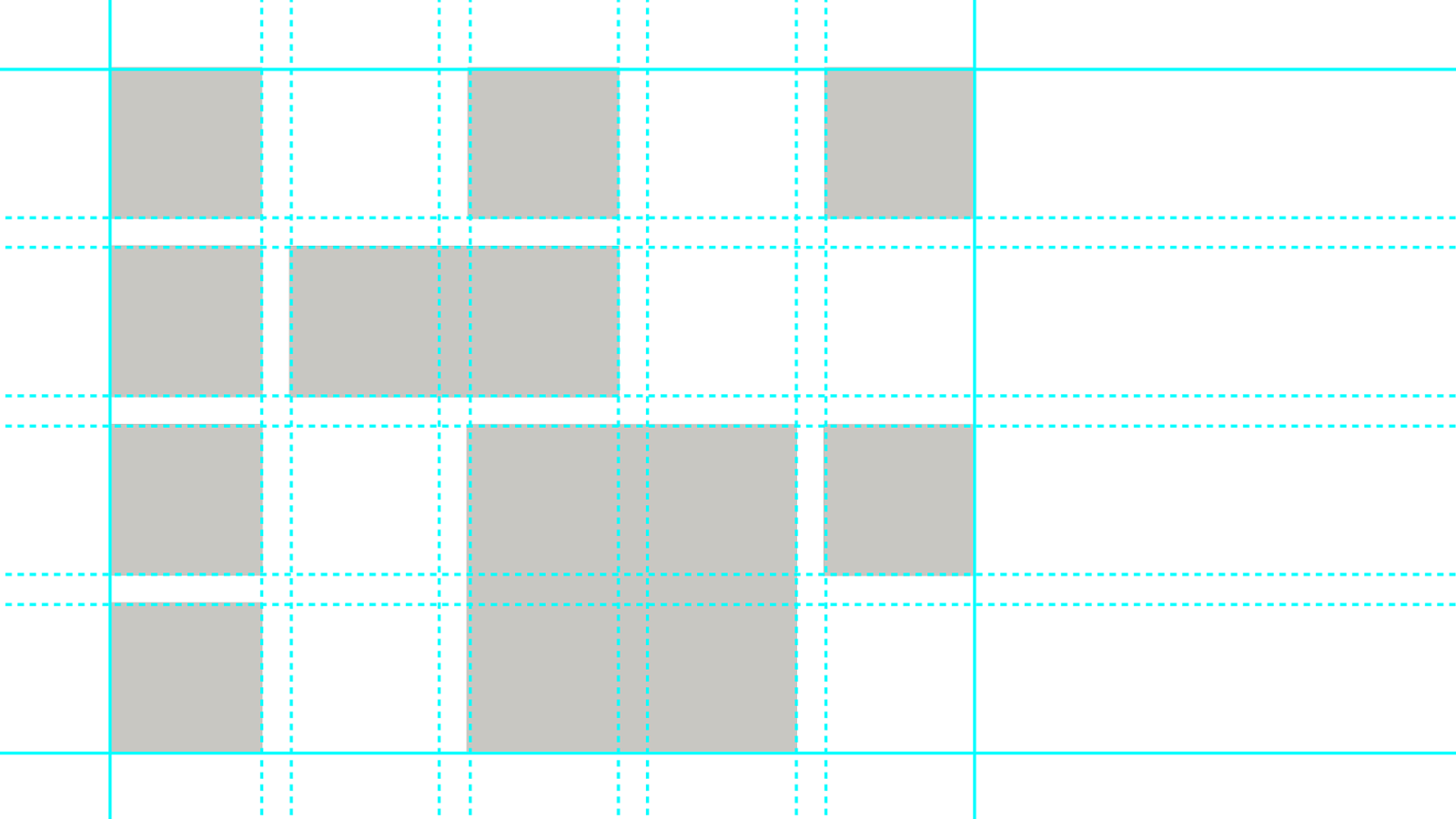
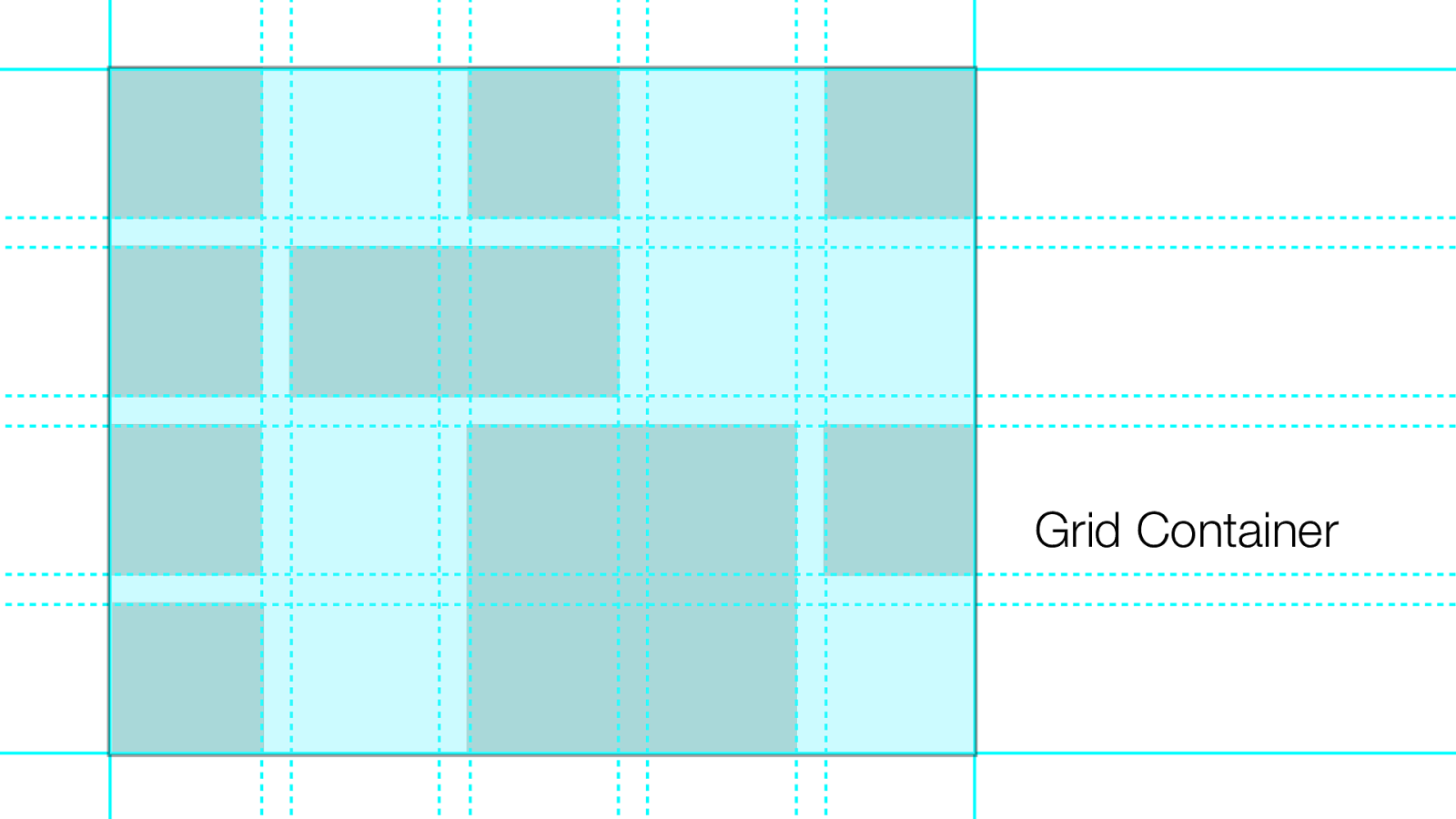
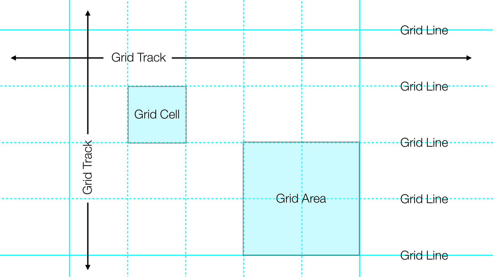
Ter minology
Grid Container
Grid Items
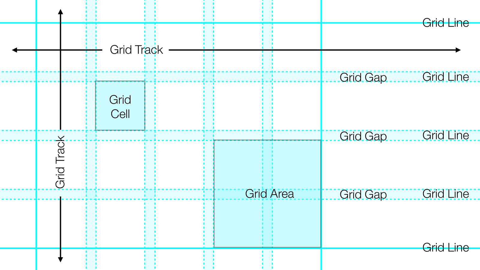
Grid Area Grid Line Grid Track Grid Track Grid Cell Grid Line Grid Line Grid Line Grid Line
Grid Area Grid Track Grid Track Grid Cell Grid Line Grid Line Grid Line Grid Line Grid Line Grid Gap Grid Gap Grid Gap
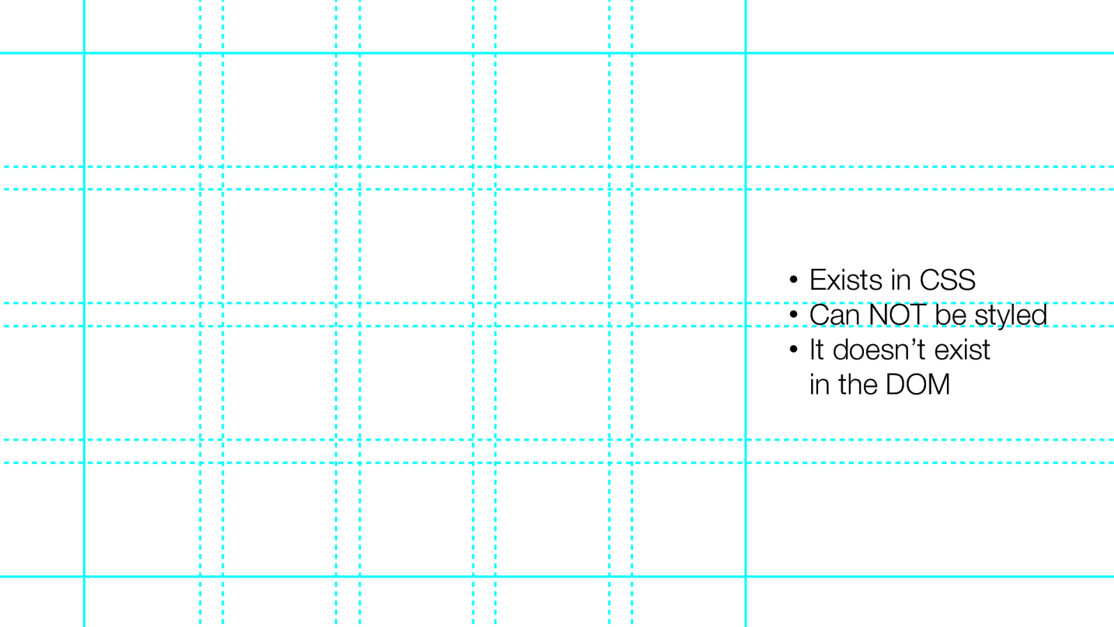
The Grid vs. The Content
• Exists in HTML • Can be styled, like anything in HTML
• Exists in CSS • Can NOT be styled • It doesn’t exist in the DOM
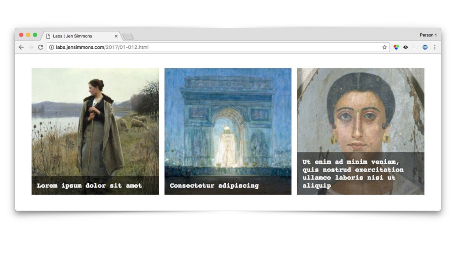
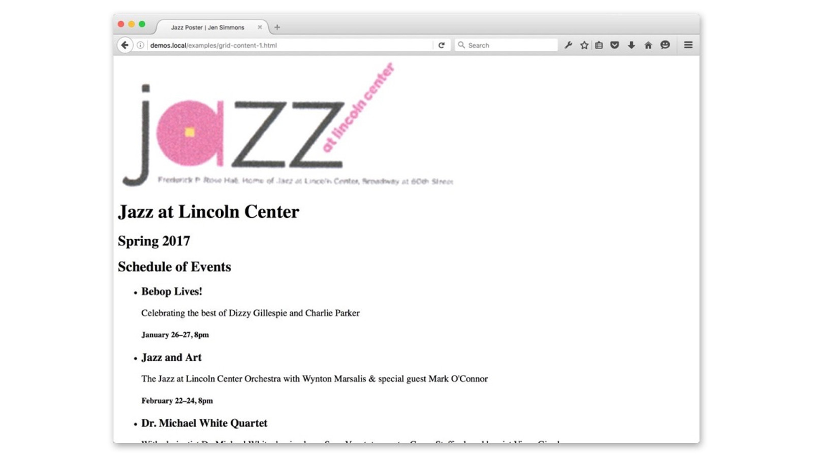
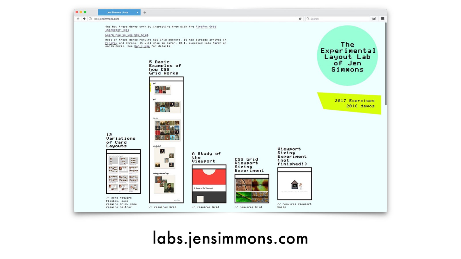
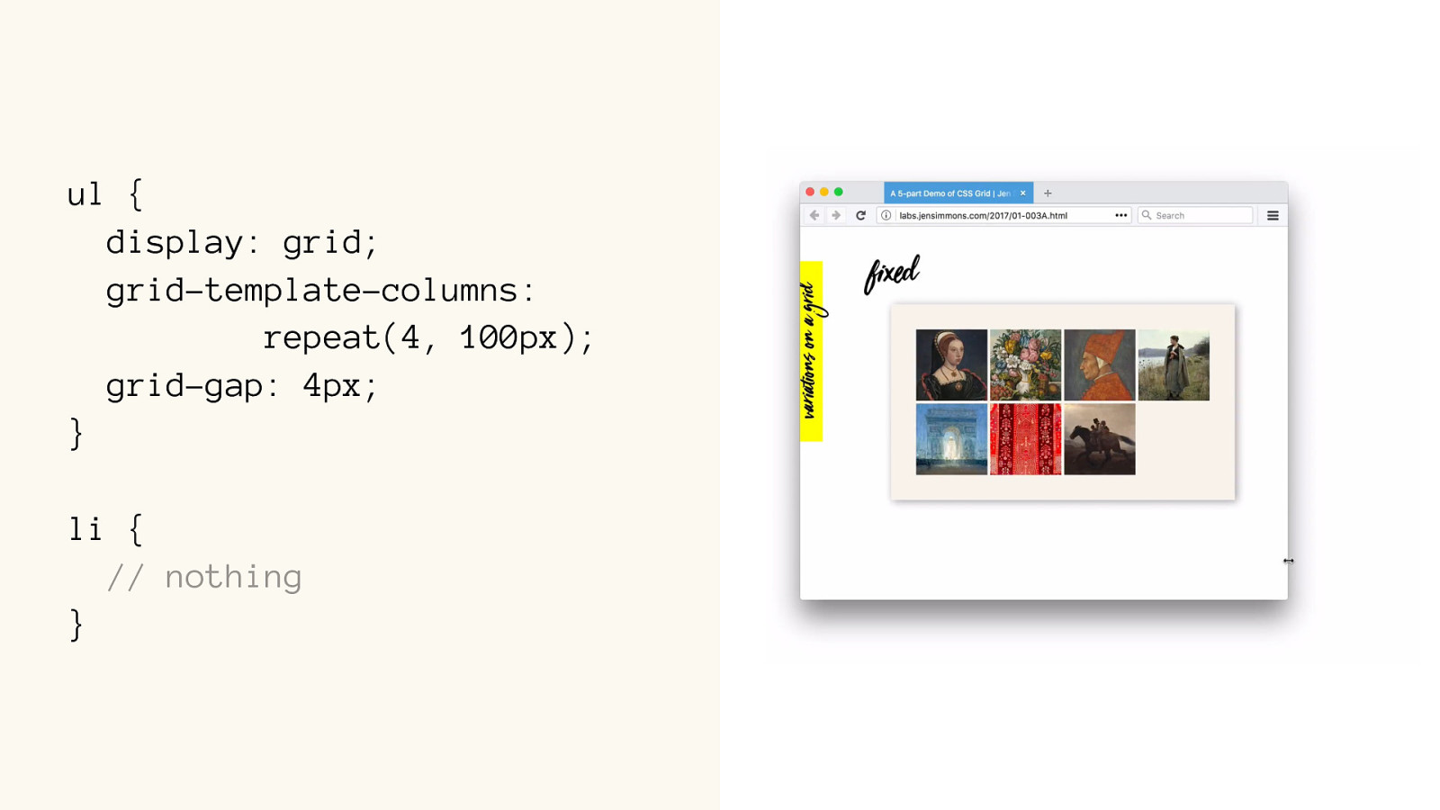
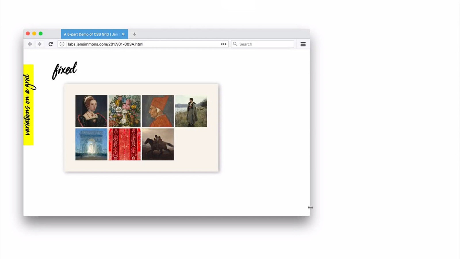
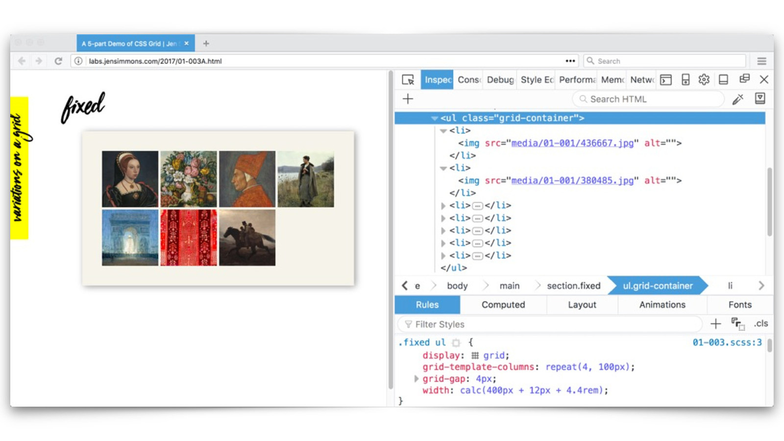
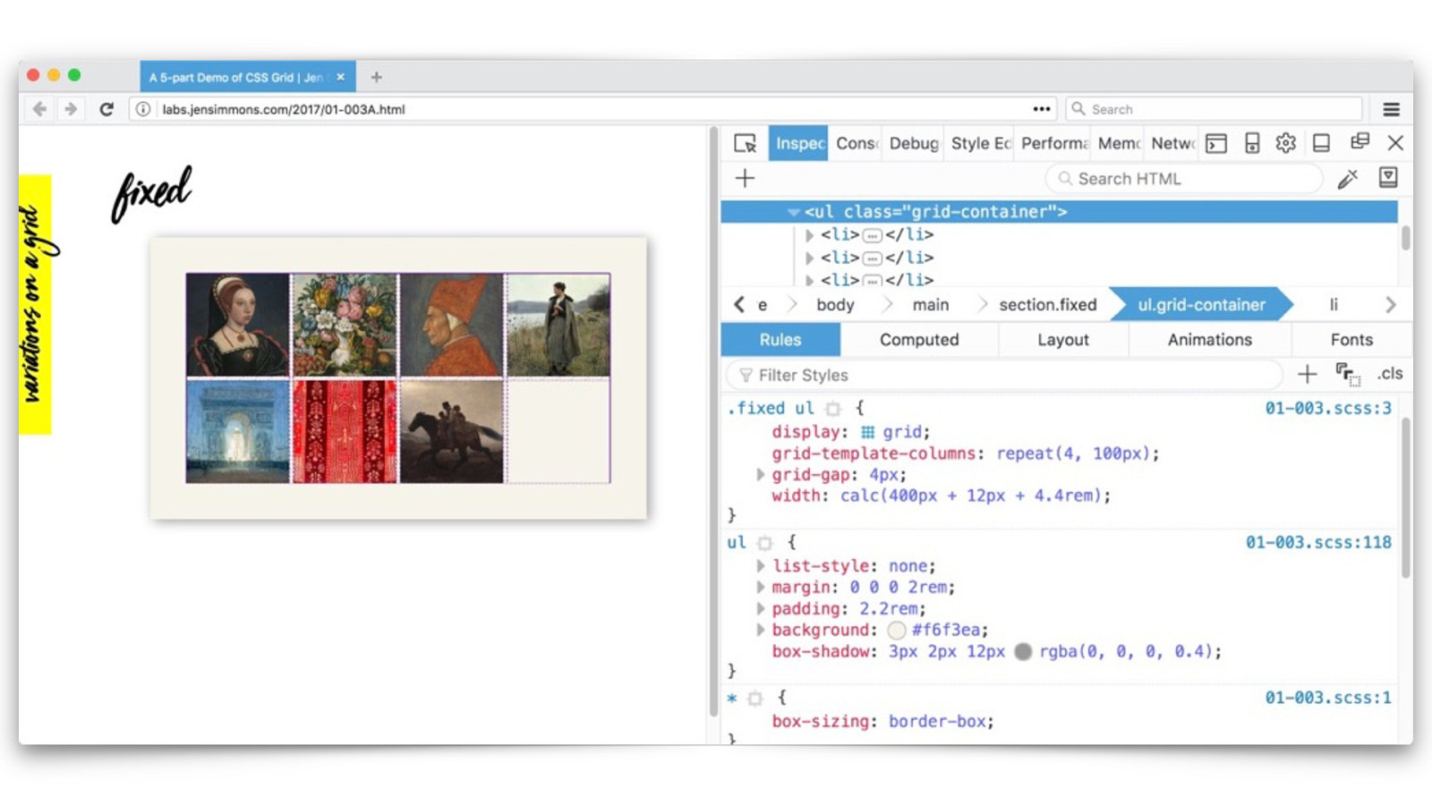
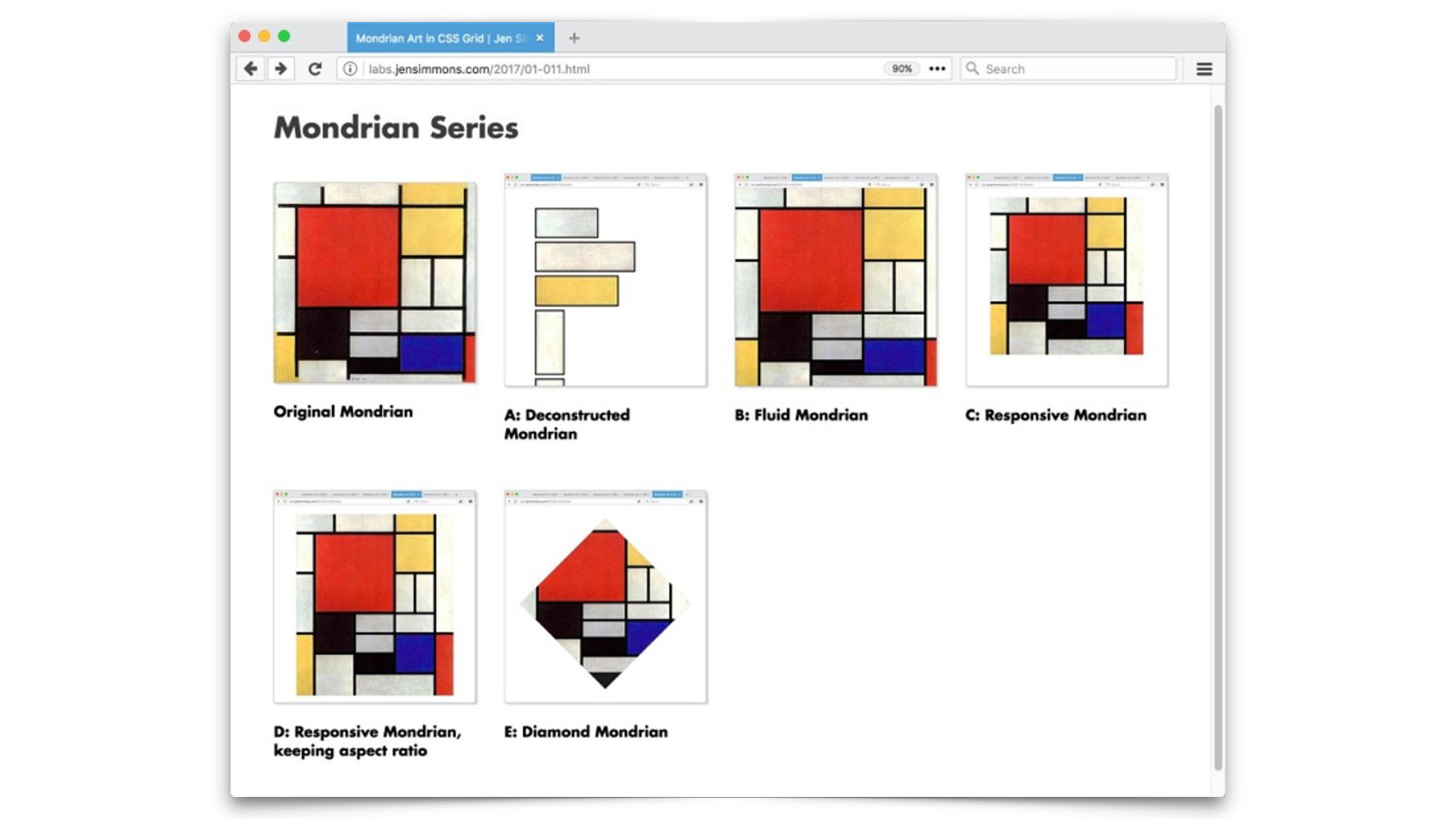
labs.jensimmons.com
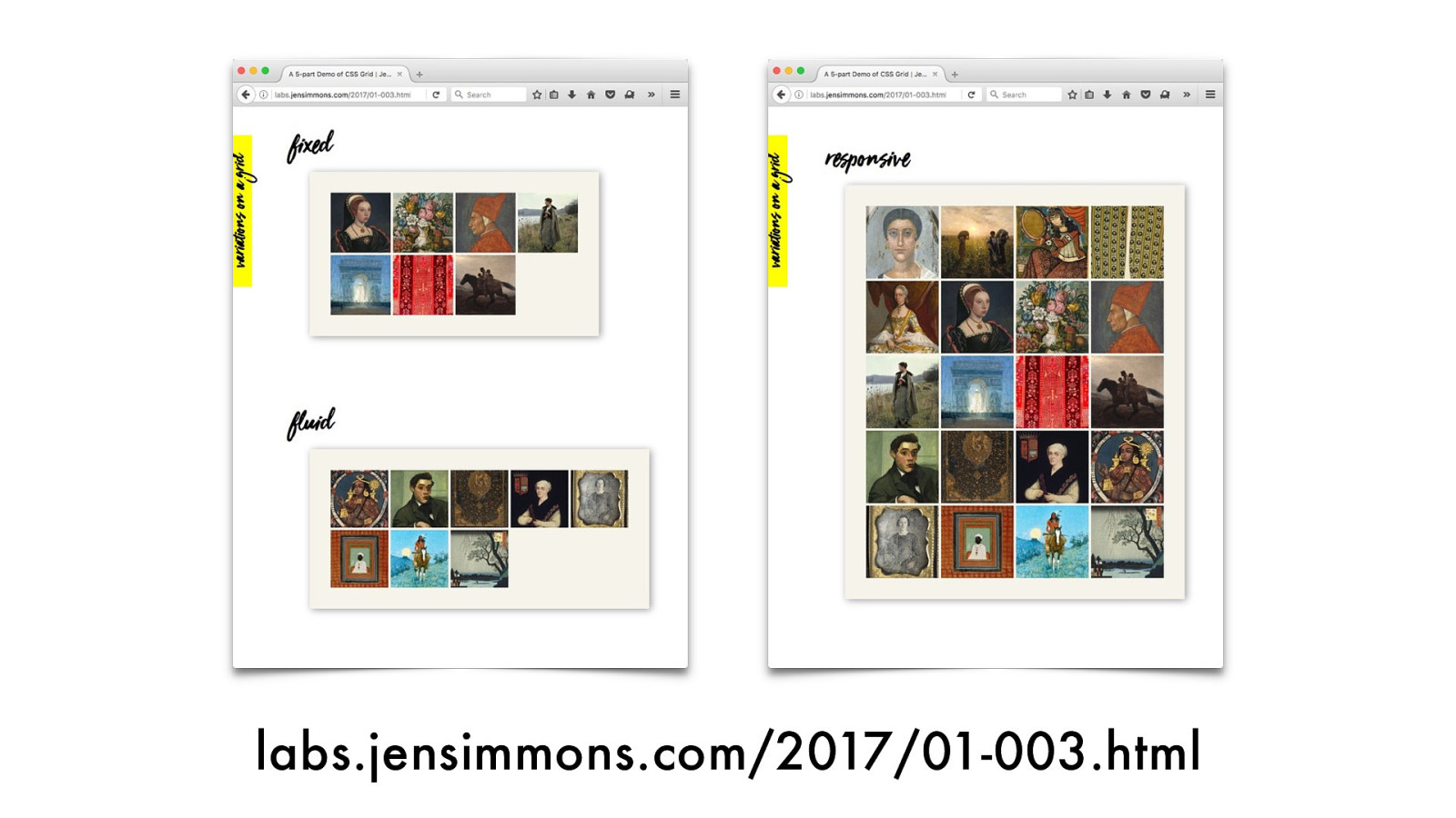
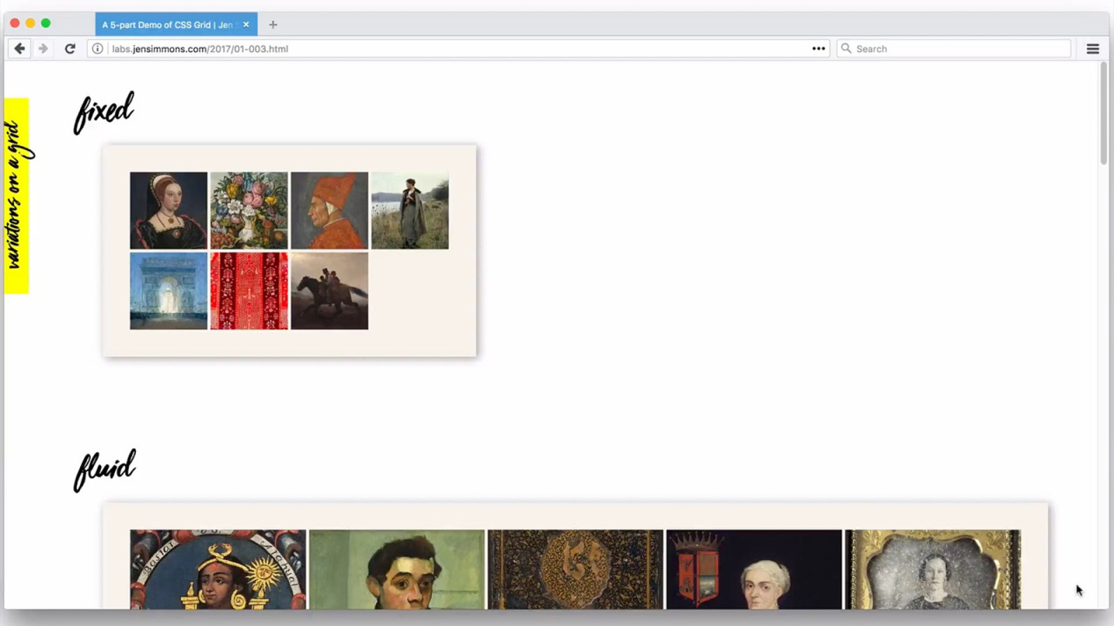
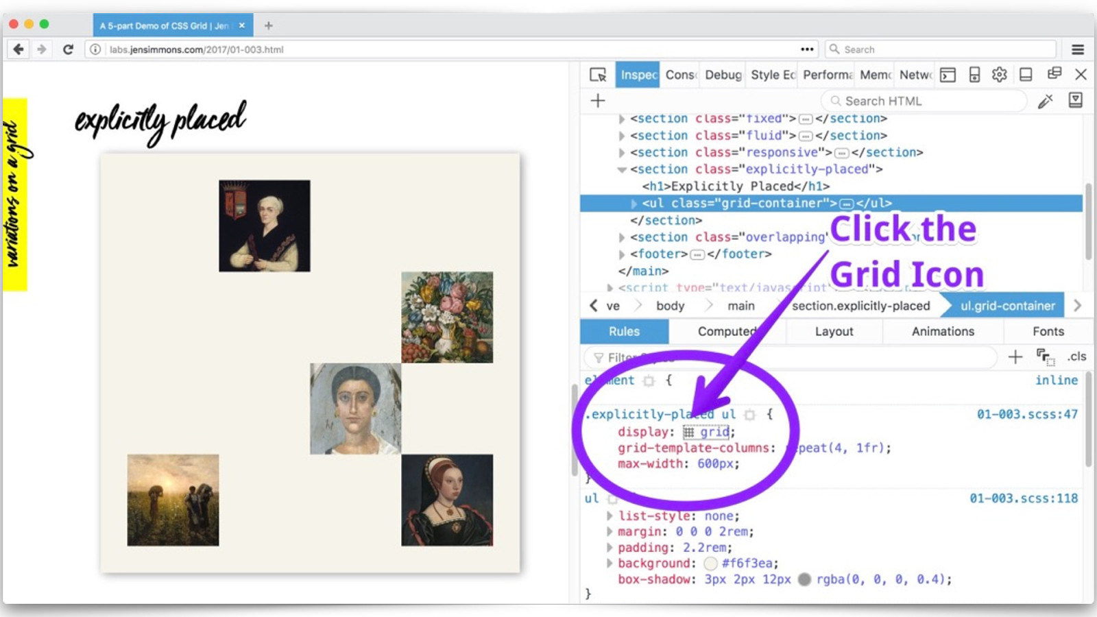
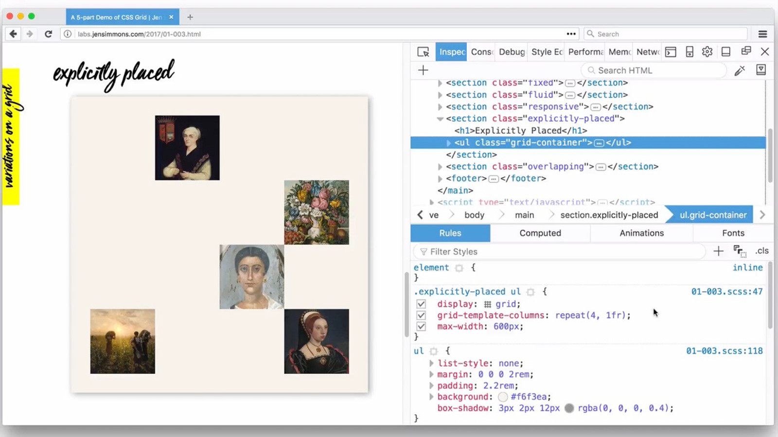
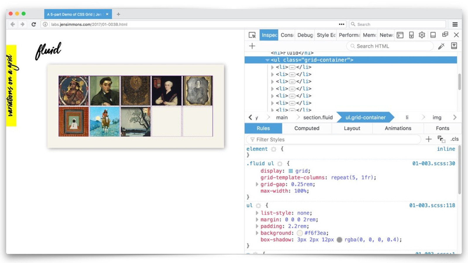
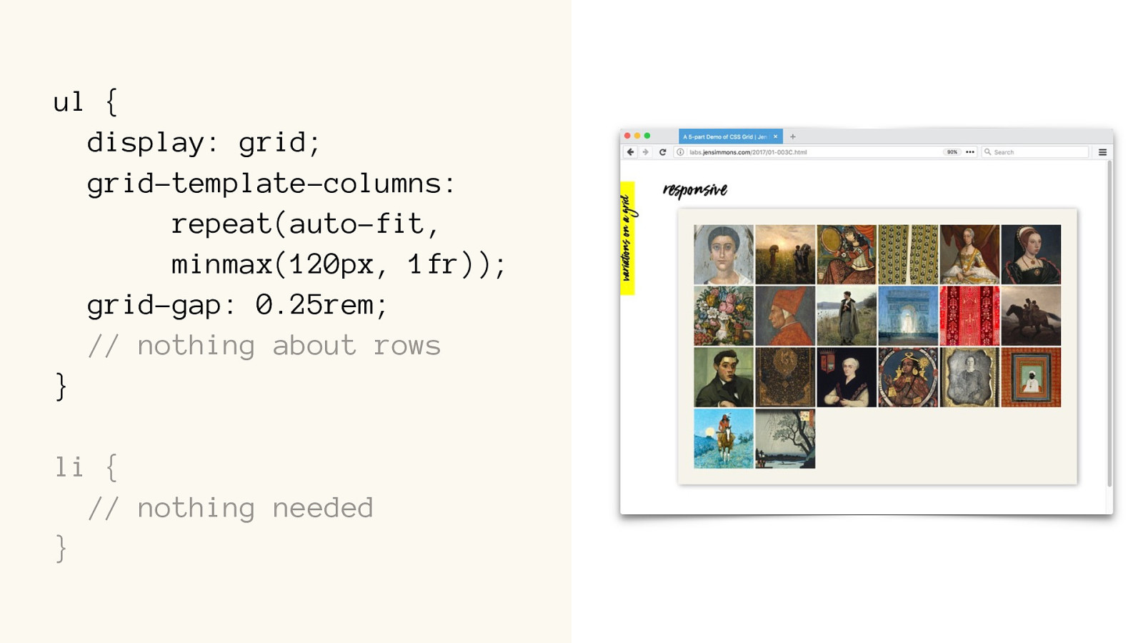
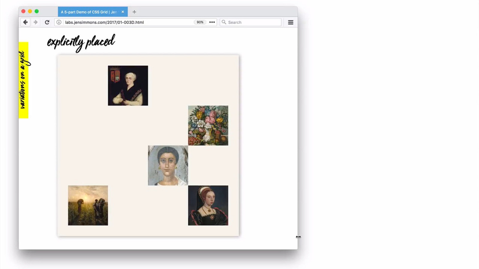
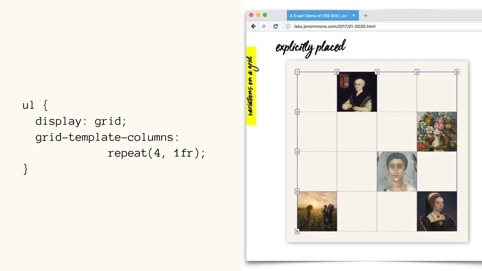
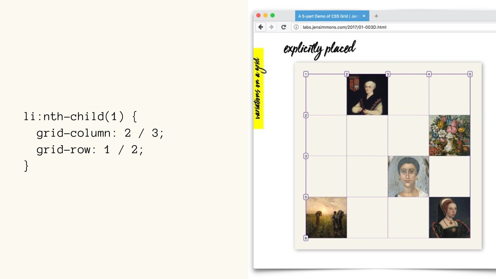
labs.jensimmons.com/2017/01-003.html
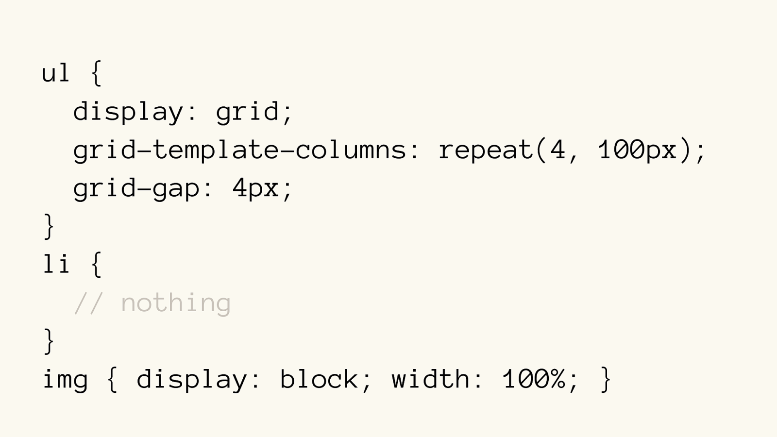
ul {
display: grid; grid-template-columns:
repeat(4, 100px); grid-gap: 4px;
} li {
// nothing
}
ul {
display: grid; grid-template-columns: repeat(4, 100px); grid-gap: 4px;
} li { // nothing } img { display: block; width: 100%; }
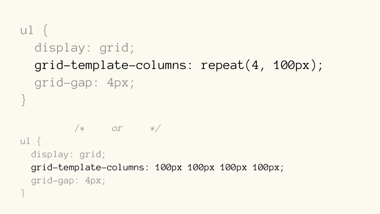
ul {
display: grid; grid-template-columns: repeat(4, 100px); grid-gap: 4px;
}
/*
or */
ul {
display: grid; grid-template-columns: 100px 100px 100px 100px; grid-gap: 4px;
}
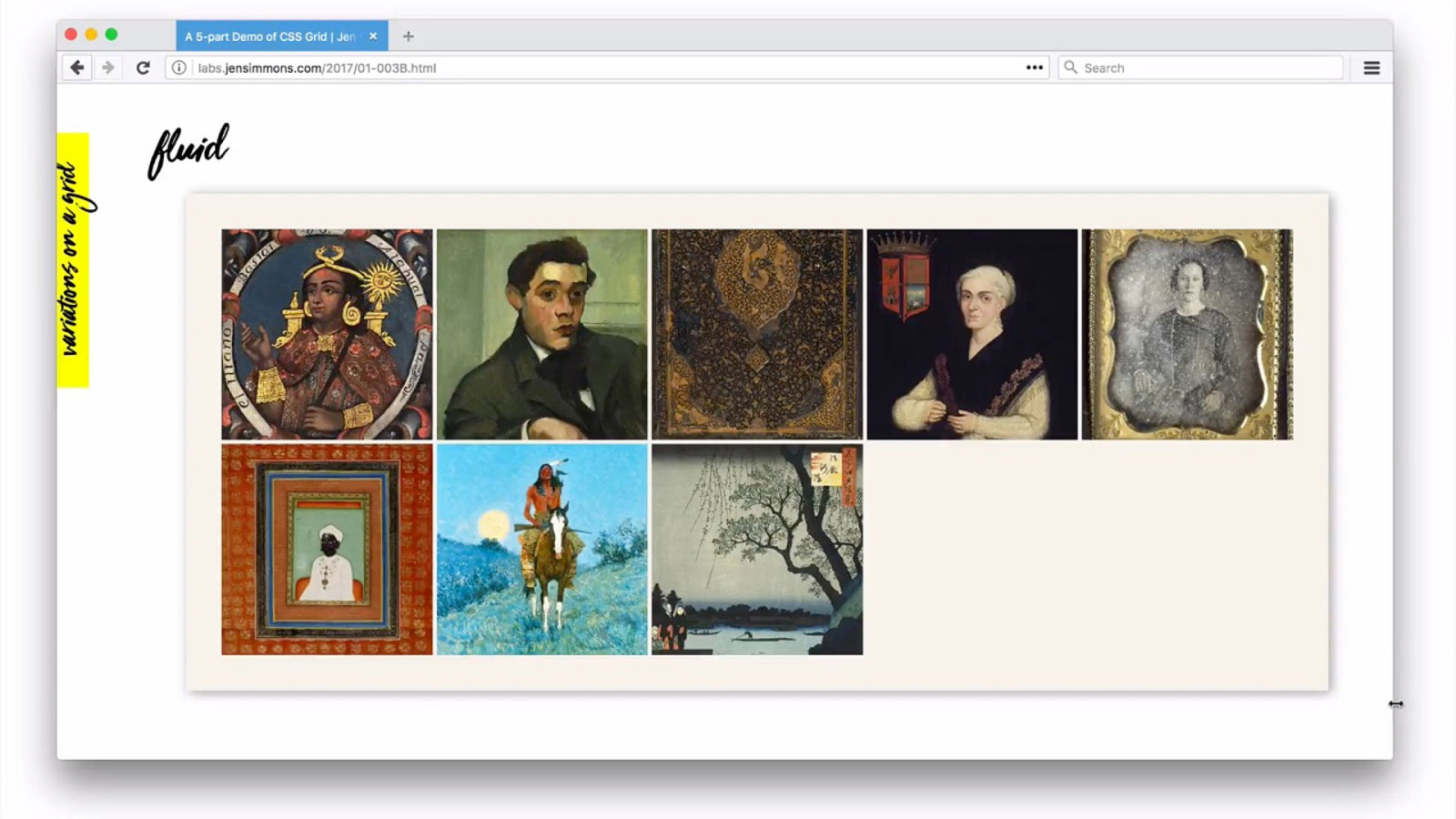
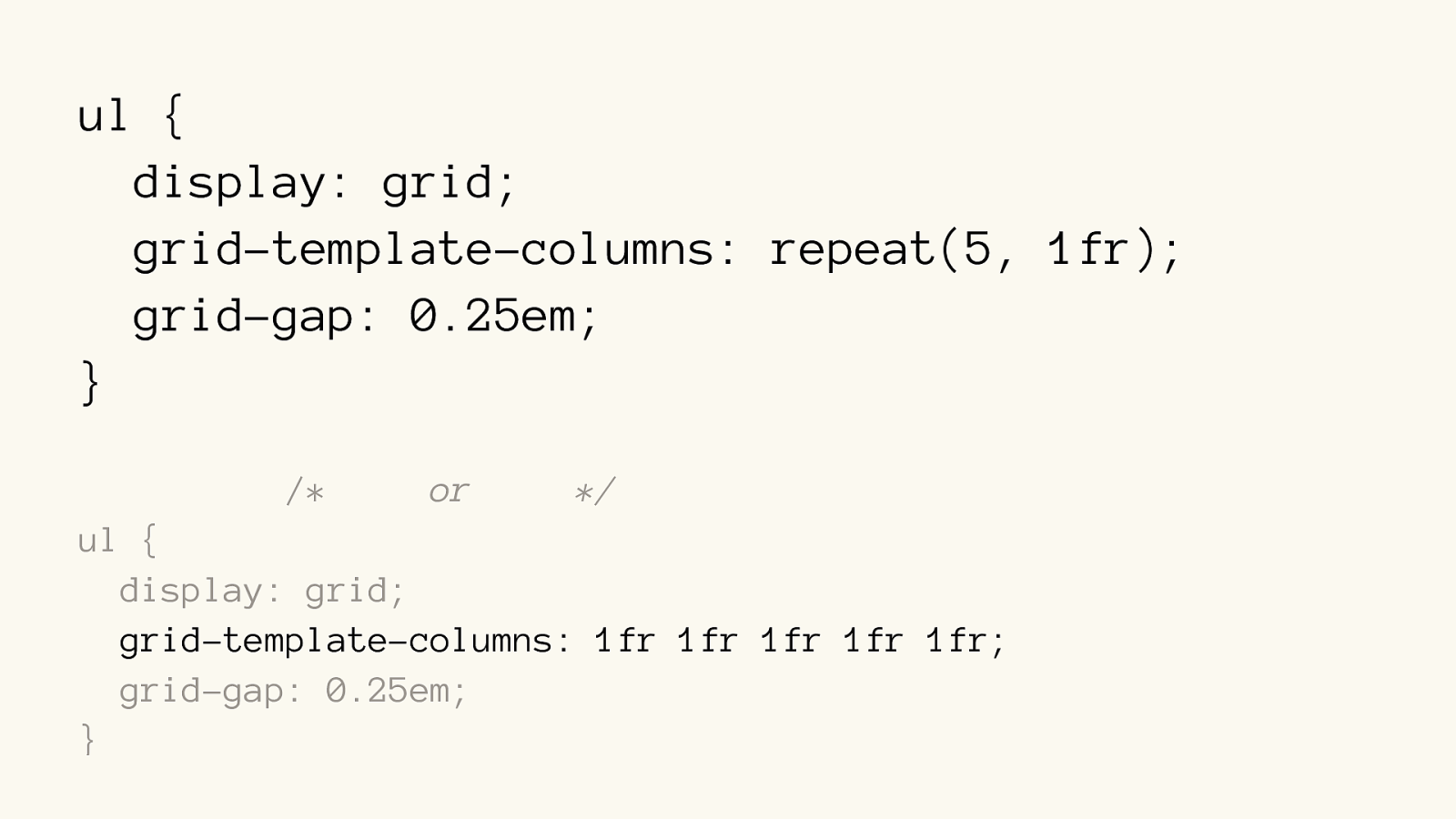
ul {
display: grid; grid-template-columns: repeat(5, 1fr ); grid-gap: 0.25em;
}
/*
or */
ul {
display: grid; grid-template-columns: 1fr 1fr 1fr 1fr 1fr ; grid-gap: 0.25em;
}
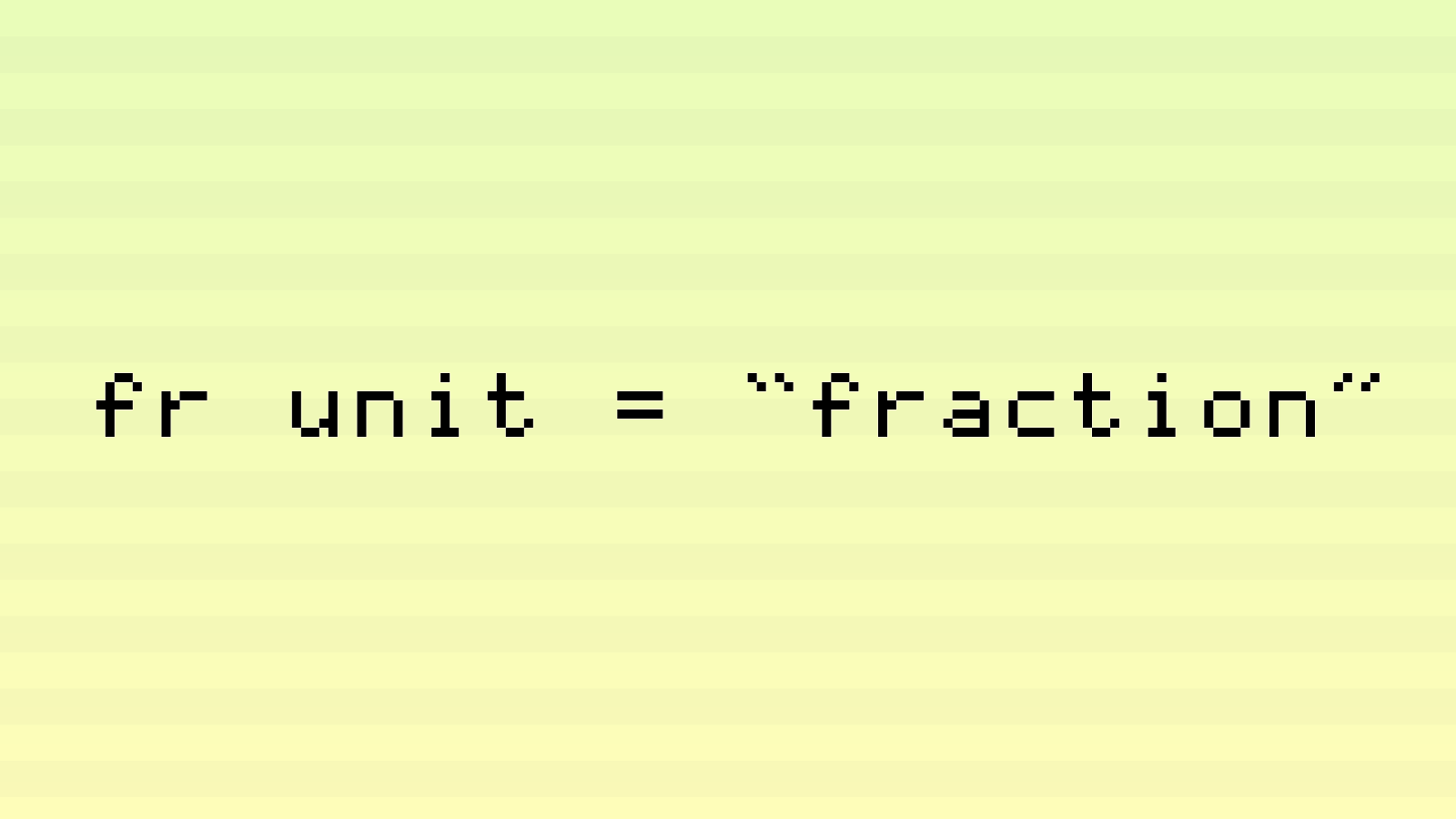
fr unit = “fraction”
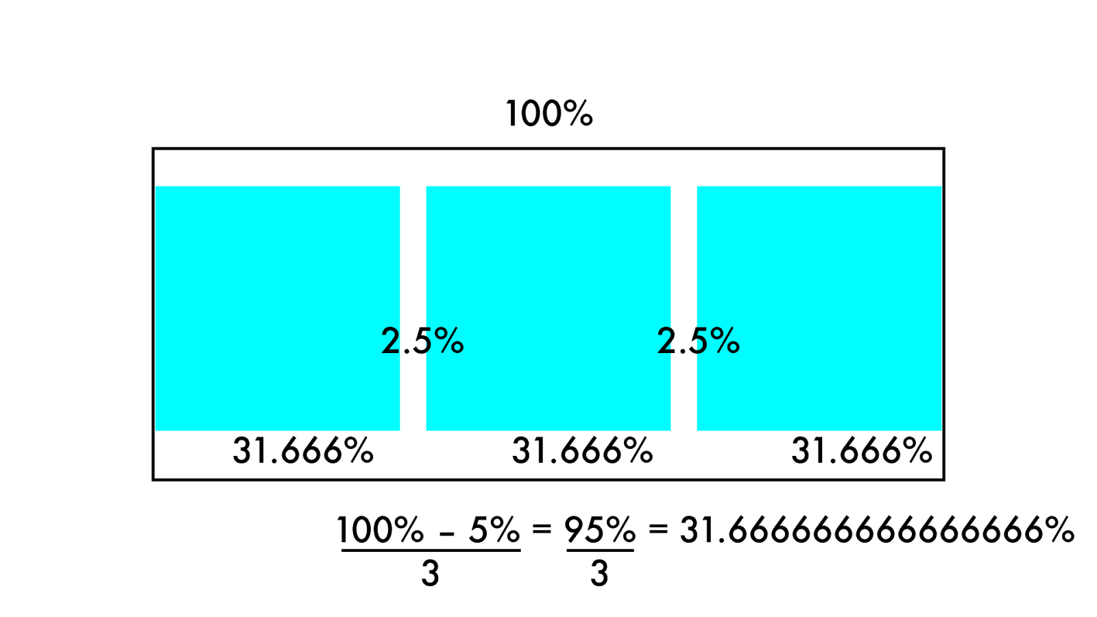
10 0 % 31. 6 6 6 % 31. 6 6 6 % 31. 6 6 6% 2.5% 2.5% 100% – 5% = 95% = 31.666666666666666% 3 3
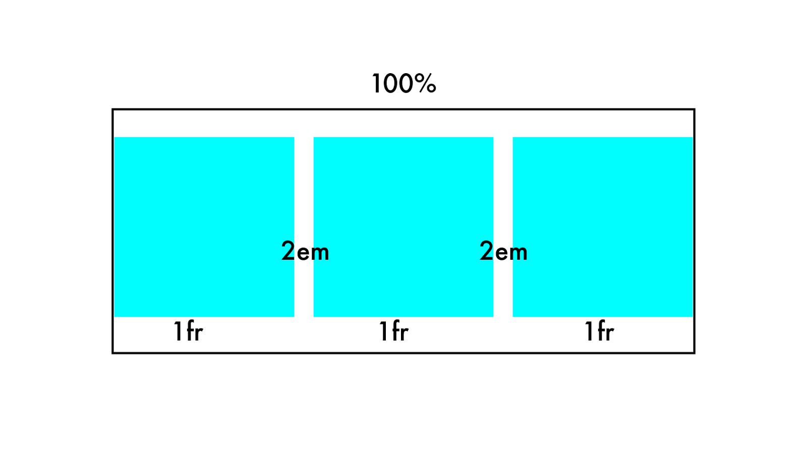
10 0 % 1fr 1fr 1fr 2em 2em
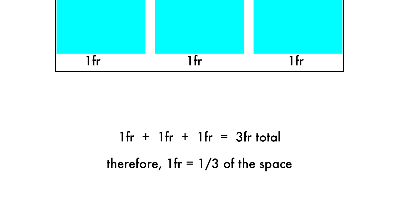
1fr 1fr 1fr 1fr + 1fr + 1fr = 3fr total therefore, 1fr = 1/3 of the space
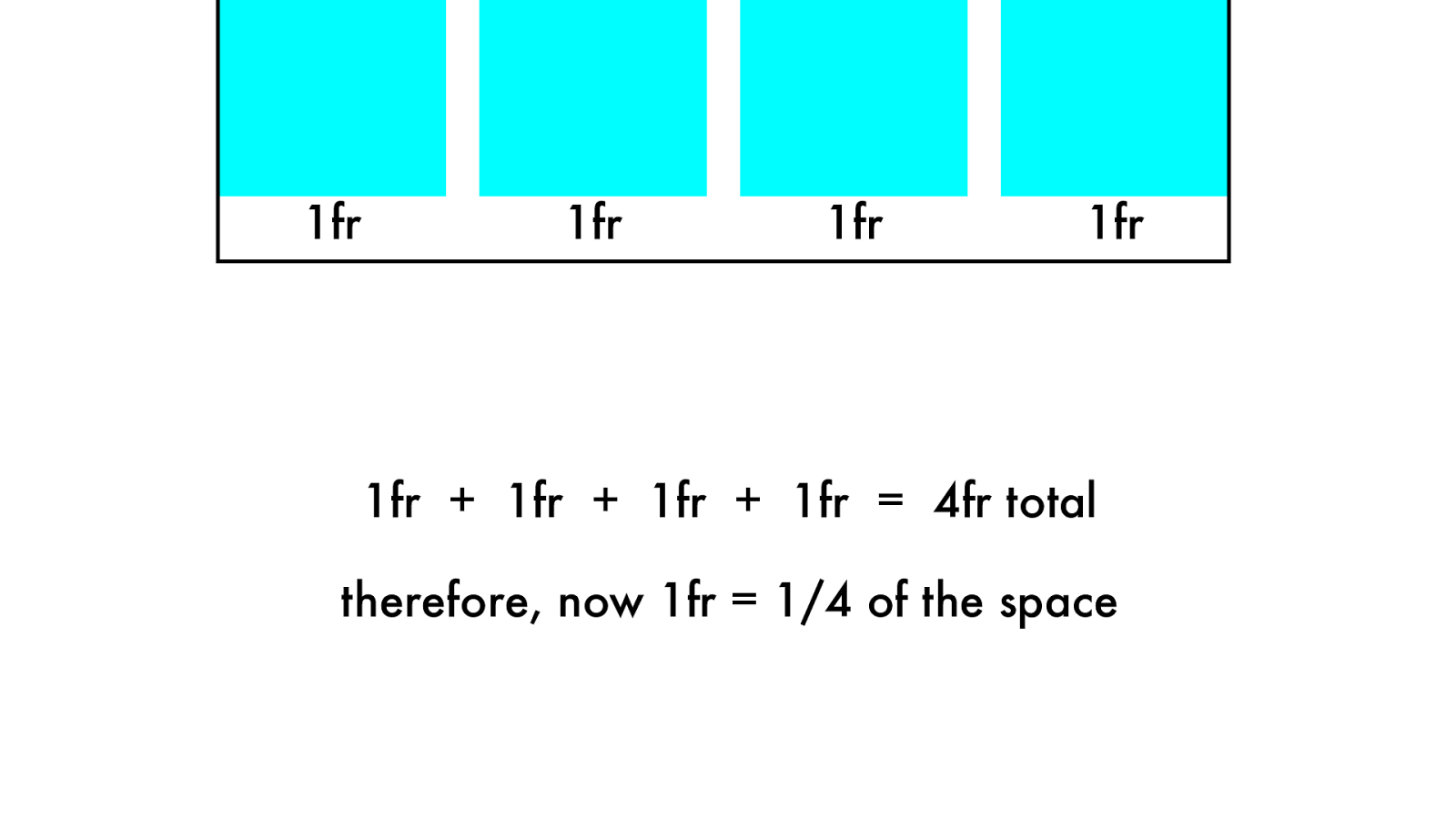
1fr 1fr 1fr 1fr + 1fr + 1fr + 1fr = 4fr total therefore, now 1fr = 1/4 of the space 1fr
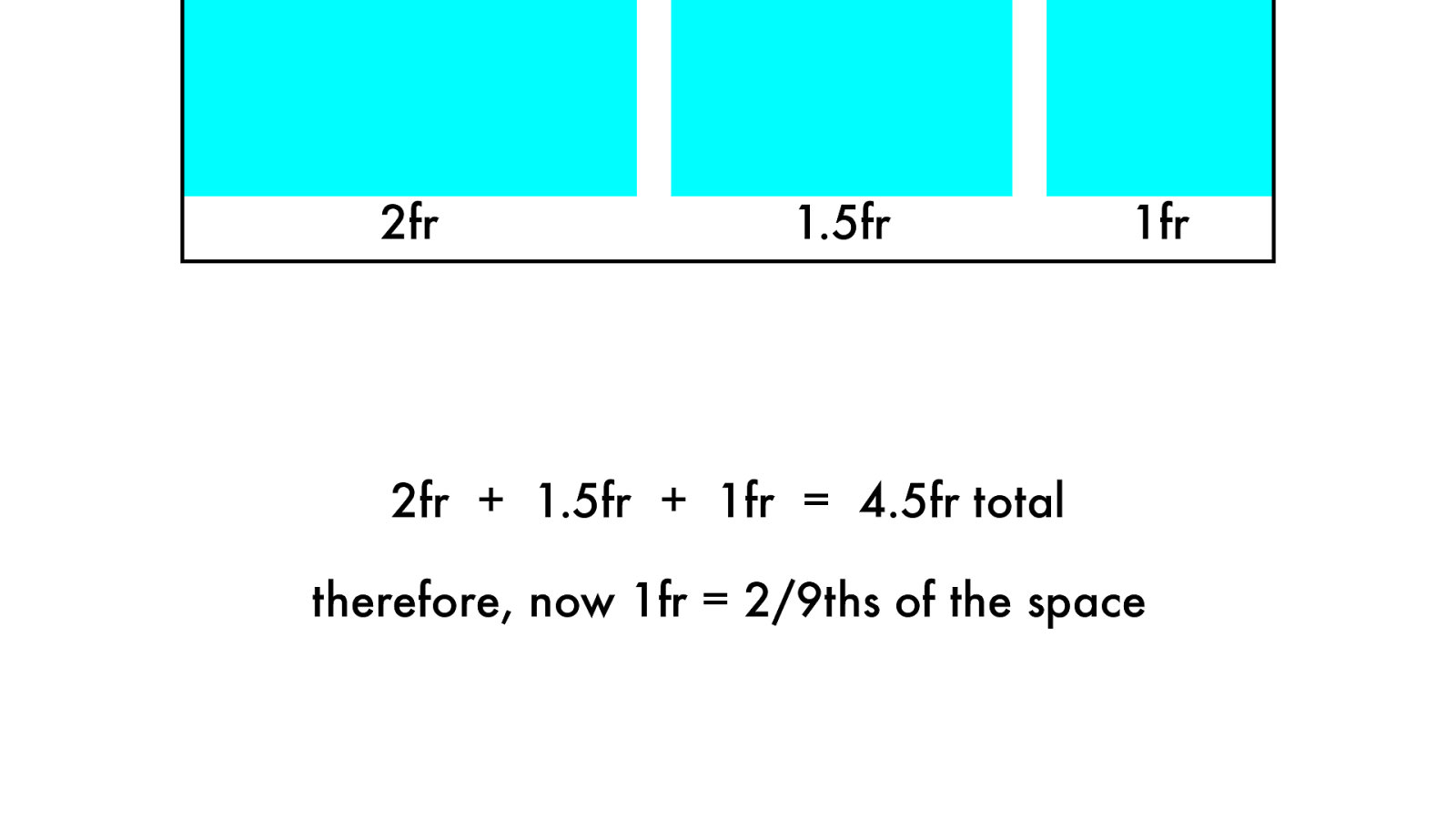
2fr + 1.5fr + 1fr = 4.5fr total therefore, now 1fr = 2/9ths of the space 2fr 1fr
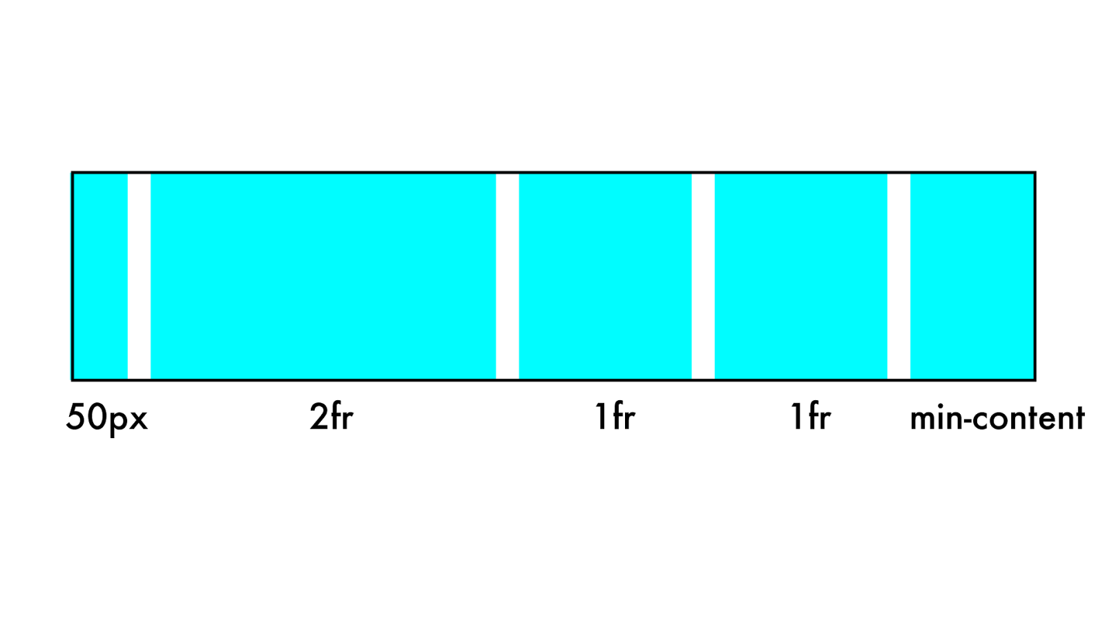
2fr 1fr 50px 1fr min-content
ul {
display: grid; grid-template-columns: repeat(5, 1fr ); grid-gap: 0.25em;
}
/*
or */
ul {
display: grid; grid-template-columns: 1fr 1fr 1fr 1fr 1fr ; grid-gap: 0.25em;
}
Comma , or not to comma?
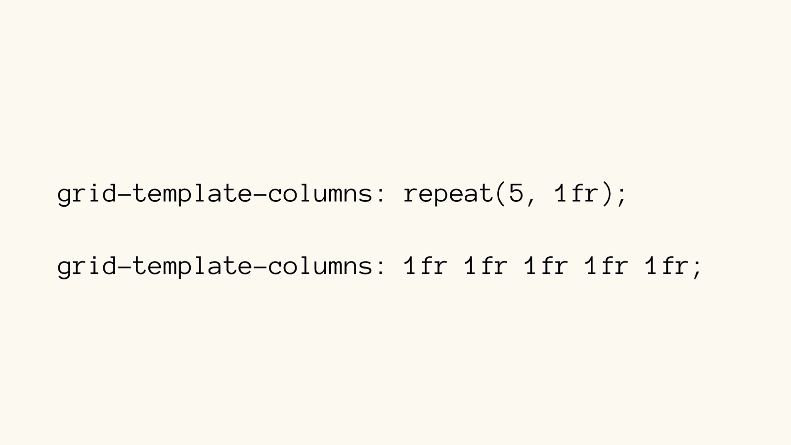
grid-template-columns: repeat(5, 1fr ); grid-template-columns: 1fr 1fr 1fr 1fr 1fr;
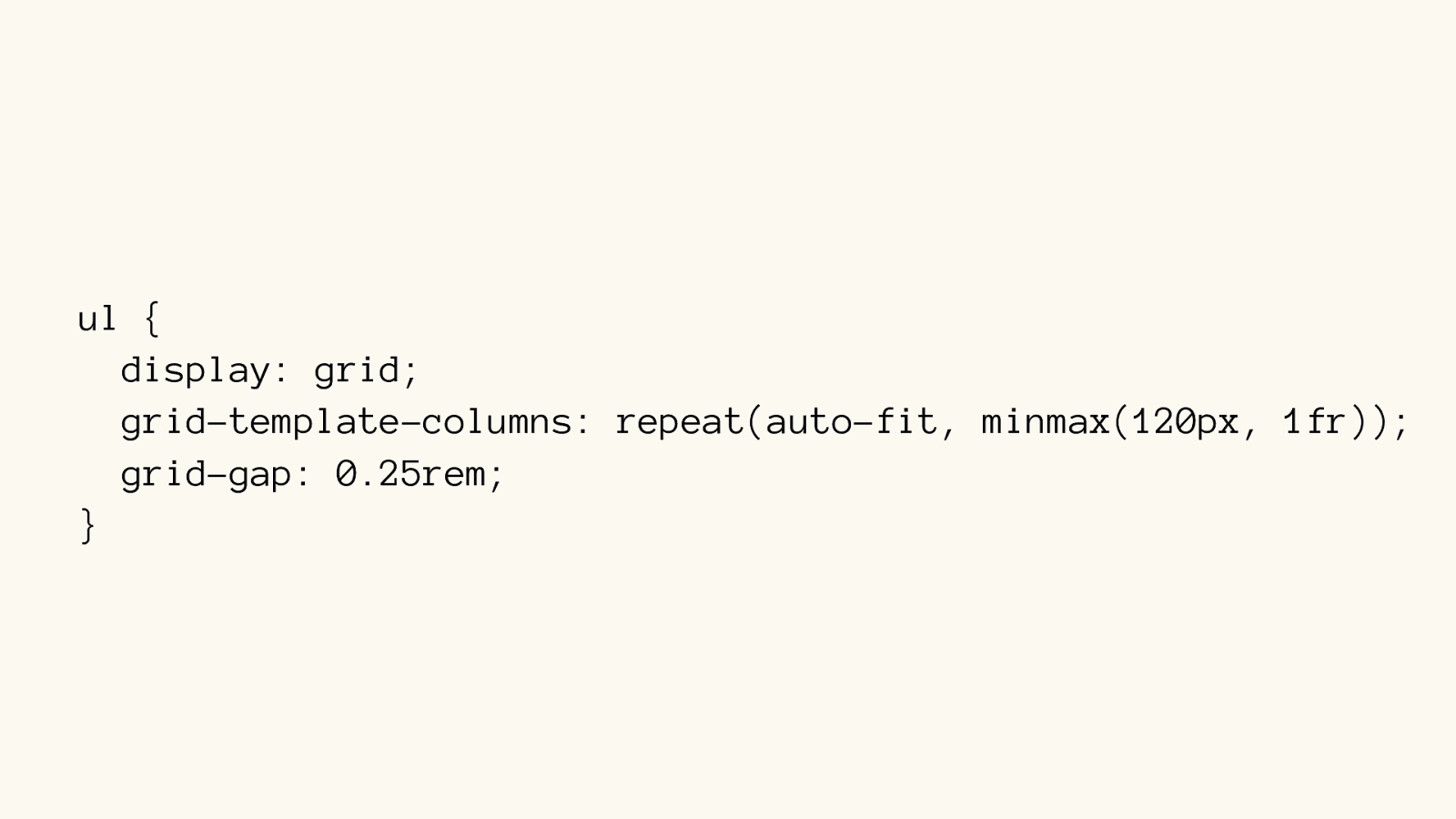
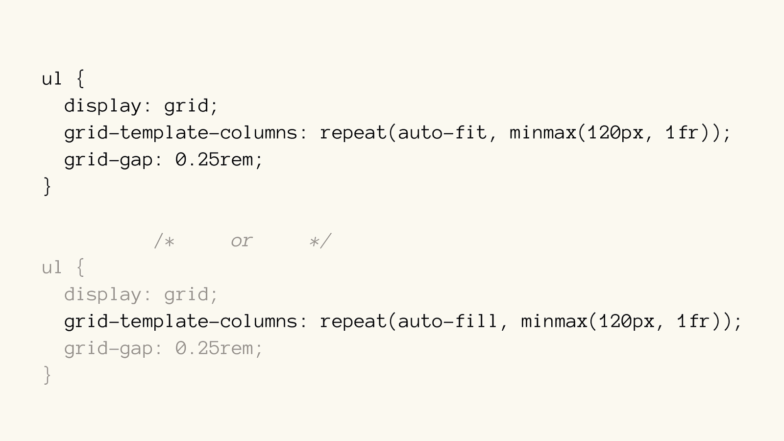
ul { display: grid; grid-template-columns: repeat(auto-fit, minmax(120px, 1fr)); grid-gap: 0.25rem; }
ul {
display: grid;
grid-template-columns: repeat(auto-fit, minmax(120px, 1fr));
grid-gap: 0.25rem;
}
/*
or */
ul {
display: grid; grid-template-columns: repeat(auto-fill , minmax(120px, 1fr)); grid-gap: 0.25rem;
}
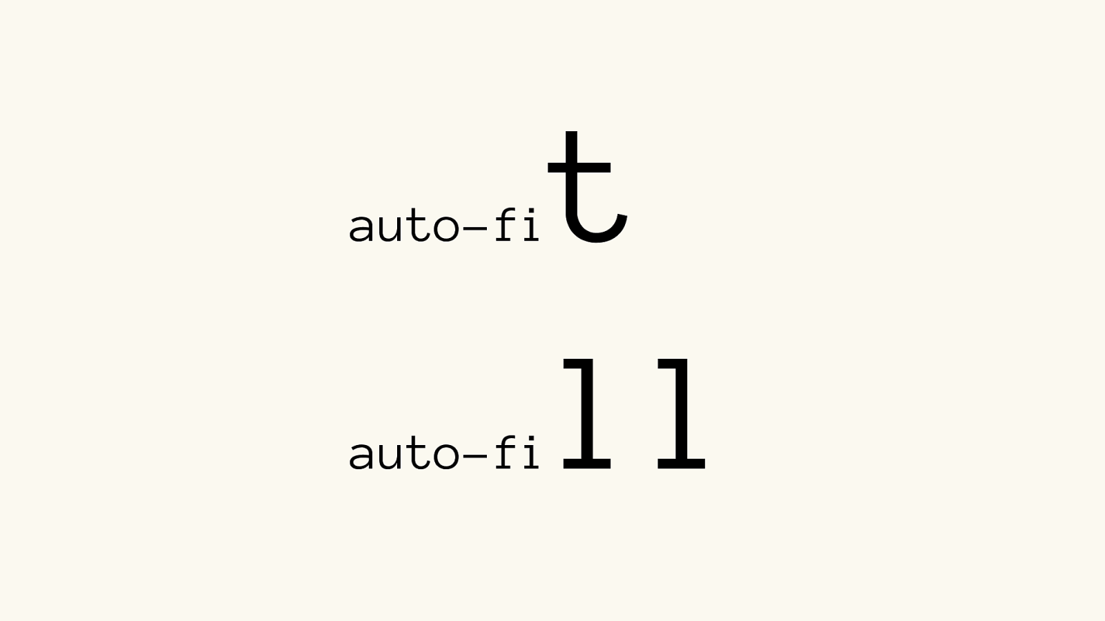
auto-fi t
auto-fi ll
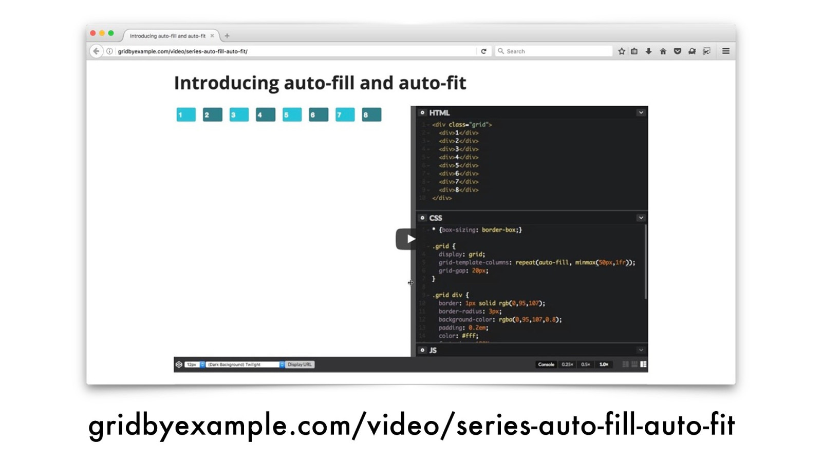
gridbyexample.com/video/series-auto-fill-auto-fit
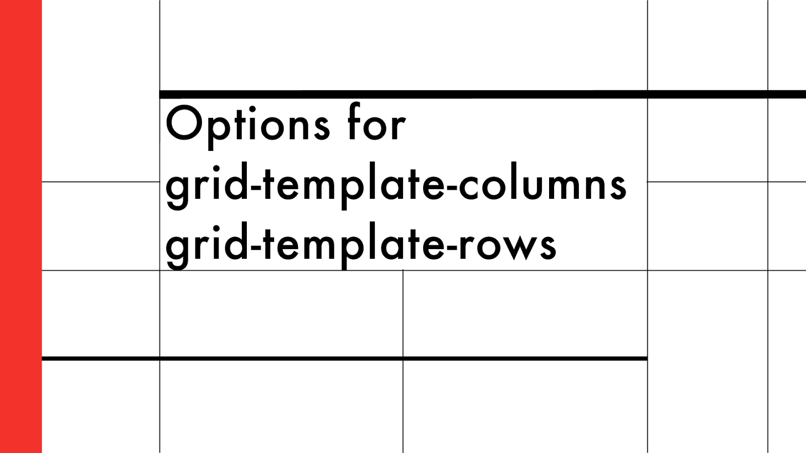
Options for grid-template-columns grid-template-rows
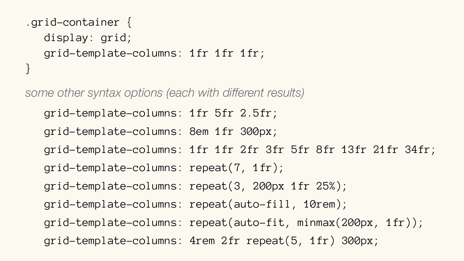
.grid-container { display: grid; grid-template-columns: 1fr 1fr 1fr; } some other syntax options (each with different results)
grid-template-columns: 1fr 5fr 2.5fr; grid-template-columns: 8em 1fr 300px; grid-template-columns: 1fr 1fr 2fr 3fr 5fr 8fr 13fr 21fr 34fr ; grid-template-columns: repeat(7, 1fr); grid-template-columns: repeat(3, 200px 1fr 25%); grid-template-columns: repeat(auto-fill, 10rem); grid-template-columns: repeat(auto-fit, minmax(200px, 1fr)); grid-template-columns: 4rem 2fr repeat(5, 1fr) 300px;
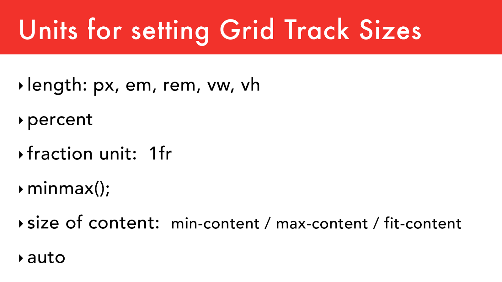
Units for setting Grid Track Sizes
‣
length: px, em, rem, vw, vh
‣
percent
‣
fraction unit: 1fr
‣
minmax();
‣
size of content:
min-content / max-content / fit-content
‣
auto
ul {
display: grid;
grid-template-columns:
repeat(auto-fit,
minmax(120px, 1fr));
grid-gap: 0.25rem;
// nothing about rows
}
li {
// nothing needed
}
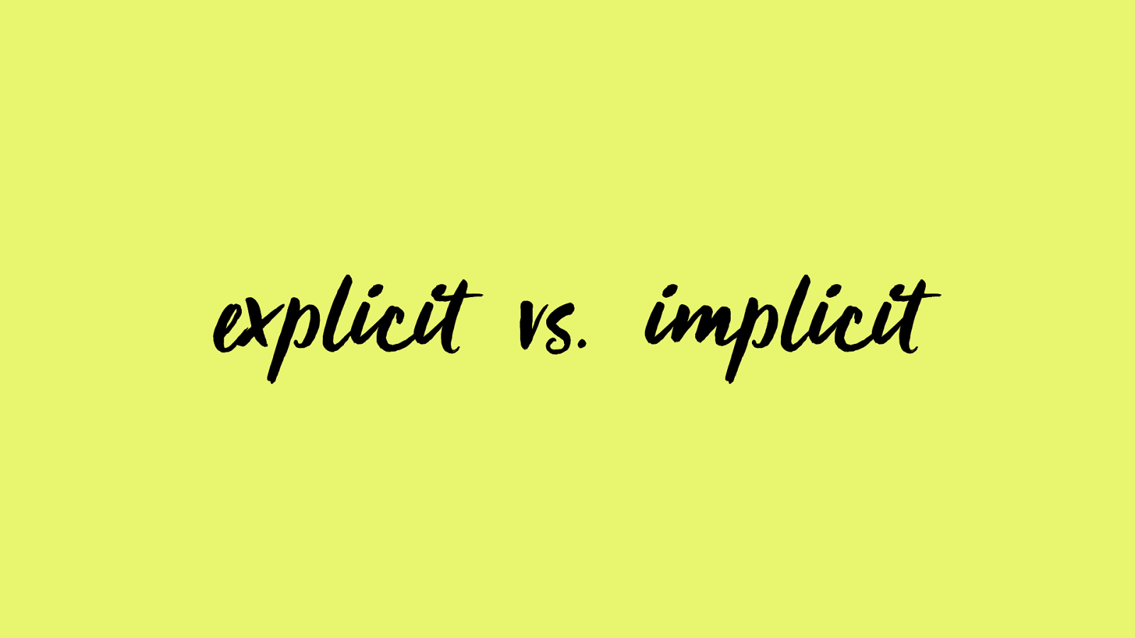
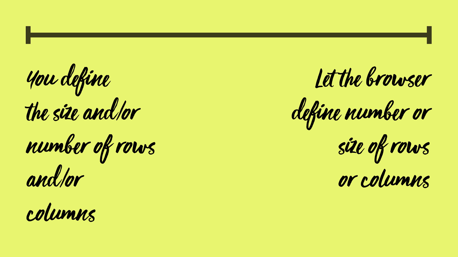
explicit vs. implicit
You define
!
e size and/or
number of rows
and/or
columns
Let
!
e browser
define number or
size of rows
or columns
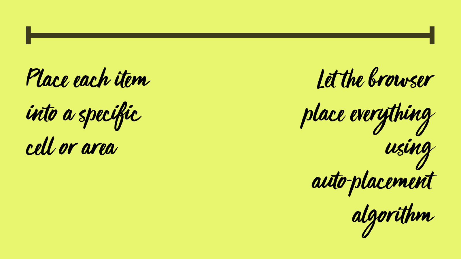
P lace each
"
em
into a specific
cell or area
Let
!
e browser
place every
!
ing
using
auto-placement
a
lgor
"
hm
ul {
display: grid; grid-template-columns:
repeat(4, 1fr);
}
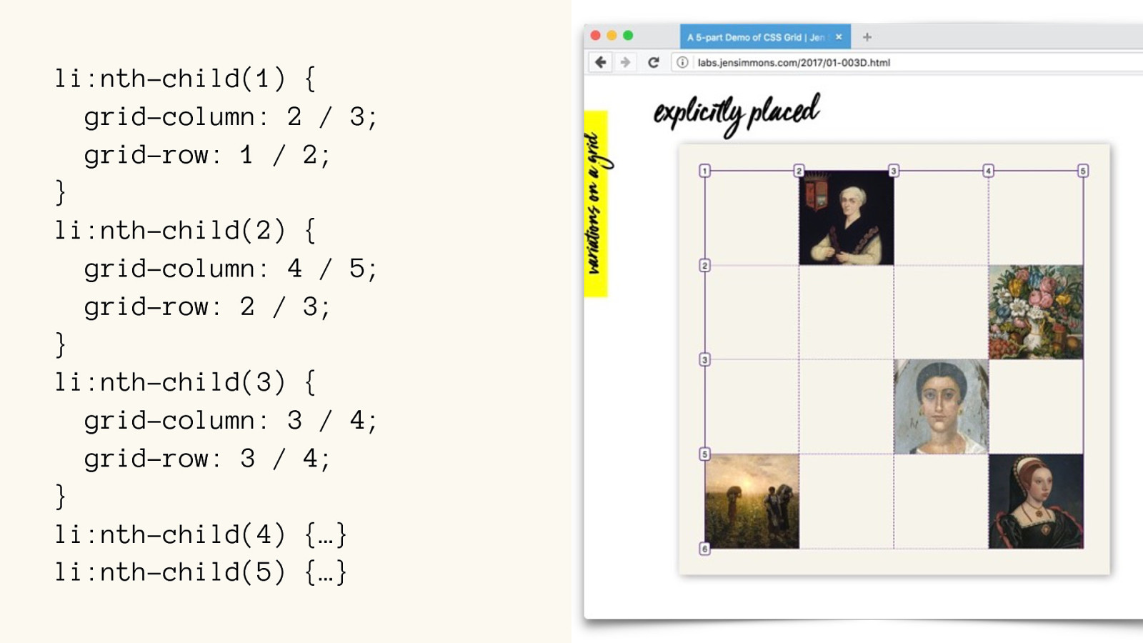
li:nth-child(1) {
grid-column: 2 / 3;
grid-row: 1 / 2; }
li:nth-child(1) {
grid-column: 2 / 3;
grid-row: 1 / 2; }
li:nth-child(2) {
grid-column: 4 / 5;
grid-row: 2 / 3; }
li:nth-child(3) {
grid-column: 3 / 4;
grid-row: 3 / 4; }
li:nth-child(4) {…}
li:nth-child(5) { …}
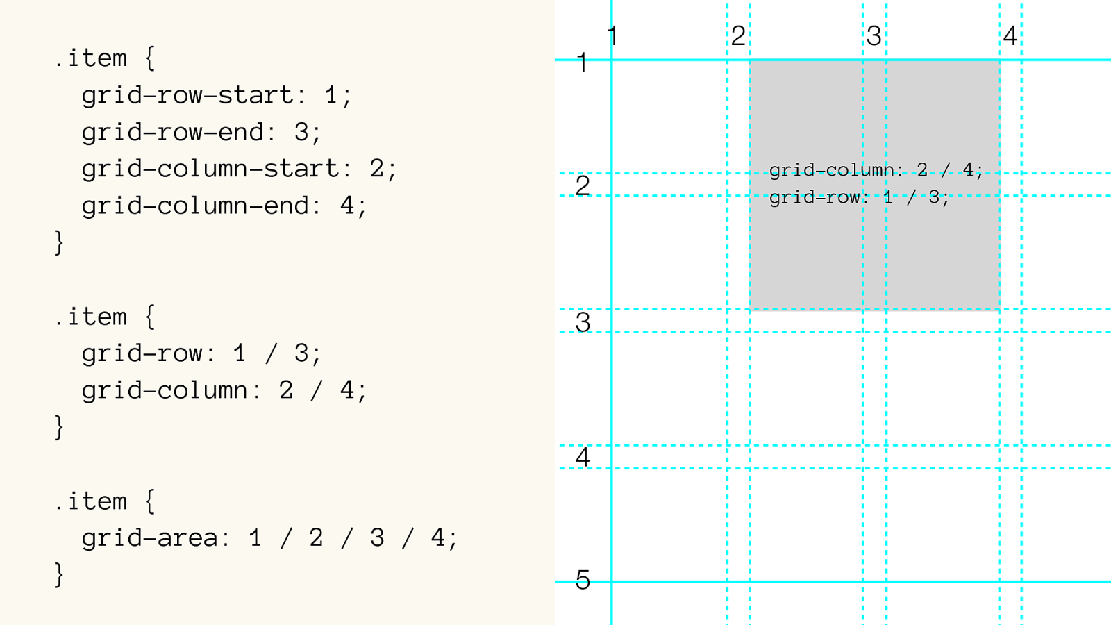
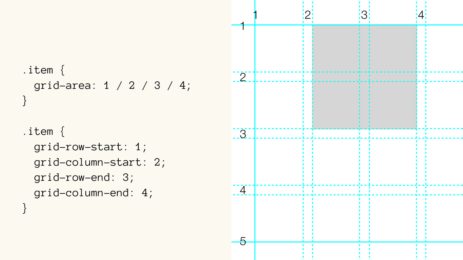
.item {
grid-row-start: 1;
grid-row-end: 3;
grid-column-start: 2;
grid-column-end: 4;
}
.item {
grid-row: 1 / 3;
grid-column: 2 / 4;
}
.item {
grid-area: 1 / 2 / 3 / 4;
}
1
2
3
4
grid-column: 2 / 4;
grid-row: 1 / 3;
1
2
3
4
5
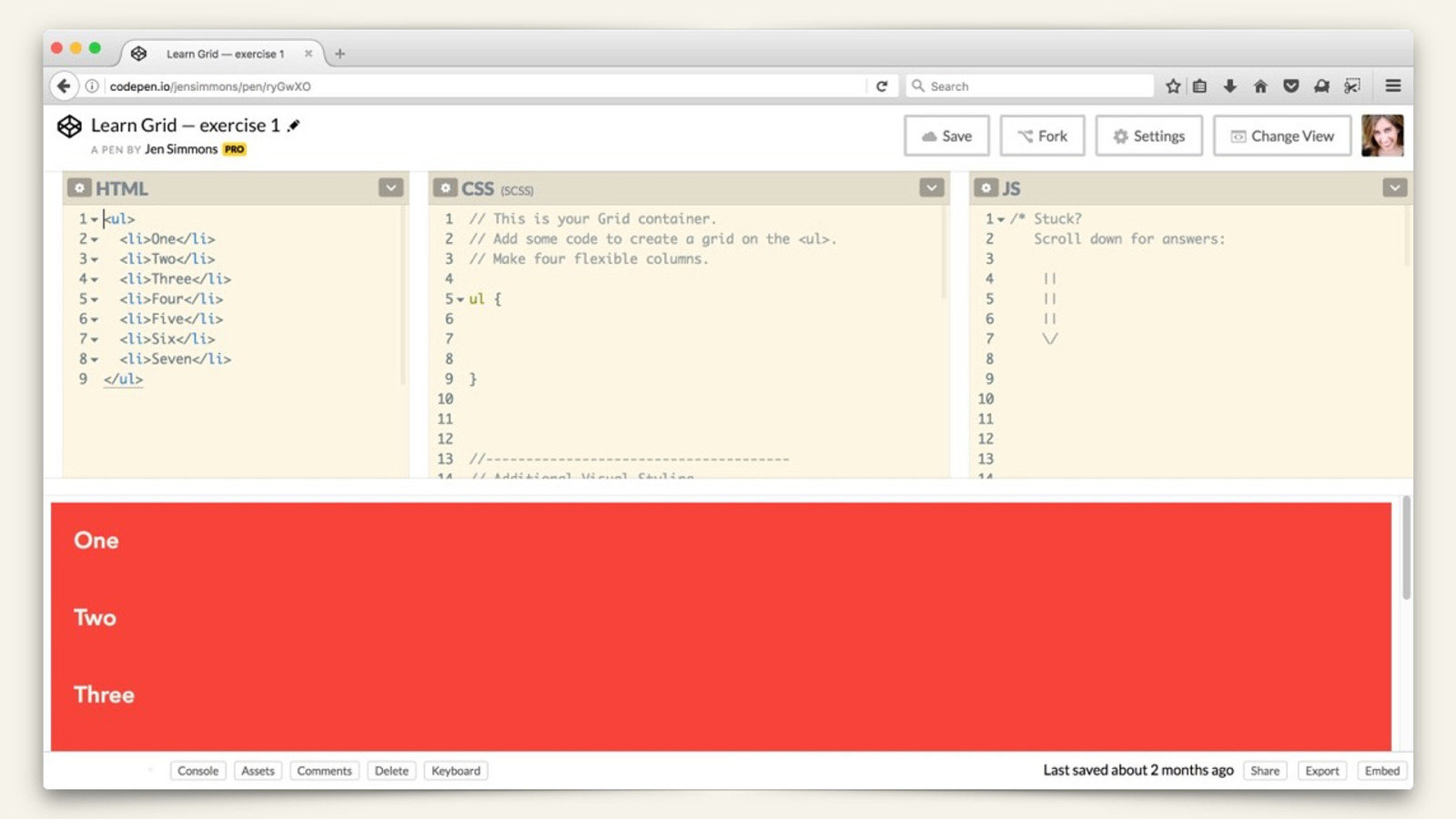
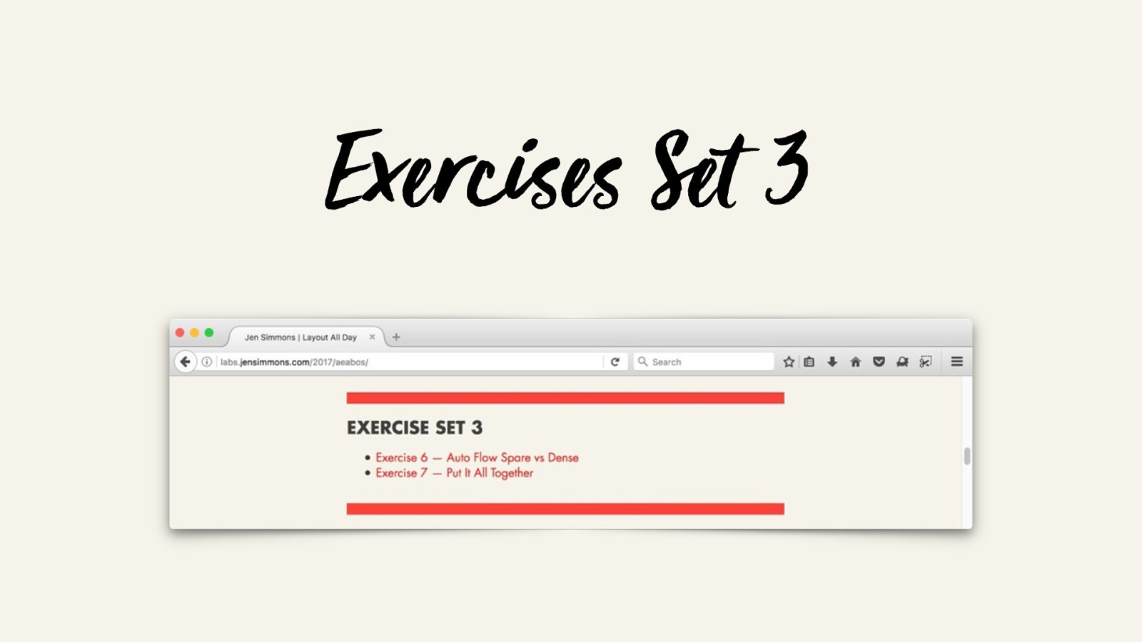
TRY IT OUT
Exercises Set 1
Exercises Set 1
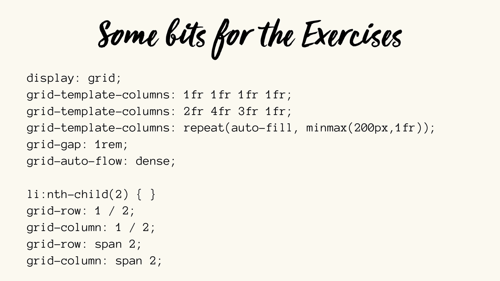
display: grid; grid-template-columns: 1fr 1fr 1fr 1fr; grid-template-columns: 2fr 4fr 3fr 1fr; grid-template-columns: repeat(auto-fill, minmax(200px,1fr));
grid-gap: 1rem;
grid-auto-flow: dense;
li:nth-child(2) { }
grid-row: 1 / 2; grid-column: 1 / 2; grid-row: span 2; grid-column: span 2; Some bits for the Exercises
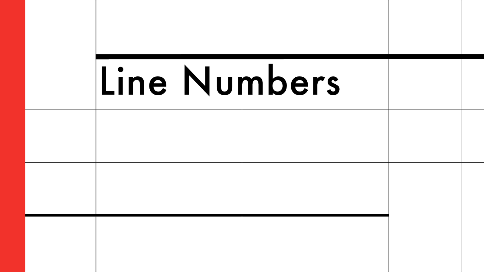
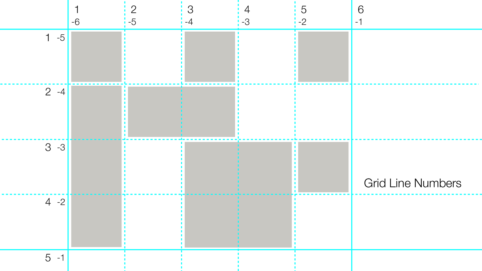
Line Numbers
1
2
3
4
5
6
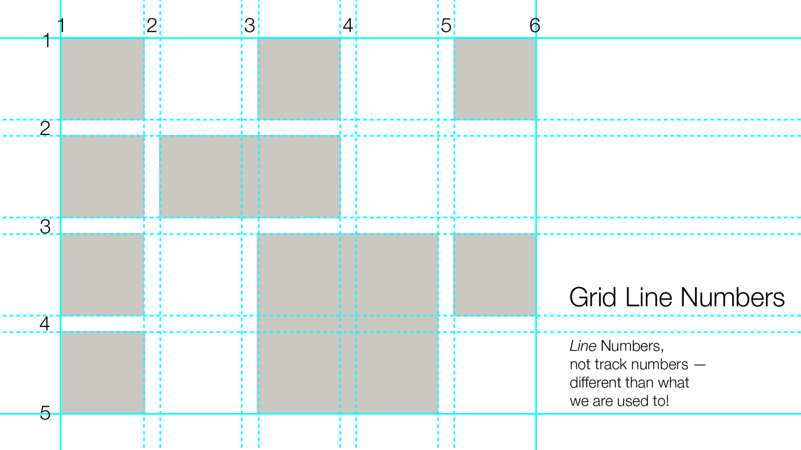
Grid Line Numbers
Line
Numbers,
not track numbers —
different than what
we are used to!
1
2
3
4
5
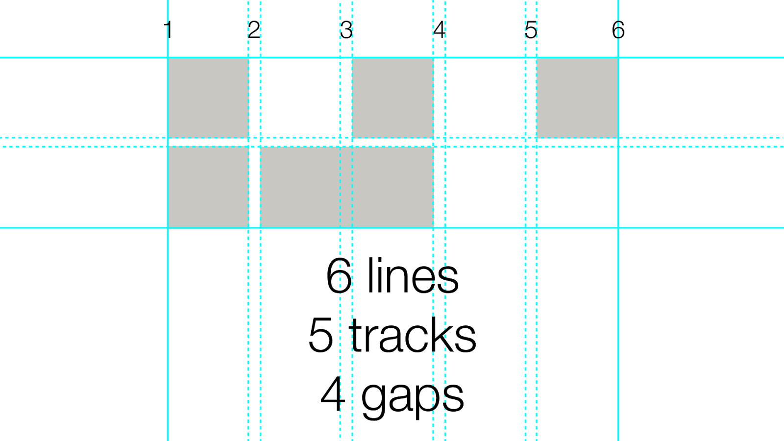
1 6 6 lines 5 tracks 4 gaps 2 3 4 5
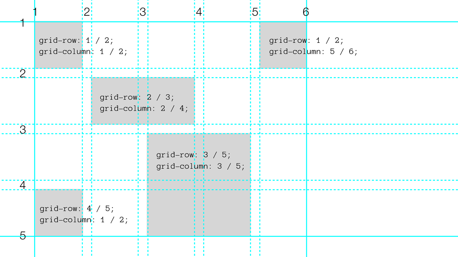
1 2 3 4 5 6 grid-row: 1 / 2; grid-column: 1 / 2; grid-row: 1 / 2;
grid-column: 5 / 6; grid-row: 2 / 3;
grid-column: 2 / 4; grid-row: 3 / 5;
grid-column: 3 / 5; 1 2 3 4 5 grid-row: 4 / 5;
grid-column: 1 / 2;
.item-A {
grid-row: 1 / 3;
grid-column: 2 / 4;
}
.item-B {
grid-row: 4 / 5;
grid-column: 1 / 2;
}
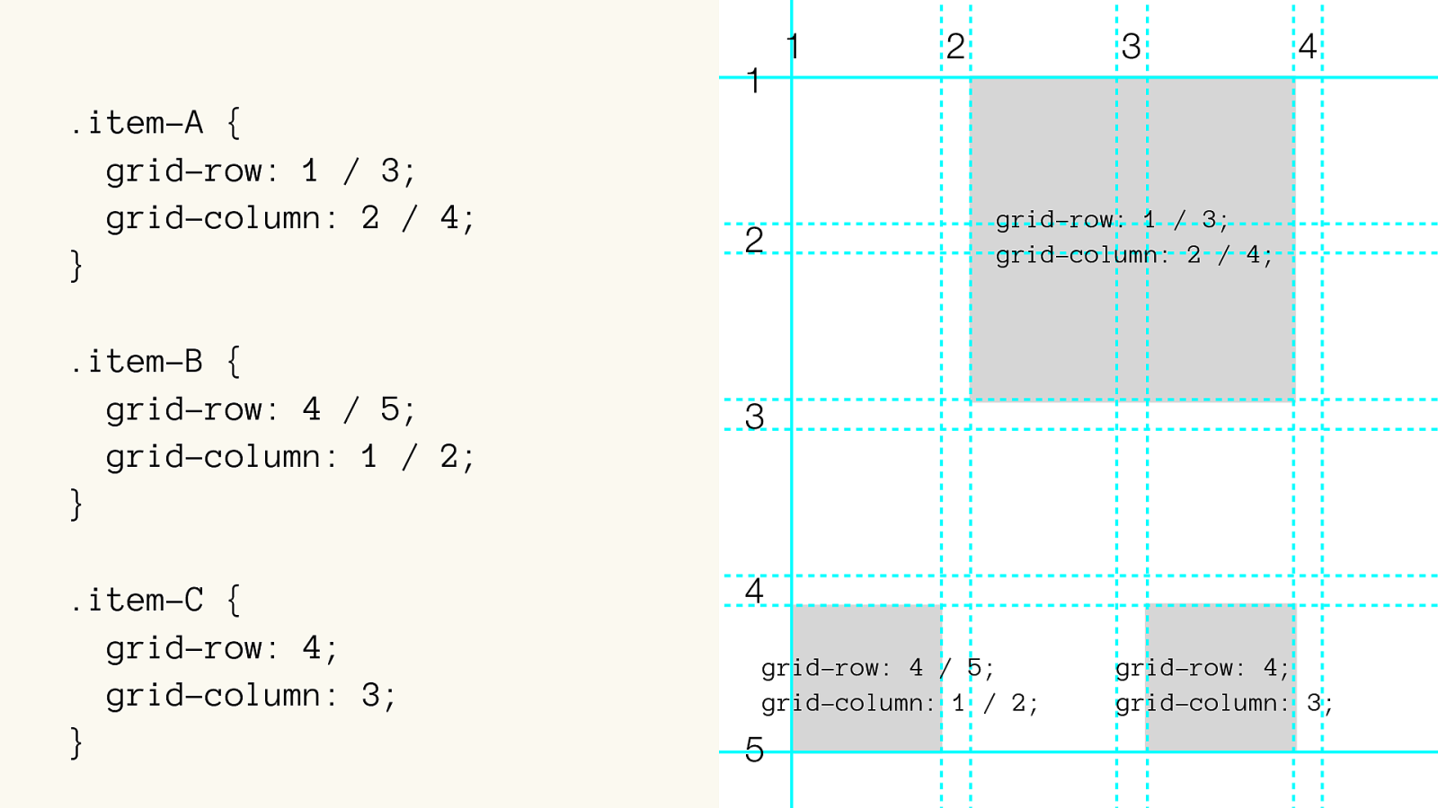
.item-C {
grid-row: 4;
grid-column: 3;
}
1
2
3
4
grid-row: 1 / 3;
grid-column: 2 / 4; 1 2 3 4 5 grid-row: 4 / 5;
grid-column: 1 / 2; grid-row: 4;
grid-column: 3;
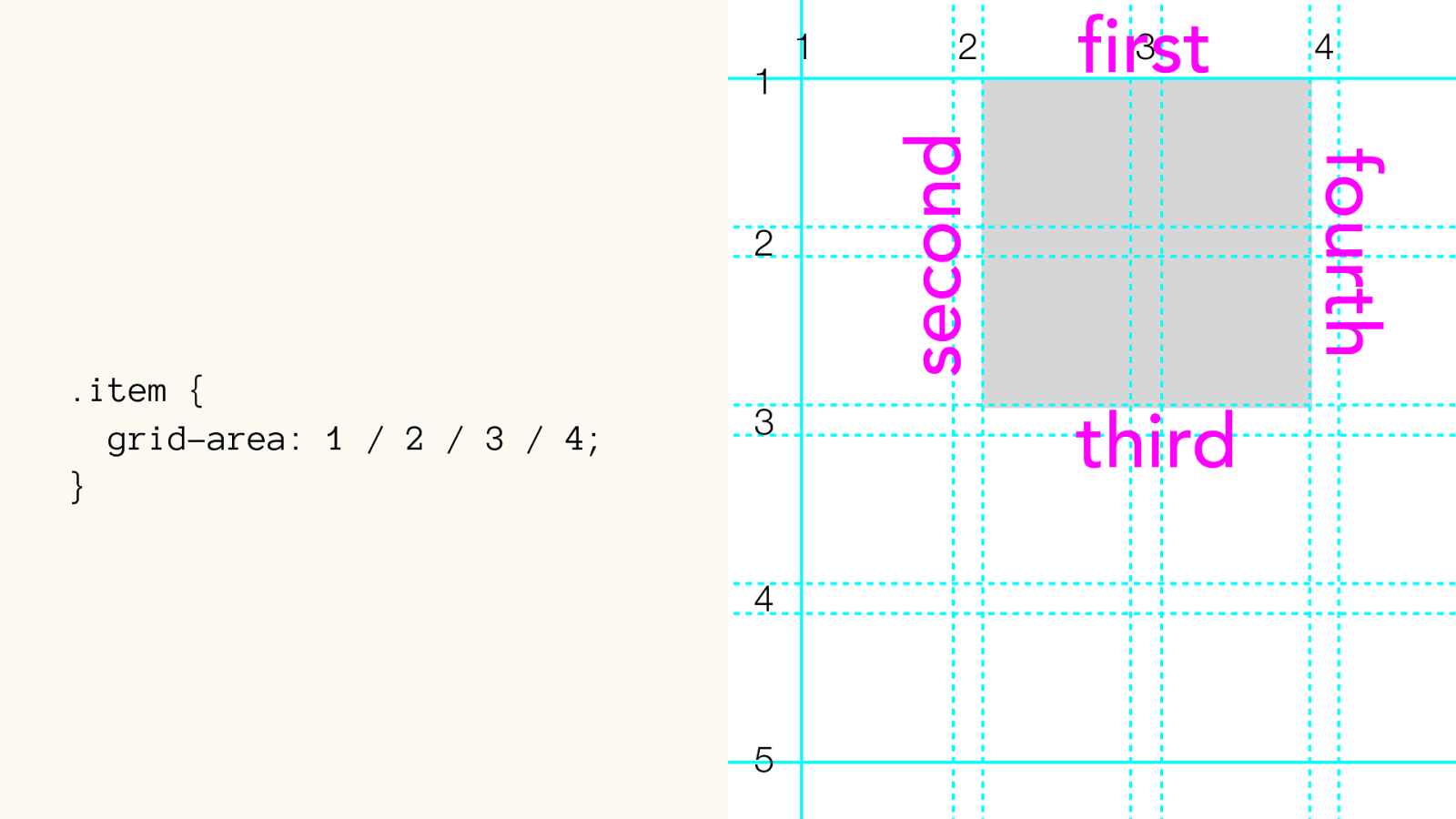
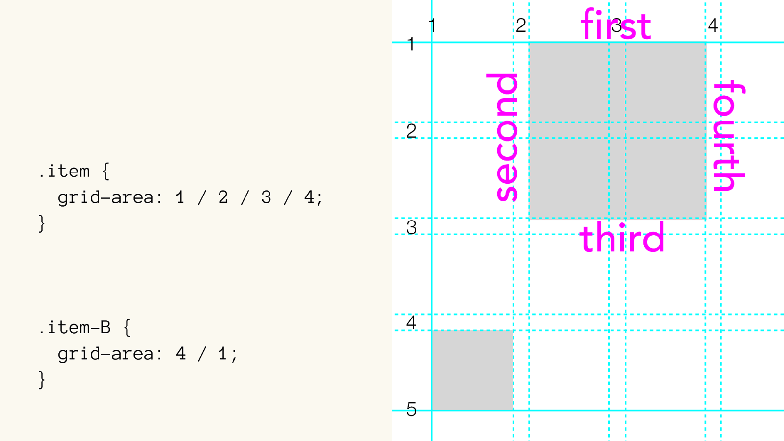
.item { grid-area: 1 / 2 / 3 / 4; } .item { grid-row-start: 1; grid-column-start: 2; grid-row-end: 3; grid-column-end: 4; } 1 2 3 4 1 2 3 4 5
.item { grid-area: 1 / 2 / 3 / 4; } 1 2 3 4 1 2 3 4 5 first second third fourth
.item { grid-area: 1 / 2 / 3 / 4; } .item-B { grid-area: 4 / 1; } 1 2 3 4 1 2 3 4 5 first second third fourth
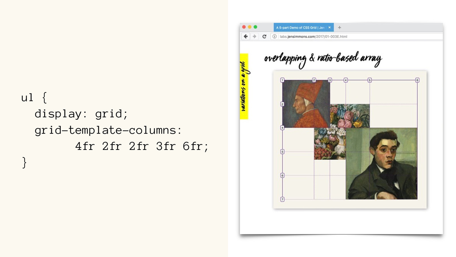
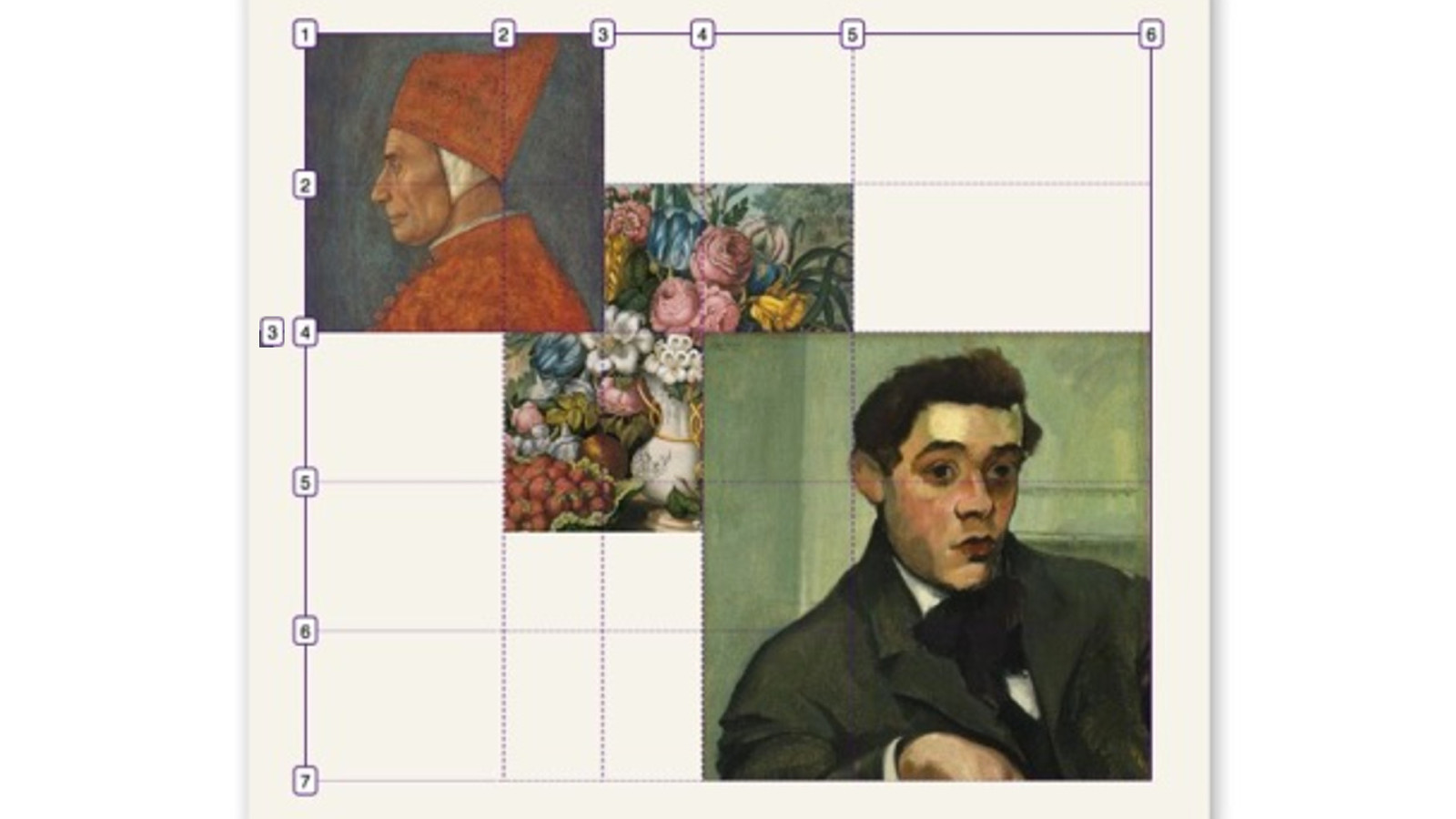
ul {
display: grid; grid-template-columns:
4fr 2fr 2fr 3fr 6fr
; }
li:nth-child(1) { grid-row: 1 / 3 ; grid-column: 1 / 3;
z-index: 2;
}
li:nth-child(2 ) { grid-row: 2 / 6 ; grid-column: 2 / 5;
}
li:nth-child(3 ) { grid-row: 4 / 7 ; grid-column: 4 / 6;
z-index: 2;
}
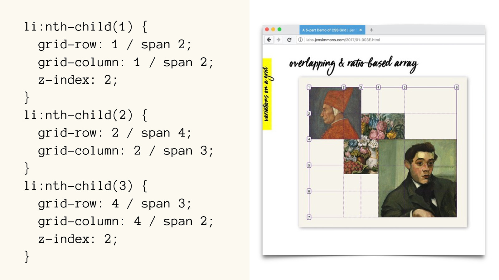
li:nth-child(1) { grid-row: 1 / span 2 ; grid-column: 1 / span 2;
z-index: 2;
}
li:nth-child(2 ) { grid-row: 2 / span 4 ; grid-column: 2 / span 3;
}
li:nth-child(3 ) { grid-row: 4 / span 3 ; grid-column: 4 / span 2;
z-index: 2;
}
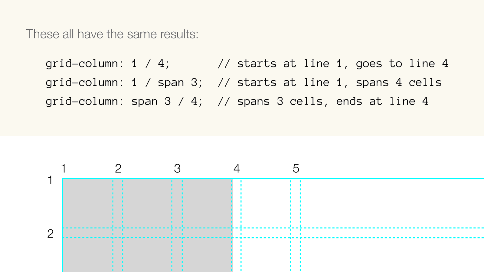
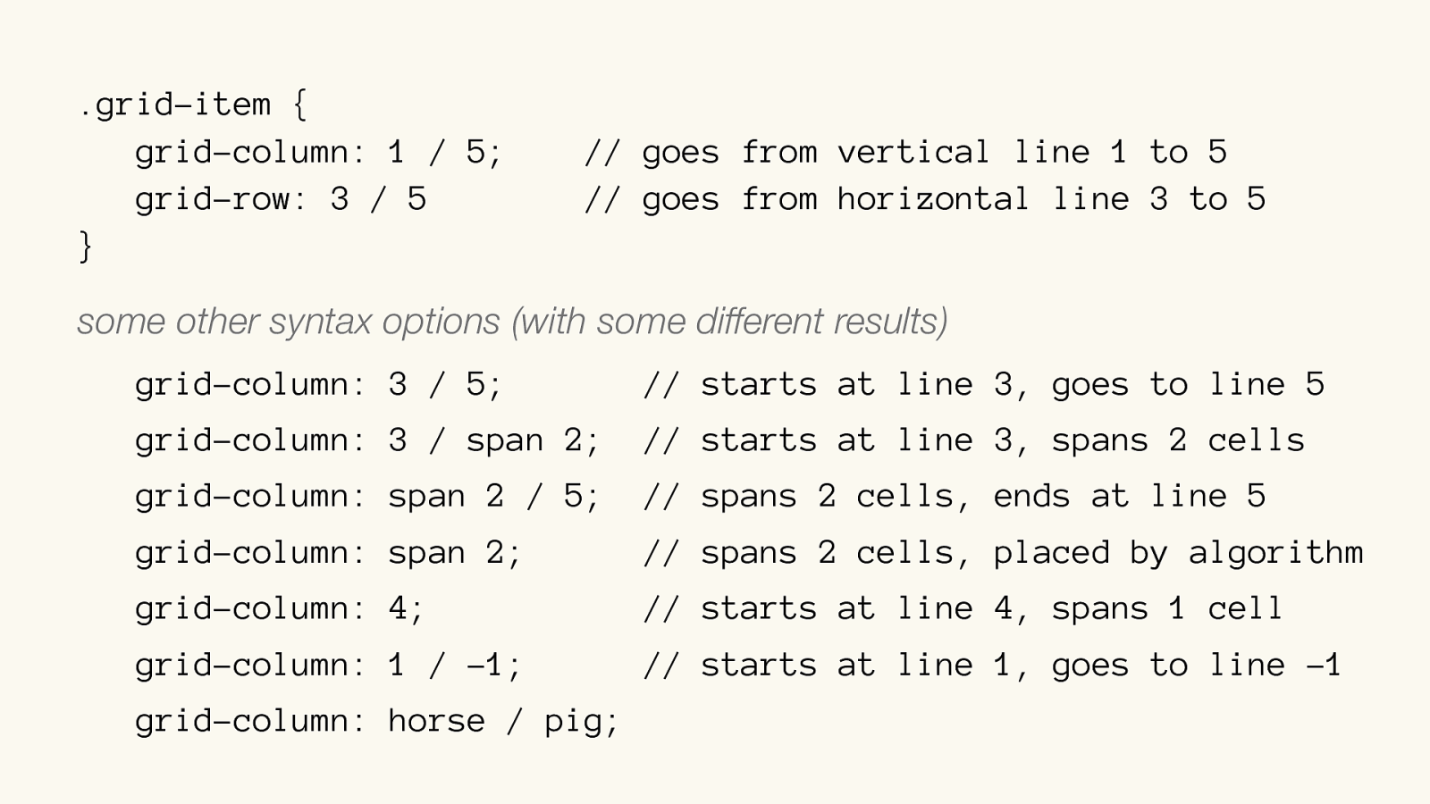
These all have the same results:
grid-column: 1 / 4; // starts at line 1, goes to line 4
grid-column: 1 / span 3; // starts at line 1, spans 4 cells
grid-column: span 3 / 4; // spans 3 cells, ends at line 4
1
2
3
4
5
1
2
.grid-item { grid-column: 1 / 5; // goes from vertical line 1 to 5 grid-row: 3 / 5 // goes from horizontal line 3 to 5
} some other syntax options (with some different results)
grid-column: 3 / 5; // starts at line 3, goes to line 5
grid-column: 3 / span 2; // starts at line 3, spans 2 cells
grid-column: span 2 / 5; // spans 2 cells, ends at line 5
grid-column: span 2; // spans 2 cells, placed by algorithm
grid-column: 4; // starts at line
4, spans 1 cell
grid-column: 1 / -1; // starts at line 1, goes to line -1
grid-column: horse / pig;
TRY IT OUT
Exercises Set 2
display: grid; grid-template-columns: 1fr 1fr 1fr 1fr; grid-template-columns: 2fr 4fr 3fr 1fr; grid-template-columns: repeat(auto-fill, minmax(200px,1fr));
grid-gap: 1rem;
grid-auto-flow: dense;
li:nth-child(2) { }
grid-row: 1 / 2; grid-column: 1 / 2; grid-row: span 2; grid-column: span 2; Some bits for the Exercises
Line Numbers
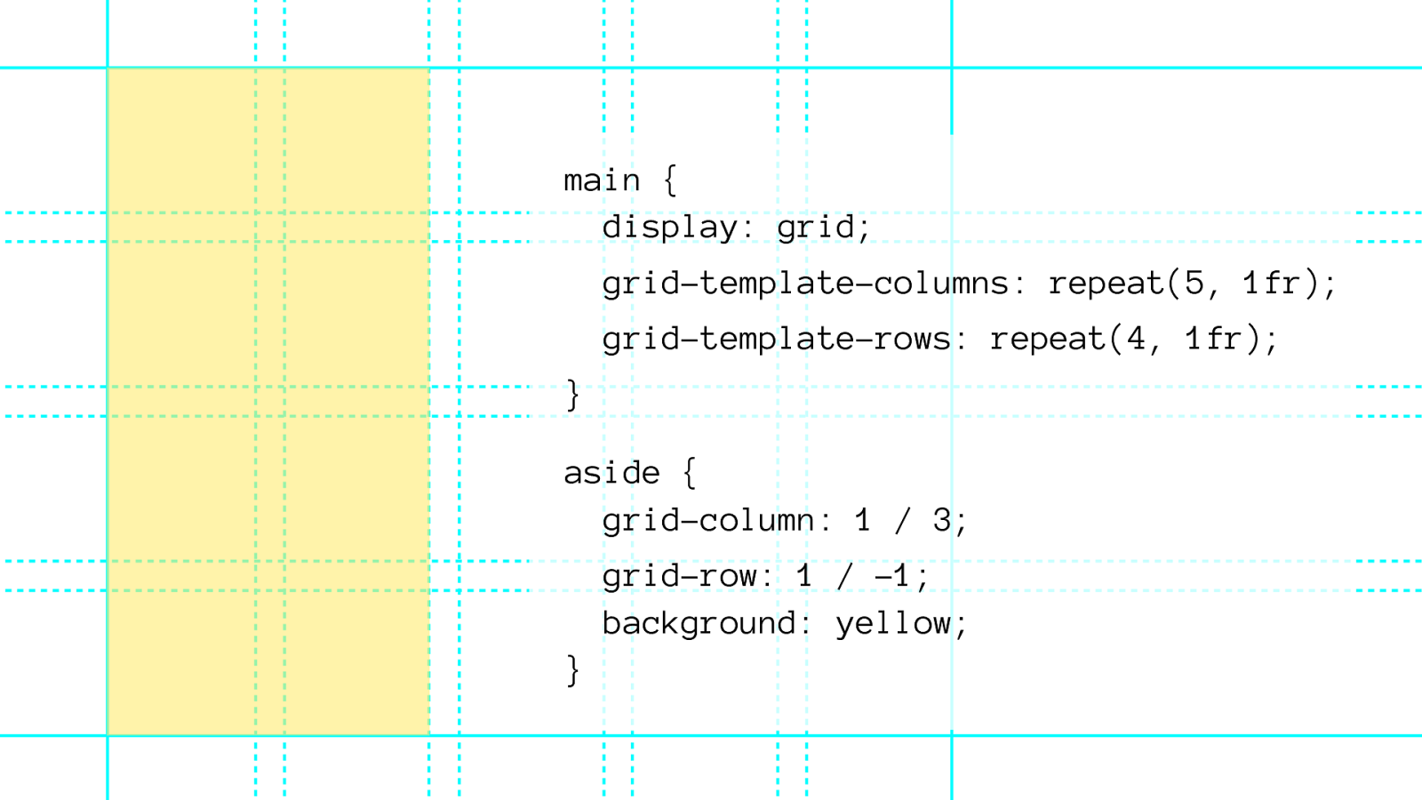
Grid Line Numbers 1 2 3 4 5 6 -5 -4 -3 -2 -1 -6 -5 -4 -3 -2 -1 1 2 3 4 5
main { display: grid; grid-template-columns: repeat(5, 1fr); grid-template-rows: repeat(4, 1fr); } aside { grid-column: 1 / 3; grid-row: 1 / -1;
background: yellow; }
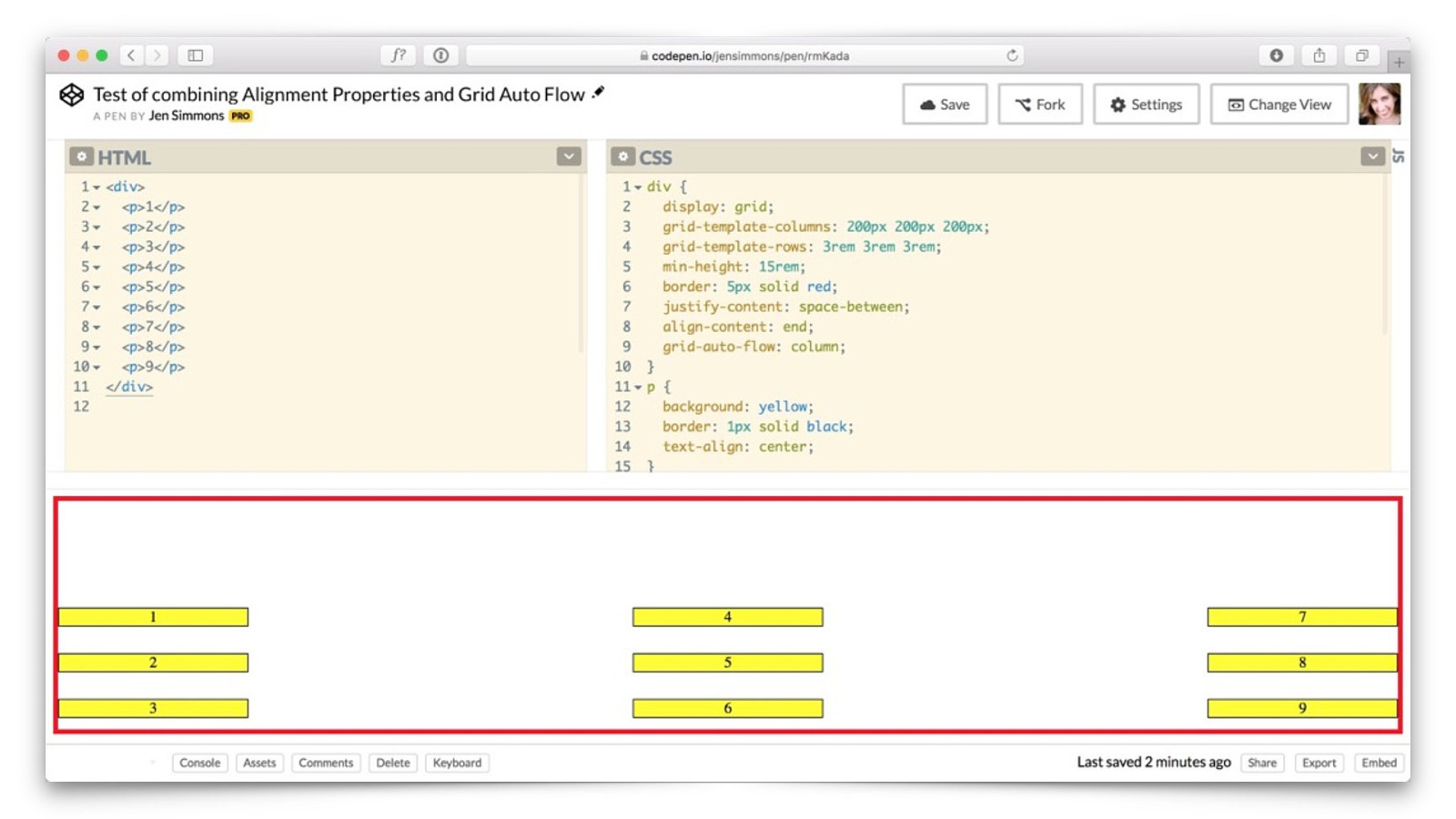
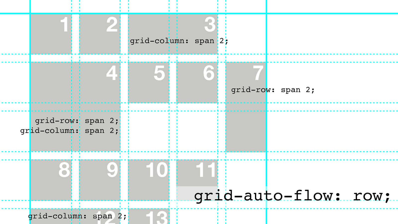
Grid Auto Flow
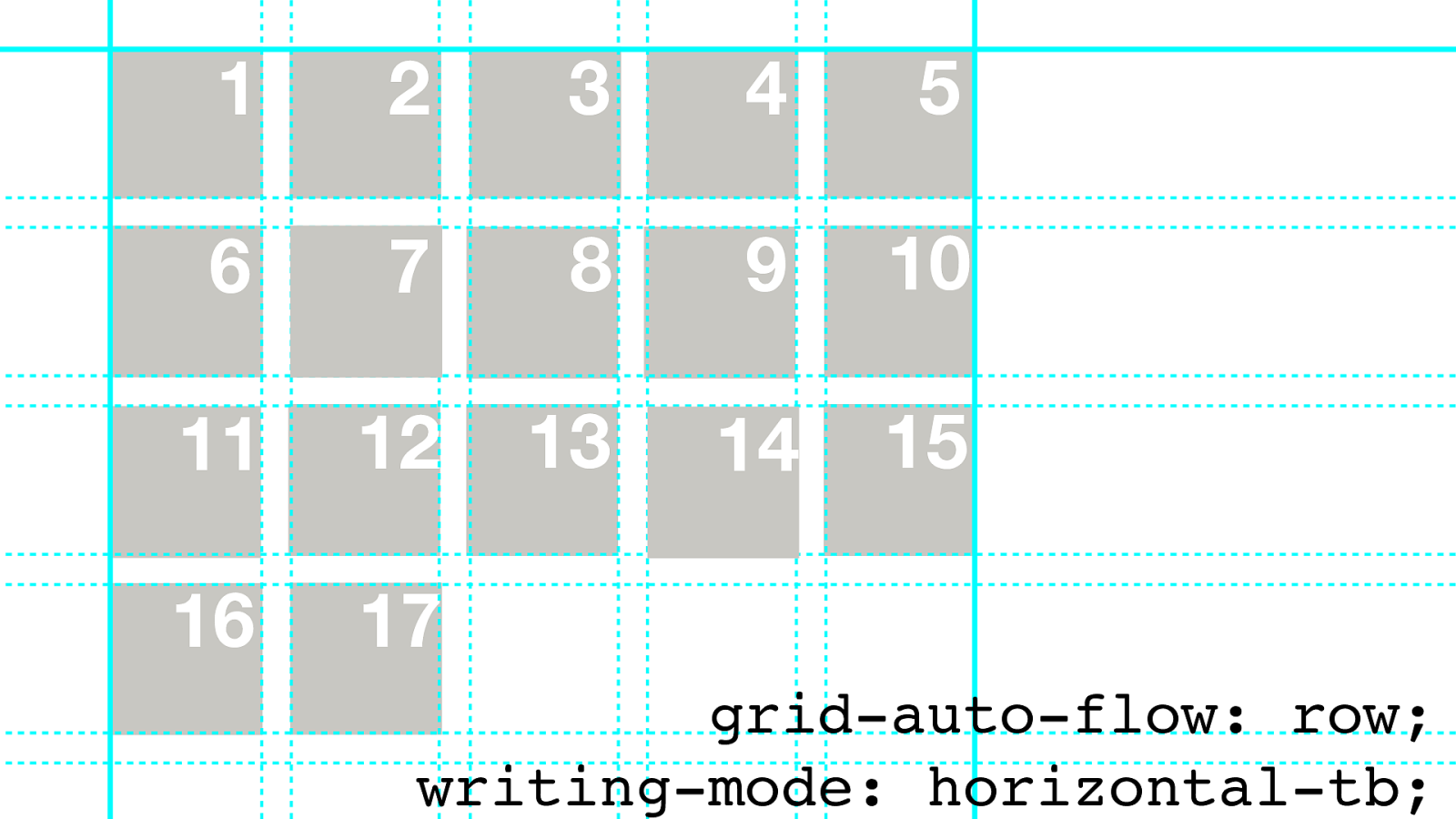
15 16 17 12 4 3 13 11 8 9 10 6 5 1 2 auto placement algorithm 7 14 .container {grid-auto-flow: row;}
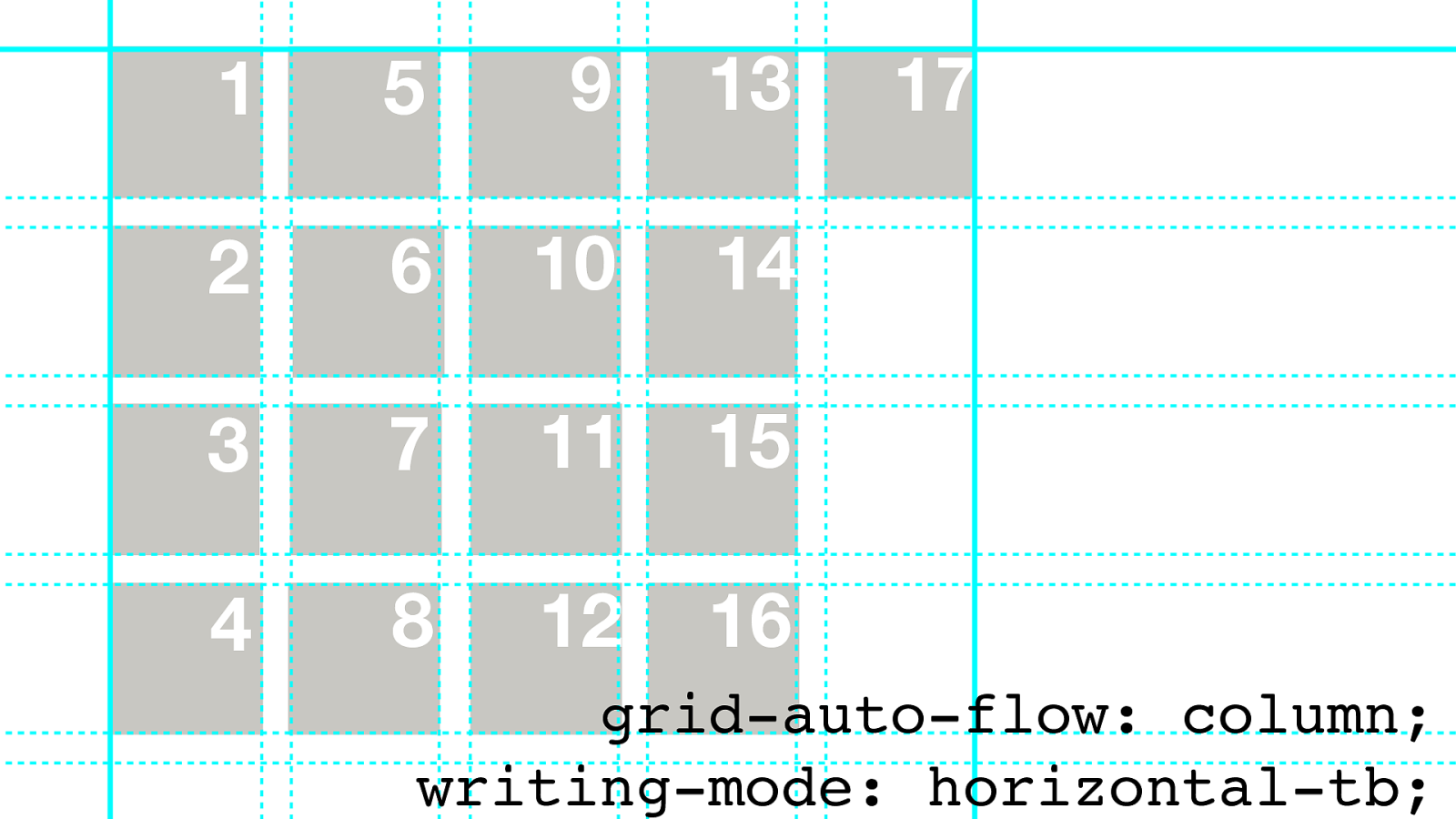
15 10 6 2 14 7 16 17 12 4 3 13 11 8 9 5 1 grid-auto-flow: column;
Grid
Justify
1
4
5
2
3
6
8
7
9
writing-mode: horizontal-tb;
grid-auto-flow: column;
Align
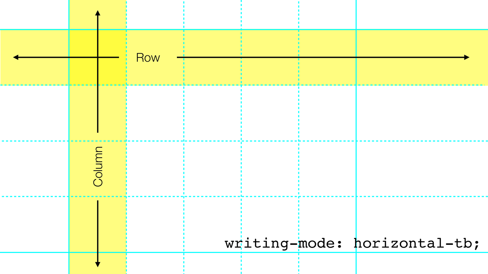
Row Column writing-mode: horizontal-tb;
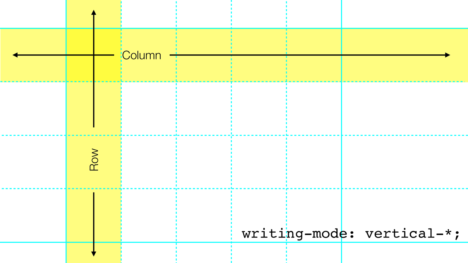
Column Row writing-mode: vertical-*;
15 10 6 2 14 7 16 17 12 4 3 13 11 8 9 5 1 grid-auto-flow: column; writing-mode: horizontal-tb;
15 16 17 12 4 3 13 11 8 9 10 6 5 1 2 7 14 grid-auto-flow: row; writing-mode: horizontal-tb;
13 11 8 9 10 7 6 5 1 2 3 4 12 grid-auto-flow: row; grid-column: span 2; grid-row: span 2; grid-column: span 2; grid-row: span 2; grid-column: span 2;
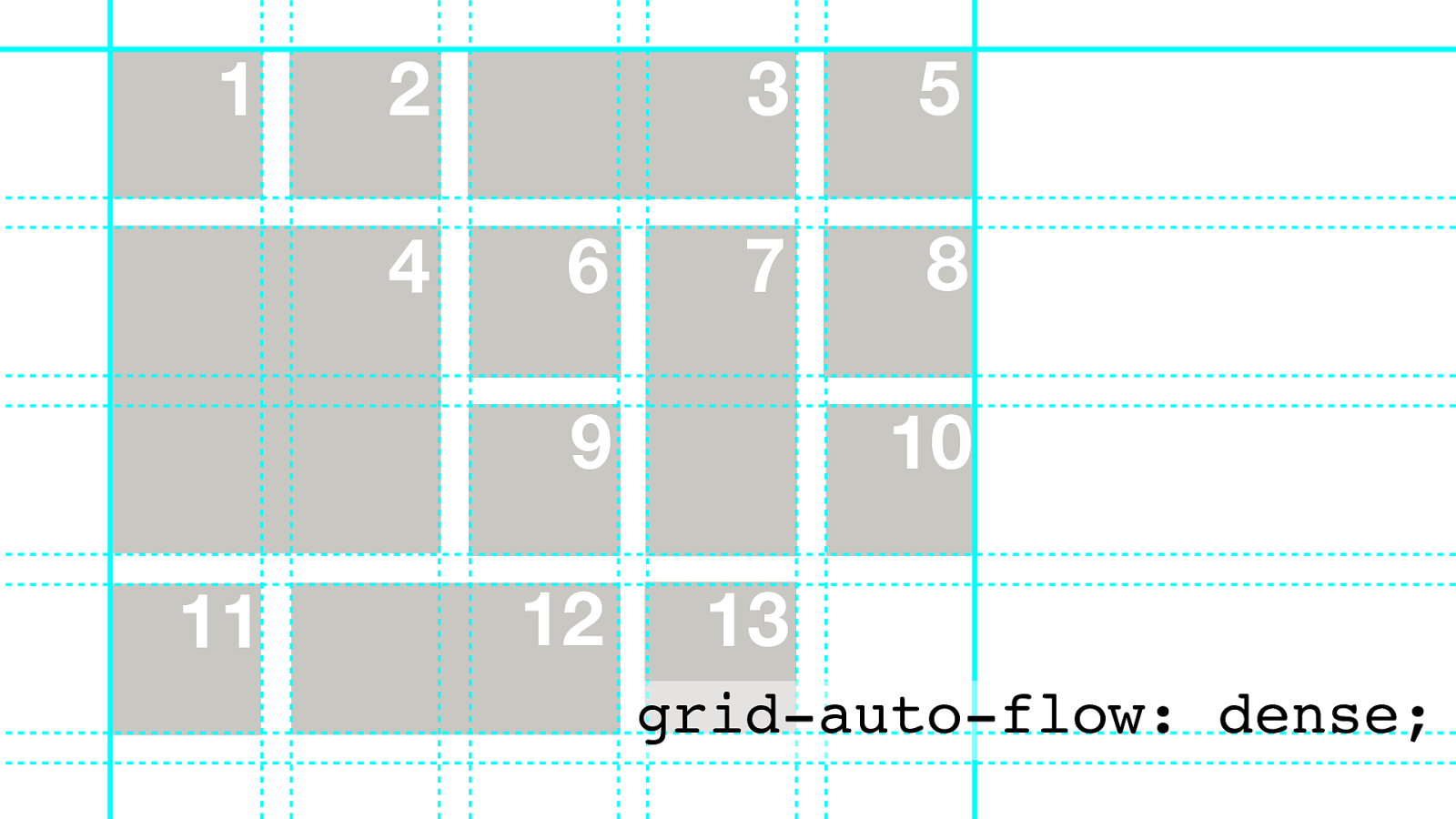
13 11 8 9 10 7 6 5 1 2 3 4 12 grid-auto-flow: dense;
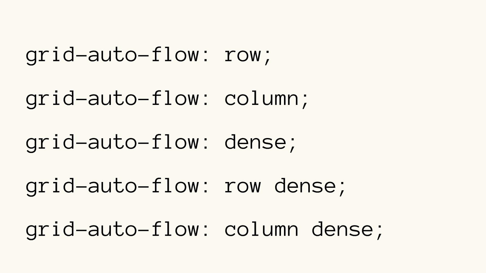
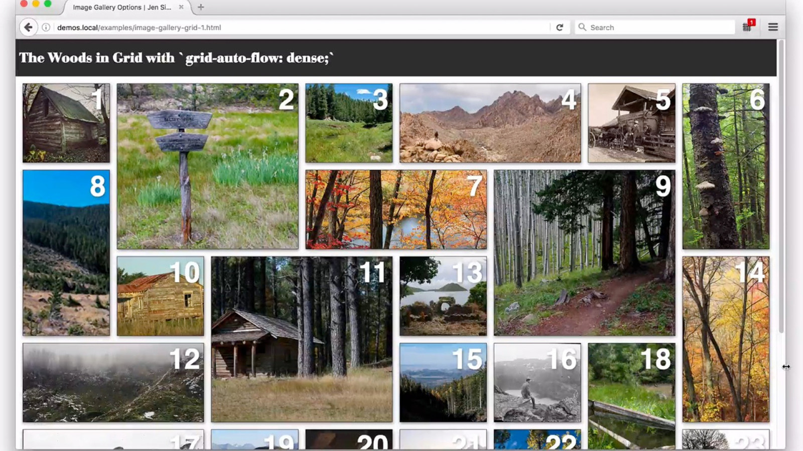
grid-auto-flow: row; grid-auto-flow: column; grid-auto-flow: dense; grid-auto-flow: row dense;
grid-auto-flow: column dense;
TRY IT OUT
Exercises Set 3
display: grid; grid-template-columns: 1fr 1fr 1fr 1fr; grid-template-columns: 2fr 4fr 3fr 1fr; grid-template-columns: repeat(auto-fill, minmax(200px,1fr));
grid-gap: 1rem;
grid-auto-flow: dense;
li:nth-child(2) { }
grid-row: 1 / 2; grid-column: 1 / 2; grid-row: span 2; grid-column: span 2; Some bits for the Exercises
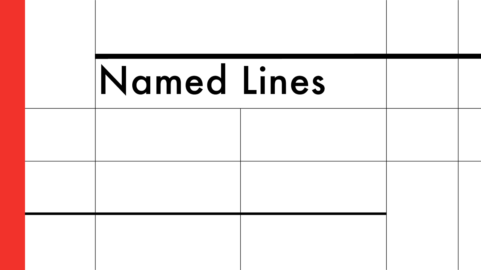
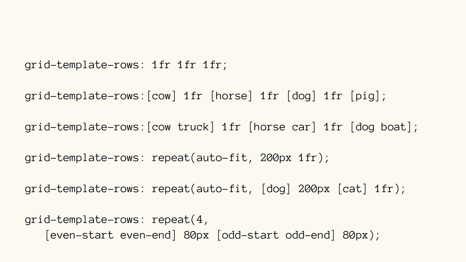
Named Lines
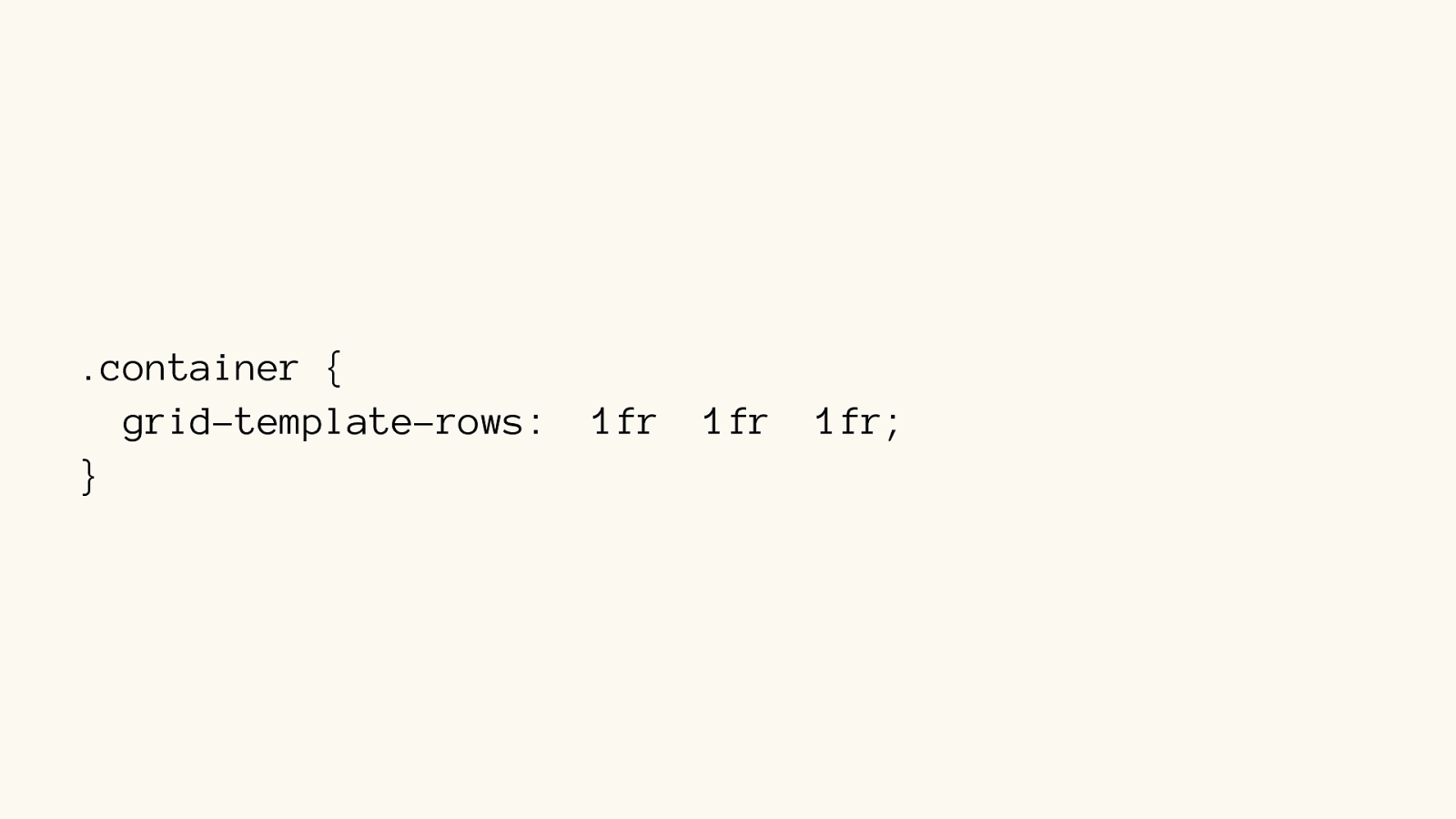
.container { grid-template-rows: 1fr 1fr 1fr;
}
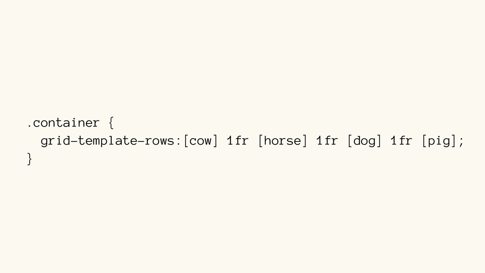
.container { grid-template-rows:[cow] 1fr [horse] 1fr [dog] 1fr [pig];
}
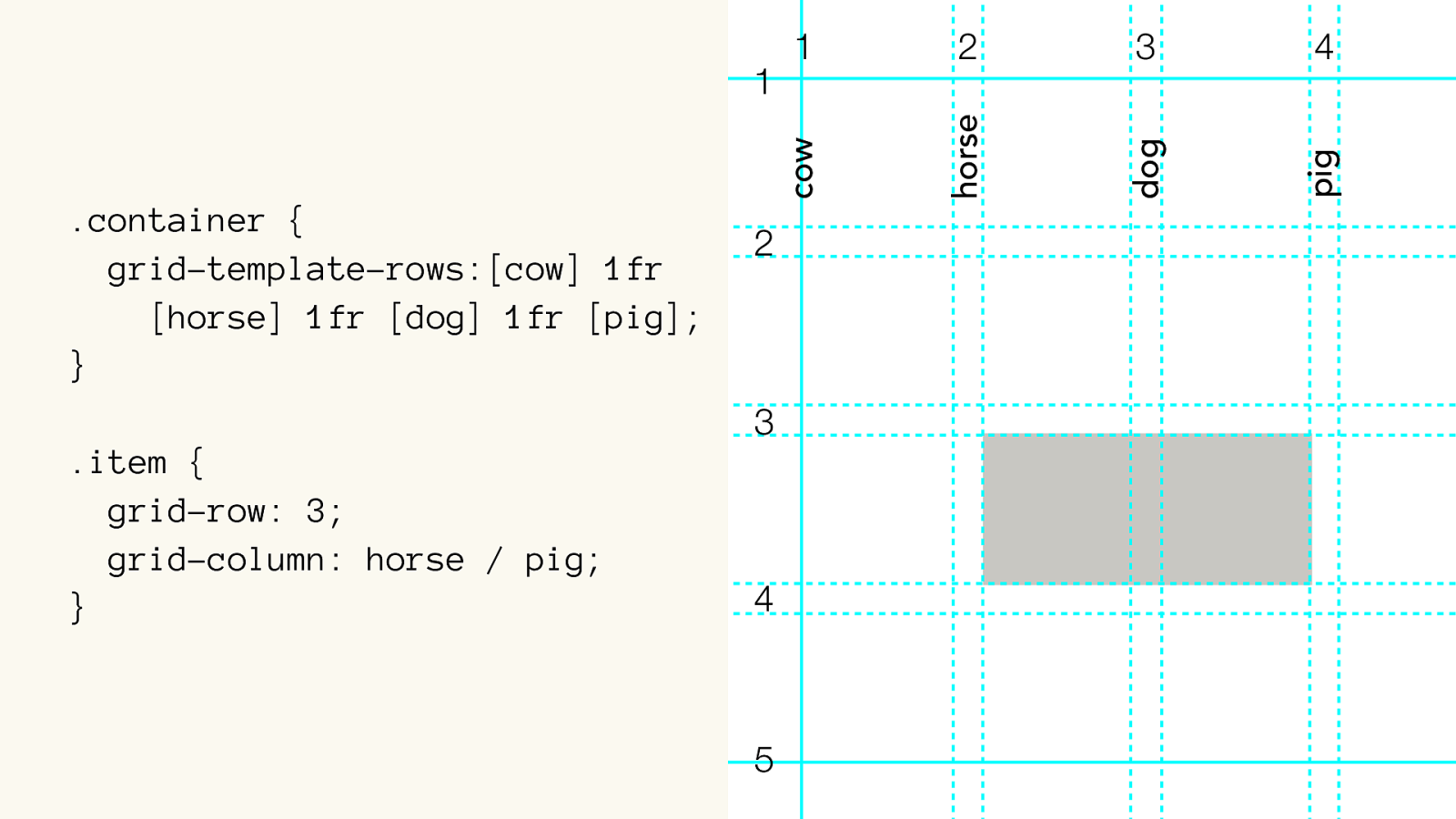
1 2 3 4 1 2 3 4 5 cow horse dog pig .container { grid-template-rows:[cow] 1fr
[horse]
1fr [dog] 1fr [pig];
}
.item {
grid-row: 3;
grid-column: horse / pig;
}
grid-template-rows: 1fr 1fr 1fr; grid-template-rows:[cow] 1fr [horse] 1fr [dog] 1fr [pig];
grid-template-rows:[cow truck] 1fr [horse car] 1fr [dog boat];
grid-template-rows: repeat(auto-fit, 200px 1fr); grid-template-rows: repeat(auto-fit, [dog] 200px [cat] 1fr); grid-template-rows: repeat(4, [ even-start even-end] 80px [odd-start odd-end] 80px);
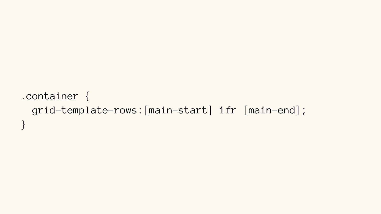
.container { grid-template-rows:[main-start] 1fr [main-end];
}
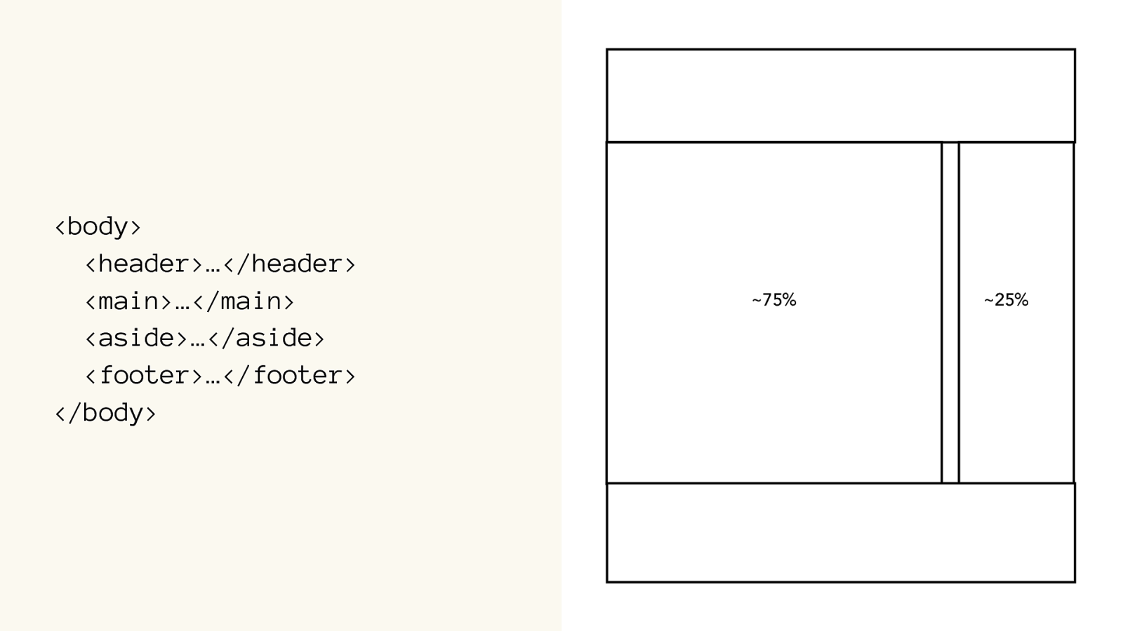
Grid Areas
Grid Area Grid Line Grid Track Grid Track Grid Cell Grid Line Grid Line Grid Line Grid Line
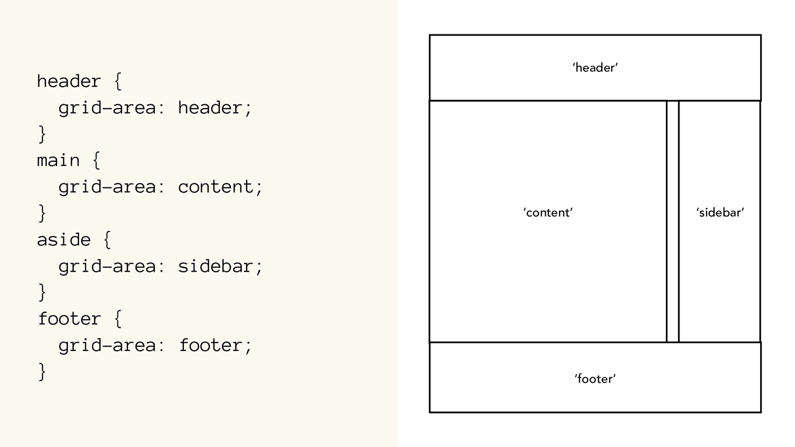
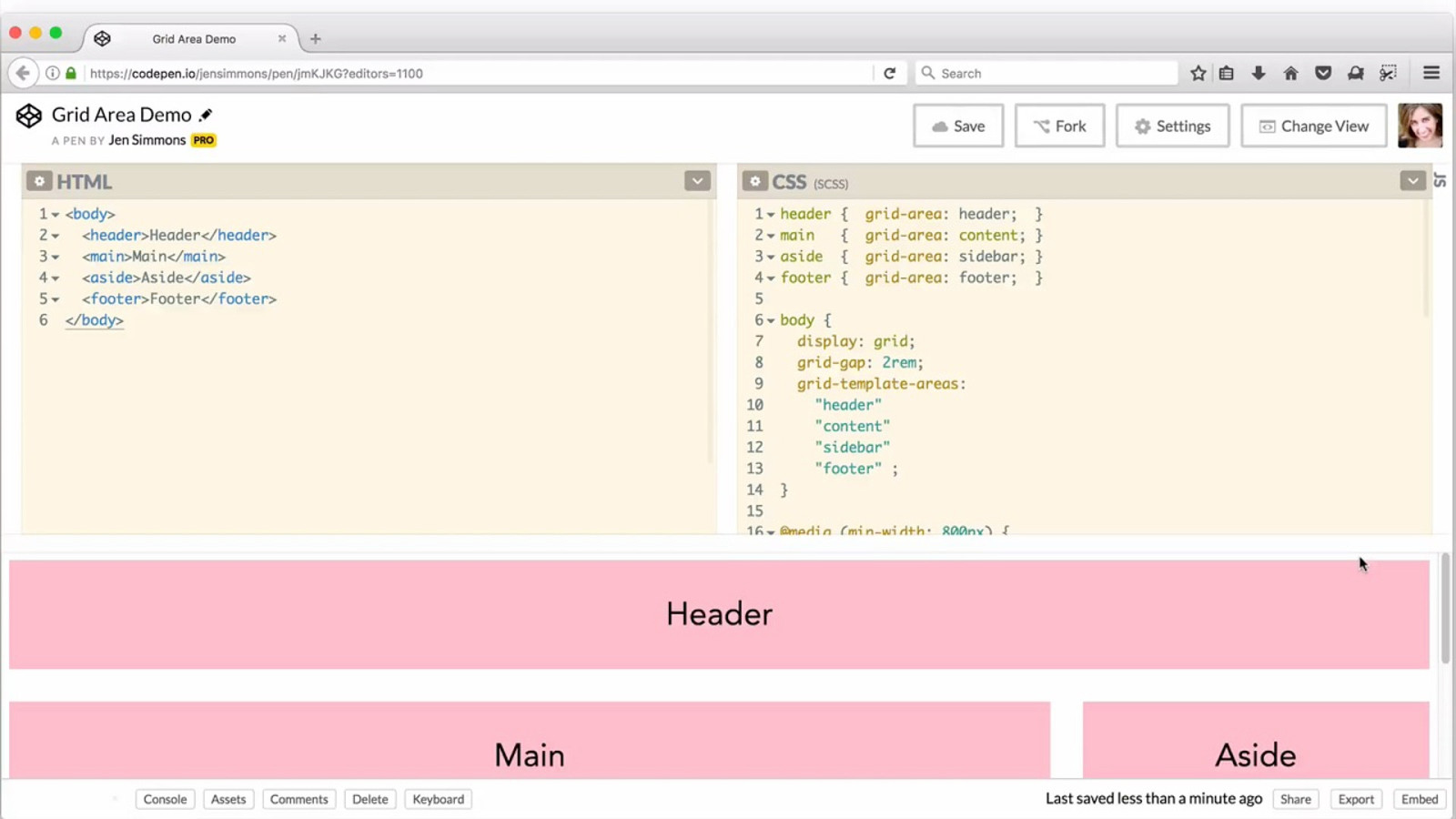
header { grid-area: header;
} main { grid-area: content;
} aside { grid-area: sidebar;
} footer { grid-area: footer;
} ‘header’ ‘sidebar’ ‘content’ ‘footer’
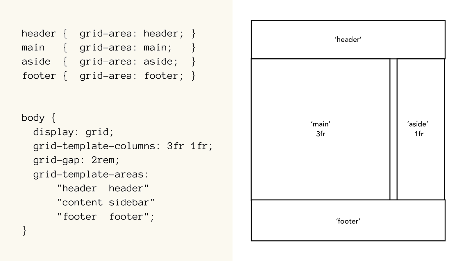
header { grid-area: header;
}
main { grid-area: main;
}
aside { grid-area: aside;
}
footer { grid-area: footer; }
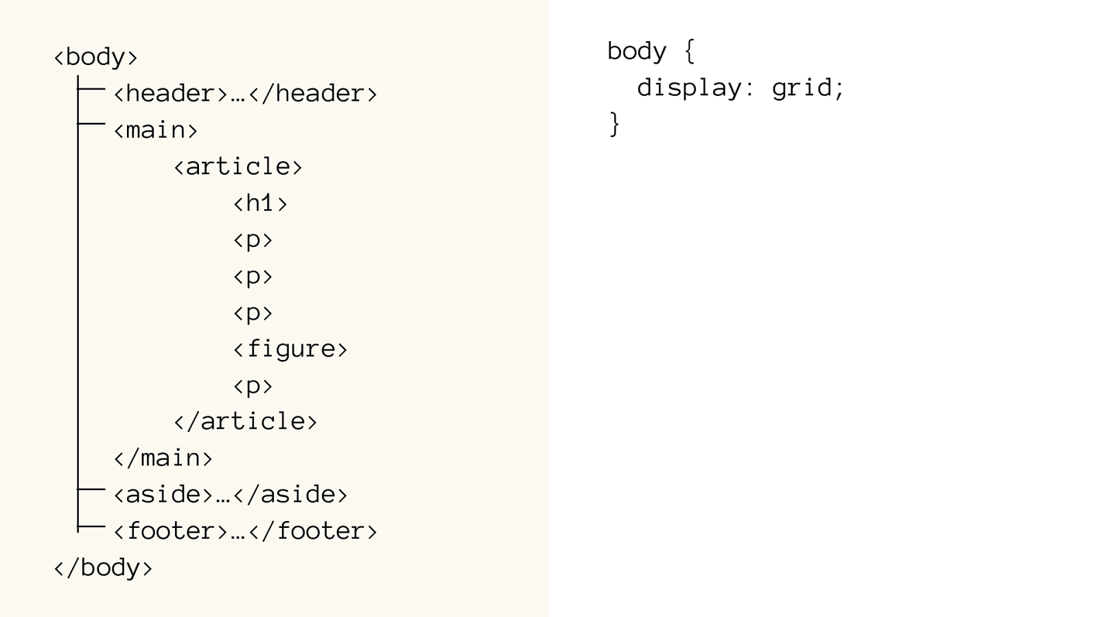
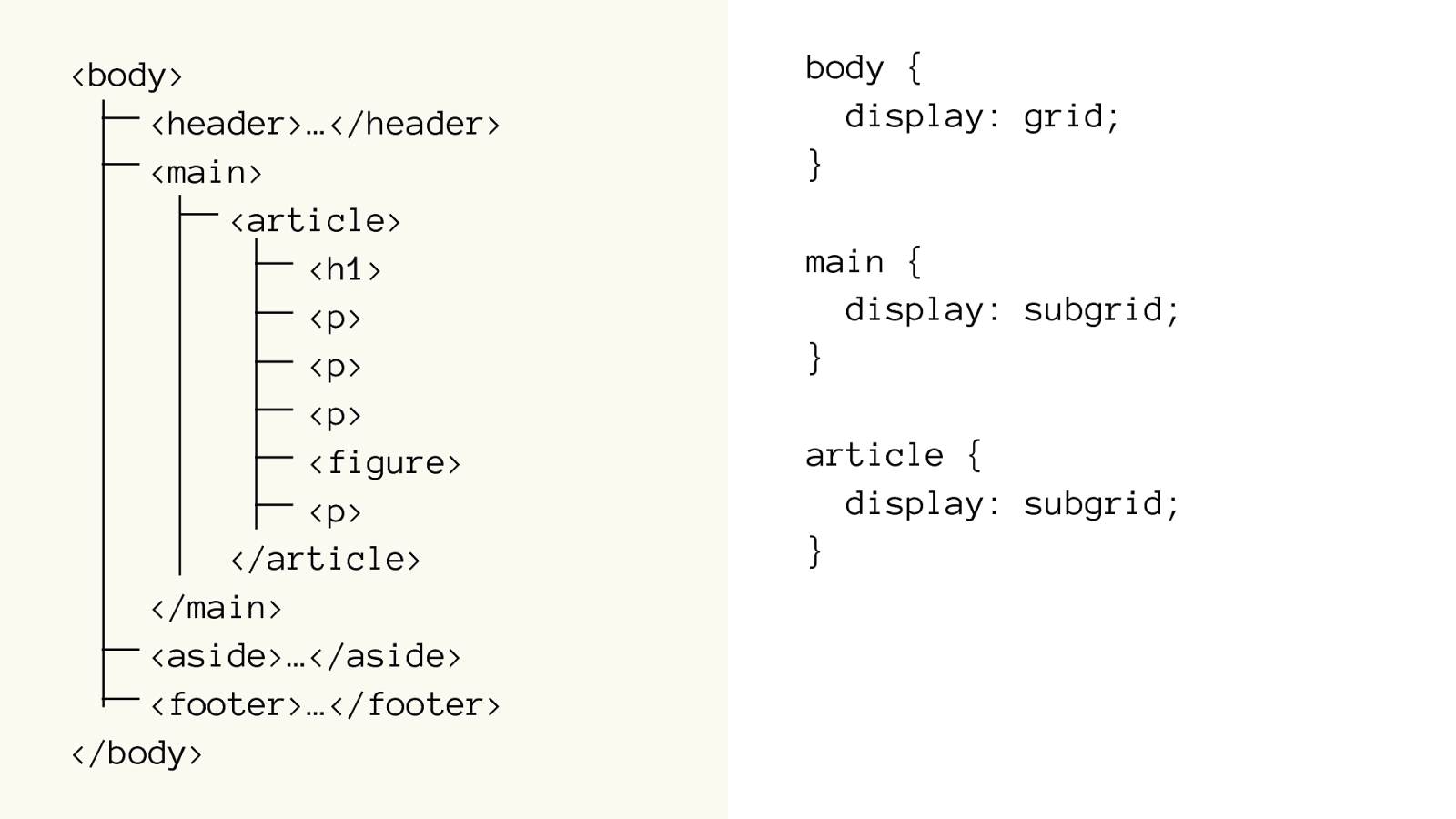
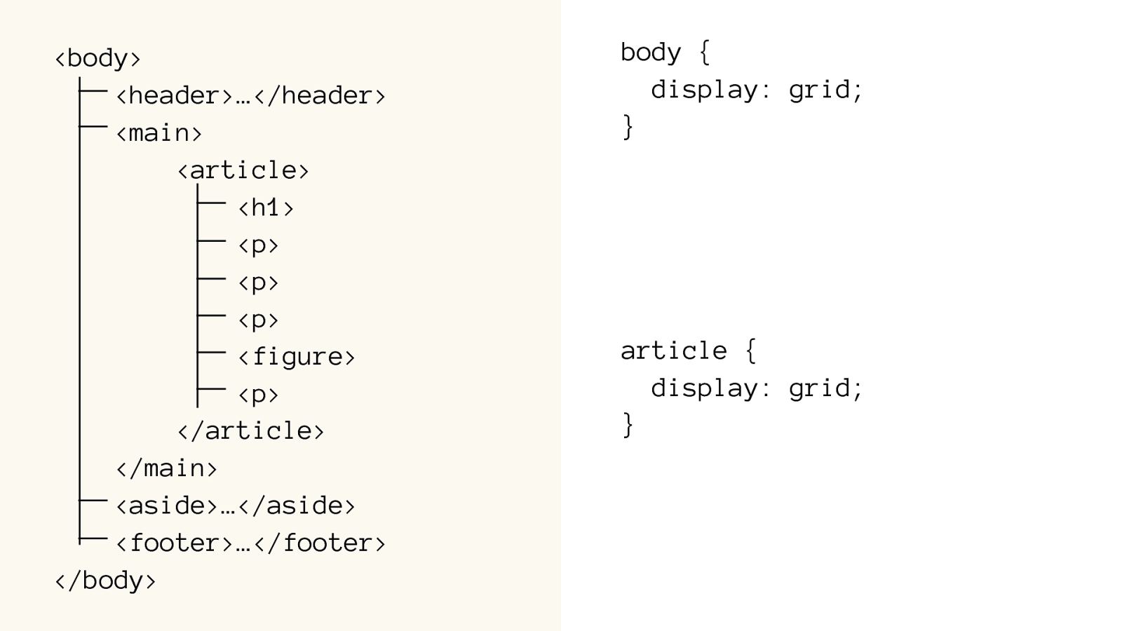
body {
display: grid;
grid-template-columns: 3fr 1fr;
grid-gap: 2rem;
grid-template-areas:
"header
header"
"content sidebar
"
"footer footer"
;
}
‘header’
‘aside’
1fr
‘main’
3fr
‘footer’
body {
display: grid;
grid-gap: 2rem; grid-template-areas:
"header" "content"
"sidebar
"
"footer"
;
}
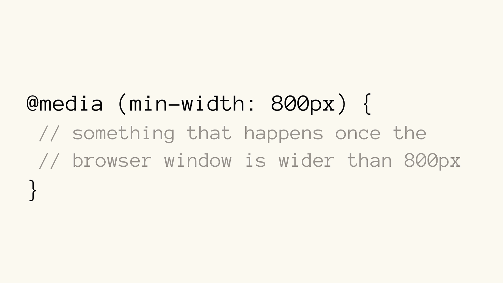
@media (min-width: 800px) {
body {
grid-template-columns:

   3fr 1fr;

grid-template-areas:
"header header"
"content sidebar
"
"footer footer"
;
}
}
Media Query
@media (min-width: 800px) { // something that happens once the // browser window is wider than 800px }
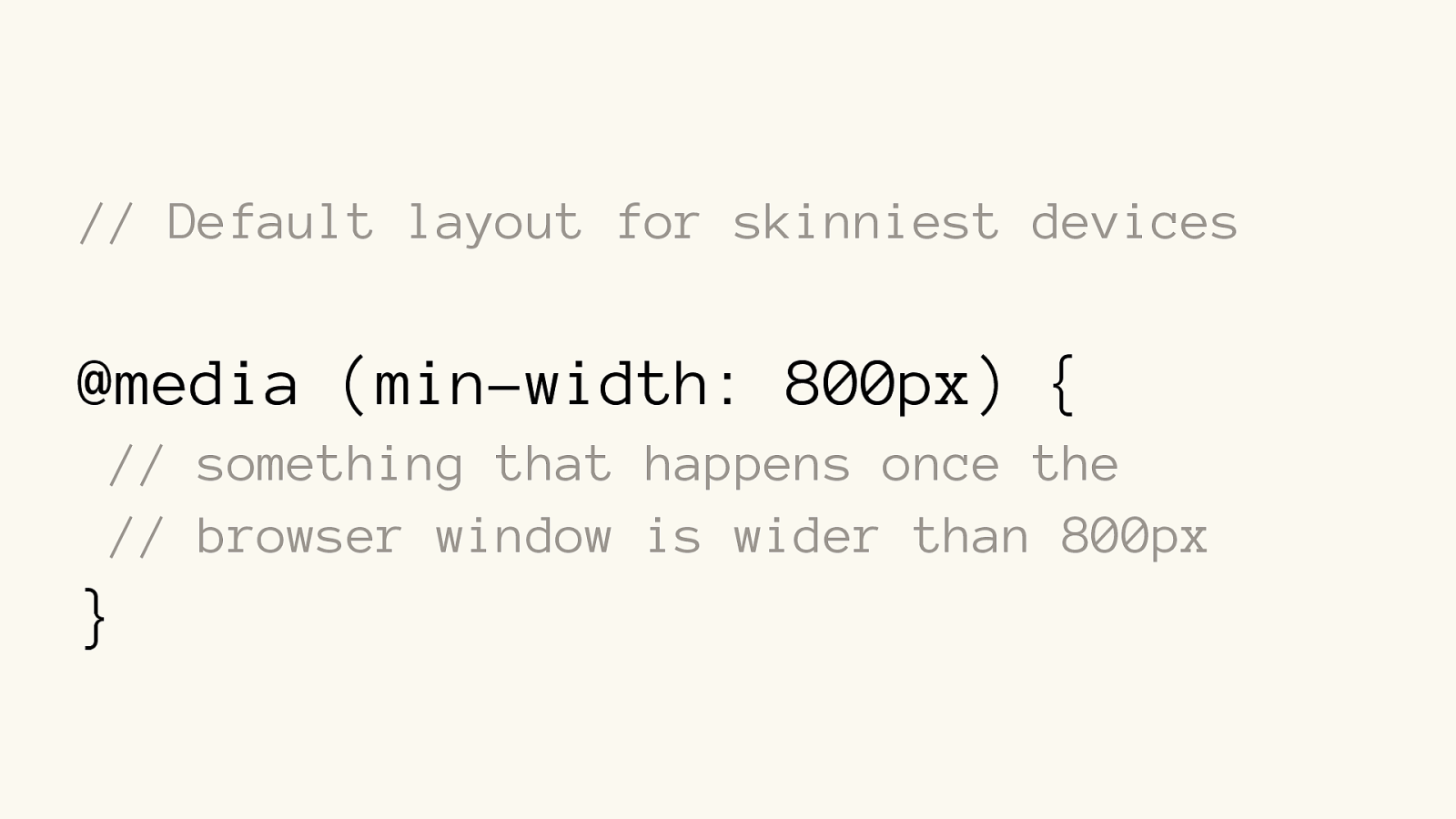
// Default layout for skinniest devices @media (min-width: 800px) { // something that happens once the // browser window is wider than 800px }
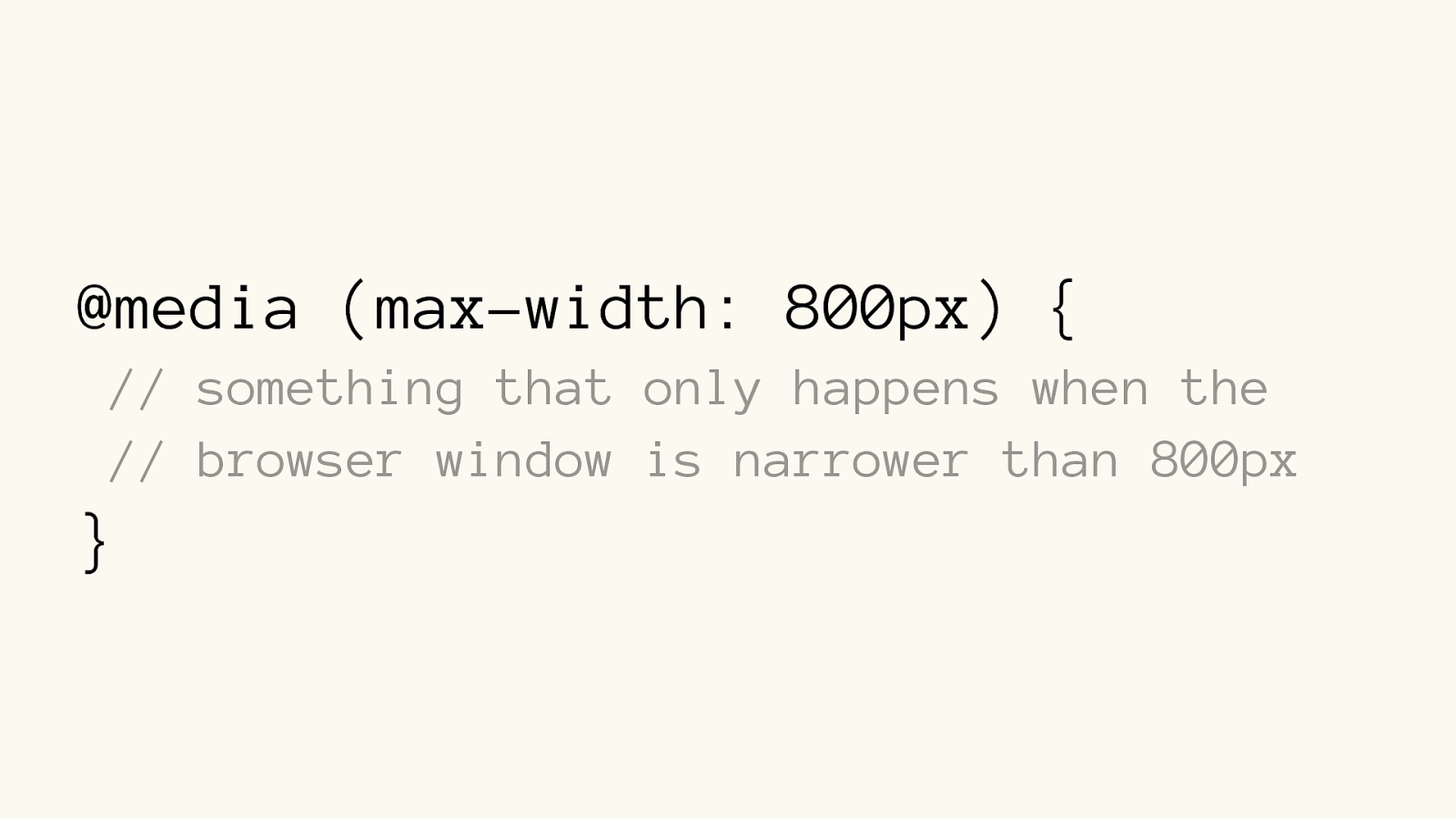
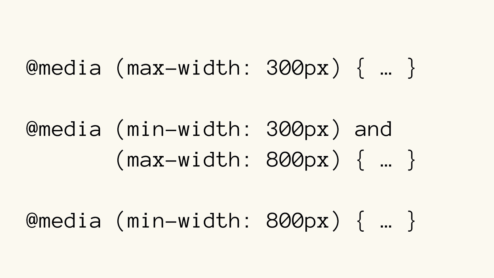
@media (max-width: 800px) { // something that only happens when the // browser window is narrower than 800px }
@media (max-width: 300px) { … }
@media (min-width: 300px) and
(max-width: 800px) { … }
@media (min-width: 800px) { … }
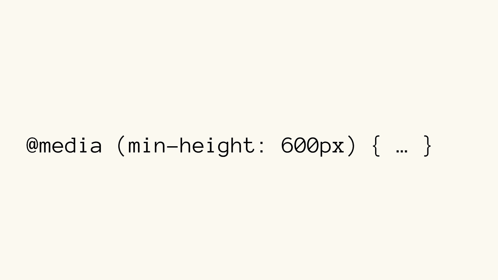
@media (min-height: 600px) { … }
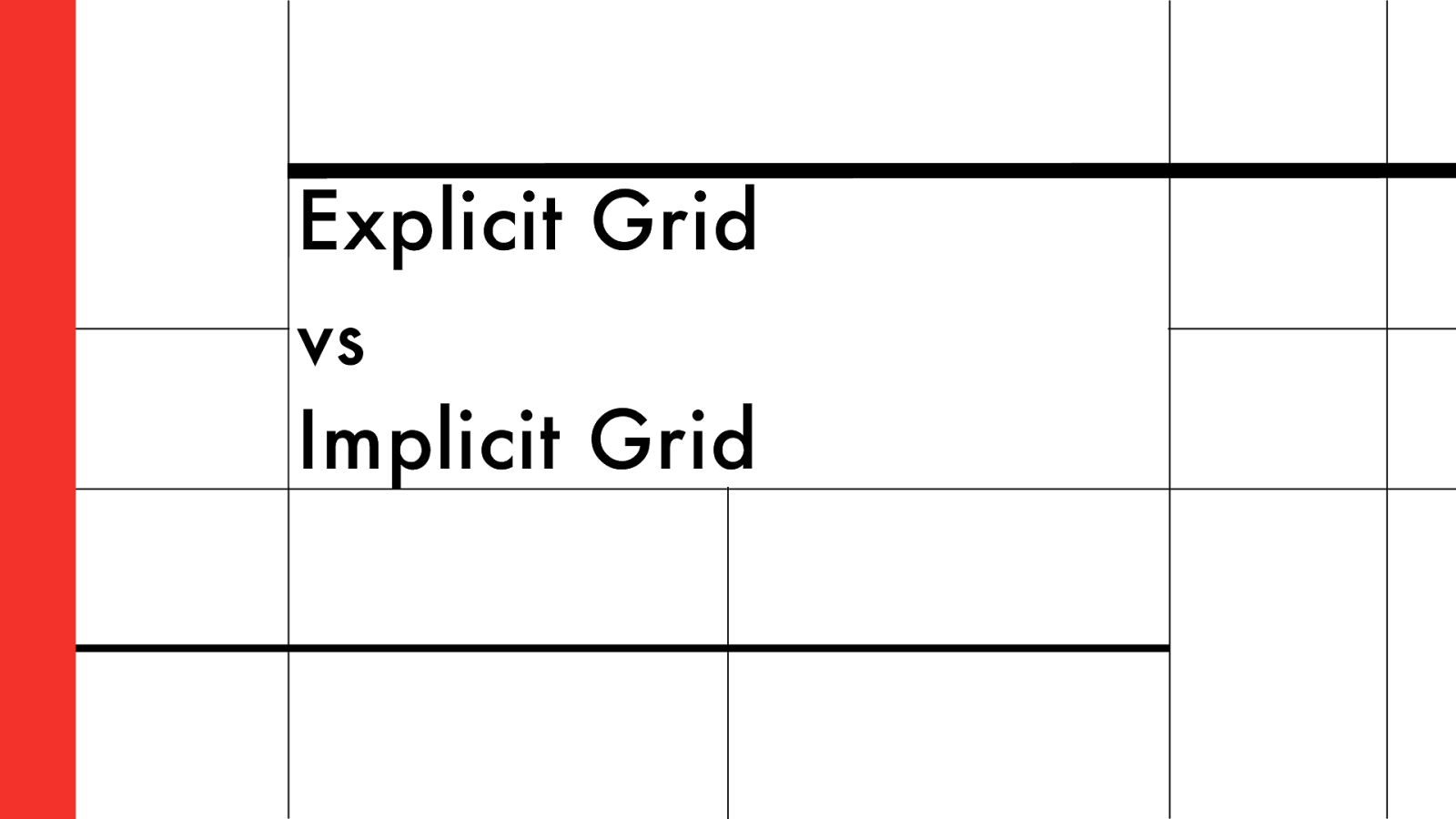
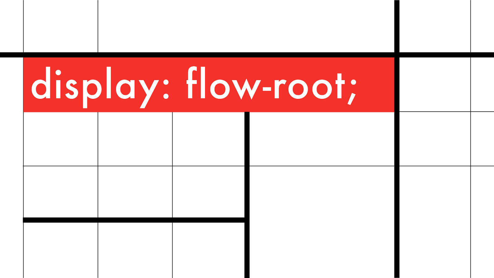
Explicit Grid vs
Implicit Grid
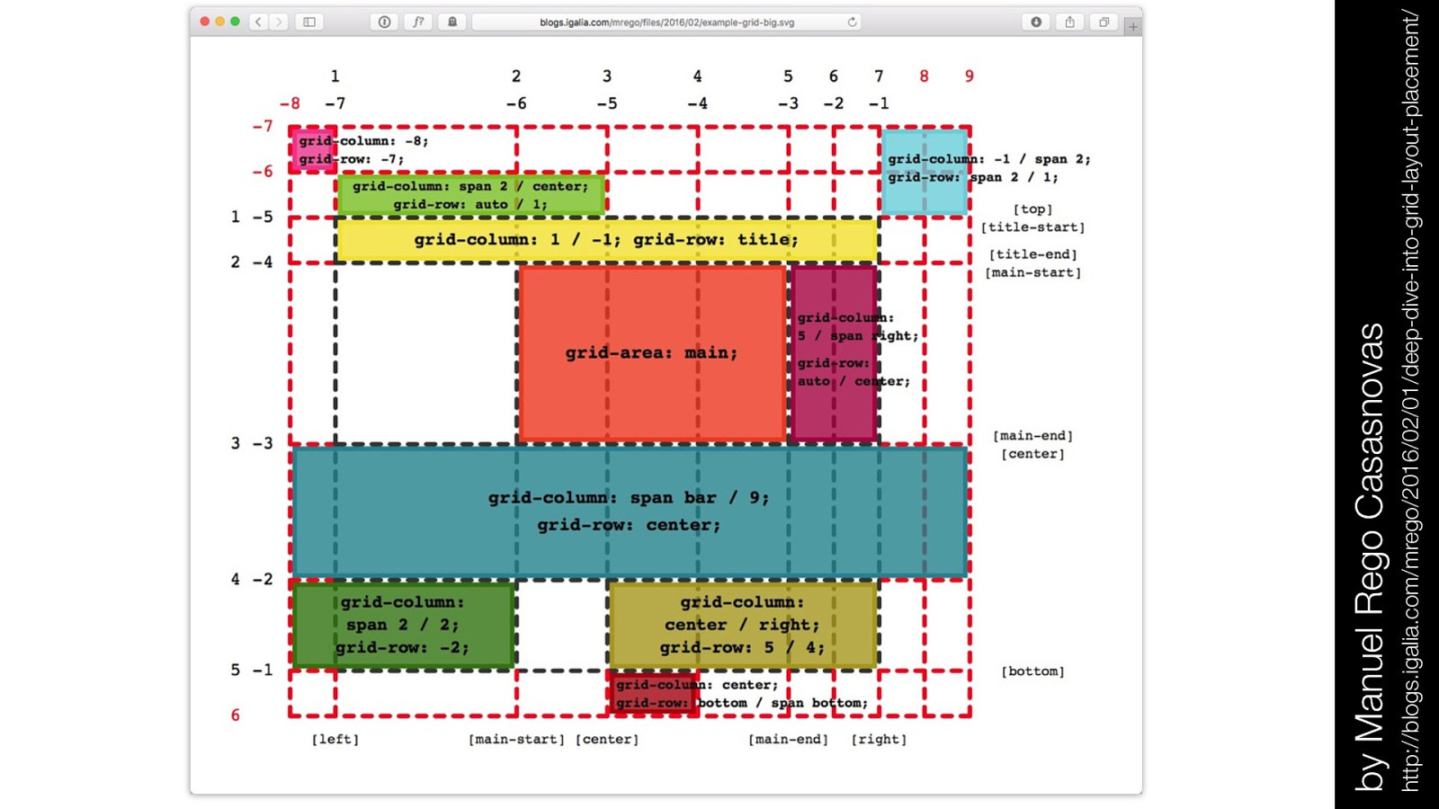
by Manuel Rego Casasnovas http://blogs.igalia.com/mrego/2016/02/01/deep-dive-into-grid-layout-placement/
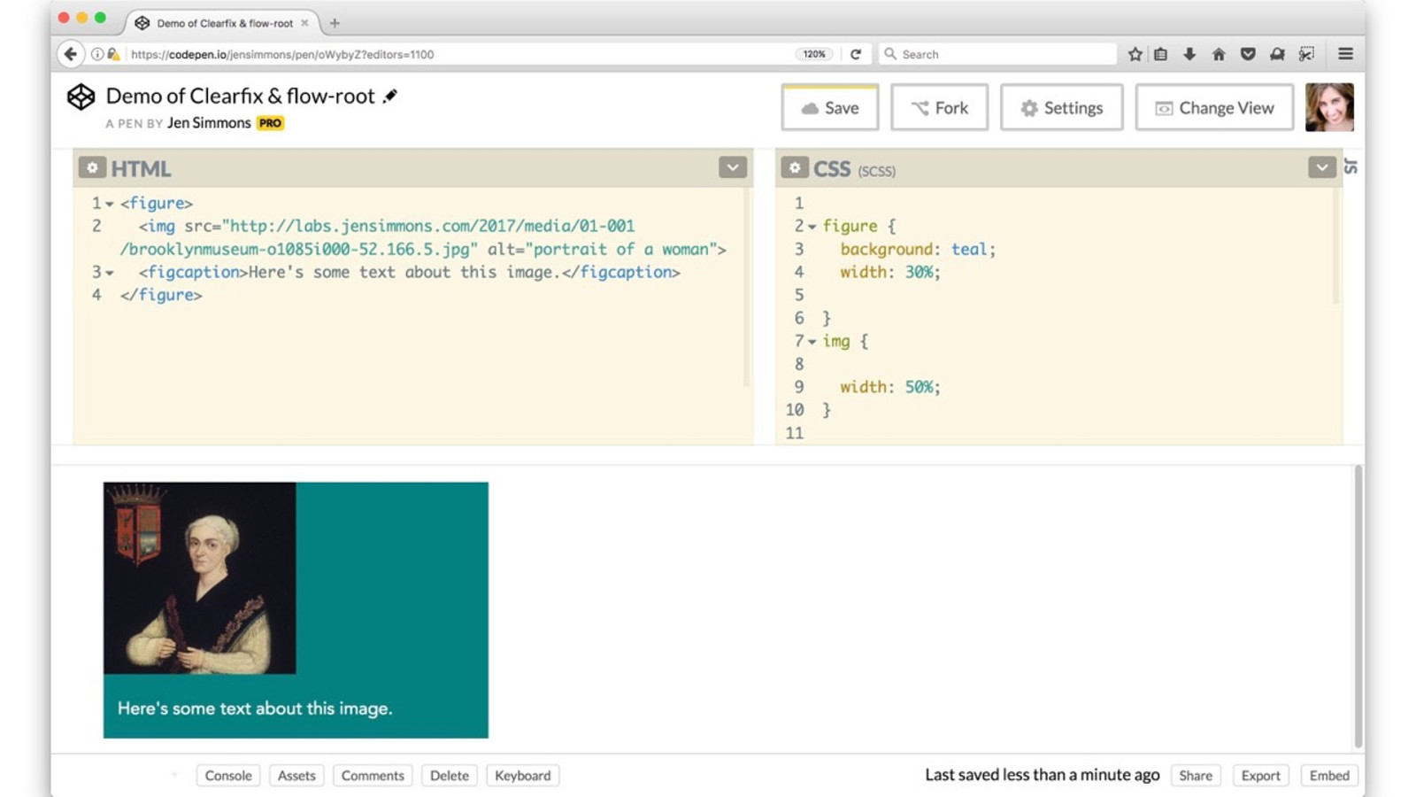
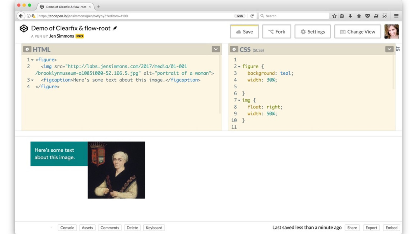
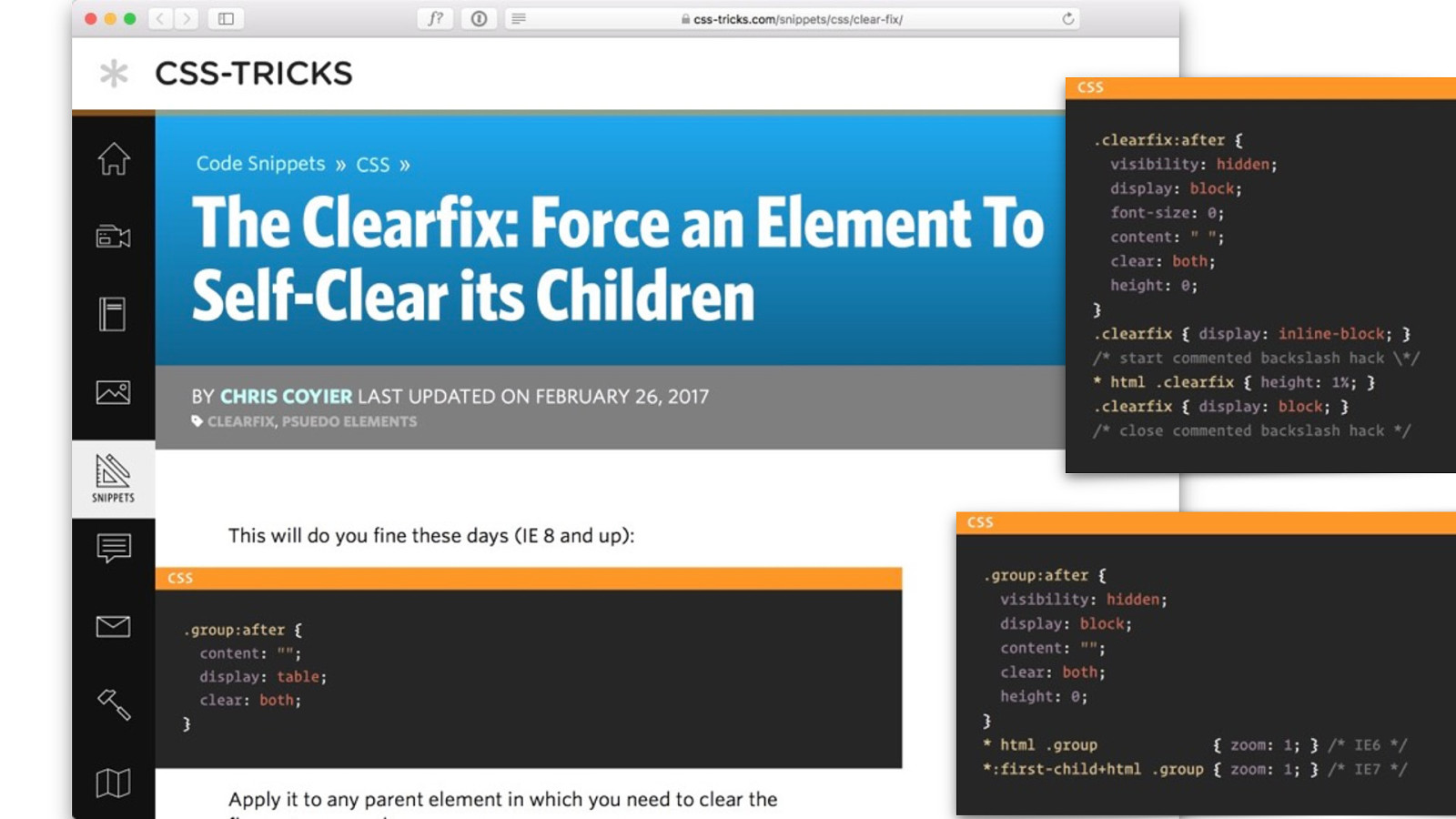
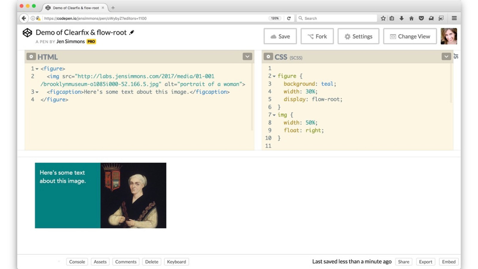
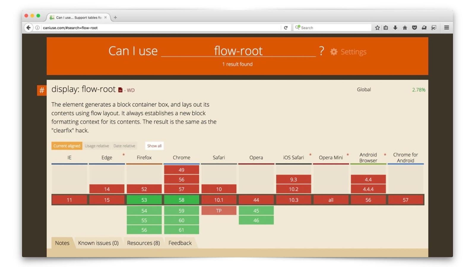
display: flow-root;
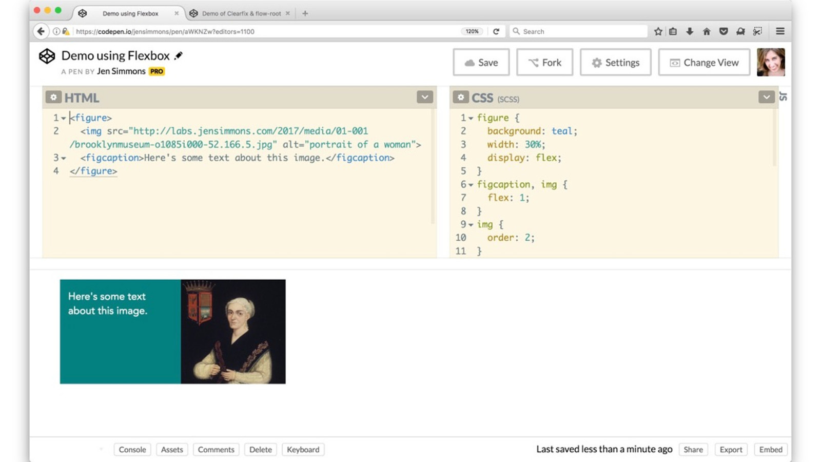
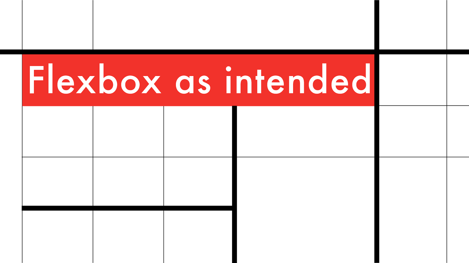
Flexbox as intended
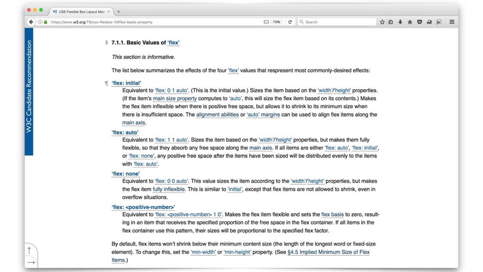
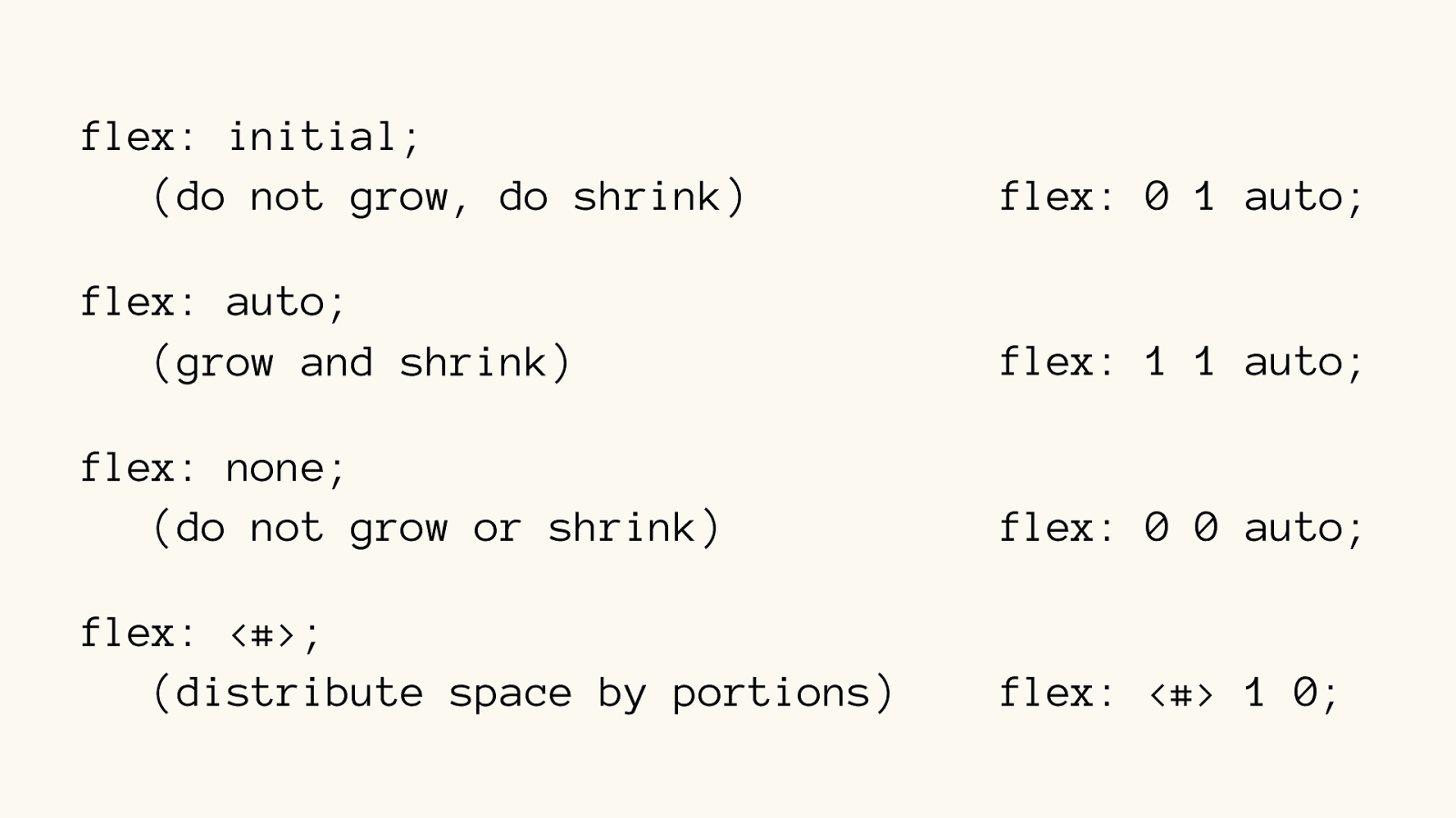
flex: initial; (do not grow, do shrink) flex: auto; (grow and shrink) flex: none; (do not grow or shrink) flex: <#>; (distribute space by portions) flex: 0 1 auto;
flex: 1 1 auto;
flex: 0 0 auto;
flex: <#> 1 0;
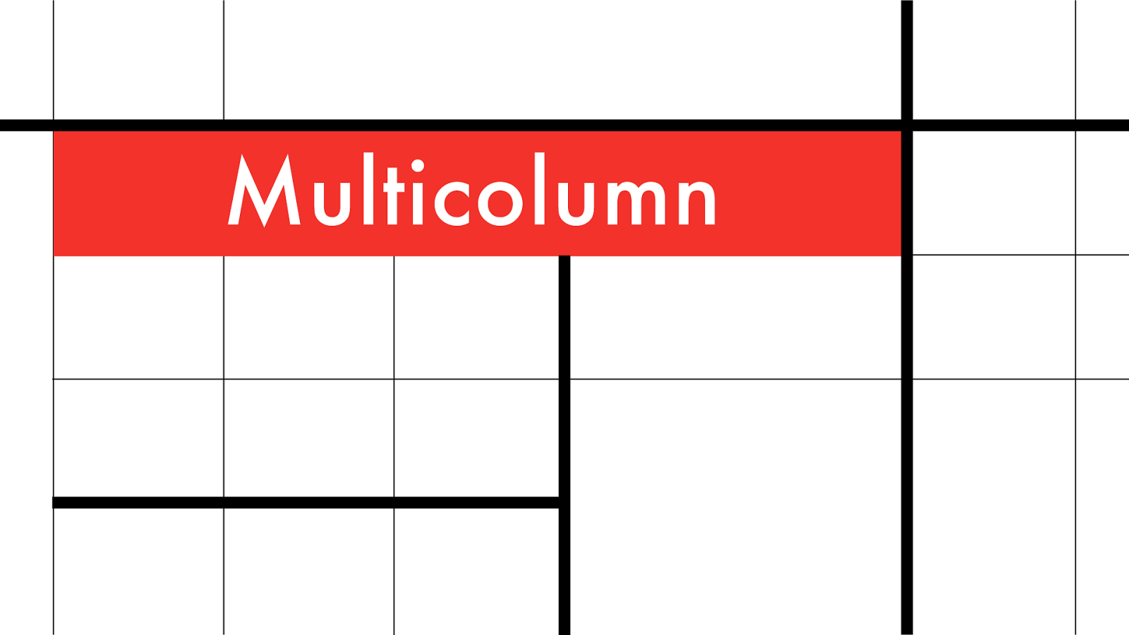
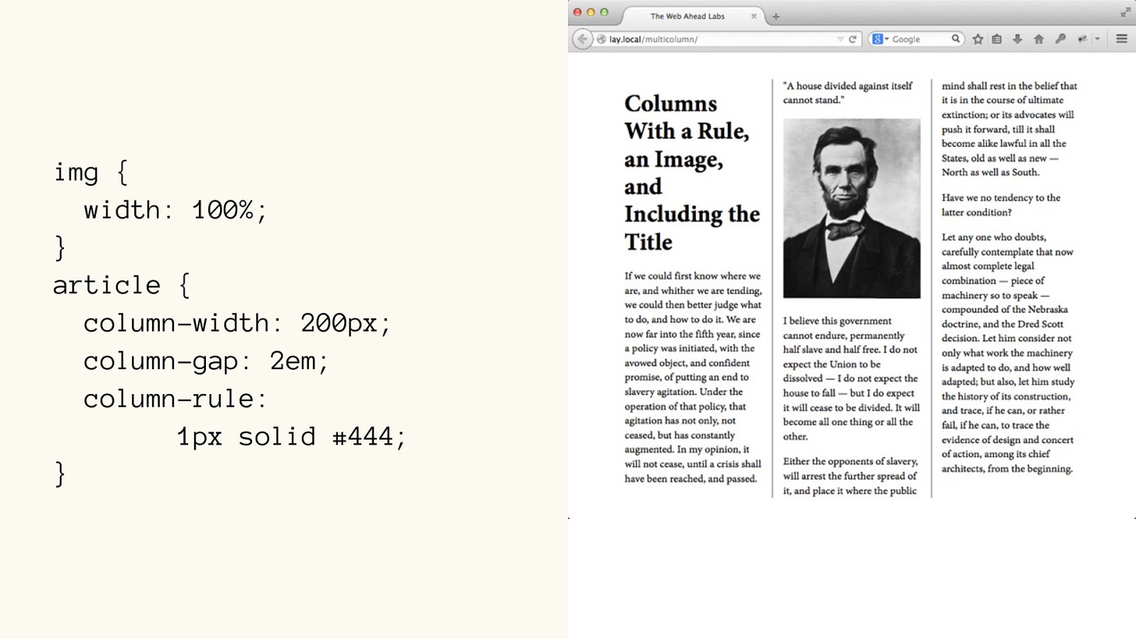
Multic olumn
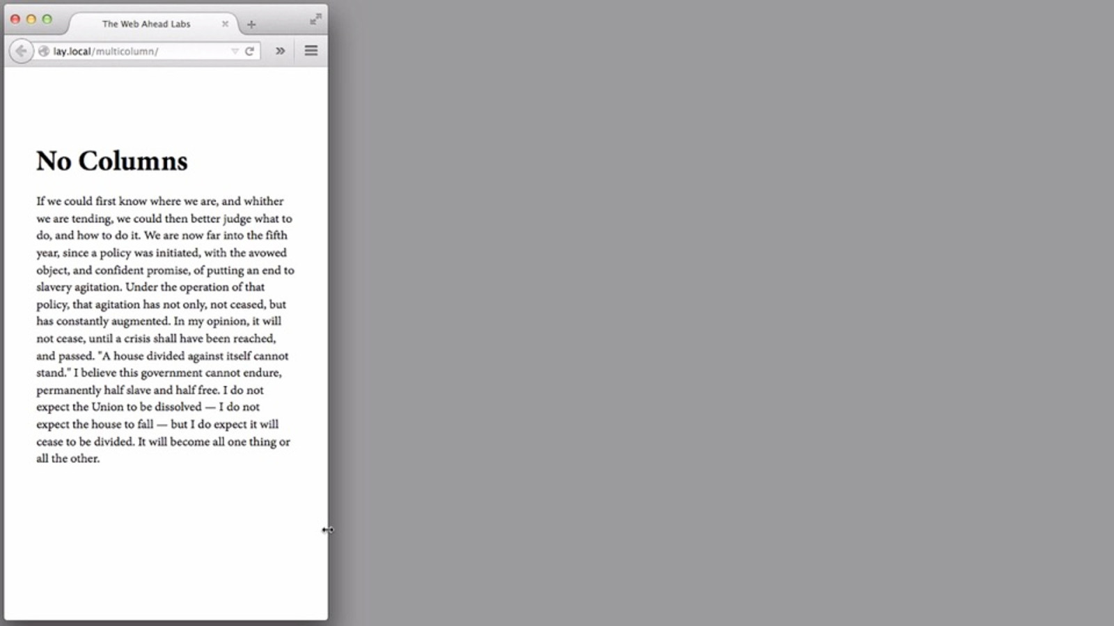
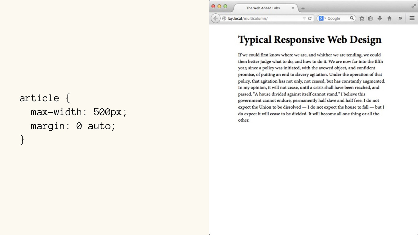
article { max-width: 500px; margin: 0 auto; }
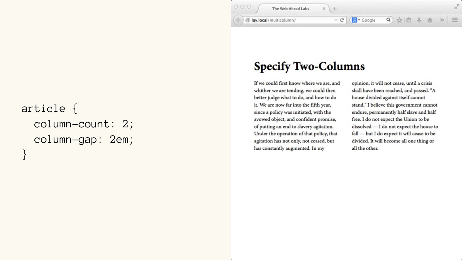
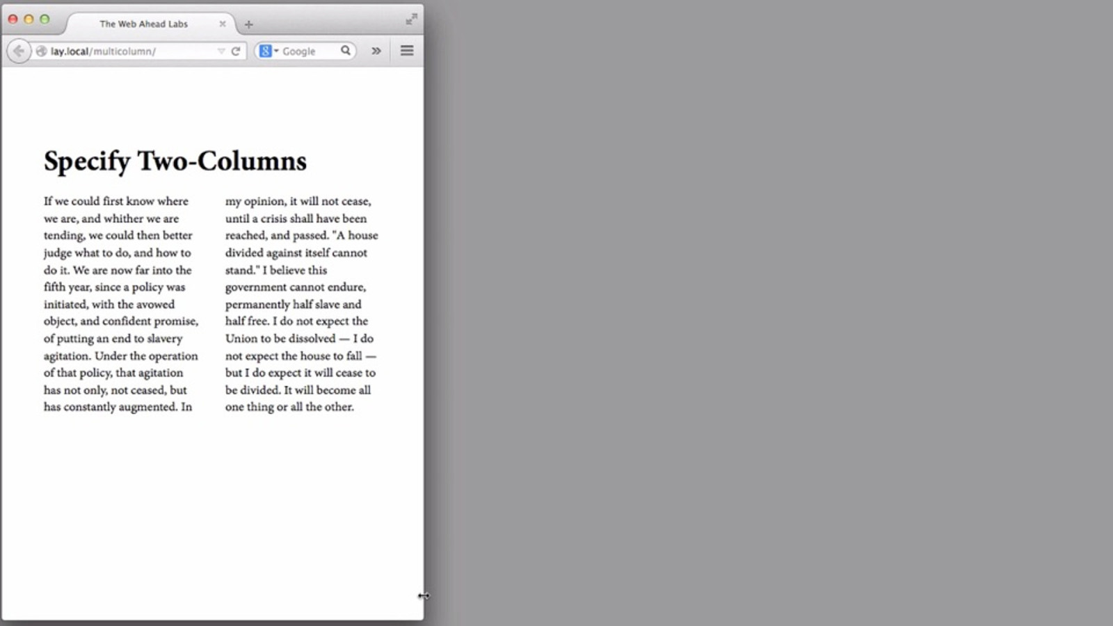
article { column-count: 2; column-gap: 2em; }
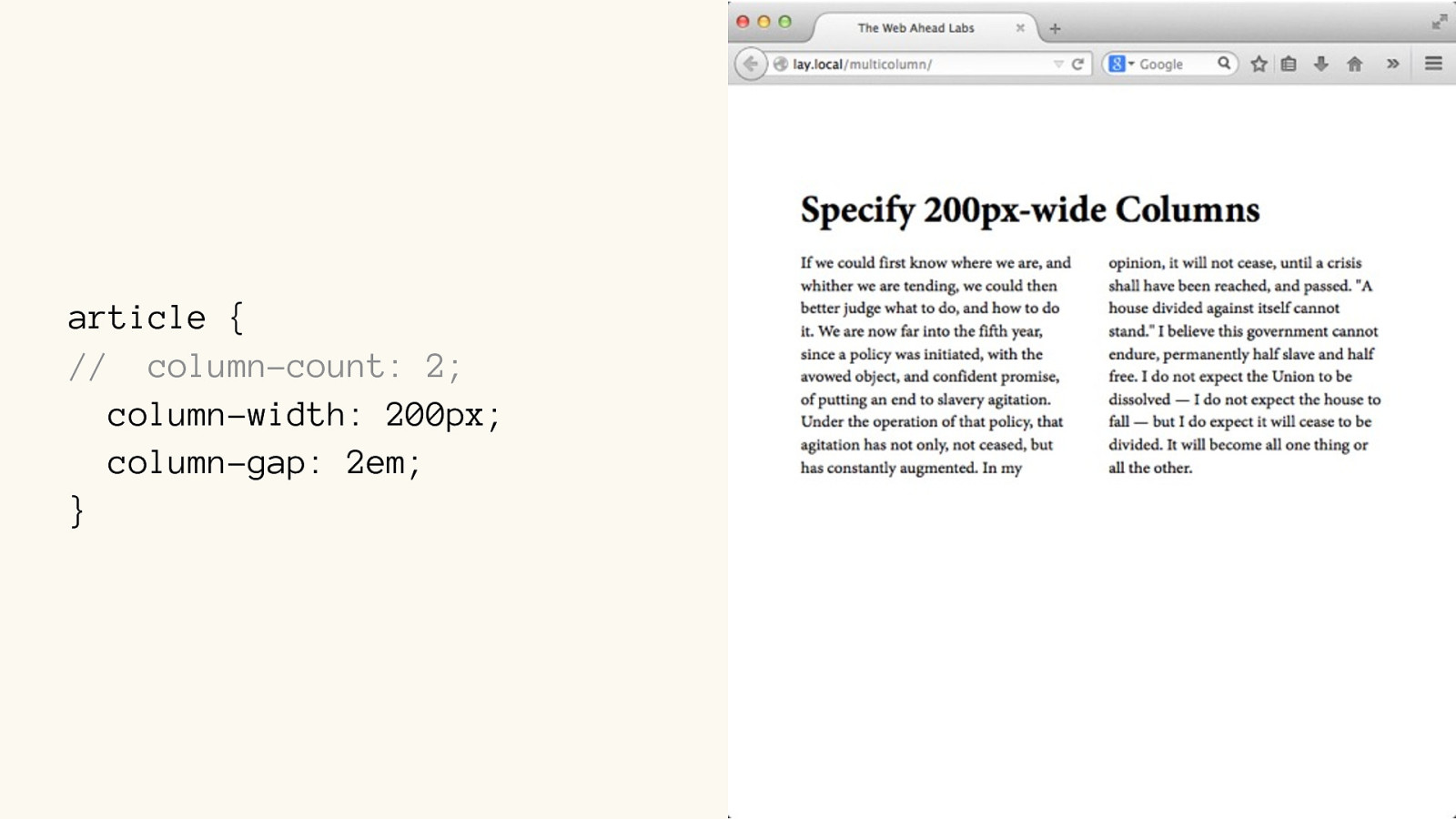
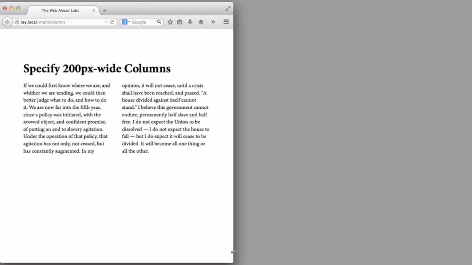
article { // column-count: 2; column-width: 200px; column-gap: 2em; }
img {
width: 100%;
}
article {
column-width: 200px;
column-gap: 2em;
column-rule:
1px solid #444;
}
THE END

Everything about web page layout is about to change. A plethora of new CSS properties for layout is about to give us super powers for building web pages. It’s as big a change as when we left behind tables for CSS—maybe bigger. There is an incredible amount to learn, including entirely new concepts of layout behavior.
Want a head start? Join Jen Simmons as she walks you through the most important new CSS properties, and shows you how to combine them into real-world usecases.
You will:
Learn how to write the code for CSS Grid, Writing Modes, Alignment, and more. Gain a new and powerful toolset for page design. Learn a process that simplifies the complexity and allows you to get to the matter at hand. See concrete examples of innovative layouts. Leave with a vision of what’s newly possible and where the industry is going. This full-day learning experience is for anyone who has a hand in designing or developing web pages: product managers, graphic designers, interface designers, experience designers, and front-end designer/developers.
You may already be proficient at CSS, and want to learn the new code. Perhaps you do not know CSS, and would like to learn some. Maybe you don’t really even want to learn CSS, but you want to understand the new possibilities, so you can better direct the design process. If any of these situations sound familiar, this day is absolutely for you.


 for free. You
can too.
for free. You
can too.