
A presentation at W3C Developer Meetup in in San Francisco, CA, USA by Jen Simmons

How CSS Grid Changes Everything (i n 15 mi n s?) W3C Developer Meetup
@jenSimmons
F ollow @jensimmons for slides
Layout on the Web
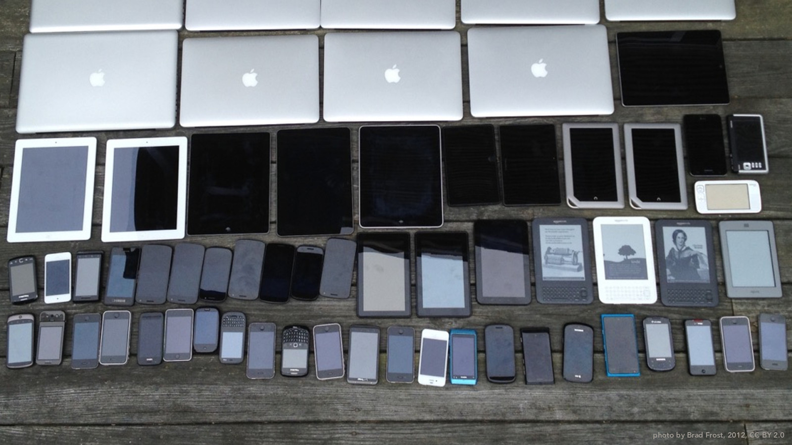
photo by Brad Frost, 2012, CC BY 2.0
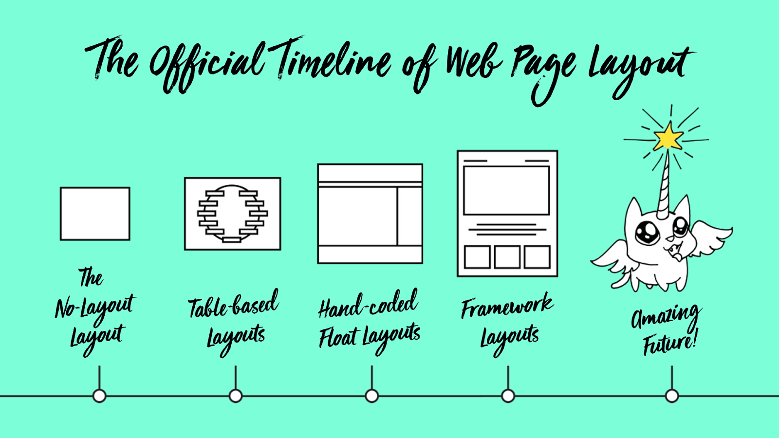
The Official Timeline of Web Page Layout
The
No-Layout
Layout
Table -based
Layouts
Hand -coded
Float Layouts
F ramework
Layouts
Amazing
Future!
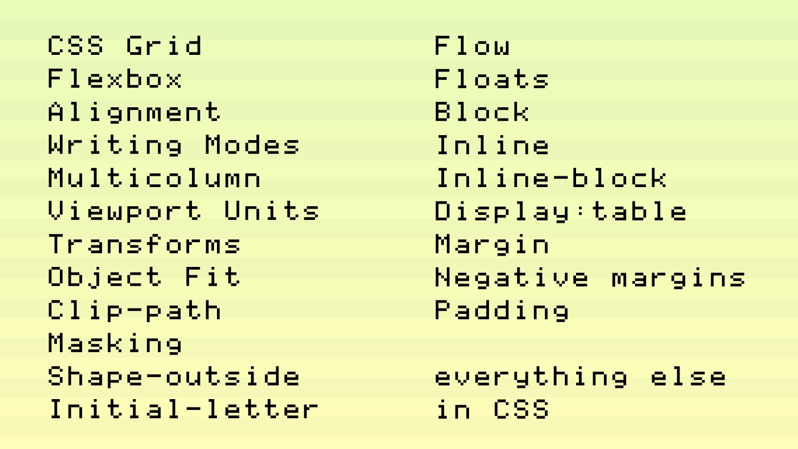
CSS Grid
Flexbox
Alignment
Writing Modes
Multicolumn
Viewport Units
Transforms
Object Fit
Clip-path
Masking
Shape-outside
Initial-letter
Flow
Floats
Block
Inline
Inline-block
Display:table
Margin
Negative margins
Padding
everything else
in CSS
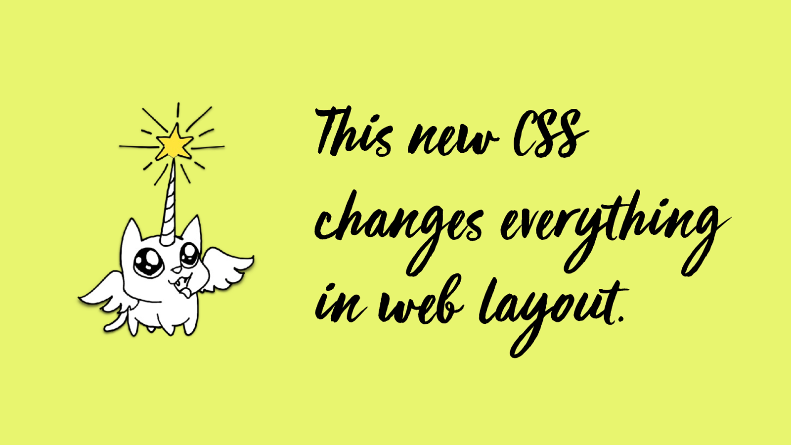
This ne w CSS
changes everything
in web layout.
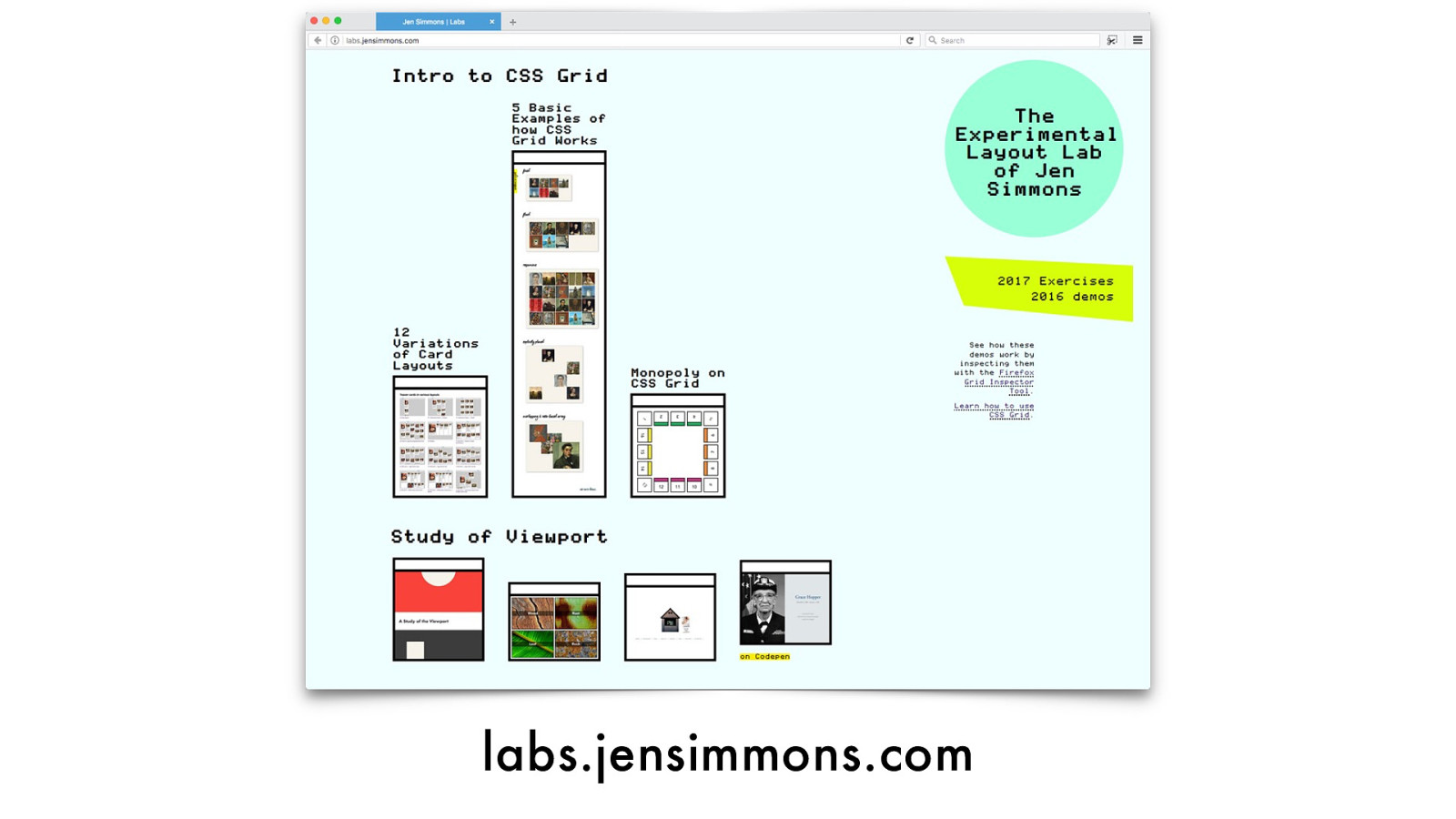
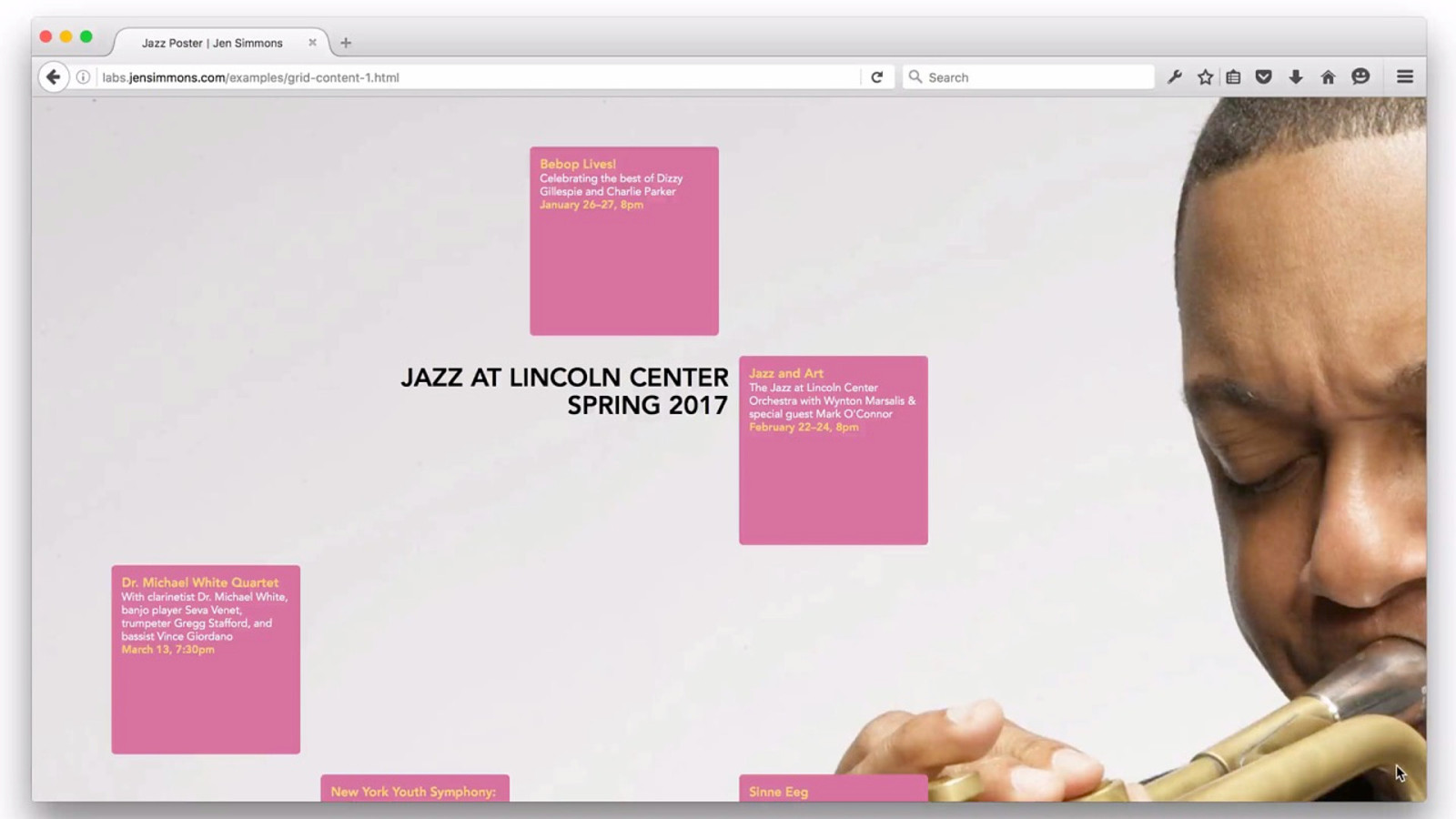
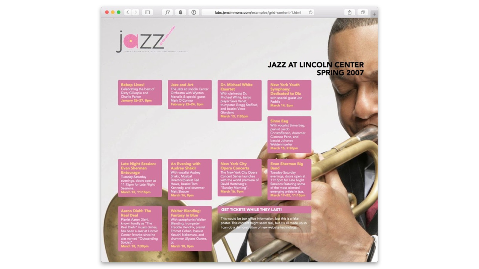
labs.jensimmons.com
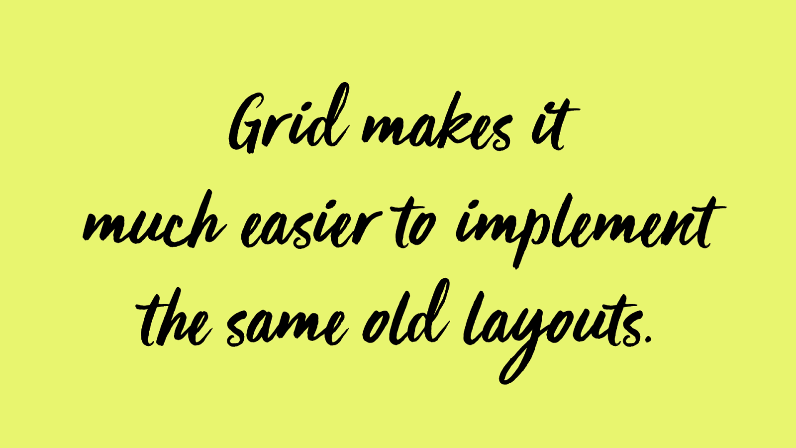
Grid makes it
much easier to imple me nt
t he same old layouts.
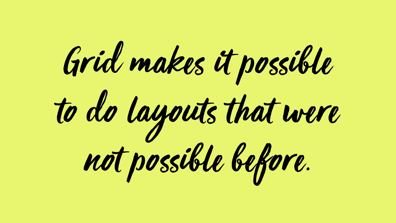
Grid makes it possible
to do layouts that were
not possible be fore.
Nature of
CSS Grid
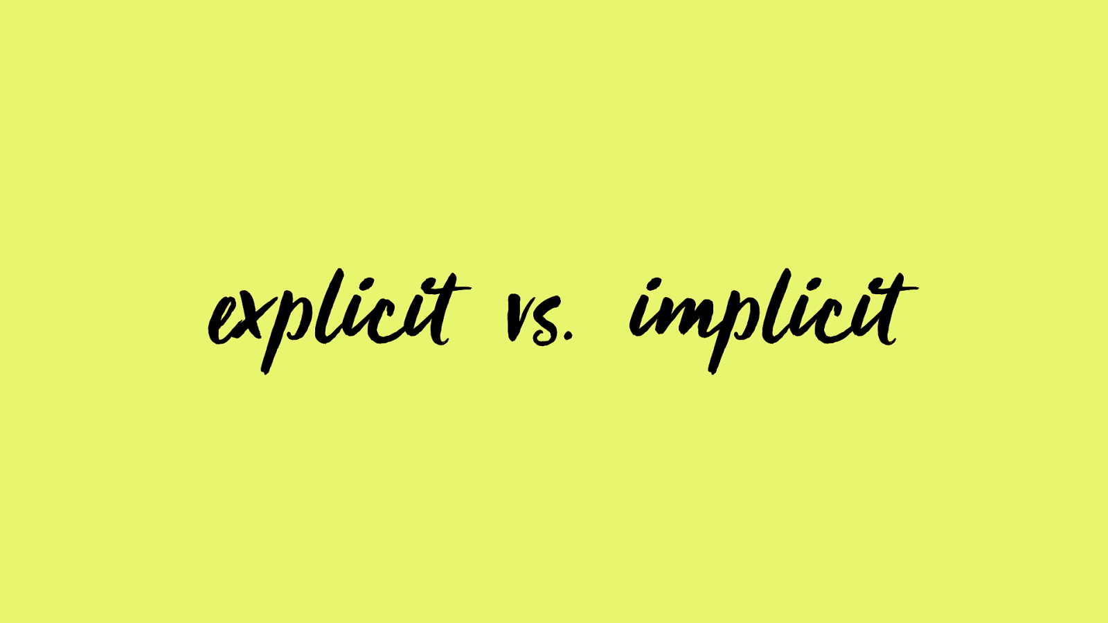
explicit vs. implicit
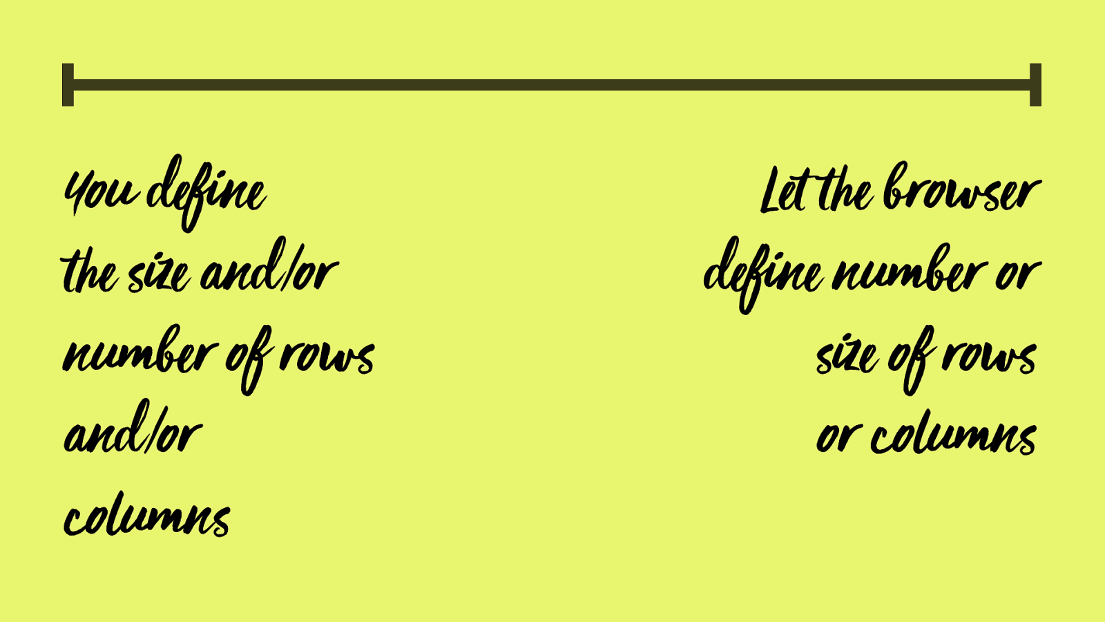
You define
!
e size and/or
number of rows
and/or
columns
Let
!
e browser
define number or
size of rows
or columns
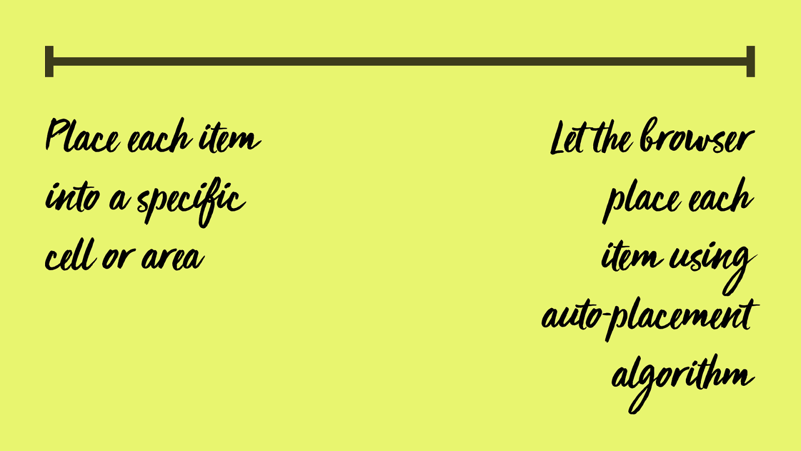
P lace each
"
em
into a specific
cell or area
Let
!
e browser
place each
"
em using
auto-placement
a
lgor
"
hm
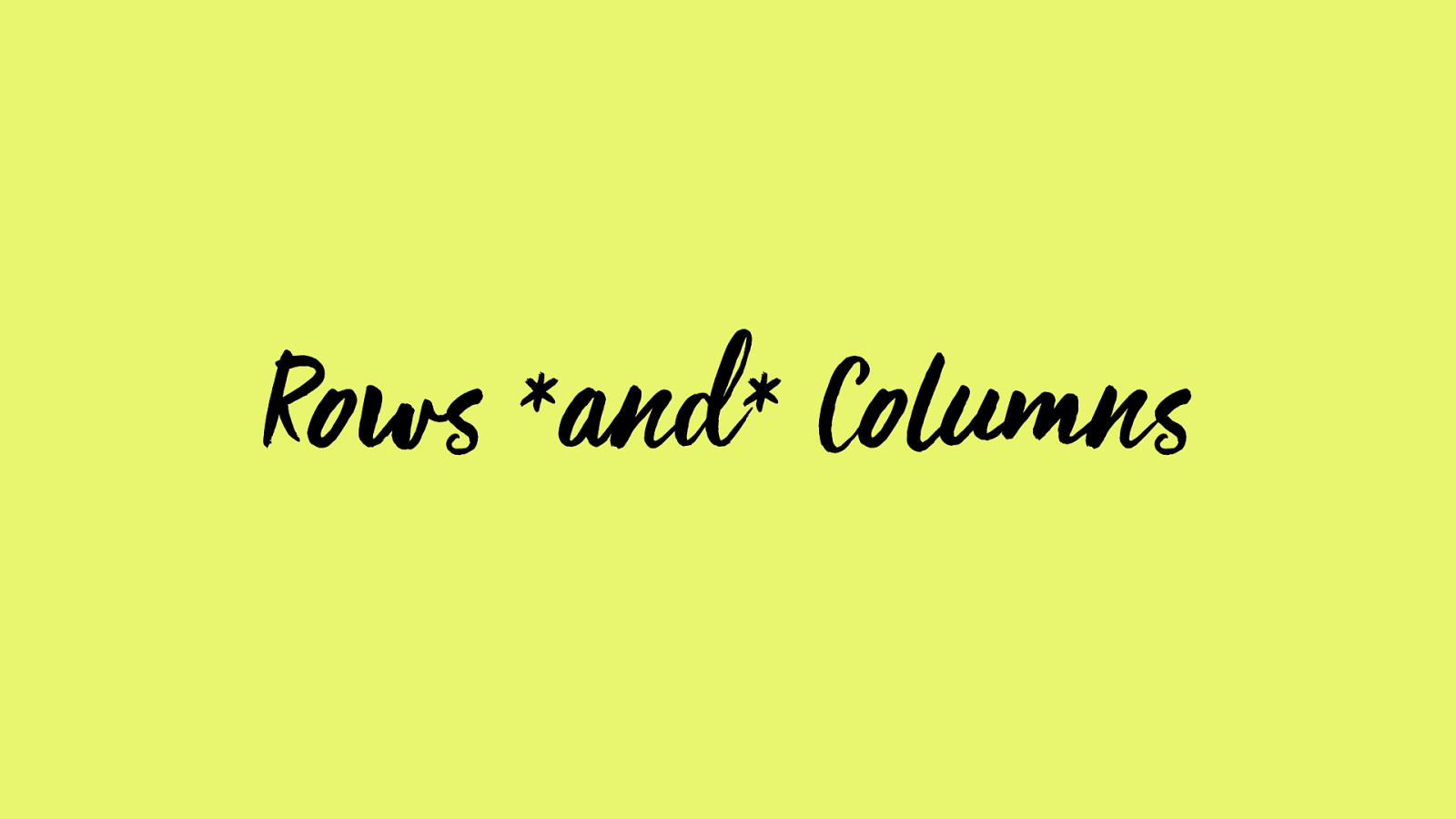
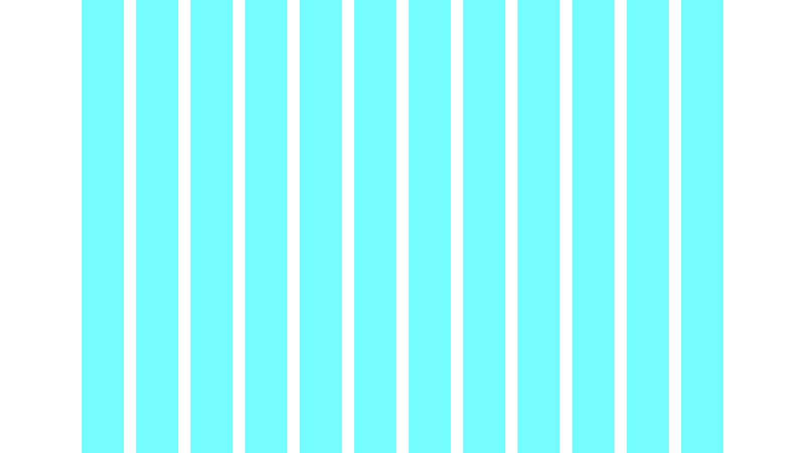
Row s and Columns
ROWS!!!!!!!!!!!
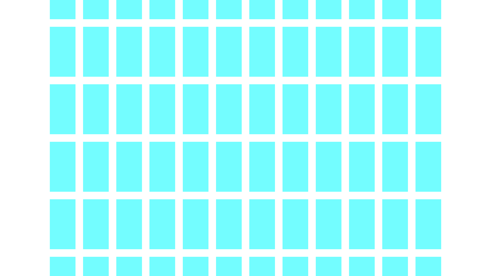
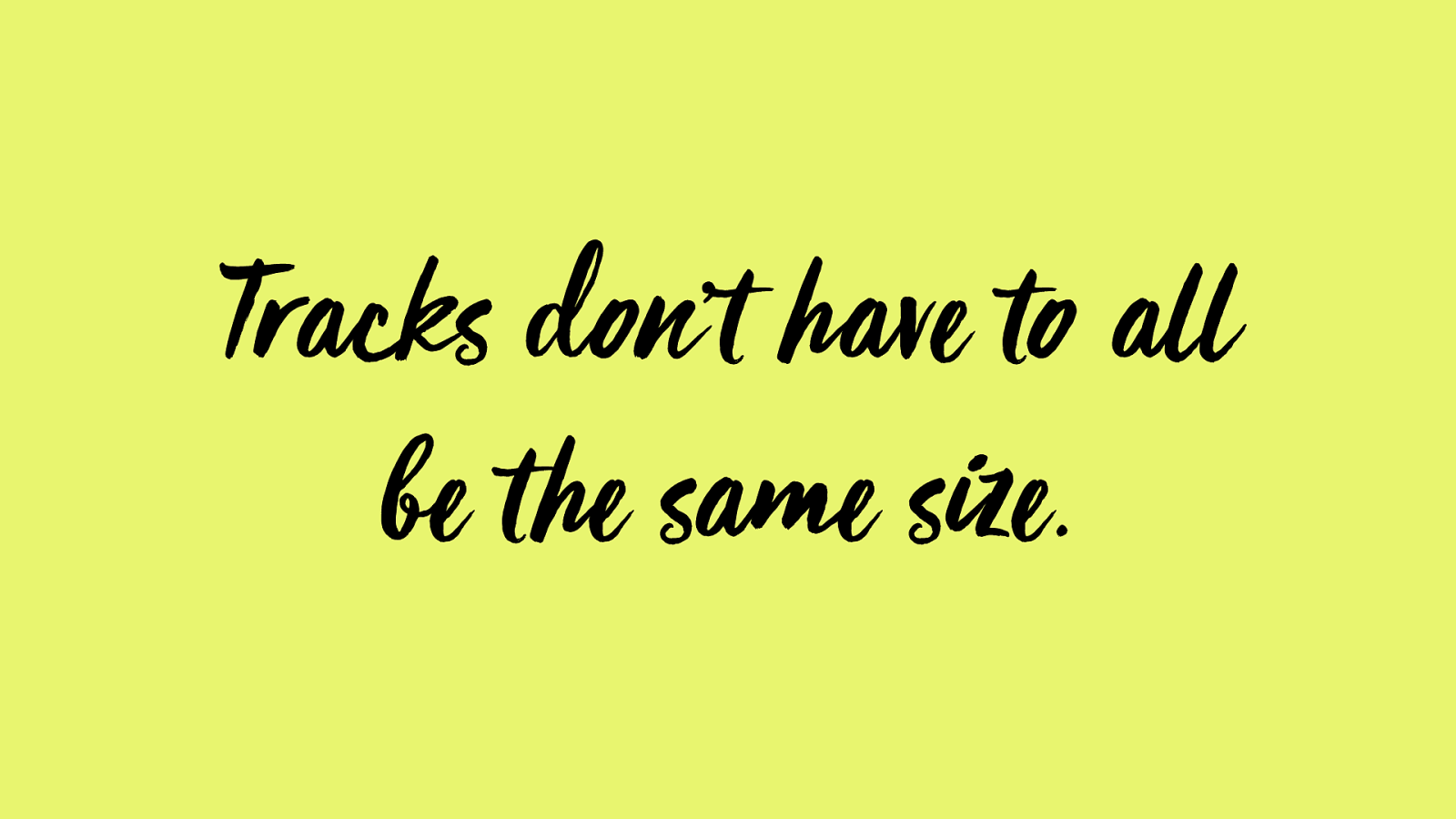
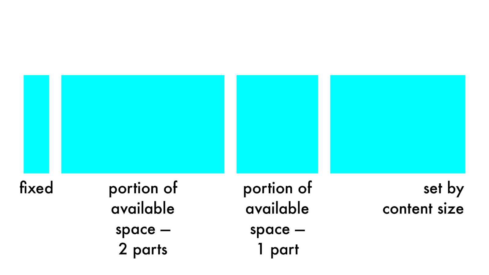
Tracks don’t have to all
be t he same size.
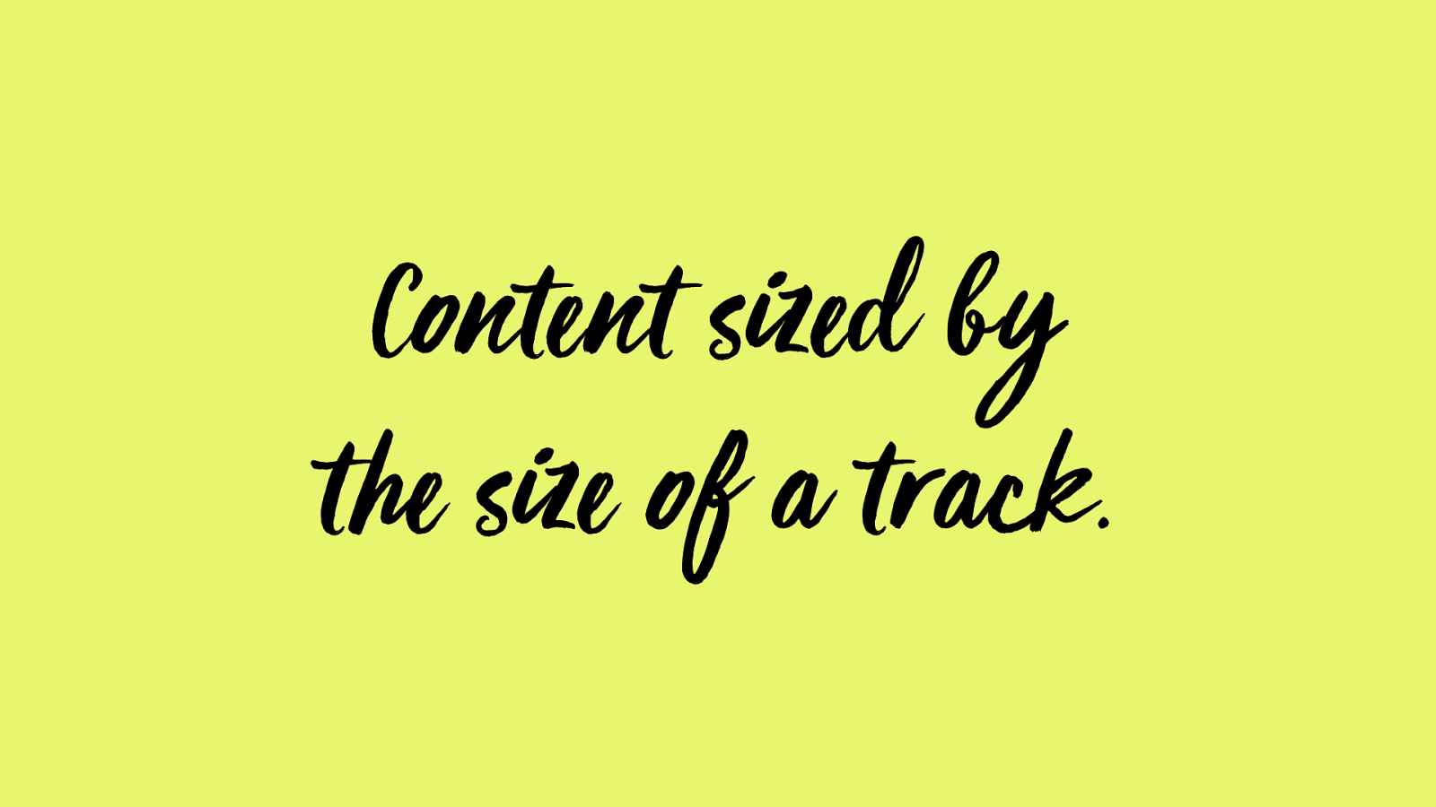
Conte nt sized by
t he size of a track.
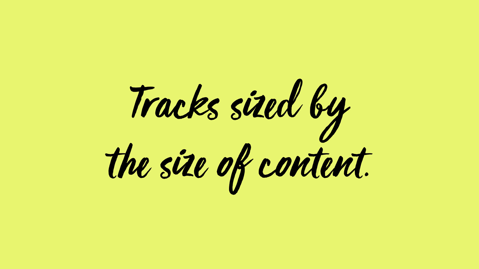
Tracks sized by
t he size of c onte nt.
portion of
available
space —
2 parts
set by
content
size
fixed
portion of
available
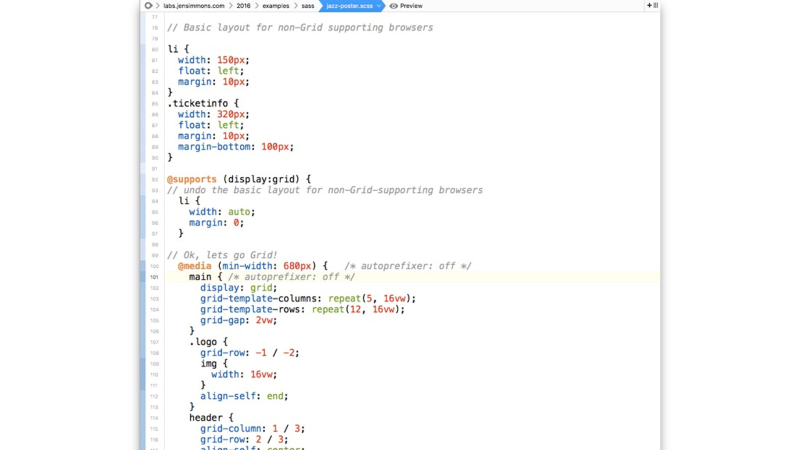
space —
1 part
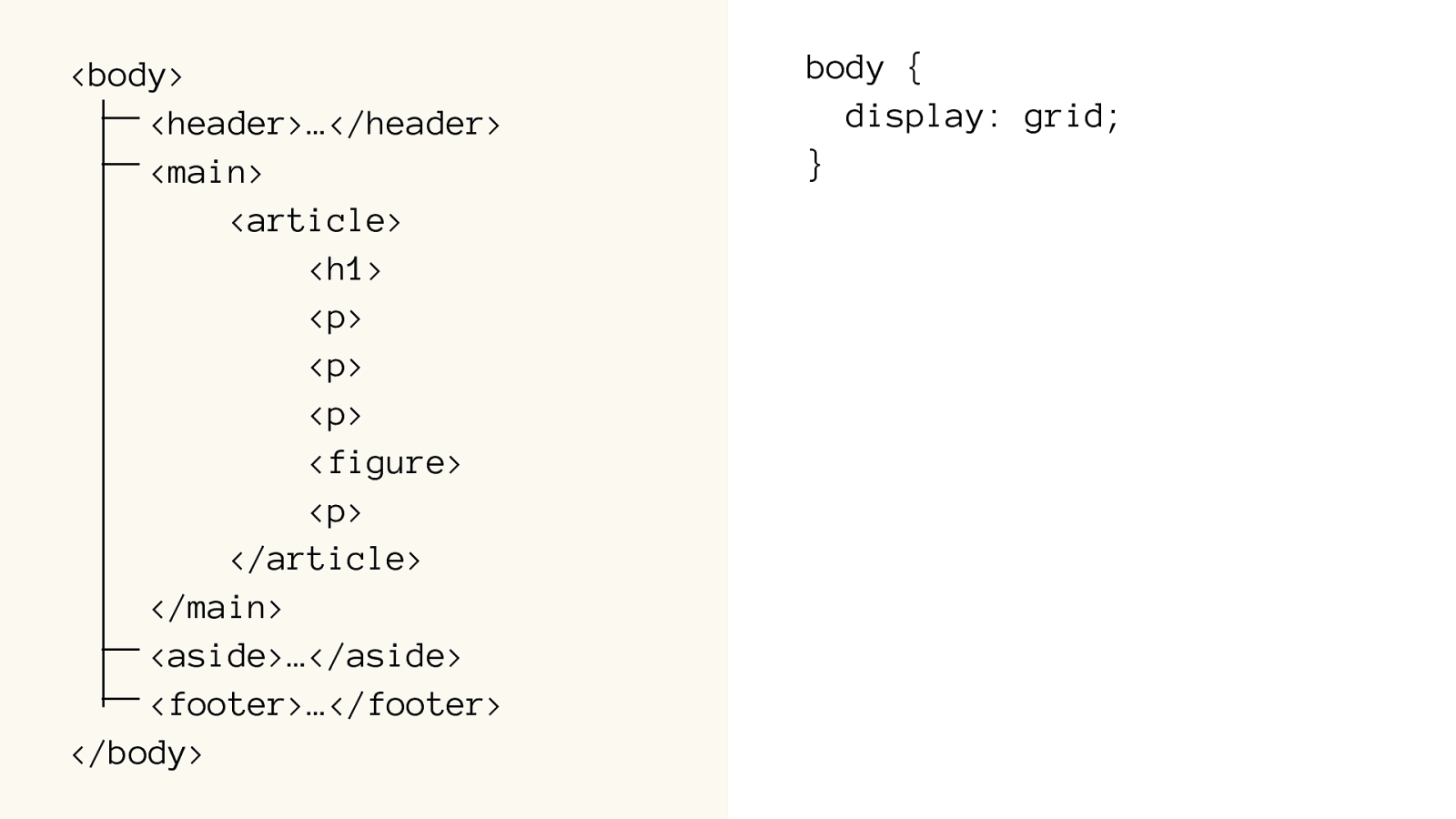
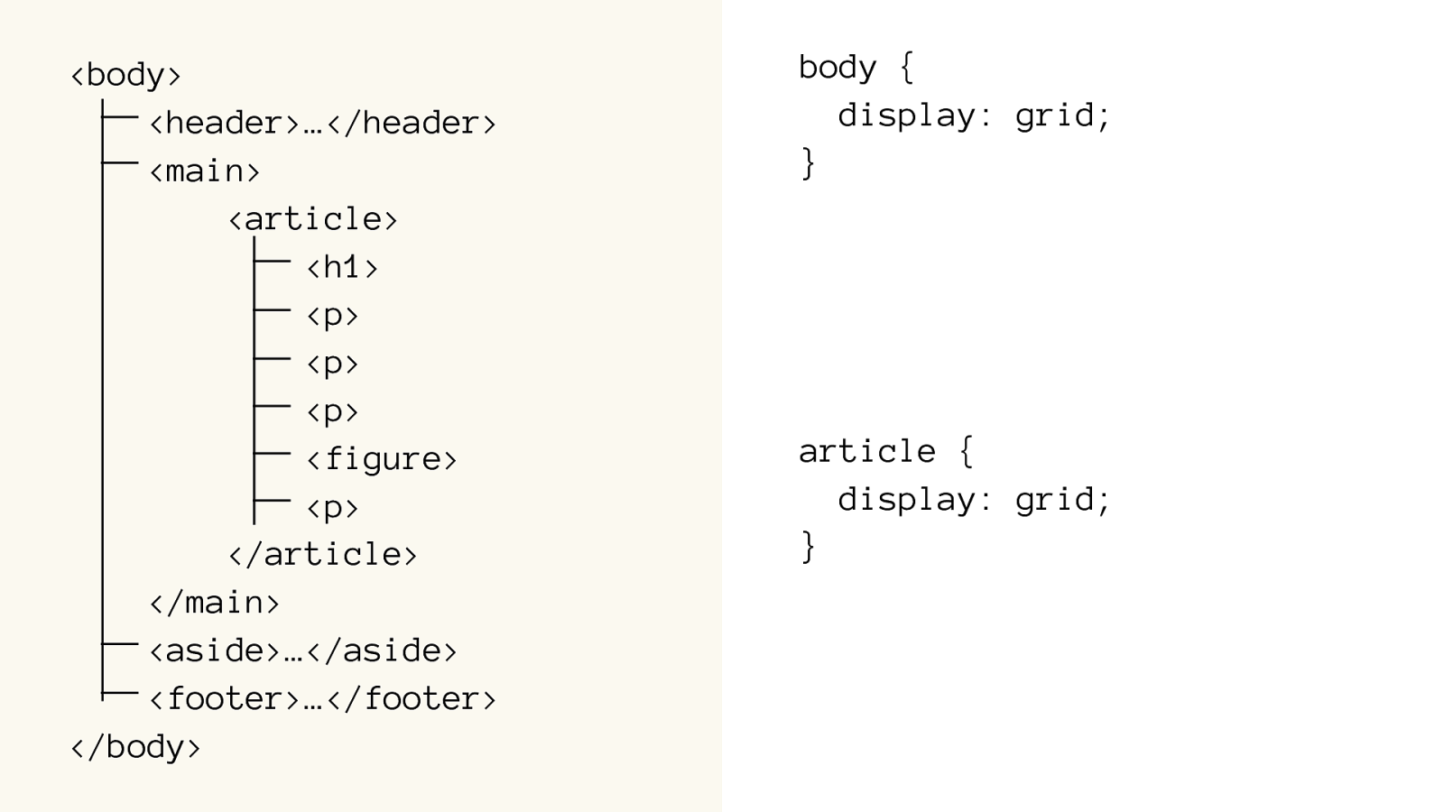
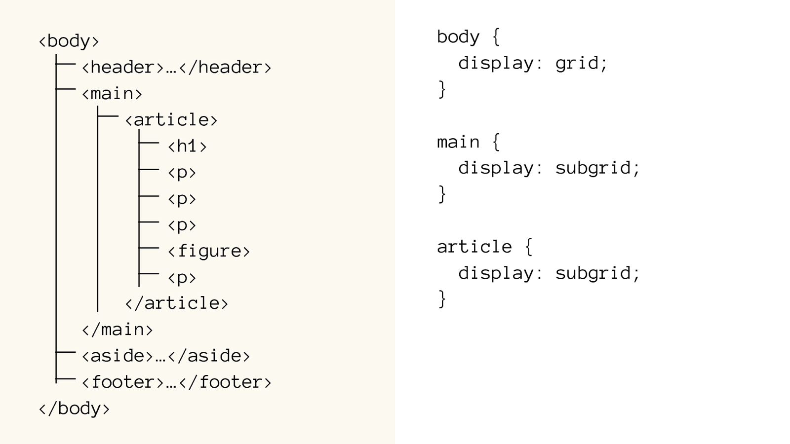
Grid Code
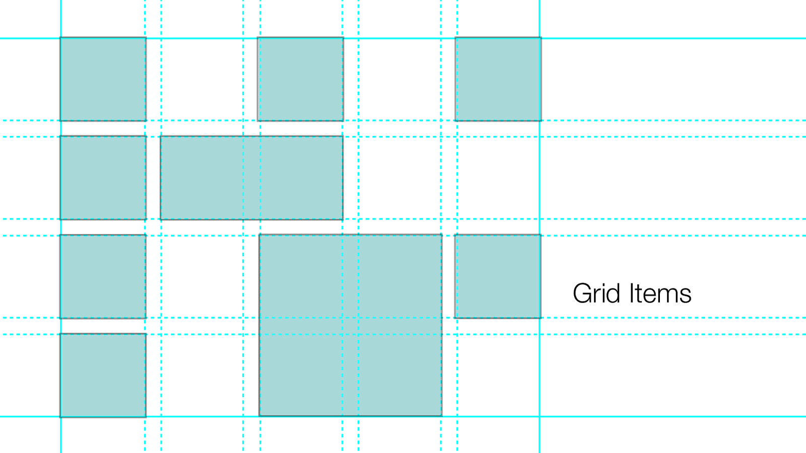
Grid Container
Grid Items
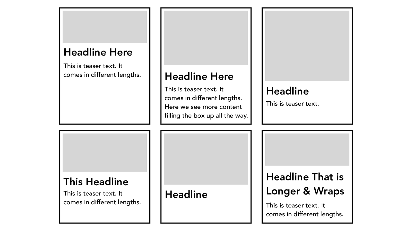
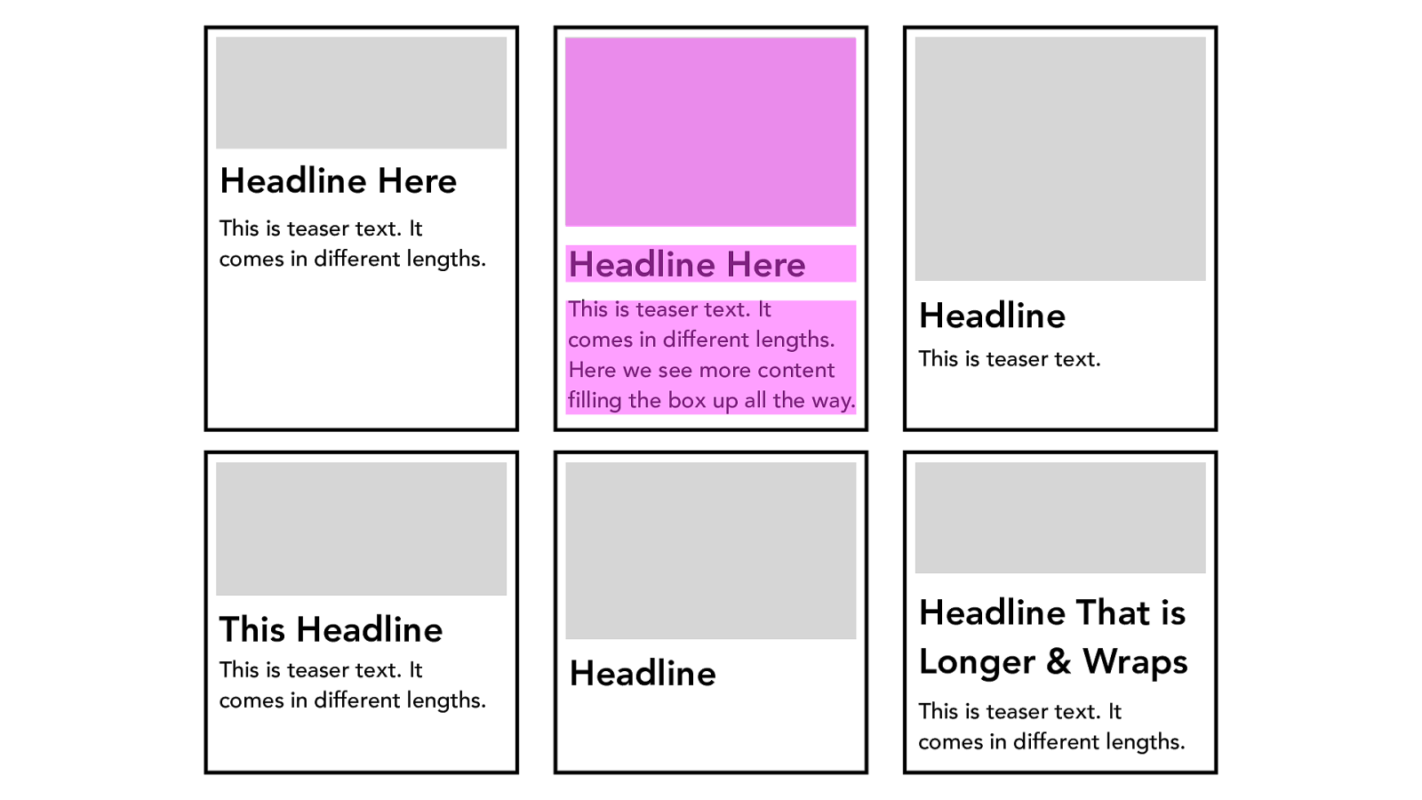
Headline Here
This is teaser text. It
comes in different lengths.
Headline Here
This is teaser text. It
comes in different lengths.
Here we see more content
filling the box up all the way.
Headline
This is teaser text.
Headline That is
Longer & Wraps
This is teaser text. It
comes in different lengths.
Headline
This Headline
This is teaser text. It
comes in different lengths.
Headline Here
This is teaser text. It
comes in different lengths.
Headline Here
This is teaser text. It
comes in different lengths.
Here we see more content
filling the box up all the way.
Headline
This is teaser text.
Headline That is
Longer & Wraps
This is teaser text. It
comes in different lengths.
Headline
This Headline
This is teaser text. It
comes in different lengths.
labs.jensimmons.com
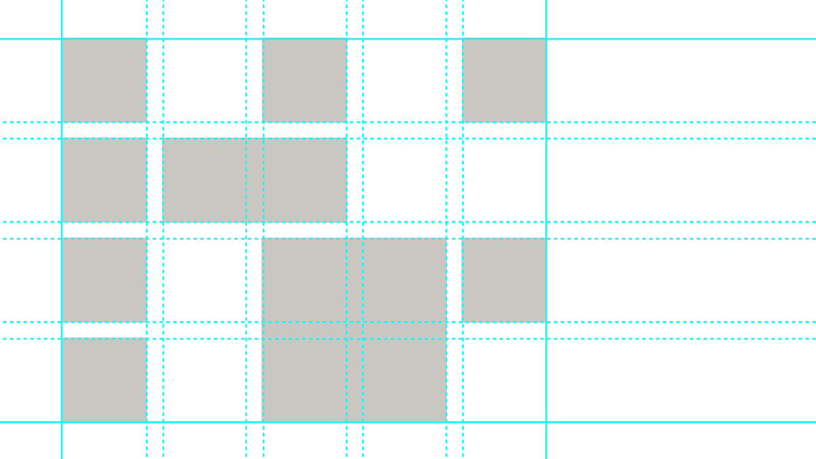
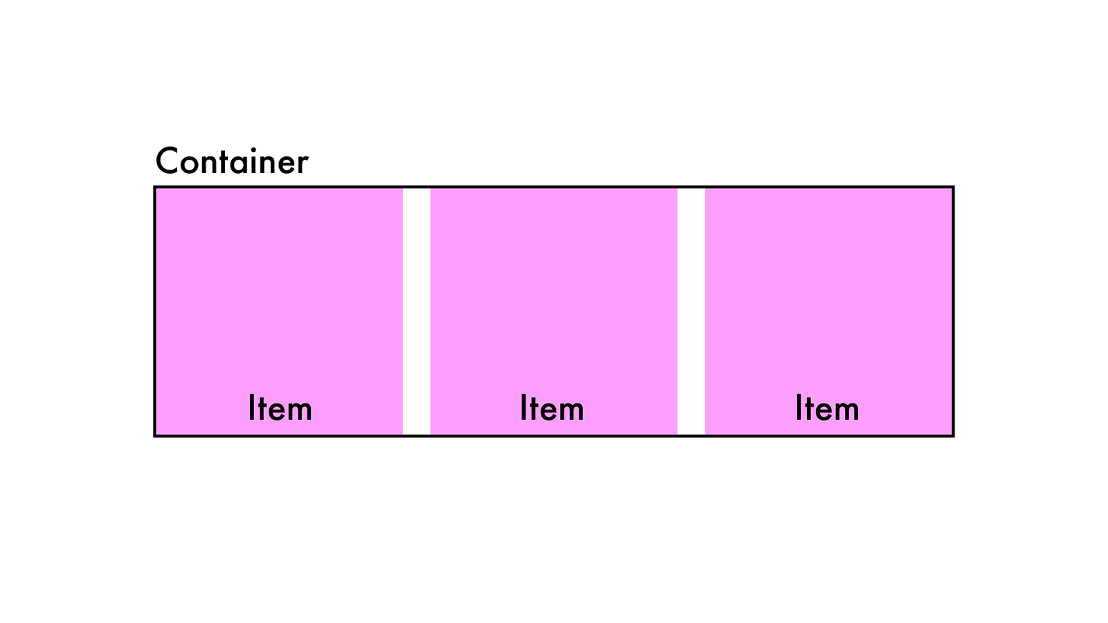
Container Item Item Item
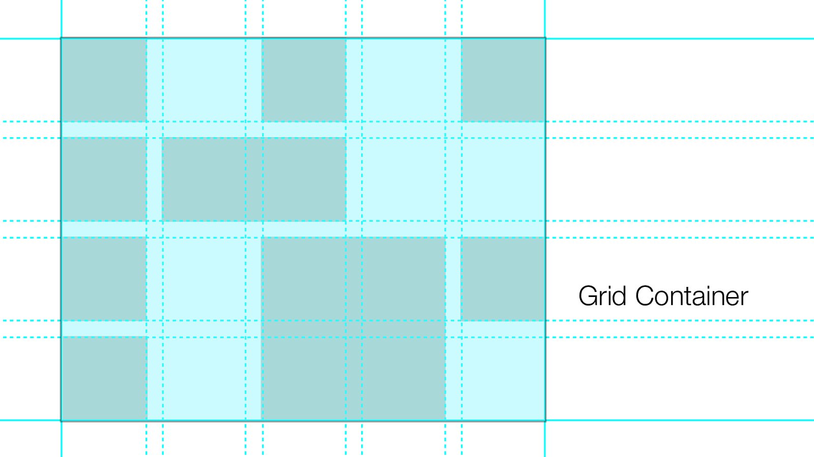
Ter minolog y
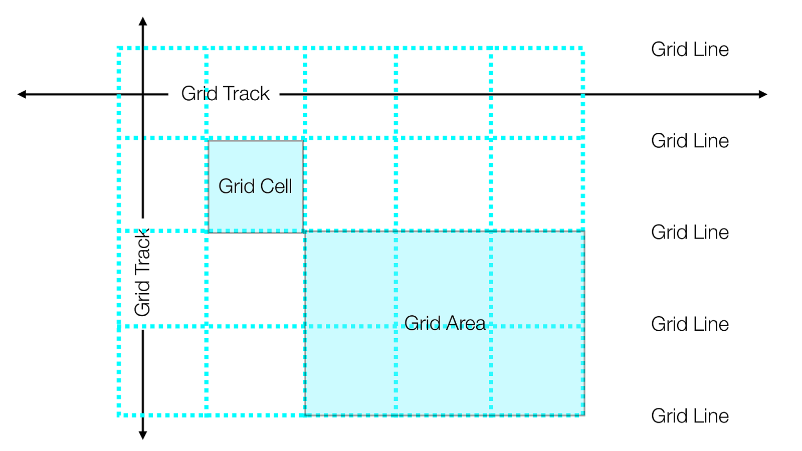
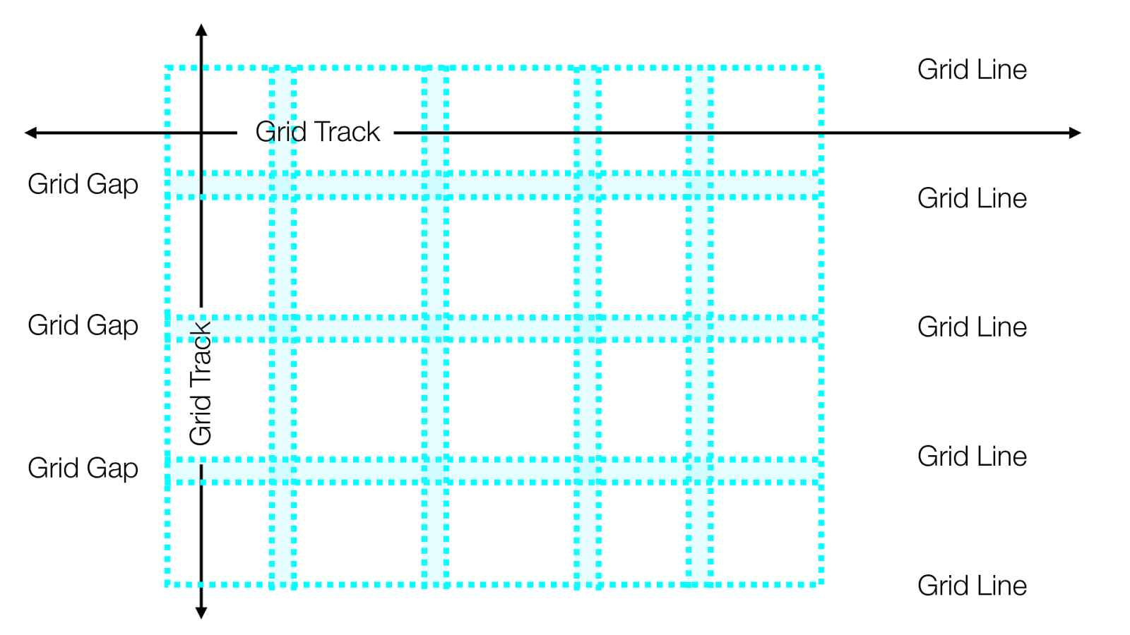
Grid Container
Grid Items
Grid Line Grid Track Grid Track Grid Line Grid Line Grid Line Grid Line Grid Area Grid Cell
Grid Line Grid Track Grid Line Grid Line Grid Line Grid Line Grid Gap Grid Gap Grid Gap Grid Track
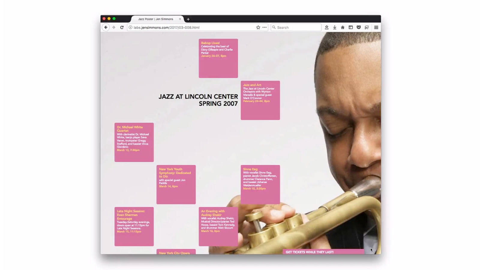
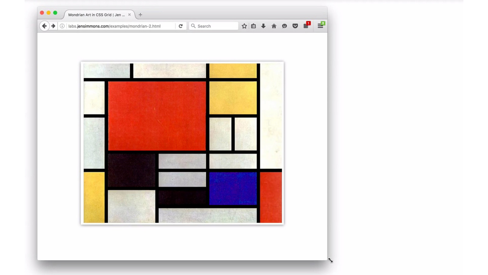
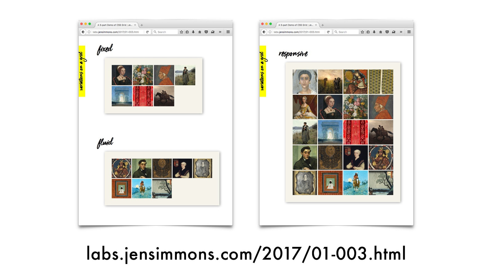
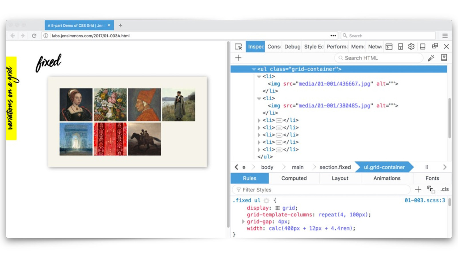
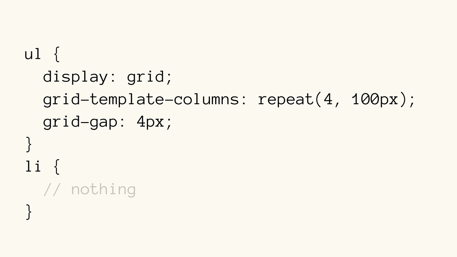
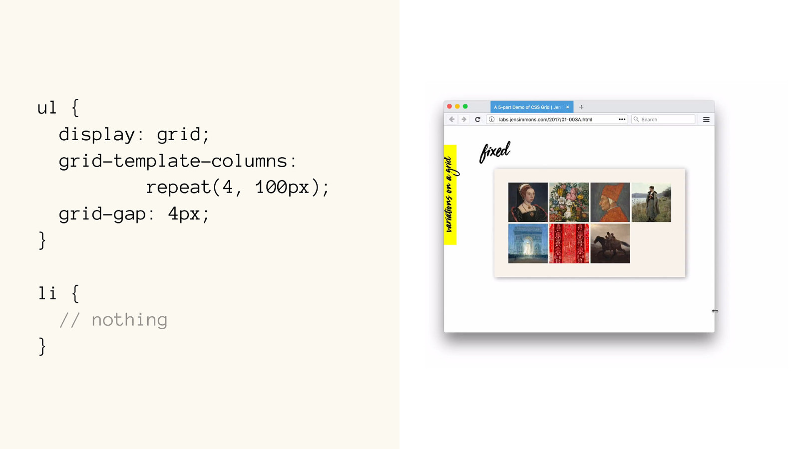
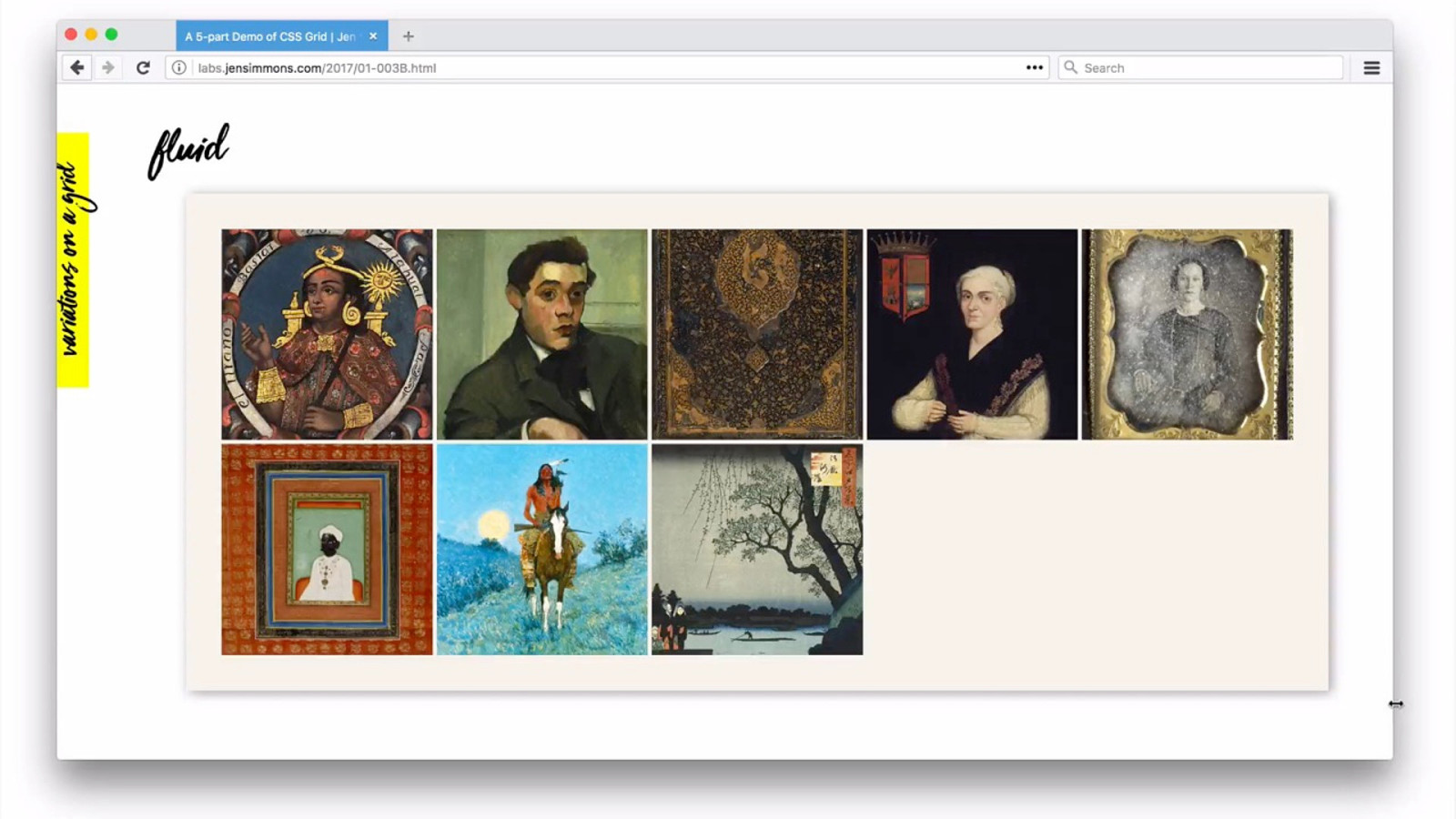
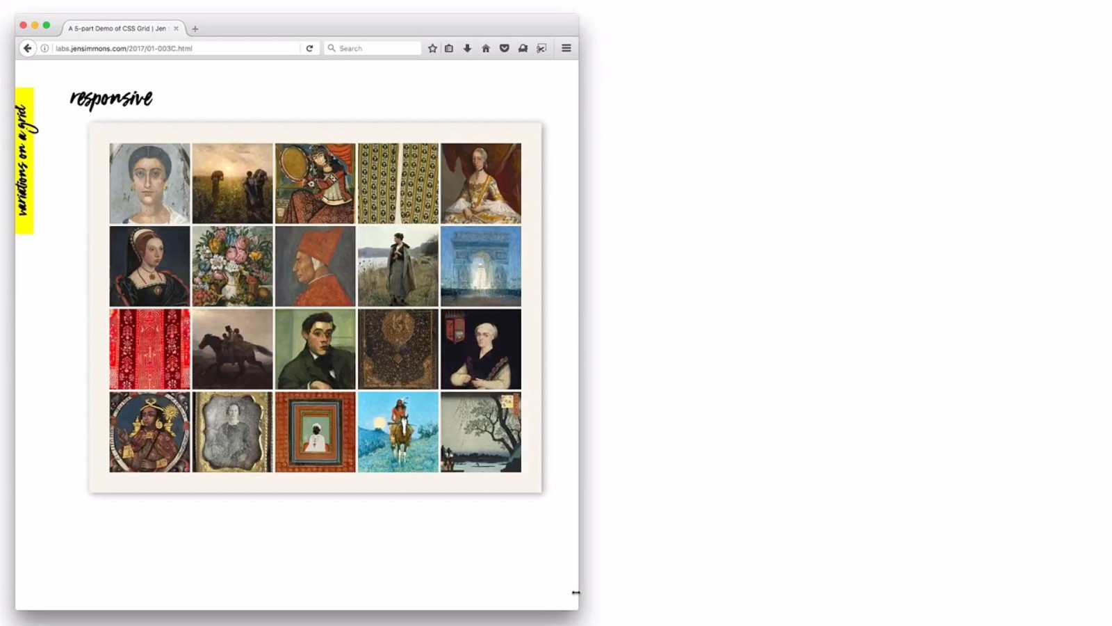
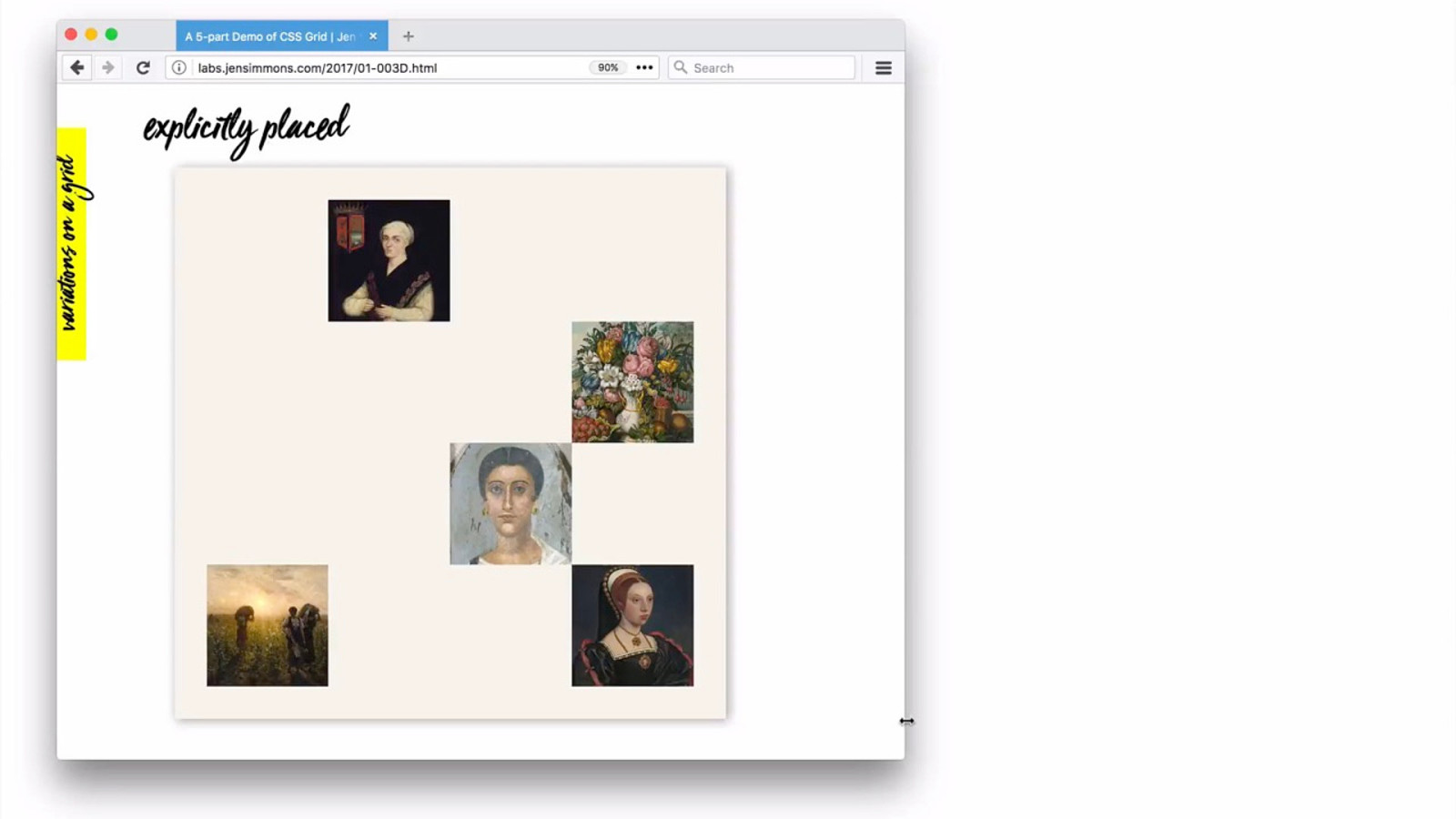
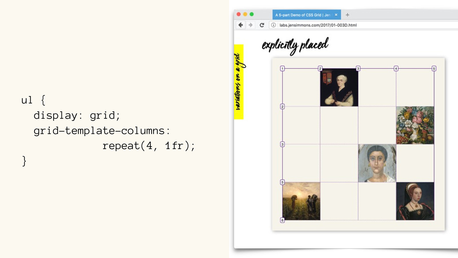
4 Examples
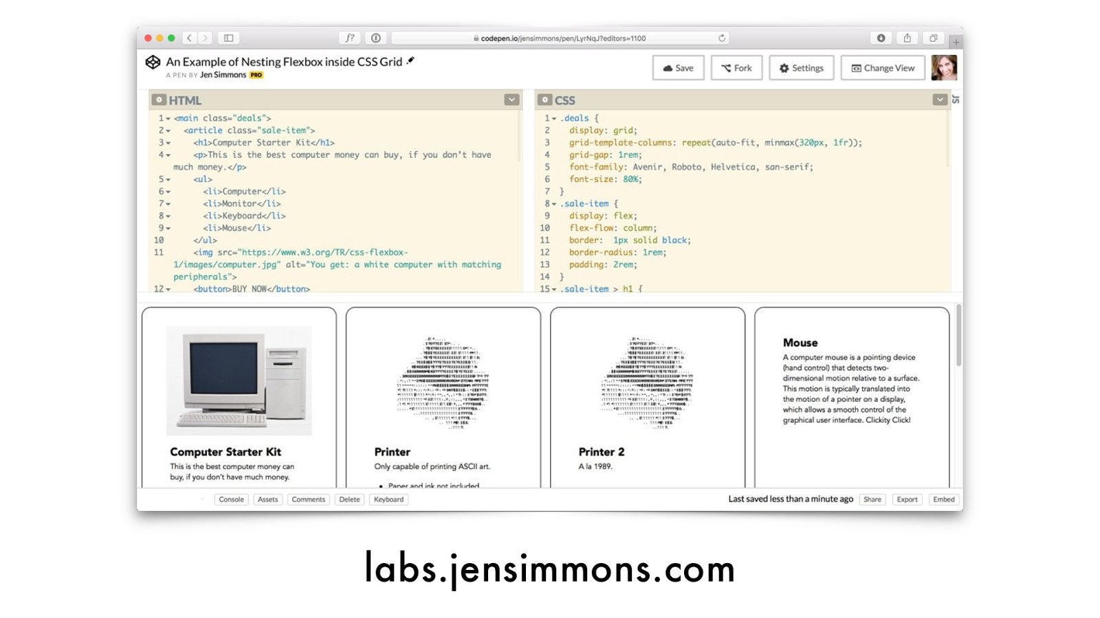
labs.jensimmons.com/2017/01-003.html
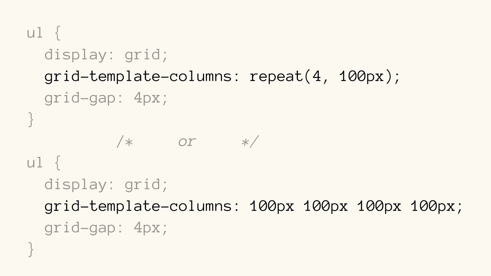
ul {
display: grid; grid-template-columns: repeat(4, 100px); grid-gap: 4px;
} li { // nothing }
ul {
display: grid; grid-template-columns:
repeat(4, 100px); grid-gap: 4px;
} li {
// nothing
}
ul {
display: grid; grid-template-columns: repeat(4, 100px); grid-gap: 4px;
}
/*
or */
ul {
display: grid; grid-template-columns: 100px 100px 100px 100px; grid-gap: 4px;
}
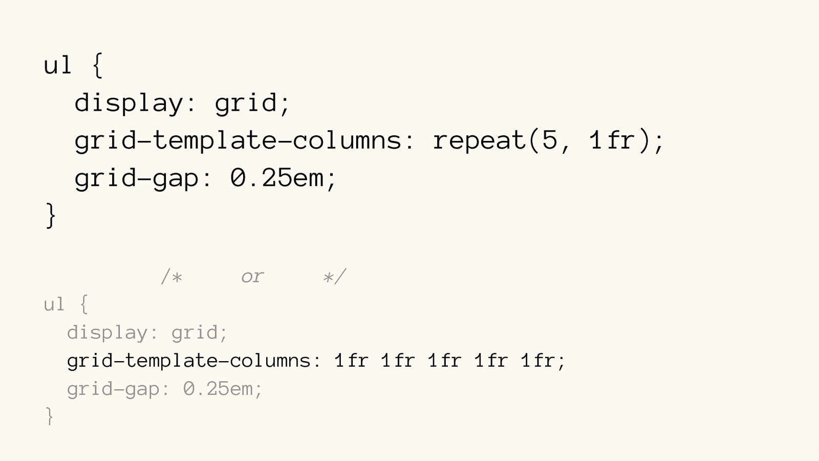
ul {
display: grid; grid-template-columns: repeat(5, 1fr ); grid-gap: 0.25em;
}
/*
or */
ul {
display: grid; grid-template-columns: 1fr 1fr 1fr 1fr 1fr ; grid-gap: 0.25em;
}
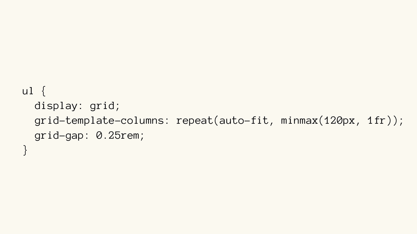
ul { display: grid; grid-template-columns: repeat(auto-fit, minmax(120px, 1fr)); grid-gap: 0.25rem; }
nightly.mozilla.org
ul {
display: grid; grid-template-columns:
repeat(4, 1fr);
}
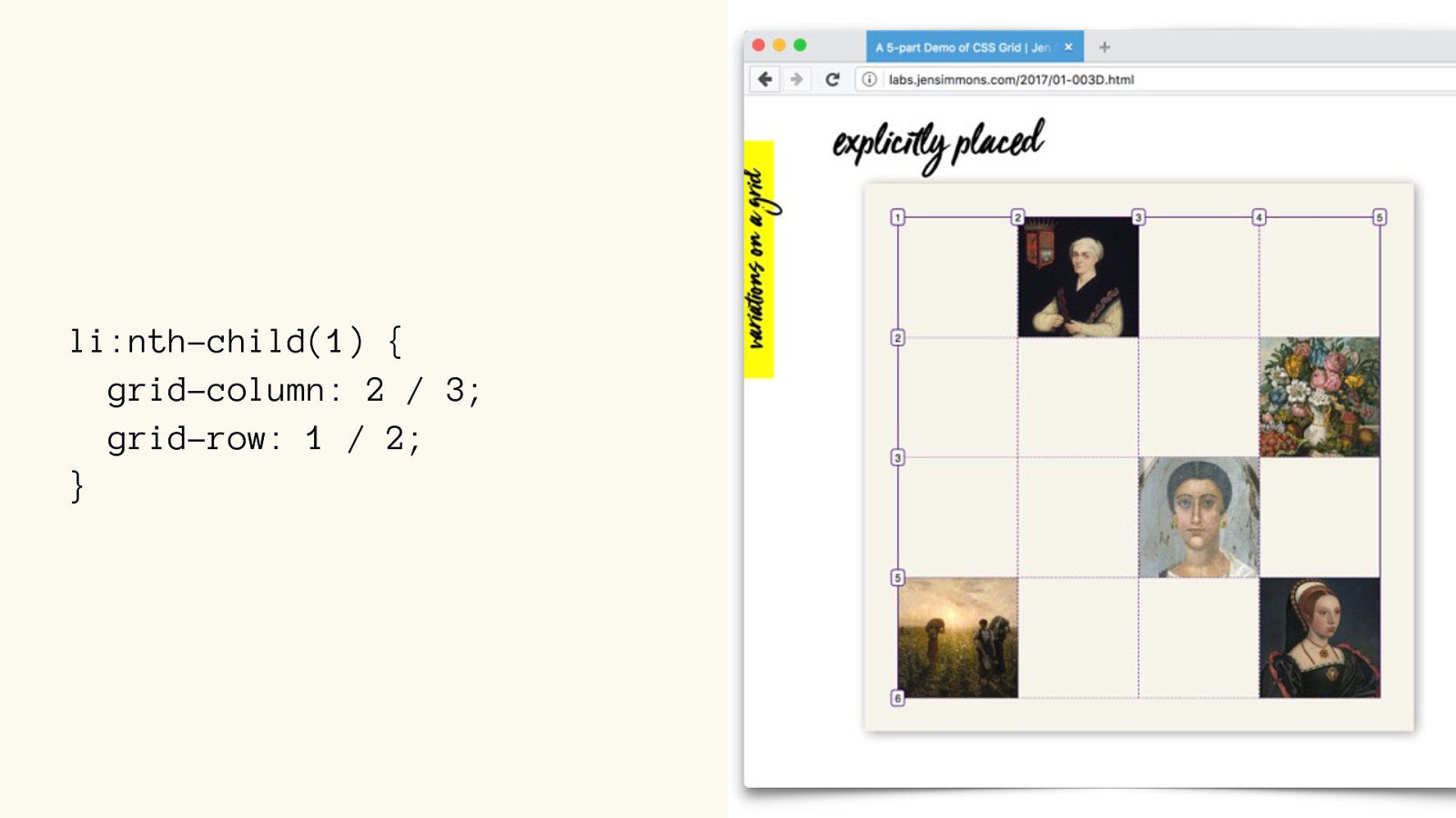
li:nth-child(1) {
grid-column: 2 / 3;
grid-row: 1 / 2; }
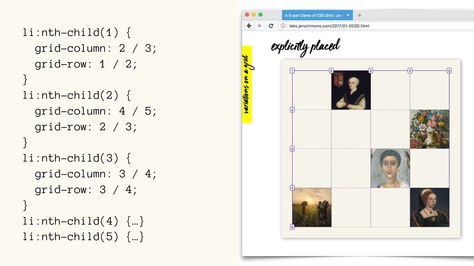
li:nth-child(1) {
grid-column: 2 / 3;
grid-row: 1 / 2; }
li:nth-child(2) {
grid-column: 4 / 5;
grid-row: 2 / 3; }
li:nth-child(3) {
grid-column: 3 / 4;
grid-row: 3 / 4; }
li:nth-child(4) {…}
li:nth-child(5) { …}
‘fr ’ unit
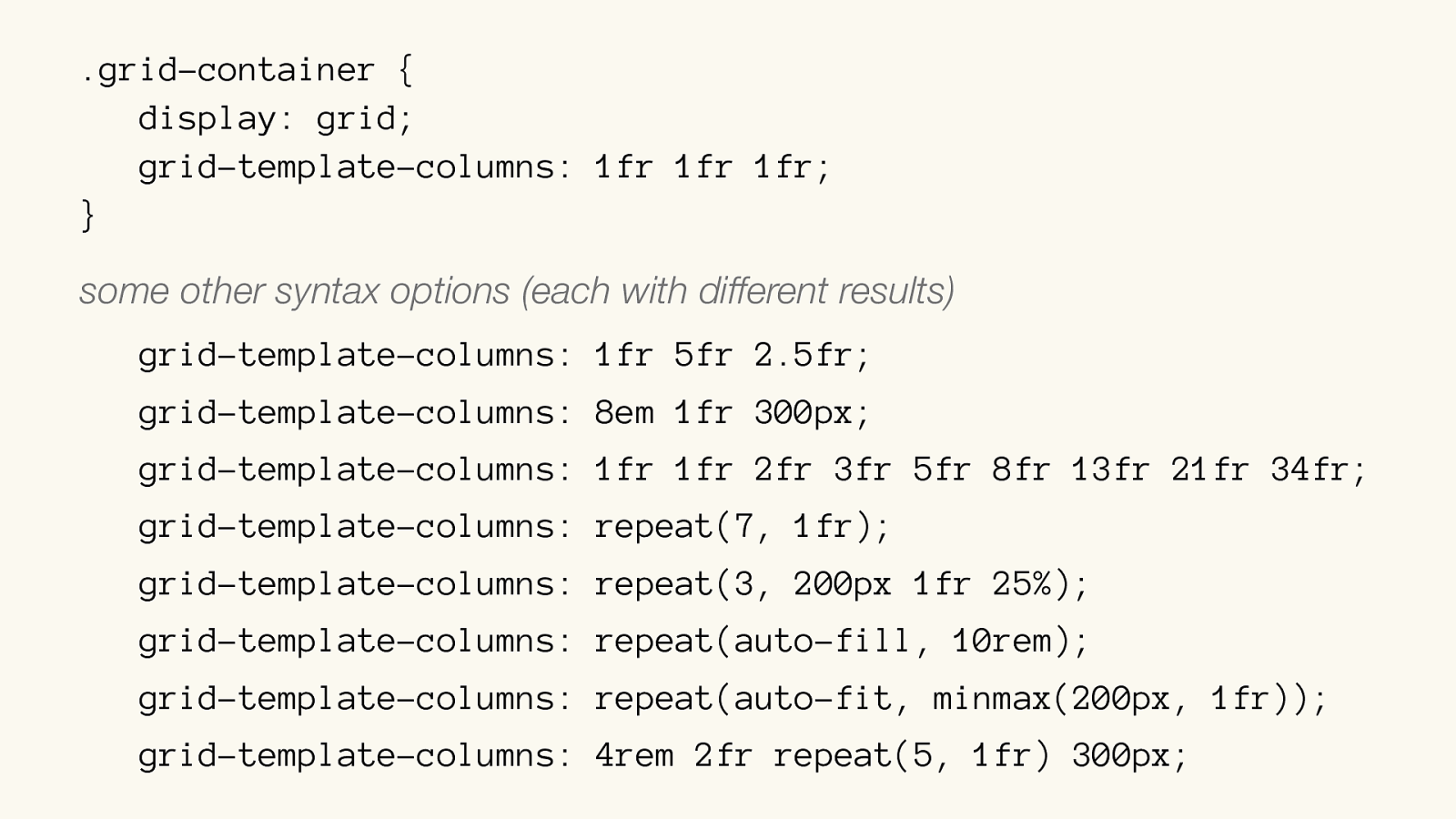
.grid-container { display: grid; grid-template-columns: 1fr 1fr 1fr; } some other syntax options (each with different results)
grid-template-columns: 1fr 5fr 2.5fr; grid-template-columns: 8em 1fr 300px; grid-template-columns: 1fr 1fr 2fr 3fr 5fr 8fr 13fr 21fr 34fr ; grid-template-columns: repeat(7, 1fr); grid-template-columns: repeat(3, 200px 1fr 25%); grid-template-columns: repeat(auto-fill, 10rem); grid-template-columns: repeat(auto-fit, minmax(200px, 1fr)); grid-template-columns: 4rem 2fr repeat(5, 1fr) 300px;
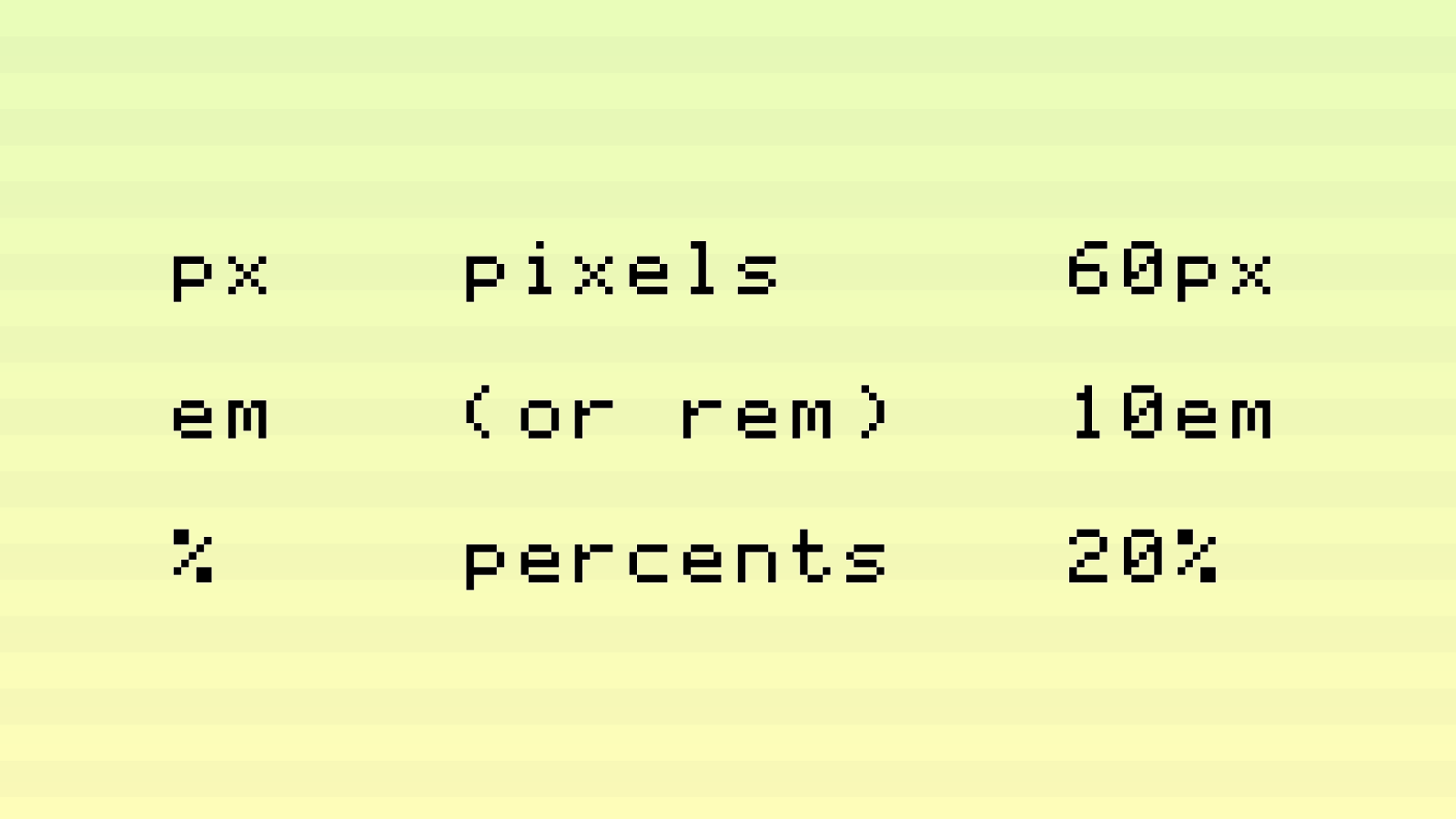
px em % pixels (or rem) percents 60px 10em 20%
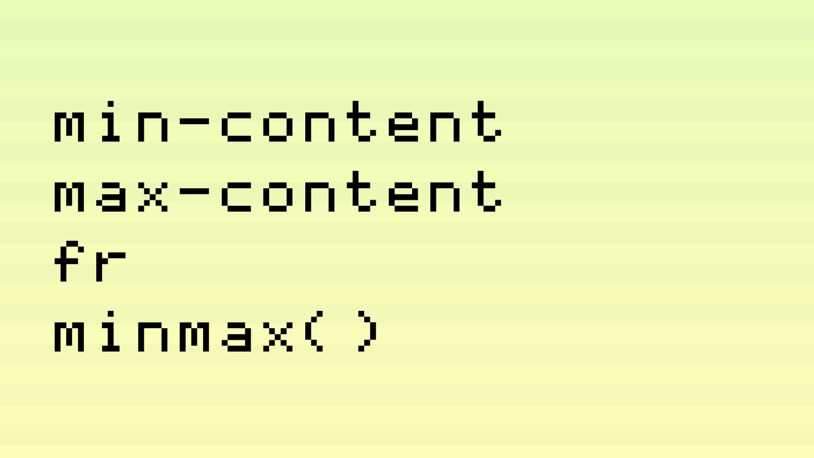
min-content max-content fr minmax()
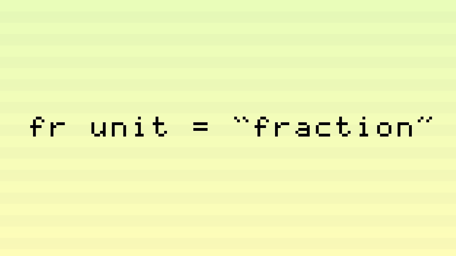
fr unit = “fraction”
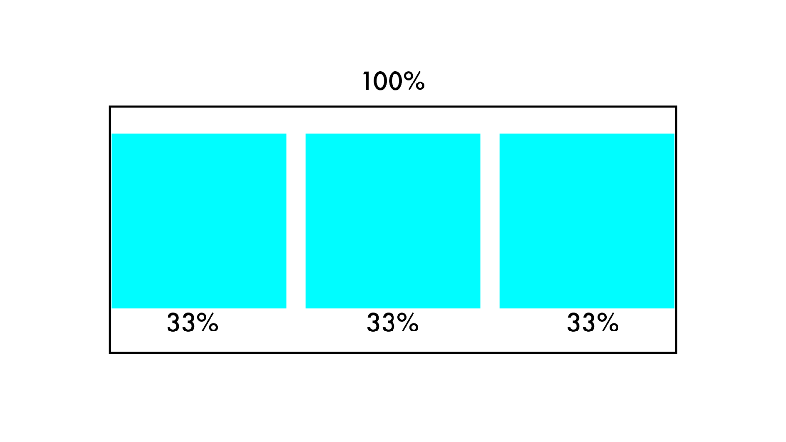
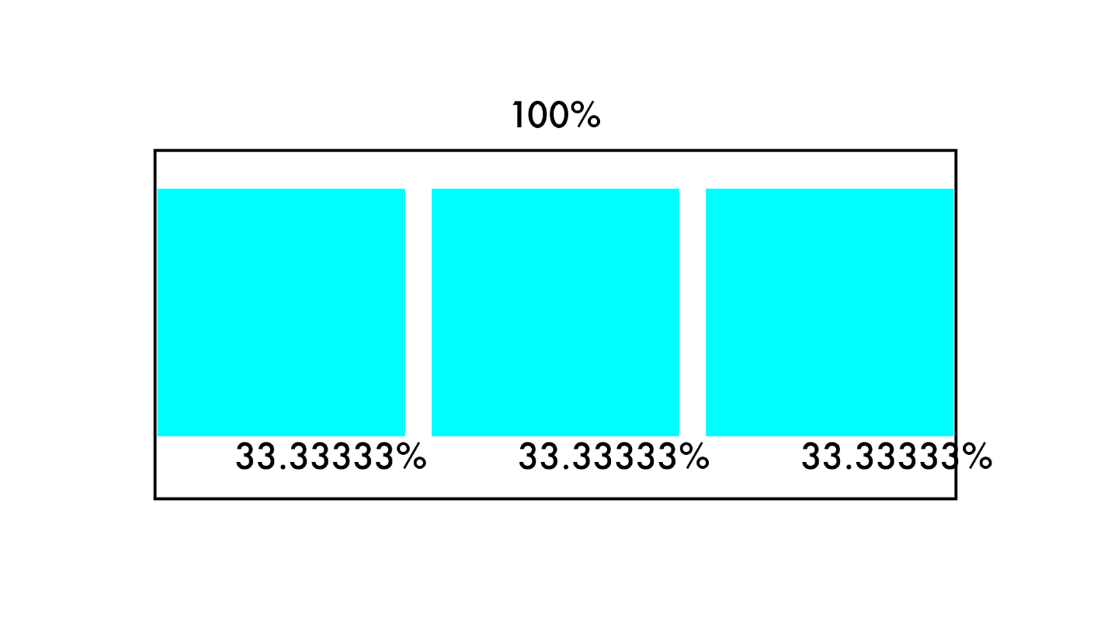
10 0 % 33% 33% 33%
10 0 % 33.33333% 33.33333 % 33.33333 %
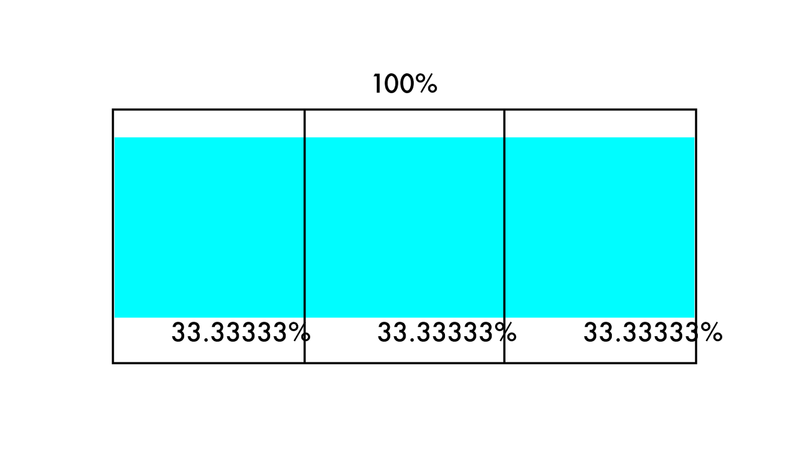
10 0 % 33.33333% 33.33333 % 33.33333 %
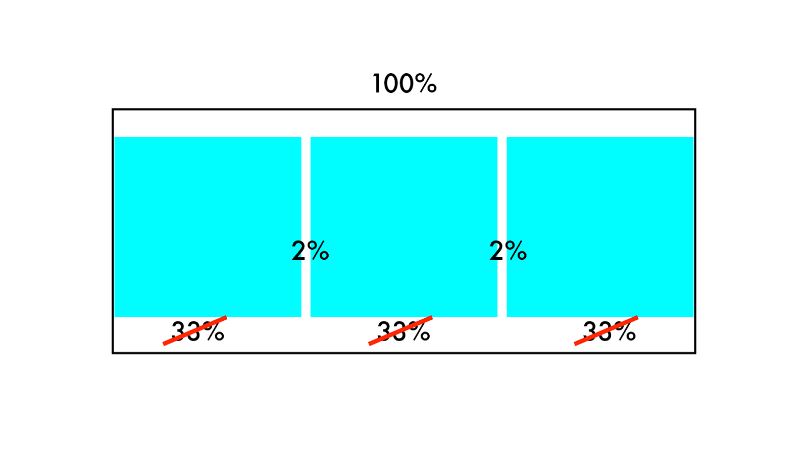
10 0 % 33% 33% 33% 2% 2%
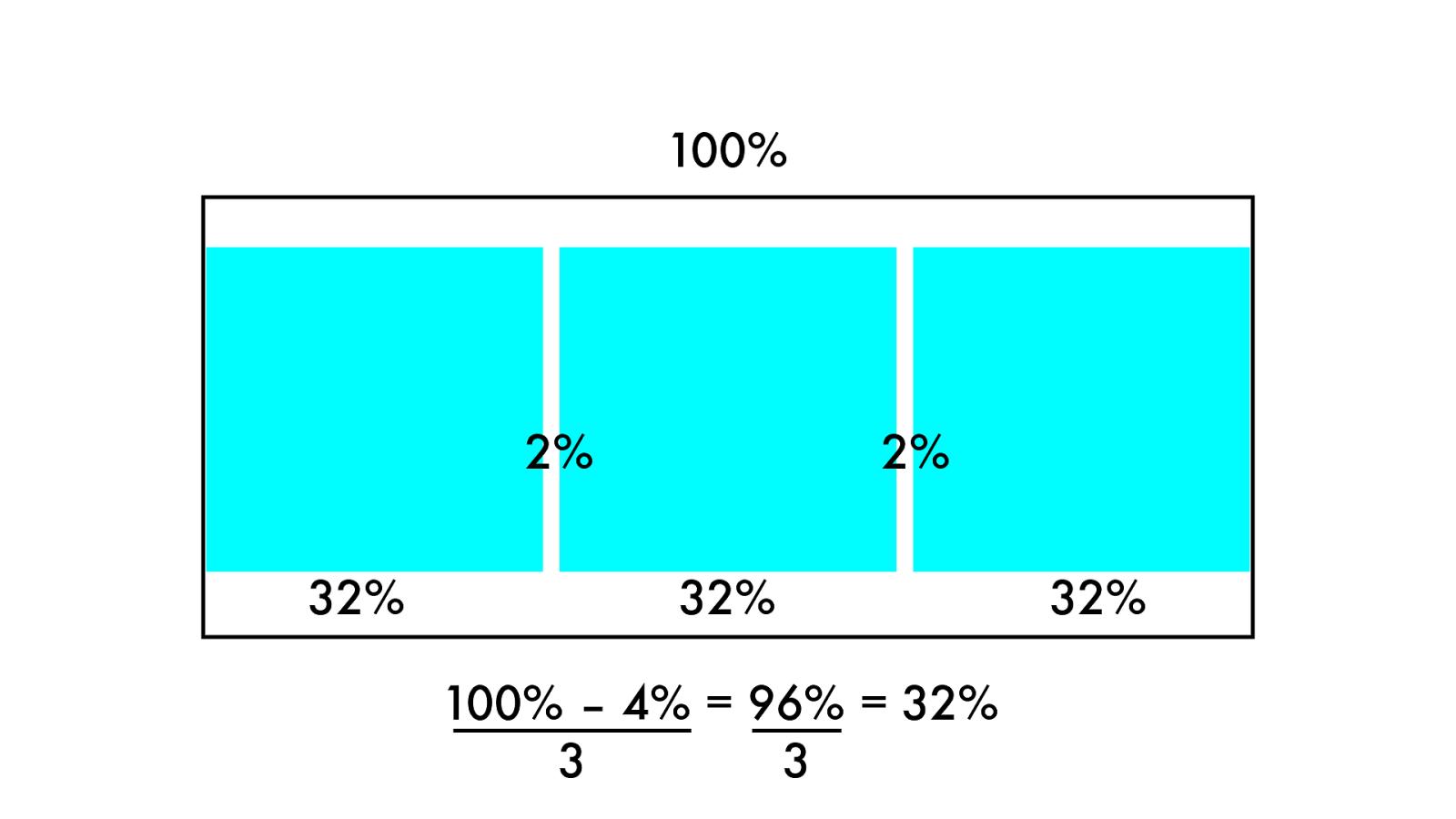
10 0 % 32% 32% 32% 2% 2% 100% – 4% = 96% = 32% 3 3
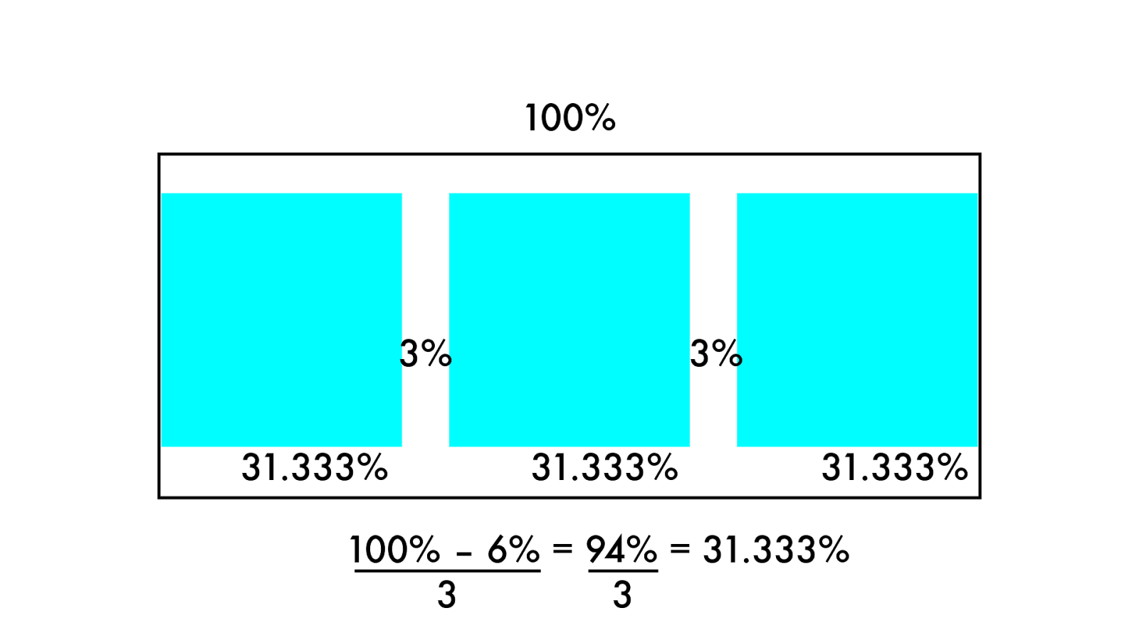
10 0 % 31. 3 3 3 % 31. 3 3 3 % 31. 3 3 3 % 3% 3% 100% – 6% = 94% = 31.333% 3 3
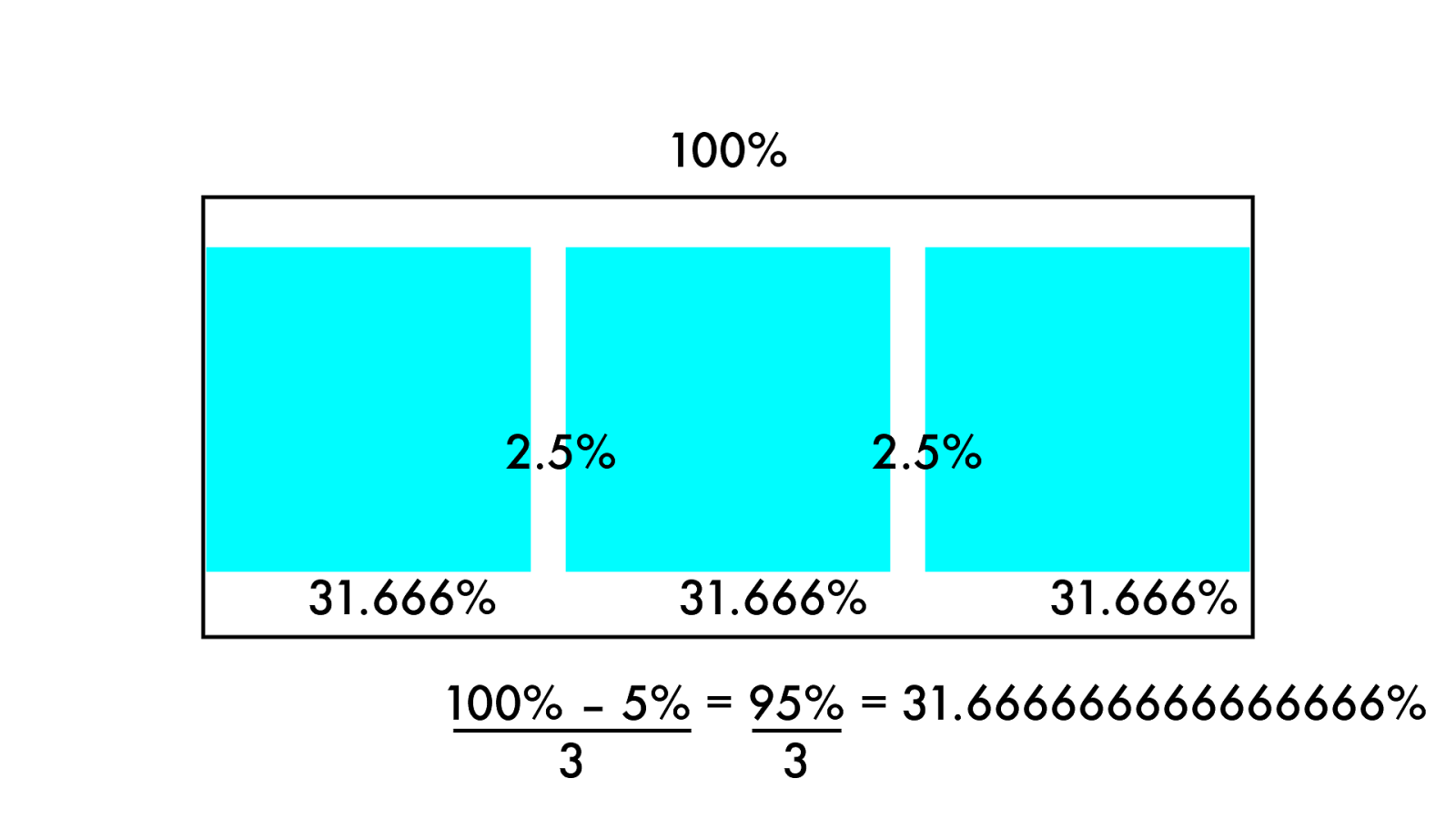
10 0 % 31. 6 6 6 % 31. 6 6 6 % 31. 6 6 6% 2.5% 2.5% 100% – 5% = 95% = 31.666666666666666% 3 3
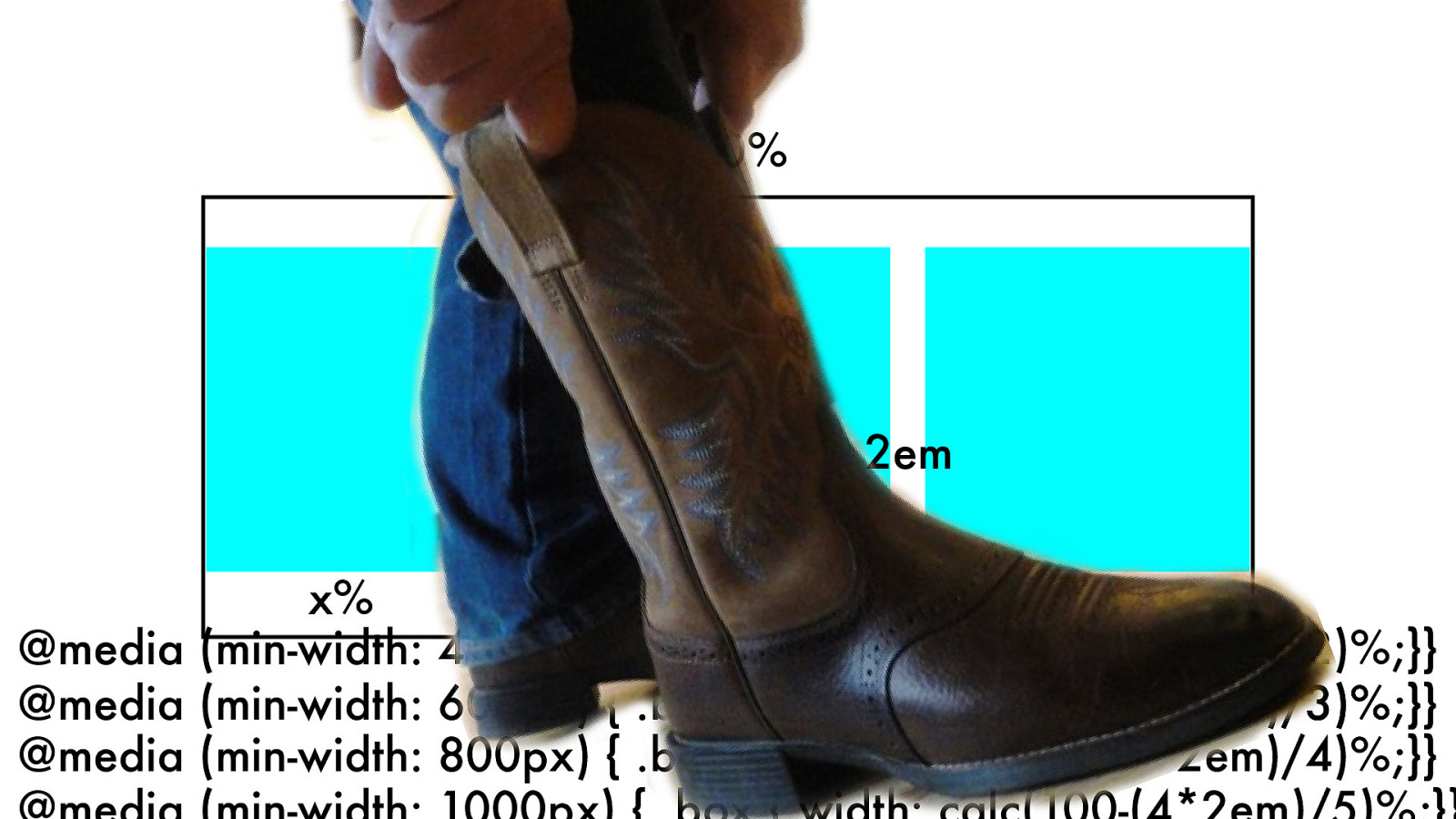
.box { width: calc(100-(22em)/3)%;} 10 0 % x% x% x% 2em 2em @media (min-width: 600px) { .box { width: calc(100-(22em)/3)%;}} @media (min-width: 800px) { .box { width: calc(100-(32em)/4)%;}} @media (min-width: 1000px) { .box { width: calc(100-(42em)/5)%;}} @media (min-width: 400px) { .box { width: calc(100-(1*2em)/2)%;}}
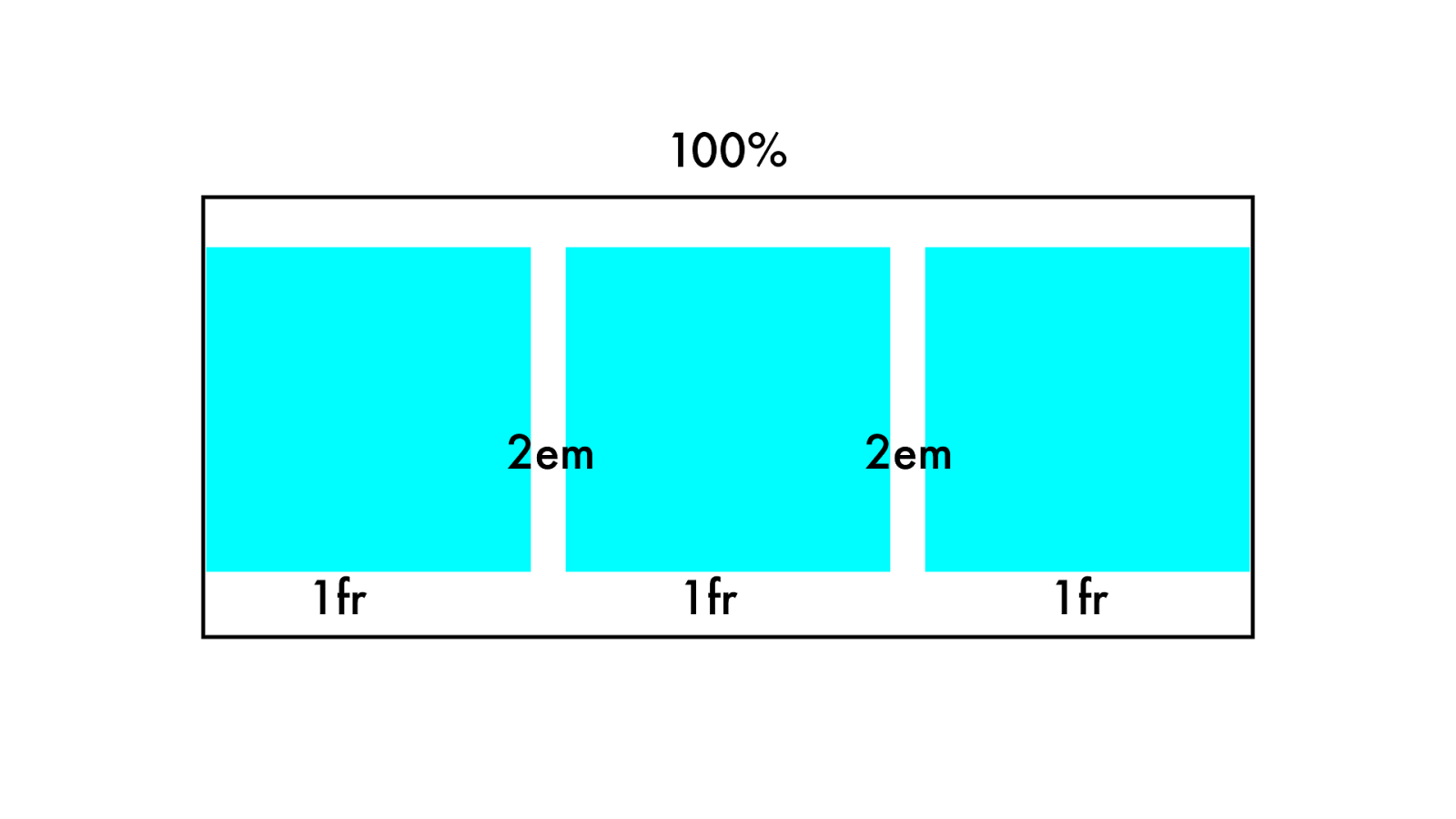
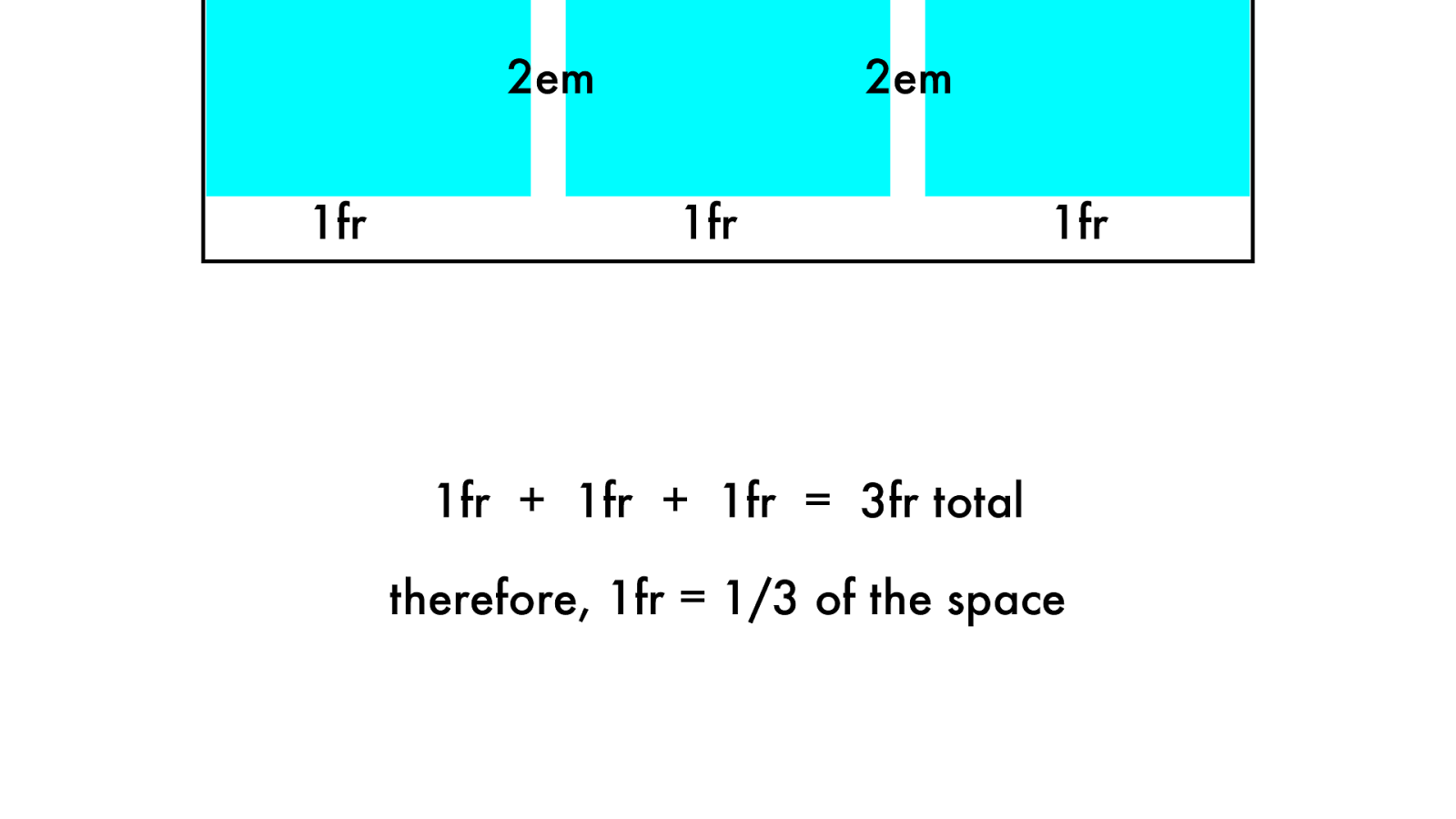
10 0 % 1fr 1fr 1fr 2em 2em
1fr 1fr 1fr 2em 2em 1fr + 1fr + 1fr = 3fr total therefore, 1fr = 1/3 of the space
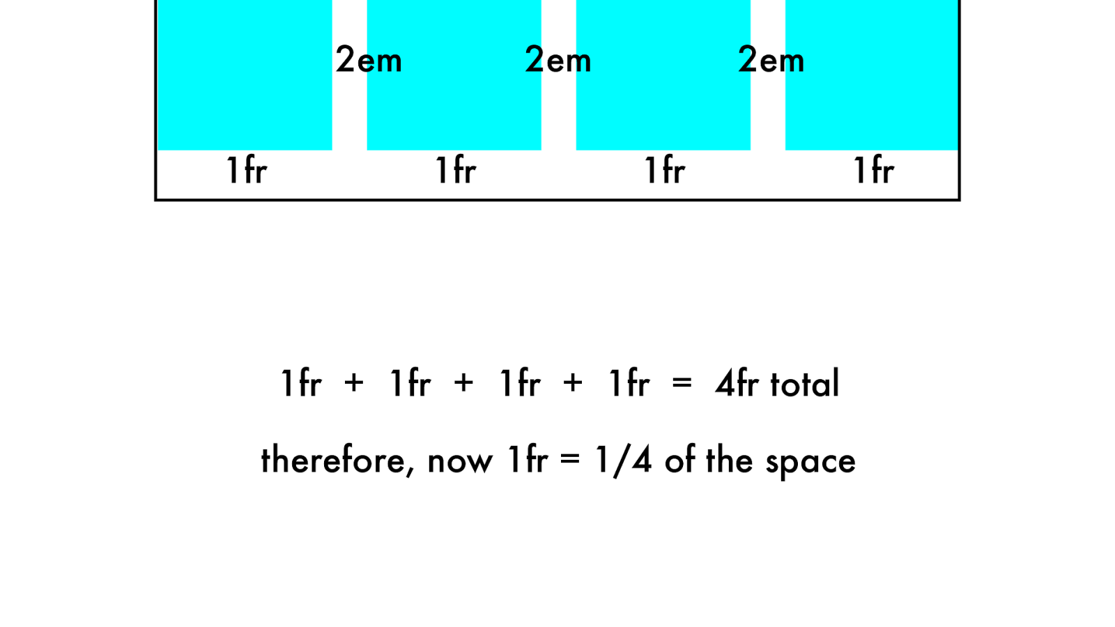
1fr 1fr 1fr 2em 2em 1fr + 1fr + 1fr + 1fr = 4fr total therefore, now 1fr = 1/4 of the space 1fr 2em
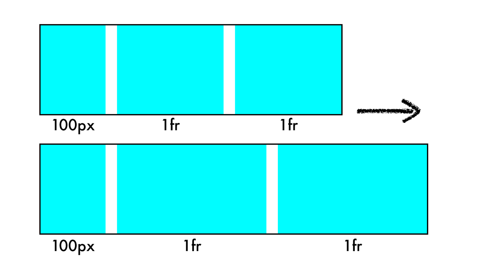
10 0 p x 1fr 1fr 1fr 1fr 10 0 p x
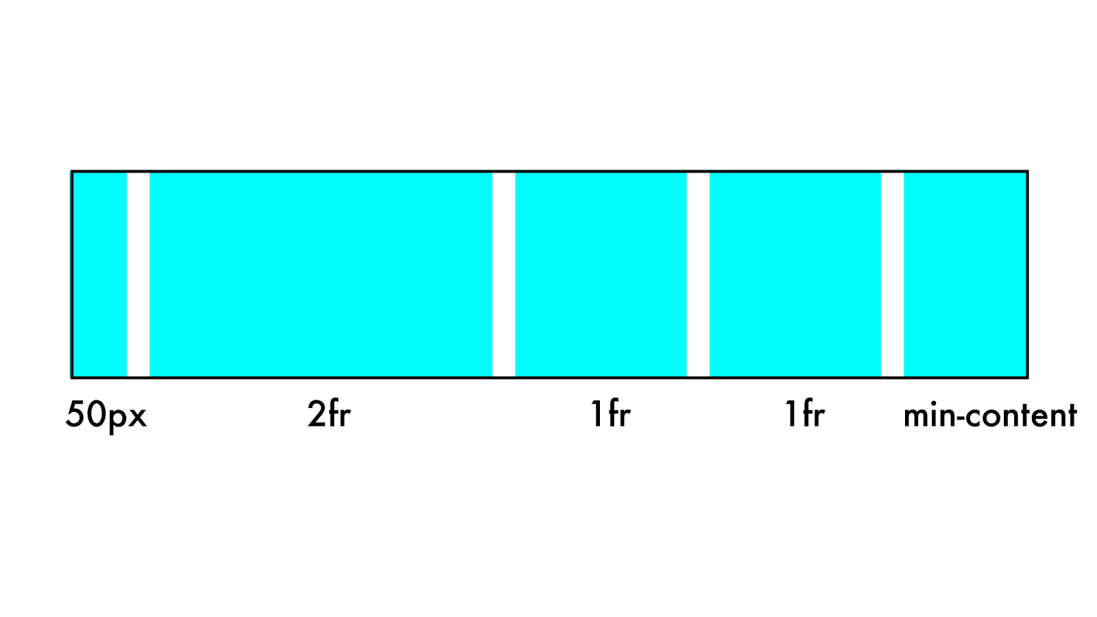
2fr 1fr 50px 1fr min-content
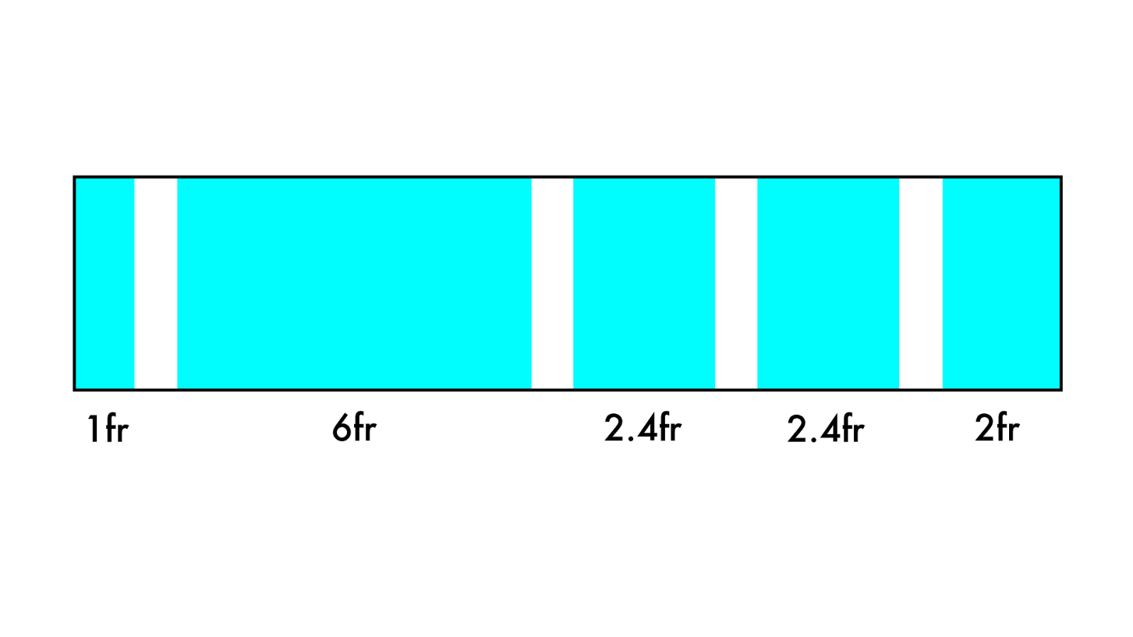
6fr 2.4fr 1fr 2.4fr 2fr
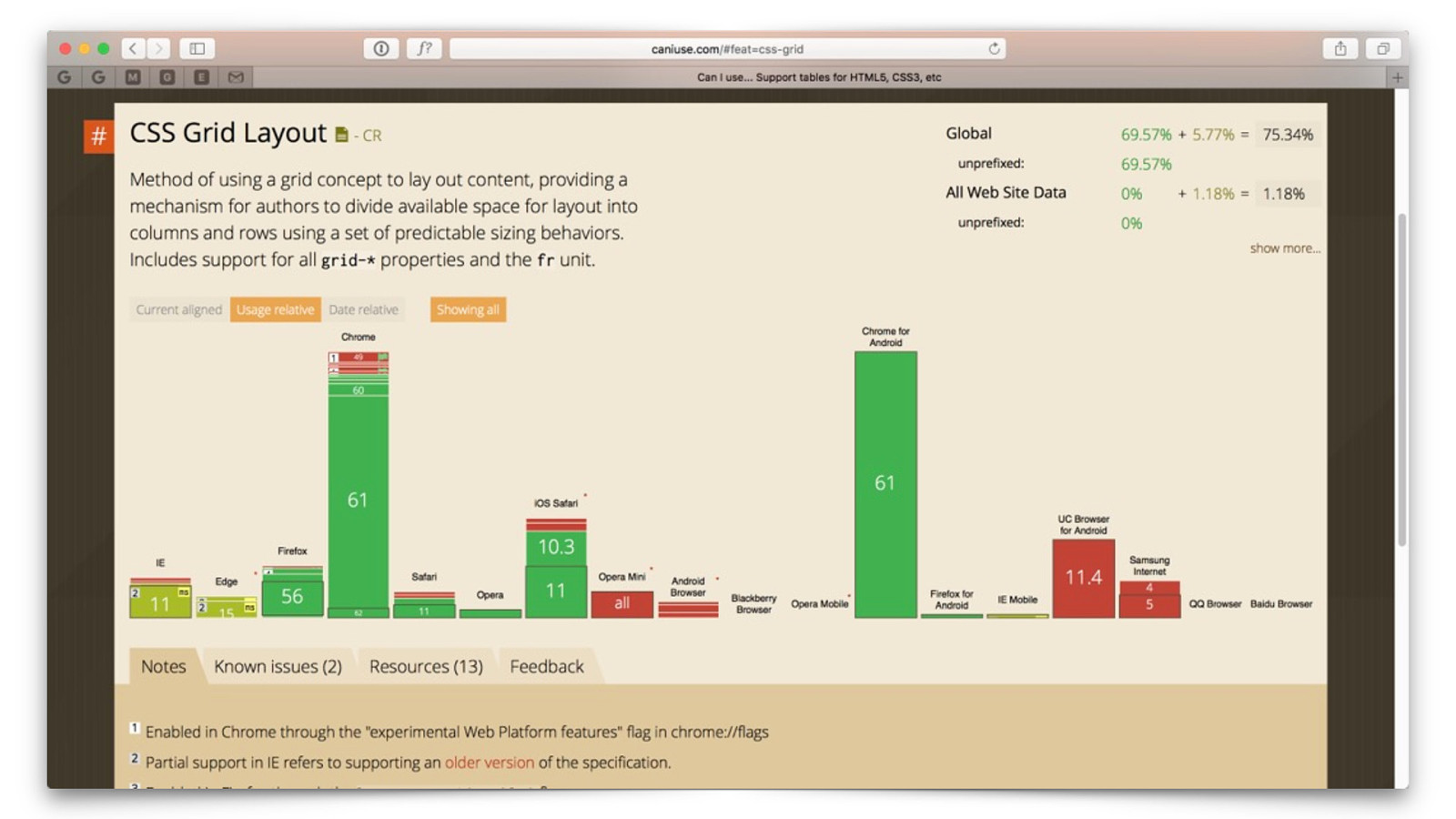
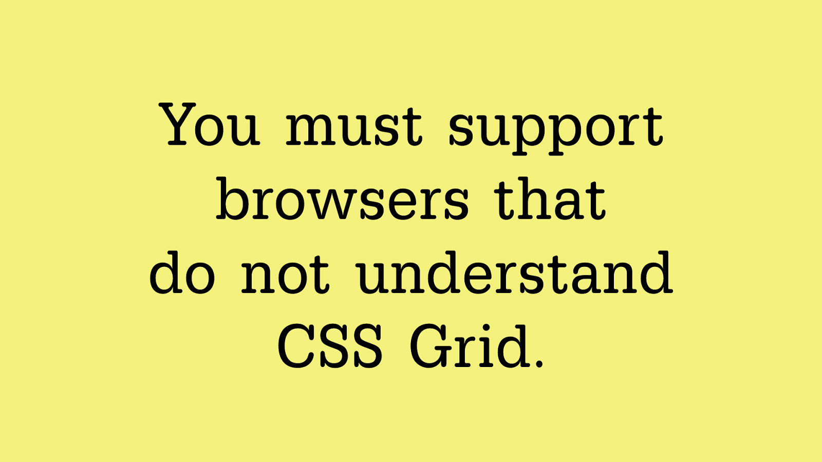
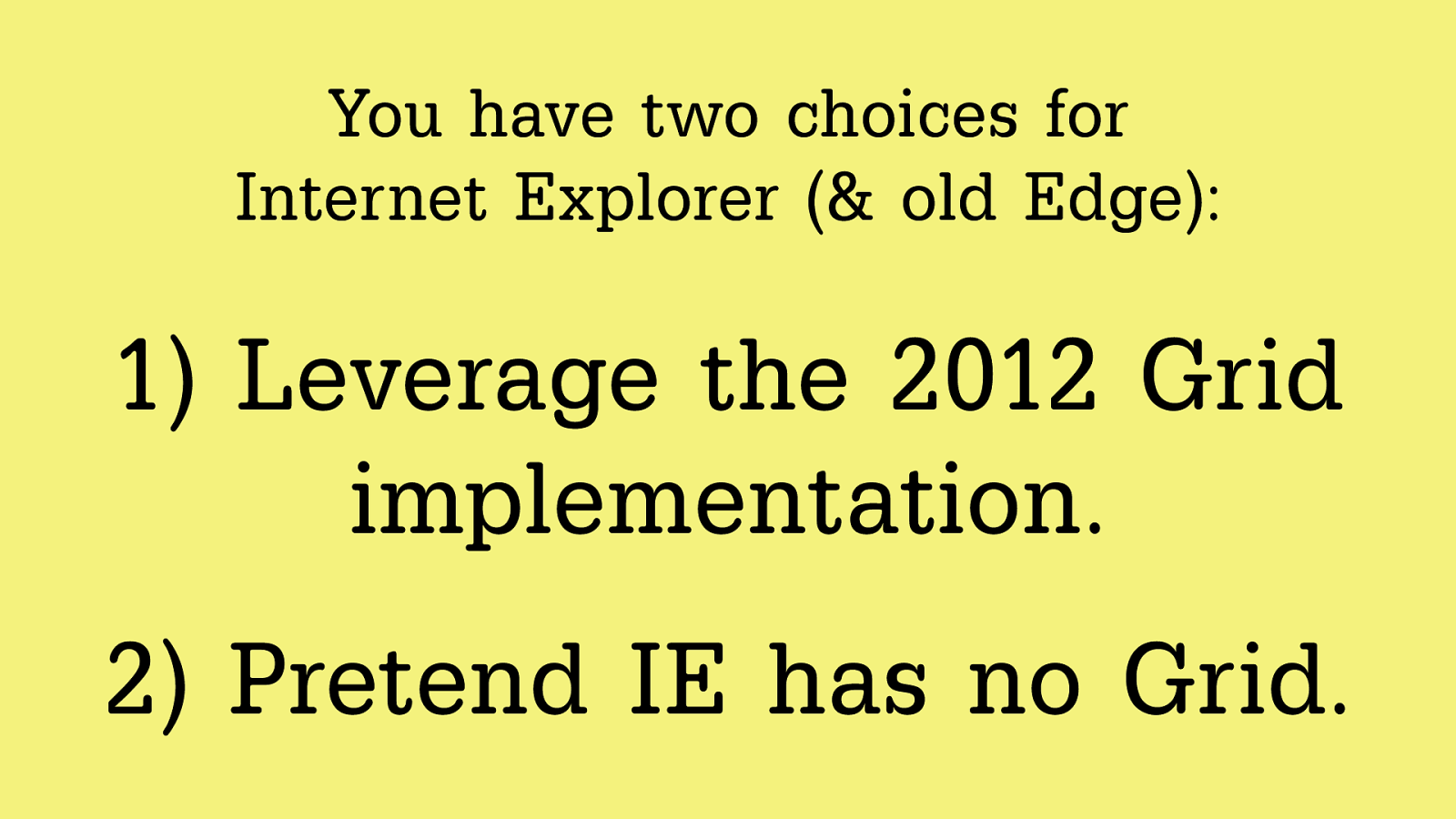
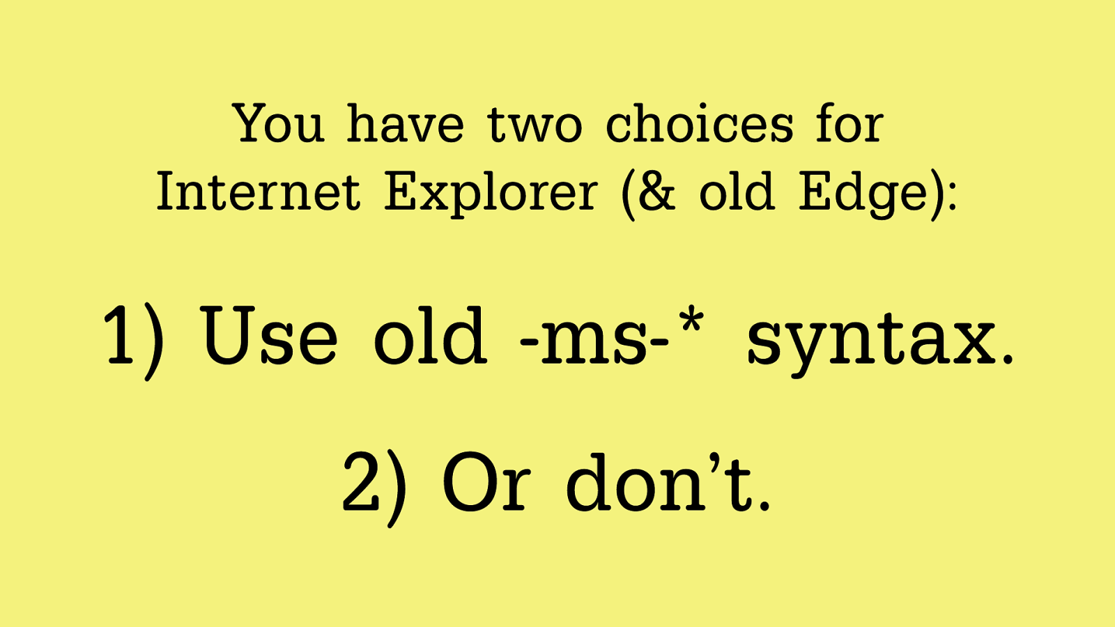
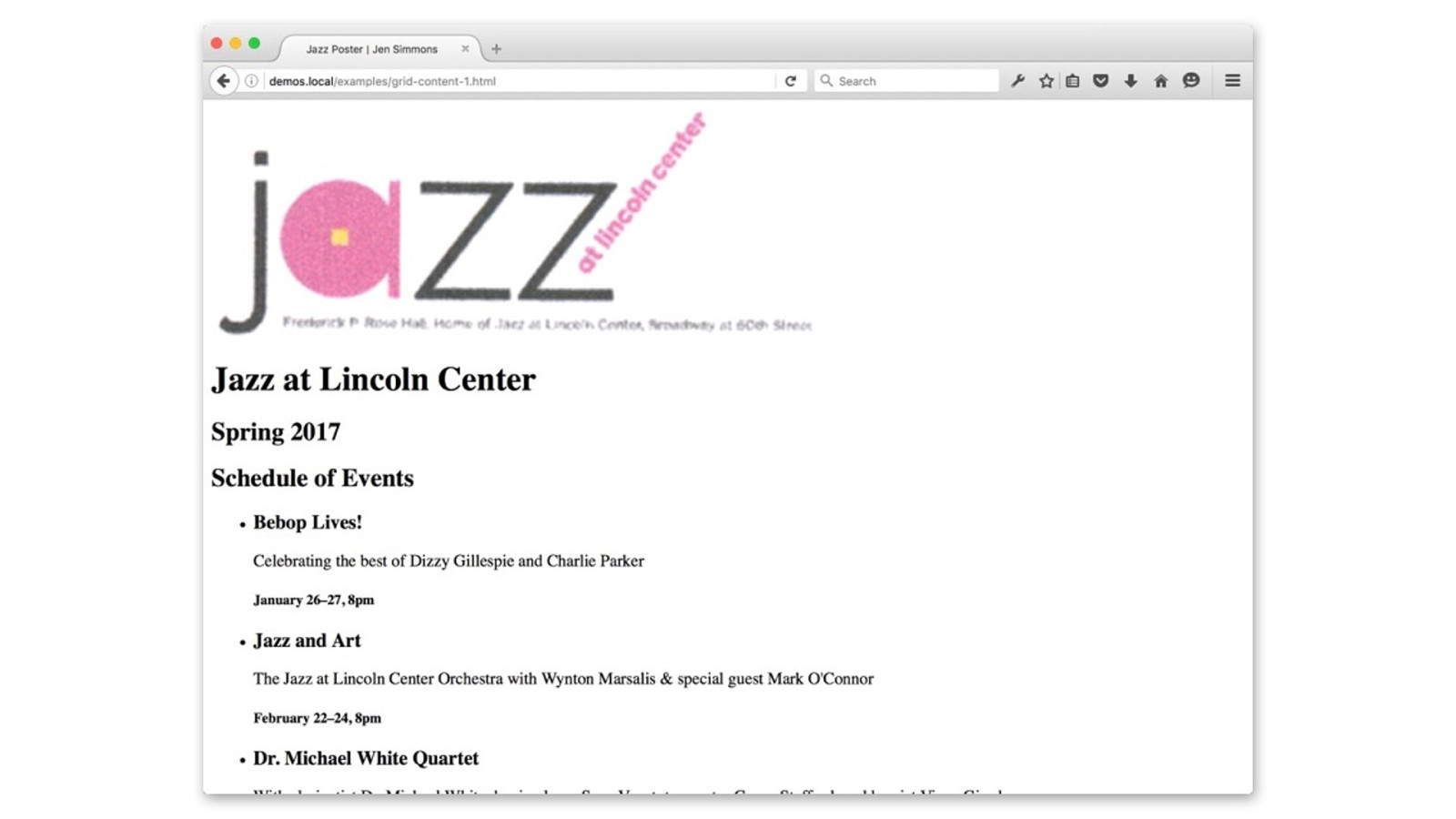
What about old brow sers?
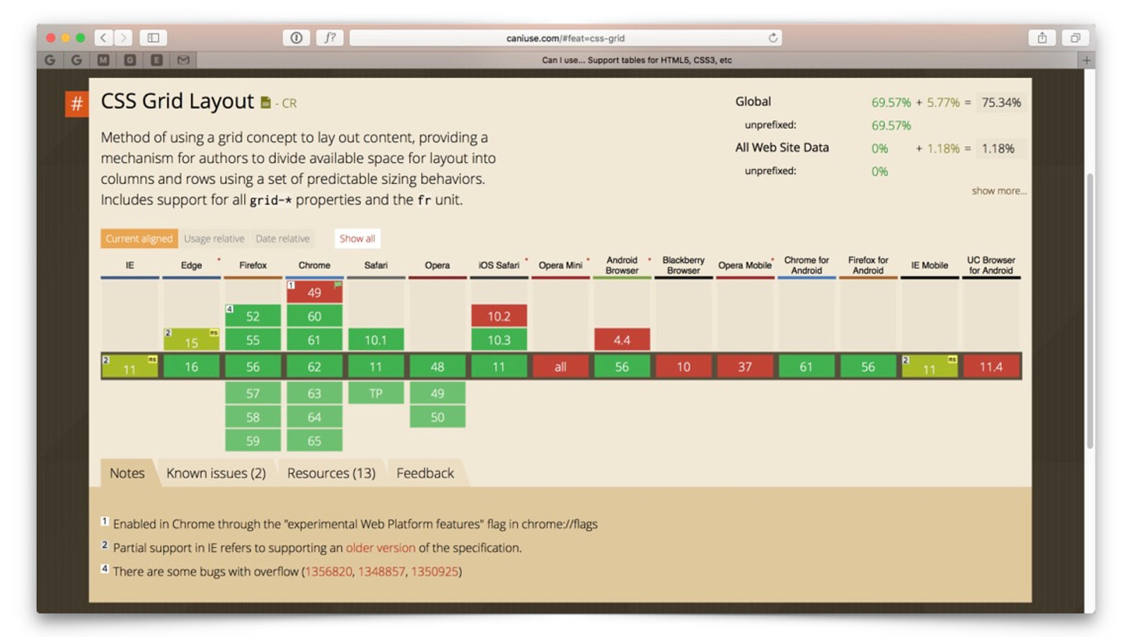
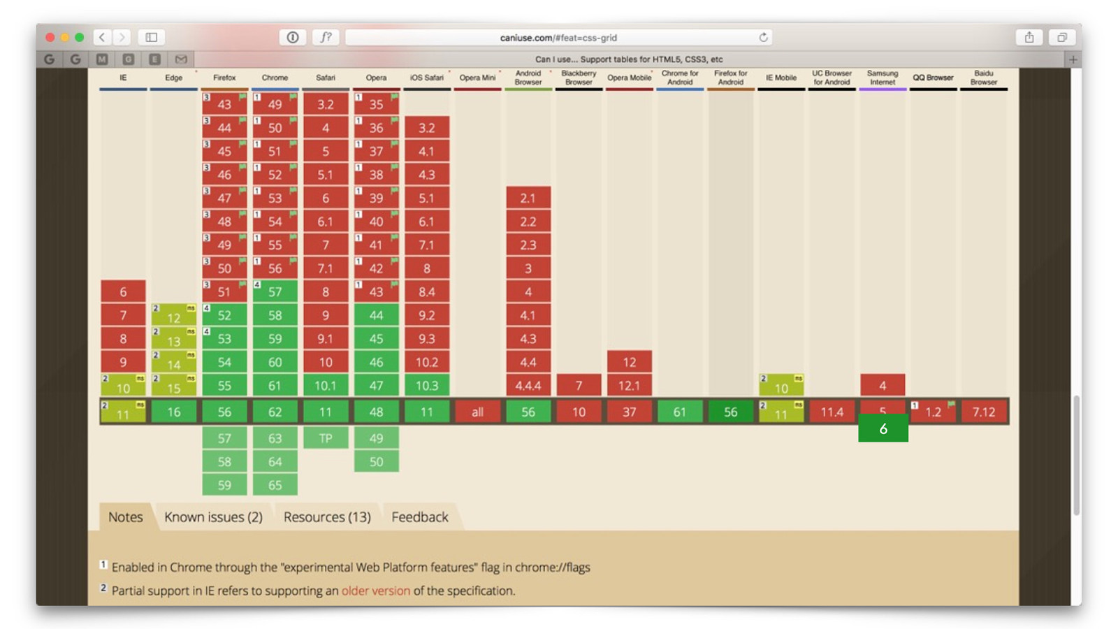
6
Yo u m u s t s u p p o r t
browsers that
do not understand
CSS Grid.
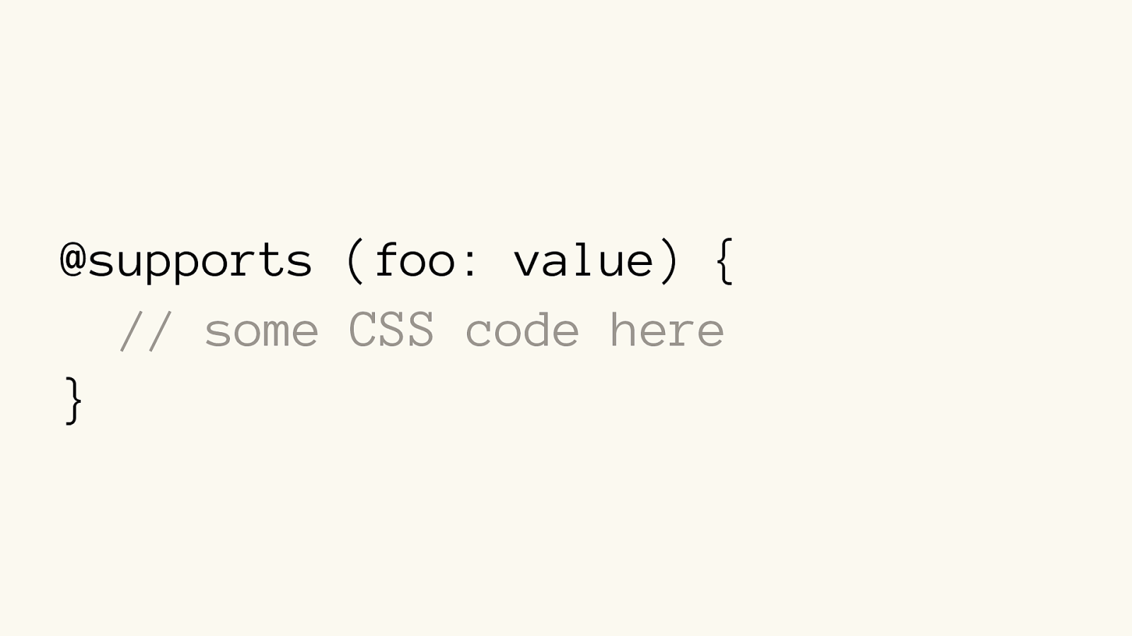
@supports (foo: value) { // some CSS code here
}
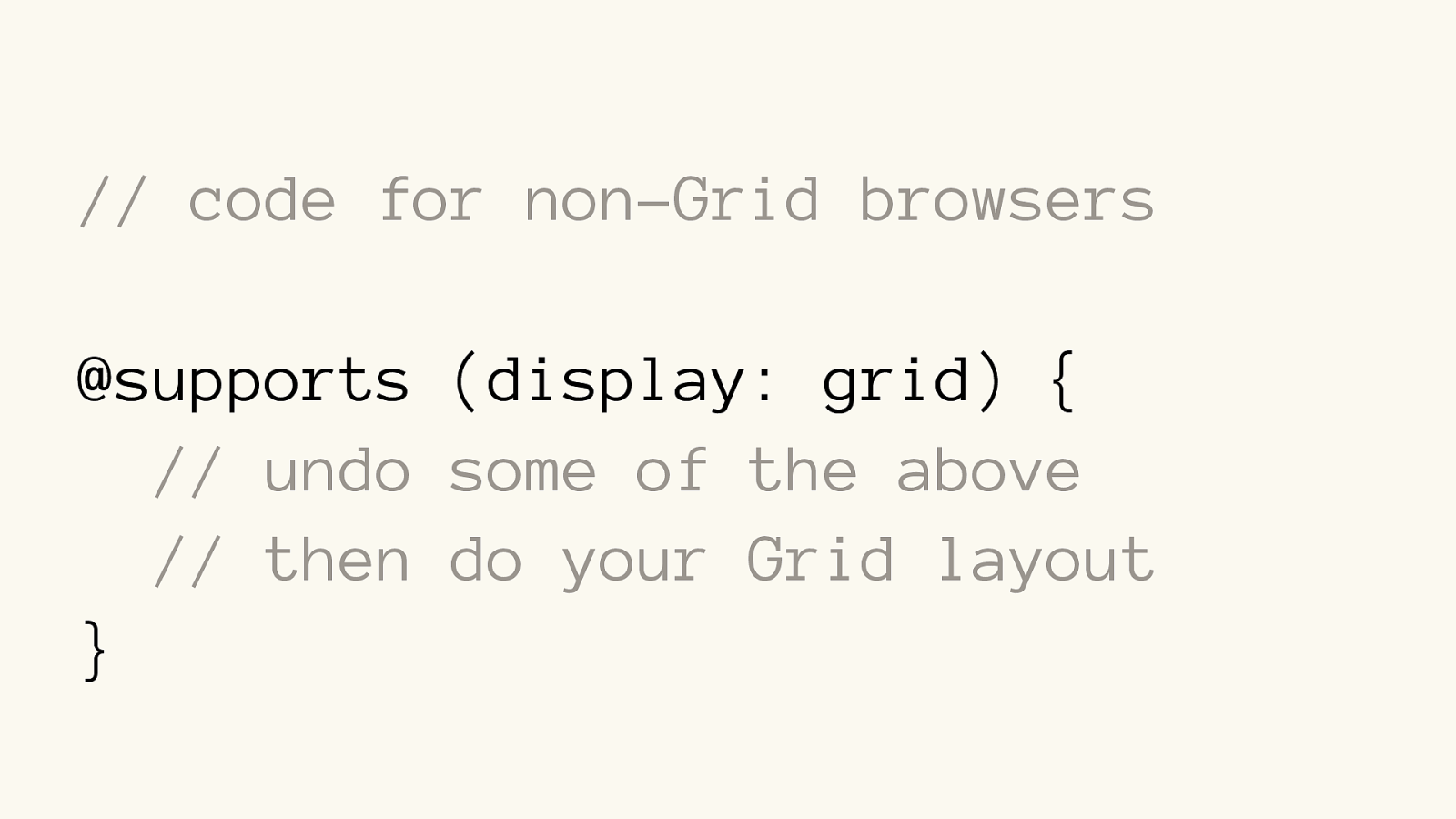
// code for non-Grid browsers
@supports (display: grid) { // undo some of the above // then do your Grid layout
}
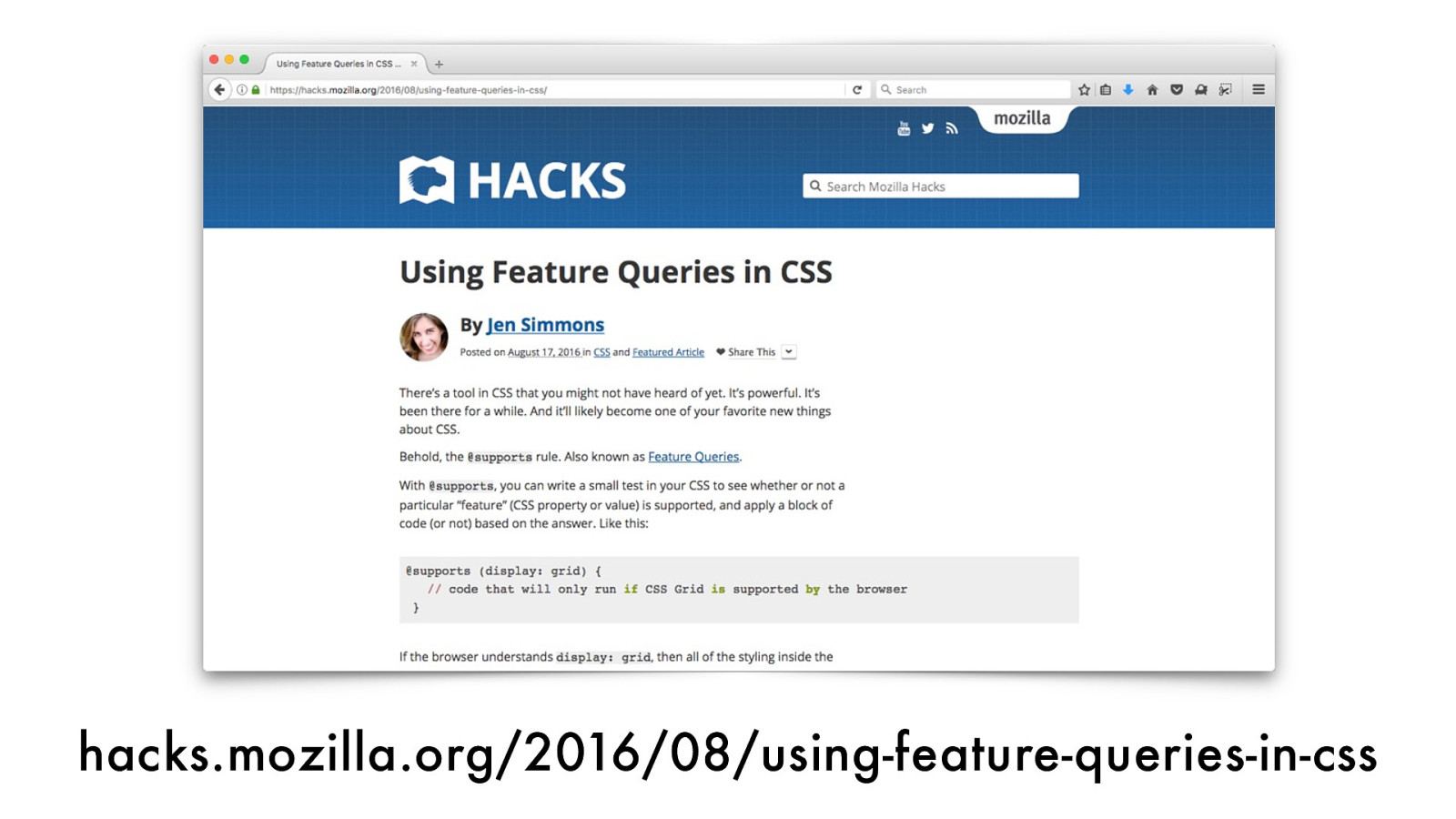
hacks.mozilla.org/2016/08/using-feature-queries-in-css
6
Yo u h a v e t w o c h o i c e s fo r
Internet Explorer (& old Edge):
Yo u h a v e t w o c h o i c e s fo r
Internet Explorer (& old Edge):
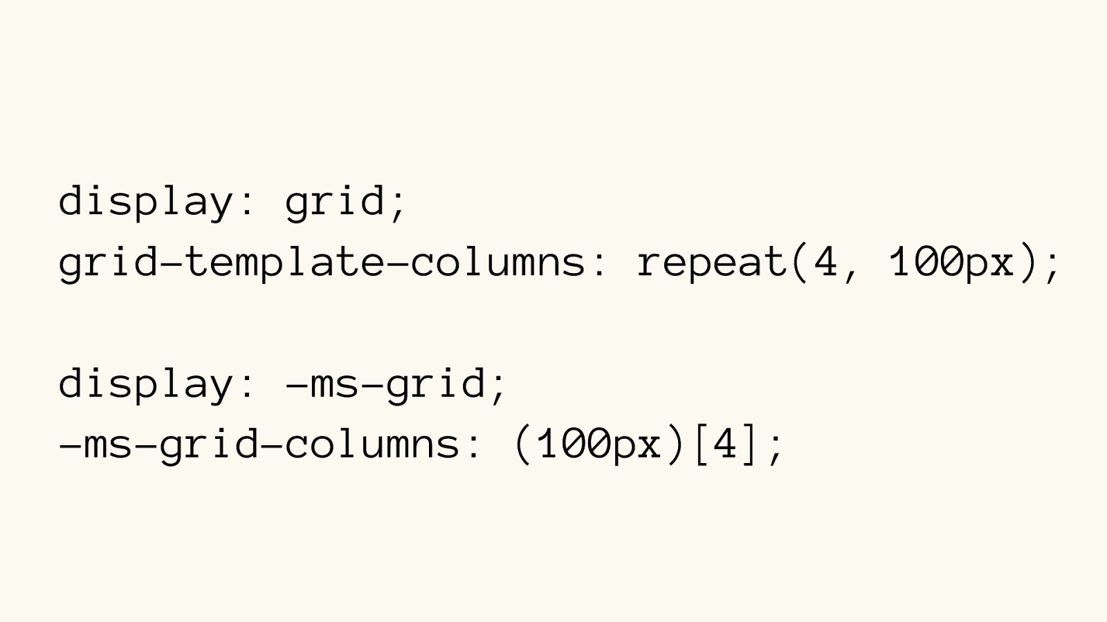
display: grid; grid-template-columns: repeat(4, 100px) ; display: -ms-grid; -ms-grid-columns: (100px)[4] ;
Autoprefixer
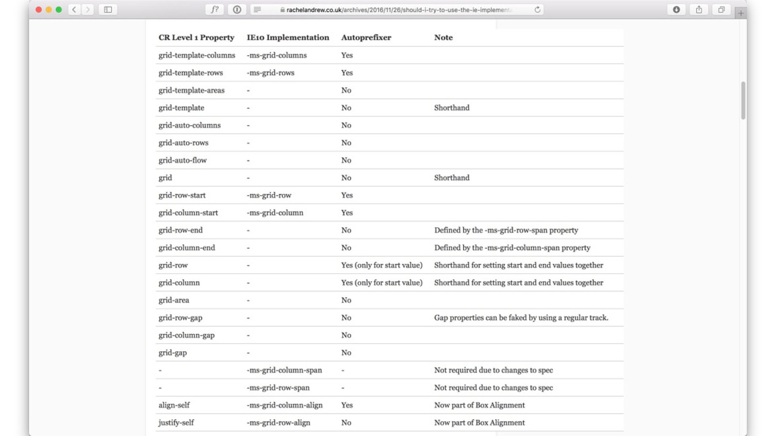
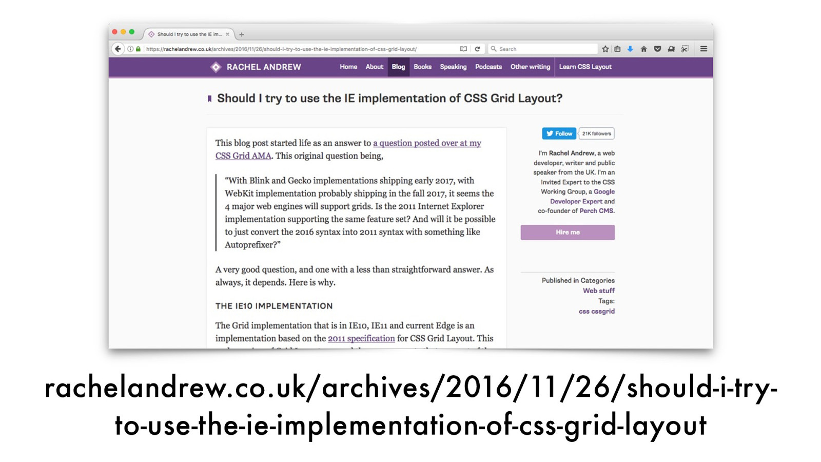
rachelandrew.co.uk/archives/2016/11/26/should-i-tr y- to-use-the-ie-implementation-of-css-grid-layout
For more…
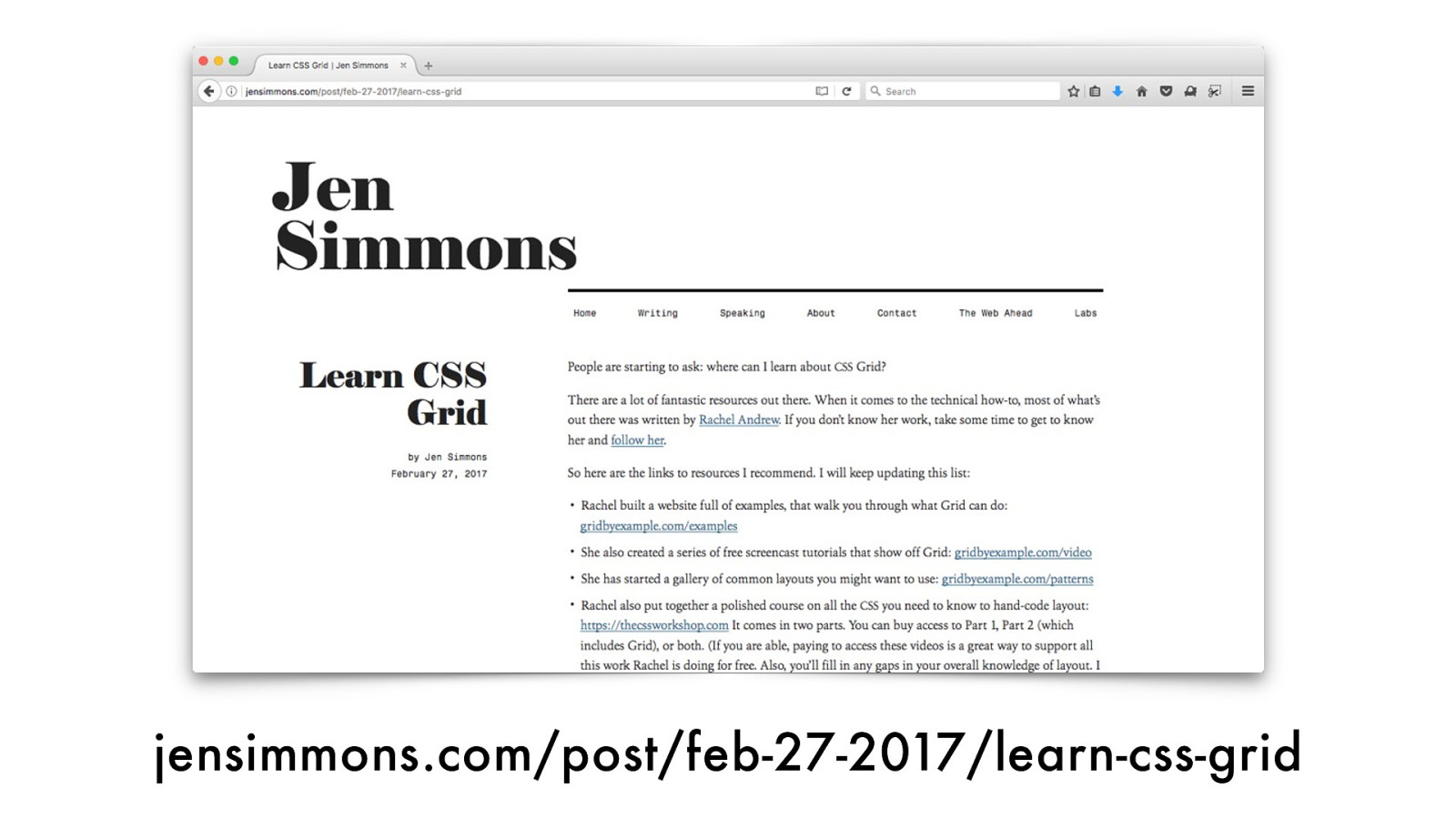
jensimmons.com/post/feb-27-2017/learn-css-grid
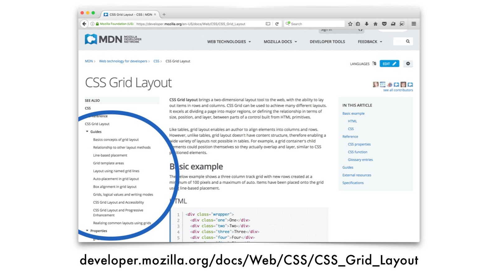
developer.mozilla.org/docs/Web/CSS/CSS_Grid_Layout
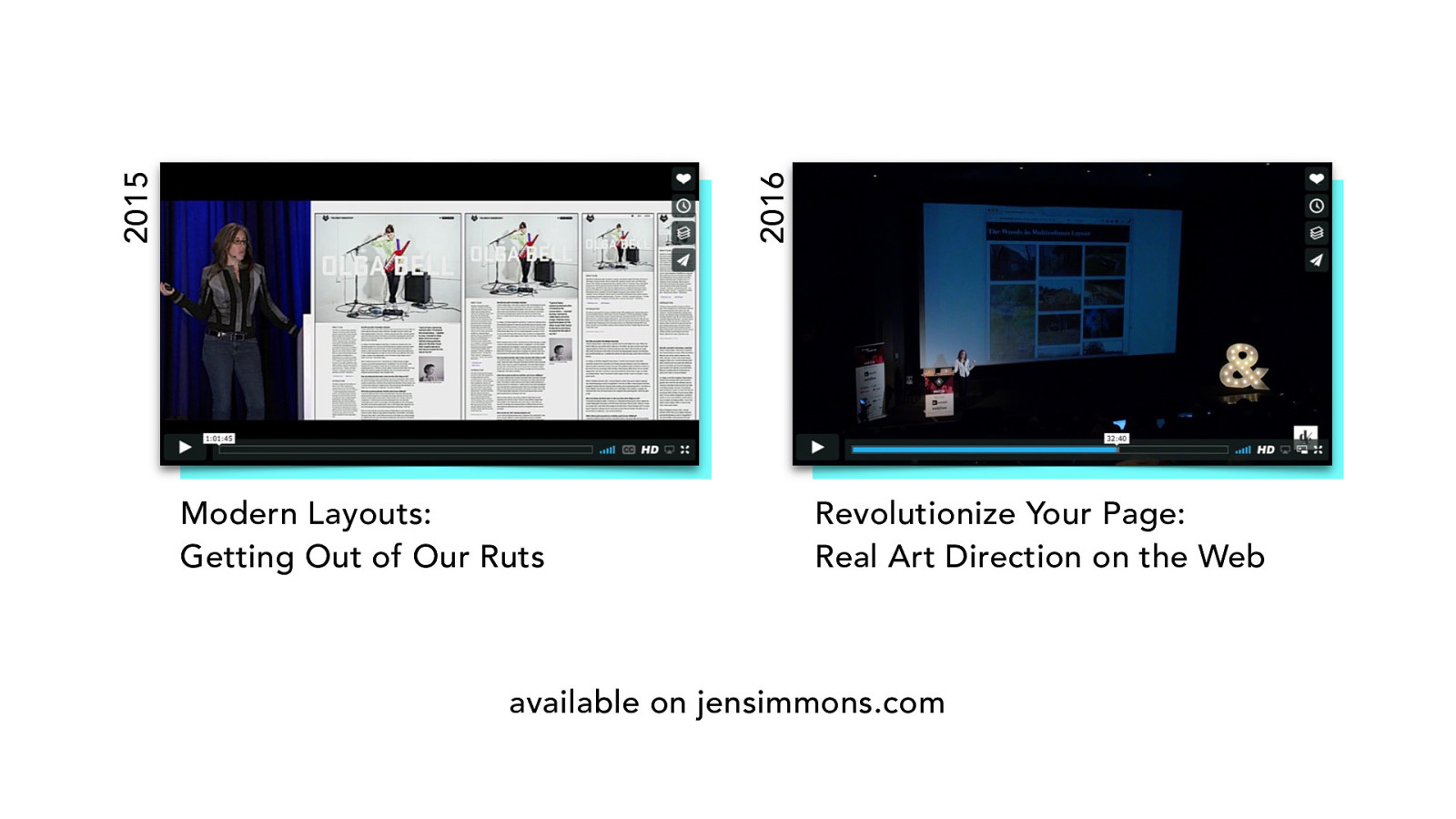
Modern Layouts: Getting Out of Our Ruts Revolutionize Your Page: Real Art Direction on the Web 2015 2016 available on jensimmons.com
jensimmons.com
@jensimmons layout.land
labs.jensimmons.com Thanks!

Here’s what was said about this presentation on social media.


 for free. You
can too.
for free. You
can too.