Jason is a Principal Designer at Chewy.com, helping lead their design system efforts across ecommerce, enterprise, and native mobile app experiences. Prior to joining Chewy, he led the team in creating a new web platform for the State of Rhode Island; redefined the typography and design system for the State of Georgia Digital Service; and helped numerous type foundries, web browsers, and software companies figure out how to make the most of the new variable font format in their products and brands.
Jason also researches and writes on typography for the web: a collection of [newsletters on his site RWT.io(https://rwt.io/typography-tips), author of Responsive Typography from O’Reilly, as well as articles for .Net Magazine, PRINT Magazine, HOW, Monotype.com, TYPE Magazine, and others. He’s also a frequent guest on podcasts, and an author of online courses for Aquent’s Gymnasium platform and Front-end Masters, and has presented at over 100 national and international conferences. He also had the honor of being inducted into the Rhode Island Design Hall of Fame in 2019.
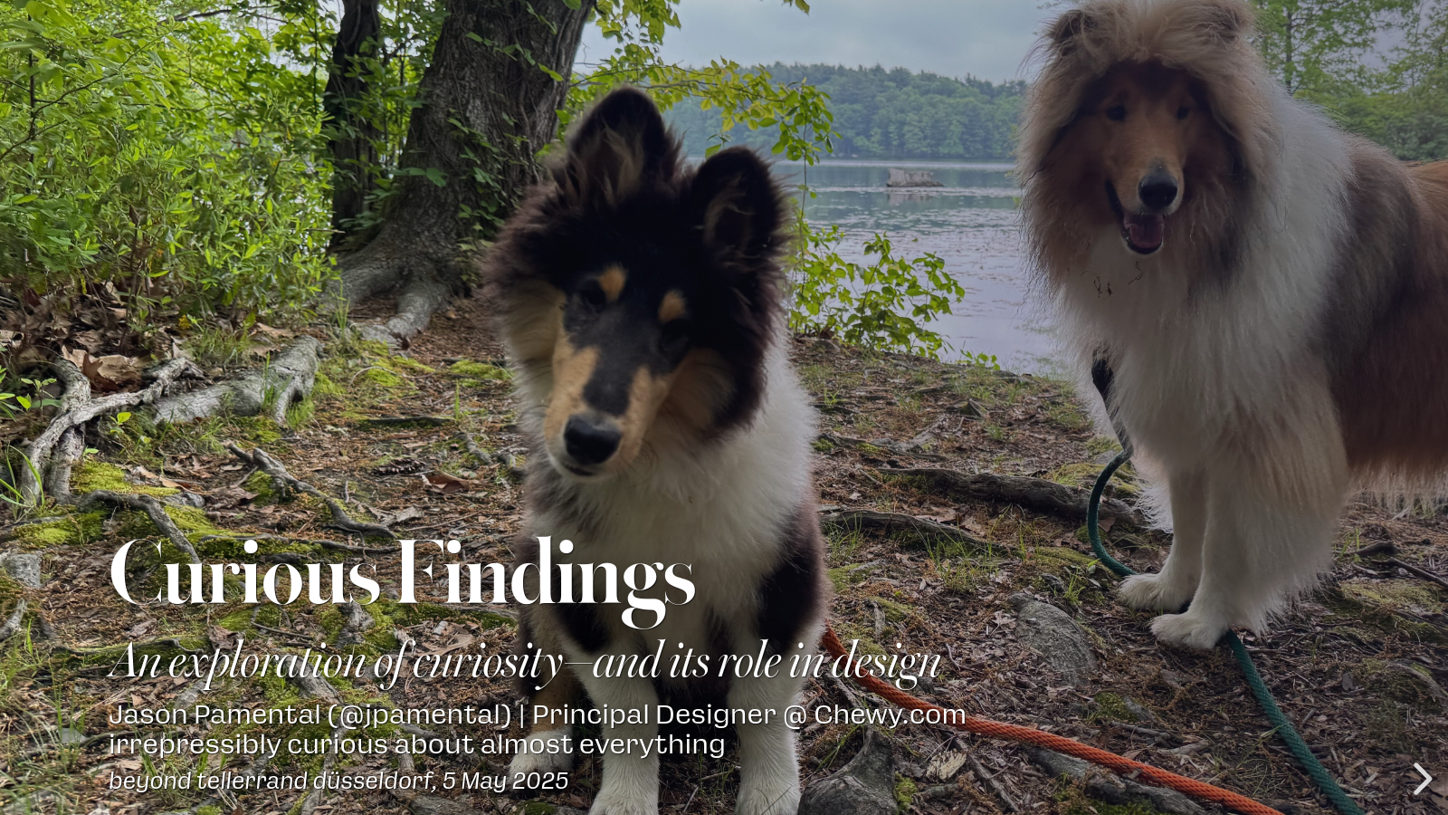
The real story: mainly he just follows Leo around Turner Reservoir, posting photos on Instagram.

Type is the voice of our words—and the majority of what we put on screen (the rest is dog pics and cat memes). Ever wonder why it doesn’t work better? Me too.
So let’s explore ways we can do it better, faster, and with greater finesse. How do we unblock render and display content faster? Can we respond to device size, settings, and layout more intuitively? Could we be more expressive and refined without resorting to hard-coding? Typographic curiosities to satisfy these challenges abound—so let’s explore them together!

