Variable Fonts and Our New Typography

A presentation at An Event Apart Seattle in April 2018 in Seattle, WA, USA by Jason Pamental

Slide 1

Slide 1

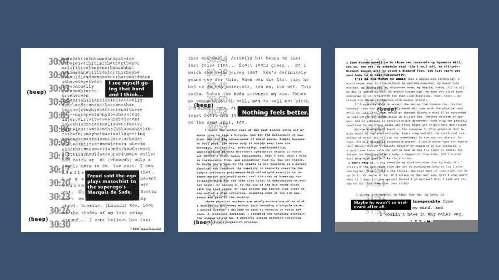
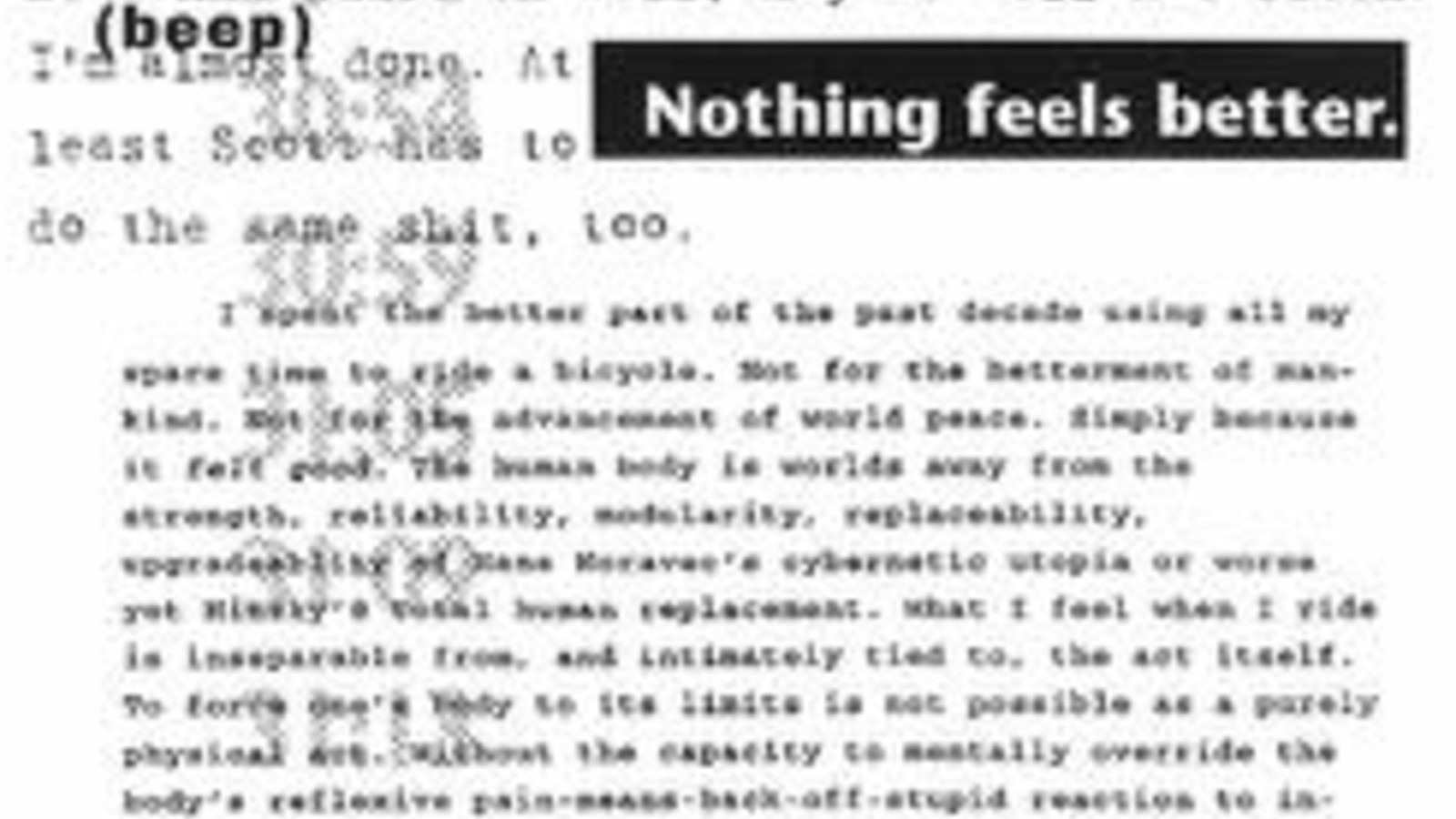
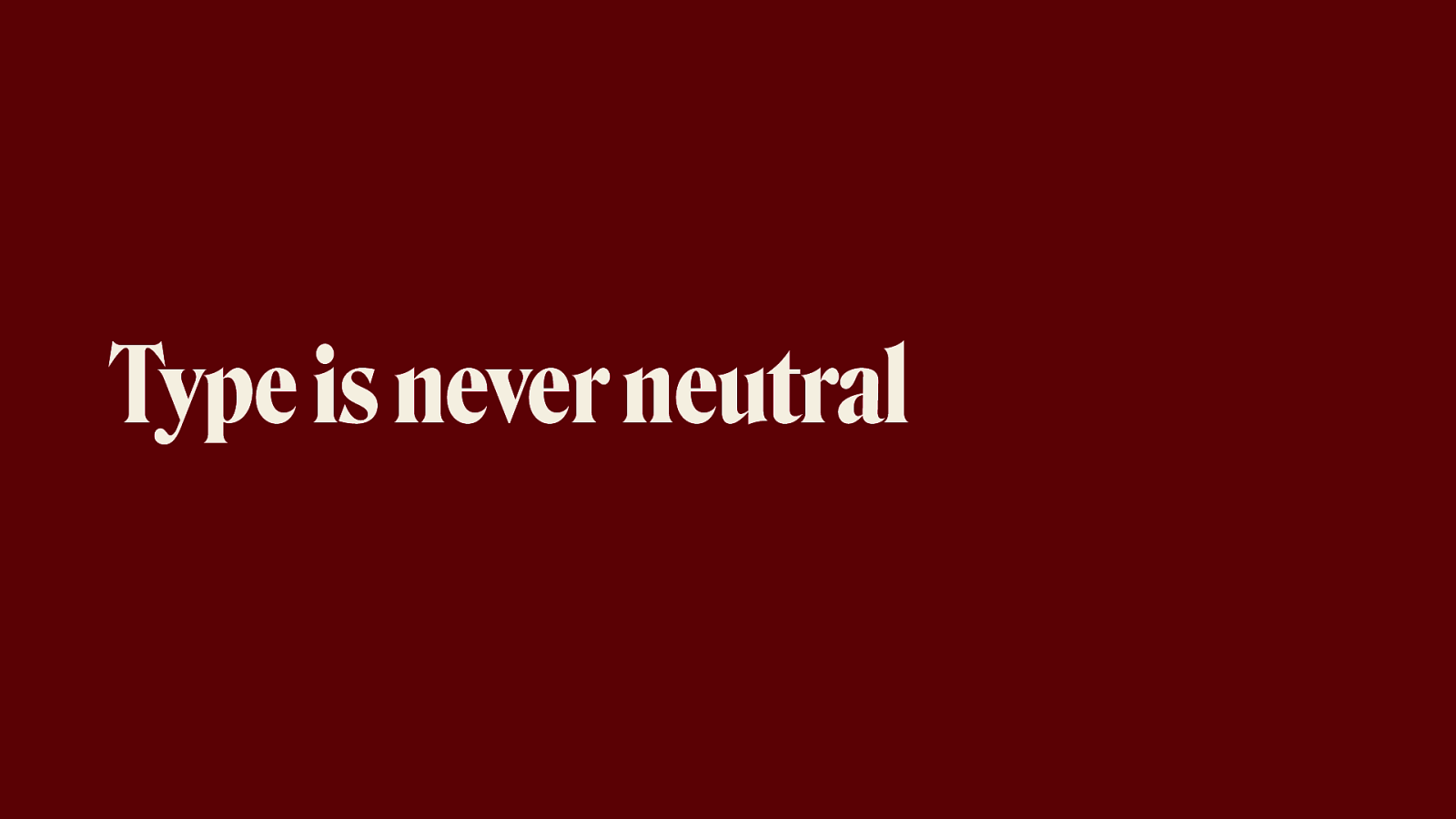
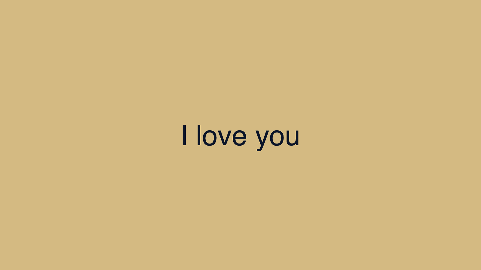
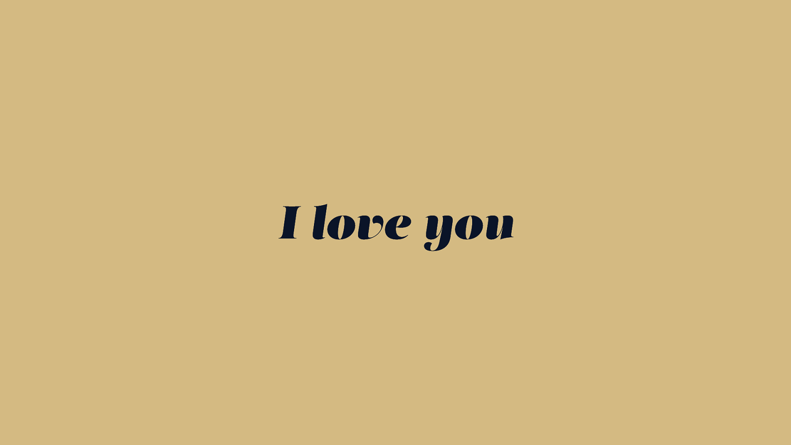
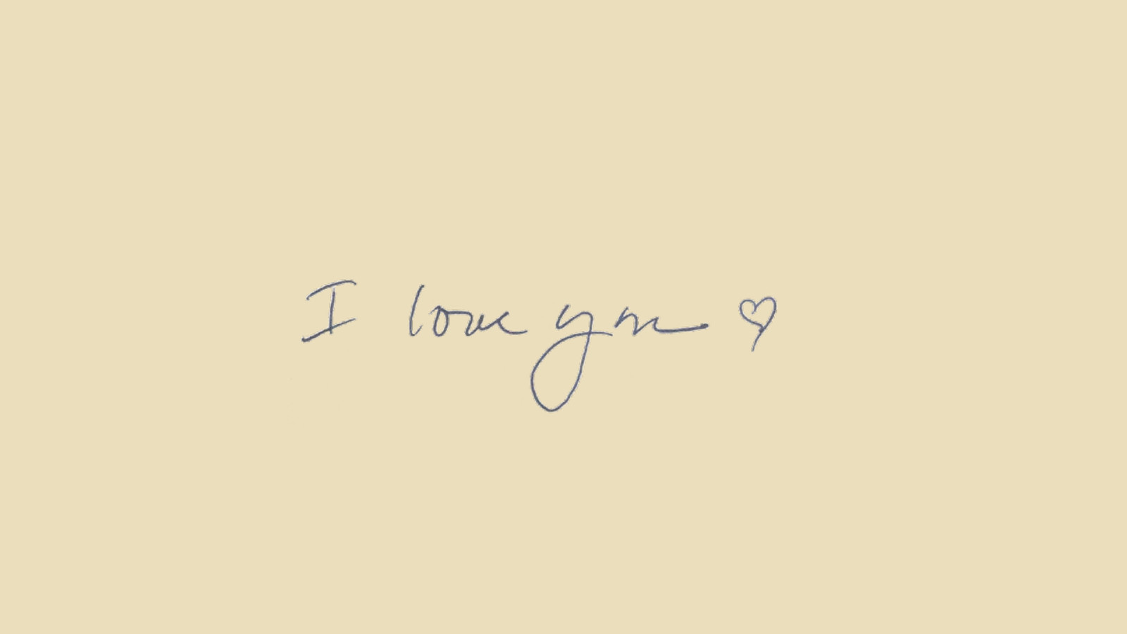
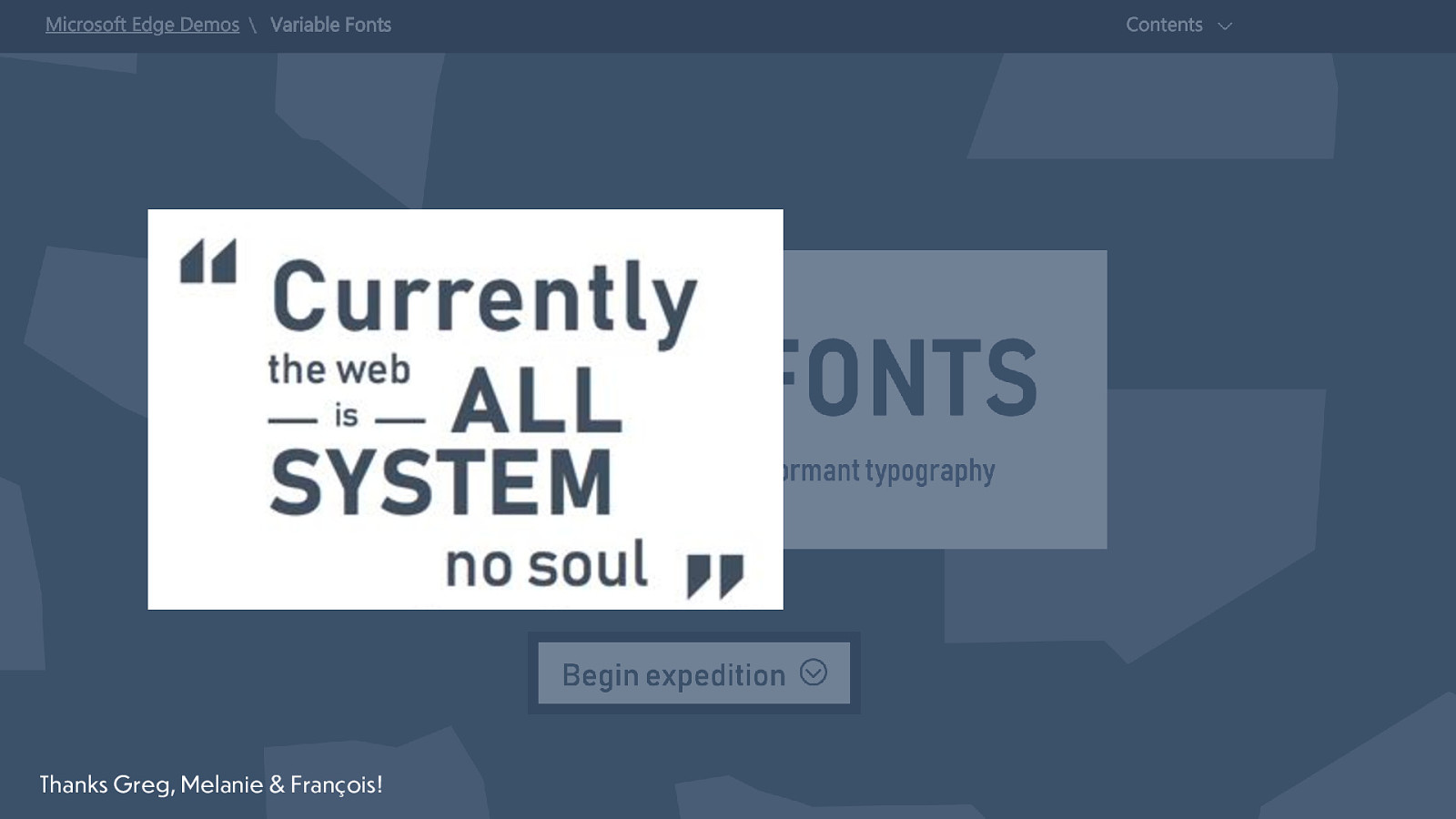
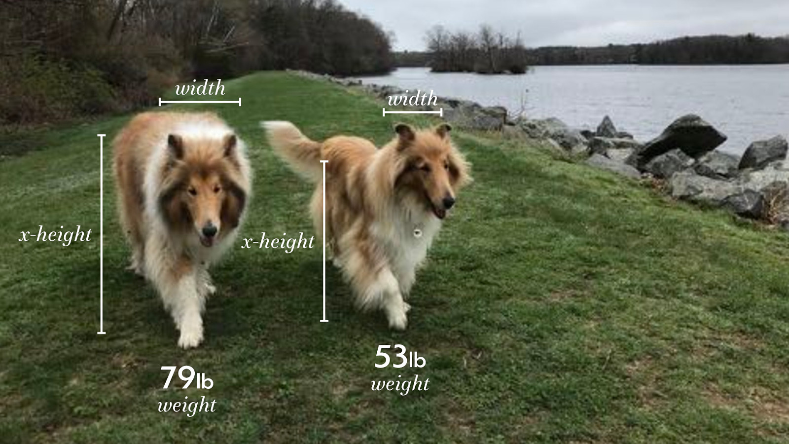
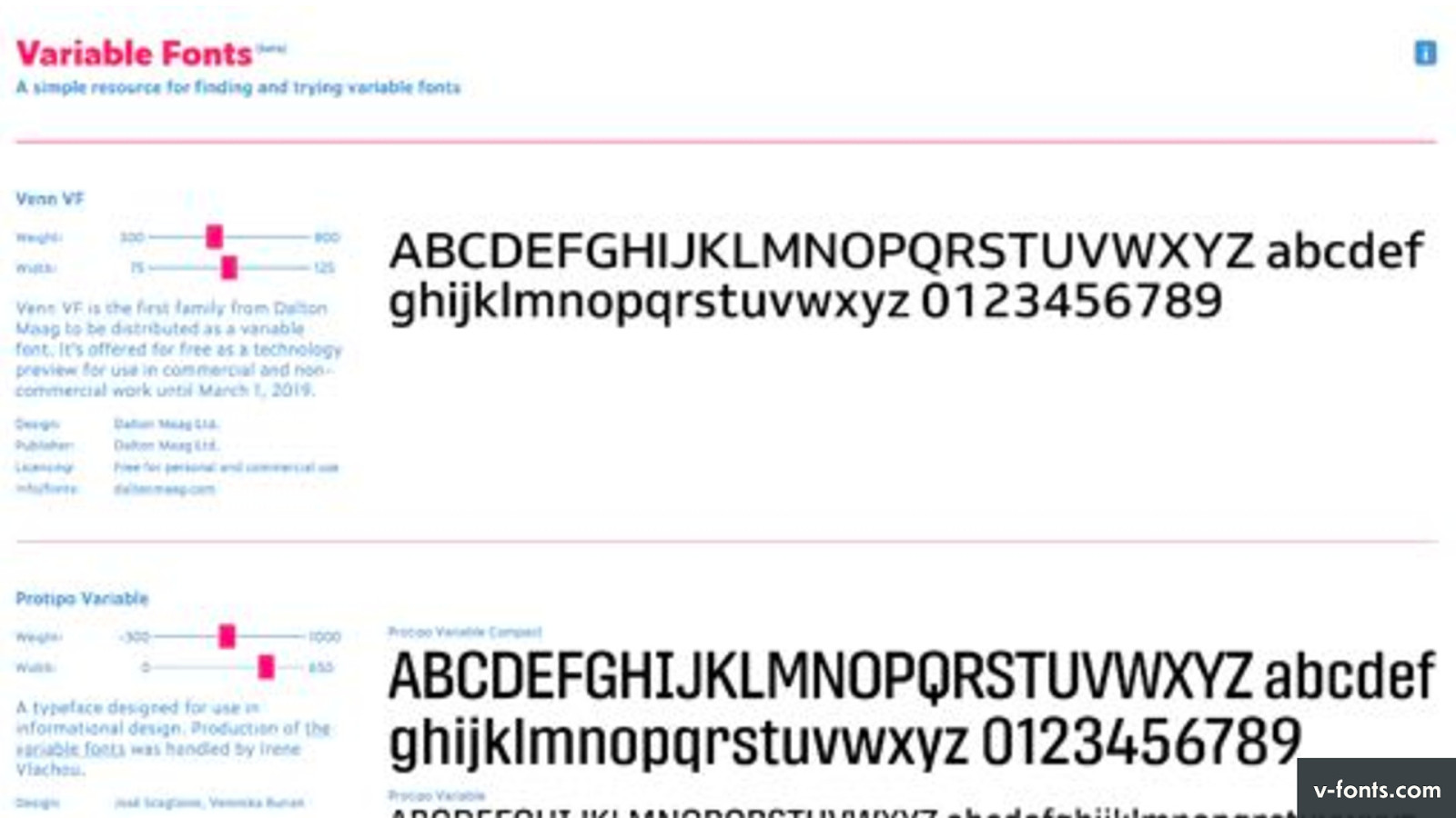
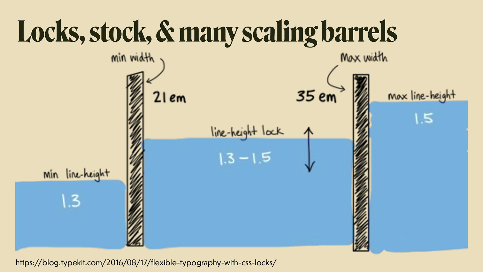
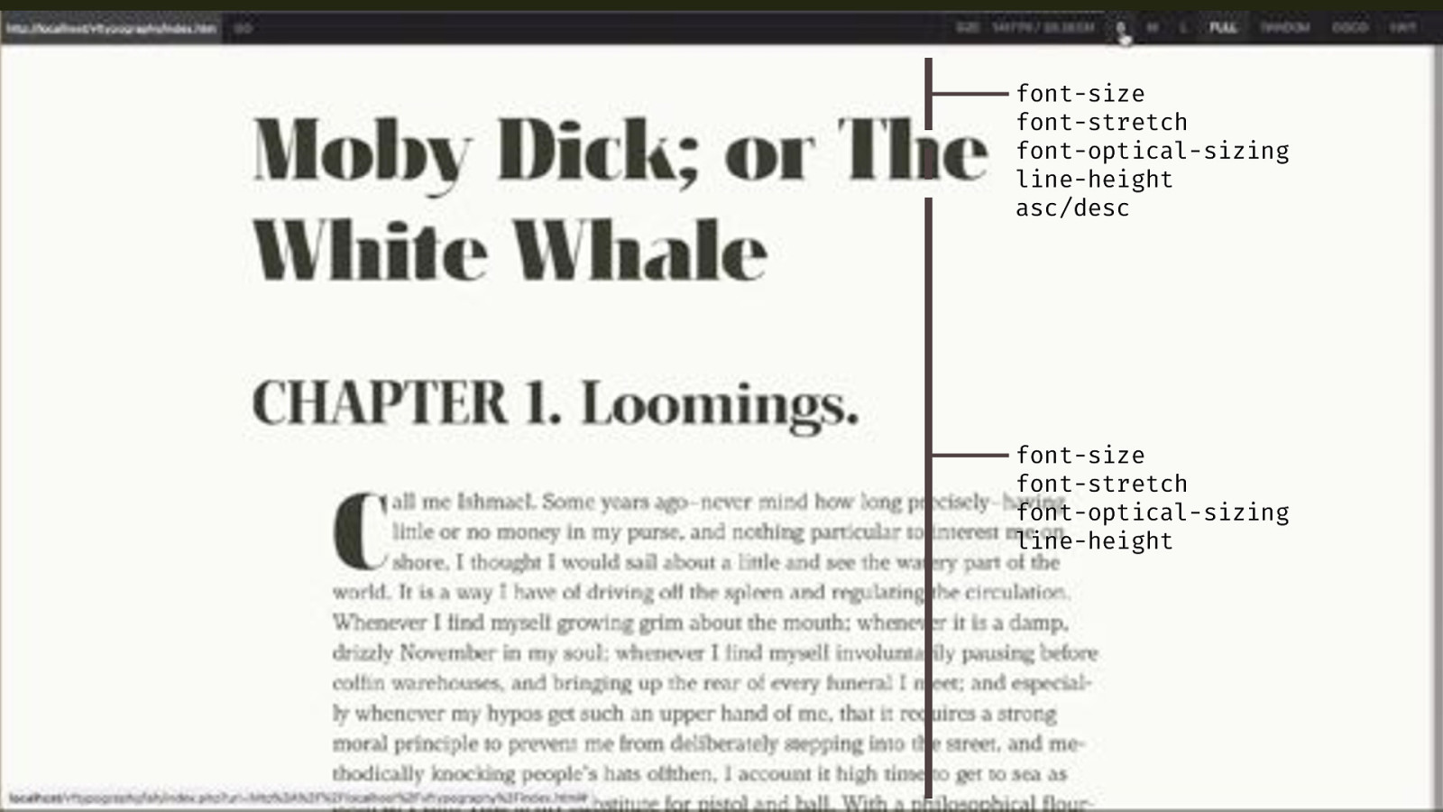
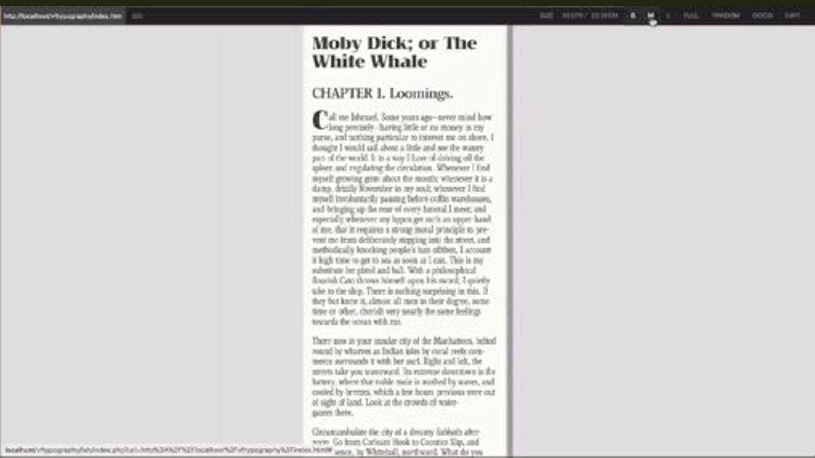
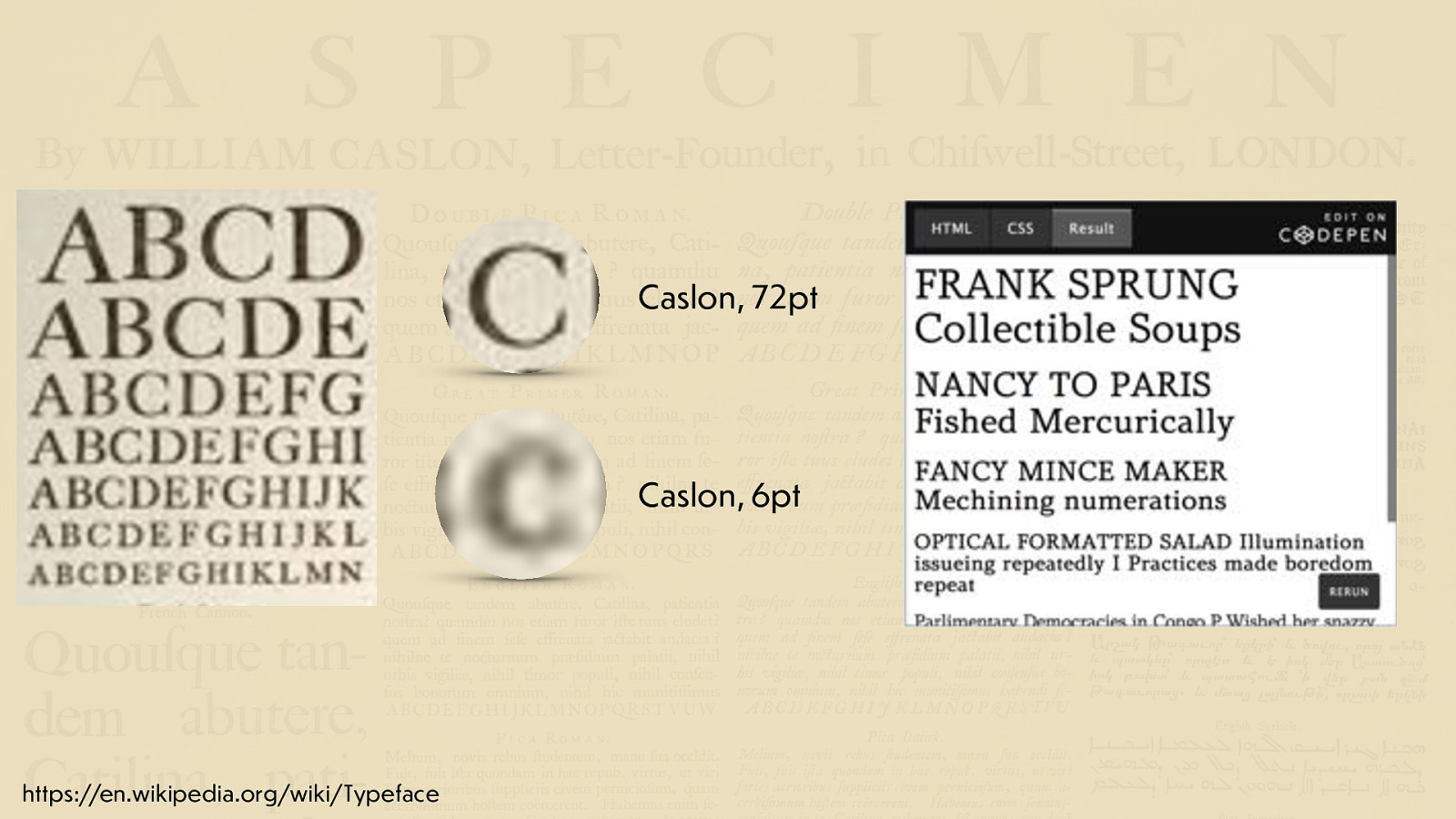
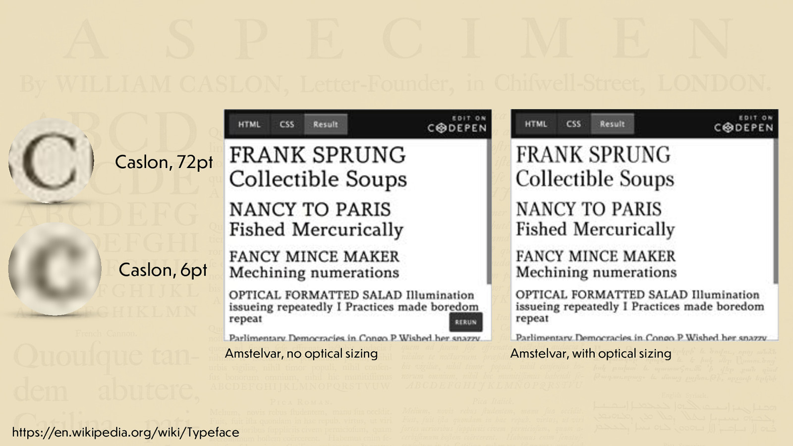
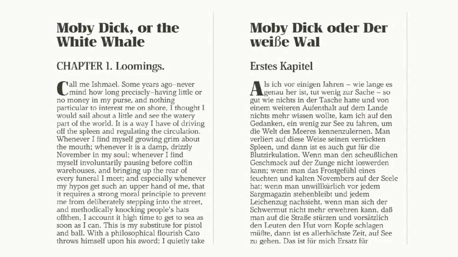
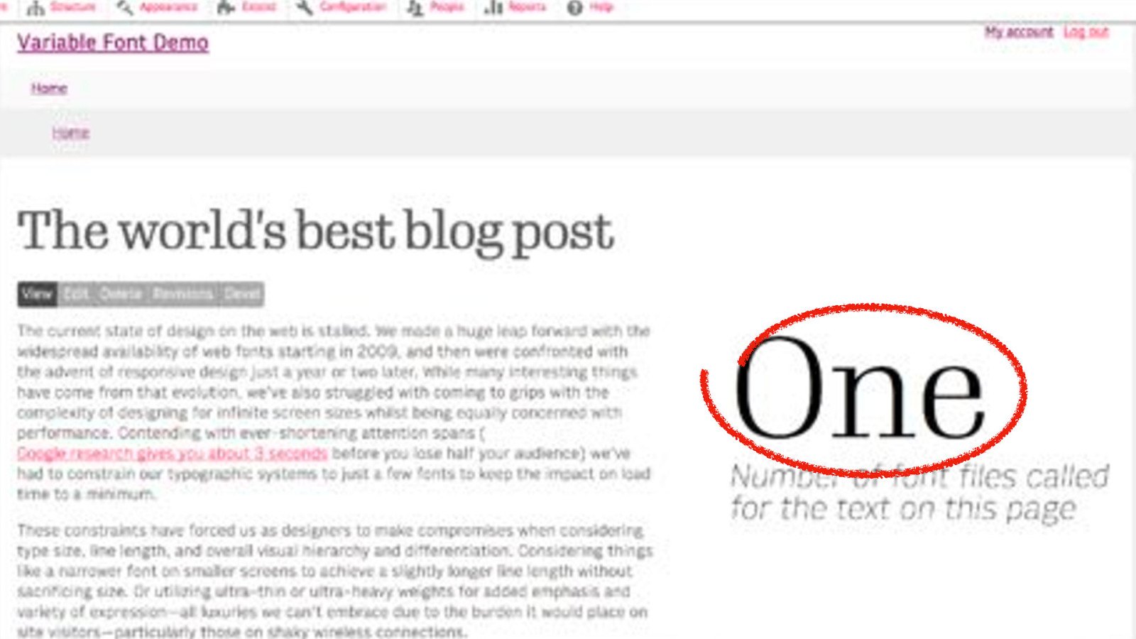
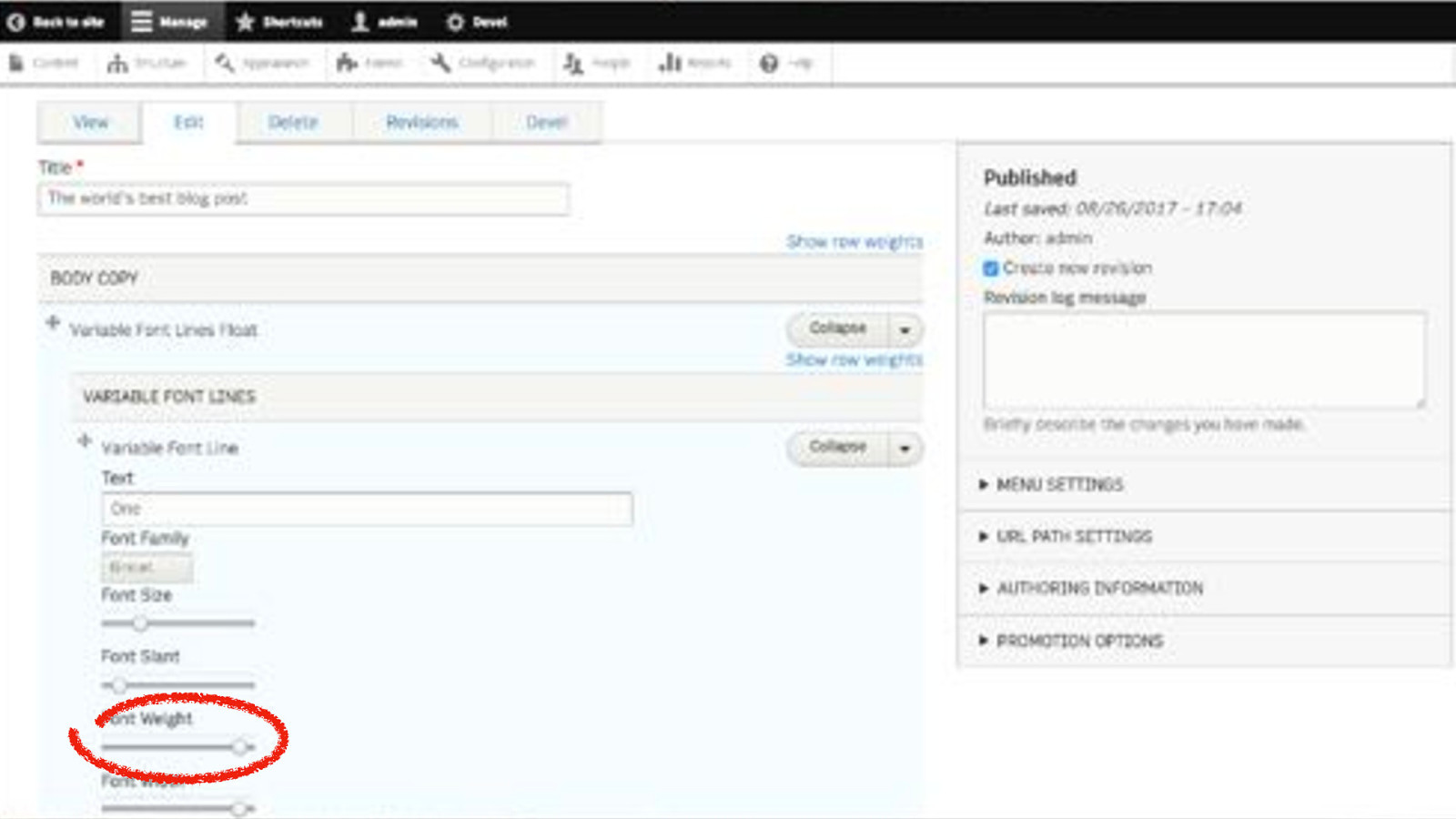
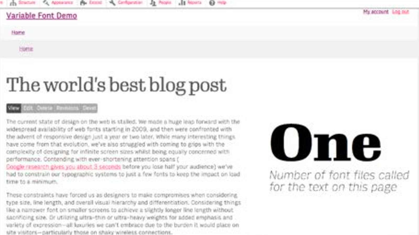
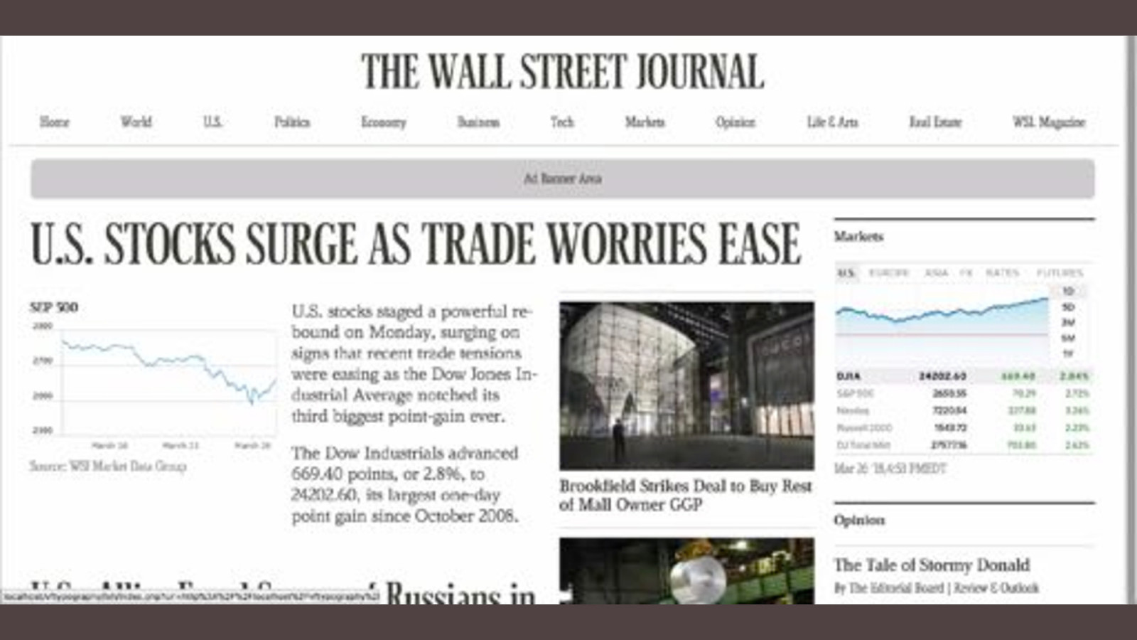
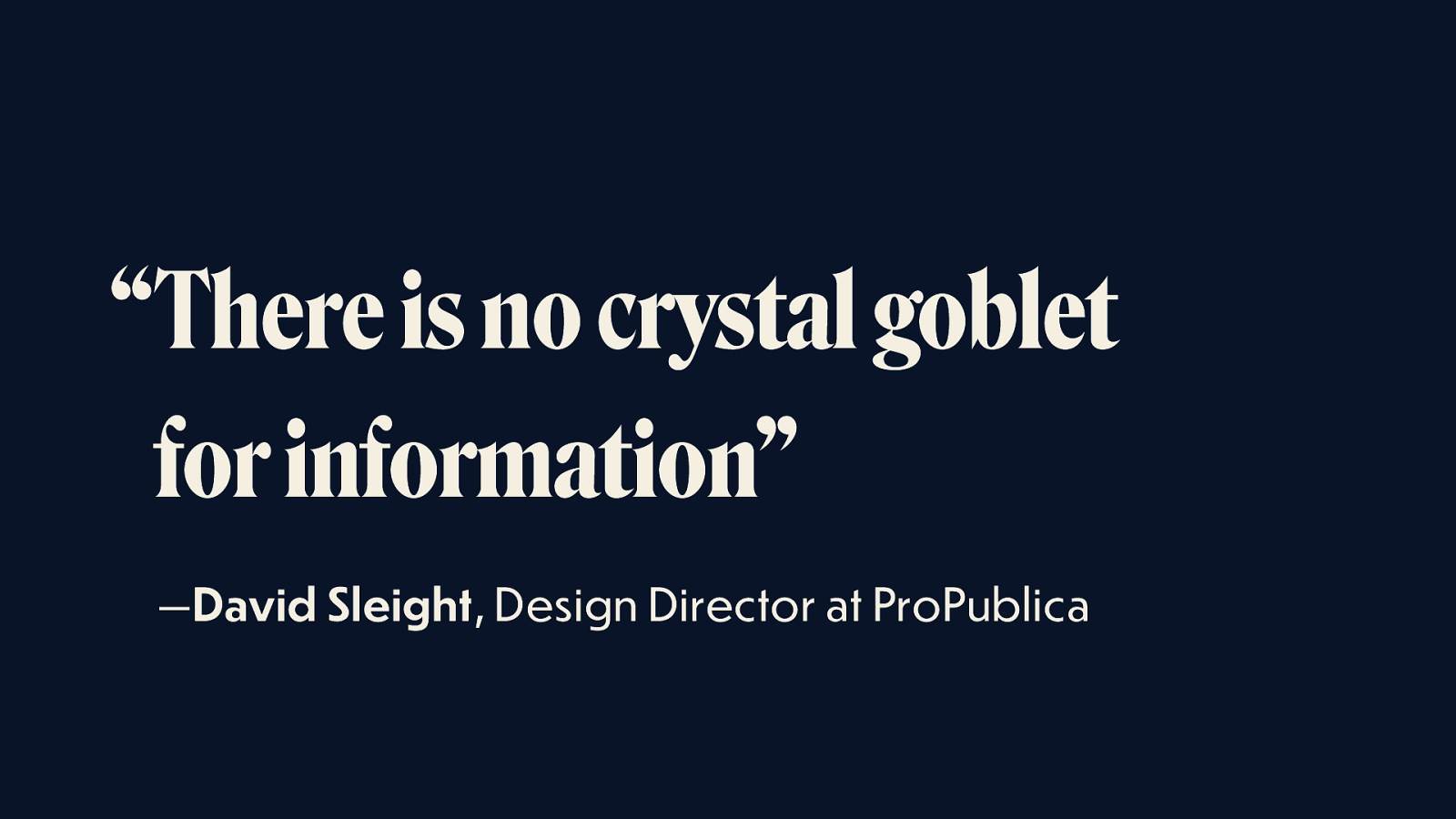
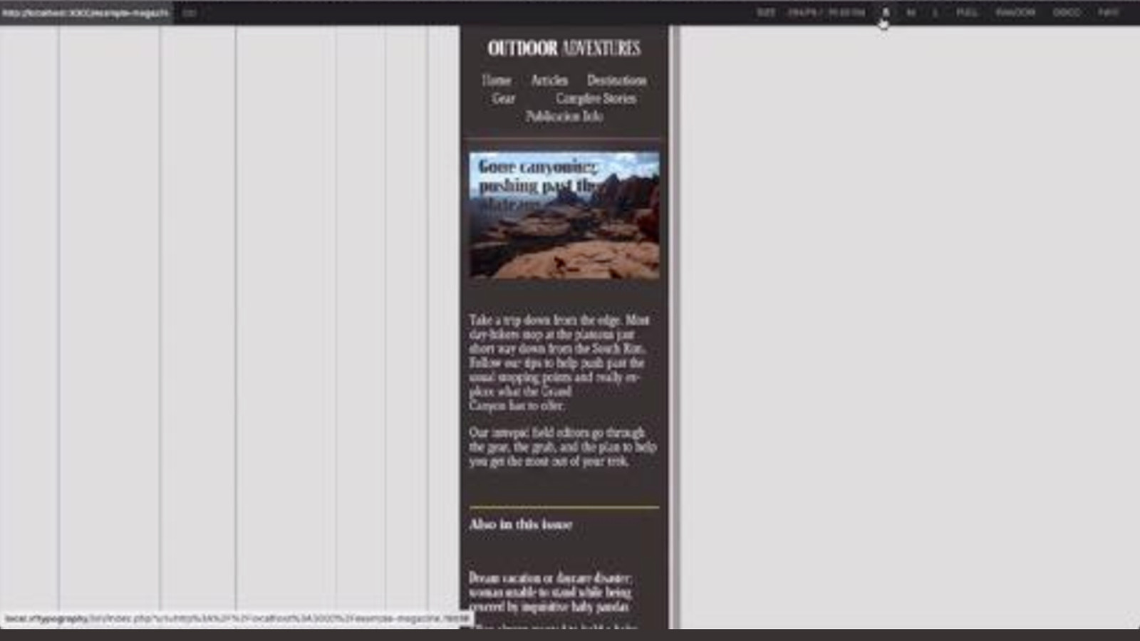
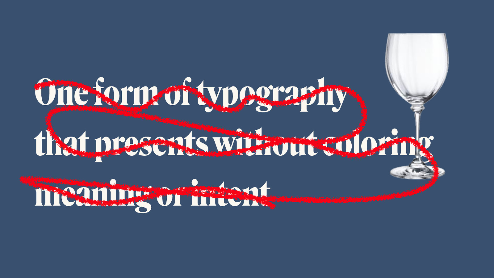
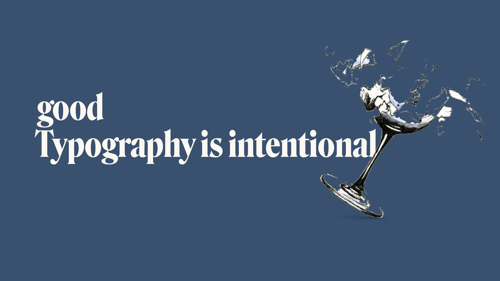
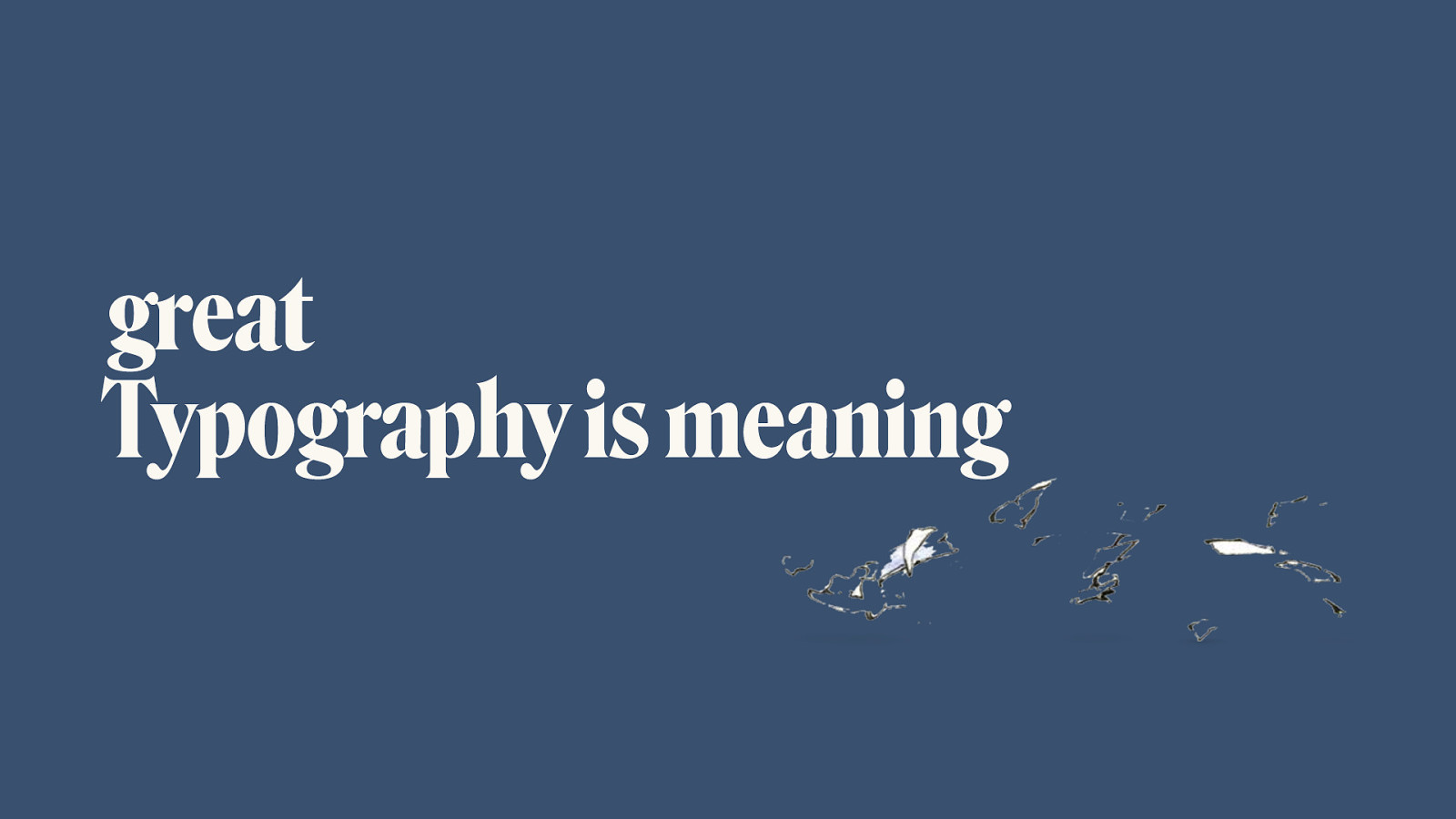
and the future of typography Jason Pamental | @jpamental Designer, Writer, Tinkerer, Typographer Variable Fonts An Event Apart | Seattle 4 April, 2018 This talk is about meaning. Because words strung together are intended to convey meaning (unless its Dadaist poetry). Words strung together conveying meaning is (as Jen coined the term) intrinsically of the web. Doing so using intentional styles & fonts could be seen as essential or as an enhancement. I’m going to talk about them as an essential component of conveying, amplifying, & clarifying that meaning

Slide 2

Slide 2

There’s been a thread I started to notice. Jeffrey talked about designing fast and slow: to do, and to learn. Jen talked about what it means to be ‘of the web’ but not to be limited by it. Pacing came through again in Jeremy’s talk, again related to what should be fast or slow. Aaron brought up the idea of friction created by poor performance: again, pace. That thread began to take shape in my mind in the form of words. Words and the web. On the web. Of the web. But still ultimately human.

Slide 3

Slide 3

I spent most of a decade dedicating every day to racing a bicycle. Not for the betterment of humanity or the advancement of human peace. But because it felt good. What I feel when I ride is inseparable from and intimately tied to the act itself. To force one’s body to it’s limits is not possible as a purely physical act. Without the capacity to mentally override the shutdown switch, we’re inherently limited. Without that capacity to will ourselves to do more, we’d have no heroes. No Shakespeares. None of the amazing women who have graced this stage, enduring so much more to get here than I could understand.

Slide 4

Slide 4

So while this talk is about the future of typography—as Jeremy said yesterday—any look at the future is really about the future’s past, or our present. But our present was someone else’s future. So let’s look into our past at that someone else’s present

Slide 5

Slide 5

In this case, that present is about 500 years ago. Been thinking a lot about the evolution of design and typography. Not just recently on the web, but over decades. Centuries. Like this book of psalms.

Slide 6

Slide 6

Or a faded, layered pub sign in Brighton

Slide 7

Slide 7

Or this Monotype drawing This thread is about finding a rhythm and structure that de fi nes beauty

Slide 8

Slide 8

“cosmografia del 
 minor mondo” And not just in type: Leonardo Da Vinci famously created his ‘cosmography of the microcosm’—an attempt to understand the human body and the relationships between it and nature, proportion, balance, and beauty

Slide 9

Slide 9

Efforts to decode that beauty and encode it in repeatable rules to satisfy every possible application and scenario

Slide 10

Slide 10

“Type well used is invisible as type” —Beatrice Warde “The Crystal Goblet”, 1932 This was codified in an essay by Beatrice Warde in 1932 where she put forth the notion that for any piece of content, there could be a perfect typesetting that, like that goblet, could shape, but not color or distort, that content But the notion that there can be a perfect (and perfectly neutral) system of typography for a given piece of content is undone by the very typographic decisions made in the process

Slide 11

Slide 11

Type is never neutral

Slide 12

Slide 12

I love you This conveys the words, but doesn’t mean it

Slide 13

Slide 13

I love you This says it like only a type-obsessed hipster can

Slide 14

Slide 14

And this one might say it in the most genuine way yet.
There’s a hand in this. A human one. With feelings.

Slide 15

Slide 15

Type is how we ‘hear’ what we read

Slide 16

Slide 16

Printed Polish Like some of those past examples—we’ve spent centuries evolving and refining how we communicate. Look at Bruce Kennett’s W.A Dwiggins biography ‘A Life in Design’. Incredible detail

Slide 17

Slide 17

Pixel Parity We’ve now developed the capability to (nearly) match that on a digital screen

Slide 18

Slide 18

but tension! There are tensions between polish, performance, and publishers: • Just as Bradi, Papi, and Tristan all wanted to run off with their stick

Slide 19

Slide 19

Can we set this in Helvetica? Change to “Type should be seen and not heard” Stop asking for fonts. You can’t have them. We have to load more javascript

  • engineering • Design may desire more fonts and particular layout/hierarchy relationships • Publishers want to be able to change the content without sacrificing design
    • Performance wants less data to download

Slide 20

Slide 20

“the idea of using three different font files 
 to represent one word would be dismissed 
 as quickly as the thought appeared” — Rich Rutter , author of ‘Web Typography’

Slide 21

Slide 21

StyleGuides.io So we create design systems

Slide 22

Slide 22

Slide 23

Slide 23

So we can solve a lot of these issues by creating a system of typography that scales in response to screen size, tailors the fallback experience, and provides a consistent user experience across all manner of content and all sorts of layouts. But as an industry we’ve come to hold up design systems as the ultimate answer. I want to talk about why they’re really just the start

Slide 24

Slide 24

https://99percentinvisible.org/episode/on-average/ In the 1950’s, researchers found that while US Air Force cockpits were designed for an average size pilot, training fatalities were increasing dramatically

Slide 25

Slide 25

“by designing something for an average 
 pilot, it was literally designed to fit nobody” https://99percentinvisible.org/episode/on-average/ But in reality, that average size pilot actually didn’t exist

Slide 26

Slide 26

So when we optimize for any possible content, we’re actually designing for no content in particular

Slide 27

Slide 27

Thanks Greg, Melanie & François! We’ve created a gilded prison for our words—one typographic system that tries to support any and all content into which we might pour

Slide 28

Slide 28

We’ve created a new 
 Crystal Goblet A sea of sameness, with diminished voice, optimized for everything, and nothing at all

Slide 29

Slide 29

This truly is the winter of our discontent We have to remember that design systems are the plateau, not the pinnacle. Let’s head into the foothills.

Slide 30

Slide 30

Variable Fonts then came September 2016

Slide 31

Slide 31

a a a a a a a a a One font that acts as many (John Hudson)

Slide 32

Slide 32

width width weight 79 lb weight 53 lb x-height x-height

Slide 33

Slide 33

Registered Axes

Slide 34

Slide 34

Weight ' wght ' font-weight: 88; font-variation-settings: ' wght' 88; font-weight: 264; font-variation-settings: ' wght' 264; Featuring Output Sans by DJR, Louvette by CJ Dunn, & Amstelvar & Decovar by David Berlow & Type Network Weight is one of the most common use cases, and this gives us a lot of flexibility in choosing just the right weight for various headings and emphasis rather than having to make a more ham-fisted choice of only a single ‘regular’ and ‘bold’

Slide 35

Slide 35

Weight ' wght ' font-weight: 88; font-variation-settings: ' wght' 88; font-weight: 264; font-variation-settings: ' wght' 264; Featuring Output Sans by DJR, Louvette by CJ Dunn, & Amstelvar & Decovar by David Berlow & Type Network Weight is one of the most common use cases, and this gives us a lot of flexibility in choosing just the right weight for various headings and emphasis rather than having to make a more ham-fisted choice of only a single ‘regular’ and ‘bold’

Slide 36

Slide 36

Width font-stretch: 265; font-variation-settings: ' wdth' 265; font-stretch: 402; font-variation-settings: ' wdth' 402; ' wdth ' Featuring Output Sans by DJR, Louvette by CJ Dunn, & Amstelvar & Decovar by David Berlow & Type Network Width can come in handy for both larger scale headlines like the WSJ in print and also for data-dense use cases like scores, or on smaller screens to improve line wrap.

Slide 37

Slide 37

Width font-stretch: 265; font-variation-settings: ' wdth' 265; font-stretch: 402; font-variation-settings: ' wdth' 402; ' wdth ' Featuring Output Sans by DJR, Louvette by CJ Dunn, & Amstelvar & Decovar by David Berlow & Type Network Width can come in handy for both larger scale headlines like the WSJ in print and also for data-dense use cases like scores, or on smaller screens to improve line wrap.

Slide 38

Slide 38

Slant font-variation-settings: ' slnt' 0; font-variation-settings: ' slnt ' 1000; ' slnt ' Featuring Output Sans by DJR, Louvette by CJ Dunn, & Amstelvar & Decovar by David Berlow & Type Network Not all typefaces will lend themselves to ‘slant’, but many sans serifs may

Slide 39

Slide 39

Slant font-variation-settings: ' slnt' 0; font-variation-settings: ' slnt ' 1000; ' slnt ' Featuring Output Sans by DJR, Louvette by CJ Dunn, & Amstelvar & Decovar by David Berlow & Type Network Not all typefaces will lend themselves to ‘slant’, but many sans serifs may

Slide 40

Slide 40

Italic font-style: normal; font-variation-settings: ' ital' 0; font-style: italic; font-variation-settings: ' ital' 1; ' ital ' Featuring Output Sans by DJR, Louvette by CJ Dunn, & Amstelvar & Decovar by David Berlow & Type Network Italic is an example of an axis that is a binary choice rather than a range. It may be more often that italics are split into a separate file, as the glyph shapes can be quite different

Slide 41

Slide 41

Italic font-style: normal; font-variation-settings: ' ital' 0; font-style: italic; font-variation-settings: ' ital' 1; ' ital ' Featuring Output Sans by DJR, Louvette by CJ Dunn, & Amstelvar & Decovar by David Berlow & Type Network Italic is an example of an axis that is a binary choice rather than a range. It may be more often that italics are split into a separate file, as the glyph shapes can be quite different

Slide 42

Slide 42

Optical Size font-variation-settings: ' opsz' 12; font-variation-settings: ' opsz' 80; ' opsz ' Featuring Output Sans by DJR, Louvette by CJ Dunn, & Amstelvar & Decovar by David Berlow & Type Network Watch how the stroke contrast changes and becomes more delicate at larger sizes. We’ll talk bit more about that later

Slide 43

Slide 43

Optical Size font-variation-settings: ' opsz' 12; font-variation-settings: ' opsz' 80; ' opsz ' Featuring Output Sans by DJR, Louvette by CJ Dunn, & Amstelvar & Decovar by David Berlow & Type Network Watch how the stroke contrast changes and becomes more delicate at larger sizes. We’ll talk bit more about that later

Slide 44

Slide 44

But wait, there’s more

Slide 45

Slide 45

Grade font-variation-settings: ' GRAD' 88; font-variation-settings: ' GRAD' 150; ' GRAD ' Featuring Output Sans by DJR, Louvette by CJ Dunn, & Amstelvar & Decovar by David Berlow & Type Network Grade is an interesting one as it increases the contrast between foreground type and background without changing the physical space the type occupies, so nothing reflows

Slide 46

Slide 46

Grade font-variation-settings: ' GRAD' 88; font-variation-settings: ' GRAD' 150; ' GRAD ' Featuring Output Sans by DJR, Louvette by CJ Dunn, & Amstelvar & Decovar by David Berlow & Type Network Grade is an interesting one as it increases the contrast between foreground type and background without changing the physical space the type occupies, so nothing reflows

Slide 47

Slide 47

Ascenders & Descenders font-variation-settings:'YTAS' 750,'YTDE' 250; font-variation-settings:'YTAS' 680,'YTDE' 190; ' YTAS ' & ' YTDE ' Featuring Output Sans by DJR, Louvette by CJ Dunn, & Amstelvar & Decovar by David Berlow & Type Network Grade is an interesting one as it increases the contrast between foreground type and background without changing the physical space the type occupies, so nothing reflows

Slide 48

Slide 48

Ascenders & Descenders font-variation-settings:'YTAS' 750,'YTDE' 250; font-variation-settings:'YTAS' 680,'YTDE' 190; ' YTAS ' & ' YTDE ' Featuring Output Sans by DJR, Louvette by CJ Dunn, & Amstelvar & Decovar by David Berlow & Type Network Grade is an interesting one as it increases the contrast between foreground type and background without changing the physical space the type occupies, so nothing reflows

Slide 49

Slide 49

Mayhem Featuring Output Sans by DJR, Louvette by CJ Dunn, & Amstelvar & Decovar by David Berlow & Type Network font-variation-settings: 'BLDA' 0, 'TRMD' 0, 'TRMC' 0, 'SKLD' 0, 'TRML' 0, 'SKLA' 0, 'TRMF' 0, 'TRMK' 0, 'BLDB' 0, 'WMX2' 900, 'TRMB' 0, 'TRMA' 0, 'SKLB' 0, 'TRMG' 0, 'TRME' 0; font-variation-settings: 'BLDA' 0, 'TRMD' 0, 'TRMC' 750, 'SKLD' 0, 'TRML' 250, 'SKLA' 1000, 'TRMF' 250, 'TRMK' 250, 'BLDB' 1000, 'WMX2' 750, 'TRMB' 500, 'TRMA' 500, 'SKLB' 1000, 'TRMG' 750, 'TRME' 500; um —all of them Decovar has a whole slew of axes defined from changing terminals, serifs, cutouts, and more

Slide 50

Slide 50

Mayhem Featuring Output Sans by DJR, Louvette by CJ Dunn, & Amstelvar & Decovar by David Berlow & Type Network font-variation-settings: 'BLDA' 0, 'TRMD' 0, 'TRMC' 0, 'SKLD' 0, 'TRML' 0, 'SKLA' 0, 'TRMF' 0, 'TRMK' 0, 'BLDB' 0, 'WMX2' 900, 'TRMB' 0, 'TRMA' 0, 'SKLB' 0, 'TRMG' 0, 'TRME' 0; font-variation-settings: 'BLDA' 0, 'TRMD' 0, 'TRMC' 750, 'SKLD' 0, 'TRML' 250, 'SKLA' 1000, 'TRMF' 250, 'TRMK' 250, 'BLDB' 1000, 'WMX2' 750, 'TRMB' 500, 'TRMA' 500, 'SKLB' 1000, 'TRMG' 750, 'TRME' 500; um —all of them

Slide 51

Slide 51

All within the limits of what the type designer intends (freedom with constraints)

superpolator.com

Slide 52

Slide 52

So, you want to see code then

Slide 53

Slide 53

@font-face {

} font-family: 'Amstelvar'; src: url('amstelvar.ttf') format('truetype'); ——————————————————————————————————————— —————— src: url('amstelvar.ttf') format('truetype-variations'); Similar, but evolving Can also be a WOFF or WOFF2 format file

Slide 54

Slide 54

.myvariablefontclass {

} .myvariablefontclass {

} font-weight: 563; /* 1-999 / font-stretch: 491; / 1-999 / font-style: italic; / binary / font-optical-sizing: auto; / matches font-size */ font-variation-settings: 'wght' 563, 'wdth' 491, 'ital' 1, 'opsz' 16; Spec: https://www.w3.org/TR/css-fonts-4/#font-feature-variation-resolution

Careful: when changing a value in font-variation-settings you have to set all the values together

Slide 55

Slide 55

.myvariablefontclass {

} font-variation-settings: 'wght' 563, 'wdth' 491, 'ital' 1, 'opsz' 16, ‘GRAD' 88, 'YTAS' 680, 'YTDE' 190 ; } Custom axes must be uppercase Examples and usage: https://codepen.io/collection/DwgRyd/ https://medium.com/clear-left-thinking/how-to-use-variable-fonts-in-the-real-world-e6d73065a604

Slide 56

Slide 56

iOS Soon Browser/device/OS support

Slide 57

Slide 57

PSA: you can help W3C Github CSS Fonts Level 3 W3C Github CSS Fonts Level 4

Slide 58

Slide 58

Laurence Penney’s Axis-Praxis.org

axis-praxis.org

Slide 59

Slide 59

Nick Sherman’s v-fonts.com

v-fonts.com

Slide 60

Slide 60

Monotype’s just-open-sourced variable font test page

https://github.com/Monotype/variableFont.js

Slide 61

Slide 61

https://developer.microsoft.com/en-us/microsoft-edge/testdrive/demos/variable-fonts/

Slide 62

Slide 62

https://variablefonts.typenetwork.com/demos/responsive-typography.html

Slide 63

Slide 63

https://www.mozilla.org/en-US/firefox/channel/desktop/#nightly JUST IN: Victoria sent me a sneak peek at what she and the rest of the Firefox team are working on for release this summer!

Slide 64

Slide 64

Standing still, moving ahead

Slide 65

Slide 65

ESPN.com loads 4 weights of Benton Sans at around ~200k; could be replaced with a single ~50-80k variable font

Slide 66

Slide 66

WSJ.com loads 10 fonts at around ~600k; could be replaced with a 2-3 ~50-80k variable fonts

Slide 67

Slide 67

Quarts loads 4 weights of Adelle Sans and 4 of PT Serif at around ~700k; could be replaced with 2-3 ~80-100k variable fonts (using Latin & Cyrillic extended, so bigger files)

Slide 68

Slide 68

We have our Voice cake and get to eat it too (quickly!) Even without any other benefits, simply replacing our current separate fonts with variable fonts would yield signi fi cant benefits

Slide 69

Slide 69

This is a pretty bright future

Slide 70

Slide 70

Typography for reading Let’s talk about Now on to the upper slopes

Slide 71

Slide 71

Sometimes you see something and it’s like you’ve never really seen it before I had to reset my own point of view

Slide 72

Slide 72

An even more modular scale Talk about modular scales, viewport sizing (Jen Simmons),

Slide 73

Slide 73

Locks, stock, & many scaling barrels https://blog.typekit.com/2016/08/17/flexible-typography-with-css-locks/ …and Tim Brown’s CSS Locks

Slide 74

Slide 74

:root {

} /* breakpoint variables / --bp-small: 24.15; --bp-medium: 43.75; --bp-large: 60.25; --bp-xlarge: 75; / h1 variables */ --h1-font-size-min: 5; --h1-font-size-max: 10; Show snippet CSS: variables and calc formula

Slide 75

Slide 75

h1 {

} font-size: calc( var(--h1-font-size-min) * 1em ); @media screen and (min-width: 24.15em) { h1 {

}} font-size: calc(( var(--h1-font-size-min) * 1em ) + ( var(--h1-font-size-max) - var(--h1-font-size-min) ) * ((100vw - ( var(--bp-small) * 1em )) / ( var(--bp- xlarge) - var(--bp-small) ))); @media screen and (min-width: 75em) { h1 { }} font-size: calc( var(—h1-font-size-max) * 1em ); Show snippet CSS: variables and calc formula

Slide 76

Slide 76

font-size font-stretch font-optical-sizing line-height asc/desc font-size font-stretch font-optical-sizing line-height Show screen animation of page in action

Slide 77

Slide 77

Show screen animation of page in action

Slide 78

Slide 78

Sidebar ☞ Optical sizing one shape is not for all sizes

Slide 79

Slide 79

Slide 80

Slide 80

Caslon, 72pt Caslon, 6pt https://en.wikipedia.org/wiki/Typeface Amstelvar, no optical sizing Amstelvar, with optical sizing This problem was solved in metal type hundreds of years ago but we lost it in the transition from metal type to photo typesetting and digital type

Slide 81

Slide 81

Meanwhile, back in your reading experience…

Slide 82

Slide 82

Show difference in line length and rag in English and German

Slide 83

Slide 83

Show text grade changing light on dark/dark on light

Slide 84

Slide 84

Show text grade changing light on dark/dark on light

Slide 85

Slide 85

So readability and finesse are pretty good, no?

Slide 86

Slide 86

Warm heart & cold fingers We can even improve interface elements with hover or active state animations

Slide 87

Slide 87

Warm heart & cold fingers We can even improve interface elements with hover or active state animations

Slide 88

Slide 88

Editorial design & art direction Let’s talk about Let’s head for the peaks

Slide 89

Slide 89

Let’s set this solid. But ick.

Slide 90

Slide 90

OH! We can fix that.

Slide 91

Slide 91

Play on text blocks that scale together (using VW units on the container like in the Drupal demo)

Slide 92

Slide 92

Let’s go further. What about editorial hierarchy on media sites?

Slide 93

Slide 93

This is every newspaper and magazine site. It has some of the typographic similarities, some of that brand voice and authority

Slide 94

Slide 94

I tried to find a list of 
 news headlines in Facebook.
I couldn’t. But we keep pushing for our content to travel. And that’s generally absent many or all of those all-important signifiers.
Here we have Apple News headlines. Sorta branded, but not really effectively.

Slide 95

Slide 95

“When you decontextualize the news […] you eliminate or impede the ability for those verifications to be there” — David Sleight , Design Director at ProPublica Facebook is like the Red Solo Goblet—or Blue, to be more on brand

Slide 96

Slide 96

What I find intriguing is how the Blendle platform presents content from many sources but preserves the branding—primarily through their type. It’s a mix (er, blend) of consistent type on the home page and then publication-branded article pages

Slide 97

Slide 97

NY Times feels ‘Timesy’

Slide 98

Slide 98

And The New Yorker is… spot on. And no ads. Just a small cost per article (but that’s a whole other conference full of conversation) But maybe this is how our content should travel. With it’s voice.

Slide 99

Slide 99

So lets get back to designing content

Slide 100

Slide 100

Here I’ve taken many of the same stories from that WSJ home page, and created a reimagined layout and design more closely aligned with their print design. This makes use of CSS Grid and a single variable font. Designed to be fast at conveying authority and importance. But slow to create a more engaging, comfortable reading experience

Slide 101

Slide 101

“There is no crystal goblet 
 for information” — David Sleight , Design Director at ProPublica Talk about ProPublica & reference designing fast & slow

Slide 102

Slide 102

I created this fictional online magazine to try and replicate some common design techniques 3 layers: original image in the back, type layer, then photo with transparency to create foreground

Slide 103

Slide 103

Over 12 different weights, widths & variants, with only 2 font fi les All these techniques can be built into the CMS

Slide 104

Slide 104

We really can elevate design for the web We can pass the plateau, and reach the pinnacle.

Slide 105

Slide 105

Type on screen is 
 intrinsically of the web

Slide 106

Slide 106

One form of typography 
 that presents without coloring meaning or intent

Slide 107

Slide 107

One form of design that can present any content

Slide 108

Slide 108

One form of content that can present any voice

Slide 109

Slide 109

Typography is intentional good

Slide 110

Slide 110

Typography is meaning great Variable fonts will help. So let’s say something

Slide 111

Slide 111

Say something. Variable fonts will help. So let’s say something

Slide 112

Slide 112

Jason Pamental | @jpamental rwt.io typefaces:
Roslindale, Gimlet, Output Sans (DJR) Dunbar, Louvette (CJ Dunn) Amstelvar, Decovar 
 (Type Network) photography:
unless otherwise noted,
photos by @jpamental Thank you

Slide 113

Slide 113

Slide 114

Slide 114

Slide 115

Slide 115

Slide 116

Slide 116

Slide 117

Slide 117

Slide 118

Slide 118

Slide 119

Slide 119

Slide 120

Slide 120

Slide 121

Slide 121

Slide 122

Slide 122

Slide 123

Slide 123

Slide 124

Slide 124

Slide 125

Slide 125

Slide 126

Slide 126

Slide 127

Slide 127

Slide 128

Slide 128

Slide 129

Slide 129

Slide 130

Slide 130

Slide 131

Slide 131