
A presentation at WordCamp Toronto 2018 in in Toronto, ON, Canada by Juan Pablo Gomez

CSS G RI D Gutenberg and the future of layouts — @jupago • jupago.com
Organizers Alex Sirota Andy McIlwain Dan Stramer Kristine Black Robin Macrae — Jacques Surveyer Jeremy Choi @jupago • jupago.com
Sponsors @jupago • jupago.com @jupago • jupago.com
ABOUT ME Juan Pablo Gómez Designer on the web @jupago jupago.com
@jupago • jupago.com
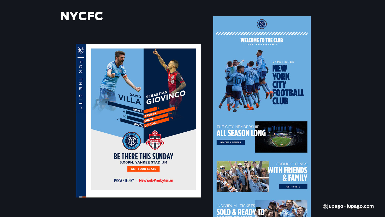
NYCFC @jupago • jupago.com
NYCFC @jupago • jupago.com
NYCFC @jupago • jupago.com
@jupago • jupago.com
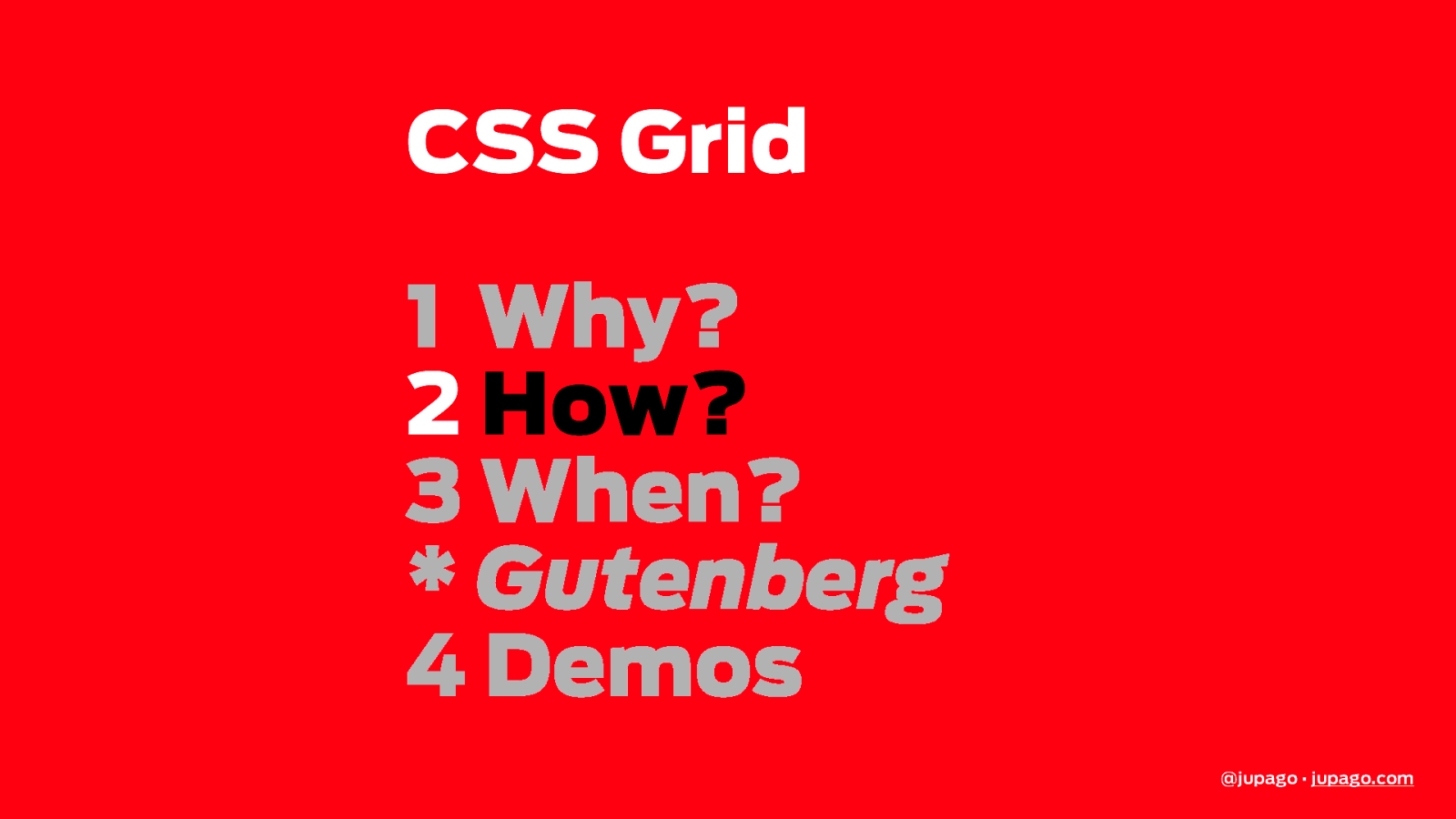
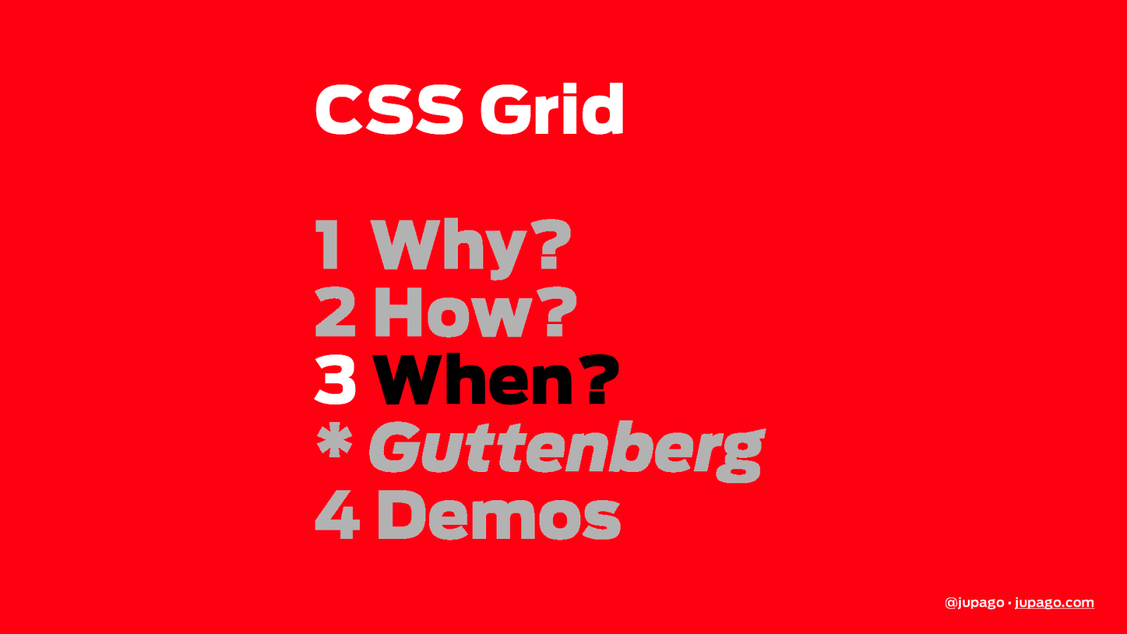
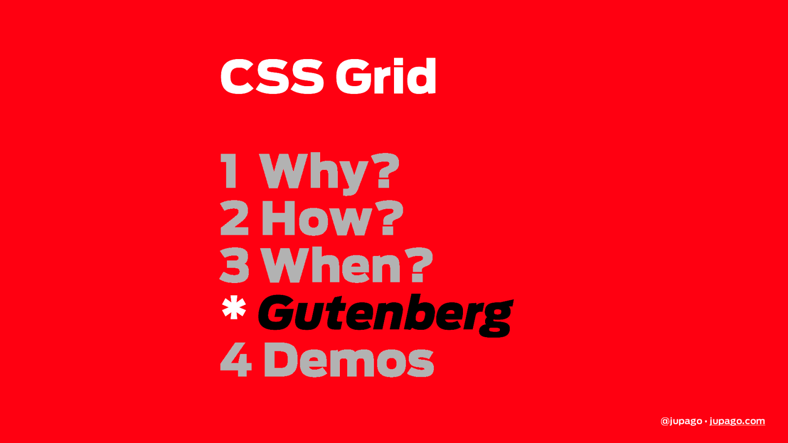
CSS Grid 1 Why? 2 How? 3 When? * Gutenberg 4 Demos @jupago • jupago.com
CSS Grid 1 Why? 2 How? 3 When? * Gutenberg 4 Demos @jupago • jupago.com
https://i.cbc.ca/1.3279853.1532811524!/fileImage/httpImage/image.jpg_gen/derivatives/16x9_780/drake.jpg http://www.imdb.com/title/tt0095016/mediaviewer/rm2280788992 https://images.gr-assets.com/books/1334416842l/830502.jpg @jupago • jupago.com
https://i.cbc.ca/1.3279853.1532811524!/fileImage/httpImage/image.jpg_gen/derivatives/16x9_780/drake.jpg http://www.imdb.com/title/tt0095016/mediaviewer/rm2280788992 https://images.gr-assets.com/books/1334416842l/830502.jpg @jupago • jupago.com
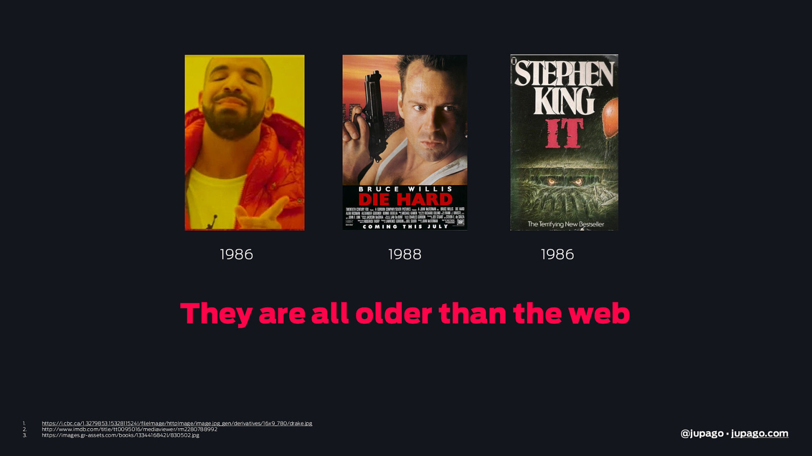
1986 1988 1986 They are all older than the web
https://i.cbc.ca/1.3279853.1532811524!/fileImage/httpImage/image.jpg_gen/derivatives/16x9_780/drake.jpg http://www.imdb.com/title/tt0095016/mediaviewer/rm2280788992 https://images.gr-assets.com/books/1334416842l/830502.jpg @jupago • jupago.com
https://giphy.com @jupago • jupago.com
http://www.ancient-egypt-online.com/egyptian-music.html https://headsup.boyslife.org/what-was-the-first-movie-ever-made/ https://hips.hearstapps.com/hmg-prod.s3.amazonaws.com/images/ed-sheeran-got-1500309510.png?crop=1.00xw:1.00xh;0,0&resize=768:* https://upload.wikimedia.org/wikipedia/commons/a/a8/Aztec_calendar_%28Sunstone%29.png http://ancientrome.ru/art/artworken/img.htm?id=1372 @jupago • jupago.com
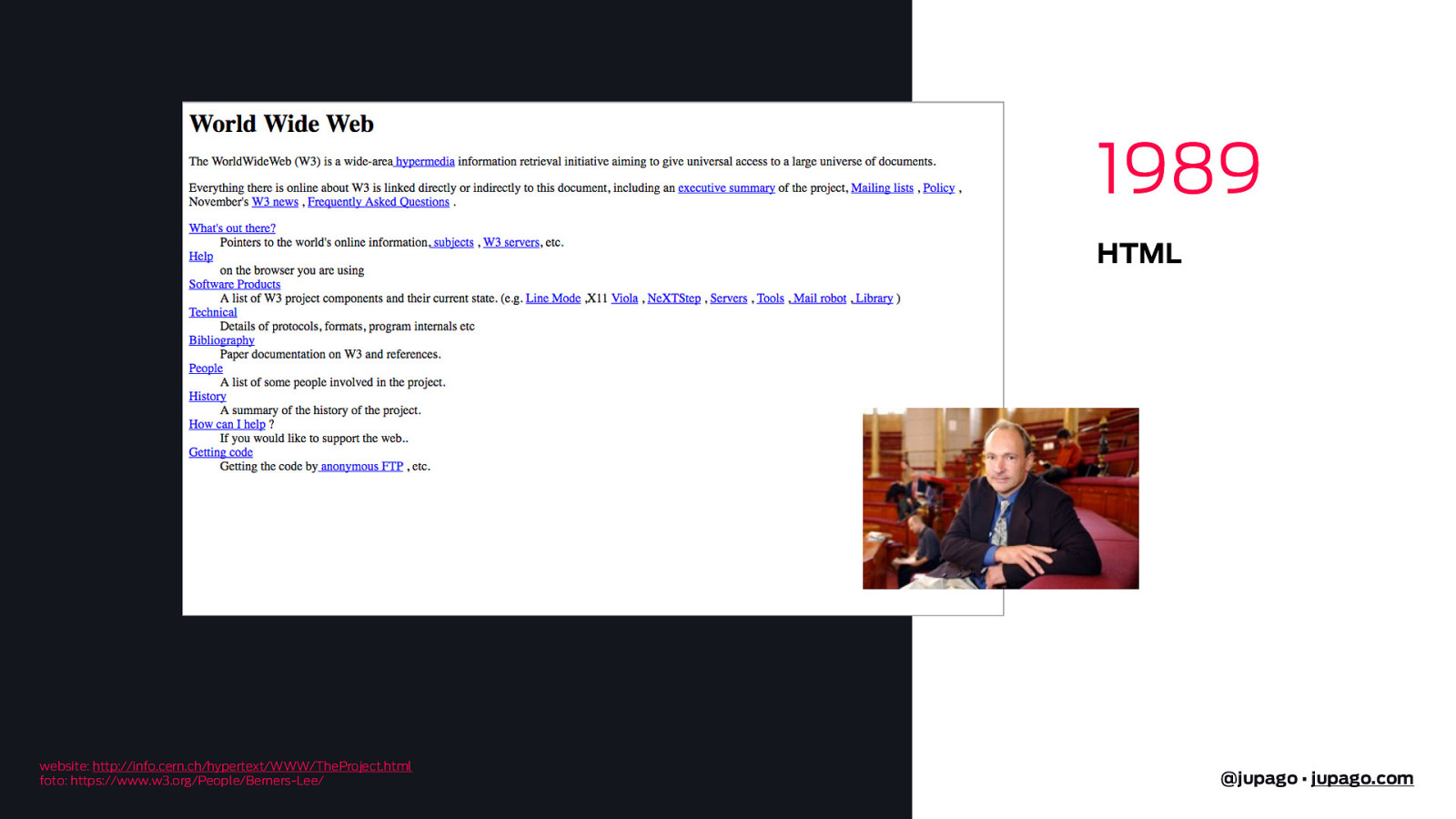
1989 HTML website: http://info.cern.ch/hypertext/WWW/TheProject.html foto: https://www.w3.org/People/Berners-Lee/ @jupago • jupago.com
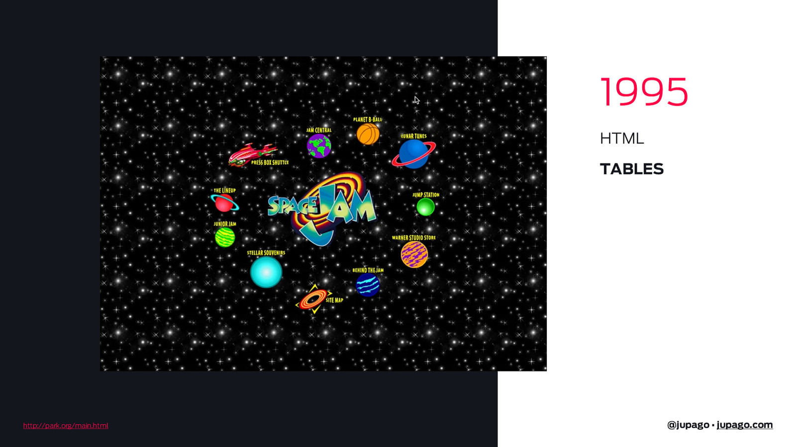
1995 HTML TABLES http://park.org/main.html @jupago • jupago.com
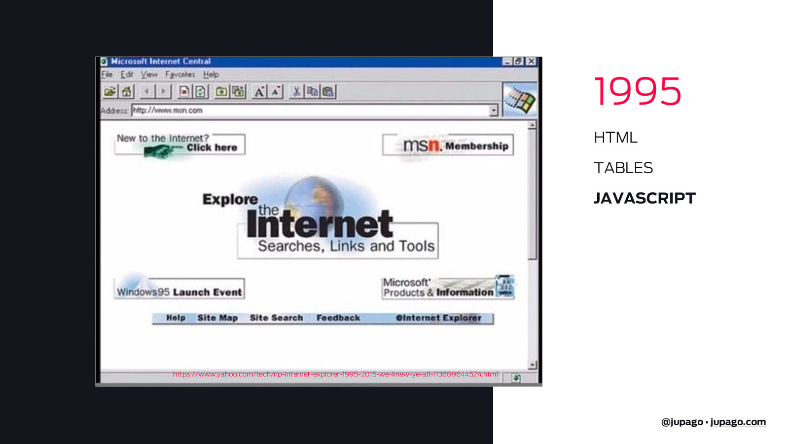
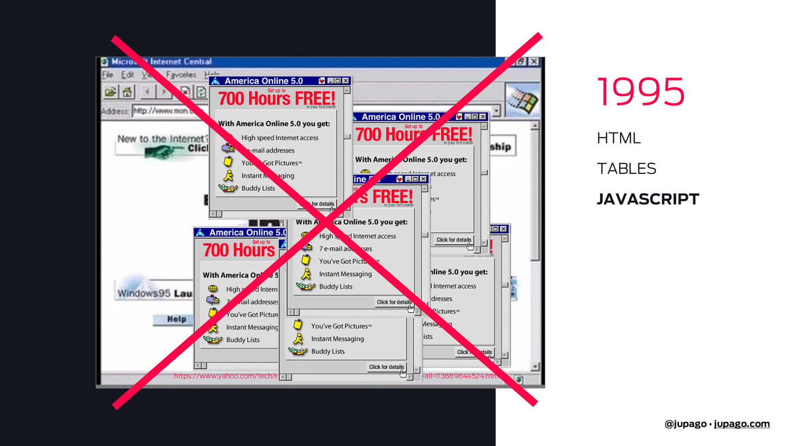
1995 HTML TABLES JAVASCRIPT https://www.yahoo.com/tech/rip-internet-explorer-1995-2015-we-knew-ye-all-113889644524.html @jupago • jupago.com
1995 HTML TABLES JAVASCRIPT https://www.yahoo.com/tech/rip-internet-explorer-1995-2015-we-knew-ye-all-113889644524.html @jupago • jupago.com
1996 HTML TABLES JAVASCRIPT FLASH @jupago • jupago.com
1996 HTML TABLES JAVASCRIPT FLASH @jupago • jupago.com
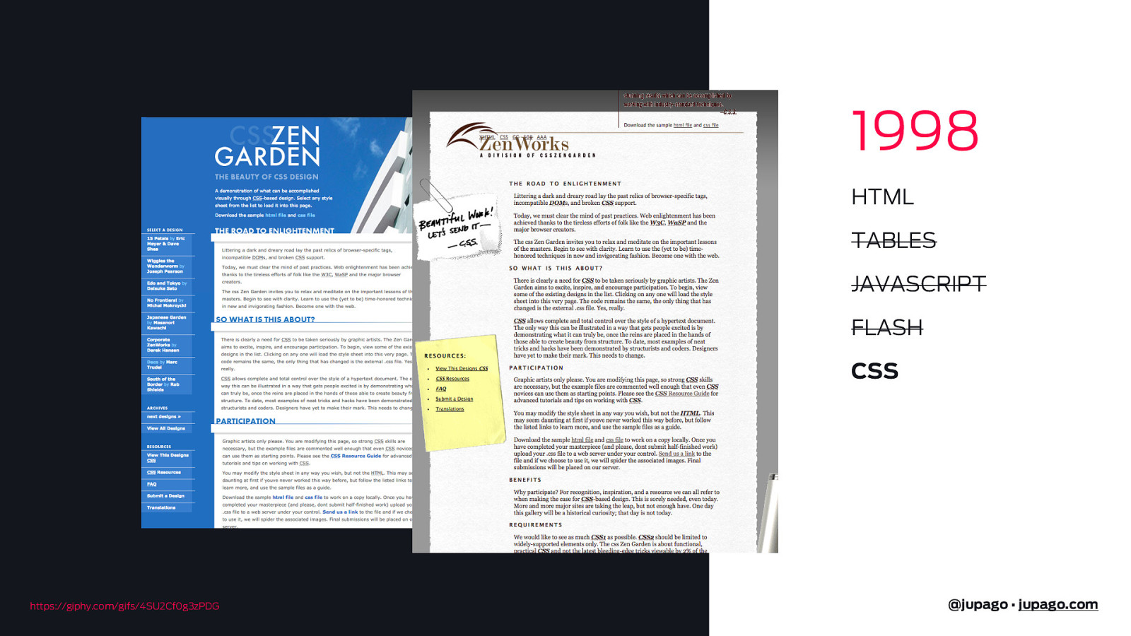
1998 HTML TABLES JAVASCRIPT FLASH CSS https://giphy.com/gifs/4SU2Cf0g3zPDG @jupago • jupago.com
https://giphy.com/gifs/4SU2Cf0g3zPDG @jupago • jupago.com
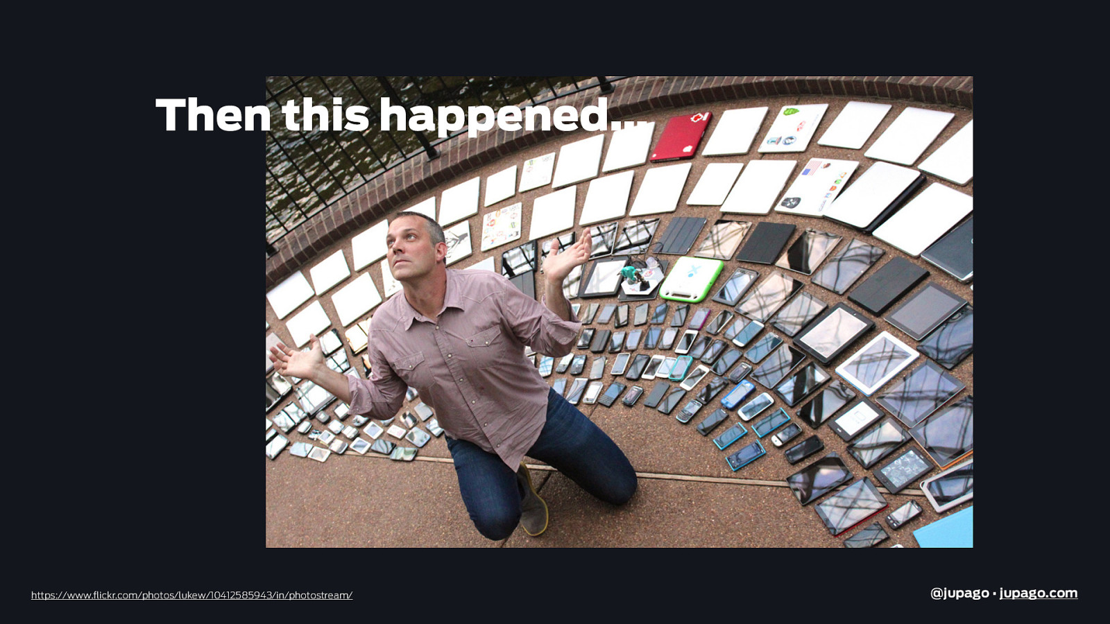
Then this happened… https://www.flickr.com/photos/lukew/10412585943/in/photostream/ @jupago • jupago.com
And this.. http://emkwan.com/post/85723552592/lol-apple-ipad-pro-prototype-spotted-in @jupago • jupago.com
And this.. giphy.com @jupago • jupago.com
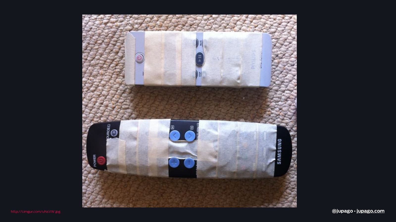
http://i.imgur.com/uNsVW.jpg @jupago • jupago.com
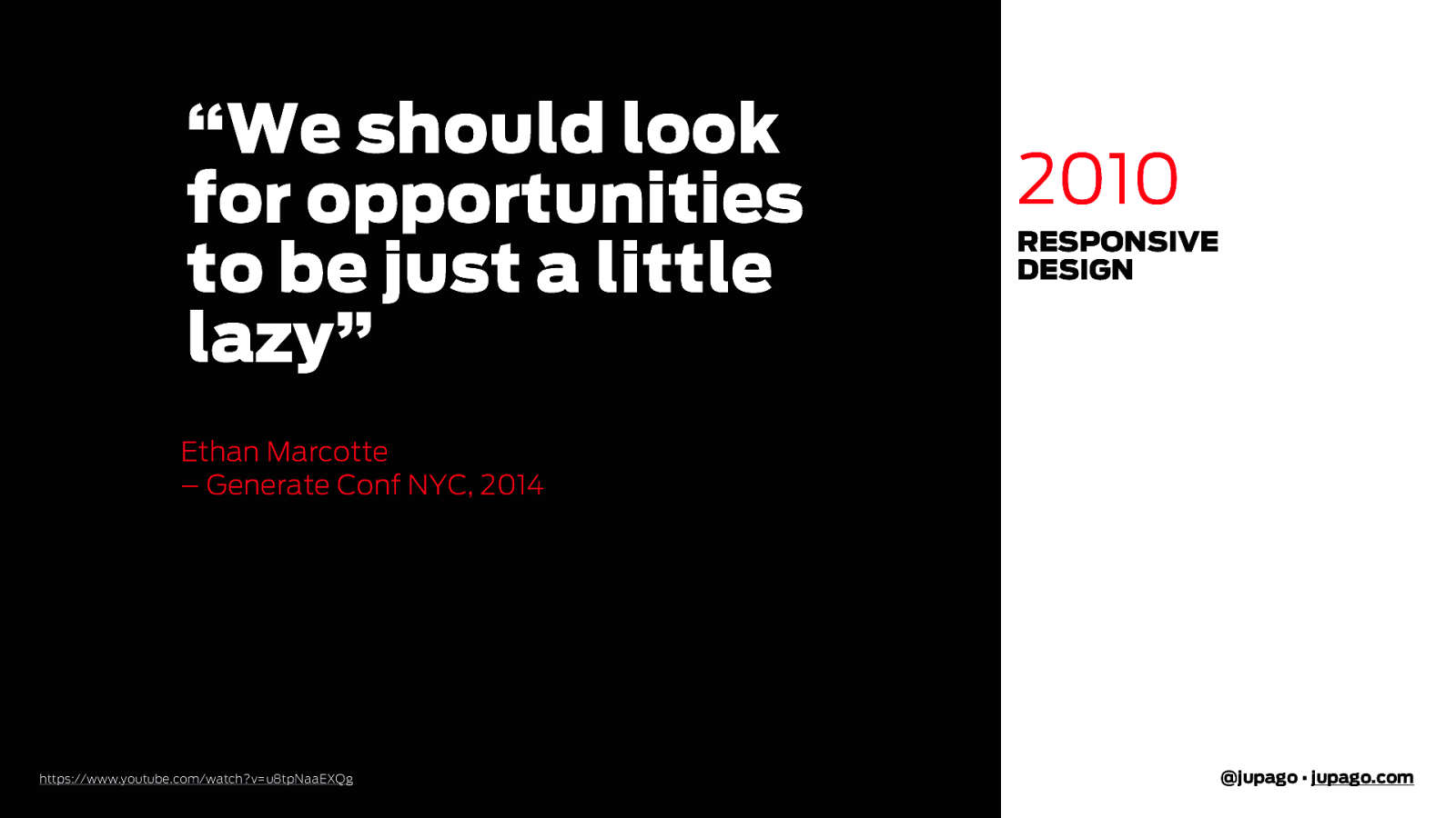
“We should look for opportunities to be just a little lazy” 2010 RESPONSIVE DESIGN Ethan Marcotte – Generate Conf NYC, 2014 https://www.youtube.com/watch?v=u8tpNaaEXQg @jupago • jupago.com
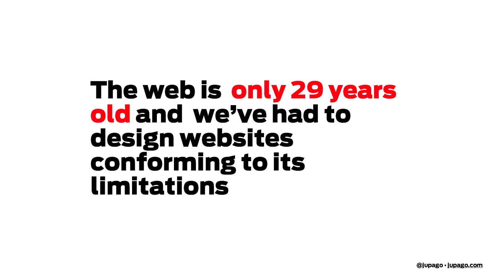
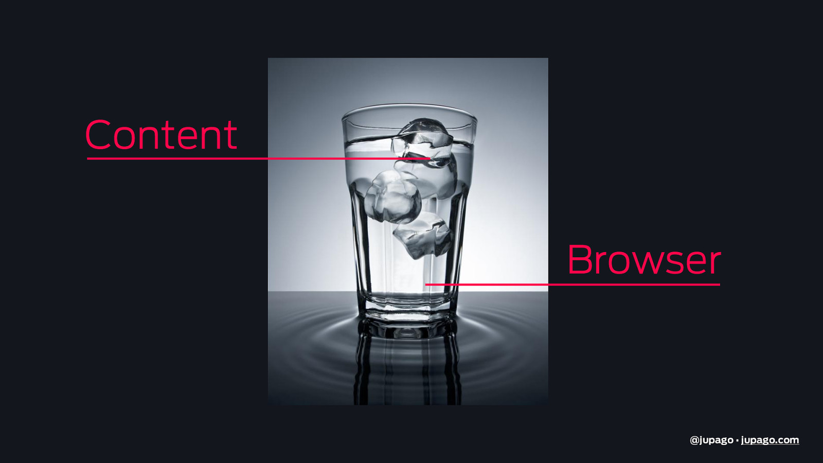
The web is only 29 years old and we’ve had to design websites conforming to its limitations @jupago • jupago.com
Content Browser @jupago • jupago.com
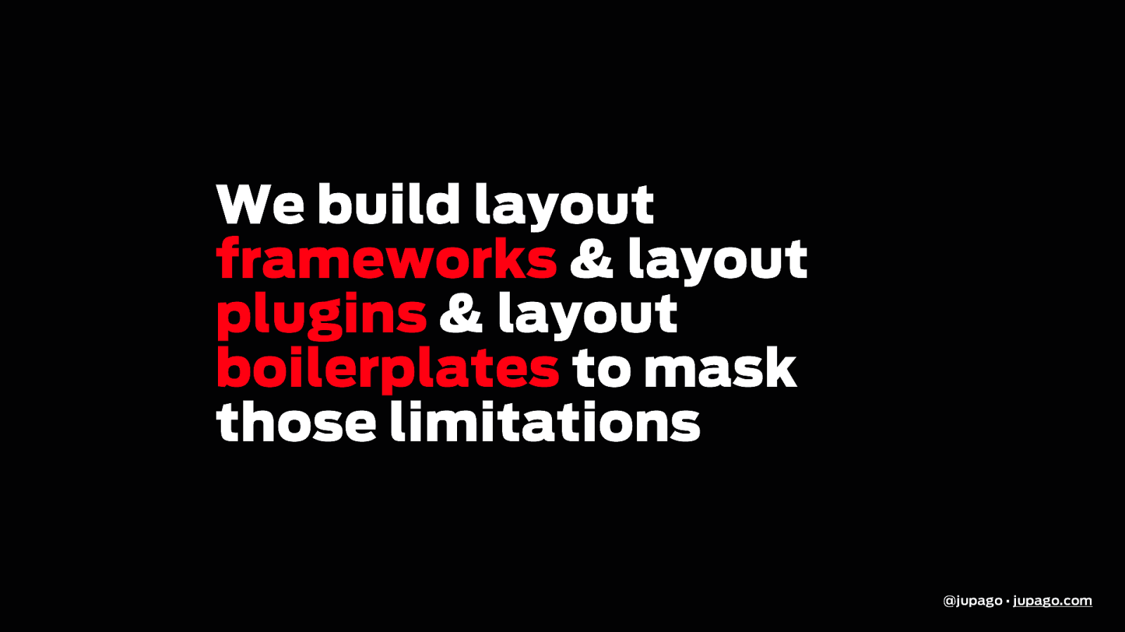
We build layout frameworks & layout plugins & layout boilerplates to mask those limitations @jupago • jupago.com
https://www.reddit.com/r/gifs/comments/4h84qg/be_different_and_youll_always_stand_out/ @jupago • jupago.com
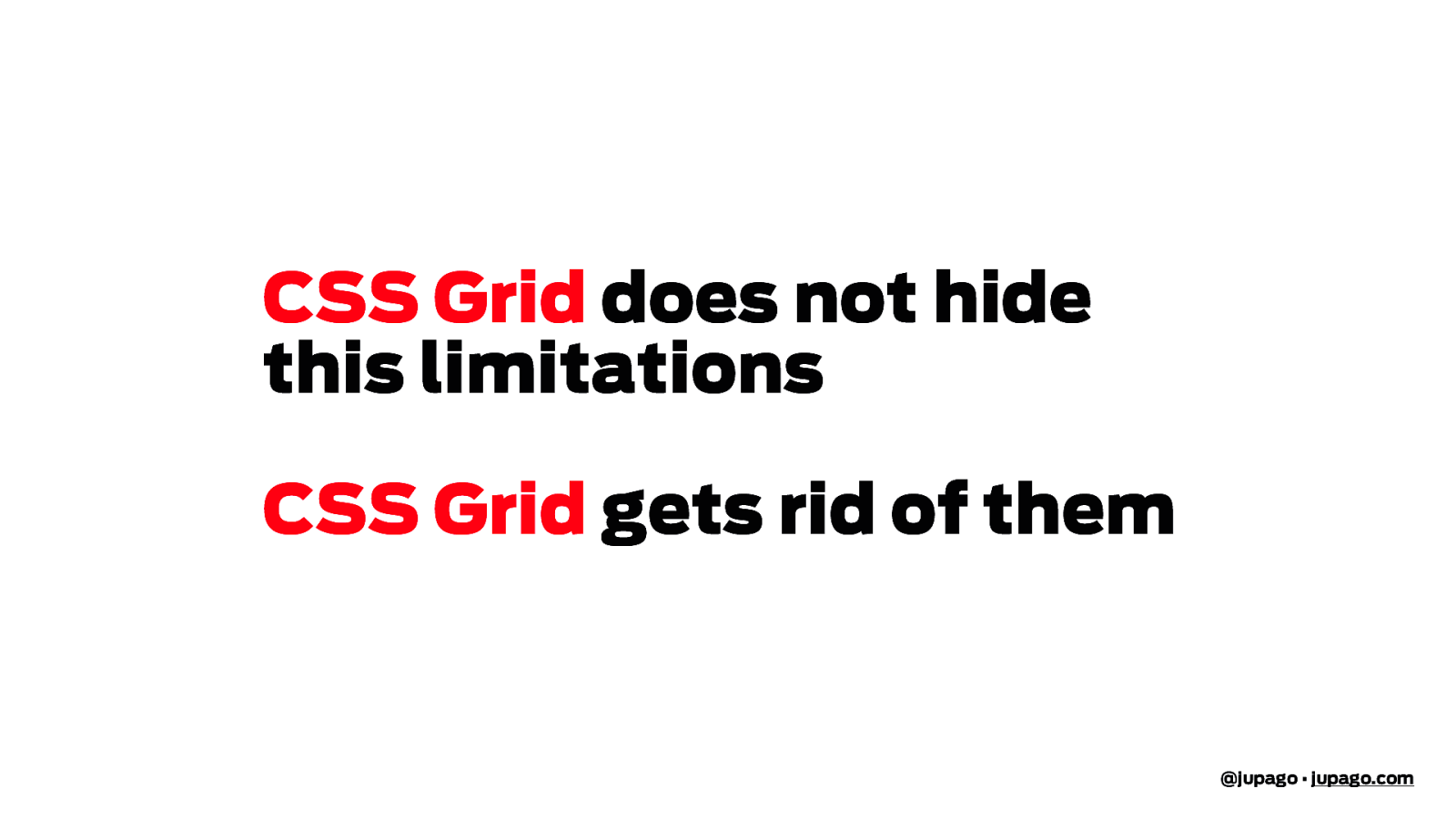
CSS Grid does not hide this limitations CSS Grid gets rid of them @jupago • jupago.com
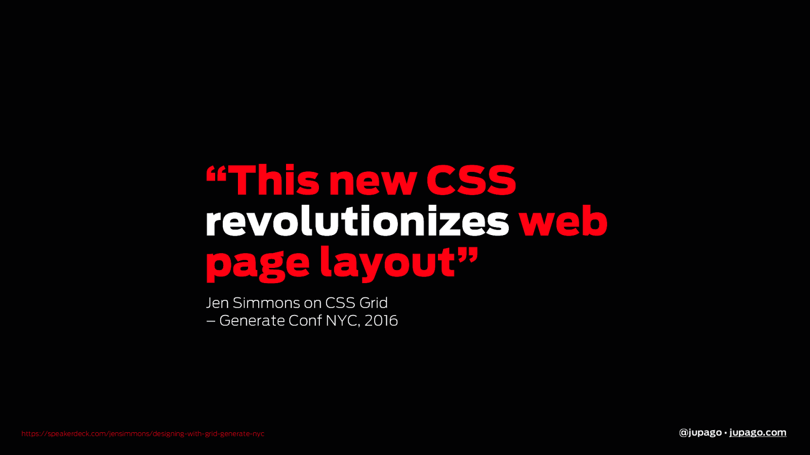
“This new CSS revolutionizes web page layout” Jen Simmons on CSS Grid – Generate Conf NYC, 2016 https://speakerdeck.com/jensimmons/designing-with-grid-generate-nyc @jupago • jupago.com
@jupago • jupago.com
CSS Grid 1 Why? 2 How? 3 When? * Gutenberg 4 Demos @jupago • jupago.com
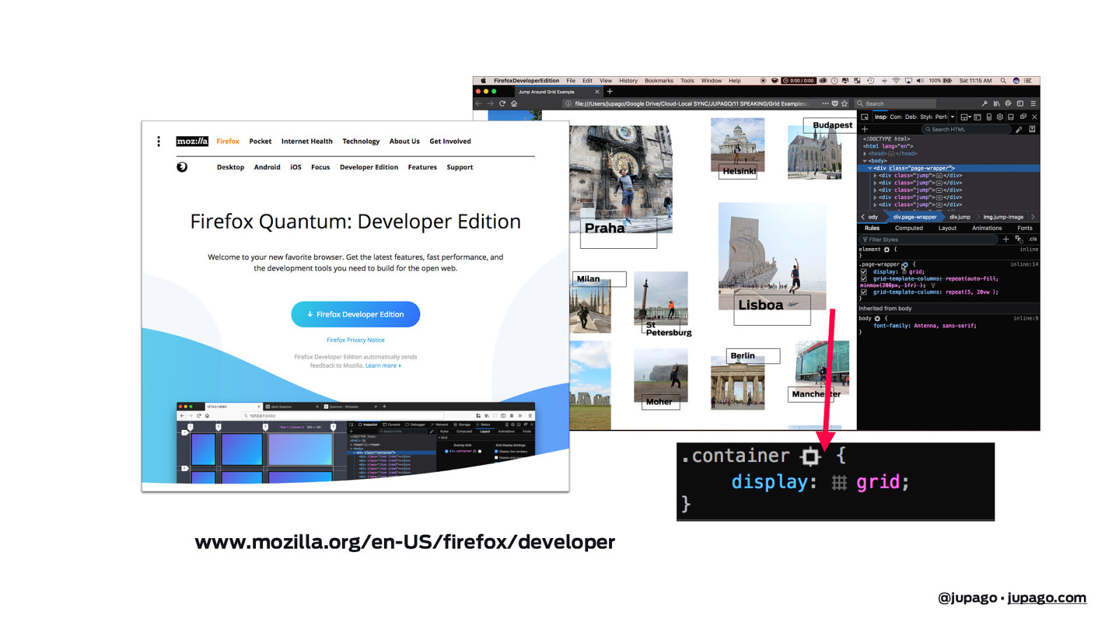
www.mozilla.org/en-US/firefox/developer @jupago • jupago.com
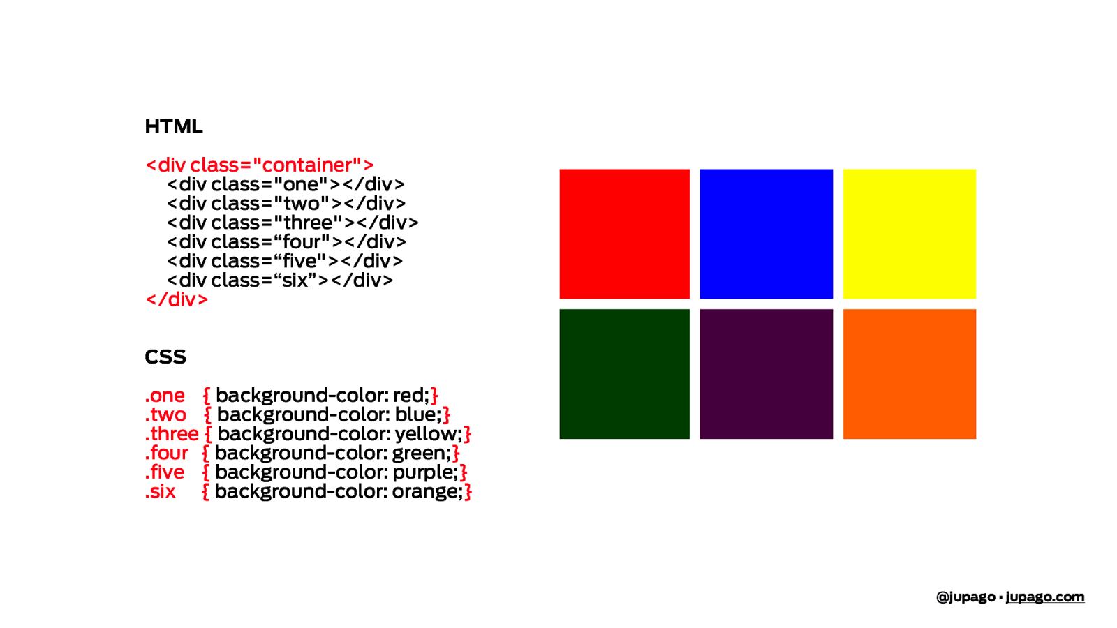
HTML <div class="container"> <div class="one"></div> <div class="two"></div> <div class="three"></div> <div class=“four"></div> <div class=“five"></div> <div class=“six”></div> </div> CSS .one { background-color: red;} .two { background-color: blue;} .three { background-color: yellow;} .four { background-color: green;} .five { background-color: purple;} .six { background-color: orange;} @jupago • jupago.com
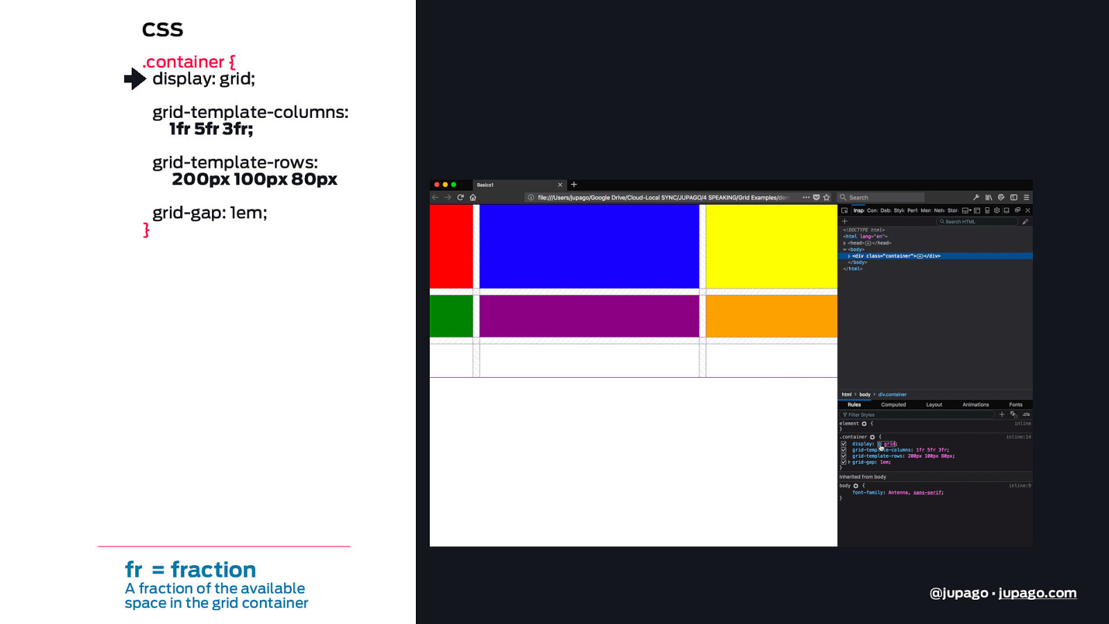
CSS .container { display: grid; grid-template-columns: 1fr 5fr 3fr; grid-template-rows: 200px 100px 80px } grid-gap: 1em; fr = fraction A fraction of the available space in the grid container @jupago • jupago.com
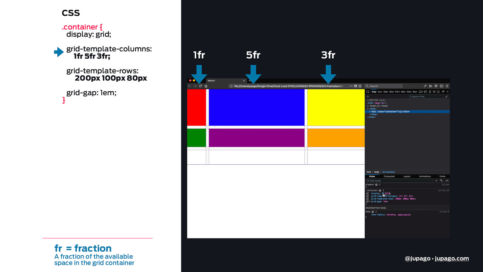
CSS .container { display: grid; grid-template-columns: 1fr 5fr 3fr; 1fr 5fr 3fr grid-template-rows: 200px 100px 80px } grid-gap: 1em; fr = fraction A fraction of the available space in the grid container @jupago • jupago.com
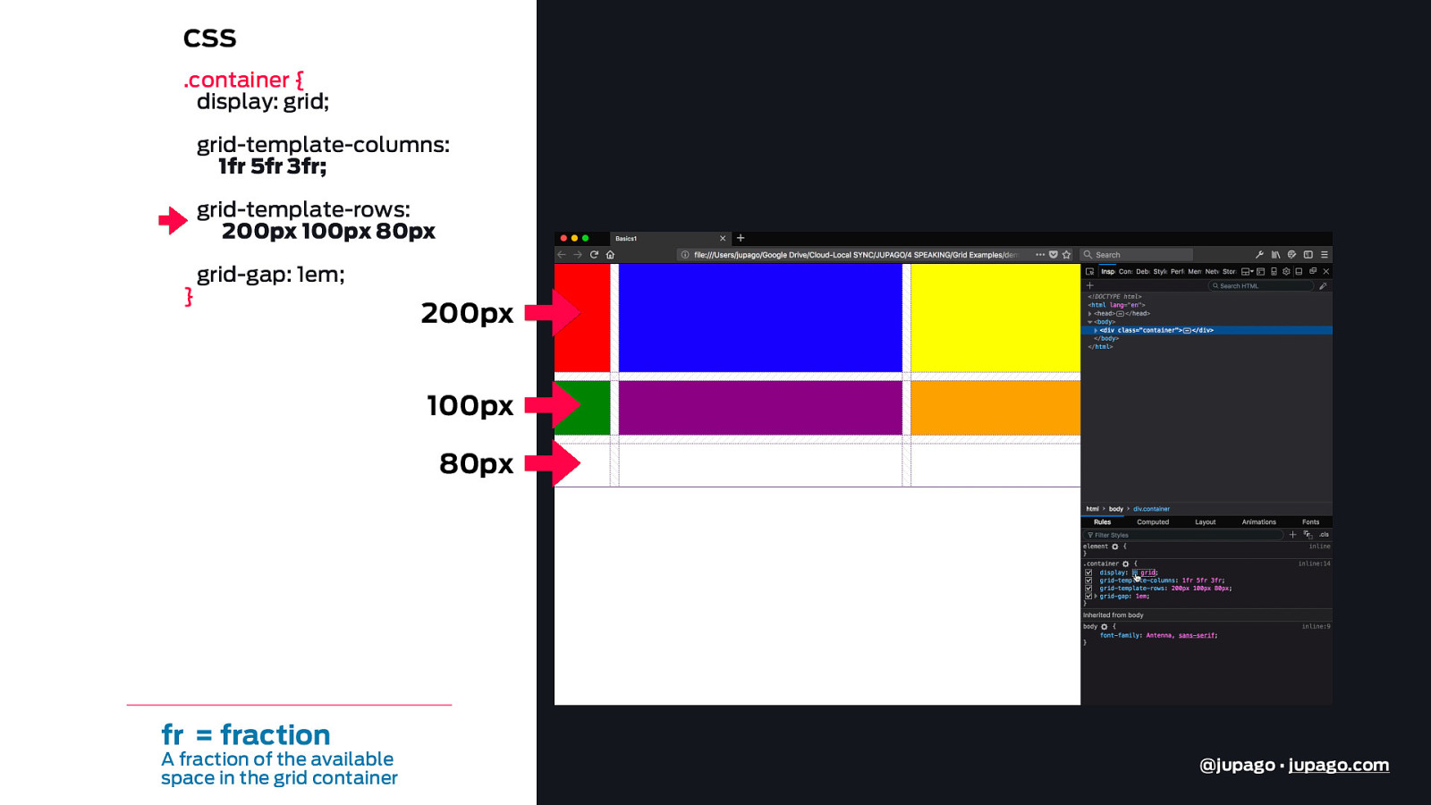
CSS .container { display: grid; grid-template-columns: 1fr 5fr 3fr; grid-template-rows: 200px 100px 80px } grid-gap: 1em; 200px 100px 80px fr = fraction A fraction of the available space in the grid container @jupago • jupago.com
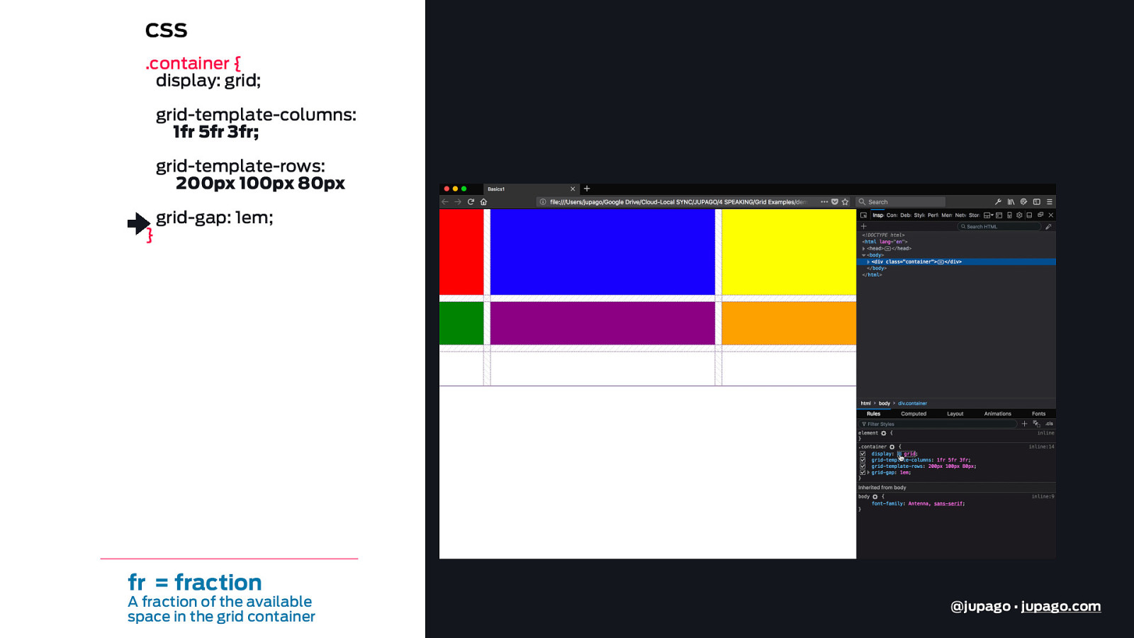
CSS .container { display: grid; grid-template-columns: 1fr 5fr 3fr; grid-template-rows: 200px 100px 80px } grid-gap: 1em; fr = fraction A fraction of the available space in the grid container @jupago • jupago.com
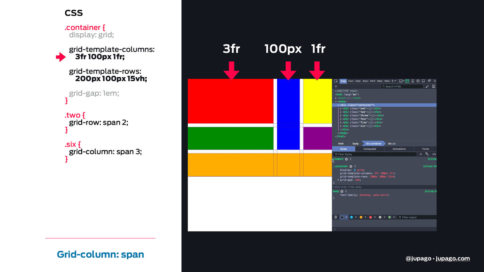
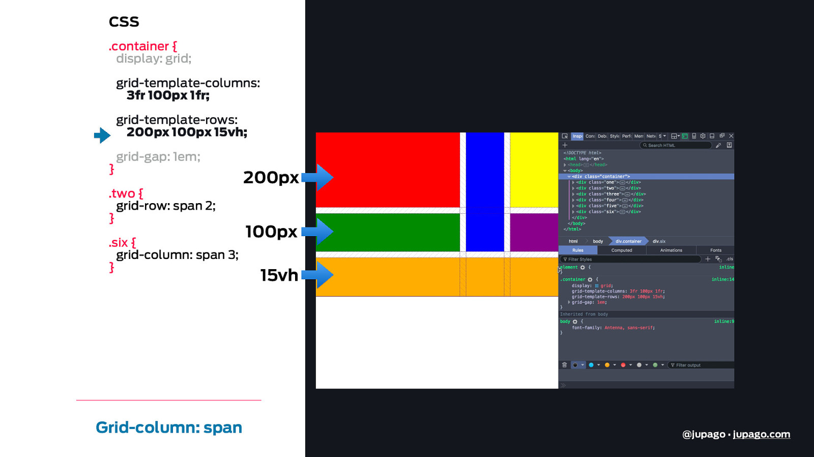
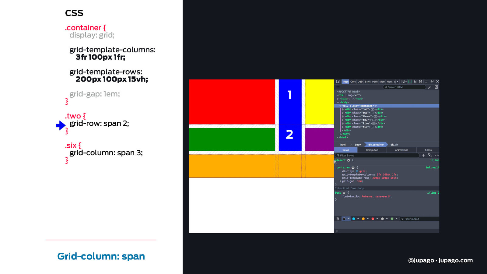
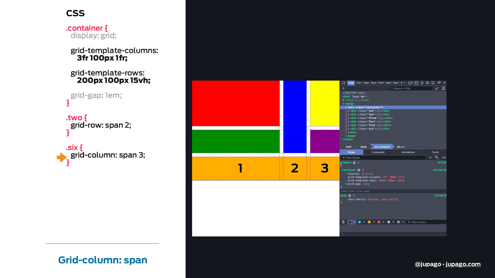
CSS .container { display: grid; grid-template-columns: 3fr 100px 1fr; 3fr 100px 1fr grid-template-rows: 200px 100px 15vh; } grid-gap: 1em; .two { grid-row: span 2; } .six { grid-column: span 3; } Grid-column: span @jupago • jupago.com
CSS .container { display: grid; grid-template-columns: 3fr 100px 1fr; grid-template-rows: 200px 100px 15vh; } grid-gap: 1em; .two { grid-row: span 2; } .six { grid-column: span 3; } Grid-column: span 200px 100px 15vh @jupago • jupago.com
CSS .container { display: grid; grid-template-columns: 3fr 100px 1fr; grid-template-rows: 200px 100px 15vh; } grid-gap: 1em; .two { grid-row: span 2; } .six { grid-column: span 3; } Grid-column: span 1 2 @jupago • jupago.com
CSS .container { display: grid; grid-template-columns: 3fr 100px 1fr; grid-template-rows: 200px 100px 15vh; } grid-gap: 1em; .two { grid-row: span 2; } .six { grid-column: span 3; } Grid-column: span 1 2 3 @jupago • jupago.com
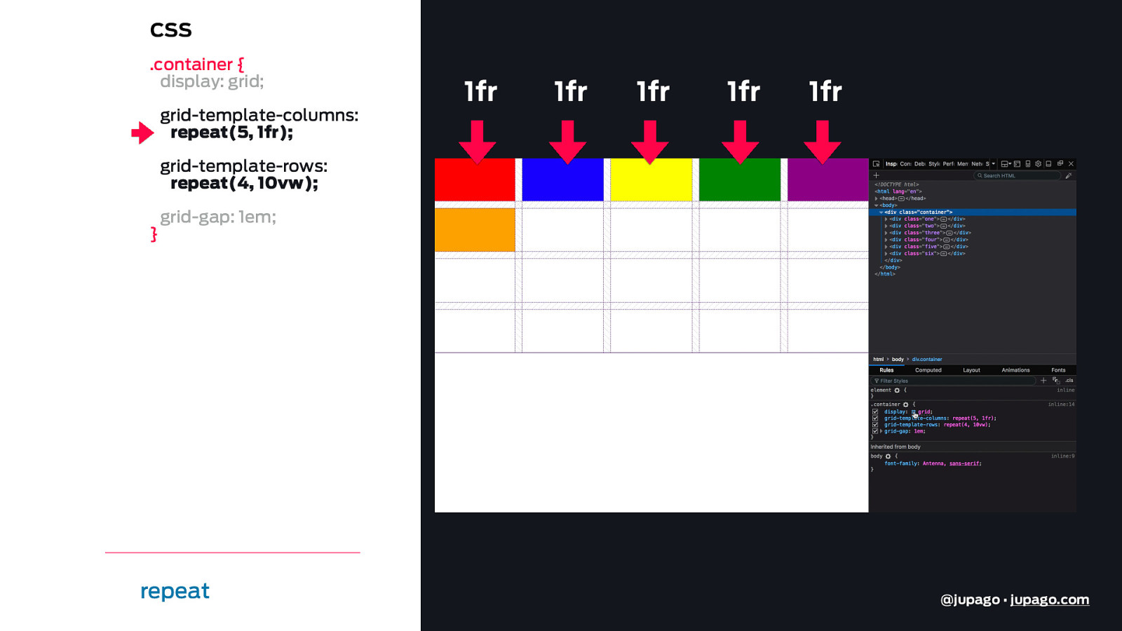
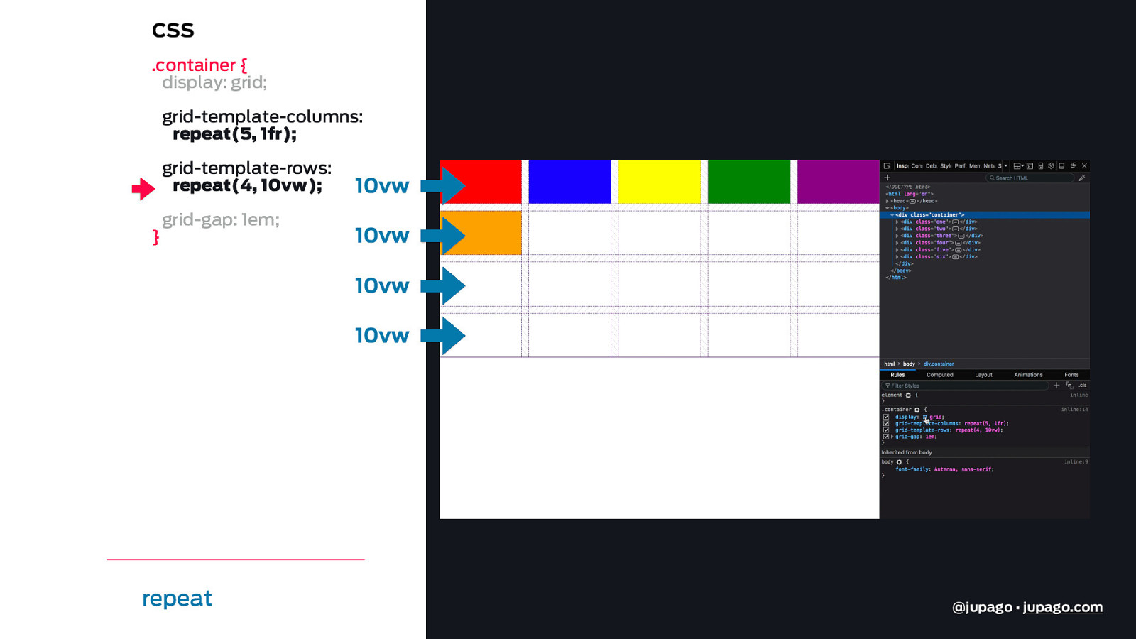
CSS .container { display: grid; grid-template-columns: repeat(5, 1fr); 1fr 1fr 1fr 1fr 1fr grid-template-rows: repeat(4, 10vw); } grid-gap: 1em; repeat @jupago • jupago.com
CSS .container { display: grid; grid-template-columns: repeat(5, 1fr); grid-template-rows: repeat(4, 10vw); } grid-gap: 1em; 10vw 10vw 10vw 10vw repeat @jupago • jupago.com
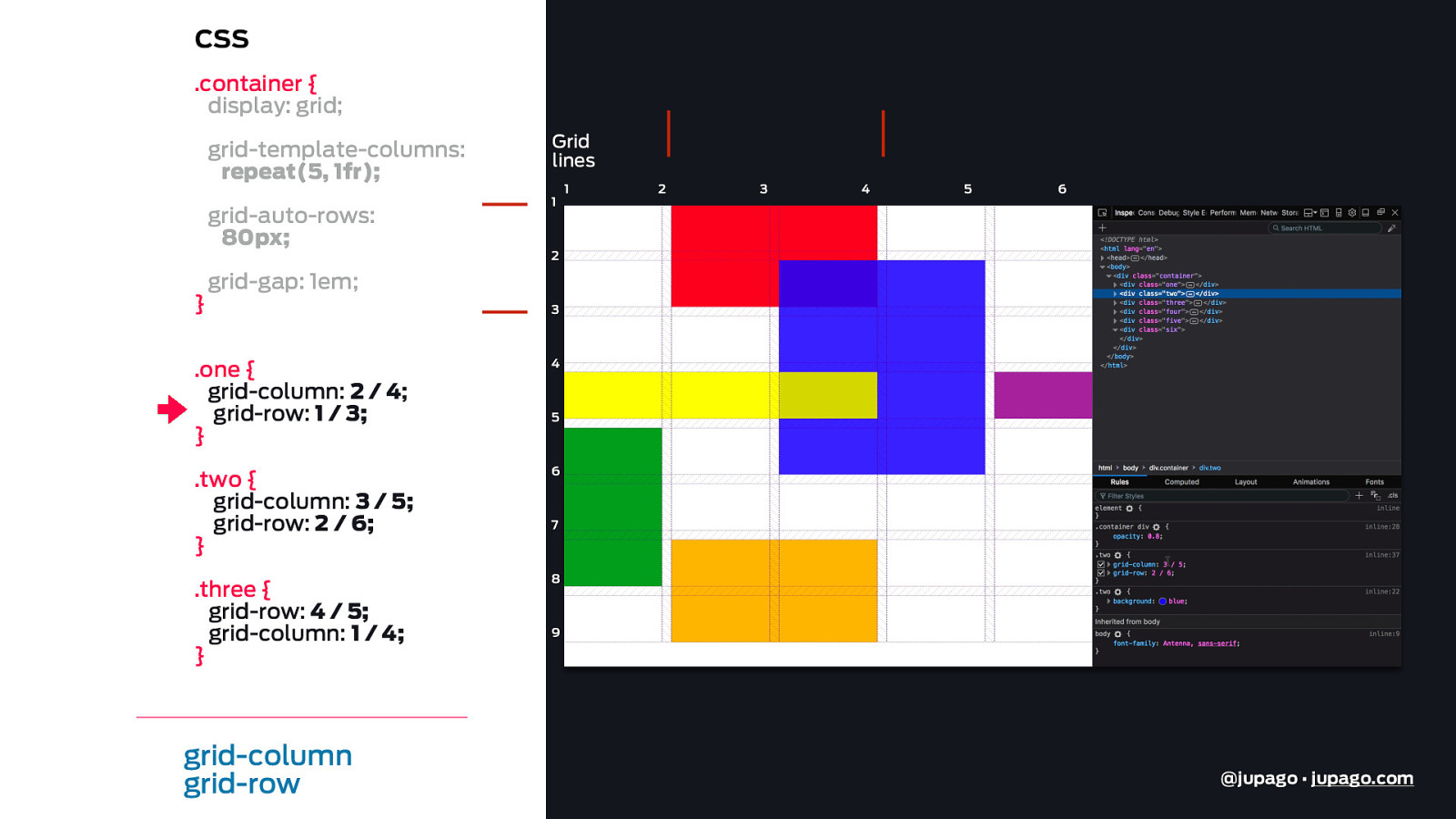
CSS .container { display: grid; grid-template-columns: repeat(5, 1fr); grid-auto-rows: 80px; } Grid lines 1 1 2 3 4 5 6 2 grid-gap: 1em; 3 .one { grid-column: 2 / 4; grid-row: 1 / 3; } 4 .two { grid-column: 3 / 5; grid-row: 2 / 6; } 6 .three { grid-row: 4 / 5; grid-column: 1 / 4; } 8 grid-column grid-row 5 7 9 @jupago • jupago.com
CSS .container { display: grid; grid-template-columns: repeat(5, 1fr); grid-auto-rows: 80px; } Grid lines 1 1 2 3 4 5 6 2 grid-gap: 1em; 3 .one { grid-column: 2 / 4; grid-row: 1 / 3; } 4 .two { grid-column: 3 / 5; grid-row: 2 / 6; } 6 .three { grid-row: 4 / 5; grid-column: 1 / 4; } 8 grid-column grid-row 5 7 9 @jupago • jupago.com
CSS .container { display: grid; grid-template-columns: repeat(5, 1fr); grid-auto-rows: 80px; } Grid lines 1 1 2 3 4 5 6 2 grid-gap: 1em; 3 .one { grid-column: 2 / 4; grid-row: 1 / 3; } 4 .two { grid-column: 3 / 5; grid-row: 2 / 6; } 6 .three { grid-row: 4 / 5; grid-column: 1 / 4; } 8 grid-column grid-row 5 7 9 @jupago • jupago.com
CSS .container { display: grid; grid-template-columns: repeat(5, 1fr); grid-auto-rows: 80px; } Grid lines 1 1 2 3 4 5 6 2 grid-gap: 1em; 3 .one { grid-column: 2 / 4; grid-row: 1 / 3; } 4 .two { grid-column: 3 / 5; grid-row: 2 / 6; } 6 .three { grid-row: 4 / 5; grid-column: 1 / 4; } 8 grid-column grid-row 5 7 9 @jupago • jupago.com
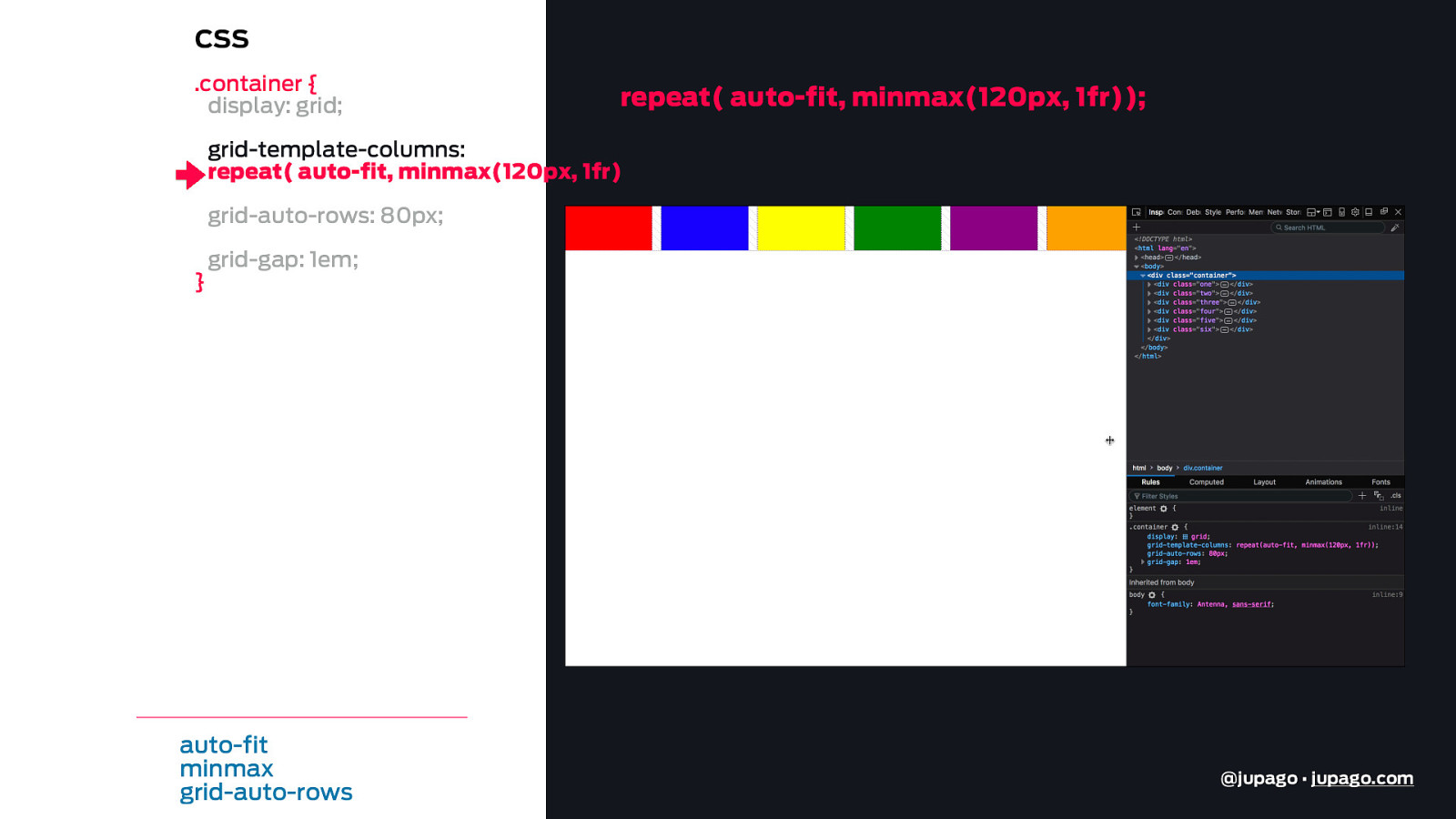
CSS .container { display: grid; repeat( auto-fit, minmax(120px, 1fr)); grid-template-columns: repeat( auto-fit, minmax(120px, 1fr)); grid-auto-rows: 80px; } grid-gap: 1em; auto-fit minmax grid-auto-rows @jupago • jupago.com
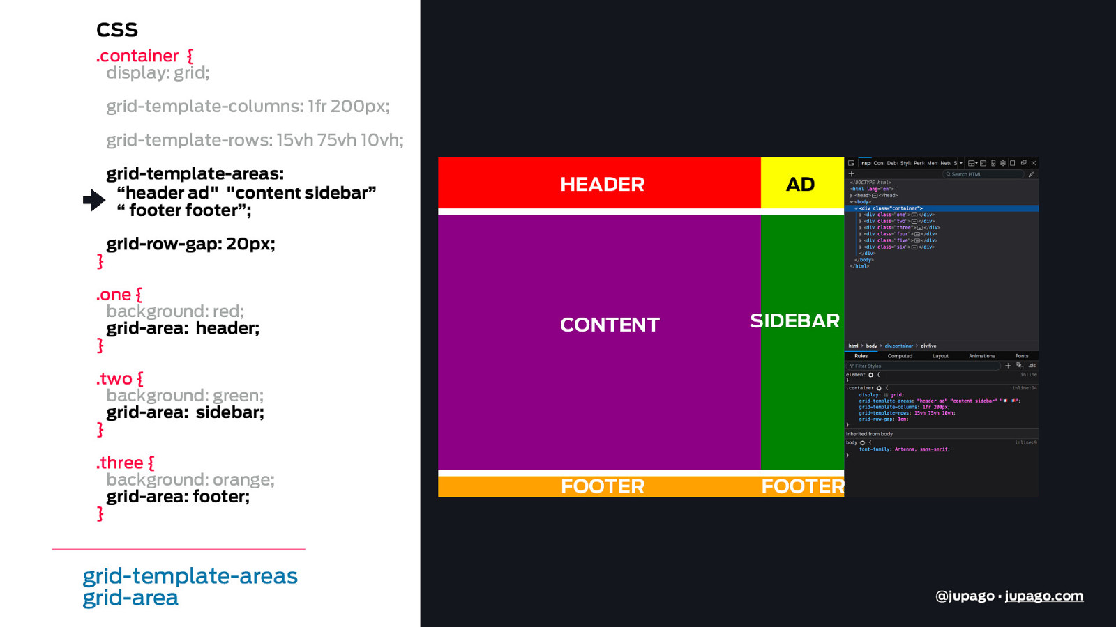
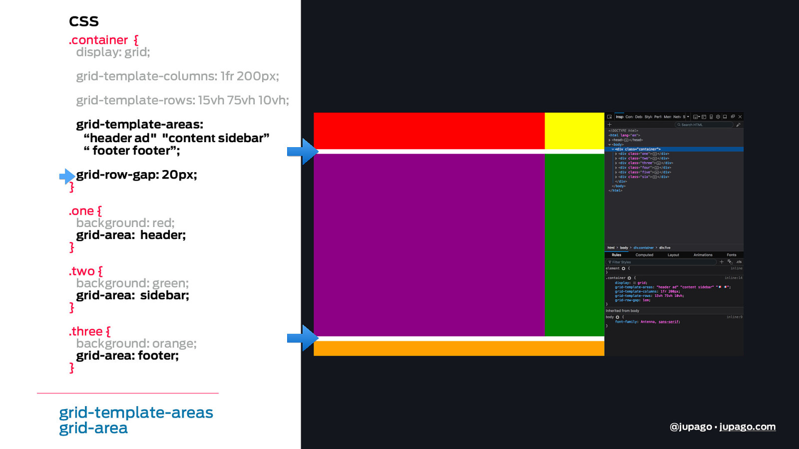
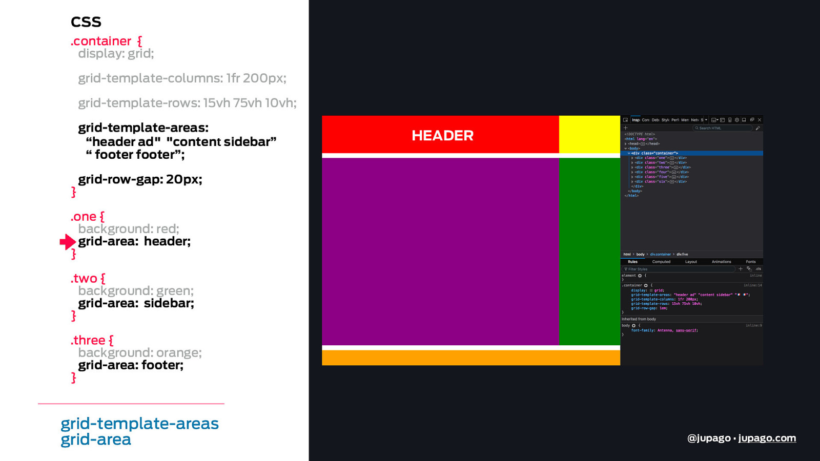
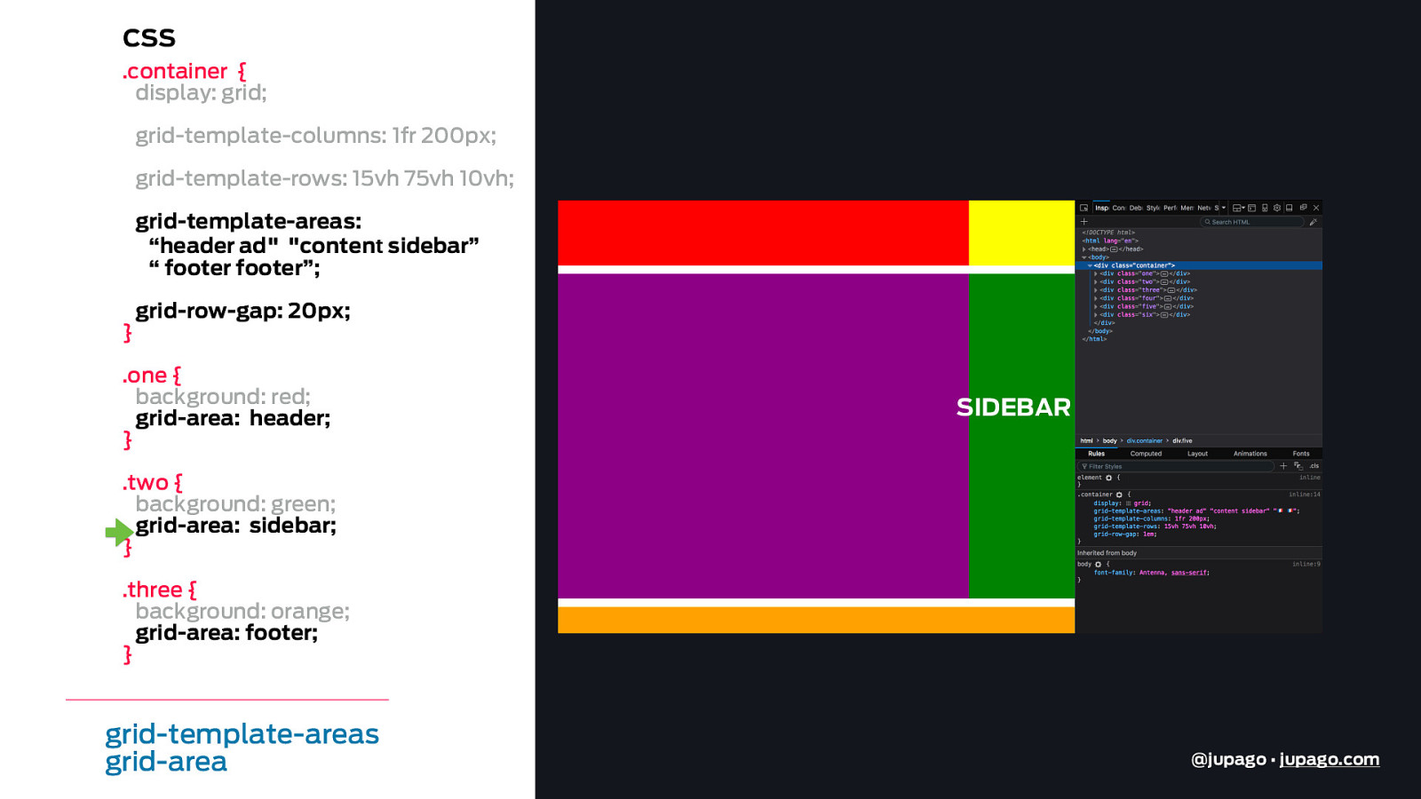
CSS .container { display: grid; grid-template-columns: 1fr 200px; grid-template-rows: 15vh 75vh 10vh; grid-template-areas: “header ad" "content sidebar” “ footer footer”; } HEADER AD grid-row-gap: 20px; .one { background: red; grid-area: header; } CONTENT SIDEBAR .two { background: green; grid-area: sidebar; } .three { background: orange; grid-area: footer; } grid-template-areas grid-area FOOTER FOOTER @jupago • jupago.com
CSS .container { display: grid; grid-template-columns: 1fr 200px; grid-template-rows: 15vh 75vh 10vh; grid-template-areas: “header ad" "content sidebar” “ footer footer”; } grid-row-gap: 20px; .one { background: red; grid-area: header; } .two { background: green; grid-area: sidebar; } .three { background: orange; grid-area: footer; } grid-template-areas grid-area @jupago • jupago.com
CSS .container { display: grid; grid-template-columns: 1fr 200px; grid-template-rows: 15vh 75vh 10vh; grid-template-areas: “header ad" "content sidebar” “ footer footer”; } HEADER grid-row-gap: 20px; .one { background: red; grid-area: header; } .two { background: green; grid-area: sidebar; } .three { background: orange; grid-area: footer; } grid-template-areas grid-area @jupago • jupago.com
CSS .container { display: grid; grid-template-columns: 1fr 200px; grid-template-rows: 15vh 75vh 10vh; grid-template-areas: “header ad" "content sidebar” “ footer footer”; } grid-row-gap: 20px; .one { background: red; grid-area: header; } SIDEBAR .two { background: green; grid-area: sidebar; } .three { background: orange; grid-area: footer; } grid-template-areas grid-area @jupago • jupago.com
CSS .container { display: grid; grid-template-columns: 1fr 200px; grid-template-rows: 15vh 75vh 10vh; grid-template-areas: “header ad" "content sidebar” “ footer footer”; } grid-row-gap: 20px; .one { background: red; grid-area: header; } .two { background: green; grid-area: sidebar; } .three { background: orange; grid-area: footer; } grid-template-areas grid-area FOOTER @jupago • jupago.com
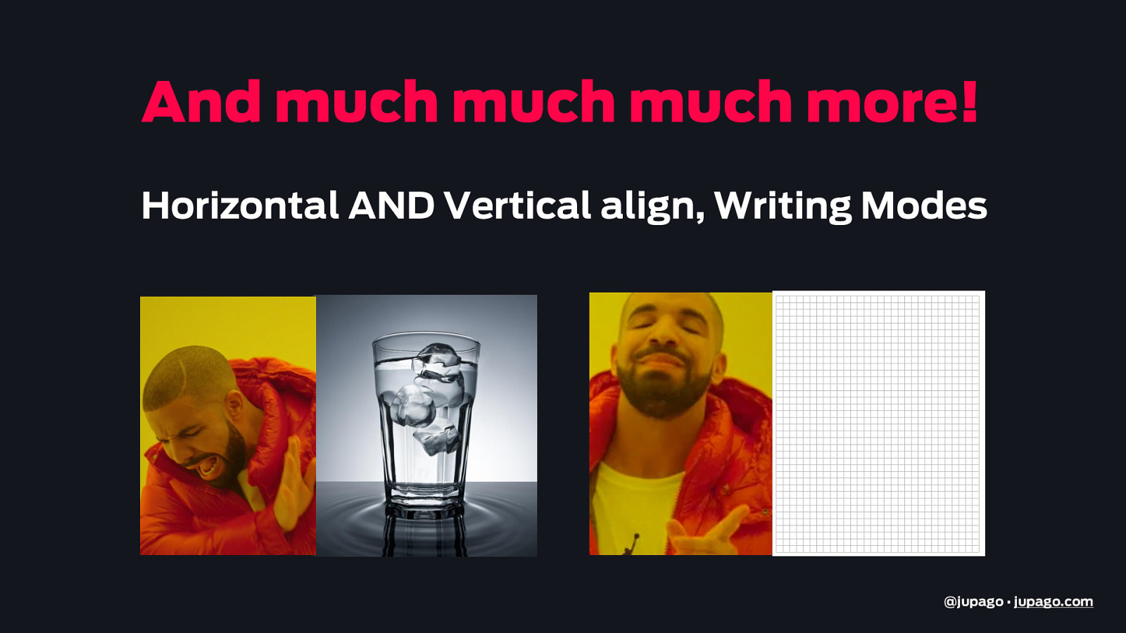
And much much much more! Horizontal AND Vertical align, Writing Modes @jupago • jupago.com
CSS Grid 1 Why? 2 How? 3 When? * Guttenberg 4 Demos @jupago • jupago.com
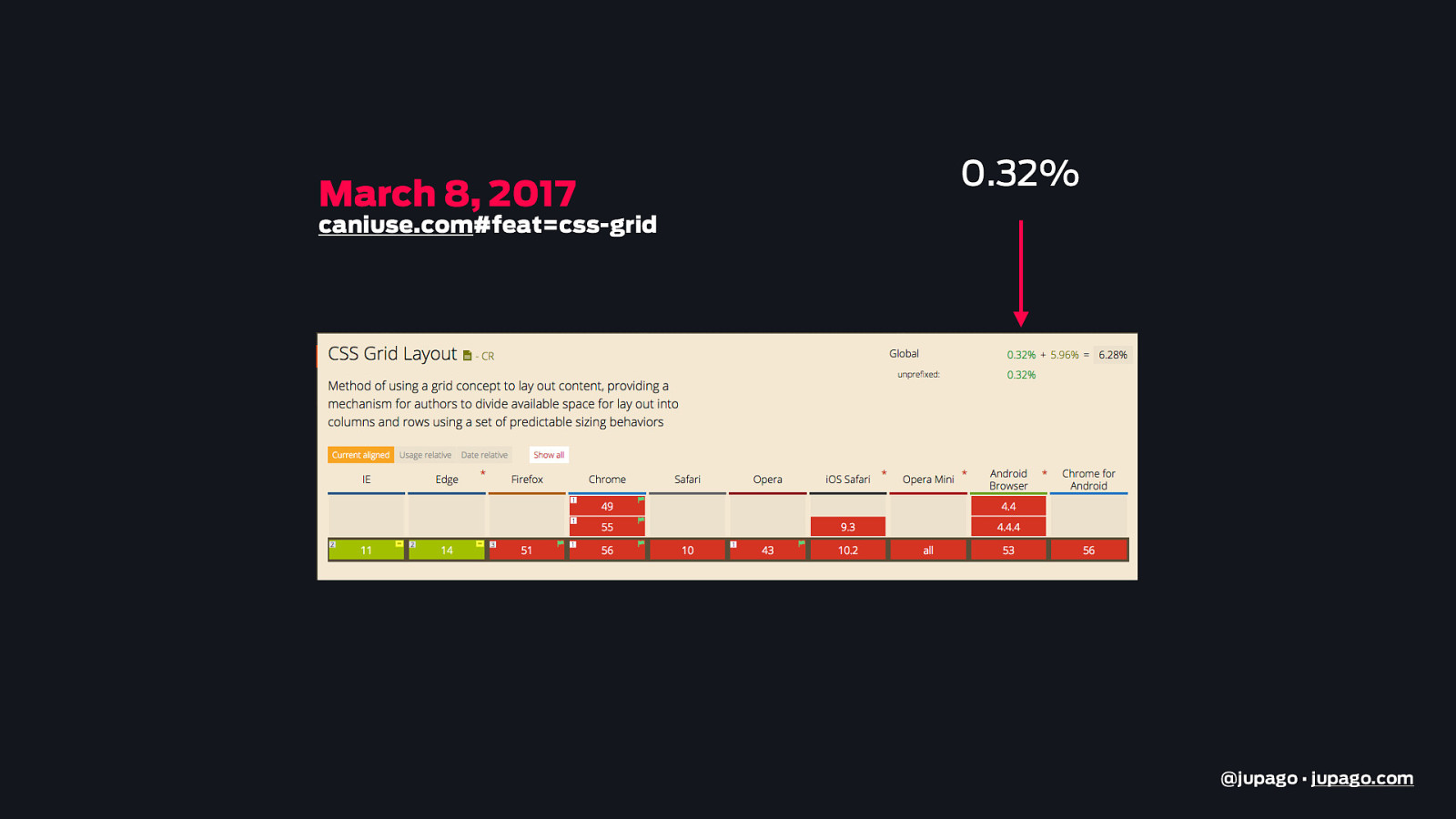
March 8, 2017 0.32% caniuse.com#feat=css-grid @jupago • jupago.com
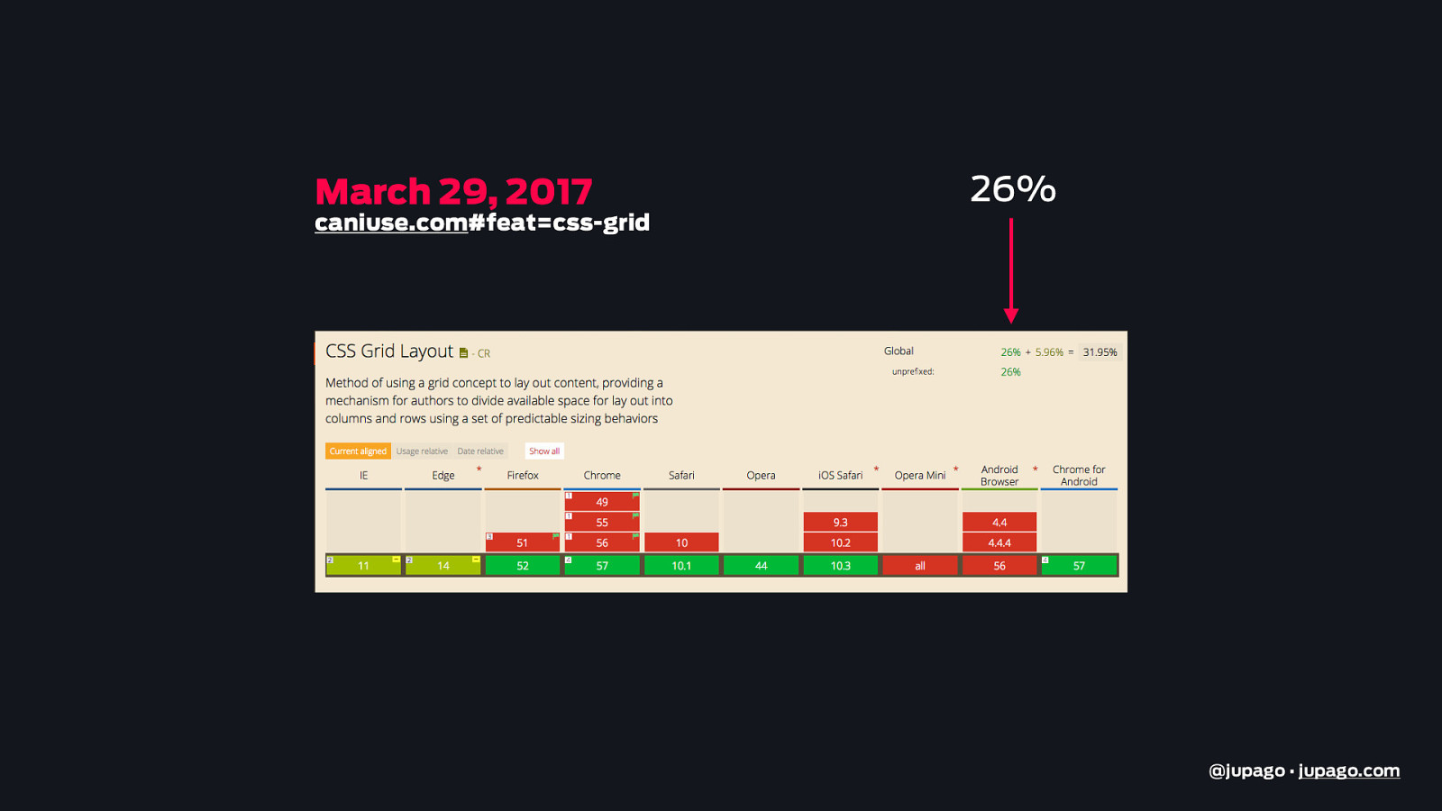
Three Weeks Later…. @jupago • jupago.com
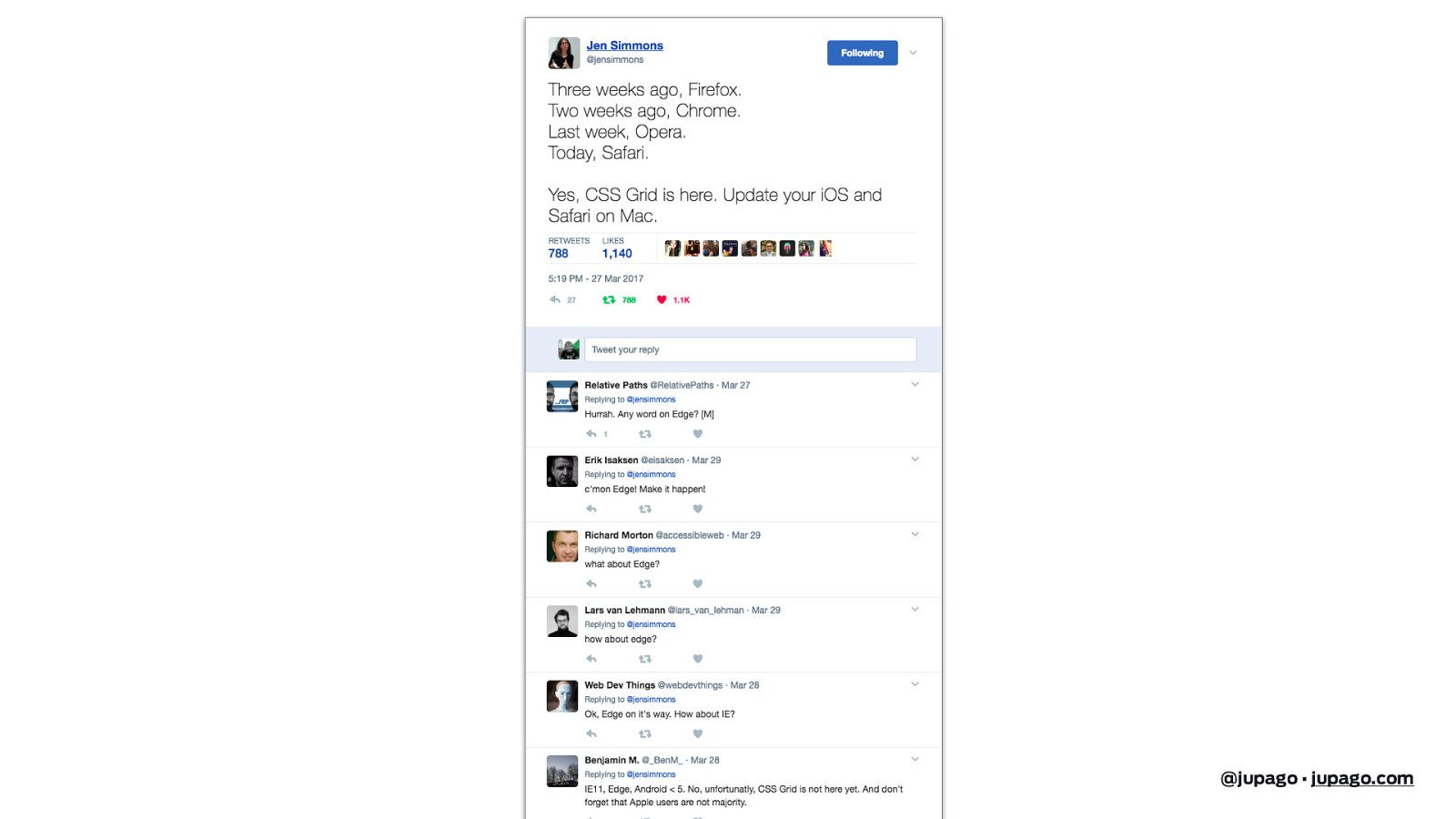
March 29, 2017 caniuse.com#feat=css-grid 26% @jupago • jupago.com
@jupago • jupago.com
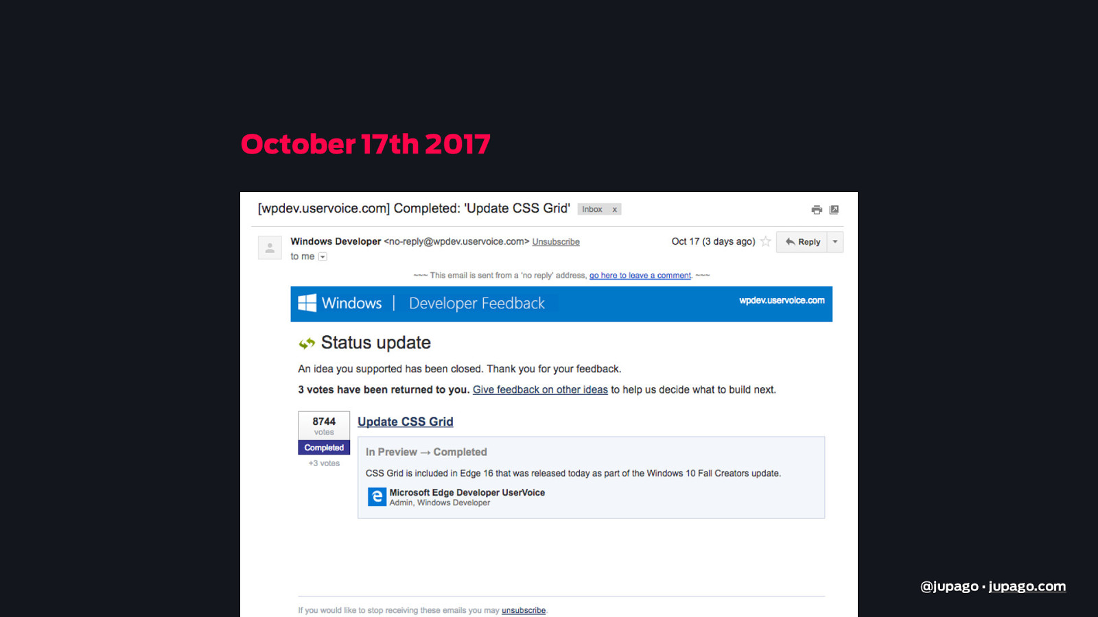
October 17th 2017 @jupago • jupago.com
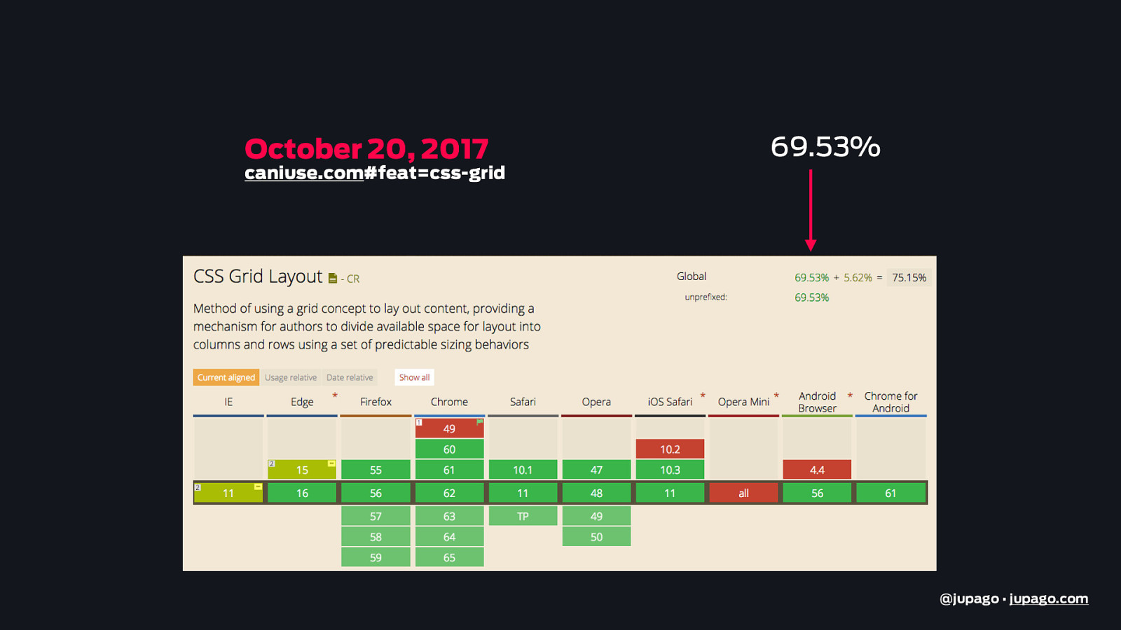
October 20, 2017 caniuse.com#feat=css-grid 69.53% @jupago • jupago.com
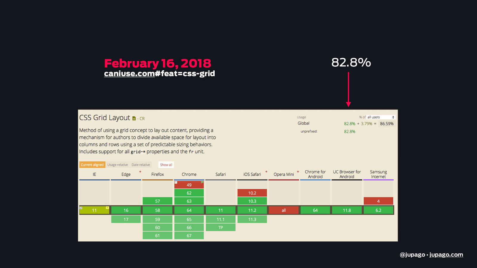
February 16, 2018 caniuse.com#feat=css-grid 82.8% @jupago • jupago.com
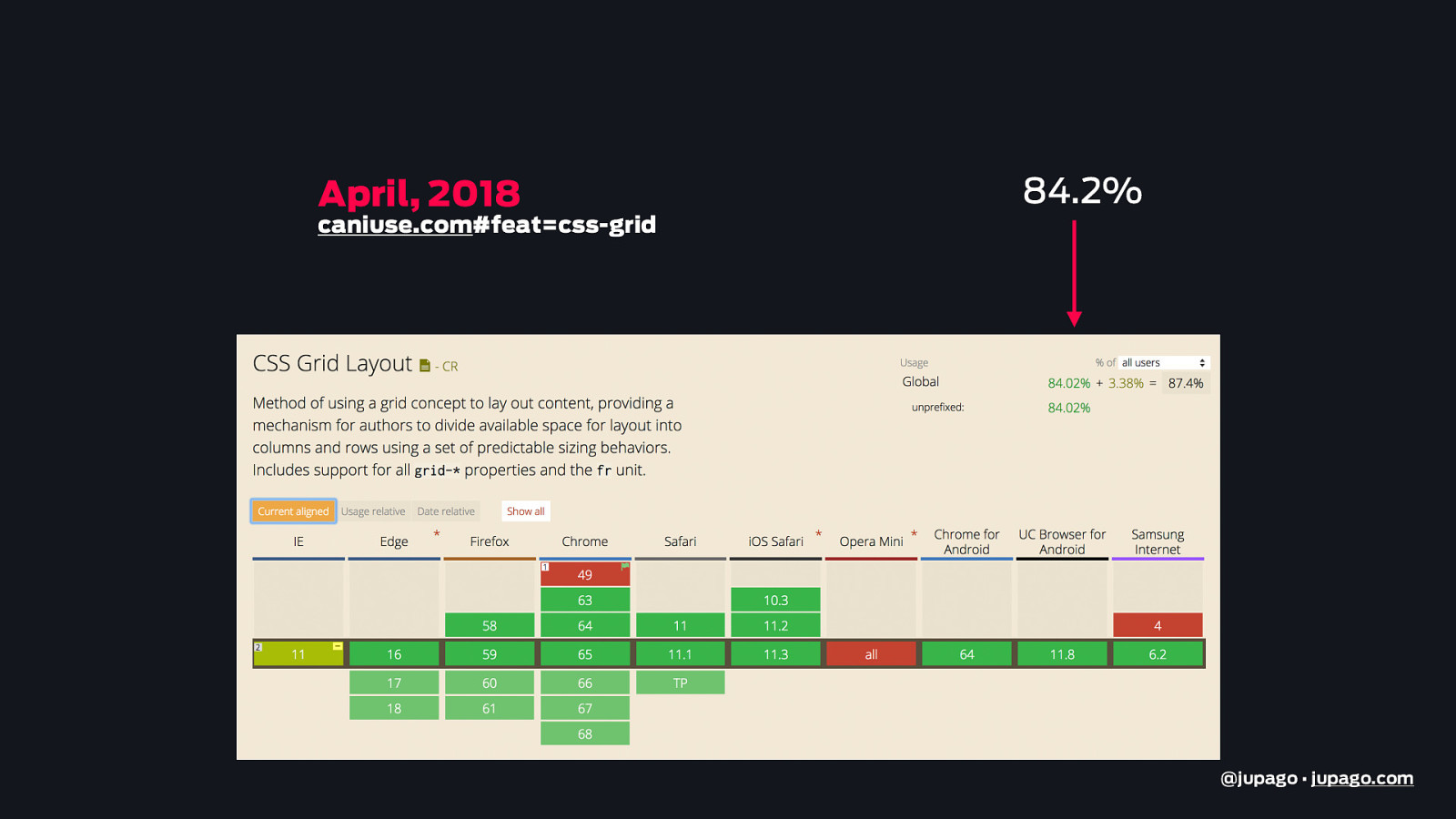
April, 2018 caniuse.com#feat=css-grid 84.2% @jupago • jupago.com
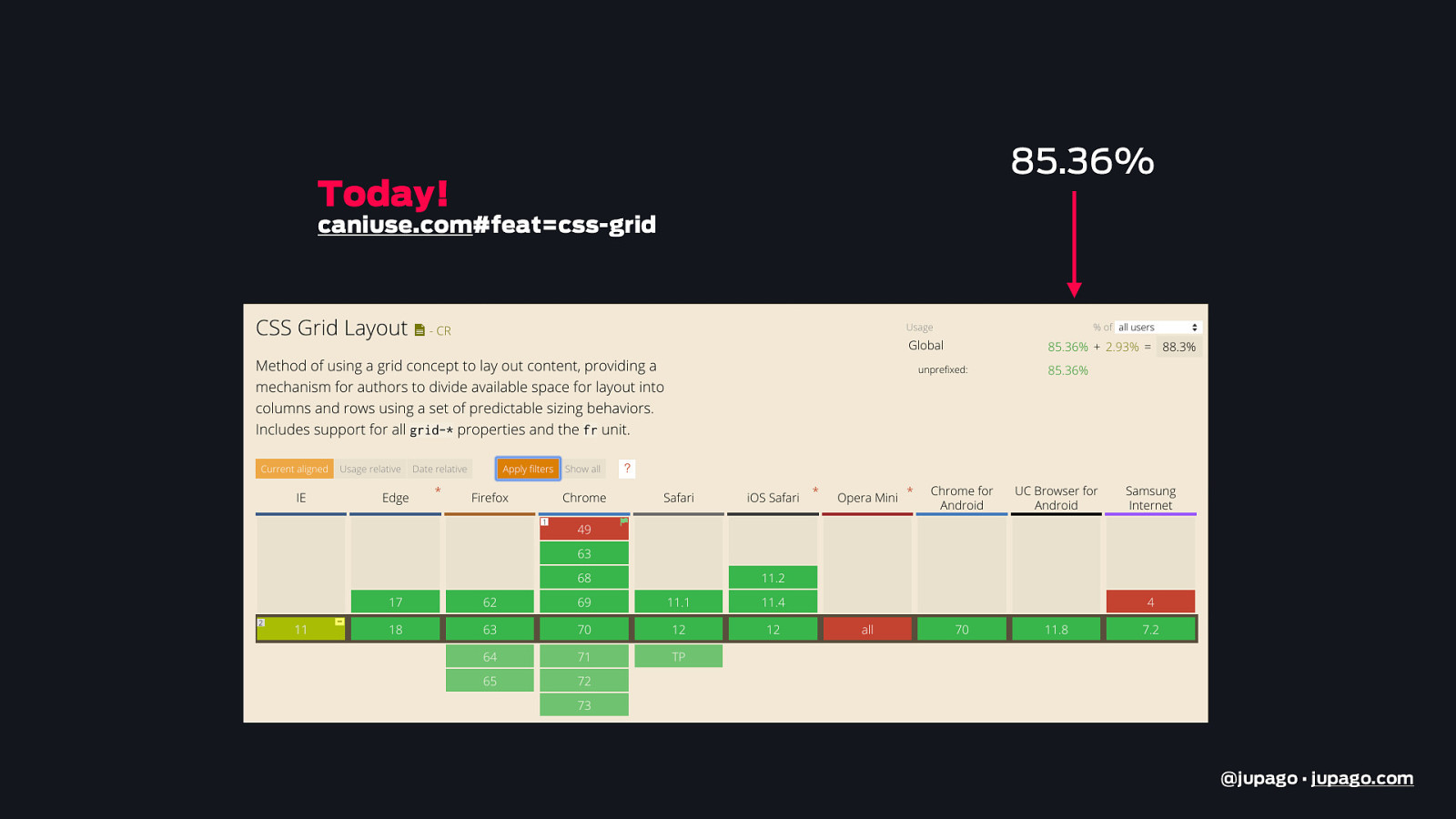
Today! 85.36% caniuse.com#feat=css-grid @jupago • jupago.com
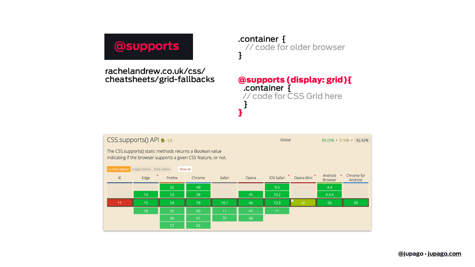
@supports rachelandrew.co.uk/css/ cheatsheets/grid-fallbacks .container { // code for older browser } @supports (display: grid){ .container { // code for CSS Grid here } } @jupago • jupago.com
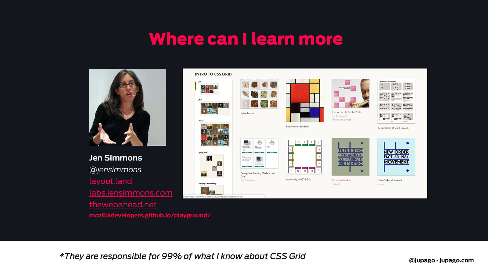
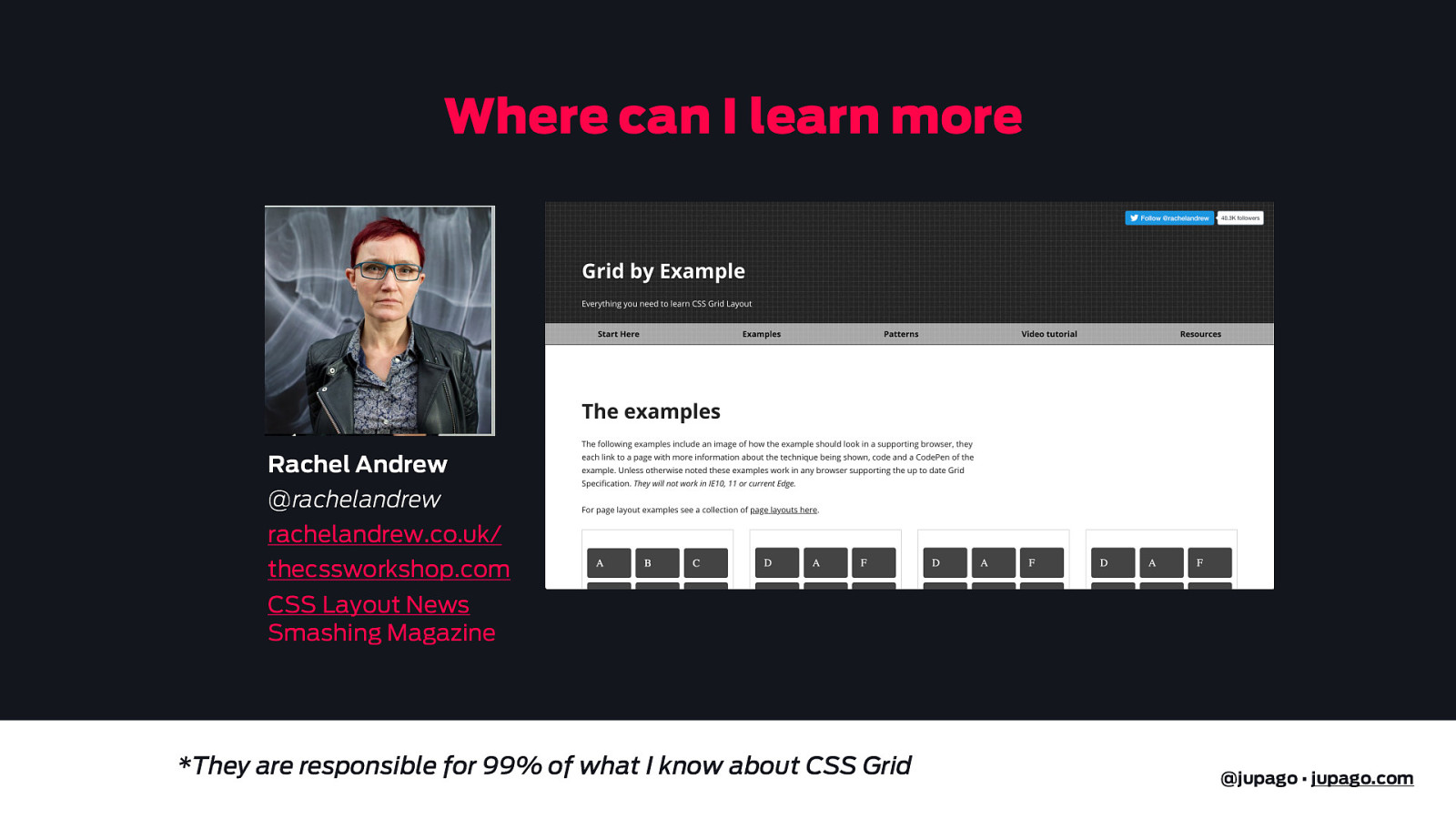
Where can I learn more Jen Simmons @jensimmons layout.land labs.jensimmons.com thewebahead.net mozilladevelopers.github.io/playground/ *They are responsible for 99% of what I know about CSS Grid @jupago • jupago.com
Where can I learn more Rachel Andrew @rachelandrew rachelandrew.co.uk/ thecssworkshop.com CSS Layout News Smashing Magazine *They are responsible for 99% of what I know about CSS Grid @jupago • jupago.com
CSS Grid 1 Why? 2 How? 3 When? * Gutenberg 4 Demos @jupago • jupago.com
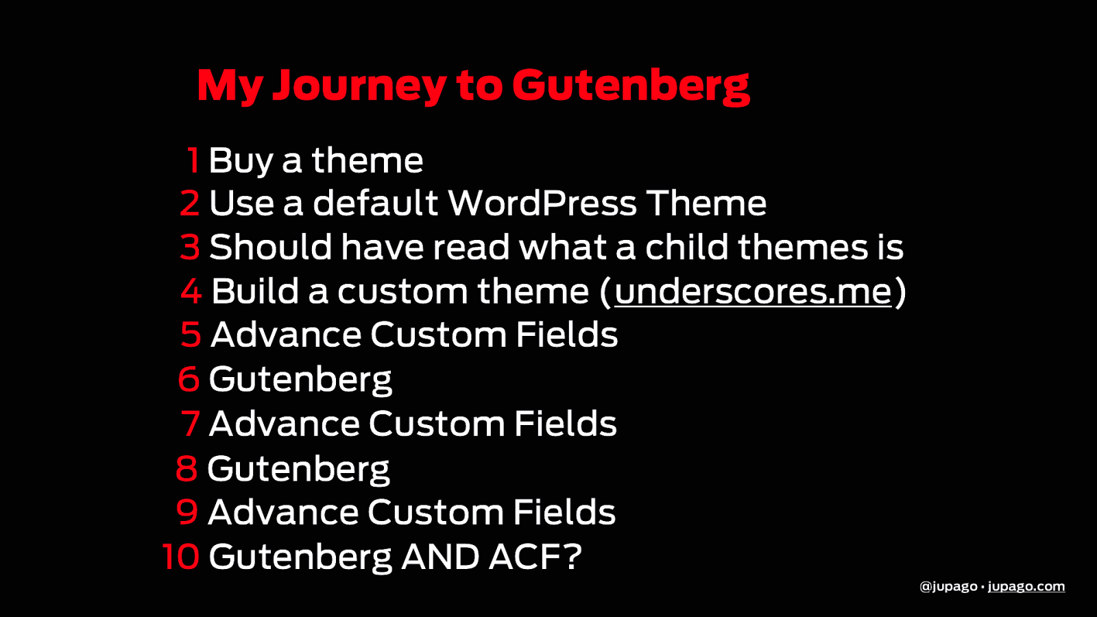
My Journey to Gutenberg 1 Buy a theme 2 Use a default WordPress Theme 3 Should have read what a child themes is 4 Build a custom theme (underscores.me) 5 Advance Custom Fields 6 Gutenberg 7 Advance Custom Fields 8 Gutenberg 9 Advance Custom Fields 10 Gutenberg AND ACF? @jupago • jupago.com
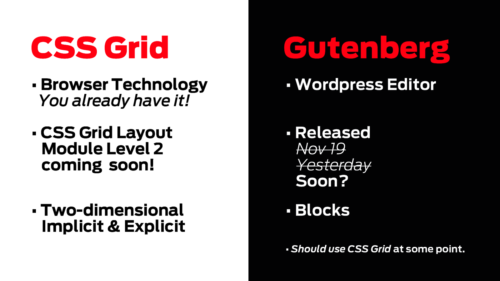
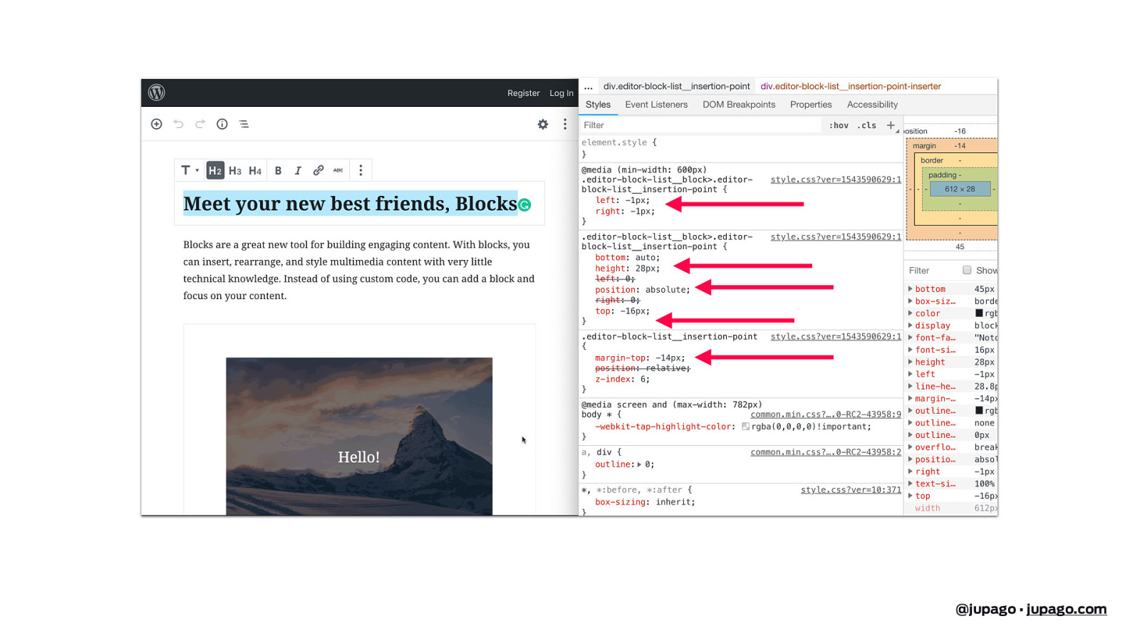
CSS Grid Gutenberg • Browser Technology You already have it! • Wordpress Editor • CSS Grid Layout Module Level 2 coming soon! • Released Nov 19 Yesterday Soon? • Two-dimensional Implicit & Explicit • Blocks • Should use CSS Grid at some point. @jupago • jupago.com
@jupago • jupago.com
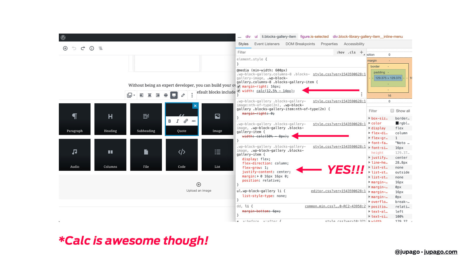
YES!!! *Calc is awesome though! @jupago • jupago.com
CSS Grid 1 Why? 2 How? 3 When? * Guttenberg 4 Demos @jupago • jupago.com
@jupago • jupago.com
THANK YOU!!! slides: noti.st/jupago Juan Pablo Gómez Web Designer Twitter: @jupago jupago.com

Released last year, CSS Grid changes everything for the web and the WordPress community. It means that, for the first time, we can think of layout on posts and pages as two-dimensional and fully responsive. CSS Grid is not another plugin hack or bootstrap patch. Quite simply, it’s the solution for which designers have been asking. It is here to stay and right now is the perfect time to learn it.
Why CSS Grid? How to use Grid? When to use Grid? Demos!
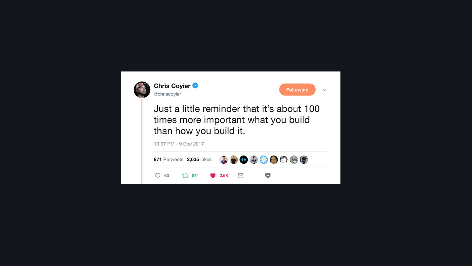
Here’s what was said about this presentation on social media.


 for free. You
can too.
for free. You
can too.