
A presentation at World Usability Congress 2024 in in Graz, Austria by Karen Hawkins
Accessible Design Considerations for Styles, Components, Patterns, and Pages Enabling designers to proactively embed accessibility considerations in their design systems October 17, 2024
Meet Karen Hawkins Karen Hawkins, CPACC Connect with me Principal of Accessible Design, Level Access Email LinkedIn Copyright © Level Access. All Rights Reserved. | Confidential 2
SECTION 1 Some background Copyright © Level Access. All Rights Reserved. | Confidential 3
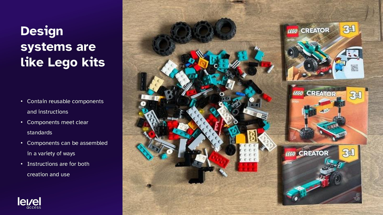
Design systems are like Lego kits • Contain reusable components and instructions • Components meet clear standards • Components can be assembled in a variety of ways • Instructions are for both creation and use
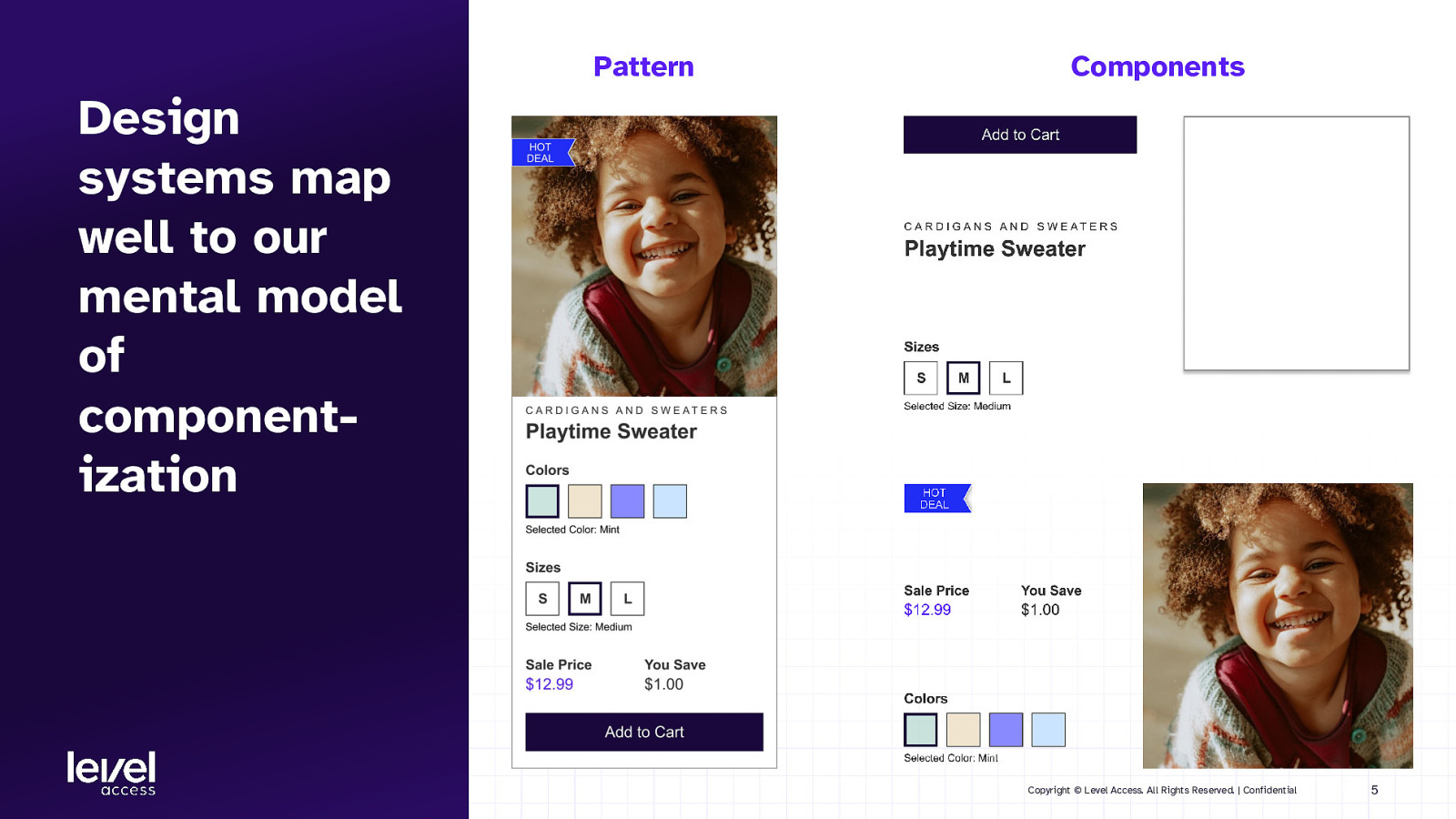
Pattern Components Design systems map well to our mental model of componentization Copyright © Level Access. All Rights Reserved. | Confidential 5
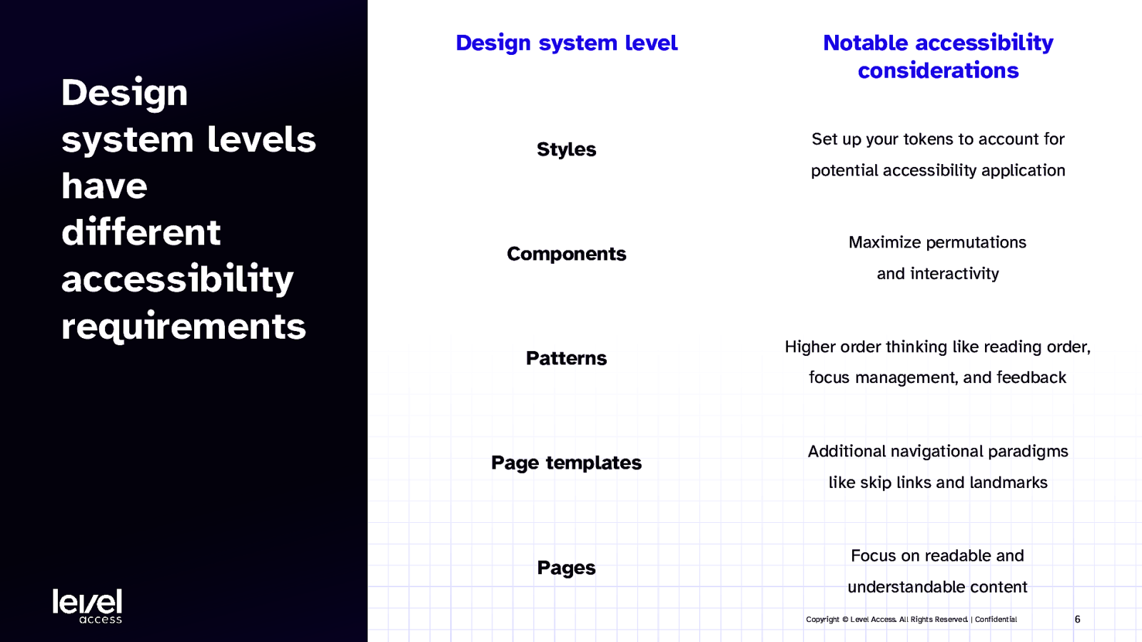
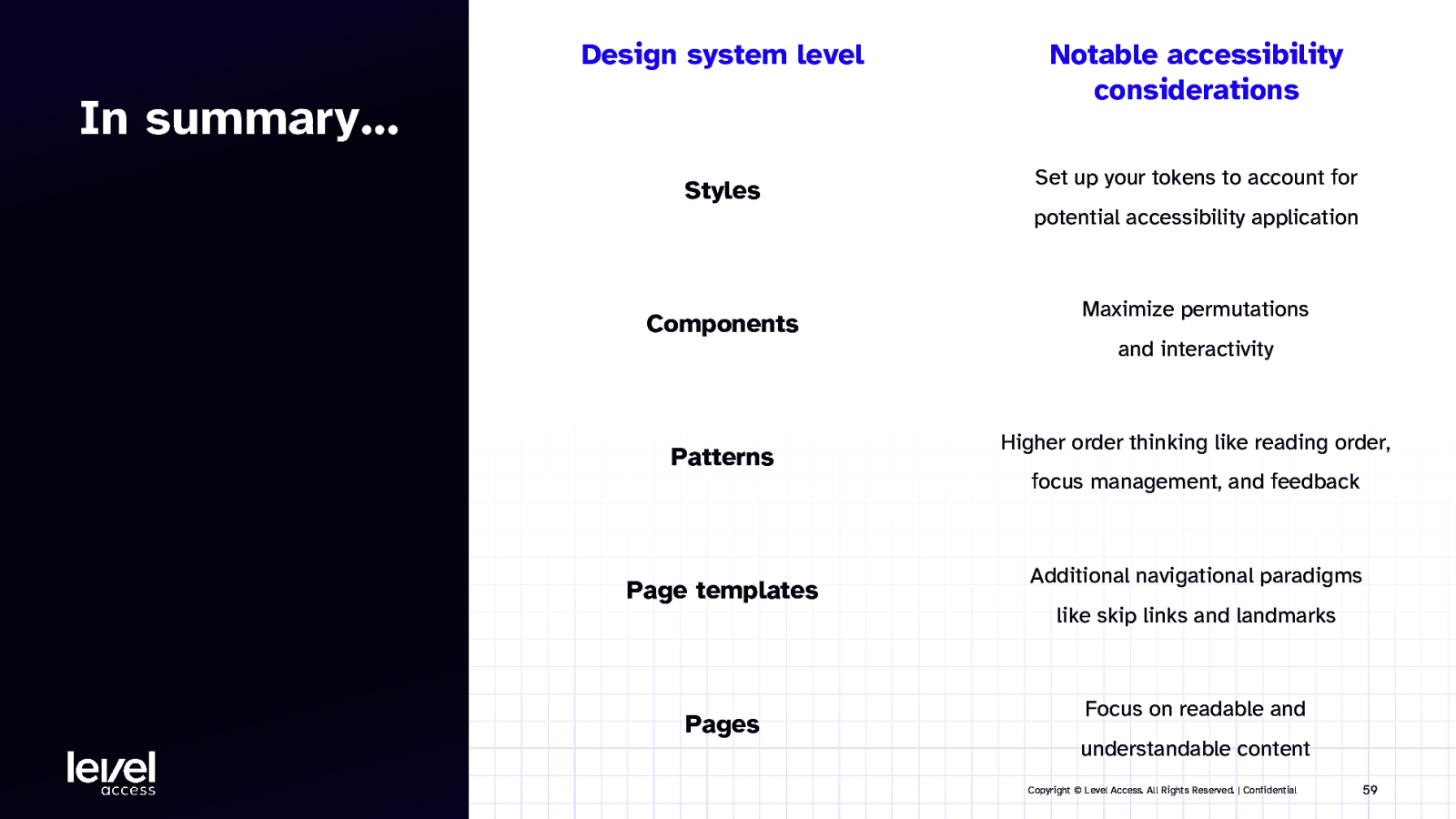
Design system level Design system levels have different accessibility requirements Styles Notable accessibility considerations Set up your tokens to account for potential accessibility application Components Patterns Page templates Pages Maximize permutations and interactivity Higher order thinking like reading order, focus management, and feedback Additional navigational paradigms like skip links and landmarks Focus on readable and understandable content Copyright © Level Access. All Rights Reserved. | Confidential 6
SECTION 2 Accessibility in style guides Copyright © Level Access. All Rights Reserved. | Confidential 7
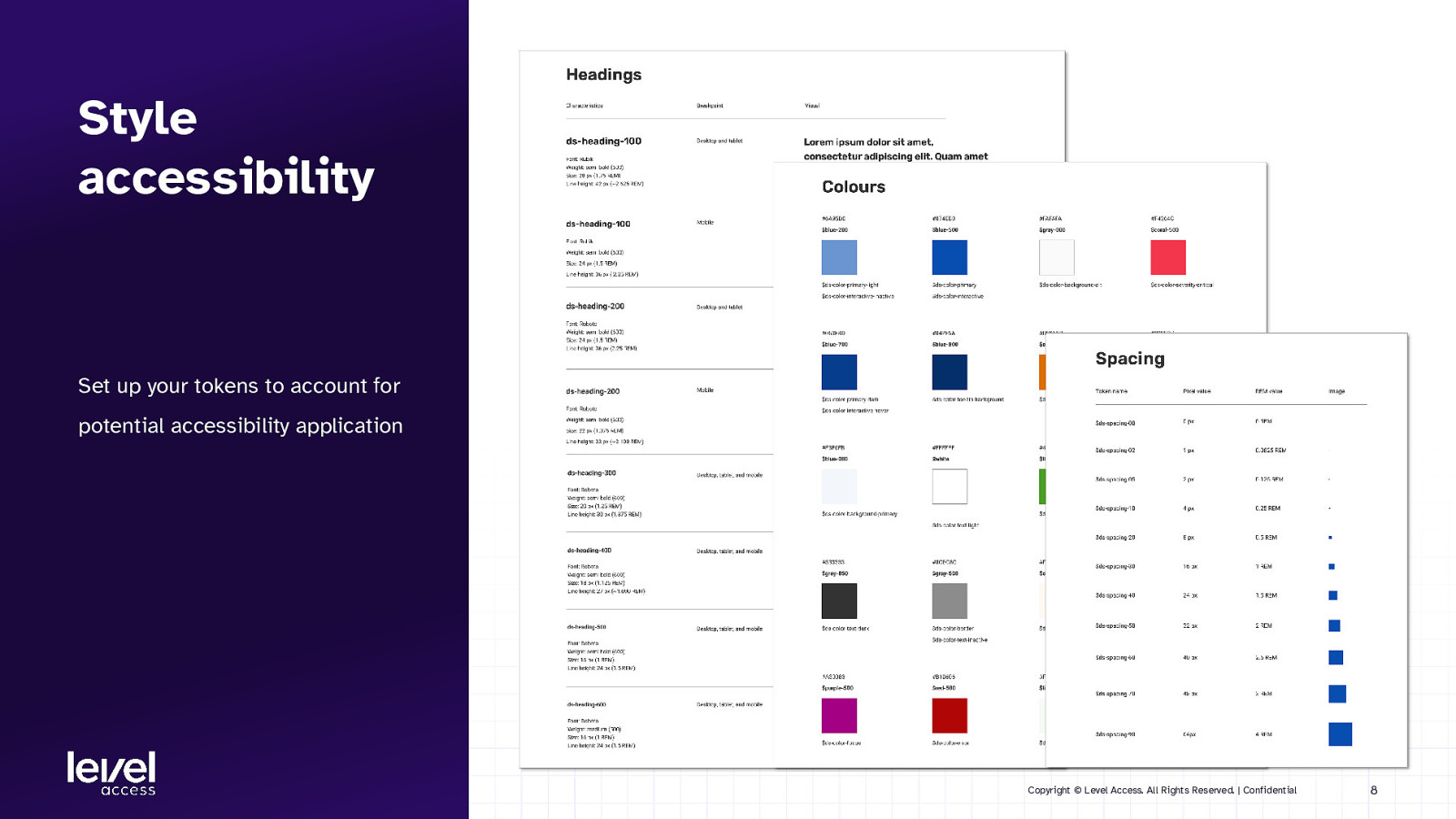
Style accessibility Set up your tokens to account for potential accessibility application Copyright © Level Access. All Rights Reserved. | Confidential 8
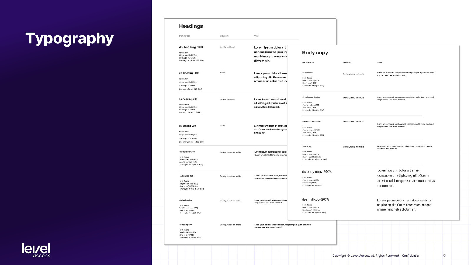
Typography Copyright © Level Access. All Rights Reserved. | Confidential 9
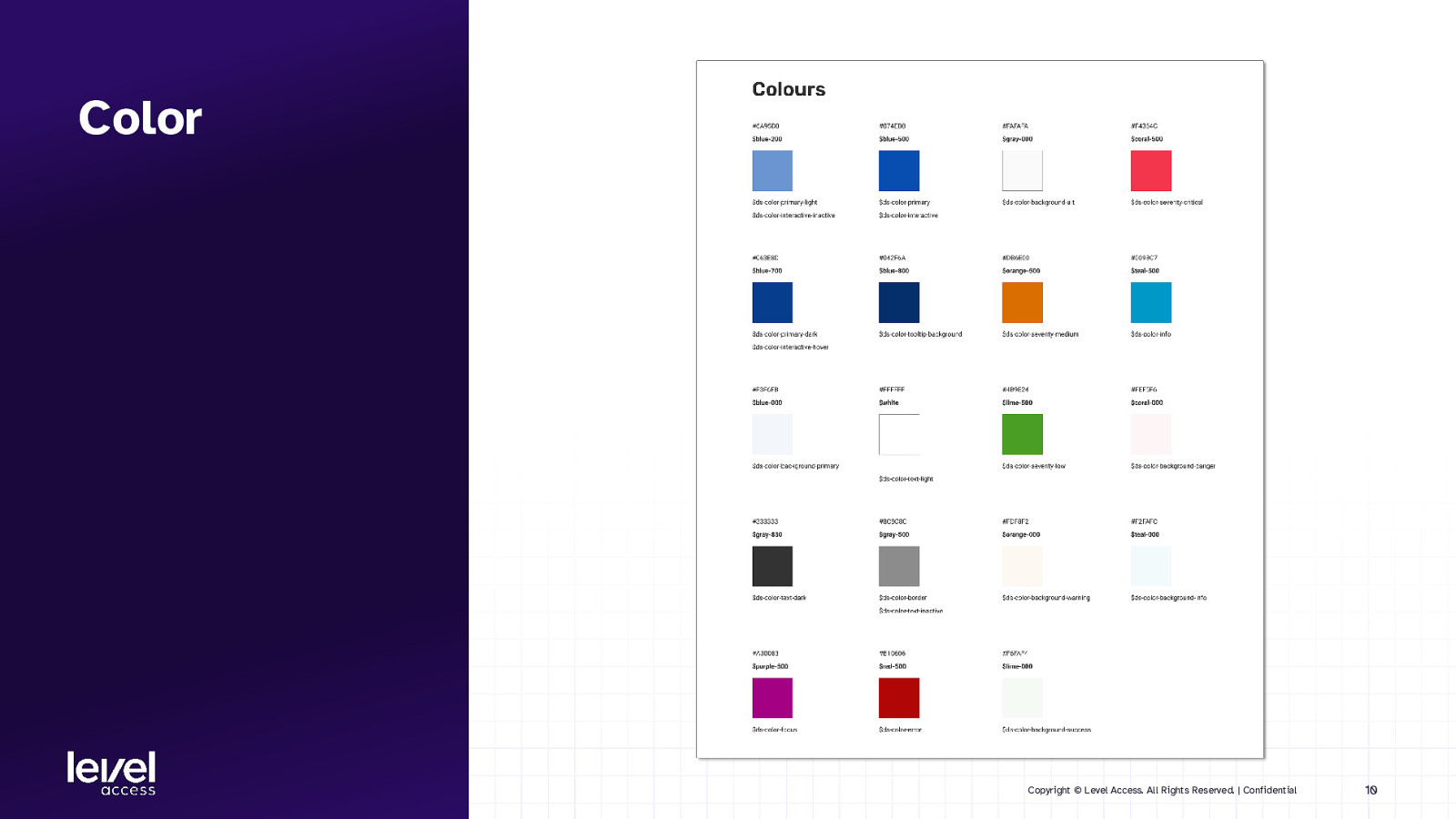
Color Copyright © Level Access. All Rights Reserved. | Confidential 10
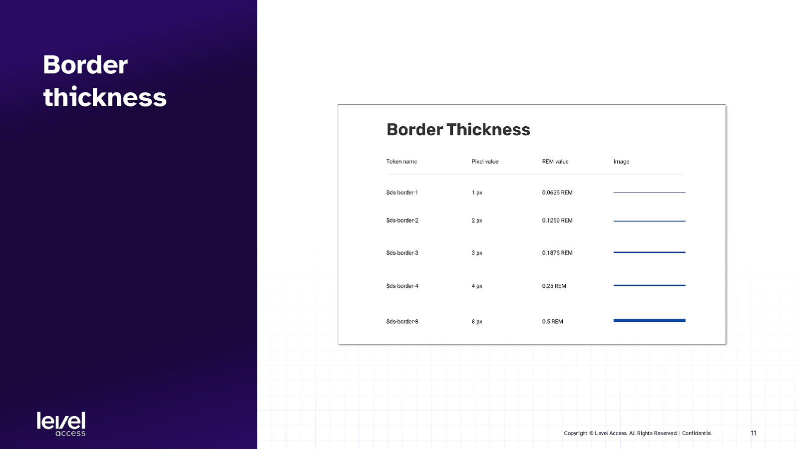
Border thickness Copyright © Level Access. All Rights Reserved. | Confidential 11
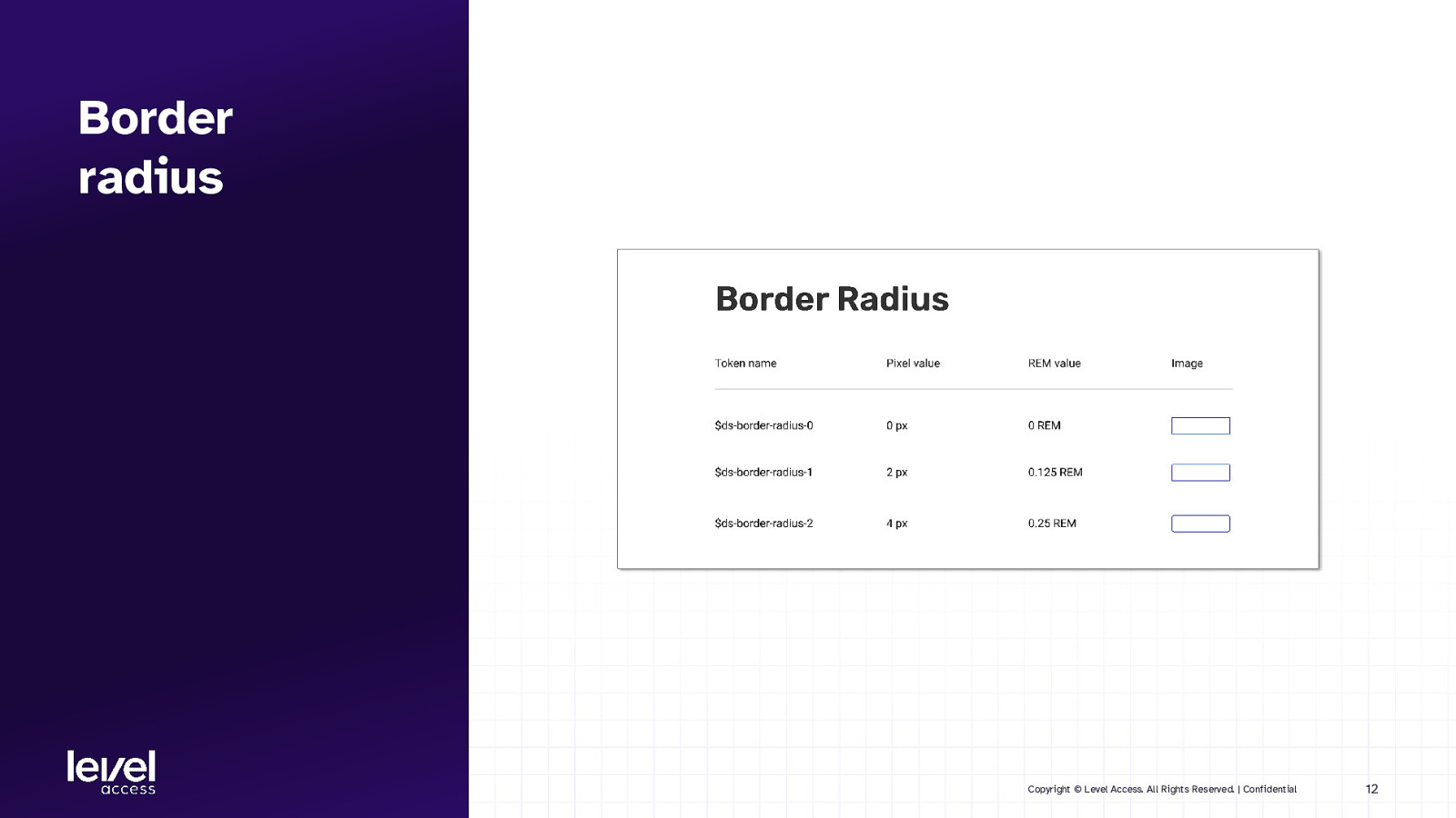
Border radius Copyright © Level Access. All Rights Reserved. | Confidential 12
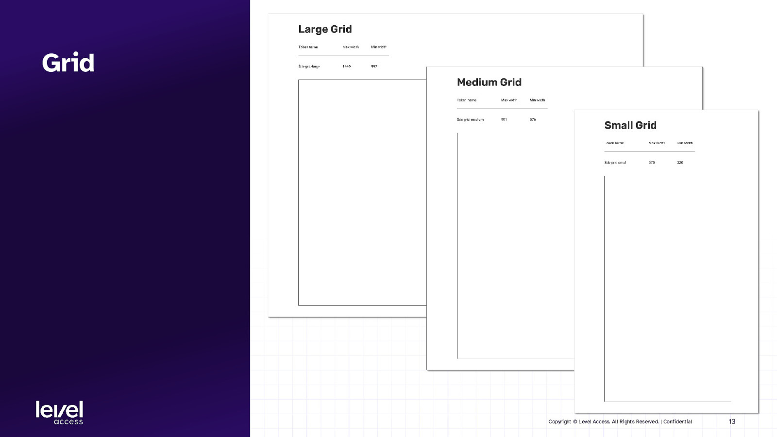
Grid Copyright © Level Access. All Rights Reserved. | Confidential 13
SECTION 3 Accessibility in component libraries Copyright © Level Access. All Rights Reserved. | Confidential 14
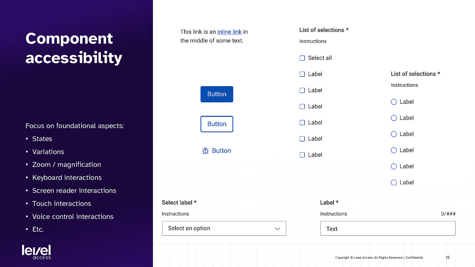
Component accessibility Focus on foundational aspects: • States • Variations • Zoom / magnification • Keyboard interactions • Screen reader interactions • Touch interactions • Voice control interactions • Etc. Copyright © Level Access. All Rights Reserved. | Confidential 15
SECTION 3.1 Accessible design considerations for components Copyright © Level Access. All Rights Reserved. | Confidential 16
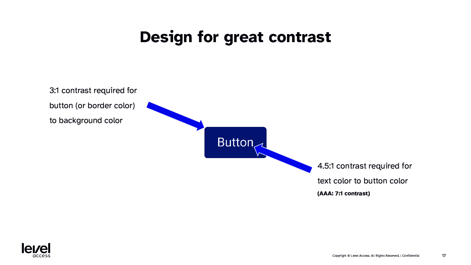
Design for great contrast 3:1 contrast required for button (or border color) to background color 4.5:1 contrast required for text color to button color (AAA: 7:1 contrast) Copyright © Level Access. All Rights Reserved. | Confidential 17
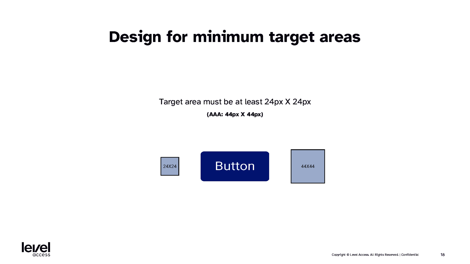
Design for minimum target areas Target area must be at least 24px X 24px (AAA: 44px X 44px) Copyright © Level Access. All Rights Reserved. | Confidential 18
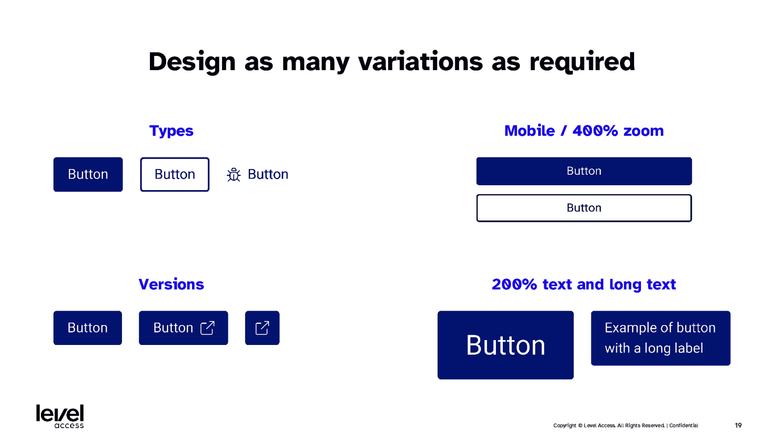
Design as many variations as required Types Mobile / 400% zoom Versions 200% text and long text Copyright © Level Access. All Rights Reserved. | Confidential 19
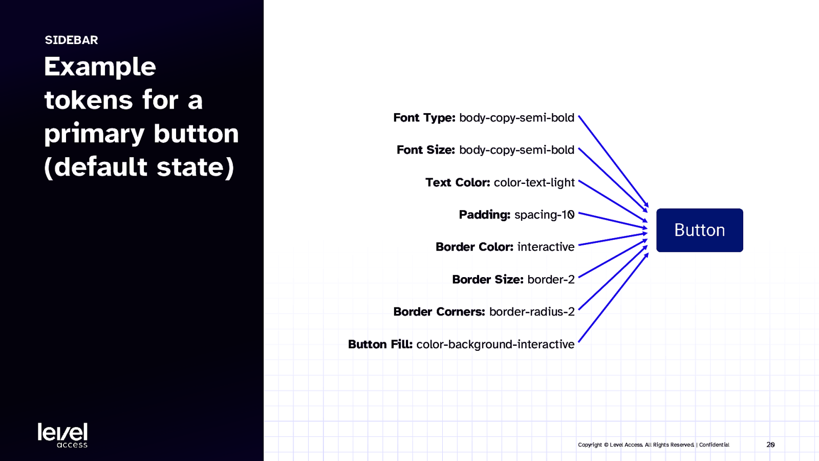
SIDEBAR Example tokens for a primary button (default state) Font Type: body-copy-semi-bold Font Size: body-copy-semi-bold Text Color: color-text-light Padding: spacing-10 Border Color: interactive Border Size: border-2 Border Corners: border-radius-2 Button Fill: color-background-interactive Copyright © Level Access. All Rights Reserved. | Confidential 20
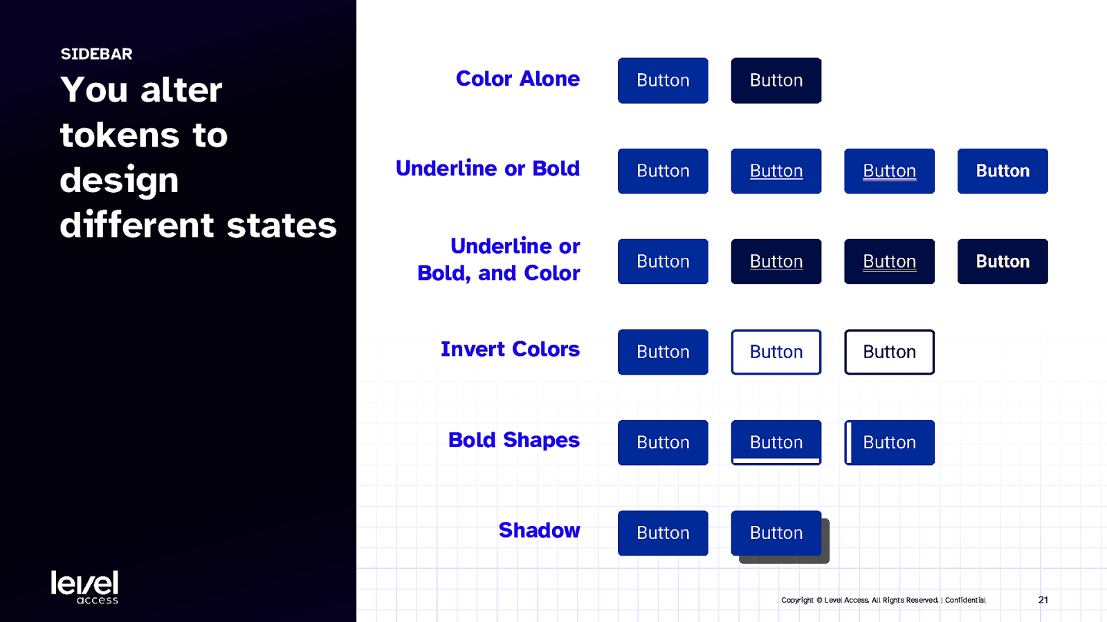
SIDEBAR You alter tokens to design different states Color Alone Underline or Bold Underline or Bold, and Color Invert Colors Bold Shapes Shadow Copyright © Level Access. All Rights Reserved. | Confidential 21
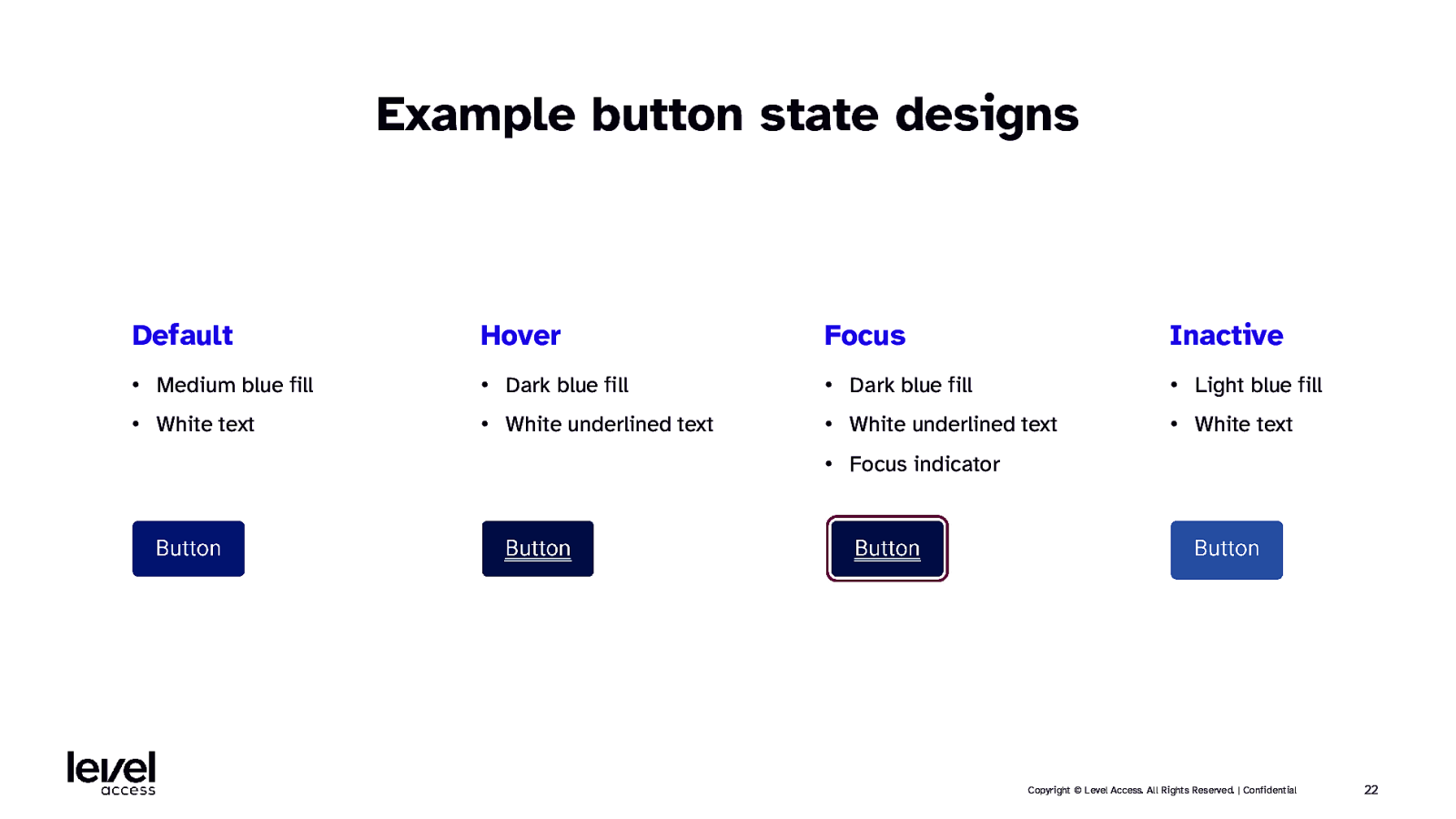
Example button state designs Default Hover Focus Inactive • Medium blue fill • Dark blue fill • Dark blue fill • Light blue fill • White text • White underlined text • White underlined text • White text • Focus indicator Copyright © Level Access. All Rights Reserved. | Confidential 22
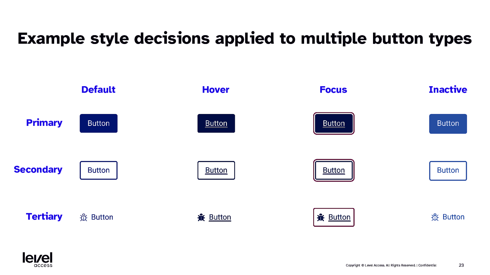
Example style decisions applied to multiple button types Default Hover Focus Inactive Primary Secondary Tertiary Copyright © Level Access. All Rights Reserved. | Confidential 23
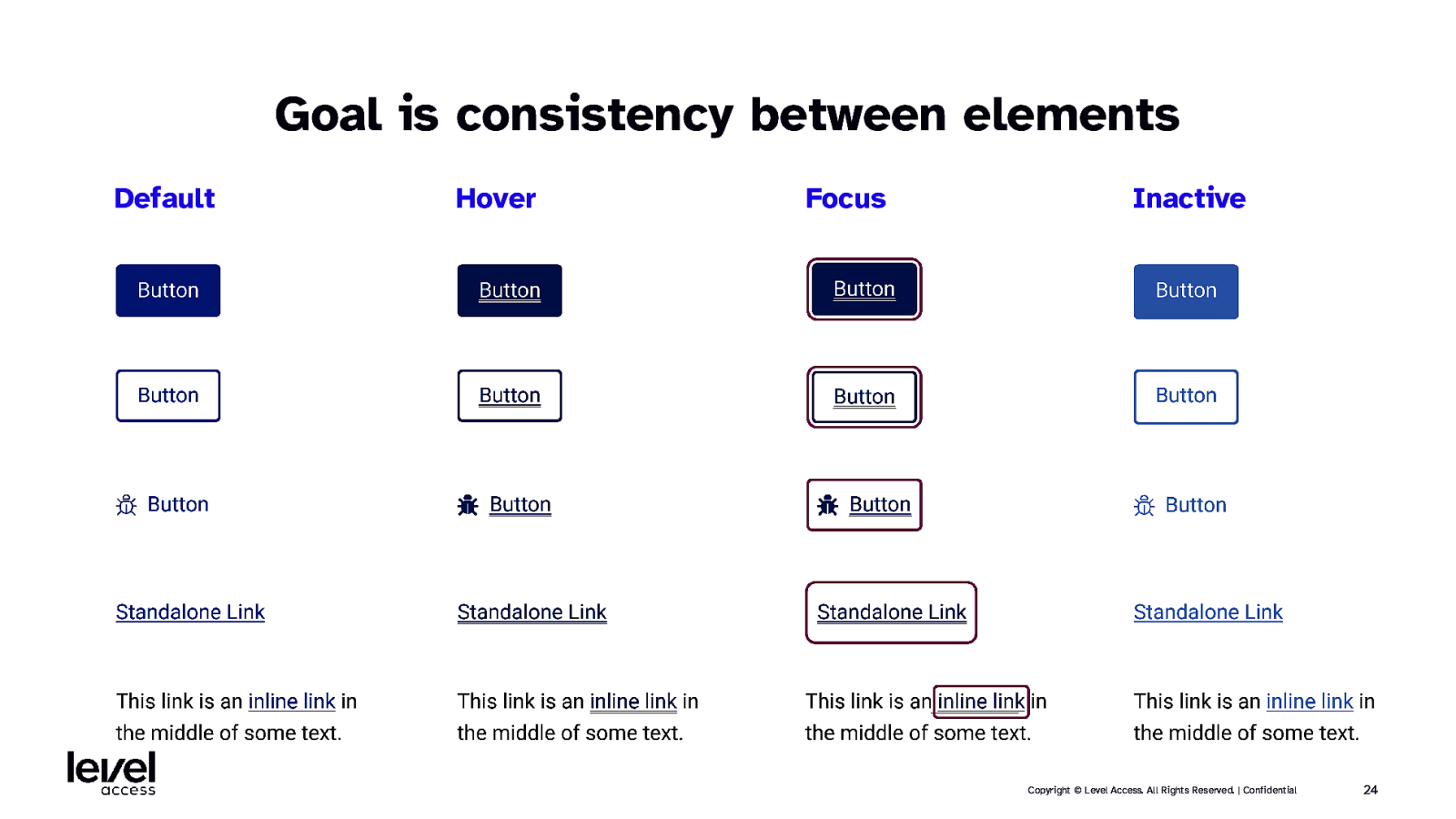
Goal is consistency between elements Default Hover Focus Inactive Copyright © Level Access. All Rights Reserved. | Confidential 24
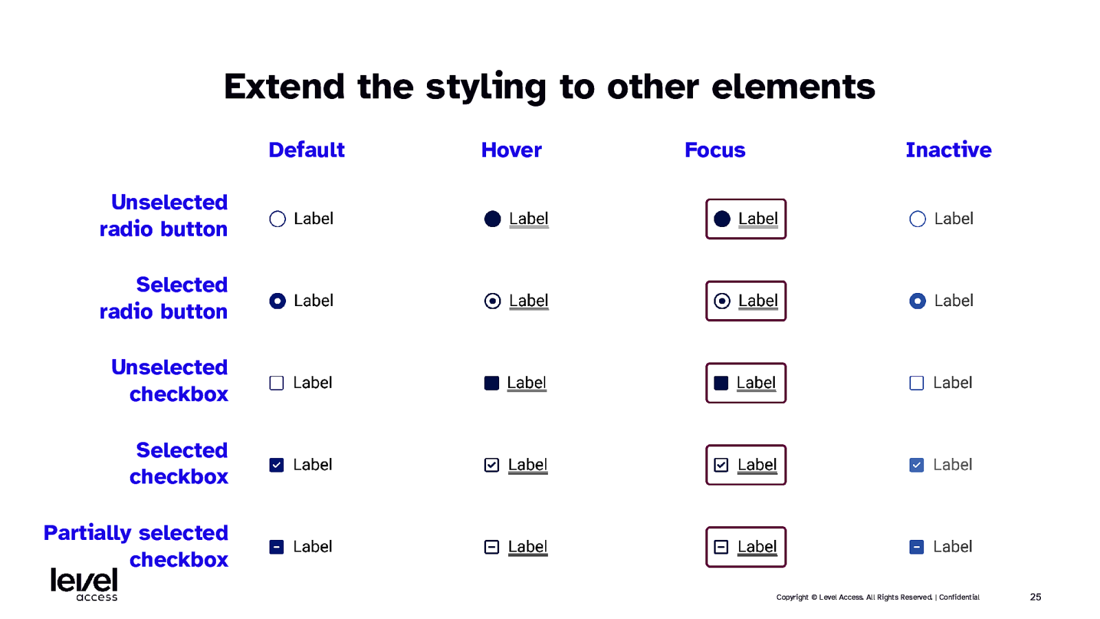
Extend the styling to other elements Default Hover Focus Inactive Unselected radio button Selected radio button Unselected checkbox Selected checkbox Partially selected checkbox Copyright © Level Access. All Rights Reserved. | Confidential 25
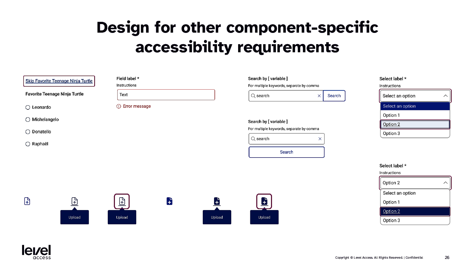
Design for other component-specific accessibility requirements Copyright © Level Access. All Rights Reserved. | Confidential 26
SECTION 3.1 Accessible documentation considerations for components Copyright © Level Access. All Rights Reserved. | Confidential 27
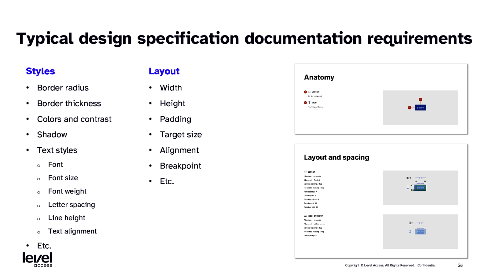
Typical design specification documentation requirements Styles Layout • Border radius • Width • Border thickness • Height • Colors and contrast • Padding • Shadow • Target size • Text styles • Alignment o Font • Breakpoint o Font size • Etc. o Font weight o Letter spacing o Line height o Text alignment • Etc. Copyright © Level Access. All Rights Reserved. | Confidential 28
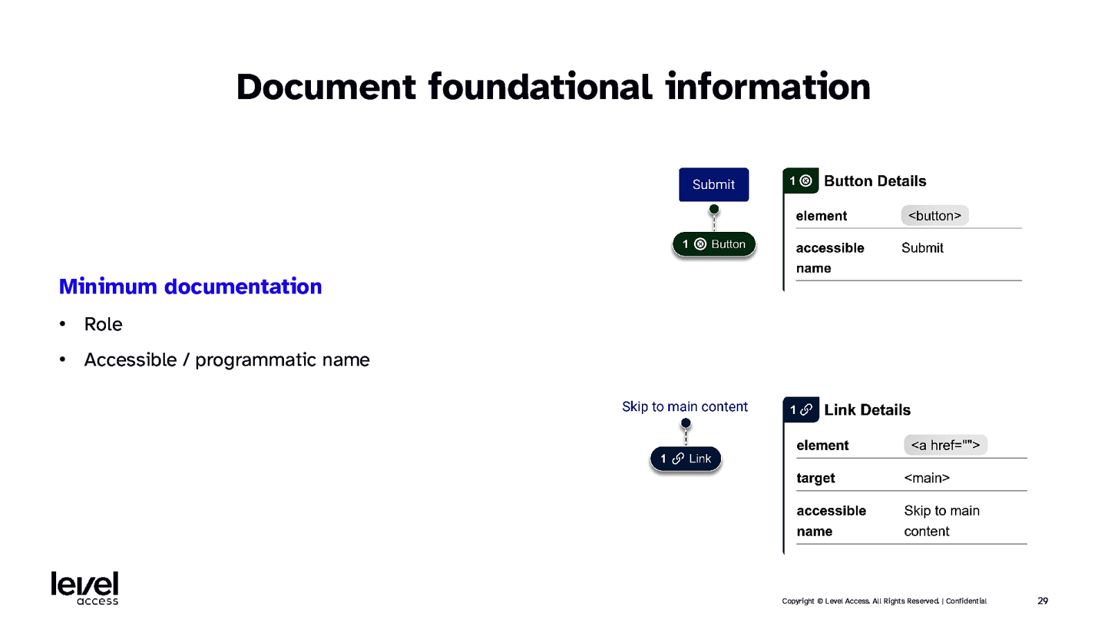
Document foundational information Minimum documentation • Role • Accessible / programmatic name Copyright © Level Access. All Rights Reserved. | Confidential 29
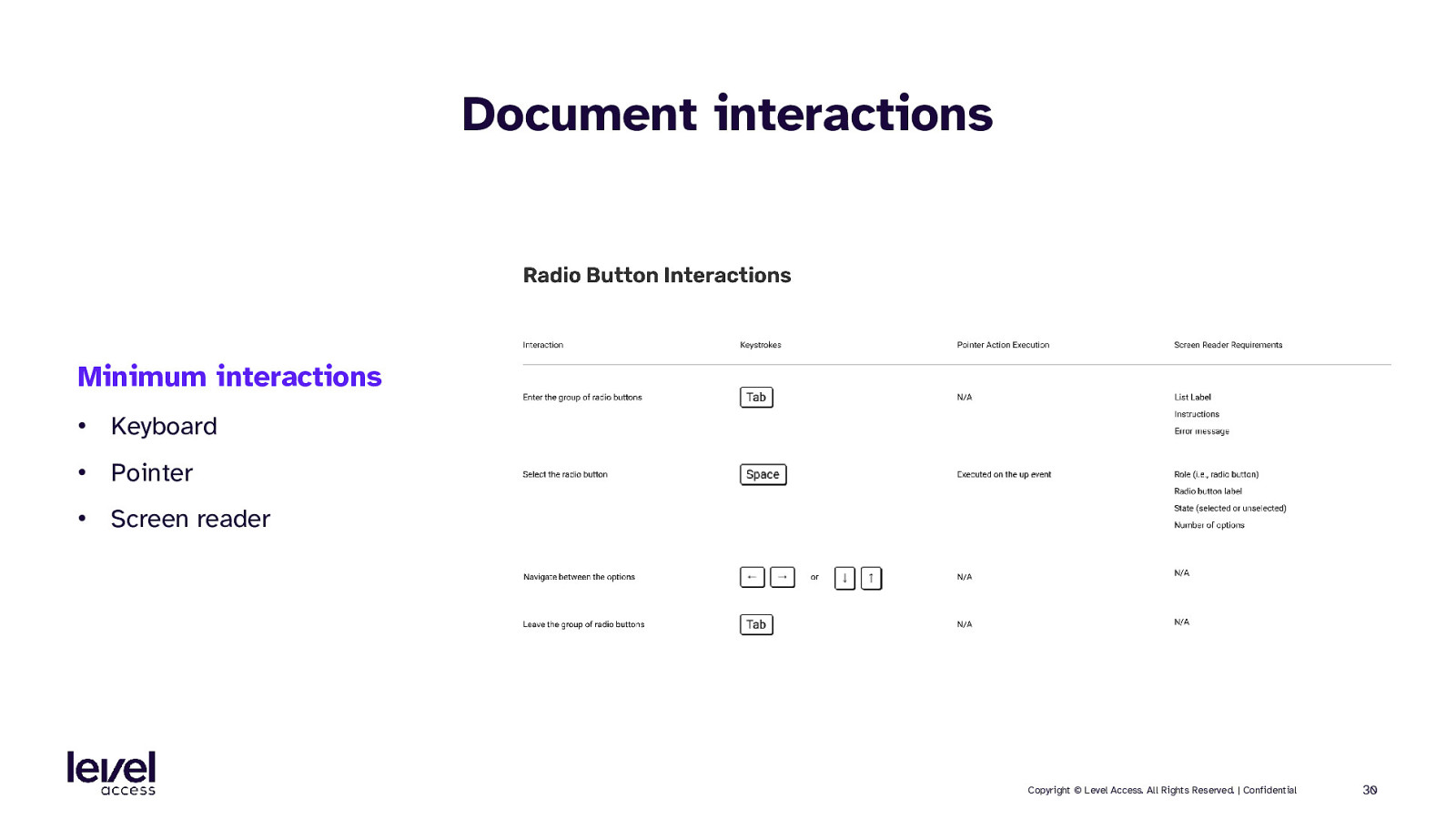
Document interactions Minimum interactions • Keyboard • Pointer • Screen reader Copyright © Level Access. All Rights Reserved. | Confidential 30
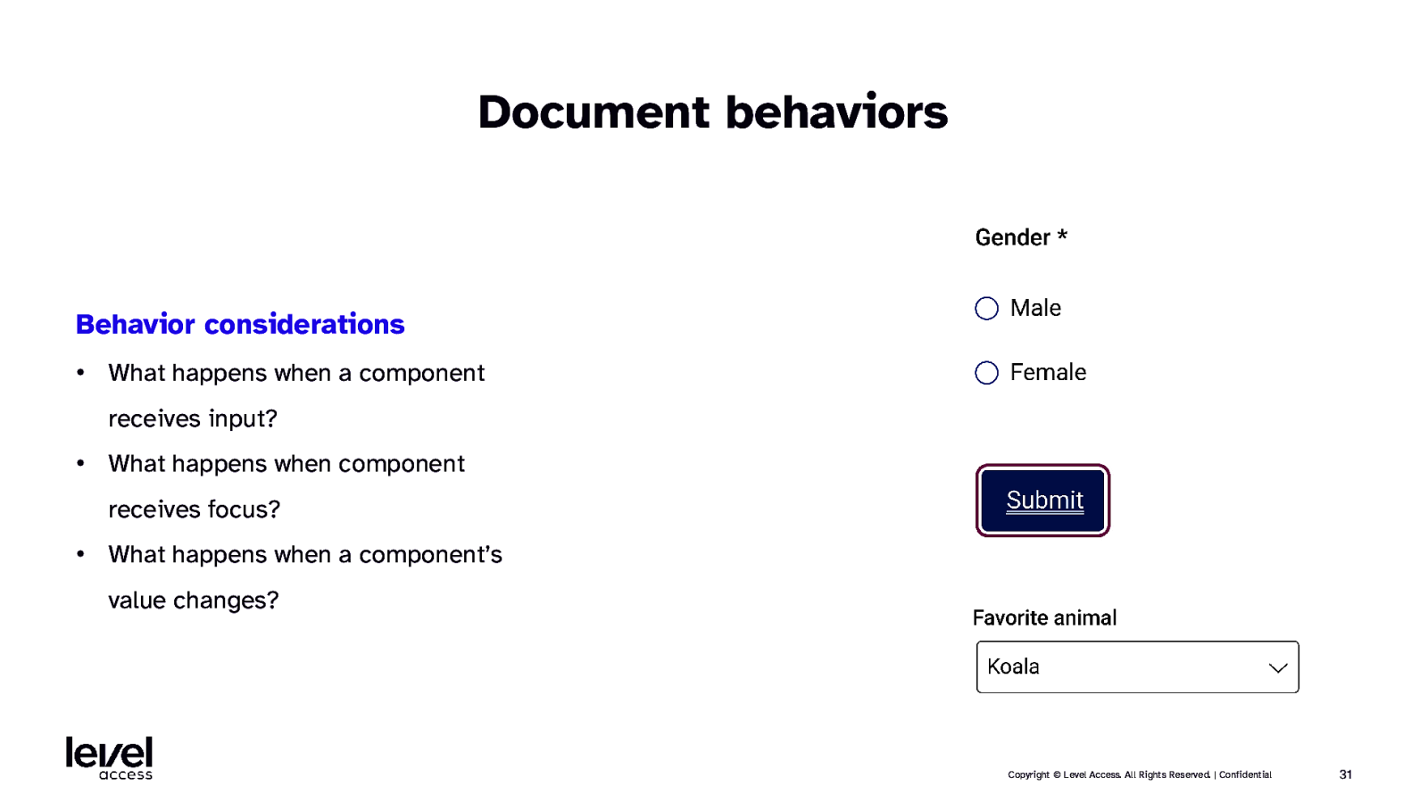
Document behaviors Behavior considerations • What happens when a component receives input? • What happens when component receives focus? • What happens when a component’s value changes? Copyright © Level Access. All Rights Reserved. | Confidential 31
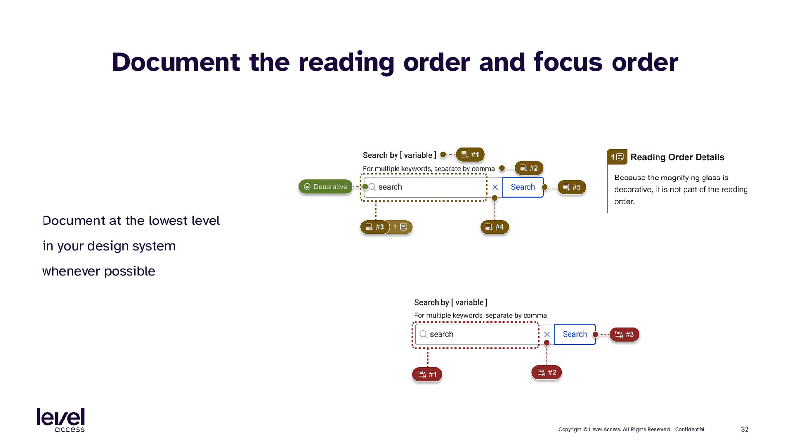
Document the reading order and focus order Document at the lowest level in your design system whenever possible Copyright © Level Access. All Rights Reserved. | Confidential 32
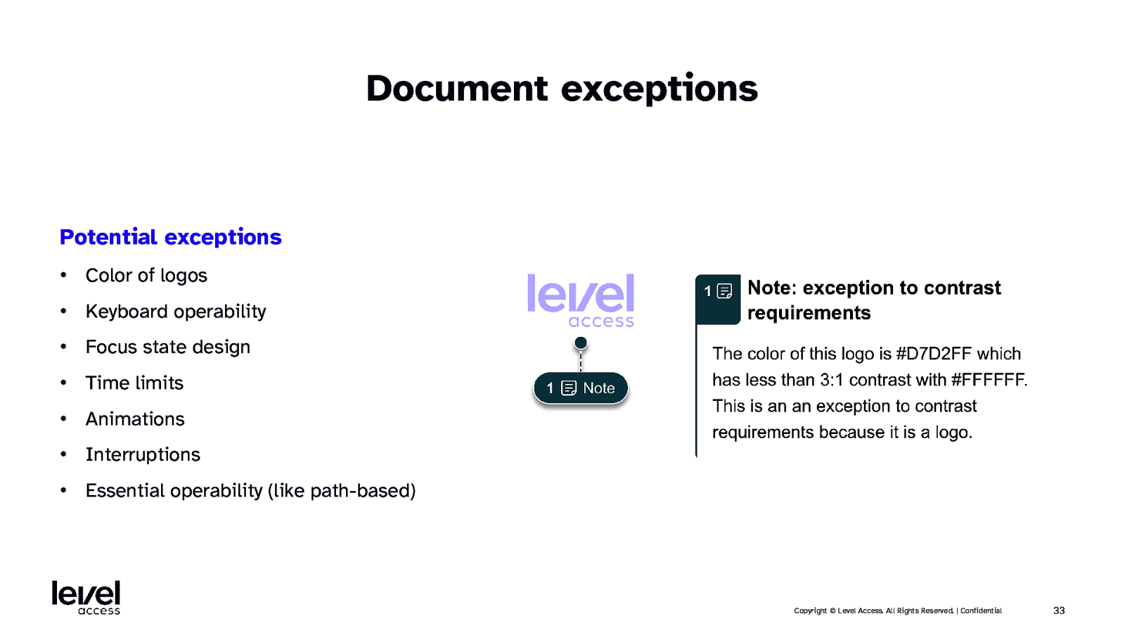
Document exceptions Potential exceptions • Color of logos • Keyboard operability • Focus state design • Time limits • Animations • Interruptions • Essential operability (like path-based) Copyright © Level Access. All Rights Reserved. | Confidential 33
SECTION 4 Accessibility in pattern libraries Copyright © Level Access. All Rights Reserved. | Confidential 34
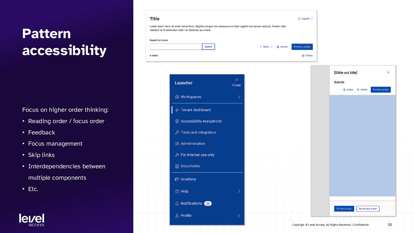
Pattern accessibility Focus on higher order thinking: • Reading order / focus order • Feedback • Focus management • Skip links • Interdependencies between multiple components • Etc. Copyright © Level Access. All Rights Reserved. | Confidential 35
SECTION 4.1 Accessible design considerations for patterns Copyright © Level Access. All Rights Reserved. | Confidential 36
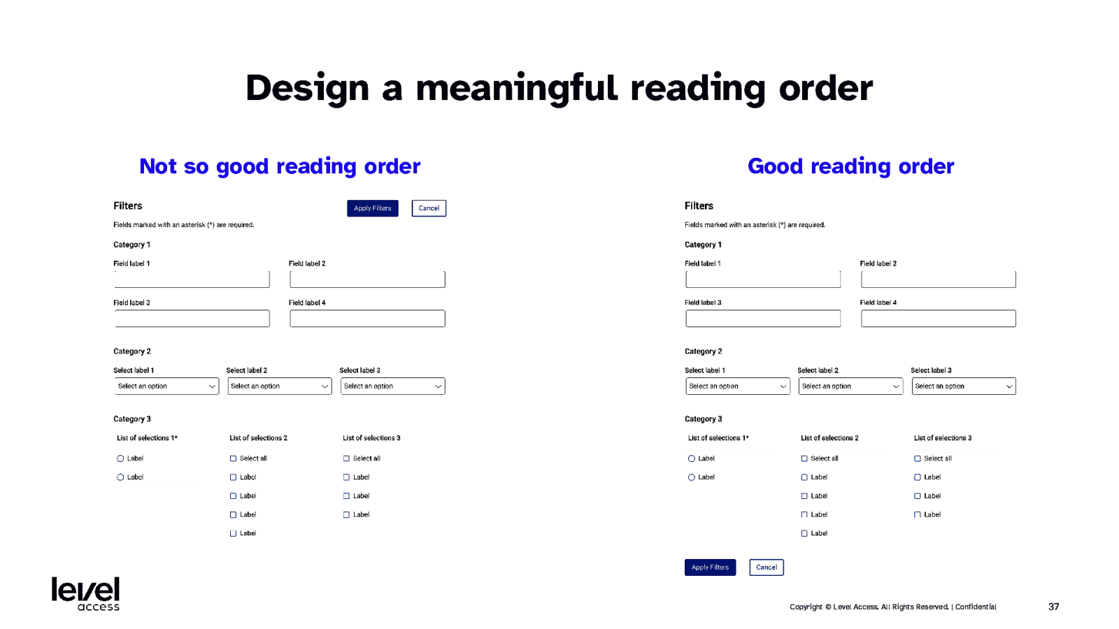
Design a meaningful reading order Not so good reading order Good reading order Copyright © Level Access. All Rights Reserved. | Confidential 37
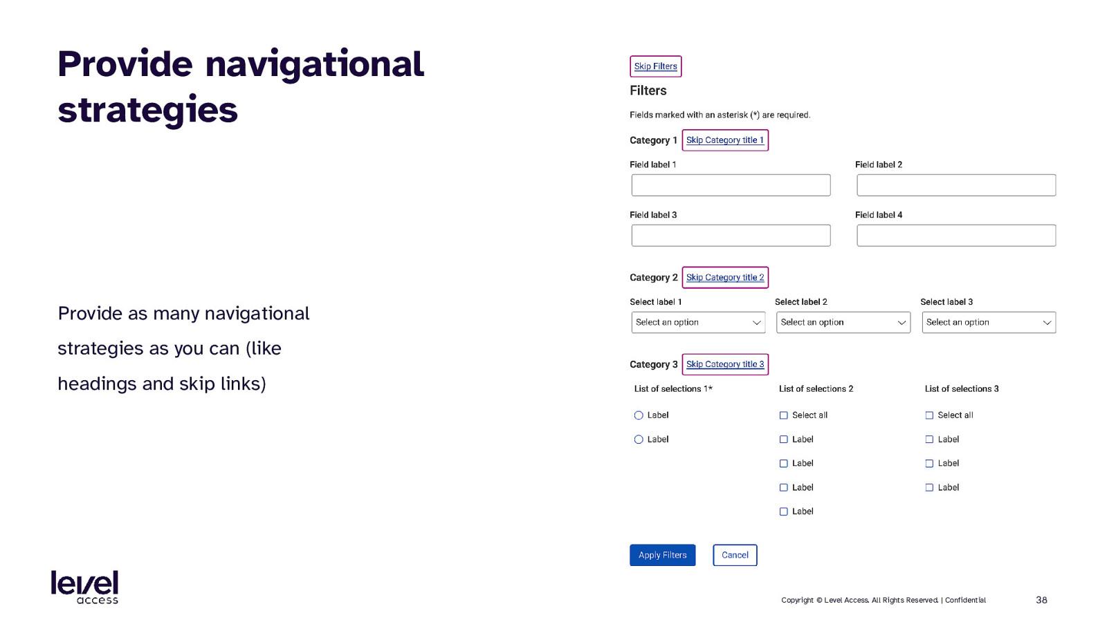
Provide navigational strategies Provide as many navigational strategies as you can (like headings and skip links) Copyright © Level Access. All Rights Reserved. | Confidential 38
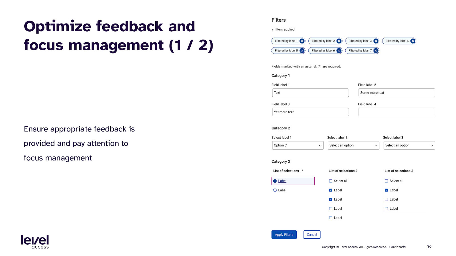
Optimize feedback and focus management (1 / 2) Ensure appropriate feedback is provided and pay attention to focus management Copyright © Level Access. All Rights Reserved. | Confidential 39
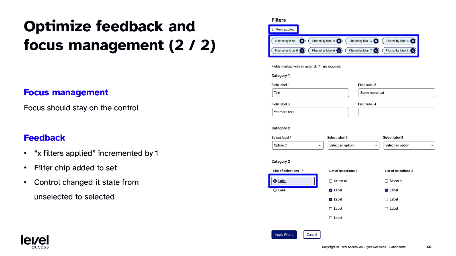
Optimize feedback and focus management (2 / 2) Focus management Focus should stay on the control Feedback • “x filters applied” incremented by 1 • Filter chip added to set • Control changed it state from unselected to selected Copyright © Level Access. All Rights Reserved. | Confidential 40
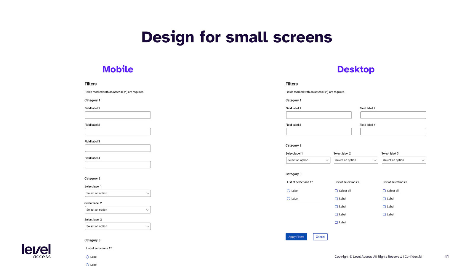
Design for small screens Mobile Desktop Copyright © Level Access. All Rights Reserved. | Confidential 41
SECTION 4.2 Accessible documentation considerations for patterns Copyright © Level Access. All Rights Reserved. | Confidential 42
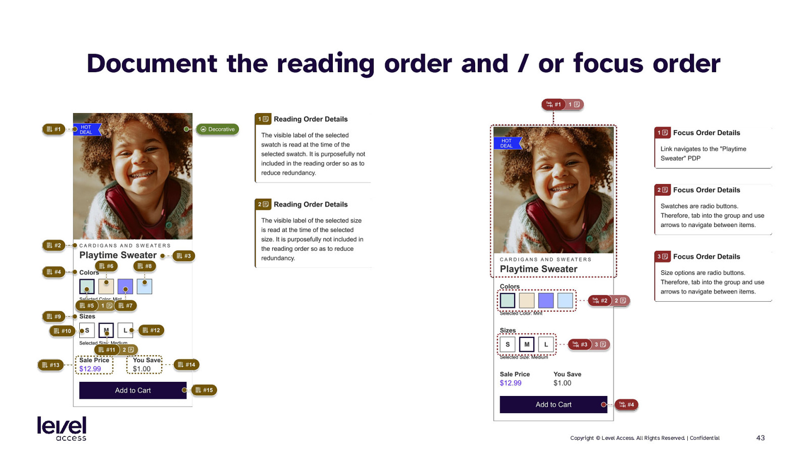
Document the reading order and / or focus order Copyright © Level Access. All Rights Reserved. | Confidential 43
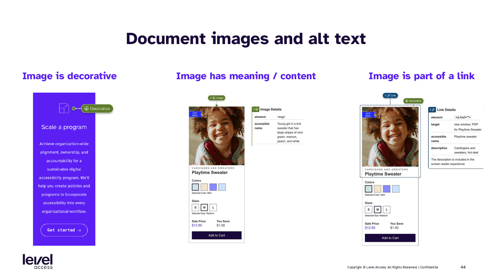
Document images and alt text Image is decorative Image has meaning / content Image is part of a link Copyright © Level Access. All Rights Reserved. | Confidential 44
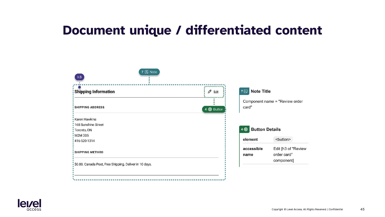
Document unique / differentiated content Copyright © Level Access. All Rights Reserved. | Confidential 45
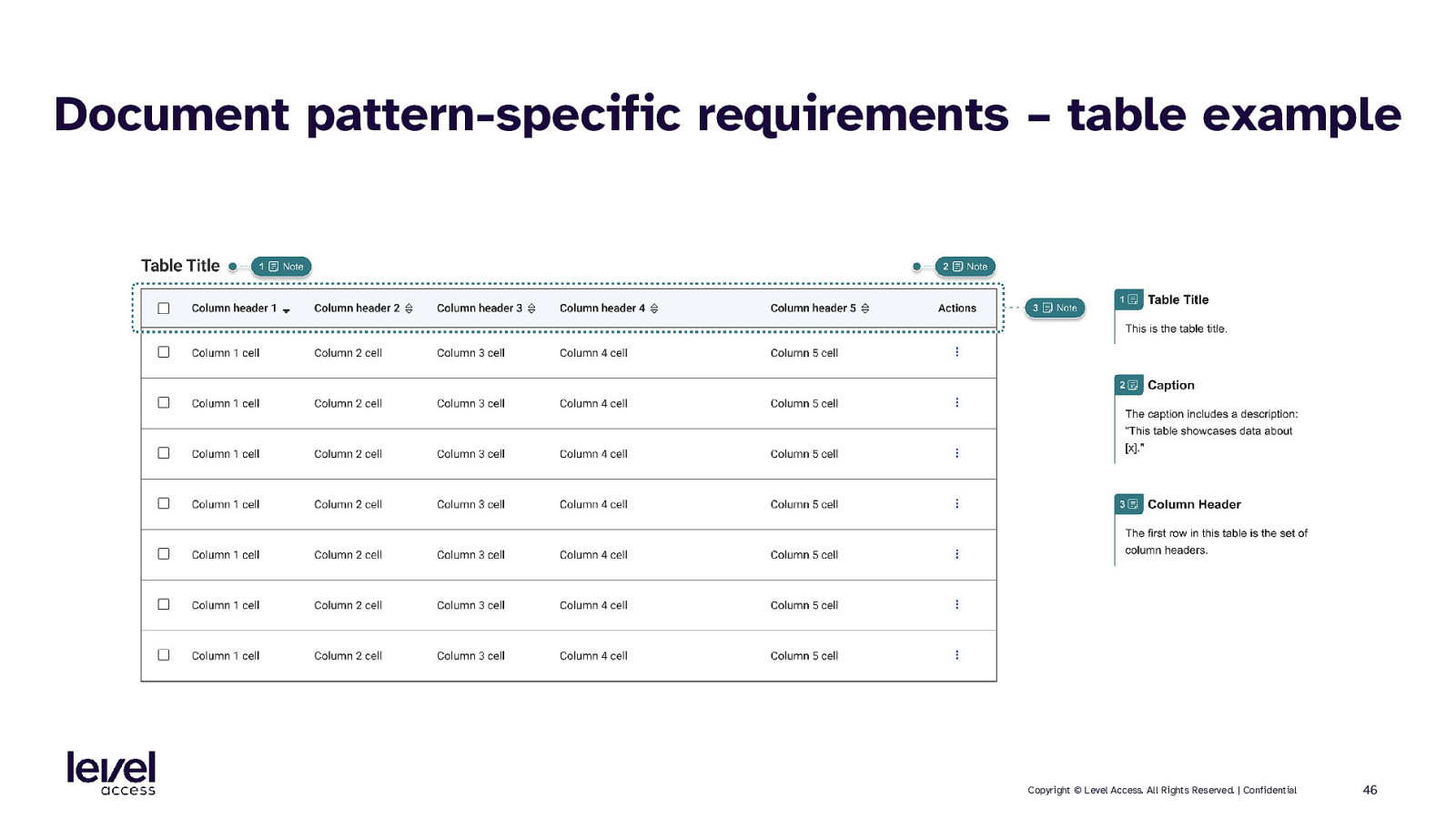
Document pattern-specific requirements – table example Copyright © Level Access. All Rights Reserved. | Confidential 46
SECTION 5 Accessibility in page templates Copyright © Level Access. All Rights Reserved. | Confidential 47
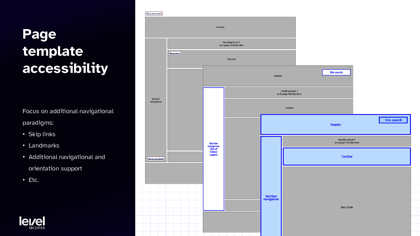
Page template accessibility Focus on additional navigational paradigms: • Skip links • Landmarks • Additional navigational and orientation support • Etc. Copyright © Level Access. All Rights Reserved. | Confidential 48
SECTION 5.1 Accessible design considerations for templates Copyright © Level Access. All Rights Reserved. | Confidential 49
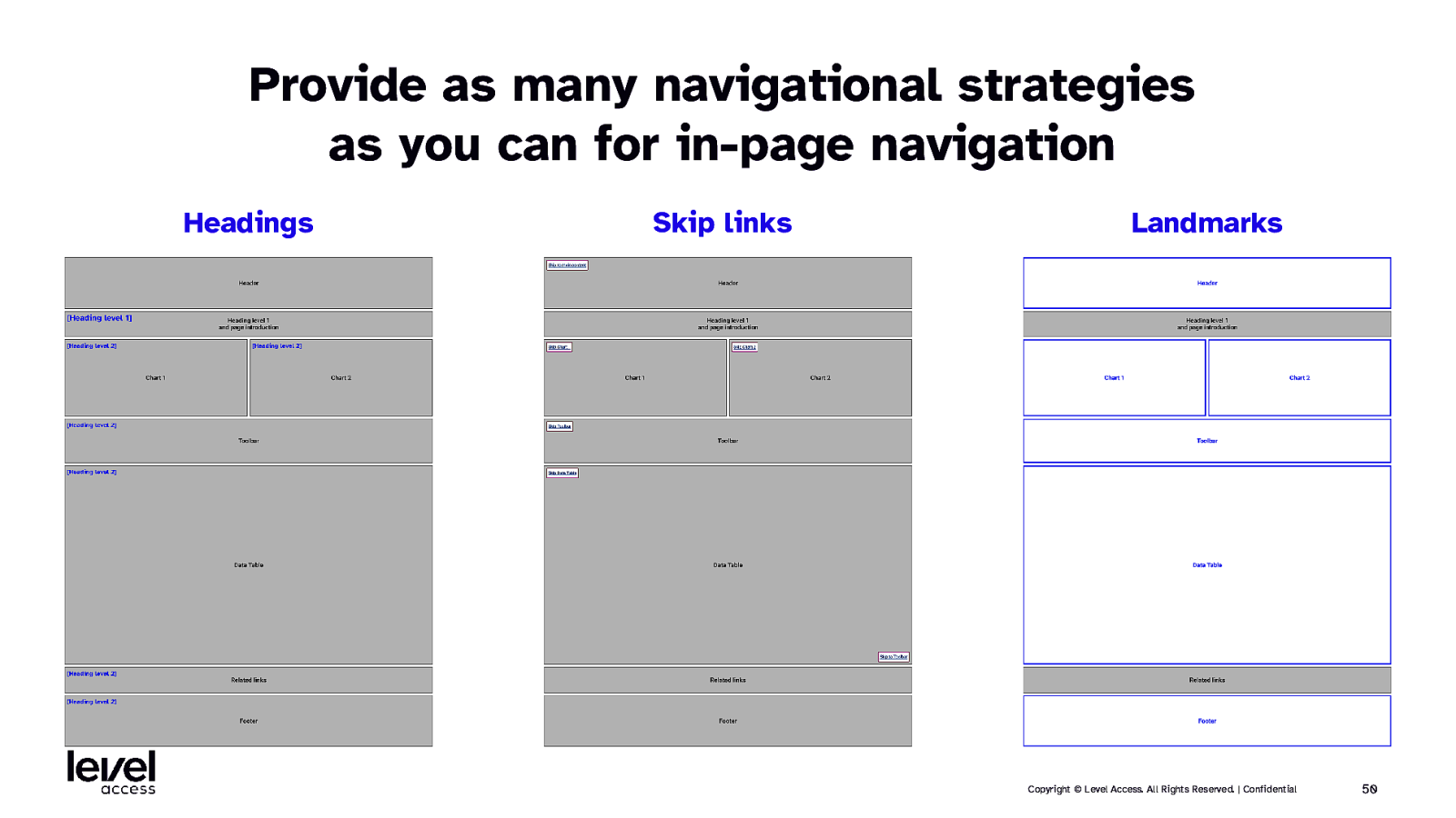
Provide as many navigational strategies as you can for in-page navigation Headings Skip links Landmarks Copyright © Level Access. All Rights Reserved. | Confidential 50
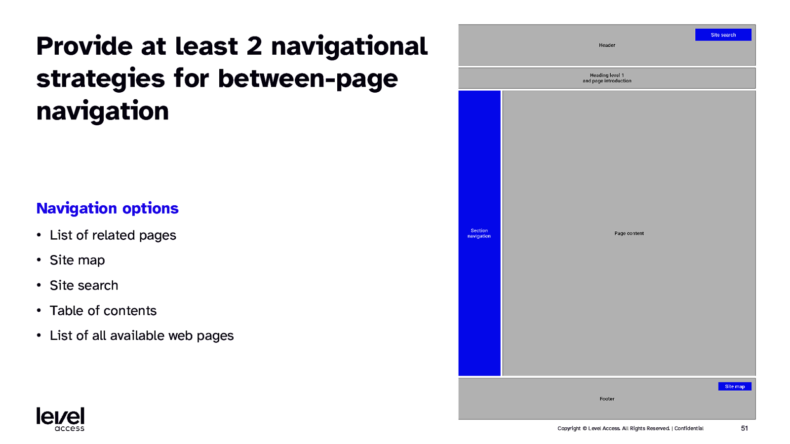
Provide at least 2 navigational strategies for between-page navigation Navigation options • List of related pages • Site map • Site search • Table of contents • List of all available web pages Copyright © Level Access. All Rights Reserved. | Confidential 51
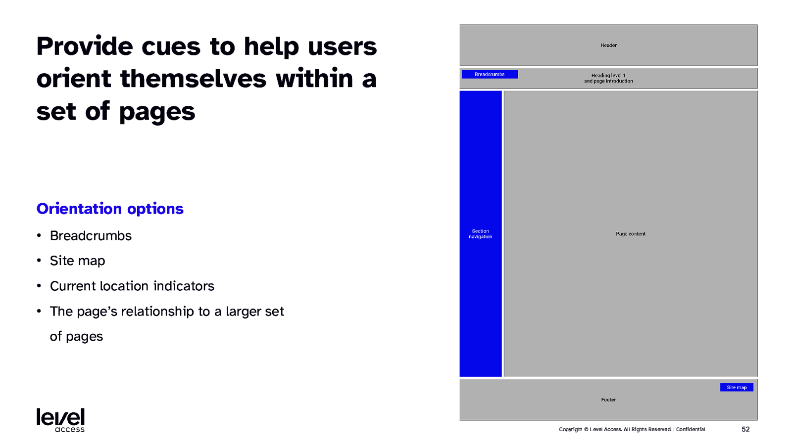
Provide cues to help users orient themselves within a set of pages Orientation options • Breadcrumbs • Site map • Current location indicators • The page’s relationship to a larger set of pages Copyright © Level Access. All Rights Reserved. | Confidential 52
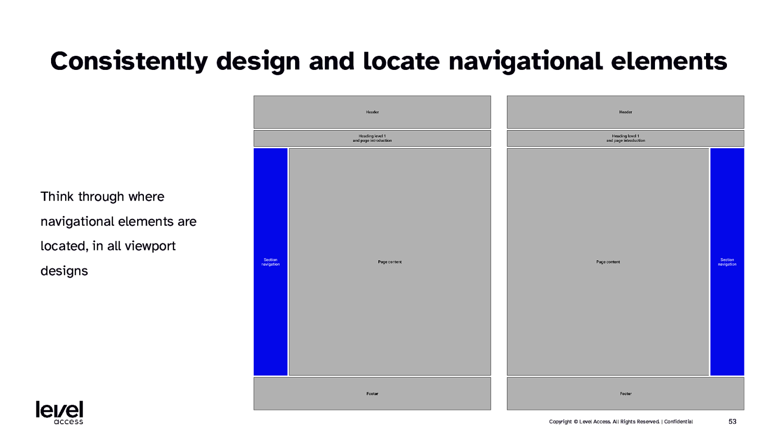
Consistently design and locate navigational elements Think through where navigational elements are located, in all viewport designs Copyright © Level Access. All Rights Reserved. | Confidential 53
SECTION 5.2 Accessible documentation considerations for templates Copyright © Level Access. All Rights Reserved. | Confidential 54
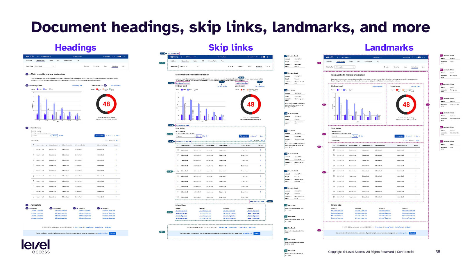
Document headings, skip links, landmarks, and more Headings Skip links Landmarks Copyright © Level Access. All Rights Reserved. | Confidential 55
SECTION 6 Accessibility in pages Copyright © Level Access. All Rights Reserved. | Confidential 56
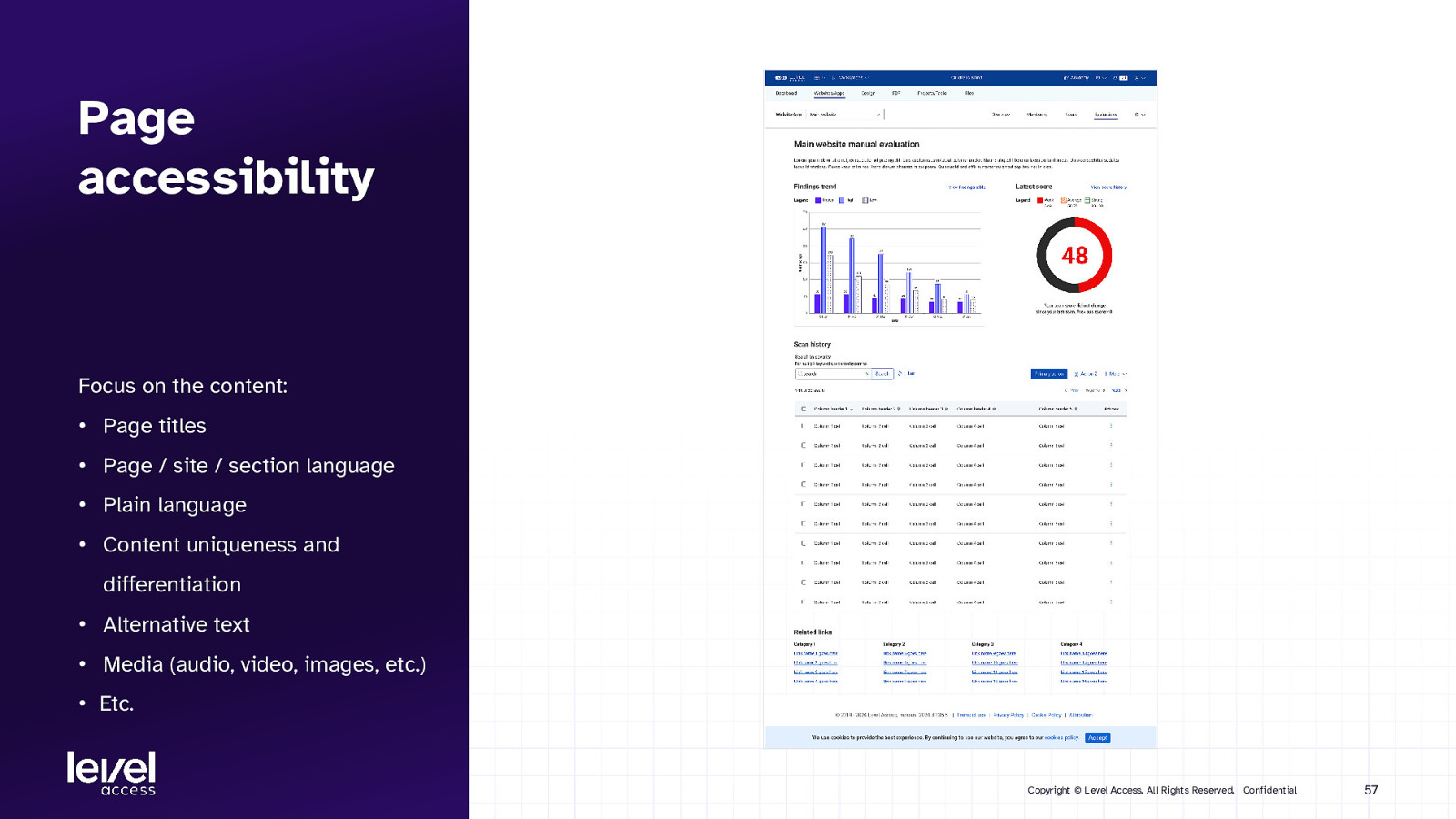
Page accessibility Focus on the content: • Page titles • Page / site / section language • Plain language • Content uniqueness and differentiation • Alternative text • Media (audio, video, images, etc.) • Etc. Copyright © Level Access. All Rights Reserved. | Confidential 57
SECTION 7 Summary Copyright © Level Access. All Rights Reserved. | Confidential 58
Design system level In summary… Styles Notable accessibility considerations Set up your tokens to account for potential accessibility application Components Patterns Page templates Pages Maximize permutations and interactivity Higher order thinking like reading order, focus management, and feedback Additional navigational paradigms like skip links and landmarks Focus on readable and understandable content Copyright © Level Access. All Rights Reserved. | Confidential 59
Any questions?
Thank you

Design systems are not simple machines, but their structure is stable. From styles like colors and fonts, to components like buttons and links, to patterns like cards and filters, to page templates and fully designed pages, the elements build upon each other, from small and simple to large and complex. At each level, the design requirements vary, as do the accessibility requirements. Thus, it is imperative that designers understand what these differences are and how to design for them.
In this session we’ll discuss the accessible design and documentation considerations for each of the levels in design systems. For styles we’ll discuss tokens. For components we’ll discuss things like states and interactions. For patterns we’ll discuss things like keyboard navigation and interactivity between elements. And for templates and pages we’ll discuss things like responsiveness and orientation.
 for free. You
can too.
for free. You
can too.