
A presentation at Registered Graphic Designers Webinar Series by Karen Hawkins
Focus people, focus! Karen Hawkins September 20, 2023
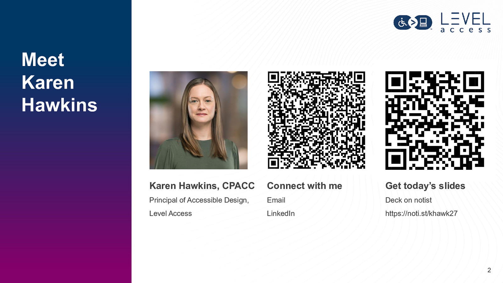
Meet Karen Hawkins Karen Hawkins, CPACC Connect with me Get today’s slides Principal of Accessible Design, Email Deck on notist Level Access LinkedIn https://noti.st/khawk27 2
Today’s learning objectives
What is a focus state? 4
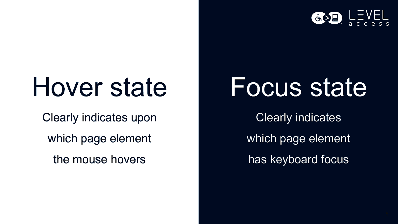
Hover state Focus state Clearly indicates upon Clearly indicates which page element which page element the mouse hovers has keyboard focus 5
Why focus on focus states? 6
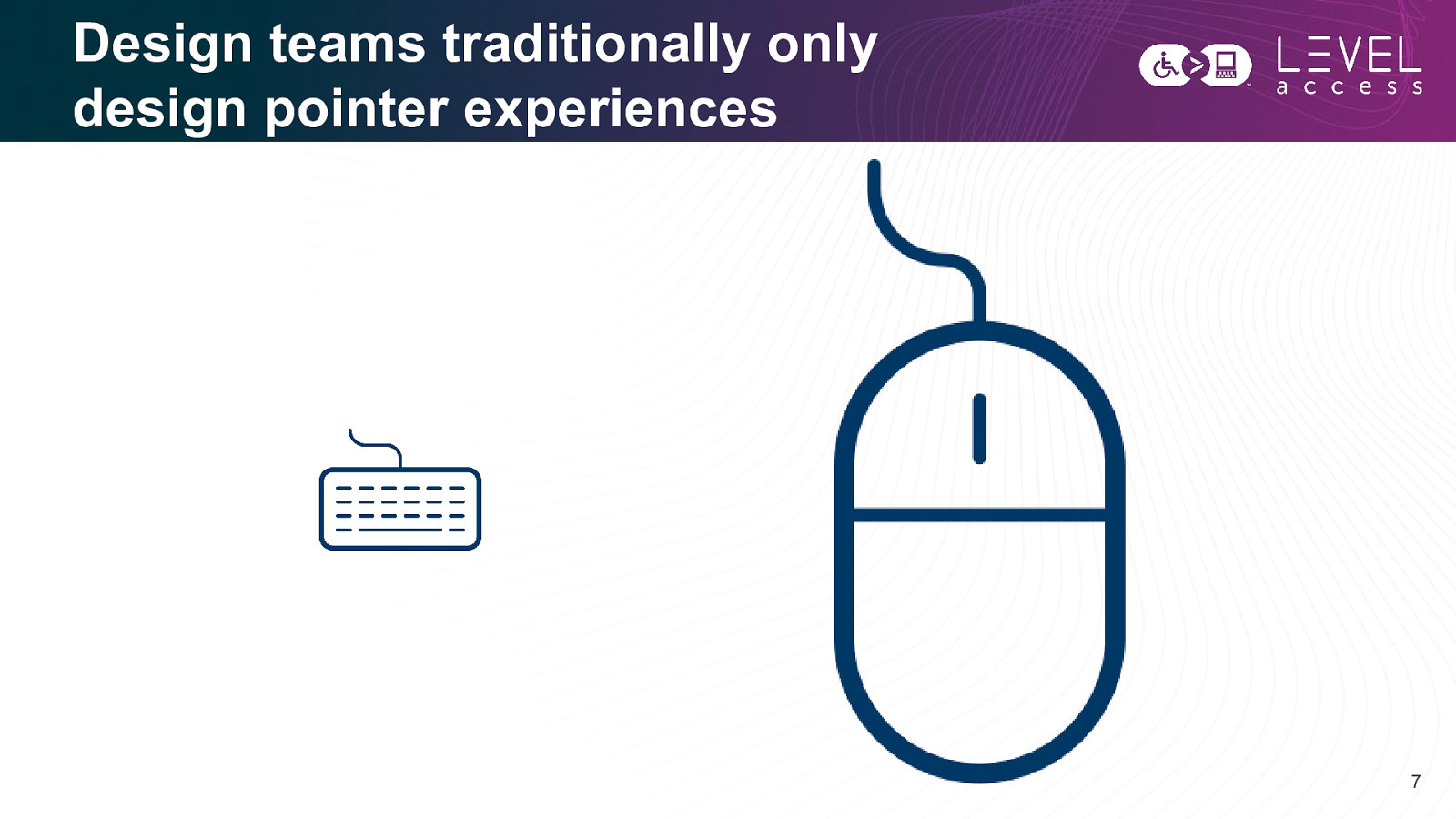
Design teams traditionally only design pointer experiences 7
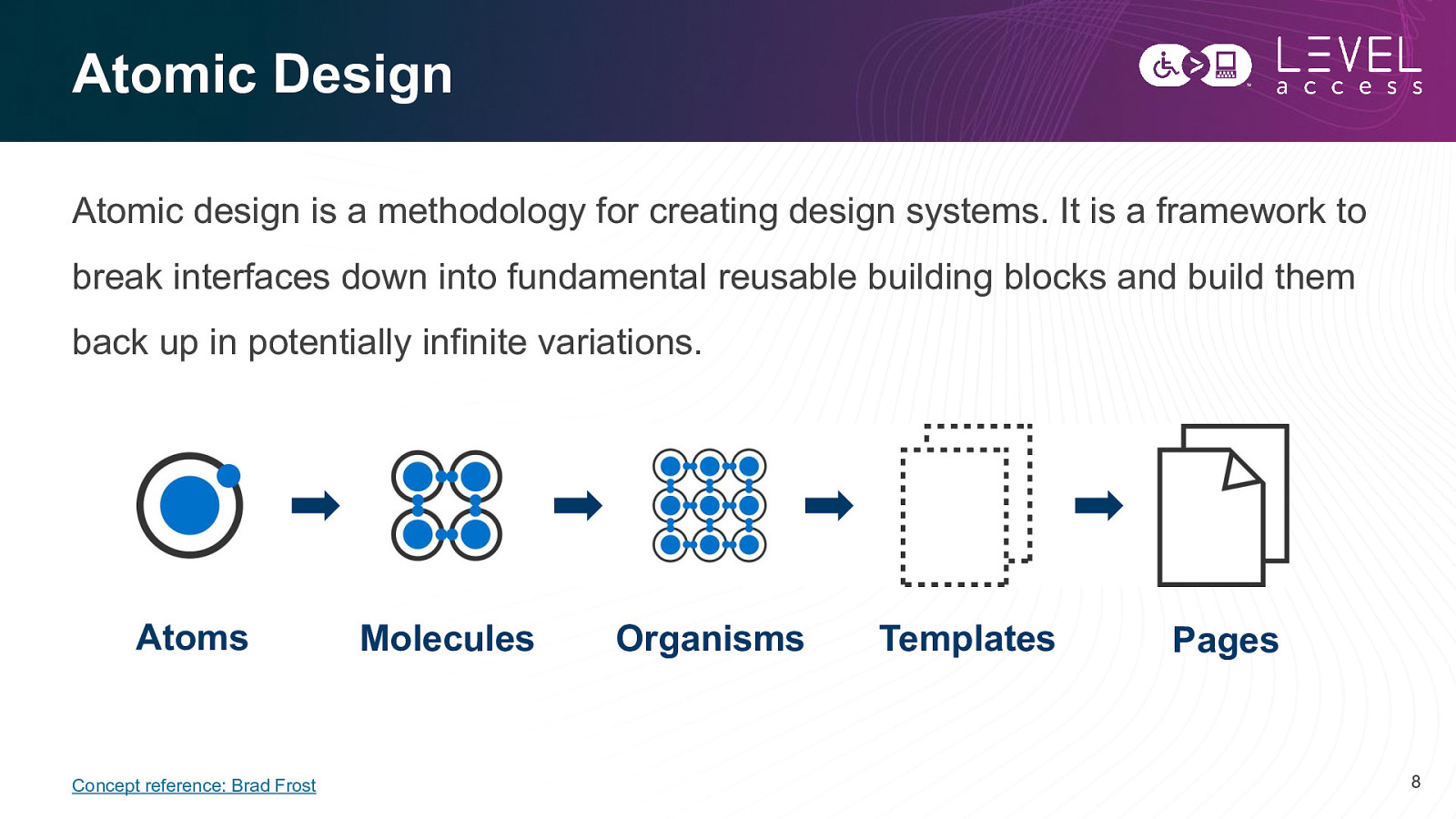
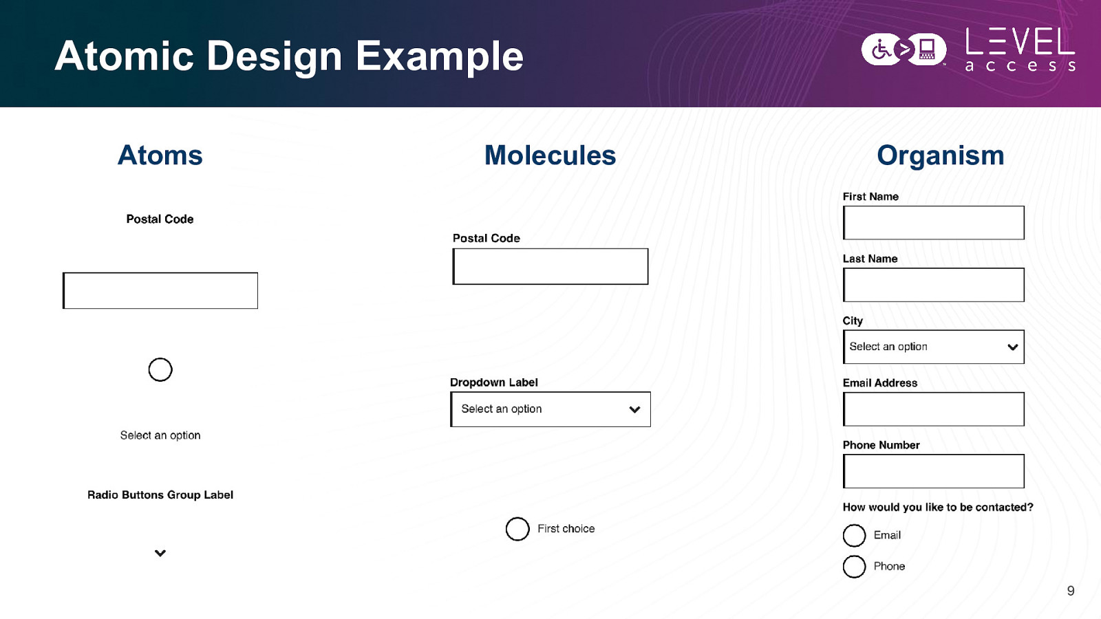
Atomic Design Atomic design is a methodology for creating design systems. It is a framework to break interfaces down into fundamental reusable building blocks and build them back up in potentially infinite variations. Atoms Concept reference: Brad Frost Molecules Organisms Templates Pages 8
Atomic Design Example Atoms Molecules Organism 9
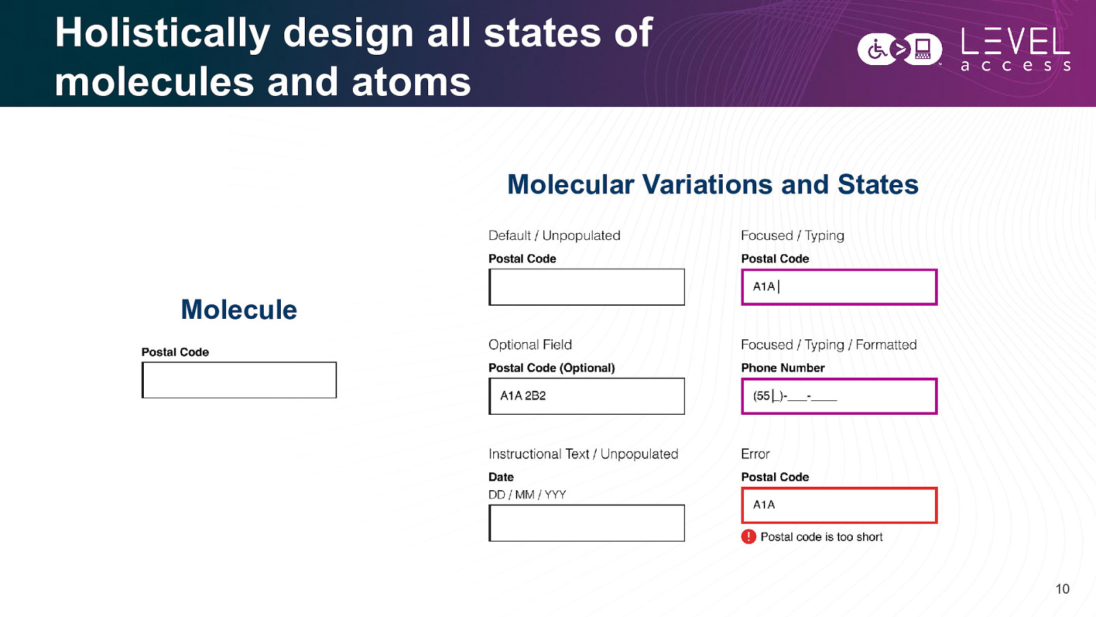
Holistically design all states of molecules and atoms Molecular Variations and States Molecule 10
Focus on Design Interactivity 11
Design 12
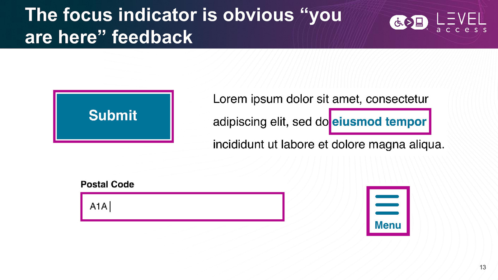
The focus indicator is obvious “you are here” feedback 13
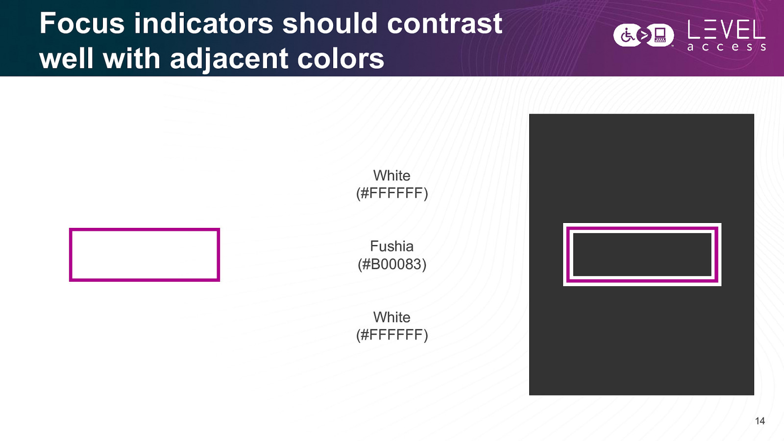
Focus indicators should contrast well with adjacent colors White (#FFFFFF) Fushia (#B00083) White (#FFFFFF) 14
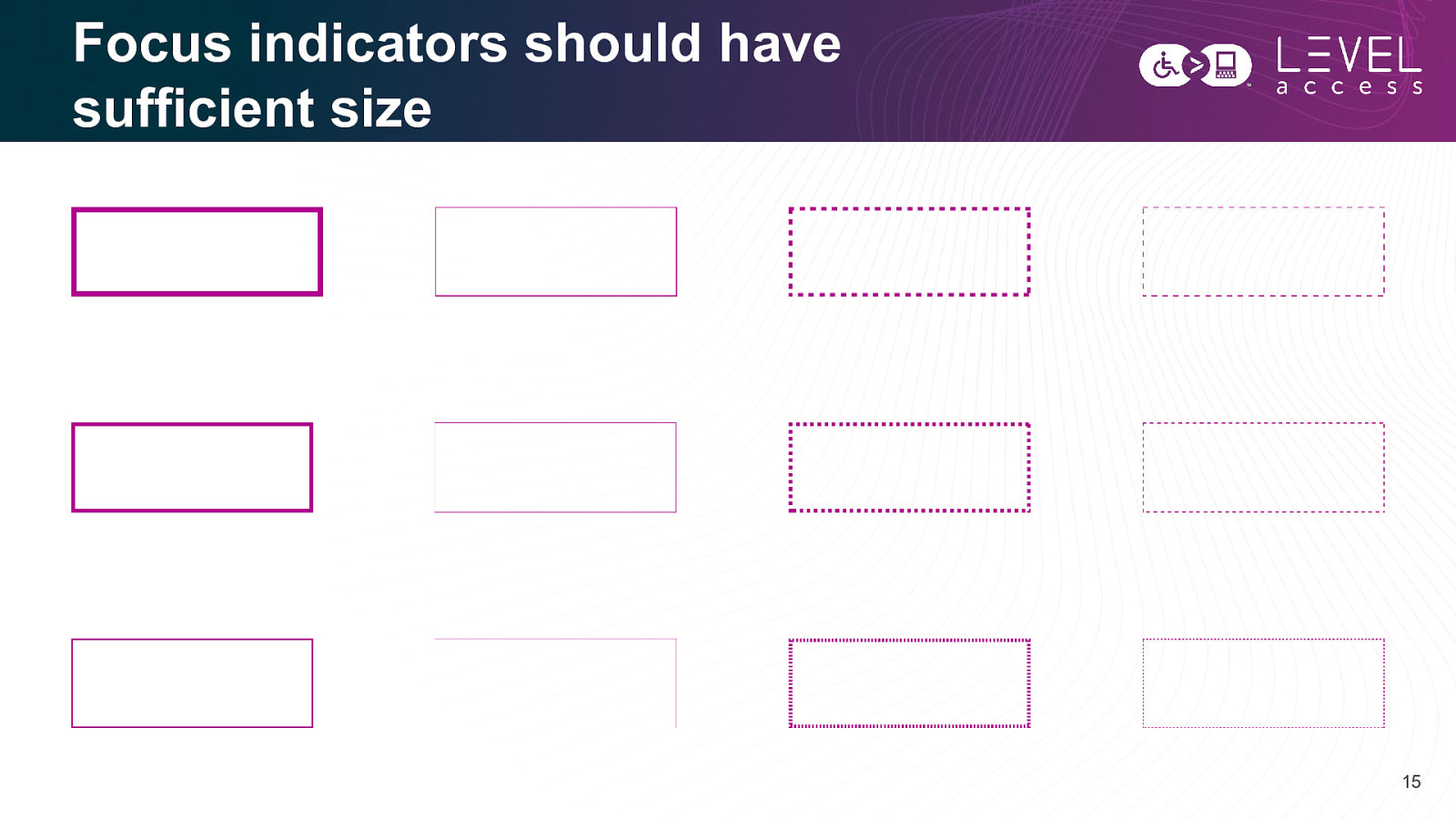
Focus indicators should have sufficient size 15
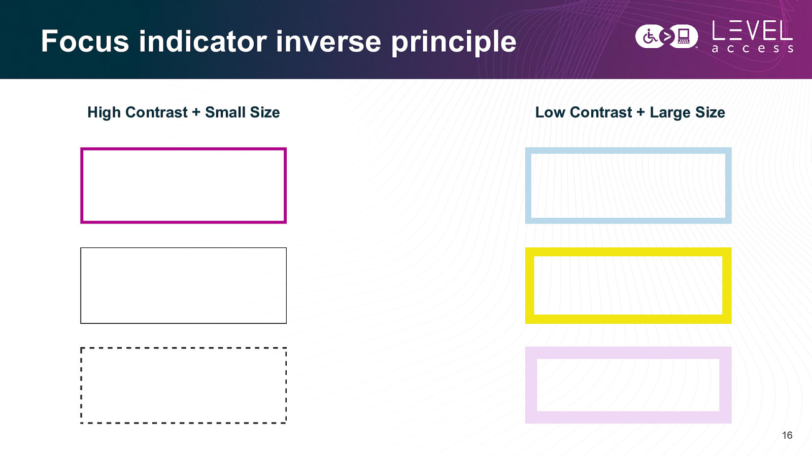
Focus indicator inverse principle High Contrast + Small Size Low Contrast + Large Size 16
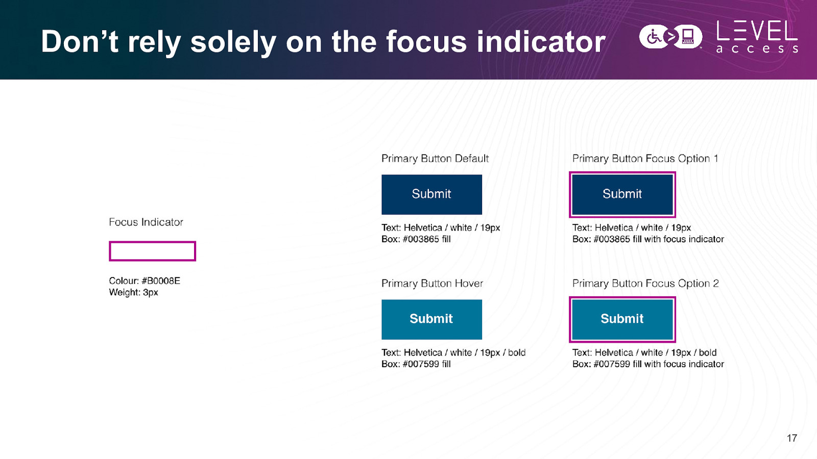
Don’t rely solely on the focus indicator 17
Think “obviousness” 18
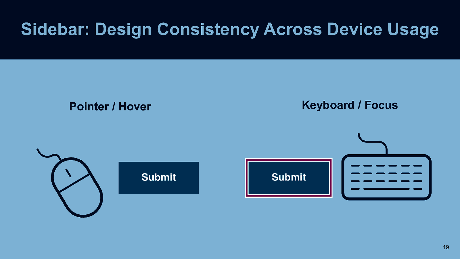
Sidebar: Design Consistency Across Device Usage Pointer / Hover Keyboard / Focus 19
Focus on consistency. 20
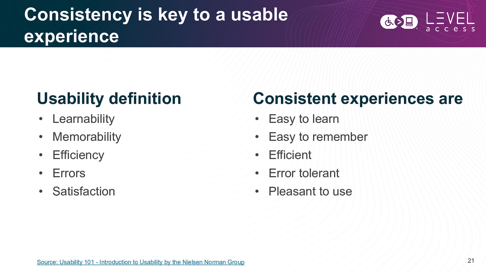
Consistency is key to a usable experience Usability definition Consistent experiences are • • • • • • • • • • Learnability Memorability Efficiency Errors Satisfaction Source: Usability 101 - Introduction to Usability by the Nielsen Norman Group Easy to learn Easy to remember Efficient Error tolerant Pleasant to use 21
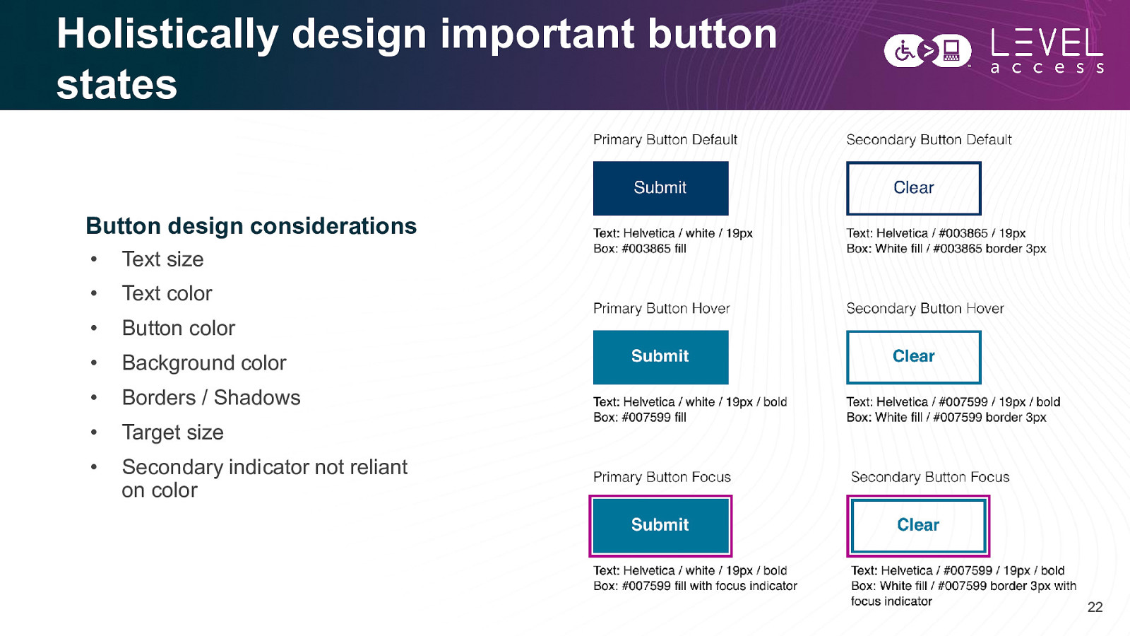
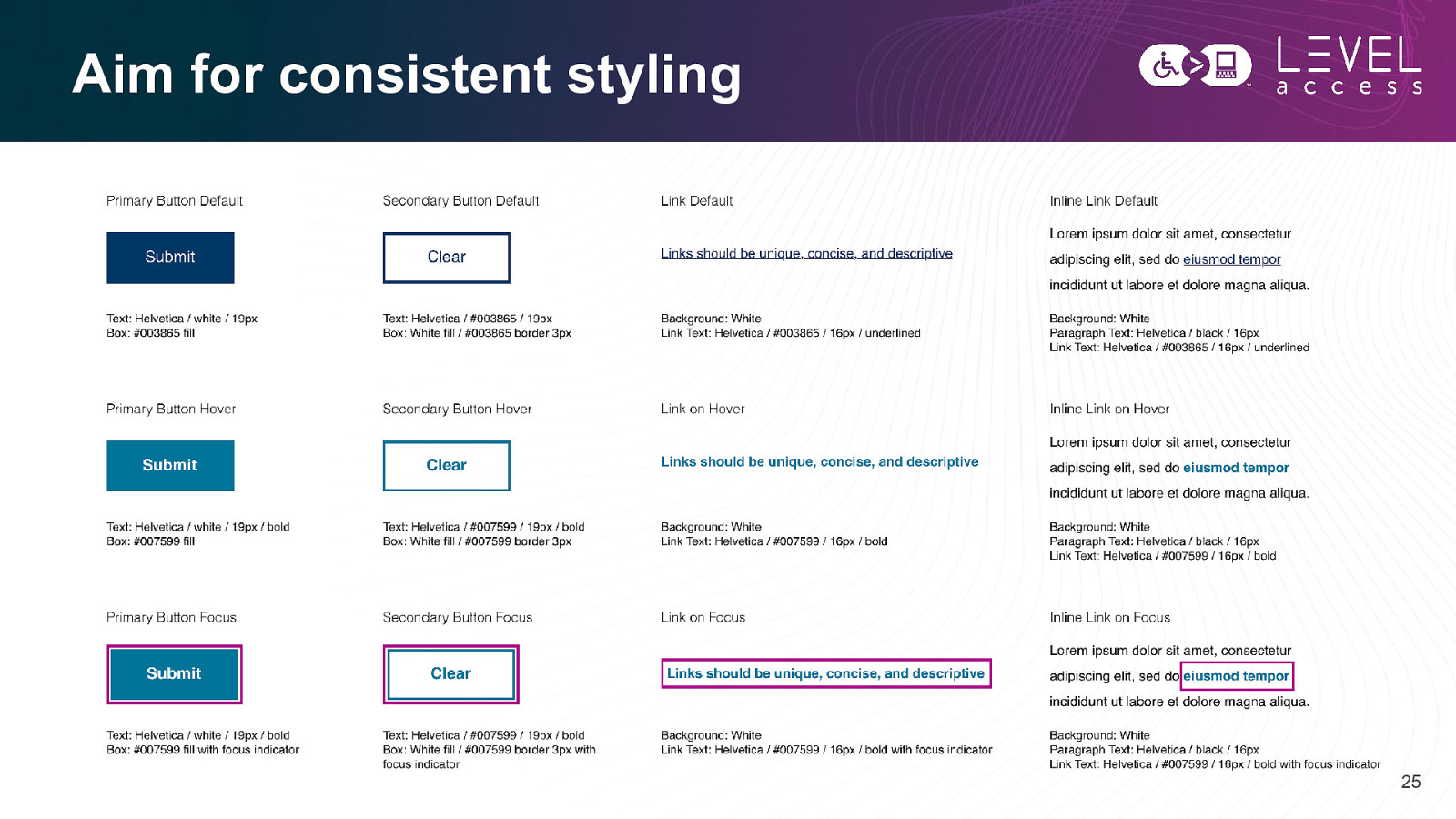
Holistically design important button states Button design considerations • Text size • Text color • Button color • Background color • Borders / Shadows • Target size • Secondary indicator not reliant on color 22
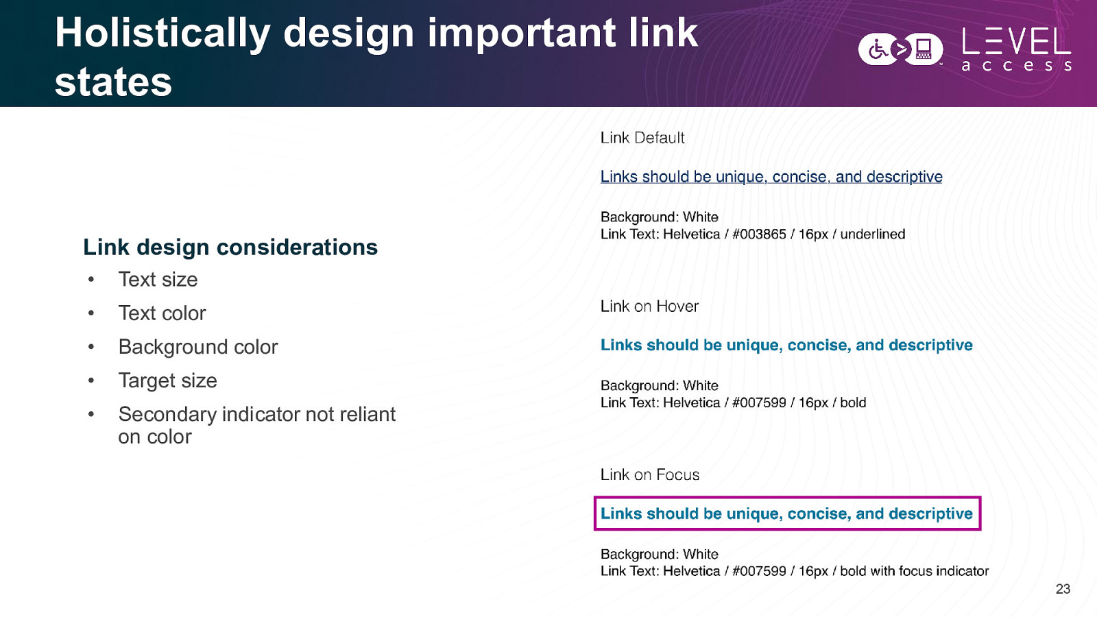
Holistically design important link states Link design considerations • Text size • Text color • Background color • Target size • Secondary indicator not reliant on color 23
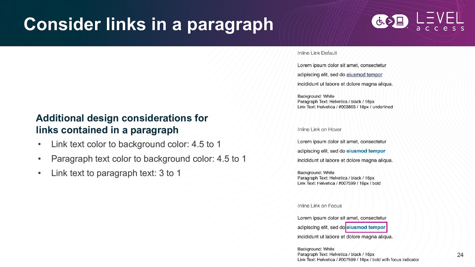
Consider links in a paragraph Additional design considerations for links contained in a paragraph • Link text color to background color: 4.5 to 1 • Paragraph text color to background color: 4.5 to 1 • Link text to paragraph text: 3 to 1 24
Aim for consistent styling 25
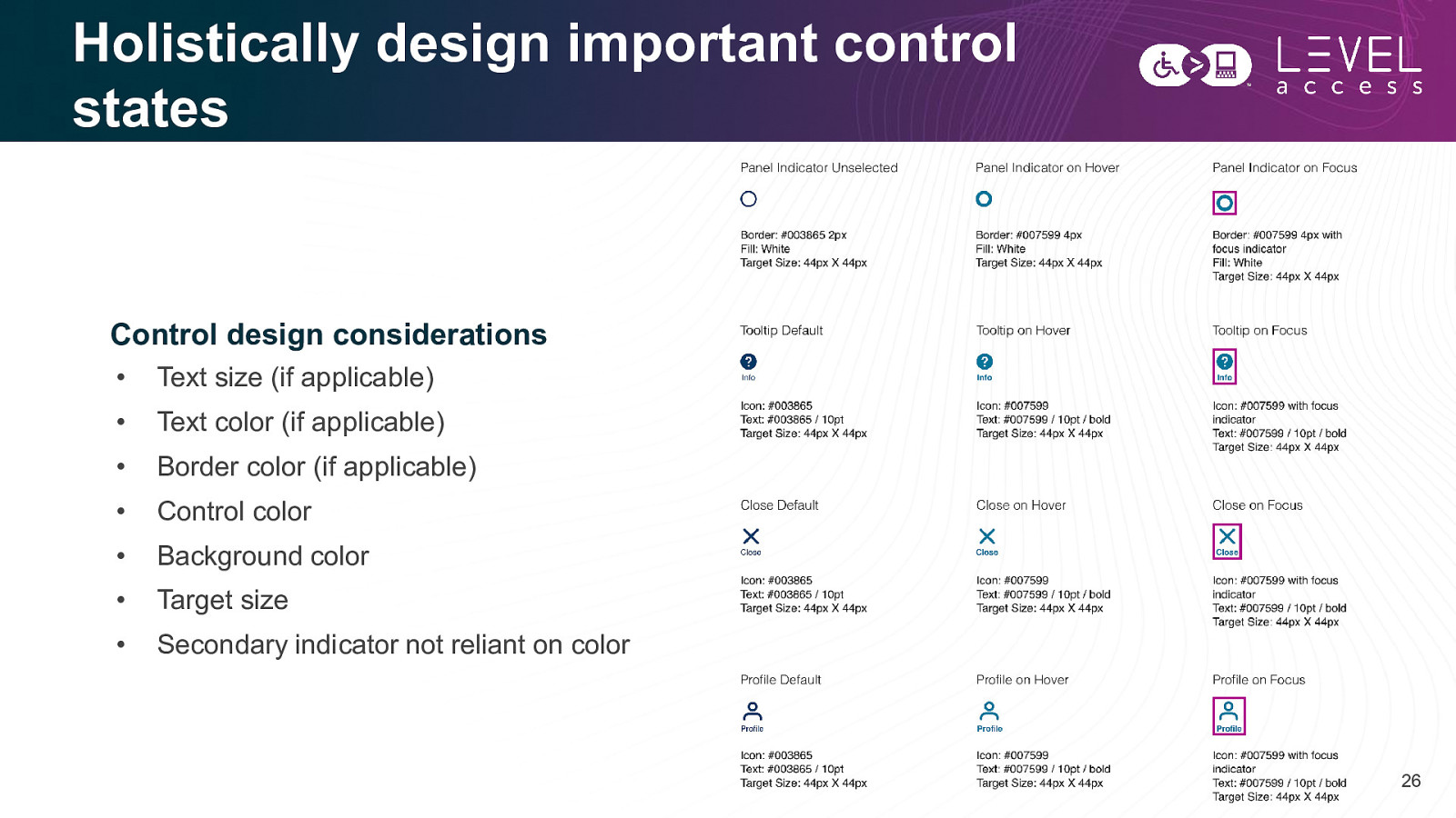
Holistically design important control states Control design considerations • Text size (if applicable) • Text color (if applicable) • Border color (if applicable) • Control color • Background color • Target size • Secondary indicator not reliant on color 26
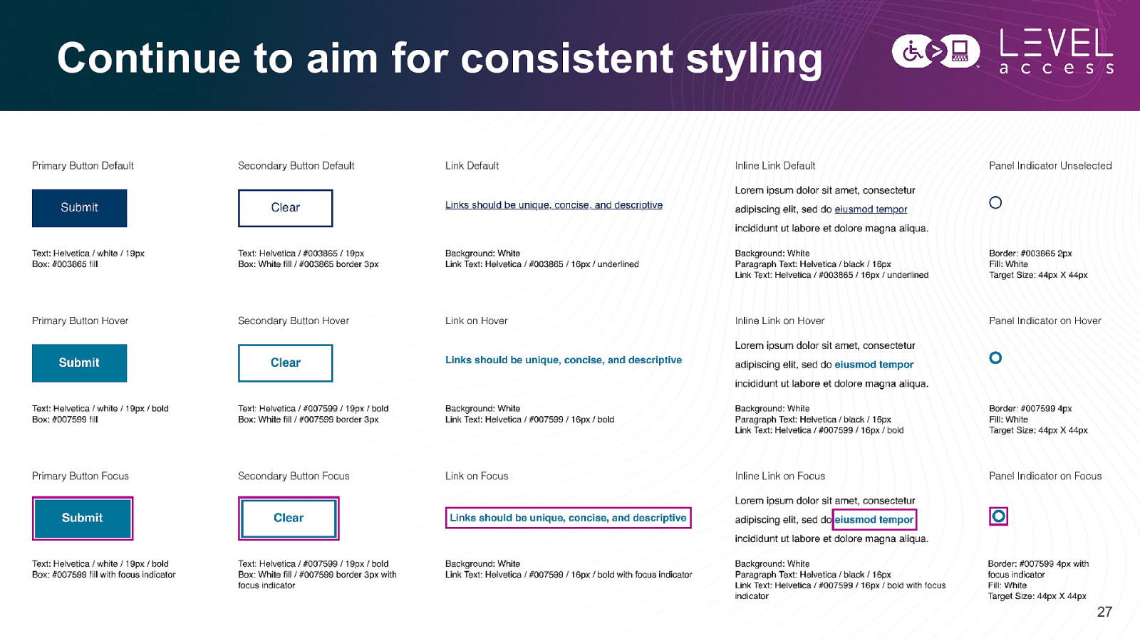
Continue to aim for consistent styling 27
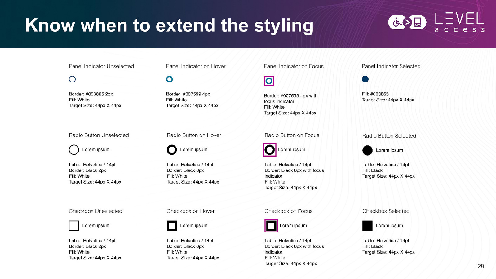
Know when to extend the styling 28
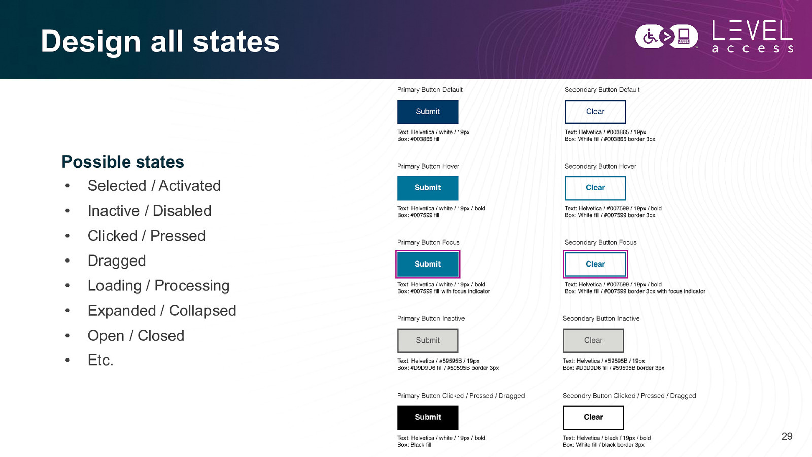
Design all states Possible states • Selected / Activated • Inactive / Disabled • Clicked / Pressed • Dragged • Loading / Processing • Expanded / Collapsed • Open / Closed • Etc. 29
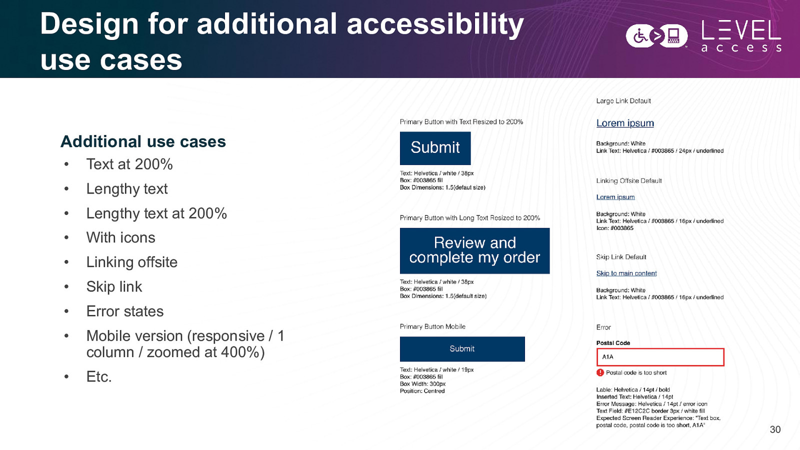
Design for additional accessibility use cases Additional use cases • Text at 200% • Lengthy text • Lengthy text at 200% • With icons • Linking offsite • Skip link • Error states • Mobile version (responsive / 1 column / zoomed at 400%) • Etc. 30
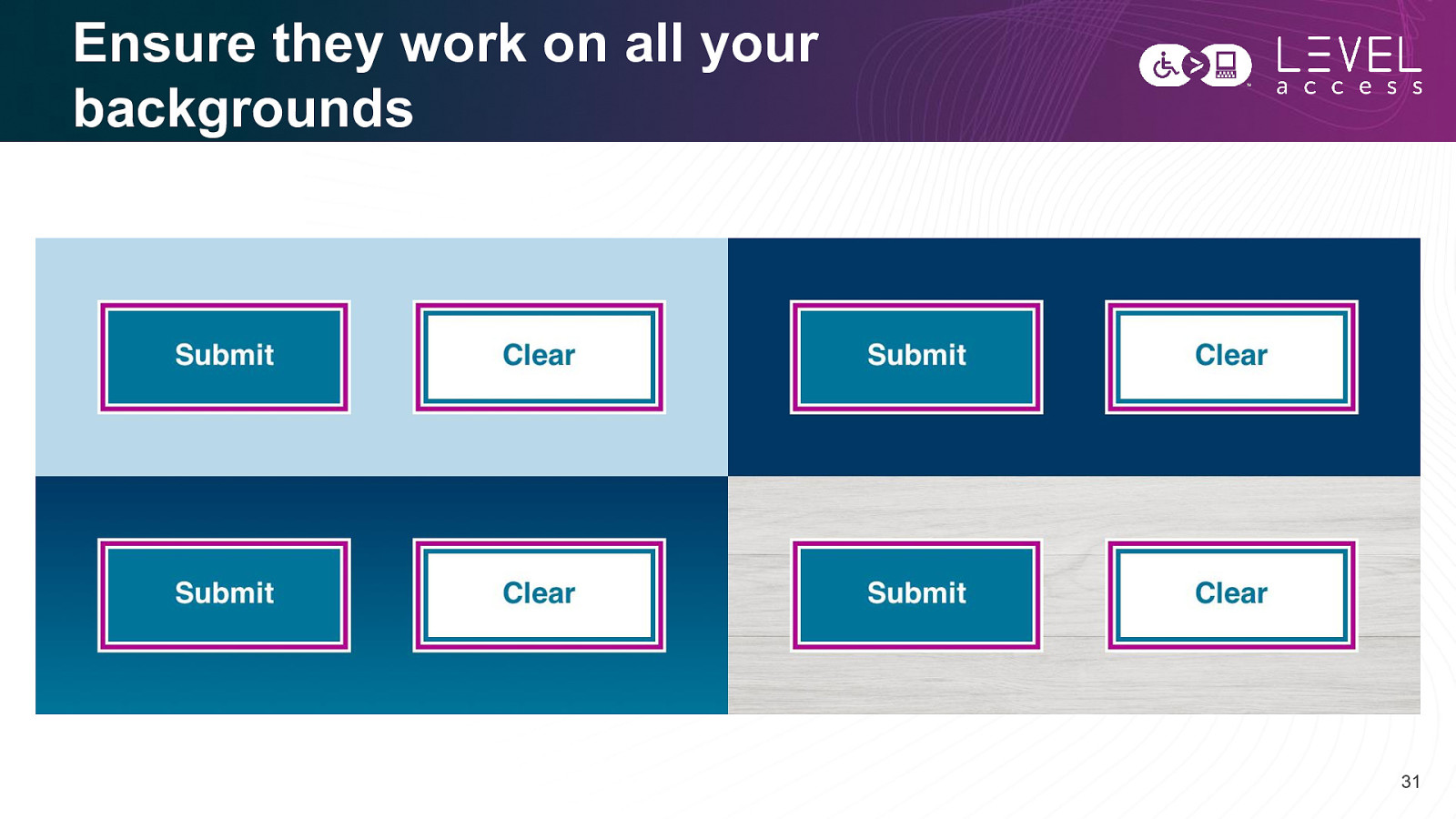
Ensure they work on all your backgrounds 31
Interactivity 32
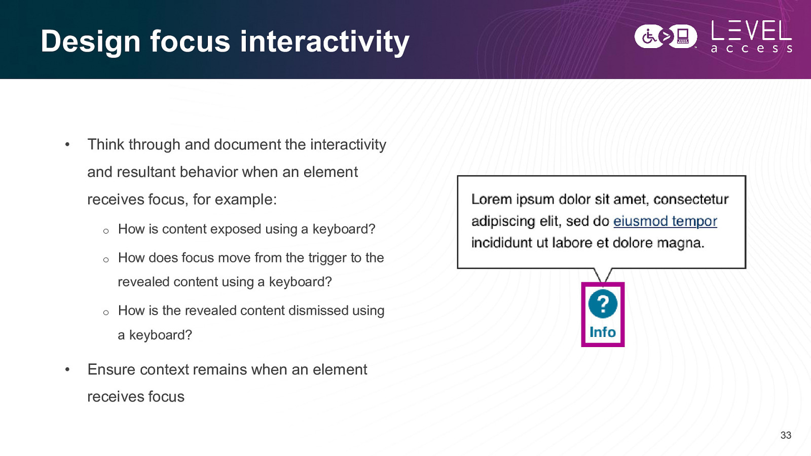
Design focus interactivity • Think through and document the interactivity and resultant behavior when an element receives focus, for example: o How is content exposed using a keyboard? o How does focus move from the trigger to the revealed content using a keyboard? o How is the revealed content dismissed using a keyboard? • Ensure context remains when an element receives focus 33
Summary 34
Focus on focus states. 35
Takeaways • Design focus indicators to have sufficient contrast and size • Design focus states to be obvious • Design focus states to be consistent • Design focus states for as many atoms, molecules, and organisms as required by your design system • It’s ok if your hover states and focus states are similar – it is actually encouraged! 36
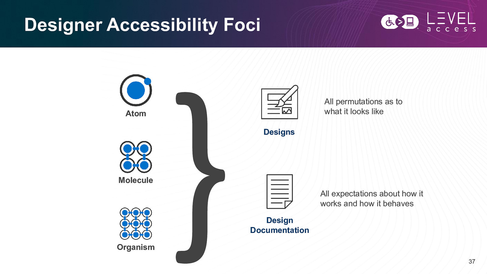
Designer Accessibility Foci All permutations as to what it looks like Atom Designs Molecule All expectations about how it works and how it behaves Design Documentation Organism 37
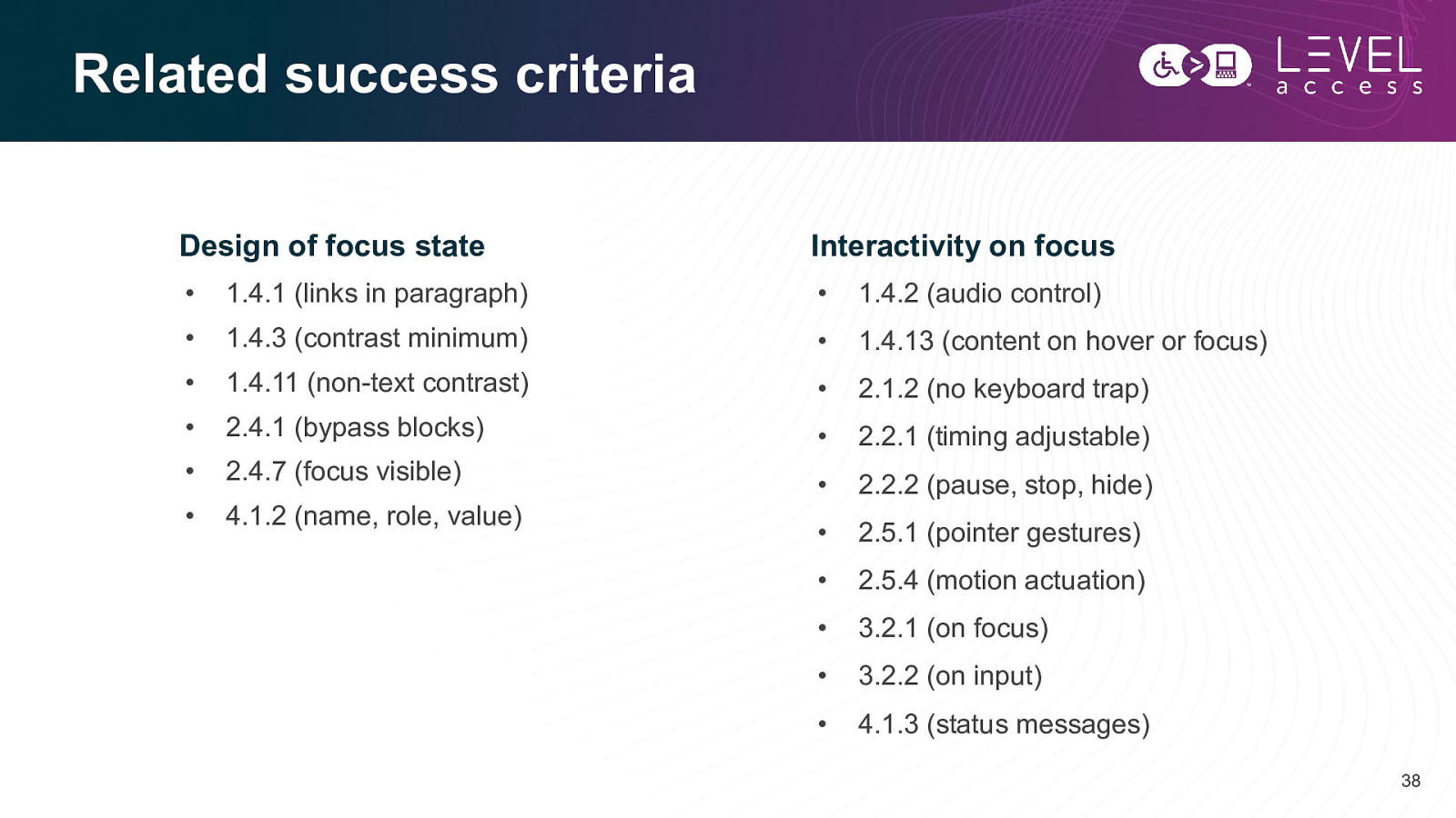
Related success criteria Design of focus state Interactivity on focus • 1.4.1 (links in paragraph) • 1.4.2 (audio control) • 1.4.3 (contrast minimum) • 1.4.13 (content on hover or focus) • 1.4.11 (non-text contrast) • 2.1.2 (no keyboard trap) • 2.4.1 (bypass blocks) • 2.2.1 (timing adjustable) • 2.4.7 (focus visible) • 2.2.2 (pause, stop, hide) • 4.1.2 (name, role, value) • 2.5.1 (pointer gestures) • 2.5.4 (motion actuation) • 3.2.1 (on focus) • 3.2.2 (on input) • 4.1.3 (status messages) 38
Questions? 39
Slides, Contact Details, and a Guide Connect with me Get today’s slides Get agile design guide Email and LinkedIn Deck on notist Downloadable document Karen Hawkins, CPACC https://noti.st/khawk27 Accessibility in the design process 40
Thank you Karen Hawkins karen.hawkins@levelaccess.com levelaccess.com

Focus, people. We need to focus. On focus states that is. The top accessibility issue identified in our design evaluation service is the lack of a designed focus state for individual components. Sure, sometimes people think about a hover state, but that’s for mouse users. What about keyboard users? How are they supposed to know where they are on page without a properly designed focus state? In this talk we will discuss the importance of well-designed focus states, and we will explore the accessibility requirements of focus states for some common components.
 for free. You
can too.
for free. You
can too.