
A presentation at a11yTO Meetup in in Toronto, ON, Canada by Karen Hawkins
Using Design Tokens to up your Accessibility Game Karen Hawkins November 9, 2023
Meet Karen Hawkins Karen Hawkins, CPACC Connect with me Get today’s slides Principal of Accessible Design, Email Deck on notist Level Access LinkedIn https://noti.st/khawk27 2
Today’s Goals
SECTION 1 Little Ditty about Design and Designs Systems 4
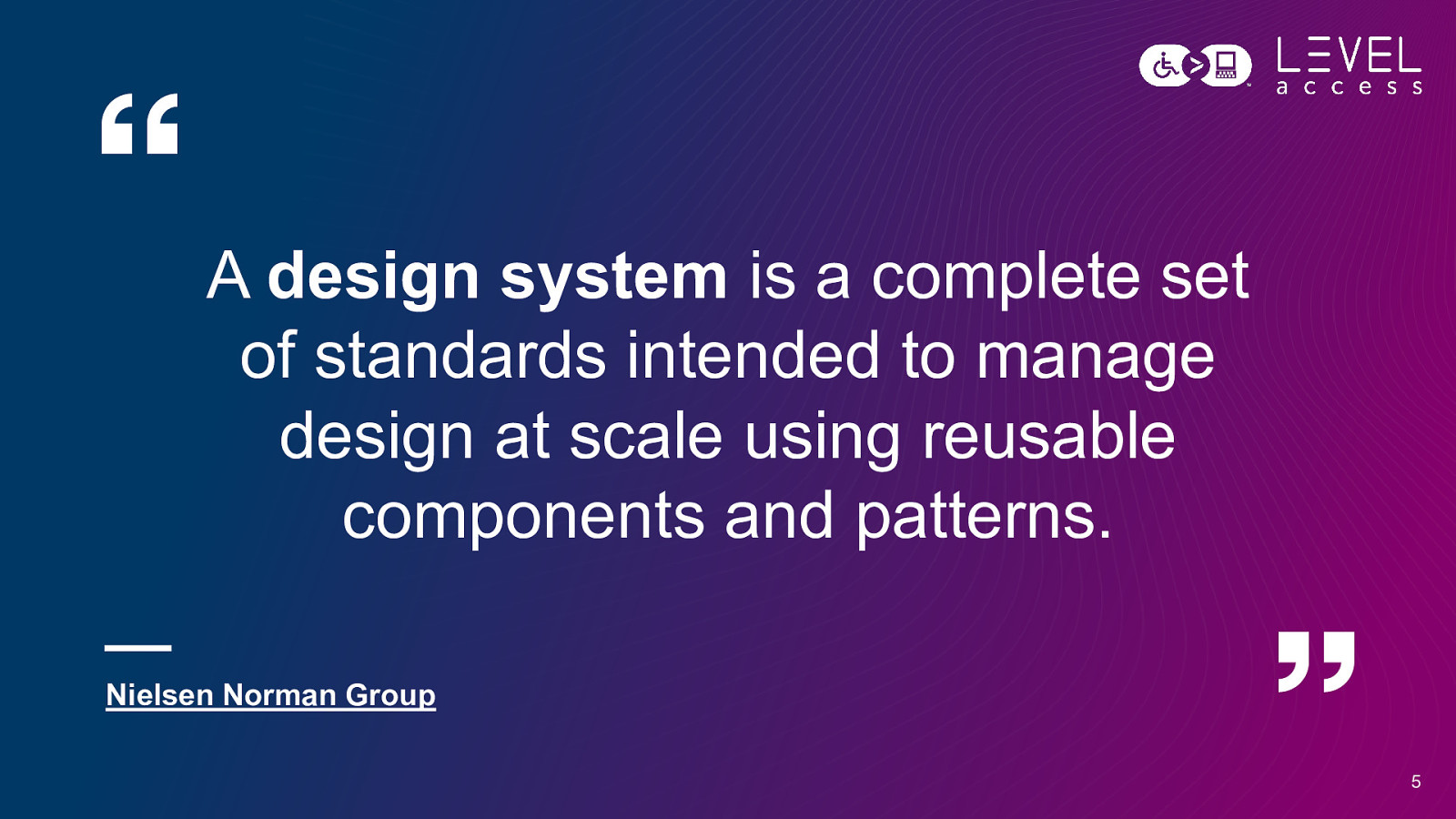
A design system is a complete set of standards intended to manage design at scale using reusable components and patterns. Nielsen Norman Group 5
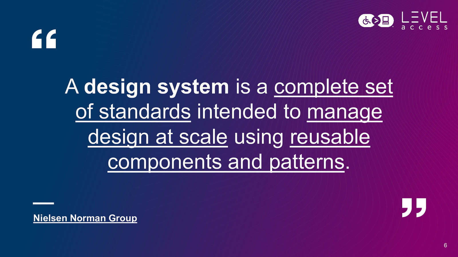
A design system is a complete set of standards intended to manage design at scale using reusable components and patterns. Nielsen Norman Group 6
Consistency Efficiency Scale 7
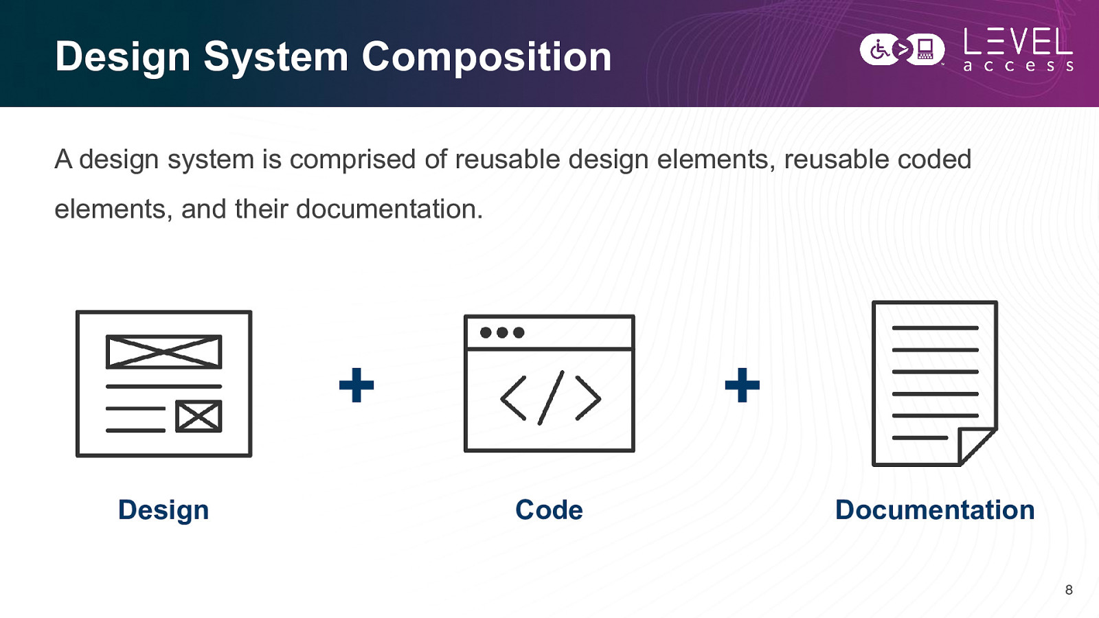
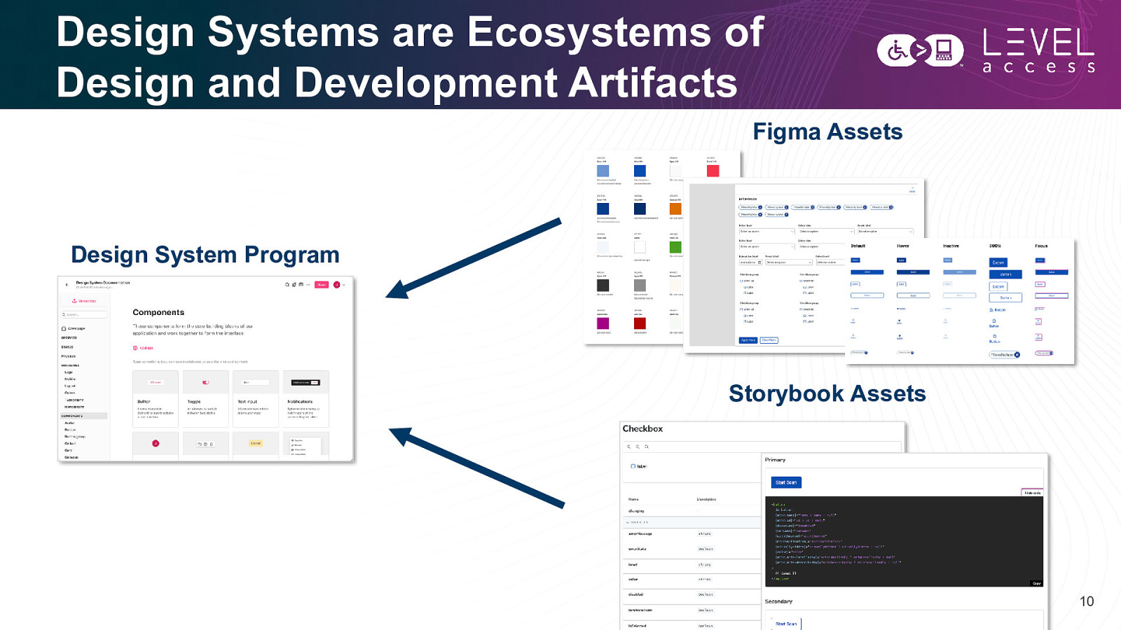
Design System Composition A design system is comprised of reusable design elements, reusable coded elements, and their documentation.
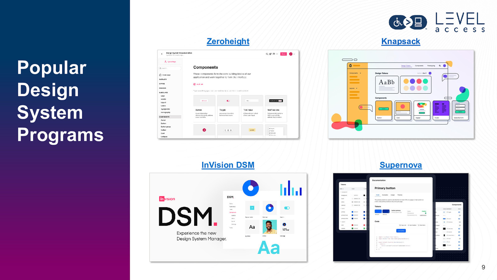
Zeroheight Knapsack InVision DSM Supernova Popular Design System Programs 9
Design Systems are Ecosystems of Design and Development Artifacts Figma Assets Design System Program Storybook Assets 10
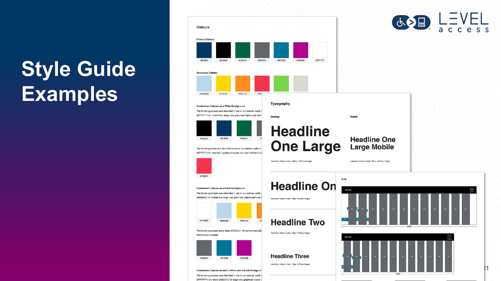
Style Guide Examples 11
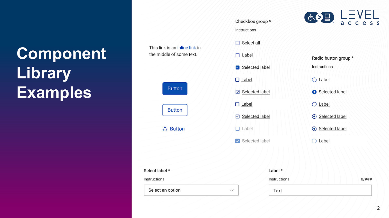
Component Library Examples 12
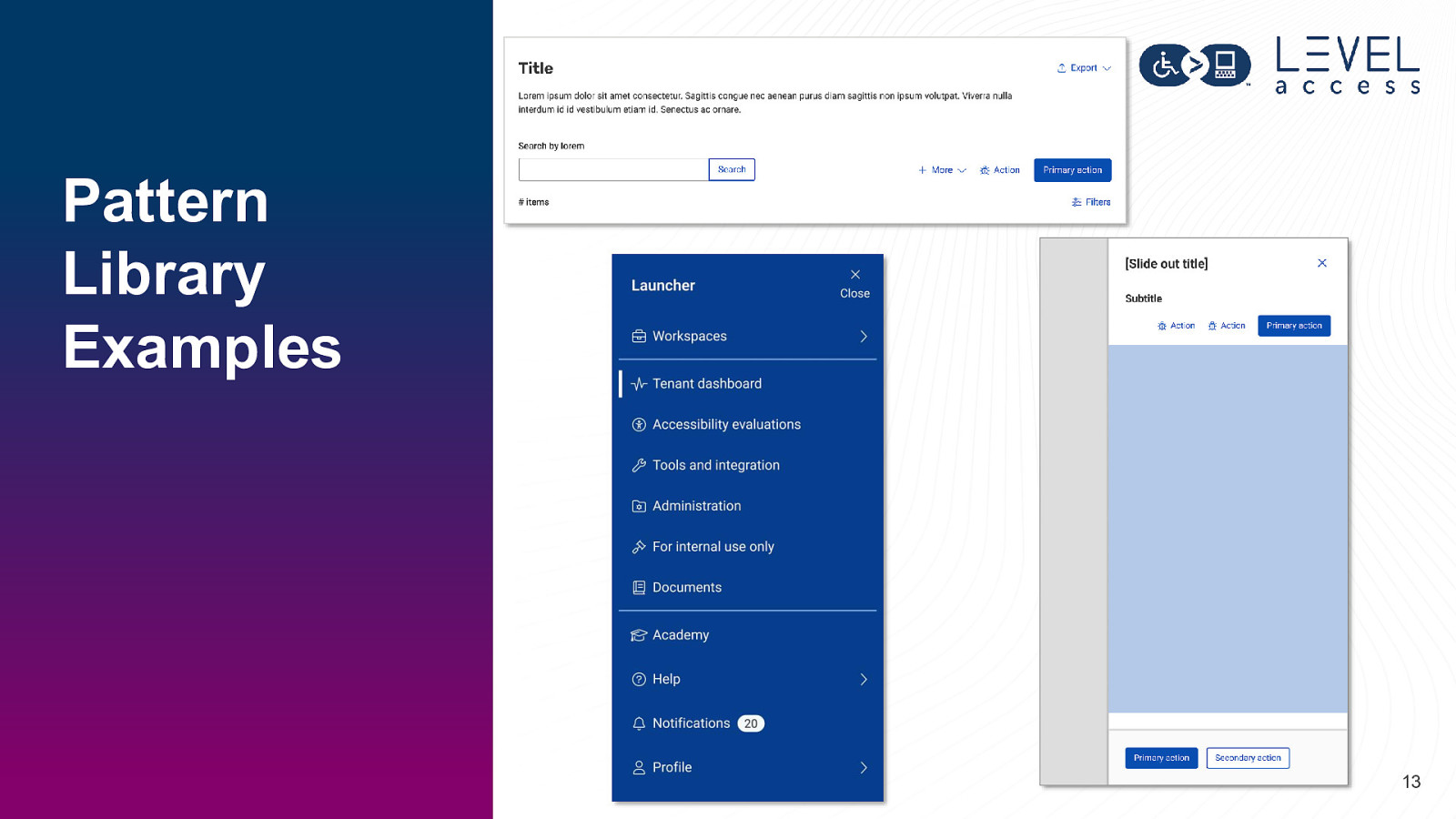
Pattern Library Examples 13
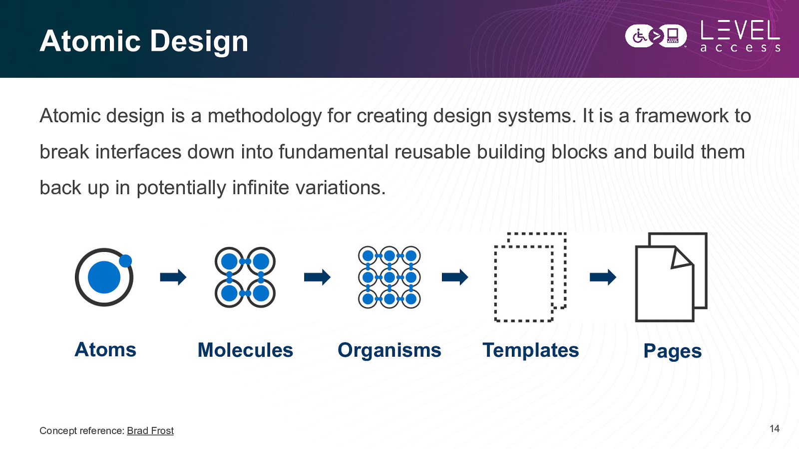
Atomic Design Atomic design is a methodology for creating design systems. It is a framework to break interfaces down into fundamental reusable building blocks and build them back up in potentially infinite variations. Atoms Concept reference: Brad Frost Molecules Organisms Templates Pages 14
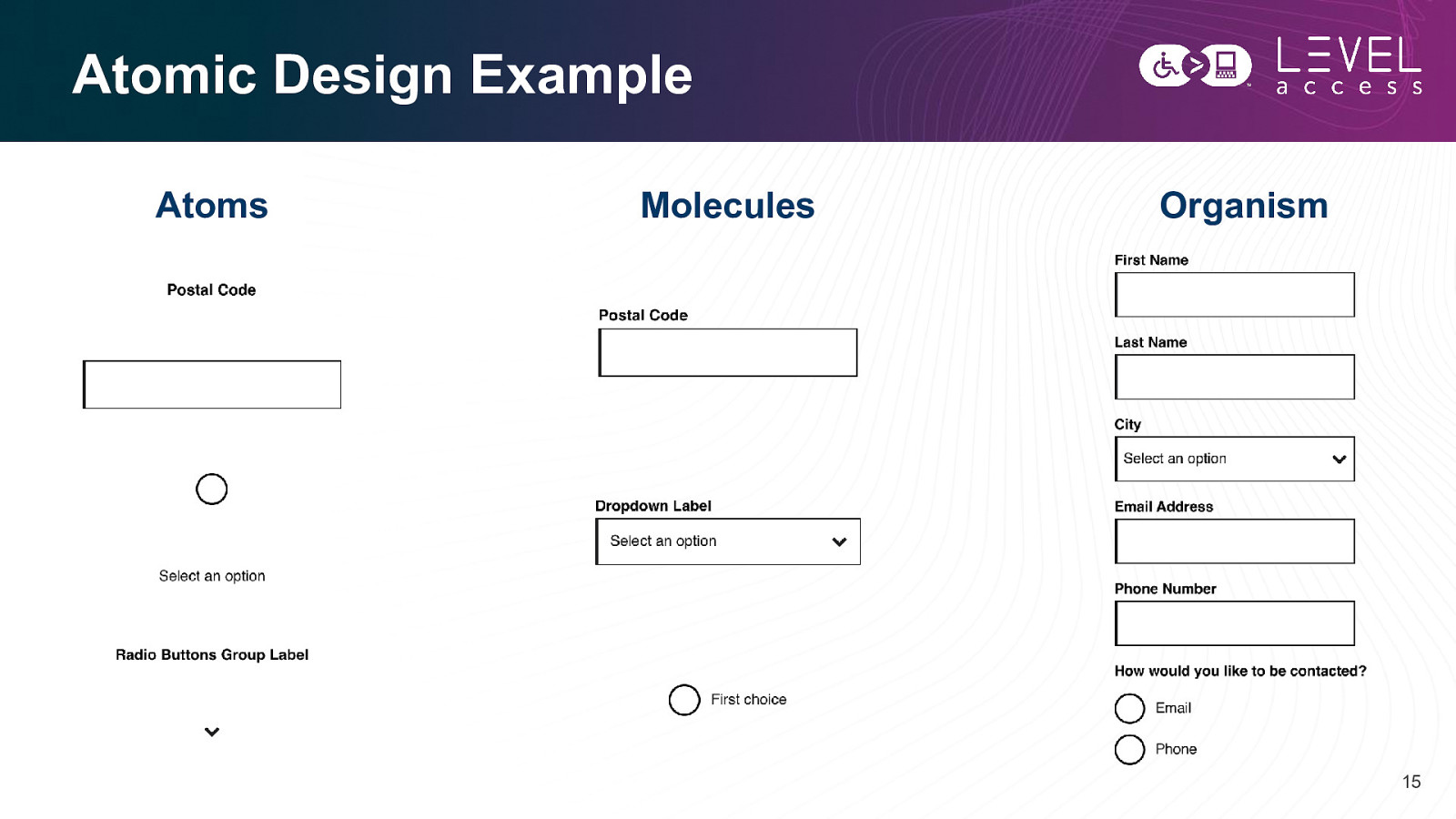
Atomic Design Example Atoms Molecules Organism 15
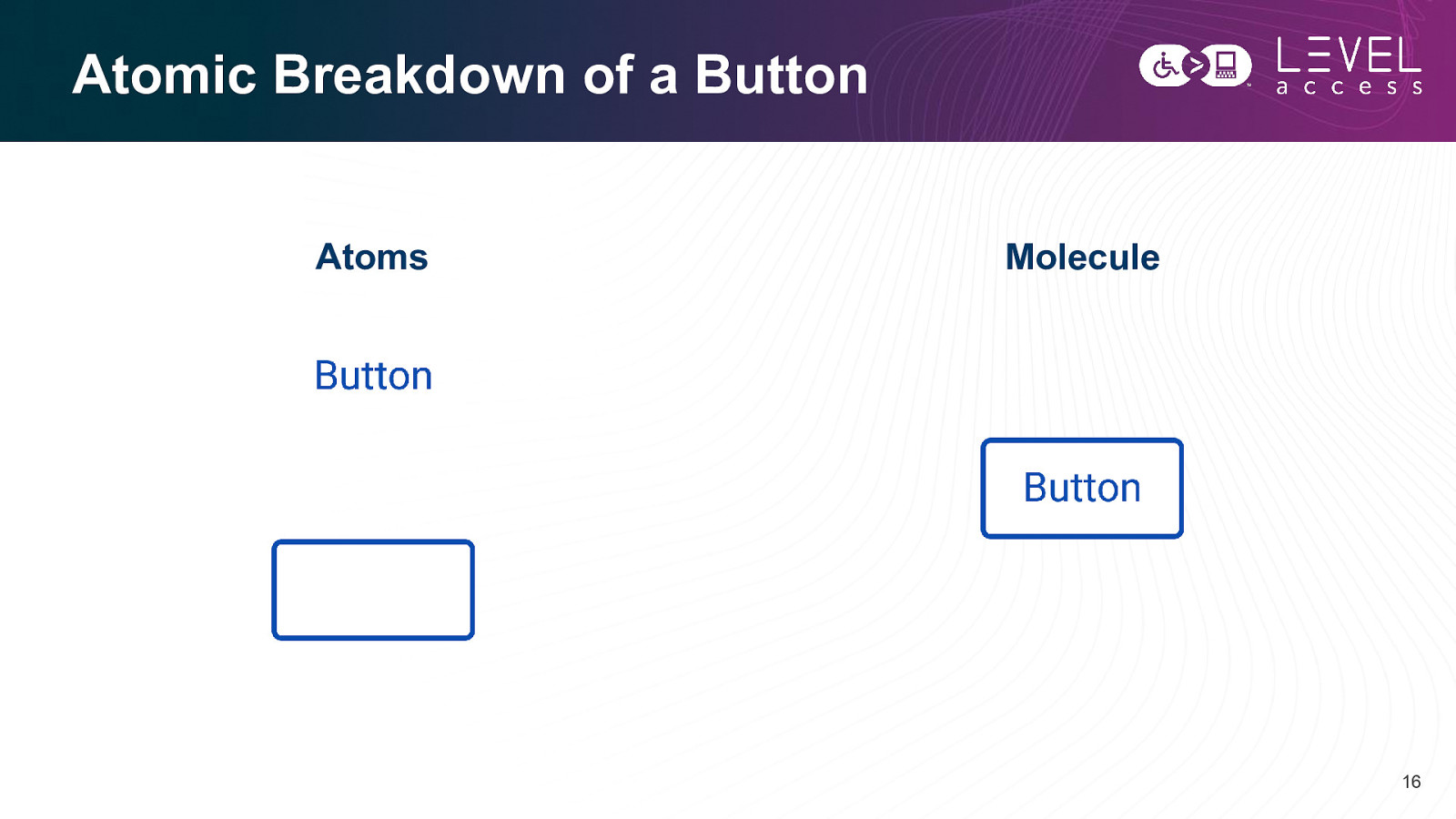
Atomic Breakdown of a Button Atoms Molecule 16
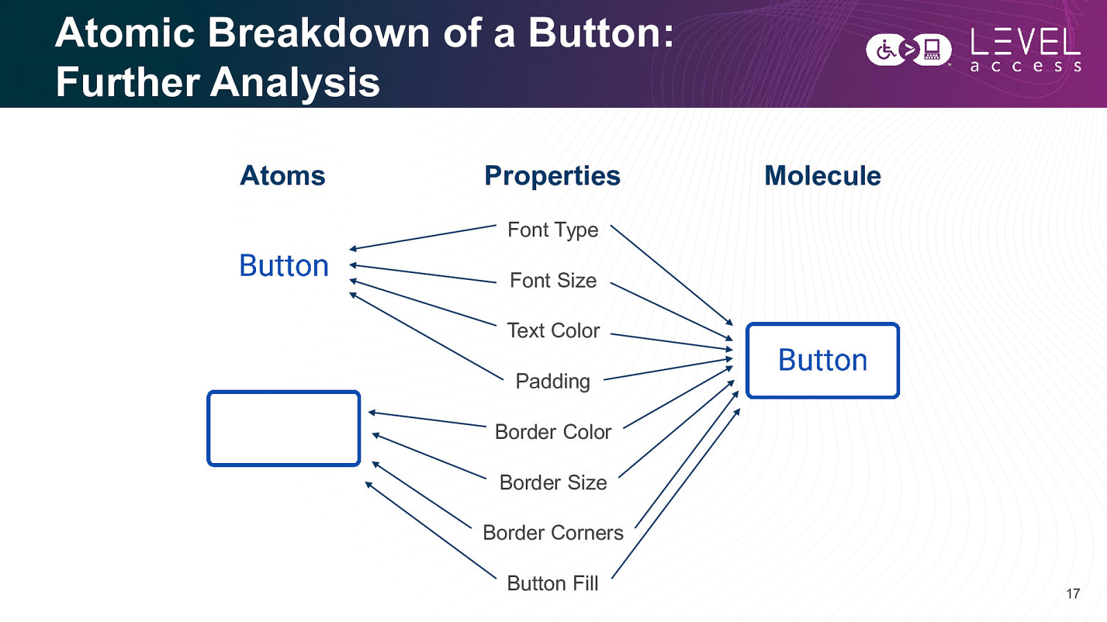
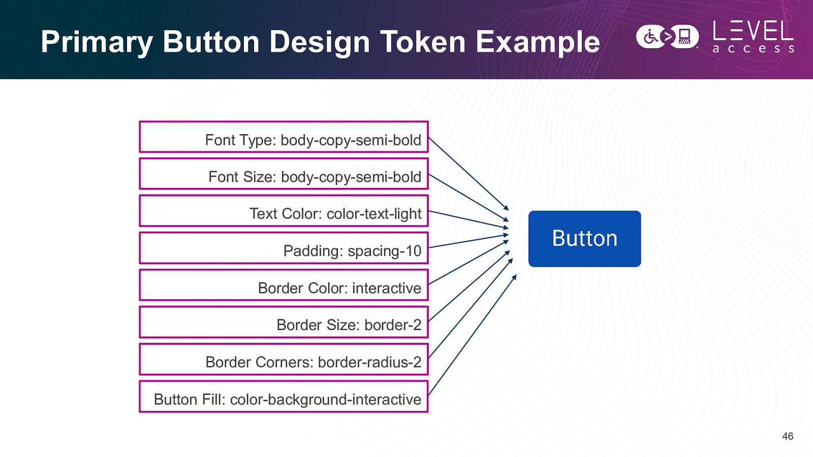
Atomic Breakdown of a Button: Further Analysis Atoms Properties Molecule Font Type Font Size Text Color Padding Border Color Border Size Border Corners Button Fill 17
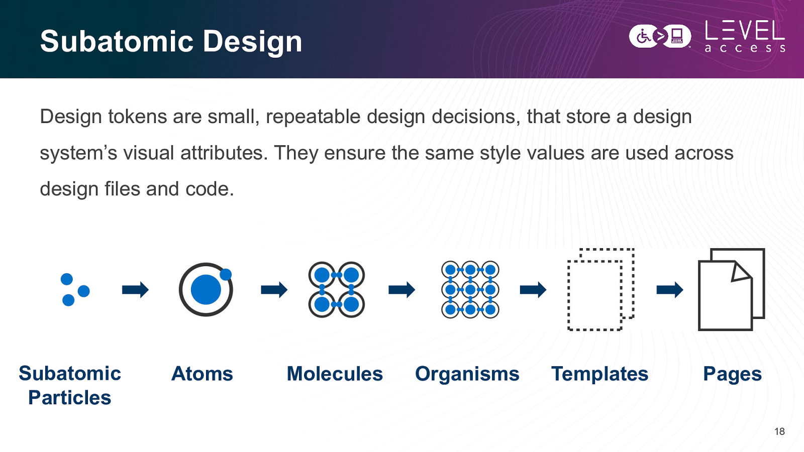
Subatomic Design Design tokens are small, repeatable design decisions, that store a design system’s visual attributes. They ensure the same style values are used across design files and code. Subatomic Particles Atoms Molecules Organisms Templates Pages 18
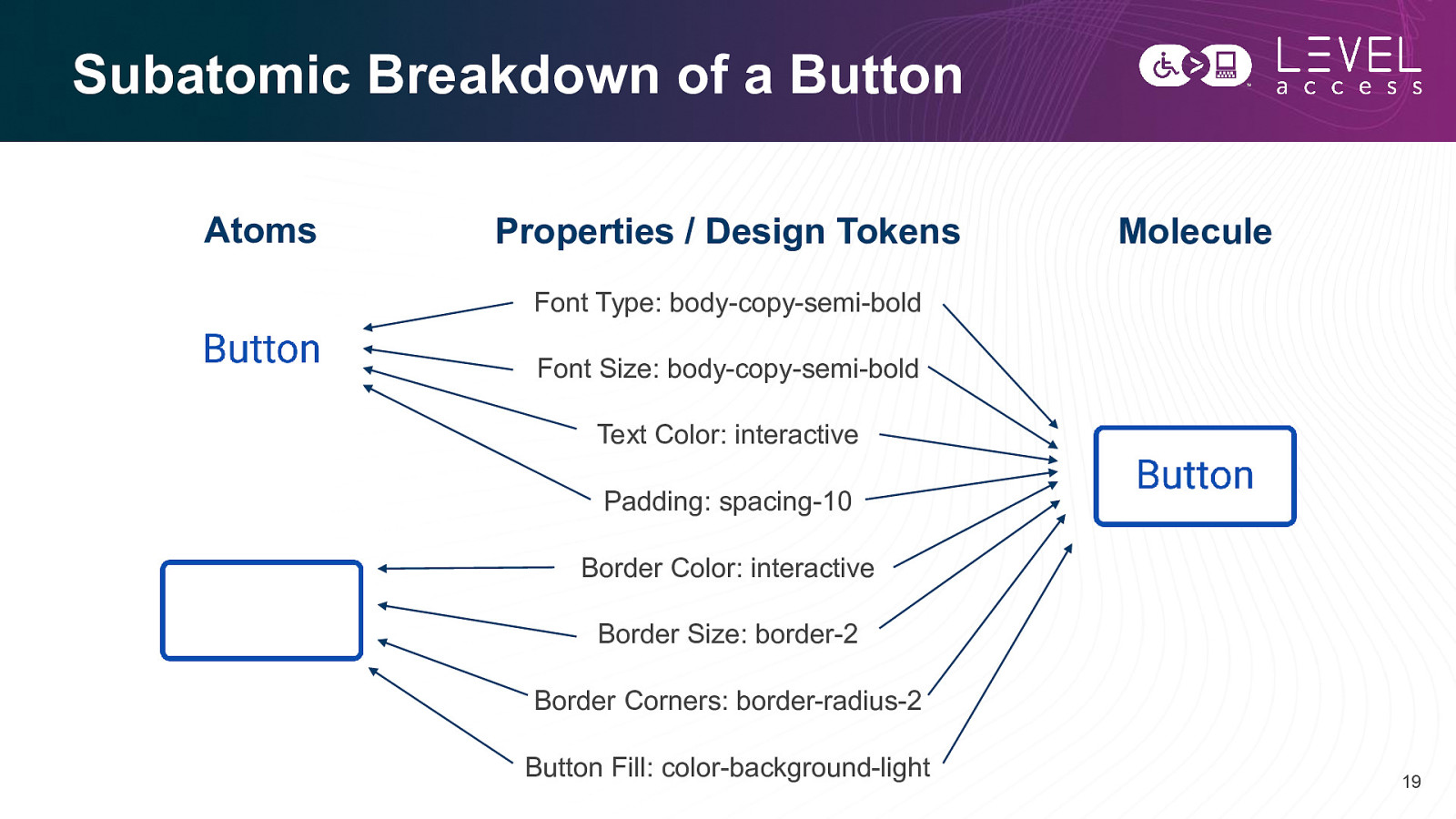
Subatomic Breakdown of a Button Atoms Properties / Design Tokens Molecule Font Type: body-copy-semi-bold Font Size: body-copy-semi-bold Text Color: interactive Padding: spacing-10 Border Color: interactive Border Size: border-2 Border Corners: border-radius-2 Button Fill: color-background-light 19
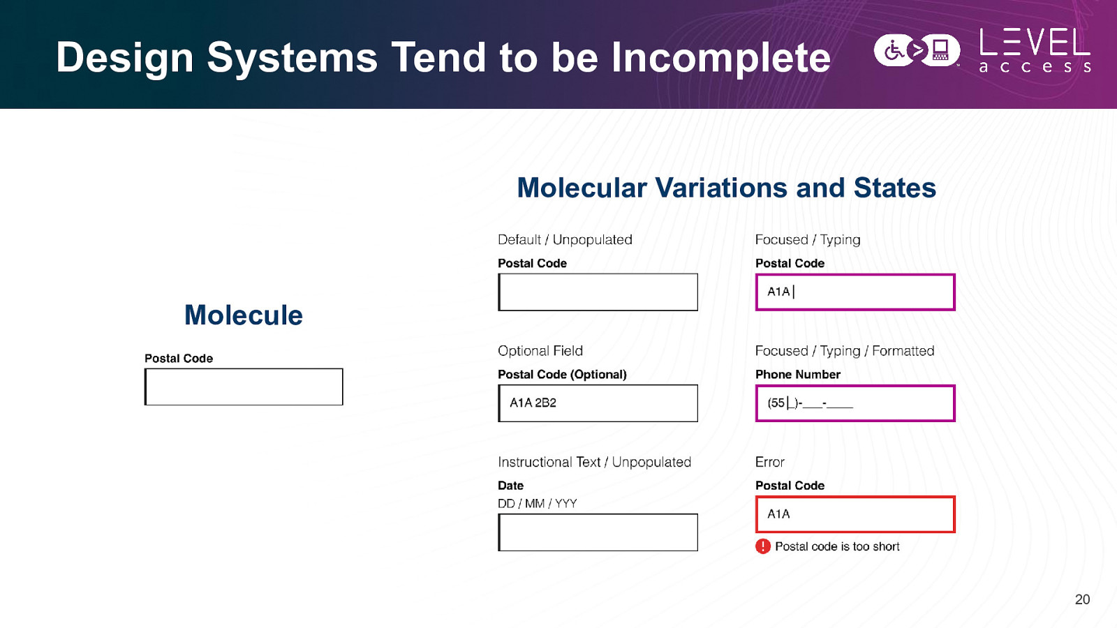
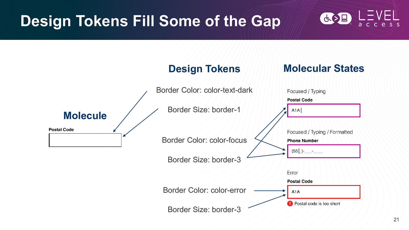
Design Systems Tend to be Incomplete Molecular Variations and States Molecule 20
Design Tokens Fill Some of the Gap Design Tokens Molecular States Border Color: color-text-dark Molecule Border Size: border-1 Border Color: color-focus Border Size: border-3 Border Color: color-error Border Size: border-3 21
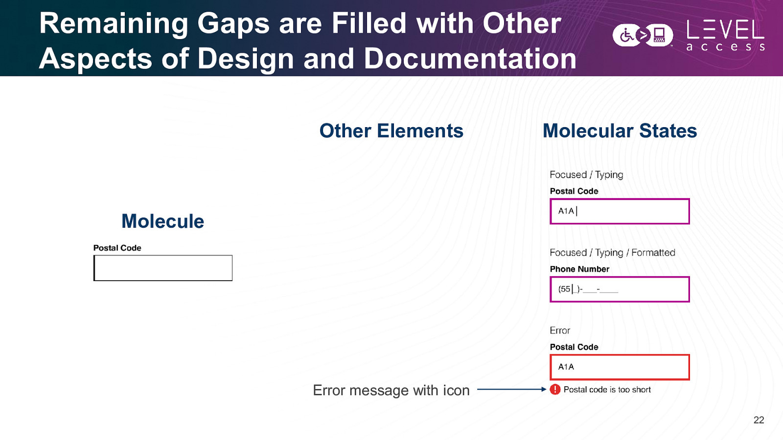
Remaining Gaps are Filled with Other Aspects of Design and Documentation Other Elements Molecular States Molecule Error message with icon 22
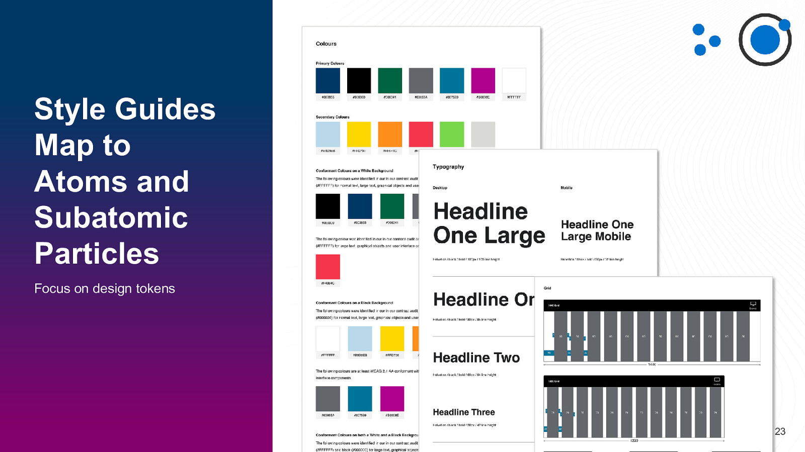
Style Guides Map to Atoms and Subatomic Particles Focus on design tokens 23
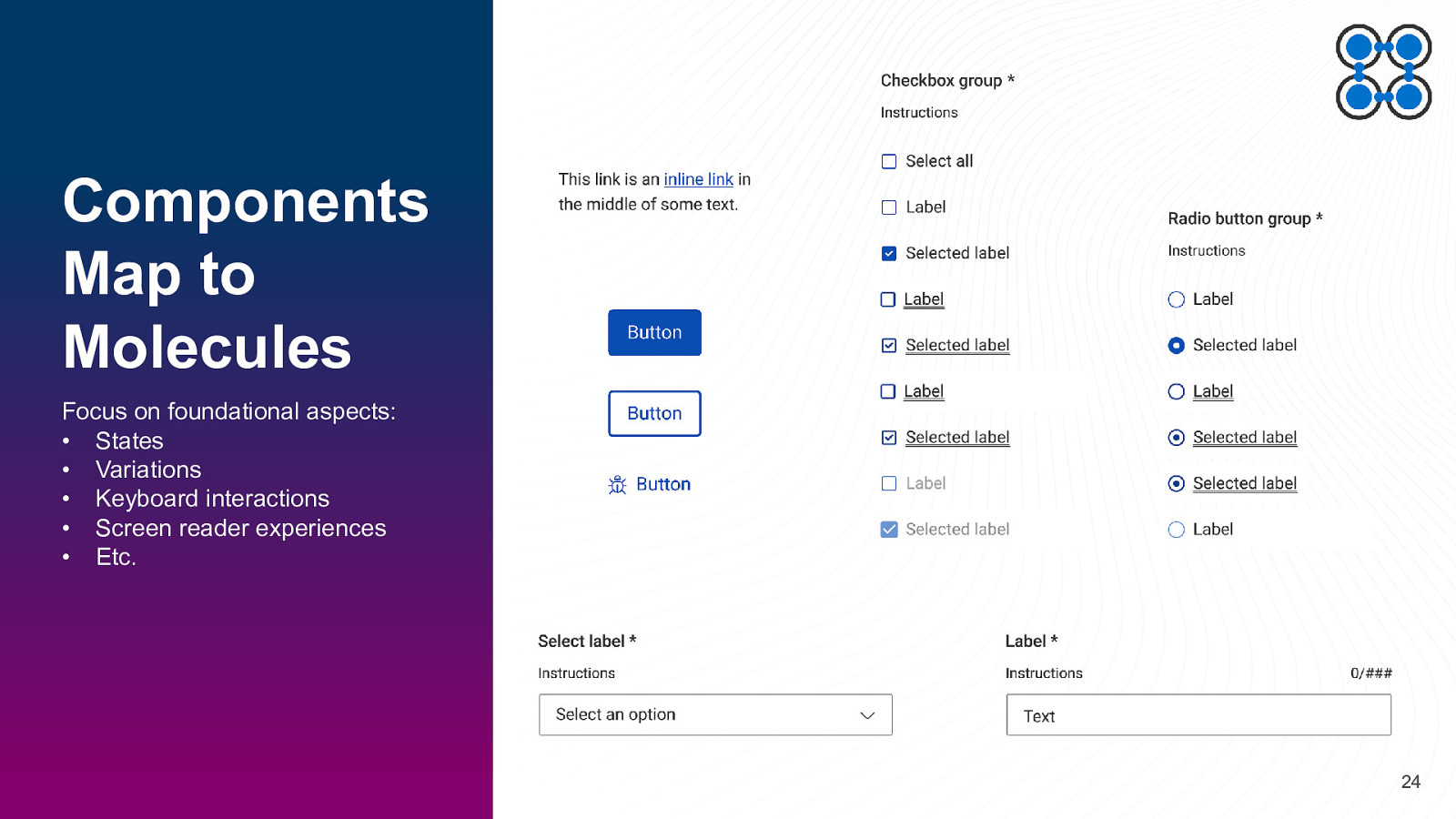
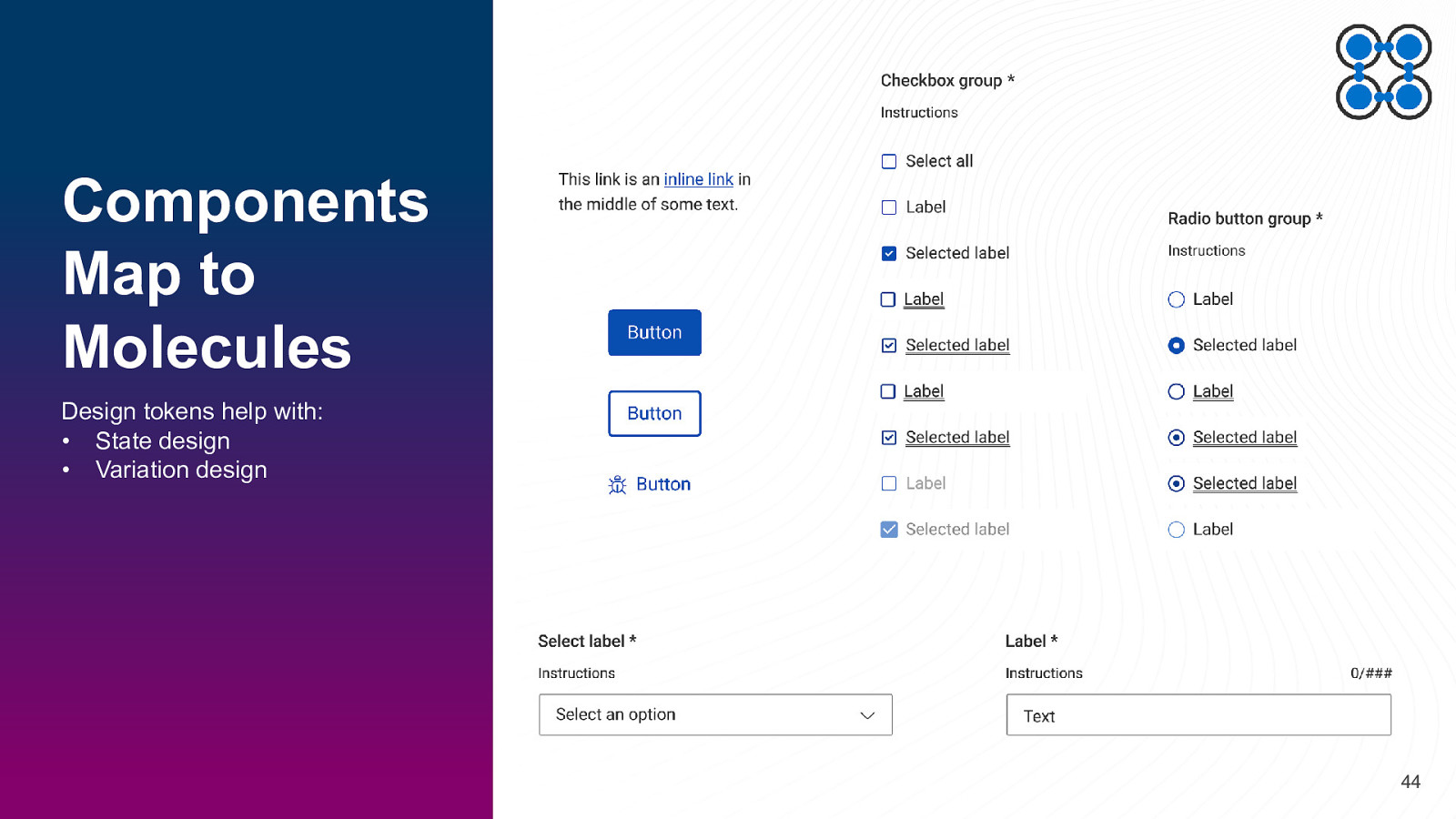
Components Map to Molecules Focus on foundational aspects: • States • Variations • Keyboard interactions • Screen reader experiences • Etc. 24
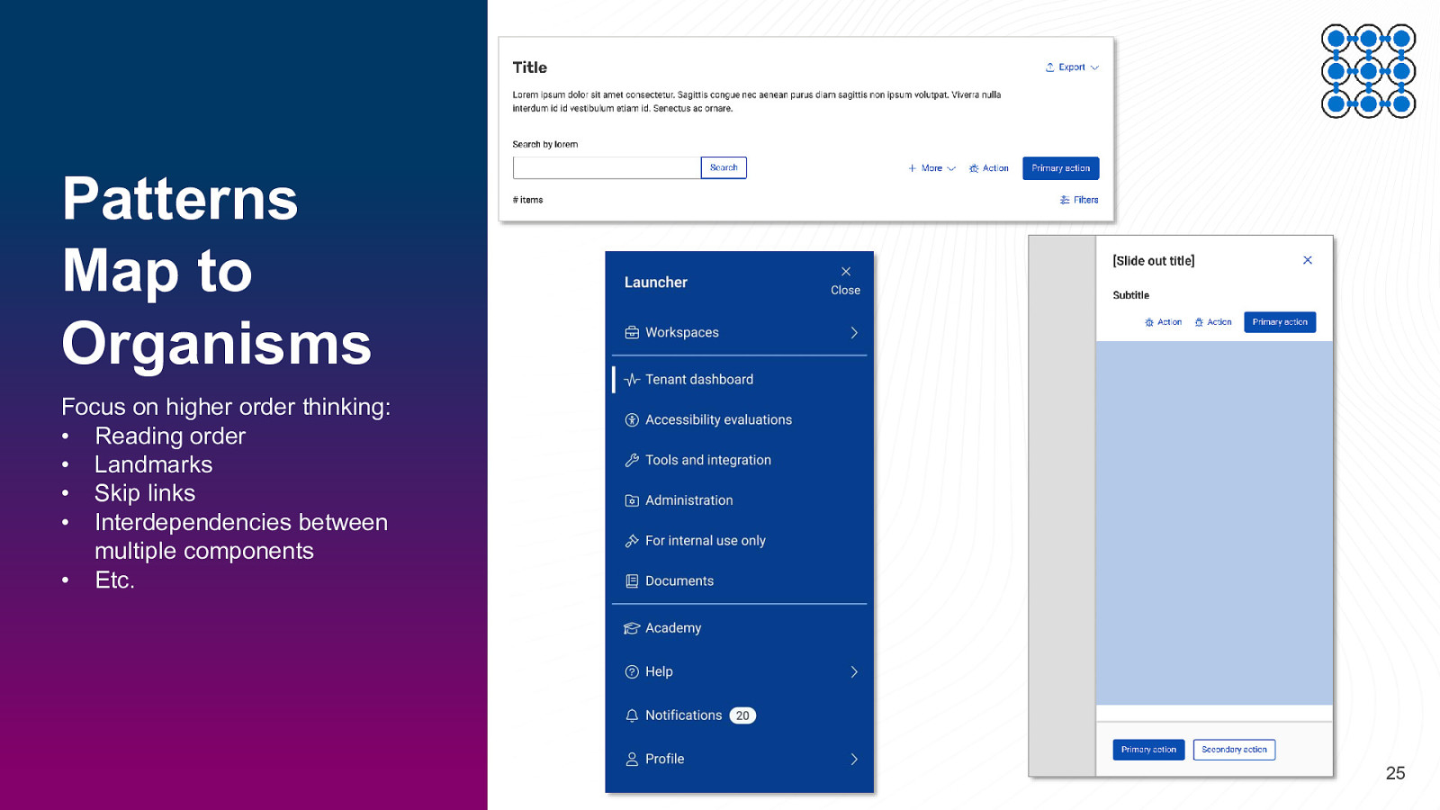
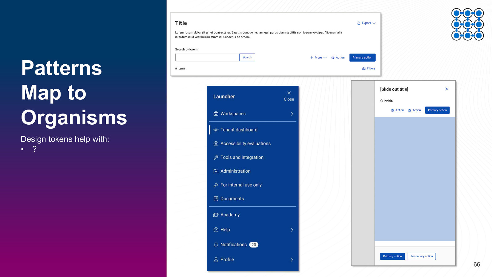
Patterns Map to Organisms Focus on higher order thinking: • Reading order • Landmarks • Skip links • Interdependencies between multiple components • Etc. 25
Questions? Comments? 26
SECTION 2 Design Tokens in Style Guides 27
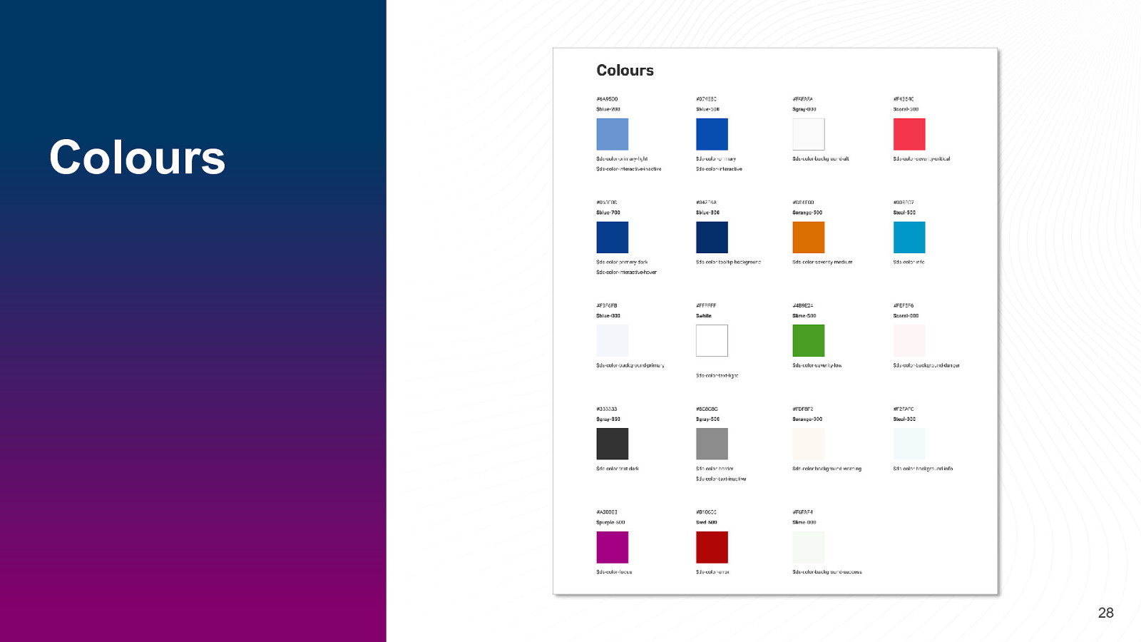
Colours 28
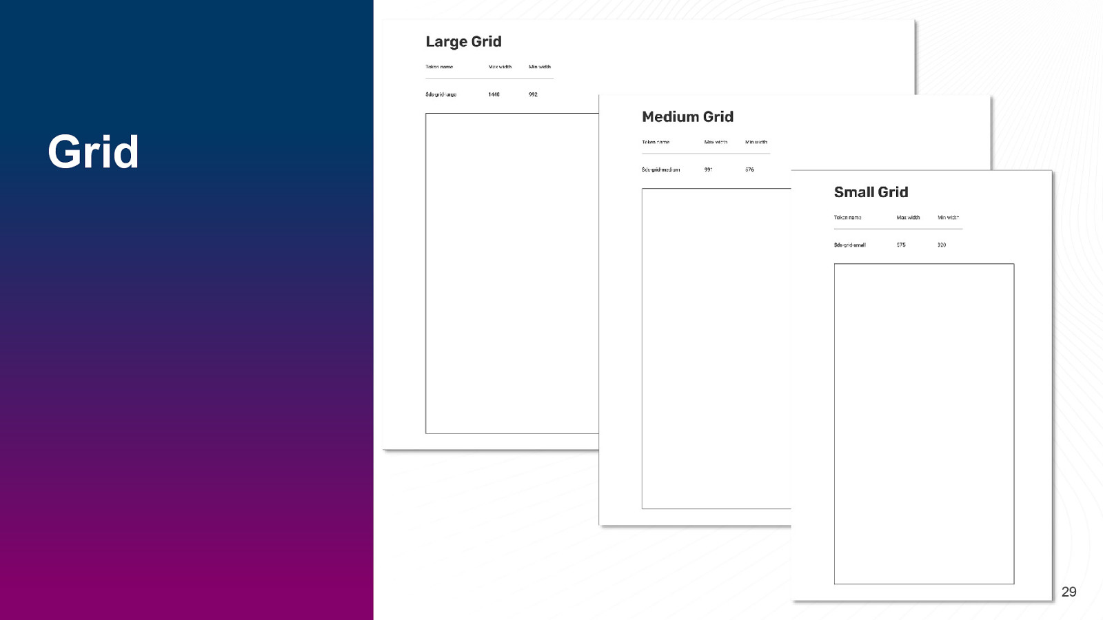
Grid 29
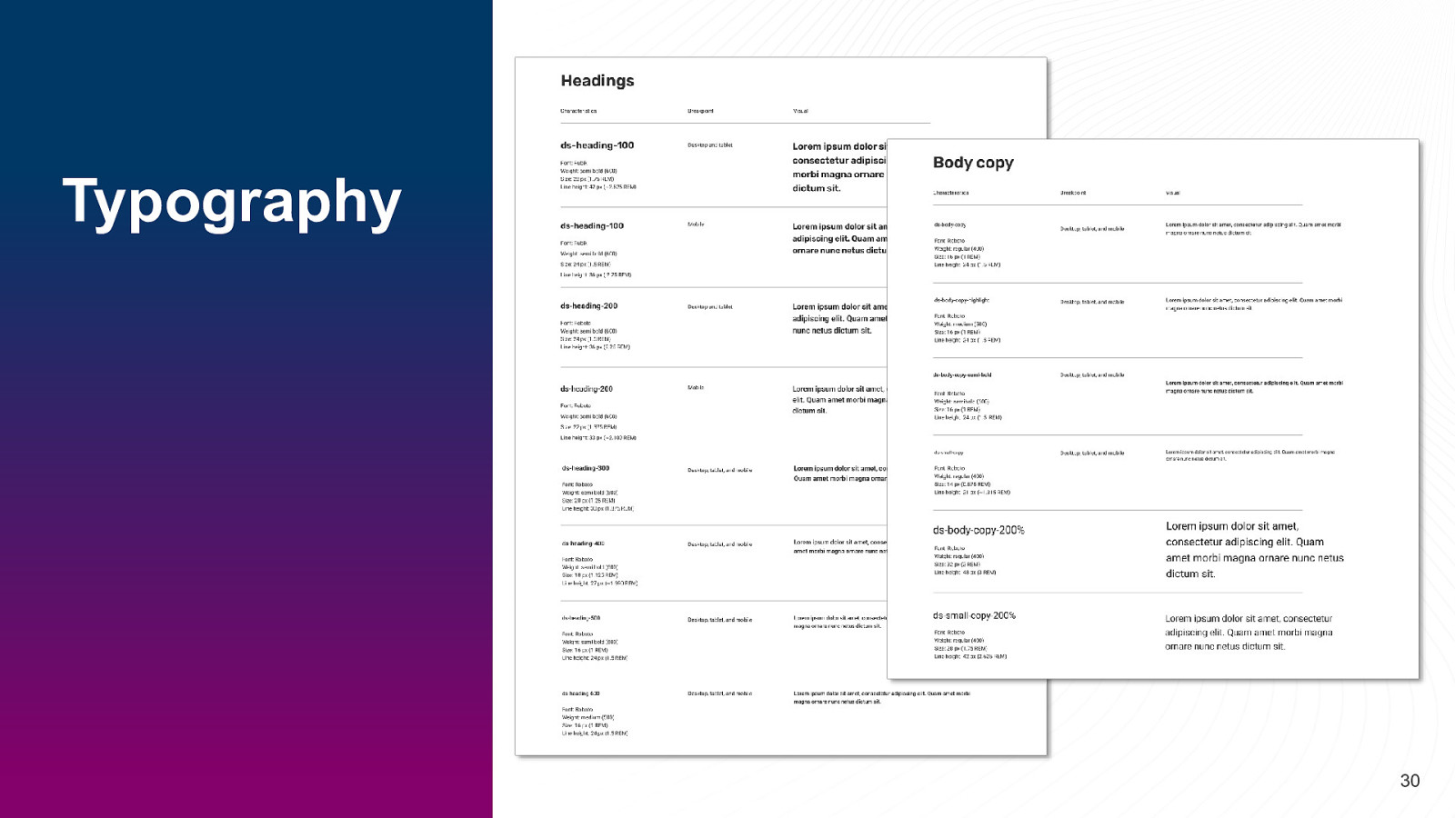
Typography 30
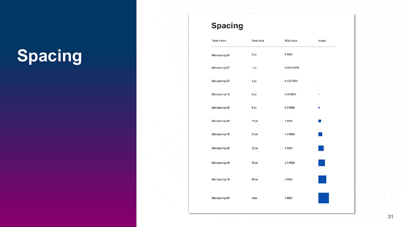
Spacing 31
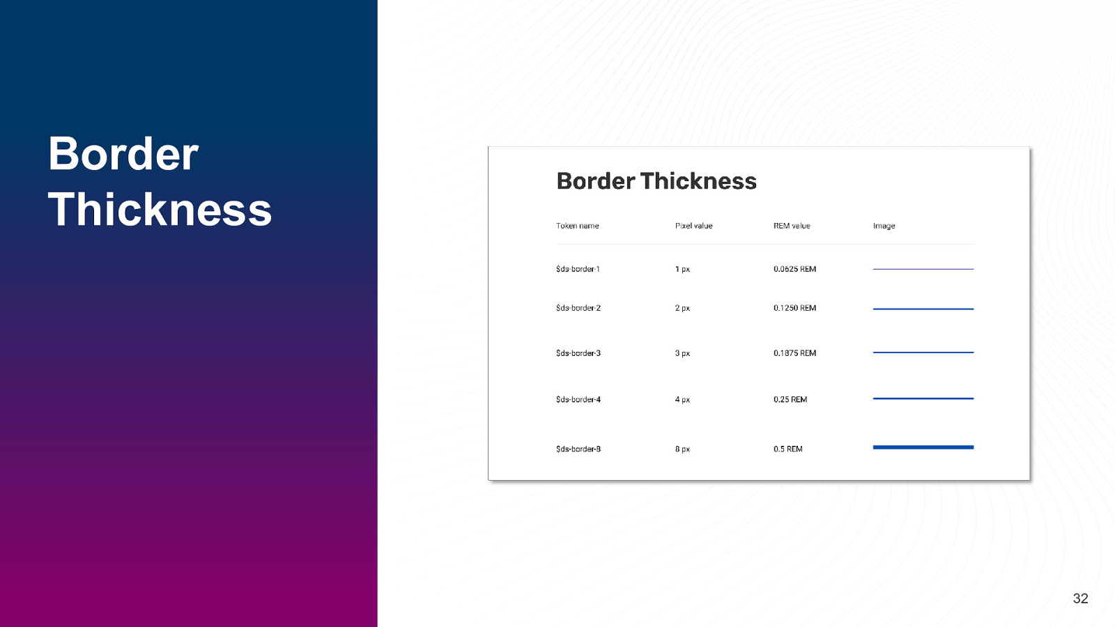
Border Thickness 32
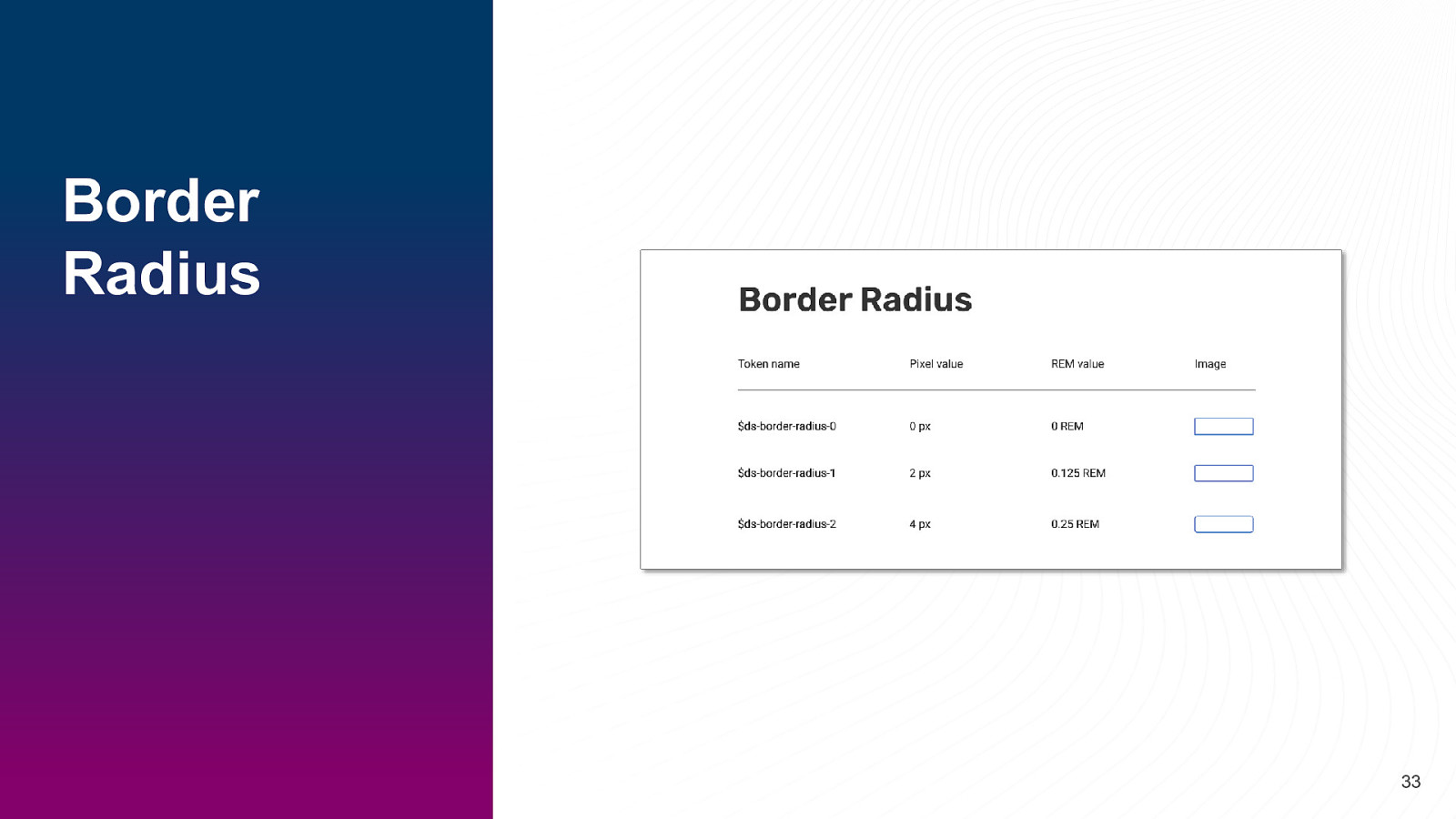
Border Radius 33
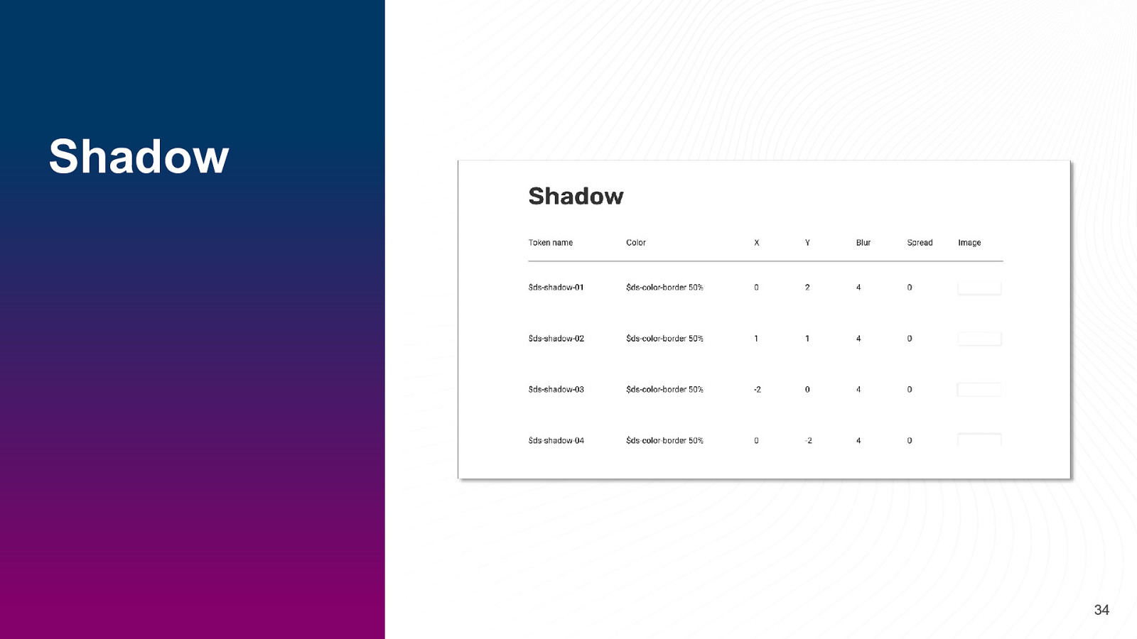
Shadow 34
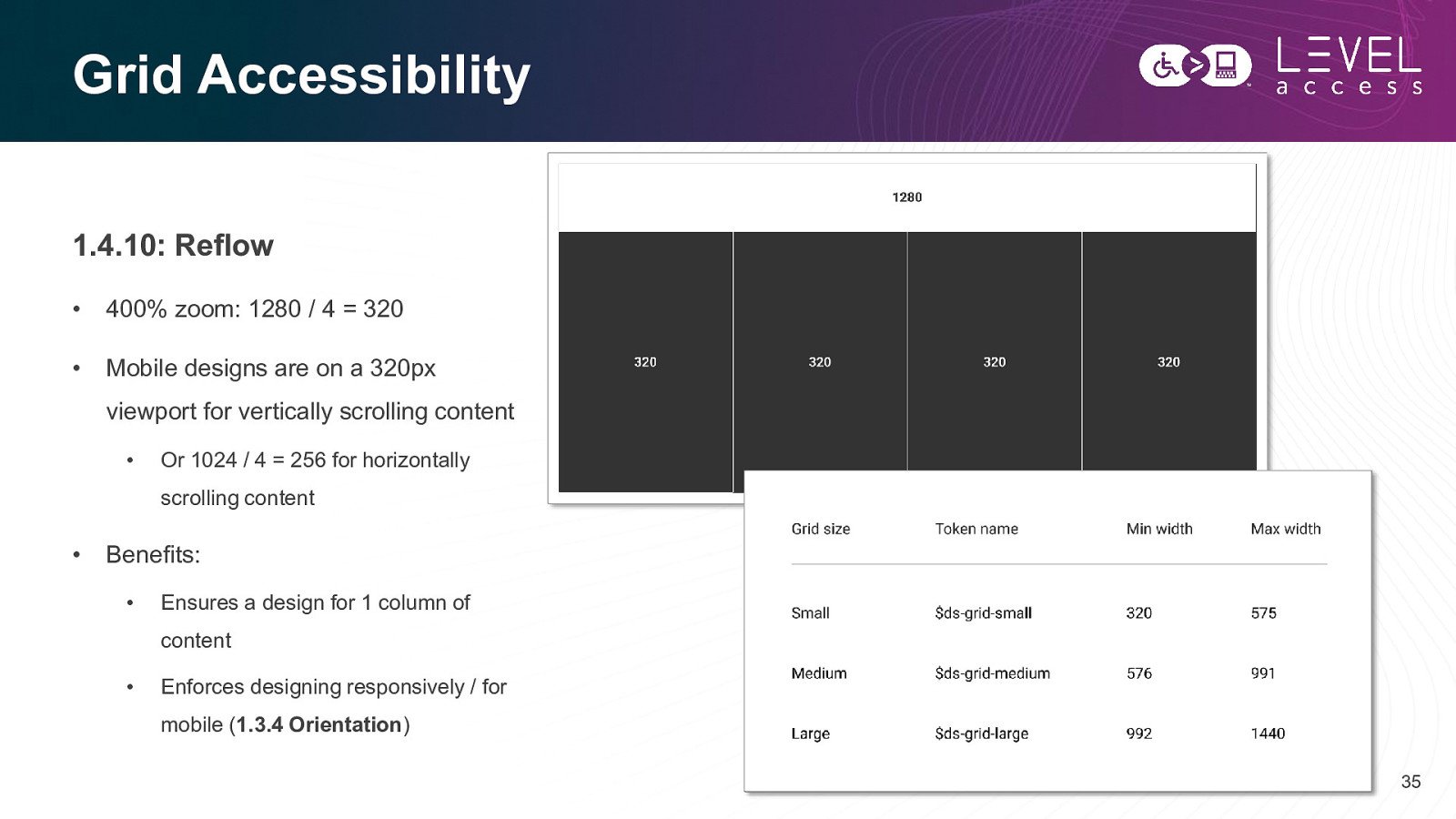
Grid Accessibility 1.4.10: Reflow • 400% zoom: 1280 / 4 = 320 • Mobile designs are on a 320px viewport for vertically scrolling content • Or 1024 / 4 = 256 for horizontally scrolling content • Benefits: • Ensures a design for 1 column of content • Enforces designing responsively / for mobile (1.3.4 Orientation) 35
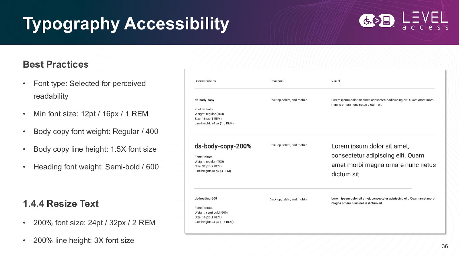
Typography Accessibility Best Practices • Font type: Selected for perceived readability • Min font size: 12pt / 16px / 1 REM • Body copy font weight: Regular / 400 • Body copy line height: 1.5X font size • Heading font weight: Semi-bold / 600 1.4.4 Resize Text • 200% font size: 24pt / 32px / 2 REM • 200% line height: 3X font size 36
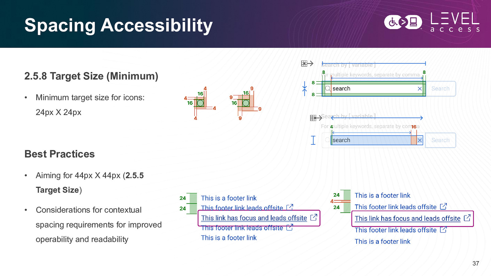
Spacing Accessibility 2.5.8 Target Size (Minimum) • Minimum target size for icons: 24px X 24px Best Practices • Aiming for 44px X 44px (2.5.5 Target Size) • Considerations for contextual spacing requirements for improved operability and readability 37
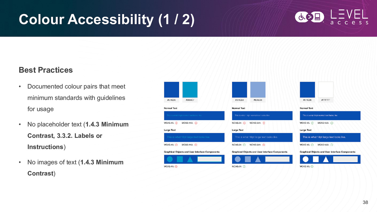
Colour Accessibility (1 / 2) Best Practices • Documented colour pairs that meet minimum standards with guidelines for usage • No placeholder text (1.4.3 Minimum Contrast, 3.3.2. Labels or Instructions) • No images of text (1.4.3 Minimum Contrast) 38
Colour Accessibility (2 / 2) 1.4.1 Use of Colour Contrast • • Not using colour alone to indicate meaning, information, etc. • Particular attention to state design and chart design • Inline links underlined by default • Using at least 1 dimension to convey meaning, with or without the addition of colour Aiming for greater than 7:1 contrast for text (1.4.6 Contrast Enhanced) • Aiming for greater than 4.5:1 contrast for graphical objects and user interface components (1.4.11 Non-Text Contrast) • Aiming for greater than 3:1 contrast for inactive elements (1.4.3 Minimum Contrast) 1.3.3 Sensory Characteristics • Not using colour alone to indicate meaning, information, etc. in instructions 39
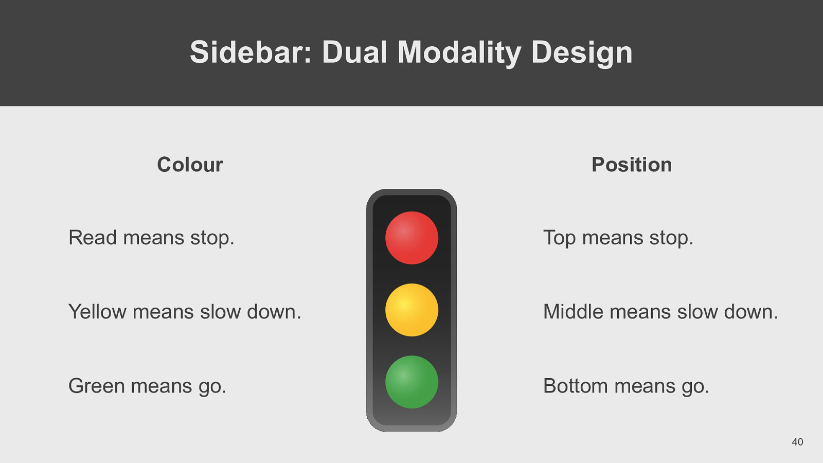
Sidebar: Dual Modality Design Colour Position Read means stop. Top means stop. Yellow means slow down. Middle means slow down. Green means go. Bottom means go. 40
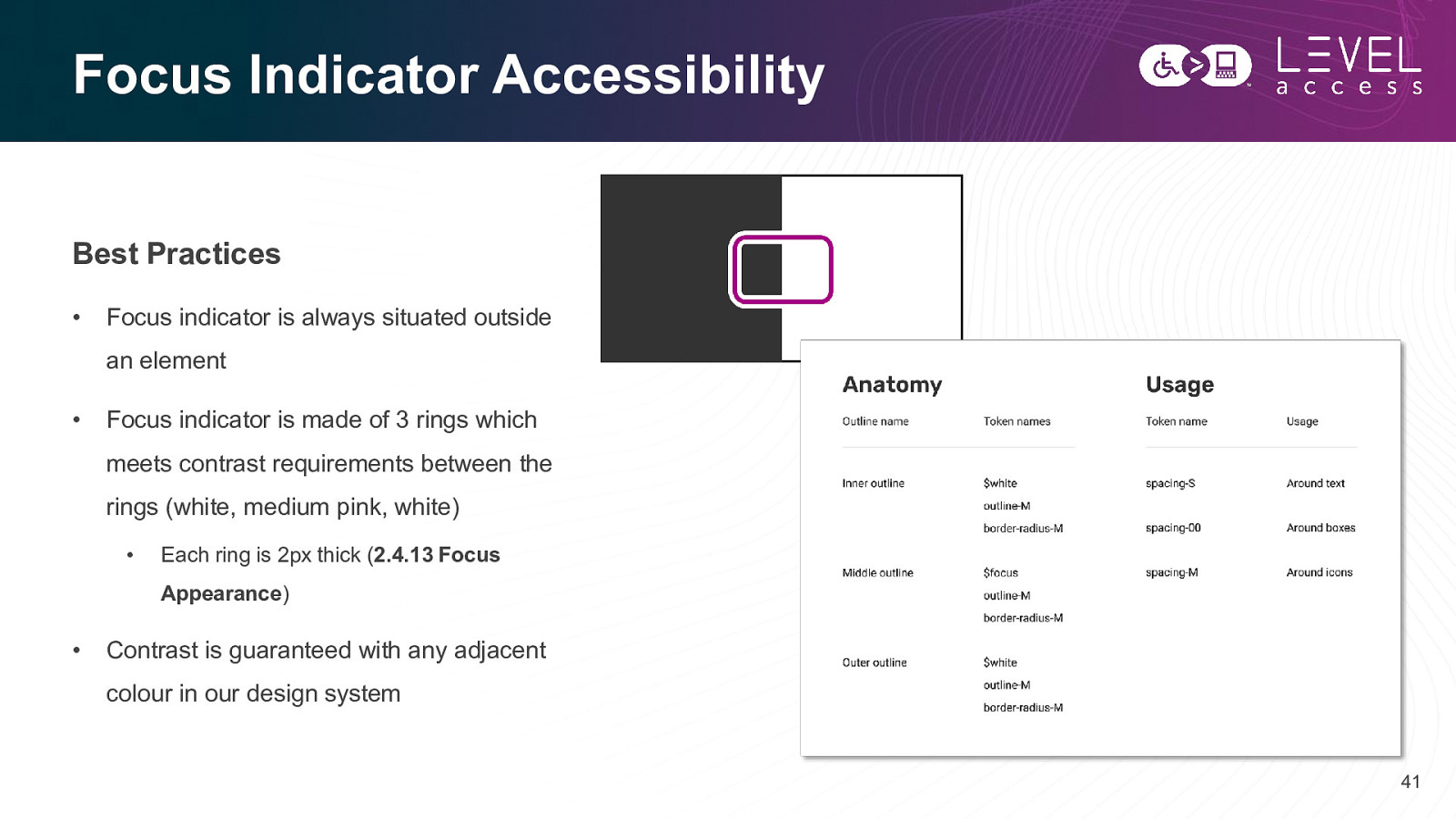
Focus Indicator Accessibility Best Practices • Focus indicator is always situated outside an element • Focus indicator is made of 3 rings which meets contrast requirements between the rings (white, medium pink, white) • Each ring is 2px thick (2.4.13 Focus Appearance) • Contrast is guaranteed with any adjacent colour in our design system 41
Questions? Comments? 42
SECTION 3 Design Tokens in Component Libraries 43
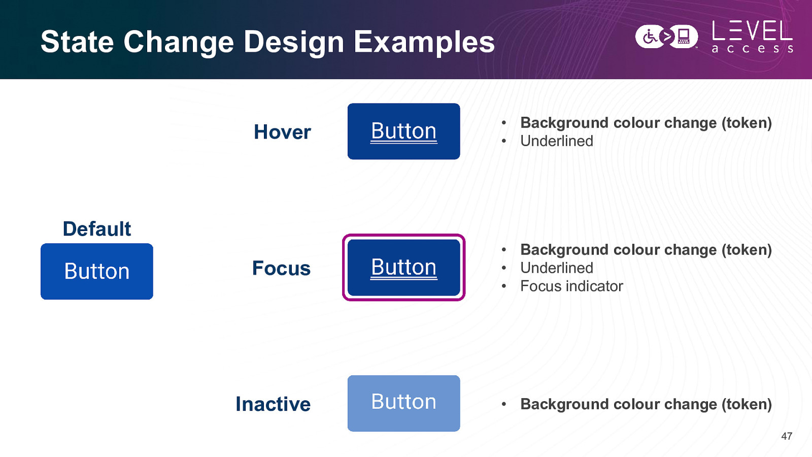
Components Map to Molecules Design tokens help with: • State design • Variation design 44
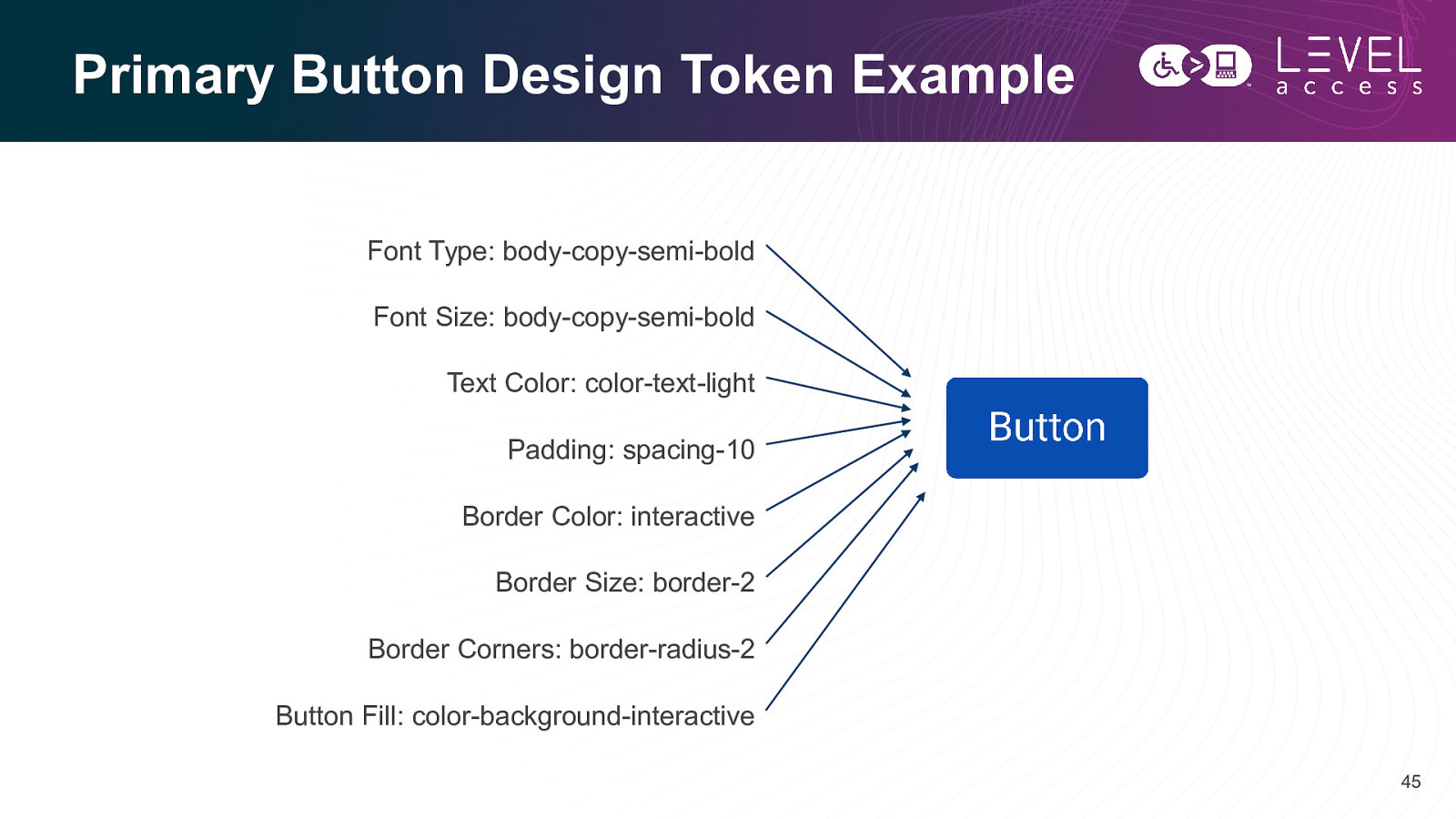
Primary Button Design Token Example Font Type: body-copy-semi-bold Font Size: body-copy-semi-bold Text Color: color-text-light Padding: spacing-10 Border Color: interactive Border Size: border-2 Border Corners: border-radius-2 Button Fill: color-background-interactive 45
Primary Button Design Token Example Font Type: body-copy-semi-bold Font Size: body-copy-semi-bold Text Color: color-text-light Padding: spacing-10 Border Color: interactive Border Size: border-2 Border Corners: border-radius-2 Button Fill: color-background-interactive 46
State Change Design Examples Hover • Background colour change (token) • Underlined Focus • Background colour change (token) • Underlined • Focus indicator Inactive • Background colour change (token) Default 47
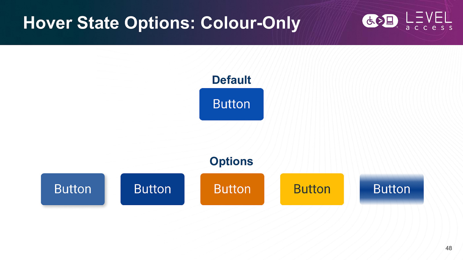
Hover State Options: Colour-Only Default Options 48
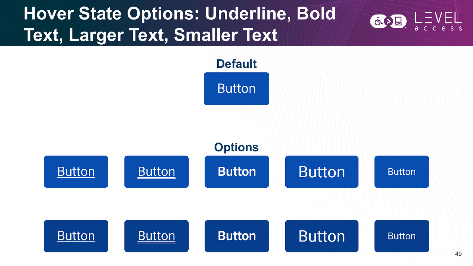
Hover State Options: Underline, Bold Text, Larger Text, Smaller Text Default Options 49
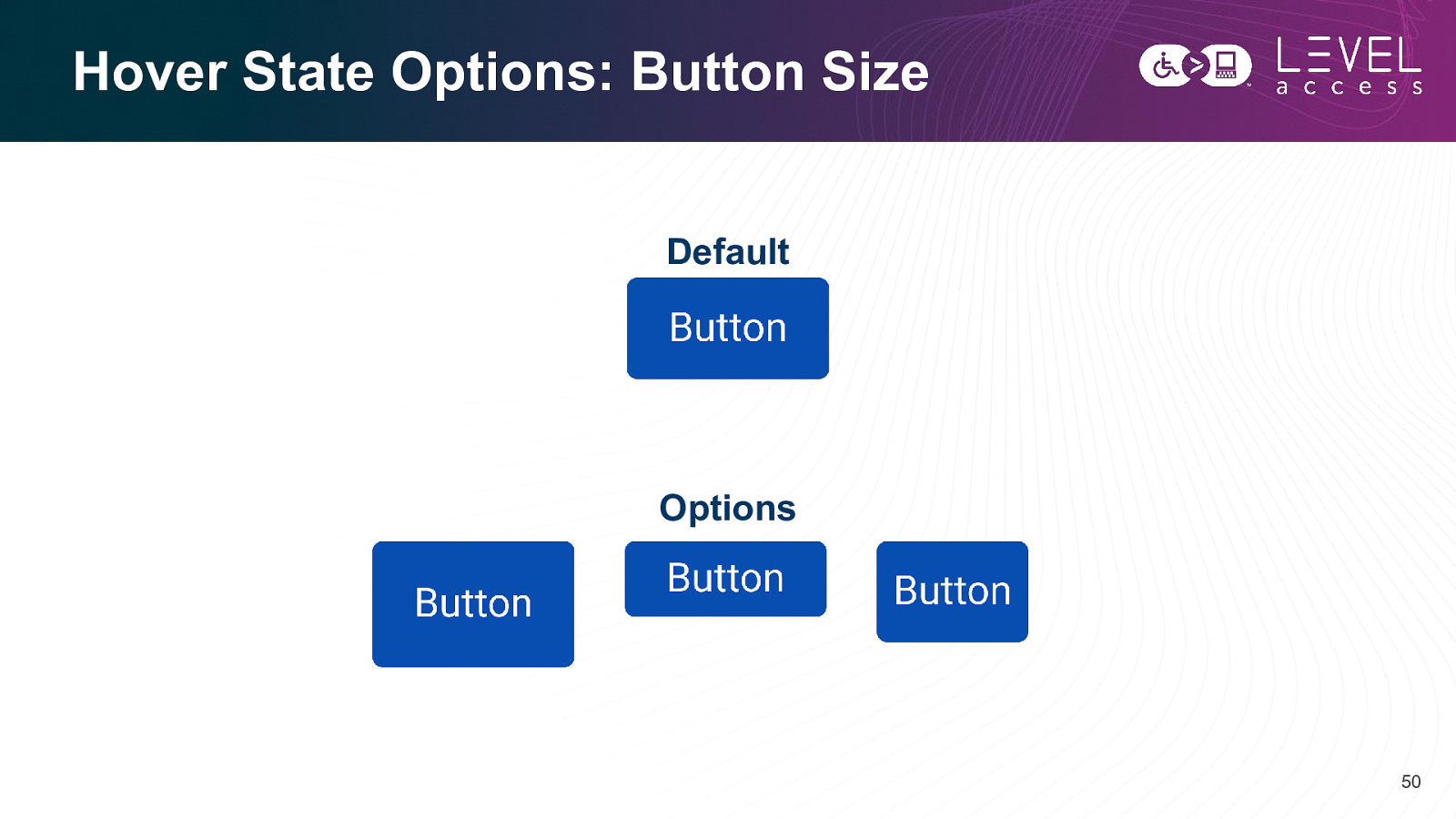
Hover State Options: Button Size Default Options 50
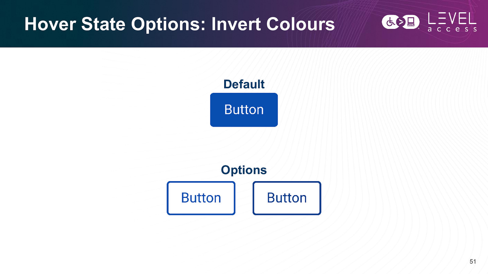
Hover State Options: Invert Colours Default Options 51
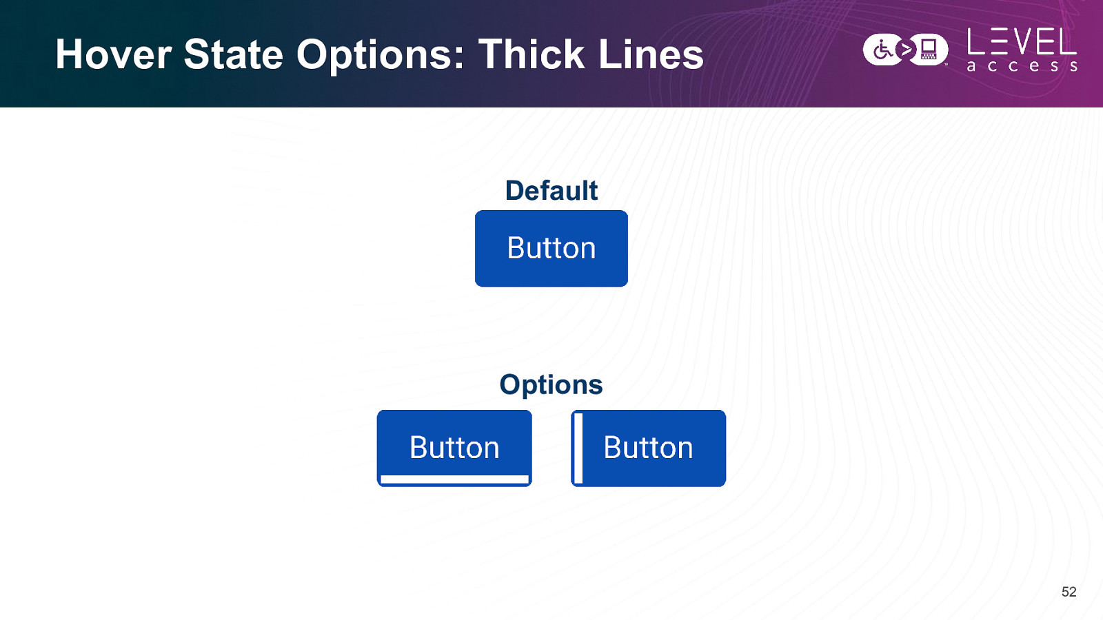
Hover State Options: Thick Lines Default Options 52
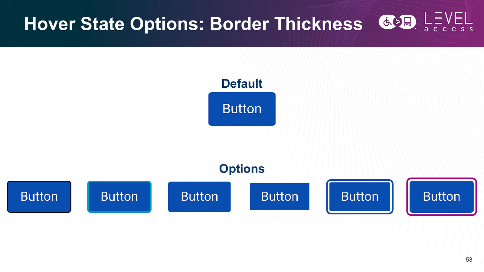
Hover State Options: Border Thickness Default Options 53
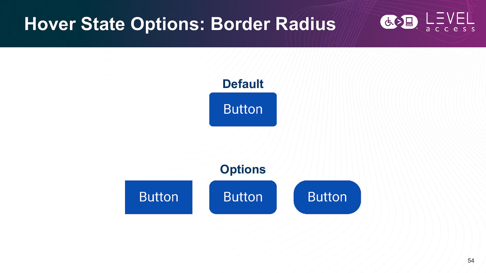
Hover State Options: Border Radius Default Options 54
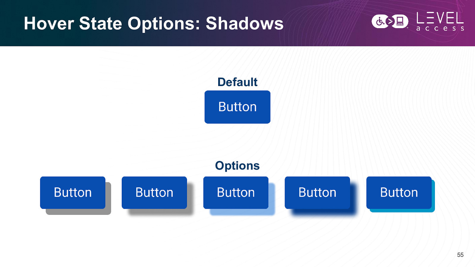
Hover State Options: Shadows Default Options 55
Hover State Options: Animation Default Options 56
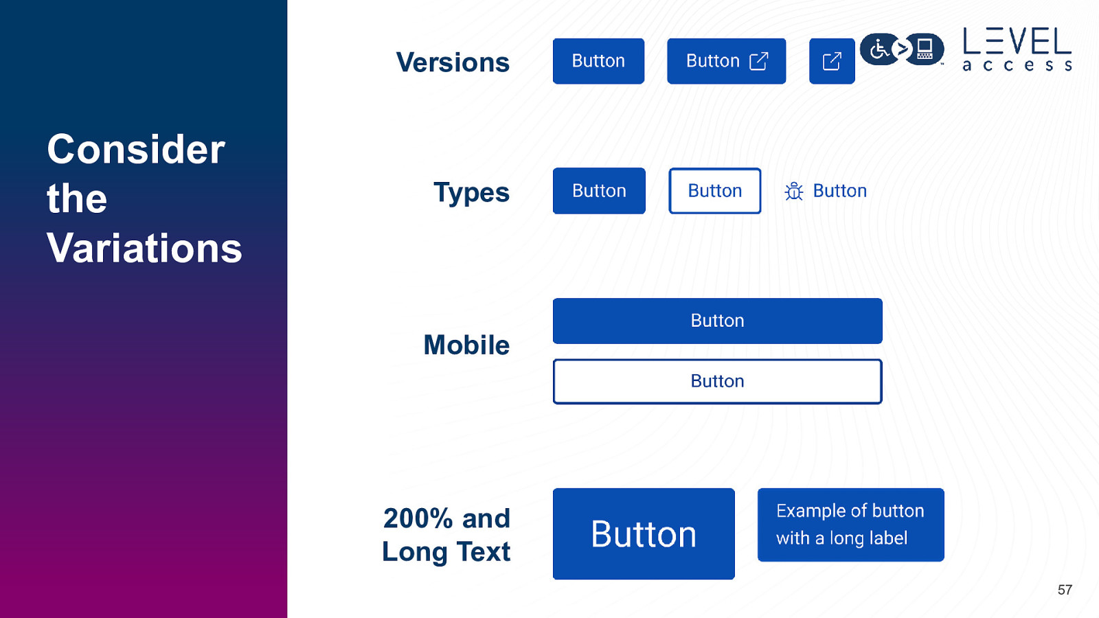
Versions Consider the Variations Types Mobile 200% and Long Text 57
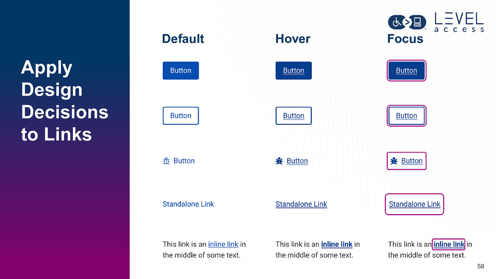
Default Hover Focus Apply Design Decisions to Links 58
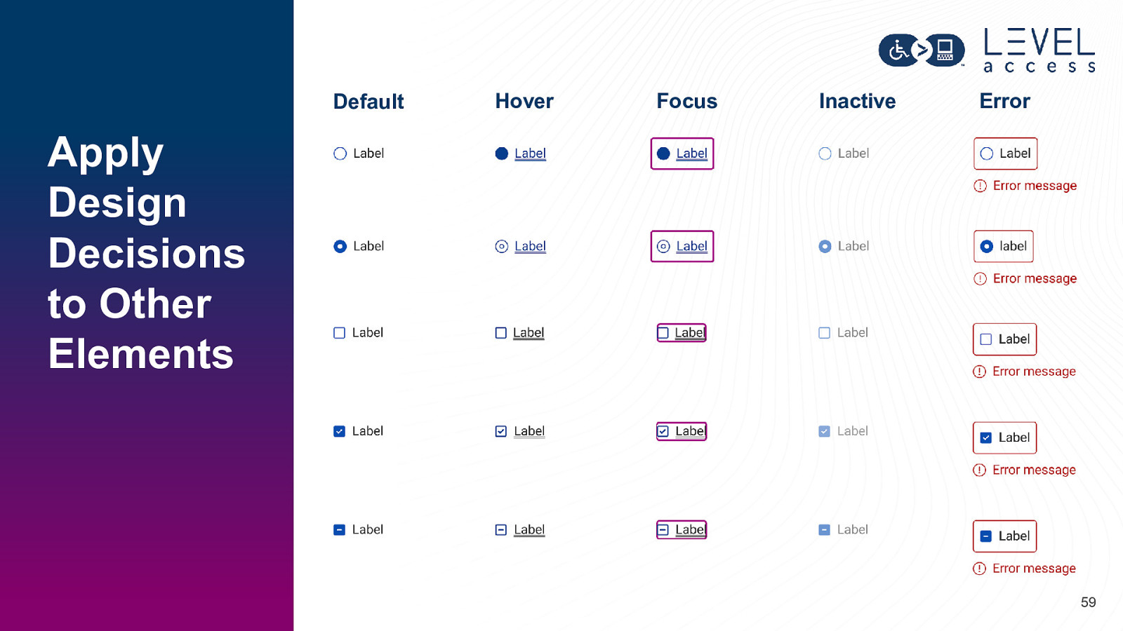
Default Hover Focus Inactive Error Apply Design Decisions to Other Elements 59
Why is consistency so important? 60
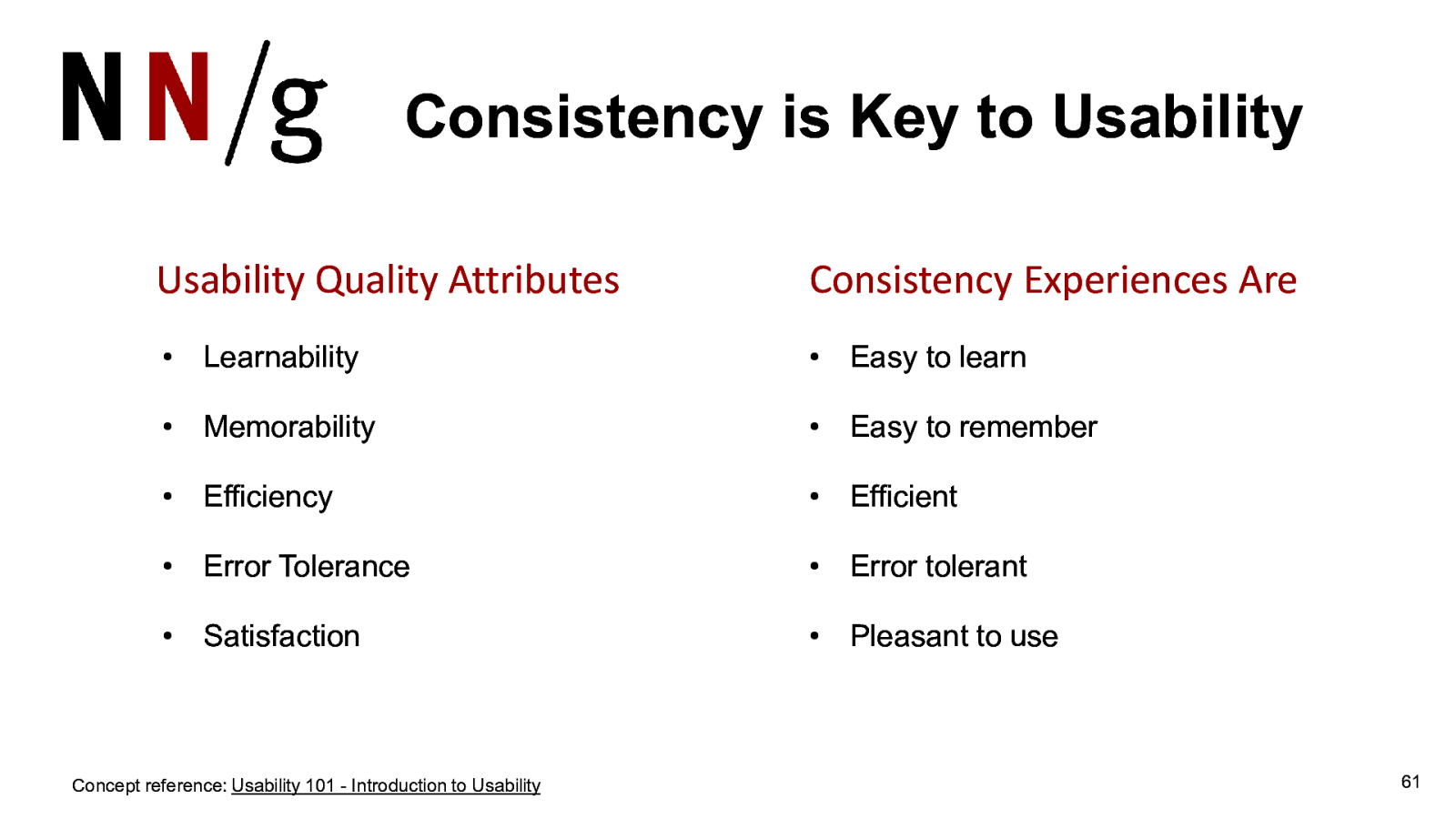
Consistency is Key to Usability Usability Quality Attributes Consistency Experiences Are • Learnability • Easy to learn • Memorability • Easy to remember • Efficiency • Efficient • Error Tolerance • Error tolerant • Satisfaction • Pleasant to use Concept reference: Usability 101 - Introduction to Usability 61
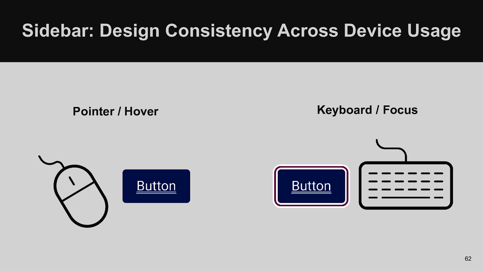
Sidebar: Design Consistency Across Device Usage Pointer / Hover Keyboard / Focus 62
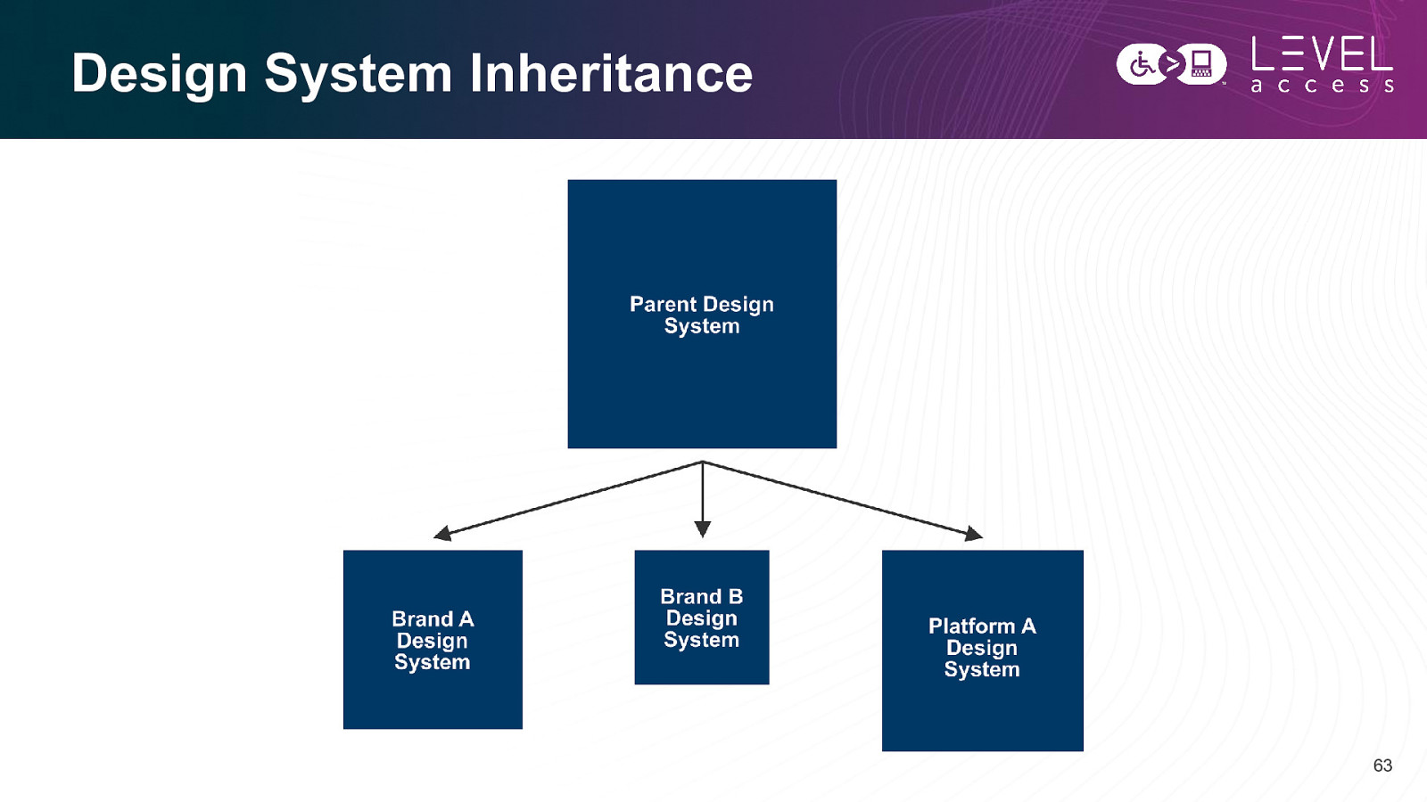
Design System Inheritance 63
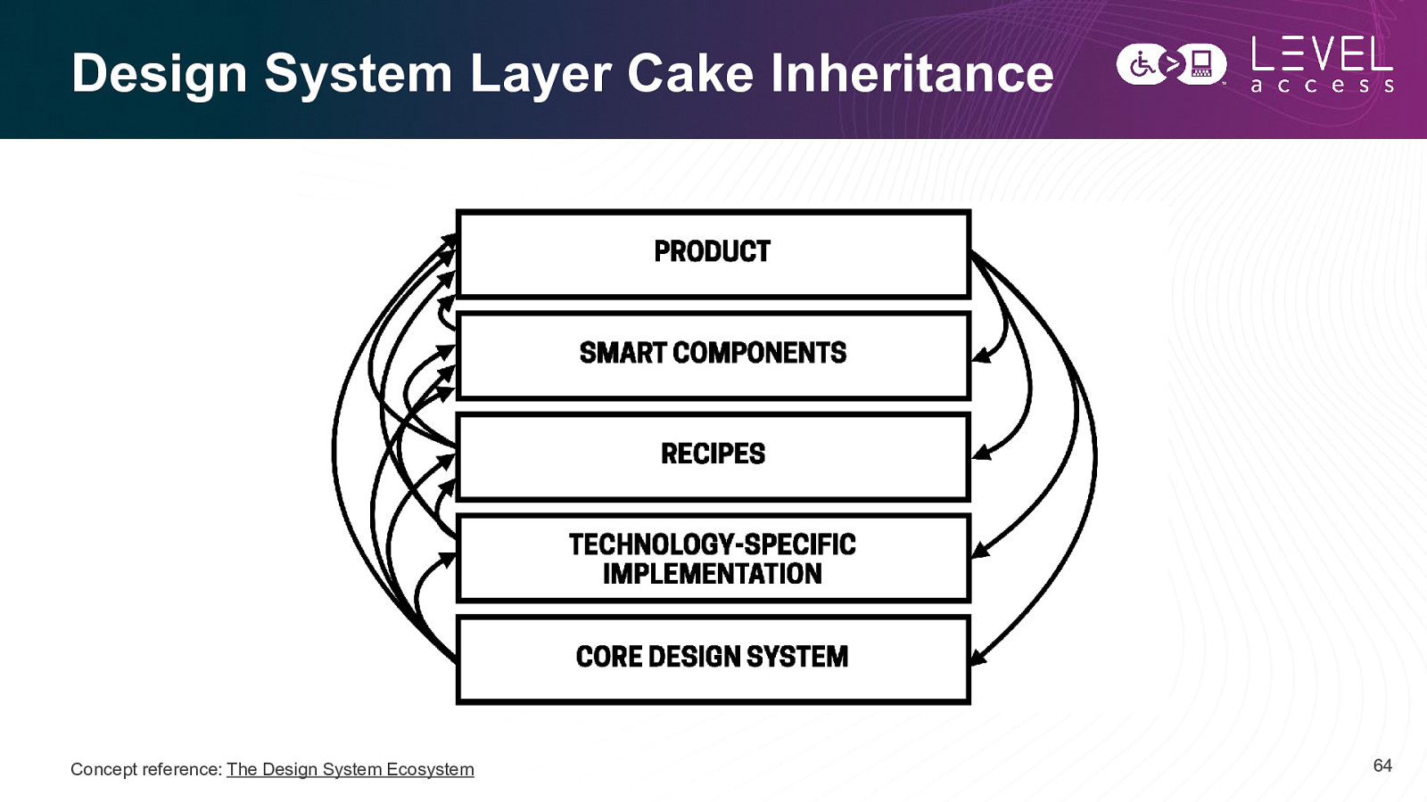
Design System Layer Cake Inheritance Concept reference: The Design System Ecosystem 64
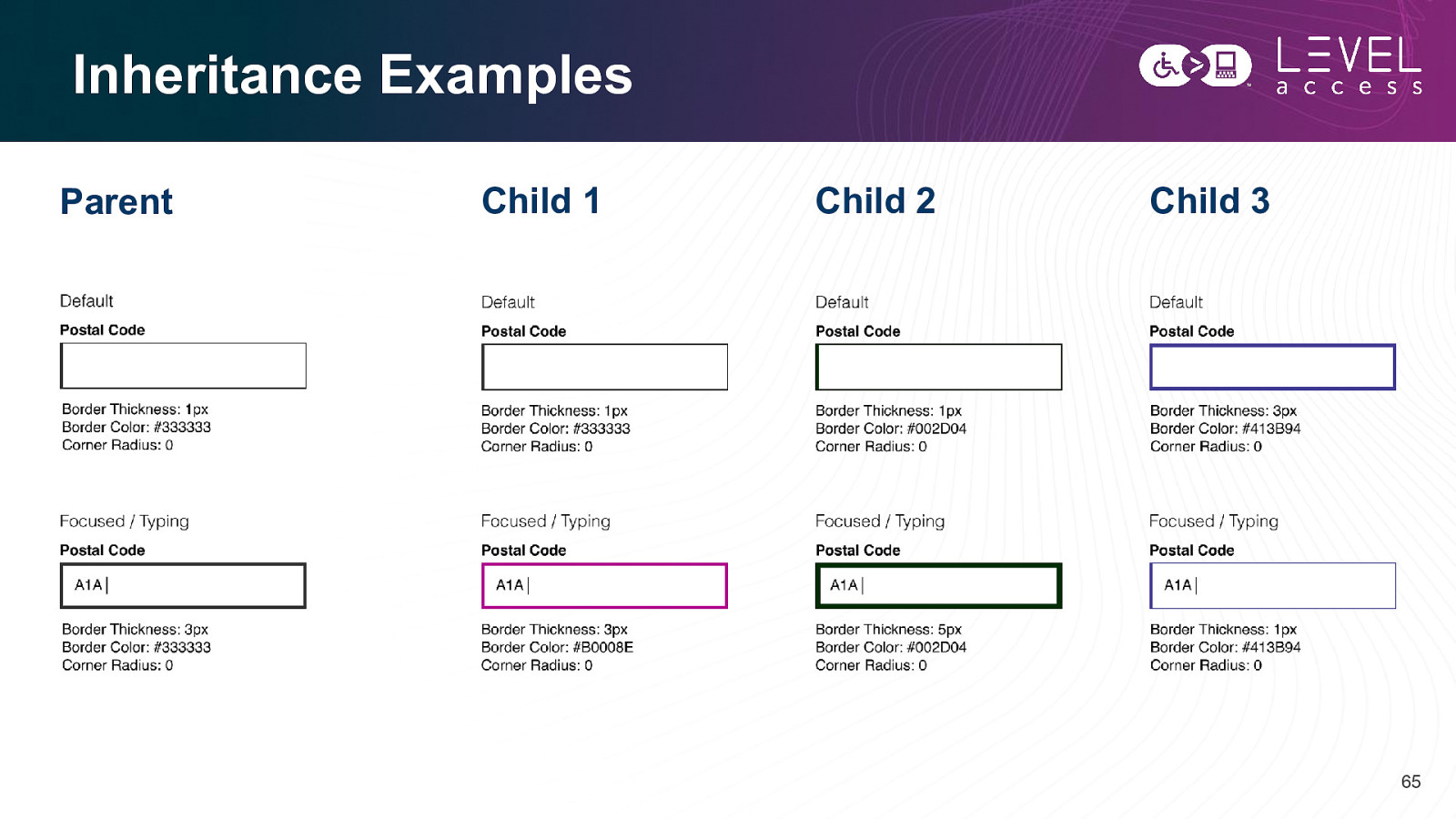
Inheritance Examples Parent Child 1 Child 2 Child 3 65
Patterns Map to Organisms Design tokens help with: • ? 66
Questions? Comments? 67
Slides, Contact Details, and a Guide Connect with me Get today’s slides Get agile design guide Email and LinkedIn Deck on notist Downloadable document Karen Hawkins, CPACC https://noti.st/khawk27 Accessibility in the design process 68
Thank you Karen Hawkins karen.hawkins@levelaccess.com levelaccess.com

Design tokens are all the rage. They exist to power consistent experiences efficiently. It truly is a powerful thing to deliver platform-agnostic consistent experiences or quickly update a style that propagates via inheritance, even across nested design systems. The resultant consistency and efficiency are the main drivers for their recent popularity.
Design tokens work at the base property level, where the tiniest design decisions are made, for instance, colour, padding, or font weight. How these micro-decisions work together or instead don’t work well together can influence whether the experience is accessible.
In this talk, Karen will show you how design tokens can significantly influence the accessibility of your designs, along with some practical ways to apply design tokens to do just that.


 for free. You
can too.
for free. You
can too.