Mobile Web Animation Lisi Linhart

A presentation at Mobile Era in November 2019 in Oslo, Norway by Lisi Linhart
Mobile Web Animation Lisi Linhart
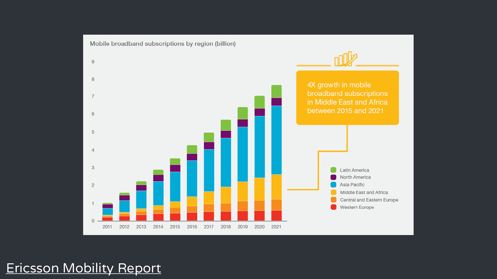
Title Text Ericsson Mobility Report
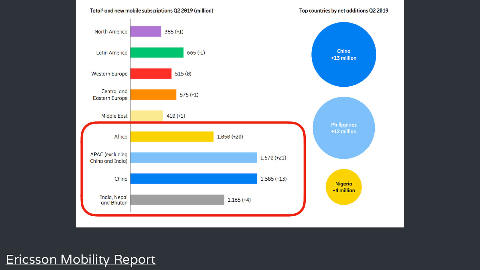
Title Text Ericsson Mobility Report
Existing research identifies several avenues through which mobile phones, and smartphones in particular, may contribute to the fortunes of disadvantaged populations. Mobile phones and inequality - Will Marler
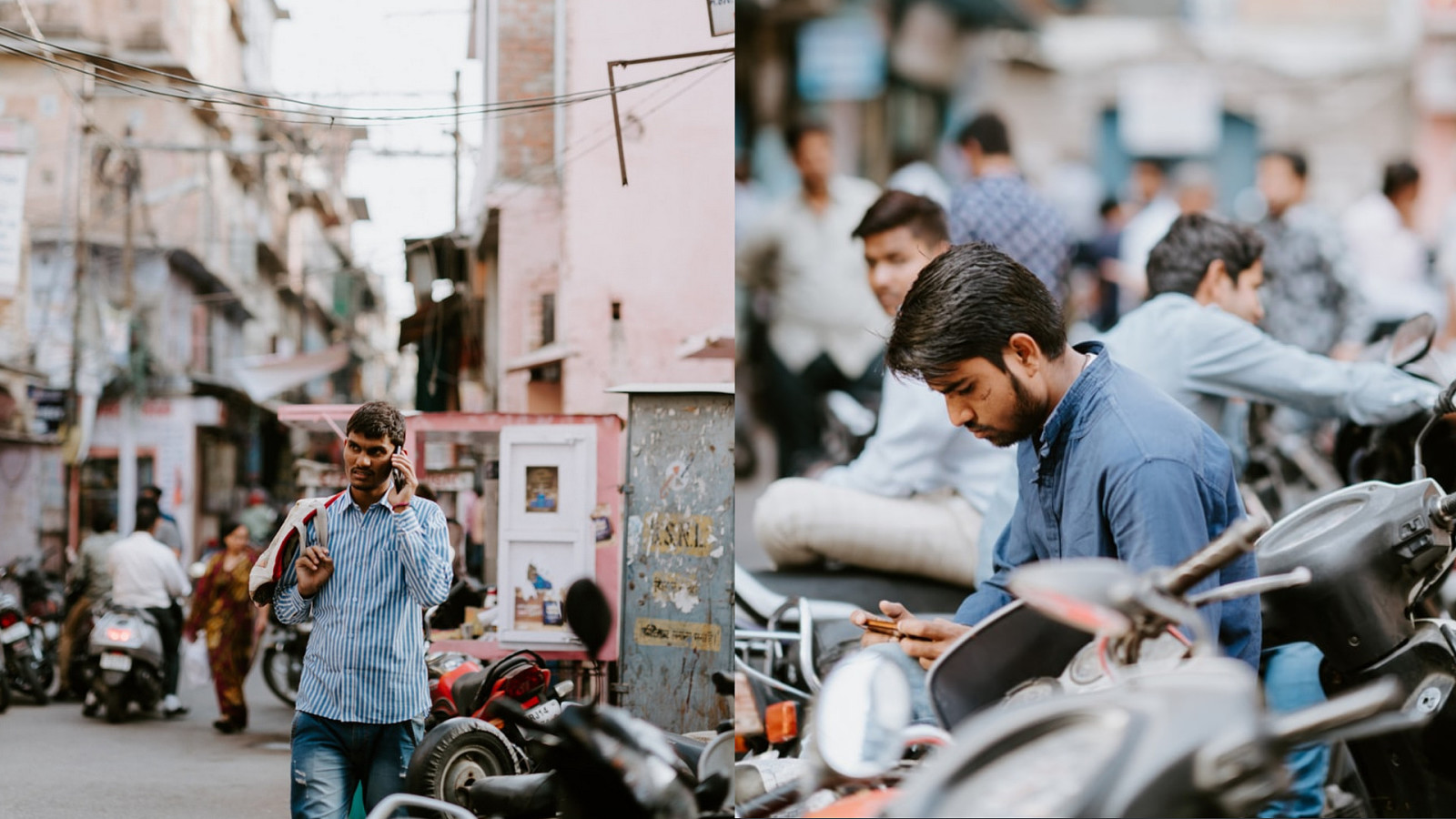
Mobile phones are considered separately as tools which are used to take advantage of digital resources, strengthen and grow personal networks and enhance coordination and mobility in everyday life. Mobile phones and inequality - Will Marler
The notion is that a gap has emerged between those who access the Internet by phone and those who do so by computer known as the “device divide”. The researchers find that those marginalized by race, income, and education are more likely to depend on a smartphone for Internet access. Mobile phones and inequality - Will Marler

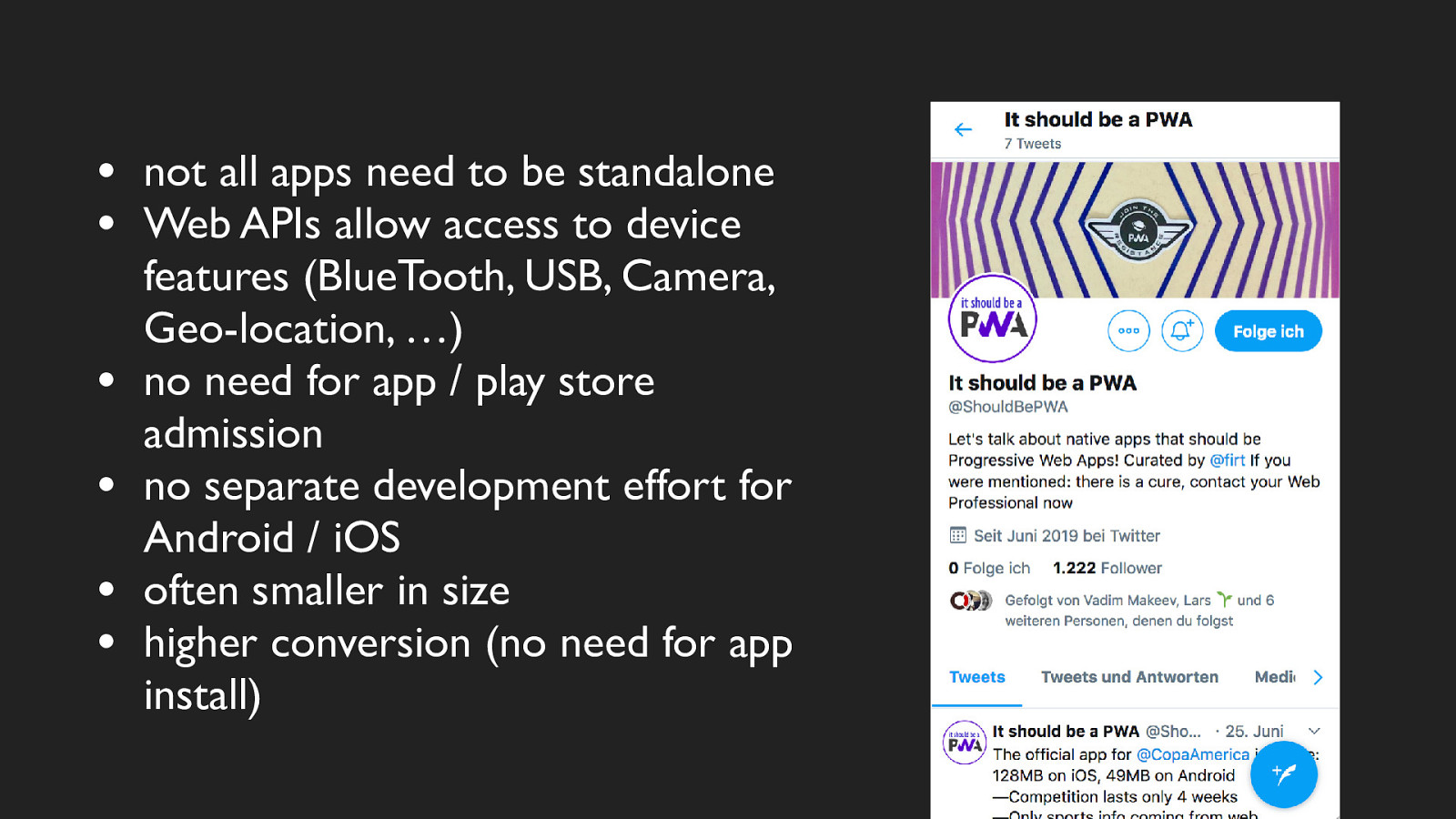
• • • • • • not all apps need to be standalone Web APIs allow access to device features (BlueTooth, USB, Camera, Geo-location, …) no need for app / play store admission no separate development effort for Android / iOS often smaller in size higher conversion (no need for app install)
Touch Interaction and Animation in Mobile Web Interfaces

Animation
Animation Touch Interaction
Animation Touch Interaction Mobile Context & Usability
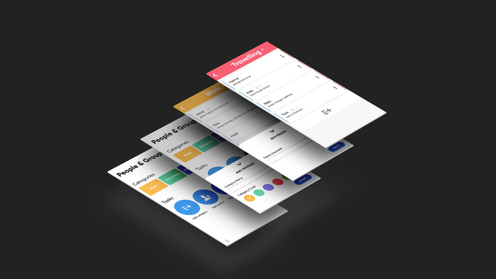
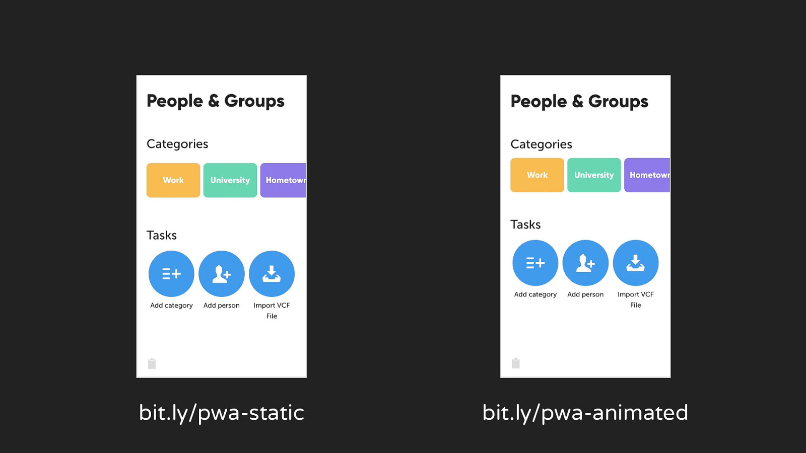
bit.ly/pwa-static bit.ly/pwa-animated
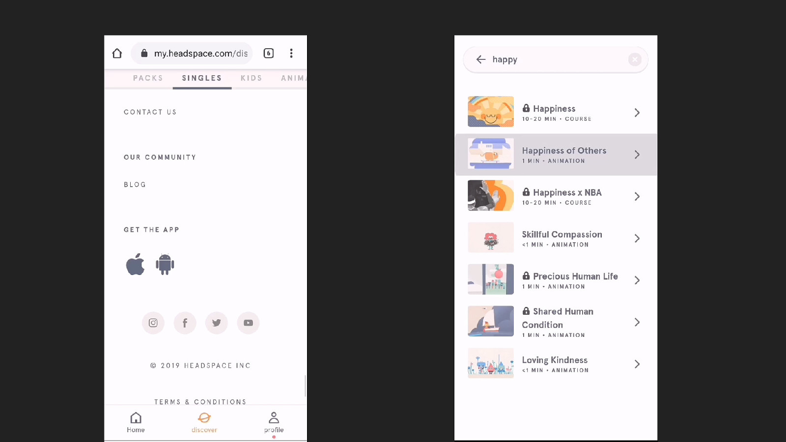
What are the problems with the mobile web?
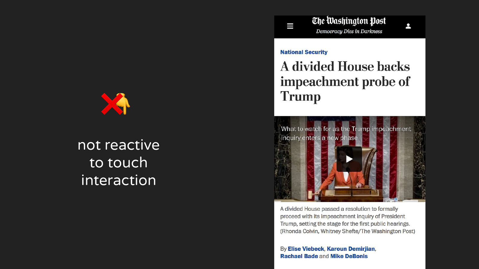
❌ 👇 not reactive to touch interaction
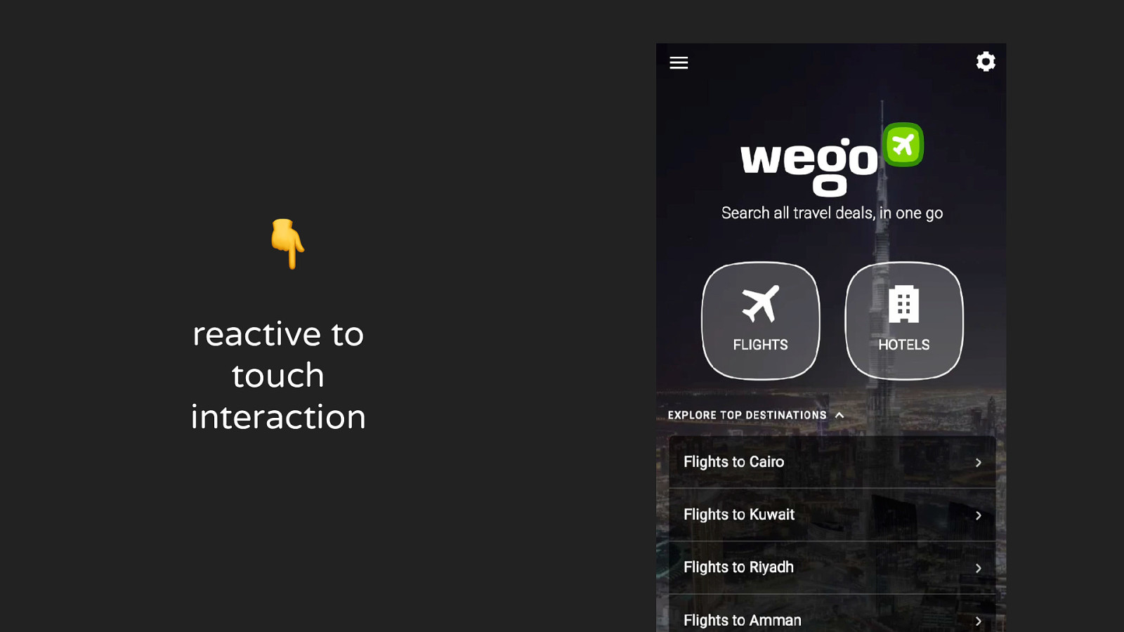
👇 reactive to touch interaction
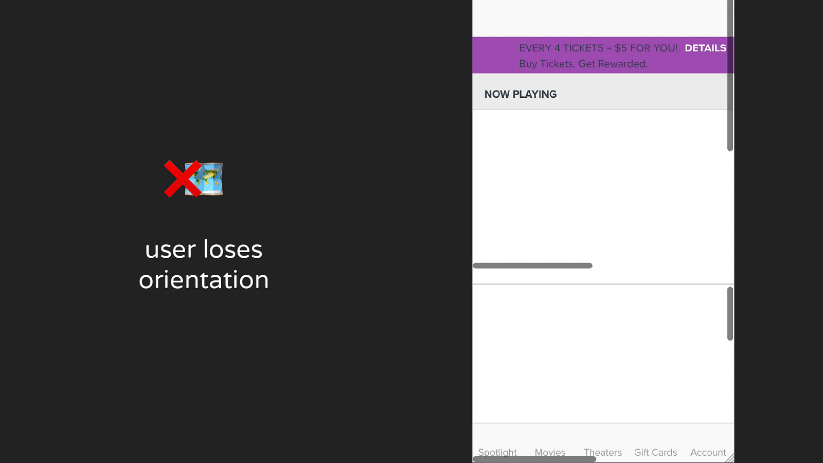
❌🗺 user loses orientation
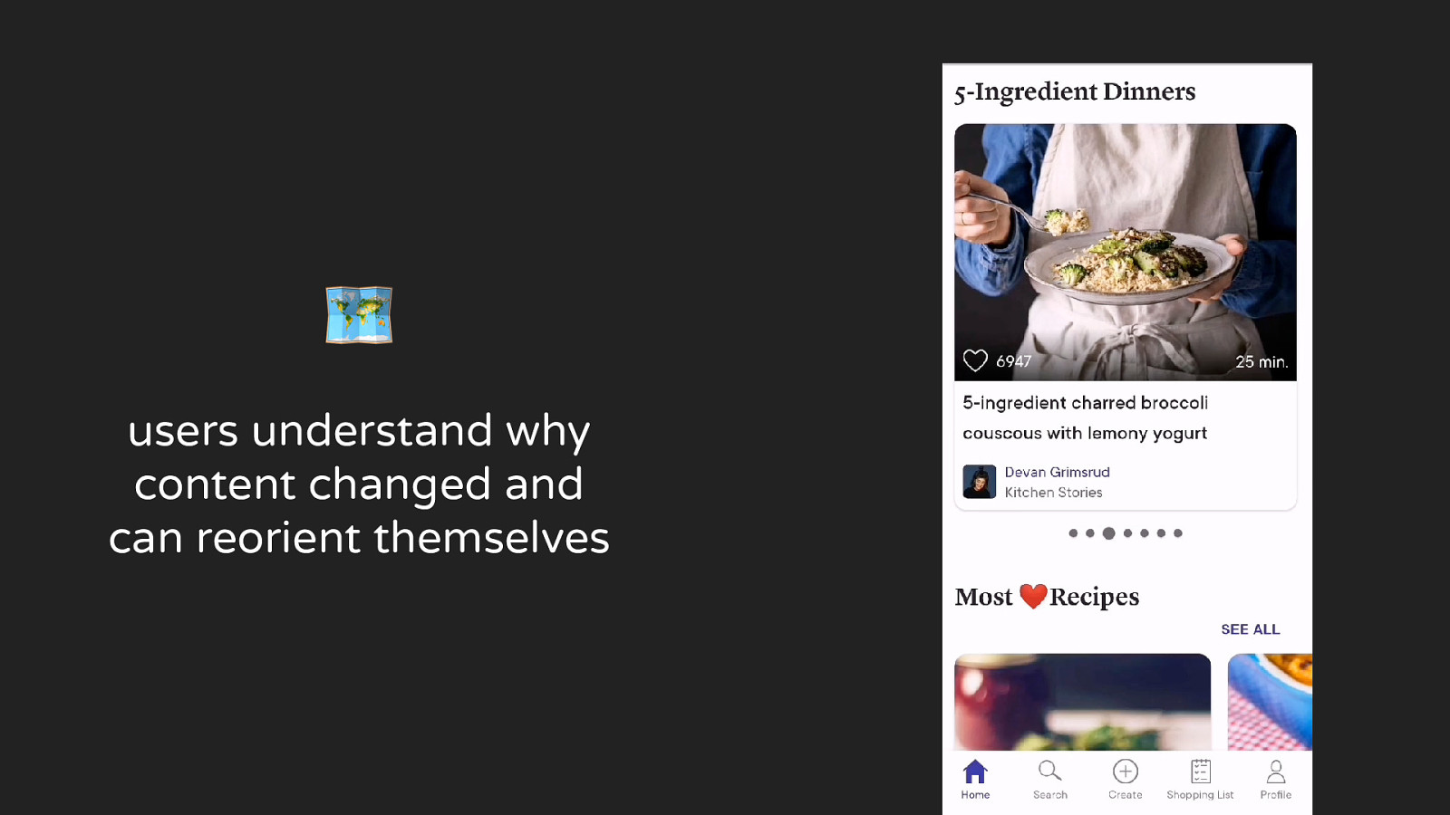
🗺 users understand why content changed and can reorient themselves
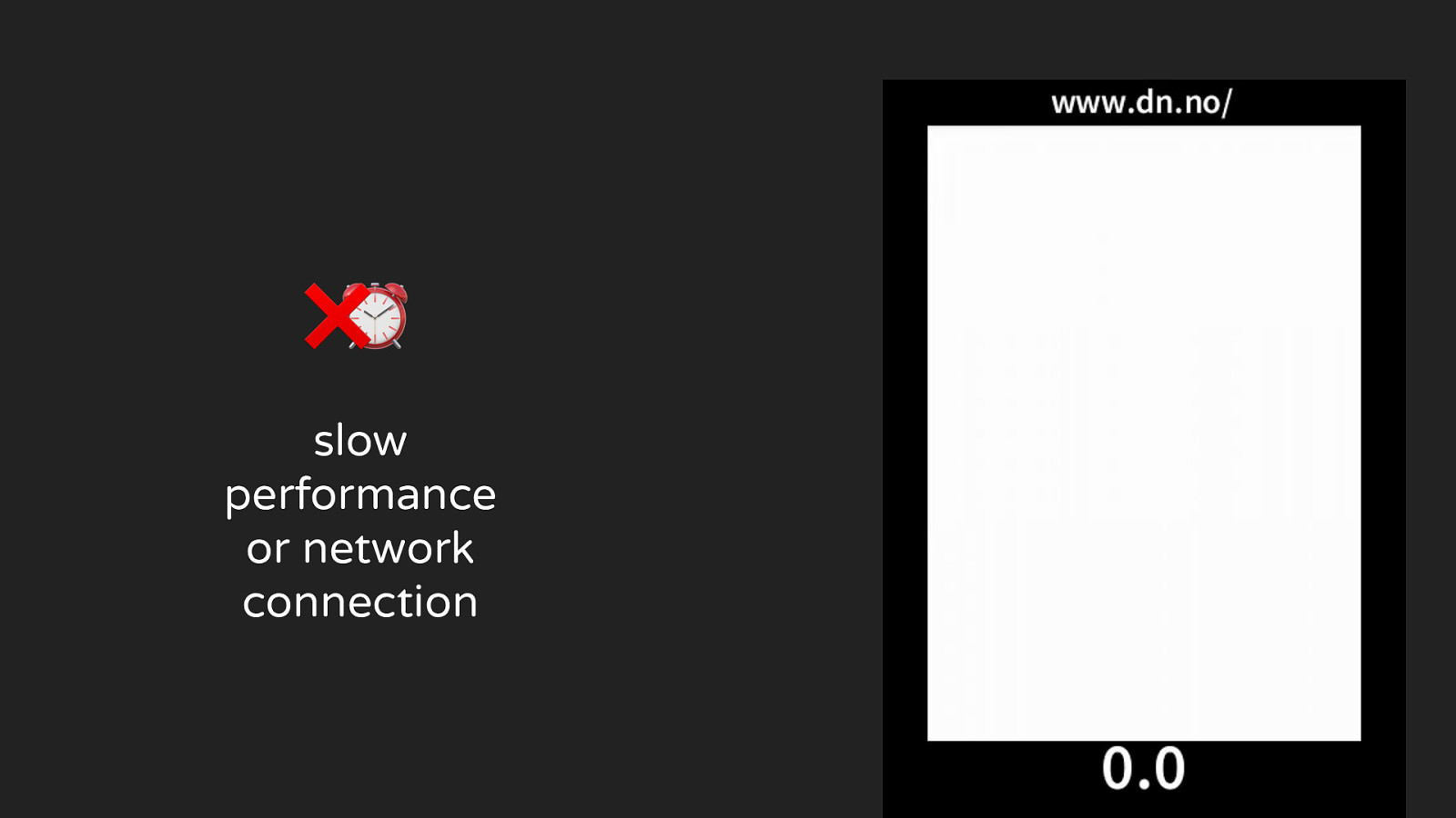
❌⏰ slow performance or network connection
⏰ loads most important parts quickly
❌🎮 user doesn’t feel in control
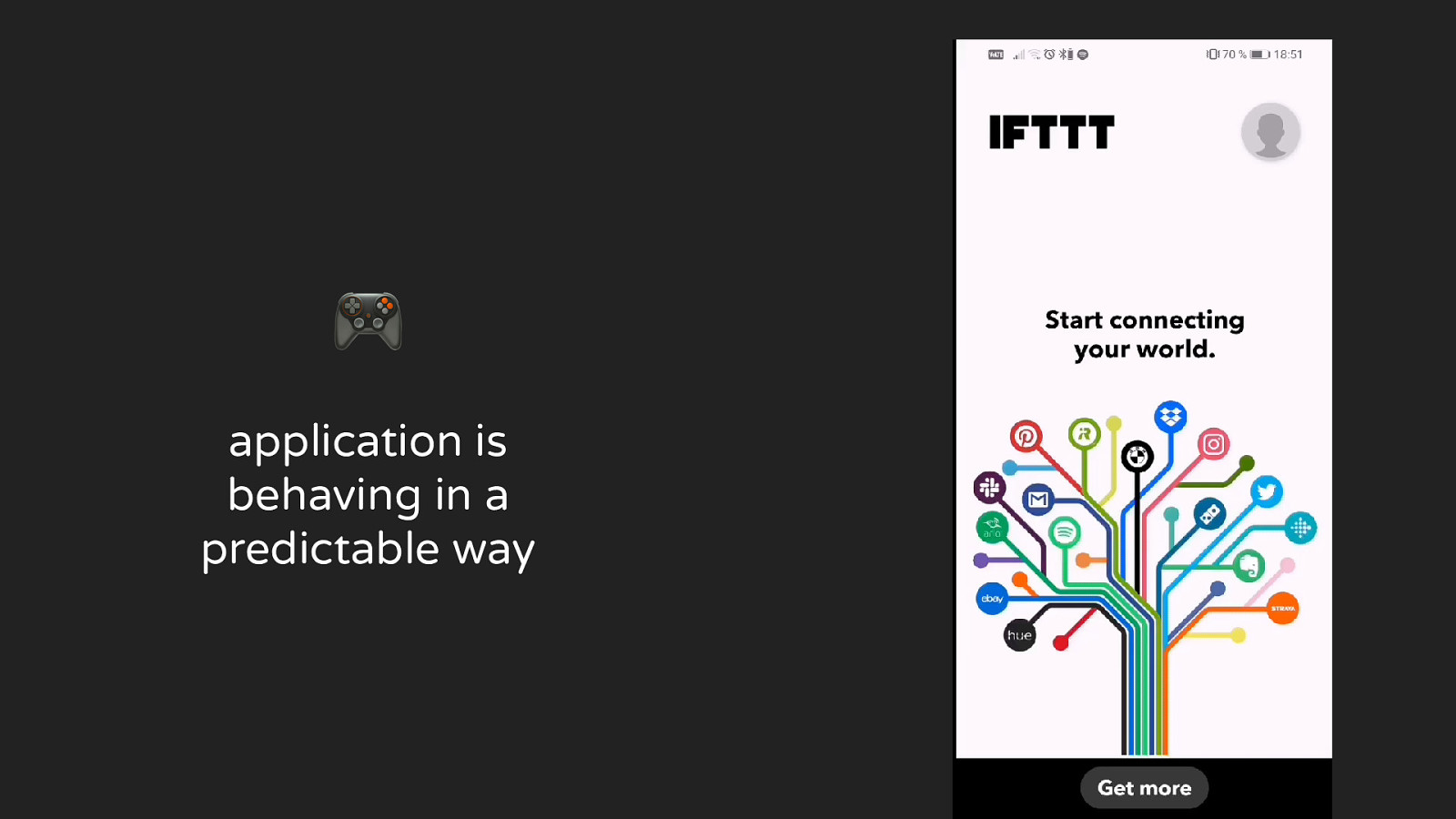
🎮 application is behaving in a predictable way
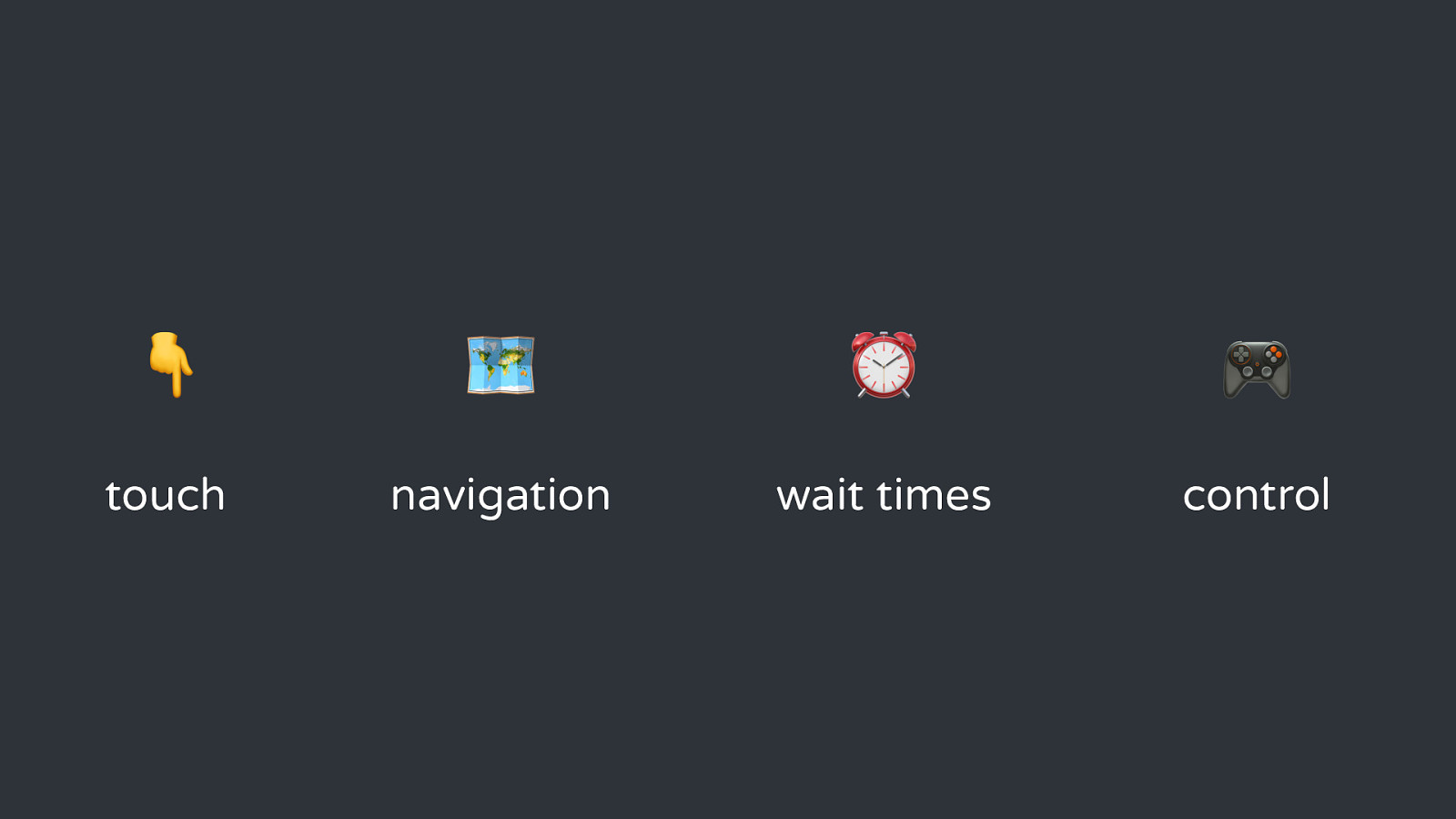
👇 🗺 ⏰ 🎮 touch navigation wait times control
What do native applications do differently?
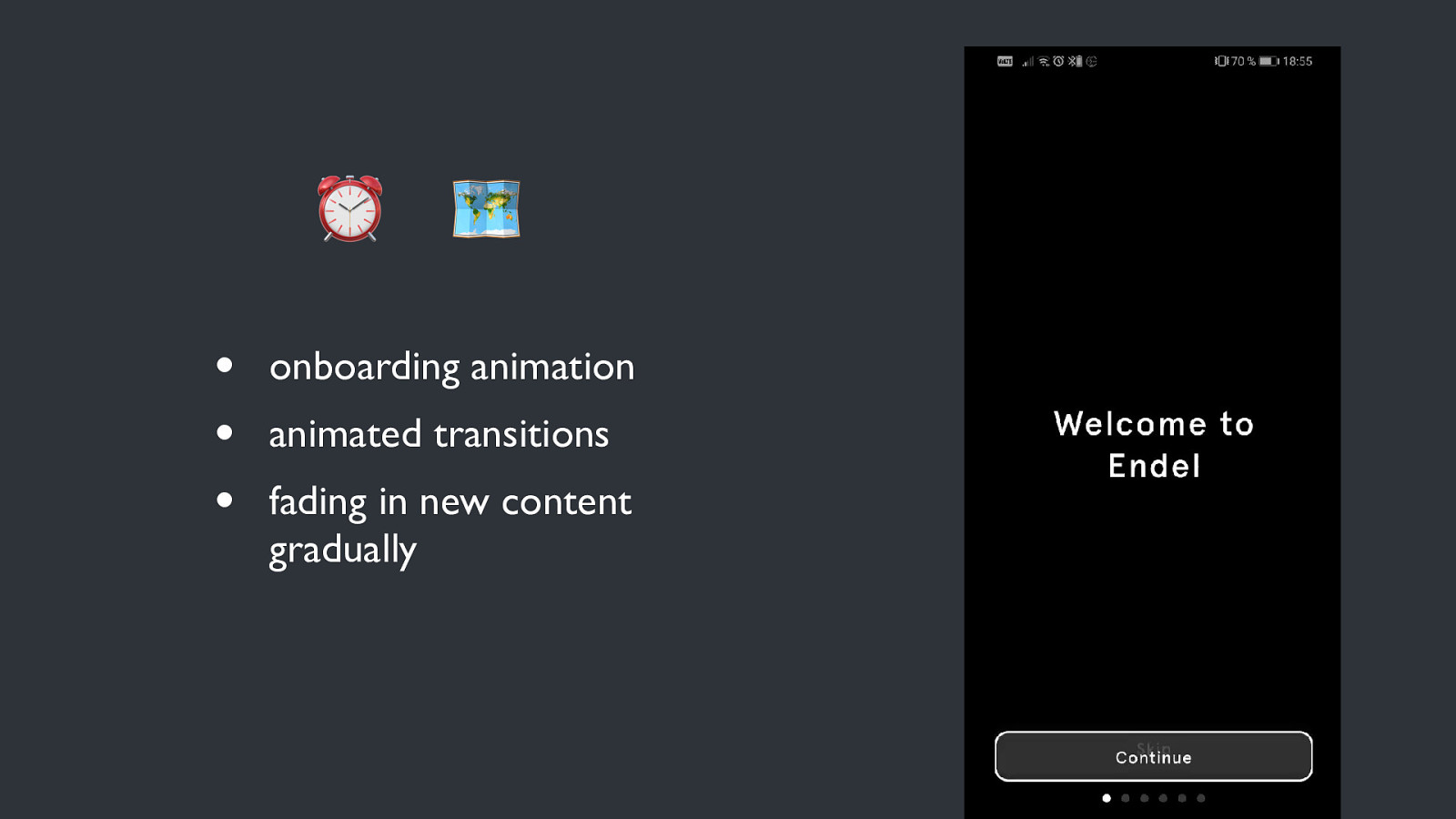
⏰ • • • 🗺 onboarding animation animated transitions fading in new content gradually
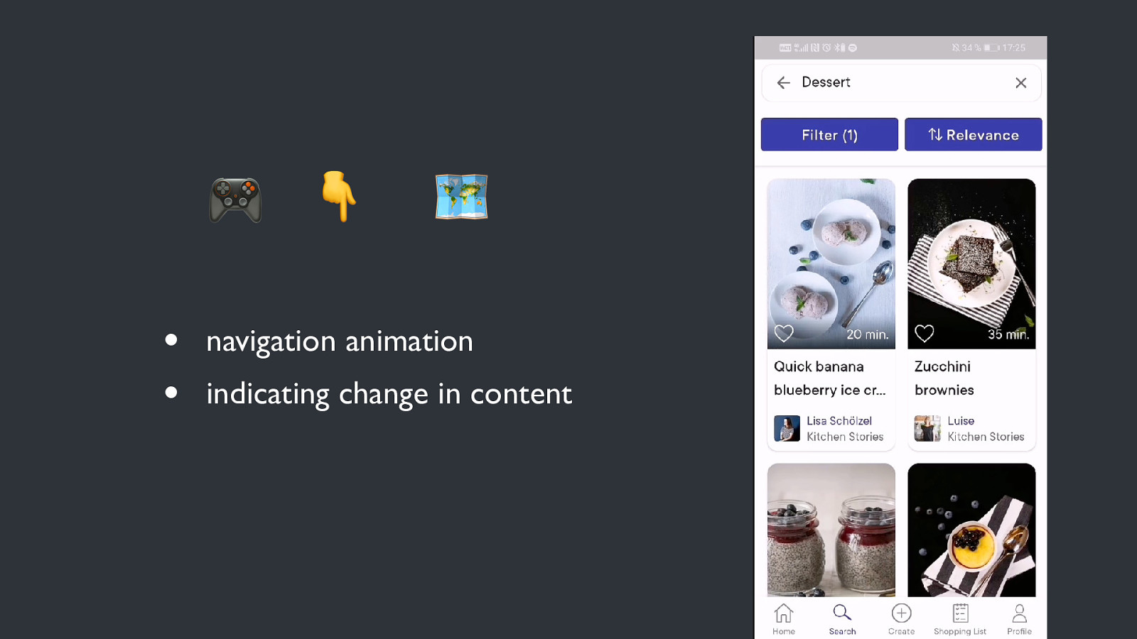
🎮 👇 • • 🗺 navigation animation indicating change in content
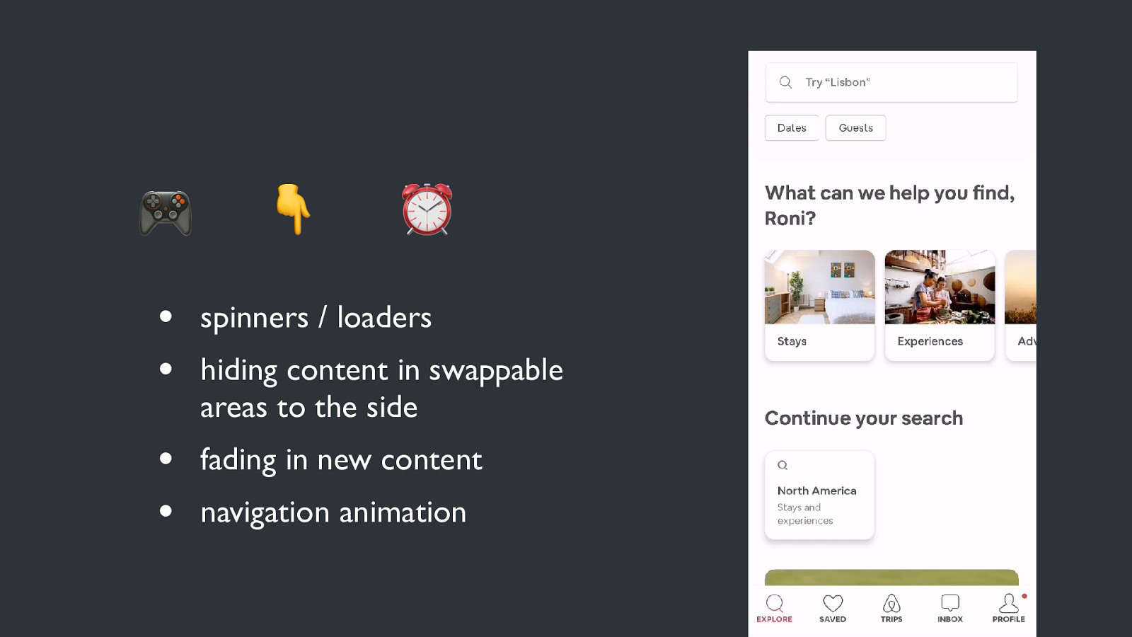
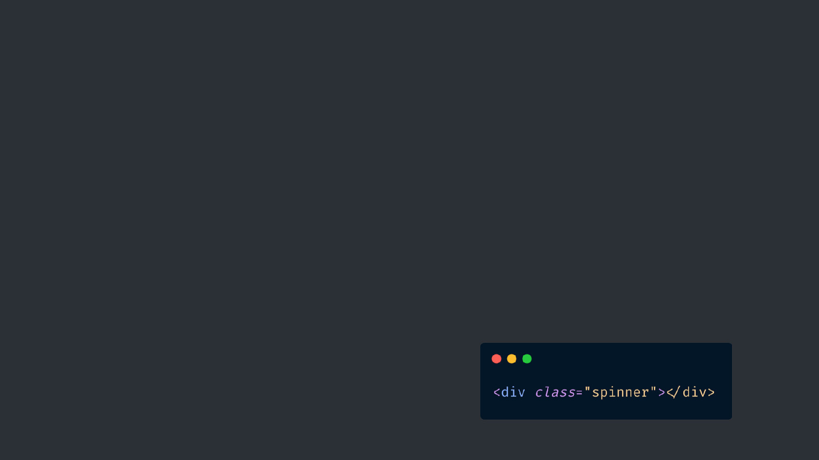
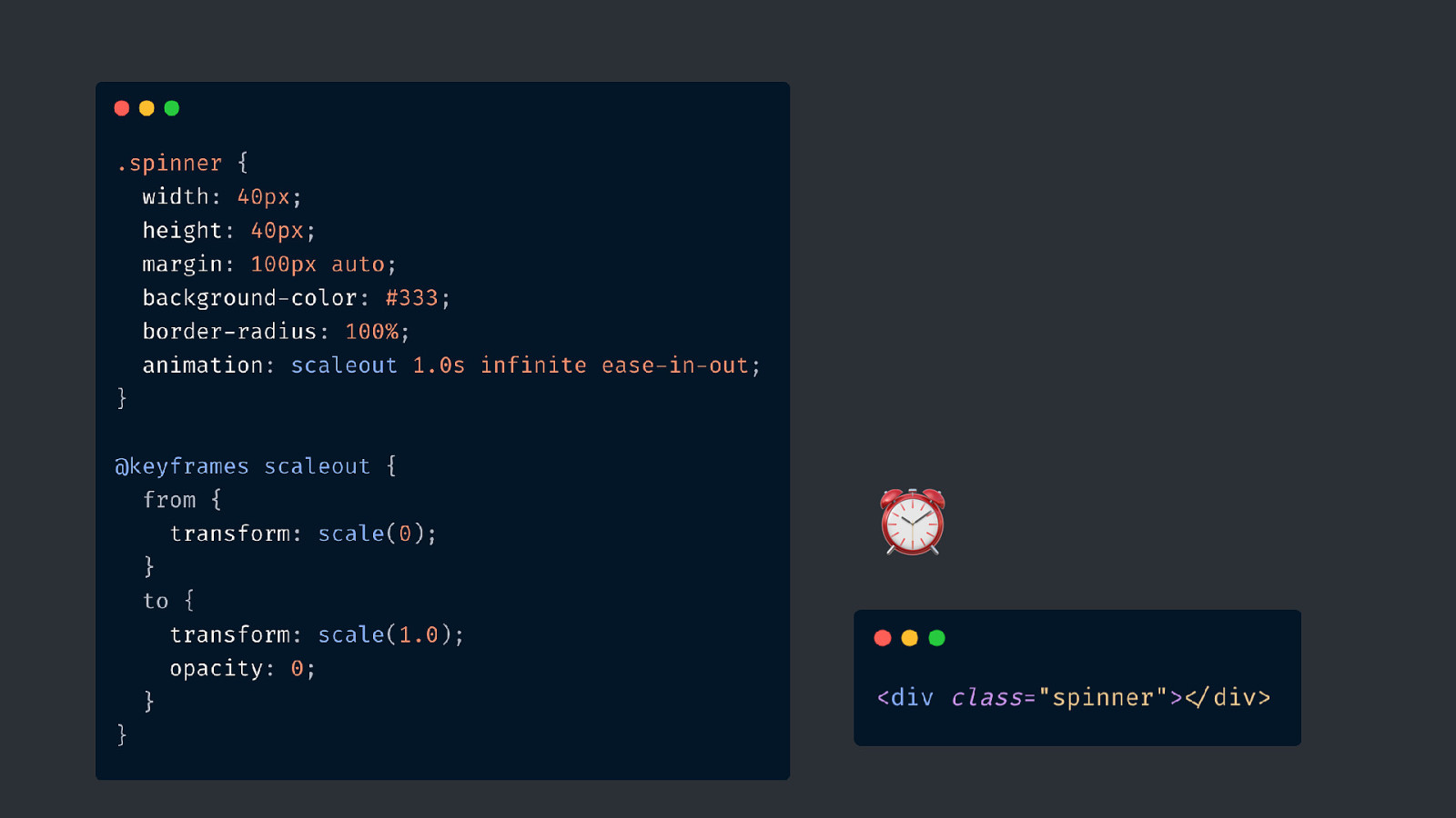
🎮 👇 ⏰ • • spinners / loaders • • fading in new content hiding content in swappable areas to the side navigation animation
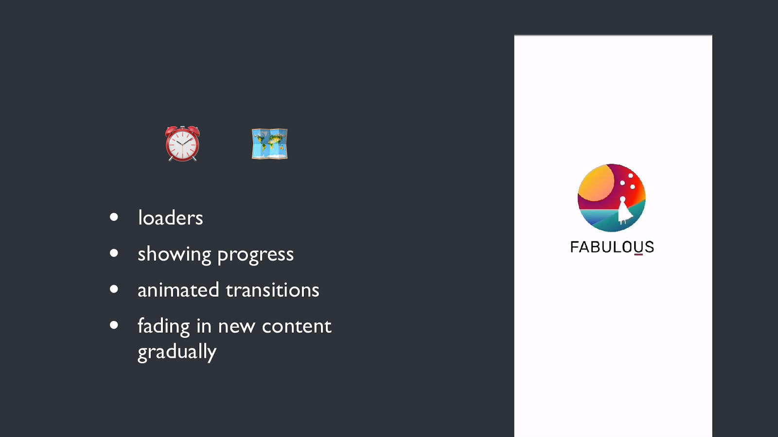
⏰ • • • • 🗺 loaders showing progress animated transitions fading in new content gradually
Animation in PWAs
NAVIGATION & CONTEXT
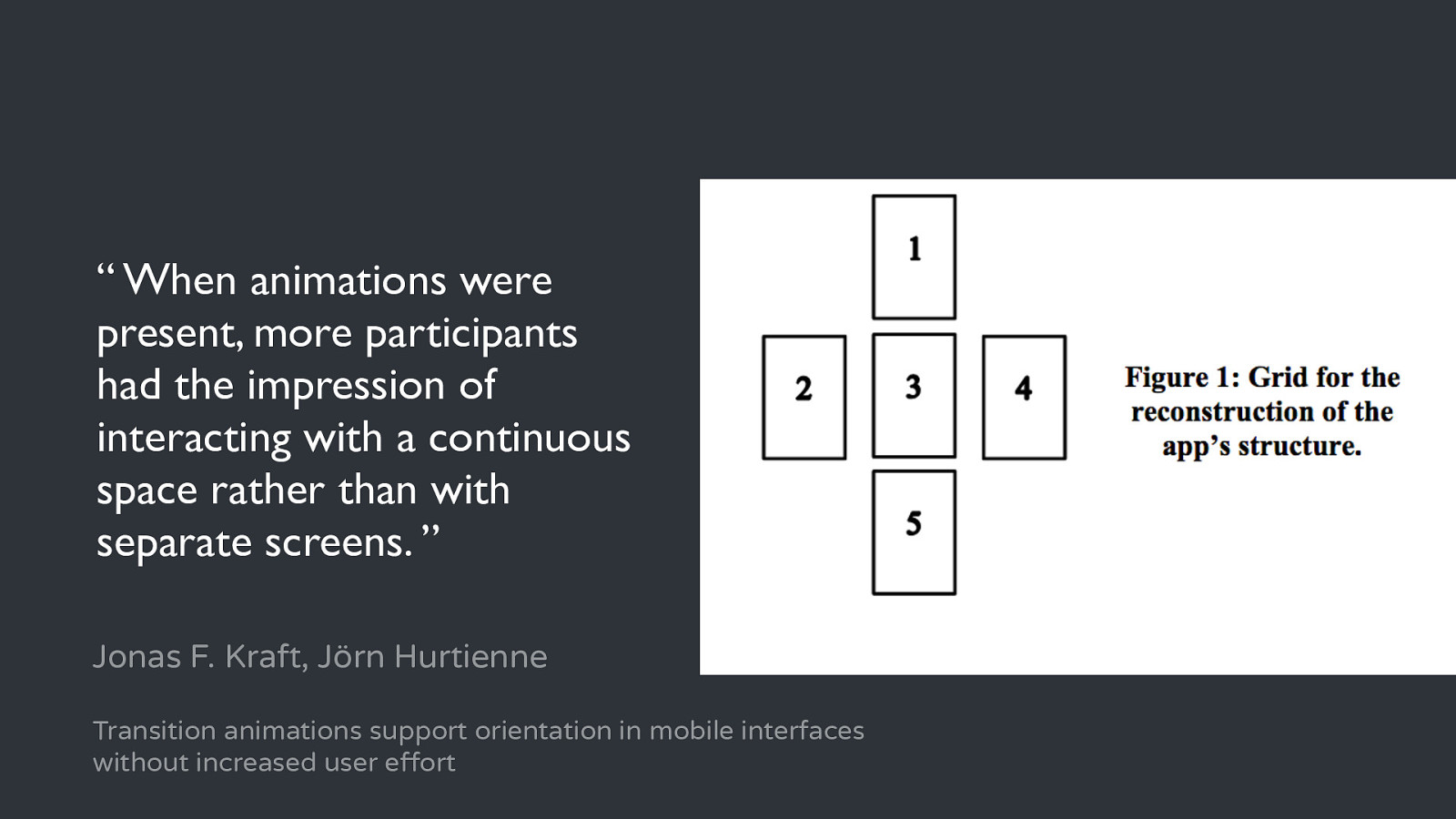
“ When animations were present, more participants had the impression of interacting with a continuous space rather than with separate screens. ” Jonas F. Kraft, Jörn Hurtienne Transition animations support orientation in mobile interfaces without increased user effort
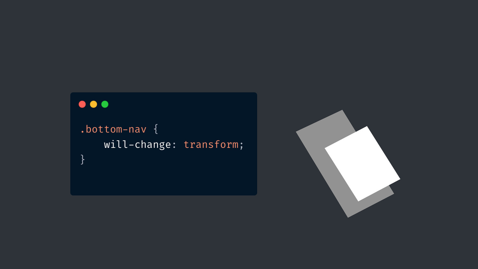
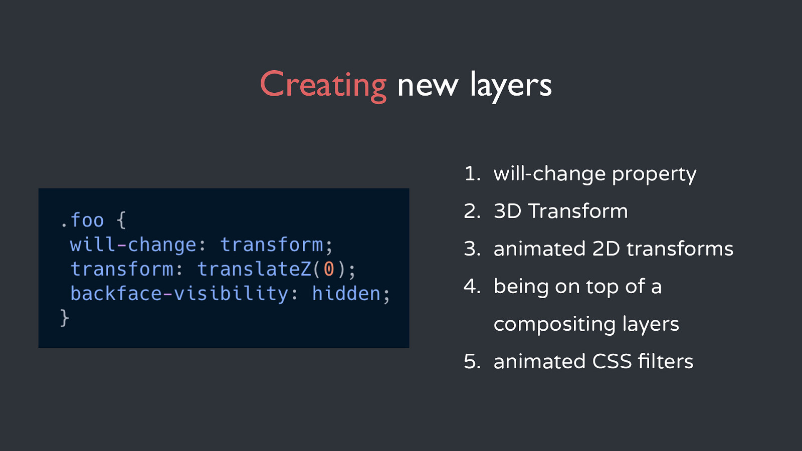
Creating new layers 1. will-change property 2. 3D Transform 3. animated 2D transforms 4. being on top of a compositing layers 5. animated CSS filters
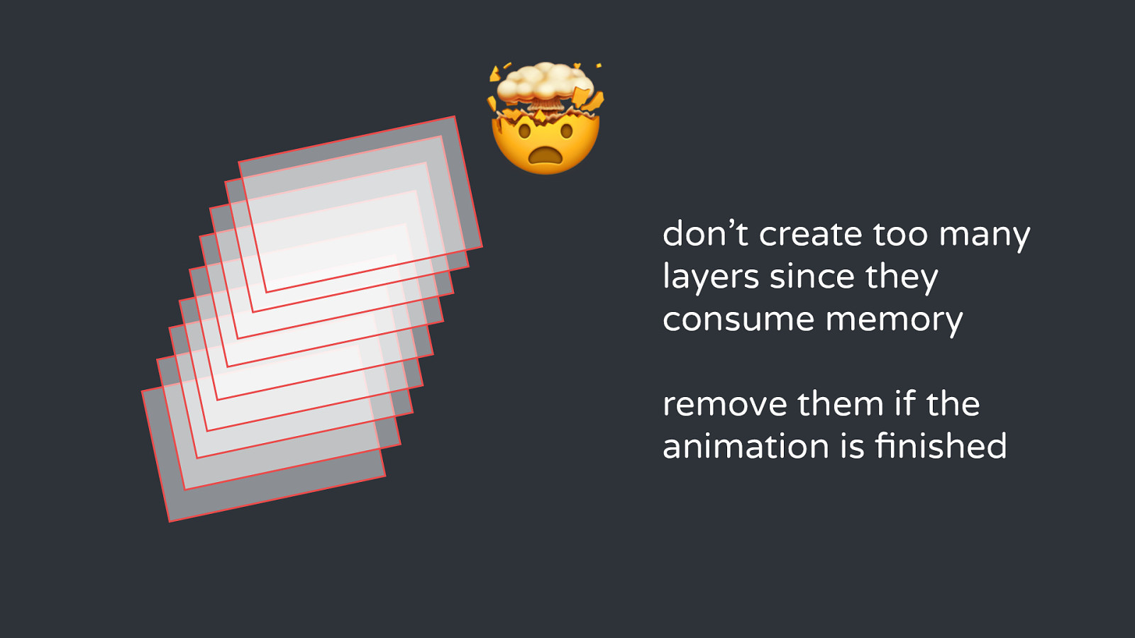
🤯 don’t create too many layers since they consume memory remove them if the animation is finished
🎮 👇
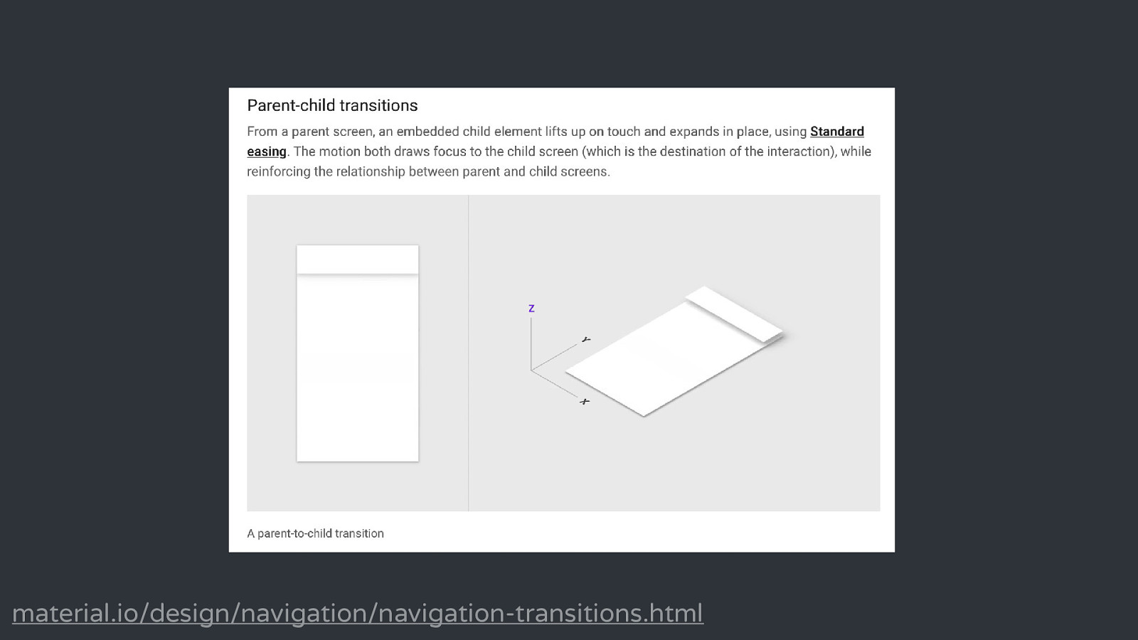
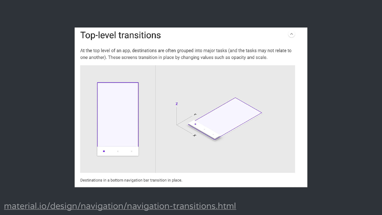
material.io/design/navigation/navigation-transitions.html
material.io/design/navigation/navigation-transitions.html
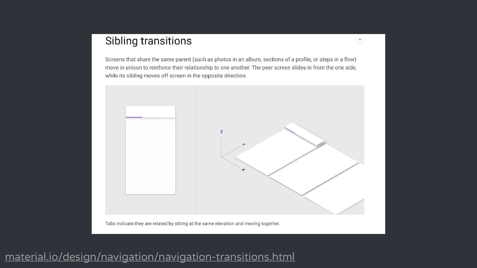
material.io/design/navigation/navigation-transitions.html
ACTIVITY & FEEDBACK
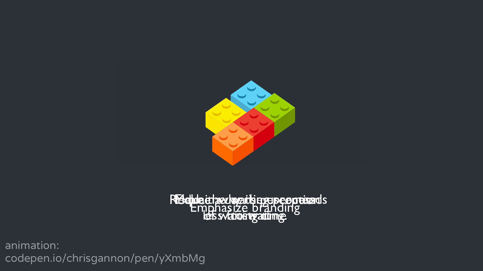
Make Explain the waiting theperception user process needs Reduce awhy user’s Emphasize branding less frustrating. to wait of waiting time animation: codepen.io/chrisgannon/pen/yXmbMg

⏰
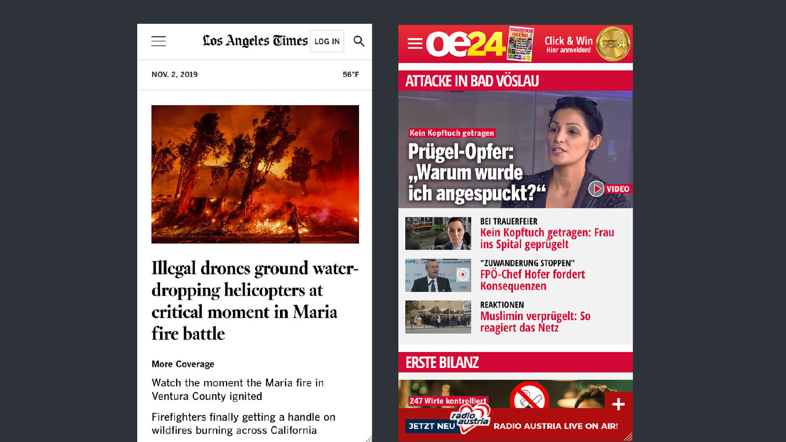
DISPLAY CLUTTER
Display clutter can be defined as the decrement of performance and cost of attention, particularly, visual search decrements, that result from the interaction between display-based and user-based factors. Nadine Moacdieh, Nadine Sarter Display Clutter: A Review of Definitions and Measurement Techniques
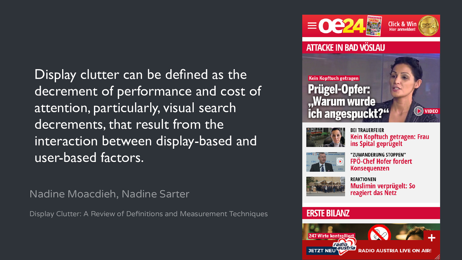
Display clutter can be defined as the decrement of performance and cost of attention, particularly, visual search decrements, that result from the interaction between display-based and user-based factors. Nadine Moacdieh, Nadine Sarter Display Clutter: A Review of Definitions and Measurement Techniques
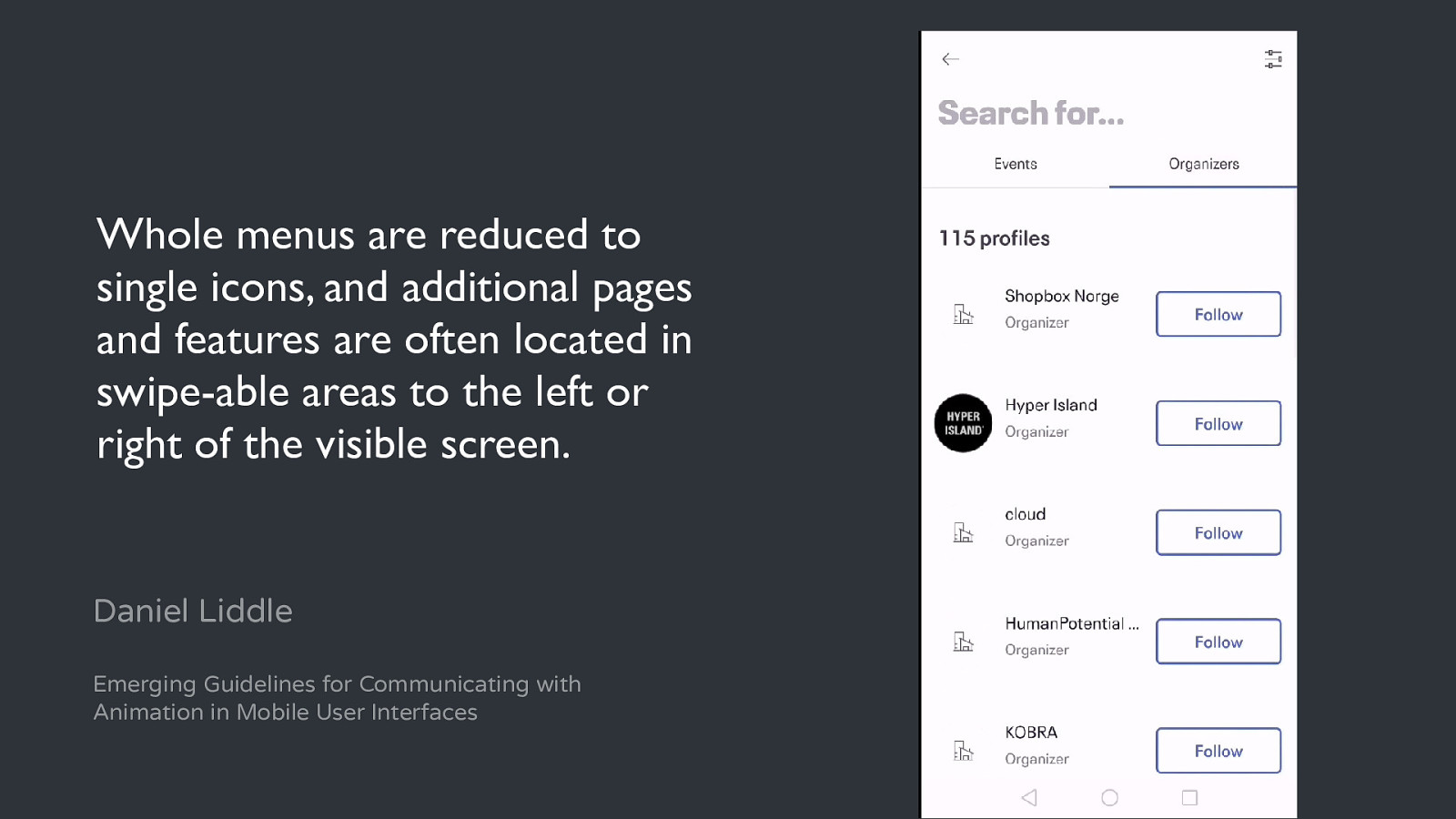
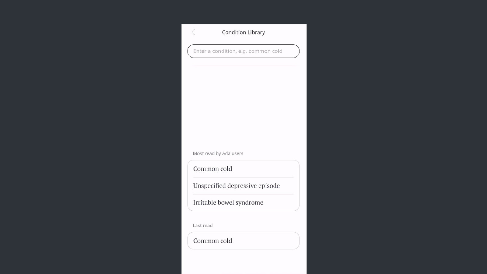
Whole menus are reduced to single icons, and additional pages and features are often located in swipe-able areas to the left or right of the visible screen. Daniel Liddle Emerging Guidelines for Communicating with Animation in Mobile User Interfaces
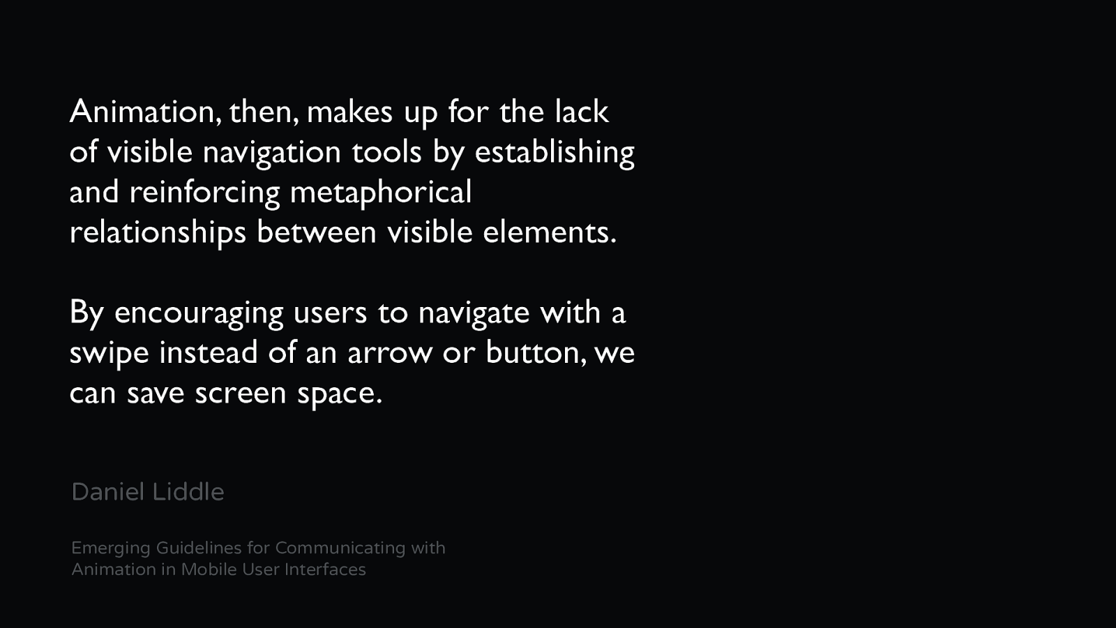
Animation, then, makes up for the lack of visible navigation tools by establishing and reinforcing metaphorical relationships between visible elements. By encouraging users to navigate with a swipe instead of an arrow or button, we can save screen space. Daniel Liddle Emerging Guidelines for Communicating with Animation in Mobile User Interfaces
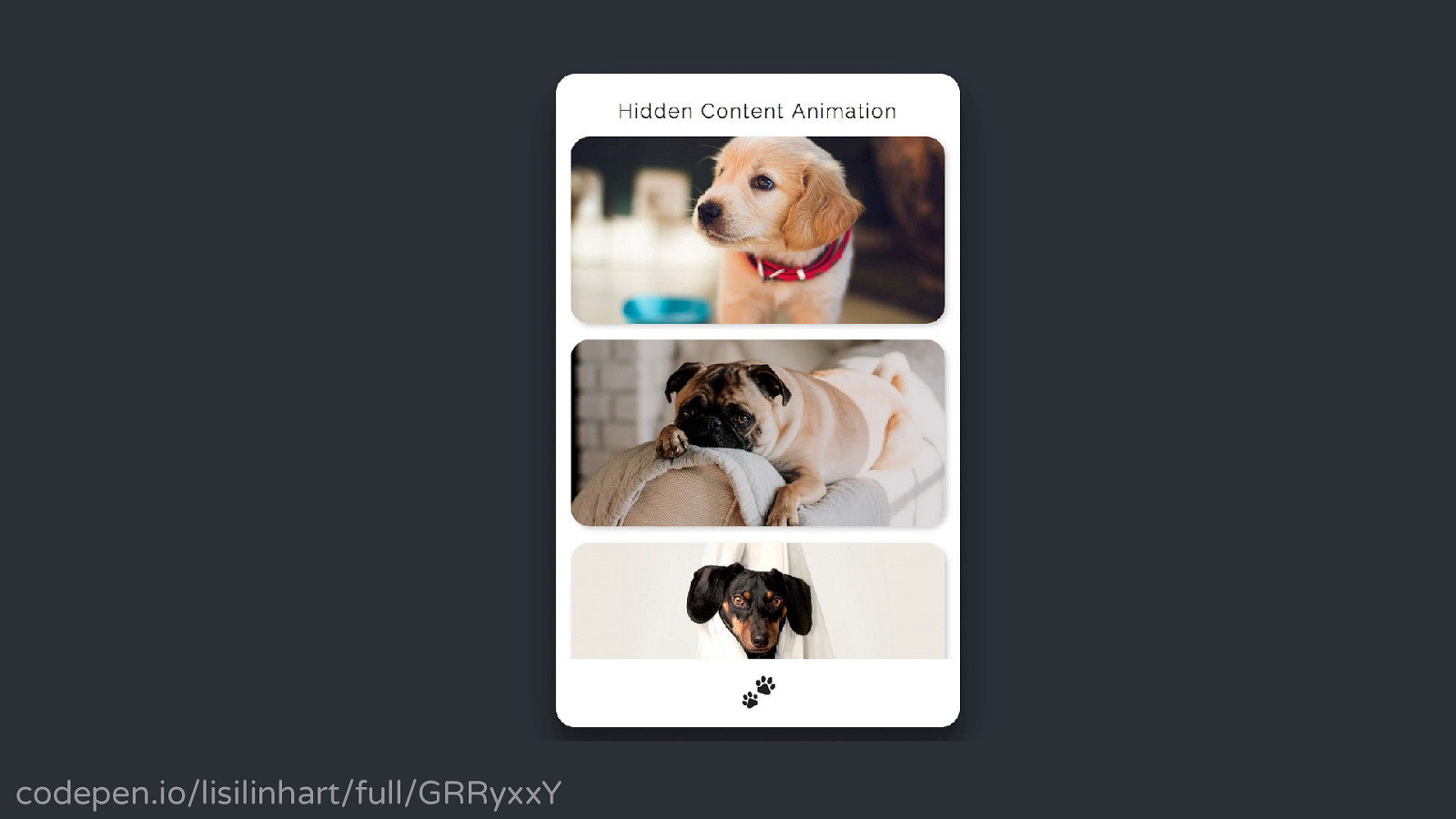
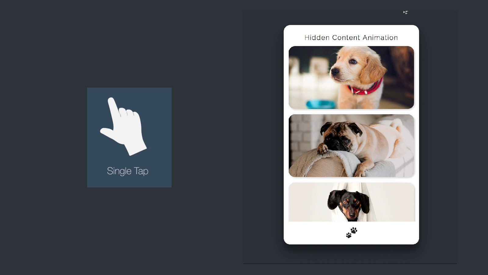
codepen.io/lisilinhart/full/GRRyxxY
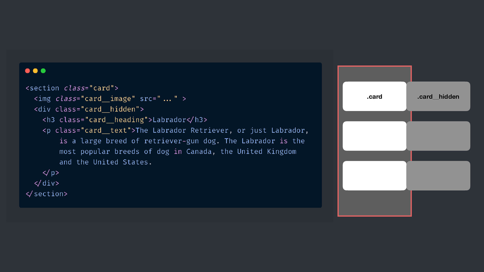
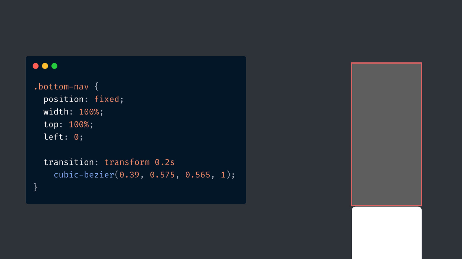
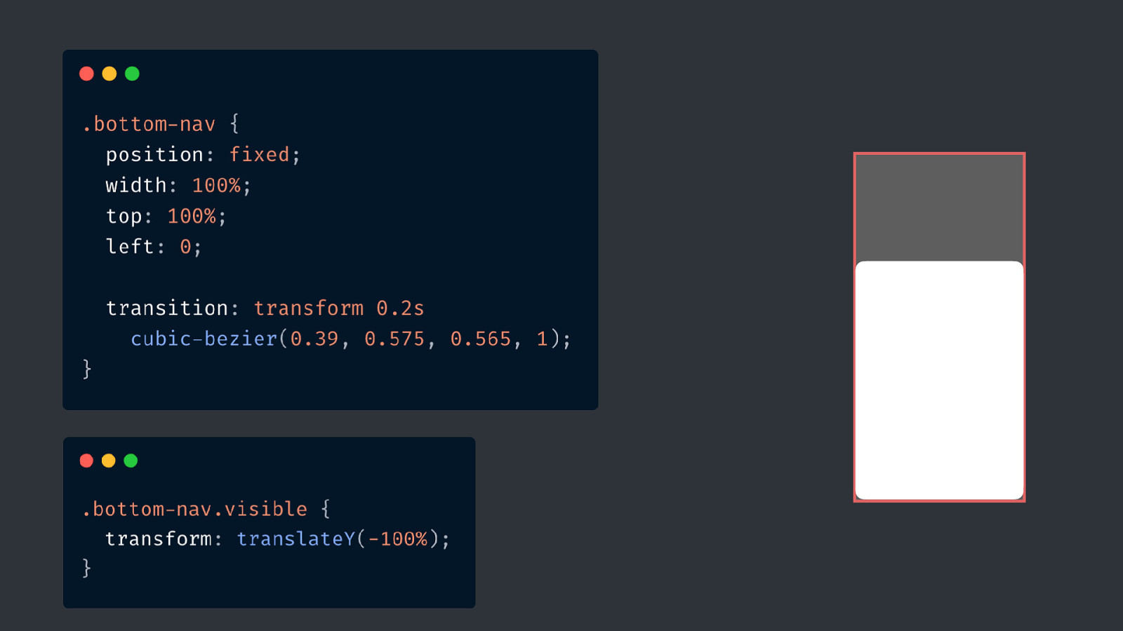
.card .card__hidden
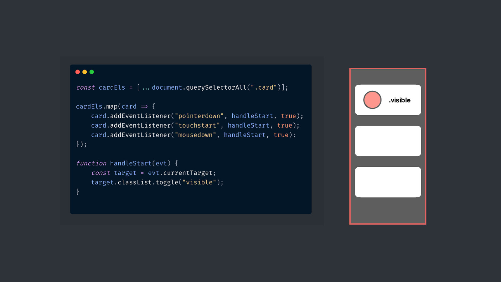
.visible
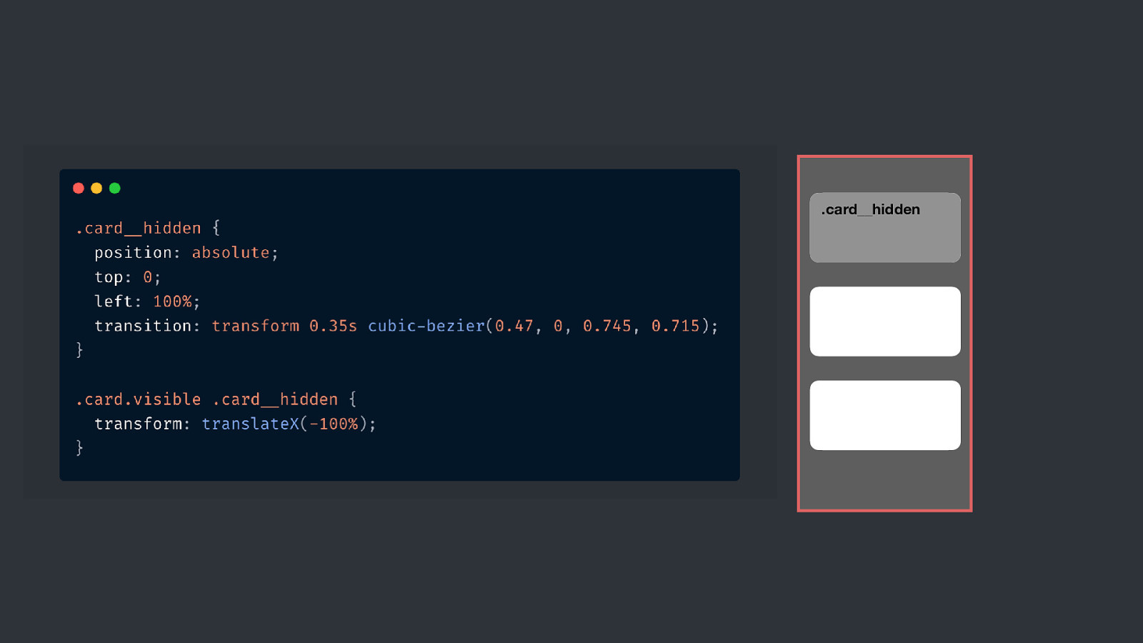
.card__hidden
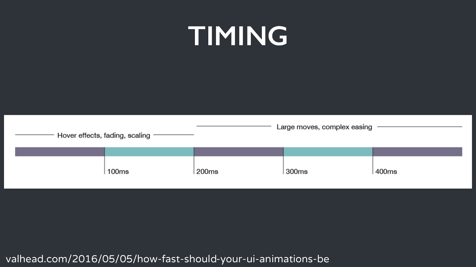
TIMING valhead.com/2016/05/05/how-fast-should-your-ui-animations-be
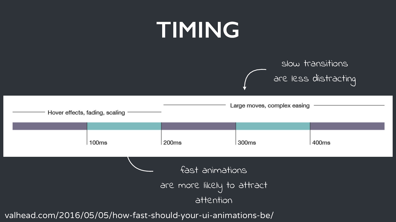
TIMING slow transitions are less distracting Title Text fast animations are more likely to attract attention valhead.com/2016/05/05/how-fast-should-your-ui-animations-be/
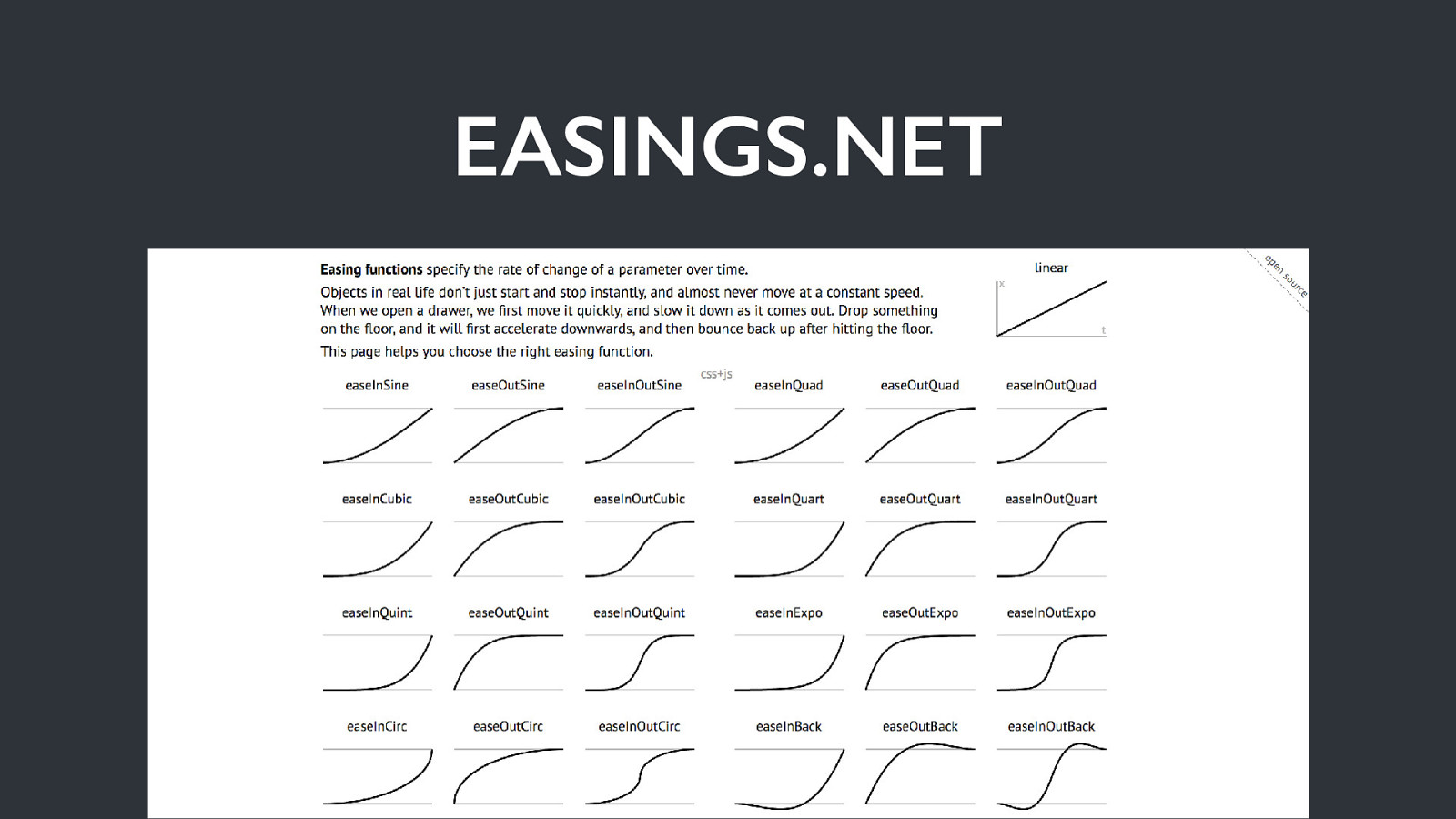
EASINGS.NET Title Text
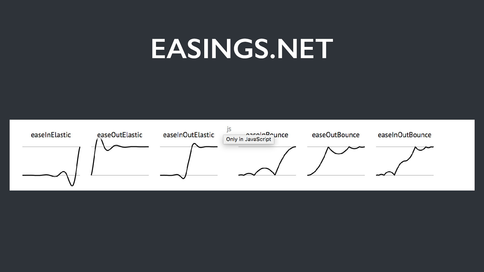
EASINGS.NET Title Text
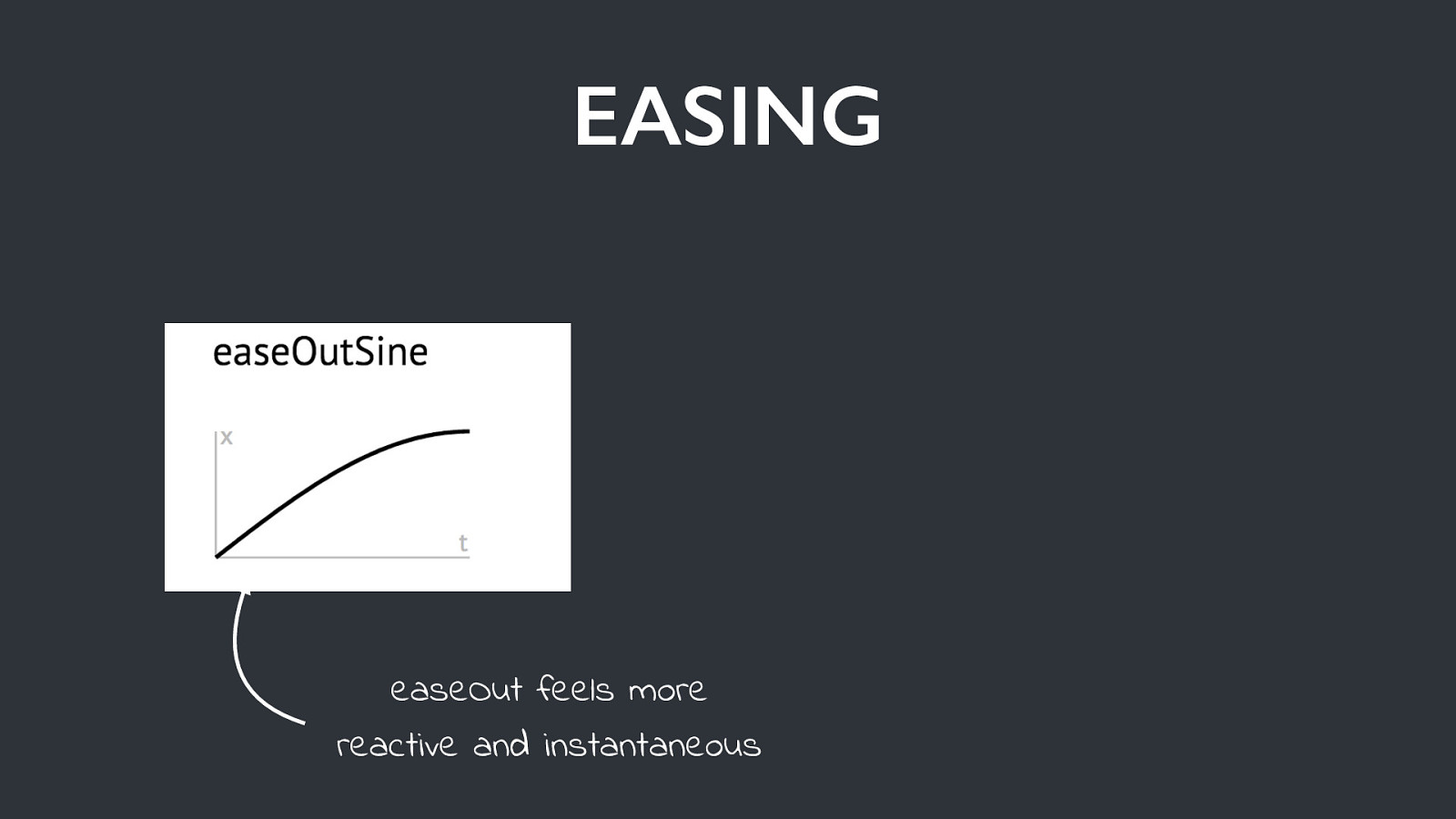
EASING easeOut feels more reactive and instantaneous
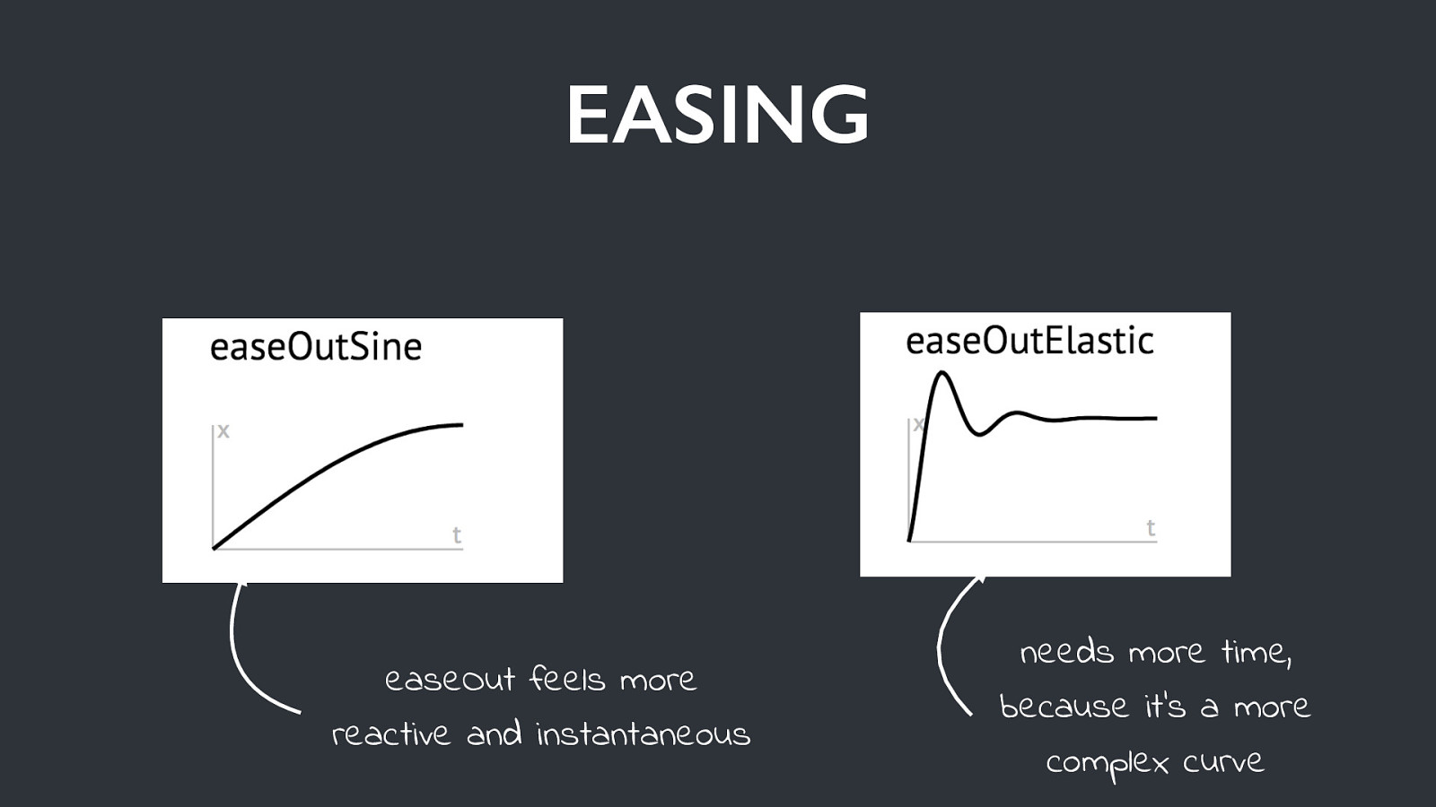
EASING easeOut feels more reactive and instantaneous needs more time, because it’s a more complex curve
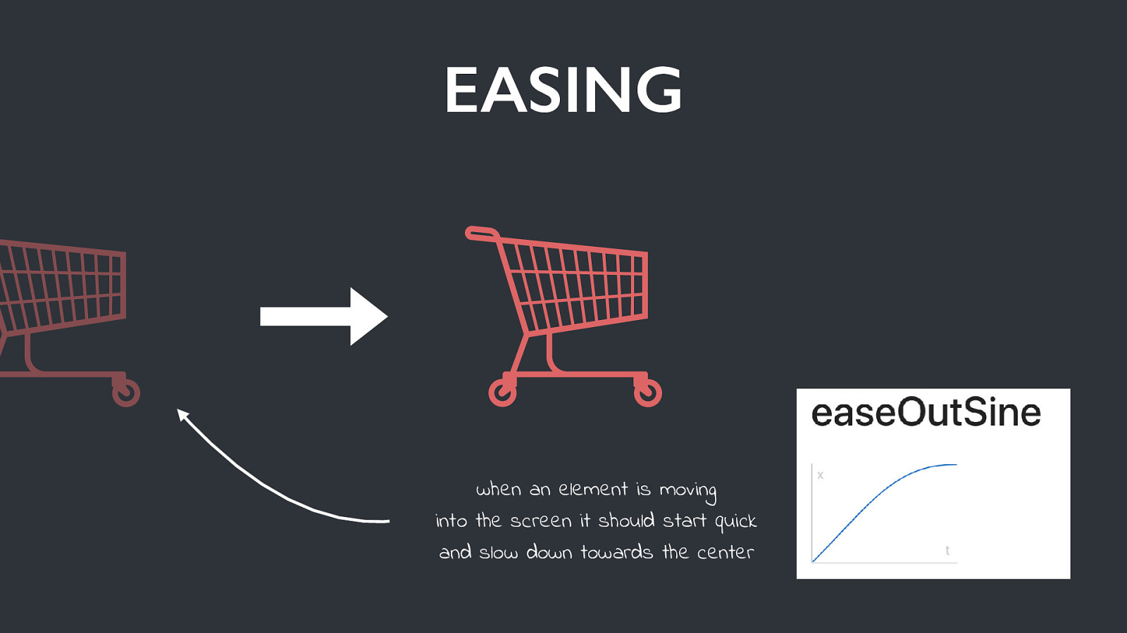
EASING when an element is moving into the screen it should start quick and slow down towards the center
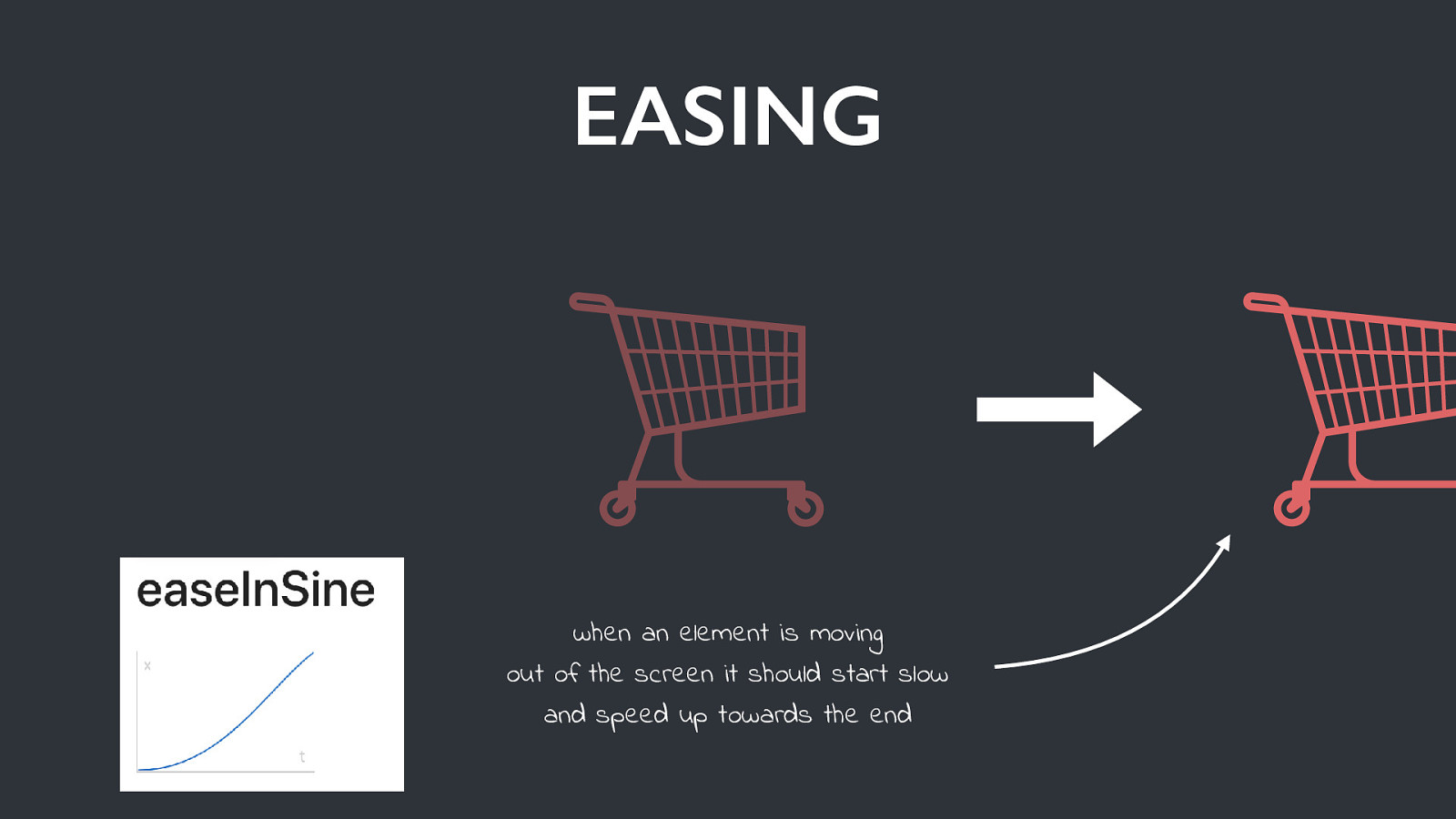
EASING when an element is moving out of the screen it should start slow and speed up towards the end
Touch & Animation
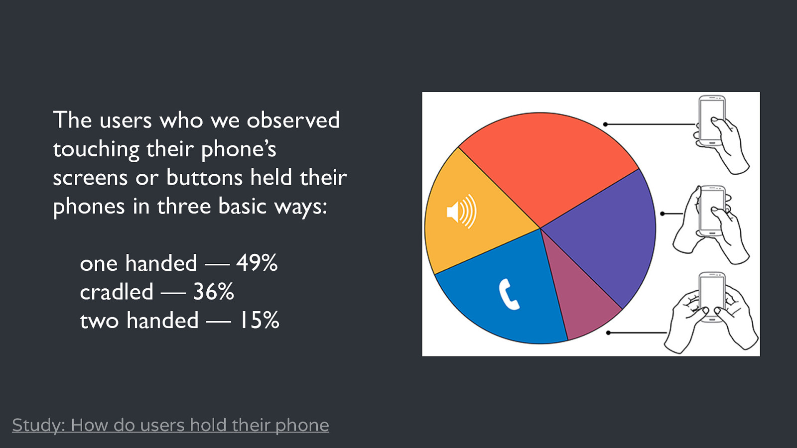
The users who we observed touching their phone’s screens or buttons held their phones in three basic ways: one handed — 49% cradled — 36% two handed — 15% Study: How do users hold their phone
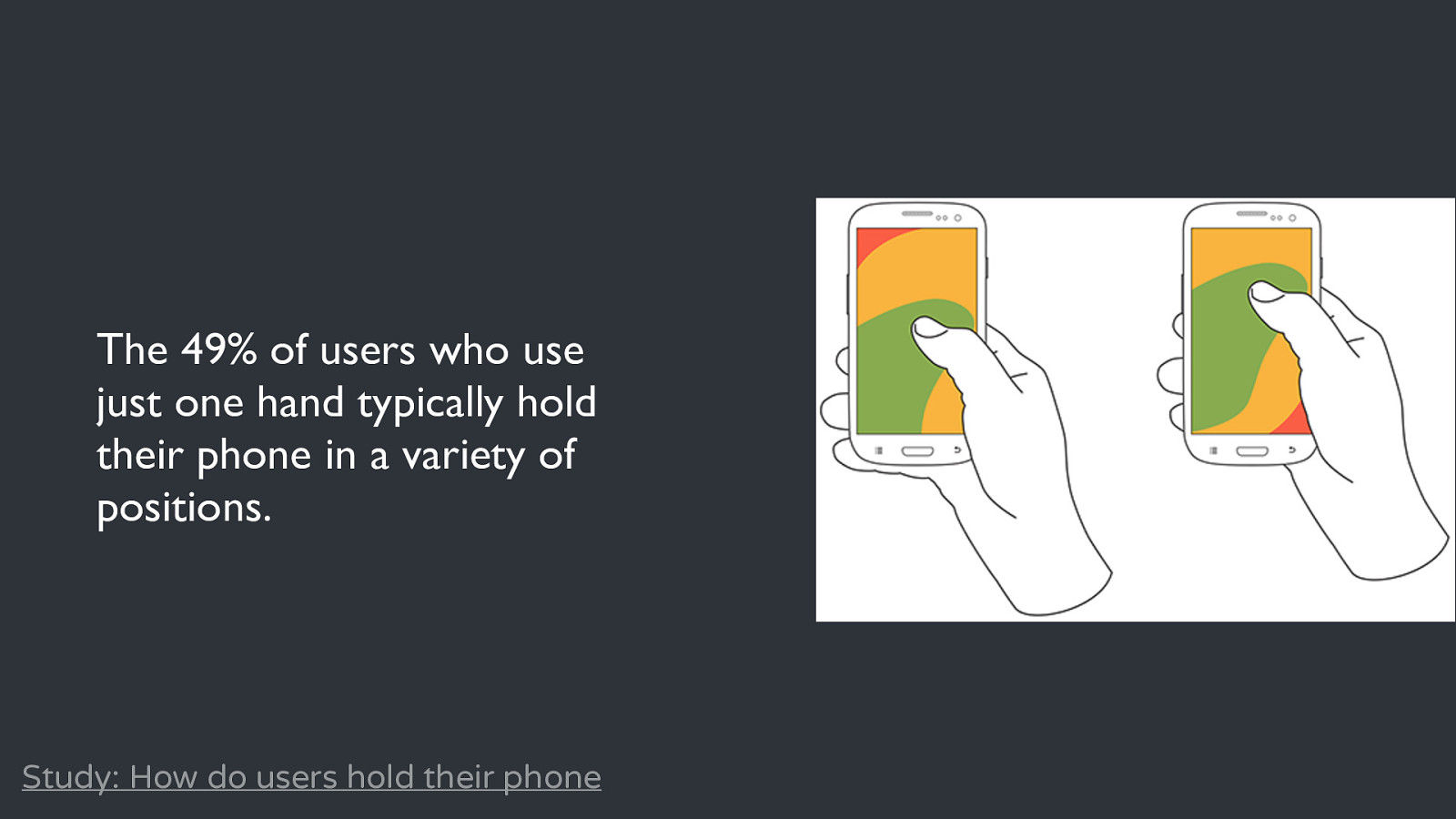
The 49% of users who use just one hand typically hold their phone in a variety of positions. Study: How do users hold their phone
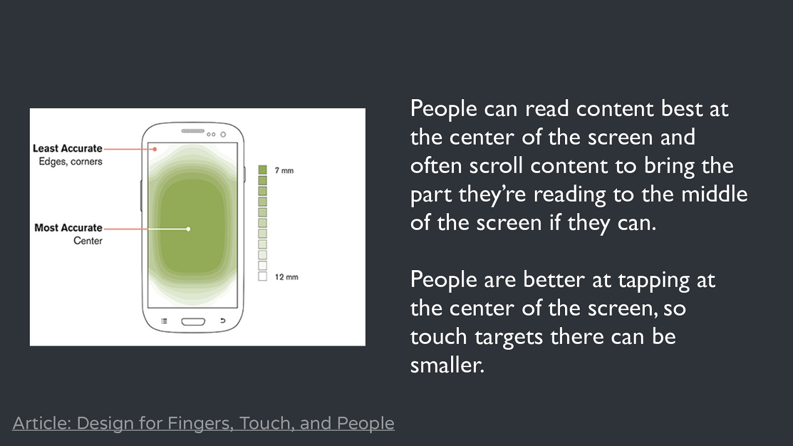
People can read content best at the center of the screen and often scroll content to bring the part they’re reading to the middle of the screen if they can. People are better at tapping at the center of the screen, so touch targets there can be smaller. Article: Design for Fingers, Touch, and People
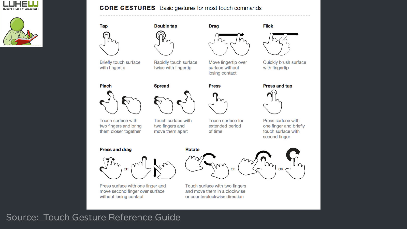
Source: Touch Gesture Reference Guide


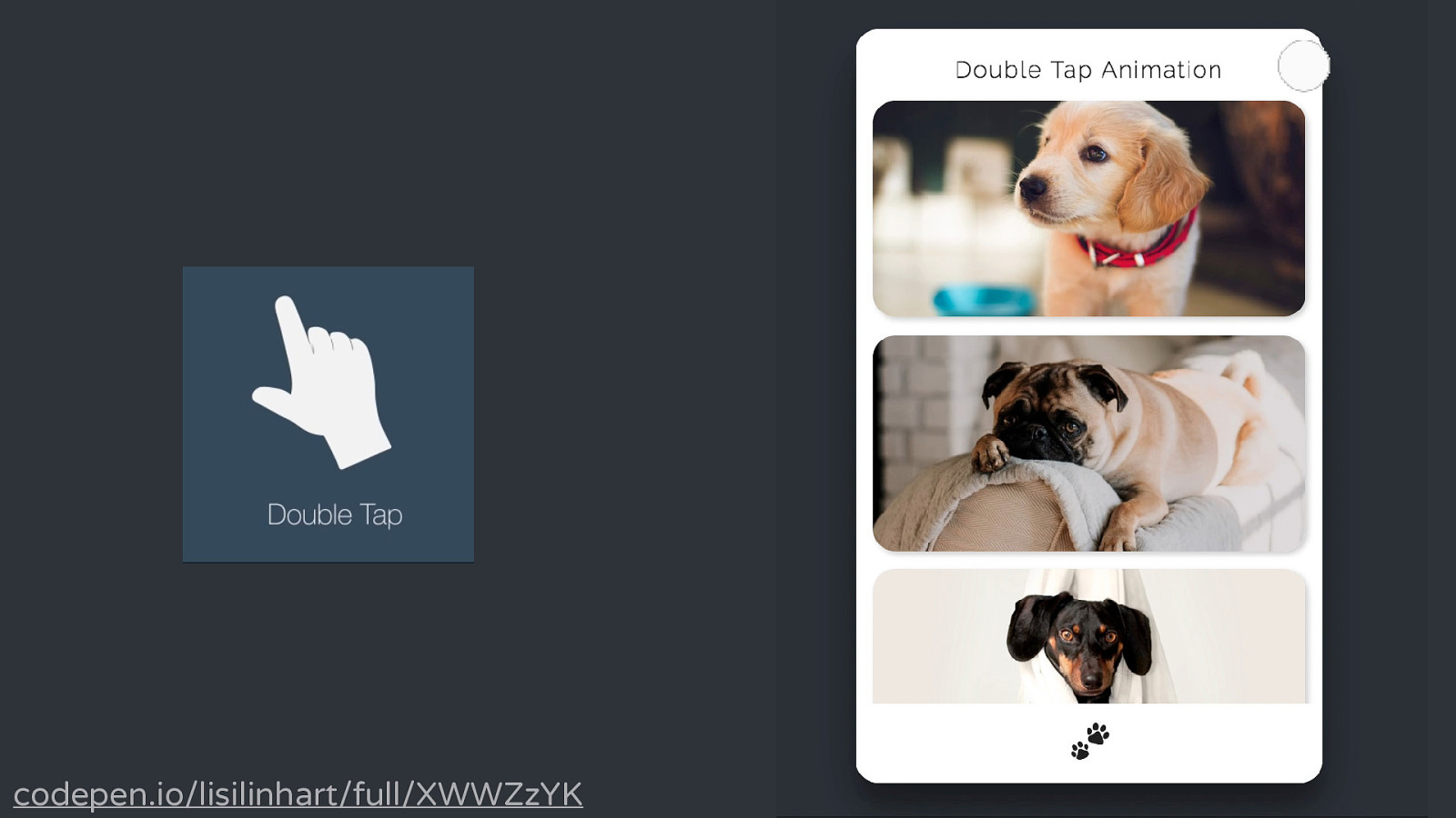
codepen.io/lisilinhart/full/XWWZzYK
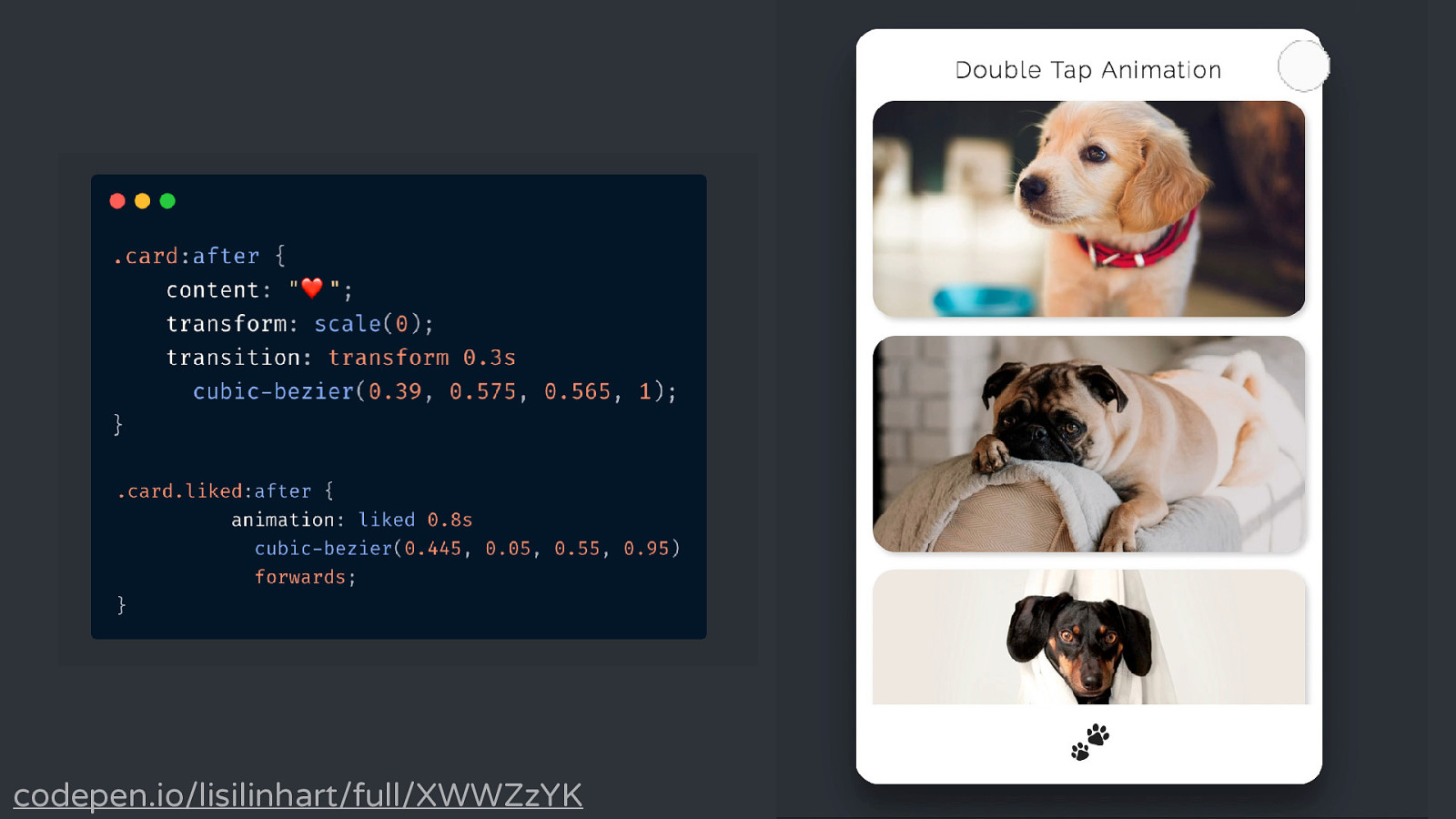
codepen.io/lisilinhart/full/XWWZzYK
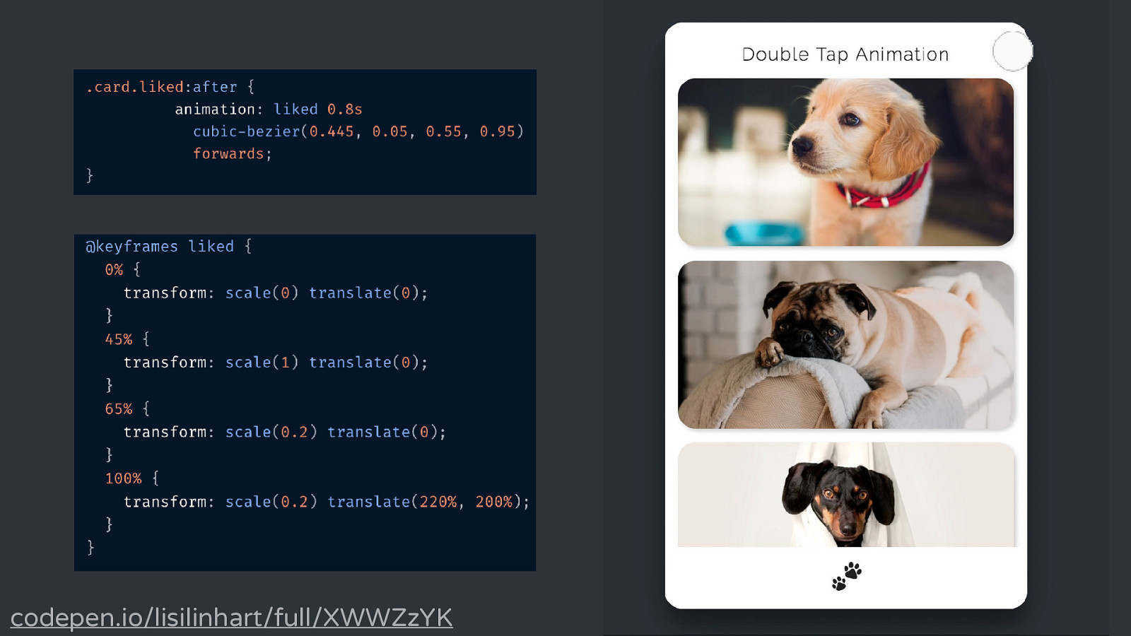
codepen.io/lisilinhart/full/XWWZzYK
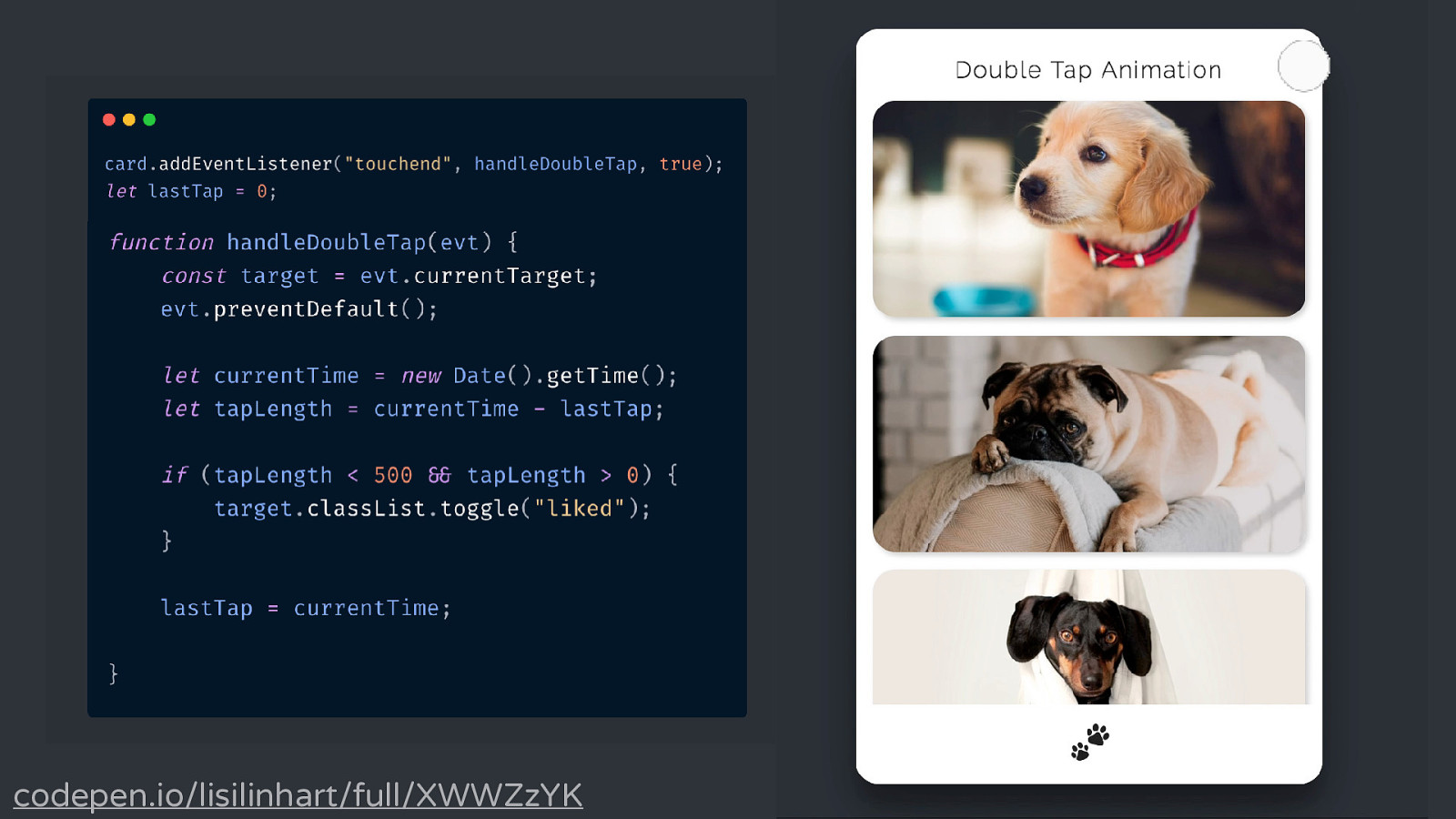
codepen.io/lisilinhart/full/XWWZzYK
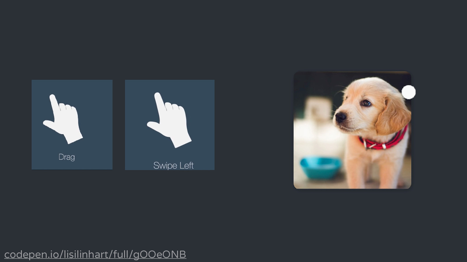
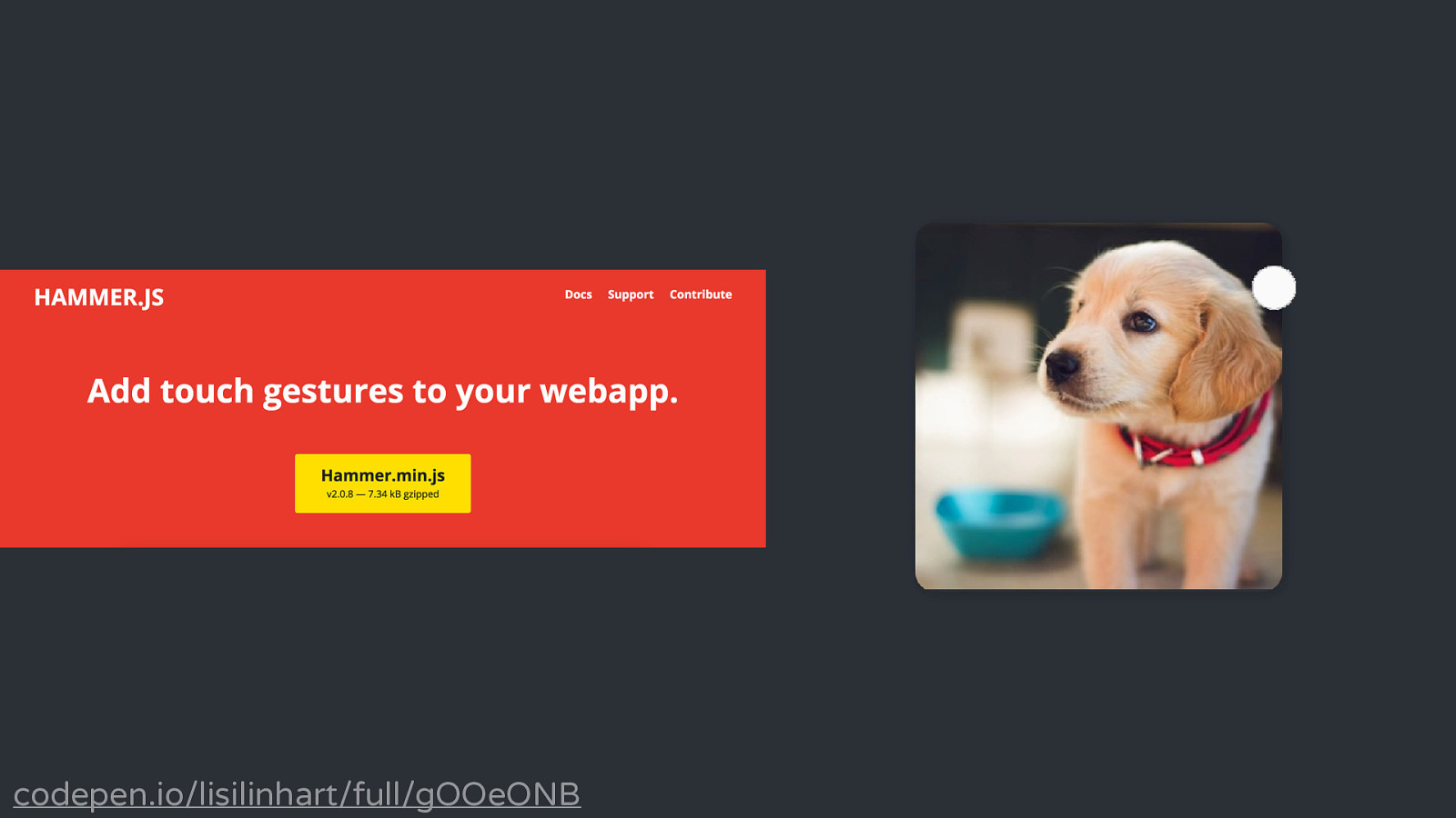
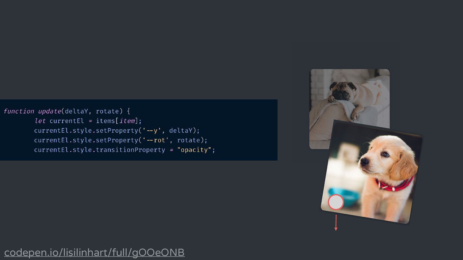
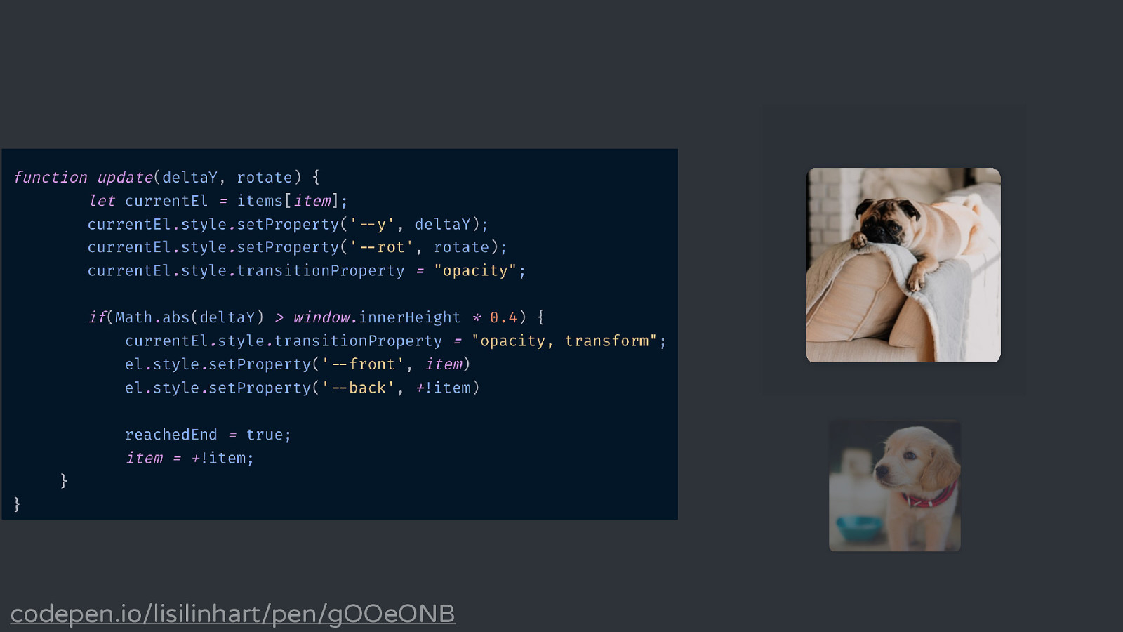
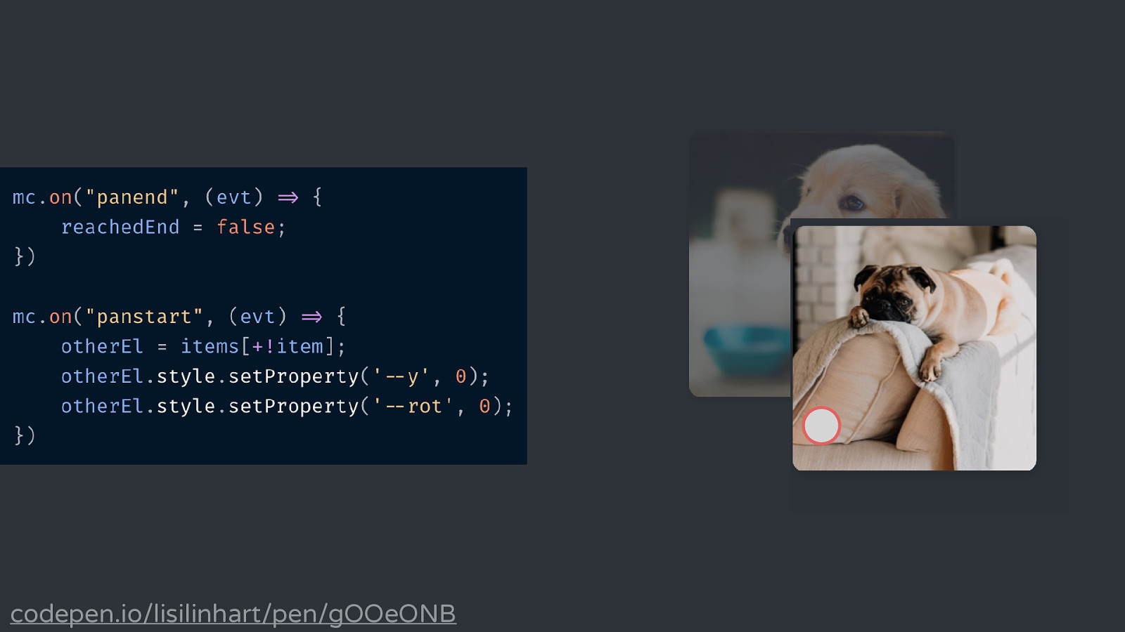
codepen.io/lisilinhart/full/gOOeONB
codepen.io/lisilinhart/full/gOOeONB
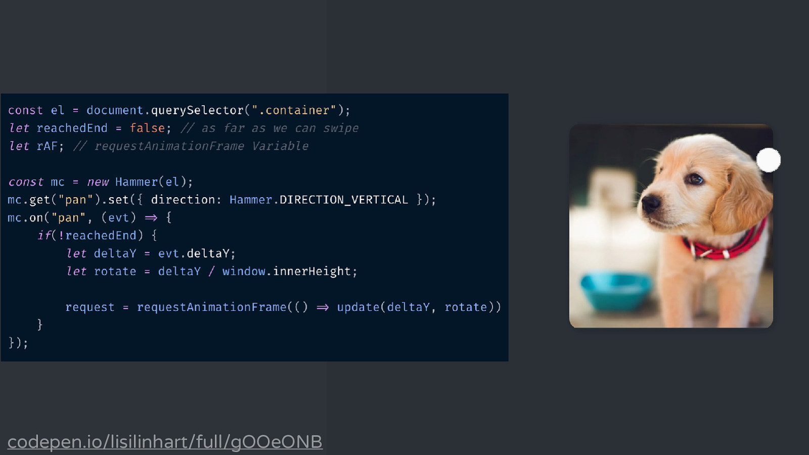
codepen.io/lisilinhart/full/gOOeONB
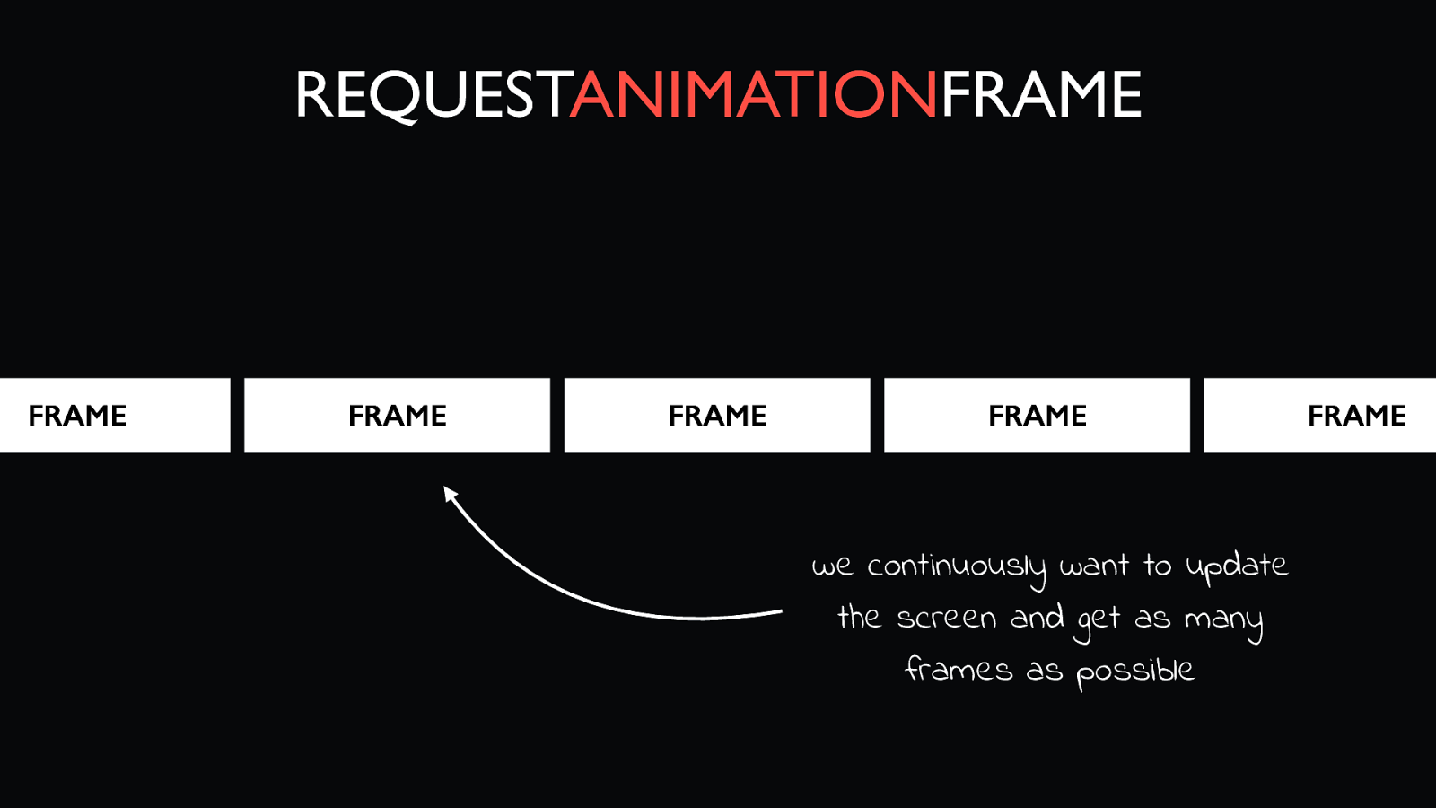
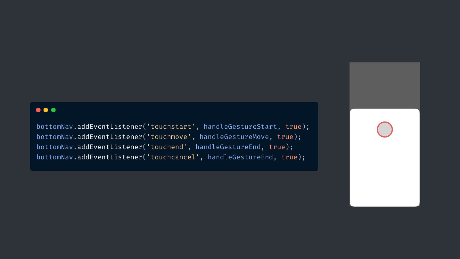
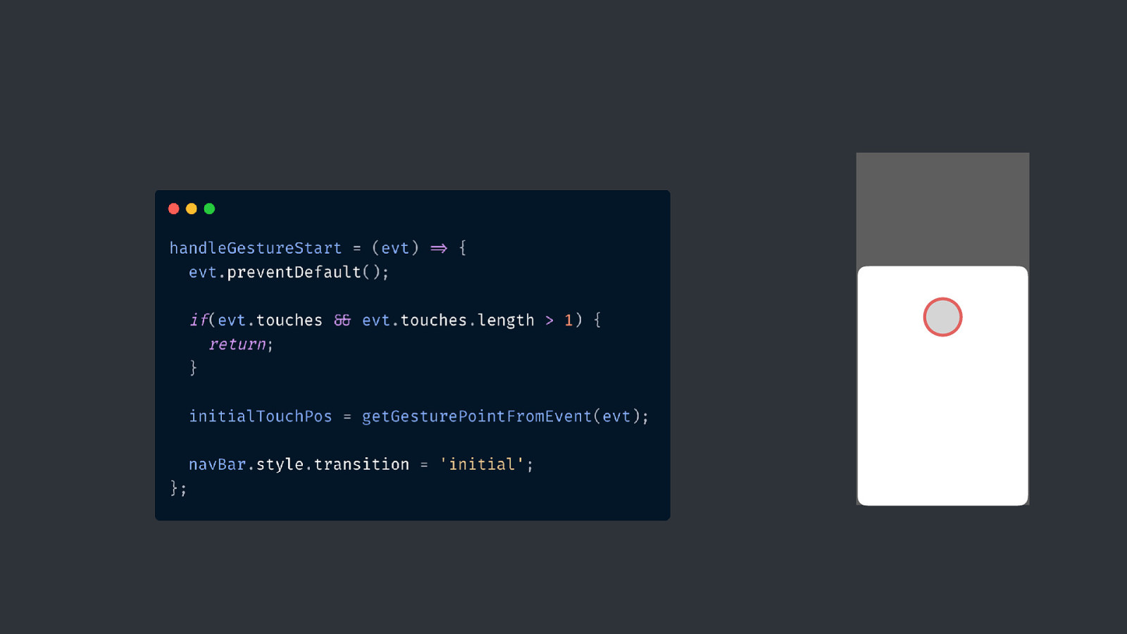
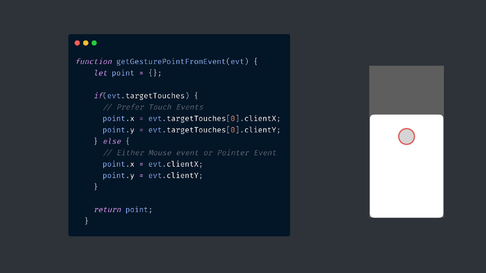
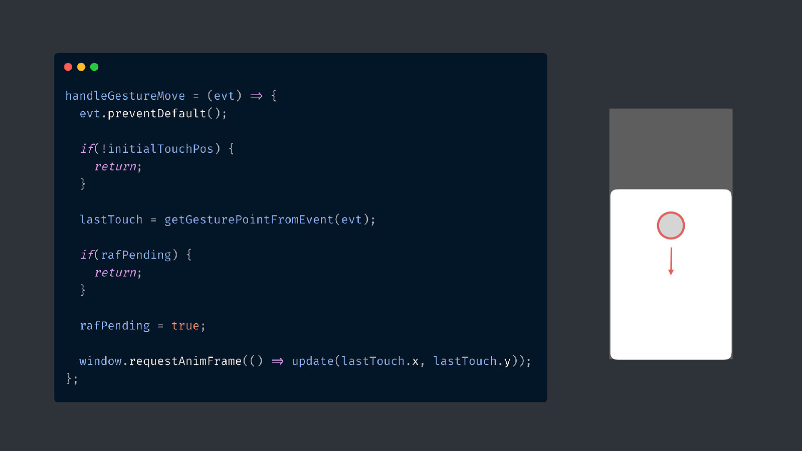
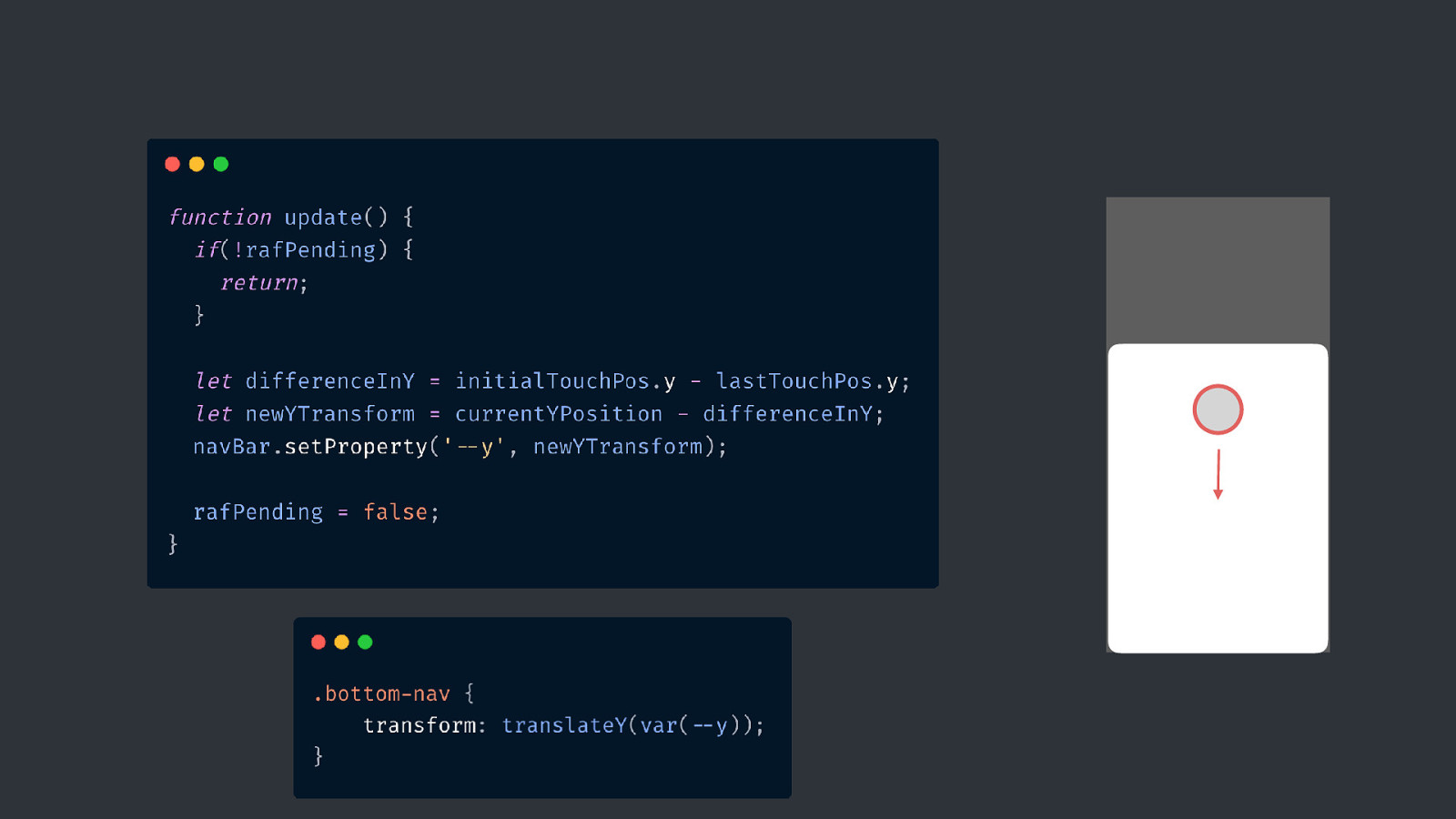
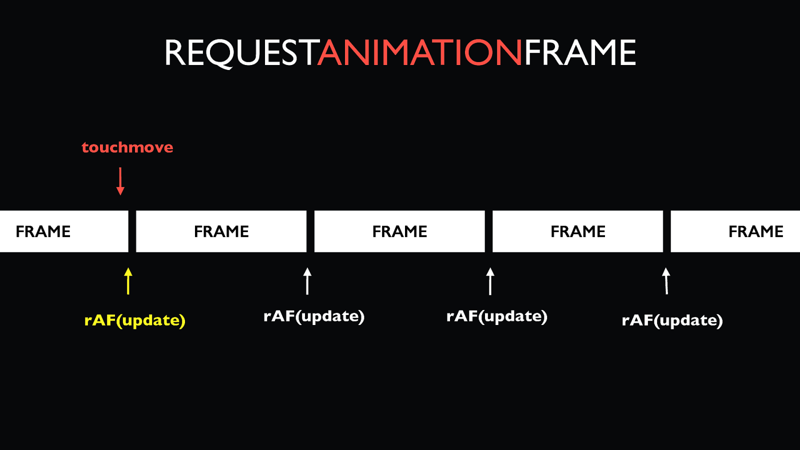
REQUESTANIMATIONFRAME FRAME FRAME FRAME FRAME we continuously want to update the screen and get as many frames as possible FRAME
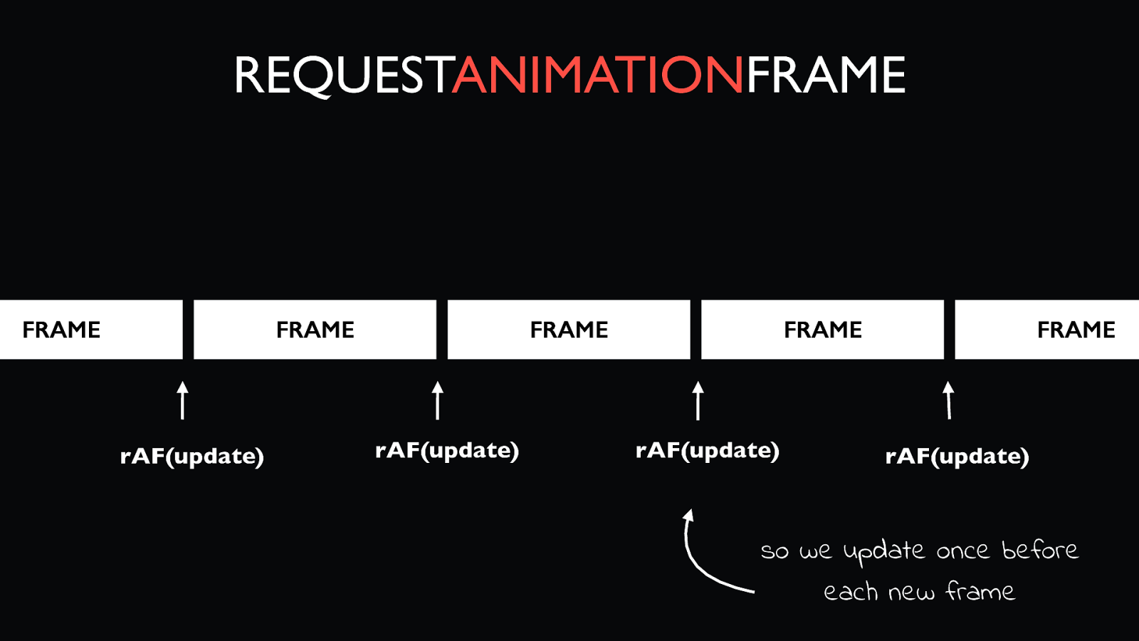
REQUESTANIMATIONFRAME FRAME FRAME rAF(update) FRAME rAF(update) FRAME rAF(update) FRAME rAF(update) so we update once before each new frame
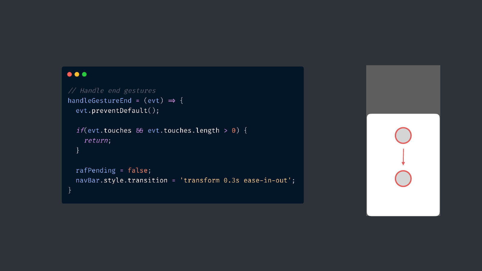
REQUESTANIMATIONFRAME touchmove FRAME FRAME rAF(update) FRAME rAF(update) FRAME rAF(update) FRAME rAF(update)
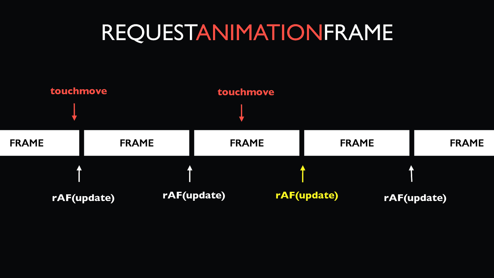
REQUESTANIMATIONFRAME touchmove FRAME touchmove FRAME rAF(update) FRAME rAF(update) FRAME rAF(update) FRAME rAF(update)
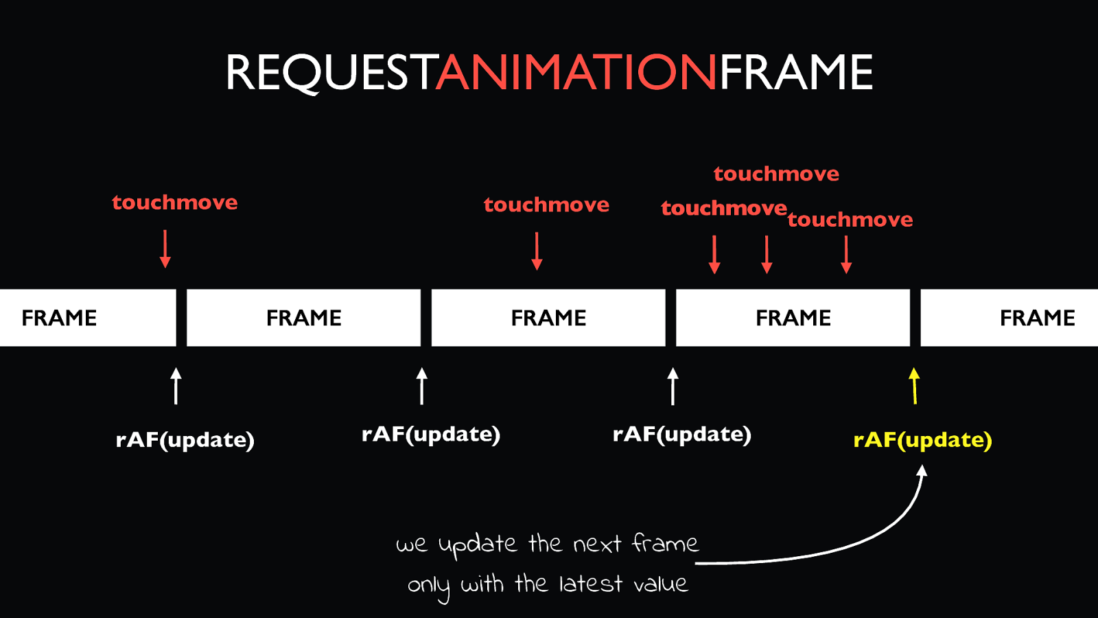
REQUESTANIMATIONFRAME touchmove touchmove FRAME touchmove touchmove touchmove FRAME FRAME FRAME rAF(update) rAF(update) rAF(update) we update the next frame only with the latest value FRAME rAF(update)
codepen.io/lisilinhart/full/gOOeONB
codepen.io/lisilinhart/pen/gOOeONB
codepen.io/lisilinhart/pen/gOOeONB
Animation Mobile TLDR; Touch
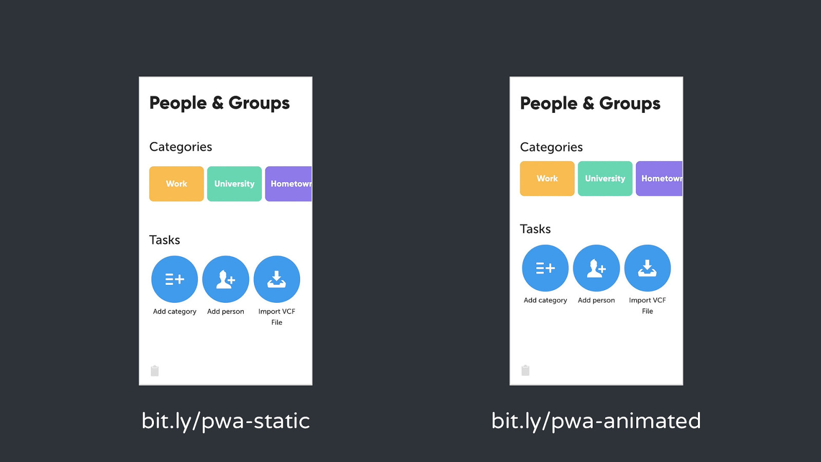
bit.ly/pwa-static bit.ly/pwa-animated
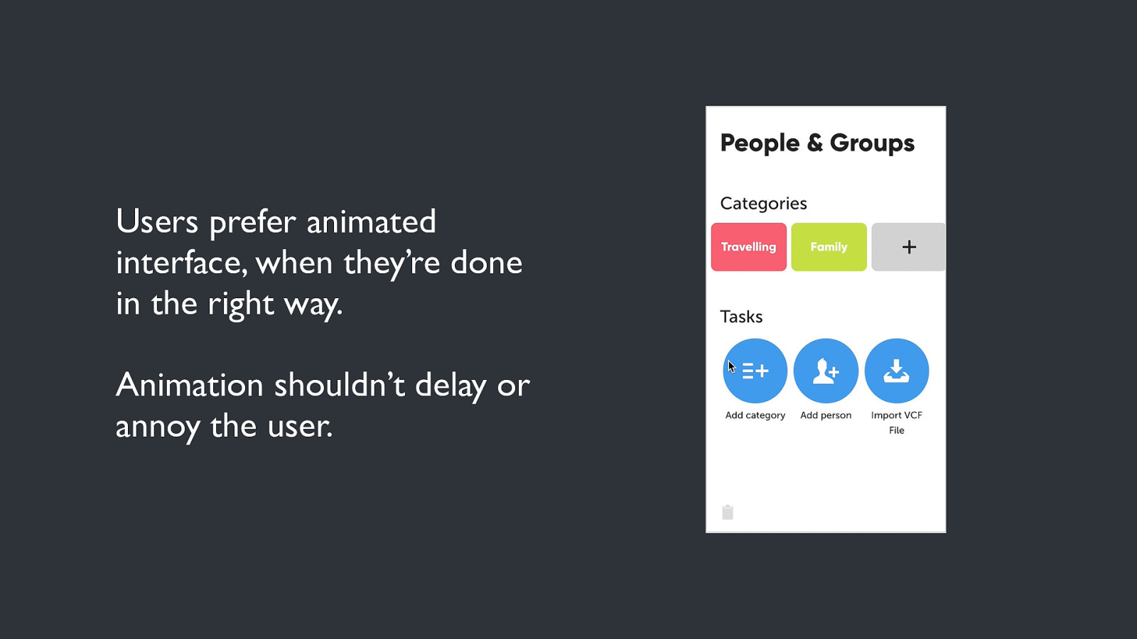
Users prefer animated interface, when they’re done in the right way. Animation shouldn’t delay or annoy the user.
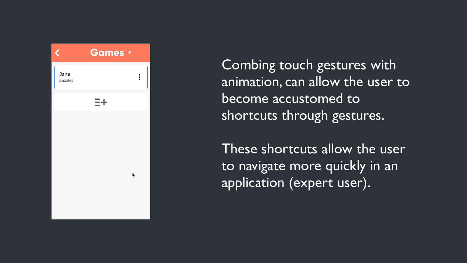
Combing touch gestures with animation, can allow the user to become accustomed to shortcuts through gestures. These shortcuts allow the user to navigate more quickly in an application (expert user).
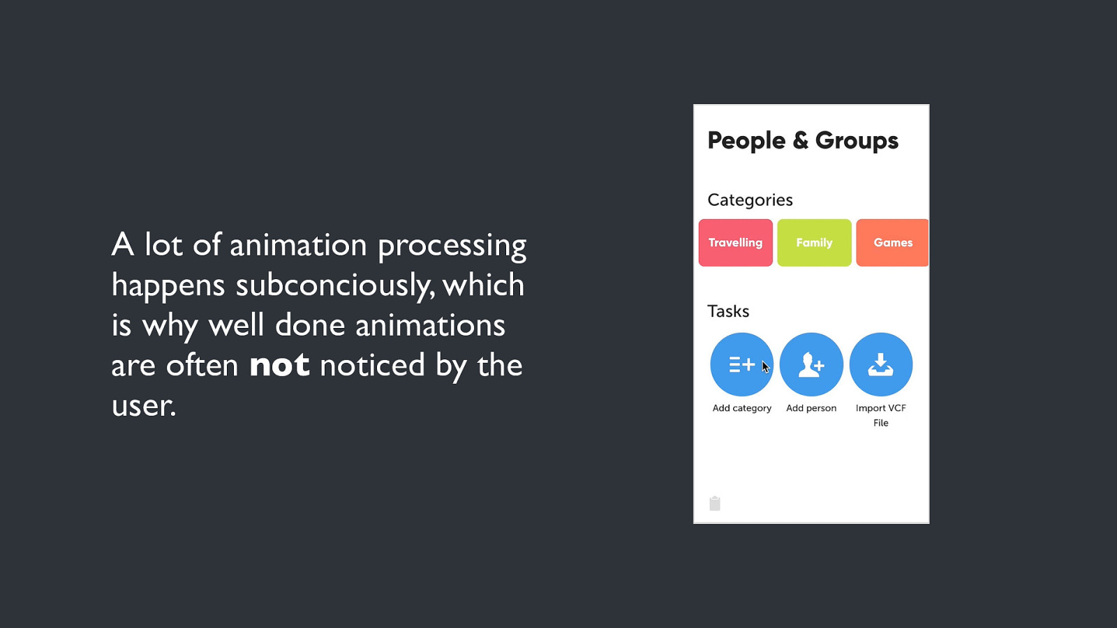
A lot of animation processing happens subconciously, which is why well done animations are often not noticed by the user.
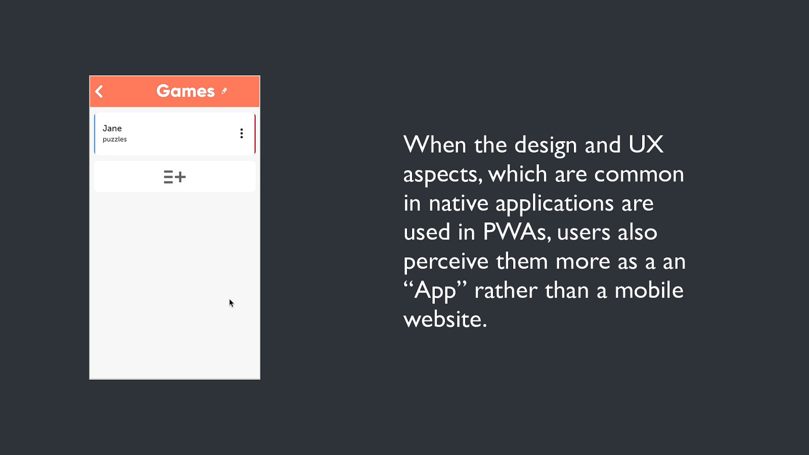
When the design and UX aspects, which are common in native applications are used in PWAs, users also perceive them more as a an “App” rather than a mobile website.
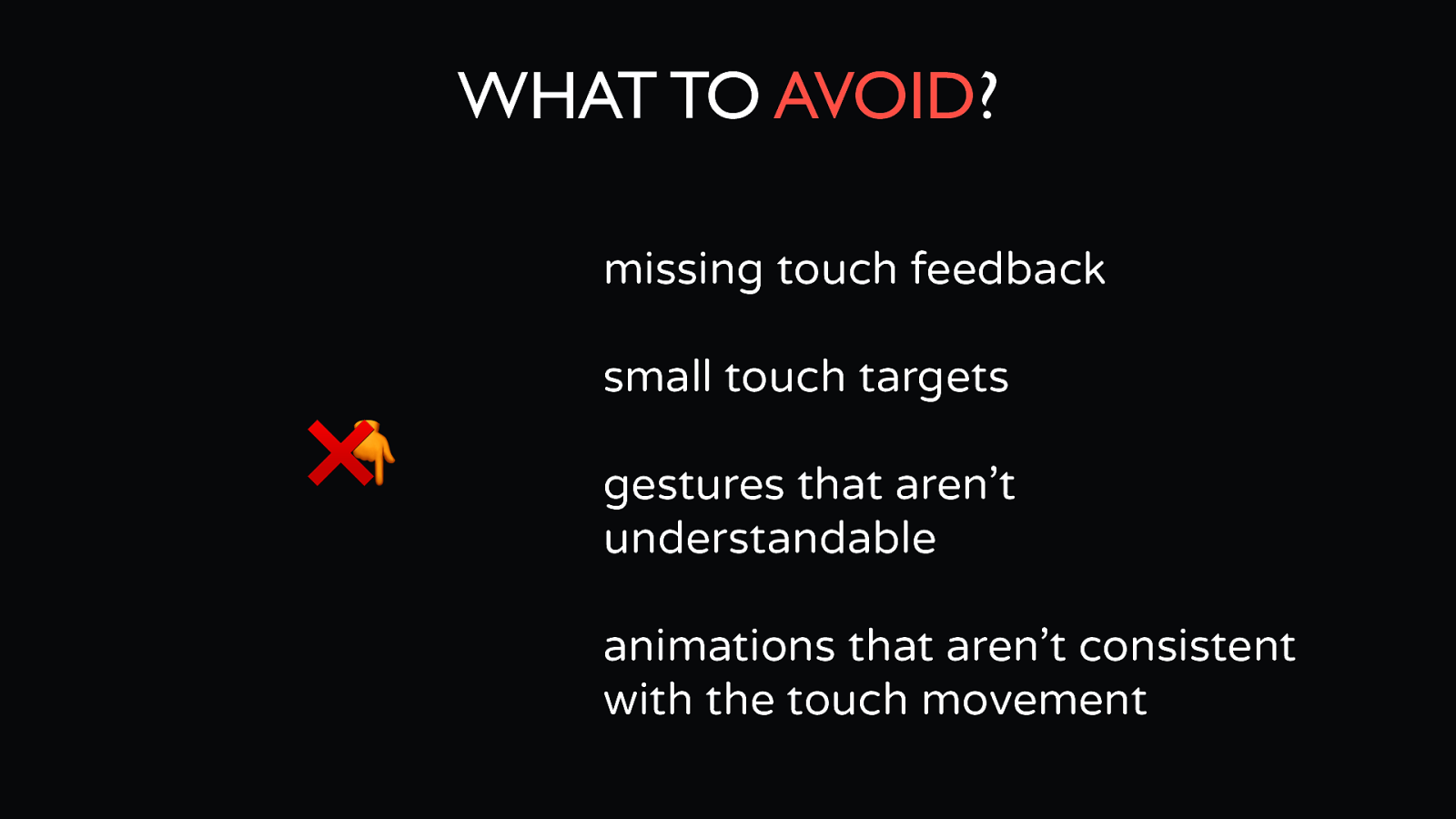
WHAT TO AVOID? missing touch feedback small touch targets ❌ 👇 gestures that aren’t understandable animations that aren’t consistent with the touch movement
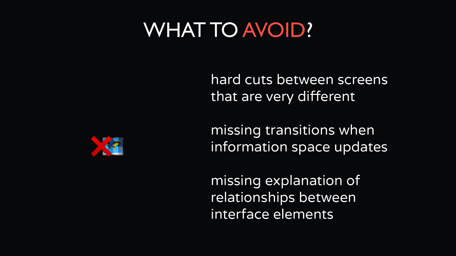
WHAT TO AVOID? hard cuts between screens that are very different ❌🗺 missing transitions when information space updates missing explanation of relationships between interface elements
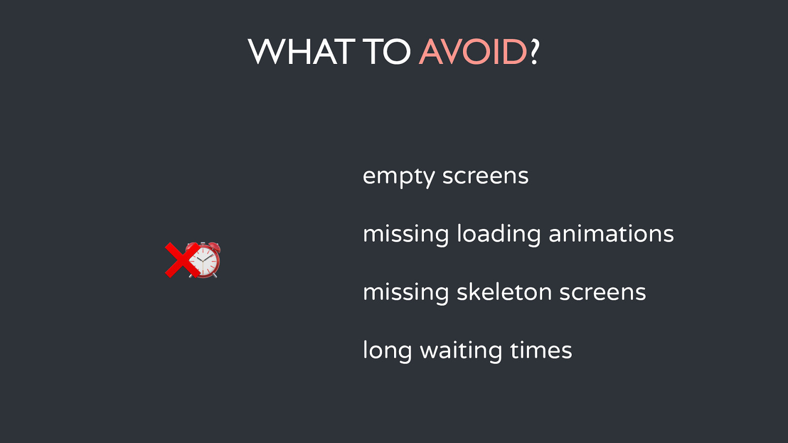
WHAT TO AVOID? empty screens ❌⏰ missing loading animations missing skeleton screens long waiting times
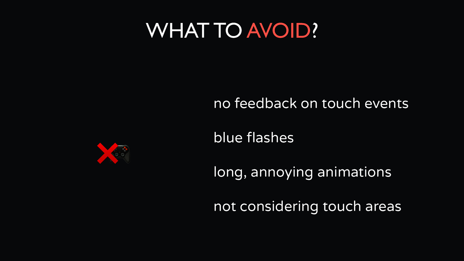
WHAT TO AVOID? no feedback on touch events ❌🎮 blue flashes long, annoying animations not considering touch areas
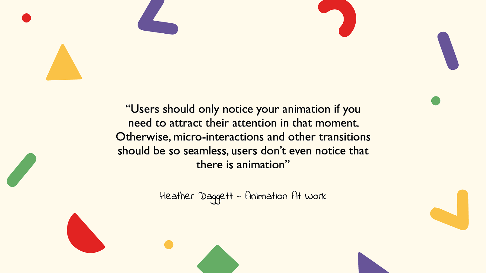
“Users should only notice your animation if you need to attract their attention in that moment. Otherwise, micro-interactions and other transitions should be so seamless, users don’t even notice that there is animation” Heather Daggett - Animation At Work
Lecturing @ LISILINHART.INFO Twitter @LISI_LINHART Blog