
A presentation at NDC London in in London, UK by Mandy Michael
Frictionless FRONT-ENDS FOR BACKEND DEVELOPERS.
MANDY MICHAEL @MANDY_KERR
HTML CSS JS.
Choosing THE RIGHT TYPE.
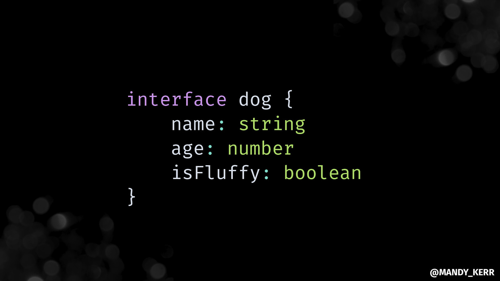
interface dog { name: string age: number isFluffy: boolean }
Be explicit ABOUT THE SHAPE OF THE CONTENT. @MANDY_KERR
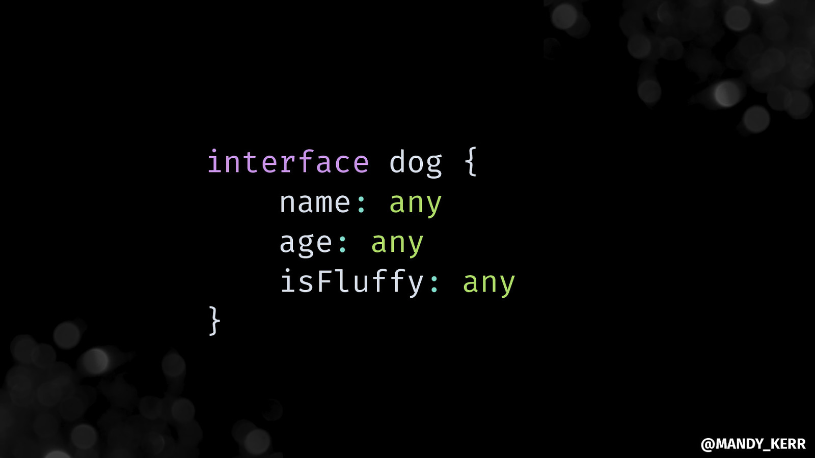
interface dog { name: any age: any isFluffy: any } @MANDY_KERR
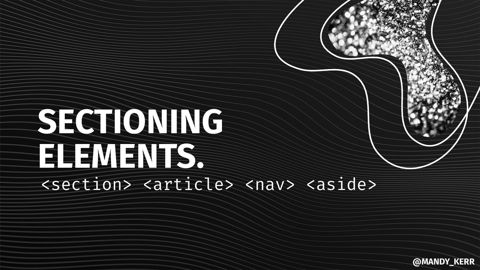
SECTIONING ELEMENTS.
<section> <article> <nav> <aside> @MANDY_KERRCLEAR STRUCTURE AND HEIRARCHY.
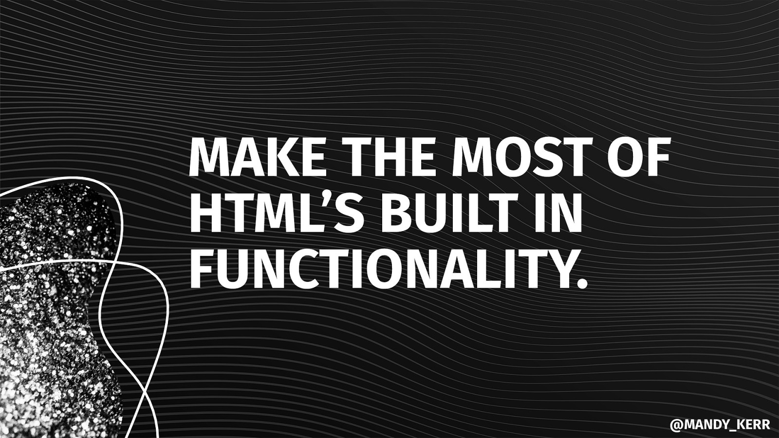
<header> <footer> <h1> <h2> <h3> @MANDY_KERRMAKE THE MOST OF HTML’S BUILT IN FUNCTIONALITY. @MANDY_KERR
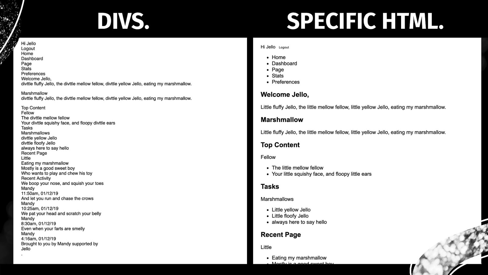
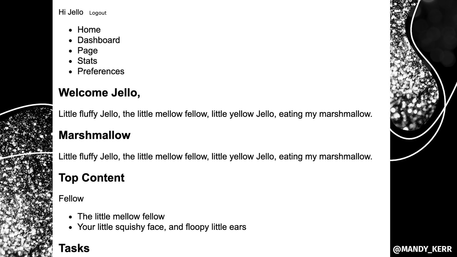
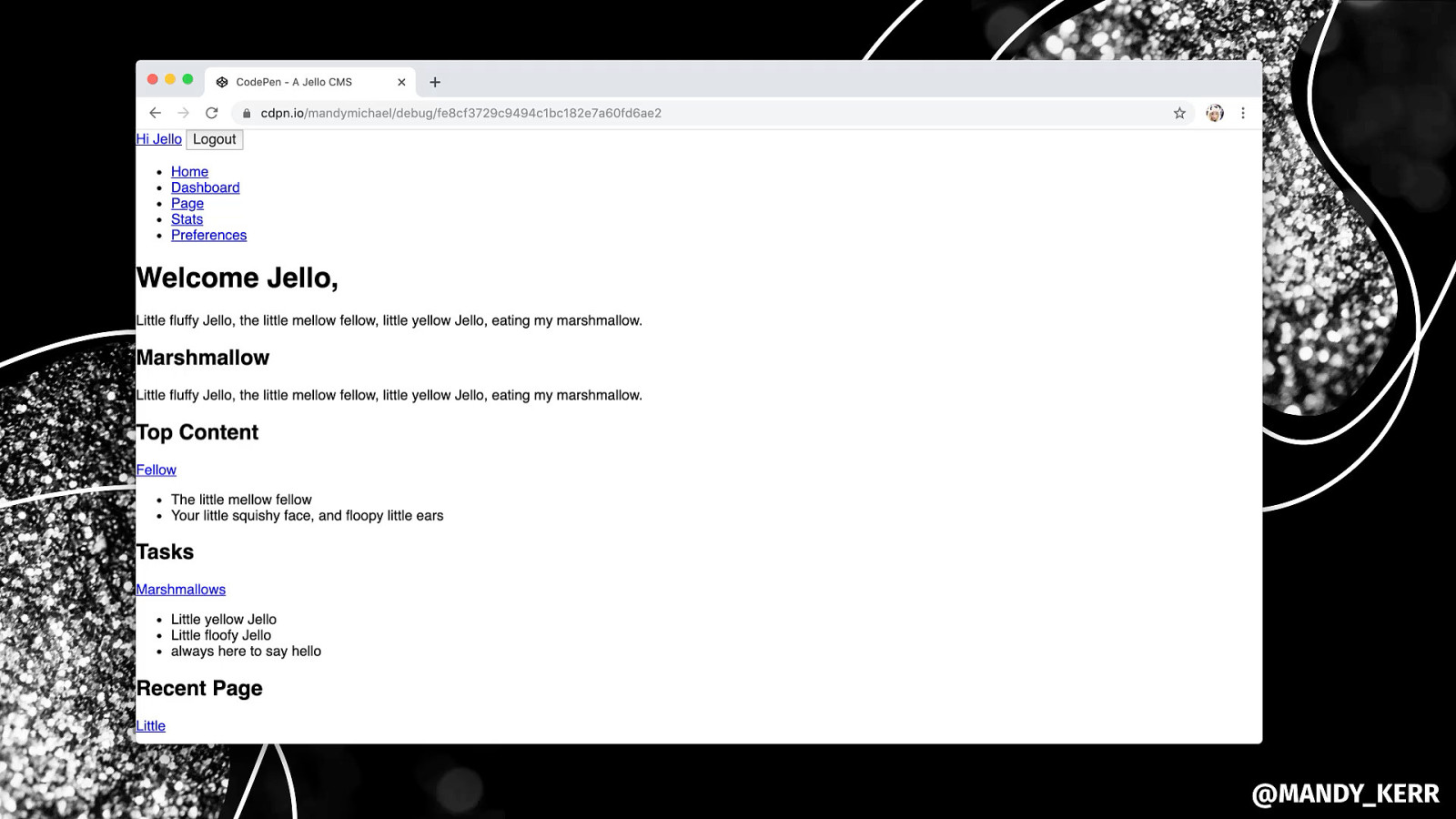
DIVS. SPECIFIC HTML. @MANDY_KERR
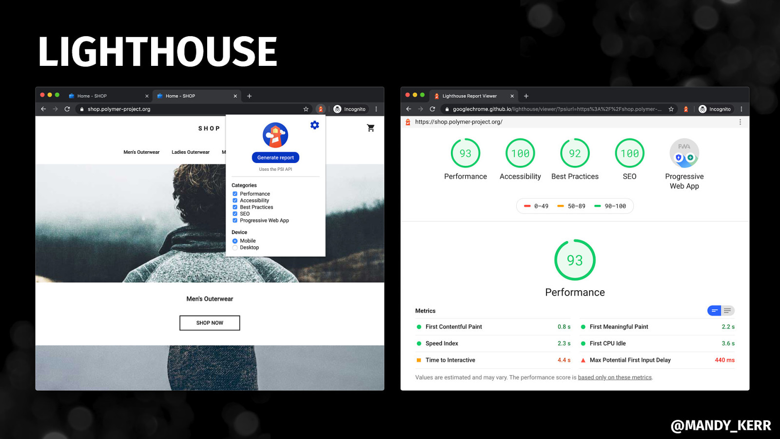
LIGHTHOUSE @MANDY_KERR
@MANDY_KERR
Understanding CSS, SCSS, CSS in JS @MANDY_KERR
Simple tricks for LAYOUTS WITH CSS GRID @MANDY_KERR
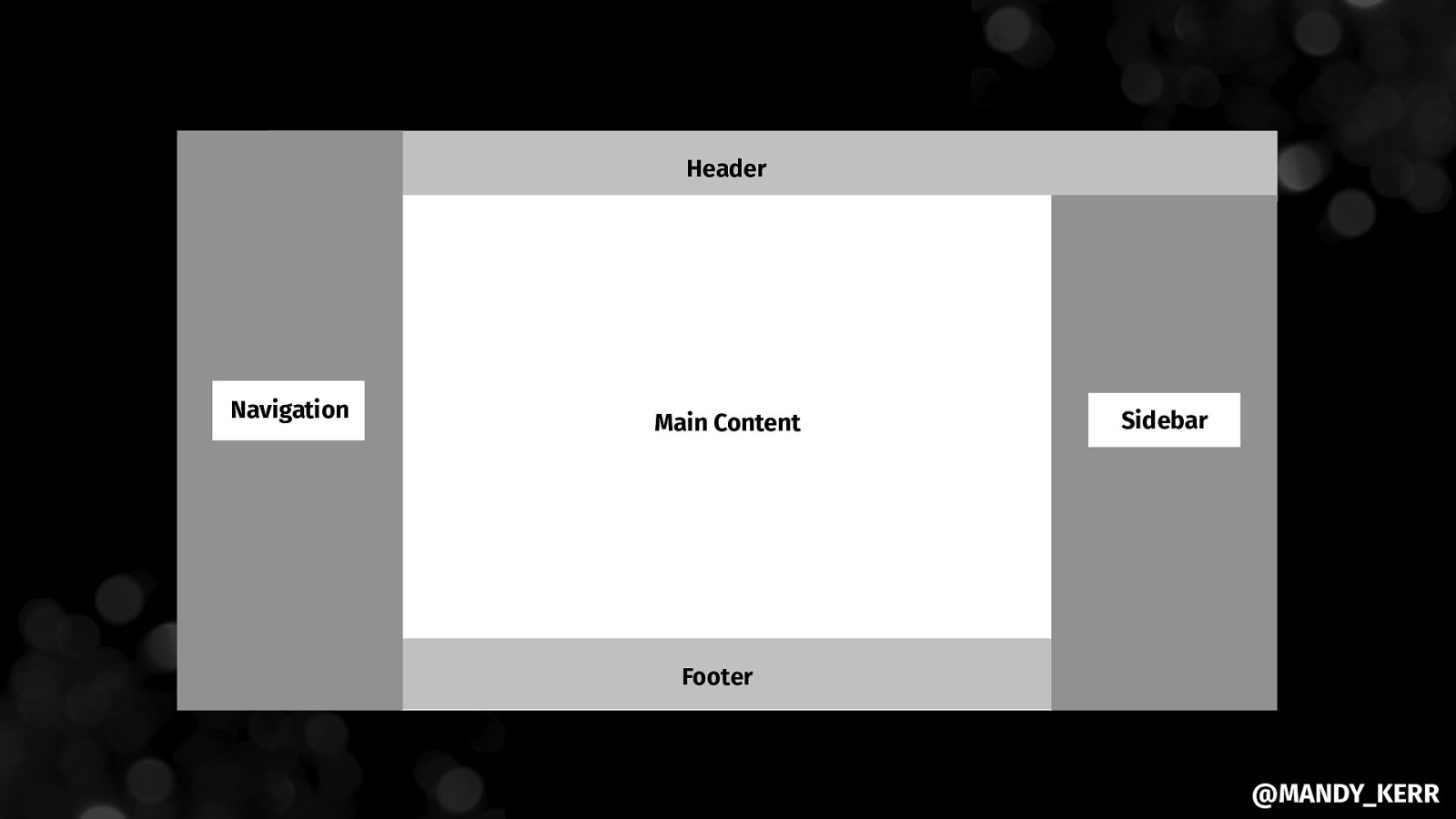
Header Navigation Main Content Sidebar Footer @MANDY_KERR
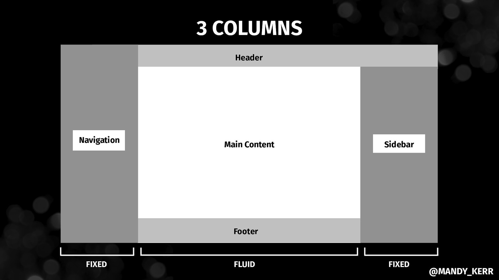
3 COLUMNS Header Navigation Main Content Sidebar Footer FIXED FLUID FIXED @MANDY_KERR
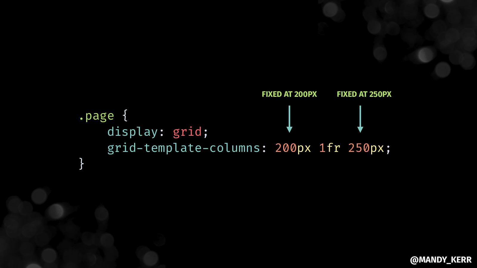
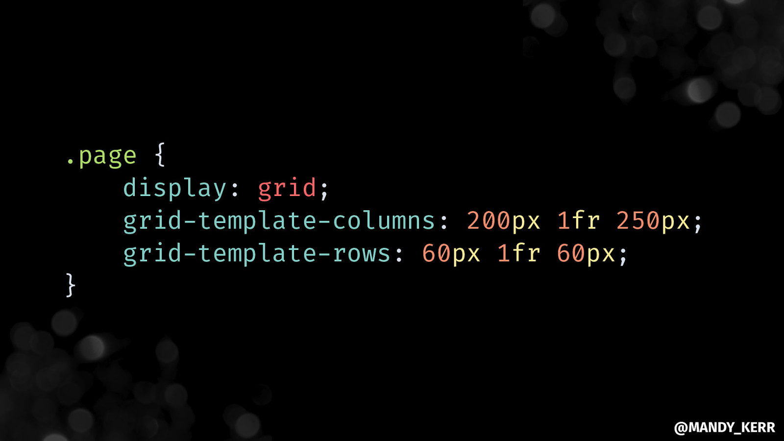
FIXED AT 200PX FIXED AT 250PX .page { display: grid; grid-template-columns: 200px 1fr 250px; } @MANDY_KERR
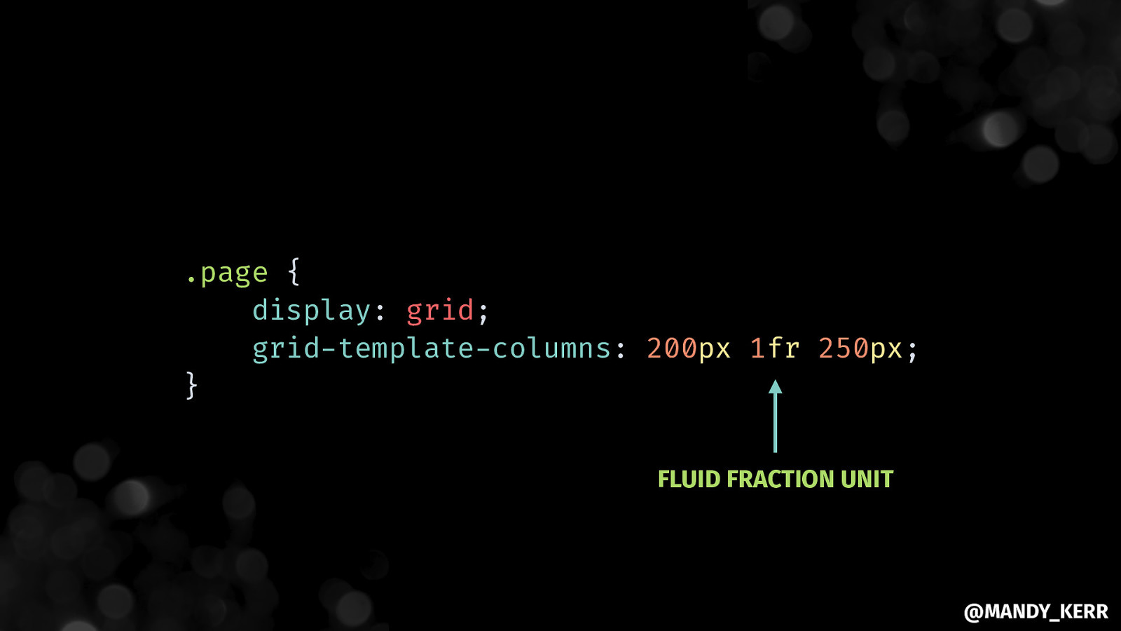
.page { display: grid; grid-template-columns: 200px 1fr 250px; } FLUID FRACTION UNIT @MANDY_KERR
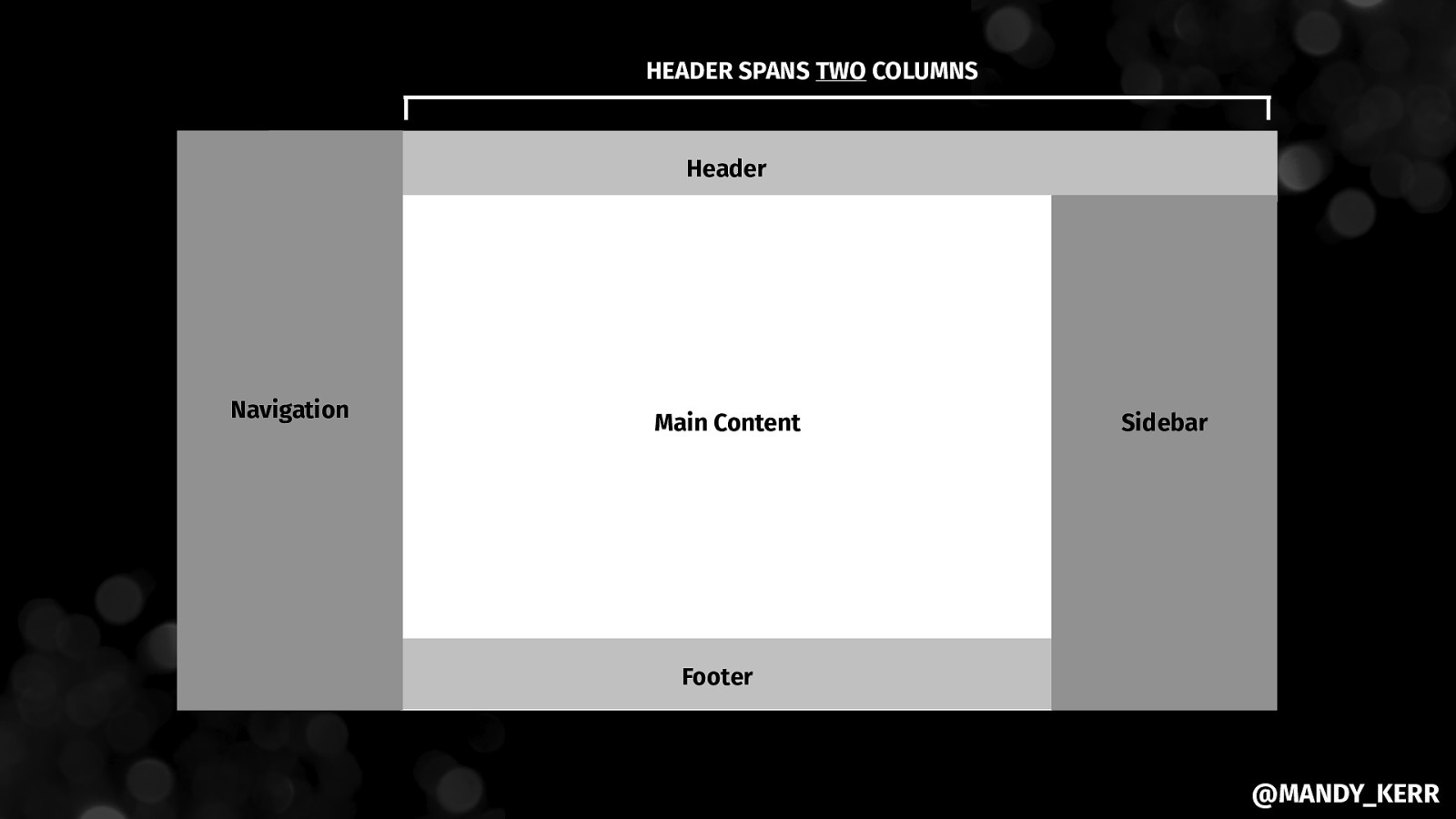
HEADER SPANS TWO COLUMNS Header Navigation Main Content Sidebar Footer @MANDY_KERR
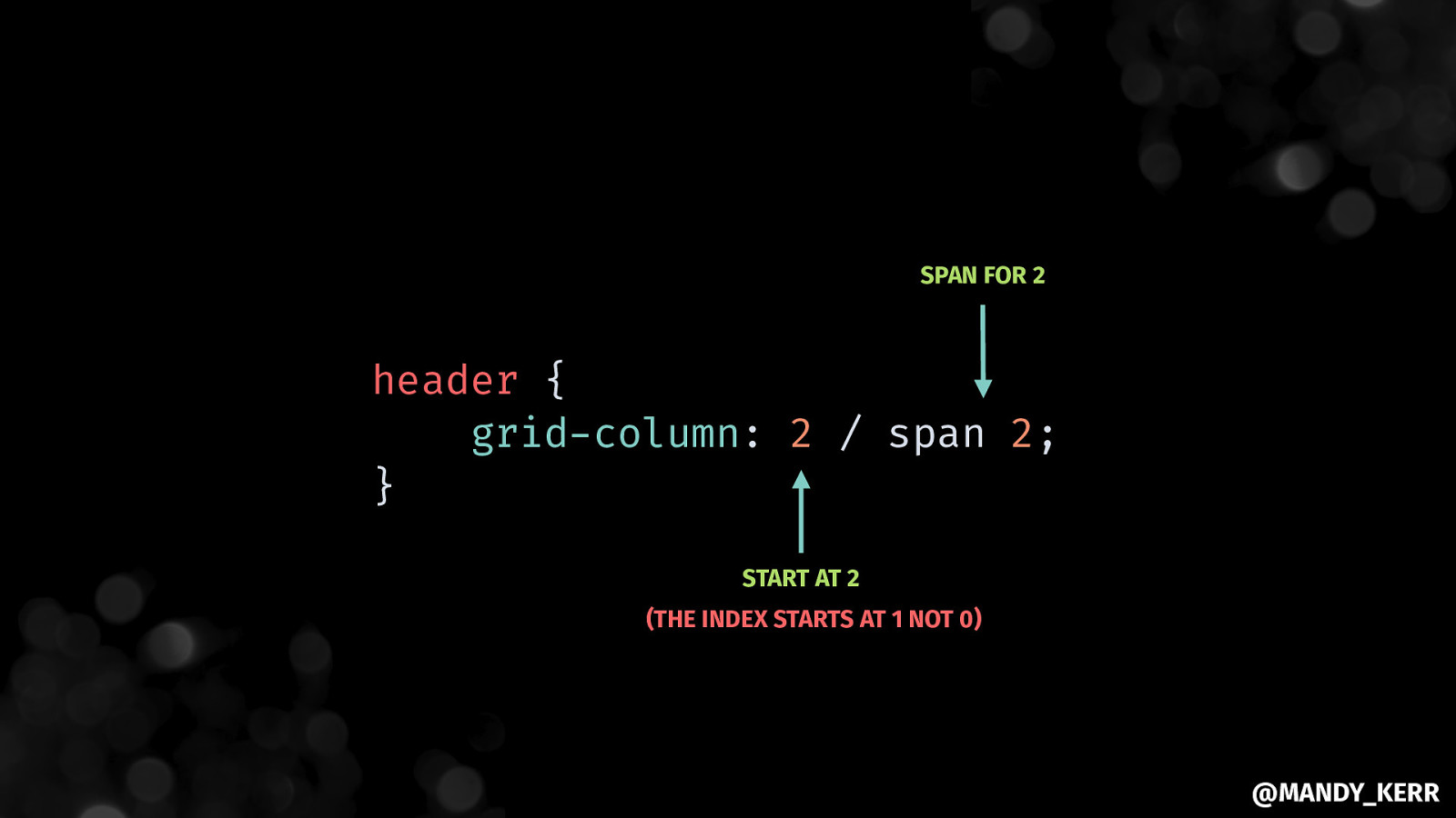
SPAN FOR 2 header { grid-column: 2 / span 2; } START AT 2 (THE INDEX STARTS AT 1 NOT 0) @MANDY_KERR
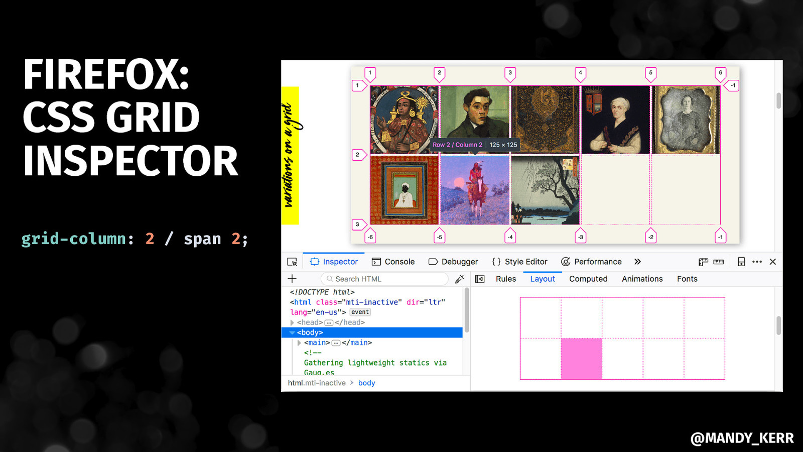
FIREFOX: CSS GRID INSPECTOR grid-column: 2 / span 2; @MANDY_KERR
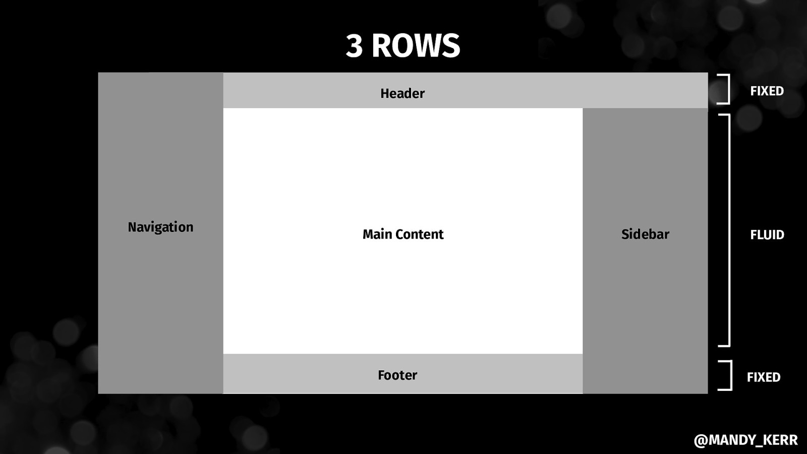
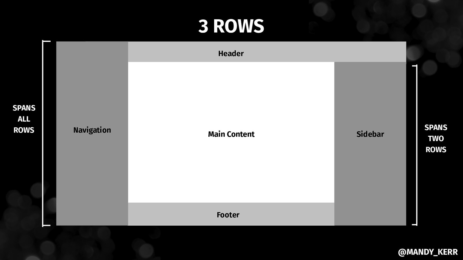
3 ROWS FIXED Header Navigation Main Content Footer Sidebar FLUID FIXED @MANDY_KERR
.page { display: grid; grid-template-columns: 200px 1fr 250px; grid-template-rows: 60px 1fr 60px; } @MANDY_KERR
3 ROWS Header SPANS ALL ROWS Navigation Main Content Sidebar SPANS TWO ROWS Footer @MANDY_KERR
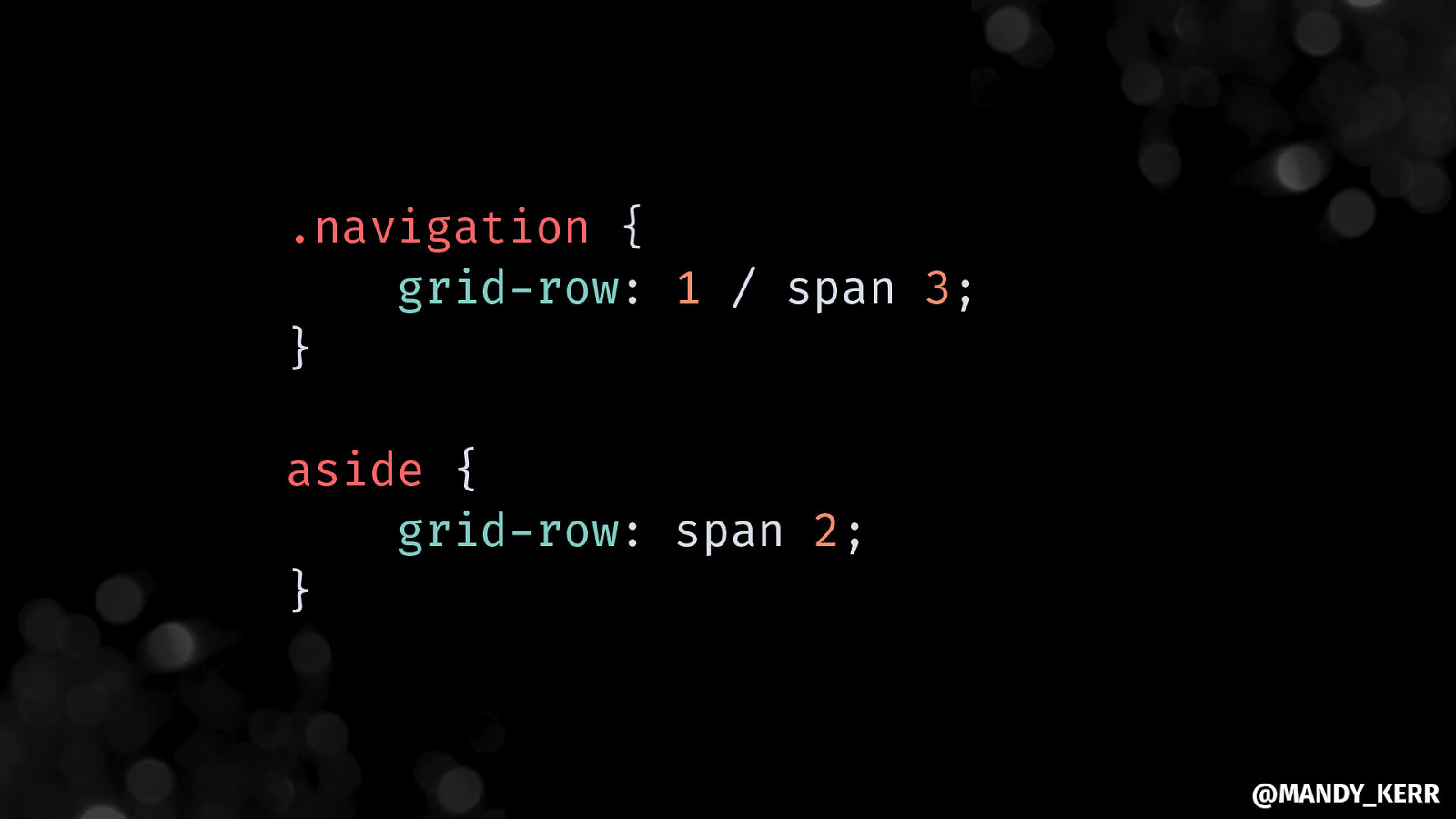
.navigation { grid-row: 1 / span 3; } aside { grid-row: span 2; } @MANDY_KERR
@MANDY_KERR
@MANDY_KERR
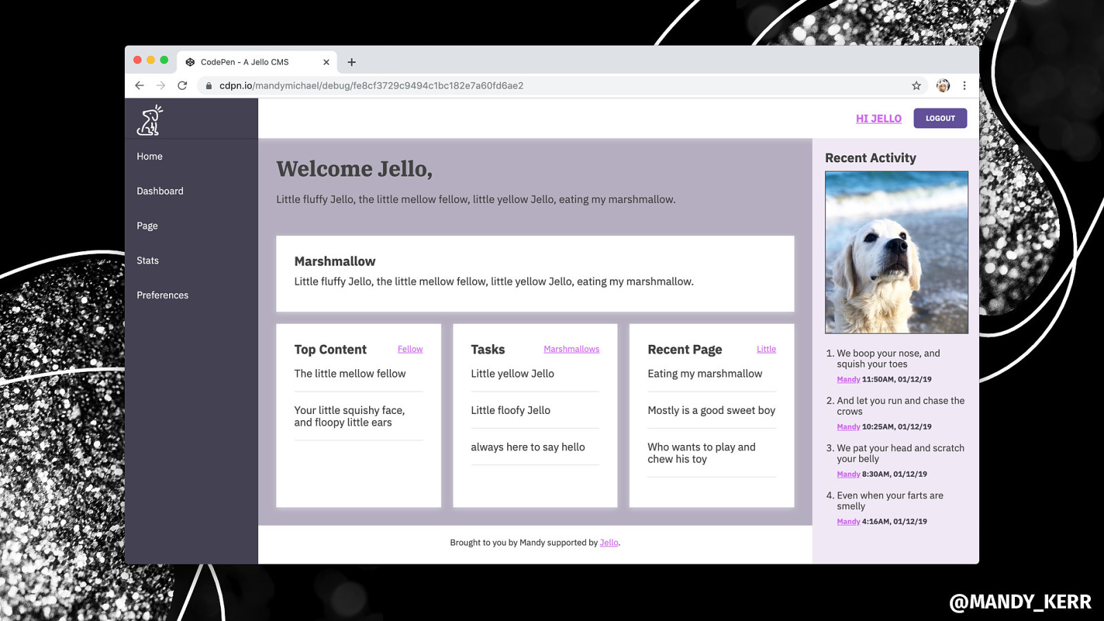
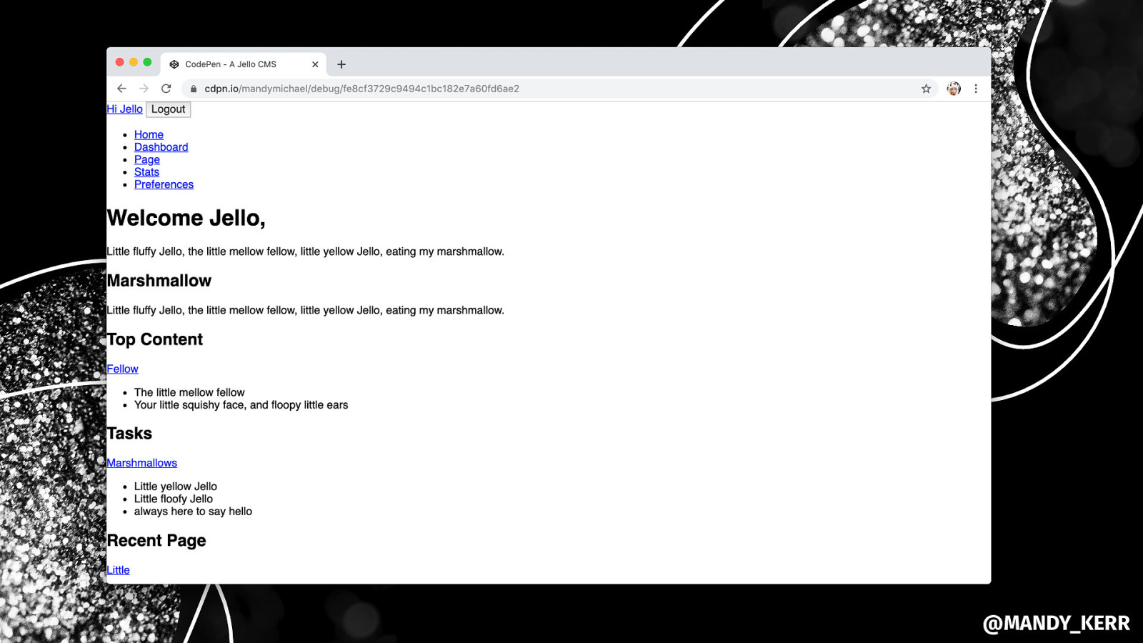
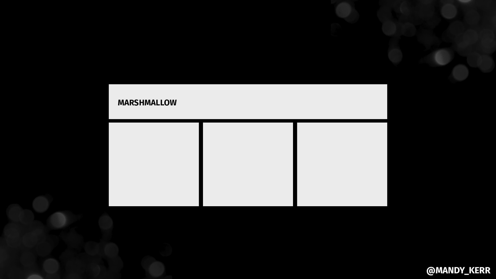
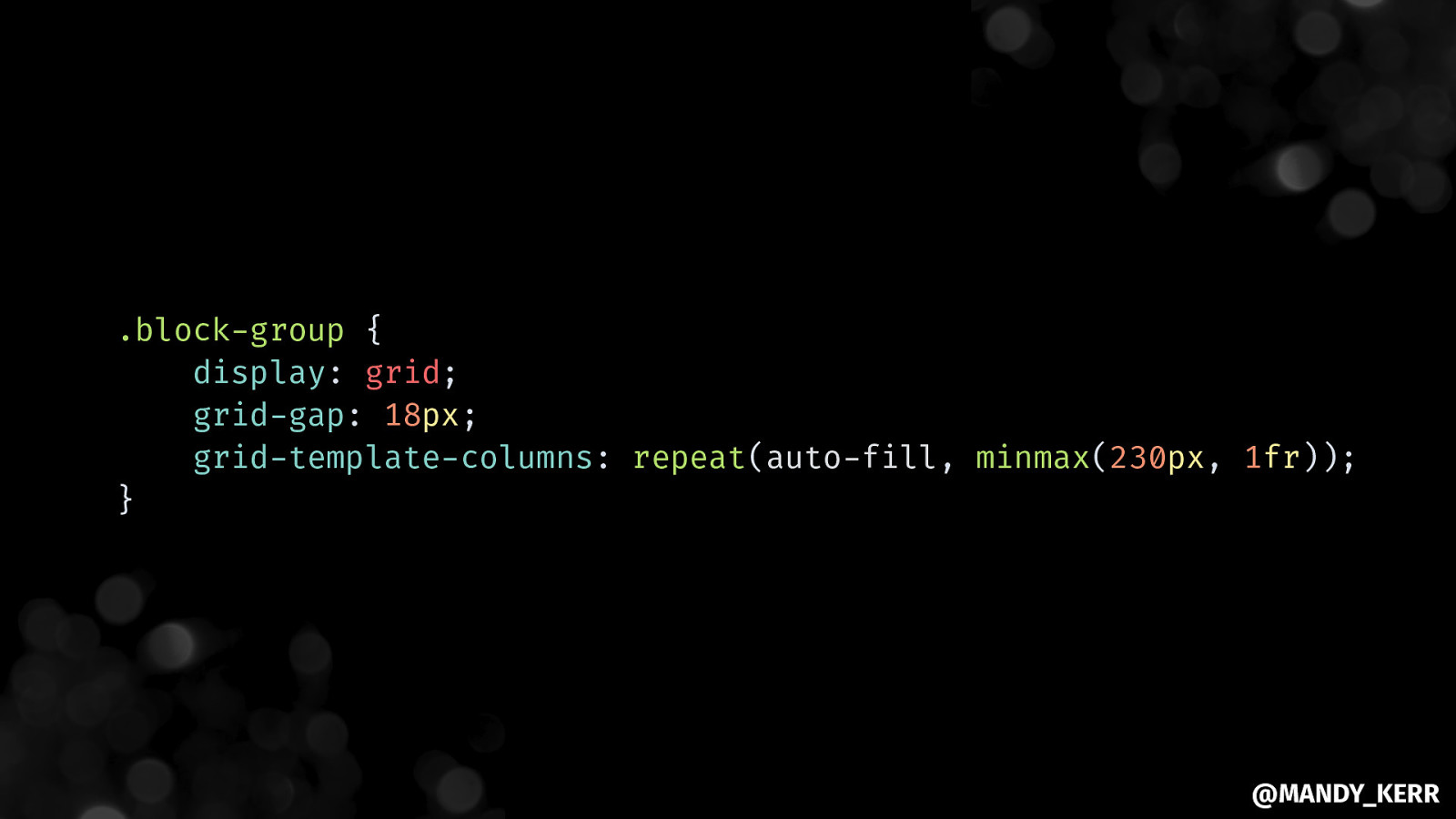
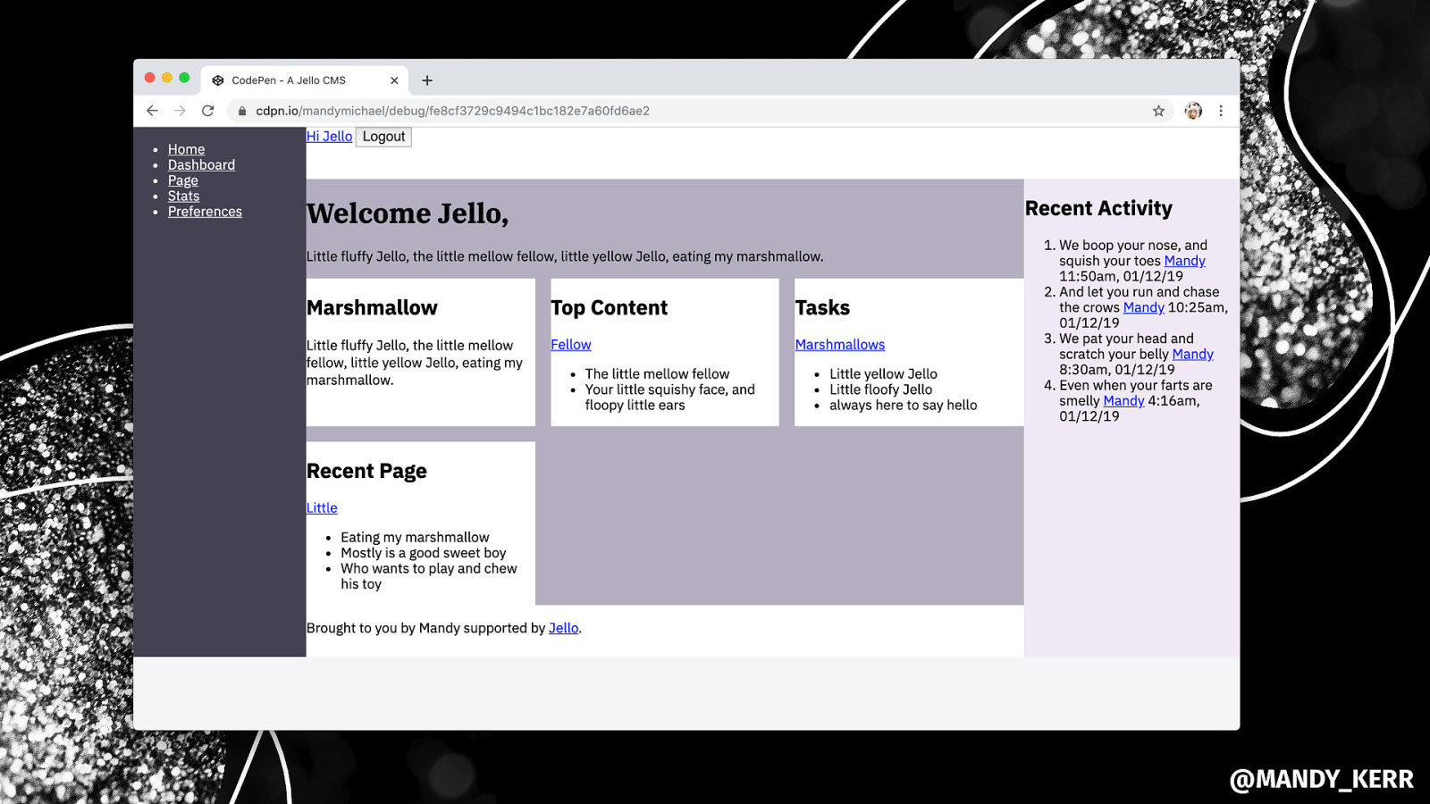
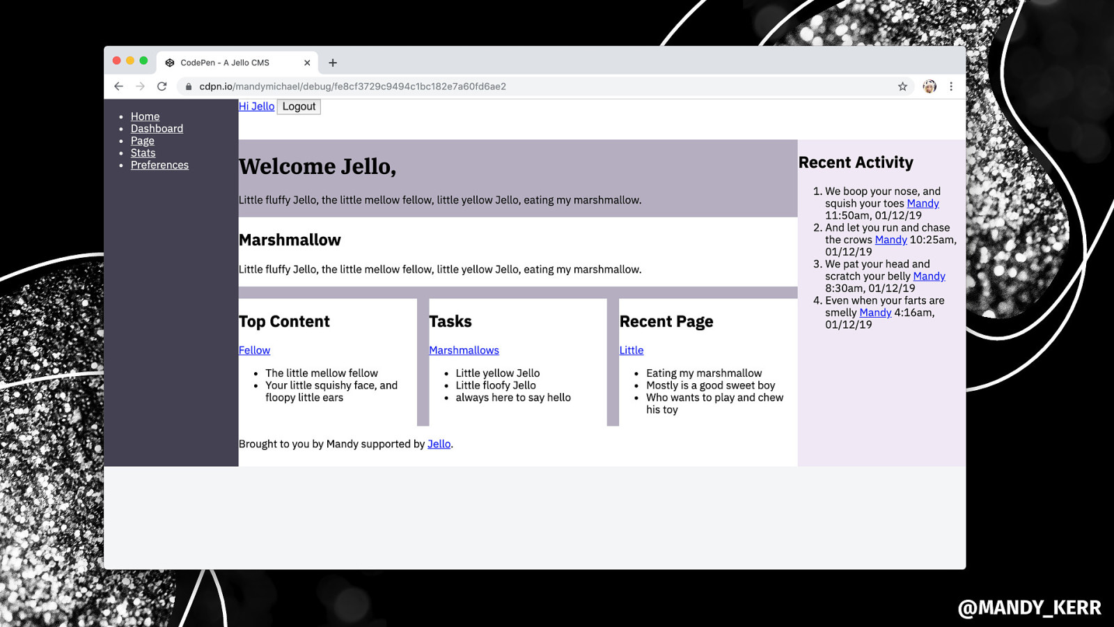
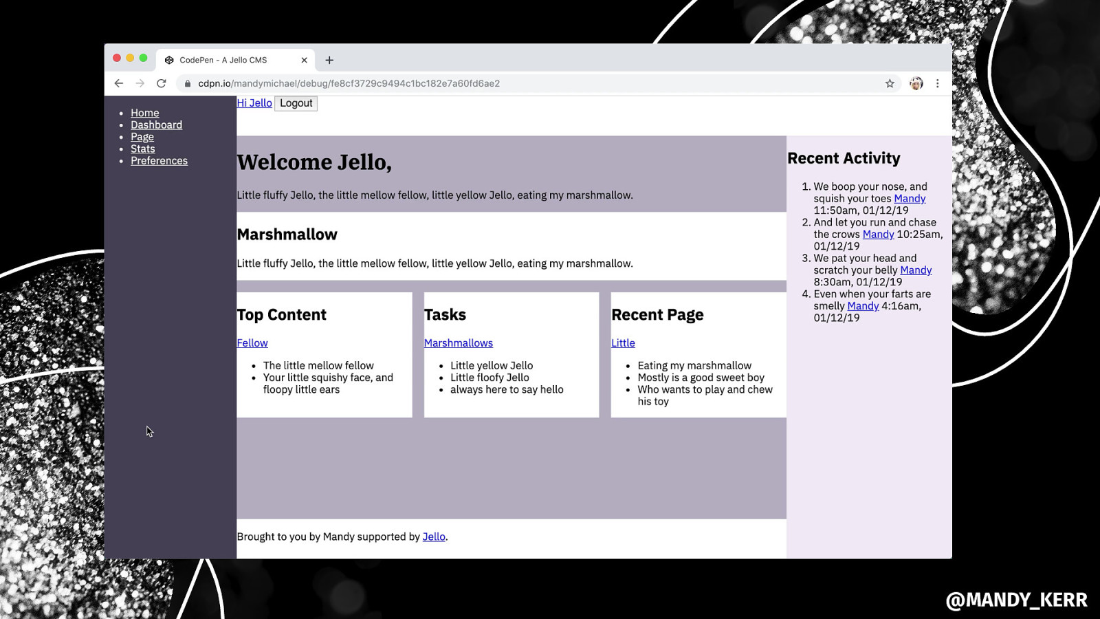
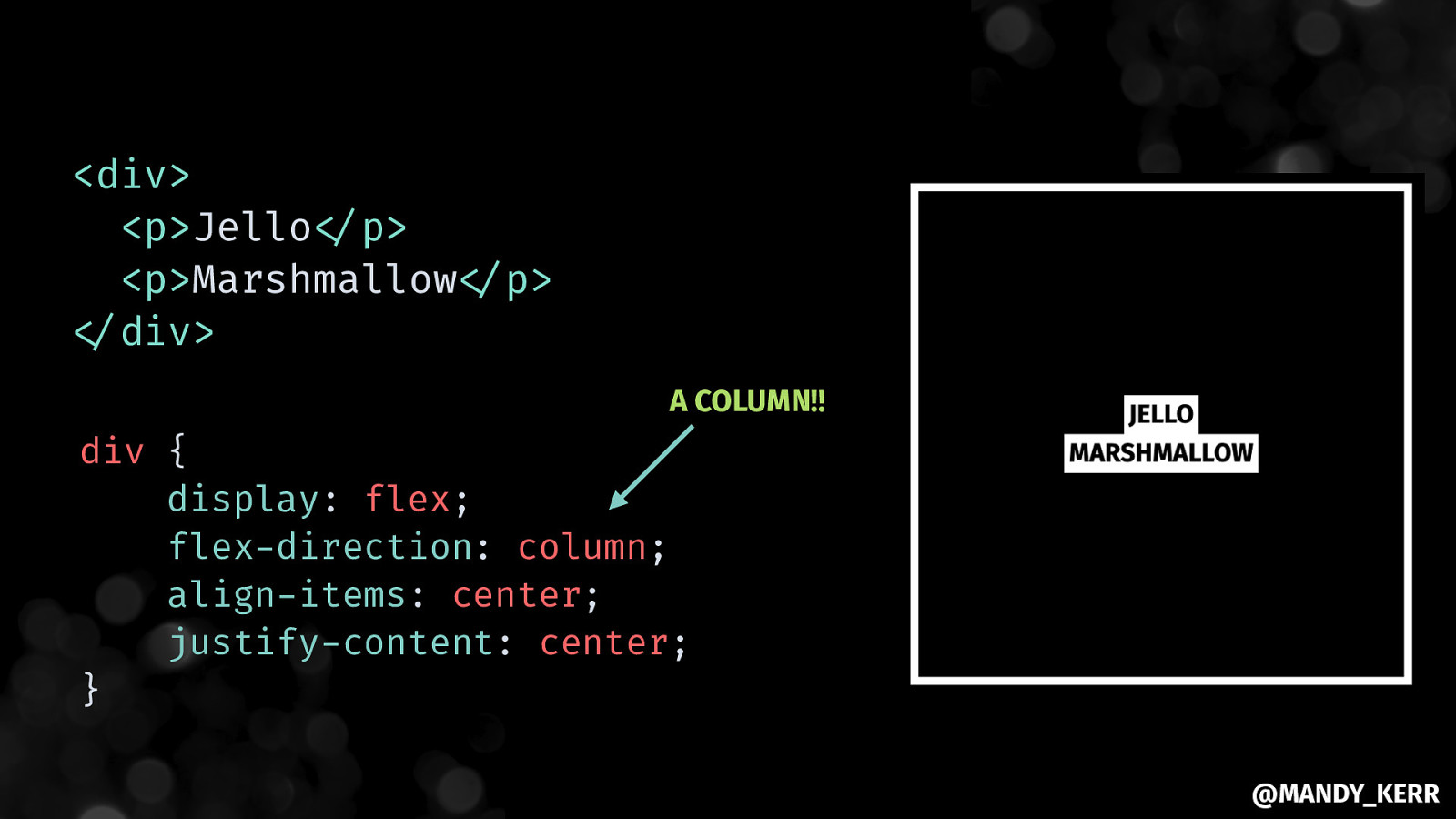
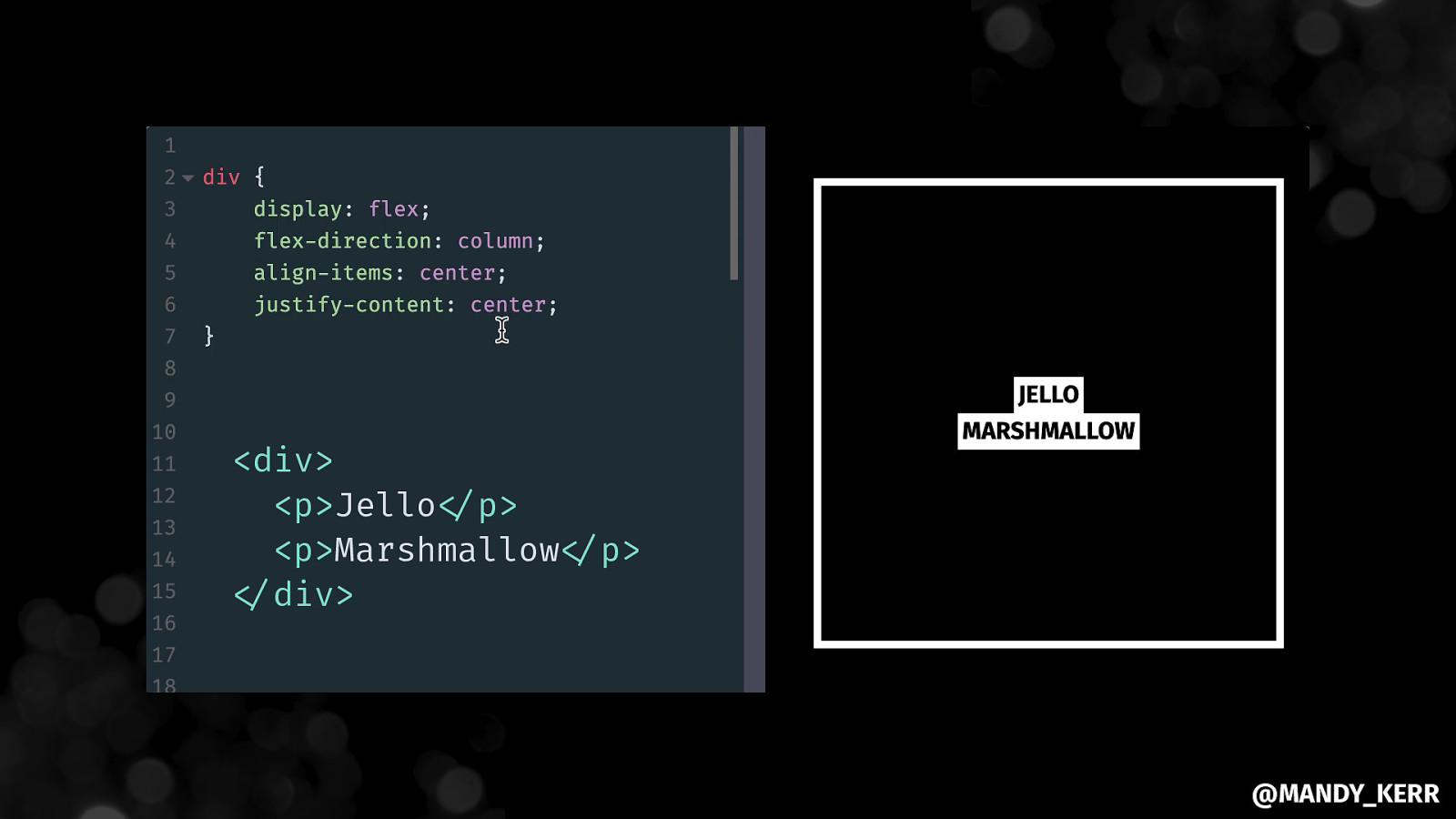
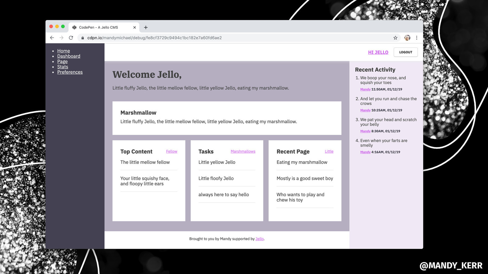
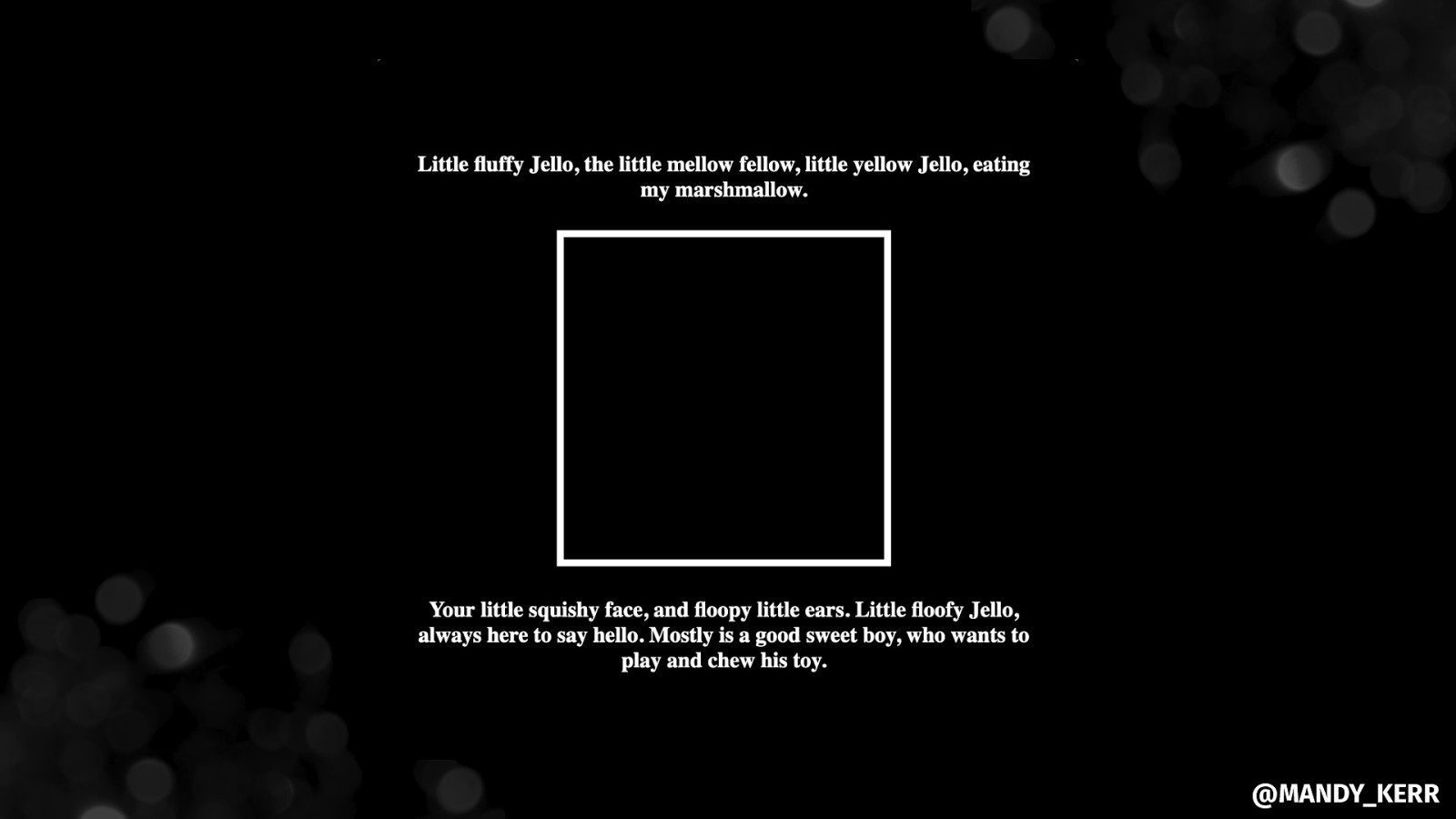
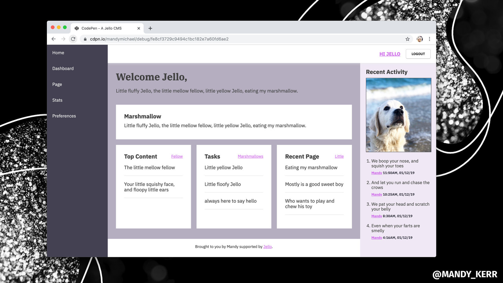
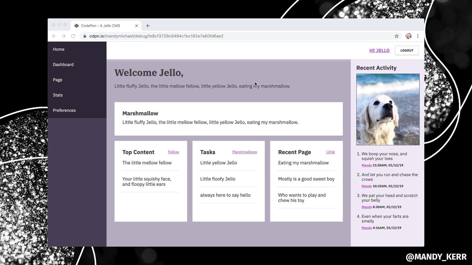
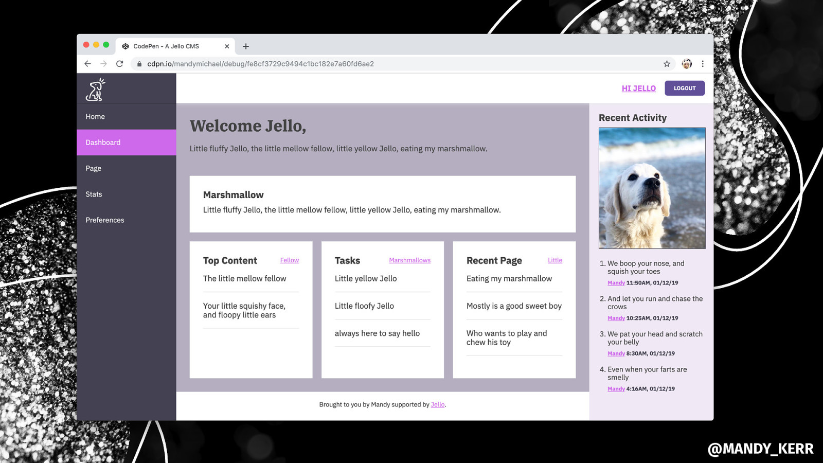
MARSHMALLOW @MANDY_KERR
.block-group { display: grid; grid-gap: 18px; grid-template-columns: repeat(auto-fill, minmax(230px, 1fr)); } @MANDY_KERR
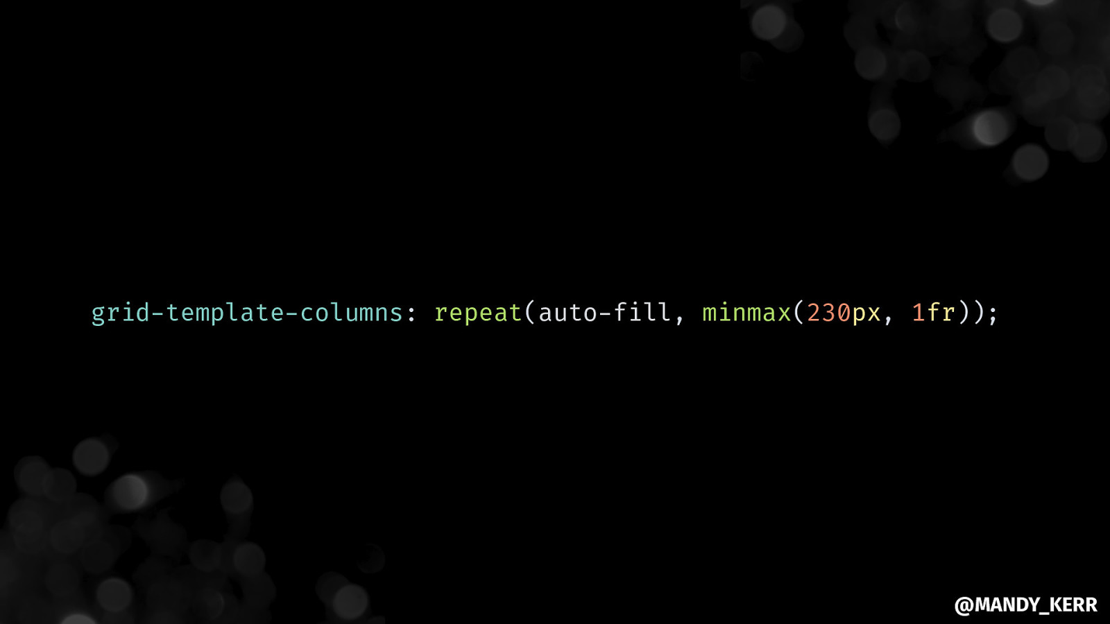
grid-template-columns: repeat(auto-fill, minmax(230px, 1fr)); @MANDY_KERR
@MANDY_KERR
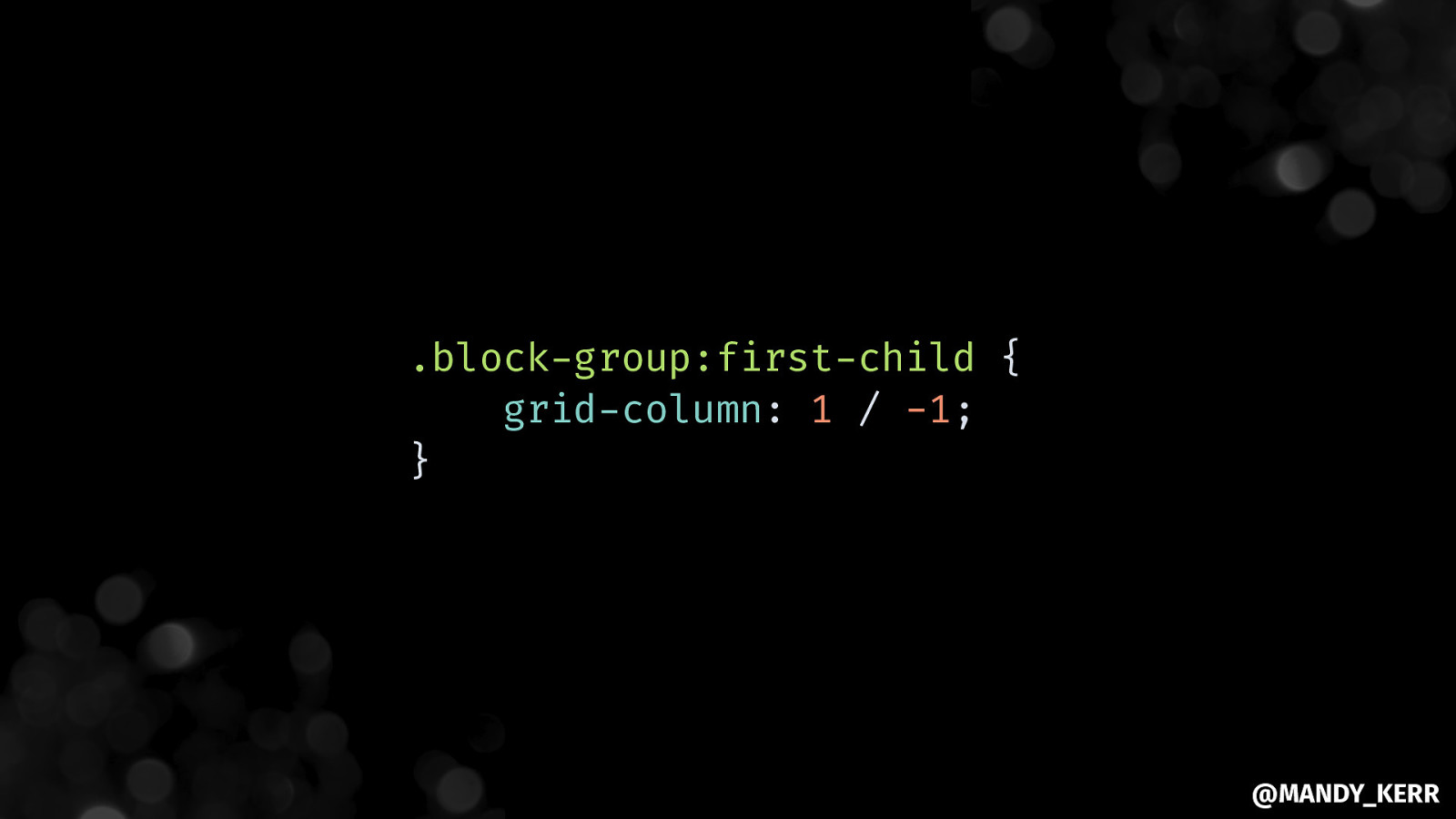
.block-group:first-child { grid-column: 1 / -1; } @MANDY_KERR
@MANDY_KERR
@MANDY_KERR
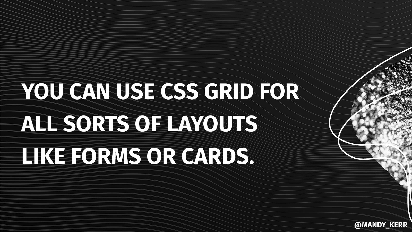
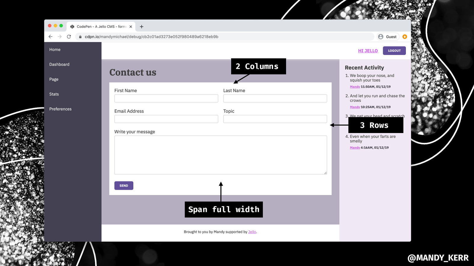
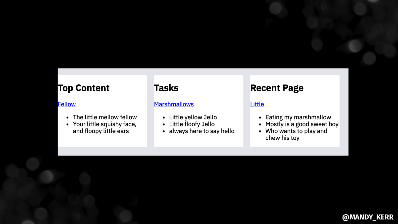
YOU CAN USE CSS GRID FOR ALL SORTS OF LAYOUTS LIKE FORMS OR CARDS. @MANDY_KERR
2 Columns 3 Rows Span full width @MANDY_KERR
EVERY-LAYOUT.DEV GRIDBYEXAMPLE.COM @rachelandrew @MANDY_KERR
@MANDY_KERR
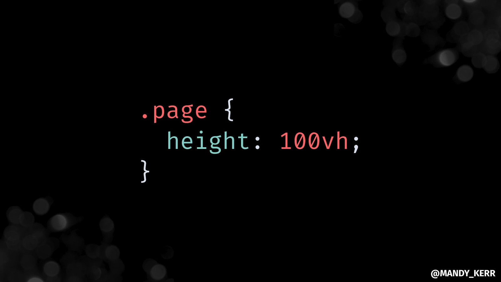
Making the page FULL HEIGHT @MANDY_KERR
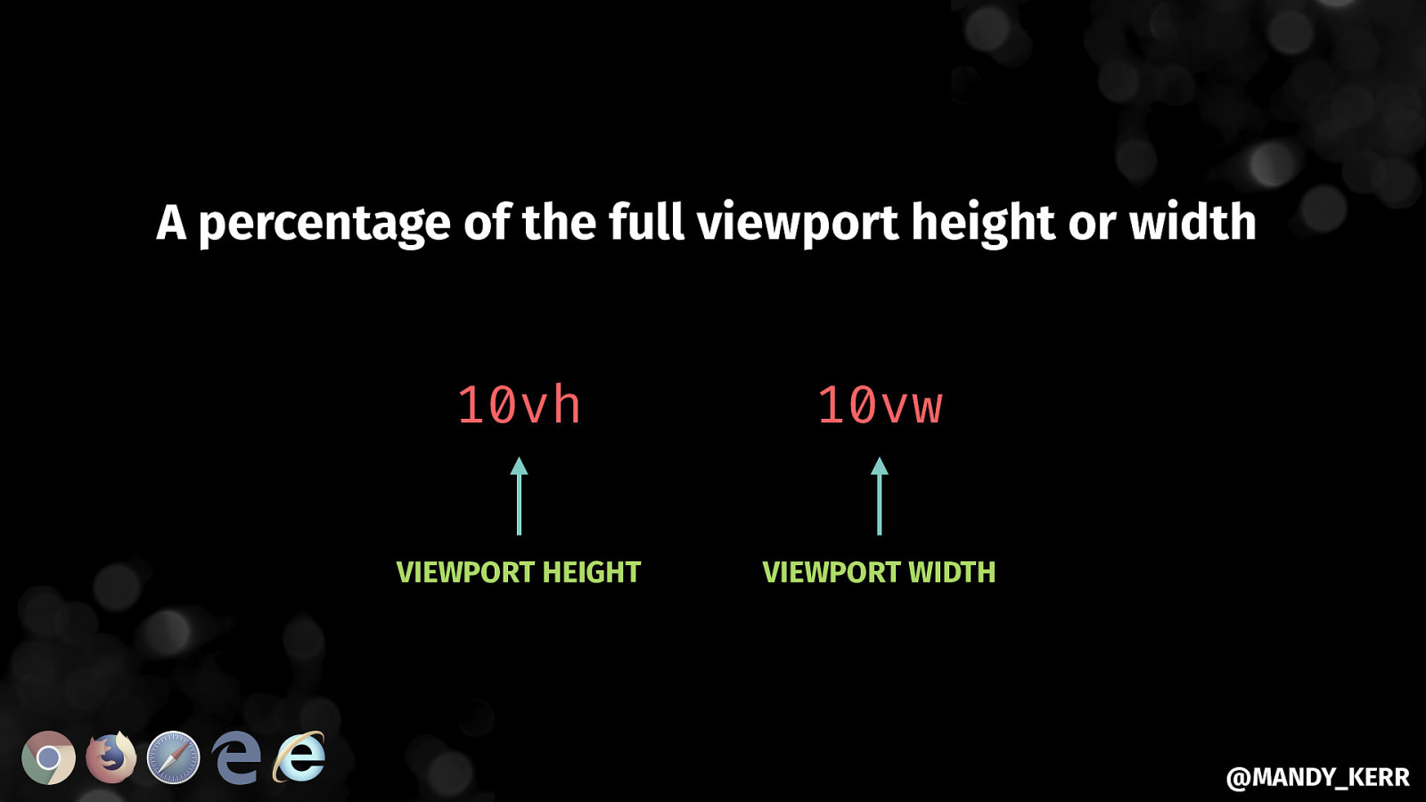
A percentage of the full viewport height or width 10vh 10vw VIEWPORT HEIGHT VIEWPORT WIDTH @MANDY_KERR
.page { height: 100vh; } @MANDY_KERR
@MANDY_KERR
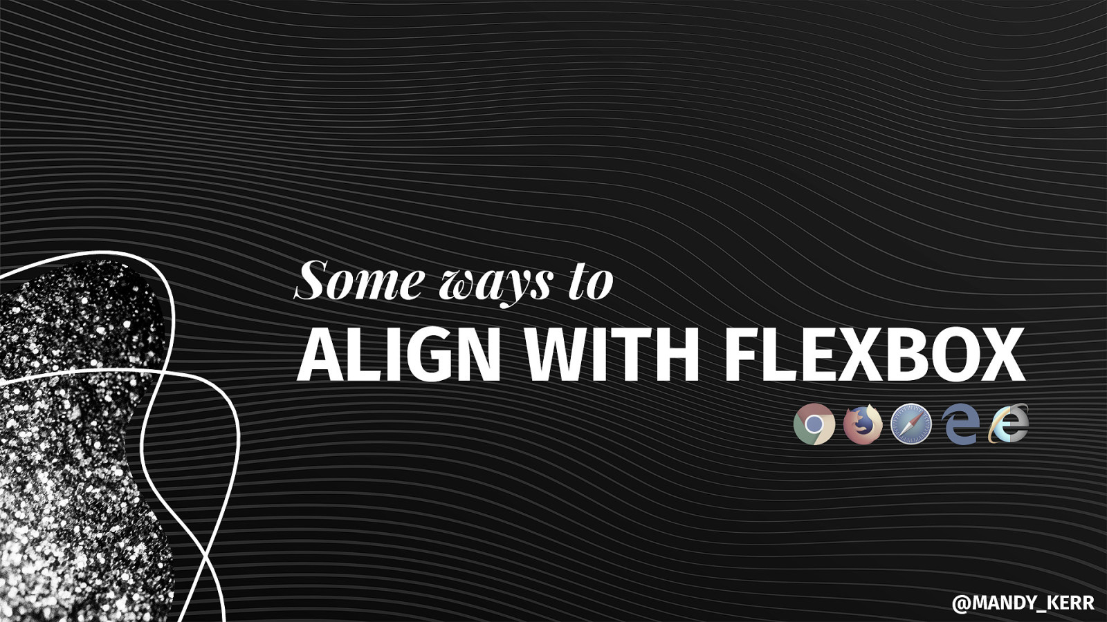
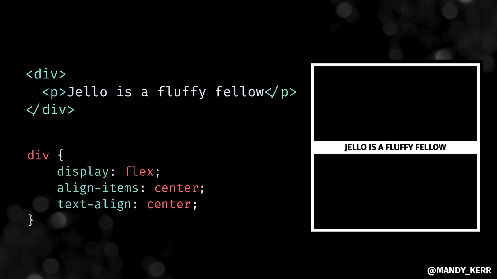
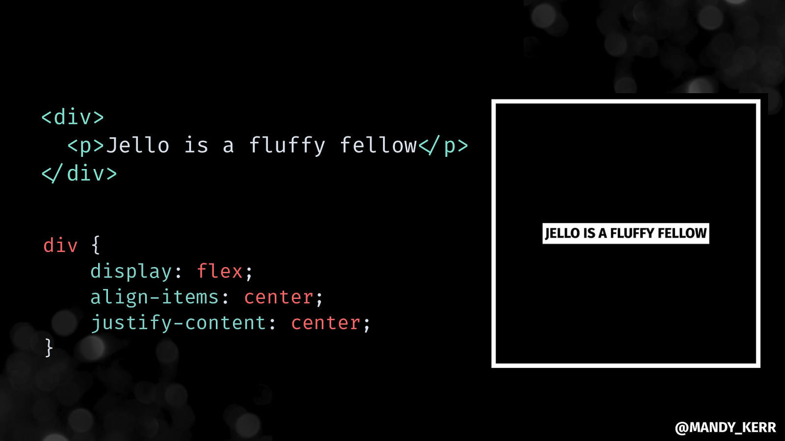
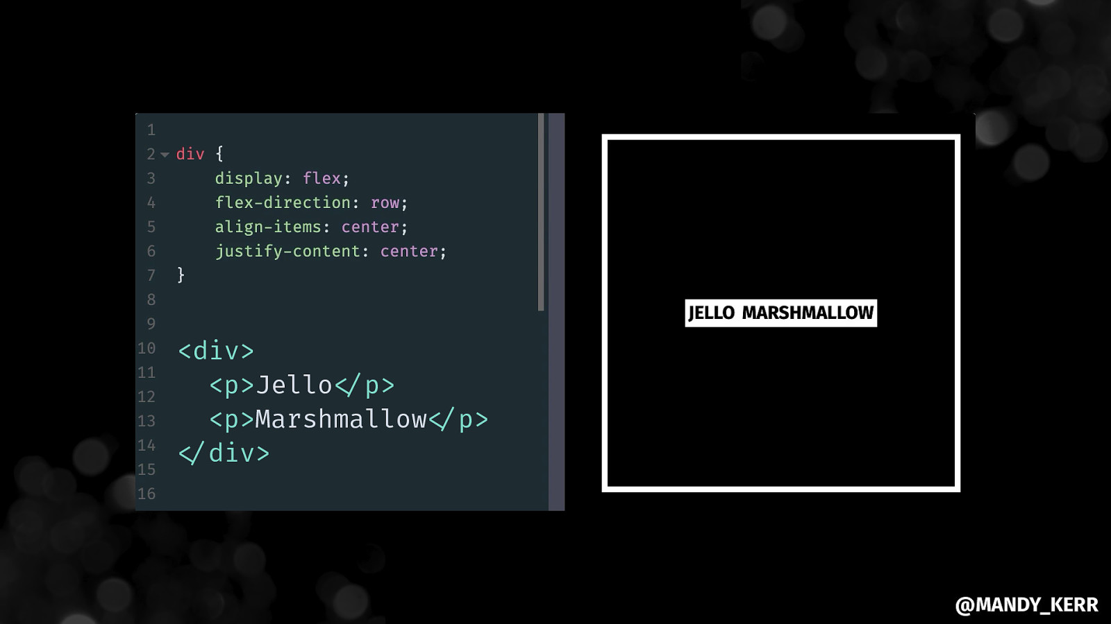
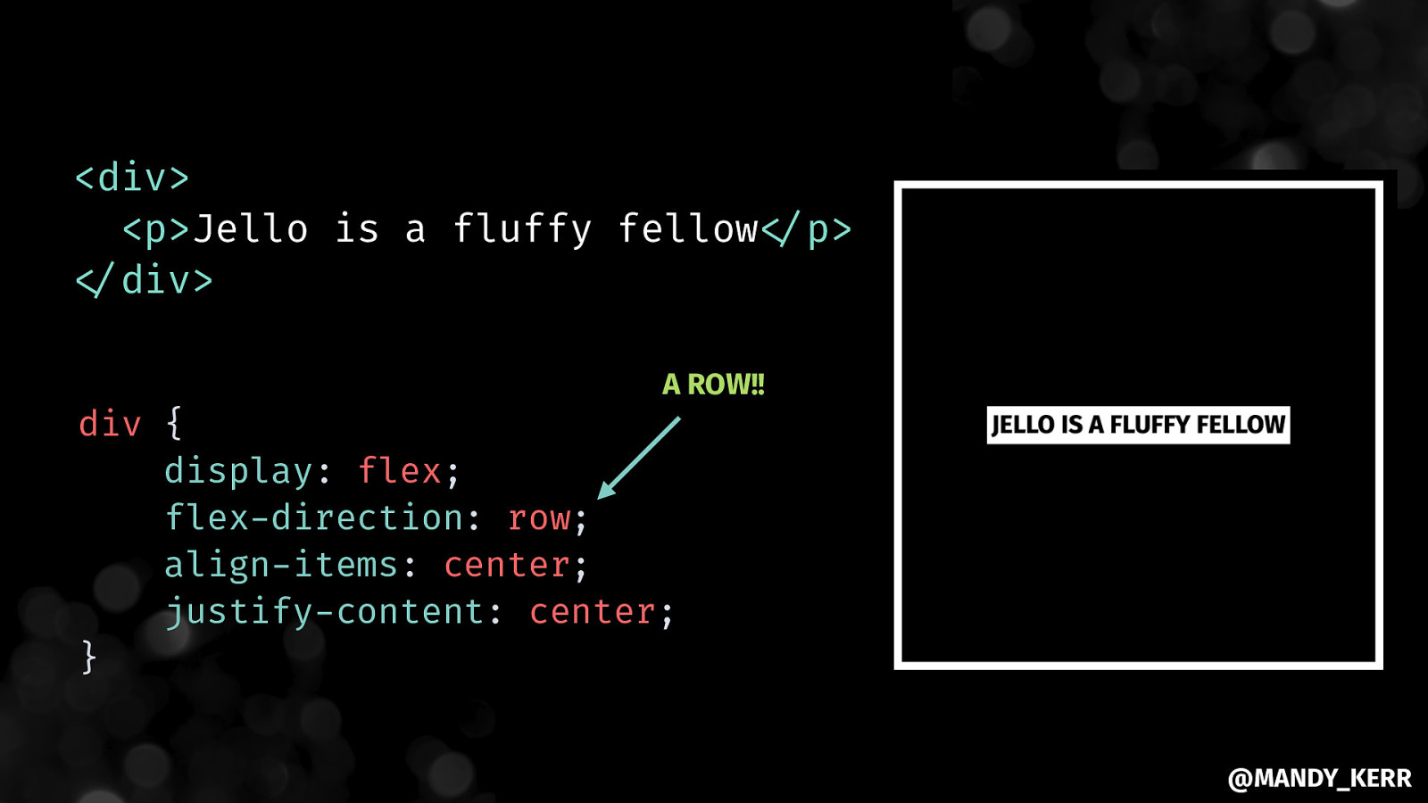
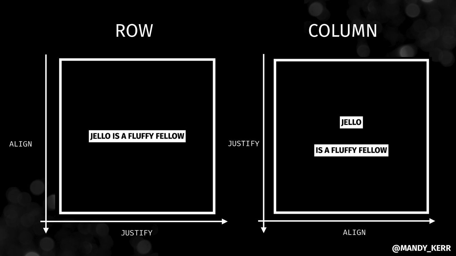
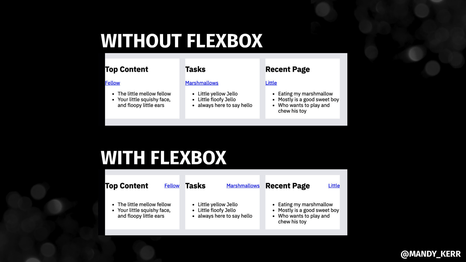
Some ways to ALIGN WITH FLEXBOX @MANDY_KERR
@MANDY_KERR
ROW COLUMN JUSTIFY ALIGN JUSTIFY ALIGN @MANDY_KERR
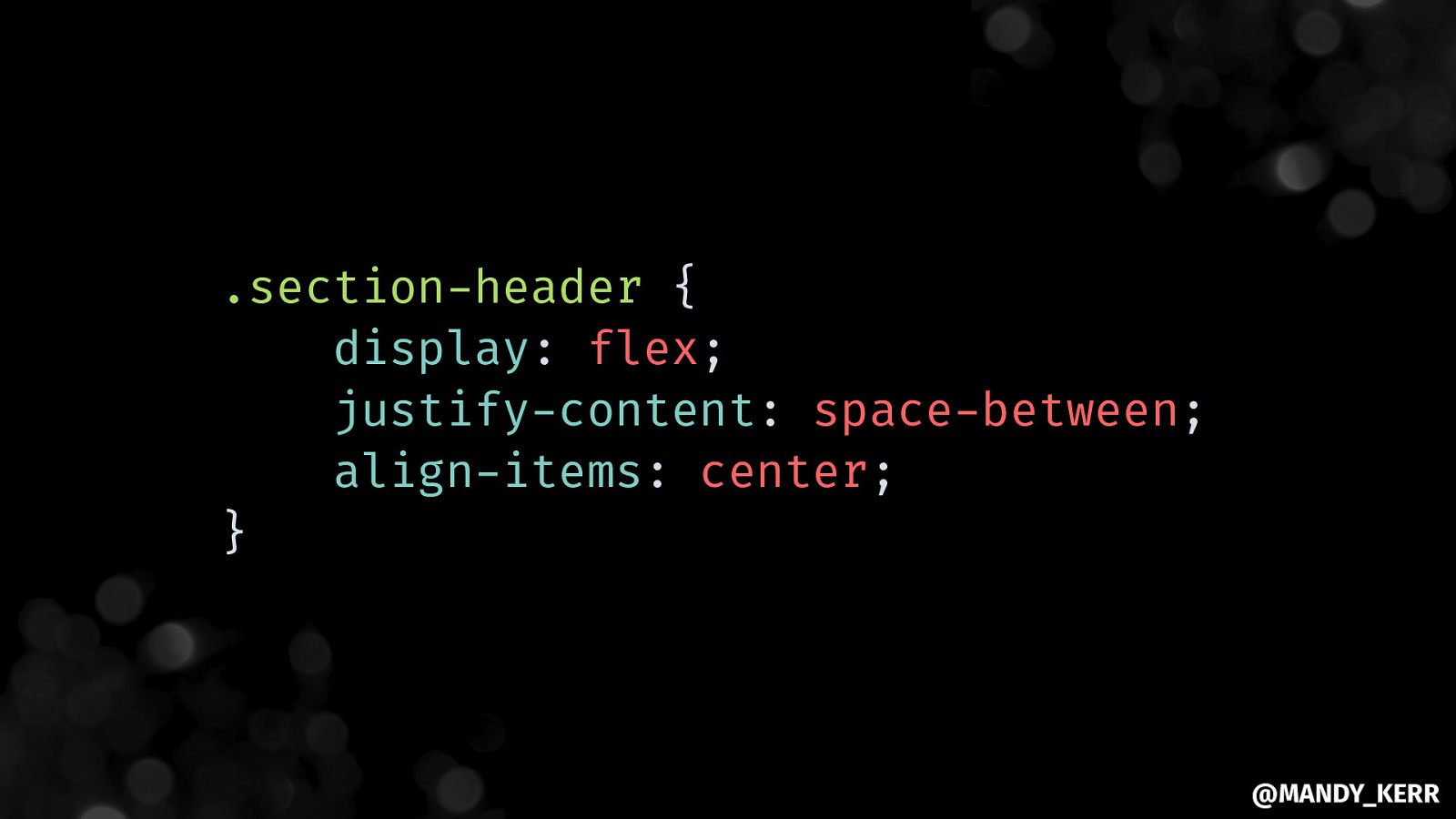
.section-header { display: flex; justify-content: space-between; align-items: center; } @MANDY_KERR
WITHOUT FLEXBOX WITH FLEXBOX @MANDY_KERR
@MANDY_KERR
Working with VARIABLES IN CSS @MANDY_KERR
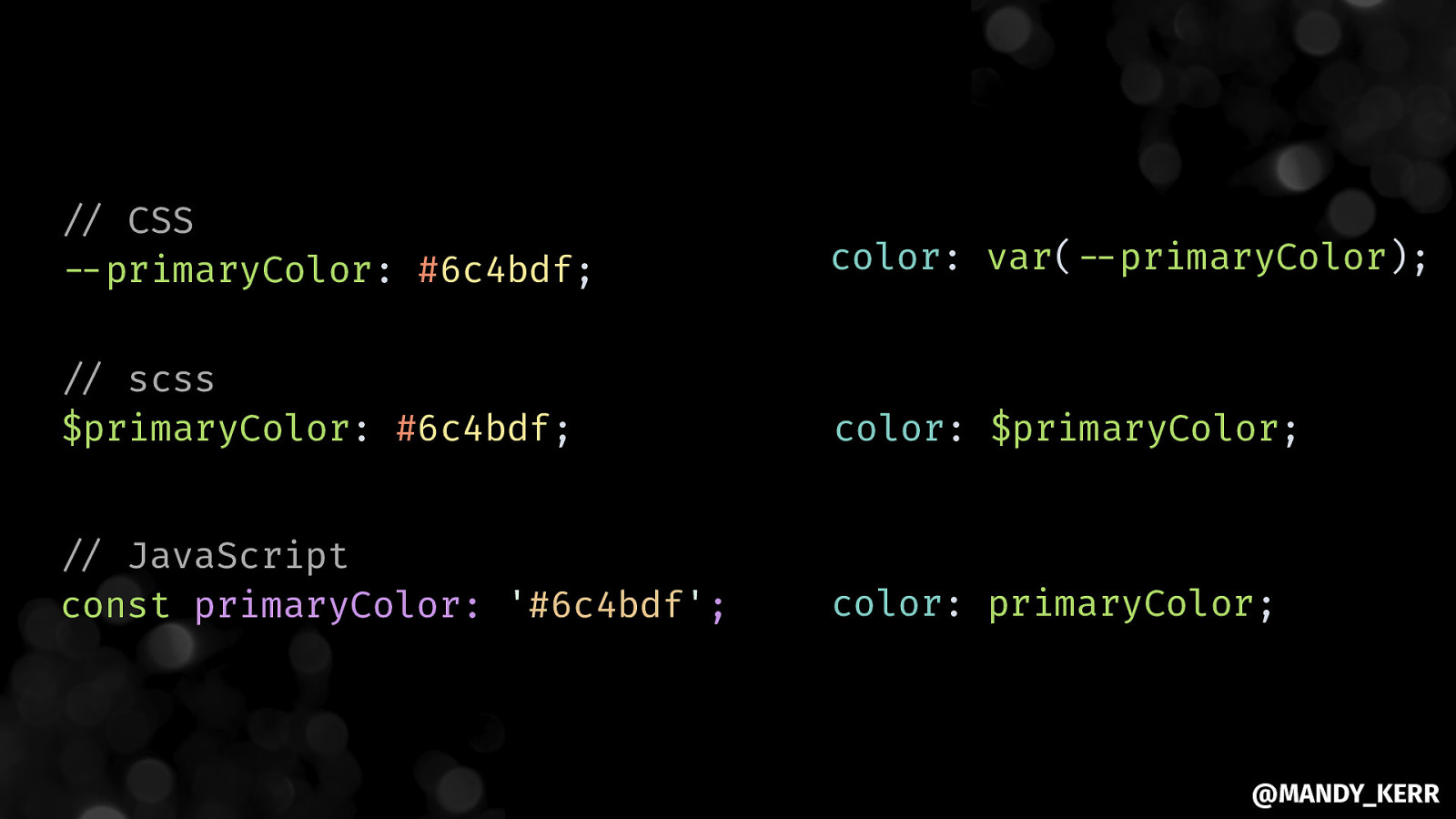
”// CSS “—primaryColor: #6c4bdf; color: var(“—primaryColor); “// scss $primaryColor: #6c4bdf; color: $primaryColor; “// JavaScript const primaryColor: ‘#6c4bdf’; color: primaryColor; @MANDY_KERR
Margins & Padding Colours Fonts @MANDY_KERR
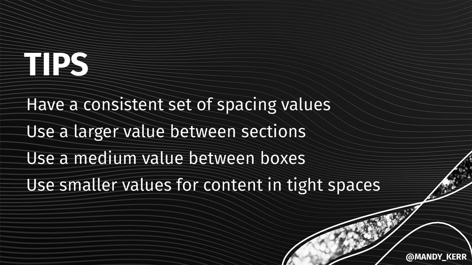
Setting up CONSISTENT SPACING @MANDY_KERR
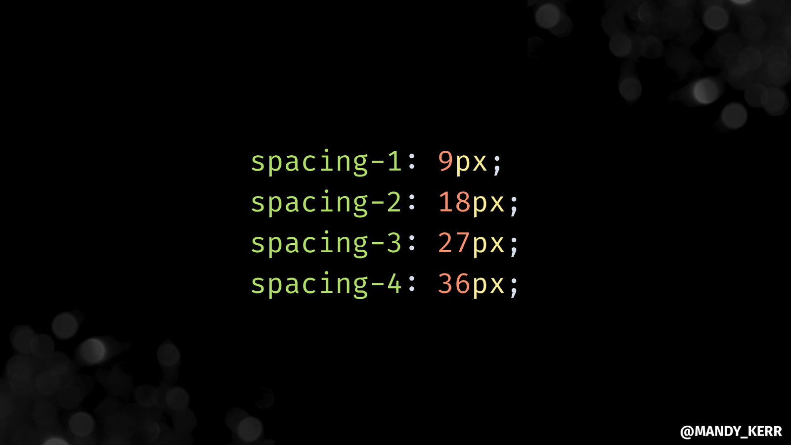
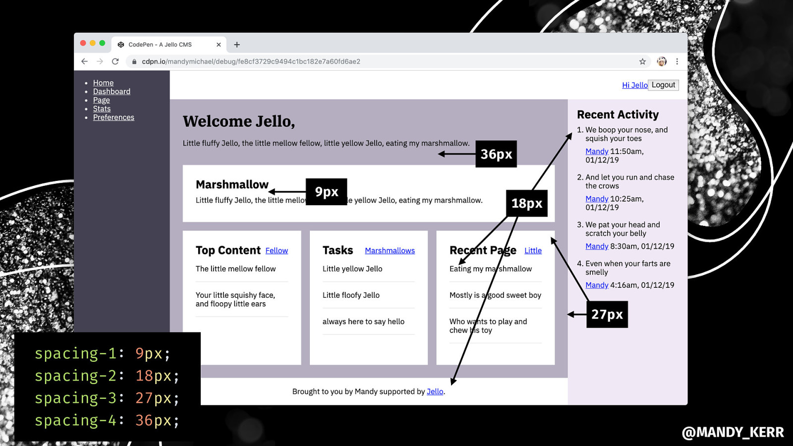
spacing-1: spacing-2: spacing-3: spacing-4: 9px; 18px; 27px; 36px; @MANDY_KERR
@MANDY_KERR
@MANDY_KERR
36px 9px 18px 27px spacing-1: spacing-2: spacing-3: spacing-4: 9px; 18px; 27px; 36px; @MANDY_KERR
TIPS Have a consistent set of spacing values Use a larger value between sections Use a medium value between boxes Use smaller values for content in tight spaces @MANDY_KERR
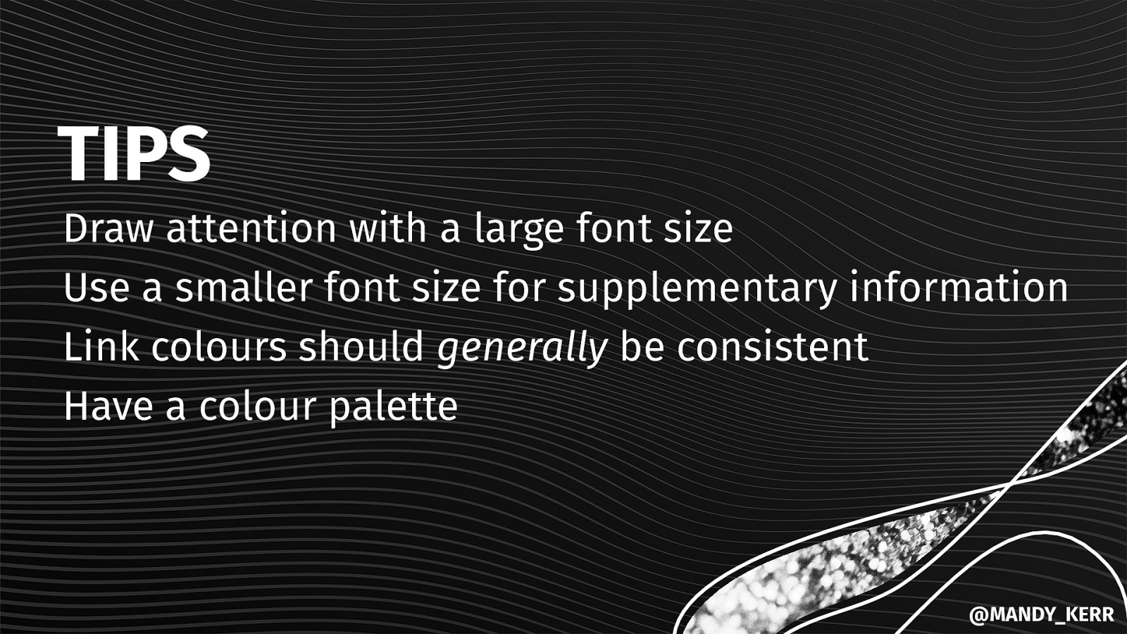
Adding in COLOURS & FONT SIZE @MANDY_KERR
@MANDY_KERR
TIPS Draw attention with a large font size Use a smaller font size for supplementary information Link colours should generally be consistent Have a colour palette @MANDY_KERR
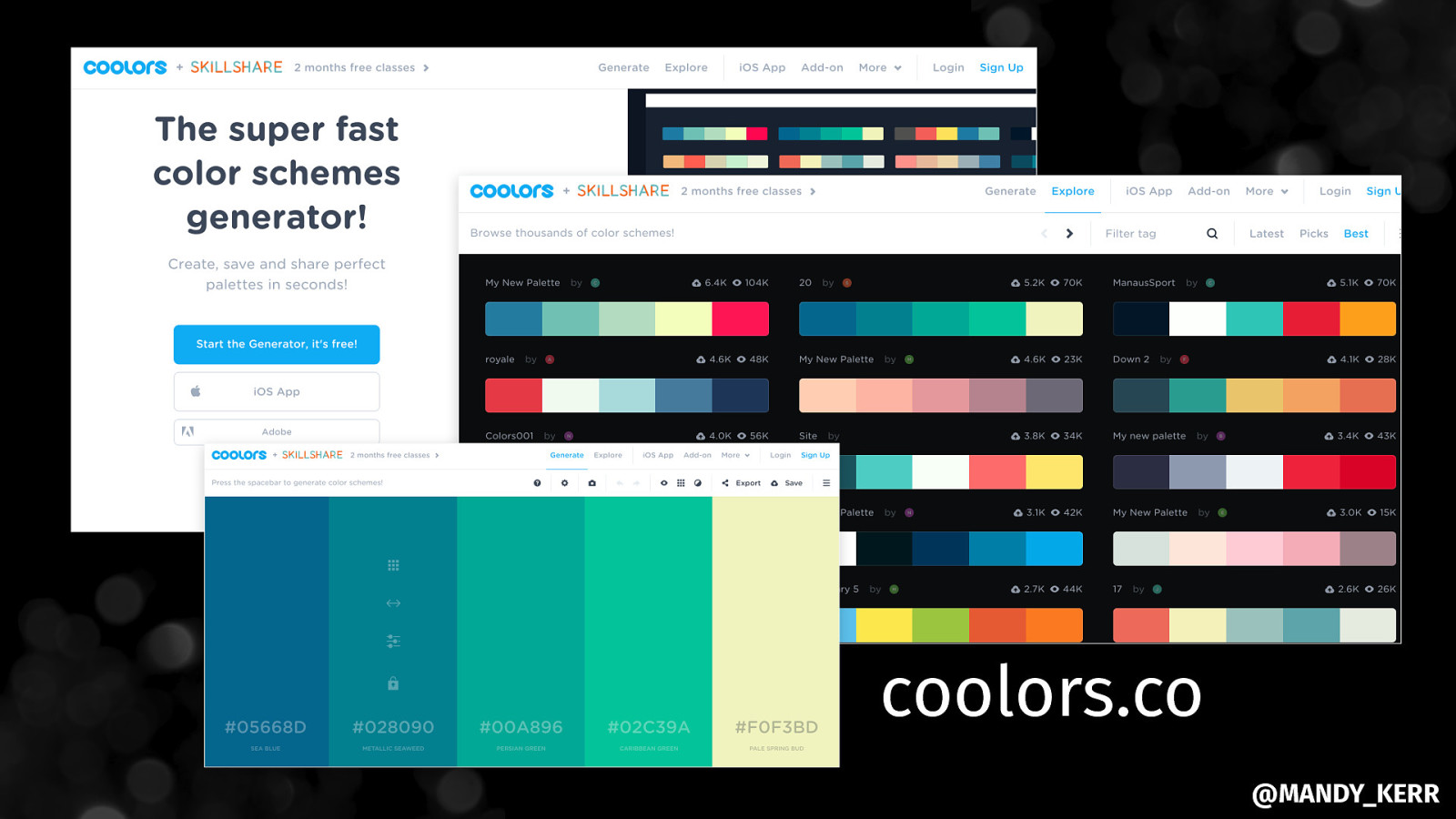
coolors.co @MANDY_KERR
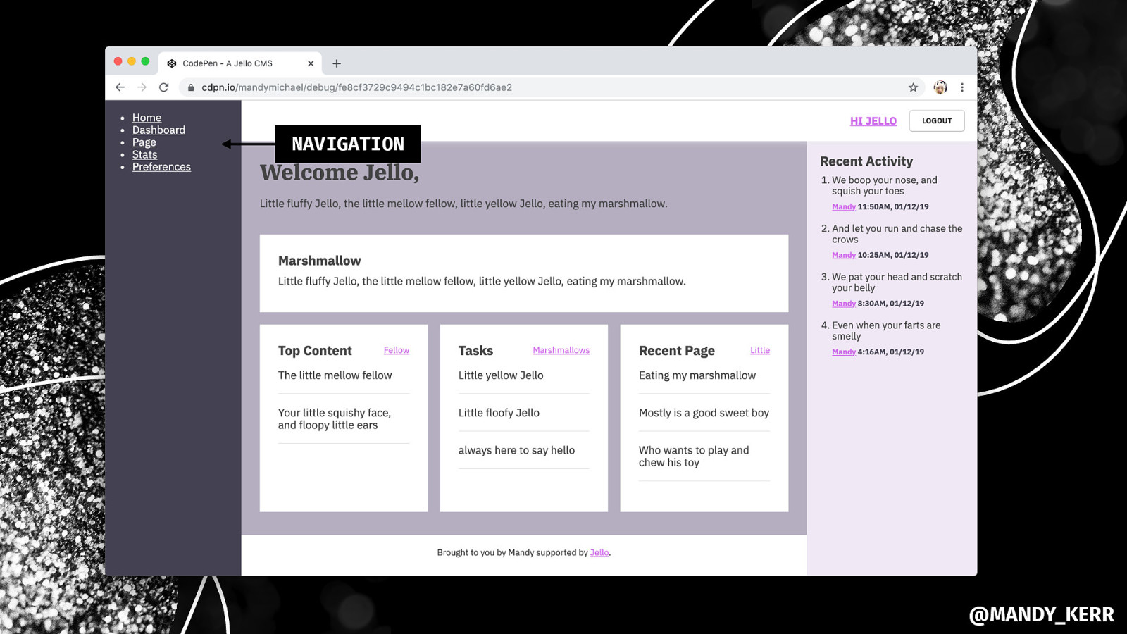
Styling THE MAIN NAVIGATION @MANDY_KERR
NAVIGATION @MANDY_KERR
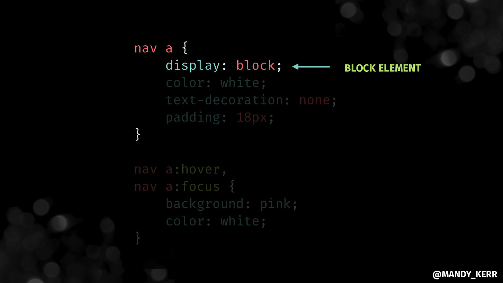
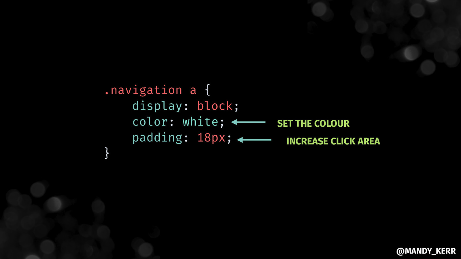
nav a { display: block; color: white; text-decoration: none; padding: 18px; } BLOCK ELEMENT nav a:hover, nav a:focus { background: pink; color: white; } @MANDY_KERR
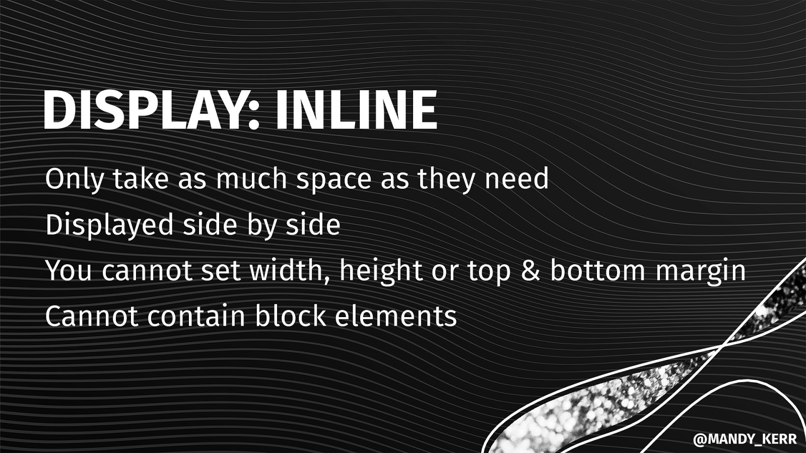
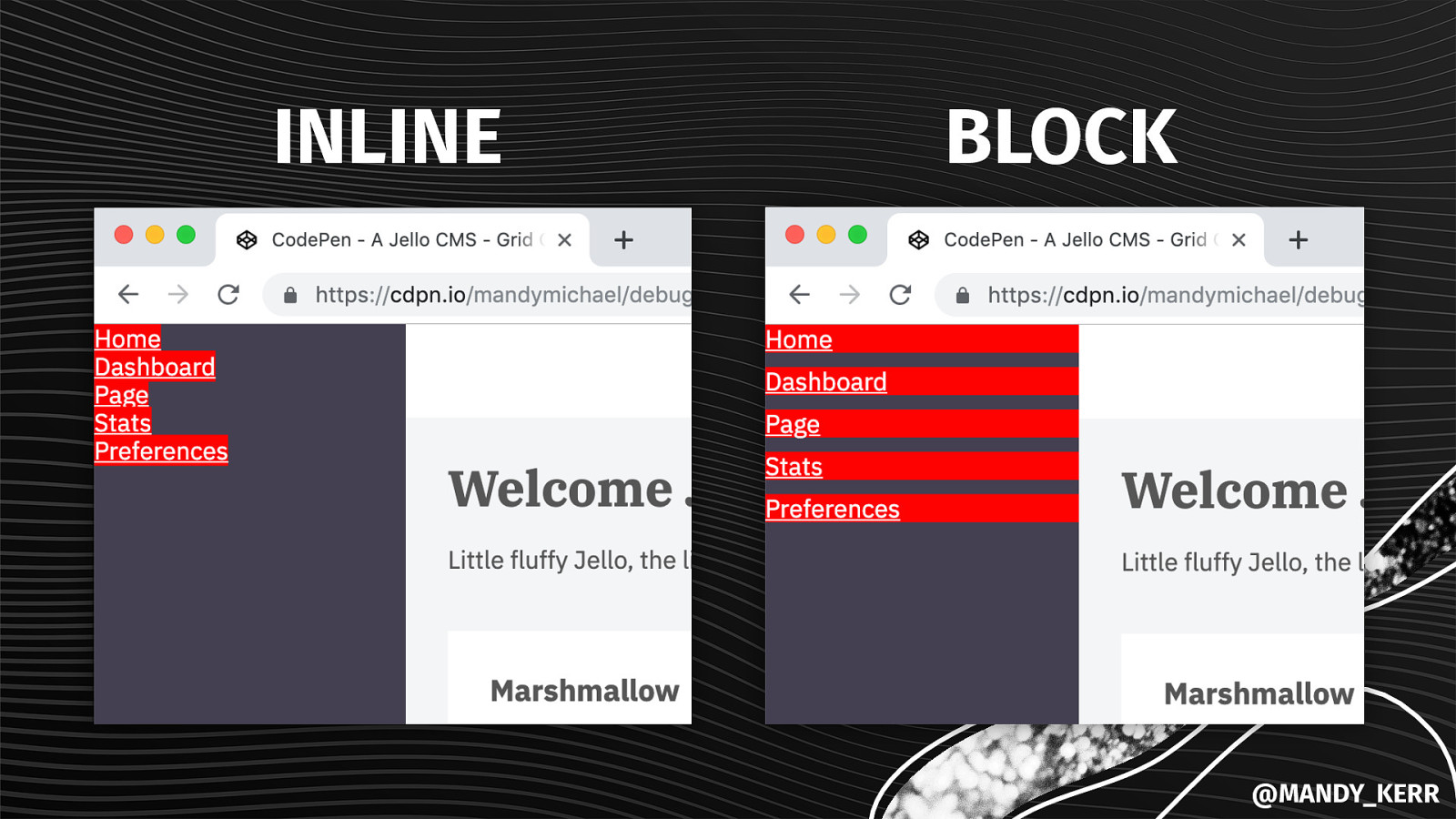
DISPLAY: INLINE Only take as much space as they need Displayed side by side You cannot set width, height or top & bottom margin Cannot contain block elements @MANDY_KERR
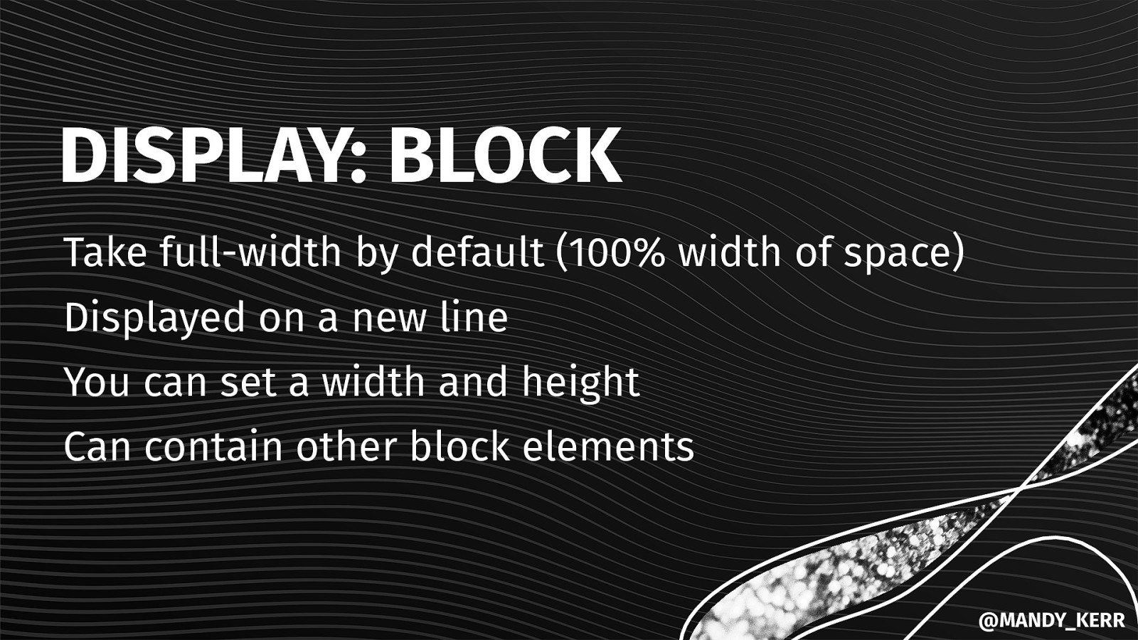
DISPLAY: BLOCK Take full-width by default (100% width of space) Displayed on a new line You can set a width and height Can contain other block elements @MANDY_KERR
INLINE BLOCK @MANDY_KERR
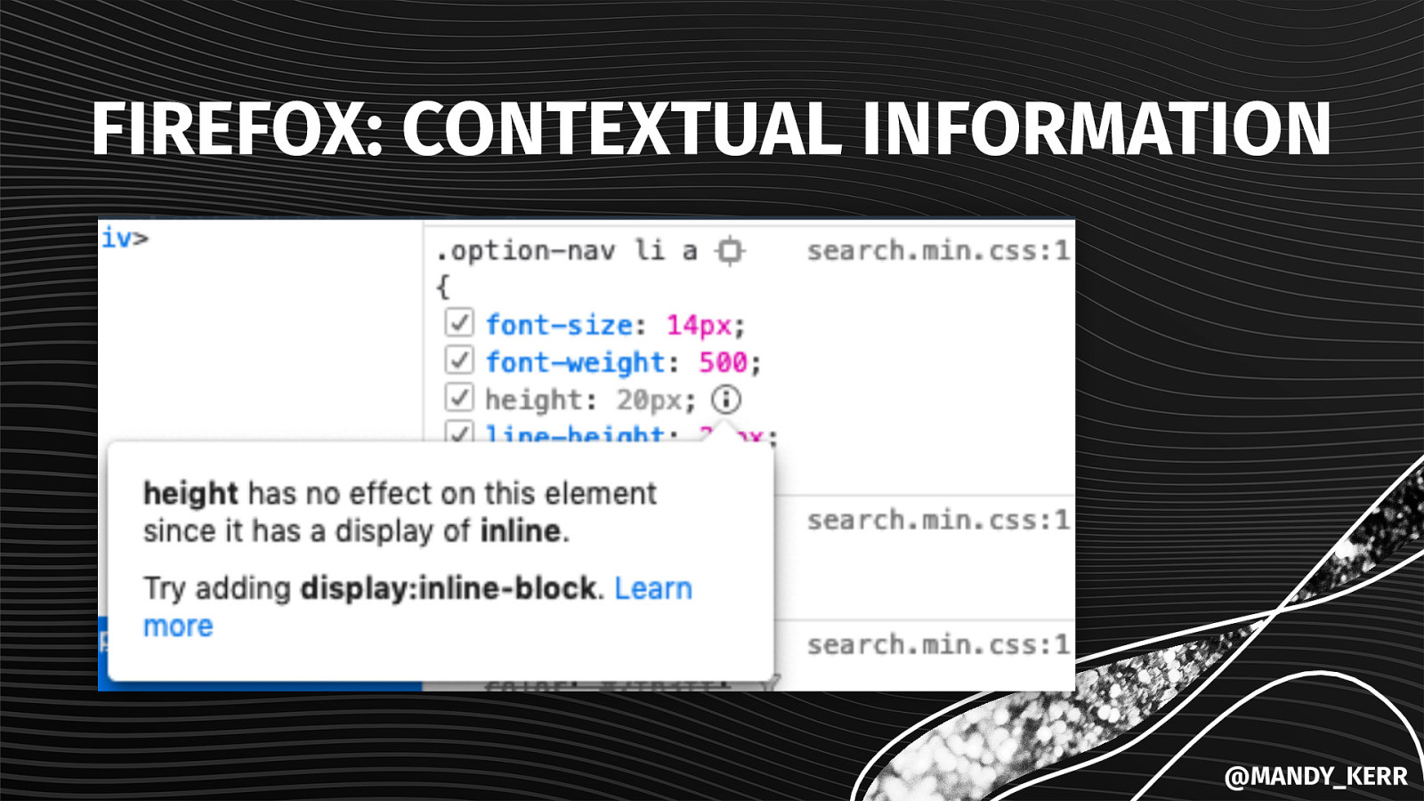
FIREFOX: CONTEXTUAL INFORMATION @MANDY_KERR
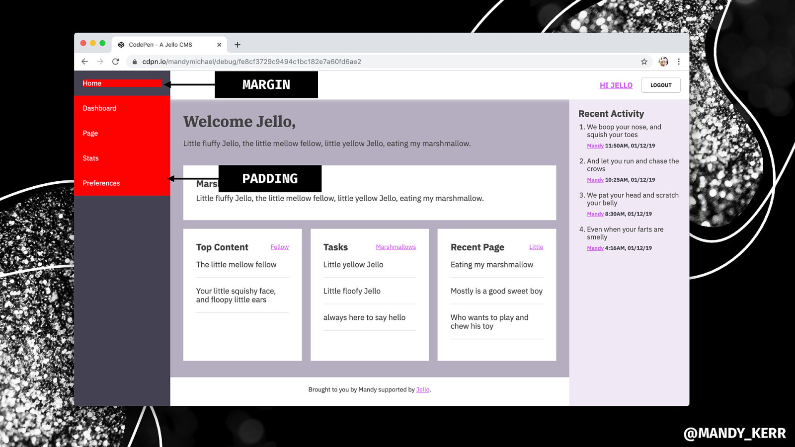
.navigation a { display: block; color: white; padding: 18px; } SET THE COLOUR INCREASE CLICK AREA @MANDY_KERR
MARGIN PADDING @MANDY_KERR
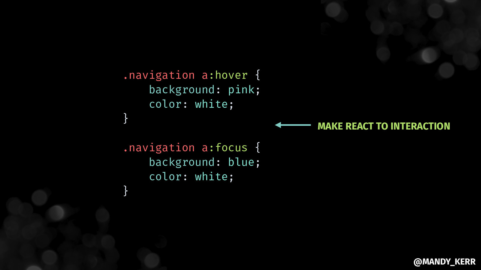
.navigation a:hover { background: pink; color: white; } MAKE REACT TO INTERACTION .navigation a:focus { background: blue; color: white; } @MANDY_KERR
@MANDY_KERR
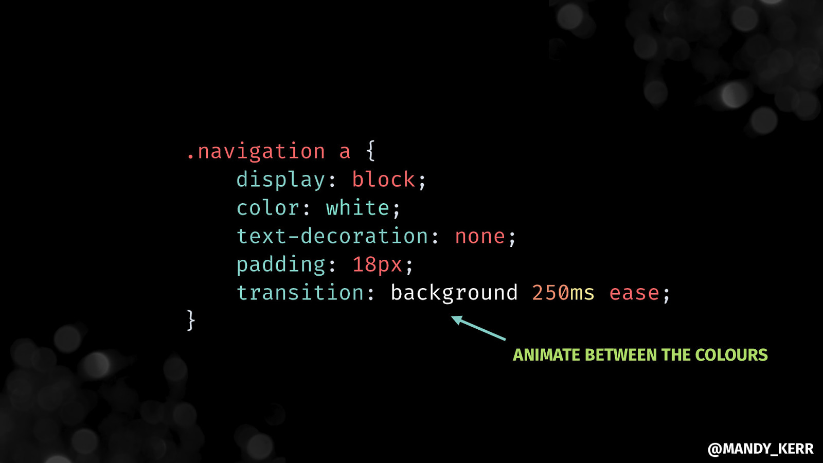
.navigation a { display: block; color: white; text-decoration: none; padding: 18px; transition: background 250ms ease; } ANIMATE BETWEEN THE COLOURS @MANDY_KERR
@MANDY_KERR
Making PERFORMANT IMAGES @MANDY_KERR
@MANDY_KERR
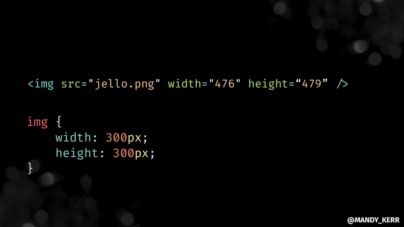
<img src=”jello.png” width=”476” height=“479” “/> img { width: 300px; height: 300px; } @MANDY_KERR
@MANDY_KERR
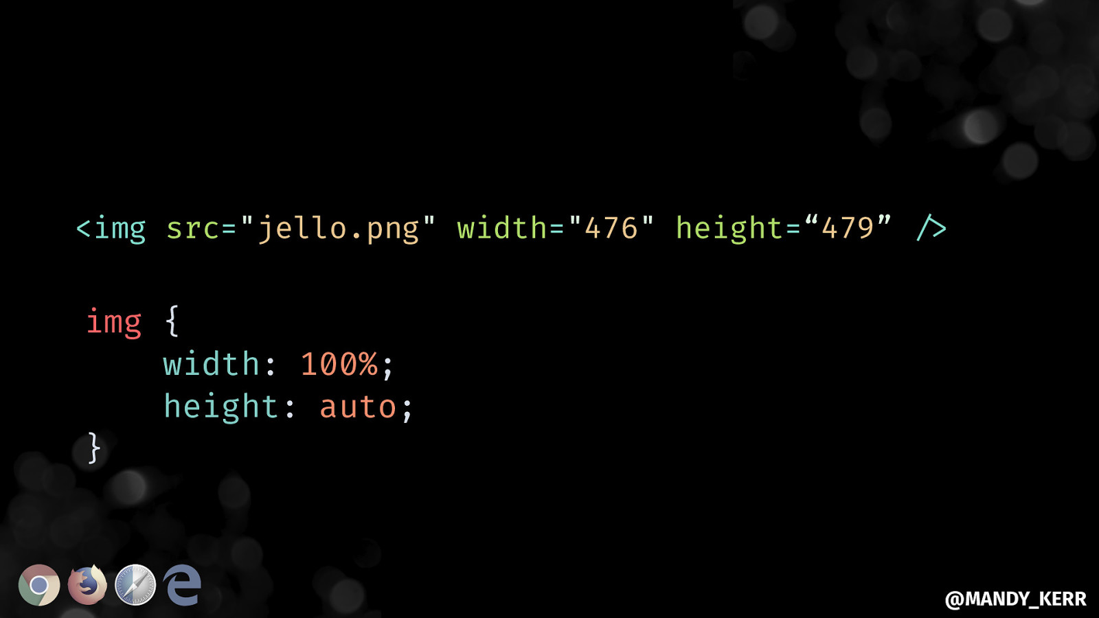
<img src=”jello.png” width=”476” height=“479” “/> img { width: 100%; height: auto; } @MANDY_KERR
@MANDY_KERR
@MANDY_KERR
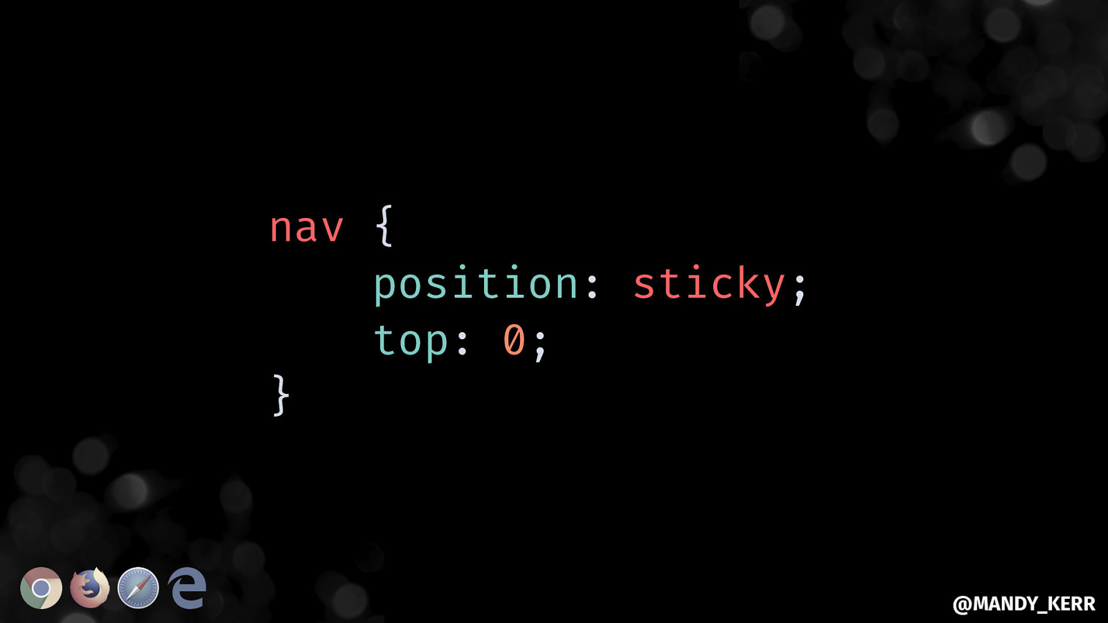
Aside.. STICKING THINGS @MANDY_KERR
nav { position: sticky; top: 0; } @MANDY_KERR
@MANDY_KERR
@MANDY_KERR
@MANDY_KERR
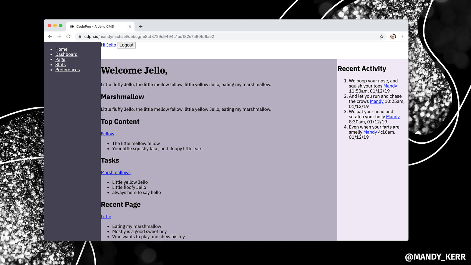
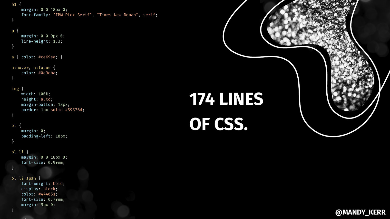
h1 { } margin: 0 0 18px 0; font-family: “IBM Plex Serif”, “Times New Roman”, serif; p { } margin: 0 0 9px 0; line-height: 1.3; a { color: #ce69ea; } a:hover, a:focus { color: #0e9dba; } img { width: 100%; height: auto; margin-bottom: 18px; border: 1px solid #59576d; } ol { } margin: 0; padding-left: 18px; 174 LINES OF CSS. ol li { margin: 0 0 18px 0; font-size: 0.9rem; } ol li span { font-weight: bold; display: block; color: #444051; font-size: 0.7rem; margin: 9px 0; } @MANDY_KERR
@MANDY_KERR
@MANDY_KERR
@MANDY_KERR
START WITH A STRONG FOUNDATION& BUILD UPON IT. @MANDY_KERR
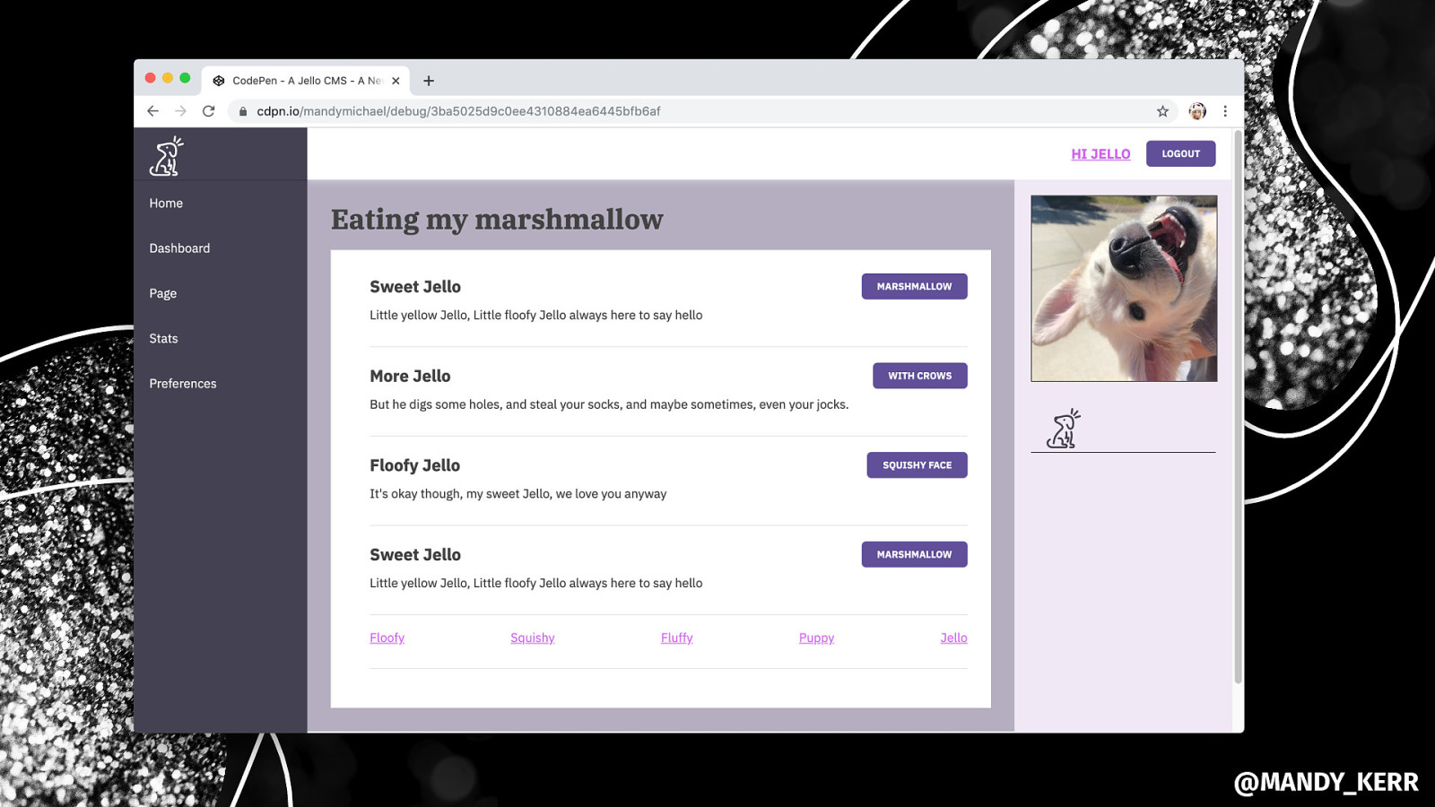
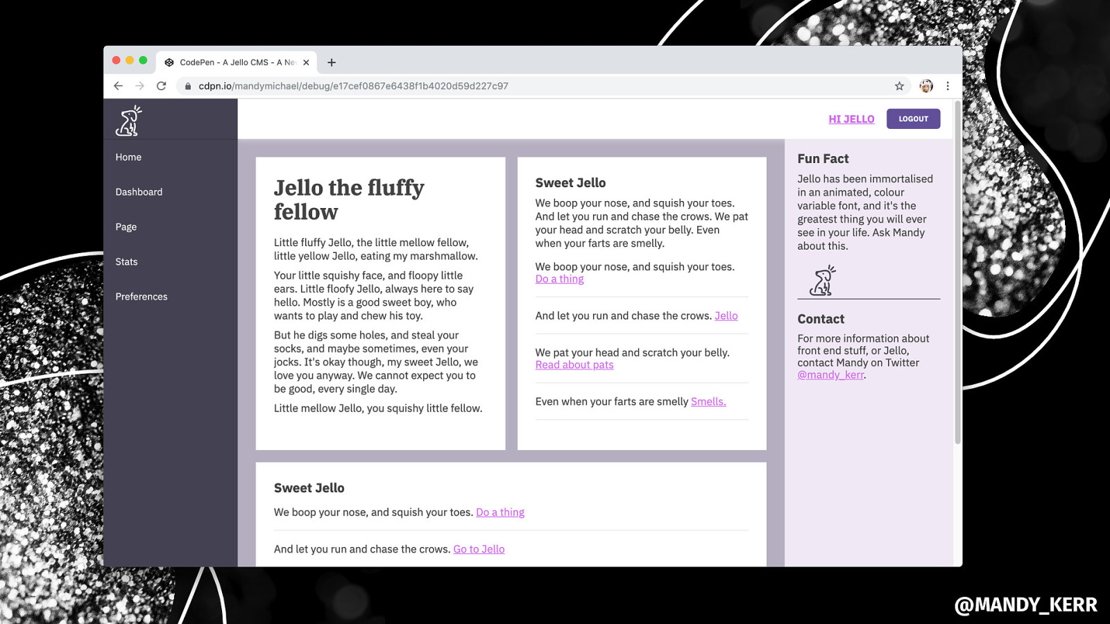
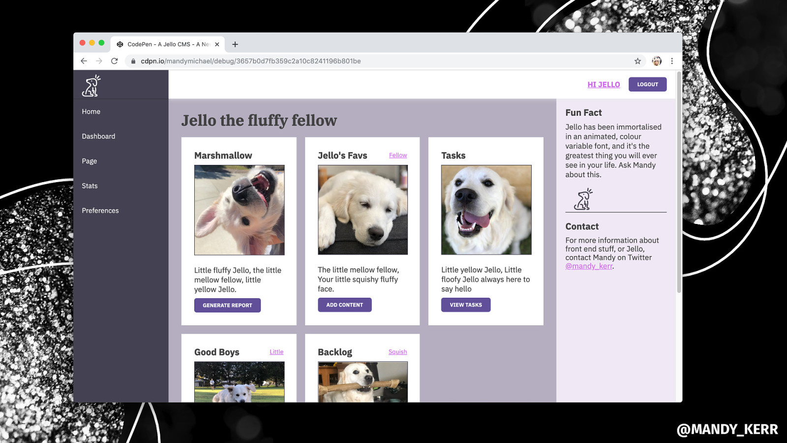
THANK YOU MDN developer.mozilla.org/docs/Web Every Layout every-layout.dev Grid by Example gridbyexample.com CSS Tricks Flexbox Guide css-tricks.com/snippets/css/a-guide-to-flexbox CSS Tricks Grid Guide css-tricks.com/snippets/css/complete-guide-grid adognamedjello @MANDY_KERR

For your users and customers, your frontend is your product. And if you are interested in learning how to build better frontends for them, Mandy has you covered. No matter your skill level and familiarity with HTML/CSS or JavaScript.
She will be walking you through some easy to use, but very powerful, techniques to put together simple layouts, and interactions. As we will be using straight HTML & CSS, it doesn’t matter if you use a front-end framework like React or Vue or write your HTML and CSS by hand.
By the end of the talk, you’ll see what a few practical tips can do to bring your frontend to the next level.
Here’s what was said about this presentation on social media.


 for free. You
can too.
for free. You
can too.