
A presentation at CSS Day in in Amsterdam, Netherlands by Matthias Ott
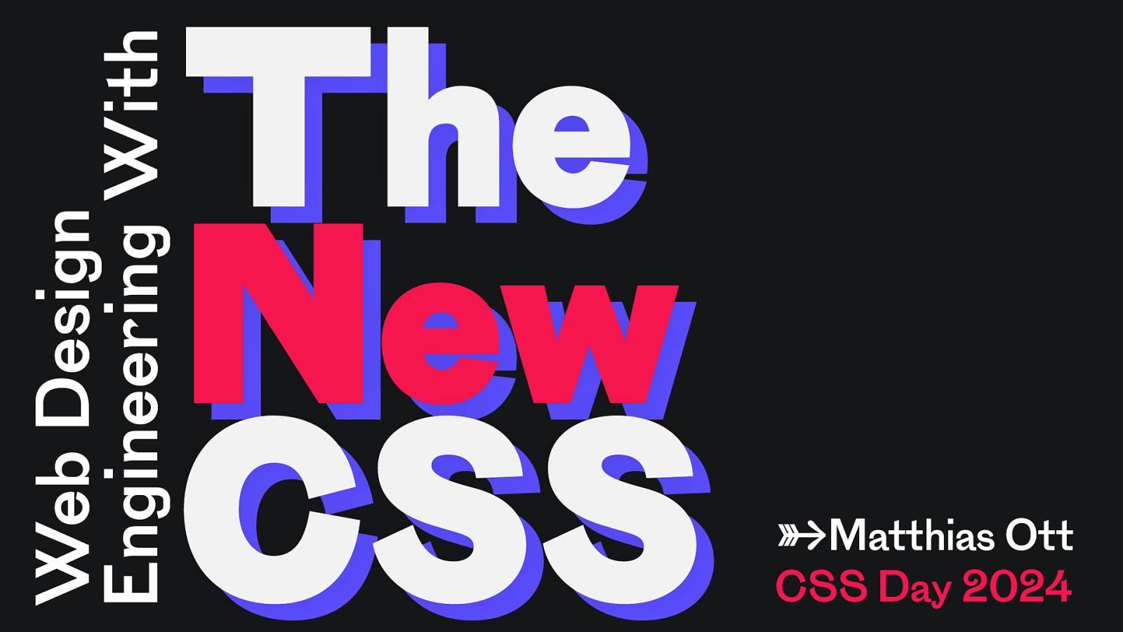
Web Design Engineering With The New CSS →Matthias Ott CSS Day 2024
👋 Matthias Ott User Experience Designer Web Design Engineer @matthiasott@mastodon.social https://matthiasott.com
ow n e t i s . b e w yo u r
✋
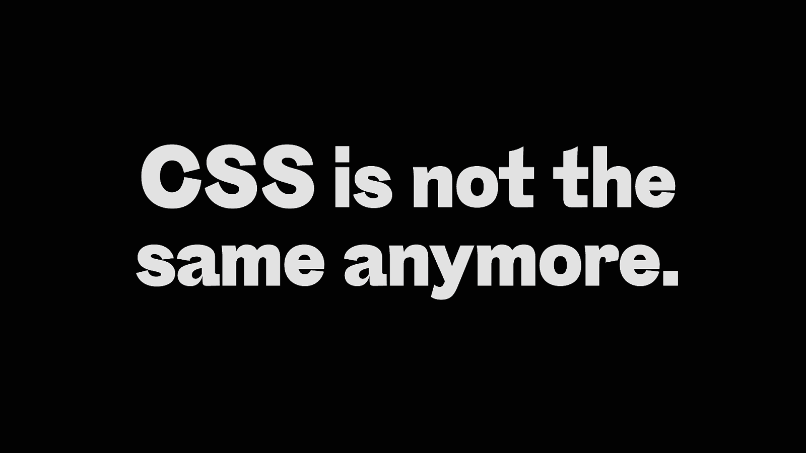
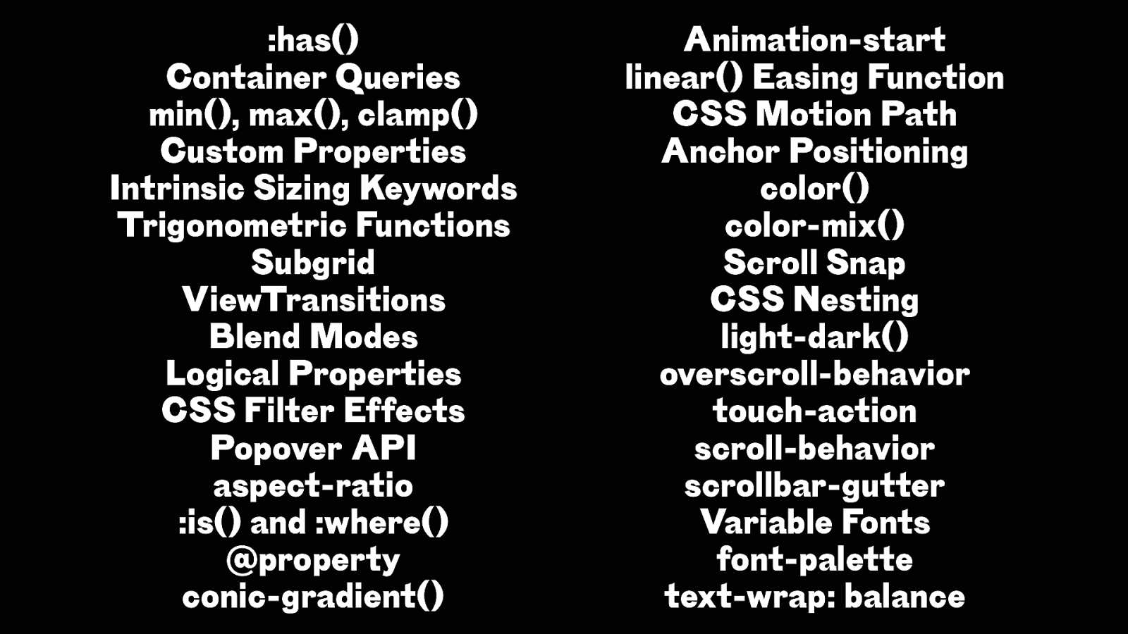
CSS is not the same anymore.
:has() Container Queries min(), max(), clamp() Custom Properties Intrinsic Sizing Keywords Trigonometric Functions Subgrid ViewTransitions Blend Modes Logical Properties CSS Filter Effects Popover API aspect-ratio :is() and :where() @property conic-gradient() Animation-start linear() Easing Function CSS Motion Path Anchor Positioning color() color-mix() Scroll Snap CSS Nesting light-dark() overscroll-behavior touch-action scroll-behavior scrollbar-gutter Variable Fonts font-palette text-wrap: balance
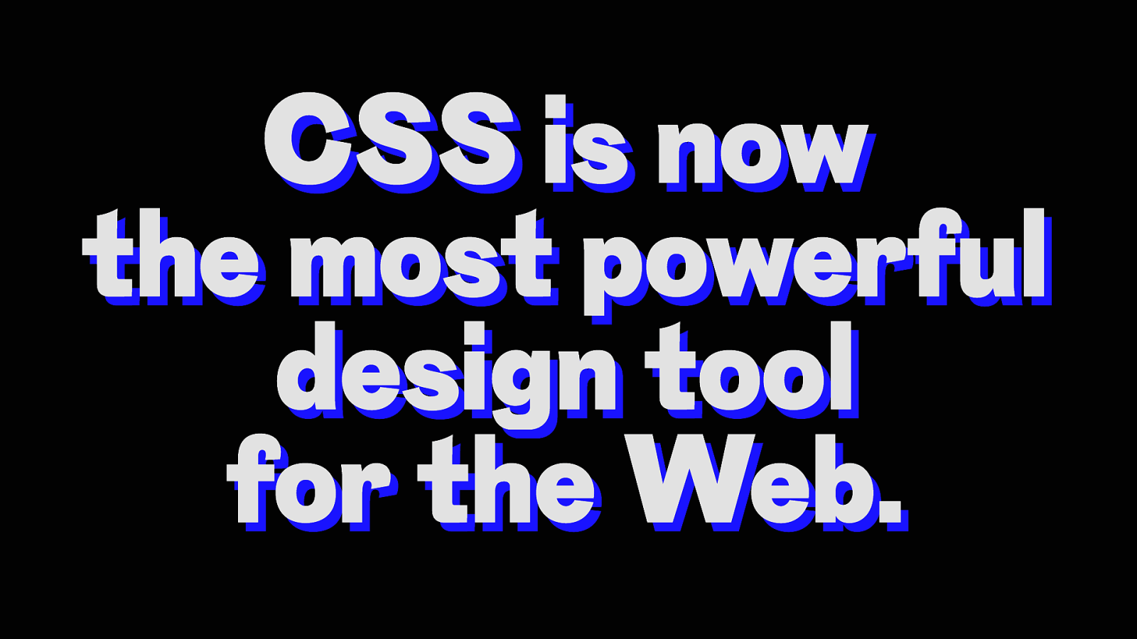
CSS is now the most powerful design tool for the Web.
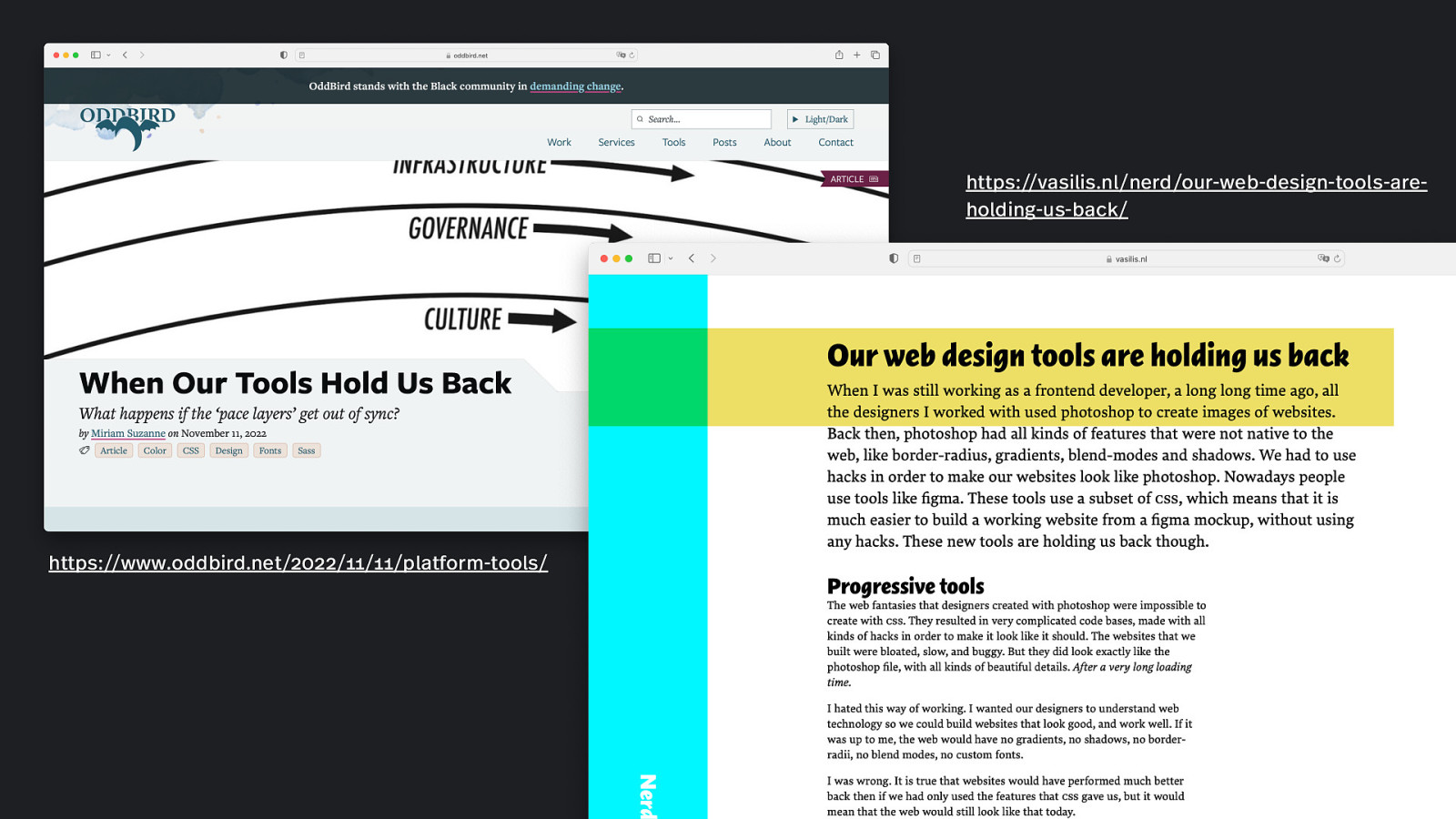
https://vasilis.nl/nerd/our-web-design-tools-areholding-us-back/ https://www.oddbird.net/2022/11/11/platform-tools/
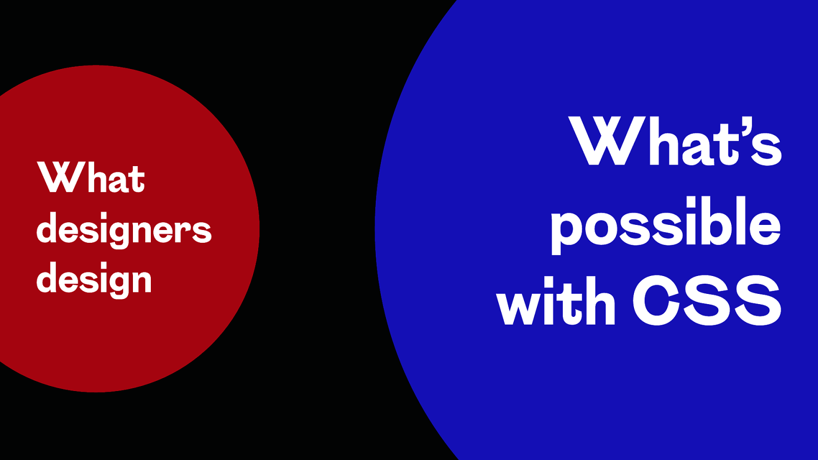
What designers design What’s possible with CSS
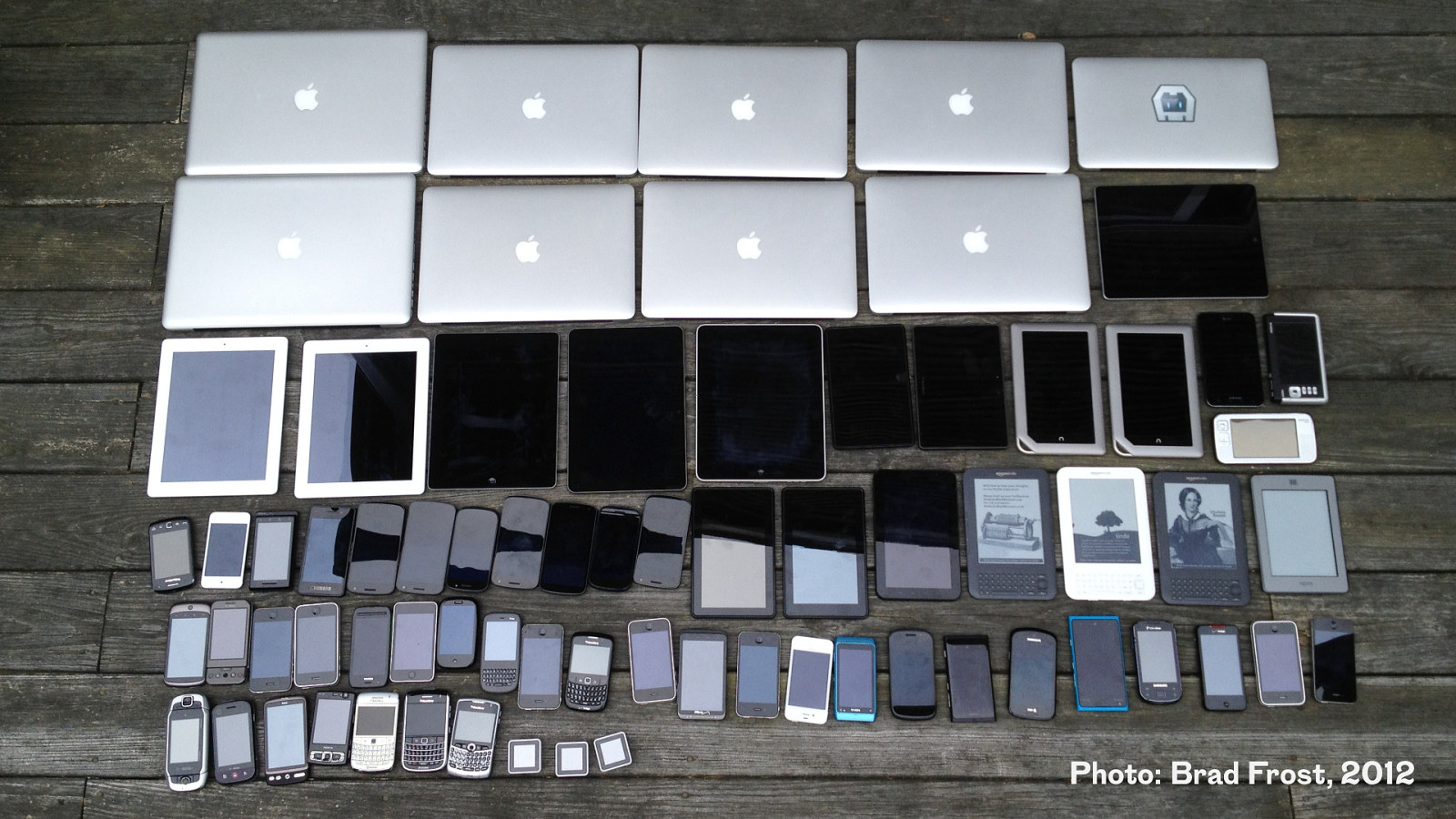
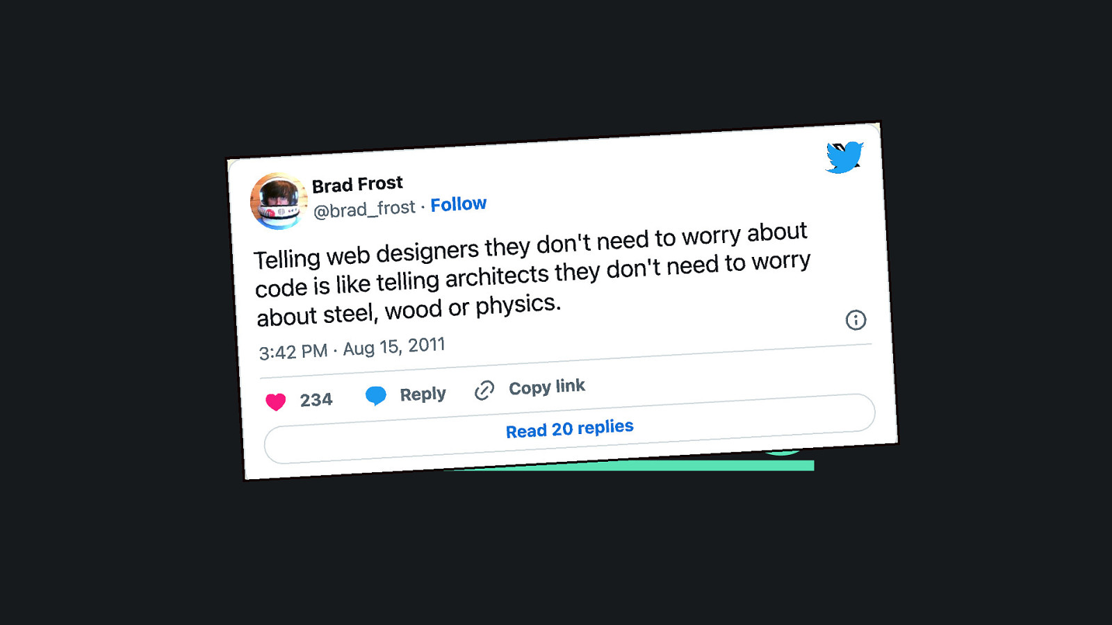
Photo: Brad Frost, 2012
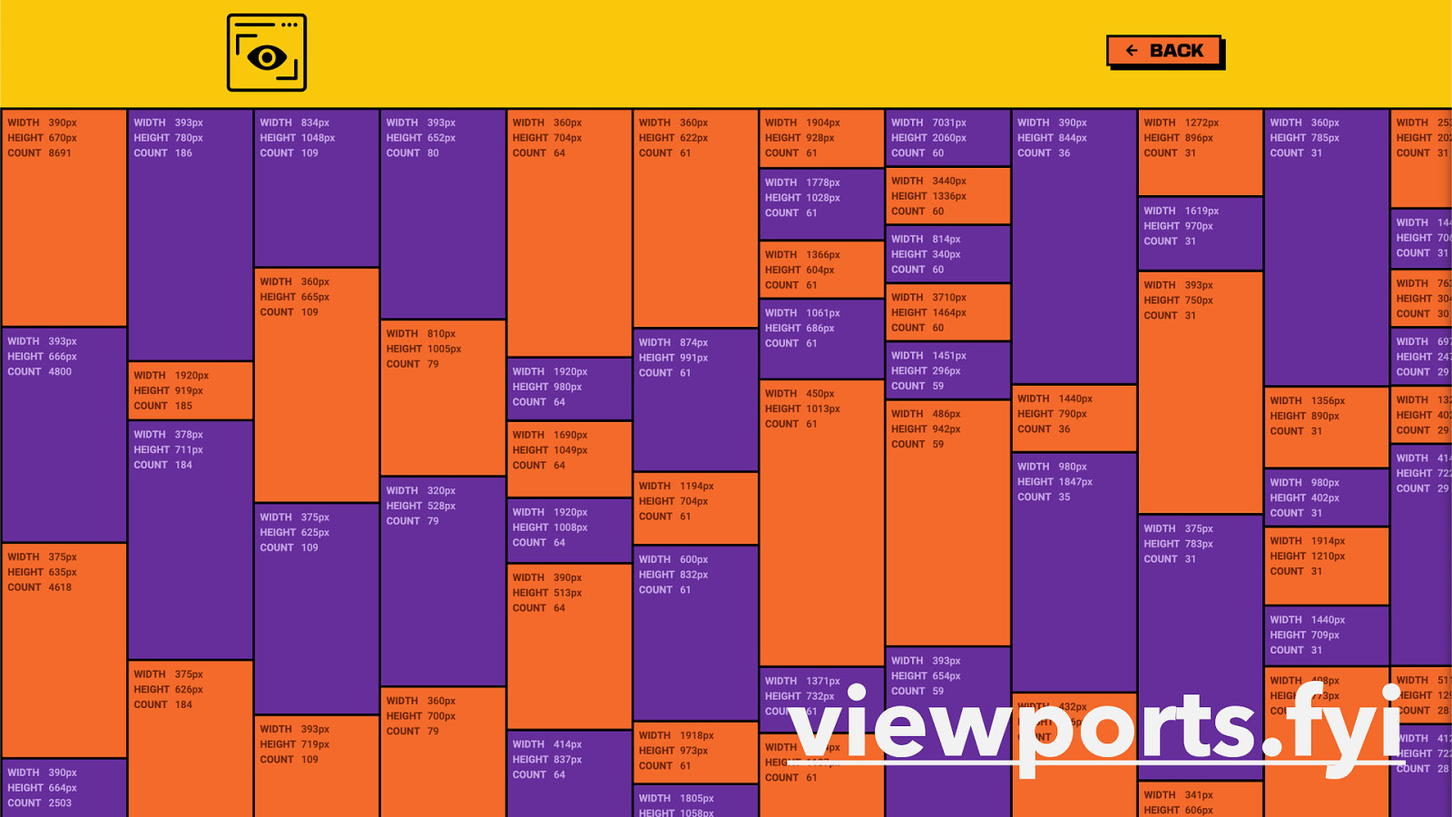
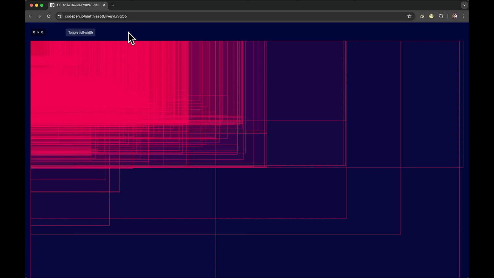
viewports.fyi
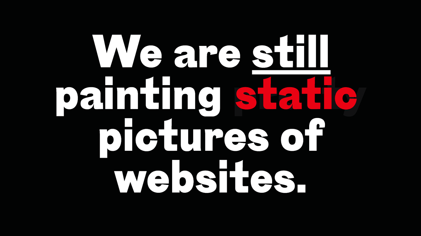
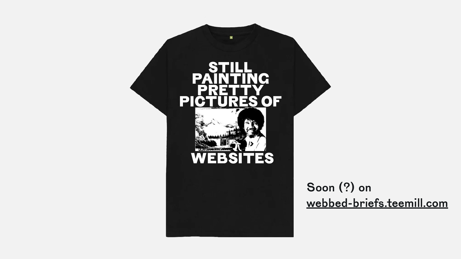
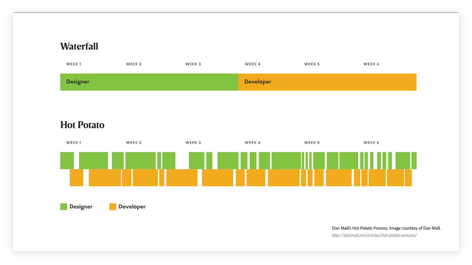
We are still static painting pretty pictures of websites.
STILL PAINTING PRETTY PICTURES OF WEBSITES Soon (?) on webbed-briefs.teemill.com
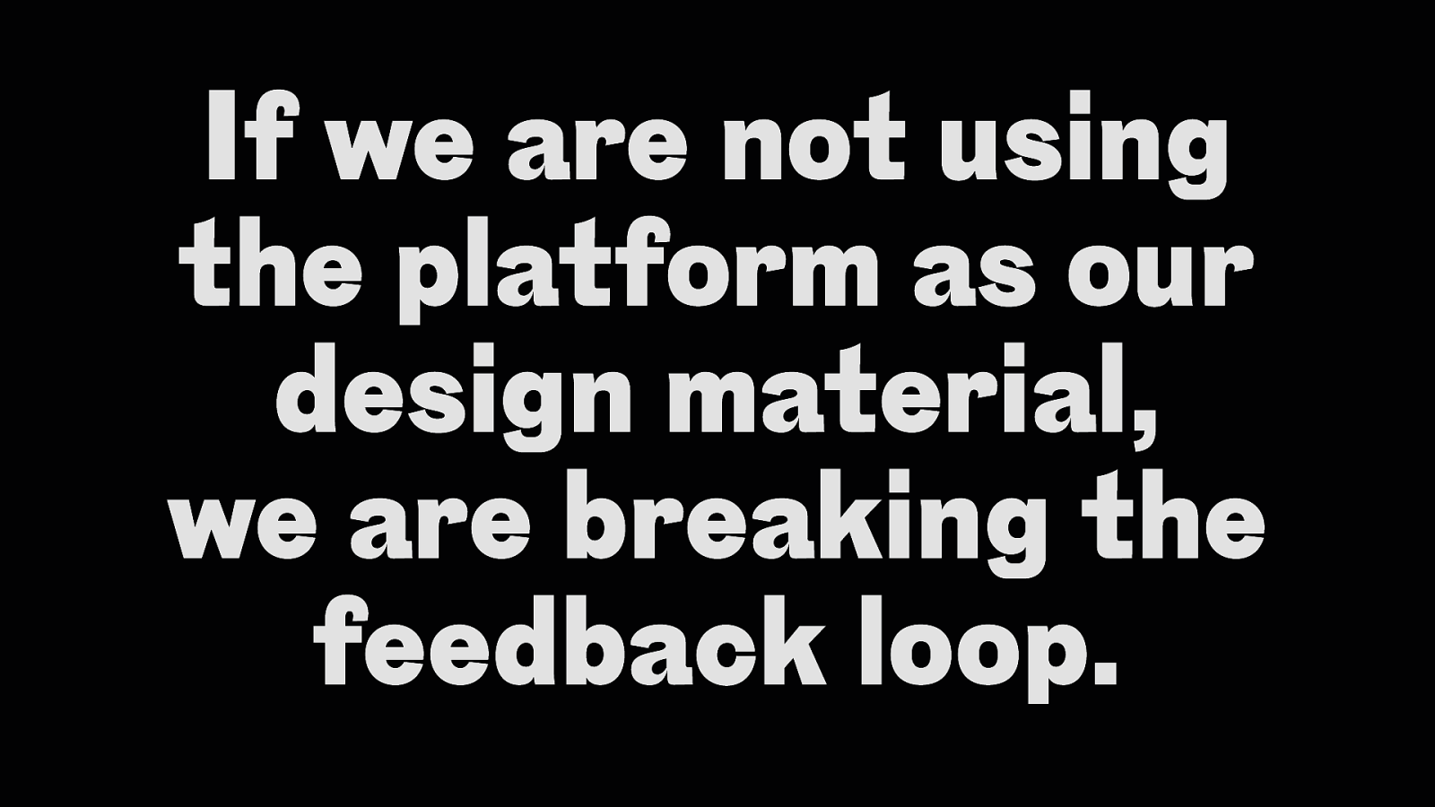
If we are not using the platform as our design material, we are breaking the feedback loop.
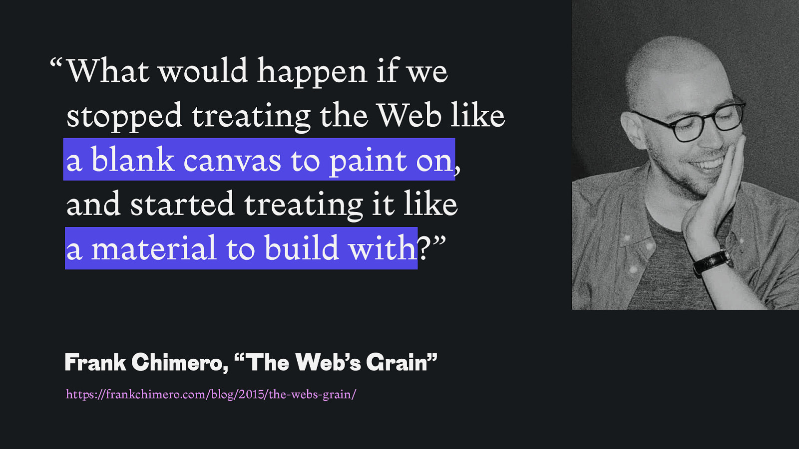
“ What would happen if we stopped treating the Web like a blank canvas to paint on, and started treating it like a material to build with?” Frank Chimero, “The Web’s Grain” https://frankchimero.com/blog/2015/the-webs-grain/
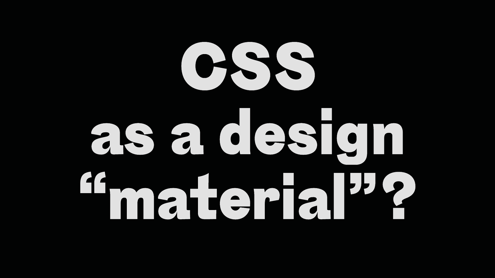
CSS as a design “material”?
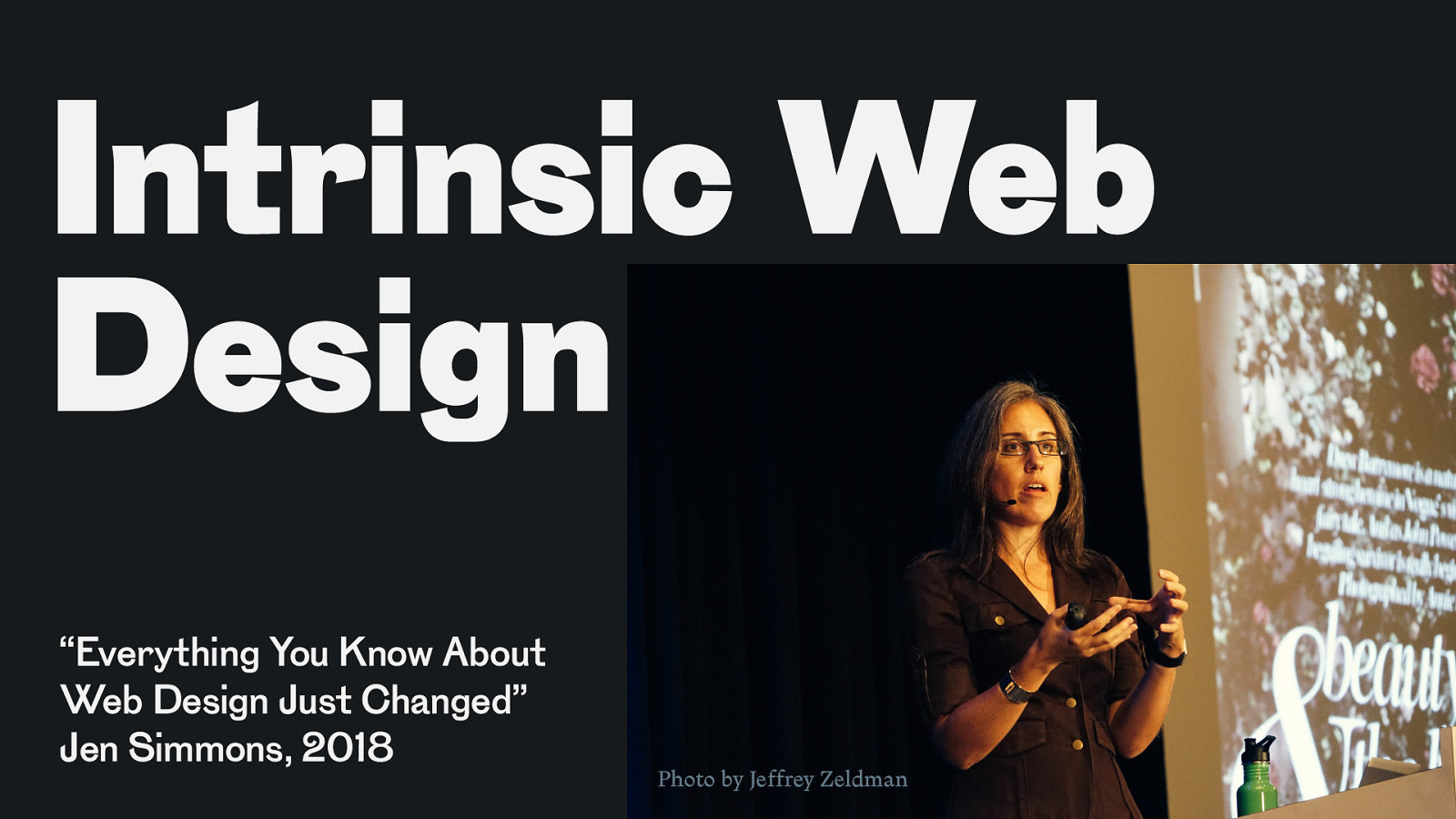
Intrinsic Web Design “Everything You Know About Web Design Just Changed” Jen Simmons, 2018 Photo by Jeffrey Zeldman
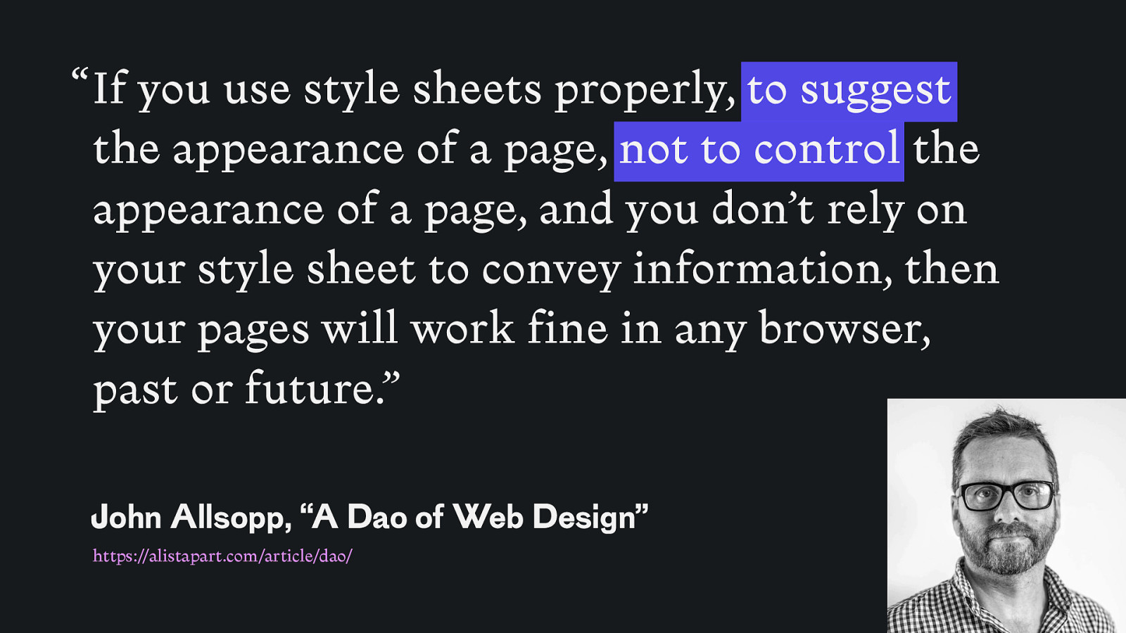
“ If you use style sheets properly, to suggest the appearance of a page, not to control the appearance of a page, and you don’t rely on your style sheet to convey information, then your pages will work fine in any browser, past or future.” John Allsopp, “A Dao of Web Design” https://alistapart.com/article/dao/
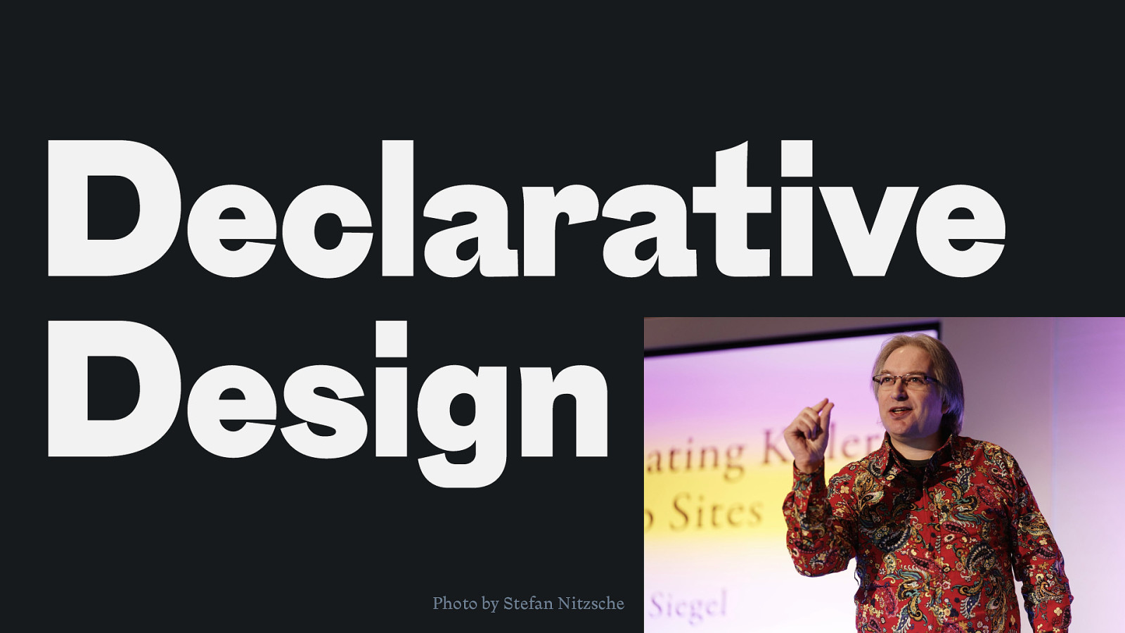
Declarative Design Photo by Stefan Nitzsche
Typography
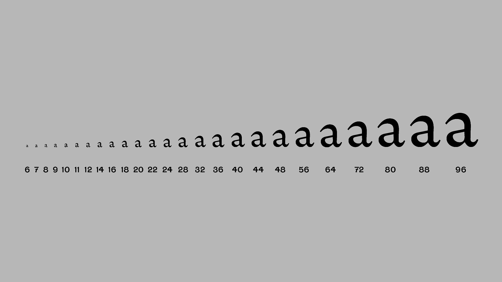
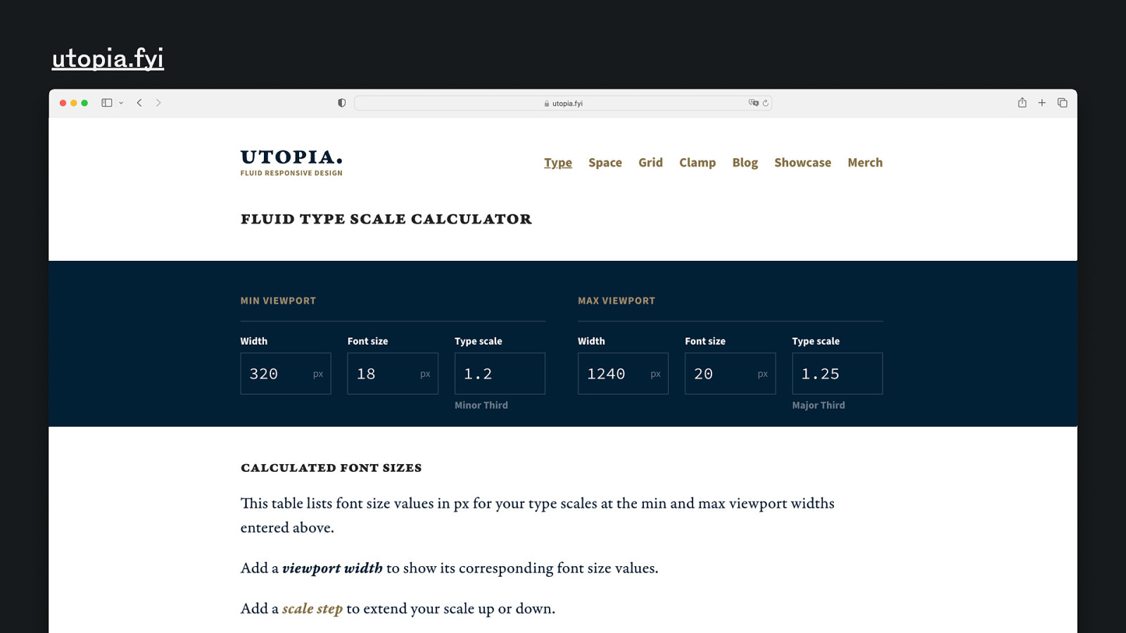
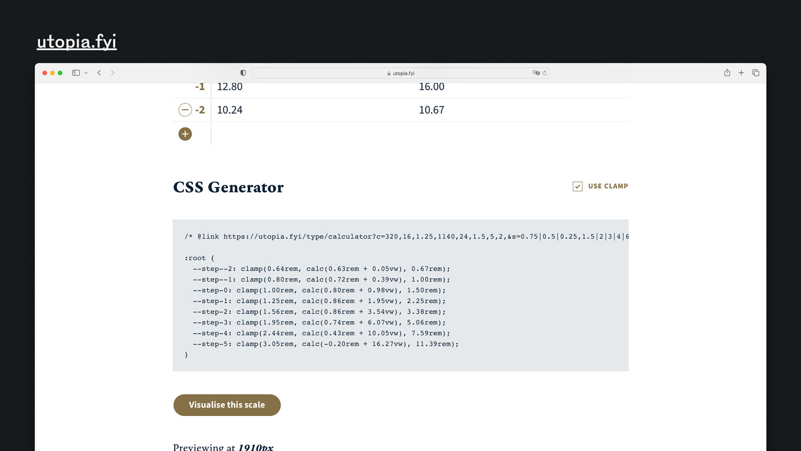
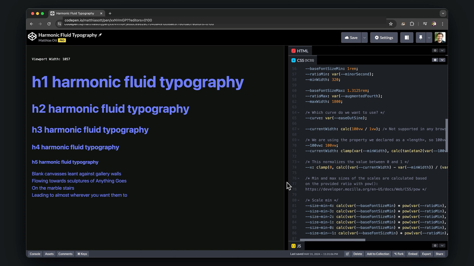
Fluid Web Typography
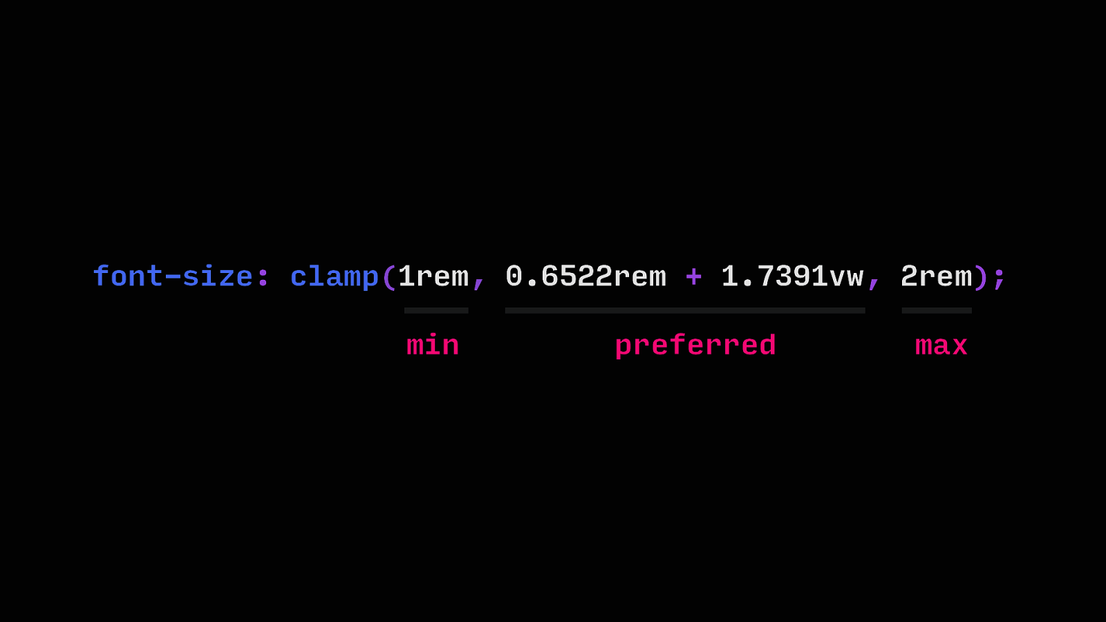
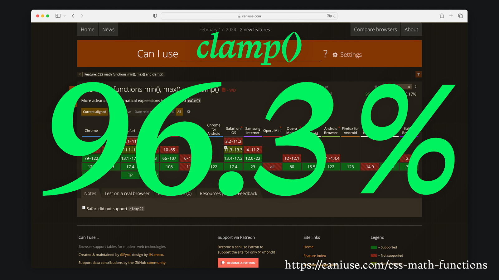
font-size: clamp(1rem, 0.6522rem + 1.7391vw, 2rem); min preferred max
clamp() 96.3 % https://caniuse.com/css-math-functions
a a a a a a a a a a a a aa aaaaa 6 7 8 9 10 11 12 14 16 18 20 22 24 28 32 36 40 44 48 aaaaa 56 64 72 80 88 a 96
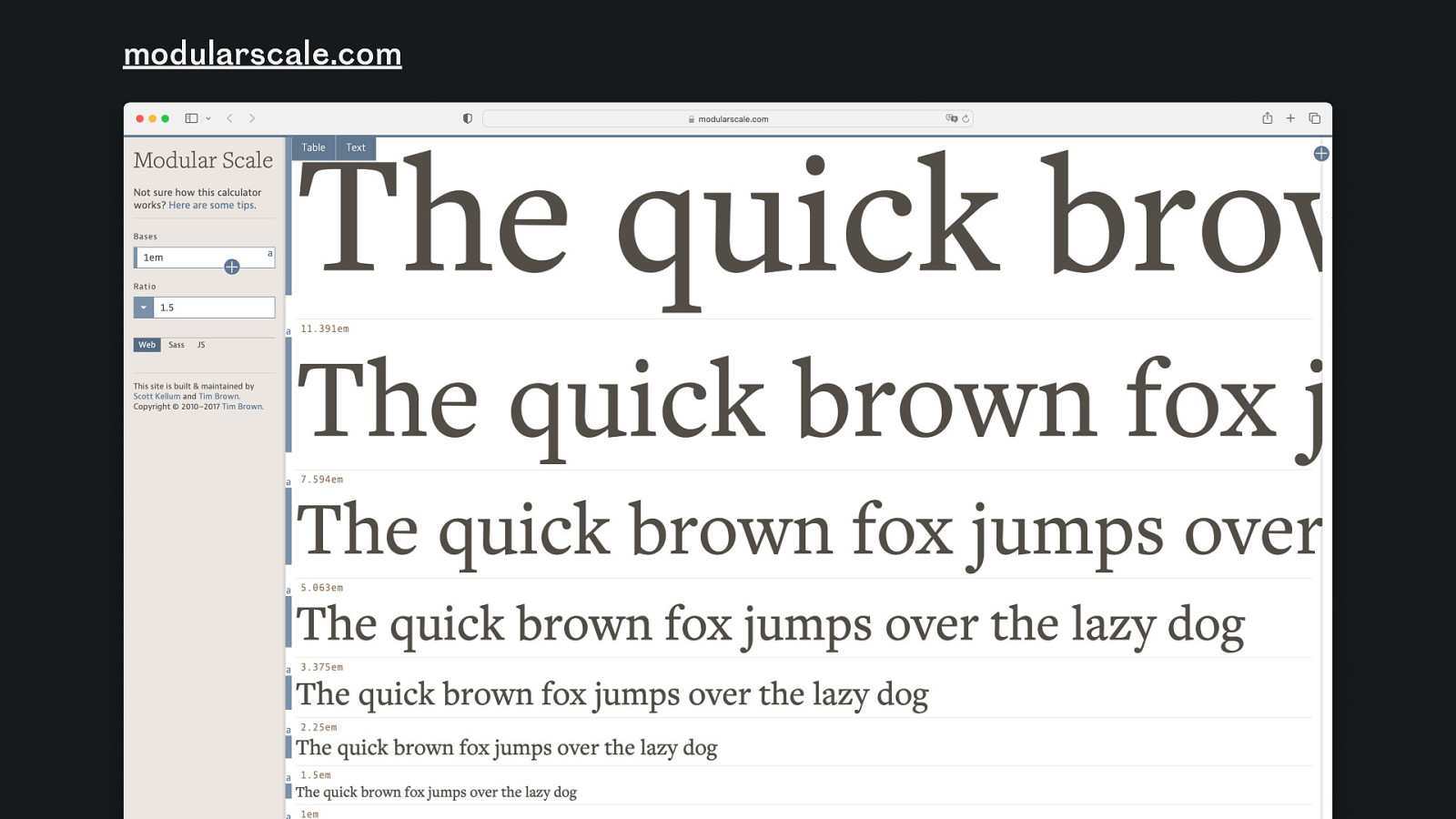
modularscale.com
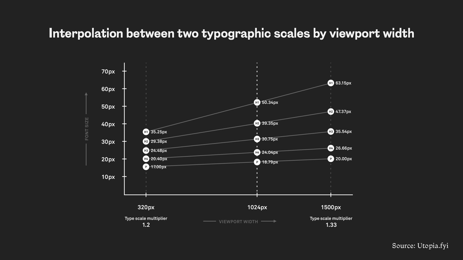
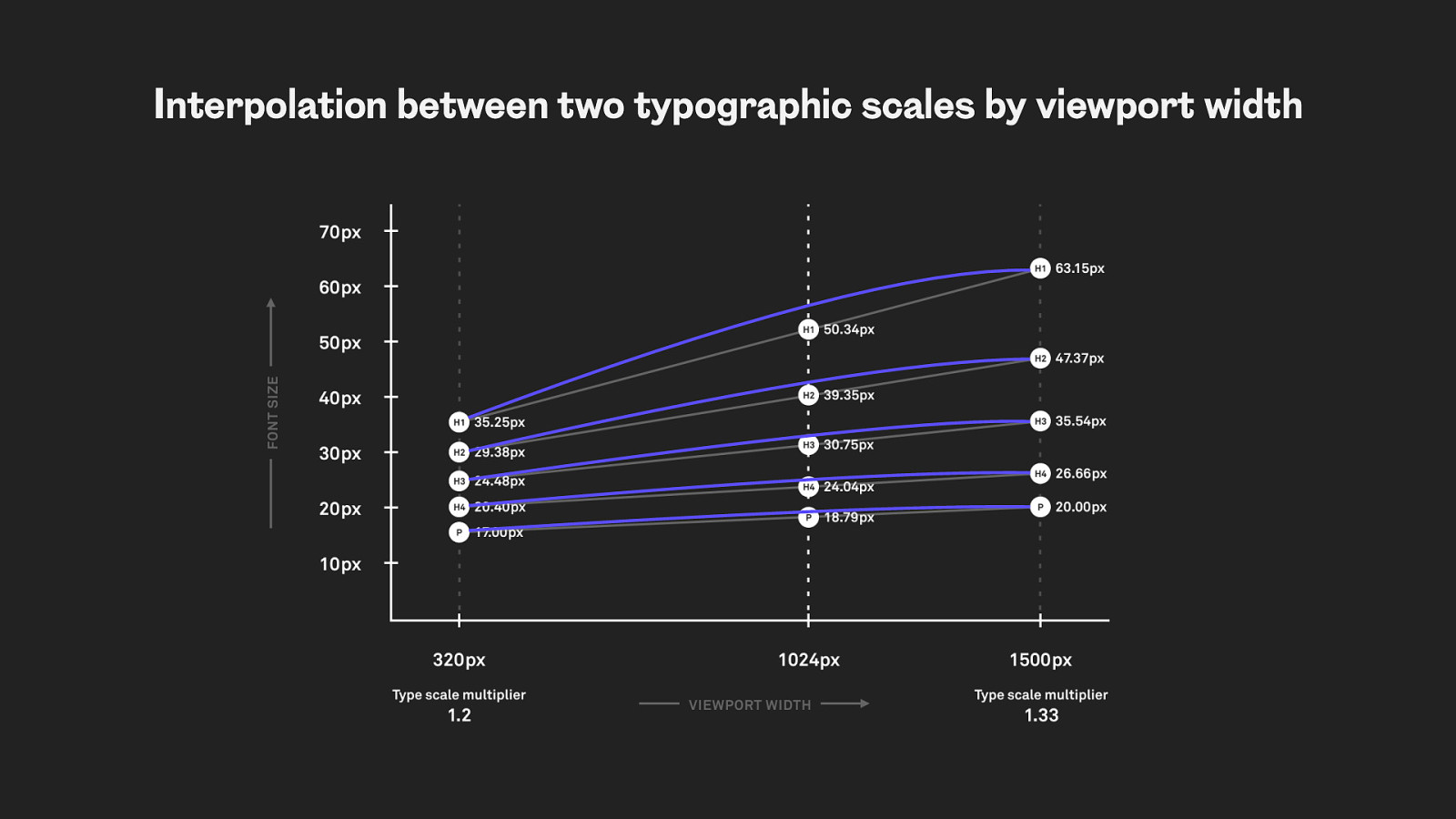
Interpolation between two typographic scales by viewport width Source: Utopia.fyi
utopia.fyi
utopia.fyi
https://utopia.fyi/
Interpolation between two typographic scales by viewport width
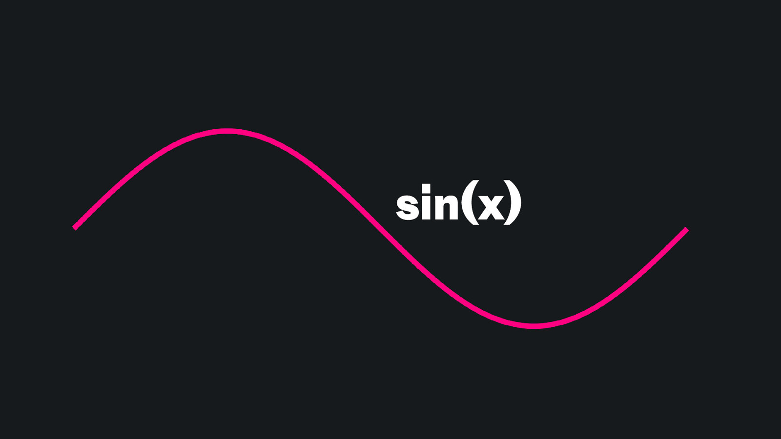
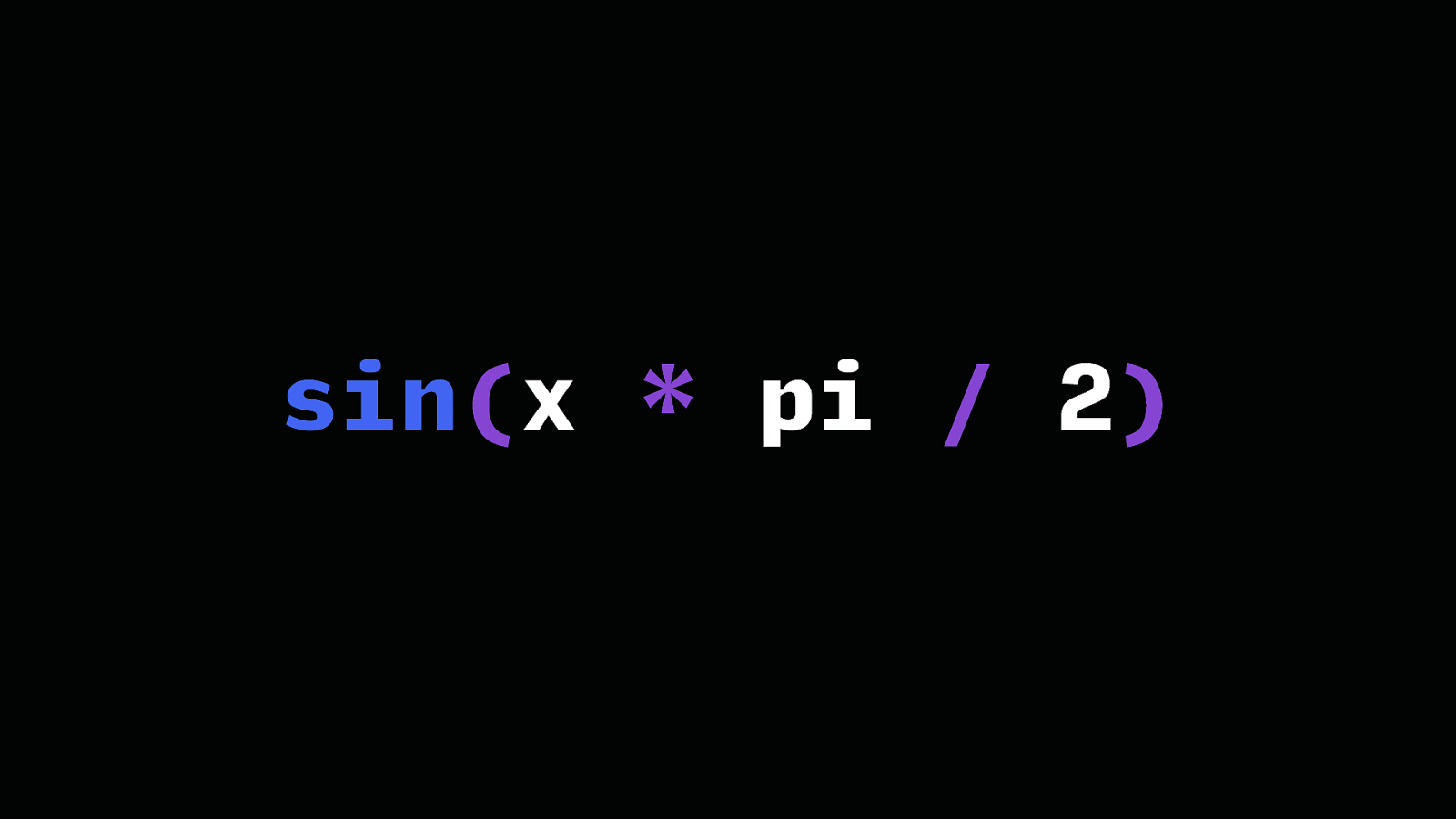
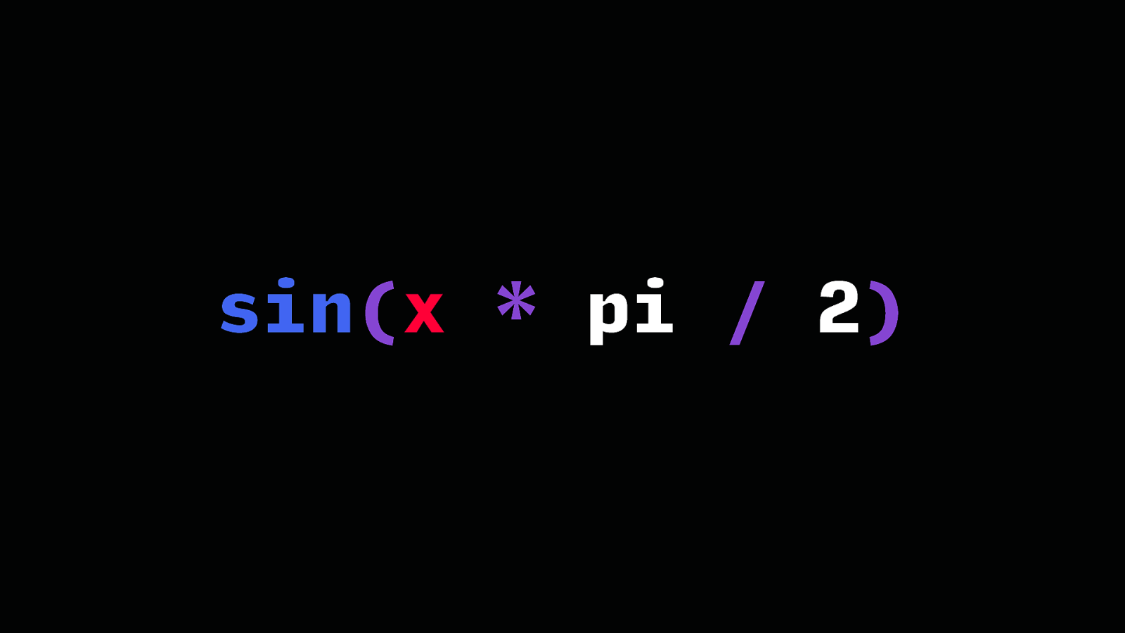
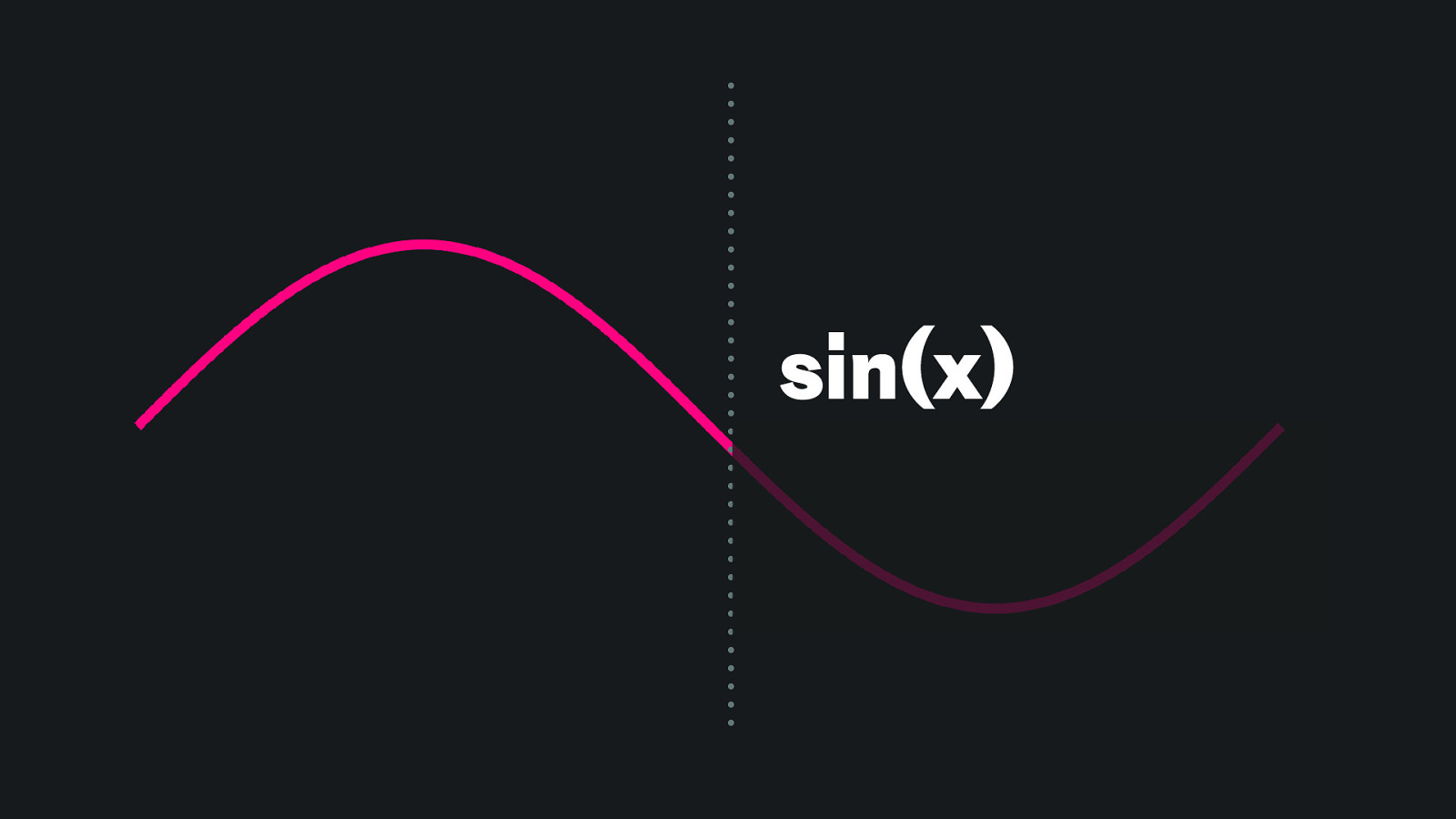
sin(x)
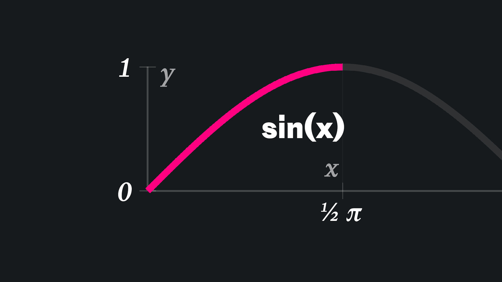
1 y sin(x) 0 x ½π
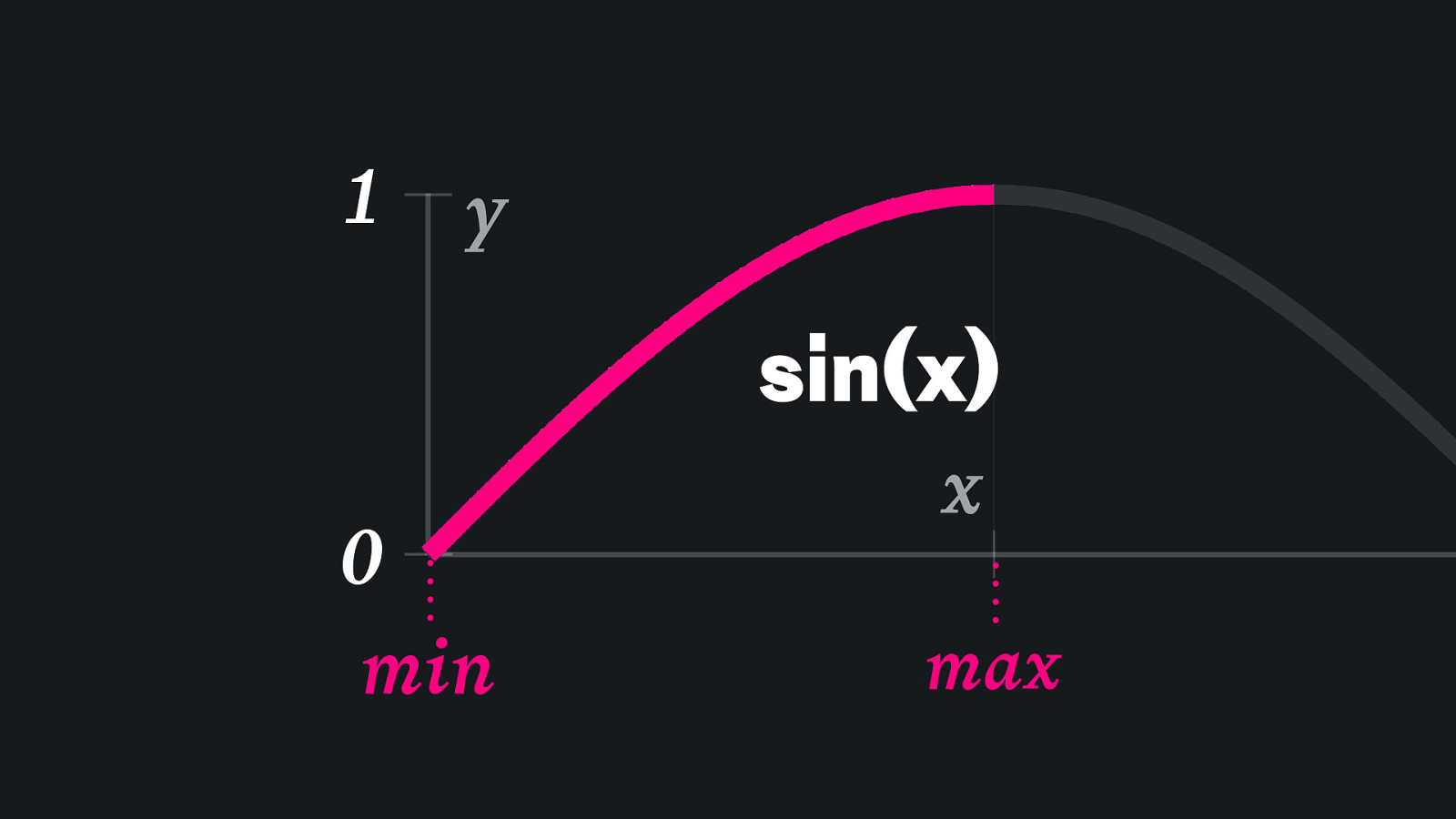
1 y sin(x) 0 min x max
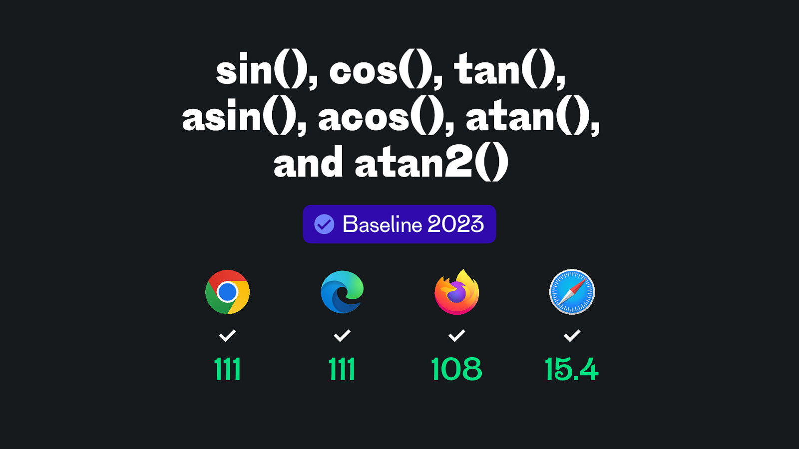
sin(), cos(), tan(), asin(), acos(), atan(), and atan2() Baseline 2023 111 111 108 15.4
sin(x * pi / 2)
sin(x * pi / 2)
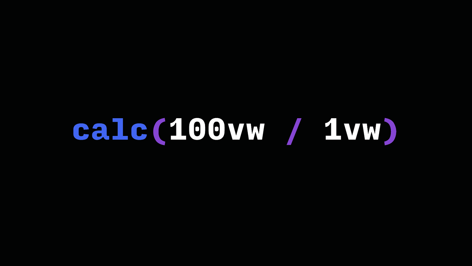
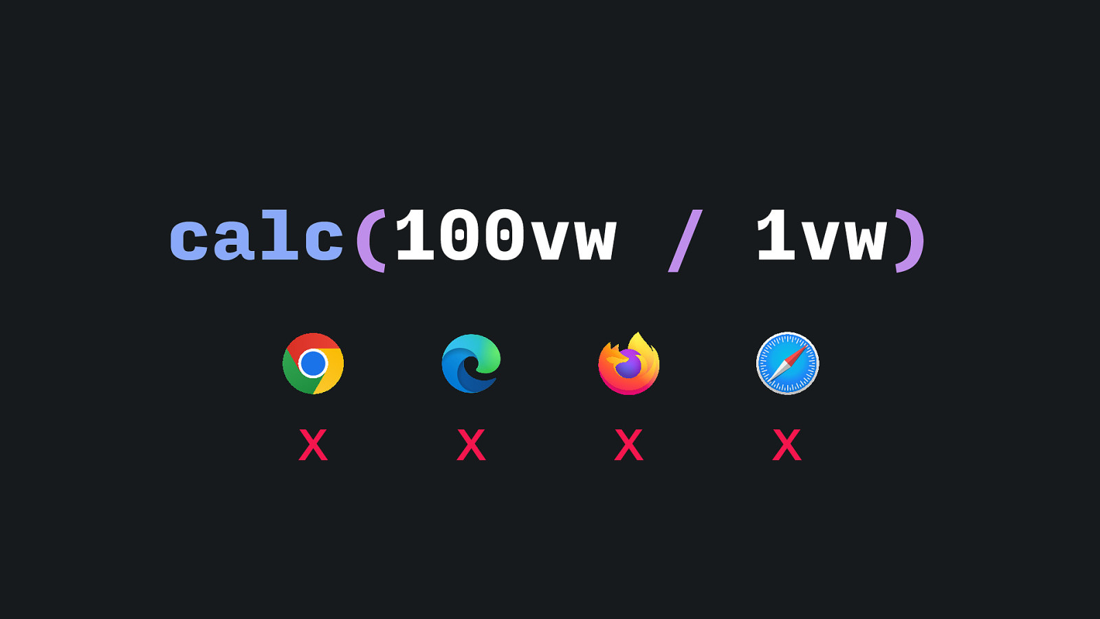
calc(100vw / 1vw)
calc(100vw / 1vw) X X X X
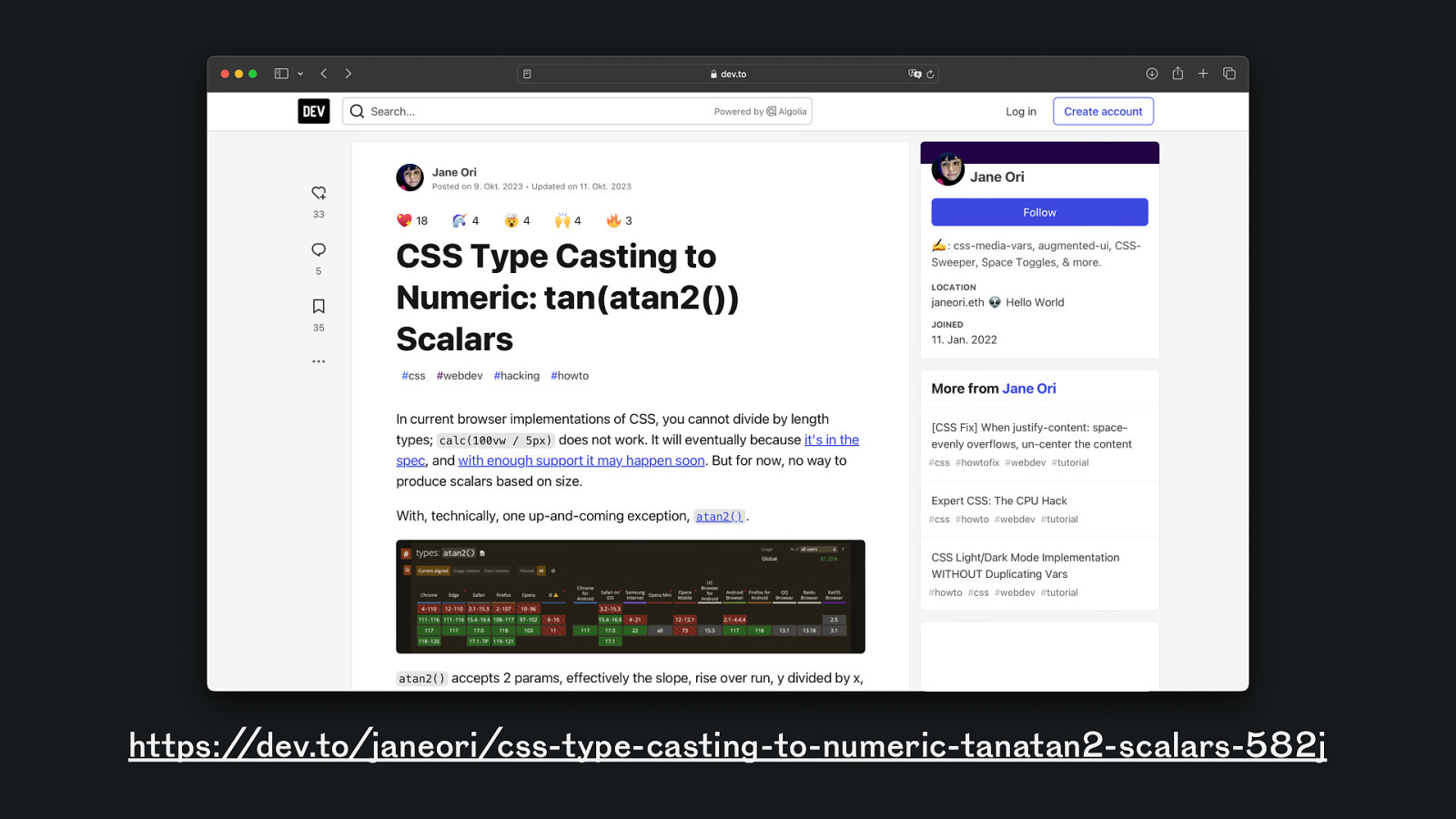
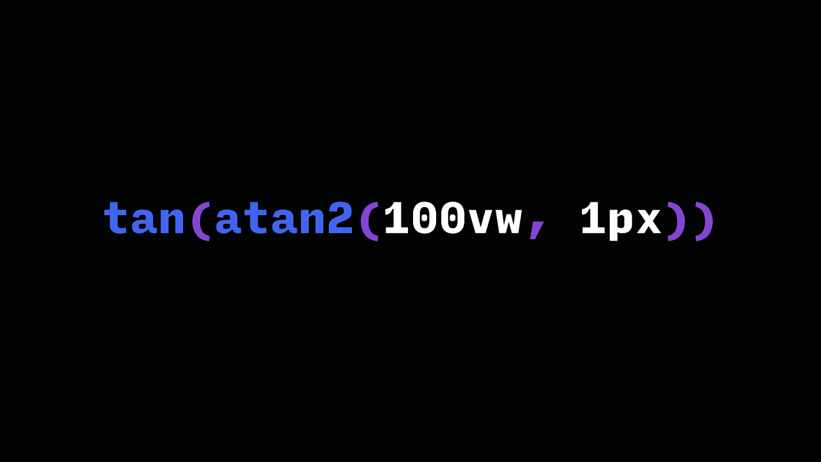
https://dev.to/janeori/css-type-casting-to-numeric-tanatan2-scalars-582j
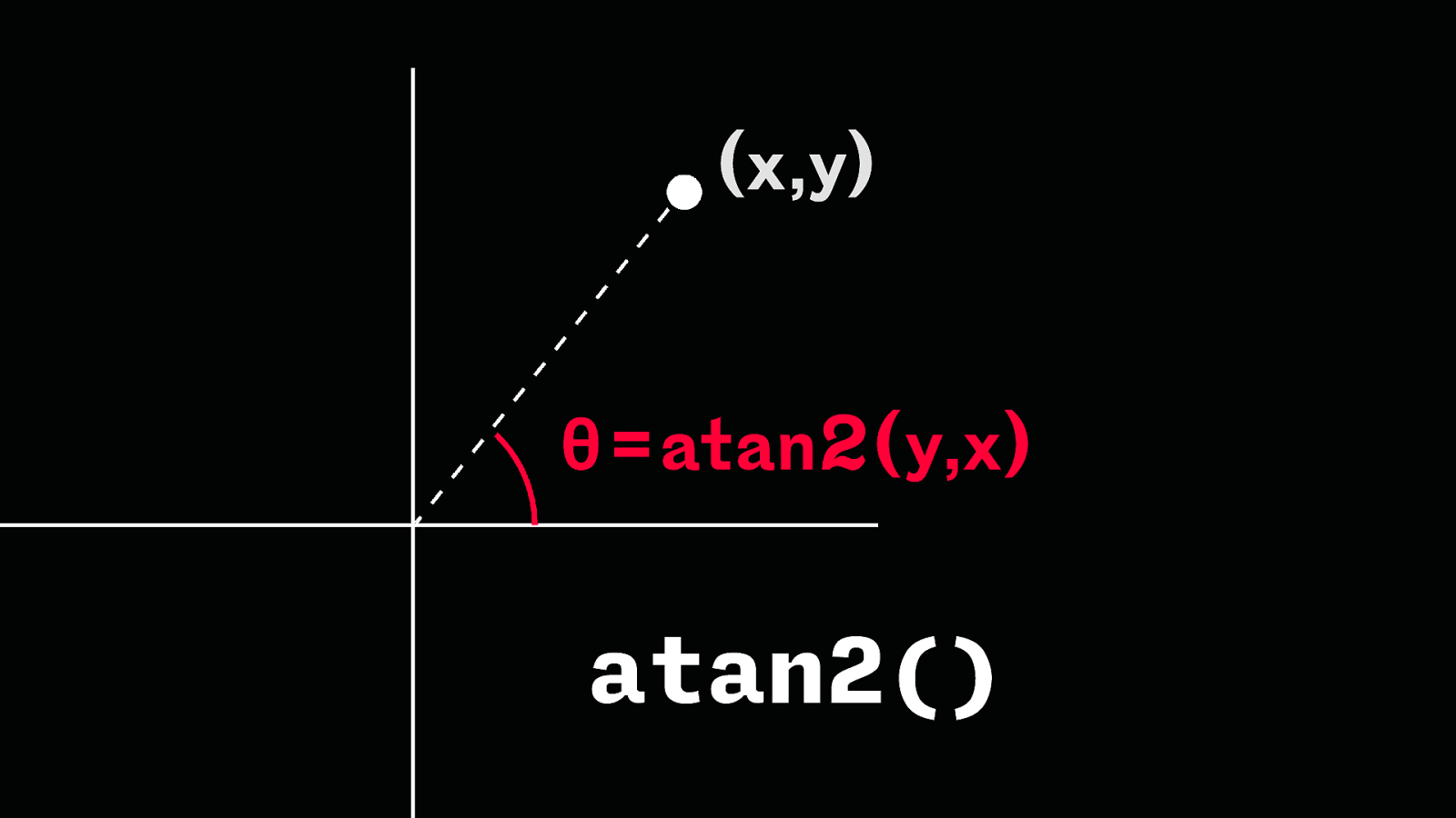
(x,y) θ=atan2(y,x) atan2()
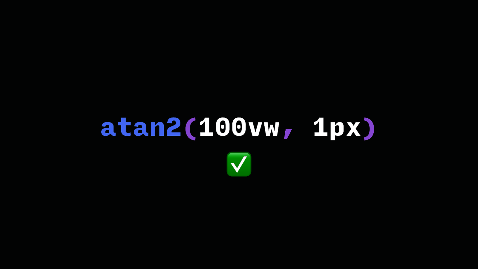
atan2(100vw, 1px) ✅
tan(atan2(100vw, 1px))
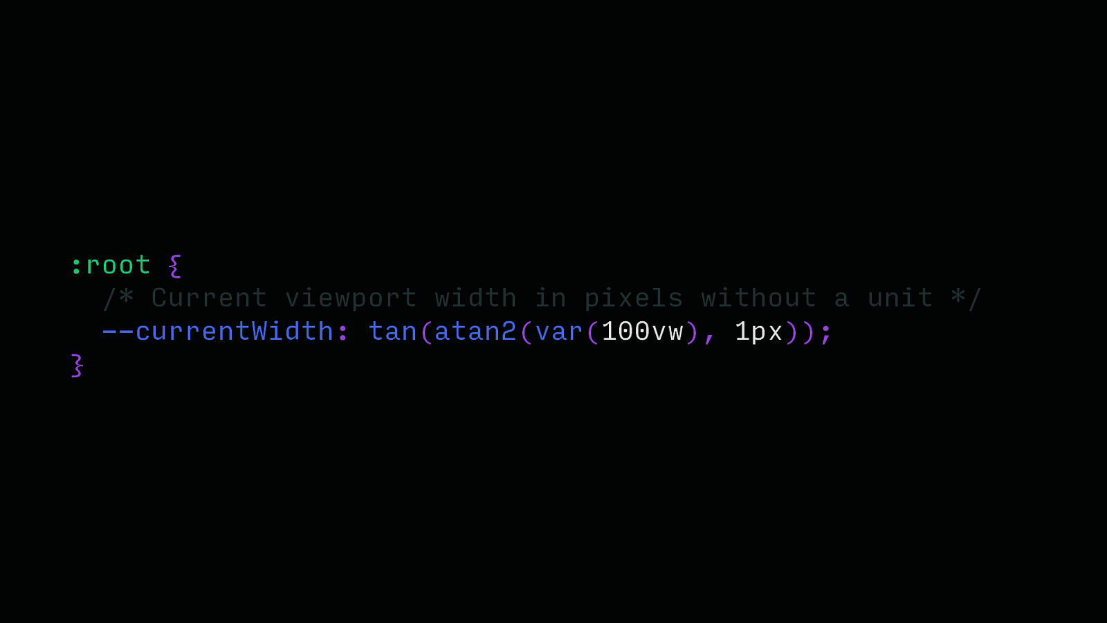
:root { /* Current viewport width in pixels without a unit */ —currentWidth: tan(atan2(var(100vw), 1px)); }
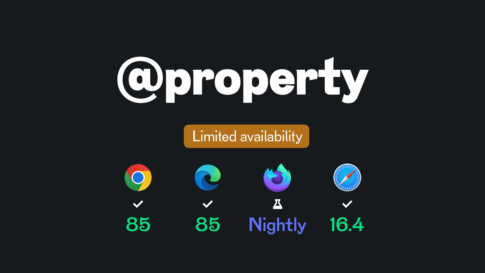
@property Limited availability 85 85 Nightly 16.4
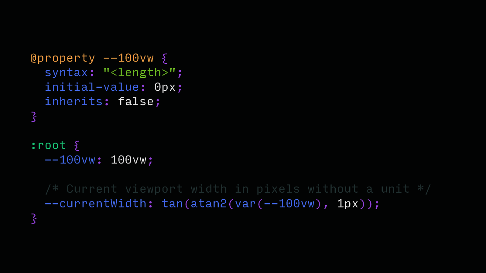
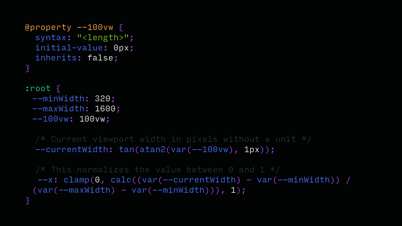
@property —100vw { syntax: “<length>”; initial-value: 0px; inherits: false; } :root { —100vw: 100vw; /* Current viewport width in pixels without a unit */ —currentWidth: tan(atan2(var(—100vw), 1px)); }
@property —100vw { syntax: “<length>”; initial-value: 0px; inherits: false; } :root { —minWidth: 320; —maxWidth: 1600; —100vw: 100vw; /* Current viewport width in pixels without a unit / —currentWidth: tan(atan2(var(—100vw), 1px)); / This normalizes the value between 0 and 1 */ —x: clamp(0, calc((var(—currentWidth) - var(—minWidth)) / (var(—maxWidth) - var(—minWidth))), 1); }
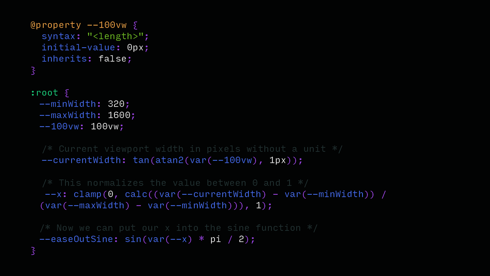
@property —100vw { syntax: “<length>”; initial-value: 0px; inherits: false; } :root { —minWidth: 320; —maxWidth: 1600; —100vw: 100vw; /* Current viewport width in pixels without a unit / —currentWidth: tan(atan2(var(—100vw), 1px)); / This normalizes the value between 0 and 1 / —x: clamp(0, calc((var(—currentWidth) - var(—minWidth)) / (var(—maxWidth) - var(—minWidth))), 1); / Now we can put our x into the sine function */ —easeOutSine: sin(var(—x) * pi / 2); }
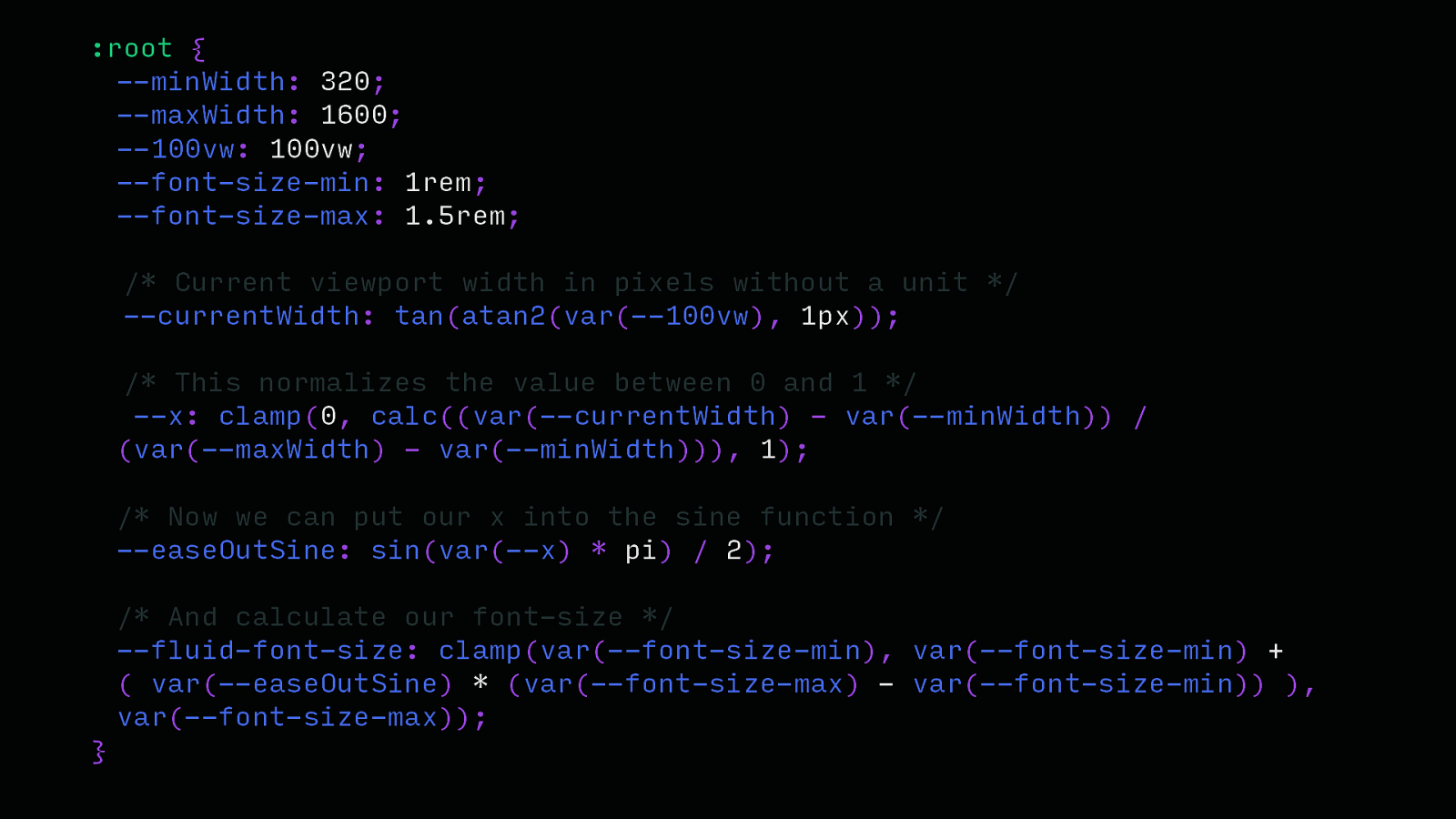
:root { —minWidth: 320; —maxWidth: 1600; —100vw: 100vw; —font-size-min: 1rem; —font-size-max: 1.5rem; /* Current viewport width in pixels without a unit / —currentWidth: tan(atan2(var(—100vw), 1px)); / This normalizes the value between 0 and 1 / —x: clamp(0, calc((var(—currentWidth) - var(—minWidth)) / (var(—maxWidth) - var(—minWidth))), 1); / Now we can put our x into the sine function / —easeOutSine: sin(var(—x) * pi) / 2); / And calculate our font-size */ —fluid-font-size: clamp(var(—font-size-min), var(—font-size-min) + ( var(—easeOutSine) * (var(—font-size-max) - var(—font-size-min)) ), var(—font-size-max)); }
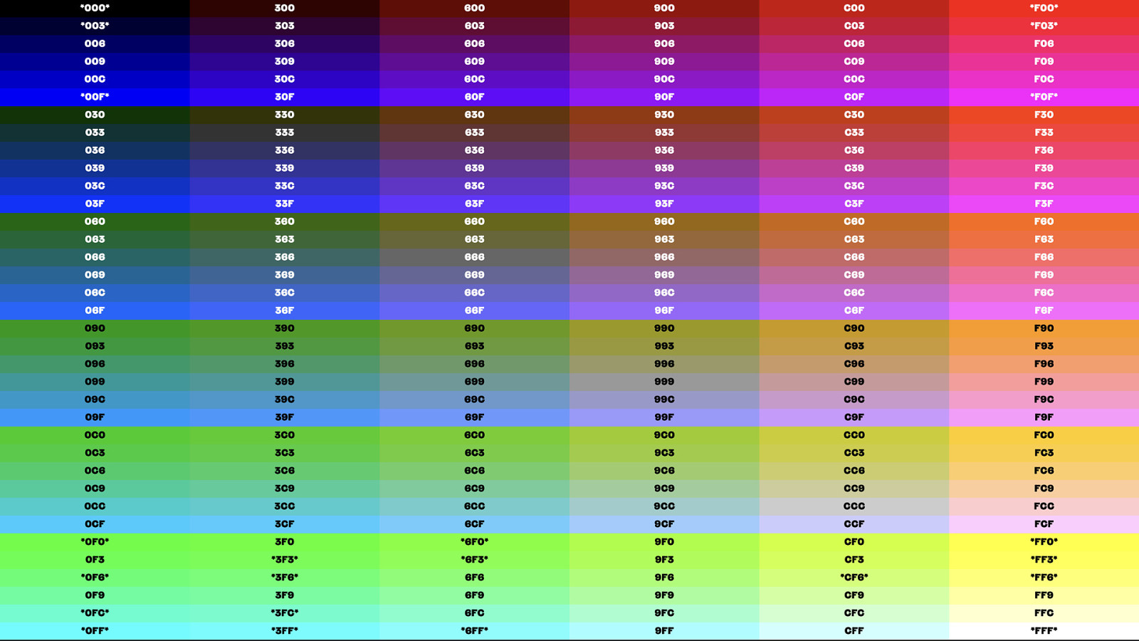
Color
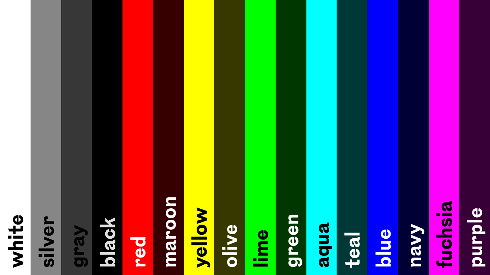
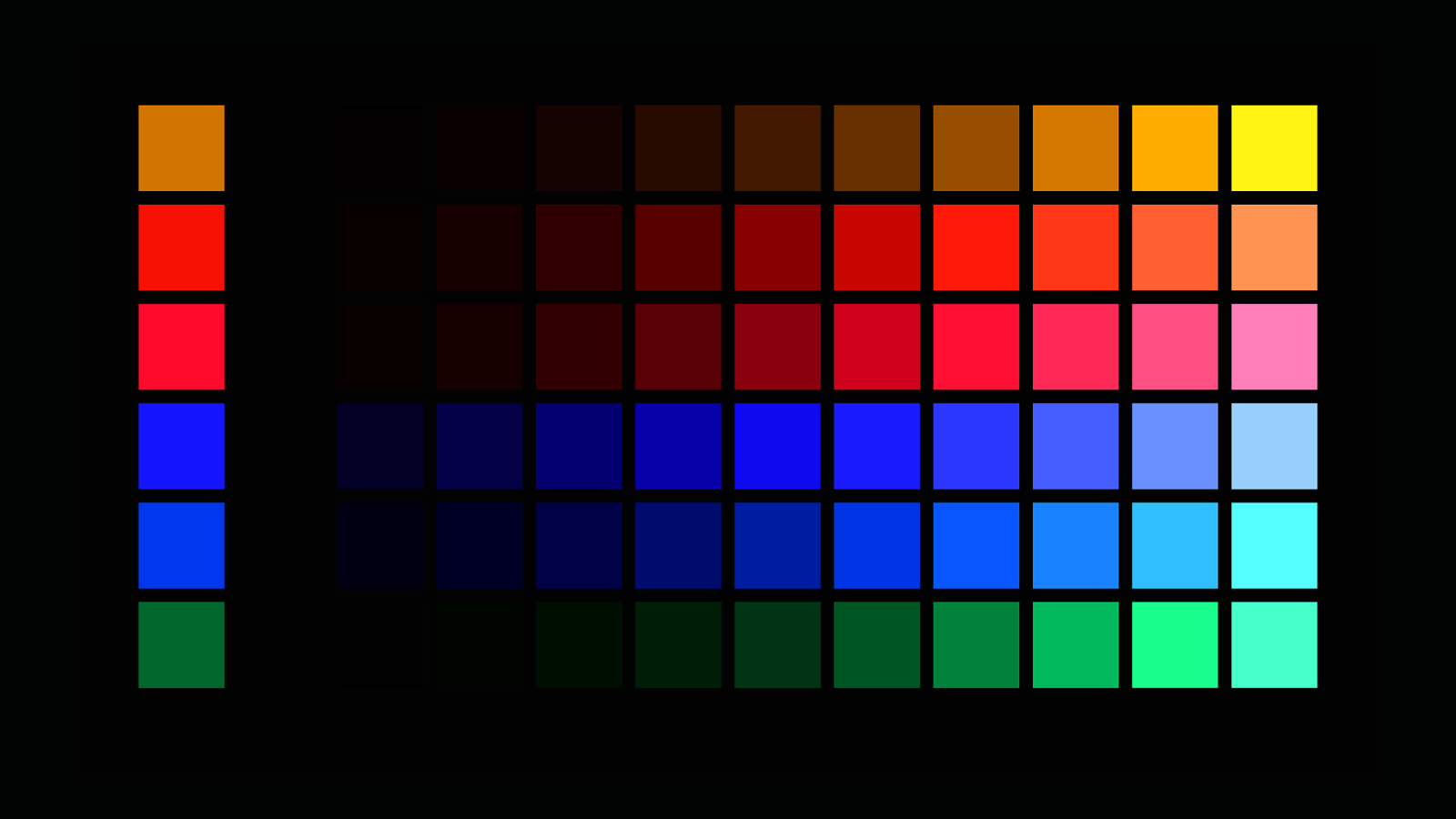
fuchsia purple blue navy teal lime green aqua yellow olive black red maroon silver gray white
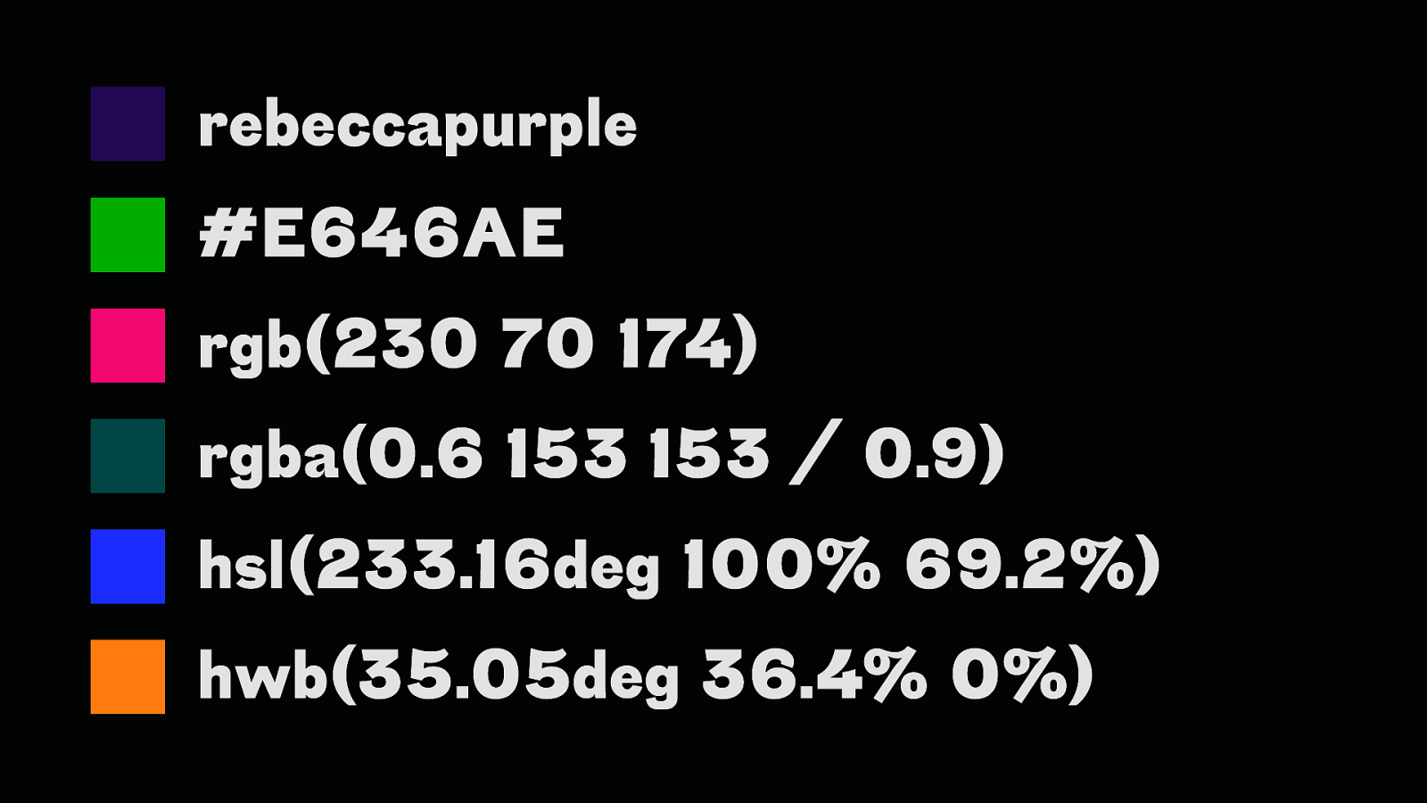
rebeccapurple #E646AE rgb(230 70 174) rgba(0.6 153 153 / 0.9) hsl(233.16deg 100% 69.2%) hwb(35.05deg 36.4% 0%)
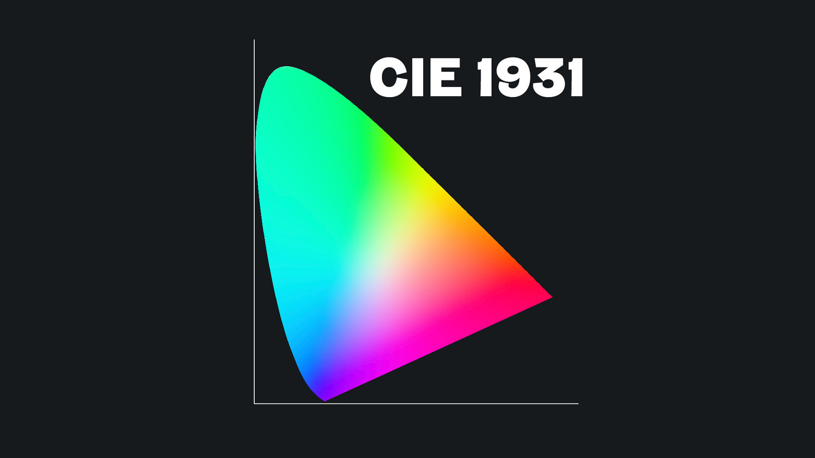
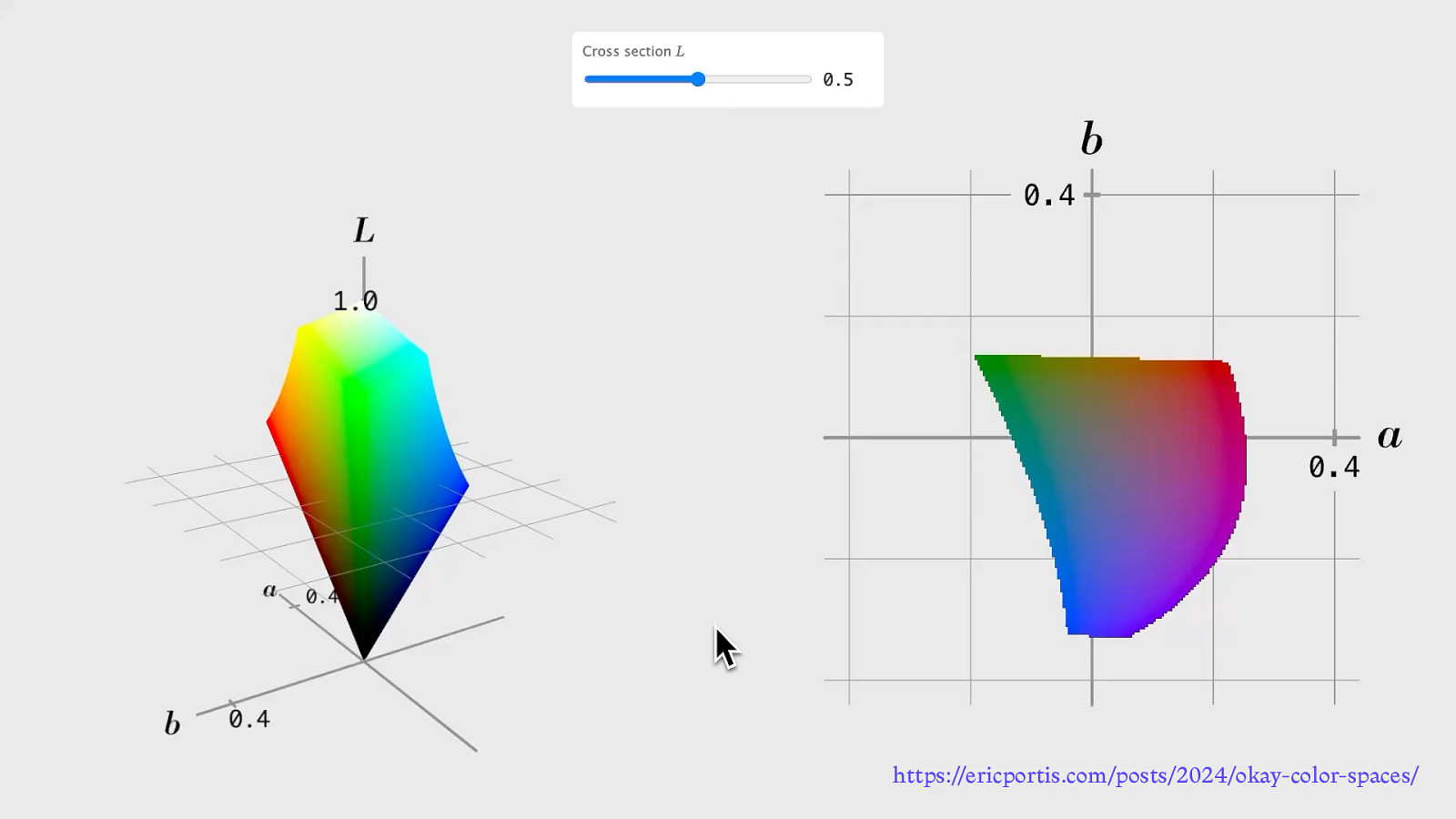
CIE 1931
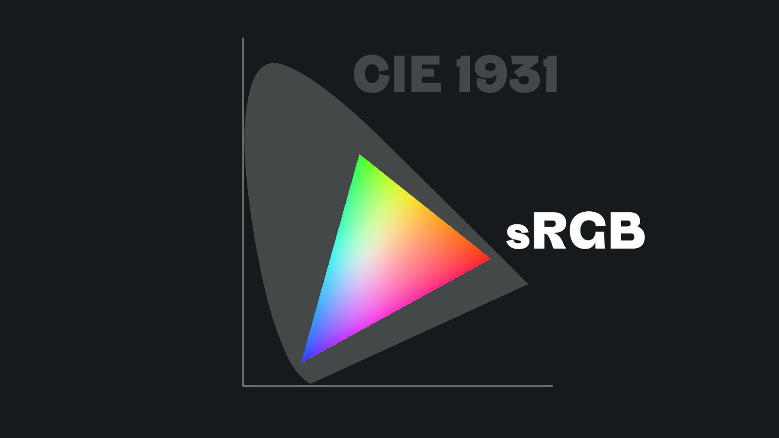
CIE 1931 sRGB
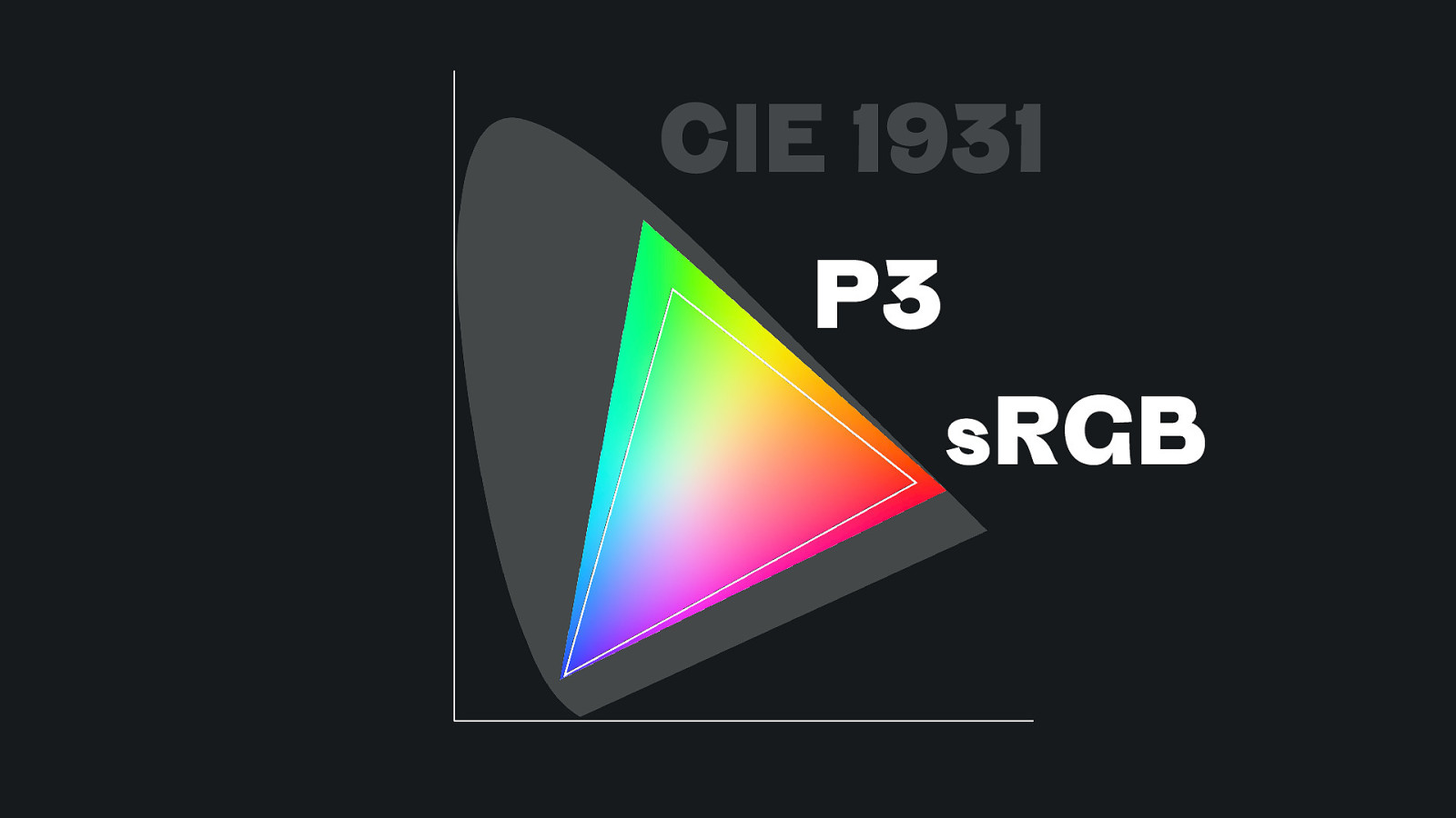
CIE 1931 P3 sRGB
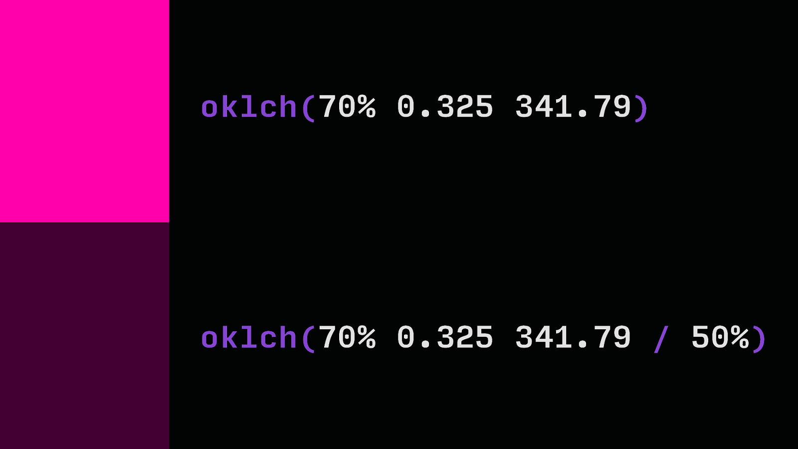
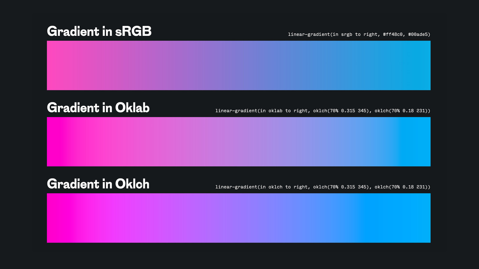
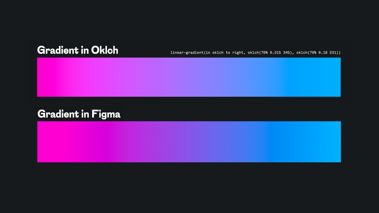
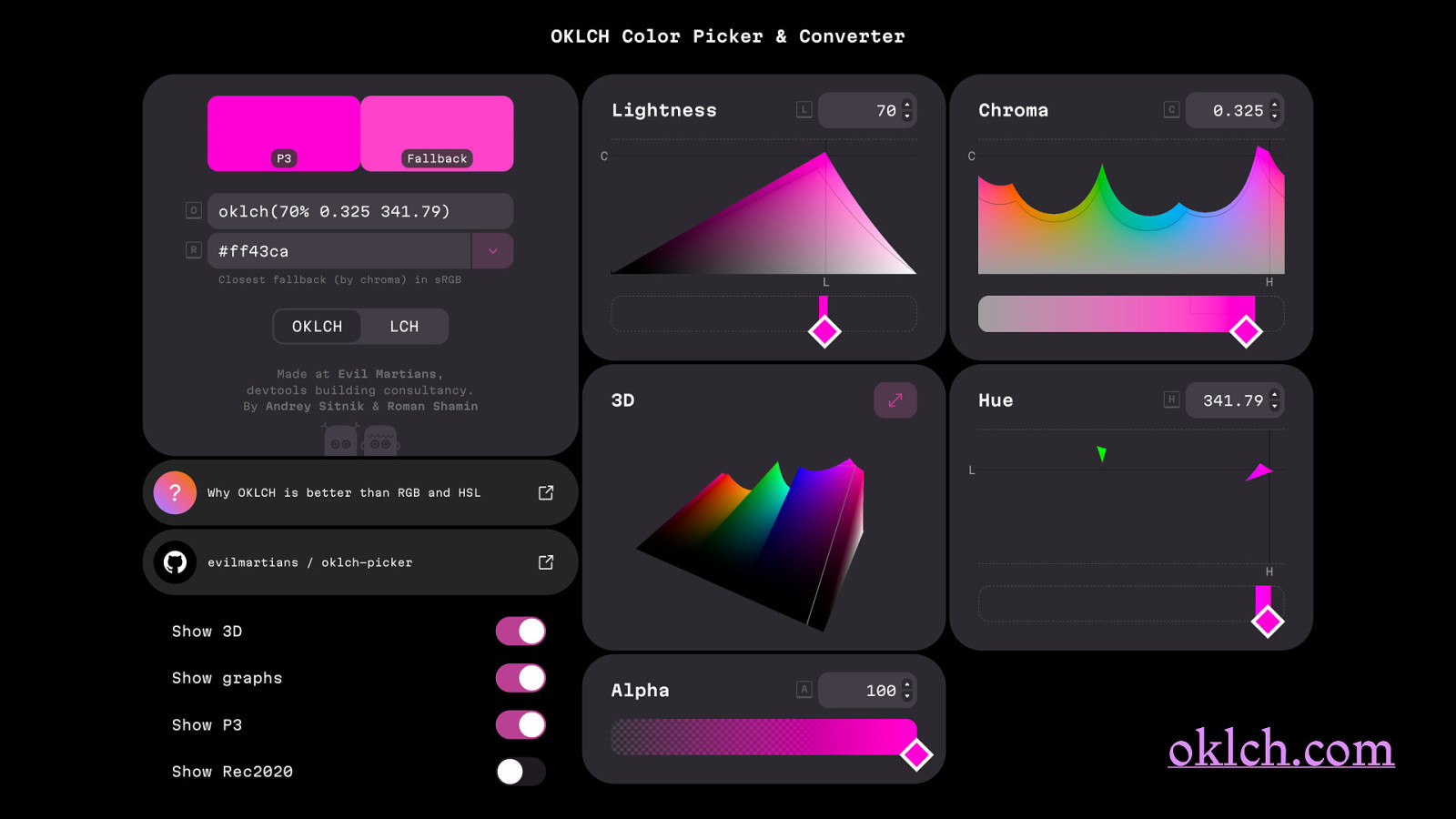
oklch
oklch(70% 0.325 341.79) oklch(70% 0.325 341.79 / 50%)
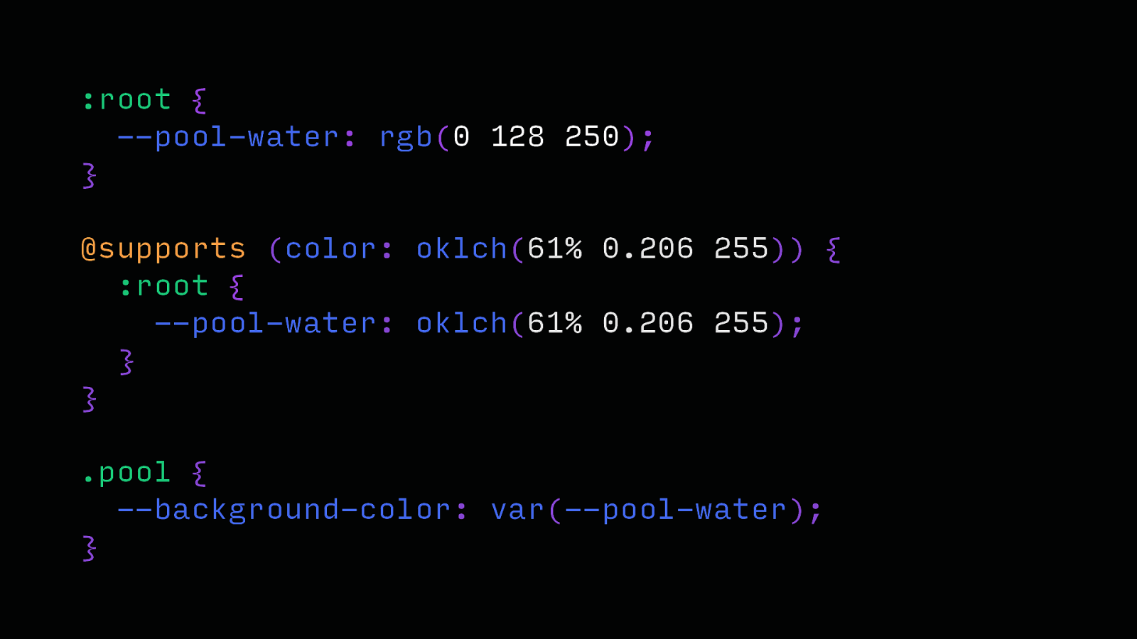
:root { —pool-water: rgb(0 128 250); } @supports (color: oklch(61% 0.206 255)) { :root { —pool-water: oklch(61% 0.206 255); } } .pool { —background-color: var(—pool-water); }
oklch.com
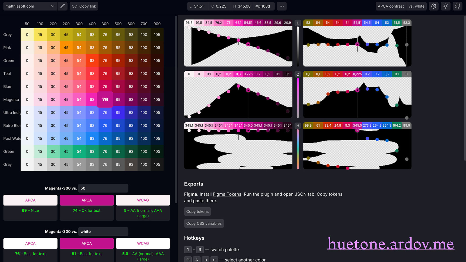
huetone.ardov.me
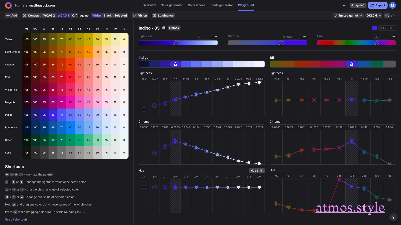
atmos.style https://huetone.ardov.me/
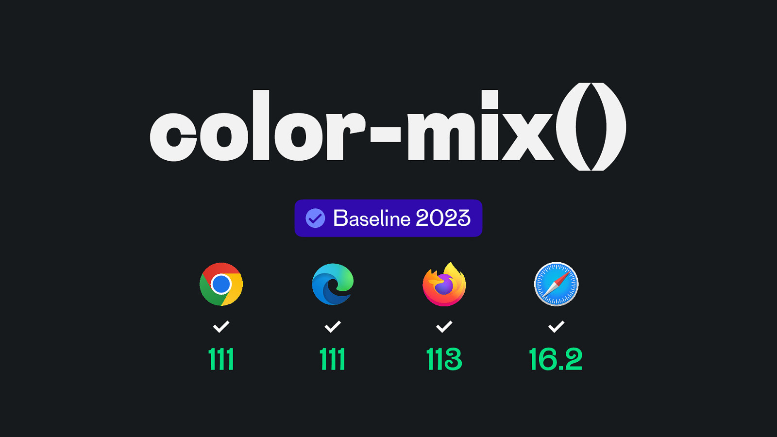
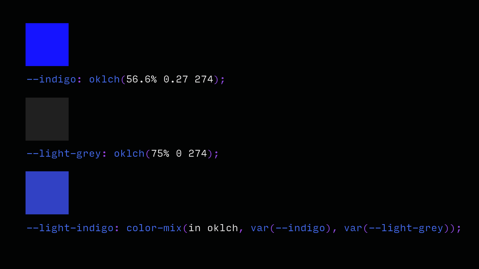
color-mix() Baseline 2023 111 111 113 16.2
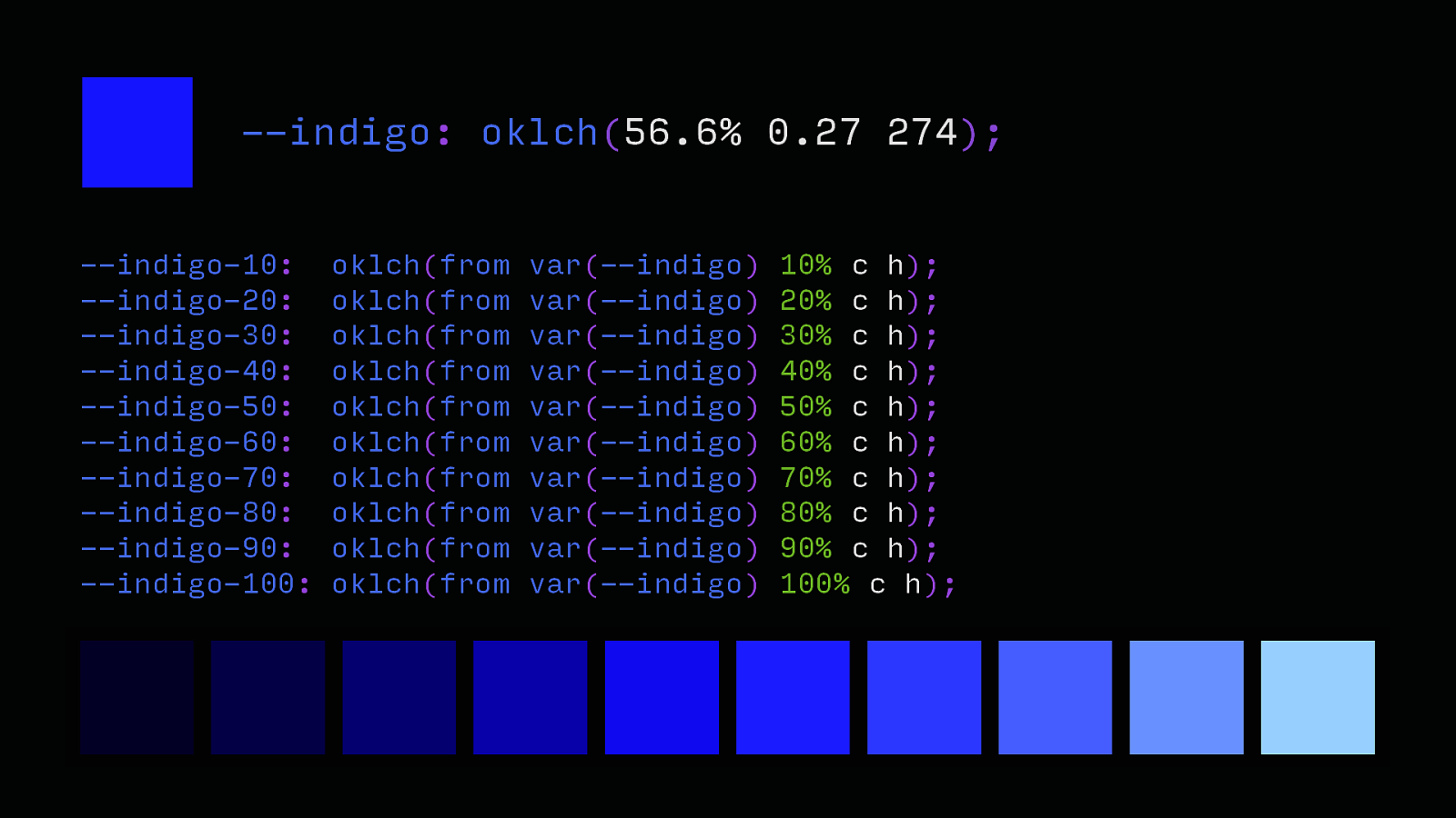
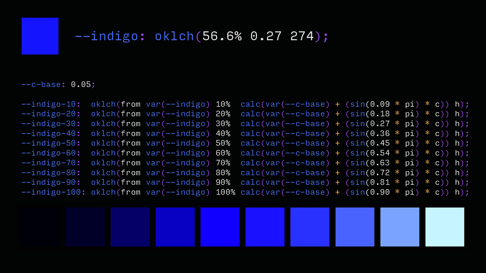
—indigo: oklch(56.6% 0.27 274); —light-grey: oklch(75% 0 274); —light-indigo: color-mix(in oklch, var(—indigo), var(—light-grey));
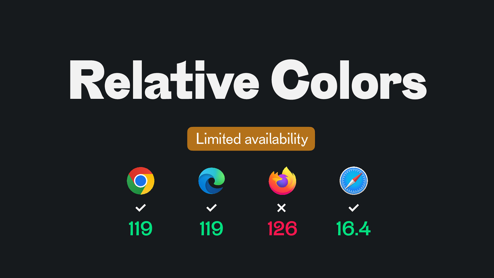
Relative Colors Limited availability 119 119 126 16.4
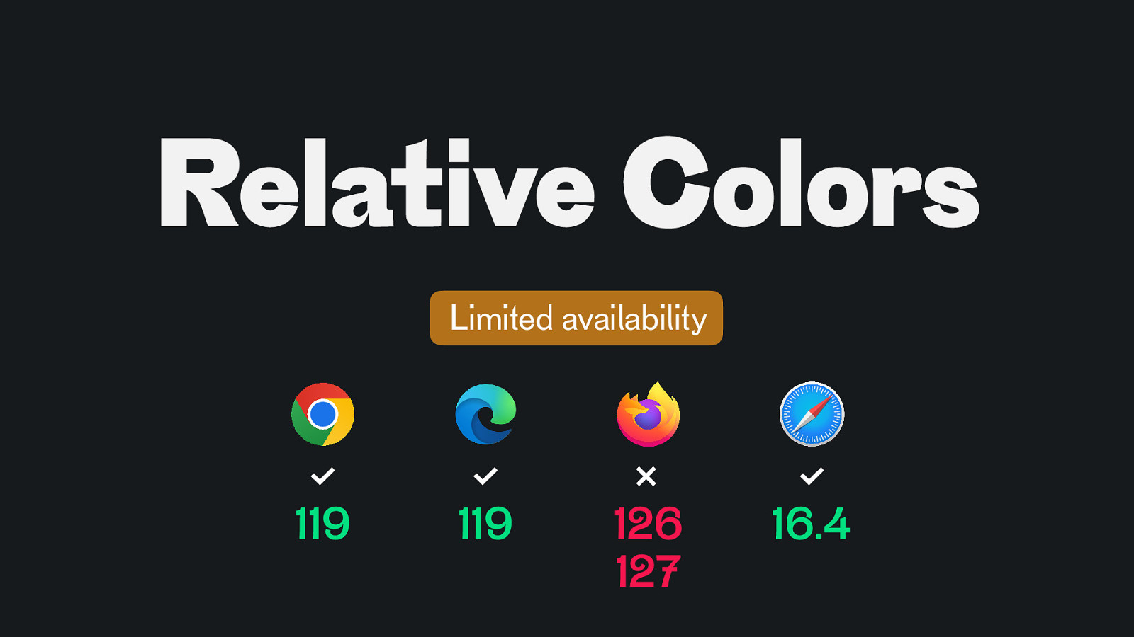
Relative Colors Limited availability 119 119 126 127 16.4
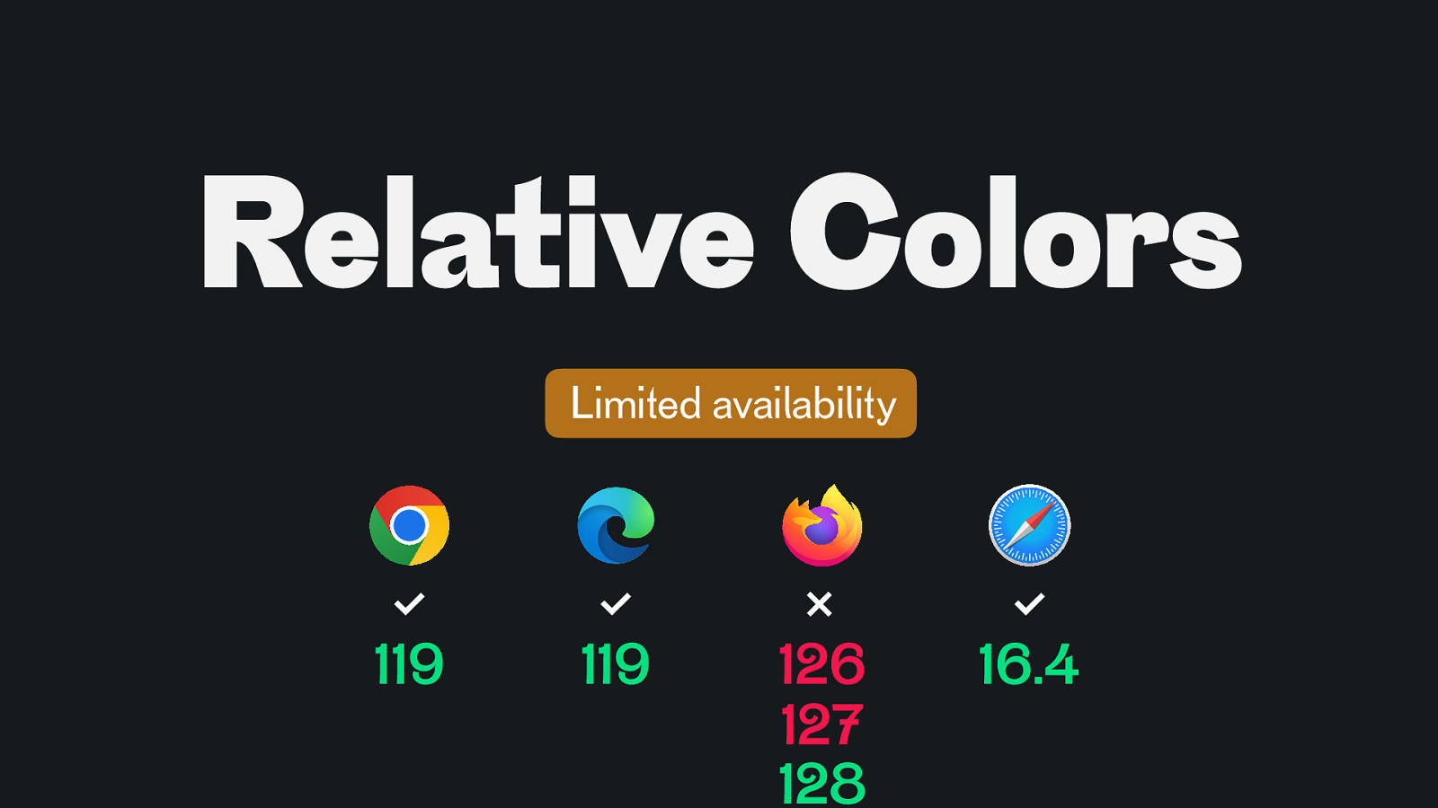
Relative Colors Limited availability 119 119 126 127 128 16.4
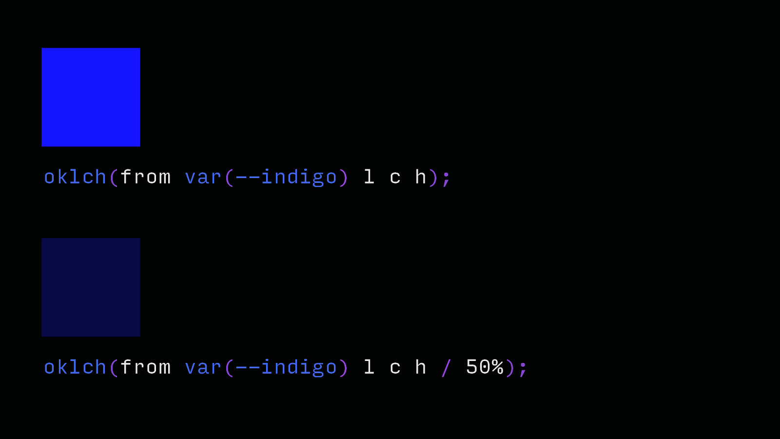
oklch(from var(—indigo) l c h); oklch(from var(—indigo) l c h / 50%);
—indigo: oklch(56.6% 0.27 274); —indigo-10: —indigo-20: —indigo-30: —indigo-40: —indigo-50: —indigo-60: —indigo-70: —indigo-80: —indigo-90: —indigo-100: oklch(from oklch(from oklch(from oklch(from oklch(from oklch(from oklch(from oklch(from oklch(from oklch(from var(—indigo) var(—indigo) var(—indigo) var(—indigo) var(—indigo) var(—indigo) var(—indigo) var(—indigo) var(—indigo) var(—indigo) 10% c h); 20% c h); 30% c h); 40% c h); 50% c h); 60% c h); 70% c h); 80% c h); 90% c h); 100% c h);
sin(x)
—indigo: oklch(56.6% 0.27 274); —c-base: 0.05; —indigo-10: —indigo-20: —indigo-30: —indigo-40: —indigo-50: —indigo-60: —indigo-70: —indigo-80: —indigo-90: —indigo-100: oklch(from oklch(from oklch(from oklch(from oklch(from oklch(from oklch(from oklch(from oklch(from oklch(from var(—indigo) var(—indigo) var(—indigo) var(—indigo) var(—indigo) var(—indigo) var(—indigo) var(—indigo) var(—indigo) var(—indigo) 10% 20% 30% 40% 50% 60% 70% 80% 90% 100% calc(var(—c-base) calc(var(—c-base) calc(var(—c-base) calc(var(—c-base) calc(var(—c-base) calc(var(—c-base) calc(var(—c-base) calc(var(—c-base) calc(var(—c-base) calc(var(—c-base)
(sin(0.09 (sin(0.18 (sin(0.27 (sin(0.36 (sin(0.45 (sin(0.54 (sin(0.63 (sin(0.72 (sin(0.81 (sin(0.90
pi) pi) pi) pi) pi) pi) pi) pi) pi) pi)
c)) c)) c)) c)) c)) c)) c)) c)) c)) c)) h); h); h); h); h); h); h); h); h); h);
https://lea.verou.me/blog/2024/contrast-color/
https://ericportis.com/posts/2024/okay-color-spaces/
https://ericportis.com/posts/2024/okay-color-spaces/
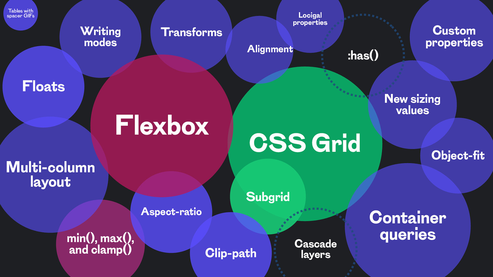
Layout
Tables with spacer GIFs Writing modes Locigal properties Transforms Alignment :has() Floats Flexbox Multi-column layout Aspect-ratio min(), max(), and clamp() Custom properties New sizing values CSS Grid Object-fit Subgrid Clip-path Cascade layers Container queries
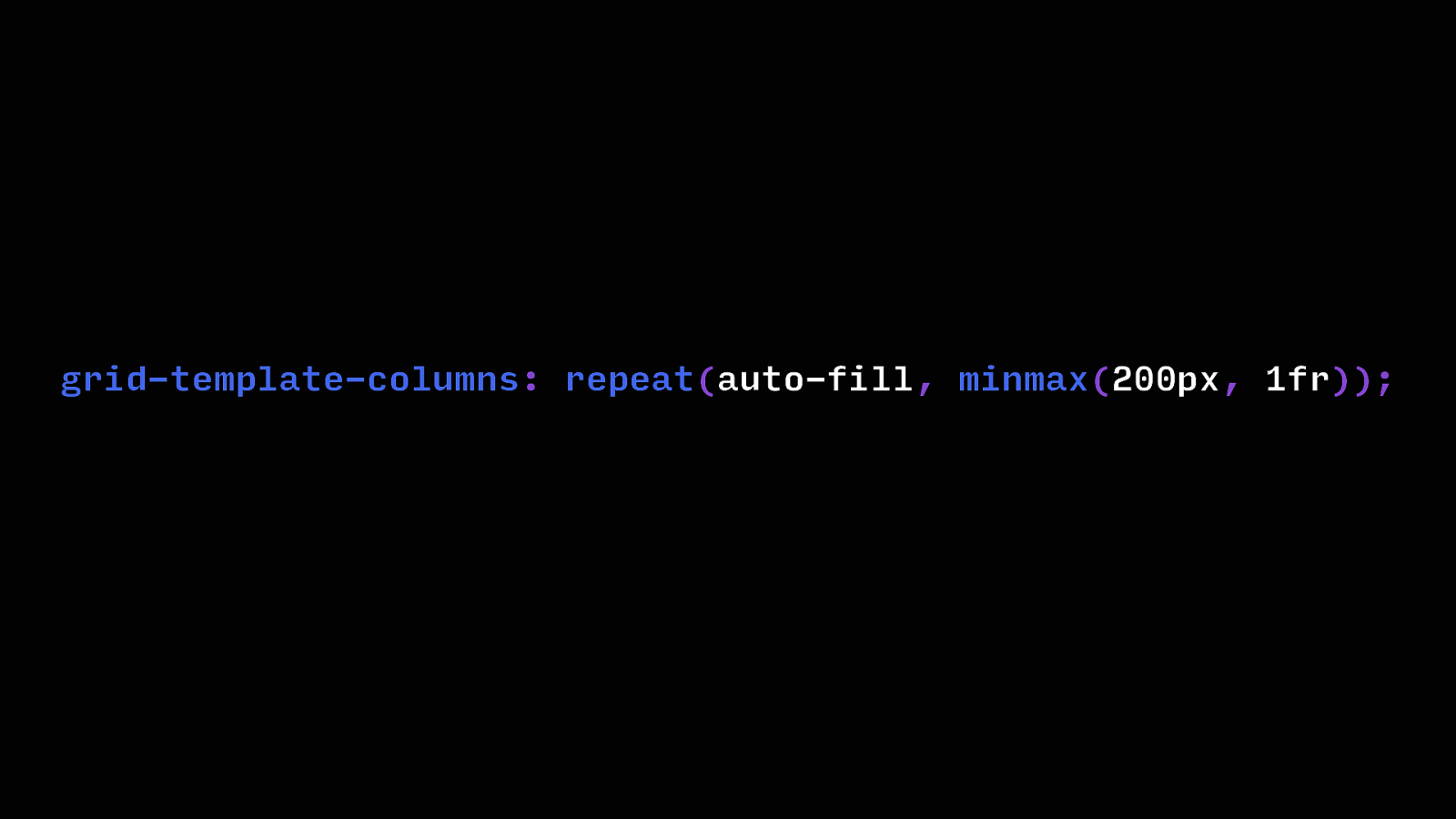
CSS Grid
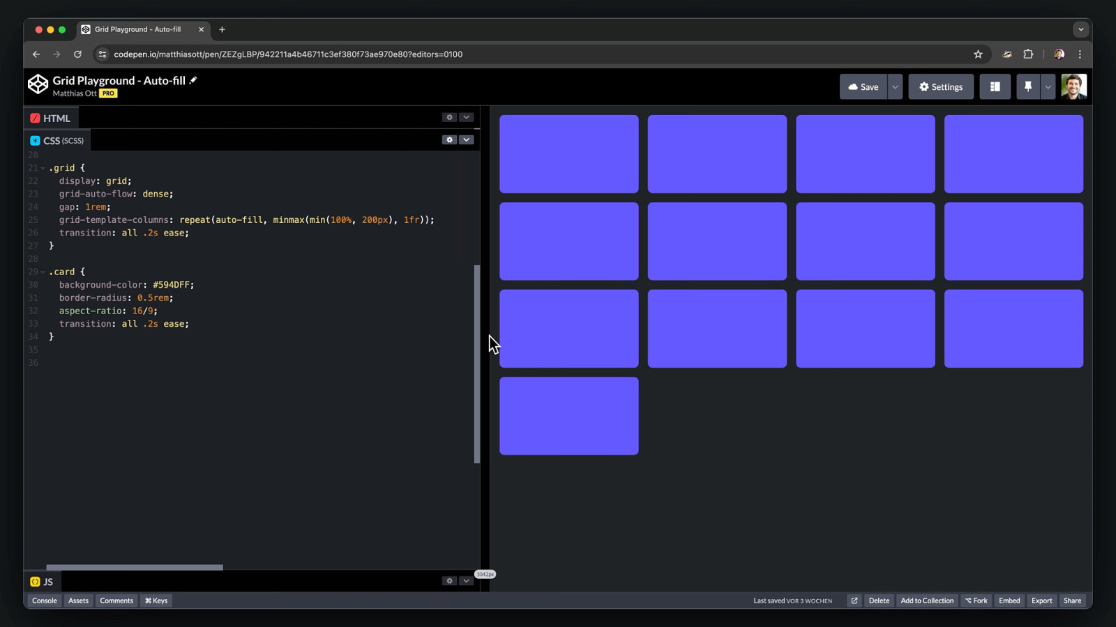
grid-template-columns: repeat(auto-fill, minmax(200px, 1fr));
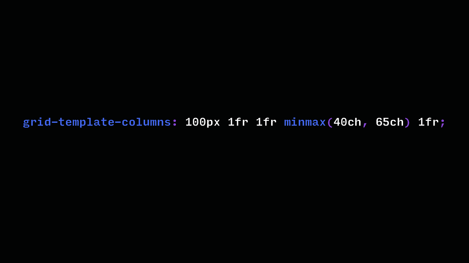
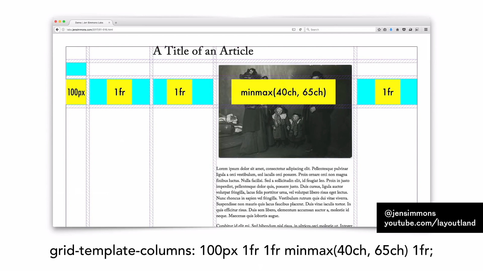
grid-template-columns: 100px 1fr 1fr minmax(40ch, 65ch) 1fr;
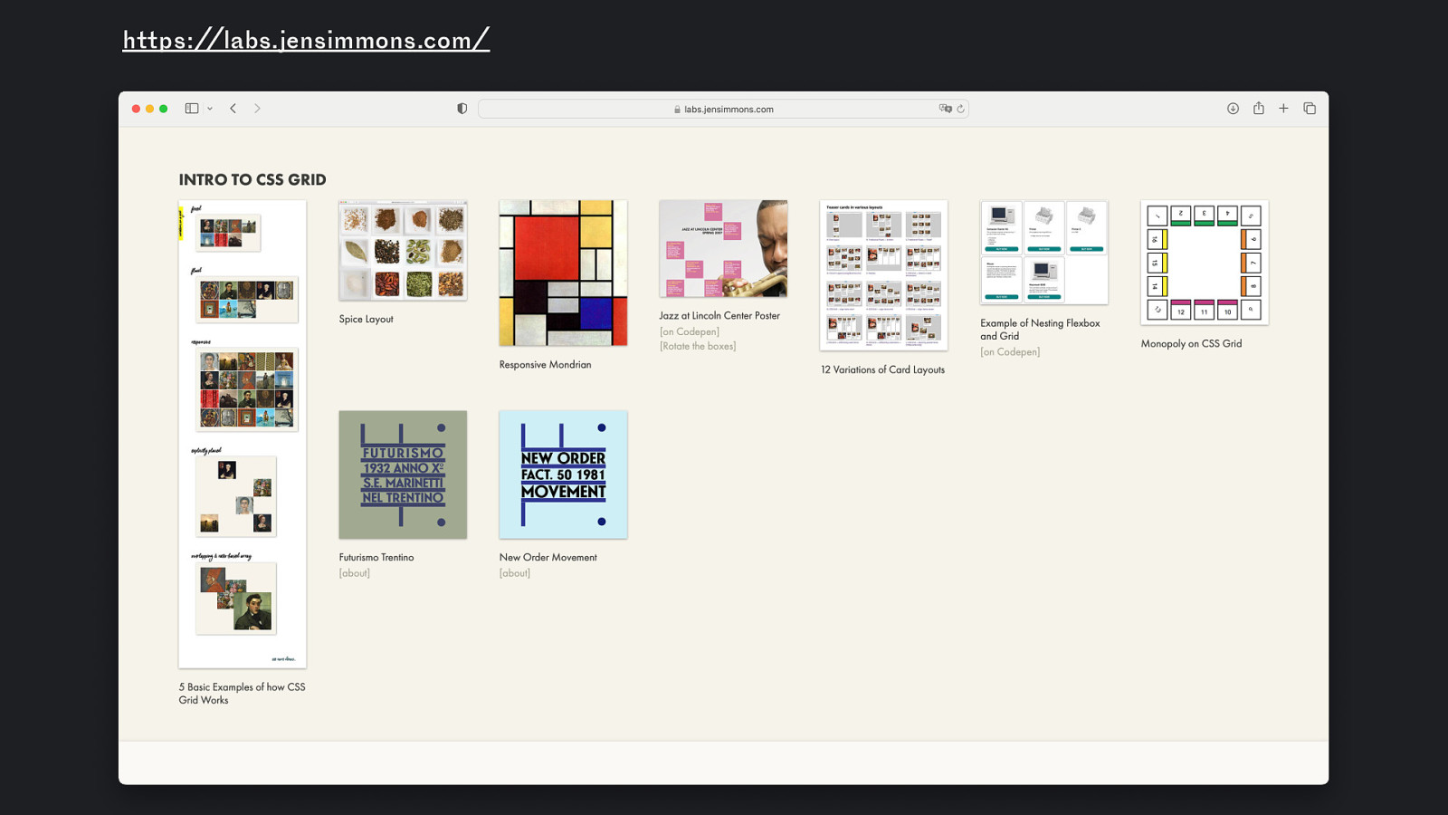
Example: CSS Grid @jensimmons youtube.com/layoutland
https://labs.jensimmons.com/
https://labs.jensimmons.com/ Example: CSS Grid
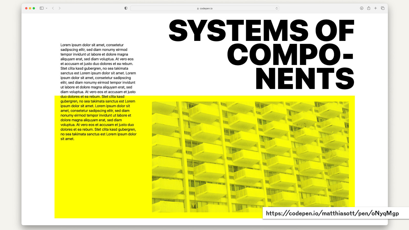
https://codepen.io/matthiasott/pen/oNyqMgp
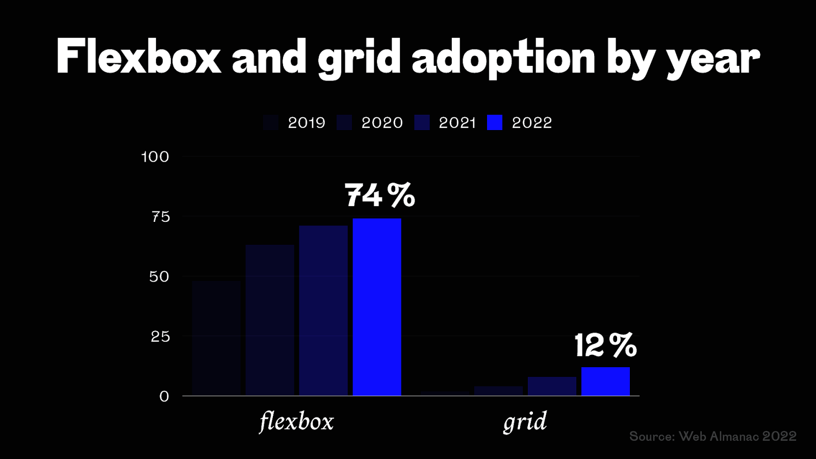
fl Flexbox and grid adoption by year 2019 2020 2021 2022 100 74 % 75 50 12 % 25 0 exbox grid Source: Web Almanac 2022
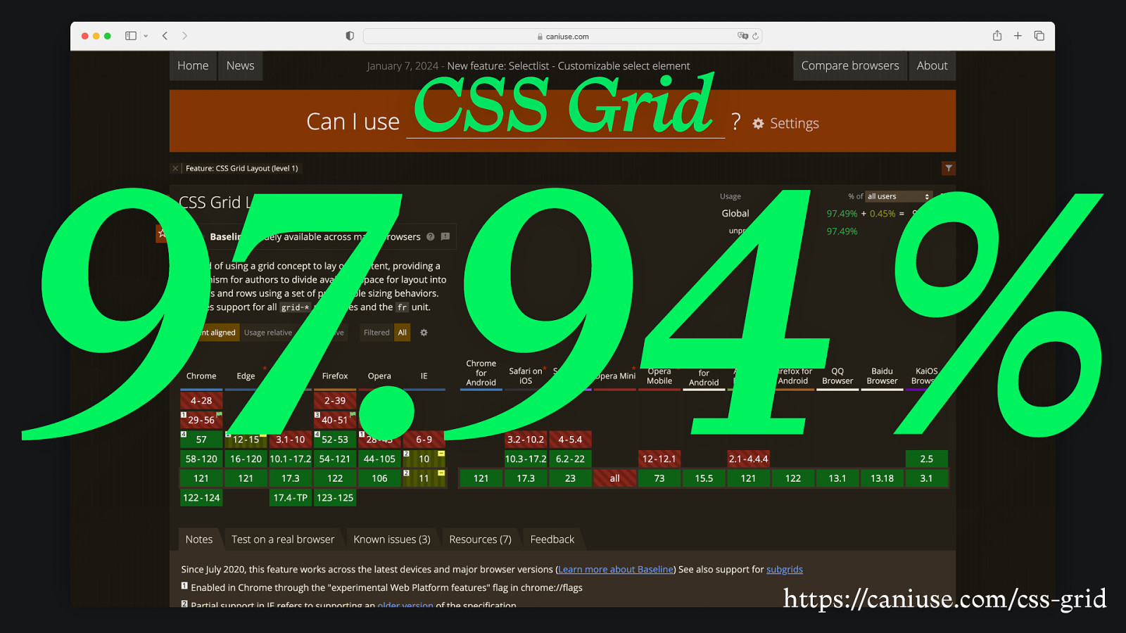
CSS Grid 97.94 % https://caniuse.com/css-grid
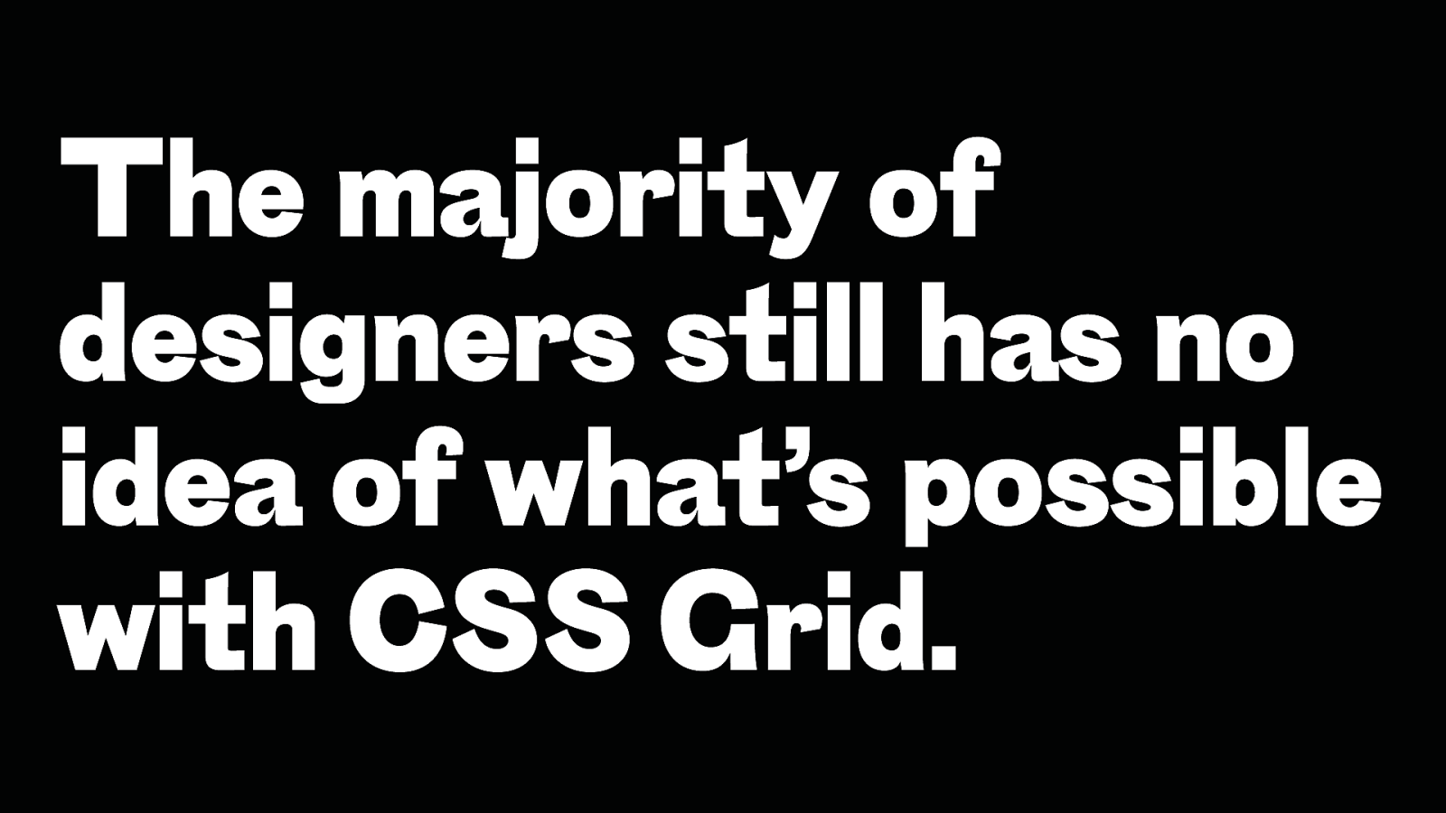
The majority of designers still has no idea of what’s possible with CSS Grid.
Subgrid
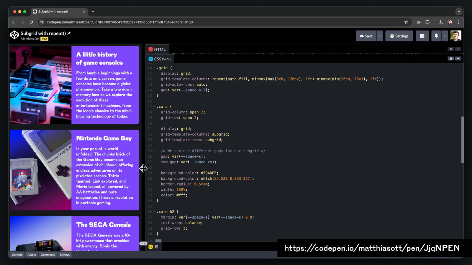
https://codepen.io/matthiasott/pen/JjqNPEN
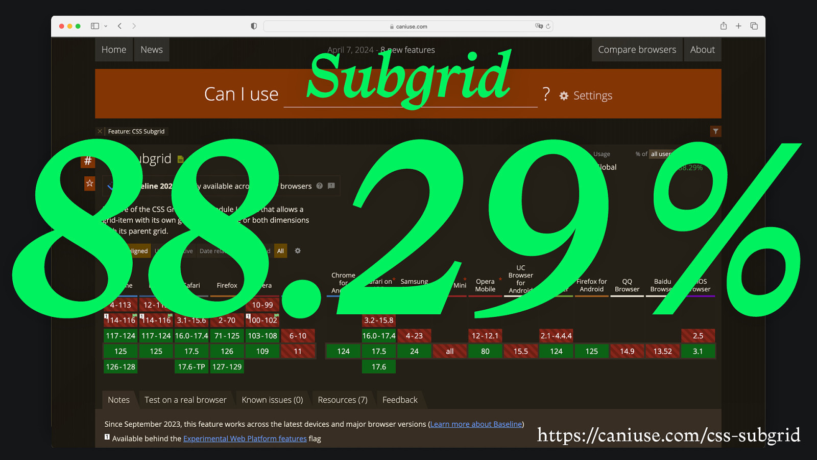
Subgrid 88.29 % https://caniuse.com/css-subgrid
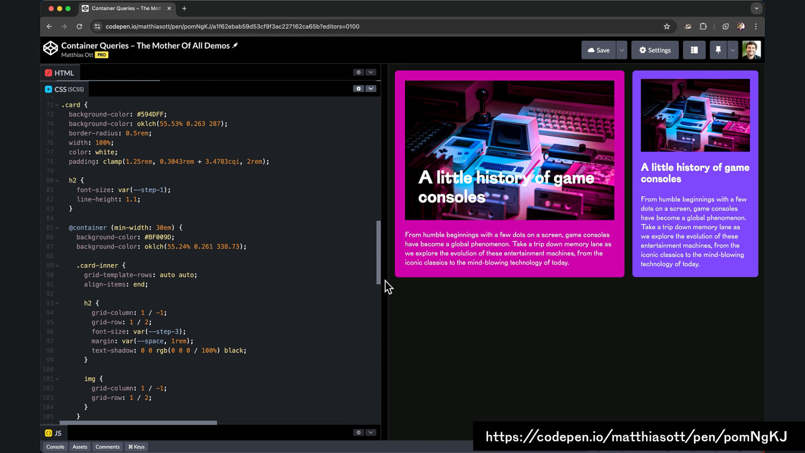
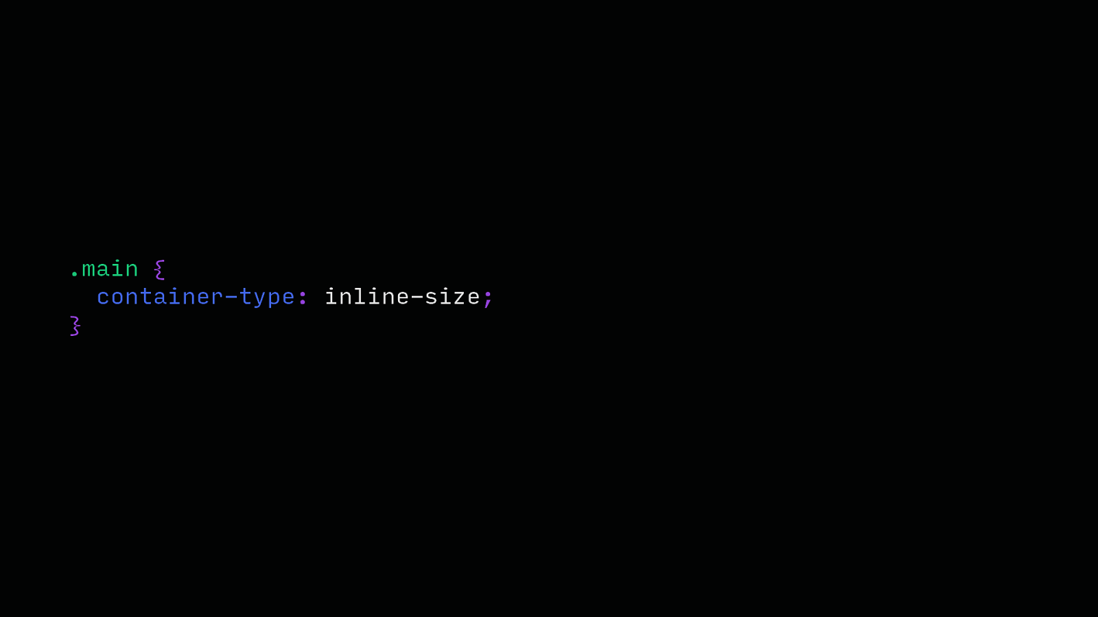
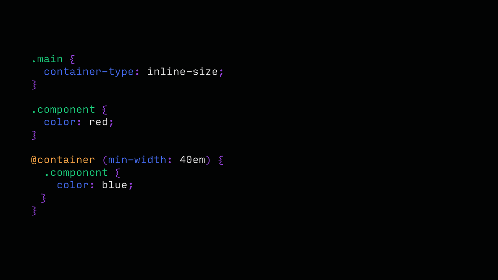
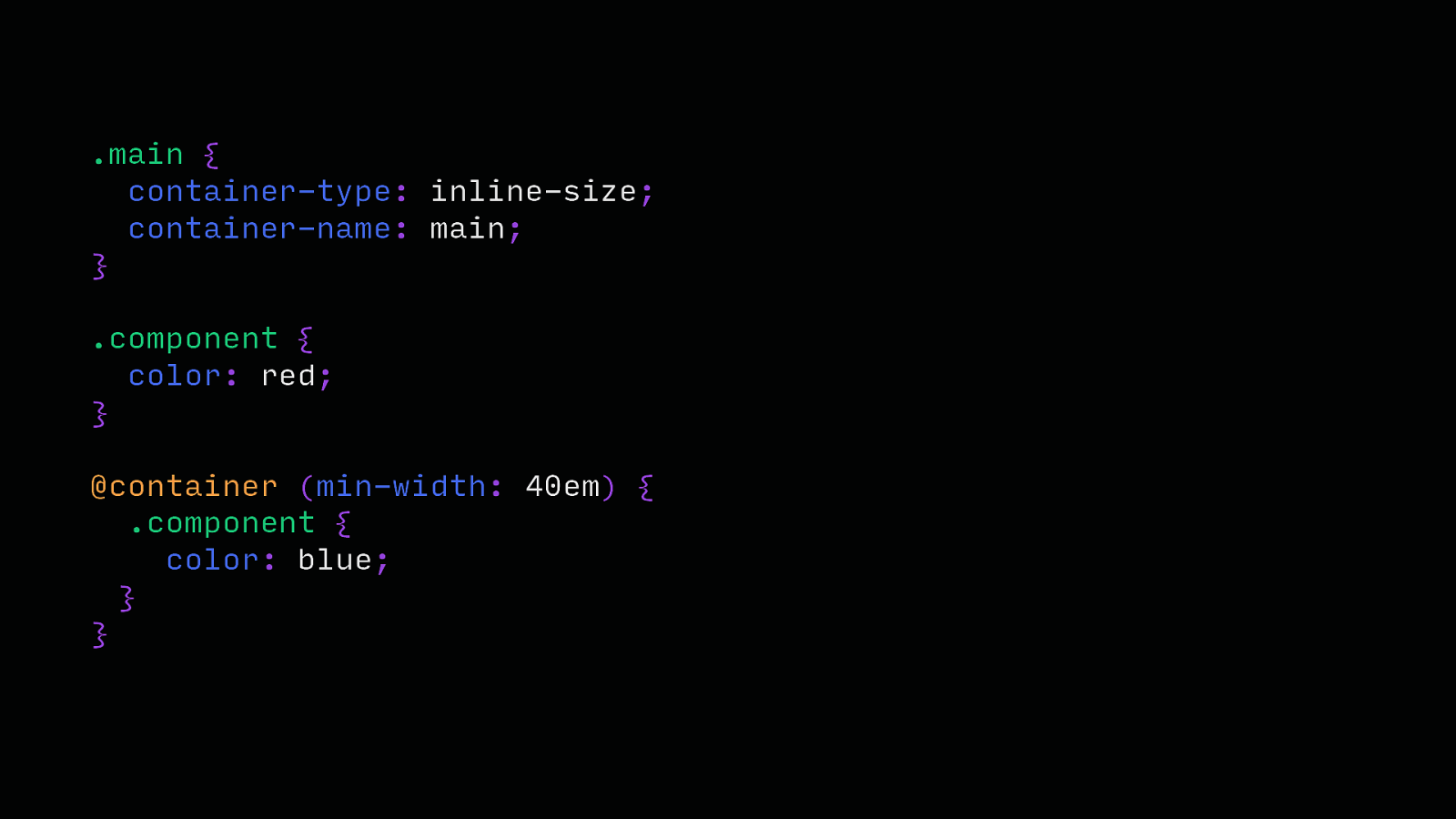
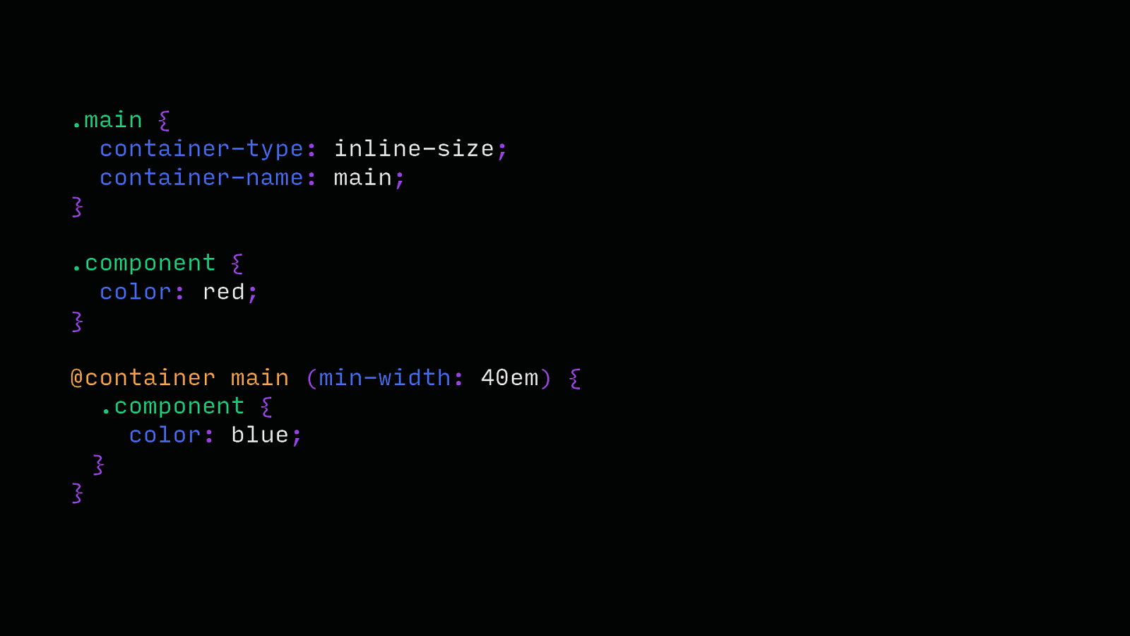
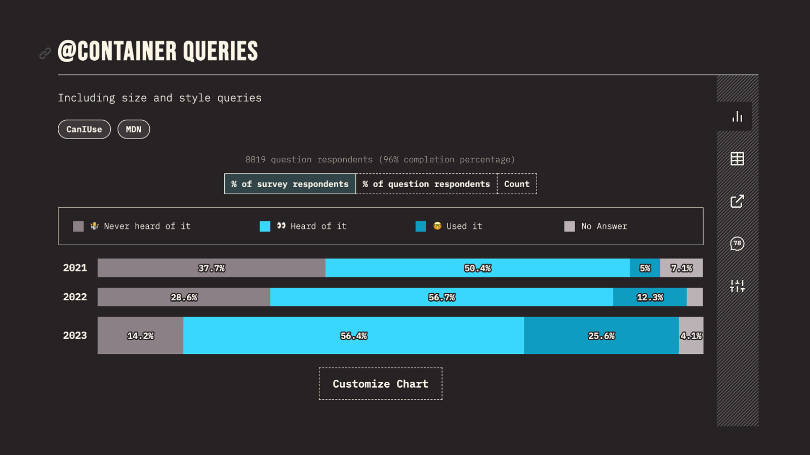
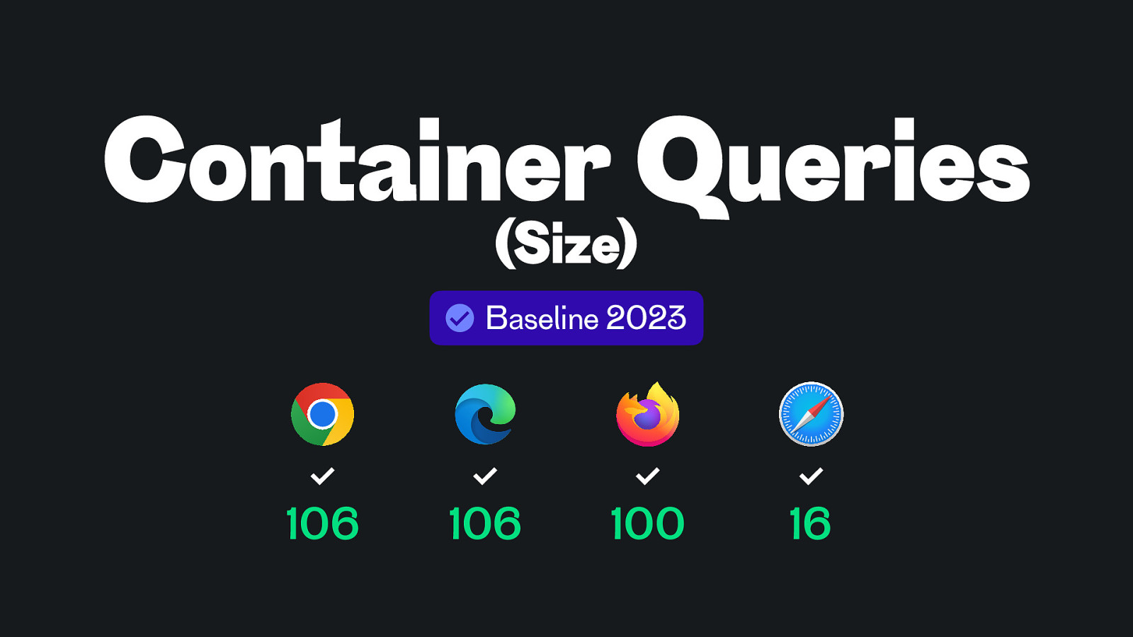
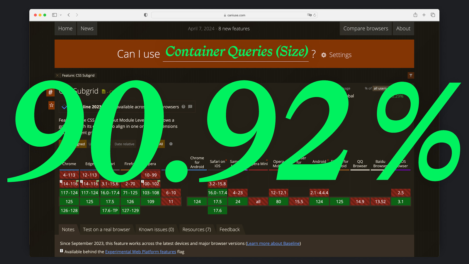
Container Queries
https://codepen.io/matthiasott/pen/pomNgKJ
.main { container-type: inline-size; }
.main { container-type: inline-size; } .component { color: red; } @container (min-width: 40em) { .component { color: blue; } }
.main { container-type: inline-size; container-name: main; } .component { color: red; } @container (min-width: 40em) { .component { color: blue; } }
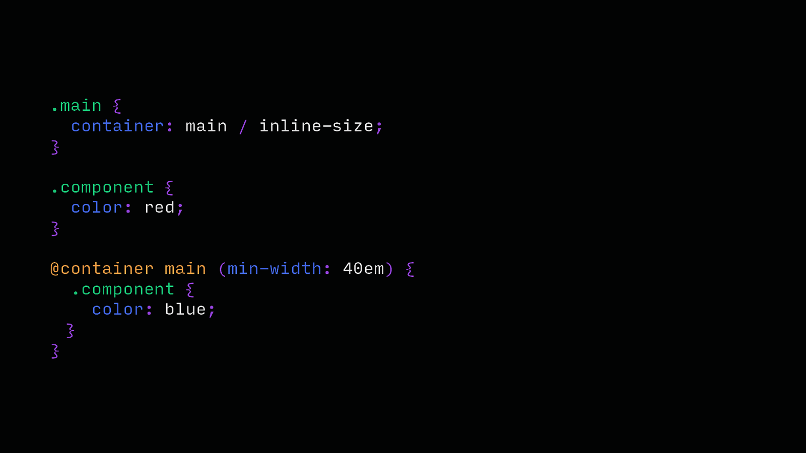
.main { container-type: inline-size; container-name: main; } .component { color: red; } @container main (min-width: 40em) { .component { color: blue; } }
.main { container: main / inline-size; } .component { color: red; } @container main (min-width: 40em) { .component { color: blue; } }
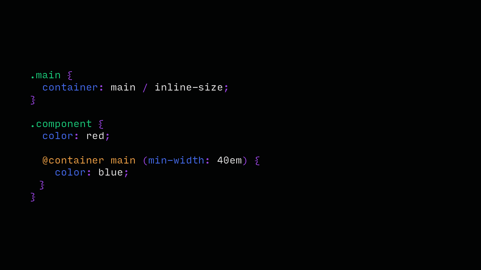
.main { container: main / inline-size; } .component { color: red; @container main (min-width: 40em) { color: blue; } }
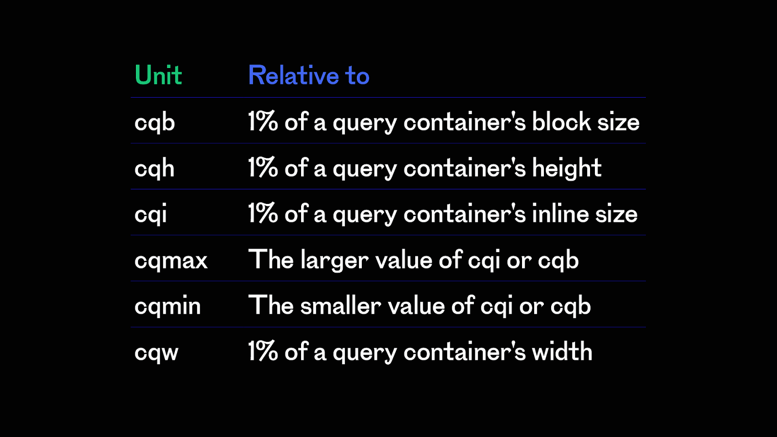
Unit Relative to cqb 1% of a query container’s block size cqh 1% of a query container’s height cqi 1% of a query container’s inline size cqmax The larger value of cqi or cqb cqmin The smaller value of cqi or cqb cqw 1% of a query container’s width
Container Queries (Size) Baseline 2023 106 106 100 16
Container Queries (Size) 90.92 %
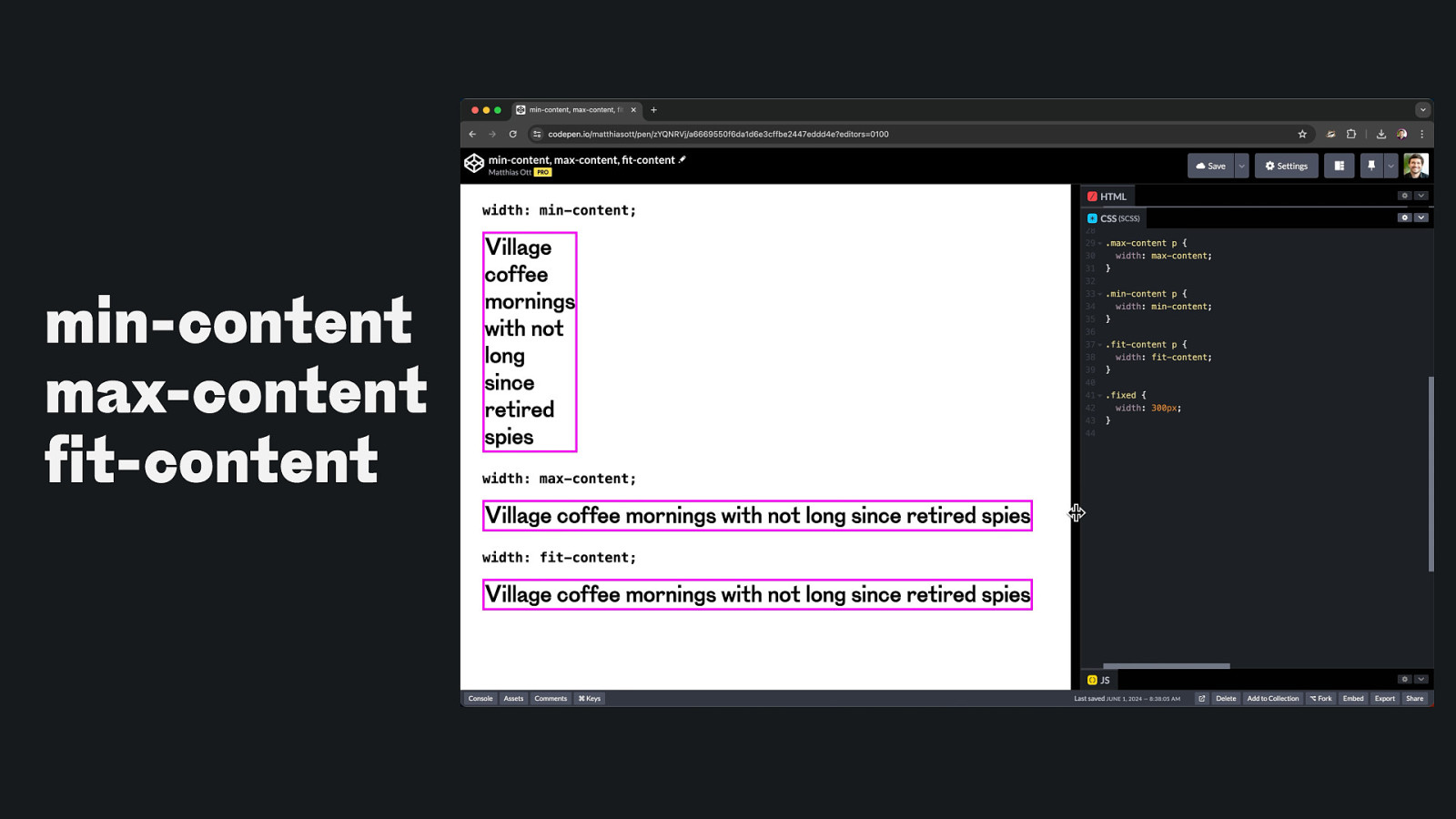
f min-content max-content it-content
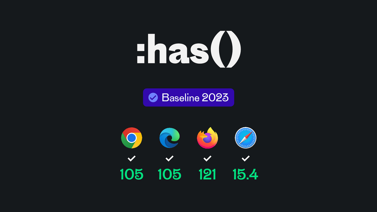
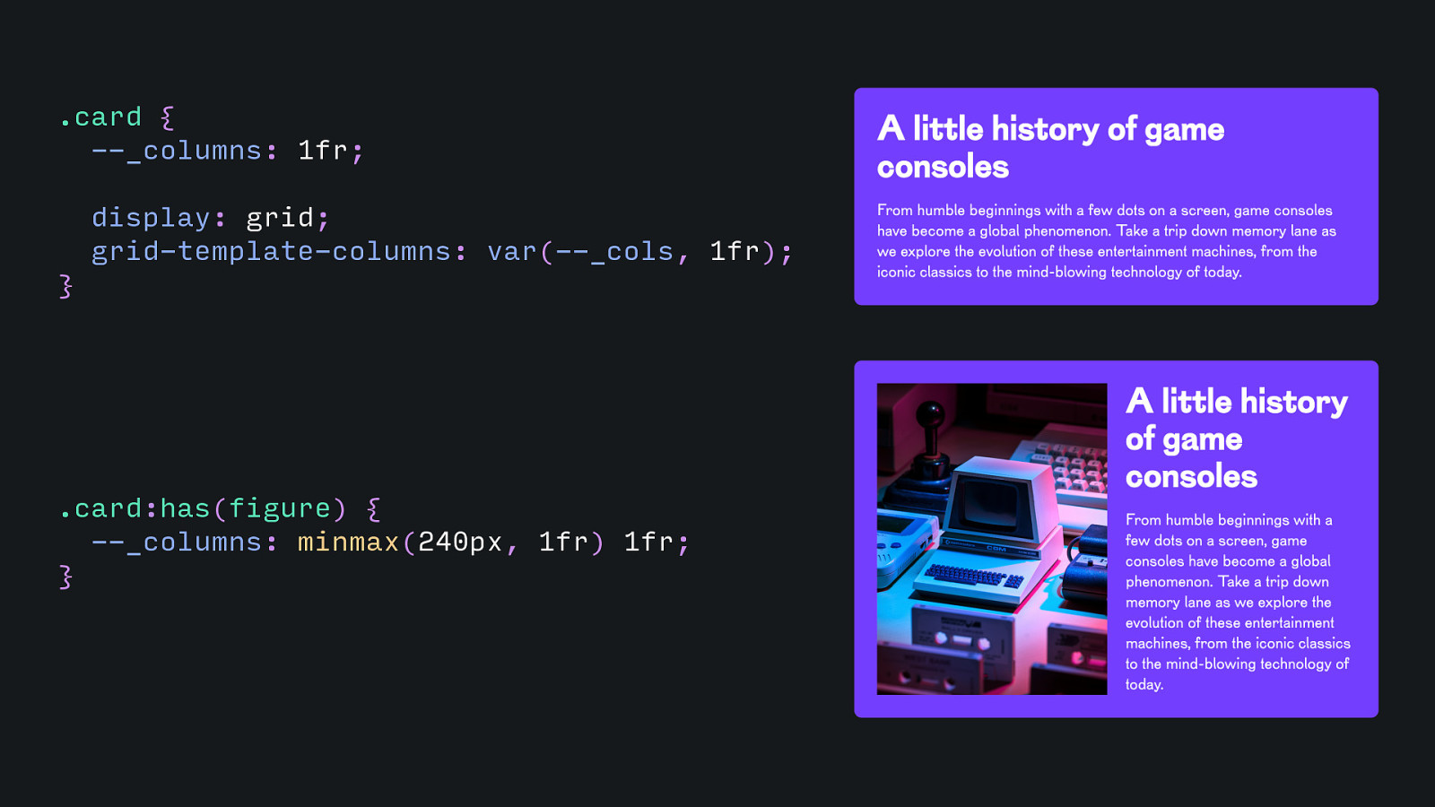
:has() Baseline 2023 105 105 121 15.4
.card { —_columns: 1fr; display: grid; grid-template-columns: var(—_cols, 1fr); } .card:has(figure) { —_columns: minmax(240px, 1fr) 1fr; }
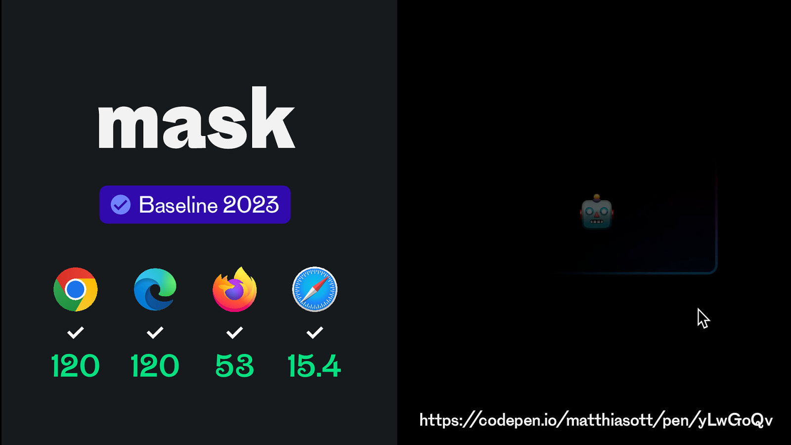
mask Baseline 2023 120 120 53 15.4 https://codepen.io/matthiasott/pen/yLwGoQv
Animation
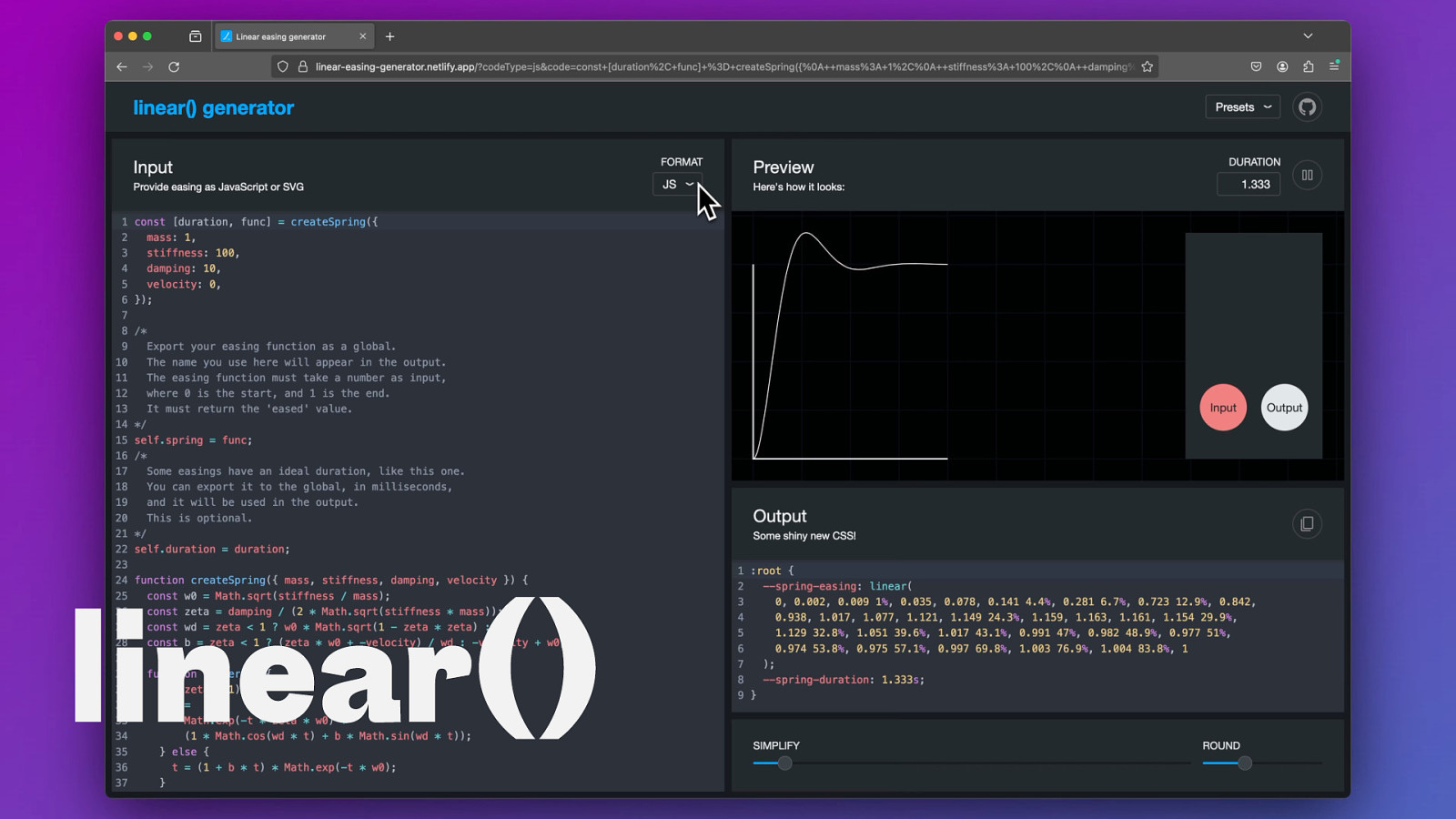
linear()
Scroll-driven Animations
Viewtransitions
Anchor Positioning
😅
& Learn teach
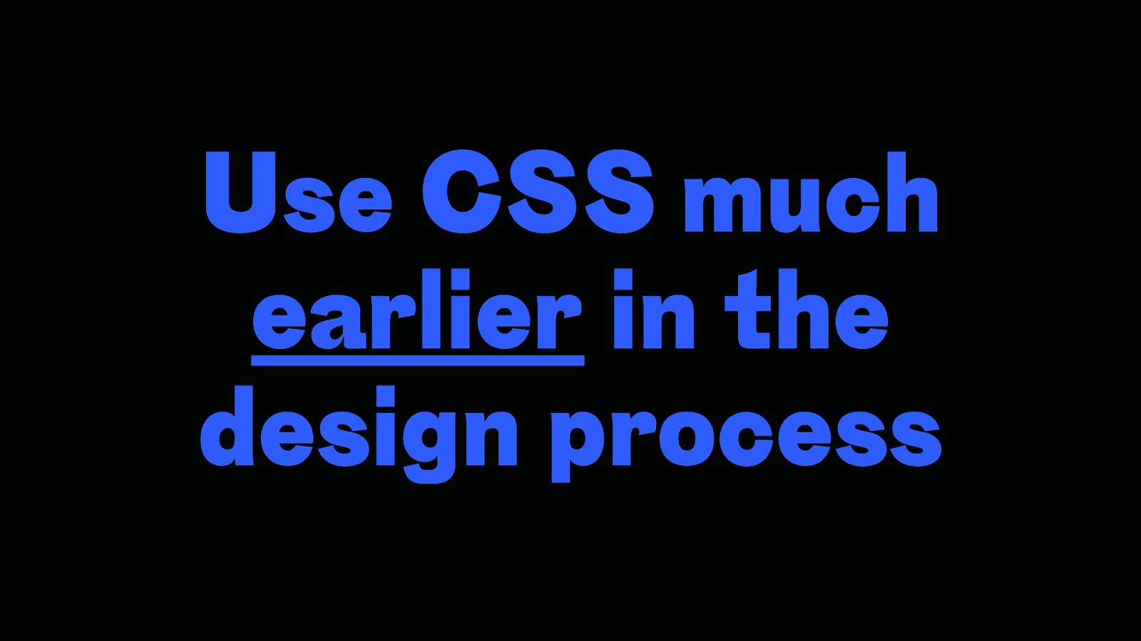
Use CSS much earlier in the design process
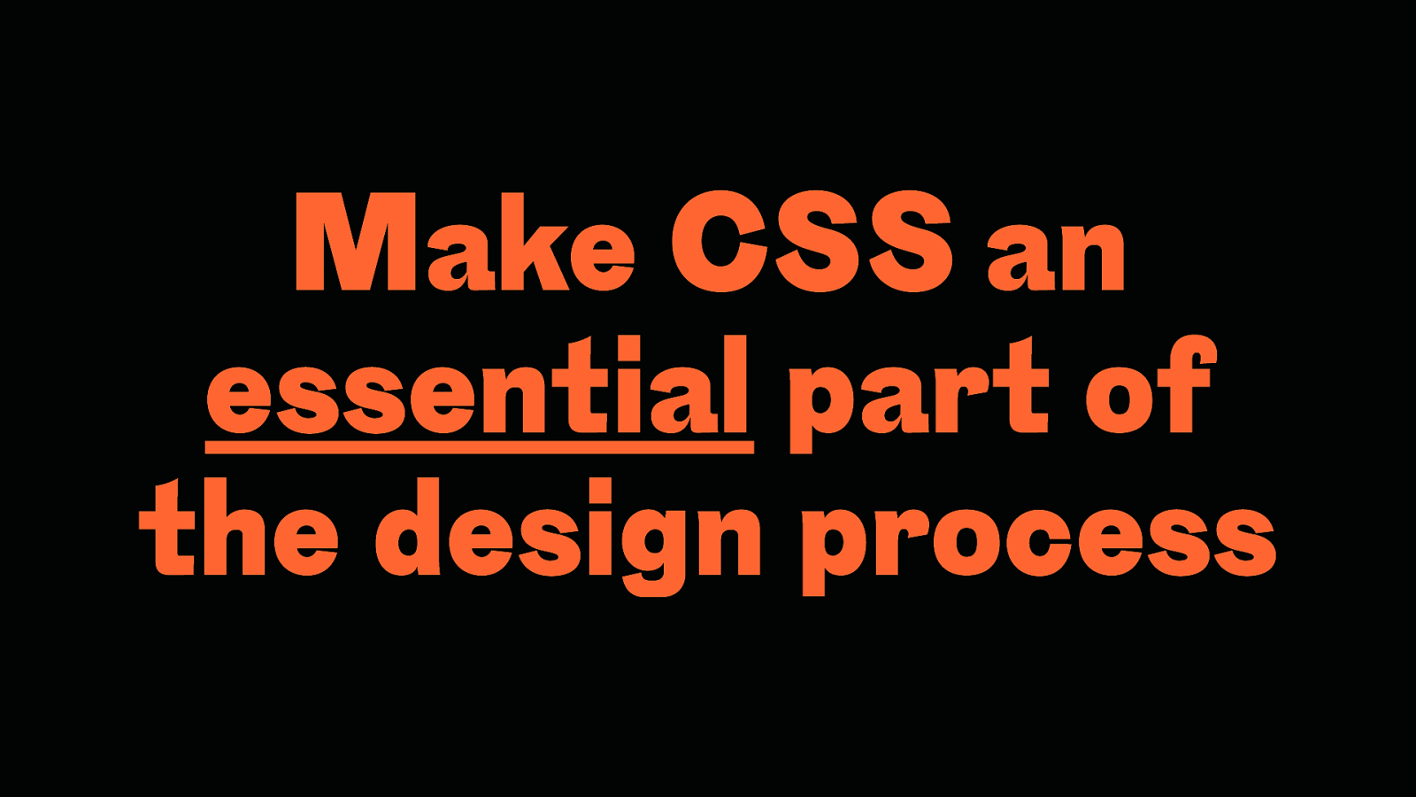
Make CSS an essential part of the design process
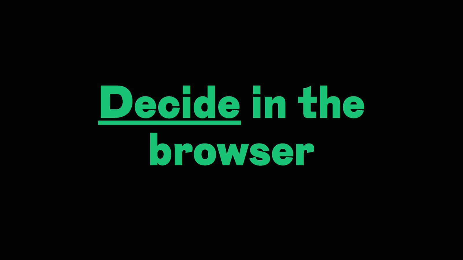
Decide in the browser
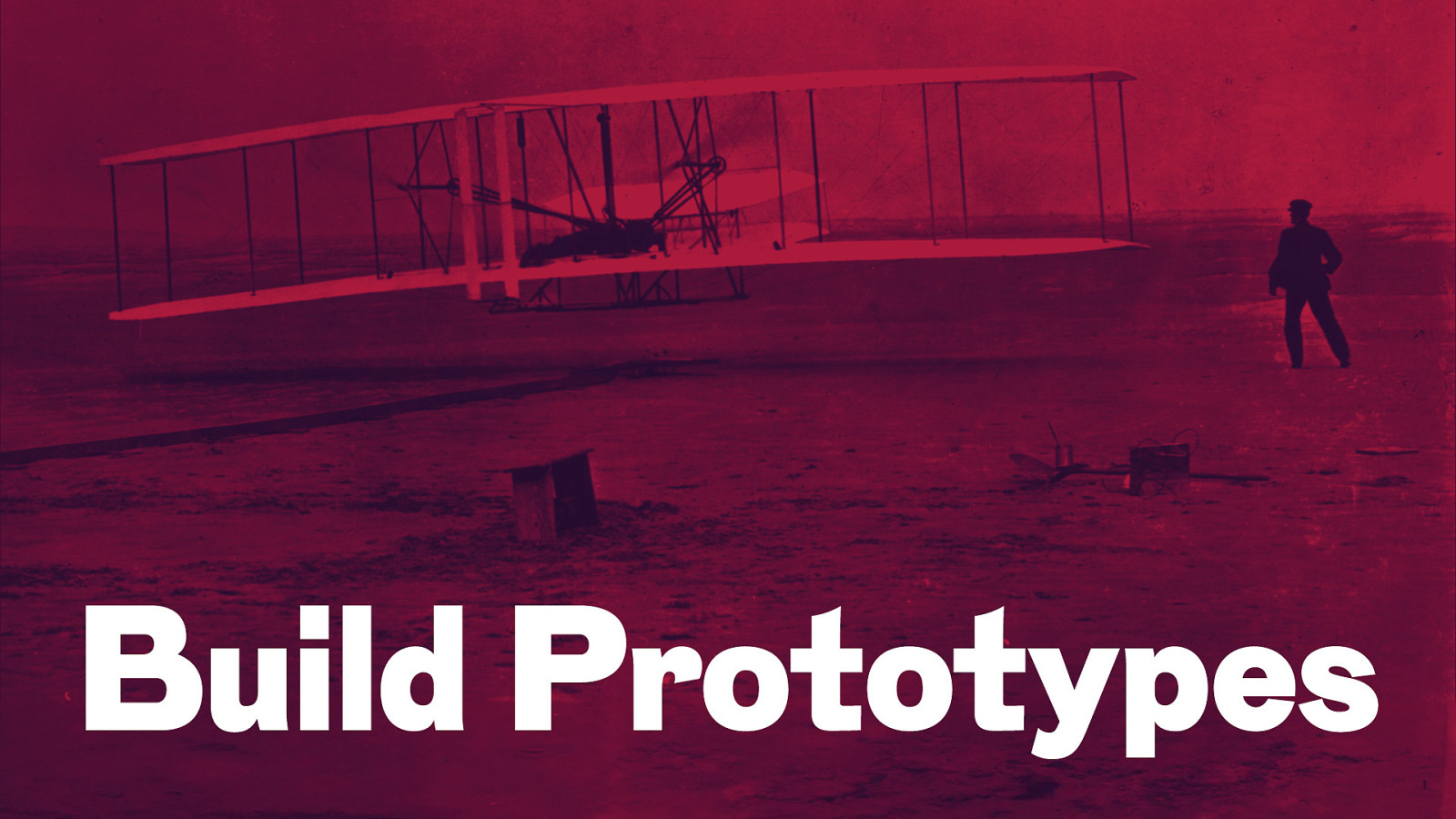
Build Prototypes
Improve collaboration between design and development
Form interdisciplinary teams
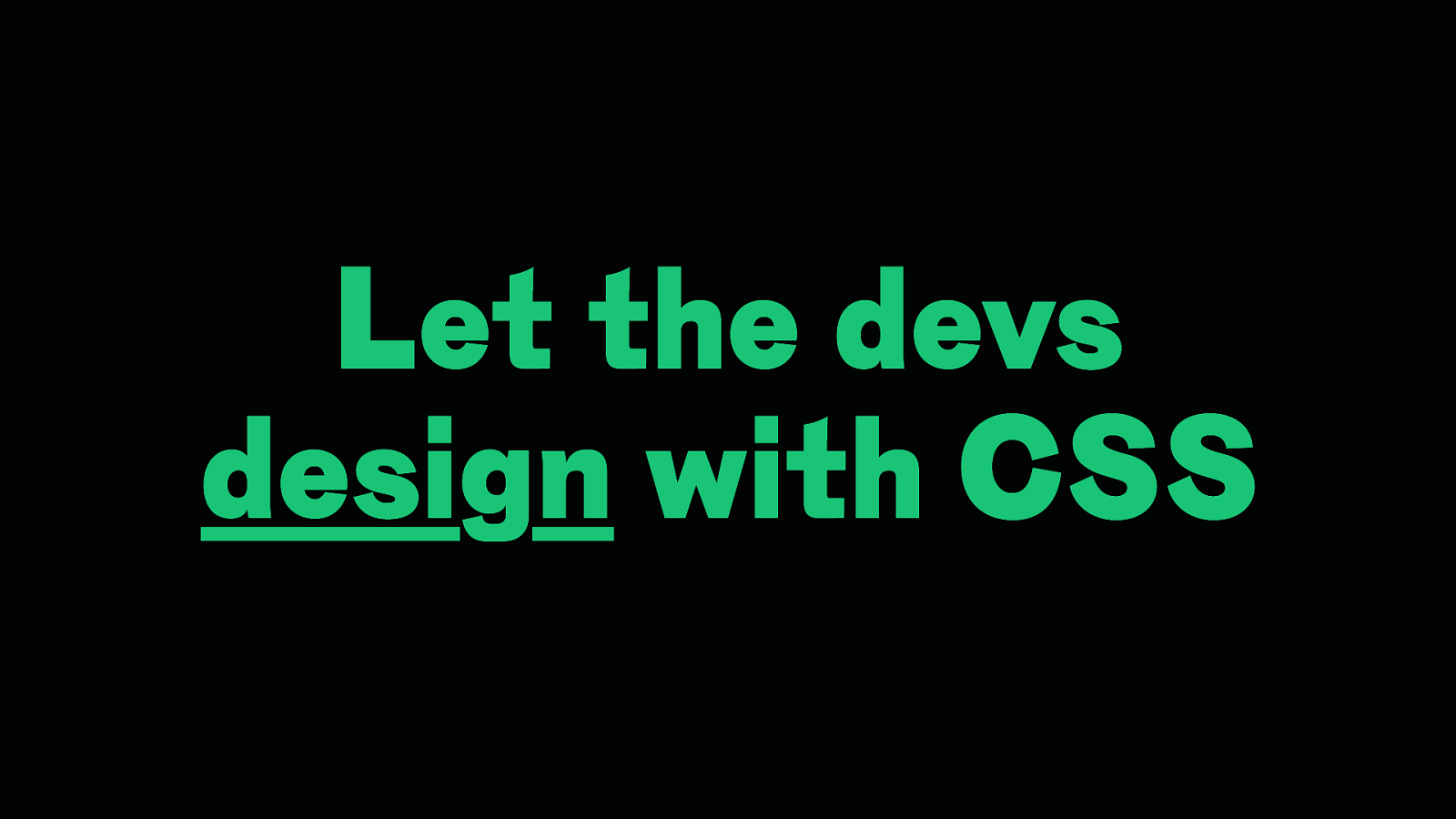
Let the devs design with CSS
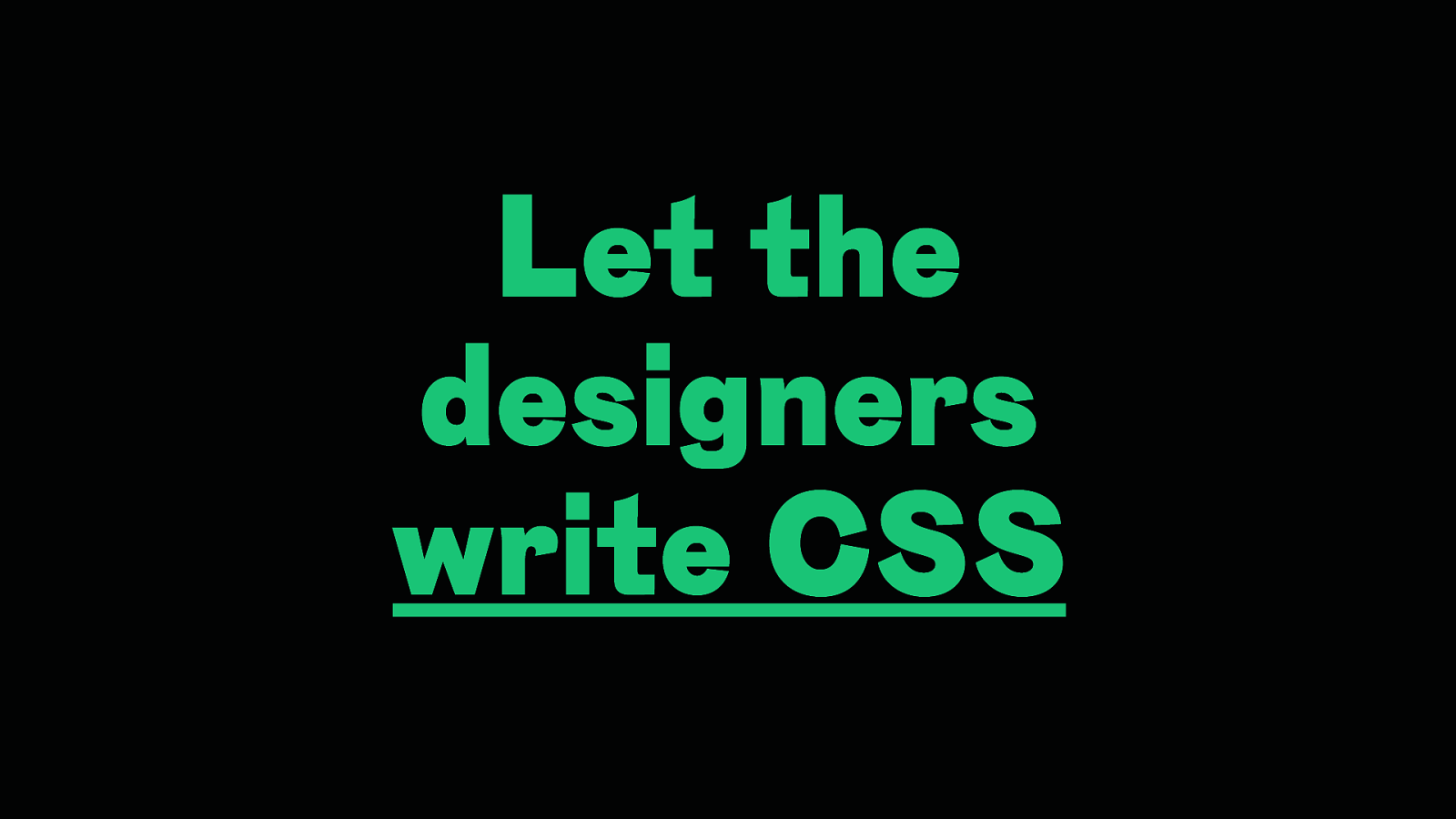
Let the designers write CSS
Let the designers write CSS
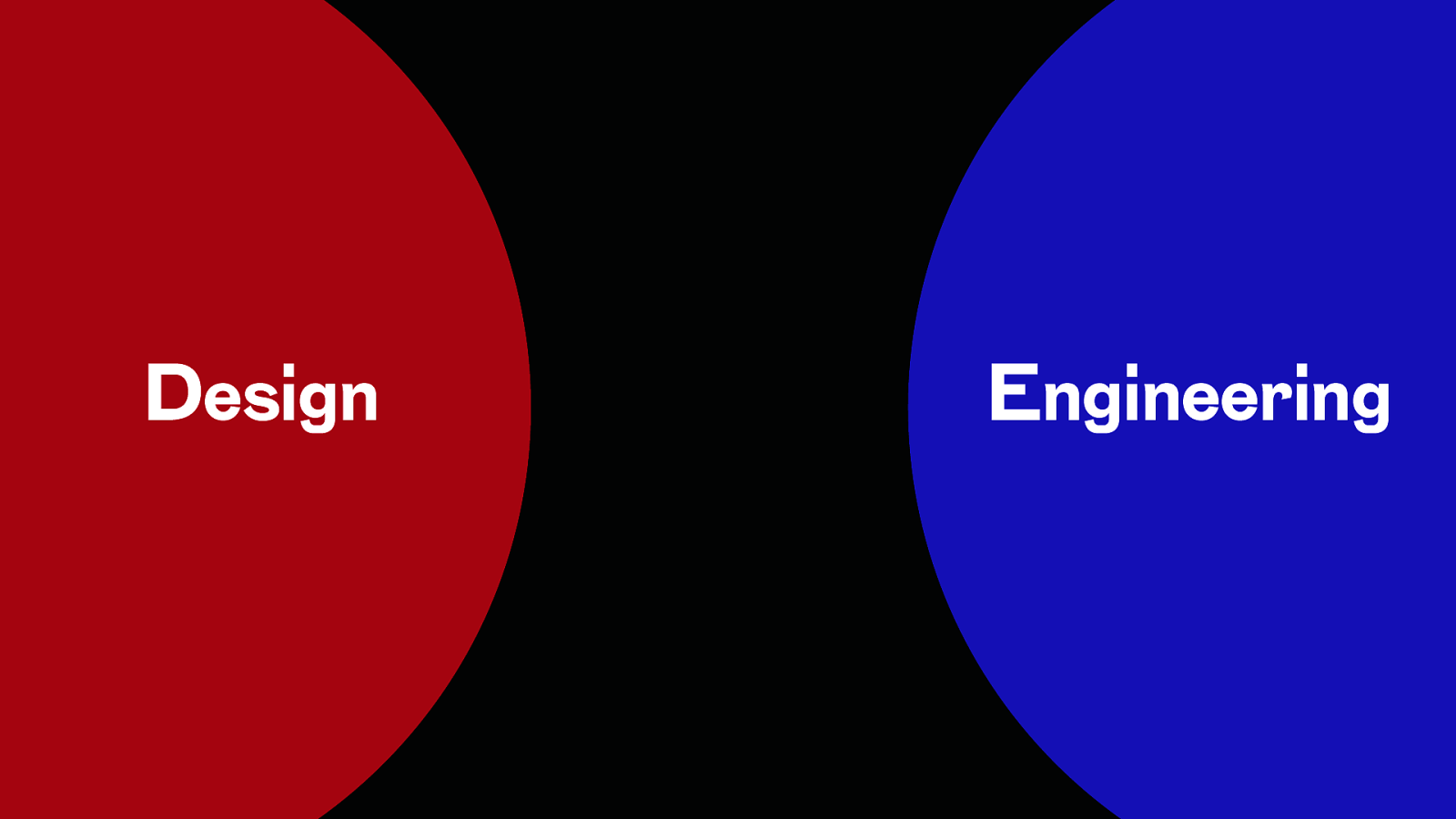
Design Engineering
Design Engineering Web
Web Design Engineering
Web Engineering Design
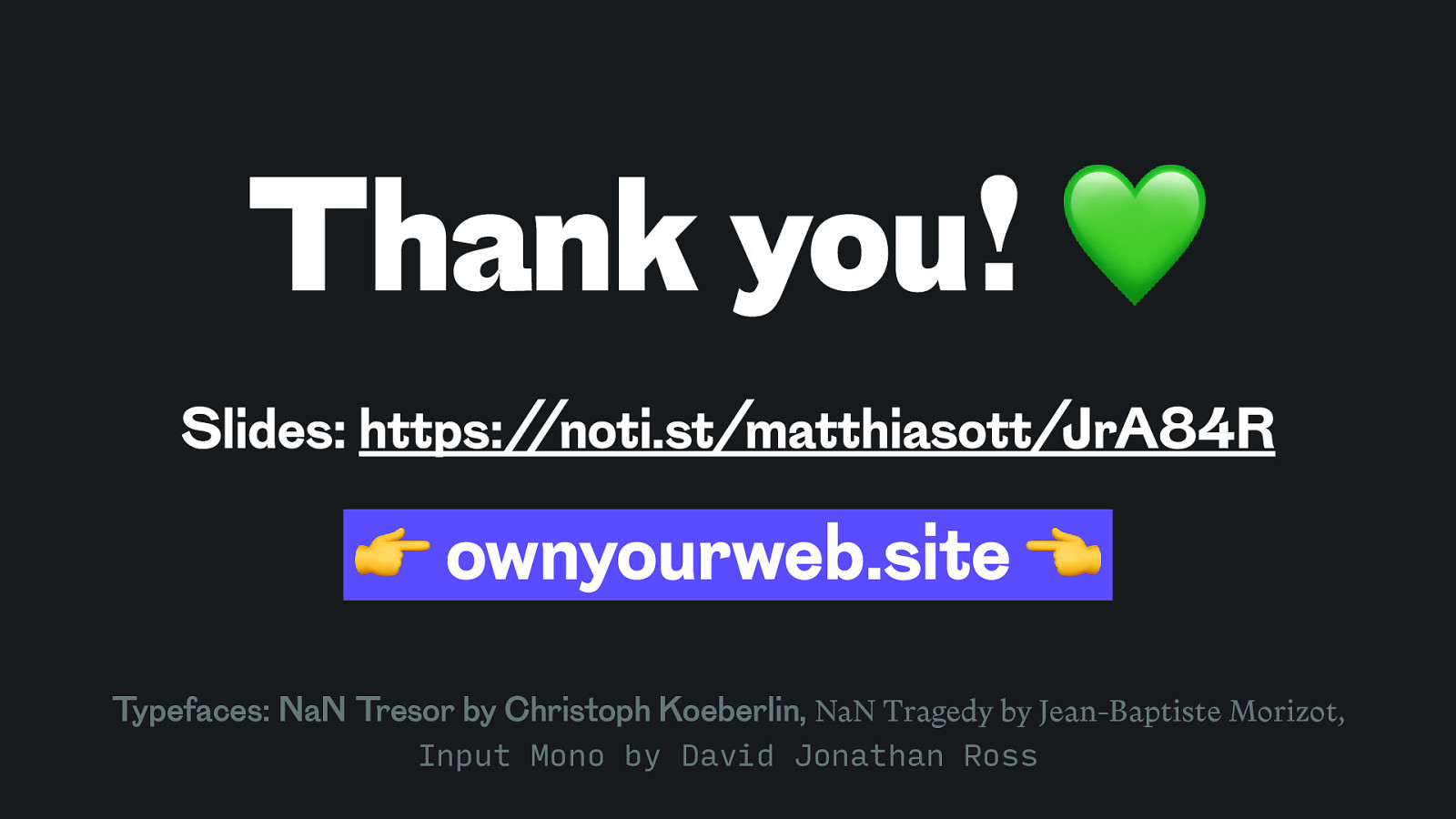
Thank you! 💚 Slides: https://noti.st/matthiasott/JrA84R 👉 ownyourweb.site 👈 Typefaces: NaN Tresor by Christoph Koeberlin, NaN Tragedy by Jean-Baptiste Morizot, Input Mono by David Jonathan Ross

With all the exciting new features arriving in CSS today and even more additions on the horizon, CSS is more powerful than ever. As a result, the very foundations of how we understand and write CSS are changing radically. But not only that: CSS is now also the most powerful design tool for the Web. Meanwhile, many teams still approach web design with an imperative mindset and static design tools that don’t reflect what modern CSS is capable of. In this session, we’ll look at how we can use the power of “the new CSS” to our advantage and how to engineer designs that are accessible, resilient, and true to the inherently fluid nature of the Web.


 for free. You
can too.
for free. You
can too.