
A presentation at Stahlstadt.js Meetup #21 in in Linz, Austria by Manuel Matuzovic

ć i v o z u t a M l e u n a M ❤ y 1 1 a , S S C , L M T H t a . v g . wien o z u t a m m @ z n i l d i r g k r a bit.ly/d
The Dark Side of the Grid
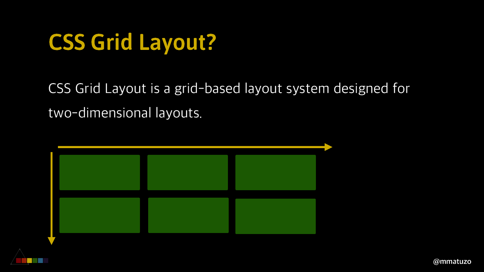
CSS Grid Layout? CSS Grid Layout is a grid-based layout system designed for two-dimensional layouts. @mmatuzo
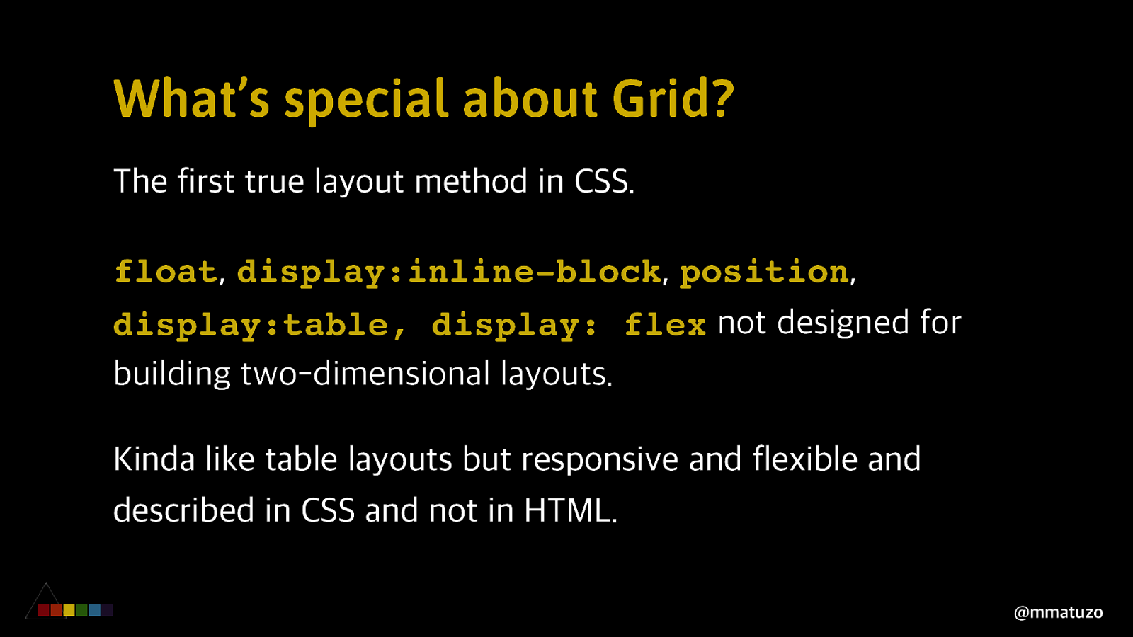
What’s special about Grid? The first true layout method in CSS. float, display:inline-block, position, display:table, display: flex not designed for building two-dimensional layouts. Kinda like table layouts but responsive and flexible and described in CSS and not in HTML. @mmatuzo
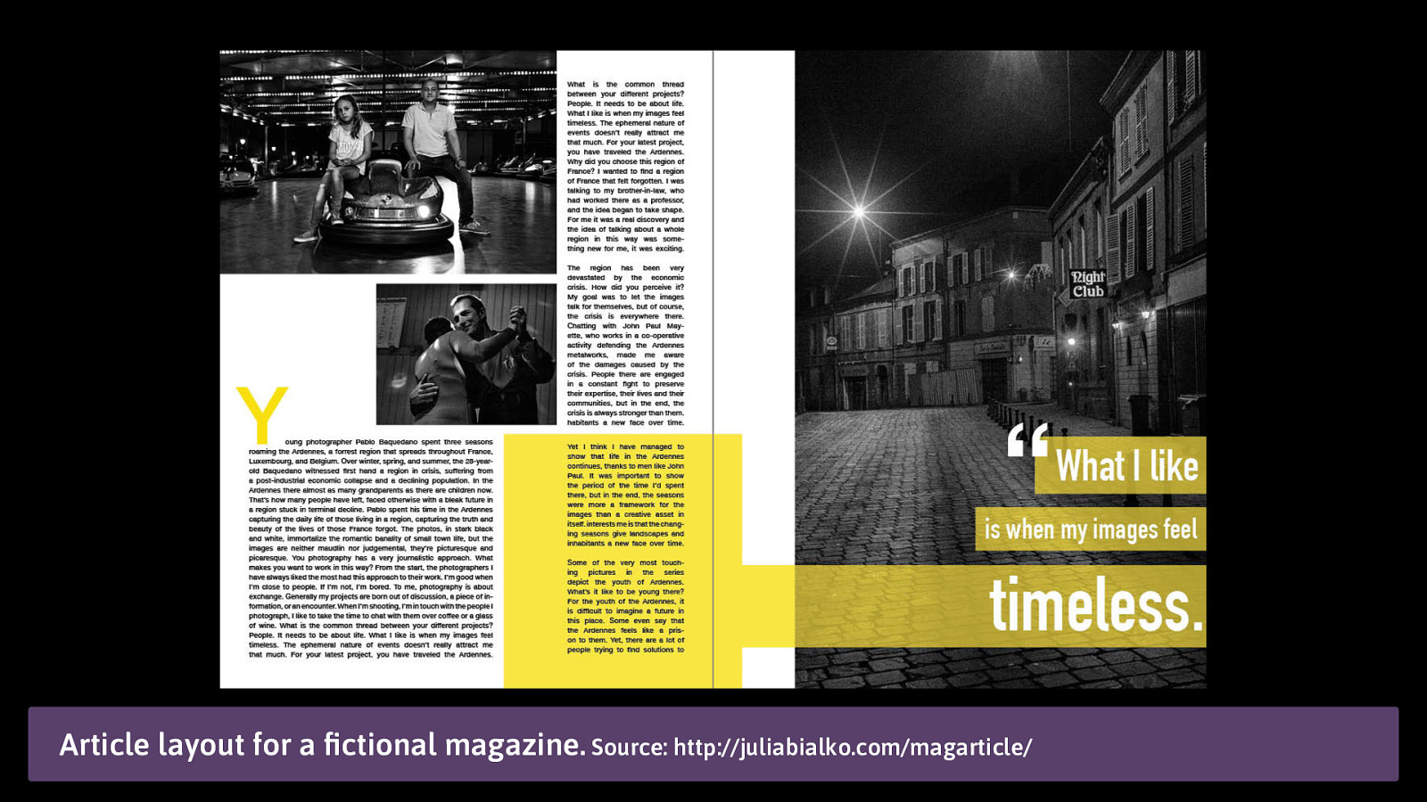
Article layout for a fictional magazine. Source: http://juliabialko.com/magarticle/
A Brief overview of Grids History Early 90s: First ideas, but “too complex” to implement. 1996: “frame-based” layout model. 2005: Advanced Layout Module (later Template Layout Module). @mmatuzo
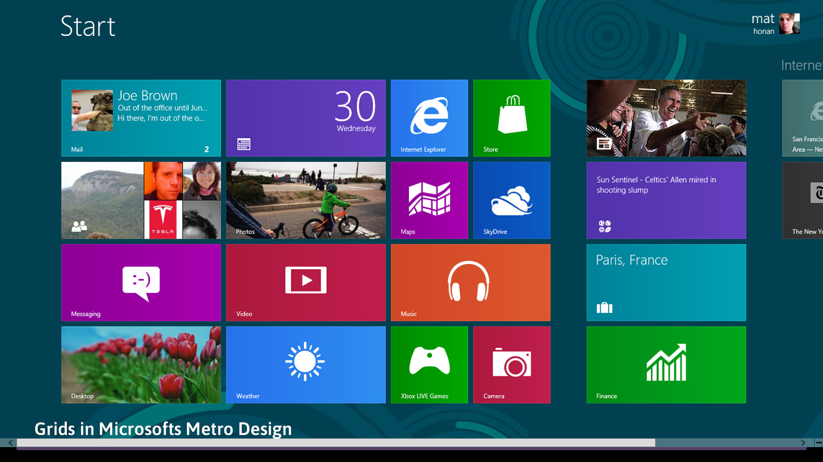
Grids in Microsofts Metro Design
A Brief overview of Grids History 2011: Microsoft ships a Grid implementation behind the -ms- vendor prefix in IE 10. Microsoft presents a draft spec to the W3C in 2012. CSS Working Group begins tweaking Microsoft’s proposal. Bloomberg hires Igalia to implement CSS Grid for both Blink and WebKit. @mmatuzo
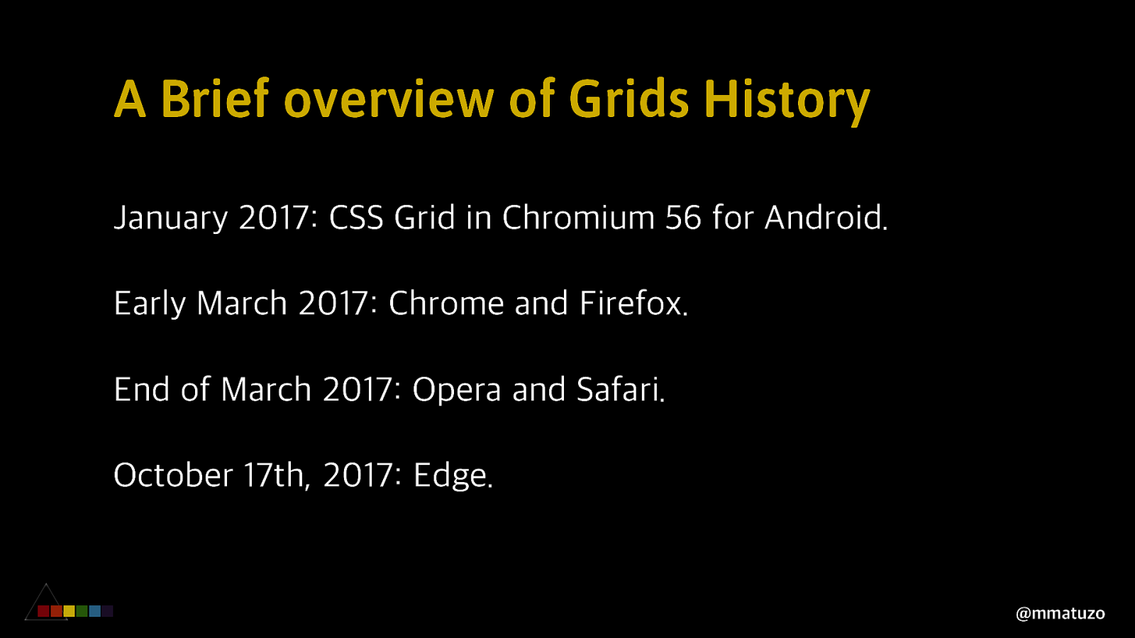
A Brief overview of Grids History January 2017: CSS Grid in Chromium 56 for Android. Early March 2017: Chrome and Firefox. End of March 2017: Opera and Safari. October 17th, 2017: Edge. @mmatuzo
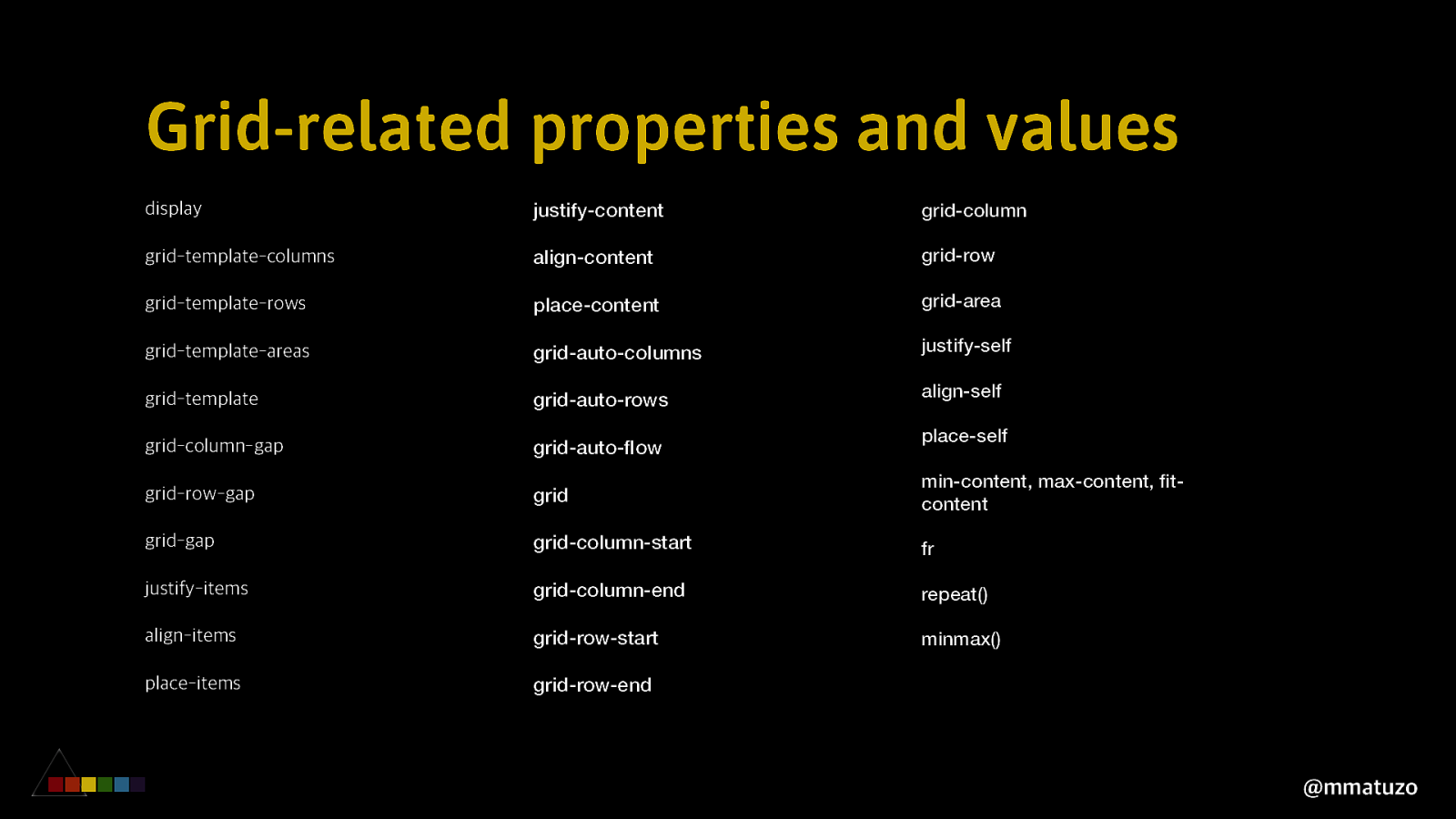
Grid-related properties and values display justify-content grid-column grid-template-columns align-content grid-row grid-template-rows place-content grid-area grid-template-areas grid-auto-columns justify-self grid-template grid-auto-rows align-self grid-column-gap grid-auto-flow place-self grid-row-gap grid min-content, max-content, fitcontent grid-gap grid-column-start fr justify-items grid-column-end repeat() align-items grid-row-start minmax() place-items grid-row-end @mmatuzo
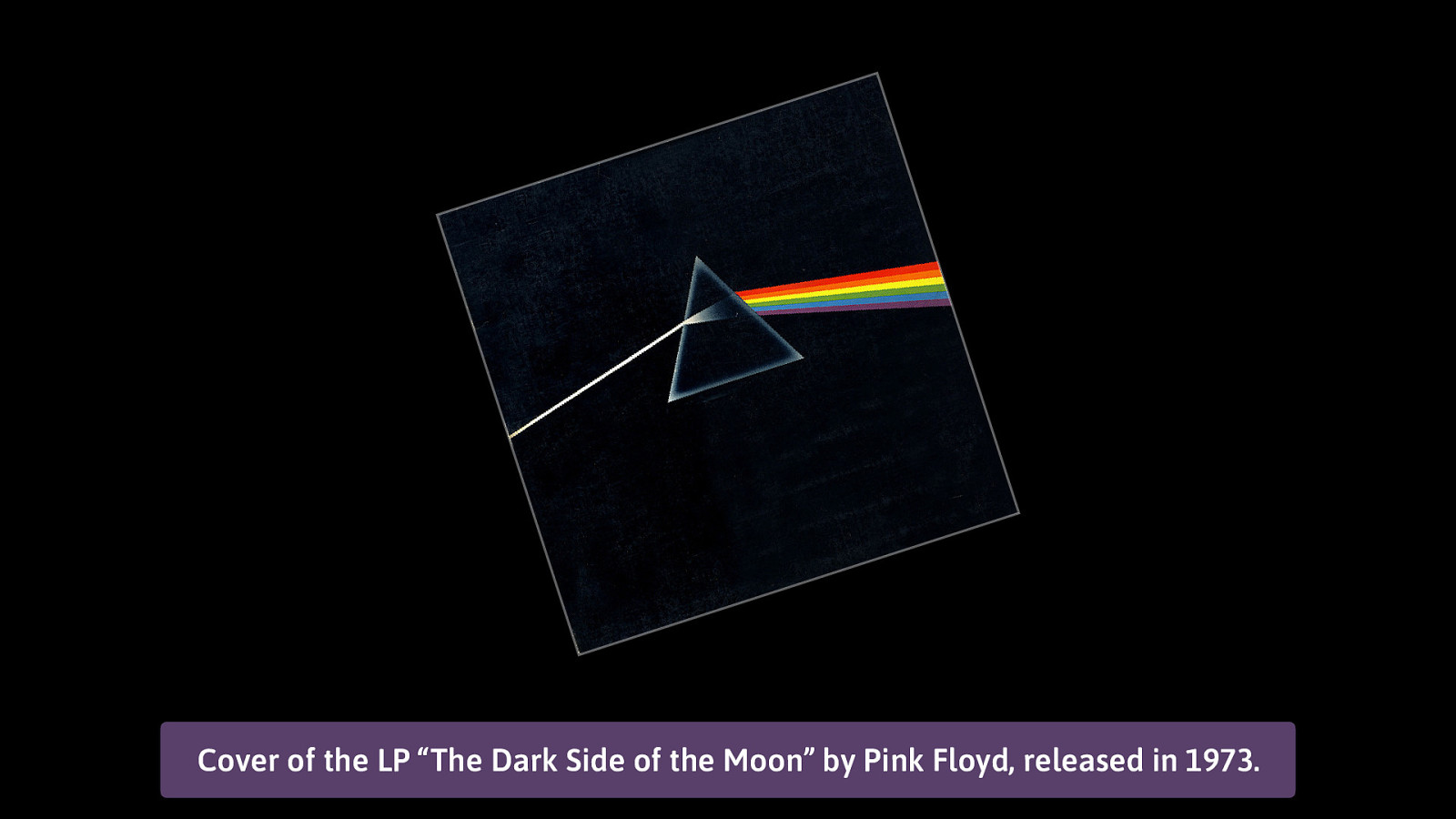
Cover of the LP “The Dark Side of the Moon” by Pink Floyd, released in 1973.
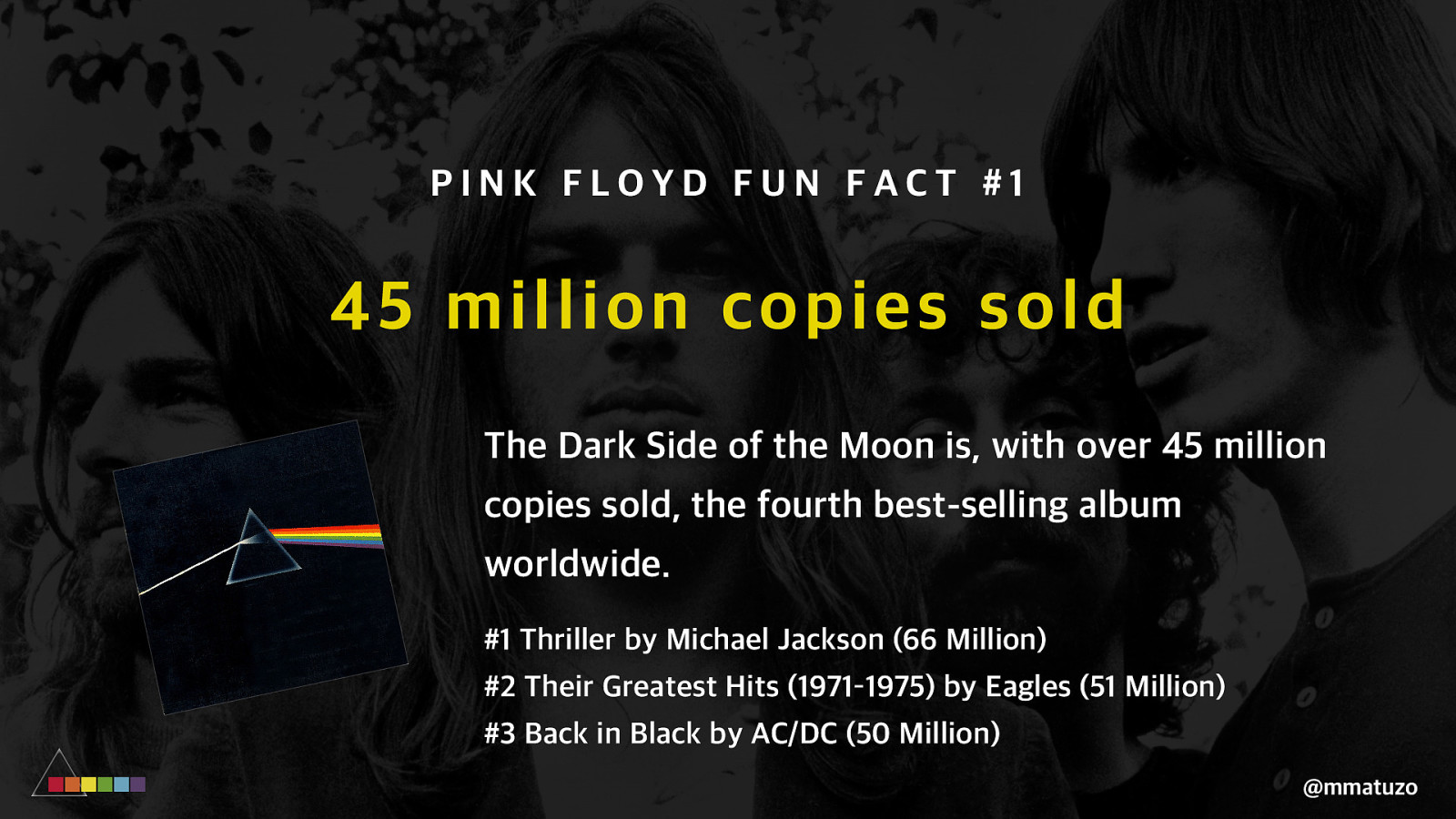
PINK FLOYD FUN FACT #1 45 million copie s sold The Dark Side of the Moon is, with over 45 million copies sold, the fourth best-selling album worldwide. #1 Thriller by Michael Jackson (66 Million) #2 Their Greatest Hits (1971–1975) by Eagles (51 Million) #3 Back in Black by AC/DC (50 Million) @mmatuzo
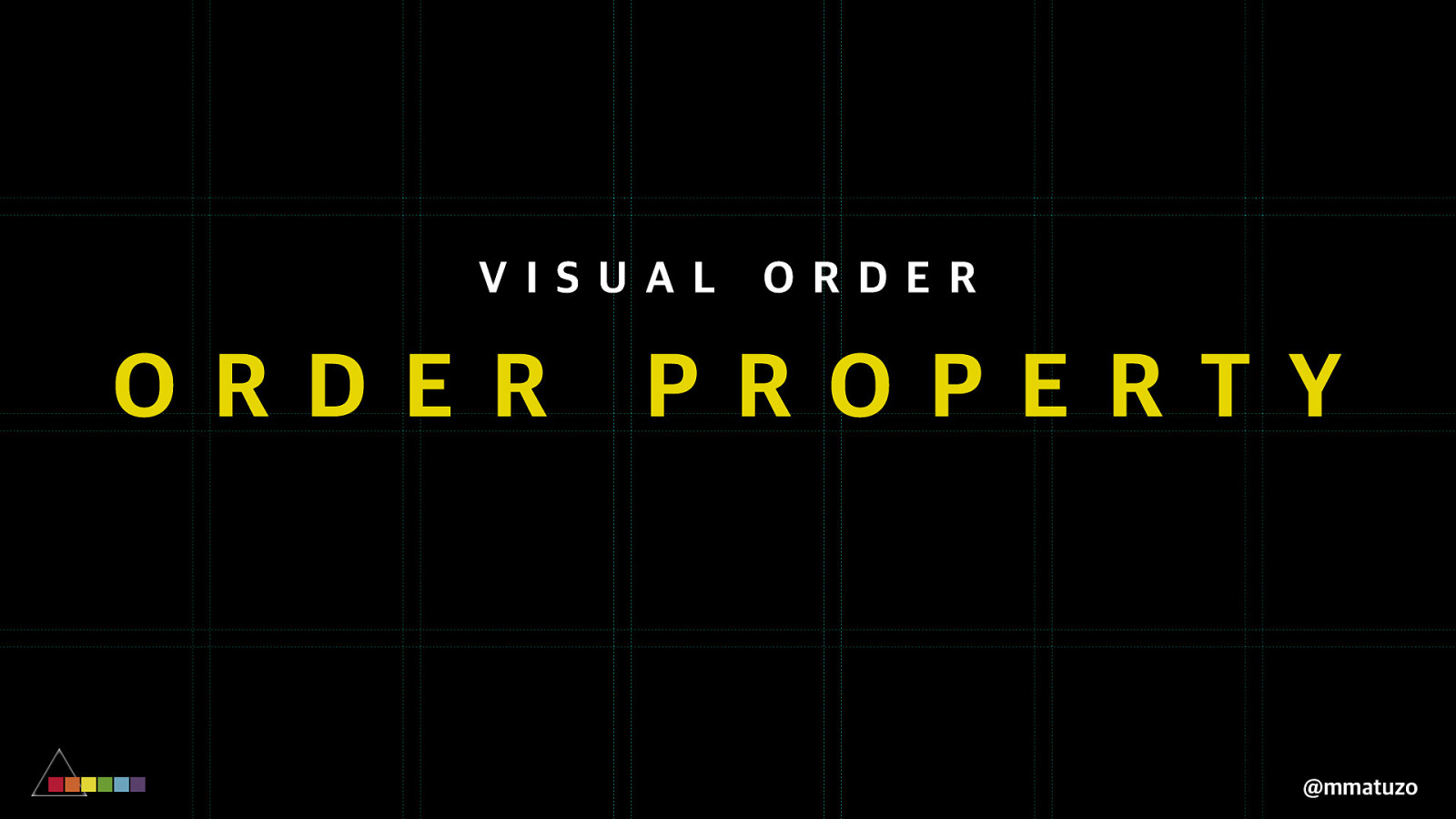
C H A N G I NG V I S U A L O R D E R @mmatuzo
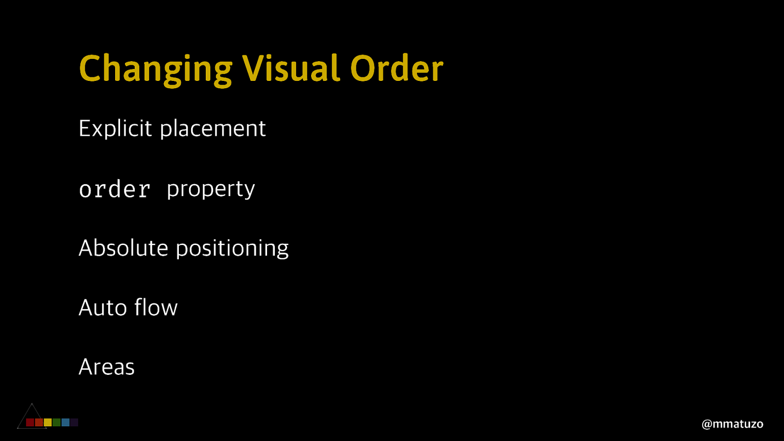
Changing Visual Order Explicit placement order property Absolute positioning Auto flow Areas @mmatuzo
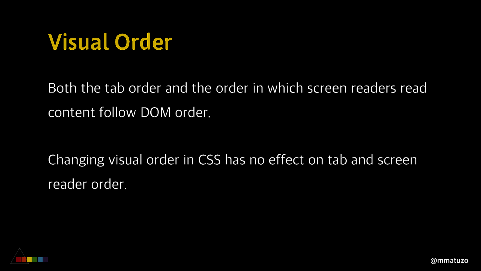
Visual Order Both the tab order and the order in which screen readers read content follow DOM order. Changing visual order in CSS has no effect on tab and screen reader order. @mmatuzo
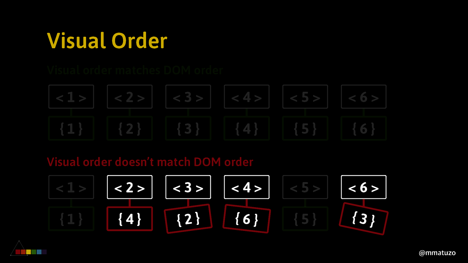
Visual Order Visual order matches DOM order <1> <2> <3> <4> <5> <6> {1} {2} {3} {4} {5} {6} Visual order doesn’t match DOM order <1> <2> <3> <4> <5> <6> {1} {4} {2} {6} {5} {3} @mmatuzo
If visual order doesn’t match DOM order.
If visual order doesn’t match DOM order. 2. Users of screen magnifiers may be confused when the display detail skips around constantly. @mmatuzo
If visual order doesn’t match DOM order. 3. If a blind user is working with a sighted user who reads the page in visual order, they may be confused when they encounter information in different order. @mmatuzo
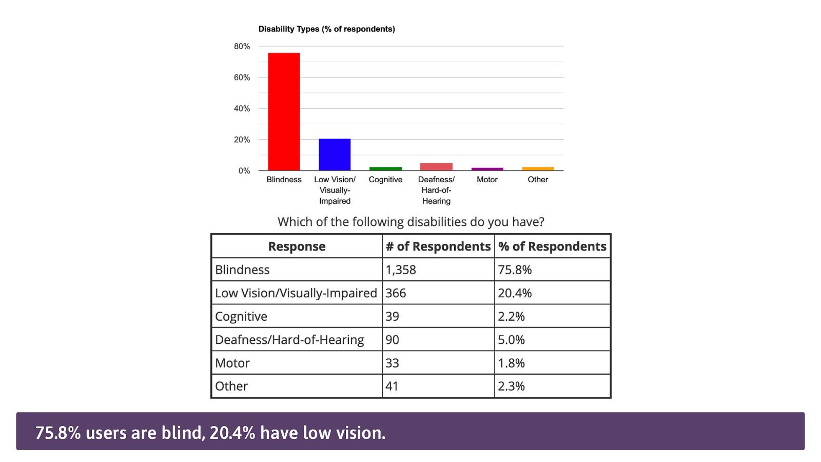
75.8% users are blind, 20.4% have low vision.
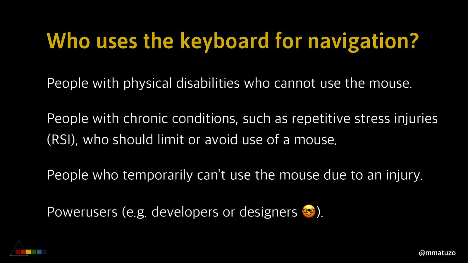
Who uses the keyboard for navigation? People with physical disabilities who cannot use the mouse. People with chronic conditions, such as repetitive stress injuries (RSI), who should limit or avoid use of a mouse. People who temporarily can’t use the mouse due to an injury. Powerusers (e.g. developers or designers 🤓). @mmatuzo
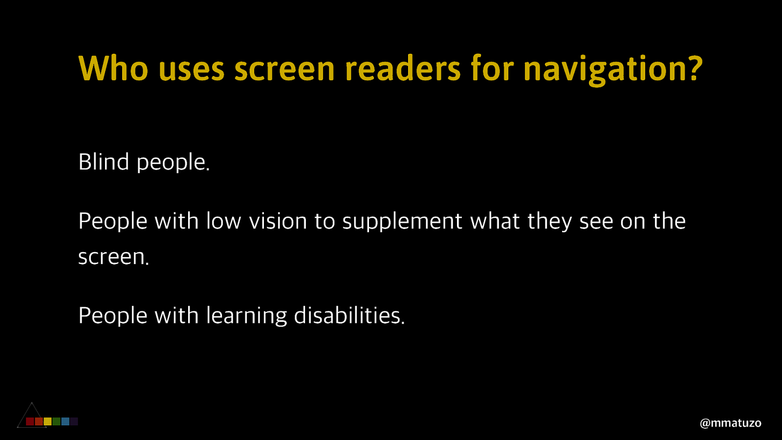
Who uses screen readers for navigation? Blind people. People with low vision to supplement what they see on the screen. People with learning disabilities. @mmatuzo
V ISUAL O RDER EX PLIC IT PL A CE ME NT @mmatuzo
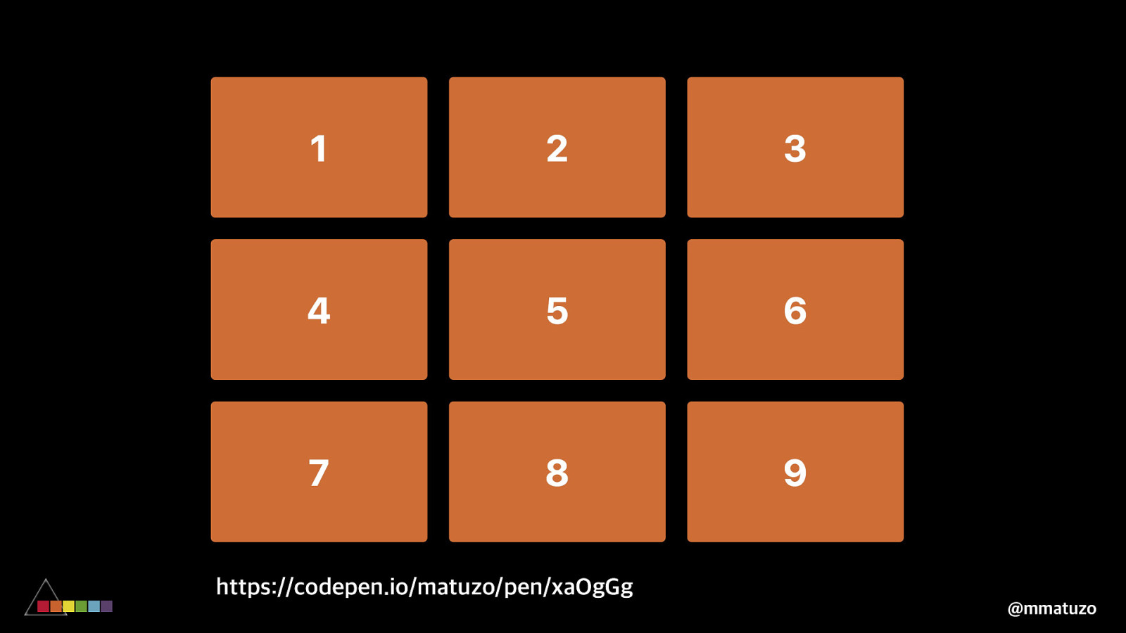
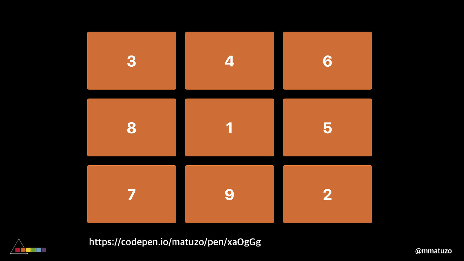
https://codepen.io/matuzo/pen/xaOgGg @mmatuzo
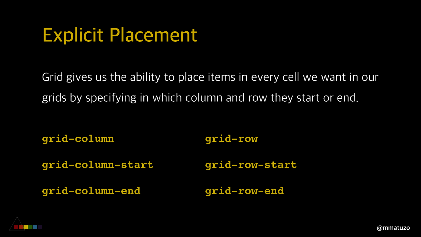
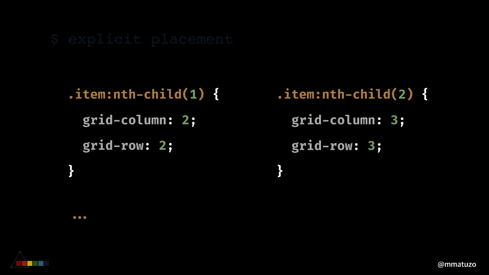
Explicit Placement Grid gives us the ability to place items in every cell we want in our grids by specifying in which column and row they start or end. grid-column grid-row grid-column-start grid-row-start grid-column-end grid-row-end @mmatuzo
$ explicit placement .item:nth-child(1) { .item:nth-child(2) { grid-column: 2; grid-column: 3; grid-row: 2; grid-row: 3; } } “”… @mmatuzo
https://codepen.io/matuzo/pen/xaOgGg @mmatuzo
V ISUAL O R D E R O RDER P R O P E R T Y @mmatuzo
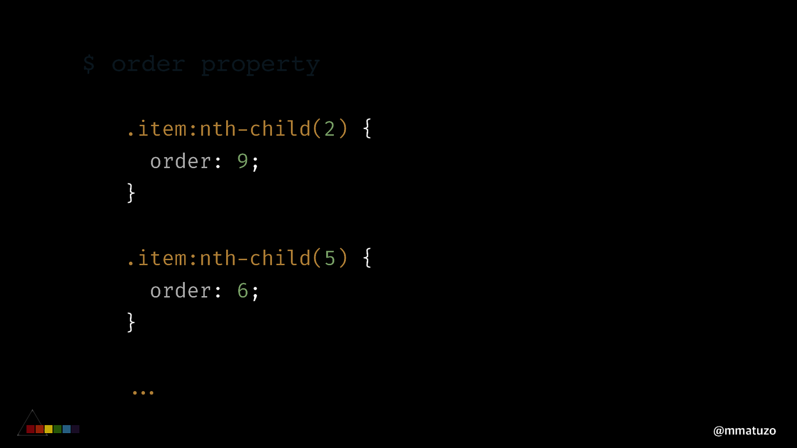
$ order property .item:nth-child(2) { order: 9; } .item:nth-child(5) { order: 6; } “”… @mmatuzo
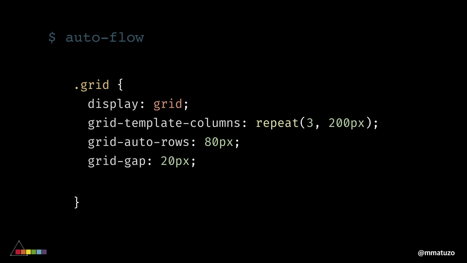
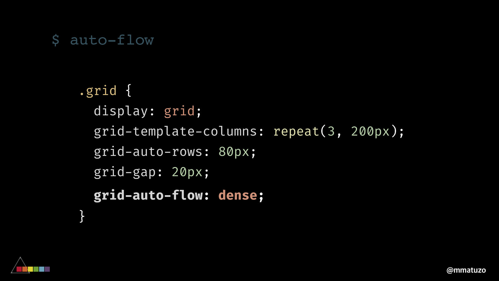
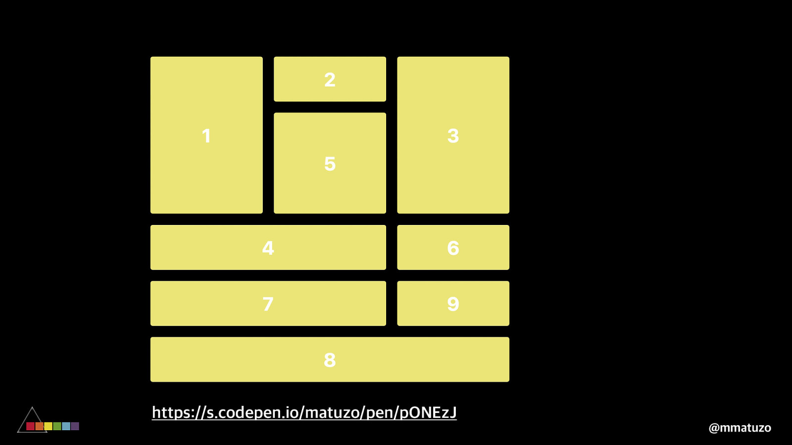
V ISUAL O RDER A U T O-F L O W @mmatuzo
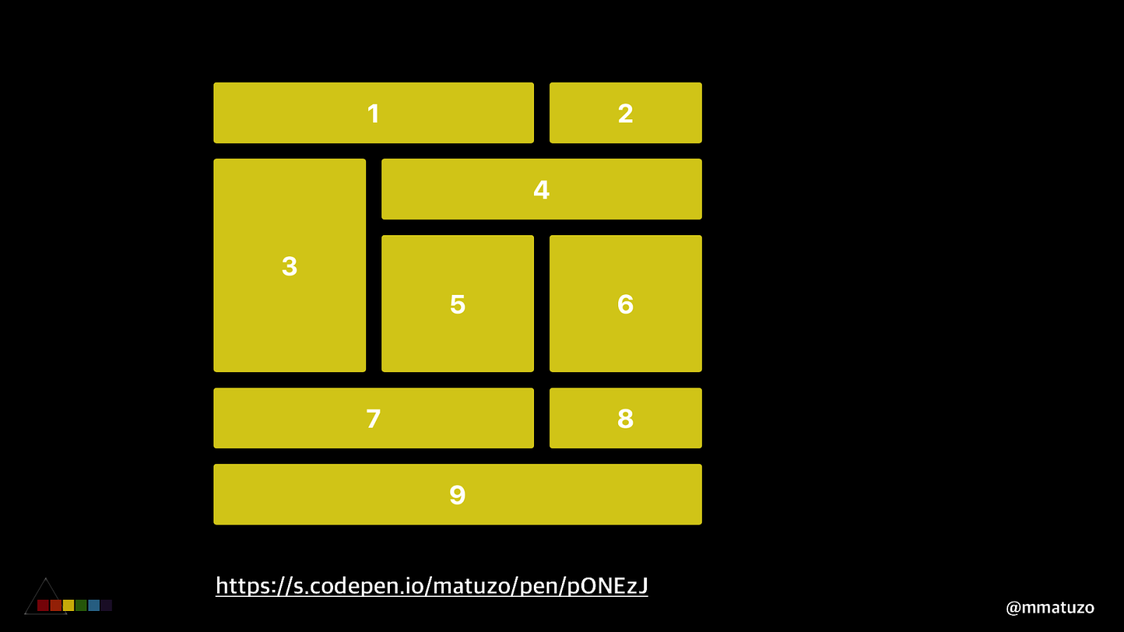
https://s.codepen.io/matuzo/pen/pONEzJ @mmatuzo
https://s.codepen.io/matuzo/pen/pONEzJ @mmatuzo
$ auto-flow .grid { display: grid; grid-template-columns: repeat(3, 200px); grid-auto-rows: 80px; grid-gap: 20px; grid-auto-flow: dense; } @mmatuzo
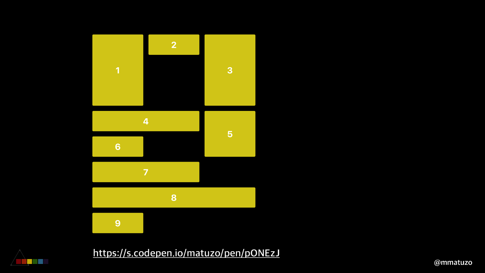
$ auto-flow .grid { display: grid; grid-template-columns: repeat(3, 200px); grid-auto-rows: 80px; grid-gap: 20px; grid-auto-flow: dense; } @mmatuzo
https://s.codepen.io/matuzo/pen/pONEzJ @mmatuzo
https://s.codepen.io/matuzo/pen/pONEzJ @mmatuzo
V ISUAL O RDER A R E A S @mmatuzo
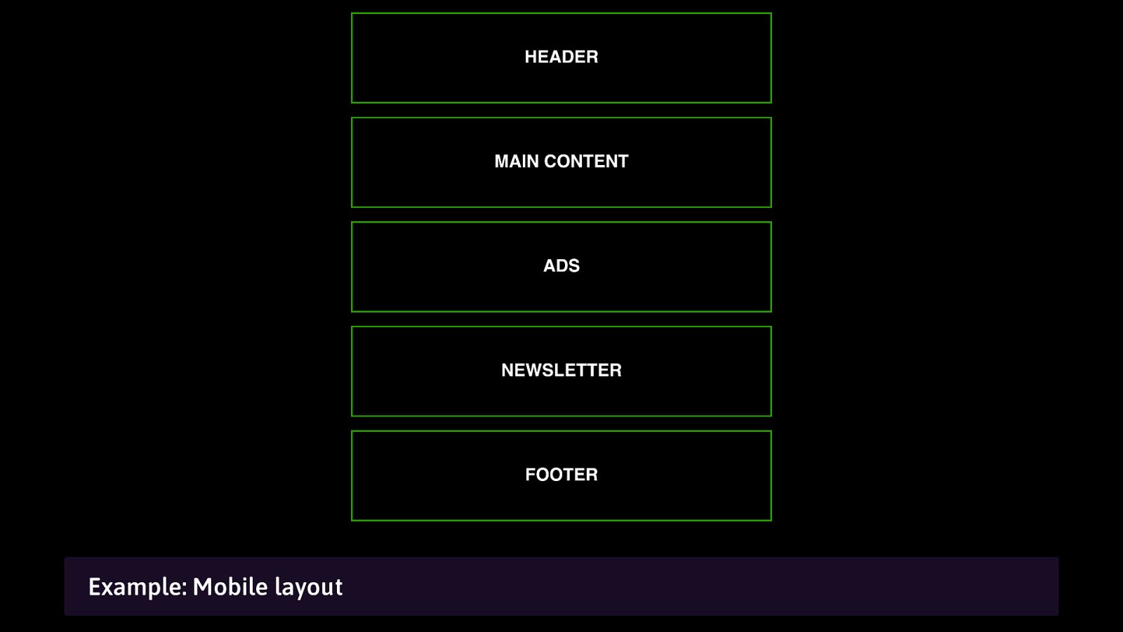
Example: Mobile layout
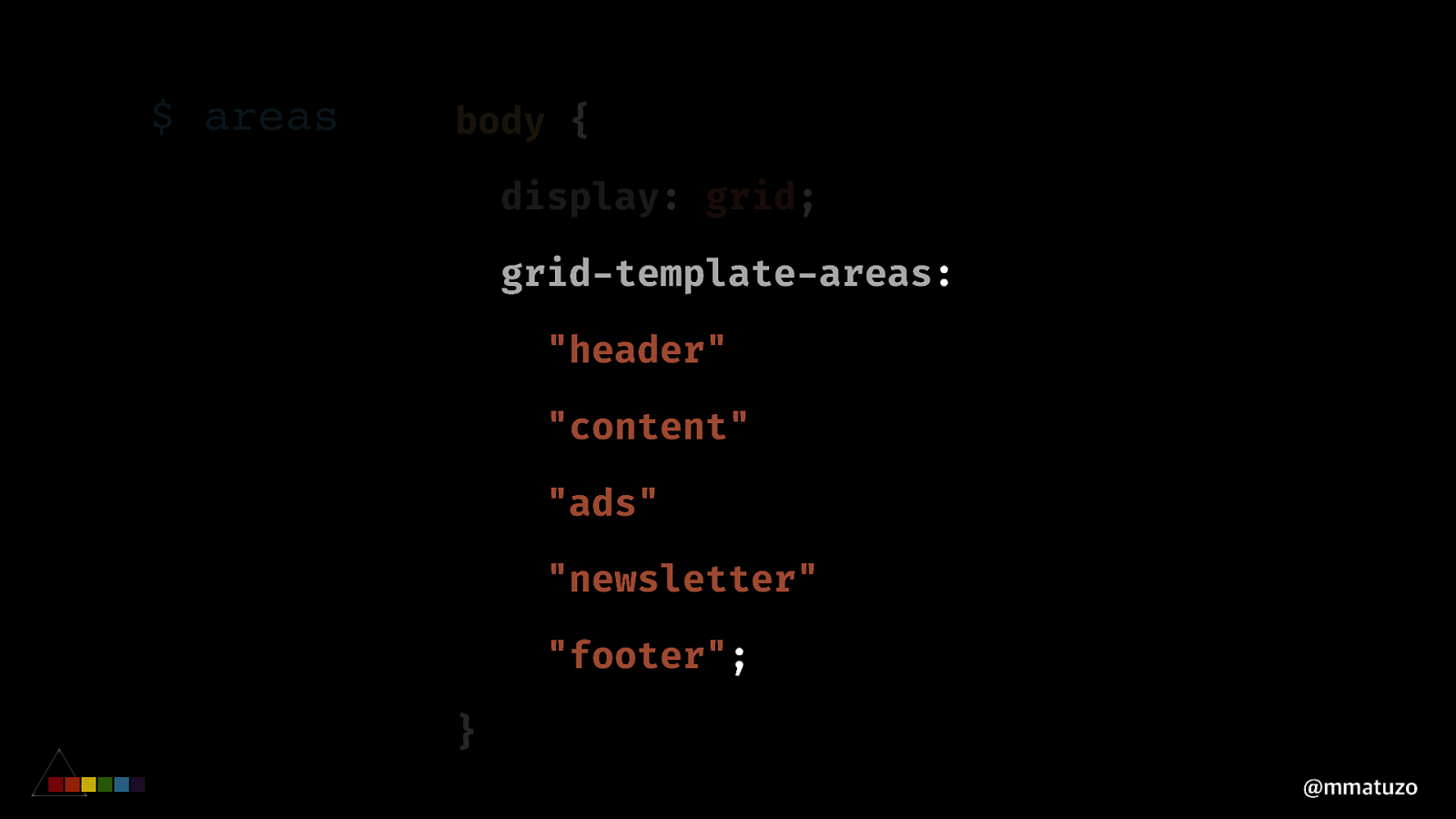
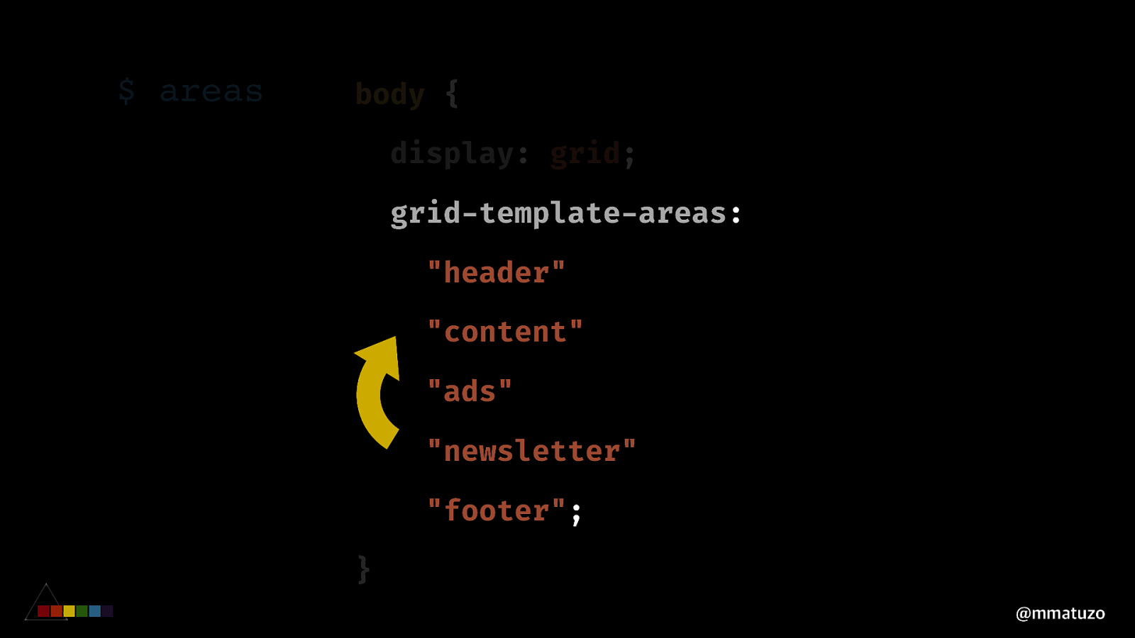
$ areas body { display: grid; grid-template-areas: “header” “content” “ads” “newsletter” “footer”; } @mmatuzo
$ areas body { display: grid; grid-template-areas: “header” “content” “ads” “newsletter” “footer”; } @mmatuzo
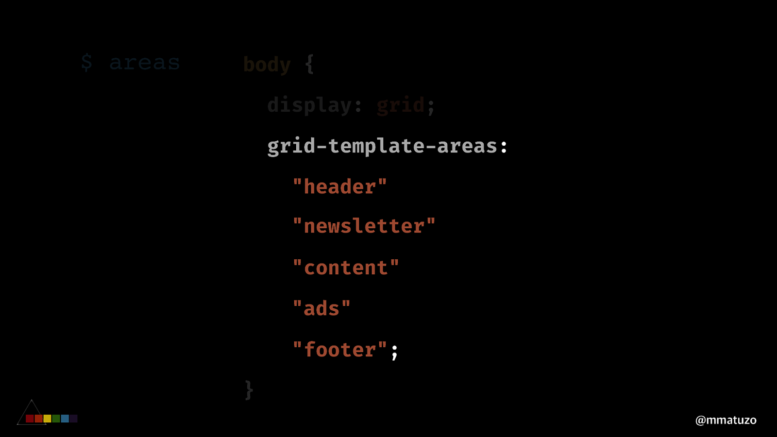
$ areas body { display: grid; grid-template-areas: “header” “newsletter” “content” “ads” “footer”; } @mmatuzo
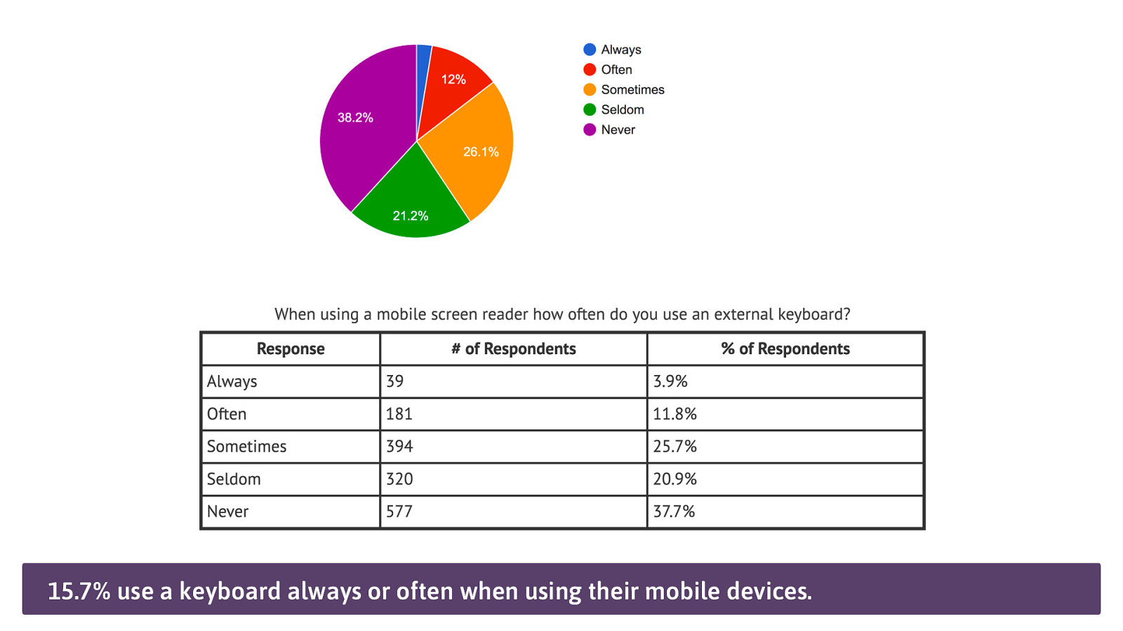
15.7% use a keyboard always or often when using their mobile devices.
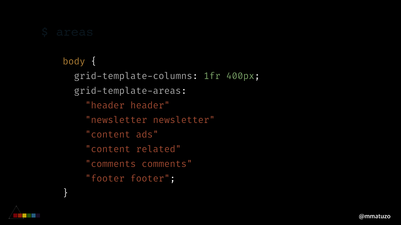
$ areas body { grid-template-columns: 1fr 400px; grid-template-areas: “header header” “newsletter newsletter” “content ads” “content related” “comments comments” “footer footer”; } @mmatuzo
WHO SE R E S P O N S IBILITY IS IT ? @mmatuzo
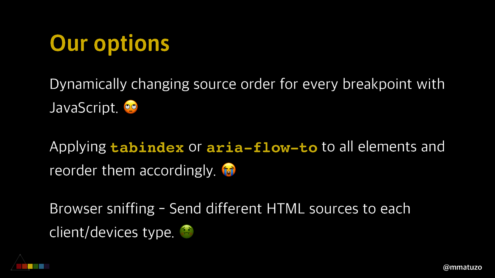
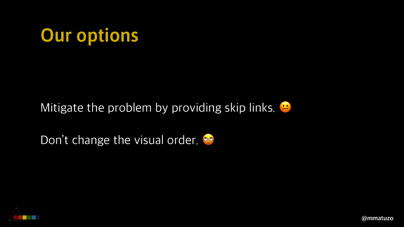
Our options Dynamically changing source order for every breakpoint with JavaScript. 🙄 Applying tabindex or aria-flow-to to all elements and reorder them accordingly. 😭 Browser sniffing - Send different HTML sources to each client/devices type. 🤢 @mmatuzo
Our options Mitigate the problem by providing skip links. 😐 Don’t change the visual order. 🙄 @mmatuzo
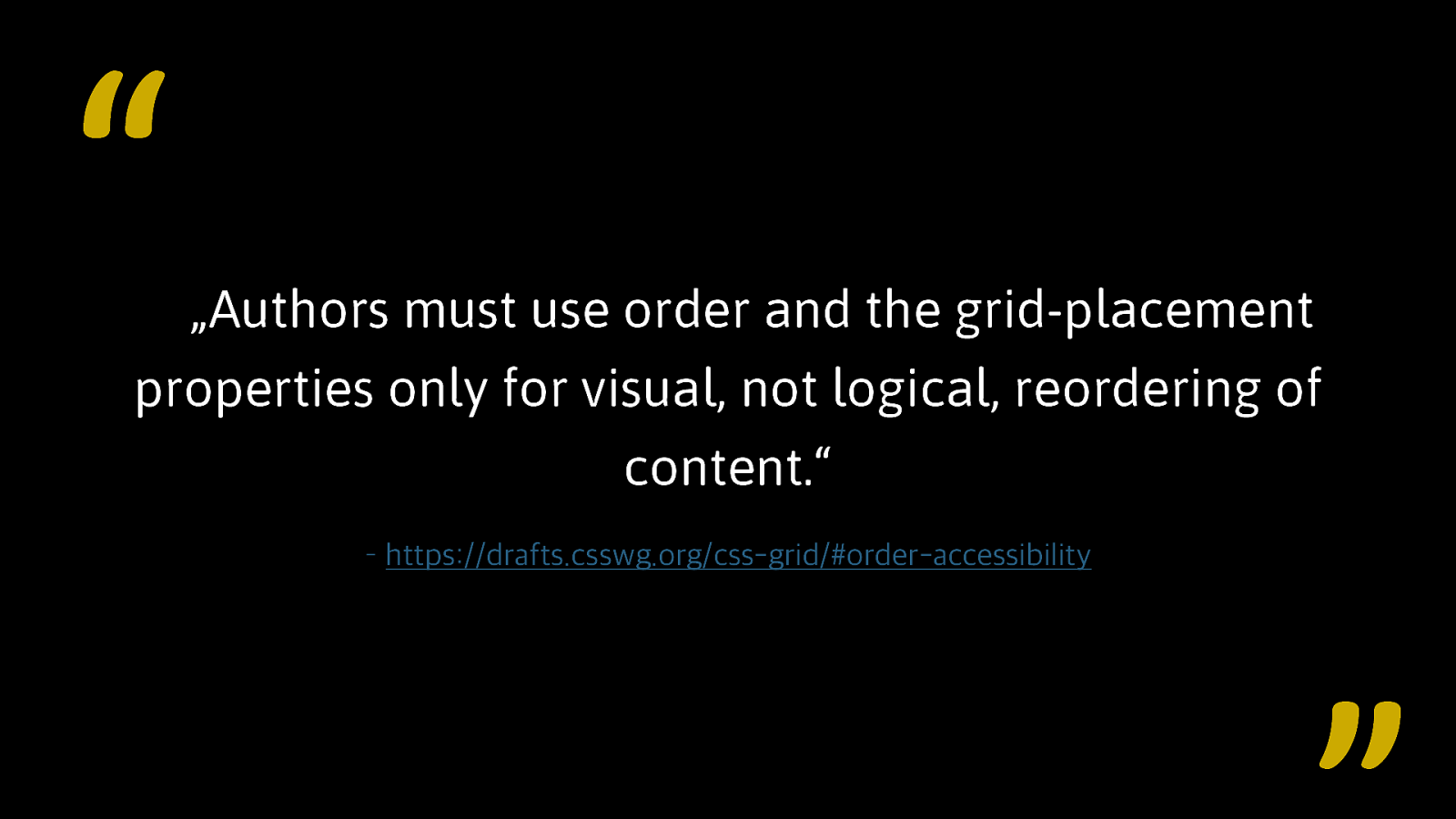
“ „Authors must use order and the grid-placement properties only for visual, not logical, reordering of content.“ – https://drafts.csswg.org/css-grid/#order-accessibility
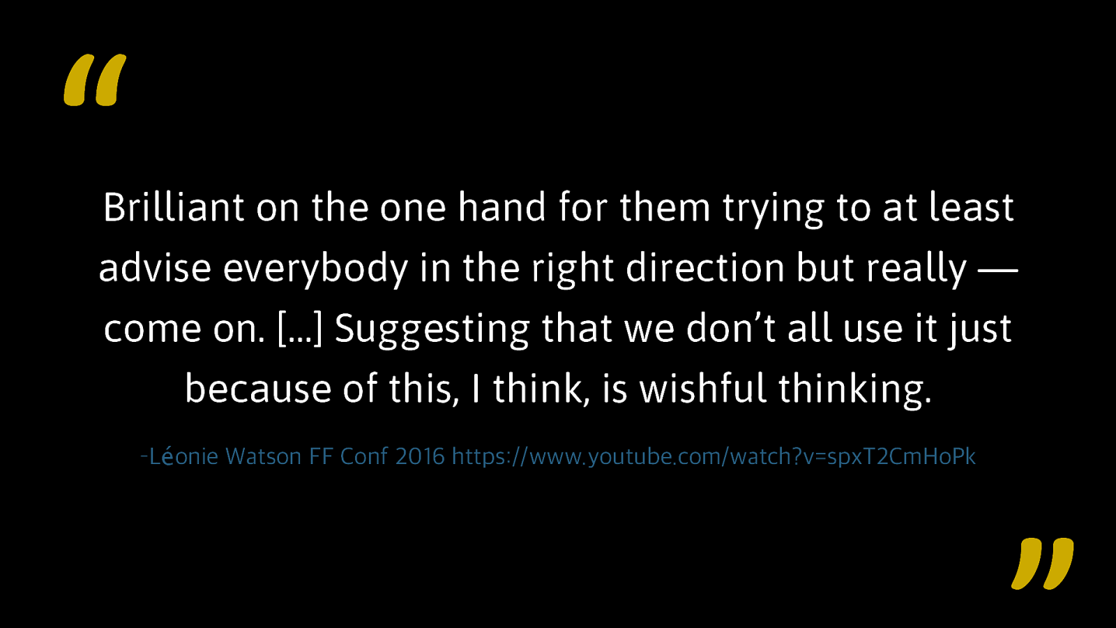
“ Brilliant on the one hand for them trying to at least advise everybody in the right direction but really — come on. […] Suggesting that we don’t all use it just because of this, I think, is wishful thinking. –Léonie Watson FF Conf 2016 https://www.youtube.com/watch?v=spxT2CmHoPk
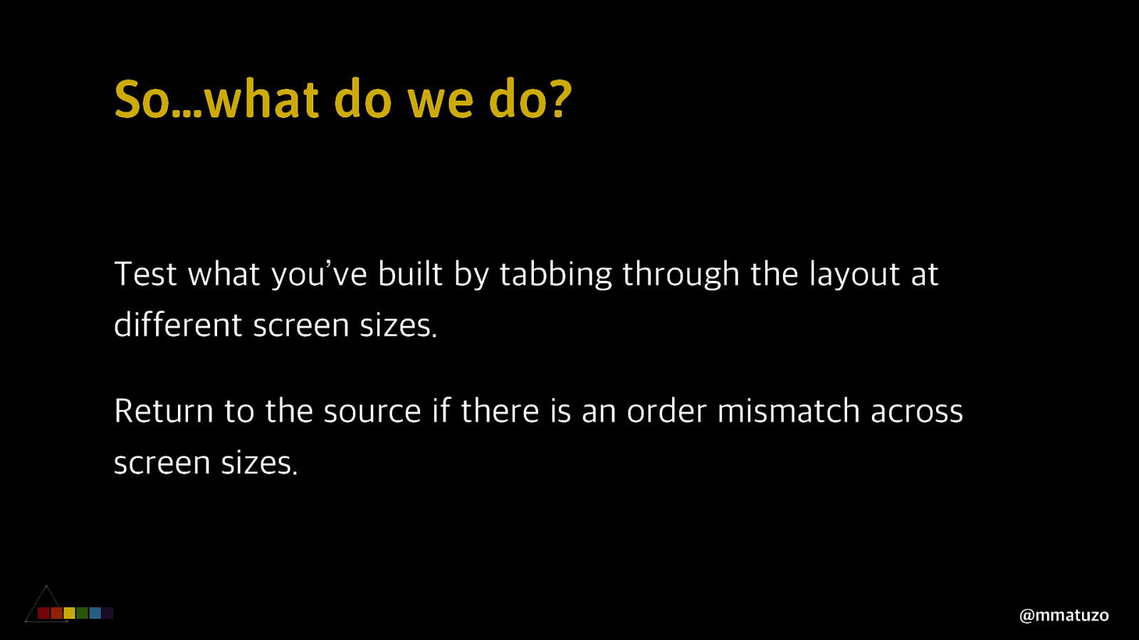
So…what do we do? Think about source order before writing HTML and CSS. Work closely with designers early on. Start with a well structured HTML document. Write CSS mobile first and change the layout according to screen sizes. @mmatuzo
So…what do we do? Test what you’ve built by tabbing through the layout at different screen sizes. Return to the source if there is an order mismatch across screen sizes. @mmatuzo
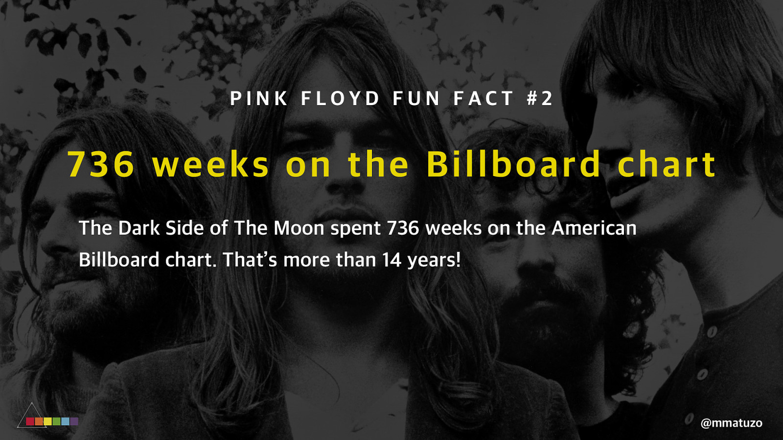
PINK FLOYD FUN FACT #2 73 6 weeks on the Billboard chart The Dark Side of The Moon spent 736 weeks on the American Billboard chart. That’s more than 14 years! @mmatuzo
C O MPR O MISIN G O N S EM AN TICS @mmatuzo
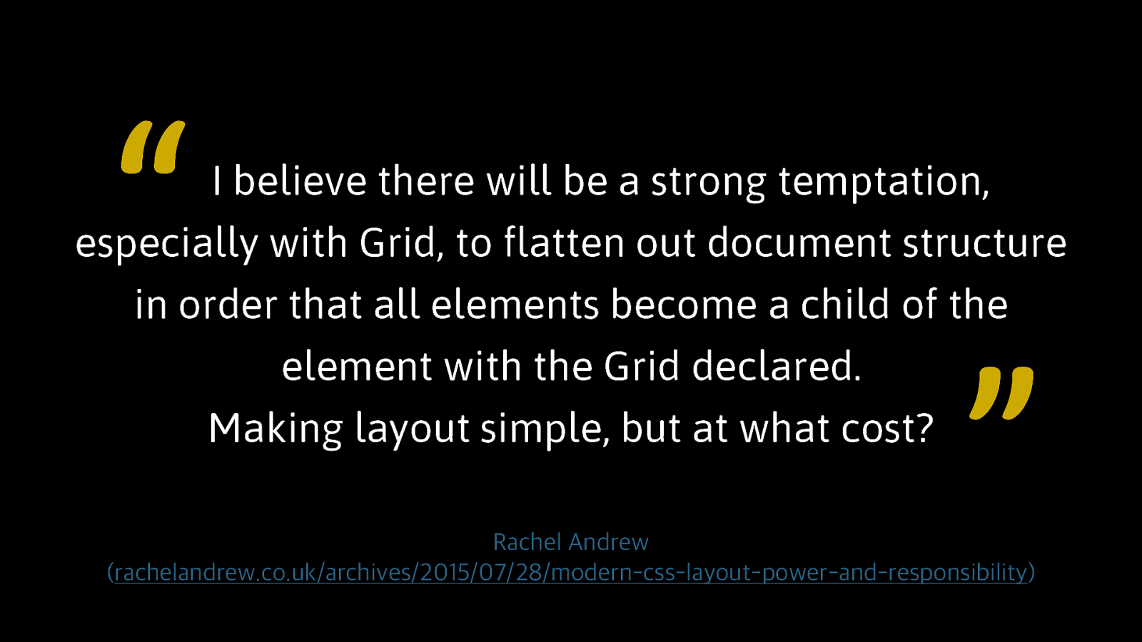
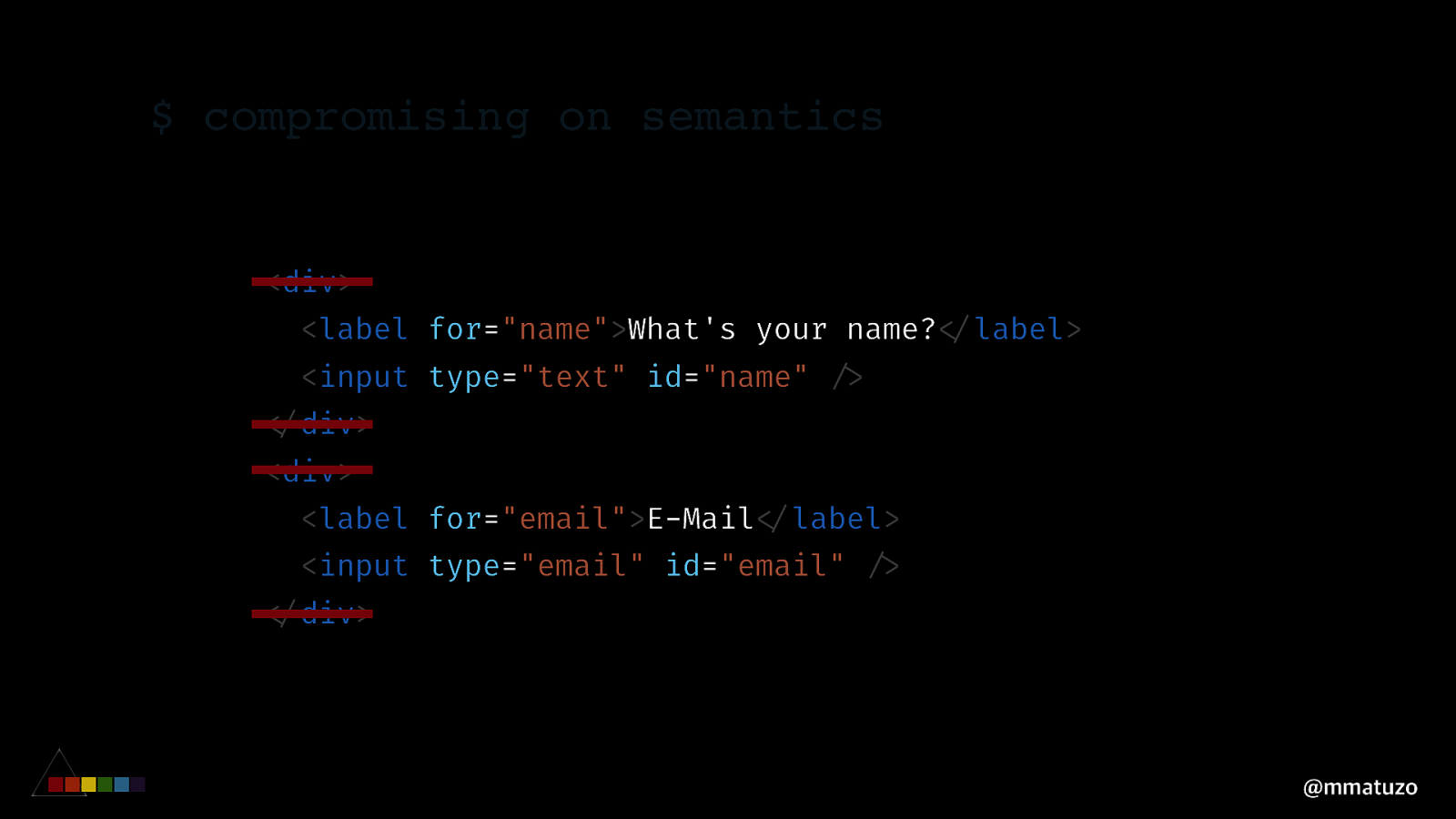
“ I believe there will be a strong temptation, especially with Grid, to flatten out document structure in order that all elements become a child of the element with the Grid declared. Making layout simple, but at what cost? ” Rachel Andrew (rachelandrew.co.uk/archives/2015/07/28/modern-css-layout-power-and-responsibility)
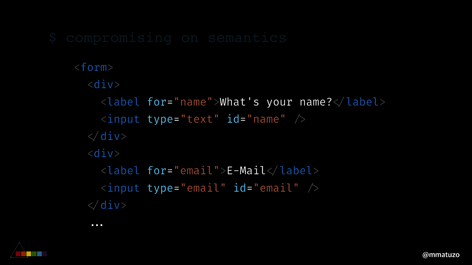
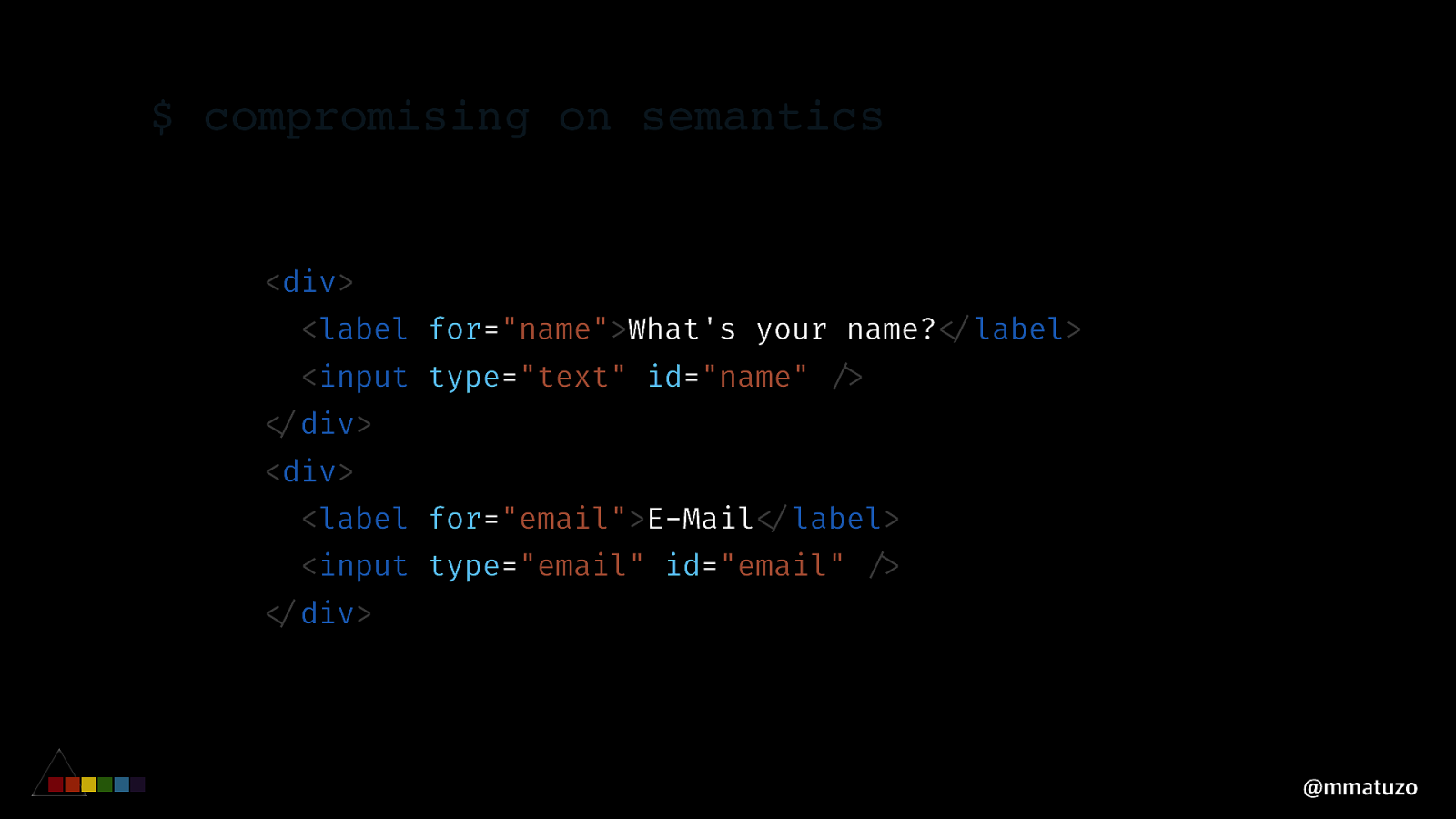
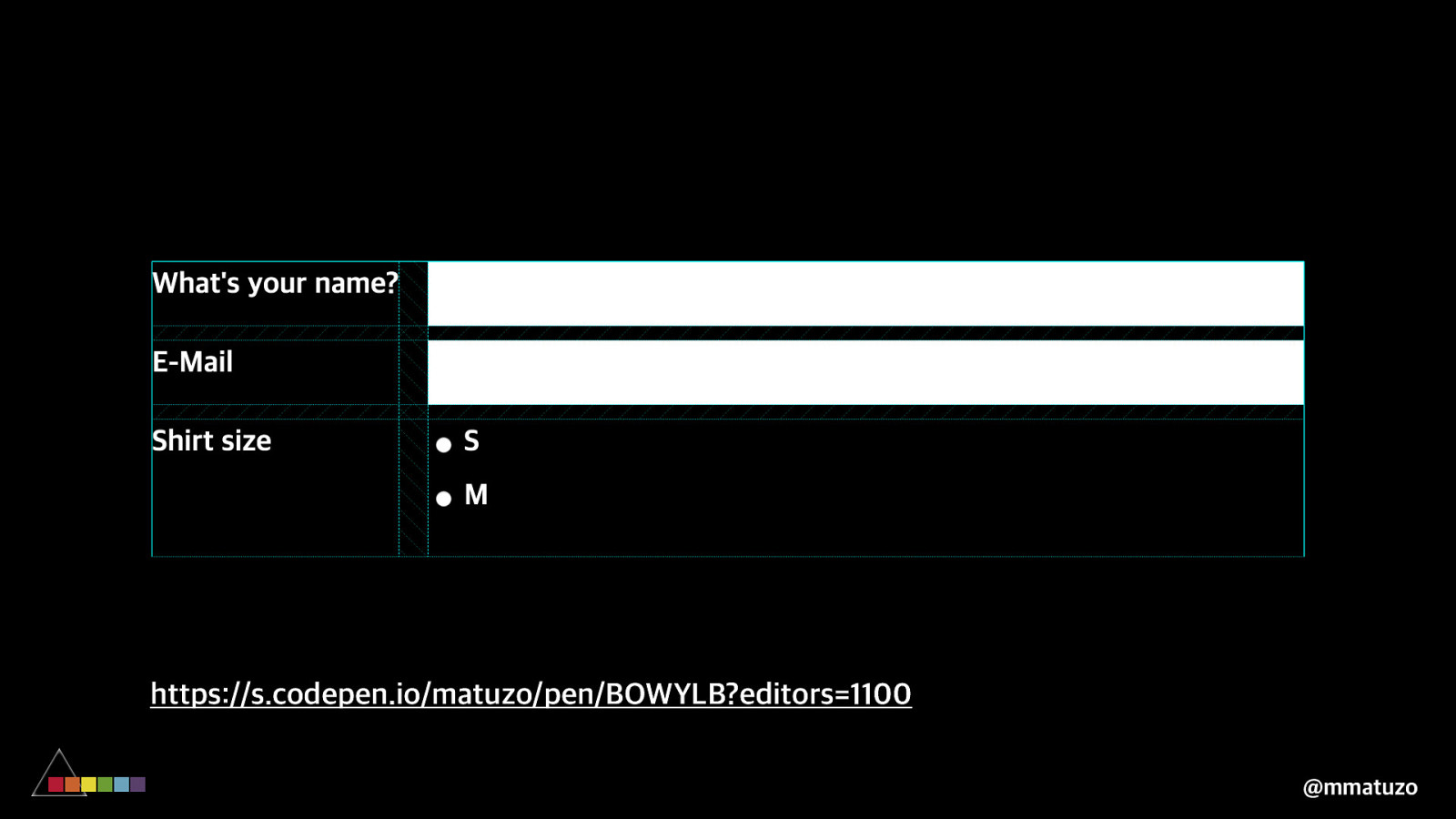
$ compromising on semantics <form> <div> <label for=”name”>What’s your name?”</label> <input type=”text” id=”name” “/> “</div> <div> <label for=”email”>E-Mail”</label> <input type=”email” id=”email” “/> “</div> “”… @mmatuzo
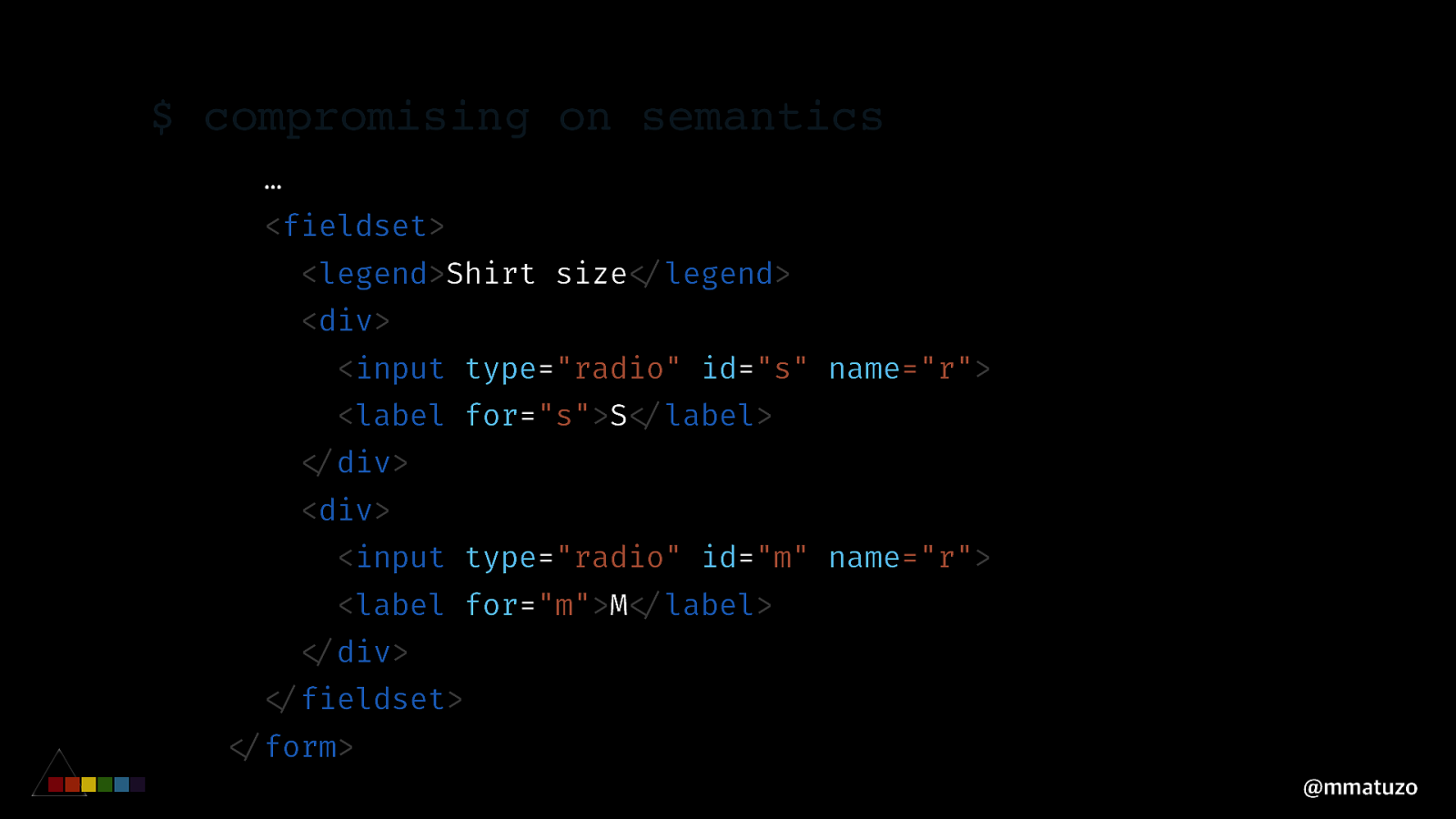
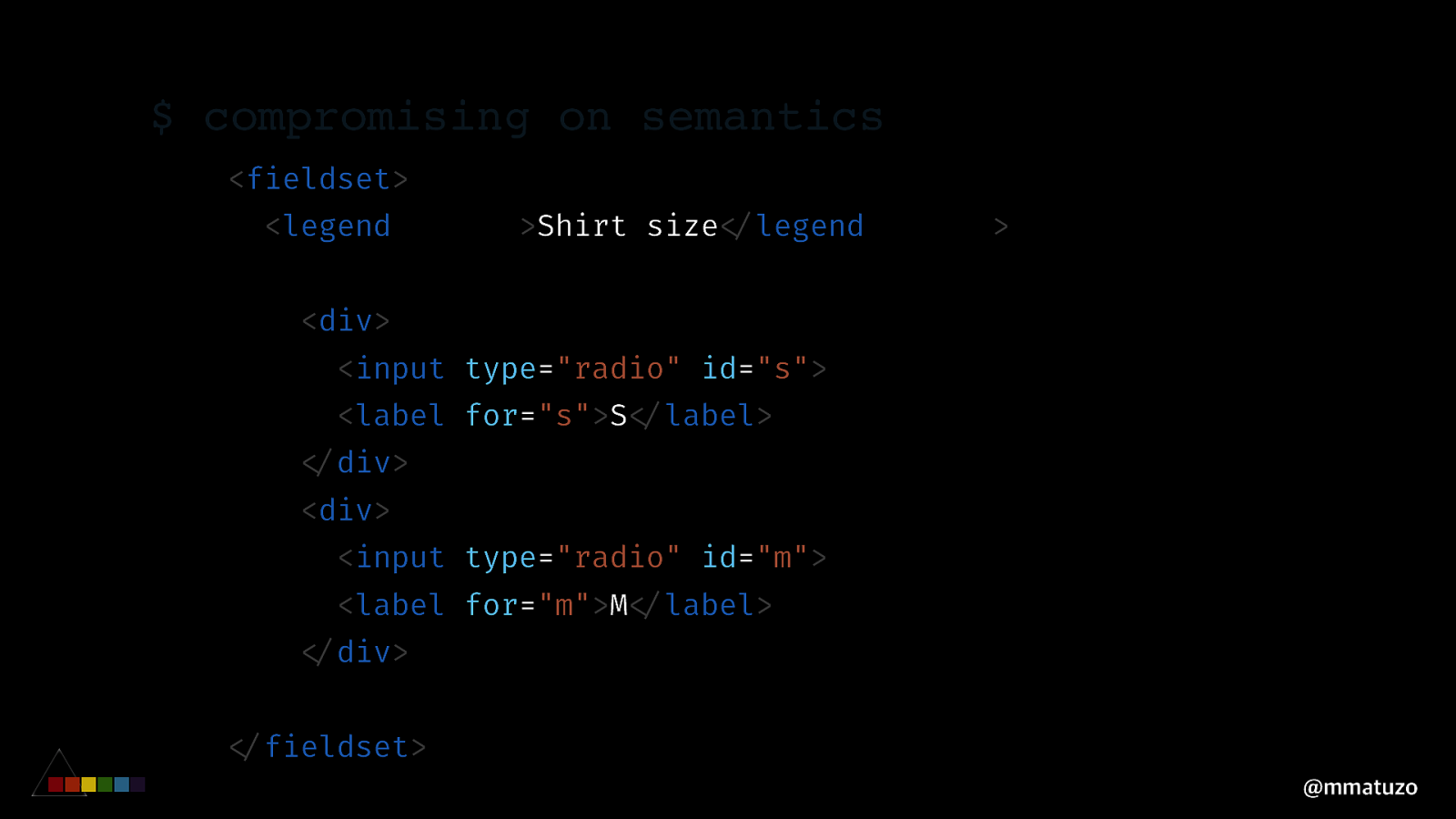
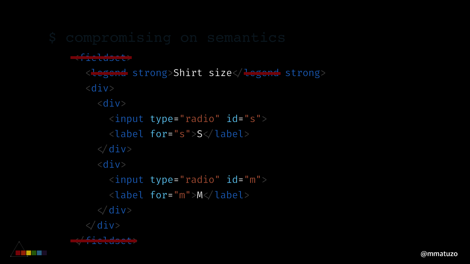
$ compromising on semantics … <fieldset> <legend>Shirt size”</legend> <div> <input type=”radio” id=”s” name=”r”> <label for=”s”>S”</label> “</div> <div> <input type=”radio” id=”m” name=”r”> <label for=”m”>M”</label> “</div> “</fieldset> “</form> @mmatuzo
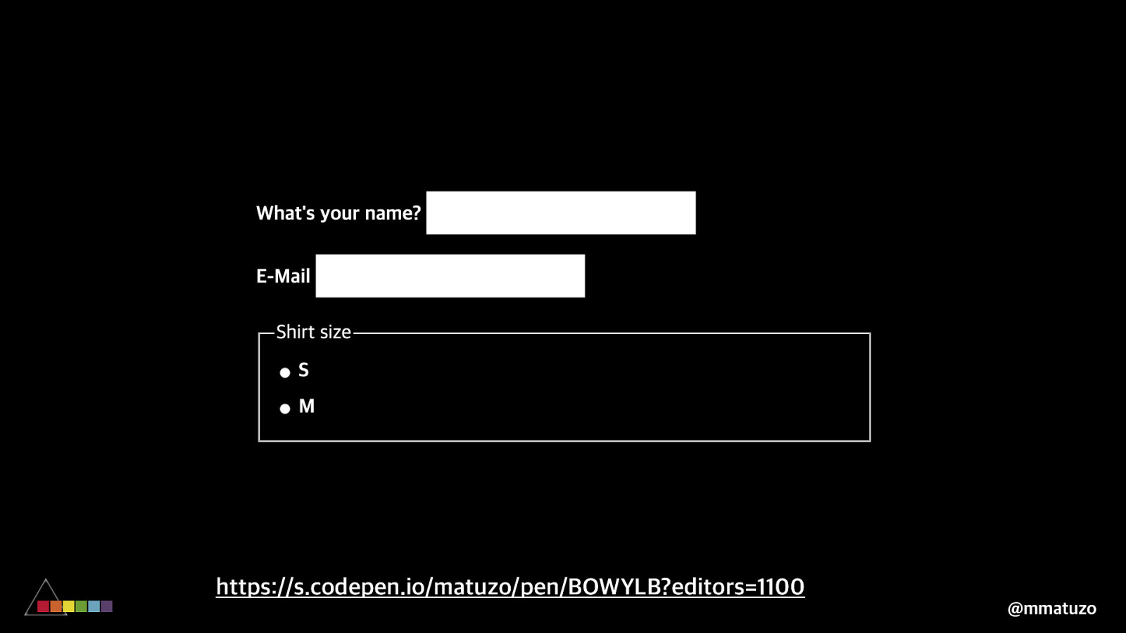
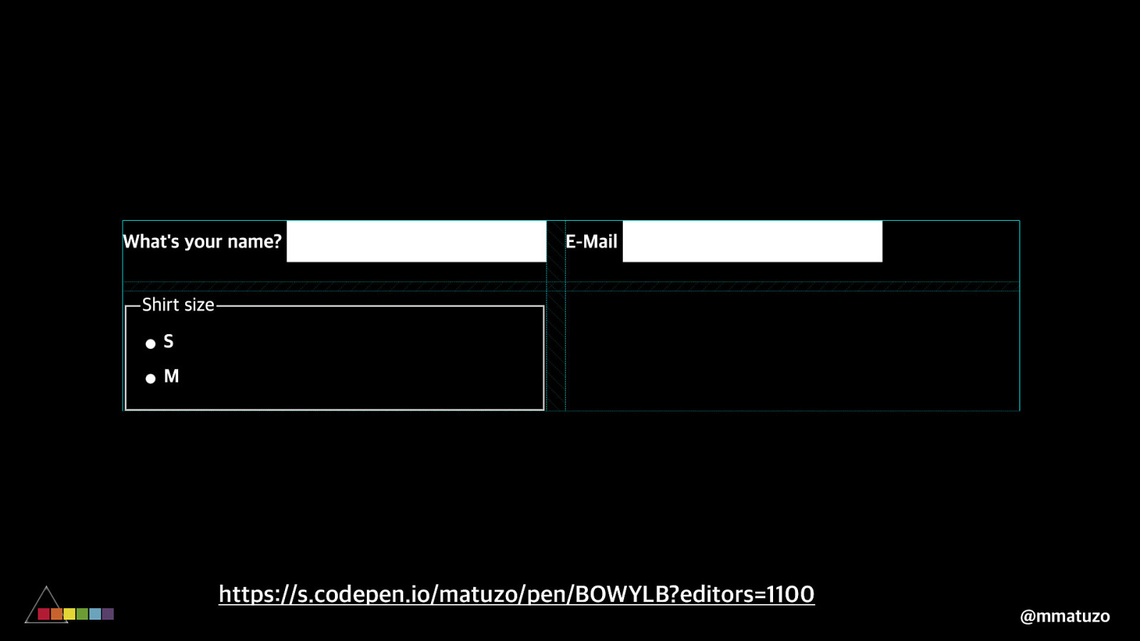
https://s.codepen.io/matuzo/pen/BOWYLB?editors=1100 @mmatuzo
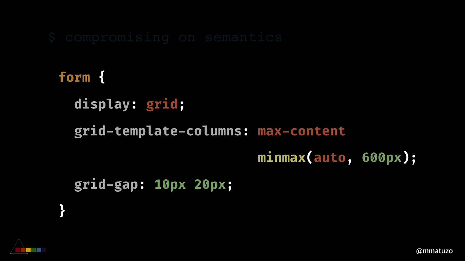
$ compromising on semantics form { display: grid; grid-template-columns: max-content minmax(auto, 600px); grid-gap: 10px 20px; } @mmatuzo
https://s.codepen.io/matuzo/pen/BOWYLB?editors=1100 @mmatuzo
$ compromising on semantics
<div> <label for=”name”>What’s your name?”</label> <input type=”text” id=”name” “/> “</div> <div> <label for=”email”>E-Mail”</label> <input type=”email” id=”email” “/> “</div> @mmatuzo$ compromising on semantics
<div> <label for=”name”>What’s your name?”</label> <input type=”text” id=”name” “/> “</div> <div> <label for=”email”>E-Mail”</label> <input type=”email” id=”email” “/> “</div> @mmatuzo$ compromising on semantics <fieldset> <legend strong>Shirt size”</legend strong> <div> <div> <input type=”radio” id=”s”> <label for=”s”>S”</label> “</div> <div> <input type=”radio” id=”m”> <label for=”m”>M”</label> “</div> “</div> “</fieldset> @mmatuzo
$ compromising on semantics <fieldset> <legend strong>Shirt size”</legend strong> <div> <div> <input type=”radio” id=”s”> <label for=”s”>S”</label> “</div> <div> <input type=”radio” id=”m”> <label for=”m”>M”</label> “</div> “</div> “</fieldset> @mmatuzo
https://s.codepen.io/matuzo/pen/BOWYLB?editors=1100 @mmatuzo
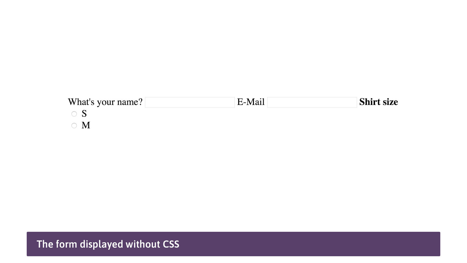
The form displayed without CSS
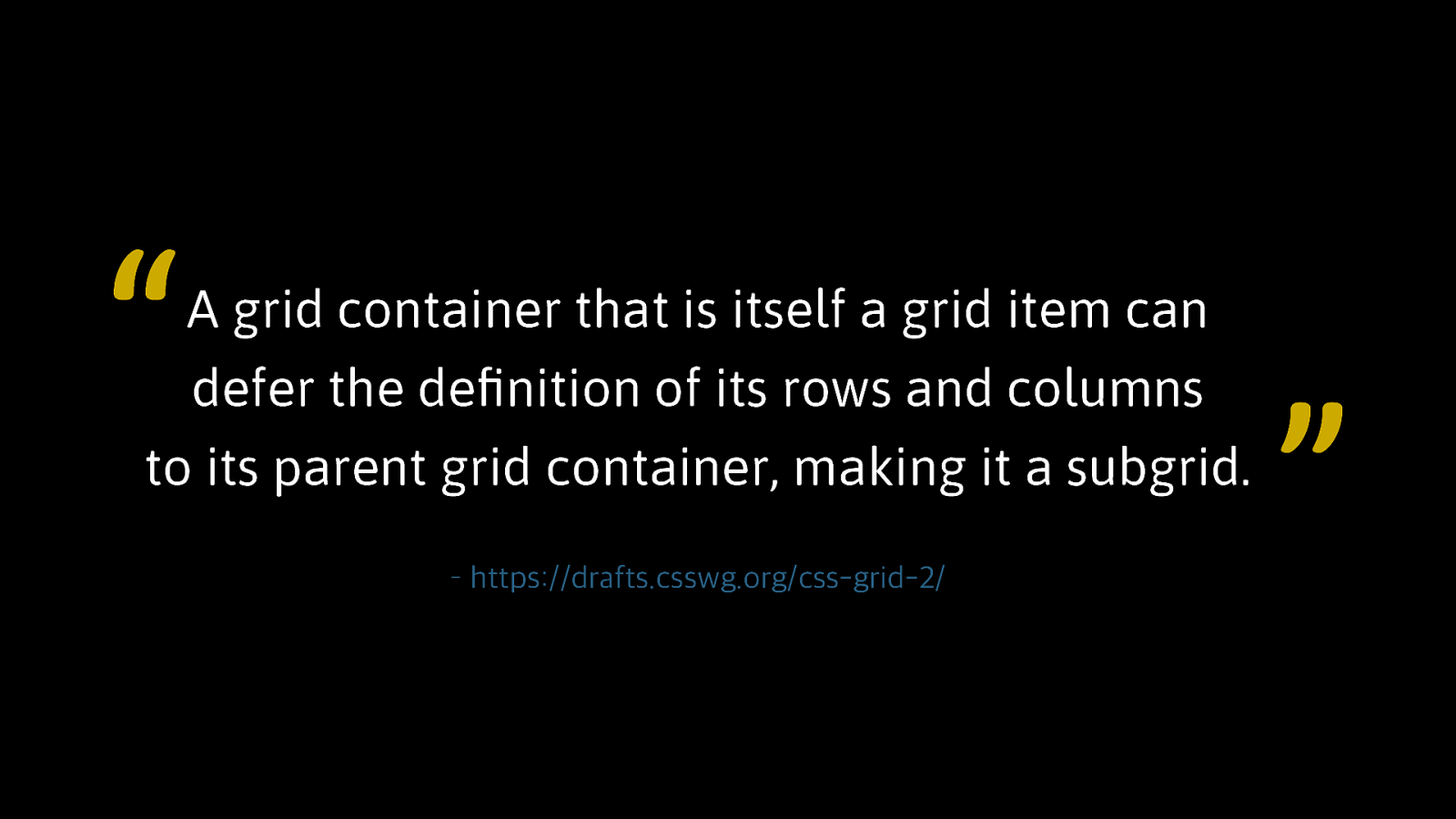
COMP ROM IS ING ON SE M ANTICS S U B GR I D @mmatuzo
“ A grid container that is itself a grid item can defer the definition of its rows and columns to its parent grid container, making it a subgrid. – https://drafts.csswg.org/css-grid-2/ ”
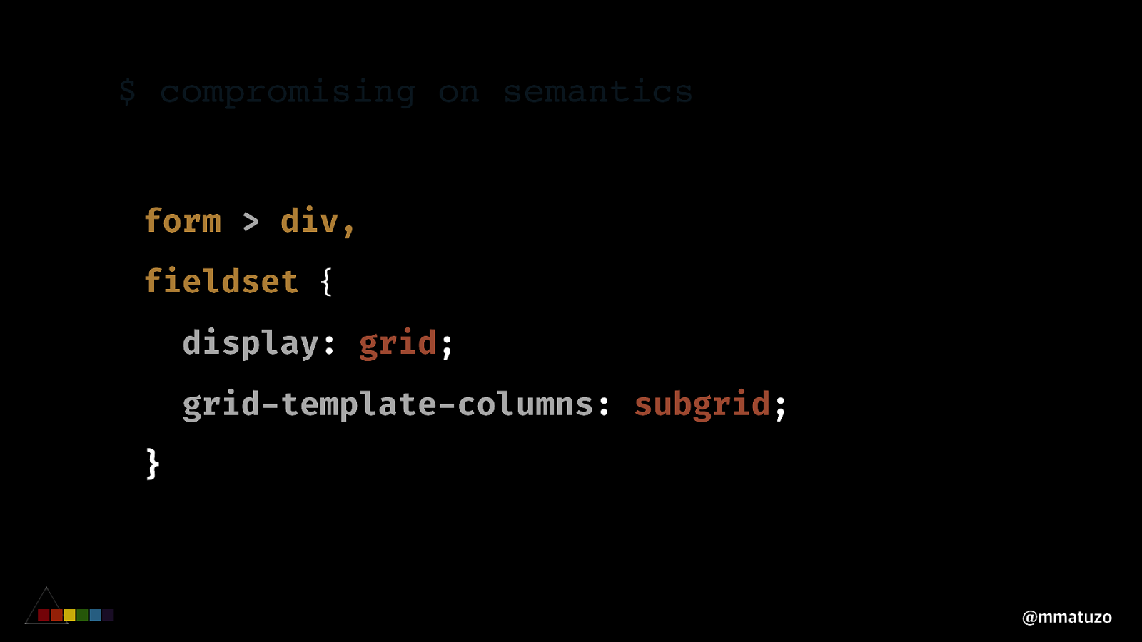
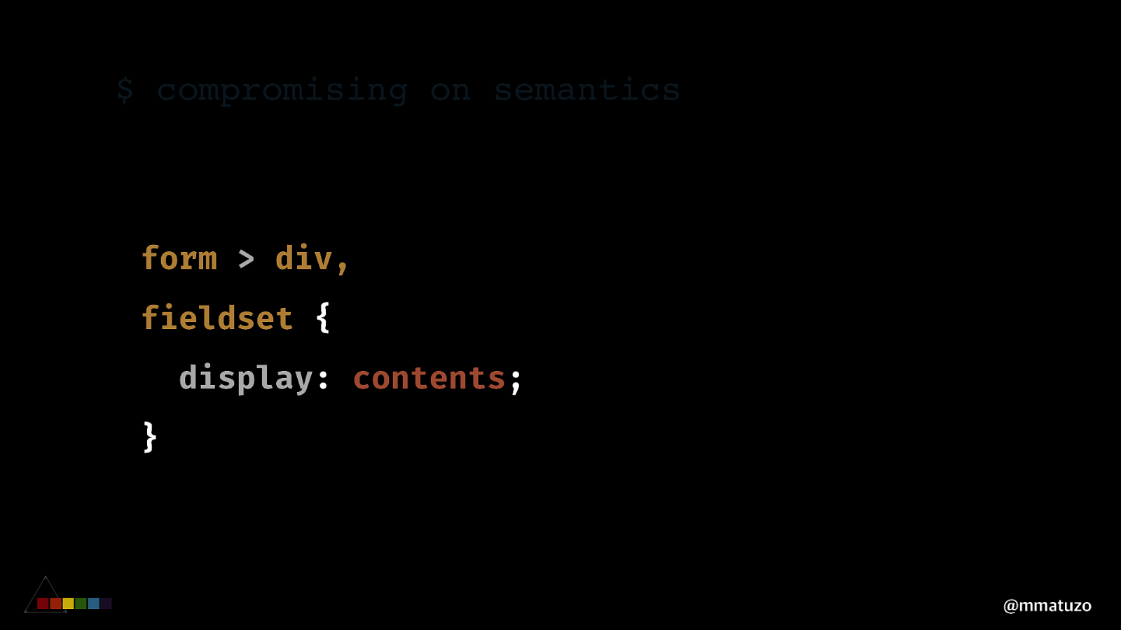
$ compromising on semantics form > div, fieldset { display: grid; grid-template-columns: subgrid; } @mmatuzo
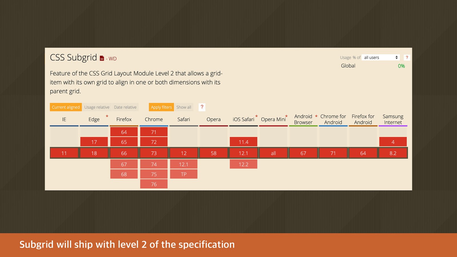
Subgrid will ship with level 2 of the specification
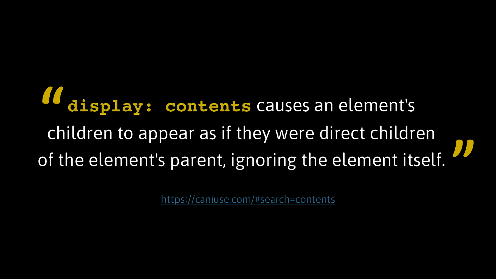
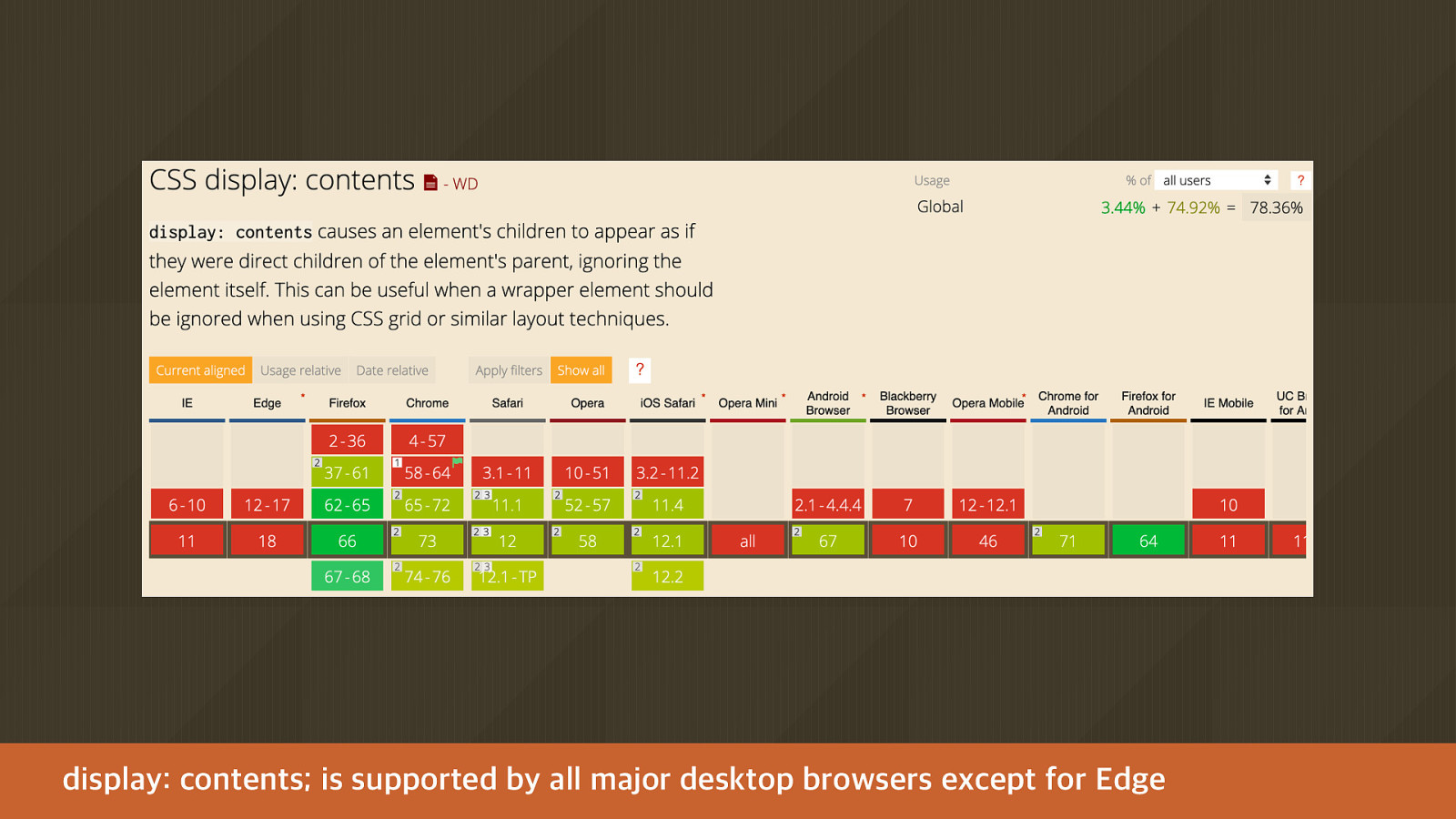
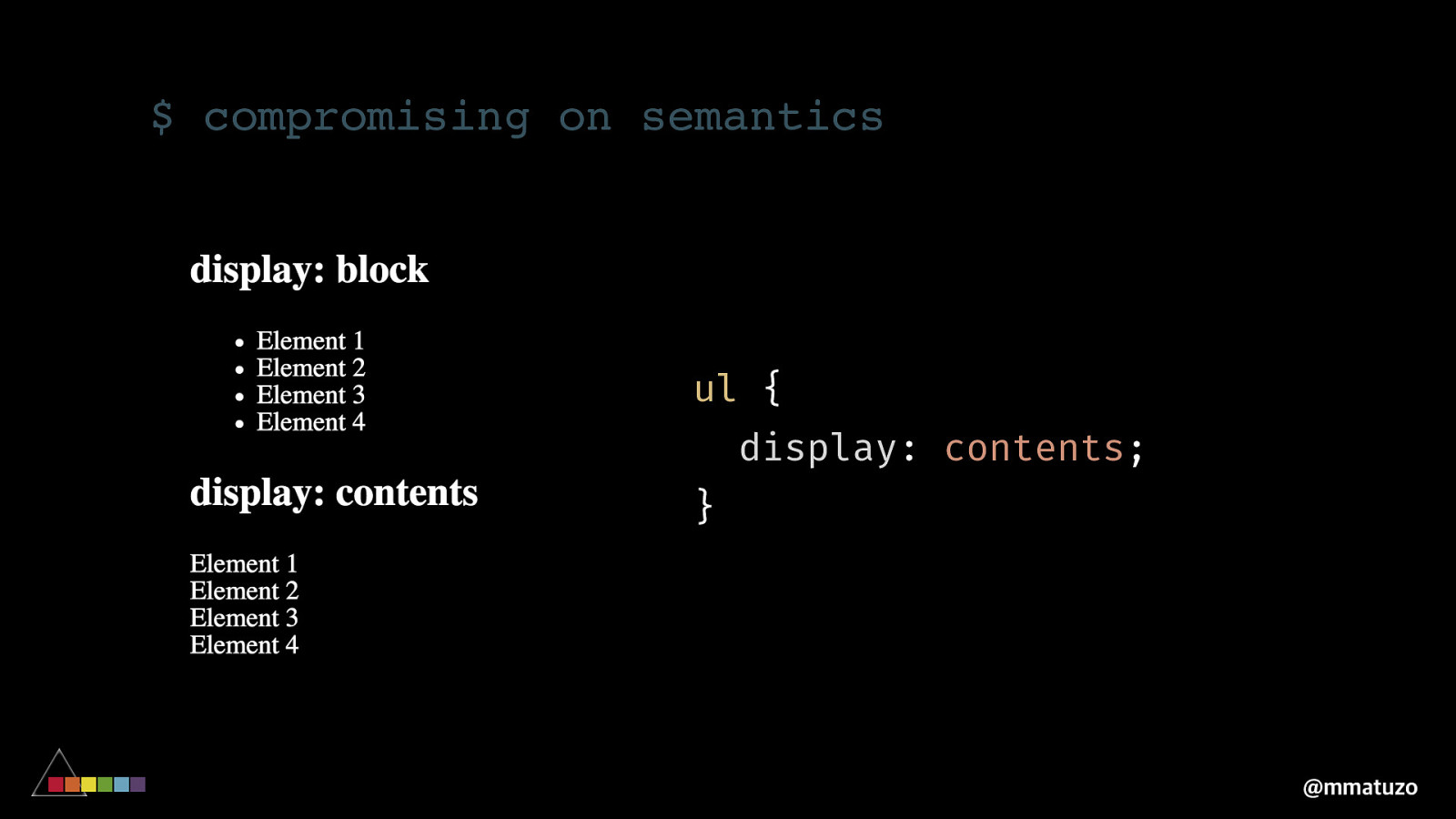
“ display: contents causes an element’s children to appear as if they were direct children of the element’s parent, ignoring the element itself. https://caniuse.com/#search=contents ”
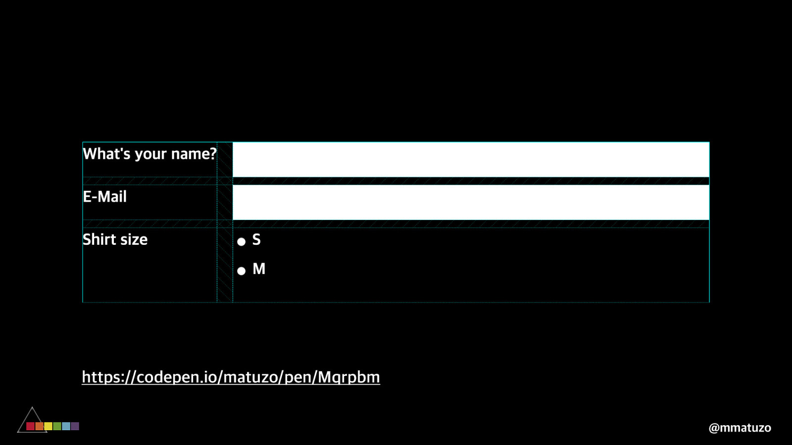
$ compromising on semantics form > div, fieldset { display: contents; } @mmatuzo
https://codepen.io/matuzo/pen/Mqrpbm @mmatuzo
display: contents; is supported by all major desktop browsers except for Edge
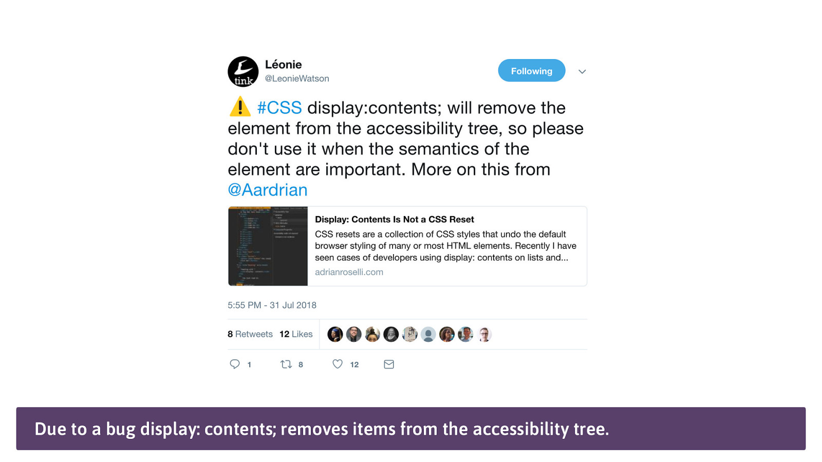
Due to a bug display: contents; removes items from the accessibility tree.
$ compromising on semantics ul { display: contents; } @mmatuzo
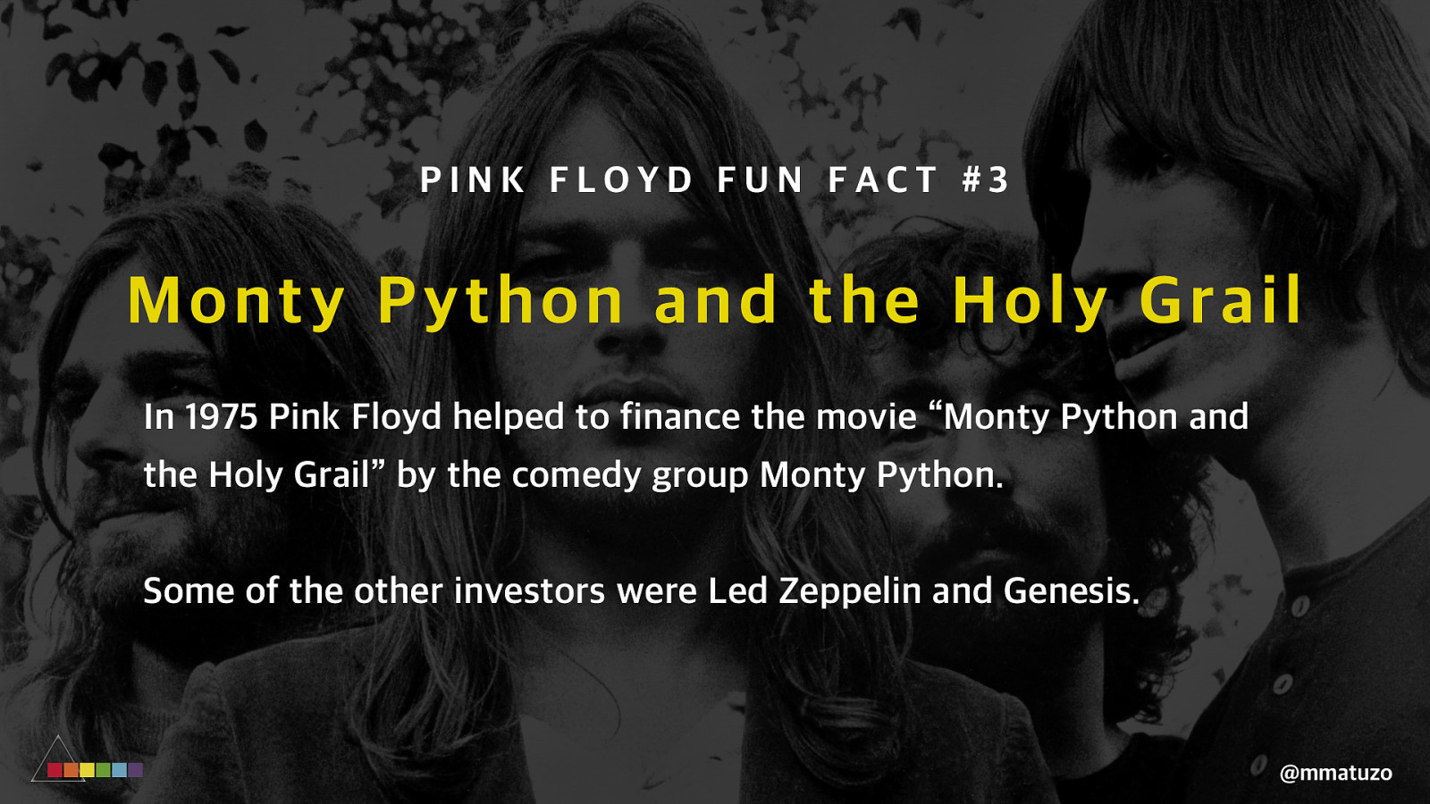
PINK FLOYD FUN FACT #3 Mo nty Python and the Holy Grail In 1975 Pink Floyd helped to finance the movie “Monty Python and the Holy Grail” by the comedy group Monty Python. Some of the other investors were Led Zeppelin and Genesis. @mmatuzo
C RO S S B RO WSER S U PPO RT @mmatuzo
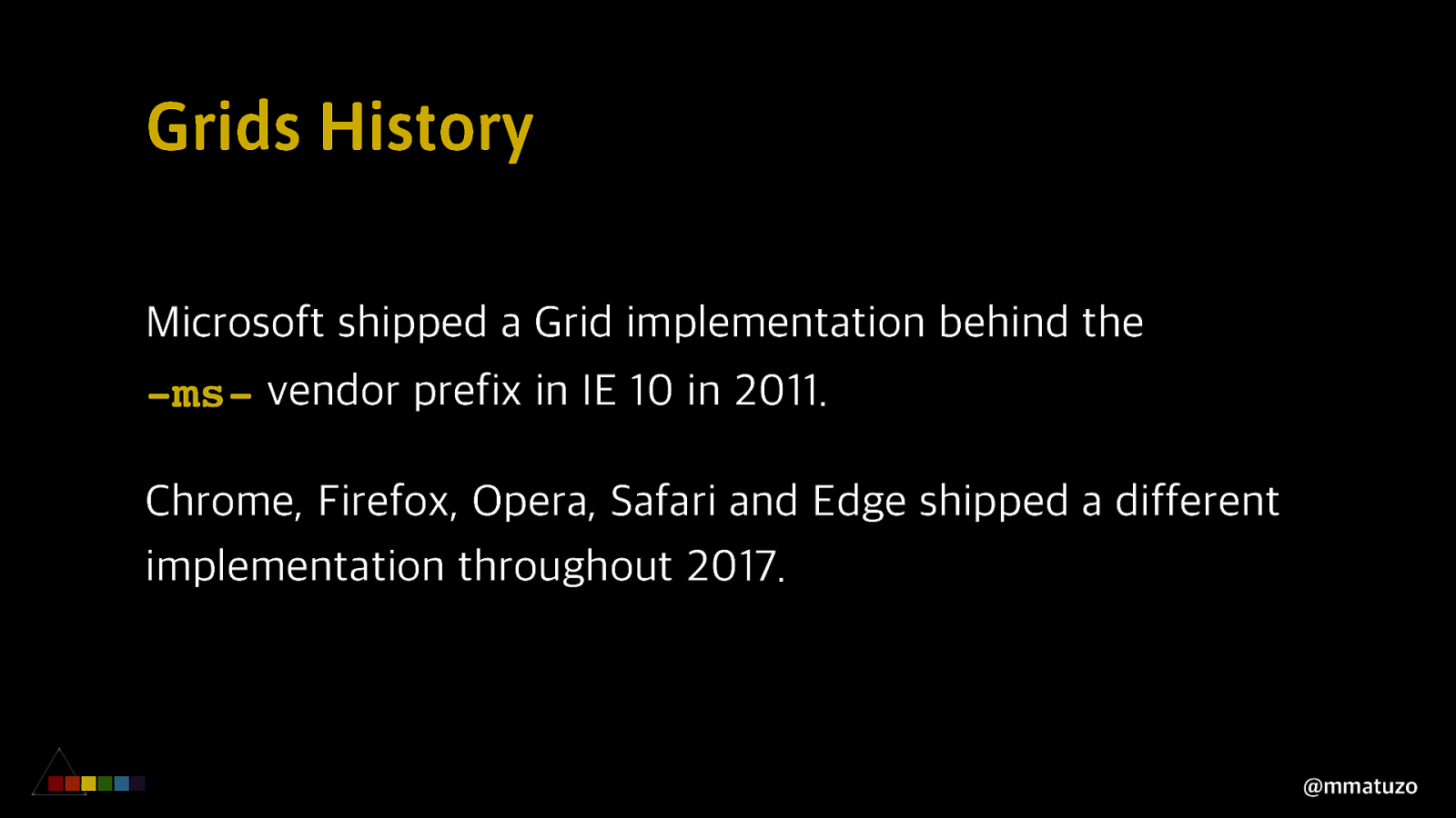
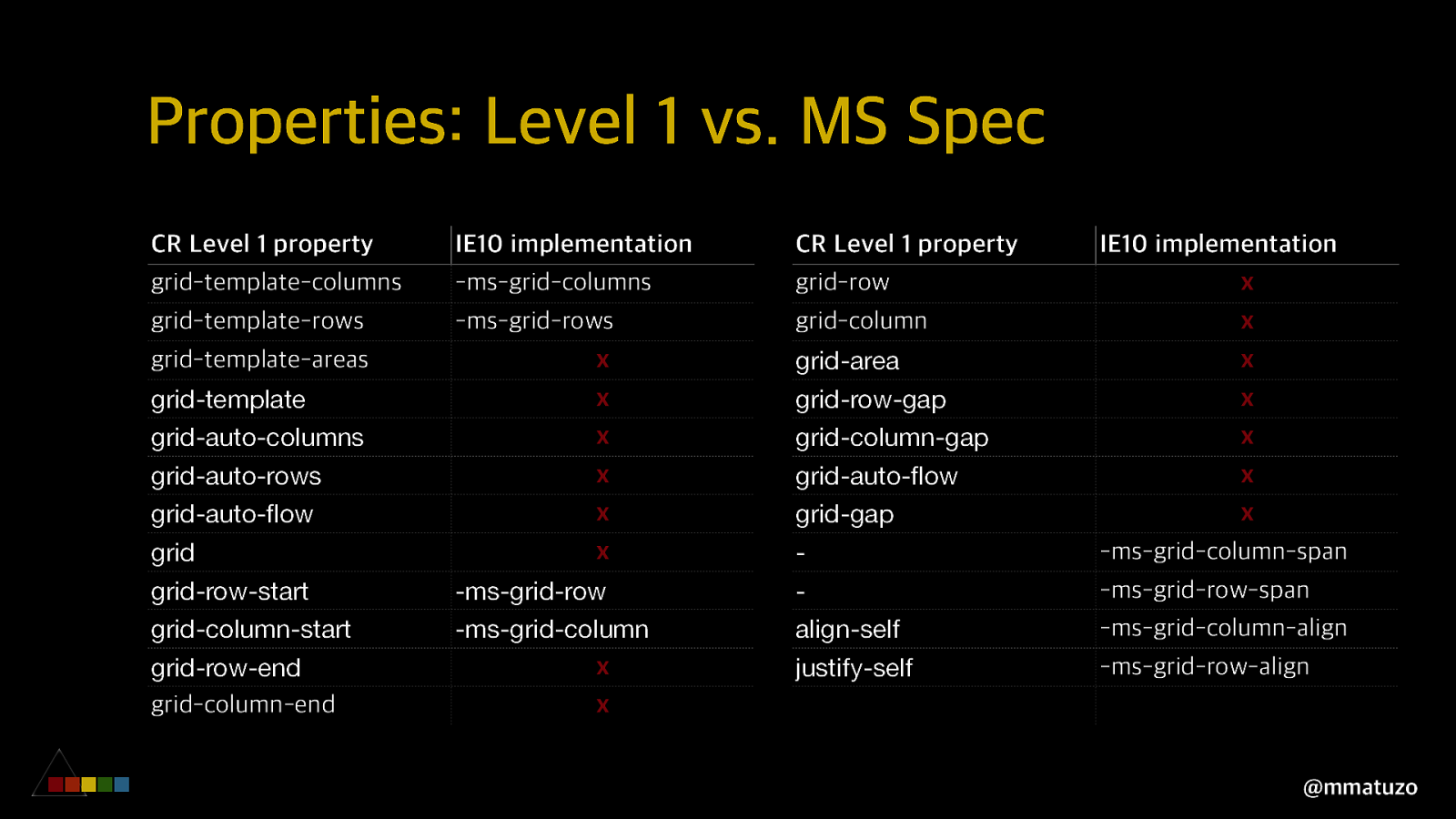
Grids History Microsoft shipped a Grid implementation behind the -ms- vendor prefix in IE 10 in 2011. Chrome, Firefox, Opera, Safari and Edge shipped a different implementation throughout 2017. @mmatuzo
Properties: Level 1 vs. MS Spec CR Level 1 property grid-template-columns grid-template-rows grid-template-areas grid-template grid-auto-columns grid-auto-rows grid-auto-flow grid grid-row-start grid-column-start grid-row-end grid-column-end IE10 implementation -ms-grid-columns -ms-grid-rows x x x x x x -ms-grid-row -ms-grid-column x x CR Level 1 property grid-row grid-column grid-area grid-row-gap grid-column-gap grid-auto-flow grid-gap align-self justify-self IE10 implementation x x x x x x x -ms-grid-column-span -ms-grid-row-span -ms-grid-column-align -ms-grid-row-align @mmatuzo
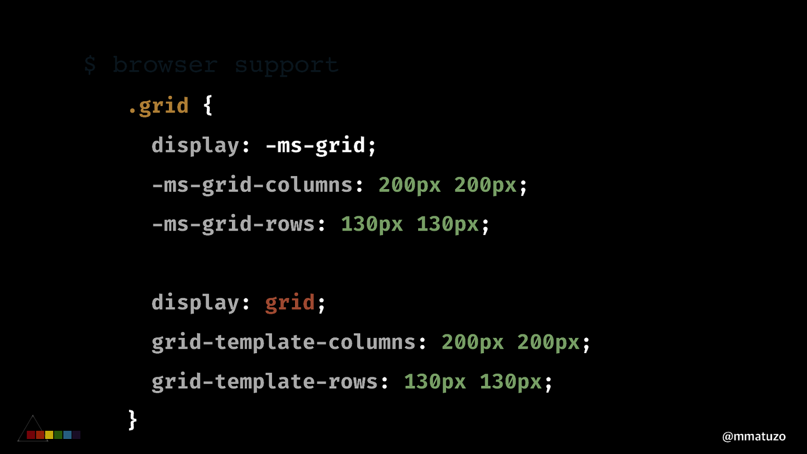
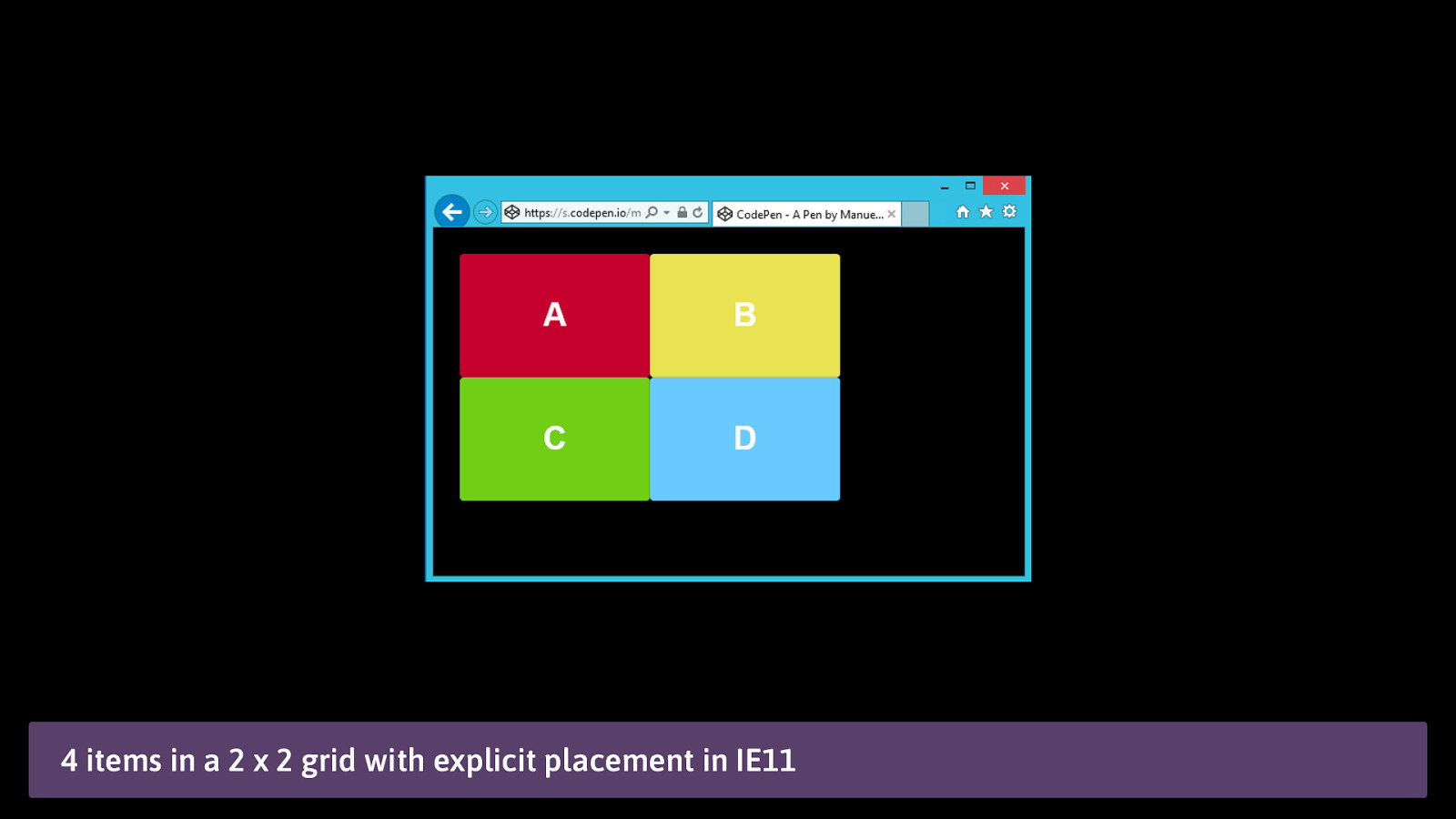
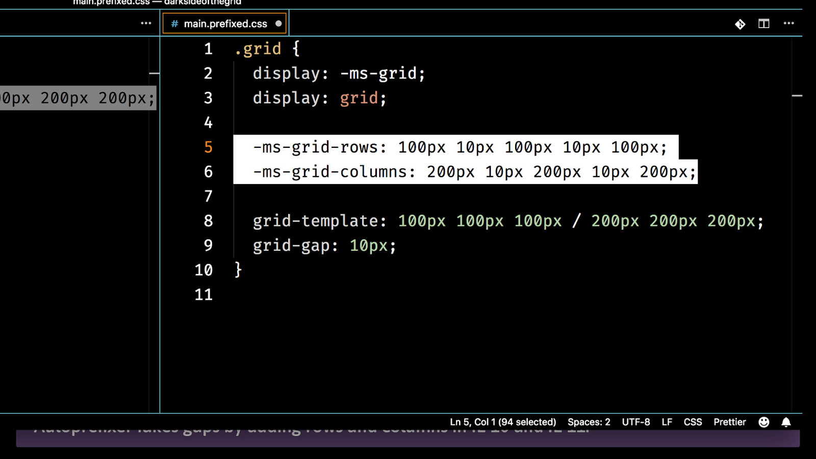
$ browser support .grid { display: -ms-grid; -ms-grid-columns: 200px 200px; -ms-grid-rows: 130px 130px; display: grid; grid-template-columns: 200px 200px; grid-template-rows: 130px 130px; } @mmatuzo
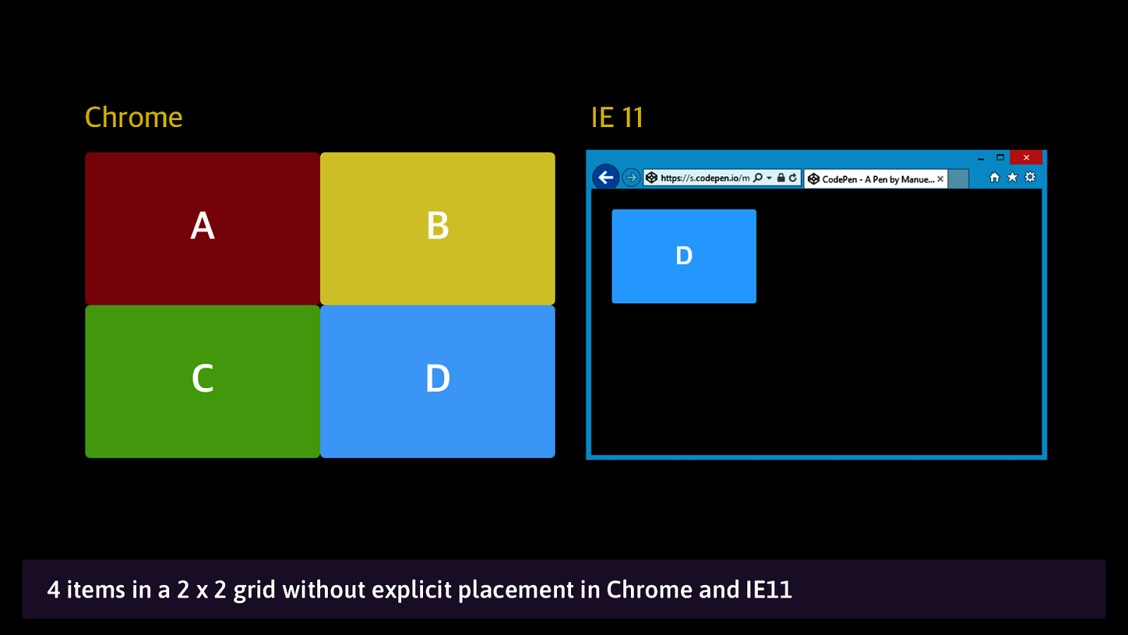
Chrome IE 11 4 items in a 2 x 2 grid without explicit placement in Chrome and IE11
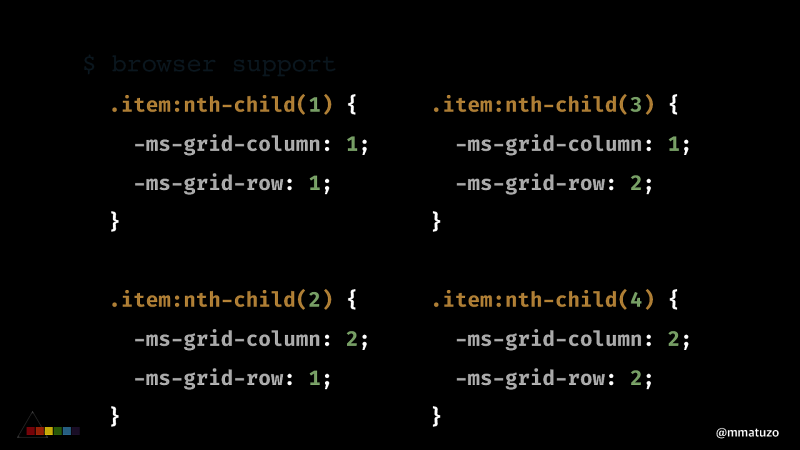
$ browser support .item:nth-child(1) { .item:nth-child(3) { -ms-grid-column: 1; -ms-grid-column: 1; -ms-grid-row: 1; -ms-grid-row: 2; } } .item:nth-child(2) { .item:nth-child(4) { } -ms-grid-column: 2; -ms-grid-column: 2; -ms-grid-row: 1; -ms-grid-row: 2; } @mmatuzo
4 items in a 2 x 2 grid with explicit placement in IE11
BRO WSER SUPP ORT A U T OP R E F I X E R ? @mmatuzo
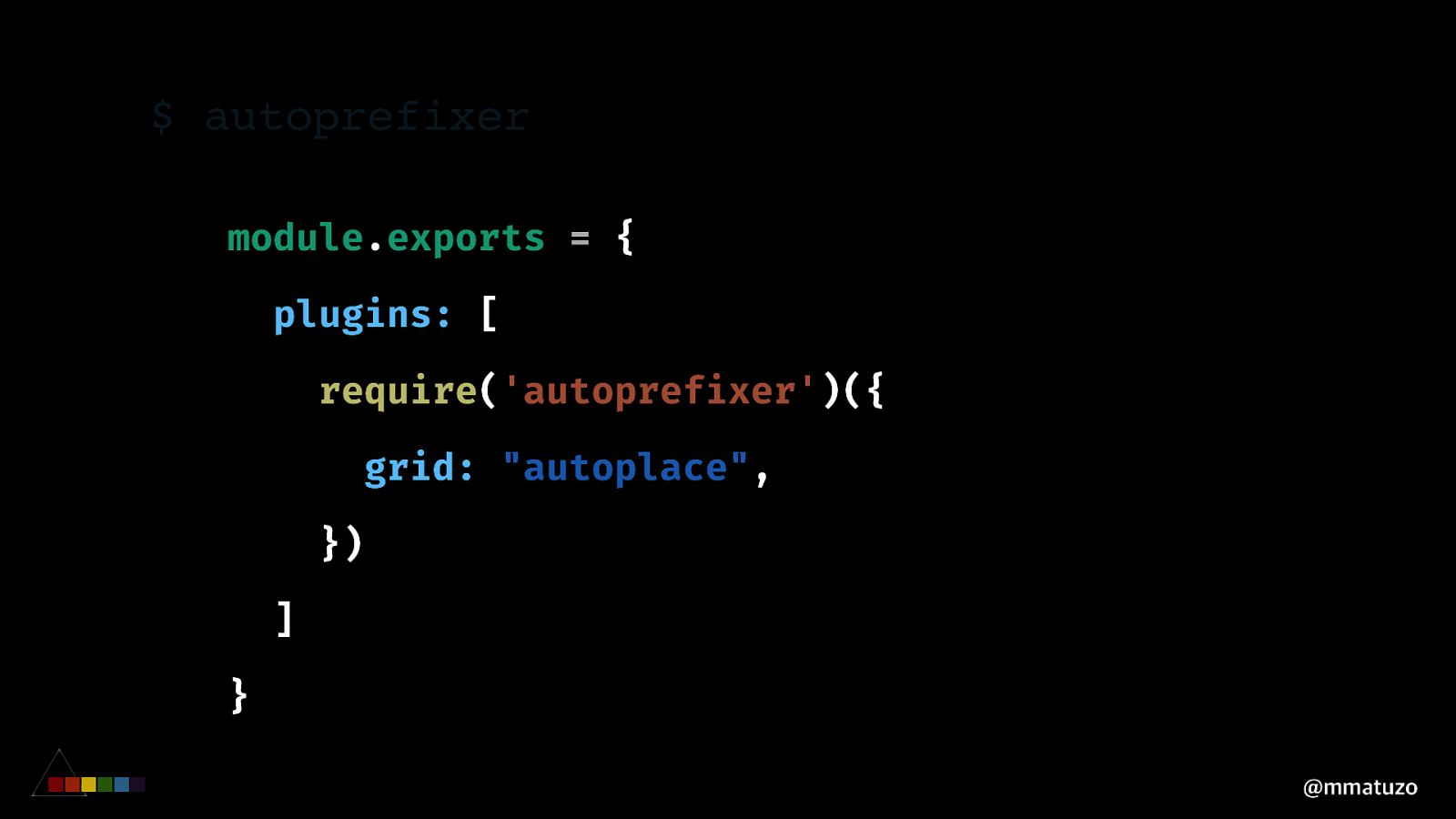
$ autoprefixer module.exports = { plugins: [ require(‘autoprefixer’)({ grid: “autoplace”, }) ] } @mmatuzo
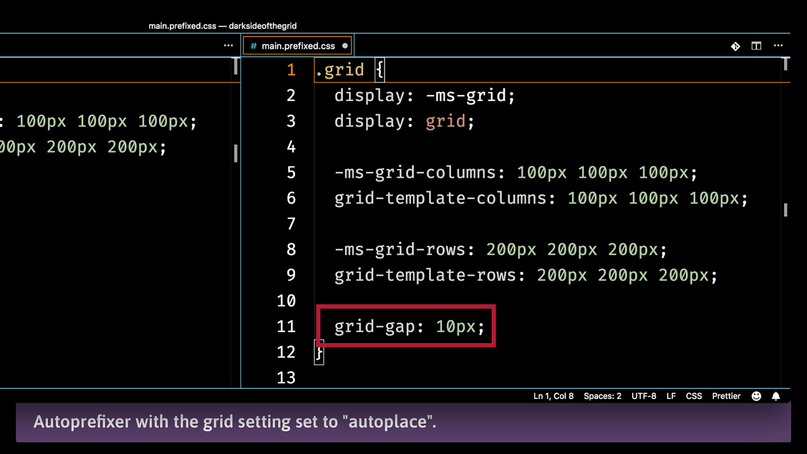
Autoprefixer with the grid setting set to “autoplace”.
Autoprefixer fakes gaps by adding rows and columns in IE 10 and IE 11.
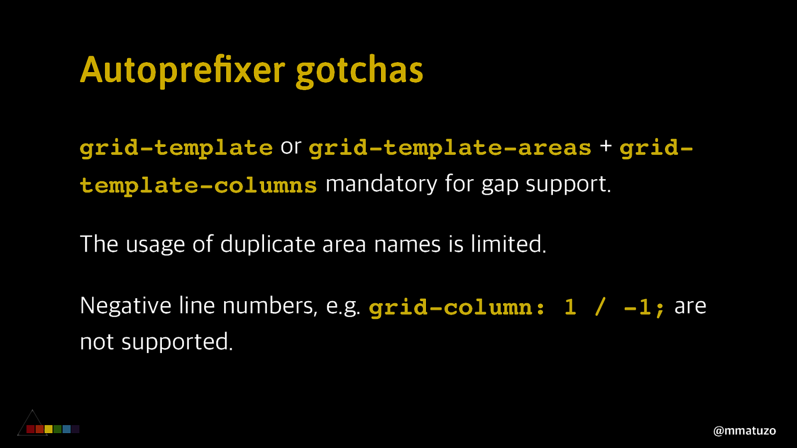
Autoprefixer gotchas grid-template or grid-template-areas + gridtemplate-columns mandatory for gap support. The usage of duplicate area names is limited. Negative line numbers, e.g. grid-column: 1 / -1; are not supported. @mmatuzo
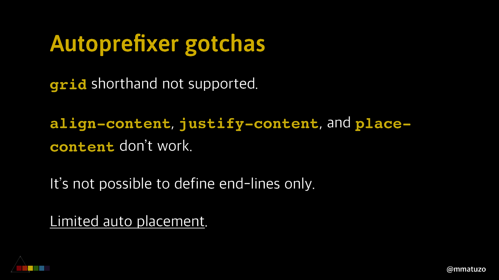
Autoprefixer gotchas grid shorthand not supported. align-content, justify-content, and placecontent don’t work. It’s not possible to define end-lines only. Limited auto placement. @mmatuzo
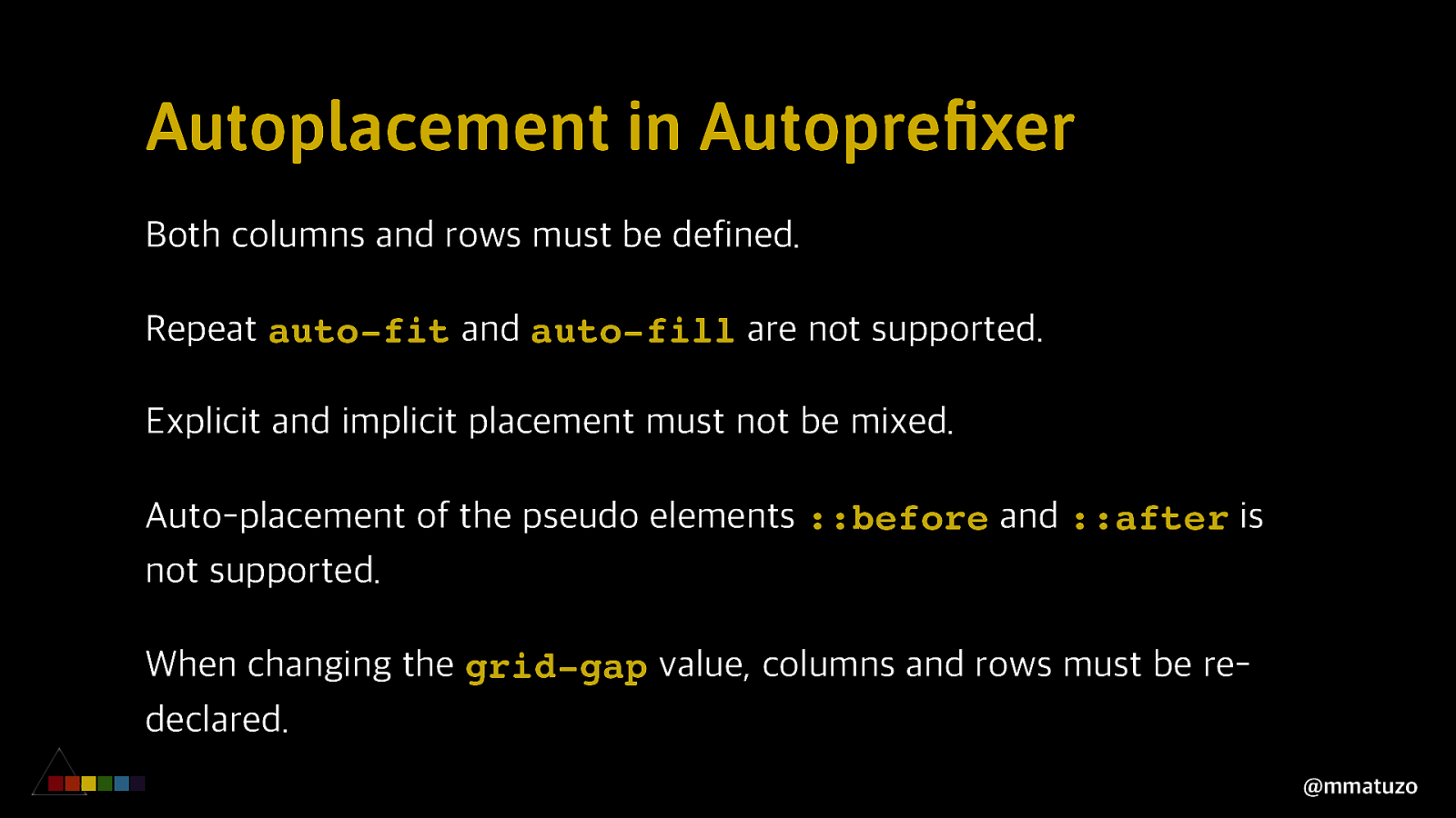
Autoplacement in Autoprefixer Both columns and rows must be defined. Repeat auto-fit and auto-fill are not supported. Explicit and implicit placement must not be mixed. Auto-placement of the pseudo elements ::before and ::after is not supported. When changing the grid-gap value, columns and rows must be redeclared. @mmatuzo
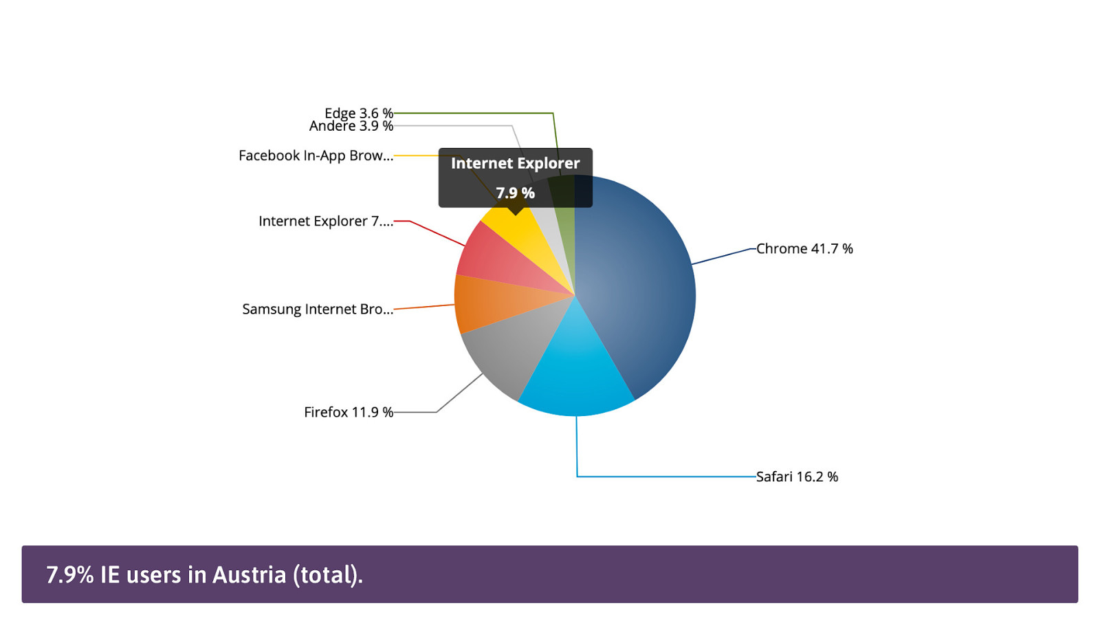
7.9% IE users in Austria (total).
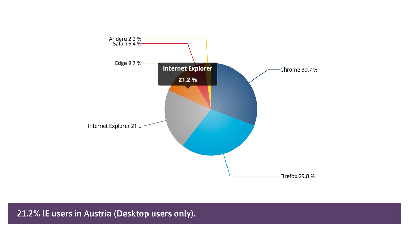
21.2% IE users in Austria (Desktop users only).
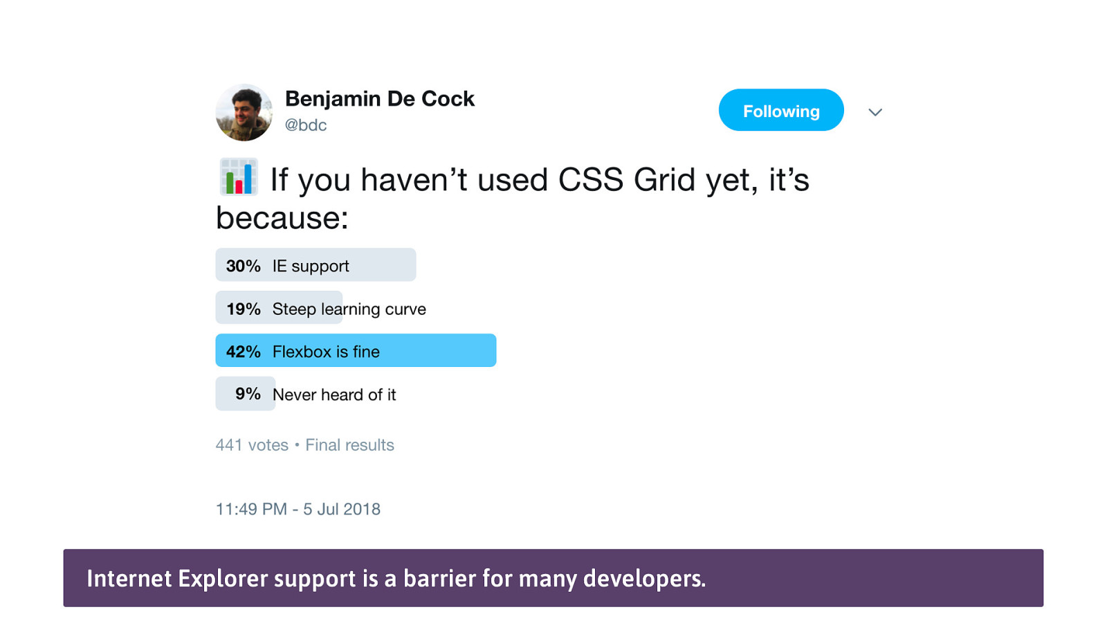
Internet Explorer support is a barrier for many developers.
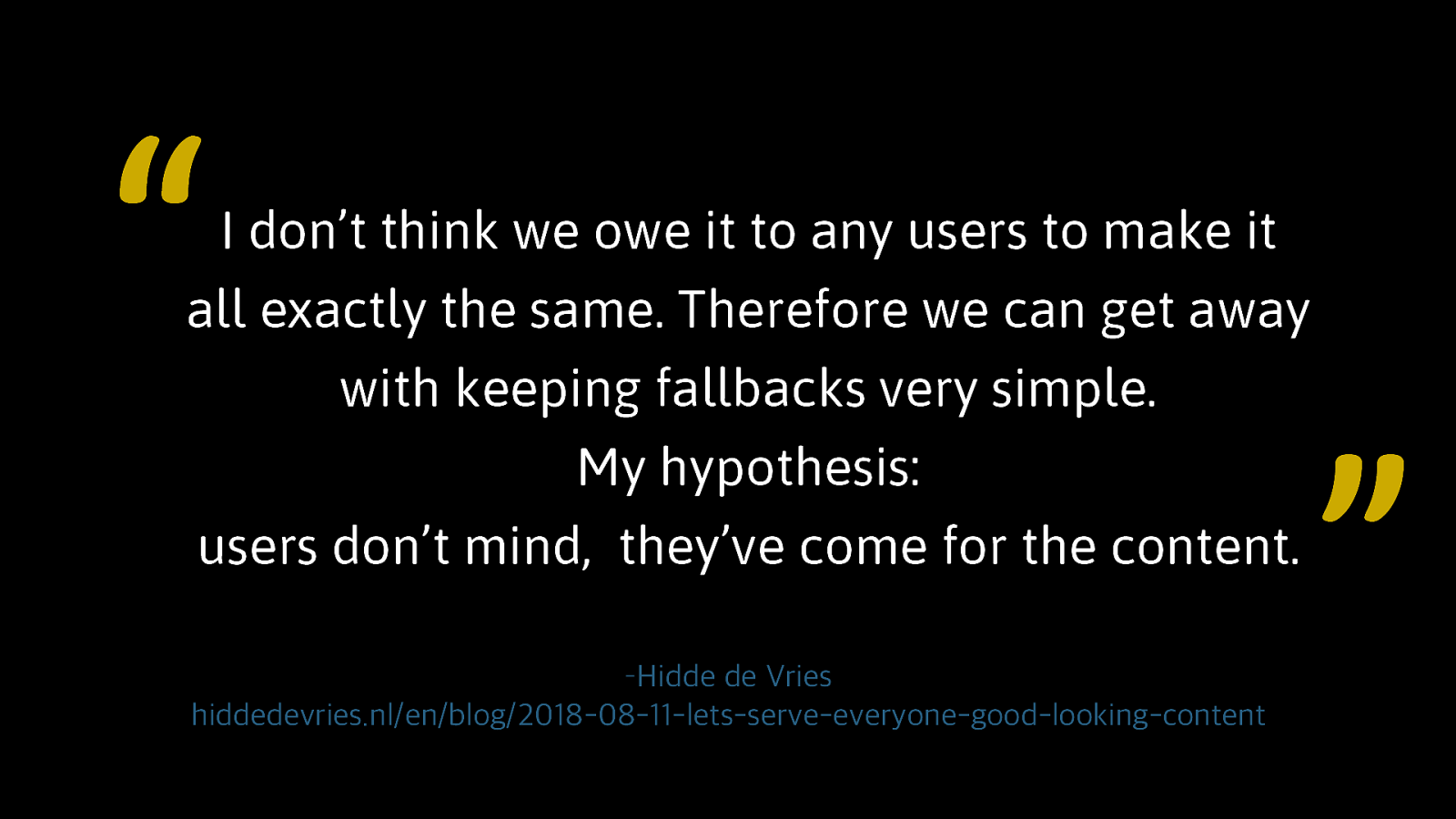
“ I don’t think we owe it to any users to make it all exactly the same. Therefore we can get away with keeping fallbacks very simple. My hypothesis: users don’t mind, they’ve come for the content. –Hidde de Vries hiddedevries.nl/en/blog/2018-08-11-lets-serve-everyone-good-looking-content ”
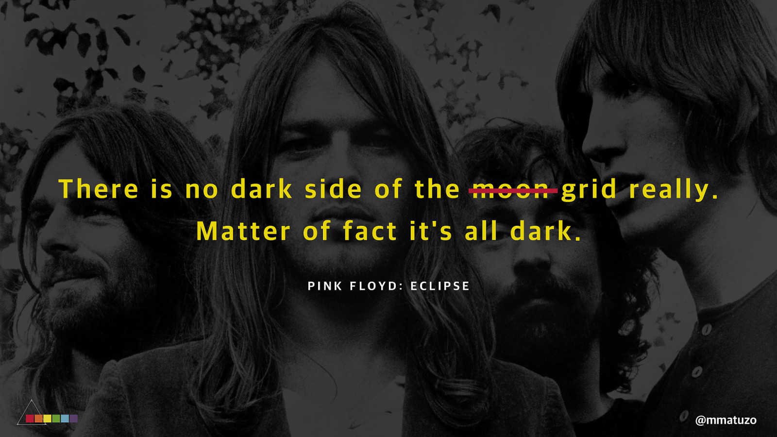
Th ere is no d ar k sid e of t h e mo o n g r i d r e a l l y . M at te r of f ac t i t ’ s al l da r k . PINK FLOYD: ECLIPSE @mmatuzo
Responsible use of Grid Avoid grid-template-areas or any other reordering techniques on interaction sensitive components. Test with your keyboard. Don’t compromise on semantics. @mmatuzo
Responsible use of Grid If you’re using autoprefixer make sure everyone in your team is aware of its limitations and what it does behind the scenes. Make sure your components work in older and less capable browsers. Embrace the power of progressive enhancement. @mmatuzo
Slides: bit.ly/dark-grid-linz Danke!🥰 manuel@matuzo.at @mmatuzo

The CSS Grid Layout specification is one of the most exciting additions to CSS in the last few years. It comes with a variety of new properties, units, functions and related specs, but it also entails new dangers. In this talk Manuel gives a quick introduction to CSS Grid Layout and confronts said dangers by explaining what’s problematic about them and providing alternative solutions. You’ll learn what you need to watch out for when working with grids, why source order matters, how to work with legacy browsers and about the ups and downs of recent display values.

 for free. You
can too.
for free. You
can too.