
A presentation at #a11yTO Conference in in Toronto, ON, Canada by Manuel Matuzovic
Manuel Matuzović @mmatuzo Museum of Fine Arts, Museum of Natural History, Volksgarten und parliament in Vienna
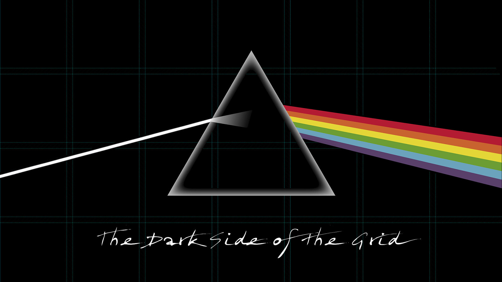
The Dark Side of the Grid
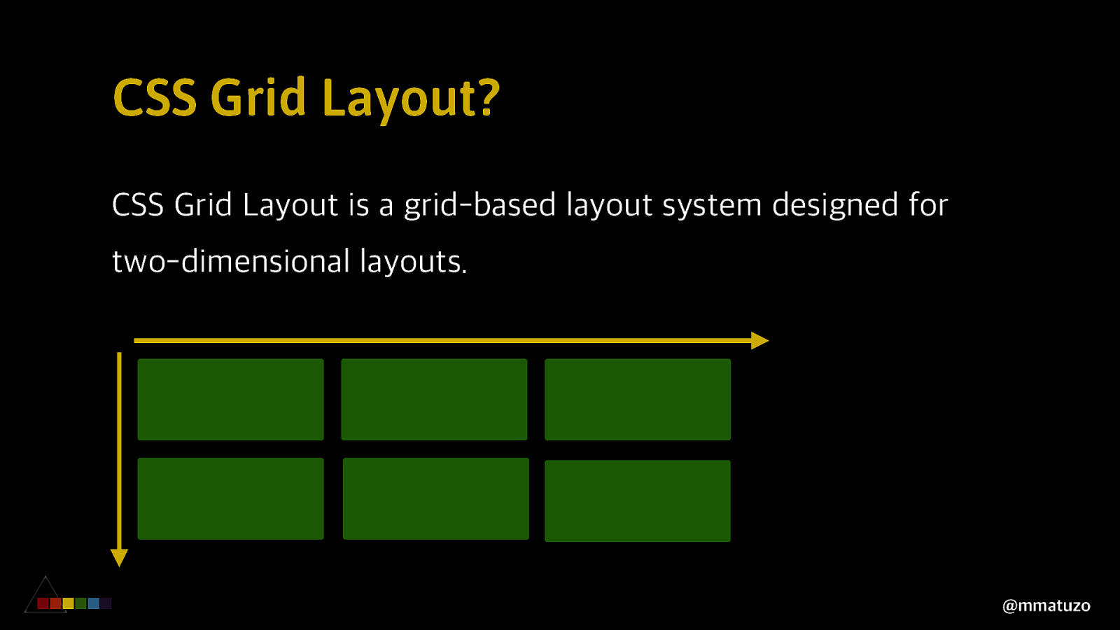
CSS Grid Layout? CSS Grid Layout is a grid-based layout system designed for two-dimensional layouts. @mmatuzo
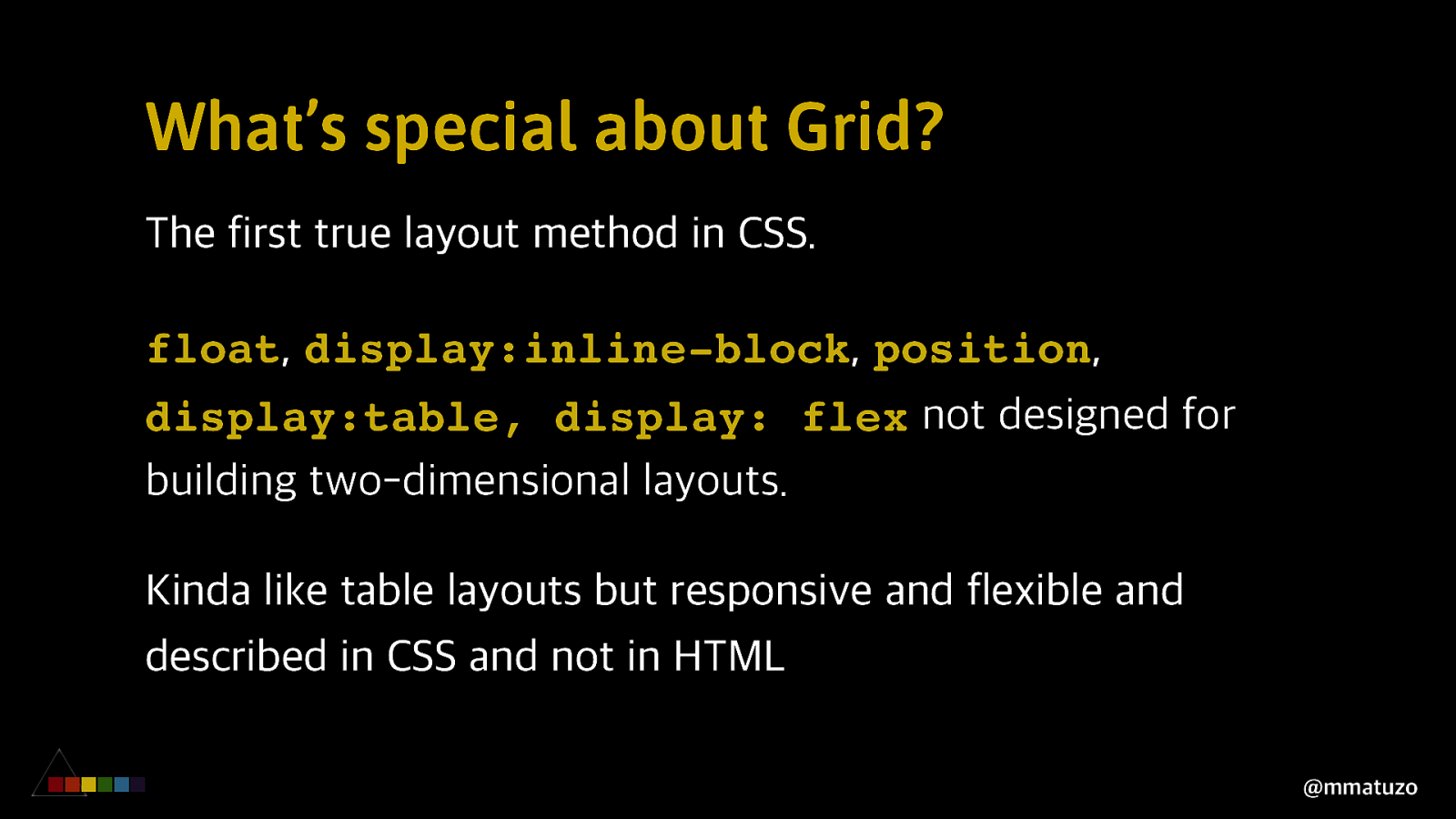
What’s special about Grid? The first true layout method in CSS. float, display:inline-block, position, display:table, display: flex not designed for building two-dimensional layouts. Kinda like table layouts but responsive and flexible and described in CSS and not in HTML @mmatuzo
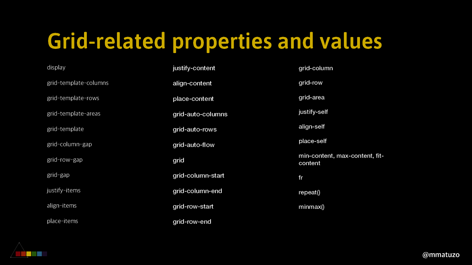
Grid-related properties and values display justify-content grid-column grid-template-columns align-content grid-row grid-template-rows place-content grid-area grid-template-areas grid-auto-columns justify-self grid-template grid-auto-rows align-self grid-column-gap grid-auto-flow place-self grid-row-gap grid min-content, max-content, fitcontent grid-gap grid-column-start fr justify-items grid-column-end repeat() align-items grid-row-start minmax() place-items grid-row-end @mmatuzo
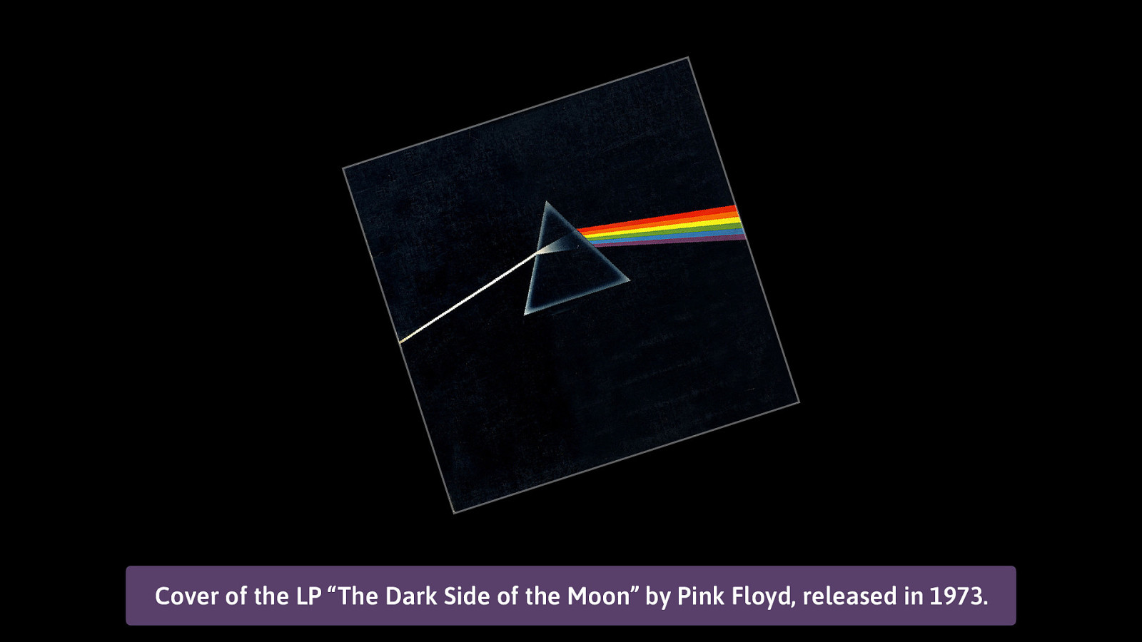
Cover of the LP “The Dark Side of the Moon” by Pink Floyd, released in 1973.
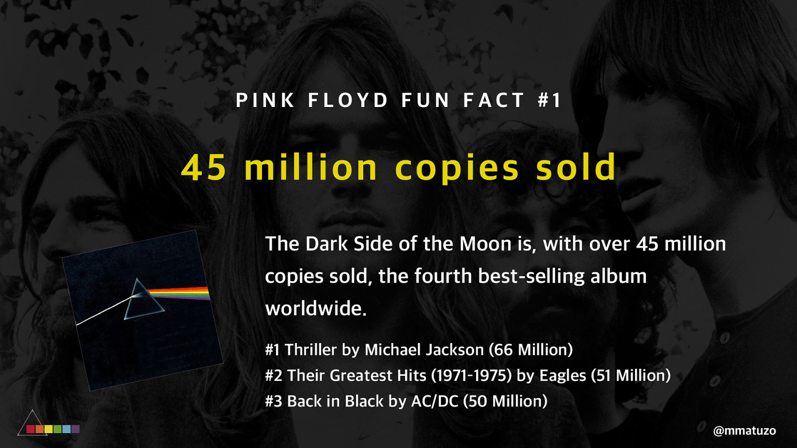
PINK FLOYD FUN FACT #1 45 million copie s sold The Dark Side of the Moon is, with over 45 million copies sold, the fourth best-selling album worldwide. #1 Thriller by Michael Jackson (66 Million) #2 Their Greatest Hits (1971–1975) by Eagles (51 Million) #3 Back in Black by AC/DC (50 Million) @mmatuzo
C H A N G I NG V I S U A L O R D E R @mmatuzo
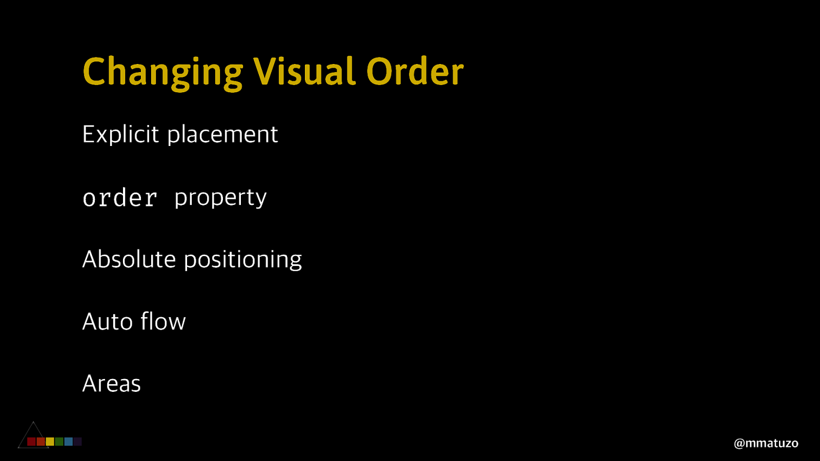
Changing Visual Order Explicit placement order property Absolute positioning Auto flow Areas @mmatuzo
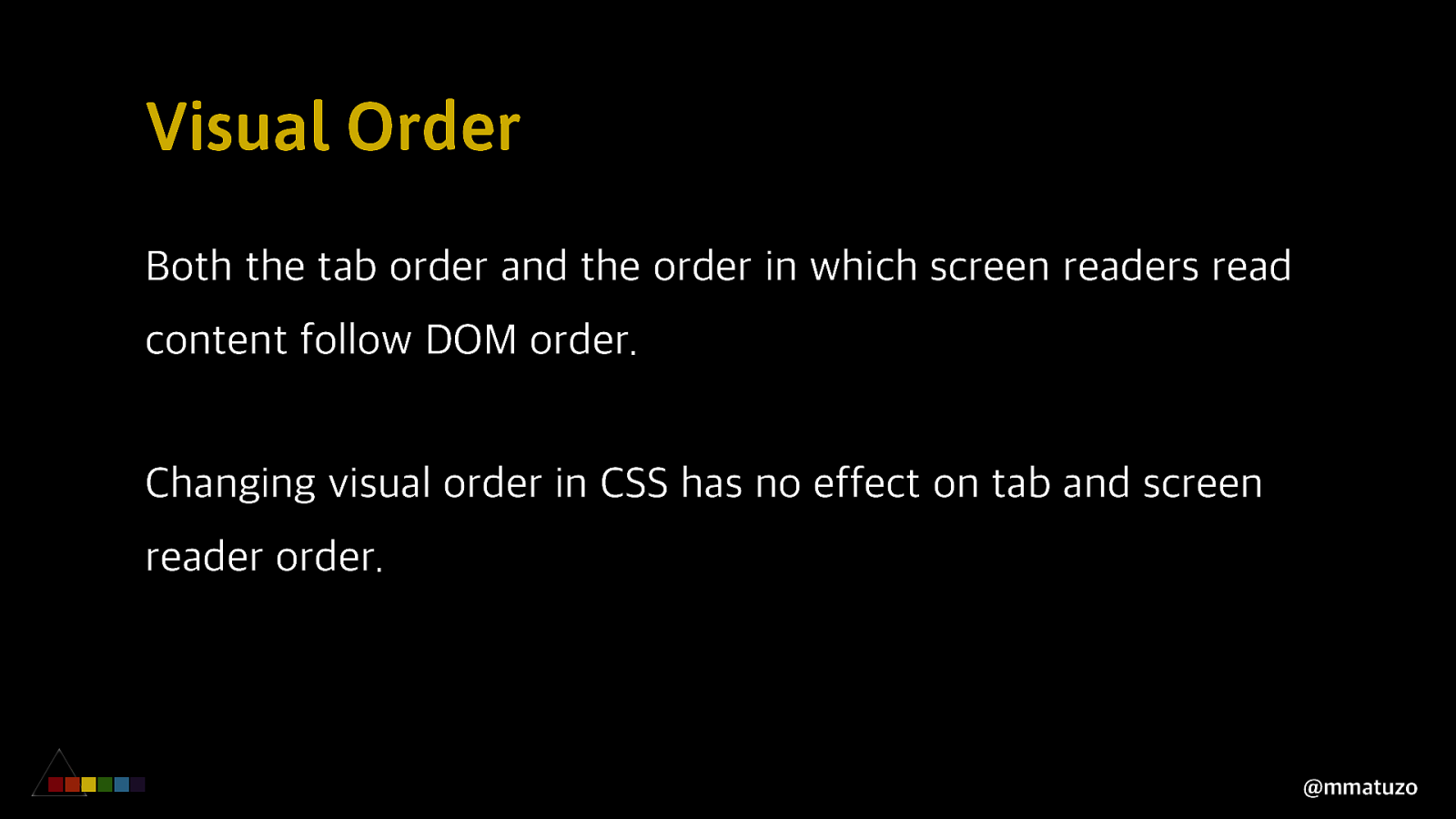
Visual Order Both the tab order and the order in which screen readers read content follow DOM order. Changing visual order in CSS has no effect on tab and screen reader order. @mmatuzo
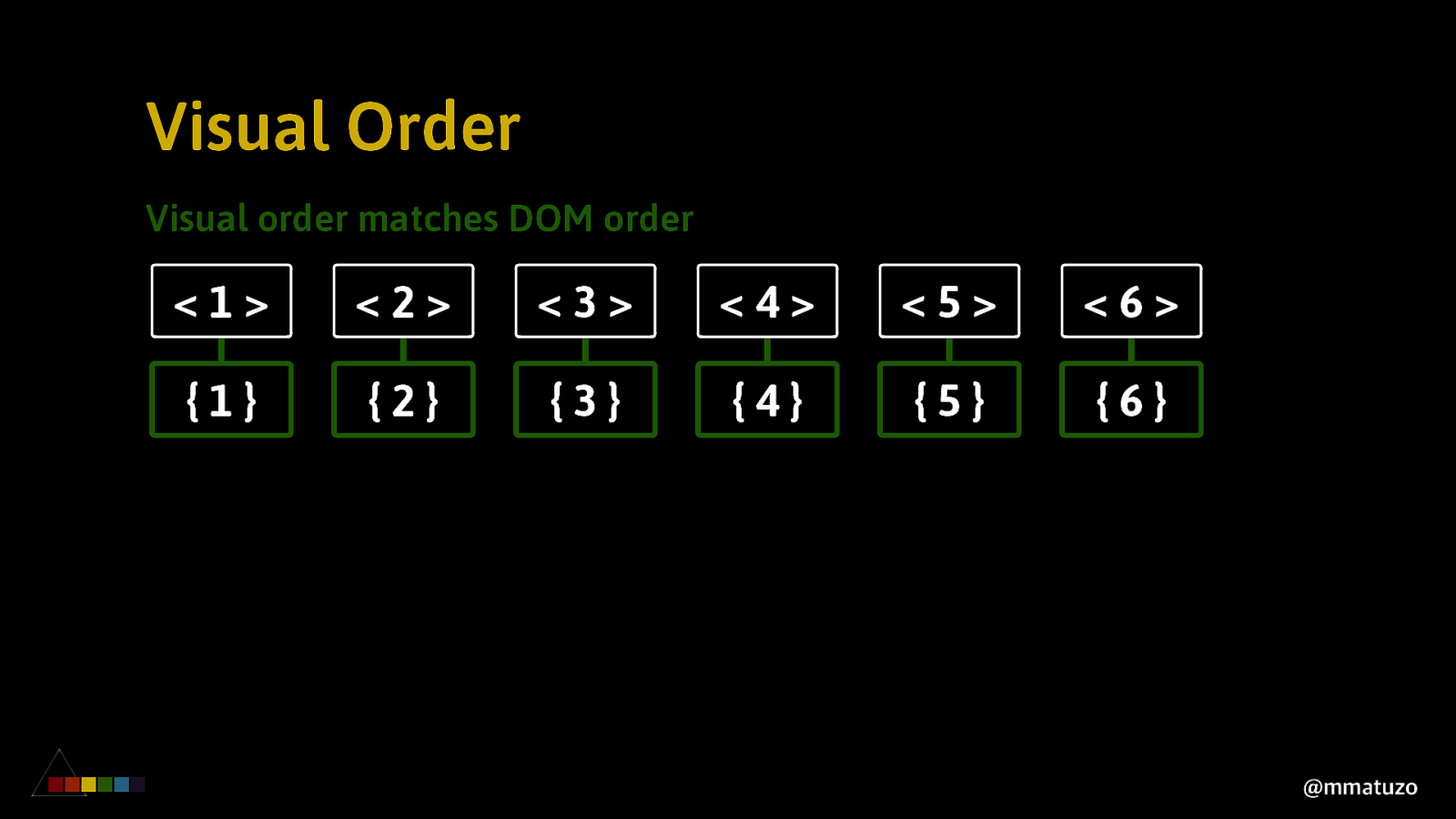
Visual Order Visual order matches DOM order <1> <2> <3> <4> <5> <6> {1} {2} {3} {4} {5} {6} @mmatuzo
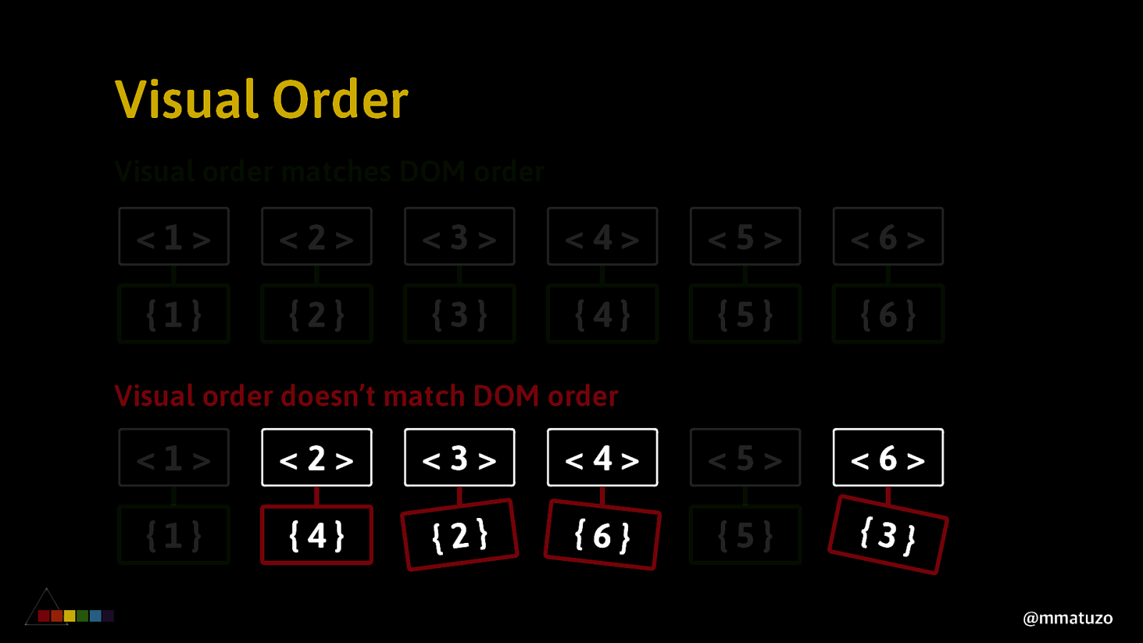
Visual Order Visual order matches DOM order <1> <2> <3> <4> <5> <6> {1} {2} {3} {4} {5} {6} Visual order doesn’t match DOM order <1> <2> <3> <4> <5> <6> {1} {4} {2} {6} {5} {3} @mmatuzo
V ISUAL O RDER EX PLIC IT PL A CE ME NT @mmatuzo
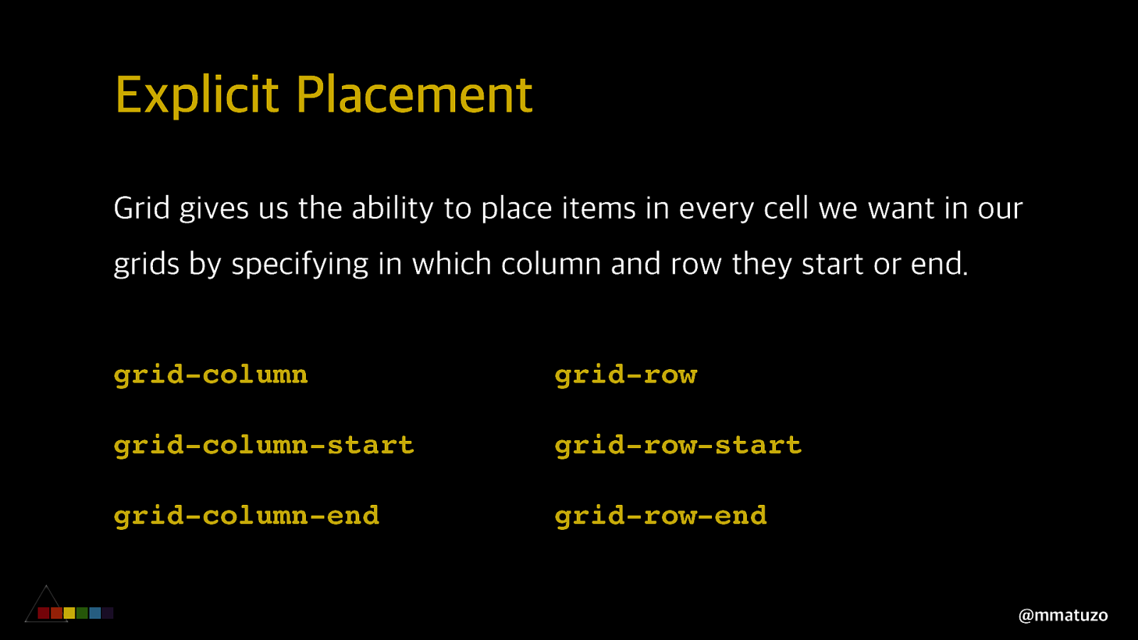
Explicit Placement Grid gives us the ability to place items in every cell we want in our grids by specifying in which column and row they start or end. grid-column grid-row grid-column-start grid-row-start grid-column-end grid-row-end @mmatuzo
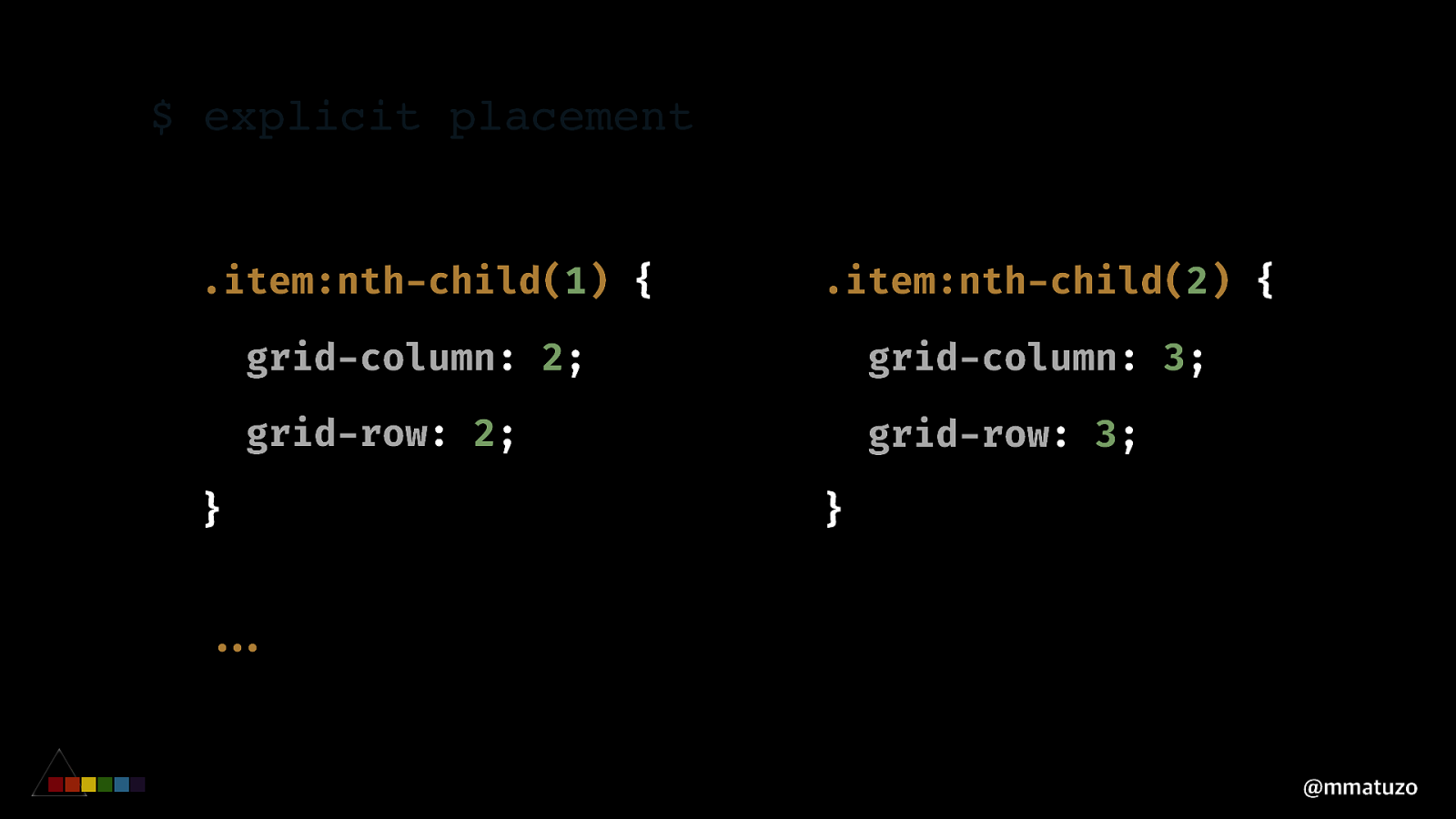
$ explicit placement .item:nth-child(1) { .item:nth-child(2) { grid-column: 2; grid-column: 3; grid-row: 2; grid-row: 3; } } ""... @mmatuzo
V ISUAL O RDER A R E A S @mmatuzo
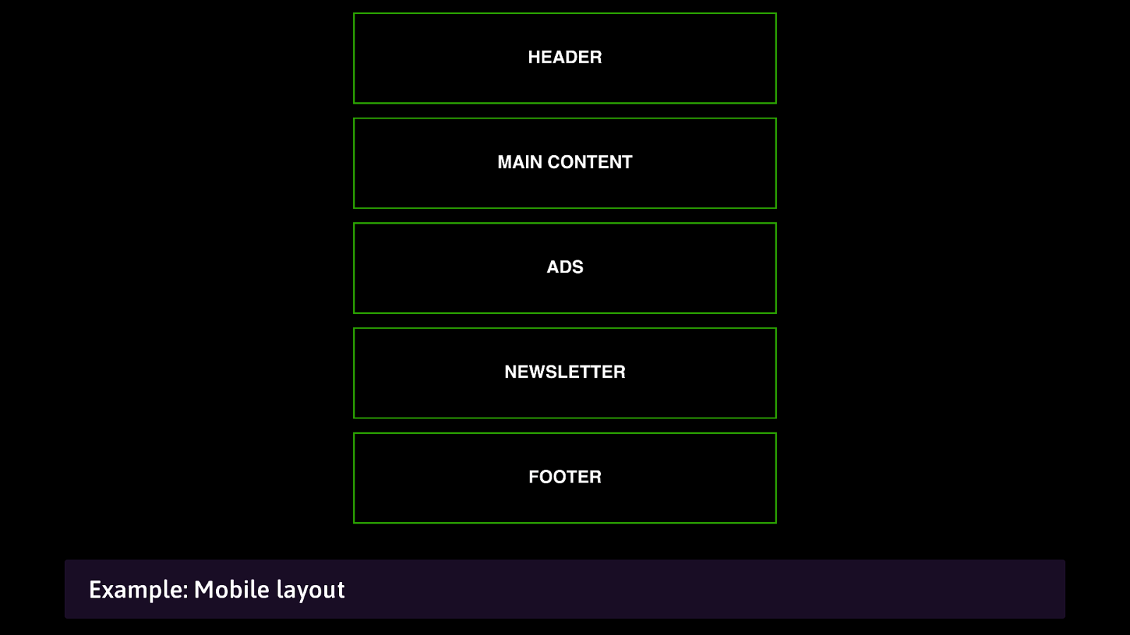
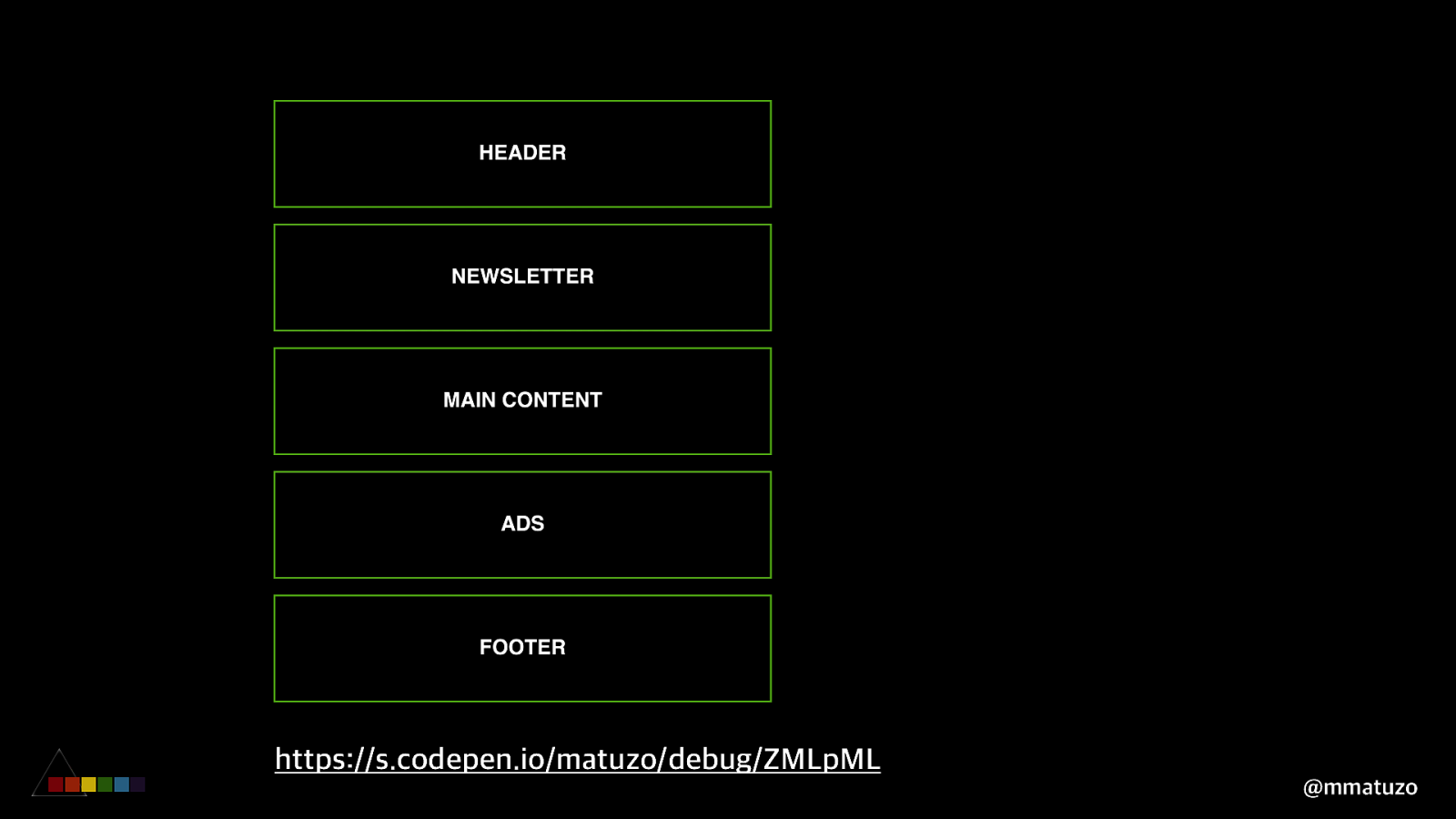
Example: Mobile layout
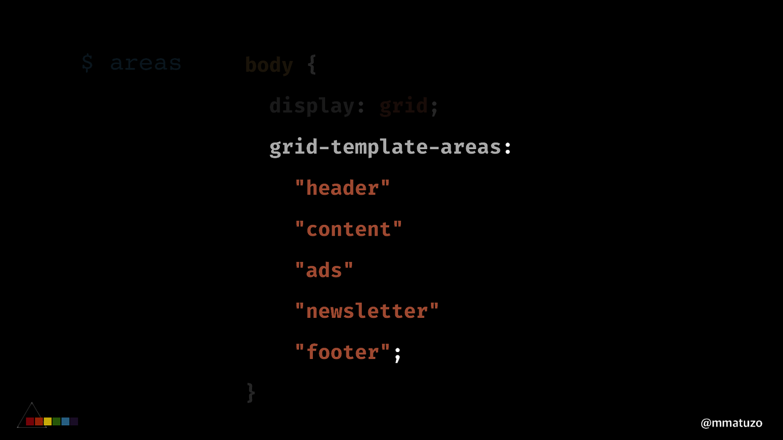
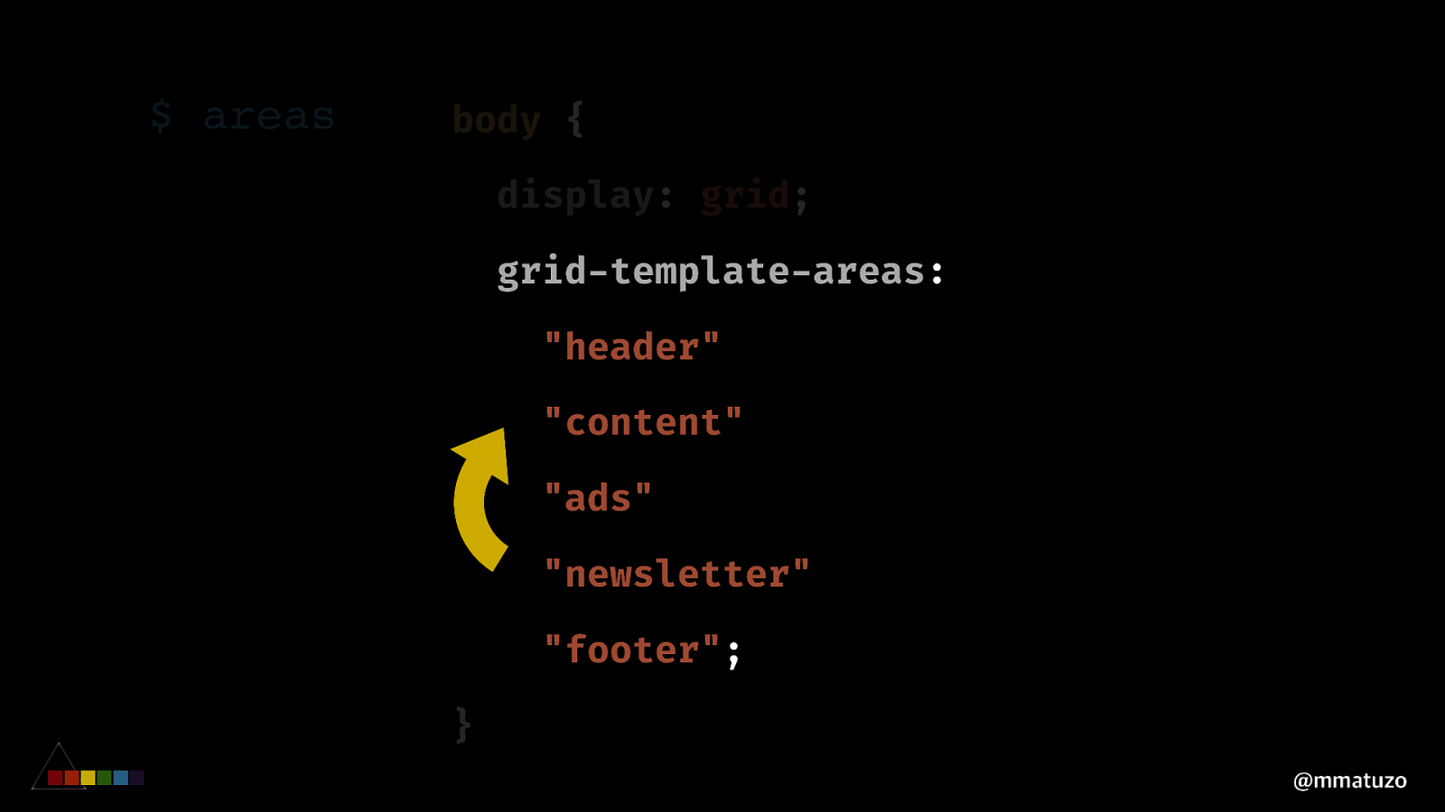
$ areas body { display: grid; grid-template-areas: "header" "content" "ads" "newsletter" "footer"; } @mmatuzo
$ areas body { display: grid; grid-template-areas: "header" "content" "ads" "newsletter" "footer"; } @mmatuzo
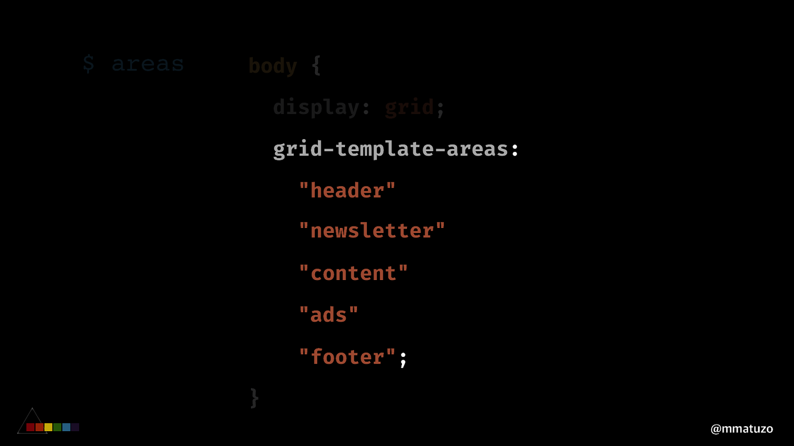
$ areas body { display: grid; grid-template-areas: "header" "newsletter" "content" "ads" "footer"; } @mmatuzo
https://s.codepen.io/matuzo/debug/ZMLpML @mmatuzo
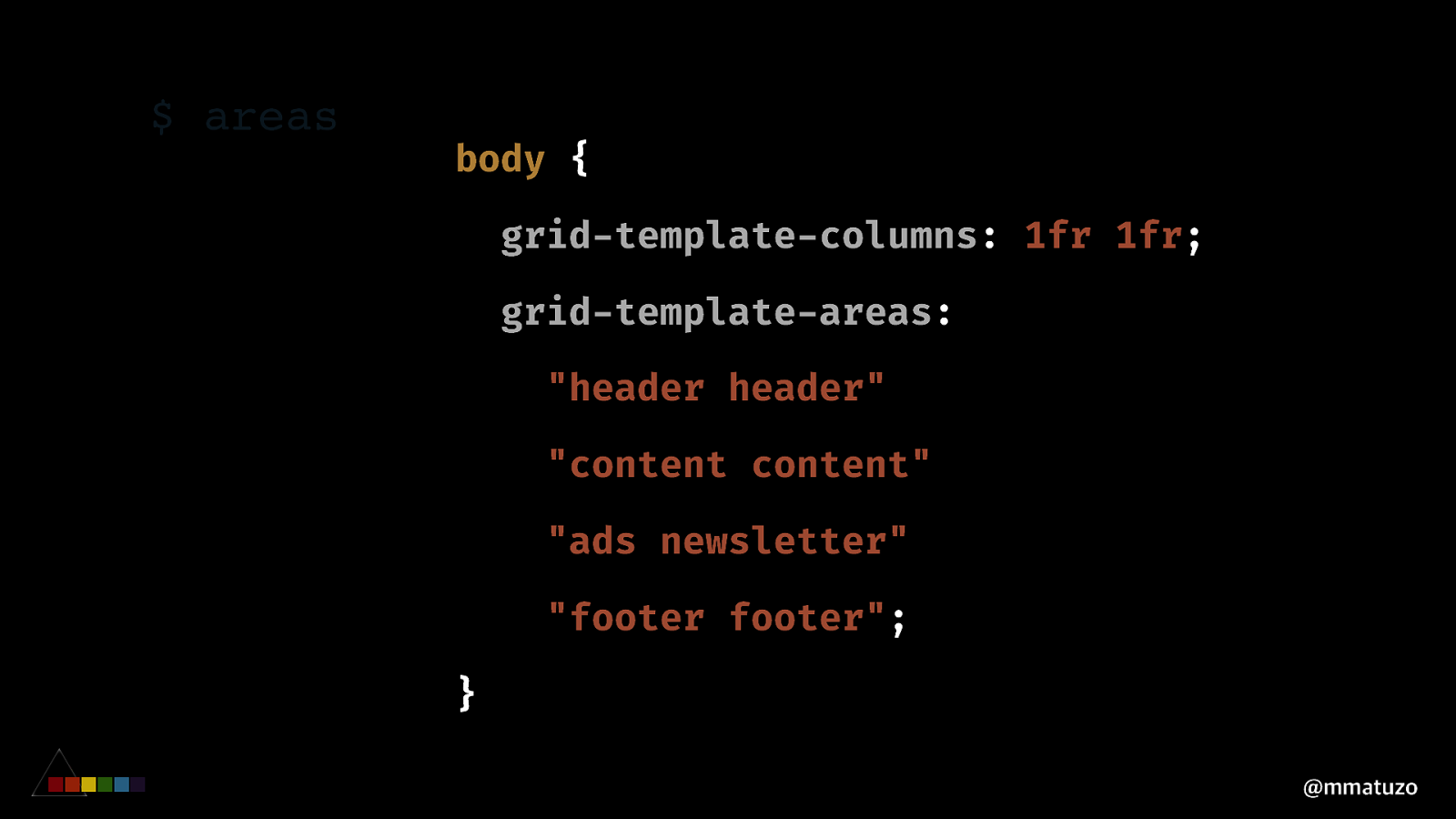
$ areas body { grid-template-columns: 1fr 1fr; grid-template-areas: "header header" "content content" "ads newsletter" "footer footer"; } @mmatuzo
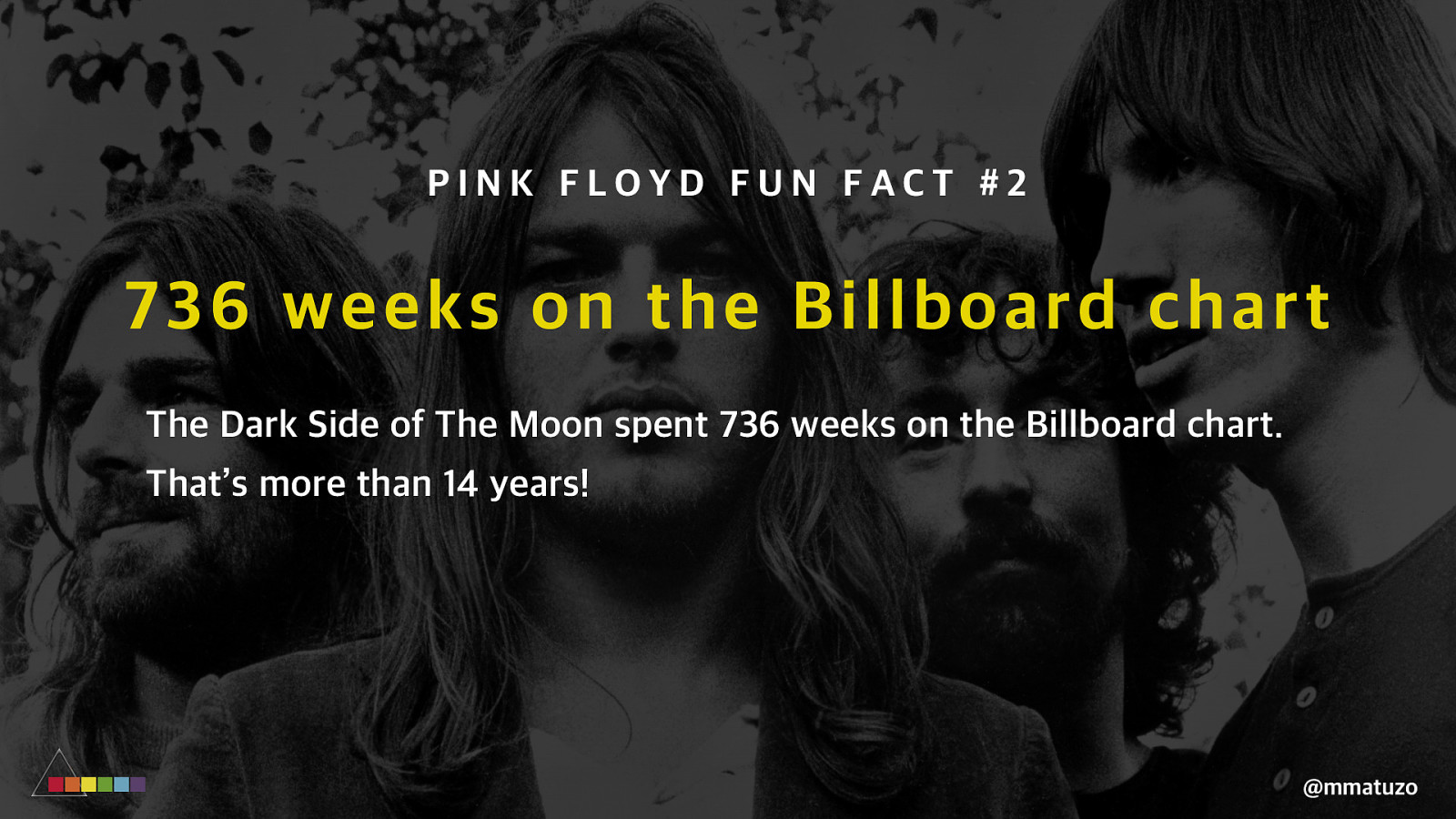
PINK FLOYD FUN FACT #2 73 6 weeks on the Billboard chart The Dark Side of The Moon spent 736 weeks on the Billboard chart. That’s more than 14 years! @mmatuzo
C O MPR O MISIN G O N S EM AN TICS @mmatuzo
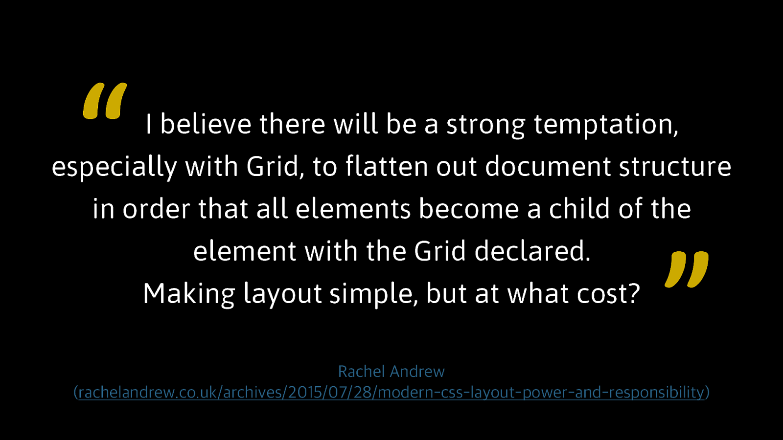
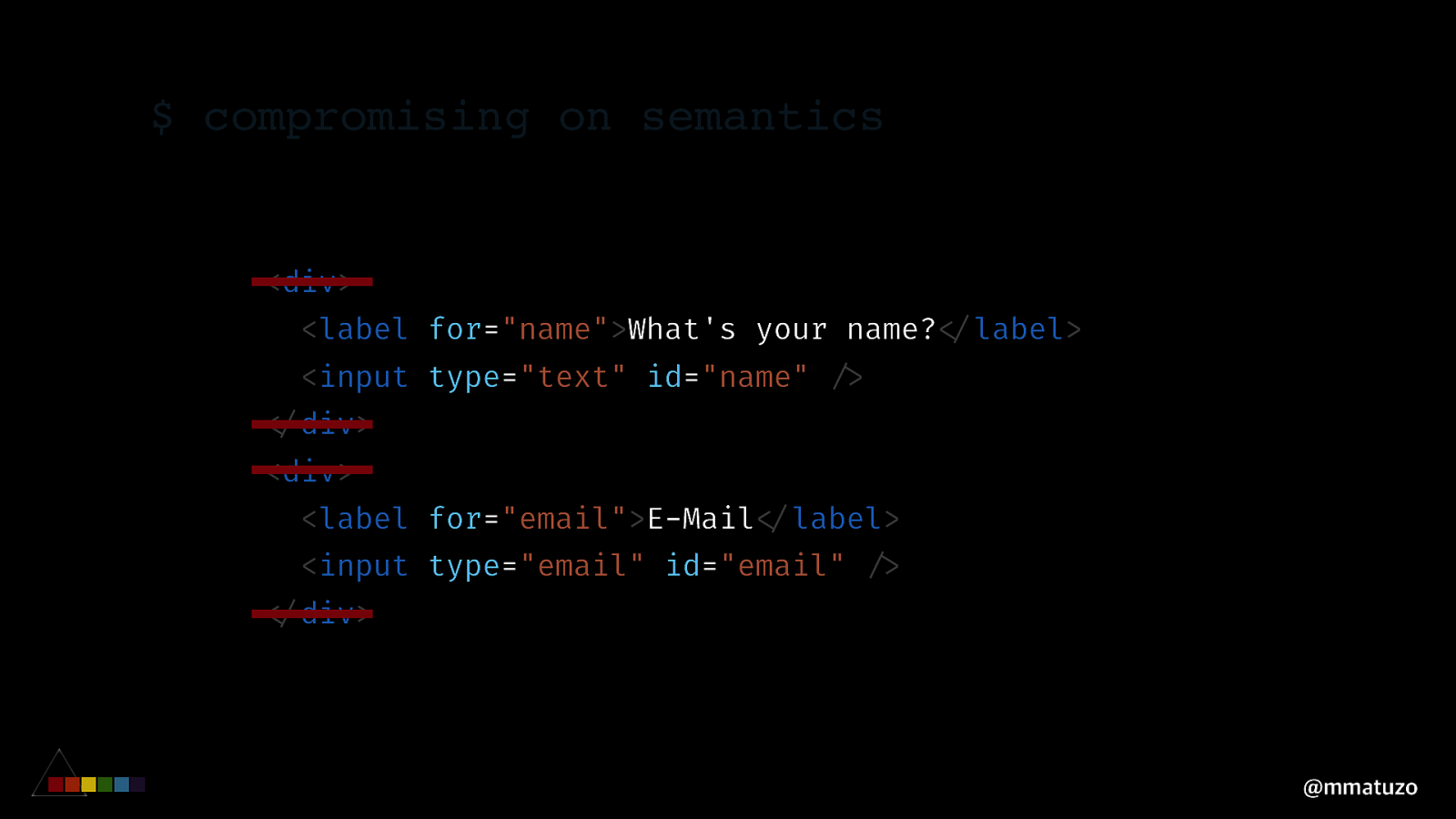
“ I believe there will be a strong temptation, especially with Grid, to flatten out document structure in order that all elements become a child of the element with the Grid declared. Making layout simple, but at what cost? ” Rachel Andrew (rachelandrew.co.uk/archives/2015/07/28/modern-css-layout-power-and-responsibility)
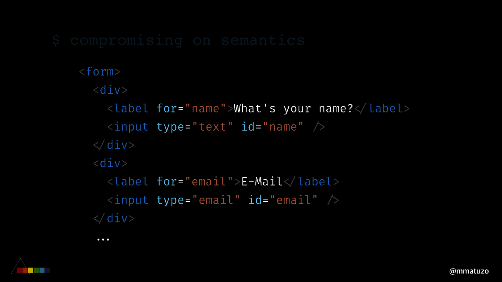
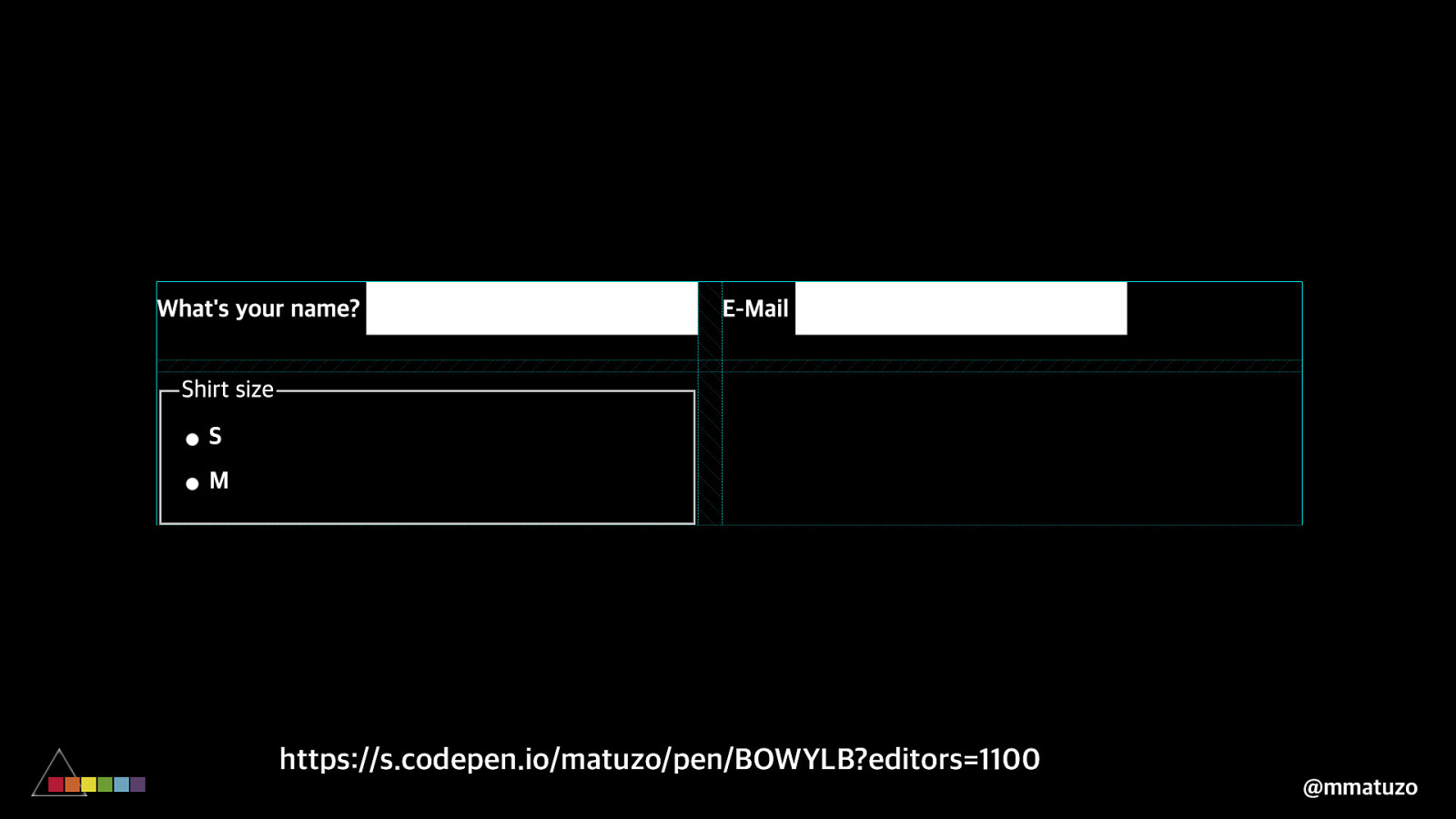
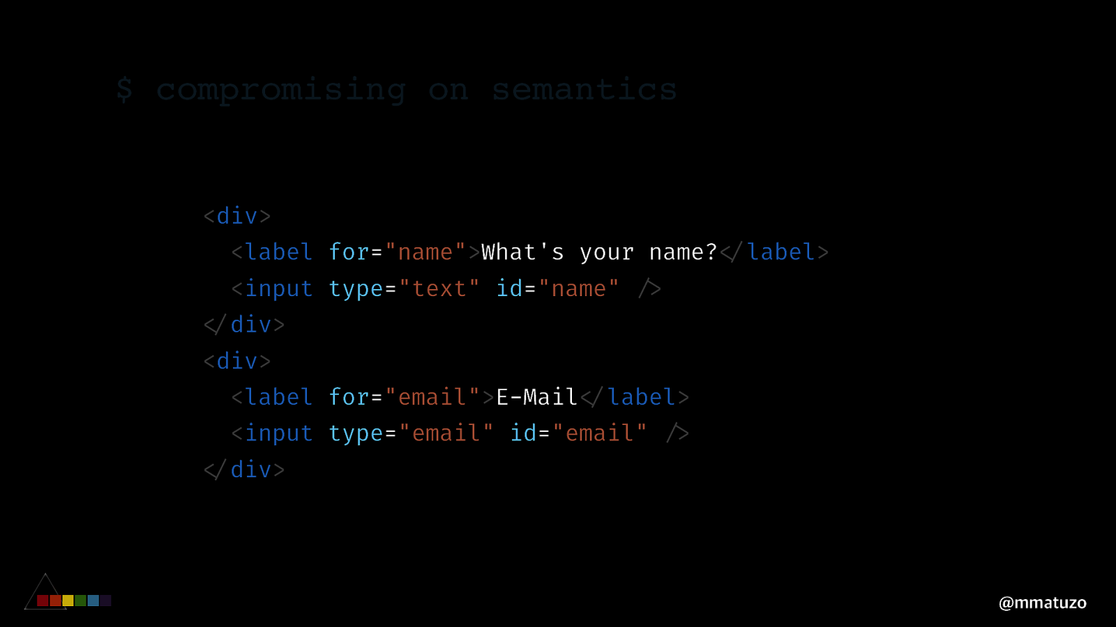
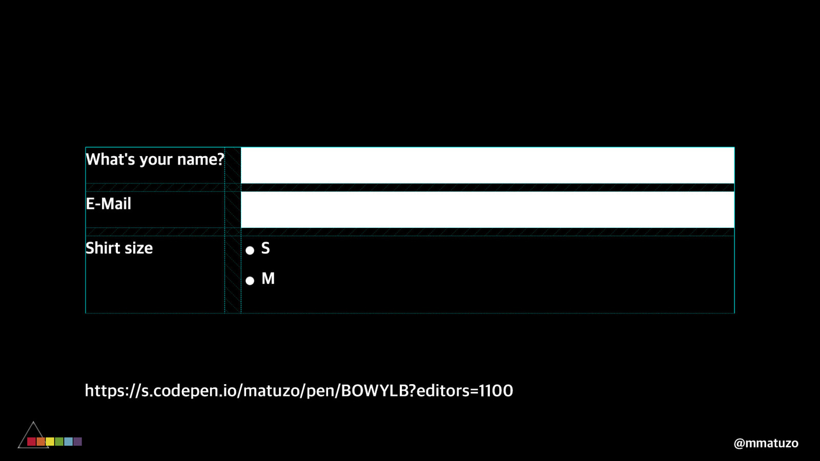
$ compromising on semantics <form> <div> <label for="name">What's your name?!</label> <input type="text" id="name" !/> !</div> <div> <label for="email">E-Mail!</label> <input type="email" id="email" !/> !</div> !!... @mmatuzo
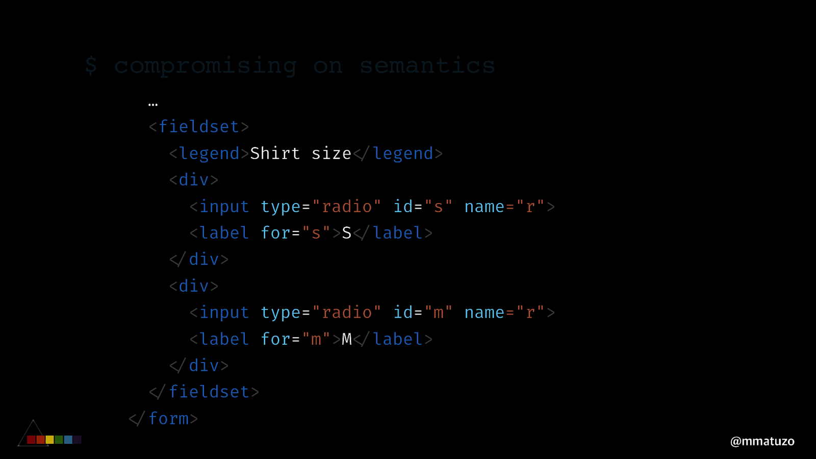
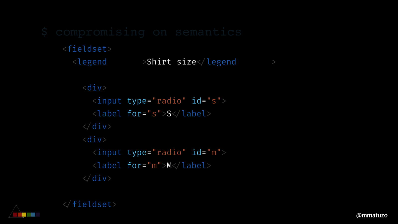
$ compromising on semantics … <fieldset> <legend>Shirt size!</legend> <div> <input type="radio" id="s" name="r"> <label for="s">S!</label> !</div> <div> <input type="radio" id="m" name="r"> <label for="m">M!</label> !</div> !</fieldset> !</form> @mmatuzo
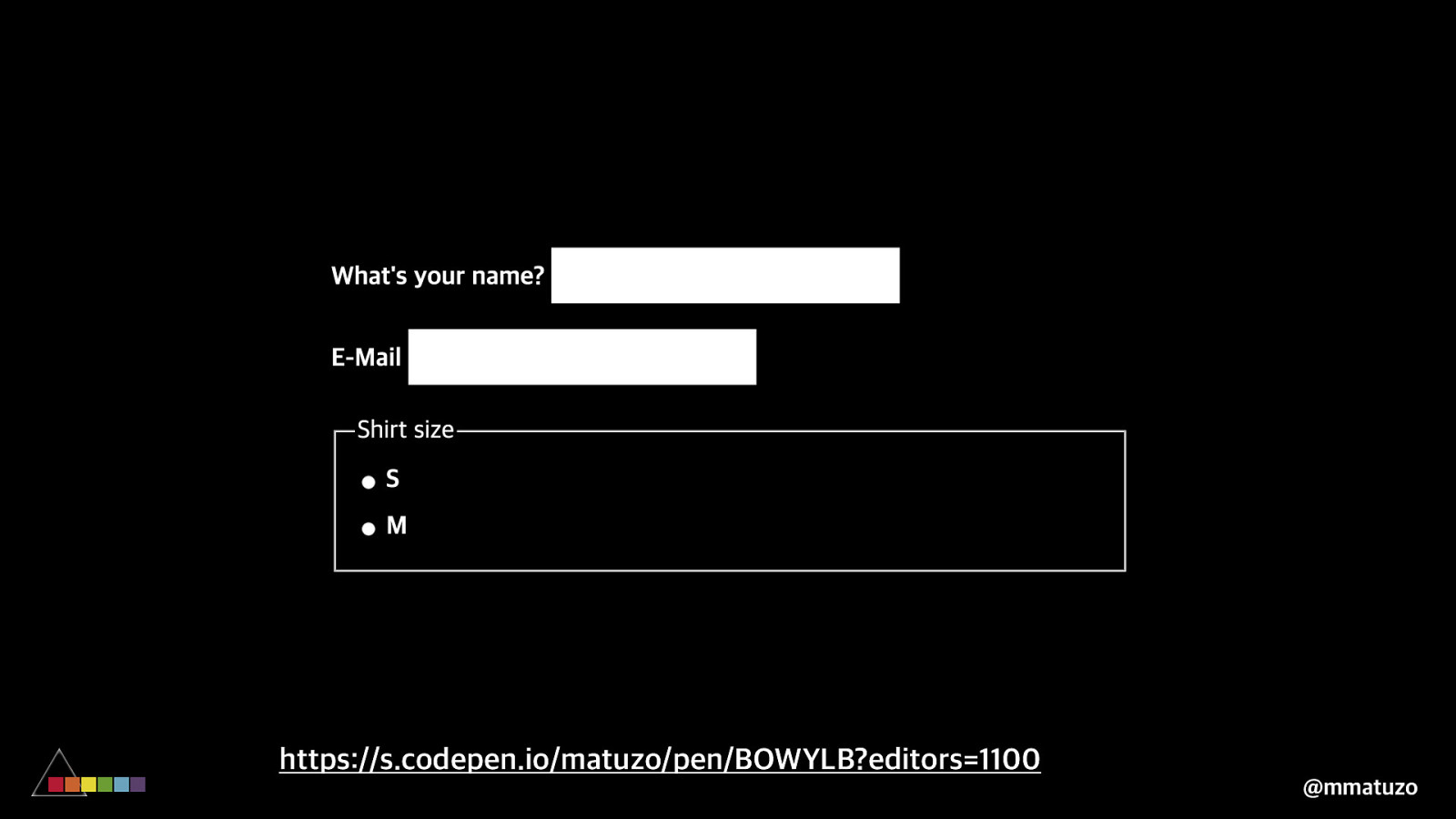
https://s.codepen.io/matuzo/pen/BOWYLB?editors=1100 @mmatuzo
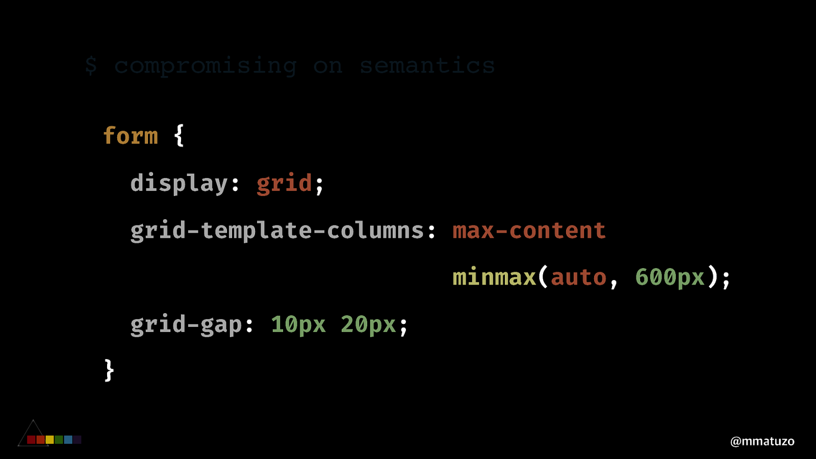
$ compromising on semantics form { display: grid; grid-template-columns: max-content minmax(auto, 600px); grid-gap: 10px 20px; } @mmatuzo
https://s.codepen.io/matuzo/pen/BOWYLB?editors=1100 @mmatuzo
$ compromising on semantics
<div> <label for="name">What's your name?!</label> <input type="text" id="name" !/> !</div> <div> <label for="email">E-Mail!</label> <input type="email" id="email" !/> !</div> @mmatuzo$ compromising on semantics
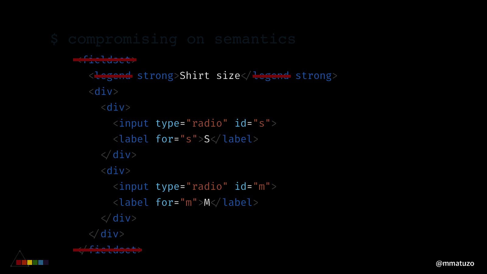
<div> <label for="name">What's your name?!</label> <input type="text" id="name" !/> !</div> <div> <label for="email">E-Mail!</label> <input type="email" id="email" !/> !</div> @mmatuzo$ compromising on semantics <fieldset> <legend strong>Shirt size!</legend strong> <div> <div> <input type="radio" id="s"> <label for="s">S!</label> !</div> <div> <input type="radio" id="m"> <label for="m">M!</label> !</div> !</div> !</fieldset> @mmatuzo
$ compromising on semantics <fieldset> <legend strong>Shirt size!</legend strong> <div> <div> <input type="radio" id="s"> <label for="s">S!</label> !</div> <div> <input type="radio" id="m"> <label for="m">M!</label> !</div> !</div> !</fieldset> @mmatuzo
https://s.codepen.io/matuzo/pen/BOWYLB?editors=1100 @mmatuzo
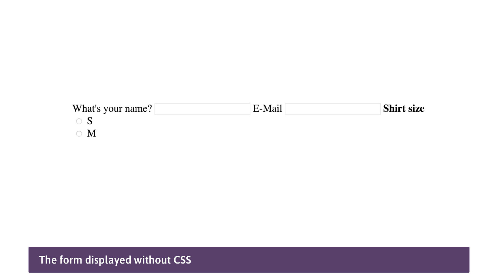
The form displayed without CSS
COMP ROM IS ING ON SE M ANTICS S U B GR I D @mmatuzo
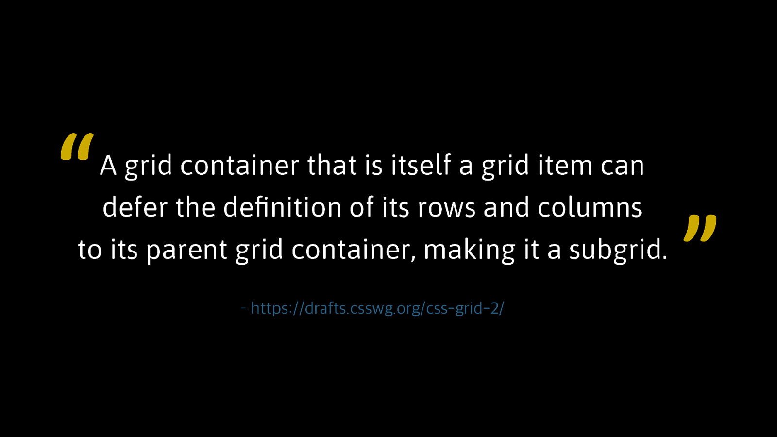
“ A grid container that is itself a grid item can defer the definition of its rows and columns to its parent grid container, making it a subgrid. – https://drafts.csswg.org/css-grid-2/ ”
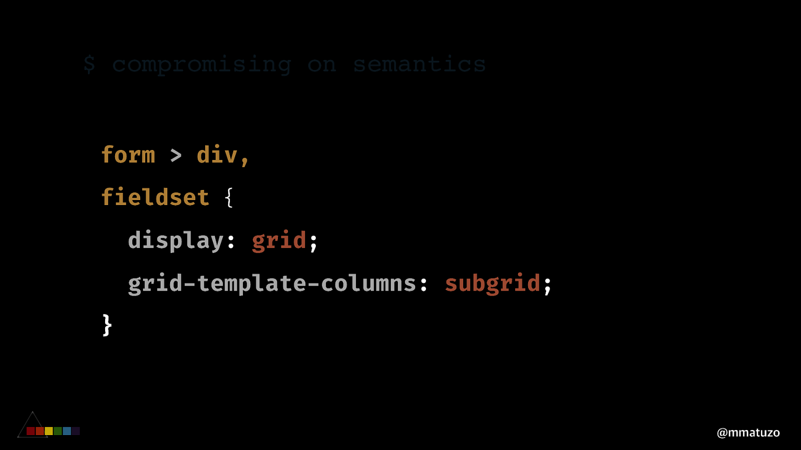
$ compromising on semantics form > div, fieldset { display: grid; grid-template-columns: subgrid; } @mmatuzo
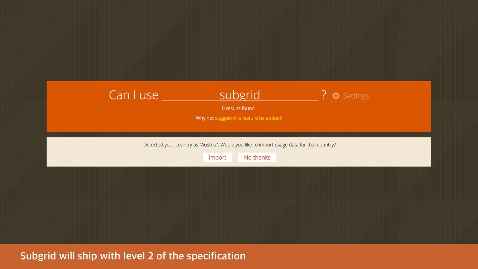
Subgrid will ship with level 2 of the specification
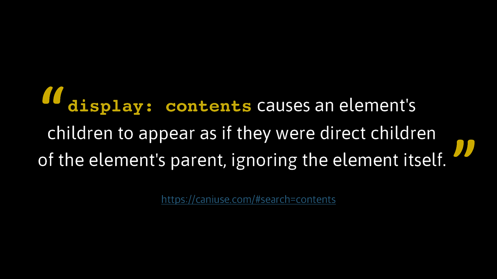
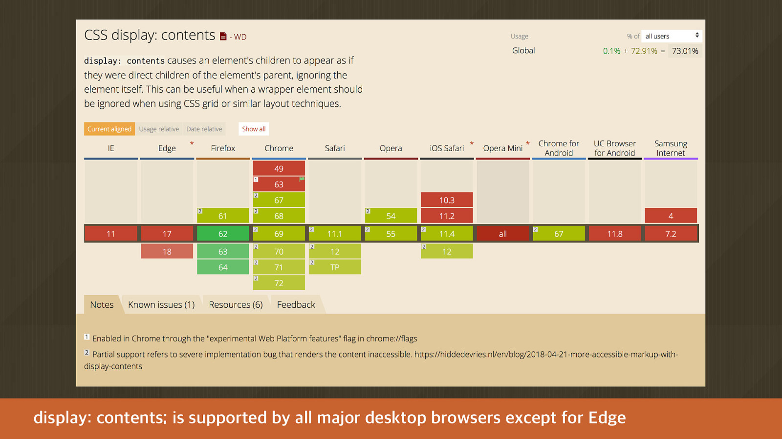
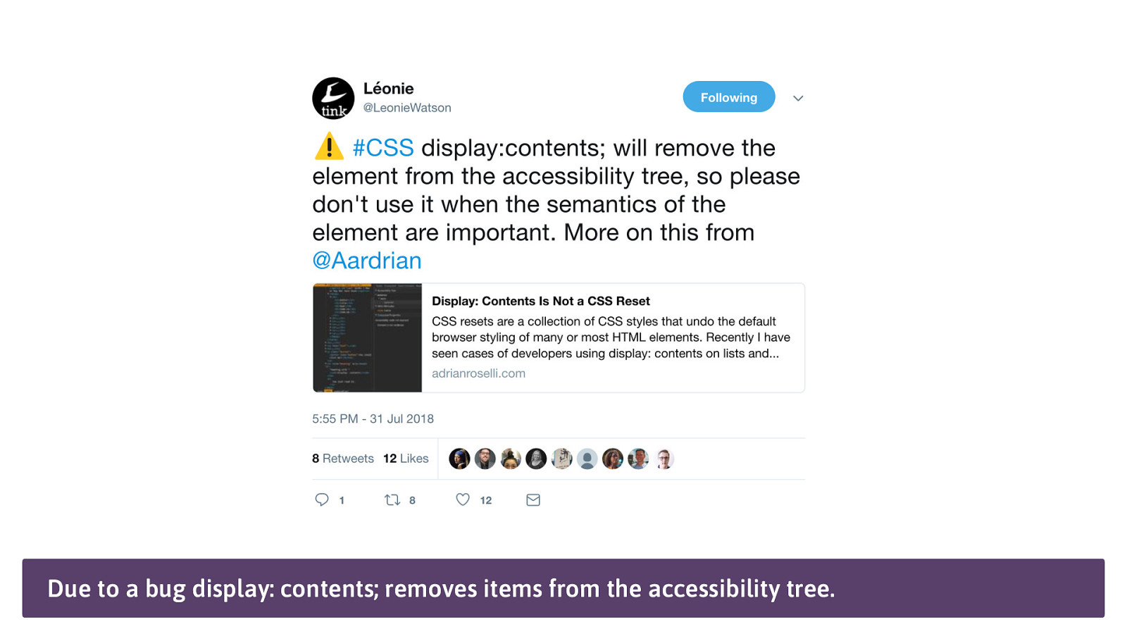
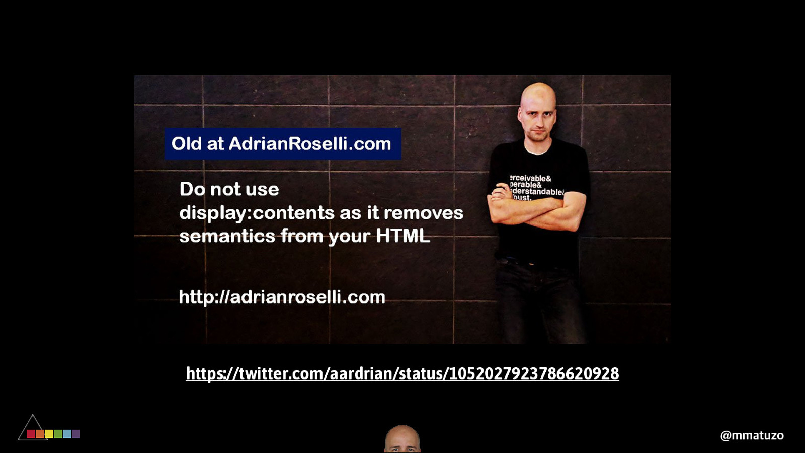
“ display: contents causes an element's children to appear as if they were direct children of the element's parent, ignoring the element itself. https://caniuse.com/#search=contents ”
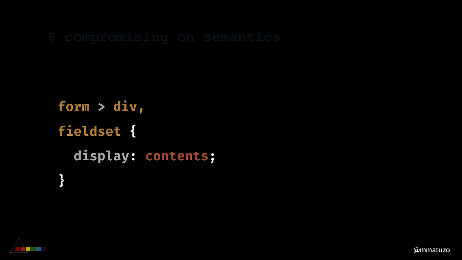
$ compromising on semantics form > div, fieldset { display: contents; } @mmatuzo
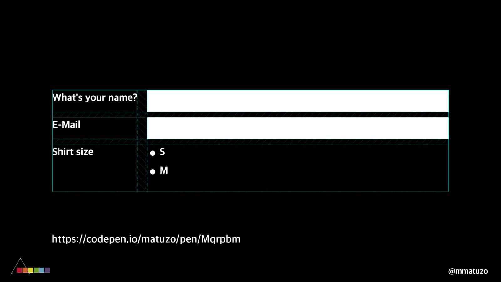
https://codepen.io/matuzo/pen/Mqrpbm @mmatuzo
display: contents; is supported by all major desktop browsers except for Edge
Due to a bug display: contents; removes items from the accessibility tree.
https://twitter.com/aardrian/status/1052027923786620928 @mmatuzo
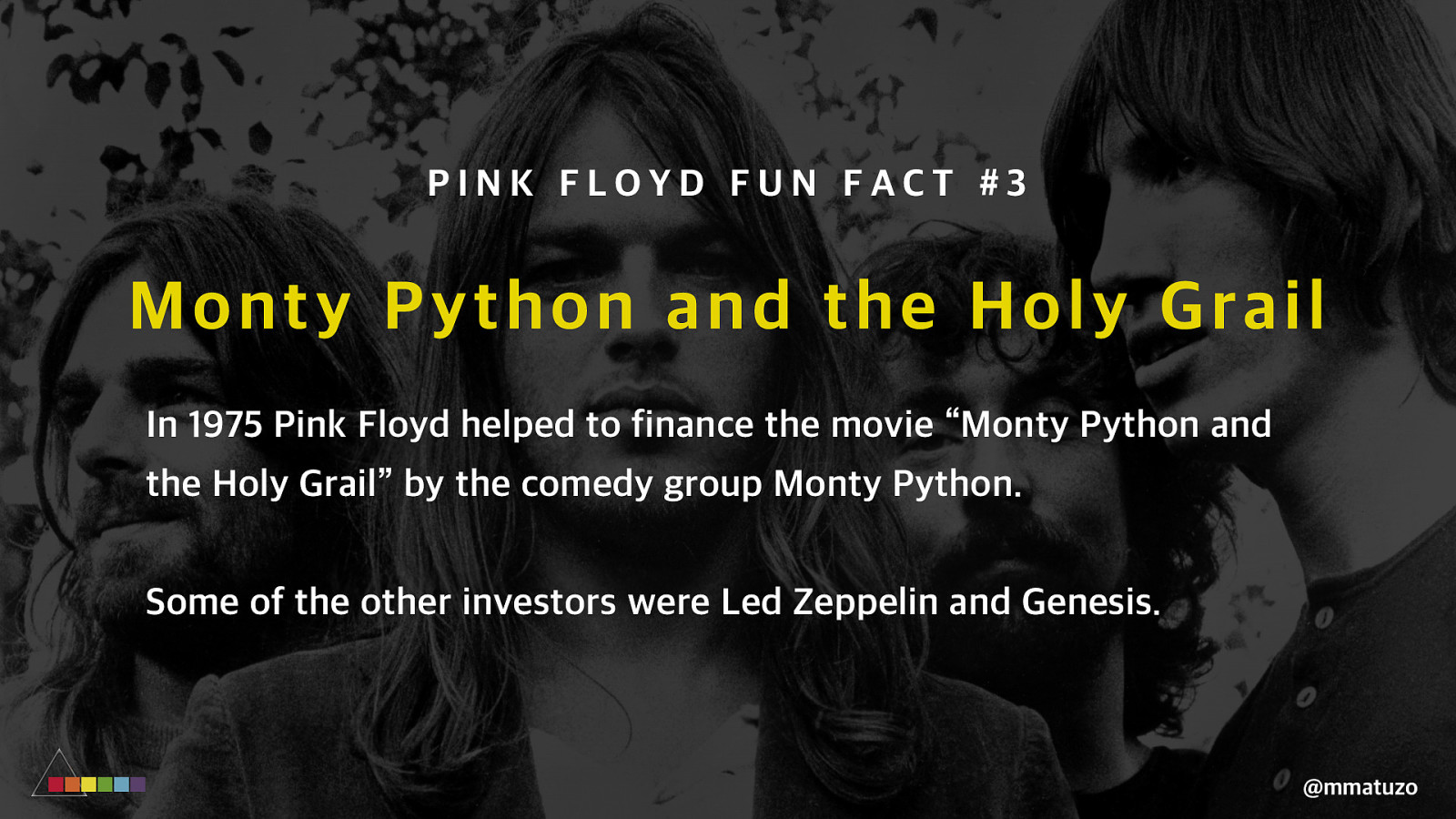
PINK FLOYD FUN FACT #3 Mo nty Python and the Holy Grail In 1975 Pink Floyd helped to finance the movie “Monty Python and the Holy Grail” by the comedy group Monty Python. Some of the other investors were Led Zeppelin and Genesis. @mmatuzo
C RO S S B RO WSER S U PPO RT @mmatuzo
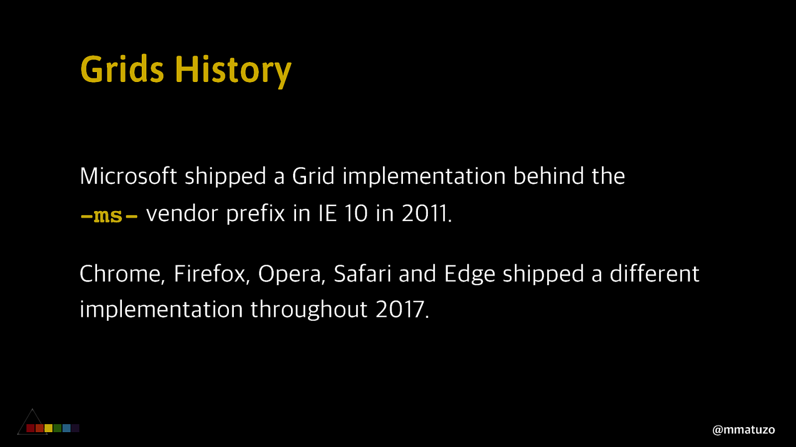
Grids History Microsoft shipped a Grid implementation behind the -ms- vendor prefix in IE 10 in 2011. Chrome, Firefox, Opera, Safari and Edge shipped a different implementation throughout 2017. @mmatuzo
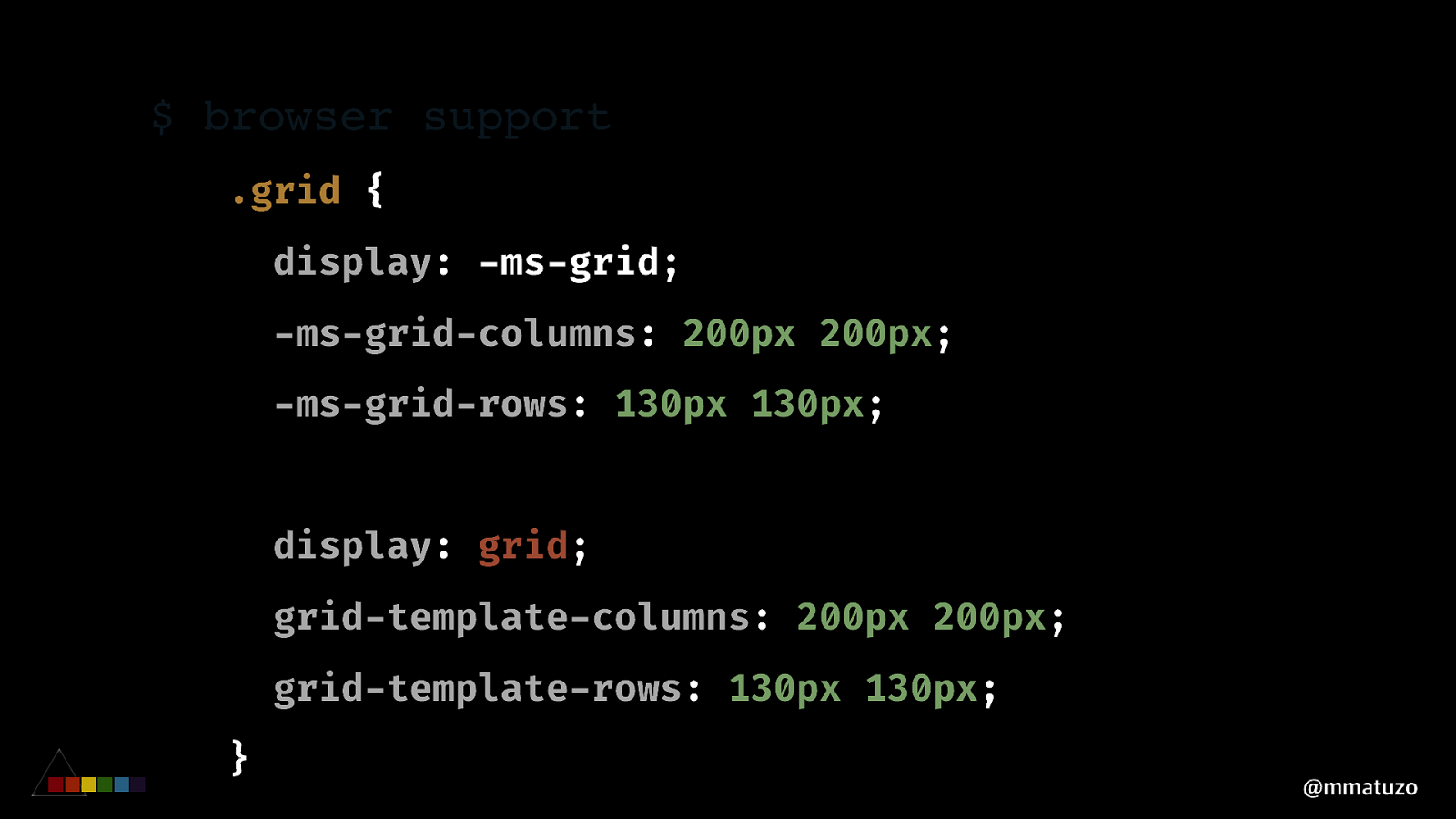
$ browser support .grid { display: -ms-grid; -ms-grid-columns: 200px 200px; -ms-grid-rows: 130px 130px; display: grid; grid-template-columns: 200px 200px; grid-template-rows: 130px 130px; } @mmatuzo
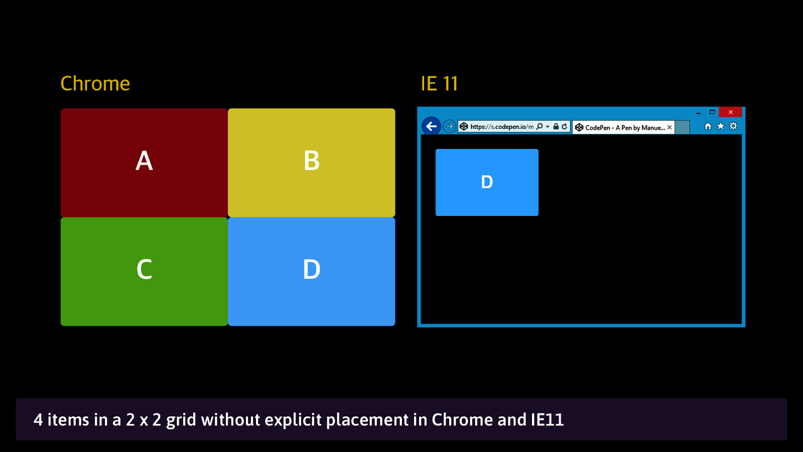
Chrome IE 11 4 items in a 2 x 2 grid without explicit placement in Chrome and IE11
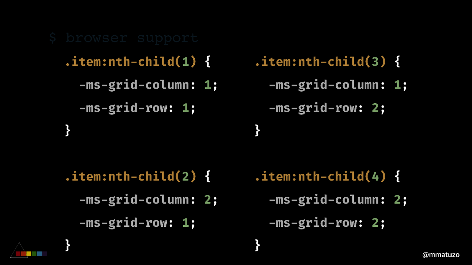
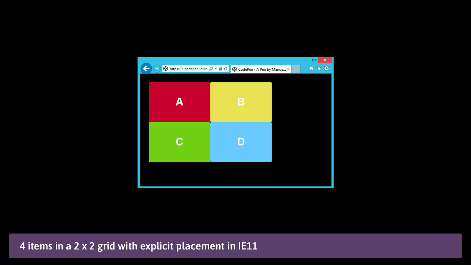
$ browser support .item:nth-child(1) { .item:nth-child(3) { -ms-grid-column: 1; -ms-grid-column: 1; -ms-grid-row: 1; -ms-grid-row: 2; } } .item:nth-child(2) { .item:nth-child(4) { } -ms-grid-column: 2; -ms-grid-column: 2; -ms-grid-row: 1; -ms-grid-row: 2; } @mmatuzo
4 items in a 2 x 2 grid with explicit placement in IE11
BRO WSER SUPP ORT A U T OP R E F I X E R ? @mmatuzo
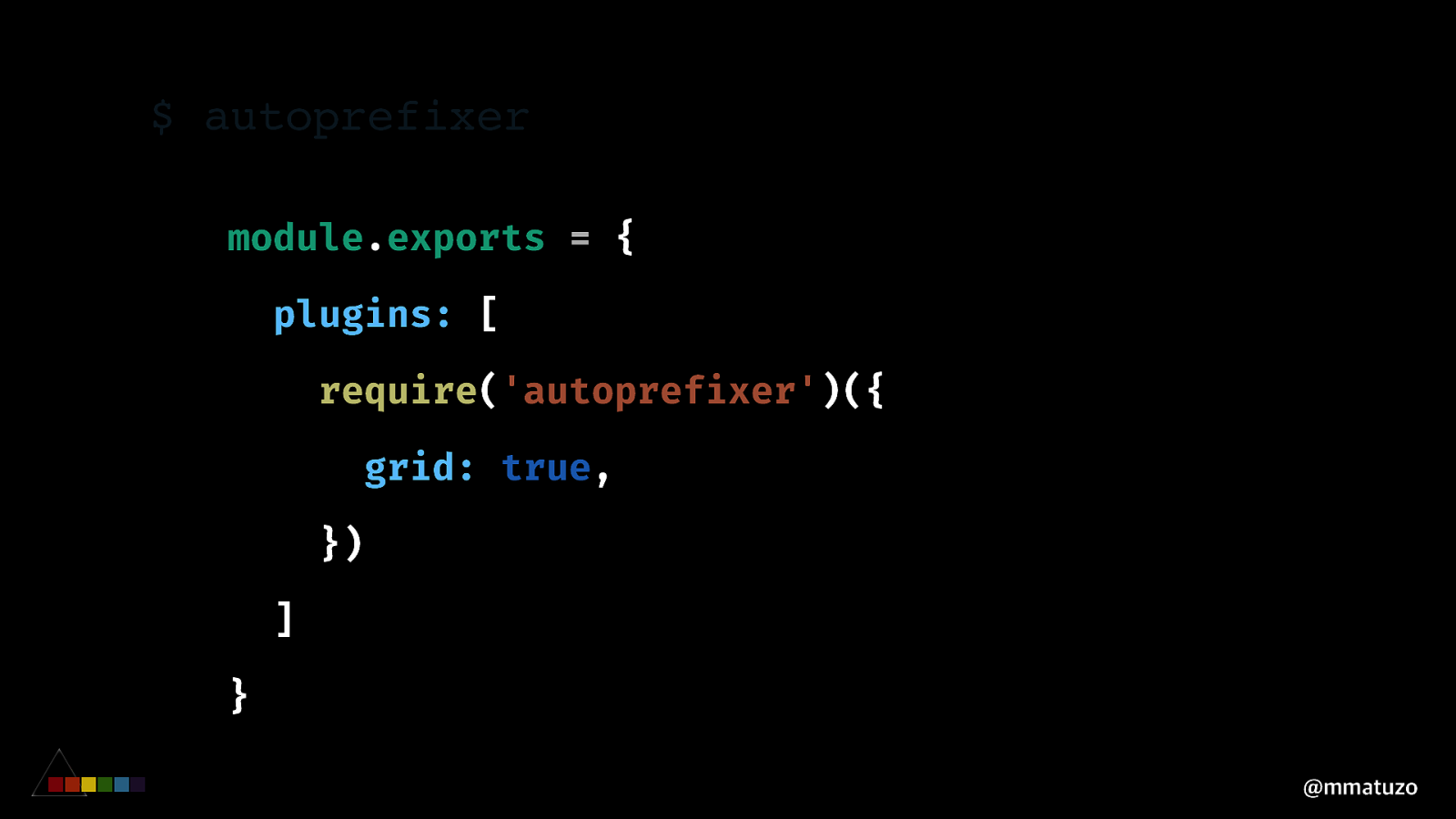
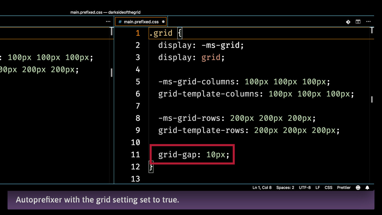
$ autoprefixer module.exports = { plugins: [ require('autoprefixer')({ grid: true, }) ] } @mmatuzo
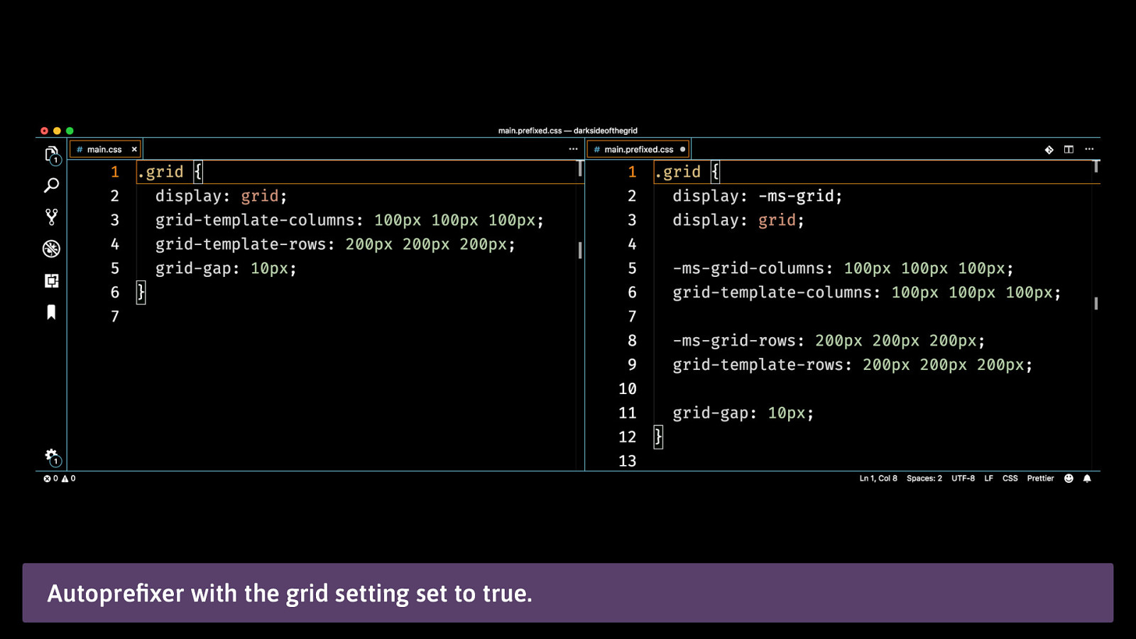
Autoprefixer with the grid setting set to true.
Autoprefixer with the grid setting set to true.
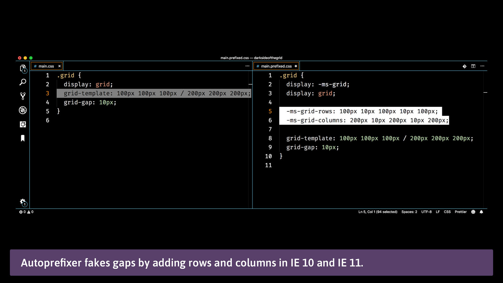
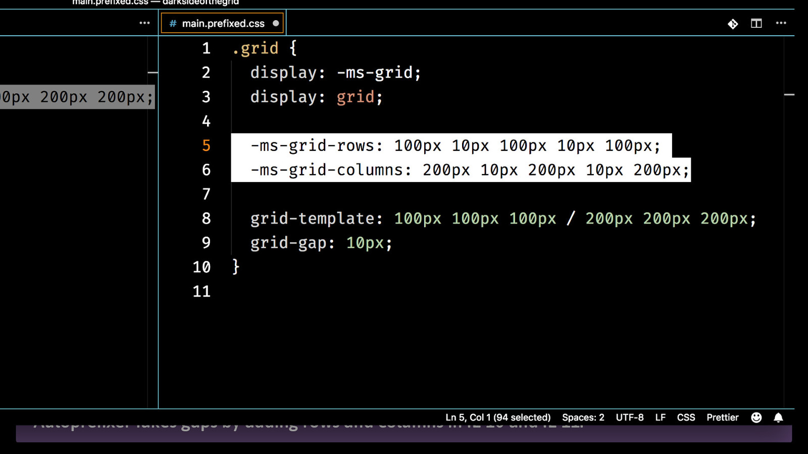
Autoprefixer fakes gaps by adding rows and columns in IE 10 and IE 11.
Autoprefixer fakes gaps by adding rows and columns in IE 10 and IE 11.
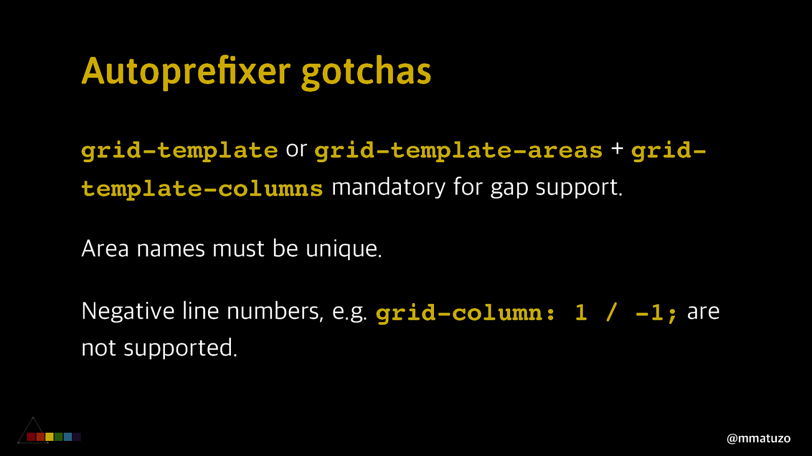
Autoprefixer gotchas grid-template or grid-template-areas + gridtemplate-columns mandatory for gap support. Area names must be unique. Negative line numbers, e.g. grid-column: 1 / -1; are not supported. @mmatuzo
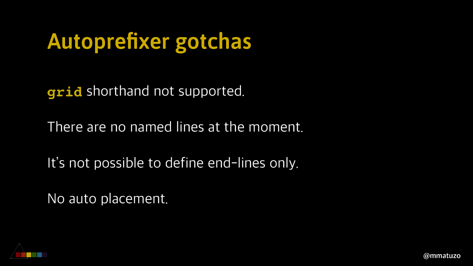
Autoprefixer gotchas grid shorthand not supported. There are no named lines at the moment. It’s not possible to define end-lines only. No auto placement. @mmatuzo
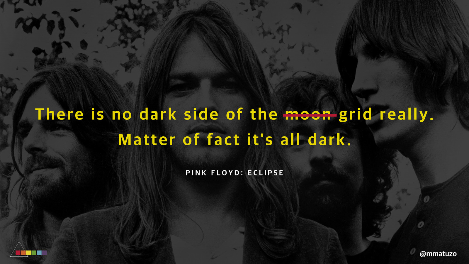
Th ere is no d ar k sid e of t h e mo o n g r i d r e a l l y . M at te r of f ac t i t ' s al l da r k . PINK FLOYD: ECLIPSE @mmatuzo
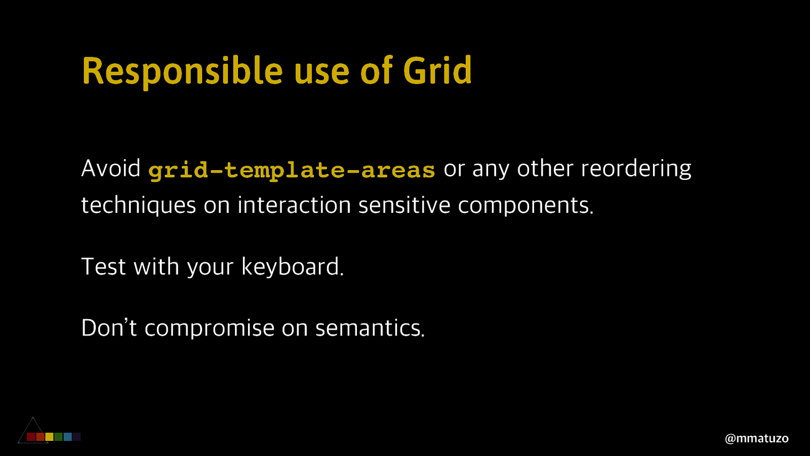
Responsible use of Grid Avoid grid-template-areas or any other reordering techniques on interaction sensitive components. Test with your keyboard. Don’t compromise on semantics. @mmatuzo
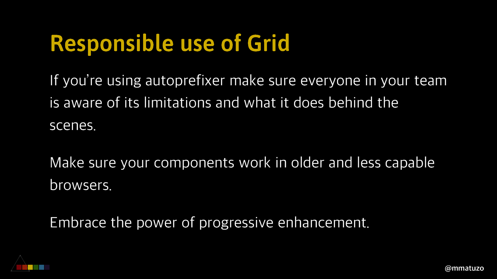
Responsible use of Grid If you’re using autoprefixer make sure everyone in your team is aware of its limitations and what it does behind the scenes. Make sure your components work in older and less capable browsers. Embrace the power of progressive enhancement. @mmatuzo
Thank you ❤ Aaron Gustafson Scott O’Hara Adrian Roselli Eric Bailey Heydon Pickering Hidde de Vries Léonie Watson Steve Faulkner Oskar Westin Rob Dodson Billy Gregory @mmatuzo
Thank you manuel@matuzo.at @mmatuzo

The CSS Grid Layout specification is one of the most exciting additions to CSS in the last few years. It comes with a variety of new properties, units, functions and related specs, but it also entails new dangers. In this talk Manuel gives a quick introduction to CSS Grid Layout and confronts said dangers by explaining what’s problematic about them and providing alternative solutions. You’ll learn what you need to watch out for when working with grids, why source order matters, how to work with legacy browsers and about the ups and downs of recent display values.
Here’s what was said about this presentation on social media.

 for free. You
can too.
for free. You
can too.